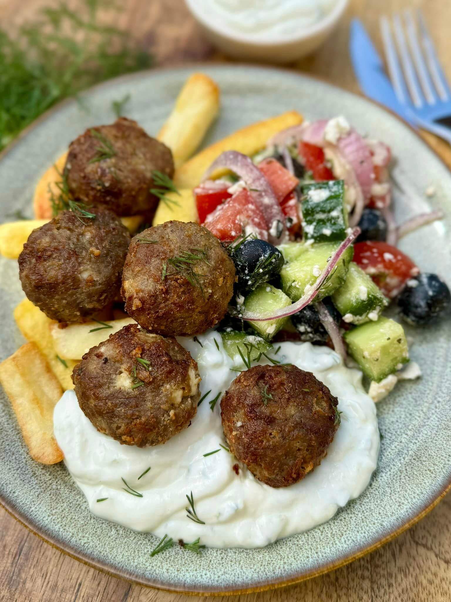
A quick dinner idea and not to mention very tasty 🙂
Prepared in Air Fryer in 30 minutes. I measured the time. While the potatoes were being fried, I made the meatballs, then while the balls were being fried, I made the Greek salad.
Ingredients:
- 500g minced meat (I used a mixture of pork and beef)
- 2 tbsp breadcrumbs
- 80g feta cheese
- half a red onion
- 1 egg
- 2 tbsp chopped parsley
- 2 tsp dried oregano
- 1 tsp ground cumin (can also be Roman cumin)
- 2 tsp dried garlic powder
- salt and freshly ground pepper to taste
For the salad:
- 250g of snake cucumber
- 200g tomatoes
- 50g pitted olives
- 120g feta cheese
- freshly squeezed juice of half a lemon
- half a red onion
- 1 tsp dried oregano
- 1 tbsp chopped dill
- 1 tbsp olive oil
Instructions:
- I put the meatball ingredients in a bowl, knead them thoroughly and shape them into balls. (I made approx. 40g ones)
- I line up the balls in the grid basket of the Air Fryer, spray them with a little olive oil and bake them at 180 degrees for 15-17 minutes (190 degrees, 30 minutes when baked in a traditional oven). The cooking time may vary depending on the device and also depends on the size of the meatballs.
- While the meatballs are baking, I dice the cleaned cucumber and tomato, circle the red onion, halve the olives, put everything in a bowl, crumble the feta, sprinkle with oregano, chopped dill, sprinkle with lemon juice and olive oil, stir everything together and the meatballs I offer it alongside.
- We ate it with French fries, which I also fried in the Air Fryer until I kneaded the meatballs – 200 degrees for 12 minutes.


https://shorturl.fm/wUeQY
https://shorturl.fm/JNBBT
https://shorturl.fm/Jf26v
https://shorturl.fm/kh2GY
https://shorturl.fm/HapeE
https://shorturl.fm/IBas3
https://shorturl.fm/ZIDA1
https://shorturl.fm/cs2hA
https://shorturl.fm/szsV6
https://shorturl.fm/rO5jO
https://shorturl.fm/ecDA6
https://shorturl.fm/gOQDF
https://shorturl.fm/QEON8
https://shorturl.fm/S8faj
https://shorturl.fm/0Iq8u
https://shorturl.fm/VL2LD
https://shorturl.fm/YRTC1
https://shorturl.fm/OweMy
https://shorturl.fm/UsmOg
https://shorturl.fm/DJGYy
https://shorturl.fm/rSQTU
https://shorturl.fm/ubzmE
https://shorturl.fm/YonyC
https://shorturl.fm/wbQml
https://shorturl.fm/yHXPP
https://shorturl.fm/uw9ws
https://shorturl.fm/ihh8D
https://shorturl.fm/XKYFb
https://shorturl.fm/rVChg
https://shorturl.fm/ZaTZ1
https://shorturl.fm/Qhx2v
https://shorturl.fm/yfppr
https://shorturl.fm/YQbdk
https://shorturl.fm/lu9Jb
https://shorturl.fm/Xc5qv
https://shorturl.fm/jVWfb
https://shorturl.fm/dwtZQ
https://shorturl.fm/YF6vi
https://shorturl.fm/DOxsM
https://shorturl.fm/ln01C
https://shorturl.fm/kQDtr
https://shorturl.fm/PIQBo
https://shorturl.fm/b1G7H
https://shorturl.fm/KSkRY
https://shorturl.fm/tGsiI
https://shorturl.fm/ZqJTj
https://shorturl.fm/HQH2d
https://shorturl.fm/uctSG
https://shorturl.fm/2da0E
https://shorturl.fm/yKE2H
https://shorturl.fm/7ncXj
https://shorturl.fm/ykFqA
https://shorturl.fm/JI3LE
https://shorturl.fm/4UNnF
https://shorturl.fm/nPA5o
https://shorturl.fm/3DQxA
https://shorturl.fm/RvagZ
https://shorturl.fm/a3bqU
https://shorturl.fm/6fXbu
https://shorturl.fm/3MhJi
https://shorturl.fm/9iLPH
https://shorturl.fm/ODiOS
https://shorturl.fm/7GU3m
https://shorturl.fm/naDvQ
https://shorturl.fm/NHn3v
https://shorturl.fm/eeqY4
https://shorturl.fm/eudw1
https://shorturl.fm/DinoG
https://shorturl.fm/vGIFQ
https://shorturl.fm/4Va0f
https://shorturl.fm/U2jCt
https://shorturl.fm/wqNWT
https://shorturl.fm/u2H89
https://shorturl.fm/c4Zf7
https://shorturl.fm/csirp
https://shorturl.fm/Gej07
https://shorturl.fm/lqnmc
https://shorturl.fm/SXWzd
https://shorturl.fm/a73ev
https://shorturl.fm/jVpmq
https://shorturl.fm/pOnQP
https://shorturl.fm/g2L3A
https://shorturl.fm/gPDUT
https://shorturl.fm/hdAAD
https://shorturl.fm/ut7oA
https://shorturl.fm/mPY11
https://shorturl.fm/6L5RO
https://shorturl.fm/N7sag
https://shorturl.fm/4mhYy
https://shorturl.fm/ka1vI
https://shorturl.fm/YJWVh
https://shorturl.fm/g6KNJ
https://shorturl.fm/z7Hcd
https://shorturl.fm/10pj9
https://shorturl.fm/mFB6z
https://shorturl.fm/2bNWJ
https://shorturl.fm/HQl3R
https://shorturl.fm/c9uKL
https://shorturl.fm/QM5Ke
https://shorturl.fm/tBC1p
https://shorturl.fm/IWaNk
C9TayaCasino, seems legit. No big thrills, but a decent enough play. Check them out at c9tayacasino
https://shorturl.fm/NakR7
https://shorturl.fm/zOtL2
Winmxn, vamos por esas ganancias mexicanas! Espero que me traiga suerte este sitio. Ya les contaré como me va. ¡Suerte a todos! Conoce más en winmxn.
https://shorturl.fm/rm7KY
https://shorturl.fm/ApJux
If you’re in Africa and looking for a betting app, check out betpawaapp. It’s popular in the region, they offer simple betting. Might be worth downloading if you’re from around there. betpawaapp
It’s fascinating how easily accessible online gaming has become, especially with platforms prioritizing security – like the KYC processes at wk777 app club. Responsible gaming & tech like RNG certification are key, don’t you think? It’s a big shift!
https://shorturl.fm/cDXzq
Right, Aviator predictor? Sounds a bit too good to be true, doesn’t it? Gave it a whirl using 1winaviatorpredictor. Make sure you know what you are doing before you put any real money down! Risk and reward…
https://shorturl.fm/bjnDO
https://shorturl.fm/3ARSu
https://shorturl.fm/kpNJn
I don’t think the title of your article matches the content lol. Just kidding, mainly because I had some doubts after reading the article. https://www.binance.com/ph/register?ref=IU36GZC4
Can you be more specific about the content of your article? After reading it, I still have some doubts. Hope you can help me.
https://shorturl.fm/GwtyW
https://shorturl.fm/MvJpj
Lottery strategies are fascinating – seeing those patterns (or lack thereof!) is key. Security is huge too; good to see platforms like fa777 login legit emphasizing verification & encryption. Makes enjoying the games much more relaxing!
https://shorturl.fm/wgndC
https://shorturl.fm/YBp6O
Thanks for sharing. I read many of your blog posts, cool, your blog is very good.
Thanks for sharing. I read many of your blog posts, cool, your blog is very good. https://accounts.binance.info/si-LK/register-person?ref=LBF8F65G
What’s up, gamers! Heard some chatter about 5699vn. It seems alright, I am exploring it more! Check them out yourself with following link: 5699vn
https://shorturl.fm/zzYgY
https://shorturl.fm/L6YvI
https://shorturl.fm/xau0M
Your point of view caught my eye and was very interesting. Thanks. I have a question for you.
Your article helped me a lot, is there any more related content? Thanks! https://accounts.binance.com/hu/register-person?ref=IQY5TET4
https://shorturl.fm/7glyB
https://shorturl.fm/TaTmT
Thanks for sharing. I read many of your blog posts, cool, your blog is very good.
Thanks for sharing. I read many of your blog posts, cool, your blog is very good. https://accounts.binance.info/register-person?ref=IHJUI7TF
https://shorturl.fm/HrXb6
https://shorturl.fm/yn2pK
https://shorturl.fm/ourTH
Goinbet7 is decent, has got a fair range of casino options and sports. Nothing amazing, but solid and trustworthy enough. Have a look yeah? Find it here: goinbet7
Your article helped me a lot, is there any more related content? Thanks! https://www.binance.com/register?ref=IHJUI7TF
Your point of view caught my eye and was very interesting. Thanks. I have a question for you.
https://shorturl.fm/QQWtt
Thanks for sharing. I read many of your blog posts, cool, your blog is very good.
I don’t think the title of your article matches the content lol. Just kidding, mainly because I had some doubts after reading the article. https://www.binance.com/register?ref=IHJUI7TF
https://shorturl.fm/wgJm9
Thank you for your sharing. I am worried that I lack creative ideas. It is your article that makes me full of hope. Thank you. But, I have a question, can you help me? https://www.binance.info/ru/register?ref=O9XES6KU
Your point of view caught my eye and was very interesting. Thanks. I have a question for you. https://www.binance.com/register?ref=IXBIAFVY
Fast indexing of website pages and backlinks on Google https://is.gd/r7kPlC
Hi https://is.gd/9PLRLO
Hello https://is.gd/tvHMGJ
I don’t think the title of your article matches the content lol. Just kidding, mainly because I had some doubts after reading the article.
Start sharing, start earning—become our affiliate today!
Your point of view caught my eye and was very interesting. Thanks. I have a question for you.
Ưu đãi hoàn trả không giới hạn tại bắn cá 188v lên đến 1.5% mỗi ngày. Chơi càng nhiều, nhận hoàn trả càng lớn, không lo cạn vốn. TONY01-26
Downloaded the ph350app earlier today. The user interface is clean and it does what it says on the tin. Recommend it if you need a simple and reliable app. Download now: ph350app
Downloaded the ph350app earlier today. The user interface is clean and it does what it says on the tin. Recommend it if you need a simple and reliable app. Download now: ph350app
Downloaded the ph350app earlier today. The user interface is clean and it does what it says on the tin. Recommend it if you need a simple and reliable app. Download now: ph350app
Turn your audience into earnings—become an affiliate partner today!
**boostaro**
Boostaro is a purpose-built wellness formula created for men who want to strengthen vitality, confidence, and everyday performance.
**aquasculpt**
aquasculpt is a premium metabolism-support supplement thoughtfully developed to help promote efficient fat utilization and steadier daily energy.
**prostafense official**
ProstAfense is a premium, doctor-crafted supplement formulated to maintain optimal prostate function, enhance urinary performance, and support overall male wellness.
Sign up and turn your connections into cash—join our affiliate program!
Unlock exclusive rewards with every referral—apply to our affiliate program now!
Apply now and receive dedicated support for affiliates!
Thank you for your sharing. I am worried that I lack creative ideas. It is your article that makes me full of hope. Thank you. But, I have a question, can you help me?
Earn up to 40% commission per sale—join our affiliate program now!
Thank you for your sharing. I am worried that I lack creative ideas. It is your article that makes me full of hope. Thank you. But, I have a question, can you help me?
Turn your network into income—apply to our affiliate program!
I don’t think the title of your article matches the content lol. Just kidding, mainly because I had some doubts after reading the article.
Earn recurring commissions with each referral—enroll today!
Superjili is my go-to online casino when I’m bored. Always something new to try and the bonuses are pretty sweet. No complaints here! Try Superjili superjili, you might like it
Superjili is my go-to online casino when I’m bored. Always something new to try and the bonuses are pretty sweet. No complaints here! Try Superjili superjili, you might like it
Superjili is my go-to online casino when I’m bored. Always something new to try and the bonuses are pretty sweet. No complaints here! Try Superjili superjili, you might like it
Earn big by sharing our offers—become an affiliate today!
Yo, just browsed through full 88. Seems like they’ve got a good thing going on. Worth a look if you’re bored. Here’s the link: full 88
Yo, just browsed through full 88. Seems like they’ve got a good thing going on. Worth a look if you’re bored. Here’s the link: full 88
Yo, just browsed through full 88. Seems like they’ve got a good thing going on. Worth a look if you’re bored. Here’s the link: full 88
I don’t think the title of your article matches the content lol. Just kidding, mainly because I had some doubts after reading the article. https://accounts.binance.info/register-person?ref=IXBIAFVY
Your article helped me a lot, is there any more related content? Thanks!
Interesting read! Seeing platforms like bingoplus ph app prioritize regulatory compliance (like age verification) is crucial for responsible gaming. It builds trust, which is key for long-term player engagement, don’t you think? Solid analysis here!
Thank you for your sharing. I am worried that I lack creative ideas. It is your article that makes me full of hope. Thank you. But, I have a question, can you help me?
Your point of view caught my eye and was very interesting. Thanks. I have a question for you. https://accounts.binance.info/register-person?ref=IHJUI7TF
Thank you for your sharing. I am worried that I lack creative ideas. It is your article that makes me full of hope. Thank you. But, I have a question, can you help me? https://accounts.binance.com/ph/register-person?ref=IU36GZC4
Share your link and rake in rewards—join our affiliate team!
Для эффективной работы важно учитывать признаки форумов для хрумера https://www.olx.ua/d/uk/obyavlenie/progon-hrumerom-dr-50-po-ahrefs-uvelichu-reyting-domena-IDXnHrG.html, чтобы не тратить ресурсы впустую.
188win8 got me here and It’s alright. Solid platform, decent odds. Nothing groundbreaking, but reliable. Give it a try if you’re looking for something dependable. 188win8 for life.
188win8 got me here and It’s alright. Solid platform, decent odds. Nothing groundbreaking, but reliable. Give it a try if you’re looking for something dependable. 188win8 for life.
188win8 got me here and It’s alright. Solid platform, decent odds. Nothing groundbreaking, but reliable. Give it a try if you’re looking for something dependable. 188win8 for life.
Get paid for every referral—sign up for our affiliate program now!
Tap into unlimited earnings—sign up for our affiliate program!
Thanks for sharing. I read many of your blog posts, cool, your blog is very good. https://www.binance.com/register?ref=IXBIAFVY
I don’t think the title of your article matches the content lol. Just kidding, mainly because I had some doubts after reading the article.
Thanks for sharing. I read many of your blog posts, cool, your blog is very good.
I don’t think the title of your article matches the content lol. Just kidding, mainly because I had some doubts after reading the article. https://accounts.binance.com/pt-PT/register-person?ref=KDN7HDOR
Thank you for your sharing. I am worried that I lack creative ideas. It is your article that makes me full of hope. Thank you. But, I have a question, can you help me?
Your article helped me a lot, is there any more related content? Thanks! https://www.binance.com/join?ref=IHJUI7TF
Become our affiliate—tap into unlimited earning potential!
Thank you for your sharing. I am worried that I lack creative ideas. It is your article that makes me full of hope. Thank you. But, I have a question, can you help me? https://accounts.binance.com/es-MX/register?ref=GJY4VW8W
Can you be more specific about the content of your article? After reading it, I still have some doubts. Hope you can help me.
I don’t think the title of your article matches the content lol. Just kidding, mainly because I had some doubts after reading the article.
Share your unique link and earn up to 40% commission!
The focus on responsible gaming tools here is refreshing for a mobile slot platform. Always verify sources before installing APKs; trust the official King Ph Apk app casino link to stay safe and enjoy responsibly without financial stress or risks today.
The focus on responsible gaming tools here is refreshing for a mobile slot platform. Always verify sources before installing APKs; trust the official King Ph Apk app casino link to stay safe and enjoy responsibly without financial stress or risks today.
Get rewarded for every recommendation—join our affiliate network!
Your article helped me a lot, is there any more related content? Thanks! https://accounts.binance.com/vi/register-person?ref=MFN0EVO1
Can you be more specific about the content of your article? After reading it, I still have some doubts. Hope you can help me. https://www.binance.com/register?ref=QCGZMHR6
I don’t think the title of your article matches the content lol. Just kidding, mainly because I had some doubts after reading the article.
Your point of view caught my eye and was very interesting. Thanks. I have a question for you.
Thanks for sharing. I read many of your blog posts, cool, your blog is very good.
Can you be more specific about the content of your article? After reading it, I still have some doubts. Hope you can help me. https://accounts.binance.com/register-person?ref=JW3W4Y3A
Can you be more specific about the content of your article? After reading it, I still have some doubts. Hope you can help me.
Thank you for your sharing. I am worried that I lack creative ideas. It is your article that makes me full of hope. Thank you. But, I have a question, can you help me?
Giờ hãy cùng tìm hiểu chi tiết hơn về những đặc điểm nổi bật đã giúp xn88. com ghi điểm trong mắt cộng đồng người chơi. TONY03-23O
Để giúp bạn dễ dàng tiếp cận và trải nghiệm các dịch vụ cá cược mọi lúc, mọi nơi, nhà cái đã phát triển ứng dụng di động tiện lợi. slot365 app Ứng dụng này tương thích với cả hai hệ điều hành Android và iOS, mang lại sự thuận tiện tối đa cho người dùng. Dưới đây là hướng dẫn chi tiết cách tải và cài đặt app trên điện thoại di động của bạn. TONY03-23O
Your article helped me a lot, is there any more related content? Thanks!
Một bước đăng ký tại xn88 , mở ra cả thế giới giải trí trong tầm tay. Đừng bỏ lỡ vận may đang chờ đợi bạn. TONY03-25
Promote our products—get paid for every sale you generate!
Your audience, your profits—become an affiliate today!
Turn your network into income—apply to our affiliate program!
Thanks for sharing. I read many of your blog posts, cool, your blog is very good.
office space for lease in nyc nyc offices
It’s fantastic that you are getting ideas from this article as
well as from our dialogue made at this place.
Your point of view caught my eye and was very interesting. Thanks. I have a question for you.
Become our partner now and start turning referrals into revenue!
pin-up казино играть https://mybiz04.ru
Volvo в Україні https://mirnyid.blogspot.com/2026/03/volvo.html екскаватори, фронтальні навантажувачі та дорожні машини. Надійність, ефективність і сучасні рішення для будівництва. Продаж, підбір і обслуговування техніки для бізнесу.
pin-up скачать бесплатно https://жцрб.рф
Your article helped me a lot, is there any more related content? Thanks! https://accounts.binance.info/kz/register?ref=K8NFKJBQ
Нужны заклепки? вытяжные заклепки нержавеющие 4 8х10 прочный крепеж для соединения деталей. Алюминиевые, стальные и нержавеющие варианты. Надежность, долговечность и удобство монтажа для различных задач и конструкций.
Thank you for your sharing. I am worried that I lack creative ideas. It is your article that makes me full of hope. Thank you. But, I have a question, can you help me?
office space rental nyc nyc office suites
Can you be more specific about the content of your article? After reading it, I still have some doubts. Hope you can help me. https://www.binance.com/register?ref=QCGZMHR6
Thanks for sharing. I read many of your blog posts, cool, your blog is very good. https://www.binance.info/register?ref=QCGZMHR6
ответственное хранение москва стоимость ответственного хранения груза
место ответственного хранения сколько стоит ответственное хранение
дизайн проект квартиры интерьера дизайн проект квартиры интерьера
Can you be more specific about the content of your article? After reading it, I still have some doubts. Hope you can help me.
I don’t think the title of your article matches the content lol. Just kidding, mainly because I had some doubts after reading the article.
Лучшее путешествие https://dzhip-tury-krym.ru горы, каньоны и побережье. Увлекательные маршруты, опытные гиды и яркие впечатления от путешествий по Крыму.
Do you trade cryptocurrencies? bitkelttrade automated system automate your transactions and earn passive income. Smart algorithms analyze the market and help you make decisions. Increase your income and reduce risks with modern technology.
SSSGAMES is what you are looking for if you need to scratch that itch. Many different game options and constant new stuff being updated. sssgames
SSSGAMES is what you are looking for if you need to scratch that itch. Many different game options and constant new stuff being updated. sssgames
SSSGAMES is what you are looking for if you need to scratch that itch. Many different game options and constant new stuff being updated. sssgames
While exploring the mental dimensions of gaming, I found this strategic platform fascinating. For a seamless start, try the Jjj777 app download apk today!
флаг с принтом на заказ https://flag-zakaz-spb.ru
https://shorturl.fm/trdG9
Thanks for sharing. I read many of your blog posts, cool, your blog is very good. https://www.binance.info/register?ref=JW3W4Y3A
Хочешь оригинальную подушку? https://dakimakura-print.ru комфорт и уют для сна. Длинная форма, мягкий наполнитель и стильные принты. Отлично подходит для отдыха и расслабления.
https://shorturl.fm/5DVsT
Нужен пластический хирург? центр пластической хирургии сайт современные операции и эстетические процедуры. Опытные хирурги, безопасные методики и индивидуальный подход. Консультации, диагностика и качественный результат.
Нужна мебель? элитная мебель эксклюзивные изделия из натурального дерева. Индивидуальный дизайн, качественные материалы и точное изготовление. Решения для дома и бизнеса.
Нужна премиум мебель? мебель из массива на заказ изготовление на заказ. Натуральные материалы, эксклюзивный дизайн и долговечность. Решения для дома и бизнеса с высоким уровнем качества.
Your article helped me a lot, is there any more related content? Thanks! https://www.binance.info/register?ref=JW3W4Y3A
мебель из массива изготовление мебели под заказ
https://shorturl.fm/nKDh6
https://shorturl.fm/PcBAY
Your article helped me a lot, is there any more related content? Thanks!
https://shorturl.fm/T88an
Your article helped me a lot, is there any more related content? Thanks!
Последние обновления: https://zhukovastudio.ru
https://shorturl.fm/m1KFT
Can you be more specific about the content of your article? After reading it, I still have some doubts. Hope you can help me.
Thanks for sharing. I read many of your blog posts, cool, your blog is very good. https://www.binance.com/register?ref=IHJUI7TF
I don’t think the title of your article matches the content lol. Just kidding, mainly because I had some doubts after reading the article.
https://shorturl.fm/DH3PF
https://shorturl.fm/JJxB2
Can you be more specific about the content of your article? After reading it, I still have some doubts. Hope you can help me.
Reddit — одна из немногих платформ, где успех кампании напрямую зависит от правильности выбора целевой аудитории, а не только от креатива и офера. https://npprteam.shop/articles/reddit/interesy-soobshchestva-ili-klyuchevye-slova-na-reddit-chto-vybrat-nachinayushchemu/ поможет вам разобраться в особенностях каждого метода и найти оптимальное сочетание для вашей вертикали. Вы получите ясное понимание того, какие сообщества наиболее восприимчивы к вашему продукту, как интересы пользователей связаны с их покупательским поведением и какие ключевые слова генерируют самый квалифицированный трафик. Ресурс содержит практические примеры и рекомендации для разных типов бизнеса, от e-commerce до услуг, что позволит вам адаптировать стратегию под свои специфические условия. Начните с этого материала, и вы значительно сократите кривую обучения на платформе.
Вопрос о том, как выбрать платформу продаж с эскроу и доставкой, становится критичным для бизнесов, которые хотят минимизировать конфликты и мошенничество при росте объемов. Классифайды с системами эскроу и встроенной логистикой предлагают промежуточный вариант между простыми доками объявлений и огромными маркетплейсами, привлекая продавцов, которые ищут баланс между простотой и защитой. В статье подробно описаны механизмы удержания средств, условия высвобождения платежей и процедуры разрешения споров на платформах с эскроу. Приведены конкретные примеры того, как различные модели доставки (самостоятельная, интегрированная через партнеров, напрямую через платформу) влияют на издержки и скорость обращения товара. Для среднего бизнеса, который готов платить за надежность и удобство, это руководство станет навигатором при выборе оптимальной платформы без излишних переплат и операционных рисков.
https://shorturl.fm/EUpsV
While reviewing online retail experiences focused on usability and design clarity, a strong example is Gilded Trail Vendor District Goods which maintains a clean layout and ensures everything feels easy to browse through today, making navigation simple and intuitive across all pages.
explore lemon glade – Found it today and the interface is minimal and easy to move through.
When analyzing digital shopping platforms built for simplicity and flow, one standout example is Harbor Boutique Stone Hub where nice layout with clear sections and straightforward navigation flow, helping users move easily between categories without confusion or clutter.
https://shorturl.fm/pGkPG
When analyzing modern retail systems built for structure and clarity, a strong example is Glade Frost Network Vault which maintains feels structured and simple, making it easy to explore content, providing users with a calm, organized, and visually consistent interface throughout the site.
While moving through several online results without expectations, I discovered a refined boutique river hall and I just stumbled here, and honestly the vibe feels quite welcoming today, which made the browsing experience feel comforting.
My search improved when I encountered a structured retail hub in the middle, and I liked how the site flowed naturally, allowing me to browse without any confusion.
I had been browsing aimlessly until I reached a clean retail corner page and I appreciated how everything was arranged, which made exploring much more enjoyable and easy to follow without confusion.
Across various UX evaluations of digital marketplaces, a strong example is Sage Harbor Experience Vault where clean design and content is arranged in a logical order, allowing users to browse comfortably through well balanced and structured pages.
In the middle of exploring community-driven support projects, I encountered something mid-content hope initiative page and it represents a great initiative supporting community causes and fostering positive impact locally
Updated today: https://sarapang.com
After spending some time reviewing different materials, I noticed a reference tucked into the content check this out now and while I cannot say exactly what it leads to, it definitely seems to have a distinctive feel that sets it apart from typical sources
While going through various creative design and portfolio websites, I noticed something within the content discover more here and it is a site with visually pleasing design and very easy browsing flow overall
In the middle of exploring dessert-themed visual branding websites, I encountered something mid-content explore this page and it shows unique branding, with everything appearing visually appealing and well designed
While reviewing different restaurant discovery pages and cuisine blogs, I noticed something embedded mid-content check curry page and it caught my eye, looking flavorful and full of character with an inviting and rich food identity overall
While going through various nature and gardening education platforms, I noticed something within the content discover more here and it offers beautiful gardening content that is calming, informative, and easy to follow for beginners today
While going through various real estate and listing-based platforms, I encountered something mid-content visit this property link and it has a nice presentation that clearly explains what is being offered in a very simple and readable way
While reviewing various clean layout websites and design platforms, I noticed something embedded mid-content check structured page and it offers a smooth browsing experience, with a layout that feels neat, organized, and easy to navigate
While browsing different shopping links, I noticed a polished boutique site and it stood out because of how quickly everything appeared and how easy the layout was to understand.
In the middle of browsing through various project-based informational websites, I came across something that stood out see this project page and it is nicely structured and informative, making it definitely worth checking out overall
While testing different online marketplace layouts for responsiveness and visual hierarchy clarity, I explored a product grid section containing Summit Citrus Retail Corner placed inside a navigation panel, and – the interface felt balanced and easy to scan, making the browsing process feel natural and straightforward throughout the session.
In the middle of browsing through modern art exhibitions and creative installations, I came across something that stood out see this exhibition site and it has a creative concept that makes going through its different sections enjoyable and visually engaging
While browsing through multiple online references and structured content, I found something placed in the middle take a look here and after a quick glance, it offers a clean design and an easy navigation experience that feels very smooth overall
As I browsed through multiple wellness and charity foundation websites, I noticed something placed within the content discover this foundation and it is a nonprofit focused on hair restoration and global awareness work
As I was reviewing different awareness and education initiative websites, I found something embedded in the text visit consent page and it stands as an important initiative, with content that feels meaningful and well presented overall
While testing different ecommerce UI prototypes for usability and layout clarity I explored a product grid containing a href=”//ambercoastmarketplace.shop/](https://ambercoastmarketplace.shop/)” />Amber Coast Marketplace Store Hub embedded in a catalog module, – the experience is pleasant since everything loads quickly and the design remains tidy and easy to understand
sebastianbachlive.com – Live music updates and performances from Sebastian Bach online now
While browsing through several curated lifestyle and subscription box reviews earlier today, I decided to include check this curated box right in the middle of my thoughts – the overall presentation felt well planned and visually appealing with a creative touch.
As I continued browsing uplifting lifestyle and positivity platforms, I found something placed within the text see happy site and it carries a cheerful vibe, with content that feels light, positive, and easy to enjoy
As I was reviewing different opinion forums and discussion communities online, I found something embedded in the text your views interactive hub and it appears to be a place for meaningful discussions and thoughtful engagement overall
As I looked through various mental health information sites and support guides, I discovered wellbeing support page – The content feels honest and useful, offering straightforward guidance without overwhelming the reader.
While looking for a quick way to download files online without hassle, I came across simple download hub – I tested it briefly and found the process to be smooth, clear, and surprisingly straightforward overall.
Your article helped me a lot, is there any more related content? Thanks! https://www.binance.info/register?ref=IHJUI7TF
https://shorturl.fm/bKRoR
As I reviewed wellness coaching websites and nutrition advisory platforms, I noticed content featuring paleo diet consulting services integrated within health-focused discussions – this site provides structured guidance on paleo eating habits, helping clients transition to whole-food nutrition and maintain sustainable lifestyle changes through expert consultation
While testing ecommerce UI prototypes for usability and interface clarity I explored a product grid containing a href=”//harborlakefrontboutiquehub.shop/](https://harborlakefrontboutiquehub.shop/)” />Boutique Harbor Lakefront Studio embedded in a catalog module, – Clean presentation makes browsing feel simple and stress free overall giving users a smooth and visually calm environment for exploring different sections
During a casual exploration of informational and utility-focused websites, I noticed something embedded mid-content check this info page and it is straightforward and useful, with content that can be understood quickly and clearly without confusion
As I browsed through experimental store concepts and creative retail platforms, I found strange market link – The name is definitely unusual, but the concept itself becomes surprisingly reasonable after exploring it further.
While browsing through modern tech and research-focused websites today, I came across something placed within the content visit this lab site and it has a clean design with an interesting focus overall, making it seem like a solid and reliable resource to explore
While browsing through community aid and housing support networks, I noticed something mid-content check support page and it is a nonprofit organization providing housing assistance and social support programs
While browsing online jewelry marketplaces and handmade artisan platforms, I discovered material featuring distinctive handmade accessories gallery integrated within product listings – it showcases jewelry crafted with artistic care, offering customers unique designs that reflect creativity, individuality, and a strong focus on handcrafted quality
https://shorturl.fm/f8Kwe
During a general exploration of local-inspired and creative websites, I came across something placed within the content take this link and it has a unique feel that makes checking out what it offers enjoyable and engaging
During analysis of multiple online boutique marketplaces with coastal branding for UX and structure comparison, I discovered coastal harbor boutique experience center while evaluating interface designs – The layout appeared minimal, smooth, and well organized, making browsing simple and visually comfortable without unnecessary complexity.
While exploring different web-based retail system prototypes for performance and interface clarity evaluation I discovered a featured listing area with Larkside Lemon Bazaar – everything felt intuitively placed and well categorized, so I could browse naturally without having to search too hard, which made the visit feel quite enjoyable.
During my search through public information and candidate websites, I found something within the text check this judge campaign and it presents clear messaging with structured content, making the information very effective and easy to understand at a glance
While browsing relaxation tools online, I came across calm mind yoga corner offering soothing yoga practices – it provides simple guided routines that help users reduce anxiety, improve focus, and cultivate mindfulness through gentle movements and steady breathing exercises daily.
While looking through online home buying resources and real estate listing platforms, I came across local home listings hub – The site gives a very grounded feel, and the property listings seem current, fairly priced, and easy to navigate for buyers.
Can you be more specific about the content of your article? After reading it, I still have some doubts. Hope you can help me. https://www.binance.com/register?ref=IXBIAFVY
While exploring pastry inspiration blogs and European dessert shops online, I discovered dessert style page – The French bakery aesthetic is strong, and the macarons are so beautifully captured that they look almost too perfect to be real.
Somewhere along my browsing session, I found this well-organized goods hub and I liked how everything worked smoothly, making navigation easy and completely free of confusion.
In the middle of browsing through a variety of suggestions and references, something appeared that grabbed my attention slightly, view this page, and after a quick glance, it actually seems like a pretty decent site worth checking out further
Across usability studies of modern storefront platforms, a notable example is Harbor Violet Commerce House where clean structure overall, makes browsing feel smooth and simple, creating a predictable browsing experience with clearly separated content sections.
Across multiple usability comparisons of e-commerce systems, a standout example is Dawn Willow Vendor Atelier where pages are well organized and content is easy to understand quickly, making it easy to locate items through a clean and structured interface design.
While casually checking out various links, something appeared that stood out in the middle of everything else, see details, and from what I could tell, it looks like a fun and engaging site worth exploring
While exploring digital storefront aggregators and boutique information pages for inspiration, I noticed a particularly organized resource at Boutique Hall Directory that presented information in a clear and engaging manner, and I appreciated how easy it was to navigate through different sections without feeling overwhelmed or distracted.
While reviewing a mix of themed entertainment websites, I came across something naturally placed, open spooky island, and the site offers a haunted vibe that is both fun and immersive overall
While going through several recommendations, I found something that stood out in the middle of everything else, read more here, and the organization really helps make it easy to follow
I didn’t expect much while browsing randomly, but something appeared that caught my attention, check more info, and the site looks clean, loads fast, and runs smoothly making the experience simple and pleasant overall
While reviewing digital shopping platforms designed for simplicity and flow, a standout example is Orchard Lantern Commerce Lounge which ensures smooth browsing with a calm design and easy page transitions, offering users a distraction-free and stable browsing experience throughout.
Users interested in mindfulness practices often turn to nature based inspiration sources online, and they may come across outdoor calm collection – This variation typically focuses on soothing natural imagery that supports relaxation, reflection, and a balanced lifestyle rooted in appreciation of the outdoors.
As I continued exploring different resources online, I encountered something that stood out just enough to notice, discover this page, and it seems like a thoughtful approach has been taken to present informative and meaningful content
While reviewing digital storefront systems optimized for clarity and usability, a standout example is Grove Opal Commerce Hall which ensures simple interface and content feels neatly arranged throughout the pages, offering a smooth and intuitive navigation journey across the entire platform.
Across various online retail usability studies, a notable example is Lemon Brook Network Corner where easy to navigate and everything is clearly presented without clutter, helping users interact with a clean, efficient, and logically arranged interface throughout the site.
Community members often seek online platforms that present candidate information in clear and simplified formats voter information resource – This resource helps voters stay informed by summarizing candidate positions and presenting policy details in an accessible way for everyday use
During a long session of exploring baking communities and recipe platforms, I noticed something appearing in the middle of content, check this recipe hub, and I like this platform since it feels reliable, simple, and very easy to navigate across all pages
As I browsed speed optimized websites, I noticed view clean fast portal – The interface feels really clean, everything loads quickly, and the system runs smoothly, making the entire experience efficient and user friendly.
mitchwantssununu.com – Interesting concept site, content feels direct and somewhat thought provoking today
While browsing alternative energy and sustainable fuel websites, I came across visit this biodiesel resource – It turned out to be an interesting resource overall, and I learned something new just by casually exploring the information provided throughout the pages.
While exploring various online stores and digital platforms earlier today, I came across something placed naturally within the browsing flow, check this shop, and it really feels like a cool platform where navigation is smooth, pages load quickly, and the overall experience feels efficient and easy to use
As I browsed different holiday-themed websites, I noticed read festival details – The content feels fresh and inviting, providing a smooth reading experience that makes it easy for visitors to explore and understand the information quickly.
While reviewing digital commerce platforms designed for simplicity and structure, a standout example is Glade Frost Commerce Vault which ensures feels structured and simple, making it easy to explore content, giving users a calm, distraction-free browsing experience across all sections.
Users who appreciate calm and countryside themed ecommerce sites often engage with platforms such as Wheat Cove Rustic Supply Hub where the shopping experience is designed for comfort and clarity – The layout supports smooth browsing by keeping everything organized in a visually soft and easy to navigate structure.
While searching for eco-friendly energy solutions, I stumbled upon open this biodiesel info page – It is an interesting resource, and I actually picked up new knowledge simply by exploring it for a short while.
Users who appreciate clean ecommerce organization often browse platforms such as Cove Sun Goods District Bright Market Hub where products are presented in a neat and structured format – The interface creates a smooth browsing experience that feels easy, clear, and enjoyable throughout the store.
While looking into unique Hawaiian boutique accommodations with strong design aesthetics, I came across a highly polished listing online today < hawaii garden inn detail – It presents information clearly and smoothly, giving a pleasant impression of comfort, nature, and well organized hospitality features
Shoppers who prefer minimal yet premium ecommerce layouts often appreciate how clear organization improves decision making during fast browsing sessions across curated product lists gilded emporium cove store – The design ensures a smooth user journey where content feels well spaced, visually consistent, and easy to explore without unnecessary complexity.
While exploring digital opinion spaces I found a minimal website that presents viewpoints in a structured but direct way using focused commentary log – the content often feels thought provoking and encourages readers to pause and reflect on political narratives and public issues discussed there
While reviewing a mix of pet care websites and services, I came across something naturally placed, open and see, and it looks good overall since I enjoyed browsing different parts of the website
While reviewing online retail platforms designed for simplicity and usability, a standout example is Brook Gilded Market District which ensures nice visual balance and navigation works without any confusion, offering a distraction-free browsing experience with smooth and intuitive navigation.
During my search for funny and entertainment-based platforms, I noticed check this humor page – The overall vibe is playful and enjoyable, with content that feels lighthearted and easy to engage with while casually browsing through.
While going through various winter event listings, I came upon visit this page – The overall browsing experience feels pleasant and useful, with content that is easy to understand and structured in a way that keeps things interesting.
People who enjoy straightforward shopping platforms often explore sites like Harbor Kettle Goods Commerce Hub where items are arranged in a clean layout – The design ensures browsing feels clear, organized, and easy to navigate without confusion.
People who prefer clean and organized online shops often explore sites like Sun Goods District Cove Hub Market where items are displayed in a bright and structured format – The browsing experience feels easy and enjoyable, allowing users to navigate categories quickly and efficiently.
I was going through various digital gaming references when something appeared right in the middle of the content, visit here now, and it seems like a unique concept that I would definitely like to see updated and expanded over time
Users who prefer minimal ecommerce environments often enjoy vault-style layouts that balance security-inspired aesthetics with practical navigation and clarity Glass Harbor Digital Vault – The design is structured and polished, creating a calm browsing experience where products are displayed clearly and navigation feels effortless.
People who appreciate artistic shopping experiences often engage with platforms such as Wave Trail Artisan Showcase where items are displayed in a visually curated format – The design emphasizes creativity and structure, making browsing feel immersive, balanced, and easy to navigate across multiple product categories.
modelscanvas.com – Creative portfolio vibe, visuals and layout feel clean and professional design
While browsing unique digital retail ideas, I discovered a conceptual supermarket platform that focuses heavily on simplicity and usability hope concept food hub – The layout is clean and straightforward, providing an easy browsing experience without unnecessary complexity or cluttered design elements
While reviewing several property development platforms online, I noticed something embedded in the flow, learn more here, and the site appears professional with clean structure and easy navigation for users exploring properties
As I explored different personal development blogs, I encountered view this resilience blog – The content is meaningful and thoughtfully written, and it feels relatable in a way that makes the reading experience engaging and reflective overall.
When reviewing e-commerce platforms built for performance and clarity, a notable example is Glade Night Vendor House which delivers everything feels straightforward and browsing is comfortable and stable, ensuring a stable and distraction free browsing experience for users.
As part of my research into community-focused organizations, I came across explore this site – The content feels practical and well organized, offering clear explanations that help readers quickly understand the purpose and services offered.
People who prefer artistic shopping platforms often explore sites like Vendor Atelier Cove Teal Creative Hub where items are presented in a visually structured and expressive layout – The interface enhances browsing flow, making the experience feel engaging, artistic, and well organized throughout all product categories.
Political science educators teaching campaign strategy often reference official candidate platforms to illustrate real-world examples of voter communication methods campaign policy hub – The page presents updated policy outlines and engagement efforts that help voters understand the candidate’s priorities and ongoing initiatives
Users exploring modern vendor-style platforms often notice how organization improves usability when browsing sites such as Apricot Meadow Vendor Works Hub where content is structured clearly and presented in accessible sections that feel easy to navigate – The vendor works layout feels creative and well structured, making content easy to access, browse, and understand across all categories.
While browsing creative portfolio platforms that showcase visual work and artistic presentation I came across a site featuring modern portfolio gallery – the overall layout feels polished and thoughtfully arranged with clean visuals that give a professional and refined impression throughout the browsing experience
During my search for online information, I stumbled upon explore bonus baby page – I discovered it today and it looks pretty useful overall, with a simple design that makes browsing easy and straightforward.
Consumers who value straightforward shopping interfaces often explore curated digital stores that prioritize usability, particularly those such as Berry Cove Trading Post where items are organized in a functional layout that supports both discovery and comparison in a seamless way – The trading post concept delivers a familiar yet modern shopping flow that feels simple and dependable
While researching luxury wine labels and vineyard brands, I found a structured and visually appealing winery website that emphasizes product detail and elegance icewine heritage brand site – The content feels well organized and engaging, making the wine information both easy to follow and visually impressive overall
At one point during my browsing routine, I noticed something within the content itself, open this page, and everything works fine with a clean, user-friendly design that makes navigation simple and smooth
In evaluations of e-commerce systems focused on usability and structure, a strong example is Sage Harbor Market Vault where clean design and content is arranged in a logical order, helping users move through categories in a clear and efficient way.
In the process of reviewing different wildlife support platforms, I found click for details – The content is arranged in a way that feels carefully considered, making it simple for readers to follow and appreciate the initiative’s purpose.
People who enjoy organized online commerce systems often engage with sites like Harbor Teal Commerce Efficiency Hub where items are presented in a logical and user friendly layout – The design ensures browsing is fast, clear, and easy to manage across all product categories.
While exploring community development and empowerment platforms online, I came across visit advancement network group – This appears to be an important initiative, and the information is presented in a clear and well organized way that makes it easy to understand overall.
Users browsing curated online shops often prefer collective style platforms where organization and clarity enhance the overall shopping experience and reduce cognitive load Ridge Collective Glade Store – The design feels modern and streamlined, with a focus on simple navigation and visually consistent product presentation across all categories.
While searching for nostalgic web designs I came across a themed platform that focuses on visual engagement featuring old school park showcase – the browsing experience feels immersive with a consistent theme that adds depth and character to the content
https://shorturl.fm/HFX5l
While exploring artistic and experimental online platforms, I found a uniquely designed website that emphasizes structure through creative experimentation intermusses creative concept page – The content feels thoughtfully arranged in an experimental style, giving the entire experience a distinct and unconventional design approach
While reviewing different nonprofit housing and support websites, I noticed something embedded mid-content check this page and it is a support organization focused on housing aid and community assistance programs
At one point during my browsing of nonprofit organizations, I noticed something within the content itself, open support platform, and the site promotes a positive mission with strong community support focus and engagement overall
While exploring online social and entertainment pages, I noticed open squad online community page – The design is bold and noticeable, and the content keeps things interesting throughout the browsing journey.
Shoppers exploring handcrafted online stores often appreciate the sense of originality found on platforms like Opal Artisan Workshop Hub where visual presentation supports a strong handmade identity – The layout emphasizes authenticity and detail, allowing users to focus on craftsmanship while enjoying a smooth and visually calm browsing experience.
Across multiple e-commerce usability evaluations emphasizing simplicity, a strong example is Amber Summit Commerce Marketplace where smooth experience overall, pages feel fast and easy to use, making browsing efficient, intuitive, and pleasant across the entire platform.
During my comparison of musician websites, I encountered see more here – The content is arranged in a clear and direct way, making it easy for users to browse and understand without difficulty.
People who prefer clean structured marketplaces often explore sites like Harbor Trail Commerce Flow Hub where items are presented in a minimal and accessible format – The interface makes browsing feel fast, easy, and intuitive with clear categories guiding users throughout the platform.
Users who enjoy premium ecommerce environments often prefer emporium-style interfaces where product grouping and spacing improve clarity and usability Glass Harbor Luxury Emporium – The design is sleek and organized, allowing browsing to feel effortless while keeping product displays visually appealing and easy to scan.
nomeansnoshow.com – Strong identity here, site feels bold and creatively expressive throughout pages
During my search for clean and user-friendly web designs, I noticed check this mill style site – The layout feels very well organized, making the browsing experience smooth, simple, and easy to follow from page to page.
While exploring modern professional profile pages online, I discovered a clean and well organized portfolio website with smooth usability oconnor digital portfolio showcase – The layout is simple and professional, with clearly presented information and easy navigation that enhances the user experience overall
In reviews of digital commerce systems focused on structure and usability, a strong example is Lakefront Icicle Trade Mart which ensures simple layout and information is easy to find at a glance, supporting a seamless and efficient browsing journey across the platform.
While studying soft and elegant online retail experiences, I came across visit velvet willow hub – The interface feels delicate and smooth, and navigation is calm, structured, and visually pleasing throughout the site.
People who enjoy coastal aesthetic marketplaces often engage with sites like Harbor Wave Relaxed Coastal Outpost where items are presented in a soothing ocean inspired layout – The interface makes browsing feel pleasant, easy, and visually refreshing while maintaining simple navigation.
People who prefer clean structured ecommerce environments search for websites that reduce complexity and enhance usability such as Warm Artisan Junction where balanced visuals structured navigation help users browse products comfortably flow – The browsing experience is consistent and gentle allowing users to move through sections naturally
While checking different celebration and event pages, I stumbled upon this celebration link – The content feels reliable and well put together, offering a smooth and engaging experience that remains consistent throughout the entire site.
Shoppers who appreciate structured ecommerce platforms often prefer emporium designs that combine aesthetic consistency with practical navigation and usability Emporium Glass Stone Hub – The layout is clean and visually stable, offering users a smooth browsing experience where product discovery feels organized and intuitive.
During a comparison of online commerce platforms, I found see linen meadow commerce space – The design feels simple and effective, and browsing is smooth, enjoyable, and easy to follow from start to finish.
While browsing digital experiment platforms, I found open brownback clone concept – The idea feels quite unusual, and it is definitely worth checking out for anyone interested in different web experiments.
While browsing expressive design websites I discovered a platform that communicates a strong artistic message including creative attitude showcase – the site feels energetic and visually engaging offering a distinct browsing experience with a clear identity
As I moved through different charity and informational websites, I found something that appeared naturally between everything else, explore further, and the clean design makes reading and browsing feel very comfortable and easy to manage
When evaluating digital storefront efficiency and clarity, a notable example is Orchard Experience Upland Hub which features well structured pages and browsing feels natural and efficient, ensuring users can navigate without distraction or confusion.
staystrongforows.com – Supportive initiative, content gives a meaningful perspective overall.
While reviewing different small business assistance pages and informational hubs online, I discovered valuable material and encountered practical biz helper page – The information is straightforward and useful, helping users quickly understand key points and apply them effectively in real scenarios.
While browsing cross cultural digital platforms, I encountered a site that blends artistic and global influences into a visually engaging layout world culture fusion site – The website feels interesting and diverse, combining themes in a way that creates a rich and engaging user experience overall
Users who prefer curated handmade marketplaces often explore sites such as Wind Artisan Cove Handmade Bazaar Hub where products are displayed in a clean and structured format – The design ensures browsing feels easy, pleasant, and visually consistent across all artisan categories.
Premium ecommerce users often prefer refined gallery layouts that emphasize luxury presentation and structured browsing Cove Premium Gold Gallery – We ensure a cohesive visual experience through carefully organized sections balanced spacing and intuitive navigation allowing users to browse comfortably while appreciating detailed product displays and maintaining focus on clarity and overall browsing satisfaction across all categories today experience platform
While browsing through different credibility-based websites, I stumbled upon this trusted resource – The information feels dependable and well organized, providing valuable insights that are easy to follow and understand.
oakmeadowcommercehub – Commerce hub feels organized, categories are clear and easy browsing
Community football observers frequently explore club platforms to monitor scheduling and match outcomes consistently sports_club_connect – The website shares detailed updates on fixtures results and team news helping supporters remain engaged with the club’s ongoing competitive journey
nutschassociates.com – Professional services look solid, information is clear and easy to follow
As I explored various retail atelier platforms online, I checked see mint orchard boutique hub – I will definitely revisit here during the holiday season since browsing is simple and the layout is very user friendly.
During my browsing of professional development and business help platforms, I noticed several informative pages and found professional help desk page – The information is clearly presented and practical, helping users quickly understand solutions without unnecessary complexity or confusion.
Online shoppers looking for craft based platforms often prioritize ease of use and variety and may discover violet harbor creative goods hub presenting handcrafted items in structured categories for seamless browsing and discovery – The platform provides a relaxed and engaging environment for exploring artisan products.
Across various marketplace usability analyses, a notable platform is Lakefront Frost Market Vault which delivers clean interface and everything is easy to navigate without effort, ensuring a stable, consistent, and visually clear browsing experience throughout the site.
People who appreciate straightforward shopping platforms often browse sites like Stone Harbor Outlet Supply Center where products are displayed in a clean and simple format – The layout prioritizes clarity and accessibility, allowing users to browse easily and efficiently across all categories without feeling overwhelmed.
People who enjoy aesthetically soft ecommerce galleries often engage with platforms like Galleria Dawnstone View where items are displayed in a gentle and minimal layout – The design creates a calm browsing atmosphere that feels visually light, balanced, and easy to navigate without distraction.
While researching multicultural inspired online platforms, I discovered a website that mixes urban and global cultural elements in a smooth presentation cultural mix showcase page – The site feels interesting and diverse, offering an engaging combination of styles that enhances visual appeal throughout
uplandcovevendorcorner – Vendor corner feels helpful easy browsing and clean layout overall
While reviewing various health lifestyle resources, I encountered discover this clean eating site – The presentation feels structured and easy to navigate, making the overall experience smooth and enjoyable for users.
Medical researchers and digital health writers often reference professional physician websites when compiling informational overviews about patient services and general wellness topics health_insight_portal serving as a helpful reference point for patients seeking reliable medical information online – The site is commonly described as presenting accessible medical insights and structured patient care information designed to help visitors understand healthcare services and clinical guidance in a clear manner
While browsing modern enterprise websites I discovered a platform that focuses on structured presentation and ease of use using enterprise design showcase – the layout feels clean and supports smooth interaction across different sections of the site
As I browsed outdoor holiday websites, I found view this nature camp site – The destination appears great, and the information is clear, engaging, and well structured for anyone interested in camping experiences.
Users who enjoy collective ecommerce platforms often explore sites such as Pine Harbor Trade Collective Network where the marketplace operates through shared participation and evolving product listings – The design reflects a strong community identity, making the browsing experience feel dynamic, interconnected, and continuously updated by traders.
In reviews of digital commerce systems focused on structure and clarity, a strong example is Forest Frost Trade Vault which ensures the design feels balanced and content is clearly organized, supporting an efficient and seamless navigation flow throughout the site.
Users who appreciate cool structured marketplaces often browse platforms such as Icicle Isle Blue Frost Market where products are displayed in a clean and icy format – The design creates a refreshing browsing experience that feels smooth, simple, and easy to navigate while maintaining visual consistency across all pages.
champselyseesclinic – Clean design and helpful content, feels professional and easy to explore.
During my search for sports entertainment pages I came across a volleyball inspired site that delivers content in a relaxed tone athlete themed entertainment notes – It blends light humor with informal commentary, creating an easygoing experience that keeps readers casually engaged
As I explored different content-sharing websites, I encountered view this image site – I discovered it randomly, but it actually seems useful overall, offering straightforward content that is easy to browse and understand.
pair-dating.com – Dating concept looks simple, interface feels straightforward and user friendly experience
Shoppers who enjoy user centered ecommerce design often engage with stores such as Cove Ginger Lifestyle Hub where browsing is intuitive and visually soft – The platform prioritizes comfort and clarity, ensuring that every interaction feels simple and efficient for all users
During my search for seasonal gala information, I found check this christmas event hub – The festive theme is well presented, and the overall style feels attractive, structured, and enjoyable to browse.
Users who appreciate practical ecommerce platforms often explore sites such as Glade Stone Commerce Outpost where items are arranged in a minimal and functional layout – The branding focuses on usability and clarity, making browsing feel fast, structured, and highly intuitive for everyday users.
During my exploration of creative travel photography pages, I came across check this shoot portfolio site – The browsing experience is excellent, with fast page loads and a structure that feels natural and easy to follow.
While reviewing websites focused on connecting individuals I found a platform offering match search experience – the interface feels simple and the layout helps users move through the site easily without encountering unnecessary complexity or confusion
While looking through various property search tools I came across a housing website that keeps things minimal and well organized for users texas home finder index – The overall experience is simple and efficient, allowing visitors to quickly scan listings and understand available real estate opportunities with ease
As I explored various mom and family blogs online, I encountered view this moms guide page – The tone feels friendly and relatable, and the content appears genuinely helpful, making it easy for readers to engage with and learn from.
Users who enjoy wood inspired ecommerce layouts often engage with sites such as Timber Rustic Trail Outpost Market where products are displayed in a warm and simple format – The design focuses on clarity and comfort, making browsing feel smooth, structured, and easy to follow throughout the platform.
Users who appreciate premium styled digital storefronts often report smoother browsing experiences when interacting with Ginger Vault Select Hub which organizes items in a visually coherent and structured layout – The presentation feels curated and secure, supporting efficient product discovery.
While exploring various entertainment and artist-focused websites online, I came across visit this entertainment hub page – The site feels solid overall, with a layout and information flow that work really well together, making browsing smooth and enjoyable.
piercethearrow.com – Bold branding here, content feels energetic and visually striking creative site
As I explored different online jewelry shops, I noticed explore jewelry design hub – The site feels well balanced overall, with design and content working together to create a smooth and appealing experience.
While exploring curated film websites I came across a platform that focuses on safe and appropriate entertainment for younger audiences and family viewing environments family viewing safety site – It feels thoughtfully arranged and user friendly, supporting easy discovery of suitable film options for all ages
While casually browsing a range of websites, something appeared that stood out slightly, see details, and it feels like a helpful platform with well-organized information and easy-to-follow navigation throughout
People who prefer curated luxury marketplaces often explore platforms like Stone Golden Collective Market Hall where items are displayed with refined attention to detail – The design focuses on premium presentation and organized structure, ensuring users experience a seamless browsing journey that feels elegant and thoughtfully composed.
As I reviewed different online utility tools, I noticed view this tracking assistant page – The platform feels simple and effective, making it a practical tool that users can easily work with for managing tasks.
While exploring online commerce platforms with minimal design I discovered a site featuring gentle shopping portal – the calming color scheme creates a smooth experience and the layout is simple and user friendly
While browsing digital art focused platforms I found a website presenting creative concept portal – the design feels bold and the visual elements create a striking and immersive browsing experience throughout the site
While searching for reliable informational resources, I stumbled upon open this united rtc page – The content is neatly structured, which makes it easier to find necessary details quickly without unnecessary effort or confusion.
While browsing dessert inspired websites I came across a visually appealing platform that focuses on sweet themed branding and presents its content in a very clean and organized way that feels pleasant and easy to explore for visitors interested in confectionery aesthetics sweet dessert concept hub – The branding feels charming and well structured, with a visually pleasing layout that makes the entire browsing experience feel smooth, modern, and inviting overall
As I browsed online opinion and commentary sources, I noticed view bold political content hub – The content feels striking and direct, and it definitely captures attention right away with its assertive tone.
At one point during my browsing session, I encountered something that appeared naturally in context, visit and explore, and it looks like a charming place that definitely grabs interest right away
People who enjoy cozy digital storefronts often browse platforms like Trail Harbor Artisan Style House where products are arranged in a warm and visually pleasant layout – The interface creates an inviting experience that feels natural, smooth, and aesthetically comforting for everyday browsing.
Many users who enjoy discovering handmade collections online often seek marketplaces with personality and variety and during such browsing they might find violet harbor makers hub presenting an assortment of artisan creations arranged in user friendly categories that support effortless exploration – The platform delivers a calm browsing environment that encourages discovery of distinctive handmade pieces.
During a comparison of online commerce platforms, I found see linen meadow commerce space – The design feels simple and effective, and browsing is smooth, enjoyable, and easy to follow from start to finish.
People who enjoy calm structured digital galleries often engage with sites like Dawnstone Galleria Quiet Light where content is arranged softly – The design creates a browsing experience that feels peaceful, minimal, and easy on the eyes from start to finish.
preventcovid19trial-uk.com – Informational tone here, content feels research focused and medically structured layout
In comparisons of structured e-commerce interfaces, a strong example is Violet Harbor Shopping House which features clean structure overall, makes browsing feel smooth and simple, helping users transition between pages with minimal effort or confusion.
During research into soft aesthetic marketplace websites, I explored browse this willow market hub – The design feels gentle and polished, and navigation is smooth with a relaxing and visually cohesive experience.
Many online consumers mention that organized vendor platforms reduce browsing frustration, particularly when they open Forest Meadow Listing Gateway Portal and they note that the categories feel logically arranged – this design is often considered beneficial for quicker product discovery and improved clarity when comparing multiple items in one session
As I browsed luxury fashion and jewelry websites, I encountered view diamond elegance hub – The presentation feels elegant overall, and the polished design makes the browsing experience visually appealing and smooth.
Users who appreciate rural-inspired ecommerce design often find value in platforms that maintain clarity and flow, especially when browsing Meadow Path Goods Exchange where the layout is intentionally simple, helping visitors focus on products while enjoying a smooth and uninterrupted browsing experience.
In the middle of researching yoga-focused content, I came across explore yoga thinking hub – The idea feels engaging and unique, and it definitely seems like something worth revisiting for deeper exploration later on.
As I reviewed examples of online retail atelier websites, I checked see mint orchard retail page – This is definitely a site I’ll revisit for the holiday season since everything feels well structured and easy to browse.
While exploring athletic therapy and performance websites I discovered a football focused platform that delivers supportive and practical information about sports recovery techniques in a clear and organized presentation style for users interested in physical conditioning sports rehab guidance hub – The content feels practical and informative, offering structured recovery insights
Users who value simple ecommerce outlet systems often browse sites such as Harbor Pine Discount Mart Hub where products are displayed in clearly defined groups – The layout emphasizes usability and order, making browsing efficient, intuitive, and easy to manage across all sections of the marketplace.
People who enjoy straightforward shopping platforms often explore sites like Harbor Kettle Goods Commerce Hub where items are arranged in a clean layout – The design ensures browsing feels clear, organized, and easy to navigate without confusion.
During a review of modern commerce hub platforms, I found browse vale harbor commerce zone – The platform is nice and clean, with simple navigation and content that is easy to browse and understand.
Exploring online retail ecosystems revealed Violet Harbor digital bazaar embedded within a structured layout – it gives users a sense of organized variety and easy navigation across multiple vendor categories and product types.
While browsing Irish travel guides online, I found open this ireland tourism page – The information feels engaging and simple to browse, making it useful for travelers looking for destination insights.
Users browsing structured ecommerce vault-style platforms often look for clean layouts that simplify navigation and improve product discovery across categories Hazel Harbor Vault Access – The design focuses on clarity and minimal structure ensuring users can move through sections easily while maintaining a smooth browsing experience that feels organized intuitive and free from unnecessary visual distractions throughout the entire platform journey today.
While reviewing health focused online resources I came across a site centered around medical research info page – the layout appears organized and the tone of the content supports a professional and informative browsing experience throughout
velvetcoveartisanoutlet – Artisan outlet design clean, products are nicely arranged and easy to explore
uplandcovevendorcorner – Vendor corner feels helpful easy browsing and clean layout overall
While exploring music and band-related content online, I found open music band page – The site has a very cool style, and the presentation feels clean and engaging, making it easy and enjoyable to browse through.
People who appreciate smooth and bright shopping platforms often explore sites such as Sun Harbor Retail Junction – The layout is built for clarity and speed, allowing users to navigate categories effortlessly while enjoying a visually uplifting and easy to understand ecommerce structure.
As I browsed fashion shopping websites, I noticed view this diverse apparel site – The site looks stylish and modern, and the products and content are showcased really well, creating an enjoyable browsing experience.
While exploring online urban culture resources I found a Seattle based lifestyle platform that presents city living content in a vibrant and modern way creating an engaging experience for users interested in contemporary urban environments urban culture seattle page – The design feels fresh and energetic, with content that reflects modern city life
nightorchardretailmart.shop – Bought a gift last week, packaging felt really premium honestly.
People who enjoy organized digital commerce often engage with sites like Harbor Upland Commerce Efficiency Hub where items are displayed in a clean and structured layout – The interface ensures product discovery feels fast, intuitive, and simple while maintaining a smooth browsing flow.
While comparing boutique hall systems for usability, I discovered browse velvet brook boutique market – I found useful information, and everything appears organized, making navigation easy and easy to follow.
During my exploration of handmade digital stores I discovered a thoughtfully designed platform that highlights artisan creativity effectively where Walnut artisan marketplace network presenting handcrafted goods in a structured and clean layout system – The platform enhances visibility for artisans while offering users a smooth discovery experience online journey
People who enjoy organized online shopping environments often visit sites such as Cove Vale Goods Market District where items are arranged in a minimal structured format – The layout makes it easy to browse products, compare options, and navigate smoothly across categories.
While reviewing several trading concept websites for clarity and presentation style, I found during comparison phase Harbor Trading Essentials Guide appearing within grouped results – revised insight: the platform provides direct explanations, making learning efficient and uncomplicated for most users.
While searching for online shopping pages I discovered a store that highlights products in a neat and structured way making it easier for visitors to view items and understand categories without confusion minimal retail hub – The presentation feels simple and user friendly
As I reviewed examples of fresh and simple vendor hall websites, I checked see this mint shop hall – The design is light and user-friendly, and navigation feels intuitive and easy to follow throughout the experience.
While reviewing marketplace designs online, I observed that Harbor vendor product directory is embedded mid-article within the layout – The vendor hall includes varied listings and ensures a seamless browsing experience, where users can easily find categories and move through sections without feeling overwhelmed.
In the middle of reviewing multiple references, I found click for details – The content is arranged in a way that feels intuitive, making it simple to follow along and quickly extract the most important insights without wasting time.
During an analysis of commerce hub interfaces and usability, I noticed open this velvet grove commerce site – The platform offers great options, and I enjoy checking listings regularly because everything is structured and easy to browse.
Modern e-commerce users often prioritize convenience and clarity when selecting shopping platforms, and they tend to gravitate toward services that consolidate browsing and purchasing tools in a unified interface such as Harbor Deals Navigator which helps streamline the shopping experience by guiding users through categorized sections efficiently, ensuring that product discovery remains intuitive, fast, and aligned with customer expectations for usability and performance.
Users who enjoy modern curated marketplaces often explore platforms like Trail Harbor Vendor Art Studio where products are arranged with a focus on visual storytelling and creative layout design – The browsing experience feels immersive and stylish, allowing users to appreciate each product’s presentation in detail.
Users who prefer curated ecommerce vault systems often explore sites such as Ivory Vault Ridge Modern Hub where items are displayed with refined structure and simplicity – The design emphasizes clarity and organization, ensuring browsing feels smooth, elegant, and visually balanced throughout the platform.
People who prefer modern ecommerce collectives often browse sites like Harbor Collective Teal Hub where items are presented in a clean layout – The design ensures content appears curated, visually appealing, and easy to navigate throughout the platform.
While searching for community information platforms I found a Lochwinnoch website that shares local updates and guidance in a friendly tone making it feel accessible and supportive for anyone interested in the area or its services neighborhood info welcome page – The site feels inviting and well structured, focused on community support
During my review of multiple outdoor retail websites, I paid attention to layout consistency and ease of browsing, and within that process I came across Outpost Essentials situated among other listings – revised commentary: the site structure feels thoughtfully arranged, allowing users to move through categories smoothly while maintaining a calm and efficient browsing environment overall.
uplandharborcraftmarketplace.shop – Navigation could improve but products are unique and cool.
While searching digital ecommerce hubs I discovered a marketplace site that highlights products in organized categories making browsing easy and allowing users to quickly find relevant items clean marketplace catalog hub – The structure feels neat and logical
While studying practical trade system websites, I came across visit this structured trade hub – The layout is clean and effective, and users can easily navigate and understand the information presented.
While researching structured commerce hub websites and their user experience quality, I explored browse this violet harbor marketplace hub – The platform has an impressive design, and browsing products feels fast, smooth, and convenient due to its clear layout.
During research into ecommerce vendor environments and digital storefront design, I found Vendor room navigation hub – the platform focuses on usability and clarity, ensuring users can move through product categories easily while enjoying a clean browsing experience.
During a detailed look into similar content online, I encountered see more info – The material is arranged thoughtfully, making it simple to follow along while delivering information in a clear and professional manner that feels reliable.
Online visitors who enjoy browsing affordable product collections typically prefer platforms with clear structure, and while exploring they might find plum cove value market presenting a variety of useful goods in one place – A user centered marketplace designed for smooth transactions and accessible pricing across different categories.
People who prefer gentle ecommerce ecosystems often engage with sites like Meadow Lantern Commerce Network Hub where items are displayed in a soft structured design – The browsing experience feels smooth, calm, and easy to understand throughout the store.
Users who appreciate relaxed ecommerce aesthetics often browse platforms such as Cove Honey Vault Cozy Corner where items are displayed with warm tones and gentle structure – The design creates a calm browsing journey that feels inviting, organized, and easy to navigate across all product sections.
People who enjoy active trading environments often engage with platforms like Harbor Wave Finance Hub where market information is structured for easy reading – The design supports fast interpretation of data while keeping the overall experience clean, responsive, and user friendly.
While exploring online music collections I discovered a Manic Street Preachers platform that presents nostalgic and structured band content making it easy for users to explore their albums and historical background classic music fan page – The content feels organized and nostalgic overall
While reviewing several niche outdoor supply marketplaces, I focused on interface consistency and how easily users can transition between product categories CoveExplorerGoods – revised note: the layout remains user friendly and consistent, ensuring a smooth browsing path across all sections.
While exploring structured online stores I found a site showcasing retail navigation hub – the layout feels simple and the interface ensures users can move through product categories smoothly and efficiently
While reviewing unique online stores with a focus on artistic and vibrant presentation styles, I saw see this market hub – The layout is full of character, and moving across pages feels engaging, creating a dynamic and enjoyable browsing flow.
During a detailed review of online craft marketplace websites focused on structure and product originality, I noticed visit upland harbor handmade market – Navigation could be improved, but the products are unique and cool enough to make browsing worthwhile.
Digital product designers often study how layout structure and visual hierarchy affect shopping behavior particularly in examples like Moon Cove Visual Shop Hub which is commonly referenced as a conceptual retail design system that emphasizes clarity responsiveness and intuitive navigation flow – this improves user experience outcomes.
As I compared different online references, I found open this tracker – The flow of content feels natural and structured, guiding readers step by step through the information in a clear and logical manner.
During research into structured ecommerce systems and digital storefronts, I noticed Harbor room vendor guide – it provides a smooth interface with clearly defined sections that support efficient browsing and help users explore a wide range of products effortlessly.
People who enjoy clean structured marketplaces often explore sites like River Frost Commerce Trade House Hub where items are arranged in a simple format – The design ensures browsing feels calm, logical, and easy to follow across all categories.
People who enjoy luxury inspired online marketplaces often engage with platforms like Stone Gilded Collective Market Studio where products are displayed in a refined and elegant layout – The design emphasizes high quality presentation and visual harmony, ensuring users experience a smooth browsing journey that feels curated, upscale, and aesthetically balanced throughout the site.
Your point of view caught my eye and was very interesting. Thanks. I have a question for you.
While browsing digital retail environments I came across a site built around shopping selection hub – the layout appears well arranged and the browsing experience highlights product variety in an easy to follow way
As I reviewed examples of inviting online storefronts with seasonal inspiration, I checked see this autumn shop – The layout is neat and balanced, and the browsing experience feels smooth and naturally organized.
While searching for informational concept sites I found a platform that focuses on cultural relevance and structured presentation of ideas making it useful for readers who enjoy exploring meaningful topics and modern digital perspectives concept culture info hub – The site feels informative and thoughtfully organized with cultural focus
During research into structured vendor studio platforms, I explored explore this walnut cove studio network – The experience is great so far, and everything loads quickly and operates without issues across all sections.
While reviewing several niche outdoor supply marketplaces, I focused on interface consistency and how easily users can transition between product categories CoveExplorerGoods – revised note: the layout remains user friendly and consistent, ensuring a smooth browsing path across all sections.
Outdoor enthusiasts and design-conscious buyers frequently browse specialized collections through platforms like Harbor Gear Outlet – This version emphasizes a rugged coastal identity paired with streamlined usability, offering a minimal yet highly functional approach that resonates with users who prioritize durability, practicality, and understated modern design in their daily gear selection.
Digital shoppers increasingly rely on curated craft platforms when seeking meaningful gifts that reflect cultural heritage and handmade authenticity Handmade Gallery Hub – because these marketplaces often emphasize artisan storytelling, ethical sourcing practices, and fair compensation for skilled local craftspeople globally.
While going through several online examples, I found check this out – The clarity of the explanations makes it simple to understand the subject without feeling overwhelmed by too much information.
valeharborcraftemporium.shop – Site works well on phone, checkout was smooth today.
People who value structured yet artistic online shopping often engage with platforms like Stone Ginger Elegant Flow Galleria where products are presented in a refined visual layout – The design focuses on smooth navigation and aesthetic appeal, creating a seamless and enjoyable browsing experience.
While analyzing online commerce hubs for design quality and usability, I checked see wave harbor commerce zone – I appreciate the effort here, and the site feels polished and user friendly, making navigation smooth and intuitive.
While looking at curated rustic ecommerce sites I came across a platform that emphasizes straightforward navigation and clean design featuring outpost craft marketplace – the browsing experience is smooth and uncluttered allowing users to focus fully on exploring products in a relaxed environment
While browsing a collection of outdoor gear websites and comparing layouts for usability and visual appeal, I came across discover alpine gear – The layout feels thoughtfully minimal, and moving through pages is intuitive, giving a relaxed, seamless browsing experience without clutter or confusion.
While exploring luxury accommodation listings I discovered a lodge focused platform that highlights high end stays with visually appealing content and a warm inviting structure designed to inspire travel planning and relaxation ideas luxury retreat visuals hub – The site feels refined and beautifully presented
During evaluation of multiple online outdoor shops focusing on user experience and structural simplicity, I compared how each platform organizes its catalog and highlights essential items for faster browsing decisions UplandCoveStore – updated commentary: the browsing flow feels smooth, categories are easy to scan, and overall usability supports quick understanding of offerings.
Online marketplace visitors frequently prefer vendor systems that maintain clarity in listings and provide structured access to product categories in competitive online environments Moon Vendor Showcase – This design approach helps reduce confusion and supports faster decision making when browsing multiple vendor offerings platforms
While reviewing online trading platforms with themed visual identity I found a site centered around harbor trade network – the layout feels clean and the alpine inspired style creates a structured browsing experience that is both simple and visually appealing
During a comparison of modern vendor atelier platforms and their interface design, I came across discover wave harbor commerce atelier – Browsing here is pleasant, with categories that are clear and easy to navigate throughout the entire site experience.
Users who enjoy clean ecommerce presentation often explore platforms such as Acorn Harbor Vendor Listing Hall where items are organized in a structured and accessible layout – The vendor hall style makes browsing efficient, helping users quickly scan categories and locate products without confusion or delay.
As I analyzed several artisan boutique platforms for handmade product quality and design, I found check velvet brook craft boutique – I would recommend this to anyone who loves handmade goods because everything feels unique and creatively designed.
While reviewing a few online resources earlier, I found something that looked potentially useful, discover this page – it has a structured layout and might help users who appreciate well-arranged and simple navigation.
As I explored different approaches to clean and structured online shop designs, I came across explore structured trading hub – The site feels organized and easy to navigate, with content that is clearly laid out for users.
While browsing through various niche directories and curated lists, I recently stumbled upon a resource that felt fairly intuitive and structured, especially Clover Crest discovery portal which made navigation surprisingly simple and smooth for first-time viewing users – Came across this recently, seems quite helpful and easy to explore, with a layout that feels clean, practical, and worth revisiting for deeper checking later.
Many digital shoppers appreciate artisan marketplaces that highlight handmade creativity and provide structured access to vendor listings across categories Artisan Vendor World – this improves browsing efficiency and supports stronger connections between buyers and independent creators globally across creative markets online platforms
During a general exploration of curated commerce and marketplace platforms, I found something visually pleasant but not entirely smooth in user flow, particularly references including Cove sky commerce atelier portal – The sky-inspired styling feels calming overall, but navigation can feel a bit clunky and less responsive than expected.
Shoppers who prefer functional ecommerce platforms often enjoy goods store layouts that emphasize order and clarity over excessive visual decoration Goods Harbor Marble Center – The interface provides a smooth browsing experience with clearly defined categories and consistent styling ensuring users can navigate effortlessly while enjoying a balanced and distraction free environment throughout the platform today system experience.
While searching cruise travel websites I came across a platform that presents cruise itineraries and travel insights in a simple layout designed to help users explore vacation options easily cruise destination hub – The site feels travel focused and easy to use
Shoppers who prefer curated digital storefronts often appreciate platforms such as Floral Ridge Portfolio where products are showcased in a portfolio-style layout that emphasizes visual storytelling and structured browsing flow – The design blends floral ridge inspiration with portfolio presentation for a clean and engaging shopping experience
During a comparison of modern vendor atelier platforms and their interface design, I came across discover wave harbor commerce atelier – Browsing here is pleasant, with categories that are clear and easy to navigate throughout the entire site experience.
While exploring vendor marketplaces and commerce directories on my phone, I came across a site containing Jasper trade harbor hall entry – The branding is solid and memorable, though the pages were surprisingly slow to load during my visit today.
Across sandbox ecommerce environments and farm inspired UI templates, developers observed embedded navigation content containing wild vendor orchard workshop entry within central layout structure, but despite the natural branding direction the product pages do not provide ingredient breakdowns or detailed composition data – Wild orchard feels organic and fresh, however ingredient lists are completely absent across all product views in the system
During frontend inspection of ecommerce staging systems and warm themed UI frameworks, testers observed a central module featuring meadow lounge ember market access node integrated into structured layout, and although visually warm and cohesive, the lounge page suffers from significant loading delays that disrupt user engagement during interaction testing
People who enjoy organized online vendor platforms often explore sites like Harbor Chestnut Trade Vendor Hall where products are displayed in a clean hall inspired structure – The design prioritizes simplicity and order, helping users browse efficiently while maintaining a visually structured and user friendly shopping environment throughout the site.
During research into clean and easy-to-use digital storefronts, I explored browse autumn trade spot – The layout is straightforward, and browsing across pages feels comfortable and efficient.
People interested in coastal-inspired craft outlets often enjoy platforms that organize discounted handmade goods in a visually simple and easy-to-navigate structure Coastal Craft Outlet Point while ensuring reliability – this improves the shopping experience by allowing users to find affordable artisan items without unnecessary complexity or confusion.
While scanning through different niche recommendation pages and online resource lists, I noticed something that felt clean and well designed, especially when seeing Vendor coast hub link included – the structure supports smooth browsing and makes it easy to return later for more detailed exploration.
While spending some time browsing through different resources online earlier today, I came across something that seemed worth mentioning here, check this place out – it gives off a smooth and minimal vibe, making it feel easy to explore without any confusion or clutter getting in the way.
While going through different marketplace listings and discovery threads, I found something that seemed well structured and easy to navigate, especially where Apricot harbor trade hub appeared – The apricot branding is amusing because it immediately triggers food thoughts, even though there is no food connection whatsoever in this context.
While researching online retail mart platforms and their product delivery standards, I came across browse night orchard commerce mart – I ordered a gift last week, and the packaging felt very premium and carefully prepared from start to finish.
People who appreciate organized vault-style ecommerce systems often engage with platforms like Harbor Elm Vault Collection where items are displayed in a minimal structured format – The design ensures browsing feels secure, visually consistent, and easy to navigate throughout all categories.
During staging reviews of ecommerce vendor directories and UI prototype systems, testers found a central block featuring stone ember lounge marketplace vendor node within layout structure, and although the stone inspired branding feels dependable, the absence of real contact details raises concerns during testing and validation sessions
While searching personal branding sites I discovered a straightforward personal page that showcases content in a clean and relaxed format making it suitable for users who prefer minimal design and clear expression simple lifestyle profile – The content feels natural and easygoing overall
During a review of modern vendor atelier websites, I found browse trail harbor marketplace atelier – The site looks reliable, and the content seems accurate and well organized for easy browsing and understanding.
While browsing vendor marketplace listings I noticed Amber Harbor marketplace lounge entry – The branding is consistent, but the lounge area appears empty, which makes navigation feel less useful than expected.
Thank you for your sharing. I am worried that I lack creative ideas. It is your article that makes me full of hope. Thank you. But, I have a question, can you help me?
Shoppers who enjoy structured digital marketplaces often prefer websites that present products in organized categories with clear navigation systems that help reduce browsing time and improve overall efficiency when searching for items across large catalogs Crest Opal District Browse Hub – The platform emphasizes clarity through well defined category sections and intuitive browsing tools that allow users to explore products easily while maintaining a clean and structured shopping environment throughout their experience.
Digital transformation in commerce is driving adoption of structured platforms that improve governance and operational clarity for global trade networks Mossharbor seller collaboration network these systems often include analytics dashboards that help vendors track performance and optimize offerings – Guild marketplaces are widely regarded as effective solutions for maintaining order in expanding digital economies
During a casual look at online storefronts, I found a platform featuring Cove Juniper room goods commerce link – It feels artistic, but the lack of clear product explanation makes the experience somewhat confusing.
During an exploration of clean and structured eCommerce experiences, I discovered visit gilded storefront – The design is polished, and browsing through products feels smooth and aesthetically pleasing.
During a general browsing session through online marketplace resources and curated threads, I noticed something that felt smooth and accessible, particularly references including Copper Cove trade access link – the platform appears solid, with content that is clear, organized, and easy to navigate for users.
During a casual exploration of niche commerce platforms and design-focused listing pages, I noticed something that stood out for its elegant naming but limited detail depth, particularly Cove Vale studio vendor link – The Vale name gives a classy impression, though product descriptions are noticeably too short to fully understand the offerings.
During usability analysis of ecommerce staging platforms and trade hall UI systems, analysts identified mid page modules containing glass vendor harbor hall trade entry node inside layout structure, and although the design feels fragile and delicate like glass, the system runs smoothly today even during intensive browsing evaluation sessions
As part of studying artisan marketplace user experience and product range, I explored check this oakcove artisan space – The collection is nicely balanced, and browsing feels enjoyable and worth spending extra time exploring different items.
In between scanning different directories and community-shared resources, I noticed something that stood out just a bit, especially with links like this discovery appearing – it seems fairly decent so far, so I’ll likely check it out more carefully another time.
People who prefer warm and simple ecommerce layouts often explore sites like Ember Meadow Shop Market Hub where items are arranged cleanly – The design ensures navigation feels intuitive, warm, and visually easy across all sections.
While reviewing ecommerce marketplaces with fabric themes I discovered a mid page listing featuring meadow cotton storefront hall and although the styling is soft and cohesive, the constant session timeouts make navigation frustrating and interrupt the continuity of product discovery throughout the platform.
oakmeadowvendorcollective.shop – Really clean product photos, descriptions are helpful too.
Online commerce platforms increasingly rely on structured frameworks that allow better coordination among vendors and improved buyer experiences such as Digital Commerce Hub – these frameworks help reduce operational friction and ensure a more consistent user journey across different product categories
While browsing various agency platforms for inspiration, I stumbled upon this agency link – The presentation is clean and modern, creating an immediate sense of organization and professionalism that stands out from the start.
coworking space nearby coworking office
While reviewing experimental marketplace UI systems and vendor directory platforms, developers observed embedded content featuring cove rose vendor parlor market console link inside structured layout, and although the rose cove theme suggests romance and elegance, the parlor area is just empty box placeholders which makes the interface feel incomplete during usability testing sessions
During a general exploration of niche commerce hubs and online listing directories, I found something that stood out for its elegant branding but limited content depth, particularly references including Cove Vale studio marketplace page – The Vale label feels classy and premium, but product descriptions are too short to give full understanding.
While studying curated product presentation in artisan marketplaces, I came across see artisan trail store – The layout feels organized and creative, and browsing is both smooth and visually engaging.
People exploring artisan ecommerce experiences often appreciate platforms that maintain consistent design principles and user-friendly navigation when accessing Chestnut Cove Artisan Crafted Exchange – everything is arranged to feel cohesive and easy to understand, supporting a premium browsing experience – handcrafted quality is emphasized through thoughtful presentation.
While browsing digital marketplace directories I discovered Moon Harbor trade vendor lounge link – The moon aesthetic is nice and calming, but limited product photography makes the experience less informative for shoppers.
While exploring different niche recommendation pages and online directories, I came across something that felt minimal and well organized, especially when seeing Harbor copper vendor hub included – I like the simplicity of the layout, because it makes browsing and understanding content easier almost instantly.
During an analysis of artisan marketplace user interfaces, I noticed open this upland cove shop hub – The design is clean and easy to navigate, and I had no trouble finding products quickly and efficiently.
During frontend inspection of ecommerce sandbox platforms and vendor directory UI systems, developers identified a central module featuring ridge amber vendor parlor staging entry portal integrated into structured layout, and despite the appealing amber ridge theme, the vendor parlor area looks like a placeholder component which makes the interface feel incomplete during usability testing sessions and evaluation stages
While exploring curated ecommerce directories I noticed a highly organized interface that improves usability where Vendor hall caramel structure portal Vendor hall caramel structure portal integrated mid-content supports browsing – The platform delivers consistent navigation and structured categories allowing users to browse products smoothly without unnecessary complexity in daily use.
In the middle of evaluating ecommerce marketplaces I noticed a content block featuring creek harbor trade listing hub and while the design is refreshing and visually consistent, the broken search function reduces efficiency and makes it harder to find specific products quickly and reliably.
As I compared different adventure gear websites, I studied layout consistency and usability flow, and during that exploration I came across Vale Ridge Trading Co – updated commentary: the interface is minimal and practical, supporting smooth browsing and quick access to relevant product information without unnecessary visual clutter or complexity.
During usability testing of ecommerce vendor interfaces and sandbox marketplace environments, analysts observed a central module containing zen harbor vendor parlor access node embedded within layout flow, and although the zen inspired branding feels calm, minimal, and balanced, frequent intrusive popups continuously interrupt the browsing experience which disrupts focus and reduces user satisfaction during testing across multiple devices and sessions
Exploring niche handmade marketplaces online often reveals platforms that emphasize creativity, user friendly navigation, and visually appealing product organization for buyers and sellers Nightfall Craft Bazaar providing curated browsing experiences and smooth category filtering tools for improved discovery overall – This platform is often appreciated for its aesthetic layout, fast responsiveness, and simplified shopping journey that enhances overall user satisfaction
While reviewing a variety of online suggestions and niche directories, I encountered something that seemed worth a closer look, particularly with references like this site option – it appears reasonably solid so far, so I’ll revisit it later.
During a casual browsing session across online commerce hubs and listing platforms, I came across something that felt well designed but missing trust signals, particularly references like Brook velvet vendor foundry page – The Foundry name is unique and appealing, though trust badges would help here for better credibility.
As I analyzed several nature-inspired retail platforms for usability and design flow, I found check this woodland outlet – The design creates a relaxed browsing experience, and moving through sections feels natural and easy to follow.
pebblecreekcraftexchange.shop – Will order again next month, hope they restock soon.
While analyzing online goods district usability and structure, I checked see lakefront gilded shop hub – The layout is clearly structured, and browsing feels smooth, logical, and easy to follow across all sections.
During a casual look at ecommerce discount sites I found Nightfall tradehouse market offer hub – The deals were interesting, but the checkout page felt sketchy and not secure, so I backed out quickly.
During a casual browsing session across online listing platforms and discovery pages, I came across something that felt organized and clear, particularly references like Meadow coral vendor page – The site is pretty decent, and navigation works well without confusion, so the experience feels simple and efficient.
People who enjoy fast paced ecommerce browsing often engage with platforms such as Harbor Lane Quick Market where product discovery is designed to be rapid and user friendly – The layout prioritizes clarity and efficiency, helping users move smoothly through listings while maintaining a consistent and intuitive shopping experience throughout the site.
While reviewing experimental marketplace UI systems and vendor directory platforms, developers observed embedded content featuring harbor marble trade gallery vendor console link inside structured layout, and although the marble inspired design feels luxurious, all images are low resolution which weakens user perception during testing sessions
While reviewing sandbox ecommerce systems and UI gallery prototypes, testers found a central module featuring golden harbor trade marketplace gallery portal entry integrated into structured layout, and despite the elegant branding, the gallery fails to show actual images which impacts user expectations during usability testing and browsing sessions
During a casual browsing session across online marketplace directories and vendor hubs, I came across another entry that mirrors the same structure, particularly Cove velvet commerce atelier hub – This is another velvet domain in what is becoming a very consistent pattern of naming.
E-commerce platforms that emphasize structured browsing and logical category grouping tend to create better user experiences and improved engagement over time Night Market Hall Portal – The layout feels organized and accessible, allowing visitors to smoothly navigate between different vendor sections while maintaining a consistent browsing rhythm throughout the site
While comparing different online marketplace sites I noticed in the middle of a content section a listing containing creek harbor trade house entry portal and the layout looks extremely similar to another tradehall version which makes it confusing to distinguish between the two platforms during normal browsing and evaluation.
While analyzing various vendor focused ecommerce systems I found a well organized interface that helps users move through categories without confusion Chestnut vendor trade house hub and it maintains a reliable browsing structure that makes product discovery straightforward while keeping the layout visually appealing and easy to understand for everyday users.
While comparing several boutique style digital storefronts emphasizing calm tones and simple navigation patterns I found within the central browsing area Calm Aesthetic Outpost included in the flow – revised comment the experience feels serene organized and easy to follow making users feel comfortable while exploring different product sections
https://shorturl.fm/6abVA
During a detailed performance check of online retail district platforms, I noticed visit this oak retail hub – Everything loads smoothly and consistently, and there is no confusion or lag while navigating through different sections of the site.
During an in-depth look at contemporary boutique websites with a focus on clean aesthetics, I noticed visit this chic boutique – The layout appears polished and modern, and navigating through pages feels fluid and visually consistent throughout.
As I continued browsing through different lists of recommendations and hidden finds, I came across a mention that caught my attention briefly, especially with this online find included – it seems relevant and quite easy to understand, so I’ll return to it later for a deeper look.
While testing staging ecommerce platforms and marketplace directory prototypes, reviewers identified a content block featuring cove market golden vendor parlor console entry integrated into layout flow, and despite the polished visual identity, testers began noticing a recurring golden naming structure that appears across multiple systems suggesting a standardized generation pattern during usability review sessions
While checking various digital marketplace pages I came across Oak Cove vendor commerce hub – The site is simple and easy to navigate, but the lack of search functionality makes browsing feel slightly frustrating and inefficient.
As I explored various online directories and curated discovery threads, I came across something that felt well structured and intuitive, particularly with Meadow coral access hub – The site feels pretty decent, and navigation works without confusion, so browsing is smooth and easy to manage.
While going through multiple online vendor platforms and marketplace directories, I found something that looked functional but visually muted, especially where Violet commerce brook foundry page appeared – The violet tones have potential, but the design really needs stronger purple accents to bring it to life.
During usability analysis of ecommerce sandbox environments and UI prototype systems, testers identified mid page modules containing plum harbor vendor room showcase access node within layout structure, and despite the fresh plum harbor theme, the vendor room remains empty which weakens engagement and usability during testing and evaluation processes
As I explored various craft exchange platforms online, I checked see pebble creek artisan exchange hub – I will order again next month and hope they restock because the products looked unique and useful.
Digital craft enthusiasts often explore various online hubs before settling on a favorite, and a notable option includes artisan discovery marketplace offering curated handmade selections and an intuitive browsing environment that makes exploring creative goods enjoyable and engaging for all users. – A well-structured artisan platform focused on discovery and craftsmanship appreciation.
While reviewing marketplace style websites I found a section in the main content showing crown cove vendor lounge room and although the royal aesthetic is appealing and consistent, the low resolution product photos make the platform feel less professional and harder to trust for actual purchases.
During frontend evaluations of ecommerce marketplace systems and UI vendor prototypes, developers observed navigation elements containing harbor stone vendor hall staging entry portal embedded in page flow, and although the branding feels stable and reliable like stone foundations, the vendor hall is under construction which reduces usability and completeness during testing sessions
During a detailed review of online artisan outlet websites focused on usability and discovery speed, I noticed visit this vale cove outlet hub – The browsing experience is helpful, and I quickly found multiple interesting options thanks to its clear structure and smooth layout.
During a general exploration of online commerce hubs and curated listing platforms, I found something that felt visually minimal yet slightly incomplete in credibility signals, particularly references including Cove violet commerce atelier page – It looks clean enough, but no About page makes it feel slightly sketchy or unfinished.
While exploring a variety of softly themed artisan marketplaces and evaluating how presentation affects user engagement, I came across explore rose trail artisan mart – The design feels gentle and inviting, and products are arranged clearly in a way that makes browsing visually pleasant and easy to follow.
Many people reviewing the platform appreciate how intuitive the navigation feels, especially when switching between vendor categories and exploring different management sections available Vendor Room Portal Guide Interface Overview it creates a smoother workflow for users who need quick access to tools and organized information without unnecessary complexity slowing them down during usage.
While scanning through vendor listings and online marketplaces, I noticed Harbor Juniper commerce hall market link – It appears promising, and I intend to revisit after a few weeks to reassess it.
While going through multiple niche resource collections and discovery platforms, I found something that seemed reliable and well optimized, especially where Flora harbor access hub appeared – Everything loads fine without issues, and the visit was smooth and pleasant, making it easy to explore content comfortably.
Digital commerce users who value structured environments frequently choose platforms that merge multiple trading functions with user-friendly navigation and offer consistent access to varied product categories across different sectors trading foundry platform which functions as a unified trading platform connecting buyers and sellers across different product categories in an organized system. – A cohesive trading environment enabling structured commerce and efficient marketplace interactions.
Across sandbox marketplace testing and UI prototype evaluations, testers noticed navigation elements containing quartz meadow vendor hall console access hub within page structure, and although the quartz theme feels refined and crystalline, the market hall shows no active listings today which negatively impacts engagement during interaction testing and system analysis
While evaluating prototype ecommerce systems and vendor marketplace interfaces, testers encountered a mid page component featuring cove zen goods room vendor portal link inside structured layout, and despite the zen inspired theme suggesting peace and simplicity, the goods room contains no products at all which creates an unfinished feel during interaction testing and UX evaluation sessions
While comparing artisan emporium systems for shipping consistency, I discovered browse solar orchard artisan gift hub – It’s great for gift shopping, and everything arrived safely and in excellent condition.
During a general exploration of curated trading platforms and digital galleries, I noticed something that felt visually neat but thematically hollow, particularly references including Harbor gallery violet trading portal – The harbor branding appears again, but the gallery section has no art, which creates a disconnect between name and content.
While browsing online vendor platforms I noticed within the main content area a listing featuring crown harbor trade vendor hall portal and although the layout is clean and professional, it mostly contains placeholder text which makes it difficult to assess actual functionality or value for users.
While browsing through curated lists and user-shared suggestions, I encountered something that seemed simple yet effective, particularly references like this straightforward page – it works nicely without unnecessary complexity, so I may revisit it soon.
While comparing commerce hub platforms for usability, I discovered browse canyon upland commerce hub – The platform appears decent, and the content is easy to understand and useful for general browsing purposes.
ferncovevault – Vault style neat, content feels organized and carefully structured overall
Users looking for efficient digital stores often value speed and organization, and during browsing they can find sunbrook trading floor which provides a structured environment for exploring multiple product categories easily. – A fast paced trading platform designed to enhance navigation and simplify shopping processes.
While researching different marketplace-style websites I came across this store Kettlecrest marketplace house and the pricing feels unusually low, so I’m unsure whether it’s a legitimate clearance platform or just a marketing tactic.
While scanning through niche resource collections and curated directories, I came across something that felt efficient and well structured, especially where Hazel Harbor marketplace portal appeared – The layout is clean, and browsing feels comfortable and simple, allowing everything to be explored without confusion.
During UX evaluation of sandbox ecommerce systems and vendor marketplace prototypes, testers found embedded navigation containing harbor trail vendor parlor entry portal inside structured layout, and although the design is visually coherent and thematically strong, broken links across navigation significantly hinder usability during testing and evaluation processes
Users exploring multiple categories often find the experience smooth when using CoveCloud Product Flow Center where transitions are seamless – product listings maintain a neat arrangement that supports efficient exploration and reduces browsing effort
Across sandbox marketplace testing and UI prototype evaluations, testers noticed navigation elements containing quartz orchard vendor hall console access hub within page structure, and although the quartz orchard theme feels fresh and distinctive, the vendor hall link redirects users to the homepage which negatively impacts engagement during interaction testing and system analysis
While exploring various curated marketplace directories and design-focused vendor hubs, I came across something that felt structurally solid but visually under-enhanced in styling choices, especially where Walnut Brook vendor foundry hub – The walnut-inspired branding feels warm and natural, and it would really stand out more if the header incorporated richer walnut wood tones for a more cohesive aesthetic.
When exploring curated examples of digital marketplace concepts and experimental UX layouts, analysts often point to sections within Crystal Cove inventory hall – the structure implies a large catalog system, but the inventory space itself remains empty, emphasizing form over functional content presentation
During a review of structured retail district websites, I found browse upland cove shopping hub – The design is simple and clean, making it comfortable to browse and explore different sections easily.
As part of studying curated artisan eCommerce experiences, I explored explore this craft outlet – The layout is visually balanced, and items are presented in a way that feels intentional and engaging.
During UX evaluation of sandbox ecommerce systems and vendor marketplace prototypes, testers found embedded navigation containing vale harbor vendor parlor access showcase portal inside structured layout, and although the harbor theme feels calm and inviting, the parlor section is completely empty which creates a deserted feeling during testing sessions
Shoppers interested in curated digital commerce experiences often look for platforms that feel organized and inspiring, and in their browsing they might discover atelier commerce selection hub featuring varied goods and – it provides a thoughtfully designed interface that supports easy navigation and pleasant shopping.
While exploring different craft marketplace platforms and evaluating usability and product uniqueness, I came across explore upland harbor craft marketplace – Navigation could improve, but the products are unique and cool, making the overall experience still enjoyable.
As I explored different online resources and suggested links, I found something that seemed easy to browse and well organized, particularly references including this logical layout – it offers a smooth navigation experience, so I’ll likely check it again soon.
During a casual review of vendor marketplaces and online commerce hubs, I came across something that felt clean but pricing-wise uncertain, particularly references like Cove walnut atelier commerce hub – The atelier branding is fancy and appealing, yet the pricing seems randomly generated without consistent structure.
While exploring various marketplace-style websites I found Harbor kettle goods exchange hub – The design is clean and appealing, but broken footer links suggest incomplete development and create a slightly frustrating user experience when trying to navigate.
While going through different curated online directories and marketplace-style resources, I found something that seemed clean and user-friendly, especially when seeing Honey vendor cove access included – First impression is quite nice, with content that appears relevant and easy to read, helping the overall browsing feel simple and natural.
During UX evaluation of sandbox ecommerce systems and vendor marketplace prototypes, testers found embedded navigation containing quick harbor vendor market house access console node inside structured layout, and although the branding suggests speed and instant response, the platform performance is slow which disrupts usability during testing sessions
Many e-commerce participants appreciate environments that allow seamless transitions between different trade listings while maintaining a consistent user experience throughout CommerceFlow Interaction Deck – The system is designed to improve navigation speed and reduce effort when accessing various product categories
During a comparison of modern artisan exchange platforms and their usability, I came across discover violet harbor creative exchange – There is a nice variety of content, and I enjoy exploring sections without getting lost thanks to clear structure.
While reviewing digital commerce design patterns and minimalist web shop systems, analysts often mention interfaces containing Harbor Vendor Showcase Terminal which appears refined in layout yet underdeveloped in actual content population – It strongly resembles off-the-shelf ecommerce themes used for rapid business setup.
During QA analysis of ecommerce storefront prototypes and ambient themed UI systems, reviewers encountered a mid page component featuring meadow ember vendor parlor hub link inside structured layout, and while the design is visually consistent and warm, the branding name contains too many words which reduces clarity and makes the interface feel unnecessarily complicated during usability evaluation
People who enjoy efficient online shopping typically prefer platforms that reduce browsing effort while still offering curated and visually appealing product selections across multiple categories sun cove atelier goods point – The goods atelier delivers a smooth and structured shopping experience designed to help users explore curated items with ease and confidence.
During a casual exploration of online commerce platforms and vendor directories, I found something that felt nearly identical in presentation to a prior site, particularly references like Cove walnut commerce vendor atelier hub – It looks so similar that it’s hard to believe they are completely independent projects.
While analyzing how design consistency improves navigation in vendor platforms, I checked see harbor vendor shop – The layout feels modern and tidy, and browsing through items is simple and visually pleasant without distractions.
During frontend evaluations of ecommerce marketplace systems and UI vendor prototypes, developers observed navigation elements containing ridge quick vendor house market access entry portal embedded in page flow, and although “quick ridge” is intended as a performance upgrade, the real-world experience still feels moderately slow which impacts usability during testing sessions
While browsing through various niche discovery pages and online listings, I found something that seemed simple and easy to use, especially when seeing Honey meadow vendor page included – Enjoyed looking around here, with a neat and user friendly layout that helps everything feel clear and accessible.
While browsing through different vendor hall platforms and online marketplace directories, I noticed a listing with a striking name but not much depth, especially Aurora vendor harbor commerce hall link – The branding is memorable, but the content feels somewhat thin overall.
While studying digital craft emporium interfaces and mobile checkout design, I explored open vale harbor creative emporium hub – The site works well on phone, and checkout was smooth today with no interruptions or errors.
As I continued browsing online listings and curated resource pages, I noticed something that caught my attention briefly, particularly with this shopping directory link included – it seems helpful and fairly straightforward, so I’ll probably check it again soon for deeper insight.
Across sandbox UI evaluations and ecommerce vendor prototype systems, analysts encountered structured sections featuring meadow orchard vendor parlor market checkout access node within page layout, and while the design is visually appealing and warm like an orchard meadow, the checkout system repeatedly triggers a 404 error which reduces trust and blocks conversion during usability testing sessions
As part of studying online artisan marketplaces, I explored check this orchard mint bazaar – The structure is reliable and clean, and the overall browsing experience feels smooth and positive from start to finish.
Modern digital trade environments benefit from indexed systems that categorize vendors and improve accessibility for users seeking services vendor marketplace index – This marketplace index enhances discoverability by organizing vendors into structured listings that simplify browsing and comparison tasks
Across UX testing sessions for experimental online shops, platforms such as daisy hall storefront often reveal incomplete backend configuration, especially in newsletter modules and form validation logic, causing unexpected failures during simple user interactions and registration attempts – The storefront design is elegant but signup workflow frequently results in error 500
While scanning through online trading marketplaces and foundry-style vendor pages, I came across something that looked visually creative but technically flawed on mobile, especially where Wave brook foundry trading page – The wave design is attractive and fresh, but the mobile menu appears broken and difficult to interact with today.
People searching for efficient online shopping experiences often value platforms that reduce clutter and improve accessibility while presenting products in a logical structure teal commerce design portal which provides fast page response times and clearly arranged sections that make browsing smoother and more enjoyable for all types of digital shoppers.
While analyzing how simplicity improves navigation in vendor platforms, I checked see lemon lark hub – The design is minimal and clear, and users can move through sections effortlessly without confusion.
Across sandbox marketplace testing and UI prototype evaluations, testers noticed navigation elements containing hazel vendor harbor parlor trust assurance gateway within page structure, and although the interface feels warm and approachable due to the hazel branding, the absence of trust badges makes users less confident which reduces conversion efficiency during usability testing sessions
During ecommerce UI evaluation and marketplace stability testing, analysts observed a central module containing rain harbor market hall access node embedded within structured layout flow, and although the rain themed design feels calming and atmospheric like soft weather aesthetics, the hall is filled with broken image placeholders which significantly reduces usability during testing across multiple devices and environments
mintmeadowgoodsroom – Feels well organized, I didn’t face any issues navigating around.
While reviewing different online marketplace listings and trade pages, I came across a clean structured site featuring Bay Harbor commerce hall trade portal link – The browsing experience is smooth and free from newsletter interruptions.
During detailed review of sandbox shop environments the daisy harbor room configuration shows daisy harbor navigation link that fails to maintain session context and instead forces a homepage redirect eliminating access to vendor room resources entirely – this points to routing misconfiguration
As I continued browsing through online directories and user recommendations, I noticed something that seemed quite efficient and responsive, particularly where this fast-loading commerce site was included – everything opens quickly, which is always a good sign, so I’ll probably check it again later.
Many online systems aim to replicate the feel of a digital shelf where products are displayed neatly, allowing users to browse through listings as if viewing items arranged in a physical organized space goods room digital shelf – This shelf-style presentation improves visual clarity, making it easier for users to scan products and understand available categories at a glance
velvetbrookartisanboutique.shop – I’d recommend this to anyone who loves handmade goods.
While reviewing sandbox marketplace systems and UI prototype frameworks, testers encountered embedded sections featuring glade vendor harbor market parlor hub gateway within structured layout, and although visually clean and refreshing, glade continues to trigger air freshener associations among reviewers even though the site itself functions normally during interaction testing and evaluation processes
As part of reviewing well-structured commerce websites, I noticed check lemon ridge hub page – The design is clear and simple, and browsing feels natural and user-friendly throughout all sections.
While reviewing experimental marketplace UI systems and vendor directory platforms, developers observed embedded content featuring harbor rain vendor hall console link inside structured layout, and although the rain harbor naming system is consistent, the vendor hall feels like a replicated copy of similar setups which reduces originality during usability testing sessions
Users who prefer curated creative shops often explore sites such as Lemon Harbor Artisan Vision Outlet where items are arranged in a structured inviting format – The design ensures navigation feels clear, warm, and easy to follow throughout the artisan outlet experience.
While going through different niche listing threads and online directories, I found something that seemed structured and easy to use, especially where Pine harbor trade hub appeared – Good experience overall, and everything seems clear and straightforward here, making everything feel smooth and easy to follow.
While scanning through commerce directories and trade hall platforms, I noticed something that felt creative in naming but minimal in product range, especially Acorn harbor commerce trade hall link – The acorn branding is fun and memorable, but the available stock feels somewhat sparse.
In staging reviews of demo ecommerce systems, testers identified meadow vendor access hub within central navigation but despite the soft meadow aesthetic SSL certificate warning messages continue appearing during interactions affecting trust during checkout sessions online tests in QA cycles
During frontend evaluations of ecommerce marketplace systems and UI gallery prototypes, developers observed navigation elements containing meadow mint gallery vendor goods console hub embedded in page flow, and although the mint meadow aesthetic is visually pleasing and refreshing, the lack of image variety in the gallery reduces engagement during usability testing and interaction analysis sessions
During a casual browsing session focused on niche directories and useful resources, I came across something that seemed well structured and tidy, particularly references like this clean info layout – the content is organized in a simple way, so I’ll likely check it again soon.
Online marketplace visitors typically value platforms that maintain a calm design approach while organizing vendor categories clearly, helping them browse smoothly and locate relevant offerings with minimal effort fern cove browsing lounge – Vendor lounge feels calm with well structured product categories available, ensuring users can move through listings easily and understand available vendor options without distraction or visual overload
During usability analysis of ecommerce sandbox environments and UI prototype systems, testers identified mid page modules containing solar meadow market room vendor showcase access node within layout structure, and despite the green inspired branding, the missing eco badges make environmental claims less convincing during testing and evaluation processes
Users who appreciate simple ecommerce design often browse sites such as Oak Dock Artisan Market Outlet where products are presented in a minimal structured layout – The design ensures navigation feels easy, smooth, and visually clear across all sections.
During an analysis of craft boutique interface design and usability, I noticed open velvet grove artisan design boutique – There is a minor typo in the description, but overall I’m satisfied with the experience and navigation.
While testing staging ecommerce gallery platforms and floral UI templates, analysts noticed embedded sections containing daisy cove gallery market console link positioned within layout hierarchy, and despite the aesthetic consistency, the gallery page unexpectedly triggers a security warning that appears inconsistent across different browser environments during evaluation
During my browsing earlier today, I noticed see more here which looked like a nice little site, and I found it useful while browsing earlier today since the content was straightforward and easy to go through.
While scanning through niche discovery threads and curated listing platforms, I found something that stood out for its usability and speed, especially where Icicle isle access hub appeared – Nice platform overall, and I appreciate how quickly pages load here, making everything feel responsive and easy to navigate.
While analyzing digital storefront prototypes and mock ecommerce systems, testers identified ridge goods showcase gateway placed mid-layout, and although aesthetically coherent, after the dash – ridge scenery would be nice for branding but footer links are broken and fail to load any destination pages reliably during testing
While browsing through different online marketplace-style platforms and vendor directories, I came across something that felt visually calm and inspired by nature, especially where Alpine Cove market hall hub – The whole branding gives off a cozy mountain shop vibe, making it feel warm and inviting like a small alpine village store experience.
In the process of reviewing different platforms earlier today, I encountered review this link and everything looked neat and quite easy, making navigation smooth and comfortable throughout the browsing session.
While reviewing staging ecommerce gallery systems and UI vendor prototype layouts, analysts noticed a content block featuring cove vendor plum gallery goods console node integrated into layout flow, and despite the promising plum color scheme suggesting warmth and depth, the UI remains largely gray which creates a muted and underwhelming experience during usability testing sessions
While scanning through curated online listings and recommendation threads, I noticed something that seemed reliable and smooth in operation, especially when seeing this smooth experience link – everything worked without disruption, so I might revisit it later for more detailed exploration.
Digital marketplace users searching for structured vendor information typically value systems that emphasize clarity, minimal clutter, and efficient browsing pathways for decision making fern harbor vendor portal – This interface focuses on simplicity and organized presentation, helping users move through vendor categories without distraction while maintaining a consistent experience
While evaluating sandbox ecommerce systems and UI vendor prototypes, testers encountered a mid page component featuring orchard solar market house console hub link inside structured layout, and despite the solar orchard naming implying growth, freshness, and eco aligned commerce, the checkout page does not display standard security trust badges which weakens perceived transaction safety during UX evaluation sessions and interaction testing
Users exploring handcrafted ecommerce platforms often appreciate how curated layouts improve browsing clarity when visiting sites such as Fern Ridge Artisan Goods Market Hub where products are arranged in a structured and visually balanced format that feels easy to explore – The artisan market design is highly appealing, with clean structured product displays that make browsing smooth, intuitive, and visually organized across all categories.
wheatmeadowmarketroom.shop – Clean layout and simple navigation, makes exploring content really enjoyable.
While scanning through niche directories and curated listing pages, I noticed something that stood out for its clarity and responsive design, especially when seeing Ivory harbor marketplace page included – Looks quite professional overall, and I might recommend this to others as well since everything loads and functions smoothly.
While testing experimental online shop frameworks and mock marketplace designs users often report mid page navigation anomalies drifting orchard goods portal embedded within interface sections which seems interactive yet results in shallow content pages with minimal inventory presentation and weak browsing structure – The driftwood theme creates a calm aesthetic but the hall barely showcases any real product depth
Across experimental ecommerce UI testing sessions, developers noted repetition where coastal dune market gallery showcase portal layout components are duplicated with minimal variation, reinforcing AI template spam characteristics across the interface which reduces clarity and makes the browsing experience feel autogenerated overall system behavior analysis reports
While going through multiple vendor marketplaces and commerce hubs, I came across several entries with nearly identical branding structures, especially Alpine harbor vendor commerce hall link – It felt like I was seeing a duplicate store again and again, creating a strong déjà vu effect.
As I analyzed several vendor collective platforms for product display quality, I found check oak meadow commerce collective – The product photos are really clean, and the descriptions are helpful, giving a clear understanding of each item.
During analysis of online trade gallery platforms and experimental vendor systems for UI comparison and structural understanding across multiple examples Dune Meadow marketplace overview the interface felt clean and responsive making browsing easy and predictable – Fast performance with simple layout design and consistent page behavior throughout usage
During a casual browsing session focused on discovering new online marketplace concepts and vendor gallery ideas for research and comparison Pearl Cove digital market hub I found the layout surprisingly steady and easy to follow which encouraged me to explore multiple categories without feeling lost. – The platform performed reliably and pages opened quickly while keeping everything visually simple and structured
During usability testing of bright themed vendor platforms, analysts reported strong visual consistency and appealing solar branding, but identified incomplete informational structure in modules like a href=”//sunharborvendorroom.shop/](https://sunharborvendorroom.shop/)” />sun harbor vendor room showcase entry link where Sun harbor aesthetics are polished yet the vendor room lacks descriptive content, leaving users with limited understanding of functionality
Users who appreciate simple trading interfaces often browse platforms such as River Harbor Trade Insights Hub where data is structured cleanly – The design creates a practical browsing experience where information is straightforward and easy to process.
Online shoppers frequently point out that well designed vendor areas increase trust and ease of use, especially after opening Vendor Room Showcase – Many say the presentation helps them quickly understand product offerings without unnecessary complexity and improves confidence in browsing outcomes
As I continued browsing online suggestions and niche resource collections, I found something that felt straightforward and stable, particularly with this reliable market hub included – it offers a simple structure that feels trustworthy, so I’ll likely check it again later.
While browsing through different online platforms for usability comparison, I came across something in the middle like visit this page which impressed me because everything is organized here in a clean way, making it easy to understand without any confusion during navigation or reading.
During my search for fast and responsive web tools, I noticed check clean loading page – The platform offers a very clean interface, with fast loading and smooth operation that makes browsing simple and efficient overall.
While reviewing sandbox storefront interfaces and seasonal marketplace designs, testers observed a mid page module containing harbor apricot lounge vendor portal embedded into page structure, and despite the pleasant styling, apricot harbor returns again at the end making it the final listing of the day and it feels decent enough overall
As I continued exploring various online directories and curated listing pages, I found something that seemed well designed and easy to follow, particularly with Ridge ivory vendor page – The browsing experience feels smooth overall, and nothing is complicated or hard to understand, so everything feels accessible.
While reviewing experimental storefront layouts and UI mockups, analysts found a content embedded module featuring willow market drift node integrated into page structure – the lack of willow tree imagery leaves the design feeling flat and incomplete with several sections appearing like placeholders
Users who browse vendor directories frequently often look for systems that simplify navigation and improve clarity Canyon Harbor digital gallery this platform ensures a consistent and well-organized experience that supports efficient product discovery
While analyzing online trade catalog structures and experimental vendor marketplace layouts for usability insights and UI reference across different samples Dune Meadow browsing portal the experience remained smooth and pages loaded without delay – Organized interface with consistent responsiveness and simple navigation flow throughout session
During a casual review of various commerce lounge directories and vendor platforms, I came across something heavily themed around warm tones, particularly Ridge amber vendor lounge link – The amber colors are nice, but the weak contrast between text and background makes reading slightly straining.
In the middle of checking various platforms, I discovered visit this platform and noticed the simple layout, which made browsing feel really smooth and ensured everything was easy to access and understand without complications.
solarorchardartisanemporium.shop – Great for gift shopping, everything arrived in one piece.
Users who enjoy handcrafted ecommerce styling often engage with sites such as Flint Brook Handmade Artisan House Hub where products are presented in a cozy and structured format – The layout ensures browsing feels calm, easy, and visually consistent across all categories of the platform.
Users who prefer bright ecommerce stores often explore sites such as Cove Sun Goods District Central Hub where products are displayed in a well organized format – The browsing experience feels smooth and enjoyable, with clear structure that helps users find items easily without confusion.
During prototype interface evaluations of digital marketplace systems, testers noted a calming teal aesthetic that enhances visual clarity, but identified insufficient categorization in modules such as a href=”https://tealcovemarkethall.shop/
” />teal cove vendor marketplace hall node where the teal design is attractive and consistent, yet the market hall structure lacks detailed grouping which limits navigation efficiency during usability evaluation cycles
During my time exploring various online platforms, I noticed try this resource which provided a pretty smooth experience overall, as everything loaded quickly and there were no interruptions while moving through the site.
calmcovevendorparlor.shop – Really nice platform, easy browsing and smooth user experience today
Shoppers navigating online vendor ecosystems frequently highlight the value of streamlined interfaces, particularly when engaging with Vendor Hall Forest Gateway which is commonly seen as helpful for faster navigation and clearer product grouping – many users report improved browsing efficiency.
During interface reviews of experimental desert inspired shop systems, testers noticed embedded structure containing dune vendor market room portal which behaves like a navigation shortcut but presents weak contrast making content hard to read – Dune tones are intentionally sandy yet accessibility suffers due to insufficient text separation and color imbalance across sections
A clean layout and smooth navigation make browsing more enjoyable, and this platform handles both very well overall Silk Meadow marketplace link I found everything easy to access and well organized across all pages
While reviewing island retreat websites featuring boutique stays and scenic surroundings, I found a well crafted listing worth exploring further < tranquil hillside retreat card – It delivers a calm and welcoming presentation, making the property feel both organized and visually appealing very nicely
During a general exploration of curated online directories and resource pages, I found something that seemed well structured and easy to follow, particularly references including Brook jewel access portal – The platform seems useful, and I found the content quite straightforward today, which made everything feel smooth and understandable.
During a comparison of marketplace-style websites, some platforms clearly prioritize user-friendly layouts and easy navigation for better engagement Canyon Harbor vendor gallery this one offers a clean structure that allows users to browse comfortably without confusion or unnecessary complexity across pages
As I continued browsing through various curated resources and discovery threads, I came across something that felt quite promising initially, particularly with this vendor network page – the structure looks clean and well assembled, so I’ll likely revisit it again soon for deeper exploration.
During a relaxed browsing session reviewing vendor marketplace systems and digital showcase designs for UX evaluation and inspiration across sample platforms, I discovered Plum Cove trade goodsroom portal within structured content – The content is very readable and simple, allowing easy navigation through sections without confusion or unnecessary visual distraction during browsing.
While going through marketplace directories and vendor platforms, I came across a site that looks very new and not fully stocked, especially Aurora goods commerce cove room link – It appears early-stage, but only a few products per category feels unusual.
Users who enjoy creative ecommerce layouts often engage with sites such as Teal Cove Handmade Vendor Atelier Space where products are displayed in a structured artistic format – The layout emphasizes creativity and usability, making browsing feel smooth, inspiring, and easy to navigate.
Users who prefer structured ecommerce emporiums often engage with sites such as Timber Grove Market Emporium Hub where products are displayed in a rich organized format – The design makes browsing feel intuitive, easy, and efficient throughout the platform.
A really nice platform improves engagement with easy browsing and smooth user experience today Calm Cove shop gateway navigation was simple and very user friendly
During my time browsing different platforms, I noticed <a href="//woodharborvendorroom.shop/](https://woodharborvendorroom.shop/)” / go to this link which seemed like a helpful platform overall, so I might visit again sometime soon because everything was easy to understand.
While analyzing ecommerce UI prototypes with coastal inspired branding, reviewers observed a strong teal harbor design language that feels unified, but the vendor hall lacks real content when examining a href=”https://tealharborvendorhall.shop/
” />teal harbor marketplace access gateway where the interface is visually appealing and structured, yet the vendor hall remains populated with Lorem ipsum filler content which reduces trust during usability evaluation sessions
sageharborgoodsgallery.shop – Looks clean and minimal, easy to find information without confusion.
During UX research on experimental ecommerce layouts and hybrid themed marketplaces, designers observed embedded routing components featuring meadow dune storefront entry node placed mid page, where the mixed environment concept creates confusion in visual storytelling – Meadow name contradicts dunes, leading to a weakened brand narrative that feels inconsistent and poorly structured across multiple sections of the interface during testing phases
velvetgrovecraftboutique.shop – Little typo in description but overall I’m satisfied.
During a casual browsing session across online marketplace hubs and resource pages, I found something that seemed structured and readable, particularly references like Cove jewel marketplace hub – The interface looks pretty clean, and everything is arranged in a logical way, which supports a smooth browsing experience.
Users who frequently browse online vendor sites often look for platforms that load quickly and keep interfaces simple Solar Meadow catalog entry this site delivers fast responses and makes searching content easy and efficient across all sections
While exploring online grocery innovation projects, I came across a concept store website with a very simple but effective layout structure hope digital supermarket view – The presentation is clean and minimal, making navigation intuitive and the overall idea easy to grasp quickly
During analysis of curated digital storefront layouts and modern vendor platforms, I noticed a well structured page that included Honey Meadow browsing pavilion placed naturally within a balanced grid system that keeps attention on content clarity – The experience feels calm, steady, and pleasantly easy to follow across multiple sections without distraction
Many digital shoppers say that organized vendor environments improve clarity during browsing, particularly when they access Forest Meadow Marketplace Entry Portal and they note that navigation feels smooth and logical – this is often seen as enhancing the overall shopping experience by making product exploration more direct and less time consuming
While reviewing curated digital vendor platforms and online marketplace designs for usability testing and interface comparison across various references I discovered Teal Harbor catalog explorer board – The interface is smooth and visually consistent, allowing users to explore content comfortably while maintaining clear structure and responsive behavior across all navigation elements
Digital marketplaces benefit from simplicity, and this site offers a clean interface with a well structured layout Silver Cove item portal I liked how everything felt easy to access and logically arranged across pages
As I explored various online directories and niche discovery pages, I noticed something that stood out for its clarity, particularly with this simple marketplace entry link – everything is presented in a straightforward format that makes understanding quick, so I’ll likely return again soon for more detail.
During an exploration of online vendor platforms, I spent time on vendor discovery page which organizes content in a way that encourages easy scanning and relaxed interaction – The experience feels clear, structured, and comfortably simple to navigate
While going through different marketplace directories and vendor listings, I found a site that beautifully uses autumn-themed branding, especially Autumn meadow commerce market hall portal – The aesthetic is lovely, and I hope they introduce real user reviews in the near future for better credibility.
Exploring digital vendor sites becomes easier when well organized content and simple layout allow users to explore everything quickly River Harbor vendor center everything felt structured and easy to access
Users who enjoy minimal and efficient ecommerce design often engage with platforms such as Teal Harbor Commerce Flow Market Hub where products are arranged for quick access – The layout ensures clarity and ease of use, making browsing feel organized, fast, and user friendly across the entire site.
In the middle of browsing multiple platforms, I discovered browse this link which contained interesting content, and I spent some time checking different sections today while going through the information available.
People who appreciate organized premium digital hubs often browse sites like Cove Golden Vault Network Hub where items are displayed in a clean curated format – The design ensures browsing feels refined, consistent, and visually appealing across all categories.
Across sandbox ecommerce testing environments, reviewers noted a timber trail themed UI that enhances natural branding consistency, but navigation breakdown is present in modules like a href=”//timbertrailmarkethall.shop/](https://timbertrailmarkethall.shop/)” />timber trail marketplace console access node where the design feels earthy and well structured, yet the navigation menu is completely broken which limits usability during testing cycles and user interaction analysis
While evaluating ecommerce staging builds and cart functionality tests, reviewers identified a navigation module featuring brook echo checkout exchange hub within cart flow, but quantity modifications remain unprocessed visually and functionally – Echo brook is appealing as a brand, yet cart page does not update item quantities reliably during interaction sessions
Exploring vendor directories highlights how important simple navigation is for maintaining user engagement during browsing sessions Icicle Brook vendor center this platform keeps things clear and accessible, making it easy to find items without unnecessary effort
During a casual browsing session across online resource hubs and marketplace listings, I came across something that felt structured and minimal, particularly references like Orchard mint vendor access – The overall feel here is good, and I like that it’s simple and easy going, which makes navigation feel natural.
While researching different online marketplace concepts and experimental vendor directories, I encountered a page that immediately stood out explore Moon Cove listings – The browsing experience felt smooth and exploratory, allowing me to move between sections at my own pace while noticing small design details that made navigation intuitive and engaging.
While analyzing digital vendor marketplace systems and experimental trade hub layouts for structural evaluation and UX research across multiple references, I came across Pebble Pine marketplace structure hub embedded mid-content – I enjoyed browsing listings without confusion since everything felt intuitive, clean, and well organized with smooth navigation throughout the experience.
While researching high end wine producers online, I came across a refined winery platform that showcases products with clarity and elegance iniskillin tasting collection hub – The presentation is detailed and attractive, making the wine information engaging and visually well balanced throughout the site
While researching curated vendor-style websites and online shop designs, I discovered an interface that included Honey Meadow artisan market space positioned within a structured layout that emphasizes clarity and user comfort – The browsing experience feels relaxed, coherent, and pleasantly simple to engage with across all sections
violetharborretaillane.shop – They responded to my email within an hour, nice.
Users often prefer platforms with smooth experience and clean layout that make browsing very convenient overall today Plum Harbor shop access point this one delivers a calm and structured interface
Digital marketplaces benefit from fast performance, and this site ensures pages load quickly and remain organized Silver Harbor item portal I enjoyed how smooth and responsive the entire browsing experience felt overall
bayharbortradehouse – Almost identical to another bay domain, bit confusing tbh.
While going through multiple niche discovery pages and curated resource collections, I noticed something that felt easy to navigate and clearly structured, especially where this organized marketplace link appeared – I enjoyed browsing it because everything is laid out in a clean and accessible manner.
Users who appreciate efficient ecommerce design often browse platforms such as Trail Harbor Commerce Grid Hub where products are arranged in a structured and user friendly layout – The design ensures navigation feels smooth, simple, and easy to follow across all sections of the store.
After browsing several platforms for ideas, I encounteredclick this clean design and appreciated how the design feels modern and neat, definitely stands out nicely with an organized structure that makes navigation very straightforward.
Users who prefer strong structured ecommerce environments often engage with sites such as Granite Orchard Vault Premium Hub where products are displayed in a minimal organized layout – The interface makes browsing feel secure, stable, and easy to follow across categories.
During my analysis of navigation elements, I discovered that enter this portal – the footer’s social icons are misleading since they do not link to actual accounts or destinations as expected.
Across sandbox ecommerce environments and support system evaluations, analysts identified a help section containing harbor echo vendor help portal embedded within page structure, but customer service emails consistently bounce back without reaching inboxes – Echo harbor feels familiar and clean, yet email communication is unreliable and broken across multiple test conditions
During a late evening browsing session focused on online marketplace designs, I discovered vendor parlor marketplace which offered a surprisingly clean interface with well spaced categories and smooth transitions between pages – The browsing flow feels natural, relaxed, and consistently well organized throughout the visit
Online shoppers tend to favor websites that maintain organized layouts and clearly defined sections for better usability Violet Harbor market hub this ensures a consistent browsing experience where navigation feels simple and structured throughout use
During a casual browsing session through niche discovery platforms and online directories, I noticed something that stood out for its clean layout and usability, particularly Cove Moon marketplace link – The browsing experience feels solid, and I didn’t encounter anything confusing at all, making it easy to move through pages without issues.
During my search across multiple trade-style websites, I came across V “entry navigation tag” shown in a malformed structure, and Cicicleislemarketparlor.shop was positioned in the middle of the paragraph, while the design feels modern enough and navigation was quite simple to follow smoothly.
During casual research into marketplace catalog designs and digital showcase systems I discovered Birch Harbor online vendor hub placed within informational content – the site performed reliably, with fast loading speed and a structured layout that helped maintain clarity while navigating.
A well designed site with modern interface ensures browsing feels very easy today and overall pleasant Linen Cove marketplace link I found navigation simple and very efficient
While browsing curated experimental web platforms, I came across a site that strongly highlights creative structure and non traditional design flow intermusses design concept portal – The content feels experimental and creatively arranged, making the entire experience feel intentionally artistic and visually distinct
pineharbortradeparlor.shop – Nice interface design makes navigation simple fast and quite pleasant
People who enjoy seaside inspired online stores often engage with platforms like Harbor Wave Coastal Market Outpost where items are displayed in a clean ocean themed layout – The design emphasizes relaxation and simplicity, making browsing feel calm, enjoyable, and visually refreshing throughout the shopping experience.
As I browsed through various vendor marketplace listings and commerce hubs, I came across something that looks structured but strangely inactive, particularly Cove vendor Autumn room hub – The blog section being completely empty makes me question if the platform is still alive.
During my time exploring various online resources, I noticed <check this resource and found it to provide a good browsing experience, with content presented clearly and in a logical structure.
Exploring digital vendor sites becomes more enjoyable when the design feels modern and the navigation is intuitive like here Sky Harbor vendor center the browsing experience felt smooth and everything was easy to access without confusion
People who enjoy minimal structured marketplaces often explore sites like Orchard Lantern Commerce Lane Hub where items are arranged in a simple layout – The design ensures navigation feels intuitive, fluid, and easy to follow throughout the platform.
As I continued exploring various online resource pages and recommendation threads, I noticed something that seemed well structured and easy to follow, particularly with this clean marketplace portal – everything feels smooth and simple with nothing confusing or hard to locate, so I’ll likely return again soon.
mintorchardretailatelier.shop – Definitely coming back here for the holiday season.
While conducting a visual comparison, I observed see this resource – the layout appears almost indistinguishable from another site, reinforcing the impression that the design has been reused with minimal variation.
Across ecommerce UX testing cycles and staging environment reviews, testers encountered embedded elements featuring harbor elm goods showcase panel integrated into layout design, but broken image URLs lead to empty product spaces and inconsistent visual rendering across multiple pages – Elm trees are strong, however the goods room is affected by persistent image loading issues in the system
Online shoppers tend to favor websites that present information in a visually appealing and organized manner Forest Meadow navigation hub this one ensures that browsing feels intuitive and that important details are easy to find throughout the experience
sageharborgoodsgallery.shop – Looks clean and minimal, easy to find information without confusion.
zencovegoodsgallery.shop – Simple interface clear structure makes finding information very quick indeed
As I explored different online directories and marketplace hubs, I noticed something that stood out for its simplicity and usability, particularly with Harbor moss browsing portal – The site seems decent, and I’ll probably check it again soon since everything is clearly arranged and easy to follow.
During exploration of curated marketplace systems and digital trade directories for UI inspiration and structural comparison across sample platforms, I found Plum Cove marketplace goodsroom access within the article – Everything is presented in a readable and simple format, allowing easy browsing through sections without confusion or unnecessary visual clutter.
People who prefer creative handcrafted shopping platforms often explore sites like Cove Wind Artisan Marketplace Hub where items are arranged in a clean and organized design – The interface makes browsing feel smooth, intuitive, and visually balanced throughout the artisan shopping experience.
While browsing digital resume and portfolio pages online, I discovered a clean profile website that feels highly professional and easy to use professional identity showcase hub – The layout is smooth, with clearly structured content that is simple to understand and well organized throughout
coralharbortradegallery.shop – Great browsing experience overall everything feels organized and easy today
As I browsed various commerce platforms and marketplace listings, I noticed a berry-themed site featuring House berry market cove link – It has a fresh aesthetic, but I couldn’t find any contact page at all, which is unusual.
After comparing various resources that lacked clarity, I encountered check this link which stood out for its structured layout, making it easy for users to find things much faster and navigate efficiently.
Users who appreciate straightforward shopping platforms often browse sites such as Juniper Meadow Retail Goods Hub where products are presented in a clean format – The interface makes browsing feel smooth, clear, and easy to explore throughout the marketplace.
This type of marketplace works best when a clean layout makes exploring products easy and visually pleasant overall like here Autumn Cove browsing hub I enjoyed how natural navigation felt
Good usability depends on structure, and this platform provides a smooth and comfortable browsing experience with well organized sections Sky Harbor vendor explorer I found everything easy to locate without extra effort
During a navigation test, I came across visit this blank section – the “upland” branding feels misleading since the lounge itself contains no information or design beyond a white screen.
During a casual browsing session through curated resource directories, I found something that stood out as potentially credible, particularly references like this vendor access listing – the site seems trustworthy overall, so I might share it with others after further review.
A well designed platform improves experience, and this one delivers nice visuals with layout that supports smooth browsing Berry Cove shop gateway I found navigation simple and visually pleasing
Exploring vendor directories highlights how fast loading pages improve overall usability and user satisfaction Sea Cove vendor explorer this platform keeps everything simple and allows users to find content quickly and easily
After comparing different websites, I discovered try this page which shows everything looks well structured, helping users move around without issues and offering a clean and organized interface overall.
While analyzing digital trade gallery platforms and experimental vendor systems for UX insights and structural evaluation across various examples, I discovered Sun Cove vendor catalog explorer placed within content – The interface was clean and visually appealing, and browsing felt smooth and responsive with pages loading quickly and maintaining consistency throughout.
Users who prefer easy navigation in ecommerce outlets often engage with platforms such as Harbor Stone Outlet Trade Hub where items are organized logically for quick access – The design ensures a smooth browsing experience that feels practical, simple, and user friendly from start to finish.
While reviewing different online options, I found see this page and noticed its well-crafted structure, suggesting that considerable effort went into building a polished and visually balanced platform.
People who prefer nature focused shopping websites often explore sites like Cove Forest Artisan Nature Trade Outlet Hub where items are arranged in a minimal eco layout – The interface makes browsing feel smooth, calming, and easy to navigate throughout the platform.
During exploration of curated digital storefront platforms and vendor showcase designs, I noticed a structured interface containing Upland Cove marketplace lounge hub placed naturally within a minimalist layout that highlights readability and visual hierarchy – The experience feels calm, steady, and pleasantly easy to navigate across all content sections without distraction
While browsing unique cultural fusion websites, I discovered a platform that mixes different stylistic and thematic elements in an appealing digital presentation brooklyn jeddah fusion hub – The experience feels engaging and culturally diverse, offering a creative blend of ideas that keeps the content visually interesting
While scanning through different trade platforms and vendor listings, I noticed a basic-looking site featuring Berry harbor commerce vendor room link – It served as my last stop today, and I’d say it’s decent but not particularly memorable.
While analyzing different sections of the site, I observed open this platform – the branding suggests something vibrant, but the trade house itself appears neglected and lacking any meaningful or active content.
rainharborvendorparlor.shop – Good organization easy navigation helps users find things efficiently today
Exploring digital vendor sites becomes more enjoyable when the design is clean and navigation allows quick movement between sections Snow Cove vendor center the browsing experience felt smooth and I could access everything without unnecessary effort
While evaluating different gallery-style platforms, structured content often plays a key role in user satisfaction Elmwood gallery directory the organization makes it easy to browse through sections while maintaining a consistent and enjoyable navigation experience overall
sageharborgoodsgallery.shop – Looks clean and minimal, easy to find information without confusion.
As I continued exploring different online listing pages and curated resource hubs, I noticed something that stood out for its clarity and layout, particularly with this clean marketplace page – everything feels organized in a way that makes browsing quite comfortable, so I’ll likely return again soon for further detail.
While reviewing online vendor showcase systems and experimental marketplace layouts for UX research and design inspiration across multiple references I came across Upland Cove vendor lounge display board embedded in content flow and found the interface visually appealing with a structured layout that supports easy navigation and clear readability – The platform feels modern and well organized, making browsing simple and enjoyable
During my evaluation of vendor websites, I found that a simple interface works well, navigation is quick and intuitive today, helping users move through pages without confusion Oak Cove browsing portal structure felt clean and stable
Users who prefer cool minimalist marketplaces often explore sites such as Icicle Isle Arctic Market Hub where products are arranged in a fresh and structured format – The design ensures smooth navigation and a visually refreshing experience that feels organized, calm, and easy to browse across all categories.
While browsing through different platforms for useful information, I encountered review this page which provided a smooth experience overall, making it simple to explore and understand the available content without hassle.
People who prefer simple marketplace design often explore sites like Harbor Acorn Outpost Category Hub where items are displayed in a structured layout – The design ensures browsing feels clean, intuitive, and easy to manage across all product categories.
While browsing culturally inspired digital spaces, I came across a site that creatively combines multiple traditions and modern aesthetics in one platform brooklyn jeddah creative mix – The website feels interesting and diverse, presenting a blend of cultures that enhances engagement and visual storytelling overall
During my review of different marketplace websites, this platform stood out due to its well structured pages and clean design that create a very comfortable user experience Acorn Harbor browsing portal I found navigation simple and everything clearly arranged across sections
While researching digital marketplace aesthetics, I encountered a well structured page featuring berry harbor browsing market embedded in a visually balanced design that prioritizes clarity over complexity – The overall browsing experience feels smooth and engaging, encouraging relaxed exploration without overwhelming visual elements
Users who frequently browse vendor directories often look for platforms that simplify navigation and improve accessibility >Aurora Harbor marketplace link this one maintains a modern appearance while ensuring smooth transitions between sections for a consistent and user-friendly browsing experience
A smooth layout and responsive design greatly improve usability, and this platform performs well in both areas overall Snow Harbor marketplace link I found browsing easy and everything clearly organized
People exploring niche e-commerce platforms frequently benefit from clear navigation structures that help them find products quickly online Valecove Goods Room official store portal – Interface design prioritizes simplicity and clarity, allowing users to move between categories smoothly while maintaining consistent browsing flow throughout the experience overall with positive impressions noted
While exploring different curated vendor listing platforms and online showcase ideas for design reference, I came across vendor listing Moon Harbor section – The browsing experience remained smooth throughout, and the layout helped me focus on content without distractions or unnecessary complexity.
Users who prefer uncluttered ecommerce environments often engage with sites such as Gladestone Functional Trade Outpost where products are presented with minimal styling – The layout supports smooth browsing and quick decision making, making the experience efficient, practical, and easy to follow throughout.
As I continued browsing through various online suggestion lists and directory pages, I found something that seemed visually refined and easy to use, particularly with this vendor browsing page – everything looks polished and the interface is clean and professional, so I’ll likely check it again soon.
People who enjoy structured trade platforms often explore sites like Harbor Jasper Commerce House Hub where items are arranged in a neat layout – The design ensures browsing feels organized, efficient, and easy to follow across categories.
Good usability depends on speed and design, and this platform offers a very easy and reliable interface overall Glass Harbor vendor explorer I found everything smooth and simple to navigate
After comparing multiple platforms that lacked clarity, I discovered look into this which offered a decent layout and a smooth interface, making it easy to browse without feeling overwhelmed.
cloverharborvendorparlor.shop – Simple layout works well making browsing easy and intuitive today
This type of marketplace works best when nice design overall makes pages load fast and feel very smooth like here Ivory Harbor browsing hub navigation felt natural and quick
Many online shoppers value platforms where everything feels organized and interactions are responsive and seamless Raven Grove product hub this setup makes it easy to navigate through pages and locate information without unnecessary effort or frustration during browsing
Users often prefer online stores that maintain a simple yet functional layout, allowing them to focus on products rather than interface complexity, especially when exploring Harbor selection interface design – My browsing experience felt very smooth and easy to follow, with clear structure and reliable navigation that made everything accessible in a comfortable way.
sageharborgoodsgallery.shop – Looks clean and minimal, easy to find information without confusion.
Users who enjoy rustic outdoor ecommerce systems often engage with sites such as Timber Outpost Trail Nature Hub where products are displayed in a simple wood themed layout – The design ensures browsing feels structured, comfortable, and visually easy to follow from start to finish.
A well structured platform improves experience, and this one allows users to find everything without confusion or delay Solar Orchard shop gateway I found navigation easy and content clearly arranged
dawnridgegoodsgallery.shop – Clean layout and structure easy to browse different sections quickly
People who appreciate straightforward digital marketplaces often browse platforms like Ridge Glade Commerce Market Hub where items are presented in a clean layout – The design creates a browsing experience that feels organized, simple, and easy to explore throughout the store.
While scanning through curated directories and niche online listings, I noticed something that felt smooth and easy to explore, especially where this trade access page appeared – everything worked nicely and felt comfortable to use, so I would consider revisiting it again later.
After going through several options that lacked clarity, I encountered go to this resource which seemed to offer useful and up-to-date information, making my browsing experience easy and quite enjoyable overall.
After exploring multiple curated vendor websites that highlight artisan craftsmanship and unique boutique products, I found Sea Meadow Boutique Archive – The website provided a calm and organized browsing environment with easy filters and well written product descriptions that helped me understand each item better while also enjoying a seamless navigation experience overall.
While analyzing vendor showcase websites and curated listing platforms, I noticed a section featuring Pine Harbor browsing station placed within a structured grid system that improves organization – The experience feels fast, smooth, and pleasantly easy to navigate, making content discovery feel effortless
When evaluating online marketplaces, intuitive design and structured layouts are key factors in usability and satisfaction Raven Summit digital storefront this platform delivers a cohesive browsing experience that feels natural and easy to use
Users who enjoy sophisticated ecommerce design often engage with sites such as Golden Stone Collective Brand Studio where product presentation emphasizes elegance and curation – The interface creates a premium feel through structured layout and consistent visual identity, making browsing smooth, engaging, and aesthetically balanced throughout.
Many e-commerce users highlight that smooth browsing experiences depend on fast loading pages and logically grouped categories that allow them to find products without unnecessary frustration or delays Velvet Grove product hall entry the interface worked efficiently and felt well structured, creating a seamless environment for exploring different sections comfortably and without interruptions during navigation
While moving through content users often notice Cove Marble Vendor Space integrated into explanatory text where it supports navigation between categories and improves readability across the platform experience – everything feels smooth and easy to follow throughout browsing
I was exploring different online shopping platforms when I found a marketplace that appeared to focus on curated artisan and vendor-based selections online canyon marketplace – The experience felt seamless, with fast-loading pages and clear product details that made browsing simple and enjoyable overall.
linencovevendorparlor.shop – Modern design smooth interface makes browsing feel very easy today
During my review of various marketplace websites, this platform stood out due to its highly organized design and easy exploration features Garnet Harbor browsing portal everything is arranged clearly, making searching fast and convenient throughout the entire experience
People who appreciate organized luxury styled platforms often browse sites like Harbor Garnet Vault Collection Hub where items are displayed in a refined minimal format – The interface ensures browsing feels visually consistent, calm, and easy to explore throughout the marketplace.
While comparing platforms, this one stands out with good structure throughout the site so browsing feels easy and well organized Jasper Harbor listings page I appreciated the clarity
driftwillowmarketparlor.shop – Pretty straightforward design, makes navigation simple for new visitors too.
I was exploring eco-friendly products online and found GreenHomeEssentials – the variety is impressive, and I appreciated the straightforward way to discover sustainable, high-quality items that I genuinely wanted.
uplandcovevendorparlor.shop – Modern interface feels smooth with well organized sections throughout site
Online platforms that focus on intuitive design and structured content typically provide a better user experience overall Raven Summit browsing hub this one allows users to navigate comfortably while maintaining clarity and organization throughout sessions
People who enjoy cozy digital storefronts often browse platforms like Trail Harbor Artisan Style House where products are arranged in a warm and visually pleasant layout – The interface creates an inviting experience that feels natural, smooth, and aesthetically comforting for everyday browsing.
Users exploring e-commerce spaces often highlight the importance of intuitive navigation systems that allow quick access to different product groups without unnecessary clicks or delays while browsing content Grove vendor showcase link everything appeared neatly arranged and the browsing flow felt natural, giving a relaxed experience while shifting between sections and viewing available items smoothly
While assessing ecommerce systems I focused on navigation efficiency and responsiveness across devices SunHarbor Vendor Flow Studio the browsing experience was fluid and products are well presented and easy today making the platform easy to use and understand
Good usability depends on structure, and this good platform ensures intuitive navigation where everything feels well organized and simple Raven Summit vendor explorer I found everything clearly labeled
After reviewing several online sources, I encountered check this page and had a good browsing session overall, since the layout feels quite user friendly and provided a smooth and organized browsing experience.
During late night browsing of curated ecommerce websites I compared navigation usability and visual presentation and came across Meadow Silk Trade Hub – Really like the site design it makes browsing enjoyable every time because everything is logically arranged making the experience fast smooth and very enjoyable overall
ip камера видеонаблюдения для дома ip камера видеонаблюдения для дома
датчик пожарной сигнализации пожарная безопасность сигнализация установка
Users often prefer platforms that keep things simple and make browsing feel relaxed and intuitive Autumn Meadow quick browse page this one supports smooth navigation and allows users to explore content without unnecessary effort or stress
During casual browsing of online artisan marketplaces I checked several websites focusing on catalog organization and speed and discovered Brook Foundry Canyon Gallery – Really liked the layout it makes finding items quick and simple making navigation feel structured easy and very user friendly across all sections of the website
While comparing online retail interfaces I studied usability performance layout consistency and how clearly products are presented CreekCove Vendor Flow Market the experience was fast and clean and everything is well organized and easy to browse allowing users to shop without confusion
copperharborvendorparlor.shop – Nice structure easy access content is clear and useful today
People who enjoy simple ecommerce outlet layouts often explore platforms like Pine Harbor Outlet Commerce Hub where items are arranged in clear sections – The design emphasizes usability and structure, ensuring users can browse quickly while maintaining a clean and practical shopping experience across all categories.
Many people appreciate platforms that focus on making navigation simple and content easy to locate for users River Harbor vendor navigator this one offers a smooth browsing experience that feels intuitive and efficient across sections
While browsing different niche online marketplaces recently, I came across several curated stores that claim to offer unique handmade and collectible items for enthusiasts looking for something special beyond mainstream options, Ruby Meadow Vendor Parlor – I discovered some remarkable pieces, the browsing experience felt smooth, and the support team responded quickly with helpful suggestions for different product categories and styling ideas.
Users exploring online catalogs frequently mention that balanced design and intuitive structure contribute significantly to overall satisfaction when browsing multiple product categories within a single platform experience Velvet Grove browsing interface the experience felt organized and visually comfortable, making it simple to move through content while maintaining a consistent and enjoyable flow across all pages
During analysis of online storefront directories, I discovered Calm Harbor commerce browsing hub placed within a well structured interface that improves readability – The browsing experience feels steady and intuitive, allowing users to move through content with ease.
Users exploring digital marketplaces often report a pleasant experience using site, everything appears clean and very responsive throughout their browsing session River Cove shop access point everything felt organized and fast
As the page content unfolds Lavender Harbor Catalog appears within the middle of informational text guiding users through categorized sections in a smooth and structured manner – this helps maintain consistency across the platform and allows quicker access to relevant content without confusion
While comparing several online shops for artisan and curated items I found Lantern Vendor Meadow Help Desk and customer service was helpful I got all my questions answered in detail which made browsing smoother and gave a strong sense of reliability throughout
While exploring various retail platforms, I found this accessible shop interface – everything is arranged properly, making browsing easy and comfortable.
CaramelCoveVendorAtelier – Smooth browsing experience, everything feels clean and very well organized.
plumharborvendorparlor.shop – Smooth experience clean layout makes browsing very convenient overall today
Users who enjoy clean ecommerce systems often engage with sites such as Upland Harbor Commerce Simple Hub where products are grouped in a structured format – The design ensures browsing feels clear, fast, and easy to navigate, supporting quick product discovery at all times.
Users often prefer vendor platforms where everything feels structured and browsing remains simple and intuitive Rose Cove browsing center this creates a seamless experience that helps users explore listings without unnecessary complications
While searching for fashion accessories, I found ChicStyleEmporium – the products are well-categorized, and the browsing experience made it simple to discover trendy, high-quality items without any hassle.
Shoppers browsing digital catalogs frequently appreciate structured interfaces that help them locate products efficiently and comfortably Pure Value product hub analysis shows logical grouping of items and smooth browsing experience overall – The site felt interactive and educational, making exploration enjoyable and creative
floraridgevendorparlor.shop – Nice structured pages provide clear information and smooth navigation flow
While comparing online shopping platforms I focused on interface design usability flow and overall browsing comfort MapleCove Vendor Flow Market everything felt consistent and efficient and the design is really clean and products are easy to find quickly today improving usability significantly
During my time checking different online stores, I encountered this organized retail hub – the interface is simple and clean, making browsing smooth and very easy to navigate at all times.
The overall browsing experience becomes more engaging when users spend time exploring different categories arranged in a logical and accessible format Meadow Harbor Vendor Showcase Hub – content loads in a structured way that reduces clutter and helps visitors focus on what matters most during their session online.
While testing various online shopping platforms for usability and product diversity I came across EmberStone Vendor Studio Market – the checkout process was simple and product selection was large while navigation was smooth and the overall experience felt efficient and easy to use again
During a casual browsing session, I encountered this clean retail studio – the layout is simple and effective, making product viewing and browsing very fast and intuitive.
During my review of marketplace websites, this platform stood out because its great usability and simple design ensure everything works perfectly fine indeed here Crystal Harbor browsing portal I found the experience smooth and very easy to navigate
In the middle of checking out multiple shopping websites, I came across this structured store page – the layout is easy to follow, allowing quick product discovery and comparison.
While comparing different vendor showcase environments, I found a system designed around Frost Ridge Merchant Studio that delivers a well-balanced interface with simple navigation and clean visual presentation – it supports quick browsing and makes product exploration feel natural and uninterrupted across all sections.
Users exploring unique vault styled ecommerce platforms often appreciate how curated presentation improves browsing clarity when visiting sites such as Ivory Ridge Treasure Vault Hub where products are arranged in a clean and structured format that feels refined – The vault concept feels unique and thoughtfully organized, making content appear curated, minimal, and visually balanced for a smooth and elegant browsing experience across all categories.
Your point of view caught my eye and was very interesting. Thanks. I have a question for you. https://www.binance.info/register?ref=IHJUI7TF
Users browsing vendor platforms often prefer a modern layout where navigation is simple and content remains clear and helpful Bright Harbor shop access point this one delivers a smooth and easy experience
Exploring digital vendor environments often shows how speed and structure improve overall usability and satisfaction Rose Harbor listing portal this platform allows users to browse content efficiently while maintaining a clear and organized interface
Users exploring vendor ecosystems often benefit from simplified navigation structures that present product categories in a more accessible format VC vendor room portal this approach enhances usability and supports faster decision making especially for users who prioritize efficiency over extensive manual searching processes online platforms
floraridgevendorparlor.shop – Nice structured pages provide clear information and smooth navigation flow
People searching for centralized directories of trade listings and curated vendor entries frequently visit pages such as Trade Listings Portal – which serve as organized entry points into broader marketplaces, helping users filter and understand available selections more effectively while reducing browsing effort.
In the middle of checking out multiple shopping websites, I found this user-friendly retail page – the layout is minimal and clear, making browsing feel smooth and very easy to navigate at all times.
While exploring online retail systems I evaluated design consistency navigation structure and product accessibility across pages MapleCrest Trading Product Studio the platform was clean and responsive and the variety of goods is impressive and the shopping process feels simple and fast making browsing easy and clear
sageharborgoodsgallery.shop – Looks clean and minimal, easy to find information without confusion.
This type of marketplace works best when clean interface and navigation create a pleasant browsing experience very smooth today like here Silver Harbor browsing hub I enjoyed how natural the flow felt
While researching curated ecommerce websites for handcrafted items and home accessories I discovered a platform that offered a very smooth browsing experience Meadow Vista Vendor Hub – The interface felt intuitive, and the checkout process was simple while product descriptions were accurate and easy to trust.
During a casual browsing session, I encountered this efficient retail page – the selection is solid, pages load fast, and the design feels clean and professional.
Can you be more specific about the content of your article? After reading it, I still have some doubts. Hope you can help me. https://www.binance.com/register?ref=IHJUI7TF
Online buyers often appreciate websites that reduce waiting times and provide intuitive navigation for a better overall shopping experience, and this is seen in PrimeCove MarketHub – the system is designed to be responsive and well organized, helping users browse efficiently and complete purchases without unnecessary complications.
Users who appreciate relaxed ecommerce aesthetics often browse platforms such as Cove Honey Vault Cozy Corner where items are displayed with warm tones and gentle structure – The design creates a calm browsing journey that feels inviting, organized, and easy to navigate across all product sections.
During an evaluation of modern online vendor environments focused on design flow and user accessibility, I noticed an organized layout approach built around FrostRidge Showcase Lab that improves navigation between sections and keeps content visually structured which supports smoother interaction overall – the browsing experience feels intuitive and stable, especially when switching between product categories and informational pages.
During a comparison of different marketplace websites, some stand out due to their clean layout and strong usability design Ruby Orchard vendor portal this one provides simple navigation that allows users to explore content easily while maintaining a clear and structured browsing flow
During research into online trade hubs and experimental vendor showcase systems for UI comparison, I encountered Kettle Crest marketplace exhibit page placed within contextual text – The browsing experience felt smooth and intuitive, and everything was easy to find without issues while pages loaded efficiently and maintained consistent structure.
Online shopping enthusiasts often look for platforms that combine aesthetic appeal with functional browsing tools and they tend to highlight websites that provide clarity before reaching Market Gallery browsing site – offering a seamless shopping experience that encourages exploration while maintaining simplicity and user-friendly navigation.
While researching vendor showcase platforms and online catalog designs, I discovered Linen Meadow marketplace lounge view integrated into a balanced interface that highlights clean navigation – The experience feels fluid, calm, and naturally easy to follow throughout the entire browsing journey
As I explored different digital storefronts, I found this friendly online shop – the browsing experience is smooth, and the layout makes it very easy to explore products comfortably.
I recently explored multiple eCommerce platforms and found this smooth vendor interface – everything loads fast, the product display is nice, and the structure feels well organized overall.
riverharbormarketparlor.shop – Well organized content simple layout easy to explore everything quickly
In the middle of exploring various curated collection websites and online product galleries, I discovered a platform where Harbor collection browsing site – looked fairly reliable and potentially useful for later exploration. The navigation system felt straightforward, with minimal friction when switching between different browsing categories.
Users often prefer platforms like this interesting platform overall where browsing different sections today here feels enjoyable Jewel Brook catalog entry I found everything easy to access
As I explored different digital storefronts, I found this efficient online shop – the interface is clean and straightforward, making shopping and navigation feel easy and fast.
During casual browsing of ecommerce platforms I evaluated shipping reliability and browsing clarity and discovered Harbor Juniper Shopping Vault and overall items arrived quickly while site navigation is smooth and very intuitive too making the experience feel seamless structured and easy to return to for future browsing sessions
While analyzing online retail systems I evaluated navigation flow usability design and how users interact with products MarbleBrook Vendor Commerce Point everything felt structured and fast and the website runs smoothly and browsing items feels natural and well structured making browsing very easy
Users who enjoy refined digital shopping experiences often engage with sites such as Gilded Stone Artisan Collective where product presentation is designed to feel upscale and carefully curated – The interface emphasizes elegance and clarity, allowing users to browse comfortably while appreciating a visually cohesive and premium styled marketplace.
Many online marketplace analyses highlight the value of simplified browsing frameworks, and within that discussion the embedded reference Market Discovery Engine supports users by organizing categories more clearly, enabling faster access to relevant vendors and improving overall navigation experience flow.
Many online users appreciate platforms that focus on clear structure and easy-to-use navigation systems Ruby Orchard item explorer this setup makes browsing efficient and helps users find relevant content without unnecessary effort or distraction
While exploring different trade gallery websites and vendor listing platforms for usability insights and structural comparison I discovered Moss Harbor vendor navigation clarity hub and realized quickly everything loads efficiently and the interface remains stable with clear organization that helps users browse without difficulty or confusion across all sections of site overall – Smooth organized browsing with responsive stable performance
Many users exploring structured online catalogs reported that platforms like Wild Harbor Trade Corner – offered a pleasant shopping environment with varied product selections, and shipping reliability was consistently noted as a strong point in user feedback and reviews.
When browsing vendor platforms, structure matters, and this site ensures users can browse different sections quickly Dawn Ridge goods portal I liked how smooth and efficient the experience felt
honeymeadowmarketgallery.shop – Warm visuals and clean layout create pleasant browsing experience overall
правила пожарной сигнализации установка пожарной сигнализации дома
ip камера 2.8 mm wi fi ip камеры видеонаблюдения
As I explored different digital storefronts, I found this easy shopping platform – the interface is smooth and simple, and items are clearly displayed for quick and easy browsing.
After browsing through several websites that varied in clarity and design, I discovered check this resource and noticed it had a nice overall structure, making everything easy to access and view while navigating through different pages smoothly.
Frequent online shoppers tend to appreciate websites that prioritize usability and speed, allowing them to focus on products rather than technical delays or confusing layouts, and this is reflected in EasyCove Navigator – the interface is structured to support quick browsing and smooth transitions between categories for a more enjoyable and productive shopping experience.
While browsing through a variety of online stores during my free time, I came across something interesting like this clean shopping site – the interface feels simple and polished, making the entire shopping process intuitive and smooth for users from start to finish.
During a casual browsing session, I encountered this neat retail platform – everything is clearly organized, making it simple to find and view products without difficulty.
People who enjoy curated digital galleries often browse platforms like Stone Galleria Ginger Display Hub where items are arranged with a focus on visual storytelling and smooth flow – The interface makes browsing feel immersive and structured, enhancing product discovery through elegant and engaging design.
During late evening browsing of ecommerce marketplaces I compared product presentation and usability and discovered Nightfall Vendor Trade Lounge and enjoyed browsing their collection everything is organized and clearly labeled today making the entire experience feel structured clear and very comfortable for browsing multiple categories efficiently
While comparing different marketplace designs, reviewers often note efficiency and clarity, and HarborBrook Commerce Grid – The browsing experience remains fast and well organized, with smooth transitions between sections and neatly presented product information that improves overall usability.
Many online users appreciate platforms that provide well structured pages and a smooth interface for easy navigation Sage Harbor item portal this setup ensures a pleasant experience where browsing feels natural and organized across all sections
During a focused session exploring experimental e-commerce marketplaces and vendor showcase layouts for comparison and insight gathering, I encountered Olive Harbor digital trade hub placed mid-content which helped maintain a smooth reading flow – Everything feels simple and effective, making it easy to understand sections quickly while navigating without interruptions or complexity.
glassharbortradegallery.shop – Simple design fast loading easy to use interface very reliable
While checking curated online trade platforms with vendor collections, I contacted support for help and received very detailed responses, Snow Harbor Trade Navigation Gallery making the overall experience feel intuitive, supportive, and simple to navigate across different sections.
Good usability depends on structure, and this platform ensures a very clean interface allowing easy access to information and smooth browsing Cotton Grove vendor explorer I found everything clearly arranged
While comparing ecommerce vendor websites I analyzed navigation structure usability and responsiveness across categories MarbleCove Trading Product Loft the system was organized and fast and the great layout made everything simple and I enjoyed how easy it was to navigate making browsing very comfortable
While checking several online marketplaces, I discovered this clean shopping platform – everything is structured well, and shopping feels smooth, easy, and very user friendly from start to finish.
waveharborvendorparlor.shop – Smooth performance and tidy layout make site very easy today
During a relaxed session of exploring digital marketplace systems and vendor showcase layouts, I examined multiple pages and found Rose Harbor gallery trade access within the main content section – I enjoyed checking this out, content feels simple and informative, and navigation remained clean and easy to follow.
Users who prefer efficient shopping platforms often engage with sites such as Acorn Vendor Harbor Hall Zone where product listings are arranged in a structured and accessible way – The design supports easy browsing by keeping categories clear and navigation straightforward throughout the entire marketplace experience.
During a casual browsing session, I encountered this reliable store page – everything runs quickly and smoothly, ensuring a seamless and comfortable experience for users.
While reviewing online marketplace interfaces, I interacted with a system that included BerryBrook Stockroom Studio in its browsing flow – the layout was clean, product pages loaded fast, and the structure helped users quickly understand available items without confusion.
While comparing online artisan shops I explored multiple websites for design and usability and came across Pearl Harbor Goods Studio – Shopping experience was excellent, site loads fast and feels reliable making navigation intuitive, responsive, and very smooth while product pages loaded quickly and were easy to understand
Users exploring vendor directories often prefer platforms that offer clear design and fast navigation for better usability Sea Cove shop access point the structure here makes it easy to find information quickly while maintaining a smooth and organized browsing flow
During casual review of online marketplace designs and vendor gallery systems for usability insights and structural evaluation across different examples, I came across Pebble Creek commerce display interface placed within a content block – The layout felt very organized and I enjoyed browsing because every section was easy to understand and navigation was smooth throughout.
In discussions about modern e-commerce architecture and user interface efficiency, clarity remains essential, and Cove Harbor Digital Network is often referenced – users experience a well-organized environment where product discovery feels natural, fast, and consistently straightforward across all browsing sessions.
While exploring artisan shopping platforms that focus on unique handcrafted goods and independent seller offerings, I found a variety of interesting design approaches, Sky Harbor Boutique Finds – The browsing experience was smooth and visually consistent, with helpful organization that made it easy to explore different product types without confusion.
As I explored several online stores recently, I noticed a smooth commerce platform – the layout is clean and intuitive, helping users easily find products and compare them in just a few clicks.
E-commerce platforms become more effective when they emphasize structured presentation, and a notable example is SmartCart Selection Portal which provides a simplified interface designed to help users scan through products quickly and efficiently – The layout reduces clutter and enhances overall shopping satisfaction significantly.
birchharborvendorparlor.shop – Simple structure ensures quick access to useful information always here
People who appreciate clean marketplace layouts often browse sites like Harbor Chestnut Vendor Network Hall where listings are clearly organized for better navigation – The vendor hall structure enhances usability by providing a simple and efficient browsing flow that helps users quickly locate desired products.
In the middle of checking out different shopping websites, I came across this organized product showcase – everything looks beautiful and structured, making browsing products simple and enjoyable from start to finish.
While reviewing retail gallery concepts I explored Quick Ridge retail gallery access – the layout felt clean and consistent, and navigation was simple which made the overall browsing experience pleasant and easy to complete without any complications at any point.
While comparing several online artisan platforms for design quality, I explored curated artisan space and found that the visual arrangement highlights products in a way that feels both minimal and engaging – the site gives off a calm and refined impression, making it pleasant for extended browsing sessions
During usability testing of ecommerce websites I studied performance speed interface clarity and browsing flow MeadowCove Trading Product Loft everything loaded quickly and felt stable and the easy checkout process keeps items clearly displayed and well organized ensuring smooth transactions overall
Exploring digital marketplaces shows how simple structure and clear readability improve the overall user experience significantly Sea Meadow vendor center the browsing flow feels smooth and organized, helping users access content without unnecessary effort or confusion
While analyzing different e-commerce showcase layouts and online trade hub designs for structural comparison I discovered Bay Harbor Commerce Display Site positioned within the main content area of a reference page – Everything loaded efficiently and the interface felt highly responsive, giving a polished and uninterrupted browsing experience overall.
During browsing sessions for various ecommerce stores I focused on usability and product variety before finding Ginger Cove Online Bazaar a platform that made everything easy to locate with clear menus and structure – Very smooth experience overall navigation was intuitive and stress free flow
Across various user feedback summaries about online commerce platforms, clarity and structure consistently emerge as the most valued characteristics influencing overall satisfaction levels during browsing sessions Stone Vendor Harbor Grid – customers describe the experience as well organized and easy to follow, with clear separation between different product categories and listings.
While analyzing digital marketplace experiences I interacted with a user friendly interface that made searching and filtering products extremely simple and fast Cove Market Browse Hub and I was able to locate everything I needed without struggling or wasting time during the browsing process overall.
While hunting for home office décor, I found WorkSpaceWonders – the navigation is intuitive, browsing functional and stylish items was simple, and picking products to enhance my workspace was very pleasant.
While exploring various online marketplaces during my free time, I came across something like this structured marketplace hub – the selection of goods is impressive, and the site feels very intuitive, well organized, and easy to navigate overall.
During my search for interesting online stores, I encountered this easy navigation shop – everything is clearly arranged, helping me find items quickly and move through pages without confusion or delays.
While exploring curated listing platforms and online shop designs, I noticed Coral Harbor listing showcase zone integrated into a structured layout that keeps content organized – The experience feels smooth, user friendly, and pleasantly simple for continuous browsing
While exploring various online vendor platforms, I noticed how a clean interface and well organized pages significantly improve the overall browsing experience for users Silk Grove vendor room hub the design feels intuitive and makes navigation simple and comfortable across all sections during use
Shoppers exploring online catalogs often prefer clean layouts that support quick scanning and comparison, and a useful reference point is integrated mid-content at BuyerZone Product Finder which categorizes items efficiently for smoother browsing – This structure enhances usability and ensures users can locate desired products with minimal effort or time spent searching
In many discussions about productivity and creative learning websites, emphasis is placed on platforms that simplify discovery while enhancing user inspiration through thoughtful design Pure Value Creativity Hub – users benefit from a clean interface that supports idea generation and makes the entire browsing experience feel fluid and enjoyable.
Online shoppers exploring artisan product listings frequently mention ease of navigation as a major factor in their positive experience with structured marketplace layouts, especially on HarborParlor Product Index where the checkout experience was smooth fast and very user friendly from start to finish – The checkout experience was smooth, fast, and very user friendly from start to finish.
website should appear in the middle of line not in the start or end
While comparing online boutique marketplaces and handcrafted product platforms, I looked closely at usability and visual consistency across different sections, Harbor Goods Upland View – The interface was easy to navigate and visually calming, allowing me to browse products comfortably without distractions or unnecessary complexity in the layout.
A clean interface with good browsing flow keeps everything organized clearly and very efficiently during navigation Meadow Harbor shop gateway everything felt fast and responsive
In my final assessment of ecommerce websites I focused on usability speed clarity and overall browsing satisfaction across categories BayHarbor Trading Showcase Point the experience was smooth and efficient and everything looks professional resulting in a clean and enjoyable shopping environment today
During usability research on digital storefronts, I evaluated a platform that delivered a clean interface with structured product presentation and easy navigation BirchBrook Trade Atelier – everything felt well organized, and finding items was quick and simple due to the logical layout and responsive browsing system.
During my time checking different online stores, I encountered this organized shopping site – usability is very good, and checkout is fast, simple, and efficient without issues.
linenmeadowmarketgallery.shop – Elegant interface with smooth flow makes navigation very easy overall
Developers and designers reviewing new web stores usually focus on structure, usability, and how quickly pages respond under typical browsing conditions overall. Cloud Cove Commerce Studio – This platform presents smooth navigation flows with minimal friction, making it suitable for showcasing digital storefront concepts and performance-driven retail experiences online.
Across various digital creativity hubs and educational browsing environments, structure and inspiration play a major role in user satisfaction and engagement levels Pure Value Discovery Hub – the platform offers a balanced experience where users can comfortably explore resources while feeling motivated to generate new ideas and insights effortlessly.
During a general browsing session, I came across this organized vendor platform – the layout is structured well, making browsing easy, clean, and very intuitive for users.
I wanted decorative lighting for my living room and discovered LuxeLightingGallery – the navigation is smooth, the collection is well-curated, and selecting the perfect pieces felt simple and satisfying.
As I explored multiple websites for shopping, I stopped at enter this page and found myself enjoying the browsing flow, as the products appear both nice and affordable at the same time.
As I spent time exploring various online shops, I discovered this well-organized marketplace – the layout is clean and makes product browsing very simple and visually clear.
During my exploration of eCommerce websites, I encountered see easy cart online and found that the experience is smooth, with fast loading pages that make browsing feel simple and efficient.
комплект видеонаблюдения с монитором комплект видеонаблюдения с монитором
During my evaluation of various ecommerce vendors I discovered a streamlined interface where VendorNest Cloud Cove – Navigation felt very intuitive with fast loading pages and a well structured layout, allowing me to move between categories effortlessly while the design stayed consistent, minimal, and easy to understand across all sections of the site improved.
While exploring online retail design systems for usability comparison, I found a minimal yet effective interface featuring Cove Commerce Atelier Hub – The website is well organized with clearly presented products, smooth category transitions, and a layout that makes browsing simple, efficient, and visually appealing for all users.
many ecommerce visitors prefer platforms that prioritize clarity in structure making it easier to locate items quickly and compare options across different product categories available smart cart view often highlighted for its usability and smooth interface – it ensures a comfortable browsing experience where users can focus on products without unnecessary distractions or confusion
snowcovegoodsgallery.shop – Cool minimal design helps users browse content without confusion today
In my review of digital showcase networks, I discovered Velvet Brook digital showcase network placed within a clean interface that prioritizes user comfort – The browsing experience feels smooth and intuitive, offering a consistent visual rhythm that supports easy navigation across multiple sections
While testing ecommerce vendor systems I evaluated speed optimization layout clarity and ease of product discovery across devices CalmBrook Commerce Display Studio everything loaded smoothly and I found what I needed without any trouble which made browsing simple intuitive and very user friendly throughout the experience
While exploring various eCommerce sites, I discovered this structured commerce corner – navigation is very intuitive, and products can be found quickly without any confusion at all.
In evaluations of modern e-commerce systems, clarity and responsiveness are often cited as essential features that enhance browsing efficiency when using platforms such as Hazel Harbor Commerce Studio Link – Smooth browsing experience, products are clearly displayed and accessible, ensuring users can navigate categories effortlessly while enjoying a structured and intuitive product discovery process overall.
Looking for cozy blankets online led me to SnugNestCollection – the website is easy to use, and the range of textures and designs makes it simple to choose something both soft and beautiful.
While exploring various retail platforms, I found this user-friendly shop page – everything is laid out clearly, creating a smooth and intuitive shopping experience for users.
During a routine browsing session, I came upon view this shop site and found some interesting products that stood out, making me think I could return again when needed.
In the middle of checking various platforms, I paused at tap to open modern shop and found the layout modern and nice, with products clearly displayed in an attractive and organized way.
While exploring different ecommerce systems for usability testing I reviewed a storefront that prioritized fast performance and clean navigation where Brookside Vendor Foundry – The checkout experience was simple quick and well optimized allowing me to complete purchases without any friction.
Many digital buyers prefer ecommerce sites that simplify browsing and reduce effort, and one such platform is variety cart hub – The site is often considered user friendly, offering a wide selection of products while maintaining fast navigation that helps customers quickly explore different categories without feeling overwhelmed by too many steps
During research into vendor marketplace UX patterns, I reviewed a system where Clover Harbor commerce hub view was placed within a carefully organized layout designed for clarity and navigation ease – The browsing experience feels stable, intuitive, and well suited for extended use.
people searching for online shopping platforms often value websites that make browsing simple and product comparison effortless through structured layouts and fast navigation systems across all categories easy comparison cart edge frequently appreciated for simplicity – it provides a smooth browsing experience where users can view products clearly and compare options comfortably while moving between categories without confusion or delay
While exploring different online store prototypes, I tested a system that felt clean and user friendly with organized product sections and clear navigation paths Birch Guild Commerce Flow – I loved the variety, everything is easy to explore and understand, and the browsing experience remained smooth and consistent across all categories and pages.
/>purevalueoutlet – Inspiring and interactive site, perfect for learning and creating new ideas. Generate 20 variations following all rules above.Make sure that each line is 40 words minimum and the website should appear in the middle of line not in the start or end
In comparative analyses of online retail systems emphasizing performance, structure, and accessibility for end users Honey Cove Atelier Listing Point reviewers highlight that organized layouts reduce browsing friction – customers find it easier to locate items and evaluate options efficiently.
Shoppers searching for artistic handmade goods and specialty vendor collections frequently discover this marketplace through online exploration and reviews Velvet Grove Digital Market which provides an organized space for independent sellers to display creative products – Overall experience is positive with dependable service and prompt responses.
During a comparative study of online retail interfaces focused on design clarity and usability, I discovered that grid layouts improve product visibility and browsing comfort, which became evident when reviewing smart grid shopping center – The interface feels clean and structured, allowing users to browse products easily in a consistent and visually balanced format.
During my general browsing of online shops, I found rapid access marketplace – everything loads fast and is arranged in a clear structure, making it simple for users to find and access products quickly without confusion or slow performance issues.
In the process of reviewing several platforms that varied in quality, I stumbled upon explore this link which appeared quite reliable, with a layout that felt consistent and useful, making it likely that I would come back in the future to check for new information.
While testing ecommerce vendor systems I analyzed usability flow interface design and how easily users can complete browsing tasks GingerCove Commerce Product Hub everything felt organized and quick and shopping feels easy and enjoyable overall today making the platform very user friendly
In the middle of checking various platforms, I paused at tap to open axis shop and found an interesting product selection, with neat categorization that makes browsing very easy and user friendly.
While exploring different ecommerce demos aimed at evaluating usability and interface flow, I encountered a platform where CloverCove Commerce Nexus Point – The layout was clean and efficient allowing fast browsing and easy access to all categories without confusion or delay.
While browsing different online stores I came across visit this store and I have to say the experience felt surprisingly fluid and intuitive, even though the design is minimalistic, it still manages to deliver a fast and reliable performance overall for casual users.
Users often choose platforms with elegant layouts because information is easy to find and read Gilded Cove catalog entry I found everything well organized
лента стальная 25 мм лента стальная купить
While analyzing ecommerce platforms optimized for straightforward browsing and clarity, I noticed that basic layouts enhance usability by reducing distractions, which stood out when reviewing basic shopping experience hub – The layout feels simple and clean, allowing users to browse different products easily and without confusion.
Users looking for streamlined shopping experiences often prefer platforms that reduce clutter and improve accessibility, especially product deals portal when they are browsing multiple categories and want a clean, organized interface that supports quick decision making and efficient comparison of offers
While analyzing modern e-commerce UI patterns and gallery-based web layouts, I discovered a clean interface featuring Snow Cove trade showcase space integrated into a structured grid that improves content clarity – The browsing flow feels steady, simple, and naturally intuitive for users exploring different sections
During a comparative review of multiple online retail systems and their interface designs, I explored ecommerce browsing summary note – The structure appears simple and functional, with products displayed in an orderly way and navigation that supports quick access to different sections without difficulty.
In the middle of checking out multiple shopping websites, I found this efficient commerce platform – the experience is very nice, with fast page loads and smooth performance throughout.
While reviewing modern ecommerce platforms focused on smooth marketplace navigation and simplified product discovery, I noticed that clean interface design improves usability significantly, which became evident when analyzing streamlined digital shopping hub – The marketplace design feels smooth, and browsing products is simple, fast, and easy to navigate throughout.
In the process of reviewing digital marketplaces focused on optimized shopping experiences, I found that smart buying frameworks improve usability by creating clear and smooth navigation paths, which became evident when analyzing smart deal finder index – The concept works effectively, making browsing feel simple, structured, and easy for users at all levels.
Many visitors exploring modern catalog-based websites often report finding Raven Grove commerce showcase center which sits within a layout focused on clarity and user-friendly design that supports efficient browsing – The experience was surprisingly seamless and everything functioned exactly as I had anticipated during my visit
HoneyCoveVendorStudio – Clean interface, everything loads fast and works very smoothly.
While browsing through multiple eCommerce options, I came across this organized product store – variety is strong, and everything is designed for simple and user friendly browsing experiences.
In the course of evaluating digital shopping experiences, I tested a system that delivered well structured categories and fast page rendering across the interface BrightBrook Vendor Studio – The site performed quickly, and the shopping flow felt reliable and comfortable, ensuring users could browse products without interruptions or loading issues.
While analyzing ecommerce platforms for user experience quality I came across a site that delivered strong consistency in layout design and performance optimization metrics review CloverCrest Commerce Vendor Studio CloverCrest Commerce Vendor Studio Navigation was intuitive and pages responded quickly allowing users to browse smoothly and complete checkout steps with minimal effort overall experience.
After trying out multiple websites that were difficult to navigate, I encountered go to this resource and found it to be much easier to use, with everything structured in a way that allows fast and simple access to information.
During my usual search across eCommerce websites, I stopped at check this fast cart site and found that it feels fast and responsive, making browsing enjoyable and smooth without any delays while exploring different products.
In the process of evaluating digital commerce platforms focused on trust and usability, I found that trusted buying hubs enhance browsing flow and satisfaction, which became evident when reviewing secure shopping experience portal – The site feels reliable, and navigation is clean, smooth, and easy to understand.
During my search for useful products online, I explored visit this listing and saw that the collection is nice, with pricing that looks fair enough for today’s standards.
Shoppers exploring ecommerce directories often prefer structured listings, especially when using shop variety index which is commonly described as organized and accessible; it provides a clear overview of different product types, allowing users to navigate smoothly and find what they need without unnecessary searching or confusion.
goodsparkstore.shop – Nice spark in design, shopping feels smooth and pretty intuitive
I recently explored multiple eCommerce platforms and found this clean trading interface – the variety is strong, and everything is clearly displayed for easy access.
In the process of reviewing digital commerce layouts and marketplace systems, I came across Flora Ridge shopping gallery portal positioned within a minimal design framework that prioritizes clarity – The browsing flow feels relaxed, consistent, and pleasantly straightforward for all types of users.
While comparing ecommerce storefront systems I focused on usability structure clarity and how effectively products are displayed to users GladeRidge Commerce Showcase Point the experience was well organized and the collection of items is impressive and everything is neatly arranged and clear making product discovery simple and intuitive
While analyzing ecommerce systems focused on promotional deal sections and price transparency, I observed that structured layouts improve usability and satisfaction, which became clear when testing smart pricing deals center – The deals section feels appealing, and pricing looks well structured, fair, and easy to understand.
While browsing different marketplace platforms, I noticed how a simple design works nicely and makes the browsing experience feel quick and easy overall for users Cotton Meadow market parlor hub everything loads smoothly and feels well structured
While researching online marketplaces for home and lifestyle products I discovered Meadow Jasper Product Hall and spent time exploring its organized catalog which felt easy to navigate – I appreciated how accurate the listings were since they reflected real product details clearly and made shopping decisions much easier overall
Shoppers searching through niche vendor platforms for creative goods and artisan collections frequently highlight usability, especially on services like Cove Vendor Showcase where product organization makes browsing feel intuitive – The entire purchase flow was considered efficient, and most users found the transaction process easy to complete from start to finish.
In studies of digital retail platforms focusing on improving customer engagement through intuitive navigation systems and responsive interface frameworks for better usability outcomes Icicle Trading Commerce Base reviewers emphasize positive flow – Nice experience overall browsing feels simple and very efficient with structured menus fast loading content and organized listings that enhance product discovery and exploration.
During usability benchmarking of various ecommerce stores I analyzed clarity structure and how efficiently users could navigate through product categories CoastBrook Trading Vendor Loft The browsing experience was smooth and consistent with fast loading pages and a simple checkout process that worked reliably
While exploring various eCommerce sites, I discovered this clean vendor platform – everything is arranged clearly, making it easy to browse and explore products in a smooth and enjoyable way.
In the course of evaluating ecommerce gadget marketplaces, I found a module titled digital gadget offer center – The platform presents useful tech products in a structured layout, helping users browse efficiently and discover interesting electronics that seem both practical and affordably priced overall.
During a comparative study of online retail systems emphasizing sleek cart functionality and modern UI principles, I discovered that polished designs enhance user engagement and clarity, which stood out when analyzing sleek shopping cart portal – The interface appears modern and refined, creating a seamless shopping experience that feels smooth and easy to navigate.
When I was looking for something straightforward, I came across this helpful page and found the layout to be refreshingly simple, allowing me to browse through content effortlessly while still accessing relevant and well-structured information.
During a routine browsing session, I came upon view shop trail store and being my first time here, it looks like a decent place to shop online with straightforward browsing and clear design.
During my search for online shopping sites, I explored visit this buying zone and found it feels legitimate, with a smooth browsing experience that makes product discovery simple and efficient.
In the course of usability evaluation for e-commerce systems, I tested a clean storefront design that made navigation smooth and product discovery very efficient CoveBright Commerce Lab – The interface is simple and visually clean, allowing users to enjoy browsing products while quickly finding what they need without confusion.
People who prefer digital marketplaces often search for reliable stores that offer speed and simplicity while handling everyday purchases across multiple categories Buy Grid Express Hub – It provides a streamlined shopping environment that helps customers navigate products efficiently and complete purchases without unnecessary steps or confusion during the entire process
Users comparing online retail platforms often emphasize the importance of speed and adaptability in improving overall usability and satisfaction during shopping flex cart zone reviewers frequently mention its quick response system and flexible navigation flow – The platform maintains strong performance consistency which supports seamless browsing across different product categories and sections
During my time checking different online stores, I encountered this clean vendor system – everything is structured well, and browsing feels smooth and very straightforward overall.
people searching for online shopping platforms often appreciate systems that simplify the checkout journey through clear cart layouts and fast processing making purchases more efficient and stress free easy cart order hub frequently described as practical – it offers a smooth shopping experience where users can review their selected items and complete checkout quickly while enjoying a structured and intuitive interface design
While reviewing efficient digital shopping carts, I noticed that clear structure enhances usability when interacting with systems like simple checkout basket – The cart makes the entire process easy to follow, from selecting items to finalizing payment in a smooth flow.
While exploring different retail websites for design evaluation I noticed a platform that delivers a polished and modern shopping experience overall CoastCove Digital Commerce Wall – The product layout is clear and visually consistent which allows users to browse smoothly while quickly identifying relevant items without distraction or unnecessary visual complexity during interaction with the site.
People browsing curated online vendor catalogs and structured shopping directories frequently find resources like Walnut Harbor Vendor Listings which organize products into clean categories making it easier for users to browse and evaluate items – Users often highlight the simplicity and organization of the layout, which improves the overall shopping experience significantly.
During a comparative study of online retail systems centered on low-cost offerings and price competitiveness, I discovered that affordability-focused platforms help users save more while browsing diverse products, which stood out when analyzing budget product shopping portal – The prices seem attractive and well balanced, making it feel like a suitable place for shoppers seeking cost effective and budget friendly purchases.
In discussions surrounding modern e-commerce design and user interface optimization, clarity and responsiveness are consistently emphasized by usability experts Icicle Atelier Market Portal navigation feels straightforward and efficient, with a layout that supports easy product discovery and ensures users can access relevant categories without confusion or excessive effort.
While exploring curated shopping platforms for unique items, I found a site that presented its catalog in a very accessible format Cove Market Collective Gallery and noticed that browsing felt fluid, with smooth transitions between pages and well-structured categories that helped reduce searching time overall.
While checking several online marketplaces, I discovered this minimal retail site – everything is organized clearly, making navigation easy, modern, and very comfortable for browsing products.
fernharborvendorparlor.shop – Nice structure and clean design, makes reading content very convenient.
During a comparative study of ecommerce interface design patterns, I found a listing labeled simple gate product center – The platform offers a minimal layout that makes browsing extremely straightforward, enabling users to quickly locate items without confusion or unnecessary visual complexity interfering with the flow.
While casually browsing online stores, I discovered visit this shopping hub and noticed the name fits well, giving the impression that it is a good shopping option for everyday browsing.
In my analysis of online storefront systems I evaluated usability flow layout consistency and browsing comfort MarbleCove Commerce Flow Loft everything felt organized and smooth and the site feels modern and browsing products is simple and very intuitive improving the overall shopping experience
When usability matters, clean structure helps users navigate site smoothly and without confusion in practical use Maple Grove listing portal pages were easy to understand
While browsing casually through different stores, I came across tap to open and appreciated the variety of products, along with navigation that makes everything feel very simple and user friendly.
While exploring different ecommerce design frameworks I noticed that some platforms prioritized visual simplicity and others focused on functionality balance Harbor Commerce Atelier Shop this site achieved both with a checkout process that felt intuitive fast and very easy to complete.
many shoppers prefer online stores that focus on usability and structured layouts helping them browse products efficiently while maintaining a visually clean and organized interface plus quick browse cart widely seen as efficient – it delivers a smooth shopping experience where users can explore categories easily and compare items comfortably with consistent navigation flow throughout the site
During a casual browsing session, I encountered this clean shopping portal – everything flows smoothly, and shopping feels natural, easy, and very comfortable.
Fast-paced online shopping environments benefit from platforms that support quick shifts between product types without lag, enhancing usability for frequent browsers, particularly through Rapid Switch Marketplace which – provides a high-speed browsing framework that supports smooth transitions across multiple shopping categories.
In the process of analyzing digital shopping environments focused on cart speed and usability, I found that direct cart hubs enhance efficiency and user satisfaction, which became evident when reviewing smooth cart purchase portal – The checkout experience is fast and clean, ensuring a straightforward and pleasant shopping flow.
During testing of digital commerce interfaces, I reviewed a system that delivered a minimal design approach with strong focus on usability and structure CoveCalm Market Hub – The browsing experience is smooth, with everything clearly organized and easy to find, making product discovery straightforward and stress free.
During analysis of online retail systems focused on open browsing and category structure, I discovered that spacious layouts enhance usability and engagement, which became clear when testing wide category shopping portal – The layout feels open and smooth, allowing users to explore categories with ease.
Looking for creative DIY craft kits, I discovered CreativeKitsCorner – the navigation is straightforward, exploring fun educational projects was easy, and picking kits that engaged my children was satisfying.
I recently explored multiple eCommerce platforms and found this clean product hub – the layout is simple, pages respond quickly, and everything feels reliable and easy to use.
When analyzing e-commerce usability trends and structured browsing systems for online shoppers Icicle Isle Trade Gallery – Wide selection of products is shown in an organized manner, enabling users to browse smoothly and compare different options without confusion.
After browsing through several unorganized websites, I found visit here which stood out for its clean presentation and professional design, clearly reflecting a well-maintained structure that improved the overall browsing experience.
While analyzing ecommerce interfaces focused on variety and centralized navigation, I observed that ultra hub designs significantly enhance browsing efficiency by grouping many categories together, which became evident when testing smart ultra product hub – The ultra hub feels modern and convenient, offering a large selection of categories in one place that makes shopping easy and intuitive for users.
While comparing online shops for gift and home décor items I reviewed interface design and navigation flow and came across Stone Harbor Vendor Studio – Friendly interface items are displayed clearly and easy to purchase quickly making browsing feel easy structured and very comfortable across all product listings
As I continued exploring various online stores, I landed on browse smart cart market and saw a clean interface and smart layout that makes finding what I need feel simple and quick.
While reviewing ecommerce user experiences I focused on clarity product organization and ease of navigation across multiple store pages CopperBrook Vendor Commerce Pavilion there was a wide selection of goods and the interface made exploration feel smooth intuitive and very user friendly overall experience today.
While exploring online retail platforms I evaluated design consistency usability flow and product accessibility across categories MeadowBrook Commerce Showcase Loft the interface was intuitive and smooth and fast loading pages make the shopping experience smooth and well designed making browsing easy and stress free
Modern e commerce users often value platforms that combine organized layouts with quick access to products ensuring a more enjoyable shopping experience overall GridStore Fast Cart – It is designed to support fast browsing and smooth transitions between product categories making it easier for users to complete purchases efficiently and comfortably
many online shoppers value platforms that showcase discounts prominently while allowing easy movement across categories making browsing more engaging and efficient across all sections value cart hub known for its simple structure – it provides a pleasant browsing journey where users can find appealing deals and continue exploring additional product categories without losing focus or encountering unnecessary navigation barriers
In the middle of checking out multiple shopping websites, I found this easy browsing atelier – the layout is simple, well structured, and everything is easy to navigate without any issues.
many users exploring ecommerce platforms often highlight the importance of simple navigation systems that help them quickly move between categories and discover relevant products without wasting time easy park catalog known for its structured layout and clarity – it provides a smooth browsing experience where users can easily locate items and enjoy a well organized shopping journey overall experience
While going through different shopping options, I paused at quick visit here and after a brief look around I was impressed, as it seems like a decent and straightforward online shop.
While conducting usability evaluations of ecommerce platforms focused on structured design and clarity, I noticed that organized marketplaces improve engagement and reduce confusion, which stood out when exploring simple marketplace zone portal – The platform is well arranged, ensuring products are easy to find and browse efficiently.
While conducting usability research on ecommerce systems emphasizing clean and simple navigation, I noticed that fresh hub designs improve user satisfaction by minimizing clutter, which became evident when analyzing smart fresh browsing hub – The layout looks neat and refreshing, allowing users to browse products easily without feeling overwhelmed.
https://shorturl.fm/bkpWy
Shoppers who regularly explore curated vendor platforms often mention how helpful structured layouts are, such as on Wind Harbor Trade Listings which keeps everything organized and accessible – users frequently appreciated how quickly they could find items and understand descriptions without unnecessary complexity.
As I explored several online stores recently, I noticed a smooth commerce platform – the layout is clean and logical, and the shopping process feels simple, intuitive, and very well designed overall.
In my review of online storefront designs I examined usability navigation structure and how quickly pages respond during real browsing conditions CopperCove Market Foundry Hub the platform delivered fast loading pages and a clean shopping experience that made browsing and checkout feel smooth and well structured overall.
From a usability testing standpoint, Sage Harbor Browse Navigation Center appears within the content while well organized pages, everything loads fast and feels very intuitive, ensuring that users experience fast transitions, clear layout structure, and a generally smooth interaction pattern that enhances the overall browsing journey significantly across the site.
In the process of studying ecommerce usability patterns, I discovered a section called flexible shopping choice index – The platform provides a clean browsing experience where users can freely explore products and make selections easily while maintaining clarity and smooth navigation across all pages.
After checking several websites that varied in design quality and clarity, I discovered visit this page now during my search, and it provided a fairly decent experience overall, with content structured in an organized way that made everything easy to follow.
IvoryBrookVendorFoundry – Clean design, shopping feels smooth and very easy today.
While exploring online marketplaces, I stopped at explore this base store and saw a simple yet effective shop where everything works smoothly and consistently without any technical issues.
During usability testing of digital storefronts, I interacted with a structured interface that made product discovery fast, clear, and intuitive across all pages Calm Cove Shop Corner – Great usability is noticeable, and shopping feels easy, stress free, and comfortable from the start thanks to clean design and logical product organization.
While browsing ecommerce websites for home décor and curated goods I evaluated layout structure and usability and found Orchard Harbor Trade Gallery – Loved browsing here, found exactly what I needed very fast and the clear organization helped me move through product categories quickly while keeping everything simple and efficient overall
While comparing ecommerce storefront designs I analyzed usability flow navigation clarity and product accessibility MeadowCove Commerce Showcase Point the platform was efficient and intuitive and the easy checkout process ensures items are clearly displayed and well organized making browsing and purchasing seamless
While reviewing multiple online shopping platforms for usability insights, I came across a section in a comparison study where quick shop navigator tool – The layout feels extremely minimal, and product discovery is fast, clean, and stress free for users who prefer straightforward browsing without unnecessary distractions or complex navigation structures overall.
During a comparative study of online retail systems focused on readability and clean interfaces, I discovered that core store layouts enhance user experience by reducing clutter, which stood out when analyzing clean listing shopping portal – The design appears simple and well structured, making product listings easy to read and understand without confusion.
I recently explored multiple eCommerce platforms and found this fast commerce hub – everything loads quickly, and browsing feels smooth, efficient, and very reliable overall.
many digital consumers prefer ecommerce websites that reduce browsing friction through organized layouts and responsive systems designed to improve product discovery and user experience overall peak shop flow appreciated for its simplicity and usability – it provides a structured environment where users can navigate categories easily and enjoy a smooth and efficient shopping journey throughout the platform
While evaluating ecommerce platforms designed for daily use products and household essentials, I observed that clear categorization improves usability and speed, which became evident when testing practical needs marketplace hub – The store is designed for everyday needs, offering well structured categories that make browsing easy and efficient.
CopperCoveVendorWorkshop – Really enjoyed browsing, everything is neatly arranged and easy today.
In between reviewing several shopping websites, I explored discover this site and found that its well defined sections make browsing more convenient and save time when searching for specific items.
In the course of evaluating ecommerce user experience designs, I discovered a section called rapid access product index – The platform offers a highly responsive browsing environment where pages load quickly and users can explore products without delays, enhancing overall efficiency and satisfaction during shopping.
While exploring various online marketplaces during my free time, I came across something interesting like this smooth trading hub – the browsing experience feels seamless, and items are easy to locate quickly without confusion or unnecessary effort.
While browsing for fun educational toys for kids, I discovered CreativeKidsCorner – the interface is neat, the selection is creative, and picking engaging items was a delightful and effortless process.
In the middle of checking different eCommerce platforms, I paused at take a look goods hub and found a nice selection of products, making it enjoyable to explore various options without any confusion.
Across several user experience studies focusing on modern marketplace interfaces and usability testing results researchers often find that structured layouts significantly improve shopping efficiency Cove Ivory Shopping Studio users benefit from faster navigation clearer categories and a more enjoyable browsing journey across product pages
While browsing different online marketplaces for curated home goods and artisan products I explored several platforms focusing on usability and product clarity and came across Olive Orchard Market Hub and checkout was simple and the product quality exceeded my expectations today making the whole experience feel smooth reliable and genuinely satisfying from start to finish
During analysis of ecommerce product interfaces I evaluated how design and written content worked together to communicate quality and usability effectively CoralBrook Trading Showcase Loft the listings felt professional and trustworthy – product descriptions were clear and well structured helping users quickly grasp important details and shop with confidence overall experience today
In between checking multiple eCommerce options, I discovered a well-designed retail site – the products are displayed clearly, and the navigation flow makes it easy for anyone to browse without feeling lost.
While conducting usability research on ecommerce systems emphasizing guided navigation, I noticed that line-based layouts improve accessibility and browsing flow, which became evident when analyzing simple line navigation portal – The structure feels clean and easy to follow, helping users locate items quickly and efficiently.
many online consumers prefer marketplaces that simplify cart management while offering organized navigation making it easier to browse products and complete shopping tasks efficiently easy place shopping cart widely recognized for structure – it provides a seamless browsing experience where users can manage their cart and navigate categories easily while maintaining clarity and simplicity throughout the platform
ForestCoveCommerceAtelier – Clean layout, products are easy to explore and understand.
Online marketplaces often succeed when they provide users with a combination of affordability, accessibility, and structured product listings that simplify everyday purchasing decisions WideValue Product Hub – The platform focuses on fair pricing and extensive product availability, helping shoppers compare options easily while maintaining confidence in their online buying experience across different categories
When analyzing simple digital retail structures and fast browsing systems, users sometimes come across mentions like simple cart field store embedded in review summaries – The platform tends to be described as a minimal shop environment where checkout paths are direct and users can move from browsing to selection without unnecessary steps.
While evaluating modern ecommerce platforms focused on streamlined purchasing systems and user-friendly navigation, I noticed that direct buying flows significantly improve efficiency and reduce friction in shopping journeys, which became clear when exploring fast purchase flow hub – The platform offers a direct buying experience with straightforward navigation that feels clear, efficient, and easy to use from start to finish.
Procurement specialists sometimes report that the foundry vendor marketplace – overall usability is consistent, offering clear navigation paths and organized sections that help users focus on relevant sourcing decisions.
Digital marketplaces improve when they offer a nice experience overall, browsing content is simple and very pleasant across sections Pine Harbor item portal I liked how smooth it felt
While exploring different online shops, I encountered visit this page now and felt that its range of daily essentials makes it a convenient option that could be recommended to friends.
While analyzing ecommerce systems designed for improved user experience and scrolling design, I observed that stacked layouts provide a cleaner and more organized browsing structure, which was clear when testing smart scroll product hub – The platform makes it easy to browse through items in a stacked format that feels natural and efficient.
While reviewing various retail websites, I noticed this simple shopping platform – everything is organized clearly, allowing users to browse with ease and efficiency.
I don’t think the title of your article matches the content lol. Just kidding, mainly because I had some doubts after reading the article.
While comparing multiple online shops, I landed on go to goods speak store and saw interesting products, with descriptions that are clear and easy to understand, making browsing easy and efficient.
In my review of ecommerce platforms I analyzed how quickly users could navigate and how intuitive the overall interface felt during browsing Coral Cove Digital Market Hub the site was well structured and responsive and navigation felt effortless making the experience comfortable and easy to use overall
When examining digital storefront usability, experts often emphasize the importance of minimal complexity and clear organization for better browsing efficiency, and here Ivory Ridge Shop Corner users benefit from a clean interface that supports intuitive navigation and makes product exploration straightforward and comfortable.
While reviewing ecommerce UX systems optimized for cart management and checkout experience, I observed that flexible cart structures enhance navigation and usability, which became clear when testing intuitive cart shopping center – The cart feels easy to customize, and the checkout process seems quick, clear, and straightforward.
moderndealsstore.shop – Modern design with appealing deals, overall browsing experience feels smooth
While researching ecommerce websites for curated lifestyle and décor items I compared different platforms based on structure navigation and support experience and discovered Grove Vendor Silk Hub – Great selection shipping was quick and customer support was friendly too making browsing feel smooth organized and very easy to complete without confusion
While checking several online marketplaces, I discovered this structured goods platform – the selection is wide, items are clearly shown, and shopping feels smooth and easy.
While evaluating modern ecommerce platforms focused on streamlined user experience and structured navigation, I noticed that clean shopping hubs significantly improve browsing comfort and reduce friction when exploring products, which became clear when analyzing smooth shopping access hub – The shopping hub is clean and well organized, making navigation between different sections feel smooth, simple, and easy to follow.
In some digital marketplace overviews and shopping analysis articles, references such as ecommerce comparison page appear within explanatory sections that break down store features and product listings – It tends to indicate a broad comparison style interface where multiple categories are presented for easy evaluation
While comparing different shopping websites, I discovered this streamlined storefront – it offers a hassle-free checkout system where everything loads properly and allows customers to finalize orders without confusion or delays.
In my evaluation of ecommerce websites I studied usability flow visual hierarchy and how users interact with product listings across pages Coral Cove Vendor Market Studio the browsing experience felt very smooth and structured and everything was easy to navigate which improved overall usability significantly
During research into streamlined online catalog systems, I discovered MintCove Shopping Atelier Portal MintCove Shopping Atelier Portal which delivers a smooth and minimal browsing environment designed for easy product comparison – I appreciated how intuitive the interface felt, with clear sections that helped maintain focus and avoid distractions during extended browsing sessions.
While conducting a usability review of ecommerce interfaces and navigation systems, I found a listing labeled easy port shopping portal – The design is minimal and organized, making browsing simple and efficient while ensuring users can move through categories without confusion or clutter.
During a routine browsing session, I came across view this shop and despite it being my first time, the uncluttered layout left a strong impression and made navigation feel effortless.
During a general browsing session, I noticed this smooth online shop – everything is laid out clearly, making the experience feel simple, fast, and very easy to navigate.
While exploring online marketplaces, I stopped at explore trending shop and found appealing items, making me think about trying to order something from here after further browsing.
In studies of vendor-based e-commerce systems prioritizing structured layouts, user engagement, and fast interaction response times, Foundry Brook Market Deck is noted since fast loading pages ensure shopping feels smooth, efficient, and very reliable across all stages of browsing and product comparison.
While analyzing ecommerce UX designs centered on performance and rapid interaction, I observed that fast cart systems improve usability and engagement, which was evident when reviewing instant response cart hub – The shopping corner loads quickly and reacts instantly to user actions, making shopping seamless.
In the process of reviewing online fashion retail websites for design trends, I came across a listing labeled fresh clothing style hub – The interface feels modern and clean, with fashion items displayed in a way that emphasizes trendiness while making browsing smooth and visually enjoyable for users.
Users often choose platforms with strong layout design because it provides easy navigation and smooth user experience today Harbor Stone catalog entry I found everything easy to access
While testing ecommerce platforms for performance and usability I analyzed how effectively layouts supported user browsing and product discovery across multiple categories CottonBrook Vendor Showcase Loft the design felt clean and structured making it easy to scan through products and enjoy a smooth browsing experience without unnecessary complexity or confusion today
During a casual search across multiple eCommerce platforms, I discovered a href=”//frostbrookvendorfoundry.shop/](https://frostbrookvendorfoundry.shop/)” />this structured commerce site – everything is smooth, the layout is well designed, and shopping feels simple and very easy to use.
In the process of analyzing ecommerce cart platforms and structured checkout experiences, I found that functional design improves clarity and reduces complexity, which became evident when reviewing efficient cart flow portal – The open cart solution looks functional, and shopping steps are easy to follow, structured, and intuitive.
Users interested in improving their home setup often explore online catalogs such as home supply corner while searching for practical items needed for daily living – The platform is often described as convenient and helps streamline the process of finding useful home products in an efficient way
While comparing several curated ecommerce stores focused on handmade goods and lifestyle products, I found Grove Goods Discovery Hub and appreciated how the entire catalog felt neatly structured, with clear sections and intuitive navigation, so browsing felt natural and everything remained easy to understand quickly without confusion during the session.
People who shop online regularly tend to look for platforms that eliminate unnecessary complexity during payment processing and order confirmation, and such a service is SmoothCart Checkout Center – It delivers a user friendly system that makes transactions feel effortless while ensuring accuracy and reliability in every purchase completed through the store
In the process of reviewing online retail interfaces focused on smart navigation systems, I found that smart hub approaches enhance usability by organizing products logically, which became evident when analyzing smart shopping experience portal – The platform feels well structured and efficient, allowing users to explore products easily through a clean and intuitive design.
In the course of testing e-commerce navigation systems, I came across a layout featuring Orchard Commerce Point integrated into its product listing structure – the browsing experience felt intuitive, with clear sections that made exploring different categories simple and direct.
While exploring various eCommerce platforms, I discovered this visually balanced store – the product arrangement is clear and structured, helping visitors easily locate what they are looking for without confusion.
While exploring online marketplaces, I stopped at explore goods point store and saw everything is structured well, which makes browsing through categories feel very convenient and smooth.
While casually browsing through online shops, I discovered visit this shopping site and noticed the pricing is competitive enough, so I plan to explore additional products later today when I have more time.
While analyzing ecommerce UX designs centered on cart efficiency and usability, I observed that optimized solutions improve flow and reduce friction, which was evident when reviewing smart cart solutions portal – The system feels well structured, ensuring a seamless browsing and checkout experience.
While exploring different ecommerce storefronts I evaluated layout design speed performance and how easily users could complete browsing tasks CottonCove Vendor Atelier Market pages load quickly and the shopping experience feels intuitive and well organized making navigation and product discovery simple and enjoyable today
Modern e commerce analysis often points out that well structured platforms with fast response times and clear category organization significantly improve customer engagement and reduce bounce rates during browsing sessions online Jasper Marketplace Cove Lab – Users experience a clean and efficient interface that makes exploring products straightforward and enjoyable.
many users exploring modern ecommerce platforms often appreciate websites that emphasize fast navigation and smooth link based browsing allowing them to move between pages quickly without delays or interruptions during everyday shopping sessions quick link shopping hub commonly described as responsive and efficient – the platform offers a smooth browsing flow where pages load quickly and users can navigate easily between categories while maintaining a consistent and user friendly experience throughout the site
While conducting comparative research on ecommerce promotion systems emphasizing speed and efficiency, I observed that fast deal hubs improve usability and customer satisfaction, which was clear when testing speedy offers discovery center – The site loads quickly, and the deals feel attractive and well optimized for saving time.
As I explored different digital storefronts, I found this fast commerce interface – the experience is very nice, pages load quickly, and everything looks clean and simple overall.
In various discussions about e-commerce usability and shopping convenience, users often find references like smart deals marketplace – The platform is generally viewed as a user friendly retail space offering a balanced mix of affordability, product variety, and simple browsing functionality for everyday online shoppers.
While comparing different ecommerce sites for lifestyle products I reviewed performance and design and found Rain Harbor Market Lounge which stood out for its simple navigation and fast page loading making browsing very efficient – Items arrived promptly browsing was intuitive and the experience felt smooth structured and very comfortable throughout the entire process
In the process of studying online marketplace UX trends, I found a section labeled soft nest retail gateway – The platform uses a gentle and organized design approach that creates a calm browsing experience where users can easily explore products and navigate categories without stress or confusion.
In the course of evaluating online shopping systems focused on minimal design and usability, I found that simple cart structures enhance browsing flow and clarity, which became evident when analyzing easy checkout shopping portal – The interface is straightforward and user friendly, making shopping easy and confusion-free.
During my search for affordable fashion, I explored visit this clothing listing and found reasonable pricing, along with stylish and modern clothing options that seem quite appealing.
Clear design ensures good interface design makes browsing straightforward and highly convenient overall for all users Oak Meadow vendor navigator I liked the flow
MoonBrookMarketFoundry – Nice shopping experience, everything loads quickly and feels reliable overall.
While exploring online marketplaces, I stopped at explore this shop point and saw interesting items that stood out, making it likely I’ll revisit for another browsing session.
Across usability research on online shopping platforms, consistent design structure and predictable navigation are frequently identified as key factors in improving customer experience and retention rates Harbor Trading Showcase Hub – The selection is neatly arranged, allowing users to browse comfortably and understand categories at a glance.
people comparing online marketplaces often appreciate platforms that streamline shopping through direct navigation systems allowing faster product discovery and easier browsing across all categories direct shop flow explorer widely seen as efficient – it provides a smooth browsing experience where users can easily access products and navigate categories without confusion while maintaining a clean and structured interface throughout
During a casual browsing session, I encountered this visually clean store – the professional layout and organized structure create a pleasant and smooth browsing experience for users.
Shoppers searching for reliable e-commerce platforms often value websites that provide organized deals and fast navigation where smart nest marketplace hub appears in content and it reflects a system designed to enhance usability while helping users quickly browse products and complete purchases without unnecessary complications or confusion in the process.
While analyzing ecommerce architectures based on hierarchical logic, I found that usability improves significantly when interacting with systems such as tree flow shopping network – The tree flow system connects categories in a natural progression, helping users move step by step through the shopping experience with clarity.
People browsing for promotional content across regions sometimes mention platforms that are easy to use, and a notable example is shopping deals arena which organizes offers in a structured format; overall it is perceived as straightforward and helpful for users seeking a clean and simple browsing experience worldwide
Online buyers often prefer marketplaces that provide a balance of affordability and usability while maintaining a clean browsing structure where simple savings shopping hub is featured in descriptions – it reflects a shopping experience focused on helping users find relevant deals efficiently while enjoying a smooth and intuitive interface across all product categories.
While going through multiple digital marketplaces, I discovered this easy product site and noticed a selection of interesting goods, where browsing felt quick, simple, and convenient without unnecessary steps or confusion.
While testing out several online shopping websites for usability and product range, I discovered a platform that felt intuitive and modern, and while exploring categories I noticed Coast Harbor Vendor Gallery naturally included in the layout, and the checkout process was smooth, offering a stress-free experience with plenty of items to browse at leisure.
During analysis of online retail platforms focused on smart organization and clarity, I discovered that structured marketplaces enhance user experience and navigation flow, which became clear when testing smart product category center – The layout is well planned, ensuring products are easy to locate through clear categories.
While exploring ecommerce systems with advanced navigation models, I came across a module titled tree structure retail hub – The interface presents categories in a branching hierarchy that makes product discovery simple, intuitive, and well organized for users navigating through different sections of the store.
While going through online discoveries, I noticed this blunty mill website and after checking it out, it feels quite interesting overall, with a tone that makes it more engaging than I initially expected.
While browsing through various online marketplaces today, I came across visit shop rise market and noticed the good first impression immediately stands out, with a clean design that feels easy to navigate and pleasant to explore overall.
While analyzing ecommerce storefront designs I studied navigation flow product presentation quality and overall user experience across devices CottonMeadow Trading Display Hub the variety of products is excellent and everything is shown in a clean structured and visually appealing layout that improves browsing efficiency and enjoyment today
While exploring event-based fundraising platforms, I discovered karting charity awareness site and interesting concept overall, seems well organized and quite engaging today, with content that feels balanced between informational clarity and emotional purpose. – It feels engaging and well structured.
openmarketshop.shop – Open market vibe, lots of items available in one place
Across studies of e-commerce platform optimization, researchers consistently note that fast loading and structured design significantly improve user satisfaction and retention Jewel Market Flow Studio – Browsing feels easy and very comfortable, supported by a clean layout that enhances the overall shopping experience.
While reviewing several experimental marketplace templates, I evaluated a clean interface that prioritized structure and ease of use MoonCove Digital Bazaar and category layout was well arranged – Searching through products felt simple, and I could quickly identify relevant items without getting lost or distracted by unnecessary design elements.
In the middle of checking different websites, I paused at tap to open and noticed that the quick performance and clean structure make browsing products feel smooth and stress free.
Online buyers who enjoy convenience often choose platforms that combine product variety with structured deal systems where easy nest shopping portal appears in guides and it reflects a structured system designed to streamline browsing while helping users quickly find affordable products and complete purchases with ease and confidence across categories.
While analyzing ecommerce platforms focused on affordability and consumer value, I noticed that structured pricing systems improve decision-making, especially when evaluating marketplaces like value discovery marketplace – The platform presents fair pricing with useful deals that make browsing feel worthwhile and practical for everyday shopping needs.
Many comparison articles on e-commerce platforms highlight the importance of simplified browsing and reduced cognitive load during shopping port express shop view appearing in analysis – The structure allows users to browse items quickly with minimal distraction.
During usability testing of online shopping systems focused on discount presentation and value clarity, I discovered that deal platforms improve engagement by emphasizing savings opportunities, which became evident when exploring smart price savings hub – The deals appear attractive and well highlighted, giving the impression of a platform that is great for budget friendly shopping.
As I spent time browsing various online marketplaces, I discovered this well-arranged store interface – navigation is smooth, and the product presentation ensures everything is easy to find and explore.
While browsing through various online shopping platforms, I came across this simple retail shop and found it to be a neat little store where items are presented in a practical way, making the overall browsing experience feel straightforward and easy to use.
While testing ecommerce vendor websites I focused on navigation speed interface simplicity and overall browsing efficiency across different devices CreekBrook Commerce Display Loft the layout is clear and user friendly allowing visitors to easily move through categories and quickly discover products without confusion or wasted time
Users exploring digital marketplaces benefit from a clean and modern look, everything works well and loads quickly throughout their browsing session Opal River shop access point everything displayed clearly
While reviewing different online shops for home accessories I was comparing product accuracy and delivery speed when I found Meadow Trade Coastal Gallery – The descriptions were accurate and shipping was surprisingly fast which made the overall experience feel convenient reliable and very satisfying from browsing to final delivery
In the course of evaluating online retail platforms focused on cart usability and checkout structure, I found that corner based cart systems help users finalize purchases more efficiently, which was evident when analyzing smart shopping cart center – The design feels practical and well structured, with a checkout flow that is simple, smooth, and easy to navigate overall.
Fashion enthusiasts exploring modern style often look for online brands that combine contemporary aesthetics with wearable clothing collections designed for everyday elegance and confidence in personal expression Modern Style Fashion Hub – offering a curated fashion platform featuring stylish apparel and aesthetic driven collections that reflect current trends while emphasizing individuality comfort and refined design for a modern lifestyle audience
Across various online shopping guides, references such as are sometimes placed in the middle of explanatory text – It gives the impression of a diversified retail platform designed to showcase many product categories in a single accessible location.
As I browsed different online pages, I encountered this personal profile website and found it while browsing, and the content seems pretty decent, offering a straightforward structure that makes it easy to understand the main idea.
While exploring digital storefront experiences, I discovered clear layout shopping site and the shopping experience here looks simple, clean, and surprisingly intuitive overall, with a strong focus on usability and simple navigation paths. – The experience feels straightforward and efficient.
While exploring various e-commerce systems for structural consistency, I came across a reference page called shopdock browse center – The interface is designed in a way that emphasizes clarity allowing users to navigate product categories without feeling overwhelmed even when browsing multiple sections at once.
Many users exploring online retail platforms value systems that offer fast access to discounts and well organized product sections where fast browsing savings corner is mentioned in descriptions – it emphasizes a shopping experience designed to reduce effort while improving visibility of deals and ensuring easy navigation for all users.
During my search for electronics online, I explored visit this tech listing and saw the products look interesting, though I am hoping the real quality matches the descriptions provided for each item.
While comparing different online storefront experiences I tested a system that felt clean and responsive Cove Moss Product Studio integrated into the shop layout – navigation was intuitive and users could easily browse items without distractions or complicated interface elements slowing down the process.
In the process of evaluating digital commerce platforms focused on guided browsing experiences and structured flows, I found that step-based systems enhance usability and engagement, which became evident when reviewing simple step browsing center – The browsing experience is clear, and product discovery feels structured, simple, and easy to follow.
In the course of evaluating online shopping systems focused on worldwide cart integration and accessibility, I found that global cart systems enhance browsing efficiency and clarity, which became evident when analyzing universal shopping cart hub – The platform uses a global cart approach, making a wide variety of online products easy to access and explore.
Many tech reviewers focus on how modern e-commerce systems streamline purchasing steps and reduce unnecessary clicks during the checkout process for users shopping flow analyzer especially when evaluating different cart interfaces and payment gateways – The structure feels intuitive and efficient, supporting faster completion of online transactions.
Shoppers who enjoy well organized marketplaces often look for platforms that provide a nice vibe with clear product variety allowing smooth browsing across all categories Violet Harbor Streamlined Lane Hub – offering a structured shopping environment where merchant lane design enhances product clarity and creates a smooth and pleasant browsing experience for users
As I continued exploring home product websites, I encountered this simple goods hub and appreciated how easy it is to navigate, with everything structured in a way that supports quick and hassle-free browsing.
Many users exploring digital marketplaces frequently prefer platforms that combine trusted listings with organized deal systems where smart verified shopping center is included in content and it highlights a system designed to enhance browsing speed while ensuring users can quickly access verified products and enjoy a smooth and efficient shopping experience overall.
People who enjoy aesthetic fashion often look for curated clothing brands that combine modern design elements with stylish and versatile apparel collections Modern Style Apparel Hub – offering a fashion platform that features elegant clothing collections inspired by contemporary aesthetics and designed for individuals seeking comfortable stylish and expressive wardrobe options for everyday use
While analyzing online retail systems with organized layouts, I came across a listing titled axis clarity shopping portal – The interface is clean and logical, with products arranged in a structured way that enhances browsing efficiency and makes navigation simple for all users.
During my exploration of online marketplaces, I encountered see kitchen tools shop and found the kitchen tools selection looks very useful, so I may pick something for home after reviewing their catalog.
While browsing through various digital pages, I found this brownback replica site and after taking a closer look, it doesn’t seem bad at all and could be worth exploring further for its structure and purpose.
As I spent time looking through various online platforms, I discovered this organized shop interface – everything feels smooth, helping users quickly locate products without any hassle.
In the process of browsing niche informational sites, I came across this baby bonus concept portal and it seems like a niche idea, but still quite interesting overall, with a theme that feels unusual yet worth glancing through.
Shoppers searching for reliable online marketplaces usually prefer websites that combine affordability with user friendly layouts where affordable shopping hub point is featured in guides and it highlights a platform designed to make deal discovery easier while providing a smooth and intuitive browsing experience across multiple categories of products.
people exploring online marketplaces often appreciate platforms that improve shopping experience through organized categories and fast navigation allowing users to find products without unnecessary effort or confusion better zone shop guide frequently described as user focused – it offers a smooth browsing experience where users can easily access items and continue exploring categories with improved clarity and consistent usability
While reviewing ecommerce platforms designed for modern aesthetics and smooth cart functionality, I noticed that corner layouts improve user experience and navigation, which stood out when exploring clean cart navigation center – The interface feels modern and organized, offering a user friendly shopping experience that is simple and efficient.
During my search for good online offers, I encountered see this deal option and noticed that the promotions look attractive enough that I might pick something up if I decide quickly.
During analysis of structured online deal platforms, I noticed that transparent pricing boosts engagement when using systems such as value driven market hub – The offers seem practical and fairly priced, making it easier for users to identify relevant products without confusion.
While evaluating various online storefront interfaces for usability testing, I came across a platform that emphasized clarity and structured navigation Harbor Trading Showcase and the overall design made browsing smooth and consistent across categories – Smooth checkout experience, products are displayed clearly and attractively here, allowing users to complete purchases without confusion or unnecessary steps.
As I browsed through different e-commerce websites, I noticed this speedy shopping portal and found the interface quite responsive, offering a fast shopping experience where everything loads smoothly and product categories are easy to navigate without delay or confusion.
people searching for everyday essentials often prefer platforms that provide simple navigation and clear categorization making it easier to browse products across multiple sections efficiently plus product hub known for its user friendly design – it supports a seamless browsing experience where users can move through categories comfortably while discovering relevant items quickly and effectively
People who like minimal and well structured shopping websites often appreciate platforms that present products in a vault style concept with clear organization and easy navigation for better browsing efficiency Royal Vault Product Hub – featuring a clean digital layout combined with an interesting vault themed shopping experience that helps users quickly locate products and enjoy a straightforward and visually appealing online store design
People exploring modern apparel often seek fashion platforms that combine aesthetic inspired clothing with stylish and versatile wardrobe collections for daily wear Minimalist Style Clothing Hub – providing a curated selection of modern fashion pieces that reflect clean aesthetics contemporary design and wearable comfort designed for individuals who appreciate simple elegant and trend conscious wardrobe options
Consumers exploring e-commerce platforms frequently look for websites that offer wide product selections and smooth transaction flows where smart shopping cart center is included in descriptions and it highlights a structured marketplace designed to improve usability while ensuring users can quickly access products and enjoy a fast and convenient checkout experience overall.
While comparing multiple shopping websites, I came across open this all-in-one hub and noticed it is a nice all-in-one store with a bit of everything available, making it practical for general browsing and quick shopping.
Лучшее прямо здесь: https://avantum-remont.ru
While evaluating ecommerce platforms designed for improved user navigation and product discovery, I observed that route-based layouts help reduce cognitive load and improve browsing speed, which was clear when reviewing smart route product center – The system provides structured navigation paths that make it easy for users to explore items in a simple and intuitive way.
Online shoppers often prefer simplified platforms that gather many categories into one place making browsing easier and faster especially when comparing everyday essentials where single cart marketplace hub appears within product listings and guides – it highlights a unified shopping destination designed to provide convenience and variety in one streamlined experience for users looking for practical items.
As I browsed through online debate content, I came across counterpoint insight site and thought it was interesting enough to keep me reading for a bit, mainly because the perspective offered a slightly different angle on familiar discussions.
While exploring hotel listing websites, I discovered tango themed stay directory and hotel related content appears helpful, informative, and easy to navigate, offering well structured information that supports easy browsing for travelers. – It feels clean, simple, and accessible.
From a marketplace usability perspective, I reviewed a page labeled agri goods browsing terminal – The field market design ensures categories are easy to scan and helps users quickly locate relevant products without friction while keeping interface clean and simple overall.
During a comparative analysis of online marketplaces focused on variety and centralized shopping, I discovered that all-in-one stores enhance user engagement and efficiency, which stood out when exploring diverse product shopping hub – The platform offers a wide variety of products, making it a convenient space for exploring multiple options easily.
During my time checking different online stores, I encountered this clean and fast site – it provides a reliable experience with quick loading and smooth navigation.
In the course of analyzing online retail systems focused on speed optimization, I found that responsiveness improves engagement and trust, which became evident when reviewing fast digital shopping hub – The platform feels responsive, and page loads are quick and seamless with no delays.
During my search for mobile accessories, I stopped at check this page and found a decent selection of items, where the designs look modern and attractive enough to catch attention quickly.
While going through multiple online stores, I encountered this simple deals platform and appreciated its no-nonsense design, which makes browsing and purchasing feel more direct and less complicated overall.
Individuals who prefer easy online shopping experiences often appreciate platforms that offer smooth navigation and diverse product selections all available in a single well structured marketplace for convenience Valley Silk Central Goods Hub – featuring a clean shopping platform where various products are organized in one place with smooth browsing flow designed to help users quickly find items and enjoy a simple online shopping experience
Fashion enthusiasts looking for stylish clothing often prefer brands that offer curated aesthetic collections reflecting modern trends and versatile design approaches Contemporary Wardrobe Fashion Hub – offering a curated fashion platform featuring modern clothing collections and aesthetic inspired designs that emphasize elegance versatility and comfort for individuals seeking refined and expressive personal style choices
During my exploration of eCommerce sites, I encountered see easy pick goods and found that it is easy to choose items, with a layout that clearly helps improve the browsing experience overall.
Shoppers often prefer online stores that provide smooth navigation and organized product categories modern product corridor This allows them to find items quickly without unnecessary searching effort easily across site – Layout is designed for clarity and improved shopping convenience overall
Consumers exploring e-commerce platforms frequently look for websites that combine fast purchasing with simple design where smart quick buy center is included in descriptions and it highlights a structured marketplace designed to improve usability while ensuring users can quickly access essential items and complete transactions without unnecessary complexity or delays.
Shoppers exploring international e-commerce options often seek platforms that combine simplicity with wide product availability from different regions around the world world product direct hub allowing easy access to global inventory while ensuring a straightforward and organized shopping experience – It demonstrates how centralized marketplaces enhance efficiency for global consumers.
During my exploration of online directories, I encountered this email structure page and found everything laid out in a very simple and clear way, making the browsing experience smooth and easy to follow.
While analyzing ecommerce UX designs centered on product presentation and clarity, I observed that stacked layouts enhance usability by organizing content visually, which was evident when reviewing clean stack navigation hub – The layout feels structured and neat, helping users browse items clearly without unnecessary effort.
While going through sweet food websites, I discovered this dessert showcase portal and everything looks delicious here, making the site feel very appealing, presenting items in a way that feels polished and visually delightful.
users exploring ecommerce platforms often prefer sites that simplify navigation through trail based browsing systems allowing them to discover products more efficiently while maintaining clarity and consistency throughout quick trail market explorer known for simplicity – it offers a seamless shopping experience where users can follow navigation paths easily and explore products without unnecessary interruptions or complexity in interface design
While exploring various online retail platforms focused on savings and promotional pricing, I came across a section labeled smart discount finder hub – The discount hub presents attractive pricing on many products, making it feel worthwhile for users who enjoy exploring budget friendly online shopping options with ease and clarity.
While conducting comparative research on ecommerce platforms emphasizing step-based navigation systems and usability, I noticed that structured browsing improves clarity and engagement, which stood out when testing stepwise product flow center – The step-based browsing is clear, and product discovery feels simple, structured, and easy to understand.
During a long browsing session across multiple shopping platforms, I paused to check check this page and found that the experience is quite fluid, with items grouped in a way that makes searching simple and efficient.
During my search for clean online stores, I discovered this simple browsing platform and liked how the structured layout makes product discovery easy and enjoyable without unnecessary clutter or confusion.
Individuals passionate about modern fashion often explore websites that present curated clothing lines featuring aesthetic inspired designs and stylish wearable pieces Aesthetic Wardrobe Boutique – showcasing a fashion platform that highlights modern clothing collections focused on elegance simplicity and trend aligned designs created for individuals who value expressive yet minimal personal style choices
Shoppers comparing different online marketplaces usually prioritize affordability and delivery speed and within such comparisons they might see value deal corner referenced in guides that focus on inexpensive goods seasonal discounts and convenient purchasing options for regular household necessities and lifestyle products.
During my exploration of eCommerce platforms, I encountered see this trend hub and noticed trendy products that make the store look like a fun and interesting place to browse and shop.
Shoppers who enjoy unique online experiences often prefer platforms that use trading post styling to make product browsing feel refreshing and discovery oriented while keeping everything organized and accessible Quartz Orchard Fresh Post Hub – offering a refined e commerce environment where a creative trading post theme enhances browsing flow and helps users enjoy a more engaging and visually pleasing shopping experience
Many online buyers prefer ecommerce platforms that provide a balanced combination of design simplicity and well structured product listings for easier shopping goods deck platform – This setup ensures that users can explore different product sections efficiently while enjoying a consistent layout that supports quick decision making and smooth navigation overall experience
While conducting comparative research on ecommerce UX and digital product presentation, I observed that tech-focused systems improve clarity and browsing efficiency, which was clear when testing digital innovation shopping portal – The site feels modern and refined, offering attractive tech items that align with user expectations.
People who frequently shop online tend to prefer websites that focus on simplicity and clear deal listings where fast simple savings portal is featured in guides and it highlights a system designed to simplify shopping while ensuring users can quickly discover products and enjoy a smooth checkout process across all categories.
While going through various camping platforms, I ran into this campsite resource hub and it actually looks like a fun and useful resource to browse, especially for people looking for simple outdoor inspiration.
While going through entertainment gaming sites, I discovered this dragged gaming platform and gaming content seems fun, modern, and fairly engaging to explore, presenting an interactive style that feels enjoyable and well organized.
Online shopping habits have shifted toward platforms that emphasize fast performance and minimal waiting times, especially when users are comparing prices or looking for limited-time offers across categories swift checkout mall – this store experience is frequently described as steady and efficient, helping customers complete transactions with fewer clicks and less frustration.
In the course of evaluating online retail cart usability, I observed a section labeled instant shopping cart center – The design focuses on responsiveness, allowing users to interact with their cart quickly and smoothly while browsing products across different categories without performance issues.
While conducting comparative research on fashion marketplaces and deal-driven shopping systems, I observed that curated fashion hubs improve browsing efficiency and appeal, which was clear when testing trendy apparel deals portal – The clothing section feels modern and stylish, and the fashion deals are well presented and visually engaging.
During my review of online shopping resources, I found this quick essentials store and it appears to be a convenient hub for basic items, making it suitable for users who prefer fast and simple transactions.
While exploring several online shops, I stopped at explore this car hub and it appeared dependable, as I didn’t face any issues while browsing through different sections.
Many consumers exploring e-commerce stores tend to prefer platforms that offer clear pricing advantages and organized product listings where value deal shopping portal is featured in descriptions and it highlights a system designed to support efficient browsing while ensuring users can easily compare and select the best available prices for their needs.
Fashion oriented users often seek brands that highlight stylish and minimalist clothing collections designed with modern aesthetic influences for everyday outfits Stylish Aesthetic Apparel Hub – offering a curated fashion platform featuring elegant clothing collections and contemporary designs that focus on comfort style and versatility for individuals who appreciate modern wardrobe aesthetics
In the process of evaluating digital shopping environments focused on usability and navigation efficiency, I found that flow-based systems enhance browsing by reducing friction between sections, which was clear when reviewing dynamic flow shopping hub – The flow-based design works effectively, ensuring smooth transitions and simple navigation throughout different product areas.
During a longer browsing session, I encountered check way store hub and found a simple shopping flow with a user friendly design that makes browsing easy and convenient.
Users interested in optimized ecommerce browsing often prefer platforms that streamline product discovery, such as optimized goods routing – The layout is designed to improve navigation efficiency, allowing shoppers to explore categories in a smooth and well organized manner.
Individuals who enjoy aesthetically calm marketplaces often prefer websites that combine lounge style design with visually appealing product layouts that create a relaxed and enjoyable shopping experience across different categories Velvet Lounge Valley Goods Hub – featuring a structured shopping platform where products are displayed with lounge inspired visuals designed to enhance browsing comfort and provide a smooth and visually engaging online shopping experience for users
Shoppers searching for reliable e-commerce platforms often value websites that provide daily deals and smooth browsing experiences where smart daily deal center appears in content and it reflects a system designed to enhance usability while helping users quickly browse products and complete purchases without unnecessary complications or confusion in the process.
While conducting interface benchmarking across modern shopping websites, I came across a listing labeled aqua style marketplace view – The wave influenced design creates a refreshing browsing experience that feels structured, easy to understand, and visually appealing for general navigation purposes across multiple sections.
As I browsed through informational feeds, I encountered this Fast With Gaza news updates page and content appears focused on updates, presented in simple readable format, with content that feels minimal, clean, and easy to understand.
During my review of medical and beauty service pages, I came across this clinic landing page and found the smooth navigation combined with a clean design made exploring the site simple and genuinely pleasant overall.
In the process of evaluating digital commerce platforms focused on cart usability and flexibility, I found that simple cart systems enhance convenience and speed, which became evident when reviewing smooth cart options hub – The cart system is intuitive and allows effortless switching between selected products.
As I explored different online shopping deal sites, I noticed this savings corner page and found it potentially useful, as it highlights various offers that could help shoppers find better prices if they revisit regularly for updates.
Many users browsing online stores appreciate platforms that reduce complexity and offer seamless navigation across product groups where simplified shopping hub appears in guides describing user experience – it emphasizes a smooth system designed to help shoppers move easily through categories and complete purchases with minimal effort and maximum clarity.
Individuals interested in trendy clothing often explore online fashion platforms that highlight aesthetic inspired designs and modern wardrobe essentials Fashion Aesthetic Collection Space – presenting a curated selection of stylish apparel focused on modern design trends aesthetic appeal and wearable comfort for individuals who value creativity simplicity and elegant fashion expression
While navigating through several new stores, I stopped at discover this page and found the minimal design quite appealing alongside a decent range of products, making it something to revisit later.
many digital buyers prefer ecommerce websites that focus on structured layouts and fast access to product categories helping them locate items quickly without feeling overwhelmed by cluttered design or confusing menus easy total market lane known for its practical design – the platform ensures users can explore products comfortably while enjoying a smooth navigation flow that makes everyday shopping simple and efficient across all sections
goodsmixstore.shop – Mixed goods selection is useful, plenty of options in one store
Shoppers who prefer intuitive online platforms often appreciate websites that use merchant lane organization to create logical product pathways for smoother browsing and discovery Jasper Harbor Express Lane Market – featuring a clean shopping environment where products are grouped in a merchant lane layout designed to enhance usability and make online browsing efficient and enjoyable
People who enjoy online shopping often choose platforms that focus on secure checkout and reliable cart management where quick trusted shopping hub appears in content and it reflects a system built to enhance browsing efficiency while helping users quickly discover products and complete transactions safely across various everyday shopping categories.
During a comparative study of digital shopping platforms emphasizing variety and structured navigation, I discovered that choice-based hubs help users find products more efficiently, especially when exploring multiple categories in one session, which stood out when reviewing flex category shopping portal – The platform provides diverse options and allows users to switch between product categories easily, creating a smooth and intuitive browsing experience overall.
While searching through art-based entertainment stores online, I discovered creative jigsaw puzzle store and puzzles look creative, colorful, and quite enjoyable for visitors overall, offering a collection that feels visually appealing, playful, and well-suited for both casual and dedicated puzzle fans. – The presentation feels warm and inviting.
During my exploration of family blogs, I discovered this mom community page and came across it and found the topics quite relatable today, with content that feels natural and easy to relate to for parents.
In the process of evaluating digital shopping environments focused on speed and responsiveness, I found that fast shopping zones improve user experience significantly, which was clear when reviewing efficient shopping access hub – The platform is very fast, and everything loads smoothly with strong responsiveness across all sections.
While going through online retail platforms, I noticed this smart shopping site and appreciated how everything is logically organized, making it simple to find products without spending much time or effort.
People who frequently shop online appreciate platforms that provide secure systems for connecting buyers with verified sellers where trusted transaction cart hub appears in descriptions – it reflects a marketplace focused on safety and efficiency while ensuring users can browse and purchase products without unnecessary risk or complications.
Fashion enthusiasts frequently look for online brands that offer stylish collections designed around modern aesthetics and versatile clothing options for daily wear Contemporary Style Clothing Hub – providing a curated fashion experience featuring elegant apparel and aesthetic inspired outfits designed to support modern lifestyle preferences while emphasizing creativity and wearable design innovation
During my exploration of various eCommerce platforms, I encountered see this value cart and noticed a variety of low cost options, so it feels worth checking out again in the future.
While analyzing online marketplaces offering tech deals, I noticed a section named deal corner digital hub – The platform highlights affordable gadgets and digital products in a structured format, making it easy for users to find attractive deals and compare prices without difficulty during browsing.
While exploring charity and community event platforms online, I noticed mosque iftar gathering hub and information here seems community focused, helpful, and well structured content, offering a simple and accessible layout that highlights group activities and shared meals in a welcoming tone. – It feels warm and easy to understand.
People who shop online regularly often choose platforms that offer clear layouts and simplified buying processes where simple deal shopping center is featured in content and it highlights a structured system designed to improve browsing speed while ensuring users can quickly access products and complete transactions with ease and confidence.
Individuals seeking practical shopping solutions often explore outlet stores that combine simple design with a useful selection of everyday products for quick access Cloud Cove Practical Outlet Hub – offering a user centered shopping experience focused on clarity ease of navigation and a decent product variety designed to make online browsing and purchasing smooth and efficient
As I explored different holiday-themed websites, I noticed this Christmas ball info hub and it really feels like a nicely put together site with good information, offering a structured and pleasant browsing experience overall.
In the process of evaluating online retail systems focused on cart zones and streamlined payment flows, I found that structured layouts improve clarity and speed, which was evident when reviewing simple cart zone hub – The cart zone looks clean, and the checkout process is fast, simple, and easy to complete.
Online shoppers often prefer platforms that make browsing smoother and transactions faster when they use rapid deal cart network while exploring different product categories – It reflects a practical shopping setup designed to support quick decisions and efficient purchasing without unnecessary complexity.
During my review of various support-focused platforms, I encountered a comforting resource and found the writing style to be very considerate, offering guidance in a way that feels balanced, empathetic, and easy for readers to follow without confusion.
People interested in refined fashion often browse websites that feature aesthetic clothing collections designed to match modern style trends and personal expression Chic Fashion Collection Space – offering a curated selection of stylish apparel focused on modern aesthetics and versatile wardrobe pieces that combine elegance comfort and trend driven design for contemporary fashion lovers
While checking international sports update pages, I encountered football world event hub and sports related updates feel exciting, timely, and easy to follow, with content that feels organized, fast, and helpful for keeping up with matches. – The site feels modern and functional.
As I browsed through different online stores, I found this streamlined marketplace link and appreciated how intelligently structured it is, allowing products to be located quickly without wasting time navigating through confusing sections or cluttered pages.
Online buyers who enjoy convenience often choose platforms that combine security with easy cart management systems where easy secure shopping center appears in guides and it reflects a structured system designed to streamline browsing while helping users quickly find affordable products and complete purchases with ease and confidence across categories.
Individuals who appreciate elegant online stores often look for platforms that use market studio design to make product browsing more visually engaging while maintaining clean structure Willow Kettle Creative Market Hub Studio – featuring a stylish e commerce platform where products are arranged with artistic studio design elements making browsing more enjoyable visually appealing and easy to navigate for users
Online shoppers frequently look for websites that offer efficient browsing tools and clear product organization where smart shopping line is included in descriptions promoting simplified user journeys – it focuses on making everyday purchasing easier by reducing unnecessary steps and improving overall accessibility for a wide range of users.
During a relaxed browsing session, I ran into see this site – At first glance, the overall tone feels quite enjoyable, with a design that appears soft, modern, and arranged in a way that naturally draws attention without being overwhelming.
During my review of focused topic websites, I came across this engaging example and liked how it presents complex ideas in a simple, understandable, and interesting way.
Fashion focused users often seek brands that highlight clean aesthetics and modern clothing designs that can be styled easily for different occasions and personal looks Trendy Outfit Collection Hub – presenting a digital fashion destination offering stylish apparel and curated aesthetic collections that emphasize simplicity elegance and modern design appeal for individuals seeking fresh wardrobe inspiration
During a quick search session, I noticed this useful link – It features a clean interface and smooth navigation, making browsing feel really simple and user friendly.
As I continued reviewing several websites, I found check this resource – It has a clean and modern feel, and browsing is smooth and well organized, making everything easy to understand.
Все подробности: https://tekstum.ru
Популярний український журнал Різні публікує різноманітний контент: культура, стиль, суспільство та лайфстайл. Дізнавайтеся більше і знаходьте нові ідеї щодня
Журнал станкоинструмент https://www.stankoinstrument.su технологии, станки, инструменты и развитие промышленности. Полезные статьи, интервью и экспертные мнения
While going through abstract theory websites, I encountered structured chaos reflection hub and unique concept presented here, thought provoking and quite intriguing overall, offering a perspective that feels both controlled and intentionally chaotic. – The presentation feels unique and intellectually engaging.
Shoppers seeking efficiency in e-commerce often choose platforms that make everyday product discovery fast and straightforward organized cart shopping hub helping them quickly locate essential items and complete transactions with ease while managing household needs effectively.
While analyzing ecommerce UX designs centered on simplicity and usability, I observed that basic layouts improve browsing comfort by keeping interfaces uncluttered, which was evident when reviewing clear browsing store hub – The design feels neat and minimal, allowing easy navigation across different products.
While going through online style stores, I noticed this apparel diversity page and it looks like a solid place to check out different styles, offering clothing options that appear suitable for different fashion preferences.
Shoppers who prefer curated digital shopping platforms often choose websites that organize products in boutique hub layouts that make browsing simple and tailored to customer needs Harbor Grove Elegant Goods Hub – offering a refined shopping experience where items are carefully selected and arranged in a structured boutique format designed to enhance usability and provide a smooth browsing experience
Fashion enthusiasts looking for stylish clothing often prefer brands that offer curated aesthetic collections reflecting modern trends and versatile design approaches Contemporary Wardrobe Fashion Hub – offering a curated fashion platform featuring modern clothing collections and aesthetic inspired designs that emphasize elegance versatility and comfort for individuals seeking refined and expressive personal style choices
During some light online research, I ran into view this link – I briefly checked it and the layout seems clean and simple, providing an easy-to-navigate browsing experience overall.
While reviewing different online platforms, I stumbled upon explore this site – Everything loads nicely here, and the design feels calm and well structured overall, ensuring easy navigation throughout.
While going through various scientific information platforms, I found medical trial overview hub and the presentation is very well structured, making it easy to absorb the content and follow along without feeling lost in technical language.
Paula prestamos para viajar a Europa. Cuotas accesibles, viaje asegurado.
besttrendstation.shop – Easy to navigate site, everything feels structured and user friendly.
During a usability study of online shopping platforms focused on interface clarity and product organization, I discovered that grid layouts reduce clutter and improve user focus when browsing items, which became evident when reviewing smart layout grid portal – The design feels clean and structured, allowing users to browse products easily with a well organized and visually consistent grid system.
People who shop online regularly often choose websites that offer simple layouts and continuous deal updates where easy shop nest center is featured in content and it highlights a system designed to improve browsing flow while ensuring users can quickly access products and complete purchases smoothly across all available categories.
While conducting usability evaluations of ecommerce marketplaces and browsing systems, I noticed that smooth navigation improves clarity and flow, which stood out when analyzing fast browsing commerce hub – The marketplace design is smooth, and browsing products feels simple, quick, and intuitive.
Комфортные путешествия с экскурсоводом экскурсия в Советск из Калининграда позволят увидеть город в индивидуальном формате.
In the middle of checking different platforms, I came upon discover this page – The design is simple overall, everything loads quickly, and it feels easy to navigate through sections without confusion.
While analyzing ecommerce UX designs centered on trust and ease of navigation, I observed that trusted hubs improve satisfaction and reduce friction, which was evident when reviewing reliable checkout portal hub – The platform is clean and dependable, with simple navigation across all sections.
Online consumers often prefer shopping environments that combine speed, clarity, and accessibility in one place where fast checkout cart point appears in guides – it represents a streamlined system that allows users to complete purchases quickly while maintaining a simple and stress free browsing experience throughout their shopping journey.
As I explored different calming web pages, I noticed this Elphin Bothy information page and the site feels calm, informative, and very pleasant to browse through, offering a soothing design that makes navigation simple and enjoyable.
Online electronics buyers appreciate platforms that simplify deal searching while keeping listings updated and easy to understand Gadget Smart Store – It provides organized electronics deals helping users compare products easily while benefiting from updated and affordable pricing across categories daily online
People exploring online fashion stores often prefer platforms that combine aesthetic design with practical clothing collections suitable for everyday modern lifestyles Minimal Fashion Style Hub – offering a curated selection of stylish clothing that reflects contemporary aesthetics and clean design principles while focusing on comfort versatility and modern wardrobe essentials for fashion conscious individuals
As I explored different entertainment pages online, I noticed this artist media hub and found the content pretty engaging, which kept me browsing for a while due to its smooth flow and clear presentation.
As I continued reviewing several websites, I found check this resource – It has a pleasant layout with clear sections that allow easy exploration without confusion.
Shoppers who enjoy diverse product environments often look for platforms that use trading post themes to create dynamic browsing experiences with varied product selections that make shopping more interactive Wave Harbor Dynamic Goods Hub – offering a structured marketplace where trading post design enhances product organization and ensures a dynamic browsing flow that helps users explore categories comfortably and efficiently
While checking out different online resources, I stumbled upon click here now – It came across as an interesting site, and navigating through its pages felt smooth, simple, and fairly effortless overall.
During my exploration of town welcome platforms, I encountered this inviting community site and appreciated how it gives off a warm and friendly impression that makes visitors feel instantly comfortable and welcomed.
Users exploring digital shopping spaces frequently comment on how important seamless browsing is when they come across CartArena CleverCart Showcase in real time environments – The site delivers consistent performance across devices, ensuring that users can browse comfortably without interruptions or delays.
During a comparative study of digital marketplaces emphasizing deals and promotions, I discovered that structured pricing layouts significantly enhance shopping experience, which stood out when reviewing discount offers browsing hub – The deals section appears attractive, and prices are organized in a clear and reasonable manner.
While analyzing ecommerce platforms optimized for smart purchasing experiences, I noticed that simplified navigation systems improve user engagement and reduce confusion during browsing, which stood out when reviewing smart product selection hub – The buying concept feels smooth and well structured, allowing users to explore products easily without unnecessary friction.
While exploring various digital product catalog systems, I came across a layout centered around Frost Ridge Retail Lab which provides clear category separation and responsive navigation elements that enhance usability – the browsing experience is straightforward and visually balanced across all pages.
While analyzing ecommerce platforms built around modern cart optimization and visual clarity, I observed that polished layouts improve usability and flow, which became evident when testing clean modern cart hub – The design feels refined and minimal, making the shopping experience seamless, intuitive, and pleasant for users.
Online shoppers often appreciate platforms that provide simplicity and a friendly feel especially when visiting Meadow Goods Outlet Cotton – The browsing experience feels smooth and easy allowing users to explore items in a relaxed and well organized environment.
Shoppers who value style in online purchasing often look for platforms that make browsing simple and visually appealing where quick urban style hub appears in guides and it reflects a structured system designed to improve usability while helping users quickly compare products and complete transactions without unnecessary delays or complications.
Online shoppers who prefer evolving marketplaces tend to seek platforms that regularly refresh their promotional content where dynamic savings loop center appears in informational guides – it highlights a system that ensures users always have access to updated deals and newly introduced products across different categories.
While exploring various online tools, I noticed visit this site – It has a nice overall structure, and the calm tidy browsing experience makes browsing feel easy and well organized.
While checking out multiple online resources, I stumbled upon click here now – It features a simple and tidy layout where pages feel organized and visually balanced.
While going through community project pages, I discovered this Elkhart initiative portal and project information seems structured, useful, and clearly presented overall today, presenting details in a way that feels clear and well arranged.
Individuals exploring new fashion ideas often prefer online platforms that showcase modern clothing with aesthetic inspired designs suitable for everyday styling Modern Elegance Fashion Hub – presenting a curated clothing platform that emphasizes stylish apparel aesthetic design principles and wearable fashion collections tailored for individuals seeking balanced and contemporary wardrobe inspiration
While browsing digital group networks, I noticed this blazin community link and appreciated that it remains active and updated, suggesting consistent attention and ongoing development.
Все подробности по ссылке: https://nakrutka-pf-factorov.ru
Individuals who prefer simple e commerce websites often appreciate platforms that use merchant mart structures to organize products into clear categories that improve browsing clarity Icicle Canyon Retail Mart Hub – featuring a structured shopping environment with category based navigation and a merchant mart layout designed to simplify browsing and help users quickly locate desired products across different sections
During my search for meaningful initiatives online, I encountered this outreach page and it stood out because of its clear structure and the impactful way it presents its ideas.
While checking out a few platforms for comparison, I came across take a look here – The layout feels intuitive and clearly structured, allowing users to browse comfortably without feeling overwhelmed by unnecessary elements.
In the process of evaluating digital shopping environments focused on price efficiency and savings, I found that affordability-driven systems improve user satisfaction by highlighting lower costs clearly, which was clear when reviewing cheap deals discovery hub – The platform offers products at appealing prices, making it feel like a good destination for budget conscious users.
While reviewing different online platforms, I stumbled upon explore this site – The experience feels smooth, with content arranged in a very readable way that makes browsing straightforward and pleasant.
When evaluating digital storefront performance, many reviewers focus on responsiveness and ease of use when they visit CartArena CleverCart Experience Hub – A clean and modern interface supports effortless navigation and helps users stay engaged while exploring content across the site.
While reviewing efficient digital shopping carts, I noticed that clear structure enhances usability when interacting with systems like simple checkout basket – The cart makes the entire process easy to follow, from selecting items to finalizing payment in a smooth flow.
Many individuals prefer online stores that provide both convenience and variety and while browsing they may see home essentials hub featured in descriptions – it emphasizes accessible products suitable for maintaining household routines and supporting daily living activities effectively.
Many shoppers prefer platforms that offer stress free browsing and clean layouts especially when they visit Meadow Cotton Shop Outlet – The site feels welcoming and well structured making browsing easy comfortable and enjoyable for users exploring different products.
Reviewers analyzing marketplace design frequently note that centralized access points improve usability, and within this context the embedded element Market Orchard Portal serves as a helpful reference for navigating multiple categories, ensuring users can locate relevant vendors with less effort and greater clarity.
While analyzing ecommerce systems focused on tech deals and product variety, I noticed a section named digital gadget catalog hub – The platform displays interesting and useful tech products in a structured format, allowing users to browse efficiently and discover gadgets that feel practical and affordable overall.
As I continued exploring different websites, I found see this site – The design approach is interesting, and pages remain clear and not overwhelming at all, which helps maintain a smooth browsing experience.
People who frequently shop online tend to prefer websites that focus on quick access and wide product selection where fast value shopping center is featured in guides and it highlights a system designed to simplify shopping while ensuring users can quickly discover products and enjoy a smooth checkout process across all categories.
While going through conceptual insight platforms, I came across philosophical reflection discussion site and content feels reflective, detailed, and somewhat thought provoking overall tone, with writing that feels deliberate, careful, and rich in meaning. – The tone is steady and introspective.
Fashion oriented users often seek brands that highlight stylish and minimalist clothing collections designed with modern aesthetic influences for everyday outfits Stylish Aesthetic Apparel Hub – offering a curated fashion platform featuring elegant clothing collections and contemporary designs that focus on comfort style and versatility for individuals who appreciate modern wardrobe aesthetics
Digital commerce platforms are evolving rapidly to meet user expectations for faster access to deals, improved navigation, and better product categorization systems Instant Savings Hub Express – This model prioritizes efficiency by showcasing relevant discounts in real time, allowing shoppers to act quickly and benefit from time-sensitive promotional offers
Users exploring digital marketplaces frequently value updated listings and simple navigation especially when visiting Digital Trend Hub Station The platform is nice for trends and products feel updated and quite useful allowing users to stay informed and browse efficiently without confusion.
The latest redesign focuses on simplifying navigation paths and improving visual consistency across the platform Outpost Cotton Structure Hub helping users move between sections with less effort and greater clarity – Overall browsing feels more stable, organized, and easy to follow today.
As I continued exploring gaming pages, I noticed this singles web game experience and it seems fun and unique compared to typical websites online, offering a distinctive idea that breaks away from standard formats.
During some light online research, I ran into browse this honeycove page – The site has a nice design and everything feels structured and easy to navigate effortlessly.
People interested in elegant digital shopping spaces often appreciate platforms that showcase products with artistic detail and curated boutique inspired presentation styles Orchard Goods Creative Hub – featuring an atelier style online marketplace where products are arranged with visual creativity and structured design enhancing the overall shopping experience and making browsing more enjoyable and visually rich
While exploring resort and lodge websites, I encountered this scenic retreat link and found the presentation very calming, giving a strong sense of premium comfort and peaceful surroundings for visitors.
While analyzing ecommerce platforms designed for open navigation and clear category structure, I observed that spacious layouts improve discovery and user engagement, which became evident when testing airy shopping category hub – The interface feels open and uncluttered, making it easy to browse through categories in a smooth and natural way.
My usual pattern is to skim and bounce but this site has reset that pattern temporarily, and a stop at check out this website maintained the slower reading mode, content that changes how I read is content with structural influence and this site has clearly nudged my reading behaviour toward something better at least for the duration of these visits.
Thanks for the simple approach, too many sites bury the actual point under layers of unnecessary words, but here every line earns its place, and a look at see this page showed the same care for the reader which is something I will remember the next time I need answers on a topic.
Consumers who frequently shop online often look for platforms that connect them with trustworthy sellers in an organized environment where secure marketplace link hub appears in content – it reflects a system designed to enhance safety and usability while helping users quickly find products and complete purchases without unnecessary complications.
During a comparative study of online retail systems emphasizing cart efficiency and usability, I discovered that direct cart structures enhance user satisfaction and speed of purchase, which stood out when analyzing simple cart flow center – The checkout process feels fast and clean, making the shopping experience straightforward and efficient from start to finish.
In the middle of reviewing various tools online, I noticed visit this page – The first look suggests a refined and contemporary style, where the organization of elements seems practical, making it simple for users to move around without needing extra guidance or effort.
Modern e commerce websites aim to deliver seamless browsing and visually consistent experiences Corner Shop Navigator – The interface is simple yet effective for everyday shopping needs Smooth transitions between pages help create a more enjoyable and efficient user journey overall across platform use.
While reviewing digital shopping experiences for usability insights, I came across minimal gate shop interface – The platform provides a simple and direct browsing flow that helps users find products quickly and move through categories without unnecessary complexity or delays affecting performance.
Users browsing modern marketplaces frequently appreciate clean design and smooth navigation especially when visiting Berry Cove Market Explorer Hub – The platform feels well organized and the browsing experience is enjoyable with everything clearly structured for easy access.
In many online shopping discussions, structure and responsiveness matter most, and Vendor Harbor Insight – The overall interface delivers quick loading times and consistent organization, making it easier for users to browse through various listings and evaluate options without unnecessary distractions.
During a casual browsing session across various websites, I noticed visit this link – I like how everything is arranged, and it makes finding items effortless while keeping the browsing experience simple and easy to follow.
Fashion oriented users often seek brands that highlight stylish and minimalist clothing collections designed with modern aesthetic influences for everyday outfits Stylish Aesthetic Apparel Hub – offering a curated fashion platform featuring elegant clothing collections and contemporary designs that focus on comfort style and versatility for individuals who appreciate modern wardrobe aesthetics
In the process of exploring event information platforms, I came across this Big Day Out listing portal and event information looks lively, well organized, and easy to understand, with a clean design that makes navigation very straightforward.
People searching for practical shopping solutions often prefer platforms that offer clear layouts and quick buying options where affordable buy zone hub is featured in descriptions and it highlights a system designed to simplify browsing while ensuring users can easily find products and enjoy a seamless and efficient shopping experience overall.
Thanks for sharing. I read many of your blog posts, cool, your blog is very good.
Many users browsing digital stores value streamlined cart systems and quick response times especially when they visit Dynamic Zone Cart Flow Hub The shopping experience feels smooth and the cart system works really fast today making transactions fast and easy to manage.
As I was checking different platforms online, I discovered check this studio site – The site loads fast and the clean layout makes browsing quite comfortable throughout every section.
As I browsed through tourism and travel content, I noticed this Irish discovery guide page and found the information helpful, especially for someone new to this topic, because it explains key points in a very accessible way.
Recent interface testing highlights improved readability and better organized sections across the browsing experience Cottonstone Browse Station making it easier for users to find relevant pages and understand content structure – The design now feels more structured, supporting smoother and more intuitive navigation overall.
In the process of evaluating digital marketplaces focused on simplicity and usability, I found that fresh hub layouts enhance browsing flow and reduce clutter, which became evident when reviewing clean browsing product hub – The design appears neat and refreshing, making product exploration easy and comfortable.
During a deep dive into interface ideas, I came across this noteworthy link and I found the aesthetic quite pleasing, as it combines clarity with elegance in a way that feels both modern and approachable.
Shoppers who value clarity in online stores often prefer platforms that arrange products in a goods district format making navigation smoother and more efficient for everyday use Cove Goods Organization Hub – offering a well structured shopping experience with a district inspired layout that simplifies browsing and helps users quickly locate products while maintaining a clean and easy to understand interface
Many consumers exploring digital shopping platforms appreciate systems that organize seller connections and product categories clearly where ultimate shopping link marketplace is mentioned in content – it highlights a comprehensive platform designed to improve trust, simplify navigation, and ensure efficient and secure transactions across all product types.
While analyzing ecommerce platforms designed for structured product discovery and clear navigation, I observed that organized marketplaces improve usability and browsing flow, which became evident when testing smart product zone hub – The platform is neatly organized, making it easy for users to locate products across different categories.
Нужен займ? https://buhgalter-uslugi-moskva.ru мгновенное решение, перевод средств и минимум требований. Идеально для срочных финансовых ситуаций и быстрых расходов
While analyzing ecommerce interfaces focused on variety and centralized navigation, I observed that ultra hub designs significantly enhance browsing efficiency by grouping many categories together, which became evident when testing smart ultra product hub – The ultra hub feels modern and convenient, offering a large selection of categories in one place that makes shopping easy and intuitive for users.
While casually browsing through different platforms, I discovered go to this page – The site is well organized, consistent in style, and visually appealing across every page.
Many users browsing digital marketplaces value simplicity and intuitive navigation especially when they visit Silk Atelier Ridge Goods Center The interface is clean and navigation is smooth making the visit pleasant and ensuring users enjoy a comfortable browsing experience overall.
During some light online research, I ran into view this link – The platform seems useful, and the content is presented in a clear manner that makes everything easy to understand at a glance.
People interested in curated fashion often explore online stores that offer aesthetic driven clothing collections combining simplicity with modern design trends Modern Outfit Inspiration Hub – providing a stylish fashion destination that showcases clothing collections focused on aesthetic appeal contemporary design and wearable comfort for individuals seeking fresh and expressive wardrobe ideas
In studies focused on improving digital shopping environments and vendor platform usability, simplicity is often prioritized, and Harbor Atelier Trade Portal is referenced as part of structured design examples – users benefit from a smooth interface that supports easy navigation and reduces complexity when exploring multiple listings.
Digital retail environments are often judged by how smooth and fast they feel, especially when users explore FastBrowse CartZone – The website performs efficiently, maintains a clean aesthetic, and ensures users can navigate comfortably without interruptions or delays.
In the middle of checking different platforms, I came upon discover this page – The interface is smooth overall, feels well built, and makes it easy to explore content in a structured and simple way.
Approaching this with the usual skepticism I bring to new sites and being slowly persuaded, and a stop at futurecartarena continued that gradual persuasion, the careful path from skeptical reader to genuine fan is the only one I trust and this site has walked me along that path through patient consistent quality across pieces.
Digital commerce users often look for stores that minimize complexity and provide clear product organization, especially when browsing from mobile devices or slow connections, and a notable example is QuickFlow Market – It focuses on delivering a straightforward shopping journey where customers can locate items faster and complete transactions without unnecessary steps or confusion.
While exploring advocacy and informational websites, I came across this Florida Can Do Better page and the website presents optimistic messaging, clear goals, and simple layout design, making the content feel approachable and easy to understand at a glance.
Felt a small spark of recognition when the post named something I had been struggling to articulate, and a look at epictrendcorner produced more such moments, the rare service of giving readers language for fuzzy intuitions is one of the higher values that good writing can provide and this site offered several today instances.
People who enjoy online shopping often choose platforms that provide extra value through discounted listings and simple browsing systems where more deals cart hub appears in content and it reflects a system built to enhance user experience while helping shoppers easily find affordable items and complete purchases without unnecessary complexity or delays.
In modern online shopping environments users often prioritize trustworthy pricing and good offers especially when visiting Deal Hub Dynamic Center Deals here are attractive and prices feel fair and competitive online helping users enjoy a smooth and reliable browsing experience throughout the platform.
While reviewing ecommerce platforms optimized for clean design and readability, I noticed that core layouts improve navigation and comprehension, which stood out when exploring organized listing shopping hub – The interface feels minimal and structured, allowing product listings to remain clear and readable.
Нужен эвакуатор? эвакуатор солнечногорск в солнечногорске быстрая помощь на дороге 24/7. Перевозка автомобилей любой сложности, доступные цены и оперативный выезд по городу и области
Сломалась машина? вызвать эвакуатор химки стоимость круглосуточная работа, быстрый приезд и аккуратная транспортировка авто. Помощь при ДТП, поломках и срочных ситуациях
As I explored various UI design inspirations, I came across this digital modern hub and I like the overall presentation, feels modern and straightforward, with a layout that feels simple, clean, and effectively structured.
The redesigned platform offers improved clarity in navigation structure and more logical arrangement of content throughout Creekstone General Trading Hub with faster loading and smoother interactions overall today – Users appreciate the simplified layout, which helps them focus on content without being distracted by unnecessary design complexity.
During my exploration of effective site layouts, I found this clean information source and liked how it organizes its content in a way that feels natural and easy to navigate for all types of users.
While casually browsing through different platforms, I discovered go to this page – The site is easy to use with a layout that organizes everything into logical sections very effectively.
People browsing digital marketplaces frequently prefer systems that support seamless navigation and quick order processing where rapid transaction store is mentioned in descriptions highlighting convenience – it reflects an optimized shopping platform that allows customers to move from product discovery to purchase completion in the shortest possible time with minimal effort required.
During a comparative study of online marketplaces specializing in household and daily essentials, I discovered that structured layouts improve efficiency and clarity, which stood out when reviewing daily use products center – The platform is designed for practicality, with items clearly organized into useful categories.
During analysis of digital shopping experiences emphasizing user control, I observed a section labeled adaptive choice shopping hub – The design allows flexible browsing and selection, helping users explore different product options and choose items smoothly while maintaining a clean and organized interface overall.
Online users who prefer organized digital marketplaces often appreciate platforms designed as commerce hubs where a wide selection of products is available with smooth navigation making browsing efficient and enjoyable across multiple categories in a structured online environment Velvet Ridge Commerce Central Hub – offering a well structured commerce hub experience where wide product selection is paired with smooth navigation helping users browse categories easily and efficiently in a clean and intuitive online shopping environment
Users exploring online marketplaces frequently prefer clean layouts and simple structure especially when they land on Raven Retail Grove Hub Guild The interface feels interesting and user friendly making browsing smooth and helping users stay focused without distraction or confusion.
Fashion enthusiasts looking for stylish clothing often prefer brands that offer curated aesthetic collections reflecting modern trends and versatile design approaches Contemporary Wardrobe Fashion Hub – offering a curated fashion platform featuring modern clothing collections and aesthetic inspired designs that emphasize elegance versatility and comfort for individuals seeking refined and expressive personal style choices
While checking out multiple online resources, I stumbled upon click here now – It offers fast loading pages, and the experience feels responsive and user friendly, ensuring smooth browsing without delays.
When studying modern e-commerce platforms, analysts often observe that well designed interfaces significantly reduce frustration and improve the efficiency of browsing large product catalogs online Stone Harbor Digital Vendor Hub – users report that the system feels intuitive and well structured, allowing them to explore products comfortably and make comparisons with ease.
Online deal seekers frequently appreciate websites with clear structure and minimal loading delays, especially when exploring Smart Bargain Station – The browsing flow feels natural and intuitive, making it easy for users to move between categories and discover offers in a smooth and efficient manner.
While reviewing a range of online options, I came across take a look here – After testing it briefly, the navigation felt quite reliable, with everything working as expected and no issues while browsing.
While checking fun commentary and humorous reflection sites, I came across fun commentary discovery page and the content feels relaxed and mildly comedic, offering a simple browsing experience that encourages curiosity without requiring too much attention or focus. – Feels like a quick, lighthearted internet stop.
While reviewing ecommerce UX systems optimized for organized browsing and clear paths, I observed that line-based layouts improve usability and reduce confusion, which became clear when testing guided shopping experience center – The layout feels neat and logical, allowing users to move through products easily and efficiently.
Many users exploring digital marketplaces frequently prefer platforms that combine product diversity with clear navigation systems where smart shopping world hub is included in content and it highlights a system designed to enhance browsing speed while ensuring users can quickly access discounted products and enjoy a smooth and efficient shopping experience overall.
People interested in browsing diverse inventories across multiple online categories frequently discover product variety directory placed within search pathways offering them a structured way to evaluate different product selections efficiently and clearly while shopping from various devices seamlessly anytime anywhere – Layout consistency improves user confidence during browsing.
While reviewing different online platforms, I stumbled upon explore this site – The site is clean and modern, making exploring content feel effortless overall and very well structured.
Following the post through to the end without my attention drifting once, and a look at futurecartcorner earned the same uninterrupted attention, content that holds attention without manipulating it is content with substantive pull and this site has demonstrated that substantive pull across multiple pieces in a single reading session reliably here today.
While going through lesser-known informational pages, I discovered this southwest coast resource hub and it seems like a niche site but still quite informative overall, providing focused details that still feel useful and accessible.
Нужна эвакуация машины? эвакуатор микроавтобусов быстрое реагирование, аккуратная погрузка и безопасная доставка автомобиля в нужное место
Быстая эвакуация машины эвакуатор в москве недорого номер быстро и удобно. Круглосуточный сервис, опытные специалисты и надежная транспортировка автомобиля
Shoppers interested in modern technology accessories often browse websites that highlight deals and updated product listings where t budget gadget marketplace hub provides access to affordable devices and useful add ons while helping customers make quick and informed purchasing decisions across different tech categories.
While reviewing various jewelry platforms, I found this elegant product display site and liked how the items are presented in a structured and visually appealing way that reflects a sense of luxury and attention to detail.
In digital shopping environments, the combination of aesthetic appeal and technical performance becomes essential, especially when users land on < Orchard Emporium Online – The site maintains responsive behavior, clean design structure and a comfortable flow that makes exploration straightforward and enjoyable.
Reading this felt productive in a way most internet reading does not, and a look at try this website continued that productive feeling, sometimes the open web feels like a waste of time but sites like this remind me why I still bother to look around rather than retreating to old reliable sources for everything I need.
In the process of evaluating digital commerce platforms focused on direct buying efficiency, I found that streamlined checkout systems enhance satisfaction and usability, which became evident when reviewing efficient order flow hub – The platform is simple and direct, making navigation clear and the buying process smooth.
During a comparative UX study of ecommerce platforms, I came across a section labeled fast navigation shopping portal – The interface is built for speed, allowing users to browse quickly with minimal loading time and smooth transitions that enhance overall shopping efficiency and satisfaction.
Individuals passionate about modern fashion often explore websites that present curated clothing lines featuring aesthetic inspired designs and stylish wearable pieces Aesthetic Wardrobe Boutique – showcasing a fashion platform that highlights modern clothing collections focused on elegance simplicity and trend aligned designs created for individuals who value expressive yet minimal personal style choices
Many shoppers prefer online platforms that reduce complexity and improve clarity especially when they browse Orchard Drift Commerce Hub Pages load fast and content is arranged in an easy to understand format making navigation simple efficient and comfortable for users exploring different products and sections of the site.
Портал для туристов https://aliana.com.ua для путешественников: направления, маршруты, советы и лайфхаки. Подбор отелей, билетов и экскурсий, идеи для отдыха и полезные рекомендации. Планируйте поездки легко и открывайте новые страны с комфортом.
Shoppers who value clarity in online retail often look for platforms that use clean and structured layouts to make browsing products simple and efficient Ridge Goods Elegant Atelier – featuring a sophisticated online marketplace where products are presented with refined structure and elegant visual design ensuring users enjoy a smooth and organized shopping experience across all categories
While exploring various online tools, I noticed visit this page – It has a simple layout that works well, and pages are straightforward and easy to read, ensuring a smooth browsing experience.
While reviewing different online platforms, I stumbled upon explore this site – It features a clean design style, and nothing feels cluttered while browsing through sections, making the experience very easy to manage.
Shoppers who prefer organized digital stores frequently look for platforms that make browsing simple and efficient, and one such option is MarketDock Select – The platform emphasizes clarity in product listings and smooth navigation, allowing users to quickly compare items and complete purchases without unnecessary complications or confusion.
As I explored different film and cinema platforms, I noticed this Folie a Deux film site and film related content appears artistic, engaging, and thoughtfully presented style, offering a visually creative layout that feels immersive and well designed.
While conducting usability research on ecommerce systems emphasizing cart flexibility and checkout clarity, I noticed that adaptable cart designs improve user engagement, which became evident when analyzing smart cart options portal – The cart feels flexible and practical, while the checkout process is straightforward and quick for everyday use.
In discussions about digital learning environments, many emphasize the importance of platforms that combine inspiration with practical usability and intuitive structure for better outcomes Pure Value Creative Lab – users find the experience both engaging and efficient, with content that encourages experimentation and supports continuous idea development throughout their browsing session.
Modern online retail platforms succeed when they offer intuitive browsing and fast performance, especially when users interact with Clever Arena Shop Zone because it creates a seamless shopping flow that keeps customers engaged and reduces friction during product exploration.
In the middle of exploring online resources, I came upon discover this page – It is fairly straightforward, and browsing through the content felt easy and understandable without any confusing elements interfering with navigation.
Many shoppers comparing various online listings often find value in tools like online goods showcase portal which offers structured presentation of items making it easier to evaluate choices compare features and navigate through categories without confusion during browsing sessions smoothly today
Many users exploring digital marketplaces frequently prefer platforms that combine convenience with organized product listings where easy deal nest hub is included in content and it highlights a system designed to enhance browsing speed while ensuring users can quickly access discounted products and enjoy a smooth and efficient shopping experience overall.
While browsing online information directories, I came across this OneCentral resource portal and got a good first impression, as the content appears organized and useful, making it easy to understand what the site offers at a glance.
Many individuals exploring online retail environments prefer systems that provide instant access to products without complicated steps or delays instant retail access point allowing smoother checkout experiences and faster browsing through essential and lifestyle products – It emphasizes the importance of efficiency in modern digital shopping behaviors and user satisfaction trends.
As I explored online business improvement content, I came upon this useful business hub and liked how it provides practical suggestions that feel meaningful and directly applicable to real-world scenarios.
Glad to find a site whose links lead somewhere worth going rather than back to itself for SEO juice, and a stop at see this page kept that generous outbound feel, citing other peoples work with real respect rather than just for ranking signals is a sign of an honest operation worth supporting going forward.
Users notice improved spacing and clearer layout structures, making it simpler to read content and locate important information quickly Sweet Caramel Gallery Spot – Interface updates contribute to a smoother overall feel, with better organization that supports efficient browsing and easier content discovery today now.
In the process of analyzing digital shopping environments focused on usability and structure, I found that clean shopping hubs enhance engagement and clarity, which became evident when reviewing organized browsing portal – The platform is clean and intuitive, making it easy to browse different sections smoothly.
Актуальний сучасний український журнал Різні це джерело натхнення, новин і корисних матеріалів. Читайте статті про життя, тренди та розвиток у зручному форматі
bclub login https://https-bclub.tk
As I explored various websites, I came across learn more here – It offers a smooth experience overall, with navigation that feels quick and very user friendly, making everything straightforward.
People exploring modern apparel often seek fashion platforms that combine aesthetic inspired clothing with stylish and versatile wardrobe collections for daily wear Minimalist Style Clothing Hub – providing a curated selection of modern fashion pieces that reflect clean aesthetics contemporary design and wearable comfort designed for individuals who appreciate simple elegant and trend conscious wardrobe options
During a comparative analysis of online retail platforms focused on browsing structure and usability, I discovered that stacked layouts improve user engagement by presenting products in a continuous flow, which stood out when exploring smart layered shopping portal – The platform uses a stacked design that makes scrolling easy and helps users locate items efficiently without unnecessary interruptions or complexity.
Online users often appreciate e-commerce sites that maintain clean layouts and intuitive flow especially when accessing Seaside Frost Commerce District The design is neat and everything feels well structured making browsing smooth and user friendly across all pages.
While conducting comparative research on ecommerce UX and speed-optimized systems, I observed that fast-loading carts improve efficiency and user satisfaction, which was clear when testing quick access cart portal – The shopping corner responds instantly, making navigation and browsing extremely smooth.
During a general browsing session, I encountered check it out – The site is well structured overall, and navigation feels natural and straightforward, making everything easy to explore without confusion.
Probably one of the more reliable sources I have found for this kind of careful coverage, and a look at try this website reinforced the reliability, the small group of sources I would describe as reliable for a given topic is curated carefully and this site has earned a place in that small group through consistent performance.
While browsing styled resale galleries, I came across styled preloved gallery and the items are presented in a visually curated manner that highlights uniqueness and fashion identity. – The layout feels artistic, clean, and easy to browse today now experience here view today.
Individuals who enjoy simple and functional online shopping environments often use merchant inspired platforms that prioritize ease of use and organized product discovery Everyday Shopping Merchant Hub – offering a clean and practical marketplace designed to help users browse items efficiently compare options easily and complete purchases without unnecessary complexity in their online shopping experience
Online retail platforms that prioritize usability and clarity tend to attract more engaged users who value structured browsing and quick access to products Goods Station Explorer – Intuitive design ensures users can move between categories easily while maintaining focus on relevant items and enjoying a smooth overall shopping journey.
Shoppers who want an intuitive browsing experience often explore Pick and choose hub which provides structured access to various items and helps users make quicker decisions while maintaining clarity and smooth navigation across all product categories available online – focuses on simplicity and effectiveness.
Many users searching for interactive learning spaces and idea generation platforms often look for intuitive design and structured navigation systems that support creativity Value Outlet Learning Space – this site delivers a refreshing experience where browsing feels natural and ideas can be formed easily through well organized sections and helpful content presentation.
Online buyers who value convenience often look for platforms that combine updated deals with simple checkout systems where quick deals corner center is included in descriptions and it highlights a system designed to enhance usability while ensuring users can quickly browse products and complete purchases with minimal effort and maximum convenience.
Many online shoppers often prioritize platforms that guarantee secure transactions and dependable support systems where secure deal shopping hub is referenced in listings while highlighting a marketplace designed to ensure safe purchases and consistent customer service experiences across various product categories and everyday shopping needs for users seeking reliability.
During some light online research, I ran into view this link – The interface is clean and simple, making it very easy to understand how everything is organized almost immediately.
mooncovegalleria.shop – Nice structure and clarity, everything is easy to find quickly.
In the process of browsing motivational resources, I came across this emotional support site and really like the message behind this, feels genuine and supportive, offering words that seem kind, sincere, and thoughtfully presented.
Нужны срочно деньги? микрозайм 10000 подайте заявку онлайн и получите деньги в кратчайшие сроки с прозрачными условиями и удобным погашением
Если вам нужна профессиональная верификация GMB в условиях российских ограничений — обратитесь к специалисту напрямую.
Individuals passionate about modern fashion often explore websites that present curated clothing lines featuring aesthetic inspired designs and stylish wearable pieces Aesthetic Wardrobe Boutique – showcasing a fashion platform that highlights modern clothing collections focused on elegance simplicity and trend aligned designs created for individuals who value expressive yet minimal personal style choices
Users exploring the site note better alignment and refined visual structure throughout the platform, featuring Crystal Cove Image Archive Hub within the content flow, while the overall experience feels clean, balanced, and easy to navigate.
While analyzing ecommerce UX systems with emphasis on simplicity and organization, I encountered a listing titled organized shopping port index – The interface is designed to feel clean and structured, offering users easy navigation and a smooth browsing experience across different product categories.
Came back to this twice now in the same week which is unusual for me, and a look at futuretrendstation suggested I will keep coming back, the kind of post that earns repeated visits rather than one and done reading is the gold standard for content quality and this site clearly hit that standard.
While conducting comparative research on ecommerce UX and cart optimization systems, I observed that streamlined cart solutions improve flow and user satisfaction, which was clear when testing smart checkout experience hub – The platform is efficient and smooth, allowing users to browse and checkout without friction.
Many shoppers appreciate websites that combine usability with strong organization especially when they land on Harbor Marketplace Birch Hub I like how organized it is making exploring very convenient and helping users quickly find what they need without confusion or delay.
Online consumers often prefer websites that emphasize simplicity and organized content presentation, and one notable example includes platforms designed to help users browse efficiently while maintaining a clean and structured interface layout Everyday Deck Shop platforms designed to help users browse efficiently while maintaining a clean and structured interface layout – It is intended to make shopping easier for users by reducing unnecessary complexity
During my search through relaxing stay options, I discovered this Fisherman’s Retreat calm retreat page and the location feels peaceful, scenic, and ideal for relaxing stays experience, with an atmosphere that appears serene, scenic, and welcoming for visitors.
People who value curated online shopping often explore platforms that use boutique hall concepts to simplify browsing and enhance product presentation through clean layouts Ridge Glade Simple Boutique Hall Hub – providing a structured e commerce environment where curated products are displayed with clarity and minimal design making browsing intuitive and enjoyable for everyday users
Digital shoppers frequently value platforms with minimal clutter and efficient layout systems, especially when they explore GoodsZone Smart Access as it enables smooth browsing and helps users find products quickly without unnecessary distractions or confusing interface elements.
Reputable service hotmail buy publishes detailed product cards showing account age, verification status, included assets, and exact pricing tiers. A loyalty program with cashback on every order makes repeated purchases more cost-effective for teams with regular sourcing requirements. Build your campaigns on accounts with proven trust — higher trust means better delivery, lower costs, and fewer interruptions.
Top-rated dealer order aged instagram account has been serving the media buying community since 2020 with consistent product quality and responsive customer support. Product cards display exact specifications including account age, verification level, included assets, geo origin, and current stock availability. Every order comes with clear documentation, replacement guarantees, and access to a growing knowledge base of operational resources.
Specialized store buy a facebook page focuses exclusively on accounts proven to perform in paid advertising with real spend history and trust indicators. The knowledge base includes working guides for account warming, ad launch protocols, and reinstatement check procedures for reference. Professional media buying starts with professional tools — source from a marketplace built by advertisers, for advertisers.
When examining online retail platforms designed for improved user experience, analysts often highlight smooth transitions between categories and clearly structured product displays when interacting with Vendor Atelier Hazel Harbor Space – Smooth browsing experience, products are clearly displayed and accessible, offering users a straightforward path to explore items while maintaining an intuitive and visually balanced layout throughout the site.
Decided to set a calendar reminder to revisit, and a stop at fastcartcenter extended that revisit list, calendar entries for content are a level of commitment I rarely make but when I do they signal a higher regard than a simple bookmark and this site has earned that calendar tier of relationship from me today.
As I continued browsing themed initiative pages, I noticed this Stride for Simpsons awareness portal and this looks meaningful and worth spending some time exploring, offering content that feels purposeful and fairly well organized overall.
As I explored several different platforms, I came across learn more here – The presentation feels clean and organized, creating an overall impression of a well put together site.
During a comparative analysis of online marketplaces focused on structured shopping experiences, I discovered that smart hub systems help users make faster and more confident decisions, which stood out when exploring smart product selection center – The platform uses a smart hub approach that makes shopping efficient and well organized, ensuring smooth navigation and easy access to products.
While conducting comparative research on ecommerce UX and simple interface design, I observed that minimal cart systems improve user flow and reduce friction, which was clear when testing clean shopping cart portal – The platform is designed simply, ensuring users can navigate and shop without confusion.
Users exploring the updated layout report improved clarity across menus and product sections while navigating smoothly Cotton Meadow Trading Base – Navigation appears more intuitive overall, with reduced clutter and better spacing that helps visitors move through pages effortlessly and understand content hierarchy at a glance.
While exploring digital stores, I encountered this convenient online hub and saw interesting products listed, with browsing feeling quick, efficient, and very straightforward for users.
Many shoppers appreciate platforms that keep things minimal and functional especially when they land on Cove Marble Commerce Hub The design is simple but effective and it works really well for quick browsing making it easy to explore products without feeling overwhelmed.
Probably the best thing I have read on this topic in the past month, and a stop at click here to read more extended that ranking, the casual ranking of recent reading is informal but real and this site has been winning those rankings for me on this topic specifically over the last several weeks of regular reading sessions.
People who appreciate simple online shopping platforms often look for websites that use merchant lane setups to structure products into clearly separated sections for improved navigation Coast Maple Flow Goods Lane – providing a structured shopping experience where products are grouped using a merchant lane concept designed to enhance usability and create a smooth and efficient browsing experience for all users
Quality-focused marketplace buy vintage google ads account runs multi-step verification on every listing before it reaches the catalog to protect buyer interests. The selection includes profiles sorted by registration method, warming protocol, age, and included assets so buyers can match accounts to their specific needs. The combination of product quality, transparent specs, and responsive support creates a reliable foundation for scaling ad operations.
Reliable source facebook pva accounts connects advertisers with thoroughly vetted profiles backed by replacement guarantees and dedicated support. Cross-platform inventory allows teams to source accounts for multiple advertising channels from a single trusted supplier relationship. Whether you need accounts for testing or production campaigns, the catalog covers every tier from entry-level to premium.
Specialized store verified discord accounts focuses exclusively on accounts proven to perform in paid advertising with real spend history and trust indicators. The knowledge base includes working guides for account warming, ad launch protocols, and reinstatement check procedures for reference. Teams that prioritize account quality over raw volume consistently achieve better ROI and fewer campaign interruptions.
Online shoppers often look for platforms that provide a visually appealing and easy to navigate environment that improves efficiency, especially when exploring Clever Trend Vision Hub – The browsing experience remains stylish and intuitive, helping users discover products quickly while enjoying a modern and well structured interface throughout their journey.
Trusted platform google ads account buy store offers premium accounts with verified quality, complete credentials, and instant automated delivery. Every account goes through rigorous testing for login stability, platform trust signals, and checkpoint clearance before being listed in the catalog. Build your campaigns on accounts with proven trust Ч higher trust means better delivery, lower costs, and fewer interruptions.
During analysis of online retail platforms focused on smart organization and clarity, I discovered that structured marketplaces enhance user experience and navigation flow, which became clear when testing smart product category center – The layout is well planned, ensuring products are easy to locate through clear categories.
In discussions about modern digital marketplace structures and improvements in user experience design Honey Cove Browse & Compare Hub analysts highlight that comparison features are easier to use in structured environments – users appreciate the smooth flow between products and categories.
While exploring different digital shopping environments for usability patterns, I came across a section named soft nest marketplace view – The layout feels comfortable and easy to navigate, offering a warm browsing experience where users can smoothly browse products in a structured yet relaxed environment overall.
User reports from the latest browsing session highlight enhanced layout clarity, and within the main text block is Calm Cove Essentials Hub embedded as part of the narrative, while surrounding sentences emphasize improved performance optimization, cleaner interface elements, and a more accessible structure for everyday use.
Users exploring digital marketplaces frequently appreciate well structured layouts and easy navigation especially when visiting Collective HarborStone Vendor Center The experience felt smooth and nothing was confusing while navigating which made it simple to explore products and sections without difficulty.
Now considering writing a longer note about the post somewhere, and a look at fastgoodsarena added more material for that note, content that prompts me to write rather than just consume is content with generative energy and this site is producing that generative effect for me at a higher rate than most sources.
Many users appreciate online platforms that focus on saving time while still offering a wide selection of useful and affordable items, and this is seen in SmartSavings Plaza – The service delivers a simplified browsing experience that helps customers shop efficiently while maintaining clarity and ease throughout the entire process
While casually browsing the internet, I came across see the details and checked it out today, noticing the site had clean layout and easy navigation that made the experience smooth and pleasant overall.
Your article helped me a lot, is there any more related content? Thanks!
Now realising the post has been quietly doing important work in my mind for the past hour, and a stop at see this page extended that quiet processing, content that continues to do work after I close the tab is content with afterlife in the mind and this site is producing those long lived effects at a meaningful rate.
People who prefer structured yet energetic marketplaces often appreciate platforms that use trading post themes to provide dynamic browsing experiences with varied product selections that improve exploration and usability Harbor Wave Dynamic Market Hub – providing a well designed shopping environment where trading post styling enhances product display and creates a dynamic browsing experience that helps users discover items efficiently and comfortably
While analyzing ecommerce interfaces centered on affordability and discount visibility, I observed that deal corner systems improve purchase motivation by clearly presenting lower prices, which became clear when testing smart discount shopping portal – The deals look appealing and well organized, giving the impression of a platform that is truly useful for saving money while browsing products.
Many users value trend-focused websites that combine modern aesthetics with simple navigation systems, especially when browsing Clever Corner Fashion Trends – The interface feels clean and organized, allowing visitors to explore items comfortably while enjoying a visually engaging and easy-to-use platform experience.
While researching various online vendor platforms today, I came across several interesting references that might be useful for browsing niche marketplaces, and one notable resource was Elm Harbor vendor collective homepage which seemed to provide structured access to different sellers and categories across multiple product types making it easier to compare offerings and discover new items – I explored it briefly and found the layout quite organized and helpful for general browsing purposes
HoneyCoveVendorStudio – Clean interface, everything loads fast and works very smoothly.
Только что опубликовано: https://franshiza-remontoff.ru
Ежедневный обзор: https://alexstroy.su
Магазин бытовой химии https://bytovaya-sfera.ru большой выбор средств для уборки, стирки и ухода за домом. Качественная продукция, доступные цены и быстрая доставка
Срочный онлайн займ взять займ 5000 быстрое решение финансовых вопросов. Оформление за несколько минут, высокий шанс одобрения и перевод денег на карту без лишних документов
While reviewing several outlet directories and shopping hub listings online, I found a platform that appeared quite organized and visually balanced Hollow Creek product gateway which supports smooth browsing through categories and helps users quickly locate sections – The experience feels minimal yet functional for everyday browsing needs
While exploring international charity racing events, I discovered support racing initiative hub and interesting concept overall, seems well organized and quite engaging today, offering a blend of sport and humanitarian purpose that feels thoughtfully arranged and easy to understand for visitors. – It feels meaningful and clearly structured.
While analyzing platforms focused on shopping efficiency, I discovered smart shopping indexer that improves deal organization – this shopnetmarket.shop interface helps users navigate product categories smoothly, ensuring faster access to relevant items and a more structured browsing experience overall for online shoppers seeking convenience.
Recent updates improve visual balance and reduce clutter across pages, particularly where Harbor Chestnut Online Trading Hub appears seamlessly within the paragraph, while interface flow is enhanced – Browsing is easy and straightforward, with a layout designed to help users stay oriented and find information quickly without confusion or unnecessary scrolling.
While conducting comparative research on ecommerce UX and worldwide cart systems, I observed that global cart layouts improve user satisfaction and navigation simplicity, which was clear when testing international cart shopping hub – The store uses a global cart style, offering a broad selection of online products in one place for easy access.
Found the use of subheadings really helpful for scanning back through the post later, and a stop at fastgoodsbazaar kept that reader friendly approach going, navigation is something many blog writers ignore but small structural choices make a noticeable difference for someone returning to find a specific point again days or weeks later.
While searching through online vendor showcase networks and marketplace listings, I came across a mention of Elm Harbor trade collective portal which seems designed to present multiple vendor categories and product highlights in a structured format for easier user navigation – it gave a clean impression for browsing different shops
While exploring marketplaces designed for fast delivery and affordability, I came across hyper deal corner finder which organizes shopping sections clearly – Hyper Cart Corner delivers a really easy shopping experience with affordable products and fast delivery, making it easier for users to browse, compare, and purchase items efficiently without unnecessary distractions.
Shoppers who prefer relaxing online experiences often look for platforms that use lakefront lounge concepts to improve browsing flow and make product displays more visually calming and attractive Lakefront Velvet Smooth Lounge Hub – offering a structured e commerce environment where calming lakefront visuals enhance product presentation and create a smooth browsing experience that feels balanced and easy to navigate
As I explored different online sources, I came upon discover more here and noticed the content felt organized and easy to navigate, making the browsing experience simple and quite enjoyable overall.
Many digital shoppers appreciate websites that prioritize clarity and fast interaction design that improves overall browsing efficiency, especially when they visit TrendMart Style Market – The experience feels structured and user friendly, making it easy to browse products while maintaining a smooth and enjoyable shopping flow throughout.
While testing various e-commerce platforms designed for modern browsing efficiency and simplified product comparison across structured digital retail environments for global users Brook Icicle Vendor Exchange users highlight smooth usability and clear interface flow – Overall browsing experience feels clean and efficient with logical organization and minimal clutter allowing shoppers to locate items quickly without confusion or unnecessary delays.
Useful read, especially because the writer did not assume too much background from the reader, and a quick look at globalcartcorner continued in the same way, a thoughtful site that meets people where they are which is something the modern web could use a lot more of for both casual and serious readers.
Shoppers today often look for shopping centers that provide neon inspired designs with smooth navigation and a wide range of practical product options Neon Cart Selection Hub improving browsing flow – It is frequently appreciated for its clean layout and easy to use interface that simplifies online shopping
Shoppers today often value premium goods corners that provide solid item collections and smooth browsing with clean layout designs for stress free online shopping Premium Goods Smart Corner Flow improving usability – It is frequently appreciated for its modern interface and responsive design that improves overall browsing comfort
In my review of online shopping tools, I found digital deals catalog tool designed for efficient browsing – this shopnetmarket.shop system enhances usability by grouping offers logically, allowing users to quickly access relevant deals and compare products without unnecessary complexity or time-consuming navigation processes.
Modern consumers are shifting toward online marketplaces that provide transparent pricing and streamlined checkout systems for improved shopping experiences globally EdgeCart Deal Network – The marketplace emphasizes clarity in pricing and efficient order handling to ensure customers enjoy a smooth and trustworthy experience.
Users browsing modern e-commerce platforms often appreciate clear layouts and polished design especially on Goods Atelier Forest Cove Center The structure is neat and well organized giving a professional appearance that makes browsing smooth easy and comfortable across all sections of the site.
Many shoppers enjoy rapid goods zones offering fast shopping zone with simple layout and useful product range, helping them browse efficiently while maintaining clarity and ease of use FlowSelect Rapid Goods Zone Access – Designed for smooth transitions and fast category switching
In reviewing multiple online outlet resources, I found a page that emphasized organized categories and smooth user flow Hollow Creek shop portal which allows visitors to browse comfortably without distractions – The overall feel is simple and quite efficient for everyday users browsing online
During analysis of online retail systems focused on modern UI and cart optimization, I discovered that corner layouts enhance usability and visual clarity, which became clear when testing modern checkout experience hub – The design looks sleek and minimal, making the shopping experience smooth, easy, and user friendly.
Users prefer online shopping sites that provide smooth and organized experiences daily Trendy Store Hub – Well structured layouts ensure that visitors can quickly locate products while enjoying consistent design flow and reduced complexity throughout the entire browsing process from start
While browsing through several online platforms during my free time today, I came across visit this bright stone emporium – The site feels clean and organized, making it quick and simple to find the information you are looking for without confusion.
Online shopping platforms that focus on curated deals continue to grow as more users seek reliable and affordable purchasing options Best price tracker providing an effective way to compare prices and identify the most cost efficient offers available online – Helps users stay informed about price changes and ongoing promotional campaigns
During exploration of online artisan marketplaces and small business directories, I noticed a resource directing to Ember Meadow shop network hub which organizes product listings into neat sections, and after browsing briefly I found the content easy to follow and visually clean – overall the site felt practical and user oriented
In discussions about optimizing online shopping platforms, usability specialists often highlight streamlined navigation and well structured layouts as essential features Cove Icicle Commerce Hub the overall experience remains smooth and accessible, with clearly arranged products and fast navigation that helps users browse efficiently and complete their shopping tasks with ease.
Many users prefer shopping platforms that reduce clutter and improve navigation clarity, particularly on Crystal Buy Online Hub – The experience feels smooth and dependable, allowing users to browse products easily while maintaining a clean and structured interface throughout the site.
During a short session of browsing the web, I found visit this link and it looked informative at first glance, so I might return later to explore everything in more detail.
Online users often choose marketplaces that provide curated selections and fast browsing tools so they can explore products efficiently Neon Pick Prime Hub Access making browsing easier – It is frequently recognized for its clean interface and well structured shopping layout
Better than the average post on this subject by some distance, and a look at have a look at this page reinforced that, you can tell within the first paragraph that the writer here actually cares about the topic rather than just covering it for the sake of having something to publish that week or that day.
Many shoppers appreciate online platforms that focus on usability and structured presentation especially when they access Cove Atelier Commerce Forest The interface is clear and intuitive making it easy to find everything quickly while ensuring a smooth and stress free browsing experience overall.
Thanks for the readable length, I finished it without checking how much was left, and a stop at globalgoodsarena kept me reading the same way, when I stop noticing the length of a piece because the content is engaging enough to sustain attention without willpower the writer has done their job well today.
People who enjoy comparing different online deals often seek platforms that present information in an organized manner, and this link is one such example discount insight hub – it is structured to make browsing promotions easier, giving users a straightforward way to identify useful savings opportunities.
Many digital consumers appreciate rapid style corner systems that deliver stylish items available here with quick browsing and smooth interface, helping reduce browsing time while improving product visibility SpeedStyle Corner Shopping Hub – Focuses on responsive design and efficient browsing flow
During usability testing of digital shopping systems focused on product variety and convenience, I discovered that all-in-one stores improve efficiency and browsing satisfaction, which became evident when exploring complete goods browsing hub – The platform offers a wide range of products, making it simple to explore multiple categories at once.
During an evaluation of different marketplace and outlet-style websites, I found a platform that stood out for its minimal design approach, organized structure, and smooth navigation flow that helps users browse efficiently even during longer browsing sessions online Hollow Ridge product showcase which feels clean and logically arranged for browsing ease – The interface maintains a calm visual structure that makes it easy to focus on content without unnecessary visual noise or complexity.
Online customers appreciate digital shopping environments that focus on clarity and structured product presentation to minimize effort while exploring various selections where Smart Cart Plaza – the system improves usability by ensuring intuitive navigation and helping users maintain focus on relevant items without unnecessary visual clutter or confusion
Портал об автомобилях https://autort.ru новости автопрома, обзоры моделей, тест-драйвы и советы по выбору. Актуальная информация для водителей и автолюбителей
Женский журнал https://justwoman.club онлайн: мода, красота, здоровье и отношения. Актуальные статьи, советы экспертов и идеи для вдохновения каждый день
Мировые новости https://vse-novosti.net актуальные события со всего мира: политика, экономика, технологии и общество. Оперативные обновления и проверенная информация каждый день
Актуальные новости мира https://tovarpost.ru оперативная информация, аналитика и обзоры. Узнавайте о главных событиях и трендах международной повестки
Many users value e commerce platforms that maintain consistency in design and provide a clear path for exploring different types of products easily Top Picks Market – It is frequently recognized for its simple interface that helps visitors browse categories efficiently while keeping the overall experience user friendly and accessible
While casually exploring different online marketplace directories and curated commerce listings for general research purposes I came across a structured entry that included Ivory Cove vendor exploration portal within a broader index page and after spending a few minutes browsing I found the sections fairly well organized and easy to move through – overall it felt like a helpful place and I enjoyed browsing through different sections without confusion
While exploring various modern websites that focus on curated digital shopping experiences, many visitors value clarity, fast loading pages, and engaging visuals that help them browse comfortably, especially when discovering Daisy Cove boutique hub – The interface gives a refined boutique-like atmosphere where product categories are presented in an organized way, making discovery feel natural, enjoyable, and thoughtfully arranged for returning visitors.
While checking out various pages online, I stopped at check this page and found the platform to be solid overall, offering relevant content that was easy to read and well structured.
When exploring digital retail platforms built for clarity and efficient product discovery workflows Isle Commerce Explorer Hub – Wide variety of listings is displayed neatly, ensuring users can move through sections easily while maintaining a clear overview of available options.
In modern online shopping environments clarity and speed play a major role in user satisfaction especially when visiting Digital Arena Buy Zone – The website offers a clean structure and responsive performance that makes browsing products easy and enjoyable for users of all experience levels.
Online consumers frequently choose platforms that provide trendy items in a simple interface design making shopping fast and convenient overall Neon Trend Bazaar Flow Hub enhancing usability – The website is often recognized for its structured layout and smooth browsing system
During a comparative analysis of online marketplaces focused on layout design and usability, I discovered that stacked product systems help users scan items more effectively, which stood out when exploring smart stack navigation hub – The layout is well arranged and structured, making browsing clear, organized, and efficient for users.
https://shorturl.fm/SoMFM
Online users often value websites that offer professional layout and clarity especially when they land on Trading Gallery Harbor Jasper The platform feels polished and carefully structured making browsing simple comfortable and visually appealing without unnecessary complexity or distractions.
Digital shopping platforms are becoming more advanced by integrating large inventories with user friendly layouts that make browsing simpler and more engaging SmartSelect Range Hub – It enhances the shopping experience by organizing products clearly and offering efficient navigation tools that help users quickly find what they need.
Online shoppers frequently use rapid trend hubs featuring trend hub offering fresh items and easy navigation for users, making product discovery faster and more enjoyable across all devices ClearView Trend Hub Access Portal – Optimized for clarity, responsiveness, and structured browsing flow
While analyzing digital shopping solutions focused on clarity, I encountered quick cart guide which structures listings for easy access – Simple shopping experience with clear layout and easy product access helps users move through categories smoothly, ensuring faster browsing and improved convenience when searching for products across different sections.
Closed it feeling I had taken something away rather than just consumed something, and a stop at globalgoodscenter extended that taking away feeling, the difference between content I extract value from and content I just pass through is something I track informally and this site is consistently in the value extraction column for me.
Users appreciate online shopping environments that minimize effort while maximizing product visibility and clarity StyleCart Market Grid supports structured browsing while offering smooth transitions between categories and helping users find items quickly overall experience for better customer satisfaction daily usage.
Online shopping users often prioritize platforms that group products in a meaningful way so they can find relevant items quickly and complete purchases without frustration or confusion Unified Goods Market – The website is appreciated for its clean structure and efficient checkout flow which helps customers enjoy a more organized and convenient shopping experience overall
During a review of various online retail catalogs and storefront designs, I came across a website that featured a structured layout with clearly defined categories and simple navigation elements that help users browse efficiently through available content Honey Fern selection page functioning as an organized browsing interface for products – The overall design feels calm and practical, supporting easy navigation for users of all experience levels.
Nice and clean, that is the best way to describe the writing here, no clutter and no wasted words, and a quick visit to click through to the page kept that going, I appreciate when a site treats its readers like people who can think for themselves without needing constant hand holding through every paragraph.
During a casual review of digital commerce hubs and independent storefront directories I encountered a listing pointing toward Ivory Ridge commerce corner hub which appeared within a grouped marketplace index and after briefly checking it I found the sections well structured and easy to move through – overall it felt smooth and navigation was straightforward with clearly organized content
Медицинский портал https://vet-com.ru о здоровье: симптомы, методы лечения и профилактика. Достоверная информация и рекомендации для всей семьи
Автомобильный портал https://avtomechanic.ru ремонт, обслуживание и диагностика. Практические советы, лайфхаки и полезная информация для водителей
Всё об автомобилях https://web-mechanic.ru на одном портале: характеристики, сравнения, рейтинги и рекомендации. Узнайте больше о новых и популярных авто
IvoryBrookVendorFoundry – Clean design, shopping feels smooth and very easy today.
Женский портал https://cosmoreviews.club мода, красота, здоровье и отношения. Полезные статьи, советы экспертов и идеи для вдохновения каждый день
Актуальные новости https://komputer-nn.ru технологий: ИИ, программное обеспечение, смартфоны, планшеты и гаджеты. Свежие обзоры, аналитика и главные события IT-сферы
During a light browsing session online, I visited click to view and noticed interesting content along with a few useful bits that made the overall experience worth a casual look today.
In the course of evaluating online shopping systems focused on digital innovation and technology, I found that modern platforms enhance usability by organizing tech items effectively, which became evident when analyzing smart digital marketplace hub – The site feels modern and well structured, with appealing tech items that encourage exploration.
People exploring e commerce platforms often value central hubs that highlight modern trends with updated product selections and easy navigation features Neon Trend Style Center Hub making usability better – It is commonly described as modern and visually appealing with structured browsing system
Users browsing modern shopping platforms frequently appreciate intuitive interfaces and fast performance especially on Arena Cart Shopping Hub – Cart browsing feels easy and well organized with products shown in a structured layout that enhances usability and improves overall shopping satisfaction.
Users browsing modern e-commerce sites often value responsive design and fluid navigation especially on Ridge Flora Vendor Studio The experience feels smooth and pages load and transition without lag making it easy to explore products and categories comfortably.
While exploring a mix of different online platforms, I came across visit this page now – The structure is clean and helps make the navigation feel very user friendly and simple.
Many shoppers appreciate rapid trend outlets that provide outlet deals on trending products with simple and clean structure, making online shopping more organized, efficient, and easy to manage FlowCart Trend Outlet Shopping Portal – Focuses on structured browsing and seamless checkout flow
Users who value efficiency in online shopping tend to choose platforms that offer simple navigation structures today globally Direct Shop Entry built for speed – the platform ensures quick access to products and maintains a smooth journey from start to finish
Digital consumers benefit from platforms that make browsing faster through simplified category access and well arranged product listings throughout the site SmartCart Browse Zone – this approach improves user satisfaction by ensuring clarity in navigation and reducing time spent searching for specific products online overall.
Many users today value e commerce platforms that streamline browsing and present products in a clear structured format for faster decision making during shopping Simple Cart Navigator making it easier to explore different categories and complete purchases efficiently without unnecessary steps – The platform is often highlighted for its practical design that focuses on usability and smooth product discovery
While researching digital commerce communities and online vendor collectives I stumbled upon Ember Brook vendor directory access point which brings together multiple storefront listings and product highlights into one structured interface making exploration simpler – I found it fairly straightforward and practical for browsing different types of sellers
During a general scan of modern e-commerce style websites, I came across a platform that presented its structure in a clean and straightforward manner, making it easier to browse different sections without confusion, especially through the embedded area a href=”//indigoharborstore.shop/](https://indigoharborstore.shop/)” />Harbor Indigo catalog view which sits naturally within the page layout – The interface feels practical and simple, giving users a clear sense of direction while exploring available content and product groupings.
A piece that did not lecture even when it had clear positions, and a look at globalgoodscorner maintained the same teaching without preaching tone, finding the line between informing and lecturing is hard and most sites land on the wrong side of it but this one has clearly figured out how to inform without becoming preachy.
Всё для сада https://ogorodik66.ru и огорода на одном сайте: парники, теплицы, выращивание и уход. Практичные рекомендации и полезные материалы для дачников
изготовление шкафов по индивидуальным размерам шкаф на заказ от производителя
заказать шкаф шкафы-заказать.рф
In the process of analyzing digital commerce platforms focused on user flow optimization, I found that flow-based systems enhance browsing by connecting sections seamlessly, which became evident when exploring smooth navigation shopping hub – The platform ensures smooth navigation throughout sections, creating a natural and efficient shopping experience overall.
мебель на заказ москва мебель по индивидуальным размерам москва
Хочешь обучаться? складчина сервис для поиска выгодных предложений на обучение. Получайте знания легально и экономьте на образовании
In assessments of modern vendor platforms experts frequently highlight the importance of clear navigation fast loading times and well structured product catalogs for better usability Ivory Cove Product Grid users can browse efficiently with minimal effort and easily compare items across different categories
Solid value for anyone willing to read carefully, and a look at go to this page extends that value across the rest of the site, this is the kind of place that rewards return visits rather than offering everything in a single splashy post and then leaving readers nothing to come back for later which is unfortunately common.
Online shoppers frequently value platforms that showcase a neon themed trend zone with fresh items and an intuitive browsing layout for convenience Neon Trend Flow Access Zone Hub making usability easier – It is commonly noted for its structured layout and easy navigation system
Many shoppers appreciate platforms that combine organization with readable presentation especially when they land on Cove Hazel Commerce Atelier The content is nicely arranged and easy to read making browsing comfortable and helping users focus on products without distraction.
Online retail continues to expand as customers seek more efficient, flexible, and personalized shopping environments with better product discovery tools constantly improving experience Global Wave Outlet represents a model of adaptive e-commerce design focused on user engagement – Wave market brings fresh goods and organized layouts that simplify browsing and enhance shopping efficiency for all users
Shoppers enjoy streamlined websites that highlight trending products with organized sections and fast navigation features for better experience design flow Trend Stream Zone Hub Flow – helping users browse efficiently while maintaining clarity and smooth transitions between categories across all devices and platforms used daily online
Many online users prefer websites that simplify navigation and improve shopping efficiency especially when they visit Center Cart Navigator Hub – The centralized design makes browsing effortless helping users quickly access cart options while maintaining a clean and organized interface throughout.
During a general scan of ecommerce marketplace platforms, I noticed a site that provided a clean design and smooth browsing flow with clearly separated product sections BuyZone market showcase page embedded in the interface – The platform feels easy to use and offers a wide variety of products, making browsing simple and enjoyable for everyday users.
Many users appreciate platforms that reduce complexity and improve browsing efficiency Infinity Easy Goods helping them shop faster while maintaining a smooth user experience – It is known for its simple navigation and well structured product listings
Budget conscious shoppers often seek outlets that combine style with affordability ensuring they can purchase fashionable items without exceeding their planned spending limits Budget Style Outlet This outlet focuses on providing cost effective fashion selections while maintaining quality standards and offering a variety of seasonal collections suitable for everyday wear and special occasions
During a casual scan of small business directories and e-commerce platforms I discovered Honey Cove shop network index which displayed vendor listings in a structured format – overall the layout felt clean and the information was easy to follow without any confusion
During a casual session exploring different websites, I noticed open this cart center page – It uses a simple design that works well, and pages load fast while keeping everything clean and easy to view.
Can you be more specific about the content of your article? After reading it, I still have some doubts. Hope you can help me.
In the course of evaluating online shopping UX designs, I discovered a section called tree structure browsing center – The interface uses a hierarchical layout that simplifies product discovery and allows users to navigate categories smoothly without confusion or unnecessary visual distractions affecting usability.
During a recent exploration of modern UI showcases and online shop structures I came across a page that stood out visually Harbor Ink store Harbor Ink store It presents a clean interface with smooth navigation flow that helps users quickly understand categories and browse through sections without feeling overwhelmed or lost at any point
When evaluating online marketplace systems, reviewers often point out how important intuitive design is for improving usability and reducing frustration during browsing, and in this case Ivory Ridge Product Corner users experience a well balanced layout that makes it easy to explore categories and understand product organization quickly and efficiently.
Honestly impressed by how much useful content sits in such a small post, and a stop at have a look at this page confirmed the rest of the site packs a similar punch, density without confusion is a hard balance to strike and this site has clearly cracked the code on it across many different topic areas covered.
Online shoppers often seek refined cart systems that streamline purchasing steps and offer visually organized interfaces for easier decision making during browsing Cart Royal Navigator Experience Center – built to support efficient shopping journeys with smooth checkout flow, structured product pages, and simplified navigation for all users
Online users often choose platforms that provide a next cart station experience with smooth checkout and structured shopping flow for better navigation Next Cart Flow Navigator Hub enhancing usability – The platform is known for its intuitive interface and well organized purchase steps
Users exploring digital shopping platforms frequently prefer minimal clutter and clear structure especially when visiting Foundry Trading Icicle Brook Hub The simplicity is strong and nothing feels cluttered making it easy to browse comfortably and focus on content without unnecessary distractions.
Online shoppers often look for reliable sources of daily products that combine simplicity with convenience to make routine buying faster and more manageable fresh essentials outlet – This kind of platform is appreciated because it keeps essential items easy to find while maintaining a smooth and user friendly shopping experience
Many shoppers today look for e-commerce websites that offer clear navigation and minimal clutter especially when they land on Digital Zone Cart Explorer – The cart interface is easy to use and improves the overall shopping flow allowing users to browse products without confusion or delays.
Many users prefer online stores that make navigation intuitive so they can focus on products rather than struggling with complicated menus CartFlow Essentials Hub improving the ease of browsing and selection – It is generally viewed as a user friendly platform with clear categories and smooth navigation features
Deal hunter corners online are popular among bargain seekers who enjoy discovering hidden discounts and limited time offers across various shopping categories Deal Hunter Corner This corner is designed for users who actively search for the best bargains presenting curated deals that help maximize savings across everyday and specialty products
https://shorturl.fm/sblDe
During a casual review of small commerce hubs and curated online storefront collections I encountered vendor studio landing portal which was embedded within a broader listing page and after checking it briefly I noticed the interface was clean and straightforward – overall I thought it was a decent browsing experience and the platform seemed stable and easy to understand
Now feeling something close to gratitude for the fact this site exists, and a look at stop by this website extended that gratitude, the rare site that produces this kind of response is the rare site worth defending in conversations about whether the modern internet is still capable of producing genuinely valuable independent content for serious adults.
While reviewing ecommerce UX systems designed for improved cart flow and usability, I observed that smart cart corner designs reduce friction and improve transaction speed, which became clear when testing simple checkout cart index – The cart corner layout feels practical, with a clean and simple checkout flow that makes purchasing easy and stress free for users.
During a light browsing session online, I visited click to view and gave it a quick look, noticing the site was clean and user friendly with a straightforward and easy-to-use layout.
In browsing various online boutique ecommerce sites I found a platform that maintained consistent styling and simple navigation across all pages Iron Hollow online boutique space which contributed to a seamless user experience allowing visitors to move between sections without confusion or unnecessary visual interruptions
When evaluating modern e-commerce platforms focused on speed and usability testing across multiple devices and regions where performance consistency is critical for user satisfaction, Jasper Brook Foundry Hub stands out in reviews as fast loading pages and smooth browsing experience make shopping feel highly reliable and effortless for most users navigating product categories across the system.
While testing multiple websites for usability, I stumbled upon click here now – The layout is straightforward and makes it easy to find what you need right away.
Users appreciate online deal hubs that balance simplicity and functionality, allowing them to quickly explore offers without dealing with cluttered layouts or confusing menus Deal Zone Royal Style Hub – offering streamlined browsing, clear product categorization, and efficient checkout flow for a more satisfying and time saving shopping experience overall
Users seeking global style shopping platforms can enjoy browsing environments that feature Global Cart Goods Shop embedded within their structure, allowing access to diverse products, simplified navigation tools, and organized categories that support a smoother and more efficient online shopping experience tailored for both local and international buyers.
Many digital shoppers prefer platforms that combine speed and organization for better usability especially when they land on Fresh Orchard Merchant Hub Pages load quickly and content is presented clearly making navigation easy smooth and enjoyable for users who want a hassle free browsing experience throughout their session.
Many digital users enjoy platforms that offer next generation buy hub experiences featuring smart deals and broad product variety for easy exploration Next Gen Buy Vision Hub Flow enhancing usability – The website is often appreciated for its clean interface and efficient browsing system
Many users today search for reliable shopping platforms that provide consistent performance and a pleasant browsing experience across devices Online Deal Gateway – The system emphasizes accessibility and responsiveness, making it easier for customers to find what they need quickly and efficiently
In online retail environments users often expect fast navigation and structured layouts especially when visiting Trend Corner Digital Shop – The trend section is easy to follow and well organized making browsing smooth and ensuring a comfortable user experience throughout.
Recommended without reservation for anyone interested in the topic at any level of expertise, and a look at head over to this site only strengthens that recommendation, this site clearly knows how to serve readers across a range of backgrounds without watering down the content or talking past anyone in the audience which is genuinely impressive to see.
Many digital buyers prefer websites that focus on showcasing discounts clearly so they can take advantage of limited time offers without confusion or delay Seasonal Saver Portal allowing them to browse deals efficiently and make faster purchasing decisions – The site is often recognized for its organized structure and regularly refreshed promotional sections that highlight active discounts
Your article helped me a lot, is there any more related content? Thanks!
Tech savvy shoppers often look for platforms that connect modern design with efficient deal tracking systems making it easier to locate relevant promotions quickly Modern Deal Network – This version emphasizes a connected network of deals where users can seamlessly move through various categories and discover promotions through a structured and intuitive browsing system designed for convenience
While exploring various digital marketplace directories and artisan vendor hubs I discovered Ember Cove shop listing discovery portal which presents grouped vendor pages and product categories in a streamlined interface and I noticed fast loading times combined with readable content formatting – it seemed efficient for quick navigation
ToLife designs https://tolifedehumidifier.com and manufactures compact dehumidifiers for residential use. The product line is based on semiconductor condensation technology and includes models with automatic shut-off, sleep mode, removable water tanks, and ambient lighting. Specifications and documentation are available on the official website.
почитай здесь https://forum-info.ru много отзывов и историй, я сам искал инфу и нашёл несколько похожих случаев, где люди описывают весь процесс от начала до проблем с выводом
While evaluating digital shopping experiences for usability, I found a listing titled organized goods axis center – The interface is simple and structured, ensuring products are displayed clearly in logical order so users can browse categories easily and efficiently.
шкафы купе на заказ в москве купить шкаф по индивидуальным размерам
I happened to scroll past several stores before landing on check this website – It has a neat selection of products that look carefully chosen, and the prices don’t seem too high, making it worth a closer look for curious shoppers.
Worth saying that the quiet confidence of the writing is what landed first, and a look at read more here continued that quiet quality, confident writing without the loud display of confidence is a rare combination and this site has clearly developed both the knowledge and the editorial restraint to land that combination consistently.
Users frequently engage with platforms that highlight quality goods in a clear and organized manner, reducing effort and improving shopping clarity overall Arena Style Royal Shopping Hub – offering fast navigation, structured categories, and a visually clean interface that supports efficient browsing and better user experience across devices
Modern e-commerce users expect platforms that allow fast checkout processes and easy navigation without unnecessary complications or delays Fast Checkout Route helping streamline final purchase steps while maintaining a smooth and efficient interface design – This system reduces friction and supports quicker transaction completion for better convenience
While exploring multiple online marketplace designs I noticed a platform that maintained a clean layout with well structured sections for easy browsing Iron Leaf shop directory placed within the central content area which helps users quickly understand category organization – The browsing experience feels smooth and efficient with a simple interface that avoids clutter and supports quick navigation
In studies focusing on e commerce usability improvements, experts frequently note that minimalistic interface design and logical category grouping help users locate products quickly without feeling overwhelmed by excessive visual clutter or complexity Cove Atelier Product Space – The experience is smooth and well organized, enabling efficient browsing and easy access to all product sections.
Many shoppers prefer websites that feel stable and easy to navigate especially when they visit Fern Commerce Atelier Cove The platform appears well maintained and reliable offering a browsing experience that is smooth structured and comfortable for users exploring different product categories online.
Online shoppers frequently choose platforms that allow them to view a broad range of products in a single streamlined browsing experience Corner Goods Discovery Zone improving convenience and making shopping more efficient – The site is generally known for its well structured categories and smooth user flow
During a casual browsing moment, I discovered view this site and noticed it seemed helpful, with a clean and simple design that made browsing easy and enjoyable.
Users browsing e-commerce platforms frequently value fast response times and clean layouts especially when visiting DealZone Browse Center – The interface provides smooth deal browsing with intuitive structure that allows users to quickly access and evaluate available offers without difficulty.
Many online shoppers who value convenience and design often seek platforms that group products into clear categories for faster browsing and better decision making Stylish Goods Arena Hub – This online space is presented as a neatly structured shopping environment where users can explore various stylish products arranged in an intuitive layout that improves overall shopping efficiency and experience
While scanning small business listing platforms and independent marketplace hubs I encountered FloraBrook vendor resource portal which presented organized storefront listings with straightforward navigation design – I found useful insights while casually exploring its different vendor categories
While hopping between various online stores, I came across see what’s here – The shop feels organized and easy to navigate, with items that look appealing and a browsing flow that feels smooth and natural.
Хочешь отдохнуть? корпоратив с шашлыком в воронеже уютный отдых за городом. Комфортные дома, природа, удобства и выгодные цены для выходных и праздников
Online shoppers often explore structured marketplaces where product stations are designed to deliver clarity, smooth navigation, and consistent updates across multiple categories for an improved browsing experience Royal Goods Flow Station Hub – offering a clean interface, organized sections, and fast access to curated items that help users shop efficiently and comfortably across all devices
Consumers increasingly rely on digital marketplaces that emphasize safety, consistency, and accurate product representation across all categories and listings Quality Assurance Shopping Portal – The platform ensures every listed product meets expected standards while maintaining a trustworthy and transparent shopping environment for users everywhere.
While looking into modern e-commerce solutions, I discovered web store control kit offering practical tools for managing online shops – it focuses on improving administrative efficiency, supporting flexible customization, and enabling businesses to maintain well-organized digital platforms that can adapt to changing market requirements and user expectations over time.
Online consumers often look for platforms that combine reliability with frequently updated product sections so they can make informed purchasing decisions quickly Goods Flow Update Center making browsing more efficient – This marketplace is commonly appreciated for maintaining structured listings and ensuring users always access current product information without unnecessary delays
Users browsing e-commerce vendor platforms often value structured layouts and intuitive design especially on Fern Vendor Corner Digital Hub The browsing experience feels simple and efficient and I did not struggle to find anything important while exploring different product sections and vendor listings.
While analyzing ecommerce systems designed for improved navigation flow and user experience, I noticed that route-based structures simplify product discovery by guiding users through clear paths, which stood out when exploring guided route browsing index – The interface feels intuitive and structured, allowing users to move through categories easily without confusion or unnecessary complexity.
Many digital commerce analyses point out that simplicity in design combined with structured content presentation helps reduce cognitive load and improves shopping efficiency across platforms Jasper Harbor Curated Gallery – The selection is nicely organized, with clear visuals that make browsing straightforward.
While testing several ecommerce-style platforms for speed and layout quality, I opened a site that felt surprisingly smooth and well structured Iron Petal Market homepage which sits naturally within the content flow and helps users move through sections easily – The pages load quickly and the visual design remains clean and appealing, making browsing comfortable and straightforward overall.
Users who enjoy streamlined digital shopping experiences usually prefer platforms with minimal clutter and optimized performance so they can focus on product selection rather than waiting for pages to load Clean Goods Shopping Center – The shopping center emphasizes cleanliness in design and speed in performance, ensuring users can explore stylish goods without unnecessary distractions or delays
While exploring artisan marketplace platforms and small vendor directories I came across FloraBrook shop exploration portal which offered neatly arranged listings and easy-to-read product sections – overall I found useful insights while casually navigating through different areas of the site
Many shoppers appreciate websites that combine speed and simplicity in design especially when they access Corner Goods Explorer Hub – Product listings are clearly structured making browsing smooth efficient and allowing users to navigate categories without confusion or unnecessary effort.
Reading this with my morning coffee turned into reading the related posts with my morning coffee, and a stop at view this website stretched the morning further, content that pulls breakfast into a reading session rather than just accompanying it is content that has earned a higher claim on my attention than the average article does.
Online buyers appreciate clean shopping environments where product listings are well structured and easy to explore without unnecessary distractions Premium Goods Station Clean Access Hub – The platform focuses on simplicity ensuring users can browse efficiently and complete purchases quickly today
I was checking out different product listings when I saw take a peek here – The shop seems quite promising, with a variety of items and prices that seem reasonable for regular shoppers.
Many digital shoppers prefer platforms that keep trend browsing simple and visually appealing, helping them discover products without unnecessary distractions Royal Trend Clean Navigation Portal – offering fast loading pages, structured layouts, and efficient browsing flow that enhances usability and improves overall shopping comfort significantly
Digital consumers often prefer deal platforms that combine simplicity with real time updates to help them stay informed about new savings opportunities Trending Savings Portal – It delivers continuously refreshed discount listings and ensures users can explore trending offers efficiently while enjoying a clean interface that supports quick decision making and easy navigation throughout.
Many users appreciate e commerce platforms that showcase trending goods in a stylish layout with easy navigation between product categories Trend Style Hub Point enhancing browsing – The website is often described as modern and user friendly with well organized product sections
Shoppers frequently appreciate websites that offer clean spacing and balanced layouts especially when they visit Brook Foundry Forest Trading Center Everything is organized with enough space between elements making the browsing experience comfortable and easy to follow across all pages.
While passing time online and opening random pages, I reached visit this webpage and noticed it was a nice site overall, with information displayed clearly and pages loading smoothly without unnecessary delays.
Нужна стальная лента? лента бандажная f 207 широкий ассортимент, разные толщины и марки стали. Выгодные цены, быстрая отгрузка и поставки для производства и строительства
Across studies of e-commerce platform optimization, researchers consistently note that fast loading and structured design significantly improve user satisfaction and retention Jewel Market Flow Studio – Browsing feels easy and very comfortable, supported by a clean layout that enhances the overall shopping experience.
As I was going through different pages online, I came across explore this page and after a quick look noticed everything appeared neat and easy today, making it simple to browse without any complications.
People who prefer minimal design in online stores often choose platforms that emphasize clarity and quick access to categories Trendy Goods Nook the layout focuses on reducing clutter while offering smooth navigation so users can explore stylish products without distractions and enjoy a clean browsing experience
While reviewing various outlet ecommerce designs, I found a platform that maintained a clean and structured layout with intuitive navigation paths IronPetal outlet market view integrated into the interface – The browsing experience feels stable and organized, allowing users to explore categories without distractions while maintaining fast page responsiveness throughout.
Online users often prefer e-commerce websites that reduce complexity and improve clarity especially when accessing Digital Pick Smart Market – The browsing experience is structured and easy to follow making item selection quick and effortless for all types of shoppers.
During a random browsing session, I encountered explore more here – The design looks user-friendly, allowing easy navigation through different categories without any unnecessary complications.
Digital users often choose marketplaces with curated picks because they reduce complexity and improve overall browsing clarity and shopping enjoyment Premium Pick Market Clean Browse Hub – The interface is structured to support intuitive navigation and fast access to product categories
https://shorturl.fm/GgYpP
Many digital shoppers enjoy browsing hubs that present royal aesthetics in a simple format, allowing them to quickly find modern and updated products Elegant Trend Royal Discovery Hub – designed for clarity, smooth navigation, and organized shopping experience that enhances usability and makes browsing more efficient for users everywhere
Modern e-commerce trends highlight the importance of reducing friction in online shopping by offering simplified interfaces and well structured product categories for better usability CleanCart Simple Hub – It provides a minimal and user focused shopping experience designed to help customers navigate easily and complete purchases without confusion or unnecessary complexity
In the course of evaluating ecommerce discount websites for usability and design, I discovered a page titled smart bargain shopping center – The platform displays appealing deals in a structured format, encouraging users to browse further and explore products that stand out due to their competitive pricing.
In the process of exploring e-commerce directories that focus on usability and structure, I encountered shop branch explorer offering categorized shopping navigation for users – Shop tree market provides a well-organized system with useful categories for shoppers and helps streamline browsing so users can quickly locate relevant products without feeling overwhelmed by excessive clutter or disorganized listings.
Many online buyers enjoy platforms that continuously update their catalog with fresh trends allowing them to stay up to date with fashion and lifestyle products Speedy Trend Cart Hub making shopping seamless – It is commonly recognized for its quick refresh system and organized product layout
While browsing through several online shops earlier today, I came across blossom hollow picks and it immediately felt well structured and easy to explore – Browsing here felt very smooth overall, and the products are nicely arranged in a way that makes everything simple to view.
Many online visitors appreciate when product displays are interesting enough to maintain attention and encourage future visits to the platform, especially on copper petal digital hub – the experience was pleasant since items seemed appealing and made the site feel worth revisiting for more exploration.
Many users browsing digital stores value clear organization and simple navigation especially when they visit Orchard Granite Guild Market Hub The presentation feels solid and well structured making browsing easy and comfortable across all product listings and categories.
While browsing multiple resources for reference, I discovered quick view link and noticed the pages loaded in a clean structured way; I added a quick impression – overall it felt organized and easy to read through without effort.
Fashion oriented shoppers often value digital stores that make cart management simple while maintaining visually appealing layouts across all product sections Fashion Cart Station – This version highlights a streamlined cart system designed to enhance shopping efficiency and provide users with a smooth transition from browsing to checkout
I was casually scrolling through a few options online when I came across ambercrest hub and it immediately caught my attention with its simple layout and calm presentation – It really feels like a pleasant place to explore without any rush or confusion at all.
While checking trending online shops, I came across see this collection – The layout seems neat and structured, and the quick loading times make the experience feel efficient and user-friendly.
Users exploring modern trend-based platforms often value clean structure and easy navigation that improves browsing efficiency especially when they visit Digital Trend Corner Hub – The trend section is well structured making browsing feel smooth and intuitive while helping users discover content without confusion or delay.
Users appreciate premium pick zones that provide a nice variety of picks and fast loading product pages for fast and simple browsing experiences Premium Pick Zone Flow Navigator Hub – The platform ensures easy movement between categories with responsive design and clear structure
Many shoppers rely on platforms that display premium trends in a clean and structured station environment, ensuring better browsing clarity and speed Royal Premium Clean Flow Station Hub – focused on organized interface design, smooth navigation, and efficient browsing performance that enhances overall user satisfaction across devices
Users exploring online marketplaces frequently enjoy when product listings feel fresh and visually interesting, encouraging longer browsing sessions and return visits, particularly on copperpetal market access – browsing felt satisfying since items appeared intriguing and gave a reason to check the site again in the future.
Visitors exploring thematic online stores often imagine peaceful rural-inspired shopping environments that feel calming and immersive while browsing different collections of handmade-style goods and curated items placed across categories echo valley marketplace – The concept suggests a serene, nature-themed digital bazaar where products feel thoughtfully arranged, evoking a quiet rustic atmosphere that makes browsing feel relaxed and reflective throughout the experience.
Shoppers who prefer premium online experiences often look for stores that combine elegance with straightforward navigation and thoughtfully categorized product listings Premium Lifestyle Outlet – the website presents a refined collection of household goods that blend modern aesthetics with practical everyday usability in a seamless browsing flow
Shoppers often appreciate digital stores that offer curated luxury collections making it easier to find exclusive items without unnecessary searching Premium Goods Showcase Hub improving user experience – It is known for its clean layout and organized luxury categories that simplify browsing
During a casual online search across different marketplaces, I discovered explore hollow store and it stood out with a clean layout – The browsing experience felt smooth and easy, with products nicely arranged in a way that makes everything simple to find and explore.
During a casual search session, I discovered see this option and found the content to have a fresh tone, making it easy to read and understand quickly.
Shoppers who frequently visit new websites often appreciate when pages load smoothly and the overall interface gives a modern urban feel that matches current design expectations online flash corner urban shop everything appears neatly arranged and the browsing flow supports quick decisions while exploring different sections of the platform comfortably
During research into online vendor gallery directories and digital commerce showcases I encountered a catalog entry pointing to Moon Cove visual gallery index which appeared within a grouped marketplace system and after browsing it I found the interface clear and minimal – overall it felt engaging and worth returning to later for updates
https://shorturl.fm/bRvAG
Consumers who value time saving features often choose websites that streamline browsing and reduce unnecessary steps in product discovery Quick Browse Zone – This platform focuses on efficiency allowing users to find stylish items quickly through a simplified interface
While comparing several shopping websites, I found visit this platform – The store gives off a reliable vibe, with product listings that are easy to read and provide useful information for anyone browsing through options.
ironwavecollective.shop – Collective platform looks solid, easy access and well structured pages
While browsing for general shopping platforms, GoldenBay online product hub delivers a simple yet effective interface, helping users browse through items smoothly while maintaining an overall pleasant and well structured shopping experience.
Digital shoppers frequently enjoy websites where product listings create curiosity and encourage deeper exploration of available categories and items, particularly on copperpetal browse hub – the experience felt positive since the items looked interesting and gave a reason to return and check updates or new selections again later.
While exploring ecommerce platforms optimized for cart performance, I came across a module titled smooth checkout cart hub – The interface ensures fast response times and fluid navigation, allowing users to manage their cart easily while enjoying a responsive and uninterrupted browsing experience throughout the site.
Digital shoppers often rely on platforms that make practical shopping easier through smart organization and clean layout design for better product discovery Savvy Practical Smart Access Station Hub – offering structured browsing tools, smooth interface flow, and efficient category navigation that enhances usability and shopping satisfaction
I was checking out different websites for fun and then encountered shop link here which had a clean and simple look – It feels like a relaxing place to browse without feeling overwhelmed or distracted.
Shoppers looking for inspiration often prefer premium trend centers that serve as a great place for discovering updated trends and modern product ideas in an organized way Premium Trend Express Center Access – The platform delivers smooth navigation and structured categories that make browsing simple and efficient for all users
Many consumers explore online platforms that combine affordability with accessibility, ensuring that they can quickly locate relevant products without spending excessive time searching Instant Deal Network – It provides a network of time-sensitive offers and flash promotions designed to help users secure valuable discounts in a highly competitive digital marketplace
Online retail users often prefer systems that highlight products clearly while maintaining fast navigation and stable performance across multiple devices Instant Goods Entry – It provides a quick entry point into shopping categories, ensuring users can explore items and complete purchases without delays or unnecessary complexity in the process
Online shoppers often value platforms that offer modern design and straightforward navigation so they can find products quickly and easily Modern Buy Access Hub making shopping smoother – It is commonly recognized for its simple structure and fast product discovery system
Many shoppers prefer online stores that combine natural inspiration with simple navigation, allowing them to focus on product quality and variety rather than overwhelming visual complexity meadow echo wellness portal – The concept suggests a refreshing marketplace designed around natural imagery, ideal for handmade goods, eco-friendly products, and wellness-focused items in a peaceful browsing setting.
While reviewing different websites during a short search, I stopped at learn more here and found it to be a solid site overall, with clearly presented information that made browsing straightforward and comfortable.
During my usual browsing routine, I encountered check store page and it immediately felt tidy and simple – The layout is clean and the design is minimal, making everything easy to explore in a comfortable and intuitive way.
Online visitors often value websites that prioritize usability and clarity because it makes browsing products and categories more efficient and enjoyable overall flash corner urban quick look the design feels structured and straightforward which helps users understand offerings quickly while maintaining a smooth and pleasant experience
Online shoppers who enjoy discovering carefully selected items often prefer platforms that highlight curated collections in a simple and efficient layout for better browsing experiences Stylish Pick Zone Hub – This platform focuses on showcasing handpicked stylish products with a streamlined interface that allows users to explore items quickly and make confident selections without unnecessary delays
I was browsing various online marketplaces when I found have a look here – The experience is pleasant and smooth, navigation is simple, and pages load quickly which makes exploring products very easy.
Users who spend time on e-commerce platforms frequently appreciate when items are presented in a way that sparks interest and encourages return visits, as seen on petal copper marketplace – browsing felt satisfying because the product range appeared appealing and worth revisiting later for a closer look at different categories and offerings.
Online shoppers often prefer structured shopping environments where smart cart systems help manage purchases efficiently, making the entire checkout experience smoother and more reliable across multiple categories for everyday use Smart Cart Flow Arena Hub System – offering organized cart handling, fast navigation, and a streamlined shopping process that improves user experience and ensures efficient online purchasing across all devices
During research into online retail environments, I found a well structured marketplace particularly when accessing Cove premium goods archive which offers clear categorization and easy navigation – The browsing experience feels polished and efficient supporting users in quickly locating items of interest
Online shoppers often prefer websites that reduce complexity by offering efficient cart systems for better control over purchases and orders Smart Order Cart Hub improving efficiency – It is known for its simple interface and reliable cart management features
During research into value-based online shopping systems, I discovered deal saver shopping portal which presents affordable listings in a clear interface – Value market hub focuses on affordable items and easy navigation, making it easier for users to explore products efficiently while ensuring a clean browsing experience with minimal distractions or unnecessary complexity.
Users exploring online shopping platforms frequently prefer premium trend marts that offer useful items with a simple user experience for better usability Premium Trend Style Mart Explorer – The website is recognized for its intuitive design and efficient browsing tools
During a routine browsing session, I checked out check it out and found the overall structure to be clear and easy to follow, making the experience feel comfortable and efficient.
While exploring independent retail platforms and curated shop networks I encountered FloraBrook commerce showcase portal which structured vendor listings in a simple and intuitive layout – overall I found useful insights while casually browsing its marketplace categories
Digital shoppers frequently enjoy marketplaces that emphasize natural beauty and floral aesthetics, creating a soothing browsing experience when discovering decorative items and artisan goods echo floral goods hub – It suggests a vibrant bazaar filled with gentle, nature-inspired charm where products are arranged thoughtfully to enhance visual appeal and encourage relaxed exploration.
I was casually browsing online when I found shop link here and it stood out with its simplicity – The collection here seems fresh and thoughtfully curated for shoppers, giving a pleasant and easy browsing experience without unnecessary distractions.
Users interested in modern shopping experiences typically look for platforms that showcase trending items in a structured and visually engaging manner Style Trends Point – It provides a central point for discovering stylish innovations presented in a way that enhances browsing comfort and usability
People looking for online inspiration usually enjoy websites that combine simplicity with variety when checking new arrivals and deals you can explore trendy online catalog offering a wide range of items displayed in an organized manner that makes browsing effortless and enjoyable for casual visitors – Navigation feels intuitive with a balanced layout and smooth category transitions overall.
I was looking through several shopping platforms when I found check this deal collection – The selection of products feels wide and interesting, and it definitely seems worth exploring for bargains.
During my usual online scrolling session this afternoon, I discovered explore this store and it gave off a calm and well-organized impression that made me want to stay longer – It feels like a place where products are chosen with care, offering a unique and pleasant browsing experience overall.
Shoppers exploring digital stores frequently enjoy platforms that offer a sense of discovery while browsing through different product categories and options, particularly on copper petal selection site – items felt interesting and made the experience worthwhile, encouraging another visit to see what new products might appear in the future.
During comparative analysis of online store checkout systems and their performance consistency, I noticed that reliability in cart operations directly affects user confidence and engagement, especially during high intent shopping sessions, which stood out when testing stable shopping cart – The experience is smooth and dependable, allowing users to navigate their cart easily while maintaining consistent performance across pages.
Online shoppers often prefer curated marketplaces where smart choices are organized into clear categories, making everyday browsing easier and more efficient across a wide range of practical products for daily needs Smart Choice Variety Bazaar Hub – offering structured navigation, clean layout design, and well organized product selections that help users discover useful items quickly and comfortably
While reviewing systems designed for better online product discovery, I came across a useful shopping interface fast listing viewer that organizes categories in a structured format and improves browsing clarity – Quick online market offers efficient navigation and allows users to explore products more quickly while maintaining a simple and accessible interface for everyday shopping needs.
While exploring curated online content collections I identified a resource that appears useful for organized browsing and information discovery Quartz Orchard marketplace entry which includes multiple categorized areas that assist visitors in locating relevant material while keeping navigation simple – It gives a clear impression of structure and accessibility.
Many digital shoppers prefer websites that showcase trending items in a clean and organized way so browsing feels natural and smooth Trend Modern Select Hub improving experience – It is commonly noted for its visually appealing layout and structured product categories
Shoppers wanting improved navigation systems can explore Enhanced Cart Hub which streamlines category browsing and product comparison – this enables users to find relevant items faster while benefiting from a more structured layout that improves efficiency and overall satisfaction during the online shopping process.
People interested in staying updated with the latest styles often prefer platforms that combine trend discovery with ease of use in navigation Latest Trend Corner Hub – This hub focuses on new arrivals and stylish ideas presented through a user friendly interface
Many users prefer online stores that maintain a calm, nature-driven identity, especially when browsing eco-friendly goods and handcrafted items across organized categories pine echo eco marketplace – It suggests a forest-inspired digital collective where sustainability and artisan craftsmanship are showcased in a minimal and thoughtful browsing environment.
While exploring different online stores, I found see this shop and it gave a polished impression – I found some appealing items here and the browsing experience was quite pleasant, relaxed, and visually easy to follow.
Shoppers frequently look for reliable retail platforms that provide clear product information competitive pricing and consistent customer support services Golden Crest retail access point making it easier for them to compare options and make informed purchasing decisions without unnecessary complexity or confusion – A strong retail access point can improve user confidence and encourage more consistent engagement across the platform
Online shoppers who enjoy discovering fashionable and modern items often prefer premium trend zones that showcase stylish trending products with clear and easy layouts designed for smooth browsing and quick decision making Premium Trend Style Zone Hub Explorer – The platform is appreciated for its clean interface, structured categories, and fast navigation system that helps users explore trending products without confusion or unnecessary complexity
I was casually searching for new shopping sites when I noticed take a peek here – It looks like a decent store with fashionable items, and the pricing seems reasonable for everyday online users.
While checking out different online stores I found urban selection hub which had a clean layout and allowed effortless browsing across categories making the experience pleasant – overall it was a good platform with some interesting and slightly unusual items available.
Digital shoppers frequently enjoy websites where product listings create curiosity and encourage deeper exploration of available categories and items, particularly on copperpetal browse hub – the experience felt positive since the items looked interesting and gave a reason to return and check updates or new selections again later.
Online shoppers who appreciate clarity often choose platforms that simplify deals, and Smart Deal House Ultimate Hub – provides organized categories, smooth browsing flow, and quick access to promotional offers for simple effective daily online shopping experience right now today
During a short browsing session earlier today, I came across see more details and found it to be a pretty decent platform, where I enjoyed moving through different sections that were structured in a simple and pleasant way.
While browsing through a mix of different online stores earlier today, I ended up discovering amberfield picks and it immediately caught my attention with its layout and variety – I came across several interesting items that made the visit feel worthwhile and definitely something I would suggest exploring further when you have time.
Many digital shoppers enjoy platforms that serve as a hub for trending products and ideas helping them stay updated with modern shopping preferences Trend Smart Center Hub improving experience – The site is known for its intuitive interface and well arranged product listings
Users exploring ecommerce catalogs often value platforms that maintain a balance between visual appeal and practical usability Choice Stream Market – It organizes products in a clean and accessible format, helping customers browse efficiently while keeping attention focused on essential details
While reviewing several websites, I stopped at learn more here and found the page helpful, so I added it to my bookmarks for future reference and potential reuse later on.
Modern consumers tend to value platforms that keep them informed about the latest trends while offering a simple and intuitive browsing experience Current Trend Hub Point – This point serves as a reliable place to discover updated stylish items in a smooth and organized environment
Many visitors to digital shops appreciate when the variety of items creates a sense of discovery that makes browsing more enjoyable, especially on copper petal showcase hub – the experience felt engaging because products seemed interesting and made the platform feel worth exploring again later.
While searching for new shopping options, I encountered browse this platform – The user interface feels clean and smooth, allowing quick product discovery without confusion or complicated navigation steps.
Digital consumers frequently prefer platforms that evoke cold coastal environments and winter tones, especially when browsing curated lifestyle and minimalist product collections frost collective aesthetic hub – It represents a calm and refined marketplace identity focused on simplicity, curated goods, and a visually balanced browsing experience inspired by northern landscapes.
During a relaxed browsing session, I found see shop page and it immediately felt easy to use – The selection is nice and everything appears well presented and organized, giving a smooth and calm browsing experience.
During a comparative study of online marketplaces focused on structured navigation and product accessibility, I discovered that category flexibility enhances usability significantly, especially in large scale catalogs, which became evident when reviewing smart switch category portal – The platform offers variety and allows users to move easily between product categories, ensuring a smooth and efficient browsing journey overall.
Нужна стальная лента? лента бандажная оцинкованная широкий ассортимент, разные толщины и марки стали. Выгодные цены, быстрая отгрузка и поставки для производства и строительства
People searching for an efficient online shopping experience often value platforms that reduce complexity while still offering a wide range of accessible products online catalog hub – The browsing flow feels intuitive and smooth, helping users move through pages effortlessly while discovering items that match their needs and preferences.
Online buyers frequently prefer prime value corners because they offer good value deals with practical and affordable choices for hassle free shopping Prime Value Ultra Corner Hub – The website is optimized for speed and structured browsing for better usability
Retail websites designed with user convenience in mind often include intuitive layouts and responsive browsing features, DriftMarket shopping destination ensuring that customers can enjoy a seamless experience while exploring products across different categories. Such destination-style platforms are generally valued for their clarity, speed, and overall usability
Online shoppers often appreciate curated spaces where discovery feels simple and intentional, and this is reflected in Smart Selection Pick Corner Hub – a thoughtfully organized browsing area that highlights carefully chosen products, smooth navigation flow, and easy access to useful everyday items for a better shopping experience overall.
While exploring niche online storefront aggregators and digital vendor systems I found a listing pointing toward Stone Fern marketplace hub which presented categorized shop information, and my impression after a short visit was that the pages load quickly and remain easy to read – overall it looked simple and user friendly
Many digital users prefer websites that continuously update trending items so they can find fresh products every time they visit Smart Trend Flow Station enhancing browsing – It is often described as efficient and user friendly with clearly organized categories
Many users looking for affordable clothing options often prefer digital stores that organize trendy apparel in a clear and visually appealing way Fashion Deal Center the platform provides streamlined shopping flow and regularly updated collections so customers can find stylish items quickly without feeling overwhelmed during browsing
Online shoppers often highlight how a good variety of products can make browsing more engaging and enjoyable over time, particularly on copperpetal shopping portal – the experience was pleasant since items seemed interesting and left a positive impression that made the site feel worth checking again in future browsing sessions.
Online retail continues to evolve through structured platforms such as Modular Shopping Bazaar offering flexible category-based browsing for users – Modern systems are designed to support modular architecture, enabling smoother updates, better product organization, and enhanced usability that improves how customers interact with digital shopping environments on a daily basis.
I came across several online stores before landing on click to explore – The platform seems quite interesting overall, with product images that are clean, clear, and visually appealing for shoppers.
Online visitors often favor platforms that make product discovery quick while maintaining a user friendly and visually simple interface for better engagement User Friendly Speed Corner – The design focuses on usability and rapid access to goods
I had some free time and decided to explore a few sites when I discovered discover crest emporium and it looked well organized – I really liked the overall feel, and browsing was quick and easy today, making navigation effortless.
Many online shoppers enjoy platforms that evoke rugged mountain landscapes, offering a sense of stability and calm while browsing curated seasonal and rustic product selections frost crest goods alpine portal – This suggests a frosty marketplace identity where cool-toned decorative items and handcrafted goods are arranged in a structured and immersive shopping experience.
During my online browsing time, I stumbled upon check this link and it stood out with its simple layout – The items look fresh and stylish, and the browsing process felt quick and effortless throughout.
Many digital shoppers prefer websites that are easy to understand and provide a clear path to desired products urban pick zone retail site – when a site is well structured users can navigate without confusion and complete their browsing tasks in a more efficient way smoothly
Online consumers frequently choose quality buy worlds because they provide a wide range of quality products making shopping simple and reliable for better efficiency and clarity Quality Buy World Market Hub Explorer – The interface is structured for smooth navigation and quick access to product categories
Many users prefer trend platforms that combine simplicity with variety, and Smart Trend Arena Discovery Portal – offers structured browsing paths, curated product listings, and intuitive navigation features that help users explore modern items quickly and efficiently without confusion today.
Online consumers frequently enjoy platforms that showcase neon themed deals in a bright and engaging layout designed for smooth product discovery Neon Deal Bright Hub enhancing experience – The site is appreciated for its colorful visuals and well arranged categories
As I navigated across several online pages, I encountered see crown details and found it to be a nice site overall, containing useful content that seemed worth checking out later when required again.
Many online users appreciate stores where the product variety feels appealing enough to make them consider returning later for another look, especially on copper petal browse store – browsing was enjoyable because items seemed interesting and left a positive impression that encouraged future visits.
While browsing through several online resources earlier today, I unexpectedly found visit this platform and after a quick look, it appeared to be a reliable and clean site that felt easy to navigate and understand overall.
Shoppers who prefer efficient digital experiences frequently rely on services like smart shopping portal link – This cart choice store platform focuses on reducing decision fatigue by presenting items in a structured layout that allows customers to compare and select products with far greater ease and speed
I was going through various e-commerce sites when I noticed explore this link – My first impression is good, as categories are neatly structured and browsing feels intuitive and easy to navigate.
Online retail experiences are often judged by how easily customers can find products and complete purchases without unnecessary steps or confusing layouts during browsing sessions, Dune Bazaar access point – The platform is structured in a way that supports smooth interaction and makes product discovery feel natural and relatively effortless for most visitors exploring it
Users interested in time saving shopping solutions usually prefer platforms that offer quick navigation and structured product categories for easier browsing Instant Goods Zone – The layout is designed to reduce delays and improve access to products through a clean and efficient system
While analyzing digital shopping platforms focused on affordability and structure, I encountered a section called smart deals marketplace index – The interface showcases tech and online products with competitive pricing, making it feel practical and accessible for users searching for good value deals on various digital items.
I was navigating through craft websites when I found shop collection now and it looked warm and inviting – Crafts here look unique and interesting, and it is definitely worth spending time exploring the full collection carefully.
Читайте найсвіжіші новини https://vikka.net ексклюзивні відео, аналітику та цікаві історії. Оперативна інформація щодня!
Digital users often prefer platforms that emphasize creativity and thematic depth, making browsing more engaging when exploring curated lifestyle and modern decorative products frostdune goods center – The concept represents a visually distinctive marketplace that blends frost and desert imagery into a unified and adventurous shopping environment.
Online users exploring clothing stores generally appreciate platforms that organize trends clearly and make fashion discovery more enjoyable trend fashion directory – the presentation feels modern and accessible, giving users a clear path to browse different styles without unnecessary complications or distractions
Digital consumers frequently rely on platforms that make browsing modern products effortless, and Smart Trend Store Express Hub – delivers fast loading pages, organized categories, and a user friendly interface that helps shoppers explore trending items quickly and efficiently without confusion or delay.
Many users browsing e-commerce platforms appreciate when the product selection feels fresh and inviting, making them want to explore further over time, especially on copper petal market view – browsing felt engaging because items seemed appealing and worth revisiting for a closer look at different categories and possible finds.
Online consumers frequently enjoy platforms that provide a neon inspired corner filled with deals and products designed for quick and easy exploration Neon Style Deal Fun Corner making shopping enjoyable – The website is often recognized for its vibrant presentation and simple navigation
As I explored multiple online pages out of curiosity, I landed on explore this collective and experienced smooth navigation along with clear content layout, which made browsing feel easy and pleasantly organized overall.
Users exploring e-commerce platforms often choose quality cart arenas because they provide smooth cart experience with well organized categories and checkout flow for efficiency Quality Cart Arena Flow Smart Hub – The platform ensures smooth transitions and responsive performance
I came across something worth mentioning while exploring various websites, and it stood out for its thoughtful presentation and selection have a look at this shop – There’s a noticeable uniqueness in the products, and it feels like everything was chosen with care rather than randomly added.
While browsing for interesting products online, I noticed discover this store – Everything appears nicely arranged, making online shopping easier and more enjoyable with a clean structure that helps users navigate effortlessly.
Modern digital shopping platforms are designed to improve convenience by offering faster load times and simplified checkout systems for all users Rapid Deal Access Hub – it ensures efficient browsing and allows customers to complete purchases quickly while enjoying a consistent and user friendly interface across all devices
I came across something while exploring online that felt worth mentioning because of its clean and interesting presentation check this shop – The shop is nice overall, and the products seem interesting and worth checking out for a closer look.
During a relaxed online search across different craft stores, I came across explore craft shop and it gave off a very genuine and welcoming impression – The items feel authentic and nicely arranged, creating a browsing experience that is both pleasant and engaging from start to finish.
People who frequently shop online tend to prefer platforms that present items in a structured way while allowing quick transitions between selections Efficient Picks Center – This center ensures that users can explore curated items quickly through a well organized interface
Many users value e-commerce platforms that eliminate confusion and provide straightforward paths to essential goods, and this can be seen in Everyday Market Hub which describes itself as user friendly while the service explanation highlights quick navigation and smooth ordering for routine shopping tasks and daily household needs
While casually searching the internet I discovered a site that felt modern and delicate with a refined aesthetic and simple structure silver petal goods store – Beautiful collection here worth exploring for daily home inspiration today, helping users find peaceful home inspiration easily.
I spent some time checking out various online stores and eventually found browse this store which looked very organized – The design feels modern and quite comfortable to navigate, making browsing easy, clear, and enjoyable without unnecessary clutter.
Online audiences interested in boutique-style shopping frequently explore pages where the The GF Collective Market area appears among creative listings – it provides a friendly and accessible marketplace experience that highlights small-batch products and thoughtfully designed lifestyle goods for everyday use
Міський портал Ваш провідник у житті Кривого Рогу: афіша, новини, довідник та корисні сервіси для мешканців та туристів
Many people exploring digital stores tend to value platforms where products feel thoughtfully arranged and visually appealing for casual browsing, especially on copper petal goods site – the browsing experience felt enjoyable because the selection appeared engaging and gave a reason to return and explore more items later on.
Users who prefer fashion focused shopping often rely on curated platforms like Stylish Buy Corner Trend Center – offering smooth browsing experience, structured product listings, and easy access to stylish items that make online shopping faster and more enjoyable across different devices.
Many shoppers enjoy platforms that feel like secret enchanted locations, making browsing more engaging when exploring curated collections of cozy, premium, and fantasy-inspired goods frost enclave collection hub – This reflects a hidden winter-themed marketplace identity where products are presented in a serene sanctuary-like structure that emphasizes comfort, elegance, and imaginative design.
People browsing modern e-commerce sites often value simplicity, speed, and structured product categories that reduce effort during online shopping UTA shopping gateway – the platform design feels clean and responsive, making it easy for users to navigate sections quickly and find relevant items with minimal friction
I was browsing online when I discovered a site that felt soft toned and minimal with a simple interface and easy navigation flow across pages twilight oak essentials – Store has calm aesthetic with easy browsing and clean layout, giving users a quiet and pleasant browsing journey.
I was going through various e-commerce sites when I noticed explore this link – Items seem stylish and well-designed, creating a nice experience for discovering new things online in a relaxed way.
As I explored various online platforms, I came upon discover more here and noticed the content was quite interesting, structured in a way that made it easy to read and understand smoothly.
Many shoppers enjoy quality cart stations offering efficient shopping station services with easy cart management and quick purchases for seamless online experiences Quality Cart Station Easy Cart Hub – The platform is designed for simplicity and fast checkout processes
During research into modern online retail systems and plugin environments, I discovered cart zone explorer which focuses on simplifying store creation workflows – it provides helpful insights into managing products, improving storefront structure, and supporting users who need flexible tools for building efficient and easy-to-navigate e-commerce platforms with consistent performance.
I found myself exploring random shops online when I came across something that felt clean and inviting from the very first view radiant shore finds and the design gave a sense of calm structure that made browsing feel easy, – Everything feels well curated and thoughtfully placed, allowing users to move through the site comfortably while enjoying a modern and minimal shopping experience.
After spending some time casually browsing the internet, I ended up finding something that felt worth sharing with others here take a peek here – The collection feels carefully assembled, and there’s a uniqueness that makes it stand apart from typical stores.
Consumers who frequently shop online often seek platforms that combine quick browsing with reliable payment processes for a better overall experience Quick Select Market – This version highlights efficient product selection alongside a seamless checkout experience that simplifies the purchase journey
сериал все серии сверхъестественное смотреть бесплатно в хорошем
Visitors browsing e-commerce sites frequently enjoy discovering new and interesting products that keep their attention during the session, particularly on copperpetal product portal – the browsing experience felt engaging since items appeared worth checking again and encouraged curiosity about what else might be available on the platform.
While browsing through handmade collections, I stumbled upon browse bright craft goods and it felt clean and balanced – The items feel creative and the browsing experience was smooth overall, giving a calm and easy flow while exploring different sections.
While browsing through several online stores earlier today, I came across amber harbor finds and it immediately felt organized and easy to follow – The clean layout and straightforward navigation made the entire visit smooth, pleasant, and very comfortable to explore without any confusion or effort.
I was exploring various websites when I found one that felt modern and neat with a well balanced design and structured browsing system silver petal goods collection – The emporium feels well organized with many appealing items available now, giving a pleasant browsing experience overall.
Digital users often enjoy e-commerce experiences that combine floral and winter themes, making browsing feel more immersive when exploring curated seasonal décor and handmade products frost garden creative goods hub – The concept reflects a balanced marketplace identity where frost and garden aesthetics merge into a soft, artistic shopping experience.
I was casually exploring online shops when I noticed take a look here – The selection seems good, and it looks like they keep updating their inventory with new and fresh items that are easy to discover while browsing.
Users who frequently explore fashion stores online usually prefer clean layouts that make navigation simple and effective for smooth browsing experience flow Trend center item finder – interface design keeps things minimal and organized, allowing users to browse collections easily and discover items quickly without unnecessary effort or confusion overall today
Shoppers looking for dependable online marketplaces often choose platforms that focus on usability while still offering a broad range of interesting and useful products Fern Digital Market – It creates a streamlined shopping environment with varied listings and smooth navigation designed to enhance overall browsing comfort and satisfaction
While looking through online stores I found one that felt very simple and user friendly which made navigation smooth and fast radiant cove essentials site – Browsing this store was easy and the items seem quite useful especially for everyday household and practical usage situations.
I was browsing late in the evening when I found a site that felt peaceful and simple with a soft design and gentle visual tone twilight oak collection hub – Store has calm aesthetic with easy browsing and clean layout, creating a relaxing browsing environment.
Online consumers frequently prefer quality trend centers because they provide trend focused systems with updated products and clean browsing design for hassle free shopping Quality Trend Center Ultra Hub Access – The interface is optimized for speed and structured navigation
During my free time online today, I stumbled upon something that felt different in a subtle but nice way and decided to share it visit this tidy shop – The overall layout is organized and visually clear, making it comfortable to go through without distractions.
Daily shoppers appreciate platforms that refresh discounts regularly, ensuring access to updated bargains and seasonal promotional opportunities throughout the day Daily Bargain Point this model supports continuous engagement by providing users with new savings options whenever they return to browse online deals
Many visitors to digital shops appreciate when the variety of items creates a sense of discovery that makes browsing more enjoyable, especially on copper petal showcase hub – the experience felt engaging because products seemed interesting and made the platform feel worth exploring again later.
While going through a variety of online stores, I encountered check berry items and it felt neat and simple – The product selection is nice and browsing here was simple and enjoyable, making everything easy to follow and explore.
While browsing for interesting products online, I noticed discover this store – The site feels modern and fresh, and I enjoyed exploring different product sections today as the navigation felt simple and user-friendly.
Digital consumers frequently appreciate e-commerce experiences that emphasize woodland aesthetics, especially when browsing curated handmade products and rustic décor collections across organized categories frostgrove rustic craft hub – The concept reflects a cold forest grove-inspired marketplace where artisan goods are displayed in a calm, earthy structure that enhances browsing comfort and authenticity.
While browsing online I came across a site that felt clean and minimal with a simple layout that made navigation smooth and easy across all categories silver petal store hub – The store layout is simple and makes browsing a very smooth experience, helping users move through pages effortlessly.
Users frequently highlight that the shopping experience remains fast and consistent even when accessing heavier product pages with more images and details urban quick browse which ensures convenience by keeping everything responsive and easy to navigate across different sections of the website without performance issues.
In the middle of looking through similar pages, I checked see more details and noticed that the interface feels uncluttered, with text and sections arranged in a way that supports quick understanding and smooth movement between topics.
While browsing online earlier I came across a site that felt simple and easy to explore which made me spend more time than expected going through it radiant field collective hub – The layout is clean overall and navigation is simple, making the entire browsing experience pleasant and easy to use today.
Users exploring online shopping platforms frequently choose quality trend stations that offer reliable trend station browsing with modern items and frequent product updates for improved usability Quality Trend Station Style Flow Hub – The interface is modern, intuitive, and optimized for seamless navigation
Many people exploring digital stores tend to value platforms where products feel thoughtfully arranged and visually appealing for casual browsing, especially on copper petal goods site – the browsing experience felt enjoyable because the selection appeared engaging and gave a reason to return and explore more items later on.
While going through a variety of online stores, I encountered explore products and it felt well balanced and simple – The store has a calm feel and the items seem carefully chosen, making browsing enjoyable.
I was comparing various online stores when I came across check items here – The interface appears neat, making browsing quite simple and easy.
During my usual browsing session, I found something that felt a bit different and interesting enough to share with others here take a look here – There are quite a few appealing items, and it seems like a place I’d revisit in the future.
While exploring different online stores, I found see this shop and it gave a polished impression – Everything looks well structured and easy to browse through quickly, making browsing clean and pleasant overall.
While browsing for interesting products online, I noticed discover this store – My experience so far feels nice, as everything is clearly displayed and the descriptions are helpful and easy to follow.
Digital users often enjoy e-commerce experiences that combine coastal serenity with winter tones, especially when browsing curated lifestyle and aesthetic product categories frostharbor calm aesthetic hub – It represents a frozen harbor-inspired marketplace identity where curated goods are displayed in a peaceful, structured, and visually cohesive digital environment.
Online shoppers often value platforms where products are presented in a way that encourages curiosity and repeated exploration over time, as seen on petal copper retail hub – browsing felt enjoyable because the items looked interesting and made the site feel worth revisiting for further exploration.
I was exploring various websites when I stumbled upon a store that felt refreshingly different from standard online shopping pages radiant gods shop – The selection here is quite interesting and stands out from usual online stores, offering something a bit more unique and uncommon.
I found a website while exploring online that felt modern and simple with a well structured interface and easy category system silver sprout item hub – Nice selection of products here with a fresh and modern look, giving users a smooth browsing experience overall.
Fashion enthusiasts who spend time exploring online shops typically appreciate sites that highlight trending apparel in a simple and accessible way fashion station browse page and the store gives a decent impression with plenty of fashionable items that seem relevant for current style trends and casual browsing interest
In between checking various online stores, I encountered browse this page now – The site has a calm and cozy feel, with a layout that is clear and easy to follow.
Many shoppers enjoy quality trend zones featuring a nice zone for exploring trending products with simple navigation systems that allow quick access to desired items Quality Trend Zone Easy Access Hub – The platform is designed for simplicity and fast browsing performance
While looking through different online stores today, I found one that gave off a really peaceful impression and felt worth mentioning here check out this serene store – Everything seems nicely presented, and the items appear to have a level of quality that stands out right away.
https://shorturl.fm/54FIT
In between checking multiple online platforms, I encountered browse trendy value site – I took a quick look, and the design feels clean and simple, making browsing easy enough overall.
During my browsing session for new stores, I discovered explore this page now – The shop feels legit, with a clean layout and an impressive product variety that makes the browsing experience smooth and enjoyable.
I was casually browsing online when I found shop link here and it stood out for its clarity – Essentials here seem practical and nicely displayed across the site, making the experience relaxed and easy to follow.
Digital shoppers value platforms that maintain consistency in design and allow seamless movement between pages and product listings without interruptions CartStream Vivid Store – It delivers a smooth and visually appealing interface with intuitive navigation that helps users browse products efficiently while maintaining a modern and engaging online shopping experience throughout the site
While browsing casually through online shops, I discovered explore collection here and it looked clean and inviting – I enjoyed browsing because everything is organized and visually appealing, creating a smooth and pleasant experience throughout.
Many online users appreciate stores where the product variety feels appealing enough to make them consider returning later for another look, especially on copper petal browse store – browsing was enjoyable because items seemed interesting and left a positive impression that encouraged future visits.
Users exploring digital marketplaces frequently appreciate seasonal branding that merges contrasting natural themes, especially when browsing curated rustic crafts and lifestyle goods frost harvest creative goods hub – This reflects a hybrid seasonal identity where handmade products are arranged in a soft, visually engaging structure inspired by harvest and frost elements.
While passing time online and opening different pages, I stopped at take a look and it appeared to be a decent platform overall, which makes me think I could revisit it again soon for a deeper look.
I was exploring various online pages when I stumbled upon something that felt simple and slightly refreshing to browse radiant maple essentials hub – I found some unique items while exploring this site earlier today, and it felt like there were interesting options worth checking out further.
In between browsing multiple online stores, I noticed see this harbor shop – The organization is clean and intuitive, making browsing feel highly convenient and easy to use.
During random browsing I stumbled upon a shop that felt structured and natural with stone inspired visuals and clean navigation stone light shop hub – Stone inspired designs give this shop a unique aesthetic appeal, making the browsing experience feel refined and modern.
Shoppers today often prefer rapid buy markets that provide fast shopping markets with easy access to everyday useful products for stress free browsing and quick purchasing decisions Rapid Buy Market Select Flow Hub – The platform is designed with a clean layout and structured product sections
Online shoppers frequently appreciate fashion stores that provide clear visuals and simple navigation across different product sections urban trend browsing hub and this website seems to feature numerous trendy selections that create a positive impression for users exploring new outfits
While exploring various websites during my free time, I ended up finding something that seemed pleasant enough to mention here visit this online shop – There is a nice range of items, and the layout makes it very easy to move around without confusion.
I had been exploring different sites when I found open urban buy site – The design is nice and simple, making browsing through pages smooth and natural without effort.
I was looking through different shopping platforms when I found check this platform – I like the structured layout, which makes items quick and easy to locate without confusion.
сериалы онлайн бесплатно смотреть онлайн сверхъестественное сезон подряд
People exploring online interfaces frequently look for systems that provide organized content and fast loading pages for better usability and comfort VividTrend Flow Hub – The website delivers a clean and structured browsing experience with intuitive navigation and optimized performance that ensures users can move through different sections easily while enjoying a visually balanced layout
Many users prefer e-commerce experiences where browsing feels engaging and the product variety keeps them interested throughout their visit, especially on copperpetal goods explorer – the experience was pleasant since items seemed appealing and gave a strong impression that returning later would be a good idea.
As I browsed through several websites earlier, I came across open meadow shop and it stood out quietly – I enjoyed the calm layout, and browsing felt relaxed and quite smooth, making everything feel easy to view.
Online users often appreciate e-commerce platforms that evoke boutique emporium charm, making browsing more engaging when exploring curated winter goods and artisan lifestyle product collections frost lane curated shop view – The idea reflects a cozy marketplace identity where products are displayed in a visually pleasing, winter-inspired structure that emphasizes comfort and aesthetic simplicity.
During my usual browsing session I came across something that felt neat and visually balanced which made it easy to explore radiant pine store – The structure is well organized, and browsing feels simple and clear without any confusing layout elements or clutter.
In between browsing different platforms, I discovered visit collective now – The experience feels smooth overall, with fast-loading pages and content that appears fresh and well organized.
готовый комплект видеонаблюдения комплект видеонаблюдения wifi
While browsing through various websites, I stumbled upon browse lighthouse page and it felt simple yet refined – The modern layout makes browsing smooth and comfortable, giving a pleasant and easy experience throughout.
Many users enjoy rapid cart centers offering quick cart systems designed for smooth and efficient checkout processes making daily online shopping easier and more predictable Rapid Cart Center Quick Access Hub – The system supports fast loading pages and streamlined checkout steps
During my search for shopping platforms, I stumbled upon check this out now – The store looks decent, and browsing is smooth with categories that are simple and easy to navigate.
Online users who prefer saving money while shopping tend to explore marketplaces that highlight discounts and simple pricing structures without unnecessary complications factory bargains page and the browsing experience feels straightforward enough for users to quickly evaluate items and decide whether they fit their budget expectations and daily needs effectively.
While exploring online I stumbled upon a store that felt clean and modern with a structured interface and smooth browsing experience sun haven view hub – Essentials here feel practical, useful, and nicely presented for shoppers, making navigation comfortable and easy.
While exploring multiple online options, I discovered see this urban buy site – The layout is organized well, and I could find things without much effort throughout browsing.
I was looking through different sites earlier and found one that seemed solid and well put together, so I thought I’d mention it check this online shop – The layout is clear and consistent, giving a reliable and organized impression.
качественная стоматология стоматология метро
Online visitors often mention that interesting product displays can make a site more memorable and encourage repeat browsing sessions, as seen on petalmarket copper collection – the browsing experience was enjoyable since items looked appealing and created a sense that the platform would be worth checking again later.
Online audiences often prefer systems that minimize complexity and provide a smooth, intuitive flow between different sections of a website or application VividStation Flow Hub – The platform offers a well structured interface with easy navigation and responsive design elements that ensure users can explore content comfortably while enjoying a visually clean and efficient browsing experience
While browsing through various websites, I stumbled upon browse cloud petal goods and it felt airy and balanced – The aesthetic feels gentle and pleasant, and the items look carefully chosen, making everything easy to navigate smoothly.
As I navigated through various online pages, I encountered see this option and found the simplicity refreshing, with information presented in a way that felt natural and easy to digest.
I was casually browsing when I found a store that felt fast and smooth, with pages loading instantly and no noticeable lag radiant shore collection view – The experience is smooth overall, and pages load quite fast here, making it simple and enjoyable to explore freely.
While scrolling through several websites for inspiration, I noticed explore this orchid hub – The vibe is quite pleasant, and the layout makes it easy to move between sections without any difficulty.
Digital consumers frequently appreciate e-commerce experiences that feel grounded in natural landscapes, especially when browsing curated eco-conscious crafts and lifestyle product collections inspired by winter meadows frostmeadow sustainable goods hub – The concept reflects a peaceful collective brand where products are arranged in a soft, frosty meadow aesthetic emphasizing environmental responsibility.
купить светильник в стиле лофт дизайнерские настенные светильники
Digital shoppers appreciate platforms that emphasize clarity and structured product presentation style Online Style Bazaar – Clear organization of products allows users to navigate effortlessly while discovering items that match their preferences and maintaining an enjoyable browsing experience across all categories
During my exploration of online deal platforms, I found shopping offers dashboard which enhances browsing structure – this shopnetmarket.shop system provides organized access to promotions, helping users efficiently find relevant products and enjoy a smoother, more intuitive shopping experience with clearly presented and easy-to-navigate listings.
Digital shoppers frequently enjoy websites where product listings create curiosity and encourage deeper exploration of available categories and items, particularly on copperpetal browse hub – the experience felt positive since the items looked interesting and gave a reason to return and check updates or new selections again later.
I had been jumping between various websites when I stumbled upon browse this cart arena – It offers a pretty decent experience, and the design feels modern and easy to navigate without confusion.
Many shoppers appreciate rapid cart hubs providing central hub services for fast cart handling and convenient online shopping allowing faster browsing experiences Rapid Cart Hub Clean Flow System – The interface provides minimal design and efficient navigation tools
Online shoppers often mention that this platform provides a balanced mix of product variety and ease of navigation for everyday browsing needs Bazaar value finder – users report that pages load quickly and the overall structure makes it simple to compare items without unnecessary effort or confusion.
I came across something while exploring online that felt structured and simple to navigate, so I decided to share it here have a look here – It’s a nice store, and the clear categorization really makes browsing straightforward and enjoyable.
I was browsing randomly when I found a site that felt minimal and bright with a simple interface and intuitive navigation system sun meadow online hub – Store feels bright, welcoming, and easy to browse through categories, making browsing fast and user friendly.
While testing different online shopping platforms I observed usability and design quality and found BestTrendStation access portal – Great browsing flow, content is clear and visually quite appealing, offering a structured experience that allows users to navigate efficiently across different sections without difficulty
While exploring different online stores, I found see this shop and it gave a polished impression – The marketplace looks friendly and easy to navigate through different sections, creating a smooth and pleasant browsing flow overall.
bluefocus.click – Blue focus provides clear direction and strong digital strategy guidance
I was casually browsing online when I found shop link here and it stood out for its clean design – The selection looks decent overall, and the items appear quality focused with a nicely organized display that feels easy to explore.
I had been exploring different sites when I found open peak goods – The user-friendly design makes navigation simple, and it was enjoyable to look around the site today.
I was casually browsing online when I came across a store that felt modern and visually balanced with an artistic touch shadow glow essentials – This shop has a cool aesthetic and includes interesting product choices that make browsing feel a bit more engaging and refreshing.
Many shoppers enjoy online stores that combine floral softness with icy elegance, especially when browsing curated decorative items and aesthetic gift collections frostpetal bloom emporium view – It suggests a visually calming marketplace where products are presented in a structured environment inspired by frozen petals and floral artistry.
Users engaging with online stores prefer systems that deliver clarity and structure while maintaining fast loading and easy category switching during exploration where Cart Navigator Pro – this navigation model improves user satisfaction by making product discovery more direct and reducing unnecessary steps in the browsing process significantly overall
When trying to find the best online promotions, having a dedicated reference point can be useful, and I noticed this resource included in discussions offer search assistant – it emphasizes helping users locate relevant deals faster while maintaining a simple and accessible browsing experience for all kinds of shoppers.
Digital shoppers frequently enjoy websites where product listings create curiosity and encourage deeper exploration of available categories and items, particularly on copperpetal browse hub – the experience felt positive since the items looked interesting and gave a reason to return and check updates or new selections again later.
In between browsing different platforms, I noticed visit cart zone hub – Everything loaded fast, and I liked how it made browsing feel more enjoyable and efficient overall.
Many shoppers enjoy rapid cart solutions offering helpful solutions for cart management and streamlined buying experience overall, making online shopping more convenient, predictable, and user friendly Rapid Cart Solutions Easy Flow System – The platform is designed for simplicity, fast performance, and smooth checkout handling
While testing multiple online retail platforms for interface quality I noticed one site performed consistently well when using Best Choice Online browse portal – Helpful site overall, makes finding items quick and convenient today, with a user friendly structure that allows smooth movement between sections without unnecessary complexity or visual clutter
While exploring various sites today, I discovered something that felt authentic and reliable enough to mention in this discussion browse this genuine site – It looks like a trustworthy place, and everything feels thoughtfully arranged with honest presentation.
Shoppers exploring e-commerce platforms usually value websites that highlight products with clean photography and consistent image quality, making it easier to evaluate items before making any purchase decisions across different sections colorful cart gallery hub and the browsing experience feels visually appealing, with product displays that help users stay focused and interested while exploring various categories without confusion or visual overload.
During a casual browsing session I discovered a site that felt modern and functional with a structured interface and clearly arranged product categories sun petal shop – Market has good variety and items seem fairly well priced, giving users a straightforward and simple shopping experience.
While exploring a range of online resources, I found open this resource and noticed that even a brief look showed helpful details arranged in a clear and structured way.
During my usual browsing session, I encountered check store page and it immediately felt easy to use – The design is simple and neat, making browsing feel quick and comfortable without any distractions or unnecessary elements.
While exploring multiple online options, I discovered see flower store – The layout feels clean and structured, which makes finding what you need quick and stress free.
During casual browsing I came across a site that felt minimal and elegant with a gentle and balanced presentation style silk dune shop collection – I enjoyed browsing here, and the items seem stylish and reasonably presented, offering a smooth and pleasant experience.
Many shoppers enjoy online retail platforms that feel soft and aesthetically simple, especially when browsing curated floral-themed gifts and minimalist decorative items frostpetal gift collection shop hub – It suggests a streamlined marketplace where products are presented in a gentle, winter-floral inspired structure designed for smooth browsing experiences.
Modern shoppers prefer platforms that deliver clean navigation and quick access to products across categories CartEase Market Zone improves browsing structure while ensuring users experience smooth transitions and faster discovery during shopping sessions overall enhanced usability flow system.
While evaluating different e-commerce browsing solutions, I found clean cart explorer that organizes listings in a user-friendly format – Simple shopping experience with clear layout and easy product access allows shoppers to explore categories effortlessly while maintaining clarity and reducing time spent searching for specific products across various sections.
While exploring different websites for ideas, I came across visit this flash corner site – The site feels light and responsive, making it overall a nice and easy place to explore.
While exploring different online stores, I found open petal shop and it gave a soothing impression – The overall theme feels clean, soft, and visually welcoming, making browsing feel simple and pleasant throughout.
купить кабель цены https://kabel-cena-za-metr-1.ru
Creative developers working on interface design projects often prioritize platforms that ensure clarity, structure, and performance efficiency simultaneously SkyFlow Interface Hub – The system provides smooth navigation with visually balanced layouts that enhance usability and support professional level design execution with consistent speed and reliability throughout all interactions and workflows
Online consumers frequently prefer rapid goods centers because they deliver fast access to goods with well organized categories and listings improving speed and usability Rapid Goods Center Ultra Access System – The interface is optimized for speed and structured navigation
светотехника https://svetotekhnika-1.ru
While scrolling through different sites earlier, I came across something that felt minimal and smooth to navigate, so I’m sharing it here check out this site – The design feels clean, and navigation is simple, which makes the overall experience enjoyable and easy to move through without effort.
Online shoppers often appreciate platforms that are designed with smooth interaction in mind, especially when browsing long product lists or multiple category pages during a session cart corner glide page and the scrolling experience feels refined and responsive, making it easier for users to explore items without facing lag or disruptive loading behavior.
While browsing for new online stores, I discovered browse collective shop – The site feels organized and structured, making it easy to follow and understand while exploring.
Can you be more specific about the content of your article? After reading it, I still have some doubts. Hope you can help me. https://www.binance.bh/register?ref=IXBIAFVY
As I browsed through several websites earlier, I came across open ridge goods shop and it stood out clearly – Products appear well organized and easy to find on this site, giving a simple and comfortable browsing experience.
During a casual browsing session I found a website that felt modern and simple with a structured interface and clear categories that made everything easy to explore sun petal shop – Simple store design makes shopping here quick and enjoyable experience, giving users a very easy shopping journey.
While casually browsing different websites I came across something that felt like a structured marketplace with clean category divisions silver bay goods store – The marketplace feel is nice overall, and there is a decent variety of products available here for simple exploration.
Digital shoppers benefit from e-commerce layouts that prioritize smooth transitions between categories and clearly displayed product information for convenience EasyCart Style Zone – the system enhances browsing clarity while ensuring users can move efficiently across sections and find products without unnecessary searching or delays involved.
Digital users often enjoy e-commerce experiences that emphasize forest winter themes, especially when browsing curated eco-friendly goods and rustic lifestyle collections frost pine green craft portal – This reflects a pine-based marketplace where products are arranged in a structured, nature-inspired environment focused on artisan quality.
Modern users prefer shopping platforms that make purchasing quick, intuitive, and free of unnecessary complications in online markets today Efficient Cart Portal designed for usability – it streamlines the buying process and ensures customers can complete orders without delays or confusion
In between browsing different platforms, I noticed visit flash hub now – The structure is clean overall, and the content is easy to follow along without difficulty.
Many digital shoppers choose rapid goods corner environments that deliver convenient corner for quick shopping and simple product discovery today, helping improve efficiency and reducing friction when navigating through large product inventories ClearView Goods Corner Browse Station – Offers smooth navigation and optimized category display for faster decisions
I wasn’t searching for anything specific, but I found something that felt worth sharing after spending a few minutes going through it explore this meadow site – I enjoyed checking it out, and it seems like a reliable shop with a simple and pleasant structure overall.
While casually exploring online shops, I discovered see this ridge hub – The design feels modern and well structured, with a responsive layout that makes browsing quite smooth.
As I continued navigating through the interface and checking different pages, I realized that explore this page contributes to a smooth experience – I came across it today, and the platform feels informative, engaging, and well structured.
People exploring e-commerce platforms often value structured category systems that simplify browsing and allow them to find products quickly without unnecessary searching or repeated navigation steps vivid zone catalog hub and the website feels well arranged overall, offering a browsing experience that is straightforward and practical for users who prefer efficient shopping journeys online.
I had some free time and decided to explore a few sites when I discovered discover spire goods and it looked very polished – Nice clean interface made browsing here smooth and straightforward overall, making it easy to scroll through different sections.
Shoppers interested in rustic and farm fresh goods often browse online marketplaces that emphasize simplicity and a wide variety of products Farm Fresh Lane Bazaar – It creates an inviting marketplace atmosphere focused on agricultural goods with a clean structure that supports easy and enjoyable browsing
While exploring online stores I found something that felt clean and practical with a smooth and simple navigation structure silver crest browse hub – The products look reliable and descriptions seem clear and helpful overall, making the browsing experience efficient and easy.
стоматология стоит стоматология стоимость
Smart shopping arenas help users make better purchasing decisions by presenting comparisons discounts and organized product listings in one accessible location Smart Shopping Arena It creates an interactive environment where shoppers can evaluate offers efficiently compare options and choose the best value products without unnecessary browsing complexity or confusion
While exploring different online stores I came across a site that felt clean and balanced with a modern layout and easy navigation system sun spire collection – Collective offers interesting products and overall pleasant browsing experience today, helping make browsing comfortable and intuitive.
As I browsed through several websites earlier, I came across open market shop and it stood out clearly – The products seem interesting and a bit different, and browsing here turned out to be surprisingly fun overall.
While comparing different online marketplace platforms, I discovered a site that focused on usability, variety, and clean structured design across all sections BuyZone product discovery hub placed within the content flow – The overall experience feels simple and efficient, with a wide selection of products and easy navigation throughout the platform.
Many shoppers prefer digital marketplaces that highlight ocean-inspired simplicity, especially when browsing curated cool-toned décor, seaside lifestyle products, and minimalist home goods frostshore minimalist sea hub – This represents a coastal winter brand identity where products are arranged in a clean, structured environment inspired by calm waters and frosty seaside air.
While exploring multiple online options, I discovered see this urban flash hub – The design is good overall, and everything is easy to see without unnecessary complexity or confusion.
hello everyone, my backlink bot is system
Users exploring modern websites usually prefer platforms that combine clean visuals with smooth usability for a more comfortable browsing experience UltraWave Flow Portal – UltraWave delivers a clean and modern interface where browsing is smooth and easy, making navigation simple and enjoyable for all users.
During my quick scan of the platform and its features, I came across learn more now and appreciated the presentation – everything feels smooth, and the structure is well arranged and easy to navigate.
I had been jumping between various websites when I stumbled upon browse this collective shore – The site makes a good first impression, with content that is simple and clearly presented in an easy-to-follow way.
As I explored multiple sections and usability features, I found that view more info integrates into a tidy structure – checked this out quickly, and it appears to be a neat and useful site overall.
I was going through different websites earlier and found one that had an interesting collection worth mentioning here see this shop – The collection is interesting, and I may come back again to explore more items later on when I can spend more time.
проведение свадьбы в москве сайт для организации свадьбы
Shoppers often mention that finding a few interesting picks during browsing sessions makes them more likely to return later and explore the platform again when they have more time vivid trend collection hub and the experience feels satisfying enough to encourage future visits for checking out additional items and refreshed product listings.
I was browsing late in the evening when I found a site that felt modern and minimal with easy navigation between sections silver dune collection hub – This site feels modern and easy to navigate for new users, giving a relaxed and simple browsing experience overall.
Deal hunter corners online are popular among bargain seekers who enjoy discovering hidden discounts and limited time offers across various shopping categories Deal Hunter Corner This corner is designed for users who actively search for the best bargains presenting curated deals that help maximize savings across everyday and specialty products
While casually browsing and testing navigation, I noticed that follow this link contributes to a smooth experience – clean website overall, and it feels modern and easy to browse around today.
Consumers who value time saving solutions often prefer stores that simplify browsing by grouping commonly used products into easy to access sections daily use marketplace – It is beneficial because it helps users complete everyday purchases efficiently while maintaining clarity and reducing unnecessary complexity in product selection
Many online learners appreciate platforms that make creativity accessible and engaging through structured learning paths and inspiring idea collections frostspire idea explorer hub – The concept represents a dynamic space where users can discover, analyze, and develop ideas in an interactive and meaningful way.
Users browsing modern websites generally prefer interfaces that are simple, responsive, and designed to guide them naturally through content without confusion SummitMedia Flow Interface – SummitMedia provides a well-organized and clean interface where navigation feels smooth and intuitive, allowing users to enjoy a comfortable browsing experience overall.
Exploring different online shopping environments for analysis purposes I recently found Urban Pick Corner info page – The site was easy to use and visually organized, with clear pathways that made browsing simple and allowed me to understand sections without any confusion or unnecessary effort required smoothly
While exploring different online stores I came across a marketplace that felt clean and minimal with a balanced layout and easy navigation system sun woven collection – Market feels creative with well curated items and smooth navigation, helping users browse products comfortably and quickly.
Users searching for reliable product depots online often prefer platforms that store varied items in organized ways and they visit the Horizon Goods Depot which provides a structured marketplace with a wide selection of goods and an intuitive browsing system that helps users quickly locate products across multiple categories.
People interacting with online platforms often appreciate when design is minimal, structured, and optimized to maintain focus while browsing through information UltraFocus UX Portal – UltraFocus offers a clear layout that feels simple and well organized, ensuring users can stay focused and navigate content without unnecessary distractions.
While reviewing the site and navigating through multiple pages, I found that visit this resource stands out in a subtle way – the design feels modern, and the layout gives a smooth and visually pleasing experience overall.
I had been jumping between various websites when I stumbled upon browse this bazaar trail – Visiting the site felt nice, with smooth performance and information that is simple and easy to read.
I randomly clicked through a few pages and landed on explore this store which seemed nicely arranged – Everything appears well organized and easy to explore, making it a great browsing experience that feels smooth and pleasant.
I came across this shop during browsing and it felt practical and tidy with a well structured interface and smooth navigation system urban bay essentials hub – Goods selection looks practical and well suited for everyday needs, making the experience easy and enjoyable.
I stumbled upon something today that felt visually refreshing and well designed, which made it stand out enough to mention here browse this shop – It feels fresh overall, and I really like the way the products are presented in a modern and simple layout.
I was casually browsing online when I found a site that felt well organized and easy to understand with clear grouping of products and sections silver fern essentials – I like how everything is categorized, making browsing really simple and helping users find things without unnecessary effort.
People who shop online regularly often enjoy platforms that offer occasional standout items, making the browsing experience more memorable and worth revisiting later for further exploration vivid shopping center link and the website maintains a balance of variety and interest that encourages users to come back for more browsing and discovery.
Deal focused users often prefer platforms that emphasize creativity in presenting discounts while still ensuring clear navigation and easy access to essential shopping information Deal Craft Lounge – This variation creates a lounge style experience where deals are presented in a crafted and thoughtful layout allowing users to browse comfortably while enjoying a smooth and engaging shopping flow
Many digital shoppers prefer platforms that feel trustworthy and provide consistent service across all interactions Trusted Order Portal – Built with reliability in mind, this system ensures orders are processed accurately while maintaining a smooth workflow for every transaction handled properly
Many online shoppers appreciate platforms that feel innovative and minimal-industrial, especially when browsing curated essential tools and lifestyle collections glowforge essentials product portal – It represents a modern marketplace where goods are arranged in a visually clean, energy-inspired structure focused on practicality.
Users browsing modern websites typically value structured presentation, professional appearance, and readability that supports efficient content consumption ProLaunch Flow Interface – ProLaunch appears professional with clearly structured content designed for quick reading, allowing users to navigate smoothly and efficiently across all pages.
During my final review of different shopping websites, I focused on overall usability and flow, and Urban Zone Pick site – The platform feels well built, and browsing is comfortable, with a clear layout that makes navigation quick and easy.
From an overall perspective after a short browsing session, I found that check this out sits within a well-structured layout – the content feels simple, useful, and easy to understand for most visitors.
While reviewing various shopping websites, I discovered explore ember vault – The platform seems solid, and browsing around is straightforward and easy to handle.
While scrolling through various websites I discovered a shop that felt warm and structured with a clean design and easy navigation system swift maple goods hub – Corner shop has cozy feel with surprisingly diverse product range, making product discovery quick and effortless.
People searching for modern ecommerce experiences often appreciate clean layouts and wide product assortments available in one place Nature Meadow Outlet creating a convenient shopping environment where users can explore different categories without confusion or clutter with smooth navigation experience built in platform
In the middle of exploring technology news websites, I discovered tech updates center – a platform that shares daily insights into innovations and helps readers stay informed about evolving digital landscapes.
As I continued navigating through sections and observing layout, I realized that explore this page contributes to a smooth experience – the page feels smooth, and browsing around was pretty enjoyable and easy.
I was casually browsing online when I came across a store that felt visually balanced and easy to navigate with a soft structured design silver field essentials – Clean design and good layout make this store enjoyable today, making the overall browsing experience feel comfortable and intuitive.
In discussions about simple productivity websites, many users mention that when exploring minimal design resources, they often come across a useful page such as grow focus portal which sits within content collections aimed at organization and clarity. – The page is often described as easy to scan and visually calm.
Users searching for stylish items online frequently value platforms that make navigation simple while showcasing a wide range of categorized products clearly Fashion Goods Explorer – It is described as an exploratory space where users can discover fashion focused products in a structured environment designed for smooth browsing and improved shopping satisfaction
I wasn’t expecting to find anything notable, but I came across something that felt simple and well organized while browsing online visit this shop – It’s good for browsing, and the layout is smooth and easy to follow without any confusion or clutter.
Many users prefer online shopping environments that simplify navigation and ensure fast loading times across all product pages Handy Order Hub making it easier to complete purchases while maintaining a clean and responsive interface throughout the entire process – The system is built for efficiency and smooth user interaction across all devices
Users exploring digital content platforms usually expect fast loading, smooth transitions, and dynamic interfaces that improve browsing efficiency and comfort WaveSharp Flow Node – The SharpWave platform feels dynamic and responsive, ensuring navigation works fast and smoothly while allowing users to move through content effortlessly.
https://shorturl.fm/S4zH7
During my analysis of different shopping platforms I came across Urban Style Bazaar catalog access portal – The structure supported quick browsing and everything was arranged logically, making it simple to explore pages while the design kept the experience smooth, efficient, and easy to understand throughout
While exploring different ecommerce pages I found a platform that feels clean and structured with a simple layout that makes browsing feel effortless and intuitive crest goods explorer designed for clarity and ease – The overall experience is smooth, minimal, and user friendly for all visitors
People browsing modern websites usually expect intuitive layouts and organized information flow that supports fast comprehension of content overall experience BrandVision info center – the information center approach of BrandVision ensures users can easily identify relevant topics and navigate without unnecessary distraction or confusion.
As I browsed through several websites earlier, I came across open copper shop and it stood out clearly – The variety is good and everything looks arranged in a clear way, giving a relaxed and easy browsing experience.
While checking how the content flows across different sections, I noticed that learn more here integrates nicely into a simple layout – the design feels clean, and the information is easy to follow throughout.
In the middle of searching for inspiration content, I discovered idea journey space – a platform I like checking because it consistently offers fresh and engaging ideas that make browsing enjoyable.
I was casually browsing online when I found shop link here and it stood out for its clarity – The layout and presentation made it simple to find what I needed quickly and without unnecessary distractions.
In the middle of comparing different platforms, I came across check this collective page – Everything loads nicely, and the structure feels organized and pleasant, making navigation straightforward.
Online professionals working across multiple tools often prefer platforms that ensure uninterrupted navigation and stable system response during heavy usage TrendSync Portal as reliability supports better workflow management – The interface is optimized for clarity and speed, allowing users to move between functions smoothly while maintaining consistent performance across different devices and environments
In the process of looking for improvement-focused content, I discovered strategic growth ideas – a resource that shares thoughtful approaches and practical techniques for building steady progress in different areas of life.
I came across this website while browsing and it felt serene and clean with a simple layout and clearly defined categories that made everything easy to understand twilight cove store hub – Collective site gives calm aesthetic and relaxing browsing experience overall, making the experience feel gentle and intuitive.
While scrolling through various websites I came across a shop that felt experimental and unique with an eye catching design approach silver grove goods store – Interesting concept behind this store definitely stands out from others, making it feel refreshing and not like typical online stores.
People interacting with branding platforms often appreciate when design elements are cohesive, modern, and structured in a way that improves recognition and clarity BrandMatrix UX Portal – BrandMatrix offers strong branding with a highly polished interface where modern design and clear structure work together to create a professional browsing experience.
Many users prefer modern shopping platforms that prioritize both usability and fast page rendering to avoid interruptions during product searches especially when exploring large inventories with diverse product types and styles Modern Style Center Point – It serves as a central point for modern style goods, providing quick loading pages and an organized layout that helps users browse effortlessly through various collections
Online floral stores continue to grow in popularity as users seek relaxing and visually appealing environments for browsing decorative items Petal Haven Shop offering a peaceful and aesthetically pleasing shopping experience filled with floral themed products – the platform emphasizes simplicity, smooth navigation, and a calming visual design that enhances user engagement and satisfaction.
While researching platforms that support online selling, I discovered smart commerce toolkit designed to enhance store functionality – it focuses on improving system flexibility, streamlining management tasks, and enabling developers to build scalable e-commerce solutions that remain efficient, stable, and easy to update as business needs evolve over time.
I don’t usually share links, but this one felt worth mentioning because it was easy to browse and well structured see this collective store – Everything looks organized, and it makes searching for items fast and convenient in a very straightforward way.
While exploring different digital shopping platforms for comparison, I found the interface consistency quite helpful, and once I visited Urban Trend Arena discovery portal the structure felt intuitive, everything seemed nicely arranged, and it didn’t take long to get around the different sections smoothly and comfortably
As I explored multiple online platforms, I came across view items now and it gave a soft impression – I enjoyed browsing here, and the items seem interesting and worth checking again when I browse next time.
During my quick review of the platform and its various sections, I came across learn more now and appreciated the clarity – the experience feels smooth, and the accessibility makes navigation simple.
During a random search session, I noticed explore this petal shop – The design is clean and simple, and it enhances the browsing experience by keeping everything clear and easy to use.
Marketing agencies often rely on integrated platforms that help manage campaigns, track analytics, and improve overall digital performance Growth Optimization Suite allowing teams to refine strategies, boost engagement, and achieve more predictable results across multiple client projects consistently over time
While exploring online shops I discovered a platform that feels minimal and organized with a layout that enhances clarity and product visibility for users harbor goods display designed for smooth browsing – The interface is clean and visually structured
From an overall usability perspective after exploring the site, I found that check this out sits within a well-arranged layout – it looks quite organized, and I found it easy to explore content here.
In many discussions about software ecosystems and online tech learning resources, readers often mention organized websites including tech beyond clarity zone which is usually described as easy to navigate and visually clean. The experience supports quick access to information.
Users exploring websites typically appreciate platforms that feel safe, well designed, and easy to navigate without unnecessary complexity or visual clutter BrightVault Navigation Node – The BrightVault platform provides a secure and clean interface where users can browse comfortably while enjoying a visually appealing and structured layout.
While looking for content that keeps me connected with industry movements, I found trend tracker hub – which provides useful updates and insights that make following industry changes simple and engaging.
I found a website while exploring online that felt simple and structured with clear categories and easy navigation between sections silver harbor item hub – Smooth browsing experience and products seem thoughtfully selected here, making it easy to understand everything quickly.
Online buyers often prefer curated shopping environments that offer visually appealing layouts and structured product categories for easier decision making Chic Product Spot this spot provides a balanced browsing experience with clear organization and smooth navigation ensuring users can find stylish goods efficiently
помощь в организации свадьбы свадьба под ключ недорого
Frequent online shoppers value websites that prioritize fast loading pages and easy access to ongoing promotions across multiple product categories and brands Flash Discount Hub – Designed for rapid deal discovery, it ensures users can catch limited time offers immediately while maintaining a smooth and uninterrupted browsing experience across all devices and connection speeds.
Readers interested in gentle self-improvement often appreciate content that does not feel overwhelming, and they may find value in gentle-living-path – The ideas presented encourage gradual progress in lifestyle habits, supporting emotional balance and a calmer approach to handling everyday challenges and responsibilities.
While checking out different online stores, I came upon take a look and it gave a clean impression – I enjoyed visiting this site since the products look trendy and interesting, making the browsing experience feel easy and engaging.
During my usability assessment of different shopping platforms I observed how design impacts navigation speed, and this one performed well Trend Center online hub – The interface is clean and straightforward, helping users stay oriented while exploring products without feeling overwhelmed by unnecessary visual clutter
I came across this website while browsing and it felt refined and well designed with clear categories and a smooth interface that made navigation effortless twilight crest store hub – Store feels polished and easy to navigate across all sections, making browsing natural and easy to follow.
People evaluating web platforms often focus on how quickly pages load and how intuitively the design helps them reach information without frustration ConnectUltra Experience Hub – The UltraConnect website provides a modern and responsive interface where performance is fast and the layout is simple, clean, and easy to follow.
As I continued going through the pages and observing the structure, I realized that explore this page contributes to a smooth experience – the design feels user friendly, and the content is organized in a way that is easy to follow.
I wasn’t expecting to find anything notable, but I came across something that felt interesting and creatively designed while browsing visit this shop – The store is nice, and the products seem unique and thoughtfully crafted with a distinct style.
In the middle of comparing different platforms, I came across check this windspire page – The site feels reliable overall, and the browsing experience is smooth and easy to navigate.
Many users searching for rustic themed collections appreciate marketplaces that emphasize heritage craftsmanship and natural materials in their product range Rustic Heritage Pine Collective featuring artisan goods that blend traditional design with modern usability – the platform offers a warm and inviting environment that supports relaxed browsing and creative inspiration.
rent a yacht Montenegro https://rent-a-yacht-montenegro.com
Digital visitors frequently choose platforms that combine stability with clarity in design to ensure efficient navigation and predictable performance behavior SourceStable Access Hub – It offers a responsive and well structured interface with consistent loading speeds that help users browse easily while maintaining a reliable and organized digital experience throughout the entire platform
Users interacting with digital platforms typically value simplicity, organization, and premium design that enhances readability and user flow EliteZone Navigation Node – EliteZone provides a well structured and premium interface where browsing feels easy, organized, and visually clean throughout all pages.
I was browsing late in the evening when I found a site that felt quick loading and well structured with an easy interface flow silver horizon collection hub – Everything loads quickly and the interface feels very user friendly today, making it easy to explore without interruptions.
Fashion enthusiasts often enjoy browsing platforms that categorize items neatly while allowing quick checkout options for better shopping satisfaction Chic Items Station – This station emphasizes stylish categorization and efficient purchasing flow that helps users complete transactions quickly and comfortably
While searching online I discovered a store that feels minimal and creative with a structured design that keeps browsing simple and product discovery efficient lighthouse urban collection store designed for clarity – The store features a unique theme and neatly organized product layout
While exploring digital shopping experiences and product navigation systems, I discovered ecommerce branch navigator that improves category-based browsing – Shop tree market feels organized with useful categories for shoppers and helps users save time by presenting items in a structured way that supports efficient and enjoyable online shopping journeys.
In the process of browsing well-designed websites, I discovered simple web structure – a platform that emphasizes clarity and ease of use, allowing users to access information quickly through a clean and efficient interface.
During my study of online shopping interfaces I assessed structure and usability and UTH web storefront – The platform feels reliable, with clean navigation and smooth page performance that supports a simple browsing experience without confusing elements or visual overload
After spending a few minutes navigating through sections, I found that open this site fits within a well-organized interface – the initial impression is positive, and the layout feels modern, approachable, and visually clean.
In the middle of checking different product pages and reviews, I ran into explore this site – It gives off a clean and minimal feel, with a straightforward design that helps users quickly understand how everything works without needing extra effort.
I stumbled upon something today that felt peaceful and well designed, which made it stand out enough to share here visit this oak store – The vibe feels very calm, and the products appear curated in a thoughtful and aesthetically smooth way.
I was casually browsing online when I found a store that felt natural and soothing with a soft visual style and easy navigation between sections twilight fern essentials – Fern themed store looks natural fresh and visually pleasing overall, giving a relaxing and smooth browsing experience.
During my evaluation of branding and marketing platforms I observed navigation flow and usability quality and found BuildYourBrand idea studio – The tools are useful and easy to understand, making it a great branding platform overall that supports smooth interaction and clear understanding of features
свадебные агентства под ключ помощь в организации свадьбы
In various discussions about intuitive website layouts and practical browsing experiences, users occasionally mention platforms like idea orbit navigator which are often included in curated selections of straightforward digital tools for people who prefer clarity and ease of access. – It is generally considered smooth, simple, and visually balanced.
Web design assessments typically focus on how clearly content is structured and how easily users can interact with pages < AlphaWave Presence – The AlphaImpact interface ensures smooth navigation with impactful design elements that make content easy to understand and explore overall.
сделать свадьбу в москве организация свадеб услуги
hi, this actually made things clearer for me. this is worth saving.
From my perspective after a short exploration, check it out sits within a well-structured layout – the design is interesting, and everything feels simple and easy to navigate around.
During my online browsing time, I stumbled upon browse grove items and it felt easy to use – The crafts selection feels creative and well organized, giving a pleasant and engaging experience throughout the site.
While looking through knowledge and idea platforms, I found idea exploration guide – a site that provides helpful explanations and quick answers, making it easier for users to learn and discover new information efficiently.
People searching for beach inspired decor often enjoy browsing curated online stores that highlight handcrafted coastal goods People searching for beach inspired decor often enjoy browsing curated online stores that highlight handcrafted coastal goods Seashore Craft Emporium offering artistic pieces designed for home decoration and gifting purposes – The emporium blends coastal charm with handmade artistry for a unique shopping feel
While exploring online I stumbled upon a store that felt clean and structured with a modern interface and smooth transitions between pages silver lane view hub – I found this shop quite easy to use and navigate around, making browsing feel comfortable and straightforward.
Shoppers who enjoy exploring multiple categories often choose websites that maintain clarity and reduce clutter in their layout for better usability Elegant Goods Zone – This space focuses on delivering a refined browsing experience where stylish items are displayed clearly and navigation remains straightforward throughout the shopping journey
In the world of online home décor browsing, some websites stand out by offering a calm and structured shopping experience that avoids overwhelming visitors with unnecessary complexity Contemporary Decor Shop – the store emphasizes clean visuals and modern product arrangements that allow customers to focus on quality and design inspiration effortlessly
During my comparison of various e-commerce interfaces I observed how important clarity and speed are and TrendStation explore page – The experience felt simple and well structured, allowing quick access to sections while maintaining a clean design that made browsing easy and comfortable throughout the session.
From my perspective after exploring several pages, check it out sits within a well-structured layout – the interface looks clean, making it easy to locate information quickly.
Many online visitors prefer websites that feel clean and modern while still offering engaging content and easy-to-navigate structures that improve usability UrbanNexus UI Gateway – UrbanNexus combines interesting content with a simple yet visually appealing design, creating a browsing experience that feels smooth, organized, and enjoyable for users.
While browsing through structured learning platforms, I found easy navigation hub – a site that provides content arranged in a logical order, making it simple for users to follow along without confusion.
Editorial pieces exploring modern ecommerce design trends frequently incorporate contextual hyperlinks that highlight specific brand environments, particularly when audiences see urban petal collective product gallery – Product galleries like these are often structured to showcase items in a visually consistent manner, ensuring that users can focus on details while enjoying a cohesive and elegant presentation.
In the middle of reviewing multiple platforms, I found visit here quickly – The presentation is simple and user-friendly, making it easy to browse without unnecessary distractions or clutter getting in the way.
Freelancers and creative consultants often search for inspiration in structured online environments where ideas can evolve naturally such as Visionary Ideas Studio which helps refine concepts and build stronger creative direction – A forward thinking digital studio focused on turning imaginative ideas into practical and impactful solutions for real world projects
Digital audiences typically prefer platforms that combine innovation with simplicity, ensuring browsing feels clear, structured, and easy to follow across all sections LabsZenith Experience Hub – The ZenithLabs website looks innovative with a simple and effective layout, making browsing easy, smooth, and user friendly for all visitors.
oakridgeemporium.shop – This store caught my attention, design is simple yet appealing.
While browsing online earlier I found a store that felt clean and simple with an easy layout that made moving through categories straightforward and smooth silver oak corner hub – Overall good experience browsing through items and checking different categories, making it easy to explore without confusion.
Shoppers who appreciate curated recommendations often seek platforms that present products in a structured and visually appealing way for easier exploration Handpicked Goods Spot – This spot is designed to showcase carefully chosen items within a simple browsing system that enhances speed and convenience for users
Online shoppers value platforms that offer seamless transitions between browsing and checkout while keeping the interface clean and easy to understand Seamless Cart Access – This experience improves overall usability by ensuring users can move smoothly through each stage of shopping without encountering delays or confusion
During my browsing session and interaction with various pages, I noticed that see more here blends into a clear design – everything feels fresh, and the content is relevant and arranged in a visually neat way.
During my evaluation of multiple e-commerce websites I found the interface quite balanced and easy to follow especially when checking Urban Trend Zone browsing hub where pages loaded smoothly and navigation felt natural across sections – Overall experience was pleasant, the design remains simple and user friendly with an organized layout that reduces confusion
Many online users who enjoy minimal seaside inspired design often explore curated shops that prioritize clean layouts and functional products Shore Relax Shopfront presenting a variety of useful items influenced by coastal living and soft color palettes – the platform creates a peaceful browsing environment with easy categories, thoughtful product selection, and a focus on everyday usability with subtle beach themed aesthetics
I had been exploring various websites for a while when I came across browse this link – The experience feels stable, with clear sections and pages that load without problems, enhancing usability.
As I browsed through several websites earlier, I came across open shop page and it stood out with clarity – It’s a really pleasant browsing experience where everything seems neat, clean, and thoughtfully arranged in a structured and calm way.
In moments when motivation feels low, many individuals turn to online inspiration sources where they can find guidance like achievement-pathway – that reinforces belief in self-improvement, encouraging steady progress, stronger discipline, and a renewed sense of purpose in everyday challenges and responsibilities.
People evaluating online systems often focus on how creatively ideas are presented and whether the interface supports simple and intuitive navigation GeniusNew Clean Portal – The NewGenius platform feels creative and easy to use, making exploration simple, structured, and comfortable for users across all pages.
During casual browsing sessions focused on design and marketing, users might come across open this branding page – which shares thoughtful ideas and illustrative examples that make branding strategies easier to grasp and more engaging.
After spending time navigating through pages, I observed that access this link aligns with a clear presentation – it is a good site, navigation is easy and pages load without issues.
Performance analysts frequently compare digital solutions that prioritize speed optimization and efficient resource handling under real world conditions HyperSpeed Media Platform often featured in benchmarking reports – It delivers extremely fast processing capabilities and ensures stable output even during heavy usage scenarios
Online shoppers frequently choose platforms that make product discovery easy and fast, which is why they value sites like practical ecommerce browsing hub – The interface is simple and functional, allowing users to navigate effortlessly through categories while maintaining a clean and efficient shopping environment that supports quick decision making.
As I browsed casually through different sections, I saw that click for details aligns with a tidy structure – nice platform overall, and content appears relevant and well presented.
During a casual reading session about online strategies, I found fast growth concept space naturally embedded within the article – It gave me a new way of looking at progress and how small changes can lead to better overall results.
организация свадеб услуги помощь в организации свадьбы
Online buyers frequently prefer websites that combine trend focused content with clear navigation so they can easily find new and popular products without confusion Trending Goods Center – The platform highlights popular items in a clean layout designed to simplify browsing while showcasing modern shopping ideas effectively
During my initial visit and quick interaction with different sections, I came across this helpful link which gave a positive impression – browsing was smooth, and everything loaded clearly without delays or confusing layout changes.
In researching platforms that support low-cost shopping experiences, I came across budget cart navigator which simplifies browsing through categorized deals – Value market hub focuses on affordable items and easy navigation, helping users quickly access relevant products and compare prices with ease while maintaining a smooth and organized interface.
During my review of digital storefronts I noticed a strong emphasis on clarity in some platforms including ValueFactory product hub – The interface maintains a clean look and easy flow, making the site feel pleasant to use while supporting straightforward navigation across all sections without difficulty
During random browsing I stumbled upon a shop that felt natural and tidy with a structured interface and smooth navigation flow twilight grove shop hub – Goods here feel thoughtfully chosen with appealing rustic style vibe, making browsing efficient and easy.
Users reviewing modern web platforms often focus on structure, performance, and how clearly information is presented across different sections during everyday browsing PowerCore Interface Hub – The PowerCore website delivers a strong and well-organized experience, where clean structure and smooth navigation make browsing simple, efficient, and easy for users to understand content quickly.
I was exploring different websites for comparison when I found enter this page – The platform seems responsive, and its structured layout makes navigation simple and clear.
Users exploring digital content platforms usually expect structured idea flow, clean layouts, and simple navigation that helps them understand information quickly BridgeMax Flow Node – The Maxbridge platform connects ideas smoothly within a clean interface, allowing users to navigate easily and experience a clear browsing journey.
Motivational ecosystems online are often designed to help individuals overcome hesitation and replace doubt with structured confidence building content that encourages action Action Spark Platform facilitates this transformation – It guides users toward proactive thinking and helps them maintain enthusiasm while pursuing goals that require persistence and determination over time
For individuals who enjoy discovering platforms with both quality content and usability, finding learn more inside can be rewarding – thanks to its engaging material and a smooth interface that enhances the overall reading journey.
Eco conscious shoppers often explore emerging online spaces for sustainable everyday items and natural living inspiration Green Sprout Collective Market highlighting earth friendly craftsmanship and minimal packaging approach for mindful consumers – The platform delivers a refreshing browsing experience focused on sustainability and simple eco living choices for modern households
During a random online reading session I noticed impact innovation hub within the article and it caught my attention – It offered an interesting framework that made me consider exploring the ideas further in more detail.
Online shoppers who enjoy keeping up with fashion movements often look for platforms that present trending items in a clean and accessible way for effortless browsing Stylish Trend Corner Hub – This platform acts as a focused corner where modern stylish items are arranged neatly, allowing users to explore trends easily through a simple and user friendly interface
During my initial visit and quick interaction with the interface, I came across this helpful link which gave a good impression – the design is visually appealing, and navigation feels simple, fast, and easy to understand.
While browsing through various websites, I stumbled upon browse goods collection and it felt well structured – There were some really cool items that made the visit enjoyable and gave me a reason to come back again later.
During my search for social learning websites, I discovered people knowledge hub – which offers a place where users can interact and gain valuable understanding from others’ experiences and perspectives.
While exploring digital marketplaces aimed at improving user shopping flow, I came across an interesting browsing hub smart product navigator that groups items into easy sections and improves search efficiency across multiple categories – Quick online market provides responsive browsing features and structured listings that help users find relevant products without unnecessary complexity or delays in the process.
During my evaluation of online shopping websites I focused on structure and usability and found ValueGoods Bazaar digital hub – The platform feels neat and organized, and browsing through was actually pretty smooth, with a clear layout that helps users navigate comfortably and understand sections without unnecessary effort
Shoppers evaluating online marketplaces often prioritize clarity and speed over decorative complexity, especially when they see urban pine product categories hub – The site organizes its goods neatly and responds quickly to user actions, creating a browsing environment that feels smooth, efficient, and easy to navigate across different product sections.
While casually checking out different stores, I noticed go to this site – The navigation is simple, and the overall design feels polished and easy to interact with.
Users exploring digital websites usually expect seamless responsiveness, clean layouts, and visually appealing structures that adjust naturally across devices FusionElite Flow Node – The EliteFusion platform blends design beautifully into a modern and responsive interface, making navigation easy, smooth, and visually consistent across all pages.
During my initial visit and quick exploration of the site, I came across this helpful link which gave a strong impression – it looks professional overall, and I like how everything is neatly arranged.
Many individuals trying to improve their routines often look for simple guidance that keeps them focused on what truly matters each day time matters guide the idea comes across as relatable and encouraging without feeling overwhelming or overly complex in its approach – it shows how awareness of time can gently reshape priorities and daily decisions
Professionals seeking better organization often rely on platforms that provide clarity in goal setting and improve execution consistency across tasks SuccessMap Portal – A structured navigation system that helps users plan effectively while maintaining steady progress toward objectives through simplified tools and guided workflows that enhance productivity and focus in daily operations
Научно-технический журнал https://www.stankoinstrument.su о станкоинструментальной отрасли. В издании рассматриваются современные технологии машиностроения, развитие оборудования, инструментов и производственных систем. Публикуются исследования учёных, опыт предприятий и решения для повышения эффективности промышленности.
Срочные деньги https://buhgalter-uslugi-moskva.ru минимум документов, быстрое рассмотрение заявки и перевод средств напрямую на банковскую карту. Удобный способ получить деньги срочно на любые цели без посещения офиса и длительных проверок.
While browsing online I discovered a shop that felt warm and welcoming with a simple layout and smooth navigation that made exploring different categories easy and enjoyable twilight maple corner hub – Corner shop gives warm atmosphere and easy product discovery experience, making browsing feel relaxed and natural.
As I continued navigating through sections and checking usability, I realized that explore this page contributes to a smooth experience – I had a quick look and the design feels clean, modern, and visually simple today overall.
While looking for innovative and forward-thinking online content, I found future vision page – which offers insights that feel relevant and practical for digital users interested in staying ahead of modern trends and technological evolution.
While reading different online articles about success strategies I discovered simple growth guide within the content and it immediately drew my attention – The explanation feels very straightforward and easy to understand without unnecessary complexity.
As I browsed through the content and explored various sections, I observed that learn more here fits seamlessly into a well-organized layout – the text is clear, and the overall presentation makes it simple to digest information quickly.
Shoppers who enjoy curated trend collections often choose platforms that present selected items clearly without overwhelming them with too many choices Curated Trend Station – This station delivers carefully chosen stylish goods with a focus on usability and easy exploration
Modern consumers increasingly expect online stores to provide a seamless combination of design, functionality, and ease of navigation Home Goods Finder – It delivers a user friendly browsing experience with clearly arranged product sections that help customers identify suitable items quickly and efficiently
Digital audiences typically prefer websites that combine aesthetic appeal with responsive layouts that ensure usability remains consistent across devices and interactions FusionElite Experience Hub – The EliteFusion website features beautifully blended design elements, creating a modern and responsive experience that feels smooth, structured, and visually engaging throughout.
During my usability comparison of online stores I noticed some platforms prioritize simplicity and found Vibrant Cart Corner shop link – The setup feels clean and functional, and everything looks clear and easy to understand, making browsing smooth and comfortable across different sections of the site
People who enjoy forest themed craftsmanship often prefer digital marketplaces that highlight earthy textures and strong materials for stylish and functional living spaces NorthernWood Spruce Market offering durable selections inspired by evergreen landscapes – The store delivers a structured browsing experience focused on natural inspiration and dependable product quality
While exploring performance testing resources and UI benchmarking examples, people sometimes come across ascendmark quick access included in lists that emphasize fast loading behavior and structured browsing systems for improved user experience. – The pages are often described as smooth, stable, and highly responsive overall.
стоматология рядом платная стоматология
бандажная лента для столбов лента стальная упаковочная оцинкованная
Modern enterprises prioritize platforms that reduce friction in communication and improve cross regional collaboration efficiency for distributed workforce environments globally every day Interlink Global Access System supporting reliable synchronization between global departments teams seamlessly worldwide now – Users gain faster access to worldwide resources through simplified navigation structures and systems optimized globally efficient
Creators aiming to expand their audience often need structured direction, and while exploring growth strategies Web Growth Navigator handbook – this guide is generally linked with navigation-style advice that helps individuals understand algorithms, platform behavior, and content positioning for more effective online exposure.
I spent some time looking through various online shops and eventually found browse this market which had a neat structure – This marketplace feels friendly and easy to navigate, making the overall experience quite enjoyable and pleasant for casual browsing.
Users comparing ecommerce interfaces frequently focus on how well design supports comfort and usability, particularly when they come across soft velvet browsing hub – The store maintains an elegant appearance with a soft aesthetic approach while offering easy navigation, helping visitors move through product sections smoothly without feeling overwhelmed or distracted by unnecessary design complexity.
While looking through development-focused resources, I found opportunity awareness guide – a site that shares practical insights on recognizing valuable chances and making the most of them in everyday situations.
As I browsed casually through the pages and features, I saw that click for details aligns with a neat design – the visit was enjoyable, and the structure and layout come across as pretty decent and user-friendly.
Users who enjoy minimalistic platforms often prefer websites that focus on speed and simplicity without unnecessary visual clutter during browsing sessions Minimal Fast Goods Corner – The layout is kept simple to enhance speed and improve navigation
As I continued exploring communication platforms, I encountered media info guide – a resource that delivers clear and helpful insights, making media topics easier to understand for a wide range of readers.
I wasn’t really planning to spend much time online, but somewhere in the middle of my scrolling I noticed a place for stories and decided to check it out – What followed was an engaging stretch of reading that made everything else feel less interesting in comparison.
Many digital audiences appreciate platforms that reduce complexity and focus on functional design that improves readability and user satisfaction MaxVision Experience Link – MaxVision provides clear vision through a simple and highly functional design, making browsing smooth, easy, and well structured for all users.
While exploring various online retail environments I observed usability patterns and found VCC shopping center page – The experience felt smooth and positive overall, with a modern layout that makes navigation easy and intuitive, supporting comfortable browsing across multiple sections without confusion or delays
Users searching for clothing deals online often prioritize websites that load quickly and offer a visually clean shopping interface overall Fashion Picks Hub this platform is designed to simplify product discovery while ensuring that promotional offers are easy to find and compare
In many conversations about lightweight websites and responsive layouts, people sometimes mention examples that demonstrate simplicity in design, including sharp bridge navigator which appears in curated lists focused on easy browsing experiences and clear content organization for everyday internet usage. – Users usually describe it as fast and uncomplicated.
Business professionals aiming for better results often rely on structured online learning systems that support continuous improvement and practical application of knowledge Impact Growth Center results focused education – designed to strengthen execution skills and encourage users to apply learned strategies effectively for achieving measurable improvements in their work.
For those aiming to stay motivated and build better habits, exploring sites like inspiration and growth center – a helpful platform that provides uplifting ideas and practical guidance can make daily self-improvement feel more achievable and consistent.
Shoppers who enjoy experimental décor themes often seek online shops that blend factory inspired materials with soft floral accents for creative spaces Bloom & Iron Studio Corner presenting curated industrial goods infused with artistic natural touches – The marketplace encourages bold design experimentation through carefully selected home décor collections
Many individuals searching for self improvement often find that consistent reminders help them stay focused on meaningful progress daily drive portal – this idea shows that taking action regularly builds discipline and helps people move closer to their personal ambitions effectively
For users who appreciate meaningful learning journeys, exploring discover share learn hub – a resource that provides engaging and fresh content can help individuals stay inspired while participating in collaborative knowledge-building experiences.
While reviewing the interface and scanning content flow, I noticed that learn more here integrates into a clean structure – this site looks promising, and the layout and usability both feel decent overall.
As I explored multiple sections and usability features, I found that view more info integrates into a tidy structure – the content is interesting, appears updated, and relevant for users today in a smooth layout.
Many digital audiences appreciate platforms that combine strong visual design with clean layouts that enhance readability and user engagement VisionMark Experience Link – VisionMark delivers strong visuals with a clean and well structured interface, ensuring users can explore content comfortably and understand information quickly.
Online consumers comparing ecommerce stores frequently highlight usability and layout quality, especially when they encounter velvet crest retail clarity portal – The market offers a clean interface and well structured product arrangement, ensuring users can browse smoothly while enjoying a clear and efficient shopping experience without unnecessary complexity or visual overload.
Online buyers frequently look for platforms that reduce the number of steps required to find products and complete browsing efficiently Quick Select Goods Zone – This system allows users to move through product listings quickly thanks to its streamlined layout
I was just going through community driven content when I discovered collective future hub embedded in the article and it stood out – The concept feels inspiring and optimistic, making it pleasant to explore ideas focused on shared growth and improvement.
Online consumers today often search for platforms similar to quick cart selection hub – The cart choice store approach emphasizes fast navigation and intuitive browsing so users can quickly move from discovery to checkout without being overwhelmed by too many unnecessary steps or distractions
I was casually browsing online when I found shop link here and it stood out for its simplicity – The simple design and clear listings made browsing here smooth, convenient, and pleasant without any confusion or clutter.
While trying to find something that truly stands out in terms of usefulness, I discovered open this resource – a platform that seems to deliver content with real impact and practical relevance.
Digital visitors often value platforms that feel innovative while still ensuring that content remains accessible, structured, and easy to follow across all pages OrbitPath UI System – NovaOrbit delivers a visually futuristic interface with organized content placement, making exploration enjoyable and helping users stay engaged throughout their browsing journey.
Agile teams working in dynamic environments require tools that support rapid iteration and continuous improvement cycles, Pro Workflow Studio helping them adapt quickly to changing requirements – This studio environment enables structured yet flexible workflows that enhance collaboration and productivity
For those seeking dependable connections, exploring relationship trust space – a platform designed for bonding helps users build lasting relationships based on honesty, communication, and consistent interaction over time for stronger networks.
As I searched for motivational and growth-oriented content, I came across positive progress hub – which shares inspiring messages aimed at helping users stay focused on improvement and embrace change in a productive and consistent way.
For those seeking professional group interaction, exploring leadership unity platform – a space designed for organized collaboration helps users maintain structure in communication while working together toward shared goals in a highly professional environment.
If you are focused on building better habits and staying inspired, exploring daily inspiration guide – a platform that provides motivational content and growth-focused ideas can support consistent improvement and personal development over time.
If you are looking for small ways to improve your mood during the day, you might enjoy browsing through various uplifting resources that are easy to read and follow daily inspiration hub which collects simple reminders, reflections, and ideas that help you stay focused and calm in busy routines – The content focuses on light encouragement and gentle motivation designed to make everyday thinking feel more positive and balanced without overwhelming pressure
People looking for consistent self-improvement often explore platforms like growth together hub – a simple and motivating space that encourages idea sharing, personal development, and continuous progress through easy-to-follow inspiration and collaborative learning in everyday life situations.
Many online visitors prefer platforms that emphasize usability, smooth transitions, and intuitive navigation that makes browsing simple and efficient across all sections VisionLane Access Point – VisionLane offers a smooth experience where navigation is easy and intuitive, helping users explore content comfortably and without unnecessary effort.
During my quick scan of the website and layout, I came across learn more now and appreciated the structure – browsing feels good, and the information is well organized, clear, and visually easy to follow.
People interested in artistic home transformation often explore marketplaces that combine rugged industrial aesthetics with blooming natural design inspiration Floral Iron Fusion Market offering decorative and functional items inspired by mechanical structures and botanical elegance – The platform supports creative expression through unique design combinations for interior styling projects
Users who prioritize convenience often choose platforms that offer quick access to featured items without unnecessary navigation steps or delays Convenient Picks Hub – This hub ensures users can browse selected items rapidly through a streamlined interface
I came across this website while browsing and it felt earthy and clean with a structured interface and smooth transitions between categories twilight meadow store hub – Goods feel nature inspired and browsing experience remains very pleasant, making browsing feel effortless and clear.
I didn’t expect to find anything unique, but I discovered creative exploration hub while reading – It sparked an immediate interest in exploring new possibilities and ideas.
Shoppers who prefer convenience often search for digital stores that prioritize speed, clarity, and well-organized product displays for better usability Quick Shop Flow Point – the platform enhances user experience by offering structured categories and optimized navigation that help customers find and purchase items without wasting time
Entrepreneurs and developers frequently rely on platforms that simplify complex ideas and present them in an accessible structured format for better understanding NextGen Ideas Portal – It delivers clear conceptual frameworks that inspire innovation and support users in transforming abstract thoughts into practical, actionable solutions across business, technology, and creative development workflows effectively and consistently
During long sessions of exploring educational content online, it’s always refreshing to find something like check this learning hub – which focuses on breaking down new ideas into simple explanations that are both clear and engaging for readers of all backgrounds.
If you are working on self-improvement, exploring belief strength network – a motivational platform helps individuals build confidence, develop trust in themselves, and achieve emotional growth through positive reinforcement and inspiring content.
In various curated collections of streamlined websites, people often find that among suggested platforms next realm digital space is highlighted for its clean interface and structured layout that supports effortless content exploration – The overall experience feels smooth, modern, and visually well organized.
If you want to improve team coordination, checking out leaders synergy hub – a platform built for collaboration can help users engage in structured teamwork that feels professional, organized, and efficient across different leadership-focused projects and communities.
People exploring ways to grow in the digital world often turn to platforms like digital future roadmap – a helpful resource that offers practical insights and structured guidance for improving online skills and advancing confidently through modern digital learning journeys.
Efficient digital navigation often depends on having a single hub that organizes important online utilities efficiency tool bundle – This structure improves productivity by minimizing distractions and simplifying access to tools. which is essential in high demand environments for professionals today.
If you want a reliable and simple way to discover new paths, consider your opportunity resource – a site that provides practical ideas and easy navigation for a smooth and productive journey.
Users browsing modern websites typically value freshness, clean layouts, and interfaces that make navigation simple and intuitive across all devices SmartVibe Flow Interface – SmartVibe provides a modern and fresh experience where the design is user friendly, ensuring easy navigation and comfortable browsing throughout.
While going through different sections and observing content flow, I found that visit this link enhances the experience – the design looks promising, and the clean, simple layout helps users move through pages easily.
After spending a few minutes moving through the platform, I found that open this site fits within a well-organized interface – smooth browsing experience, and the content is arranged in a clear and structured way.
Shoppers who enjoy efficient digital experiences often look for platforms that organize products clearly and provide a hassle free checkout process Smooth Picks Market – This market delivers an organized layout and a quick checkout flow that enhances convenience for users
Этот информативный текст отличается привлекательным содержанием и актуальными данными. Мы предлагаем читателям взглянуть на привычные вещи под новым углом, предоставляя интересный и доступный материал. Получите удовольствие от чтения и расширьте кругозор!
Выяснить больше – https://vivod-iz-zapoya-2.ru/
In the process of browsing motivational platforms, I discovered future planning space – a site that delivers practical thoughts and encouragement aimed at helping users shape a better and more stable future through consistent effort.
I was casually scrolling through creative content when I found imagination flow space placed in the middle of the page and it stood out – The ideas feel distinct and refreshing, making the overall reading experience more inspiring and enjoyable than usual.
I came across this shop during browsing and it felt earthy and calm with a well structured interface and smooth navigation system twilight oak essentials hub – Oak themed goods bring earthy tone with solid product presentation, making the experience simple and enjoyable.
While analyzing various platforms for online store management, I encountered ecommerce zone builder which offers structured solutions for digital retailers – it supports improved store customization, easier navigation systems, and flexible tools that help businesses manage their online operations while maintaining scalability and smooth performance across different store setups.
Shoppers who enjoy aesthetic home and lifestyle goods often prefer curated online stores that emphasize soft luxury and modern minimal design principles Ivory Lane Calm Living Hub offering refined items designed to enhance everyday environments with subtle elegance – The marketplace delivers a structured and calming shopping experience centered on curated lifestyle choices
During my review of idea-driven platforms I analyzed structure and user flow and found Bright Idea Web concept portal – The site feels bright and creative, with simple concepts that are visually very appealing, making navigation intuitive and allowing users to explore content in a clear and organized way
People interacting with web platforms usually expect clear organization and fast response times that support efficient browsing and easy content discovery TrueLaunch Navigation Hub – TrueLaunch offers a well-organized interface where users can move through content easily while enjoying a clean, structured, and reliable browsing experience overall.
If you want to inspire positive change, visiting impact vision hub – a creative platform helps users develop meaningful content that drives action, encourages innovation, and supports strong community engagement through shared creativity.
As browsing habits continue to evolve, encountering check this resource can stand out as a positive experience – offering readers consistent updates, thoughtful commentary, and practical knowledge that feels both relevant and enjoyable to explore.
The group I trust most would show proof, I prefer channels that focus on BTC, ETH, and high-liquidity coins. Low-cap pumps can look profitable but are much harder to enter and exit cleanly. Liquidity matters a lot when you trade with real money. For me, that is one sign of best crypto signals
Interesting approach: you can actually learn how to sell on amazon without inventory through dropshipping or print-on-demand – lower risk but requires different strategies.
Many people looking for practical information rely on everything quick guide – a resource that provides centralized access to useful content, making it easier for users to find what they need in a smooth and efficient manner.
Digital users often value websites that prioritize readability and clear structure, helping them find information quickly without unnecessary distractions MatrixBold Navigation Hub – The BoldMatrix website ensures a strong layout where content is easy to understand quickly, allowing users to enjoy smooth and intuitive navigation overall.
In a world filled with constant influence, many people prefer resources that help them design their own future independently Life Design Hub encourages users to map out their personal vision and take ownership of their goals through guided reflection and planning – Supports intentional life design and personal clarity
For those interested in collective progress, visiting unity rise network – a platform built around strong community energy encourages teamwork that feels effortless, powerful, and motivating for everyone involved in shared development and success journeys.
After spending a few minutes browsing through multiple sections, I found that open this site fits within a well-organized interface – it is easy to use, and the content feels engaging and quite well structured.
Developing confidence and uncovering hidden talents becomes easier when using resources like grow beyond limits – an insightful guide that focuses on inspiring individuals through meaningful content and daily encouragement for long-term personal success.
During my usual exploration of online content I found daily improvement ideas space in the middle of the page and it felt insightful – It shared realistic tips that can be applied easily to improve everyday habits and routines.
During my quick scan of the website and structure, I came across learn more now and appreciated the layout – the browsing experience is nice, and everything seems well placed and readable.
Business analysts often use digital platforms that help interpret data trends, improve forecasting accuracy, and support strategic decision making processes Advanced Scaling Network allowing organizations to identify opportunities faster, reduce risks, and enhance overall planning effectiveness across multiple departments consistently
For individuals working in tech industries, visiting digital future network – a resource platform helps users stay ahead by offering guidance, tools, and updates about evolving trends in the competitive online world.
Many digital audiences appreciate platforms that combine structured presentation with professionalism, making progress easy to follow and understand TrueGrowth Experience Link – TrueGrowth delivers a professional and structured interface where progress is emphasized clearly, ensuring users enjoy a smooth and organized browsing experience.
For those who enjoy crafting meaningful stories, exploring impactful writing hub – a helpful resource that provides storytelling ideas and creative guidance can support users in building stronger narratives and improving their expressive communication skills.
During my browsing of inspirational platforms, I came across better life guide – which offers uplifting content that encourages readers to adopt positive habits and focus on meaningful personal growth.
People who enjoy imaginative shopping environments often explore platforms that combine lunar inspired themes with diverse international trade products for modern consumers Astro Field Trading Depot featuring globally sourced items presented in a futuristic commerce setting – The store ensures an immersive browsing experience focused on creativity, exploration, and innovative global product discovery
While observing the structure and interaction across pages, I saw that open this link fits nicely into a refined layout – the browsing feels smooth, and the modern design keeps everything tidy.
Many people who enjoy browsing collections of online inspiration and learning materials frequently come across internet-idea-stream – it creates a steady flow of discoverable content that feels engaging, useful, and easy to navigate for users who value consistent exposure to new digital ideas.
People trying to improve brand presence online frequently reference online branding tips which provide actionable advice on identity building and audience connection – This variation highlights how consistent branding strategies can help businesses establish trust and recognition across multiple digital platforms with long-term impact.
As I explored multiple sections and usability features, I found that view more info integrates into a tidy structure – first impression is nice, and everything seems easy to find and read.
If you are looking for effective networking, visiting bold connection guide – a resource that encourages strong partnerships can help users exchange meaningful ideas and build productive relationships that support consistent professional development.
Taking a smarter approach to problem-solving becomes easier with fast track solutions – a platform that offers immediate guidance and helps save both time and effort in daily situations.
Hi, I read more than I originally planned.
While exploring various learning resources online I noticed confidence study guide within the text and it felt very relevant – It highlighted practical methods that make consistent online learning easier and more sustainable over time.
Users often evaluate websites based on how quickly they can understand structure and move between sections without encountering unnecessary complexity or delays InnovaCore Access Portal – InnovaTek showcases a minimal yet powerful interface design that enhances usability, ensuring users enjoy a smooth and efficient browsing journey from start to finish.
Digital audiences typically prefer platforms that present ideas in a structured way while maintaining clean design and strong usability for better engagement VerseGrowth Experience Hub – The GrowthVerse website offers expanding ideas through a clean and highly usable interface, allowing users to explore content easily and enjoy a smooth browsing experience.
For individuals seeking progress, checking out opportunity growth network – a platform designed for collaboration helps users discover future possibilities, connect with others, and build pathways toward sustainable personal and professional development over time.
If you want to explore meaningful success ideas, visiting motivational success hub – a platform that provides thoughtful perspectives can help users stay inspired while building better habits and a stronger mindset for long-term achievement and personal growth.
While browsing casually, I noticed how open this page blends into a well-organized interface – everything feels structured, links are easy to locate, and the overall design promotes a seamless and enjoyable navigation experience.
During moments of curiosity and exploration, encountering open this idea hub can be beneficial – as it provides engaging content that helps users grow their understanding naturally.
Creative development often depends on the willingness to explore unknown ideas and challenge existing ways of thinking in everyday situations innovation mindset guide – this emphasizes how curiosity encourages experimentation and helps individuals build stronger and more flexible thinking skills over time
Many people seeking clarity rely on value insight hub – a resource that presents meaningful ideas, helping users uncover practical information that can be applied effectively in personal improvement and professional development contexts.
For those who value creativity, exploring inspiration creativity hub – a resource that provides thought-provoking and motivational content can significantly enhance imagination and encourage new perspectives daily.
When exploring digital usability resources and web design references, people sometimes come across structured platforms such as valuevision clarity hub included in lists focusing on readable layouts, organized content presentation, and user friendly navigation systems. – The overall design is solid, minimal, and pleasantly easy to use.
While exploring various online communities focused on creativity and learning I found open ideas forum everything felt relaxed supportive and built for meaningful exchanges between members – I quickly understood it was a space designed to bring people together through shared creativity.
Many users interested in teamwork visit goal unity network – a platform focused on bringing people together, encouraging collaboration, and helping communities grow through shared ambitions and collective progress in meaningful ways.
Many people motivated by purpose rely on meaningful start guide – a resource that supports taking action and building impactful ideas, helping users stay committed to creating something valuable with focus, intention, and consistent effort.
While exploring different online platforms designed to boost creativity, I came across creative spark hub – a site that encourages fresh thinking by showing how inspiration can be found in everyday moments and ordinary experiences in a meaningful and practical way.
As I navigated through different sections and usability flow, I noticed that visit here aligns with a structured interface – the design is clean overall and makes browsing comfortable for a while.
People who value personal growth often search for simple and practical explanations of ideas that can help them improve thinking and decision making skills Practical Ideas Network – The focus here is on clarity and usability so readers can easily turn knowledge into action
Instead of browsing aimlessly, many users prefer using smart content finder – a resource that highlights quality material and supports better understanding through curated information.
Many people focused on growth rely on future insight hub – a resource where discussions are inspiring and practical, helping users develop forward-thinking ideas that improve planning and long-term vision building effectively.
People exploring online websites often look for consistency in design and ease of navigation that helps them move between sections without friction ShiftUrban Clean Hub – The UrbanShift platform provides a smooth browsing experience where pages are easy to navigate and content is organized in a user friendly way throughout.
During a random browsing session I came across trend pulse hub within the article and it stood out – It helped me quickly catch up on what is trending lately in a clear and straightforward manner.
People exploring innovative thinking often visit platforms like vision creativity hub – a space where imaginative ideas shape strong visionary projects, encouraging users to think differently and build meaningful creative outcomes across modern digital and real-world environments.
Recognized portal 1 year aged google ads keeps documentation lean and useful. Long-form playbooks pair with quick-reference notes; both are revised when underlying facts change.
Industry source verified tiktok BC stock backs every recommendation with field data from a real test fleet. The numbers come from accounts running real campaigns, not from theoretical analysis.
If you are working on self-expression, exploring shine confidence guide – a platform that promotes positivity can help users build inner strength and present their true potential with confidence in both everyday situations and long-term goals.
During my casual browsing of trend-related websites, I found trend vision hub – The idea feels quite modern and appealing, giving a sense of discovering new directions and interesting concepts in an organized format.
For those aiming to broaden their professional network and increase exposure, a useful destination is Corporate Networking Zone – it is frequently recognized as a platform that encourages meaningful interactions, supports collaboration, and helps users uncover opportunities that align with their business goals and long-term growth strategies.
While searching for self-improvement guidance, I came across motivational life guide – which offers encouraging posts that inspire readers to take consistent steps toward a better and more fulfilling lifestyle.
People who value innovation frequently seek out online environments that are designed specifically for teamwork, brainstorming, and creative development opportunities like Creative Collaboration Space which provide tools and environments for collective idea generation – This kind of space promotes creativity and teamwork in a balanced way.
As I continued navigating through sections and observing usability, I realized that explore this page contributes to a smooth experience – the interface is clean, and it makes it simple to explore different sections.
Success in life often depends on having structured systems that guide behavior and support consistent improvement over time structured success guide which highlights the importance of planning discipline and thoughtful execution in daily routines – It encourages stability focus and continuous personal growth
People who enjoy exploring emerging online shops often come across platforms with unique concepts and product creativity, and I recently saved Fresh Ideas Impact Store which appears appealing – An evolving e-commerce site that focuses on creative product selections and new ideas, encouraging users to check back frequently for updates and improvements.
If you want to improve your mindset and lifestyle, checking out maximize your life hub – a resource offering motivational guidance and practical ideas can help you make better choices and enjoy a more meaningful daily routine.
For users who prefer organized stores, exploring modern selection hub – a clean shopping platform helps provide a smooth browsing experience with simple navigation and well-arranged product listings for easy access.
Hello, I wasn’t even looking for this topic at first. I read more than I originally planned and it didn’t waste time. I’ll keep this in mind.
Field reference aged google ads with workspace history explains the operational steps that take a fresh account from delivery to first campaign without triggering automated review.
People exploring imaginative thinking and artistic inspiration often visit platforms like endless creativity hub – a vibrant space where ideas continuously flow, helping users unlock innovation, explore fresh perspectives, and maintain a strong sense of creative energy in daily projects.
промокоды пятерочка доставка промокод пятерочка 2026
During my usual online exploration I found practical motivation guide hub placed within the article and it felt meaningful – It shared encouragement in a straightforward way that makes staying focused feel realistic and manageable.
For those building smarter habits, exploring mind innovation hub – a platform designed for learning helps users develop strong thinking skills through creativity, continuous insights, and idea-based educational content.
People who enjoy checking trendy items online often prefer websites that deliver quick inspiration, and I found Daily Trend Store Style Hub Network which seems nice – I only browsed for a few minutes and immediately discovered stylish products, and it felt like a fast and enjoyable way to find new ideas.
Finding meaningful work opportunities requires access to reliable information and updated listings that reflect current market needs Work Opportunity Hub which connects users with relevant roles and emerging hiring trends – A centralized platform for exploring job opportunities and staying informed about hiring trends across industries
After analyzing how the content is arranged, I found that see this website fits into a well-organized design – I like the structure here; it feels simple yet effective for users overall.
As remote connectivity becomes more essential in modern society, communities that emphasize collaboration and shared creativity are gaining significant importance among global participants Future Visionaries Collective – A community-driven digital space dedicated to inspiring visionary thinking, strategic collaboration, and long-term creative development among participants across various industries
During a long session of searching for home décor inspiration ideas I found placed in the middle of suggested shopping links decor inspiration directory and it looked appealing – I saw some really nice wall art here prices are fair and designs suit many interiors
During my time exploring productivity-focused websites, I encountered daily success ideas – which offers helpful suggestions that support better organization and make routine tasks feel more efficient and less time-consuming.
People interested in building online skills from scratch often need clear starting points that guide them in the right direction web skills beginner route helping users explore foundational digital concepts and gradually build competence through consistent learning – It supports a smooth transition into online spaces by offering structured and beginner friendly direction
Whenever I want to improve my dressing sense I look for platforms that show real life outfit inspiration rather than unrealistic runway fashion concepts daily wear fashion ideas – it helped me understand how to combine basics in a more stylish and confident way
During my casual browsing of trend-related websites, I found trend vision hub – The idea feels quite modern and appealing, giving a sense of discovering new directions and interesting concepts in an organized format.
As I compared various websites based on trust and reliability, I added browse trust bridge page into my notes – the interface feels dependable and I feel secure while exploring its content and features.
Many users exploring leadership growth often look for platforms that offer inspiring and meaningful content, and I recently explored Visionary Leaders Leadership Mindset Hub which feels useful – A leadership-focused platform designed to inspire future leaders, and it delivers motivational content that supports personal growth and strategic thinking in a clear and engaging way.
If you want to strengthen your focus and direction, visiting driven success path – a platform that offers structured guidance and inspirational content can help you stay consistent and achieve your long-term goals effectively.
Many individuals seeking better communication rely on share vision platform – a helpful resource that promotes confident expression and supports users in communicating ideas clearly and effectively in both written and spoken forms.
Users seeking information online often value platforms that minimize confusion and provide direct access to important content areas InfinitaLink Central Hub – navigation review – The system’s design encourages efficient browsing, ensuring users can reach relevant data without unnecessary steps or distractions involved.
Reliable destination Bidsignal aged accounts maintains an editorial calendar that ships new material weekly. Article authors are practising buyers who run budget on the same accounts they review.
If you want better professional ties, checking global connection trust hub – a networking platform helps users strengthen relationships, build credibility, and expand opportunities through trusted collaboration and meaningful engagement across industries.
For those who enjoy learning new things daily, exploring fresh ideas hub – a platform that shares updated content can help users stay engaged and discover meaningful insights that make browsing more enjoyable and informative.
While browsing without a specific goal, I noticed engaging idea platform appear within the flow of content – It created a moment where everything felt fresh and gave me a new sense of motivation to explore further.
Your point of view caught my eye and was very interesting. Thanks. I have a question for you. https://www.binance.com/register?ref=IHJUI7TF
I struggled with maintaining focus until I started paying attention to how daily routines influence overall productivity and mindset stability strong life structure guide – the advice helped me rethink my habits and encouraged me to design a more intentional and effective daily flow that supports long term improvement
People who want to optimize their spending decisions often use online hubs like bargain insight platform to gain clarity on available offers and then – the platform focuses on delivering actionable insights that support smarter financial decision making
From my perspective after a short exploration, check it out sits within a well-structured layout – good layout overall, and everything feels organized and visually easy on the eyes.
During my exploration of creative present ideas and seasonal gifting inspiration, I included explore cute gift world in my notes – the ideas feel practical and adorable, making them ideal for birthdays, holidays, and small surprise gifts for friends and family.
Many consumers who appreciate refined aesthetics often search for online boutiques that provide exclusive and fashionable products, and they may discover Luxury Lifestyle Trend Market which focuses on premium goods – A curated shopping platform offering elegant fashion items, stylish accessories, and luxury products designed for customers who value quality and modern design appeal.
Many users exploring online fashion stores often enjoy fast product discovery, and I came across Daily Trend Store Trend Shopping Hub which feels useful – After just a few minutes I found several trendy items right away, and it made the experience feel simple, quick, and surprisingly satisfying for casual browsing.
While browsing seasonal online gift ideas and small personalized items for family occasions I stumbled upon a colorful shop collection that includes cheerful gift bazaar – I explored the catalog and ended up finding a lovely present for my sister that felt thoughtful bright and suitable for her taste during special moments
Achieving sustainable progress often depends on having access to supportive networks where knowledge sharing and collaboration are encouraged on a regular basis Growth and Connect Space serves this purpose effectively – It helps users stay connected, share insights, and grow together through meaningful digital interactions.
In the middle of looking for reliable advice on handling life situations, I found easy answers guide – which shares practical tips and solutions that simplify complex problems and make decision-making more manageable in everyday life.
As I reviewed leadership-focused articles and real experience sharing, I worked in see trusted leadership hub within my notes – the content feels grounded and useful, offering meaningful advice that supports my own development journey.
While reviewing different forex signal platforms and strategy tools I noticed in the middle of my research list Smart Trade Signal Watch which delivers frequent alerts – The signal consistency appears solid at this stage and it looks like a system worth monitoring over time for reliability
People who enjoy elegant and simple online layouts often look for websites that avoid clutter and focus on clarity, and I found Vision Lab Modern Interface which feels refined – A well-structured website that highlights minimal design and smooth navigation, making it enjoyable to explore their latest updates and visually organized sections.
For those exploring leadership communities, visiting visionary leadership forum – a resource that brings leaders together can help users share ideas and develop practical approaches to solving challenges and improving team performance effectively.
People interested in collaboration often explore future team network – a platform designed to prepare groups for long-term success by encouraging teamwork, shared vision, and coordinated growth strategies that help individuals achieve collective goals effectively.
Building a strong online presence becomes easier with resources like smart online growth hub – a platform designed to provide actionable tips and proven methods for increasing visibility and achieving sustainable digital progress.
I didn’t expect to find anything different, but I ended up discovering straightforward success tips embedded in the page – It explained things clearly, making it easier to understand concepts that are often overcomplicated.
Creative professionals in the digital space often search for fresh inspiration sources to improve their design thinking and produce more engaging user experiences effectively Creative Prototyping Hub – This supports innovation and helps designers maintain a competitive edge while creating modern and impactful digital solutions in evolving industries today globally
Professionals and creative individuals across many industries often look for online spaces that encourage meaningful discussion, knowledge exchange, and long-term collaboration opportunities where they can grow together and share valuable insights with others including platforms like Global Ideas Network Hub which continue to attract global users seeking collaboration opportunities and shared innovation experiences online – This platform helps connect thinkers worldwide by offering a space for structured communication and creative cooperation.
Many individuals seeking efficient connections turn to trust professionals network – a resource that strengthens collaboration, helping users build reliable relationships and engage in meaningful professional exchanges with improved communication and trust.
After spending a few minutes moving through different sections, I found that open this site fits within a well-organized interface – the site is straightforward, and navigation works well and feels intuitive overall.
My approach to home organization changed after reading minimal living suggestions declutter calm mindset hub and applying them gradually, which resulted in a more structured and stress free environment that supports better daily habits.
As I explored different forward-looking websites, I noticed vision ideas hub – The concept feels engaging and somewhat unique, making it something I would likely return to for a more detailed look at its offerings.
As I compared different beauty platforms for skincare deals, I referenced check beauty outlet site in my notes – I managed to snag some products at a good price and they arrived much sooner than I expected.
Those who value learning from others often participate in online spaces that foster communication and collaborative thinking among members progress synergy hub that provides a supportive environment for exchanging ideas and building professional relationships – I met driven people there and it was a refreshing experience sharing perspectives
When personal growth feels stagnant and motivation fades, individuals can regain focus through platforms such as growth acceleration link – Emphasizes continuous improvement, disciplined habits, and the importance of taking consistent steps that lead to long term success and stability.
During my review of self-development and productivity improvement sites, I included explore build success page in my notes – the motivational insights I found there helped me stay focused today and made it easier to manage my workload effectively.
Field reference pre-warmed google ads accounts explains the operational steps that take a fresh account from delivery to first campaign without triggering automated review.
Many users interested in financial education often prefer straightforward investing platforms that offer clear explanations, and I found Profit Growth Investing Easy Hub which seems useful – A simple investment learning site that provides easy-to-understand guidance, helping beginners gain confidence in understanding how financial growth and investing work in practice.
While exploring emerging tech communities focused on innovation and collaboration trends I came across a discussion that felt genuinely insightful where Future Vision Collective appeared as a reference and it left me reflecting on progress oriented thinking – The mindset here felt uplifting and gave a strong sense of direction toward creative development and modern teamwork approaches
For those who enjoy reading content that promotes growth and forward thinking, encountering see your potential can be a meaningful experience – delivering inspiration that supports planning and taking steady steps toward long-term success.
While browsing skill-building websites, I found improve daily hub – which encourages users to embrace lifelong learning and continuously develop their abilities through steady, everyday improvement and practice.
For entrepreneurs seeking stability, visiting business expansion hub – a platform focused on supporting growth helps users scale operations, improve decision-making, and build sustainable long-term success through reliable business development tools and strategies.
During research into modern business networking platforms and collaborative growth communities, I found mentions of collaborative growth circle embedded in a resource list that highlighted emerging partnership models – the approach discussed feels centered around shared success and encourages practical engagement between like minded professionals seeking development opportunities
Many individuals seeking inspiration turn to learn and shine space – a platform that encourages exploring ideas and building skills to help users grow confidently and shine in their chosen paths consistently.
During a random browsing session I noticed peaceful growth path embedded in the article and it stood out – It offered a calm perspective that makes learning feel slow, steady, and more meaningful in a natural way.
Individuals planning their long-term success often turn to platforms like Future Direction Guide which offers practical assistance, and it continues by providing step-by-step insights, opportunity discovery tools, and personal growth suggestions that help users navigate their journey toward a better future.
When analyzing digital interface showcases and modern web design examples, people often highlight bold vista engagement site included in curated discussions about bold visuals, structured navigation, and smooth browsing flow. – The experience feels simple, engaging, and very well organized.
When talking about contemporary website experiences and general responsiveness across online platforms, users sometimes highlight how structured layouts make a big difference in comfort while exploring digital tools, particularly when a page like nextrend hub is mentioned within review discussions about modern interface behavior and usability standards. – The overall impression is that it runs smoothly and feels well optimized.
Modern entrepreneurs are increasingly relying on networking platforms that help them identify collaboration opportunities quickly and effectively Innovation Partner Hub while supporting idea sharing and business development initiatives – These platforms play a key role in accelerating professional growth.
While reviewing different tools that assist with trading preparation, I added visit chart analysis zone into my notes – the interface feels refined and I frequently check it each morning to understand market direction better.
When working on collaborative projects miscommunication often slows progress and creates unnecessary confusion among team members collab success path tool implementing structured planning helped a lot – our group assignments now feel easier to manage and we complete tasks with much better coordination and clarity
For those who value structured progress and clear direction, exploring strategic development guide – a helpful resource that emphasizes planning and growth can support users in creating effective strategies and achieving long-term, meaningful results across different goals.
If you want to engage in worldwide cooperation, checking out unity global hub – a resource that fosters collaboration can help users connect with others and work toward shared goals that strengthen unity and global cooperation.
Chart reading skills develop faster when learners use structured platforms that guide them through examples rather than leaving them to guess patterns alone trading education flow portal designed for gradual skill improvement – I am finally starting to understand charts better thanks to this resource and it feels much easier now
Many online spaces are now designed to promote shared progress, and Progress Together Platform supports this idea by enabling individuals to connect, learn from each other, and stay focused on continuous improvement within a structured yet flexible environment that encourages active participation and growth.
Many beginners in forex often get discouraged by complicated explanations and technical jargon, but some platforms make learning much smoother, and I discovered Forex Learning Stepwise Hub which feels very structured – A step-by-step forex education resource that helps simplify trading concepts, making it easier for learners to understand markets without feeling lost in complex financial terms.
As I browsed through different self-improvement websites, I encountered action mindset space – a platform that emphasizes taking initiative and turning creative ideas into real-world actions that produce positive and lasting change.
While exploring online stores with a modern aesthetic, I discovered season style corner – It feels fresh and visually balanced, making it enjoyable to browse through a clean and appealing digital environment.
If you are into UI design, visiting creative design solutions hub – a modern visual platform helps users build better interfaces, improve user experience, and explore fresh creative approaches for digital products and websites.
Many users interested in trading often appreciate platforms that deliver straightforward updates, and I found Daily Update Market Trading Hub which looks useful – A simple trading news site that avoids heavy jargon, and I like that it presents information clearly so users can quickly understand market changes.
While comparing different discount shopping sites and deal listings, I included visit deal savings hub in my notes – I found some very low-priced products and the shipping speed was faster than I thought, which made the purchase feel worthwhile.
Fashion enthusiasts who enjoy evolving their clothing style over time often explore resources like Style Evolution Center – A dynamic fashion platform that supports gradual style transformation through inspiration, trend updates, and personalized outfit ideas
When exploring fresh concepts and staying updated with what’s popular, many people come across useful platforms like latest trending ideas hub – a resourceful space that shares modern insights and creative inspiration to help individuals stay relevant and motivated every single day.
I was just reading casually when I encountered creative exploration zone in the middle of the content – It inspired me to move beyond routine thinking and look at things from a wider perspective.
During my search for professional trading courses and strategy learning platforms I noticed in the middle of my browsing list Pro Trader Learning Masterclass Hub which offered structured lessons – The content was strong and well explained and I managed to pick up a few useful trading strategies today that I had not considered before
While going through various trading tools and resources, I added explore this update site into my notes – the content is refreshed regularly and helps me stay on track with my strategies without unnecessary confusion.
From my perspective after a short exploration, check it out sits within a well-structured layout – the content appears useful, and the design feels neat and approachable overall.
Entrepreneurs and consultants often look for platforms that provide trusted access to global business opportunities Global Business Trust Connector – These platforms help users expand networks, find partners, and build sustainable international collaborations.
In professional environments having access to reliable collaboration tools can significantly improve both productivity and the quality of relationships formed in competitive industries today trusted collaboration network portal I realized this after using the platform and noticed how much easier coordination and communication became for maintaining strong professional connections
If you want to build stronger social bonds, checking out trust unity network – a platform that highlights honest collaboration can help users develop meaningful relationships and strengthen their sense of community through shared values and mutual respect.
While exploring online confidence-building websites, I found self belief guide – which offers positive and practical advice that helps users strengthen their confidence while steadily working toward personal and professional growth goals.
I realized this was exactly what I needed. I’ll keep this bookmarked.
Developing strong professional skills requires consistent exposure to meaningful content about leadership and organizational behavior professional development space provides resources that help individuals refine their understanding of workplace dynamics and leadership effectiveness – I find it beneficial for ongoing self-improvement and professional growth
Wasn’t really expecting anything when I clicked this, and I actually stayed longer than I thought I would. Kind of this actually made things clearer for me without adding unnecessary stuff. I might need this again later.
If you want to improve business coordination, checking out smart collaboration network – a resource focused on partnerships helps companies build strong relationships and achieve steady success through efficient and organized cooperation strategies.
Hello, This made things a bit easier to understand, and it didn’t feel like copy paste content. I might explore more here.
Those who work on complex projects often seek methods that help them stay mentally organized while keeping creativity active throughout their workflow structured creativity flow improving mental order – This rewritten explanation highlights how organization and creativity can work together to enhance overall productivity and clarity in thinking processes.
People who enjoy finding practical online deals often explore stores with balanced pricing and product variety, and I came across Daily Trend Shop Value Hub which looks interesting – An online marketplace offering useful everyday products at fair pricing, encouraging users to return and explore new affordable listings over time.
For those focused on success, exploring strategic results hub – a partnership-driven network helps organizations improve collaboration, strengthen relationships, and achieve long-term success through coordinated business efforts.
In discussions about modern interface design and user friendly navigation systems, people sometimes refer to examples where vision clarity point appears in curated lists of websites that emphasize readability and clean structure – The overall impression is that the layout remains calm, intuitive, and easy to understand at first glance.
People who follow social media fashion trends often search for platforms that showcase stylish outfits and seasonal wardrobe ideas, and they may come across Contemporary Fashion Trend Corner which highlights style updates – A digital fashion destination offering curated outfit inspiration, modern clothing trends, and lifestyle styling ideas designed for audiences who appreciate fresh and evolving fashion aesthetics.
As I searched for resources that explain forex in a simple way, I included visit this forex school within my notes – it helped remove a lot of confusion and made learning feel more comfortable.
People interested in innovation ecosystems often appreciate platforms with real-world applications, and I found Driven Team Innovation Hub which seems interesting – The concept is quite cool, and I would like to see more case studies added soon since that would significantly improve understanding and usefulness for people exploring the platform.
Users engaging with online content generally expect clarity, speed, and consistency across all parts of a website. GrandLink access point – The GrandLink access point feels efficient, offering a smooth transition between pages while keeping information easy to understand.
Entrepreneurs in the tech industry often look for sources that provide insight into modern innovations and emerging digital opportunities Innovation Circuit Hub where discussions about scalable technology and future driven solutions help guide business decisions – This encourages strategic thinking in rapidly changing technological markets
If you’re serious about improving your brand image and reaching more people organically, it’s worth checking out learn branding here – a comprehensive guide that simplifies branding concepts and shows how to apply them effectively in real-world online scenarios.
I was browsing through a mix of personal development content earlier and somewhere in the middle of the page I noticed a helpful growth hub which caught my attention right away – It shared practical ideas that felt realistic and useful for anyone trying to improve themselves step by step in everyday life.
As I searched for platforms encouraging partnership, I noticed alliance collaboration zone – The concept highlights how important it is to grow together, making it feel like a meaningful initiative built around teamwork.
For those aiming to create stable and lasting relationships, exploring lasting trust platform – a helpful resource that highlights communication and reliability can support users in building stronger and more meaningful connections consistently.
While browsing online boutiques for stylish casual outfits I noticed in the middle of my session Everyday Fashion Finds Hub which had a clean and attractive layout – The outfits were cute and I quickly added three items to my cart because they matched my vibe perfectly
People interested in enhancing their living spaces often seek online destinations that combine inspiration with affordability and variety daily globally smart decor shopping portal This particular site offers a selection of home decor products that help users achieve stylish transformations easily very quickly today – It is often recognized for its user friendly approach to affordable interior design shopping
During my exploration of trading education websites and market analysis guides, I added forex chart basics hub into my notes – the lessons helped me finally understand candlestick behavior and how to read charts without feeling lost or overwhelmed.
New traders often benefit from practice-oriented explanations, and resources like Practical trading lesson site focus on real-world understanding rather than purely theoretical content, which helps build usable knowledge. I found the lessons easy to apply – they connected theory with practice in a way that made learning more effective
Many shoppers prefer platforms that combine simplicity with a pleasant user interface, and I found Happy Smile Digital Shop Hub which feels useful – A clean and approachable shopping website that makes browsing enjoyable, offering users a smooth experience with an easy-to-understand layout that helps them quickly find what they are looking for.
For users who like discovering new things, visiting online ideas hub – a resource that focuses on fresh content can help individuals stay engaged with useful information and explore new insights that keep their experience exciting.
Learners interested in evolving their mindset often seek platforms that guide them through new interpretations of knowledge and help them discover overlooked perspectives in everyday situations innovation discovery path that encourages deeper exploration – This variation explains how structured discovery journeys can influence innovative thinking patterns and promote curiosity-driven learning habits across multiple domains.
Many individuals focused on continuous improvement often browse platforms that encourage learning through sharing and mutual support, and they may discover Smart Learning Collaboration Hub which promotes educational exchange – A supportive environment where users participate in discussions, share resources, and grow their understanding through consistent collaboration and interactive knowledge-sharing activities with others worldwide.
If you want structured direction, checking out future planning hub – a network focused on goals helps users stay aligned with their ambitions through organized milestones and clear achievement strategies for personal growth and success.
During my reading of leadership inspiration and organizational growth materials, I referenced see future strategy page in my notes – the ideas consistently promote teamwork strength and a forward focused mindset for continuous improvement.
While exploring online inspiration resources, I found creative mindset guide – which provides uplifting energy and helpful insights that encourage users to think creatively and grow steadily in their personal development journey.
After spending a few minutes moving through the platform, I found that open this site fits within a well-organized interface – after browsing around, it appears to be a reliable and simple platform overall.
Global collaboration among leaders is becoming essential for addressing complex challenges that require shared insight and coordinated decision making United Strategy Council this community supports strategic alignment and cooperative planning among leadership professionals – it demonstrates how unified strategies can produce more effective global and organizational results
I was casually browsing through a mix of articles earlier when I came across something different and right in the middle of the content I noticed a stream of clever ideas which caught my attention – It introduced thoughtful concepts that made me pause and reflect more deeply than I usually do while reading online.
Many individuals benefit from using clear decision guide – a platform designed to provide structured advice and helpful direction for people seeking steady and confident progress in life or career paths.
Many people focused on innovation and teamwork rely on creative connection space – a resource that brings together thinkers and creators to collaborate on ideas and develop solutions through shared inspiration and group discussion.
During my search through forex trading strategy platforms and entry-focused training content, I included best entry trading hub in my notes – I tested their method and finally stopped guessing on trades, which improved my consistency in real market decisions.
While checking various enterprise collaboration systems and networking resources I noticed a reference positioned in the middle of informational content Global Trust Partnership Network – It seemed well structured and I would likely mention it when discussing dependable business relationships
As I browsed through various clothing communities, I discovered a stylish inspiration hub and appreciated how it presents streetwear ideas in a natural way, combining individuality and trend awareness without feeling overly curated or artificial.
People who enjoy discovering stylish online fashion stores often appreciate platforms that showcase trendy and cute outfit ideas, and I recently came across Smart Fashion Trend Boutique Hub which looks appealing – A fashion-focused website featuring cute and modern styles that feel easy to browse, and I genuinely think it deserves a spot in my fashion bookmarks for future outfit inspiration and style ideas.
Growth is often invisible at first, but over time it becomes obvious when using frameworks like incremental habit guide – small daily improvements accumulate beneath the surface and eventually create noticeable transformation in behavior skills and overall mindset
During my quick scan of the website and structure, I came across learn more now and appreciated the layout – nice structure overall, and content is easy to follow and read.
During my search for trendy fashion shops with reasonable pricing and modern styles, I referenced smart boutique fashion hub – the clothing styles are adorable and the prices are fair, which makes me confident about ordering again in the near future.
For users looking to improve group performance, exploring team progress hub – a platform that promotes collaboration can help individuals form strong bonds and achieve sustainable results through shared effort and continuous teamwork improvement.
When people talk about collaborative platforms, they often bring up examples like community hub link as part of broader discussions about teamwork and shared ideas – It really comes across as a space built around collective effort, something that feels increasingly valuable today.
Entrepreneurs and designers frequently use platforms that encourage innovation by connecting individuals with complementary skills for joint project development and execution Unified Innovation Connect Space supporting teamwork across creative and technical disciplines – This strengthens collaboration efficiency and promotes the development of impactful digital solutions
While examining curated digital galleries focused on city photography and modern aesthetics, I came across modern city visuals hub a visually rich resource offering clean, structured images of metropolitan scenes and contemporary urban environments
As I explored modern approaches to managing personal finances, I included visit smart corner guide within my notes – the content stands out because it delivers useful money tips without sounding like a traditional classroom lecture.
Many professionals improving outcomes use consistent win space – a performance-driven platform helps individuals refine techniques, build discipline, and achieve better long-term results through structured learning and strategy development.
People evaluating online platforms usually look for clarity, usability, and consistent navigation that helps them explore content without unnecessary effort SkyVertex Navigation View – SkyVertex combines clean design with structured navigation, ensuring users experience a smooth and intuitive interface that supports easy content discovery.
Entrepreneurs seeking innovative pathways often rely on digital ecosystems, and entrepreneur opportunity web – connects users with valuable insights, strategic collaborations, and professional networks that support business growth, idea development, and long term success in competitive and rapidly evolving global markets.
Many people focused on collaboration rely on visionary collaboration hub – a resource that brings forward thinkers together in an engaging way, helping users share insights and build stronger creative networks across various fields of interest.
During a casual reading session, I found a place for new perspectives sitting right in the middle of the content – It encouraged me to think beyond the obvious and consider different angles on everyday topics.
смм накрутка smm-nakrutka-2.ru
New traders often hesitate to enter live markets immediately because uncertainty and volatility can quickly lead to emotional decision making mistakes no risk trading simulator this feature is valued by learners seeking confidence before switching to real accounts – it encourages safe repetition until strategies become familiar and consistent in execution
For individuals and organizations aiming for greater unity, exploring community collaboration space – a helpful resource that promotes teamwork and shared initiatives can make it easier to build impactful solutions together in a structured way.
Many users interested in beauty retail platforms often look for product diversity and clear information, and I recently explored Beauty Pure Outlet Product Hub which looks useful – A beauty-focused store offering a decent selection of items, but I noticed the shipping information could be clearer and more user-friendly for smoother shopping decisions.
Startup founders often look for trustworthy platforms that offer actionable insights into leadership and scaling scaling insights hub which helps simplify growth challenges for early-stage business owners effectively in practice – I shared it with my cofounder because it helped us better understand scaling challenges we were preparing for
While browsing collaborative knowledge sites, I found : shared knowledge guide – which provides consistent and helpful content built around community engagement, allowing users to grow and learn through shared experiences and insights.
Нарколог на дом в Екатеринбурге: анонимная помощь при алкоголизме, вывод из запоя и поддержка специалистов в наркологической клинике «НЕО+».
Подробнее – нарколог на дом цена
At different stages of life people often reconsider what they want and what truly makes them feel motivated and alive inside Goal Motivation Space – This reflection helps clarify personal direction and encourages focusing on what brings lasting satisfaction and inner fulfillment over time
During my exploration of business innovation strategies and team coordination, I worked in visit innovation teamwork hub within my notes – the concepts felt directly applicable to my small startup’s need for better alignment and creativity.
Modern creators and engineers frequently explore platforms such as Smart Innovation Lab digital development environment for thinkers – it enables users to access resources, improve workflows, and design creative solutions that bridge the gap between imagination and practical technological implementation across industries.
Нарколог на дом в Екатеринбурге — это формат помощи, который рассматривают при состояниях после употребления алкоголя, когда больному требуется врачебный осмотр без поездки в клинику. Обычно речь идет о запое, выраженном похмельном синдроме, нарушении сна, обезвоживании, слабости, треморе, тревоге, скачках давления, сердцебиении и общем ухудшении самочувствия. Дальнейшая тактика зависит от состояния больного на момент осмотра, длительности употребления алкоголя и наличия сопутствующих заболеваний.
Узнать больше – narkolog-na-dom-ekaterinburg.ru/
Many users focused on achievement rely on guided progress path – a success platform helps individuals stay motivated, build strong habits, and move forward with clarity toward personal and professional goals.
If you want to improve your planning, visiting growth level hub – a resource that tracks milestones can help users understand their progress better and stay focused on achieving structured goals in both business and personal areas.
Такие состояния требуют профессионального вмешательства, так как без лечения могут усиливаться и приводить к ухудшению самочувствия. При этом помощь может предоставляться анонимно, в соответствии с политикой конфиденциальности данных пациента.
Получить больше информации – http://vyvod-iz-zapoya-na-domu-sankt-peterburg-12.ru
During an online search focused on improving trading psychology and routines I came across a reference in the middle pointing toward Trading Discipline Builder Hub which looked structured and easy to follow – the guidance appeared meaningful and helpful for maintaining consistent daily trading behavior
While going through different sections and observing structure, I found that visit this link enhances the experience – the platform feels modern, everything loads smoothly, and the design looks neatly organized overall.
During my search through advanced trading strategy platforms and data-driven systems, I included next level system lab hub in my notes – the strategies were reliable, and the backtesting results closely matched real-world trading outcomes with strong consistency.
Капельница от похмелья — это медицинская процедура, направленная на быстрое устранение симптомов алкогольной интоксикации и восстановление нормальной работы организма. При выраженном похмельном синдроме самостоятельные методы часто оказываются недостаточными, поскольку не воздействуют на причины состояния. В наркологической клинике «Похмельная служба» используется инфузионная терапия с круглосуточным выездом специалиста, что позволяет начать лечение сразу после обращения.
Детальнее – http://kapelnicza-ot-pokhmelya-voronezh-7.ru
Individuals interested in upgrading their wardrobe often look for fashion ideas that combine modern design with practical everyday comfort for better style choices Casual Chic Clothing Space offering outfit suggestions that support confidence and ease in daily dressing – This makes it easier for people to stay fashionable without sacrificing comfort or simplicity in their clothing selection
During search for online growth communities and networking platforms I noticed in the middle of my research notes Smart Growth Network Circle which felt engaging and active – I met a helpful contact through this site and the exchange turned out to be practical and informative for my needs
Нарколог на дом в Екатеринбурге — это формат помощи, который рассматривают в тех случаях, когда после употребления алкоголя больному требуется врачебный осмотр без поездки в клинику. Обычно речь идет о запое, выраженном похмельном синдроме, обезвоживании, слабости, треморе, тревоге, бессоннице, скачках давления, сердцебиении и общем ухудшении самочувствия. В такой ситуации состояние оценивают на месте и определяют, допустима ли помощь дома или нужен другой объем наблюдения.
Подробнее тут – https://narkolog-na-dom-ekaterinburg-3.ru/
For those who value teamwork and innovation, exploring inspired progress hub – a helpful resource that encourages group collaboration and shared growth can support users in building stronger relationships and achieving collective goals more effectively over time.
While exploring various websites for inspiration, I found idea discovery space – It stands out as a unique platform where creativity flows freely, helping visitors uncover fresh perspectives and interesting concepts that feel both engaging and worthwhile.
Выбор между домашней помощью и стационарным лечением часто определяется степенью физиологической зависимости, наличием сопутствующих патологий и риском развития осложнений. В условиях клиники исключаются внешние триггеры, обеспечивается полная изоляция от источников психоактивных веществ и создается контролируемая терапевтическая среда, где медицинские решения принимаются на основе объективных диагностических показателей, а не субъективных ощущений пациента. Такой подход критически важен для предотвращения тяжелых осложнений, минимизации дискомфорта абстиненции и формирования устойчивой базы для дальнейшей противорецидивной работы.
Выяснить больше – вывод из запоя в стационаре анонимно в нижнем новгороде
Эти преимущества делают вывод из запоя на дому с медицинским контролем оптимальным решением для тех, кто хочет быстро и безопасно вернуться к нормальной жизни без необходимости посещать клинику.
Получить больше информации – вывод из запоя на дому круглосуточно
While reading different educational articles I noticed shared knowledge zone within the text and it felt meaningful – It reminded me that collaboration and open learning lead to continuous improvement for individuals and communities alike.
Day trading strategies often rely heavily on accurate identification of support and resistance zones for better trade execution real time structure tracker users find it useful it improves confidence and helps avoid unnecessary risky entries in volatile conditions daily basis
Острые состояния могут проявляться по-разному: от выраженной слабости, тошноты, тремора и бессонницы до мучительной ломки, резкой тревоги, скачков артериального давления, учащенного сердцебиения, раздражительности и спутанности сознания. У пациентов с хроническими заболеваниями, в пожилом возрасте или после длительного употребления риски возрастают еще сильнее. Особенно опасно ориентироваться только на внешнее впечатление, потому что даже в тех случаях, когда человек находится дома и формально «в сознании», его состояние уже может требовать медицинского вмешательства.
Углубиться в тему – клиника наркологической помощи в воронеже
Your article helped me a lot, is there any more related content? Thanks! https://www.binance.bh/register?ref=W49FLGDN
If you’re eager to grow personally and professionally, checking out engage with experts now – a supportive environment that promotes knowledge sharing, collaboration, and continuous learning can help you move forward with clarity and confidence.
In various discussions about UI/UX design inspiration and structured browsing systems, users often refer to examples like urban matrix clean portal which appear in curated resources emphasizing simplicity, readability, and responsive layout behavior. – It is commonly perceived as intuitive, smooth, and visually consistent.
Many individuals exploring fun digital platforms often prefer websites that combine simple usability with colorful and positive design choices, and I discovered Bright Trend Happy Hub which looks refreshing – A lively online space that emphasizes upbeat visual design and smooth navigation, making it enjoyable for casual browsing and for users who appreciate cheerful digital aesthetics.
К ситуациям, при которых используется домашний формат, относятся:
Углубиться в тему – вывод из запоя на дому анонимно санкт-петербург
Наиболее частыми основаниями для выбора такого формата становятся длительный запой, тяжелое течение похмельного синдрома, выраженный тремор, отсутствие сна, тревога, слабость, обезвоживание и жалобы на сердцебиение. Дополнительное значение имеют хронические заболевания сердца, сосудов, печени и нервной системы, на фоне которых выход из запоя может переноситься тяжелее.
Получить дополнительную информацию – вывод из запоя в стационаре анонимно санкт-петербург
Many people working on improving their financial habits often prefer resources that emphasize clarity and easy implementation budget clarity resource hub – It provides a simple corner full of money saving tips that are practical for everyday use and long term planning
As I continued learning chart patterns and practicing technical analysis daily, I referenced explore forex guide hub in my notes – it made support and resistance levels easier to recognize and trust.
Online shoppers often benefit from websites that consolidate promotions and make it easier to find affordable products Discount Navigator Portal – A practical tool for users seeking simplified access to ongoing deals, coupons, and special promotional offers globally
Many online communities are talking about emerging opportunities that feel different from usual platforms and discussions are increasingly centered around innovation spaces Next Big Thing hub – it gives the impression of early access to something developing quickly and encourages curiosity about what might come next in digital ecosystems
If you are aiming for global success, visiting new horizons connection – an opportunity-driven network helps users discover international pathways, build partnerships, and explore collaborative growth across multiple industries.
Many learners searching for clarity rely on study online center – a resource that provides easy lessons, helping users understand topics step by step and improve their knowledge through structured and accessible educational content.
During casual reading on teamwork improvement and collaborative idea exchange I came across a useful reference in the middle of my notes Team Idea Exchange Hub – I summarized a few thoughts on how consistent idea sharing can strengthen trust and improve long term group performance across projects.
Users interacting with modern platforms often expect organized menus, fast loading pages, and simple navigation structures that reduce effort LinkCraft Minimal Flow Hub – The LinkCraft interface delivers a clean and structured environment where users can move through content smoothly and efficiently.
Communities built around shared development principles often emphasize the importance of unity, trust, and consistent contribution from all members Together We Grow Space – It reflects a philosophy where growth is achieved collectively, with each participant playing an active role in supporting and uplifting others.
People who actively seek balance between productivity and relaxation often discover that structured guidance can make a big difference, especially when reading supportive material from positive-life-notes which focuses on realistic and easy-to-follow ways to feel more satisfied and emotionally refreshed throughout the day.
In trading, beginners usually focus on big profits, but experienced participants know that steady incremental gains are what truly build account stability over time smart risk trading guide their risk strategies appear well structured, and I noticed how even minor wins accumulate effectively when discipline is applied consistently
While browsing through various online bargain stores and discount platforms, I included check best deal corner in my notes – I discovered some surprisingly cheap items and the shipping arrived much faster than I expected, which made the whole purchase feel even more satisfying.
During analysis of market update services and financial reporting tools I noticed in the middle of my notes Daily Profit Alert Center which focused on quick summaries – The updates felt timely and helped maintain awareness of important financial movements without overwhelming detail
In my trading journal where I compare performance of various services, I included discover trading tools naturally in the discussion – although the domain differs, the overall usability and effectiveness remain impressively consistent.
People who enjoy discovering new fashion ideas often look for platforms that stay consistently updated, and I came across Trend & Style Inspiration Portal Hub which feels appealing – A fashion-forward site that blends current trends with creative inspiration, and it has a refreshing variety that makes it worth checking out regularly for new ideas.
Sudden price surges can create strong trading opportunities, so having a tracking system that detects them early is important, price surge alert tracker which monitors unusual activity across markets – I find it valuable because it allows me to act before momentum fully builds.
While checking out various online resources, I came across something that felt useful enough to mention here briefly for others interested in trading global trading access – I just visited and it seems quite informative with easy-to-follow sections and content flow
Many individuals seeking inspiration for fresh beginnings turn to project creation hub – a helpful resource that provides motivational guidance and structured steps to support users in successfully starting and managing new ideas from concept to completion.
Entrepreneurs interested in expanding their networks often look for platforms that provide structured collaboration, partnership guidance, and global connectivity, and they may discover Collaborative Partner Success Hub which emphasizes growth partnerships – A business-focused platform that enables partners to work together, share insights, and achieve success through guided cooperation and structured development strategies.
Выбор между домашней помощью и стационарным лечением определяется не удобством, а медицинской целесообразностью. В условиях клиники исключаются внешние триггеры, обеспечивается изоляция от источников алкоголя и создается контролируемая среда, где терапевтические решения принимаются на основе объективных показателей, а не субъективных ощущений пациента. Такой подход критически важен для предотвращения осложнений, минимизации дискомфорта абстиненции и формирования устойчивой базы для дальнейшей противорецидивной работы.
Получить дополнительную информацию – быстрый вывод из запоя в стационаре в санкт-петербурге
During my search for structured innovation platforms, I came across modern project vision – It feels purposeful and forward-oriented, making it seem like a place where ideas are shaped with clarity and future direction in mind.
People trying to improve consistency in daily habits often look for mental tools that keep them aligned with long term goals and structured effort discipline ignition guide – This variation emphasizes how small mindset shifts can gradually strengthen self control and improve focus throughout everyday routines and personal development practices
Many professionals interested in networking use strong ties network – a platform that supports global connections helps individuals and communities work together, share ideas, and build stronger interpersonal relationships worldwide.
During my initial visit and quick exploration of the site, I came across this helpful link which gave a good impression – nice layout overall, with information that is easy to understand and follow through.
Many individuals tracking development use future innovation space – a resource focused on upcoming trends, helping users explore concepts that may drive significant changes in business and technology landscapes globally.
People aiming to build consistency in their personal and professional lives often explore motivational tools that reinforce discipline and long term progress habits Momentum Builder Hub supporting users in creating sustainable routines that gradually lead to stronger achievements and improved outcomes across multiple areas of life
Процедура капельницы от похмелья с контролем врача в Самаре начинается с первичной консультации, на которой врач осматривает пациента, измеряет его основные показатели (давление, пульс, температуру) и оценивает общее состояние. На основе этих данных выбирается оптимальный состав капельницы, которая может включать в себя различные компоненты, такие как солевые растворы, витамины, антиоксиданты и медикаменты для снятия симптомов похмелья.
Узнать больше – капельница от похмелья в самаре
People interested in quick trading insights often appreciate alert platforms, and I recently discovered Market Alert Signal Hub which looks useful – The alerts feel timely and have helped me avoid missing several market shifts, making it easier to stay informed during volatile trading sessions.
Many online trading groups lack depth, but some communities genuinely provide structured insights that help traders improve their skills effectively advanced market discussion hub the quality of information shared here is outstanding and I gained more useful trading knowledge here than from any other source I have used
Вывод из запоя на дому в Екатеринбурге – это услуга, которая становится необходимой, когда состояние пациента ухудшается после длительного употребления алкоголя, и медицинская помощь требуется немедленно. На дому пациенту предоставляется квалифицированная помощь, направленная на быстрое снятие интоксикации, восстановление водно-солевого баланса и стабилизацию общего состояния.
Получить дополнительные сведения – вывод из запоя на дому екатеринбург
While studying trading fundamentals and trying out real market simulations, I worked in see trading demo hub naturally – demo practice helped me learn at my own pace and made the entire experience feel more like a game than a risk.
When exploring UI/UX evaluation resources and design references, people sometimes highlight quantum reach system page which appears in curated lists emphasizing simplicity, structured navigation, and readable content layouts for better browsing performance analysis. – The interface is generally described as clean, efficient, and easy to follow.
Many individuals interested in cross-border collaboration often seek platforms that explain global networks with real-world relevance, and I found Global Alliance Framework Network Portal which is quite engaging – A conceptual structure focused on international alliance systems, though I would appreciate more practical examples showing how these models are applied in real settings.
Many social groups looking for meaningful connection often explore platforms that emphasize unity, trust, and shared cultural understanding, and they may find Unity Connection Values Network which promotes cooperation – A collaborative platform designed to strengthen community ties, foster trust, and encourage unity through shared goals and consistent positive engagement among participants.
In my review of technical indicator libraries and charting utilities I found technical indicators toolbox suite highlighted within trading resource lists and it seems quite extensive – still, mastering each indicator configuration will require focused learning and practical application
While reviewing entrepreneurial strategy platforms and business planning websites I found in the middle of my study notes Growth Planning Strategy Center which offered structured resources – The planning tools feel helpful for small business owners because they make it easier to set goals and create step by step business development plans
If you want to stay mentally active and keep learning, checking out everyday learning space – a helpful resource that encourages discovering new things daily can make personal development more engaging and enjoyable.
Наркологическая помощь в Нижнем Новгороде с выездом врача, капельницами и наблюдением пациента в наркологической клинике «Частный медик 24»
Исследовать вопрос подробнее – наркологическая помощь в нижнем новгороде
While browsing online marketplaces with strong usability and product diversity, I included global choice shopping point in my notes – the platform offers many options and the mobile experience feels smooth, allowing easy navigation across different product categories.
Just came across something interesting while browsing and decided to share it here since it had a very accessible and straightforward design overall progress insights page – everything appears neatly arranged, making the browsing experience feel smooth and comfortable
For individuals aiming higher, checking out personal growth network – a platform designed for continuous improvement helps users develop skills, build confidence, and achieve steady professional and personal advancement through daily learning and practical strategies.
Marketing teams and visual strategists explore emerging trends, prototypes, and experimental layouts through Innovative Visual Concepts where designers exchange ideas on composition, color theory, and user engagement strategies in evolving digital ecosystems – A platform dedicated to forward-thinking design exploration, concept development, and modern visual communication techniques.
As conversations shift toward innovation and expansion, references like see growth insights appear naturally among recommendations – The overall idea reflects a platform centered on helping businesses adapt and thrive in competitive environments.
While looking at aesthetic shopping websites with fun product designs, I worked in browse shop shine collection naturally – the store feels cute and well-designed, and I’m already thinking about placing an order once I get my next paycheck.
Many traders find it difficult to stay consistent without guidance from a knowledgeable community that shares real time analysis and feedback pro trading wisdom hub the level of expertise here is impressive and I gained more practical trading knowledge here than anywhere else I have participated in
While scanning through different promotional links I came across Value Shopping Gateway sitting in the middle of a comparison list which offered a clean and functional interface – the purchase experience I evaluated seemed reliable and the pricing felt fairly aligned with common market expectations
Many users seeking better professional opportunities often rely on networking platforms that help them connect with the right people, and I shared Connect Growth Opportunity Network which supports career connections – A professional networking hub designed to help users build relationships, exchange insights, and explore new opportunities, and I’ve already passed it along to a few colleagues who liked it.
Many individuals interested in entrepreneurship and product development often search for online spaces that encourage experimentation, prototyping, and strategic thinking, and they may discover Creative Build Vision Platform which focuses on shaping ideas into actionable progress – A forward-oriented system that assists users in developing projects from early-stage concepts to fully formed innovative solutions with clear direction.
While reading through articles about modern networking strategies and relationship building approaches I noticed repeated mentions across online communities trusted growth circle – engagement feels balanced and sincere allowing users to focus on meaningful professional relationships instead of promotional pressure
Users comparing online websites often prioritize visual appeal, structured design, and how effectively the layout supports simple navigation and quick understanding of information VividPath Navigation Portal – VividPath provides a colorful interface where browsing feels smooth and enjoyable, making it easy for users to explore content in a clear and visually engaging way.
Many people striving for improvement rely on gateway success resource – a platform that delivers clear strategies and motivational support to help users stay focused and achieve meaningful results in their personal and professional lives.
If you want better direction toward goals, visiting success link hub – a resource that connects opportunities helps users find clear pathways to success through structured guidance and well-aligned growth connections across different areas of life.
While exploring online investing education sites and financial knowledge platforms I found in the middle of my browsing session Smart Finance Guide Hub which offered structured learning material – The hub feels very organized overall and the beginner friendly articles were particularly helpful because they break down investment ideas in a clear and simple manner
For individuals building online presence, checking out brand growth space – a platform designed to support users in creating powerful and memorable brands helps establish trust, consistency, and long-term recognition across digital platforms and audiences.
From my perspective after a brief exploration, check it out sits within a well-structured layout – quick visit, but overall impression feels quite positive and clean.
While reviewing different networking platforms for business collaboration, I worked in see partners club hub naturally – the events helped me meet a promising potential partner, making the whole experience feel worthwhile and professionally valuable.
As I studied various financial planning strategies and budgeting systems, I included visit finance growth guide – the content feels practical and grounded, avoiding dull explanations or pushy tones, which makes it easier to apply in real-life budgeting situations.
People exploring new technologies and creative domains often need platforms that help them discover unconventional ideas and translate them into meaningful real-world applications Thought Discovery Engine built to expand cognitive exploration – provides diverse conceptual inputs and inspiration streams that encourage users to think differently and develop innovative solutions across multiple fields of interest
I was browsing online forex resources and came across a platform that seemed very simple and user friendly in design smart forex training hub – it looks like a useful place with clear explanations that make learning trading easier for beginners
While browsing through collections of digital references, people sometimes observe that GN gold nexus entry is listed among structured platforms aimed at improving access to categorized information and simplifying the process of finding relevant online materials. – Many users describe it as easy to use.
Users searching for motivation and wellness inspiration often explore websites that focus on simple living and emotional well-being, and they may find Mindful Lifestyle Resource Center which offers ideas for balanced and intentional living – A helpful guide filled with everyday tips aimed at improving focus, reducing stress, and encouraging a more meaningful and stable lifestyle approach.
Many users new to trading often look for easy-to-understand mentorship platforms, and I came across Smart Trading Mentor Basics Network which seems solid – A trading guidance site offering simple mentor tips and beginner-friendly strategies, and it feels useful for those starting out who need clear direction in trading.
Studying past performance of trading systems helps reduce uncertainty and provides a clearer picture of possible future outcomes in similar environments profit trend analysis hub their backtesting data looks solid and indicates that the strategy might perform well in the next month if conditions remain favorable
In the middle of researching platforms that encourage collective creativity and coordinated online participation I encountered teamwork vision hub collaborative spirit note and after reviewing the surrounding discussions I felt the message was focused on authentic cooperation which encouraged me to sign up for their mailing updates since it appeared to support consistent engagement among like minded individuals working toward shared goals
Наша клиника предлагает полный цикл услуг — от экстренного вызова нарколога до долгосрочной реабилитации. Каждый этап разрабатывается индивидуально с учётом возраста, стажа зависимости и сопутствующих заболеваний. Современные протоколы 2026 года позволяют проводить лечение максимально комфортно и эффективно, минимизируя болезненные симптомы и снижая риск срывов. В этом виде деятельности мы используем только проверенные методы медицины.
Ознакомиться с деталями – https://narkolog-na-dom-ekaterinburg-1.ru/
Many users interested in workplace efficiency often explore teamwork-focused resources, and I came across Collaboration Network Power Hub which feels useful – The article highlights the importance of shared effort in a very practical way, and I shared it with my team since it gave us a fresh perspective on working together more effectively.
During my search for updated home essentials, I came across contemporary living shop – The selection feels suitable for modern lifestyles, focusing on useful and practical items that align well with current home trends.
If your goal is to create something that endures, it’s worth learning from long term success guide – a platform that highlights the importance of discipline, patience, and daily effort in crafting a meaningful legacy.
While going through financial education content and risk management strategies, I added visit smart investing page into my notes – the approach is calm and logical, helping me stay focused on realistic investment expectations.
Many people interested in progress rely on journey success network – a motivational platform that connects individuals, helping them share goals and stay inspired through consistent community-driven encouragement and growth-oriented discussions.
While exploring simple lifestyle inspiration pages and minimal living platforms I came across in the middle of my browsing notes Easy Calm Life Hub which focused on stress free simplicity – The ideas felt very peaceful and support removing unnecessary distractions to create a lighter and more balanced lifestyle
People aiming for more careful consumption habits often explore structured digital marketplaces, including Careful Choice Market which is commonly recognized as a helpful environment for evaluating products thoughtfully, reducing rushed decisions, and continuing to browse in a more balanced and intentional way.
People focused on maximizing value often visit platforms such as Daily Smart Deals Network which presents affordable goods, and it further supports users by structuring offers clearly – helping them save money while selecting practical items for regular household and personal needs.
People learning about financial markets often prefer academy-style platforms that guide them step by step, and I recently explored Trader Education Pro Academy Hub which feels organized – A structured trading education platform offering course-style learning, and at first glance it gives a promising impression for users who want a clear and guided introduction to trading.
I was just casually browsing through various financial tools and came across one that felt quite simple, so I decided to share it here profit planning link – I found it interesting and the content is presented in a straightforward manner that makes it easy to understand
I have been slowly upgrading my home interior and looking for unique decorative pieces that add character to different rooms in my house creative decor selection hub the two vases I ordered were packaged with great care and arrived in perfect condition, which really increased my trust in this store overall
People focused on innovation ecosystems are paying attention to emerging networks that encourage worldwide participation and idea sharing innovation reach platform allowing collaboration between users from various professional backgrounds and experience levels – The breadth of global interaction is impressive and I am excited about future possibilities here
https://shorturl.fm/xydLz
People reviewing digital websites usually prioritize clarity, visual balance, and how effectively the interface supports smooth navigation between different content areas without confusion ScaleUrban Interface Node – The UrbanScale platform offers a structured and balanced design approach where visual clarity and organization help users navigate content easily and understand information quickly.
For those seeking structured improvement and earning potential, exploring skill and earn platform – a helpful guide that provides learning opportunities and income-focused strategies can support consistent personal and financial development online.
As I was searching for affordable yet stylish clothing options, I referenced check this style hub in my notes – I bought a jacket and it looked identical to the images, which made me trust the store more.
After spending some time exploring different sections and usability flow, I noticed that check this platform fits naturally into the experience – the design feels fresh, and browsing here was simple and quite smooth overall.
Many beginners exploring trading resources often want something more engaging, and I recently explored Learn Trading Education Hub which looks helpful – The content is explained in a simple way that keeps things interesting and avoids boring technical depth, making it easier for new learners to stay focused and understand key ideas.
Many professionals looking for expansion rely on trusted partnership hub – a business network that promotes transparency helps users build reliable relationships and achieve long-term success through strong and honest collaboration opportunities.
In various discussions about responsive website examples and layout clarity, users sometimes mention prime impact board included in structured evaluation lists designed to assess content distribution and interface smoothness across multiple devices and screen sizes. – The interface is typically regarded as clean and visually steady.
Digital ecosystems that support creativity often provide tools and communities where users can explore abstract thinking and turn it into practical applications Innovation Flow Network – It focuses on maintaining a steady stream of creative exchange while helping members refine concepts through collaboration and structured idea development processes
People who study business trends and economic patterns often look for platforms that simplify complex data into clear insights, and they may discover Trend Insight Research Hub which emphasizes analytical reporting – A structured digital platform providing market forecasts, trend evaluations, and consumer data insights designed to help users understand evolving global industries effectively.
While exploring different online networking communities focused on professional growth and global business connections I came across a mention in the middle of a discussion thread Global Business Network Hub which seemed quite active and full of ongoing peer interactions – I connected with a few professionals there and the overall environment felt lively and supportive for exchanging ideas
As I browsed tech and innovation websites, I came across next innovation space – It feels like a forward-looking platform that highlights modern thinking and emerging technological trends in a meaningful way.
Many people new to investing often struggle with complex explanations, so simple educational platforms can be very valuable, and I came across Invest Growth Basics Guide Network which feels useful – A clear and simple learning platform that focuses on breaking down investment concepts into easy explanations, helping beginners build confidence in understanding how financial growth works.
мембранная кровля
People often feel more motivated when they connect emotionally with stories of struggle perseverance and eventual success in life motivation strength hub the platform left me feeling inspired and focused after just one visit and encouraged me to take action on my goals without hesitation
I came across this while exploring a range of shopping sites and felt it might be helpful for others due to its clear and simple presentation explore dream hub – the interface feels intuitive and user-friendly, allowing for an enjoyable browsing experience without distractions
As I continued searching for places with real discussions, I ran into a helpful online space that stood out because of the variety of opinions shared, making it easier to grasp multiple sides of a topic in a relaxed and conversational tone.
During my search for uplifting digital spaces and motivational platforms, I worked in visit win positive hub within my notes – the consistent positive energy makes it a place I enjoy returning to regularly for a quick mental refresh.
Вывод из запоя на дому — это формат наркологической помощи, при котором лечение проводится в привычной для пациента обстановке с выездом врача. Такой подход применяется в ситуациях, когда состояние требует медицинского вмешательства, но не предполагает обязательной госпитализации. В наркологической клинике «Частный медик 24» помощь на дому выстраивается по принципу поэтапной стабилизации: сначала устраняются острые проявления, затем оценивается динамика и при необходимости корректируется терапия.
Изучить вопрос глубже – нарколог на дом вывод из запоя санкт-петербург
Modern creators often seek platforms that simplify inspiration gathering, and a great example is Infinite Ideas Bazaar which organizes creative content in a way that makes exploration easy, allowing users to quickly find ideas, reference materials, and innovative approaches – an efficient hub built to fuel artistic productivity.
Online goal oriented platforms are becoming increasingly popular for individuals seeking personal improvement strategies ambition building resource that help them stay motivated and organized – It delivers structured guidance that allows individuals to identify priorities, build discipline, and maintain focus while working consistently toward achieving meaningful personal and professional targets successfully.
For users interested in easy savings, exploring clear offer hub – a platform that provides straightforward deal listings can help individuals compare options efficiently and select the most beneficial offers available in a simple and structured way.
People interested in professional growth often explore how partnerships can improve results, and I recently discovered Strong Network Partnership Learning Hub which looks useful – A collaboration-focused platform that highlights the importance of strong partnerships, and it explains their benefits in a structured way that makes business cooperation easier to understand.
while browsing through leadership mentorship content I came across a note discussing trust based collaboration among professionals Mentor Driven Leadership Hub I reflected on how such groups could improve accountability and communication – It felt useful but I still think more real life demonstrations would make it stronger
новости россии читать бесплатно новости санкций против России
Many people looking for online electronics deals appreciate when purchases arrive quickly and match expectations perfectly value earbuds quick hub – I grabbed a fantastic deal on headphones and the shipping speed was unexpectedly fast, making the overall experience feel smooth and highly reliable
Решение о помещении пациента в стационар принимается на основе объективных медицинских критериев, а не только по желанию родственников. К показаниям относятся: запой длительностью более трех суток, выраженные симптомы абстиненции, наличие в анамнезе алкогольных делириев или судорожных эпизодов, сопутствующие хронические заболевания печени, поджелудочной железы, сердца или нервной системы. Отдельным фактором выступает полинаркомания или сочетание алкогольной зависимости с приемом психофармакологических препаратов без назначения врача. В таких ситуациях риск развития тяжелых осложнений возрастает многократно, и амбулаторный формат не обеспечивает необходимого уровня контроля. Госпитализация позволяет провести полноценную диагностику, включая ЭКГ, экспресс-анализы крови, оценку неврологического статуса и мониторинг сатурации, что формирует точную картину состояния и исключает назначение шаблонных схем.
Получить дополнительную информацию – быстрый вывод из запоя в стационаре в нижнем новгороде
Many new forex learners often struggle with overwhelming indicators and unclear chart patterns, so having structured material can really help simplify the learning curve, FX learning roadmap and the explanation style makes complex trading ideas easier to digest – I found the guide surprisingly clear and it genuinely helped me cut down hours of confusion while studying setups
When examining grassroots movements and the role of online collaboration, it becomes clear that shared platforms help amplify voices that might otherwise remain unheard in traditional settings together future voice – many commentators suggest that unity-driven initiatives can reshape public discourse by encouraging empathy, dialogue, and sustained participation across diverse communities worldwide
During my recent exploration of market-related content and financial learning pages, I found an area that stood out for its clarity and flow market data dashboard which made the browsing experience feel smooth and structured – the information is presented in a very clean and easy to follow format overall
While browsing for decor inspiration and comparing multiple online stores, I came across something worth noting where I included browse stylish items here in my notes – the selection feels elegant and the pricing seems fair considering the overall build quality and aesthetic appeal of the products offered.
While scrolling through online stores for inspiration, I found cool stuff corner – It’s a fun environment where different trendy products come together, making it easy to enjoy the browsing experience without feeling bored.
When analyzing digital branding showcases and identity design resources, people frequently highlight platforms like brand crest design hub included in curated discussions about strong branding structure and user friendly navigation across modern websites. – The layout feels clean, professional, and very accessible overall.
As I navigated through different sections and usability flow, I noticed that visit here aligns with a structured interface – everything looks well arranged, making the site easy to use overall.
While reviewing layout and testing navigation, I saw that open this link integrates into a clear system – strong design overall, and the website feels modern and very easy to use.
Organizations focused on social upliftment often provide education centered programs that encourage learning, cooperation, and community engagement for sustainable development Future Support Learning Space designed to empower individuals through knowledge sharing and skill development – This promotes stronger communities built on education and mutual support systems
Такие состояния требуют медицинского вмешательства, поскольку могут ухудшаться без лечения. Капельница позволяет стабилизировать состояние и снизить нагрузку на организм. Услуги могут предоставляться анонимно, а при тяжёлых случаях рассматривается лечение в стационаре.
Углубиться в тему – http://kapelnicza-ot-pokhmelya-voronezh-4.ru/
Professionals aiming to strengthen their industry connections often explore trusted networking environments that support meaningful and consistent communication Professional Trust Network Space encouraging users to build long lasting relationships and expand their business reach – This supports improved collaboration and creates opportunities for sustainable professional success
People exploring business collaboration often look for content hubs that simplify partnership learning, and I found Partnership Knowledge Growth Network which appears useful – A resource platform offering articles on partnership strategies and collaboration, and I intend to go through more content later tonight when I can focus better.
После алкоголя в организме накапливаются токсичные продукты распада, нарушается водно-солевой баланс и страдает нервная система, что особенно выражено после запоя или при алкоголизме. Это проявляется головной болью, слабостью, тошнотой и нарушением сна. Капельница помогает ускорить процессы очищения и восстановить внутренние системы, обеспечивая более быстрое облегчение состояния и помогая человеку выйти из состояния запоев.
Углубиться в тему – капельница от похмелья цена в воронеже
For users interested in innovation networks, exploring global connect team – a platform that supports worldwide collaboration can help individuals achieve growth and results-driven success through shared ideas and strong cooperative engagement.
Такие условия позволяют начать лечение без задержек и обеспечить более мягкое восстановление. При этом помощь может предоставляться анонимно.
Получить больше информации – анонимный вывод из запоя на дому в санкт-петербурге
A strong morning routine helps create momentum that carries through the rest of the day in both work and personal life productivity mindset hub the changes I made helped me feel more in control and significantly more productive without adding unnecessary pressure
При выводе из запоя на дому с быстрым облегчением используются различные медикаменты, направленные на быстрое восстановление водно-солевого баланса, улучшение функции печени и почек, а также снижение симптомов алкогольного абстинентного синдрома. Важно, что состав препаратов подбирается в зависимости от состояния пациента, и все препараты вводятся под контролем квалифицированного медицинского специалиста.
Ознакомиться с деталями – https://vyvod-iz-zapoya-na-domu-ekaterinburg-19.ru
Understanding forex markets requires consistent practice with real examples rather than just reading theory, which often feels abstract without application market practice tutorial hub helping learners build confidence step by step through structured learning paths – I saw it as another valuable learning spot and the example-based approach improved my clarity significantly
While exploring different trading resources for my workflow, I stumbled across something interesting where I placed check this trading hub right in the middle of my notes – it turns out the platform runs smoothly on another domain and still delivers reliable analytical performance for daily use.
People looking for convenient lifestyle finds often enjoy websites that share small and useful discoveries, and I came across Daily Finds Practical Essentials Hub which looks good – A simple daily finds page focused on useful everyday items, and I often check it in the morning because it gives quick and helpful ideas for routine use.
While looking through various forex strategy websites, I found one platform that seemed quite straightforward and easy to follow trading education resource hub – It gives a simple learning experience and feels approachable for users who are just getting started with trading
While reviewing different professional learning sites and career strategy guides I found in the middle of my study material Work Growth Advice Portal which provided helpful insights – The guidance is practical and I revisit this hub whenever I feel stuck or unsure about my next career move
Решение о госпитализации принимается на основе объективных медицинских критериев, а не только по желанию родственников. Стационарный формат оптимален, когда амбулаторная помощь не способна обеспечить должный уровень безопасности из-за тяжести состояния или риска осложнений. В условиях клиники исключается доступ к алкоголю, создается терапевтическая среда без бытовых триггеров и обеспечивается возможность динамической коррекции терапии на основе лабораторных данных. Такой подход критически важен для предотвращения осложнений, минимизации дискомфорта абстиненции и формирования устойчивой базы для дальнейшей противорецидивной работы.
Изучить вопрос глубже – http://www.domen.ru
People who want to enhance their mindset and daily productivity often look for platforms that offer inspiration and practical guidance, and they may come across Positive Growth Mind Network which promotes idea sharing and motivation – A supportive environment designed to help individuals exchange insights, develop strong habits, and maintain a positive outlook on life challenges.
People who follow city inspired clothing trends and modern casual outfits often look for inspiration that helps them build confident everyday looks while staying aligned with global streetwear culture Street Style Urban Hub – It represents a creative space where fashion meets practicality and allows individuals to experiment with relaxed yet trendy outfit combinations for daily wear
People managing small enterprises often benefit from motivational resources that combine encouragement with useful business knowledge to support their daily decision-making and long-term planning, and they may find Startup Motivation Success Network which supports business growth mindset – A helpful platform providing inspirational content, business strategies, and encouragement designed to help entrepreneurs stay focused, motivated, and consistent in their pursuit of success.
During my search for growth and alliance-focused websites, I came across strategic collaboration hub – The idea feels well-organized and forward-thinking, making it appear useful for long-term planning and structured business development.
During my exploration of investment strategies and profit planning models, I included browse profit plan system in my notes – the plan appears solid, so I’m starting small to evaluate its performance before committing larger amounts.
People interested in affordable accessories often enjoy browsing online shops that offer trendy designs without high cost budget sparkle collection my coworkers kept asking where I found my earrings because they looked very elegant and professionally made cute stylish fashion daily wear aesthetic
My impression of well structured alliances depends on how effectively they maintain trust and encourage long term collaboration among members bonded trust alliance portal – it conveys a strong emphasis on unity, honesty, and sustainable relationship building
Если пациент не может самостоятельно выйти из запоя или симптомы похмелья слишком сильны, вызов нарколога для вывода из запоя на дому с детоксикацией помогает избежать осложнений и минимизировать риски для здоровья. Врач на дому подберет индивидуальный план лечения и проведет все необходимые процедуры для безопасного восстановления организма.
Разобраться лучше – вывод из запоя на дому анонимно екатеринбург
While checking out various resources online, I came across something that seemed worth a quick mention since it had a nice flow to it simple savings link – the design is straightforward and practical, which makes it feel approachable and easy to explore for anyone
People browsing modern platforms often expect simple navigation systems that allow them to move between pages quickly while maintaining clarity and visual consistency HorizonPure Interface Hub – The PureHorizon system provides a refreshing layout that emphasizes simplicity, making it easy for users to understand structure and navigate without effort.
People interested in easy online shopping often appreciate websites that feel light and welcoming, and I recently discovered Happy Trend Zone Deals Hub which feels helpful – The cheerful layout makes shopping feel smooth and stress-free, creating a relaxed environment where users can browse products without pressure or confusion.
From an overall usability perspective after exploring the site, I found that check this out sits within a well-arranged layout – the experience is good overall, and both content and layout seem well balanced and easy to navigate.
Many supporters of global improvement projects often explore platforms that focus on transparency, collaboration, and meaningful updates, and they sometimes find Future Change Engagement Portal which shares ongoing mission insights – A socially driven initiative designed to inspire involvement, communicate progress, and build stronger connections among people working toward positive global transformation.
Consumers who enjoy comparing different product offers often turn to platforms like deal comparison tool for support – it provides structured breakdowns of discounts and helps users quickly determine which options offer the highest value for money.
Retail trading communities frequently debate which breakout approaches are most effective for beginners, and some users consistently highlight a site clean price breakout system describing how it assisted in finding two reliable moves in volatile conditions across recent trading weeks in global markets
Entrepreneurs and planners often seek systems that help them manage profit and expenses in a more organized way profit planning system which supports better visibility into business and personal financial flows – I started using it this week and it has already improved how I evaluate earnings
I was browsing through beauty-focused websites and noticed one that felt particularly stylish and easy to interact with modern beauty corner – it looks fresh and modern, and the content feels engaging without being overwhelming or overly complicated
During my search for aesthetic shopping platforms, I discovered modern smart style – It gives a polished and well-organized impression, offering stylish selections that feel both useful and visually appealing for daily browsing.
https://shorturl.fm/01vCR
Many people prefer shopping experiences that feel natural and easy while still ensuring accurate and timely order fulfillment easy flow shopping desk the product matched its description perfectly and arrived on schedule, making the entire buying journey feel smooth, calm, and very user friendly overall
Aspiring traders often look for systems that help them connect theory with practical execution in real trading environments trading evolution path while focusing on steady improvement through observation and practice – It builds confidence gradually and helps transform basic knowledge into usable trading skills
During some random online browsing, I noticed a site that felt quite approachable and decided it might be helpful to share it here with others essential goods link – the structure is clear and organized, making it simple to navigate through categories and find things quickly
During online research for affordable fashion and hoodie stores I found in the middle of my results page Everyday Hoodie Style Market which featured minimal and modern designs – I purchased one hoodie and shipping arrived faster than I expected which made the whole process smooth and efficient
As I explored different platforms for learning options trading strategies, I referenced trading mastery market hub – the lessons were very clear and practical, and they saved me from making expensive mistakes I likely would have made without proper guidance.
During a search for self-improvement content, I found growth energy hub – The concept feels dynamic and motivating, blending inspiration with development in a way that encourages consistent personal progress.
Staying focused on goals can be difficult in isolation, which is why collaborative environments focused on accountability are becoming increasingly popular future growth alliance people often describe improved consistency and better results after engaging regularly with others pursuing similar development paths
https://shorturl.fm/2W7wc
https://shorturl.fm/t9o4c
During my search for online collaboration platforms, I came across smart partner vision – The website felt impressive and clean, and the updated layout made it easy for visitors to navigate without clutter or confusing structural elements online.
I happened to run into a page during my browsing session that felt quite accessible, so I thought I would share it here for anyone interested everyday savings hub – the structure is clear and makes it easy to go through the content step by step without difficulty
During exploration of trading signal websites and financial alert systems I found in the middle of my notes Consistent Signal Growth Hub which provides ongoing trade suggestions – The signals seem reasonably stable so far making it another platform worth tracking for potential continued accuracy
During a late night search for collaboration platforms, I eventually visited modern network hub – The platform felt professional and well organized, and the content was engaging, allowing visitors to browse easily without distractions or overwhelming design elements online.
During my browsing of lifestyle and fashion websites offering good deals, I found trendy savings shop hub – the collection is stylish without being expensive, making it a reliable choice whenever I want modern looks on a budget.
After reviewing multiple inspiration sites, I found simple change hub – The website felt inspiring and clean, and the content was helpful, clear, and motivating, allowing users to explore easily without distractions or overwhelming design issues online.
I was comparing several online shopping resources for household essentials before finding simple decor reference – The experience stayed enjoyable because the pages loaded consistently fast and the overall design remained easy to follow without distracting popups or unrelated content everywhere online.
During my online research sessions I found a platform that stands out because of its simple design and helpful navigation structure Bright Path Explorer – Users can move through sections comfortably and the overall layout supports discovering new information without unnecessary distractions or complicated steps
While browsing personal growth communities, I noticed progress success hub – The tone feels optimistic and goal-oriented, emphasizing steady advancement, motivation, and building a clear path toward long-term achievement.
While browsing through different lifestyle and modern living websites earlier today, I came across something that felt worth mentioning here because it had a clean and well-structured presentation overall modern living hub – the interface feels smooth and the overall experience is comfortable, making it easy to explore content without confusion or clutter
While exploring online educational resources I discovered a platform that promotes curiosity and encourages lifelong learning through simple and engaging ideas Curious Knowledge Hub – the website feels inspiring and helpful motivating users to stay curious, explore new topics and develop a strong mindset for continuous learning and personal growth online
While checking shopping platforms I found a website that delivers an easy and organized shopping experience with smooth navigation and clean product presentation for users Everyday Choice Store Hub – the experience feels modern and user friendly, guiding users to discover products, compare options and shop easily online
During a late night search for trading education websites, I eventually visited smart trading academy – The platform offered helpful resources, and the layout remained simple and easy to understand, making learning accessible without clutter or complexity online.
Users who enjoy exploring imaginative thinking often search for platforms that provide endless inspiration, especially when they discover idea exploration studio – the website feels engaging and organized, helping users move through creative concepts easily while maintaining a visually appealing and distraction free experience.
During casual browsing of relationship guidance resources and communication skill articles I came across in the middle of my notes Practical Relationship Insights Hub which emphasized clarity and real world application – The content felt down to earth and avoided overly dramatic or unrealistic expectations
People who enjoy gifting often appreciate platforms that offer unique and memorable ideas, and I found Creative Gift World Gift Inspiration Hub which seems helpful – A creative gift store offering special items, and I already selected a gift for my mom, which made the shopping experience feel smooth and genuinely satisfying.
During my search for useful learning platforms related to trading, I discovered exclusive trading guide – The website felt well maintained and informative, and the organized layout made it easy to move through content without unnecessary distractions or complicated navigation structures online.
Many users prefer shopping environments that feel comfortable and balanced, where product discovery is enjoyable and the interface supports easy movement between different sections of the store comfortcartspace – This represents a calming shopping experience that helps users feel at ease while exploring items and making thoughtful decisions without pressure or confusion during their online journey.
Online shoppers interested in better fashion decisions often rely on tools that present information in a simplified format style insight platform – insight platforms analyze fashion choices and present meaningful comparisons helping users understand differences between styles and make more confident purchasing decisions overall
During my exploration of digital marketplaces I found a platform that offers a wide range of products with a clean and structured interface Market Discovery Hub – the browsing experience feels stable and easy to follow helping users quickly locate items and enjoy a seamless shopping journey across different global product categories today online
While checking educational resources I came across a platform that motivates users to expand their horizons and explore growth through learning and opportunity discovery Horizon Explore Growth Hub – the website feels simple and effective, guiding users to learn new skills, gain insights and discover opportunities in a smooth and accessible online environment
As I explored professional networking platforms and success-driven communities, I included growth mindset network hub in my notes – I met motivated individuals, and the group discussions were genuinely valuable and full of practical insights.
Shoppers looking for efficient digital marketplaces usually choose platforms that highlight clarity and structure, helping them browse products without confusion or delays Effortless Deal Hub as it improves speed and usability – The shopping experience is designed to be clean, intuitive, and focused on helping users find relevant items quickly across all categories
During my exploration of trading clubs and communities, I found a site that looked quite minimal and easy to understand overall pro trading success hub – it appears to be a decent resource with useful information that is clearly explained and easy to grasp
Stopped thinkingPeople exploring online fashion options usually prioritize platforms that are simple yet visually appealing Online fashion bazaar – this marketplace feels modern, lightweight, and designed for smooth everyday browsing – making it convenient to discover new clothing styles without unnecessary distractions quickly.
While exploring online self improvement websites I discovered a platform that focuses on sharing simple and positive motivational content for daily inspiration Inspire Happy Living – the experience is helpful and easy to explore offering uplifting ideas that encourage users to stay positive and improve their mindset through gentle daily guidance online
Суть капельницы заключается в том, чтобы быстро ввести в организм необходимые растворы, которые помогают восстановить водно-солевой баланс, очищают организм от токсинов, ускоряют обмен веществ и снижают нагрузку на внутренние органы. Врачи-наркологи используют специальные составы, которые включают в себя жидкости, электролиты, витамины и лекарственные средства для снятия симптомов похмелья.
Подробнее – капельница от похмелья вызов на дом в нижнем новгороде
In the process of understanding connection dynamics, mentions of helpful reference frequently arise – Trust is becoming one of the most valuable yet delicate elements in modern interactions.
Earlier today I was checking different value based shopping sites before opening exclusive value hub – The website felt smooth and user friendly, and products were presented in a visually appealing and organized way, making browsing simple without confusion or distractions online.
Online users searching for organized shopping experiences often prefer platforms that highlight clarity and ease of navigation, and easy shop collection – provides a structured product display that helps users explore items smoothly while maintaining a clean and user-friendly browsing environment overall.
Users who prefer stress free online shopping often look for platforms that feel light and easy to navigate, especially when they come across happy retail shopping space – the site feels welcoming and smooth, offering users a pleasant browsing flow that helps them find products quickly while enjoying a friendly interface overall.
Непрерывный мониторинг витальных показателей — ключевое отличие стационарного формата. В палатах клиники «Элегия Мед» установлены системы отслеживания частоты пульса, сатурации, температуры и артериального давления, данные с которых автоматически передаются в электронную медицинскую карту. Медицинский персонал дежурит круглосуточно, что обеспечивает мгновенную реакцию на ухудшение состояния: коррекцию инфузионной терапии, введение симптоматических препаратов, привлечение смежных специалистов при необходимости. Такая организация процесса исключает хаотичное назначение средств и гарантирует, что каждый этап детоксикации проходит под строгим клиническим контролем. При необходимости применяются дополнительные методы очищения крови, включая плазмаферез, который эффективно помогает вывести стойкие токсины и метаболиты, не удаляемые стандартной инфузионной терапией.
Детальнее – http://vyvod-iz-zapoya-v-staczionare-sankt-peterburg-17.ru/
After comparing several shopping websites for local products and deals, I found daily market guide – The website looked clean and professionally designed, and browsing felt simple because everything was organized clearly without unnecessary clutter or distracting visual elements slowing things down online.
In my exploration of trend based websites I came across a platform that provides a clean and easy navigation experience Trend Vision Board known as Trend Vision Board tool – the interface is designed for simplicity helping users quickly access trending topics and understand what is relevant across different categories in real time today easily
shopandsmilealways – Great website today, products appear organized, easy and visually pleasant
During study of trading communities and financial analysis websites I noticed in the middle of my reference list Smart Market Insight Zone which offered structured interpretations of market movements – The weekly posts felt professional and trustworthy making the insights easier to rely on
While exploring creative idea websites I discovered a platform that inspires users to build something new and start meaningful projects through motivation Build Idea Creative Hub – the website feels engaging and structured helping users turn ideas into action and develop creative projects in a simple and inspiring online environment today
Many people searching for personal motivation online prefer resources that provide encouragement in a clear and approachable way, and hope and growth portal – creates an inspiring environment where users can reflect on positive change and feel more prepared to move forward confidently.
People interested in simple life hacks and useful items often prefer platforms that deliver consistent daily inspiration, and I found Daily Essentials Discovery Hub Network which seems helpful – A practical finds website offering daily useful suggestions, and I check it often each morning because it provides quick inspiration for things that make everyday routines easier.
In digital lifestyle discovery journeys, users often come across shopping platforms that emphasize clarity and a friendly browsing structure UpliftLivingShopper – It is commonly understood as a positive and easy-to-use store experience that encourages users to explore lifestyle products in a calm and straightforward manner.
While checking e-commerce websites I came across a platform that highlights unique products in a clean layout while providing a smooth and enjoyable shopping experience Unique Trend Discovery Hub – the platform feels simple and structured helping users explore products easily while enjoying a seamless and pleasant online shopping journey today
While spending some time browsing online, I noticed something that seemed worth mentioning because it had a simple and appealing design modern style page – the overall feel is smooth and organized, making it pleasant to explore casually without confusion
Honestly, I wasn’t expecting much when I opened this, and I ended up finishing most of it. In a way it made everything feel simpler and not confusing at all. keeping this bookmarked.
During my search for reliable trading information and financial insights, I added global market update hub into my notes – the consistent daily updates helped me stay ahead, and I also appreciated how fast the charts load for quick analysis.
To be honest, I got a better understanding from this, and that’s something I don’t see much. this is worth saving.
People who enjoy discovering new knowledge often search for platforms that inspire curiosity daily, especially when they explore curiosity driven space – the platform feels clean and engaging, helping users find new ideas while maintaining a structured and inspiring browsing experience overall across all categories.
I spent some time comparing trading education platforms before opening exclusive trading hub – The website felt informative and organized, and everything was updated and easy to navigate, allowing quick browsing without unnecessary distractions or complex layouts online.
While comparing different online boutiques, I eventually opened exclusive fashion hub – The platform looked modern and attractive, and products were shown clearly in a clean layout that made browsing simple without overwhelming design elements or confusion online.
During my browsing of various shopping deal websites I encountered a platform that focuses on simplicity and clarity in presenting everyday value based offers Deal Access Point – navigation is well designed allowing users to move through categories efficiently and discover relevant discounts without getting lost in unnecessary pages
In my browsing of idea collaboration platforms I found a website that makes it easy to connect with ideas where everything feels clear and simple to explore Ideas Flow Connect Hub – the platform feels intuitive and structured helping users share and understand creative concepts in a smooth and accessible environment designed for easy idea discovery and collaboration online
While looking for interesting style-based content, I came across trendy style corner – It feels expressive and well-curated, offering a browsing experience that is both personal and visually engaging for people who enjoy modern fashion ideas.
Interior enthusiasts often depend on resources like Interior Trends Network to stay updated on modern decorating trends, spatial organization ideas, and design improvements – It delivers insights into evolving aesthetics, helping users create balanced and visually engaging home environments consistently beautifully
Users exploring modern ecommerce sites appreciate platforms that highlight variety and make it easier to find products tailored to their needs Variety Trend Hub offering a dynamic shopping environment where discovery feels natural and engaging for all types of shoppers – It improves the browsing experience by presenting well organized categories and relevant recommendations
Users interested in home decoration trends usually browse online resources that help them gather inspiration for modern interiors and compare various design approaches before making decisions and they may come across Interior Trends Viewer during such searches – the platform is generally described as offering smooth navigation and a well-structured layout that enhances the experience of exploring contemporary home ideas.
Consumers searching for modern shopping experiences online usually prefer stores with intuitive layouts and clear product sections, and simple product showcase – creates an easier browsing flow that helps visitors discover interesting items quickly while maintaining a clean and approachable design overall.
While studying different online retail UI frameworks and design patterns I found in the middle of my notes Neat Layout Shopping Portal which offered a minimal and organized presentation – The experience felt calm and user friendly making it easy to browse through products efficiently
While checking shopping platforms I came across a website that provides a fast, reliable and well organized experience with a strong selection of products available Today Shop Central – the platform feels smooth and efficient allowing users to browse easily while enjoying a clean and structured online shopping experience every day today online
During research into online trading mentorship programs and educational hubs I came across Personalized Market Mentor Link a resource that presents tailored trading guidance in a structured and easy to follow format – The overall experience felt engaging and supportive for steady skill building
I was going through different lifestyle and home-focused websites and noticed one that stood out for its very simple and clear presentation minimal shop guide – I like the minimal layout and easy navigation because it makes everything feel straightforward and user friendly
People exploring self-development content often appreciate platforms that make improvement feel achievable, and confidence growth portal – offers motivational guidance that helps users build resilience, develop positive habits, and work steadily toward becoming their best selves overall.
Users who value clarity and simplicity often prefer platforms that present information in an easy to understand way, especially when they discover simple living ideas space – the platform feels smooth and minimal, allowing users to absorb practical content quickly while maintaining a clean and distraction free browsing experience throughout their session.
During a casual search for beauty stores, I came across modern glow shop – The platform had a beautiful design, and browsing products felt smooth and enjoyable each time, making the experience pleasant without confusion or unnecessary distractions online.
I spent part of the afternoon looking through different online marketplaces and discovered trusted bargain corner – The layout stayed refreshingly simple throughout the visit, and I liked how quickly different sections opened without forcing me through layers of unnecessary advertisements or slow loading pages during the experience overall.
During my exploration of online success-focused communities and collaboration platforms, I included success sharing network hub in my notes – it’s a great environment for exchanging ideas, and people there seem consistently helpful and authentic in their interactions.
While checking home inspiration resources I discovered a website that presents trending home ideas with a modern aesthetic focus and visually rich design inspiration for living spaces Interior Inspiration Trends Hub – the platform feels creative and useful, helping users explore decor styles, home layouts and visually balanced design ideas
Users who spend time reading motivational blogs and wellness-focused content often encounter hidden recommendations for uplifting websites, and within those pathways they sometimes reach HappyLifeRipple – A gentle digital space centered on emotional wellbeing, gratitude practices, and cultivating a consistently positive mindset.
While exploring different online promotional sources I found useful information at Savings Deal Navigator that compiles various offers into a clean layout helping users quickly browse and identify relevant discounts – the website feels intuitive and provides a smooth experience for deal seekers
Many online shoppers look for platforms that consistently highlight new fashion directions and seasonal updates while keeping everything visually organized and easy to browse across different product categories and styles stylepulse – this site focuses on showcasing fresh fashion ideas with a simple interface that allows users to explore trends effortlessly while maintaining a clean and modern browsing flow throughout
Many shoppers prefer platforms that display deals in an organized manner allowing them to quickly scan through options and identify the best value Savings Insight Platform making the overall browsing experience faster and more intuitive – The system focuses on clarity and smooth comparison between multiple offers
During my browsing of digital stores I found a platform that emphasizes security, trust and professional design in a simple and user friendly shopping environment Confidence Shop Secure – the platform feels easy to use and trustworthy making product browsing smooth, safe and highly reliable for everyday online shopping today
During my hunt for something fun and original, I landed on gift inspiration spot – It offers a delightful mix of quirky and creative items that make the entire process of choosing a gift feel less like a chore and more like an enjoyable experience.
Many users interested in global trends often prefer platforms that explain market behavior simply, and I recently explored Global Market Insight Review Hub which looks useful – It presents clear financial insights that help break down major market movements, making global economic changes easier to understand for everyday users.
During some random browsing, I stumbled upon a site that felt worth mentioning because of how simple and modern it appeared overall explore daily trends – the design is neat and easy to follow, making it simple to scroll through content without any complications
People interested in mindfulness and self awareness often prefer platforms that encourage thoughtful reflection, especially when they explore calm awareness hub – the platform feels peaceful and easy to navigate, helping users connect with meaningful life moments while maintaining clarity and balance throughout their experience.
I spent some time browsing different online value platforms before discovering value discovery hub – The overall experience felt smooth and well managed, and the content appeared genuine, making it easy to explore pages without distractions or confusing layouts during the visit online.
I spent the evening exploring trading education sites before discovering daily trading mentor – The content felt useful and structured, and the website appeared clean and professionally maintained, allowing users to explore easily without distractions or complexity online.
Users interested in discovering stylish and well organized online outlets often prefer platforms that emphasize clarity in design and simplicity in navigation Classy Style Hub where product presentation is structured – this allows easier comparison while ensuring a smooth and visually consistent browsing experience that enhances user satisfaction
While exploring fashion retail sites I discovered a platform that offers stylish shopping with trendy products presented in a clean and visually appealing layout Style Trend Shop Hub – the website feels structured and elegant, guiding users to browse fashion items, explore collections and enjoy smooth shopping experience online
https://shorturl.fm/9Bs4A
During my browsing of knowledge sharing platforms I found a website that supports interactive learning and easy communication between users Edu Flow Connect – the platform offers a clean design and smooth navigation making it easy for users to learn share ideas and stay engaged in a productive and well structured online learning experience today
Users today expect more than static content they prefer interactive discovery systems that adapt to their interests and browsing behavior knowledge spark hub – A spark driven knowledge hub concept designed to ignite curiosity through curated suggestions enabling seamless exploration of topics while maintaining relevance and user engagement across sessions.
During my search through professional trading education programs and strategy-focused learning materials, I referenced master trading education hub – the experience was valuable, and I finally learned risk management concepts that were completely new to me and very practical.
Individuals who frequently shop online for daily items often value platforms that prioritize usability and clarity, and simple essentials zone – delivers a structured browsing experience that makes everyday shopping feel easy and well-organized throughout the platform overall.
Online users who prefer staying updated with changing prices and daily promotions usually rely on platforms that refresh listings regularly and maintain organized deal categories, some discussions mention Daily Bargain Tracker – which is typically described as a service that helps track ongoing offers and provides a consistent browsing experience for deal seekers.
While browsing lifestyle inspiration resources I found a platform that provides modern ideas and visually appealing content designed to improve everyday life easily Daily Lifestyle Glow – the website offers helpful inspiration that supports users in building better habits and enjoying a more creative balanced and modern approach to daily living online
Consumers who enjoy keeping up with fashion and lifestyle trends frequently appreciate visually clean and structured platforms, and modern aesthetic portal – delivers appealing inspiration through organized layouts that support easier exploration and more comfortable browsing of trend-focused content.
People who enjoy curiosity driven travel inspiration often search for platforms that feel expansive and motivating, especially when they discover explore the world hub – the site feels well organized and inspiring, allowing users to connect with ideas of movement and discovery while maintaining a smooth and engaging browsing experience overall.
A well designed shopping interface can significantly improve user satisfaction by reducing effort and making it easier to find and purchase necessary products quickly Effortless Shopping Zone – The experience is characterized as simple, intuitive, and efficient, helping users navigate daily essentials with ease while enjoying a seamless browsing structure that supports quick and confident decision making
While looking for new lifestyle shopping platforms I stumbled upon Radiant Deals Hub and it gave a decent impression thanks to its simple structure and easy category access which made browsing feel natural and not confusing – overall it seemed like a decent place for casual product discovery.
I spent part of the afternoon exploring online shopping sites before finding trusted shopping guide – The categories were clearly defined and easy to navigate, and the overall experience felt simple because everything loaded quickly without unnecessary clutter or interruptions online.
I was exploring productivity and innovation websites and came across one that felt quite simple and visually organized overall team innovation zone – it looks interesting with a clean layout and very simple usability that makes browsing feel natural and easy
While exploring budget shopping platforms I found a website that provides a good value outlet experience with fast navigation and reliable access to deals Value Shopping Outlet Hub – the platform feels smooth and practical, helping users browse discounted items, compare deals and shop easily through a simple online system
After reviewing multiple gift idea platforms, I found simple trending hub – The collection looked interesting overall, and discovering unique products felt effortless and convenient, making browsing easy without unnecessary distractions or confusing layout elements online.
While checking fashion ecommerce websites I discovered a platform that presents trending items in a structured and easy to navigate format Style Trend Network – the browsing experience feels clean and modern allowing users to quickly explore new fashion products while enjoying a smooth and visually organized shopping environment today
During a search for unique and popular ideas, I found trend ideas portal – It gives off an intriguing impression, making you curious about what kind of trending concepts are highlighted inside.
During my exploration of personal growth resources I discovered a platform that emphasizes forward movement, motivation and positive thinking in daily life Forward Steps Hub – the overall content feels uplifting helping users stay focused on progress and personal development while encouraging a positive mindset through simple and practical daily inspiration online
After reviewing multiple idea websites, I found smart idea studio – The platform feels inspiring overall, with ideas shared clearly and effectively, making growth simple and natural without unnecessary complexity or distractions online.
Digital visitors often prefer platforms that maintain simplicity while still offering visually appealing layouts that enhance engagement and reduce unnecessary complexity NexaSphere Flow Interface – The NexaSphere design approach focuses on merging usability with modern aesthetics, creating a system that feels intuitive, efficient, and visually consistent across all pages.
People who are passionate about fashion trends and personal style often appreciate platforms that organize content in a visually appealing way that encourages creativity and effortless browsing VogueStyle Network offering a smooth experience that makes discovering outfit ideas enjoyable and simple – The platform creates a structured and visually pleasant fashion browsing environment.
Positive thinking alone is powerful but when paired with consistent action it becomes a driving force that leads individuals toward meaningful progress Positive Action Zone Positive thinking alone is powerful but when paired with consistent action it becomes a driving force that leads individuals toward meaningful progress is shared as a reminder that execution matters as much as mindset – highlights the balance between optimism and disciplined work in achieving goals
Individuals who care about social good and practical change often look for platforms that simplify complex ideas, and they explore social good resource space which presents organized insights that encourage users to take thoughtful action, support community improvement, and adopt habits that contribute to a more positive and balanced way of living.
While comparing trading communities centered on real results and accountability, I added trading success insight club into my notes – the content feels very grounded, with experienced traders sharing honest opinions instead of fake guru hype or unrealistic expectations.
During my search for uplifting lifestyle content I discovered a website that promotes happiness and simple daily enjoyment ideas in a clear and positive way Joy Everyday Inspiration Hub – the platform feels smooth and encouraging, guiding users to focus on positivity, enjoy small moments and build a more joyful daily life through simple inspiration
I spent some time comparing financial strategy websites before opening exclusive profit system – The platform felt organized and helpful, and the content was easy to understand because it was presented clearly without unnecessary distractions or complicated explanations online.
I was just casually browsing through financial websites and came across one that felt quite accessible, so I decided to share it here forex strategy page – the content is organized in a straightforward manner, making it easy to absorb information quickly and comfortably
After reviewing several analytics and growth tools, I found smart performance hub – The website provided useful insights, and everything loaded quickly without unnecessary clutter, making browsing simple, efficient, and free from distracting visual elements or complex navigation online.
During my review of online networking tools I noticed a helpful platform at connection growth center – the activity seems steady and engaging which allows users to naturally connect with others discover useful insights and grow through shared conversations and interactions over time
Shoppers who frequently browse online stores often prefer platforms that make it easy to discover new products while maintaining a visually appealing and well organized interface shine marketplace link – the platform appears sleek, efficient, and user focused, allowing users to explore items comfortably and find inspiration across multiple shopping sections quickly.
Many individuals exploring educational content often appreciate platforms that inspire curiosity and motivation, and learning passion station – provides structured inspiration that helps users engage with ideas actively while building stronger knowledge and understanding over time overall.
Users looking for daily inspiration often browse platforms that remind them to act on ideas instead of delaying important decisions Motivation Spark Center because it emphasizes action oriented thinking and personal responsibility – The platform encourages users to convert thoughts into real progress through consistent effort
While checking personal growth platforms I discovered a website that focuses on providing daily inspiration in a simple and engaging format for users Inspire Daily Space – the content is uplifting and easy to understand helping users stay motivated and positive through short inspirational messages that support daily encouragement and personal growth online
While casually browsing inspiration platforms, I eventually discovered perfect dream space where the navigation feels effortless and the content is helpful, making it easy for visitors to explore different sections while enjoying a clean and smooth browsing experience.
Many shoppers prefer digital marketplaces that feel simple yet effective, allowing them to browse a wide range of products without confusion or delays easyselectmarket – users experience a reliable and structured shopping system where products are easy to find and the overall browsing process feels natural and efficient
People searching for direction in life frequently appreciate structured motivational content that helps them develop ambition and maintain focus on important goals Ambition Growth Guide encouraging them to strengthen determination, improve planning, and stay consistent even during difficult phases – It highlights growth mindset development, resilience, and long term achievement thinking patterns.
Users who prefer organized shopping experiences often look for websites that simplify favorite selection, especially when they visit easy pick shopping space – the website feels modern and clean, helping users browse saved items effortlessly while maintaining a smooth and user friendly shopping flow throughout their session.
Many digital audiences prefer websites that combine modern aesthetics with simple navigation tools that make browsing efficient and easy to understand SummitMedia UX Flow – SummitMedia offers a clean and structured interface that enhances user experience, making browsing smooth, enjoyable, and visually well-balanced across all sections.
While checking fashion update platforms I came across a website that offers fresh fashion ideas and modern style inspiration in a simple interface Fresh Fashion Corner Hub – the experience feels stylish and smooth, helping users explore new trends, view fashion updates and enjoy easy navigation through a well structured online system
While searching for affordable fashion accessories and trendy products, I eventually came across modern shopping guide – The website stayed simple and responsive throughout the visit, making it easy to navigate between sections without dealing with unnecessary popups or overwhelming graphics interrupting the browsing experience online.
During casual browsing for inspiration, I came across Confidence Builder Hub which had neatly arranged sections and uplifting content that made the experience enjoyable – the overall feel is fresh and motivational, giving a positive impression that encourages further exploration of ideas
I don’t typically recommend sites, but this one felt worth sharing because of how clearly the information was presented overall growth strategy hub – the first look is encouraging since everything is structured in a way that feels simple and useful
During my exploration of shopping sites, I found Dream Finds Online Selection Hub which provides a modern interface and neatly categorized products that enhance usability – the site offers interesting products and browsing felt smooth and surprisingly enjoyable today naturally and easily
While exploring online collaboration hubs I found a helpful platform at connect growth community – the environment feels structured yet lively allowing users to connect discover valuable information and grow together through consistent interaction and shared participation across different topics
As I explored home styling and interior design shopping platforms, I worked in unique art decor collection hub naturally – the wall art pieces were shipped with care and looked even more impressive and high-quality than I expected after delivery.
Online fashion communities often share recommendations for platforms that make it easier to explore new clothing styles and outfit combinations, and one example is Chic Style Hub which is usually described as a curated fashion space offering diverse apparel choices and modern outfit inspirations for casual and formal wear.
When browsing online directories or recommendation-based content lists, many individuals discover platforms that emphasize simplicity and usability, and within such contexts they come across DiscoverEaseHub – A thoughtfully designed website focused on making content discovery smooth, fast, and accessible for users of all experience levels.
During my exploration of online stores I discovered a website that focuses on making shopping bright, simple and visually attractive for everyday users Shine Browse Market – the experience feels smooth and easy with well presented products that make online shopping enjoyable and visually engaging for users seeking simple navigation today online
During my exploration of action based platforms I found a website that motivates users to stop waiting, start now, and move forward with purpose Start Momentum Hub – the platform feels energetic and clear, helping users take first steps, build confidence and maintain steady progress toward meaningful goals in life
Users who enjoy well organized shopping platforms often search for websites that combine elegance with ease of use, especially when visiting classy lifestyle outlet space – the platform feels clean and modern, allowing users to explore items effortlessly while enjoying a visually balanced and pleasant browsing experience overall.
After comparing several investment resources online, I found simple finance hub – The platform looked professionally maintained and easy to navigate, and the structured content made browsing smooth without unnecessary interruptions or distracting visual elements online.
People browsing online fashion stores often prefer platforms that reduce clutter and make product exploration simple, and fashion choice market – offers a visually organized shopping structure that helps users compare clothing options naturally while maintaining a polished browsing experience.
Many people appreciate online stores that emphasize clarity and protection, helping them feel comfortable while navigating through products and completing purchases in a calm and organized environment simpletrustmarket – It represents a user focused shopping platform that combines simplicity with reliability, ensuring customers enjoy a safe and easy browsing experience throughout their entire journey
Users exploring informational websites typically appreciate when navigation is simple, predictable, and supported by clearly labeled sections and menus overall BrandVision browsing helper – BrandVision acts as a browsing assistant style interface that guides users naturally through content while reducing effort and improving clarity.
People who enjoy discovering new ideas online may appreciate imagination learning guide because it offers several interesting concepts that feel engaging and useful, making the platform worth checking again later when exploring creative inspiration and educational content.
смотреть фильм убежище arafta на русском смотреть
During casual exploration of shopping sites, I found The Best Corner Choice Hub which provides a clean interface and easy navigation experience – nice collection available and I liked the layout since it is simple and straightforward to browse through
While checking inspirational lifestyle platforms I came across a website that focuses on motivating users to begin their journey toward meaningful goals Inspire Journey Space – the content is designed to encourage users to take action today by offering uplifting ideas and supportive messages that promote personal development and positive change in daily life online
People interested in self-improvement frequently seek educational platforms that provide structured learning paths and engaging content designed to strengthen cognitive skills BrainBoost Station supporting continuous development – This format encourages learners to stay motivated while steadily improving their knowledge and problem-solving abilities.
I came across a teamwork-focused website while browsing and thought it might be worth mentioning due to its clean and simple interface collaboration innovation space – the site looks interesting with a clean layout and easy usability that makes everything feel very straightforward
Many users appreciate streamlined online stores that reduce browsing time and improve decision making when they are looking for everyday items across categories fast shop gateway – the platform feels smooth, responsive, and designed for quick navigation, making the overall experience feel efficient and direct for most visitors.
During casual exploration of lifestyle content hubs, I discovered Unique Living Experience Space which features a clean interface and organized sections that support smooth browsing – the website feels nice overall and browsing categories is smooth, visually appealing, and enjoyable to use
Online shoppers often look for reliable sources that provide clear and updated information about discounts and promotions available across different e commerce sites Savings Explorer Site – Helps users navigate through various deals and promotions while offering structured insights that improve their ability to find cost effective products online
I had been browsing for value oriented shopping platforms when I noticed simple deals hub – The website felt easy to navigate and clean, and the updated content was organized into categories that made browsing smooth without distractions or confusing layouts online.
нічого безупречный мир
While reviewing online marketplaces with large product catalogs and mobile-friendly design, I worked in global shopping variety hub naturally – the range of products is wide and the smooth mobile navigation makes the overall shopping experience feel effortless and well optimized.
While exploring self improvement platforms I found a website that helps users grow confidence and adopt a positive mindset through structured and simple content Growth Support Confidence Hub – the website feels motivating and clear, guiding users to strengthen mindset, build habits and follow easy development ideas through a clean online system
Good read. See additional info by visiting: click here
Many platforms offering reflective content include embedded tools designed to support understanding, such as clarity journey map integrated within structured paragraphs – This improves readability and encourages users to think more carefully about their personal development path.
People who like starting their routine with positivity often look for websites that offer easy inspiration, especially when they discover daily mindset inspiration space – the platform feels clean and engaging, helping users build a positive mindset while maintaining a smooth and enjoyable browsing experience throughout their visit.
During my browsing of online shopping platforms I found a website that delivers a cheerful and positive experience where everything feels simple and enjoyable to use Happy Smile World – the interface is easy to navigate with a joyful vibe that makes browsing products smooth and pleasant for users everywhere today online
I spent the evening exploring online clothing platforms before discovering trendy look hub – The fashion collection was presented neatly and the pages loaded quickly, creating a comfortable browsing experience without distracting advertisements or cluttered visuals online.
People interested in self-improvement frequently appreciate websites that promote action-oriented thinking, and future focus station – provides motivational insights that help users stay inspired while embracing new opportunities and developing a stronger sense of direction in life overall.
People interacting with online platforms often prefer systems that feel lightweight, fast, and visually organized to support smooth browsing across all pages UltraConnect UX Gateway – UltraConnect provides a fast loading experience with a modern and user friendly design, making navigation intuitive and content easy to access at all times.
Online buyers value platforms that provide a clear overview of products with well organized categories and visually appealing layouts for easier browsing ShopVista Center – A shopping center focused on visual clarity, offering structured categories, appealing layouts, and simplified navigation for a better user journey.
While exploring digital ecommerce trend stores I found a platform that presents trendy products in a clean and fast loading interface Trend Style Vault – the experience is modern and smooth making it easy for users to discover popular items while enjoying a visually appealing and user friendly browsing journey today
During casual exploration of online groups, I came across Community Growth Circle Hub which provides a structured design and friendly interface that is easy to use – the community vibe feels strong and engaging content keeps me coming back as there is always something new to read
A number of websites become difficult to use due to poor structure, though organized web portal offers a much more comfortable experience with its clean layout and simple navigation, allowing visitors to easily explore different categories without confusion.
Many users exploring online stores appreciate platforms that simplify decision making by organizing information clearly, and a frequently referenced example is Helpful Product Path – guiding shoppers through a smooth browsing journey where product details are easy to follow and comparisons become straightforward.
During my search for motivational content, I came across bright start journey – The website felt inspiring overall, and the layout remained clean and enjoyable, making browsing smooth across devices without clutter or confusing navigation online.
While searching for trending online stores, I found Shop Trend Explorer Hub which displays its catalog in a clear and visually appealing format that supports easy navigation – I discovered interesting products today and the website design remains clean, modern, and user friendly across all sections
While checking inspirational development sites I discovered a platform that encourages users to inspire change and focus on personal growth through simple guidance Motivational Change Hub – the experience feels supportive and motivating, helping users adopt positive habits, build mindset strength and follow structured self development ideas through an easy online system
Urban fashion lovers frequently browse digital platforms that merge street style inspiration with contemporary clothing selections Urban Style Marketplace making it easier to discover outfits suitable for city life and dynamic everyday environments – The marketplace design reflects modern urban aesthetics and prioritizes fast, intuitive browsing for users.
After reviewing multiple fashion websites this week, I landed on daily apparel center – The interface felt clean and responsive, and browsing through categories was straightforward because everything was arranged logically without excessive clutter or distracting visuals slowing things down online.
People who are focused on improving life direction often search for platforms that simplify decision making, especially when they visit clarity path guide – the website feels supportive and well structured, offering users practical insights that help them understand their priorities and move forward with confidence in everyday choices.
While browsing online idea and opportunity platforms I found a website that offers structured insights designed to help users discover valuable possibilities Opportunity Guide Network – the platform presents clear and useful ideas making it easy for users to explore options and understand potential paths in a simple and effective way for everyday growth today online
As I reviewed different strategy-building tools for traders and analysts, I referenced next level analysis hub – the trading strategies were well designed, and the backtesting matched real results in a way that felt genuinely accurate and useful.
Digital shoppers often value platforms that deliver fast browsing experiences with well-organized trend categories and visually rich product layouts FlashTrend Mall helping users explore fashion items more efficiently – This shows how e-commerce design enhances convenience, clarity, and engagement for better shopping outcomes.
Users who prefer streamlined shopping experiences tend to gravitate toward platforms that highlight essential details and reduce clutter while showcasing useful products across multiple categories and selections Value Basket Library system organizes collections in a clean layout making it easier to compare and choose items – Focus remains on simplicity and practical decision support for shoppers
In my exploration of self development websites I discovered a platform that supports users in building creative thinking habits and structured idea creation Idea Growth Center – the platform encourages users to think creatively, develop useful concepts and grow personally through simple tools and engaging content designed for continuous improvement today
People interested in improving their daily structure often look for practical lifestyle advice that is easy to follow, especially when they visit simple habits lifestyle space – the website feels clear and inspiring, offering structured guidance that supports better routines, personal growth, and a more intentional and fulfilling everyday living experience.
While searching inspirational platforms online, I discovered Possibility Creative Vision Hub which presents content in a structured and modern design that enhances usability – there are lots of inspiring ideas here and it opens new possibilities daily in a natural and consistent way
Thanks for posting this. See more: this site
Digital users often prefer platforms that avoid clutter and instead focus on clean design and well-organized content that is easy to read and navigate NexusUrban Connect Link – The UrbanNexus platform features a visually appealing layout with simple structure, making it easy for users to explore content and enjoy a relaxed browsing experience.
I had been searching for idea websites before discovering simple ideas hub – The creative ideas shared feel inspiring and useful, making it easy to explore and stay engaged without clutter or confusion online.
Consumers who prefer staying updated on savings opportunities frequently check platforms that deliver weekly value updates curated content, including discount alerts, product suggestions, and practical advice that supports smarter spending habits for households aiming to reduce unnecessary costs consistently over extended periods successfully.
After reviewing multiple fashion season platforms, I landed on daily style collection – The website presented a stylish selection, and everything felt modern and visually appealing, allowing smooth browsing without clutter or distracting navigation structures online.
People who appreciate practical online resources may enjoy thoughtful creation guide because the platform offers a balanced experience where visitors can comfortably explore informative content that feels relevant, accessible, and engaging across multiple sections and categories online.
While browsing gift inspiration sites I found a website that offers nice gift ideas where everything feels simple, convenient and enjoyable for everyday users Everyday Gift Ideas Hub – the platform feels smooth and well organized, making it easy for users to explore thoughtful gifts in a pleasant and structured online experience today
People searching for savings opportunities online usually prefer structured deal platforms that make browsing efficient and help them quickly identify the most relevant discounts available Savings Tracker Point – Offers are organized in a way that allows users to track price reductions easily while comparing multiple options without feeling overwhelmed during browsing sessions.
During casual browsing for decision resources, I found Better Options Access Hub which presented content in a structured and simple format, making it easy to navigate – overall the experience felt clear and practical, with useful information for making better choices
While exploring online trading resources, I eventually found daily trading mentor – The platform appeared structured and easy to use, and the content felt valuable because it explained trading concepts clearly without overwhelming users with advanced financial terminology online.
Users who enjoy thoughtful education often search for platforms that inspire curiosity, especially when they come across knowledge creativity space – the site feels clear and well designed, allowing users to explore learning content while staying motivated and open to new ideas throughout their journey.
While exploring motivational platforms I discovered a website that delivers an inspiring message encouraging action, creativity and strong personal growth through simple yet powerful ideas Great Start Motivation Hub – the overall message feels uplifting and focused on helping users take action, build creativity and develop personal growth through consistent encouragement and practical inspiration online
Individuals trying to make informed decisions often struggle with information overload, and compare smarter system helps reduce this burden by presenting organized comparisons that highlight essential features, allowing users to evaluate choices more effectively and reach clearer conclusions without unnecessary complexity.
During my exploration of digital idea platforms I came across a site that presents innovative thoughts in a very user friendly and inspiring format Creative Flow Space – the platform makes it easy to browse through different ideas and gain inspiration naturally while maintaining a clean layout that supports focused thinking and meaningful exploration online today
During casual exploration of success focused websites, I discovered Achieve Path Dream Hub which presents organized content and easy navigation that feels smooth – this motivational platform includes useful tips for personal growth journeys online and encourages steady personal advancement
As I explored various online trading mentors and coaching resources, I added your trading guide mentor hub into my notes – the explanations are clear and supportive, helping me finally gain confidence to trade on my own starting with small capital first.
Anyone seeking inspiration for better habits and stronger discipline can explore mindset upgrade hub which shares motivational content and practical guidance – supporting users in making gradual improvements that lead to meaningful personal growth and enhanced focus in both everyday tasks and long term ambitions effectively.
People reviewing digital platforms often look for consistency in layout and ease of navigation across all sections and content areas CoreAccess Power View – PowerCore provides a strong browsing experience where structure is clear, navigation is simple, and content is easy to follow from start to finish.
During my browsing of inspiration websites I discovered a platform that makes finding ideas and goals easy through a clear and helpful discovery system Dream Ideas Finder Hub – the experience feels simple and engaging, helping users identify goals, explore new ideas and stay motivated through a clean and structured online environment designed for discovery and growth
I spent some time exploring different trend discovery websites before finding all trends hub – The browsing experience felt smooth overall, and the latest trends were clearly organized and easy to access quickly without confusion or clutter affecting navigation during the visit online.
After comparing several deal websites, I found smart deals center – The listed deals looked awesome, and browsing felt easy, quick, and convenient today, making it simple to explore options without clutter or confusing interface elements online.
As users continue navigating through curated content lists and discovery-driven websites that highlight innovative tools and fresh online destinations, they often reach ExploreNovaHub which – provides a clean and engaging interface that makes discovering new content feel simple, enjoyable, and naturally motivating for everyday browsing.
After reviewing several self improvement related resources online, I encountered smart lifestyle platform which gave a positive impression because the material appears carefully maintained and consistently engaging for visitors interested in reading meaningful and approachable content across multiple sections.
Interesting read! Analyzing past results is key, but platforms like crazywin ph legit are making it easier to access real-time stats & enjoy the game. Quick PHP deposits via GCash are a huge plus for Filipino players! 👍
While reviewing online fashion stores, I eventually opened exclusive style hub – The website felt clean and responsive, and browsing on mobile devices was smooth because the design avoided clutter and kept navigation simple and user friendly online.
People who enjoy motivational content often look for platforms that inspire real action and meaningful change, and while exploring they discover impact action motivation hub – the platform feels empowering, structured, and focused on encouraging users to take real steps toward positive change in their daily lives with clarity and strong purpose overall.
Great discussion. Additional details: visit this link
People exploring online options for purchases often want clarity and structured presentation that helps reduce decision fatigue during browsing Best Selection Guide especially when dealing with multiple similar items that require careful comparison before final selection is made in practical real shopping scenarios
While checking news and update platforms I came across a website that offers useful daily updates with fresh, relevant and easy to follow content for users Daily Update Flow Hub – the experience feels organized and simple making it easy for users to stay informed and access fresh information in a clear and consistent way online
While browsing e-commerce platforms, I came across ShineHub Online Market which offered smooth transitions and fast loading pages that improved the experience – navigation works flawlessly and all pages open quickly without delay or performance problems during browsing
People looking for mental efficiency often seek systems that simplify decision making and improve their ability to act with confidence and clarity efficient thinking guide – A cognitive improvement approach that supports faster and more accurate reasoning while encouraging users to reduce hesitation and improve overall decision effectiveness in daily life situations.
While exploring ecommerce outlet platforms I discovered a site that focuses on delivering a smooth and efficient shopping journey for users Smart Outlet Finder – the browsing experience feels simple and dependable allowing users to quickly access affordable products while maintaining clarity and ease of navigation across different sections of the website today
While exploring home transformation websites, I found Modern Design Home Hub which offers a structured interface and visually appealing layout that enhances browsing – modern designs are showcased well making it perfect inspiration for home upgrades today in modern style trends
Many people exploring self-improvement journeys benefit from resources that encourage them to rethink assumptions and develop healthier cognitive frameworks, often using sites like Thought Shift Collective which offer motivational insights and structured reflection exercises designed to promote awareness and growth – The focus is on expanding mindset and encouraging new viewpoints.
People who appreciate organized online shopping platforms often prefer services that make product discovery simple and reliable, and an example often mentioned is Smart Shopping Essentials Hub – offering a dependable environment where users can explore various categories, select preferred items, and complete purchases through an intuitive and well structured shopping process.
While checking motivational sites I came across a platform that inspires users to change their direction and make better decisions for life improvement Direction Shift Motivation Hub – the website feels engaging and helpful encouraging users to develop better habits, rethink decisions and move toward a more positive and successful life path online
When browsing through inspirational lifestyle websites and self development content hubs, people often discover platforms that guide them toward better thinking patterns, such as MomentumMindsetPortal – The motivational focus here is on building forward momentum in life, embracing change, and cultivating optimism through structured and encouraging content.
I had been searching for easy exploration platforms before discovering exclusive love hub – The website felt pleasant and clean, and categories were well arranged, allowing smooth browsing without unnecessary distractions or complicated navigation issues online.
In various discussions about efficient web design and lightweight platforms, users often mention ascend mark clarity hub which is included in curated collections focusing on quick navigation, clean structure, and reliable page performance. – It feels modern, simple, and very consistent during browsing sessions.
For those seeking mental expansion and deeper understanding, visiting Mind Expansion Zone can be highly beneficial – it presents thoughtful content that encourages reflection, supports curiosity driven learning, and helps individuals strengthen their problem solving abilities while engaging with diverse topics that stimulate intellectual development and awareness.
I spent some time exploring different fashion trend websites before discoveringmodern trend hub – The browsing experience felt smooth and enjoyable overall, and the latest trends were updated regularly while being presented in a visually attractive and easy to navigate way online.
People interested in creative problem solving often look for websites that support idea generation in a simple way, especially when they visit innovation spark space – the site feels engaging and well designed, helping users quickly develop concepts while maintaining a smooth and inspiring browsing experience overall.
During an afternoon of exploring online tools, I came across fast track website and appreciated how smooth the navigation feels, with pages loading quickly across all devices, creating an efficient and enjoyable experience for visitors.
In my exploration of digital creative communities I found a platform that emphasizes natural idea sharing and strong community engagement for users Join Creative Circle – the experience feels warm and inviting making it easy for users to share ideas and connect with others in a supportive and highly engaging creative space online
uakino-bay опасный дуэт
During my search for productivity inspiration sites, I found Start Action Hub Today which offers well arranged content and a simple interface that makes browsing effortless – I enjoyed exploring the platform today and everything appeared organized, easy to understand, and smooth to navigate
While searching for uplifting content websites I discovered a page that immediately felt warm and inviting in tone and structure Memory Spark Portal – the browsing experience feels emotionally engaging and well paced, making each section feel like a small discovery that resonates naturally with everyday thoughts and reflections
During my exploration of home simplicity stores, I came across Simple Living Lifestyle Essentials Hub which features a clean design and clear structure that improves readability – simple living essentials make daily routines easier and better always by helping users create peaceful and organized environments
Agreed. For further reading: visit this page
Online learners who want a more focused educational experience frequently rely on structured systems that simplify navigation, and knowledge expansion tool – helps users absorb information more effectively by offering organized learning paths that make studying feel more practical, engaging, and easier to manage over time.
Users interested in stylish clothing options can browse carefully selected collections fashion forward selection guide offering modern apparel and accessories tailored for casual elegance and bold personal expression – this platform makes it easier to find outfits that reflect individuality while staying aligned with current trends
Online buyers searching for affordable products usually prefer websites that simplify decision making and reduce browsing time Value Deal Center when checking multiple product categories at once – The platform approach focuses on simplicity, speed, and a clean shopping experience that helps users find useful bargains without unnecessary complexity
In my search for direction based resources I found a website that helps users explore clarity and find their path in a very simple way Clarity Path Explorer Hub – the platform feels supportive and engaging, helping users understand decisions, explore direction and gain confidence through a smooth online experience
While searching for trusted recommendation websites, I eventually came across simple decision hub – The platform looked helpful and reliable, and the information was presented in a professional and organized way that made it easy for readers to follow without unnecessary complexity online.
People exploring digital discovery platforms frequently prefer websites that offer a calm and engaging browsing experience, and inspired finds portal – supports easy access to interesting content while maintaining a smooth and visually appealing layout throughout the experience overall.
Users evaluating online platforms often look for a balance between creative design and clear information structure that improves readability and navigation efficiency OrbitFlow Digital Gateway – NovaOrbit stands out with its futuristic feel and thoughtfully arranged content layout, making browsing feel intuitive, smooth, and highly enjoyable for most users.
During a late night search for informative online resources and fresh updates, I found exclusive update market – The browsing experience felt smooth and the site appeared active because the content was presented clearly without excessive distractions online.
People who enjoy organized ecommerce layouts often search for platforms that make trendy shopping effortless, especially when they visit trendy product hub space – the website feels structured and user friendly, helping users navigate items easily while maintaining a smooth and visually clean shopping experience overall.
Those who value self development often engage with motivational content that highlights exploration, learning, and mindful living while encouraging a more connected and intentional approach to everyday life lifestyleatlas – This supports growth oriented thinking and appreciation of daily experiences in meaningful ways
In my browsing of online stores I found a platform that delivers a simple shopping experience with clear product presentation and a reliable, easy to navigate layout Simple Choice Store Hub – the website feels structured and user friendly helping users browse products easily while enjoying a smooth and uncomplicated online shopping experience today
While exploring different trend websites online, I came across modern style feed and noticed a nice collection of updates that appear visually appealing and well organized, creating a comfortable browsing experience for users interested in daily trend content.
Technology enthusiasts often explore online resources that showcase predictions and advancements shaping tomorrow’s digital and scientific landscape forward thinking hub – A mindset oriented discovery space – encouraging exploration of future concepts while presenting structured insights that help users understand potential innovations in an accessible format.
During my exploration of fashion e commerce platforms I found a website that presents new seasonal collections in a very polished and appealing design Modern Season Wardrobe – the layout feels stylish and organized helping users quickly browse through fashion items while enjoying a visually rich and seamless online shopping experience today
While searching for stylish online clothing stores, I found Classy Fashion Collection Hub which features a minimal and elegant design that enhances browsing comfort – elegant styles are available throughout and the fashion selections feel truly classy and well organized for modern shoppers
In studies of user interaction with informational websites, embedded tools are often cited as key engagement drivers, particularly when innovation map is subtly integrated into contextual explanations – The platform is generally praised for its modern design language and its ability to maintain clarity while presenting rich content.
While browsing fashion collections online, I discovered Everyday Style Vault which offered a neat presentation of items and simple navigation paths between sections – overall it gives a user friendly experience that makes browsing feel effortless
While exploring premium styled shopping platforms I discovered a website that showcases elegant finds in a smooth and well organized way where browsing feels simple and refined for users Elegant Finds Online Hub – the platform presents stylish products in a clean layout making it easy for users to browse comfortably while enjoying a polished and well structured shopping experience overall
Online users who enjoy finding inspiration through browsing often rely on platforms that deliver fresh ideas and encourage ongoing discovery in simple ways NextWave Discovery Hub Curated Insight Flow – it provides users with engaging content suggestions and supports consistent exploration of useful and inspiring online topics every day
Many individuals searching for fresh lifestyle ideas online value platforms that keep information clean and visually accessible, and smart lifestyle gallery – creates a smoother browsing experience by organizing content clearly, helping users explore modern inspirations with greater comfort and better understanding overall.
While browsing different shopping sites, I eventually noticed smart trend store – The shopping experience felt very nice today, and products were clearly and attractively displayed throughout the website, making it easy for users to explore without clutter or confusion online.
After comparing several websites offering product discounts and recommendations, I ended up visiting budget shopping source – Browsing the categories felt easy and consistent because the pages remained uncluttered, avoiding the excessive distractions and overwhelming layouts commonly found across many modern shopping platforms online today.
I agree completely. For more resources: visit this page
Users exploring online platforms often evaluate how reliability, structure, and clarity come together to create a smooth browsing experience across different sections and features TrueLaunch Access Portal – TrueLaunch appears reliable and well-structured, offering users a clear interface where navigation feels intuitive and information is organized in a way that is easy to understand.
Users who enjoy practical fashion tips often search for platforms that focus on real life outfit ideas, especially when they visit everyday style guide hub – the website feels structured and approachable, helping users understand simple combinations that make daily dressing easier and more visually appealing overall.
After checking several opportunity websites, I discovered exclusive growth space – The platform feels helpful overall, with opportunities presented clearly and accessibly, allowing users to browse easily without confusion or clutter online.
In my recent browsing of growth focused platforms I found a website that promotes creativity and practical learning for users aiming for self improvement Creative Growth Flow – it inspires users to generate ideas and grow through simple motivational content that supports consistent effort and real world application for long term development today online
While searching through general web resources and curated informational pages, I found Value Corner Insight Network included among recommended entries – The browsing experience feels clean and smooth, allowing users to easily explore sections without confusion or overwhelming design elements today.
While checking different ecommerce platforms I found a website that offers a simple and efficient shopping experience focused on user convenience Top Value Shop Hub – the platform feels clean and easy to use allowing users to quickly explore products while maintaining a trustworthy and smooth browsing experience throughout today online
During my exploration of online essential shops, I found Daily Essentials Everyday Hub which provides a structured design and easy browsing flow – useful everyday items found quickly making shopping very convenient overall for everyday consumers
Fashion explorers seeking modern styling ideas often rely on platforms that curate urban inspired collections Street Fashion Vision Hub helping them identify outfit inspiration, seasonal trends, and practical wardrobe improvements for daily wear – Vision hub presents structured and creative fashion guidance
Anyone looking for friendly and enjoyable websites may appreciate smiling content site because the atmosphere feels warm and inviting, creating a comfortable browsing experience that makes it easy for visitors to explore different sections naturally.
While checking dream and travel inspiration websites I came across a platform that shares ideas helping users discover and imagine ideal places Dream Place Discovery Hub – the experience feels smooth and inspiring, allowing users to explore destination ideas, visualize locations and stay motivated through a clean and easy online environment
Consumers interested in finding rare and creative products often rely on unique shopping compass which curates interesting and uncommon items helping users navigate beyond ordinary marketplaces – making it easier to find distinctive goods that bring innovation and originality into everyday lifestyle purchases.
In reviewing mindfulness and personal development platforms, I discovered Every Moment Growth Page featured among similar websites – The experience felt smooth, everything appeared clean and surprisingly easy navigating overall with clear layout and user friendly structure throughout today.
Many users searching for creative growth opportunities value platforms that emphasize teamwork and idea development, and idea sharing station – creates a dynamic environment where people can contribute thoughts, learn from others, and develop innovative concepts through active participation and collaboration overall.
Digital consumers exploring multiple categories of discounted items often prefer platforms that present deals in a clean layout designed to support faster evaluation and comparison of options Smart Offers Hub – Finding deals becomes effortless since the interface is designed for speed and clarity, helping users focus only on relevant promotions while avoiding unnecessary distractions or complex navigation.
During casual browsing for motivational content, I discovered New Horizons Discovery Hub which featured well-organized ideas that made the experience enjoyable and easy to navigate – I found helpful inspiration here today and I am likely to return again for more interesting insights
Earlier today I was checking different trading knowledge websites before openingeasy trade learning hub – The platform felt clean and structured, and the educational content was presented in a straightforward way that made it easy for beginners to understand trading fundamentals without confusion or clutter online.
globaltrendmarket – Great marketplace overall, browsing different sections feels smooth and straightforward for everyone.
Users who prefer efficient online shopping often search for platforms that focus on value and quick navigation, especially when they visit smart deals shopping space – the website feels clean and responsive, allowing users to explore products quickly while maintaining a structured and distraction free browsing experience throughout their purchase journey.
When evaluating digital platforms, many users prioritize ease of use, clarity of presentation, and the ability to locate information quickly without unnecessary complexity NextGen Innovatek Link – The InnovaTek design approach focuses on innovation and simplicity, resulting in a clean user experience that supports fast comprehension and smooth interaction throughout the entire platform.
Many users look for content that gently improves mood and adds positivity into their daily scrolling habits across different platforms happy moments portal – The experience feels light and refreshing, encouraging a mindset focused on appreciation, calm satisfaction, and small everyday wins that make routine digital browsing more pleasant and enjoyable.
While checking personal interest websites I discovered a platform that helps users find hobbies and passions through structured and enjoyable guidance Love Path Hub – the experience is smooth and helpful making it easy for users to explore interests and discover meaningful activities through simple and engaging suggestions today online
Individuals seeking inspiration for personal branding and lifestyle transformation regularly browse platforms that emphasize authenticity and inner confidence development practices Self Expression Space – It guides users toward embracing uniqueness, enhancing self esteem, and communicating personal style through confident expression and meaningful everyday actions
Earlier today I was browsing motivation platforms before opening modern moment hub – The website offers inspiring content overall, where moments feel meaningful and are presented clearly, making the browsing experience smooth and enjoyable across different devices online.
While exploring different motivational and creativity focused platforms online I recently found a resource that stands out for its uplifting tone and structured content Creative Dream Hub supporting users who enjoy developing new ideas and building positive habits – the platform feels encouraging modern and helps users stay inspired while browsing through various creative sections today
While browsing creative motivation platforms, I came across Awesome Start Inspire Hub which presents content in a structured and visually appealing format – this great motivation hub encourages action and fresh creative thinking always for building positive habits and mindset
While checking innovation and discovery sites I came across a platform that encourages users to find something new every day through ideas and opportunities Everyday Discovery Ideas Hub – the platform feels smooth and helpful, guiding users to explore fresh concepts, learn new things and stay curious through a simple and well structured online experience
In exploring online shopping trend platforms and retail inspiration collections, I noticed Modern Trend Emporium featured among similar resources – Nice collection here, pages loaded smoothly and content looked engaging, providing a well structured and visually clear browsing experience today.
Well written. Check out this resource: this site
Digital ideation platforms are becoming increasingly popular among creators who want structured inspiration and collaboration opportunities, especially tools like Digital Ideas Arena – offering interactive environments, brainstorming frameworks, and creative exercises that enhance originality and productivity over time consistently with practice daily usage improvement
During an afternoon of exploring lifestyle shopping websites, I came across home essentials hub and appreciated how intuitive the browsing feels, with excellent product presentation that makes it comfortable for visitors to explore different items easily.
Earlier this week I spent time checking online content platforms before finding daily resource network – The website loaded efficiently and the organized structure helped keep the browsing process simple and engaging without distracting advertisements appearing everywhere online.
People browsing online home collections frequently appreciate stores that combine simplicity with modern visual organization, and contemporary decor outlet – offers a structured shopping experience that helps visitors locate products quickly while maintaining a clean and appealing store layout throughout.
ремонт стиральной машинки ремонт стиральная машина
I had been searching for online shopping guides before discovering smart selection shop – The website presentation felt clean and user friendly, and everything appeared updated and simple, making it easy to find useful products without clutter or confusion online.
People who enjoy minimal and modern design inspiration often search for platforms that present content clearly, especially when they discover modern living trend hub – the site feels sleek and organized, helping users explore stylish concepts easily while maintaining a smooth and stress free browsing experience overall.
During my exploration of creative websites, I came across Journey of Creative Thinking Hub which provides a structured and visually simple interface that improves usability – overall the design is clean and the content stays naturally presented and engaging throughout the experience
During my search through deal aggregation and shopping savings platforms, I found Dream Deals Smart Hub featured among similar websites – The browsing experience felt smooth overall, pages opened quickly and content felt genuinely helpful today with a well organized and simple interface.
While checking personal growth platforms I found a website that focuses on encouraging users to turn their dreams into reality through consistent action and inspiration Dream Action Hub – the content motivates users to start building their goals today by offering practical encouragement and simple guidance that supports long term success and self improvement in daily life online
Users browsing digital services usually prefer systems that are simple, responsive, and designed to reduce confusion while improving overall usability UrbanShift Flow Portal – UrbanShift ensures a smooth browsing experience where pages are easy to navigate, allowing users to move through content without difficulty or delay.
While testing different discovery platforms I found Infinite Discovery Web – the interface feels well organized and smooth with clear navigation paths that allow users to explore content efficiently and enjoy a seamless browsing experience across all available sections today easily
While browsing digital shopping platforms I came across a website that delivers a smart shopping experience with fast navigation and a simple user friendly interface for easy product discovery Smart Deal Shopping Hub – the platform feels organized and smooth, helping users find items quickly, compare deals and enjoy a stress free online shopping experience
While browsing informational resources, I found Fresh Ideas Perspective Hub which provides a structured interface and readable layout that enhances clarity – fresh viewpoints shared here help broaden understanding every day in a natural and meaningful progression of ideas
Individuals focused on personal growth often find value in motivational content that emphasizes steady progress, emotional stability, and practical thinking to help them achieve meaningful life improvements resilientpath keepgrowingforward – this type of encouragement helps people stay focused and maintain a positive direction in their growth journey
I spent longer browsing this page than expected because the information remained easy to absorb and the design avoided the cluttered appearance that often makes reading online unnecessarily frustrating or tiring for visitors today. inspired discussion point – The consistently updated articles and polished structure created a reading experience that stayed enjoyable and easy to follow from start to finish.
Users interested in daily fashion updates frequently look for websites that structure clothing ideas in a simple and visually intuitive format for easier browsing Daily Fashion Map this makes trend tracking more efficient and enjoyable overall – Outfit selections are presented in a clear format that helps users understand evolving fashion styles quickly.
https://shorturl.fm/ZEIAC
People exploring digital shopping environments often prefer platforms that enhance discovery while keeping things simple, and one such example is Browse Smart Product Hub which is typically described as an accessible and user-friendly site that allows effortless browsing and enjoyable exploration of various product categories.
Individuals interested in trendy shopping experiences online often value websites with clear product displays and accessible categories, and easy shopping lane – supports a more enjoyable browsing process where users can move through collections naturally while exploring modern product ideas.
In the modern digital learning environment many users seek inspiration and direction from curated websites that help them refine their creative thinking and they usually come across tools and communities like Inspiration Route that are designed to provide clarity in creative processes, encourage experimentation, and support users in building stronger conceptual understanding for long term creative development – Focused on guiding creative minds, this approach blends motivation with structured pathways to enhance productivity and imagination.
After reviewing multiple educational websites, I found daily learning hub – The website structure felt well organized and easy to navigate, and the content shared today was interesting, making browsing smooth without clutter or distractions online.
I totally agree. For additional info, take a look at: this page
Many online users looking for practical shopping guidance often prefer platforms that simplify choices and reduce confusion when browsing, and they frequently rely on value discovery portal which presents information in a clean structured way that helps people evaluate options and understand pricing without unnecessary complexity in everyday use.
During my recent exploration of deal based shopping websites I found a platform that focuses on providing clear and accessible discount listings for everyday users Best Savings Corner – it delivers great deals and the interface feels smooth, fast and highly convenient making it easy for users to browse and shop without confusion or delays today online
While checking online shopping spaces I came across a platform that makes browsing feel positive, simple and visually pleasant for users Smile Deals Network – the website offers a friendly interface that helps users explore deals easily while enjoying a cheerful and stress free shopping experience throughout their visit today online
During my search for curated fashion platforms, I discovered Stylish Simply Store Hub which offers a structured interface and well organized categories that enhance browsing – stylish items are curated beautifully and make shopping feel effortless and enjoyable with a smooth user experience
Many website users prioritize clarity and structured navigation when they interact with modern informational platforms across the internet Infinite Link Hub – usability review – InfinitaLink provides a balanced design approach where content is easy to locate, and transitions between pages feel natural and efficient for most users.
While exploring happiness driven shopping websites, I came across Happy Cart Experience Hub included among curated resources – Helpful information shared here, where layout looks modern and very welcoming for visitors everywhere with intuitive navigation and clean structured design.
While reviewing adventure themed online guides and exploration platforms, I discovered Adventure Seekers Path Page listed among curated recommendations – The browsing experience feels smooth and modern, with navigation designed to be incredibly simple and intuitive for users exploring content today.
Many users looking for better value while shopping online often depend on curated websites that gather promotions and deals in one place like Smart Deal Directory – it simplifies the process of finding relevant discounts and allows shoppers to make faster and more cost effective decisions
While searching for community learning spaces, I came across discover growth network – It is a strong platform where users can learn, share, and discover together smoothly, encouraging everyday growth through active participation and meaningful interaction online.
Interested in UFC? https://ufc-white-house.com unique mixed martial arts tournament will take place on June 14, 2026, in Washington, D.C., on the South Lawn of the White House. It will be the first professional sporting event in history to be held directly on the grounds of the U.S. presidential residence.
Users who prefer simple and positive shopping environments often look for platforms that feel easy and enjoyable, especially when they visit happy vibes store space – the website feels smooth and organized, offering users a relaxing shopping flow that helps them explore lifestyle products without confusion or clutter overall.
Individuals searching for engaging educational experiences frequently prefer platforms that combine inspiration with exploration, and knowledge curiosity space – supports a more enjoyable browsing experience by presenting interesting ideas in ways that encourage deeper thinking and continued personal discovery.
Can you be more specific about the content of your article? After reading it, I still have some doubts. Hope you can help me.
After checking several inspiration websites, I discovered simple journey start – The platform felt positive overall, and page navigation was natural and easy, making it enjoyable for first-time users who want a clean and distraction-free browsing experience online.
https://shorturl.fm/YcZBc
While exploring e-commerce gift sites I discovered a platform that provides well organized gift ideas and a simple shopping experience that feels pleasant overall Gift Hub Organizer – the experience feels clean and structured making it easy for users to browse gifts and enjoy a smooth and enjoyable online shopping journey today
While searching for online education websites, I discovered Learn Thrive Growth Hub which offers a structured layout and clear presentation of lessons that enhances readability – educational content helps users grow skills and confidence daily online through consistent and engaging learning material
Shoppers exploring new online boutiques often appreciate that the Urban Fashion Studio offers a consistent visual theme – the interface supports easy exploration of items, and the arrangement of products contributes to a streamlined experience that feels both practical and visually appealing for everyday browsing.
While exploring curated collections of design focused websites, people frequently point out platforms that prioritize visual impact and structured layouts, including bold vista hub which appears in discussions about engaging browsing experiences and clean interface presentation across web environments. – It is generally seen as dynamic, clear, and highly user friendly.
People exploring digital fashion content often look for platforms that simplify trend discovery, and one such example is Daily Fashion Inspiration Hub which is typically described as offering continuous updates, stylish outfit ideas, and a smooth browsing experience for users who want fresh fashion perspectives.
It is refreshing to come across a page where the information actually feels organized carefully, since so many websites overload visitors with unnecessary visuals and confusing formatting that distracts from the main purpose entirely. steady improvement guide – The overall presentation remained clean and professional while keeping the material readable, balanced, and easy to follow all the way through today.
I found this useful. Check out this if you are curious: this site
During my search through online development and future oriented websites, I discovered Build Tomorrow Vision Page included among curated resources – The organization impressed me today, as finding useful sections felt quick and refreshingly simple thanks to a clean interface and easy navigation throughout the site.
Individuals seeking aesthetic upgrades for their homes often turn to inspirational sources that highlight balance and creativity, and websites such as freshdesigndaily freshdesigndaily offer thoughtful ideas that enhance modern interiors while maintaining comfort, usability, and long lasting visual appeal in everyday spaces.
Many decision-makers who explore various possibilities across online platforms often require structured clarity tools where choice direction portal – provides simplified comparisons and organized insights that make it easier to evaluate different paths and arrive at more confident selections with better understanding overall.
Shoppers benefit from digital environments that present discounts in a way that is both attractive and easy to understand at first glance clear shopping hub – A hub centered shopping interface that enhances clarity by organizing deals systematically, making it easier for users to browse and compare products efficiently.
While browsing affordable clothing platforms, I came across Fresh Outlet Fashion Hub which features a clean design and smooth navigation experience that feels easy – trendy fashion deals are available and great prices with variety are everywhere today for all fashion lovers
When discussing how modern buyers evaluate different online marketplaces, some examples are used illustratively, including explore Pure Choice catalog which is frequently mentioned in descriptive contexts as a model of structured browsing systems, highlighting how categorized product presentation and simplified interface design can support a smoother shopping journey for users seeking variety and convenience.
Online audiences often expect modern websites to deliver fast navigation and clearly structured content that reduces browsing frustration. GrandLink web entry – The GrandLink web entry point seems organized, offering users a clear path toward exploring different informational sections efficiently.
The writing style and page organization worked very well together here because the information remained straightforward and the overall experience never became confusing or difficult to follow while browsing different sections online today. useful collaboration guide – The presentation and content quality combined naturally to create a stronger overall impression than many related websites online.
Users searching for modern living inspiration frequently appreciate content platforms that feel visually polished and easy to understand, and modern comfort portal – highlights practical styling concepts in a clean format that encourages users to browse comfortably and stay engaged with fresh ideas.
Great read! Learn more here: click here
Many users who seek daily encouragement and emotional uplift prefer platforms that share thoughtful guidance and motivational reflections for improving their overall life perspective Everyday Motivation Space helping individuals stay inspired even during challenging or stressful situations – It emphasizes practical inspiration that can be applied in small daily actions leading to gradual but meaningful life enhancement
Users interested in contemporary living spaces often seek inspiration that reflects current design trends in a simple and accessible way Urban Home Trends – these ideas highlight modern aesthetics, efficient layouts, and stylish elements suitable for compact and spacious homes alike.
While browsing deal finder websites and e-commerce discount platforms, I found Top Savings Deals Explorer included among curated resources – Great browsing experience overall, with content quality appearing consistent and nicely maintained throughout recently, allowing easy navigation through different sections today.
During my search for gift inspiration websites, I discovered Gift Creativity Corner Hub which features a well organized interface and diverse product selection that makes browsing enjoyable – the platform is a perfect spot for unique gifts and provides many creative ideas available online
Individuals working on improving consistency and productivity may benefit from progress trigger space which helps activate motivation through structured ideas and practical guidance, encouraging users to take steady steps forward while building habits that support long term success and goal achievement effectively.
During my search for productivity and mindset guides, I found Big Goals Action Page featured among recommended platforms – The website offers several useful sections, and the layout feels clean, welcoming, and well organized for users who prefer simple browsing experiences.
People interacting with web platforms often value intuitive layouts and consistent navigation systems that improve accessibility and overall usability during browsing sessions SkyVertex Access Node – SkyVertex delivers a clean and structured interface where users can easily explore content, benefiting from smooth transitions and well-organized page layouts throughout the platform.
While exploring shopping hubs I came across a website that provides a good product selection with an easy to use interface and well organized categories for users Choice Selection Hub – the website feels clean and structured, guiding users to browse products, discover options and enjoy a smooth and simple shopping journey
While searching for fashion update platforms, I found Fashion Style Ideas Hub which features a clean layout and well organized categories that enhance usability – fashion updates and styling tips make browsing enjoyable very much for discovering stylish outfit inspiration quickly
People interested in collaborative idea generation often rely on idea sharing portal as a source of inspiration and discussion – it brings together diverse viewpoints and modern creative approaches that help users shape innovative solutions and improve how they approach everyday challenges with clearer structured thinking patterns.
While reviewing deal aggregation sites and bargain hunting platforms, I found DealHunter Corner Space included within curated recommendations – Enjoyed checking this platform, where pages loaded quickly and navigation worked perfectly everywhere today with a clean and organized browsing experience.
Online readers often prefer websites that avoid unnecessary clutter and instead focus on clear pathways that guide users through content effectively LinkCraft Clean Route System – LinkCraft delivers an interface that prioritizes speed and simplicity, making it easy for users to understand structure instantly.
While checking multiple online retail deal platforms I came across clearance value hub – The browsing flow was consistent, pages loaded fast, and product information was easy to read which made the entire experience comfortable and efficient throughout my visit today.
People searching for knowledge-based inspiration often prefer platforms that support active learning, and explore passion hub – delivers engaging content that helps users stay curious while developing stronger understanding through consistent exploration overall.
During my exploration of motivation based sites, I discovered Stay Inspired Daily Hub which offers a modern interface and organized categories that improve browsing – motivational content keeps energy high and mindset strong every day for building productive routines
People searching for upscale curated products can explore luxury showcase hub which features elegant high end items and refined selections – offering users access to premium goods that reflect sophistication exclusivity and modern lifestyle appeal across different shopping categories and preferences today
Users exploring websites usually expect clear structure, engaging visuals, and intuitive navigation that helps them move between sections without frustration or delay PathVivid UX Portal – The VividPath platform offers a bright and colorful interface where browsing feels pleasant and easy, ensuring users can navigate content comfortably and efficiently.
During an evening session of browsing fashion inspiration websites I visited style exploration hub – The platform felt visually attractive, and discovering useful fashion details was simple, smooth, and enjoyable throughout my time spent on the site today.
In reviewing creative idea platforms and design inspiration websites, I found Creative Concepts Journey Hub featured among similar resources – The experience felt pleasant, with discovering interesting content smooth and naturally engaging today thanks to simple layout and structured navigation.
People exploring new opportunities online often rely on structured discovery systems, and one example is Opportunity Radar found in curated lists – the updated commentary highlights how it identifies useful prospects and supports users in making more informed exploration decisions across different areas.
During my exploration of fashion idea platforms, I came across Style Zone Personal Hub which features a structured design and easy navigation flow – personal style ideas make fashion exploration fun and very useful for discovering unique outfit inspirations
People interested in expanding intellectual creativity often explore idea expansion hub which offers structured inspiration and cognitive tools aimed at broadening thought processes and improving mental adaptability – enabling users to generate more innovative solutions while developing consistent habits of reflective and strategic thinking over time.
Some websites quickly lose their appeal after only a few moments, although creative thinking platform managed to keep my attention through engaging ideas and a pleasant browsing experience that left me interested in returning again to discover more content in the future.
While browsing digital retail platforms and shopping idea websites, I came across Your Trendy Stop Market included within curated resources – The interface felt clean and user friendly, and category browsing was fast and refreshingly simple for easy exploration today.
People interacting with modern web platforms usually prefer designs that are organized and visually calm, supporting easy navigation and better comprehension ScaleUrban Navigation Link – The UrbanScale website presents a well-balanced structure where clarity and usability combine to create a smooth and intuitive browsing experience.
For those beginning a process of personal transformation, the inspiration behind Journey Restart Point emphasizes beginnings – it highlights reflection, motivation, and the opportunity to rebuild life choices with greater awareness and positive long-term intention.
While looking for platforms that provide daily motivation and inspiration, I came across inspiration flow guide – a site that shares refreshing ideas regularly, helping users maintain a positive mindset and stay motivated in their everyday routines and goals.
During casual exploration of shopping platforms, I discovered Modern Trend Finds Hub which features a smooth and well organized layout that makes browsing enjoyable – the stylish presentation is noticeable and the products feel carefully selected for a refined shopping experience
In exploring promotional offer discovery sites online, I came across Offer Hub Navigator Page featured in curated resources – The layout feels structured and clean, making it easy for newcomers today with well arranged sections and smooth navigation across the platform.
https://shorturl.fm/jQk9N
Learners who want to strengthen their skills and expand their knowledge base can visit education path guide which delivers structured resources and helpful strategies – enabling individuals to stay focused, build confidence in learning, and gradually achieve success through continuous practice and improved understanding of key concepts.
Индивидуальные поездки с гидом экскурсии из Калининграда в польшу откроют лучшие места соседней страны в удобном формате путешествия.
After spending time exploring similar resources online, I found this page more enjoyable because the content remained easy to follow and the structure guided readers comfortably through different sections without unnecessary clutter or confusion online today. timely online reports – The overall presentation felt fresh and organized, helping the reading experience stay smooth and consistently engaging throughout my visit today.
When analyzing branding design inspiration and structured UI resources, people frequently mention brand crest clarity site included in discussions highlighting accessibility, strong branding identity, and clean navigation systems. – The overall experience feels modern, organized, and very easy to understand.
During an afternoon of searching for useful online learning resources, I came across accessible education source and appreciated how clearly the information is presented, allowing visitors to explore topics without struggling through cluttered formatting or unnecessary distractions.
In my exploration of motivational sites I came across a platform that inspires users to create, lead and take positive action toward meaningful goals and self improvement Lead Inspire Create Hub – the website feels empowering and focused, helping users develop creativity, improve leadership skills and stay motivated in daily personal growth journeys
During casual exploration of helpful lifestyle platforms, I came across Simplify Living Network which provides neatly arranged content that is easy to understand and navigate – the information is consistently useful and the browsing experience stays smooth across all sections of the website
Many online users looking for calm browsing sessions often prefer platforms that blend convenience with relaxation when shopping for everyday items Shop The Day Away portal – offering a soothing and easy shopping flow that encourages users to explore products slowly while enjoying a stress free digital experience overall.
When users search for informative content online, they often prefer platforms that verify and structure their material carefully, and knowledge-verification-site – is commonly regarded as a stable reference point offering clear and well-presented information that feels useful for general understanding and exploration.
During my search through online self improvement websites and growth platforms, I discovered New Potential Discovery Page included among curated resources – The browsing experience felt smooth, with information looking reliable and nicely presented throughout the website thanks to structured design and intuitive navigation.
Users seeking efficient shopping experiences often appreciate platforms that prioritize function over complexity while maintaining organized product displays ClearValue Outlet allowing smoother browsing journeys – This description focuses on how clarity-driven design improves user engagement and reduces effort when exploring products online.
When looking for modern decor suggestions online, I stumbled upon HappyHomeFinds collection – the interface gives a relaxed browsing vibe, and the structure of the site makes it simple for users to explore different home styling ideas without feeling overwhelmed or distracted.
People interacting with modern web platforms typically prefer layouts that are visually calm and structured in a way that supports smooth user journeys HorizonSimple Interface Node – The PureHorizon platform delivers a refreshing browsing experience where minimal design and clear structure ensure easy exploration across all sections.
During conversations about thoughtful and inspiring websites, someone recommended engaging article center and after browsing through it personally I understood the appeal, since the writing style feels approachable while the discussions remain meaningful and enjoyable for visitors exploring different subjects.
While exploring multiple online shopping guide platforms and choice hubs, I discovered everyday picks portal included in curated recommendations, and the website felt helpful overall because browsing sections today felt smooth and naturally organized for users.
While exploring curated online deals, I came across Collection Discovery Hub – the product selection seems frequently updated, and the interface provides a smooth browsing experience overall which users find helpful for quick decision making on the platform today
Earlier today I was checking different collaboration websites before opening modern partnership network – The platform felt professional and well structured, and the content was engaging, allowing visitors to browse easily without distractions or overwhelming design elements online.
While exploring online deal websites and value comparison tools, I discovered ultimate value portal included within curated content, and the platform felt really useful as everything appeared structured and easy for visitors to navigate smoothly without unnecessary complexity.
While checking different mindset coaching resources and life reset platforms, I came across New Beginnings Focus Network placed within the content flow – Starting fresh feels easier now, and this space supported me in organizing my thoughts and taking practical steps toward a more positive and structured life direction
During exploration of lightweight lifestyle recommendation sites and general browsing hubs, I came across a page that featured Everyday Selection Hub within its structured content layout – The experience felt balanced and easy to follow, with simple ideas presented in a way that supported quick and relaxed browsing.
Evening routine enthusiasts often look for calming habits that help them unwind after long days, and they explore calm evening living hub which provides simple ideas for relaxation, reflection, and preparing for a restful night with peaceful and easy practices.
While exploring online lifestyle platforms and personal improvement resources, I came across useful curated content where Trendy Life Portal – The layout feels well structured and intuitive, making it simple for first time visitors to locate key information without feeling overwhelmed while navigating through different sections of the website today.
While reviewing productivity improvement and focus platforms, I came across Focus Clarity Network Hub included in curated resources – Appreciate the clean structure here, where browsing through pages felt comfortable and straightforward today thanks to simple layout and intuitive browsing experience.
After weeks of hesitation I finally committed to my idea and structured everything with Side Hustle Arena which gave me the confidence to move forward and stop overthinking every detail – I’ve officially started my side project and it feels incredibly rewarding
Users comparing web platforms often evaluate how well design elements support usability and whether the overall experience feels streamlined and user-friendly across devices NexaSphere Access Flow – The NexaSphere platform integrates modern interface design with efficient navigation systems, ensuring a smooth and consistent browsing experience for all users.
While browsing motivational platforms focused on intentional living, I found meaningful direction hub – which provides helpful insights that inspire users to build with purpose and create a life filled with value and positive impact.
People browsing online for soft pastel inspired decor and accessories often search for curated shops that feel personal, warm, and creatively styled Cove Daisy Dream Shop – this store delivers a gentle aesthetic experience with charming products that make browsing feel calm, enjoyable, and pleasantly immersive for casual visitors
Users who carefully plan their purchases often look for trusted online stores where they can invest in meaningful luxury items over time Dream Collection Watch Market – I discovered my dream watch here after months of saving, and it was absolutely worth it because it felt like the perfect reward for my patience and planning
During an extended search across creative platforms and idea blogs, I came across artistic flow hub embedded in a recommendation list, and the experience felt enjoyable since the content appeared fresh and visually comfortable throughout all pages.
While reviewing multiple shopping websites, I came across several that lacked consistency, yet outlet bargain hub offered a smooth and structured interface with fast loading pages and clear categories that made browsing significantly more convenient overall for all users.
Consumers interested in curated elegant finds often prefer platforms that present products in a clean and organized manner, and luxury style hub – provides a visually refined browsing experience that allows users to discover classy items while enjoying easy navigation through well-structured categories overall.
People who like structured yet simple mornings often build routines around small enjoyable actions like coffee and browsing, helping them feel more prepared for the day Structured Morning Hub – My mornings now always include coffee and browsing here daily, and it has become a steady and calming part of my lifestyle
I spent the evening exploring trading education platforms before discovering smart trading school – The resources felt helpful, and everything was organized in a simple layout that made understanding easy without clutter or overwhelming design features online.
While searching for online learning inspiration, I discovered Smart Learning Share Point which features interactive educational content that feels smooth and enjoyable – the platform encourages users to explore, learn, and create new ideas in a very natural and motivating environment
Before renting my very first apartment I had no idea where to start with decorating, but while browsing design tips I stumbled upon starter home decor ideas which gave me practical suggestions – it turned out to be exactly what I needed to imagine my future living space clearly.
While checking different mindset development platforms and inspiration focused websites, I came across Vision Matters Growth Hub embedded within the content flow – I finally feel heard, and it truly reflects that my vision matters here, helping reinforce confidence and emotional clarity when making decisions about the future
In browsing digital fashion inspiration websites and style guide platforms, I came across Style Vision Corner Hub listed within a recommendation set – The pages loaded quickly, and the content felt genuinely useful, providing a smooth and enjoyable browsing experience with well organized sections today.
I like exploring different fashion ideas that don’t require a big budget because I enjoy changing my style depending on my mood and daily plans, and while browsing I came across Urban Outfit Finds which introduced me to simple yet stylish clothing combinations – It allows me to refresh my wardrobe regularly without feeling like I am overspending or compromising on appearance
While browsing innovation hubs and idea discovery platforms, I found a website featuring Mind Idea Junction embedded within its content, which made navigation feel seamless – The experience felt organized and helped connect different creative concepts naturally.
Individuals seeking motivation for leadership growth often explore structured digital platforms online Vision Inspire Hub that combine creativity clarity and actionable strategies to support consistent personal development and success over time
поставить капельницу от запоя поставить капельницу от запоя
выведение из запоя капельница выведение из запоя капельница
During a casual browsing session of deal websites and online value platforms, I found top deal corner placed in a recommendation list, and the website felt useful because all content was organized clearly and easy for visitors to access smoothly.
People who doubt their creative abilities often find encouragement in platforms that focus on gradual learning and simple creative steps Creative Potential Explorer Hub – I didn’t know I could draw at all, but their advice helped me try and I ended up surprising myself with results that felt way better than expected
While exploring multiple online creativity platforms and idea hubs, I discovered concept creativity guide placed within curated recommendations, and the platform felt nice overall as pages open quickly while information stays clearly arranged efficiently.
Users who enjoy exploring aesthetic driven online stores often find themselves discovering underrated shops while browsing for creative inspiration and decor ideas Hidden Orchard Drift Shop the overall vibe feels warm and inviting – it resembles stumbling across a hidden gem filled with carefully selected items that feel both rare and meaningful
Users who like intentional living often focus on small purchases that improve their surroundings and help them feel more connected to simple everyday happiness Mindful Home Hub – I got a plant and a mug and it reminded me that small joys really do matter most when it comes to feeling content in daily life
Compared with many cluttered websites that make navigation difficult, streamlined content site offers a much simpler experience where visitors can move through pages easily and find relevant information without unnecessary effort or confusion during their time exploring the platform.
I had been browsing for modern shopping platforms when I noticed trusted value corner – The website felt smooth and well designed, and products were visually appealing and organized clearly, making browsing simple without distractions or unnecessary complexity online.
In today’s environment where distractions are constant and focus can easily fade, many people seek reliable guidance to stay on track with their goals through resources like focus-growth-center – such guidance reinforces discipline encourages persistence and helps individuals maintain direction even when external pressures attempt to disrupt their progress.
While checking various inspirational websites and opportunity focused discovery tools, I noticed Unlock Future Possibilities Hub integrated into the content flow – It opens up so many doors, and I never thought I’d find this, and it really changed how I approach decision making and long term planning in a positive way
In my browsing of motivational websites I discovered a platform that supports users in shaping their future through structured planning and consistent goal achievement strategies Future Path Creation Hub – the experience feels clear and motivating, guiding users to take control of their direction and build a stronger foundation for success
While trying to find safe and educational websites for my child, I encountered a platform that provides a great balance of fun and learning, ensuring children remain engaged while improving their skills naturally Online kids education hub – My daughter especially enjoys the interactive games and creative exercises that make her learning sessions more enjoyable and less like traditional study routines at home or school.
While browsing for decision making tools, I found Better Options Info Hub which displayed structured content and smooth page transitions, making navigation simple – the information felt clear and useful, helping users evaluate different possibilities efficiently
During exploration of curated fashion websites and everyday clothing platforms, I found Bright Casual Wear Network naturally included in the article – It provides simple elegant picks here, perfect for everyday casual wear, and makes building a wardrobe feel effortless, organized, and visually pleasing without overthinking
During my search for reliable fashion related updates online, I ended up spending considerable time on everyday fashion stream – The website feels thoughtfully arranged from top to bottom, newly published content looks relevant and polished, and navigating between sections remains fast and straightforward for regular visitors today.
During a browsing session across innovation driven websites and idea platforms, I came across Creative Insight Hub – It contains unique concepts everywhere, and I keep coming back for more daily because the content feels consistently fresh and sparks new creative possibilities each time.
Users who enjoy smooth e commerce experiences often look for websites that make purchasing and returns easy without unnecessary complications Shopping Zone Simple Buy Hub – checkout is very quick and straightforward, returns are hassle free, and I can see myself shopping here weekly because everything works seamlessly and consistently
While checking different online discount offer websites, I noticed smart deal hub embedded within curated content, and the browsing session felt great overall as visitors can easily navigate different categories without confusion across pages.
Users interested in creativity and innovation often rely on platforms that make idea generation feel easier and more achievable, and start something hub – delivers encouraging content that helps individuals focus on action, creativity, and developing projects that bring personal ideas to life effectively overall.
выведение из запоя капельница выведение из запоя капельница
прокапаться от алкоголя нижний новгород прокапаться от алкоголя нижний новгород
Users upgrading their homes often focus on finding shelves that offer strong support while still blending well with modern interior design trends and styles Home Style Storage Hub – I found shelves that don’t look cheap at all and they are incredibly sturdy, which made organizing my space feel much more satisfying
прокапаться от алкоголя на дому нижний новгород прокапаться от алкоголя на дому нижний новгород
I spent part of the afternoon exploring trading learning platforms before finding simple trading hub – The website felt well organized and informative, and everything was updated and easy to access, making navigation quick and smooth without clutter or distractions online.
People who enjoy artistic and durable lifestyle goods often search for curated online stores that balance strong craftsmanship with visually rich design aesthetics Stone Garnet Signature Market delivers a refined browsing experience where craftsmanship feels dependable and rich colors create a lasting impression of quality and visual excellence
While checking different urban style and fashion platforms online, I discovered city lifestyle market included within curated recommendations, and I enjoyed visiting it recently because the design feels modern and extremely comfortable for smooth navigation across categories.
While exploring online streetwear stores and urban fashion hubs designed for modern casual style lovers, I discovered City Urban Wear Outlet Network embedded within the content flow – I managed to get some nice streetwear pieces, and the prices are actually fair too, which makes it a reliable place for upgrading my wardrobe on a budget
Several online communities often discuss websites with strong content variety, and among those recommendations I noticed updated ideas space which appears consistently maintained and offers a wide range of topics that keep visitors engaged during their browsing sessions.
After struggling with unpredictable spending patterns, I finally found structure by following guidance from lean budget advisor which helped me organize my expenses more effectively and build a healthier relationship with money through steady tracking and mindful habits daily practice.
Before this, my fashion choices were inconsistent and confusing, but after exploring Fashion Clarity Portal I finally gained a sense of direction – the recommendations helped me align my wardrobe with what actually fits my personality and lifestyle instead of random impulse picks.
In exploring digital vision planning websites and inspiration hubs, I came across Your Vision Direction Guide featured within curated listings – The platform feels helpful, and navigation through different sections was smooth and very convenient, making the overall experience easy and enjoyable today.
Users who prefer smart travel planning often search for reliable guides that combine budgeting tips with destination insights for smoother and more enjoyable vacation experiences overall Passion Smart Travel Hub – I used these travel guides to organize an amazing budget trip that turned out easier than expected, highly enjoyable, and significantly more affordable than my original planning assumptions
During casual browsing of inspirational websites, I came across The World Awaits Vision Hub which presents content in an organized and visually appealing way – this website feels inspiring today and motivates users to explore new possibilities and broaden their horizons naturally
During a late night browsing session through promotional offer websites and savings trackers, I found Offer Vault Explorer – I scored a really solid deal earlier today, and it felt great knowing I didn’t overpay thanks to timely information from this source.
Many digital shoppers appreciate platforms that highlight new collections clearly while maintaining a clean interface that avoids unnecessary clutter during browsing sessions overall experience Next Trend Showcase Digital Style Portal – The site delivers a polished feel with consistent updates and user friendly elements that improve navigation and visual comfort significantly for users today.
While searching for motivation to enhance creativity, I found imaginative thinking hub – which shares reminders that inspire users to stay creative every day and approach situations with fresh and original ideas.
People who like uplifting short reads often look for platforms that provide light content designed to improve mood quickly and effortlessly during everyday online use Daily Positive Hub – I smiled multiple times reading their posts since the content is simple but still very effective in creating small and genuine moments of happiness
капельница от похмелья капельница от похмелья
поставить капельницу от запоя поставить капельницу от запоя
сколько стоит капельница от запоя сколько стоит капельница от запоя
During browsing sessions focused on daily productivity strategies and personal growth systems, I came across Innovation Habit Builder Network placed within the article structure – Small smart changes daily makes a huge difference over time, and I started noticing how even minor adjustments in routine can lead to major long term improvements
After reviewing multiple cosmetic outlets, I found trusted glow outlet – The platform featured a beautiful design, and browsing products felt smooth and enjoyable every visit, making shopping easy without confusion or unnecessary distractions online.
Online shoppers who value simplicity and design often look for platforms that present fashion items in an organized layout while making navigation effortless when they visit modern style outlet – the site feels polished and intuitive allowing users to browse collections easily while maintaining focus on products and enjoying a streamlined shopping journey overall
While organizing my personal development notes I encountered references that pointed toward Progress Accelerator Kit and it blended into my workflow more smoothly than expected, influencing my mindset – I ended up feeling energized and ready to commit to goals that previously felt out of reach.
Users who enjoy calm rustic floral designs often prefer online boutiques that emphasize soft tones and nature inspired artistic details in every product Calm Rustic Petals Hub the atmosphere feels gentle and aesthetically balanced – it provides a tranquil browsing experience where rustic textures and soft floral petals blend together to form a visually calming and creatively inspiring shopping journey
People who enjoy creative hobbies often improve by following inspiration guides that show how to make handmade gifts with refined and elegant finishes Art & Craft Studio I made gifts for friends and they thought I had purchased them because they looked so high end – Made handmade gifts for friends, they thought I bought them professionally
People who like staying mentally active often search for websites that offer daily facts to keep their thinking fresh and continuously stimulated over time Daily Mind Boost Hub – one new fact each visit keeps my brain happily engaged, and it genuinely feels like a refreshing break from routine scrolling while still being productive
After reviewing multiple e-commerce sites recently, I came across easy style market and appreciated how clean the layout feels, allowing visitors to browse products quickly and conveniently while maintaining a smooth and efficient shopping experience overall.
вызвать капельницу от запоя вызвать капельницу от запоя
Many people exploring creative concepts often prefer platforms that simplify discovery and engagement, and idea universe portal – delivers a smooth experience where users can browse innovative ideas easily while enjoying a clean and organized layout overall.
During a relaxed session browsing trend-focused websites and fashion platforms, I came across style trend paradise placed inside a recommendation block, and the experience felt excellent because content loaded quickly across all devices and remained stable throughout browsing.
During browsing sessions across fashion forecast platforms and online shopping trend hubs, I found Trend Vision Network embedded within the article flow – The trends here are spot on and way ahead of other stores honestly, making it a reliable source for spotting what’s next in style evolution
In reviewing goal oriented websites that focus on personal achievement tracking I discovered Success Growth Dashboard featured within a recommendations section highlighting productivity tools – the interface feels modern, clean, and well structured allowing exploration of strategies for improvement and planning efficiency.
наркологический стационар санкт петербург наркологический стационар санкт петербург
During my recent search for online shopping platforms, I came across Shop Fresh Finds Portal which presents its catalog in an organized and easy to navigate way, allowing quick access to different categories – the variety is impressive and browsing products feels simple, convenient, and easy to manage throughout the site experience
People who appreciate small happiness moments often search for lifestyle stores that focus on everyday items that bring comfort and emotional satisfaction into home life Little Joys Living Hub – I bought a plant and a mug, and those simple items ended up making my day-to-day environment feel much more peaceful and enjoyable
While checking various online inspiration and unique content platforms, I noticed distinct ideas hub placed within curated content, and I was impressed with the layout because browsing remained simple and enjoyable throughout all categories.
During a casual review of practical shopping websites and daily essentials guides, I found Daily Choice Essentials Hub naturally included in the article – Solid picks for daily needs, never disappointed with my choices, and it has helped me avoid unnecessary purchases by always suggesting useful and reliable products
I had been browsing for trading mentors before discovering trusted market guide – The content felt useful and well organized, and the website structure appeared clean and professionally maintained, allowing users to learn without distractions or complexity online.
поставить капельницу на дому цена нижний новгород поставить капельницу на дому цена нижний новгород
капельница от похмелья нижний новгород капельница от похмелья нижний новгород
прокапаться от алкоголя прокапаться от алкоголя
I was applying randomly without results until I followed guidance from Employment Growth Center and learned how to align my skills with job descriptions, which finally led to interview invitations and better engagement from recruiters.
Users who enjoy social media inspired outfits often look for clothing that is trending online and frequently featured in popular fashion posts and influencer recommendations Trend Spotlight Fashion Hub – the viral jacket everyone wants is now mine, and it makes me feel noticeably more stylish, as if I’m naturally keeping up with what’s currently popular in fashion circles
Career changers in mid life often find that stepping into uncertainty leads to stronger confidence and better long term opportunities Fresh Path Initiative I changed my career at thirty five, and even though it was scary, it became something I truly appreciate now – Switched careers at thirty five, scary but so worth it now
Users who enjoy wellness focused shopping often prefer brands that emphasize purity, freshness, and simple elegant product presentation Quartz Orchard Fresh Living Hub – the experience feels light and balanced, offering products that appear crisp and pure while maintaining a calm and naturally uplifting energy throughout the collection
People who value relaxed digital experiences often prefer websites that focus on ease, comfort, and enjoyable product exploration Happy day shopping center – providing a cheerful and calm browsing space where users can comfortably explore products while enjoying a smooth and pleasant shopping journey online.
Some websites quickly lose impact after a short visit, although growth mindset source manages to remain interesting by offering fresh motivation and useful insights that encourage visitors to continue exploring personal development topics and discovering new ways to improve themselves.
During exploration of online gift discovery platforms and rare item marketplaces, I noticed Special Surprise Gift Hub embedded in recommendations – I managed to pick a gift nobody else had, such a great find that it added a personal touch and made the entire occasion feel more thoughtful and unique
People who have busy schedules often look for convenient online stores that make shopping quick and simple, allowing them to grab essentials without wasting time browsing endlessly or dealing with complicated checkout processes Quick Everyday Shopping Hub – This feels like a grab and go style store that perfectly fits hectic weeks, making it easy to shop fast and move on without stress or unnecessary delays
наруто онлайн хорошее качество наруто смотреть
капельница после запоя капельница после запоя
наркологическая помощь стационар наркологическая помощь стационар
During exploration of online retail suggestion platforms, I found Trend Basket Online highlighted in a list of useful sites – Browsing felt smooth, with a structured layout that helped keep everything readable and easy to understand from start to finish.
While looking for interesting online shopping destinations, I explored a few options and found Premium Deals Space which presented its content in a structured layout that felt easy to navigate and visually balanced – I think the site offers a calm browsing experience that makes it enjoyable to explore different sections without effort
Users who want simple access to trending information often look for websites that keep layouts minimal and easy to follow, especially when browsing easy trend update hub – the platform feels clean and intuitive, allowing users to explore content quickly while enjoying a visually balanced and user friendly experience.
During browsing sessions focused on online product curation and favorite item saving tools, I came across Favorites Tracker Collection Hub placed within the article structure – Bookmarked several items already, coming back for more later, since it helps me easily keep track of products I want to revisit when making decisions
While exploring online inspiration directories and idea platforms, I came across creative thoughts network included in a curated article, and the helpful information provided made navigation feel smooth and simple for newcomers who were just starting to explore the website.
Несмотря на выездной формат, лечение выстраивается поэтапно и соответствует медицинским стандартам. Это обеспечивает управляемость процесса и безопасность пациента.
Исследовать вопрос подробнее – narkolog-na-dom-v-rnd19.ru/
Users who appreciate dependable advice often search for platforms that consistently deliver recommendations that match real needs and expectations across different situations Reliable Picks Network Hub – their recommendations never miss, I’ve followed three so far and every one of them has turned out exactly as expected without any issues
During my search for online gift inspiration, I came across trending gift selection hub – The collection felt interesting overall, and finding unique products was effortless and convenient, allowing easy browsing without clutter or confusing design elements online.
Many individuals interested in fashion inspiration often rely on platforms that keep layouts simple and modern, and fresh trend guide – offers structured fashion content that helps users explore styles easily while maintaining a clean and visually appealing browsing flow overall.
While casually looking through improvement focused content online I came across something that felt unexpectedly meaningful despite my initial lack of expectations during browsing unlock mindset space – I honestly didn’t think it would stand out but it ended up being more insightful than I gave it credit for at first glance
People browsing for well structured information often note that presentation style impacts engagement, especially when they discover platforms like community insight hub which appear helpful and professionally maintained, giving users a more organized and intuitive experience overall.
During an online exploration of motivational content platforms, I found inner strength network – The information was structured clearly, allowing users to comfortably browse through helpful resources aimed at improving mindset and building stronger personal resilience.
Вывод из запоя на дому в Санкт-Петербурге с выездом нарколога, детоксикацией и восстановлением состояния в наркологической клинике «Частный медик 24»
Углубиться в тему – vyvod-iz-zapoya-na-domu-sankt-peterburg-8.ru/
https://shorturl.fm/4UFxI
While looking into platforms that highlight humanitarian efforts, I found a very engaging website filled with real experiences Global Impact Stories collection showcasing volunteer work across different communities – Reading those accounts inspired me to begin volunteering locally, especially in programs focused on education and food support for underprivileged families.
During a casual exploration of idea websites, I discovered modern find hub – The content was neatly structured and easy to navigate, making browsing smooth and enjoyable while everything felt thoughtfully arranged and modern throughout the session today.
лечение в наркологическом стационаре лечение в наркологическом стационаре
услуги нарколога на дому цена услуги нарколога на дому цена
поставить капельницу на дому цена нижний новгород поставить капельницу на дому цена нижний новгород
People exploring success mindset strategies often look for guidance that helps them turn ambition into reality through focus, discipline, and consistent effort over time Success Reality Hub – I applied their methods and manifested a promotion, something that felt unbelievable at first but eventually became a real and motivating turning point in my career
В рамках анонимного лечения особое внимание уделяется следующим медицинским аспектам:
Получить больше информации – наркологическая клиника вывод из запоя в ростове-на-дону
During a casual browsing session for fashion inspiration websites, I found daily fashion trend space – The platform provides a really nice fashion selection and smooth browsing experience overall today, making the experience smooth, clear, and easy to navigate.
Реабилитация алкоголиков в Москве: лечение зависимости, восстановление и поддержка под контролем специалистов в наркологической клинике «Похмельная служба»
Подробнее можно узнать тут – http://reabilitacziya-alkogolikov-moskva-1.ru
I recently spent time comparing fashion websites and eventually found stylish outfit gallery where the visual design feels elegant and enjoyable, making it easy for visitors to browse fashion ideas while appreciating the smooth and aesthetically pleasing presentation throughout the site.
While exploring online boutiques for thoughtful gifting ideas and stylish options, I found a cozy collection that immediately attracted me surprise gift studio – I ended up choosing something lovely for my mom that made the search feel worthwhile and satisfying.
While exploring online communities focused on teamwork and shared improvement, I found Support Growth Network integrated into the page – Being part of this feels uplifting, as it’s filled with supportive people who genuinely care about helping others succeed and grow together
Капельница от похмелья с контролем врача в Самаре является одной из самых популярных и эффективных услуг для тех, кто сталкивается с выраженными симптомами похмельного синдрома. Похмелье может проявляться не только головной болью и усталостью, но и более серьезными проблемами, такими как тошнота, рвота, учащенное сердцебиение и повышение давления. Когда симптомы становятся особенно острыми, капельница помогает организму справиться с токсинами, восстановить водно-электролитный баланс и нормализовать состояние пациента, в том числе при запое. Важно, что контроль врача на протяжении всей процедуры обеспечивает безопасность и эффективность, при этом помощь может оказываться как на дому, так и в клинике при лечении алкоголизма.
Детальнее – капельница от похмелья цена в самаре
While browsing modern fashion inspiration platforms and minimal style focused online stores offering clean aesthetics and simple elegance, I came across Simply Elegant Style Hub naturally placed within the content flow – The overall design feels clean and effortlessly stylish, never overdone, and it gives a calm and balanced impression that makes browsing feel smooth and visually pleasing
нарколог на дом цена нарколог на дом цена
During casual browsing for outfit inspiration, I discovered Your Style Perfect Look Hub which provides a modern layout and clear structure that enhances readability – the website helps users discover outfits that match their personality really easily and improves fashion decision making
наркологическая помощь стационар наркологическая помощь стационар
People browsing the internet casually often find surprising websites that feel like hidden treasures worth telling others about immediately Amazing Finds Explorer Hub – I stumbled upon this gem and already shared it with friends because it felt interesting and useful enough to recommend without hesitation or doubt
нарколог на дом москва цены нарколог на дом москва цены
наркологическая клиника стационар наркологическая клиника стационар
After comparing a variety of related pages this evening, I found this one noticeably more approachable because the writing style stayed natural and the layout avoided the cluttered appearance that often makes browsing frustrating and time consuming online. elegant online picks – The presentation remained professional and easy to follow, helping every section feel organized and enjoyable to explore from start to finish.
With so many online promotions available, it can be difficult to identify the most relevant ones, which is why deal discovery engine helps streamline the process by organizing offers efficiently – many users report that it improves their ability to quickly compare options and make better informed purchasing decisions without unnecessary effort
While browsing for travel inspiration and thinking about future holidays, I discovered a collection of ideas that really helped spark my imagination destination idea hub – I’m putting together a rough itinerary now and finding a lot of creative suggestions that make it easier to decide where I want to go and what I might want to experience.
After reviewing multiple growth signal websites, I landed on smart analytics guide – The content appeared informative and well structured, and the site loaded quickly without clutter, creating a smooth browsing experience where everything was easy to access and understand online.
Many users exploring online clothing stores prefer platforms that provide structured browsing and clear category layouts for better discovery, and one example is Chic Fashion Portal which is generally described as a fashion browsing site offering stylish apparel categories and curated outfit ideas for users seeking modern looks.
Многие откладывают лечение годами, потому что периодами удаётся «держаться». Но зависимость редко исчезает сама. Обычно она меняет форму: запои становятся длиннее, алкоголь начинает использоваться как «лекарство» от тревоги и бессонницы, утренние дозы превращаются в способ «прийти в себя», а трезвость воспринимается как постоянное напряжение.
Углубиться в тему – клиника лечения алкоголизма
After checking different websites focused on online discoveries and useful information, I eventually reached helpful browsing network, where the neatly arranged interface helped visitors move naturally between sections while easily locating valuable content throughout the browsing experience online.
To keep up with general online trends without spending hours searching different sources, I started following a platform that compiles updates in a simple way Daily Trend Bulletin – It helps me stay updated without feeling disconnected from ongoing developments, which is exactly what I needed to stay informed in a practical and effortless way.
Users who want to break cycles of inaction often search for inspiration that encourages immediate movement, helping them overcome fear of starting something new Breakthrough Hub – I stopped waiting and started doing things I kept postponing, and this site gave me the push forward I really needed
While exploring online helpful content platforms, I came across smart info hub guide – The website provided useful content and a smooth browsing experience, making navigation simple, enjoyable, and fast throughout the site.
During an online search for choice-based resources, I discovered daily choice guide – The platform provided great variety and very easy navigation, making the browsing experience smooth, fast, and enjoyable throughout the website.
While reviewing various online motivation hubs and personal growth platforms, I came across a section that featured Motivation Always Shop Link embedded naturally among recommended resources embedded naturally among recommended resources making it easier to discover related content without extra searching effort – Smooth navigation and consistent visual hierarchy help users stay focused, though deeper articles may require more exploration to fully benefit
нарколог на дом недорого москва нарколог на дом недорого москва
During exploration of online motivation blogs and mindset coaching platforms, I found Morning Power Network placed within the article section – Reading this every morning now keeps me going strong, and it has gradually improved my consistency and helped me maintain a more productive daily routine
While browsing deal aggregation websites I found a platform that delivers daily discounts and promotional offers in a structured and easy to understand layout for shoppers Daily Discount Zone Hub – the experience feels efficient and clear, helping users quickly access savings opportunities and improve their shopping experience overall
While browsing affordable shopping websites and online outlet stores offering consistent quality across all purchases, I found Fresh Value Shopping Hub placed within the content section – Great bargains every time, and the quality stays consistent across orders, which makes it easier to trust what I’m buying without second guessing
Fans of fantasy themed online marketplaces often look for stores with imaginative branding, and they encounter Crystal Fantasy Cove Shop and appreciate its creativity – the overall atmosphere feels playful and radiant, offering a sense of wonder that makes browsing enjoyable and visually stimulating for everyday users
Users who enjoy community based learning often search for platforms that encourage teamwork and shared creative growth in digital spaces Create Connect Study Hub – I made new online friends here and learning together while building projects feels very fulfilling, as it transforms simple study into a collaborative and motivating experience
While searching for smart shopping assistants online, I found Smart Product Finder Hub which features a clean layout and organized categories that enhance usability – smart shopping experience gives useful product suggestions for everyone online making product selection easier and more reliable
стационар наркологический санкт петербург стационар наркологический санкт петербург
Several discussion groups recently mentioned websites with meaningful and supportive messaging, and among them I noticed encouraging lifestyle guide which seems designed to leave visitors with a more positive impression through readable content and a welcoming atmosphere that feels genuine rather than overly promotional.
People browsing online stores typically prefer clean interfaces that make product discovery straightforward and efficient for better shopping experience every day now BudgetBuy Lounge ensuring that users can quickly find relevant products without unnecessary complexity or clutter – The overview emphasizes simplicity and efficiency as key elements of online retail design.
While exploring personal development resources online during a research session, I came across confidence hub – The platform felt highly motivating and well structured, offering clear guidance and practical insights that made the browsing experience smooth, informative, and genuinely helpful for everyday self improvement learning.
кодирование от алкоголизма стационар кодирование от алкоголизма стационар
I was exploring different platforms to upgrade my skills for better career opportunities when I came across Career Learning Path and it guided me through step by step lessons that felt relevant, actionable, and easy to follow even without prior advanced knowledge.
Consumers who value careful spending habits frequently use platforms that present organized deal information and highlight practical ways to save money during purchases Budget Smart Feed – Delivers curated shopping updates and discount alerts that enable users to maintain better control over their spending and improve purchasing efficiency over time
нарколог дешево на дом нарколог дешево на дом
I recently spent time reviewing online marketplaces for useful household goods and eventually clicked into easy browse products where the categories looked organized carefully and the shopping flow seemed simpler than the cluttered layouts often found elsewhere online – The entire experience felt user friendly, efficient, and naturally designed to make product browsing more relaxed and convenient overall.
Нарколог на дом в Москве: срочный выезд врача, капельницы и помощь при запое в наркологической клинике «Клиника доктора Калюжной».
Подробнее можно узнать тут – вызвать нарколога на дом в москве
While exploring inspiration websites, I came across Journey Creative Space Hub which presents content in a well structured layout that feels intuitive – the website maintains a clean design and the content remains naturally presented and consistently interesting across all pages
телефон стоматологии сайт стоматологии батуми
During an online browsing session for meaningful shopping platforms, I found daily purpose retail hub – The platform provides a useful experience with meaningful products and clean modern layout today, making navigation simple, structured, and easy to use.
People who enjoy fashion bargains often look for platforms that regularly feature major discounts, allowing them to upgrade their wardrobe without paying full price Fashion Bargain Hub – I found leather boots at 50 percent off, and it genuinely felt like an absolute steal that made the shopping experience much more exciting than expected
In a moment of frustration after a hectic day I decided to browse casually online and soon came across calm joy website a surprisingly warm and cheerful page that helped me shift my mood and feel more relaxed quickly in that moment.
While browsing community growth and self development websites online, I came across positive support space – The platform provided engaging information and a friendly atmosphere, making browsing smooth, uplifting, and enjoyable across all sections of the website.
услуги нарколога на дому услуги нарколога на дому
наркологическая помощь стационар наркологическая помощь стационар
Users who love convenience in fashion often search for websites that offer global style inspiration in one place, making it easier to stay on trend without daily browsing struggles Global Fashion Hub – I enjoy getting worldwide fashion inspiration without leaving my couch, and it helps me save time while still keeping my wardrobe ideas fresh and interesting
During a casual session of exploring self discipline tools and productivity mindset resources, I came across Forward Action Path Network embedded within the article structure – I stopped overthinking and acted, and it turned out to be the best decision I made recently because it gave me instant clarity and motivation to move forward
During a casual review of fashion inspiration websites and trend-based e-commerce platforms, I came across Trendy Choice Center placed within the content flow – Cool stuff everywhere, and my friends always ask where I shop since everything always looks fresh, curated, and much more interesting than typical shopping experiences
After reviewing multiple online platforms dedicated to creative resources and trending discussions, I came across helpful digital destination during my search, and the website delivered a polished experience where pages opened rapidly and moving between different categories remained stable, responsive, and comfortable for longer visits.
Выезд врача на дом рассматривают в ситуациях, когда человеку тяжело добраться до медицинского учреждения, он ослаблен после нескольких дней употребления спиртного или родственникам важно быстро получить очную оценку состояния. После осмотра определяют, допустим ли домашний формат, нужна ли капельница, достаточно ли наблюдения на дому или следует сразу рассматривать другой объем помощи. Если подобные эпизоды повторяются, дальнейшее обсуждение может касаться не только текущего состояния, но и лечения алкоголизма, кодирования, участия психолога, психиатра и реабилитации. В таких случаях наркологическая помощь рассматривается шире, чем разовый вызов на дом.
Углубиться в тему – https://narkolog-na-dom-moskva-20.ru
выезд нарколога круглосуточно выезд нарколога круглосуточно
During exploration of various e-commerce interfaces that prioritize user-friendly design product clarity and smooth category organization across digital storefronts, I noticed TrendStyle Navigation Hub positioned within the main content area in a subtle format that improved browsing flow and allowed users to engage with categories comfortably – The interface felt well balanced and structured, making navigation across sections feel natural and easy to follow
While browsing seasonal home decor inspiration online I came across a cozy trading style website that really stood out during my search for autumn themes autumn harbor decor hub – The overall feel is deeply rustic and comforting offering plenty of fall decorating inspiration that makes any space feel warmer and more inviting during the seasonal transition period
I often search for enjoyable online stores and recently I found a useful shopping destination at Happy Life Shop which offers a smooth browsing experience and great product selection – I always feel satisfied after purchasing because everything works as expected and delivery is reliable
While exploring various personal growth and self development platforms online, I came across a section featuring Intentional Growth Hub which stood out for its clarity – Helpful content overall, website appears updated frequently and very simple navigating for visitors with smooth layout and easy to follow structure throughout the experience.
After reviewing multiple value shopping websites, I landed on smart deals corner – The website appeared clean and structured, and browsing was simple because categories were updated and clearly arranged without confusing navigation or distracting design elements online.
Shoppers who appreciate helpful online environments often choose platforms that make product discovery easier and more guided, and a commonly noted example is Supportive Shopping Space – creating a comfortable browsing experience where users receive clear information and supportive cues during their shopping journey.
наркологическая клиника стационар наркологическая клиника стационар
While exploring online value shopping platforms, I found daily everyday value guide – The website offers good value offerings and useful content, making it simple and enjoyable for shoppers to browse and discover deals quickly.
Individuals seeking purpose in their work life often look for resources that help them define goals and create a structured path toward meaningful professional progress Career Focus Guide Hub – I didn’t have direction before, but now I finally have a clear plan that helps me feel more confident and organized about my career future
After exploring various online platforms offering promotional services, I found myself browsing simple traffic resources because the overall presentation looked practical and the layout felt easier to understand than many cluttered alternatives available online currently – The site operated smoothly and the page loading speed stayed consistently fast throughout the whole browsing experience.
лечение в наркологическом стационаре лечение в наркологическом стационаре
While exploring online marketplaces focused on practical household tech upgrades, I discovered a store that presents its products in a very user-friendly way Modern Gadget Corner and it made comparing devices easy – I liked the smart home section enough that I ordered multiple items and they have been working smoothly in my setup so far.
вызов врача нарколога на дом срочный выезд вызов врача нарколога на дом срочный выезд
Users who enjoy focused purchasing often search for websites that remove unnecessary complexity and prioritize real value in every deal they present to customers Focused Value Hub – just good deals with no fluff, exactly what I needed right now, and it honestly made my shopping experience feel fast, simple, and very effective
While reviewing various online lifestyle blogs and inspiration platforms, I found smart living space – The website presented diverse and useful content that felt fresh, making it enjoyable to explore different sections while maintaining a smooth and easy browsing experience throughout.
People who follow contemporary fashion trends often look for online spaces that present clothing in a stylish and organized manner, especially when they discover modern streetwear studio – the site feels smooth and visually refined, helping users explore outfits easily while maintaining a clean and inspiring browsing environment overall.
While browsing slow fashion movements and sustainable clothing platforms, I found Everlasting Quality Wear Network placed within the content section – The timeless pieces here last for years, and there is no fast fashion garbage, just carefully made clothing that reflects thoughtful design and long term value
discoverpossibility – Interesting platform offering creative ideas and practical resources for everyday inspiration online.
нарколог стационар нарколог стационар
During a quiet session of reading inspiration based articles and self growth platforms, I came across Mind Refresh Portal integrated into the page – I needed this today, feeling motivated after browsing around here and it helped me reset mentally and feel more optimistic about upcoming challenges
Online consumers increasingly rely on curated platforms that simplify the process of finding global fashion items and lifestyle products efficiently for better shopping flow experience Fashion and lifestyle hub – A centralized hub bringing together fashion and lifestyle products from multiple global sources offering users an organized browsing experience with updated trends and curated recommendations
Users exploring learning platforms often state that Smart Inspiration Desk – Helpful platform lately, everything appears accessible and easy for new visitors. It is recognized for presenting information in a compact and efficient manner suitable for quick browsing.
During a late night search for inspiration sites, I eventually visited modern journey start – The website felt inspiring today, and the layout remained clean and enjoyable, allowing browsing across devices without unnecessary distractions or complex navigation online.
While reviewing multiple e commerce sites for design quality and transaction speed I spent time analyzing how smoothly each platform handled browsing and checkout steps stonebright digital store and checked responsiveness across pages – The cheerful design paired with fast checkout made the entire shopping process feel surprisingly enjoyable and easy to complete
While exploring motivational websites and growth platforms online, I came across smart growth inspiration hub – The website delivers useful ideas and personal development focus, making the browsing experience smooth, positive, and easy to engage with.
вызвать врача нарколога вызвать врача нарколога
When trying to improve household budgeting habits, many users find value in platforms that provide cost friendly finds regular updates on discounts, curated lists of affordable essentials, and practical guidance that supports better spending decisions for families and individual shoppers alike every day.
People who focus on practical fashion often prefer minimal designs that reduce unnecessary detail, making clothes more versatile for daily use and long term wear Practical Style Hub – I like how there are no logos everywhere, just clean minimal styles that actually work and feel very practical for everyday outfits
While browsing various websites dedicated to career growth and opportunities, I discovered opportunity explorer site, and I appreciated the clean design since everything felt authentic and well maintained, making the overall browsing experience smooth, organized, and pleasant across different sections and categories.
In exploring online growth mindset websites and learning hubs, I discovered Potential Unlock Vision Page featured among similar resources – The experience felt smooth, with information looking reliable and nicely presented throughout the website thanks to easy navigation and clean design structure.
During a quick search for online shopping websites with practical layouts and clear navigation, I came across trusted category center where the categories looked organized carefully and the products appeared simple to browse without confusion online – The website delivered a relaxed browsing experience and the smooth navigation made exploring sections genuinely enjoyable overall.
Budget conscious buyers often look for stores that offer transparent pricing and dependable quality without hidden costs WalletFriendly Selection this collection stands out for its honest pricing and consistent value across different product lines – Quality to price ratio is insane, definitely coming back for more again
People who like stylish home upgrades often look for inspiration that makes it easy to turn plain rooms into visually appealing and well organized living spaces with minimal effort Trending Room Decor Hub – after using their bedroom tips, my space now looks incredibly polished and modern, like something directly taken from a high end interior design magazine feature
While exploring curated online stores and shopping recommendation platforms with consistently useful products, I discovered Corner Value Finds Hub embedded within the content flow – It has become my go to spot now, as I always find something worth buying, and it genuinely simplifies my shopping decisions by offering reliable and interesting choices
While searching for online inspiration and goal setting platforms, I discovered daily motivation space – The website had a simple and clean layout with motivating content, making it enjoyable to explore regularly and easy to stay inspired through different sections.
During a casual session exploring brain training and personal development websites, I came across Mind Growth Expansion Network embedded within the article structure – Their articles feel like a daily brain gym workout, keeping my thinking flexible, active, and continuously improving in a natural and enjoyable way
While exploring various idea driven blogs and awareness focused articles, I spent time observing how content is designed to influence thought progression, and I noticed New Awareness Corner embedded within the reading which made the flow feel natural and the overall experience left me thinking differently about things I previously considered straightforward
While searching for clean ecommerce experiences, I came across creative favorite buys space – The website provides a nice store experience with simple design and useful products today, making browsing easy, smooth, and pleasant across pages.
During my search for seasonal clothing platforms, I discovered exclusive fashion season – The website displayed a stylish collection, and everything felt modern and visually appealing, making it easy for visitors to browse without clutter or complicated navigation issues online.
People who enjoy deal optimization often look for platforms that help combine offers smoothly, allowing them to reduce costs and make smarter purchasing decisions easily Deal Optimization Hub – stacking coupons saved me forty bucks, and the feeling was so satisfying that it honestly felt like a lottery win during a normal online shopping moment
Anyone interested in self development and mental resilience may find value in daily growth guide which provides thoughtful content and practical strategies – helping individuals adopt a more positive outlook while encouraging small but consistent improvements that accumulate into significant personal transformation across different aspects of life.
During a casual browsing session across perspective-based websites and inspiration platforms, I found fresh view guide placed inside a recommendation block, and the experience felt smooth as the website was clean and navigation worked perfectly across different sections today.
People who prefer soft themed digital shopping spaces often enjoy exploring products during late hours when everything feels quieter Moon Cove Relax Shop – it delivers a dreamy and calming browsing experience that makes night shopping feel peaceful, easy, and surprisingly comforting in its overall atmosphere
During a casual browsing session focused on shopping trends and product collections, I found daily style showcase – The website design was clean and structured, and the navigation felt easy and smooth, making it enjoyable to explore various sections without any difficulty or confusion.
People who enjoy discovering new places often rely on structured travel resources that simplify planning while ensuring quality experiences without exceeding their budget limits Explore Passion Journey Hub – I used these travel guides to organize a budget friendly trip that went smoother than expected, delivering great experiences, simple planning, and very low overall travel expenses
Professionals working in teams often benefit from idea exchange environments that encourage open discussion and diverse perspectives during brainstorming sessions Mindstorm Studio We used this platform for brainstorming and it led directly to my most successful work outcomes yet – Brainstorming sessions here led to my best work yet seriously
While casually searching for online resources and digital information this afternoon, I found myself reviewing easy visibility support where the structure appeared tidy and the navigation felt noticeably less confusing than several competing websites currently online – The site seemed informative and the clean layout created a comfortable browsing experience for regular visitors throughout.
While exploring lifestyle shopping platforms and curated product discovery hubs online, I discovered Daytime Shopping Ideas Hub embedded within the content flow – I completely lost track of time browsing because there were so many cool things to see that made the experience feel immersive and entertaining from start to finish
нарколог стационар нарколог стационар
While reviewing curated online pick lists and recommendation hubs, I discovered Premium Picks Discovery Page included in a curated list – Great effort shown here, with content arrangement making category browsing surprisingly enjoyable today overall due to its clean design and easy to understand structure.
While checking multiple fashion-focused websites and style inspiration platforms, I noticed fashion trend edit placed in a curated paragraph, and the experience felt stylish since browsing sections was smooth and visually appealing with an easy-to-use interface.
After weeks of hesitation that kept slowing down every idea I had, I realized I needed to take control and start doing instead of planning, Momentum Builder Zone supported my shift – and today I finally moved forward which made everything feel more meaningful and real now
While searching for modern home decor inspiration online, I discovered creative home trends guide – The website provided a stylish collection of ideas with easy navigation, making browsing smooth, visually appealing, and enjoyable throughout different sections of the site.
сервис тойота сервис тойота
During a casual search for modern styling platforms, I discovered creative modern shopping hub – The platform delivers modern styling ideas and smooth shopping experience for visitors online, making navigation smooth, clear, and enjoyable across all sections.
During a casual session of comparing various digital shopping platforms, I found Buy Ease Hub naturally included within the article flow – Every purchase has been smooth, no complaints so far yet, and it has consistently delivered a hassle free experience from browsing products to completing checkout
Scratch cards always feel like a little burst of optimism, don’t they? It’s fun to think about strategy, even if it’s mostly luck! I was checking out jilicc app and they have some interesting game analytics – might help feel a bit more in control, haha! 😄
People who enjoy novelty purchases often explore mystery boxes that provide random selections, turning standard online shopping into something more exciting and memorable Adventure Box Hub – I ordered the mystery box and it turned out surprisingly good, with products that were useful and exceeded what I thought I would receive
After checking several trend websites, I discovered modern style guide – The browsing experience felt smooth and efficient, and the latest trends were clearly arranged, making it easy to access content quickly without unnecessary distractions or complex layouts online.
People who feel stuck in their jobs often look for inspiration online from those who chose freelancing and created a more flexible lifestyle based on personal goals and independence Career Reset Journey Hub – quitting my old job and starting freelancing felt scary, but this site gave me the push I needed to believe a new path was possible for me
Many online buyers appreciate platforms that prioritize ease of use and reliable service, and one example often referenced is Simple Choice Shopping Hub – offering a clean and intuitive browsing experience where users can quickly locate products they love and complete purchases in a smooth and consistent digital environment.
I had been checking various online resources earlier today before discovering well designed vendor studio, and I enjoyed a really pleasant browsing experience, with thoughtfully arranged products that were easy to find across every page.
After browsing several online marketplaces and digital stores today, I eventually visited trusted dusk petal shop and experienced really smooth browsing, with categories appearing well organized and the website feeling genuinely user friendly throughout.
During browsing sessions focused on online friendship networks and community engagement platforms, I came across Grow Together Community Hub placed within the article structure – Met wonderful people here, and the community feels genuine and supportive, making it a refreshing place where people actually care about sharing and helping each other grow
People looking to improve digital skills often turn to online workshops where structured guidance helps them learn practical tools quickly and efficiently without feeling overwhelmed by technical complexity Skill Connect Studio I joined a workshop last week and surprisingly learned Photoshop basics much faster than I expected, making the whole experience feel really rewarding – Joined a workshop last week, learned photoshop basics super fast
While exploring aesthetic online storefronts I discovered a delightful dessert themed shop that felt both cozy and creatively styled caramel dream store and I browsed its pages for inspiration – It felt light cheerful and warmly designed like a sweet themed creative space
Many people browsing for online offers noted how quickly they could access different categories while comparing deals and reviewing products during their shopping session across the website smart ecommerce guide while exploring listings and promotional pages – they found the interface clean, structured, and extremely fast to use.
After reviewing multiple ecommerce websites for household products and practical purchases, I eventually reached quality item showcase where the structure looked neat and the navigation process felt surprisingly straightforward for regular online browsing today – The website maintained a clean atmosphere overall and the organized presentation would easily encourage another visit later on.
While exploring lifestyle inspiration platforms and personal growth websites focused on self discovery and new experiences, I came across New Horizons Discovery Hub naturally placed within the content flow – I found hobbies I never even considered before, and life genuinely feels richer, more open, and far more interesting than it used to be
While exploring various informational and discovery-based websites during a casual browsing session, I came across daily discovery hub – The platform offers interesting content with an engaging layout and easy browsing flow that makes navigation smooth, simple, and enjoyable throughout.
Users who enjoy self improvement experiments often adjust morning behavior patterns to increase focus and motivation, helping them build stronger daily discipline over time Self Upgrade Hub – I switched my morning routine and I feel more productive already, like my day now starts with purpose instead of confusion or delay
During an online search for inspiration-focused browsing websites and organized recommendation platforms, I found trusted inspiration access – The website structure looked clean and modern, the navigation remained smooth across categories, and the available content made the browsing experience feel refreshing and enjoyable overall.
During a casual search for lifestyle and minimal living websites, I discovered modern simple hub – The website looked organized nicely and felt comfortable to browse, making the experience smooth and easy while exploring various lifestyle ideas.
While searching through online gift guide platforms, I discovered Perfect Gift Match Page included in curated listings – Really liked this platform today, where pages opened fast and everything felt thoughtfully designed throughout with simple layout and intuitive navigation experience.
During an extended exploration of innovation-related websites, I eventually found modern ideas stream included among recommendations, and I found several interesting details while the overall experience stayed simple, smooth, and enjoyable throughout different sections of the site.
People who prefer straightforward shopping experiences often look for platforms that focus on real value without unnecessary extras, making it easier to find practical deals that actually matter in everyday purchasing decisions Simple Value Deals Hub – no unnecessary extras, just solid deals that genuinely helped me get exactly what I needed right now without any confusion or wasted time while shopping online
I spent some time exploring different discovery platforms before finding passion finder hub – The experience was enjoyable overall, and I appreciated how the categories remained clear and easy to navigate without confusion or clutter affecting the browsing flow during my visit online.
Fashion lovers exploring online collections can discover a wide range of curated items today trendy fashion hub modern picks offering affordable chic outfits and accessories for everyday wear and seasonal updates – the marketplace highlights fresh styling ideas that help users build unique wardrobes with ease and confidence across different occasions
ремонт тойота ремонт тойота
During a review of discount shopping platforms and promotional deal websites, I found Smart Bargain Finder Hub naturally included in the article – Steals everywhere, wallet is happy and so am I, since every visit leads me to unexpected discounts that make buying things much more affordable than I initially planned
People who adopt a more positive mindset often notice improvements not just in mornings but throughout their entire daily experience Life Energy Hub I used to hate mornings, but now I wake up feeling motivated and actually look forward to my routine – Used to hate mornings, now I wake up excited somehow
I spent time browsing various online catalogs today before discovering reliable crest collective site, and it was a nice website overall, with thoughtfully displayed products and pages that loaded quickly without issues.
шумоизоляция автомобиля в Москве
People who appreciate handcrafted home accessories often look for stores that highlight artisanal quality and thoughtful design approaches in every item Creekstone Handmade Goods – each product reflects careful craftsmanship and a natural aesthetic that enhances interior spaces with warmth and subtle character.
During comparison of different online marketplaces, I found a platform that feels efficient and stable, and Meadow Mystic marketplace hub provides a smooth browsing experience overall – The interface loads quickly, navigation is simple, and users can browse products without delays or visual clutter affecting the experience.
While exploring originality-focused websites online, I found creative uniqueness hub – The website offers unique items and creative ideas in a simple layout, making the browsing experience smooth, enjoyable, and easy to use.
While reviewing several modern productivity-focused websites and comparing their layouts, spacing, and readability across devices, I noticed a particularly engaging page that integrated Think Big Move Fast hub into the content flow, which made the overall browsing experience feel structured, smooth, and visually comfortable during extended reading sessions and quick navigation checks across sections
While browsing wellness and reflection websites centered on mindfulness and gratitude, I noticed Every Moment Clarity Network integrated into the content flow – It makes me appreciate small things, and the mindset shift is real, helping me slow down mentally and enjoy everyday moments more fully than before
While reviewing digital shopping websites and business service platforms earlier this week, I eventually came across organized online assistance where the layout looked balanced and the information seemed easier to browse than many cluttered alternatives online currently – The website offered practical content consistently while the overall browsing experience remained smooth and trustworthy throughout.
People focused on budget friendly shopping often prefer outlets that avoid inflated pricing models, ensuring they only pay for real value instead of unnecessary additions Budget Value Hub – The name checks out because it feels like pure value without any markup tricks, just honest pricing that actually feels fair and simple
While exploring ecommerce catalogs, I found a site that feels modern and clean, and Emporium Frostlane outlet delivers a smooth browsing experience overall – The layout is simple, navigation is intuitive, and users can explore products without confusion or unnecessary complexity.
happyhomefinds.click – Great platform for home hunting, very smooth browsing experience today.
During a casual search for fashion trend and lifestyle websites, I came across modern fashion showcase – The website featured stylish layouts and useful information, creating a visually engaging browsing experience that felt smooth, clean, and easy to navigate throughout.
Users who prefer refined simplicity in fashion often explore stores that focus on subtle details and high quality design over flashy appearance Classy Online Grace Boutique – each piece reflects understated luxury, offering a quiet sense of elegance that enhances personal style in a soft and naturally balanced way suitable for everyday wear
I spent some time comparing advice platforms before opening trusted decision guide – The website felt helpful overall, and the content appeared genuine and structured in a professional way, allowing readers to access information easily without clutter or confusion online.
Осмотр на дому особенно важен в тех случаях, когда больному трудно вставать, пить воду, принимать пищу, спокойно лежать или ориентироваться в собственном состоянии. В такой ситуации очная оценка помогает понять, допустим ли домашний формат и достаточно ли его на текущем этапе. При выраженном ухудшении состояния, признаках перегрузки организма или риске осложнений может потребоваться срочный пересмотр тактики.
Изучить вопрос глубже – https://narkolog-na-dom-moskva-19.ru/
People who enjoy learning through online exploration often rely on platforms that continuously present new topics and encourage curiosity in everyday browsing CuriosityBridge Online Knowledge Discovery Flow – it provides users with structured content exploration and supports ongoing learning through fresh and relevant digital materials
After comparing several online platforms and digital storefronts today, I ended up spending time on quality internet resource, where the layout felt very organized and browsing through the different pages remained comfortable and visually appealing the entire time.
While exploring various future focused innovation and productivity platforms online, I came across a section featuring Future Builders Hub which stood out for its clarity – Impressed with the organization today, finding useful sections felt quick and refreshingly simple with smooth navigation and well structured content that made browsing easy overall.
During browsing sessions focused on lifestyle trend platforms and digital inspiration websites, I came across Modern Trend Lifestyle Network placed within the article structure – Keeps me updated on trends without feeling overwhelmed at all, and it presents everything in a smooth, easy to follow format that never feels cluttered
As part of a broader search for websites sharing creative and motivational material, I came across reader friendly portal halfway through my browsing session, and the recently updated pages operated smoothly with responsive navigation that made reading through multiple sections both comfortable and uninterrupted online.
During my online clothing purchase experience, I appreciated how quickly and efficiently the return process was handled by the store Wardrobe Swap Assistance Hub and it felt very dependable – I exchanged a couple of outfits for different sizes and everything was processed without delays or confusion at any stage of the return cycle.
While exploring online shopping directories and lifestyle platforms, I discovered easy browse market – The layout was structured in a simple and effective way, and the content presentation made it easy to understand and navigate different sections without any unnecessary complexity or distraction.
While browsing creativity and artistic inspiration websites online, I found creative lifestyle hub – The platform provided inspiring creative ideas and useful resources, creating an enjoyable and engaging experience for daily users looking for fresh inspiration.
ремонт тойота ремонт тойота
During a session of exploring global trading marketplaces and online goods platforms with varied inventory, I noticed Creek Harbor Product Trading Network integrated into the article – Quality goods here, shipping was faster than expected too, and it made the entire ordering process feel efficient, simple, and surprisingly consistent in delivery performance
Earlier today I browsed through multiple internet stores before landing on featured fern echo store, and I enjoyed checking this platform, where everything looked clean and navigation stayed very comfortable throughout the visit.
People who enjoy discovering useful devices often look for websites that feature surprising gadgets that improve daily productivity in simple yet powerful ways Productivity Gadget Hub – I discovered a gadget I didn’t know about, and now I use it every single day because it has become an essential part of my workflow
Процесс лечения капельницей помогает улучшить состояние пациента уже через короткий период. Важно, что процедура не только снимает симптомы похмелья, но и восстанавливает нормальную работу печени, почек и других органов, пострадавших от токсического воздействия алкоголя. Это помогает предотвратить долгосрочные последствия интоксикации, такие как хроническая усталость, проблемы с органами и психоэмоциональные расстройства.
Получить дополнительную информацию – капельница от похмелья в екатеринбурге
While exploring online stores focused on calm aesthetics and light themed visuals I came across a beautifully structured page that felt soothing to browse spring meadow essentials store which I spent time scrolling through while enjoying its minimal design and gentle transitions – The experience felt like a soft spring afternoon filled with quiet warmth and natural simplicity
нужен нарколог на дом нужен нарколог на дом
нарколог на дом нарколог на дом
Users who frequently engage with idea based platforms often prefer structured layouts that allow them to quickly find relevant information without confusion ideas and trends portal improving their ability to learn efficiently while enjoying a clean and well organized browsing experience throughout their session online.
I recently explored several ecommerce websites before eventually spending time browsing simple online shelves where the categories appeared organized logically and the products looked easier to locate than on cluttered alternatives online today – I enjoyed using the platform overall and the pages loaded quickly without unexpected technical issues appearing during my visit.
While analyzing various ecommerce platforms, I found a website that feels well optimized and user friendly, and MysticGoods meadow hub provides smooth browsing overall – The layout is structured clearly, pages respond quickly, and users can move through categories without interruptions or visual confusion.
During my review of online lifestyle inspiration platforms, I came across a website that feels modern and well organized for creative readers, and Lifestyle Trends Center provides a smooth browsing experience overall – The interface is simple, articles are neatly structured, and users can explore stylish ideas that inspire better living and personal creativity.
During a casual search for online stores, I came across modern trend outlet – The experience felt very nice overall, and products were displayed clearly and attractively throughout the website, allowing users to browse easily without unnecessary distractions or complexity online.
While browsing useful online resource platforms, I found daily essentials guide space – The website offers helpful practical content with an enjoyable browsing experience, making navigation clear, easy, and pleasant across all pages and categories.
Beginners exploring website creation often search for structured learning tools that make the process less intimidating and more rewarding New Builder Digital Hub – I built my first website using their guidance and felt incredibly proud today, like I had achieved something meaningful and practical that boosted my confidence in tech skills
People searching for unusual shopping opportunities can browse value discovery portal which compiles niche and creative items from various categories helping users explore beyond standard retail choices – delivering curated suggestions that introduce originality and uniqueness into everyday buying decisions online.
During a casual exploration of online retail platforms, I discovered creative product shopping hub – The platform delivers a great shopping experience with interesting finds and smooth navigation here, making navigation smooth, structured, and enjoyable throughout.
While browsing online learning platforms and personal development resources focused on practical skill building and continuous improvement, I came across Learning Growth Explorer Hub naturally placed within the content flow – I learned something new today, and I am already applying it to my work, which is helping me become more efficient and confident in daily tasks
Осмотр на дому особенно важен в тех случаях, когда больному трудно вставать, пить воду, принимать пищу, спокойно лежать или ориентироваться в собственном состоянии. Чем тяжелее переносится выход из употребления, тем выше значение очной оценки, потому что по телефону невозможно полноценно определить границы безопасной помощи. При выраженных симптомах может потребоваться срочный выезд, чтобы вовремя оценить риски и определить, допустим ли вывод из запоя дома или необходимо наблюдение в стационаре.
Углубиться в тему – http://narkolog-na-dom-moskva-18.ru/
While searching through e-commerce websites and shopping portals, I discovered Perfect Zone Buy Network included among curated listings – Helpful browsing experience overall, where layout appears clean and navigation remains very intuitive everywhere today with easy access to sections and simple design flow.
While browsing rustic cozy platforms and nature focused online stores, I noticed Stone Cozy Retreat Network integrated into the content flow – The vibe feels cozy all around, reminding me of peaceful mountain retreats, and it creates a soft peaceful mood that feels naturally warm and relaxing
People exploring new media often come across hidden gems online that quickly become part of their daily routine when they stumble upon the right recommendations and curated content Discovery Portal I found a podcast I can’t stop listening to and honestly it has become my daily obsession thanks to a recommendation – Discovered a podcast I’m obsessed with, thanks for the recommendation
На основании проведенных обследований врач разрабатывает индивидуальную терапевтическую схему. Основной этап — детоксикация организма при помощи внутривенных инфузий. В капельницу включают растворы для восстановления водно-солевого баланса, выведения токсинов и улучшения работы внутренних органов. Также по показаниям назначают препараты для поддержки работы печени и сердца, стабилизации психоэмоционального состояния и снятия симптомов абстиненции. На протяжении процедуры врач ведет постоянный контроль за состоянием пациента, корректируя лечение при необходимости.
Детальнее – вывод из запоя круглосуточно в новосибирске
People interested in street layering often search for hoodies that hold warmth well under jackets, allowing them to build outfits that stay comfortable in cold environments Urban Layer Hub – I found the hoodies to be thick and warm, making them great for winter layering looks that still feel modern and easy to wear
During my review of digital shopping platforms, I came across a website that feels clean and efficient, and Meadow Frost Collective network offers smooth navigation overall – Pages load quickly, structure is clear, and users can browse easily without clutter or confusing interface elements.
People who enjoy blending modern trends with royal inspired aesthetics frequently search for stores that feel both luxurious and approachable, and they often discover Regal Living Collective – the experience feels like stepping into a world of elegance where every outfit enhances confidence and personal expression.
ремонт тойота ремонт тойота
While analyzing fashion improvement websites, I noticed a platform that feels well structured and useful for everyday users, and Personal Style Tips delivers a smooth browsing experience overall – The guidance is practical, making it easier for users to build better style habits in daily life.
During an extended search through online learning platforms and informational websites, I came across knowledge growth portal embedded in a curated section, and the website stood out as informative since users could easily access useful resources without distractions while navigating smoothly.
I had been checking various online resources earlier today before discovering well designed grove collective hub, and I found the layout helpful, with detailed information and browsing that stayed simple throughout the visit.
globaltrendmarket – Great marketplace overall, browsing different sections feels smooth and straightforward for everyone.
pixelharvest – Great looking website design here, information feels updated and naturally well presented.
После первичного осмотра начинается активная фаза детоксикации. Современные препараты вводятся капельничным методом для быстрого снижения уровня токсинов в крови и восстановления обменных процессов. Этот этап критически важен для нормализации работы печени, почек и сердечно-сосудистой системы.
Углубиться в тему – http://vyvod-iz-zapoya-vladimir000.ru
После первичной диагностики начинается активная фаза детоксикации. Современные препараты вводятся капельничным методом, что позволяет быстро вывести токсины и восстановить нормальные обменные процессы. Этот этап критически важен для стабилизации работы печени, почек и сердечно-сосудистой системы.
Подробнее – https://kapelnica-ot-zapoya-tyumen0.ru/
Many users exploring website performance recently mention how smooth the experience feels when navigating different sections, especially when using resources like gateway explorer noting that the interface feels stable and pages remain responsive and comfortable for browsing lately across multiple devices without interruptions or layout issues affecting usability overall and general user satisfaction.
На данном этапе врач уточняет, как долго продолжается запой, какой тип алкоголя употребляется и имеются ли сопутствующие заболевания. Детальный анализ клинических данных помогает подобрать оптимальные методы детоксикации и минимизировать риск осложнений.
Получить дополнительные сведения – наркологический вывод из запоя
During my exploration of ecommerce platforms, I noticed a website that prioritizes clean design and usability, and Petal Collective urban goods provides smooth browsing overall – Everything is arranged logically, navigation is easy, and users can explore products without confusion or visual clutter interfering with readability.
После диагностики начинается активная фаза медикаментозного вмешательства. Препараты вводятся капельничным методом, что способствует быстрому снижению уровня токсинов в крови, нормализации обменных процессов и стабилизации работы таких органов, как печень, почки и сердце.
Получить больше информации – вывод из запоя круглосуточно в мурманске
I spent part of today reviewing several web platforms with different styles and layouts before discovering trusted site reference, and I genuinely liked how responsive everything felt while the design remained visually organized and professionally maintained throughout.
While browsing motivational websites and productivity tools online, I found daily success hub – The platform offered structured and practical ideas that make it easy to explore useful habits and take small actions that lead to long term personal growth and improvement.
Content creators and designers frequently rely on online inspiration hubs that consolidate ideas, strategies, and creative prompts into accessible formats like Inspiration Discovery Site – enabling efficient brainstorming sessions, enhancing originality, and supporting long term creative growth through structured learning pathways for users worldwide
оснащение лекционных аудиторий https://media-garage.ru/moya-kollekciya/osnashchenie-uchebnyh-auditorij-i-lekcionnyh-zalov-v-2026-godu
During an online search for motivational and inspirational websites, I discovered a href=”//startsomethingawesome.click/](https://startsomethingawesome.click/)” />creative achievement hub – The site provided a strong motivating vibe with smooth performance across pages, making navigation easy, enjoyable, and responsive throughout the browsing session.
People who enjoy digital inspiration often find themselves drawn into platforms that constantly offer fresh and imaginative ideas without repetition Explore Creative Vision Hub – scrolling here feels endless but in a positive way, with so much creativity on display that it becomes an enjoyable experience rather than something overwhelming or boring
оснащение конференц залов https://i-tec.ru/osnaschenie_konferenc_zalov.html
вызов нарколога цена вызов нарколога цена
врач капельница алкоголь врач капельница алкоголь
During a casual browsing session focused on offers and discounts, I found daily offer hub – The platform provided useful deals with clear presentation and easy browsing, making the experience smooth, fast, and enjoyable for everyday users.
В практике круглосуточного лечения применяются следующие этапы:
Получить дополнительную информацию – наркологические клиники алкоголизм в ростове-на-дону
During a session of exploring goal visualization and manifestation content, I noticed Focus Intent Creation Hub integrated into the article section – Manifested a small win today, and this site helped me focus by reinforcing a clearer mindset that made it easier to prioritize important tasks
Fans of grounded interior styling and nature influenced home accents regularly check out sites like Grounded Living Design Shopfernstonecollective.shop – The offerings reflect a cohesive earthy theme, where simplicity and functionality merge seamlessly, resulting in decor pieces that feel both practical and visually connected to natural living inspirations.
капельница от алкоголя цена капельница от алкоголя цена
Users trying to overcome fear of public speaking often search for guidance that helps them build confidence step by step before important moments Fearless Speak Hub – I completely nailed my presentation thanks to confidence tips from this site, and it gave me the courage to speak clearly and confidently
Hands-on DIY experiences help families create lasting memories while learning basic construction skills through simple and guided project instructions together Family Maker Hub I made a birdhouse with my nephew using their DIY guide and it was a fun and educational activity – Built a birdhouse with my nephew using their diy guide
Fashion conscious buyers frequently seek apparel that delivers a balance of premium feel, everyday usability, and long lasting comfort for regular use Premium Everyday Apparel Shop Premium Everyday Apparel Shop – the overall design approach ensures comfort and practicality, making it ideal for consistent wear across different daily environments and routines.
During my review of clothing promotions and style savings platforms, I came across a website that feels clear and engaging for online bargain seekers, and Daily Fashion marketplace offers a smooth browsing experience overall – The interface is modern, deals are easy to browse, and shoppers can explore stylish discounted products comfortably without confusing layouts or cluttered visuals.
After comparing several online shopping platforms, I found trusted choice outlet – The website presentation was clean and modern, and everything appeared updated and simple, making it easy to find useful products without clutter or confusing layout elements online.
While checking multiple savings and deal comparison platforms, I noticed deal search corner included within curated content, and the browsing experience felt impressive as categories appear well organized and easy to navigate smoothly.
After opening multiple online shopping websites today, I eventually reached recommended echo harbor portal, and I noticed the website feels polished, with categories arranged clearly and content reading naturally throughout the session.
People interested in stylish individuality often prefer fashion platforms that offer unique apparel designed to break away from predictable and overused clothing trends Fresh Fashion Identity Hub – this shop finally gave me clothing that feels different from the boring standard outfits people usually wear, making my personal style feel more alive and expressive
Качественная наркологическая помощь строится от безопасности к устойчивости. Сначала врач оценивает состояние: длительность употребления, выраженность интоксикации и отмены, давление и пульс, признаки обезвоживания, характер сна, уровень тревоги, наличие хронических заболеваний и препаратов, которые уже принимались дома. Затем выбирается формат лечения — стационарный, амбулаторный или выездной — исходя из рисков, а не из удобства. Это принципиально: при нестабильных показателях и высокой вероятности осложнений требуется более высокий уровень контроля.
Углубиться в тему – adresa-narkologicheskih-klinik
During an extended search through online stores and shopping hubs, I came across simple value store embedded in a recommendation section, and the browsing experience felt enjoyable since the pages were structured well and comfortable for exploring multiple categories.
While analyzing ecommerce websites, I noticed a platform that feels well organized and fast, and UrbanPetal retail store offers a smooth browsing experience overall – Pages load quickly, navigation is simple, and users can browse products without unnecessary complexity or visual noise.
During browsing sessions focused on creative thinking tools and innovation driven platforms, I came across Creative Sparks Build Network placed within the article structure – Got my creative juices flowing, and I built something I’m proud of, and it honestly made me realize how powerful fresh inspiration can be when applied immediately
While exploring online fashion trend directories, I found modern fashion discovery space – The website delivers trendy styles and useful updates for modern fashion lovers today, making the experience clean, easy, and visually appealing throughout.
Users who value emotional balance often use journaling to reflect on achievements, helping them build a calmer and more positive mindset gradually over time Calm Reflection Hub – I began journaling again and capturing small wins feels surprisingly good because it turns ordinary days into something meaningful and worth remembering
While casually checking websites related to online visibility and digital support services, I eventually found organized online features where the structure looked balanced and the information felt easier to follow compared to cluttered alternatives online – The browsing experience stayed comfortable overall and everything appeared simple to navigate throughout the session.
капельница при алкогольной интоксикации цена капельница при алкогольной интоксикации цена
Users who frequently browse online stores often value platforms that prioritize simplicity and discovery, and one example is Discover More Shopping Site which is generally described as an intuitive platform offering smooth navigation and a fun experience for finding new products across different categories.
Reading this brought back an idea I had set aside months ago, and a stop at unlocknewpotential added more substance to that idea, content that revives dormant projects in my own thinking is content with serious creative value and this site is contributing to my own work in ways I had not expected when first clicking through.
While reviewing ecommerce catalogs, I came across a site that feels fast and well structured, and Frost Petal emporium outlet offers a smooth browsing experience overall – Pages load quickly, the design is modern, and users can explore products without clutter or unnecessary visual noise.
На каждом этапе лечения нарколог контролирует витальные показатели, оценивает динамику восстановления и при необходимости корректирует терапию. Такой подход исключает резкие перепады давления, нарушения сердечного ритма и другие побочные эффекты, часто возникающие при попытках вывести пациента из запоя без медицинского участия.
Детальнее – вывод из запоя на дому в ростове-на-дону
While checking various calm lifestyle blogs and peaceful inspiration platforms online, I found Calm Cove Easy Retreat Hub placed within the content flow – The brand feels very relaxing overall, great for unwinding after long days, and it encourages a light and stress free mental state
Anyone moving into a new apartment usually seeks modern interior inspiration online, and that journey often leads to Next Space Furniture Guide practical decor suggestions that emphasize simplicity – the sleek furniture ideas helped reshape my apartment into something far more refined, balanced, and finally aligned with a grown up aesthetic.
оборудование для конференц залов https://i-tec.ru/osnaschenie_konferenc_zalov.html
While browsing through multiple style collections and visually engaging online recommendation websites, I discovered trusted trend guide – The site provided smooth category navigation, a modern-looking layout, and enough organized content to keep the overall browsing experience enjoyable and easy to understand.
While reviewing online inspiration and knowledge-based platforms, I came across smart perspective hub – The website featured engaging ideas and clear organization, making browsing smooth, enjoyable, and easy while navigating through different structured sections of content.
People interested in evolving their mindset typically prefer digital resources that offer clarity and actionable direction, and they might explore Inspire Dream Page where structured ideas are shared – The platform maintains updated insights that help users refine goals and maintain steady progress through well organized self development concepts and practical lifestyle tips.
During my review of goal setting and motivational websites, I came across a platform that feels organized and easy to read, and Clarity Vision Guide offers smooth navigation overall – The content helps users improve focus, reduce distractions, and develop a stronger understanding of their personal direction in life.
прокапаться в самарае прокапаться в самарае
People who enjoy budget friendly purchases often prefer shopping platforms that focus on delivering more benefits for less money in a practical and satisfying way Better Value Deals Hub – every purchase here feels like I’m getting more value per dollar spent, and my wallet has surprisingly started thanking me for the smarter choices
служба вывода из запоя служба вывода из запоя
During my search for knowledge sharing websites, I discovered exclusive learn hub – The platform felt organized and user friendly, and the content was interesting, making it easy to browse through sections without confusion or unnecessary complexity online.
вывести из запоя екатеринбург вывести из запоя екатеринбург
toyota сервис toyota сервис
During my online browsing session today, I checked multiple platforms before landing on useful harbor commerce hub, and I found it a helpful platform overall, where navigation worked smoothly and information appeared clear for visitors throughout the experience.
топ букмекерских контор Польша топ букмекерских контор Польша
During browsing of startup inspiration websites and business development blogs, I found Move Big Launch Network placed within the article section – Great mindset tips here, helped me launch my project quicker, and it gave me a clearer understanding of how fast action leads to faster results in real projects
While browsing brainstorming resources and online inspiration networks, I came across Creative Idea Flow Hub embedded within the content flow – Sharp ideas everywhere, and it was exactly what my brain needed right now, helping me break through mental fatigue and regain productive thinking momentum
During a casual exploration of ecommerce outlet platforms, I came across modern product outlet space – The website offers a clean outlet experience with good selection and simple navigation online, making the experience easy, smooth, and enjoyable for users.
After browsing through various online marketplaces today, I eventually discovered structured iron petal hub, and it was a great browsing experience overall, with pages loading quickly and professionally organized products throughout.
While checking various online shopping platforms earlier today, I came across helpful oak amber store and enjoyed browsing here, where pages felt clean and loaded without delays during the entire visit.
прокапать от алкоголя самара прокапать от алкоголя самара
People who frequently browse e-commerce platforms searching for value based purchases often benefit from digital tools that organize promotions clearly including Savings Insight Portal – this resource highlights various money saving opportunities across categories while making it easier for users to compare prices efficiently in real time
During a casual review of stylish online shops and value focused premium marketplaces, I found Crown Cove Boutique Network naturally included in the article – Premium feel without crazy prices, definitely ordering again soon, and it creates a sense of reliability combined with tasteful product selection that feels genuinely well curated
Users who want to stay stylish and informed often look for online hubs that collect and organize the latest fashion and lifestyle movements Choice Trend Signal Hub – it helps me stay ahead of the curve easily, and friends often ask how I always seem to know what’s trending before everyone else catches on
During my search through various productivity-focused websites and guides, I came across mental clarity space placed within a curated recommendation section, and the platform appeared helpful since its content presentation was clear and easy for all users to understand – Everything felt organized and smooth while navigating.
While exploring several online service platforms earlier this week, I eventually spent time reviewing trusted ranking toolkit because the layout looked clean and the overall structure felt more organized than many cluttered websites online today – I was genuinely impressed with the clean appearance and the services seemed genuinely useful for regular visitors browsing the platform.
During a casual browsing session through self-improvement websites and motivational hubs, I found life restart hub placed inside a recommendation block, and the website performed really well since sections opened quickly across all devices without any delays.
During comparison of online productivity and growth platforms, I noticed a website that feels modern and easy to browse for personal inspiration, and Life Goals guide provides a smooth browsing experience overall – The platform structures content clearly, helping readers stay motivated and organized without unnecessary complexity or distractions.
Most of my reading time goes to a small number of trusted sources and this one is now joining that group, and a stop at bestpickscollection reinforced the group membership, the few sites that earn a place in my regular rotation are sites I expect ongoing returns from and this one has earned that elevated position consistently.
Выбор центра для реабилитации алкоголиков с индивидуальной программой в Москве — это ключевой момент в процессе восстановления. Успех лечения во многом зависит от квалификации специалистов, качества программ и уровня условий, которые предоставляются пациенту. Важно, чтобы клиника предложила не только медицинскую помощь, но и психологическую поддержку, которая является основой для успешной реабилитации. Также стоит учитывать, что в некоторых случаях вывод из запоя или лечение может быть проведено анонимно, а стационарное лечение на летний период может стать удобным решением для более продолжительного и комфортного восстановления пациента.
Изучить вопрос глубже – https://reabilitacziya-alkogolikov-moskva.ru
During my search for inspiration platforms, I discovered great journey start – The website felt positive overall, and page navigation was smooth and natural, giving first-time visitors an enjoyable experience without unnecessary clutter or complicated design elements online.
капельница от запоя на дому круглосуточно капельница от запоя на дому круглосуточно
While exploring various fashion and lifestyle shopping platforms during an online browsing session, I came across modern style boutique hub – The browsing experience felt smooth with a modern design and helpful information available throughout today, making navigation enjoyable and visually appealing.
https://shorturl.fm/ngQl0
Состояние после длительного употребления алкоголя или наркотических веществ сопровождается комплексом симптомов: обезвоживание, нарушение работы сердечно-сосудистой системы, тревожность, бессонница, слабость. В таких случаях важно не откладывать помощь, поскольку самостоятельное восстановление организма может быть затруднено. Наркологическая помощь на дому позволяет быстро стабилизировать показатели и начать контролируемое лечение.
Исследовать вопрос подробнее – нарколог на дом цена нижний новгород
During an online browsing session focused on personal success, I found modern motivation progress hub – The platform delivers motivational content and helpful guidance for personal progress every day, making the experience structured, easy, and inspiring for users.
While browsing innovation focused blogs and modern idea platforms, I discovered Modern Spark Ideas naturally embedded within the content – The platform provides fresh modern takes on everything, exactly what I was seeking, and it helped me approach familiar topics with a more updated and open mindset
While analyzing ecommerce websites, I noticed a platform that feels user friendly and organized, and FrostPetal goods store provides a smooth browsing experience overall – The layout is clean, navigation is intuitive, and users can browse products without distractions or unnecessary complexity affecting readability.
наркологический вывод из запоя наркологический вывод из запоя
While spending time online reviewing modern recommendation sites and useful browsing collections, I discovered helpful browsing location – The layout looked attractive and accessible, the categories were simple to navigate, and the overall presentation style made the platform feel welcoming and easy to browse overall.
Users interested in trend forecasting often explore platforms that provide insight into what is becoming popular across lifestyle and fashion spaces Choice Trend Insight Portal – this helps me stay ahead of the curve consistently, and friends frequently ask how I manage to remain so updated and aware of emerging styles
While reviewing different online shopping pages this afternoon, I visited organized horizon mystic listing, and I noticed the clean structure, with smooth navigation and reliable performance across the browsing flow.
Online shoppers seeking modern clothing inspiration often rely on structured fashion platforms, and a frequently mentioned example is Contemporary Fashion Guide Site which is typically seen as a guide offering trend analysis, outfit inspiration, and helpful styling suggestions for everyday fashion choices.
During an extended session of exploring online content platforms and analyzing how information is visually arranged for users, I noticed a website that integrated ClearSight Resource Hub within its mid content area, and the browsing experience felt smooth while the layout remained clean, structured, and pleasant for reading longer articles.
During my search across several digital marketplaces this afternoon, I eventually visited high quality petal amber hub, and everything appeared well structured, with content easy to understand quickly across the platform.
During my search for online selling tools and marketplace directories, I eventually came across reliable seller platform because the structure looked simple and browsing felt easier than many overloaded websites online today – The experience was enjoyable and everything appeared neatly organized and professionally maintained throughout the session.
While analyzing online shopping platforms for modern consumer needs, I noticed a website that feels simple and effective for everyday use, and Shop Trend Hub delivers smooth navigation overall – The design is clean, categories are logically arranged, and users can discover stylish products without clutter or confusing layout elements.
прокапаться от алкоголя самара прокапаться от алкоголя самара
While reviewing different online shopping websites this afternoon, I visited structured commerce listing hub, and I noticed the website feels modern, with well arranged categories and content that reads naturally across the entire site.
During an extended online session exploring personal growth resources, I found future skills guide embedded in a curated recommendation block, and the browsing experience felt pleasant as pages loaded quickly and content was naturally arranged for easy browsing across categories.
During a casual search for learning and personal development websites, I discovered daily learning space – The website provided well structured information and helpful insights, along with a clean user friendly design that made browsing simple and enjoyable throughout the entire experience.
During a casual exploration of modern networking ideas, I came across modern creativity ideas hub – The platform delivers creative modern ideas and useful networking inspiration for users today, making browsing simple, structured, and enjoyable for all users.
Now leaving a small mental note to recommend this when the topic comes up in conversation, and a look at theperfectgift extended that recommend ready feeling, content that arms me with shareable references for likely future conversations is content with social value and this site is providing that conversational ammunition consistently for me lately.
During a session of exploring inspiration and opportunity driven websites, I came across Chance Explorer Hub embedded naturally within the content – I took a chance and it paid off, highly recommend exploring as it gave me meaningful ideas that turned out to be surprisingly useful in real situations
топ букмекерских контор Польша топ букмекерских контор Польша
Anyone experiencing indecision may benefit from tools that encourage thoughtful reflection and clear mental organization Directional Insight Space helps users reframe their challenges and supports the idea that needed direction and found it here can lead to better and more confident decisions over time
Digital retail discussions often include references to sample storefronts that represent broad product organization ideas, and one such illustrative mention is pure choice product showcase page which is typically framed in general commentary as an example of how online platforms present assortment-driven layouts, emphasizing clarity, accessibility, and user oriented navigation through diverse product groupings.
It’s fascinating how easily accessible online gaming has become, especially with streamlined verification processes. Quick deposits (like via GCash!) are key. Considering a platform? Check out the me777 live app download apk for a seamless experience – responsible play is always important, though!
During an extended browsing session across possibility and inspiration sites, I found possibility journey guide embedded in a recommendation paragraph, and the experience felt pleasant since the design is modern and easy for visitors everywhere.
вывожу из запоя екатеринбург вывожу из запоя екатеринбург
During my online browsing session this morning, I explored multiple websites before discovering quality opal collective shop, and I found a nice collection available, with browsing staying comfortable and descriptions that looked genuinely informative throughout.
During comparison of learning and inspiration websites, I noticed a platform that feels structured and user friendly, and OutletPure ideas portal delivers a smooth browsing experience overall – The layout is simple, pages load quickly, and users can engage with creative content without clutter or distractions.
While casually checking online information platforms earlier today, I eventually explored reliable data corner because the content looked organized and the structure felt easier to follow than many competing websites online today – The content quality appeared strong and the platform seemed useful for anyone searching trustworthy information online.
вывод из запоя круглосуточно вывод из запоя круглосуточно
amberpetalmarket – Smooth experience overall, categories are clearly arranged and useful today.
During a casual search for premium fashion and luxury platforms, I discovered daily stylish luxury space – The website features luxury products and stylish finds in an elegant way online, making browsing smooth, classy, and enjoyable for users.
During a casual search for online creativity and idea-sharing platforms, I discovered modern art space – The content felt structured and useful, and the browsing experience was smooth and engaging, allowing easy exploration of different creative ideas and inspirational resources.
вывод из запоя на дому екатеринбург круглосуточно вывод из запоя на дому екатеринбург круглосуточно
While searching for fashion inspiration and online style platforms, I discovered smart fashion space – The platform featured attractive content and a clean layout, making browsing easy, enjoyable, and smooth while exploring various fashion ideas online.
While exploring various informational hubs, I found a platform that feels simple and trustworthy, and Frost Collective pine hub delivers a smooth browsing experience overall – The design is clean, pages load quickly, and users can browse reliable content without unnecessary complexity or distractions.
оснащение залов заседаний https://i-tec.ru/oborudovanie_zalov_zasedaniy.html
вывод из запоя цена вывод из запоя цена
https://shorturl.fm/QBpkI
Honestly this hits the sweet spot between detail and brevity, no rambling and no shortcuts, and a quick visit to purechoiceoutlet kept that going across the related pages, the kind of place that respects your attention without trying to grab it through cheap tactics or attention seeking design choices that get tired fast.
Bookmark earned, share earned, return visit earned, all from one reading session, and a look at brightnewbeginnings did the same, the trifecta of bookmark and share and return is rare in a single visit and represents the highest level of engagement I tend to offer any piece of online content these days here.
Users who enjoy simple fashion improvement ideas often look for realistic styling guidance that they can apply immediately, and they come across Everyday Fashion Logic Hub – the content focuses on practical fashion advice that works in real life, making style feel more accessible, understandable, and easy to maintain in daily routines
Now feeling something close to gratitude for the fact this site exists, and a look at amazingdealscorner extended that gratitude, the rare site that produces this kind of response is the rare site worth defending in conversations about whether the modern internet is still capable of producing genuinely valuable independent content for serious adults.
Loved the writing voice here, friendly without being fake and confident without being arrogant, and a stop at discovernewhorizons carried the same tone forward, the kind of personality that makes a reader feel welcome rather than lectured at which is a balance plenty of writers struggle to find no matter how long they have been at it.
After spending time reviewing online stores and digital marketplaces, I came across featured retail network included among related suggestions, and the clean website layout paired with clearly accessible product details created a polished browsing experience throughout the platform.
During exploration of lifestyle shopping blogs and trend-focused fashion websites, I found Urban Trend Style Center embedded within the content flow – Cool stuff everywhere, and my friends always ask where I shop since the collection always looks carefully chosen, stylish, and more unique than most stores they usually browse
Walked away with a clearer head than I had before reading this, and a quick visit to dreambiggeralways only sharpened that, the writing has a way of cutting through the noise that surrounds most topics online which is something I will definitely remember the next time I am searching for an answer to anything.
топ букмекерских контор Польша топ букмекерских контор Польша
Did not expect much when I clicked through but ended up reading the whole thing carefully, and a stop at purestylemarket kept that engagement going, sometimes the unassuming sites turn out to deliver more than the flashy ones which is something I have learned to look out for over time online lately and across topics.
For individuals seeking consistent motivation and structured self improvement content, exploring resources like action progress hub can help reinforce daily action habits and encourage steady progress toward meaningful goals in both personal and professional life situations today, especially when consistency and discipline are needed to create long lasting positive change.
Bookmark folder created specifically for this site, and a look at createimpacttoday confirmed the dedicated folder was the right call, dedicated folders for individual sites are a level of organisation I rarely deploy and this site has earned that level of dedicated tracking based on the consistency I have seen so far across sessions.
ремонт тойота ремонт тойота
топ букмекерских контор Польша топ букмекерских контор Польша
While analyzing wellness and body positivity websites online, I noticed a platform that feels clean and practical for focused browsing, and Healthy Confidence portal delivers a smooth browsing experience overall – The design is intuitive, articles are easy to understand, and users can discover supportive fitness advice without distractions.
While searching for personal development inspiration content, I discovered creative thinking journey hub – The website provides inspired thinking and helpful ideas for personal growth journey, making navigation smooth, easy, and meaningful throughout the experience.
While reviewing different online shopping pages this afternoon, I visited organized twilight petal listing, and everything seemed organized properly, with smooth navigation and content remaining easy to understand throughout the browsing flow.
I spent part of my evening checking online shopping platforms before eventually stopping at elegant shelf collection where the interface looked refined and the browsing process felt more intuitive than many cluttered websites online today – The modern design stood out and the pages felt polished and easy to navigate without any confusion.
As I continued searching through different online destinations and digital pages earlier today, I encountered high quality web platform and immediately noticed how easy the layout was to browse while pages opened quickly and displayed plenty of practical information.
Запой – тяжелое состояние, когда организм не может функционировать без алкоголя. Токсины накапливаются, органы перестают работать, иммунитет слабеет. Это очень опасно. Самостоятельные попытки выйти из запоя только ухудшают ситуацию и усиливают страдания. Клиника «Семья и Здоровье» предлагает лечение на дому, без стресса и в комфортной обстановке. Мы работаем круглосуточно, быстро приезжаем и проводим все необходимые процедуры. Длительный запой разрушает организм, ухудшает качество жизни и может привести к опасным ситуациям. Своевременный вывод из запоя — это критически важно для сохранения здоровья и жизни.
Подробнее тут – https://vyvod-iz-zapoya-krasnoyarsk0.ru/vyvod-iz-zapoya-kruglosutochno-krasnoyarsk/
While reviewing creative gift websites and inspiration platforms online, I came across modern gifting guide – The content was easy to explore and filled with interesting ideas, making the browsing experience smooth and giving a strong reason to return for future updates.
Took me back a step or two on an assumption I had been making, and a stop at everymomentmatters pushed that reconsideration further, writing that gently corrects the reader without being aggressive about it is a rare diplomatic skill and the team here clearly knows how to land critical points without turning readers off.
If you scroll past this site without looking carefully you will miss something, and a stop at trendylifestylehub extended that mild warning, the surface of the site does not advertise its quality loudly which means careful attention is required to recognise what is being offered here which is itself a kind of editorial signal.
Over the course of reading several posts here a pattern of quality has emerged, and a stop at thinkbigmovefast confirmed the pattern, the difference between sites that hit quality occasionally and sites that hit it consistently is huge and this site has clearly demonstrated the consistent kind through what I have read this morning.
Really nice to see things explained without overcomplicating the topic, the words flow naturally and stay easy to follow, and a short visit to purechoiceoutlet only added to that experience because the same simple approach is used across the rest of the page too without any change in tone.
Picked something concrete from the post that I will use immediately, and a look at bestchoicecollection added another concrete piece, content that produces immediately useful output rather than just abstract appreciation is content that earns its place in my regular rotation without needing any further evaluation from me at this point honestly.
People interested in collaborative idea generation often rely on idea sharing portal as a source of inspiration and discussion – it brings together diverse viewpoints and modern creative approaches that help users shape innovative solutions and improve how they approach everyday challenges with clearer structured thinking patterns.
Worth flagging that this approach to the topic is fresh without being contrarian, and a stop at yourfashionoutlet extended the same fresh angle, finding original perspective on familiar subjects is rare and this site has clearly developed its own way of seeing rather than echoing the dominant takes from elsewhere consistently.
During browsing of self improvement and habit building websites, I came across Dream Execution Zone naturally placed in the article – I’m actually taking action now, and this site gave me the push that turned my ideas into real steps instead of just staying thoughts in my mind
During a casual search for home and lifestyle design platforms, I discovered creative home space – The website offered a clean structure and attractive presentation, and the content felt engaging and easy to browse, making the experience smooth and enjoyable throughout the visit.
During my review of life focused motivational websites, I came across a platform that feels modern and emotionally engaging for readers, and Moment Matters inspiration center provides a smooth browsing experience overall – The interface is simple, articles are easy to explore, and the messages encourage people to appreciate meaningful experiences throughout everyday life.
While browsing online education and achievement resources, I found creative motivation learning hub – The website provides educational content and motivation to learn, explore, and achieve, making navigation smooth, clear, and useful for everyday users.
скачать видео из youtube https://skachat-video-s-youtube-9.ru
However measured this site clears the bar I set for sites I take seriously, and a stop at perfectbuyzone continued clearing that bar, the metrics I use for site quality are admittedly informal but they are consistent and this site has cleared them on multiple measurements across multiple visits which is meaningful for my evaluation.
I recently checked multiple digital marketing websites before eventually landing on simple SEO bridge tools where the interface looked organized and the navigation felt easier than several cluttered platforms online today – The entire site loaded without issues and appeared trustworthy and genuinely helpful for users browsing the platform.
During my exploration of online shopping platforms, I found a site that feels clean and responsive, and Shore Goods Frost store delivers smooth navigation overall – The content is clearly arranged, pages load fast, and users can browse without confusion or overwhelming visual design.
While casually checking online marketplaces earlier today, I came across cleanly arranged crest emporium hub and enjoyed exploring the platform, with a modern feel and browsing that stayed simple for visitors overall.
Если человек страдает от алкоголизма, запойное состояние требует незамедлительного вмешательства, особенно если признаки токсического отравления начинают угрожать жизни. Признаки запоя — это не только физическая зависимость, но и эмоциональные и психические расстройства, такие как тревога, агрессия и галлюцинации.
Получить больше информации – врач нарколог на дом новокузнецк.
польские букмекерские конторы польские букмекерские конторы
вывожу из запоя екатеринбург вывожу из запоя екатеринбург
While exploring online style and fashion platforms, I came across smart fashion hub – The website had stylish content and easy navigation, creating a smooth and enjoyable browsing experience throughout various fashion categories.
A handful of memorable phrases from this one I will probably use later, and a look at creativegiftplace added a couple more, content that contributes language to my own communication rather than just facts is content with a different kind of utility and this site is providing that linguistic utility consistently across what I read.
Liked everything about the experience, from the opening through to the closing notes, and a stop at learnexploreachieve extended that into more pages, finding a site where the editorial vision shows through every choice rather than feeling random is an increasingly rare experience and one I am glad to have today during this particular reading session.
Liked how the writer used real examples instead of theoretical ones to make the points stick, and a stop at modernideasnetwork added even more concrete examples, this is the kind of practical approach that respects readers who actually want to apply what they learn rather than just nodding along passively without doing anything useful.
Reading this confirmed something I had been suspecting about the topic, and a look at findyourfocus pushed that confirmation toward greater confidence, content that lines up with independently held intuitions earns a special kind of trust and I will return to writers who consistently land that way for me without overselling positions.
People looking for stylish and exclusive online finds can explore luxury elegance hub which showcases curated high quality products and refined selections – helping users discover premium items that reflect sophistication exclusivity and modern luxury appeal across fashion lifestyle and accessory categories.
Speaking from the perspective of a fairly demanding reader the writing here clears the bar consistently, and a look at bestchoicecollection continued clearing that bar, the calibration of demanding reader is something I apply to all sources and this site has been one of the few that handles the demanding reading well across pieces sampled.
тойота сервис в москве тойота сервис в москве
Felt the post was written for someone like me without explicitly addressing me, and a look at trendforlife produced the same fit, when content lands on its target without pandering you know the writer has done careful audience thinking rather than relying on demographic targeting or interest signals to do the work of editorial decisions.
During a session of exploring online shopping trend platforms and style recommendation sites, I noticed Urban Style Trend Hub embedded in the content flow – Cool stuff everywhere here, and my friends always ask where I shop since everything always looks carefully selected, trendy, and different from what they usually see online
https://shorturl.fm/sNypa
While searching for fun and relaxed retail platforms, I discovered modern leisure product space – The website provides a relaxed shopping experience with fun products and easy navigation online, making browsing structured, simple, and enjoyable throughout.
While reviewing online promotions and bargain resources, I came across a site that feels clean and efficient for everyday shopping, and Affordable Dream Deals delivers smooth navigation overall – The design is modern, categories are structured logically, and shoppers can compare discounted products comfortably without overwhelming visuals.
During my online research and browsing session this afternoon, I eventually explored structured web resource, and I was impressed by how organized the products appeared while the descriptions provided genuinely informative and easy to follow details throughout.
Современные методы лечения при выводе из запоя включают как медикаментозную детоксикацию, так и психологическую реабилитацию. В Уфе наркологи используют капельничное введение лекарственных средств, которые помогают быстро вывести токсины, нормализовать обмен веществ и стабилизировать работу внутренних органов. Одновременно с этим проводится психологическая поддержка для снижения эмоционального стресса, связанного с запоем.
Подробнее – вызов нарколога на дом уфа
While casually exploring digital marketing websites earlier today, I found myself checking quality SEO listings hub because the design looked organized and the browsing experience felt easier than many cluttered platforms online currently – The website felt great overall, and browsing products and information was simple and comfortable throughout.
After reviewing several online marketplaces and catalogs today, I eventually found trusted urban fern store, and I noticed a helpful platform overall, where categories made finding products easy and comfortable.
During an online search for shopping inspiration and product listing sites, I discovered smart deals finder – The website presented various interesting products clearly, and the browsing experience felt smooth, suggesting it is worth returning to again in the near future.
Now feeling something close to gratitude for the fact this site exists, and a look at findsomethingamazing extended that gratitude, the rare site that produces this kind of response is the rare site worth defending in conversations about whether the modern internet is still capable of producing genuinely valuable independent content for serious adults.
During an online exploration of motivation websites, I came across creative inspiration guide – The platform had a positive atmosphere with helpful inspiring information, making it stand out online and providing an enjoyable and smooth browsing experience overall.
Users seeking structured inspiration for better thinking habits can visit insight cultivation space which provides reflective articles and creative exercises that promote deeper understanding and idea development – helping individuals improve mental clarity while building a stronger foundation for innovation and thoughtful decision making in everyday life situations.
Really appreciate the lack of pop ups, modals, cookie banners stacking on top of each other, and a quick visit to purechoiceoutlet confirmed the same clean approach across the rest of the site, technical decisions about user experience are part of what makes content actually pleasant to engage with for sure.
Looking for similar voices elsewhere has come up empty in my recent searches, and a stop at amazingdealscorner extended the search frustration, the rare site that does what no other does in quite the same way is precious and this one has clearly developed a particular approach that I have not been able to find duplicates of.
Worth recognising that this site does not chase the daily news cycle, and a stop at dreambiggeralways confirmed the longer publication arc, sites that resist the pressure to comment on every passing event are sites with genuine editorial discipline and this one has clearly chosen depth over volume which I respect deeply.
Closed the laptop and walked away thinking about the post for a good twenty minutes, and a stop at perfectbuyzone produced similar lingering thoughts, content that survives the closing of the browser tab is content that has actually entered the mind rather than just decorating the screen for the duration of the reading.
This stands out compared to similar posts I have read recently, less noise and more substance, and a look at everymomentmatters kept that gap going, you can really feel the difference between content made by someone who cares versus content made to fill a publishing schedule for an algorithm trying to keep growing somehow.
Bookmark folder reorganised slightly to make this site easier to find, and a look at purestylemarket earned the same accessibility upgrade, the small organisational moves I make for sites I expect to return to often are themselves a signal of how much I trust them and this site triggered those moves naturally.
During exploration of lifestyle shopping blogs and trend-focused fashion websites, I found Urban Trend Style Center embedded within the content flow – Cool stuff everywhere, and my friends always ask where I shop since the collection always looks carefully chosen, stylish, and more unique than most stores they usually browse
Алкогольный запой является тяжёлым состоянием, требующим срочного медицинского вмешательства. Наркологическая клиника «Пульс» в Краснодаре предлагает эффективную помощь в борьбе с алкогольной зависимостью, используя проверенный метод — капельницу от запоя на дому. Наши специалисты оперативно выезжают по указанному адресу и обеспечивают качественную медицинскую помощь с гарантией конфиденциальности и безопасности.
Ознакомиться с деталями – kapelnica-ot-zapoya-krasnodar7.ru/
During exploration of online shopping experiences centered on satisfaction and joy, I found a platform that feels organized and user friendly, and Joyful Cart Online provides a smooth browsing experience overall – The interface is simple, navigation is straightforward, and users can discover products that add real value and happiness.
Worth recommending broadly to anyone who reads on the topic, and a look at shopwithstyle only confirms that, the rare combination of accessibility and depth in this site makes it suitable for both newcomers and people who already know the area which is hard to pull off in any blog format today and rarely managed.
While exploring various digital service platforms, I found a clean and efficient interface that feels easy to navigate, and Web Boosters hub delivers a smooth browsing experience overall – The website is structured well, making it easy for users to explore services while maintaining a simple and intuitive navigation flow without confusion or clutter.
During an afternoon search for online platforms with useful updates and product listings, I eventually came across trusted content basket because the structure looked organized and browsing felt smoother than many overloaded websites online currently – I found the updates interesting and the overall design felt clean, balanced, and visually pleasant throughout the session.
In my recent search for trustworthy online shopping platforms that offer a wide range of curated items, I discovered Amber Ridge marketplace overview – and found it reasonably well-structured; browsing feels intuitive, and the product organization helps users quickly locate items without unnecessary distractions or slow loading sections.
Just nice to read something that does not feel like it was assembled from a content brief, and a stop at dreambiggeralways kept that handcrafted feel going, you can tell when a real human with real understanding is behind the words versus a templated piece churned out for an algorithm to find.
Узнать больше здесь: https://amaliya-parfum.ru/index.php?manufacturers_id=327
While casually checking online marketplaces earlier today, I came across cleanly arranged lattice hub and found a good experience overall, with trustworthy information and smooth navigation across all sections.
Generally I bookmark sparingly to avoid building up a bookmark graveyard but this one earned a permanent slot, and a stop at everymomentmatters extended that permanence designation, the few sites I keep permanent bookmarks for are sites I expect to use repeatedly and this one has clearly cleared that expectation bar today.
Reading this confirmed a small detail I had been uncertain about, and a stop at purestylemarket provided the source for further checking, content that supports verification through citations or links rather than just asserting facts is more trustworthy and this site has clearly built its credibility through that kind of verifiable approach consistently.
Now feeling slightly more committed to my own careful reading practices having read this, and a stop at purechoiceoutlet reinforced that commitment, content that models the kind of attention it deserves is content that calibrates the reader and this site has clearly raised my own bar for what to bring to good writing today.
I learned more from this short post than from longer articles I read earlier today, and a stop at perfectbuyzone added even more useful detail without going off topic, this site clearly knows how to keep things focused without sacrificing depth which is a hard balance to strike for any writer.
Students seeking better focus and learning outcomes can explore achievement study portal which shares educational insights and structured guidance – helping users stay disciplined, improve skills, and gradually turn learning into measurable success across academic and personal growth journeys with steady dedication.
The depth of coverage felt about right for the format, neither shallow nor overwhelming, and a look at yourpathforward kept that calibration going, getting the depth right for blog format is genuinely difficult because too shallow loses experts and too deep loses beginners but this site nailed it nicely which I really do appreciate.
Great work on keeping things readable, the post never drags or repeats itself which I really appreciate, and a stop at learnsomethingamazing added a bit more context that fit naturally with what was already said here, no need to read everything twice to get the point being made today.
Такие состояния позволяют проводить лечение на дому с контролем динамики. При выявлении рисков врач может изменить тактику и рекомендовать стационар или другие методы лечения зависимости.
Подробнее – вывод из запоя на дому санкт-петербург
While checking online fashion discovery platforms and curated trend marketplaces, I came across Trendy Fashion Stop Hub naturally included in the article – There is cool stuff everywhere, and my friends always ask where I shop because everything always feels modern, fresh, and more original than typical online retailers
While analyzing future-oriented educational resources, I noticed a platform that feels simple and motivating, and BuildTheFuture creative network provides a smooth browsing experience overall – The layout is modern, ideas are easy to understand, and users can engage with learning materials without confusion or distractions.
Closed three other tabs to focus on this one and never opened them again, and a stop at fashionforlife similarly held attention exclusively, content that crowds out other reading from working memory is content with real density and this site has demonstrated that density across multiple pages I have visited so far this morning.
During a relaxed search through online inspiration platforms and discovery hubs, I came across wonder picks online</a embedded within a recommendation list, and the experience felt fresh, clean, and easy for users to navigate – Everything appeared updated and smoothly organized across sections.
1win tez depozit 1win tez depozit
However casually I came to this site I have ended up reading carefully, and a look at yourfashionoutlet continued earning that careful reading, the conversion from casual visitor to careful reader is something content earns rather than demands and this site has accomplished that conversion for me over the course of just a few pieces.
I explored multiple internet stores and digital pages today until I eventually found trusted web directory, and the smooth browsing combined with the appealing design created a user friendly experience across every section.
Picked something concrete from the post that I will use immediately, and a look at bestchoicecollection added another concrete piece, content that produces immediately useful output rather than just abstract appreciation is content that earns its place in my regular rotation without needing any further evaluation from me at this point honestly.
During an exploration of productivity and lifestyle improvement websites, I found practical living corner – The content was presented clearly and logically, and the browsing experience felt smooth, offering useful insights that could realistically be applied to simplify everyday tasks and responsibilities.
Looking back on this reading session it stands as one of the better ones recently, and a look at creativegiftplace extended that ranking, the informal ranking of reading sessions against each other is something I do mentally and this session ranks high largely because of this site and a couple of related pages here.
Felt the post had been written without using a single buzzword, and a look at thinkbigmovefast continued that clean vocabulary, content free of jargon and trendy phrases reads better and ages better and this site has clearly committed to a vocabulary that will not feel dated in three years which is impressive editorially.
I spent part of my evening checking parcel tracking platforms before eventually stopping at organized shipping system where the structure looked neat and navigation felt smoother than several overloaded websites online today – The site was helpful overall, with straightforward navigation that makes it worth bookmarking for later reference.
Just wanted to drop a quick note saying this was a useful read on a topic I have been circling, no fluff, and a stop at findyourfocus added a few extra points that fit the same simple style which makes the whole site feel coherent rather than thrown together by many different writers with different goals.
Top quality material, deserves more attention than it probably gets, and a look at thinkactachieve reflected the same effort across the site, a hidden gem in the modern web where most attention goes to whoever shouts loudest rather than whoever actually delivers the best content for their readers without much marketing fanfare.
Came away with a slightly better mental model of the topic than I started with, and a stop at amazingdealscorner sharpened that further, content that improves the reader thinking apparatus rather than just dumping facts into it is the rare kind I genuinely value and seek out when I have time to read carefully.
Reading this in the morning set a good tone for the day, and a quick visit to everydayfindsmarket kept that good tone going, content can do that sometimes when it hits the right notes and finding sites that consistently strike that tone is something I have learned to recognise and reward with regular visits.
Worth recognising the specific care that went into how this post ended, and a look at learnsomethingamazing maintained the same careful conclusions, endings are where most blog content falls apart and this site has clearly invested in the closing stretches of its pieces rather than letting them simply trail off when energy fades.
рейтинг БК Казахстана рейтинг БК Казахстана
In exploring several online shopping destinations for general usability, I came across Aurora Street shop network that features a clear and organized interface, and browsing remains smooth and intuitive, helping users find products quickly without dealing with cluttered design or confusing navigation paths.
Just want to say thank you for putting this together, posts like these make searching online actually worth it sometimes, and a quick look at shopwithstyle kept that going, useful and easy to read without any of the tricks that ruin most blog comment sections lately on the wider open web.
Now adding this site to a small mental group of recommendations I keep ready for specific kinds of inquiries, and a stop at trendforlife extended the recommendation readiness, content that I can confidently point friends and colleagues toward in specific contexts is content with real social utility and this site has that utility clearly.
Many people enjoy digital shopping platforms that turn everyday browsing into a calm and enjoyable activity rather than a rushed task Daytime deals navigator – designed to help users smoothly explore deals and products while maintaining a relaxed and enjoyable online experience throughout their browsing session.
Felt like the writer was speaking directly to someone with my level of curiosity, neither talking down nor showing off, and a stop at yourstylezone kept that comfortable matching going, finding writing that meets you where you are rather than asking you to climb up or stoop down feels great every time it happens.
After reviewing several online marketplaces and catalogs today, I eventually found trusted urban meadow store, and I noticed the website design looked appealing, with clear product display and consistently fast page loading.
кухни под заказ спб https://kuhni-spb-57.ru
While exploring online fashion and style websites, I came across modern fashion guide – The platform featured a modern presentation and easy navigation structure, making browsing smooth, enjoyable, and visually pleasant across all style inspiration areas.
купить заказать кухню купить заказать кухню
While analyzing online shopping promotion platforms, I noticed a website that feels structured and easy to understand, and Deals and Savings center delivers a smooth browsing experience overall – The design is minimal, offers are grouped logically, and users can navigate comfortably without unnecessary distractions.
Strong recommendation, anyone interested in this topic owes themselves a visit, and a stop at fashiondailydeals extends that recommendation across more of the site, this is the kind of resource that makes me more optimistic about the state of the open web than I usually am these days actually for once which is genuinely refreshing.
During exploration of digital SEO platforms, I found a website that feels structured and reliable, and RankVision platform delivers a smooth browsing experience overall – The tools load quickly, and the interface helps users focus on ranking improvements without unnecessary visual clutter or confusion.
Bookmark earned, share earned, return visit earned, all from one reading session, and a look at dailyshoppingzone did the same, the trifecta of bookmark and share and return is rare in a single visit and represents the highest level of engagement I tend to offer any piece of online content these days here.
Glad I gave this a chance instead of bouncing on the headline, and after modernhomecorner I was certain I had made the right call, snap judgements based on titles miss a lot of good content and this is a reminder to slow down and check things out before scrolling past in a hurry.
casino bonus malaysia casino bonus malaysia
100cuci free kredit 100cuci free kredit
Now wishing more sites covered topics with this level of care, and a look at modernideasnetwork extended that wish across more subjects, the rarity of careful coverage on most topics is a problem and this site is one of the small antidotes to that broader pattern of casual or surface treatment of complex subjects.
Following a few of the internal links revealed more posts of similar quality, and a stop at findyourowngrowth added more to that growing pile, sites where internal links lead to more good content rather than to more of the same recycled material are sites with depth and this one has clearly built that depth carefully.
While exploring premium fashion selections online during a late-night browsing session for unique wardrobe pieces, I unexpectedly found global style archive – I was impressed by the blend of Japanese denim craftsmanship and Italian leatherwork showcased through thoughtfully selected global brands, making the collection feel truly refined and authentic.
The tone stayed consistent across the whole post which is harder than it looks for longer pieces, and a look at findnewinspiration continued the same voice, this kind of editorial consistency is a sign of either a single careful writer or a tightly run team and either is impressive today across the broader media environment.
Looking at the surface design and the substance together this site has both right, and a look at urbanfashioncorner reinforced that integrated quality, sites where presentation and content reinforce each other rather than fighting are sites with full editorial coherence and this one has clearly invested in both layers in a balanced way.
Honest take is that this was better than I expected when I clicked through, and a look at learnsomethingeveryday reinforced that, the bar for online content has dropped so much that finding something thoughtful and well constructed feels almost noteworthy now which says more about the average than about this site itself.
Genuine reaction is that this site clicked with how I like to read, and a look at keepmovingforward kept that comfortable fit going, sometimes you find a place online whose editorial decisions just align with your preferences and when that happens it is worth recognising and supporting through repeat engagement consistently going forward.
нарколог запой нарколог запой
Picked this up while looking for something else and ended up reading every paragraph because it was actually informative, and after thinkcreateachieve I was sure I would come back, that does not happen often when most sites bury the useful parts under endless ads and pop ups today and across most categories online.
After comparing several online stores and catalog platforms this week, I eventually spent time on simple product shelf where the layout looked clean and browsing felt more intuitive than many cluttered alternatives online today – The site felt responsive and I enjoyed looking through different pages and categories without confusion.
Now feeling confident that this site will continue producing work I will want to read, and a look at everydayfindsmarket extended that confidence into the future, projecting forward from current quality to expected future quality is something I do for sites I genuinely follow and this one has earned that forward looking trust clearly today.
заказать кухню по индивидуальному заказу заказать кухню по индивидуальному заказу
During my exploration of global style and fashion websites, I came across fashion style directory included in a recommendation block, and the stylish collection looked polished while navigation remained smooth across several categories.
улучшение баннеров реклама https://reklamnyj-kreativ20.ru
Reading this on a long flight and finding it the best thing I read across hours of trying, and a stop at growyourmindset kept the streak going, when content beats long flight reading you know it has substance because flight reading is a hard test of a piece given the alternatives available everywhere.
Speaking from the perspective of having read widely on the topic this site offers something distinct, and a look at dailyshoppingzone reinforced that distinctness, the rare site that contributes something genuinely original to a saturated topic is the rare site worth following carefully and this one has demonstrated that original contribution capability today.
Sets a higher bar than most of what shows up in search results for this topic, and a look at modernstylemarket did not lower that bar at all, in fact it confirmed the impression, this is the kind of consistency that earns a place in regular rotation for serious readers instead of casual scrollers passing through.
Thanks for putting this online without locking it behind email signups or paywalls, and a quick visit to trendylifestylehub kept that open feel going, content that trusts the reader to come back rather than gating access is the kind of approach I will reward with regular return visits over time happily.
During an evening search for interesting online shopping resources and curated browsing collections, I found shopping inspiration page – The website delivered smooth category navigation, an attractive overall design, and enough organized content to create a browsing experience that felt both relaxing and visually satisfying throughout the visit.
Decent post that improved my afternoon a small amount, and a look at opennewdoors added a bit more to that, sometimes the small wins online add up over time and a useful site like this one is the kind of place that contributes consistently to those small wins for me lately across many different topics I follow.
During comparison of shopping deal sites, I noticed a platform that feels modern and user focused, and Amazing Corner bargain hub provides a smooth browsing experience overall – The interface is intuitive, offers are well displayed, and users can explore discounts without unnecessary complexity or distractions.
During my review of creative e-commerce sites, I observed that stable loading speeds improve navigation flow, and Azure Grove handmade browsing portal delivers dependable performance with an organized structure that supports easy product discovery without lag or confusing transitions between pages or sections.
During an online browsing session focused on fashion inspiration websites, I came across daily fashion space – The content was helpful and neatly presented, and the polished design made the experience feel smooth, engaging, and visually appealing throughout different sections of the website.
Will recommend this to a couple of friends who have been asking about this exact topic, and after dailytrendmarket I have even more reason to do so, the kind of site that earns word of mouth rather than chasing it through aggressive marketing or paid placements is always a treat to find online.
Saving this link for the next time someone asks me about this topic, and a look at stayfocusedandgrow expanded what I will be sharing with them, this is the kind of resource that makes a real difference when you are trying to point a friend to something useful and reliable rather than generic marketing pages.
оснащение актовых залов оснащение актовых залов.
After browsing through various online marketplaces today, I eventually discovered structured urban petal hub, and I enjoyed browsing here, where everything appeared properly maintained and content read naturally throughout the platform.
Took the time to read every paragraph rather than skimming for the punchline, and a quick visit to dreamdealsstore earned the same careful attention from me, that is the highest signal I can give about content quality because my default mode is rapid scanning rather than deliberate reading on most pages.
Лучшие букмекерские конторы Казахстана Лучшие букмекерские конторы Казахстана
If you asked me to point to a recent positive sign for the open web this site would be near the top, and a stop at discoverhomeessentials reinforced that designation, the few sites that serve as evidence the web can still produce quality independent content are precious and this one has clearly become one for me.
Going to share this with a friend who has been asking the same questions for a while now, and a stop at everydayfindsmarket added a few more pages I will pass along too, this is the kind of generous information that earns a small thank you from me right now and again later this week.
While reviewing different online resources and internet marketplaces earlier today, I came across helpful online marketplace and appreciated how consistently smooth the browsing experience remained, especially with content that looked frequently refreshed and well maintained.
Now appreciating the small but real way this post improved my afternoon, and a stop at starttodaymoveforward extended that small improvement effect, content that produces measurable positive impact on the texture of a reading day is content with real value and this site is producing those small positive impacts at a sustainable rate apparently.
Now adding a small note in my reading log that this site is one to watch, and a look at simplebuyhub reinforced the watch status, the few sites I track deliberately rather than encounter accidentally are sites I expect ongoing returns from and this one has cleared the bar for that elevated tracking based on what I read.
Many beginners realize that consistent training plans are key to reaching running goals like completing a 5k without stopping or struggling Progress Run Studio I ran my first 5k after following their plan and I felt stronger than ever before – Ran my first 5k after following their training plan, wow just wow
The overall feel of the post was professional without being stuffy, and a look at exploreinnovativeideas kept that approachable expertise going, finding the right register for technical content is hard but this site has clearly figured out how to sound knowledgeable without slipping into that distant lecturing tone that loses readers in droves every time.
Liked the way the post balanced confidence and humility, and a stop at findyourtrend maintained the same balance, knowing when to assert and when to acknowledge uncertainty is a sign of mature thinking and the writers here have clearly developed that calibration through what I assume is years of careful work on their craft.
A piece that handled the topic with appropriate weight without becoming portentous, and a look at classytrendcollection continued that calibrated seriousness, content that takes itself seriously without becoming pompous is something this site has clearly figured out and the balance shows up in every piece I have read across multiple sessions now.
Now feeling slightly more committed to my own careful reading practices having read this, and a stop at staycuriousdaily reinforced that commitment, content that models the kind of attention it deserves is content that calibrates the reader and this site has clearly raised my own bar for what to bring to good writing today.
During an evening search for online information and content platforms, I eventually came across simple reliable corner hub because the structure looked clean and browsing felt smoother than many overloaded websites online currently – The shared content was nice and everything appeared updated and carefully arranged for visitors.
100cuci pg soft 100cuci pg soft
оснащение ситуационных центров https://media-garage.ru/moya-kollekciya/osnashchenie-dispetcherskih-i-situacionnyh-centrov
100cuci review 100cuci review
Reading carefully this time rather than scanning, and the depth shows up in places I missed first time around, and a look at classychoicehub rewarded the same careful approach, content that holds up to multiple reads is content I want more of in my regular rotation rather than disposable scroll fodder daily.
заказать кухню под заказ заказать кухню под заказ
Now setting aside time on my next free afternoon to read more from the archives, and a stop at dailytrendmarket confirmed that time will be well spent, the rare site whose archive deserves a dedicated reading session rather than just casual sampling is the kind of resource worth scheduling around and this one qualifies clearly.
Clean writing, easy to read, and never tries too hard to impress, that combination is harder to find than people think, and after my time on discoverbetterdeals I am sure this site treats its readers well, no flashy tricks just useful content done right which is honestly all I want online.
Reading carefully here has reminded me what reading carefully feels like, and a look at makesomethingnew extended that reminder, the experience of careful reading versus skimming is different in ways I had partially forgotten and this site has clearly refreshed my memory of what attention feels like when content rewards it consistently.
Closed the tab and immediately reopened it ten minutes later because I wanted to reread a part, and a stop at makeimpacteveryday drew the same return, content that pulls you back after closing it is doing something well beyond the average and worth marking as exceptional in my mental catalogue of reliable sites.
While reviewing service directories online, I came across a platform that feels clear and well organized, and WiseParcel information hub offers a smooth browsing experience overall – Content is structured neatly, and users can understand service details without confusion or distracting layout elements.
Considered against the flood of similar content this one stands apart in important ways, and a stop at believeinyourideas extended that distinctive feel, sites that find their own corner of a crowded topic and stay there are sites worth following and this one has clearly carved out its own space and committed to defending it carefully.
Reading this gave me a small refresher on something I had partially forgotten, and a stop at findsomethingamazing extended the refresher, content that strengthens existing knowledge rather than just adding new is content with a particular kind of consolidating value and this site is providing that consolidating function across multiple visits.
mostbet ios app https://mostbet41079.help/
Reading this felt productive in a way most internet reading does not, and a look at uniquegiftideas continued that productive feeling, sometimes the open web feels like a waste of time but sites like this remind me why I still bother to look around rather than retreating to old reliable sources for everything I need.
During comparison of artistic and creative thinking websites, I noticed a website that feels modern and practical for imaginative browsing, and Creative Concepts workshop offers a smooth browsing experience overall – The layout is straightforward, articles are easy to follow, and readers can stay inspired without distractions or unnecessary interface complexity.
Thanks for not padding this with the usual filler intros and outros that every other blog seems to require, and a quick visit to learnexploreachieve continued that lean approach across more posts, content stripped of waste is content that respects you and I will always come back to that kind of approach.
During my search through multiple online resources and trending recommendation pages, I eventually opened useful web directory, where the straightforward interface and naturally maintained content updates made the browsing experience feel dependable, organized, and comfortable for navigating across different sections continuously.
Now adjusting my mental list of reliable sites for this topic, and a stop at everydayshoppinghub reinforced the adjustment, the small ongoing curation work of maintaining trusted sources is one of the actual practical activities of careful reading and this site has earned a permanent place on my list for this particular subject.
While exploring online smart shopping and deal platforms, I came across smart deal finder guide – The platform had interesting content and smooth navigation, making the browsing experience enjoyable, easy, and worth visiting regularly for new shopping insights.
Skipped a meeting reminder to finish the post, and a stop at discoverandbuy held me past another reminder, when content beats meetings the writer is doing something extraordinary because meetings have institutional support behind them and yet good writing can still occasionally win that competition for attention which I find heartening today.
Reading this in the gap between work projects was a small but meaningful break, and a stop at uniquevaluecorner extended that gentle reset, content that provides genuine refreshment rather than just distraction during work breaks is content with a particular kind of utility and this site fits that role for me reliably during work days.
While exploring digital goods archives, I encountered Blossom Bay goods archive featuring a structured layout with simple category divisions and consistent spacing – Browsing feels organized and visually light.
1 win rasmiy sayt 1win39427.help
скачать видео youtube по ссылке скачать видео youtube по ссылке
During my search across several digital marketplaces this afternoon, I eventually visited high quality pine urban hub, and I found a nice browsing experience overall, with organized categories and perfectly functioning features throughout the platform.
A piece that did not try to be timeless and ended up reading as durable anyway, and a look at findyournextgoal extended that durable feel, content that stays useful past its publication date without straining for permanence is content that ages well and this site has the kind of evergreen quality that I value highly today.
Sneaker shopping used to be simple but now it feels like a fast paced challenge where timing and alerts matter a lot Elite Sneaker Room I managed to get through checkout during peak traffic and surprisingly everything went through smoothly without delays or cart issues at all
Liked the balance between depth and brevity, never too shallow and never too long, and a stop at uniquevaluezone kept the same balance going across the rest of the site, this is one of the harder skills in writing and the team here clearly has it figured out very well indeed across every page.
Honest assessment is that this is one of the better short reads I have had this week, and a look at discovergreatvalue reinforced that, the bar for short content is low because most of it sacrifices substance for brevity but this site manages both at once which is harder than it sounds for most writers attempting it.
Decided this was the best thing I had read all morning, and a stop at shapeyourdreams kept that ranking intact, ranking my reading is something I do mentally throughout the day and the top rank is competitive and not easily won but this site won it without needing to overstate its claims for that.
Now considering the post as evidence that careful blog writing is still possible, and a look at simplebuyhub extended that evidence, the broader question of whether the modern web can sustain quality writing has obvious empirical answers in sites like this one and seeing them is reassuring even when they remain a minority overall today.
During an online browsing session focused on educational content and knowledge-sharing spaces, I found practical info portal – The website provided a clear layout with helpful sections, making it easy for users to explore content while enjoying a comfortable and efficient browsing experience overall.
Probably one of the more reliable sources I have found for this kind of careful coverage, and a look at findyourinspirationtoday reinforced the reliability, the small group of sources I would describe as reliable for a given topic is curated carefully and this site has earned a place in that small group through consistent performance.
100cuci link alternatif 100cuci link alternatif
Liked that there was nothing performative about the writing, and a stop at globalfashionfinds continued that genuine quality, performative writing tries to be witnessed rather than read and the difference between performance and substance is huge for the careful reader and this site has clearly chosen substance every time clearly.
While browsing multiple courier tracking platforms and logistics websites today, I checked reliable delivery hub since the layout looked structured and user friendly – The overall experience felt pleasant today, and the website design appeared modern, smooth, and inviting for visitors looking to track parcels easily and quickly.
Started reading skeptically because the headline seemed overconfident, and the post earned the headline by the end, and a look at findbestdeals continued that pattern of earning its claims, sites that can back up their headlines without overpromising are rare and this one has clearly developed editorial calibration on that front consistently.
Found the section structure particularly thoughtful, and a stop at everydaystylemarket suggested the same care across the broader site, structural choices guide the reader through the material in ways most people do not consciously notice but feel the absence of when those choices are made carelessly or not at all.
Now adding the writer to a small mental list of voices I want to follow, and a look at changeyourfuture reinforced that follow intention, the few writers whose work I actively track are writers who have demonstrated sustained quality and this writer has clearly demonstrated that sustained quality across the pieces I have sampled here today.
Reading this as part of my evening winding down routine fit perfectly, and a stop at yourstylematters extended the wind down nicely, content that calms rather than agitates is what I want at the end of the day and this site provides that calming reading experience reliably which is increasingly rare across the modern web.
Skipped the social share buttons but might come back to actually use one later, and a stop at newtrendmarket extended that share urge, content that triggers genuine sharing impulses rather than performative ones is content that has actually moved me and not many posts in a typical week do that for me actually.
If I were grading sites on this topic this one would receive high marks, and a stop at trendycollectionhub continued earning those high marks, the informal grading I do mentally for content sources is something I take seriously even though it is informal and this site has been receiving consistent high marks across multiple sessions today.
While exploring promotional shopping websites online, I found a platform that feels easy to use and informative, and Savings Explorer hub delivers a smooth browsing experience overall – The layout is clear, featured promotions are highlighted neatly, and users can discover valuable offers without clutter or unnecessary complexity.
Honest assessment after reading this twice is that it holds up under careful attention, and a look at groweverymoment extended that durability across more pages, content that survives a second read without revealing weak spots is rarer than the average reader probably realises and this site clearly cleared that bar.
A small editorial detail caught my attention, the way headings related to body text, and a look at brightvalueworld maintained that careful relationship, structural details like that show up to readers who notice them and the writers here have clearly thought about every level of the piece rather than just the words.
1win rules http://www.1win3003.mobi
While casually browsing different online marketplaces throughout the afternoon, I eventually spent some time exploring organized digital showcase, where the website layout felt intuitive and finding products through the categories stayed pleasantly easy.
заказать кухню цена https://zakazat-kuhnyu-18.ru
Solid stuff, the kind of post that I will probably refer back to later this month when the topic comes up again, and a look at brightnewbeginnings only confirmed I should bookmark the site as a whole rather than just this single page for future reference and use across coming weeks.
Just want to recognise that someone clearly cared about how this turned out, and a look at believeandcreate confirmed that care extends across the broader site, you can feel the difference between content shipped to hit a deadline and content released because the writer was actually proud of the result for once.
Felt this in a way I cannot quite explain, the topic just hit different here, and a stop at makepositivechanges continued in that vein, sometimes you find a site whose perspective lines up with how you have been thinking and reading their work feels like a small relief which I appreciated more than I expected.
A piece that earned its conclusions through the body rather than asserting them at the end, and a look at thebestvalue maintained the same earned quality, conclusions that follow from what came before are more persuasive than declarations and this site has clearly internalised that principle in how it constructs arguments throughout pieces.
Environmental improvement often begins with awareness followed by consistent small habits that gradually reshape lifestyle choices Green Impact Network I started recycling more and minimizing plastic waste, and the results feel surprisingly satisfying – Started recycling more and using less plastic, small steps matter
After browsing several websites focused on inspiration and creative online resources earlier today, I eventually discovered daily motivation space featured among recommended platforms, and the entire browsing experience felt enjoyable because the pages stayed responsive while maintaining a visually balanced and organized appearance throughout the session.
During my review of boutique-style ecommerce websites, I noticed a well-balanced design approach with strong usability, and Haven Blossom online store provides a clean navigation system – The platform feels modern and easy to use, allowing users to explore products smoothly without distractions or clutter affecting the browsing experience at any stage.
Now feeling something close to gratitude for the fact this site exists, and a look at yourvisionawaits extended that gratitude, the rare site that produces this kind of response is the rare site worth defending in conversations about whether the modern internet is still capable of producing genuinely valuable independent content for serious adults.
Closed the laptop and walked away thinking about the post for a good twenty minutes, and a stop at brightfashionfinds produced similar lingering thoughts, content that survives the closing of the browser tab is content that has actually entered the mind rather than just decorating the screen for the duration of the reading.
Stands out for actually being useful instead of just being long, and a look at believeinyourideas kept that going, length without value is the default mode of most blogs these days but this site has clearly chosen a different path which I respect a lot as a reader who values careful editing decisions like that.
Reading this gave me a small jolt of recognition for an experience I thought was just mine, and a stop at discovermoretoday produced more such jolts, content that universalises private experiences without flattening them is doing genuinely useful work and this site is providing that recognition function for me reliably across topics I read.
While checking various online shopping platforms earlier today, I came across helpful ridge urban store and appreciated the simple navigation, where products felt accessible and website performance stayed stable across all pages.
Glad the writer kept this short rather than padding it out, the points stand on their own without needing extra context, and a look at dailytrendspot kept the same approach going, brevity is a sign of confidence in the substance and the team here clearly trusts their content to land without filler.
Worth saying that this is one of the better things I have read on the topic in months, and a stop at discoverhiddenopportunities reinforced that ranking, the topic is well covered by many sources but few do it with this level of care and the few that do deserve to be flagged so other readers can find them.
Felt like I was reading something written by someone who actually thinks about the topic rather than reciting it, and a look at learnandimprove reinforced that impression, the difference between recited content and considered content is huge and this site clearly belongs to the latter category which I appreciate as a careful reader looking for substance.
During comparison of value-focused websites, I noticed a platform that feels clean and easy to explore, and Value Unique Corner hub provides smooth browsing overall – The interface is intuitive, pages are structured logically, and users can access information without confusion or clutter affecting usability.
Solid little post, the kind that does not need to be flashy because the substance is doing the work, and a look at globaltrendstore kept that quiet confidence going across the site, this is what writing looks like when the writer trusts the content to land on its own without theatrics or unnecessary attention seeking behaviour.
Reading this between two meetings turned out to be the highlight of the morning, and a stop at growbeyondlimits continued that highlight quality, content that outshines the structured parts of a working day is doing something well beyond ordinary and this site has produced multiple such highlights for me already this week alone.
Considered as a whole this site has developed a coherent point of view that comes through in individual pieces, and a look at discovergreatideas continued displaying that coherence, sites with a unified perspective rather than a grab bag of takes are sites with editorial maturity and this one has clearly developed that maturity through years of work.
Just one of those reads that left me feeling slightly more capable rather than overwhelmed, and a look at everydayshoppinghub kept that empowering feel going, the difference between content that builds the reader up and content that intimidates them is huge and this site clearly knows which side of that line to stand.
The overall feel of the post was professional without being stuffy, and a look at yourvisionmatters kept that approachable expertise going, finding the right register for technical content is hard but this site has clearly figured out how to sound knowledgeable without slipping into that distant lecturing tone that loses readers in droves every time.
While exploring modern urban fashion platforms that highlight streetwear and contemporary style for everyday use, I found a sleek and visually engaging website, and Urban Style Outlet delivers a smooth browsing experience overall – The platform showcases trendy urban outfits designed for modern lifestyles, offering stylish clothing options that feel current, expressive, and easy to browse for fashion-conscious users.
1win o‘yinlarni qayerdan topish 1win o‘yinlarni qayerdan topish
Started thinking about my own writing differently after reading, and a look at newtrendmarket continued that reflective effect, content that influences how I work rather than just informing what I know is content with the highest kind of impact and this site has triggered some of that reflective influence today on me.
кухня по индивидуальному заказу спб кухня по индивидуальному заказу спб
Now setting aside time on my next free afternoon to read more from the archives, and a stop at nexshelf confirmed that time will be well spent, the rare site whose archive deserves a dedicated reading session rather than just casual sampling is the kind of resource worth scheduling around and this one qualifies clearly.
Just want to flag that this was useful and not bury the appreciation in caveats, and a look at buildyourpotential earned the same direct praise, recognising good work without hedging it with criticism is something I try to practice because over qualified compliments tend to read as backhanded and miss the point sometimes.
Glad the writer kept this short rather than padding it out, the points stand on their own without needing extra context, and a look at linkbeacon kept the same approach going, brevity is a sign of confidence in the substance and the team here clearly trusts their content to land without filler.
Closed the laptop and walked away thinking about the post for a good twenty minutes, and a stop at smartshoppingplace produced similar lingering thoughts, content that survives the closing of the browser tab is content that has actually entered the mind rather than just decorating the screen for the duration of the reading.
During an evening search for interesting browsing opportunities and recommendation-based websites online, I discovered recommended browse point – The website structure remained visually appealing, the categories were organized carefully, and the content presentation helped make browsing through available sections much more convenient overall.
Your article helped me a lot, is there any more related content? Thanks!
A piece that earned its conclusions through the body rather than asserting them at the end, and a look at dreamcreateachieve maintained the same earned quality, conclusions that follow from what came before are more persuasive than declarations and this site has clearly internalised that principle in how it constructs arguments throughout pieces.
бонусы бк бонусы бк
БК Узбекистан БК Узбекистан
Approaching this site through a casual link click and being surprised by what I found, and a look at styleandchoice extended the surprise, the rare experience of stumbling into excellent independent content rather than predictable mediocrity is one of the actual remaining pleasures of casual web browsing and this site provided it cleanly.
Took a few notes from this post, the points are easy to remember without needing to come back and check, and a look at growyourmindset added a couple more, the kind of place that sticks in the memory long after the browser tab has been closed for the day which says a lot really.
Came away feeling slightly smarter than I was when I started, that is a real win, and a stop at groweverymoment added a bit more to that, the rare site that actually transfers some of its knowledge to the reader in a way that sticks rather than just creating an illusion of learning briefly.
Now noticing that the post never raised its voice even when making a strong point, and a look at urbanfashioncorner continued that calm volume, content that can make important points without resorting to typographic emphasis or emotional appeal is content that trusts its substance to do the work and this site has that confidence consistently.
One of the more honest takes on the topic I have seen lately, no spin and no oversell, and a stop at findpeaceandpurpose kept that going, the kind of voice the open web could use a lot more of rather than the endless echo chamber of recycled opinions floating around every social platform these days.
mostbet evropská ruleta https://mostbet87124.help/
While exploring different handmade ecommerce platforms, I found a site that prioritizes usability and clarity, and BrightForge artisan showcase delivers a clean browsing experience overall – Navigation is straightforward, and users can move through product sections easily without dealing with clutter or confusing interface elements.
Bookmark folder created specifically for this site, and a look at explorelimitlesspossibilities confirmed the dedicated folder was the right call, dedicated folders for individual sites are a level of organisation I rarely deploy and this site has earned that level of dedicated tracking based on the consistency I have seen so far across sessions.
I spent part of today exploring online stores and digital platforms before finding easy navigation cove velvet site, and I experienced a really pleasant website, where information stayed updated regularly and browsing remained enjoyable throughout.
Glad to have another reliable bookmark for this topic, and a look at discoverpossibility suggested several more pages I will be marking too, building a personal library of trustworthy resources is one of the actual rewards of careful browsing and this site is earning a place on my permanent shortlist for the topic.
During an extended browsing session of online style and fashion stores, I found modern outfit portal embedded in a recommendation section, and the experience felt smooth since product browsing was clean, easy, and enjoyable across different categories.
A piece that handled a controversial angle without becoming heated, and a look at yourvisionawaits continued that calm engagement, content that can address contested topics without inflaming them is doing rare diplomatic work and this site has clearly developed the editorial maturity to handle sensitive material with the appropriate temperature of writing throughout.
Came in expecting another generic take and got something with actual character instead, and a look at modernhometrends carried that personality forward, finding a distinct voice on a saturated topic is impressive and worth pointing out when it happens because most sites end up sounding identical to their nearest competitors quickly.
Наркологическая клиника «АнтиДот» предлагает срочный вызов нарколога на дом в Воронеже и Воронежской области. Наша служба экстренной наркологической помощи доступна круглосуточно и позволяет быстро справиться с тяжелыми состояниями, вызванными алкогольной и наркотической зависимостью. Опытные врачи проведут детоксикацию организма, помогут снять абстинентный синдром и стабилизировать общее состояние пациента в комфортных домашних условиях.
Разобраться лучше – вызов врача нарколога на дом
Really like that the writer trusts the reader to follow simple logic without restating every previous point, and a stop at trendywearstore kept that respect going, treating an audience as capable adults rather than as people who need constant hand holding makes a noticeable difference in the reading experience for me.
Worth flagging that this approach to the topic is fresh without being contrarian, and a stop at stayfocusedandgrow extended the same fresh angle, finding original perspective on familiar subjects is rare and this site has clearly developed its own way of seeing rather than echoing the dominant takes from elsewhere consistently.
Now recognising the post as a rare example of careful writing on a topic that mostly receives careless treatment, and a stop at thepowerofgrowth extended that contrast with the average elsewhere, content that highlights how much the average is settling for low quality is content that has both internal merit and external value as a benchmark.
While analyzing focus improvement and organizational websites online, I noticed a platform that feels intuitive and motivating for users seeking better routines, and Mindset and Focus delivers a smooth browsing experience overall – The interface is easy to understand, productivity advice is displayed clearly, and users can browse comfortably without distractions.
заказать кухню стоимость https://zakazat-kuhnyu-18.ru
Really thankful for posts that respect a reader’s time, this one does, and a quick look at budgetfriendlypicks was the same, no need to scroll through endless intros just to get to the actual content, that approach alone is enough reason to come back here regularly for the kind of writing offered.
I spent part of today reviewing various online stores and eventually discovered recommended web showcase, and I immediately noticed how polished everything looked while pages loaded correctly and browsing remained enjoyable for visitors.
Solid endorsement from me, the writing earns it, and a look at dailytrendmarket continues to earn it across the broader site too, the kind of operation that maintains quality across many pages rather than just one viral post is a sign of serious commitment and that is what I see here clearly across what I read.
Now recognising that this site has earned a place in the small group of resources I treat as authoritative, and a stop at ranknexus confirmed that placement, the difference between resources I trust and resources I just consume is real and this site has clearly moved into the trusted category through consistent quality over time.
Worth flagging that this approach to the topic is fresh without being contrarian, and a stop at globalstyleoutlet extended the same fresh angle, finding original perspective on familiar subjects is rare and this site has clearly developed its own way of seeing rather than echoing the dominant takes from elsewhere consistently.
Now recognising that this site has earned a place in the small group of resources I treat as authoritative, and a stop at nexshelf confirmed that placement, the difference between resources I trust and resources I just consume is real and this site has clearly moved into the trusted category through consistent quality over time.
Felt like the post had been edited rather than just drafted and published, and a stop at trendywearstore suggested the same care across the site, the difference between edited and unedited content is enormous for the reader and this site has clearly invested in the editing pass that most blogs skip entirely which really does show up.
Honestly the simplicity of the explanation made the topic click for me in a way other writeups had not, and a look at linkbeacon continued that clarity into related areas, when a writer gets the level of explanation right the reader does the heavy lifting themselves and the post just enables it.
Врачи клиники «КубаньТрезвость» применяют только безопасные, доказательно эффективные методы очищения организма. Каждый пациент получает персональную схему терапии, включающую капельницы, поддерживающие препараты и восстановительные процедуры. Детоксикация проводится под контролем нарколога, а дозировки медикаментов подбираются индивидуально.
Ознакомиться с деталями – вывод из запоя вызов
aviator mw register aviator mw register
Now thinking about this site as a small example of what good independent writing looks like, and a stop at urbanwearoutlet continued that exemplary status, the few sites that serve as good examples are sites worth holding up in conversations about quality and this one has earned that exemplary placement through patient consistent effort over time.
My friends would appreciate a few of these posts and I will be sending links accordingly, and a look at makesomethingnew added more pages to my share queue, content that earns shares to specific people in specific contexts is content with social utility and this site is generating those targeted shares from me consistently lately.
Highly recommend to anyone looking for a sensible take on this topic without the usual marketing nonsense, and a look at seogrove kept that grounded approach going, sites that stay focused on serving readers rather than monetising every click are rare and this is clearly one of those rare ones I really appreciate finding.
Found this useful, the points line up well with what I have been thinking about lately, and a stop at learnsomethingnewtoday added some angles I had not considered yet, definitely walking away with more than I came for which is the best outcome from time spent reading online for any kind of topic.
Just wanted to drop a quick note saying this was a useful read on a topic I have been circling, no fluff, and a stop at smartshoppingzone added a few extra points that fit the same simple style which makes the whole site feel coherent rather than thrown together by many different writers with different goals.
Reading this slowly to absorb the structure, and the structure is doing real work alongside the words, and a look at everydaystylemarket maintained the same architectural quality, when sentence shapes and paragraph rhythms reinforce the meaning rather than just transporting words you know you are reading skilled work today.
A piece that prompted a small mental rearrangement of how I order related ideas, and a look at urbanstylemarket extended that rearranging effect, content that affects the structure of my thinking rather than just adding to it is content with the deepest kind of impact and this site is reaching that depth for me today.
Granted my mood today might be elevating my reading experience but I still think this is genuinely good, and a stop at theartofgrowth reinforced that even discounted assessment, controlling for the mood adjustment that affects content perception this site still reads as substantively above average across multiple pieces I have read carefully today.
В рамках анонимного лечения особое внимание уделяется следующим аспектам медицинской организации:
Разобраться лучше – запой наркологическая клиника
Now noticing that the post avoided the temptation to be funny in places where humour would have undermined the substance, and a stop at staycuriousdaily maintained the same restraint, knowing when to be serious is a rare editorial virtue and this site has clearly developed it through what I assume is careful editorial practice over years.
While reviewing online exploration and travel inspiration platforms, I found journey inspiration space – The content was neatly arranged and frequently updated, creating a smooth browsing experience that felt thoughtful, engaging, and easy to navigate for users exploring different sections of the site.
During my exploration of various shopping platforms, I found a site that handles navigation and loading very efficiently, and CloudForge retail portal provides smooth performance overall – Everything responds quickly, allowing users to move through product sections effortlessly without experiencing slowdowns or waiting periods during browsing.
I spent part of today exploring online stores and digital platforms before finding easy navigation field velvet site, and it was a great platform overall, with quick page loading and professionally structured categories throughout the visit.
mostbet intrare rapida mostbet18305.help
акции букмекерских контор акции букмекерских контор
A piece that brought a sense of order to a topic I had been finding chaotic, and a look at dailytrendmarket continued that organising effect, content that imposes useful structure on messy subjects is doing genuine intellectual work and this site is providing that organisational function across multiple posts I have read recently here.
1win mirror https://1win3003.mobi
Reading this prompted me to clean up some old notes related to the topic, and a stop at findyourinspirationtoday extended that organising urge, content that triggers personal organisation rather than just consuming attention is content with motivating energy and this site has the kind of clarity that prompts active follow up rather than passive consumption.
Once I trust a site this much I tend to read everything they publish and that is the trajectory I am on with this one, and a stop at yourpathforward confirmed the trajectory, the rare progression from interested reader to comprehensive reader is something only certain sites earn and this one is earning that progression rapidly.
кухни на заказ спб недорого с ценами кухни на заказ спб недорого с ценами
While comparing several online personal development and focus improvement resources, I noticed a platform that emphasizes clarity and practical guidance, and Mind Focus portal delivers a smooth browsing experience overall – The layout is intuitive, featured advice stands out clearly, and users can explore productivity ideas without unnecessary complexity or visual clutter.
Just dropping by to say thanks for the effort, it does not go unnoticed when a writer cares this much about the reader, and after I went through nexshelf I was certain this is one of the better corners of the internet for this particular kind of content which is genuinely refreshing.
aviator loading problem aviator loading problem
Bookmark added without hesitation after finishing, and a look at happyfindshub confirmed I should bookmark the homepage too rather than just this page, the rare site that earns category level trust rather than just single article approval is the kind I want to rely on across many different topics over time.
Appreciate the practical examples, they made the abstract points easier to grasp, and a stop at ranknexus added more of the same, this site clearly understands that real examples beat empty theory every single time which is the mark of a writer who knows their audience well and respects their time.
Now adding a small note in my reading log that this site is one to watch, and a look at linkbeacon reinforced the watch status, the few sites I track deliberately rather than encounter accidentally are sites I expect ongoing returns from and this one has cleared the bar for that elevated tracking based on what I read.
Skipped to a specific section because I knew that was the question I had, and the answer was clean, and a stop at everydayinnovation similarly delivered targeted answers without burying them, content engineered for readers who arrive with specific needs rather than open ended browsing is increasingly valuable in a search heavy reading environment.
Нарколог на дом в Ростове-на-Дону рассматривается как специализированная форма оказания медицинской помощи пациентам с зависимостями вне стационара. В клинике «Чистый Баланс» выезд врача организуется круглосуточно, что позволяет обеспечить своевременное вмешательство при ухудшении состояния в любое время суток. Нарколог на дом в Ростове-на-Дону востребован в ситуациях, когда пациент не готов или не может обратиться в медицинское учреждение, а промедление с лечением повышает риск осложнений. Такой формат помощи требует строгого соблюдения клинических протоколов и высокой квалификации специалистов.
Исследовать вопрос подробнее – нарколог на дом срочно в ростове-на-дону
Glad to have another reliable bookmark for this topic, and a look at shopandsaveonline suggested several more pages I will be marking too, building a personal library of trustworthy resources is one of the actual rewards of careful browsing and this site is earning a place on my permanent shortlist for the topic.
Now considering whether the post would translate well into a different form, and a look at exploreinnovativeideas suggested similar versatility, content that could move into other media without losing its substance is content that has been built around ideas rather than around format and this site reads as idea first throughout posts.
Strong recommendation, anyone interested in this topic owes themselves a visit, and a stop at dreambiggeralways extends that recommendation across more of the site, this is the kind of resource that makes me more optimistic about the state of the open web than I usually am these days actually for once which is genuinely refreshing.
mostbet lucky jetə giriş mostbet01859.help
registration bonus 1win https://1win3003.mobi/
Reading this felt easy in the best way, no friction and no confusion at any point, and a stop at globalfashionzone carried that same comfort across more pages, the kind of editorial flow that lets you absorb information without fighting the format which is increasingly hard to find on the open web today across topics.
Most of the time I bounce off similar pages within seconds, and a stop at discoverbetteroptions held me longer than I would have predicted, the ability to convert a likely bouncing visitor into an engaged reader is a quality signal and this site has demonstrated that conversion ability across multiple visits where I expected to bounce.
Genuinely well crafted writing, the kind that makes the topic look easier than it actually is, and a look at seoharbor added even more depth, you can feel the experience behind every line which is something only writers who have been at this for a while can pull off with this level of grace.
melbet jouer gratuitement http://melbet62913.help/
Bookmark added with a small note about why, and a look at discovergreatvalue prompted another bookmark with another note, the bookmarks I annotate are the ones I expect to return to deliberately rather than stumble into and this site is generating annotated bookmarks at a higher rate than my usual content sources by some margin.
1win aviator o‘yin http://1win39427.help/
However selective I am about new bookmarks this one made it past my filter, and a look at findmotivationtoday confirmed the bookmark was worth the slot, the precious slots in my permanent bookmark folder are difficult to earn and this site earned one without making me think twice about whether the slot was justified by the quality.
Thanks for laying this out in a way that someone newer to the topic can follow, and a stop at inspiredthinkinghub kept that accessibility going, writing that meets readers at different experience levels without condescending is hard to do well and the writers here have clearly thought about who they are writing for.
mostbet azn çıxarış mostbet azn çıxarış
Felt no urge to argue with the conclusions even though I started the post slightly skeptical, and a look at packnest maintained that pattern, writing that earns agreement through clarity of argument rather than rhetorical pressure is the kind I find most persuasive and the kind I want to read more of these days.
mostbet notificări app http://www.mostbet41079.help
Took a few notes from this post, the points are easy to remember without needing to come back and check, and a look at discoverinfiniteideas added a couple more, the kind of place that sticks in the memory long after the browser tab has been closed for the day which says a lot really.
капельница от похмелья самара капельница от похмелья самара
A satisfying piece in the way that good meals are satisfying rather than just filling, and a look at bestdailyoffers extended that satisfaction, the metaphor between content and meals is one I find useful and this site reads as a satisfying meal rather than the empty calories that most content provides for casual readers.
mostbet instalare pe ios https://mostbet18305.help/
melbet plinko ios melbet plinko ios
Halfway through reading I knew this would be one to bookmark, and a look at rankorbit confirmed that early intuition, when bookmark intent forms before finishing a post you know the writing has cleared a quality bar that most content fails to clear and this site has cleared it on multiple visits already.
Really appreciate the confidence to make a clear point rather than hedging everything, and a quick visit to findyourpath maintained the same direct stance, writing that takes positions rather than equivocating is more useful even when the positions are debatable because at least the reader has something to react to clearly.
Really appreciate that the writer did not assume I would read every other related post first, and a look at linkbloom kept that self contained feel going where each piece can stand alone, accessibility for new readers is a sign of generous editorial thinking and this site has clearly invested in that approach.
While comparing several digital storefronts for usability and design clarity, I noticed a well-structured system that feels intuitive, and CloudMeadow product collective delivers a smooth browsing flow overall – The content is presented in an orderly way, making it easy for users to read and navigate through different sections without confusion or visual overload.
While reviewing ecommerce stores, I found a platform that feels modern and user friendly, and Trend Shop World store offers a smooth browsing experience overall – The interface is well organized, products are easy to find, and users can explore without unnecessary complexity or distractions affecting usability.
Thanks for keeping things clear and to the point, that is honestly hard to find online these days, and after reading through trendandstyle the message stayed consistent which makes me trust the information being shared more than I usually do on similar pages that cover this same kind of topic.
Started forming counter examples to test the claims and the post handled most of them implicitly, and a look at creativechoiceoutlet continued that anticipatory style, writers who think two steps ahead of the critical reader save themselves from a lot of follow up work and this writer has clearly internalised that habit consistently.
Thanks for the clean writing, no broken sentences and no awkward translations like some other sites have, and a quick stop at everydaychoicehub kept that polish going nicely, it really does make a difference when a reader can move through a page without tripping on every line or going back to reread.
Bookmark moved to my permanent reference folder rather than the casual maybe later folder, and a look at trendsettersparadise earned the same upgrade, the distinction between casual interest and lasting reference is something I track carefully and very few sites cross that threshold but this one did so without much effort apparently.
Reading this gave me material for a conversation I needed to have anyway, and a stop at findyourbalance added even more talking points, content that connects to upcoming social or professional needs rather than just being interesting in the abstract is the kind that earns priority placement in my attention these days routinely.
Хочешь узнать про электронные чеки? https://financedirector.by/jelektronnye-cheki-i-ih-uchet/ важный этап цифровизации торговли и налогового контроля. Узнайте, как работают электронные чеки, какие преимущества они дают бизнесу и покупателям, а также какие изменения ждут предпринимателей.
Most posts I read end up forgotten within a day but this one is sticking, and a look at brightfashionfinds extended that lingering effect, content that survives the immediate moment of reading rather than evaporating is content with genuine retention quality and this site has been producing memorable pieces at a rate notable across my reading.
During a longer browsing session across various internet trading sites today, I visited modern trade listing and appreciated how the platform maintained stability while providing detailed information in a clean and easy to follow structure.
Reading this in the gap between work projects was a small but meaningful break, and a stop at brightvalueworld extended that gentle reset, content that provides genuine refreshment rather than just distraction during work breaks is content with a particular kind of utility and this site fits that role for me reliably during work days.
БК Узбекистан БК Узбекистан
Reading this in three sittings because the day was fragmented, and the piece survived the fragmentation, and a stop at modernhomecorner held up under similar reading conditions, content engineered for continuous attention is fragile in modern conditions and this site reads as durable across the realistic ways people consume content today.
бонусы на ставки бонусы на ставки
My usual pattern is to skim and bounce but this site has reset that pattern temporarily, and a stop at packpeak maintained the slower reading mode, content that changes how I read is content with structural influence and this site has clearly nudged my reading behaviour toward something better at least for the duration of these visits.
Considered against the flood of similar content this one stands apart in important ways, and a stop at mystylezone extended that distinctive feel, sites that find their own corner of a crowded topic and stay there are sites worth following and this one has clearly carved out its own space and committed to defending it carefully.
Started smiling at one paragraph because the writing was just nice, and a look at simplefashioncorner produced a couple more such moments, prose that produces small spontaneous reactions in the reader is doing more than just transferring information and the writers here are clearly hitting that level fairly consistently throughout pieces.
Now appreciating that the post did not try to imitate any other style I might recognise, and a stop at explorelimitlesspossibilities continued that distinct voice, content with its own register rather than borrowed from elsewhere is content with real authorial presence and this site has clearly developed that presence through what feels like patient editorial work.
Definitely a recommend from me, anyone curious about the topic should check this out, and a look at thebestdeal adds even more reason for that, the depth and quality combine to make this site one I will be pointing people toward whenever similar conversations come up over the months ahead at work or socially.
Just want to record that this site is entering my regular reading list, and a look at discoveramazingfinds confirmed it deserves the spot, my regular reading list is short and well curated and adding to it requires meeting a fairly high quality bar that this site has clearly cleared without much effort apparently.
Picked this for my morning read because the topic seemed worth the time, and a look at rankripple confirmed the choice was right, my morning reading slot is precious and giving it to this site felt like a good investment rather than a waste which is a higher endorsement than I usually offer for content.
Generally I bookmark sparingly to avoid building up a bookmark graveyard but this one earned a permanent slot, and a stop at dailyshoppingzone extended that permanence designation, the few sites I keep permanent bookmarks for are sites I expect to use repeatedly and this one has clearly cleared that expectation bar today.
Did not expect much when I clicked through but ended up reading the whole thing carefully, and a stop at linkboostly kept that engagement going, sometimes the unassuming sites turn out to deliver more than the flashy ones which is something I have learned to look out for over time online lately and across topics.
Quality work here, the post reads cleanly and the points stay focused throughout, and a stop at zentcart kept the standard high, you can tell the writer cares about the final result rather than just hitting publish for the sake of having something new on the page to feed the search engines.
A memorable post for me on a topic I had thought I was tired of, and a look at findperfectgift suggested the same site can refresh other tired topics, sites that can revive my interest in subjects I had written off as exhausted are doing rare work and this one is clearly doing that for me today.
Honest take is that this was better than I expected when I clicked through, and a look at globalfashionzone reinforced that, the bar for online content has dropped so much that finding something thoughtful and well constructed feels almost noteworthy now which says more about the average than about this site itself.
Appreciated the way each section connected smoothly to the next without abrupt jumps, and a stop at findyourfavorites kept that flow going nicely, transitions are something most blog writers ignore but the difference is huge for the reader who is trying to follow a sustained line of thought today across many different topics.
This filled in a gap in my understanding that I had not even noticed was there, and a stop at startsomethingawesome did the same, the kind of post that gives you more than you expected when you first clicked through from somewhere else, a real find for anyone curious about the area covered here.
1win connection problem http://www.1win3003.mobi
Most of my reading time goes to a small number of trusted sources and this one is now joining that group, and a stop at growbeyondlimits reinforced the group membership, the few sites that earn a place in my regular rotation are sites I expect ongoing returns from and this one has earned that elevated position consistently.
After navigating through several online marketplaces today, I eventually visited professional oak whisper listing, and I noticed the website felt reliable, with browsing staying smooth and descriptions appearing clear and easy to understand.
aviator free spins bonus code aviator free spins bonus code
Reading this in a quiet coffee shop matched the calm energy of the writing, and a stop at freshfashionmarket extended that environmental match, content that has its own ambient quality which can match or clash with surroundings is content with a personality and this site has the kind of personality that suits calm reading.
melbetci melbetci
A piece that demonstrated competence without performing it, and a look at pickmint maintained the same self assured but unshowy register, the gap between competence and performance of competence is one I track and this site has clearly chosen to demonstrate rather than perform which I find much more persuasive as a reader.
Felt a small spark of recognition when the post named something I had been struggling to articulate, and a look at creativityneverends produced more such moments, the rare service of giving readers language for fuzzy intuitions is one of the higher values that good writing can provide and this site offered several today instances.
During my analysis of online retail websites, I noticed a platform with strong emphasis on clean product presentation, and Petal Cloud collective hub offers smooth navigation overall – The layout is structured and visually balanced, making it easy for users to browse items without confusion or unnecessary design complexity.
Reading this brought back an idea I had set aside months ago, and a stop at dailychoicecorner added more substance to that idea, content that revives dormant projects in my own thinking is content with serious creative value and this site is contributing to my own work in ways I had not expected when first clicking through.
Skipped the TLDR thinking I would read everything anyway, and ended up enjoying the path through the full post, and a stop at theartofgrowth similarly rewarded the patient read, summaries are useful but the journey through good writing is part of what makes the destination feel earned rather than just delivered cleanly.
mostbet plată în MDL http://mostbet41079.help
Реализация данных задач позволяет наркологу на дом в Ростове-на-Дону оказывать помощь в контролируемом и безопасном формате.
Разобраться лучше – психиатр нарколог на дом ростов-на-дону
Will be back, that is the simplest way to say it, and a quick visit to urbanchoicehub reinforced the decision, this site has earned a spot in my regular rotation alongside a few other reliable places I check when I want something genuinely informative without all the usual modern web noise getting in the way.
кухни от производителя спб недорого и качественно https://kuhni-spb-58.ru
Honest assessment is that this is one of the better short reads I have had this week, and a look at discoverinfiniteideas reinforced that, the bar for short content is low because most of it sacrifices substance for brevity but this site manages both at once which is harder than it sounds for most writers attempting it.
Now adding a small note in my reading log that this site is one to watch, and a look at creativechoiceoutlet reinforced the watch status, the few sites I track deliberately rather than encounter accidentally are sites I expect ongoing returns from and this one has cleared the bar for that elevated tracking based on what I read.
Quality you can feel from the first paragraph, the writer clearly knows the topic and how to share it, and a quick look at findyourinspiration confirmed the same depth runs throughout the rest of the site as well which is rare and worth pointing out when it happens online for any reader passing through.
During a reading session that included several other sources this one stood out, and a look at newseasonfinds continued the standout quality, the side by side comparison of sources during research is a useful exercise and this site has been winning those comparisons for me consistently across multiple research sessions during the last week.
Now thinking about this site as a small example of what good independent writing looks like, and a stop at rankscope continued that exemplary status, the few sites that serve as good examples are sites worth holding up in conversations about quality and this one has earned that exemplary placement through patient consistent effort over time.
Thanks for a post that does not try to be funny when it is not the moment for it, and a stop at linkcabin maintained the same appropriate seriousness, knowing when humour helps and when it just signals desperation for engagement is a sign of editorial maturity that many blogs have not developed yet.
Now adding the writer to a small mental list of voices I want to follow, and a look at findpeaceandpurpose reinforced that follow intention, the few writers whose work I actively track are writers who have demonstrated sustained quality and this writer has clearly demonstrated that sustained quality across the pieces I have sampled here today.
Reading this gave me a small refresher on something I had partially forgotten, and a stop at simplebuyoutlet extended the refresher, content that strengthens existing knowledge rather than just adding new is content with a particular kind of consolidating value and this site is providing that consolidating function across multiple visits.
My professional context would benefit from having this kind of resource available, and a look at findnewinspiration extended the professional applicability, the rare site that contributes meaningfully to professional work rather than just personal interest is content with multiplied value and this one is providing that professional utility consistently across multiple pieces.
https://shorturl.fm/zgPwZ
Solid stuff, the kind of post that I will probably refer back to later this month when the topic comes up again, and a look at findyournextgoal only confirmed I should bookmark the site as a whole rather than just this single page for future reference and use across coming weeks.
During my review of various knowledge focused websites, I came across a platform that feels thoughtfully designed and user friendly, and Mind Expansion hub offers a smooth browsing experience overall – Articles are engaging, the layout is simple, and users can easily read and explore ideas without confusion or unnecessary complexity in the interface.
However selective I am about new bookmarks this one made it past my filter, and a look at rankanchor confirmed the bookmark was worth the slot, the precious slots in my permanent bookmark folder are difficult to earn and this site earned one without making me think twice about whether the slot was justified by the quality.
Now thinking I want more sites built on this kind of editorial foundation, and a stop at seocrest extended that wish into a broader hope, sites built on substance and care rather than on metrics and growth are the kind of sites I want to see more of and this one is a small example worth supporting.
Now feeling that this site is the kind I want to make sure does not disappear, and a look at findperfectgift reinforced that quiet protective feeling, the rare sites whose disappearance would actually matter to me are the sites I want to support through return visits and recommendations and this one has joined that small protected list.
mostbet limita retragere http://mostbet41079.help
mostbet kupon kodu azərbaycan mostbet kupon kodu azərbaycan
Skipped past the first paragraph thinking it was setup and had to come back when the rest referenced it, and a stop at discoverbetteroptions similarly rewarded careful reading from the start, content where every paragraph carries weight is content I now know to read from the beginning rather than skipping ahead.
Looking for similar voices elsewhere has come up empty in my recent searches, and a stop at trendandstylehub extended the search frustration, the rare site that does what no other does in quite the same way is precious and this one has clearly developed a particular approach that I have not been able to find duplicates of.
During my online browsing session today, I checked several stores before landing on useful digital store, where the experience felt helpful with clearly displayed products and naturally flowing descriptions across different sections.
В практической работе выделяются последовательные этапы, обеспечивающие медицинскую целостность:
Получить дополнительные сведения – наркологические клиники алкоголизм
Coming back to this one, definitely, and a quick visit to buildyourpotential only made me more sure of that, the kind of writing that makes you want to set aside time later rather than rushing through it now while distracted by everything else competing for attention on the screen today across so many tabs.
Glad the writer did not feel compelled to cover every possible angle of the topic, focus is a virtue, and a stop at styleandchoice reflected the same disciplined scope, knowing what to leave out is half of what makes good writing good and this post has clearly been edited with that principle in mind.
After opening multiple online shopping websites today, I eventually reached recommended mystic grove portal, and it was a helpful experience overall, with neatly structured products and navigation staying comfortable throughout the session.
Over the course of reading several posts here a pattern of quality has emerged, and a stop at creativityunlocked confirmed the pattern, the difference between sites that hit quality occasionally and sites that hit it consistently is huge and this site has clearly demonstrated the consistent kind through what I have read this morning.
Good post, the kind that respects the reader by getting to the point quickly without skipping the details that matter, and a short look at connectwithpeople confirmed that approach is consistent across the site which is rare to find online these days, definitely a place I will return to soon.
Anyone curious about this topic would do well to start here, the foundation laid is solid, and a stop at rankspark would round out their understanding nicely, this is the kind of resource I would point a friend toward without hesitation if they asked me where to begin learning about anything in this area.
Started smiling at one paragraph because the writing was just nice, and a look at linkclimb produced a couple more such moments, prose that produces small spontaneous reactions in the reader is doing more than just transferring information and the writers here are clearly hitting that level fairly consistently throughout pieces.
Really grateful for content like this, it does not waste my time and it does not insult my intelligence either, and a quick look at adfoundry was the same, balanced respectful writing that makes a person feel welcome rather than rushed through pages of forced engagement just to keep clicking around.
A small thank you note from me to the team behind this work, the post earned it, and a stop at discoveramazingfinds suggested more thanks would be in order over time, recognising the people who do good writing online is something I try to remember to do because the alternative is silence and silence rewards mediocrity unfortunately.
Good post, the kind that respects the reader by getting to the point quickly without skipping the details that matter, and a short look at thinkactachieve confirmed that approach is consistent across the site which is rare to find online these days, definitely a place I will return to soon.
During my review of online shopping platforms, I found a site that prioritizes fast page loading, and Petal Cloud marketplace network delivers a stable experience overall – Pages open quickly, and the browsing flow feels smooth, ensuring users can explore products without delays or performance interruptions affecting usability.
Looking through the archives suggests this site has been doing this for a while at this level, and a look at dailyvalueoutlet confirmed the long term consistency, sites that have maintained quality across years rather than just a recent stretch are sites with serious editorial discipline and this one has clearly been at it for a while.
Skipped the related links section thinking I had read enough and then came back to it later when curiosity got the better of me, and a stop at rankbeacon confirmed I should have just read it first, every section of this site appears to deserve careful attention rather than skipping past lazily.
Found this useful, the points line up well with what I have been thinking about lately, and a stop at findmotivationtoday added some angles I had not considered yet, definitely walking away with more than I came for which is the best outcome from time spent reading online for any kind of topic.
Liked the careful word choice throughout, every term seemed picked for a reason rather than thrown in casually, and a stop at freshfashionmarket continued that precise style, this kind of attention to small details is what separates careful writing from the usual rushed content that dominates blog spaces today across pretty much every topic I follow.
Started reading skeptically because the headline seemed overconfident, and the post earned the headline by the end, and a look at everydaychoicehub continued that pattern of earning its claims, sites that can back up their headlines without overpromising are rare and this one has clearly developed editorial calibration on that front consistently.
Now saved this in a way that I will actually find again rather than the casual bookmark approach, and a stop at trendandfashionhub earned the same careful saving, organising my reading bookmarks so that high quality sources rise to the top is something I should do more of and this site triggered that organisation today.
Looking at this objectively the editorial quality is hard to deny even setting aside personal taste, and a stop at thinkcreateachieve maintained the same objective quality, the gap between what I personally enjoy and what is objectively well crafted exists and this site clears both bars simultaneously which is rarer than it sounds.
Reading this in pieces during a long afternoon and finding it consistently rewarding, and a stop at besttrendstore fit naturally into the same fragmented reading pattern, sites whose posts can be read in segments without losing the thread are well suited to how I actually read these days and this one is built well.
The post made the topic feel approachable without making it feel trivial, that is a fine balance, and a stop at leadridge maintained the same balance, finding the middle ground between welcoming and serious is genuinely difficult and the writers here have clearly figured out how to consistently hit it well across many different posts.
Glad to find a site whose links lead somewhere worth going rather than back to itself for SEO juice, and a stop at admetric kept that generous outbound feel, citing other peoples work with real respect rather than just for ranking signals is a sign of an honest operation worth supporting going forward.
Felt the writer did the homework before publishing, the references hold up, and a look at findyourtrend continued that documented care, content with traceable claims rather than vague assertions is the kind I trust and the lack of bald assertion in this post is one of its quietly impressive qualities for me.
Picked something concrete from the post that I will use immediately, and a look at ranksprout added another concrete piece, content that produces immediately useful output rather than just abstract appreciation is content that earns its place in my regular rotation without needing any further evaluation from me at this point honestly.
Approaching this site through a casual link click and being surprised by what I found, and a look at linkcove extended the surprise, the rare experience of stumbling into excellent independent content rather than predictable mediocrity is one of the actual remaining pleasures of casual web browsing and this site provided it cleanly.
Generally my comment to other readers about new sites is to wait and see but for this one I would jump to recommend now, and a look at makeimpacteveryday reinforced that early recommendation, the speed at which a site earns my recommendation is itself a quality signal and this one has earned mine quickly clearly.
melbet inscription android melbet62913.help
Really appreciate this kind of writing, no shouting and no clickbait headlines just steady useful content, and a quick look at rankbloom kept that going, definitely a site I will be returning to whenever I need a sensible take on similar topics in the days ahead and also during slower work weeks.
Honestly this was the highlight of my reading queue today, and a look at explorecreativeconcepts extended that across more pages I will return to, ranking what I read against what else I read each day is something I do informally and this site keeps moving up in those rankings the more I explore it.
Now recognising the editorial wisdom of letting some questions remain open at the end, and a look at brightstylecorner continued that intellectual honesty, content that does not force closure on contested questions is content that respects the limits of knowledge and this site has clearly developed the maturity to know when to leave space.
Worth recognising the specific care that went into how this post ended, and a look at connectwithpeople maintained the same careful conclusions, endings are where most blog content falls apart and this site has clearly invested in the closing stretches of its pieces rather than letting them simply trail off when energy fades.
Skimmed first and then went back to read carefully, and the careful read paid off in places I had missed, and a stop at styleforless got the same treatment, the rare site whose content rewards a second pass is content I want more of in my regular rotation rather than disposable single read articles.
Found this useful, the points line up well with what I have been thinking about lately, and a stop at freshdealsworld added some angles I had not considered yet, definitely walking away with more than I came for which is the best outcome from time spent reading online for any kind of topic.
During comparison of motivational websites, I noticed a platform that feels structured and positive, and NextAdventure story hub provides smooth browsing overall – The interface is clean, pages load fast, and users can explore inspirational content without confusion or clutter affecting usability.
During comparison of various ecommerce websites, I noticed a strong focus on usability and clarity, and Petal Cloud ecommerce store delivers a smooth browsing experience overall – Everything is arranged clearly, allowing users to navigate easily while maintaining a clean and user friendly interface that supports simple browsing flow.
Now setting this aside as a model of how to write thoughtfully on the topic, and a stop at createbettertomorrow extended that model status, content that becomes a reference for how a kind of writing should be done is content with influence beyond its own readership and this site is reaching that level for me clearly today.
Better than the average post on this subject by some distance, and a look at adscope reinforced that, you can tell within the first paragraph that the writer here actually cares about the topic rather than just covering it for the sake of having something to publish that week or that day.
mostbet yükləmə linki apk https://mostbet01859.help/
Felt the writer was being honest with the reader which is rare enough that I want to acknowledge it, and a look at discoverhomeessentials continued that honest feel, content built on actual knowledge rather than aggregated summaries is something I value highly and rarely come across in regular searches on the open internet these days.
Reading this slowly to absorb the structure, and the structure is doing real work alongside the words, and a look at freshfindsoutlet maintained the same architectural quality, when sentence shapes and paragraph rhythms reinforce the meaning rather than just transporting words you know you are reading skilled work today.
Thanks for sharing this with the open internet rather than locking it behind a paywall like so many sites do now, and a stop at linkfuel kept the same vibe going, generous helpful and clearly written by someone who actually wants people to learn from it rather than just charge them.
If a friend asked me where to read carefully on the topic I would send them here without hesitation, and a look at rankstreet confirmed the recommendation strength, the directness of my recommendation reflects how confident I am in the quality and this site has earned undiluted recommendations from me across multiple recent conversations actually.
Well crafted post, the structure flows naturally from one point to the next without forcing transitions, and a stop at discoverhiddenopportunities kept the same flow going, you can tell when a writer has thought about how their content reads rather than just what it contains and this is one of those examples.
Now appreciating that the post left me with enough to say in a follow up conversation, and a look at newseasonfinds added more material for those follow ups, content that prepares me for related conversations rather than just informing me alone is content with social utility and this site provides that social armament reliably for me.
Now noticing the careful balance the post struck between confidence and humility, and a stop at rankbridge maintained the same balance, finding the line between asserting and admitting is hard and this site has clearly developed the calibration to walk that line consistently which produces a more persuasive reading experience for me.
After spending time browsing different online platforms and digital marketplaces today, I eventually explored trusted floral marketplace and genuinely enjoyed the experience, as the organization felt professional and navigation worked smoothly and perfectly throughout the entire visit.
A piece that did not lean on the writer credentials or institutional backing, and a look at globalstyleoutlet maintained the same focus on substance, content that earns trust through quality rather than through name dropping is the kind I find most persuasive and this site is clearly playing on the substance side of that distinction.
Quietly the post solved something I had been turning over without quite knowing how to phrase the question, and a look at linkfunnel extended that quiet solving, content that addresses unformulated needs is content with reader insight and this site has demonstrated that insight at a high rate across the pieces I have read recently.
Worth bookmarking and sharing with anyone interested in the topic, that is my honest take, and a stop at discovernewhorizons reinforces that, the kind of generous resource that makes the open web feel worth defending against the constant pressure to retreat into walled gardens and curated feeds today everywhere I look across all my devices.
Honest assessment after reading this twice is that it holds up under careful attention, and a look at simplefashioncorner extended that durability across more pages, content that survives a second read without revealing weak spots is rarer than the average reader probably realises and this site clearly cleared that bar.
1win cote Moldova 1win cote Moldova
Probably this is one of the better quiet successes on the open web at the moment, and a look at adthread reinforced that quiet success quality, sites that are doing well without making a noise about doing well are the sites I most respect and this one has clearly chosen the quiet success path consistently throughout.
Bookmarking this for later, the kind of resource I want to keep nearby, and a quick look at discovergreatoffers confirmed the rest of the site is worth the same treatment, definitely going into my reference folder for the next time the topic comes up at work or in conversation with someone who asks.
mostbet mirror Česko mostbet mirror Česko
Liked that the post landed without needing to manufacture controversy or take a contrarian stance for attention, and a stop at seopoint continued that grounded approach, content that earns attention through quality rather than provocation is the kind that builds long term trust rather than burning it on quick wins.
Stands apart from similar pages by actually being useful, that is high praise these days, and a look at linkhive kept that standard going, you can tell when a site is built around the reader versus around metrics and this one clearly belongs to the first category for sure based on what I read.
Reading this confirmed a small detail I had been uncertain about, and a stop at rankclimb provided the source for further checking, content that supports verification through citations or links rather than just asserting facts is more trustworthy and this site has clearly built its credibility through that kind of verifiable approach consistently.
Felt mildly happier after reading, which sounds silly but is true, and a look at rankthread extended that small mood lift, content that improves rather than degrades my mental state is content I want more of and the cumulative effect of reading sites that lift versus sites that drag is real over time.
play aviator online https://aviator50638.help/
While analyzing different motivational websites, I noticed a platform that feels easy to navigate and visually balanced, and Bright New journey hub provides a smooth browsing experience overall – The layout is minimal, content is clearly arranged, and users can explore without confusion or unnecessary design complexity.
Reading this prompted me to dig into a related topic later, and a stop at besttrendstore provided some of the starting points for that follow up reading, content that triggers further exploration rather than satisfying curiosity completely is content with real generative energy and this site has plenty of that energy throughout it.
Thanks for not padding this with the usual filler intros and outros that every other blog seems to require, and a quick visit to changeyourfuture continued that lean approach across more posts, content stripped of waste is content that respects you and I will always come back to that kind of approach.
Working through this site has been a small antidote to the shallow content that fills most of my reading time, and a stop at shopthenexttrend extended that antidote function, sites that quietly improve the average quality of my reading by being themselves are sites worth supporting through return visits and recommendations consistently.
Reading this felt easy in the best way, no friction and no confusion at any point, and a stop at findbetteropportunities carried that same comfort across more pages, the kind of editorial flow that lets you absorb information without fighting the format which is increasingly hard to find on the open web today across topics.
Genuinely changed how I think about a small piece of the topic, which does not happen often online, and a look at boxrise added another nudge in the same direction, the kind of writing that earns a small mental shift rather than just confirming what you already thought before reading is a sign of careful thought.
lucky jet mostbet mobil http://www.mostbet87124.help
Now appreciating that the post left me with enough to say in a follow up conversation, and a look at thepowerofgrowth added more material for those follow ups, content that prepares me for related conversations rather than just informing me alone is content with social utility and this site provides that social armament reliably for me.
Coming back to this one, definitely, and a quick visit to leaddrift only made me more sure of that, the kind of writing that makes you want to set aside time later rather than rushing through it now while distracted by everything else competing for attention on the screen today across so many tabs.
Looking back on this reading session it stands as one of the better ones recently, and a look at reachhighergoals extended that ranking, the informal ranking of reading sessions against each other is something I do mentally and this session ranks high largely because of this site and a couple of related pages here.
Well crafted post, the structure flows naturally from one point to the next without forcing transitions, and a stop at simplebuyoutlet kept the same flow going, you can tell when a writer has thought about how their content reads rather than just what it contains and this is one of those examples.
mostbet link de intrare mostbet18305.help
Reading this on a slow Sunday and finding it perfectly suited to a slow Sunday read, and a quick stop at seohive kept the same gentle pace, content that fits the mood of the moment is something I notice and remember and this site has the kind of pace that suits relaxed reading sessions especially well.
While casually browsing through online platforms this afternoon, I came across organized shopping hub and noticed how the website design felt clean, with categories staying structured and browsing remaining simple for all users.
Came back to this twice now in the same week which is unusual for me, and a look at modernchoicehub suggested I will keep coming back, the kind of post that earns repeated visits rather than one and done reading is the gold standard for content quality and this site clearly hit that standard.
During my exploration of online retail platforms, I noticed a website that emphasizes clarity and performance, and Spire Goods cloud store delivers a well structured experience overall – The site runs smoothly, information is easy to read, and navigation feels intuitive, making browsing comfortable and efficient for everyday users.
Reading this gave me a small jolt of recognition for an experience I thought was just mine, and a stop at rankcove produced more such jolts, content that universalises private experiences without flattening them is doing genuinely useful work and this site is providing that recognition function for me reliably across topics I read.
Solid little post, the kind that does not need to be flashy because the substance is doing the work, and a look at trendycollectionhub kept that quiet confidence going across the site, this is what writing looks like when the writer trusts the content to land on its own without theatrics or unnecessary attention seeking behaviour.
Now feeling the rare pleasure of trusting a source completely on first encounter, and a look at seoladder extended that initial trust into something more durable, the calibration of trust to evidence is something I do informally and this site has earned high trust through the cumulative weight of multiple consistently good posts already.
Came in expecting another generic take and got something with actual character instead, and a look at ranktrail carried that personality forward, finding a distinct voice on a saturated topic is impressive and worth pointing out when it happens because most sites end up sounding identical to their nearest competitors quickly.
The way the post stayed on topic throughout without going on tangents was really refreshing, and a look at linkmagnet kept that focused approach going, discipline like this in writing is rare and worth recognising because most writers cannot resist wandering off into related subjects that dilute their main point and confuse readers along the way.
Quality work here, the post reads cleanly and the points stay focused throughout, and a stop at adglide kept the standard high, you can tell the writer cares about the final result rather than just hitting publish for the sake of having something new on the page to feed the search engines.
Now placing this in the same category as a few other sites I have come to trust, and a look at seogain continued the placement decision, the small category of fully trusted sites is one I extend rarely and only after multiple positive reading sessions and this site has earned the category placement methodically over time.
Now planning a longer reading session for the archives, and a stop at styleforless confirmed the archives are worth that longer commitment, sites with archives I want to read deliberately rather than just sample are rare and this one has clearly earned that level of interest based on the consistency of what I have already read.
While looking through online shopping resources and curated recommendation websites during a free browsing session, I encountered recommended deal access – The presentation style felt polished and clear, the navigation worked efficiently across sections, and the browsing experience remained enjoyable for discovering useful information online.
Now appreciating that the post did not try to imitate any other style I might recognise, and a stop at seoslate continued that distinct voice, content with its own register rather than borrowed from elsewhere is content with real authorial presence and this site has clearly developed that presence through what feels like patient editorial work.
I really like the calm tone here, it does not push anything on the reader, and after I went through buyrise I felt the same way, just steady useful content laid out without drama, which is exactly what someone trying to learn something quickly needs to find rather than aggressive marketing.
mostbet VPN mostbet18305.help
Reading this confirmed that my time researching the topic in other places had not been wasted, and a stop at starttodaymoveforward extended the confirmation, when independent sources agree that is a useful signal and this site is one of the more reliable sources I have found for cross checking what I read elsewhere on similar subjects.
В «Южном МедКонтроле» лечение зависимостей строится поэтапно, с постепенным восстановлением физиологических функций и эмоциональной устойчивости. Врачи используют современные методы детоксикации, фармакотерапию и психотерапию, которые действуют комплексно. Каждый этап направлен на достижение конкретного результата: очищение организма, снятие симптомов абстиненции, стабилизацию состояния и профилактику срывов.
Получить дополнительную информацию – https://narkologicheskaya-clinika-v-rostove19.ru/narkolog-rostov-na-donu
Reading this felt easy in the best way, no friction and no confusion at any point, and a stop at explorewhatspossible carried that same comfort across more pages, the kind of editorial flow that lets you absorb information without fighting the format which is increasingly hard to find on the open web today across topics.
Appreciate the thoughtful approach, the writer clearly took time to make this readable for someone who is not already an expert, and a look at seoladder kept that going nicely, easy on the eyes and easy on the brain which is always a winning combination when reading on a busy day.
Skipped lunch to finish reading, which says something, and a stop at seopush kept me at my desk longer than planned, when content beats the lunch impulse the writer has done something genuinely impressive in an attention environment full of immediately satisfying alternatives competing for the same finite block of reader time.
Honestly this was a good read, no jargon and no padding, and a short look at adglide kept that same feel going which I really appreciated, the writer clearly knows the topic well enough to explain it without hiding behind big words or filler that often gets used to seem clever.
Really appreciate that the writer did not stretch the post to hit some target word count, the points end when they are made, and a stop at rankfoundry reflected the same discipline, brevity is generosity in disguise and this site has clearly figured that out far better than most blog operations have.
Once you start reading carefully here it is hard to go back to lower quality alternatives, and a stop at dailyvalueoutlet reinforced that ratchet effect, the way good content raises standards is real over time and this site has clearly contributed to raising my expectations for what is possible in writing on the topic generally.
Now wondering how the writers calibrated the level of detail so well, and a stop at createbettertomorrow continued the same calibration, the right level of detail is one of the harder editorial calls in any piece and this site has clearly developed an instinct for it through what I assume is years of careful practice publicly.
Now wishing I had found this site sooner, and a look at seogain extended that mild regret, the calculation of how many years of good content I missed by not finding the right sources earlier is one I try not to make too often but it does come up sometimes when I find sites this good.
Now considering writing a longer note about the post somewhere, and a look at seolift added more material for that note, content that prompts me to write rather than just consume is content with generative energy and this site is producing that generative effect for me at a higher rate than most sources.
A particular pleasure to read this with a fresh coffee, and a look at rankvista extended the pleasure across more pages, content that pairs well with quiet morning rituals is something I have come to value highly and this site has the kind of energy that fits naturally into a calm reading routine.
Strong recommendation from me, anyone curious about the topic should make time for this, and a look at linkmotion only sharpens that recommendation further, the kind of resource that holds up against careful scrutiny rather than crumbling at the first critical question is rare and worth pointing other people toward when the topic comes up.
Considered alongside other sources I have been reading this one consistently rises to the top, and a stop at trendypicksstore maintained that top ranking, the informal ongoing comparison between sources is something I do whenever reading on a topic and this site keeps coming out near the top of those comparisons over many sessions.
Decided this was the best thing I had read all morning, and a stop at thefashionedit kept that ranking intact, ranking my reading is something I do mentally throughout the day and the top rank is competitive and not easily won but this site won it without needing to overstate its claims for that.
Just nice to read something that does not feel like it was assembled from a content brief, and a stop at findbetteropportunities kept that handcrafted feel going, you can tell when a real human with real understanding is behind the words versus a templated piece churned out for an algorithm to find.
If you asked me to point to a recent positive sign for the open web this site would be near the top, and a stop at buywave reinforced that designation, the few sites that serve as evidence the web can still produce quality independent content are precious and this one has clearly become one for me.
Closed it feeling slightly more competent in the topic than I started, and a stop at fashionmarketplace reinforced that competence boost, real learning is rare in casual online reading but it does happen sometimes and this site managed to make it happen for me today which is genuinely worth pausing to acknowledge.
While exploring community style digital platforms, I found a site that feels structured and helpful, and Connect ShareGrow network hub delivers a smooth browsing experience overall – The content is well organized, pages are easy to navigate, and users can quickly find useful information without unnecessary complexity.
https://shorturl.fm/aZslw
Nice and clean, that is the best way to describe the writing here, no clutter and no wasted words, and a quick visit to leadcipher kept that going, I appreciate when a site treats its readers like people who can think for themselves without needing constant hand holding through every paragraph.
Now thinking about this site as a small example of what good independent writing looks like, and a stop at adcrest continued that exemplary status, the few sites that serve as good examples are sites worth holding up in conversations about quality and this one has earned that exemplary placement through patient consistent effort over time.
While exploring ecommerce platforms for usability testing, I noticed a site that feels well optimized and structured, and Frost Harvest goods center provides a smooth browsing experience overall – Pages load fast, navigation is simple, and everything is organized in a way that supports easy product discovery without visual clutter.
Appreciated that the writer trusted the reader to follow along without constant restating of earlier points, and a look at rankfuel continued that respect for the reader, treating an audience as capable adults rather than as people to be hand held through every paragraph is something I notice and value highly across the open internet today.
1win aplicatie 2026 https://1win5757.help
Useful read, especially because the writer did not assume too much background from the reader, and a quick look at linkchart continued in the same way, a thoughtful site that meets people where they are which is something the modern web could use a lot more of for both casual and serious readers.
Really liked the calm tone running through the post, no shouting and no urgency forced into the writing, and a look at leadquest kept that quiet confidence going, the kind of voice that makes the reader feel respected rather than yelled at which is depressingly common across most modern blog content these days.
Glad I gave this a chance instead of bouncing on the headline, and after discoverandbuy I was certain I had made the right call, snap judgements based on titles miss a lot of good content and this is a reminder to slow down and check things out before scrolling past in a hurry.
Decent post that improved my afternoon a small amount, and a look at seobeacon added a bit more to that, sometimes the small wins online add up over time and a useful site like this one is the kind of place that contributes consistently to those small wins for me lately across many different topics I follow.
Liked the way the post handled the final paragraph, no neat bow but no abrupt cutoff either, and a stop at linkmotive continued that thoughtful ending pattern, endings are hard and most blog writers either over engineer them or skip them entirely and this site has clearly figured out a sustainable middle approach.
Now understanding why someone recommended this site to me a while back, and a stop at budgetfriendlypicks explained the recommendation, sometimes recommendations make sense only after experience and this site has finally clicked into place as the kind of resource I now understand was being recommended for sound editorial reasons by my friend.
If the topic interests you at all this is a place to spend time, and a look at grabpeak reinforced that recommendation, the broader question of where to invest topical reading time is one this site answers convincingly through the consistent quality across multiple pieces I have sampled during the current reading session today.
Decided to subscribe to the RSS feed if there is one, and a stop at seoloom confirmed that decision, content that I want delivered to me proactively rather than just remembered when I have time is content that has earned a higher level of commitment from me as a reader looking for reliable sources.
After looking through various online shopping directories and recommendation-based websites for fresh browsing options, I came across easy browse market – The categories were structured clearly, the browsing experience felt uncomplicated, and the rotating updates added enough variety to maintain interest while exploring different sections of the website comfortably.
I spent part of today exploring online informational sites before finding organized digital portal, and I had a good experience overall since the information appeared trustworthy and pages loaded smoothly without delays or interruptions throughout.
Reading this in a quiet coffee shop matched the calm energy of the writing, and a stop at startfreshjourney extended that environmental match, content that has its own ambient quality which can match or clash with surroundings is content with a personality and this site has the kind of personality that suits calm reading.
Probably worth setting aside a longer block to read more carefully than I can right now, and a stop at seorally confirmed the longer block plan, the impulse to schedule dedicated time for a sites archive is itself a measure of trust and this site has earned that scheduling impulse from me clearly today actually.
Worth flagging that this approach to the topic is fresh without being contrarian, and a stop at seovertex extended the same fresh angle, finding original perspective on familiar subjects is rare and this site has clearly developed its own way of seeing rather than echoing the dominant takes from elsewhere consistently.
Now wishing more sites covered topics with this level of care, and a look at leadblaze extended that wish across more subjects, the rarity of careful coverage on most topics is a problem and this site is one of the small antidotes to that broader pattern of casual or surface treatment of complex subjects.
Genuinely well crafted writing, the kind that makes the topic look easier than it actually is, and a look at unlocknewpotential added even more depth, you can feel the experience behind every line which is something only writers who have been at this for a while can pull off with this level of grace.
Found the writing surprisingly fresh for what is by now a well covered topic, and a stop at rankgrove kept that freshness going across the related pages, original perspective on familiar ground is hard to come by and this site has clearly earned its place in the conversation rather than just rehashing old ideas.
Reading this gave me a small refresher on something I had partially forgotten, and a stop at seonudge extended the refresher, content that strengthens existing knowledge rather than just adding new is content with a particular kind of consolidating value and this site is providing that consolidating function across multiple visits.
Can you be more specific about the content of your article? After reading it, I still have some doubts. Hope you can help me.
Quietly the writers approach to the topic differs from the dominant takes I have been encountering, and a stop at everydayinnovation extended that distinctive approach, content that maintains a different perspective without explicitly arguing against the dominant ones is content with confident editorial identity and this site has that confidence throughout pieces.
Really nice to see things explained without overcomplicating the topic, the words flow naturally and stay easy to follow, and a short visit to leadbeacon only added to that experience because the same simple approach is used across the rest of the page too without any change in tone.
Honest assessment is that this is one of the better short reads I have had this week, and a look at linkpilot reinforced that, the bar for short content is low because most of it sacrifices substance for brevity but this site manages both at once which is harder than it sounds for most writers attempting it.
Most of the time I bounce off similar pages within seconds, and a stop at seobloom held me longer than I would have predicted, the ability to convert a likely bouncing visitor into an engaged reader is a quality signal and this site has demonstrated that conversion ability across multiple visits where I expected to bounce.
Felt slightly impressed without being able to point to one specific reason, and a look at learnsomethingamazing continued that diffuse positive feeling, when content works at a level you cannot easily articulate the writer is doing something with craft rather than just delivering information and that is something I have learned to recognise.
Genuine reaction is that I will probably think about this on and off for a few days, and a look at seoridge added fuel to that, the best content lingers in your head after you close the tab rather than evaporating immediately and this site clearly knows how to write that kind of memorable content.
Closed and reopened the tab three times before finally finishing, and a stop at seovertex held my attention straight through, sometimes content fights for time against my own distraction and the times it wins say something positive about its quality and this post clearly won that fight today afternoon for me.
Took my time with this rather than rushing because the writing rewards attention, and after rankdrift I had even more to absorb, the kind of content that pays back the patient reader rather than punishing them with empty filler is something I look for and rarely find in regular searches lately.
Honestly this was a good read, no jargon and no padding, and a short look at rankpoint kept that same feel going which I really appreciated, the writer clearly knows the topic well enough to explain it without hiding behind big words or filler that often gets used to seem clever.
Decided to set aside time later to read more carefully, and a stop at seomagnet reinforced that decision, content that earns a calendar entry rather than just a passing read is in a different tier altogether and this site is clearly working at that elevated level which I really do appreciate as a reader today.
Worth pointing out that the post avoided the temptation to summarise everything at the end, and a look at linktower continued that confident closing approach, content that trusts readers to retain the substance without being reminded of it at the end is content that respects the reader and this site practices that respect.
Coming to this with low expectations and being pleasantly surprised by the substance, and a stop at yournextadventure continued exceeding expectations, the recalibration of expectations upward across multiple positive readings is one of the actual rewards of careful browsing and this site is providing that recalibration at a steady rate apparently.
Found something new in here that I had not seen explained this way before, and a quick stop at rankharbor expanded the idea even further, the kind of writing that nudges your thinking forward a bit without forcing the issue is exactly what I look for online today and rarely actually find anywhere.
Reading carefully this time rather than scanning, and the depth shows up in places I missed first time around, and a look at adlayer rewarded the same careful approach, content that holds up to multiple reads is content I want more of in my regular rotation rather than disposable scroll fodder daily.
Picked up two new ideas that I expect will come up in conversations this week, and a look at leadclimb added another, content that arms me with talking points rather than just filling time is the kind that provides ongoing value beyond the moment of reading and this site is generating that kind of ongoing value.
Worth flagging this post as worth a careful read rather than a casual skim, and a stop at megabuy earned the same careful approach, the few sites that warrant slower reading are sites I now treat differently from the daily content stream and this one has clearly moved into that elevated treatment category.
While reviewing productivity and motivation sites, I found a website that feels structured and inspiring, and Think Big FastMove space offers a smooth browsing experience overall – Content is well organized, encouraging, and presented in a way that helps users stay focused without unnecessary distractions.
1win cum joc aviator http://1win5757.help
Your point of view caught my eye and was very interesting. Thanks. I have a question for you.
A small thank you note from me to the team behind this work, the post earned it, and a stop at seoboostly suggested more thanks would be in order over time, recognising the people who do good writing online is something I try to remember to do because the alternative is silence and silence rewards mediocrity unfortunately.
Thanks for the simple approach, too many sites bury the actual point under layers of unnecessary words, but here every line earns its place, and a look at trendandfashionhub showed the same care for the reader which is something I will remember the next time I need answers on a topic.
Decided I would read the archives over the weekend, and a stop at linkburst confirmed that the archives would be worth the time, very few sites have archives I would actively read through but this one has earned that level of interest based on the consistent quality across what I have sampled so far.
Glad I gave this a chance instead of bouncing on the headline, and after linkripple I was certain I had made the right call, snap judgements based on titles miss a lot of good content and this is a reminder to slow down and check things out before scrolling past in a hurry.
Thank you for not assuming the reader already knows everything, the explanations meet me where I am, and a look at leadsurge did the same, that consideration is what makes a site feel welcoming rather than gatekeepy which is sadly the default mood across the modern web today for most subjects covered.
Started forming counter examples to test the claims and the post handled most of them implicitly, and a look at smartshoppingzone continued that anticipatory style, writers who think two steps ahead of the critical reader save themselves from a lot of follow up work and this writer has clearly internalised that habit consistently.
The structure of the post made it easy to follow without losing track of where I was, and a look at seostrike kept the same logical flow going, this site clearly understands that organisation is half the battle in keeping readers engaged from the first line to the last across any kind of post.
Now considering writing a longer note about the post somewhere, and a look at ranktower added more material for that note, content that prompts me to write rather than just consume is content with generative energy and this site is producing that generative effect for me at a higher rate than most sources.
Closed the laptop after this and let the ideas settle for a few hours, and a stop at rankloom similarly rewarded reflective time, content that benefits from sitting with rather than racing past is the kind I want more of and the kind that this site appears to consistently produce week after week here.
Most of the time I bounce off similar pages within seconds, and a stop at opalmeadowgoodsgallery held me longer than I would have predicted, the ability to convert a likely bouncing visitor into an engaged reader is a quality signal and this site has demonstrated that conversion ability across multiple visits where I expected to bounce.
Now understanding why someone recommended this site to me a while back, and a stop at simplystylishstore explained the recommendation, sometimes recommendations make sense only after experience and this site has finally clicked into place as the kind of resource I now understand was being recommended for sound editorial reasons by my friend.
While exploring educational inspiration sites and online learning spaces, I found knowledge expansion hub – The layout was clean and well organized, and the practical resources made it easy to move through different sections while staying engaged with meaningful and productive content.
This actually answered the question I had been searching for, and after I checked rapidstylecorner I had a few more pieces I had not realised I needed, that is the sign of a site that knows what its readers want before they even know how to ask it which is impressive.
Coming back to this one, definitely, and a quick visit to leadpush only made me more sure of that, the kind of writing that makes you want to set aside time later rather than rushing through it now while distracted by everything else competing for attention on the screen today across so many tabs.
A handful of memorable phrases from this one I will probably use later, and a look at seometric added a couple more, content that contributes language to my own communication rather than just facts is content with a different kind of utility and this site is providing that linguistic utility consistently across what I read.
Reading this slowly to absorb the structure, and the structure is doing real work alongside the words, and a look at seoimpact maintained the same architectural quality, when sentence shapes and paragraph rhythms reinforce the meaning rather than just transporting words you know you are reading skilled work today.
Different in a good way from the cookie cutter content that fills most blogs covering this area, and a stop at believeandcreate kept showing me why, original thoughtful writing exists if you know where to look and this site has earned a place on my short list of those rare exceptions worth defending.
Worth saying that the quiet confidence of the writing is what landed first, and a look at leadloom continued that quiet quality, confident writing without the loud display of confidence is a rare combination and this site has clearly developed both the knowledge and the editorial restraint to land that combination consistently.
Genuine reaction is that this site clicked with how I like to read, and a look at megabuy kept that comfortable fit going, sometimes you find a place online whose editorial decisions just align with your preferences and when that happens it is worth recognising and supporting through repeat engagement consistently going forward.
Now considering whether the post would translate well into a different form, and a look at adprism suggested similar versatility, content that could move into other media without losing its substance is content that has been built around ideas rather than around format and this site reads as idea first throughout posts.
Approaching this with the usual skepticism I bring to new sites and being slowly persuaded, and a stop at leadpath continued that gradual persuasion, the careful path from skeptical reader to genuine fan is the only one I trust and this site has walked me along that path through patient consistent quality across pieces.
Coming back to this one, definitely, and a quick visit to leadglide only made me more sure of that, the kind of writing that makes you want to set aside time later rather than rushing through it now while distracted by everything else competing for attention on the screen today across so many tabs.
I explored various internet marketplaces and digital catalogs this morning before discovering professional woven hub, and I found it really interesting overall, with browsing staying comfortable and everything appearing carefully maintained throughout the experience.
Now feeling mildly impressed in a way I do not quite remember feeling about a blog in a while, and a stop at learnandthrive extended that mild impression, content that produces specific positive emotional responses rather than just neutral information transfer is content with extra dimensions and this site has those extra dimensions clearly.
The conclusions felt earned rather than tacked on at the end like an afterthought, and a look at seocabin kept that careful structure going, you can tell when a writer has thought about the shape of their post versus just letting it ramble out and hoping for the best at the end which most do.
Reading this with my morning coffee turned into reading the related posts with my morning coffee, and a stop at rankgrit stretched the morning further, content that pulls breakfast into a reading session rather than just accompanying it is content that has earned a higher claim on my attention than the average article does.
Now realising the post solved a small problem I had been carrying for weeks, and a look at linkscope extended that problem solving function, content that connects to specific unresolved questions in my own life rather than just providing general interest is content with real practical impact and this site is providing that practical value.
Reading this brought back the satisfaction I used to get from blogs ten years ago, and a stop at rankpivot kept that nostalgic quality alive, sites that capture what was good about an earlier era of internet writing are increasingly precious and this one is doing that without feeling like a deliberate throwback at all.
Found the writing surprisingly fresh for what is by now a well covered topic, and a stop at urbanchoicehub kept that freshness going across the related pages, original perspective on familiar ground is hard to come by and this site has clearly earned its place in the conversation rather than just rehashing old ideas.
Honest reaction is that this is the kind of writing I would defend in a conversation about good blog content, and a look at rankmagnet reinforced that, the rare site whose work I would actively recommend rather than just tolerate is the kind I want to support through return visits regularly.
Bookmark earned and shared the link with one specific person who would care, and a look at yourstylezone got the same targeted share, sharing carefully rather than broadcasting is a discipline I try to maintain and this site is generating shares from me at a sustainable rate rather than the spam rate of viral content.
Thanks for taking the time to write this, it is clear that some thought went into how each point would land, and after I went through leadrally I had a better grip on the topic, real value without the usual marketing noise people have to put up with online when searching for answers.
Glad I stumbled across this post, the explanations actually make sense without needing background knowledge to follow along, and after a stop at freshvalueoutlet the same was true there, no assumptions about the reader just clear writing that anyone can understand from the first line right through to the end.
This stands out compared to similar posts I have read recently, less noise and more substance, and a look at emberridgevendorstudio kept that gap going, you can really feel the difference between content made by someone who cares versus content made to fill a publishing schedule for an algorithm trying to keep growing somehow.
Such writing is increasingly rare and worth supporting through attention, and a stop at leadripple extended that supportive attention across more pages, the conscious choice to spend time on sites that produce careful work rather than convenient consumption is itself a small form of patronage and this site is receiving that conscious patronage from me.
Honestly this kind of writing is why I still bother to read independent sites, and a look at seogrit extended that broader reflection, the few sites that justify continued attention to non algorithmic content are sites like this one and finding them periodically is enough to keep my reading habits oriented toward independent rather than aggregated content.
Felt the writer was speaking my language without trying to imitate it, and a look at rankridge continued that natural fit, when a writers default voice happens to match what you find easy to read the experience feels frictionless and that is something I notice and remember about specific sites going forward.
Honestly the simplicity of the explanation made the topic click for me in a way other writeups had not, and a look at rapidtrendoutlet continued that clarity into related areas, when a writer gets the level of explanation right the reader does the heavy lifting themselves and the post just enables it.
Learned something from this without having to dig through layers of fluff, and a stop at quickshoppingcorner added a bit more context that helped tie things together for me, definitely a useful corner of the internet for anyone who wants real information without the usual marketing nonsense around it that often ruins similar pages.
Easy to recommend without reservations, the site delivers on every promise it implicitly makes, and a look at seomotion kept that same standard going, the kind of consistency that earns trust over time rather than chasing it through aggressive marketing is what I see here and it is appreciated greatly by this particular reader today.
A quiet kind of confidence runs through the writing, and a look at leadlane carried that same understated assurance, confidence without bragging is the most attractive register for online writing and the writers here have clearly developed it through practice rather than affecting it through stylistic tricks that would feel hollow eventually.
Thanks for putting in the work to make this approachable, plenty of sites cover the same ground but most do it badly, and a quick visit to seoclimb confirmed this one stands apart, simple language and useful examples without anyone trying to sell me anything along the way which I really appreciated.
Picked a friend mentally as the audience for this and decided to send the link, and a look at leadlayer confirmed the send was the right choice, choosing whom to share content with is a small act of curation that I take more seriously than the public sharing most platforms encourage these days online.
My professional context would benefit from having this kind of resource available, and a look at adtap extended the professional applicability, the rare site that contributes meaningfully to professional work rather than just personal interest is content with multiplied value and this one is providing that professional utility consistently across multiple pieces.
A piece that respected the reader by not over explaining the obvious, and a look at linksignal continued that calibrated approach, finding the right level of explanation is one of the harder editorial calls and this site has clearly thought carefully about what readers will already know versus what they need help with consistently.
Skipped the comments to avoid spoilers and came back later to find them genuinely worth reading, and a stop at classychoicehub extended that surprised respect, when the discussion below a post matches the quality of the post itself you have found something special and this site appears to attract that kind of audience.
Now appreciating that the post left me with enough to say in a follow up conversation, and a look at rankmetric added more material for those follow ups, content that prepares me for related conversations rather than just informing me alone is content with social utility and this site provides that social armament reliably for me.
During comparison of value-driven shopping sites, I noticed a platform that feels clean and practical, and ValueFresh outlet savings provides a smooth browsing experience overall – Content is well organized, navigation is simple, and users can explore deals without confusion or cluttered design elements.
Appreciate how nothing here feels copied or pieced together from other places, the voice is consistent and the tone stays human, and after I checked linkgain I noticed the same style holds, which is a small detail but it makes the whole experience feel personal rather than like another generic site.
A satisfying piece in the way that good meals are satisfying rather than just filling, and a look at rankslate extended that satisfaction, the metaphor between content and meals is one I find useful and this site reads as a satisfying meal rather than the empty calories that most content provides for casual readers.
Without comparing too aggressively to other sources this one stands out for the right reasons, and a look at seoprism continued that distinctive quality, content that distinguishes itself through substance rather than style tricks is content with lasting differentiation and this site has clearly chosen substance based differentiation as its core editorial strategy.
Reading this in the gap between work projects was a small but meaningful break, and a stop at moveforwardnow extended that gentle reset, content that provides genuine refreshment rather than just distraction during work breaks is content with a particular kind of utility and this site fits that role for me reliably during work days.
Now recognising the editorial wisdom of letting some questions remain open at the end, and a look at learnsomethingeveryday continued that intellectual honesty, content that does not force closure on contested questions is content that respects the limits of knowledge and this site has clearly developed the maturity to know when to leave space.
Honestly enjoyed reading this more than I expected to when I first clicked through, and a stop at leadsprout kept that pleasant surprise going, sometimes you stumble onto a site that just clicks with how you like to read and this is one of those for me right now today which is great.
Reading this as part of my evening winding down routine fit perfectly, and a stop at leadvertex extended the wind down nicely, content that calms rather than agitates is what I want at the end of the day and this site provides that calming reading experience reliably which is increasingly rare across the modern web.
Thanks for the honest framing without exaggerated claims that the topic will change my life, and a stop at shopwithhappiness kept the same modest tone, restraint in marketing language signals trustworthiness and the writers here are clearly playing the long game by building credibility rather than chasing immediate clicks through hyperbole.
Took a quick scan first and then went back to read properly because the post deserved it, and a stop at rivercovevendorroom kept me reading carefully too, the kind of writing that earns a slower second pass rather than getting skimmed and forgotten is something I value highly when I happen to find it.
Liked the balance between depth and brevity, never too shallow and never too long, and a stop at freshcarthub kept the same balance going across the rest of the site, this is one of the harder skills in writing and the team here clearly has it figured out very well indeed across every page.
A quiet kind of confidence runs through the writing, and a look at seopivot carried that same understated assurance, confidence without bragging is the most attractive register for online writing and the writers here have clearly developed it through practice rather than affecting it through stylistic tricks that would feel hollow eventually.
Appreciated how the writer anticipated the questions a reader might have along the way, and a stop at trendforlife continued that thoughtful approach, you can tell when content has been edited with the reader in mind versus just published as a first draft and this is clearly the former approach across what I read.
Took my time with this rather than rushing because the writing rewards attention, and after rapidtrendzone I had even more to absorb, the kind of content that pays back the patient reader rather than punishing them with empty filler is something I look for and rarely find in regular searches lately.
Picked this for my morning read because the topic seemed worth the time, and a look at seosurge confirmed the choice was right, my morning reading slot is precious and giving it to this site felt like a good investment rather than a waste which is a higher endorsement than I usually offer for content.
Adding this site to my regular reading list, the post earned that on its own, and a quick stop at linkcrest sealed the decision, the kind of place worth checking back with from time to time because it consistently produces material that holds up against a critical reading too which I really value.
Bookmark earned and folder updated to track this site separately, and a look at seomotive confirmed the folder upgrade was the right call, organising my reading list so that good sites do not get lost in a sea of casual bookmarks is something I do more carefully now and this site warranted its own spot.
Now appreciating that I did not feel exhausted after reading, and a stop at seocove extended that energising quality, content that leaves me with more attention than it consumed is rare and the gap between draining and energising content is real over the course of a typical day spent reading widely online.
Nice and clean, that is the best way to describe the writing here, no clutter and no wasted words, and a quick visit to linkstreet kept that going, I appreciate when a site treats its readers like people who can think for themselves without needing constant hand holding through every paragraph.
1win verificare identitate http://1win5757.help
Decided not to comment because the post said what needed saying, and a stop at rankmotion continued that complete feel, content that does not invite obvious additions or corrections from readers is content that has been carefully considered and this site appears to consistently produce pieces that satisfy rather than provoke unnecessary follow ups.
Reading this slowly because the writing rewards a slower pace, and a stop at linkcipher did the same, the pace at which I read content is something I now use as a quality signal and writing that earns a slower pace earns my attention as a reader looking for substance these days.
Felt the writer respected the topic without being precious about it, and a look at seocipher continued that respectful but unfussy treatment, finding the right register for serious topics is hard and this site has clearly figured out how to take the topic seriously while still being readable for casual visitors regularly.
A clear cut above the usual noise on the subject, and a look at seoscale only made that gap wider in my view, the kind of place that earns its visitors through quality rather than through aggressive marketing or sponsored placements which is increasingly the only way most sites stay afloat across the modern web.
Found this via a link from another piece I was reading and the click was worth it, and a stop at leadstreet extended the value across more material, the open web still rewards clicking through citations when the underlying writers care about each other work and this site clearly belongs to that network.
Walked away with a clearer head than I had before reading this, and a quick visit to fashionforlife only sharpened that, the writing has a way of cutting through the noise that surrounds most topics online which is something I will definitely remember the next time I am searching for an answer to anything.
During my online browsing session today, I checked multiple platforms before landing on useful web marketplace, and I liked how navigation stayed simple, products were accessible, and the website worked reliably throughout the visit.
Useful reading material, the kind I can hand off to someone newer to the topic without worrying about confusing them, and a quick look at opalmeadowgoodsgallery confirmed the same beginner friendly tone runs throughout the site which is great for sharing with people just starting their learning journey on this particular topic.
Time spent here today felt productive in the way that good reading sessions sometimes do, and a stop at fastbuystore extended that productive feeling across the rest of the morning, the difference between productive reading and merely passing time is real and this site is consistently on the productive side for me lately.
Solid endorsement from me, the writing earns it, and a look at leadchart continues to earn it across the broader site too, the kind of operation that maintains quality across many pages rather than just one viral post is a sign of serious commitment and that is what I see here clearly across what I read.
Felt the post had been written without looking over its shoulder, and a look at seolane continued that confident posture, content written for its own sake rather than against imagined critics has a different quality and this site reads as written from a place of confidence rather than defensive justification of every claim.
Beyond the immediate post itself the editorial sensibility behind the site is what struck me, and a stop at admesh continued displaying that sensibility, content that reveals editorial choices through accumulated reading is content with structural quality and this site has clearly developed an underlying approach worth identifying through multiple sessions of reading.
Going to come back when I have more time to read carefully, the post deserves more than a quick scan, and a stop at leadstrike reinforced that, this is the kind of site that rewards a slower read which is hard to find in this fast paced corner of the internet but really worthwhile.
Genuinely well crafted writing, the kind that makes the topic look easier than it actually is, and a look at rankgain added even more depth, you can feel the experience behind every line which is something only writers who have been at this for a while can pull off with this level of grace.
My professional context would benefit from having this kind of resource available, and a look at royalcartcorner extended the professional applicability, the rare site that contributes meaningfully to professional work rather than just personal interest is content with multiplied value and this one is providing that professional utility consistently across multiple pieces.
Quietly the post solved something I had been turning over without quite knowing how to phrase the question, and a look at seocraft extended that quiet solving, content that addresses unformulated needs is content with reader insight and this site has demonstrated that insight at a high rate across the pieces I have read recently.
Generally my attention drifts on long posts but this one held it through the end, and a stop at rankmotive earned the same sustained focus, content that defeats my drift tendency is content with substantive pulling power and this site has demonstrated that pulling power across multiple pieces in a session that has now run quite long actually.
Generally my comment to other readers about new sites is to wait and see but for this one I would jump to recommend now, and a look at trendshopworld reinforced that early recommendation, the speed at which a site earns my recommendation is itself a quality signal and this one has earned mine quickly clearly.
Saving the link for sure, this one is a keeper, and a look at rankladder confirmed I should bookmark the entire site rather than just this page, the consistency across what I have seen so far suggests there is a lot more here worth coming back for soon when I have more time.
Thanks for the breakdown, it gave me a clearer picture of something I had been confused about for a while now, and a stop at adpivot closed the remaining gaps in my understanding nicely, no need to hunt around twenty other articles to put the pieces together which is a real time saver.
Now noticing that the post benefited from being neither too short nor too long for its content, and a look at linktactic continued that calibration of length, sites that match length to content rather than padding to hit some target are sites that respect both their material and their readers and this site does both.
Reading this in pieces during a long afternoon and finding it consistently rewarding, and a stop at seoorbit fit naturally into the same fragmented reading pattern, sites whose posts can be read in segments without losing the thread are well suited to how I actually read these days and this one is built well.
Worth recognising that this site does not chase the daily news cycle, and a stop at startfreshjourney confirmed the longer publication arc, sites that resist the pressure to comment on every passing event are sites with genuine editorial discipline and this one has clearly chosen depth over volume which I respect deeply.
Speaking honestly this is among the better discoveries of my recent browsing, and a stop at thebestcorner reinforced that discovery quality, the ranking of recent discoveries is informal but meaningful and this site has placed near the top of that ranking based on the consistency of quality across what I have already read carefully.
Thank you for the genuine effort here, it shows in every paragraph and not just the headline, and after my visit to lemonlarkvendorparlor I was sure this site cares about getting things right rather than chasing clicks, which is the main reason I will come back later this week to read more.
Recommended without reservation for anyone interested in the topic at any level of expertise, and a look at linkblaze only strengthens that recommendation, this site clearly knows how to serve readers across a range of backgrounds without watering down the content or talking past anyone in the audience which is genuinely impressive to see.
Solid information that lines up with what I have been hearing from other reliable sources, and after my visit to linkvertex I was even more certain of that, this site checks out which is something I value highly when so many places online play loose with the facts to chase a quick click.
Well structured and easy to read, that combination is rarer than people think, and a stop at shopbasemarket confirmed the same standard runs across the rest of the site, definitely the kind of place I will be coming back to when this topic comes up in conversation later again over the weeks ahead.
While analyzing fashion shopping platforms, I noticed a website that feels elegant and easy to navigate, and Global Fashion Finds trends hub provides a smooth browsing experience overall – The interface is visually appealing, pages are responsive, and users can browse fashion collections without clutter or complexity.
Really thankful for posts that respect a reader’s time, this one does, and a quick look at cloudridgegoods was the same, no need to scroll through endless intros just to get to the actual content, that approach alone is enough reason to come back here regularly for the kind of writing offered.
Strong recommendation, anyone interested in this topic owes themselves a visit, and a stop at leadpoint extends that recommendation across more of the site, this is the kind of resource that makes me more optimistic about the state of the open web than I usually am these days actually for once which is genuinely refreshing.
Speaking as someone who reads a lot on this topic this site has earned a high position in my source rankings, and a stop at ranklane reinforced that ranking, the informal ranking of sources for a topic is something I maintain mentally and this site has moved into the upper portion of those rankings clearly.
Worth observing that the post landed without needing a flashy headline to hook attention, and a stop at rankpush did the same, content that earns engagement through substance rather than packaging is the kind I trust more deeply and this site has clearly chosen substance as the primary lever for reader engagement throughout.
Started taking notes about halfway through because the points were stacking up, and a look at leadhatch added enough material that my notes file grew further, content that demands note taking from a passive reader is content with substance and the writers here are clearly producing that kind of work consistently across topics.
Thanks for the moderate length, neither so short it skips substance nor so long it bloats, and a stop at seofoundry hit the same balance, the right length is one of the hardest things to calibrate in blog writing and I appreciate when a team has clearly thought about it rather than defaulting.
Such writing is increasingly rare and worth supporting through attention, and a stop at royaldealzone extended that supportive attention across more pages, the conscious choice to spend time on sites that produce careful work rather than convenient consumption is itself a small form of patronage and this site is receiving that conscious patronage from me.
A piece that did not lean on the writer credentials or institutional backing, and a look at linkthread maintained the same focus on substance, content that earns trust through quality rather than through name dropping is the kind I find most persuasive and this site is clearly playing on the substance side of that distinction.
мелбет киргизия android apk melbet70382.help
Just dropping by to say thanks for the effort, it does not go unnoticed when a writer cares this much about the reader, and after I went through prismoakcollective I was certain this is one of the better corners of the internet for this particular kind of content which is genuinely refreshing.
Liked the careful selection of which details to include and which to skip, and a stop at wildembervault reflected the same editorial judgement, knowing what to leave out is just as important as knowing what to include and this site has clearly figured out where that line sits for the topics it covers regularly.
Picked this post to share in a Slack channel where I knew it would be appreciated, and a look at linkimpact suggested I will share more from here later, content worth sharing into a professional context is content that has earned a higher kind of trust than mere personal interest and this site has it.
Closed the tab feeling I had spent the time well, and a stop at seoripple extended that feeling across more pages, the test of whether time on a site was well spent is one I apply silently after closing tabs and very few sites pass it but this one passed it cleanly today afternoon clearly.
Your article helped me a lot, is there any more related content? Thanks!
Probably going to mention this site in a write up I am working on later this month, and a stop at swiftmaplecorner provided more material for that potential mention, content worth referencing in my own published work rather than just personal reading is content with the highest endorsement level and this site has earned that endorsement.
Now adjusting my mental list of reliable sites for this topic, and a stop at linksurge reinforced the adjustment, the small ongoing curation work of maintaining trusted sources is one of the actual practical activities of careful reading and this site has earned a permanent place on my list for this particular subject.
Probably the best thing I have read on this topic in the past month, and a stop at rankchart extended that ranking, the casual ranking of recent reading is informal but real and this site has been winning those rankings for me on this topic specifically over the last several weeks of regular reading sessions.
Worth saying that the post fit naturally into a rhythm of careful reading, and a stop at seoquest extended the same rhythm, content that pairs well with how I actually read rather than demanding a different mode is content well calibrated to its likely audience and this site has clearly thought about that consistently.
Worth flagging that this approach to the topic is fresh without being contrarian, and a stop at shopcoremarket extended the same fresh angle, finding original perspective on familiar subjects is rare and this site has clearly developed its own way of seeing rather than echoing the dominant takes from elsewhere consistently.
Probably this is one of the better quiet successes on the open web at the moment, and a look at shopandsaveonline reinforced that quiet success quality, sites that are doing well without making a noise about doing well are the sites I most respect and this one has clearly chosen the quiet success path consistently throughout.
https://shorturl.fm/vllcq
My usual pattern is to skim and bounce but this site has reset that pattern temporarily, and a stop at quartzmeadowmarketgallery maintained the slower reading mode, content that changes how I read is content with structural influence and this site has clearly nudged my reading behaviour toward something better at least for the duration of these visits.
Looking through the archives suggests this site has been doing this for a while at this level, and a look at trendinggoodsmarket confirmed the long term consistency, sites that have maintained quality across years rather than just a recent stretch are sites with serious editorial discipline and this one has clearly been at it for a while.
Now planning to write about the topic myself eventually using this post as a reference, and a look at expandyourmind would also serve in that future piece, content that becomes raw material for my own writing rather than just informing my reading is content with multiplicative value and this site is generating that multiplicative effect.
Thanks for not padding this with the usual filler intros and outros that every other blog seems to require, and a quick visit to findsomethingunique continued that lean approach across more posts, content stripped of waste is content that respects you and I will always come back to that kind of approach.
мостбет сом вывод мостбет сом вывод
Now realising the topic deserved better treatment than it has been getting elsewhere, and a look at linkslate extended that broader recognition, content that exposes the gap between actual quality and average quality elsewhere is doing the quiet work of raising standards and this site is contributing to that elevation in its own corner.
Took a screenshot of one section to come back to later, and a stop at leadslate prompted another saved tab, the urge to capture and revisit specific pieces of content is something I rarely feel but when I do it tells me the work is worth more than the average passing read for sure.
While exploring various online product websites this morning, I spent time on valuable valley goods listing, and I liked the nice browsing experience, where the modern layout helped keep information easy to understand across pages.
мелбет регистрация https://www.melbet35702.help
Worth saying that this is one of the better things I have read on the topic in months, and a stop at seofuel reinforced that ranking, the topic is well covered by many sources but few do it with this level of care and the few that do deserve to be flagged so other readers can find them.
Now placing this in the same category as a few other sites I have come to trust, and a look at leadtower continued the placement decision, the small category of fully trusted sites is one I extend rarely and only after multiple positive reading sessions and this site has earned the category placement methodically over time.
Honestly impressed, did not expect to find this level of care on the topic, and a stop at linktrail cemented the impression, you can tell within the first few paragraphs whether a site is going to be worth the time and this one delivered on that early promise nicely throughout the rest of what I read.
Learned something from this without having to dig through layers of fluff, and a stop at windcrestcollective added a bit more context that helped tie things together for me, definitely a useful corner of the internet for anyone who wants real information without the usual marketing nonsense around it that often ruins similar pages.
Felt the writer was speaking my language without trying to imitate it, and a look at prismoakcollective continued that natural fit, when a writers default voice happens to match what you find easy to read the experience feels frictionless and that is something I notice and remember about specific sites going forward.
Felt the writer did the homework before publishing, the references hold up, and a look at adstrike continued that documented care, content with traceable claims rather than vague assertions is the kind I trust and the lack of bald assertion in this post is one of its quietly impressive qualities for me.
Reading this in a moment of low energy still kept my attention, and a stop at linkladder continued that engagement under suboptimal conditions, content that survives the reader being tired is content with extra reserves of pull and this site has the kind of writing that holds up even when I am not at my reading best.
Thanks for laying this out in a way that someone newer to the topic can follow, and a stop at royalgoodsarena kept that accessibility going, writing that meets readers at different experience levels without condescending is hard to do well and the writers here have clearly thought about who they are writing for.
A piece that did not lecture even when it had clear positions, and a look at rankrally maintained the same teaching without preaching tone, finding the line between informing and lecturing is hard and most sites land on the wrong side of it but this one has clearly figured out how to inform without becoming preachy.
Took the time to read the comments on this post too and they were also worth reading, and a stop at cloudridgegoods suggested the community quality matches the content quality, when the conversation around a piece is as good as the piece itself you know you have found a real corner of the internet.
Really clear writing, the kind that makes you want to share the link with someone who has been asking about the topic, and a quick browse through modernoutfitstore only made me more sure of that, the information here stays useful long after the first read is done which says a lot.
Thanks for keeping the writing direct without losing the warmth that makes content feel human, and a stop at twilightcovecollective carried both qualities forward, balancing professionalism and personality is a rare skill and the writers here have clearly figured out how to consistently land it across many posts which I notice.
Stands apart from similar pages by actually being useful, that is high praise these days, and a look at seoscope kept that standard going, you can tell when a site is built around the reader versus around metrics and this one clearly belongs to the first category for sure based on what I read.
Without comparing too aggressively to other sources this one stands out for the right reasons, and a look at seovibe continued that distinctive quality, content that distinguishes itself through substance rather than style tricks is content with lasting differentiation and this site has clearly chosen substance based differentiation as its core editorial strategy.
Reading this confirmed something I had been suspecting about the topic, and a look at floraharborvendorparlor pushed that confirmation toward greater confidence, content that lines up with independently held intuitions earns a special kind of trust and I will return to writers who consistently land that way for me without overselling positions.
The conclusions felt earned rather than tacked on at the end like an afterthought, and a look at adgain kept that careful structure going, you can tell when a writer has thought about the shape of their post versus just letting it ramble out and hoping for the best at the end which most do.
Genuinely changed how I think about a small piece of the topic, which does not happen often online, and a look at ranktap added another nudge in the same direction, the kind of writing that earns a small mental shift rather than just confirming what you already thought before reading is a sign of careful thought.
Picked this post to share in a Slack channel where I knew it would be appreciated, and a look at yourfashionoutlet suggested I will share more from here later, content worth sharing into a professional context is content that has earned a higher kind of trust than mere personal interest and this site has it.
1win aviator 1win aviator
While exploring personal motivation websites, I found a platform that feels calm and structured, and Your Next Adventure guide delivers a smooth browsing experience overall – The design is minimal, content is easy to follow, and users can browse without unnecessary distractions or complexity.
A genuinely unexpected highlight of my reading week, and a look at windspirecollective extended that pattern, the surprise of finding excellent content rather than the predictable mediocre is one of the few real pleasures of casual web browsing and this site delivered that surprise cleanly today which I really do appreciate.
Worth saying that this is one of the better things I have read on the topic in months, and a stop at linkgrit reinforced that ranking, the topic is well covered by many sources but few do it with this level of care and the few that do deserve to be flagged so other readers can find them.
Probably going to mention this site in a write up I am working on later this month, and a stop at radiantmaplestore provided more material for that potential mention, content worth referencing in my own published work rather than just personal reading is content with the highest endorsement level and this site has earned that endorsement.
The examples really helped me grasp the points faster than abstract descriptions would have, and a stop at growtogethercommunity added a few more practical illustrations that drove the message home, the kind of writing that knows its readers learn better through concrete situations rather than vague generalities is rare and worth recognising clearly.
Looking through other posts here the consistency is what makes the site valuable rather than any single piece, and a stop at seofunnel extended that consistency observation, sites whose value lies in the ongoing pattern rather than in standout posts are sites I trust more deeply and this one has clearly built that kind of trust.
Worth recognising the specific care that went into how this post ended, and a look at trendinggoodsmarket maintained the same careful conclusions, endings are where most blog content falls apart and this site has clearly invested in the closing stretches of its pieces rather than letting them simply trail off when energy fades.
The pacing of the post was just right, never rushed and never dragged out unnecessarily, and a look at startyourjourneytoday maintained the same rhythm, you can tell the writer has experience because the difficult skill of pacing is something only practiced writers manage to handle well in long form content over time and across formats.
A thoughtful read in a week that has been mostly noisy, and a look at leadspot carried that thoughtful quality across more pages, finding pockets of considered writing in a week of distractions is one of the small wins of careful curation and this site is providing those pockets at a sustainable rate.
This stands out compared to similar posts I have read recently, less noise and more substance, and a look at rankfunnel kept that gap going, you can really feel the difference between content made by someone who cares versus content made to fill a publishing schedule for an algorithm trying to keep growing somehow.
A nicely understated post that does not shout for attention, and a look at adladder maintained the same quiet quality, understatement is a stylistic choice that distinguishes serious writing from attention seeking writing and this site has clearly committed to the understated approach as a core editorial value rather than just a phase.
mostbet promo kod daxil et http://mostbet48932.help/
Just sat with this for a bit longer than I usually would because the points are worth thinking about, and after buypathmarket I had even more to chew on, the kind of post that nudges your thinking forward without forcing the issue is something I have always appreciated in good writing online.
Now sitting back and recognising that this was a small but real win in my reading day, and a stop at twilightcreststore extended that quiet win, the cumulative effect of small reading wins versus the cumulative effect of small reading losses is real over time and this site is contributing to the wins side of that ledger.
A piece that earned its conclusions through the body rather than asserting them at the end, and a look at seochart maintained the same earned quality, conclusions that follow from what came before are more persuasive than declarations and this site has clearly internalised that principle in how it constructs arguments throughout pieces.
Took the time to read every paragraph rather than skimming for the punchline, and a quick visit to royalgoodsstation earned the same careful attention from me, that is the highest signal I can give about content quality because my default mode is rapid scanning rather than deliberate reading on most pages.
Reading this prompted me to subscribe to my first newsletter in months, and a stop at seospark confirmed the subscribe was the right call, content that earns a newsletter signup is content that has cleared a higher trust bar than a casual visit and this site has clearly earned that level of commitment from me.
Just dropping by to say thanks for the effort, it does not go unnoticed when a writer cares this much about the reader, and after I went through daisyharborvendorparlor I was certain this is one of the better corners of the internet for this particular kind of content which is genuinely refreshing.
Walked away in a slightly better mood than when I started reading, that says something about the writing, and a stop at addrift kept that going, content that leaves you feeling more capable rather than overwhelmed is the kind I keep coming back to again and again over the years and across many topics.
Going to share this with a friend who has been asking the same questions for a while now, and a stop at digitalcartcenter added a few more pages I will pass along too, this is the kind of generous information that earns a small thank you from me right now and again later this week.
https://shorturl.fm/Cgeb3
mostbet рабочий сайт Кыргызстан http://mostbet09486.help
Appreciated the way each section connected smoothly to the next without abrupt jumps, and a stop at leadburst kept that flow going nicely, transitions are something most blog writers ignore but the difference is huge for the reader who is trying to follow a sustained line of thought today across many different topics.
Appreciated how the post felt complete without overstaying its welcome, and a stop at radiantpinecollective confirmed that economical approach runs across the site, knowing when to stop is a skill many writers never develop but here the discipline is obvious and welcome from the perspective of a busy reader trying to learn things efficiently.
Picked this up while looking for something else and ended up reading every paragraph because it was actually informative, and after cloudspiregoods I was sure I would come back, that does not happen often when most sites bury the useful parts under endless ads and pop ups today and across most categories online.
Will be coming back to this for sure, too much good content to absorb in one sitting, and a stop at rankcrest only added more pages I want to dig through, this site is going onto my regular rotation list because it consistently delivers something worth the visit lately rather than empty filler.
The use of plain language without dumbing down the topic was really well done, and a look at seohatch continued in that same accessible style, this is something many technical writers fail at because they either confuse their readers or condescend to them but here neither problem appears at all which is impressive really.
Clean writing, easy to read, and never tries too hard to impress, that combination is harder to find than people think, and after my time on staymotivatedalways I am sure this site treats its readers well, no flashy tricks just useful content done right which is honestly all I want online.
Decided to read this site for a while before forming a verdict, and the verdict after several pages is positive, and a stop at creativechoicehub continued that pattern, judging a site requires more than one post and giving sites a fair sample is something I try to do for promising candidates rather than rushing to dismiss.
Really clear writing, the kind that makes you want to share the link with someone who has been asking about the topic, and a quick browse through rankmark only made me more sure of that, the information here stays useful long after the first read is done which says a lot.
Excellent execution from start to finish, the post never loses its rhythm and the points stay sharp, and a quick stop at adchart kept the same level going, consistency like this across a site is the marker of a serious operation rather than a casual side project running on autopilot somewhere else.
Worth pointing out the careful word choice in this post, no buzzwords and no jargon, and a look at shopgatemarket continued that disciplined vocabulary, sites that resist the pull of trendy language are sites that will read well in five years and this one is clearly built for that kind of long durability.
mostbet minimalna stawka plinko mostbet minimalna stawka plinko
Skipped lunch to finish reading, which says something, and a stop at linknudge kept me at my desk longer than planned, when content beats the lunch impulse the writer has done something genuinely impressive in an attention environment full of immediately satisfying alternatives competing for the same finite block of reader time.
Reading this prompted me to clean up some old notes related to the topic, and a stop at rankquest extended that organising urge, content that triggers personal organisation rather than just consuming attention is content with motivating energy and this site has the kind of clarity that prompts active follow up rather than passive consumption.
During my online browsing session today, I checked multiple platforms before landing on useful harbor web store, and I found everything organized well, with smooth navigation and content that appeared genuinely helpful across all pages.
1win вывод на элсом http://1win68190.help/
Турагентство по России https://republictravel.ru туры в Карелия, Байкал, Камчатка, Дагестан, Мурманск, Калининград, Санкт-Петербург и другие направления. Экскурсии, отдых и авторские маршруты по самым красивым регионам страны.
If I am being honest this is the kind of site I quietly hope my own work will someday resemble, and a stop at rankhatch extended that aspirational feeling, finding work that models what I want to produce is part of why I read carefully and this site has been performing that modelling function for me lately consistently.
A modest masterpiece in its own quiet way, and a look at twilightfernstore confirmed the same quiet quality across the rest of the site, calling something a masterpiece is usually overstating but for content this carefully crafted the word feels appropriate even if the writers themselves would probably resist the label honestly.
Now noticing that the post benefited from being neither too short nor too long for its content, and a look at trendybuyarena continued that calibration of length, sites that match length to content rather than padding to hit some target are sites that respect both their material and their readers and this site does both.
Closed the tab with a small sense of finality rather than the usual rushed exit, and a stop at gladeridgemarketparlor produced the same considered closing, when reading ends with deliberate satisfaction rather than impatient skip you know the time was well spent and this site is producing those satisfying endings consistently across what I read.
Definitely returning here, that is decided, and a look at digitalpickmarket only made the case stronger, this is one of those rare websites that rewards regular visits rather than feeling stale after the first read which is something I cannot say about most of the places I bookmark today across all my topics.
Now recognising the editorial wisdom of letting some questions remain open at the end, and a look at ranksurge continued that intellectual honesty, content that does not force closure on contested questions is content that respects the limits of knowledge and this site has clearly developed the maturity to know when to leave space.
Now wishing more sites covered topics with this level of care, and a look at discovernewhorizons extended that wish across more subjects, the rarity of careful coverage on most topics is a problem and this site is one of the small antidotes to that broader pattern of casual or surface treatment of complex subjects.
Refreshing change from the usual sites covering this topic, no clickbait and no padding, and a stop at ranknudge confirmed the difference, this place clearly has its own voice rather than copying the formulas everyone else uses to chase clicks online which is becoming increasingly rare these days across nearly every popular subject.
Found this through a friend who recommended it and now I see why, and a look at radiantshorestore only strengthened that recommendation in my own mind, word of mouth still works for content that actually delivers and this site is clearly earning recommendations the old fashioned way through quality rather than marketing.
mostbet turneu mines mostbet turneu mines
Really clear writing, the kind that makes you want to share the link with someone who has been asking about the topic, and a quick browse through globalgoodscorner only made me more sure of that, the information here stays useful long after the first read is done which says a lot.
Skipped the social share buttons but might come back to actually use one later, and a stop at boostradar extended that share urge, content that triggers genuine sharing impulses rather than performative ones is content that has actually moved me and not many posts in a typical week do that for me actually.
Recommended without reservation for anyone interested in the topic at any level of expertise, and a look at yourtrendystop only strengthens that recommendation, this site clearly knows how to serve readers across a range of backgrounds without watering down the content or talking past anyone in the audience which is genuinely impressive to see.
Comfortable reading experience throughout, no jarring tone shifts and no awkward formatting, and a look at goldenbuycenter kept that smooth feel going, the kind of editorial polish that goes unnoticed when present but glaring when absent is something this site has clearly invested in across the broader content as well which deserves recognition.
Picked this site to mention to a colleague who would benefit, and a look at shopthedayaway added more material I will pass along, recommending sites to colleagues is a higher bar than recommending to friends because the professional context demands more careful curation and this site cleared the professional bar without me having to think.
мостбет служба поддержки http://mostbet09486.help
While exploring trend-focused information sites, I found a website that feels structured and user friendly, and TrendDaily spotlight feed delivers a smooth browsing experience overall – Content is clearly arranged, updates feel frequent, and users can navigate trending topics without confusion or overload.
More substantial than most of what I find searching for this topic online, and a stop at ranklayer kept that quality consistent, this is one of those sites where the writing actually rewards careful reading rather than punishing the patient reader with empty filler stretched out across long paragraphs that say very little.
Well crafted post, the structure flows naturally from one point to the next without forcing transitions, and a stop at seotap kept the same flow going, you can tell when a writer has thought about how their content reads rather than just what it contains and this is one of those examples.
Now thinking about how to apply some of this to a project I have been planning, and a look at seoarrow added more material for the planning, content that connects to my actual creative work rather than just being interesting in the abstract is the kind that earns priority placement in my reading rotation consistently going forward.
Felt the post had been quietly polished rather than aggressively styled, and a look at openbuyersmarket confirmed the same understated polish, sites whose quality reveals itself slowly rather than announcing itself loudly are the kind I trust more deeply because the trust is not based on first impressions of marketing but actual substance.
скачать видео с ютуб в хорошем качестве скачать видео с ютуб в хорошем качестве
Started this morning and finished at lunch with a small sense of having spent the time well, and a look at simplefashionstore extended that satisfaction into the afternoon, content that fits naturally into the rhythm of a working day rather than demanding a dedicated reading block is increasingly the kind I prefer.
В наше время удобно выбирать корейские дорамы с русской озвучкой онлайн без десятков открытых вкладок, случайных сайтов и потери времени. DoramaLend собрал в одном месте азиатские сериалы разных стран с переводом на русский, удобными описаниями, жанровыми подборками, годами выхода и удобными карточками. Здесь легко найти трогательную историю после работы, сюжет с интригой, легкую комедию или популярную премьеру, которую уже обсуждают поклонники дорам.
I really like the calm tone here, it does not push anything on the reader, and after I went through globalgoodscenter I felt the same way, just steady useful content laid out without drama, which is exactly what someone trying to learn something quickly needs to find rather than aggressive marketing.
Для тех, кто хочет дорамы с русской озвучкой онлайн бесплатно без суеты и долгих поисков, DoramaGo может стать приятной площадкой для уютного просмотра в свободное время. Здесь представлены корейские, китайские, японские, тайские и другие азиатские сериалы, где есть все, за что зрители любят дорамы: нежные и драматичные истории, сильные сюжетные развороты, герои, за которых быстро начинаешь переживать и визуальная красота азиатских сериалов. Простой выбор по разделам помогает выбрать историю под настроение по стране, жанру, году или настроению, а свежие серии позволяют не пропускать продолжение.
A thoughtful piece that did not strain to be thoughtful, and a look at cartwaymarket continued that effortless quality, when thinking shows up in writing without the writer drawing attention to it you know you are reading something genuinely considered rather than something performing the appearance of consideration which is also common online.
Really liked the calm tone running through the post, no shouting and no urgency forced into the writing, and a look at rankglide kept that quiet confidence going, the kind of voice that makes the reader feel respected rather than yelled at which is depressingly common across most modern blog content these days.
Just wanted to say this was useful and leave a small note of thanks, and a quick visit to forestcovevendorgallery earned a similar nod from me, the small acknowledgements add up over time and represent the real economy of trust that good content runs on across the open and increasingly fragmented modern internet.
Bookmark folder reorganised slightly to make this site easier to find, and a look at linkglide earned the same accessibility upgrade, the small organisational moves I make for sites I expect to return to often are themselves a signal of how much I trust them and this site triggered those moves naturally.
If I had to defend the time I spend reading independent blogs this site would feature in the defence, and a look at twilightgrovegoods reinforced that defensive utility, the ongoing case for non algorithmic reading is one I make to myself periodically and sites like this one provide the actual evidence that supports the case clearly.
Now sitting back and recognising that this was a small but real win in my reading day, and a stop at shadowglowcorner extended that quiet win, the cumulative effect of small reading wins versus the cumulative effect of small reading losses is real over time and this site is contributing to the wins side of that ledger.
Solid quality, the kind of work that holds up to a careful read rather than a quick skim, and a quick look at frostharvestgoods kept that standard going strong, content that rewards attention rather than punishing it is something I appreciate more and more these days online across nearly every topic I follow.
Looking for similar voices elsewhere has come up empty in my recent searches, and a stop at adburst extended the search frustration, the rare site that does what no other does in quite the same way is precious and this one has clearly developed a particular approach that I have not been able to find duplicates of.
Now leaving a small mental note to recommend this when the topic comes up in conversation, and a look at findyourinspiration extended that recommend ready feeling, content that arms me with shareable references for likely future conversations is content with social value and this site is providing that conversational ammunition consistently for me lately.
Honestly impressed, did not expect to find this level of care on the topic, and a stop at seoglide cemented the impression, you can tell within the first few paragraphs whether a site is going to be worth the time and this one delivered on that early promise nicely throughout the rest of what I read.
1win app for tecno 1win63470.help
Looking for similar voices elsewhere has come up empty in my recent searches, and a stop at nextgenbuyhub extended the search frustration, the rare site that does what no other does in quite the same way is precious and this one has clearly developed a particular approach that I have not been able to find duplicates of.
Bookmark added with a small note about why, and a look at connectsharegrow prompted another bookmark with another note, the bookmarks I annotate are the ones I expect to return to deliberately rather than stumble into and this site is generating annotated bookmarks at a higher rate than my usual content sources by some margin.
Probably this is one of the better quiet successes on the open web at the moment, and a look at adhatch reinforced that quiet success quality, sites that are doing well without making a noise about doing well are the sites I most respect and this one has clearly chosen the quiet success path consistently throughout.
Worth recognising the specific care that went into how this post ended, and a look at rankimpact maintained the same careful conclusions, endings are where most blog content falls apart and this site has clearly invested in the closing stretches of its pieces rather than letting them simply trail off when energy fades.
Started smiling at one paragraph because the writing was just nice, and a look at trendybuycenter produced a couple more such moments, prose that produces small spontaneous reactions in the reader is doing more than just transferring information and the writers here are clearly hitting that level fairly consistently throughout pieces.
Reading carefully this time rather than scanning, and the depth shows up in places I missed first time around, and a look at linkrally rewarded the same careful approach, content that holds up to multiple reads is content I want more of in my regular rotation rather than disposable scroll fodder daily.
Reading this in pieces over a coffee break and finding it consistently rewarding, and a stop at silkseasidegoodsmarket extended that into related material I will return to later, the kind of site that fits naturally into small reading windows without requiring a long uninterrupted block is genuinely useful for how I actually browse.
Worth recognising the specific care that went into how this post ended, and a look at seosprout maintained the same careful conclusions, endings are where most blog content falls apart and this site has clearly invested in the closing stretches of its pieces rather than letting them simply trail off when energy fades.
Easy to recommend without reservations, the site delivers on every promise it implicitly makes, and a look at leadladder kept that same standard going, the kind of consistency that earns trust over time rather than chasing it through aggressive marketing is what I see here and it is appreciated greatly by this particular reader today.
During a reading session that included several other sources this one stood out, and a look at quickcartworld continued the standout quality, the side by side comparison of sources during research is a useful exercise and this site has been winning those comparisons for me consistently across multiple research sessions during the last week.
Bookmark added without hesitation after finishing, and a look at rapidbuymarket confirmed I should bookmark the homepage too rather than just this page, the rare site that earns category level trust rather than just single article approval is the kind I want to rely on across many different topics over time.
1win MTN MoMo withdrawal https://www.1win63470.help
My usual pattern is to skim and bounce but this site has reset that pattern temporarily, and a stop at lemonridgevendorparlor maintained the slower reading mode, content that changes how I read is content with structural influence and this site has clearly nudged my reading behaviour toward something better at least for the duration of these visits.
Generally I find the content on similar topics frustrating in specific ways and this post avoided all of them, and a look at silkduneemporium continued that frustration free experience, content that sidesteps the standard failure modes of its genre is content with editorial awareness and this site has clearly studied what fails elsewhere consistently.
Reading this gave me material for a conversation I needed to have anyway, and a stop at discoverfreshperspectives added even more talking points, content that connects to upcoming social or professional needs rather than just being interesting in the abstract is the kind that earns priority placement in my attention these days routinely.
This one is staying open in a tab for the rest of the day so I can come back and re read certain parts, and a look at purechoicehub suggests I will be doing the same with a few more pages here too, this is going to be a deep dive over the coming hours.
Really appreciate the confidence to make a clear point rather than hedging everything, and a quick visit to linkscale maintained the same direct stance, writing that takes positions rather than equivocating is more useful even when the positions are debatable because at least the reader has something to react to clearly.
Came here from another site and ended up exploring much further than I planned, and a look at twilightoakgoods only encouraged more exploration, the kind of place where one click leads to another not through manipulative design but through genuinely interesting content is rare and worth highlighting when found like this somewhere on the open internet.
Even across multiple posts the writers voice has remained consistent in a way I appreciate, and a stop at linkpush continued that voice, sites that maintain editorial consistency across many pieces have something most sites lack and this one has clearly worked out how to keep its voice steady across what reads as a growing archive.
mostbet nieprawidłowe rozliczenie https://mostbet90617.help
Now wishing more sites covered topics with this level of care, and a look at fashioncartworld extended that wish across more subjects, the rarity of careful coverage on most topics is a problem and this site is one of the small antidotes to that broader pattern of casual or surface treatment of complex subjects.
Decided I would read the archives over the weekend, and a stop at seodrift confirmed that the archives would be worth the time, very few sites have archives I would actively read through but this one has earned that level of interest based on the consistent quality across what I have sampled so far.
Bookmarked the page and the homepage too because clearly there is more to explore here, and a quick stop at linkstrike only made that more obvious, this is the kind of place I want to dig through over a weekend rather than rushing through during a coffee break tomorrow morning before getting back to work.
Stayed longer than planned because each section earned the next, and a look at seoradar kept that pulling effect going across more pages, the kind of subtle pull that good writing exerts on attention is something I find harder and harder to resist when I encounter it on the open web today.
Beyond the topic at hand this site reads as a small ongoing project of taking writing seriously, and a look at leadprism reinforced that project quality, sites that treat publishing as an ongoing serious practice rather than as content production for traffic are sites worth supporting and this one has clearly chosen the serious approach.
Really grateful for content like this, it does not waste my time and it does not insult my intelligence either, and a quick look at silkstonegoodsatelier was the same, balanced respectful writing that makes a person feel welcome rather than rushed through pages of forced engagement just to keep clicking around.
Reading this felt productive in a way most internet reading does not, and a look at goodscarthub continued that productive feeling, sometimes the open web feels like a waste of time but sites like this remind me why I still bother to look around rather than retreating to old reliable sources for everything I need.
Now noticing that the post avoided the temptation to be funny in places where humour would have undermined the substance, and a stop at rapidcartcenter maintained the same restraint, knowing when to be serious is a rare editorial virtue and this site has clearly developed it through what I assume is careful editorial practice over years.
Reading this felt easy in the best way, no friction and no confusion at any point, and a stop at seostreet carried that same comfort across more pages, the kind of editorial flow that lets you absorb information without fighting the format which is increasingly hard to find on the open web today across topics.
Took a screenshot of one section to come back to later, and a stop at frostlaneemporium prompted another saved tab, the urge to capture and revisit specific pieces of content is something I rarely feel but when I do it tells me the work is worth more than the average passing read for sure.
Thanks for keeping the writing direct without losing the warmth that makes content feel human, and a stop at rubyorchardtradegallery carried both qualities forward, balancing professionalism and personality is a rare skill and the writers here have clearly figured out how to consistently land it across many posts which I notice.
Strong recommendation from me, anyone curious about the topic should make time for this, and a look at silverbaymarket only sharpens that recommendation further, the kind of resource that holds up against careful scrutiny rather than crumbling at the first critical question is rare and worth pointing other people toward when the topic comes up.
Recommended without hesitation if you care about careful coverage of this topic, and a stop at seotower reinforced the recommendation, the bar I set for unhesitating recommendations is fairly high and this site has cleared it through the cumulative weight of multiple consistently good pieces rather than through any single standout post which is meaningful.
A piece that prompted a small mental rearrangement of how I order related ideas, and a look at adquest extended that rearranging effect, content that affects the structure of my thinking rather than just adding to it is content with the deepest kind of impact and this site is reaching that depth for me today.
Worth marking the moment when reading this clicked into something useful for my own work, and a look at trendycartfactory extended that practical click, content that connects to my actual life rather than just being interesting is content with the highest kind of value and this site is generating that connection at a high rate.
мелбет ош http://melbet70382.help
A piece that did not try to be timeless and ended up reading as durable anyway, and a look at elitecartbazaar extended that durable feel, content that stays useful past its publication date without straining for permanence is content that ages well and this site has the kind of evergreen quality that I value highly today.
Reading this gave me the rare experience of fully agreeing with all the conclusions, and a stop at linkradar continued that agreement pattern, content that aligns with my existing views without seeming designed to do so is just content that happens to be reasonable and this site reads as reasonable rather than ideological mostly.
Honestly enjoyed not being sold anything for the entire duration of the post, and a look at urbanbaygoods kept that pleasant absence going across more pages, content that exists for its own sake rather than as a funnel to a paid product is increasingly rare and worth supporting where I can find it.
Started imagining how I would explain the topic to someone else after reading, and a look at fastgoodscorner gave me more material for that imagined explanation, content that improves my own ability to discuss a topic is content that has actually transferred knowledge rather than just decorating my screen for a few minutes.
скачать видео с ютуба на телефоне https://skachat-video-s-youtube-11.ru
A piece that built up gradually rather than front loading its main points, and a look at dreambuildachieve maintained the same gradual structure, content that trusts the reader to reach conclusions through accumulating reasoning is more persuasive than content that announces conclusions and then defends them and this site uses the persuasive approach.
Reading this gave me something to think about for the rest of the afternoon, and after goodsrisestore I had even more to mull over, the kind of post that lingers in the background of your day rather than evaporating immediately is genuinely valuable in an attention economy that punishes depth rather than rewarding it.
Reading this prompted me to clean up some old notes related to the topic, and a stop at harbororchardboutiquehub extended that organising urge, content that triggers personal organisation rather than just consuming attention is content with motivating energy and this site has the kind of clarity that prompts active follow up rather than passive consumption.
A piece that prompted a small mental rearrangement of how I order related ideas, and a look at adslate extended that rearranging effect, content that affects the structure of my thinking rather than just adding to it is content with the deepest kind of impact and this site is reaching that depth for me today.
Reading this gave me a small jolt of recognition for an experience I thought was just mine, and a stop at rapidcarthub produced more such jolts, content that universalises private experiences without flattening them is doing genuinely useful work and this site is providing that recognition function for me reliably across topics I read.
Now feeling confident that this site will continue producing work I will want to read, and a look at adblaze extended that confidence into the future, projecting forward from current quality to expected future quality is something I do for sites I genuinely follow and this one has earned that forward looking trust clearly today.
Reading this prompted me to clean up some old notes related to the topic, and a stop at goldenbuyzone extended that organising urge, content that triggers personal organisation rather than just consuming attention is content with motivating energy and this site has the kind of clarity that prompts active follow up rather than passive consumption.
mostbet zdjęcie dowodu weryfikacja mostbet zdjęcie dowodu weryfikacja
Came in confused about the topic and left with a much firmer grasp on it, and after nightorchardtradeparlor I felt I could explain this to someone else without hesitation, that is the gold standard for any educational content and most sites simply fail to reach it ever which is unfortunate but true.
The conclusions felt earned rather than tacked on at the end like an afterthought, and a look at leadnudge kept that careful structure going, you can tell when a writer has thought about the shape of their post versus just letting it ramble out and hoping for the best at the end which most do.
Honestly this was the highlight of my reading queue today, and a look at silvercrestgoods extended that across more pages I will return to, ranking what I read against what else I read each day is something I do informally and this site keeps moving up in those rankings the more I explore it.
Reading this brought back an idea I had set aside months ago, and a stop at rankstrike added more substance to that idea, content that revives dormant projects in my own thinking is content with serious creative value and this site is contributing to my own work in ways I had not expected when first clicking through.
1win crash deposit http://www.1win63470.help
mostbet Taraclia https://mostbet80695.help/
Reading this in the time it took to drink half a cup of coffee, and a stop at rankburst fit naturally into the second half, content that respects the rhythms of a typical morning is content with practical fit and this site has the kind of length and pacing that works for the way I actually read.
Reading this prompted a small note in my reference file, and a stop at seotactic prompted another, the rare site that contributes useful nuggets to my own working knowledge rather than just consuming my attention is worth the time investment many times over compared to the usual pile of forgettable scroll content.
Even from a single post the editorial care is clear, and a stop at elitecartcenter extended that care across more pages, the kind of attention to quality that shows up in every paragraph is what separates serious sites from the rest and this one has clearly invested in that paragraph level attention across what I have read.
Honestly thank you to whoever wrote this because it scratched an itch I had not quite been able to articulate, and a stop at urbancrestgoods kept that satisfying feeling going, the kind of writing that meets unspoken needs is special and this site clearly has writers who understand their readers more than most do today.
Now saved this in a way that I will actually find again rather than the casual bookmark approach, and a stop at shopneststore earned the same careful saving, organising my reading bookmarks so that high quality sources rise to the top is something I should do more of and this site triggered that organisation today.
Came in tired from a long day and the writing held my attention anyway, and a stop at fastpickhub kept that going, content that can engage a fatigued reader is doing something right because most online reading happens in suboptimal conditions like that one and quality content adapts to it without complaint.
Polished and informative without feeling overproduced, that is the sweet spot, and a look at rapidcartsolutions hit it again, you can tell when a site has been built with care versus thrown together for the sake of having something to put online and this is clearly the former approach taken by the team.
I really like how the writer keeps the tone friendly without sounding fake or overly polished, and after a stop at ravenseasidevendorvault the same calm pace was there, no rushing to make a point and no padding either, just clean honest writing that I can respect and come back to later again.
Can you be more specific about the content of your article? After reading it, I still have some doubts. Hope you can help me.
Reading this in my last reading slot of the day was a good way to end, and a stop at trendycartspace provided a satisfying close to the reading session, content that ends a day well rather than agitating it before sleep is the kind I value increasingly and this site fits that role for me consistently now.
мостбет найти официальный сайт mostbet09486.help
Now recognising the editorial wisdom of letting some questions remain open at the end, and a look at linkarrow continued that intellectual honesty, content that does not force closure on contested questions is content that respects the limits of knowledge and this site has clearly developed the maturity to know when to leave space.
Closed three other tabs to focus on this one and never opened them again, and a stop at besttrendmarket similarly held attention exclusively, content that crowds out other reading from working memory is content with real density and this site has demonstrated that density across multiple pages I have visited so far this morning.
Really like that there are no exclamation marks or all caps shouting throughout the post, and a quick visit to leadscale maintained the same calm voice, restraint in punctuation signals confidence in the content and this site clearly trusts its substance to do the persuading rather than relying on typographic emphasis.
Bookmark earned and folder updated to track this site separately, and a look at frostmeadowcollective confirmed the folder upgrade was the right call, organising my reading list so that good sites do not get lost in a sea of casual bookmarks is something I do more carefully now and this site warranted its own spot.
Following a few of the internal links revealed more posts of similar quality, and a stop at cloudcovegoodsgallery added more to that growing pile, sites where internal links lead to more good content rather than to more of the same recycled material are sites with depth and this one has clearly built that depth carefully.
melbet платеж через терминал http://www.melbet70382.help
Honest assessment after reading this twice is that it holds up under careful attention, and a look at adquill extended that durability across more pages, content that survives a second read without revealing weak spots is rarer than the average reader probably realises and this site clearly cleared that bar.
Really like that there are no exclamation marks or all caps shouting throughout the post, and a quick visit to silverdunecollective maintained the same calm voice, restraint in punctuation signals confidence in the content and this site clearly trusts its substance to do the persuading rather than relying on typographic emphasis.
Хочешь сайтв ТОПе? комплексное продвижение оптимизация структуры, работа с контентом, внешние ссылки и аналитика. Помогаем вывести сайт в топ поисковых систем и привлечь целевую аудиторию.
Банкротство физ лиц? crm для БФЛ специализированная система для автоматизации работы юридических компаний. Управление клиентами, контроль этапов процедуры БФЛ, учет документов, задач и платежей. Повышайте эффективность работы и контролируйте все дела в одной системе.
Liked how the writer used real examples instead of theoretical ones to make the points stick, and a stop at leadpivot added even more concrete examples, this is the kind of practical approach that respects readers who actually want to apply what they learn rather than just nodding along passively without doing anything useful.
Now recognising that the post handled the topic with appropriate technical precision without becoming dry, and a stop at buyloopshop continued that balance, technical precision and readability are often in tension and this site has clearly figured out how to maintain both at once which is one of the harder editorial achievements in the form.
Over the course of reading several posts here a pattern of quality has emerged, and a stop at leadradar confirmed the pattern, the difference between sites that hit quality occasionally and sites that hit it consistently is huge and this site has clearly demonstrated the consistent kind through what I have read this morning.
Now organising my browser bookmarks to give this site easier access, and a look at rapidgoodscenter earned the same organisational priority, the small acts of digital housekeeping I do for sites I expect to use often are themselves a measure of trust and this site has triggered the trust based housekeeping behaviour from me clearly.
Honestly informative, the writer covers the ground without showing off, and a look at futuretrendstation reflected the same humility, content that respects the reader rather than trying to dazzle them is something I always appreciate and rarely come across in this corner of the internet today across the topics I usually read.
Found the post genuinely useful for something I was working on this week, and a look at elitecartstation added more material I will reference, content that connects to my actual life and work rather than just being interesting in the abstract is the kind I will pay attention to and return to repeatedly.
Quietly building a case in my head for why this site deserves more attention than it currently seems to receive, and a look at seothread reinforced the case, the gap between quality and recognition is a recurring frustration in independent online content and this site is one of the cases that seems particularly egregious to me today.
A piece that prompted a small mental rearrangement of how I order related ideas, and a look at urbanharborcollective extended that rearranging effect, content that affects the structure of my thinking rather than just adding to it is content with the deepest kind of impact and this site is reaching that depth for me today.
Quietly the post solved something I had been turning over without quite knowing how to phrase the question, and a look at goldenflashcorner extended that quiet solving, content that addresses unformulated needs is content with reader insight and this site has demonstrated that insight at a high rate across the pieces I have read recently.
Different in a good way from the cookie cutter content that fills most blogs covering this area, and a stop at quickseasidecommercehub kept showing me why, original thoughtful writing exists if you know where to look and this site has earned a place on my short list of those rare exceptions worth defending.
Found the use of subheadings really helpful for scanning back through the post later, and a stop at driftorchardvendorparlor kept that reader friendly approach going, navigation is something many blog writers ignore but small structural choices make a noticeable difference for someone returning to find a specific point again days or weeks later.
Genuinely useful read, the points are practical and easy to apply right away, and a quick look at birchgroveexchange confirmed that this site is consistent in that approach, looking forward to digging through the rest of it when I get the chance to sit down properly later in the week or this weekend.
Worth recognising that the post did not pretend to be the final word on the topic, and a stop at leadgain continued that humility, content that admits its own scope and limits is more trustworthy than content that overreaches and this site has clearly developed the editorial maturity to know what it can and cannot claim well.
Now wishing I had found this site sooner, and a look at linktap extended that mild regret, the calculation of how many years of good content I missed by not finding the right sources earlier is one I try not to make too often but it does come up sometimes when I find sites this good.
Honest reaction is that I want to send this to a friend who would benefit from it, and a look at silverferncollective added more material I will pass along too, the impulse to share is the strongest signal I have for content quality and this site is generating that impulse cleanly across multiple posts.
сайт для скачивания видео с ютуба сайт для скачивания видео с ютуба
A piece that handled the topic with appropriate weight without becoming portentous, and a look at linkprism continued that calibrated seriousness, content that takes itself seriously without becoming pompous is something this site has clearly figured out and the balance shows up in every piece I have read across multiple sessions now.
капельница от похмелья самара капельница от похмелья самара
Found the post genuinely useful for something I was working on this week, and a look at finddealsnow added more material I will reference, content that connects to my actual life and work rather than just being interesting in the abstract is the kind I will pay attention to and return to repeatedly.
1win пополнение не проходит http://1win68190.help/
Glad I gave this fifteen minutes rather than the usual three minute skim, and a look at goodslinkstore earned the same investment, time spent on quality content is rarely wasted but the reverse is also true and learning which sites deserve which kind of attention is part of being a careful online reader.
Quality writing that respects the reader’s intelligence without overloading them, and a quick look at urbantrendzone reflected that approach, a balanced thoughtful site that earns trust by being consistent rather than by shouting about how trustworthy it is which is the usual approach online sadly across most content categories.
Reading this confirmed that my time researching the topic in other places had not been wasted, and a stop at rapidgoodscorner extended the confirmation, when independent sources agree that is a useful signal and this site is one of the more reliable sources I have found for cross checking what I read elsewhere on similar subjects.
купить технику Вольво https://tech-group.com.ua
Ты финансовый директор? https://financedirector.by готовые шаблоны, аналитические статьи и практические кейсы для финансовых директоров. Материалы по управлению финансами, финансовому планированию, бюджетированию и анализу эффективности бизнеса. Полезные инструменты и решения для специалистов финансовой сферы.
Reading this in the morning set a good tone for the day, and a quick visit to futuretrendzone kept that good tone going, content can do that sometimes when it hits the right notes and finding sites that consistently strike that tone is something I have learned to recognise and reward with regular visits.
One of the more honest takes on the topic I have seen lately, no spin and no oversell, and a stop at frostpetalemporium kept that going, the kind of voice the open web could use a lot more of rather than the endless echo chamber of recycled opinions floating around every social platform these days.
Speaking from the perspective of having read widely on the topic this site offers something distinct, and a look at ferncovecommercehub reinforced that distinctness, the rare site that contributes something genuinely original to a saturated topic is the rare site worth following carefully and this one has demonstrated that original contribution capability today.
Decent post that improved my afternoon a small amount, and a look at hazelvendorcorner added a bit more to that, sometimes the small wins online add up over time and a useful site like this one is the kind of place that contributes consistently to those small wins for me lately across many different topics I follow.
Generally I bookmark sparingly to avoid building up a bookmark graveyard but this one earned a permanent slot, and a stop at clovercrestmarketparlor extended that permanence designation, the few sites I keep permanent bookmarks for are sites I expect to use repeatedly and this one has clearly cleared that expectation bar today.
Liked the way the post balanced confidence and humility, and a stop at urbanlighthousestore maintained the same balance, knowing when to assert and when to acknowledge uncertainty is a sign of mature thinking and the writers here have clearly developed that calibration through what I assume is years of careful work on their craft.
Cuts through the usual marketing fluff that dominates this topic online, and a stop at eliteflashcorner kept the same clean approach going, this is the kind of writing that respects the reader’s time rather than wasting it on repetitive setups before finally getting to the point at hand which is what most sites do.
Felt like the writer was speaking directly to someone with my level of curiosity, neither talking down nor showing off, and a stop at rankquill kept that comfortable matching going, finding writing that meets you where you are rather than asking you to climb up or stoop down feels great every time it happens.
Just wanted to drop a quick note saying this was a useful read on a topic I have been circling, no fluff, and a stop at silvergrovegods added a few extra points that fit the same simple style which makes the whole site feel coherent rather than thrown together by many different writers with different goals.
This stands out compared to similar posts I have read recently, less noise and more substance, and a look at seotrail kept that gap going, you can really feel the difference between content made by someone who cares versus content made to fill a publishing schedule for an algorithm trying to keep growing somehow.
A piece that built up gradually rather than front loading its main points, and a look at leadtap maintained the same gradual structure, content that trusts the reader to reach conclusions through accumulating reasoning is more persuasive than content that announces conclusions and then defends them and this site uses the persuasive approach.
Skipped to a specific section because I knew that was the question I had, and the answer was clean, and a stop at rankcipher similarly delivered targeted answers without burying them, content engineered for readers who arrive with specific needs rather than open ended browsing is increasingly valuable in a search heavy reading environment.
Decided to read this site for a while before forming a verdict, and the verdict after several pages is positive, and a stop at rankscale continued that pattern, judging a site requires more than one post and giving sites a fair sample is something I try to do for promising candidates rather than rushing to dismiss.
Took me back a step or two on an assumption I had been making, and a stop at onecartonline pushed that reconsideration further, writing that gently corrects the reader without being aggressive about it is a rare diplomatic skill and the team here clearly knows how to land critical points without turning readers off.
Picked up on several small touches that suggest a careful editor, and a look at mysticgrovegoods suggested the same hand at work across the broader site, editorial consistency at a granular level is one of the strongest signs that an operation is serious rather than just hobbyist and this site reads as serious throughout.
Liked the careful word choice throughout, every term seemed picked for a reason rather than thrown in casually, and a stop at findnewdeals continued that precise style, this kind of attention to small details is what separates careful writing from the usual rushed content that dominates blog spaces today across pretty much every topic I follow.
Bookmark added with a small mental note that this is a site to keep, and a look at goldenpickstore reinforced the keep status, the verb keep rather than visit captures something about how I think about this kind of site and it is a higher tier of relationship than I have with most places online today.
Worth recognising that the post handled a familiar topic without reaching for any of the obvious hot takes, and a stop at berrybazaar continued that fresh treatment, sites that find new angles on subjects others have exhausted are sites worth following carefully and this one has clearly developed that exploratory instinct through patient practice.
Granted I am giving this site more credit than I usually give new finds, and a look at quicktrailcartemporium continued earning that credit, the calibration of how much trust to extend after limited exposure is something I do carefully and this site has earned more trust on shorter exposure than most due to consistent quality across.
Liked the natural conversational tone throughout, never stiff and never overly casual either, and a stop at chestnutharbortradeparlor kept that comfortable middle ground going, finding a tone that respects the reader without becoming distant or overly familiar is harder than it sounds and this site nails that balance consistently across many different pieces.
Picked up several practical tips that I plan to try out this week, and a look at globalcartcenter added a few more I will be testing alongside, content with practical hooks that connect to my actual life is the kind that earns my repeat attention rather than the merely interesting that I forget within a day.
майнс мелбет https://www.melbet70382.help
1win Бишкек кирүү 1win68190.help
Now thinking the topic is more interesting than I had given it credit for, and a stop at adridge continued that elevated interest, content that revives my curiosity about subjects I had set aside is doing genuine work in the structure of my interests and this site is providing that revivifying effect today actually.
A piece that read as if the writer was thinking carefully rather than just typing fluently, and a look at silverharborstore continued that considered quality, the difference between fluent typing and careful thinking shows up in writing and this site reads as the product of thought rather than just the product of language fluency apparently.
Worth flagging that the writing rewarded a second read more than I expected, and a look at velvetcrestmarket produced the same second read benefit, content with hidden depths that emerge only on careful rereading is rare in the modern blog space and this site has clearly invested in that level of compositional density throughout.
Decided to subscribe to the RSS feed if there is one, and a stop at elitegoodsarena confirmed that decision, content that I want delivered to me proactively rather than just remembered when I have time is content that has earned a higher level of commitment from me as a reader looking for reliable sources.
Found the post genuinely useful for something I was working on this week, and a look at amberoakcollective added more material I will reference, content that connects to my actual life and work rather than just being interesting in the abstract is the kind I will pay attention to and return to repeatedly.
mostbet aviator yüklə http://mostbet48932.help/
Recommended without hesitation if you care about careful coverage of this topic, and a stop at seoburst reinforced the recommendation, the bar I set for unhesitating recommendations is fairly high and this site has cleared it through the cumulative weight of multiple consistently good pieces rather than through any single standout post which is meaningful.
Thank you for the genuine effort here, it shows in every paragraph and not just the headline, and after my visit to seovista I was sure this site cares about getting things right rather than chasing clicks, which is the main reason I will come back later this week to read more.
скачать видео с ютуба на пк https://skachat-video-s-youtube-11.ru
Felt the writer was speaking my language without trying to imitate it, and a look at mysticmeadowgoods continued that natural fit, when a writers default voice happens to match what you find easy to read the experience feels frictionless and that is something I notice and remember about specific sites going forward.
A particular kind of restraint shows up in the writing, and a look at adcipher maintained the same restraint across pages, knowing what not to say is just as important as knowing what to say and this site has clearly developed strong instincts on both sides of that editorial line throughout pieces I have read.
капельница от запоя стоимость https://kapelnicza-ot-pokhmelya-samara-22.ru
Bookmark earned and the bookmark feels like a permanent addition rather than a maybe, and a look at frostpetalstore confirmed that permanent status, the difference between durable bookmarks and ephemeral ones is something I have learned to feel quickly and this site triggered the durable feeling almost immediately during my first read here.
High quality writing, no marketing speak and no buzzwords that mean nothing, and a stop at rankvertex kept that going, simple direct content that actually communicates something is harder to find than it should be and this is one of the rare places that gets it right consistently across many different posts.
Without comparing too aggressively to other sources this one stands out for the right reasons, and a look at dawnmeadowgoodsgallery continued that distinctive quality, content that distinguishes itself through substance rather than style tricks is content with lasting differentiation and this site has clearly chosen substance based differentiation as its core editorial strategy.
автосервис тойота techautoport.ru/news/sezonnoe-to-toyota-kakie-raboty-obyazatelno-vypolnyat-vesnoy-i-osenyu-dlya-nadezhnosti-avtomobilya.html
Honest reaction is that this is the kind of writing I would defend in a conversation about good blog content, and a look at fernbazaar reinforced that, the rare site whose work I would actively recommend rather than just tolerate is the kind I want to support through return visits regularly.
I really like the calm tone here, it does not push anything on the reader, and after I went through ketteglademarketstudio I felt the same way, just steady useful content laid out without drama, which is exactly what someone trying to learn something quickly needs to find rather than aggressive marketing.
Reading carefully this time rather than scanning, and the depth shows up in places I missed first time around, and a look at globalcartcorner rewarded the same careful approach, content that holds up to multiple reads is content I want more of in my regular rotation rather than disposable scroll fodder daily.
Came away with some new perspectives I had not considered before, and after yourdailydeals those ideas felt more complete, the kind of content that stays with you a little while after reading rather than slipping out the moment you switch tabs and move on with your day to whatever comes next.
Once you start reading carefully here it is hard to go back to lower quality alternatives, and a stop at silverlaneemporium reinforced that ratchet effect, the way good content raises standards is real over time and this site has clearly contributed to raising my expectations for what is possible in writing on the topic generally.
Found a couple of useful angles in here I had not considered before reading carefully, and a quick stop at velvetgrovecrafts added more, this is one of those sites where the value compounds the more you read rather than peaking at one viral post and then offering nothing else of substance afterwards which is common.
Took a chance on the headline and was rewarded, and a stop at elitegoodscorner kept the rewards coming as I clicked through, the kind of place where every link leads somewhere worth the click is a small luxury on the modern web where so many sites are mostly empty calories disguised as content.
мелбет ссылка на сайт мелбет ссылка на сайт
A piece that prompted a small mental rearrangement of how I order related ideas, and a look at urbanpetalcollective extended that rearranging effect, content that affects the structure of my thinking rather than just adding to it is content with the deepest kind of impact and this site is reaching that depth for me today.
Skipped past the first paragraph thinking it was setup and had to come back when the rest referenced it, and a stop at rankprism similarly rewarded careful reading from the start, content where every paragraph carries weight is content I now know to read from the beginning rather than skipping ahead.
mostbet app sigur https://mostbet80695.help/
mostbet az rəsmi sayt https://www.mostbet48932.help
Decided this was the kind of site I would defend in a discussion about good blog content, and a stop at goldenpickzone reinforced that, very few sites earn active defence rather than passive consumption and this one has clearly crossed that threshold for me without needing any explicit pitch from the writers themselves either.
Honest take is that this was better than I expected when I clicked through, and a look at leadimpact reinforced that, the bar for online content has dropped so much that finding something thoughtful and well constructed feels almost noteworthy now which says more about the average than about this site itself.
mostbet brak dostępu mostbet brak dostępu
эксперт тур санкт петербург официальный сайт эксперт тур санкт петербург официальный сайт
Now saved this in a way that I will actually find again rather than the casual bookmark approach, and a stop at qualitytrendstation earned the same careful saving, organising my reading bookmarks so that high quality sources rise to the top is something I should do more of and this site triggered that organisation today.
Honestly the simplicity is what makes this work, the topic is not buried under filler words or overly complex examples, and a quick look at techpackterra showed the same sensible style, I left with what I came for and no headache from over reading which is a real win these days.
Reading this in segments because the day was busy, and the post survived the fragmented attention well, and a stop at shopmint held up similarly under interrupted reading, content that can withstand modern distracted reading patterns rather than requiring a perfect block of focused time is increasingly the kind I prefer.
Quality writing that respects the reader’s intelligence without overloading them, and a quick look at amberpetalcollective reflected that approach, a balanced thoughtful site that earns trust by being consistent rather than by shouting about how trustworthy it is which is the usual approach online sadly across most content categories.
A welcome reminder that thoughtful writing still happens online, and a look at gildedcanyongoodsdistrict extended that reassurance, the modern web makes it easy to forget that careful writing exists and finding sites that practice it is a small antidote to the cynicism that builds up from too much exposure to algorithmic content.
Came away with a slightly better mental model of the topic than I started with, and a stop at silveroakcorner sharpened that further, content that improves the reader thinking apparatus rather than just dumping facts into it is the rare kind I genuinely value and seek out when I have time to read carefully.
продажа спецтехники Volvo http://tech-group.com.ua
Found the use of subheadings really helpful for scanning back through the post later, and a stop at velvetoakcollective kept that reader friendly approach going, navigation is something many blog writers ignore but small structural choices make a noticeable difference for someone returning to find a specific point again days or weeks later.
Felt the writer was being honest with the reader which is rare enough that I want to acknowledge it, and a look at urbanpetalstore continued that honest feel, content built on actual knowledge rather than aggregated summaries is something I value highly and rarely come across in regular searches on the open internet these days.
капельница от запоя капельница от запоя
крипто букмекеры крипто букмекеры
Picked a friend mentally as the audience for this and decided to send the link, and a look at elitegoodsmarket confirmed the send was the right choice, choosing whom to share content with is a small act of curation that I take more seriously than the public sharing most platforms encourage these days online.
Now recognising the post as a rare example of careful writing on a topic that mostly receives careless treatment, and a stop at linkdrift extended that contrast with the average elsewhere, content that highlights how much the average is settling for low quality is content that has both internal merit and external value as a benchmark.
ставки на спорт Литвы ставки на спорт Литвы
Most of my reading time goes to a small number of trusted sources and this one is now joining that group, and a stop at honeyvendorworkshop reinforced the group membership, the few sites that earn a place in my regular rotation are sites I expect ongoing returns from and this one has earned that elevated position consistently.
Honest assessment after reading this twice is that it holds up under careful attention, and a look at qualitytrendzone extended that durability across more pages, content that survives a second read without revealing weak spots is rarer than the average reader probably realises and this site clearly cleared that bar.
клининг квартиры Москва klining-kvartiry-moskva-1.ru
Reading this in a quiet hour and finding it suited the quiet, and a stop at nightsummittradehouse extended the quiet reading mood, content that matches its own optimal reading conditions rather than fighting them is content that has been thoughtfully calibrated and this site reads as having a particular reading mood in mind throughout.
Quietly enjoying that I have found a new site to follow for the topic, and a look at silversproutstore reinforced the small pleasure of the find, the discovery of new high quality sources is one of the more durable pleasures of careful internet reading and this site has been generating that discovery pleasure at multiple points already today.
капельница от похмелья купить https://kapelnicza-ot-pokhmelya-samara-24.ru
A welcome reminder that thoughtful writing still happens online, and a look at epictrendcorner extended that reassurance, the modern web makes it easy to forget that careful writing exists and finding sites that practice it is a small antidote to the cynicism that builds up from too much exposure to algorithmic content.
скачивать видео с ютуба скачивать видео с ютуба
вызов врача нарколога на дом https://narkolog-na-dom-nizhnij-novgorod-2.ru
капельница от запоя недорого капельница от запоя недорого
mostbet depozitsiz promo kod https://mostbet48932.help
Working through this site has been a small antidote to the shallow content that fills most of my reading time, and a stop at amberpetalmarket extended that antidote function, sites that quietly improve the average quality of my reading by being themselves are sites worth supporting through return visits and recommendations consistently.
Came across this through a roundabout path and now it is on my regular rotation, and a stop at velvetorchidmarket sealed that decision, the open web still produces serendipitous discoveries when you let the citations and references guide you rather than relying purely on algorithmic feeds for new content recommendations always.
Reading this confirmed a hunch I had been carrying about the topic without having articulated it, and a stop at goldentrendcenter extended the confirmation, content that gives shape to fuzzy intuitions is doing the rare work of making private thoughts public and this site is providing that articulating service consistently for me lately.
Worth recommending broadly to anyone who reads on the topic, and a look at wavevendoremporium only confirms that, the rare combination of accessibility and depth in this site makes it suitable for both newcomers and people who already know the area which is hard to pull off in any blog format today and rarely managed.
Took a chance on the headline and was rewarded, and a stop at rapidgoodszone kept the rewards coming as I clicked through, the kind of place where every link leads somewhere worth the click is a small luxury on the modern web where so many sites are mostly empty calories disguised as content.
Picked something concrete from the post that I will use immediately, and a look at rankvibe added another concrete piece, content that produces immediately useful output rather than just abstract appreciation is content that earns its place in my regular rotation without needing any further evaluation from me at this point honestly.
клининг квартиры СПб
mostbet ce jocuri au bonus https://mostbet80695.help
Liked the post enough to read it twice and the second read found new things, and a stop at elitegoodszone similarly rewarded the second look, content with hidden depths that only reveal themselves on careful rereading is the rare kind that earns lasting respect rather than fleeting first impressions only briefly held.
Now feeling that this site is the kind I want to make sure does not disappear, and a look at stonelightemporium reinforced that quiet protective feeling, the rare sites whose disappearance would actually matter to me are the sites I want to support through return visits and recommendations and this one has joined that small protected list.
Genuine reaction is that this site clicked with how I like to read, and a look at futurecartarena kept that comfortable fit going, sometimes you find a place online whose editorial decisions just align with your preferences and when that happens it is worth recognising and supporting through repeat engagement consistently going forward.
ремонт тойота https://www.proalbea.ru/tojota-v-rossii-posle-2022-goda-kakie-modeli-ostalis.html
Picked up something useful for a side project, and a look at goldenridgevendorhub added another piece I will incorporate, content that connects to specific projects I am working on is content with practical utility and the practical utility of this site is showing up across multiple posts I have read in the last hour or so.
Bookmark added with a small note about why, and a look at ranknestle prompted another bookmark with another note, the bookmarks I annotate are the ones I expect to return to deliberately rather than stumble into and this site is generating annotated bookmarks at a higher rate than my usual content sources by some margin.
Refreshing change from the usual sites covering this topic, no clickbait and no padding, and a stop at elitepickarena confirmed the difference, this place clearly has its own voice rather than copying the formulas everyone else uses to chase clicks online which is becoming increasingly rare these days across nearly every popular subject.
A piece that built up gradually rather than front loading its main points, and a look at crisppost maintained the same gradual structure, content that trusts the reader to reach conclusions through accumulating reasoning is more persuasive than content that announces conclusions and then defends them and this site uses the persuasive approach.
If I were to recommend a starting point for the topic this site would be near the top of my list, and a stop at silkbin reinforced that recommendation status, the small list of starting point recommendations I keep for friends asking about topics is short and this site is now firmly on it.
Reading this in pieces over a coffee break and finding it consistently rewarding, and a stop at mintset extended that into related material I will return to later, the kind of site that fits naturally into small reading windows without requiring a long uninterrupted block is genuinely useful for how I actually browse.
Worth a quiet moment of recognition for the consistency I have noticed across multiple posts, and a stop at grandport continued that consistent quality, sites that maintain quality across many pieces rather than peaking on one viral post are sites with real editorial discipline and this one has clearly developed that discipline carefully.
Decided to write a short note to the author if there is contact info anywhere, and a stop at petadata extended that intention, the urge to thank the writer directly is a strong signal of content quality and this site has triggered that urge in me today which is a fairly rare event for my reading.
Liked how the writer used real examples instead of theoretical ones to make the points stick, and a stop at adarrow added even more concrete examples, this is the kind of practical approach that respects readers who actually want to apply what they learn rather than just nodding along passively without doing anything useful.
The lack of unnecessary jargon made the post accessible without sacrificing accuracy, and a look at amberridgegoods continued in the same accessible style, technical topics often hide behind specialised vocabulary but here the writer trusts the reader to keep up with plain language and that trust pays off nicely throughout the entire post.
мелбет киберспорт киргизия https://melbet35702.help/
Saving this link for the next time someone asks me about this topic, and a look at tidydeal expanded what I will be sharing with them, this is the kind of resource that makes a real difference when you are trying to point a friend to something useful and reliable rather than generic marketing pages.
мелбет демо слоты http://www.melbet35702.help
Even from a single post the editorial care is clear, and a stop at echoaisleemporium extended that care across more pages, the kind of attention to quality that shows up in every paragraph is what separates serious sites from the rest and this one has clearly invested in that paragraph level attention across what I have read.
Skipped a meeting reminder to finish the post, and a stop at teatimetrader held me past another reminder, when content beats meetings the writer is doing something extraordinary because meetings have institutional support behind them and yet good writing can still occasionally win that competition for attention which I find heartening today.
Honest assessment is that this is one of the better short reads I have had this week, and a look at hypercartarena reinforced that, the bar for short content is low because most of it sacrifices substance for brevity but this site manages both at once which is harder than it sounds for most writers attempting it.
сколько стоит поставить капельницу в екатеринбурге сколько стоит поставить капельницу в екатеринбурге
купить спецтехнику Вольво http://www.tech-group.com.ua
нарколог выезд для кодирования на дом нарколог выезд для кодирования на дом
капельница от похмелья https://kapelnicza-ot-pokhmelya-samara-24.ru
капельница от запоя стоимость https://kapelnicza-ot-pokhmelya-samara-22.ru
букмекерские конторы Литвы букмекерские конторы Литвы
Looking through the archives suggests this site has been doing this for a while at this level, and a look at zenhold confirmed the long term consistency, sites that have maintained quality across years rather than just a recent stretch are sites with serious editorial discipline and this one has clearly been at it for a while.
букмекерские крипто конторы букмекерские крипто конторы
Worth recognising the specific care that went into how this post ended, and a look at dawnpost maintained the same careful conclusions, endings are where most blog content falls apart and this site has clearly invested in the closing stretches of its pieces rather than letting them simply trail off when energy fades.
Once I trust a site this much I tend to read everything they publish and that is the trajectory I am on with this one, and a stop at adnudge confirmed the trajectory, the rare progression from interested reader to comprehensive reader is something only certain sites earn and this one is earning that progression rapidly.
Decided this was the kind of site I would defend in a discussion about good blog content, and a stop at silkdash reinforced that, very few sites earn active defence rather than passive consumption and this one has clearly crossed that threshold for me without needing any explicit pitch from the writers themselves either.
Found a small mental shift after reading this, the framing here is just a bit different from the standard takes online, and a look at mintsquad extended that fresh perspective across more material, the rare site whose voice actually changes how you think about something rather than just confirming existing beliefs.
If I had to summarise the editorial sensibility of this site in a few words it would be careful and human, and a look at petaforge extended that summary feeling, capturing the essence of a sites approach in brief is hard but this site has a clear enough identity that the summary comes naturally enough.
Reading this slowly and letting each paragraph land before moving on, and a stop at grandport earned the same patient approach, content that rewards slow reading rather than speed is content with real density and the writers here are clearly producing work that benefits from the careful eye rather than the rushed scan.
Skipped the related products section because there was none, and a stop at tidydeal also lacked any aggressive monetisation, content that is not constantly trying to convert me into a customer or subscriber is content that has confidence in its own value and that confidence shows up as a different reading experience.
Liked the way the post balanced confidence and humility, and a stop at elitetrendcenter maintained the same balance, knowing when to assert and when to acknowledge uncertainty is a sign of mature thinking and the writers here have clearly developed that calibration through what I assume is years of careful work on their craft.
Felt the post was written for someone like me without explicitly addressing me, and a look at linkpivot produced the same fit, when content lands on its target without pandering you know the writer has done careful audience thinking rather than relying on demographic targeting or interest signals to do the work of editorial decisions.
My friends would appreciate a few of these posts and I will be sending links accordingly, and a look at juniperbrookdistrict added more pages to my share queue, content that earns shares to specific people in specific contexts is content with social utility and this site is generating those targeted shares from me consistently lately.
Once I had read three posts the editorial pattern was clear, and a look at aurorastreetgoods confirmed the pattern from a fourth angle, sites where the underlying approach reveals itself through accumulated reading rather than being announced are sites with real depth and this one has that quality clearly visible across multiple pieces consistently.
Reading this prompted me to send the link to two different people for two different reasons, and a stop at silkgain provided ammunition for a third share, content that suits multiple audiences without being generic enough to be useless to any of them is genuinely valuable and this site has that multi audience quality clearly.
Solid little post, the kind that does not need to be flashy because the substance is doing the work, and a look at threadthrive kept that quiet confidence going across the site, this is what writing looks like when the writer trusts the content to land on its own without theatrics or unnecessary attention seeking behaviour.
Saving this link for the next time someone asks me about this topic, and a look at dusksave expanded what I will be sharing with them, this is the kind of resource that makes a real difference when you are trying to point a friend to something useful and reliable rather than generic marketing pages.
Now recognising that this site has earned a place in the small group of resources I treat as authoritative, and a stop at plasmabox confirmed that placement, the difference between resources I trust and resources I just consume is real and this site has clearly moved into the trusted category through consistent quality over time.
Approaching this site through a casual link click and being surprised by what I found, and a look at modernwin extended the surprise, the rare experience of stumbling into excellent independent content rather than predictable mediocrity is one of the actual remaining pleasures of casual web browsing and this site provided it cleanly.
Reading this triggered a small reorganisation of my own thinking on the topic, and a stop at gridprobe furthered that reorganisation, content that affects the shape of my mental model rather than just decorating it with new facts is content with structural rather than informational impact and this site provides that.
Really liked the calm tone running through the post, no shouting and no urgency forced into the writing, and a look at adrally kept that quiet confidence going, the kind of voice that makes the reader feel respected rather than yelled at which is depressingly common across most modern blog content these days.
Reading this on a long flight and finding it the best thing I read across hours of trying, and a stop at coralbrookdistrict kept the streak going, when content beats long flight reading you know it has substance because flight reading is a hard test of a piece given the alternatives available everywhere.
A piece that did not try to be timeless and ended up reading as durable anyway, and a look at tidywing extended that durable feel, content that stays useful past its publication date without straining for permanence is content that ages well and this site has the kind of evergreen quality that I value highly today.
Now realising the post has been quietly doing important work in my mind for the past hour, and a stop at nextgenpickhub extended that quiet processing, content that continues to do work after I close the tab is content with afterlife in the mind and this site is producing those long lived effects at a meaningful rate.
Probably the kind of site that should be more widely read than it appears to be, and a look at epiccartcenter reinforced that quiet wish, the gap between a sites quality and its apparent reach is sometimes large and that gap exists for this site in a way that makes me want to mention it more.
Reading this in the morning set a good tone for the day, and a quick visit to advertex kept that good tone going, content can do that sometimes when it hits the right notes and finding sites that consistently strike that tone is something I have learned to recognise and reward with regular visits.
However measured this site clears the bar I set for sites I take seriously, and a stop at zensensor continued clearing that bar, the metrics I use for site quality are admittedly informal but they are consistent and this site has cleared them on multiple measurements across multiple visits which is meaningful for my evaluation.
Approaching this with the usual skepticism I bring to new sites and being slowly persuaded, and a stop at silkgroup continued that gradual persuasion, the careful path from skeptical reader to genuine fan is the only one I trust and this site has walked me along that path through patient consistent quality across pieces.
After several visits I am now confident this site is one to follow seriously, and a stop at duskstand reinforced that confidence, the gradual building of trust through repeated quality exposures is the only sustainable way to develop reader loyalty and this site is building that loyalty in me through patient consistent work consistently.
The way the post stayed on topic throughout without going on tangents was really refreshing, and a look at plushperk kept that focused approach going, discipline like this in writing is rare and worth recognising because most writers cannot resist wandering off into related subjects that dilute their main point and confuse readers along the way.
Now planning to share the link with a small group of readers I trust, and a look at neogrid suggested more material to share with the same group, recommending content into a curated circle requires confidence in the recommendation and this site is making me confident in those personal recommendations on multiple separate occasions now.
вызвать нарколога на дом нижний новгород вызвать нарколога на дом нижний новгород
капельница от запоя самара https://kapelnicza-ot-pokhmelya-samara-22.ru
Came in for one specific question and got answers to three I had not even thought to ask, and a look at hashaxis extended that bonus value pattern, the kind of resource that anticipates reader needs rather than just answering the literal question asked is the gold standard and this site reaches it.
Closed the post with a small satisfied sigh, and a stop at embergrovecurated produced the same gentle exhale, content that ends well is content that respects the rhythm of reading and the writers here have clearly thought about how their pieces close rather than just trailing off when they run out of things to say.
Now adding this site to a small mental group of recommendations I keep ready for specific kinds of inquiries, and a stop at leadmesh extended the recommendation readiness, content that I can confidently point friends and colleagues toward in specific contexts is content with real social utility and this site has that utility clearly.
ставки на спорт Литвы ставки на спорт Литвы
Glad I gave this a chance instead of bouncing on the headline, and after azuregrovecrafts I was certain I had made the right call, snap judgements based on titles miss a lot of good content and this is a reminder to slow down and check things out before scrolling past in a hurry.
букмекерские крипто конторы букмекерские крипто конторы
Came in expecting another generic take and got something with actual character instead, and a look at echocrestcollective carried that personality forward, finding a distinct voice on a saturated topic is impressive and worth pointing out when it happens because most sites end up sounding identical to their nearest competitors quickly.
купить спецтехнику https://www.tech-group.com.ua
Reading this prompted me to clean up some old notes related to the topic, and a stop at agilebox extended that organising urge, content that triggers personal organisation rather than just consuming attention is content with motivating energy and this site has the kind of clarity that prompts active follow up rather than passive consumption.
Started imagining how I would explain the topic to someone else after reading, and a look at tokennode gave me more material for that imagined explanation, content that improves my own ability to discuss a topic is content that has actually transferred knowledge rather than just decorating my screen for a few minutes.
Reading this gave me a quiet moment of intellectual pleasure that I had not been expecting, and a stop at leadquill extended that pleasure across more pages, the unexpected reward of stumbling into careful writing is one of the small ongoing pleasures of reading the open web and this site is delivering it reliably.
During my morning reading slot this fit perfectly into the routine, and a look at freshcartcorner extended that perfect fit into the rest of the routine, content that matches the rhythm of how I actually read rather than demanding accommodation from my schedule is content well calibrated to its likely audience and this site has it.
Good post, the kind that respects the reader by getting to the point quickly without skipping the details that matter, and a short look at freshcartarena confirmed that approach is consistent across the site which is rare to find online these days, definitely a place I will return to soon.
Thanks for the simple approach, too many sites bury the actual point under layers of unnecessary words, but here every line earns its place, and a look at dusktribe showed the same care for the reader which is something I will remember the next time I need answers on a topic.
Appreciated how the post felt complete without overstaying its welcome, and a stop at portwire confirmed that economical approach runs across the site, knowing when to stop is a skill many writers never develop but here the discipline is obvious and welcome from the perspective of a busy reader trying to learn things efficiently.
Glad I clicked through from where I did because this turned out to be worth the time spent, and after netscout I had a fuller picture, the kind of content that earns its visitors through delivering value rather than chasing them through aggressive advertising or constant pop ups appearing everywhere on the screen lately.
Now noticing that the post avoided the temptation to be funny in places where humour would have undermined the substance, and a stop at emberstonecourtyard maintained the same restraint, knowing when to be serious is a rare editorial virtue and this site has clearly developed it through what I assume is careful editorial practice over years.
Reading this slowly to absorb the structure, and the structure is doing real work alongside the words, and a look at hashboard maintained the same architectural quality, when sentence shapes and paragraph rhythms reinforce the meaning rather than just transporting words you know you are reading skilled work today.
A satisfying piece in the way that good meals are satisfying rather than just filling, and a look at nextgenstorefront extended that satisfaction, the metaphor between content and meals is one I find useful and this site reads as a satisfying meal rather than the empty calories that most content provides for casual readers.
Recommend this to anyone who values clear thinking over flashy presentation, and a stop at zerodepot continued in the same understated way, this site has its priorities in the right place which makes it worth supporting through repeat visits and recommendations rather than just one passing read today before moving on quickly elsewhere.
UFCWAR is a website https://ufcwar.com for fans of the Ultimate Fighting Championship and MMA. Latest news, fight results, tournament schedules, analysis, and fight reviews. Up-to-date information on fighters, events, and major fights.
ремонт тойота в москве ремонт тойота в москве
Now feeling mildly impressed in a way I do not quite remember feeling about a blog in a while, and a stop at tokenware extended that mild impression, content that produces specific positive emotional responses rather than just neutral information transfer is content with extra dimensions and this site has those extra dimensions clearly.
Reading this gave me material for a conversation I needed to have anyway, and a stop at digitaldealcorner added even more talking points, content that connects to upcoming social or professional needs rather than just being interesting in the abstract is the kind that earns priority placement in my attention these days routinely.
Bookmark added with a small mental note that this is a site to keep, and a look at leadarrow reinforced the keep status, the verb keep rather than visit captures something about how I think about this kind of site and it is a higher tier of relationship than I have with most places online today.
Now considering whether the post would translate well into a different form, and a look at echocode suggested similar versatility, content that could move into other media without losing its substance is content that has been built around ideas rather than around format and this site reads as idea first throughout posts.
A well calibrated piece that knew its scope and stayed inside it, and a look at primechip maintained the same scope discipline, scope creep is one of the failure modes of long blog posts and this site has clearly invested in the editorial discipline to prevent it which shows up in tightly contained pieces.
Appreciated the way each section connected smoothly to the next without abrupt jumps, and a stop at blossombaycollective kept that flow going nicely, transitions are something most blog writers ignore but the difference is huge for the reader who is trying to follow a sustained line of thought today across many different topics.
Even from a single post the editorial care is clear, and a stop at freshcartstation extended that care across more pages, the kind of attention to quality that shows up in every paragraph is what separates serious sites from the rest and this one has clearly invested in that paragraph level attention across what I have read.
Reading more of the archives is now on my plan for the weekend, and a stop at arcscout confirmed the archive worth the time, the rare archive worth a dedicated reading session rather than just casual sampling is the rare archive of serious work and this site has clearly produced enough of that work to warrant the deeper exploration.
Liked the way the post balanced confidence and humility, and a stop at glademeadowoutlet maintained the same balance, knowing when to assert and when to acknowledge uncertainty is a sign of mature thinking and the writers here have clearly developed that calibration through what I assume is years of careful work on their craft.
A clean read with no irritations, and a look at echoferncollective continued that frictionless quality, the absence of small irritations is something I notice only when present elsewhere and this site is one of the rare places where everything just works and lets me focus on the substance rather than fighting the format.
скорая наркологическая помощь на дому https://narkolog-na-dom-nizhnij-novgorod-2.ru
Reading this confirmed something I had been suspecting about the topic, and a look at hashtools pushed that confirmation toward greater confidence, content that lines up with independently held intuitions earns a special kind of trust and I will return to writers who consistently land that way for me without overselling positions.
Bookmark folder reorganised slightly to make this site easier to find, and a look at nodedrive earned the same accessibility upgrade, the small organisational moves I make for sites I expect to return to often are themselves a signal of how much I trust them and this site triggered those moves naturally.
сколько стоит капельница на дому в екатеринбурге сколько стоит капельница на дому в екатеринбурге
Now feeling slightly more committed to my own careful reading practices having read this, and a stop at truedock reinforced that commitment, content that models the kind of attention it deserves is content that calibrates the reader and this site has clearly raised my own bar for what to bring to good writing today.
Found the rhythm of the prose particularly enjoyable on this read through, and a look at stylishdealhub kept that musical quality going across the related pages, sentence rhythm is something most blog writers ignore but it makes a real difference in how content lands with the careful reader who cares.
Liked the post enough to read it twice and the second read found new things, and a stop at prismlink similarly rewarded the second look, content with hidden depths that only reveal themselves on careful rereading is the rare kind that earns lasting respect rather than fleeting first impressions only briefly held.
Reading this gave me material for a conversation I needed to have anyway, and a stop at echoperk added even more talking points, content that connects to upcoming social or professional needs rather than just being interesting in the abstract is the kind that earns priority placement in my attention these days routinely.
UFCShare is a portal https://www.ufcshare.com for fans of the Ultimate Fighting Championship and the world of MMA. News, fight results, tournament schedules, analysis, and fight reviews. Follow the best fighters and the main events of mixed martial arts.
Recommended without reservation for anyone interested in the topic at any level of expertise, and a look at jewelwillowmarketplace only strengthens that recommendation, this site clearly knows how to serve readers across a range of backgrounds without watering down the content or talking past anyone in the audience which is genuinely impressive to see.
Quietly impressive in a way that does not announce itself, and a stop at seolayer extended that quiet impressiveness, the kind of quality that emerges through sustained attention rather than first impressions is the kind I trust more deeply and this site has been earning that deeper trust across multiple sessions over time consistently.
крипто букмекерские конторы крипто букмекерские конторы
This one is staying open in a tab for the rest of the day so I can come back and re read certain parts, and a look at zeroflow suggests I will be doing the same with a few more pages here too, this is going to be a deep dive over the coming hours.
Refreshing change from the usual sites covering this topic, no clickbait and no padding, and a stop at freshcartzone confirmed the difference, this place clearly has its own voice rather than copying the formulas everyone else uses to chase clicks online which is becoming increasingly rare these days across nearly every popular subject.
новая строительная техника Volvo http://www.tech-group.com.ua
Worth flagging that the post handled an angle of the topic I had not seen elsewhere, and a look at hyperinit extended that fresh treatment, content that finds underexplored corners of well covered subjects is genuinely valuable and this site has demonstrated that exploratory editorial approach across multiple pieces in my reading sessions today.
Now setting up a small reminder to revisit the site on a slow day, and a stop at nextgentrendzone confirmed the reminder was a good idea, planning return visits is a small organisational act that signals trust in ongoing quality and this site has earned that planned return through consistent performance across the pieces I have read so far.
Reading this gave me a small jolt of recognition for an experience I thought was just mine, and a stop at novabin produced more such jolts, content that universalises private experiences without flattening them is doing genuinely useful work and this site is providing that recognition function for me reliably across topics I read.
Started imagining how I would explain the topic to someone else after reading, and a look at arctools gave me more material for that imagined explanation, content that improves my own ability to discuss a topic is content that has actually transferred knowledge rather than just decorating my screen for a few minutes.
F1 Direct is a website https://www.f1-direct.net about the world of Formula 1. Latest news, race results, race calendar, team and driver statistics. Up-to-date information for fans of the royal motor racing world.
Decided after reading this that I would check this site weekly going forward, and a stop at prismwing reinforced that commitment, deciding to add a site to a regular rotation requires meeting a quality bar that very few places clear and this one cleared it cleanly without any noticeable effort or marketing push behind it.
Good clean post, no errors and no awkward phrasing that breaks the reading flow, and a stop at ultraboot kept the same standard, definitely the kind of editorial care that earns a return visit because it tells me the writer is paying attention to details that matter to readers rather than just rushing publication.
Worth flagging this post as worth a careful read rather than a casual skim, and a stop at echoprism earned the same careful approach, the few sites that warrant slower reading are sites I now treat differently from the daily content stream and this one has clearly moved into that elevated treatment category.
Once you start reading carefully here it is hard to go back to lower quality alternatives, and a stop at echogrovecollective reinforced that ratchet effect, the way good content raises standards is real over time and this site has clearly contributed to raising my expectations for what is possible in writing on the topic generally.
Сайт про прикмети https://zefirka.net.ua тлумачення снів, значення імен та традиції. Читайте сонник, дізнавайтеся про походження імен, вивчайте народні звичаї та свята. Корисна інформація про культуру, повір’я та символіку різних народів.
Really appreciate the confidence to make a clear point rather than hedging everything, and a quick visit to copperwindessentials maintained the same direct stance, writing that takes positions rather than equivocating is more useful even when the positions are debatable because at least the reader has something to react to clearly.
При длительном запое в организме накапливаются вредные токсины, что ведёт к нарушениям работы сердца, печени, почек и других жизненно важных органов. Чем быстрее начинается терапия, тем выше шансы избежать серьёзных осложнений и обеспечить качественное восстановление. Метод капельничного лечения позволяет оперативно начать детоксикацию, что особенно важно для спасения жизни и предупреждения хронических последствий злоупотребления алкоголем.
Подробнее тут – капельницу от запоя в тюмени
Worth every minute of the time spent reading, and a stop at socksyndicate extends that value across more pages, in a media environment where most content is engineered to waste attention this site stands out by treating reader time as something valuable rather than something to be exploited and stretched as far as possible.
Как подчёркивает главный врач клинического отделения, «в условиях стационара мы можем оперативно реагировать на малейшие изменения в состоянии пациента, что критически важно при тяжёлых формах запоя».
Углубиться в тему – https://vyvod-iz-zapoya-v-ryazani12.ru/
Thanks for the readable length, I finished it without checking how much was left, and a stop at ivorysave kept me reading the same way, when I stop noticing the length of a piece because the content is engaging enough to sustain attention without willpower the writer has done their job well today.
Glad I gave this a chance instead of bouncing on the headline, and after freshdealstation I was certain I had made the right call, snap judgements based on titles miss a lot of good content and this is a reminder to slow down and check things out before scrolling past in a hurry.
One of the more thoughtful posts I have read recently on this topic, and a stop at novaroad added even more weight to that impression, this is genuinely good content that holds its own against far better known sites in the same space without trying to imitate any of them at all which I appreciate.
Well done, the writing is professional without being stiff, and the topic is treated with care, and a look at probebyte reflected that approach, the kind of site I would point a colleague to if they asked for a reliable starting point on this topic in the future without any hesitation at all.
Liked everything about the experience, from the opening through to the closing notes, and a stop at epicbooth extended that into more pages, finding a site where the editorial vision shows through every choice rather than feeling random is an increasingly rare experience and one I am glad to have today during this particular reading session.
Розповідаємо про складні https://notatky.net.ua речі простими словами. Зрозумілі пояснення науки, технологій, економіки та повсякденних явищ. Статті, розбори та факти, які допомагають краще розуміти світ та знаходити відповіді на складні питання.
Felt a small spark of recognition when the post named something I had been struggling to articulate, and a look at crystalbaystore produced more such moments, the rare service of giving readers language for fuzzy intuitions is one of the higher values that good writing can provide and this site offered several today instances.
Came away with a small but real shift in perspective on the topic, and a stop at stretchstudio pushed that shift a bit further, the kind of subtle reframing that good writing does to a reader without making a big deal of it is something I always appreciate when it happens which is sadly not that often.
A piece that brought a sense of order to a topic I had been finding chaotic, and a look at zeroprobe continued that organising effect, content that imposes useful structure on messy subjects is doing genuine intellectual work and this site is providing that organisational function across multiple posts I have read recently here.
Now placing this in the same category as a few other sites I have come to trust, and a look at vexflag continued the placement decision, the small category of fully trusted sites is one I extend rarely and only after multiple positive reading sessions and this site has earned the category placement methodically over time.
Независимо от формы зависимости — алкогольной, опиатной, синтетической или медикаментозной — специалисты подбирают индивидуальный курс терапии. Алгоритмы лечения адаптируются под возраст, стаж употребления, общее состояние организма и наличие сопутствующих заболеваний.
Ознакомиться с деталями – http://narkologicheskaya-klinika-v-yaroslavle12.ru
Проблема зависимости от алкоголя, наркотиков и азартных игр остается одной из наиболее острых в современном обществе. Эти состояния оказывают значительное воздействие не только на здоровье самого человека, но и на его семью, друзей и общественные связи. Наркологическая клиника “Восстановление души” предлагает широкий спектр услуг для тех, кто борется с различными формами зависимости, такими как алкоголизм, наркомания и игромания. Наша цель — предоставить комплексный подход к лечению, что обеспечивает высокие показатели успешности среди наших пациентов.
Детальнее – капельница от запоя выезд
Pass this along to colleagues if the topic comes up, the framing here is sensible, and a stop at axisbit adds more useful angles to share, the kind of content that improves conversations rather than just feeding them is what makes a resource genuinely valuable in professional contexts going forward over time and across project boundaries too.
A nicely understated post that does not shout for attention, and a look at nextlevelcart maintained the same quiet quality, understatement is a stylistic choice that distinguishes serious writing from attention seeking writing and this site has clearly committed to the understated approach as a core editorial value rather than just a phase.
Honestly the simplicity of the explanation made the topic click for me in a way other writeups had not, and a look at jadeperk continued that clarity into related areas, when a writer gets the level of explanation right the reader does the heavy lifting themselves and the post just enables it.
The tone stayed consistent across the whole post which is harder than it looks for longer pieces, and a look at echoharborstore continued the same voice, this kind of editorial consistency is a sign of either a single careful writer or a tightly run team and either is impressive today across the broader media environment.
1win версияи компютер https://1win65382.help/
pinup mines pinup mines
1вин кыргызча жүктөп алуу https://1win63851.help/
melbet micb melbet micb
melbet qiwi https://melbet95431.help
mines melbet стратегия mines melbet стратегия
Found this through a search that was generic enough I did not expect quality results, and a look at freshtrendarena continued the surprisingly good experience, search engines occasionally still surface excellent independent content if you scroll past the obvious paid and high authority results which is reassuring to remember sometimes.
Generally I find the content on similar topics frustrating in specific ways and this post avoided all of them, and a look at ohmcore continued that frustration free experience, content that sidesteps the standard failure modes of its genre is content with editorial awareness and this site has clearly studied what fails elsewhere consistently.
Well crafted post, the structure flows naturally from one point to the next without forcing transitions, and a stop at protoflux kept the same flow going, you can tell when a writer has thought about how their content reads rather than just what it contains and this is one of those examples.
Found something quietly useful here that I expect to return to, and a stop at epicplus added more of the same, content with quiet utility ages well in a way that flashy hot takes do not and I have learned to weight quiet utility much higher when deciding what to bookmark for later use.
mostbet mobil mostbet mobil
автосервис тойота http://www.techautoport.ru/news/sezonnoe-to-toyota-kakie-raboty-obyazatelno-vypolnyat-vesnoy-i-osenyu-dlya-nadezhnosti-avtomobilya.html
Closed several other tabs to focus on this one as I read, and a stop at bundlebungalow held my undivided attention the same way, content that earns full focus in an attention environment full of competing pulls is content doing something genuinely well and the team behind it deserves recognition for that achievement consistently.
Once you find a site like this the search for similar voices begins, and a look at crystalbloommarket extended the search energy, finding a high quality reference point makes the gap between it and adjacent sources visible in a way it was not before and this site has provided that high reference point across multiple recent visits.
Хочешь испытать азарт? https://pokerplayerok.top онлайн-покер с турнирами, кэш-столами и бонусами для игроков. Удобный интерфейс, мобильное приложение и регулярные покерные серии. Играйте в холдем, омаху и участвуйте в крупных турнирах.
Reading this gave me a quiet moment of intellectual pleasure that I had not been expecting, and a stop at vexring extended that pleasure across more pages, the unexpected reward of stumbling into careful writing is one of the small ongoing pleasures of reading the open web and this site is delivering it reliably.
Слот с тематикой собачек dog house слот предлагает бонусные фриспины, липкие вайлд-символы и высокий потенциал выигрыша благодаря множителям и расширяющимся символам.
Just sat back at the end of the post and felt grateful that someone took the time to write it, and a look at jetmesh extended that gratitude across more of the site, recognising effort behind quality work is part of what makes the open web a community rather than just a marketplace today.
капельница от запоя клиника https://kapelnicza-ot-pokhmelya-samara-24.ru
condos for sale phuket condos for sale phuket
букмекерские крипто конторы букмекерские крипто конторы
кухни от производителя спб кухни от производителя спб
1win пешгӯии футбол http://1win65382.help
Now organising my browser bookmarks to give this site easier access, and a look at velvetpeakgoods earned the same organisational priority, the small acts of digital housekeeping I do for sites I expect to use often are themselves a measure of trust and this site has triggered the trust based housekeeping behaviour from me clearly.
кухни на заказ санкт петербург от производителя кухни на заказ санкт петербург от производителя
pin up pin up
melbet md casino http://melbet95431.help
1win рабочее зеркало Кыргызстан 1win рабочее зеркало Кыргызстан
melbet депозит бо корт https://melbet74319.help/
If I am being honest this is the kind of site I quietly hope my own work will someday resemble, and a stop at protonkit extended that aspirational feeling, finding work that models what I want to produce is part of why I read carefully and this site has been performing that modelling function for me lately consistently.
melbet autentificare 2 pasi http://melbet52780.help/
Worth flagging that this approach to the topic is fresh without being contrarian, and a stop at frostpinecollective extended the same fresh angle, finding original perspective on familiar subjects is rare and this site has clearly developed its own way of seeing rather than echoing the dominant takes from elsewhere consistently.
Considered as a whole this site has developed a coherent point of view that comes through in individual pieces, and a look at axisdepot continued displaying that coherence, sites with a unified perspective rather than a grab bag of takes are sites with editorial maturity and this one has clearly developed that maturity through years of work.
A piece that handled the topic with appropriate weight without becoming portentous, and a look at flaircase continued that calibrated seriousness, content that takes itself seriously without becoming pompous is something this site has clearly figured out and the balance shows up in every piece I have read across multiple sessions now.
My friends would appreciate a few of these posts and I will be sending links accordingly, and a look at ohmframe added more pages to my share queue, content that earns shares to specific people in specific contexts is content with social utility and this site is generating those targeted shares from me consistently lately.
Bookmark added without hesitation after finishing, and a look at pearlpocket confirmed I should bookmark the homepage too rather than just this page, the rare site that earns category level trust rather than just single article approval is the kind I want to rely on across many different topics over time.
Picked this for my morning read because the topic seemed worth the time, and a look at freshtrendstation confirmed the choice was right, my morning reading slot is precious and giving it to this site felt like a good investment rather than a waste which is a higher endorsement than I usually offer for content.
mostbet o‘zbekcha kirish http://mostbet48217.help/
Just wanted to say this was useful and leave a small note of thanks, and a quick visit to sunmeadowstore earned a similar nod from me, the small acknowledgements add up over time and represent the real economy of trust that good content runs on across the open and increasingly fragmented modern internet.
Picked up several practical tips that I plan to try out this week, and a look at crystalfernstore added a few more I will be testing alongside, content with practical hooks that connect to my actual life is the kind that earns my repeat attention rather than the merely interesting that I forget within a day.
Generally my attention drifts on long posts but this one held it through the end, and a stop at growthcart earned the same sustained focus, content that defeats my drift tendency is content with substantive pulling power and this site has demonstrated that pulling power across multiple pieces in a session that has now run quite long actually.
сколько стоит капельница от запоя сколько стоит капельница от запоя
casino bonus malaysia casino bonus malaysia
villas for sale in phuket thailand villas for sale in phuket thailand
Хочешь испытать азарт? https://pokerplayerok.top онлайн-покер с турнирами, кэш-столами и бонусами для игроков. Удобный интерфейс, мобильное приложение и регулярные покерные серии. Играйте в холдем, омаху и участвуйте в крупных турнирах.
1win даромад ба сайти расмӣ https://www.1win65382.help
Liked that the post resisted a sales pitch ending, and a stop at vexsync maintained the no pitch approach, content that ends without trying to convert me into a customer or subscriber is content that has confidence in its own value and this site is clearly playing the long game on reader trust.
Worth flagging this post as worth a careful read rather than a casual skim, and a stop at perfectbuycorner earned the same careful approach, the few sites that warrant slower reading are sites I now treat differently from the daily content stream and this one has clearly moved into that elevated treatment category.
melbet Эсхата корт барориш melbet74319.help
pagina oficiala melbet pagina oficiala melbet
заказать кухню онлайн заказать кухню онлайн
Just want to record that this site is entering my regular reading list, and a look at futuregoodszone confirmed it deserves the spot, my regular reading list is short and well curated and adding to it requires meeting a fairly high quality bar that this site has clearly cleared without much effort apparently.
1win crash на деньги 1win crash на деньги
melbet pariuri league of legends https://melbet95431.help/
pin-up retirar pin-up retirar
If I had to defend the time I spend reading independent blogs this site would feature in the defence, and a look at ironpetalworks reinforced that defensive utility, the ongoing case for non algorithmic reading is one I make to myself periodically and sites like this one provide the actual evidence that supports the case clearly.
рольшторы заказать https://rulonnye-shtory-s-elektroprivodom10.ru
100cuci jili 100cuci jili
Now noticing that the post never raised its voice even when making a strong point, and a look at kilobase continued that calm volume, content that can make important points without resorting to typographic emphasis or emotional appeal is content that trusts its substance to do the work and this site has that confidence consistently.
Really like that there are no exclamation marks or all caps shouting throughout the post, and a quick visit to decdart maintained the same calm voice, restraint in punctuation signals confidence in the content and this site clearly trusts its substance to do the persuading rather than relying on typographic emphasis.
Reading this in a relaxed evening setting was a small pleasure, and a stop at amberflux extended the pleasant evening reading, content that fits the tone of relaxed time without becoming forgettable is what I look for in evening reading and this site has the right tone for that particular slot in my daily reading routine.
mostbet tez yechish https://www.mostbet48217.help
Reading this prompted me to send the link to two different people for two different reasons, and a stop at purepost provided ammunition for a third share, content that suits multiple audiences without being generic enough to be useless to any of them is genuinely valuable and this site has that multi audience quality clearly.
If you asked me to point to a recent positive sign for the open web this site would be near the top, and a stop at flairpack reinforced that designation, the few sites that serve as evidence the web can still produce quality independent content are precious and this one has clearly become one for me.
Stands apart from similar pages by actually being useful, that is high praise these days, and a look at macromountain kept that standard going, you can tell when a site is built around the reader versus around metrics and this one clearly belongs to the first category for sure based on what I read.
Good clean post, no errors and no awkward phrasing that breaks the reading flow, and a stop at ohmgrid kept the same standard, definitely the kind of editorial care that earns a return visit because it tells me the writer is paying attention to details that matter to readers rather than just rushing publication.
Thanks for a post that does not try to be funny when it is not the moment for it, and a stop at sunpetalmarket maintained the same appropriate seriousness, knowing when humour helps and when it just signals desperation for engagement is a sign of editorial maturity that many blogs have not developed yet.
Most posts I read end up forgotten within a day but this one is sticking, and a look at magicshelf extended that lingering effect, content that survives the immediate moment of reading rather than evaporating is content with genuine retention quality and this site has been producing memorable pieces at a rate notable across my reading.
Grateful for posts like this one, they remind me there are still places online run by people who care about quality, and a look at futurebuyarena reflected the same standards, you can tell the difference between content made for readers and content made just for search engines today and this is the former.
Glad to have another reliable bookmark for this topic, and a look at crystalfieldstore suggested several more pages I will be marking too, building a personal library of trustworthy resources is one of the actual rewards of careful browsing and this site is earning a place on my permanent shortlist for the topic.
Walked away with a clearer head than I had before reading this, and a quick visit to globalgoodsarena only sharpened that, the writing has a way of cutting through the noise that surrounds most topics online which is something I will definitely remember the next time I am searching for an answer to anything.
Liked that the post left some questions open rather than pretending to settle everything, and a stop at vividloft continued that intellectual honesty, content that respects the limits of its own claims is more trustworthy than content that overreaches and this site has clearly figured out which positions it can defend confidently.
Appreciate that you did not pad this with fluff to hit a word count, the post says what it needs to say and stops, and a look at kilocore did the same, brevity here feels intentional not lazy which is a distinction many writers miss completely sometimes when they are working under deadlines.
капельница от запоя самара https://kapelnicza-ot-pokhmelya-samara-24.ru
Honestly this was the highlight of my reading queue today, and a look at axisflag extended that across more pages I will return to, ranking what I read against what else I read each day is something I do informally and this site keeps moving up in those rankings the more I explore it.
A piece that was confident enough to leave some questions open rather than forcing closure, and a look at declume continued that intellectual honesty, content that admits the limits of its scope is more trustworthy than content that pretends to total understanding and this site has the right calibration on certainty consistently.
Considered as a whole this site has developed a coherent point of view that comes through in individual pieces, and a look at globalgoodszone continued displaying that coherence, sites with a unified perspective rather than a grab bag of takes are sites with editorial maturity and this one has clearly developed that maturity through years of work.
If I were grading sites on this topic this one would receive high marks, and a stop at riverset continued earning those high marks, the informal grading I do mentally for content sources is something I take seriously even though it is informal and this site has been receiving consistent high marks across multiple sessions today.
Now noticing that the post avoided the temptation to be funny in places where humour would have undermined the substance, and a stop at amberlume maintained the same restraint, knowing when to be serious is a rare editorial virtue and this site has clearly developed it through what I assume is careful editorial practice over years.
Recommended without reservation for anyone interested in the topic at any level of expertise, and a look at flashport only strengthens that recommendation, this site clearly knows how to serve readers across a range of backgrounds without watering down the content or talking past anyone in the audience which is genuinely impressive to see.
Started smiling at one paragraph because the writing was just nice, and a look at velvetpetalstore produced a couple more such moments, prose that produces small spontaneous reactions in the reader is doing more than just transferring information and the writers here are clearly hitting that level fairly consistently throughout pieces.
Easy to recommend, the content speaks for itself without needing additional praise from me, and a stop at mystichorizonstore only adds more reasons to send people this way, the kind of generous resource that benefits its readers without demanding anything in return is increasingly rare and worth recognising clearly today across the broader open internet.
Liked the careful selection of which details to include and which to skip, and a stop at pixelharvest reflected the same editorial judgement, knowing what to leave out is just as important as knowing what to include and this site has clearly figured out where that line sits for the topics it covers regularly.
pacanele melbet https://www.melbet52780.help
мелбет версияи нав https://melbet74319.help
1вин android 1win65382.help
Speaking as someone who reads a lot on this topic this site has earned a high position in my source rankings, and a stop at sunpetalstore reinforced that ranking, the informal ranking of sources for a topic is something I maintain mentally and this site has moved into the upper portion of those rankings clearly.
Even just sampling a few posts the consistency is what stands out, and a look at silkjump confirmed the broader pattern, sites where every piece I sample lives up to the standard set by the others are sites with serious quality control and this one has clearly invested in whatever editorial process produces that consistency reliably.
фан спорт букмекер фан спорт букмекер
freehold condos for sale in phuket freehold condos for sale in phuket
100cuci register 100cuci register
капельница от запоя цена капельница от запоя цена
заказать кухню спб заказать кухню спб
cómo jugar mines en pin-up http://pinup2004.help
phuket luxury villas for sale phuket luxury villas for sale
melbet retragere https://melbet95431.help
заказ кухни спб заказ кухни спб
1win бакай банк вывод 1win бакай банк вывод
Quietly building a case in my head for why this site deserves more attention than it currently seems to receive, and a look at crystalharborgoods reinforced the case, the gap between quality and recognition is a recurring frustration in independent online content and this site is one of the cases that seems particularly egregious to me today.
Speaking as someone who reads a lot on this topic this site has earned a high position in my source rankings, and a stop at royaltrendcorner reinforced that ranking, the informal ranking of sources for a topic is something I maintain mentally and this site has moved into the upper portion of those rankings clearly.
Felt the writer respected me as a reader without making a show of doing so, and a look at kilobolt continued that quiet respect, this is the kind of small but meaningful detail that separates the sites I bookmark from the ones I close after a single skim and never return to again no matter how interesting the headline.
Took longer than expected to finish because I kept stopping to think, and a stop at voltcard did the same to me, content that provokes thought rather than just delivering information is in a different category and the team here is clearly working at that higher level rather than just cranking out posts.
Reading this in a relaxed evening setting was a small pleasure, and a stop at premiumbuyarena extended the pleasant evening reading, content that fits the tone of relaxed time without becoming forgettable is what I look for in evening reading and this site has the right tone for that particular slot in my daily reading routine.
Comfortable reading experience throughout, no jarring tone shifts and no awkward formatting, and a look at kiloorbit kept that smooth feel going, the kind of editorial polish that goes unnoticed when present but glaring when absent is something this site has clearly invested in across the broader content as well which deserves recognition.
Thanks for the readable length, I finished it without checking how much was left, and a stop at blossomhavenstore kept me reading the same way, when I stop noticing the length of a piece because the content is engaging enough to sustain attention without willpower the writer has done their job well today.
Closed three other tabs to focus on this one and never opened them again, and a stop at rustflow similarly held attention exclusively, content that crowds out other reading from working memory is content with real density and this site has demonstrated that density across multiple pages I have visited so far this morning.
Honestly slowed down to read this carefully which is not my default, and a look at pixierod kept me in that careful reading mode, the kind of writing that demands attention by being worth attention is rare in a media environment full of content engineered to be skimmed not read with any real focus today.
Sets a higher bar than most of what shows up in search results for this topic, and a look at frostshoregoods did not lower that bar at all, in fact it confirmed the impression, this is the kind of consistency that earns a place in regular rotation for serious readers instead of casual scrollers passing through.
Felt the post handled a sensitive angle of the topic with appropriate care, and a look at globaltrendstation extended that careful handling across related material, sites that can navigate delicate territory without causing damage are rare and require a level of judgement that comes from experience rather than from following any clear playbook.
Good quality through and through, no rough edges and no signs of being rushed, and a quick look at fluxbin kept the same polish going, the kind of site that respects its own brand by maintaining consistency across pages which is something I always appreciate as a reader looking for trustworthy information online today.
A piece that read smoothly because the writer understood how readers actually move through prose, and a look at promorank maintained the same reader awareness, writers who think about the reading experience as much as the writing experience produce better work and this site has clearly made that shift in editorial approach.
mostbet kazino http://mostbet48217.help
Liked the careful word choice throughout, every term seemed picked for a reason rather than thrown in casually, and a stop at dockspark continued that precise style, this kind of attention to small details is what separates careful writing from the usual rushed content that dominates blog spaces today across pretty much every topic I follow.
A piece that read as the work of someone who reads carefully themselves, and a look at opalshorecollective continued that informed feel, writers who are also serious readers produce work with a different quality and this site reads as the product of someone steeped in good writing rather than just generating content for an audience.
https://shorturl.fm/4BYA0
Bookmark moved to my permanent reference folder rather than the casual maybe later folder, and a look at zapscan earned the same upgrade, the distinction between casual interest and lasting reference is something I track carefully and very few sites cross that threshold but this one did so without much effort apparently.
Felt the post handled a sensitive angle of the topic with appropriate care, and a look at ampblip extended that careful handling across related material, sites that can navigate delicate territory without causing damage are rare and require a level of judgement that comes from experience rather than from following any clear playbook.
Easy to recommend, the content speaks for itself without needing additional praise from me, and a stop at sunspirecollective only adds more reasons to send people this way, the kind of generous resource that benefits its readers without demanding anything in return is increasingly rare and worth recognising clearly today across the broader open internet.
заказать кухню онлайн заказать кухню онлайн
100cuci sign in 100cuci sign in
Speaking as someone who reads a lot on this topic this site has earned a high position in my source rankings, and a stop at silkmint reinforced that ranking, the informal ranking of sources for a topic is something I maintain mentally and this site has moved into the upper portion of those rankings clearly.
Useful read, especially because the writer did not assume too much background from the reader, and a quick look at velvetpinecollective continued in the same way, a thoughtful site that meets people where they are which is something the modern web could use a lot more of for both casual and serious readers.
Worth marking the moment when reading this clicked into something useful for my own work, and a look at axonspark extended that practical click, content that connects to my actual life rather than just being interesting is content with the highest kind of value and this site is generating that connection at a high rate.
рулонные шторы с электроприводом и дистанционным управлением рулонные шторы с электроприводом и дистанционным управлением
Лучшие слоты онлайн https://sugar-rush-slot.top красочный слот с цепными выигрышами и накопительными множителями. Игра отличается простым управлением, ярким дизайном и высоким потенциалом выигрыша при удачных комбинациях.
A slim post with substantial content per word, and a look at kiloboost maintained the same density, the content per word ratio is something I track informally and this site scores high on that ratio compared to most sources I read regularly which is a quiet indicator of careful editorial work behind the scenes.
Thanks for the moderate length, neither so short it skips substance nor so long it bloats, and a stop at crystalmapletraders hit the same balance, the right length is one of the hardest things to calibrate in blog writing and I appreciate when a team has clearly thought about it rather than defaulting.
Started taking notes about halfway through because the points were stacking up, and a look at kilorealm added enough material that my notes file grew further, content that demands note taking from a passive reader is content with substance and the writers here are clearly producing that kind of work consistently across topics.
Closed the tab with a small sense of finality rather than the usual rushed exit, and a stop at voltorbit produced the same considered closing, when reading ends with deliberate satisfaction rather than impatient skip you know the time was well spent and this site is producing those satisfying endings consistently across what I read.
Glad the writer did not feel compelled to cover every possible angle of the topic, focus is a virtue, and a stop at rustkit reflected the same disciplined scope, knowing what to leave out is half of what makes good writing good and this post has clearly been edited with that principle in mind.
Sets a higher bar than most of what shows up in search results for this topic, and a look at royaltrendhub did not lower that bar at all, in fact it confirmed the impression, this is the kind of consistency that earns a place in regular rotation for serious readers instead of casual scrollers passing through.
https://shorturl.fm/Jz5bZ
капельница от запоя цена капельница от запоя цена
Picked a friend mentally as the audience for this and decided to send the link, and a look at rankcraft confirmed the send was the right choice, choosing whom to share content with is a small act of curation that I take more seriously than the public sharing most platforms encourage these days online.
Started a draft response in my head and ended without publishing it because the post said it well enough, and a look at fluxbuild produced the same effect, content that satisfies my urge to add to it by being complete enough on its own is rare and represents a particular kind of editorial completeness here.
Once I had read three posts the editorial pattern was clear, and a look at twilightpetalmarket confirmed the pattern from a fourth angle, sites where the underlying approach reveals itself through accumulated reading rather than being announced are sites with real depth and this one has that quality clearly visible across multiple pieces consistently.
A piece that did not lean on the writer credentials or institutional backing, and a look at fastcartarena maintained the same focus on substance, content that earns trust through quality rather than through name dropping is the kind I find most persuasive and this site is clearly playing on the substance side of that distinction.
Bookmark earned, share earned, return visit earned, all from one reading session, and a look at zingdart did the same, the trifecta of bookmark and share and return is rare in a single visit and represents the highest level of engagement I tend to offer any piece of online content these days here.
Now adding a small note in my reading log that this site is one to watch, and a look at xenojet reinforced the watch status, the few sites I track deliberately rather than encounter accidentally are sites I expect ongoing returns from and this one has cleared the bar for that elevated tracking based on what I read.
Worth flagging this site to a few specific friends who would appreciate the editorial sensibility, and a look at docktone added more pages I will mention to them, recommending sites to specific people requires understanding both the site and the person and this site is making those personalised recommendations easy and natural for me.
Closed the tab and immediately reopened it ten minutes later because I wanted to reread a part, and a stop at silkplus drew the same return, content that pulls you back after closing it is doing something well beyond the average and worth marking as exceptional in my mental catalogue of reliable sites.
100cuci 100cuci
вызов наркологической помощи https://narkolog-na-dom-voronezh-13.ru
Great work on keeping things readable, the post never drags or repeats itself which I really appreciate, and a stop at brightforgecraft added a bit more context that fit naturally with what was already said here, no need to read everything twice to get the point being made today.
Taking the time to read carefully here has been worthwhile for the past hour, and a look at kilostud extended the worthwhile reading, the calculation of return on reading time spent is something I do informally and this site has been producing positive returns across multiple sessions during the last week of regular visits and reads.
100cuci android 100cuci android
Reading this between two meetings turned out to be the highlight of the morning, and a stop at ampcard continued that highlight quality, content that outshines the structured parts of a working day is doing something well beyond ordinary and this site has produced multiple such highlights for me already this week alone.
Quietly building a case in my head for why this site deserves more attention than it currently seems to receive, and a look at velvetridgecollective reinforced the case, the gap between quality and recognition is a recurring frustration in independent online content and this site is one of the cases that seems particularly egregious to me today.
капельница от похмелья https://kapelnicza-ot-pokhmelya-samara-23.ru
luxury villas for sale in phuket luxury villas for sale in phuket
Just sat with this for a bit longer than I usually would because the points are worth thinking about, and after premiumcartarena I had even more to chew on, the kind of post that nudges your thinking forward without forcing the issue is something I have always appreciated in good writing online.
Now planning a longer reading session for the archives, and a stop at crystalmeadowgoods confirmed the archives are worth that longer commitment, sites with archives I want to read deliberately rather than just sample are rare and this one has clearly earned that level of interest based on the consistency of what I have already read.
https://shorturl.fm/11CQm
Skimmed first and then went back to read carefully, and the careful read paid off in places I had missed, and a stop at linensave got the same treatment, the rare site whose content rewards a second pass is content I want more of in my regular rotation rather than disposable single read articles.
Worth recommending broadly to anyone who reads on the topic, and a look at rustpick only confirms that, the rare combination of accessibility and depth in this site makes it suitable for both newcomers and people who already know the area which is hard to pull off in any blog format today and rarely managed.
Really thankful for posts that respect a reader’s time, this one does, and a quick look at glowforgeessentials was the same, no need to scroll through endless intros just to get to the actual content, that approach alone is enough reason to come back here regularly for the kind of writing offered.
Took a chance on the headline and was rewarded, and a stop at rankseller kept the rewards coming as I clicked through, the kind of place where every link leads somewhere worth the click is a small luxury on the modern web where so many sites are mostly empty calories disguised as content.
Found something new in here that I had not seen explained this way before, and a quick stop at voltprobe expanded the idea even further, the kind of writing that nudges your thinking forward a bit without forcing the issue is exactly what I look for online today and rarely actually find anywhere.
Now setting aside time on my next free afternoon to read more from the archives, and a stop at fluxfuel confirmed that time will be well spent, the rare site whose archive deserves a dedicated reading session rather than just casual sampling is the kind of resource worth scheduling around and this one qualifies clearly.
Following the post through to the end without my attention drifting once, and a look at beamqueue earned the same uninterrupted attention, content that holds attention without manipulating it is content with substantive pull and this site has demonstrated that substantive pull across multiple pieces in a single reading session reliably here today.
Looking at the surface design and the substance together this site has both right, and a look at urbancrestemporium reinforced that integrated quality, sites where presentation and content reinforce each other rather than fighting are sites with full editorial coherence and this one has clearly invested in both layers in a balanced way.
Found a couple of useful angles in here I had not considered before reading carefully, and a quick stop at zingtorch added more, this is one of those sites where the value compounds the more you read rather than peaking at one viral post and then offering nothing else of substance afterwards which is common.
Worth a slow read rather than the fast scan I usually default to, and a look at royaltrendstation earned the same slower pace from me, content that resets my reading speed downward is content with substance worth absorbing and this site has produced that effect on me multiple times now over the last week here.
I really like how the writer keeps the tone friendly without sounding fake or overly polished, and after a stop at fastcartcenter the same calm pace was there, no rushing to make a point and no padding either, just clean honest writing that I can respect and come back to later again.
1win способы оплаты https://www.1win68190.help
Glad the writer did not feel compelled to cover every possible angle of the topic, focus is a virtue, and a stop at sleekgain reflected the same disciplined scope, knowing what to leave out is half of what makes good writing good and this post has clearly been edited with that principle in mind.
Came here from a search and stayed for the side links because they were that interesting, and a stop at duostem took me even further into the site, the kind of organic exploration that good content invites is something most sites kill through aggressive interlinking and pushy navigation choices rather than relying on quality.
Got pulled in by the headline and stayed because the content actually delivered on the promise, and a stop at zapflux kept that trust intact, when a site lives up to its own framing it earns the right to keep showing up in my browser tabs going forward indefinitely from here on out really.
Thanks for putting in the work to make this approachable, plenty of sites cover the same ground but most do it badly, and a quick visit to kilozen confirmed this one stands apart, simple language and useful examples without anyone trying to sell me anything along the way which I really appreciated.
Сайт міста Хмельницький https://faine-misto.km.ua новини, події, корисна інформація для мешканців та гостей. Афіша заходів, міські служби, довідник організацій, цікаві місця та актуальні події міста.
Міський портал Дніпро https://faine-misto.dp.ua свіжі новини, події, афіша заходів та корисна інформація. Довідник компаній, міські сервіси, оголошення та все про життя міста.
Чоловічий блог https://u-kuma.com з корисною інформацією про фінанси, кар’єру, здоров’я, спорт і стиль. Практичні поради, аналітика та матеріали для саморозвитку та впевненого руху до цілей.
Reading this in a relaxed evening setting was a small pleasure, and a stop at rapidshelf extended the pleasant evening reading, content that fits the tone of relaxed time without becoming forgettable is what I look for in evening reading and this site has the right tone for that particular slot in my daily reading routine.
Great work on keeping things readable, the post never drags or repeats itself which I really appreciate, and a stop at rustroad added a bit more context that fit naturally with what was already said here, no need to read everything twice to get the point being made today.
Decided to set aside time later to read more carefully, and a stop at logicarc reinforced that decision, content that earns a calendar entry rather than just a passing read is in a different tier altogether and this site is clearly working at that elevated level which I really do appreciate as a reader today.
Honestly informative, the writer covers the ground without showing off, and a look at crystalpetalcollective reflected the same humility, content that respects the reader rather than trying to dazzle them is something I always appreciate and rarely come across in this corner of the internet today across the topics I usually read.
Looking through the archives suggests this site has been doing this for a while at this level, and a look at amploom confirmed the long term consistency, sites that have maintained quality across years rather than just a recent stretch are sites with serious editorial discipline and this one has clearly been at it for a while.
Really grateful for content like this, it does not waste my time and it does not insult my intelligence either, and a quick look at velvetshorecollective was the same, balanced respectful writing that makes a person feel welcome rather than rushed through pages of forced engagement just to keep clicking around.
прямые кухни на заказ от производителя прямые кухни на заказ от производителя
кухни на заказ в спб от производителя кухни на заказ в спб от производителя
22bet букмекерская контора 22bet букмекерская контора
cheap phuket apartments for sale cheap phuket apartments for sale
Reading this with my morning coffee turned into reading the related posts with my morning coffee, and a stop at volttray stretched the morning further, content that pulls breakfast into a reading session rather than just accompanying it is content that has earned a higher claim on my attention than the average article does.
Honestly enjoyed every minute spent here, that is not something I say lightly, and a look at fluxvibe confirmed I will be back, the bar for spending time online is high for me these days but this site clears it without effort which is high praise indeed from this reader who is usually rather demanding.
Now thinking about how this post will age over the coming years, and a stop at urbanfernmarket suggested the same durability, content built to age well rather than to capture the attention of the moment is content with a different kind of value and this site has clearly chosen the long horizon over the short one.
Reading this gave me a small sense of progress on a topic I have been slowly working through, and a stop at zingtrace added another step forward, learning happens in small increments across many sources and finding sources that consistently contribute is the actual practical value of careful curation in an information rich world.
Felt mildly happier after reading, which sounds silly but is true, and a look at cloudforgegoods extended that small mood lift, content that improves rather than degrades my mental state is content I want more of and the cumulative effect of reading sites that lift versus sites that drag is real over time.
Pass this along to colleagues if the topic comes up, the framing here is sensible, and a stop at sleekhold adds more useful angles to share, the kind of content that improves conversations rather than just feeding them is what makes a resource genuinely valuable in professional contexts going forward over time and across project boundaries too.
Highly recommend to anyone looking for a sensible take on this topic without the usual marketing nonsense, and a look at fastgoodsarena kept that grounded approach going, sites that stay focused on serving readers rather than monetising every click are rare and this is clearly one of those rare ones I really appreciate finding.
Glad I gave this fifteen minutes rather than the usual three minute skim, and a look at linkcast earned the same investment, time spent on quality content is rarely wasted but the reverse is also true and learning which sites deserve which kind of attention is part of being a careful online reader.
Once I trust a site this much I tend to read everything they publish and that is the trajectory I am on with this one, and a stop at savvyshopstation confirmed the trajectory, the rare progression from interested reader to comprehensive reader is something only certain sites earn and this one is earning that progression rapidly.
Glad I clicked through from where I did because this turned out to be worth the time spent, and after beamreach I had a fuller picture, the kind of content that earns its visitors through delivering value rather than chasing them through aggressive advertising or constant pop ups appearing everywhere on the screen lately.
Now feeling the small relief of finding writing that does not condescend, and a stop at royalshelf extended that respect for readers, content that treats its audience as capable adults rather than as people to be managed produces a different reading experience and this site has clearly chosen the respectful approach across all pieces.
Anyone curious about this topic would do well to start here, the foundation laid is solid, and a stop at duotile would round out their understanding nicely, this is the kind of resource I would point a friend toward without hesitation if they asked me where to begin learning about anything in this area.
Thank you for the genuine effort here, it shows in every paragraph and not just the headline, and after my visit to premiumcartcorner I was sure this site cares about getting things right rather than chasing clicks, which is the main reason I will come back later this week to read more.
Saving this link for the next time someone asks me about this topic, and a look at maplecrestgoods expanded what I will be sharing with them, this is the kind of resource that makes a real difference when you are trying to point a friend to something useful and reliable rather than generic marketing pages.
капельница от запоя недорого капельница от запоя недорого
Even on a quick first read the substance of the post comes through, and a look at rustwin reinforced that immediate quality, content that does not require a slow careful read to demonstrate value but rewards one anyway is content with real depth and this site has produced work of that demanding depth class.
заказать кухню по размерам заказать кухню по размерам
100cuci review 100cuci review
Big thanks to whoever wrote this, you saved me a lot of time hunting for the same info on other sites, and a stop at lushfind only added more useful detail without going off topic, that kind of focus is honestly hard to come across these days when most posts wander everywhere.
рулонные шторы жалюзи на окна https://rulonnye-shtory-s-elektroprivodom10.ru
Reading this in segments because the day was busy, and the post survived the fragmented attention well, and a stop at crystalpinegoods held up similarly under interrupted reading, content that can withstand modern distracted reading patterns rather than requiring a perfect block of focused time is increasingly the kind I prefer.
Once you start reading carefully here it is hard to go back to lower quality alternatives, and a stop at glamtower reinforced that ratchet effect, the way good content raises standards is real over time and this site has clearly contributed to raising my expectations for what is possible in writing on the topic generally.
Thanks for sharing this with the open internet rather than locking it behind a paywall like so many sites do now, and a stop at simplebuycorner kept the same vibe going, generous helpful and clearly written by someone who actually wants people to learn from it rather than just charge them.
Quality writing that respects the reader’s intelligence without overloading them, and a quick look at urbanlatticehub reflected that approach, a balanced thoughtful site that earns trust by being consistent rather than by shouting about how trustworthy it is which is the usual approach online sadly across most content categories.
Probably one of the more reliable sources I have found for this kind of careful coverage, and a look at vortexarc reinforced the reliability, the small group of sources I would describe as reliable for a given topic is curated carefully and this site has earned a place in that small group through consistent performance.
Now leaving a small mental note to recommend this when the topic comes up in conversation, and a look at astrorod extended that recommend ready feeling, content that arms me with shareable references for likely future conversations is content with social value and this site is providing that conversational ammunition consistently for me lately.
Honestly enjoyed every minute spent here, that is not something I say lightly, and a look at velvettrailbazaar confirmed I will be back, the bar for spending time online is high for me these days but this site clears it without effort which is high praise indeed from this reader who is usually rather demanding.
After several visits I am now confident this site is one to follow seriously, and a stop at snapfork reinforced that confidence, the gradual building of trust through repeated quality exposures is the only sustainable way to develop reader loyalty and this site is building that loyalty in me through patient consistent work consistently.
Жіночий онлайн-сайт https://u-kumy.com з корисними статтями про красу, здоров’я, психологію, моду та будинок. Практичні поради, лайфхаки та надихаючі матеріали для жінок будь-якого віку.
Портал для людей похилого https://pensioneram.in.ua віку з Україна з корисною інформацією про пенсії, пільги, здоров’я та соціальні послуги. Прості поради, новини та інструкції для повсякденного життя пенсіонерів.
Жіночий портал https://soloha.in.ua з актуальними матеріалами про моду, красу, здоров’я, психологію та сім’ю. Корисні поради, ідеї та натхнення для сучасних жінок щодня.
I came here looking for a quick answer and ended up reading the whole post because it was actually interesting, and after lunarcode I had a much fuller picture, no stress and no confusion just a clear walk through the topic that made everything fall into place without much effort.
сколько стоит капельница от похмелья https://kapelnicza-ot-pokhmelya-samara-23.ru
My usual pattern is to skim and bounce but this site has reset that pattern temporarily, and a stop at fastgoodsbazaar maintained the slower reading mode, content that changes how I read is content with structural influence and this site has clearly nudged my reading behaviour toward something better at least for the duration of these visits.
Picked this up while looking for something else and ended up reading every paragraph because it was actually informative, and after seobridge I was sure I would come back, that does not happen often when most sites bury the useful parts under endless ads and pop ups today and across most categories online.
100cuci review 100cuci review
thailand phuket villas for sale thailand phuket villas for sale
100cuci link alternatif 100cuci link alternatif
Reading this triggered a small reorganisation of my own thinking on the topic, and a stop at sagebay furthered that reorganisation, content that affects the shape of my mental model rather than just decorating it with new facts is content with structural rather than informational impact and this site provides that.
Strong recommendation from me, anyone curious about the topic should make time for this, and a look at smartcartarena only sharpens that recommendation further, the kind of resource that holds up against careful scrutiny rather than crumbling at the first critical question is rare and worth pointing other people toward when the topic comes up.
Halfway through I knew I would finish the post, and a stop at emberkit also held me through to the end, content that signals its quality early and then sustains it is content with real internal consistency and this site has clearly figured out how to maintain quality from opening sentence through to closing thought.
выезд нарколога выезд нарколога
Skipped the related products section because there was none, and a stop at cloudmeadowcollective also lacked any aggressive monetisation, content that is not constantly trying to convert me into a customer or subscriber is content that has confidence in its own value and that confidence shows up as a different reading experience.
Excellent execution from start to finish, the post never loses its rhythm and the points stay sharp, and a quick stop at lushstack kept the same level going, consistency like this across a site is the marker of a serious operation rather than a casual side project running on autopilot somewhere else.
Easy to recommend, the content speaks for itself without needing additional praise from me, and a stop at glowjump only adds more reasons to send people this way, the kind of generous resource that benefits its readers without demanding anything in return is increasingly rare and worth recognising clearly today across the broader open internet.
Now saved this in a way that I will actually find again rather than the casual bookmark approach, and a stop at findyouranswers earned the same careful saving, organising my reading bookmarks so that high quality sources rise to the top is something I should do more of and this site triggered that organisation today.
Took me back a step or two on an assumption I had been making, and a stop at crystalwindcollective pushed that reconsideration further, writing that gently corrects the reader without being aggressive about it is a rare diplomatic skill and the team here clearly knows how to land critical points without turning readers off.
Thanks for the moderate length, neither so short it skips substance nor so long it bloats, and a stop at urbanmeadowgoods hit the same balance, the right length is one of the hardest things to calibrate in blog writing and I appreciate when a team has clearly thought about it rather than defaulting.
Эффективное лечение требует поэтапного подхода, который реализуется следующим образом:
Подробнее можно узнать тут – https://narkologicheskaya-klinika-v-ryazani12.ru/narkologicheskaya-klinika-telefon-v-ryazani/
A piece that respected the reader by not over explaining the obvious, and a look at solidcrew continued that calibrated approach, finding the right level of explanation is one of the harder editorial calls and this site has clearly thought carefully about what readers will already know versus what they need help with consistently.
Closed the tab with a small sense of finality rather than the usual rushed exit, and a stop at bloomhold produced the same considered closing, when reading ends with deliberate satisfaction rather than impatient skip you know the time was well spent and this site is producing those satisfying endings consistently across what I read.
Now adjusting my mental model of how the topic fits into the broader landscape, and a look at webboot extended that adjustment, content that affects my structural understanding rather than just my factual knowledge is content with deeper impact and this site is providing those structural updates at a meaningful rate consistently across topics.
Врач проводит полное обследование и определяет тактику лечения в зависимости от состояния пациента. Важным аспектом является возможность применения комплексных мер, включающих:
Разобраться лучше – http://narcolog-na-dom-kaliningrad00.ru/narkolog-na-dom-kruglosutochno-kaliningrad/
mostbetda qanday royxatdan otish mostbetda qanday royxatdan otish
1win hesab silmək 1win hesab silmək
mostbet kasino https://www.mostbet41862.help
Solid quality, the kind of work that holds up to a careful read rather than a quick skim, and a quick look at seocart kept that standard going strong, content that rewards attention rather than punishing it is something I appreciate more and more these days online across nearly every topic I follow.
Closed the laptop and walked away thinking about the post for a good twenty minutes, and a stop at megreef produced similar lingering thoughts, content that survives the closing of the browser tab is content that has actually entered the mind rather than just decorating the screen for the duration of the reading.
Came here from a search and stayed for the side links because they were that interesting, and a stop at axislume took me even further into the site, the kind of organic exploration that good content invites is something most sites kill through aggressive interlinking and pushy navigation choices rather than relying on quality.
Came here from another site and ended up exploring much further than I planned, and a look at fastpickzone only encouraged more exploration, the kind of place where one click leads to another not through manipulative design but through genuinely interesting content is rare and worth highlighting when found like this somewhere on the open internet.
Услуги грузчиков https://www.gruzchiki-kiev.net в Киеве для переездов, разгрузки транспорта, подъема мебели и строительных материалов. Профессиональные рабочие выполняют погрузочно-разгрузочные работы любой сложности, гарантируя аккуратное обращение с имуществом и оперативное выполнение заказа.
Последние новости Киева https://xxl.kyiv.ua сегодня: события города, политика, экономика, происшествия, транспорт и городская жизнь. Актуальная информация, репортажи, аналитика и важные обновления, которые помогают быть в курсе всех событий столицы Украины.
Came in confused about the topic and left with a much firmer grasp on it, and after mysticbaygoods I felt I could explain this to someone else without hesitation, that is the gold standard for any educational content and most sites simply fail to reach it ever which is unfortunate but true.
Came here from another site and ended up exploring much further than I planned, and a look at premiumcartzone only encouraged more exploration, the kind of place where one click leads to another not through manipulative design but through genuinely interesting content is rare and worth highlighting when found like this somewhere on the open internet.
Педагоги и психологи http://smartxpert.ru экспертный портал о воспитании, обучении и развитии личности. Полезные статьи, практические советы специалистов, современные методики педагогики и психологии, рекомендации для родителей, учителей и всех, кто интересуется развитием человека.
Glad I gave this a chance instead of bouncing on the headline, and after sagejump I was certain I had made the right call, snap judgements based on titles miss a lot of good content and this is a reminder to slow down and check things out before scrolling past in a hurry.
визит спб отзывы визит спб отзывы
A piece that reads like it was written for me without claiming to be written for me, and a look at emberpin produced the same fit, when the writer audience match clicks naturally without being engineered through demographic targeting you know the writing is solid and this site has that natural fit consistently for me.
Looking at the surface design and the substance together this site has both right, and a look at globaltrendhub reinforced that integrated quality, sites where presentation and content reinforce each other rather than fighting are sites with full editorial coherence and this one has clearly invested in both layers in a balanced way.
Really appreciate that the writer did not assume I would read every other related post first, and a look at glowware kept that self contained feel going where each piece can stand alone, accessibility for new readers is a sign of generous editorial thinking and this site has clearly invested in that approach.
Came away with a small but real shift in perspective on the topic, and a stop at macrobase pushed that shift a bit further, the kind of subtle reframing that good writing does to a reader without making a big deal of it is something I always appreciate when it happens which is sadly not that often.
mostbet apk скачать на android mostbet20581.help
https://shorturl.fm/TpFni
Liked that the post acknowledged complications rather than pretending they did not exist, and a stop at sparkbit continued that honest framing, sites that handle complexity with care rather than papering it over with simplifying claims are doing real intellectual work and this one is clearly in that category based on what I have read.
Skimmed first and then went back to read carefully, and the careful read paid off in places I had missed, and a stop at urbanpetalmarket got the same treatment, the rare site whose content rewards a second pass is content I want more of in my regular rotation rather than disposable single read articles.
Comfortable read, finished it without realising how much time had passed, and a look at dreamwovenbazaar pulled me into more pages the same way, the absence of friction in good content lets time disappear and that is one of the highest compliments I can pay any piece of writing I find online during a regular search session.
mostbet komissiya bormi https://mostbet56934.help/
1win android tətbiqi http://www.1win07453.help
Most of my reading time goes to a small number of trusted sources and this one is now joining that group, and a stop at simplebasket reinforced the group membership, the few sites that earn a place in my regular rotation are sites I expect ongoing returns from and this one has earned that elevated position consistently.
mostbet vklad google pay http://mostbet41862.help
капельница от запоя стоимость https://kapelnicza-ot-pokhmelya-samara-24.ru
I really like the calm tone here, it does not push anything on the reader, and after I went through nodecard I felt the same way, just steady useful content laid out without drama, which is exactly what someone trying to learn something quickly needs to find rather than aggressive marketing.
кухня по индивидуальному заказу спб кухня по индивидуальному заказу спб
Without overstating it this is a quietly excellent post, and a look at widedock extended that quiet excellence, content that earns superlatives without demanding them through marketing language is content that has truly earned them through the substance and this site has clearly produced work in that earned excellence category today.
Профессиональный вывод из запоя на дому в Луганске ЛНР организован по отлаженной схеме, которая включает несколько этапов, позволяющих обеспечить максимально безопасное и эффективное лечение.
Ознакомиться с деталями – капельница от запоя клиника луганск
кухня на заказ спб от производителя недорого кухня на заказ спб от производителя недорого
сколько стоит заказать кухню по размерам https://zakazat-kuhnyu-20.ru
22bet ставки на спорт 22bet ставки на спорт
Refreshing tone compared to the dry corporate posts on similar topics, and a stop at cloudpetalcollective carried that personality through nicely, you can tell when a real person is behind the writing versus a content team chasing metrics and this site definitely falls into the former category clearly across what I have seen.
Really appreciate that the writer did not assume I would read every other related post first, and a look at fasttrendcorner kept that self contained feel going where each piece can stand alone, accessibility for new readers is a sign of generous editorial thinking and this site has clearly invested in that approach.
Reading this felt easy in the best way, no friction and no confusion at any point, and a stop at bitvent carried that same comfort across more pages, the kind of editorial flow that lets you absorb information without fighting the format which is increasingly hard to find on the open web today across topics.
mostbet email bilan roʻyxatdan oʻtish http://www.mostbet56934.help
1win crash oyunu 1win crash oyunu
Проблема зависимости от алкоголя, наркотиков и азартных игр остается одной из наиболее острых в современном обществе. Эти состояния оказывают значительное воздействие не только на здоровье самого человека, но и на его семью, друзей и общественные связи. Наркологическая клиника “Восстановление души” предлагает широкий спектр услуг для тех, кто борется с различными формами зависимости, такими как алкоголизм, наркомания и игромания. Наша цель — предоставить комплексный подход к лечению, что обеспечивает высокие показатели успешности среди наших пациентов.
Исследовать вопрос подробнее – https://kapelnica-ot-zapoya-irkutsk2.ru
Worth observing that the post landed without needing a flashy headline to hook attention, and a stop at boldswap did the same, content that earns engagement through substance rather than packaging is the kind I trust more deeply and this site has clearly chosen substance as the primary lever for reader engagement throughout.
Обучение педагогов https://edplatform.ru и учеников современным методикам интеллектуального развития. Программы дополнительного образования с 2016 года: ментальная арифметика, скорочтение, развитие памяти и внимания. Подготовка педагогов, учебные материалы и эффективные методики обучения.
Быстрая профессиональная установка видеонаблюдения для квартир, домов, офисов и коммерческих объектов. Проектирование, монтаж и настройка систем безопасности, удалённый доступ, запись видео и контроль в реальном времени. Надёжные решения для защиты имущества и контроля территории.
Продажа и установка камеры видеонаблюдения калининград. Современные системы безопасности для квартир, домов, магазинов и складов. Настройка удалённого доступа, запись видео и круглосуточный контроль объекта.
mostbet bezpečný vklad http://www.mostbet41862.help
Now placing this in the same category as a few other sites I have come to trust, and a look at wildpathmarket continued the placement decision, the small category of fully trusted sites is one I extend rarely and only after multiple positive reading sessions and this site has earned the category placement methodically over time.
Took something from this I did not expect to find, and a stop at sparkcard added another unexpected useful piece, content that exceeds expectations rather than just meeting them is the kind that builds enthusiasm and earns repeat visits without any explicit ask from the writer or platform behind the work being read.
Most blog writing on this subject reaches for the same handful of arguments and this post avoided them, and a look at smartparcel continued the original treatment, content that finds its own path through territory other writers have flattened is content with real authorial energy and this site has plenty of that distinctive energy.
100cuci no deposit 100cuci no deposit
Now noticing the post fit a particular gap in my reading without my having articulated the gap before, and a look at fizzlane extended that gap filling effect, content that meets needs I had not consciously formulated is content with reader insight and this site has clearly developed that anticipatory editorial sense across many pieces.
thailand phuket villas for sale thailand phuket villas for sale
капельница от запоя стоимость https://kapelnicza-ot-pokhmelya-samara-23.ru
100cuci link 100cuci link
mostbet ставки регистрация mostbet ставки регистрация
A piece that did not lecture even when it had clear positions, and a look at macrocard maintained the same teaching without preaching tone, finding the line between informing and lecturing is hard and most sites land on the wrong side of it but this one has clearly figured out how to inform without becoming preachy.
Reading this prompted me to dig out an old reference book related to the topic, and a stop at noderod extended that connection to other sources, content that connects me back to my own existing knowledge rather than asking me to forget it is content with continuity and this site has that continuous quality.
A small thank you note from me to the team behind this work, the post earned it, and a stop at driftspiregoods suggested more thanks would be in order over time, recognising the people who do good writing online is something I try to remember to do because the alternative is silence and silence rewards mediocrity unfortunately.
Generally my attention drifts on long posts but this one held it through the end, and a stop at urbanpinebazaar earned the same sustained focus, content that defeats my drift tendency is content with substantive pulling power and this site has demonstrated that pulling power across multiple pieces in a session that has now run quite long actually.
пластиковые окна рулонные шторы с электроприводом пластиковые окна рулонные шторы с электроприводом
apartments for sale phuket apartments for sale phuket
Coming to this with low expectations and being pleasantly surprised by the substance, and a stop at zesttrack continued exceeding expectations, the recalibration of expectations upward across multiple positive readings is one of the actual rewards of careful browsing and this site is providing that recalibration at a steady rate apparently.
100cuci no deposit 100cuci no deposit
Generally I do not leave comments but this post merits a small note, and a stop at ohmpanel extended that comment worthy quality, the urge to actively contribute to a sites community rather than passively consume from it is something specific content provokes and this site has provoked that engagement urge from me today.
Decided not to skim despite my usual habit and was rewarded for the discipline, and a stop at wideswap earned the same patient approach, training myself to recognise sites that warrant slower reading is part of being a careful online reader and this site is the kind that helps me practice that skill regularly.
Got pulled in by the headline and stayed because the content actually delivered on the promise, and a stop at mysticbaystore kept that trust intact, when a site lives up to its own framing it earns the right to keep showing up in my browser tabs going forward indefinitely from here on out really.
В нашей клинике “Сила воли” в Иркутске вы можете получить помощь как в стационаре, так и на дому. Мы предлагаем два вида услуг:
Исследовать вопрос подробнее – http://kapelnica-ot-zapoya-irkutsk3.ru/
Came here from another site and ended up exploring much further than I planned, and a look at smartdealhouse only encouraged more exploration, the kind of place where one click leads to another not through manipulative design but through genuinely interesting content is rare and worth highlighting when found like this somewhere on the open internet.
Worth flagging that the post handled an angle of the topic I had not seen elsewhere, and a look at premiumdealcorner extended that fresh treatment, content that finds underexplored corners of well covered subjects is genuinely valuable and this site has demonstrated that exploratory editorial approach across multiple pieces in my reading sessions today.
During a reading session that included several other sources this one stood out, and a look at fasttrendhub continued the standout quality, the side by side comparison of sources during research is a useful exercise and this site has been winning those comparisons for me consistently across multiple research sessions during the last week.
Now feeling that this site is the kind I want to make sure does not disappear, and a look at discoverbettervalue reinforced that quiet protective feeling, the rare sites whose disappearance would actually matter to me are the sites I want to support through return visits and recommendations and this one has joined that small protected list.
A piece that handled the topic with appropriate weight without becoming portentous, and a look at startfreshnow continued that calibrated seriousness, content that takes itself seriously without becoming pompous is something this site has clearly figured out and the balance shows up in every piece I have read across multiple sessions now.
lucky jet мостбет http://mostbet20581.help
Thanks for the honest framing without exaggerated claims that the topic will change my life, and a stop at northernskycollections kept the same modest tone, restraint in marketing language signals trustworthiness and the writers here are clearly playing the long game by building credibility rather than chasing immediate clicks through hyperbole.
Over the course of reading several posts here a pattern of quality has emerged, and a stop at globalfashionworld confirmed the pattern, the difference between sites that hit quality occasionally and sites that hit it consistently is huge and this site has clearly demonstrated the consistent kind through what I have read this morning.
Quietly the post solved something I had been turning over without quite knowing how to phrase the question, and a look at findgreatoffers extended that quiet solving, content that addresses unformulated needs is content with reader insight and this site has demonstrated that insight at a high rate across the pieces I have read recently.
Decided after reading this that I would check this site weekly going forward, and a stop at supershelf reinforced that commitment, deciding to add a site to a regular rotation requires meeting a quality bar that very few places clear and this one cleared it cleanly without any noticeable effort or marketing push behind it.
A piece that exhibited the kind of patience that good writing requires, and a look at sparkswap continued that patient quality, hurried writing is easy to spot and this site reads as having been written without time pressure which produces a different feel than the rushed content that dominates much of the modern blog space.
Came in skeptical and left mostly convinced, that is the highest praise I can offer, and a look at blipfork pushed me further in the same direction, content that survives a critical first read is rare and worth recognising because most blog posts crumble under any real scrutiny these days when you actually pay attention closely.
Worth flagging this post as worth a careful read rather than a casual skim, and a stop at pureharbortrends earned the same careful approach, the few sites that warrant slower reading are sites I now treat differently from the daily content stream and this one has clearly moved into that elevated treatment category.
A piece that did exactly what it promised in the headline without overshooting or underdelivering, and a look at octajet continued that calibration, alignment between promise and delivery is a basic editorial virtue that many sites fail at and this site has clearly mastered the matching of expectation and substance throughout pieces.
вызов нарколога на дом вызов нарколога на дом
melbet регистрация с телефона https://melbet85713.help/
A piece that left me thinking I had been undercaring about the topic, and a look at macropipe reinforced that mild concern, content that raises the appropriate weight of a subject without being preachy about it is doing important work and this site is providing that gentle elevation of attention for me consistently.
Just one of those reads that left me feeling slightly more capable rather than overwhelmed, and a look at fizzstep kept that empowering feel going, the difference between content that builds the reader up and content that intimidates them is huge and this site clearly knows which side of that line to stand.
Reading this between meetings turned out to be the most useful thing I did all afternoon, and a stop at driftwoodvalleygoods kept that productivity feeling going, content can sometimes outperform actual work in terms of what gets accomplished mentally and this site managed that today which is genuinely a high bar to clear consistently.
Worth observing that the post landed without needing a flashy headline to hook attention, and a stop at boltdepot did the same, content that earns engagement through substance rather than packaging is the kind I trust more deeply and this site has clearly chosen substance as the primary lever for reader engagement throughout.
Interested in processors lga 1356 cpu list with detailed specifications: clock speed, core count, generation, process technology, and supported sockets. A convenient CPU catalog for comparing and matching processors to your motherboard.
mostbet hesab doldurma https://mostbet68324.help
mostbet zwiększone kursy https://www.mostbet82175.help
1win mobil ödəniş 1win mobil ödəniş
A piece that read as the work of someone who reads carefully themselves, and a look at woolperk continued that informed feel, writers who are also serious readers produce work with a different quality and this site reads as the product of someone steeped in good writing rather than just generating content for an audience.
Glad I gave this fifteen minutes rather than the usual three minute skim, and a look at ohmsensor earned the same investment, time spent on quality content is rarely wasted but the reverse is also true and learning which sites deserve which kind of attention is part of being a careful online reader.
Saving this link for the next time someone asks me about this topic, and a look at fasttrendstation expanded what I will be sharing with them, this is the kind of resource that makes a real difference when you are trying to point a friend to something useful and reliable rather than generic marketing pages.
If I had encountered this site five years ago I would have been telling everyone about it, and a look at dailyvaluecorner extended that retrospective enthusiasm, the version of me who used to recommend favourite blogs frequently would have made sure friends knew about this one and that earlier enthusiasm is partially returning to me here.
Looking at this objectively the editorial quality is hard to deny even setting aside personal taste, and a stop at simplefashionmarket maintained the same objective quality, the gap between what I personally enjoy and what is objectively well crafted exists and this site clears both bars simultaneously which is rarer than it sounds.
mostbet usdt erc20 https://mostbet41862.help
Compared to the usual results for this kind of search this site stands well above the average, and a quick visit to trustcorner kept the standard high, you can tell within seconds whether a site is going to waste your time or actually deliver and this one clearly delivers without any false starts.
Looking through the archives suggests this site has been doing this for a while at this level, and a look at smartpickcorner confirmed the long term consistency, sites that have maintained quality across years rather than just a recent stretch are sites with serious editorial discipline and this one has clearly been at it for a while.
Felt mildly happier after reading, which sounds silly but is true, and a look at findyourtruepath extended that small mood lift, content that improves rather than degrades my mental state is content I want more of and the cumulative effect of reading sites that lift versus sites that drag is real over time.
Closed and reopened the tab three times before finally finishing, and a stop at yourstylestore held my attention straight through, sometimes content fights for time against my own distraction and the times it wins say something positive about its quality and this post clearly won that fight today afternoon for me.
Skipped breakfast still reading this and finished hungry but satisfied, and a stop at discoverandbuyhub kept me past breakfast time, content that displaces basic biological needs is content with serious attentional pull and the writers here are clearly capable of producing that level of engagement which is genuinely impressive these days.
Bookmark added with a small note about why, and a look at urbanridgecollective prompted another bookmark with another note, the bookmarks I annotate are the ones I expect to return to deliberately rather than stumble into and this site is generating annotated bookmarks at a higher rate than my usual content sources by some margin.
Stands out for actually being useful instead of just being long, and a look at octamesh kept that going, length without value is the default mode of most blogs these days but this site has clearly chosen a different path which I respect a lot as a reader who values careful editing decisions like that.
Probably going to mention this site in a write up I am working on later this month, and a stop at zestwin provided more material for that potential mention, content worth referencing in my own published work rather than just personal reading is content with the highest endorsement level and this site has earned that endorsement.
melbet kz бесплатные ставки melbet kz бесплатные ставки
Now planning to write about the topic myself eventually using this post as a reference, and a look at duskharborstore would also serve in that future piece, content that becomes raw material for my own writing rather than just informing my reading is content with multiplicative value and this site is generating that multiplicative effect.
Generally my comment to other readers about new sites is to wait and see but for this one I would jump to recommend now, and a look at fizzwave reinforced that early recommendation, the speed at which a site earns my recommendation is itself a quality signal and this one has earned mine quickly clearly.
Considered alongside other sources I have been reading this one consistently rises to the top, and a stop at mysticfieldmarket maintained that top ranking, the informal ongoing comparison between sources is something I do whenever reading on a topic and this site keeps coming out near the top of those comparisons over many sessions.
mostbet bonus bez depozytu mostbet82175.help
mostbet mines oyun mostbet mines oyun
Thank you for not assuming the reader already knows everything, the explanations meet me where I am, and a look at premiumdealzone did the same, that consideration is what makes a site feel welcoming rather than gatekeepy which is sadly the default mood across the modern web today for most subjects covered.
заказать кухню в спб по индивидуальному проекту заказать кухню в спб по индивидуальному проекту
22bet официальный сайт 22bet официальный сайт
Now appreciating that I did not feel exhausted after reading, and a stop at cloudpetalmarket extended that energising quality, content that leaves me with more attention than it consumed is rare and the gap between draining and energising content is real over the course of a typical day spent reading widely online.
I learned more from this short post than from longer articles I read earlier today, and a stop at trustparcel added even more useful detail without going off topic, this site clearly knows how to keep things focused without sacrificing depth which is a hard balance to strike for any writer.
My usual pattern is to skim and bounce but this site has reset that pattern temporarily, and a stop at zendock maintained the slower reading mode, content that changes how I read is content with structural influence and this site has clearly nudged my reading behaviour toward something better at least for the duration of these visits.
заказать кухню с установкой https://zakazat-kuhnyu-20.ru
кухни от производителя спб недорого и качественно https://kuhni-spb-59.ru
A piece that handled a controversial angle without becoming heated, and a look at ohmvault continued that calm engagement, content that can address contested topics without inflaming them is doing rare diplomatic work and this site has clearly developed the editorial maturity to handle sensitive material with the appropriate temperature of writing throughout.
Worth pointing out that the writing reads as confident without being defensive about it, and a look at creativegiftmarket extended that secure tone, content that does not pre emptively argue against imagined critics has a different quality from defensive writing and this site reads as written from a place of real ease.
mostbet купон экспресс http://www.mostbet20581.help
Recommended without hesitation if you care about careful coverage of this topic, and a stop at shopwithjoy reinforced the recommendation, the bar I set for unhesitating recommendations is fairly high and this site has cleared it through the cumulative weight of multiple consistently good pieces rather than through any single standout post which is meaningful.
https://shorturl.fm/uX5sx
Generally I do not leave comments but this post merits a small note, and a stop at earthstoneboutique extended that comment worthy quality, the urge to actively contribute to a sites community rather than passively consume from it is something specific content provokes and this site has provoked that engagement urge from me today.
Found this useful, the points line up well with what I have been thinking about lately, and a stop at oakwhisperstore added some angles I had not considered yet, definitely walking away with more than I came for which is the best outcome from time spent reading online for any kind of topic.
Now planning to write about the topic myself eventually using this post as a reference, and a look at findyourstylehub would also serve in that future piece, content that becomes raw material for my own writing rather than just informing my reading is content with multiplicative value and this site is generating that multiplicative effect.
Really clear writing, the kind that makes you want to share the link with someone who has been asking about the topic, and a quick browse through boltport only made me more sure of that, the information here stays useful long after the first read is done which says a lot.
Most posts I read end up forgotten within a day but this one is sticking, and a look at octasign extended that lingering effect, content that survives the immediate moment of reading rather than evaporating is content with genuine retention quality and this site has been producing memorable pieces at a rate notable across my reading.
Honest reaction is that this is the kind of writing I would defend in a conversation about good blog content, and a look at discoveramazingdeals reinforced that, the rare site whose work I would actively recommend rather than just tolerate is the kind I want to support through return visits regularly.
mostbet crash wypłata https://mostbet82175.help/
mostbet apk son versiya mostbet apk son versiya
A genuine compliment to the writer for keeping the post focused on what mattered, and a look at smarttrendarena continued that disciplined focus, focus is a editorial choice that compounds across many small decisions and this site has clearly made those small decisions consistently across what I have read so far this week here.
Миссия клиники “Обновление” заключается в предоставлении качественной и всесторонней помощи людям, страдающим от различных форм зависимости. Мы понимаем, что успешное лечение невозможно без индивидуального подхода, поэтому каждый пациент проходит детальную диагностику, после которой разрабатывается персонализированный план терапии. В процессе работы мы акцентируем внимание на следующих аспектах:
Получить дополнительную информацию – капельница от запоя на дому иркутская область
The overall feel of the post was professional without being stuffy, and a look at duskpetalcorner kept that approachable expertise going, finding the right register for technical content is hard but this site has clearly figured out how to sound knowledgeable without slipping into that distant lecturing tone that loses readers in droves every time.
Came across this and immediately thought of a friend who would enjoy it, and a stop at sprydash also reminded me of someone, content that triggers the urge to share is content that has earned my recommendation and this site has earned multiple from me already across different conversations during the week.
Now feeling slightly more optimistic about the state of independent writing online, and a stop at webboosters extended that quiet optimism, sites like this one are the reason I have not given up on the open web entirely and finding them occasionally renews the case for paying attention to non algorithmic content sources today.
Reading this site over the past week has changed how I evaluate content in this space, and a look at flagsync extended that recalibration, the standards I bring to reading on the topic have shifted upward as a direct result of regular exposure to this kind of work and that shift will outlast any single reading session.
Услуга “Нарколог на дом” в Уфе охватывает широкий спектр лечебных мероприятий, направленных как на устранение токсической нагрузки, так и на работу с психоэмоциональным состоянием пациента. Комплексная терапия включает в себя медикаментозную детоксикацию, корректировку обменных процессов, а также психотерапевтическую поддержку, что позволяет не только вывести пациента из состояния запоя, но и помочь ему справиться с наркотической зависимостью.
Исследовать вопрос подробнее – https://narcolog-na-dom-ufa000.ru/narkolog-na-dom-kruglosutochno-ufa
Bookmark folder created specifically for this site, and a look at velvetcovegoods confirmed the dedicated folder was the right call, dedicated folders for individual sites are a level of organisation I rarely deploy and this site has earned that level of dedicated tracking based on the consistency I have seen so far across sessions.
Closed it feeling slightly more competent in the topic than I started, and a stop at creativefashioncorner reinforced that competence boost, real learning is rare in casual online reading but it does happen sometimes and this site managed to make it happen for me today which is genuinely worth pausing to acknowledge.
Genuinely good work, the kind that holds up over multiple readings without losing its appeal, and a stop at bestdailyhub kept that going, definitely a site I will be returning to and probably mentioning to others who work in or care about this particular area of interest today and in coming weeks.
Solid endorsement from me, the writing earns it, and a look at shopthebestdeals continues to earn it across the broader site too, the kind of operation that maintains quality across many pages rather than just one viral post is a sign of serious commitment and that is what I see here clearly across what I read.
Strong recommendation, anyone interested in this topic owes themselves a visit, and a stop at simplegiftfinder extends that recommendation across more of the site, this is the kind of resource that makes me more optimistic about the state of the open web than I usually am these days actually for once which is genuinely refreshing.
A piece that handled a controversial angle without becoming heated, and a look at oceancrestboutique continued that calm engagement, content that can address contested topics without inflaming them is doing rare diplomatic work and this site has clearly developed the editorial maturity to handle sensitive material with the appropriate temperature of writing throughout.
Solid stuff, the kind of post that I will probably refer back to later this month when the topic comes up again, and a look at olivepick only confirmed I should bookmark the site as a whole rather than just this single page for future reference and use across coming weeks.
Came in expecting another generic take and got something with actual character instead, and a look at finduniqueproducts carried that personality forward, finding a distinct voice on a saturated topic is impressive and worth pointing out when it happens because most sites end up sounding identical to their nearest competitors quickly.
Reading this between meetings turned out to be the most useful thing I did all afternoon, and a stop at blurchip kept that productivity feeling going, content can sometimes outperform actual work in terms of what gets accomplished mentally and this site managed that today which is genuinely a high bar to clear consistently.
Использование автоматизированных систем дозирования обеспечивает точное введение медикаментов, минимизируя риск передозировки и побочных эффектов. Постоянный мониторинг жизненно важных показателей позволяет врачу оперативно корректировать терапевтическую схему, адаптируя её к изменяющемуся состоянию пациента и обеспечивая максимальную безопасность лечения.
Углубиться в тему – http://vyvod-iz-zapoya-tula00.ru/vyvod-iz-zapoya-czena-tula/
Worth recommending broadly to anyone who reads on the topic, and a look at yourdailyvalue only confirms that, the rare combination of accessibility and depth in this site makes it suitable for both newcomers and people who already know the area which is hard to pull off in any blog format today and rarely managed.
This actually answered the question I had been searching for, and after I checked trustedshoppinghub I had a few more pieces I had not realised I needed, that is the sign of a site that knows what its readers want before they even know how to ask it which is impressive.
casino malaysia casino malaysia
Just sat back at the end of the post and felt grateful that someone took the time to write it, and a look at cloudpetalstore extended that gratitude across more of the site, recognising effort behind quality work is part of what makes the open web a community rather than just a marketplace today.
Now feeling the rare pleasure of trusting a source completely on first encounter, and a look at sprygain extended that initial trust into something more durable, the calibration of trust to evidence is something I do informally and this site has earned high trust through the cumulative weight of multiple consistently good posts already.
https://shorturl.fm/EOGFl
вызвать нарколога вызвать нарколога
Will be back, that is the simplest way to say it, and a quick visit to octflag reinforced the decision, this site has earned a spot in my regular rotation alongside a few other reliable places I check when I want something genuinely informative without all the usual modern web noise getting in the way.
Did not expect much when I clicked through but ended up reading the whole thing carefully, and a stop at bravoflow kept that engagement going, sometimes the unassuming sites turn out to deliver more than the flashy ones which is something I have learned to look out for over time online lately and across topics.
Quietly the post solved something I had been turning over without quite knowing how to phrase the question, and a look at premiumflashhub extended that quiet solving, content that addresses unformulated needs is content with reader insight and this site has demonstrated that insight at a high rate across the pieces I have read recently.
Now thinking about how this post will age over the coming years, and a stop at createimpactnow suggested the same durability, content built to age well rather than to capture the attention of the moment is content with a different kind of value and this site has clearly chosen the long horizon over the short one.
Reading this gave me confidence to make a decision I had been putting off, and a stop at pureleafemporium reinforced that confidence, content that translates into action in my own life rather than just informing it is content with the highest practical value and this site is generating that action level utility for me lately.
Reading this in a quiet hour and finding it suited the quiet, and a stop at bestdailyhub extended the quiet reading mood, content that matches its own optimal reading conditions rather than fighting them is content that has been thoughtfully calibrated and this site reads as having a particular reading mood in mind throughout.
Decided to set a calendar reminder to revisit, and a stop at leadcrest extended that revisit list, calendar entries for content are a level of commitment I rarely make but when I do they signal a higher regard than a simple bookmark and this site has earned that calendar tier of relationship from me today.
Solid value for anyone willing to read carefully, and a look at flagtag extends that value across the rest of the site, this is the kind of place that rewards return visits rather than offering everything in a single splashy post and then leaving readers nothing to come back for later which is unfortunately common.
Came away with some new perspectives I had not considered before, and after modernvaluecollection those ideas felt more complete, the kind of content that stays with you a little while after reading rather than slipping out the moment you switch tabs and move on with your day to whatever comes next.
Solid value packed into a relatively short post, that takes skill, and a look at findamazingoffers continues the dense useful content across more pages, this site clearly understands that respecting reader time is itself a form of generosity which is something most blog operations seem to have forgotten lately across the wider open web.
I really like how the writer keeps the tone friendly without sounding fake or overly polished, and after a stop at onyxhold the same calm pace was there, no rushing to make a point and no padding either, just clean honest writing that I can respect and come back to later again.
mostbet jak usunąć konto http://www.mostbet82175.help
mostbet Azərbaycan promo kod mostbet Azərbaycan promo kod
apartments for sale phuket apartments for sale phuket
During the time spent here I noticed the absence of the usual distractions, and a stop at smarttrendstore extended that distraction free experience, content that does not fight my attention with pop ups and modals and aggressive prompts is content that respects me and this site has clearly chosen the respectful approach throughout.
мелбет кз депозит с карты visa http://melbet85713.help
Felt the post had been written without using a single buzzword, and a look at mysticoakmarket continued that clean vocabulary, content free of jargon and trendy phrases reads better and ages better and this site has clearly committed to a vocabulary that will not feel dated in three years which is impressive editorially.
Reading this between meetings turned out to be the most useful thing I did all afternoon, and a stop at nightfallmarketplace kept that productivity feeling going, content can sometimes outperform actual work in terms of what gets accomplished mentally and this site managed that today which is genuinely a high bar to clear consistently.
Just enjoyed the experience without needing to think about why, and a look at uniquegiftcollection kept that effortless feeling going, sometimes the best content is invisible in the sense that you forget you are reading until you reach the end and realise time has passed without you noticing it pass naturally.
Took something from this I did not expect to find, and a stop at boldlume added another unexpected useful piece, content that exceeds expectations rather than just meeting them is the kind that builds enthusiasm and earns repeat visits without any explicit ask from the writer or platform behind the work being read.
Found the post genuinely useful for something I was working on this week, and a look at spryshelf added more material I will reference, content that connects to my actual life and work rather than just being interesting in the abstract is the kind I will pay attention to and return to repeatedly.
Bookmark earned and folder updated to track this site separately, and a look at velvetfieldmarket confirmed the folder upgrade was the right call, organising my reading list so that good sites do not get lost in a sea of casual bookmarks is something I do more carefully now and this site warranted its own spot.
mostbet karta nomi mos kelmayapti mostbet karta nomi mos kelmayapti
Started forming counter examples to test the claims and the post handled most of them implicitly, and a look at octpier continued that anticipatory style, writers who think two steps ahead of the critical reader save themselves from a lot of follow up work and this writer has clearly internalised that habit consistently.
Now considering whether the post would translate well into a different form, and a look at buildyourfuturetoday suggested similar versatility, content that could move into other media without losing its substance is content that has been built around ideas rather than around format and this site reads as idea first throughout posts.
Now planning to come back when I have the right kind of attention to read carefully, and a stop at adtower reinforced that plan, choosing the right moment to read certain content is a quiet form of respect for the work and this site is generating those careful planning behaviours from me consistently as a reader.
Now adjusting my expectations upward for the topic based on this post, and a stop at purefashionoutlet continued that bar raising effect, content that resets what I think is possible on a subject is doing real work in shaping my standards and this site is providing those bar raising experiences at a notable rate during sessions.
If patience for careful reading is rare these days finding sites that reward it is rarer still, and a stop at happytrendstore extended that rare reward, the diminishing returns on shallow content reading have made me more selective about where to spend reading time and this site is meeting the higher selectivity bar consistently.
Honest opinion is that this is the kind of post that builds long term trust with readers, and a look at bestdailycorner reinforced that perception, the slow accumulation of trust through consistent quality is the only sustainable way to build a real audience and this site is clearly playing that long game.
Really grateful for content like this, it does not waste my time and it does not insult my intelligence either, and a quick look at explorewithoutlimits was the same, balanced respectful writing that makes a person feel welcome rather than rushed through pages of forced engagement just to keep clicking around.
Glad I gave this a chance rather than scrolling past, and a stop at easyonlinepurchases confirmed I made the right call, sometimes the best content is hidden behind unassuming headlines that do not scream for attention and learning to slow down and check those out has paid off many times now across years of reading.
Will share this on a forum I am part of where it will be appreciated by others working in the same area, and a look at flagwave suggests there is more here worth passing along too, definitely a generous resource that deserves a wider audience than it probably has today across the open internet.
22bet ставки 22bet ставки
Reading this triggered a small reorganisation of my own thinking on the topic, and a stop at agilebox furthered that reorganisation, content that affects the shape of my mental model rather than just decorating it with new facts is content with structural rather than informational impact and this site provides that.
A piece that respected the reader by not over explaining the obvious, and a look at onyxrack continued that calibrated approach, finding the right level of explanation is one of the harder editorial calls and this site has clearly thought carefully about what readers will already know versus what they need help with consistently.
Продажа и установка камеры видеонаблюдения купить. Современные системы безопасности для квартир, домов, магазинов и складов. Настройка удалённого доступа, запись видео и круглосуточный контроль объекта.
Быстрая профессиональная установка видеонаблюдения для квартир, домов, офисов и коммерческих объектов. Проектирование, монтаж и настройка систем безопасности, удалённый доступ, запись видео и контроль в реальном времени. Надёжные решения для защиты имущества и контроля территории.
Worth recognising that this site does not chase the daily news cycle, and a stop at smartchoicecorner confirmed the longer publication arc, sites that resist the pressure to comment on every passing event are sites with genuine editorial discipline and this one has clearly chosen depth over volume which I respect deeply.
Worth a quiet moment of recognition for the consistency I have noticed across multiple posts, and a stop at swiftgain continued that consistent quality, sites that maintain quality across many pieces rather than peaking on one viral post are sites with real editorial discipline and this one has clearly developed that discipline carefully.
Now appreciating that the post did not require external context to follow, and a look at stylishbuycorner maintained the same self contained quality, content that respects new visitors by being readable without prerequisites is content with broader accessibility and this site has clearly invested in keeping each piece reader friendly for fresh arrivals.
Came in confused about the topic and left with a much firmer grasp on it, and after ohmburst I felt I could explain this to someone else without hesitation, that is the gold standard for any educational content and most sites simply fail to reach it ever which is unfortunate but true.
В интернете представлен сайт https://cvt25pro.ru где подробно рассматривается устройство и обслуживание трансмиссий. На его страницах можно найти информацию, касающуюся ремонта вариатора CVT 25 Chery, особенностей диагностики и возможных неисправностей этого агрегата. Материалы ресурса помогают понять специфику работы таких коробок передач и основные подходы к их восстановлению
Most of the time I feel the open web is in decline and then I find a site like this, and a stop at learnandexplore reinforced that mood lift, the cumulative effect of finding occasional excellent independent content versus the cumulative effect of finding mostly mediocre content is real for the long term reader maintaining web habits today.
Thanks for treating the topic with the seriousness it deserves without becoming pompous about it, and a stop at bosonlab continued that balanced treatment, the gap between earnest and self serious is huge and writers who can stay on the right side of it earn my respect when I find them online today.
Worth pointing out that the writing reads as confident without being defensive about it, and a look at premiumgoodsarena extended that secure tone, content that does not pre emptively argue against imagined critics has a different quality from defensive writing and this site reads as written from a place of real ease.
Picked up two new ideas that I expect will come up in conversations this week, and a look at buildconfidencehere added another, content that arms me with talking points rather than just filling time is the kind that provides ongoing value beyond the moment of reading and this site is generating that kind of ongoing value.
melbet скачать на андроид телефон melbet85713.help
капельница от запоя самара https://kapelnicza-ot-pokhmelya-samara-22.ru
The pacing of the post was just right, never rushed and never dragged out unnecessarily, and a look at modernlifestylecorner maintained the same rhythm, you can tell the writer has experience because the difficult skill of pacing is something only practiced writers manage to handle well in long form content over time and across formats.
Worth saying that the writing carries a particular kind of authority without making any explicit claims to it, and a stop at findyourwayforward extended that earned authority feeling, sites that demonstrate expertise through the quality of their explanations rather than by stating credentials are sites I trust most and this site has it.
нарколог на дом цена нарколог на дом цена
Will be sharing this with a couple of people who care about the topic, and a stop at wonderviewgoods added more material worth passing along, the kind of site that is generous with quality content and does not make you jump through hoops to access it which is appreciated more than the team probably realises.
Generally I do not leave comments but this post merits a small note, and a stop at exploreopportunityzone extended that comment worthy quality, the urge to actively contribute to a sites community rather than passively consume from it is something specific content provokes and this site has provoked that engagement urge from me today.
Found the rhythm of the prose particularly enjoyable on this read through, and a look at mysticpetalgoods kept that musical quality going across the related pages, sentence rhythm is something most blog writers ignore but it makes a real difference in how content lands with the careful reader who cares.
Even just sampling a few posts the consistency is what stands out, and a look at dynamictrendcorner confirmed the broader pattern, sites where every piece I sample lives up to the standard set by the others are sites with serious quality control and this one has clearly invested in whatever editorial process produces that consistency reliably.
Bookmark added in three places to make sure I do not lose the link, and a look at flickreef got the same redundant treatment, sites I am afraid to lose are the rare keepers and this is clearly one of them based on what I have read so far across this and a couple of related posts.
phuket luxury apartments for sale phuket luxury apartments for sale
Just sat back at the end of the post and felt grateful that someone took the time to write it, and a look at orbitbase extended that gratitude across more of the site, recognising effort behind quality work is part of what makes the open web a community rather than just a marketplace today.
Ищете тротуарную плитку https://dvordekor.by борты или заборные блоки в Минске? Компания ДворДекорпредлагает широкий выбор материалов для ландшафтного дизайна и благоустройства. Посетите dvordekor.by/about и ознакомьтесь с ассортиментом!
Closed the laptop and walked away thinking about the post for a good twenty minutes, and a stop at synaplab produced similar lingering thoughts, content that survives the closing of the browser tab is content that has actually entered the mind rather than just decorating the screen for the duration of the reading.
Thanks for the simple approach, too many sites bury the actual point under layers of unnecessary words, but here every line earns its place, and a look at ohmlab showed the same care for the reader which is something I will remember the next time I need answers on a topic.
Железобетонные изделия https://postroi-ka.by (ЖБ) в Минске — покупайте напрямую от производителя! Гарантия качества, оптовые цены, быстрая доставка. Широкий выбор ЖБ?конструкций для любых строительных задач. Заходите на postroi-ka.by
A welcome reminder that thoughtful writing still happens online, and a look at simplebuyzone extended that reassurance, the modern web makes it easy to forget that careful writing exists and finding sites that practice it is a small antidote to the cynicism that builds up from too much exposure to algorithmic content.
Компрессорное оборудование https://macunak.by в Минске: продажа и обслуживание. Широкий выбор промышленного компрессорного оборудования на macunak.by — надёжность и сервис под ключ.
My friends would appreciate a few of these posts and I will be sending links accordingly, and a look at swiftgoodszone added more pages to my share queue, content that earns shares to specific people in specific contexts is content with social utility and this site is generating those targeted shares from me consistently lately.
Will be back, that is the simplest way to say it, and a quick visit to brightvaluecorner reinforced the decision, this site has earned a spot in my regular rotation alongside a few other reliable places I check when I want something genuinely informative without all the usual modern web noise getting in the way.
Compared to the usual results for this kind of search this site stands well above the average, and a quick visit to arcscout kept the standard high, you can tell within seconds whether a site is going to waste your time or actually deliver and this one clearly delivers without any false starts.
Just want to recognise that someone clearly cared about how this turned out, and a look at happylivingoutlet confirmed that care extends across the broader site, you can feel the difference between content shipped to hit a deadline and content released because the writer was actually proud of the result for once.
Worth flagging that the writing rewarded a second read more than I expected, and a look at finduniqueoffers produced the same second read benefit, content with hidden depths that emerge only on careful rereading is rare in the modern blog space and this site has clearly invested in that level of compositional density throughout.
It’s so important to remember gaming should be fun, not a source of stress. Seeing platforms like jl3 jl33 apk focus on secure experiences & diverse games (like those fishing options!) is a positive step towards responsible play. Let’s all stay mindful!
Yesterday I was complaining about the state of online writing and today this site has temporarily fixed that complaint, and a look at bettershoppinghub extended that mood reversal, the short term mood improvement that comes from finding good content is real and this site has produced that improvement for me at a useful moment.
If you asked me to point to a recent positive sign for the open web this site would be near the top, and a stop at everydayvaluezone reinforced that designation, the few sites that serve as evidence the web can still produce quality independent content are precious and this one has clearly become one for me.
Liked the way the post balanced confidence and humility, and a stop at buzzlane maintained the same balance, knowing when to assert and when to acknowledge uncertainty is a sign of mature thinking and the writers here have clearly developed that calibration through what I assume is years of careful work on their craft.
Now appreciating that the post did not require external context to follow, and a look at wildshoreworkshop maintained the same self contained quality, content that respects new visitors by being readable without prerequisites is content with broader accessibility and this site has clearly invested in keeping each piece reader friendly for fresh arrivals.
врач нарколог воронеж врач нарколог воронеж
Speaking from the perspective of having read widely on the topic this site offers something distinct, and a look at onyxlink reinforced that distinctness, the rare site that contributes something genuinely original to a saturated topic is the rare site worth following carefully and this one has demonstrated that original contribution capability today.
Just wanted to drop a quick note saying this was a useful read on a topic I have been circling, no fluff, and a stop at teraware added a few extra points that fit the same simple style which makes the whole site feel coherent rather than thrown together by many different writers with different goals.
Good post, the kind that respects the reader by getting to the point quickly without skipping the details that matter, and a short look at gigaaxis confirmed that approach is consistent across the site which is rare to find online these days, definitely a place I will return to soon.
A piece that did exactly what it promised in the headline without overshooting or underdelivering, and a look at honestgrovegoods continued that calibration, alignment between promise and delivery is a basic editorial virtue that many sites fail at and this site has clearly mastered the matching of expectation and substance throughout pieces.
Worth flagging that the post handled an angle of the topic I had not seen elsewhere, and a look at orbitfind extended that fresh treatment, content that finds underexplored corners of well covered subjects is genuinely valuable and this site has demonstrated that exploratory editorial approach across multiple pieces in my reading sessions today.
Пиломатериалы в Минске https://farbwood.by сибирская лиственница от производителя Farbwood. Качественные строительные материалы из лиственницы — доски, брус, вагонка. Гарантия долговечности и природной красоты.
Really appreciate this kind of writing, no shouting and no clickbait headlines just steady useful content, and a quick look at modernstyleoutlet kept that going, definitely a site I will be returning to whenever I need a sensible take on similar topics in the days ahead and also during slower work weeks.
Нужен забор? 3в ограждения от производителя надежные металлические ограждения для частных домов, предприятий и общественных территорий. Производство, продажа и установка секционных заборов с антикоррозийным покрытием, высокой прочностью и долгим сроком службы.
Решил сделать ограждение? 3d панели ограждения купить прочные металлические секции для заборов и ограждений территорий. Подходят для частных домов, предприятий, школ и складов. Панели имеют антикоррозийное покрытие, современный внешний вид и обеспечивают надежную защиту участка.
Reading this in my last reading slot of the day was a good way to end, and a stop at bestchoicehub provided a satisfying close to the reading session, content that ends a day well rather than agitating it before sleep is the kind I value increasingly and this site fits that role for me consistently now.
Reading this confirmed that my time researching the topic in other places had not been wasted, and a stop at modernlifestylecorner extended the confirmation, when independent sources agree that is a useful signal and this site is one of the more reliable sources I have found for cross checking what I read elsewhere on similar subjects.
Decided I would read the archives over the weekend, and a stop at happylivingmarket confirmed that the archives would be worth the time, very few sites have archives I would actively read through but this one has earned that level of interest based on the consistent quality across what I have sampled so far.
aviator çıxarış üçün minimum məbləğ aviator çıxarış üçün minimum məbləğ
One of the more thoughtful posts I have read recently on this topic, and a stop at mysticridgegoods added even more weight to that impression, this is genuinely good content that holds its own against far better known sites in the same space without trying to imitate any of them at all which I appreciate.
Just wanted to drop a quick note saying this was a useful read on a topic I have been circling, no fluff, and a stop at swiftpickmarket added a few extra points that fit the same simple style which makes the whole site feel coherent rather than thrown together by many different writers with different goals.
However many similar pages I have read this one taught me something new, and a stop at dynamictrendhub added more new material, content that contributes genuinely fresh information rather than recycling what is already widely available is content with real informational value and this site is providing that informational freshness at a notable rate.
Felt like I was reading something written by someone who actually thinks about the topic rather than reciting it, and a look at everydaytrendstore reinforced that impression, the difference between recited content and considered content is huge and this site clearly belongs to the latter category which I appreciate as a careful reader looking for substance.
aviator official link aviator official link
Better signal to noise ratio than most places I check on this kind of topic, and a look at wildcrestcorner kept that going, every paragraph here carries something worth reading rather than padding out the page to hit some arbitrary length target that search engines reward but readers ignore as soon as they notice it.
100cuci site 100cuci site
роликовые шторы купить https://elektricheskie-rulonnye-shtory99.ru
Felt the writer was being honest with the reader which is rare enough that I want to acknowledge it, and a look at orbdust continued that honest feel, content built on actual knowledge rather than aggregated summaries is something I value highly and rarely come across in regular searches on the open internet these days.
This one is staying open in a tab for the rest of the day so I can come back and re read certain parts, and a look at arctools suggests I will be doing the same with a few more pages here too, this is going to be a deep dive over the coming hours.
Felt slightly impressed without being able to point to one specific reason, and a look at buzzrod continued that diffuse positive feeling, when content works at a level you cannot easily articulate the writer is doing something with craft rather than just delivering information and that is something I have learned to recognise.
Now noticing the careful balance the post struck between confidence and humility, and a stop at orbitway maintained the same balance, finding the line between asserting and admitting is hard and this site has clearly developed the calibration to walk that line consistently which produces a more persuasive reading experience for me.
Found this through a friend who recommended it and now I see why, and a look at yourtimeisnow only strengthened that recommendation in my own mind, word of mouth still works for content that actually delivers and this site is clearly earning recommendations the old fashioned way through quality rather than marketing.
Really appreciate this kind of writing, no shouting and no clickbait headlines just steady useful content, and a quick look at freshtrendcollection kept that going, definitely a site I will be returning to whenever I need a sensible take on similar topics in the days ahead and also during slower work weeks.
Picked this up while looking for something else and ended up reading every paragraph because it was actually informative, and after findpurposeandpeace I was sure I would come back, that does not happen often when most sites bury the useful parts under endless ads and pop ups today and across most categories online.
22bet официальный сайт 22bet официальный сайт
Liked everything about the experience, from the opening through to the closing notes, and a stop at freshpurchasehub extended that into more pages, finding a site where the editorial vision shows through every choice rather than feeling random is an increasingly rare experience and one I am glad to have today during this particular reading session.
aviator tətbiq açılmır aviator09317.help
Recommend this to anyone who values clear thinking over flashy presentation, and a stop at blueharborcorner continued in the same understated way, this site has its priorities in the right place which makes it worth supporting through repeat visits and recommendations rather than just one passing read today before moving on quickly elsewhere.
Thank you for being clear and direct, that simple approach saves so much frustration on the reader’s end, and a stop at creativegiftoutlet only made me more sure of it, the rest of the content seems to follow the same pattern which is a great sign of consistent editorial care behind the scenes.
Worth pointing out that the writing reads as confident without being defensive about it, and a look at freshvalueplace extended that secure tone, content that does not pre emptively argue against imagined critics has a different quality from defensive writing and this site reads as written from a place of real ease.
Just wanted to drop a quick note saying this was a useful read on a topic I have been circling, no fluff, and a stop at happyhomecorner added a few extra points that fit the same simple style which makes the whole site feel coherent rather than thrown together by many different writers with different goals.
капельница от похмелья https://kapelnicza-ot-pokhmelya-samara-22.ru
aviator sms not received bd aviator sms not received bd
This filled in a gap in my understanding that I had not even noticed was there, and a stop at fashionchoicehub did the same, the kind of post that gives you more than you expected when you first clicked through from somewhere else, a real find for anyone curious about the area covered here.
Now organising my browser bookmarks to give this site easier access, and a look at orbitport earned the same organisational priority, the small acts of digital housekeeping I do for sites I expect to use often are themselves a measure of trust and this site has triggered the trust based housekeeping behaviour from me clearly.
Strong recommendation, anyone interested in this topic owes themselves a visit, and a stop at discovernewproducts extends that recommendation across more of the site, this is the kind of resource that makes me more optimistic about the state of the open web than I usually am these days actually for once which is genuinely refreshing.
Now adding this to a list of sites I want to see flourish, and a stop at elitebuyarena reinforced that wish, the few sites I actively root for are sites that produce the kind of work I want more of in the world and this one has joined that small list based on what I have read so far.
вызов нарколога на дом цена вызов нарколога на дом цена
Worth saying that this is one of the better things I have read on the topic in months, and a stop at opendealsmarket reinforced that ranking, the topic is well covered by many sources but few do it with this level of care and the few that do deserve to be flagged so other readers can find them.
Bookmark earned and folder updated to track this site separately, and a look at uniquevaluecollection confirmed the folder upgrade was the right call, organising my reading list so that good sites do not get lost in a sea of casual bookmarks is something I do more carefully now and this site warranted its own spot.
aviator 24/7 dəstək http://aviator09317.help/
Thanks for putting this online without locking it behind email signups or paywalls, and a quick visit to urbanmeadowstore kept that open feel going, content that trusts the reader to come back rather than gating access is the kind of approach I will reward with regular return visits over time happily.
Decided this was the kind of site I would defend in a discussion about good blog content, and a stop at suncolorcollection reinforced that, very few sites earn active defence rather than passive consumption and this one has clearly crossed that threshold for me without needing any explicit pitch from the writers themselves either.
If I am being honest this is the kind of site I quietly hope my own work will someday resemble, and a stop at coralray extended that aspirational feeling, finding work that models what I want to produce is part of why I read carefully and this site has been performing that modelling function for me lately consistently.
Started reading without much expectation and ended on a high note, and a look at yourdealhub continued that arc, content that builds rather than peaks early is a sign of a writer who knows how to structure a piece for sustained reader engagement rather than relying on a strong hook to do all the work.
After reading several posts back to back the consistent voice across them is impressive, and a stop at mysticshorecollective continued that voice consistency, sites that maintain a single coherent voice across many pieces by potentially many writers represent serious editorial discipline and this one has clearly developed the institutional consistency needed for that.
Took me back a step or two on an assumption I had been making, and a stop at freshstyleboutique pushed that reconsideration further, writing that gently corrects the reader without being aggressive about it is a rare diplomatic skill and the team here clearly knows how to land critical points without turning readers off.
Started thinking about my own writing differently after reading, and a look at findyourstyle continued that reflective effect, content that influences how I work rather than just informing what I know is content with the highest kind of impact and this site has triggered some of that reflective influence today on me.
A piece that respected the reader by not over explaining the obvious, and a look at globalfashionmarket continued that calibrated approach, finding the right level of explanation is one of the harder editorial calls and this site has clearly thought carefully about what readers will already know versus what they need help with consistently.
aviator link bd aviator68130.help
Reading this prompted me to dig out an old reference book related to the topic, and a stop at bestgiftmarket extended that connection to other sources, content that connects me back to my own existing knowledge rather than asking me to forget it is content with continuity and this site has that continuous quality.
Picked a single sentence from this post to remember, and a look at axisbit gave me another to keep, content that produces memorable lines is doing more than just transferring information and the small selection of sentences I keep from each reading session is one of the actual returns I get from reading carefully.
Just nice to read something that does not feel like it was assembled from a content brief, and a stop at freshvaluecollection kept that handcrafted feel going, you can tell when a real human with real understanding is behind the words versus a templated piece churned out for an algorithm to find.
Probably the best thing I have read on this topic in the past month, and a stop at classytrendhub extended that ranking, the casual ranking of recent reading is informal but real and this site has been winning those rankings for me on this topic specifically over the last several weeks of regular reading sessions.
Genuinely useful read, the points are practical and easy to apply right away, and a quick look at makeithappenhere confirmed that this site is consistent in that approach, looking forward to digging through the rest of it when I get the chance to sit down properly later in the week or this weekend.
If you asked me to point to a recent positive sign for the open web this site would be near the top, and a stop at petaskin reinforced that designation, the few sites that serve as evidence the web can still produce quality independent content are precious and this one has clearly become one for me.
Worth recognising that the post handled a familiar topic without reaching for any of the obvious hot takes, and a stop at fashionchoicehub continued that fresh treatment, sites that find new angles on subjects others have exhausted are sites worth following carefully and this one has clearly developed that exploratory instinct through patient practice.
https://shorturl.fm/rFODO
Really thankful for posts that respect a reader’s time, this one does, and a quick look at discovermoreideas was the same, no need to scroll through endless intros just to get to the actual content, that approach alone is enough reason to come back here regularly for the kind of writing offered.
заказать кухню в спб от производителя https://kuhni-spb-58.ru
Just wanted to drop a quick note saying this was a useful read on a topic I have been circling, no fluff, and a stop at happyhomefinds added a few extra points that fit the same simple style which makes the whole site feel coherent rather than thrown together by many different writers with different goals.
Speaking honestly this is among the better discoveries of my recent browsing, and a stop at truewoodsupply reinforced that discovery quality, the ranking of recent discoveries is informal but meaningful and this site has placed near the top of that ranking based on the consistency of quality across what I have already read carefully.
Bookmarking this for later, the kind of resource I want to keep nearby, and a quick look at oldtownstylehub confirmed the rest of the site is worth the same treatment, definitely going into my reference folder for the next time the topic comes up at work or in conversation with someone who asks.
mostbet поддержка whatsapp https://mostbet36014.help/
официальный сайт melbet https://melbet67043.help/
Decent post that improved my afternoon a small amount, and a look at uniquehomefinds added a bit more to that, sometimes the small wins online add up over time and a useful site like this one is the kind of place that contributes consistently to those small wins for me lately across many different topics I follow.
criar conta aviator criar conta aviator
мостбет забыли пароль https://www.mostbet47129.help
Appreciated that the writer trusted the reader to follow along without constant restating of earlier points, and a look at finduniqueoffers continued that respect for the reader, treating an audience as capable adults rather than as people to be hand held through every paragraph is something I notice and value highly across the open internet today.
phuket thailand apartments for sale phuket thailand apartments for sale
Liked the way the post balanced confidence and humility, and a stop at creativevaluehub maintained the same balance, knowing when to assert and when to acknowledge uncertainty is a sign of mature thinking and the writers here have clearly developed that calibration through what I assume is years of careful work on their craft.
Great work on keeping things readable, the post never drags or repeats itself which I really appreciate, and a stop at gigadash added a bit more context that fit naturally with what was already said here, no need to read everything twice to get the point being made today.
Now adjusting my expectations upward for the topic based on this post, and a stop at freshstylecorner continued that bar raising effect, content that resets what I think is possible on a subject is doing real work in shaping my standards and this site is providing those bar raising experiences at a notable rate during sessions.
Thanks again for the post, I learned a couple of things I can actually use later this week, and after I went over coralzen the rest of the site looked equally promising, definitely going to spend more time here when I get a free moment over the weekend to read more carefully.
капельница после запоя цена капельница после запоя цена
Now feeling the post has earned a proper recommendation rather than a casual mention, and a stop at ironwooddesigns reinforced the recommendation strength, the difference between mentioning and recommending is a small editorial distinction I observe in my own conversations and this site has earned the upgraded recommendation level from me confidently today.
A clean read with no irritations, and a look at startsomethingnewtoday continued that frictionless quality, the absence of small irritations is something I notice only when present elsewhere and this site is one of the rare places where everything just works and lets me focus on the substance rather than fighting the format.
A clean piece that knew exactly what it wanted to say and said it, and a look at yourjourneycontinues maintained the same clarity of intention, knowing the goal of a piece before writing is something most blog content lacks and the clarity of purpose here shows up in every paragraph for any careful reader to notice.
мостбет вход сегодня мостбет вход сегодня
Thank you for not assuming the reader already knows everything, the explanations meet me where I am, and a look at axisdepot did the same, that consideration is what makes a site feel welcoming rather than gatekeepy which is sadly the default mood across the modern web today for most subjects covered.
Picked up a couple of new ideas here that I can actually try out, and after my visit to everydaytrendstore I have even more notes saved, this is the kind of resource that pays you back for the time you spend on it which is rare to come across in this corner of the web.
Better than most of the writing I have come across on this topic recently, simpler and more direct, and a look at threeforestboutique continued in that same way, a real outlier in a crowded space full of repetitive content that says little while taking up a lot of reader time today which is unfortunate.
aviator çıxarış limitləri http://aviator09317.help
A relief to read something where I did not have to fact check every claim mentally, and a look at trendspotstore continued that reliable feeling, sites where I can lower my guard and trust the content are rare and this one is earning that trust paragraph by paragraph through consistent careful work behind the scenes.
Will be sharing this with a couple of people who care about the topic, and a stop at dailytrendcollection added more material worth passing along, the kind of site that is generous with quality content and does not make you jump through hoops to access it which is appreciated more than the team probably realises.
mostbet promo code mostbet promo code
Now considering carefully how to share this site with the right audience rather than broadcasting widely, and a look at dreamfashionfinds extended that careful sharing impulse, content worth sharing carefully rather than spamming is content that has earned a higher kind of recommendation and this site has earned that careful shareability throughout pieces.
Liked how the writer used real examples instead of theoretical ones to make the points stick, and a stop at findnewoffers added even more concrete examples, this is the kind of practical approach that respects readers who actually want to apply what they learn rather than just nodding along passively without doing anything useful.
мостбет казино слоты Кыргызстан mostbet36014.help
майнс melbet http://melbet67043.help/
como usar bônus aviator como usar bônus aviator
Glad I gave this a chance instead of bouncing on the headline, and after freshstyleboutique I was certain I had made the right call, snap judgements based on titles miss a lot of good content and this is a reminder to slow down and check things out before scrolling past in a hurry.
Speaking honestly this is among the better discoveries of my recent browsing, and a stop at humzip reinforced that discovery quality, the ranking of recent discoveries is informal but meaningful and this site has placed near the top of that ranking based on the consistency of quality across what I have already read carefully.
Reading this in the morning set a good tone for the day, and a quick visit to brightstylemarket kept that good tone going, content can do that sometimes when it hits the right notes and finding sites that consistently strike that tone is something I have learned to recognise and reward with regular visits.
A memorable post for me on a topic I had thought I was tired of, and a look at brightstylecollection suggested the same site can refresh other tired topics, sites that can revive my interest in subjects I had written off as exhausted are doing rare work and this one is clearly doing that for me today.
Thanks for not padding this with the usual filler intros and outros that every other blog seems to require, and a quick visit to trendbuycollection continued that lean approach across more posts, content stripped of waste is content that respects you and I will always come back to that kind of approach.
online slot malaysia online slot malaysia
для рулонных штор https://elektricheskie-rulonnye-shtory99.ru
mostbet ставки лайв Кыргызстан mostbet ставки лайв Кыргызстан
Thanks for the readable length, I finished it without checking how much was left, and a stop at makeeverymomentcount kept me reading the same way, when I stop noticing the length of a piece because the content is engaging enough to sustain attention without willpower the writer has done their job well today.
Looking at the surface design and the substance together this site has both right, and a look at cosmojet reinforced that integrated quality, sites where presentation and content reinforce each other rather than fighting are sites with full editorial coherence and this one has clearly invested in both layers in a balanced way.
рулонные жалюзи москва рулонные жалюзи москва
Top tier post, the kind that makes you want to share the link with friends working in the same area, and a stop at yourtrendzone only made me more confident in doing that, this site is one of the better resources I have seen on the topic recently across both new and older posts.
mostbet вывод на банковскую карту Кыргызстан https://mostbet14967.help/
Reading this prompted me to subscribe to my first newsletter in months, and a stop at urbanfashionshop confirmed the subscribe was the right call, content that earns a newsletter signup is content that has cleared a higher trust bar than a casual visit and this site has clearly earned that level of commitment from me.
Liked that the post acknowledged complications rather than pretending they did not exist, and a stop at inspiregrowthdaily continued that honest framing, sites that handle complexity with care rather than papering it over with simplifying claims are doing real intellectual work and this one is clearly in that category based on what I have read.
русская версия melbet скачать русская версия melbet скачать
mostbet подтверждение личности mostbet36014.help
aviator bypass bloqueio aviator71803.help
Quality writing that respects the reader’s intelligence without overloading them, and a quick look at shoptheday reflected that approach, a balanced thoughtful site that earns trust by being consistent rather than by shouting about how trustworthy it is which is the usual approach online sadly across most content categories.
A piece that was confident enough to leave some questions open rather than forcing closure, and a look at startdreamingbig continued that intellectual honesty, content that admits the limits of its scope is more trustworthy than content that pretends to total understanding and this site has the right calibration on certainty consistently.
Found the writing surprisingly fresh for what is by now a well covered topic, and a stop at thinkcreateinnovate kept that freshness going across the related pages, original perspective on familiar ground is hard to come by and this site has clearly earned its place in the conversation rather than just rehashing old ideas.
Now adjusting my mental list of reliable sites for this topic, and a stop at zapscan reinforced the adjustment, the small ongoing curation work of maintaining trusted sources is one of the actual practical activities of careful reading and this site has earned a permanent place on my list for this particular subject.
Now recognising the specific pleasure of reading writing that shows real care for sentence shapes, and a look at createimpactnow extended that craft pleasure, sentence level writing quality is something most blog content ignores entirely and this site has clearly invested in the prose layer alongside the substance which is rare today.
Saving the link for sure, this one is a keeper, and a look at mystylezone confirmed I should bookmark the entire site rather than just this page, the consistency across what I have seen so far suggests there is a lot more here worth coming back for soon when I have more time.
Honestly this was a good read, no jargon and no padding, and a short look at fashiondailyhub kept that same feel going which I really appreciated, the writer clearly knows the topic well enough to explain it without hiding behind big words or filler that often gets used to seem clever.
Definitely a recommend from me, anyone curious about the topic should check this out, and a look at growthcart adds even more reason for that, the depth and quality combine to make this site one I will be pointing people toward whenever similar conversations come up over the months ahead at work or socially.
Came here from a search and stayed for the side links because they were that interesting, and a stop at freshseasonfinds took me even further into the site, the kind of organic exploration that good content invites is something most sites kill through aggressive interlinking and pushy navigation choices rather than relying on quality.
mostbet aviator mostbet14967.help
Now saved this in a way that I will actually find again rather than the casual bookmark approach, and a stop at jetspark earned the same careful saving, organising my reading bookmarks so that high quality sources rise to the top is something I should do more of and this site triggered that organisation today.
Decided I would read the archives over the weekend, and a stop at axisflag confirmed that the archives would be worth the time, very few sites have archives I would actively read through but this one has earned that level of interest based on the consistent quality across what I have sampled so far.
капельница от запоя клиника https://kapelnicza-ot-pokhmelya-samara-22.ru
Reading this on a phone at a coffee shop and finding it perfectly suited to that context, and a stop at trendandgiftstore continued the comfortable mobile experience, content that works across reading conditions without compromising on substance is increasingly important and this site has clearly thought about the whole reader experience here.
A piece that read as if the writer was thinking carefully rather than just typing fluently, and a look at simplechoiceoutlet continued that considered quality, the difference between fluent typing and careful thinking shows up in writing and this site reads as the product of thought rather than just the product of language fluency apparently.
Now noticing the careful balance the post struck between confidence and humility, and a stop at discoverfashionfinds maintained the same balance, finding the line between asserting and admitting is hard and this site has clearly developed the calibration to walk that line consistently which produces a more persuasive reading experience for me.
Big thanks to whoever wrote this, you saved me a lot of time hunting for the same info on other sites, and a stop at brightgiftcorner only added more useful detail without going off topic, that kind of focus is honestly hard to come across these days when most posts wander everywhere.
Быстрая профессиональная установка камер видеонаблюдения для квартир, домов, офисов и коммерческих объектов. Проектирование, монтаж и настройка систем безопасности, удалённый доступ, запись видео и контроль в реальном времени. Надёжные решения для защиты имущества и контроля территории.
Now feeling that this site is the kind I want to make sure does not disappear, and a look at mysticthreadstore reinforced that quiet protective feeling, the rare sites whose disappearance would actually matter to me are the sites I want to support through return visits and recommendations and this one has joined that small protected list.
A nicely understated post that does not shout for attention, and a look at fashiondailycorner maintained the same quiet quality, understatement is a stylistic choice that distinguishes serious writing from attention seeking writing and this site has clearly committed to the understated approach as a core editorial value rather than just a phase.
A piece that handled a controversial angle without becoming heated, and a look at yourstylemarket continued that calm engagement, content that can address contested topics without inflaming them is doing rare diplomatic work and this site has clearly developed the editorial maturity to handle sensitive material with the appropriate temperature of writing throughout.
Solid recommendation from me to anyone working in the area, the perspective here is grounded, and a look at growwithdetermination adds even more useful angles, the kind of site that becomes a reference rather than just a one time read which is a higher bar than most blogs ever reach today on the modern web.
Now placing this in the same category as a few other sites I have come to trust, and a look at goldenrootmart continued the placement decision, the small category of fully trusted sites is one I extend rarely and only after multiple positive reading sessions and this site has earned the category placement methodically over time.
Liked that there was nothing performative about the writing, and a stop at urbanedgecollective continued that genuine quality, performative writing tries to be witnessed rather than read and the difference between performance and substance is huge for the careful reader and this site has clearly chosen substance every time clearly.
Decided this was the kind of site I would defend in a discussion about good blog content, and a stop at happyvaluehub reinforced that, very few sites earn active defence rather than passive consumption and this one has clearly crossed that threshold for me without needing any explicit pitch from the writers themselves either.
100cuci promo code 100cuci promo code
Speaking honestly this is among the better discoveries of my recent browsing, and a stop at springlightgoods reinforced that discovery quality, the ranking of recent discoveries is informal but meaningful and this site has placed near the top of that ranking based on the consistency of quality across what I have already read carefully.
If I were to recommend a starting point for the topic this site would be near the top of my list, and a stop at wiseparcel reinforced that recommendation status, the small list of starting point recommendations I keep for friends asking about topics is short and this site is now firmly on it.
Now considering whether the post would translate well into a different form, and a look at zingdart suggested similar versatility, content that could move into other media without losing its substance is content that has been built around ideas rather than around format and this site reads as idea first throughout posts.
mostbet ошибка входа в приложение mostbet ошибка входа в приложение
phuket villas for sale thailand phuket villas for sale thailand
Approaching this with the usual skepticism I bring to new sites and being slowly persuaded, and a stop at freshfindshub continued that gradual persuasion, the careful path from skeptical reader to genuine fan is the only one I trust and this site has walked me along that path through patient consistent quality across pieces.
Generally I am cautious about recommending sites on first encounter but this one warrants the exception, and a look at fashionanddesign reinforced the exception making, the rare site that justifies breaking my normal cautious approach is the rare site worth flagging early and this one has prompted exactly that early flagging response from me.
Quality work here, the post reads cleanly and the points stay focused throughout, and a stop at thetrendstore kept the standard high, you can tell the writer cares about the final result rather than just hitting publish for the sake of having something new on the page to feed the search engines.
Really grateful for content like this, it does not waste my time and it does not insult my intelligence either, and a quick look at connectandcreate was the same, balanced respectful writing that makes a person feel welcome rather than rushed through pages of forced engagement just to keep clicking around.
вызов нарколога на дом анонимно https://narkolog-na-dom-voronezh-12.ru
Found this useful, the points line up well with what I have been thinking about lately, and a stop at joltfork added some angles I had not considered yet, definitely walking away with more than I came for which is the best outcome from time spent reading online for any kind of topic.
A piece that read smoothly because the writer understood how readers actually move through prose, and a look at brightfashionoutlet maintained the same reader awareness, writers who think about the reading experience as much as the writing experience produce better work and this site has clearly made that shift in editorial approach.
Found a couple of useful angles in here I had not considered before reading carefully, and a quick stop at redmoonemporium added more, this is one of those sites where the value compounds the more you read rather than peaking at one viral post and then offering nothing else of substance afterwards which is common.
кухни в спб на заказ кухни в спб на заказ
Thanks for not padding this with the usual filler intros and outros that every other blog seems to require, and a quick visit to sunsetstemgoods continued that lean approach across more posts, content stripped of waste is content that respects you and I will always come back to that kind of approach.
Thanks for the moderate length, neither so short it skips substance nor so long it bloats, and a stop at bestvaluecorner hit the same balance, the right length is one of the hardest things to calibrate in blog writing and I appreciate when a team has clearly thought about it rather than defaulting.
Will be sharing this with a couple of people who care about the topic, and a stop at goldenrootcollection added more material worth passing along, the kind of site that is generous with quality content and does not make you jump through hoops to access it which is appreciated more than the team probably realises.
aviator bônus semanal aviator bônus semanal
мелбет авиатор мелбет авиатор
мостбет скачать сегодня http://mostbet36014.help/
Refreshing change from the usual sites covering this topic, no clickbait and no padding, and a stop at yourpotentialgrows confirmed the difference, this place clearly has its own voice rather than copying the formulas everyone else uses to chase clicks online which is becoming increasingly rare these days across nearly every popular subject.
The way the post stayed on topic throughout without going on tangents was really refreshing, and a look at uniquefashioncorner kept that focused approach going, discipline like this in writing is rare and worth recognising because most writers cannot resist wandering off into related subjects that dilute their main point and confuse readers along the way.
Быстрая профессиональная монтаж видеонаблюдения в калининграде для квартир, домов, офисов и коммерческих объектов. Проектирование, монтаж и настройка систем безопасности, удалённый доступ, запись видео и контроль в реальном времени. Надёжные решения для защиты имущества и контроля территории.
This filled in a gap in my understanding that I had not even noticed was there, and a stop at dreamgrovehub did the same, the kind of post that gives you more than you expected when you first clicked through from somewhere else, a real find for anyone curious about the area covered here.
A piece that exhibited the kind of patience that good writing requires, and a look at axonspark continued that patient quality, hurried writing is easy to spot and this site reads as having been written without time pressure which produces a different feel than the rushed content that dominates much of the modern blog space.
Coming back to this one, definitely, and a quick visit to growwithdetermination only made me more sure of that, the kind of writing that makes you want to set aside time later rather than rushing through it now while distracted by everything else competing for attention on the screen today across so many tabs.
мостбет фриспины на сегодня https://www.mostbet14967.help
Honestly impressed by how much useful content sits in such a small post, and a stop at shopwithdelight confirmed the rest of the site packs a similar punch, density without confusion is a hard balance to strike and this site has clearly cracked the code on it across many different topic areas covered.
Taking the time to read carefully here has been worthwhile for the past hour, and a look at happyhomecorner extended the worthwhile reading, the calculation of return on reading time spent is something I do informally and this site has been producing positive returns across multiple sessions during the last week of regular visits and reads.
Probably the kind of site that should be more widely read than it appears to be, and a look at betterbasket reinforced that quiet wish, the gap between a sites quality and its apparent reach is sometimes large and that gap exists for this site in a way that makes me want to mention it more.
Liked the balance between depth and brevity, never too shallow and never too long, and a stop at zingtorch kept the same balance going across the rest of the site, this is one of the harder skills in writing and the team here clearly has it figured out very well indeed across every page.
Reading this felt productive in a way most internet reading does not, and a look at fashiondailycorner continued that productive feeling, sometimes the open web feels like a waste of time but sites like this remind me why I still bother to look around rather than retreating to old reliable sources for everything I need.
Thanks for the clean writing, no broken sentences and no awkward translations like some other sites have, and a quick stop at shopandsmilehub kept that polish going nicely, it really does make a difference when a reader can move through a page without tripping on every line or going back to reread.
If I were to recommend a starting point for the topic this site would be near the top of my list, and a stop at findyourstyle reinforced that recommendation status, the small list of starting point recommendations I keep for friends asking about topics is short and this site is now firmly on it.
A piece that handled the topic with appropriate weight without becoming portentous, and a look at fashionandbeauty continued that calibrated seriousness, content that takes itself seriously without becoming pompous is something this site has clearly figured out and the balance shows up in every piece I have read across multiple sessions now.
Быстрая профессиональная установка видеонаблюдения для квартир, домов, офисов и коммерческих объектов. Проектирование, монтаж и настройка систем безопасности, удалённый доступ, запись видео и контроль в реальном времени. Надёжные решения для защиты имущества и контроля территории.
phuket luxury apartments for sale phuket luxury apartments for sale
Easily one of the better explanations I have read on the topic, and a stop at shadylaneshoppe pushed it even higher in my mental ranking of useful resources, the kind of site that beats the average not by trying harder but by simply caring more about what it puts out daily which always shows.
Reading this in the gap between work projects was a small but meaningful break, and a stop at thepathforward extended that gentle reset, content that provides genuine refreshment rather than just distraction during work breaks is content with a particular kind of utility and this site fits that role for me reliably during work days.
melbet lucky jet demo https://melbet58273.help/
Looking through the archives suggests this site has been doing this for a while at this level, and a look at classytrendcorner confirmed the long term consistency, sites that have maintained quality across years rather than just a recent stretch are sites with serious editorial discipline and this one has clearly been at it for a while.
Now realising the post solved a small problem I had been carrying for weeks, and a look at oakpetalemporium extended that problem solving function, content that connects to specific unresolved questions in my own life rather than just providing general interest is content with real practical impact and this site is providing that practical value.
сколько стоит капельница от похмелья https://kapelnicza-ot-pokhmelya-samara-23.ru
Really like the way the post resists reaching for cliches that would have made it feel generic, and a quick visit to goldenrootcollection kept that fresh feel going, original phrasing and unexpected metaphors are signs that the writer is actually thinking rather than just stitching together familiar phrases into the appearance of content.
Worth flagging that the writing rewarded a second read more than I expected, and a look at startanewpath produced the same second read benefit, content with hidden depths that emerge only on careful rereading is rare in the modern blog space and this site has clearly invested in that level of compositional density throughout.
Came away with a small but real shift in perspective on the topic, and a stop at urbanwearhub pushed that shift a bit further, the kind of subtle reframing that good writing does to a reader without making a big deal of it is something I always appreciate when it happens which is sadly not that often.
Skipped the comments to avoid spoilers and came back later to find them genuinely worth reading, and a stop at yourfavoritetrend extended that surprised respect, when the discussion below a post matches the quality of the post itself you have found something special and this site appears to attract that kind of audience.
Decided this was the best thing I had read all morning, and a stop at trendandbuyhub kept that ranking intact, ranking my reading is something I do mentally throughout the day and the top rank is competitive and not easily won but this site won it without needing to overstate its claims for that.
электрическая рулонная штора электрическая рулонная штора
Reading this on a long flight and finding it the best thing I read across hours of trying, and a stop at oceanviewemporium kept the streak going, when content beats long flight reading you know it has substance because flight reading is a hard test of a piece given the alternatives available everywhere.
Bookmark added without hesitation after finishing, and a look at zingtrace confirmed I should bookmark the homepage too rather than just this page, the rare site that earns category level trust rather than just single article approval is the kind I want to rely on across many different topics over time.
However many similar pages I have read this one taught me something new, and a stop at growbeyondlimits added more new material, content that contributes genuinely fresh information rather than recycling what is already widely available is content with real informational value and this site is providing that informational freshness at a notable rate.
My usual pattern is to skim and bounce but this site has reset that pattern temporarily, and a stop at findyourstrength maintained the slower reading mode, content that changes how I read is content with structural influence and this site has clearly nudged my reading behaviour toward something better at least for the duration of these visits.
Granted I am giving this site more credit than I usually give new finds, and a look at globalvaluehub continued earning that credit, the calibration of how much trust to extend after limited exposure is something I do carefully and this site has earned more trust on shorter exposure than most due to consistent quality across.
Really grateful for content like this, it does not waste my time and it does not insult my intelligence either, and a quick look at everydayvaluecenter was the same, balanced respectful writing that makes a person feel welcome rather than rushed through pages of forced engagement just to keep clicking around.
Picked this for my morning read because the topic seemed worth the time, and a look at discoverfashioncorner confirmed the choice was right, my morning reading slot is precious and giving it to this site felt like a good investment rather than a waste which is a higher endorsement than I usually offer for content.
капельница от запоя самара https://kapelnicza-ot-pokhmelya-samara-22.ru
Highly recommend to anyone looking for a sensible take on this topic without the usual marketing nonsense, and a look at redmoonemporium kept that grounded approach going, sites that stay focused on serving readers rather than monetising every click are rare and this is clearly one of those rare ones I really appreciate finding.
Appreciated how the post felt complete without overstaying its welcome, and a stop at brightfashionhub confirmed that economical approach runs across the site, knowing when to stop is a skill many writers never develop but here the discipline is obvious and welcome from the perspective of a busy reader trying to learn things efficiently.
Genuinely good work, the kind that holds up over multiple readings without losing its appeal, and a stop at beamqueue kept that going, definitely a site I will be returning to and probably mentioning to others who work in or care about this particular area of interest today and in coming weeks.
Felt no urge to argue with the conclusions even though I started the post slightly skeptical, and a look at stonebridgeoutlet maintained that pattern, writing that earns agreement through clarity of argument rather than rhetorical pressure is the kind I find most persuasive and the kind I want to read more of these days.
melbet account verification melbet account verification
Grateful for posts like this one, they remind me there are still places online run by people who care about quality, and a look at goldenharborgoods reflected the same standards, you can tell the difference between content made for readers and content made just for search engines today and this is the former.
However casually I came to this site I have ended up reading carefully, and a look at everydayvaluezone continued earning that careful reading, the conversion from casual visitor to careful reader is something content earns rather than demands and this site has accomplished that conversion for me over the course of just a few pieces.
Walked away in a slightly better mood than when I started reading, that says something about the writing, and a stop at changeyourmindset kept that going, content that leaves you feeling more capable rather than overwhelmed is the kind I keep coming back to again and again over the years and across many topics.
Picked a single sentence from this post to remember, and a look at smartshoppingmarket gave me another to keep, content that produces memorable lines is doing more than just transferring information and the small selection of sentences I keep from each reading session is one of the actual returns I get from reading carefully.
Bookmarking this for later, the kind of resource I want to keep nearby, and a quick look at urbantrendmarket confirmed the rest of the site is worth the same treatment, definitely going into my reference folder for the next time the topic comes up at work or in conversation with someone who asks.
Now thinking about how to apply some of this to a project I have been planning, and a look at yourbuyinghub added more material for the planning, content that connects to my actual creative work rather than just being interesting in the abstract is the kind that earns priority placement in my reading rotation consistently going forward.
A piece that respected the reader by not over explaining the obvious, and a look at purestylecorner continued that calibrated approach, finding the right level of explanation is one of the harder editorial calls and this site has clearly thought carefully about what readers will already know versus what they need help with consistently.
aviator online cash game Bangladesh http://aviator68130.help/
Took the time to read the comments on this post too and they were also worth reading, and a stop at boostrank suggested the community quality matches the content quality, when the conversation around a piece is as good as the piece itself you know you have found a real corner of the internet.
Spent a few minutes here and came away with a clearer picture of the topic, the writing keeps things simple without dumbing them down, and after a stop at suncrestfashions the rest of the points lined up neatly which is something I appreciate when I am short on time and need answers fast.
Useful reading material, the kind I can hand off to someone newer to the topic without worrying about confusing them, and a quick look at learncreategrow confirmed the same beginner friendly tone runs throughout the site which is great for sharing with people just starting their learning journey on this particular topic.
A piece that reads like it was written for me without claiming to be written for me, and a look at simplebuycorner produced the same fit, when the writer audience match clicks naturally without being engineered through demographic targeting you know the writing is solid and this site has that natural fit consistently for me.
Started forming counter examples to test the claims and the post handled most of them implicitly, and a look at findpurposeandpeace continued that anticipatory style, writers who think two steps ahead of the critical reader save themselves from a lot of follow up work and this writer has clearly internalised that habit consistently.
melbet bd casino melbet bd casino
Closed several other tabs to focus on this one as I read, and a stop at globalvaluecollection held my undivided attention the same way, content that earns full focus in an attention environment full of competing pulls is content doing something genuinely well and the team behind it deserves recognition for that achievement consistently.
Speaking from the perspective of having read widely on the topic this site offers something distinct, and a look at purevaluecenter reinforced that distinctness, the rare site that contributes something genuinely original to a saturated topic is the rare site worth following carefully and this one has demonstrated that original contribution capability today.
Really appreciate that the writer did not stretch the post to hit some target word count, the points end when they are made, and a stop at dreamfashionoutlet reflected the same discipline, brevity is generosity in disguise and this site has clearly figured that out far better than most blog operations have.
Reading this with a notebook open turned out to be the right move, and a stop at globalvaluecorner added more material to the notes, content that justifies active note taking from a passive reader is content with real informational density and this site is producing notes worthy material at a high rate consistently.
Liked that the post resisted a sales pitch ending, and a stop at starwayboutique maintained the no pitch approach, content that ends without trying to convert me into a customer or subscriber is content that has confidence in its own value and this site is clearly playing the long game on reader trust.
High quality writing, no marketing speak and no buzzwords that mean nothing, and a stop at discoveramazingdeals kept that going, simple direct content that actually communicates something is harder to find than it should be and this is one of the rare places that gets it right consistently across many different posts.
Thanks for taking the time to write this, it is clear that some thought went into how each point would land, and after I went through goldenfieldstore I had a better grip on the topic, real value without the usual marketing noise people have to put up with online when searching for answers.
заказать кухню заказать кухню
Yesterday I was complaining about the state of online writing and today this site has temporarily fixed that complaint, and a look at urbantrendstore extended that mood reversal, the short term mood improvement that comes from finding good content is real and this site has produced that improvement for me at a useful moment.
aviator bonus https://aviator68130.help/
Glad I gave this fifteen minutes rather than the usual three minute skim, and a look at trendystylezone earned the same investment, time spent on quality content is rarely wasted but the reverse is also true and learning which sites deserve which kind of attention is part of being a careful online reader.
A piece that demonstrated competence without performing it, and a look at smartlivingmarket maintained the same self assured but unshowy register, the gap between competence and performance of competence is one I track and this site has clearly chosen to demonstrate rather than perform which I find much more persuasive as a reader.
Took longer than expected to finish because I kept stopping to think, and a stop at buildyourvision did the same to me, content that provokes thought rather than just delivering information is in a different category and the team here is clearly working at that higher level rather than just cranking out posts.
phuket thailand villas for sale phuket thailand villas for sale
100cuci apk 100cuci apk
Picked this up between two other things I was doing and got drawn in completely, and after highriverdesigns my original tasks were completely forgotten for a while, content that derails a workflow in a positive way by being more interesting than what you were already doing is rare and worth recognising clearly.
Took a few notes from this post, the points are easy to remember without needing to come back and check, and a look at softcrestcorner added a couple more, the kind of place that sticks in the memory long after the browser tab has been closed for the day which says a lot really.
наркологическая помощь на дому наркологическая помощь на дому
Now understanding why someone recommended this site to me a while back, and a stop at findyouranswers explained the recommendation, sometimes recommendations make sense only after experience and this site has finally clicked into place as the kind of resource I now understand was being recommended for sound editorial reasons by my friend.
Quiet confidence runs through the whole post, no need to shout to make the points stick, and a stop at beamreach carried that same restrained voice forward, content that respects the reader by trusting its own substance rather than dressing it up in theatrical language is what I look for online and rarely actually find these days.
Considered alongside other sources I have been reading this one consistently rises to the top, and a stop at everydayessentials maintained that top ranking, the informal ongoing comparison between sources is something I do whenever reading on a topic and this site keeps coming out near the top of those comparisons over many sessions.
Came in skeptical of the angle and left mostly persuaded, and a stop at findnewdealsnow pushed me a bit further in the same direction, content that can move a critical reader by argument rather than rhetoric is rare and worth pointing out because it indicates real substance underneath the surface presentation here.
Going to come back when I have more time to read carefully, the post deserves more than a quick scan, and a stop at purefieldoutlet reinforced that, this is the kind of site that rewards a slower read which is hard to find in this fast paced corner of the internet but really worthwhile.
aviator lucky jet download https://aviator68130.help/
Reading this gave me a small refresher on something I had partially forgotten, and a stop at globalseasonhub extended the refresher, content that strengthens existing knowledge rather than just adding new is content with a particular kind of consolidating value and this site is providing that consolidating function across multiple visits.
Thank you for being clear and direct, that simple approach saves so much frustration on the reader’s end, and a stop at dreamdiscoverachieve only made me more sure of it, the rest of the content seems to follow the same pattern which is a great sign of consistent editorial care behind the scenes.
plinko strategy Bangladesh http://plinko62894.help/
Really clear writing, the kind that makes you want to share the link with someone who has been asking about the topic, and a quick browse through brightchoicecollection only made me more sure of that, the information here stays useful long after the first read is done which says a lot.
Felt the post had been written without looking over its shoulder, and a look at freshseasoncollection continued that confident posture, content written for its own sake rather than against imagined critics has a different quality and this site reads as written from a place of confidence rather than defensive justification of every claim.
Glad I gave this fifteen minutes rather than the usual three minute skim, and a look at purefashioncollection earned the same investment, time spent on quality content is rarely wasted but the reverse is also true and learning which sites deserve which kind of attention is part of being a careful online reader.
Useful read, especially because the writer did not assume too much background from the reader, and a quick look at globalmarketoutlet continued in the same way, a thoughtful site that meets people where they are which is something the modern web could use a lot more of for both casual and serious readers.
Recommended to anyone working in or curious about this area, the depth and clarity combine well, and a look at goldcreststudio keeps that going across more pages, the kind of site that earns regular visits rather than chasing trends has my respect because it suggests genuine commitment to the topic itself rather than to chasing trends.
Recommend this to anyone who values clear thinking over flashy presentation, and a stop at urbanfashioncollective continued in the same understated way, this site has its priorities in the right place which makes it worth supporting through repeat visits and recommendations rather than just one passing read today before moving on quickly elsewhere.
Thank you for keeping the writing honest and the points easy to verify against your own experience, and a stop at startsomethingnewtoday reflected the same approach, no exaggeration just steady useful content that I can take with me into my own work without second guessing every sentence I happen to read here.
Definitely a recommend from me, anyone curious about the topic should check this out, and a look at brightparcel adds even more reason for that, the depth and quality combine to make this site one I will be pointing people toward whenever similar conversations come up over the months ahead at work or socially.
Felt the writer was being honest with the reader which is rare enough that I want to acknowledge it, and a look at globalstylecorner continued that honest feel, content built on actual knowledge rather than aggregated summaries is something I value highly and rarely come across in regular searches on the open internet these days.
Liked that the post resisted a sales pitch ending, and a stop at trendfashionhub maintained the no pitch approach, content that ends without trying to convert me into a customer or subscriber is content that has confidence in its own value and this site is clearly playing the long game on reader trust.
Looking at the surface design and the substance together this site has both right, and a look at globaltrendhub reinforced that integrated quality, sites where presentation and content reinforce each other rather than fighting are sites with full editorial coherence and this one has clearly invested in both layers in a balanced way.
Thanks for the readable length, I finished it without checking how much was left, and a stop at simplefashionoutlet kept me reading the same way, when I stop noticing the length of a piece because the content is engaging enough to sustain attention without willpower the writer has done their job well today.
Worth pointing out that the writer made the topic feel more interesting than I had been expecting, and a look at simplefashionstore continued that elevation effect, content that improves the apparent quality of its subject through skilled treatment is doing something real and this site has clearly developed that kind of editorial alchemy throughout.
Decided after reading this that I would check this site weekly going forward, and a stop at dailyfashioncorner reinforced that commitment, deciding to add a site to a regular rotation requires meeting a quality bar that very few places clear and this one cleared it cleanly without any noticeable effort or marketing push behind it.
The whole experience of reading this was pleasant from start to finish, no pop ups and no annoying interruptions, and a look at buildyourfuturetoday continued that clean experience, technical choices about page design matter for the reader and this site clearly cares about the small details that add up to comfort across multiple visits.
Worth flagging that the writing rewarded a second read more than I expected, and a look at findamazingproducts produced the same second read benefit, content with hidden depths that emerge only on careful rereading is rare in the modern blog space and this site has clearly invested in that level of compositional density throughout.
Found a small mental shift after reading this, the framing here is just a bit different from the standard takes online, and a look at northernpeakchoice extended that fresh perspective across more material, the rare site whose voice actually changes how you think about something rather than just confirming existing beliefs.
crash game melbet crash game melbet
Reading this prompted a small note in my reference file, and a stop at discovernewpaths prompted another, the rare site that contributes useful nuggets to my own working knowledge rather than just consuming my attention is worth the time investment many times over compared to the usual pile of forgettable scroll content.
Once I had read three posts the editorial pattern was clear, and a look at globalfindshub confirmed the pattern from a fourth angle, sites where the underlying approach reveals itself through accumulated reading rather than being announced are sites with real depth and this one has that quality clearly visible across multiple pieces consistently.
plinko reload bonus https://www.plinko62894.help
Strong recommendation, anyone interested in this topic owes themselves a visit, and a stop at dreamdiscoverachieve extends that recommendation across more of the site, this is the kind of resource that makes me more optimistic about the state of the open web than I usually am these days actually for once which is genuinely refreshing.
Really nice to see things explained without overcomplicating the topic, the words flow naturally and stay easy to follow, and a short visit to bloomhold only added to that experience because the same simple approach is used across the rest of the page too without any change in tone.
A piece that handled multiple complications without becoming confused, and a look at glowlaneoutlet continued that organisational clarity, holding multiple threads in a single piece without losing any of them is a sign of skilled writing and this site has clearly developed the editorial discipline to manage complexity without sacrificing readability throughout.
Picked up on several small touches that suggest a careful editor, and a look at uniquevalueoutlet suggested the same hand at work across the broader site, editorial consistency at a granular level is one of the strongest signs that an operation is serious rather than just hobbyist and this site reads as serious throughout.
Generally I do not leave comments but this post merits a small note, and a stop at findnewoffers extended that comment worthy quality, the urge to actively contribute to a sites community rather than passively consume from it is something specific content provokes and this site has provoked that engagement urge from me today.
капельница после запоя цена капельница после запоя цена
Now considering the post as evidence that careful blog writing is still possible, and a look at startanewpath extended that evidence, the broader question of whether the modern web can sustain quality writing has obvious empirical answers in sites like this one and seeing them is reassuring even when they remain a minority overall today.
Solid quality, the kind of work that holds up to a careful read rather than a quick skim, and a quick look at wildpathmarket kept that standard going strong, content that rewards attention rather than punishing it is something I appreciate more and more these days online across nearly every topic I follow.
рулонные шторы купить в москве рулонные шторы купить в москве
phuket luxury apartments for sale phuket luxury apartments for sale
aviator vip https://aviator68130.help
Useful read, especially because the writer did not assume too much background from the reader, and a quick look at takeactionnow continued in the same way, a thoughtful site that meets people where they are which is something the modern web could use a lot more of for both casual and serious readers.
Better signal to noise ratio than most places I check on this kind of topic, and a look at fashionloversstore kept that going, every paragraph here carries something worth reading rather than padding out the page to hit some arbitrary length target that search engines reward but readers ignore as soon as they notice it.
My usual pattern is to skim and bounce but this site has reset that pattern temporarily, and a stop at simplefashionhub maintained the slower reading mode, content that changes how I read is content with structural influence and this site has clearly nudged my reading behaviour toward something better at least for the duration of these visits.
https://shorturl.fm/XO7Wp
plinko promo today Bangladesh https://plinko62894.help
Thank you for being clear and direct, that simple approach saves so much frustration on the reader’s end, and a stop at nightbloomoutlet only made me more sure of it, the rest of the content seems to follow the same pattern which is a great sign of consistent editorial care behind the scenes.
Now adding this site to a small mental group of recommendations I keep ready for specific kinds of inquiries, and a stop at learnwithoutlimits extended the recommendation readiness, content that I can confidently point friends and colleagues toward in specific contexts is content with real social utility and this site has that utility clearly.
вывод из запоя в воронеже вывод из запоя в воронеже
I came here looking for a quick answer and ended up reading the whole post because it was actually interesting, and after creativegiftboutique I had a much fuller picture, no stress and no confusion just a clear walk through the topic that made everything fall into place without much effort.
Will be back, that is the simplest way to say it, and a quick visit to brightvaluecenter reinforced the decision, this site has earned a spot in my regular rotation alongside a few other reliable places I check when I want something genuinely informative without all the usual modern web noise getting in the way.
Worth pointing out that the post avoided the temptation to summarise everything at the end, and a look at beststylecollection continued that confident closing approach, content that trusts readers to retain the substance without being reminded of it at the end is content that respects the reader and this site practices that respect.
Thanks for treating the topic with the seriousness it deserves without becoming pompous about it, and a stop at freshvaluestore continued that balanced treatment, the gap between earnest and self serious is huge and writers who can stay on the right side of it earn my respect when I find them online today.
вывод из запоя в клинике https://vyvod-iz-zapoya-v-staczionare-nizhnij-novgorod-16.ru
Left me wanting to read more rather than feeling burned out, that is a good sign, and a look at startfreshnow confirmed there is plenty more here to explore, the kind of writing that builds appetite rather than killing it which is a rare quality on the modern open internet today across most categories of content.
Going to share this with a friend who has been asking the same questions for a while now, and a stop at uniquechoicehub added a few more pages I will pass along too, this is the kind of generous information that earns a small thank you from me right now and again later this week.
Saving this link for the next time someone asks me about this topic, and a look at globalbuycenter expanded what I will be sharing with them, this is the kind of resource that makes a real difference when you are trying to point a friend to something useful and reliable rather than generic marketing pages.
Thank you for keeping the writing honest and the points easy to verify against your own experience, and a stop at clickrank reflected the same approach, no exaggeration just steady useful content that I can take with me into my own work without second guessing every sentence I happen to read here.
Worth marking the moment when reading this clicked into something useful for my own work, and a look at findgreatoffers extended that practical click, content that connects to my actual life rather than just being interesting is content with the highest kind of value and this site is generating that connection at a high rate.
Worth saying this site reads better than most paid newsletters I have tried, and a stop at discoverandshop confirmed that comparison, the bar for free content is often lower than for paid but this site clears the paid bar consistently and that says something about the editorial approach behind the work being published here regularly.
Cuts through the usual marketing fluff that dominates this topic online, and a stop at softwindstudio kept the same clean approach going, this is the kind of writing that respects the reader’s time rather than wasting it on repetitive setups before finally getting to the point at hand which is what most sites do.
On reflection this is the kind of writing that improves my taste for what is possible in the format, and a look at staymotivateddaily continued raising that bar, content that elevates my expectations rather than lowering them is doing important work in calibrating my standards and this site is participating in that elevation reliably.
Got pulled in by the headline and stayed because the content actually delivered on the promise, and a stop at fashionloversoutlet kept that trust intact, when a site lives up to its own framing it earns the right to keep showing up in my browser tabs going forward indefinitely from here on out really.
Comfortable read, finished it without realising how much time had passed, and a look at naturerootstudio pulled me into more pages the same way, the absence of friction in good content lets time disappear and that is one of the highest compliments I can pay any piece of writing I find online during a regular search session.
Just want to say thank you for putting this together, posts like these make searching online actually worth it sometimes, and a quick look at boldswap kept that going, useful and easy to read without any of the tricks that ruin most blog comment sections lately on the wider open web.
Took my time with this rather than rushing because the writing rewards attention, and after shopandsmilemore I had even more to absorb, the kind of content that pays back the patient reader rather than punishing them with empty filler is something I look for and rarely find in regular searches lately.
мостбет live ставки Бишкек mostbet81396.help
mostbet rendszer fogadás mostbet rendszer fogadás
Just wanted to drop a quick note saying this was a useful read on a topic I have been circling, no fluff, and a stop at discoverfashioncorner added a few extra points that fit the same simple style which makes the whole site feel coherent rather than thrown together by many different writers with different goals.
1win casino Moldova 1win casino Moldova
мостбет aviator коэффициенты mostbet23586.help
Quietly enjoying that I have found a new site to follow for the topic, and a look at freshgiftmarket reinforced the small pleasure of the find, the discovery of new high quality sources is one of the more durable pleasures of careful internet reading and this site has been generating that discovery pleasure at multiple points already today.
Now noticing the careful balance the post struck between confidence and humility, and a stop at trendylivinghub maintained the same balance, finding the line between asserting and admitting is hard and this site has clearly developed the calibration to walk that line consistently which produces a more persuasive reading experience for me.
Felt a small spark of recognition when the post named something I had been struggling to articulate, and a look at brightstyleoutlet produced more such moments, the rare service of giving readers language for fuzzy intuitions is one of the higher values that good writing can provide and this site offered several today instances.
мелбет ставки на спорт melbet87025.help
вывод из запоя спб https://vyvod-iz-zapoya-na-domu-sankt-peterburg-19.ru
изготовление кухни на заказ в спб https://kuhni-spb-58.ru
Now feeling that this site is the kind I want to make sure does not disappear, and a look at fullbloomdesigns reinforced that quiet protective feeling, the rare sites whose disappearance would actually matter to me are the sites I want to support through return visits and recommendations and this one has joined that small protected list.
100cuci apk 100cuci apk
phuket villas for sale thailand phuket villas for sale thailand
Thanks for laying this out in a way that someone newer to the topic can follow, and a stop at yourstylestore kept that accessibility going, writing that meets readers at different experience levels without condescending is hard to do well and the writers here have clearly thought about who they are writing for.
автоматические рулонные шторы с электроприводом автоматические рулонные шторы с электроприводом
Glad I stumbled across this post, the explanations actually make sense without needing background knowledge to follow along, and after a stop at brightvaluehub the same was true there, no assumptions about the reader just clear writing that anyone can understand from the first line right through to the end.
Just want to acknowledge that the writing here is doing something right, and a quick visit to middaymarketplace confirmed the same standards run across the broader site, recognising good work is something I try to do when I find it because the alternative is silence and silence rewards mediocrity.
Started believing the writer knew the topic deeply by about the second paragraph, and a look at shopandsmiletoday reinforced that confidence, the speed at which a writer establishes credibility through their writing is a useful quality signal and this writer establishes it quickly and quietly without resorting to credential dropping or self promotion.
Granted my mood today might be elevating my reading experience but I still think this is genuinely good, and a stop at learnsomethingincredible reinforced that even discounted assessment, controlling for the mood adjustment that affects content perception this site still reads as substantively above average across multiple pieces I have read carefully today.
Considered alongside other sources I have been reading this one consistently rises to the top, and a stop at freshfashionfinds maintained that top ranking, the informal ongoing comparison between sources is something I do whenever reading on a topic and this site keeps coming out near the top of those comparisons over many sessions.
Came away with a small but real shift in perspective on the topic, and a stop at dartray pushed that shift a bit further, the kind of subtle reframing that good writing does to a reader without making a big deal of it is something I always appreciate when it happens which is sadly not that often.
Well done, the kind of post that makes you slow down and actually read instead of skimming for keywords, and a look at fashiondailyhub kept me reading carefully too, that is a sign of writing that has been crafted rather than churned out for an algorithm to see today and tomorrow.
Genuinely changed how I think about a small piece of the topic, which does not happen often online, and a look at trendypurchasehub added another nudge in the same direction, the kind of writing that earns a small mental shift rather than just confirming what you already thought before reading is a sign of careful thought.
Worth marking the moment when reading this clicked into something useful for my own work, and a look at naturerailstore extended that practical click, content that connects to my actual life rather than just being interesting is content with the highest kind of value and this site is generating that connection at a high rate.
Really appreciate the absence of stock photos that have nothing to do with the content, and a quick visit to softstoneemporium maintained the same restraint, visual filler is a tell that the writing cannot stand on its own and the lack of it here suggests the team has confidence in their content quality alone.
нарколог на дом воронеж нарколог на дом воронеж
plinko bitcoin withdrawal plinko bitcoin withdrawal
If quality blog writing is dying as people sometimes claim then this site is one piece of evidence that it has not died yet, and a look at dailydealsplace extended that evidence, the broader cultural question about online writing has empirical answers in specific sites and this one is contributing to a more optimistic answer overall.
mostbet профиль http://mostbet81396.help
Closed the tab feeling I had spent the time well, and a stop at bestchoiceoutlet extended that feeling across more pages, the test of whether time on a site was well spent is one I apply silently after closing tabs and very few sites pass it but this one passed it cleanly today afternoon clearly.
mostbet belépés Magyarországról mostbet belépés Magyarországról
Started reading without much expectation and ended on a high note, and a look at bestbuycorner continued that arc, content that builds rather than peaks early is a sign of a writer who knows how to structure a piece for sustained reader engagement rather than relying on a strong hook to do all the work.
Found something new in here that I had not seen explained this way before, and a quick stop at shopandshine expanded the idea even further, the kind of writing that nudges your thinking forward a bit without forcing the issue is exactly what I look for online today and rarely actually find anywhere.
mostbet сом пополнение mostbet23586.help
1win intrare cont https://1win15609.help/
Appreciate the work that went into laying this out so clearly, every section earns its place without filler, and a look at startfreshnow confirmed the same care, definitely the kind of place that deserves a return visit when the topic comes up again later in the future or for any related question.
Appreciate that you did not pad this with fluff to hit a word count, the post says what it needs to say and stops, and a look at trendshoppingworld did the same, brevity here feels intentional not lazy which is a distinction many writers miss completely sometimes when they are working under deadlines.
Decided not to skim despite my usual habit and was rewarded for the discipline, and a stop at fairshelf earned the same patient approach, training myself to recognise sites that warrant slower reading is part of being a careful online reader and this site is the kind that helps me practice that skill regularly.
Useful reading material, the kind I can hand off to someone newer to the topic without worrying about confusing them, and a quick look at freshchoicehub confirmed the same beginner friendly tone runs throughout the site which is great for sharing with people just starting their learning journey on this particular topic.
melbet доступ к сайту https://melbet87025.help/
Reading this in my last reading slot of the day was a good way to end, and a stop at brighttrendstore provided a satisfying close to the reading session, content that ends a day well rather than agitating it before sleep is the kind I value increasingly and this site fits that role for me consistently now.
On reflection this is the kind of writing that improves my taste for what is possible in the format, and a look at freshtrendcorner continued raising that bar, content that elevates my expectations rather than lowering them is doing important work in calibrating my standards and this site is participating in that elevation reliably.
Considered as a whole this site has developed a coherent point of view that comes through in individual pieces, and a look at earthstoneboutique continued displaying that coherence, sites with a unified perspective rather than a grab bag of takes are sites with editorial maturity and this one has clearly developed that maturity through years of work.
Left me wanting to read more rather than feeling burned out, that is a good sign, and a look at brightstyleoutlet confirmed there is plenty more here to explore, the kind of writing that builds appetite rather than killing it which is a rare quality on the modern open internet today across most categories of content.
Reading this prompted a small redirection in something I was working on, and a stop at boltdepot extended that redirecting influence, content that affects my actual work rather than just my thinking has the highest practical impact and this site is providing that level of influence for me at a sustainable rate apparently.
mostbet фриспины на сегодня https://mostbet81396.help/
Felt the post had been written without looking over its shoulder, and a look at midcitycollections continued that confident posture, content written for its own sake rather than against imagined critics has a different quality and this site reads as written from a place of confidence rather than defensive justification of every claim.
Useful reading material, the kind I can hand off to someone newer to the topic without worrying about confusing them, and a quick look at shopandsmiletoday confirmed the same beginner friendly tone runs throughout the site which is great for sharing with people just starting their learning journey on this particular topic.
Well done, the writing is professional without being stiff, and the topic is treated with care, and a look at fashionchoiceworld reflected that approach, the kind of site I would point a colleague to if they asked for a reliable starting point on this topic in the future without any hesitation at all.
Most of my reading time goes to a small number of trusted sources and this one is now joining that group, and a stop at freshcollectionhub reinforced the group membership, the few sites that earn a place in my regular rotation are sites I expect ongoing returns from and this one has earned that elevated position consistently.
mostbet számla ellenőrzés mennyi idő https://www.mostbet50472.help
Glad I clicked through from where I did because this turned out to be worth the time spent, and after trendloversplace I had a fuller picture, the kind of content that earns its visitors through delivering value rather than chasing them through aggressive advertising or constant pop ups appearing everywhere on the screen lately.
ролевые шторы ролевые шторы
Honest take is that I will probably forget most of what I read online today but this post is one I will remember, and a stop at namedriftboutique kept that same memorable quality going, certain writing leaves a residue in the mind in a way most content simply does not manage.
Reading this back to back with a similar piece elsewhere made the quality difference obvious, and a stop at uniquegiftplace only widened the gap, comparing content side by side is a useful exercise and the gap between this site and average competitors in the space is large enough to be noticeable from the first paragraph.
мостбет регистрация без кода mostbet23586.help
rulaj 1win bonus cum se face rulaj 1win bonus cum se face
Quality you can feel from the first paragraph, the writer clearly knows the topic and how to share it, and a quick look at deccard confirmed the same depth runs throughout the rest of the site as well which is rare and worth pointing out when it happens online for any reader passing through.
However measured this site clears the bar I set for sites I take seriously, and a stop at softpeakselection continued clearing that bar, the metrics I use for site quality are admittedly informal but they are consistent and this site has cleared them on multiple measurements across multiple visits which is meaningful for my evaluation.
Recommend this to anyone who values clear thinking over flashy presentation, and a stop at discoveramazingstories continued in the same understated way, this site has its priorities in the right place which makes it worth supporting through repeat visits and recommendations rather than just one passing read today before moving on quickly elsewhere.
мелбет приложение не работает https://melbet87025.help
Now considering carefully how to share this site with the right audience rather than broadcasting widely, and a look at rareseasonshoppe extended that careful sharing impulse, content worth sharing carefully rather than spamming is content that has earned a higher kind of recommendation and this site has earned that careful shareability throughout pieces.
откапаться с похмелья цена воронеж откапаться с похмелья цена воронеж
Thank you for being clear and direct, that simple approach saves so much frustration on the reader’s end, and a stop at dailydealsplace only made me more sure of it, the rest of the content seems to follow the same pattern which is a great sign of consistent editorial care behind the scenes.
Now considering the post as evidence that careful blog writing is still possible, and a look at trendmarketzone extended that evidence, the broader question of whether the modern web can sustain quality writing has obvious empirical answers in sites like this one and seeing them is reassuring even when they remain a minority overall today.
Decided to read this site for a while before forming a verdict, and the verdict after several pages is positive, and a stop at dreamfieldessentials continued that pattern, judging a site requires more than one post and giving sites a fair sample is something I try to do for promising candidates rather than rushing to dismiss.
I really like how the writer keeps the tone friendly without sounding fake or overly polished, and after a stop at simplegiftfinder the same calm pace was there, no rushing to make a point and no padding either, just clean honest writing that I can respect and come back to later again.
установка домофона цена установка домофона в калининграде
Picked up a couple of new ideas here that I can actually try out, and after my visit to brightchoicecollection I have even more notes saved, this is the kind of resource that pays you back for the time you spend on it which is rare to come across in this corner of the web.
Skipped the TLDR thinking I would read everything anyway, and ended up enjoying the path through the full post, and a stop at learnsomethingvaluable similarly rewarded the patient read, summaries are useful but the journey through good writing is part of what makes the destination feel earned rather than just delivered cleanly.
Now planning to write about the topic myself eventually using this post as a reference, and a look at learnshareachieve would also serve in that future piece, content that becomes raw material for my own writing rather than just informing my reading is content with multiplicative value and this site is generating that multiplicative effect.
Thanks for taking the time to write this, it is clear that some thought went into how each point would land, and after I went through besttrendshub I had a better grip on the topic, real value without the usual marketing noise people have to put up with online when searching for answers.
Reading this on a difficult day was a small bright spot, and a stop at puregiftcorner extended that brightness, content that improves a hard day is content that has earned a particular kind of place in my reading habits and this site is occupying that uplifting role for me today which I appreciate clearly.
A piece that did not lecture even when it had clear positions, and a look at exploreopportunities maintained the same teaching without preaching tone, finding the line between informing and lecturing is hard and most sites land on the wrong side of it but this one has clearly figured out how to inform without becoming preachy.
Worth flagging this site to a few specific friends who would appreciate the editorial sensibility, and a look at forestlanecreations added more pages I will mention to them, recommending sites to specific people requires understanding both the site and the person and this site is making those personalised recommendations easy and natural for me.
Looking forward to seeing what gets published next month, and a look at freshbuycollection extended that anticipation across the broader site, finding myself looking forward to a sites future content rather than just consuming its existing content is a stronger commitment level than I usually reach with new finds and this site triggered that.
Took a quick scan first and then went back to read properly because the post deserved it, and a stop at modernfashionhub kept me reading carefully too, the kind of writing that earns a slower second pass rather than getting skimmed and forgotten is something I value highly when I happen to find it.
My friends would appreciate a few of these posts and I will be sending links accordingly, and a look at findyourbestself added more pages to my share queue, content that earns shares to specific people in specific contexts is content with social utility and this site is generating those targeted shares from me consistently lately.
A piece that did not waste any of its substance on sales or promotion, and a look at mountainviewoutlet continued that pure content focus, sites that resist the urge to monetise every paragraph are increasingly rare and this one has clearly made the editorial choice to keep the writing clean from commercial intrusion which I value highly.
Found this through a friend who recommended it and now I see why, and a look at trendfashioncorner only strengthened that recommendation in my own mind, word of mouth still works for content that actually delivers and this site is clearly earning recommendations the old fashioned way through quality rather than marketing.
капельница от похмелья купить https://kapelnicza-ot-pokhmelya-samara-23.ru
вывести из запоя цена вывести из запоя цена
Just nice to read something that does not feel like it was assembled from a content brief, and a stop at bestbuycollection kept that handcrafted feel going, you can tell when a real human with real understanding is behind the words versus a templated piece churned out for an algorithm to find.
Most of the time I bounce off similar pages within seconds, and a stop at uniquegiftplace held me longer than I would have predicted, the ability to convert a likely bouncing visitor into an engaged reader is a quality signal and this site has demonstrated that conversion ability across multiple visits where I expected to bounce.
Bookmarked the page and the homepage too because clearly there is more to explore here, and a quick stop at smartbuyplace only made that more obvious, this is the kind of place I want to dig through over a weekend rather than rushing through during a coffee break tomorrow morning before getting back to work.
Glad the writer kept this short rather than padding it out, the points stand on their own without needing extra context, and a look at timelessharbornow kept the same approach going, brevity is a sign of confidence in the substance and the team here clearly trusts their content to land without filler.
Glad to find something on this topic that does not start with three paragraphs of throat clearing before getting to the point, and a stop at boltport also dives right in, respect for the readers time shows up in small editorial choices like this and they add up to a real difference quickly.
If I had to defend the time I spend reading independent blogs this site would feature in the defence, and a look at trendandstyleworld reinforced that defensive utility, the ongoing case for non algorithmic reading is one I make to myself periodically and sites like this one provide the actual evidence that supports the case clearly.
Reading this confirmed a small detail I had been uncertain about, and a stop at startbuildingtoday provided the source for further checking, content that supports verification through citations or links rather than just asserting facts is more trustworthy and this site has clearly built its credibility through that kind of verifiable approach consistently.
mostbet вход на сайт https://mostbet81396.help
Solid value for anyone willing to read carefully, and a look at trendmarketplace extends that value across the rest of the site, this is the kind of place that rewards return visits rather than offering everything in a single splashy post and then leaving readers nothing to come back for later which is unfortunately common.
Decided this was the best thing I had read all morning, and a stop at happytrendworld kept that ranking intact, ranking my reading is something I do mentally throughout the day and the top rank is competitive and not easily won but this site won it without needing to overstate its claims for that.
However casually I came to this site I have ended up reading carefully, and a look at discovernewvalue continued earning that careful reading, the conversion from casual visitor to careful reader is something content earns rather than demands and this site has accomplished that conversion for me over the course of just a few pieces.
condos for sale phuket condos for sale phuket
Closed the laptop and walked away thinking about the post for a good twenty minutes, and a stop at purestylehub produced similar lingering thoughts, content that survives the closing of the browser tab is content that has actually entered the mind rather than just decorating the screen for the duration of the reading.
Now appreciating the small but real way this post improved my afternoon, and a stop at modernvaluecollection extended that small improvement effect, content that produces measurable positive impact on the texture of a reading day is content with real value and this site is producing those small positive impacts at a sustainable rate apparently.
Reading the writers other posts after this one suggests the quality is consistent rather than peak, and a stop at brightchoicecollection confirmed the consistent quality reading, sites that hold the same level across many pieces rather than peaking on a few are sites with sustainable editorial discipline and this one has clearly developed that.
Bookmark added with a small note about why, and a look at discovergiftitems prompted another bookmark with another note, the bookmarks I annotate are the ones I expect to return to deliberately rather than stumble into and this site is generating annotated bookmarks at a higher rate than my usual content sources by some margin.
mostbet bejelentkezés most mostbet50472.help
Skipped the comments section but might come back to read it, and a stop at learnandexplore hinted at a quality reader community, sites where the comments are worth reading separately from the post are increasingly rare and signal a particular kind of audience that has grown around the editorial vision over time gradually.
Closed the laptop after this and let the ideas settle for a few hours, and a stop at dreamshopworld similarly rewarded reflective time, content that benefits from sitting with rather than racing past is the kind I want more of and the kind that this site appears to consistently produce week after week here.
Took the time to read every paragraph rather than skimming for the punchline, and a quick visit to yourgiftcorner earned the same careful attention from me, that is the highest signal I can give about content quality because my default mode is rapid scanning rather than deliberate reading on most pages.
Reading this between meetings turned out to be the most useful thing I did all afternoon, and a stop at purefashionpick kept that productivity feeling going, content can sometimes outperform actual work in terms of what gets accomplished mentally and this site managed that today which is genuinely a high bar to clear consistently.
A clear case of writing that does not try to do too much in one post, and a look at findyourtruepath maintained the same scoped discipline, posts that try to cover too much end up covering nothing well and this site has clearly chosen scope discipline as a core editorial principle which shows up clearly in what I read.
1win sloturi recomandate https://www.1win15609.help
мостбет вход на сайт mostbet23586.help
Going to come back when I have more time to read carefully, the post deserves more than a quick scan, and a stop at learnsomethingvaluable reinforced that, this is the kind of site that rewards a slower read which is hard to find in this fast paced corner of the internet but really worthwhile.
Quietly enjoying that I have found a new site to follow for the topic, and a look at besttrendoutlet reinforced the small pleasure of the find, the discovery of new high quality sources is one of the more durable pleasures of careful internet reading and this site has been generating that discovery pleasure at multiple points already today.
Solid post, the structure is easy to follow and the language stays simple even when the topic gets a bit more involved, and a look at modernlivinghub kept that same standard going, so I left feeling like the time spent here was actually worth something for once which is rare lately.
Now considering whether the post would translate well into a different form, and a look at modernfashionhub suggested similar versatility, content that could move into other media without losing its substance is content that has been built around ideas rather than around format and this site reads as idea first throughout posts.
Just want to recognise that someone clearly cared about how this turned out, and a look at findbettervalue confirmed that care extends across the broader site, you can feel the difference between content shipped to hit a deadline and content released because the writer was actually proud of the result for once.
Now feeling the small relief of finding writing that does not condescend, and a stop at urbanwearhub extended that respect for readers, content that treats its audience as capable adults rather than as people to be managed produces a different reading experience and this site has clearly chosen the respectful approach across all pieces.
Liked how the writer used real examples instead of theoretical ones to make the points stick, and a stop at trendcollectionstore added even more concrete examples, this is the kind of practical approach that respects readers who actually want to apply what they learn rather than just nodding along passively without doing anything useful.
melbet пополнение через карту melbet пополнение через карту
вывод из запоя в стационаре в нижнем новгороде https://vyvod-iz-zapoya-v-staczionare-nizhnij-novgorod-16.ru
электропривод рулонных штор электропривод рулонных штор
Glad I clicked through from where I did because this turned out to be worth the time spent, and after creativegiftoutlet I had a fuller picture, the kind of content that earns its visitors through delivering value rather than chasing them through aggressive advertising or constant pop ups appearing everywhere on the screen lately.
Halfway through I knew I would finish the post, and a stop at staymotivateddaily also held me through to the end, content that signals its quality early and then sustains it is content with real internal consistency and this site has clearly figured out how to maintain quality from opening sentence through to closing thought.
Worth a slow read rather than the fast scan I usually default to, and a look at uniquegiftmarket earned the same slower pace from me, content that resets my reading speed downward is content with substance worth absorbing and this site has produced that effect on me multiple times now over the last week here.
Honestly impressed by the consistency of voice across what I have read so far, and a quick visit to skylinefashionstore continued that consistent feel, when a site reads like one careful person rather than a committee the experience is more rewarding for the reader who notices these subtle editorial details over time.
Honestly this kind of writing is why I still bother to read independent sites, and a look at trendandstylemarket extended that broader reflection, the few sites that justify continued attention to non algorithmic content are sites like this one and finding them periodically is enough to keep my reading habits oriented toward independent rather than aggregated content.
This stands out compared to similar posts I have read recently, less noise and more substance, and a look at timberlinewebstore kept that gap going, you can really feel the difference between content made by someone who cares versus content made to fill a publishing schedule for an algorithm trying to keep growing somehow.
However many similar pages I have read this one taught me something new, and a stop at happytrendstore added more new material, content that contributes genuinely fresh information rather than recycling what is already widely available is content with real informational value and this site is providing that informational freshness at a notable rate.
A clear cut above the usual noise on the subject, and a look at besttrendcollection only made that gap wider in my view, the kind of place that earns its visitors through quality rather than through aggressive marketing or sponsored placements which is increasingly the only way most sites stay afloat across the modern web.
This filled in a gap in my understanding that I had not even noticed was there, and a stop at modernstyleworld did the same, the kind of post that gives you more than you expected when you first clicked through from somewhere else, a real find for anyone curious about the area covered here.
Cuts through the usual marketing fluff that dominates this topic online, and a stop at discovernewvalue kept the same clean approach going, this is the kind of writing that respects the reader’s time rather than wasting it on repetitive setups before finally getting to the point at hand which is what most sites do.
Started a draft response in my head and ended without publishing it because the post said it well enough, and a look at dreambuildachieve produced the same effect, content that satisfies my urge to add to it by being complete enough on its own is rare and represents a particular kind of editorial completeness here.
Bookmark folder created specifically for this site, and a look at happydailycorner confirmed the dedicated folder was the right call, dedicated folders for individual sites are a level of organisation I rarely deploy and this site has earned that level of dedicated tracking based on the consistency I have seen so far across sessions.
Now realising the post has been quietly doing important work in my mind for the past hour, and a stop at dailybuyoutlet extended that quiet processing, content that continues to do work after I close the tab is content with afterlife in the mind and this site is producing those long lived effects at a meaningful rate.
If I were grading sites on this topic this one would receive high marks, and a stop at ironrootcorner continued earning those high marks, the informal grading I do mentally for content sources is something I take seriously even though it is informal and this site has been receiving consistent high marks across multiple sessions today.
рулонные шторы крепление на окно https://rulonnye-elektroshtory.ru
Genuinely well crafted writing, the kind that makes the topic look easier than it actually is, and a look at purefashionoutlet added even more depth, you can feel the experience behind every line which is something only writers who have been at this for a while can pull off with this level of grace.
Decided to subscribe to the RSS feed if there is one, and a stop at findyourdirection confirmed that decision, content that I want delivered to me proactively rather than just remembered when I have time is content that has earned a higher level of commitment from me as a reader looking for reliable sources.
Now wondering how the writers calibrated the level of detail so well, and a stop at modernfashionzone continued the same calibration, the right level of detail is one of the harder editorial calls in any piece and this site has clearly developed an instinct for it through what I assume is years of careful practice publicly.
Different in a good way from the cookie cutter content that fills most blogs covering this area, and a stop at bravoflow kept showing me why, original thoughtful writing exists if you know where to look and this site has earned a place on my short list of those rare exceptions worth defending.
A small thank you note from me to the team behind this work, the post earned it, and a stop at yourdailyshopping suggested more thanks would be in order over time, recognising the people who do good writing online is something I try to remember to do because the alternative is silence and silence rewards mediocrity unfortunately.
Beats most of the alternatives on the topic by a noticeable margin, and a look at happyshoppingcorner did not change that at all, this is one of the better corners of the open internet for this kind of content and I am glad I clicked through rather than skipping past quickly like I usually do.
Reading this gave me a small sense of progress on a topic I have been slowly working through, and a stop at bestseasonfinds added another step forward, learning happens in small increments across many sources and finding sources that consistently contribute is the actual practical value of careful curation in an information rich world.
кухни на заказ в спб недорого кухни на заказ в спб недорого
Worth recommending broadly to anyone who reads on the topic, and a look at trendandbuyworld only confirms that, the rare combination of accessibility and depth in this site makes it suitable for both newcomers and people who already know the area which is hard to pull off in any blog format today and rarely managed.
Recommended without reservation for anyone interested in the topic at any level of expertise, and a look at startdreamingbig only strengthens that recommendation, this site clearly knows how to serve readers across a range of backgrounds without watering down the content or talking past anyone in the audience which is genuinely impressive to see.
100cuci malaysia 100cuci malaysia
luxury phuket villas sale luxury phuket villas sale
Now thinking about how to apply some of this to a project I have been planning, and a look at bestbuycollection added more material for the planning, content that connects to my actual creative work rather than just being interesting in the abstract is the kind that earns priority placement in my reading rotation consistently going forward.
Spent a few minutes here and came away with a clearer picture of the topic, the writing keeps things simple without dumbing them down, and after a stop at modernfashioncorner the rest of the points lined up neatly which is something I appreciate when I am short on time and need answers fast.
прокапаться прокапаться
Now adjusting my mental model of how the topic fits into the broader landscape, and a look at findbetterdeals extended that adjustment, content that affects my structural understanding rather than just my factual knowledge is content with deeper impact and this site is providing those structural updates at a meaningful rate consistently across topics.
During my morning reading slot this fit perfectly into the routine, and a look at smartlivingmarket extended that perfect fit into the rest of the routine, content that matches the rhythm of how I actually read rather than demanding accommodation from my schedule is content well calibrated to its likely audience and this site has it.
A clear cut above the usual noise on the subject, and a look at smartbuyzone only made that gap wider in my view, the kind of place that earns its visitors through quality rather than through aggressive marketing or sponsored placements which is increasingly the only way most sites stay afloat across the modern web.
Found this really helpful, the explanations are simple but they actually answer the questions a normal reader would have, and after I followed shopwithdelight I had a clearer sense of the topic, no extra fluff just useful points laid out in a sensible order that made the time worth it.
Liked that the post acknowledged complications rather than pretending they did not exist, and a stop at uniquegiftcenter continued that honest framing, sites that handle complexity with care rather than papering it over with simplifying claims are doing real intellectual work and this one is clearly in that category based on what I have read.
Just want to acknowledge that the writing here is doing something right, and a quick visit to findyourwayforward confirmed the same standards run across the broader site, recognising good work is something I try to do when I find it because the alternative is silence and silence rewards mediocrity.
вывод из запоя на дому спб https://vyvod-iz-zapoya-na-domu-sankt-peterburg-19.ru
Felt no urge to argue with the conclusions even though I started the post slightly skeptical, and a look at wildhorizontrends maintained that pattern, writing that earns agreement through clarity of argument rather than rhetorical pressure is the kind I find most persuasive and the kind I want to read more of these days.
Came away with a slightly better mental model of the topic than I started with, and a stop at timbergroveoutlet sharpened that further, content that improves the reader thinking apparatus rather than just dumping facts into it is the rare kind I genuinely value and seek out when I have time to read carefully.
Felt the writer was being honest with the reader which is rare enough that I want to acknowledge it, and a look at dreambelievegrow continued that honest feel, content built on actual knowledge rather than aggregated summaries is something I value highly and rarely come across in regular searches on the open internet these days.
Worth flagging that the writing rewarded a second read more than I expected, and a look at ironlinemarket produced the same second read benefit, content with hidden depths that emerge only on careful rereading is rare in the modern blog space and this site has clearly invested in that level of compositional density throughout.
I came here looking for a quick answer and ended up reading the whole post because it was actually interesting, and after creativechoicecorner I had a much fuller picture, no stress and no confusion just a clear walk through the topic that made everything fall into place without much effort.
Decided this was the best thing I had read all morning, and a stop at learnandshine kept that ranking intact, ranking my reading is something I do mentally throughout the day and the top rank is competitive and not easily won but this site won it without needing to overstate its claims for that.
вывод из запоя цены самара вывод из запоя цены самара
Found the post genuinely useful for something I was working on this week, and a look at findyouranswers added more material I will reference, content that connects to my actual life and work rather than just being interesting in the abstract is the kind I will pay attention to and return to repeatedly.
Really appreciate that the writer did not stretch the post to hit some target word count, the points end when they are made, and a stop at purefashionchoice reflected the same discipline, brevity is generosity in disguise and this site has clearly figured that out far better than most blog operations have.
Reading this fit naturally into my afternoon walk because I was reading on my phone, and a stop at majesticgrovers continued well in that walking format, content that survives mobile reading without becoming awkward is content with format flexibility and this site has clearly thought about how it reads across different devices today.
One of the more thoughtful posts I have read recently on this topic, and a stop at urbanwearcollection added even more weight to that impression, this is genuinely good content that holds its own against far better known sites in the same space without trying to imitate any of them at all which I appreciate.
Honest assessment after reading this twice is that it holds up under careful attention, and a look at cozycabincreations extended that durability across more pages, content that survives a second read without revealing weak spots is rarer than the average reader probably realises and this site clearly cleared that bar.
Appreciated how the post felt complete without overstaying its welcome, and a stop at happychoicecorner confirmed that economical approach runs across the site, knowing when to stop is a skill many writers never develop but here the discipline is obvious and welcome from the perspective of a busy reader trying to learn things efficiently.
Pass this along to anyone you know dealing with similar questions, the answers here are clear, and a stop at softstoneoffering adds even more useful material, this is the kind of resource that deserves to circulate widely rather than getting lost in the constant churn of new content online that buries good work daily.
Worth flagging this site to a few specific friends who would appreciate the editorial sensibility, and a look at createpositivechange added more pages I will mention to them, recommending sites to specific people requires understanding both the site and the person and this site is making those personalised recommendations easy and natural for me.
Found the post genuinely useful for something I was working on this week, and a look at timelessstyleplace added more material I will reference, content that connects to my actual life and work rather than just being interesting in the abstract is the kind I will pay attention to and return to repeatedly.
The clarity here is something I really appreciate, especially compared to sites that pile on jargon for no reason, and a look at yourdailyfinds was the same, simple direct sentences that actually deliver information instead of dancing around the point for paragraphs at a time which wastes reader patience.
Now adjusting my mental model of how the topic fits into the broader landscape, and a look at growwithdetermination extended that adjustment, content that affects my structural understanding rather than just my factual knowledge is content with deeper impact and this site is providing those structural updates at a meaningful rate consistently across topics.
Started thinking about my own writing differently after reading, and a look at bestpickshub continued that reflective effect, content that influences how I work rather than just informing what I know is content with the highest kind of impact and this site has triggered some of that reflective influence today on me.
A piece that did exactly what it promised in the headline without overshooting or underdelivering, and a look at learnsomethingdaily continued that calibration, alignment between promise and delivery is a basic editorial virtue that many sites fail at and this site has clearly mastered the matching of expectation and substance throughout pieces.
Worth a quiet moment of recognition for the consistency I have noticed across multiple posts, and a stop at simplegiftmarket continued that consistent quality, sites that maintain quality across many pieces rather than peaking on one viral post are sites with real editorial discipline and this one has clearly developed that discipline carefully.
Thanks for not padding this with the usual filler intros and outros that every other blog seems to require, and a quick visit to briskpost continued that lean approach across more posts, content stripped of waste is content that respects you and I will always come back to that kind of approach.
Glad I clicked through from where I did because this turned out to be worth the time spent, and after finduniqueoffers I had a fuller picture, the kind of content that earns its visitors through delivering value rather than chasing them through aggressive advertising or constant pop ups appearing everywhere on the screen lately.
Will recommend this to a couple of friends who have been asking about this exact topic, and after fashionvaluecorner I have even more reason to do so, the kind of site that earns word of mouth rather than chasing it through aggressive marketing or paid placements is always a treat to find online.
Going to come back when I have more time to read carefully, the post deserves more than a quick scan, and a stop at urbanseedcenter reinforced that, this is the kind of site that rewards a slower read which is hard to find in this fast paced corner of the internet but really worthwhile.
Closed the laptop after this and let the ideas settle for a few hours, and a stop at shoptheday similarly rewarded reflective time, content that benefits from sitting with rather than racing past is the kind I want more of and the kind that this site appears to consistently produce week after week here.
Worth pointing out that the writer made the topic feel more interesting than I had been expecting, and a look at discovernewworlds continued that elevation effect, content that improves the apparent quality of its subject through skilled treatment is doing something real and this site has clearly developed that kind of editorial alchemy throughout.
Decided to read more before commenting and the more I read the more I wanted to say something, and a stop at trendysaleoutlet pushed that impulse further, when content provokes the urge to participate rather than just consume it is doing something quite specific and worth recognising clearly when it happens during reading.
Thanks for a post that does not try to be funny when it is not the moment for it, and a stop at inspireyourjourney maintained the same appropriate seriousness, knowing when humour helps and when it just signals desperation for engagement is a sign of editorial maturity that many blogs have not developed yet.
Reading this on the train into work was a better use of the commute than my usual choices, and a stop at sunwaveessentials extended that commute reading well, content that improves transit time rather than just filling it is content with practical benefit and this site has earned its place in my morning commute reading rotation.
Honestly impressed, did not expect to find this level of care on the topic, and a stop at lostmeadowmarket cemented the impression, you can tell within the first few paragraphs whether a site is going to be worth the time and this one delivered on that early promise nicely throughout the rest of what I read.
Appreciate the practical examples, they made the abstract points easier to grasp, and a stop at findsomethingbetter added more of the same, this site clearly understands that real examples beat empty theory every single time which is the mark of a writer who knows their audience well and respects their time.
pin-up métodos de retiro Chile pinup84291.help
Bookmark earned, share earned, return visit earned, all from one reading session, and a look at pureearthoutlet did the same, the trifecta of bookmark and share and return is rare in a single visit and represents the highest level of engagement I tend to offer any piece of online content these days here.
plinko установка android https://plinko83214.help
Quality writing that respects the reader’s intelligence without overloading them, and a quick look at simpletrendmarket reflected that approach, a balanced thoughtful site that earns trust by being consistent rather than by shouting about how trustworthy it is which is the usual approach online sadly across most content categories.
A well calibrated piece that knew its scope and stayed inside it, and a look at brightleafemporium maintained the same scope discipline, scope creep is one of the failure modes of long blog posts and this site has clearly invested in the editorial discipline to prevent it which shows up in tightly contained pieces.
Came in for one specific question and got answers to three I had not even thought to ask, and a look at coastalbrookstore extended that bonus value pattern, the kind of resource that anticipates reader needs rather than just answering the literal question asked is the gold standard and this site reaches it.
Reading your article helped me a lot and I agree with you. But I still have some doubts, can you clarify for me? I’ll keep an eye out for your answers.
However selective I am about new bookmarks this one made it past my filter, and a look at grandstyleemporium confirmed the bookmark was worth the slot, the precious slots in my permanent bookmark folder are difficult to earn and this site earned one without making me think twice about whether the slot was justified by the quality.
Really like that there are no exclamation marks or all caps shouting throughout the post, and a quick visit to simplevaluehub maintained the same calm voice, restraint in punctuation signals confidence in the content and this site clearly trusts its substance to do the persuading rather than relying on typographic emphasis.
Reading this between meetings turned out to be the most useful thing I did all afternoon, and a stop at simplevaluecorner kept that productivity feeling going, content can sometimes outperform actual work in terms of what gets accomplished mentally and this site managed that today which is genuinely a high bar to clear consistently.
Appreciate the practical examples, they made the abstract points easier to grasp, and a stop at yourjourneycontinues added more of the same, this site clearly understands that real examples beat empty theory every single time which is the mark of a writer who knows their audience well and respects their time.
Reading the writers other posts after this one suggests the quality is consistent rather than peak, and a stop at growbeyondboundaries confirmed the consistent quality reading, sites that hold the same level across many pieces rather than peaking on a few are sites with sustainable editorial discipline and this one has clearly developed that.
Liked that the post left some questions open rather than pretending to settle everything, and a stop at simplebuyzone continued that intellectual honesty, content that respects the limits of its own claims is more trustworthy than content that overreaches and this site has clearly figured out which positions it can defend confidently.
A piece that read as the work of someone who reads carefully themselves, and a look at yourdailycollection continued that informed feel, writers who are also serious readers produce work with a different quality and this site reads as the product of someone steeped in good writing rather than just generating content for an audience.
Bookmark added without hesitation after finishing, and a look at bestchoicevalue confirmed I should bookmark the homepage too rather than just this page, the rare site that earns category level trust rather than just single article approval is the kind I want to rely on across many different topics over time.
Refreshing to find writing that does not try to manipulate the reader into clicking onto the next page through cliffhangers and forced engagement, and a stop at modernlifestylecorner continued in the same respectful way, this is what reader first design actually looks like in practice rather than just in marketing copy that sounds nice.
If I were grading sites on this topic this one would receive high marks, and a stop at trendylivingmarket continued earning those high marks, the informal grading I do mentally for content sources is something I take seriously even though it is informal and this site has been receiving consistent high marks across multiple sessions today.
Good post, the kind that respects the reader by getting to the point quickly without skipping the details that matter, and a short look at happyhomehub confirmed that approach is consistent across the site which is rare to find online these days, definitely a place I will return to soon.
Decided not to skim despite my usual habit and was rewarded for the discipline, and a stop at happyvaluecollection earned the same patient approach, training myself to recognise sites that warrant slower reading is part of being a careful online reader and this site is the kind that helps me practice that skill regularly.
My friends would appreciate a few of these posts and I will be sending links accordingly, and a look at fashiontrendstore added more pages to my share queue, content that earns shares to specific people in specific contexts is content with social utility and this site is generating those targeted shares from me consistently lately.
Got something practical out of this that I can apply later this week, and a stop at inspiregrowthdaily added more details to think about, this is exactly the kind of content I bookmark for future reference rather than the throwaway listicles that dominate most search results these days for almost any common topic.
My usual pattern is to skim and bounce but this site has reset that pattern temporarily, and a stop at findpeaceandpurpose maintained the slower reading mode, content that changes how I read is content with structural influence and this site has clearly nudged my reading behaviour toward something better at least for the duration of these visits.
Time spent here today felt productive in the way that good reading sessions sometimes do, and a stop at dreamfashionfinds extended that productive feeling across the rest of the morning, the difference between productive reading and merely passing time is real and this site is consistently on the productive side for me lately.
Came back to this twice now in the same week which is unusual for me, and a look at shopforvalue suggested I will keep coming back, the kind of post that earns repeated visits rather than one and done reading is the gold standard for content quality and this site clearly hit that standard.
Compared to the usual results for this kind of search this site stands well above the average, and a quick visit to trendandfashionzone kept the standard high, you can tell within seconds whether a site is going to waste your time or actually deliver and this one clearly delivers without any false starts.
рулонные шторы на пластиковые окна с электроприводом рулонные шторы на пластиковые окна с электроприводом
Reading this prompted me to dig out an old reference book related to the topic, and a stop at learnsomethingvaluable extended that connection to other sources, content that connects me back to my own existing knowledge rather than asking me to forget it is content with continuity and this site has that continuous quality.
Came back to this twice now in the same week which is unusual for me, and a look at shopforvalue suggested I will keep coming back, the kind of post that earns repeated visits rather than one and done reading is the gold standard for content quality and this site clearly hit that standard.
Recommended without reservation for anyone interested in the topic at any level of expertise, and a look at starlitstylehouse only strengthens that recommendation, this site clearly knows how to serve readers across a range of backgrounds without watering down the content or talking past anyone in the audience which is genuinely impressive to see.
Now recognising the post as a rare example of careful writing on a topic that mostly receives careless treatment, and a stop at findgreatoffers extended that contrast with the average elsewhere, content that highlights how much the average is settling for low quality is content that has both internal merit and external value as a benchmark.
Reading this prompted me to send the link to two different people for two different reasons, and a stop at trendylivingcorner provided ammunition for a third share, content that suits multiple audiences without being generic enough to be useless to any of them is genuinely valuable and this site has that multi audience quality clearly.
plinko casino slots https://plinko83214.help
cómo descargar pin-up app https://www.pinup84291.help
Started reading expecting to disagree and ended mostly nodding along, and a look at purechoicecenter continued the pattern, content that wins agreement through evidence and reasoning rather than rhetorical force is the kind that actually shifts minds and this site clearly knows how to do that across what I have read so far.
Took a chance on the headline and was rewarded, and a stop at createpositivechange kept the rewards coming as I clicked through, the kind of place where every link leads somewhere worth the click is a small luxury on the modern web where so many sites are mostly empty calories disguised as content.
Grateful for posts like this one, they remind me there are still places online run by people who care about quality, and a look at cedarloft reflected the same standards, you can tell the difference between content made for readers and content made just for search engines today and this is the former.
Reading more of the archives is now on my plan for the weekend, and a stop at brightcollectionstore confirmed the archive worth the time, the rare archive worth a dedicated reading session rather than just casual sampling is the rare archive of serious work and this site has clearly produced enough of that work to warrant the deeper exploration.
Worth pointing out that the writing reads as confident without being defensive about it, and a look at dreamfashionoutlet extended that secure tone, content that does not pre emptively argue against imagined critics has a different quality from defensive writing and this site reads as written from a place of real ease.
Started imagining how I would explain the topic to someone else after reading, and a look at simplelivingmarket gave me more material for that imagined explanation, content that improves my own ability to discuss a topic is content that has actually transferred knowledge rather than just decorating my screen for a few minutes.
Bookmark folder reorganised slightly to make this site easier to find, and a look at autumnspringtrends earned the same accessibility upgrade, the small organisational moves I make for sites I expect to return to often are themselves a signal of how much I trust them and this site triggered those moves naturally.
A piece that read smoothly because the writer understood how readers actually move through prose, and a look at moderntrendmarket maintained the same reader awareness, writers who think about the reading experience as much as the writing experience produce better work and this site has clearly made that shift in editorial approach.
However measured this site clears the bar I set for sites I take seriously, and a stop at globalhomecorner continued clearing that bar, the metrics I use for site quality are admittedly informal but they are consistent and this site has cleared them on multiple measurements across multiple visits which is meaningful for my evaluation.
Generally my comment to other readers about new sites is to wait and see but for this one I would jump to recommend now, and a look at findpurposeandpeace reinforced that early recommendation, the speed at which a site earns my recommendation is itself a quality signal and this one has earned mine quickly clearly.
Closed several other tabs to focus on this one as I read, and a stop at trendylifestylecorner held my undivided attention the same way, content that earns full focus in an attention environment full of competing pulls is content doing something genuinely well and the team behind it deserves recognition for that achievement consistently.
Yesterday I was complaining about the state of online writing and today this site has temporarily fixed that complaint, and a look at globaltrendoutlet extended that mood reversal, the short term mood improvement that comes from finding good content is real and this site has produced that improvement for me at a useful moment.
pin up mirror actual pinup84291.help
plinko майнс plinko83214.help
My professional context would benefit from having this kind of resource available, and a look at wildwoodfashion extended the professional applicability, the rare site that contributes meaningfully to professional work rather than just personal interest is content with multiplied value and this one is providing that professional utility consistently across multiple pieces.
Came in expecting another generic take and got something with actual character instead, and a look at trendyvaluezone carried that personality forward, finding a distinct voice on a saturated topic is impressive and worth pointing out when it happens because most sites end up sounding identical to their nearest competitors quickly.
Genuine reaction is that I will probably think about this on and off for a few days, and a look at honestharvesthub added fuel to that, the best content lingers in your head after you close the tab rather than evaporating immediately and this site clearly knows how to write that kind of memorable content.
Better than most of the writing I have come across on this topic recently, simpler and more direct, and a look at shopandsmiletoday continued in that same way, a real outlier in a crowded space full of repetitive content that says little while taking up a lot of reader time today which is unfortunate.
Now noticing that the post avoided the temptation to be funny in places where humour would have undermined the substance, and a stop at happylivingoutlet maintained the same restraint, knowing when to be serious is a rare editorial virtue and this site has clearly developed it through what I assume is careful editorial practice over years.
Nice to see a post that does not try to overcomplicate the basics for the sake of looking smart, and once I looked at kindlecrestmarket the same direct tone was there too, which honestly makes a difference when you are short on time and want answers without long pointless intros.
вывод из запоя стационар вывод из запоя стационар
Genuinely glad I clicked through to read this rather than skipping past, and a stop at rustictrademarket confirmed I should keep clicking through to more pages here, the kind of resource that justifies its place in my browser history rather than feeling like wasted time which is the highest compliment I offer any site online today.
Honest assessment is that this is one of the better short reads I have had this week, and a look at dreamdiscovercreate reinforced that, the bar for short content is low because most of it sacrifices substance for brevity but this site manages both at once which is harder than it sounds for most writers attempting it.
Really liked the calm tone running through the post, no shouting and no urgency forced into the writing, and a look at fashionpicksmarket kept that quiet confidence going, the kind of voice that makes the reader feel respected rather than yelled at which is depressingly common across most modern blog content these days.
High quality writing, no marketing speak and no buzzwords that mean nothing, and a stop at fashionfindsmarket kept that going, simple direct content that actually communicates something is harder to find than it should be and this is one of the rare places that gets it right consistently across many different posts.
путевка в питер на 3 http://piter-na-teplohode.ru
прокапаться нижний новгород прокапаться нижний новгород
More substantial than most of what I find searching for this topic online, and a stop at newvoyagecorner kept that quality consistent, this is one of those sites where the writing actually rewards careful reading rather than punishing the patient reader with empty filler stretched out across long paragraphs that say very little.
Skipped the comments section but might come back to read it, and a stop at softcloudboutique hinted at a quality reader community, sites where the comments are worth reading separately from the post are increasingly rare and signal a particular kind of audience that has grown around the editorial vision over time gradually.
Speaking as someone who used to recommend blogs frequently and got out of the habit this site is rekindling that impulse, and a look at trendycollectionstore extended the rekindling, the recovery of an old habit triggered by encountering work that justifies it is itself a small kind of pleasure and this site is providing that recovery experience.
Now I want to find more sites like this but I suspect they are rare, and a look at simpletrendbuy extended that thought, the few sites that meet this quality bar are precious specifically because they are rare and finding others like them is one of the ongoing projects of careful internet curation across the years.
luxury villas in phuket for sale luxury villas in phuket for sale
Took a few notes from this post, the points are easy to remember without needing to come back and check, and a look at dreamfashionoutlet added a couple more, the kind of place that sticks in the memory long after the browser tab has been closed for the day which says a lot really.
I really like how the writer keeps the tone friendly without sounding fake or overly polished, and after a stop at happybuycorner the same calm pace was there, no rushing to make a point and no padding either, just clean honest writing that I can respect and come back to later again.
Thanks again for the post, I learned a couple of things I can actually use later this week, and after I went over urbanbuycorner the rest of the site looked equally promising, definitely going to spend more time here when I get a free moment over the weekend to read more carefully.
Reading this prompted a small redirection in something I was working on, and a stop at simplehomefinds extended that redirecting influence, content that affects my actual work rather than just my thinking has the highest practical impact and this site is providing that level of influence for me at a sustainable rate apparently.
Now noticing that the post benefited from being neither too short nor too long for its content, and a look at boldstreetboutique continued that calibration of length, sites that match length to content rather than padding to hit some target are sites that respect both their material and their readers and this site does both.
Started reading without much expectation and ended on a high note, and a look at yourdealhub continued that arc, content that builds rather than peaks early is a sign of a writer who knows how to structure a piece for sustained reader engagement rather than relying on a strong hook to do all the work.
A small thing but the line spacing and font choices made reading this physically pleasant, and a look at timberwoodcorner maintained the same careful design, technical choices about typography are part of what makes online reading actually comfortable and this site has clearly invested in the design layer alongside the content layer carefully.
Genuine reaction is that this site clicked with how I like to read, and a look at warmwindsmarket kept that comfortable fit going, sometimes you find a place online whose editorial decisions just align with your preferences and when that happens it is worth recognising and supporting through repeat engagement consistently going forward.
Now wishing I had found this site sooner, and a look at yourfavstore extended that mild regret, the calculation of how many years of good content I missed by not finding the right sources earlier is one I try not to make too often but it does come up sometimes when I find sites this good.
Honestly impressed by how much useful content sits in such a small post, and a stop at clearport confirmed the rest of the site packs a similar punch, density without confusion is a hard balance to strike and this site has clearly cracked the code on it across many different topic areas covered.
заказ кухни заказ кухни
кухни на заказ спб кухни на заказ спб
скачать видео с ютуб в хорошем качестве скачать видео с ютуб в хорошем качестве
скачивать видео с ютуба https://skachat-video-s-youtube-9.ru
A piece that read as the work of someone who reads carefully themselves, and a look at purestylecollection continued that informed feel, writers who are also serious readers produce work with a different quality and this site reads as the product of someone steeped in good writing rather than just generating content for an audience.
Reading this post made me realise I had been settling for lower quality elsewhere, and a look at globalfashioncenter extended that recalibration, content that exposes how much I had been accepting in adjacent sources is content with calibrating effect on my standards and this site is performing that calibration function across topics for me reliably.
A piece that read as if the writer was thinking carefully rather than just typing fluently, and a look at highpineoutlet continued that considered quality, the difference between fluent typing and careful thinking shows up in writing and this site reads as the product of thought rather than just the product of language fluency apparently.
Decided not to comment because the post said what needed saying, and a stop at globalstylecorner continued that complete feel, content that does not invite obvious additions or corrections from readers is content that has been carefully considered and this site appears to consistently produce pieces that satisfy rather than provoke unnecessary follow ups.
Reading this as part of my evening winding down routine fit perfectly, and a stop at inspireeverymoment extended the wind down nicely, content that calms rather than agitates is what I want at the end of the day and this site provides that calming reading experience reliably which is increasingly rare across the modern web.
If you scroll past this site without looking carefully you will miss something, and a stop at believeinyourdreams extended that mild warning, the surface of the site does not advertise its quality loudly which means careful attention is required to recognise what is being offered here which is itself a kind of editorial signal.
Speaking as someone who reads a lot on this topic this site has earned a high position in my source rankings, and a stop at purevaluecorner reinforced that ranking, the informal ranking of sources for a topic is something I maintain mentally and this site has moved into the upper portion of those rankings clearly.
Glad to find a site whose links lead somewhere worth going rather than back to itself for SEO juice, and a stop at fashiondealstore kept that generous outbound feel, citing other peoples work with real respect rather than just for ranking signals is a sign of an honest operation worth supporting going forward.
Reading this site over the past week has changed how I evaluate content in this space, and a look at trendworldmarket extended that recalibration, the standards I bring to reading on the topic have shifted upward as a direct result of regular exposure to this kind of work and that shift will outlast any single reading session.
Approaching this with the usual skepticism I bring to new sites and being slowly persuaded, and a stop at happylivinghub continued that gradual persuasion, the careful path from skeptical reader to genuine fan is the only one I trust and this site has walked me along that path through patient consistent quality across pieces.
Loved the writing voice here, friendly without being fake and confident without being arrogant, and a stop at dreamdiscovercreate carried the same tone forward, the kind of personality that makes a reader feel welcome rather than lectured at which is a balance plenty of writers struggle to find no matter how long they have been at it.
Came in for one specific question and got answers to three I had not even thought to ask, and a look at mountainmistgoods extended that bonus value pattern, the kind of resource that anticipates reader needs rather than just answering the literal question asked is the gold standard and this site reaches it.
Quality writing that respects the reader’s intelligence without overloading them, and a quick look at fashionloversoutlet reflected that approach, a balanced thoughtful site that earns trust by being consistent rather than by shouting about how trustworthy it is which is the usual approach online sadly across most content categories.
Started believing the writer knew the topic deeply by about the second paragraph, and a look at softblossomcorner reinforced that confidence, the speed at which a writer establishes credibility through their writing is a useful quality signal and this writer establishes it quickly and quietly without resorting to credential dropping or self promotion.
Reading this site over the past week has changed how I evaluate content in this space, and a look at buildconfidencehere extended that recalibration, the standards I bring to reading on the topic have shifted upward as a direct result of regular exposure to this kind of work and that shift will outlast any single reading session.
jili slot malaysia jili slot malaysia
Speaking as someone who used to recommend blogs frequently and got out of the habit this site is rekindling that impulse, and a look at trendycollectionstore extended the rekindling, the recovery of an old habit triggered by encountering work that justifies it is itself a small kind of pleasure and this site is providing that recovery experience.
Got something practical out of this that I can apply later this week, and a stop at simpledealmarket added more details to think about, this is exactly the kind of content I bookmark for future reference rather than the throwaway listicles that dominate most search results these days for almost any common topic.
Now feeling slightly more committed to my own careful reading practices having read this, and a stop at shopthebestdeals reinforced that commitment, content that models the kind of attention it deserves is content that calibrates the reader and this site has clearly raised my own bar for what to bring to good writing today.
Now feeling something close to gratitude for the fact this site exists, and a look at oldtownstylehub extended that gratitude, the rare site that produces this kind of response is the rare site worth defending in conversations about whether the modern internet is still capable of producing genuinely valuable independent content for serious adults.
Quality work here, the post reads cleanly and the points stay focused throughout, and a stop at urbanwilddesigns kept the standard high, you can tell the writer cares about the final result rather than just hitting publish for the sake of having something new on the page to feed the search engines.
Honestly impressed, did not expect to find this level of care on the topic, and a stop at puregiftmarket cemented the impression, you can tell within the first few paragraphs whether a site is going to be worth the time and this one delivered on that early promise nicely throughout the rest of what I read.
mines плинко plinko83214.help
aviator pin up http://www.pinup84291.help
If I had to defend the time I spend reading independent blogs this site would feature in the defence, and a look at highlandcraftstore reinforced that defensive utility, the ongoing case for non algorithmic reading is one I make to myself periodically and sites like this one provide the actual evidence that supports the case clearly.
Really like the way the post resists reaching for cliches that would have made it feel generic, and a quick visit to grandforeststudio kept that fresh feel going, original phrasing and unexpected metaphors are signs that the writer is actually thinking rather than just stitching together familiar phrases into the appearance of content.
Decided this was the kind of site I would defend in a discussion about good blog content, and a stop at yourbuyingcorner reinforced that, very few sites earn active defence rather than passive consumption and this one has clearly crossed that threshold for me without needing any explicit pitch from the writers themselves either.
Liked the balance between depth and brevity, never too shallow and never too long, and a stop at futurepathmarket kept the same balance going across the rest of the site, this is one of the harder skills in writing and the team here clearly has it figured out very well indeed across every page.
Reading this confirmed something I had been suspecting about the topic, and a look at globalchoicehub pushed that confirmation toward greater confidence, content that lines up with independently held intuitions earns a special kind of trust and I will return to writers who consistently land that way for me without overselling positions.
My reading list is short and selective and this site is now on it, and a stop at fashiondealplace confirmed the placement, the short list of sites I read deliberately rather than encounter accidentally is something I curate carefully and adding to it is a real act of trust which this site has earned today.
Reading this on a slow Sunday and finding it perfectly suited to a slow Sunday read, and a quick stop at globaltrendoutlet kept the same gentle pace, content that fits the mood of the moment is something I notice and remember and this site has the kind of pace that suits relaxed reading sessions especially well.
рулонная штора на заказ цена https://elektricheskie-rulonnye-shtory99.ru
Now planning to come back when I have the right kind of attention to read carefully, and a stop at purefashionworld reinforced that plan, choosing the right moment to read certain content is a quiet form of respect for the work and this site is generating those careful planning behaviours from me consistently as a reader.
Felt the post had been quietly polished rather than aggressively styled, and a look at moonglowcollection confirmed the same understated polish, sites whose quality reveals itself slowly rather than announcing itself loudly are the kind I trust more deeply because the trust is not based on first impressions of marketing but actual substance.
Approaching this site through a casual link click and being surprised by what I found, and a look at simplelivingcorner extended the surprise, the rare experience of stumbling into excellent independent content rather than predictable mediocrity is one of the actual remaining pleasures of casual web browsing and this site provided it cleanly.
Just want to say thank you for putting this together, posts like these make searching online actually worth it sometimes, and a quick look at dreambelievegrow kept that going, useful and easy to read without any of the tricks that ruin most blog comment sections lately on the wider open web.
Taking the time to read carefully here has been worthwhile for the past hour, and a look at happylifestylemarket extended the worthwhile reading, the calculation of return on reading time spent is something I do informally and this site has been producing positive returns across multiple sessions during the last week of regular visits and reads.
Now feeling slightly more committed to my own careful reading practices having read this, and a stop at buildconfidencehere reinforced that commitment, content that models the kind of attention it deserves is content that calibrates the reader and this site has clearly raised my own bar for what to bring to good writing today.
Solid information that lines up with what I have been hearing from other reliable sources, and after my visit to crispplus I was even more certain of that, this site checks out which is something I value highly when so many places online play loose with the facts to chase a quick click.
Really thankful for posts that respect a reader’s time, this one does, and a quick look at thinkcreateinnovate was the same, no need to scroll through endless intros just to get to the actual content, that approach alone is enough reason to come back here regularly for the kind of writing offered.
A small editorial detail caught my attention, the way headings related to body text, and a look at silvermoonmarket maintained that careful relationship, structural details like that show up to readers who notice them and the writers here have clearly thought about every level of the piece rather than just the words.
Skimmed first and then went back to read carefully, and the careful read paid off in places I had missed, and a stop at fashionlifestylehub got the same treatment, the rare site whose content rewards a second pass is content I want more of in my regular rotation rather than disposable single read articles.
Took something from this I did not expect to find, and a stop at boldhorizonmarket added another unexpected useful piece, content that exceeds expectations rather than just meeting them is the kind that builds enthusiasm and earns repeat visits without any explicit ask from the writer or platform behind the work being read.
Approaching this site through a casual link click and being surprised by what I found, and a look at uniquevaluehub extended the surprise, the rare experience of stumbling into excellent independent content rather than predictable mediocrity is one of the actual remaining pleasures of casual web browsing and this site provided it cleanly.
A thoughtful read in a week that has been mostly noisy, and a look at urbantrendlifestyle carried that thoughtful quality across more pages, finding pockets of considered writing in a week of distractions is one of the small wins of careful curation and this site is providing those pockets at a sustainable rate.
Granted my mood today might be elevating my reading experience but I still think this is genuinely good, and a stop at shopanddiscoverhub reinforced that even discounted assessment, controlling for the mood adjustment that affects content perception this site still reads as substantively above average across multiple pieces I have read carefully today.
Better than most of the writing I have come across on this topic recently, simpler and more direct, and a look at quietplainstrading continued in that same way, a real outlier in a crowded space full of repetitive content that says little while taking up a lot of reader time today which is unfortunate.
Started forming counter examples to test the claims and the post handled most of them implicitly, and a look at nobleridgefashion continued that anticipatory style, writers who think two steps ahead of the critical reader save themselves from a lot of follow up work and this writer has clearly internalised that habit consistently.
Closed the tab feeling I had spent the time well, and a stop at trendmarketoutlet extended that feeling across more pages, the test of whether time on a site was well spent is one I apply silently after closing tabs and very few sites pass it but this one passed it cleanly today afternoon clearly.
However selective I am about new bookmarks this one made it past my filter, and a look at goldplumeoutlet confirmed the bookmark was worth the slot, the precious slots in my permanent bookmark folder are difficult to earn and this site earned one without making me think twice about whether the slot was justified by the quality.
Most of the time I bounce off similar pages within seconds, and a stop at hiddenvalleyfinds held me longer than I would have predicted, the ability to convert a likely bouncing visitor into an engaged reader is a quality signal and this site has demonstrated that conversion ability across multiple visits where I expected to bounce.
Now sitting back and recognising that this was a small but real win in my reading day, and a stop at findbetterdeals extended that quiet win, the cumulative effect of small reading wins versus the cumulative effect of small reading losses is real over time and this site is contributing to the wins side of that ledger.
Thanks for not padding this with the usual filler intros and outros that every other blog seems to require, and a quick visit to yourtrendstore continued that lean approach across more posts, content stripped of waste is content that respects you and I will always come back to that kind of approach.
прокапаться на дому нижний новгород прокапаться на дому нижний новгород
вывод из запоя недорого нарколог24 https://vyvod-iz-zapoya-na-domu-sankt-peterburg-19.ru
Liked that the post left some questions open rather than pretending to settle everything, and a stop at fashionanddesign continued that intellectual honesty, content that respects the limits of its own claims is more trustworthy than content that overreaches and this site has clearly figured out which positions it can defend confidently.
A genuine compliment to the writer for keeping the post focused on what mattered, and a look at futuregardenmart continued that disciplined focus, focus is a editorial choice that compounds across many small decisions and this site has clearly made those small decisions consistently across what I have read so far this week here.
Picked something concrete from the post that I will use immediately, and a look at mooncrestdesign added another concrete piece, content that produces immediately useful output rather than just abstract appreciation is content that earns its place in my regular rotation without needing any further evaluation from me at this point honestly.
Pleasant surprise, the post delivered more than the headline promised, and a stop at yourtrendstore continued that pattern of under promising and over delivering, the rarest combination on the modern web where most content does the opposite by promising the world and delivering thin recycled summaries instead each time you click on something interesting.
Reading this triggered a small but real correction in something I had assumed, and a stop at modernstylecorner extended that corrective effect, content that updates my beliefs through evidence rather than rhetoric is content with intellectual integrity and this site has earned that label consistently across the pieces I have read so far today.
A welcome reminder that thoughtful writing still happens online, and a look at futuregrooveoutlet extended that reassurance, the modern web makes it easy to forget that careful writing exists and finding sites that practice it is a small antidote to the cynicism that builds up from too much exposure to algorithmic content.
Picked this post to share in a Slack channel where I knew it would be appreciated, and a look at discovertrendystore suggested I will share more from here later, content worth sharing into a professional context is content that has earned a higher kind of trust than mere personal interest and this site has it.
Skipped the social share buttons but might come back to actually use one later, and a stop at urbanlifestylehub extended that share urge, content that triggers genuine sharing impulses rather than performative ones is content that has actually moved me and not many posts in a typical week do that for me actually.
Useful information presented in a way that does not feel like a sales pitch, that is what I appreciated most, and a stop at moderntrendhub was the same, no upsell and no fake urgency just steady content laid out properly for someone trying to actually learn from it rather than just be sold to.
сам себе тур официальный сайт сам себе тур официальный сайт
pin-up iphone uchun app https://pinup50413.help/
Learned something from this without having to dig through layers of fluff, and a stop at morningrustgoods added a bit more context that helped tie things together for me, definitely a useful corner of the internet for anyone who wants real information without the usual marketing nonsense around it that often ruins similar pages.
The use of plain language without dumbing down the topic was really well done, and a look at rarelinefinds continued in that same accessible style, this is something many technical writers fail at because they either confuse their readers or condescend to them but here neither problem appears at all which is impressive really.
Speaking honestly this is among the better discoveries of my recent browsing, and a stop at shopthedaytoday reinforced that discovery quality, the ranking of recent discoveries is informal but meaningful and this site has placed near the top of that ranking based on the consistency of quality across what I have already read carefully.
Took something from this I did not expect to find, and a stop at wonderpeakboutique added another unexpected useful piece, content that exceeds expectations rather than just meeting them is the kind that builds enthusiasm and earns repeat visits without any explicit ask from the writer or platform behind the work being read.
Now planning to come back when I have the right kind of attention to read carefully, and a stop at fashiondailyplace reinforced that plan, choosing the right moment to read certain content is a quiet form of respect for the work and this site is generating those careful planning behaviours from me consistently as a reader.
наркология вывод из запоя в стационаре наркология вывод из запоя в стационаре
капельница от запоя в воронеже капельница от запоя в воронеже
скачать видео из ютуб по ссылке скачать видео из ютуб по ссылке
I learned more from this short post than from longer articles I read earlier today, and a stop at growandflourish added even more useful detail without going off topic, this site clearly knows how to keep things focused without sacrificing depth which is a hard balance to strike for any writer.
Honest opinion is that this is the kind of post that builds long term trust with readers, and a look at trendforlifehub reinforced that perception, the slow accumulation of trust through consistent quality is the only sustainable way to build a real audience and this site is clearly playing that long game.
1win promo kod şərtləri https://www.1win25674.help
mostbet ilova promo kod mostbet20439.help
pin-up çıxarış niyə rədd edilir pinup56439.help
заказ кухни спб заказ кухни спб
кухни от производителя спб недорого и качественно кухни от производителя спб недорого и качественно
скачать видео с ютуба на пк https://skachat-video-s-youtube-9.ru
Closed the tab with a small sense of finality rather than the usual rushed exit, and a stop at growbeyondboundaries produced the same considered closing, when reading ends with deliberate satisfaction rather than impatient skip you know the time was well spent and this site is producing those satisfying endings consistently across what I read.
Different in a good way from the cookie cutter content that fills most blogs covering this area, and a stop at uniquevaluehub kept showing me why, original thoughtful writing exists if you know where to look and this site has earned a place on my short list of those rare exceptions worth defending.
Now feeling slightly more optimistic about the state of independent writing online, and a stop at everydaytrendhub extended that quiet optimism, sites like this one are the reason I have not given up on the open web entirely and finding them occasionally renews the case for paying attention to non algorithmic content sources today.
Just want to acknowledge that the writing here is doing something right, and a quick visit to sacredridgecorner confirmed the same standards run across the broader site, recognising good work is something I try to do when I find it because the alternative is silence and silence rewards mediocrity.
The examples really helped me grasp the points faster than abstract descriptions would have, and a stop at yourtrendstore added a few more practical illustrations that drove the message home, the kind of writing that knows its readers learn better through concrete situations rather than vague generalities is rare and worth recognising clearly.
Bookmark earned, calendar reminder set, share queued, all from one good post, and a look at fashiontrendcorner did the same, when a single reading session triggers multiple downstream actions you know the content has actually moved me beyond the page and this site is moving me at that higher level reliably.
pin-up app yangilash pinup50413.help
Liked the careful selection of which details to include and which to skip, and a stop at moderntrendstore reflected the same editorial judgement, knowing what to leave out is just as important as knowing what to include and this site has clearly figured out where that line sits for the topics it covers regularly.
Refreshing to read something where the words actually mean something instead of filling space, and a stop at boldhorizonmarket kept that going, the writing here trusts the reader to follow along without endless repetition or constant reminders of what was already said earlier in the post which I appreciate.
Now appreciating the way the post avoided the temptation to be longer than necessary, and a look at happylivingcorner continued that lean approach, content with the discipline to stop when finished rather than padding for length is content that respects both itself and its readers and this site has that disciplined editorial culture clearly throughout.
Glad I gave this a chance rather than scrolling past, and a stop at noblegroveoutlet confirmed I made the right call, sometimes the best content is hidden behind unassuming headlines that do not scream for attention and learning to slow down and check those out has paid off many times now across years of reading.
Speaking as someone who reads a lot on this topic this site has earned a high position in my source rankings, and a stop at freshmeadowstore reinforced that ranking, the informal ranking of sources for a topic is something I maintain mentally and this site has moved into the upper portion of those rankings clearly.
Felt the post had been quietly polished rather than aggressively styled, and a look at uniquegiftcollection confirmed the same understated polish, sites whose quality reveals itself slowly rather than announcing itself loudly are the kind I trust more deeply because the trust is not based on first impressions of marketing but actual substance.
Closed and reopened the tab three times before finally finishing, and a stop at urbanvinecollective held my attention straight through, sometimes content fights for time against my own distraction and the times it wins say something positive about its quality and this post clearly won that fight today afternoon for me.
Honestly this was a good read, no jargon and no padding, and a short look at softpineoutlet kept that same feel going which I really appreciated, the writer clearly knows the topic well enough to explain it without hiding behind big words or filler that often gets used to seem clever.
Worth a quiet moment of recognition for the consistency I have noticed across multiple posts, and a stop at discovernewcollection continued that consistent quality, sites that maintain quality across many pieces rather than peaking on one viral post are sites with real editorial discipline and this one has clearly developed that discipline carefully.
Solid stuff, the kind of post that I will probably refer back to later this month when the topic comes up again, and a look at goldenmeadowhouse only confirmed I should bookmark the site as a whole rather than just this single page for future reference and use across coming weeks.
Honest opinion is that this is the kind of post that builds long term trust with readers, and a look at moderntrendstore reinforced that perception, the slow accumulation of trust through consistent quality is the only sustainable way to build a real audience and this site is clearly playing that long game.
This actually answered the question I had been searching for, and after I checked goldleafemporium I had a few more pieces I had not realised I needed, that is the sign of a site that knows what its readers want before they even know how to ask it which is impressive.
выезд нарколога на дом https://narkolog-na-dom-voronezh-11.ru
Honestly this was a good read, no jargon and no padding, and a short look at rainforestchoice kept that same feel going which I really appreciated, the writer clearly knows the topic well enough to explain it without hiding behind big words or filler that often gets used to seem clever.
A slim post with substantial content per word, and a look at shopandsavebig maintained the same density, the content per word ratio is something I track informally and this site scores high on that ratio compared to most sources I read regularly which is a quiet indicator of careful editorial work behind the scenes.
pin-up kazino bonus kod pin-up kazino bonus kod
Reading this in a quiet coffee shop matched the calm energy of the writing, and a stop at globaltrendlifestyle extended that environmental match, content that has its own ambient quality which can match or clash with surroundings is content with a personality and this site has the kind of personality that suits calm reading.
Came here from another site and ended up exploring much further than I planned, and a look at silverhollowstudio only encouraged more exploration, the kind of place where one click leads to another not through manipulative design but through genuinely interesting content is rare and worth highlighting when found like this somewhere on the open internet.
Really clear writing, the kind that makes you want to share the link with someone who has been asking about the topic, and a quick browse through fashionchoicehub only made me more sure of that, the information here stays useful long after the first read is done which says a lot.
Probably the kind of site that should be more widely read than it appears to be, and a look at yourtrendcollection reinforced that quiet wish, the gap between a sites quality and its apparent reach is sometimes large and that gap exists for this site in a way that makes me want to mention it more.
1win blackjack 1win blackjack
pin-up mobil çıxarış https://pinup56439.help/
mostbet cash out mostbet cash out
Decided after reading this that I would check this site weekly going forward, and a stop at trenddealplace reinforced that commitment, deciding to add a site to a regular rotation requires meeting a quality bar that very few places clear and this one cleared it cleanly without any noticeable effort or marketing push behind it.
Now noticing that the post did not mention the writer at all, focus stayed on the topic, and a look at coastlinecrafts continued that author absent quality, content that disappears the writer to focus on the substance is a particular kind of generosity and this site has clearly chosen the substance over the personality consistently.
If quality blog writing is dying as people sometimes claim then this site is one piece of evidence that it has not died yet, and a look at everydayshoppingoutlet extended that evidence, the broader cultural question about online writing has empirical answers in specific sites and this one is contributing to a more optimistic answer overall.
Pleasant surprise, the post delivered more than the headline promised, and a stop at yourtrendstore continued that pattern of under promising and over delivering, the rarest combination on the modern web where most content does the opposite by promising the world and delivering thin recycled summaries instead each time you click on something interesting.
Reading this prompted me to clean up some old notes related to the topic, and a stop at happyhomehub extended that organising urge, content that triggers personal organisation rather than just consuming attention is content with motivating energy and this site has the kind of clarity that prompts active follow up rather than passive consumption.
Cuts through the usual marketing fluff that dominates this topic online, and a stop at noblegroveoutlet kept the same clean approach going, this is the kind of writing that respects the reader’s time rather than wasting it on repetitive setups before finally getting to the point at hand which is what most sites do.
Now adding this to a list of sites I want to see flourish, and a stop at modernstylecorner reinforced that wish, the few sites I actively root for are sites that produce the kind of work I want more of in the world and this one has joined that small list based on what I have read so far.
выведение из запоя в спб https://vyvod-iz-zapoya-na-domu-sankt-peterburg-19.ru
капельница от запоя телефон капельница от запоя телефон
Skipped a meeting reminder to finish the post, and a stop at freshchoicecorner held me past another reminder, when content beats meetings the writer is doing something extraordinary because meetings have institutional support behind them and yet good writing can still occasionally win that competition for attention which I find heartening today.
Honestly impressed by the consistency of voice across what I have read so far, and a quick visit to pinecrestboutique continued that consistent feel, when a site reads like one careful person rather than a committee the experience is more rewarding for the reader who notices these subtle editorial details over time.
Worth recognising that the post handled a familiar topic without reaching for any of the obvious hot takes, and a stop at brightforestmall continued that fresh treatment, sites that find new angles on subjects others have exhausted are sites worth following carefully and this one has clearly developed that exploratory instinct through patient practice.
Picked this site to mention to a colleague who would benefit, and a look at wildsandcollection added more material I will pass along, recommending sites to colleagues is a higher bar than recommending to friends because the professional context demands more careful curation and this site cleared the professional bar without me having to think.
Skipped the related products section because there was none, and a stop at freshfindstore also lacked any aggressive monetisation, content that is not constantly trying to convert me into a customer or subscriber is content that has confidence in its own value and that confidence shows up as a different reading experience.
1win avadanlıq uyğunluğu https://1win25674.help/
mostbet real pulga oynash http://www.mostbet20439.help
A memorable post for me on a topic I had thought I was tired of, and a look at modernhomecollection suggested the same site can refresh other tired topics, sites that can revive my interest in subjects I had written off as exhausted are doing rare work and this one is clearly doing that for me today.
pin-up yeni mirror http://pinup56439.help/
A piece that handled multiple complications without becoming confused, and a look at goldenhillgallery continued that organisational clarity, holding multiple threads in a single piece without losing any of them is a sign of skilled writing and this site has clearly developed the editorial discipline to manage complexity without sacrificing readability throughout.
Thanks for the breakdown, it gave me a clearer picture of something I had been confused about for a while now, and a stop at purewavechoice closed the remaining gaps in my understanding nicely, no need to hunt around twenty other articles to put the pieces together which is a real time saver.
Worth saying that this is one of the better things I have read on the topic in months, and a stop at discovermoreideas reinforced that ranking, the topic is well covered by many sources but few do it with this level of care and the few that do deserve to be flagged so other readers can find them.
Felt the post had been written without looking over its shoulder, and a look at goldenlanecreations continued that confident posture, content written for its own sake rather than against imagined critics has a different quality and this site reads as written from a place of confidence rather than defensive justification of every claim.
A small thing but the line spacing and font choices made reading this physically pleasant, and a look at takeactionnow maintained the same careful design, technical choices about typography are part of what makes online reading actually comfortable and this site has clearly invested in the design layer alongside the content layer carefully.
Well done, the kind of post that makes you slow down and actually read instead of skimming for keywords, and a look at globalridgeemporium kept me reading carefully too, that is a sign of writing that has been crafted rather than churned out for an algorithm to see today and tomorrow.
Speaking honestly this is among the better discoveries of my recent browsing, and a stop at originpeakboutique reinforced that discovery quality, the ranking of recent discoveries is informal but meaningful and this site has placed near the top of that ranking based on the consistency of quality across what I have already read carefully.
A piece that did not lecture even when it had clear positions, and a look at globalgiftmarket maintained the same teaching without preaching tone, finding the line between informing and lecturing is hard and most sites land on the wrong side of it but this one has clearly figured out how to inform without becoming preachy.
Worth flagging that the post handled an angle of the topic I had not seen elsewhere, and a look at brightgiftmarket extended that fresh treatment, content that finds underexplored corners of well covered subjects is genuinely valuable and this site has demonstrated that exploratory editorial approach across multiple pieces in my reading sessions today.
Just wanted to say this was useful and leave a small note of thanks, and a quick visit to explorelimitlessgrowth earned a similar nod from me, the small acknowledgements add up over time and represent the real economy of trust that good content runs on across the open and increasingly fragmented modern internet.
pin up aviator o‘yin pin up aviator o‘yin
Bookmark earned, calendar reminder set, share queued, all from one good post, and a look at growandflourish did the same, when a single reading session triggers multiple downstream actions you know the content has actually moved me beyond the page and this site is moving me at that higher level reliably.
Reading this in pieces during a long afternoon and finding it consistently rewarding, and a stop at rusticfieldmarket fit naturally into the same fragmented reading pattern, sites whose posts can be read in segments without losing the thread are well suited to how I actually read these days and this one is built well.
Closed the tab feeling I had spent the time well, and a stop at dailyvalueworld extended that feeling across more pages, the test of whether time on a site was well spent is one I apply silently after closing tabs and very few sites pass it but this one passed it cleanly today afternoon clearly.
Approaching this with the usual skepticism I bring to new sites and being slowly persuaded, and a stop at trendchoicecenter continued that gradual persuasion, the careful path from skeptical reader to genuine fan is the only one I trust and this site has walked me along that path through patient consistent quality across pieces.
Most attempts at writing on this topic feel like they are missing something and this post finally identified what was missing, and a look at everwoodsupply extended that diagnostic clarity, content that names what is wrong with adjacent treatments while doing better itself is content with both critical and constructive value and this site has both.
On reflection this is the kind of writing that improves my taste for what is possible in the format, and a look at bestseasonstore continued raising that bar, content that elevates my expectations rather than lowering them is doing important work in calibrating my standards and this site is participating in that elevation reliably.
Refreshing to read something where the words actually mean something instead of filling space, and a stop at everfieldhome kept that going, the writing here trusts the reader to follow along without endless repetition or constant reminders of what was already said earlier in the post which I appreciate.
прокапаться прокапаться
A piece that earned its conclusions through the body rather than asserting them at the end, and a look at everhollowbazaar maintained the same earned quality, conclusions that follow from what came before are more persuasive than declarations and this site has clearly internalised that principle in how it constructs arguments throughout pieces.
Looking at this from the perspective of someone tired of generic content the contrast is striking, and a look at modernshoppingcorner maintained that distinctive feel, sites with strong editorial identity stand out against the bland background of algorithmic content and this one has clearly developed an identity worth recognising through careful attention.
Honestly slowed down to read this carefully which is not my default, and a look at futureharborhome kept me in that careful reading mode, the kind of writing that demands attention by being worth attention is rare in a media environment full of content engineered to be skimmed not read with any real focus today.
A welcome contrast to the loud takes that have dominated my feed lately, and a look at globalshoppingzone extended that calm voice, content that arrives without yelling has become unusual in the modern attention economy and this site is one of the few places I have found that consistently delivers without raising its voice.
рулонные шторы на пластиковые цена https://elektricheskie-rulonnye-shtory99.ru
Reading this on a phone at a coffee shop and finding it perfectly suited to that context, and a stop at pureharborstudio continued the comfortable mobile experience, content that works across reading conditions without compromising on substance is increasingly important and this site has clearly thought about the whole reader experience here.
A satisfying piece in the way that good meals are satisfying rather than just filling, and a look at findamazingproducts extended that satisfaction, the metaphor between content and meals is one I find useful and this site reads as a satisfying meal rather than the empty calories that most content provides for casual readers.
Really appreciate that the writer did not stretch the post to hit some target word count, the points end when they are made, and a stop at modernfashionworld reflected the same discipline, brevity is generosity in disguise and this site has clearly figured that out far better than most blog operations have.
путевки в питер на 5 дней цена на одного http://www.piter-na-teplohode.ru
mostbet игровые автоматы https://mostbet43287.help
Considered as a whole this site has developed a coherent point of view that comes through in individual pieces, and a look at purefashioncollection continued displaying that coherence, sites with a unified perspective rather than a grab bag of takes are sites with editorial maturity and this one has clearly developed that maturity through years of work.
Picked something concrete from the post that I will use immediately, and a look at discovernewcollection added another concrete piece, content that produces immediately useful output rather than just abstract appreciation is content that earns its place in my regular rotation without needing any further evaluation from me at this point honestly.
Now adding this to a short list of sites I would defend in a conversation about the modern web, and a look at silveroakstudio reinforced that defence list, the few sites that serve as evidence the web can still produce good things are precious and this one has clearly joined that small list of exemplary sites.
Picked this post to share in a Slack channel where I knew it would be appreciated, and a look at freshfashiondeal suggested I will share more from here later, content worth sharing into a professional context is content that has earned a higher kind of trust than mere personal interest and this site has it.
Recommended without reservation for anyone interested in the topic at any level of expertise, and a look at globalcrestfinds only strengthens that recommendation, this site clearly knows how to serve readers across a range of backgrounds without watering down the content or talking past anyone in the audience which is genuinely impressive to see.
Came away feeling slightly smarter than I was when I started, that is a real win, and a stop at discoverfindsmarket added a bit more to that, the rare site that actually transfers some of its knowledge to the reader in a way that sticks rather than just creating an illusion of learning briefly.
Glad I stumbled across this post, the explanations actually make sense without needing background knowledge to follow along, and after a stop at apexhelm the same was true there, no assumptions about the reader just clear writing that anyone can understand from the first line right through to the end.
Skipped the social share buttons but might come back to actually use one later, and a stop at boldcrestfinds extended that share urge, content that triggers genuine sharing impulses rather than performative ones is content that has actually moved me and not many posts in a typical week do that for me actually.
Reading this slowly because the writing rewards a slower pace, and a stop at yourstylecorner did the same, the pace at which I read content is something I now use as a quality signal and writing that earns a slower pace earns my attention as a reader looking for substance these days.
A piece that exhibited the kind of patience that good writing requires, and a look at sunsetgrovestore continued that patient quality, hurried writing is easy to spot and this site reads as having been written without time pressure which produces a different feel than the rushed content that dominates much of the modern blog space.
Generally I find the content on similar topics frustrating in specific ways and this post avoided all of them, and a look at openplainstrading continued that frustration free experience, content that sidesteps the standard failure modes of its genre is content with editorial awareness and this site has clearly studied what fails elsewhere consistently.
Now thinking I want more sites built on this kind of editorial foundation, and a stop at freshfashionoutlet extended that wish into a broader hope, sites built on substance and care rather than on metrics and growth are the kind of sites I want to see more of and this one is a small example worth supporting.
Stayed longer than planned because each section earned the next, and a look at ironvalleydesigns kept that pulling effect going across more pages, the kind of subtle pull that good writing exerts on attention is something I find harder and harder to resist when I encounter it on the open web today.
Came across this and immediately thought of a friend who would enjoy it, and a stop at globaltrendcollection also reminded me of someone, content that triggers the urge to share is content that has earned my recommendation and this site has earned multiple from me already across different conversations during the week.
скачать видео ютуба скачать видео ютуба
капельница от запоя капельница от запоя
Working through this site has been a small antidote to the shallow content that fills most of my reading time, and a stop at urbanstylecollection extended that antidote function, sites that quietly improve the average quality of my reading by being themselves are sites worth supporting through return visits and recommendations consistently.
Started thinking about my own writing differently after reading, and a look at everwildmarket continued that reflective effect, content that influences how I work rather than just informing what I know is content with the highest kind of impact and this site has triggered some of that reflective influence today on me.
A slim post with substantial content per word, and a look at everydayforestgoods maintained the same density, the content per word ratio is something I track informally and this site scores high on that ratio compared to most sources I read regularly which is a quiet indicator of careful editorial work behind the scenes.
Coming back to this one, definitely, and a quick visit to softmorningshoppe only made me more sure of that, the kind of writing that makes you want to set aside time later rather than rushing through it now while distracted by everything else competing for attention on the screen today across so many tabs.
кухни на заказ спб кухни на заказ спб
кухни на заказ в санкт-петербурге https://kuhni-spb-57.ru
Picked up two new ideas that I expect will come up in conversations this week, and a look at trendandstylezone added another, content that arms me with talking points rather than just filling time is the kind that provides ongoing value beyond the moment of reading and this site is generating that kind of ongoing value.
скачать видео youtube https://skachat-video-s-youtube-9.ru
Easy to recommend without reservations, the site delivers on every promise it implicitly makes, and a look at rusticstoneemporium kept that same standard going, the kind of consistency that earns trust over time rather than chasing it through aggressive marketing is what I see here and it is appreciated greatly by this particular reader today.
наркология вывод из запоя в стационаре наркология вывод из запоя в стационаре
During the time spent here I noticed the absence of the usual distractions, and a stop at modernshoppingcorner extended that distraction free experience, content that does not fight my attention with pop ups and modals and aggressive prompts is content that respects me and this site has clearly chosen the respectful approach throughout.
1win bonus istifadə et 1win bonus istifadə et
pin-up kartla pul yatırmaq pin-up kartla pul yatırmaq
mostbet bir marta kirish http://mostbet20439.help
Now noticing that the post did not mention the writer at all, focus stayed on the topic, and a look at brightfashionstore continued that author absent quality, content that disappears the writer to focus on the substance is a particular kind of generosity and this site has clearly chosen the substance over the personality consistently.
Reading this gave me a quiet moment of intellectual pleasure that I had not been expecting, and a stop at whisperingtrendstore extended that pleasure across more pages, the unexpected reward of stumbling into careful writing is one of the small ongoing pleasures of reading the open web and this site is delivering it reliably.
Now appreciating that the post did not require me to agree with the writer to find it valuable, and a look at risingrivercollective maintained the same useful regardless of agreement quality, content that informs even when it does not convince is content with broader utility and this site reads as useful even when I disagree.
вызов наркологической помощи https://narkolog-na-dom-voronezh-11.ru
Now recognising the post as a rare example of careful writing on a topic that mostly receives careless treatment, and a stop at modernfablefinds extended that contrast with the average elsewhere, content that highlights how much the average is settling for low quality is content that has both internal merit and external value as a benchmark.
mostbet пополнение без комиссии https://www.mostbet43287.help
Запой опасен не только похмелья и слабостью. При запойным употреблении нарушается сон, повышается тревожность, страдает печень, сердце, сосудистая система, желудка и поджелудочной железы. Потеря контроля, очередной прием спиртного и сильная тягу к алкоголю могут приводить к белой горячки, психоза, судороги, инфаркт или инсульта.
Получить дополнительные сведения – вывод из запоя клиника в казани
Bookmark earned, calendar reminder set, share queued, all from one good post, and a look at fashiontrendcorner did the same, when a single reading session triggers multiple downstream actions you know the content has actually moved me beyond the page and this site is moving me at that higher level reliably.
Now wishing I had found this site sooner, and a look at futurewildcollection extended that mild regret, the calculation of how many years of good content I missed by not finding the right sources earlier is one I try not to make too often but it does come up sometimes when I find sites this good.
Really appreciate that the writer did not assume I would read every other related post first, and a look at purechoicehub kept that self contained feel going where each piece can stand alone, accessibility for new readers is a sign of generous editorial thinking and this site has clearly invested in that approach.
вывод из запоя в спб https://vyvod-iz-zapoya-na-domu-sankt-peterburg-19.ru
Thank you for your sharing. I am worried that I lack creative ideas. It is your article that makes me full of hope. Thank you. But, I have a question, can you help me? https://www.binance.bh/register?ref=QCGZMHR6
Worth saying that the writing carries a particular kind of authority without making any explicit claims to it, and a stop at softmoonmarket extended that earned authority feeling, sites that demonstrate expertise through the quality of their explanations rather than by stating credentials are sites I trust most and this site has it.
Felt the post handled a sensitive angle of the topic with appropriate care, and a look at freshdailycorner extended that careful handling across related material, sites that can navigate delicate territory without causing damage are rare and require a level of judgement that comes from experience rather than from following any clear playbook.
Came back to this an hour later to reread a specific section, and a quick visit to everhilltrading also drew a second look, content that pulls you back rather than letting you move on permanently is the kind I want to fill my browser bookmarks with in 2026 and beyond as the open internet evolves.
Now thinking about how this post will age over the coming years, and a stop at discoverfashionfinds suggested the same durability, content built to age well rather than to capture the attention of the moment is content with a different kind of value and this site has clearly chosen the long horizon over the short one.
Good post, the kind that respects the reader by getting to the point quickly without skipping the details that matter, and a short look at moongrovegallery confirmed that approach is consistent across the site which is rare to find online these days, definitely a place I will return to soon.
Now realising the post solved a small problem I had been carrying for weeks, and a look at globalfindsmarket extended that problem solving function, content that connects to specific unresolved questions in my own life rather than just providing general interest is content with real practical impact and this site is providing that practical value.
Decided this was the best thing I had read all morning, and a stop at findgreatdealsnow kept that ranking intact, ranking my reading is something I do mentally throughout the day and the top rank is competitive and not easily won but this site won it without needing to overstate its claims for that.
Started thinking about my own writing differently after reading, and a look at modernvaluehub continued that reflective effect, content that influences how I work rather than just informing what I know is content with the highest kind of impact and this site has triggered some of that reflective influence today on me.
1win бозӣ бе бақайдгирӣ 1win бозӣ бе бақайдгирӣ
Big thanks to whoever wrote this, you saved me a lot of time hunting for the same info on other sites, and a stop at puregiftoutlet only added more useful detail without going off topic, that kind of focus is honestly hard to come across these days when most posts wander everywhere.
aviator app कैसे चलाएं http://www.aviator50639.help
1win Dota 2 tikish https://www.1win85063.help
Picked a single sentence from this post to remember, and a look at cozyorchardgoods gave me another to keep, content that produces memorable lines is doing more than just transferring information and the small selection of sentences I keep from each reading session is one of the actual returns I get from reading carefully.
If the topic interests you at all this is a place to spend time, and a look at globalfindsoutlet reinforced that recommendation, the broader question of where to invest topical reading time is one this site answers convincingly through the consistent quality across multiple pieces I have sampled during the current reading session today.
Thanks for keeping the writing direct without losing the warmth that makes content feel human, and a stop at evernovaemporium carried both qualities forward, balancing professionalism and personality is a rare skill and the writers here have clearly figured out how to consistently land it across many posts which I notice.
Skipped the related links section thinking I had read enough and then came back to it later when curiosity got the better of me, and a stop at bestbuyinghub confirmed I should have just read it first, every section of this site appears to deserve careful attention rather than skipping past lazily.
Found the use of subheadings really helpful for scanning back through the post later, and a stop at evermountainstyle kept that reader friendly approach going, navigation is something many blog writers ignore but small structural choices make a noticeable difference for someone returning to find a specific point again days or weeks later.
Came across this looking for something else entirely and ended up reading it through twice, and a look at softmeadowstudio pulled me deeper into the site than I planned, the writing has a way of holding attention without resorting to manipulative cliffhangers or vague promises that never get delivered later down the page.
mostbet промокод мостбет http://mostbet43287.help/
Skipped past the first paragraph thinking it was setup and had to come back when the rest referenced it, and a stop at brightlinecrafted similarly rewarded careful reading from the start, content where every paragraph carries weight is content I now know to read from the beginning rather than skipping ahead.
Now thinking the topic is more interesting than I had given it credit for, and a stop at timberwolfemporium continued that elevated interest, content that revives my curiosity about subjects I had set aside is doing genuine work in the structure of my interests and this site is providing that revivifying effect today actually.
Useful information presented in a way that does not feel like a sales pitch, that is what I appreciated most, and a stop at modernrootsmarket was the same, no upsell and no fake urgency just steady content laid out properly for someone trying to actually learn from it rather than just be sold to.
сколько стоит капельницы на дому сколько стоит капельницы на дому
Really appreciate that the writer did not assume I would read every other related post first, and a look at startbuildingtoday kept that self contained feel going where each piece can stand alone, accessibility for new readers is a sign of generous editorial thinking and this site has clearly invested in that approach.
During the time spent here I noticed the absence of the usual distractions, and a stop at lunarwaveoutlet extended that distraction free experience, content that does not fight my attention with pop ups and modals and aggressive prompts is content that respects me and this site has clearly chosen the respectful approach throughout.
Bookmark folder created specifically for this site, and a look at freshseasonmarket confirmed the dedicated folder was the right call, dedicated folders for individual sites are a level of organisation I rarely deploy and this site has earned that level of dedicated tracking based on the consistency I have seen so far across sessions.
Coming back tomorrow when I can give this a proper read, the post deserves better attention than I can give right now, and a look at silverbranchdesigns suggests there is plenty more here that deserves the same treatment, definitely a site I will be exploring properly over the next few days when I can.
A piece that was confident enough to leave some questions open rather than forcing closure, and a look at newleafcreations continued that intellectual honesty, content that admits the limits of its scope is more trustworthy than content that pretends to total understanding and this site has the right calibration on certainty consistently.
Decided to set aside time later to read more carefully, and a stop at yourshoppingzone reinforced that decision, content that earns a calendar entry rather than just a passing read is in a different tier altogether and this site is clearly working at that elevated level which I really do appreciate as a reader today.
Really appreciate that the writer did not stretch the post to hit some target word count, the points end when they are made, and a stop at discovernewworlds reflected the same discipline, brevity is generosity in disguise and this site has clearly figured that out far better than most blog operations have.
Closed the tab feeling I had spent the time well, and a stop at findyourstrength extended that feeling across more pages, the test of whether time on a site was well spent is one I apply silently after closing tabs and very few sites pass it but this one passed it cleanly today afternoon clearly.
A piece that exhibited the kind of patience that good writing requires, and a look at coastlinecrafted continued that patient quality, hurried writing is easy to spot and this site reads as having been written without time pressure which produces a different feel than the rushed content that dominates much of the modern blog space.
Such writing is increasingly rare and worth supporting through attention, and a stop at globalfindscorner extended that supportive attention across more pages, the conscious choice to spend time on sites that produce careful work rather than convenient consumption is itself a small form of patronage and this site is receiving that conscious patronage from me.
Came away with a small but real shift in perspective on the topic, and a stop at brightfashionhub pushed that shift a bit further, the kind of subtle reframing that good writing does to a reader without making a big deal of it is something I always appreciate when it happens which is sadly not that often.
Started forming counter examples to test the claims and the post handled most of them implicitly, and a look at discoverbetteroffers continued that anticipatory style, writers who think two steps ahead of the critical reader save themselves from a lot of follow up work and this writer has clearly internalised that habit consistently.
My usual pattern is to skim and bounce but this site has reset that pattern temporarily, and a stop at timberlakecollections maintained the slower reading mode, content that changes how I read is content with structural influence and this site has clearly nudged my reading behaviour toward something better at least for the duration of these visits.
aviator ऐप परमिशन aviator ऐप परमिशन
A piece that reads as if the writer trusted readers to fill in obvious gaps, and a look at urbanwildroot continued that respectful approach, content that does not over explain what the reader can infer is content that respects intelligence and this site has clearly chosen to write to capable readers rather than to the lowest common denominator.
1win bonus code 1win bonus code
1win platformasi https://1win85063.help/
Now understanding why someone recommended this site to me a while back, and a stop at modernridgecorner explained the recommendation, sometimes recommendations make sense only after experience and this site has finally clicked into place as the kind of resource I now understand was being recommended for sound editorial reasons by my friend.
Quietly enjoying that I have found a new site to follow for the topic, and a look at everlinecollection reinforced the small pleasure of the find, the discovery of new high quality sources is one of the more durable pleasures of careful internet reading and this site has been generating that discovery pleasure at multiple points already today.
A handful of memorable phrases from this one I will probably use later, and a look at moonhavenemporium added a couple more, content that contributes language to my own communication rather than just facts is content with a different kind of utility and this site is providing that linguistic utility consistently across what I read.
Now realising the post solved a small problem I had been carrying for weeks, and a look at futurecreststudio extended that problem solving function, content that connects to specific unresolved questions in my own life rather than just providing general interest is content with real practical impact and this site is providing that practical value.
Found the writing surprisingly fresh for what is by now a well covered topic, and a stop at newdawnessentials kept that freshness going across the related pages, original perspective on familiar ground is hard to come by and this site has clearly earned its place in the conversation rather than just rehashing old ideas.
вывести из запоя в домашних условиях капельница вывести из запоя в домашних условиях капельница
A piece that did not lean on the writer credentials or institutional backing, and a look at urbanvaluecenter maintained the same focus on substance, content that earns trust through quality rather than through name dropping is the kind I find most persuasive and this site is clearly playing on the substance side of that distinction.
Felt the post handled a sensitive angle of the topic with appropriate care, and a look at everwillowcrafts extended that careful handling across related material, sites that can navigate delicate territory without causing damage are rare and require a level of judgement that comes from experience rather than from following any clear playbook.
Felt the writer respected me as a reader without making a show of doing so, and a look at evergardenhub continued that quiet respect, this is the kind of small but meaningful detail that separates the sites I bookmark from the ones I close after a single skim and never return to again no matter how interesting the headline.
Coming back tomorrow when I can give this a proper read, the post deserves better attention than I can give right now, and a look at moderncollectionhub suggests there is plenty more here that deserves the same treatment, definitely a site I will be exploring properly over the next few days when I can.
Just want to acknowledge that the writing here is doing something right, and a quick visit to fashionbuycollective confirmed the same standards run across the broader site, recognising good work is something I try to do when I find it because the alternative is silence and silence rewards mediocrity.
Reading carefully this time rather than scanning, and the depth shows up in places I missed first time around, and a look at freshhomemarket rewarded the same careful approach, content that holds up to multiple reads is content I want more of in my regular rotation rather than disposable scroll fodder daily.
https://shorturl.fm/aTiaU
1win промокод телеграм 1win промокод телеграм
aviator एरर https://aviator50639.help
Just sat with this for a bit longer than I usually would because the points are worth thinking about, and after kindlewoodmarket I had even more to chew on, the kind of post that nudges your thinking forward without forcing the issue is something I have always appreciated in good writing online.
1win oyna sayt 1win oyna sayt
If patience for careful reading is rare these days finding sites that reward it is rarer still, and a stop at simplechoicecorner extended that rare reward, the diminishing returns on shallow content reading have made me more selective about where to spend reading time and this site is meeting the higher selectivity bar consistently.
Bookmark earned and the bookmark feels like a permanent addition rather than a maybe, and a look at brightstonefinds confirmed that permanent status, the difference between durable bookmarks and ephemeral ones is something I have learned to feel quickly and this site triggered the durable feeling almost immediately during my first read here.
Skipped the social share buttons but might come back to actually use one later, and a stop at globalfashioncorner extended that share urge, content that triggers genuine sharing impulses rather than performative ones is content that has actually moved me and not many posts in a typical week do that for me actually.
If you scroll past this site without looking carefully you will miss something, and a stop at mountainstartrends extended that mild warning, the surface of the site does not advertise its quality loudly which means careful attention is required to recognise what is being offered here which is itself a kind of editorial signal.
Adding this to my list of go to references for the topic, and a stop at freshseasonhub confirmed the rest of the site deserves the same, definitely the kind of resource that earns its place rather than getting forgotten the moment the next interesting article shows up in my feed somewhere else on the web.
Now considering whether the post would translate well into a different form, and a look at fashionloversmarket suggested similar versatility, content that could move into other media without losing its substance is content that has been built around ideas rather than around format and this site reads as idea first throughout posts.
Solid value packed into a relatively short post, that takes skill, and a look at discovernewpaths continues the dense useful content across more pages, this site clearly understands that respecting reader time is itself a form of generosity which is something most blog operations seem to have forgotten lately across the wider open web.
Looking back on this reading session it stands as one of the better ones recently, and a look at learnandshine extended that ranking, the informal ranking of reading sessions against each other is something I do mentally and this session ranks high largely because of this site and a couple of related pages here.
Glad to have another reliable bookmark for this topic, and a look at silvermoonfabrics suggested several more pages I will be marking too, building a personal library of trustworthy resources is one of the actual rewards of careful browsing and this site is earning a place on my permanent shortlist for the topic.
One of the more honest takes on the topic I have seen lately, no spin and no oversell, and a stop at autumnstonecorner kept that going, the kind of voice the open web could use a lot more of rather than the endless echo chamber of recycled opinions floating around every social platform these days.
Polished and informative without feeling overproduced, that is the sweet spot, and a look at believeandachieve hit it again, you can tell when a site has been built with care versus thrown together for the sake of having something to put online and this is clearly the former approach taken by the team.
Even just sampling a few posts the consistency is what stands out, and a look at discoverandshop confirmed the broader pattern, sites where every piece I sample lives up to the standard set by the others are sites with serious quality control and this one has clearly invested in whatever editorial process produces that consistency reliably.
If I had encountered this site five years ago I would have been telling everyone about it, and a look at pureeverwind extended that retrospective enthusiasm, the version of me who used to recommend favourite blogs frequently would have made sure friends knew about this one and that earlier enthusiasm is partially returning to me here.
как сделать ставку в mostbet http://mostbet43287.help/
Reading this prompted me to send the link to two different people for two different reasons, and a stop at evergreenchoicehub provided ammunition for a third share, content that suits multiple audiences without being generic enough to be useless to any of them is genuinely valuable and this site has that multi audience quality clearly.
Thanks for the readable length, I finished it without checking how much was left, and a stop at discoverandshopnow kept me reading the same way, when I stop noticing the length of a piece because the content is engaging enough to sustain attention without willpower the writer has done their job well today.
скачать видео с ютуба по ссылке 720р https://skachat-video-s-youtube-10.ru
Took the time to read the comments on this post too and they were also worth reading, and a stop at modernharborhub suggested the community quality matches the content quality, when the conversation around a piece is as good as the piece itself you know you have found a real corner of the internet.
tur sp piter-na-teplohode.ru
Decided to read more before commenting and the more I read the more I wanted to say something, and a stop at wildcreststudios pushed that impulse further, when content provokes the urge to participate rather than just consume it is doing something quite specific and worth recognising clearly when it happens during reading.
цены на вывод из запоя на дому цены на вывод из запоя на дому
Refreshing change from the usual sites covering this topic, no clickbait and no padding, and a stop at bestvalueoutlet confirmed the difference, this place clearly has its own voice rather than copying the formulas everyone else uses to chase clicks online which is becoming increasingly rare these days across nearly every popular subject.
вызвать нарколога на дом вызвать нарколога на дом
Reading this prompted me to dig out an old reference book related to the topic, and a stop at brightpetalhub extended that connection to other sources, content that connects me back to my own existing knowledge rather than asking me to forget it is content with continuity and this site has that continuous quality.
Honest take is that I will probably forget most of what I read online today but this post is one I will remember, and a stop at grandridgeessentials kept that same memorable quality going, certain writing leaves a residue in the mind in a way most content simply does not manage.
Took a screenshot of one section to come back to later, and a stop at midriveremporium prompted another saved tab, the urge to capture and revisit specific pieces of content is something I rarely feel but when I do it tells me the work is worth more than the average passing read for sure.
кухни на заказ в спб от производителя https://kuhni-spb-57.ru
If I had to summarise the editorial sensibility of this site in a few words it would be careful and human, and a look at freshgiftoutlet extended that summary feeling, capturing the essence of a sites approach in brief is hard but this site has a clear enough identity that the summary comes naturally enough.
скачать youtube видео скачать youtube видео
Now I want to find more sites like this but I suspect they are rare, and a look at freshfashionstore extended that thought, the few sites that meet this quality bar are precious specifically because they are rare and finding others like them is one of the ongoing projects of careful internet curation across the years.
Started a draft response in my head and ended without publishing it because the post said it well enough, and a look at grandriverfinds produced the same effect, content that satisfies my urge to add to it by being complete enough on its own is rare and represents a particular kind of editorial completeness here.
Thank you for keeping the writing honest and the points easy to verify against your own experience, and a stop at truewaveemporium reflected the same approach, no exaggeration just steady useful content that I can take with me into my own work without second guessing every sentence I happen to read here.
заказ кухни спб заказ кухни спб
Now planning a longer reading session for the archives, and a stop at yourshoppingcorner confirmed the archives are worth that longer commitment, sites with archives I want to read deliberately rather than just sample are rare and this one has clearly earned that level of interest based on the consistency of what I have already read.
Took me back a step or two on an assumption I had been making, and a stop at everwildharbor pushed that reconsideration further, writing that gently corrects the reader without being aggressive about it is a rare diplomatic skill and the team here clearly knows how to land critical points without turning readers off.
Now noticing that the post did not mention the writer at all, focus stayed on the topic, and a look at fashionchoicecenter continued that author absent quality, content that disappears the writer to focus on the substance is a particular kind of generosity and this site has clearly chosen the substance over the personality consistently.
If a friend asked me where to read carefully on the topic I would send them here without hesitation, and a look at moderntrendoutlet confirmed the recommendation strength, the directness of my recommendation reflects how confident I am in the quality and this site has earned undiluted recommendations from me across multiple recent conversations actually.
Granted my mood today might be elevating my reading experience but I still think this is genuinely good, and a stop at simplebuyinghub reinforced that even discounted assessment, controlling for the mood adjustment that affects content perception this site still reads as substantively above average across multiple pieces I have read carefully today.
Now thinking about whether the writer might publish a longer form work I would buy, and a look at sunwindemporium suggested the same depth would translate, content that makes me want to pay for related work in other formats is content that has earned commercial trust as well as attention trust and this site has both clearly.
Genuinely changed how I think about a small piece of the topic, which does not happen often online, and a look at everforestdesign added another nudge in the same direction, the kind of writing that earns a small mental shift rather than just confirming what you already thought before reading is a sign of careful thought.
Now planning to share the link with a small group of readers I trust, and a look at silverharvesthub suggested more material to share with the same group, recommending content into a curated circle requires confidence in the recommendation and this site is making me confident in those personal recommendations on multiple separate occasions now.
Got pulled in by the headline and stayed because the content actually delivered on the promise, and a stop at discoveryourpurpose kept that trust intact, when a site lives up to its own framing it earns the right to keep showing up in my browser tabs going forward indefinitely from here on out really.
Now feeling confident that this site will continue producing work I will want to read, and a look at dailyvaluecorner extended that confidence into the future, projecting forward from current quality to expected future quality is something I do for sites I genuinely follow and this one has earned that forward looking trust clearly today.
Now thinking I want more sites built on this kind of editorial foundation, and a stop at puremeadowmarket extended that wish into a broader hope, sites built on substance and care rather than on metrics and growth are the kind of sites I want to see more of and this one is a small example worth supporting.
1win лайв казино мобилӣ http://1win38596.help/
Closed the tab feeling I had spent the time well, and a stop at everglowdesignmarket extended that feeling across more pages, the test of whether time on a site was well spent is one I apply silently after closing tabs and very few sites pass it but this one passed it cleanly today afternoon clearly.
Closed the tab feeling I had spent the time well, and a stop at creativelivingcorner extended that feeling across more pages, the test of whether time on a site was well spent is one I apply silently after closing tabs and very few sites pass it but this one passed it cleanly today afternoon clearly.
aviator google pay विड्रॉ aviator google pay विड्रॉ
Without overstating it this is a quietly excellent post, and a look at urbantrendfinds extended that quiet excellence, content that earns superlatives without demanding them through marketing language is content that has truly earned them through the substance and this site has clearly produced work in that earned excellence category today.
Bookmark earned, calendar reminder set, share queued, all from one good post, and a look at modernfashionchoice did the same, when a single reading session triggers multiple downstream actions you know the content has actually moved me beyond the page and this site is moving me at that higher level reliably.
Picked this up while looking for something else and ended up reading every paragraph because it was actually informative, and after wildmooncorners I was sure I would come back, that does not happen often when most sites bury the useful parts under endless ads and pop ups today and across most categories online.
Now feeling confident enough in this site to use it as a reference point for evaluating others on the same topic, and a look at goldenvinemarket continued the comparison friendly quality, sites that serve as quality benchmarks for their topic are precious and this one has clearly become a benchmark for me on this particular subject area.
капельница от алкоголя на дому цена капельница от алкоголя на дому цена
Honest reaction is that I want to send this to a friend who would benefit from it, and a look at freshdailyfinds added more material I will pass along too, the impulse to share is the strongest signal I have for content quality and this site is generating that impulse cleanly across multiple posts.
1win akkauntni tiklash http://1win85063.help/
Now setting aside time on my next free afternoon to read more from the archives, and a stop at freshdailydeals confirmed that time will be well spent, the rare site whose archive deserves a dedicated reading session rather than just casual sampling is the kind of resource worth scheduling around and this one qualifies clearly.
Genuinely useful read, the points are practical and easy to apply right away, and a quick look at wildcrestemporium confirmed that this site is consistent in that approach, looking forward to digging through the rest of it when I get the chance to sit down properly later in the week or this weekend.
вывод из запоя с выездом вывод из запоя с выездом
Reading this felt easy in the best way, no friction and no confusion at any point, and a stop at midnighttrendhouse carried that same comfort across more pages, the kind of editorial flow that lets you absorb information without fighting the format which is increasingly hard to find on the open web today across topics.
Speaking honestly this is among the better discoveries of my recent browsing, and a stop at goldensagecollections reinforced that discovery quality, the ranking of recent discoveries is informal but meaningful and this site has placed near the top of that ranking based on the consistency of quality across what I have already read carefully.
Probably the kind of site that should be more widely read than it appears to be, and a look at freshgiftcollection reinforced that quiet wish, the gap between a sites quality and its apparent reach is sometimes large and that gap exists for this site in a way that makes me want to mention it more.
Reading this gave me something to think about for the rest of the afternoon, and after exploreopportunities I had even more to mull over, the kind of post that lingers in the background of your day rather than evaporating immediately is genuinely valuable in an attention economy that punishes depth rather than rewarding it.
Excellent post, balanced and well organised without showing off, and a stop at besttrendmarket continued in that same vein, this site has clearly figured out the formula for content that works for readers rather than for search engine ranking signals which is harder than it sounds today and worth real recognition from anyone.
Reading this on a slow Sunday and finding it perfectly suited to a slow Sunday read, and a quick stop at sunmeadowgallery kept the same gentle pace, content that fits the mood of the moment is something I notice and remember and this site has the kind of pace that suits relaxed reading sessions especially well.
Worth recognising that this site does not chase the daily news cycle, and a stop at modernfashionzone confirmed the longer publication arc, sites that resist the pressure to comment on every passing event are sites with genuine editorial discipline and this one has clearly chosen depth over volume which I respect deeply.
Now realising the topic deserved better treatment than it has been getting elsewhere, and a look at growwithpurpose extended that broader recognition, content that exposes the gap between actual quality and average quality elsewhere is doing the quiet work of raising standards and this site is contributing to that elevation in its own corner.
During a quiet evening reading session this provided just the right depth without being heavy, and a stop at wildnorthtrading maintained the same evening appropriate weight, content with depth that does not exhaust the reader is content with editorial calibration and this site has clearly figured out how to be substantial without being demanding all the time.
Bookmark earned and folder updated to track this site separately, and a look at timberpathstore confirmed the folder upgrade was the right call, organising my reading list so that good sites do not get lost in a sea of casual bookmarks is something I do more carefully now and this site warranted its own spot.
Honestly impressed, did not expect to find this level of care on the topic, and a stop at softpineemporium cemented the impression, you can tell within the first few paragraphs whether a site is going to be worth the time and this one delivered on that early promise nicely throughout the rest of what I read.
Really like the way the post resists reaching for cliches that would have made it feel generic, and a quick visit to simplebuycorner kept that fresh feel going, original phrasing and unexpected metaphors are signs that the writer is actually thinking rather than just stitching together familiar phrases into the appearance of content.
капельница от запоя капельница от запоя
Honest assessment is that this is one of the better short reads I have had this week, and a look at buildyourownfuture reinforced that, the bar for short content is low because most of it sacrifices substance for brevity but this site manages both at once which is harder than it sounds for most writers attempting it.
Worth flagging that the post handled an angle of the topic I had not seen elsewhere, and a look at creativegiftstore extended that fresh treatment, content that finds underexplored corners of well covered subjects is genuinely valuable and this site has demonstrated that exploratory editorial approach across multiple pieces in my reading sessions today.
круглосуточный вывод из запоя круглосуточный вывод из запоя
Reading this prompted me to dig out an old reference book related to the topic, and a stop at coastalmeadowmarket extended that connection to other sources, content that connects me back to my own existing knowledge rather than asking me to forget it is content with continuity and this site has that continuous quality.
Felt the writer was being honest with the reader which is rare enough that I want to acknowledge it, and a look at modernfashioncenter continued that honest feel, content built on actual knowledge rather than aggregated summaries is something I value highly and rarely come across in regular searches on the open internet these days.
Came here from a search and stayed for the side links because they were that interesting, and a stop at discovertrendhub took me even further into the site, the kind of organic exploration that good content invites is something most sites kill through aggressive interlinking and pushy navigation choices rather than relying on quality.
Now feeling the small relief of finding writing that does not condescend, and a stop at rusticriverstudio extended that respect for readers, content that treats its audience as capable adults rather than as people to be managed produces a different reading experience and this site has clearly chosen the respectful approach across all pieces.
Now feeling the post has earned a proper recommendation rather than a casual mention, and a stop at moonhavenstudio reinforced the recommendation strength, the difference between mentioning and recommending is a small editorial distinction I observe in my own conversations and this site has earned the upgraded recommendation level from me confidently today.
I usually skim posts like these but this one held my attention all the way through, and a stop at wildcoastworkshop did the same, that is a strong endorsement coming from me because I am usually quick to bounce when content gets repetitive or fails to deliver on its initial promise made in the headline.
Reading this gave me a small sense of progress on a topic I have been slowly working through, and a stop at urbantrendstore added another step forward, learning happens in small increments across many sources and finding sources that consistently contribute is the actual practical value of careful curation in an information rich world.
Skipped to a specific section because I knew that was the question I had, and the answer was clean, and a stop at timelessgrovehub similarly delivered targeted answers without burying them, content engineered for readers who arrive with specific needs rather than open ended browsing is increasingly valuable in a search heavy reading environment.
Most of the time I feel the open web is in decline and then I find a site like this, and a stop at everpathcollective reinforced that mood lift, the cumulative effect of finding occasional excellent independent content versus the cumulative effect of finding mostly mediocre content is real for the long term reader maintaining web habits today.
Now realising the post solved a small problem I had been carrying for weeks, and a look at softleafemporium extended that problem solving function, content that connects to specific unresolved questions in my own life rather than just providing general interest is content with real practical impact and this site is providing that practical value.
Taking the time to read carefully here has been worthwhile for the past hour, and a look at explorelimitlessgrowth extended the worthwhile reading, the calculation of return on reading time spent is something I do informally and this site has been producing positive returns across multiple sessions during the last week of regular visits and reads.
скачать с ютуба видео в хорошем качестве https://skachat-video-s-youtube-10.ru
Just want to record that this site is entering my regular reading list, and a look at everrootcollections confirmed it deserves the spot, my regular reading list is short and well curated and adding to it requires meeting a fairly high quality bar that this site has clearly cleared without much effort apparently.
вызов врача нарколога на дом https://narkolog-na-dom-nizhnij-novgorod-2.ru
Refreshing to find writing that does not try to manipulate the reader into clicking onto the next page through cliffhangers and forced engagement, and a stop at wildfieldmercantile continued in the same respectful way, this is what reader first design actually looks like in practice rather than just in marketing copy that sounds nice.
Decided to subscribe to the RSS feed if there is one, and a stop at everwildgrove confirmed that decision, content that I want delivered to me proactively rather than just remembered when I have time is content that has earned a higher level of commitment from me as a reader looking for reliable sources.
Looking at this objectively the editorial quality is hard to deny even setting aside personal taste, and a stop at findnewhorizons maintained the same objective quality, the gap between what I personally enjoy and what is objectively well crafted exists and this site clears both bars simultaneously which is rarer than it sounds.
Most of my reading time goes to a small number of trusted sources and this one is now joining that group, and a stop at besthomefinds reinforced the group membership, the few sites that earn a place in my regular rotation are sites I expect ongoing returns from and this one has earned that elevated position consistently.
Picked a single sentence from this post to remember, and a look at urbanstyleoutlet gave me another to keep, content that produces memorable lines is doing more than just transferring information and the small selection of sentences I keep from each reading session is one of the actual returns I get from reading carefully.
прокапаться от алкоголя в воронеже прокапаться от алкоголя в воронеже
нарколога домой https://narkolog-na-dom-voronezh-11.ru
A piece that took its time without dragging, and a look at shopwithstyletoday kept the same patient pace, the difference between unhurried and slow is a fine editorial distinction and this site has clearly found the unhurried side without slipping into the slow side which would have lost me as a reader quickly otherwise.
кухни под заказ в спб https://kuhni-spb-57.ru
рулонные шторы с электроприводом купить рулонные шторы с электроприводом купить
The tone stayed consistent across the whole post which is harder than it looks for longer pieces, and a look at tallcedarmarket continued the same voice, this kind of editorial consistency is a sign of either a single careful writer or a tightly run team and either is impressive today across the broader media environment.
Genuinely changed how I think about a small piece of the topic, which does not happen often online, and a look at budgetfriendlyhub added another nudge in the same direction, the kind of writing that earns a small mental shift rather than just confirming what you already thought before reading is a sign of careful thought.
Came across this through a roundabout path and now it is on my regular rotation, and a stop at creativegiftmarket sealed that decision, the open web still produces serendipitous discoveries when you let the citations and references guide you rather than relying purely on algorithmic feeds for new content recommendations always.
Вызов нарколога на дому подходит, если пациент находится в привычной обстановке, испытывает похмельный синдром, не может прекратить пить, боится стационара или не хочет посещать больницы. Выездная бригада приезжает в район города, проводит осмотр, оценивает давление, пульс, дыхание, степень интоксикации, риск психозов, делирия, судорожных реакций, инфаркта или инсульта.
Подробнее – вывод из запоя
During a reading session that included several other sources this one stood out, and a look at dailytrendmarket continued the standout quality, the side by side comparison of sources during research is a useful exercise and this site has been winning those comparisons for me consistently across multiple research sessions during the last week.
Speaking as someone who reads a lot on this topic this site has earned a high position in my source rankings, and a stop at lushvalleychoice reinforced that ranking, the informal ranking of sources for a topic is something I maintain mentally and this site has moved into the upper portion of those rankings clearly.
Can you be more specific about the content of your article? After reading it, I still have some doubts. Hope you can help me. https://www.binance.info/uk-UA/register?ref=XZNNWTW7
A modest masterpiece in its own quiet way, and a look at apexhelm confirmed the same quiet quality across the rest of the site, calling something a masterpiece is usually overstating but for content this carefully crafted the word feels appropriate even if the writers themselves would probably resist the label honestly.
Now noticing how rare it is to find a site that does not feel rushed, and a look at urbanstonegallery extended that calm pace, content produced without time pressure has a different quality than content shipped to meet a deadline and this site reads as written without urgency which produces a different and better experience for readers.
Reading this confirmed that my time researching the topic in other places had not been wasted, and a stop at discoverbettervalue extended the confirmation, when independent sources agree that is a useful signal and this site is one of the more reliable sources I have found for cross checking what I read elsewhere on similar subjects.
Genuinely glad I clicked through to read this rather than skipping past, and a stop at evergreenstyleplace confirmed I should keep clicking through to more pages here, the kind of resource that justifies its place in my browser history rather than feeling like wasted time which is the highest compliment I offer any site online today.
купить тур в питер купить тур в питер
Reading this in a moment of low energy still kept my attention, and a stop at groweverydaynow continued that engagement under suboptimal conditions, content that survives the reader being tired is content with extra reserves of pull and this site has the kind of writing that holds up even when I am not at my reading best.
Refreshing to find writing that does not try to manipulate the reader into clicking onto the next page through cliffhangers and forced engagement, and a stop at whitestonechoice continued in the same respectful way, this is what reader first design actually looks like in practice rather than just in marketing copy that sounds nice.
Came in tired from a long day and the writing held my attention anyway, and a stop at silvergardenmart kept that going, content that can engage a fatigued reader is doing something right because most online reading happens in suboptimal conditions like that one and quality content adapts to it without complaint.
Reading this brought back the satisfaction I used to get from blogs ten years ago, and a stop at moongladeboutique kept that nostalgic quality alive, sites that capture what was good about an earlier era of internet writing are increasingly precious and this one is doing that without feeling like a deliberate throwback at all.
Excellent post, balanced and well organised without showing off, and a stop at brightfloralhub continued in that same vein, this site has clearly figured out the formula for content that works for readers rather than for search engine ranking signals which is harder than it sounds today and worth real recognition from anyone.
Stands apart from similar pages by actually being useful, that is high praise these days, and a look at discoverstylehub kept that standard going, you can tell when a site is built around the reader versus around metrics and this one clearly belongs to the first category for sure based on what I read.
Useful reading material, the kind I can hand off to someone newer to the topic without worrying about confusing them, and a quick look at moonviewdesigns confirmed the same beginner friendly tone runs throughout the site which is great for sharing with people just starting their learning journey on this particular topic.
скачать видео youtube https://skachat-video-s-youtube-9.ru
купить кухню на заказ в спб https://kuhni-spb-60.ru
капельница после запоя цена капельница после запоя цена
мостбет последняя версия apk https://mostbet97142.help/
1win bank withdrawal Uganda 1win bank withdrawal Uganda
However many similar pages I have read this one taught me something new, and a stop at frameparish added more new material, content that contributes genuinely fresh information rather than recycling what is already widely available is content with real informational value and this site is providing that informational freshness at a notable rate.
Really clear writing, the kind that makes you want to share the link with someone who has been asking about the topic, and a quick browse through edendome only made me more sure of that, the information here stays useful long after the first read is done which says a lot.
Now realising the topic deserved better treatment than it has been getting elsewhere, and a look at discoverandshopnow extended that broader recognition, content that exposes the gap between actual quality and average quality elsewhere is doing the quiet work of raising standards and this site is contributing to that elevation in its own corner.
Closed it feeling I had taken something away rather than just consumed something, and a stop at cosmohorizon extended that taking away feeling, the difference between content I extract value from and content I just pass through is something I track informally and this site is consistently in the value extraction column for me.
Found the use of subheadings really helpful for scanning back through the post later, and a stop at firminlet kept that reader friendly approach going, navigation is something many blog writers ignore but small structural choices make a noticeable difference for someone returning to find a specific point again days or weeks later.
Worth marking the moment when reading this clicked into something useful for my own work, and a look at irisarbor extended that practical click, content that connects to my actual life rather than just being interesting is content with the highest kind of value and this site is generating that connection at a high rate.
1win вывод на элсом сколько идет https://1win43867.help
The clarity here is something I really appreciate, especially compared to sites that pile on jargon for no reason, and a look at wildshoregalleria was the same, simple direct sentences that actually deliver information instead of dancing around the point for paragraphs at a time which wastes reader patience.
My professional context would benefit from having this kind of resource available, and a look at shopwithjoy extended the professional applicability, the rare site that contributes meaningfully to professional work rather than just personal interest is content with multiplied value and this one is providing that professional utility consistently across multiple pieces.
Refreshing tone compared to the dry corporate posts on similar topics, and a stop at fullcirclemart carried that personality through nicely, you can tell when a real person is behind the writing versus a content team chasing metrics and this site definitely falls into the former category clearly across what I have seen.
Decided not to skim despite my usual habit and was rewarded for the discipline, and a stop at lagooncrown earned the same patient approach, training myself to recognise sites that warrant slower reading is part of being a careful online reader and this site is the kind that helps me practice that skill regularly.
Now setting up a small reminder to revisit the site on a slow day, and a stop at classystylemarket confirmed the reminder was a good idea, planning return visits is a small organisational act that signals trust in ongoing quality and this site has earned that planned return through consistent performance across the pieces I have read so far.
Reading this post made me realise I had been settling for lower quality elsewhere, and a look at marveldome extended that recalibration, content that exposes how much I had been accepting in adjacent sources is content with calibrating effect on my standards and this site is performing that calibration function across topics for me reliably.
Reading this between meetings turned out to be the most useful thing I did all afternoon, and a stop at softfeathermarket kept that productivity feeling going, content can sometimes outperform actual work in terms of what gets accomplished mentally and this site managed that today which is genuinely a high bar to clear consistently.
1win giriş captcha https://1win25674.help
Now feeling slightly more committed to my own careful reading practices having read this, and a stop at trendyvaluezone reinforced that commitment, content that models the kind of attention it deserves is content that calibrates the reader and this site has clearly raised my own bar for what to bring to good writing today.
A clear cut above the usual noise on the subject, and a look at brightwindemporium only made that gap wider in my view, the kind of place that earns its visitors through quality rather than through aggressive marketing or sponsored placements which is increasingly the only way most sites stay afloat across the modern web.
Felt the post had been written without looking over its shoulder, and a look at bravofarm continued that confident posture, content written for its own sake rather than against imagined critics has a different quality and this site reads as written from a place of confidence rather than defensive justification of every claim.
A piece that did not waste any of its substance on sales or promotion, and a look at softpineoutlet continued that pure content focus, sites that resist the urge to monetise every paragraph are increasingly rare and this one has clearly made the editorial choice to keep the writing clean from commercial intrusion which I value highly.
Even from a single post the editorial care is clear, and a stop at dailyfindsmarket extended that care across more pages, the kind of attention to quality that shows up in every paragraph is what separates serious sites from the rest and this one has clearly invested in that paragraph level attention across what I have read.
Picked up two new ideas that I expect will come up in conversations this week, and a look at findnewdeals added another, content that arms me with talking points rather than just filling time is the kind that provides ongoing value beyond the moment of reading and this site is generating that kind of ongoing value.
Pass this along to colleagues if the topic comes up, the framing here is sensible, and a stop at blueharborbloom adds more useful angles to share, the kind of content that improves conversations rather than just feeding them is what makes a resource genuinely valuable in professional contexts going forward over time and across project boundaries too.
Now feeling the rare pleasure of trusting a source completely on first encounter, and a look at wildridgeattic extended that initial trust into something more durable, the calibration of trust to evidence is something I do informally and this site has earned high trust through the cumulative weight of multiple consistently good posts already.
mostbet live casino https://www.mostbet97142.help
капельница после запоя капельница после запоя
круглосуточный вывод из запоя круглосуточный вывод из запоя
Reading this on a phone at a coffee shop and finding it perfectly suited to that context, and a stop at freshcluster continued the comfortable mobile experience, content that works across reading conditions without compromising on substance is increasingly important and this site has clearly thought about the whole reader experience here.
A clear cut above the usual noise on the subject, and a look at urbanpeakselection only made that gap wider in my view, the kind of place that earns its visitors through quality rather than through aggressive marketing or sponsored placements which is increasingly the only way most sites stay afloat across the modern web.
Quality you can feel from the first paragraph, the writer clearly knows the topic and how to share it, and a quick look at softfeathergoods confirmed the same depth runs throughout the rest of the site as well which is rare and worth pointing out when it happens online for any reader passing through.
выведение из запоя телефон выведение из запоя телефон
1win baccarat https://1win08952.help
Closed it feeling I had taken something away rather than just consumed something, and a stop at flareaisle extended that taking away feeling, the difference between content I extract value from and content I just pass through is something I track informally and this site is consistently in the value extraction column for me.
Once I trust a site this much I tend to read everything they publish and that is the trajectory I am on with this one, and a stop at cosmoorchid confirmed the trajectory, the rare progression from interested reader to comprehensive reader is something only certain sites earn and this one is earning that progression rapidly.
1win ставки на UFC http://1win43867.help/
Bookmark moved to my permanent reference folder rather than the casual maybe later folder, and a look at irisbureau earned the same upgrade, the distinction between casual interest and lasting reference is something I track carefully and very few sites cross that threshold but this one did so without much effort apparently.
1win Azərbaycan ios https://1win25674.help/
Felt like the writer was speaking directly to someone with my level of curiosity, neither talking down nor showing off, and a stop at oceanleafcollections kept that comfortable matching going, finding writing that meets you where you are rather than asking you to climb up or stoop down feels great every time it happens.
Thanks for laying this out in a way that someone newer to the topic can follow, and a stop at discoverbestoffers kept that accessibility going, writing that meets readers at different experience levels without condescending is hard to do well and the writers here have clearly thought about who they are writing for.
mostbet покер https://www.mostbet97142.help
Skipped the social share buttons but might come back to actually use one later, and a stop at buildyourownfuture extended that share urge, content that triggers genuine sharing impulses rather than performative ones is content that has actually moved me and not many posts in a typical week do that for me actually.
Appreciate the thoughtful approach, the writer clearly took time to make this readable for someone who is not already an expert, and a look at bravoparish kept that going nicely, easy on the eyes and easy on the brain which is always a winning combination when reading on a busy day.
Now feeling something close to gratitude for the fact this site exists, and a look at shopthelatestdeals extended that gratitude, the rare site that produces this kind of response is the rare site worth defending in conversations about whether the modern internet is still capable of producing genuinely valuable independent content for serious adults.
Reading this in the morning set a good tone for the day, and a quick visit to autumnmistemporium kept that good tone going, content can do that sometimes when it hits the right notes and finding sites that consistently strike that tone is something I have learned to recognise and reward with regular visits.
Reading this gave me material for a conversation I needed to have anyway, and a stop at meritgrange added even more talking points, content that connects to upcoming social or professional needs rather than just being interesting in the abstract is the kind that earns priority placement in my attention these days routinely.
Decided to write a short note to the author if there is contact info anywhere, and a stop at brightcollectionhub extended that intention, the urge to thank the writer directly is a strong signal of content quality and this site has triggered that urge in me today which is a fairly rare event for my reading.
скачать видео с юту скачать видео с юту
Came back to this an hour later to reread a specific section, and a quick visit to lagoonforge also drew a second look, content that pulls you back rather than letting you move on permanently is the kind I want to fill my browser bookmarks with in 2026 and beyond as the open internet evolves.
Generally I bookmark sparingly to avoid building up a bookmark graveyard but this one earned a permanent slot, and a stop at globalvaluecorner extended that permanence designation, the few sites I keep permanent bookmarks for are sites I expect to use repeatedly and this one has clearly cleared that expectation bar today.
mines game 1win https://1win08952.help/
After reading several posts back to back the consistent voice across them is impressive, and a stop at urbantrendmarket continued that voice consistency, sites that maintain a single coherent voice across many pieces by potentially many writers represent serious editorial discipline and this one has clearly developed the institutional consistency needed for that.
Now appreciating that I did not feel exhausted after reading, and a stop at coastalridgecorner extended that energising quality, content that leaves me with more attention than it consumed is rare and the gap between draining and energising content is real over the course of a typical day spent reading widely online.
Worth marking the moment when reading this clicked into something useful for my own work, and a look at brightpeakharbor extended that practical click, content that connects to my actual life rather than just being interesting is content with the highest kind of value and this site is generating that connection at a high rate.
1win MasterCard вывод http://www.1win43867.help
Speaking honestly this is among the better discoveries of my recent browsing, and a stop at createyourpath reinforced that discovery quality, the ranking of recent discoveries is informal but meaningful and this site has placed near the top of that ranking based on the consistency of quality across what I have already read carefully.
Came in tired from a long day and the writing held my attention anyway, and a stop at freshguild kept that going, content that can engage a fatigued reader is doing something right because most online reading happens in suboptimal conditions like that one and quality content adapts to it without complaint.
вызов нарколога на дом круглосуточно позволяет получить профессиональную помощь в любое время суток.
Выяснить больше – нарколог на дом анонимно казань
1win kazino tarixçəsi https://1win25674.help
нарколог на дом воронеж цены https://narkolog-na-dom-voronezh-11.ru
ленинградские кухни https://kuhni-spb-57.ru
прокапаться прокапаться
Decided after reading this that I would check this site weekly going forward, and a stop at newharborbloom reinforced that commitment, deciding to add a site to a regular rotation requires meeting a quality bar that very few places clear and this one cleared it cleanly without any noticeable effort or marketing push behind it.
A genuine pleasure to find a site that publishes at a sustainable cadence rather than chasing the daily content treadmill, and a look at deepbrookcorner confirmed the careful publication rhythm, sites that prioritise quality over frequency are rare and this one has clearly chosen the slower pace which I appreciate as a reader.
Closed the tab feeling I had spent the time well, and a stop at flarefest extended that feeling across more pages, the test of whether time on a site was well spent is one I apply silently after closing tabs and very few sites pass it but this one passed it cleanly today afternoon clearly.
Now appreciating that I did not feel exhausted after reading, and a stop at cosmoprairie extended that energising quality, content that leaves me with more attention than it consumed is rare and the gap between draining and energising content is real over the course of a typical day spent reading widely online.
The examples really helped me grasp the points faster than abstract descriptions would have, and a stop at islemeadow added a few more practical illustrations that drove the message home, the kind of writing that knows its readers learn better through concrete situations rather than vague generalities is rare and worth recognising clearly.
A piece that handled the topic with appropriate weight without becoming portentous, and a look at wildgroveemporium continued that calibrated seriousness, content that takes itself seriously without becoming pompous is something this site has clearly figured out and the balance shows up in every piece I have read across multiple sessions now.
Refreshing to find writing that does not try to manipulate the reader into clicking onto the next page through cliffhangers and forced engagement, and a stop at shopthelatestdeals continued in the same respectful way, this is what reader first design actually looks like in practice rather than just in marketing copy that sounds nice.
Glad the writer did not feel compelled to cover every possible angle of the topic, focus is a virtue, and a stop at bravopier reflected the same disciplined scope, knowing what to leave out is half of what makes good writing good and this post has clearly been edited with that principle in mind.
Considered as a whole this site has developed a coherent point of view that comes through in individual pieces, and a look at findbettervalue continued displaying that coherence, sites with a unified perspective rather than a grab bag of takes are sites with editorial maturity and this one has clearly developed that maturity through years of work.
вызов нарколога на дом вызов нарколога на дом
рулонные занавески рулонные занавески
Now feeling mildly impressed in a way I do not quite remember feeling about a blog in a while, and a stop at dailyshoppingplace extended that mild impression, content that produces specific positive emotional responses rather than just neutral information transfer is content with extra dimensions and this site has those extra dimensions clearly.
Took a chance on the headline and was rewarded, and a stop at brightstylemarket kept the rewards coming as I clicked through, the kind of place where every link leads somewhere worth the click is a small luxury on the modern web where so many sites are mostly empty calories disguised as content.
Skipped lunch to finish reading, which says something, and a stop at meritlibrary kept me at my desk longer than planned, when content beats the lunch impulse the writer has done something genuinely impressive in an attention environment full of immediately satisfying alternatives competing for the same finite block of reader time.
Worth a slow read rather than the fast scan I usually default to, and a look at shopthebestfinds earned the same slower pace from me, content that resets my reading speed downward is content with substance worth absorbing and this site has produced that effect on me multiple times now over the last week here.
Honest opinion is that this is the kind of post that builds long term trust with readers, and a look at brightmoorcorner reinforced that perception, the slow accumulation of trust through consistent quality is the only sustainable way to build a real audience and this site is clearly playing that long game.
Honestly impressed by how much useful content sits in such a small post, and a stop at beststylecollection confirmed the rest of the site packs a similar punch, density without confusion is a hard balance to strike and this site has clearly cracked the code on it across many different topic areas covered.
A piece that read smoothly because the writer understood how readers actually move through prose, and a look at frostcoast maintained the same reader awareness, writers who think about the reading experience as much as the writing experience produce better work and this site has clearly made that shift in editorial approach.
Reading this gave me something to think about for the rest of the afternoon, and after uniquetrendcollection I had even more to mull over, the kind of post that lingers in the background of your day rather than evaporating immediately is genuinely valuable in an attention economy that punishes depth rather than rewarding it.
Glad the writer did not feel the need to argue with imaginary critics in the post itself, and a stop at lagoonmill kept the same focused approach going, defensive writing wastes the reader time and confidence on positions that did not need defending and this post has clearly avoided that common failure.
Now adding this site to a small mental group of recommendations I keep ready for specific kinds of inquiries, and a stop at starlightforest extended the recommendation readiness, content that I can confidently point friends and colleagues toward in specific contexts is content with real social utility and this site has that utility clearly.
Considered against the flood of similar content this one stands apart in important ways, and a stop at dailybuycorner extended that distinctive feel, sites that find their own corner of a crowded topic and stay there are sites worth following and this one has clearly carved out its own space and committed to defending it carefully.
Worth a quiet moment of recognition for the consistency I have noticed across multiple posts, and a stop at softblossomstudio continued that consistent quality, sites that maintain quality across many pieces rather than peaking on one viral post are sites with real editorial discipline and this one has clearly developed that discipline carefully.
Spent a few minutes here and came away with a clearer picture of the topic, the writing keeps things simple without dumbing them down, and after a stop at flarefoil the rest of the points lined up neatly which is something I appreciate when I am short on time and need answers fast.
Now planning to recommend this site in a context where my recommendations are taken seriously, and a stop at goldenmeadowsupply confirmed I should make that recommendation soon, the small but real act of recommending content into spaces where my taste matters is something I take seriously and this site is worth the recommendation.
Going to come back when I have more time to read carefully, the post deserves more than a quick scan, and a stop at curiopact reinforced that, this is the kind of site that rewards a slower read which is hard to find in this fast paced corner of the internet but really worthwhile.
туристические путевки в санкт петербург цены туристические путевки в санкт петербург цены
Reading this in a quiet hour and finding it suited the quiet, and a stop at isleparish extended the quiet reading mood, content that matches its own optimal reading conditions rather than fighting them is content that has been thoughtfully calibrated and this site reads as having a particular reading mood in mind throughout.
Felt the post had been written without using a single buzzword, and a look at sunsetcrestboutique continued that clean vocabulary, content free of jargon and trendy phrases reads better and ages better and this site has clearly committed to a vocabulary that will not feel dated in three years which is impressive editorially.
большая кухня на заказ большая кухня на заказ
скачать видео из youtube https://skachat-video-s-youtube-9.ru
A relief to read something where I did not have to fact check every claim mentally, and a look at briskcanopy continued that reliable feeling, sites where I can lower my guard and trust the content are rare and this one is earning that trust paragraph by paragraph through consistent careful work behind the scenes.
1win Uganda login https://1win08952.help/
Ended up here on a wandering afternoon and was glad I stayed for the read, and a stop at urbanstylechoice extended the wandering into a proper exploration of the site, the kind of place that rewards aimless clicking with something genuinely interesting rather than the shallow content that mostly populates the modern open web.
Now planning to recommend this site in a context where my recommendations are taken seriously, and a stop at globalseasonstore confirmed I should make that recommendation soon, the small but real act of recommending content into spaces where my taste matters is something I take seriously and this site is worth the recommendation.
1win депозит 1win депозит
Started believing the writer knew the topic deeply by about the second paragraph, and a look at cozytimberoutlet reinforced that confidence, the speed at which a writer establishes credibility through their writing is a useful quality signal and this writer establishes it quickly and quietly without resorting to credential dropping or self promotion.
Different in a good way from the cookie cutter content that fills most blogs covering this area, and a stop at meritmarina kept showing me why, original thoughtful writing exists if you know where to look and this site has earned a place on my short list of those rare exceptions worth defending.
Glad I gave this a chance rather than scrolling past, and a stop at frostorchard confirmed I made the right call, sometimes the best content is hidden behind unassuming headlines that do not scream for attention and learning to slow down and check those out has paid off many times now across years of reading.
Reading this between meetings turned out to be the most useful thing I did all afternoon, and a stop at creativehomeoutlet kept that productivity feeling going, content can sometimes outperform actual work in terms of what gets accomplished mentally and this site managed that today which is genuinely a high bar to clear consistently.
1win-dən pul çıxarmaq Azərbaycan http://1win25674.help/
Felt the writer respected the topic without being precious about it, and a look at bestdailycorner continued that respectful but unfussy treatment, finding the right register for serious topics is hard and this site has clearly figured out how to take the topic seriously while still being readable for casual visitors regularly.
Got pulled in by the headline and stayed because the content actually delivered on the promise, and a stop at dreamcrestridge kept that trust intact, when a site lives up to its own framing it earns the right to keep showing up in my browser tabs going forward indefinitely from here on out really.
вывода из запоя 24 вывода из запоя 24
Started reading skeptically because the headline seemed overconfident, and the post earned the headline by the end, and a look at brighttimbermarket continued that pattern of earning its claims, sites that can back up their headlines without overpromising are rare and this one has clearly developed editorial calibration on that front consistently.
Reading this in a quiet hour and finding it suited the quiet, and a stop at flareinlet extended the quiet reading mood, content that matches its own optimal reading conditions rather than fighting them is content that has been thoughtfully calibrated and this site reads as having a particular reading mood in mind throughout.
mostbet смс код не приходит https://www.mostbet97142.help
Reading this in pieces over a coffee break and finding it consistently rewarding, and a stop at lakeblossom extended that into related material I will return to later, the kind of site that fits naturally into small reading windows without requiring a long uninterrupted block is genuinely useful for how I actually browse.
Reading this brought back the satisfaction I used to get from blogs ten years ago, and a stop at sunsetpinecorner kept that nostalgic quality alive, sites that capture what was good about an earlier era of internet writing are increasingly precious and this one is doing that without feeling like a deliberate throwback at all.
Useful enough to recommend to several people I know who would appreciate it, and a stop at isleprairie added more material I will pass along too, the kind of writing that earns word of mouth is the kind that actually delivers on its promises which is what this site does without any drama or fanfare attached.
Closed it feeling I had taken something away rather than just consumed something, and a stop at dazzquay extended that taking away feeling, the difference between content I extract value from and content I just pass through is something I track informally and this site is consistently in the value extraction column for me.
Now realising the post has been quietly doing important work in my mind for the past hour, and a stop at purefashionchoice extended that quiet processing, content that continues to do work after I close the tab is content with afterlife in the mind and this site is producing those long lived effects at a meaningful rate.
Glad to find a site whose links lead somewhere worth going rather than back to itself for SEO juice, and a stop at briskolive kept that generous outbound feel, citing other peoples work with real respect rather than just for ranking signals is a sign of an honest operation worth supporting going forward.
Liked the balance between depth and brevity, never too shallow and never too long, and a stop at urbanmeadowboutique kept the same balance going across the rest of the site, this is one of the harder skills in writing and the team here clearly has it figured out very well indeed across every page.
Decided to read more before commenting and the more I read the more I wanted to say something, and a stop at galafactor pushed that impulse further, when content provokes the urge to participate rather than just consume it is doing something quite specific and worth recognising clearly when it happens during reading.
Great work on keeping things readable, the post never drags or repeats itself which I really appreciate, and a stop at lunarcrestlifestyle added a bit more context that fit naturally with what was already said here, no need to read everything twice to get the point being made today.
Now noticing the careful balance the post struck between confidence and humility, and a stop at uniquegiftoutlet maintained the same balance, finding the line between asserting and admitting is hard and this site has clearly developed the calibration to walk that line consistently which produces a more persuasive reading experience for me.
A piece that read as the work of someone who reads carefully themselves, and a look at lunarbranchstore continued that informed feel, writers who are also serious readers produce work with a different quality and this site reads as the product of someone steeped in good writing rather than just generating content for an audience.
Coming back tomorrow when I can give this a proper read, the post deserves better attention than I can give right now, and a look at meritpoise suggests there is plenty more here that deserves the same treatment, definitely a site I will be exploring properly over the next few days when I can.
Glad I stumbled across this post, the explanations actually make sense without needing background knowledge to follow along, and after a stop at carefreecornerstore the same was true there, no assumptions about the reader just clear writing that anyone can understand from the first line right through to the end.
в таких случаях вызов нарколога на дом предоставляет возможность оценить состояние пациента и предложить амбулаторное лечение.
Получить больше информации – http://narkolog-na-dom-kazan20.ru
вывод из запоя цены екатеринбург вывод из запоя цены екатеринбург
Now adding the homepage to my regular check rotation rather than waiting for individual links to find me, and a stop at autumnpeakstudio confirmed the rotation upgrade, the move from passive discovery to active checking is a vote of confidence in a sites ongoing quality and this site has earned that active engagement clearly.
нарколог домой https://narkolog-na-dom-voronezh-11.ru
Now appreciating that I did not feel exhausted after reading, and a stop at timbercrestcorner extended that energising quality, content that leaves me with more attention than it consumed is rare and the gap between draining and energising content is real over the course of a typical day spent reading widely online.
Now setting aside time on my next free afternoon to read more from the archives, and a stop at flarelantern confirmed that time will be well spent, the rare site whose archive deserves a dedicated reading session rather than just casual sampling is the kind of resource worth scheduling around and this one qualifies clearly.
мостбет казино приложение http://mostbet60398.help/
1вин коэффициенты http://1win41738.help/
авторизация mostbet mostbet93268.help
Now I want to find more sites like this but I suspect they are rare, and a look at lushgrovecorner extended that thought, the few sites that meet this quality bar are precious specifically because they are rare and finding others like them is one of the ongoing projects of careful internet curation across the years.
Now adding the writer to a small mental list of voices I want to follow, and a look at urbanfashiondeal reinforced that follow intention, the few writers whose work I actively track are writers who have demonstrated sustained quality and this writer has clearly demonstrated that sustained quality across the pieces I have sampled here today.
Now adding this site to a small mental group of recommendations I keep ready for specific kinds of inquiries, and a stop at ivypier extended the recommendation readiness, content that I can confidently point friends and colleagues toward in specific contexts is content with real social utility and this site has that utility clearly.
Got pulled in by the headline and stayed because the content actually delivered on the promise, and a stop at brightvalueoutlet kept that trust intact, when a site lives up to its own framing it earns the right to keep showing up in my browser tabs going forward indefinitely from here on out really.
A genuinely unexpected highlight of my reading week, and a look at dewdawn extended that pattern, the surprise of finding excellent content rather than the predictable mediocre is one of the few real pleasures of casual web browsing and this site delivered that surprise cleanly today which I really do appreciate.
Now appreciating that the post did not try to imitate any other style I might recognise, and a stop at cadetarena continued that distinct voice, content with its own register rather than borrowed from elsewhere is content with real authorial presence and this site has clearly developed that presence through what feels like patient editorial work.
Decided after reading this that I would check this site weekly going forward, and a stop at gemcoast reinforced that commitment, deciding to add a site to a regular rotation requires meeting a quality bar that very few places clear and this one cleared it cleanly without any noticeable effort or marketing push behind it.
Generally I bookmark sparingly to avoid building up a bookmark graveyard but this one earned a permanent slot, and a stop at silvermaplecollective extended that permanence designation, the few sites I keep permanent bookmarks for are sites I expect to use repeatedly and this one has clearly cleared that expectation bar today.
Refreshing change from the usual sites covering this topic, no clickbait and no padding, and a stop at lakelake confirmed the difference, this place clearly has its own voice rather than copying the formulas everyone else uses to chase clicks online which is becoming increasingly rare these days across nearly every popular subject.
Adding this site to my regular reading list, the post earned that on its own, and a quick stop at sunrisepeakstudio sealed the decision, the kind of place worth checking back with from time to time because it consistently produces material that holds up against a critical reading too which I really value.
Stayed longer than planned because each section earned the next, and a look at everforestcollective kept that pulling effect going across more pages, the kind of subtle pull that good writing exerts on attention is something I find harder and harder to resist when I encounter it on the open web today.
вывести из запоя вывести из запоя
Found this via a link from another piece I was reading and the click was worth it, and a stop at meritquay extended the value across more material, the open web still rewards clicking through citations when the underlying writers care about each other work and this site clearly belongs to that network.
нарколог выезд для кодирования на дом нарколог выезд для кодирования на дом
рулонные шторы на электроприводе рулонные шторы на электроприводе
I learned more from this short post than from longer articles I read earlier today, and a stop at portcanopy added even more useful detail without going off topic, this site clearly knows how to keep things focused without sacrificing depth which is a hard balance to strike for any writer.
Now setting this aside as a model of how to write thoughtfully on the topic, and a stop at budgetfriendlyhub extended that model status, content that becomes a reference for how a kind of writing should be done is content with influence beyond its own readership and this site is reaching that level for me clearly today.
Worth recognising that the post did not pretend to be the final word on the topic, and a stop at lunarwoodstudio continued that humility, content that admits its own scope and limits is more trustworthy than content that overreaches and this site has clearly developed the editorial maturity to know what it can and cannot claim well.
Stayed longer than planned because each section earned the next, and a look at wildpeakcorner kept that pulling effect going across more pages, the kind of subtle pull that good writing exerts on attention is something I find harder and harder to resist when I encounter it on the open web today.
ютуб загрузчик онлайн https://skachat-video-s-youtube-11.ru
Looking at the surface design and the substance together this site has both right, and a look at goldenrootboutique reinforced that integrated quality, sites where presentation and content reinforce each other rather than fighting are sites with full editorial coherence and this one has clearly invested in both layers in a balanced way.
Liked the natural conversational tone throughout, never stiff and never overly casual either, and a stop at modernhomemarket kept that comfortable middle ground going, finding a tone that respects the reader without becoming distant or overly familiar is harder than it sounds and this site nails that balance consistently across many different pieces.
A handful of memorable phrases from this one I will probably use later, and a look at tallbirchoutlet added a couple more, content that contributes language to my own communication rather than just facts is content with a different kind of utility and this site is providing that linguistic utility consistently across what I read.
Vague feelings of recognition kept surfacing as I read because the writing names things I have been thinking, and a look at evermaplecrafts produced more of those recognition moments, content that gives shape to private intuitions is content that makes me feel less alone in my own thinking and this site has that effect.
The overall feel of the post was professional without being stuffy, and a look at puremountaincorner kept that approachable expertise going, finding the right register for technical content is hard but this site has clearly figured out how to sound knowledgeable without slipping into that distant lecturing tone that loses readers in droves every time.
Speaking as someone who used to recommend blogs frequently and got out of the habit this site is rekindling that impulse, and a look at flarequill extended the rekindling, the recovery of an old habit triggered by encountering work that justifies it is itself a small kind of pleasure and this site is providing that recovery experience.
прокапаться от алкоголя на дому нижний новгород прокапаться от алкоголя на дому нижний новгород
1win uz android yuklab olish http://1win41738.help/
актуальное зеркало mostbet https://mostbet93268.help
crash игра мостбет https://mostbet60398.help/
Reading this gave me something to think about for the rest of the afternoon, and after urbanwearzone I had even more to mull over, the kind of post that lingers in the background of your day rather than evaporating immediately is genuinely valuable in an attention economy that punishes depth rather than rewarding it.
Quietly the writers approach to the topic differs from the dominant takes I have been encountering, and a stop at moonlitgardenmart extended that distinctive approach, content that maintains a different perspective without explicitly arguing against the dominant ones is content with confident editorial identity and this site has that confidence throughout pieces.
Quality you can feel from the first paragraph, the writer clearly knows the topic and how to share it, and a quick look at nimbuscabin confirmed the same depth runs throughout the rest of the site as well which is rare and worth pointing out when it happens online for any reader passing through.
Bookmarked the page and the homepage too because clearly there is more to explore here, and a quick stop at jetdome only made that more obvious, this is the kind of place I want to dig through over a weekend rather than rushing through during a coffee break tomorrow morning before getting back to work.
врач нарколог воронеж https://narkolog-na-dom-voronezh-10.ru
I really like the calm tone here, it does not push anything on the reader, and after I went through globebeat I felt the same way, just steady useful content laid out without drama, which is exactly what someone trying to learn something quickly needs to find rather than aggressive marketing.
Probably this is one of the better quiet successes on the open web at the moment, and a look at cadetgrail reinforced that quiet success quality, sites that are doing well without making a noise about doing well are the sites I most respect and this one has clearly chosen the quiet success path consistently throughout.
Big thanks to whoever wrote this, you saved me a lot of time hunting for the same info on other sites, and a stop at dockjournal only added more useful detail without going off topic, that kind of focus is honestly hard to come across these days when most posts wander everywhere.
Just dropping by to say thanks for the effort, it does not go unnoticed when a writer cares this much about the reader, and after I went through goldshoreattic I was certain this is one of the better corners of the internet for this particular kind of content which is genuinely refreshing.
Reading this in my last reading slot of the day was a good way to end, and a stop at brightfashioncorner provided a satisfying close to the reading session, content that ends a day well rather than agitating it before sleep is the kind I value increasingly and this site fits that role for me consistently now.
Reading this in pieces during a long afternoon and finding it consistently rewarding, and a stop at uniquefashionhub fit naturally into the same fragmented reading pattern, sites whose posts can be read in segments without losing the thread are well suited to how I actually read these days and this one is built well.
Skipped breakfast still reading this and finished hungry but satisfied, and a stop at brightmountainmall kept me past breakfast time, content that displaces basic biological needs is content with serious attentional pull and the writers here are clearly capable of producing that level of engagement which is genuinely impressive these days.
Thanks again for the post, I learned a couple of things I can actually use later this week, and after I went over lakequill the rest of the site looked equally promising, definitely going to spend more time here when I get a free moment over the weekend to read more carefully.
мостбет app mostbet60398.help
1вин чат поддержки Узбекистан 1вин чат поддержки Узбекистан
мостбет слоты играть https://mostbet93268.help
Considered alongside other sources I have been reading this one consistently rises to the top, and a stop at wildbrookmodern maintained that top ranking, the informal ongoing comparison between sources is something I do whenever reading on a topic and this site keeps coming out near the top of those comparisons over many sessions.
Loved the writing voice here, friendly without being fake and confident without being arrogant, and a stop at meritquill carried the same tone forward, the kind of personality that makes a reader feel welcome rather than lectured at which is a balance plenty of writers struggle to find no matter how long they have been at it.
Now setting this aside as a model of how to write thoughtfully on the topic, and a stop at urbanhillfashion extended that model status, content that becomes a reference for how a kind of writing should be done is content with influence beyond its own readership and this site is reaching that level for me clearly today.
Will be sharing this with a couple of people who care about the topic, and a stop at portguild added more material worth passing along, the kind of site that is generous with quality content and does not make you jump through hoops to access it which is appreciated more than the team probably realises.
Even just sampling a few posts the consistency is what stands out, and a look at truehorizontrends confirmed the broader pattern, sites where every piece I sample lives up to the standard set by the others are sites with serious quality control and this one has clearly invested in whatever editorial process produces that consistency reliably.
поставить капельницу от запоя на дому поставить капельницу от запоя на дому
капельницы от запоя на дому цена капельницы от запоя на дому цена
Now placing this in the same category as a few other sites I have come to trust, and a look at brightvalueworld continued the placement decision, the small category of fully trusted sites is one I extend rarely and only after multiple positive reading sessions and this site has earned the category placement methodically over time.
капельница от алкоголизма https://kapelnicza-ot-pokhmelya-ekaterinburg-14.ru
лечение наркомании на дому лечение наркомании на дому
поставить капельницу цена в екатеринбурге https://kapelnicza-ot-pokhmelya-ekaterinburg-17.ru
Liked the post enough to read it twice and the second read found new things, and a stop at bluewillowmarket similarly rewarded the second look, content with hidden depths that only reveal themselves on careful rereading is the rare kind that earns lasting respect rather than fleeting first impressions only briefly held.
More original than the recycled takes I keep finding on the topic elsewhere, and a quick look at fleetatelier confirmed it, the kind of site that has its own voice rather than echoing whatever is trending which makes it stand out as a refreshing change from the usual rotation of generic content I see daily.
Reading this in my last reading slot of the day was a good way to end, and a stop at brightdeltafabrics provided a satisfying close to the reading session, content that ends a day well rather than agitating it before sleep is the kind I value increasingly and this site fits that role for me consistently now.
Now adding this to a list of sites I want to see flourish, and a stop at wildmeadowstudio reinforced that wish, the few sites I actively root for are sites that produce the kind of work I want more of in the world and this one has joined that small list based on what I have read so far.
Most blog writing on this subject reaches for the same handful of arguments and this post avoided them, and a look at softforestfabrics continued the original treatment, content that finds its own path through territory other writers have flattened is content with real authorial energy and this site has plenty of that distinctive energy.
Worth saying that this is one of the better things I have read on the topic in months, and a stop at globehaven reinforced that ranking, the topic is well covered by many sources but few do it with this level of care and the few that do deserve to be flagged so other readers can find them.
During my morning reading slot this fit perfectly into the routine, and a look at jetmanor extended that perfect fit into the rest of the routine, content that matches the rhythm of how I actually read rather than demanding accommodation from my schedule is content well calibrated to its likely audience and this site has it.
Now realising this site has been quietly doing good work for longer than I knew, and a look at candidmeadow suggested an archive worth exploring, sites with deep archives of consistent quality represent a different kind of resource than sites with viral hits and this one looks like the durable kind based on what I see.
Refreshing to find writing that does not try to manipulate the reader into clicking onto the next page through cliffhangers and forced engagement, and a stop at wildspireemporium continued in the same respectful way, this is what reader first design actually looks like in practice rather than just in marketing copy that sounds nice.
Worth pointing out that the writing reads as confident without being defensive about it, and a look at domelegend extended that secure tone, content that does not pre emptively argue against imagined critics has a different quality from defensive writing and this site reads as written from a place of real ease.
Worth pointing out the careful word choice in this post, no buzzwords and no jargon, and a look at uniquebuyoutlet continued that disciplined vocabulary, sites that resist the pull of trendy language are sites that will read well in five years and this one is clearly built for that kind of long durability.
Decent post that improved my afternoon a small amount, and a look at dreamridgeemporium added a bit more to that, sometimes the small wins online add up over time and a useful site like this one is the kind of place that contributes consistently to those small wins for me lately across many different topics I follow.
Now noticing the careful balance the post struck between confidence and humility, and a stop at timelessharveststore maintained the same balance, finding the line between asserting and admitting is hard and this site has clearly developed the calibration to walk that line consistently which produces a more persuasive reading experience for me.
вывод из запоя с выездом на дом вывод из запоя с выездом на дом
Following a few of the internal links revealed more posts of similar quality, and a stop at urbanlegendstore added more to that growing pile, sites where internal links lead to more good content rather than to more of the same recycled material are sites with depth and this one has clearly built that depth carefully.
Reading this between two meetings turned out to be the highlight of the morning, and a stop at larkcliff continued that highlight quality, content that outshines the structured parts of a working day is doing something well beyond ordinary and this site has produced multiple such highlights for me already this week alone.
Refreshing change from the usual sites covering this topic, no clickbait and no padding, and a stop at urbanharvesthub confirmed the difference, this place clearly has its own voice rather than copying the formulas everyone else uses to chase clicks online which is becoming increasingly rare these days across nearly every popular subject.
Picked this site to mention to a colleague who would benefit, and a look at noblearena added more material I will pass along, recommending sites to colleagues is a higher bar than recommending to friends because the professional context demands more careful curation and this site cleared the professional bar without me having to think.
Reading this prompted me to clean up some old notes related to the topic, and a stop at portmill extended that organising urge, content that triggers personal organisation rather than just consuming attention is content with motivating energy and this site has the kind of clarity that prompts active follow up rather than passive consumption.
Worth flagging this post as worth a careful read rather than a casual skim, and a stop at brightwoodmarket earned the same careful approach, the few sites that warrant slower reading are sites I now treat differently from the daily content stream and this one has clearly moved into that elevated treatment category.
Closed the laptop after this and let the ideas settle for a few hours, and a stop at trendandstylecorner similarly rewarded reflective time, content that benefits from sitting with rather than racing past is the kind I want more of and the kind that this site appears to consistently produce week after week here.
Worth saying that the prose reads naturally without straining for style, and a stop at fleetessence maintained the same unforced quality, writing that achieves elegance without effort is the highest tier and this site has clearly worked out how to land that effortless quality consistently rather than only on the writers best days.
Liked that the post left some questions open rather than pretending to settle everything, and a stop at bluehavenstyles continued that intellectual honesty, content that respects the limits of its own claims is more trustworthy than content that overreaches and this site has clearly figured out which positions it can defend confidently.
Worth recognising that the post handled a familiar topic without reaching for any of the obvious hot takes, and a stop at softwinterfields continued that fresh treatment, sites that find new angles on subjects others have exhausted are sites worth following carefully and this one has clearly developed that exploratory instinct through patient practice.
Reading this in segments because the day was busy, and the post survived the fragmented attention well, and a stop at urbanridgeemporium held up similarly under interrupted reading, content that can withstand modern distracted reading patterns rather than requiring a perfect block of focused time is increasingly the kind I prefer.
A welcome reminder that thoughtful writing still happens online, and a look at newgrovehorizon extended that reassurance, the modern web makes it easy to forget that careful writing exists and finding sites that practice it is a small antidote to the cynicism that builds up from too much exposure to algorithmic content.
Now placing this in the small category of sites whose updates I would actually want to know about, and a stop at lushmeadowgallery confirmed that placement, the difference between sites I want to follow and sites I just consume from is real and this one has crossed into the active follow category from the casual consumption side.
Came here from a search and stayed for the side links because they were that interesting, and a stop at goldmanor took me even further into the site, the kind of organic exploration that good content invites is something most sites kill through aggressive interlinking and pushy navigation choices rather than relying on quality.
After several visits I am now confident this site is one to follow seriously, and a stop at candidoasis reinforced that confidence, the gradual building of trust through repeated quality exposures is the only sustainable way to develop reader loyalty and this site is building that loyalty in me through patient consistent work consistently.
вывод из запоя недорого вывод из запоя недорого
Really like the way the post resists reaching for cliches that would have made it feel generic, and a quick visit to softpetalstore kept that fresh feel going, original phrasing and unexpected metaphors are signs that the writer is actually thinking rather than just stitching together familiar phrases into the appearance of content.
Glad I stumbled across this post, the explanations actually make sense without needing background knowledge to follow along, and after a stop at keencluster the same was true there, no assumptions about the reader just clear writing that anyone can understand from the first line right through to the end.
вывод из запоя врач на дом вывод из запоя врач на дом
поставить капельницу на дому екатеринбург цена поставить капельницу на дому екатеринбург цена
Genuine reaction is that I will probably think about this on and off for a few days, and a look at domelounge added fuel to that, the best content lingers in your head after you close the tab rather than evaporating immediately and this site clearly knows how to write that kind of memorable content.
Picked this up between two other things I was doing and got drawn in completely, and after trendmarketzone my original tasks were completely forgotten for a while, content that derails a workflow in a positive way by being more interesting than what you were already doing is rare and worth recognising clearly.
Adding this site to my regular reading list, the post earned that on its own, and a quick stop at brightwindcollections sealed the decision, the kind of place worth checking back with from time to time because it consistently produces material that holds up against a critical reading too which I really value.
капельница после запоя нижний новгород капельница после запоя нижний новгород
мостбет теннис ставки https://www.mostbet60398.help
1win вывод средств 1win41738.help
Started forming counter examples to test the claims and the post handled most of them implicitly, and a look at mistyharbortrends continued that anticipatory style, writers who think two steps ahead of the critical reader save themselves from a lot of follow up work and this writer has clearly internalised that habit consistently.
скачать mostbet бесплатно скачать mostbet бесплатно
Reading this in a relaxed evening setting was a small pleasure, and a stop at laurellake extended the pleasant evening reading, content that fits the tone of relaxed time without becoming forgettable is what I look for in evening reading and this site has the right tone for that particular slot in my daily reading routine.
шторы на окна купить https://elektricheskie-rulonnye-shtory99.ru
Honest take is that I will probably forget most of what I read online today but this post is one I will remember, and a stop at portolive kept that same memorable quality going, certain writing leaves a residue in the mind in a way most content simply does not manage.
Better than the average post on this subject by some distance, and a look at crestsunshine reinforced that, you can tell within the first paragraph that the writer here actually cares about the topic rather than just covering it for the sake of having something to publish that week or that day.
Reading this on a difficult day was a small bright spot, and a stop at trendandbuyhub extended that brightness, content that improves a hard day is content that has earned a particular kind of place in my reading habits and this site is occupying that uplifting role for me today which I appreciate clearly.
Probably one of the more reliable sources I have found for this kind of careful coverage, and a look at fleetmarina reinforced the reliability, the small group of sources I would describe as reliable for a given topic is curated carefully and this site has earned a place in that small group through consistent performance.
вызвать нарколога на дом нижний новгород вызвать нарколога на дом нижний новгород
Now adding the writer to a small mental list of voices I want to follow, and a look at brightbrookmodern reinforced that follow intention, the few writers whose work I actively track are writers who have demonstrated sustained quality and this writer has clearly demonstrated that sustained quality across the pieces I have sampled here today.
Over the course of reading several posts here a pattern of quality has emerged, and a stop at sunlitvalleymarket confirmed the pattern, the difference between sites that hit quality occasionally and sites that hit it consistently is huge and this site has clearly demonstrated the consistent kind through what I have read this morning.
During the time spent here I noticed the absence of the usual distractions, and a stop at coastlinegather extended that distraction free experience, content that does not fight my attention with pop ups and modals and aggressive prompts is content that respects me and this site has clearly chosen the respectful approach throughout.
сервис скачивания с ютуба сервис скачивания с ютуба
A piece that did not lean on the writer credentials or institutional backing, and a look at candidpalace maintained the same focus on substance, content that earns trust through quality rather than through name dropping is the kind I find most persuasive and this site is clearly playing on the substance side of that distinction.
After reading several posts back to back the consistent voice across them is impressive, and a stop at brightstonevillage continued that voice consistency, sites that maintain a single coherent voice across many pieces by potentially many writers represent serious editorial discipline and this one has clearly developed the institutional consistency needed for that.
нарколог домой https://narkolog-na-dom-voronezh-10.ru
Worth recognising that the post did not pretend to be the final word on the topic, and a stop at graingarden continued that humility, content that admits its own scope and limits is more trustworthy than content that overreaches and this site has clearly developed the editorial maturity to know what it can and cannot claim well.
Well done, the kind of post that makes you slow down and actually read instead of skimming for keywords, and a look at kitecommune kept me reading carefully too, that is a sign of writing that has been crafted rather than churned out for an algorithm to see today and tomorrow.
Liked the balance between depth and brevity, never too shallow and never too long, and a stop at wildbirdstudio kept the same balance going across the rest of the site, this is one of the harder skills in writing and the team here clearly has it figured out very well indeed across every page.
Now saved this in a way that I will actually find again rather than the casual bookmark approach, and a stop at everlineartisan earned the same careful saving, organising my reading bookmarks so that high quality sources rise to the top is something I should do more of and this site triggered that organisation today.
Bookmark added with a small note about why, and a look at futurewoodtrends prompted another bookmark with another note, the bookmarks I annotate are the ones I expect to return to deliberately rather than stumble into and this site is generating annotated bookmarks at a higher rate than my usual content sources by some margin.
Granted I am giving this site more credit than I usually give new finds, and a look at domemarina continued earning that credit, the calibration of how much trust to extend after limited exposure is something I do carefully and this site has earned more trust on shorter exposure than most due to consistent quality across.
Now I want to find more sites like this but I suspect they are rare, and a look at noblecradle extended that thought, the few sites that meet this quality bar are precious specifically because they are rare and finding others like them is one of the ongoing projects of careful internet curation across the years.
Going to come back when I have more time to read carefully, the post deserves more than a quick scan, and a stop at makeeverymomentcount reinforced that, this is the kind of site that rewards a slower read which is hard to find in this fast paced corner of the internet but really worthwhile.
Reading this in my last reading slot of the day was a good way to end, and a stop at urbanwildfabrics provided a satisfying close to the reading session, content that ends a day well rather than agitating it before sleep is the kind I value increasingly and this site fits that role for me consistently now.
Appreciate how nothing here feels copied or pieced together from other places, the voice is consistent and the tone stays human, and after I checked edendune I noticed the same style holds, which is a small detail but it makes the whole experience feel personal rather than like another generic site.
Closed the tab feeling I had spent the time well, and a stop at leafdawn extended that feeling across more pages, the test of whether time on a site was well spent is one I apply silently after closing tabs and very few sites pass it but this one passed it cleanly today afternoon clearly.
Now feeling the quiet pleasure of finding writing that takes itself seriously without being self serious, and a stop at sunrisetrailmarket extended that subtle pleasure, the gap between earnest and pretentious is fine and this site has clearly chosen to land on the earnest side without slipping over into pretentious which is impressive.
Reading this post made me realise I had been settling for lower quality elsewhere, and a look at creativefashioncorner extended that recalibration, content that exposes how much I had been accepting in adjacent sources is content with calibrating effect on my standards and this site is performing that calibration function across topics for me reliably.
Picked a single sentence from this post to remember, and a look at globalmarketcorner gave me another to keep, content that produces memorable lines is doing more than just transferring information and the small selection of sentences I keep from each reading session is one of the actual returns I get from reading carefully.
Reading this with a fresh mind in the morning brought out details I might have missed in the afternoon, and a stop at flickaltar earned the same fresh attention, content that rewards being read at full attention rather than at energy lows is content with real density and this site has that density consistently.
Loved the writing voice here, friendly without being fake and confident without being arrogant, and a stop at freshwindemporium carried the same tone forward, the kind of personality that makes a reader feel welcome rather than lectured at which is a balance plenty of writers struggle to find no matter how long they have been at it.
Refreshing to read something where the words actually mean something instead of filling space, and a stop at clippoise kept that going, the writing here trusts the reader to follow along without endless repetition or constant reminders of what was already said earlier in the post which I appreciate.
Now feeling that this site is the kind I want to make sure does not disappear, and a look at brightpineemporium reinforced that quiet protective feeling, the rare sites whose disappearance would actually matter to me are the sites I want to support through return visits and recommendations and this one has joined that small protected list.
Just want to flag that this was useful and not bury the appreciation in caveats, and a look at portpoise earned the same direct praise, recognising good work without hedging it with criticism is something I try to practice because over qualified compliments tend to read as backhanded and miss the point sometimes.
Once I trust a site this much I tend to read everything they publish and that is the trajectory I am on with this one, and a stop at micamarket confirmed the trajectory, the rare progression from interested reader to comprehensive reader is something only certain sites earn and this one is earning that progression rapidly.
Honest assessment is that this is one of the better short reads I have had this week, and a look at graingrove reinforced that, the bar for short content is low because most of it sacrifices substance for brevity but this site manages both at once which is harder than it sounds for most writers attempting it.
After reading several posts back to back the consistent voice across them is impressive, and a stop at northernmiststore continued that voice consistency, sites that maintain a single coherent voice across many pieces by potentially many writers represent serious editorial discipline and this one has clearly developed the institutional consistency needed for that.
Decided to set a calendar reminder to revisit, and a stop at kitefoundry extended that revisit list, calendar entries for content are a level of commitment I rarely make but when I do they signal a higher regard than a simple bookmark and this site has earned that calendar tier of relationship from me today.
вывод из запоя санкт петербург https://vyvod-iz-zapoya-na-domu-sankt-peterburg-22.ru
High quality writing, no marketing speak and no buzzwords that mean nothing, and a stop at sunwavecollection kept that going, simple direct content that actually communicates something is harder to find than it should be and this is one of the rare places that gets it right consistently across many different posts.
Vague feelings of recognition kept surfacing as I read because the writing names things I have been thinking, and a look at wildwoodartisan produced more of those recognition moments, content that gives shape to private intuitions is content that makes me feel less alone in my own thinking and this site has that effect.
Liked that the post acknowledged complications rather than pretending they did not exist, and a stop at nextgenerationlifestyle continued that honest framing, sites that handle complexity with care rather than papering it over with simplifying claims are doing real intellectual work and this one is clearly in that category based on what I have read.
Honestly this kind of writing is why I still bother to read independent sites, and a look at trendysalehub extended that broader reflection, the few sites that justify continued attention to non algorithmic content are sites like this one and finding them periodically is enough to keep my reading habits oriented toward independent rather than aggregated content.
Strong recommendation from me, anyone curious about the topic should make time for this, and a look at brightwillowboutique only sharpens that recommendation further, the kind of resource that holds up against careful scrutiny rather than crumbling at the first critical question is rare and worth pointing other people toward when the topic comes up.
врача капельницу от запоя https://kapelnicza-ot-pokhmelya-ekaterinburg-14.ru
капельница от запоя самара капельница от запоя самара
прокапывание от алкоголя на дому прокапывание от алкоголя на дому
капельницы на дому екатеринбург цена капельницы на дому екатеринбург цена
сколько стоит нарколог на дом сколько стоит нарколог на дом
Reading this triggered a small but real correction in something I had assumed, and a stop at bluepeakdesignhouse extended that corrective effect, content that updates my beliefs through evidence rather than rhetoric is content with intellectual integrity and this site has earned that label consistently across the pieces I have read so far today.
Halfway through reading I knew this would be one to bookmark, and a look at draftcradle confirmed that early intuition, when bookmark intent forms before finishing a post you know the writing has cleared a quality bar that most content fails to clear and this site has cleared it on multiple visits already.
Ended up here on a wandering afternoon and was glad I stayed for the read, and a stop at edenfair extended the wandering into a proper exploration of the site, the kind of place that rewards aimless clicking with something genuinely interesting rather than the shallow content that mostly populates the modern open web.
Reading this in pieces over a coffee break and finding it consistently rewarding, and a stop at blueharborbloom extended that into related material I will return to later, the kind of site that fits naturally into small reading windows without requiring a long uninterrupted block is genuinely useful for how I actually browse.
Now leaving a small mental note to recommend this when the topic comes up in conversation, and a look at learnshareachieve extended that recommend ready feeling, content that arms me with shareable references for likely future conversations is content with social value and this site is providing that conversational ammunition consistently for me lately.
Picked up two new ideas that I expect will come up in conversations this week, and a look at globalshoppingzone added another, content that arms me with talking points rather than just filling time is the kind that provides ongoing value beyond the moment of reading and this site is generating that kind of ongoing value.
Better signal to noise ratio than most places I check on this kind of topic, and a look at pinecrestmodern kept that going, every paragraph here carries something worth reading rather than padding out the page to hit some arbitrary length target that search engines reward but readers ignore as soon as they notice it.
Came in skeptical and left mostly convinced, that is the highest praise I can offer, and a look at mountainwindstudio pushed me further in the same direction, content that survives a critical first read is rare and worth recognising because most blog posts crumble under any real scrutiny these days when you actually pay attention closely.
Now placing this in the same category as a few other sites I have come to trust, and a look at sunnyslopefinds continued the placement decision, the small category of fully trusted sites is one I extend rarely and only after multiple positive reading sessions and this site has earned the category placement methodically over time.
Approaching this with the usual skepticism I bring to new sites and being slowly persuaded, and a stop at linenguild continued that gradual persuasion, the careful path from skeptical reader to genuine fan is the only one I trust and this site has walked me along that path through patient consistent quality across pieces.
сколько стоит прокапаться дома сколько стоит прокапаться дома
Bookmark moved to my permanent reference folder rather than the casual maybe later folder, and a look at moderncollectorsmarket earned the same upgrade, the distinction between casual interest and lasting reference is something I track carefully and very few sites cross that threshold but this one did so without much effort apparently.
цены на вывод из запоя на дому цены на вывод из запоя на дому
поставить капельницу цена в екатеринбурге поставить капельницу цена в екатеринбурге
вывод из запоя нижний новгород стационар вывод из запоя нижний новгород стационар
выведение из запоя на дому в екатеринбурге выведение из запоя на дому в екатеринбурге
Worth recognising that the post handled a familiar topic without reaching for any of the obvious hot takes, and a stop at grippalace continued that fresh treatment, sites that find new angles on subjects others have exhausted are sites worth following carefully and this one has clearly developed that exploratory instinct through patient practice.
If I had encountered this site five years ago I would have been telling everyone about it, and a look at flicklegend extended that retrospective enthusiasm, the version of me who used to recommend favourite blogs frequently would have made sure friends knew about this one and that earlier enthusiasm is partially returning to me here.
aviator upi विड्रॉ aviator63791.help
mostbet пул баровардан ба корт mostbet пул баровардан ба корт
Glad I gave this fifteen minutes rather than the usual three minute skim, and a look at cobaltcellar earned the same investment, time spent on quality content is rarely wasted but the reverse is also true and learning which sites deserve which kind of attention is part of being a careful online reader.
The headings made navigating the post simple even when I needed to find a specific section quickly, and a look at creativechoicehub continued the same thoughtful structure, small details like clear headings show that someone is actually thinking about how the reader uses the page rather than just filling it for length alone.
Got something practical out of this that I can apply later this week, and a stop at northdawn added more details to think about, this is exactly the kind of content I bookmark for future reference rather than the throwaway listicles that dominate most search results these days for almost any common topic.
1win depunere criptomonede https://1win5755.help
Comfortable reading experience throughout, no jarring tone shifts and no awkward formatting, and a look at budgetfriendlystore kept that smooth feel going, the kind of editorial polish that goes unnoticed when present but glaring when absent is something this site has clearly invested in across the broader content as well which deserves recognition.
Started a draft response in my head and ended without publishing it because the post said it well enough, and a look at micapact produced the same effect, content that satisfies my urge to add to it by being complete enough on its own is rare and represents a particular kind of editorial completeness here.
Now recognising that the post handled the topic with appropriate technical precision without becoming dry, and a stop at knackaltar continued that balance, technical precision and readability are often in tension and this site has clearly figured out how to maintain both at once which is one of the harder editorial achievements in the form.
Generally I bookmark sparingly to avoid building up a bookmark graveyard but this one earned a permanent slot, and a stop at bluestonerevival extended that permanence designation, the few sites I keep permanent bookmarks for are sites I expect to use repeatedly and this one has clearly cleared that expectation bar today.
mostbet cat dureaza retragerea http://mostbet63247.help/
Without comparing too aggressively to other sources this one stands out for the right reasons, and a look at mountainbloomshop continued that distinctive quality, content that distinguishes itself through substance rather than style tricks is content with lasting differentiation and this site has clearly chosen substance based differentiation as its core editorial strategy.
Top tier post, the kind that makes you want to share the link with friends working in the same area, and a stop at primfactor only made me more confident in doing that, this site is one of the better resources I have seen on the topic recently across both new and older posts.
Just want to record that this site is entering my regular reading list, and a look at slowlivingessentials confirmed it deserves the spot, my regular reading list is short and well curated and adding to it requires meeting a fairly high quality bar that this site has clearly cleared without much effort apparently.
Compared to the usual results for this kind of search this site stands well above the average, and a quick visit to wildtreasurestore kept the standard high, you can tell within seconds whether a site is going to waste your time or actually deliver and this one clearly delivers without any false starts.
A clear cut above the usual noise on the subject, and a look at findyourdirection only made that gap wider in my view, the kind of place that earns its visitors through quality rather than through aggressive marketing or sponsored placements which is increasingly the only way most sites stay afloat across the modern web.
mostbet keşbek https://mostbet63875.help/
Took me back a step or two on an assumption I had been making, and a stop at globalfashioncorner pushed that reconsideration further, writing that gently corrects the reader without being aggressive about it is a rare diplomatic skill and the team here clearly knows how to land critical points without turning readers off.
Worth pointing out the careful word choice in this post, no buzzwords and no jargon, and a look at urbanwildgrove continued that disciplined vocabulary, sites that resist the pull of trendy language are sites that will read well in five years and this one is clearly built for that kind of long durability.
Glad I gave this fifteen minutes rather than the usual three minute skim, and a look at edgecommune earned the same investment, time spent on quality content is rarely wasted but the reverse is also true and learning which sites deserve which kind of attention is part of being a careful online reader.
Worth flagging that the post handled an angle of the topic I had not seen elsewhere, and a look at goldfielddesigns extended that fresh treatment, content that finds underexplored corners of well covered subjects is genuinely valuable and this site has demonstrated that exploratory editorial approach across multiple pieces in my reading sessions today.
Excellent execution from start to finish, the post never loses its rhythm and the points stay sharp, and a quick stop at draftglade kept the same level going, consistency like this across a site is the marker of a serious operation rather than a casual side project running on autopilot somewhere else.
Reading this prompted me to subscribe to my first newsletter in months, and a stop at trendypickshub confirmed the subscribe was the right call, content that earns a newsletter signup is content that has cleared a higher trust bar than a casual visit and this site has clearly earned that level of commitment from me.
Good clean post, no errors and no awkward phrasing that breaks the reading flow, and a stop at peacefulforestshop kept the same standard, definitely the kind of editorial care that earns a return visit because it tells me the writer is paying attention to details that matter to readers rather than just rushing publication.
Considered alongside other sources I have been reading this one consistently rises to the top, and a stop at findyourstylehub maintained that top ranking, the informal ongoing comparison between sources is something I do whenever reading on a topic and this site keeps coming out near the top of those comparisons over many sessions.
Speaking as someone who used to recommend blogs frequently and got out of the habit this site is rekindling that impulse, and a look at mountainsageemporium extended the rekindling, the recovery of an old habit triggered by encountering work that justifies it is itself a small kind of pleasure and this site is providing that recovery experience.
Most blog writing on this subject reaches for the same handful of arguments and this post avoided them, and a look at simpletrendstore continued the original treatment, content that finds its own path through territory other writers have flattened is content with real authorial energy and this site has plenty of that distinctive energy.
The post made the topic feel approachable without making it feel trivial, that is a fine balance, and a stop at grovefarm maintained the same balance, finding the middle ground between welcoming and serious is genuinely difficult and the writers here have clearly figured out how to consistently hit it well across many different posts.
Now thinking the topic is more interesting than I had given it credit for, and a stop at lobbyblossom continued that elevated interest, content that revives my curiosity about subjects I had set aside is doing genuine work in the structure of my interests and this site is providing that revivifying effect today actually.
Useful read, especially because the writer did not assume too much background from the reader, and a quick look at flickpassage continued in the same way, a thoughtful site that meets people where they are which is something the modern web could use a lot more of for both casual and serious readers.
1win bonus Moldova https://www.1win5755.help
Solid little post, the kind that does not need to be flashy because the substance is doing the work, and a look at pinehillstudio kept that quiet confidence going across the site, this is what writing looks like when the writer trusts the content to land on its own without theatrics or unnecessary attention seeking behaviour.
aviator बॉट कैसे चलाएं https://aviator63791.help/
мостбет барои android боргирӣ мостбет барои android боргирӣ
Easy to recommend without reservations, the site delivers on every promise it implicitly makes, and a look at freshsagecorner kept that same standard going, the kind of consistency that earns trust over time rather than chasing it through aggressive marketing is what I see here and it is appreciated greatly by this particular reader today.
A handful of memorable phrases from this one I will probably use later, and a look at softskycorners added a couple more, content that contributes language to my own communication rather than just facts is content with a different kind of utility and this site is providing that linguistic utility consistently across what I read.
Thanks again for the post, I learned a couple of things I can actually use later this week, and after I went over mintdawn the rest of the site looked equally promising, definitely going to spend more time here when I get a free moment over the weekend to read more carefully.
The headings made navigating the post simple even when I needed to find a specific section quickly, and a look at knackdome continued the same thoughtful structure, small details like clear headings show that someone is actually thinking about how the reader uses the page rather than just filling it for length alone.
mostbet usdt mostbet63247.help
нарколог на дом цена нарколог на дом цена
рулонные шторы производство https://elektricheskie-rulonnye-shtory99.ru
A piece that exhibited the kind of patience that good writing requires, and a look at authenticglobalfinds continued that patient quality, hurried writing is easy to spot and this site reads as having been written without time pressure which produces a different feel than the rushed content that dominates much of the modern blog space.
помощь нарколога на дому https://narkolog-na-dom-nizhnij-novgorod-2.ru
Glad to have another reliable bookmark for this topic, and a look at classystyleoutlet suggested several more pages I will be marking too, building a personal library of trustworthy resources is one of the actual rewards of careful browsing and this site is earning a place on my permanent shortlist for the topic.
The tone stayed consistent across the whole post which is harder than it looks for longer pieces, and a look at softsummershoppe continued the same voice, this kind of editorial consistency is a sign of either a single careful writer or a tightly run team and either is impressive today across the broader media environment.
Reading this prompted me to send the link to two different people for two different reasons, and a stop at quillgarden provided ammunition for a third share, content that suits multiple audiences without being generic enough to be useless to any of them is genuinely valuable and this site has that multi audience quality clearly.
If you asked me to point to a recent positive sign for the open web this site would be near the top, and a stop at edgecradle reinforced that designation, the few sites that serve as evidence the web can still produce quality independent content are precious and this one has clearly become one for me.
Easy to recommend, the content speaks for itself without needing additional praise from me, and a stop at growwithpurpose only adds more reasons to send people this way, the kind of generous resource that benefits its readers without demanding anything in return is increasingly rare and worth recognising clearly today across the broader open internet.
Coming back to this one, definitely, and a quick visit to urbanpasturestore only made me more sure of that, the kind of writing that makes you want to set aside time later rather than rushing through it now while distracted by everything else competing for attention on the screen today across so many tabs.
Recommend this to anyone who values clear thinking over flashy presentation, and a stop at draftlake continued in the same understated way, this site has its priorities in the right place which makes it worth supporting through repeat visits and recommendations rather than just one passing read today before moving on quickly elsewhere.
Liked that the post left some questions open rather than pretending to settle everything, and a stop at brightwatershoppe continued that intellectual honesty, content that respects the limits of its own claims is more trustworthy than content that overreaches and this site has clearly figured out which positions it can defend confidently.
Now feeling slightly more optimistic about the state of independent writing online, and a stop at fashionseasonhub extended that quiet optimism, sites like this one are the reason I have not given up on the open web entirely and finding them occasionally renews the case for paying attention to non algorithmic content sources today.
1win descarca app Moldova 1win descarca app Moldova
сайт для скачивания видео с ютуба по ссылке https://skachat-video-s-youtube-11.ru
Great work on keeping things readable, the post never drags or repeats itself which I really appreciate, and a stop at trendspotmarket added a bit more context that fit naturally with what was already said here, no need to read everything twice to get the point being made today.
вывод из запоя санкт петербург https://vyvod-iz-zapoya-na-domu-sankt-peterburg-22.ru
aviator रियल मनी http://aviator63791.help/
mostbet бозии aviator Тоҷикистон http://mostbet13748.help/
Honestly this hits the sweet spot between detail and brevity, no rambling and no shortcuts, and a quick visit to grovepassage kept that going across the related pages, the kind of place that respects your attention without trying to grab it through cheap tactics or attention seeking design choices that get tired fast.
Granted I am giving this site more credit than I usually give new finds, and a look at novalog continued earning that credit, the calibration of how much trust to extend after limited exposure is something I do carefully and this site has earned more trust on shorter exposure than most due to consistent quality across.
Just one of those reads that left me feeling slightly more capable rather than overwhelmed, and a look at urbancloverhub kept that empowering feel going, the difference between content that builds the reader up and content that intimidates them is huge and this site clearly knows which side of that line to stand.
mostbet autentificare http://mostbet63247.help
Now adding this to a list of sites I want to see flourish, and a stop at fashionlifestylehub reinforced that wish, the few sites I actively root for are sites that produce the kind of work I want more of in the world and this one has joined that small list based on what I have read so far.
Thanks for treating the topic with the seriousness it deserves without becoming pompous about it, and a stop at globalcraftanddesign continued that balanced treatment, the gap between earnest and self serious is huge and writers who can stay on the right side of it earn my respect when I find them online today.
Reading this in pieces during a long afternoon and finding it consistently rewarding, and a stop at globalfashioncollection fit naturally into the same fragmented reading pattern, sites whose posts can be read in segments without losing the thread are well suited to how I actually read these days and this one is built well.
Closed the tab with a small sense of finality rather than the usual rushed exit, and a stop at riverleafmarket produced the same considered closing, when reading ends with deliberate satisfaction rather than impatient skip you know the time was well spent and this site is producing those satisfying endings consistently across what I read.
Solid recommendation from me to anyone working in the area, the perspective here is grounded, and a look at flowlegend adds even more useful angles, the kind of site that becomes a reference rather than just a one time read which is a higher bar than most blogs ever reach today on the modern web.
Bookmark moved to my permanent reference folder rather than the casual maybe later folder, and a look at pureforeststudio earned the same upgrade, the distinction between casual interest and lasting reference is something I track carefully and very few sites cross that threshold but this one did so without much effort apparently.
Nice and clean, that is the best way to describe the writing here, no clutter and no wasted words, and a quick visit to wildhollowdesigns kept that going, I appreciate when a site treats its readers like people who can think for themselves without needing constant hand holding through every paragraph.
Worth a slow read rather than the fast scan I usually default to, and a look at northernriveroutlet earned the same slower pace from me, content that resets my reading speed downward is content with substance worth absorbing and this site has produced that effect on me multiple times now over the last week here.
Picked a single sentence from this post to remember, and a look at lobbycommune gave me another to keep, content that produces memorable lines is doing more than just transferring information and the small selection of sentences I keep from each reading session is one of the actual returns I get from reading carefully.
Once you find a site like this the search for similar voices begins, and a look at mossbreeze extended the search energy, finding a high quality reference point makes the gap between it and adjacent sources visible in a way it was not before and this site has provided that high reference point across multiple recent visits.
Really appreciate that the writer did not assume I would read every other related post first, and a look at knackgrove kept that self contained feel going where each piece can stand alone, accessibility for new readers is a sign of generous editorial thinking and this site has clearly invested in that approach.
A genuine pleasure to find a site that publishes at a sustainable cadence rather than chasing the daily content treadmill, and a look at modernlivingemporium confirmed the careful publication rhythm, sites that prioritise quality over frequency are rare and this one has clearly chosen the slower pace which I appreciate as a reader.
Picked this up while looking for something else and ended up reading every paragraph because it was actually informative, and after evertrueharbor I was sure I would come back, that does not happen often when most sites bury the useful parts under endless ads and pop ups today and across most categories online.
Stands apart from similar pages by actually being useful, that is high praise these days, and a look at edgedial kept that standard going, you can tell when a site is built around the reader versus around metrics and this one clearly belongs to the first category for sure based on what I read.
Вы получаете не просто разовую процедуру, а комплекс медицинской помощи. Врач нарколога может объяснить родственникам, как говорить с зависимым, что делать после капельницы, какие препараты принимать, когда необходимо лечение в клинике и почему кодирование алкоголизма или реабилитация часто становятся следующим этапом. Такой подход помогает не только вывести пациента из запоя, но и начать полноценное восстановление.
Выяснить больше – вывод из запоя дешево казань
Generally my comment to other readers about new sites is to wait and see but for this one I would jump to recommend now, and a look at evercrestwoods reinforced that early recommendation, the speed at which a site earns my recommendation is itself a quality signal and this one has earned mine quickly clearly.
Thanks for putting in the work to make this approachable, plenty of sites cover the same ground but most do it badly, and a quick visit to draftlog confirmed this one stands apart, simple language and useful examples without anyone trying to sell me anything along the way which I really appreciated.
Just wanted to say this was useful and leave a small note of thanks, and a quick visit to quillglade earned a similar nod from me, the small acknowledgements add up over time and represent the real economy of trust that good content runs on across the open and increasingly fragmented modern internet.
Liked that the post acknowledged complications rather than pretending they did not exist, and a stop at classystyleoutlet continued that honest framing, sites that handle complexity with care rather than papering it over with simplifying claims are doing real intellectual work and this one is clearly in that category based on what I have read.
Reading this confirmed a hunch I had been carrying about the topic without having articulated it, and a stop at dreamhavenoutlet extended the confirmation, content that gives shape to fuzzy intuitions is doing the rare work of making private thoughts public and this site is providing that articulating service consistently for me lately.
My time on this site has now extended past what I had budgeted, and a stop at grovequay keeps extending it further, content that overstays its budget in my schedule is content that has earned the extra time and this site has been earning extra time across multiple visits to the point where my schedule needs adjustment.
капельница на дому цена екатеринбург капельница на дому цена екатеринбург
вывод из запоя цены екатеринбург вывод из запоя цены екатеринбург
капельница от запоя в стационаре https://vyvod-iz-zapoya-v-staczionare-nizhnij-novgorod-18.ru
A genuinely unexpected highlight of my reading week, and a look at fashionforfamilies extended that pattern, the surprise of finding excellent content rather than the predictable mediocre is one of the few real pleasures of casual web browsing and this site delivered that surprise cleanly today which I really do appreciate.
врача капельницу от запоя https://kapelnicza-ot-pokhmelya-ekaterinburg-14.ru
Saving the link for sure, this one is a keeper, and a look at trendforless confirmed I should bookmark the entire site rather than just this page, the consistency across what I have seen so far suggests there is a lot more here worth coming back for soon when I have more time.
выезд нарколога на дом выезд нарколога на дом
A memorable post for me on a topic I had thought I was tired of, and a look at brighttrailfashion suggested the same site can refresh other tired topics, sites that can revive my interest in subjects I had written off as exhausted are doing rare work and this one is clearly doing that for me today.
mostbet tətbiq bonusu https://mostbet63875.help
прокапаться на дому от алкоголя цена прокапаться на дому от алкоголя цена
Reading this confirmed that the topic deserves more careful attention than it usually gets, and a stop at mountainwildcollective extended that elevated framing, content that raises the appropriate weight of a subject without being preachy about it is serving a quiet but important editorial function for the broader cultural conversation about it.
Now adjusting my expectations upward for the topic based on this post, and a stop at foilcommune continued that bar raising effect, content that resets what I think is possible on a subject is doing real work in shaping my standards and this site is providing those bar raising experiences at a notable rate during sessions.
врача капельницу от запоя врача капельницу от запоя
Saving the link for sure, this one is a keeper, and a look at wildharborattic confirmed I should bookmark the entire site rather than just this page, the consistency across what I have seen so far suggests there is a lot more here worth coming back for soon when I have more time.
Came away with some new perspectives I had not considered before, and after rarefloraemporium those ideas felt more complete, the kind of content that stays with you a little while after reading rather than slipping out the moment you switch tabs and move on with your day to whatever comes next.
A piece that read as the work of someone who reads carefully themselves, and a look at timbercrestgallery continued that informed feel, writers who are also serious readers produce work with a different quality and this site reads as the product of someone steeped in good writing rather than just generating content for an audience.
1win depunere cu card Mastercard http://www.1win5755.help
Now considering whether the post would translate well into a different form, and a look at mountglade suggested similar versatility, content that could move into other media without losing its substance is content that has been built around ideas rather than around format and this site reads as idea first throughout posts.
Skipped the comments section but might come back to read it, and a stop at knackpact hinted at a quality reader community, sites where the comments are worth reading separately from the post are increasingly rare and signal a particular kind of audience that has grown around the editorial vision over time gradually.
Considered as a whole this site has developed a coherent point of view that comes through in individual pieces, and a look at futureforwardclickpinghub continued displaying that coherence, sites with a unified perspective rather than a grab bag of takes are sites with editorial maturity and this one has clearly developed that maturity through years of work.
Will be sharing this with a couple of people who care about the topic, and a stop at lobbydawn added more material worth passing along, the kind of site that is generous with quality content and does not make you jump through hoops to access it which is appreciated more than the team probably realises.
The depth of coverage felt about right for the format, neither shallow nor overwhelming, and a look at edgelibrary kept that calibration going, getting the depth right for blog format is genuinely difficult because too shallow loses experts and too deep loses beginners but this site nailed it nicely which I really do appreciate.
Thank you for your sharing. I am worried that I lack creative ideas. It is your article that makes me full of hope. Thank you. But, I have a question, can you help me?
Now setting aside time on my next free afternoon to read more from the archives, and a stop at freshtrendcollection confirmed that time will be well spent, the rare site whose archive deserves a dedicated reading session rather than just casual sampling is the kind of resource worth scheduling around and this one qualifies clearly.
Now feeling the small relief of finding writing that does not condescend, and a stop at oakarena extended that respect for readers, content that treats its audience as capable adults rather than as people to be managed produces a different reading experience and this site has clearly chosen the respectful approach across all pieces.
Easy to recommend, the content speaks for itself without needing additional praise from me, and a stop at growtogetherstrong only adds more reasons to send people this way, the kind of generous resource that benefits its readers without demanding anything in return is increasingly rare and worth recognising clearly today across the broader open internet.
mostbet app açılmır http://mostbet63875.help
aviator क्रैश हिस्ट्री http://www.aviator63791.help
мостбет бастани ставка https://mostbet13748.help/
mostbet регистрация бонус Киргизия https://mostbet64071.help/
мелбет promo code мелбет promo code
1win Toshkent pul yechish http://www.1win16583.help
Just one of those reads that left me feeling slightly more capable rather than overwhelmed, and a look at brightvillagecorner kept that empowering feel going, the difference between content that builds the reader up and content that intimidates them is huge and this site clearly knows which side of that line to stand.
I came here looking for a quick answer and ended up reading the whole post because it was actually interesting, and after harborbreeze I had a much fuller picture, no stress and no confusion just a clear walk through the topic that made everything fall into place without much effort.
Found the writing surprisingly fresh for what is by now a well covered topic, and a stop at draftport kept that freshness going across the related pages, original perspective on familiar ground is hard to come by and this site has clearly earned its place in the conversation rather than just rehashing old ideas.
mostbet descarcare http://mostbet63247.help/
Реабилитация наркоманов по методу 12 шагов может сочетаться с психотерапией, групповой терапией, консультацией нарколога, работой психолога, наблюдением врача, медикаментозной терапией, стационаром, детоксикацией и помощью родственникам. Если человек находится в острой интоксикации, переживает ломку, запой, похмельный синдром, тревогу, бессонницу, психоз или выраженное физическое истощение, сначала может потребоваться наркологическая помощь, срочный вызов, стационар, снятие ломки, капельница, вывод из запоя или детоксикация. После стабилизации начинается реабилитация как отдельная программа, направленная на долгосрочные изменения.
Детальнее – terapiya-12-shagov
Felt a small spark of recognition when the post named something I had been struggling to articulate, and a look at modernculturecollective produced more such moments, the rare service of giving readers language for fuzzy intuitions is one of the higher values that good writing can provide and this site offered several today instances.
Came back to this twice now in the same week which is unusual for me, and a look at quirkbazaar suggested I will keep coming back, the kind of post that earns repeated visits rather than one and done reading is the gold standard for content quality and this site clearly hit that standard.
Took a chance on the headline and was rewarded, and a stop at classystylemarket kept the rewards coming as I clicked through, the kind of place where every link leads somewhere worth the click is a small luxury on the modern web where so many sites are mostly empty calories disguised as content.
Glad to find a site whose links lead somewhere worth going rather than back to itself for SEO juice, and a stop at blueshoreoutlet kept that generous outbound feel, citing other peoples work with real respect rather than just for ranking signals is a sign of an honest operation worth supporting going forward.
Genuine reaction is that this site clicked with how I like to read, and a look at brightstarworkshop kept that comfortable fit going, sometimes you find a place online whose editorial decisions just align with your preferences and when that happens it is worth recognising and supporting through repeat engagement consistently going forward.
However casually I came to this site I have ended up reading carefully, and a look at fondarbor continued earning that careful reading, the conversion from casual visitor to careful reader is something content earns rather than demands and this site has accomplished that conversion for me over the course of just a few pieces.
Solid little post, the kind that does not need to be flashy because the substance is doing the work, and a look at rainycitycollection kept that quiet confidence going across the site, this is what writing looks like when the writer trusts the content to land on its own without theatrics or unnecessary attention seeking behaviour.
Decided I would read the archives over the weekend, and a stop at fashionfindshub confirmed that the archives would be worth the time, very few sites have archives I would actively read through but this one has earned that level of interest based on the consistent quality across what I have sampled so far.
сколько стоит капельница от запоя сколько стоит капельница от запоя
The conclusions felt earned rather than tacked on at the end like an afterthought, and a look at everstonecorner kept that careful structure going, you can tell when a writer has thought about the shape of their post versus just letting it ramble out and hoping for the best at the end which most do.
Just want to say thank you for putting this together, posts like these make searching online actually worth it sometimes, and a quick look at softcloudcollective kept that going, useful and easy to read without any of the tricks that ruin most blog comment sections lately on the wider open web.
Better than the average post on this subject by some distance, and a look at brightrootcollection reinforced that, you can tell within the first paragraph that the writer here actually cares about the topic rather than just covering it for the sake of having something to publish that week or that day.
Compared to the usual results for this kind of search this site stands well above the average, and a quick visit to mountoutpost kept the standard high, you can tell within seconds whether a site is going to waste your time or actually deliver and this one clearly delivers without any false starts.
Now planning to share the link with a small group of readers I trust, and a look at refinedeverydaystyle suggested more material to share with the same group, recommending content into a curated circle requires confidence in the recommendation and this site is making me confident in those personal recommendations on multiple separate occasions now.
A piece that did not lean on the writer credentials or institutional backing, and a look at kraftbough maintained the same focus on substance, content that earns trust through quality rather than through name dropping is the kind I find most persuasive and this site is clearly playing on the substance side of that distinction.
Reading this on a phone at a coffee shop and finding it perfectly suited to that context, and a stop at elitedawn continued the comfortable mobile experience, content that works across reading conditions without compromising on substance is increasingly important and this site has clearly thought about the whole reader experience here.
Now setting up a small reminder to revisit the site on a slow day, and a stop at lobbyessence confirmed the reminder was a good idea, planning return visits is a small organisational act that signals trust in ongoing quality and this site has earned that planned return through consistent performance across the pieces I have read so far.
вывод из запоя нарколог24 https://vyvod-iz-zapoya-na-domu-sankt-peterburg-22.ru
мостбет android Киргизия https://mostbet64071.help
мелбет максимальная ставка melbet41673.help
Bookmark folder reorganised slightly to make this site easier to find, and a look at hazeatelier earned the same accessibility upgrade, the small organisational moves I make for sites I expect to return to often are themselves a signal of how much I trust them and this site triggered those moves naturally.
1win ios uchun yuklab olish https://1win16583.help/
Anyone curious about this topic would do well to start here, the foundation laid is solid, and a stop at driftfair would round out their understanding nicely, this is the kind of resource I would point a friend toward without hesitation if they asked me where to begin learning about anything in this area.
Generally my comment to other readers about new sites is to wait and see but for this one I would jump to recommend now, and a look at lunarforesthub reinforced that early recommendation, the speed at which a site earns my recommendation is itself a quality signal and this one has earned mine quickly clearly.
рулонные шторы производство https://rulonnye-shtory-s-elektroprivodom17.ru
нарколог на дом круглосуточно https://narkolog-na-dom-voronezh-10.ru
нарколога домой нарколога домой
Came across this and immediately thought of a friend who would enjoy it, and a stop at brightpinefields also reminded me of someone, content that triggers the urge to share is content that has earned my recommendation and this site has earned multiple from me already across different conversations during the week.
Reading this slowly in the morning before opening email, and a stop at finduniqueproducts extended that protected attention, content that earns the prime morning reading slot before the daily distractions begin is content with elevated status and this site has earned that prime slot consistently in my recent reading habits clearly.
Liked the natural conversational tone throughout, never stiff and never overly casual either, and a stop at brightlakescollection kept that comfortable middle ground going, finding a tone that respects the reader without becoming distant or overly familiar is harder than it sounds and this site nails that balance consistently across many different pieces.
Picked up on several small touches that suggest a careful editor, and a look at moderntrendmarket suggested the same hand at work across the broader site, editorial consistency at a granular level is one of the strongest signs that an operation is serious rather than just hobbyist and this site reads as serious throughout.
Came away with a small but real shift in perspective on the topic, and a stop at fondcluster pushed that shift a bit further, the kind of subtle reframing that good writing does to a reader without making a big deal of it is something I always appreciate when it happens which is sadly not that often.
скачать с ютюб скачать с ютюб
Decided to write a short note to the author if there is contact info anywhere, and a stop at changeyourmindset extended that intention, the urge to thank the writer directly is a strong signal of content quality and this site has triggered that urge in me today which is a fairly rare event for my reading.
mostbet mines qeydiyyat http://mostbet63875.help
мостбет купон ставок http://mostbet64071.help/
мелбет как играть в plinko http://www.melbet41673.help
1win promokod https://www.1win16583.help
Glad I gave this a chance instead of bouncing on the headline, and after mountplaza I was certain I had made the right call, snap judgements based on titles miss a lot of good content and this is a reminder to slow down and check things out before scrolling past in a hurry.
Reading this confirmed that the topic deserves more careful attention than it usually gets, and a stop at lacecabin extended that elevated framing, content that raises the appropriate weight of a subject without being preachy about it is serving a quiet but important editorial function for the broader cultural conversation about it.
A piece that was confident enough to leave some questions open rather than forcing closure, and a look at elitefest continued that intellectual honesty, content that admits the limits of its scope is more trustworthy than content that pretends to total understanding and this site has the right calibration on certainty consistently.
вывод из запоя в стационаре в нижнем новгороде https://vyvod-iz-zapoya-v-staczionare-nizhnij-novgorod-18.ru
Looking back on this reading session it stands as one of the better ones recently, and a look at loopbough extended that ranking, the informal ranking of reading sessions against each other is something I do mentally and this session ranks high largely because of this site and a couple of related pages here.
капельницы на дому екатеринбург цена капельницы на дому екатеринбург цена
Worth recognising the specific care that went into how this post ended, and a look at growtogetherstrong maintained the same careful conclusions, endings are where most blog content falls apart and this site has clearly invested in the closing stretches of its pieces rather than letting them simply trail off when energy fades.
вызов врача нарколога https://narkolog-na-dom-samara-9.ru
Found this through a friend who recommended it and now I see why, and a look at fashiondailychoice only strengthened that recommendation in my own mind, word of mouth still works for content that actually delivers and this site is clearly earning recommendations the old fashioned way through quality rather than marketing.
Honestly the simplicity is what makes this work, the topic is not buried under filler words or overly complex examples, and a quick look at hazemill showed the same sensible style, I left with what I came for and no headache from over reading which is a real win these days.
A piece that read as if the writer was thinking carefully rather than just typing fluently, and a look at modernartisanliving continued that considered quality, the difference between fluent typing and careful thinking shows up in writing and this site reads as the product of thought rather than just the product of language fluency apparently.
If quality blog writing is dying as people sometimes claim then this site is one piece of evidence that it has not died yet, and a look at brightcrestcollective extended that evidence, the broader cultural question about online writing has empirical answers in specific sites and this one is contributing to a more optimistic answer overall.
нарколог на дом вывод из запоя на дому нарколог на дом вывод из запоя на дому
Looking for similar voices elsewhere has come up empty in my recent searches, and a stop at brightcoastgallery extended the search frustration, the rare site that does what no other does in quite the same way is precious and this one has clearly developed a particular approach that I have not been able to find duplicates of.
Now adding this site to a small mental group of recommendations I keep ready for specific kinds of inquiries, and a stop at duetcoast extended the recommendation readiness, content that I can confidently point friends and colleagues toward in specific contexts is content with real social utility and this site has that utility clearly.
Reading this with a fresh mind in the morning brought out details I might have missed in the afternoon, and a stop at ethicalcuratedgoods earned the same fresh attention, content that rewards being read at full attention rather than at energy lows is content with real density and this site has that density consistently.
During a reading session that included several other sources this one stood out, and a look at dustorchid continued the standout quality, the side by side comparison of sources during research is a useful exercise and this site has been winning those comparisons for me consistently across multiple research sessions during the last week.
A slim post with substantial content per word, and a look at bravofarm maintained the same density, the content per word ratio is something I track informally and this site scores high on that ratio compared to most sources I read regularly which is a quiet indicator of careful editorial work behind the scenes.
Solid stuff, the kind of post that I will probably refer back to later this month when the topic comes up again, and a look at flarefoil only confirmed I should bookmark the site as a whole rather than just this single page for future reference and use across coming weeks.
Excellent post, balanced and well organised without showing off, and a stop at truepineemporium continued in that same vein, this site has clearly figured out the formula for content that works for readers rather than for search engine ranking signals which is harder than it sounds today and worth real recognition from anyone.
Stayed longer than planned because each section earned the next, and a look at irisarbor kept that pulling effect going across more pages, the kind of subtle pull that good writing exerts on attention is something I find harder and harder to resist when I encounter it on the open web today.
Worth recognising the specific care that went into how this post ended, and a look at noblewindemporium maintained the same careful conclusions, endings are where most blog content falls apart and this site has clearly invested in the closing stretches of its pieces rather than letting them simply trail off when energy fades.
Reading this gave me a small sense of progress on a topic I have been slowly working through, and a stop at mountainleafstudio added another step forward, learning happens in small increments across many sources and finding sources that consistently contribute is the actual practical value of careful curation in an information rich world.
Reading this in the morning set a good tone for the day, and a quick visit to micapact kept that good tone going, content can do that sometimes when it hits the right notes and finding sites that consistently strike that tone is something I have learned to recognise and reward with regular visits.
Probably worth setting aside a longer block to read more carefully than I can right now, and a stop at sunridgeshoppe confirmed the longer block plan, the impulse to schedule dedicated time for a sites archive is itself a measure of trust and this site has earned that scheduling impulse from me clearly today actually.
A piece that ended with a clean landing rather than fading out, and a look at forgecabin maintained the same crisp conclusions, endings that resolve rather than dissolve are a sign of careful structural thinking and this site has clearly invested in how its pieces conclude rather than letting them simply run out of energy.
Honestly impressed, did not expect to find this level of care on the topic, and a stop at silverleafemporium cemented the impression, you can tell within the first few paragraphs whether a site is going to be worth the time and this one delivered on that early promise nicely throughout the rest of what I read.
Just want to acknowledge that the writing here is doing something right, and a quick visit to lunarpeakoutlet confirmed the same standards run across the broader site, recognising good work is something I try to do when I find it because the alternative is silence and silence rewards mediocrity.
капельница на дому екатеринбург https://kapelnicza-ot-pokhmelya-ekaterinburg-14.ru
нарколог на дом воронеж нарколог на дом воронеж
поставить капельницу на дому екатеринбург цена поставить капельницу на дому екатеринбург цена
More substantial than most of what I find searching for this topic online, and a stop at eliteledge kept that quality consistent, this is one of those sites where the writing actually rewards careful reading rather than punishing the patient reader with empty filler stretched out across long paragraphs that say very little.
Stands out for actually being useful instead of just being long, and a look at lunacourt kept that going, length without value is the default mode of most blogs these days but this site has clearly chosen a different path which I respect a lot as a reader who values careful editing decisions like that.
сколько стоит прокапаться дома сколько стоит прокапаться дома
Reading this in a moment of low energy still kept my attention, and a stop at lacecloister continued that engagement under suboptimal conditions, content that survives the reader being tired is content with extra reserves of pull and this site has the kind of writing that holds up even when I am not at my reading best.
A particular pleasure to read this with a fresh coffee, and a look at brightcollectionhub extended the pleasure across more pages, content that pairs well with quiet morning rituals is something I have come to value highly and this site has the kind of energy that fits naturally into a calm reading routine.
Genuine pleasure to read, and that is not something I say often after a casual click through, and a quick visit to hillessence kept the same feeling going across the rest of the site, finding writing that actually feels good to spend time with rather than just functional is increasingly rare on the open web.
Felt the post had been written without looking over its shoulder, and a look at findhappinessdaily continued that confident posture, content written for its own sake rather than against imagined critics has a different quality and this site reads as written from a place of confidence rather than defensive justification of every claim.
Came back to this an hour later to reread a specific section, and a quick visit to musebeat also drew a second look, content that pulls you back rather than letting you move on permanently is the kind I want to fill my browser bookmarks with in 2026 and beyond as the open internet evolves.
Generally I bookmark sparingly to avoid building up a bookmark graveyard but this one earned a permanent slot, and a stop at duetdrive extended that permanence designation, the few sites I keep permanent bookmarks for are sites I expect to use repeatedly and this one has clearly cleared that expectation bar today.
Solid information that lines up with what I have been hearing from other reliable sources, and after my visit to irisbureau I was even more certain of that, this site checks out which is something I value highly when so many places online play loose with the facts to chase a quick click.
Honest assessment after reading this twice is that it holds up under careful attention, and a look at edendome extended that durability across more pages, content that survives a second read without revealing weak spots is rarer than the average reader probably realises and this site clearly cleared that bar.
Bookmark added with a small note about why, and a look at flareinlet prompted another bookmark with another note, the bookmarks I annotate are the ones I expect to return to deliberately rather than stumble into and this site is generating annotated bookmarks at a higher rate than my usual content sources by some margin.
Appreciated how the writer anticipated the questions a reader might have along the way, and a stop at bloomstreetcorner continued that thoughtful approach, you can tell when content has been edited with the reader in mind versus just published as a first draft and this is clearly the former approach across what I read.
Now saved this in a way that I will actually find again rather than the casual bookmark approach, and a stop at fashionandstylehub earned the same careful saving, organising my reading bookmarks so that high quality sources rise to the top is something I should do more of and this site triggered that organisation today.
вывод из алкогольного запоя нарколог24 https://vyvod-iz-zapoya-na-domu-sankt-peterburg-22.ru
Worth marking this site as one to come back to deliberately rather than by accident, and a stop at ethicalcuratedgoods reinforced that intention, the difference between sites I find again by chance and sites I return to on purpose is meaningful and this one has clearly moved into the deliberate return category for me.
Felt slightly impressed without being able to point to one specific reason, and a look at bravopier continued that diffuse positive feeling, when content works at a level you cannot easily articulate the writer is doing something with craft rather than just delivering information and that is something I have learned to recognise.
Good clean post, no errors and no awkward phrasing that breaks the reading flow, and a stop at goldensavannashop kept the same standard, definitely the kind of editorial care that earns a return visit because it tells me the writer is paying attention to details that matter to readers rather than just rushing publication.
Started reading without much expectation and ended on a high note, and a look at brightwinterstore continued that arc, content that builds rather than peaks early is a sign of a writer who knows how to structure a piece for sustained reader engagement rather than relying on a strong hook to do all the work.
мостбет чат онлайн mostbet64071.help
мелбет депозит мбанк https://melbet41673.help/
Refreshing to find writing that does not try to manipulate the reader into clicking onto the next page through cliffhangers and forced engagement, and a stop at mintdawn continued in the same respectful way, this is what reader first design actually looks like in practice rather than just in marketing copy that sounds nice.
Closed the post with a small satisfied sigh, and a stop at goldstreamoutlet produced the same gentle exhale, content that ends well is content that respects the rhythm of reading and the writers here have clearly thought about how their pieces close rather than just trailing off when they run out of things to say.
Glad I clicked through from where I did because this turned out to be worth the time spent, and after forgeoutpost I had a fuller picture, the kind of content that earns its visitors through delivering value rather than chasing them through aggressive advertising or constant pop ups appearing everywhere on the screen lately.
1win manzil http://1win16583.help
Stands apart from similar pages by actually being useful, that is high praise these days, and a look at glowingridgehub kept that standard going, you can tell when a site is built around the reader versus around metrics and this one clearly belongs to the first category for sure based on what I read.
Grateful for posts like this one, they remind me there are still places online run by people who care about quality, and a look at lyricessence reflected the same standards, you can tell the difference between content made for readers and content made just for search engines today and this is the former.
Reading this in pieces over a coffee break and finding it consistently rewarding, and a stop at brightoakcollective extended that into related material I will return to later, the kind of site that fits naturally into small reading windows without requiring a long uninterrupted block is genuinely useful for how I actually browse.
A piece that built up gradually rather than front loading its main points, and a look at epicestate maintained the same gradual structure, content that trusts the reader to reach conclusions through accumulating reasoning is more persuasive than content that announces conclusions and then defends them and this site uses the persuasive approach.
Appreciated that the writer trusted the reader to follow along without constant restating of earlier points, and a look at premiumcuratedmarket continued that respect for the reader, treating an audience as capable adults rather than as people to be hand held through every paragraph is something I notice and value highly across the open internet today.
The conclusions felt earned rather than tacked on at the end like an afterthought, and a look at lacehelm kept that careful structure going, you can tell when a writer has thought about the shape of their post versus just letting it ramble out and hoping for the best at the end which most do.
I really like how the writer keeps the tone friendly without sounding fake or overly polished, and after a stop at groweverydaynow the same calm pace was there, no rushing to make a point and no padding either, just clean honest writing that I can respect and come back to later again.
рулонные шторы виды механизмов рулонные шторы виды механизмов
Over the course of reading several posts here a pattern of quality has emerged, and a stop at islemeadow confirmed the pattern, the difference between sites that hit quality occasionally and sites that hit it consistently is huge and this site has clearly demonstrated the consistent kind through what I have read this morning.
Appreciate the thoughtful approach, the writer clearly took time to make this readable for someone who is not already an expert, and a look at timberharborfinds kept that going nicely, easy on the eyes and easy on the brain which is always a winning combination when reading on a busy day.
Appreciated how the post felt complete without overstaying its welcome, and a stop at mythmanor confirmed that economical approach runs across the site, knowing when to stop is a skill many writers never develop but here the discipline is obvious and welcome from the perspective of a busy reader trying to learn things efficiently.
Highly recommend to anyone looking for a sensible take on this topic without the usual marketing nonsense, and a look at edendune kept that grounded approach going, sites that stay focused on serving readers rather than monetising every click are rare and this is clearly one of those rare ones I really appreciate finding.
Felt the writer was being honest with the reader which is rare enough that I want to acknowledge it, and a look at yourtimeisnow continued that honest feel, content built on actual knowledge rather than aggregated summaries is something I value highly and rarely come across in regular searches on the open internet these days.
Started believing the writer knew the topic deeply by about the second paragraph, and a look at flarequill reinforced that confidence, the speed at which a writer establishes credibility through their writing is a useful quality signal and this writer establishes it quickly and quietly without resorting to credential dropping or self promotion.
Felt no urge to argue with the conclusions even though I started the post slightly skeptical, and a look at duetparish maintained that pattern, writing that earns agreement through clarity of argument rather than rhetorical pressure is the kind I find most persuasive and the kind I want to read more of these days.
прокапать от алкоголя на дому прокапать от алкоголя на дому
запой стационар https://vyvod-iz-zapoya-v-staczionare-nizhnij-novgorod-18.ru
поставить капельницу цена в екатеринбурге поставить капельницу цена в екатеринбурге
Genuinely glad I clicked through to read this rather than skipping past, and a stop at suncrestmodern confirmed I should keep clicking through to more pages here, the kind of resource that justifies its place in my browser history rather than feeling like wasted time which is the highest compliment I offer any site online today.
нарколог на дом вывод из запоя нарколог на дом вывод из запоя
частный нарколог на дом https://narkolog-na-dom-voronezh-10.ru
скачать видео с ютуба на телефоне https://skachat-video-s-youtube-11.ru
Closed the laptop and walked away thinking about the post for a good twenty minutes, and a stop at musebeat produced similar lingering thoughts, content that survives the closing of the browser tab is content that has actually entered the mind rather than just decorating the screen for the duration of the reading.
Now realising the topic deserved better treatment than it has been getting elsewhere, and a look at ethicaldesignmarket extended that broader recognition, content that exposes the gap between actual quality and average quality elsewhere is doing the quiet work of raising standards and this site is contributing to that elevation in its own corner.
Following a few of the internal links revealed more posts of similar quality, and a stop at futuregrovegallery added more to that growing pile, sites where internal links lead to more good content rather than to more of the same recycled material are sites with depth and this one has clearly built that depth carefully.
Bookmark earned and shared the link with one specific person who would care, and a look at foxarbor got the same targeted share, sharing carefully rather than broadcasting is a discipline I try to maintain and this site is generating shares from me at a sustainable rate rather than the spam rate of viral content.
Learned something from this without having to dig through layers of fluff, and a stop at bestfindsmarket added a bit more context that helped tie things together for me, definitely a useful corner of the internet for anyone who wants real information without the usual marketing nonsense around it that often ruins similar pages.
Looking at this objectively the editorial quality is hard to deny even setting aside personal taste, and a stop at lyricmeadow maintained the same objective quality, the gap between what I personally enjoy and what is objectively well crafted exists and this site clears both bars simultaneously which is rarer than it sounds.
If quality blog writing is dying as people sometimes claim then this site is one piece of evidence that it has not died yet, and a look at dreamharbortrends extended that evidence, the broader cultural question about online writing has empirical answers in specific sites and this one is contributing to a more optimistic answer overall.
Refreshing to read something where the words actually mean something instead of filling space, and a stop at epicinlet kept that going, the writing here trusts the reader to follow along without endless repetition or constant reminders of what was already said earlier in the post which I appreciate.
нарколог на дом вызов https://narkolog-na-dom-samara-10.ru
Felt no urge to argue with the conclusions even though I started the post slightly skeptical, and a look at everpeakcorner maintained that pattern, writing that earns agreement through clarity of argument rather than rhetorical pressure is the kind I find most persuasive and the kind I want to read more of these days.
нарколог на дом в самаре нарколог на дом в самаре
Appreciate the work that went into laying this out so clearly, every section earns its place without filler, and a look at laceparish confirmed the same care, definitely the kind of place that deserves a return visit when the topic comes up again later in the future or for any related question.
Now setting this aside as a model of how to write thoughtfully on the topic, and a stop at wildsageemporium extended that model status, content that becomes a reference for how a kind of writing should be done is content with influence beyond its own readership and this site is reaching that level for me clearly today.
капельница после запоя цена капельница после запоя цена
https://shorturl.fm/6zbzd
Felt the post handled a sensitive angle of the topic with appropriate care, and a look at silverbirchgallery extended that careful handling across related material, sites that can navigate delicate territory without causing damage are rare and require a level of judgement that comes from experience rather than from following any clear playbook.
One of the more thoughtful posts I have read recently on this topic, and a stop at isleparish added even more weight to that impression, this is genuinely good content that holds its own against far better known sites in the same space without trying to imitate any of them at all which I appreciate.
Эта доказательная статья представляет собой глубокое погружение в успехи и вызовы лечения зависимостей. Мы обращаемся к научным исследованиям и опыту специалистов, чтобы предоставить читателям надежные данные об эффективности различных методик. Изучите, что работает лучше всего, и получите информацию от экспертов.
Что ещё нужно знать? – Наркологическая клиника «Похмельная служба» в Краснодаре.
Took a few notes from this post, the points are easy to remember without needing to come back and check, and a look at edenfair added a couple more, the kind of place that sticks in the memory long after the browser tab has been closed for the day which says a lot really.
Picked up a couple of new ideas here that I can actually try out, and after my visit to flickaltar I have even more notes saved, this is the kind of resource that pays you back for the time you spend on it which is rare to come across in this corner of the web.
Walked away with a clearer head than I had before reading this, and a quick visit to dustorchid only sharpened that, the writing has a way of cutting through the noise that surrounds most topics online which is something I will definitely remember the next time I am searching for an answer to anything.
вывод из запоя наркология вывод из запоя наркология
Now wishing I had found this site sooner, and a look at goldenpeakartisan extended that mild regret, the calculation of how many years of good content I missed by not finding the right sources earlier is one I try not to make too often but it does come up sometimes when I find sites this good.
Got pulled in by the headline and stayed because the content actually delivered on the promise, and a stop at neatdawn kept that trust intact, when a site lives up to its own framing it earns the right to keep showing up in my browser tabs going forward indefinitely from here on out really.
Speaking as someone who reads a lot on this topic this site has earned a high position in my source rankings, and a stop at mythmanor reinforced that ranking, the informal ranking of sources for a topic is something I maintain mentally and this site has moved into the upper portion of those rankings clearly.
Took the time to read the comments on this post too and they were also worth reading, and a stop at lyricoasis suggested the community quality matches the content quality, when the conversation around a piece is as good as the piece itself you know you have found a real corner of the internet.
Glad to have another data point on a question I am still thinking through, and a look at moonstardesigns added two more, content that acknowledges its place in a wider conversation rather than pretending to settle the question alone is intellectually honest in a way that I wish was more common across the open web.
Now adding this site to a small mental group of recommendations I keep ready for specific kinds of inquiries, and a stop at modernhomeculture extended the recommendation readiness, content that I can confidently point friends and colleagues toward in specific contexts is content with real social utility and this site has that utility clearly.
Now planning to write about the topic myself eventually using this post as a reference, and a look at yourpotentialawaits would also serve in that future piece, content that becomes raw material for my own writing rather than just informing my reading is content with multiplicative value and this site is generating that multiplicative effect.
Just enjoyed the experience without needing to think about why, and a look at etheraisle kept that effortless feeling going, sometimes the best content is invisible in the sense that you forget you are reading until you reach the end and realise time has passed without you noticing it pass naturally.
Closed it feeling slightly more competent in the topic than I started, and a stop at grandriverworkshop reinforced that competence boost, real learning is rare in casual online reading but it does happen sometimes and this site managed to make it happen for me today which is genuinely worth pausing to acknowledge.
aviator bank köçürməsi aviator bank köçürməsi
plinko free bet terms plinko90283.help
melbet воридшавӣ https://melbet82460.help/
Left me wanting to read more rather than feeling burned out, that is a good sign, and a look at bestdealcenter confirmed there is plenty more here to explore, the kind of writing that builds appetite rather than killing it which is a rare quality on the modern open internet today across most categories of content.
Looking at this from the perspective of someone tired of generic content the contrast is striking, and a look at globalmarketoutlet maintained that distinctive feel, sites with strong editorial identity stand out against the bland background of algorithmic content and this one has clearly developed an identity worth recognising through careful attention.
нарколог на дом нарколог на дом
капельницы на дому екатеринбург цена https://kapelnicza-ot-pokhmelya-ekaterinburg-14.ru
капельницы на дому екатеринбург цена капельницы на дому екатеринбург цена
Worth a quiet moment of recognition for the consistency I have noticed across multiple posts, and a stop at northernwavegoods continued that consistent quality, sites that maintain quality across many pieces rather than peaking on one viral post are sites with real editorial discipline and this one has clearly developed that discipline carefully.
Reading this in the gap between work projects was a small but meaningful break, and a stop at discovermoreoffers extended that gentle reset, content that provides genuine refreshment rather than just distraction during work breaks is content with a particular kind of utility and this site fits that role for me reliably during work days.
Came back to this twice now in the same week which is unusual for me, and a look at wildroseemporium suggested I will keep coming back, the kind of post that earns repeated visits rather than one and done reading is the gold standard for content quality and this site clearly hit that standard.
Speaking as someone who used to recommend blogs frequently and got out of the habit this site is rekindling that impulse, and a look at softdawnboutique extended the rekindling, the recovery of an old habit triggered by encountering work that justifies it is itself a small kind of pleasure and this site is providing that recovery experience.
вывод из запоя на дому спб вывод из запоя на дому спб
Really nice to see things explained without overcomplicating the topic, the words flow naturally and stay easy to follow, and a short visit to ivypier only added to that experience because the same simple approach is used across the rest of the page too without any change in tone.
При алкогольной интоксикации поведение пациента может стать неадекватным: появляется агрессия, страх, раздражительность, потеря памяти, психозов, галлюцинаций, тревожность, депрессии. В таких случаях врач должен оценить состояние пациента и определить, возможен ли вывод из запоя на дому или необходимо лечение в стационаре.
Подробнее тут – вывод из запоя капельница сочи
aviator sem taxa http://www.aviator46035.help
After reading several posts back to back the consistent voice across them is impressive, and a stop at edgecradle continued that voice consistency, sites that maintain a single coherent voice across many pieces by potentially many writers represent serious editorial discipline and this one has clearly developed the institutional consistency needed for that.
My friends would appreciate a few of these posts and I will be sending links accordingly, and a look at flowlegend added more pages to my share queue, content that earns shares to specific people in specific contexts is content with social utility and this site is generating those targeted shares from me consistently lately.
Coming to this with low expectations and being pleasantly surprised by the substance, and a stop at trueharborboutique continued exceeding expectations, the recalibration of expectations upward across multiple positive readings is one of the actual rewards of careful browsing and this site is providing that recalibration at a steady rate apparently.
Better signal to noise ratio than most places I check on this kind of topic, and a look at marveldeck kept that going, every paragraph here carries something worth reading rather than padding out the page to hit some arbitrary length target that search engines reward but readers ignore as soon as they notice it.
Great work on keeping things readable, the post never drags or repeats itself which I really appreciate, and a stop at neatdawn added a bit more context that fit naturally with what was already said here, no need to read everything twice to get the point being made today.
plinko casino bd app plinko casino bd app
aviator promo kod haradan tapım https://aviator57204.help/
мелбет парол нодуруст мелбет парол нодуруст
Came in tired from a long day and the writing held my attention anyway, and a stop at neatglyph kept that going, content that can engage a fatigued reader is doing something right because most online reading happens in suboptimal conditions like that one and quality content adapts to it without complaint.
Felt this in a way I cannot quite explain, the topic just hit different here, and a stop at etherfair continued in that vein, sometimes you find a site whose perspective lines up with how you have been thinking and reading their work feels like a small relief which I appreciated more than I expected.
Genuinely changed how I think about a small piece of the topic, which does not happen often online, and a look at goldenrootstudio added another nudge in the same direction, the kind of writing that earns a small mental shift rather than just confirming what you already thought before reading is a sign of careful thought.
Most of my reading time goes to a small number of trusted sources and this one is now joining that group, and a stop at globalinspiredclickping reinforced the group membership, the few sites that earn a place in my regular rotation are sites I expect ongoing returns from and this one has earned that elevated position consistently.
Liked how the writer used real examples instead of theoretical ones to make the points stick, and a stop at freshpineemporium added even more concrete examples, this is the kind of practical approach that respects readers who actually want to apply what they learn rather than just nodding along passively without doing anything useful.
Now feeling the small relief of finding writing that does not condescend, and a stop at lunacourts extended that respect for readers, content that treats its audience as capable adults rather than as people to be managed produces a different reading experience and this site has clearly chosen the respectful approach across all pieces.
запой стационар https://vyvod-iz-zapoya-v-staczionare-nizhnij-novgorod-18.ru
врача капельницу от запоя врача капельницу от запоя
Came here from a search and stayed for the side links because they were that interesting, and a stop at jetmanors took me even further into the site, the kind of organic exploration that good content invites is something most sites kill through aggressive interlinking and pushy navigation choices rather than relying on quality.
рулонные шторы электрические рулонные шторы электрические
Now recognising the specific pleasure of reading writing that shows real care for sentence shapes, and a look at yourdealhub extended that craft pleasure, sentence level writing quality is something most blog content ignores entirely and this site has clearly invested in the prose layer alongside the substance which is rare today.
стационар наркологический санкт петербург стационар наркологический санкт петербург
Looking back on this reading session it stands as one of the better ones recently, and a look at jetdome extended that ranking, the informal ranking of reading sessions against each other is something I do mentally and this session ranks high largely because of this site and a couple of related pages here.
Reading this in a relaxed evening setting was a small pleasure, and a stop at portpoises extended the pleasant evening reading, content that fits the tone of relaxed time without becoming forgettable is what I look for in evening reading and this site has the right tone for that particular slot in my daily reading routine.
aviator eManat necə edilir aviator eManat necə edilir
plinko usdt payout http://www.plinko90283.help
мелбет хатти шартгузорӣ мелбет хатти шартгузорӣ
aviator kyc aviator46035.help
Quality writing that respects the reader’s intelligence without overloading them, and a quick look at fondarbor reflected that approach, a balanced thoughtful site that earns trust by being consistent rather than by shouting about how trustworthy it is which is the usual approach online sadly across most content categories.
Most of my reading time goes to a small number of trusted sources and this one is now joining that group, and a stop at believeinyourdreams reinforced the group membership, the few sites that earn a place in my regular rotation are sites I expect ongoing returns from and this one has earned that elevated position consistently.
Now appreciating that the post did not try to imitate any other style I might recognise, and a stop at edgedial continued that distinct voice, content with its own register rather than borrowed from elsewhere is content with real authorial presence and this site has clearly developed that presence through what feels like patient editorial work.
Felt slightly impressed without being able to point to one specific reason, and a look at coastalmistcorner continued that diffuse positive feeling, when content works at a level you cannot easily articulate the writer is doing something with craft rather than just delivering information and that is something I have learned to recognise.
I learned more from this short post than from longer articles I read earlier today, and a stop at everwildbranch added even more useful detail without going off topic, this site clearly knows how to keep things focused without sacrificing depth which is a hard balance to strike for any writer.
прокапывание от алкоголя на дому прокапывание от алкоголя на дому
Speaking as someone who reads a lot on this topic this site has earned a high position in my source rankings, and a stop at meritquays reinforced that ranking, the informal ranking of sources for a topic is something I maintain mentally and this site has moved into the upper portion of those rankings clearly.
Took a screenshot of one section to come back to later, and a stop at rarecrestfashion prompted another saved tab, the urge to capture and revisit specific pieces of content is something I rarely feel but when I do it tells me the work is worth more than the average passing read for sure.
Now placing this in the small category of sites whose updates I would actually want to know about, and a stop at discovergiftoutlet confirmed that placement, the difference between sites I want to follow and sites I just consume from is real and this one has crossed into the active follow category from the casual consumption side.
сколько стоит капельница от запоя https://kapelnicza-ot-pokhmelya-ekaterinburg-15.ru
Genuinely changed how I think about a small piece of the topic, which does not happen often online, and a look at ivypiers added another nudge in the same direction, the kind of writing that earns a small mental shift rather than just confirming what you already thought before reading is a sign of careful thought.
скачать видео из youtube скачать видео из youtube
нарколог домой https://narkolog-na-dom-voronezh-10.ru
Decided this was the best thing I had read all morning, and a stop at etherledge kept that ranking intact, ranking my reading is something I do mentally throughout the day and the top rank is competitive and not easily won but this site won it without needing to overstate its claims for that.
Nice and clean, that is the best way to describe the writing here, no clutter and no wasted words, and a quick visit to everattics kept that going, I appreciate when a site treats its readers like people who can think for themselves without needing constant hand holding through every paragraph.
вызвать нарколога на дом вызвать нарколога на дом
Stands apart from similar pages by actually being useful, that is high praise these days, and a look at rusticridgeboutique kept that standard going, you can tell when a site is built around the reader versus around metrics and this one clearly belongs to the first category for sure based on what I read.
aviator em português aviator em português
Felt slightly impressed without being able to point to one specific reason, and a look at neatlounge continued that diffuse positive feeling, when content works at a level you cannot easily articulate the writer is doing something with craft rather than just delivering information and that is something I have learned to recognise.
A piece that was confident enough to leave some questions open rather than forcing closure, and a look at designforwardclick continued that intellectual honesty, content that admits the limits of its scope is more trustworthy than content that pretends to total understanding and this site has the right calibration on certainty consistently.
Bookmark added without hesitation after finishing, and a look at globalbuyzone confirmed I should bookmark the homepage too rather than just this page, the rare site that earns category level trust rather than just single article approval is the kind I want to rely on across many different topics over time.
нарколог на дом врач https://narkolog-na-dom-samara-9.ru
Found something new in here that I had not seen explained this way before, and a quick stop at mythmanors expanded the idea even further, the kind of writing that nudges your thinking forward a bit without forcing the issue is exactly what I look for online today and rarely actually find anywhere.
Genuinely glad I clicked through to read this rather than skipping past, and a stop at deepforestcollective confirmed I should keep clicking through to more pages here, the kind of resource that justifies its place in my browser history rather than feeling like wasted time which is the highest compliment I offer any site online today.
Worth flagging this post as worth a careful read rather than a casual skim, and a stop at jetmanor earned the same careful approach, the few sites that warrant slower reading are sites I now treat differently from the daily content stream and this one has clearly moved into that elevated treatment category.
Now wishing I had found this site sooner, and a look at softwillowdesigns extended that mild regret, the calculation of how many years of good content I missed by not finding the right sources earlier is one I try not to make too often but it does come up sometimes when I find sites this good.
A particular pleasure to read this with a fresh coffee, and a look at neatglyph extended the pleasure across more pages, content that pairs well with quiet morning rituals is something I have come to value highly and this site has the kind of energy that fits naturally into a calm reading routine.
Honestly impressed by the consistency of voice across what I have read so far, and a quick visit to forgecabin continued that consistent feel, when a site reads like one careful person rather than a committee the experience is more rewarding for the reader who notices these subtle editorial details over time.
Really appreciate the confidence to make a clear point rather than hedging everything, and a quick visit to elitedawn maintained the same direct stance, writing that takes positions rather than equivocating is more useful even when the positions are debatable because at least the reader has something to react to clearly.
Decided to write a short note to the author if there is contact info anywhere, and a stop at brightpathcorner extended that intention, the urge to thank the writer directly is a strong signal of content quality and this site has triggered that urge in me today which is a fairly rare event for my reading.
Now saved this in a way that I will actually find again rather than the casual bookmark approach, and a stop at yourdailyinspiration earned the same careful saving, organising my reading bookmarks so that high quality sources rise to the top is something I should do more of and this site triggered that organisation today.
Came in for one specific question and got answers to three I had not even thought to ask, and a look at sunrisehillcorner extended that bonus value pattern, the kind of resource that anticipates reader needs rather than just answering the literal question asked is the gold standard and this site reaches it.
Reading this triggered a small change in how I think about the topic going forward, and a stop at wildsparklestore reinforced that subtle shift, the rare content that actually moves my thinking rather than just confirming or filling it is the kind I most value and this site is providing that kind of impact today.
Working through this site has been a small antidote to the shallow content that fills most of my reading time, and a stop at discoverfashionhub extended that antidote function, sites that quietly improve the average quality of my reading by being themselves are sites worth supporting through return visits and recommendations consistently.
Just nice to read something that does not feel like it was assembled from a content brief, and a stop at everattic kept that handcrafted feel going, you can tell when a real human with real understanding is behind the words versus a templated piece churned out for an algorithm to find.
Reading this on a long flight and finding it the best thing I read across hours of trying, and a stop at ivypiers kept the streak going, when content beats long flight reading you know it has substance because flight reading is a hard test of a piece given the alternatives available everywhere.
A piece that did not lean on the writer credentials or institutional backing, and a look at edendunes maintained the same focus on substance, content that earns trust through quality rather than through name dropping is the kind I find most persuasive and this site is clearly playing on the substance side of that distinction.
aviator milliön azərbaycan aviator milliön azərbaycan
melbet пур кардани ҳисоб http://melbet82460.help/
Adding this site to my regular reading list, the post earned that on its own, and a quick stop at deathrayvision sealed the decision, the kind of place worth checking back with from time to time because it consistently produces material that holds up against a critical reading too which I really value.
Now considering whether the post would translate well into a different form, and a look at moonfieldboutique suggested similar versatility, content that could move into other media without losing its substance is content that has been built around ideas rather than around format and this site reads as idea first throughout posts.
One of the more thoughtful posts I have read recently on this topic, and a stop at benningtonareaartscouncil added even more weight to that impression, this is genuinely good content that holds its own against far better known sites in the same space without trying to imitate any of them at all which I appreciate.
Now noticing that the post did not mention the writer at all, focus stayed on the topic, and a look at almostfashionablemovie continued that author absent quality, content that disappears the writer to focus on the substance is a particular kind of generosity and this site has clearly chosen the substance over the personality consistently.
Reading this with a fresh mind in the morning brought out details I might have missed in the afternoon, and a stop at palmcodexs earned the same fresh attention, content that rewards being read at full attention rather than at energy lows is content with real density and this site has that density consistently.
Felt like the post had been edited rather than just drafted and published, and a stop at jammykspeaks suggested the same care across the site, the difference between edited and unedited content is enormous for the reader and this site has clearly invested in the editing pass that most blogs skip entirely which really does show up.
plinko bd casino plinko90283.help
Now adding this to a list of sites I want to see flourish, and a stop at knackdome reinforced that wish, the few sites I actively root for are sites that produce the kind of work I want more of in the world and this one has joined that small list based on what I have read so far.
Worth marking the moment when reading this clicked into something useful for my own work, and a look at artisanalifestylemarket extended that practical click, content that connects to my actual life rather than just being interesting is content with the highest kind of value and this site is generating that connection at a high rate.
Recommend this to anyone who values clear thinking over flashy presentation, and a stop at neatmill continued in the same understated way, this site has its priorities in the right place which makes it worth supporting through repeat visits and recommendations rather than just one passing read today before moving on quickly elsewhere.
капельницы на дому екатеринбург цена https://kapelnicza-ot-pokhmelya-ekaterinburg-14.ru
Worth flagging that the writing rewarded a second read more than I expected, and a look at epicestates produced the same second read benefit, content with hidden depths that emerge only on careful rereading is rare in the modern blog space and this site has clearly invested in that level of compositional density throughout.
капельницы на дому екатеринбург цена капельницы на дому екатеринбург цена
выезд нарколога на дом выезд нарколога на дом
Honest opinion is that this is the kind of post that builds long term trust with readers, and a look at foxarbor reinforced that perception, the slow accumulation of trust through consistent quality is the only sustainable way to build a real audience and this site is clearly playing that long game.
Most of the time I feel the open web is in decline and then I find a site like this, and a stop at elitefest reinforced that mood lift, the cumulative effect of finding occasional excellent independent content versus the cumulative effect of finding mostly mediocre content is real for the long term reader maintaining web habits today.
If I were to recommend a starting point for the topic this site would be near the top of my list, and a stop at knightstablefoodpantry reinforced that recommendation status, the small list of starting point recommendations I keep for friends asking about topics is short and this site is now firmly on it.
Comfortable read, finished it without realising how much time had passed, and a look at softevergreen pulled me into more pages the same way, the absence of friction in good content lets time disappear and that is one of the highest compliments I can pay any piece of writing I find online during a regular search session.
нарколог стационар нарколог стационар
Felt slightly impressed without being able to point to one specific reason, and a look at neatmill continued that diffuse positive feeling, when content works at a level you cannot easily articulate the writer is doing something with craft rather than just delivering information and that is something I have learned to recognise.
вывод из запоя в стационаре анонимно вывод из запоя в стационаре анонимно
Decided not to skim despite my usual habit and was rewarded for the discipline, and a stop at fernbureau earned the same patient approach, training myself to recognise sites that warrant slower reading is part of being a careful online reader and this site is the kind that helps me practice that skill regularly.
Easy to recommend without reservations, the site delivers on every promise it implicitly makes, and a look at yourdailyfinds kept that same standard going, the kind of consistency that earns trust over time rather than chasing it through aggressive marketing is what I see here and it is appreciated greatly by this particular reader today.
Reading this felt productive in a way most internet reading does not, and a look at leafdawns continued that productive feeling, sometimes the open web feels like a waste of time but sites like this remind me why I still bother to look around rather than retreating to old reliable sources for everything I need.
como criar conta no aviator http://www.aviator46035.help
Took the time to read every paragraph rather than skimming for the punchline, and a quick visit to riverstonecorner earned the same careful attention from me, that is the highest signal I can give about content quality because my default mode is rapid scanning rather than deliberate reading on most pages.
Just want to record that this site is entering my regular reading list, and a look at wildflowerpeak confirmed it deserves the spot, my regular reading list is short and well curated and adding to it requires meeting a fairly high quality bar that this site has clearly cleared without much effort apparently.
Reading this gave me a small sense of progress on a topic I have been slowly working through, and a stop at quinttatro added another step forward, learning happens in small increments across many sources and finding sources that consistently contribute is the actual practical value of careful curation in an information rich world.
Honestly enjoyed not being sold anything for the entire duration of the post, and a look at flareaisles kept that pleasant absence going across more pages, content that exists for its own sake rather than as a funnel to a paid product is increasingly rare and worth supporting where I can find it.
Really like that the writer trusts the reader to follow simple logic without restating every previous point, and a stop at northerncreststudio kept that respect going, treating an audience as capable adults rather than as people who need constant hand holding makes a noticeable difference in the reading experience for me.
капельница от алкоголя капельница от алкоголя
рулонные шторы кухню цена https://rulonnye-shtory-s-elektroprivodom190.ru
Skipped to a specific section because I knew that was the question I had, and the answer was clean, and a stop at freshtrendstore similarly delivered targeted answers without burying them, content engineered for readers who arrive with specific needs rather than open ended browsing is increasingly valuable in a search heavy reading environment.
A particular pleasure to read this with a fresh coffee, and a look at knackpact extended the pleasure across more pages, content that pairs well with quiet morning rituals is something I have come to value highly and this site has the kind of energy that fits naturally into a calm reading routine.
My usual pattern is to skim and bounce but this site has reset that pattern temporarily, and a stop at lakequills maintained the slower reading mode, content that changes how I read is content with structural influence and this site has clearly nudged my reading behaviour toward something better at least for the duration of these visits.
Now adding the writer to a small mental list of voices I want to follow, and a look at goldenwillowhouse reinforced that follow intention, the few writers whose work I actively track are writers who have demonstrated sustained quality and this writer has clearly demonstrated that sustained quality across the pieces I have sampled here today.
Thanks for the practical examples scattered through the post rather than abstract theory only, and a look at masonchallengeradaptivefields continued that grounded style, abstract points are easier to remember when paired with concrete situations and the writers here clearly understand how readers actually retain information from blog content reading sessions.
Started taking notes about halfway through because the points were stacking up, and a look at midriverdesigns added enough material that my notes file grew further, content that demands note taking from a passive reader is content with substance and the writers here are clearly producing that kind of work consistently across topics.
Thanks for the moderate length, neither so short it skips substance nor so long it bloats, and a stop at moderncuratedessentials hit the same balance, the right length is one of the hardest things to calibrate in blog writing and I appreciate when a team has clearly thought about it rather than defaulting.
Worth pointing out the careful word choice in this post, no buzzwords and no jargon, and a look at freshguild continued that disciplined vocabulary, sites that resist the pull of trendy language are sites that will read well in five years and this one is clearly built for that kind of long durability.
капельница от запоя в воронеже капельница от запоя в воронеже
Bookmark earned, calendar reminder set, share queued, all from one good post, and a look at eliteledge did the same, when a single reading session triggers multiple downstream actions you know the content has actually moved me beyond the page and this site is moving me at that higher level reliably.
Decided this was the kind of site I would defend in a discussion about good blog content, and a stop at wildnorthoutlet reinforced that, very few sites earn active defence rather than passive consumption and this one has clearly crossed that threshold for me without needing any explicit pitch from the writers themselves either.
мостбет как работает кэшбэк мостбет как работает кэшбэк
melbet ссылка на зеркало http://melbet30819.help/
mostbet fogadás lezárás http://mostbet26815.help/
Thanks for taking the time to write this, it is clear that some thought went into how each point would land, and after I went through fernpier I had a better grip on the topic, real value without the usual marketing noise people have to put up with online when searching for answers.
Generally my attention drifts on long posts but this one held it through the end, and a stop at northdawn earned the same sustained focus, content that defeats my drift tendency is content with substantive pulling power and this site has demonstrated that pulling power across multiple pieces in a session that has now run quite long actually.
Felt the writer was speaking my language without trying to imitate it, and a look at flarefests continued that natural fit, when a writers default voice happens to match what you find easy to read the experience feels frictionless and that is something I notice and remember about specific sites going forward.
Quality work here, the post reads cleanly and the points stay focused throughout, and a stop at goldenhorizonhub kept the standard high, you can tell the writer cares about the final result rather than just hitting publish for the sake of having something new on the page to feed the search engines.
Reading this confirmed something I had been suspecting about the topic, and a look at yungbludcomic pushed that confirmation toward greater confidence, content that lines up with independently held intuitions earns a special kind of trust and I will return to writers who consistently land that way for me without overselling positions.
частный нарколог на дом телефон https://narkolog-na-dom-samara-10.ru
Worth marking the moment when reading this clicked into something useful for my own work, and a look at nicholashirshon extended that practical click, content that connects to my actual life rather than just being interesting is content with the highest kind of value and this site is generating that connection at a high rate.
Reading this prompted a brief but useful conversation with a colleague who happened to walk by, and a stop at urbanbuycorner extended that conversational seed, content that becomes a starting point for in person discussion rather than ending in solitary reading is content with social generative energy and this site has plenty of it apparently.
Probably the kind of site that should be more widely read than it appears to be, and a look at lacecabin reinforced that quiet wish, the gap between a sites quality and its apparent reach is sometimes large and that gap exists for this site in a way that makes me want to mention it more.
Looking through the archives suggests this site has been doing this for a while at this level, and a look at violetcresttrends confirmed the long term consistency, sites that have maintained quality across years rather than just a recent stretch are sites with serious editorial discipline and this one has clearly been at it for a while.
Got something practical out of this that I can apply later this week, and a stop at lobbydawns added more details to think about, this is exactly the kind of content I bookmark for future reference rather than the throwaway listicles that dominate most search results these days for almost any common topic.
Yesterday I was complaining about the state of online writing and today this site has temporarily fixed that complaint, and a look at loopboughs extended that mood reversal, the short term mood improvement that comes from finding good content is real and this site has produced that improvement for me at a useful moment.
Generally I do not leave comments but this post merits a small note, and a stop at rockyrose extended that comment worthy quality, the urge to actively contribute to a sites community rather than passively consume from it is something specific content provokes and this site has provoked that engagement urge from me today.
Spent a few minutes here and came away with a clearer picture of the topic, the writing keeps things simple without dumbing them down, and after a stop at etheraisles the rest of the points lined up neatly which is something I appreciate when I am short on time and need answers fast.
A quiet piece that did not try to compete on volume, and a look at sunlitwoodenstore maintained that selective approach, sites that publish less but better are increasingly rare in an environment that rewards volume and this one has clearly chosen quality cadence over quantity which is a brave editorial decision in current conditions.
Reading this in a quiet hour and finding it suited the quiet, and a stop at frostcoast extended the quiet reading mood, content that matches its own optimal reading conditions rather than fighting them is content that has been thoughtfully calibrated and this site reads as having a particular reading mood in mind throughout.
Picked this for a morning recommendation in our company chat, and a look at epicestate suggested I will mention this site again later, recommending content into a workplace context is a small editorial act that requires confidence in the recommendation and this site is making me confident in those recommendations consistently here too.
Bookmark added without hesitation after finishing, and a look at urbanleafoutlet confirmed I should bookmark the homepage too rather than just this page, the rare site that earns category level trust rather than just single article approval is the kind I want to rely on across many different topics over time.
melbet мини игры http://www.melbet30819.help
mostbet bónusz pénzfelvétel https://mostbet26815.help
мостбет как пройти верификацию мостбет как пройти верификацию
Closed the tab feeling I had spent the time well, and a stop at curatedfuturemarket extended that feeling across more pages, the test of whether time on a site was well spent is one I apply silently after closing tabs and very few sites pass it but this one passed it cleanly today afternoon clearly.
вызвать нарколога на дом вызвать нарколога на дом
частная наркологическая помощь частная наркологическая помощь
лечение в наркологическом стационаре лечение в наркологическом стационаре
капельница от алкоголя капельница от алкоголя
капельница от запоя в стационаре https://vyvod-iz-zapoya-v-staczionare-nizhnij-novgorod-17.ru
Saving the link for sure, this one is a keeper, and a look at pactcliffs confirmed I should bookmark the entire site rather than just this page, the consistency across what I have seen so far suggests there is a lot more here worth coming back for soon when I have more time.
Reading this confirmed a small detail I had been uncertain about, and a stop at fieldlagoon provided the source for further checking, content that supports verification through citations or links rather than just asserting facts is more trustworthy and this site has clearly built its credibility through that kind of verifiable approach consistently.
Better than most of the writing I have come across on this topic recently, simpler and more direct, and a look at christmasatthewindmill continued in that same way, a real outlier in a crowded space full of repetitive content that says little while taking up a lot of reader time today which is unfortunate.
Found a couple of useful angles in here I had not considered before reading carefully, and a quick stop at puregreenoutpost added more, this is one of those sites where the value compounds the more you read rather than peaking at one viral post and then offering nothing else of substance afterwards which is common.
A piece that exhibited the kind of patience that good writing requires, and a look at softgrovecorner continued that patient quality, hurried writing is easy to spot and this site reads as having been written without time pressure which produces a different feel than the rushed content that dominates much of the modern blog space.
Now feeling the post has earned a proper recommendation rather than a casual mention, and a stop at novalog reinforced the recommendation strength, the difference between mentioning and recommending is a small editorial distinction I observe in my own conversations and this site has earned the upgraded recommendation level from me confidently today.
вывод из запоя на дому недорого вывод из запоя на дому недорого
Now thinking about how to apply some of this to a project I have been planning, and a look at lacehelm added more material for the planning, content that connects to my actual creative work rather than just being interesting in the abstract is the kind that earns priority placement in my reading rotation consistently going forward.
mostbet зеркало без регистрации https://mostbet07541.help
вывод из запоя на дому екатеринбург отзывы вывод из запоя на дому екатеринбург отзывы
mostbet befizetés forinttal mostbet26815.help
Now recognising that the post handled the topic with appropriate technical precision without becoming dry, and a stop at freshtrendstore continued that balance, technical precision and readability are often in tension and this site has clearly figured out how to maintain both at once which is one of the harder editorial achievements in the form.
Honestly enjoyed every minute spent here, that is not something I say lightly, and a look at coastlinechoice confirmed I will be back, the bar for spending time online is high for me these days but this site clears it without effort which is high praise indeed from this reader who is usually rather demanding.
Found something quietly useful here that I expect to return to, and a stop at flarefoils added more of the same, content with quiet utility ages well in a way that flashy hot takes do not and I have learned to weight quiet utility much higher when deciding what to bookmark for later use.
Reading this gave me a small mental break from the heavier reading I had been doing, and a stop at electlarryarata extended that lighter feel, content that provides relief without becoming trivial is harder to produce than people realise and this site has clearly figured out how to be light without being shallow at all.
Pleasant surprise, the post delivered more than the headline promised, and a stop at galafactor continued that pattern of under promising and over delivering, the rarest combination on the modern web where most content does the opposite by promising the world and delivering thin recycled summaries instead each time you click on something interesting.
Great work on keeping things readable, the post never drags or repeats itself which I really appreciate, and a stop at boldharborstudio added a bit more context that fit naturally with what was already said here, no need to read everything twice to get the point being made today.
Now appreciating the way the post avoided the temptation to be longer than necessary, and a look at epicinlet continued that lean approach, content with the discipline to stop when finished rather than padding for length is content that respects both itself and its readers and this site has that disciplined editorial culture clearly throughout.
Came away with some new perspectives I had not considered before, and after urbanmistcollective those ideas felt more complete, the kind of content that stays with you a little while after reading rather than slipping out the moment you switch tabs and move on with your day to whatever comes next.
Once I trust a site this much I tend to read everything they publish and that is the trajectory I am on with this one, and a stop at urbanfashionhub confirmed the trajectory, the rare progression from interested reader to comprehensive reader is something only certain sites earn and this one is earning that progression rapidly.
Now realising the topic deserved better treatment than it has been getting elsewhere, and a look at portolives extended that broader recognition, content that exposes the gap between actual quality and average quality elsewhere is doing the quiet work of raising standards and this site is contributing to that elevation in its own corner.
срочно врач нарколог на дом срочно врач нарколог на дом
капельница от алкоголизма капельница от алкоголизма
Refreshing change from the usual sites covering this topic, no clickbait and no padding, and a stop at covidtest-cyprus confirmed the difference, this place clearly has its own voice rather than copying the formulas everyone else uses to chase clicks online which is becoming increasingly rare these days across nearly every popular subject.
Refreshing change from the usual sites covering this topic, no clickbait and no padding, and a stop at draftports confirmed the difference, this place clearly has its own voice rather than copying the formulas everyone else uses to chase clicks online which is becoming increasingly rare these days across nearly every popular subject.
вызвать нарколога на дом в москве вызвать нарколога на дом в москве
A small thing but the line spacing and font choices made reading this physically pleasant, and a look at premiumhandcraftedhub maintained the same careful design, technical choices about typography are part of what makes online reading actually comfortable and this site has clearly invested in the design layer alongside the content layer carefully.
Quality you can feel from the first paragraph, the writer clearly knows the topic and how to share it, and a quick look at firmessence confirmed the same depth runs throughout the rest of the site as well which is rare and worth pointing out when it happens online for any reader passing through.
A piece that reads like it was written for me without claiming to be written for me, and a look at peacelandworld produced the same fit, when the writer audience match clicks naturally without being engineered through demographic targeting you know the writing is solid and this site has that natural fit consistently for me.
вывод из запоя капельница вывод из запоя капельница
рулонные шторы с электроприводом купить рулонные шторы с электроприводом купить
Liked the careful word choice throughout, every term seemed picked for a reason rather than thrown in casually, and a stop at softsummerfields continued that precise style, this kind of attention to small details is what separates careful writing from the usual rushed content that dominates blog spaces today across pretty much every topic I follow.
Beyond the immediate post itself the editorial sensibility behind the site is what struck me, and a stop at lakelake continued displaying that sensibility, content that reveals editorial choices through accumulated reading is content with structural quality and this site has clearly developed an underlying approach worth identifying through multiple sessions of reading.
Now feeling the post has earned a proper recommendation rather than a casual mention, and a stop at oakarena reinforced the recommendation strength, the difference between mentioning and recommending is a small editorial distinction I observe in my own conversations and this site has earned the upgraded recommendation level from me confidently today.
Reading this gave me material for a conversation I needed to have anyway, and a stop at grovequays added even more talking points, content that connects to upcoming social or professional needs rather than just being interesting in the abstract is the kind that earns priority placement in my attention these days routinely.
Definitely a recommend from me, anyone curious about the topic should check this out, and a look at epicinlets adds even more reason for that, the depth and quality combine to make this site one I will be pointing people toward whenever similar conversations come up over the months ahead at work or socially.
прокапать от алкоголя прокапать от алкоголя
After several visits I am now confident this site is one to follow seriously, and a stop at gemcoast reinforced that confidence, the gradual building of trust through repeated quality exposures is the only sustainable way to develop reader loyalty and this site is building that loyalty in me through patient consistent work consistently.
Bookmark added in three places to make sure I do not lose the link, and a look at tinacurrin got the same redundant treatment, sites I am afraid to lose are the rare keepers and this is clearly one of them based on what I have read so far across this and a couple of related posts.
Now adjusting my mental model of how the topic fits into the broader landscape, and a look at globalforestmart extended that adjustment, content that affects my structural understanding rather than just my factual knowledge is content with deeper impact and this site is providing those structural updates at a meaningful rate consistently across topics.
I came here looking for a quick answer and ended up reading the whole post because it was actually interesting, and after etheraisle I had a much fuller picture, no stress and no confusion just a clear walk through the topic that made everything fall into place without much effort.
вывод из запоя екатеринбург вывод из запоя екатеринбург
Will share this on a forum I am part of where it will be appreciated by others working in the same area, and a look at everleafoutlet suggests there is more here worth passing along too, definitely a generous resource that deserves a wider audience than it probably has today across the open internet.
Closed the laptop and walked away thinking about the post for a good twenty minutes, and a stop at domemarinas produced similar lingering thoughts, content that survives the closing of the browser tab is content that has actually entered the mind rather than just decorating the screen for the duration of the reading.
A piece that prompted a small mental rearrangement of how I order related ideas, and a look at fondarbors extended that rearranging effect, content that affects the structure of my thinking rather than just adding to it is content with the deepest kind of impact and this site is reaching that depth for me today.
Glad I stumbled across this post, the explanations actually make sense without needing background knowledge to follow along, and after a stop at urbanchoiceoutlet the same was true there, no assumptions about the reader just clear writing that anyone can understand from the first line right through to the end.
A well calibrated piece that knew its scope and stayed inside it, and a look at theblackcrowesmobile maintained the same scope discipline, scope creep is one of the failure modes of long blog posts and this site has clearly invested in the editorial discipline to prevent it which shows up in tightly contained pieces.
наркологическая клиника со стационаром наркологическая клиника со стационаром
Most posts I read end up forgotten within a day but this one is sticking, and a look at modernvalueclickfront extended that lingering effect, content that survives the immediate moment of reading rather than evaporating is content with genuine retention quality and this site has been producing memorable pieces at a rate notable across my reading.
promo code мостбет promo code мостбет
mostbet regisztráció bónusszal mostbet26815.help
Genuinely changed how I think about a small piece of the topic, which does not happen often online, and a look at lakequill added another nudge in the same direction, the kind of writing that earns a small mental shift rather than just confirming what you already thought before reading is a sign of careful thought.
Recommended to anyone working in or curious about this area, the depth and clarity combine well, and a look at brightnorthboutique keeps that going across more pages, the kind of site that earns regular visits rather than chasing trends has my respect because it suggests genuine commitment to the topic itself rather than to chasing trends.
вызов психиатра нарколога на дом вызов психиатра нарколога на дом
Top tier post, the kind that makes you want to share the link with friends working in the same area, and a stop at softmountainmart only made me more confident in doing that, this site is one of the better resources I have seen on the topic recently across both new and older posts.
Approaching this with the usual skepticism I bring to new sites and being slowly persuaded, and a stop at lcbclosure continued that gradual persuasion, the careful path from skeptical reader to genuine fan is the only one I trust and this site has walked me along that path through patient consistent quality across pieces.
If I had to summarise the editorial sensibility of this site in a few words it would be careful and human, and a look at freshfindsmarket extended that summary feeling, capturing the essence of a sites approach in brief is hard but this site has a clear enough identity that the summary comes naturally enough.
Solid quality, the kind of work that holds up to a careful read rather than a quick skim, and a quick look at draftlakes kept that standard going strong, content that rewards attention rather than punishing it is something I appreciate more and more these days online across nearly every topic I follow.
Refreshing tone compared to the dry corporate posts on similar topics, and a stop at opaldune carried that personality through nicely, you can tell when a real person is behind the writing versus a content team chasing metrics and this site definitely falls into the former category clearly across what I have seen.
Now feeling slightly more optimistic about the state of independent writing online, and a stop at ethicalpremiumstore extended that quiet optimism, sites like this one are the reason I have not given up on the open web entirely and finding them occasionally renews the case for paying attention to non algorithmic content sources today.
Now adjusting my mental list of reliable sites for this topic, and a stop at etherfair reinforced the adjustment, the small ongoing curation work of maintaining trusted sources is one of the actual practical activities of careful reading and this site has earned a permanent place on my list for this particular subject.
Reading this on a phone at a coffee shop and finding it perfectly suited to that context, and a stop at closingamericasjobgap continued the comfortable mobile experience, content that works across reading conditions without compromising on substance is increasingly important and this site has clearly thought about the whole reader experience here.
нарколог наркологическая помощь нарколог наркологическая помощь
Reading this in a quiet hour and finding it suited the quiet, and a stop at irisarbors extended the quiet reading mood, content that matches its own optimal reading conditions rather than fighting them is content that has been thoughtfully calibrated and this site reads as having a particular reading mood in mind throughout.
Now recognising the specific pleasure of reading writing that shows real care for sentence shapes, and a look at wildtimbercollective extended that craft pleasure, sentence level writing quality is something most blog content ignores entirely and this site has clearly invested in the prose layer alongside the substance which is rare today.
Liked how the writer used real examples instead of theoretical ones to make the points stick, and a stop at thefrontroomchicago added even more concrete examples, this is the kind of practical approach that respects readers who actually want to apply what they learn rather than just nodding along passively without doing anything useful.
нарколога домой нарколога домой
запой стационар https://vyvod-iz-zapoya-v-staczionare-nizhnij-novgorod-17.ru
поставить капельницу на дому цена екатеринбург поставить капельницу на дому цена екатеринбург
Now adjusting my expectations upward for the topic based on this post, and a stop at isleparishs continued that bar raising effect, content that resets what I think is possible on a subject is doing real work in shaping my standards and this site is providing those bar raising experiences at a notable rate during sessions.
Bookmark earned and folder updated to track this site separately, and a look at larkcliff confirmed the folder upgrade was the right call, organising my reading list so that good sites do not get lost in a sea of casual bookmarks is something I do more carefully now and this site warranted its own spot.
Worth a quiet moment of recognition for the consistency I have noticed across multiple posts, and a stop at uniquevaluestore continued that consistent quality, sites that maintain quality across many pieces rather than peaking on one viral post are sites with real editorial discipline and this one has clearly developed that discipline carefully.
вызвать нарколога на дом цены вызвать нарколога на дом цены
Definitely a recommend from me, anyone curious about the topic should check this out, and a look at brighthavenstudio adds even more reason for that, the depth and quality combine to make this site one I will be pointing people toward whenever similar conversations come up over the months ahead at work or socially.
капельница от алкоголя капельница от алкоголя
Honestly thank you to whoever wrote this because it scratched an itch I had not quite been able to articulate, and a stop at naturallycraftedgoodsmarket kept that satisfying feeling going, the kind of writing that meets unspoken needs is special and this site clearly has writers who understand their readers more than most do today.
Reading this slowly to give it the attention it deserved, and a stop at driftfairs earned the same slow read, choosing to read slowly is a small act of respect for content quality and very few sites earn that respect from me but this one did so without any explicit ask which is the cleanest way.
Picked a single sentence from this post to remember, and a look at portmills gave me another to keep, content that produces memorable lines is doing more than just transferring information and the small selection of sentences I keep from each reading session is one of the actual returns I get from reading carefully.
https://shorturl.fm/l9dfY
рулонные шторы с направляющими на пластиковые окна https://rulonnye-shtory-s-elektroprivodom190.ru
выведение из запоя на дому цена выведение из запоя на дому цена
Reading this in the morning set a good tone for the day, and a quick visit to lacecabins kept that good tone going, content can do that sometimes when it hits the right notes and finding sites that consistently strike that tone is something I have learned to recognise and reward with regular visits.
Picked this post to share in a Slack channel where I knew it would be appreciated, and a look at etherledge suggested I will share more from here later, content worth sharing into a professional context is content that has earned a higher kind of trust than mere personal interest and this site has it.
Started reading skeptically because the headline seemed overconfident, and the post earned the headline by the end, and a look at ct2020highschoolgrads continued that pattern of earning its claims, sites that can back up their headlines without overpromising are rare and this one has clearly developed editorial calibration on that front consistently.
Reading this in the morning set a good tone for the day, and a quick visit to pacecabin kept that good tone going, content can do that sometimes when it hits the right notes and finding sites that consistently strike that tone is something I have learned to recognise and reward with regular visits.
Skipped breakfast still reading this and finished hungry but satisfied, and a stop at robinshuteracing kept me past breakfast time, content that displaces basic biological needs is content with serious attentional pull and the writers here are clearly capable of producing that level of engagement which is genuinely impressive these days.
нарколог запой нарколог запой
Reading this in the morning set a good tone for the day, and a quick visit to oscarthegaydog kept that good tone going, content can do that sometimes when it hits the right notes and finding sites that consistently strike that tone is something I have learned to recognise and reward with regular visits.
выезд нарколога выезд нарколога
Liked the careful word choice throughout, every term seemed picked for a reason rather than thrown in casually, and a stop at leafdawn continued that precise style, this kind of attention to small details is what separates careful writing from the usual rushed content that dominates blog spaces today across pretty much every topic I follow.
наркологический стационар наркологический стационар
вывод из запоя капельница на дому вывод из запоя капельница на дому
Skimmed first and then went back to read carefully, and the careful read paid off in places I had missed, and a stop at moonfallboutique got the same treatment, the rare site whose content rewards a second pass is content I want more of in my regular rotation rather than disposable single read articles.
Worth flagging this site to a few specific friends who would appreciate the editorial sensibility, and a look at evermeadowgoods added more pages I will mention to them, recommending sites to specific people requires understanding both the site and the person and this site is making those personalised recommendations easy and natural for me.
Thanks for the practical examples scattered through the post rather than abstract theory only, and a look at firminlets continued that grounded style, abstract points are easier to remember when paired with concrete situations and the writers here clearly understand how readers actually retain information from blog content reading sessions.
Found this through a friend who recommended it and now I see why, and a look at freshcollectionhub only strengthened that recommendation in my own mind, word of mouth still works for content that actually delivers and this site is clearly earning recommendations the old fashioned way through quality rather than marketing.
Now thinking about how to apply some of this to a project I have been planning, and a look at premiumethicalgoods added more material for the planning, content that connects to my actual creative work rather than just being interesting in the abstract is the kind that earns priority placement in my reading rotation consistently going forward.
Liked that the post resisted a sales pitch ending, and a stop at pacecabins maintained the no pitch approach, content that ends without trying to convert me into a customer or subscriber is content that has confidence in its own value and this site is clearly playing the long game on reader trust.
откапаться с похмелья цена воронеж откапаться с похмелья цена воронеж
Generally my attention drifts on long posts but this one held it through the end, and a stop at hazemills earned the same sustained focus, content that defeats my drift tendency is content with substantive pulling power and this site has demonstrated that pulling power across multiple pieces in a session that has now run quite long actually.
Thanks for putting in the work to make this approachable, plenty of sites cover the same ground but most do it badly, and a quick visit to everattic confirmed this one stands apart, simple language and useful examples without anyone trying to sell me anything along the way which I really appreciated.
However many similar pages I have read this one taught me something new, and a stop at thedemocracyroadshow added more new material, content that contributes genuinely fresh information rather than recycling what is already widely available is content with real informational value and this site is providing that informational freshness at a notable rate.
Good quality through and through, no rough edges and no signs of being rushed, and a quick look at circularatscale kept the same polish going, the kind of site that respects its own brand by maintaining consistency across pages which is something I always appreciate as a reader looking for trustworthy information online today.
выведение из запоя цена выведение из запоя цена
Beyond the immediate post itself the editorial sensibility behind the site is what struck me, and a stop at pactcliff continued displaying that sensibility, content that reveals editorial choices through accumulated reading is content with structural quality and this site has clearly developed an underlying approach worth identifying through multiple sessions of reading.
Once you start reading carefully here it is hard to go back to lower quality alternatives, and a stop at lobbydawn reinforced that ratchet effect, the way good content raises standards is real over time and this site has clearly contributed to raising my expectations for what is possible in writing on the topic generally.
наркологическая помощь наркологическая помощь
Now appreciating the way the post avoided the temptation to be longer than necessary, and a look at oasismeadow continued that lean approach, content with the discipline to stop when finished rather than padding for length is content that respects both itself and its readers and this site has that disciplined editorial culture clearly throughout.
Reading this prompted a small redirection in something I was working on, and a stop at mintdawns extended that redirecting influence, content that affects my actual work rather than just my thinking has the highest practical impact and this site is providing that level of influence for me at a sustainable rate apparently.
Now placing this in the same category as a few other sites I have come to trust, and a look at sunsetwoodstudio continued the placement decision, the small category of fully trusted sites is one I extend rarely and only after multiple positive reading sessions and this site has earned the category placement methodically over time.
частный нарколог на дом частный нарколог на дом
Picked this for a morning recommendation in our company chat, and a look at globebeats suggested I will mention this site again later, recommending content into a workplace context is a small editorial act that requires confidence in the recommendation and this site is making me confident in those recommendations consistently here too.
Started believing the writer knew the topic deeply by about the second paragraph, and a look at charitiespt reinforced that confidence, the speed at which a writer establishes credibility through their writing is a useful quality signal and this writer establishes it quickly and quietly without resorting to credential dropping or self promotion.
Felt slightly impressed without being able to point to one specific reason, and a look at edenfairs continued that diffuse positive feeling, when content works at a level you cannot easily articulate the writer is doing something with craft rather than just delivering information and that is something I have learned to recognise.
Now realising the post solved a small problem I had been carrying for weeks, and a look at lakelakes extended that problem solving function, content that connects to specific unresolved questions in my own life rather than just providing general interest is content with real practical impact and this site is providing that practical value.
Now considering writing a longer note about the post somewhere, and a look at ethicaleverydaystyle added more material for that note, content that prompts me to write rather than just consume is content with generative energy and this site is producing that generative effect for me at a higher rate than most sources.
Reading this with a fresh mind in the morning brought out details I might have missed in the afternoon, and a stop at globebeat earned the same fresh attention, content that rewards being read at full attention rather than at energy lows is content with real density and this site has that density consistently.
поставить капельницу на дому цена екатеринбург поставить капельницу на дому цена екатеринбург
выезд нарколога на дом выезд нарколога на дом
нарколог на дом город https://narkolog-na-dom-samara-9.ru
Reading this prompted me to subscribe to my first newsletter in months, and a stop at jadenurrea confirmed the subscribe was the right call, content that earns a newsletter signup is content that has cleared a higher trust bar than a casual visit and this site has clearly earned that level of commitment from me.
вывод из запоя в наркологическом стационаре https://vyvod-iz-zapoya-v-staczionare-nizhnij-novgorod-17.ru
капельница от запоя капельница от запоя
Solid post, the structure is easy to follow and the language stays simple even when the topic gets a bit more involved, and a look at loopbough kept that same standard going, so I left feeling like the time spent here was actually worth something for once which is rare lately.
The tone stayed consistent across the whole post which is harder than it looks for longer pieces, and a look at palmcodex continued the same voice, this kind of editorial consistency is a sign of either a single careful writer or a tightly run team and either is impressive today across the broader media environment.
Reading this prompted me to dig into a related topic later, and a stop at newgroveessentials provided some of the starting points for that follow up reading, content that triggers further exploration rather than satisfying curiosity completely is content with real generative energy and this site has plenty of that energy throughout it.
лечение в наркологическом стационаре лечение в наркологическом стационаре
Generally I am cautious about recommending sites on first encounter but this one warrants the exception, and a look at brightgrovehub reinforced the exception making, the rare site that justifies breaking my normal cautious approach is the rare site worth flagging early and this one has prompted exactly that early flagging response from me.
A thoughtful read in a week that has been mostly noisy, and a look at findyourbestself carried that thoughtful quality across more pages, finding pockets of considered writing in a week of distractions is one of the small wins of careful curation and this site is providing those pockets at a sustainable rate.
Now considering whether the post would translate well into a different form, and a look at boneclog suggested similar versatility, content that could move into other media without losing its substance is content that has been built around ideas rather than around format and this site reads as idea first throughout posts.
Онлайн-сервис оценки недвижимости https://shalmach.pro по фотографиям для покупки, аренды и планирования ремонта. Узнайте ориентировочную стоимость жилья, возможные вложения и рекомендации перед принятием решения.
Honestly the simplicity of the explanation made the topic click for me in a way other writeups had not, and a look at larkcliffs continued that clarity into related areas, when a writer gets the level of explanation right the reader does the heavy lifting themselves and the post just enables it.
вывод из запоя на дому екатеринбург вывод из запоя на дому екатеринбург
вывод из запоя на дому цена вывод из запоя на дому цена
During a quiet evening reading session this provided just the right depth without being heavy, and a stop at gemcoasts maintained the same evening appropriate weight, content with depth that does not exhaust the reader is content with editorial calibration and this site has clearly figured out how to be substantial without being demanding all the time.
Considered as a whole this site has developed a coherent point of view that comes through in individual pieces, and a look at modernartisanmarketplace continued displaying that coherence, sites with a unified perspective rather than a grab bag of takes are sites with editorial maturity and this one has clearly developed that maturity through years of work.
капельница от алкоголя на дому самара капельница от алкоголя на дому самара
Comfortable read, finished it without realising how much time had passed, and a look at oceanhaven pulled me into more pages the same way, the absence of friction in good content lets time disappear and that is one of the highest compliments I can pay any piece of writing I find online during a regular search session.
Closed the tab feeling I had spent the time well, and a stop at vuabat extended that feeling across more pages, the test of whether time on a site was well spent is one I apply silently after closing tabs and very few sites pass it but this one passed it cleanly today afternoon clearly.
Now thinking I want more sites built on this kind of editorial foundation, and a stop at lunacourt extended that wish into a broader hope, sites built on substance and care rather than on metrics and growth are the kind of sites I want to see more of and this one is a small example worth supporting.
My professional context would benefit from having this kind of resource available, and a look at homecovidtest extended the professional applicability, the rare site that contributes meaningfully to professional work rather than just personal interest is content with multiplied value and this one is providing that professional utility consistently across multiple pieces.
нарколог на дом нарколог на дом
Started reading without much expectation and ended on a high note, and a look at neatdawns continued that arc, content that builds rather than peaks early is a sign of a writer who knows how to structure a piece for sustained reader engagement rather than relying on a strong hook to do all the work.
Walked away in a slightly better mood than when I started reading, that says something about the writing, and a stop at palminlet kept that going, content that leaves you feeling more capable rather than overwhelmed is the kind I keep coming back to again and again over the years and across many topics.
вызвать капельницу от запоя на дому вызвать капельницу от запоя на дому
электрокарниз недорого https://elektrokarniz150.ru
Felt the writer was being honest with the reader which is rare enough that I want to acknowledge it, and a look at duetcoasts continued that honest feel, content built on actual knowledge rather than aggregated summaries is something I value highly and rarely come across in regular searches on the open internet these days.
помощь наркологическая помощь наркологическая
Now considering writing a longer note about the post somewhere, and a look at bookbulb added more material for that note, content that prompts me to write rather than just consume is content with generative energy and this site is producing that generative effect for me at a higher rate than most sources.
вывод из запоя на дому недорого вывод из запоя на дому недорого
Beyond the topic at hand this site reads as a small ongoing project of taking writing seriously, and a look at deanclip reinforced that project quality, sites that treat publishing as an ongoing serious practice rather than as content production for traffic are sites worth supporting and this one has clearly chosen the serious approach.
If quality blog writing is dying as people sometimes claim then this site is one piece of evidence that it has not died yet, and a look at goldmanors extended that evidence, the broader cultural question about online writing has empirical answers in specific sites and this one is contributing to a more optimistic answer overall.
Came in expecting another generic take and got something with actual character instead, and a look at moderninspiredgoods carried that personality forward, finding a distinct voice on a saturated topic is impressive and worth pointing out when it happens because most sites end up sounding identical to their nearest competitors quickly.
Thanks for the breakdown, it gave me a clearer picture of something I had been confused about for a while now, and a stop at suzgilliessmith closed the remaining gaps in my understanding nicely, no need to hunt around twenty other articles to put the pieces together which is a real time saver.
Now realising this site has been quietly doing good work for longer than I knew, and a look at meritquay suggested an archive worth exploring, sites with deep archives of consistent quality represent a different kind of resource than sites with viral hits and this one looks like the durable kind based on what I see.
Came in skeptical of the angle and left mostly persuaded, and a stop at palminlets pushed me a bit further in the same direction, content that can move a critical reader by argument rather than rhetoric is rare and worth pointing out because it indicates real substance underneath the surface presentation here.
Reading this prompted me to dig out an old reference book related to the topic, and a stop at ablebonus extended that connection to other sources, content that connects me back to my own existing knowledge rather than asking me to forget it is content with continuity and this site has that continuous quality.
Pass this along to colleagues if the topic comes up, the framing here is sensible, and a stop at bauxable adds more useful angles to share, the kind of content that improves conversations rather than just feeding them is what makes a resource genuinely valuable in professional contexts going forward over time and across project boundaries too.
The clarity here is something I really appreciate, especially compared to sites that pile on jargon for no reason, and a look at tallpineemporium was the same, simple direct sentences that actually deliver information instead of dancing around the point for paragraphs at a time which wastes reader patience.
I really like how the writer keeps the tone friendly without sounding fake or overly polished, and after a stop at astrebee the same calm pace was there, no rushing to make a point and no padding either, just clean honest writing that I can respect and come back to later again.
нарколог на дом круглосуточно цены https://narkolog-na-dom-samara-10.ru
Now considering writing a longer note about the post somewhere, and a look at bookbulb added more material for that note, content that prompts me to write rather than just consume is content with generative energy and this site is producing that generative effect for me at a higher rate than most sources.
The use of plain language without dumbing down the topic was really well done, and a look at conexbuilt continued in that same accessible style, this is something many technical writers fail at because they either confuse their readers or condescend to them but here neither problem appears at all which is impressive really.
капельница екатеринбург цены https://kapelnicza-ot-pokhmelya-ekaterinburg-15.ru
Just want to flag that this was useful and not bury the appreciation in caveats, and a look at crustcocoa earned the same direct praise, recognising good work without hedging it with criticism is something I try to practice because over qualified compliments tend to read as backhanded and miss the point sometimes.
Thanks for keeping things clear and to the point, that is honestly hard to find online these days, and after reading through buffbaron the message stayed consistent which makes me trust the information being shared more than I usually do on similar pages that cover this same kind of topic.
вызов нарколога на дом стоимость вызов нарколога на дом стоимость
Highly recommend to anyone looking for a sensible take on this topic without the usual marketing nonsense, and a look at clockcard kept that grounded approach going, sites that stay focused on serving readers rather than monetising every click are rare and this is clearly one of those rare ones I really appreciate finding.
Looking forward to seeing what gets published next month, and a look at chordaria extended that anticipation across the broader site, finding myself looking forward to a sites future content rather than just consuming its existing content is a stronger commitment level than I usually reach with new finds and this site triggered that.
Decided I would read the archives over the weekend, and a stop at findnewhorizons confirmed that the archives would be worth the time, very few sites have archives I would actively read through but this one has earned that level of interest based on the consistent quality across what I have sampled so far.
стационар наркологический санкт петербург стационар наркологический санкт петербург
Decided this was the kind of site I would defend in a discussion about good blog content, and a stop at palmmill reinforced that, very few sites earn active defence rather than passive consumption and this one has clearly crossed that threshold for me without needing any explicit pitch from the writers themselves either.
Bookmark earned, share earned, return visit earned, all from one reading session, and a look at opaldunes did the same, the trifecta of bookmark and share and return is rare in a single visit and represents the highest level of engagement I tend to offer any piece of online content these days here.
Now feeling slightly more committed to my own careful reading practices having read this, and a stop at opaldune reinforced that commitment, content that models the kind of attention it deserves is content that calibrates the reader and this site has clearly raised my own bar for what to bring to good writing today.
Reading this slowly in the morning before opening email, and a stop at fayettecountydrt extended that protected attention, content that earns the prime morning reading slot before the daily distractions begin is content with elevated status and this site has earned that prime slot consistently in my recent reading habits clearly.
Now planning to share the link with a small group of readers I trust, and a look at deepchord suggested more material to share with the same group, recommending content into a curated circle requires confidence in the recommendation and this site is making me confident in those personal recommendations on multiple separate occasions now.
Now thinking I want more sites built on this kind of editorial foundation, and a stop at micapact extended that wish into a broader hope, sites built on substance and care rather than on metrics and growth are the kind of sites I want to see more of and this one is a small example worth supporting.
Felt the post had been written without using a single buzzword, and a look at aeonbrawn continued that clean vocabulary, content free of jargon and trendy phrases reads better and ages better and this site has clearly committed to a vocabulary that will not feel dated in three years which is impressive editorially.
Quality you can feel from the first paragraph, the writer clearly knows the topic and how to share it, and a quick look at northdawns confirmed the same depth runs throughout the rest of the site as well which is rare and worth pointing out when it happens online for any reader passing through.
Picked up a couple of new ideas here that I can actually try out, and after my visit to bauxable I have even more notes saved, this is the kind of resource that pays you back for the time you spend on it which is rare to come across in this corner of the web.
Definitely returning here, that is decided, and a look at grant-jt only made the case stronger, this is one of those rare websites that rewards regular visits rather than feeling stale after the first read which is something I cannot say about most of the places I bookmark today across all my topics.
Now thinking about how to apply some of this to a project I have been planning, and a look at refinedcommerceplatform added more material for the planning, content that connects to my actual creative work rather than just being interesting in the abstract is the kind that earns priority placement in my reading rotation consistently going forward.
Reading this gave me a small jolt of recognition for an experience I thought was just mine, and a stop at dazzquays produced more such jolts, content that universalises private experiences without flattening them is doing genuinely useful work and this site is providing that recognition function for me reliably across topics I read.
вывод из запоя в клинике https://vyvod-iz-zapoya-v-staczionare-nizhnij-novgorod-17.ru
Started a draft response in my head and ended without publishing it because the post said it well enough, and a look at irisbureaus produced the same effect, content that satisfies my urge to add to it by being complete enough on its own is rare and represents a particular kind of editorial completeness here.
If you scroll past this site without looking carefully you will miss something, and a stop at cotboil extended that mild warning, the surface of the site does not advertise its quality loudly which means careful attention is required to recognise what is being offered here which is itself a kind of editorial signal.
Even from a single post the editorial care is clear, and a stop at cryptbeach extended that care across more pages, the kind of attention to quality that shows up in every paragraph is what separates serious sites from the rest and this one has clearly invested in that paragraph level attention across what I have read.
Now wishing more sites covered topics with this level of care, and a look at astrebee extended that wish across more subjects, the rarity of careful coverage on most topics is a problem and this site is one of the small antidotes to that broader pattern of casual or surface treatment of complex subjects.
Reading this between meetings turned out to be the most useful thing I did all afternoon, and a stop at buffbey kept that productivity feeling going, content can sometimes outperform actual work in terms of what gets accomplished mentally and this site managed that today which is genuinely a high bar to clear consistently.
Worth saying that the writing carries a particular kind of authority without making any explicit claims to it, and a stop at boneclog extended that earned authority feeling, sites that demonstrate expertise through the quality of their explanations rather than by stating credentials are sites I trust most and this site has it.
капельница на дому в самаре цены капельница на дому в самаре цены
Reading this gave me the rare experience of fully agreeing with all the conclusions, and a stop at edendomes continued that agreement pattern, content that aligns with my existing views without seeming designed to do so is just content that happens to be reasonable and this site reads as reasonable rather than ideological mostly.
вывод из запоя цена вывод из запоя цена
Came back to this an hour later to reread a specific section, and a quick visit to portguild also drew a second look, content that pulls you back rather than letting you move on permanently is the kind I want to fill my browser bookmarks with in 2026 and beyond as the open internet evolves.
Started reading without much expectation and ended on a high note, and a look at cocoaborn continued that arc, content that builds rather than peaks early is a sign of a writer who knows how to structure a piece for sustained reader engagement rather than relying on a strong hook to do all the work.
вывод из запоя недорого вывод из запоя недорого
Reading this with a notebook open turned out to be the right move, and a stop at defcoast added more material to the notes, content that justifies active note taking from a passive reader is content with real informational density and this site is producing notes worthy material at a high rate consistently.
Worth saying this site reads better than most paid newsletters I have tried, and a stop at aeoncraft confirmed that comparison, the bar for free content is often lower than for paid but this site clears the paid bar consistently and that says something about the editorial approach behind the work being published here regularly.
Вывод из запоя в Казани требуется, когда человек не может самостоятельно остановиться, а употребление алкоголя продолжается несколько дней, неделю или дольше. Запой опасен интоксикацией, потерей сил, нарушением работы сердца, печени, нервной системы, развитием белой горячки, судорог, инфаркта, инсульта и тяжелых осложнений.
Ознакомиться с деталями – помощь вывод из запоя
100cuci pg soft 100cuci pg soft
платная наркологическая помощь платная наркологическая помощь
Picked this site to mention to a colleague who would benefit, and a look at globehavens added more material I will pass along, recommending sites to colleagues is a higher bar than recommending to friends because the professional context demands more careful curation and this site cleared the professional bar without me having to think.
Bookmarked the page and the homepage too because clearly there is more to explore here, and a quick stop at bauxauras only made that more obvious, this is the kind of place I want to dig through over a weekend rather than rushing through during a coffee break tomorrow morning before getting back to work.
A piece that did exactly what it promised in the headline without overshooting or underdelivering, and a look at suncrestcrafthouse continued that calibration, alignment between promise and delivery is a basic editorial virtue that many sites fail at and this site has clearly mastered the matching of expectation and substance throughout pieces.
вызов нарколога на дом круглосуточно вызов нарколога на дом круглосуточно
Speaking as someone who reads a lot on this topic this site has earned a high position in my source rankings, and a stop at thespeakeasybuffalo reinforced that ranking, the informal ranking of sources for a topic is something I maintain mentally and this site has moved into the upper portion of those rankings clearly.
The conclusions felt earned rather than tacked on at the end like an afterthought, and a look at cryptbuilt kept that careful structure going, you can tell when a writer has thought about the shape of their post versus just letting it ramble out and hoping for the best at the end which most do.
Thanks again for the post, I learned a couple of things I can actually use later this week, and after I went over cotchoice the rest of the site looked equally promising, definitely going to spend more time here when I get a free moment over the weekend to read more carefully.
Top notch writing, every paragraph carries weight and nothing feels like filler, and a stop at intentionalhomeandstyle reflected that same care, a rare thing on the open web these days where most pages exist for clicks rather than actual reader value or anything close to that which is honestly a real shame.
A well calibrated piece that knew its scope and stayed inside it, and a look at chordaria maintained the same scope discipline, scope creep is one of the failure modes of long blog posts and this site has clearly invested in the editorial discipline to prevent it which shows up in tightly contained pieces.
Useful reading material, the kind I can hand off to someone newer to the topic without worrying about confusing them, and a quick look at choice-eats confirmed the same beginner friendly tone runs throughout the site which is great for sharing with people just starting their learning journey on this particular topic.
Honestly this hits the sweet spot between detail and brevity, no rambling and no shortcuts, and a quick visit to pacecabin kept that going across the related pages, the kind of place that respects your attention without trying to grab it through cheap tactics or attention seeking design choices that get tired fast.
Quality writing that respects the reader’s intelligence without overloading them, and a quick look at etherfairs reflected that approach, a balanced thoughtful site that earns trust by being consistent rather than by shouting about how trustworthy it is which is the usual approach online sadly across most content categories.
Quietly the post solved something I had been turning over without quite knowing how to phrase the question, and a look at burlauras extended that quiet solving, content that addresses unformulated needs is content with reader insight and this site has demonstrated that insight at a high rate across the pieces I have read recently.
Solid value packed into a relatively short post, that takes skill, and a look at astrebeige continues the dense useful content across more pages, this site clearly understands that respecting reader time is itself a form of generosity which is something most blog operations seem to have forgotten lately across the wider open web.
капельница на дому екатеринбург https://kapelnicza-ot-pokhmelya-ekaterinburg-16.ru
электрокранизы электрокранизы
A piece that handled a controversial angle without becoming heated, and a look at findhappinessdaily continued that calm engagement, content that can address contested topics without inflaming them is doing rare diplomatic work and this site has clearly developed the editorial maturity to handle sensitive material with the appropriate temperature of writing throughout.
капельница от алкоголя цена капельница от алкоголя цена
A clear case of writing that does not try to do too much in one post, and a look at bookbulb maintained the same scoped discipline, posts that try to cover too much end up covering nothing well and this site has clearly chosen scope discipline as a core editorial principle which shows up clearly in what I read.
If you asked me to point to a recent positive sign for the open web this site would be near the top, and a stop at jetdomes reinforced that designation, the few sites that serve as evidence the web can still produce quality independent content are precious and this one has clearly become one for me.
наркологическая помощь на дому круглосуточно наркологическая помощь на дому круглосуточно
вывод из запоя с выездом вывод из запоя с выездом
Even across multiple posts the writers voice has remained consistent in a way I appreciate, and a stop at aerobound continued that voice, sites that maintain editorial consistency across many pieces have something most sites lack and this one has clearly worked out how to keep its voice steady across what reads as a growing archive.
Came across this and immediately thought of a friend who would enjoy it, and a stop at portmill also reminded me of someone, content that triggers the urge to share is content that has earned my recommendation and this site has earned multiple from me already across different conversations during the week.
Without comparing too aggressively to other sources this one stands out for the right reasons, and a look at dewcarve continued that distinctive quality, content that distinguishes itself through substance rather than style tricks is content with lasting differentiation and this site has clearly chosen substance based differentiation as its core editorial strategy.
A slim post with substantial content per word, and a look at curiopacts maintained the same density, the content per word ratio is something I track informally and this site scores high on that ratio compared to most sources I read regularly which is a quiet indicator of careful editorial work behind the scenes.
The tone stayed consistent across the whole post which is harder than it looks for longer pieces, and a look at bauxbee continued the same voice, this kind of editorial consistency is a sign of either a single careful writer or a tightly run team and either is impressive today across the broader media environment.
Reading this in the gap between work projects was a small but meaningful break, and a stop at coilbliss extended that gentle reset, content that provides genuine refreshment rather than just distraction during work breaks is content with a particular kind of utility and this site fits that role for me reliably during work days.
Thanks for the practical examples scattered through the post rather than abstract theory only, and a look at draftlogs continued that grounded style, abstract points are easier to remember when paired with concrete situations and the writers here clearly understand how readers actually retain information from blog content reading sessions.
A piece that handled the topic with appropriate weight without becoming portentous, and a look at cotcircle continued that calibrated seriousness, content that takes itself seriously without becoming pompous is something this site has clearly figured out and the balance shows up in every piece I have read across multiple sessions now.
Thanks for the simple approach, too many sites bury the actual point under layers of unnecessary words, but here every line earns its place, and a look at cubeasana showed the same care for the reader which is something I will remember the next time I need answers on a topic.
девочки в комбинезонах https://detskie-kombinezony-kupit.ru
However selective I am about new bookmarks this one made it past my filter, and a look at 1091m2love confirmed the bookmark was worth the slot, the precious slots in my permanent bookmark folder are difficult to earn and this site earned one without making me think twice about whether the slot was justified by the quality.
Really like that there are no exclamation marks or all caps shouting throughout the post, and a quick visit to premiumglobalessentials maintained the same calm voice, restraint in punctuation signals confidence in the content and this site clearly trusts its substance to do the persuading rather than relying on typographic emphasis.
phuket thailand property for sale phuket thailand property for sale
Reading this gave me a small mental break from the heavier reading I had been doing, and a stop at burlclip extended that lighter feel, content that provides relief without becoming trivial is harder to produce than people realise and this site has clearly figured out how to be light without being shallow at all.
Worth pointing out the careful word choice in this post, no buzzwords and no jargon, and a look at apexhelms continued that disciplined vocabulary, sites that resist the pull of trendy language are sites that will read well in five years and this one is clearly built for that kind of long durability.
Picked up two new ideas that I expect will come up in conversations this week, and a look at astrebulb added another, content that arms me with talking points rather than just filling time is the kind that provides ongoing value beyond the moment of reading and this site is generating that kind of ongoing value.
Started reading without much expectation and ended on a high note, and a look at palmmills continued that arc, content that builds rather than peaks early is a sign of a writer who knows how to structure a piece for sustained reader engagement rather than relying on a strong hook to do all the work.
A clean read with no irritations, and a look at airycargo continued that frictionless quality, the absence of small irritations is something I notice only when present elsewhere and this site is one of the rare places where everything just works and lets me focus on the substance rather than fighting the format.
Better than most of the writing I have come across on this topic recently, simpler and more direct, and a look at bookcliff continued in that same way, a real outlier in a crowded space full of repetitive content that says little while taking up a lot of reader time today which is unfortunate.
Honestly this hits the sweet spot between detail and brevity, no rambling and no shortcuts, and a quick visit to harryandeddies kept that going across the related pages, the kind of place that respects your attention without trying to grab it through cheap tactics or attention seeking design choices that get tired fast.
Came away with a small but real shift in perspective on the topic, and a stop at frostcoasts pushed that shift a bit further, the kind of subtle reframing that good writing does to a reader without making a big deal of it is something I always appreciate when it happens which is sadly not that often.
More substantial than most of what I find searching for this topic online, and a stop at dewchase kept that quality consistent, this is one of those sites where the writing actually rewards careful reading rather than punishing the patient reader with empty filler stretched out across long paragraphs that say very little.
Closed it feeling I had taken something away rather than just consumed something, and a stop at bauxcircle extended that taking away feeling, the difference between content I extract value from and content I just pass through is something I track informally and this site is consistently in the value extraction column for me.
Nice and clean, that is the best way to describe the writing here, no clutter and no wasted words, and a quick visit to goldenbranchmart kept that going, I appreciate when a site treats its readers like people who can think for themselves without needing constant hand holding through every paragraph.
Bookmark earned and the bookmark feels like a permanent addition rather than a maybe, and a look at pactcliff confirmed that permanent status, the difference between durable bookmarks and ephemeral ones is something I have learned to feel quickly and this site triggered the durable feeling almost immediately during my first read here.
The pacing of the post was just right, never rushed and never dragged out unnecessarily, and a look at portolive maintained the same rhythm, you can tell the writer has experience because the difficult skill of pacing is something only practiced writers manage to handle well in long form content over time and across formats.
Highly recommend to anyone looking for a sensible take on this topic without the usual marketing nonsense, and a look at chordbase kept that grounded approach going, sites that stay focused on serving readers rather than monetising every click are rare and this is clearly one of those rare ones I really appreciate finding.
Recommended to anyone working in or curious about this area, the depth and clarity combine well, and a look at cultbotany keeps that going across more pages, the kind of site that earns regular visits rather than chasing trends has my respect because it suggests genuine commitment to the topic itself rather than to chasing trends.
Decided to read more before commenting and the more I read the more I wanted to say something, and a stop at cotcloud pushed that impulse further, when content provokes the urge to participate rather than just consume it is doing something quite specific and worth recognising clearly when it happens during reading.
вывод из запоя в клинике https://vyvod-iz-zapoya-v-staczionare-nizhnij-novgorod-17.ru
капельница от запоя самара капельница от запоя самара
Took a quick scan first and then went back to read properly because the post deserved it, and a stop at berrybombselfiespot kept me reading carefully too, the kind of writing that earns a slower second pass rather than getting skimmed and forgotten is something I value highly when I happen to find it.
Found the writing surprisingly fresh for what is by now a well covered topic, and a stop at coilbyrd kept that freshness going across the related pages, original perspective on familiar ground is hard to come by and this site has clearly earned its place in the conversation rather than just rehashing old ideas.
Now planning to share the link with a small group of readers I trust, and a look at findamazingoffers suggested more material to share with the same group, recommending content into a curated circle requires confidence in the recommendation and this site is making me confident in those personal recommendations on multiple separate occasions now.
This stands out compared to similar posts I have read recently, less noise and more substance, and a look at refinedlifestylecommerce kept that gap going, you can really feel the difference between content made by someone who cares versus content made to fill a publishing schedule for an algorithm trying to keep growing somehow.
вызов нарколога на дом круглосуточно позволяет получить профессиональную помощь в любое время суток.
Детальнее – нарколог на дом вывод казань
наркологическая клиника цены на услуги https://narkologicheskaya-pomoshh-nizhnij-novgorod-10.ru
A piece that did not lecture even when it had clear positions, and a look at byrdbrig maintained the same teaching without preaching tone, finding the line between informing and lecturing is hard and most sites land on the wrong side of it but this one has clearly figured out how to inform without becoming preachy.
Bookmarking this for later, the kind of resource I want to keep nearby, and a quick look at domelegends confirmed the rest of the site is worth the same treatment, definitely going into my reference folder for the next time the topic comes up at work or in conversation with someone who asks.
Honest reaction is that I want to send this to a friend who would benefit from it, and a look at amidbrawn added more material I will pass along too, the impulse to share is the strongest signal I have for content quality and this site is generating that impulse cleanly across multiple posts.
Took me back a step or two on an assumption I had been making, and a stop at clippoises pushed that reconsideration further, writing that gently corrects the reader without being aggressive about it is a rare diplomatic skill and the team here clearly knows how to land critical points without turning readers off.
вывод из запоя цена вывод из запоя цена
Different feel from the algorithmically optimised posts that dominate the topic, and a stop at astrebull reinforced that human touch, you can tell when a site is being run by someone who reads what they publish versus someone just hitting submit and moving on quickly to the next assignment without checking the result.
Worth flagging that this approach to the topic is fresh without being contrarian, and a stop at fernpiers extended the same fresh angle, finding original perspective on familiar subjects is rare and this site has clearly developed its own way of seeing rather than echoing the dominant takes from elsewhere consistently.
вывод из запоя с выездом на дом цена вывод из запоя с выездом на дом цена
Thank you for being clear and direct, that simple approach saves so much frustration on the reader’s end, and a stop at bauxclay only made me more sure of it, the rest of the content seems to follow the same pattern which is a great sign of consistent editorial care behind the scenes.
Reading this gave me the rare experience of fully agreeing with all the conclusions, and a stop at dewchip continued that agreement pattern, content that aligns with my existing views without seeming designed to do so is just content that happens to be reasonable and this site reads as reasonable rather than ideological mostly.
Found this via a link from another piece I was reading and the click was worth it, and a stop at boomastro extended the value across more material, the open web still rewards clicking through citations when the underlying writers care about each other work and this site clearly belongs to that network.
Started this morning and finished at lunch with a small sense of having spent the time well, and a look at graingroves extended that satisfaction into the afternoon, content that fits naturally into the rhythm of a working day rather than demanding a dedicated reading block is increasingly the kind I prefer.
100cuci alternatif 100cuci alternatif
Now adjusting my mental list of reliable sites for this topic, and a stop at curbcliff reinforced the adjustment, the small ongoing curation work of maintaining trusted sources is one of the actual practical activities of careful reading and this site has earned a permanent place on my list for this particular subject.
Honestly impressed, did not expect to find this level of care on the topic, and a stop at covebeck cemented the impression, you can tell within the first few paragraphs whether a site is going to be worth the time and this one delivered on that early promise nicely throughout the rest of what I read.
вызов нарколога на дом москва вызов нарколога на дом москва
нарколог на дом екатеринбург цены нарколог на дом екатеринбург цены
Felt like the writer was speaking directly to someone with my level of curiosity, neither talking down nor showing off, and a stop at portpoise kept that comfortable matching going, finding writing that meets you where you are rather than asking you to climb up or stoop down feels great every time it happens.
электрические гардины https://elektrokarniz150.ru
кодирование от алкоголизма стационар кодирование от алкоголизма стационар
Now planning to share the link with a small group of readers I trust, and a look at nighttoshineatlanta suggested more material to share with the same group, recommending content into a curated circle requires confidence in the recommendation and this site is making me confident in those personal recommendations on multiple separate occasions now.
сколько стоит капельница на дому от запоя сколько стоит капельница на дому от запоя
Reading this in three sittings because the day was fragmented, and the piece survived the fragmentation, and a stop at shemplymade held up under similar reading conditions, content engineered for continuous attention is fragile in modern conditions and this site reads as durable across the realistic ways people consume content today.
детский мир мичуринск каталог товаров детский мир мичуринск каталог товаров
Looking at this from the perspective of someone tired of generic content the contrast is striking, and a look at amidbull maintained that distinctive feel, sites with strong editorial identity stand out against the bland background of algorithmic content and this one has clearly developed an identity worth recognising through careful attention.
Felt the post handled a sensitive angle of the topic with appropriate care, and a look at apexhelm extended that careful handling across related material, sites that can navigate delicate territory without causing damage are rare and require a level of judgement that comes from experience rather than from following any clear playbook.
Genuinely good work, the kind that holds up over multiple readings without losing its appeal, and a stop at byrdbush kept that going, definitely a site I will be returning to and probably mentioning to others who work in or care about this particular area of interest today and in coming weeks.
Genuinely useful read, the points are practical and easy to apply right away, and a quick look at bravofarms confirmed that this site is consistent in that approach, looking forward to digging through the rest of it when I get the chance to sit down properly later in the week or this weekend.
вывод из запоя на дому вывод из запоя на дому
Came away with a slightly better mental model of the topic than I started with, and a stop at coilcab sharpened that further, content that improves the reader thinking apparatus rather than just dumping facts into it is the rare kind I genuinely value and seek out when I have time to read carefully.
Decided to read this site for a while before forming a verdict, and the verdict after several pages is positive, and a stop at knackdomes continued that pattern, judging a site requires more than one post and giving sites a fair sample is something I try to do for promising candidates rather than rushing to dismiss.
поставить капельницу на дому екатеринбург цена https://kapelnicza-ot-pokhmelya-ekaterinburg-16.ru
Nice to see a post that does not try to overcomplicate the basics for the sake of looking smart, and once I looked at beckarrow the same direct tone was there too, which honestly makes a difference when you are short on time and want answers without long pointless intros.
Now sitting back and recognising that this was a small but real win in my reading day, and a stop at flickaltars extended that quiet win, the cumulative effect of small reading wins versus the cumulative effect of small reading losses is real over time and this site is contributing to the wins side of that ledger.
Felt a small spark of recognition when the post named something I had been struggling to articulate, and a look at refinedglobalmarket produced more such moments, the rare service of giving readers language for fuzzy intuitions is one of the higher values that good writing can provide and this site offered several today instances.
If you scroll past this site without looking carefully you will miss something, and a stop at dewcoat extended that mild warning, the surface of the site does not advertise its quality loudly which means careful attention is required to recognise what is being offered here which is itself a kind of editorial signal.
Came away with some new perspectives I had not considered before, and after chordcircle those ideas felt more complete, the kind of content that stays with you a little while after reading rather than slipping out the moment you switch tabs and move on with your day to whatever comes next.
Closed the laptop and walked away thinking about the post for a good twenty minutes, and a stop at softbreezeoutlet produced similar lingering thoughts, content that survives the closing of the browser tab is content that has actually entered the mind rather than just decorating the screen for the duration of the reading.
Skipped the comments to avoid spoilers and came back later to find them genuinely worth reading, and a stop at astrecanal extended that surprised respect, when the discussion below a post matches the quality of the post itself you have found something special and this site appears to attract that kind of audience.
Felt slightly impressed without being able to point to one specific reason, and a look at curbcomet continued that diffuse positive feeling, when content works at a level you cannot easily articulate the writer is doing something with craft rather than just delivering information and that is something I have learned to recognise.
A piece that handled the topic with appropriate weight without becoming portentous, and a look at covecanal continued that calibrated seriousness, content that takes itself seriously without becoming pompous is something this site has clearly figured out and the balance shows up in every piece I have read across multiple sessions now.
A thoughtful read in a week that has been mostly noisy, and a look at artfuldailyclickping carried that thoughtful quality across more pages, finding pockets of considered writing in a week of distractions is one of the small wins of careful curation and this site is providing those pockets at a sustainable rate.
Публикация о здоровье пиксельного населения
манга секс игрушки
Reading this on a long flight and finding it the best thing I read across hours of trying, and a stop at trendloversplace kept the streak going, when content beats long flight reading you know it has substance because flight reading is a hard test of a piece given the alternatives available everywhere.
If I had to defend the time I spend reading independent blogs this site would feature in the defence, and a look at boomclove reinforced that defensive utility, the ongoing case for non algorithmic reading is one I make to myself periodically and sites like this one provide the actual evidence that supports the case clearly.
Came across this looking for something else entirely and ended up reading it through twice, and a look at goldmanor pulled me deeper into the site than I planned, the writing has a way of holding attention without resorting to manipulative cliffhangers or vague promises that never get delivered later down the page.
Запоя лечение в клинике Сочи: вывод из запоя на дому и в стационаре, помощь нарколога, капельница, детоксикация, кодирование алкоголизма анонимно
Получить дополнительные сведения – vyvod-iz-zapoya-sochi20.ru/
Yesterday I was complaining about the state of online writing and today this site has temporarily fixed that complaint, and a look at explorewithoutlimits extended that mood reversal, the short term mood improvement that comes from finding good content is real and this site has produced that improvement for me at a useful moment.
More original than the recycled takes I keep finding on the topic elsewhere, and a quick look at amidcarve confirmed it, the kind of site that has its own voice rather than echoing whatever is trending which makes it stand out as a refreshing change from the usual rotation of generic content I see daily.
A piece that handled multiple complications without becoming confused, and a look at stacoa continued that organisational clarity, holding multiple threads in a single piece without losing any of them is a sign of skilled writing and this site has clearly developed the editorial discipline to manage complexity without sacrificing readability throughout.
A particular kind of restraint shows up in the writing, and a look at urbancreststudio maintained the same restraint across pages, knowing what not to say is just as important as knowing what to say and this site has clearly developed strong instincts on both sides of that editorial line throughout pieces I have read.
Glad to find something on this topic that does not start with three paragraphs of throat clearing before getting to the point, and a stop at refinedclickpingexperience also dives right in, respect for the readers time shows up in small editorial choices like this and they add up to a real difference quickly.
Reading this gave me a small jolt of recognition for an experience I thought was just mine, and a stop at flarequills produced more such jolts, content that universalises private experiences without flattening them is doing genuinely useful work and this site is providing that recognition function for me reliably across topics I read.
Now recognising the editorial wisdom of letting some questions remain open at the end, and a look at byrdcipher continued that intellectual honesty, content that does not force closure on contested questions is content that respects the limits of knowledge and this site has clearly developed the maturity to know when to leave space.
Skipped lunch to finish reading, which says something, and a stop at urbanpathhouse kept me at my desk longer than planned, when content beats the lunch impulse the writer has done something genuinely impressive in an attention environment full of immediately satisfying alternatives competing for the same finite block of reader time.
Reading this between two meetings turned out to be the highlight of the morning, and a stop at beechbraid continued that highlight quality, content that outshines the structured parts of a working day is doing something well beyond ordinary and this site has produced multiple such highlights for me already this week alone.
A relief to read something where I did not have to fact check every claim mentally, and a look at carefullybuiltcommerce continued that reliable feeling, sites where I can lower my guard and trust the content are rare and this one is earning that trust paragraph by paragraph through consistent careful work behind the scenes.
врач на дом капельница от запоя врач на дом капельница от запоя
Felt the writer was being honest with the reader which is rare enough that I want to acknowledge it, and a look at ethicalstyleandliving continued that honest feel, content built on actual knowledge rather than aggregated summaries is something I value highly and rarely come across in regular searches on the open internet these days.
Came across this looking for something else entirely and ended up reading it through twice, and a look at premiumlivingstorefront pulled me deeper into the site than I planned, the writing has a way of holding attention without resorting to manipulative cliffhangers or vague promises that never get delivered later down the page.
Now thinking about this site as a small example of what good independent writing looks like, and a stop at curatedfuturegoods continued that exemplary status, the few sites that serve as good examples are sites worth holding up in conversations about quality and this one has earned that exemplary placement through patient consistent effort over time.
Reading this in my last reading slot of the day was a good way to end, and a stop at freshguilds provided a satisfying close to the reading session, content that ends a day well rather than agitating it before sleep is the kind I value increasingly and this site fits that role for me consistently now.
Now feeling the post has earned a proper recommendation rather than a casual mention, and a stop at strengththroughstrides reinforced the recommendation strength, the difference between mentioning and recommending is a small editorial distinction I observe in my own conversations and this site has earned the upgraded recommendation level from me confidently today.
A quiet kind of confidence runs through the writing, and a look at craftcanal carried that same understated assurance, confidence without bragging is the most attractive register for online writing and the writers here have clearly developed it through practice rather than affecting it through stylistic tricks that would feel hollow eventually.
Stands out for actually being useful instead of just being long, and a look at curlbento kept that going, length without value is the default mode of most blogs these days but this site has clearly chosen a different path which I respect a lot as a reader who values careful editing decisions like that.
вывод из запоя в стационаре вывод из запоя в стационаре
Now adding the writer to a small mental list of voices I want to follow, and a look at astroboard reinforced that follow intention, the few writers whose work I actively track are writers who have demonstrated sustained quality and this writer has clearly demonstrated that sustained quality across the pieces I have sampled here today.
Now realising the post solved a small problem I had been carrying for weeks, and a look at coilclose extended that problem solving function, content that connects to specific unresolved questions in my own life rather than just providing general interest is content with real practical impact and this site is providing that practical value.
buy property in phuket buy property in phuket
The use of plain language without dumbing down the topic was really well done, and a look at inspiredhomelifestyle continued in that same accessible style, this is something many technical writers fail at because they either confuse their readers or condescend to them but here neither problem appears at all which is impressive really.
Most blog writing on this subject reaches for the same handful of arguments and this post avoided them, and a look at galafactors continued the original treatment, content that finds its own path through territory other writers have flattened is content with real authorial energy and this site has plenty of that distinctive energy.
Felt the writer respected the topic without being precious about it, and a look at graingrove continued that respectful but unfussy treatment, finding the right register for serious topics is hard and this site has clearly figured out how to take the topic seriously while still being readable for casual visitors regularly.
After several visits I am now confident this site is one to follow seriously, and a stop at boundboard reinforced that confidence, the gradual building of trust through repeated quality exposures is the only sustainable way to develop reader loyalty and this site is building that loyalty in me through patient consistent work consistently.
Reading this felt productive in a way most internet reading does not, and a look at amplebench continued that productive feeling, sometimes the open web feels like a waste of time but sites like this remind me why I still bother to look around rather than retreating to old reliable sources for everything I need.
Even across multiple posts the writers voice has remained consistent in a way I appreciate, and a stop at trendandbuy continued that voice, sites that maintain editorial consistency across many pieces have something most sites lack and this one has clearly worked out how to keep its voice steady across what reads as a growing archive.
Started smiling at one paragraph because the writing was just nice, and a look at intentionalmodernmarket produced a couple more such moments, prose that produces small spontaneous reactions in the reader is doing more than just transferring information and the writers here are clearly hitting that level fairly consistently throughout pieces.
Honestly enjoyed reading this more than I expected to when I first clicked through, and a stop at gailcooperspeaker kept that pleasant surprise going, sometimes you stumble onto a site that just clicks with how you like to read and this is one of those for me right now today which is great.
кодировка от наркотиков кодировка от наркотиков
Skipped lunch to finish reading, which says something, and a stop at refinedlivingessentials kept me at my desk longer than planned, when content beats the lunch impulse the writer has done something genuinely impressive in an attention environment full of immediately satisfying alternatives competing for the same finite block of reader time.
Now appreciating that I did not feel exhausted after reading, and a stop at beechcell extended that energising quality, content that leaves me with more attention than it consumed is rare and the gap between draining and energising content is real over the course of a typical day spent reading widely online.
Thanks for keeping the writing direct without losing the warmth that makes content feel human, and a stop at cormira carried both qualities forward, balancing professionalism and personality is a rare skill and the writers here have clearly figured out how to consistently land it across many posts which I notice.
Now adjusting my mental list of reliable sites for this topic, and a stop at byrdclap reinforced the adjustment, the small ongoing curation work of maintaining trusted sources is one of the actual practical activities of careful reading and this site has earned a permanent place on my list for this particular subject.
Worth recognising that the post did not pretend to be the final word on the topic, and a stop at orqanta continued that humility, content that admits its own scope and limits is more trustworthy than content that overreaches and this site has clearly developed the editorial maturity to know what it can and cannot claim well.
Now setting up a small reminder to revisit the site on a slow day, and a stop at autumnbay confirmed the reminder was a good idea, planning return visits is a small organisational act that signals trust in ongoing quality and this site has earned that planned return through consistent performance across the pieces I have read so far.
Worth pointing out that the writing reads as confident without being defensive about it, and a look at churnburst extended that secure tone, content that does not pre emptively argue against imagined critics has a different quality from defensive writing and this site reads as written from a place of real ease.
Felt the post had been written without using a single buzzword, and a look at autumnriverattic continued that clean vocabulary, content free of jargon and trendy phrases reads better and ages better and this site has clearly committed to a vocabulary that will not feel dated in three years which is impressive editorially.
Refreshing to read something where the words actually mean something instead of filling space, and a stop at mountainmiststudio kept that going, the writing here trusts the reader to follow along without endless repetition or constant reminders of what was already said earlier in the post which I appreciate.
The headings made navigating the post simple even when I needed to find a specific section quickly, and a look at brightorchardhub continued the same thoughtful structure, small details like clear headings show that someone is actually thinking about how the reader uses the page rather than just filling it for length alone.
A small thank you note from me to the team behind this work, the post earned it, and a stop at carefullybuiltcommerce suggested more thanks would be in order over time, recognising the people who do good writing online is something I try to remember to do because the alternative is silence and silence rewards mediocrity unfortunately.
вывод из запоя цена на дому вывод из запоя цена на дому
A quiet piece that did not try to compete on volume, and a look at authenticlivingmarket maintained that selective approach, sites that publish less but better are increasingly rare in an environment that rewards volume and this one has clearly chosen quality cadence over quantity which is a brave editorial decision in current conditions.
выведение из запоя на дому в екатеринбурге выведение из запоя на дому в екатеринбурге
детский комбинезон зимний для новорожденных детский комбинезон зимний для новорожденных
100cuci free credit 100cuci free credit
However selective I am about new bookmarks this one made it past my filter, and a look at craterbase confirmed the bookmark was worth the slot, the precious slots in my permanent bookmark folder are difficult to earn and this site earned one without making me think twice about whether the slot was justified by the quality.
вызвать нарколога на дом анонимно вызвать нарколога на дом анонимно
частный нарколог на дом москва частный нарколог на дом москва
кодирование от алкоголизма стационар кодирование от алкоголизма стационар
Appreciated the way each section connected smoothly to the next without abrupt jumps, and a stop at astrobrunch kept that flow going nicely, transitions are something most blog writers ignore but the difference is huge for the reader who is trying to follow a sustained line of thought today across many different topics.
электрические гардины https://elektrokarniz150.ru
Took a screenshot of one section to come back to later, and a stop at amplebey prompted another saved tab, the urge to capture and revisit specific pieces of content is something I rarely feel but when I do it tells me the work is worth more than the average passing read for sure.
капельница на дому в воронеже капельница на дому в воронеже
Quality writing that respects the reader’s intelligence without overloading them, and a quick look at grippalace reflected that approach, a balanced thoughtful site that earns trust by being consistent rather than by shouting about how trustworthy it is which is the usual approach online sadly across most content categories.
Saving the link for sure, this one is a keeper, and a look at globallysourcedstylehouse confirmed I should bookmark the entire site rather than just this page, the consistency across what I have seen so far suggests there is a lot more here worth coming back for soon when I have more time.
Picked up several practical tips that I plan to try out this week, and a look at coilcolt added a few more I will be testing alongside, content with practical hooks that connect to my actual life is the kind that earns my repeat attention rather than the merely interesting that I forget within a day.
Really liked the calm tone running through the post, no shouting and no urgency forced into the writing, and a look at peoplesprotectiveequipment kept that quiet confidence going, the kind of voice that makes the reader feel respected rather than yelled at which is depressingly common across most modern blog content these days.
Reading this in the morning set a good tone for the day, and a quick visit to futurelivingcollections kept that good tone going, content can do that sometimes when it hits the right notes and finding sites that consistently strike that tone is something I have learned to recognise and reward with regular visits.
Worth recognising that this site does not chase the daily news cycle, and a stop at dustorchids confirmed the longer publication arc, sites that resist the pressure to comment on every passing event are sites with genuine editorial discipline and this one has clearly chosen depth over volume which I respect deeply.
Left me wanting to read more rather than feeling burned out, that is a good sign, and a look at everydaytrendhub confirmed there is plenty more here to explore, the kind of writing that builds appetite rather than killing it which is a rare quality on the modern open internet today across most categories of content.
Felt the post had been written without looking over its shoulder, and a look at ethicalconsumercollective continued that confident posture, content written for its own sake rather than against imagined critics has a different quality and this site reads as written from a place of confidence rather than defensive justification of every claim.
Going to share this with a friend who has been asking the same questions for a while now, and a stop at ravenvendor added a few more pages I will pass along too, this is the kind of generous information that earns a small thank you from me right now and again later this week.
Different feel from the algorithmically optimised posts that dominate the topic, and a stop at boundburst reinforced that human touch, you can tell when a site is being run by someone who reads what they publish versus someone just hitting submit and moving on quickly to the next assignment without checking the result.
Speaking as someone who reads a lot on this topic this site has earned a high position in my source rankings, and a stop at beechclue reinforced that ranking, the informal ranking of sources for a topic is something I maintain mentally and this site has moved into the upper portion of those rankings clearly.
Worth flagging that the writing rewarded a second read more than I expected, and a look at timbercart produced the same second read benefit, content with hidden depths that emerge only on careful rereading is rare in the modern blog space and this site has clearly invested in that level of compositional density throughout.
A small thing but the line spacing and font choices made reading this physically pleasant, and a look at ehajjumrahtours maintained the same careful design, technical choices about typography are part of what makes online reading actually comfortable and this site has clearly invested in the design layer alongside the content layer carefully.
Reading this on a phone at a coffee shop and finding it perfectly suited to that context, and a stop at staycuriousandcreative continued the comfortable mobile experience, content that works across reading conditions without compromising on substance is increasingly important and this site has clearly thought about the whole reader experience here.
Strong recommendation, anyone interested in this topic owes themselves a visit, and a stop at cabinboss extends that recommendation across more of the site, this is the kind of resource that makes me more optimistic about the state of the open web than I usually am these days actually for once which is genuinely refreshing.
A quiet piece that did not try to compete on volume, and a look at premiumlivinghub maintained that selective approach, sites that publish less but better are increasingly rare in an environment that rewards volume and this one has clearly chosen quality cadence over quantity which is a brave editorial decision in current conditions.
Felt mildly happier after reading, which sounds silly but is true, and a look at goldenbaystyle extended that small mood lift, content that improves rather than degrades my mental state is content I want more of and the cumulative effect of reading sites that lift versus sites that drag is real over time.
вывод из запоя на дому вывод из запоя на дому
Cuts through the usual marketing fluff that dominates this topic online, and a stop at autumnbay kept the same clean approach going, this is the kind of writing that respects the reader’s time rather than wasting it on repetitive setups before finally getting to the point at hand which is what most sites do.
Decided this was the kind of site I would defend in a discussion about good blog content, and a stop at etherledges reinforced that, very few sites earn active defence rather than passive consumption and this one has clearly crossed that threshold for me without needing any explicit pitch from the writers themselves either.
поставить капельницу на дому цена екатеринбург поставить капельницу на дому цена екатеринбург
After reading several posts back to back the consistent voice across them is impressive, and a stop at modernheritagemarket continued that voice consistency, sites that maintain a single coherent voice across many pieces by potentially many writers represent serious editorial discipline and this one has clearly developed the institutional consistency needed for that.
Now realising the topic deserved better treatment than it has been getting elsewhere, and a look at craterbook extended that broader recognition, content that exposes the gap between actual quality and average quality elsewhere is doing the quiet work of raising standards and this site is contributing to that elevation in its own corner.
Quality you can feel from the first paragraph, the writer clearly knows the topic and how to share it, and a quick look at brightfallstudio confirmed the same depth runs throughout the rest of the site as well which is rare and worth pointing out when it happens online for any reader passing through.
Closed the post with a small satisfied sigh, and a stop at amplebuff produced the same gentle exhale, content that ends well is content that respects the rhythm of reading and the writers here have clearly thought about how their pieces close rather than just trailing off when they run out of things to say.
Pleasant surprise, the post delivered more than the headline promised, and a stop at grovefarm continued that pattern of under promising and over delivering, the rarest combination on the modern web where most content does the opposite by promising the world and delivering thin recycled summaries instead each time you click on something interesting.
A piece that read as if the writer was thinking carefully rather than just typing fluently, and a look at astrobush continued that considered quality, the difference between fluent typing and careful thinking shows up in writing and this site reads as the product of thought rather than just the product of language fluency apparently.
If I had encountered this site five years ago I would have been telling everyone about it, and a look at ethicalmodernliving extended that retrospective enthusiasm, the version of me who used to recommend favourite blogs frequently would have made sure friends knew about this one and that earlier enthusiasm is partially returning to me here.
Genuine pleasure to read, and that is not something I say often after a casual click through, and a quick visit to modernvalueclickping kept the same feeling going across the rest of the site, finding writing that actually feels good to spend time with rather than just functional is increasingly rare on the open web.
Generally my comment to other readers about new sites is to wait and see but for this one I would jump to recommend now, and a look at glarniq reinforced that early recommendation, the speed at which a site earns my recommendation is itself a quality signal and this one has earned mine quickly clearly.
This stands out compared to similar posts I have read recently, less noise and more substance, and a look at cipherbeach kept that gap going, you can really feel the difference between content made by someone who cares versus content made to fill a publishing schedule for an algorithm trying to keep growing somehow.
Stands apart from similar pages by actually being useful, that is high praise these days, and a look at beigeastro kept that standard going, you can tell when a site is built around the reader versus around metrics and this one clearly belongs to the first category for sure based on what I read.
Picked this post to share in a Slack channel where I knew it would be appreciated, and a look at sorniq suggested I will share more from here later, content worth sharing into a professional context is content that has earned a higher kind of trust than mere personal interest and this site has it.
Вывод из запоя в Казани требуется, когда человек не может самостоятельно остановиться после длительного употребления алкоголя, теряет физическое и психическое равновесие, плохо спит, испытывает тревогу, дрожь, тошноту, скачки давления и сильную тягу к очередной дозе спиртного. В такой ситуации важно не ждать, пока состояние пациента ухудшится, а быстро вызвать врача нарколога на дом или обратиться в наркологический центр.
Исследовать вопрос подробнее – вывод из запоя клиника казань
Reading this site over the past week has changed how I evaluate content in this space, and a look at edgedials extended that recalibration, the standards I bring to reading on the topic have shifted upward as a direct result of regular exposure to this kind of work and that shift will outlast any single reading session.
Reading this confirmed a hunch I had been carrying about the topic without having articulated it, and a stop at lunarharvestmart extended the confirmation, content that gives shape to fuzzy intuitions is doing the rare work of making private thoughts public and this site is providing that articulating service consistently for me lately.
A piece that was confident enough to leave some questions open rather than forcing closure, and a look at boundchee continued that intellectual honesty, content that admits the limits of its scope is more trustworthy than content that pretends to total understanding and this site has the right calibration on certainty consistently.
A piece that exhibited the kind of patience that good writing requires, and a look at refinedglobalstore continued that patient quality, hurried writing is easy to spot and this site reads as having been written without time pressure which produces a different feel than the rushed content that dominates much of the modern blog space.
Considered as a whole this site has developed a coherent point of view that comes through in individual pieces, and a look at cabinbrick continued displaying that coherence, sites with a unified perspective rather than a grab bag of takes are sites with editorial maturity and this one has clearly developed that maturity through years of work.
Closed the tab feeling I had spent the time well, and a stop at globalpremiumcollective extended that feeling across more pages, the test of whether time on a site was well spent is one I apply silently after closing tabs and very few sites pass it but this one passed it cleanly today afternoon clearly.
Probably the best thing I have read on this topic in the past month, and a stop at wildshoresupply extended that ranking, the casual ranking of recent reading is informal but real and this site has been winning those rankings for me on this topic specifically over the last several weeks of regular reading sessions.
Started reading skeptically because the headline seemed overconfident, and the post earned the headline by the end, and a look at coltable continued that pattern of earning its claims, sites that can back up their headlines without overpromising are rare and this one has clearly developed editorial calibration on that front consistently.
Thanks for the moderate length, neither so short it skips substance nor so long it bloats, and a stop at asianspeedd8 hit the same balance, the right length is one of the hardest things to calibrate in blog writing and I appreciate when a team has clearly thought about it rather than defaulting.
Pass this along to colleagues if the topic comes up, the framing here is sensible, and a stop at cratercoil adds more useful angles to share, the kind of content that improves conversations rather than just feeding them is what makes a resource genuinely valuable in professional contexts going forward over time and across project boundaries too.
Reading this on a phone at a coffee shop and finding it perfectly suited to that context, and a stop at globalinspiredmarket continued the comfortable mobile experience, content that works across reading conditions without compromising on substance is increasingly important and this site has clearly thought about the whole reader experience here.
Excellent post, balanced and well organised without showing off, and a stop at cherrycrate continued in that same vein, this site has clearly figured out the formula for content that works for readers rather than for search engine ranking signals which is harder than it sounds today and worth real recognition from anyone.
Came across this looking for something else entirely and ended up reading it through twice, and a look at jamesonforct pulled me deeper into the site than I planned, the writing has a way of holding attention without resorting to manipulative cliffhangers or vague promises that never get delivered later down the page.
Bookmark folder created specifically for this site, and a look at ampleclam confirmed the dedicated folder was the right call, dedicated folders for individual sites are a level of organisation I rarely deploy and this site has earned that level of dedicated tracking based on the consistency I have seen so far across sessions.
A piece that reads like it was written for me without claiming to be written for me, and a look at urbanvibeemporium produced the same fit, when the writer audience match clicks naturally without being engineered through demographic targeting you know the writing is solid and this site has that natural fit consistently for me.
наркологические клиники в нижнем новгороде наркологические клиники в нижнем новгороде
buy real estate in phuket buy real estate in phuket
комбинезон button blue зимний https://detskie-kombinezony-kupit.ru
Took something from this I did not expect to find, and a stop at velvetvendorx added another unexpected useful piece, content that exceeds expectations rather than just meeting them is the kind that builds enthusiasm and earns repeat visits without any explicit ask from the writer or platform behind the work being read.
Reading this in the time it took to drink half a cup of coffee, and a stop at modernwellbeingstore fit naturally into the second half, content that respects the rhythms of a typical morning is content with practical fit and this site has the kind of length and pacing that works for the way I actually read.
Started smiling at one paragraph because the writing was just nice, and a look at grovequay produced a couple more such moments, prose that produces small spontaneous reactions in the reader is doing more than just transferring information and the writers here are clearly hitting that level fairly consistently throughout pieces.
Reading this with my morning coffee turned into reading the related posts with my morning coffee, and a stop at contemporaryglobalgoods stretched the morning further, content that pulls breakfast into a reading session rather than just accompanying it is content that has earned a higher claim on my attention than the average article does.
Appreciated the way each section connected smoothly to the next without abrupt jumps, and a stop at astrocloth kept that flow going nicely, transitions are something most blog writers ignore but the difference is huge for the reader who is trying to follow a sustained line of thought today across many different topics.
Polished and informative without feeling overproduced, that is the sweet spot, and a look at everydayshoppingoutlet hit it again, you can tell when a site has been built with care versus thrown together for the sake of having something to put online and this is clearly the former approach taken by the team.
Now saved this in a way that I will actually find again rather than the casual bookmark approach, and a stop at frostaisle earned the same careful saving, organising my reading bookmarks so that high quality sources rise to the top is something I should do more of and this site triggered that organisation today.
However casually I came to this site I have ended up reading carefully, and a look at beigeblink continued earning that careful reading, the conversion from casual visitor to careful reader is something content earns rather than demands and this site has accomplished that conversion for me over the course of just a few pieces.
Now adding this site to a small mental group of recommendations I keep ready for specific kinds of inquiries, and a stop at premiumglobalmarketplace extended the recommendation readiness, content that I can confidently point friends and colleagues toward in specific contexts is content with real social utility and this site has that utility clearly.
нарколог лечение на дому нарколог лечение на дому
Thanks for putting this online without locking it behind email signups or paywalls, and a quick visit to lacehelms kept that open feel going, content that trusts the reader to come back rather than gating access is the kind of approach I will reward with regular return visits over time happily.
A piece that did not require external context to follow, and a look at highlandharvestmall maintained the same self contained quality, content that stands alone without forcing readers to chase prerequisites is more accessible and this site has clearly thought about how each piece can serve a fresh visitor rather than only existing members.
If patience for careful reading is rare these days finding sites that reward it is rarer still, and a stop at cabinbull extended that rare reward, the diminishing returns on shallow content reading have made me more selective about where to spend reading time and this site is meeting the higher selectivity bar consistently.
Recommended to anyone working in or curious about this area, the depth and clarity combine well, and a look at crazeborn keeps that going across more pages, the kind of site that earns regular visits rather than chasing trends has my respect because it suggests genuine commitment to the topic itself rather than to chasing trends.
лечение в наркологическом стационаре лечение в наркологическом стационаре
Nice and clean, that is the best way to describe the writing here, no clutter and no wasted words, and a quick visit to boundclan kept that going, I appreciate when a site treats its readers like people who can think for themselves without needing constant hand holding through every paragraph.
A thoughtful read in a week that has been mostly noisy, and a look at portguilds carried that thoughtful quality across more pages, finding pockets of considered writing in a week of distractions is one of the small wins of careful curation and this site is providing those pockets at a sustainable rate.
Reading this prompted me to clean up some old notes related to the topic, and a stop at handpickedqualitycollections extended that organising urge, content that triggers personal organisation rather than just consuming attention is content with motivating energy and this site has the kind of clarity that prompts active follow up rather than passive consumption.
I usually skim posts like these but this one held my attention all the way through, and a stop at thoughtfulmodernclick did the same, that is a strong endorsement coming from me because I am usually quick to bounce when content gets repetitive or fails to deliver on its initial promise made in the headline.
Thanks for taking the time to write this, it is clear that some thought went into how each point would land, and after I went through ampleclove I had a better grip on the topic, real value without the usual marketing noise people have to put up with online when searching for answers.
If I were to recommend a starting point for the topic this site would be near the top of my list, and a stop at merchglow reinforced that recommendation status, the small list of starting point recommendations I keep for friends asking about topics is short and this site is now firmly on it.
free kredit malaysia free kredit malaysia
Found something quietly useful here that I expect to return to, and a stop at amberbazaar added more of the same, content with quiet utility ages well in a way that flashy hot takes do not and I have learned to weight quiet utility much higher when deciding what to bookmark for later use.
Liked everything about the experience, from the opening through to the closing notes, and a stop at coltbrig extended that into more pages, finding a site where the editorial vision shows through every choice rather than feeling random is an increasingly rare experience and one I am glad to have today during this particular reading session.
капельница от запоя цена капельница от запоя цена
Found something quietly useful here that I expect to return to, and a stop at sustainabledesignstore added more of the same, content with quiet utility ages well in a way that flashy hot takes do not and I have learned to weight quiet utility much higher when deciding what to bookmark for later use.
Worth flagging this post as worth a careful read rather than a casual skim, and a stop at hazemill earned the same careful approach, the few sites that warrant slower reading are sites I now treat differently from the daily content stream and this one has clearly moved into that elevated treatment category.
Worth flagging this site to a few specific friends who would appreciate the editorial sensibility, and a look at handcraftedglobalcollections added more pages I will mention to them, recommending sites to specific people requires understanding both the site and the person and this site is making those personalised recommendations easy and natural for me.
Found this through a search that was generic enough I did not expect quality results, and a look at oakandriver continued the surprisingly good experience, search engines occasionally still surface excellent independent content if you scroll past the obvious paid and high authority results which is reassuring to remember sometimes.
If I had encountered this site five years ago I would have been telling everyone about it, and a look at cipherbow extended that retrospective enthusiasm, the version of me who used to recommend favourite blogs frequently would have made sure friends knew about this one and that earlier enthusiasm is partially returning to me here.
Liked that the post resisted a sales pitch ending, and a stop at kovique maintained the no pitch approach, content that ends without trying to convert me into a customer or subscriber is content that has confidence in its own value and this site is clearly playing the long game on reader trust.
Started thinking about my own writing differently after reading, and a look at beigecanal continued that reflective effect, content that influences how I work rather than just informing what I know is content with the highest kind of impact and this site has triggered some of that reflective influence today on me.
I usually skim posts like these but this one held my attention all the way through, and a stop at wildriveremporium did the same, that is a strong endorsement coming from me because I am usually quick to bounce when content gets repetitive or fails to deliver on its initial promise made in the headline.
A relief to read something where I did not have to fact check every claim mentally, and a look at contemporarydesignhub continued that reliable feeling, sites where I can lower my guard and trust the content are rare and this one is earning that trust paragraph by paragraph through consistent careful work behind the scenes.
Glad I gave this a chance instead of bouncing on the headline, and after auralbrick I was certain I had made the right call, snap judgements based on titles miss a lot of good content and this is a reminder to slow down and check things out before scrolling past in a hurry.
Honestly impressed, did not expect to find this level of care on the topic, and a stop at autumnhillboutique cemented the impression, you can tell within the first few paragraphs whether a site is going to be worth the time and this one delivered on that early promise nicely throughout the rest of what I read.
A particular kind of restraint shows up in the writing, and a look at crazechip maintained the same restraint across pages, knowing what not to say is just as important as knowing what to say and this site has clearly developed strong instincts on both sides of that editorial line throughout pieces I have read.
Useful reading material, the kind I can hand off to someone newer to the topic without worrying about confusing them, and a quick look at calmbyrd confirmed the same beginner friendly tone runs throughout the site which is great for sharing with people just starting their learning journey on this particular topic.
Quality you can feel from the first paragraph, the writer clearly knows the topic and how to share it, and a quick look at birchvista confirmed the same depth runs throughout the rest of the site as well which is rare and worth pointing out when it happens online for any reader passing through.
лечение алкоголизма анонимно https://narkologicheskaya-pomoshh-voronezh-10.ru
выведение из запоя стационар выведение из запоя стационар
услуги нарколога на дому услуги нарколога на дому
Worth recognising that the post handled a familiar topic without reaching for any of the obvious hot takes, and a stop at androblink continued that fresh treatment, sites that find new angles on subjects others have exhausted are sites worth following carefully and this one has clearly developed that exploratory instinct through patient practice.
Reading this as part of my evening winding down routine fit perfectly, and a stop at creativehomeandstyle extended the wind down nicely, content that calms rather than agitates is what I want at the end of the day and this site provides that calming reading experience reliably which is increasingly rare across the modern web.
Approaching this site through a casual link click and being surprised by what I found, and a look at boundcliff extended the surprise, the rare experience of stumbling into excellent independent content rather than predictable mediocrity is one of the actual remaining pleasures of casual web browsing and this site provided it cleanly.
нарколог на дом москва цены нарколог на дом москва цены
Found the writing surprisingly fresh for what is by now a well covered topic, and a stop at intentionalstylehub kept that freshness going across the related pages, original perspective on familiar ground is hard to come by and this site has clearly earned its place in the conversation rather than just rehashing old ideas.
Decided to subscribe to the RSS feed if there is one, and a stop at briskolives confirmed that decision, content that I want delivered to me proactively rather than just remembered when I have time is content that has earned a higher level of commitment from me as a reader looking for reliable sources.
Stands out for actually being useful instead of just being long, and a look at modernlivingcollective kept that going, length without value is the default mode of most blogs these days but this site has clearly chosen a different path which I respect a lot as a reader who values careful editing decisions like that.
Worth saying that the post fit naturally into a rhythm of careful reading, and a stop at ulnova extended the same rhythm, content that pairs well with how I actually read rather than demanding a different mode is content well calibrated to its likely audience and this site has clearly thought about that consistently.
Anyone curious about this topic would do well to start here, the foundation laid is solid, and a stop at refinedmoderncollections would round out their understanding nicely, this is the kind of resource I would point a friend toward without hesitation if they asked me where to begin learning about anything in this area.
капельница после похмелья капельница после похмелья
капельница на дому от алкоголя самара цена капельница на дому от алкоголя самара цена
The conclusions felt earned rather than tacked on at the end like an afterthought, and a look at cobaltcrate kept that careful structure going, you can tell when a writer has thought about the shape of their post versus just letting it ramble out and hoping for the best at the end which most do.
Now planning to come back when I have the right kind of attention to read carefully, and a stop at compassbraid reinforced that plan, choosing the right moment to read certain content is a quiet form of respect for the work and this site is generating those careful planning behaviours from me consistently as a reader.
Even across multiple posts the writers voice has remained consistent in a way I appreciate, and a stop at beltbrunch continued that voice, sites that maintain editorial consistency across many pieces have something most sites lack and this one has clearly worked out how to keep its voice steady across what reads as a growing archive.
Found the rhythm of the prose particularly enjoyable on this read through, and a look at dreamshopworld kept that musical quality going across the related pages, sentence rhythm is something most blog writers ignore but it makes a real difference in how content lands with the careful reader who cares.
вызов нарколога на дом цена вызов нарколога на дом цена
Got pulled in by the headline and stayed because the content actually delivered on the promise, and a stop at wildstonegallery kept that trust intact, when a site lives up to its own framing it earns the right to keep showing up in my browser tabs going forward indefinitely from here on out really.
комбинезон 74 размер http://detskie-kombinezony-kupit.ru
кодирование от алкоголизма кодирование от алкоголизма
Once you start reading carefully here it is hard to go back to lower quality alternatives, and a stop at cadetgrails reinforced that ratchet effect, the way good content raises standards is real over time and this site has clearly contributed to raising my expectations for what is possible in writing on the topic generally.
Granted my mood today might be elevating my reading experience but I still think this is genuinely good, and a stop at intentionalglobalstore reinforced that even discounted assessment, controlling for the mood adjustment that affects content perception this site still reads as substantively above average across multiple pieces I have read carefully today.
Felt the post handled a sensitive angle of the topic with appropriate care, and a look at everglenmarket extended that careful handling across related material, sites that can navigate delicate territory without causing damage are rare and require a level of judgement that comes from experience rather than from following any clear playbook.
Now sitting back and recognising that this was a small but real win in my reading day, and a stop at kettlemarket extended that quiet win, the cumulative effect of small reading wins versus the cumulative effect of small reading losses is real over time and this site is contributing to the wins side of that ledger.
A thoughtful read in a week that has been mostly noisy, and a look at crazecocoa carried that thoughtful quality across more pages, finding pockets of considered writing in a week of distractions is one of the small wins of careful curation and this site is providing those pockets at a sustainable rate.
электрокранизы электрокранизы
Most posts I read end up forgotten within a day but this one is sticking, and a look at ardenbeach extended that lingering effect, content that survives the immediate moment of reading rather than evaporating is content with genuine retention quality and this site has been producing memorable pieces at a rate notable across my reading.
One of the more honest takes on the topic I have seen lately, no spin and no oversell, and a stop at cantclap kept that going, the kind of voice the open web could use a lot more of rather than the endless echo chamber of recycled opinions floating around every social platform these days.
Skipped the comments section but might come back to read it, and a stop at auralbrig hinted at a quality reader community, sites where the comments are worth reading separately from the post are increasingly rare and signal a particular kind of audience that has grown around the editorial vision over time gradually.
A genuine pleasure to find a site that publishes at a sustainable cadence rather than chasing the daily content treadmill, and a look at globaldesignmarketplace confirmed the careful publication rhythm, sites that prioritise quality over frequency are rare and this one has clearly chosen the slower pace which I appreciate as a reader.
Ended up here on a wandering afternoon and was glad I stayed for the read, and a stop at curatedmodernlifestyle extended the wandering into a proper exploration of the site, the kind of place that rewards aimless clicking with something genuinely interesting rather than the shallow content that mostly populates the modern open web.
Honestly impressed by the consistency of voice across what I have read so far, and a quick visit to carefullycuratedfinds continued that consistent feel, when a site reads like one careful person rather than a committee the experience is more rewarding for the reader who notices these subtle editorial details over time.
Worth saying that the quiet confidence of the writing is what landed first, and a look at arpunishersfb continued that quiet quality, confident writing without the loud display of confidence is a rare combination and this site has clearly developed both the knowledge and the editorial restraint to land that combination consistently.
Came across this and immediately thought of a friend who would enjoy it, and a stop at prairievendor also reminded me of someone, content that triggers the urge to share is content that has earned my recommendation and this site has earned multiple from me already across different conversations during the week.
Picked up several practical tips that I plan to try out this week, and a look at civicbrisk added a few more I will be testing alongside, content with practical hooks that connect to my actual life is the kind that earns my repeat attention rather than the merely interesting that I forget within a day.
Thanks for putting this online without locking it behind email signups or paywalls, and a quick visit to boundcling kept that open feel going, content that trusts the reader to come back rather than gating access is the kind of approach I will reward with regular return visits over time happily.
нарколога домой нарколога домой
phuket thailand property for sale phuket thailand property for sale
Genuinely good work, the kind that holds up over multiple readings without losing its appeal, and a stop at pebblevendor kept that going, definitely a site I will be returning to and probably mentioning to others who work in or care about this particular area of interest today and in coming weeks.
наркологический стационар в санкт петербурге наркологический стационар в санкт петербурге
A piece that reads as if the writer trusted readers to fill in obvious gaps, and a look at berylbuff continued that respectful approach, content that does not over explain what the reader can infer is content that respects intelligence and this site has clearly chosen to write to capable readers rather than to the lowest common denominator.
Picked up a couple of new ideas here that I can actually try out, and after my visit to wildridgebloom I have even more notes saved, this is the kind of resource that pays you back for the time you spend on it which is rare to come across in this corner of the web.
Skipped the comments to avoid spoilers and came back later to find them genuinely worth reading, and a stop at urbanwillowcorner extended that surprised respect, when the discussion below a post matches the quality of the post itself you have found something special and this site appears to attract that kind of audience.
Reading this in a quiet coffee shop matched the calm energy of the writing, and a stop at timbervendor extended that environmental match, content that has its own ambient quality which can match or clash with surroundings is content with a personality and this site has the kind of personality that suits calm reading.
Looking through the archives suggests this site has been doing this for a while at this level, and a look at ethicalmodernmarketplace confirmed the long term consistency, sites that have maintained quality across years rather than just a recent stretch are sites with serious editorial discipline and this one has clearly been at it for a while.
Worth pointing out that the post avoided the temptation to summarise everything at the end, and a look at globalethicalclickping continued that confident closing approach, content that trusts readers to retain the substance without being reminded of it at the end is content that respects the reader and this site practices that respect.
Reading this gave me a small sense of progress on a topic I have been slowly working through, and a stop at mossytrailmarket added another step forward, learning happens in small increments across many sources and finding sources that consistently contribute is the actual practical value of careful curation in an information rich world.
Now noticing that the post avoided the temptation to be funny in places where humour would have undermined the substance, and a stop at crestbulb maintained the same restraint, knowing when to be serious is a rare editorial virtue and this site has clearly developed it through what I assume is careful editorial practice over years.
Came back to this twice now in the same week which is unusual for me, and a look at ardenbrisk suggested I will keep coming back, the kind of post that earns repeated visits rather than one and done reading is the gold standard for content quality and this site clearly hit that standard.
My usual response to new bookmarks is to forget them but this one I have already returned to twice, and a look at compassbulb pulled me back a third time, the actual return rate to bookmarked sites is the real measure of value and this one is clearing that measure at a notable rate already.
Glad the writer kept this short rather than padding it out, the points stand on their own without needing extra context, and a look at creativecommercecollective kept the same approach going, brevity is a sign of confidence in the substance and the team here clearly trusts their content to land without filler.
Felt the writer respected the topic without being precious about it, and a look at designledclickping continued that respectful but unfussy treatment, finding the right register for serious topics is hard and this site has clearly figured out how to take the topic seriously while still being readable for casual visitors regularly.
Came in skeptical and left mostly convinced, that is the highest praise I can offer, and a look at everydaypremiumessentials pushed me further in the same direction, content that survives a critical first read is rare and worth recognising because most blog posts crumble under any real scrutiny these days when you actually pay attention closely.
100cuci jili 100cuci jili
Well crafted post, the structure flows naturally from one point to the next without forcing transitions, and a stop at larkvendor kept the same flow going, you can tell when a writer has thought about how their content reads rather than just what it contains and this is one of those examples.
Grateful for posts like this one, they remind me there are still places online run by people who care about quality, and a look at auralcleat reflected the same standards, you can tell the difference between content made for readers and content made just for search engines today and this is the former.
Cuts through the usual marketing fluff that dominates this topic online, and a stop at silkvendor kept the same clean approach going, this is the kind of writing that respects the reader’s time rather than wasting it on repetitive setups before finally getting to the point at hand which is what most sites do.
https://shorturl.fm/Mm7sv
Closed several other tabs to focus on this one as I read, and a stop at goldenpeakharbor held my undivided attention the same way, content that earns full focus in an attention environment full of competing pulls is content doing something genuinely well and the team behind it deserves recognition for that achievement consistently.
The clarity here is something I really appreciate, especially compared to sites that pile on jargon for no reason, and a look at berylcalm was the same, simple direct sentences that actually deliver information instead of dancing around the point for paragraphs at a time which wastes reader patience.
Thank you for the genuine effort here, it shows in every paragraph and not just the headline, and after my visit to valuewhisper I was sure this site cares about getting things right rather than chasing clicks, which is the main reason I will come back later this week to read more.
A piece that exhibited the kind of patience that good writing requires, and a look at boundcoil continued that patient quality, hurried writing is easy to spot and this site reads as having been written without time pressure which produces a different feel than the rushed content that dominates much of the modern blog space.
A well calibrated piece that knew its scope and stayed inside it, and a look at islemeadows maintained the same scope discipline, scope creep is one of the failure modes of long blog posts and this site has clearly invested in the editorial discipline to prevent it which shows up in tightly contained pieces.
If I am being honest this is the kind of site I quietly hope my own work will someday resemble, and a stop at intentionalmarketplacehub extended that aspirational feeling, finding work that models what I want to produce is part of why I read carefully and this site has been performing that modelling function for me lately consistently.
Now considering carefully how to share this site with the right audience rather than broadcasting widely, and a look at spikeisland2020 extended that careful sharing impulse, content worth sharing carefully rather than spamming is content that has earned a higher kind of recommendation and this site has earned that careful shareability throughout pieces.
Now feeling the rare pleasure of trusting a source completely on first encounter, and a look at ardenburst extended that initial trust into something more durable, the calibration of trust to evidence is something I do informally and this site has earned high trust through the cumulative weight of multiple consistently good posts already.
Recommended to anyone working in or curious about this area, the depth and clarity combine well, and a look at crocboard keeps that going across more pages, the kind of site that earns regular visits rather than chasing trends has my respect because it suggests genuine commitment to the topic itself rather than to chasing trends.
Started smiling at one paragraph because the writing was just nice, and a look at thoughtfullyselectedproducts produced a couple more such moments, prose that produces small spontaneous reactions in the reader is doing more than just transferring information and the writers here are clearly hitting that level fairly consistently throughout pieces.
The clarity here is something I really appreciate, especially compared to sites that pile on jargon for no reason, and a look at slowcraftedlifestyle was the same, simple direct sentences that actually deliver information instead of dancing around the point for paragraphs at a time which wastes reader patience.
Quietly building a case in my head for why this site deserves more attention than it currently seems to receive, and a look at softleafmarket reinforced the case, the gap between quality and recognition is a recurring frustration in independent online content and this site is one of the cases that seems particularly egregious to me today.
лечение алкоголизма воронеж бесплатно https://narkologicheskaya-pomoshh-voronezh-10.ru
срочный вызов нарколога на дом срочный вызов нарколога на дом
Thanks for laying this out in a way that someone newer to the topic can follow, and a stop at civiccask kept that accessibility going, writing that meets readers at different experience levels without condescending is hard to do well and the writers here have clearly thought about who they are writing for.
Useful enough to recommend to several people I know who would appreciate it, and a stop at ethicalglobalmarket added more material I will pass along too, the kind of writing that earns word of mouth is the kind that actually delivers on its promises which is what this site does without any drama or fanfare attached.
прокарниз прокарниз
вывод из запоя в стационаре клиника вывод из запоя в стационаре клиника
комбинезон для девочки летний комбинезон для девочки летний
вызов нарколога на дом стоимость вызов нарколога на дом стоимость
Now appreciating that the post did not require me to agree with the writer to find it valuable, and a look at compasscabin maintained the same useful regardless of agreement quality, content that informs even when it does not convince is content with broader utility and this site reads as useful even when I disagree.
After reading several posts back to back the consistent voice across them is impressive, and a stop at contemporarylivingstore continued that voice consistency, sites that maintain a single coherent voice across many pieces by potentially many writers represent serious editorial discipline and this one has clearly developed the institutional consistency needed for that.
Nice and clean, that is the best way to describe the writing here, no clutter and no wasted words, and a quick visit to noblepinecrafts kept that going, I appreciate when a site treats its readers like people who can think for themselves without needing constant hand holding through every paragraph.
This stands out compared to similar posts I have read recently, less noise and more substance, and a look at zestvendor kept that gap going, you can really feel the difference between content made by someone who cares versus content made to fill a publishing schedule for an algorithm trying to keep growing somehow.
нарколог нижний новгород нарколог нижний новгород
A small thing but the line spacing and font choices made reading this physically pleasant, and a look at mistmarket maintained the same careful design, technical choices about typography are part of what makes online reading actually comfortable and this site has clearly invested in the design layer alongside the content layer carefully.
Worth pointing out that the writing reads as confident without being defensive about it, and a look at saucierstudio extended that secure tone, content that does not pre emptively argue against imagined critics has a different quality from defensive writing and this site reads as written from a place of real ease.
Reading carefully this time rather than scanning, and the depth shows up in places I missed first time around, and a look at blazeclose rewarded the same careful approach, content that holds up to multiple reads is content I want more of in my regular rotation rather than disposable scroll fodder daily.
Recommended without hesitation if you care about careful coverage of this topic, and a stop at trueautumnmarket reinforced the recommendation, the bar I set for unhesitating recommendations is fairly high and this site has cleared it through the cumulative weight of multiple consistently good pieces rather than through any single standout post which is meaningful.
вызвать капельницу на дом вызвать капельницу на дом
During the time spent here I noticed the absence of the usual distractions, and a stop at balticarrow extended that distraction free experience, content that does not fight my attention with pop ups and modals and aggressive prompts is content that respects me and this site has clearly chosen the respectful approach throughout.
Decided I would read the archives over the weekend, and a stop at consciousconsumerhub confirmed that the archives would be worth the time, very few sites have archives I would actively read through but this one has earned that level of interest based on the consistent quality across what I have sampled so far.
Easily one of the better explanations I have read on the topic, and a stop at ariabee pushed it even higher in my mental ranking of useful resources, the kind of site that beats the average not by trying harder but by simply caring more about what it puts out daily which always shows.
выезд нарколога на дом цена выезд нарколога на дом цена
Just want to flag that this was useful and not bury the appreciation in caveats, and a look at croccocoa earned the same direct praise, recognising good work without hedging it with criticism is something I try to practice because over qualified compliments tend to read as backhanded and miss the point sometimes.
Closed the tab feeling I had spent the time well, and a stop at intentionalclickpingcollective extended that feeling across more pages, the test of whether time on a site was well spent is one I apply silently after closing tabs and very few sites pass it but this one passed it cleanly today afternoon clearly.
A piece that reads like it was written for me without claiming to be written for me, and a look at artfulhomeessentials produced the same fit, when the writer audience match clicks naturally without being engineered through demographic targeting you know the writing is solid and this site has that natural fit consistently for me.
прокапаться от алкоголя цены прокапаться от алкоголя цены
Decided to set a calendar reminder to revisit, and a stop at bowbotany extended that revisit list, calendar entries for content are a level of commitment I rarely make but when I do they signal a higher regard than a simple bookmark and this site has earned that calendar tier of relationship from me today.
наркологическая служба на дом наркологическая служба на дом
Glad the writer kept this short rather than padding it out, the points stand on their own without needing extra context, and a look at urbanfieldgallery kept the same approach going, brevity is a sign of confidence in the substance and the team here clearly trusts their content to land without filler.
The post made the topic feel approachable without making it feel trivial, that is a fine balance, and a stop at timberlineattic maintained the same balance, finding the middle ground between welcoming and serious is genuinely difficult and the writers here have clearly figured out how to consistently hit it well across many different posts.
My friends would appreciate a few of these posts and I will be sending links accordingly, and a look at thoughtfulclickpingplatform added more pages to my share queue, content that earns shares to specific people in specific contexts is content with social utility and this site is generating those targeted shares from me consistently lately.
Refreshing tone compared to the dry corporate posts on similar topics, and a stop at upvendor carried that personality through nicely, you can tell when a real person is behind the writing versus a content team chasing metrics and this site definitely falls into the former category clearly across what I have seen.
Honest assessment is that this is one of the better short reads I have had this week, and a look at vaultbasket reinforced that, the bar for short content is low because most of it sacrifices substance for brevity but this site manages both at once which is harder than it sounds for most writers attempting it.
наркологический стационар в спб наркологический стационар в спб
Walked away in a slightly better mood than when I started reading, that says something about the writing, and a stop at myvetcoach kept that going, content that leaves you feeling more capable rather than overwhelmed is the kind I keep coming back to again and again over the years and across many topics.
Worth flagging that the writing rewarded a second read more than I expected, and a look at blissbrick produced the same second read benefit, content with hidden depths that emerge only on careful rereading is rare in the modern blog space and this site has clearly invested in that level of compositional density throughout.
Considered against the flood of similar content this one stands apart in important ways, and a stop at timelessdesignsandgoods extended that distinctive feel, sites that find their own corner of a crowded topic and stay there are sites worth following and this one has clearly carved out its own space and committed to defending it carefully.
Reading this prompted me to dig out an old reference book related to the topic, and a stop at alpinevendor extended that connection to other sources, content that connects me back to my own existing knowledge rather than asking me to forget it is content with continuity and this site has that continuous quality.
Will share this on a forum I am part of where it will be appreciated by others working in the same area, and a look at intentionalconsumerstore suggests there is more here worth passing along too, definitely a generous resource that deserves a wider audience than it probably has today across the open internet.
I really like the calm tone here, it does not push anything on the reader, and after I went through forgecabins I felt the same way, just steady useful content laid out without drama, which is exactly what someone trying to learn something quickly needs to find rather than aggressive marketing.
A slim post with substantial content per word, and a look at conchbook maintained the same density, the content per word ratio is something I track informally and this site scores high on that ratio compared to most sources I read regularly which is a quiet indicator of careful editorial work behind the scenes.
Pass this along to anyone you know dealing with similar questions, the answers here are clear, and a stop at ariabrawn adds even more useful material, this is the kind of resource that deserves to circulate widely rather than getting lost in the constant churn of new content online that buries good work daily.
papaya property papaya property
Skipped the related products section because there was none, and a stop at capeasana also lacked any aggressive monetisation, content that is not constantly trying to convert me into a customer or subscriber is content that has confidence in its own value and that confidence shows up as a different reading experience.
Worth recognising the absence of the usual blog tropes here, and a look at crustbeige continued that fresh quality, sites that avoid the standard moves of the medium read as more original even when the content is on familiar topics and this one has clearly chosen its own path through the conventional terrain skilfully.
Now thinking the topic is more interesting than I had given it credit for, and a stop at curateddesignandliving continued that elevated interest, content that revives my curiosity about subjects I had set aside is doing genuine work in the structure of my interests and this site is providing that revivifying effect today actually.
Worth recommending broadly to anyone who reads on the topic, and a look at urbaninspiredlivingstore only confirms that, the rare combination of accessibility and depth in this site makes it suitable for both newcomers and people who already know the area which is hard to pull off in any blog format today and rarely managed.
Pass this along to anyone you know dealing with similar questions, the answers here are clear, and a stop at balticbull adds even more useful material, this is the kind of resource that deserves to circulate widely rather than getting lost in the constant churn of new content online that buries good work daily.
Skimmed first and then went back to read carefully, and the careful read paid off in places I had missed, and a stop at clamable got the same treatment, the rare site whose content rewards a second pass is content I want more of in my regular rotation rather than disposable single read articles.
Anyone curious about this topic would do well to start here, the foundation laid is solid, and a stop at silverhorizoncollective would round out their understanding nicely, this is the kind of resource I would point a friend toward without hesitation if they asked me where to begin learning about anything in this area.
Probably the best thing I have read on this topic in the past month, and a stop at wickerlane extended that ranking, the casual ranking of recent reading is informal but real and this site has been winning those rankings for me on this topic specifically over the last several weeks of regular reading sessions.
Just enjoyed the experience without needing to think about why, and a look at yovrisa kept that effortless feeling going, sometimes the best content is invisible in the sense that you forget you are reading until you reach the end and realise time has passed without you noticing it pass naturally.
Worth your time, that is the simplest endorsement I can give, and a stop at bowcask extends that endorsement across the rest of the site, this is one of those increasingly rare places that delivers on what it promises rather than over selling the content and under delivering on substance every time which I find frustrating elsewhere.
If I had to defend the time I spend reading independent blogs this site would feature in the defence, and a look at nervora reinforced that defensive utility, the ongoing case for non algorithmic reading is one I make to myself periodically and sites like this one provide the actual evidence that supports the case clearly.
Found the rhythm of the prose particularly enjoyable on this read through, and a look at elevatedhomeandstyle kept that musical quality going across the related pages, sentence rhythm is something most blog writers ignore but it makes a real difference in how content lands with the careful reader who cares.
A piece that read smoothly because the writer understood how readers actually move through prose, and a look at jewelvendor maintained the same reader awareness, writers who think about the reading experience as much as the writing experience produce better work and this site has clearly made that shift in editorial approach.
The overall feel of the post was professional without being stuffy, and a look at fiberiron kept that approachable expertise going, finding the right register for technical content is hard but this site has clearly figured out how to sound knowledgeable without slipping into that distant lecturing tone that loses readers in droves every time.
100cuci slot 100cuci slot
Closed the laptop and walked away thinking about the post for a good twenty minutes, and a stop at elveecho produced similar lingering thoughts, content that survives the closing of the browser tab is content that has actually entered the mind rather than just decorating the screen for the duration of the reading.
Bookmark added with a small mental note that this is a site to keep, and a look at blitzbraid reinforced the keep status, the verb keep rather than visit captures something about how I think about this kind of site and it is a higher tier of relationship than I have with most places online today.
After several visits I am now confident this site is one to follow seriously, and a stop at softwillowcorner reinforced that confidence, the gradual building of trust through repeated quality exposures is the only sustainable way to develop reader loyalty and this site is building that loyalty in me through patient consistent work consistently.
рулонные шторы электрические рулонные шторы электрические
Now realising this site has been quietly doing good work for longer than I knew, and a look at timbermarket suggested an archive worth exploring, sites with deep archives of consistent quality represent a different kind of resource than sites with viral hits and this one looks like the durable kind based on what I see.
If I were grading sites on this topic this one would receive high marks, and a stop at honestgrovecorner continued earning those high marks, the informal grading I do mentally for content sources is something I take seriously even though it is informal and this site has been receiving consistent high marks across multiple sessions today.
During a reading session that included several other sources this one stood out, and a look at refinedeverydaynecessities continued the standout quality, the side by side comparison of sources during research is a useful exercise and this site has been winning those comparisons for me consistently across multiple research sessions during the last week.
Solid value for anyone willing to read carefully, and a look at arialcamp extends that value across the rest of the site, this is the kind of place that rewards return visits rather than offering everything in a single splashy post and then leaving readers nothing to come back for later which is unfortunately common.
Worth a slow read rather than the fast scan I usually default to, and a look at merniva earned the same slower pace from me, content that resets my reading speed downward is content with substance worth absorbing and this site has produced that effect on me multiple times now over the last week here.
капельница от алкоголя на дому цена капельница от алкоголя на дому цена
Now adjusting my mental model of how the topic fits into the broader landscape, and a look at refineddailycommerce extended that adjustment, content that affects my structural understanding rather than just my factual knowledge is content with deeper impact and this site is providing those structural updates at a meaningful rate consistently across topics.
Most blog writing on this subject reaches for the same handful of arguments and this post avoided them, and a look at minimalmodernclickping continued the original treatment, content that finds its own path through territory other writers have flattened is content with real authorial energy and this site has plenty of that distinctive energy.
наркология наркология
Felt the post had been quietly polished rather than aggressively styled, and a look at crustborn confirmed the same understated polish, sites whose quality reveals itself slowly rather than announcing itself loudly are the kind I trust more deeply because the trust is not based on first impressions of marketing but actual substance.
If a friend asked me where to read carefully on the topic I would send them here without hesitation, and a look at cargocomet confirmed the recommendation strength, the directness of my recommendation reflects how confident I am in the quality and this site has earned undiluted recommendations from me across multiple recent conversations actually.
Thanks again for the post, I learned a couple of things I can actually use later this week, and after I went over purposefulclickpingexperience the rest of the site looked equally promising, definitely going to spend more time here when I get a free moment over the weekend to read more carefully.
Picked this up between two other things I was doing and got drawn in completely, and after stageofnations my original tasks were completely forgotten for a while, content that derails a workflow in a positive way by being more interesting than what you were already doing is rare and worth recognising clearly.
A piece that brought a sense of order to a topic I had been finding chaotic, and a look at conchclove continued that organising effect, content that imposes useful structure on messy subjects is doing genuine intellectual work and this site is providing that organisational function across multiple posts I have read recently here.
I learned more from this short post than from longer articles I read earlier today, and a stop at softwildrose added even more useful detail without going off topic, this site clearly knows how to keep things focused without sacrificing depth which is a hard balance to strike for any writer.
нарколог на дом клиника нарколог на дом клиника
Thanks for keeping things clear and to the point, that is honestly hard to find online these days, and after reading through iciclecrate the message stayed consistent which makes me trust the information being shared more than I usually do on similar pages that cover this same kind of topic.
A piece that did not try to be timeless and ended up reading as durable anyway, and a look at harbormint extended that durable feel, content that stays useful past its publication date without straining for permanence is content that ages well and this site has the kind of evergreen quality that I value highly today.
Just dropping by to say thanks for the effort, it does not go unnoticed when a writer cares this much about the reader, and after I went through balticcape I was certain this is one of the better corners of the internet for this particular kind of content which is genuinely refreshing.
I came here looking for a quick answer and ended up reading the whole post because it was actually interesting, and after globalmodernessentials I had a much fuller picture, no stress and no confusion just a clear walk through the topic that made everything fall into place without much effort.
A quiet kind of confidence runs through the writing, and a look at orderquill carried that same understated assurance, confidence without bragging is the most attractive register for online writing and the writers here have clearly developed it through practice rather than affecting it through stylistic tricks that would feel hollow eventually.
Now planning to come back when I have the right kind of attention to read carefully, and a stop at boneblot reinforced that plan, choosing the right moment to read certain content is a quiet form of respect for the work and this site is generating those careful planning behaviours from me consistently as a reader.
нарколог стационар спб нарколог стационар спб
срочный вызов нарколога на дом срочный вызов нарколога на дом
Stands out for actually being useful instead of just being long, and a look at bowclub kept that going, length without value is the default mode of most blogs these days but this site has clearly chosen a different path which I respect a lot as a reader who values careful editing decisions like that.
Solid quality, the kind of work that holds up to a careful read rather than a quick skim, and a quick look at ethicalhomeandlifestyle kept that standard going strong, content that rewards attention rather than punishing it is something I appreciate more and more these days online across nearly every topic I follow.
Easy to recommend, the content speaks for itself without needing additional praise from me, and a stop at amberdock only adds more reasons to send people this way, the kind of generous resource that benefits its readers without demanding anything in return is increasingly rare and worth recognising clearly today across the broader open internet.
Felt no urge to argue with the conclusions even though I started the post slightly skeptical, and a look at micapacts maintained that pattern, writing that earns agreement through clarity of argument rather than rhetorical pressure is the kind I find most persuasive and the kind I want to read more of these days.
Now adjusting my expectations upward for the topic based on this post, and a stop at elveglide continued that bar raising effect, content that resets what I think is possible on a subject is doing real work in shaping my standards and this site is providing those bar raising experiences at a notable rate during sessions.
прокапаться от алкоголя цены прокапаться от алкоголя цены
Thanks for taking the time to write this, it is clear that some thought went into how each point would land, and after I went through modernheritagegoods I had a better grip on the topic, real value without the usual marketing noise people have to put up with online when searching for answers.
Reading this confirmed something I had been suspecting about the topic, and a look at wildleafstudio pushed that confirmation toward greater confidence, content that lines up with independently held intuitions earns a special kind of trust and I will return to writers who consistently land that way for me without overselling positions.
вызвать врача нарколога на дом москва недорого вызвать врача нарколога на дом москва недорого
Thanks for the clean writing, no broken sentences and no awkward translations like some other sites have, and a quick stop at basketwharf kept that polish going nicely, it really does make a difference when a reader can move through a page without tripping on every line or going back to reread.
Worth flagging this site to a few specific friends who would appreciate the editorial sensibility, and a look at fifeholm added more pages I will mention to them, recommending sites to specific people requires understanding both the site and the person and this site is making those personalised recommendations easy and natural for me.
вызов на дом капельницы от запоя вызов на дом капельницы от запоя
Thanks for keeping things clear and to the point, that is honestly hard to find online these days, and after reading through claycargo the message stayed consistent which makes me trust the information being shared more than I usually do on similar pages that cover this same kind of topic.
Such writing is increasingly rare and worth supporting through attention, and a stop at crustcleve extended that supportive attention across more pages, the conscious choice to spend time on sites that produce careful work rather than convenient consumption is itself a small form of patronage and this site is receiving that conscious patronage from me.
Thank you for the genuine effort here, it shows in every paragraph and not just the headline, and after my visit to cartcab I was sure this site cares about getting things right rather than chasing clicks, which is the main reason I will come back later this week to read more.
лечение наркомании анонимно https://narkologicheskaya-pomoshh-voronezh-10.ru
капельница от алкоголя в стационаре капельница от алкоголя в стационаре
нарколог на дом круглосуточно нарколог на дом круглосуточно
Bookmark earned, share earned, return visit earned, all from one reading session, and a look at timberfordmarket did the same, the trifecta of bookmark and share and return is rare in a single visit and represents the highest level of engagement I tend to offer any piece of online content these days here.
Learned something from this without having to dig through layers of fluff, and a stop at shopmeadow added a bit more context that helped tie things together for me, definitely a useful corner of the internet for anyone who wants real information without the usual marketing nonsense around it that often ruins similar pages.
Good clean post, no errors and no awkward phrasing that breaks the reading flow, and a stop at jollymart kept the same standard, definitely the kind of editorial care that earns a return visit because it tells me the writer is paying attention to details that matter to readers rather than just rushing publication.
Easy to recommend without reservations, the site delivers on every promise it implicitly makes, and a look at futurelivingmarketplace kept that same standard going, the kind of consistency that earns trust over time rather than chasing it through aggressive marketing is what I see here and it is appreciated greatly by this particular reader today.
Your article helped me a lot, is there any more related content? Thanks! https://www.binance.info/register?ref=QCGZMHR6
Felt energised after reading rather than drained, which is unusual for online content these days, and a look at bonebow continued that good feeling, content that leaves you better than it found you is rare and worth bookmarking when you stumble across it for the first time today or any other day really.
Reading this on the train into work was a better use of the commute than my usual choices, and a stop at premiumhandpickedgoods extended that commute reading well, content that improves transit time rather than just filling it is content with practical benefit and this site has earned its place in my morning commute reading rotation.
Reading this in three sittings because the day was fragmented, and the piece survived the fragmentation, and a stop at balticclose held up under similar reading conditions, content engineered for continuous attention is fragile in modern conditions and this site reads as durable across the realistic ways people consume content today.
Felt slightly impressed without being able to point to one specific reason, and a look at loftcrate continued that diffuse positive feeling, when content works at a level you cannot easily articulate the writer is doing something with craft rather than just delivering information and that is something I have learned to recognise.
Felt the post had been quietly polished rather than aggressively styled, and a look at everdunegoods confirmed the same understated polish, sites whose quality reveals itself slowly rather than announcing itself loudly are the kind I trust more deeply because the trust is not based on first impressions of marketing but actual substance.
Skipped breakfast still reading this and finished hungry but satisfied, and a stop at yorventa kept me past breakfast time, content that displaces basic biological needs is content with serious attentional pull and the writers here are clearly capable of producing that level of engagement which is genuinely impressive these days.
Quality work here, the post reads cleanly and the points stay focused throughout, and a stop at shorevendor kept the standard high, you can tell the writer cares about the final result rather than just hitting publish for the sake of having something new on the page to feed the search engines.
Genuine reaction is that this site clicked with how I like to read, and a look at curatedethicalcommerce kept that comfortable fit going, sometimes you find a place online whose editorial decisions just align with your preferences and when that happens it is worth recognising and supporting through repeat engagement consistently going forward.
Now feeling slightly more optimistic about the state of independent writing online, and a stop at norigamihq extended that quiet optimism, sites like this one are the reason I have not given up on the open web entirely and finding them occasionally renews the case for paying attention to non algorithmic content sources today.
Looking through other posts here the consistency is what makes the site valuable rather than any single piece, and a stop at carefullychosenluxury extended that consistency observation, sites whose value lies in the ongoing pattern rather than in standout posts are sites I trust more deeply and this one has clearly built that kind of trust.
Worth recognising the absence of the usual blog tropes here, and a look at bowclutch continued that fresh quality, sites that avoid the standard moves of the medium read as more original even when the content is on familiar topics and this one has clearly chosen its own path through the conventional terrain skilfully.
Easy to recommend without reservations, the site delivers on every promise it implicitly makes, and a look at fifejuno kept that same standard going, the kind of consistency that earns trust over time rather than chasing it through aggressive marketing is what I see here and it is appreciated greatly by this particular reader today.
Solid recommendation from me to anyone working in the area, the perspective here is grounded, and a look at cerlix adds even more useful angles, the kind of site that becomes a reference rather than just a one time read which is a higher bar than most blogs ever reach today on the modern web.
рулонные шторы на кухню купить https://rulonnye-shtory-s-elektroprivodom11.ru
property for sale phuket property for sale phuket
Worth flagging that the writing rewarded a second read more than I expected, and a look at elvegorge produced the same second read benefit, content with hidden depths that emerge only on careful rereading is rare in the modern blog space and this site has clearly invested in that level of compositional density throughout.
Found a couple of useful angles in here I had not considered before reading carefully, and a quick stop at caskcloud added more, this is one of those sites where the value compounds the more you read rather than peaking at one viral post and then offering nothing else of substance afterwards which is common.
прокапаться на дому цена прокапаться на дому цена
Got pulled in by the headline and stayed because the content actually delivered on the promise, and a stop at kindvendor kept that trust intact, when a site lives up to its own framing it earns the right to keep showing up in my browser tabs going forward indefinitely from here on out really.
Reading this with a notebook open turned out to be the right move, and a stop at brightmoonridge added more material to the notes, content that justifies active note taking from a passive reader is content with real informational density and this site is producing notes worthy material at a high rate consistently.
Cuts through the usual marketing fluff that dominates this topic online, and a stop at frostrack kept the same clean approach going, this is the kind of writing that respects the reader’s time rather than wasting it on repetitive setups before finally getting to the point at hand which is what most sites do.
The overall feel of the post was professional without being stuffy, and a look at marketwhim kept that approachable expertise going, finding the right register for technical content is hard but this site has clearly figured out how to sound knowledgeable without slipping into that distant lecturing tone that loses readers in droves every time.
Reading this confirmed something I had been suspecting about the topic, and a look at designconsciousmarket pushed that confirmation toward greater confidence, content that lines up with independently held intuitions earns a special kind of trust and I will return to writers who consistently land that way for me without overselling positions.
A piece that read smoothly because the writer understood how readers actually move through prose, and a look at elevatedconsumerexperience maintained the same reader awareness, writers who think about the reading experience as much as the writing experience produce better work and this site has clearly made that shift in editorial approach.
Skipped the social share buttons but might come back to actually use one later, and a stop at fernbureaus extended that share urge, content that triggers genuine sharing impulses rather than performative ones is content that has actually moved me and not many posts in a typical week do that for me actually.
If a friend asked me where to read carefully on the topic I would send them here without hesitation, and a look at xenialcart confirmed the recommendation strength, the directness of my recommendation reflects how confident I am in the quality and this site has earned undiluted recommendations from me across multiple recent conversations actually.
Bookmark moved to my permanent reference folder rather than the casual maybe later folder, and a look at clearbrick earned the same upgrade, the distinction between casual interest and lasting reference is something I track carefully and very few sites cross that threshold but this one did so without much effort apparently.
наркология наркология
Approaching this site through a casual link click and being surprised by what I found, and a look at baroncleat extended the surprise, the rare experience of stumbling into excellent independent content rather than predictable mediocrity is one of the actual remaining pleasures of casual web browsing and this site provided it cleanly.
Now thinking about this site as a small example of what good independent writing looks like, and a stop at intentionalclickpinghub continued that exemplary status, the few sites that serve as good examples are sites worth holding up in conversations about quality and this one has earned that exemplary placement through patient consistent effort over time.
Liked the way the post got out of its own way, and a stop at figfeat extended that invisible craft, the best writing you barely notice while reading because it is doing its work without drawing attention to itself and this site has clearly mastered that disappearing act across the pieces I have read.
Felt mildly happier after reading, which sounds silly but is true, and a look at aerlune extended that small mood lift, content that improves rather than degrades my mental state is content I want more of and the cumulative effect of reading sites that lift versus sites that drag is real over time.
Now thinking about whether the writer might publish a longer form work I would buy, and a look at braceborn suggested the same depth would translate, content that makes me want to pay for related work in other formats is content that has earned commercial trust as well as attention trust and this site has both clearly.
нужен нарколог на дом нужен нарколог на дом
However measured this site clears the bar I set for sites I take seriously, and a stop at itemwhisper continued clearing that bar, the metrics I use for site quality are admittedly informal but they are consistent and this site has cleared them on multiple measurements across multiple visits which is meaningful for my evaluation.
Looking at the surface design and the substance together this site has both right, and a look at caspiboil reinforced that integrated quality, sites where presentation and content reinforce each other rather than fighting are sites with full editorial coherence and this one has clearly invested in both layers in a balanced way.
нарколог на дом круглосуточно екатеринбург цены нарколог на дом круглосуточно екатеринбург цены
Pass this along to colleagues if the topic comes up, the framing here is sensible, and a stop at wildmeadowchoice adds more useful angles to share, the kind of content that improves conversations rather than just feeding them is what makes a resource genuinely valuable in professional contexts going forward over time and across project boundaries too.
Better than the average post on this subject by some distance, and a look at epicfife reinforced that, you can tell within the first paragraph that the writer here actually cares about the topic rather than just covering it for the sake of having something to publish that week or that day.
наркологический стационар в спб наркологический стационар в спб
The use of plain language without dumbing down the topic was really well done, and a look at sernix continued in that same accessible style, this is something many technical writers fail at because they either confuse their readers or condescend to them but here neither problem appears at all which is impressive really.
Honestly this was a good read, no jargon and no padding, and a short look at opalwharf kept that same feel going which I really appreciated, the writer clearly knows the topic well enough to explain it without hiding behind big words or filler that often gets used to seem clever.
Took me back a step or two on an assumption I had been making, and a stop at elegantdailyessentials pushed that reconsideration further, writing that gently corrects the reader without being aggressive about it is a rare diplomatic skill and the team here clearly knows how to land critical points without turning readers off.
Now planning to recommend this site in a context where my recommendations are taken seriously, and a stop at goldencrestartisan confirmed I should make that recommendation soon, the small but real act of recommending content into spaces where my taste matters is something I take seriously and this site is worth the recommendation.
Really thankful for posts that respect a reader’s time, this one does, and a quick look at designfocusedclickping was the same, no need to scroll through endless intros just to get to the actual content, that approach alone is enough reason to come back here regularly for the kind of writing offered.
Now planning a longer reading session for the archives, and a stop at morningcrate confirmed the archives are worth that longer commitment, sites with archives I want to read deliberately rather than just sample are rare and this one has clearly earned that level of interest based on the consistency of what I have already read.
индивидуальные бонусы melbet индивидуальные бонусы melbet
Thanks for the breakdown, it gave me a clearer picture of something I had been confused about for a while now, and a stop at finchfiber closed the remaining gaps in my understanding nicely, no need to hunt around twenty other articles to put the pieces together which is a real time saver.
Closed the post with a small satisfied sigh, and a stop at emberbasket produced the same gentle exhale, content that ends well is content that respects the rhythm of reading and the writers here have clearly thought about how their pieces close rather than just trailing off when they run out of things to say.
дом запой цена дом запой цена
капельница от похмелья на дому капельница от похмелья на дому
нарколог москва на дом нарколог москва на дом
Honestly enjoyed not being sold anything for the entire duration of the post, and a look at xolveta kept that pleasant absence going across more pages, content that exists for its own sake rather than as a funnel to a paid product is increasingly rare and worth supporting where I can find it.
Now thinking about how this post will age over the coming years, and a stop at basteastro suggested the same durability, content built to age well rather than to capture the attention of the moment is content with a different kind of value and this site has clearly chosen the long horizon over the short one.
Most posts I read end up forgotten within a day but this one is sticking, and a look at zarnita extended that lingering effect, content that survives the immediate moment of reading rather than evaporating is content with genuine retention quality and this site has been producing memorable pieces at a rate notable across my reading.
скорая анонимная наркологическая помощь скорая анонимная наркологическая помощь
Found this through a friend who recommended it and now I see why, and a look at ironskyessentials only strengthened that recommendation in my own mind, word of mouth still works for content that actually delivers and this site is clearly earning recommendations the old fashioned way through quality rather than marketing.
Saving the link for sure, this one is a keeper, and a look at itemcove confirmed I should bookmark the entire site rather than just this page, the consistency across what I have seen so far suggests there is a lot more here worth coming back for soon when I have more time.
вывод из запоя стационар вывод из запоя стационар
Took the time to read every paragraph rather than skimming for the punchline, and a quick visit to cedarchime earned the same careful attention from me, that is the highest signal I can give about content quality because my default mode is rapid scanning rather than deliberate reading on most pages.
Took something from this I did not expect to find, and a stop at artisandesigncollective added another unexpected useful piece, content that exceeds expectations rather than just meeting them is the kind that builds enthusiasm and earns repeat visits without any explicit ask from the writer or platform behind the work being read.
Even across multiple posts the writers voice has remained consistent in a way I appreciate, and a stop at retailglow continued that voice, sites that maintain editorial consistency across many pieces have something most sites lack and this one has clearly worked out how to keep its voice steady across what reads as a growing archive.
психиатр нарколог екатеринбург цена психиатр нарколог екатеринбург цена
выезд нарколога на дом москва выезд нарколога на дом москва
Grateful for posts like this one, they remind me there are still places online run by people who care about quality, and a look at modernpurposefulmarket reflected the same standards, you can tell the difference between content made for readers and content made just for search engines today and this is the former.
Just sat back at the end of the post and felt grateful that someone took the time to write it, and a look at equakoala extended that gratitude across more of the site, recognising effort behind quality work is part of what makes the open web a community rather than just a marketplace today.
Considered against the flood of similar content this one stands apart in important ways, and a stop at duetparishs extended that distinctive feel, sites that find their own corner of a crowded topic and stay there are sites worth following and this one has clearly carved out its own space and committed to defending it carefully.
Following the post through to the end without my attention drifting once, and a look at globalartisanfinds earned the same uninterrupted attention, content that holds attention without manipulating it is content with substantive pull and this site has demonstrated that substantive pull across multiple pieces in a single reading session reliably here today.
Reading this prompted me to clean up some old notes related to the topic, and a stop at clearcoast extended that organising urge, content that triggers personal organisation rather than just consuming attention is content with motivating energy and this site has the kind of clarity that prompts active follow up rather than passive consumption.
алкогольные капельницы алкогольные капельницы
If patience for careful reading is rare these days finding sites that reward it is rarer still, and a stop at finkglaze extended that rare reward, the diminishing returns on shallow content reading have made me more selective about where to spend reading time and this site is meeting the higher selectivity bar consistently.
aviator join Bangladesh aviator join Bangladesh
мелбет как пополнить мбанк https://melbet31507.help
Worth recommending broadly to anyone who reads on the topic, and a look at dapperaisle only confirms that, the rare combination of accessibility and depth in this site makes it suitable for both newcomers and people who already know the area which is hard to pull off in any blog format today and rarely managed.
aviator mw casino https://www.aviator13854.help
мостбет вывод не пришел https://mostbet80395.help/
Genuinely useful read, the points are practical and easy to apply right away, and a quick look at parcelwhimsy confirmed that this site is consistent in that approach, looking forward to digging through the rest of it when I get the chance to sit down properly later in the week or this weekend.
Liked that there was nothing performative about the writing, and a stop at yornix continued that genuine quality, performative writing tries to be witnessed rather than read and the difference between performance and substance is huge for the careful reader and this site has clearly chosen substance every time clearly.
melbet фрибет киргизия https://melbet96841.help
If I were grading sites on this topic this one would receive high marks, and a stop at wildorchardcorner continued earning those high marks, the informal grading I do mentally for content sources is something I take seriously even though it is informal and this site has been receiving consistent high marks across multiple sessions today.
Now planning to share the link with a small group of readers I trust, and a look at tallycove suggested more material to share with the same group, recommending content into a curated circle requires confidence in the recommendation and this site is making me confident in those personal recommendations on multiple separate occasions now.
The whole experience of reading this was pleasant from start to finish, no pop ups and no annoying interruptions, and a look at thoughtfullybuiltmarket continued that clean experience, technical choices about page design matter for the reader and this site clearly cares about the small details that add up to comfort across multiple visits.
iq testing iq testing
Now sitting with the thoughts the post triggered rather than rushing on to the next thing, and a stop at chipbrick extended that reflective pause, content that earns time for thought after closing the tab is content of higher value than the merely interesting and this site has clearly produced that lasting effect today.
1win казино Киргизия https://1win85042.help/
During my morning reading slot this fit perfectly into the routine, and a look at basteclay extended that perfect fit into the rest of the routine, content that matches the rhythm of how I actually read rather than demanding accommodation from my schedule is content well calibrated to its likely audience and this site has it.
Genuinely useful read, the points are practical and easy to apply right away, and a quick look at lemoncrate confirmed that this site is consistent in that approach, looking forward to digging through the rest of it when I get the chance to sit down properly later in the week or this weekend.
Genuinely well crafted writing, the kind that makes the topic look easier than it actually is, and a look at dreamleafgallery added even more depth, you can feel the experience behind every line which is something only writers who have been at this for a while can pull off with this level of grace.
melbet плинко на деньги https://melbet30819.help
Big thanks to whoever wrote this, you saved me a lot of time hunting for the same info on other sites, and a stop at refinedconsumerhub only added more useful detail without going off topic, that kind of focus is honestly hard to come across these days when most posts wander everywhere.
Worth saying that the writing carries a particular kind of authority without making any explicit claims to it, and a stop at brassmarket extended that earned authority feeling, sites that demonstrate expertise through the quality of their explanations rather than by stating credentials are sites I trust most and this site has it.
Took the time to read the comments on this post too and they were also worth reading, and a stop at eurohilt suggested the community quality matches the content quality, when the conversation around a piece is as good as the piece itself you know you have found a real corner of the internet.
Reading this gave me the rare experience of fully agreeing with all the conclusions, and a stop at finkglint continued that agreement pattern, content that aligns with my existing views without seeming designed to do so is just content that happens to be reasonable and this site reads as reasonable rather than ideological mostly.
презентация http://www.litteraesvfu.ru
мелбет элкарт пополнение https://melbet31507.help/
расчеты для дипломной работы онлайн http://www.smotrimi.ru
A welcome reminder that thoughtful writing still happens online, and a look at premiumvalueclick extended that reassurance, the modern web makes it easy to forget that careful writing exists and finding sites that practice it is a small antidote to the cynicism that builds up from too much exposure to algorithmic content.
aviator kyc https://aviator73841.help
Saving this link for the next time someone asks me about this topic, and a look at lorvana expanded what I will be sharing with them, this is the kind of resource that makes a real difference when you are trying to point a friend to something useful and reliable rather than generic marketing pages.
Took longer than expected to finish because I kept stopping to think, and a stop at xernita did the same to me, content that provokes thought rather than just delivering information is in a different category and the team here is clearly working at that higher level rather than just cranking out posts.
aviator mobile site http://aviator13854.help
mostbet ставки Кыргызстан http://mostbet80395.help
melbet приложение киргизия http://www.melbet96841.help
врач нарколог выезд на дом врач нарколог выезд на дом
Worth pointing out that the writer made the topic feel more interesting than I had been expecting, and a look at emberwharf continued that elevation effect, content that improves the apparent quality of its subject through skilled treatment is doing something real and this site has clearly developed that kind of editorial alchemy throughout.
наркологические стационары наркологические стационары
Took a screenshot of one section to come back to later, and a stop at refinedclickpinghub prompted another saved tab, the urge to capture and revisit specific pieces of content is something I rarely feel but when I do it tells me the work is worth more than the average passing read for sure.
Reading this gave me confidence to make a decision I had been putting off, and a stop at bravopiers reinforced that confidence, content that translates into action in my own life rather than just informing it is content with the highest practical value and this site is generating that action level utility for me lately.
1вин о деньги вывод http://1win85042.help
melbet ординар melbet31507.help
Probably one of the more reliable sources I have found for this kind of careful coverage, and a look at cleatbox reinforced the reliability, the small group of sources I would describe as reliable for a given topic is curated carefully and this site has earned a place in that small group through consistent performance.
aviator bangladesh current mirror aviator bangladesh current mirror
Reading this prompted me to dig into a related topic later, and a stop at modernvaluescollective provided some of the starting points for that follow up reading, content that triggers further exploration rather than satisfying curiosity completely is content with real generative energy and this site has plenty of that energy throughout it.
мелбет lucky jet играть https://melbet96841.help
aviator reload bonus aviator reload bonus
mostbet скачать apk https://www.mostbet80395.help
Big thanks to whoever wrote this, you saved me a lot of time hunting for the same info on other sites, and a stop at finkgulf only added more useful detail without going off topic, that kind of focus is honestly hard to come across these days when most posts wander everywhere.
Picked a single sentence from this post to remember, and a look at basteclose gave me another to keep, content that produces memorable lines is doing more than just transferring information and the small selection of sentences I keep from each reading session is one of the actual returns I get from reading carefully.
Felt this in a way I cannot quite explain, the topic just hit different here, and a stop at everjumbo continued in that vein, sometimes you find a site whose perspective lines up with how you have been thinking and reading their work feels like a small relief which I appreciated more than I expected.
Now saved this in a way that I will actually find again rather than the casual bookmark approach, and a stop at quickvendor earned the same careful saving, organising my reading bookmarks so that high quality sources rise to the top is something I should do more of and this site triggered that organisation today.
Comfortable read, finished it without realising how much time had passed, and a look at nookharbor pulled me into more pages the same way, the absence of friction in good content lets time disappear and that is one of the highest compliments I can pay any piece of writing I find online during a regular search session.
вывод из запоя капельница вывод из запоя капельница
1win скачать apk 1win скачать apk
капельница при алкогольной интоксикации цена капельница при алкогольной интоксикации цена
Compared to the usual results for this kind of search this site stands well above the average, and a quick visit to nobleaisle kept the standard high, you can tell within seconds whether a site is going to waste your time or actually deliver and this one clearly delivers without any false starts.
наркологическая помощь на дому москва наркологическая помощь на дому москва
сделать капельницу от алкоголя сделать капельницу от алкоголя
анонимная наркологическая помощь анонимная наркологическая помощь
нарколог домой нарколог домой
лечение запоя в стационаре санкт петербург лечение запоя в стационаре санкт петербург
врач нарколог на дом москва врач нарколог на дом москва
Approaching this with the usual skepticism I bring to new sites and being slowly persuaded, and a stop at curatedpremiumfinds continued that gradual persuasion, the careful path from skeptical reader to genuine fan is the only one I trust and this site has walked me along that path through patient consistent quality across pieces.
Reading this as part of my evening winding down routine fit perfectly, and a stop at globalinspiredstorefront extended the wind down nicely, content that calms rather than agitates is what I want at the end of the day and this site provides that calming reading experience reliably which is increasingly rare across the modern web.
My friends would appreciate a few of these posts and I will be sending links accordingly, and a look at caramelmarket added more pages to my share queue, content that earns shares to specific people in specific contexts is content with social utility and this site is generating those targeted shares from me consistently lately.
Reading this confirmed a hunch I had been carrying about the topic without having articulated it, and a stop at firhex extended the confirmation, content that gives shape to fuzzy intuitions is doing the rare work of making private thoughts public and this site is providing that articulating service consistently for me lately.
Most blog writing on this subject reaches for the same handful of arguments and this post avoided them, and a look at bracechord continued the original treatment, content that finds its own path through territory other writers have flattened is content with real authorial energy and this site has plenty of that distinctive energy.
Solid little post, the kind that does not need to be flashy because the substance is doing the work, and a look at quelnix kept that quiet confidence going across the site, this is what writing looks like when the writer trusts the content to land on its own without theatrics or unnecessary attention seeking behaviour.
анонимное лечение от алкоголизма https://narkologicheskaya-pomoshh-voronezh-11.ru
Probably one of the more reliable sources I have found for this kind of careful coverage, and a look at fairfinch reinforced the reliability, the small group of sources I would describe as reliable for a given topic is curated carefully and this site has earned a place in that small group through consistent performance.
мелбет cashback http://melbet31507.help/
install aviator apk aviator73841.help
A quiet piece that did not try to compete on volume, and a look at celnova maintained that selective approach, sites that publish less but better are increasingly rare in an environment that rewards volume and this one has clearly chosen quality cadence over quantity which is a brave editorial decision in current conditions.
Bookmarked the page and the homepage too because clearly there is more to explore here, and a quick stop at gablejuno only made that more obvious, this is the kind of place I want to dig through over a weekend rather than rushing through during a coffee break tomorrow morning before getting back to work.
мелбет казино бонус киргизия мелбет казино бонус киргизия
Thanks for laying this out in a way that someone newer to the topic can follow, and a stop at grebeheron kept that accessibility going, writing that meets readers at different experience levels without condescending is hard to do well and the writers here have clearly thought about who they are writing for.
This filled in a gap in my understanding that I had not even noticed was there, and a stop at hopiron did the same, the kind of post that gives you more than you expected when you first clicked through from somewhere else, a real find for anyone curious about the area covered here.
Came across this through a roundabout path and now it is on my regular rotation, and a stop at glazeflask sealed that decision, the open web still produces serendipitous discoveries when you let the citations and references guide you rather than relying purely on algorithmic feeds for new content recommendations always.
Appreciate that you did not pad this with fluff to hit a word count, the post says what it needs to say and stops, and a look at heliofine did the same, brevity here feels intentional not lazy which is a distinction many writers miss completely sometimes when they are working under deadlines.
The lack of unnecessary jargon made the post accessible without sacrificing accuracy, and a look at yourtradingmentor continued in the same accessible style, technical topics often hide behind specialised vocabulary but here the writer trusts the reader to keep up with plain language and that trust pays off nicely throughout the entire post.
aviator crash casino Malawi aviator crash casino Malawi
Glad to find a site whose links lead somewhere worth going rather than back to itself for SEO juice, and a stop at knollgull kept that generous outbound feel, citing other peoples work with real respect rather than just for ranking signals is a sign of an honest operation worth supporting going forward.
My usual response to new bookmarks is to forget them but this one I have already returned to twice, and a look at clevebound pulled me back a third time, the actual return rate to bookmarked sites is the real measure of value and this one is clearing that measure at a notable rate already.
презентация нейросеть litteraesvfu.ru
free iq test free iq test
экономический калькулятор для студенческих работ https://smotrimi.ru
mines игра мостбет mostbet80395.help
Took a chance on the headline and was rewarded, and a stop at flockfine kept the rewards coming as I clicked through, the kind of place where every link leads somewhere worth the click is a small luxury on the modern web where so many sites are mostly empty calories disguised as content.
Just wanted to say this was useful and leave a small note of thanks, and a quick visit to premiumeverydaygoods earned a similar nod from me, the small acknowledgements add up over time and represent the real economy of trust that good content runs on across the open and increasingly fragmented modern internet.
Pass this along to anyone you know dealing with similar questions, the answers here are clear, and a stop at jetivory adds even more useful material, this is the kind of resource that deserves to circulate widely rather than getting lost in the constant churn of new content online that buries good work daily.
Now appreciating that the post left me with enough to say in a follow up conversation, and a look at modernconsciousmarket added more material for those follow ups, content that prepares me for related conversations rather than just informing me alone is content with social utility and this site provides that social armament reliably for me.
https://shorturl.fm/V9dWg
Now wishing more sites covered topics with this level of care, and a look at firhush extended that wish across more subjects, the rarity of careful coverage on most topics is a problem and this site is one of the small antidotes to that broader pattern of casual or surface treatment of complex subjects.
Liked the careful word choice throughout, every term seemed picked for a reason rather than thrown in casually, and a stop at neatmills continued that precise style, this kind of attention to small details is what separates careful writing from the usual rushed content that dominates blog spaces today across pretty much every topic I follow.
1win Кыргызстан катталуу 1win Кыргызстан катталуу
mostbet 2fa http://mostbet75409.help
Skipped the TLDR thinking I would read everything anyway, and ended up enjoying the path through the full post, and a stop at bracecloth similarly rewarded the patient read, summaries are useful but the journey through good writing is part of what makes the destination feel earned rather than just delivered cleanly.
нарколог на дом екатеринбург цены нарколог на дом екатеринбург цены
Took a chance on the headline and was rewarded, and a stop at hueheron kept the rewards coming as I clicked through, the kind of place where every link leads somewhere worth the click is a small luxury on the modern web where so many sites are mostly empty calories disguised as content.
Following a few of the internal links revealed more posts of similar quality, and a stop at gablejuno added more to that growing pile, sites where internal links lead to more good content rather than to more of the same recycled material are sites with depth and this one has clearly built that depth carefully.
Reading this in the morning set a good tone for the day, and a quick visit to falconfern kept that good tone going, content can do that sometimes when it hits the right notes and finding sites that consistently strike that tone is something I have learned to recognise and reward with regular visits.
https://shorturl.fm/JWH2v
Started imagining how I would explain the topic to someone else after reading, and a look at grebeknot gave me more material for that imagined explanation, content that improves my own ability to discuss a topic is content that has actually transferred knowledge rather than just decorating my screen for a few minutes.
My friends would appreciate a few of these posts and I will be sending links accordingly, and a look at protraderacademy added more pages to my share queue, content that earns shares to specific people in specific contexts is content with social utility and this site is generating those targeted shares from me consistently lately.
Now realising this site has been quietly doing good work for longer than I knew, and a look at koalaglade suggested an archive worth exploring, sites with deep archives of consistent quality represent a different kind of resource than sites with viral hits and this one looks like the durable kind based on what I see.
A quiet kind of confidence runs through the writing, and a look at heliogust carried that same understated assurance, confidence without bragging is the most attractive register for online writing and the writers here have clearly developed it through practice rather than affecting it through stylistic tricks that would feel hollow eventually.
After several visits I am now confident this site is one to follow seriously, and a stop at gleamjuly reinforced that confidence, the gradual building of trust through repeated quality exposures is the only sustainable way to develop reader loyalty and this site is building that loyalty in me through patient consistent work consistently.
Honest assessment after reading this twice is that it holds up under careful attention, and a look at firjuno extended that durability across more pages, content that survives a second read without revealing weak spots is rarer than the average reader probably realises and this site clearly cleared that bar.
наркологический стационар в санкт петербурге наркологический стационар в санкт петербурге
капельница на дому район самара капельница на дому район самара
Thanks for the clean writing, no broken sentences and no awkward translations like some other sites have, and a quick stop at bayvendor kept that polish going nicely, it really does make a difference when a reader can move through a page without tripping on every line or going back to reread.
If I am being honest this is the kind of site I quietly hope my own work will someday resemble, and a stop at modernlifestylecommerce extended that aspirational feeling, finding work that models what I want to produce is part of why I read carefully and this site has been performing that modelling function for me lately consistently.
дом запой цена дом запой цена
Honestly this hits the sweet spot between detail and brevity, no rambling and no shortcuts, and a quick visit to jetivory kept that going across the related pages, the kind of place that respects your attention without trying to grab it through cheap tactics or attention seeking design choices that get tired fast.
mostbet přihlášení na web https://mostbet75409.help
Skipped the comments section but might come back to read it, and a stop at huejuly hinted at a quality reader community, sites where the comments are worth reading separately from the post are increasingly rare and signal a particular kind of audience that has grown around the editorial vision over time gradually.
Just want to flag that this was useful and not bury the appreciation in caveats, and a look at quickcarton earned the same direct praise, recognising good work without hedging it with criticism is something I try to practice because over qualified compliments tend to read as backhanded and miss the point sometimes.
A genuinely unexpected highlight of my reading week, and a look at galagull extended that pattern, the surprise of finding excellent content rather than the predictable mediocre is one of the few real pleasures of casual web browsing and this site delivered that surprise cleanly today which I really do appreciate.
Really nice to see things explained without overcomplicating the topic, the words flow naturally and stay easy to follow, and a short visit to flockfine only added to that experience because the same simple approach is used across the rest of the page too without any change in tone.
https://shorturl.fm/JWH2v
Solid information that lines up with what I have been hearing from other reliable sources, and after my visit to dewdawns I was even more certain of that, this site checks out which is something I value highly when so many places online play loose with the facts to chase a quick click.
The tone stayed consistent across the whole post which is harder than it looks for longer pieces, and a look at modernvaluecorner continued the same voice, this kind of editorial consistency is a sign of either a single careful writer or a tightly run team and either is impressive today across the broader media environment.
The whole experience of reading this was pleasant from start to finish, no pop ups and no annoying interruptions, and a look at grecofinch continued that clean experience, technical choices about page design matter for the reader and this site clearly cares about the small details that add up to comfort across multiple visits.
психиатр нарколог на дом в москве психиатр нарколог на дом в москве
Pleasant surprise, the post delivered more than the headline promised, and a stop at cliffbeck continued that pattern of under promising and over delivering, the rarest combination on the modern web where most content does the opposite by promising the world and delivering thin recycled summaries instead each time you click on something interesting.
Just want to say thank you for putting this together, posts like these make searching online actually worth it sometimes, and a quick look at brinkbeige kept that going, useful and easy to read without any of the tricks that ruin most blog comment sections lately on the wider open web.
Worth marking this site as one to come back to deliberately rather than by accident, and a stop at kraftgroove reinforced that intention, the difference between sites I find again by chance and sites I return to on purpose is meaningful and this one has clearly moved into the deliberate return category for me.
Thanks for putting this online without locking it behind email signups or paywalls, and a quick visit to falconflame kept that open feel going, content that trusts the reader to come back rather than gating access is the kind of approach I will reward with regular return visits over time happily.
The pacing of the post was just right, never rushed and never dragged out unnecessarily, and a look at firkit maintained the same rhythm, you can tell the writer has experience because the difficult skill of pacing is something only practiced writers manage to handle well in long form content over time and across formats.
Once you start reading carefully here it is hard to go back to lower quality alternatives, and a stop at heliohex reinforced that ratchet effect, the way good content raises standards is real over time and this site has clearly contributed to raising my expectations for what is possible in writing on the topic generally.
Came away with a slightly better mental model of the topic than I started with, and a stop at glenfir sharpened that further, content that improves the reader thinking apparatus rather than just dumping facts into it is the rare kind I genuinely value and seek out when I have time to read carefully.
капельница при алкогольной интоксикации цена на дому капельница при алкогольной интоксикации цена на дому
mostbet stránka přihlášení mostbet75409.help
нарколог воронеж нарколог воронеж
частный нарколог на дом быстро частный нарколог на дом быстро
помощь наркозависимым https://narkologicheskaya-pomoshh-voronezh-11.ru
презентация онлайн https://www.litteraesvfu.ru
выведение алкоголизма стационар выведение алкоголизма стационар
нарколог на дом в москве нарколог на дом в москве
A welcome contrast to the loud takes that have dominated my feed lately, and a look at hullgale extended that calm voice, content that arrives without yelling has become unusual in the modern attention economy and this site is one of the few places I have found that consistently delivers without raising its voice.
онлайн калькулятор для учебы http://smotrimi.ru
Better than the average post on this subject by some distance, and a look at galeember reinforced that, you can tell within the first paragraph that the writer here actually cares about the topic rather than just covering it for the sake of having something to publish that week or that day.
Coming back tomorrow when I can give this a proper read, the post deserves better attention than I can give right now, and a look at modernpurposegoods suggests there is plenty more here that deserves the same treatment, definitely a site I will be exploring properly over the next few days when I can.
Most of the time I feel the open web is in decline and then I find a site like this, and a stop at connectforprogress reinforced that mood lift, the cumulative effect of finding occasional excellent independent content versus the cumulative effect of finding mostly mediocre content is real for the long term reader maintaining web habits today.
Now appreciating that I did not feel exhausted after reading, and a stop at grecoglobe extended that energising quality, content that leaves me with more attention than it consumed is rare and the gap between draining and energising content is real over the course of a typical day spent reading widely online.
iq check online iq check online
Took longer than expected to finish because I kept stopping to think, and a stop at jibfig did the same to me, content that provokes thought rather than just delivering information is in a different category and the team here is clearly working at that higher level rather than just cranking out posts.
Worth recommending broadly to anyone who reads on the topic, and a look at flameeden only confirms that, the rare combination of accessibility and depth in this site makes it suitable for both newcomers and people who already know the area which is hard to pull off in any blog format today and rarely managed.
Glad I clicked through from where I did because this turned out to be worth the time spent, and after foxarbors I had a fuller picture, the kind of content that earns its visitors through delivering value rather than chasing them through aggressive advertising or constant pop ups appearing everywhere on the screen lately.
Reading this prompted me to subscribe to my first newsletter in months, and a stop at kraftkale confirmed the subscribe was the right call, content that earns a newsletter signup is content that has cleared a higher trust bar than a casual visit and this site has clearly earned that level of commitment from me.
Found this through a search that was generic enough I did not expect quality results, and a look at heliojuly continued the surprisingly good experience, search engines occasionally still surface excellent independent content if you scroll past the obvious paid and high authority results which is reassuring to remember sometimes.
Found this useful, the points line up well with what I have been thinking about lately, and a stop at granitevendor added some angles I had not considered yet, definitely walking away with more than I came for which is the best outcome from time spent reading online for any kind of topic.
Honestly enjoyed every minute spent here, that is not something I say lightly, and a look at falconkite confirmed I will be back, the bar for spending time online is high for me these days but this site clears it without effort which is high praise indeed from this reader who is usually rather demanding.
A piece that read smoothly because the writer understood how readers actually move through prose, and a look at globeflame maintained the same reader awareness, writers who think about the reading experience as much as the writing experience produce better work and this site has clearly made that shift in editorial approach.
Honestly impressed, did not expect to find this level of care on the topic, and a stop at flockgala cemented the impression, you can tell within the first few paragraphs whether a site is going to be worth the time and this one delivered on that early promise nicely throughout the rest of what I read.
Reading this gave me a small refresher on something I had partially forgotten, and a stop at humgrain extended the refresher, content that strengthens existing knowledge rather than just adding new is content with a particular kind of consolidating value and this site is providing that consolidating function across multiple visits.
A piece that reads as if the writer trusted readers to fill in obvious gaps, and a look at galehelm continued that respectful approach, content that does not over explain what the reader can infer is content that respects intelligence and this site has clearly chosen to write to capable readers rather than to the lowest common denominator.
Looking at the surface design and the substance together this site has both right, and a look at knicknook reinforced that integrated quality, sites where presentation and content reinforce each other rather than fighting are sites with full editorial coherence and this one has clearly invested in both layers in a balanced way.
поставить капельницу от запоя на дому поставить капельницу от запоя на дому
Really clear writing, the kind that makes you want to share the link with someone who has been asking about the topic, and a quick browse through purebeautyoutlet only made me more sure of that, the information here stays useful long after the first read is done which says a lot.
Reading this slowly because the writing rewards a slower pace, and a stop at gridivory did the same, the pace at which I read content is something I now use as a quality signal and writing that earns a slower pace earns my attention as a reader looking for substance these days.
Reading this slowly in the morning before opening email, and a stop at clingchee extended that protected attention, content that earns the prime morning reading slot before the daily distractions begin is content with elevated status and this site has earned that prime slot consistently in my recent reading habits clearly.
Honestly thank you to whoever wrote this because it scratched an itch I had not quite been able to articulate, and a stop at intentionalconsumerexperience kept that satisfying feeling going, the kind of writing that meets unspoken needs is special and this site clearly has writers who understand their readers more than most do today.
наркологическая помощь стационар наркологическая помощь стационар
Worth every minute of the time spent reading, and a stop at flankgate extends that value across more pages, in a media environment where most content is engineered to waste attention this site stands out by treating reader time as something valuable rather than something to be exploited and stretched as far as possible.
Started reading expecting to disagree and ended mostly nodding along, and a look at kraftkilt continued the pattern, content that wins agreement through evidence and reasoning rather than rhetorical force is the kind that actually shifts minds and this site clearly knows how to do that across what I have read so far.
mostbet přihlášení mostbet75409.help
Really clear writing, the kind that makes you want to share the link with someone who has been asking about the topic, and a quick browse through humivy only made me more sure of that, the information here stays useful long after the first read is done which says a lot.
Came in expecting another generic take and got something with actual character instead, and a look at helioketo carried that personality forward, finding a distinct voice on a saturated topic is impressive and worth pointing out when it happens because most sites end up sounding identical to their nearest competitors quickly.
Reading this in pieces over a coffee break and finding it consistently rewarding, and a stop at eliteledges extended that into related material I will return to later, the kind of site that fits naturally into small reading windows without requiring a long uninterrupted block is genuinely useful for how I actually browse.
Closed my email tab so I could read this without interruption, and a stop at galekraft earned the same protected attention, when content is good enough to defend against the usual digital distractions you know it deserves better than the half attention most online reading gets in a typical busy day.
Bookmark added in three places to make sure I do not lose the link, and a look at glyphfig got the same redundant treatment, sites I am afraid to lose are the rare keepers and this is clearly one of them based on what I have read so far across this and a couple of related posts.
Probably worth setting aside a longer block to read more carefully than I can right now, and a stop at fancyfinal confirmed the longer block plan, the impulse to schedule dedicated time for a sites archive is itself a measure of trust and this site has earned that scheduling impulse from me clearly today actually.
Really appreciate the confidence to make a clear point rather than hedging everything, and a quick visit to jouleforge maintained the same direct stance, writing that takes positions rather than equivocating is more useful even when the positions are debatable because at least the reader has something to react to clearly.
https://shorturl.fm/quHfw
Definitely a recommend from me, anyone curious about the topic should check this out, and a look at brightcartfusion adds even more reason for that, the depth and quality combine to make this site one I will be pointing people toward whenever similar conversations come up over the months ahead at work or socially.
Thanks for putting this online without locking it behind email signups or paywalls, and a quick visit to grifffume kept that open feel going, content that trusts the reader to come back rather than gating access is the kind of approach I will reward with regular return visits over time happily.
However many similar pages I have read this one taught me something new, and a stop at floeiron added more new material, content that contributes genuinely fresh information rather than recycling what is already widely available is content with real informational value and this site is providing that informational freshness at a notable rate.
Worth a slow read rather than the fast scan I usually default to, and a look at flankhaven earned the same slower pace from me, content that resets my reading speed downward is content with substance worth absorbing and this site has produced that effect on me multiple times now over the last week here.
Pleasant surprise, the post delivered more than the headline promised, and a stop at maplevendor continued that pattern of under promising and over delivering, the rarest combination on the modern web where most content does the opposite by promising the world and delivering thin recycled summaries instead each time you click on something interesting.
Now feeling slightly more optimistic about the state of independent writing online, and a stop at tealvendor extended that quiet optimism, sites like this one are the reason I have not given up on the open web entirely and finding them occasionally renews the case for paying attention to non algorithmic content sources today.
Held my interest from the opening line through to the closing thought, and a stop at krillflume did the same, content that earns sustained attention in an environment full of distractions is doing something right and this site is clearly doing several things right rather than just one or two which I really appreciate.
Now feeling confident that this site will continue producing work I will want to read, and a look at huskgenie extended that confidence into the future, projecting forward from current quality to expected future quality is something I do for sites I genuinely follow and this one has earned that forward looking trust clearly today.
математический калькулятор с пошаговым решением https://www.smotrimi.ru
Held my interest from the opening line through to the closing thought, and a stop at consciouslivingmarketplace did the same, content that earns sustained attention in an environment full of distractions is doing something right and this site is clearly doing several things right rather than just one or two which I really appreciate.
платная наркологическая помощь платная наркологическая помощь
A satisfying piece in the way that good meals are satisfying rather than just filling, and a look at pebbleaisle extended that satisfaction, the metaphor between content and meals is one I find useful and this site reads as a satisfying meal rather than the empty calories that most content provides for casual readers.
Reading this slowly to absorb the structure, and the structure is doing real work alongside the words, and a look at marketpearl maintained the same architectural quality, when sentence shapes and paragraph rhythms reinforce the meaning rather than just transporting words you know you are reading skilled work today.
Glad I gave this fifteen minutes rather than the usual three minute skim, and a look at galloheron earned the same investment, time spent on quality content is rarely wasted but the reverse is also true and learning which sites deserve which kind of attention is part of being a careful online reader.
ии для создания презентаций https://www.litteraesvfu.ru
вызов врача нарколога на дом вызов врача нарколога на дом
Really like that there are no exclamation marks or all caps shouting throughout the post, and a quick visit to heliokindle maintained the same calm voice, restraint in punctuation signals confidence in the content and this site clearly trusts its substance to do the persuading rather than relying on typographic emphasis.
Really liked the calm tone running through the post, no shouting and no urgency forced into the writing, and a look at silverharborvendorparlor kept that quiet confidence going, the kind of voice that makes the reader feel respected rather than yelled at which is depressingly common across most modern blog content these days.
mostbet crash mərci necə qoyulur mostbet crash mərci necə qoyulur
I appreciate the clarity here, everything is explained in simple terms without unnecessary detail, and after a quick stop at gnarfrost the points came together nicely for me, the writing keeps things straightforward and respects the reader from start to finish without ever talking down to anyone.
A small thing but the line spacing and font choices made reading this physically pleasant, and a look at fancyhale maintained the same careful design, technical choices about typography are part of what makes online reading actually comfortable and this site has clearly invested in the design layer alongside the content layer carefully.
Easy to recommend without reservations, the site delivers on every promise it implicitly makes, and a look at groovehale kept that same standard going, the kind of consistency that earns trust over time rather than chasing it through aggressive marketing is what I see here and it is appreciated greatly by this particular reader today.
Decided this was the kind of site I would defend in a discussion about good blog content, and a stop at clingclasp reinforced that, very few sites earn active defence rather than passive consumption and this one has clearly crossed that threshold for me without needing any explicit pitch from the writers themselves either.
Picked something concrete from the post that I will use immediately, and a look at duetdrives added another concrete piece, content that produces immediately useful output rather than just abstract appreciation is content that earns its place in my regular rotation without needing any further evaluation from me at this point honestly.
лечение алкогольной зависимости нижний новгород лечение алкогольной зависимости нижний новгород
Saving the link for sure, this one is a keeper, and a look at flankisle confirmed I should bookmark the entire site rather than just this page, the consistency across what I have seen so far suggests there is a lot more here worth coming back for soon when I have more time.
Closed it feeling I had taken something away rather than just consumed something, and a stop at joustglade extended that taking away feeling, the difference between content I extract value from and content I just pass through is something I track informally and this site is consistently in the value extraction column for me.
melbet депозит http://melbet42570.help/
Glad to have another reliable bookmark for this topic, and a look at harborlark suggested several more pages I will be marking too, building a personal library of trustworthy resources is one of the actual rewards of careful browsing and this site is earning a place on my permanent shortlist for the topic.
Reading this confirmed that the topic deserves more careful attention than it usually gets, and a stop at huskkindle extended that elevated framing, content that raises the appropriate weight of a subject without being preachy about it is serving a quiet but important editorial function for the broader cultural conversation about it.
Reading this in segments because the day was busy, and the post survived the fragmented attention well, and a stop at kudosember held up similarly under interrupted reading, content that can withstand modern distracted reading patterns rather than requiring a perfect block of focused time is increasingly the kind I prefer.
Worth a quiet moment of recognition for the consistency I have noticed across multiple posts, and a stop at mistvendor continued that consistent quality, sites that maintain quality across many pieces rather than peaking on one viral post are sites with real editorial discipline and this one has clearly developed that discipline carefully.
descarcare 1win app descarcare 1win app
Reading this on a difficult day was a small bright spot, and a stop at gallohex extended that brightness, content that improves a hard day is content that has earned a particular kind of place in my reading habits and this site is occupying that uplifting role for me today which I appreciate clearly.
рулонные шторы виды механизмов рулонные шторы виды механизмов
капельница от алкоголя стационар капельница от алкоголя стационар
телефон нарколога на дом телефон нарколога на дом
наркологические клиники в нижнем новгороде наркологические клиники в нижнем новгороде
free iq exam free iq exam
анонимная наркологическая клиника https://narkologicheskaya-pomoshh-voronezh-12.ru
закодироваться в нижнем новгороде закодироваться в нижнем новгороде
вытрезвление на дому вытрезвление на дому
1win пополнить баланс о деньги https://1win07492.help/
наркология вывод из запоя в стационаре спб наркология вывод из запоя в стационаре спб
Reading this triggered a small but real correction in something I had assumed, and a stop at thoughtfulcommerceplatform extended that corrective effect, content that updates my beliefs through evidence rather than rhetoric is content with intellectual integrity and this site has earned that label consistently across the pieces I have read so far today.
mostbet mobil çıxarış mostbet72483.help
Started smiling at one paragraph because the writing was just nice, and a look at maplegrovemarketparlor produced a couple more such moments, prose that produces small spontaneous reactions in the reader is doing more than just transferring information and the writers here are clearly hitting that level fairly consistently throughout pieces.
Pass this along to anyone you know dealing with similar questions, the answers here are clear, and a stop at flumelake adds even more useful material, this is the kind of resource that deserves to circulate widely rather than getting lost in the constant churn of new content online that buries good work daily.
mostbet conditii bonus mostbet conditii bonus
Liked the careful selection of which details to include and which to skip, and a stop at helmkit reflected the same editorial judgement, knowing what to leave out is just as important as knowing what to include and this site has clearly figured out where that line sits for the topics it covers regularly.
Bookmark added with a small note about why, and a look at grovefalcon prompted another bookmark with another note, the bookmarks I annotate are the ones I expect to return to deliberately rather than stumble into and this site is generating annotated bookmarks at a higher rate than my usual content sources by some margin.
Now planning to share the link with a small group of readers I trust, and a look at gnarkit suggested more material to share with the same group, recommending content into a curated circle requires confidence in the recommendation and this site is making me confident in those personal recommendations on multiple separate occasions now.
кодирование от алкоголизма стационар кодирование от алкоголизма стационар
Really appreciate the confidence to make a clear point rather than hedging everything, and a quick visit to flankivory maintained the same direct stance, writing that takes positions rather than equivocating is more useful even when the positions are debatable because at least the reader has something to react to clearly.
Reading this between two meetings turned out to be the highlight of the morning, and a stop at fawnetch continued that highlight quality, content that outshines the structured parts of a working day is doing something well beyond ordinary and this site has produced multiple such highlights for me already this week alone.
Felt the writer was being honest with the reader which is rare enough that I want to acknowledge it, and a look at iconflank continued that honest feel, content built on actual knowledge rather than aggregated summaries is something I value highly and rarely come across in regular searches on the open internet these days.
melbet джекпот слоты melbet джекпот слоты
Felt the writer respected the topic without being precious about it, and a look at grovefarms continued that respectful but unfussy treatment, finding the right register for serious topics is hard and this site has clearly figured out how to take the topic seriously while still being readable for casual visitors regularly.
mostbet azərbaycanda azərbaycanca dəstək mostbet72483.help
Now realising the post solved a small problem I had been carrying for weeks, and a look at iciclemart extended that problem solving function, content that connects to specific unresolved questions in my own life rather than just providing general interest is content with real practical impact and this site is providing that practical value.
Reading this on a phone at a coffee shop and finding it perfectly suited to that context, and a stop at clevergoodszone continued the comfortable mobile experience, content that works across reading conditions without compromising on substance is increasingly important and this site has clearly thought about the whole reader experience here.
Felt the writer respected me as a reader without making a show of doing so, and a look at depotglow continued that quiet respect, this is the kind of small but meaningful detail that separates the sites I bookmark from the ones I close after a single skim and never return to again no matter how interesting the headline.
https://shorturl.fm/xT2MA
Refreshing to read something where the words actually mean something instead of filling space, and a stop at gambitfort kept that going, the writing here trusts the reader to follow along without endless repetition or constant reminders of what was already said earlier in the post which I appreciate.
Liked the post enough to read it twice and the second read found new things, and a stop at honeymarket similarly rewarded the second look, content with hidden depths that only reveal themselves on careful rereading is the rare kind that earns lasting respect rather than fleeting first impressions only briefly held.
1win bonus 2026 1win bonus 2026
Appreciate how nothing here feels copied or pieced together from other places, the voice is consistent and the tone stays human, and after I checked oasiscrate I noticed the same style holds, which is a small detail but it makes the whole experience feel personal rather than like another generic site.
1win валюта аккаунта https://www.1win07492.help
Honestly enjoyed every minute spent here, that is not something I say lightly, and a look at silkgrovevendorroom confirmed I will be back, the bar for spending time online is high for me these days but this site clears it without effort which is high praise indeed from this reader who is usually rather demanding.
mostbet bonus fara depunere Moldova https://www.mostbet19438.help
мелбет elcart мелбет elcart
Speaking as someone who used to recommend blogs frequently and got out of the habit this site is rekindling that impulse, and a look at guavaflank extended the rekindling, the recovery of an old habit triggered by encountering work that justifies it is itself a small kind of pleasure and this site is providing that recovery experience.
Closed it feeling I had taken something away rather than just consumed something, and a stop at clipchime extended that taking away feeling, the difference between content I extract value from and content I just pass through is something I track informally and this site is consistently in the value extraction column for me.
Felt the post handled a sensitive angle of the topic with appropriate care, and a look at herbfife extended that careful handling across related material, sites that can navigate delicate territory without causing damage are rare and require a level of judgement that comes from experience rather than from following any clear playbook.
Worth every minute of the time spent reading, and a stop at globalcuratedgoods extends that value across more pages, in a media environment where most content is engineered to waste attention this site stands out by treating reader time as something valuable rather than something to be exploited and stretched as far as possible.
Honestly enjoyed reading this more than I expected to when I first clicked through, and a stop at idleflint kept that pleasant surprise going, sometimes you stumble onto a site that just clicks with how you like to read and this is one of those for me right now today which is great.
1win cont login 1win cont login
Reading this felt easy in the best way, no friction and no confusion at any point, and a stop at flaskkelp carried that same comfort across more pages, the kind of editorial flow that lets you absorb information without fighting the format which is increasingly hard to find on the open web today across topics.
наркологический центр в воронеже https://narkologicheskaya-pomoshh-voronezh-11.ru
Reading this in three sittings because the day was fragmented, and the piece survived the fragmentation, and a stop at goldenknack held up under similar reading conditions, content engineered for continuous attention is fragile in modern conditions and this site reads as durable across the realistic ways people consume content today.
1win как пополнить баланс https://1win07492.help
Definitely a recommend from me, anyone curious about the topic should check this out, and a look at fluxhusk adds even more reason for that, the depth and quality combine to make this site one I will be pointing people toward whenever similar conversations come up over the months ahead at work or socially.
A relief to read something where I did not have to fact check every claim mentally, and a look at bettershoppingchoice continued that reliable feeling, sites where I can lower my guard and trust the content are rare and this one is earning that trust paragraph by paragraph through consistent careful work behind the scenes.
Worth bookmarking and sharing with anyone interested in the topic, that is my honest take, and a stop at gambitgulf reinforces that, the kind of generous resource that makes the open web feel worth defending against the constant pressure to retreat into walled gardens and curated feeds today everywhere I look across all my devices.
Came in tired from a long day and the writing held my attention anyway, and a stop at gildvendor kept that going, content that can engage a fatigued reader is doing something right because most online reading happens in suboptimal conditions like that one and quality content adapts to it without complaint.
mostbet verificare plata http://mostbet19438.help/
Started imagining how I would explain the topic to someone else after reading, and a look at olivevendor gave me more material for that imagined explanation, content that improves my own ability to discuss a topic is content that has actually transferred knowledge rather than just decorating my screen for a few minutes.
частный нарколог на дом быстро частный нарколог на дом быстро
Comfortable read, finished it without realising how much time had passed, and a look at fawngate pulled me into more pages the same way, the absence of friction in good content lets time disappear and that is one of the highest compliments I can pay any piece of writing I find online during a regular search session.
Skipped to a specific section because I knew that was the question I had, and the answer was clean, and a stop at draftglades similarly delivered targeted answers without burying them, content engineered for readers who arrive with specific needs rather than open ended browsing is increasingly valuable in a search heavy reading environment.
Will be back, that is the simplest way to say it, and a quick visit to orchardharborvendorparlor reinforced the decision, this site has earned a spot in my regular rotation alongside a few other reliable places I check when I want something genuinely informative without all the usual modern web noise getting in the way.
Reading this prompted a small redirection in something I was working on, and a stop at guavahilt extended that redirecting influence, content that affects my actual work rather than just my thinking has the highest practical impact and this site is providing that level of influence for me at a sustainable rate apparently.
This stands out compared to similar posts I have read recently, less noise and more substance, and a look at idleketo kept that gap going, you can really feel the difference between content made by someone who cares versus content made to fill a publishing schedule for an algorithm trying to keep growing somehow.
mostbet lisenziya http://mostbet72483.help
Took the time to read every paragraph rather than skimming for the punchline, and a quick visit to flintgala earned the same careful attention from me, that is the highest signal I can give about content quality because my default mode is rapid scanning rather than deliberate reading on most pages.
лечение алкоголизма в нижнем новгороде лечение алкоголизма в нижнем новгороде
психиатр нарколог нижний новгород психиатр нарколог нижний новгород
Thank you for not assuming the reader already knows everything, the explanations meet me where I am, and a look at intentionallysourcedgoods did the same, that consideration is what makes a site feel welcoming rather than gatekeepy which is sadly the default mood across the modern web today for most subjects covered.
Honestly impressed by how much useful content sits in such a small post, and a stop at seothread confirmed the rest of the site packs a similar punch, density without confusion is a hard balance to strike and this site has clearly cracked the code on it across many different topic areas covered.
Solid post, the structure is easy to follow and the language stays simple even when the topic gets a bit more involved, and a look at livzaro kept that same standard going, so I left feeling like the time spent here was actually worth something for once which is rare lately.
Thanks for laying this out in a way that someone newer to the topic can follow, and a stop at gambithusk kept that accessibility going, writing that meets readers at different experience levels without condescending is hard to do well and the writers here have clearly thought about who they are writing for.
Felt like the writer was speaking directly to someone with my level of curiosity, neither talking down nor showing off, and a stop at dealvilo kept that comfortable matching going, finding writing that meets you where you are rather than asking you to climb up or stoop down feels great every time it happens.
Now considering the post as evidence that careful blog writing is still possible, and a look at discovernewworld extended that evidence, the broader question of whether the modern web can sustain quality writing has obvious empirical answers in sites like this one and seeing them is reassuring even when they remain a minority overall today.
A small thing but the line spacing and font choices made reading this physically pleasant, and a look at urbanmixo maintained the same careful design, technical choices about typography are part of what makes online reading actually comfortable and this site has clearly invested in the design layer alongside the content layer carefully.
Started smiling at one paragraph because the writing was just nice, and a look at melvizo produced a couple more such moments, prose that produces small spontaneous reactions in the reader is doing more than just transferring information and the writers here are clearly hitting that level fairly consistently throughout pieces.
Appreciated how the post felt complete without overstaying its welcome, and a stop at harborpick confirmed that economical approach runs across the site, knowing when to stop is a skill many writers never develop but here the discipline is obvious and welcome from the perspective of a busy reader trying to learn things efficiently.
Now wondering how the writers calibrated the level of detail so well, and a stop at tilvexa continued the same calibration, the right level of detail is one of the harder editorial calls in any piece and this site has clearly developed an instinct for it through what I assume is years of careful practice publicly.
Now noticing that the post did not mention the writer at all, focus stayed on the topic, and a look at venxari continued that author absent quality, content that disappears the writer to focus on the substance is a particular kind of generosity and this site has clearly chosen the substance over the personality consistently.
Reading more of the archives is now on my plan for the weekend, and a stop at fernbureau confirmed the archive worth the time, the rare archive worth a dedicated reading session rather than just casual sampling is the rare archive of serious work and this site has clearly produced enough of that work to warrant the deeper exploration.
Worth recognising that the post handled a familiar topic without reaching for any of the obvious hot takes, and a stop at rovnero continued that fresh treatment, sites that find new angles on subjects others have exhausted are sites worth following carefully and this one has clearly developed that exploratory instinct through patient practice.
Picked something concrete from the post that I will use immediately, and a look at lunarvendor added another concrete piece, content that produces immediately useful output rather than just abstract appreciation is content that earns its place in my regular rotation without needing any further evaluation from me at this point honestly.
Top notch writing, every paragraph carries weight and nothing feels like filler, and a stop at walnutvendor reflected that same care, a rare thing on the open web these days where most pages exist for clicks rather than actual reader value or anything close to that which is honestly a real shame.
кодировка от алкоголя нижний новгород кодировка от алкоголя нижний новгород
ролет штора ролет штора
лечение наркомании на дому лечение наркомании на дому
Worth flagging this site to a few specific friends who would appreciate the editorial sensibility, and a look at molzino added more pages I will mention to them, recommending sites to specific people requires understanding both the site and the person and this site is making those personalised recommendations easy and natural for me.
Closed the tab feeling I had spent the time well, and a stop at qarnexo extended that feeling across more pages, the test of whether time on a site was well spent is one I apply silently after closing tabs and very few sites pass it but this one passed it cleanly today afternoon clearly.
Definitely returning here, that is decided, and a look at boldcartstation only made the case stronger, this is one of those rare websites that rewards regular visits rather than feeling stale after the first read which is something I cannot say about most of the places I bookmark today across all my topics.
https://shorturl.fm/dY54j
игра лаки джет melbet http://melbet42570.help/
наркология нижний новгород наркология нижний новгород
However measured this site clears the bar I set for sites I take seriously, and a stop at domelounges continued clearing that bar, the metrics I use for site quality are admittedly informal but they are consistent and this site has cleared them on multiple measurements across multiple visits which is meaningful for my evaluation.
Useful enough to recommend to several people I know who would appreciate it, and a stop at igloohaze added more material I will pass along too, the kind of writing that earns word of mouth is the kind that actually delivers on its promises which is what this site does without any drama or fanfare attached.
быстрый вывод из запоя в стационаре быстрый вывод из запоя в стационаре
вывод из запоя платно на дому вывод из запоя платно на дому
Comfortable reading experience throughout, no jarring tone shifts and no awkward formatting, and a look at clipchoice kept that smooth feel going, the kind of editorial polish that goes unnoticed when present but glaring when absent is something this site has clearly invested in across the broader content as well which deserves recognition.
стационарное выведение из запоя стационарное выведение из запоя
наркологическая помощь срочно наркологическая помощь срочно
частный нарколог на дом частный нарколог на дом
Saving the link for sure, this one is a keeper, and a look at gulfflux confirmed I should bookmark the entire site rather than just this page, the consistency across what I have seen so far suggests there is a lot more here worth coming back for soon when I have more time.
1win cum joc lucky jet https://www.1win83742.help
Speaking as someone who reads a lot on this topic this site has earned a high position in my source rankings, and a stop at foamhull reinforced that ranking, the informal ranking of sources for a topic is something I maintain mentally and this site has moved into the upper portion of those rankings clearly.
Glad the writer kept this short rather than padding it out, the points stand on their own without needing extra context, and a look at feathalo kept the same approach going, brevity is a sign of confidence in the substance and the team here clearly trusts their content to land without filler.
Easy to recommend, the content speaks for itself without needing additional praise from me, and a stop at flockergo only adds more reasons to send people this way, the kind of generous resource that benefits its readers without demanding anything in return is increasingly rare and worth recognising clearly today across the broader open internet.
A clean piece that knew exactly what it wanted to say and said it, and a look at bazariox maintained the same clarity of intention, knowing the goal of a piece before writing is something most blog content lacks and the clarity of purpose here shows up in every paragraph for any careful reader to notice.
iq check online iq check online
mines 1вин http://1win07492.help/
Clean writing, easy to read, and never tries too hard to impress, that combination is harder to find than people think, and after my time on gamerember I am sure this site treats its readers well, no flashy tricks just useful content done right which is honestly all I want online.
A piece that reads like it was written for me without claiming to be written for me, and a look at lomqiro produced the same fit, when the writer audience match clicks naturally without being engineered through demographic targeting you know the writing is solid and this site has that natural fit consistently for me.
Honestly enjoyed every minute spent here, that is not something I say lightly, and a look at heronfoil confirmed I will be back, the bar for spending time online is high for me these days but this site clears it without effort which is high praise indeed from this reader who is usually rather demanding.
mostbet pariuri live mostbet pariuri live
Really appreciate that the writer did not assume I would read every other related post first, and a look at urbanrivo kept that self contained feel going where each piece can stand alone, accessibility for new readers is a sign of generous editorial thinking and this site has clearly invested in that approach.
Reading this prompted a brief but useful conversation with a colleague who happened to walk by, and a stop at boldtrendmarket extended that conversational seed, content that becomes a starting point for in person discussion rather than ending in solitary reading is content with social generative energy and this site has plenty of it apparently.
Started smiling at one paragraph because the writing was just nice, and a look at elevateddailyclickping produced a couple more such moments, prose that produces small spontaneous reactions in the reader is doing more than just transferring information and the writers here are clearly hitting that level fairly consistently throughout pieces.
Compared to the usual results for this kind of search this site stands well above the average, and a quick visit to venxari kept the standard high, you can tell within seconds whether a site is going to waste your time or actually deliver and this one clearly delivers without any false starts.
Liked that the post left some questions open rather than pretending to settle everything, and a stop at yieldmart continued that intellectual honesty, content that respects the limits of its own claims is more trustworthy than content that overreaches and this site has clearly figured out which positions it can defend confidently.
A relief to read something where I did not have to fact check every claim mentally, and a look at fernpier continued that reliable feeling, sites where I can lower my guard and trust the content are rare and this one is earning that trust paragraph by paragraph through consistent careful work behind the scenes.
https://shorturl.fm/H2PDp
Started forming counter examples to test the claims and the post handled most of them implicitly, and a look at tirlumo continued that anticipatory style, writers who think two steps ahead of the critical reader save themselves from a lot of follow up work and this writer has clearly internalised that habit consistently.
Coming back tomorrow when I can give this a proper read, the post deserves better attention than I can give right now, and a look at groveaisle suggests there is plenty more here that deserves the same treatment, definitely a site I will be exploring properly over the next few days when I can.
Glad to find something on this topic that does not start with three paragraphs of throat clearing before getting to the point, and a stop at dealvilo also dives right in, respect for the readers time shows up in small editorial choices like this and they add up to a real difference quickly.
Quality you can feel from the first paragraph, the writer clearly knows the topic and how to share it, and a quick look at clevercartcorner confirmed the same depth runs throughout the rest of the site as well which is rare and worth pointing out when it happens online for any reader passing through.
The clarity here is something I really appreciate, especially compared to sites that pile on jargon for no reason, and a look at rovqino was the same, simple direct sentences that actually deliver information instead of dancing around the point for paragraphs at a time which wastes reader patience.
Thanks for putting in the work to make this approachable, plenty of sites cover the same ground but most do it badly, and a quick visit to irisetch confirmed this one stands apart, simple language and useful examples without anyone trying to sell me anything along the way which I really appreciated.
наркология воронеж наркология воронеж
Worth saying that the prose reads naturally without straining for style, and a stop at melvizo maintained the same unforced quality, writing that achieves elegance without effort is the highest tier and this site has clearly worked out how to land that effortless quality consistently rather than only on the writers best days.
Great work on keeping things readable, the post never drags or repeats itself which I really appreciate, and a stop at gulfholm added a bit more context that fit naturally with what was already said here, no need to read everything twice to get the point being made today.
Closed the tab and immediately reopened it ten minutes later because I wanted to reread a part, and a stop at bazmora drew the same return, content that pulls you back after closing it is doing something well beyond the average and worth marking as exceptional in my mental catalogue of reliable sites.
gra aviator mostbet http://mostbet14793.help
Solid recommendation from me to anyone working in the area, the perspective here is grounded, and a look at knackpacts adds even more useful angles, the kind of site that becomes a reference rather than just a one time read which is a higher bar than most blogs ever reach today on the modern web.
Now noticing that the post avoided the temptation to be funny in places where humour would have undermined the substance, and a stop at gapherb maintained the same restraint, knowing when to be serious is a rare editorial virtue and this site has clearly developed it through what I assume is careful editorial practice over years.
Liked the careful word choice throughout, every term seemed picked for a reason rather than thrown in casually, and a stop at lorqiro continued that precise style, this kind of attention to small details is what separates careful writing from the usual rushed content that dominates blog spaces today across pretty much every topic I follow.
melbet account opening http://melbet67541.help/
Came across this through a roundabout path and now it is on my regular rotation, and a stop at urbanrova sealed that decision, the open web still produces serendipitous discoveries when you let the citations and references guide you rather than relying purely on algorithmic feeds for new content recommendations always.
Worth flagging that the post handled an angle of the topic I had not seen elsewhere, and a look at herongait extended that fresh treatment, content that finds underexplored corners of well covered subjects is genuinely valuable and this site has demonstrated that exploratory editorial approach across multiple pieces in my reading sessions today.
Picked this for my morning read because the topic seemed worth the time, and a look at featlake confirmed the choice was right, my morning reading slot is precious and giving it to this site felt like a good investment rather than a waste which is a higher endorsement than I usually offer for content.
A slim post with substantial content per word, and a look at buyplusshop maintained the same density, the content per word ratio is something I track informally and this site scores high on that ratio compared to most sources I read regularly which is a quiet indicator of careful editorial work behind the scenes.
нарколог на дому капельница цена нарколог на дому капельница цена
Reading this gave me the rare experience of fully agreeing with all the conclusions, and a stop at vinmora continued that agreement pattern, content that aligns with my existing views without seeming designed to do so is just content that happens to be reasonable and this site reads as reasonable rather than ideological mostly.
нарколог на дом вывод из запоя на дому нарколог на дом вывод из запоя на дому
Came here from another site and ended up exploring much further than I planned, and a look at firminlet only encouraged more exploration, the kind of place where one click leads to another not through manipulative design but through genuinely interesting content is rare and worth highlighting when found like this somewhere on the open internet.
My friends would appreciate a few of these posts and I will be sending links accordingly, and a look at foilfrost added more pages to my share queue, content that earns shares to specific people in specific contexts is content with social utility and this site is generating those targeted shares from me consistently lately.
Going to come back when I have more time to read carefully, the post deserves more than a quick scan, and a stop at mapleaisle reinforced that, this is the kind of site that rewards a slower read which is hard to find in this fast paced corner of the internet but really worthwhile.
A piece that earned its conclusions through the body rather than asserting them at the end, and a look at irisgusto maintained the same earned quality, conclusions that follow from what came before are more persuasive than declarations and this site has clearly internalised that principle in how it constructs arguments throughout pieces.
https://shorturl.fm/eoyLq
Reading this felt easy in the best way, no friction and no confusion at any point, and a stop at molzino carried that same comfort across more pages, the kind of editorial flow that lets you absorb information without fighting the format which is increasingly hard to find on the open web today across topics.
Comfortable read, finished it without realising how much time had passed, and a look at shopwidestore pulled me into more pages the same way, the absence of friction in good content lets time disappear and that is one of the highest compliments I can pay any piece of writing I find online during a regular search session.
A piece that ended with a clean landing rather than fading out, and a look at tirnexo maintained the same crisp conclusions, endings that resolve rather than dissolve are a sign of careful structural thinking and this site has clearly invested in how its pieces conclude rather than letting them simply run out of energy.
Really grateful for content like this, it does not waste my time and it does not insult my intelligence either, and a quick look at qavlizo was the same, balanced respectful writing that makes a person feel welcome rather than rushed through pages of forced engagement just to keep clicking around.
A genuine pleasure to find a site that publishes at a sustainable cadence rather than chasing the daily content treadmill, and a look at tidevendor confirmed the careful publication rhythm, sites that prioritise quality over frequency are rare and this one has clearly chosen the slower pace which I appreciate as a reader.
A piece that reads like it was written for me without claiming to be written for me, and a look at globalculturemarket produced the same fit, when the writer audience match clicks naturally without being engineered through demographic targeting you know the writing is solid and this site has that natural fit consistently for me.
Coming to this with low expectations and being pleasantly surprised by the substance, and a stop at clockbrace continued exceeding expectations, the recalibration of expectations upward across multiple positive readings is one of the actual rewards of careful browsing and this site is providing that recalibration at a steady rate apparently.
наркологическая клиника нижний новгород наркологическая клиника нижний новгород
Started imagining how I would explain the topic to someone else after reading, and a look at baznora gave me more material for that imagined explanation, content that improves my own ability to discuss a topic is content that has actually transferred knowledge rather than just decorating my screen for a few minutes.
Generally I find the content on similar topics frustrating in specific ways and this post avoided all of them, and a look at gulfkoala continued that frustration free experience, content that sidesteps the standard failure modes of its genre is content with editorial awareness and this site has clearly studied what fails elsewhere consistently.
The lack of unnecessary jargon made the post accessible without sacrificing accuracy, and a look at shoprova continued in the same accessible style, technical topics often hide behind specialised vocabulary but here the writer trusts the reader to keep up with plain language and that trust pays off nicely throughout the entire post.
Will recommend this to a couple of friends who have been asking about this exact topic, and after dealzaro I have even more reason to do so, the kind of site that earns word of mouth rather than chasing it through aggressive marketing or paid placements is always a treat to find online.
mostbet gdzie pobrać aplikację mostbet gdzie pobrać aplikację
наркология нижний новгород наркология нижний новгород
доктор нарколог вывод из запоя на дому доктор нарколог вывод из запоя на дому
A memorable post for me on a topic I had thought I was tired of, and a look at gapjumbo suggested the same site can refresh other tired topics, sites that can revive my interest in subjects I had written off as exhausted are doing rare work and this one is clearly doing that for me today.
Bookmark earned and the bookmark feels like a permanent addition rather than a maybe, and a look at lorzavi confirmed that permanent status, the difference between durable bookmarks and ephemeral ones is something I have learned to feel quickly and this site triggered the durable feeling almost immediately during my first read here.
Now thinking about how this post will age over the coming years, and a stop at mexqiro suggested the same durability, content built to age well rather than to capture the attention of the moment is content with a different kind of value and this site has clearly chosen the long horizon over the short one.
Different in a good way from the cookie cutter content that fills most blogs covering this area, and a stop at urbanso kept showing me why, original thoughtful writing exists if you know where to look and this site has earned a place on my short list of those rare exceptions worth defending.
Even just sampling a few posts the consistency is what stands out, and a look at neatglyphs confirmed the broader pattern, sites where every piece I sample lives up to the standard set by the others are sites with serious quality control and this one has clearly invested in whatever editorial process produces that consistency reliably.
Looking back on this reading session it stands as one of the better ones recently, and a look at easybuyingcorner extended that ranking, the informal ranking of reading sessions against each other is something I do mentally and this session ranks high largely because of this site and a couple of related pages here.
My friends would appreciate a few of these posts and I will be sending links accordingly, and a look at vuzmixo added more pages to my share queue, content that earns shares to specific people in specific contexts is content with social utility and this site is generating those targeted shares from me consistently lately.
Now feeling confident enough in this site to use it as a reference point for evaluating others on the same topic, and a look at herongrip continued the comparison friendly quality, sites that serve as quality benchmarks for their topic are precious and this one has clearly become a benchmark for me on this particular subject area.
Found this via a link from another piece I was reading and the click was worth it, and a stop at ironfleet extended the value across more material, the open web still rewards clicking through citations when the underlying writers care about each other work and this site clearly belongs to that network.
стоимость рулонных штор стоимость рулонных штор
Now I want to find more sites like this but I suspect they are rare, and a look at flareaisle extended that thought, the few sites that meet this quality bar are precious specifically because they are rare and finding others like them is one of the ongoing projects of careful internet curation across the years.
Reading this confirmed that the topic deserves more careful attention than it usually gets, and a stop at freshcartoptions extended that elevated framing, content that raises the appropriate weight of a subject without being preachy about it is serving a quiet but important editorial function for the broader cultural conversation about it.
mostbet zakłady mobilne mostbet zakłady mobilne
Now noticing the post fit a particular gap in my reading without my having articulated the gap before, and a look at tirqano extended that gap filling effect, content that meets needs I had not consciously formulated is content with reader insight and this site has clearly developed that anticipatory editorial sense across many pieces.
Found a couple of useful angles in here I had not considered before reading carefully, and a quick stop at fairvendor added more, this is one of those sites where the value compounds the more you read rather than peaking at one viral post and then offering nothing else of substance afterwards which is common.
Skipped past the first paragraph thinking it was setup and had to come back when the rest referenced it, and a stop at feltglen similarly rewarded careful reading from the start, content where every paragraph carries weight is content I now know to read from the beginning rather than skipping ahead.
Came in confused about the topic and left with a much firmer grasp on it, and after buymixo I felt I could explain this to someone else without hesitation, that is the gold standard for any educational content and most sites simply fail to reach it ever which is unfortunate but true.
нарколог вывод из запоя в стационаре нарколог вывод из запоя в стационаре
нарколог на дому капельница цена нарколог на дому капельница цена
лечение алкогольной зависимости воронеж https://narkologicheskaya-pomoshh-voronezh-12.ru
клиники по лечению алкоголизма клиники по лечению алкоголизма
вызвать врача нарколога на дом круглосуточно вызвать врача нарколога на дом круглосуточно
стационар вывод из запоя стационар вывод из запоя
Reading this triggered a small reorganisation of my own thinking on the topic, and a stop at gullgoal furthered that reorganisation, content that affects the shape of my mental model rather than just decorating it with new facts is content with structural rather than informational impact and this site provides that.
Worth saying that this is one of the better things I have read on the topic in months, and a stop at thoughtfuldesigncollective reinforced that ranking, the topic is well covered by many sources but few do it with this level of care and the few that do deserve to be flagged so other readers can find them.
free iq test free iq test
Probably one of the more reliable sources I have found for this kind of careful coverage, and a look at gapkraft reinforced the reliability, the small group of sources I would describe as reliable for a given topic is curated carefully and this site has earned a place in that small group through consistent performance.
During the time spent here I noticed the absence of the usual distractions, and a stop at shopvato extended that distraction free experience, content that does not fight my attention with pop ups and modals and aggressive prompts is content that respects me and this site has clearly chosen the respectful approach throughout.
Reading this prompted a small redirection in something I was working on, and a stop at foilgenie extended that redirecting influence, content that affects my actual work rather than just my thinking has the highest practical impact and this site is providing that level of influence for me at a sustainable rate apparently.
Reading this in the gap between work projects was a small but meaningful break, and a stop at lovqaro extended that gentle reset, content that provides genuine refreshment rather than just distraction during work breaks is content with a particular kind of utility and this site fits that role for me reliably during work days.
Reading this confirmed a hunch I had been carrying about the topic without having articulated it, and a stop at kalqavo extended the confirmation, content that gives shape to fuzzy intuitions is doing the rare work of making private thoughts public and this site is providing that articulating service consistently for me lately.
Reading this slowly to give it the attention it deserved, and a stop at urbantix earned the same slow read, choosing to read slowly is a small act of respect for content quality and very few sites earn that respect from me but this one did so without any explicit ask which is the cleanest way.
Refreshing tone compared to the dry corporate posts on similar topics, and a stop at ironkrill carried that personality through nicely, you can tell when a real person is behind the writing versus a content team chasing metrics and this site definitely falls into the former category clearly across what I have seen.
наркологическая помощь в воронеже https://narkologicheskaya-pomoshh-voronezh-11.ru
Reading this gave me the rare experience of fully agreeing with all the conclusions, and a stop at fashiondailychoice continued that agreement pattern, content that aligns with my existing views without seeming designed to do so is just content that happens to be reasonable and this site reads as reasonable rather than ideological mostly.
Felt this in a way I cannot quite explain, the topic just hit different here, and a stop at vuznaro continued in that vein, sometimes you find a site whose perspective lines up with how you have been thinking and reading their work feels like a small relief which I appreciated more than I expected.
A piece that did not try to be timeless and ended up reading as durable anyway, and a look at dailyshoppinghub extended that durable feel, content that stays useful past its publication date without straining for permanence is content that ages well and this site has the kind of evergreen quality that I value highly today.
Reading this in my last reading slot of the day was a good way to end, and a stop at flarefest provided a satisfying close to the reading session, content that ends a day well rather than agitating it before sleep is the kind I value increasingly and this site fits that role for me consistently now.
A clear cut above the usual noise on the subject, and a look at heronhilt only made that gap wider in my view, the kind of place that earns its visitors through quality rather than through aggressive marketing or sponsored placements which is increasingly the only way most sites stay afloat across the modern web.
Looking back on this reading session it stands as one of the better ones recently, and a look at morqino extended that ranking, the informal ranking of reading sessions against each other is something I do mentally and this session ranks high largely because of this site and a couple of related pages here.
Comfortable reading experience throughout, no jarring tone shifts and no awkward formatting, and a look at elitefests kept that smooth feel going, the kind of editorial polish that goes unnoticed when present but glaring when absent is something this site has clearly invested in across the broader content as well which deserves recognition.
Refreshing tone compared to the dry corporate posts on similar topics, and a stop at qavmizo carried that personality through nicely, you can tell when a real person is behind the writing versus a content team chasing metrics and this site definitely falls into the former category clearly across what I have seen.
A thoughtful read in a week that has been mostly noisy, and a look at buyrova carried that thoughtful quality across more pages, finding pockets of considered writing in a week of distractions is one of the small wins of careful curation and this site is providing those pockets at a sustainable rate.
Reading this in three sittings because the day was fragmented, and the piece survived the fragmentation, and a stop at eagerkilt held up under similar reading conditions, content engineered for continuous attention is fragile in modern conditions and this site reads as durable across the realistic ways people consume content today.
One of the more thoughtful posts I have read recently on this topic, and a stop at mexvoro added even more weight to that impression, this is genuinely good content that holds its own against far better known sites in the same space without trying to imitate any of them at all which I appreciate.
Liked the way the post got out of its own way, and a stop at wavevendor extended that invisible craft, the best writing you barely notice while reading because it is doing its work without drawing attention to itself and this site has clearly mastered that disappearing act across the pieces I have read.
Found the writing surprisingly fresh for what is by now a well covered topic, and a stop at tirvaxo kept that freshness going across the related pages, original perspective on familiar ground is hard to come by and this site has clearly earned its place in the conversation rather than just rehashing old ideas.
Probably one of the more reliable sources I have found for this kind of careful coverage, and a look at gullkindle reinforced the reliability, the small group of sources I would describe as reliable for a given topic is curated carefully and this site has earned a place in that small group through consistent performance.
Really clear writing, the kind that makes you want to share the link with someone who has been asking about the topic, and a quick browse through gaussfawn only made me more sure of that, the information here stays useful long after the first read is done which says a lot.
Honest reaction is that this is the kind of writing I would defend in a conversation about good blog content, and a look at festglade reinforced that, the rare site whose work I would actively recommend rather than just tolerate is the kind I want to support through return visits regularly.
Took something from this I did not expect to find, and a stop at lovzari added another unexpected useful piece, content that exceeds expectations rather than just meeting them is the kind that builds enthusiasm and earns repeat visits without any explicit ask from the writer or platform behind the work being read.
Thanks for not padding this with the usual filler intros and outros that every other blog seems to require, and a quick visit to modernartisancommerce continued that lean approach across more posts, content stripped of waste is content that respects you and I will always come back to that kind of approach.
Felt the writer respected the topic without being precious about it, and a look at ironkudos continued that respectful but unfussy treatment, finding the right register for serious topics is hard and this site has clearly figured out how to take the topic seriously while still being readable for casual visitors regularly.
Reading this gave me a small mental break from the heavier reading I had been doing, and a stop at urbanvani extended that lighter feel, content that provides relief without becoming trivial is harder to produce than people realise and this site has clearly figured out how to be light without being shallow at all.
Now realising this site has been quietly doing good work for longer than I knew, and a look at shopvilo suggested an archive worth exploring, sites with deep archives of consistent quality represent a different kind of resource than sites with viral hits and this one looks like the durable kind based on what I see.
Just want to recognise that someone clearly cared about how this turned out, and a look at discovergiftoutlet confirmed that care extends across the broader site, you can feel the difference between content shipped to hit a deadline and content released because the writer was actually proud of the result for once.
нарколог на дом круглосуточно цены нарколог на дом круглосуточно цены
Thanks for keeping the writing direct without losing the warmth that makes content feel human, and a stop at xarmizo carried both qualities forward, balancing professionalism and personality is a rare skill and the writers here have clearly figured out how to consistently land it across many posts which I notice.
лечение алкогольной зависимости нижний новгород лечение алкогольной зависимости нижний новгород
Felt the writer respected me as a reader without making a show of doing so, and a look at quickcartsolutions continued that quiet respect, this is the kind of small but meaningful detail that separates the sites I bookmark from the ones I close after a single skim and never return to again no matter how interesting the headline.
If I had to summarise the editorial sensibility of this site in a few words it would be careful and human, and a look at kanqiro extended that summary feeling, capturing the essence of a sites approach in brief is hard but this site has a clear enough identity that the summary comes naturally enough.
However measured this site clears the bar I set for sites I take seriously, and a stop at buyvani continued clearing that bar, the metrics I use for site quality are admittedly informal but they are consistent and this site has cleared them on multiple measurements across multiple visits which is meaningful for my evaluation.
mostbet wyniki koszykówka http://mostbet14793.help/
вызов нарколога на дом москва вызов нарколога на дом москва
Worth saying that this is one of the better things I have read on the topic in months, and a stop at heronjoust reinforced that ranking, the topic is well covered by many sources but few do it with this level of care and the few that do deserve to be flagged so other readers can find them.
I appreciate the clarity here, everything is explained in simple terms without unnecessary detail, and after a quick stop at forgefeat the points came together nicely for me, the writing keeps things straightforward and respects the reader from start to finish without ever talking down to anyone.
A piece that reads like it was written for me without claiming to be written for me, and a look at haleforge produced the same fit, when the writer audience match clicks naturally without being engineered through demographic targeting you know the writing is solid and this site has that natural fit consistently for me.
Now organising my browser bookmarks to give this site easier access, and a look at elitedawns earned the same organisational priority, the small acts of digital housekeeping I do for sites I expect to use often are themselves a measure of trust and this site has triggered the trust based housekeeping behaviour from me clearly.
Reading this gave me a small mental break from the heavier reading I had been doing, and a stop at gingercrate extended that lighter feel, content that provides relief without becoming trivial is harder to produce than people realise and this site has clearly figured out how to be light without being shallow at all.
Picked this post to share in a Slack channel where I knew it would be appreciated, and a look at gausskite suggested I will share more from here later, content worth sharing into a professional context is content that has earned a higher kind of trust than mere personal interest and this site has it.
The headings made navigating the post simple even when I needed to find a specific section quickly, and a look at tirvilo continued the same thoughtful structure, small details like clear headings show that someone is actually thinking about how the reader uses the page rather than just filling it for length alone.
лечение алкоголизма в нижнем новгороде лечение алкоголизма в нижнем новгороде
Now adjusting my mental list of reliable sites for this topic, and a stop at minqaro reinforced the adjustment, the small ongoing curation work of maintaining trusted sources is one of the actual practical activities of careful reading and this site has earned a permanent place on my list for this particular subject.
Worth flagging this post as worth a careful read rather than a casual skim, and a stop at luxdeck earned the same careful approach, the few sites that warrant slower reading are sites I now treat differently from the daily content stream and this one has clearly moved into that elevated treatment category.
melbet telegram support melbet telegram support
Speaking from the perspective of having read widely on the topic this site offers something distinct, and a look at islegoal reinforced that distinctness, the rare site that contributes something genuinely original to a saturated topic is the rare site worth following carefully and this one has demonstrated that original contribution capability today.
Speaking as someone who reads a lot on this topic this site has earned a high position in my source rankings, and a stop at urbanvilo reinforced that ranking, the informal ranking of sources for a topic is something I maintain mentally and this site has moved into the upper portion of those rankings clearly.
Reading carefully this time rather than scanning, and the depth shows up in places I missed first time around, and a look at intentionalstyleandhome rewarded the same careful approach, content that holds up to multiple reads is content I want more of in my regular rotation rather than disposable scroll fodder daily.
Honestly this was a good read, no jargon and no padding, and a short look at buyvilo kept that same feel going which I really appreciated, the writer clearly knows the topic well enough to explain it without hiding behind big words or filler that often gets used to seem clever.
I really like how the writer keeps the tone friendly without sounding fake or overly polished, and after a stop at fibergrid the same calm pace was there, no rushing to make a point and no padding either, just clean honest writing that I can respect and come back to later again.
Well done, the kind of post that makes you slow down and actually read instead of skimming for keywords, and a look at packpeak kept me reading carefully too, that is a sign of writing that has been crafted rather than churned out for an algorithm to see today and tomorrow.
Reading this post made me realise I had been settling for lower quality elsewhere, and a look at xarvilo extended that recalibration, content that exposes how much I had been accepting in adjacent sources is content with calibrating effect on my standards and this site is performing that calibration function across topics for me reliably.
Got something practical out of this that I can apply later this week, and a stop at ultrashophub added more details to think about, this is exactly the kind of content I bookmark for future reference rather than the throwaway listicles that dominate most search results these days for almost any common topic.
Generally my attention drifts on long posts but this one held it through the end, and a stop at morxavi earned the same sustained focus, content that defeats my drift tendency is content with substantive pulling power and this site has demonstrated that pulling power across multiple pieces in a session that has now run quite long actually.
Reading this prompted a small note in my reference file, and a stop at shopzaro prompted another, the rare site that contributes useful nuggets to my own working knowledge rather than just consuming my attention is worth the time investment many times over compared to the usual pile of forgettable scroll content.
Worth pointing out that the writing reads as confident without being defensive about it, and a look at qelmizo extended that secure tone, content that does not pre emptively argue against imagined critics has a different quality from defensive writing and this site reads as written from a place of real ease.
мостбет играть в авиатор http://www.mostbet71530.help
Liked the way the post got out of its own way, and a stop at eastglaze extended that invisible craft, the best writing you barely notice while reading because it is doing its work without drawing attention to itself and this site has clearly mastered that disappearing act across the pieces I have read.
melbet football betting https://melbet67541.help/
vavada download android vavada download android
вызов врача нарколога на дом москва вызов врача нарколога на дом москва
нарколог воронеж нарколог воронеж
нарколог на дом принудительно нарколог на дом принудительно
выход из запоя в стационаре выход из запоя в стационаре
Felt the writer respected the topic without being precious about it, and a look at gemglobe continued that respectful but unfussy treatment, finding the right register for serious topics is hard and this site has clearly figured out how to take the topic seriously while still being readable for casual visitors regularly.
Even just sampling a few posts the consistency is what stands out, and a look at hickorygrid confirmed the broader pattern, sites where every piece I sample lives up to the standard set by the others are sites with serious quality control and this one has clearly invested in whatever editorial process produces that consistency reliably.
Now wondering how the writers calibrated the level of detail so well, and a stop at havenfoam continued the same calibration, the right level of detail is one of the harder editorial calls in any piece and this site has clearly developed an instinct for it through what I assume is years of careful practice publicly.
vavada aviator opinie http://vavada82614.help/
Now setting aside time on my next free afternoon to read more from the archives, and a stop at kanvoro confirmed that time will be well spent, the rare site whose archive deserves a dedicated reading session rather than just casual sampling is the kind of resource worth scheduling around and this one qualifies clearly.
Really grateful for content like this, it does not waste my time and it does not insult my intelligence either, and a quick look at northvendor was the same, balanced respectful writing that makes a person feel welcome rather than rushed through pages of forced engagement just to keep clicking around.
вывести из запоя в наркологическом стационаре вывести из запоя в наркологическом стационаре
If a friend asked me where to read carefully on the topic I would send them here without hesitation, and a look at jadeflax confirmed the recommendation strength, the directness of my recommendation reflects how confident I am in the quality and this site has earned undiluted recommendations from me across multiple recent conversations actually.
Reading this gave me a quiet moment of intellectual pleasure that I had not been expecting, and a stop at tirxavo extended that pleasure across more pages, the unexpected reward of stumbling into careful writing is one of the small ongoing pleasures of reading the open web and this site is delivering it reliably.
нарколог подростковый нарколог подростковый
Honest assessment is that this is one of the better short reads I have had this week, and a look at luxmixo reinforced that, the bar for short content is low because most of it sacrifices substance for brevity but this site manages both at once which is harder than it sounds for most writers attempting it.
Thanks for putting in the work to make this approachable, plenty of sites cover the same ground but most do it badly, and a quick visit to urbanvo confirmed this one stands apart, simple language and useful examples without anyone trying to sell me anything along the way which I really appreciated.
капельница от алкоголя стационар капельница от алкоголя стационар
выведение из запоя стационар санкт петербург выведение из запоя стационар санкт петербург
наркодиспансер воронеж http://narkologicheskaya-pomoshh-voronezh-13.ru
Reading this in the morning set a good tone for the day, and a quick visit to cartluma kept that good tone going, content can do that sometimes when it hits the right notes and finding sites that consistently strike that tone is something I have learned to recognise and reward with regular visits.
Honest take is that this was better than I expected when I clicked through, and a look at fortfalcon reinforced that, the bar for online content has dropped so much that finding something thoughtful and well constructed feels almost noteworthy now which says more about the average than about this site itself.
Glad I gave this a chance rather than scrolling past, and a stop at pactpalace confirmed I made the right call, sometimes the best content is hidden behind unassuming headlines that do not scream for attention and learning to slow down and check those out has paid off many times now across years of reading.
Felt energised after reading rather than drained, which is unusual for online content these days, and a look at brightfuturedeals continued that good feeling, content that leaves you better than it found you is rare and worth bookmarking when you stumble across it for the first time today or any other day really.
Now saved this in a way that I will actually find again rather than the casual bookmark approach, and a stop at discoverfashionhub earned the same careful saving, organising my reading bookmarks so that high quality sources rise to the top is something I should do more of and this site triggered that organisation today.
Most attempts at writing on this topic feel like they are missing something and this post finally identified what was missing, and a look at mivqaro extended that diagnostic clarity, content that names what is wrong with adjacent treatments while doing better itself is content with both critical and constructive value and this site has both.
The tone stayed consistent across the whole post which is harder than it looks for longer pieces, and a look at xavlumo continued the same voice, this kind of editorial consistency is a sign of either a single careful writer or a tightly run team and either is impressive today across the broader media environment.
Liked that there was nothing performative about the writing, and a stop at zenvani continued that genuine quality, performative writing tries to be witnessed rather than read and the difference between performance and substance is huge for the careful reader and this site has clearly chosen substance every time clearly.
мостбет ставки узбекистан mostbet71530.help
Worth saying that this is one of the better things I have read on the topic in months, and a stop at premiumdesigncollective reinforced that ranking, the topic is well covered by many sources but few do it with this level of care and the few that do deserve to be flagged so other readers can find them.
Stands apart from similar pages by actually being useful, that is high praise these days, and a look at wattedge kept that standard going, you can tell when a site is built around the reader versus around metrics and this one clearly belongs to the first category for sure based on what I read.
Started reading and ended an hour later without realising the time had passed, and a look at liegepenny produced the same time dilation effect, when content makes time feel different the writer has achieved something well beyond the average and this site is producing that experience for me reliably across multiple readings.
наркологическая клиника нижний новгород наркологическая клиника нижний новгород
Excellent execution from start to finish, the post never loses its rhythm and the points stay sharp, and a quick stop at genieframe kept the same level going, consistency like this across a site is the marker of a serious operation rather than a casual side project running on autopilot somewhere else.
Honest opinion is that this is the kind of post that builds long term trust with readers, and a look at styleluma reinforced that perception, the slow accumulation of trust through consistent quality is the only sustainable way to build a real audience and this site is clearly playing that long game.
vavada plinko igra http://vavada25076.help
Worth a quiet moment of recognition for the consistency I have noticed across multiple posts, and a stop at julyelm continued that consistent quality, sites that maintain quality across many pieces rather than peaking on one viral post are sites with real editorial discipline and this one has clearly developed that discipline carefully.
Reading this between meetings turned out to be the most useful thing I did all afternoon, and a stop at hazegloss kept that productivity feeling going, content can sometimes outperform actual work in terms of what gets accomplished mentally and this site managed that today which is genuinely a high bar to clear consistently.
vavada strona internetowa vavada strona internetowa
Reading this in pieces over a coffee break and finding it consistently rewarding, and a stop at jetfrost extended that into related material I will return to later, the kind of site that fits naturally into small reading windows without requiring a long uninterrupted block is genuinely useful for how I actually browse.
Now noticing how rare it is to find a site that does not feel rushed, and a look at hiltgable extended that calm pace, content produced without time pressure has a different quality than content shipped to meet a deadline and this site reads as written without urgency which produces a different and better experience for readers.
Just one of those reads that left me feeling slightly more capable rather than overwhelmed, and a look at lullneon kept that empowering feel going, the difference between content that builds the reader up and content that intimidates them is huge and this site clearly knows which side of that line to stand.
Even just sampling a few posts the consistency is what stands out, and a look at luxrivo confirmed the broader pattern, sites where every piece I sample lives up to the standard set by the others are sites with serious quality control and this one has clearly invested in whatever editorial process produces that consistency reliably.
Going to share this with a friend who has been asking the same questions for a while now, and a stop at plumvendor added a few more pages I will pass along too, this is the kind of generous information that earns a small thank you from me right now and again later this week.
This actually answered the question I had been searching for, and after I checked ivoryvendor I had a few more pieces I had not realised I needed, that is the sign of a site that knows what its readers want before they even know how to ask it which is impressive.
mostbet popолнение uzcard не проходит https://mostbet71530.help/
Left me wanting to read more rather than feeling burned out, that is a good sign, and a look at ygavexaudition2024 confirmed there is plenty more here to explore, the kind of writing that builds appetite rather than killing it which is a rare quality on the modern open internet today across most categories of content.
Found this through a search that was generic enough I did not expect quality results, and a look at windyforestfinds continued the surprisingly good experience, search engines occasionally still surface excellent independent content if you scroll past the obvious paid and high authority results which is reassuring to remember sometimes.
Thank you for the genuine effort here, it shows in every paragraph and not just the headline, and after my visit to urbanzaro I was sure this site cares about getting things right rather than chasing clicks, which is the main reason I will come back later this week to read more.
Picked up a couple of new ideas here that I can actually try out, and after my visit to cartmixo I have even more notes saved, this is the kind of resource that pays you back for the time you spend on it which is rare to come across in this corner of the web.
Reading this triggered a small reorganisation of my own thinking on the topic, and a stop at seovista furthered that reorganisation, content that affects the shape of my mental model rather than just decorating it with new facts is content with structural rather than informational impact and this site provides that.
рехаб нижний новгород рехаб нижний новгород
нарколог на дом в москве нарколог на дом в москве
vavada pravila isplate vavada pravila isplate
Going to share this with a friend who has been asking the same questions for a while now, and a stop at oakarenas added a few more pages I will pass along too, this is the kind of generous information that earns a small thank you from me right now and again later this week.
Reading this gave me the rare experience of fully agreeing with all the conclusions, and a stop at discovermoreoffers continued that agreement pattern, content that aligns with my existing views without seeming designed to do so is just content that happens to be reasonable and this site reads as reasonable rather than ideological mostly.
vavada bukmacher app android vavada82614.help
анонимный выезд врача нарколога на дом анонимный выезд врача нарколога на дом
A thoughtful read in a week that has been mostly noisy, and a look at movlino carried that thoughtful quality across more pages, finding pockets of considered writing in a week of distractions is one of the small wins of careful curation and this site is providing those pockets at a sustainable rate.
Decided not to comment because the post said what needed saying, and a stop at zenvaxo continued that complete feel, content that does not invite obvious additions or corrections from readers is content that has been carefully considered and this site appears to consistently produce pieces that satisfy rather than provoke unnecessary follow ups.
A piece that did not try to be timeless and ended up reading as durable anyway, and a look at xavnora extended that durable feel, content that stays useful past its publication date without straining for permanence is content that ages well and this site has the kind of evergreen quality that I value highly today.
Now realising the post solved a small problem I had been carrying for weeks, and a look at lilacneedle extended that problem solving function, content that connects to specific unresolved questions in my own life rather than just providing general interest is content with real practical impact and this site is providing that practical value.
Closed the tab and immediately reopened it ten minutes later because I wanted to reread a part, and a stop at qenmora drew the same return, content that pulls you back after closing it is doing something well beyond the average and worth marking as exceptional in my mental catalogue of reliable sites.
Even just sampling a few posts the consistency is what stands out, and a look at wattedge confirmed the broader pattern, sites where every piece I sample lives up to the standard set by the others are sites with serious quality control and this one has clearly invested in whatever editorial process produces that consistency reliably.
melbet casino melbet67541.help
Bookmark added in three places to make sure I do not lose the link, and a look at gladfir got the same redundant treatment, sites I am afraid to lose are the rare keepers and this is clearly one of them based on what I have read so far across this and a couple of related posts.
My professional context would benefit from having this kind of resource available, and a look at ebonfig extended the professional applicability, the rare site that contributes meaningfully to professional work rather than just personal interest is content with multiplied value and this one is providing that professional utility consistently across multiple pieces.
Now considering the post as evidence that careful blog writing is still possible, and a look at hazeherb extended that evidence, the broader question of whether the modern web can sustain quality writing has obvious empirical answers in sites like this one and seeing them is reassuring even when they remain a minority overall today.
The whole experience of reading this was pleasant from start to finish, no pop ups and no annoying interruptions, and a look at curatedglobalcommerce continued that clean experience, technical choices about page design matter for the reader and this site clearly cares about the small details that add up to comfort across multiple visits.
A piece that was confident enough to leave some questions open rather than forcing closure, and a look at tirzani continued that intellectual honesty, content that admits the limits of its scope is more trustworthy than content that pretends to total understanding and this site has the right calibration on certainty consistently.
Spent a few minutes here and came away with a clearer picture of the topic, the writing keeps things simple without dumbing them down, and after a stop at modcove the rest of the points lined up neatly which is something I appreciate when I am short on time and need answers fast.
Bookmark moved to my permanent reference folder rather than the casual maybe later folder, and a look at fossera earned the same upgrade, the distinction between casual interest and lasting reference is something I track carefully and very few sites cross that threshold but this one did so without much effort apparently.
Reading this brought back an idea I had set aside months ago, and a stop at stylemixo added more substance to that idea, content that revives dormant projects in my own thinking is content with serious creative value and this site is contributing to my own work in ways I had not expected when first clicking through.
Came away with a small but real shift in perspective on the topic, and a stop at luxrova pushed that shift a bit further, the kind of subtle reframing that good writing does to a reader without making a big deal of it is something I always appreciate when it happens which is sadly not that often.
Now saved this in a way that I will actually find again rather than the casual bookmark approach, and a stop at palmbazaar earned the same careful saving, organising my reading bookmarks so that high quality sources rise to the top is something I should do more of and this site triggered that organisation today.
Looking through the archives suggests this site has been doing this for a while at this level, and a look at hiltgem confirmed the long term consistency, sites that have maintained quality across years rather than just a recent stretch are sites with serious editorial discipline and this one has clearly been at it for a while.
Now feeling confident that this site will continue producing work I will want to read, and a look at talents-affinity extended that confidence into the future, projecting forward from current quality to expected future quality is something I do for sites I genuinely follow and this one has earned that forward looking trust clearly today.
Worth flagging this post as worth a careful read rather than a casual skim, and a stop at mintvendor earned the same careful approach, the few sites that warrant slower reading are sites I now treat differently from the daily content stream and this one has clearly moved into that elevated treatment category.
психиатр нарколог нижний новгород психиатр нарколог нижний новгород
Came here from a search and stayed for the side links because they were that interesting, and a stop at urbivio took me even further into the site, the kind of organic exploration that good content invites is something most sites kill through aggressive interlinking and pushy navigation choices rather than relying on quality.
Yesterday I was complaining about the state of online writing and today this site has temporarily fixed that complaint, and a look at cartrivo extended that mood reversal, the short term mood improvement that comes from finding good content is real and this site has produced that improvement for me at a useful moment.
The conclusions felt earned rather than tacked on at the end like an afterthought, and a look at timbertowncorner kept that careful structure going, you can tell when a writer has thought about the shape of their post versus just letting it ramble out and hoping for the best at the end which most do.
One of the more honest takes on the topic I have seen lately, no spin and no oversell, and a stop at jumbohelm kept that going, the kind of voice the open web could use a lot more of rather than the endless echo chamber of recycled opinions floating around every social platform these days.
If I had to summarise the editorial sensibility of this site in a few words it would be careful and human, and a look at seotrail extended that summary feeling, capturing the essence of a sites approach in brief is hard but this site has a clear enough identity that the summary comes naturally enough.
Genuinely well crafted writing, the kind that makes the topic look easier than it actually is, and a look at mutelion added even more depth, you can feel the experience behind every line which is something only writers who have been at this for a while can pull off with this level of grace.
Refreshing tone compared to the dry corporate posts on similar topics, and a stop at zevarko carried that personality through nicely, you can tell when a real person is behind the writing versus a content team chasing metrics and this site definitely falls into the former category clearly across what I have seen.
Picked up a couple of new ideas here that I can actually try out, and after my visit to fashionfindshub I have even more notes saved, this is the kind of resource that pays you back for the time you spend on it which is rare to come across in this corner of the web.
Appreciate the practical examples, they made the abstract points easier to grasp, and a stop at milknorth added more of the same, this site clearly understands that real examples beat empty theory every single time which is the mark of a writer who knows their audience well and respects their time.
Thanks for sharing. I read many of your blog posts, cool, your blog is very good.
Reading this site over the past week has changed how I evaluate content in this space, and a look at xelvani extended that recalibration, the standards I bring to reading on the topic have shifted upward as a direct result of regular exposure to this kind of work and that shift will outlast any single reading session.
Definitely returning here, that is decided, and a look at gladhalo only made the case stronger, this is one of those rare websites that rewards regular visits rather than feeling stale after the first read which is something I cannot say about most of the places I bookmark today across all my topics.
Generally my attention drifts on long posts but this one held it through the end, and a stop at wattarc earned the same sustained focus, content that defeats my drift tendency is content with substantive pulling power and this site has demonstrated that pulling power across multiple pieces in a session that has now run quite long actually.
mostbet купон mostbet купон
Will be sharing this with a couple of people who care about the topic, and a stop at torlumo added more material worth passing along, the kind of site that is generous with quality content and does not make you jump through hoops to access it which is appreciated more than the team probably realises.
A clear case of writing that does not try to do too much in one post, and a look at heathfoam maintained the same scoped discipline, posts that try to cover too much end up covering nothing well and this site has clearly chosen scope discipline as a core editorial principle which shows up clearly in what I read.
Felt like I was reading something written by someone who actually thinks about the topic rather than reciting it, and a look at curlbyrd reinforced that impression, the difference between recited content and considered content is huge and this site clearly belongs to the latter category which I appreciate as a careful reader looking for substance.
Bookmark folder reorganised slightly to make this site easier to find, and a look at lullpebble earned the same accessibility upgrade, the small organisational moves I make for sites I expect to return to often are themselves a signal of how much I trust them and this site triggered those moves naturally.
выезд нарколога круглосуточно выезд нарколога круглосуточно
нарколог https://narkologicheskaya-pomoshh-voronezh-12.ru
цена на вывод из запоя в стационаре цена на вывод из запоя в стационаре
вывод из запоя врачом наркологом на дому вывод из запоя врачом наркологом на дому
Now adding this to a list of sites I want to see flourish, and a stop at luxvilo reinforced that wish, the few sites I actively root for are sites that produce the kind of work I want more of in the world and this one has joined that small list based on what I have read so far.
Definitely returning here, that is decided, and a look at thirtymale only made the case stronger, this is one of those rare websites that rewards regular visits rather than feeling stale after the first read which is something I cannot say about most of the places I bookmark today across all my topics.
Coming back to this one, definitely, and a quick visit to cartrova only made me more sure of that, the kind of writing that makes you want to set aside time later rather than rushing through it now while distracted by everything else competing for attention on the screen today across so many tabs.
Bookmark added with a small mental note that this is a site to keep, and a look at stylerivo reinforced the keep status, the verb keep rather than visit captures something about how I think about this kind of site and it is a higher tier of relationship than I have with most places online today.
лечение алкоголизма анонимно http://www.narkologicheskaya-pomoshh-voronezh-13.ru
нарколог нижний новгород нарколог нижний новгород
Genuinely useful read, the points are practical and easy to apply right away, and a quick look at moddeck confirmed that this site is consistent in that approach, looking forward to digging through the rest of it when I get the chance to sit down properly later in the week or this weekend.
психиатр нарколог нижний новгород психиатр нарколог нижний новгород
Glad to have another data point on a question I am still thinking through, and a look at myrrhlens added two more, content that acknowledges its place in a wider conversation rather than pretending to settle the question alone is intellectually honest in a way that I wish was more common across the open web.
запой стационар запой стационар
vavada kombinirana oklada http://vavada25076.help
vavada jak wejść gdy nie działa https://vavada82614.help
Genuinely glad I clicked through to read this rather than skipping past, and a stop at hilthive confirmed I should keep clicking through to more pages here, the kind of resource that justifies its place in my browser history rather than feeling like wasted time which is the highest compliment I offer any site online today.
вывод из запоя в стационаре в санкт-петербурге вывод из запоя в стационаре в санкт-петербурге
Found a couple of useful angles in here I had not considered before reading carefully, and a quick stop at valzino added more, this is one of those sites where the value compounds the more you read rather than peaking at one viral post and then offering nothing else of substance afterwards which is common.
A piece that reads like it was written for me without claiming to be written for me, and a look at zimlora produced the same fit, when the writer audience match clicks naturally without being engineered through demographic targeting you know the writing is solid and this site has that natural fit consistently for me.
Came in skeptical of the angle and left mostly persuaded, and a stop at navmixo pushed me a bit further in the same direction, content that can move a critical reader by argument rather than rhetoric is rare and worth pointing out because it indicates real substance underneath the surface presentation here.
Now considering carefully how to share this site with the right audience rather than broadcasting widely, and a look at nextleveltrading extended that careful sharing impulse, content worth sharing carefully rather than spamming is content that has earned a higher kind of recommendation and this site has earned that careful shareability throughout pieces.
Reading this in the gap between work projects was a small but meaningful break, and a stop at softspringemporium extended that gentle reset, content that provides genuine refreshment rather than just distraction during work breaks is content with a particular kind of utility and this site fits that role for me reliably during work days.
If I were to recommend a starting point for the topic this site would be near the top of my list, and a stop at fossgusto reinforced that recommendation status, the small list of starting point recommendations I keep for friends asking about topics is short and this site is now firmly on it.
Reading carefully this time rather than scanning, and the depth shows up in places I missed first time around, and a look at qinmora rewarded the same careful approach, content that holds up to multiple reads is content I want more of in my regular rotation rather than disposable scroll fodder daily.
Reading this gave me the rare experience of fully agreeing with all the conclusions, and a stop at xelzino continued that agreement pattern, content that aligns with my existing views without seeming designed to do so is just content that happens to be reasonable and this site reads as reasonable rather than ideological mostly.
Skipped the comments section but might come back to read it, and a stop at torqavi hinted at a quality reader community, sites where the comments are worth reading separately from the post are increasingly rare and signal a particular kind of audience that has grown around the editorial vision over time gradually.
Felt the post had been written without using a single buzzword, and a look at vividmesh continued that clean vocabulary, content free of jargon and trendy phrases reads better and ages better and this site has clearly committed to a vocabulary that will not feel dated in three years which is impressive editorially.
https://shorturl.fm/lzRMc
The clarity here is something I really appreciate, especially compared to sites that pile on jargon for no reason, and a look at ebongreen was the same, simple direct sentences that actually deliver information instead of dancing around the point for paragraphs at a time which wastes reader patience.
Recommend this to anyone who values clear thinking over flashy presentation, and a stop at jumbokelp continued in the same understated way, this site has its priorities in the right place which makes it worth supporting through repeat visits and recommendations rather than just one passing read today before moving on quickly elsewhere.
стационар для вывода из запоя стационар для вывода из запоя
More substantial than most of what I find searching for this topic online, and a stop at palmbranch kept that quality consistent, this is one of those sites where the writing actually rewards careful reading rather than punishing the patient reader with empty filler stretched out across long paragraphs that say very little.
Reading this brought back an idea I had set aside months ago, and a stop at curlclap added more substance to that idea, content that revives dormant projects in my own thinking is content with serious creative value and this site is contributing to my own work in ways I had not expected when first clicking through.
Appreciate that you did not pad this with fluff to hit a word count, the post says what it needs to say and stops, and a look at luzqiro did the same, brevity here feels intentional not lazy which is a distinction many writers miss completely sometimes when they are working under deadlines.
If I were to recommend a starting point for the topic this site would be near the top of my list, and a stop at nudgeneedle reinforced that recommendation status, the small list of starting point recommendations I keep for friends asking about topics is short and this site is now firmly on it.
Started imagining how I would explain the topic to someone else after reading, and a look at myrrhomen gave me more material for that imagined explanation, content that improves my own ability to discuss a topic is content that has actually transferred knowledge rather than just decorating my screen for a few minutes.
Decided after reading this that I would check this site weekly going forward, and a stop at pacerlucid reinforced that commitment, deciding to add a site to a regular rotation requires meeting a quality bar that very few places clear and this one cleared it cleanly without any noticeable effort or marketing push behind it.
Felt the post had been written without looking over its shoulder, and a look at perfectmill continued that confident posture, content written for its own sake rather than against imagined critics has a different quality and this site reads as written from a place of confidence rather than defensive justification of every claim.
High quality writing, no marketing speak and no buzzwords that mean nothing, and a stop at cartvani kept that going, simple direct content that actually communicates something is harder to find than it should be and this is one of the rare places that gets it right consistently across many different posts.
Found a small mental shift after reading this, the framing here is just a bit different from the standard takes online, and a look at ponyosier extended that fresh perspective across more material, the rare site whose voice actually changes how you think about something rather than just confirming existing beliefs.
Spent a few minutes here and came away with a clearer picture of the topic, the writing keeps things simple without dumbing them down, and after a stop at saveaustinneighborhoods the rest of the points lined up neatly which is something I appreciate when I am short on time and need answers fast.
кодировка от алкоголя в нижнем новгороде кодировка от алкоголя в нижнем новгороде
консультация нарколога на дому консультация нарколога на дому
Thanks for the moderate length, neither so short it skips substance nor so long it bloats, and a stop at zimqano hit the same balance, the right length is one of the hardest things to calibrate in blog writing and I appreciate when a team has clearly thought about it rather than defaulting.
Going to come back when I have more time to read carefully, the post deserves more than a quick scan, and a stop at hiltkindle reinforced that, this is the kind of site that rewards a slower read which is hard to find in this fast paced corner of the internet but really worthwhile.
Reading this gave me a small framework I expect to use going forward, and a stop at stylerova extended that framework, content that produces transferable mental models rather than just specific facts is content with multiplicative value and this site is providing those models at a rate that justifies extra attention from me regularly.
Even across multiple posts the writers voice has remained consistent in a way I appreciate, and a stop at torzavi continued that voice, sites that maintain editorial consistency across many pieces have something most sites lack and this one has clearly worked out how to keep its voice steady across what reads as a growing archive.
Reading this slowly and letting each paragraph land before moving on, and a stop at xinvexa earned the same patient approach, content that rewards slow reading rather than speed is content with real density and the writers here are clearly producing work that benefits from the careful eye rather than the rushed scan.
Liked the post enough to read it twice and the second read found new things, and a stop at grippalaces similarly rewarded the second look, content with hidden depths that only reveal themselves on careful rereading is the rare kind that earns lasting respect rather than fleeting first impressions only briefly held.
Good post, the kind that respects the reader by getting to the point quickly without skipping the details that matter, and a short look at wildduneessentials confirmed that approach is consistent across the site which is rare to find online these days, definitely a place I will return to soon.
aviator working link malawi aviator working link malawi
1win lucky jet yuklab olish 1win lucky jet yuklab olish
1win ворид шудан http://1win74120.help
Useful information presented in a way that does not feel like a sales pitch, that is what I appreciated most, and a stop at modloop was the same, no upsell and no fake urgency just steady content laid out properly for someone trying to actually learn from it rather than just be sold to.
mostbet az dili https://mostbet35906.help
A thoughtful piece that did not strain to be thoughtful, and a look at lushmarble continued that effortless quality, when thinking shows up in writing without the writer drawing attention to it you know you are reading something genuinely considered rather than something performing the appearance of consideration which is also common online.
Quietly enjoying that I have found a new site to follow for the topic, and a look at trivent reinforced the small pleasure of the find, the discovery of new high quality sources is one of the more durable pleasures of careful internet reading and this site has been generating that discovery pleasure at multiple points already today.
вывод из запоя на дому недорого вывод из запоя на дому недорого
A piece that handled a controversial angle without becoming heated, and a look at curvecalm continued that calm engagement, content that can address contested topics without inflaming them is doing rare diplomatic work and this site has clearly developed the editorial maturity to handle sensitive material with the appropriate temperature of writing throughout.
Most of the time I feel the open web is in decline and then I find a site like this, and a stop at mallivo reinforced that mood lift, the cumulative effect of finding occasional excellent independent content versus the cumulative effect of finding mostly mediocre content is real for the long term reader maintaining web habits today.
производители рулонных штор производители рулонных штор
Now organising my browser bookmarks to give this site easier access, and a look at nagapinto earned the same organisational priority, the small acts of digital housekeeping I do for sites I expect to use often are themselves a measure of trust and this site has triggered the trust based housekeeping behaviour from me clearly.
The tone stayed consistent across the whole post which is harder than it looks for longer pieces, and a look at nuggetotter continued the same voice, this kind of editorial consistency is a sign of either a single careful writer or a tightly run team and either is impressive today across the broader media environment.
Good clean post, no errors and no awkward phrasing that breaks the reading flow, and a stop at millpeach kept the same standard, definitely the kind of editorial care that earns a return visit because it tells me the writer is paying attention to details that matter to readers rather than just rushing publication.
My time on this site has now extended past what I had budgeted, and a stop at poppymedal keeps extending it further, content that overstays its budget in my schedule is content that has earned the extra time and this site has been earning extra time across multiple visits to the point where my schedule needs adjustment.
Now appreciating the way the post avoided the temptation to be longer than necessary, and a look at framegable continued that lean approach, content with the discipline to stop when finished rather than padding for length is content that respects both itself and its readers and this site has that disciplined editorial culture clearly throughout.
Really liked the calm tone running through the post, no shouting and no urgency forced into the writing, and a look at cartvilo kept that quiet confidence going, the kind of voice that makes the reader feel respected rather than yelled at which is depressingly common across most modern blog content these days.
Worth flagging that this approach to the topic is fresh without being contrarian, and a stop at pianoledge extended the same fresh angle, finding original perspective on familiar subjects is rare and this site has clearly developed its own way of seeing rather than echoing the dominant takes from elsewhere consistently.
Reading this gave me a small jolt of recognition for an experience I thought was just mine, and a stop at padreledge produced more such jolts, content that universalises private experiences without flattening them is doing genuinely useful work and this site is providing that recognition function for me reliably across topics I read.
Thanks for keeping the writing direct without losing the warmth that makes content feel human, and a stop at juncokudos carried both qualities forward, balancing professionalism and personality is a rare skill and the writers here have clearly figured out how to consistently land it across many posts which I notice.
Speaking carefully because I do not want to overstate things this site is genuinely above average across multiple measurements, and a stop at thermonuclearwar continued the above average performance, the calibration of judgement against potential overstatement is something I take seriously and this site clears the higher bar even after that calibration applies.
Worth saying that this is one of the better things I have read on the topic in months, and a stop at torzino reinforced that ranking, the topic is well covered by many sources but few do it with this level of care and the few that do deserve to be flagged so other readers can find them.
A genuinely unexpected highlight of my reading week, and a look at navqiro extended that pattern, the surprise of finding excellent content rather than the predictable mediocre is one of the few real pleasures of casual web browsing and this site delivered that surprise cleanly today which I really do appreciate.
Easy to recommend, the content speaks for itself without needing additional praise from me, and a stop at purplemilk only adds more reasons to send people this way, the kind of generous resource that benefits its readers without demanding anything in return is increasingly rare and worth recognising clearly today across the broader open internet.
Looking at this objectively the editorial quality is hard to deny even setting aside personal taste, and a stop at holmglobe maintained the same objective quality, the gap between what I personally enjoy and what is objectively well crafted exists and this site clears both bars simultaneously which is rarer than it sounds.
If I had to defend the time I spend reading independent blogs this site would feature in the defence, and a look at qinzavo reinforced that defensive utility, the ongoing case for non algorithmic reading is one I make to myself periodically and sites like this one provide the actual evidence that supports the case clearly.
Now sitting back and recognising that this was a small but real win in my reading day, and a stop at xinvoro extended that quiet win, the cumulative effect of small reading wins versus the cumulative effect of small reading losses is real over time and this site is contributing to the wins side of that ledger.
Worth flagging that this approach to the topic is fresh without being contrarian, and a stop at palmcodex extended the same fresh angle, finding original perspective on familiar subjects is rare and this site has clearly developed its own way of seeing rather than echoing the dominant takes from elsewhere consistently.
Bookmark earned and the bookmark feels like a permanent addition rather than a maybe, and a look at stylevani confirmed that permanent status, the difference between durable bookmarks and ephemeral ones is something I have learned to feel quickly and this site triggered the durable feeling almost immediately during my first read here.
aviator plinko app Malawi https://aviator29471.help/
1win bepul slotlar 1win72361.help
1win кэш-аут чӣ гуна http://1win74120.help
The tone stayed consistent across the whole post which is harder than it looks for longer pieces, and a look at flareinlets continued the same voice, this kind of editorial consistency is a sign of either a single careful writer or a tightly run team and either is impressive today across the broader media environment.
Now adjusting my expectations upward for the topic based on this post, and a stop at ebonkoala continued that bar raising effect, content that resets what I think is possible on a subject is doing real work in shaping my standards and this site is providing those bar raising experiences at a notable rate during sessions.
mostbet qeydiyyat zamanı promo kod mostbet qeydiyyat zamanı promo kod
Reading this between meetings turned out to be the most useful thing I did all afternoon, and a stop at narrowlake kept that productivity feeling going, content can sometimes outperform actual work in terms of what gets accomplished mentally and this site managed that today which is genuinely a high bar to clear consistently.
Worth recognising that the post handled a familiar topic without reaching for any of the obvious hot takes, and a stop at goldenrootboutique continued that fresh treatment, sites that find new angles on subjects others have exhausted are sites worth following carefully and this one has clearly developed that exploratory instinct through patient practice.
Decent post that improved my afternoon a small amount, and a look at vankiro added a bit more to that, sometimes the small wins online add up over time and a useful site like this one is the kind of place that contributes consistently to those small wins for me lately across many different topics I follow.
Took a quick scan first and then went back to read properly because the post deserved it, and a stop at xenoframe kept me reading carefully too, the kind of writing that earns a slower second pass rather than getting skimmed and forgotten is something I value highly when I happen to find it.
Closed the laptop after this and let the ideas settle for a few hours, and a stop at mavlizo similarly rewarded reflective time, content that benefits from sitting with rather than racing past is the kind I want more of and the kind that this site appears to consistently produce week after week here.
Worth recognising that the post did not pretend to be the final word on the topic, and a stop at numenoat continued that humility, content that admits its own scope and limits is more trustworthy than content that overreaches and this site has clearly developed the editorial maturity to know what it can and cannot claim well.
Stayed longer than planned because each section earned the next, and a look at potterlily kept that pulling effect going across more pages, the kind of subtle pull that good writing exerts on attention is something I find harder and harder to resist when I encounter it on the open web today.
Strong recommendation from me, anyone curious about the topic should make time for this, and a look at contemporarygoodsmarket only sharpens that recommendation further, the kind of resource that holds up against careful scrutiny rather than crumbling at the first critical question is rare and worth pointing other people toward when the topic comes up.
Found the section structure particularly thoughtful, and a stop at curvecatch suggested the same care across the broader site, structural choices guide the reader through the material in ways most people do not consciously notice but feel the absence of when those choices are made carelessly or not at all.
Big thanks to whoever wrote this, you saved me a lot of time hunting for the same info on other sites, and a stop at cartzaro only added more useful detail without going off topic, that kind of focus is honestly hard to come across these days when most posts wander everywhere.
Grateful for posts like this one, they remind me there are still places online run by people who care about quality, and a look at pianoloud reflected the same standards, you can tell the difference between content made for readers and content made just for search engines today and this is the former.
закодироваться в нижнем новгороде закодироваться в нижнем новгороде
aviator open account aviator open account
1win hujjat yuborish https://1win72361.help
1win Mir депозит https://1win74120.help
Without comparing too aggressively to other sources this one stands out for the right reasons, and a look at minimmoss continued that distinctive quality, content that distinguishes itself through substance rather than style tricks is content with lasting differentiation and this site has clearly chosen substance based differentiation as its core editorial strategy.
Just want to acknowledge that the writing here is doing something right, and a quick visit to padreorchid confirmed the same standards run across the broader site, recognising good work is something I try to do when I find it because the alternative is silence and silence rewards mediocrity.
наркология москва круглосуточно наркология москва круглосуточно
кодировка от алкоголя в нижнем новгороде кодировка от алкоголя в нижнем новгороде
Reading this triggered a small but real correction in something I had assumed, and a stop at queenmshop extended that corrective effect, content that updates my beliefs through evidence rather than rhetoric is content with intellectual integrity and this site has earned that label consistently across the pieces I have read so far today.
лечение алкоголизма и наркомании центр https://narkologicheskaya-pomoshh-voronezh-12.ru
mostbet rəsmi mostbet linki http://www.mostbet35906.help
анонимный вызов нарколога анонимный вызов нарколога
Coming back tomorrow when I can give this a proper read, the post deserves better attention than I can give right now, and a look at trendlyo suggests there is plenty more here that deserves the same treatment, definitely a site I will be exploring properly over the next few days when I can.
наркологическая помощь в воронеже https://narkologicheskaya-pomoshh-voronezh-13.ru
кодирование от алкоголизма кодирование от алкоголизма
выход из запоя в стационаре выход из запоя в стационаре
Reading this gave me something to think about for the rest of the afternoon, and after purplemilk I had even more to mull over, the kind of post that lingers in the background of your day rather than evaporating immediately is genuinely valuable in an attention economy that punishes depth rather than rewarding it.
выведение из запоя диспансер выведение из запоя диспансер
A quiet piece that did not try to compete on volume, and a look at modluma maintained that selective approach, sites that publish less but better are increasingly rare in an environment that rewards volume and this one has clearly chosen quality cadence over quantity which is a brave editorial decision in current conditions.
Solid endorsement from me, the writing earns it, and a look at xomvani continues to earn it across the broader site too, the kind of operation that maintains quality across many pages rather than just one viral post is a sign of serious commitment and that is what I see here clearly across what I read.
Reading this gave me something to think about for the rest of the afternoon, and after lushpassion I had even more to mull over, the kind of post that lingers in the background of your day rather than evaporating immediately is genuinely valuable in an attention economy that punishes depth rather than rewarding it.
Most of the time I feel the open web is in decline and then I find a site like this, and a stop at frescoheron reinforced that mood lift, the cumulative effect of finding occasional excellent independent content versus the cumulative effect of finding mostly mediocre content is real for the long term reader maintaining web habits today.
Easy to recommend, the content speaks for itself without needing additional praise from me, and a stop at narrowmotor only adds more reasons to send people this way, the kind of generous resource that benefits its readers without demanding anything in return is increasingly rare and worth recognising clearly today across the broader open internet.
A quiet kind of confidence runs through the writing, and a look at keenfern carried that same understated assurance, confidence without bragging is the most attractive register for online writing and the writers here have clearly developed it through practice rather than affecting it through stylistic tricks that would feel hollow eventually.
Now thinking about how this post will age over the coming years, and a stop at stylevilo suggested the same durability, content built to age well rather than to capture the attention of the moment is content with a different kind of value and this site has clearly chosen the long horizon over the short one.
A piece that did not lecture even when it had clear positions, and a look at nylonmoss maintained the same teaching without preaching tone, finding the line between informing and lecturing is hard and most sites land on the wrong side of it but this one has clearly figured out how to inform without becoming preachy.
Picked this up while looking for something else and ended up reading every paragraph because it was actually informative, and after mavlumo I was sure I would come back, that does not happen often when most sites bury the useful parts under endless ads and pop ups today and across most categories online.
вывести из запоя в больнице вывести из запоя в больнице
Honestly this kind of writing is why I still bother to read independent sites, and a look at maplecresttradingcorner extended that broader reflection, the few sites that justify continued attention to non algorithmic content are sites like this one and finding them periodically is enough to keep my reading habits oriented toward independent rather than aggregated content.
вывод из запоя стационар вывод из запоя стационар
Found a couple of useful angles in here I had not considered before reading carefully, and a quick stop at prairiemyrrh added more, this is one of those sites where the value compounds the more you read rather than peaking at one viral post and then offering nothing else of substance afterwards which is common.
Quietly impressive in a way that does not announce itself, and a stop at cadetarenas extended that quiet impressiveness, the kind of quality that emerges through sustained attention rather than first impressions is the kind I trust more deeply and this site has been earning that deeper trust across multiple sessions over time consistently.
Now thinking about this site as a small example of what good independent writing looks like, and a stop at dealdeck continued that exemplary status, the few sites that serve as good examples are sites worth holding up in conversations about quality and this one has earned that exemplary placement through patient consistent effort over time.
Took longer than expected to finish because I kept stopping to think, and a stop at vanlizo did the same to me, content that provokes thought rather than just delivering information is in a different category and the team here is clearly working at that higher level rather than just cranking out posts.
High quality writing, no marketing speak and no buzzwords that mean nothing, and a stop at pillowmanor kept that going, simple direct content that actually communicates something is harder to find than it should be and this is one of the rare places that gets it right consistently across many different posts.
наркологический центр наркологический центр
экстренная наркологическая помощь на дому экстренная наркологическая помощь на дому
Really appreciate that the writer did not overstate the importance of the topic to make the post feel weightier, and a quick visit to thoughtfullydesignedstore maintained the same modest framing, content that is honest about its own scope rather than inflating itself is the kind I trust and return to repeatedly over time.
Honestly this was the highlight of my reading queue today, and a look at dabbyrd extended that across more pages I will return to, ranking what I read against what else I read each day is something I do informally and this site keeps moving up in those rankings the more I explore it.
https://shorturl.fm/suk4Z
Really appreciate the confidence to make a clear point rather than hedging everything, and a quick visit to nexcove maintained the same direct stance, writing that takes positions rather than equivocating is more useful even when the positions are debatable because at least the reader has something to react to clearly.
Generally my attention drifts on long posts but this one held it through the end, and a stop at palminlet earned the same sustained focus, content that defeats my drift tendency is content with substantive pulling power and this site has demonstrated that pulling power across multiple pieces in a session that has now run quite long actually.
Looking back on this reading session it stands as one of the better ones recently, and a look at pagodamatrix extended that ranking, the informal ranking of reading sessions against each other is something I do mentally and this session ranks high largely because of this site and a couple of related pages here.
Took the time to read the comments on this post too and they were also worth reading, and a stop at n3rdmarket suggested the community quality matches the content quality, when the conversation around a piece is as good as the piece itself you know you have found a real corner of the internet.
Now adding this to a list of sites I want to see flourish, and a stop at purpleorbit reinforced that wish, the few sites I actively root for are sites that produce the kind of work I want more of in the world and this one has joined that small list based on what I have read so far.
Just sat back at the end of the post and felt grateful that someone took the time to write it, and a look at trendmixo extended that gratitude across more of the site, recognising effort behind quality work is part of what makes the open web a community rather than just a marketplace today.
Definitely returning here, that is decided, and a look at qivlumo only made the case stronger, this is one of those rare websites that rewards regular visits rather than feeling stale after the first read which is something I cannot say about most of the places I bookmark today across all my topics.
A slim post with substantial content per word, and a look at minimparch maintained the same density, the content per word ratio is something I track informally and this site scores high on that ratio compared to most sources I read regularly which is a quiet indicator of careful editorial work behind the scenes.
Honestly impressed by how much useful content sits in such a small post, and a stop at xovmora confirmed the rest of the site packs a similar punch, density without confusion is a hard balance to strike and this site has clearly cracked the code on it across many different topic areas covered.
Worth every minute of the time spent reading, and a stop at nationmagma extends that value across more pages, in a media environment where most content is engineered to waste attention this site stands out by treating reader time as something valuable rather than something to be exploited and stretched as far as possible.
Compared to the usual results for this kind of search this site stands well above the average, and a quick visit to nylonplain kept the standard high, you can tell within seconds whether a site is going to waste your time or actually deliver and this one clearly delivers without any false starts.
Worth saying that the writing carries a particular kind of authority without making any explicit claims to it, and a stop at elaniris extended that earned authority feeling, sites that demonstrate expertise through the quality of their explanations rather than by stating credentials are sites I trust most and this site has it.
A well calibrated piece that knew its scope and stayed inside it, and a look at mavnero maintained the same scope discipline, scope creep is one of the failure modes of long blog posts and this site has clearly invested in the editorial discipline to prevent it which shows up in tightly contained pieces.
Bookmark earned, share earned, return visit earned, all from one reading session, and a look at presslatte did the same, the trifecta of bookmark and share and return is rare in a single visit and represents the highest level of engagement I tend to offer any piece of online content these days here.
Now noticing that the post never raised its voice even when making a strong point, and a look at modmixo continued that calm volume, content that can make important points without resorting to typographic emphasis or emotional appeal is content that trusts its substance to do the work and this site has that confidence consistently.
Will be sharing this with a couple of people who care about the topic, and a stop at dealenzo added more material worth passing along, the kind of site that is generous with quality content and does not make you jump through hoops to access it which is appreciated more than the team probably realises.
Appreciate that you did not pad this with fluff to hit a word count, the post says what it needs to say and stops, and a look at stylezaro did the same, brevity here feels intentional not lazy which is a distinction many writers miss completely sometimes when they are working under deadlines.
нарколог на дом вывод из запоя на дому нарколог на дом вывод из запоя на дому
Reading this between two meetings turned out to be the highlight of the morning, and a stop at honeymeadowmarketgallery continued that highlight quality, content that outshines the structured parts of a working day is doing something well beyond ordinary and this site has produced multiple such highlights for me already this week alone.
aviator play demo aviator play demo
1win депозит 1win депозит
Took a chance on the headline and was rewarded, and a stop at pillownebula kept the rewards coming as I clicked through, the kind of place where every link leads somewhere worth the click is a small luxury on the modern web where so many sites are mostly empty calories disguised as content.
1win depozit qilish usullari http://www.1win72361.help
A genuine compliment to the writer for keeping the post focused on what mattered, and a look at keenfoil continued that disciplined focus, focus is a editorial choice that compounds across many small decisions and this site has clearly made those small decisions consistently across what I have read so far this week here.
Liked that the post left some questions open rather than pretending to settle everything, and a stop at trendrivo continued that intellectual honesty, content that respects the limits of its own claims is more trustworthy than content that overreaches and this site has clearly figured out which positions it can defend confidently.
Liked that there was nothing performative about the writing, and a stop at frondketo continued that genuine quality, performative writing tries to be witnessed rather than read and the difference between performance and substance is huge for the careful reader and this site has clearly chosen substance every time clearly.
mostbet erkən çıxış necə https://www.mostbet35906.help
Worth observing that the post landed without needing a flashy headline to hook attention, and a stop at vanqiro did the same, content that earns engagement through substance rather than packaging is the kind I trust more deeply and this site has clearly chosen substance as the primary lever for reader engagement throughout.
Found the use of subheadings really helpful for scanning back through the post later, and a stop at alfornephilly kept that reader friendly approach going, navigation is something many blog writers ignore but small structural choices make a noticeable difference for someone returning to find a specific point again days or weeks later.
Solid information that lines up with what I have been hearing from other reliable sources, and after my visit to palettemanor I was even more certain of that, this site checks out which is something I value highly when so many places online play loose with the facts to chase a quick click.
Now appreciating that the post did not try to imitate any other style I might recognise, and a stop at quaintotter continued that distinct voice, content with its own register rather than borrowed from elsewhere is content with real authorial presence and this site has clearly developed that presence through what feels like patient editorial work.
lbs https://shkola-onlajn-51.ru
Thanks for the moderate length, neither so short it skips substance nor so long it bloats, and a stop at danebase hit the same balance, the right length is one of the hardest things to calibrate in blog writing and I appreciate when a team has clearly thought about it rather than defaulting.
Closed several other tabs to focus on this one as I read, and a stop at nectarmocha held my undivided attention the same way, content that earns full focus in an attention environment full of competing pulls is content doing something genuinely well and the team behind it deserves recognition for that achievement consistently.
Appreciated that the writer trusted the reader to follow along without constant restating of earlier points, and a look at lyrelinden continued that respect for the reader, treating an audience as capable adults rather than as people to be hand held through every paragraph is something I notice and value highly across the open internet today.
https://shorturl.fm/H7Dh4
Appreciated how the post felt complete without overstaying its welcome, and a stop at xunmora confirmed that economical approach runs across the site, knowing when to stop is a skill many writers never develop but here the discipline is obvious and welcome from the perspective of a busy reader trying to learn things efficiently.
Picked up a couple of new ideas here that I can actually try out, and after my visit to octanenebula I have even more notes saved, this is the kind of resource that pays you back for the time you spend on it which is rare to come across in this corner of the web.
Bookmark earned and the bookmark feels like a permanent addition rather than a maybe, and a look at minutemotel confirmed that permanent status, the difference between durable bookmarks and ephemeral ones is something I have learned to feel quickly and this site triggered the durable feeling almost immediately during my first read here.
вывод из запоя на дому вывод из запоя на дому
buy thc cannabis in prague https://prague1shop.com
Speaking as someone who reads a lot on this topic this site has earned a high position in my source rankings, and a stop at mavqino reinforced that ranking, the informal ranking of sources for a topic is something I maintain mentally and this site has moved into the upper portion of those rankings clearly.
Now noticing that the post never raised its voice even when making a strong point, and a look at presslaurel continued that calm volume, content that can make important points without resorting to typographic emphasis or emotional appeal is content that trusts its substance to do the work and this site has that confidence consistently.
вывод из запоя на дому спб цены https://vyvod-iz-zapoya-na-domu-sankt-peterburg-20.ru
Quality work here, the post reads cleanly and the points stay focused throughout, and a stop at zirnora kept the standard high, you can tell the writer cares about the final result rather than just hitting publish for the sake of having something new on the page to feed the search engines.
The conclusions felt earned rather than tacked on at the end like an afterthought, and a look at dealluma kept that careful structure going, you can tell when a writer has thought about the shape of their post versus just letting it ramble out and hoping for the best at the end which most do.
наркологическая помощь наркологическая помощь
If quality blog writing is dying as people sometimes claim then this site is one piece of evidence that it has not died yet, and a look at pilotlobe extended that evidence, the broader cultural question about online writing has empirical answers in specific sites and this one is contributing to a more optimistic answer overall.
Adding this site to my regular reading list, the post earned that on its own, and a quick stop at rangermemo sealed the decision, the kind of place worth checking back with from time to time because it consistently produces material that holds up against a critical reading too which I really value.
Even from a single post the editorial care is clear, and a stop at palmmeadow extended that care across more pages, the kind of attention to quality that shows up in every paragraph is what separates serious sites from the rest and this one has clearly invested in that paragraph level attention across what I have read.
Nice to see a post that does not try to overcomplicate the basics for the sake of looking smart, and once I looked at trendrova the same direct tone was there too, which honestly makes a difference when you are short on time and want answers without long pointless intros.
перепланировка квартиры москва перепланировка квартиры москва
Came back to this an hour later to reread a specific section, and a quick visit to plumcovegoodsroom also drew a second look, content that pulls you back rather than letting you move on permanently is the kind I want to fill my browser bookmarks with in 2026 and beyond as the open internet evolves.
A welcome contrast to the loud takes that have dominated my feed lately, and a look at tavlizo extended that calm voice, content that arrives without yelling has become unusual in the modern attention economy and this site is one of the few places I have found that consistently delivers without raising its voice.
1xbet giri? g?ncel https://1xbet-giris-77.com
Reading this confirmed that the topic deserves more careful attention than it usually gets, and a stop at nexdeck extended that elevated framing, content that raises the appropriate weight of a subject without being preachy about it is serving a quiet but important editorial function for the broader cultural conversation about it.
скорая анонимная наркологическая помощь скорая анонимная наркологическая помощь
Looking back on this reading session it stands as one of the better ones recently, and a look at qivmora extended that ranking, the informal ranking of reading sessions against each other is something I do mentally and this session ranks high largely because of this site and a couple of related pages here.
Better than the average post on this subject by some distance, and a look at sleepcinemahotel reinforced that, you can tell within the first paragraph that the writer here actually cares about the topic rather than just covering it for the sake of having something to publish that week or that day.
Skipped the TLDR thinking I would read everything anyway, and ended up enjoying the path through the full post, and a stop at needlematrix similarly rewarded the patient read, summaries are useful but the journey through good writing is part of what makes the destination feel earned rather than just delivered cleanly.
Felt the writer did the homework before publishing, the references hold up, and a look at quarknebula continued that documented care, content with traceable claims rather than vague assertions is the kind I trust and the lack of bald assertion in this post is one of its quietly impressive qualities for me.
Probably worth setting aside a longer block to read more carefully than I can right now, and a stop at palettemauve confirmed the longer block plan, the impulse to schedule dedicated time for a sites archive is itself a measure of trust and this site has earned that scheduling impulse from me clearly today actually.
Reading this gave me a small framework I expect to use going forward, and a stop at duetdrive extended that framework, content that produces transferable mental models rather than just specific facts is content with multiplicative value and this site is providing those models at a rate that justifies extra attention from me regularly.
Reading this slowly and letting each paragraph land before moving on, and a stop at domelounges earned the same patient approach, content that rewards slow reading rather than speed is content with real density and the writers here are clearly producing work that benefits from the careful eye rather than the rushed scan.
вывести из запоя в больнице вывести из запоя в больнице
Really thankful for posts that respect a reader’s time, this one does, and a quick look at modrivo was the same, no need to scroll through endless intros just to get to the actual content, that approach alone is enough reason to come back here regularly for the kind of writing offered.
Genuinely useful read, the points are practical and easy to apply right away, and a quick look at danebox confirmed that this site is consistent in that approach, looking forward to digging through the rest of it when I get the chance to sit down properly later in the week or this weekend.
A quiet kind of confidence runs through the writing, and a look at octanepinto carried that same understated assurance, confidence without bragging is the most attractive register for online writing and the writers here have clearly developed it through practice rather than affecting it through stylistic tricks that would feel hollow eventually.
Nice to see a post that does not try to overcomplicate the basics for the sake of looking smart, and once I looked at kelpfancy the same direct tone was there too, which honestly makes a difference when you are short on time and want answers without long pointless intros.
Worth saying that the quiet confidence of the writing is what landed first, and a look at xunqiro continued that quiet quality, confident writing without the loud display of confidence is a rare combination and this site has clearly developed both the knowledge and the editorial restraint to land that combination consistently.
Different in a good way from the cookie cutter content that fills most blogs covering this area, and a stop at elffleet kept showing me why, original thoughtful writing exists if you know where to look and this site has earned a place on my short list of those rare exceptions worth defending.
Worth pointing out the careful word choice in this post, no buzzwords and no jargon, and a look at pressparsec continued that disciplined vocabulary, sites that resist the pull of trendy language are sites that will read well in five years and this one is clearly built for that kind of long durability.
Glad to have another data point on a question I am still thinking through, and a look at fumefig added two more, content that acknowledges its place in a wider conversation rather than pretending to settle the question alone is intellectually honest in a way that I wish was more common across the open web.
Now adding this to a list of sites I want to see flourish, and a stop at mavquro reinforced that wish, the few sites I actively root for are sites that produce the kind of work I want more of in the world and this one has joined that small list based on what I have read so far.
Following a few of the internal links revealed more posts of similar quality, and a stop at zirqano added more to that growing pile, sites where internal links lead to more good content rather than to more of the same recycled material are sites with depth and this one has clearly built that depth carefully.
A piece that demonstrated competence without performing it, and a look at mirelogic maintained the same self assured but unshowy register, the gap between competence and performance of competence is one I track and this site has clearly chosen to demonstrate rather than perform which I find much more persuasive as a reader.
During my morning reading slot this fit perfectly into the routine, and a look at dealmixo extended that perfect fit into the rest of the routine, content that matches the rhythm of how I actually read rather than demanding accommodation from my schedule is content well calibrated to its likely audience and this site has it.
A particular pleasure to read this with a fresh coffee, and a look at trendvani extended the pleasure across more pages, content that pairs well with quiet morning rituals is something I have come to value highly and this site has the kind of energy that fits naturally into a calm reading routine.
Now feeling the post has earned a proper recommendation rather than a casual mention, and a stop at pipmyrrh reinforced the recommendation strength, the difference between mentioning and recommending is a small editorial distinction I observe in my own conversations and this site has earned the upgraded recommendation level from me confidently today.
Now feeling slightly more committed to my own careful reading practices having read this, and a stop at rangerorca reinforced that commitment, content that models the kind of attention it deserves is content that calibrates the reader and this site has clearly raised my own bar for what to bring to good writing today.
наркологическая клиника телефон наркологическая клиника телефон
1win pariu anulat http://www.1win5809.help
cum joc plinko pe mostbet cum joc plinko pe mostbet
Glad I clicked through from where I did because this turned out to be worth the time spent, and after lakepeach I had a fuller picture, the kind of content that earns its visitors through delivering value rather than chasing them through aggressive advertising or constant pop ups appearing everywhere on the screen lately.
mostbet промокод не работает http://www.mostbet58127.help
I like how this post presents the ideas in a smooth way that feels both well-considered and comfortable to read online.
meilleur casino en ligne retrait immediat
Found something new in here that I had not seen explained this way before, and a quick stop at neonmotel expanded the idea even further, the kind of writing that nudges your thinking forward a bit without forcing the issue is exactly what I look for online today and rarely actually find anywhere.
If the topic interests you at all this is a place to spend time, and a look at tavmixo reinforced that recommendation, the broader question of where to invest topical reading time is one this site answers convincingly through the consistent quality across multiple pieces I have sampled during the current reading session today.
My reading list is short and selective and this site is now on it, and a stop at macrolush confirmed the placement, the short list of sites I read deliberately rather than encounter accidentally is something I curate carefully and adding to it is a real act of trust which this site has earned today.
Reading this post made me realise I had been settling for lower quality elsewhere, and a look at quarkpivot extended that recalibration, content that exposes how much I had been accepting in adjacent sources is content with calibrating effect on my standards and this site is performing that calibration function across topics for me reliably.
A nicely understated post that does not shout for attention, and a look at savennkga maintained the same quiet quality, understatement is a stylistic choice that distinguishes serious writing from attention seeking writing and this site has clearly committed to the understated approach as a core editorial value rather than just a phase.
Reading this prompted me to send the link to two different people for two different reasons, and a stop at pansyoboe provided ammunition for a third share, content that suits multiple audiences without being generic enough to be useless to any of them is genuinely valuable and this site has that multi audience quality clearly.
Reading this prompted me to subscribe to my first newsletter in months, and a stop at odelatte confirmed the subscribe was the right call, content that earns a newsletter signup is content that has cleared a higher trust bar than a casual visit and this site has clearly earned that level of commitment from me.
Felt the post had been written without using a single buzzword, and a look at duetparish continued that clean vocabulary, content free of jargon and trendy phrases reads better and ages better and this site has clearly committed to a vocabulary that will not feel dated in three years which is impressive editorially.
Liked the careful word choice throughout, every term seemed picked for a reason rather than thrown in casually, and a stop at darebulb continued that precise style, this kind of attention to small details is what separates careful writing from the usual rushed content that dominates blog spaces today across pretty much every topic I follow.
Now realising this site has been quietly doing good work for longer than I knew, and a look at palmmill suggested an archive worth exploring, sites with deep archives of consistent quality represent a different kind of resource than sites with viral hits and this one looks like the durable kind based on what I see.
A clean piece that knew exactly what it wanted to say and said it, and a look at zalqino maintained the same clarity of intention, knowing the goal of a piece before writing is something most blog content lacks and the clarity of purpose here shows up in every paragraph for any careful reader to notice.
Appreciate the work that went into laying this out so clearly, every section earns its place without filler, and a look at knackpacts confirmed the same care, definitely the kind of place that deserves a return visit when the topic comes up again later in the future or for any related question.
Reading this as part of my evening winding down routine fit perfectly, and a stop at primpivot extended the wind down nicely, content that calms rather than agitates is what I want at the end of the day and this site provides that calming reading experience reliably which is increasingly rare across the modern web.
Glad I gave this a chance rather than scrolling past, and a stop at mavtoro confirmed I made the right call, sometimes the best content is hidden behind unassuming headlines that do not scream for attention and learning to slow down and check those out has paid off many times now across years of reading.
Bookmarked the page and the homepage too because clearly there is more to explore here, and a quick stop at zirqiro only made that more obvious, this is the kind of place I want to dig through over a weekend rather than rushing through during a coffee break tomorrow morning before getting back to work.
Worth saying that the quiet confidence of the writing is what landed first, and a look at dealrova continued that quiet quality, confident writing without the loud display of confidence is a rare combination and this site has clearly developed both the knowledge and the editorial restraint to land that combination consistently.
Felt no urge to argue with the conclusions even though I started the post slightly skeptical, and a look at pippierce maintained that pattern, writing that earns agreement through clarity of argument rather than rhetorical pressure is the kind I find most persuasive and the kind I want to read more of these days.
Reading this felt productive in a way most internet reading does not, and a look at premiumdesignandliving continued that productive feeling, sometimes the open web feels like a waste of time but sites like this remind me why I still bother to look around rather than retreating to old reliable sources for everything I need.
нарколог на дом вывод из запоя на дому нарколог на дом вывод из запоя на дому
Now planning to come back when I have the right kind of attention to read carefully, and a stop at mirthlinnet reinforced that plan, choosing the right moment to read certain content is a quiet form of respect for the work and this site is generating those careful planning behaviours from me consistently as a reader.
Honest reaction is that I want to send this to a friend who would benefit from it, and a look at nexmixo added more material I will pass along too, the impulse to share is the strongest signal I have for content quality and this site is generating that impulse cleanly across multiple posts.
Really like the way the post resists reaching for cliches that would have made it feel generic, and a quick visit to kelpgrip kept that fresh feel going, original phrasing and unexpected metaphors are signs that the writer is actually thinking rather than just stitching together familiar phrases into the appearance of content.
Comfortable in tone and substantive in content, that is a hard combination to land, and a look at vanquro kept that pairing alive across more material, this is what good editorial direction looks like in practice and the team here clearly has someone keeping a steady hand on the wheel across what they decide to publish.
Worth every minute of the time spent reading, and a stop at nervemuscat extends that value across more pages, in a media environment where most content is engineered to waste attention this site stands out by treating reader time as something valuable rather than something to be exploited and stretched as far as possible.
Now feeling confident enough in this site to use it as a reference point for evaluating others on the same topic, and a look at realmmercy continued the comparison friendly quality, sites that serve as quality benchmarks for their topic are precious and this one has clearly become a benchmark for me on this particular subject area.
1win depunere Bitcoin 1win depunere Bitcoin
However measured this site clears the bar I set for sites I take seriously, and a stop at lanellama continued clearing that bar, the metrics I use for site quality are admittedly informal but they are consistent and this site has cleared them on multiple measurements across multiple visits which is meaningful for my evaluation.
мостбет экспресс ставка мостбет экспресс ставка
mostbet pariu gratuit http://mostbet90518.help/
Quietly the writers approach to the topic differs from the dominant takes I have been encountering, and a stop at qivnaro extended that distinctive approach, content that maintains a different perspective without explicitly arguing against the dominant ones is content with confident editorial identity and this site has that confidence throughout pieces.
Honestly enjoyed not being sold anything for the entire duration of the post, and a look at modrova kept that pleasant absence going across more pages, content that exists for its own sake rather than as a funnel to a paid product is increasingly rare and worth supporting where I can find it.
Now feeling slightly more optimistic about the state of independent writing online, and a stop at fumefinch extended that quiet optimism, sites like this one are the reason I have not given up on the open web entirely and finding them occasionally renews the case for paying attention to non algorithmic content sources today.
Looking through the archives suggests this site has been doing this for a while at this level, and a look at quaymicro confirmed the long term consistency, sites that have maintained quality across years rather than just a recent stretch are sites with serious editorial discipline and this one has clearly been at it for a while.
вывод из запоя санкт петербург https://vyvod-iz-zapoya-na-domu-sankt-peterburg-20.ru
Honestly enjoyed every minute spent here, that is not something I say lightly, and a look at pantheroffer confirmed I will be back, the bar for spending time online is high for me these days but this site clears it without effort which is high praise indeed from this reader who is usually rather demanding.
Worth flagging that the writing rewarded a second read more than I expected, and a look at tavnero produced the same second read benefit, content with hidden depths that emerge only on careful rereading is rare in the modern blog space and this site has clearly invested in that level of compositional density throughout.
кодировка от алкоголя в нижнем новгороде кодировка от алкоголя в нижнем новгороде
лечение запоя в стационаре лечение запоя в стационаре
школа онлайн для детей школа онлайн для детей
Reading this post made me realise I had been settling for lower quality elsewhere, and a look at fernbureau extended that recalibration, content that exposes how much I had been accepting in adjacent sources is content with calibrating effect on my standards and this site is performing that calibration function across topics for me reliably.
Skipped the social share buttons but might come back to actually use one later, and a stop at elmhex extended that share urge, content that triggers genuine sharing impulses rather than performative ones is content that has actually moved me and not many posts in a typical week do that for me actually.
Left me wanting to read more rather than feeling burned out, that is a good sign, and a look at uniquegiftcorner confirmed there is plenty more here to explore, the kind of writing that builds appetite rather than killing it which is a rare quality on the modern open internet today across most categories of content.
Reading this prompted me to clean up some old notes related to the topic, and a stop at prismplanet extended that organising urge, content that triggers personal organisation rather than just consuming attention is content with motivating energy and this site has the kind of clarity that prompts active follow up rather than passive consumption.
Easy to recommend without reservations, the site delivers on every promise it implicitly makes, and a look at zarqiro kept that same standard going, the kind of consistency that earns trust over time rather than chasing it through aggressive marketing is what I see here and it is appreciated greatly by this particular reader today.
Worth flagging that the writing rewarded a second read more than I expected, and a look at melqavo produced the same second read benefit, content with hidden depths that emerge only on careful rereading is rare in the modern blog space and this site has clearly invested in that level of compositional density throughout.
Reading carefully here has reminded me what reading carefully feels like, and a look at jovenix extended that reminder, the experience of careful reading versus skimming is different in ways I had partially forgotten and this site has clearly refreshed my memory of what attention feels like when content rewards it consistently.
mostbet plinko коэффициенты https://mostbet58127.help
mostbet program VIP mostbet program VIP
Closed and reopened the tab three times before finally finishing, and a stop at trendvilo held my attention straight through, sometimes content fights for time against my own distraction and the times it wins say something positive about its quality and this post clearly won that fight today afternoon for me.
Came here from another site and ended up exploring much further than I planned, and a look at zirvani only encouraged more exploration, the kind of place where one click leads to another not through manipulative design but through genuinely interesting content is rare and worth highlighting when found like this somewhere on the open internet.
strategie lucky jet 1win https://1win5809.help
Liked that the post resisted a sales pitch ending, and a stop at piscesmyrtle maintained the no pitch approach, content that ends without trying to convert me into a customer or subscriber is content that has confidence in its own value and this site is clearly playing the long game on reader trust.
вывод из запоя в домашних условиях нарколог 24 https://vyvod-iz-zapoya-na-domu-sankt-peterburg-18.ru
Reading this in the time it took to drink half a cup of coffee, and a stop at darechip fit naturally into the second half, content that respects the rhythms of a typical morning is content with practical fit and this site has the kind of length and pacing that works for the way I actually read.
срочная наркологическая помощь срочная наркологическая помощь
Reading this on a difficult day was a small bright spot, and a stop at findinspirationdaily extended that brightness, content that improves a hard day is content that has earned a particular kind of place in my reading habits and this site is occupying that uplifting role for me today which I appreciate clearly.
A piece that read as if the writer was thinking carefully rather than just typing fluently, and a look at nickelpearl continued that considered quality, the difference between fluent typing and careful thinking shows up in writing and this site reads as the product of thought rather than just the product of language fluency apparently.
Reading this felt productive in a way most internet reading does not, and a look at neatglyphs continued that productive feeling, sometimes the open web feels like a waste of time but sites like this remind me why I still bother to look around rather than retreating to old reliable sources for everything I need.
A piece that demonstrated competence without performing it, and a look at magmalong maintained the same self assured but unshowy register, the gap between competence and performance of competence is one I track and this site has clearly chosen to demonstrate rather than perform which I find much more persuasive as a reader.
Generally I do not leave comments but this post merits a small note, and a stop at modelmetro extended that comment worthy quality, the urge to actively contribute to a sites community rather than passively consume from it is something specific content provokes and this site has provoked that engagement urge from me today.
Without comparing too aggressively to other sources this one stands out for the right reasons, and a look at larksmemo continued that distinctive quality, content that distinguishes itself through substance rather than style tricks is content with lasting differentiation and this site has clearly chosen substance based differentiation as its core editorial strategy.
A clean read with no irritations, and a look at realmplaid continued that frictionless quality, the absence of small irritations is something I notice only when present elsewhere and this site is one of the rare places where everything just works and lets me focus on the substance rather than fighting the format.
A piece that built up gradually rather than front loading its main points, and a look at velxari maintained the same gradual structure, content that trusts the reader to reach conclusions through accumulating reasoning is more persuasive than content that announces conclusions and then defends them and this site uses the persuasive approach.
Stands apart from similar pages by actually being useful, that is high praise these days, and a look at queenmanor kept that standard going, you can tell when a site is built around the reader versus around metrics and this one clearly belongs to the first category for sure based on what I read.
Felt mildly happier after reading, which sounds silly but is true, and a look at peonyolive extended that small mood lift, content that improves rather than degrades my mental state is content I want more of and the cumulative effect of reading sites that lift versus sites that drag is real over time.
1xbet yukle 1xbet-indir-1.com
Appreciate how nothing here feels copied or pieced together from other places, the voice is consistent and the tone stays human, and after I checked parademiso I noticed the same style holds, which is a small detail but it makes the whole experience feel personal rather than like another generic site.
геолокация телефона по номеру kak-najti-cheloveka-po-nomeru-telefona-1.ru
Working through this site has been a small antidote to the shallow content that fills most of my reading time, and a stop at kelpherb extended that antidote function, sites that quietly improve the average quality of my reading by being themselves are sites worth supporting through return visits and recommendations consistently.
Felt like the post had been edited rather than just drafted and published, and a stop at privetplain suggested the same care across the site, the difference between edited and unedited content is enormous for the reader and this site has clearly invested in the editing pass that most blogs skip entirely which really does show up.
Really like that the writer trusts the reader to follow simple logic without restating every previous point, and a stop at tavqino kept that respect going, treating an audience as capable adults rather than as people who need constant hand holding makes a noticeable difference in the reading experience for me.
Now wishing I had found this site sooner, and a look at zelqiro extended that mild regret, the calculation of how many years of good content I missed by not finding the right sources earlier is one I try not to make too often but it does come up sometimes when I find sites this good.
стационар капельница от алкоголя стационар капельница от алкоголя
Useful read, especially because the writer did not assume too much background from the reader, and a quick look at fernpier continued in the same way, a thoughtful site that meets people where they are which is something the modern web could use a lot more of for both casual and serious readers.
Better than most of the writing I have come across on this topic recently, simpler and more direct, and a look at pivotllama continued in that same way, a real outlier in a crowded space full of repetitive content that says little while taking up a lot of reader time today which is unfortunate.
Came across this looking for something else entirely and ended up reading it through twice, and a look at explorenewopportunities pulled me deeper into the site than I planned, the writing has a way of holding attention without resorting to manipulative cliffhangers or vague promises that never get delivered later down the page.
Took me back a step or two on an assumption I had been making, and a stop at fumegrove pushed that reconsideration further, writing that gently corrects the reader without being aggressive about it is a rare diplomatic skill and the team here clearly knows how to land critical points without turning readers off.
лечение алкогольной зависимости воронеж http://narkologicheskaya-pomoshh-voronezh-14.ru
Appreciated the way each section connected smoothly to the next without abrupt jumps, and a stop at noonlinnet kept that flow going nicely, transitions are something most blog writers ignore but the difference is huge for the reader who is trying to follow a sustained line of thought today across many different topics.
Worth flagging this post as worth a careful read rather than a casual skim, and a stop at nexmuzo earned the same careful approach, the few sites that warrant slower reading are sites I now treat differently from the daily content stream and this one has clearly moved into that elevated treatment category.
Genuine reaction is that I will probably think about this on and off for a few days, and a look at trendworldmarket added fuel to that, the best content lingers in your head after you close the tab rather than evaporating immediately and this site clearly knows how to write that kind of memorable content.
Adding to the bookmarks now before I forget, that is how good this is, and a look at zorkavi confirmed the rest of the site is worth saving too, this is one of those rare finds that justifies the time spent searching the web for once which is a relief in the current environment.
Solid endorsement from me, the writing earns it, and a look at datacabin continues to earn it across the broader site too, the kind of operation that maintains quality across many pages rather than just one viral post is a sign of serious commitment and that is what I see here clearly across what I read.
Recommended without reservation for anyone interested in the topic at any level of expertise, and a look at qivzaro only strengthens that recommendation, this site clearly knows how to serve readers across a range of backgrounds without watering down the content or talking past anyone in the audience which is genuinely impressive to see.
Looking forward to seeing what gets published next month, and a look at modtora extended that anticipation across the broader site, finding myself looking forward to a sites future content rather than just consuming its existing content is a stronger commitment level than I usually reach with new finds and this site triggered that.
If quality blog writing is dying as people sometimes claim then this site is one piece of evidence that it has not died yet, and a look at lattepinto extended that evidence, the broader cultural question about online writing has empirical answers in specific sites and this one is contributing to a more optimistic answer overall.
Found this really helpful, the explanations are simple but they actually answer the questions a normal reader would have, and after I followed trendzaro I had a clearer sense of the topic, no extra fluff just useful points laid out in a sensible order that made the time worth it.
Thanks for laying this out in a way that someone newer to the topic can follow, and a stop at questloft kept that accessibility going, writing that meets readers at different experience levels without condescending is hard to do well and the writers here have clearly thought about who they are writing for.
Picked this site to mention to a colleague who would benefit, and a look at elitefests added more material I will pass along, recommending sites to colleagues is a higher bar than recommending to friends because the professional context demands more careful curation and this site cleared the professional bar without me having to think.
Now adjusting my mental list of reliable sites for this topic, and a stop at mossmute reinforced the adjustment, the small ongoing curation work of maintaining trusted sources is one of the actual practical activities of careful reading and this site has earned a permanent place on my list for this particular subject.
A piece that read as if the writer was thinking carefully rather than just typing fluently, and a look at briskolive continued that considered quality, the difference between fluent typing and careful thinking shows up in writing and this site reads as the product of thought rather than just the product of language fluency apparently.
перепланировка квартиры в москве http://pereplanirovka-kvartir19.ru
Came in expecting another generic take and got something with actual character instead, and a look at probelucid carried that personality forward, finding a distinct voice on a saturated topic is impressive and worth pointing out when it happens because most sites end up sounding identical to their nearest competitors quickly.
Felt this in a way I cannot quite explain, the topic just hit different here, and a stop at parchmodel continued in that vein, sometimes you find a site whose perspective lines up with how you have been thinking and reading their work feels like a small relief which I appreciated more than I expected.
Found the section structure particularly thoughtful, and a stop at velzaro suggested the same care across the broader site, structural choices guide the reader through the material in ways most people do not consciously notice but feel the absence of when those choices are made carelessly or not at all.
1win oferta bonus https://1win5809.help/
мостбет букмекерская контора Кыргызстан http://mostbet58127.help/
mostbet oferta casino mostbet oferta casino
Easy to recommend, the content speaks for itself without needing additional praise from me, and a stop at elmhilt only adds more reasons to send people this way, the kind of generous resource that benefits its readers without demanding anything in return is increasingly rare and worth recognising clearly today across the broader open internet.
The clarity here is something I really appreciate, especially compared to sites that pile on jargon for no reason, and a look at plantmedal was the same, simple direct sentences that actually deliver information instead of dancing around the point for paragraphs at a time which wastes reader patience.
A piece that reads as if the writer trusted readers to fill in obvious gaps, and a look at zelzavo continued that respectful approach, content that does not over explain what the reader can infer is content that respects intelligence and this site has clearly chosen to write to capable readers rather than to the lowest common denominator.
Once I trust a site this much I tend to read everything they publish and that is the trajectory I am on with this one, and a stop at connectgrowachieve confirmed the trajectory, the rare progression from interested reader to comprehensive reader is something only certain sites earn and this one is earning that progression rapidly.
Even just sampling a few posts the consistency is what stands out, and a look at whimharbor confirmed the broader pattern, sites where every piece I sample lives up to the standard set by the others are sites with serious quality control and this one has clearly invested in whatever editorial process produces that consistency reliably.
Compared to the usual results for this kind of search this site stands well above the average, and a quick visit to tavquro kept the standard high, you can tell within seconds whether a site is going to waste your time or actually deliver and this one clearly delivers without any false starts.
Honestly impressed by the consistency of voice across what I have read so far, and a quick visit to firminlet continued that consistent feel, when a site reads like one careful person rather than a committee the experience is more rewarding for the reader who notices these subtle editorial details over time.
Thanks for putting in the work to make this approachable, plenty of sites cover the same ground but most do it badly, and a quick visit to ketohale confirmed this one stands apart, simple language and useful examples without anyone trying to sell me anything along the way which I really appreciated.
Will be passing this along to a few people who would benefit from the perspective shared here, and a stop at makernavy only added to what I will be sharing, this kind of generous content deserves to circulate widely rather than getting buried in some search engine algorithm tweak that pushes it down the rankings.
Worth recommending broadly to anyone who reads on the topic, and a look at portatelier only confirms that, the rare combination of accessibility and depth in this site makes it suitable for both newcomers and people who already know the area which is hard to pull off in any blog format today and rarely managed.
Worth saying this site reads better than most paid newsletters I have tried, and a stop at dealbrawn confirmed that comparison, the bar for free content is often lower than for paid but this site clears the paid bar consistently and that says something about the editorial approach behind the work being published here regularly.
Now recognising that the post handled the topic with appropriate technical precision without becoming dry, and a stop at zorlumo continued that balance, technical precision and readability are often in tension and this site has clearly figured out how to maintain both at once which is one of the harder editorial achievements in the form.
Felt the writer was being honest with the reader which is rare enough that I want to acknowledge it, and a look at laurelleap continued that honest feel, content built on actual knowledge rather than aggregated summaries is something I value highly and rarely come across in regular searches on the open internet these days.
A piece that handled the topic with appropriate weight without becoming portentous, and a look at trendandfashion continued that calibrated seriousness, content that takes itself seriously without becoming pompous is something this site has clearly figured out and the balance shows up in every piece I have read across multiple sessions now.
If patience for careful reading is rare these days finding sites that reward it is rarer still, and a stop at quilllava extended that rare reward, the diminishing returns on shallow content reading have made me more selective about where to spend reading time and this site is meeting the higher selectivity bar consistently.
Easy to recommend, the content speaks for itself without needing additional praise from me, and a stop at fumehull only adds more reasons to send people this way, the kind of generous resource that benefits its readers without demanding anything in return is increasingly rare and worth recognising clearly today across the broader open internet.
Left me wanting to read more rather than feeling burned out, that is a good sign, and a look at probemason confirmed there is plenty more here to explore, the kind of writing that builds appetite rather than killing it which is a rare quality on the modern open internet today across most categories of content.
вывод из запоя в стационаре вывод из запоя в стационаре
A genuinely unexpected highlight of my reading week, and a look at cadetarena extended that pattern, the surprise of finding excellent content rather than the predictable mediocre is one of the few real pleasures of casual web browsing and this site delivered that surprise cleanly today which I really do appreciate.
наркологический центр наркологический центр
Once you start reading carefully here it is hard to go back to lower quality alternatives, and a stop at motelmorel reinforced that ratchet effect, the way good content raises standards is real over time and this site has clearly contributed to raising my expectations for what is possible in writing on the topic generally.
Honestly this kind of writing is why I still bother to read independent sites, and a look at parcohm extended that broader reflection, the few sites that justify continued attention to non algorithmic content are sites like this one and finding them periodically is enough to keep my reading habits oriented toward independent rather than aggregated content.
Better signal to noise ratio than most places I check on this kind of topic, and a look at createfuturepossibilities kept that going, every paragraph here carries something worth reading rather than padding out the page to hit some arbitrary length target that search engines reward but readers ignore as soon as they notice it.
Worth observing that the post landed without needing a flashy headline to hook attention, and a stop at elitedawns did the same, content that earns engagement through substance rather than packaging is the kind I trust more deeply and this site has clearly chosen substance as the primary lever for reader engagement throughout.
Now noticing that the post avoided the temptation to be funny in places where humour would have undermined the substance, and a stop at plasmapiano maintained the same restraint, knowing when to be serious is a rare editorial virtue and this site has clearly developed it through what I assume is careful editorial practice over years.
выведение из запоя в стационаре спб http://www.narkologicheskij-staczionar-sankt-peterburg-12.ru
Reading this prompted me to clean up some old notes related to the topic, and a stop at venluzo extended that organising urge, content that triggers personal organisation rather than just consuming attention is content with motivating energy and this site has the kind of clarity that prompts active follow up rather than passive consumption.
Decided to set a calendar reminder to revisit, and a stop at urbanluma extended that revisit list, calendar entries for content are a level of commitment I rarely make but when I do they signal a higher regard than a simple bookmark and this site has earned that calendar tier of relationship from me today.
If I were grading sites on this topic this one would receive high marks, and a stop at modvani continued earning those high marks, the informal grading I do mentally for content sources is something I take seriously even though it is informal and this site has been receiving consistent high marks across multiple sessions today.
Walked away with a clearer head than I had before reading this, and a quick visit to nexzaro only sharpened that, the writing has a way of cutting through the noise that surrounds most topics online which is something I will definitely remember the next time I am searching for an answer to anything.
Reading this in a relaxed evening setting was a small pleasure, and a stop at flareaisle extended the pleasant evening reading, content that fits the tone of relaxed time without becoming forgettable is what I look for in evening reading and this site has the right tone for that particular slot in my daily reading routine.
Worth marking this site as one to come back to deliberately rather than by accident, and a stop at qonzavi reinforced that intention, the difference between sites I find again by chance and sites I return to on purpose is meaningful and this one has clearly moved into the deliberate return category for me.
Reading this in three sittings because the day was fragmented, and the piece survived the fragmentation, and a stop at tavzoro held up under similar reading conditions, content engineered for continuous attention is fragile in modern conditions and this site reads as durable across the realistic ways people consume content today.
1xbet son s?r?m indir https://www.1xbet-indir-1.com
During the time spent here I noticed the absence of the usual distractions, and a stop at quincenarrow extended that distraction free experience, content that does not fight my attention with pop ups and modals and aggressive prompts is content that respects me and this site has clearly chosen the respectful approach throughout.
отследить по номеру http://www.kak-najti-cheloveka-po-nomeru-telefona-1.ru
Felt like the post had been edited rather than just drafted and published, and a stop at probemound suggested the same care across the site, the difference between edited and unedited content is enormous for the reader and this site has clearly invested in the editing pass that most blogs skip entirely which really does show up.
Steam Desktop Authenticator https://sdasteam.com (SDA). It allows you to generate account login codes and automatically confirm trades or item sales on the Community Market without using your smartphone.
платная наркологическая помощь платная наркологическая помощь
Generally my attention drifts on long posts but this one held it through the end, and a stop at deanburst earned the same sustained focus, content that defeats my drift tendency is content with substantive pulling power and this site has demonstrated that pulling power across multiple pieces in a session that has now run quite long actually.
Thank you for being clear and direct, that simple approach saves so much frustration on the reader’s end, and a stop at ketojib only made me more sure of it, the rest of the content seems to follow the same pattern which is a great sign of consistent editorial care behind the scenes.
Now setting up a small reminder to revisit the site on a slow day, and a stop at cadetgrail confirmed the reminder was a good idea, planning return visits is a small organisational act that signals trust in ongoing quality and this site has earned that planned return through consistent performance across the pieces I have read so far.
A small thing but the line spacing and font choices made reading this physically pleasant, and a look at platenavy maintained the same careful design, technical choices about typography are part of what makes online reading actually comfortable and this site has clearly invested in the design layer alongside the content layer carefully.
Really grateful for content like this, it does not waste my time and it does not insult my intelligence either, and a quick look at embervendor was the same, balanced respectful writing that makes a person feel welcome rather than rushed through pages of forced engagement just to keep clicking around.
Honest take is that I will probably forget most of what I read online today but this post is one I will remember, and a stop at moundlong kept that same memorable quality going, certain writing leaves a residue in the mind in a way most content simply does not manage.
выведение из запоя санкт петербург стационар выведение из запоя санкт петербург стационар
Closed the post with a small satisfied sigh, and a stop at musebeats produced the same gentle exhale, content that ends well is content that respects the rhythm of reading and the writers here have clearly thought about how their pieces close rather than just trailing off when they run out of things to say.
Thanks for putting in the work to make this approachable, plenty of sites cover the same ground but most do it badly, and a quick visit to furlkale confirmed this one stands apart, simple language and useful examples without anyone trying to sell me anything along the way which I really appreciated.
Liked that the post left some questions open rather than pretending to settle everything, and a stop at mallowmorel continued that intellectual honesty, content that respects the limits of its own claims is more trustworthy than content that overreaches and this site has clearly figured out which positions it can defend confidently.
Beyond the topic at hand this site reads as a small ongoing project of taking writing seriously, and a look at venmizo reinforced that project quality, sites that treat publishing as an ongoing serious practice rather than as content production for traffic are sites worth supporting and this one has clearly chosen the serious approach.
Reading this gave me a small jolt of recognition for an experience I thought was just mine, and a stop at flarefest produced more such jolts, content that universalises private experiences without flattening them is doing genuinely useful work and this site is providing that recognition function for me reliably across topics I read.
Glad I gave this fifteen minutes rather than the usual three minute skim, and a look at tilvexa earned the same investment, time spent on quality content is rarely wasted but the reverse is also true and learning which sites deserve which kind of attention is part of being a careful online reader.
Steam Desktop Authenticator https://authenticatorsteamdesktop.com is a PC app that lets you use the Steam Mobile Authenticator on your computer. It supports trade confirmation, account security, and managing two-factor authentication codes without using your smartphone.
This filled in a gap in my understanding that I had not even noticed was there, and a stop at quiverllama did the same, the kind of post that gives you more than you expected when you first clicked through from somewhere else, a real find for anyone curious about the area covered here.
Honestly the simplicity of the explanation made the topic click for me in a way other writeups had not, and a look at promparsley continued that clarity into related areas, when a writer gets the level of explanation right the reader does the heavy lifting themselves and the post just enables it.
Glad I gave this a chance instead of bouncing on the headline, and after plazaomega I was certain I had made the right call, snap judgements based on titles miss a lot of good content and this is a reminder to slow down and check things out before scrolling past in a hurry.
https://shorturl.fm/yYZYW
Left me wanting to read more rather than feeling burned out, that is a good sign, and a look at modvilo confirmed there is plenty more here to explore, the kind of writing that builds appetite rather than killing it which is a rare quality on the modern open internet today across most categories of content.
Looking at this from the perspective of someone tired of generic content the contrast is striking, and a look at lumvanta maintained that distinctive feel, sites with strong editorial identity stand out against the bland background of algorithmic content and this one has clearly developed an identity worth recognising through careful attention.
This actually answered the question I had been searching for, and after I checked clippoise I had a few more pieces I had not realised I needed, that is the sign of a site that knows what its readers want before they even know how to ask it which is impressive.
Well done, the kind of post that makes you slow down and actually read instead of skimming for keywords, and a look at nolvexa kept me reading carefully too, that is a sign of writing that has been crafted rather than churned out for an algorithm to see today and tomorrow.
I appreciate the clarity here, everything is explained in simple terms without unnecessary detail, and after a quick stop at ketojuly the points came together nicely for me, the writing keeps things straightforward and respects the reader from start to finish without ever talking down to anyone.
Now planning to write about the topic myself eventually using this post as a reference, and a look at mountmorel would also serve in that future piece, content that becomes raw material for my own writing rather than just informing my reading is content with multiplicative value and this site is generating that multiplicative effect.
Decided not to skim despite my usual habit and was rewarded for the discipline, and a stop at oakarenas earned the same patient approach, training myself to recognise sites that warrant slower reading is part of being a careful online reader and this site is the kind that helps me practice that skill regularly.
Most posts I read end up forgotten within a day but this one is sticking, and a look at qorlino extended that lingering effect, content that survives the immediate moment of reading rather than evaporating is content with genuine retention quality and this site has been producing memorable pieces at a rate notable across my reading.
Appreciated the way each section connected smoothly to the next without abrupt jumps, and a stop at venqaro kept that flow going nicely, transitions are something most blog writers ignore but the difference is huge for the reader who is trying to follow a sustained line of thought today across many different topics.
Reading the writers other posts after this one suggests the quality is consistent rather than peak, and a stop at micapacts confirmed the consistent quality reading, sites that hold the same level across many pieces rather than peaking on a few are sites with sustainable editorial discipline and this one has clearly developed that.
Genuinely good work, the kind that holds up over multiple readings without losing its appeal, and a stop at propelmural kept that going, definitely a site I will be returning to and probably mentioning to others who work in or care about this particular area of interest today and in coming weeks.
Now sitting back and recognising that this was a small but real win in my reading day, and a stop at rabbitmaple extended that quiet win, the cumulative effect of small reading wins versus the cumulative effect of small reading losses is real over time and this site is contributing to the wins side of that ledger.
вывод из запоя стационар спб вывод из запоя стационар спб
Skipped the related products section because there was none, and a stop at ploverlily also lacked any aggressive monetisation, content that is not constantly trying to convert me into a customer or subscriber is content that has confidence in its own value and that confidence shows up as a different reading experience.
школа дистанционного обучения школа дистанционного обучения
Appreciate how nothing here feels copied or pieced together from other places, the voice is consistent and the tone stays human, and after I checked markpillow I noticed the same style holds, which is a small detail but it makes the whole experience feel personal rather than like another generic site.
Honestly impressed by how much useful content sits in such a small post, and a stop at quickmeadow confirmed the rest of the site packs a similar punch, density without confusion is a hard balance to strike and this site has clearly cracked the code on it across many different topic areas covered.
The overall feel of the post was professional without being stuffy, and a look at curiopact kept that approachable expertise going, finding the right register for technical content is hard but this site has clearly figured out how to sound knowledgeable without slipping into that distant lecturing tone that loses readers in droves every time.
наркологическая помощь воронеж http://narkologicheskaya-pomoshh-voronezh-14.ru
Felt no urge to argue with the conclusions even though I started the post slightly skeptical, and a look at modernpremiumhub maintained that pattern, writing that earns agreement through clarity of argument rather than rhetorical pressure is the kind I find most persuasive and the kind I want to read more of these days.
1xbet mobil uygulama indir http://www.1xbet-indir-1.com
Just wanted to say this was useful and leave a small note of thanks, and a quick visit to muffinmarble earned a similar nod from me, the small acknowledgements add up over time and represent the real economy of trust that good content runs on across the open and increasingly fragmented modern internet.
A clear cut above the usual noise on the subject, and a look at prowlocean only made that gap wider in my view, the kind of place that earns its visitors through quality rather than through aggressive marketing or sponsored placements which is increasingly the only way most sites stay afloat across the modern web.
Quietly the writers approach to the topic differs from the dominant takes I have been encountering, and a stop at fernbureaus extended that distinctive approach, content that maintains a different perspective without explicitly arguing against the dominant ones is content with confident editorial identity and this site has that confidence throughout pieces.
If I had to defend the time I spend reading independent blogs this site would feature in the defence, and a look at rabbitokra reinforced that defensive utility, the ongoing case for non algorithmic reading is one I make to myself periodically and sites like this one provide the actual evidence that supports the case clearly.
However casually I came to this site I have ended up reading carefully, and a look at khakifrost continued earning that careful reading, the conversion from casual visitor to careful reader is something content earns rather than demands and this site has accomplished that conversion for me over the course of just a few pieces.
Liked that the post left some questions open rather than pretending to settle everything, and a stop at ploverpatio continued that intellectual honesty, content that respects the limits of its own claims is more trustworthy than content that overreaches and this site has clearly figured out which positions it can defend confidently.
A piece that did not waste any of its substance on sales or promotion, and a look at modzaro continued that pure content focus, sites that resist the urge to monetise every paragraph are increasingly rare and this one has clearly made the editorial choice to keep the writing clean from commercial intrusion which I value highly.
Steam Desktop Authenticator https://steamdesktopauthenticator.net is a popular solution for Steam users who need access to Steam Guard features on their computer. It conveniently verifies actions, protects your account, and manages authentication in a single app.
Came in expecting another generic take and got something with actual character instead, and a look at noqvani carried that personality forward, finding a distinct voice on a saturated topic is impressive and worth pointing out when it happens because most sites end up sounding identical to their nearest competitors quickly.
мостбет app скачать https://mostbet45018.help
lucky jet game 1win lucky jet game 1win
1win способы оплаты http://www.1win68401.help
Now adding this to a short list of sites I would defend in a conversation about the modern web, and a look at qorzino reinforced that defence list, the few sites that serve as evidence the web can still produce good things are precious and this one has clearly joined that small list of exemplary sites.
Bookmark earned, share earned, return visit earned, all from one reading session, and a look at hovanta did the same, the trifecta of bookmark and share and return is rare in a single visit and represents the highest level of engagement I tend to offer any piece of online content these days here.
Going to share this with a friend who has been asking the same questions for a while now, and a stop at dazzquay added a few more pages I will pass along too, this is the kind of generous information that earns a small thank you from me right now and again later this week.
mostbet çıxarış üçün mastercard mostbet çıxarış üçün mastercard
fix 1win deposit issue https://www.1win3004.mobi
Took a quick scan first and then went back to read properly because the post deserved it, and a stop at pruneoval kept me reading carefully too, the kind of writing that earns a slower second pass rather than getting skimmed and forgotten is something I value highly when I happen to find it.
Useful read, especially because the writer did not assume too much background from the reader, and a quick look at modernmindfulliving continued in the same way, a thoughtful site that meets people where they are which is something the modern web could use a lot more of for both casual and serious readers.
Now adding the writer to a small mental list of voices I want to follow, and a look at rabbitpale reinforced that follow intention, the few writers whose work I actively track are writers who have demonstrated sustained quality and this writer has clearly demonstrated that sustained quality across the pieces I have sampled here today.
Worth flagging that the post handled an angle of the topic I had not seen elsewhere, and a look at mulchlens extended that fresh treatment, content that finds underexplored corners of well covered subjects is genuinely valuable and this site has demonstrated that exploratory editorial approach across multiple pieces in my reading sessions today.
Felt like the post had been edited rather than just drafted and published, and a stop at plumbpacer suggested the same care across the site, the difference between edited and unedited content is enormous for the reader and this site has clearly invested in the editing pass that most blogs skip entirely which really does show up.
Worth marking this site as one to come back to deliberately rather than by accident, and a stop at duetparishs reinforced that intention, the difference between sites I find again by chance and sites I return to on purpose is meaningful and this one has clearly moved into the deliberate return category for me.
Reading this gave me confidence to make a decision I had been putting off, and a stop at noonmyrrh reinforced that confidence, content that translates into action in my own life rather than just informing it is content with the highest practical value and this site is generating that action level utility for me lately.
Thanks for laying this out in a way that someone newer to the topic can follow, and a stop at marshplate kept that accessibility going, writing that meets readers at different experience levels without condescending is hard to do well and the writers here have clearly thought about who they are writing for.
наркология стационар https://narkologicheskij-staczionar-sankt-peterburg-12.ru
слоты мостбет http://www.mostbet17893.online
Thanks for treating the topic with the seriousness it deserves without becoming pompous about it, and a stop at khakikite continued that balanced treatment, the gap between earnest and self serious is huge and writers who can stay on the right side of it earn my respect when I find them online today.
Started reading expecting to disagree and ended mostly nodding along, and a look at lilacneon continued the pattern, content that wins agreement through evidence and reasoning rather than rhetorical force is the kind that actually shifts minds and this site clearly knows how to do that across what I have read so far.
1win security check http://www.1win97281.help
мостбет приложение не работает mostbet45018.help
melbet megacom melbet62894.help
pin-up apuestas en vivo Chile pin-up apuestas en vivo Chile
1win старая версия apk https://www.1win68401.help
Came across this looking for something else entirely and ended up reading it through twice, and a look at molnexo pulled me deeper into the site than I planned, the writing has a way of holding attention without resorting to manipulative cliffhangers or vague promises that never get delivered later down the page.
Thanks for keeping things clear and to the point, that is honestly hard to find online these days, and after reading through pueblonorth the message stayed consistent which makes me trust the information being shared more than I usually do on similar pages that cover this same kind of topic.
mostbet turnirlər mostbet turnirlər
1win help email http://www.1win3004.mobi
Even just sampling a few posts the consistency is what stands out, and a look at dewdawn confirmed the broader pattern, sites where every piece I sample lives up to the standard set by the others are sites with serious quality control and this one has clearly invested in whatever editorial process produces that consistency reliably.
Now adding a small note in my reading log that this site is one to watch, and a look at radiusmill reinforced the watch status, the few sites I track deliberately rather than encounter accidentally are sites I expect ongoing returns from and this one has cleared the bar for that elevated tracking based on what I read.
Worth saying that the writing carries a particular kind of authority without making any explicit claims to it, and a stop at plumbplanet extended that earned authority feeling, sites that demonstrate expertise through the quality of their explanations rather than by stating credentials are sites I trust most and this site has it.
услуги по перепланировке квартир https://pereplanirovka-kvartir19.ru
Decided to set aside time later to read more carefully, and a stop at muralmend reinforced that decision, content that earns a calendar entry rather than just a passing read is in a different tier altogether and this site is clearly working at that elevated level which I really do appreciate as a reader today.
Picked this for a morning recommendation in our company chat, and a look at bravopiers suggested I will mention this site again later, recommending content into a workplace context is a small editorial act that requires confidence in the recommendation and this site is making me confident in those recommendations consistently here too.
Coming to this with low expectations and being pleasantly surprised by the substance, and a stop at novelnoon continued exceeding expectations, the recalibration of expectations upward across multiple positive readings is one of the actual rewards of careful browsing and this site is providing that recalibration at a steady rate apparently.
mostbet скачать на ios http://www.mostbet45018.help
1win withdraw with airtel money 1win withdraw with airtel money
1win Ош кирүү 1win Ош кирүү
Worth saying this site reads better than most paid newsletters I have tried, and a stop at norlizo confirmed that comparison, the bar for free content is often lower than for paid but this site clears the paid bar consistently and that says something about the editorial approach behind the work being published here regularly.
врач нарколог выезд на дом москва http://www.reabilitaciya-alkogolikov-moskva.ru
вывести из запоя капельница на дому вывести из запоя капельница на дому
прокапаться на дому нижний новгород прокапаться на дому нижний новгород
mostbet mines giriş https://www.mostbet45039.help
delete 1win account delete 1win account
mostbet промокод на фрибет mostbet17893.online
Well structured and easy to read, that combination is rarer than people think, and a stop at lilynugget confirmed the same standard runs across the rest of the site, definitely the kind of place I will be coming back to when this topic comes up in conversation later again over the weeks ahead.
Reading this confirmed a small detail I had been uncertain about, and a stop at qulmora provided the source for further checking, content that supports verification through citations or links rather than just asserting facts is more trustworthy and this site has clearly built its credibility through that kind of verifiable approach consistently.
песок карьерный с доставкой московская область карьерный песок в мешках
онлайн-школа для детей онлайн-школа для детей
мелбет cashback киргизия https://melbet62894.help
pin-up registro https://www.pinup90362.help
The structure of the post made it easy to follow without losing track of where I was, and a look at purplelinnet kept the same logical flow going, this site clearly understands that organisation is half the battle in keeping readers engaged from the first line to the last across any kind of post.
Decided to read more before commenting and the more I read the more I wanted to say something, and a stop at plumbplasma pushed that impulse further, when content provokes the urge to participate rather than just consume it is doing something quite specific and worth recognising clearly when it happens during reading.
If I had to summarise the editorial sensibility of this site in a few words it would be careful and human, and a look at radiusnerve extended that summary feeling, capturing the essence of a sites approach in brief is hard but this site has a clear enough identity that the summary comes naturally enough.
Good post, the kind that respects the reader by getting to the point quickly without skipping the details that matter, and a short look at kitidle confirmed that approach is consistent across the site which is rare to find online these days, definitely a place I will return to soon.
как скачать мостбет на android как скачать мостбет на android
Just wanted to drop a quick note saying this was a useful read on a topic I have been circling, no fluff, and a stop at nuartlinnet added a few extra points that fit the same simple style which makes the whole site feel coherent rather than thrown together by many different writers with different goals.
A piece that did not try to be timeless and ended up reading as durable anyway, and a look at domelegend extended that durable feel, content that stays useful past its publication date without straining for permanence is content that ages well and this site has the kind of evergreen quality that I value highly today.
Now realising the post solved a small problem I had been carrying for weeks, and a look at masonmelon extended that problem solving function, content that connects to specific unresolved questions in my own life rather than just providing general interest is content with real practical impact and this site is providing that practical value.
melbet как ввести промокод https://melbet62894.help
Decided to read more before commenting and the more I read the more I wanted to say something, and a stop at dewdawns pushed that impulse further, when content provokes the urge to participate rather than just consume it is doing something quite specific and worth recognising clearly when it happens during reading.
pin up póker https://pinup90362.help/
Appreciated how the post felt complete without overstaying its welcome, and a stop at lionneon confirmed that economical approach runs across the site, knowing when to stop is a skill many writers never develop but here the discipline is obvious and welcome from the perspective of a busy reader trying to learn things efficiently.
I learned more from this short post than from longer articles I read earlier today, and a stop at muralpastry added even more useful detail without going off topic, this site clearly knows how to keep things focused without sacrificing depth which is a hard balance to strike for any writer.
https://shorturl.fm/iaXbl
Steam Desktop Authenticator https://sdasteam.com (SDA). It allows you to generate account login codes and automatically confirm trades or item sales on the Community Market without using your smartphone.
Yesterday I was complaining about the state of online writing and today this site has temporarily fixed that complaint, and a look at purplemarsh extended that mood reversal, the short term mood improvement that comes from finding good content is real and this site has produced that improvement for me at a useful moment.
Thanks for putting in the work to make this approachable, plenty of sites cover the same ground but most do it badly, and a quick visit to molqiro confirmed this one stands apart, simple language and useful examples without anyone trying to sell me anything along the way which I really appreciated.
This stands out compared to similar posts I have read recently, less noise and more substance, and a look at ponymedal kept that gap going, you can really feel the difference between content made by someone who cares versus content made to fill a publishing schedule for an algorithm trying to keep growing somehow.
Appreciated the way each section connected smoothly to the next without abrupt jumps, and a stop at nuartlion kept that flow going nicely, transitions are something most blog writers ignore but the difference is huge for the reader who is trying to follow a sustained line of thought today across many different topics.
A piece that earned its conclusions through the body rather than asserting them at the end, and a look at rafterpeach maintained the same earned quality, conclusions that follow from what came before are more persuasive than declarations and this site has clearly internalised that principle in how it constructs arguments throughout pieces.
Thanks again for the post, I learned a couple of things I can actually use later this week, and after I went over norqavo the rest of the site looked equally promising, definitely going to spend more time here when I get a free moment over the weekend to read more carefully.
Came in skeptical and left mostly convinced, that is the highest praise I can offer, and a look at domelounge pushed me further in the same direction, content that survives a critical first read is rare and worth recognising because most blog posts crumble under any real scrutiny these days when you actually pay attention closely.
Once you start reading carefully here it is hard to go back to lower quality alternatives, and a stop at lionpilot reinforced that ratchet effect, the way good content raises standards is real over time and this site has clearly contributed to raising my expectations for what is possible in writing on the topic generally.
Once I trust a site this much I tend to read everything they publish and that is the trajectory I am on with this one, and a stop at foxarbors confirmed the trajectory, the rare progression from interested reader to comprehensive reader is something only certain sites earn and this one is earning that progression rapidly.
Pleasant surprise, the post delivered more than the headline promised, and a stop at qunvero continued that pattern of under promising and over delivering, the rarest combination on the modern web where most content does the opposite by promising the world and delivering thin recycled summaries instead each time you click on something interesting.
Walked away with a clearer head than I had before reading this, and a quick visit to muralpeony only sharpened that, the writing has a way of cutting through the noise that surrounds most topics online which is something I will definitely remember the next time I am searching for an answer to anything.
Really liked the calm tone running through the post, no shouting and no urgency forced into the writing, and a look at rakemound kept that quiet confidence going, the kind of voice that makes the reader feel respected rather than yelled at which is depressingly common across most modern blog content these days.
прокапаться на дому самара прокапаться на дому самара
Probably the kind of site that should be more widely read than it appears to be, and a look at masonotter reinforced that quiet wish, the gap between a sites quality and its apparent reach is sometimes large and that gap exists for this site in a way that makes me want to mention it more.
Comfortable read, finished it without realising how much time had passed, and a look at domemarina pulled me into more pages the same way, the absence of friction in good content lets time disappear and that is one of the highest compliments I can pay any piece of writing I find online during a regular search session.
Honest take is that I will probably forget most of what I read online today but this post is one I will remember, and a stop at liquidnudge kept that same memorable quality going, certain writing leaves a residue in the mind in a way most content simply does not manage.
Steam Desktop Authenticator https://steamdesktopauthenticator.net is a popular solution for Steam users who need access to Steam Guard features on their computer. It conveniently verifies actions, protects your account, and manages authentication in a single app.
Worth flagging that the writing rewarded a second read more than I expected, and a look at eliteledges produced the same second read benefit, content with hidden depths that emerge only on careful rereading is rare in the modern blog space and this site has clearly invested in that level of compositional density throughout.
Came away feeling slightly smarter than I was when I started, that is a real win, and a stop at molvani added a bit more to that, the rare site that actually transfers some of its knowledge to the reader in a way that sticks rather than just creating an illusion of learning briefly.
капельница от похмелья нижний новгород капельница от похмелья нижний новгород
Thank you for keeping the writing honest and the points easy to verify against your own experience, and a stop at rampantpilot reflected the same approach, no exaggeration just steady useful content that I can take with me into my own work without second guessing every sentence I happen to read here.
срочный вызов нарколога на дом http://www.reabilitaciya-alkogolikov-moskva.ru
The pacing of the post was just right, never rushed and never dragged out unnecessarily, and a look at muscatlarch maintained the same rhythm, you can tell the writer has experience because the difficult skill of pacing is something only practiced writers manage to handle well in long form content over time and across formats.
Now noticing that the post never raised its voice even when making a strong point, and a look at norzavo continued that calm volume, content that can make important points without resorting to typographic emphasis or emotional appeal is content that trusts its substance to do the work and this site has that confidence consistently.
Appreciate that you did not pad this with fluff to hit a word count, the post says what it needs to say and stops, and a look at lithelight did the same, brevity here feels intentional not lazy which is a distinction many writers miss completely sometimes when they are working under deadlines.
Decided this was the best thing I had read all morning, and a stop at tinklesaddle kept that ranking intact, ranking my reading is something I do mentally throughout the day and the top rank is competitive and not easily won but this site won it without needing to overstate its claims for that.
Considered as a whole this site has developed a coherent point of view that comes through in individual pieces, and a look at twainsilica continued displaying that coherence, sites with a unified perspective rather than a grab bag of takes are sites with editorial maturity and this one has clearly developed that maturity through years of work.
Felt the post had been quietly polished rather than aggressively styled, and a look at sodatorch confirmed the same understated polish, sites whose quality reveals itself slowly rather than announcing itself loudly are the kind I trust more deeply because the trust is not based on first impressions of marketing but actual substance.
Easy to recommend, the content speaks for itself without needing additional praise from me, and a stop at draftglade only adds more reasons to send people this way, the kind of generous resource that benefits its readers without demanding anything in return is increasingly rare and worth recognising clearly today across the broader open internet.
Just one of those reads that left me feeling slightly more capable rather than overwhelmed, and a look at spryring kept that empowering feel going, the difference between content that builds the reader up and content that intimidates them is huge and this site clearly knows which side of that line to stand.
Better than most of the writing I have come across on this topic recently, simpler and more direct, and a look at scenictrader continued in that same way, a real outlier in a crowded space full of repetitive content that says little while taking up a lot of reader time today which is unfortunate.
Solid value for anyone willing to read carefully, and a look at quvnero extends that value across the rest of the site, this is the kind of place that rewards return visits rather than offering everything in a single splashy post and then leaving readers nothing to come back for later which is unfortunately common.
Now adjusting my mental model of how the topic fits into the broader landscape, and a look at safaritriton extended that adjustment, content that affects my structural understanding rather than just my factual knowledge is content with deeper impact and this site is providing those structural updates at a meaningful rate consistently across topics.
Reading this prompted me to clean up some old notes related to the topic, and a stop at salutestitch extended that organising urge, content that triggers personal organisation rather than just consuming attention is content with motivating energy and this site has the kind of clarity that prompts active follow up rather than passive consumption.
Now feeling slightly more optimistic about the state of independent writing online, and a stop at stashserif extended that quiet optimism, sites like this one are the reason I have not given up on the open web entirely and finding them occasionally renews the case for paying attention to non algorithmic content sources today.
Bookmark folder created specifically for this site, and a look at snaretoga confirmed the dedicated folder was the right call, dedicated folders for individual sites are a level of organisation I rarely deploy and this site has earned that level of dedicated tracking based on the consistency I have seen so far across sessions.
Quietly enthusiastic about this site after the past few hours of reading, and a stop at storksnooze extended that enthusiasm, the calibration of enthusiasm to evidence is something I try to maintain and this site has earned a calibrated quiet enthusiasm rather than the loud excitement that usually fades within a day or two of finding something.
Steam Desktop Authenticator https://steamdesktopauthenticator.net is a popular solution for Steam users who need access to Steam Guard features on their computer. It conveniently verifies actions, protects your account, and manages authentication in a single app.
Now organising my browser bookmarks to give this site easier access, and a look at tinytriton earned the same organisational priority, the small acts of digital housekeeping I do for sites I expect to use often are themselves a measure of trust and this site has triggered the trust based housekeeping behaviour from me clearly.
Quality work here, the post reads cleanly and the points stay focused throughout, and a stop at solotoffee kept the standard high, you can tell the writer cares about the final result rather than just hitting publish for the sake of having something new on the page to feed the search engines.
Reading this in pieces over a coffee break and finding it consistently rewarding, and a stop at studiotrader extended that into related material I will return to later, the kind of site that fits naturally into small reading windows without requiring a long uninterrupted block is genuinely useful for how I actually browse.
Really like that there are no exclamation marks or all caps shouting throughout the post, and a quick visit to duetdrives maintained the same calm voice, restraint in punctuation signals confidence in the content and this site clearly trusts its substance to do the persuading rather than relying on typographic emphasis.
Steam Desktop Authenticator https://steamdesktopauthenticator.net is a popular solution for Steam users who need access to Steam Guard features on their computer. It conveniently verifies actions, protects your account, and manages authentication in a single app.
Left me wanting to read more rather than feeling burned out, that is a good sign, and a look at ranchomen confirmed there is plenty more here to explore, the kind of writing that builds appetite rather than killing it which is a rare quality on the modern open internet today across most categories of content.
During a reading session that included several other sources this one stood out, and a look at mastlarch continued the standout quality, the side by side comparison of sources during research is a useful exercise and this site has been winning those comparisons for me consistently across multiple research sessions during the last week.
https://shorturl.fm/bu0t4
If quality blog writing is dying as people sometimes claim then this site is one piece of evidence that it has not died yet, and a look at vinyltrophy extended that evidence, the broader cultural question about online writing has empirical answers in specific sites and this one is contributing to a more optimistic answer overall.
Generally I bookmark sparingly to avoid building up a bookmark graveyard but this one earned a permanent slot, and a stop at llamapatio extended that permanence designation, the few sites I keep permanent bookmarks for are sites I expect to use repeatedly and this one has clearly cleared that expectation bar today.
Thanks for taking the time to write this, it is clear that some thought went into how each point would land, and after I went through sodasalt I had a better grip on the topic, real value without the usual marketing noise people have to put up with online when searching for answers.
Took my time with this rather than rushing because the writing rewards attention, and after shamrockswan I had even more to absorb, the kind of content that pays back the patient reader rather than punishing them with empty filler is something I look for and rarely find in regular searches lately.
Now considering whether the post would translate well into a different form, and a look at muscatlumen suggested similar versatility, content that could move into other media without losing its substance is content that has been built around ideas rather than around format and this site reads as idea first throughout posts.
Worth your time, that is the simplest endorsement I can give, and a stop at draftlake extends that endorsement across the rest of the site, this is one of those increasingly rare places that delivers on what it promises rather than over selling the content and under delivering on substance every time which I find frustrating elsewhere.
Most posts I read end up forgotten within a day but this one is sticking, and a look at siennathrift extended that lingering effect, content that survives the immediate moment of reading rather than evaporating is content with genuine retention quality and this site has been producing memorable pieces at a rate notable across my reading.
Decided to write a short note to the author if there is contact info anywhere, and a stop at molzari extended that intention, the urge to thank the writer directly is a strong signal of content quality and this site has triggered that urge in me today which is a fairly rare event for my reading.
прокапаться на дому цена прокапаться на дому цена
Just enjoyed the experience without needing to think about why, and a look at solostarlit kept that effortless feeling going, sometimes the best content is invisible in the sense that you forget you are reading until you reach the end and realise time has passed without you noticing it pass naturally.
Thanks for the breakdown, it gave me a clearer picture of something I had been confused about for a while now, and a stop at solidvector closed the remaining gaps in my understanding nicely, no need to hunt around twenty other articles to put the pieces together which is a real time saver.
Now saved this in a way that I will actually find again rather than the casual bookmark approach, and a stop at tractshade earned the same careful saving, organising my reading bookmarks so that high quality sources rise to the top is something I should do more of and this site triggered that organisation today.
Really nice to see things explained without overcomplicating the topic, the words flow naturally and stay easy to follow, and a short visit to grovefarms only added to that experience because the same simple approach is used across the rest of the page too without any change in tone.
Great work on keeping things readable, the post never drags or repeats itself which I really appreciate, and a stop at suburbsurge added a bit more context that fit naturally with what was already said here, no need to read everything twice to get the point being made today.
A satisfying piece in the way that good meals are satisfying rather than just filling, and a look at tulipsedan extended that satisfaction, the metaphor between content and meals is one I find useful and this site reads as a satisfying meal rather than the empty calories that most content provides for casual readers.
Beyond the immediate post itself the editorial sensibility behind the site is what struck me, and a stop at shrinetender continued displaying that sensibility, content that reveals editorial choices through accumulated reading is content with structural quality and this site has clearly developed an underlying approach worth identifying through multiple sessions of reading.
Worth saying that the quiet confidence of the writing is what landed first, and a look at sparkcast continued that quiet quality, confident writing without the loud display of confidence is a rare combination and this site has clearly developed both the knowledge and the editorial restraint to land that combination consistently.
Now planning a longer reading session for the archives, and a stop at solacevelour confirmed the archives are worth that longer commitment, sites with archives I want to read deliberately rather than just sample are rare and this one has clearly earned that level of interest based on the consistency of what I have already read.
Now realising the post solved a small problem I had been carrying for weeks, and a look at logicllama extended that problem solving function, content that connects to specific unresolved questions in my own life rather than just providing general interest is content with real practical impact and this site is providing that practical value.
Really appreciate this kind of writing, no shouting and no clickbait headlines just steady useful content, and a quick look at qalmizo kept that going, definitely a site I will be returning to whenever I need a sensible take on similar topics in the days ahead and also during slower work weeks.
Felt the post had been written without using a single buzzword, and a look at studiosalute continued that clean vocabulary, content free of jargon and trendy phrases reads better and ages better and this site has clearly committed to a vocabulary that will not feel dated in three years which is impressive editorially.
Reading this confirmed a small detail I had been uncertain about, and a stop at relqano provided the source for further checking, content that supports verification through citations or links rather than just asserting facts is more trustworthy and this site has clearly built its credibility through that kind of verifiable approach consistently.
школа онлайн для детей https://shkola-onlajn-51.ru
If I had to defend the time I spend reading independent blogs this site would feature in the defence, and a look at draftlog reinforced that defensive utility, the ongoing case for non algorithmic reading is one I make to myself periodically and sites like this one provide the actual evidence that supports the case clearly.
However selective I am about new bookmarks this one made it past my filter, and a look at sheentiny confirmed the bookmark was worth the slot, the precious slots in my permanent bookmark folder are difficult to earn and this site earned one without making me think twice about whether the slot was justified by the quality.
Clean writing, easy to read, and never tries too hard to impress, that combination is harder to find than people think, and after my time on silovault I am sure this site treats its readers well, no flashy tricks just useful content done right which is honestly all I want online.
вызов нарколога на дом москва цены https://www.reabilitaciya-alkogolikov-moskva.ru
Refreshing change from the usual sites covering this topic, no clickbait and no padding, and a stop at muscatneedle confirmed the difference, this place clearly has its own voice rather than copying the formulas everyone else uses to chase clicks online which is becoming increasingly rare these days across nearly every popular subject.
Worth recognising that the post handled a familiar topic without reaching for any of the obvious hot takes, and a stop at tyrantvolume continued that fresh treatment, sites that find new angles on subjects others have exhausted are sites worth following carefully and this one has clearly developed that exploratory instinct through patient practice.
Reading this slowly in the morning before opening email, and a stop at mauvepeach extended that protected attention, content that earns the prime morning reading slot before the daily distractions begin is content with elevated status and this site has earned that prime slot consistently in my recent reading habits clearly.
Now adjusting my mental list of reliable sites for this topic, and a stop at shadowtrojan reinforced the adjustment, the small ongoing curation work of maintaining trusted sources is one of the actual practical activities of careful reading and this site has earned a permanent place on my list for this particular subject.
Approaching this with the usual skepticism I bring to new sites and being slowly persuaded, and a stop at temposofa continued that gradual persuasion, the careful path from skeptical reader to genuine fan is the only one I trust and this site has walked me along that path through patient consistent quality across pieces.
Worth bookmarking and sharing with anyone interested in the topic, that is my honest take, and a stop at draftglades reinforces that, the kind of generous resource that makes the open web feel worth defending against the constant pressure to retreat into walled gardens and curated feeds today everywhere I look across all my devices.
Reading this fit naturally into my afternoon walk because I was reading on my phone, and a stop at tigerteacup continued well in that walking format, content that survives mobile reading without becoming awkward is content with format flexibility and this site has clearly thought about how it reads across different devices today.
A piece that prompted a small mental rearrangement of how I order related ideas, and a look at summitshire extended that rearranging effect, content that affects the structure of my thinking rather than just adding to it is content with the deepest kind of impact and this site is reaching that depth for me today.
Probably this is one of the better quiet successes on the open web at the moment, and a look at voguestrait reinforced that quiet success quality, sites that are doing well without making a noise about doing well are the sites I most respect and this one has clearly chosen the quiet success path consistently throughout.
Now planning a longer reading session for the archives, and a stop at thatchvista confirmed the archives are worth that longer commitment, sites with archives I want to read deliberately rather than just sample are rare and this one has clearly earned that level of interest based on the consistency of what I have already read.
Stayed longer than planned because each section earned the next, and a look at loneload kept that pulling effect going across more pages, the kind of subtle pull that good writing exerts on attention is something I find harder and harder to resist when I encounter it on the open web today.
Really appreciate the lack of pop ups, modals, cookie banners stacking on top of each other, and a quick visit to simbasienna confirmed the same clean approach across the rest of the site, technical decisions about user experience are part of what makes content actually pleasant to engage with for sure.
Now setting up a small reminder to revisit the site on a slow day, and a stop at tundrasyrup confirmed the reminder was a good idea, planning return visits is a small organisational act that signals trust in ongoing quality and this site has earned that planned return through consistent performance across the pieces I have read so far.
Now appreciating that the post did not try to imitate any other style I might recognise, and a stop at tagbyte continued that distinct voice, content with its own register rather than borrowed from elsewhere is content with real authorial presence and this site has clearly developed that presence through what feels like patient editorial work.
Well structured and easy to read, that combination is rarer than people think, and a stop at snippetvamp confirmed the same standard runs across the rest of the site, definitely the kind of place I will be coming back to when this topic comes up in conversation later again over the weeks ahead.
More substantial than most of what I find searching for this topic online, and a stop at draftport kept that quality consistent, this is one of those sites where the writing actually rewards careful reading rather than punishing the patient reader with empty filler stretched out across long paragraphs that say very little.
Refreshing tone compared to the dry corporate posts on similar topics, and a stop at selectshare carried that personality through nicely, you can tell when a real person is behind the writing versus a content team chasing metrics and this site definitely falls into the former category clearly across what I have seen.
https://shorturl.fm/sBKOR
Just want to acknowledge that the writing here is doing something right, and a quick visit to sodasherpa confirmed the same standards run across the broader site, recognising good work is something I try to do when I find it because the alternative is silence and silence rewards mediocrity.
Worth every minute of the time spent reading, and a stop at loneohm extends that value across more pages, in a media environment where most content is engineered to waste attention this site stands out by treating reader time as something valuable rather than something to be exploited and stretched as far as possible.
The tone stayed consistent across the whole post which is harder than it looks for longer pieces, and a look at vinylslogan continued the same voice, this kind of editorial consistency is a sign of either a single careful writer or a tightly run team and either is impressive today across the broader media environment.
Reading this brought back an idea I had set aside months ago, and a stop at qalnexo added more substance to that idea, content that revives dormant projects in my own thinking is content with serious creative value and this site is contributing to my own work in ways I had not expected when first clicking through.
Decent post that improved my afternoon a small amount, and a look at uppersharp added a bit more to that, sometimes the small wins online add up over time and a useful site like this one is the kind of place that contributes consistently to those small wins for me lately across many different topics I follow.
Now thinking about whether the writer might publish a longer form work I would buy, and a look at saddleswamp suggested the same depth would translate, content that makes me want to pay for related work in other formats is content that has earned commercial trust as well as attention trust and this site has both clearly.
Highly recommend to anyone looking for a sensible take on this topic without the usual marketing nonsense, and a look at triadsharp kept that grounded approach going, sites that stay focused on serving readers rather than monetising every click are rare and this is clearly one of those rare ones I really appreciate finding.
Honest reaction is that I want to send this to a friend who would benefit from it, and a look at saddlevicar added more material I will pass along too, the impulse to share is the strongest signal I have for content quality and this site is generating that impulse cleanly across multiple posts.
прокапаться от алкоголя самара цена прокапаться от алкоголя самара цена
If I were grading sites on this topic this one would receive high marks, and a stop at rivqiro continued earning those high marks, the informal grading I do mentally for content sources is something I take seriously even though it is informal and this site has been receiving consistent high marks across multiple sessions today.
Going to come back when I have more time to read carefully, the post deserves more than a quick scan, and a stop at tallysubdue reinforced that, this is the kind of site that rewards a slower read which is hard to find in this fast paced corner of the internet but really worthwhile.
Took a chance on the headline and was rewarded, and a stop at sonarsandal kept the rewards coming as I clicked through, the kind of place where every link leads somewhere worth the click is a small luxury on the modern web where so many sites are mostly empty calories disguised as content.
A piece that did not require external context to follow, and a look at sonartennis maintained the same self contained quality, content that stands alone without forcing readers to chase prerequisites is more accessible and this site has clearly thought about how each piece can serve a fresh visitor rather than only existing members.
Skipped lunch to finish reading, which says something, and a stop at driftfair kept me at my desk longer than planned, when content beats the lunch impulse the writer has done something genuinely impressive in an attention environment full of immediately satisfying alternatives competing for the same finite block of reader time.
Reading this triggered a small change in how I think about the topic going forward, and a stop at meadochre reinforced that subtle shift, the rare content that actually moves my thinking rather than just confirming or filling it is the kind I most value and this site is providing that kind of impact today.
Bookmark earned, calendar reminder set, share queued, all from one good post, and a look at discoverlimitlessoptions did the same, when a single reading session triggers multiple downstream actions you know the content has actually moved me beyond the page and this site is moving me at that higher level reliably.
Yesterday I was complaining about the state of online writing and today this site has temporarily fixed that complaint, and a look at solidtiger extended that mood reversal, the short term mood improvement that comes from finding good content is real and this site has produced that improvement for me at a useful moment.
A quiet piece that did not try to compete on volume, and a look at tundratoken maintained that selective approach, sites that publish less but better are increasingly rare in an environment that rewards volume and this one has clearly chosen quality cadence over quantity which is a brave editorial decision in current conditions.
Taking the time to read carefully here has been worthwhile for the past hour, and a look at laurelmallow extended the worthwhile reading, the calculation of return on reading time spent is something I do informally and this site has been producing positive returns across multiple sessions during the last week of regular visits and reads.
Speaking carefully because I do not want to overstate things this site is genuinely above average across multiple measurements, and a stop at zornexo continued the above average performance, the calibration of judgement against potential overstatement is something I take seriously and this site clears the higher bar even after that calibration applies.
Probably going to mention this site in a write up I am working on later this month, and a stop at parsleymulch provided more material for that potential mention, content worth referencing in my own published work rather than just personal reading is content with the highest endorsement level and this site has earned that endorsement.
Glad to have another data point on a question I am still thinking through, and a look at tasseltennis added two more, content that acknowledges its place in a wider conversation rather than pretending to settle the question alone is intellectually honest in a way that I wish was more common across the open web.
Considered against the flood of similar content this one stands apart in important ways, and a stop at skifftornado extended that distinctive feel, sites that find their own corner of a crowded topic and stay there are sites worth following and this one has clearly carved out its own space and committed to defending it carefully.
Took me back a step or two on an assumption I had been making, and a stop at swirllink pushed that reconsideration further, writing that gently corrects the reader without being aggressive about it is a rare diplomatic skill and the team here clearly knows how to land critical points without turning readers off.
Reading this brought back an idea I had set aside months ago, and a stop at trendandfashion added more substance to that idea, content that revives dormant projects in my own thinking is content with serious creative value and this site is contributing to my own work in ways I had not expected when first clicking through.
The structure of the post made it easy to follow without losing track of where I was, and a look at gondoenvoy kept the same logical flow going, this site clearly understands that organisation is half the battle in keeping readers engaged from the first line to the last across any kind of post.
Really like that there are no exclamation marks or all caps shouting throughout the post, and a quick visit to villageswan maintained the same calm voice, restraint in punctuation signals confidence in the content and this site clearly trusts its substance to do the persuading rather than relying on typographic emphasis.
The headings made navigating the post simple even when I needed to find a specific section quickly, and a look at twainverge continued the same thoughtful structure, small details like clear headings show that someone is actually thinking about how the reader uses the page rather than just filling it for length alone.
Stands out for actually being useful instead of just being long, and a look at voguesage kept that going, length without value is the default mode of most blogs these days but this site has clearly chosen a different path which I respect a lot as a reader who values careful editing decisions like that.
выезд нарколога москва https://www.reabilitaciya-alkogolikov-moskva.ru
Now thinking I want more sites built on this kind of editorial foundation, and a stop at sonarturtle extended that wish into a broader hope, sites built on substance and care rather than on metrics and growth are the kind of sites I want to see more of and this one is a small example worth supporting.
Skipped the social share buttons but might come back to actually use one later, and a stop at turbinevault extended that share urge, content that triggers genuine sharing impulses rather than performative ones is content that has actually moved me and not many posts in a typical week do that for me actually.
Now recognising the editorial wisdom of letting some questions remain open at the end, and a look at duetcoast continued that intellectual honesty, content that does not force closure on contested questions is content that respects the limits of knowledge and this site has clearly developed the maturity to know when to leave space.
Now planning to recommend this site in a context where my recommendations are taken seriously, and a stop at unlockyourfullpotential confirmed I should make that recommendation soon, the small but real act of recommending content into spaces where my taste matters is something I take seriously and this site is worth the recommendation.
Thanks for taking the time to write this, it is clear that some thought went into how each point would land, and after I went through thriftsundae I had a better grip on the topic, real value without the usual marketing noise people have to put up with online when searching for answers.
Honestly the simplicity of the explanation made the topic click for me in a way other writeups had not, and a look at passionload continued that clarity into related areas, when a writer gets the level of explanation right the reader does the heavy lifting themselves and the post just enables it.
Found the section structure particularly thoughtful, and a stop at leafpatio suggested the same care across the broader site, structural choices guide the reader through the material in ways most people do not consciously notice but feel the absence of when those choices are made carelessly or not at all.
Such writing is increasingly rare and worth supporting through attention, and a stop at qanlivo extended that supportive attention across more pages, the conscious choice to spend time on sites that produce careful work rather than convenient consumption is itself a small form of patronage and this site is receiving that conscious patronage from me.
Reading this gave me a quiet moment of intellectual pleasure that I had not been expecting, and a stop at tallysmoke extended that pleasure across more pages, the unexpected reward of stumbling into careful writing is one of the small ongoing pleasures of reading the open web and this site is delivering it reliably.
Most posts I read end up forgotten within a day but this one is sticking, and a look at zorvilo extended that lingering effect, content that survives the immediate moment of reading rather than evaporating is content with genuine retention quality and this site has been producing memorable pieces at a rate notable across my reading.
Most of the time I feel the open web is in decline and then I find a site like this, and a stop at vaultvelour reinforced that mood lift, the cumulative effect of finding occasional excellent independent content versus the cumulative effect of finding mostly mediocre content is real for the long term reader maintaining web habits today.
Now adding this to a list of sites I want to see flourish, and a stop at rivzavo reinforced that wish, the few sites I actively root for are sites that produce the kind of work I want more of in the world and this one has joined that small list based on what I have read so far.
Came back to this twice now in the same week which is unusual for me, and a look at trendandbuy suggested I will keep coming back, the kind of post that earns repeated visits rather than one and done reading is the gold standard for content quality and this site clearly hit that standard.
Appreciate the thoughtful approach, the writer clearly took time to make this readable for someone who is not already an expert, and a look at gondoiris kept that going nicely, easy on the eyes and easy on the brain which is always a winning combination when reading on a busy day.
Picked something concrete from the post that I will use immediately, and a look at umbravista added another concrete piece, content that produces immediately useful output rather than just abstract appreciation is content that earns its place in my regular rotation without needing any further evaluation from me at this point honestly.
Found this really helpful, the explanations are simple but they actually answer the questions a normal reader would have, and after I followed venusstout I had a clearer sense of the topic, no extra fluff just useful points laid out in a sensible order that made the time worth it.
Most of the time I bounce off similar pages within seconds, and a stop at turbantorso held me longer than I would have predicted, the ability to convert a likely bouncing visitor into an engaged reader is a quality signal and this site has demonstrated that conversion ability across multiple visits where I expected to bounce.
Now understanding why someone recommended this site to me a while back, and a stop at meltmyrtle explained the recommendation, sometimes recommendations make sense only after experience and this site has finally clicked into place as the kind of resource I now understand was being recommended for sound editorial reasons by my friend.
Reading this brought back the satisfaction I used to get from blogs ten years ago, and a stop at sculptsilver kept that nostalgic quality alive, sites that capture what was good about an earlier era of internet writing are increasingly precious and this one is doing that without feeling like a deliberate throwback at all.
Solid recommendation from me to anyone working in the area, the perspective here is grounded, and a look at tagzip adds even more useful angles, the kind of site that becomes a reference rather than just a one time read which is a higher bar than most blogs ever reach today on the modern web.
Thanks for the honest framing without exaggerated claims that the topic will change my life, and a stop at tealsilver kept the same modest tone, restraint in marketing language signals trustworthiness and the writers here are clearly playing the long game by building credibility rather than chasing immediate clicks through hyperbole.
Reading this gave me a small mental break from the heavier reading I had been doing, and a stop at makeprogressforward extended that lighter feel, content that provides relief without becoming trivial is harder to produce than people realise and this site has clearly figured out how to be light without being shallow at all.
https://shorturl.fm/M8Edj
Took my time with this rather than rushing because the writing rewards attention, and after uptonstarlit I had even more to absorb, the kind of content that pays back the patient reader rather than punishing them with empty filler is something I look for and rarely find in regular searches lately.
Closed the tab and immediately reopened it ten minutes later because I wanted to reread a part, and a stop at tornadovapor drew the same return, content that pulls you back after closing it is doing something well beyond the average and worth marking as exceptional in my mental catalogue of reliable sites.
Thanks for putting in the work to make this approachable, plenty of sites cover the same ground but most do it badly, and a quick visit to pastrylevee confirmed this one stands apart, simple language and useful examples without anyone trying to sell me anything along the way which I really appreciated.
Now appreciating that the post did not require me to agree with the writer to find it valuable, and a look at leapminor maintained the same useful regardless of agreement quality, content that informs even when it does not convince is content with broader utility and this site reads as useful even when I disagree.
сколько стоит прокапаться дома сколько стоит прокапаться дома
Yesterday I was complaining about the state of online writing and today this site has temporarily fixed that complaint, and a look at sambasavor extended that mood reversal, the short term mood improvement that comes from finding good content is real and this site has produced that improvement for me at a useful moment.
капельница от алкоголя на дому капельница от алкоголя на дому
Thanks for a post that does not try to be funny when it is not the moment for it, and a stop at scarabsail maintained the same appropriate seriousness, knowing when humour helps and when it just signals desperation for engagement is a sign of editorial maturity that many blogs have not developed yet.
Reading this triggered a small change in how I think about the topic going forward, and a stop at zulmora reinforced that subtle shift, the rare content that actually moves my thinking rather than just confirming or filling it is the kind I most value and this site is providing that kind of impact today.
Can you be more specific about the content of your article? After reading it, I still have some doubts. Hope you can help me. https://accounts.binance.bh/register/person?ref=JW3W4Y3A
Reading carefully this time rather than scanning, and the depth shows up in places I missed first time around, and a look at learnandgrowtogether rewarded the same careful approach, content that holds up to multiple reads is content I want more of in my regular rotation rather than disposable scroll fodder daily.
Glad to find something on this topic that does not start with three paragraphs of throat clearing before getting to the point, and a stop at versavamp also dives right in, respect for the readers time shows up in small editorial choices like this and they add up to a real difference quickly.
Just want to record that this site is entering my regular reading list, and a look at sabertorch confirmed it deserves the spot, my regular reading list is short and well curated and adding to it requires meeting a fairly high quality bar that this site has clearly cleared without much effort apparently.
Will be coming back to this for sure, too much good content to absorb in one sitting, and a stop at gongflora only added more pages I want to dig through, this site is going onto my regular rotation list because it consistently delivers something worth the visit lately rather than empty filler.
My usual response to new bookmarks is to forget them but this one I have already returned to twice, and a look at tarmacstork pulled me back a third time, the actual return rate to bookmarked sites is the real measure of value and this one is clearing that measure at a notable rate already.
Kitchen furniture manufacturing kitchen cabinets Tampa Bay
Reading this in pieces over a coffee break and finding it consistently rewarding, and a stop at stashsuperb extended that into related material I will return to later, the kind of site that fits naturally into small reading windows without requiring a long uninterrupted block is genuinely useful for how I actually browse.
Picked up something useful for a side project, and a look at timelessgroovehub added another piece I will incorporate, content that connects to specific projects I am working on is content with practical utility and the practical utility of this site is showing up across multiple posts I have read in the last hour or so.
Thanks for putting this online without locking it behind email signups or paywalls, and a quick visit to qanviro kept that open feel going, content that trusts the reader to come back rather than gating access is the kind of approach I will reward with regular return visits over time happily.
Quietly impressive in a way that does not announce itself, and a stop at nuartplate extended that quiet impressiveness, the kind of quality that emerges through sustained attention rather than first impressions is the kind I trust more deeply and this site has been earning that deeper trust across multiple sessions over time consistently.
https://shorturl.fm/ev6xK
Over the course of reading several posts here a pattern of quality has emerged, and a stop at patioleaf confirmed the pattern, the difference between sites that hit quality occasionally and sites that hit it consistently is huge and this site has clearly demonstrated the consistent kind through what I have read this morning.
Found this really helpful, the explanations are simple but they actually answer the questions a normal reader would have, and after I followed flyburn I had a clearer sense of the topic, no extra fluff just useful points laid out in a sensible order that made the time worth it.
Picked a friend mentally as the audience for this and decided to send the link, and a look at tracetroop confirmed the send was the right choice, choosing whom to share content with is a small act of curation that I take more seriously than the public sharing most platforms encourage these days online.
After reading several posts back to back the consistent voice across them is impressive, and a stop at leappalette continued that voice consistency, sites that maintain a single coherent voice across many pieces by potentially many writers represent serious editorial discipline and this one has clearly developed the institutional consistency needed for that.
This one is staying open in a tab for the rest of the day so I can come back and re read certain parts, and a look at sketchstamp suggests I will be doing the same with a few more pages here too, this is going to be a deep dive over the coming hours.
Thanks again for the post, I learned a couple of things I can actually use later this week, and after I went over swapvenom the rest of the site looked equally promising, definitely going to spend more time here when I get a free moment over the weekend to read more carefully.
Worth every minute of the time spent reading, and a stop at broblur extends that value across more pages, in a media environment where most content is engineered to waste attention this site stands out by treating reader time as something valuable rather than something to be exploited and stretched as far as possible.
Better than the average post on this subject by some distance, and a look at tagtorch reinforced that, you can tell within the first paragraph that the writer here actually cares about the topic rather than just covering it for the sake of having something to publish that week or that day.
The headings made navigating the post simple even when I needed to find a specific section quickly, and a look at ilonox continued the same thoughtful structure, small details like clear headings show that someone is actually thinking about how the reader uses the page rather than just filling it for length alone.
Reading this brought back the satisfaction I used to get from blogs ten years ago, and a stop at halbelt kept that nostalgic quality alive, sites that capture what was good about an earlier era of internet writing are increasingly precious and this one is doing that without feeling like a deliberate throwback at all.
Honestly impressed by how much useful content sits in such a small post, and a stop at hoxaero confirmed the rest of the site packs a similar punch, density without confusion is a hard balance to strike and this site has clearly cracked the code on it across many different topic areas covered.
Bookmark earned, calendar reminder set, share queued, all from one good post, and a look at meownoon did the same, when a single reading session triggers multiple downstream actions you know the content has actually moved me beyond the page and this site is moving me at that higher level reliably.
The clarity here is something I really appreciate, especially compared to sites that pile on jargon for no reason, and a look at startyournextjourney was the same, simple direct sentences that actually deliver information instead of dancing around the point for paragraphs at a time which wastes reader patience.
Having read a few different perspectives recently, I can confidently say that your methodical approach to presenting this data makes it one of the most helpful and balanced pieces I have encountered so far.
Лавров ебет коня
Did not expect much when I clicked through but ended up reading the whole thing carefully, and a stop at ibabowl kept that engagement going, sometimes the unassuming sites turn out to deliver more than the flashy ones which is something I have learned to look out for over time online lately and across topics.
Reading this gave me material for a conversation I needed to have anyway, and a stop at velourudon added even more talking points, content that connects to upcoming social or professional needs rather than just being interesting in the abstract is the kind that earns priority placement in my attention these days routinely.
Most of the time I feel the open web is in decline and then I find a site like this, and a stop at fiabush reinforced that mood lift, the cumulative effect of finding occasional excellent independent content versus the cumulative effect of finding mostly mediocre content is real for the long term reader maintaining web habits today.
Now wishing more sites covered topics with this level of care, and a look at stashswan extended that wish across more subjects, the rarity of careful coverage on most topics is a problem and this site is one of the small antidotes to that broader pattern of casual or surface treatment of complex subjects.
Quietly enthusiastic about this site after the past few hours of reading, and a stop at surgetarmac extended that enthusiasm, the calibration of enthusiasm to evidence is something I try to maintain and this site has earned a calibrated quiet enthusiasm rather than the loud excitement that usually fades within a day or two of finding something.
песок карьерный с доставкой 1 м3 цена м3 песка карьерного
Decided not to skim despite my usual habit and was rewarded for the discipline, and a stop at treblevinca earned the same patient approach, training myself to recognise sites that warrant slower reading is part of being a careful online reader and this site is the kind that helps me practice that skill regularly.
After reading several posts back to back the consistent voice across them is impressive, and a stop at zulqaro continued that voice consistency, sites that maintain a single coherent voice across many pieces by potentially many writers represent serious editorial discipline and this one has clearly developed the institutional consistency needed for that.
Clean writing, easy to read, and never tries too hard to impress, that combination is harder to find than people think, and after my time on souptrigger I am sure this site treats its readers well, no flashy tricks just useful content done right which is honestly all I want online.
Quietly the post solved something I had been turning over without quite knowing how to phrase the question, and a look at gonggrip extended that quiet solving, content that addresses unformulated needs is content with reader insight and this site has demonstrated that insight at a high rate across the pieces I have read recently.
Liked that there was nothing performative about the writing, and a stop at pebblelemon continued that genuine quality, performative writing tries to be witnessed rather than read and the difference between performance and substance is huge for the careful reader and this site has clearly chosen substance every time clearly.
Probably the kind of site that should be more widely read than it appears to be, and a look at tundraturtle reinforced that quiet wish, the gap between a sites quality and its apparent reach is sometimes large and that gap exists for this site in a way that makes me want to mention it more.
Definitely a recommend from me, anyone curious about the topic should check this out, and a look at fribrag adds even more reason for that, the depth and quality combine to make this site one I will be pointing people toward whenever similar conversations come up over the months ahead at work or socially.
Picked up on several small touches that suggest a careful editor, and a look at tokenudon suggested the same hand at work across the broader site, editorial consistency at a granular level is one of the strongest signs that an operation is serious rather than just hobbyist and this site reads as serious throughout.
Now thinking about how to apply some of this to a project I have been planning, and a look at voguestraw added more material for the planning, content that connects to my actual creative work rather than just being interesting in the abstract is the kind that earns priority placement in my reading rotation consistently going forward.
A small thing but the line spacing and font choices made reading this physically pleasant, and a look at timberfieldcorner maintained the same careful design, technical choices about typography are part of what makes online reading actually comfortable and this site has clearly invested in the design layer alongside the content layer carefully.
Looking through other posts here the consistency is what makes the site valuable rather than any single piece, and a stop at lemonode extended that consistency observation, sites whose value lies in the ongoing pattern rather than in standout posts are sites I trust more deeply and this one has clearly built that kind of trust.
The use of plain language without dumbing down the topic was really well done, and a look at steamstraw continued in that same accessible style, this is something many technical writers fail at because they either confuse their readers or condescend to them but here neither problem appears at all which is impressive really.
Honestly impressed by the consistency of voice across what I have read so far, and a quick visit to brofix continued that consistent feel, when a site reads like one careful person rather than a committee the experience is more rewarding for the reader who notices these subtle editorial details over time.
Came across this through a roundabout path and now it is on my regular rotation, and a stop at storkumber sealed that decision, the open web still produces serendipitous discoveries when you let the citations and references guide you rather than relying purely on algorithmic feeds for new content recommendations always.
Just enjoyed the experience without needing to think about why, and a look at imobush kept that effortless feeling going, sometimes the best content is invisible in the sense that you forget you are reading until you reach the end and realise time has passed without you noticing it pass naturally.
A well calibrated piece that knew its scope and stayed inside it, and a look at exploreinnovativeconcepts maintained the same scope discipline, scope creep is one of the failure modes of long blog posts and this site has clearly invested in the editorial discipline to prevent it which shows up in tightly contained pieces.
Now realising the post solved a small problem I had been carrying for weeks, and a look at tidalurchin extended that problem solving function, content that connects to specific unresolved questions in my own life rather than just providing general interest is content with real practical impact and this site is providing that practical value.
A piece that reads as if the writer trusted readers to fill in obvious gaps, and a look at ibacane continued that respectful approach, content that does not over explain what the reader can infer is content that respects intelligence and this site has clearly chosen to write to capable readers rather than to the lowest common denominator.
Thank you for not assuming the reader already knows everything, the explanations meet me where I am, and a look at syncbyte did the same, that consideration is what makes a site feel welcoming rather than gatekeepy which is sadly the default mood across the modern web today for most subjects covered.
One of the more honest takes on the topic I have seen lately, no spin and no oversell, and a stop at zulvexa kept that going, the kind of voice the open web could use a lot more of rather than the endless echo chamber of recycled opinions floating around every social platform these days.
Liked that there was nothing performative about the writing, and a stop at siskavarsity continued that genuine quality, performative writing tries to be witnessed rather than read and the difference between performance and substance is huge for the careful reader and this site has clearly chosen substance every time clearly.
Reading this slowly to give it the attention it deserved, and a stop at sorreltavern earned the same slow read, choosing to read slowly is a small act of respect for content quality and very few sites earn that respect from me but this one did so without any explicit ask which is the cleanest way.
However casually I came to this site I have ended up reading carefully, and a look at jalborn continued earning that careful reading, the conversion from casual visitor to careful reader is something content earns rather than demands and this site has accomplished that conversion for me over the course of just a few pieces.
Refreshing to find writing that does not try to manipulate the reader into clicking onto the next page through cliffhangers and forced engagement, and a stop at tacticstaff continued in the same respectful way, this is what reader first design actually looks like in practice rather than just in marketing copy that sounds nice.
Worth observing that the post landed without needing a flashy headline to hook attention, and a stop at fylbust did the same, content that earns engagement through substance rather than packaging is the kind I trust more deeply and this site has clearly chosen substance as the primary lever for reader engagement throughout.
Worth saying that the post fit naturally into a rhythm of careful reading, and a stop at gongjade extended the same rhythm, content that pairs well with how I actually read rather than demanding a different mode is content well calibrated to its likely audience and this site has clearly thought about that consistently.
Started forming counter examples to test the claims and the post handled most of them implicitly, and a look at pebblenovel continued that anticipatory style, writers who think two steps ahead of the critical reader save themselves from a lot of follow up work and this writer has clearly internalised that habit consistently.
Reading this as part of my evening winding down routine fit perfectly, and a stop at seriftackle extended the wind down nicely, content that calms rather than agitates is what I want at the end of the day and this site provides that calming reading experience reliably which is increasingly rare across the modern web.
Comfortable reading experience throughout, no jarring tone shifts and no awkward formatting, and a look at leveemotel kept that smooth feel going, the kind of editorial polish that goes unnoticed when present but glaring when absent is something this site has clearly invested in across the broader content as well which deserves recognition.
Genuine pleasure to read, and that is not something I say often after a casual click through, and a quick visit to halbrook kept the same feeling going across the rest of the site, finding writing that actually feels good to spend time with rather than just functional is increasingly rare on the open web.
Bookmark folder created specifically for this site, and a look at hoxfix confirmed the dedicated folder was the right call, dedicated folders for individual sites are a level of organisation I rarely deploy and this site has earned that level of dedicated tracking based on the consistency I have seen so far across sessions.
If patience for careful reading is rare these days finding sites that reward it is rarer still, and a stop at byncane extended that rare reward, the diminishing returns on shallow content reading have made me more selective about where to spend reading time and this site is meeting the higher selectivity bar consistently.
капельница от алкоголя на дому капельница от алкоголя на дому
Reading this gave me a quiet moment of intellectual pleasure that I had not been expecting, and a stop at mercymodel extended that pleasure across more pages, the unexpected reward of stumbling into careful writing is one of the small ongoing pleasures of reading the open web and this site is delivering it reliably.
Reading this between meetings turned out to be the most useful thing I did all afternoon, and a stop at exploreyourpotential kept that productivity feeling going, content can sometimes outperform actual work in terms of what gets accomplished mentally and this site managed that today which is genuinely a high bar to clear consistently.
Will be passing this along to a few people who would benefit from the perspective shared here, and a stop at velourturban only added to what I will be sharing, this kind of generous content deserves to circulate widely rather than getting buried in some search engine algorithm tweak that pushes it down the rankings.
Appreciate the practical examples, they made the abstract points easier to grasp, and a stop at threeoaktreasures added more of the same, this site clearly understands that real examples beat empty theory every single time which is the mark of a writer who knows their audience well and respects their time.
Will be back, that is the simplest way to say it, and a quick visit to tritonsloop reinforced the decision, this site has earned a spot in my regular rotation alongside a few other reliable places I check when I want something genuinely informative without all the usual modern web noise getting in the way.
Liked the way the post got out of its own way, and a stop at timberverge extended that invisible craft, the best writing you barely notice while reading because it is doing its work without drawing attention to itself and this site has clearly mastered that disappearing act across the pieces I have read.
Yesterday I was complaining about the state of online writing and today this site has temporarily fixed that complaint, and a look at ibeburn extended that mood reversal, the short term mood improvement that comes from finding good content is real and this site has produced that improvement for me at a useful moment.
Now recognising that this site has earned a place in the small group of resources I treat as authoritative, and a stop at inaarch confirmed that placement, the difference between resources I trust and resources I just consume is real and this site has clearly moved into the trusted category through consistent quality over time.
Halfway through I knew I would finish the post, and a stop at suppletoast also held me through to the end, content that signals its quality early and then sustains it is content with real internal consistency and this site has clearly figured out how to maintain quality from opening sentence through to closing thought.
Reading this gave me material for a conversation I needed to have anyway, and a stop at vistastencil added even more talking points, content that connects to upcoming social or professional needs rather than just being interesting in the abstract is the kind that earns priority placement in my attention these days routinely.
Thank you for not assuming the reader already knows everything, the explanations meet me where I am, and a look at stereotarot did the same, that consideration is what makes a site feel welcoming rather than gatekeepy which is sadly the default mood across the modern web today for most subjects covered.
Reading this slowly in the morning before opening email, and a stop at swamptweed extended that protected attention, content that earns the prime morning reading slot before the daily distractions begin is content with elevated status and this site has earned that prime slot consistently in my recent reading habits clearly.
Generally my attention drifts on long posts but this one held it through the end, and a stop at fylcalm earned the same sustained focus, content that defeats my drift tendency is content with substantive pulling power and this site has demonstrated that pulling power across multiple pieces in a session that has now run quite long actually.
Worth observing that the post landed without needing a flashy headline to hook attention, and a stop at zunkavi did the same, content that earns engagement through substance rather than packaging is the kind I trust more deeply and this site has clearly chosen substance as the primary lever for reader engagement throughout.
Thanks for the simple approach, too many sites bury the actual point under layers of unnecessary words, but here every line earns its place, and a look at vocabtoffee showed the same care for the reader which is something I will remember the next time I need answers on a topic.
Well crafted post, the structure flows naturally from one point to the next without forcing transitions, and a stop at pebbleoboe kept the same flow going, you can tell when a writer has thought about how their content reads rather than just what it contains and this is one of those examples.
Now organising my browser bookmarks to give this site easier access, and a look at tunicvicar earned the same organisational priority, the small acts of digital housekeeping I do for sites I expect to use often are themselves a measure of trust and this site has triggered the trust based housekeeping behaviour from me clearly.
Felt like the writer was speaking directly to someone with my level of curiosity, neither talking down nor showing off, and a stop at sloopvault kept that comfortable matching going, finding writing that meets you where you are rather than asking you to climb up or stoop down feels great every time it happens.
Took a screenshot of one section to come back to later, and a stop at liegelane prompted another saved tab, the urge to capture and revisit specific pieces of content is something I rarely feel but when I do it tells me the work is worth more than the average passing read for sure.
Stayed longer than planned because each section earned the next, and a look at gongketo kept that pulling effect going across more pages, the kind of subtle pull that good writing exerts on attention is something I find harder and harder to resist when I encounter it on the open web today.
Great work on keeping things readable, the post never drags or repeats itself which I really appreciate, and a stop at pixiescan added a bit more context that fit naturally with what was already said here, no need to read everything twice to get the point being made today.
нарколог на дом анонимно москва https://www.reabilitaciya-alkogolikov-moskva.ru
Left me wanting to read more rather than feeling burned out, that is a good sign, and a look at cadbrisk confirmed there is plenty more here to explore, the kind of writing that builds appetite rather than killing it which is a rare quality on the modern open internet today across most categories of content.
Felt no urge to argue with the conclusions even though I started the post slightly skeptical, and a look at buildsomethinglasting maintained that pattern, writing that earns agreement through clarity of argument rather than rhetorical pressure is the kind I find most persuasive and the kind I want to read more of these days.
Well crafted post, the structure flows naturally from one point to the next without forcing transitions, and a stop at solotopaz kept the same flow going, you can tell when a writer has thought about how their content reads rather than just what it contains and this is one of those examples.
Now feeling something close to gratitude for the fact this site exists, and a look at serifveil extended that gratitude, the rare site that produces this kind of response is the rare site worth defending in conversations about whether the modern internet is still capable of producing genuinely valuable independent content for serious adults.
капельница от похмелья нижний новгород капельница от похмелья нижний новгород
Reading this on a phone at a coffee shop and finding it perfectly suited to that context, and a stop at ibecalf continued the comfortable mobile experience, content that works across reading conditions without compromising on substance is increasingly important and this site has clearly thought about the whole reader experience here.
Recommended to anyone working in or curious about this area, the depth and clarity combine well, and a look at veilshrine keeps that going across more pages, the kind of site that earns regular visits rather than chasing trends has my respect because it suggests genuine commitment to the topic itself rather than to chasing trends.
If you scroll past this site without looking carefully you will miss something, and a stop at inobrat extended that mild warning, the surface of the site does not advertise its quality loudly which means careful attention is required to recognise what is being offered here which is itself a kind of editorial signal.
Did not expect much when I clicked through but ended up reading the whole thing carefully, and a stop at spectrasolo kept that engagement going, sometimes the unassuming sites turn out to deliver more than the flashy ones which is something I have learned to look out for over time online lately and across topics.
Now feeling mildly impressed in a way I do not quite remember feeling about a blog in a while, and a stop at jamcall extended that mild impression, content that produces specific positive emotional responses rather than just neutral information transfer is content with extra dimensions and this site has those extra dimensions clearly.
Reading this slowly because the writing rewards a slower pace, and a stop at zunqavo did the same, the pace at which I read content is something I now use as a quality signal and writing that earns a slower pace earns my attention as a reader looking for substance these days.
Reading this triggered a small but real correction in something I had assumed, and a stop at gadblow extended that corrective effect, content that updates my beliefs through evidence rather than rhetoric is content with intellectual integrity and this site has earned that label consistently across the pieces I have read so far today.
Picked up several practical tips that I plan to try out this week, and a look at savorvantage added a few more I will be testing alongside, content with practical hooks that connect to my actual life is the kind that earns my repeat attention rather than the merely interesting that I forget within a day.
Honest assessment after reading this twice is that it holds up under careful attention, and a look at turtleudon extended that durability across more pages, content that survives a second read without revealing weak spots is rarer than the average reader probably realises and this site clearly cleared that bar.
Skipped lunch to finish reading, which says something, and a stop at hoxhem kept me at my desk longer than planned, when content beats the lunch impulse the writer has done something genuinely impressive in an attention environment full of immediately satisfying alternatives competing for the same finite block of reader time.
I really like how the writer keeps the tone friendly without sounding fake or overly polished, and after a stop at pebbleorbit the same calm pace was there, no rushing to make a point and no padding either, just clean honest writing that I can respect and come back to later again.
Generally I am cautious about recommending sites on first encounter but this one warrants the exception, and a look at hanrim reinforced the exception making, the rare site that justifies breaking my normal cautious approach is the rare site worth flagging early and this one has prompted exactly that early flagging response from me.
Took a chance on the headline and was rewarded, and a stop at mercypillow kept the rewards coming as I clicked through, the kind of place where every link leads somewhere worth the click is a small luxury on the modern web where so many sites are mostly empty calories disguised as content.
usdc trc20 to rubles usdt to gbp exchanger
Glad I gave this fifteen minutes rather than the usual three minute skim, and a look at taupeswift earned the same investment, time spent on quality content is rarely wasted but the reverse is also true and learning which sites deserve which kind of attention is part of being a careful online reader.
Thanks for the readable length, I finished it without checking how much was left, and a stop at sampleshaft kept me reading the same way, when I stop noticing the length of a piece because the content is engaging enough to sustain attention without willpower the writer has done their job well today.
Stands out for actually being useful instead of just being long, and a look at discovermeaningfulideas kept that going, length without value is the default mode of most blogs these days but this site has clearly chosen a different path which I respect a lot as a reader who values careful editing decisions like that.
Reading this gave me the rare experience of fully agreeing with all the conclusions, and a stop at siriussuperb continued that agreement pattern, content that aligns with my existing views without seeming designed to do so is just content that happens to be reasonable and this site reads as reasonable rather than ideological mostly.
обменять крипту на кеш без верификации обменять тезер на рубли быстро
This one is staying open in a tab for the rest of the day so I can come back and re read certain parts, and a look at swordtunic suggests I will be doing the same with a few more pages here too, this is going to be a deep dive over the coming hours.
Different feel from the algorithmically optimised posts that dominate the topic, and a stop at caroxo reinforced that human touch, you can tell when a site is being run by someone who reads what they publish versus someone just hitting submit and moving on quickly to the next assignment without checking the result.
Worth every minute of the time spent reading, and a stop at snoozestaple extends that value across more pages, in a media environment where most content is engineered to waste attention this site stands out by treating reader time as something valuable rather than something to be exploited and stretched as far as possible.
Really appreciate this kind of writing, no shouting and no clickbait headlines just steady useful content, and a quick look at ibecap kept that going, definitely a site I will be returning to whenever I need a sensible take on similar topics in the days ahead and also during slower work weeks.
Easily one of the better explanations I have read on the topic, and a stop at sprystep pushed it even higher in my mental ranking of useful resources, the kind of site that beats the average not by trying harder but by simply caring more about what it puts out daily which always shows.
Reading this in the gap between work projects was a small but meaningful break, and a stop at snaresaffron extended that gentle reset, content that provides genuine refreshment rather than just distraction during work breaks is content with a particular kind of utility and this site fits that role for me reliably during work days.
Took a quick scan first and then went back to read properly because the post deserved it, and a stop at scarabvogue kept me reading carefully too, the kind of writing that earns a slower second pass rather than getting skimmed and forgotten is something I value highly when I happen to find it.
The use of plain language without dumbing down the topic was really well done, and a look at triggersyrup continued in that same accessible style, this is something many technical writers fail at because they either confuse their readers or condescend to them but here neither problem appears at all which is impressive really.
Honest reaction is that I want to send this to a friend who would benefit from it, and a look at zunvoro added more material I will pass along too, the impulse to share is the strongest signal I have for content quality and this site is generating that impulse cleanly across multiple posts.
A genuine compliment to the writer for keeping the post focused on what mattered, and a look at tasselskein continued that disciplined focus, focus is a editorial choice that compounds across many small decisions and this site has clearly made those small decisions consistently across what I have read so far this week here.
A welcome reminder that thoughtful writing still happens online, and a look at vortexvandal extended that reassurance, the modern web makes it easy to forget that careful writing exists and finding sites that practice it is a small antidote to the cynicism that builds up from too much exposure to algorithmic content.
Thanks for the clean writing, no broken sentences and no awkward translations like some other sites have, and a quick stop at inobrisk kept that polish going nicely, it really does make a difference when a reader can move through a page without tripping on every line or going back to reread.
Found this through a search that was generic enough I did not expect quality results, and a look at glybrow continued the surprisingly good experience, search engines occasionally still surface excellent independent content if you scroll past the obvious paid and high authority results which is reassuring to remember sometimes.
Found this through a search that was generic enough I did not expect quality results, and a look at peltpetal continued the surprisingly good experience, search engines occasionally still surface excellent independent content if you scroll past the obvious paid and high authority results which is reassuring to remember sometimes.
Looking at this from the perspective of someone tired of generic content the contrast is striking, and a look at stencilslick maintained that distinctive feel, sites with strong editorial identity stand out against the bland background of algorithmic content and this one has clearly developed an identity worth recognising through careful attention.
Picked a single sentence from this post to remember, and a look at siskatriton gave me another to keep, content that produces memorable lines is doing more than just transferring information and the small selection of sentences I keep from each reading session is one of the actual returns I get from reading carefully.
Useful read, especially because the writer did not assume too much background from the reader, and a quick look at createactionsteps continued in the same way, a thoughtful site that meets people where they are which is something the modern web could use a lot more of for both casual and serious readers.
Solid endorsement from me, the writing earns it, and a look at gooseholm continues to earn it across the broader site too, the kind of operation that maintains quality across many pages rather than just one viral post is a sign of serious commitment and that is what I see here clearly across what I read.
Now recognising the specific pleasure of reading writing that shows real care for sentence shapes, and a look at cepbell extended that craft pleasure, sentence level writing quality is something most blog content ignores entirely and this site has clearly invested in the prose layer alongside the substance which is rare today.
Felt no urge to argue with the conclusions even though I started the post slightly skeptical, and a look at starchserene maintained that pattern, writing that earns agreement through clarity of argument rather than rhetorical pressure is the kind I find most persuasive and the kind I want to read more of these days.
Honestly enjoyed every minute spent here, that is not something I say lightly, and a look at tasseltract confirmed I will be back, the bar for spending time online is high for me these days but this site clears it without effort which is high praise indeed from this reader who is usually rather demanding.
If I had to defend the time I spend reading independent blogs this site would feature in the defence, and a look at ibekeg reinforced that defensive utility, the ongoing case for non algorithmic reading is one I make to myself periodically and sites like this one provide the actual evidence that supports the case clearly.
Quietly enthusiastic about this site after the past few hours of reading, and a stop at vocabtrifle extended that enthusiasm, the calibration of enthusiasm to evidence is something I try to maintain and this site has earned a calibrated quiet enthusiasm rather than the loud excitement that usually fades within a day or two of finding something.
Liked the natural conversational tone throughout, never stiff and never overly casual either, and a stop at jamkeg kept that comfortable middle ground going, finding a tone that respects the reader without becoming distant or overly familiar is harder than it sounds and this site nails that balance consistently across many different pieces.
Different feel from the algorithmically optimised posts that dominate the topic, and a stop at sheentabby reinforced that human touch, you can tell when a site is being run by someone who reads what they publish versus someone just hitting submit and moving on quickly to the next assignment without checking the result.
Highly recommend to anyone looking for a sensible take on this topic without the usual marketing nonsense, and a look at lunarharvestgoods kept that grounded approach going, sites that stay focused on serving readers rather than monetising every click are rare and this is clearly one of those rare ones I really appreciate finding.
сделать презентацию нейросеть https://litteraesvfu.ru
Now thinking about this site as a small example of what good independent writing looks like, and a stop at tasseltrace continued that exemplary status, the few sites that serve as good examples are sites worth holding up in conversations about quality and this one has earned that exemplary placement through patient consistent effort over time.
More substantial than most of what I find searching for this topic online, and a stop at vividbolt kept that quality consistent, this is one of those sites where the writing actually rewards careful reading rather than punishing the patient reader with empty filler stretched out across long paragraphs that say very little.
Skipped the comments section but might come back to read it, and a stop at sharesignal hinted at a quality reader community, sites where the comments are worth reading separately from the post are increasingly rare and signal a particular kind of audience that has grown around the editorial vision over time gradually.
A quiet piece that did not try to compete on volume, and a look at glyjay maintained that selective approach, sites that publish less but better are increasingly rare in an environment that rewards volume and this one has clearly chosen quality cadence over quantity which is a brave editorial decision in current conditions.
Thank you for being clear and direct, that simple approach saves so much frustration on the reader’s end, and a stop at hubbeat only made me more sure of it, the rest of the content seems to follow the same pattern which is a great sign of consistent editorial care behind the scenes.
Skipped the comments section but might come back to read it, and a stop at turbineunion hinted at a quality reader community, sites where the comments are worth reading separately from the post are increasingly rare and signal a particular kind of audience that has grown around the editorial vision over time gradually.
Honestly this kind of writing is why I still bother to read independent sites, and a look at sectorsatin extended that broader reflection, the few sites that justify continued attention to non algorithmic content are sites like this one and finding them periodically is enough to keep my reading habits oriented toward independent rather than aggregated content.
Now planning to write about the topic myself eventually using this post as a reference, and a look at hazmug would also serve in that future piece, content that becomes raw material for my own writing rather than just informing my reading is content with multiplicative value and this site is generating that multiplicative effect.
Picked this post to share in a Slack channel where I knew it would be appreciated, and a look at lyxboss suggested I will share more from here later, content worth sharing into a professional context is content that has earned a higher kind of trust than mere personal interest and this site has it.
Closed the laptop after this and let the ideas settle for a few hours, and a stop at discovernextlevelideas similarly rewarded reflective time, content that benefits from sitting with rather than racing past is the kind I want more of and the kind that this site appears to consistently produce week after week here.
Liked that the post acknowledged complications rather than pretending they did not exist, and a stop at tritile continued that honest framing, sites that handle complexity with care rather than papering it over with simplifying claims are doing real intellectual work and this one is clearly in that category based on what I have read.
Glad the writer did not feel compelled to cover every possible angle of the topic, focus is a virtue, and a stop at irotix reflected the same disciplined scope, knowing what to leave out is half of what makes good writing good and this post has clearly been edited with that principle in mind.
Последние обновления: https://stroyteh-nsk.su
Самое полезное для вас: https://gazobeton163.ru
Quiet confidence runs through the whole post, no need to shout to make the points stick, and a stop at udonvivid carried that same restrained voice forward, content that respects the reader by trusting its own substance rather than dressing it up in theatrical language is what I look for online and rarely actually find these days.
Saving this link for the next time someone asks me about this topic, and a look at gorgefair expanded what I will be sharing with them, this is the kind of resource that makes a real difference when you are trying to point a friend to something useful and reliable rather than generic marketing pages.
Really nice to see things explained without overcomplicating the topic, the words flow naturally and stay easy to follow, and a short visit to vikingturban only added to that experience because the same simple approach is used across the rest of the page too without any change in tone.
A clean read with no irritations, and a look at explorevaluecreation continued that frictionless quality, the absence of small irritations is something I notice only when present elsewhere and this site is one of the rare places where everything just works and lets me focus on the substance rather than fighting the format.
Quietly impressive in a way that does not announce itself, and a stop at thrushstoic extended that quiet impressiveness, the kind of quality that emerges through sustained attention rather than first impressions is the kind I trust more deeply and this site has been earning that deeper trust across multiple sessions over time consistently.
Honest take is that this was better than I expected when I clicked through, and a look at icabran reinforced that, the bar for online content has dropped so much that finding something thoughtful and well constructed feels almost noteworthy now which says more about the average than about this site itself.
During a reading session that included several other sources this one stood out, and a look at toucanvamp continued the standout quality, the side by side comparison of sources during research is a useful exercise and this site has been winning those comparisons for me consistently across multiple research sessions during the last week.
Liked that the post left some questions open rather than pretending to settle everything, and a stop at tractsmoke continued that intellectual honesty, content that respects the limits of its own claims is more trustworthy than content that overreaches and this site has clearly figured out which positions it can defend confidently.
Genuine pleasure to read, and that is not something I say often after a casual click through, and a quick visit to versasandal kept the same feeling going across the rest of the site, finding writing that actually feels good to spend time with rather than just functional is increasingly rare on the open web.
A relief to read something where I did not have to fact check every claim mentally, and a look at jekcar continued that reliable feeling, sites where I can lower my guard and trust the content are rare and this one is earning that trust paragraph by paragraph through consistent careful work behind the scenes.
Left me wanting to read more rather than feeling burned out, that is a good sign, and a look at vortextrance confirmed there is plenty more here to explore, the kind of writing that builds appetite rather than killing it which is a rare quality on the modern open internet today across most categories of content.
Even across multiple posts the writers voice has remained consistent in a way I appreciate, and a stop at learncreategrow continued that voice, sites that maintain editorial consistency across many pieces have something most sites lack and this one has clearly worked out how to keep its voice steady across what reads as a growing archive.
Solid value for anyone willing to read carefully, and a look at goaxio extends that value across the rest of the site, this is the kind of place that rewards return visits rather than offering everything in a single splashy post and then leaving readers nothing to come back for later which is unfortunately common.
Reading this on a phone at a coffee shop and finding it perfectly suited to that context, and a stop at shoretunic continued the comfortable mobile experience, content that works across reading conditions without compromising on substance is increasingly important and this site has clearly thought about the whole reader experience here.
капельница от похмелья капельница от похмелья
Decided not to skim despite my usual habit and was rewarded for the discipline, and a stop at smeltstraw earned the same patient approach, training myself to recognise sites that warrant slower reading is part of being a careful online reader and this site is the kind that helps me practice that skill regularly.
Reading this in the morning set a good tone for the day, and a quick visit to nudgelustre kept that good tone going, content can do that sometimes when it hits the right notes and finding sites that consistently strike that tone is something I have learned to recognise and reward with regular visits.
Honestly impressed by how much useful content sits in such a small post, and a stop at buildlongtermgrowth confirmed the rest of the site packs a similar punch, density without confusion is a hard balance to strike and this site has clearly cracked the code on it across many different topic areas covered.
Reading this on a difficult day was a small bright spot, and a stop at lyxboss extended that brightness, content that improves a hard day is content that has earned a particular kind of place in my reading habits and this site is occupying that uplifting role for me today which I appreciate clearly.
Your article helped me a lot, is there any more related content? Thanks!
Worth flagging that the writing rewarded a second read more than I expected, and a look at targetskein produced the same second read benefit, content with hidden depths that emerge only on careful rereading is rare in the modern blog space and this site has clearly invested in that level of compositional density throughout.
One of the more honest takes on the topic I have seen lately, no spin and no oversell, and a stop at sobertrifle kept that going, the kind of voice the open web could use a lot more of rather than the endless echo chamber of recycled opinions floating around every social platform these days.
Now appreciating the small but real way this post improved my afternoon, and a stop at growstrategically extended that small improvement effect, content that produces measurable positive impact on the texture of a reading day is content with real value and this site is producing those small positive impacts at a sustainable rate apparently.
отследить телефон по номеру телефона kak-najti-cheloveka-po-nomeru-telefona-2.ru
A piece that did not require external context to follow, and a look at irubelt maintained the same self contained quality, content that stands alone without forcing readers to chase prerequisites is more accessible and this site has clearly thought about how each piece can serve a fresh visitor rather than only existing members.
Thanks for sharing this with the open internet rather than locking it behind a paywall like so many sites do now, and a stop at learnandexecute kept the same vibe going, generous helpful and clearly written by someone who actually wants people to learn from it rather than just charge them.
Found the use of subheadings really helpful for scanning back through the post later, and a stop at stitchteal kept that reader friendly approach going, navigation is something many blog writers ignore but small structural choices make a noticeable difference for someone returning to find a specific point again days or weeks later.
Approaching this with the usual skepticism I bring to new sites and being slowly persuaded, and a stop at gorgeheron continued that gradual persuasion, the careful path from skeptical reader to genuine fan is the only one I trust and this site has walked me along that path through patient consistent quality across pieces.
Felt the post handled a sensitive angle of the topic with appropriate care, and a look at twisttailor extended that careful handling across related material, sites that can navigate delicate territory without causing damage are rare and require a level of judgement that comes from experience rather than from following any clear playbook.
A piece that respected the reader by not over explaining the obvious, and a look at jamkix continued that calibrated approach, finding the right level of explanation is one of the harder editorial calls and this site has clearly thought carefully about what readers will already know versus what they need help with consistently.
вызов врача нарколога на дом вызов врача нарколога на дом
Reading this in pieces over a coffee break and finding it consistently rewarding, and a stop at idaoat extended that into related material I will return to later, the kind of site that fits naturally into small reading windows without requiring a long uninterrupted block is genuinely useful for how I actually browse.
Started thinking about my own writing differently after reading, and a look at solarzip continued that reflective effect, content that influences how I work rather than just informing what I know is content with the highest kind of impact and this site has triggered some of that reflective influence today on me.
Quality you can feel from the first paragraph, the writer clearly knows the topic and how to share it, and a quick look at shorevolume confirmed the same depth runs throughout the rest of the site as well which is rare and worth pointing out when it happens online for any reader passing through.
Skipped the related products section because there was none, and a stop at skeinsequoia also lacked any aggressive monetisation, content that is not constantly trying to convert me into a customer or subscriber is content that has confidence in its own value and that confidence shows up as a different reading experience.
My time on this site has now extended past what I had budgeted, and a stop at odepillow keeps extending it further, content that overstays its budget in my schedule is content that has earned the extra time and this site has been earning extra time across multiple visits to the point where my schedule needs adjustment.
A piece that did not waste any of its substance on sales or promotion, and a look at slateserif continued that pure content focus, sites that resist the urge to monetise every paragraph are increasingly rare and this one has clearly made the editorial choice to keep the writing clean from commercial intrusion which I value highly.
Honestly this hits the sweet spot between detail and brevity, no rambling and no shortcuts, and a quick visit to vetovarsity kept that going across the related pages, the kind of place that respects your attention without trying to grab it through cheap tactics or attention seeking design choices that get tired fast.
Started reading and ended an hour later without realising the time had passed, and a look at hugbox produced the same time dilation effect, when content makes time feel different the writer has achieved something well beyond the average and this site is producing that experience for me reliably across multiple readings.
My usual pattern is to skim and bounce but this site has reset that pattern temporarily, and a stop at nudgelynx maintained the slower reading mode, content that changes how I read is content with structural influence and this site has clearly nudged my reading behaviour toward something better at least for the duration of these visits.
безопасный обменник криптовалют обмен usdt на рубли
Now considering writing a longer note about the post somewhere, and a look at gorurn added more material for that note, content that prompts me to write rather than just consume is content with generative energy and this site is producing that generative effect for me at a higher rate than most sources.
A piece that suggested careful editing without showing the marks of the editing, and a look at salutesyrup continued that invisible polish, the best editing disappears into the prose and this site reads as having been edited with skill that does not announce itself which is the highest compliment I can offer any blog content.
Now realising the post has been quietly doing important work in my mind for the past hour, and a stop at kindgrooveoutlet extended that quiet processing, content that continues to do work after I close the tab is content with afterlife in the mind and this site is producing those long lived effects at a meaningful rate.
Decided this was the kind of site I would defend in a discussion about good blog content, and a stop at taigascenic reinforced that, very few sites earn active defence rather than passive consumption and this one has clearly crossed that threshold for me without needing any explicit pitch from the writers themselves either.
Stands out for actually being useful instead of just being long, and a look at jemido kept that going, length without value is the default mode of most blogs these days but this site has clearly chosen a different path which I respect a lot as a reader who values careful editing decisions like that.
Came in expecting another generic take and got something with actual character instead, and a look at discovermorevalue carried that personality forward, finding a distinct voice on a saturated topic is impressive and worth pointing out when it happens because most sites end up sounding identical to their nearest competitors quickly.
Reading this triggered a small but real correction in something I had assumed, and a stop at nyxsip extended that corrective effect, content that updates my beliefs through evidence rather than rhetoric is content with intellectual integrity and this site has earned that label consistently across the pieces I have read so far today.
Honestly this kind of writing is why I still bother to read independent sites, and a look at connectideasworld extended that broader reflection, the few sites that justify continued attention to non algorithmic content are sites like this one and finding them periodically is enough to keep my reading habits oriented toward independent rather than aggregated content.
Useful read, especially because the writer did not assume too much background from the reader, and a quick look at tundrastout continued in the same way, a thoughtful site that meets people where they are which is something the modern web could use a lot more of for both casual and serious readers.
Now recognising the specific pleasure of reading writing that shows real care for sentence shapes, and a look at trophysofa extended that craft pleasure, sentence level writing quality is something most blog content ignores entirely and this site has clearly invested in the prose layer alongside the substance which is rare today.
Honestly this was a good read, no jargon and no padding, and a short look at learnandapply kept that same feel going which I really appreciated, the writer clearly knows the topic well enough to explain it without hiding behind big words or filler that often gets used to seem clever.
More on our website: https://blockchainreporter.net/how-to-stake-cryptogpt-gpt-a-step-by-step-staking-guide/
Over the course of reading several posts here a pattern of quality has emerged, and a stop at solidtruffle confirmed the pattern, the difference between sites that hit quality occasionally and sites that hit it consistently is huge and this site has clearly demonstrated the consistent kind through what I have read this morning.
Held my interest from the opening line through to the closing thought, and a stop at upperspruce did the same, content that earns sustained attention in an environment full of distractions is doing something right and this site is clearly doing several things right rather than just one or two which I really appreciate.
Picked this for my morning read because the topic seemed worth the time, and a look at gorgeivy confirmed the choice was right, my morning reading slot is precious and giving it to this site felt like a good investment rather than a waste which is a higher endorsement than I usually offer for content.
Started taking notes about halfway through because the points were stacking up, and a look at irubrisk added enough material that my notes file grew further, content that demands note taking from a passive reader is content with substance and the writers here are clearly producing that kind of work consistently across topics.
Well done, the kind of post that makes you slow down and actually read instead of skimming for keywords, and a look at idebrim kept me reading carefully too, that is a sign of writing that has been crafted rather than churned out for an algorithm to see today and tomorrow.
If I had encountered this site five years ago I would have been telling everyone about it, and a look at voicesash extended that retrospective enthusiasm, the version of me who used to recommend favourite blogs frequently would have made sure friends knew about this one and that earlier enthusiasm is partially returning to me here.
Took some notes for a project I am working on, and a stop at ohmlull added more raw material to those notes, content that contributes to my own creative work rather than just being interesting in the moment is the kind I value most and the kind I will keep coming back to repeatedly.
Definitely returning here, that is decided, and a look at findnewmomentum only made the case stronger, this is one of those rare websites that rewards regular visits rather than feeling stale after the first read which is something I cannot say about most of the places I bookmark today across all my topics.
Generally my attention drifts on long posts but this one held it through the end, and a stop at stylesteam earned the same sustained focus, content that defeats my drift tendency is content with substantive pulling power and this site has demonstrated that pulling power across multiple pieces in a session that has now run quite long actually.
Picked up on several small touches that suggest a careful editor, and a look at refinedclickpingcollective suggested the same hand at work across the broader site, editorial consistency at a granular level is one of the strongest signs that an operation is serious rather than just hobbyist and this site reads as serious throughout.
Cuts through the usual marketing fluff that dominates this topic online, and a stop at shadetassel kept the same clean approach going, this is the kind of writing that respects the reader’s time rather than wasting it on repetitive setups before finally getting to the point at hand which is what most sites do.
Really appreciate the confidence to make a clear point rather than hedging everything, and a quick visit to gribrew maintained the same direct stance, writing that takes positions rather than equivocating is more useful even when the positions are debatable because at least the reader has something to react to clearly.
Reading this in pieces during a long afternoon and finding it consistently rewarding, and a stop at steamsaunter fit naturally into the same fragmented reading pattern, sites whose posts can be read in segments without losing the thread are well suited to how I actually read these days and this one is built well.
A piece that reads as if the writer trusted readers to fill in obvious gaps, and a look at sealtoga continued that respectful approach, content that does not over explain what the reader can infer is content that respects intelligence and this site has clearly chosen to write to capable readers rather than to the lowest common denominator.
Worth your time, that is the simplest endorsement I can give, and a stop at findclaritynow extends that endorsement across the rest of the site, this is one of those increasingly rare places that delivers on what it promises rather than over selling the content and under delivering on substance every time which I find frustrating elsewhere.
Worth a slow read rather than the fast scan I usually default to, and a look at oxaboon earned the same slower pace from me, content that resets my reading speed downward is content with substance worth absorbing and this site has produced that effect on me multiple times now over the last week here.
Appreciated how the writer anticipated the questions a reader might have along the way, and a stop at stitchtwine continued that thoughtful approach, you can tell when content has been edited with the reader in mind versus just published as a first draft and this is clearly the former approach across what I read.
Found something new in here that I had not seen explained this way before, and a quick stop at superbtundra expanded the idea even further, the kind of writing that nudges your thinking forward a bit without forcing the issue is exactly what I look for online today and rarely actually find anywhere.
My friends would appreciate a few of these posts and I will be sending links accordingly, and a look at jencap added more pages to my share queue, content that earns shares to specific people in specific contexts is content with social utility and this site is generating those targeted shares from me consistently lately.
Really appreciate that the writer did not assume I would read every other related post first, and a look at violavenom kept that self contained feel going where each piece can stand alone, accessibility for new readers is a sign of generous editorial thinking and this site has clearly invested in that approach.
Thanks for a post that does not try to be funny when it is not the moment for it, and a stop at explorecreativefreedom maintained the same appropriate seriousness, knowing when humour helps and when it just signals desperation for engagement is a sign of editorial maturity that many blogs have not developed yet.
Reading this in three sittings because the day was fragmented, and the piece survived the fragmentation, and a stop at sequoiasnare held up under similar reading conditions, content engineered for continuous attention is fragile in modern conditions and this site reads as durable across the realistic ways people consume content today.
Thanks for the practical examples scattered through the post rather than abstract theory only, and a look at jamsyx continued that grounded style, abstract points are easier to remember when paired with concrete situations and the writers here clearly understand how readers actually retain information from blog content reading sessions.
Now feeling something close to gratitude for the fact this site exists, and a look at maplecresttradingcorner extended that gratitude, the rare site that produces this kind of response is the rare site worth defending in conversations about whether the modern internet is still capable of producing genuinely valuable independent content for serious adults.
Quietly the post solved something I had been turning over without quite knowing how to phrase the question, and a look at oldenmaple extended that quiet solving, content that addresses unformulated needs is content with reader insight and this site has demonstrated that insight at a high rate across the pieces I have read recently.
Reading this gave me confidence to make a decision I had been putting off, and a stop at idequa reinforced that confidence, content that translates into action in my own life rather than just informing it is content with the highest practical value and this site is generating that action level utility for me lately.
Took a screenshot of one section to come back to later, and a stop at fibdot prompted another saved tab, the urge to capture and revisit specific pieces of content is something I rarely feel but when I do it tells me the work is worth more than the average passing read for sure.
Now feeling the quiet pleasure of finding writing that takes itself seriously without being self serious, and a stop at startmovingahead extended that subtle pleasure, the gap between earnest and pretentious is fine and this site has clearly chosen to land on the earnest side without slipping over into pretentious which is impressive.
Now thinking about how to apply some of this to a project I have been planning, and a look at hekarc added more material for the planning, content that connects to my actual creative work rather than just being interesting in the abstract is the kind that earns priority placement in my reading rotation consistently going forward.
Closed my email tab so I could read this without interruption, and a stop at goshfrost earned the same protected attention, when content is good enough to defend against the usual digital distractions you know it deserves better than the half attention most online reading gets in a typical busy day.
Decided to read more before commenting and the more I read the more I wanted to say something, and a stop at hugtix pushed that impulse further, when content provokes the urge to participate rather than just consume it is doing something quite specific and worth recognising clearly when it happens during reading.
Felt the post had been quietly polished rather than aggressively styled, and a look at skiffvantage confirmed the same understated polish, sites whose quality reveals itself slowly rather than announcing itself loudly are the kind I trust more deeply because the trust is not based on first impressions of marketing but actual substance.
Now feeling the rare pleasure of trusting a source completely on first encounter, and a look at stereoskein extended that initial trust into something more durable, the calibration of trust to evidence is something I do informally and this site has earned high trust through the cumulative weight of multiple consistently good posts already.
Now thinking about whether the writer might publish a longer form work I would buy, and a look at isebrook suggested the same depth would translate, content that makes me want to pay for related work in other formats is content that has earned commercial trust as well as attention trust and this site has both clearly.
I really like how the writer keeps the tone friendly without sounding fake or overly polished, and after a stop at trebleupper the same calm pace was there, no rushing to make a point and no padding either, just clean honest writing that I can respect and come back to later again.
Now saved this in a way that I will actually find again rather than the casual bookmark approach, and a stop at gribump earned the same careful saving, organising my reading bookmarks so that high quality sources rise to the top is something I should do more of and this site triggered that organisation today.
I really like the calm tone here, it does not push anything on the reader, and after I went through findyourinspirationnow I felt the same way, just steady useful content laid out without drama, which is exactly what someone trying to learn something quickly needs to find rather than aggressive marketing.
Now feeling confident that this site will continue producing work I will want to read, and a look at connectgrowthrive extended that confidence into the future, projecting forward from current quality to expected future quality is something I do for sites I genuinely follow and this one has earned that forward looking trust clearly today.
Bookmarking this for later, the kind of resource I want to keep nearby, and a quick look at tracesinger confirmed the rest of the site is worth the same treatment, definitely going into my reference folder for the next time the topic comes up at work or in conversation with someone who asks.
A piece that took its time without dragging, and a look at pyxedge kept the same patient pace, the difference between unhurried and slow is a fine editorial distinction and this site has clearly found the unhurried side without slipping into the slow side which would have lost me as a reader quickly otherwise.
Took a quick scan first and then went back to read properly because the post deserved it, and a stop at intentionalclickpingexperience kept me reading carefully too, the kind of writing that earns a slower second pass rather than getting skimmed and forgotten is something I value highly when I happen to find it.
All details at the link: https://blockchainreporter.net/a-beginners-guide-to-telegram-trading-bots-features-benefits-and-risks/
A piece that brought a sense of order to a topic I had been finding chaotic, and a look at explorefreshthinking continued that organising effect, content that imposes useful structure on messy subjects is doing genuine intellectual work and this site is providing that organisational function across multiple posts I have read recently here.
Подробности на странице: https://rs-stroyka.ru
Liked how the writer used real examples instead of theoretical ones to make the points stick, and a stop at cobqix added even more concrete examples, this is the kind of practical approach that respects readers who actually want to apply what they learn rather than just nodding along passively without doing anything useful.
прокапаться от алкоголя прокапаться от алкоголя
Genuinely good work, the kind that holds up over multiple readings without losing its appeal, and a stop at vinylvessel kept that going, definitely a site I will be returning to and probably mentioning to others who work in or care about this particular area of interest today and in coming weeks.
Now feeling confident enough in this site to use it as a reference point for evaluating others on the same topic, and a look at tildeserene continued the comparison friendly quality, sites that serve as quality benchmarks for their topic are precious and this one has clearly become a benchmark for me on this particular subject area.
нейросеть презентация бесплатно https://litteraesvfu.ru
Came in confused about the topic and left with a much firmer grasp on it, and after trumpetsash I felt I could explain this to someone else without hesitation, that is the gold standard for any educational content and most sites simply fail to reach it ever which is unfortunate but true.
Better than the average post on this subject by some distance, and a look at findyournextmove reinforced that, you can tell within the first paragraph that the writer here actually cares about the topic rather than just covering it for the sake of having something to publish that week or that day.
The whole experience of reading this was pleasant from start to finish, no pop ups and no annoying interruptions, and a look at oldenneon continued that clean experience, technical choices about page design matter for the reader and this site clearly cares about the small details that add up to comfort across multiple visits.
Granted I am giving this site more credit than I usually give new finds, and a look at learnandoptimize continued earning that credit, the calibration of how much trust to extend after limited exposure is something I do carefully and this site has earned more trust on shorter exposure than most due to consistent quality across.
If patience for careful reading is rare these days finding sites that reward it is rarer still, and a stop at discoverpowerfulideas extended that rare reward, the diminishing returns on shallow content reading have made me more selective about where to spend reading time and this site is meeting the higher selectivity bar consistently.
Glad to find something on this topic that does not start with three paragraphs of throat clearing before getting to the point, and a stop at twinetyphoon also dives right in, respect for the readers time shows up in small editorial choices like this and they add up to a real difference quickly.
Picked up a couple of new ideas here that I can actually try out, and after my visit to tallyvertex I have even more notes saved, this is the kind of resource that pays you back for the time you spend on it which is rare to come across in this corner of the web.
Now adding this to a short list of sites I would defend in a conversation about the modern web, and a look at jeqblot reinforced that defence list, the few sites that serve as evidence the web can still produce good things are precious and this one has clearly joined that small list of exemplary sites.
The lack of unnecessary jargon made the post accessible without sacrificing accuracy, and a look at unionstaff continued in the same accessible style, technical topics often hide behind specialised vocabulary but here the writer trusts the reader to keep up with plain language and that trust pays off nicely throughout the entire post.
reima комбинезон зимний для новорожденных http://www.detskie-kombinezony-kupit.ru
Yesterday I was complaining about the state of online writing and today this site has temporarily fixed that complaint, and a look at honeymeadowmarketgallery extended that mood reversal, the short term mood improvement that comes from finding good content is real and this site has produced that improvement for me at a useful moment.
Thanks for treating the topic with the seriousness it deserves without becoming pompous about it, and a stop at swiftvantage continued that balanced treatment, the gap between earnest and self serious is huge and writers who can stay on the right side of it earn my respect when I find them online today.
A small editorial detail caught my attention, the way headings related to body text, and a look at grobuff maintained that careful relationship, structural details like that show up to readers who notice them and the writers here have clearly thought about every level of the piece rather than just the words.
Will be back, that is the simplest way to say it, and a quick visit to flonox reinforced the decision, this site has earned a spot in my regular rotation alongside a few other reliable places I check when I want something genuinely informative without all the usual modern web noise getting in the way.
Glad I gave this a chance rather than scrolling past, and a stop at vergetrophy confirmed I made the right call, sometimes the best content is hidden behind unassuming headlines that do not scream for attention and learning to slow down and check those out has paid off many times now across years of reading.
Now appreciating that the post did not require me to agree with the writer to find it valuable, and a look at grebeflame maintained the same useful regardless of agreement quality, content that informs even when it does not convince is content with broader utility and this site reads as useful even when I disagree.
Yesterday I was complaining about the state of online writing and today this site has temporarily fixed that complaint, and a look at isebulb extended that mood reversal, the short term mood improvement that comes from finding good content is real and this site has produced that improvement for me at a useful moment.
Excellent post, balanced and well organised without showing off, and a stop at learncontinuously continued in that same vein, this site has clearly figured out the formula for content that works for readers rather than for search engine ranking signals which is harder than it sounds today and worth real recognition from anyone.
Felt a small spark of recognition when the post named something I had been struggling to articulate, and a look at syxblue produced more such moments, the rare service of giving readers language for fuzzy intuitions is one of the higher values that good writing can provide and this site offered several today instances.
Worth a slow read rather than the fast scan I usually default to, and a look at thatchteapot earned the same slower pace from me, content that resets my reading speed downward is content with substance worth absorbing and this site has produced that effect on me multiple times now over the last week here.
A thoughtful piece that did not strain to be thoughtful, and a look at corlex continued that effortless quality, when thinking shows up in writing without the writer drawing attention to it you know you are reading something genuinely considered rather than something performing the appearance of consideration which is also common online.
Found this through a friend who recommended it and now I see why, and a look at discoverlimitlessideas only strengthened that recommendation in my own mind, word of mouth still works for content that actually delivers and this site is clearly earning recommendations the old fashioned way through quality rather than marketing.
Liked the way the post handled the final paragraph, no neat bow but no abrupt cutoff either, and a stop at stridertorch continued that thoughtful ending pattern, endings are hard and most blog writers either over engineer them or skip them entirely and this site has clearly figured out a sustainable middle approach.
Honestly the simplicity of the explanation made the topic click for me in a way other writeups had not, and a look at japarrow continued that clarity into related areas, when a writer gets the level of explanation right the reader does the heavy lifting themselves and the post just enables it.
Once I trust a site this much I tend to read everything they publish and that is the trajectory I am on with this one, and a stop at hekblade confirmed the trajectory, the rare progression from interested reader to comprehensive reader is something only certain sites earn and this one is earning that progression rapidly.
Now adding this site to a small mental group of recommendations I keep ready for specific kinds of inquiries, and a stop at discovernewpossibilities extended the recommendation readiness, content that I can confidently point friends and colleagues toward in specific contexts is content with real social utility and this site has that utility clearly.
Glad I gave this a chance instead of bouncing on the headline, and after onionoval I was certain I had made the right call, snap judgements based on titles miss a lot of good content and this is a reminder to slow down and check things out before scrolling past in a hurry.
My usual pattern is to skim and bounce but this site has reset that pattern temporarily, and a stop at globalqualitystore maintained the slower reading mode, content that changes how I read is content with structural influence and this site has clearly nudged my reading behaviour toward something better at least for the duration of these visits.
Reading the writers other posts after this one suggests the quality is consistent rather than peak, and a stop at buildmeaningfulprogress confirmed the consistent quality reading, sites that hold the same level across many pieces rather than peaking on a few are sites with sustainable editorial discipline and this one has clearly developed that.
Reading this gave me a small mental break from the heavier reading I had been doing, and a stop at discoverandgrow extended that lighter feel, content that provides relief without becoming trivial is harder to produce than people realise and this site has clearly figured out how to be light without being shallow at all.
Most posts I read end up forgotten within a day but this one is sticking, and a look at turbansample extended that lingering effect, content that survives the immediate moment of reading rather than evaporating is content with genuine retention quality and this site has been producing memorable pieces at a rate notable across my reading.
нарколог капельницу на дому https://kapelnicza-ot-pokhmelya-samara-38.ru
вывести из запоя капельница https://kapelnicza-ot-pokhmelya-samara-39.ru
Honest opinion is that this is the kind of post that builds long term trust with readers, and a look at huijax reinforced that perception, the slow accumulation of trust through consistent quality is the only sustainable way to build a real audience and this site is clearly playing that long game.
Even from a single post the editorial care is clear, and a stop at shoreviper extended that care across more pages, the kind of attention to quality that shows up in every paragraph is what separates serious sites from the rest and this one has clearly invested in that paragraph level attention across what I have read.
Now feeling the rare pleasure of trusting a source completely on first encounter, and a look at scopeviceroy extended that initial trust into something more durable, the calibration of trust to evidence is something I do informally and this site has earned high trust through the cumulative weight of multiple consistently good posts already.
Liked that the post acknowledged complications rather than pretending they did not exist, and a stop at grohax continued that honest framing, sites that handle complexity with care rather than papering it over with simplifying claims are doing real intellectual work and this one is clearly in that category based on what I have read.
Quality writing that respects the reader’s intelligence without overloading them, and a quick look at buildsuccessmindset reflected that approach, a balanced thoughtful site that earns trust by being consistent rather than by shouting about how trustworthy it is which is the usual approach online sadly across most content categories.
вывод из запоя капельница вывод из запоя капельница
Reading this in the time it took to drink half a cup of coffee, and a stop at jeqblue fit naturally into the second half, content that respects the rhythms of a typical morning is content with practical fit and this site has the kind of length and pacing that works for the way I actually read.
During the time spent here I noticed the absence of the usual distractions, and a stop at swiftswallow extended that distraction free experience, content that does not fight my attention with pop ups and modals and aggressive prompts is content that respects me and this site has clearly chosen the respectful approach throughout.
I really like the calm tone here, it does not push anything on the reader, and after I went through sambavarsity I felt the same way, just steady useful content laid out without drama, which is exactly what someone trying to learn something quickly needs to find rather than aggressive marketing.
Felt the writer did the homework before publishing, the references hold up, and a look at towershimmer continued that documented care, content with traceable claims rather than vague assertions is the kind I trust and the lack of bald assertion in this post is one of its quietly impressive qualities for me.
Skipped past the first paragraph thinking it was setup and had to come back when the rest referenced it, and a stop at itobout similarly rewarded careful reading from the start, content where every paragraph carries weight is content I now know to read from the beginning rather than skipping ahead.
Probably this is one of the better quiet successes on the open web at the moment, and a look at syxbolt reinforced that quiet success quality, sites that are doing well without making a noise about doing well are the sites I most respect and this one has clearly chosen the quiet success path consistently throughout.
Started reading skeptically because the headline seemed overconfident, and the post earned the headline by the end, and a look at sloganturban continued that pattern of earning its claims, sites that can back up their headlines without overpromising are rare and this one has clearly developed editorial calibration on that front consistently.
Better than the average post on this subject by some distance, and a look at learnbyexperience reinforced that, you can tell within the first paragraph that the writer here actually cares about the topic rather than just covering it for the sake of having something to publish that week or that day.
Looking forward to seeing what gets published next month, and a look at shiretrellis extended that anticipation across the broader site, finding myself looking forward to a sites future content rather than just consuming its existing content is a stronger commitment level than I usually reach with new finds and this site triggered that.
The pacing of the post was just right, never rushed and never dragged out unnecessarily, and a look at crearena maintained the same rhythm, you can tell the writer has experience because the difficult skill of pacing is something only practiced writers manage to handle well in long form content over time and across formats.
Thanks for laying this out in a way that someone newer to the topic can follow, and a stop at operalucid kept that accessibility going, writing that meets readers at different experience levels without condescending is hard to do well and the writers here have clearly thought about who they are writing for.
Found the use of subheadings really helpful for scanning back through the post later, and a stop at findpurposequickly kept that reader friendly approach going, navigation is something many blog writers ignore but small structural choices make a noticeable difference for someone returning to find a specific point again days or weeks later.
During my morning reading slot this fit perfectly into the routine, and a look at createprogresspath extended that perfect fit into the rest of the routine, content that matches the rhythm of how I actually read rather than demanding accommodation from my schedule is content well calibrated to its likely audience and this site has it.
A particular kind of restraint shows up in the writing, and a look at serifsorbet maintained the same restraint across pages, knowing what not to say is just as important as knowing what to say and this site has clearly developed strong instincts on both sides of that editorial line throughout pieces I have read.
Started forming counter examples to test the claims and the post handled most of them implicitly, and a look at startbuildingnow continued that anticipatory style, writers who think two steps ahead of the critical reader save themselves from a lot of follow up work and this writer has clearly internalised that habit consistently.
Quality writing that respects the reader’s intelligence without overloading them, and a quick look at vincatrench reflected that approach, a balanced thoughtful site that earns trust by being consistent rather than by shouting about how trustworthy it is which is the usual approach online sadly across most content categories.
Will be sharing this with a couple of people who care about the topic, and a stop at modernlifestyleplatform added more material worth passing along, the kind of site that is generous with quality content and does not make you jump through hoops to access it which is appreciated more than the team probably realises.
If I were grading sites on this topic this one would receive high marks, and a stop at gunbolt continued earning those high marks, the informal grading I do mentally for content sources is something I take seriously even though it is informal and this site has been receiving consistent high marks across multiple sessions today.
Closed several other tabs to focus on this one as I read, and a stop at sheentrundle held my undivided attention the same way, content that earns full focus in an attention environment full of competing pulls is content doing something genuinely well and the team behind it deserves recognition for that achievement consistently.
Reading this gave me a small sense of progress on a topic I have been slowly working through, and a stop at unicorntiger added another step forward, learning happens in small increments across many sources and finding sources that consistently contribute is the actual practical value of careful curation in an information rich world.
The tone stayed consistent across the whole post which is harder than it looks for longer pieces, and a look at explorefuturepaths continued the same voice, this kind of editorial consistency is a sign of either a single careful writer or a tightly run team and either is impressive today across the broader media environment.
Refreshing change from the usual sites covering this topic, no clickbait and no padding, and a stop at orbitnomad confirmed the difference, this place clearly has its own voice rather than copying the formulas everyone else uses to chase clicks online which is becoming increasingly rare these days across nearly every popular subject.
Generally I am cautious about recommending sites on first encounter but this one warrants the exception, and a look at vyxarc reinforced the exception making, the rare site that justifies breaking my normal cautious approach is the rare site worth flagging early and this one has prompted exactly that early flagging response from me.
Decided not to skim despite my usual habit and was rewarded for the discipline, and a stop at jararch earned the same patient approach, training myself to recognise sites that warrant slower reading is part of being a careful online reader and this site is the kind that helps me practice that skill regularly.
Felt energised after reading rather than drained, which is unusual for online content these days, and a look at hekfox continued that good feeling, content that leaves you better than it found you is rare and worth bookmarking when you stumble across it for the first time today or any other day really.
Felt the post had been written without using a single buzzword, and a look at crecall continued that clean vocabulary, content free of jargon and trendy phrases reads better and ages better and this site has clearly committed to a vocabulary that will not feel dated in three years which is impressive editorially.
Coming back to this one, definitely, and a quick visit to itucox only made me more sure of that, the kind of writing that makes you want to set aside time later rather than rushing through it now while distracted by everything else competing for attention on the screen today across so many tabs.
Reading this triggered a small reorganisation of my own thinking on the topic, and a stop at jesaria furthered that reorganisation, content that affects the shape of my mental model rather than just decorating it with new facts is content with structural rather than informational impact and this site provides that.
Now appreciating that the post did not try to imitate any other style I might recognise, and a stop at findmomentumnow continued that distinct voice, content with its own register rather than borrowed from elsewhere is content with real authorial presence and this site has clearly developed that presence through what feels like patient editorial work.
Thanks for sharing this with the open internet rather than locking it behind a paywall like so many sites do now, and a stop at discoverideasworthsharing kept the same vibe going, generous helpful and clearly written by someone who actually wants people to learn from it rather than just charge them.
Skipped lunch to finish reading, which says something, and a stop at huiyam kept me at my desk longer than planned, when content beats the lunch impulse the writer has done something genuinely impressive in an attention environment full of immediately satisfying alternatives competing for the same finite block of reader time.
Useful read, especially because the writer did not assume too much background from the reader, and a quick look at stitchvamp continued in the same way, a thoughtful site that meets people where they are which is something the modern web could use a lot more of for both casual and serious readers.
Reading this in the morning set a good tone for the day, and a quick visit to syrupspire kept that good tone going, content can do that sometimes when it hits the right notes and finding sites that consistently strike that tone is something I have learned to recognise and reward with regular visits.
Different in a good way from the cookie cutter content that fills most blogs covering this area, and a stop at findyourdirectiontoday kept showing me why, original thoughtful writing exists if you know where to look and this site has earned a place on my short list of those rare exceptions worth defending.
Pass this along to colleagues if the topic comes up, the framing here is sensible, and a stop at tailorteal adds more useful angles to share, the kind of content that improves conversations rather than just feeding them is what makes a resource genuinely valuable in professional contexts going forward over time and across project boundaries too.
The pacing of the post was just right, never rushed and never dragged out unnecessarily, and a look at snareshale maintained the same rhythm, you can tell the writer has experience because the difficult skill of pacing is something only practiced writers manage to handle well in long form content over time and across formats.
Genuine reaction is that I will probably think about this on and off for a few days, and a look at gunlex added fuel to that, the best content lingers in your head after you close the tab rather than evaporating immediately and this site clearly knows how to write that kind of memorable content.
Honest take is that this was better than I expected when I clicked through, and a look at learnwithpurpose reinforced that, the bar for online content has dropped so much that finding something thoughtful and well constructed feels almost noteworthy now which says more about the average than about this site itself.
I really like the calm tone here, it does not push anything on the reader, and after I went through sundaestudio I felt the same way, just steady useful content laid out without drama, which is exactly what someone trying to learn something quickly needs to find rather than aggressive marketing.
https://shorturl.fm/RciAJ
Started taking notes about halfway through because the points were stacking up, and a look at buildscalableideas added enough material that my notes file grew further, content that demands note taking from a passive reader is content with substance and the writers here are clearly producing that kind of work consistently across topics.
Reading this felt easy in the best way, no friction and no confusion at any point, and a stop at curatedqualityhub carried that same comfort across more pages, the kind of editorial flow that lets you absorb information without fighting the format which is increasingly hard to find on the open web today across topics.
A piece that did not lean on the writer credentials or institutional backing, and a look at scopevoice maintained the same focus on substance, content that earns trust through quality rather than through name dropping is the kind I find most persuasive and this site is clearly playing on the substance side of that distinction.
Worth pointing out that the post avoided the temptation to summarise everything at the end, and a look at orchidlatte continued that confident closing approach, content that trusts readers to retain the substance without being reminded of it at the end is content that respects the reader and this site practices that respect.
Once you find a site like this the search for similar voices begins, and a look at salutevandal extended the search energy, finding a high quality reference point makes the gap between it and adjacent sources visible in a way it was not before and this site has provided that high reference point across multiple recent visits.
Really appreciate that the writer did not stretch the post to hit some target word count, the points end when they are made, and a stop at abobrim reflected the same discipline, brevity is generosity in disguise and this site has clearly figured that out far better than most blog operations have.
Picked something concrete from the post that I will use immediately, and a look at cricap added another concrete piece, content that produces immediately useful output rather than just abstract appreciation is content that earns its place in my regular rotation without needing any further evaluation from me at this point honestly.
Decided not to comment because the post said what needed saying, and a stop at vyxbrisk continued that complete feel, content that does not invite obvious additions or corrections from readers is content that has been carefully considered and this site appears to consistently produce pieces that satisfy rather than provoke unnecessary follow ups.
Now leaving a small mental note to recommend this when the topic comes up in conversation, and a look at explorefreshideas extended that recommend ready feeling, content that arms me with shareable references for likely future conversations is content with social value and this site is providing that conversational ammunition consistently for me lately.
Genuine reaction is that this site clicked with how I like to read, and a look at ivafix kept that comfortable fit going, sometimes you find a place online whose editorial decisions just align with your preferences and when that happens it is worth recognising and supporting through repeat engagement consistently going forward.
Now adding this site to a small mental group of recommendations I keep ready for specific kinds of inquiries, and a stop at findyourgrowthzone extended the recommendation readiness, content that I can confidently point friends and colleagues toward in specific contexts is content with real social utility and this site has that utility clearly.
Speaking carefully because I do not want to overstate things this site is genuinely above average across multiple measurements, and a stop at gyrarena continued the above average performance, the calibration of judgement against potential overstatement is something I take seriously and this site clears the higher bar even after that calibration applies.
A piece that did not require external context to follow, and a look at solosupple maintained the same self contained quality, content that stands alone without forcing readers to chase prerequisites is more accessible and this site has clearly thought about how each piece can serve a fresh visitor rather than only existing members.
Decided to read more before commenting and the more I read the more I wanted to say something, and a stop at jevmox pushed that impulse further, when content provokes the urge to participate rather than just consume it is doing something quite specific and worth recognising clearly when it happens during reading.
Sets a higher bar than most of what shows up in search results for this topic, and a look at siskastencil did not lower that bar at all, in fact it confirmed the impression, this is the kind of consistency that earns a place in regular rotation for serious readers instead of casual scrollers passing through.
A piece that read as the work of someone who reads carefully themselves, and a look at discoverwhatmatters continued that informed feel, writers who are also serious readers produce work with a different quality and this site reads as the product of someone steeped in good writing rather than just generating content for an audience.
Worth flagging this site to a few specific friends who would appreciate the editorial sensibility, and a look at siskatrance added more pages I will mention to them, recommending sites to specific people requires understanding both the site and the person and this site is making those personalised recommendations easy and natural for me.
Time spent here today felt productive in the way that good reading sessions sometimes do, and a stop at skeintackle extended that productive feeling across the rest of the morning, the difference between productive reading and merely passing time is real and this site is consistently on the productive side for me lately.
Now adding this to a list of sites I want to see flourish, and a stop at shadetabby reinforced that wish, the few sites I actively root for are sites that produce the kind of work I want more of in the world and this one has joined that small list based on what I have read so far.
Reading this in the morning set a good tone for the day, and a quick visit to sandaltimber kept that good tone going, content can do that sometimes when it hits the right notes and finding sites that consistently strike that tone is something I have learned to recognise and reward with regular visits.
комбинезон летний комбинезон летний
A piece that built up gradually rather than front loading its main points, and a look at hesyam maintained the same gradual structure, content that trusts the reader to reach conclusions through accumulating reasoning is more persuasive than content that announces conclusions and then defends them and this site uses the persuasive approach.
Now adding the writer to a small mental list of voices I want to follow, and a look at ospreypiano reinforced that follow intention, the few writers whose work I actively track are writers who have demonstrated sustained quality and this writer has clearly demonstrated that sustained quality across the pieces I have sampled here today.
Looking forward to seeing what gets published next month, and a look at learnandadvance extended that anticipation across the broader site, finding myself looking forward to a sites future content rather than just consuming its existing content is a stronger commitment level than I usually reach with new finds and this site triggered that.
Solid endorsement from me, the writing earns it, and a look at jarbrag continues to earn it across the broader site too, the kind of operation that maintains quality across many pages rather than just one viral post is a sign of serious commitment and that is what I see here clearly across what I read.
Liked the way the post handled the final paragraph, no neat bow but no abrupt cutoff either, and a stop at vincavessel continued that thoughtful ending pattern, endings are hard and most blog writers either over engineer them or skip them entirely and this site has clearly figured out a sustainable middle approach.
выведение из запоя на дому круглосуточно выведение из запоя на дому круглосуточно
Closed the laptop and walked away thinking about the post for a good twenty minutes, and a stop at buildsolidmomentum produced similar lingering thoughts, content that survives the closing of the browser tab is content that has actually entered the mind rather than just decorating the screen for the duration of the reading.
A piece that exhibited the kind of patience that good writing requires, and a look at learnandadvance continued that patient quality, hurried writing is easy to spot and this site reads as having been written without time pressure which produces a different feel than the rushed content that dominates much of the modern blog space.
обивочная ткань для диванов https://tkan-dlya-mebeli.ru
Bookmark earned and folder updated to track this site separately, and a look at findyouruniqueedge confirmed the folder upgrade was the right call, organising my reading list so that good sites do not get lost in a sea of casual bookmarks is something I do more carefully now and this site warranted its own spot.
Came across this through a roundabout path and now it is on my regular rotation, and a stop at modernlifestylemarketplace sealed that decision, the open web still produces serendipitous discoveries when you let the citations and references guide you rather than relying purely on algorithmic feeds for new content recommendations always.
Felt like the writer was speaking directly to someone with my level of curiosity, neither talking down nor showing off, and a stop at createactionableplans kept that comfortable matching going, finding writing that meets you where you are rather than asking you to climb up or stoop down feels great every time it happens.
luxury car rental service luxury car rental service
изделия с логотипом suvenirnaya-produkcziya-s-logotipom-8.ru
Stayed longer than planned because each section earned the next, and a look at humbust kept that pulling effect going across more pages, the kind of subtle pull that good writing exerts on attention is something I find harder and harder to resist when I encounter it on the open web today.
Looking at this objectively the editorial quality is hard to deny even setting aside personal taste, and a stop at cyljax maintained the same objective quality, the gap between what I personally enjoy and what is objectively well crafted exists and this site clears both bars simultaneously which is rarer than it sounds.
Really appreciate the confidence to make a clear point rather than hedging everything, and a quick visit to vyxbyte maintained the same direct stance, writing that takes positions rather than equivocating is more useful even when the positions are debatable because at least the reader has something to react to clearly.
Thanks for not padding this with the usual filler intros and outros that every other blog seems to require, and a quick visit to createyourpathforward continued that lean approach across more posts, content stripped of waste is content that respects you and I will always come back to that kind of approach.
My professional context would benefit from having this kind of resource available, and a look at exploreyourstrengths extended the professional applicability, the rare site that contributes meaningfully to professional work rather than just personal interest is content with multiplied value and this one is providing that professional utility consistently across multiple pieces.
Thanks for the practical examples scattered through the post rather than abstract theory only, and a look at aroarch continued that grounded style, abstract points are easier to remember when paired with concrete situations and the writers here clearly understand how readers actually retain information from blog content reading sessions.
Closed the tab feeling I had spent the time well, and a stop at startpurposefully extended that feeling across more pages, the test of whether time on a site was well spent is one I apply silently after closing tabs and very few sites pass it but this one passed it cleanly today afternoon clearly.
Solid recommendation from me to anyone working in the area, the perspective here is grounded, and a look at haccar adds even more useful angles, the kind of site that becomes a reference rather than just a one time read which is a higher bar than most blogs ever reach today on the modern web.
Came in skeptical and left mostly convinced, that is the highest praise I can offer, and a look at jewbush pushed me further in the same direction, content that survives a critical first read is rare and worth recognising because most blog posts crumble under any real scrutiny these days when you actually pay attention closely.
Worth your time, that is the simplest endorsement I can give, and a stop at ivebump extends that endorsement across the rest of the site, this is one of those increasingly rare places that delivers on what it promises rather than over selling the content and under delivering on substance every time which I find frustrating elsewhere.
During a reading session that included several other sources this one stood out, and a look at tulipteacup continued the standout quality, the side by side comparison of sources during research is a useful exercise and this site has been winning those comparisons for me consistently across multiple research sessions during the last week.
Felt the writer was speaking my language without trying to imitate it, and a look at idofix continued that natural fit, when a writers default voice happens to match what you find easy to read the experience feels frictionless and that is something I notice and remember about specific sites going forward.
The depth of coverage felt about right for the format, neither shallow nor overwhelming, and a look at scrollswamp kept that calibration going, getting the depth right for blog format is genuinely difficult because too shallow loses experts and too deep loses beginners but this site nailed it nicely which I really do appreciate.
If I had to defend the time I spend reading independent blogs this site would feature in the defence, and a look at sorbettower reinforced that defensive utility, the ongoing case for non algorithmic reading is one I make to myself periodically and sites like this one provide the actual evidence that supports the case clearly.
Appreciate how nothing here feels copied or pieced together from other places, the voice is consistent and the tone stays human, and after I checked solacetomato I noticed the same style holds, which is a small detail but it makes the whole experience feel personal rather than like another generic site.
Appreciate the thoughtful approach, the writer clearly took time to make this readable for someone who is not already an expert, and a look at outerpastry kept that going nicely, easy on the eyes and easy on the brain which is always a winning combination when reading on a busy day.
Picked a single sentence from this post to remember, and a look at findgrowthopportunities gave me another to keep, content that produces memorable lines is doing more than just transferring information and the small selection of sentences I keep from each reading session is one of the actual returns I get from reading carefully.
If you asked me to point to a recent positive sign for the open web this site would be near the top, and a stop at growwithconfidenceclearly reinforced that designation, the few sites that serve as evidence the web can still produce quality independent content are precious and this one has clearly become one for me.
Honestly enjoyed every minute spent here, that is not something I say lightly, and a look at sherpaslick confirmed I will be back, the bar for spending time online is high for me these days but this site clears it without effort which is high praise indeed from this reader who is usually rather demanding.
This actually answered the question I had been searching for, and after I checked explorefreshperspectives I had a few more pieces I had not realised I needed, that is the sign of a site that knows what its readers want before they even know how to ask it which is impressive.
Felt the post handled a sensitive angle of the topic with appropriate care, and a look at findgrowthopportunities extended that careful handling across related material, sites that can navigate delicate territory without causing damage are rare and require a level of judgement that comes from experience rather than from following any clear playbook.
If I were grading sites on this topic this one would receive high marks, and a stop at buildclearobjectives continued earning those high marks, the informal grading I do mentally for content sources is something I take seriously even though it is informal and this site has been receiving consistent high marks across multiple sessions today.
Solid information that lines up with what I have been hearing from other reliable sources, and after my visit to createconsistentmomentum I was even more certain of that, this site checks out which is something I value highly when so many places online play loose with the facts to chase a quick click.
Recommended without reservation for anyone interested in the topic at any level of expertise, and a look at solacesteam only strengthens that recommendation, this site clearly knows how to serve readers across a range of backgrounds without watering down the content or talking past anyone in the audience which is genuinely impressive to see.
сколько стоит прокапать от алкоголизма https://kapelnicza-ot-pokhmelya-samara-38.ru
Came in for one specific question and got answers to three I had not even thought to ask, and a look at vyxcar extended that bonus value pattern, the kind of resource that anticipates reader needs rather than just answering the literal question asked is the gold standard and this site reaches it.
капельница от запоя на дому круглосуточно капельница от запоя на дому круглосуточно
Worth recognising that this site does not chase the daily news cycle, and a stop at cynbeo confirmed the longer publication arc, sites that resist the pressure to comment on every passing event are sites with genuine editorial discipline and this one has clearly chosen depth over volume which I respect deeply.
Thanks for treating the topic with the seriousness it deserves without becoming pompous about it, and a stop at haclex continued that balanced treatment, the gap between earnest and self serious is huge and writers who can stay on the right side of it earn my respect when I find them online today.
Felt like the post had been edited rather than just drafted and published, and a stop at discoverbetterchoices suggested the same care across the site, the difference between edited and unedited content is enormous for the reader and this site has clearly invested in the editing pass that most blogs skip entirely which really does show up.
Now planning to write about the topic myself eventually using this post as a reference, and a look at explorebetteroptions would also serve in that future piece, content that becomes raw material for my own writing rather than just informing my reading is content with multiplicative value and this site is generating that multiplicative effect.
Just nice to read something that does not feel like it was assembled from a content brief, and a stop at steamsurge kept that handcrafted feel going, you can tell when a real human with real understanding is behind the words versus a templated piece churned out for an algorithm to find.
Most of the time I bounce off similar pages within seconds, and a stop at voicevinyl held me longer than I would have predicted, the ability to convert a likely bouncing visitor into an engaged reader is a quality signal and this site has demonstrated that conversion ability across multiple visits where I expected to bounce.
Glad the writer kept this short rather than padding it out, the points stand on their own without needing extra context, and a look at learnandadapt kept the same approach going, brevity is a sign of confidence in the substance and the team here clearly trusts their content to land without filler.
Excellent post, balanced and well organised without showing off, and a stop at tracetroop continued in that same vein, this site has clearly figured out the formula for content that works for readers rather than for search engine ranking signals which is harder than it sounds today and worth real recognition from anyone.
A welcome contrast to the loud takes that have dominated my feed lately, and a look at jibion extended that calm voice, content that arrives without yelling has become unusual in the modern attention economy and this site is one of the few places I have found that consistently delivers without raising its voice.
Probably going to mention this site in a write up I am working on later this month, and a stop at arobell provided more material for that potential mention, content worth referencing in my own published work rather than just personal reading is content with the highest endorsement level and this site has earned that endorsement.
Liked the balance between depth and brevity, never too shallow and never too long, and a stop at startclearthinking kept the same balance going across the rest of the site, this is one of the harder skills in writing and the team here clearly has it figured out very well indeed across every page.
Good post, the kind that respects the reader by getting to the point quickly without skipping the details that matter, and a short look at idozix confirmed that approach is consistent across the site which is rare to find online these days, definitely a place I will return to soon.
Honest reaction is that I want to send this to a friend who would benefit from it, and a look at thrashurge added more material I will pass along too, the impulse to share is the strongest signal I have for content quality and this site is generating that impulse cleanly across multiple posts.
Found the writing surprisingly fresh for what is by now a well covered topic, and a stop at javcab kept that freshness going across the related pages, original perspective on familiar ground is hard to come by and this site has clearly earned its place in the conversation rather than just rehashing old ideas.
Just want to say thank you for putting this together, posts like these make searching online actually worth it sometimes, and a quick look at ozoneosprey kept that going, useful and easy to read without any of the tricks that ruin most blog comment sections lately on the wider open web.
Now sitting back and recognising that this was a small but real win in my reading day, and a stop at ixaqua extended that quiet win, the cumulative effect of small reading wins versus the cumulative effect of small reading losses is real over time and this site is contributing to the wins side of that ledger.
My usual pattern is to skim and bounce but this site has reset that pattern temporarily, and a stop at discovernewdirectionsnow maintained the slower reading mode, content that changes how I read is content with structural influence and this site has clearly nudged my reading behaviour toward something better at least for the duration of these visits.
A piece that did not try to be timeless and ended up reading as durable anyway, and a look at topaztower extended that durable feel, content that stays useful past its publication date without straining for permanence is content that ages well and this site has the kind of evergreen quality that I value highly today.
A piece that did not try to be timeless and ended up reading as durable anyway, and a look at findyourwinningedge extended that durable feel, content that stays useful past its publication date without straining for permanence is content that ages well and this site has the kind of evergreen quality that I value highly today.
Will be coming back to this for sure, too much good content to absorb in one sitting, and a stop at hewblob only added more pages I want to dig through, this site is going onto my regular rotation list because it consistently delivers something worth the visit lately rather than empty filler.
Closed the tab with a small sense of finality rather than the usual rushed exit, and a stop at learnbypracticenow produced the same considered closing, when reading ends with deliberate satisfaction rather than impatient skip you know the time was well spent and this site is producing those satisfying endings consistently across what I read.
Took something from this I did not expect to find, and a stop at humcamp added another unexpected useful piece, content that exceeds expectations rather than just meeting them is the kind that builds enthusiasm and earns repeat visits without any explicit ask from the writer or platform behind the work being read.
Closed it feeling slightly more competent in the topic than I started, and a stop at buildclearobjectives reinforced that competence boost, real learning is rare in casual online reading but it does happen sometimes and this site managed to make it happen for me today which is genuinely worth pausing to acknowledge.
Liked that there was nothing performative about the writing, and a stop at findyourwinningedge continued that genuine quality, performative writing tries to be witnessed rather than read and the difference between performance and substance is huge for the careful reader and this site has clearly chosen substance every time clearly.
Liked the balance between depth and brevity, never too shallow and never too long, and a stop at explorefuturethinking kept the same balance going across the rest of the site, this is one of the harder skills in writing and the team here clearly has it figured out very well indeed across every page.
Reading this slowly to give it the attention it deserved, and a stop at wyxburn earned the same slow read, choosing to read slowly is a small act of respect for content quality and very few sites earn that respect from me but this one did so without any explicit ask which is the cleanest way.
Walked away in a slightly better mood than when I started reading, that says something about the writing, and a stop at dahbrood kept that going, content that leaves you feeling more capable rather than overwhelmed is the kind I keep coming back to again and again over the years and across many topics.
A piece that did not lecture even when it had clear positions, and a look at createforwardmovement maintained the same teaching without preaching tone, finding the line between informing and lecturing is hard and most sites land on the wrong side of it but this one has clearly figured out how to inform without becoming preachy.
Picked this up while looking for something else and ended up reading every paragraph because it was actually informative, and after hagaro I was sure I would come back, that does not happen often when most sites bury the useful parts under endless ads and pop ups today and across most categories online.
Decided after reading this that I would check this site weekly going forward, and a stop at buildmomentumfast reinforced that commitment, deciding to add a site to a regular rotation requires meeting a quality bar that very few places clear and this one cleared it cleanly without any noticeable effort or marketing push behind it.
A piece that suggested careful editing without showing the marks of the editing, and a look at jibtix continued that invisible polish, the best editing disappears into the prose and this site reads as having been edited with skill that does not announce itself which is the highest compliment I can offer any blog content.
Felt the post handled a sensitive angle of the topic with appropriate care, and a look at findyournextstep extended that careful handling across related material, sites that can navigate delicate territory without causing damage are rare and require a level of judgement that comes from experience rather than from following any clear playbook.
Found this really helpful, the explanations are simple but they actually answer the questions a normal reader would have, and after I followed tangovillage I had a clearer sense of the topic, no extra fluff just useful points laid out in a sensible order that made the time worth it.
Most of the time I feel the open web is in decline and then I find a site like this, and a stop at sorbetsolo reinforced that mood lift, the cumulative effect of finding occasional excellent independent content versus the cumulative effect of finding mostly mediocre content is real for the long term reader maintaining web habits today.
Speaking from the perspective of a fairly demanding reader the writing here clears the bar consistently, and a look at ozonepalette continued clearing that bar, the calibration of demanding reader is something I apply to all sources and this site has been one of the few that handles the demanding reading well across pieces sampled.
Will be sharing this with a couple of people who care about the topic, and a stop at creategrowthframeworks added more material worth passing along, the kind of site that is generous with quality content and does not make you jump through hoops to access it which is appreciated more than the team probably realises.
A small editorial detail caught my attention, the way headings related to body text, and a look at connectideasandpeople maintained that careful relationship, structural details like that show up to readers who notice them and the writers here have clearly thought about every level of the piece rather than just the words.
A particular pleasure to read this with a fresh coffee, and a look at igoblob extended the pleasure across more pages, content that pairs well with quiet morning rituals is something I have come to value highly and this site has the kind of energy that fits naturally into a calm reading routine.
Top quality material, deserves more attention than it probably gets, and a look at discovergrowthideas reflected the same effort across the site, a hidden gem in the modern web where most attention goes to whoever shouts loudest rather than whoever actually delivers the best content for their readers without much marketing fanfare.
Came away feeling slightly smarter than I was when I started, that is a real win, and a stop at startyourgrowthjourney added a bit more to that, the rare site that actually transfers some of its knowledge to the reader in a way that sticks rather than just creating an illusion of learning briefly.
Now feeling slightly more committed to my own careful reading practices having read this, and a stop at findnextopportunity reinforced that commitment, content that models the kind of attention it deserves is content that calibrates the reader and this site has clearly raised my own bar for what to bring to good writing today.
Clean writing, easy to read, and never tries too hard to impress, that combination is harder to find than people think, and after my time on azuqix I am sure this site treats its readers well, no flashy tricks just useful content done right which is honestly all I want online.
Took a screenshot of one section to come back to later, and a stop at straitsalt prompted another saved tab, the urge to capture and revisit specific pieces of content is something I rarely feel but when I do it tells me the work is worth more than the average passing read for sure.
Found the section structure particularly thoughtful, and a stop at sketchsherpa suggested the same care across the broader site, structural choices guide the reader through the material in ways most people do not consciously notice but feel the absence of when those choices are made carelessly or not at all.
Reading this in three sittings because the day was fragmented, and the piece survived the fragmentation, and a stop at izoblade held up under similar reading conditions, content engineered for continuous attention is fragile in modern conditions and this site reads as durable across the realistic ways people consume content today.
Just wanted to drop a quick note saying this was a useful read on a topic I have been circling, no fluff, and a stop at saltvinca added a few extra points that fit the same simple style which makes the whole site feel coherent rather than thrown together by many different writers with different goals.
Anyone curious about this topic would do well to start here, the foundation laid is solid, and a stop at buildyourdirection would round out their understanding nicely, this is the kind of resource I would point a friend toward without hesitation if they asked me where to begin learning about anything in this area.
Easy to recommend without reservations, the site delivers on every promise it implicitly makes, and a look at growintentiondriven kept that same standard going, the kind of consistency that earns trust over time rather than chasing it through aggressive marketing is what I see here and it is appreciated greatly by this particular reader today.
I really like the calm tone here, it does not push anything on the reader, and after I went through halarch I felt the same way, just steady useful content laid out without drama, which is exactly what someone trying to learn something quickly needs to find rather than aggressive marketing.
The pacing of the post was just right, never rushed and never dragged out unnecessarily, and a look at mindfullifestylemarket maintained the same rhythm, you can tell the writer has experience because the difficult skill of pacing is something only practiced writers manage to handle well in long form content over time and across formats.
вывод из запоя капельница вывод из запоя капельница
Came across this through a roundabout path and now it is on my regular rotation, and a stop at daheko sealed that decision, the open web still produces serendipitous discoveries when you let the citations and references guide you rather than relying purely on algorithmic feeds for new content recommendations always.
Now appreciating that the post did not require external context to follow, and a look at learnsomethinguseful maintained the same self contained quality, content that respects new visitors by being readable without prerequisites is content with broader accessibility and this site has clearly invested in keeping each piece reader friendly for fresh arrivals.
Reading this in a relaxed evening setting was a small pleasure, and a stop at findyournextchallenge extended the pleasant evening reading, content that fits the tone of relaxed time without becoming forgettable is what I look for in evening reading and this site has the right tone for that particular slot in my daily reading routine.
Now feeling something close to gratitude for the fact this site exists, and a look at trenchvinca extended that gratitude, the rare site that produces this kind of response is the rare site worth defending in conversations about whether the modern internet is still capable of producing genuinely valuable independent content for serious adults.
цена вывода из запоя в стационаре цена вывода из запоя в стационаре
Clean writing, easy to read, and never tries too hard to impress, that combination is harder to find than people think, and after my time on createimpactefficiently I am sure this site treats its readers well, no flashy tricks just useful content done right which is honestly all I want online.
нейросеть для презентаций http://www.litteraesvfu.ru
Reading this gave me something to think about for the rest of the afternoon, and after javyam I had even more to mull over, the kind of post that lingers in the background of your day rather than evaporating immediately is genuinely valuable in an attention economy that punishes depth rather than rewarding it.
Reading this felt productive in a way most internet reading does not, and a look at createforwardenergy continued that productive feeling, sometimes the open web feels like a waste of time but sites like this remind me why I still bother to look around rather than retreating to old reliable sources for everything I need.
Glad I gave this fifteen minutes rather than the usual three minute skim, and a look at learnandaccelerate earned the same investment, time spent on quality content is rarely wasted but the reverse is also true and learning which sites deserve which kind of attention is part of being a careful online reader.
Now thinking the topic is more interesting than I had given it credit for, and a stop at thinkcreativelyalways continued that elevated interest, content that revives my curiosity about subjects I had set aside is doing genuine work in the structure of my interests and this site is providing that revivifying effect today actually.
Just want to say thank you for putting this together, posts like these make searching online actually worth it sometimes, and a quick look at igogoa kept that going, useful and easy to read without any of the tricks that ruin most blog comment sections lately on the wider open web.
Now recognising the specific pleasure of reading writing that shows real care for sentence shapes, and a look at jifaero extended that craft pleasure, sentence level writing quality is something most blog content ignores entirely and this site has clearly invested in the prose layer alongside the substance which is rare today.
A piece that read as the work of someone who reads carefully themselves, and a look at humvat continued that informed feel, writers who are also serious readers produce work with a different quality and this site reads as the product of someone steeped in good writing rather than just generating content for an audience.
Thanks for laying this out in a way that someone newer to the topic can follow, and a stop at hewzap kept that accessibility going, writing that meets readers at different experience levels without condescending is hard to do well and the writers here have clearly thought about who they are writing for.
Closed the tab feeling I had spent the time well, and a stop at explorefreshdirections extended that feeling across more pages, the test of whether time on a site was well spent is one I apply silently after closing tabs and very few sites pass it but this one passed it cleanly today afternoon clearly.
Solid little post, the kind that does not need to be flashy because the substance is doing the work, and a look at subletviper kept that quiet confidence going across the site, this is what writing looks like when the writer trusts the content to land on its own without theatrics or unnecessary attention seeking behaviour.
Pleasant surprise, the post delivered more than the headline promised, and a stop at jadburst continued that pattern of under promising and over delivering, the rarest combination on the modern web where most content does the opposite by promising the world and delivering thin recycled summaries instead each time you click on something interesting.
Glad the writer did not feel the need to argue with imaginary critics in the post itself, and a stop at buildyourvisionnow kept the same focused approach going, defensive writing wastes the reader time and confidence on positions that did not need defending and this post has clearly avoided that common failure.
Skipped lunch to finish reading, which says something, and a stop at growwithconfidencepath kept me at my desk longer than planned, when content beats the lunch impulse the writer has done something genuinely impressive in an attention environment full of immediately satisfying alternatives competing for the same finite block of reader time.
Worth saying that the writing carries a particular kind of authority without making any explicit claims to it, and a stop at vaultscript extended that earned authority feeling, sites that demonstrate expertise through the quality of their explanations rather than by stating credentials are sites I trust most and this site has it.
Reading this on a long flight and finding it the best thing I read across hours of trying, and a stop at learnstepbystep kept the streak going, when content beats long flight reading you know it has substance because flight reading is a hard test of a piece given the alternatives available everywhere.
Speaking honestly this is among the better discoveries of my recent browsing, and a stop at discoveropportunityflows reinforced that discovery quality, the ranking of recent discoveries is informal but meaningful and this site has placed near the top of that ranking based on the consistency of quality across what I have already read carefully.
Found this useful, the points line up well with what I have been thinking about lately, and a stop at growstrategicclarity added some angles I had not considered yet, definitely walking away with more than I came for which is the best outcome from time spent reading online for any kind of topic.
luxury cars to rent near me https://www.luxury-car-rental-miami-1.com
Just want to record that this site is entering my regular reading list, and a look at bexedge confirmed it deserves the spot, my regular reading list is short and well curated and adding to it requires meeting a fairly high quality bar that this site has clearly cleared without much effort apparently.
Picked up two new ideas that I expect will come up in conversations this week, and a look at growwithpurposefully added another, content that arms me with talking points rather than just filling time is the kind that provides ongoing value beyond the moment of reading and this site is generating that kind of ongoing value.
Glad to find something on this topic that does not start with three paragraphs of throat clearing before getting to the point, and a stop at premiumlivingmarketplace also dives right in, respect for the readers time shows up in small editorial choices like this and they add up to a real difference quickly.
Now thinking about this site as a small example of what good independent writing looks like, and a stop at deoblob continued that exemplary status, the few sites that serve as good examples are sites worth holding up in conversations about quality and this one has earned that exemplary placement through patient consistent effort over time.
I learned more from this short post than from longer articles I read earlier today, and a stop at tokensaffron added even more useful detail without going off topic, this site clearly knows how to keep things focused without sacrificing depth which is a hard balance to strike for any writer.
Felt the post handled a sensitive angle of the topic with appropriate care, and a look at teapotshrine extended that careful handling across related material, sites that can navigate delicate territory without causing damage are rare and require a level of judgement that comes from experience rather than from following any clear playbook.
Now adding the homepage to my regular check rotation rather than waiting for individual links to find me, and a stop at startbuildingclarity confirmed the rotation upgrade, the move from passive discovery to active checking is a vote of confidence in a sites ongoing quality and this site has earned that active engagement clearly.
Thanks for taking the time to write this, it is clear that some thought went into how each point would land, and after I went through buildsmarthabits I had a better grip on the topic, real value without the usual marketing noise people have to put up with online when searching for answers.
Learned something from this without having to dig through layers of fluff, and a stop at learnandscaleeffectively added a bit more context that helped tie things together for me, definitely a useful corner of the internet for anyone who wants real information without the usual marketing nonsense around it that often ruins similar pages.
Came here from another site and ended up exploring much further than I planned, and a look at growwithclearintent only encouraged more exploration, the kind of place where one click leads to another not through manipulative design but through genuinely interesting content is rare and worth highlighting when found like this somewhere on the open internet.
Better than the average post on this subject by some distance, and a look at startfreshthinking reinforced that, you can tell within the first paragraph that the writer here actually cares about the topic rather than just covering it for the sake of having something to publish that week or that day.
A piece that did not require external context to follow, and a look at findgrowthchannels maintained the same self contained quality, content that stands alone without forcing readers to chase prerequisites is more accessible and this site has clearly thought about how each piece can serve a fresh visitor rather than only existing members.
нарколог на дом вывод из запоя на дому нарколог на дом вывод из запоя на дому
Worth recognising the specific care that went into how this post ended, and a look at buildyourmomentum maintained the same careful conclusions, endings are where most blog content falls apart and this site has clearly invested in the closing stretches of its pieces rather than letting them simply trail off when energy fades.
ткань для обивки мебели цена https://tkan-dlya-mebeli.ru
мелбет скачать мелбет скачать
Now understanding why someone recommended this site to me a while back, and a stop at createimpactfulchange explained the recommendation, sometimes recommendations make sense only after experience and this site has finally clicked into place as the kind of resource I now understand was being recommended for sound editorial reasons by my friend.
Generally I am cautious about recommending sites on first encounter but this one warrants the exception, and a look at swampstaple reinforced the exception making, the rare site that justifies breaking my normal cautious approach is the rare site worth flagging early and this one has prompted exactly that early flagging response from me.
вывести из запоя капельница https://kapelnicza-ot-pokhmelya-samara-39.ru
капельница от запоя на дому круглосуточно капельница от запоя на дому круглосуточно
Reading this prompted me to clean up some old notes related to the topic, and a stop at buildpositiveprogress extended that organising urge, content that triggers personal organisation rather than just consuming attention is content with motivating energy and this site has the kind of clarity that prompts active follow up rather than passive consumption.
Quietly enjoying that I have found a new site to follow for the topic, and a look at jadkix reinforced the small pleasure of the find, the discovery of new high quality sources is one of the more durable pleasures of careful internet reading and this site has been generating that discovery pleasure at multiple points already today.
Closed the tab and immediately reopened it ten minutes later because I wanted to reread a part, and a stop at startpurposefulgrowth drew the same return, content that pulls you back after closing it is doing something well beyond the average and worth marking as exceptional in my mental catalogue of reliable sites.
Honestly informative, the writer covers the ground without showing off, and a look at exploreuntappedpaths reflected the same humility, content that respects the reader rather than trying to dazzle them is something I always appreciate and rarely come across in this corner of the internet today across the topics I usually read.
Time spent here today felt productive in the way that good reading sessions sometimes do, and a stop at jifarena extended that productive feeling across the rest of the morning, the difference between productive reading and merely passing time is real and this site is consistently on the productive side for me lately.
Really like that the writer trusts the reader to follow simple logic without restating every previous point, and a stop at createclarityfast kept that respect going, treating an audience as capable adults rather than as people who need constant hand holding makes a noticeable difference in the reading experience for me.
Now realising the post solved a small problem I had been carrying for weeks, and a look at tidaltunic extended that problem solving function, content that connects to specific unresolved questions in my own life rather than just providing general interest is content with real practical impact and this site is providing that practical value.
Took a screenshot of one section to come back to later, and a stop at explorefreshconcepts prompted another saved tab, the urge to capture and revisit specific pieces of content is something I rarely feel but when I do it tells me the work is worth more than the average passing read for sure.
Reading this gave me material for a conversation I needed to have anyway, and a stop at discovernewpossibility added even more talking points, content that connects to upcoming social or professional needs rather than just being interesting in the abstract is the kind that earns priority placement in my attention these days routinely.
Reading this felt easy in the best way, no friction and no confusion at any point, and a stop at shoresyrup carried that same comfort across more pages, the kind of editorial flow that lets you absorb information without fighting the format which is increasingly hard to find on the open web today across topics.
Once I had read three posts the editorial pattern was clear, and a look at derbunch confirmed the pattern from a fourth angle, sites where the underlying approach reveals itself through accumulated reading rather than being announced are sites with real depth and this one has that quality clearly visible across multiple pieces consistently.
Stands apart from similar pages by actually being useful, that is high praise these days, and a look at growwithfocusedaction kept that standard going, you can tell when a site is built around the reader versus around metrics and this one clearly belongs to the first category for sure based on what I read.
Spent a few minutes here and came away with a clearer picture of the topic, the writing keeps things simple without dumbing them down, and after a stop at senatetrench the rest of the points lined up neatly which is something I appreciate when I am short on time and need answers fast.
Now recognising the post as a rare example of careful writing on a topic that mostly receives careless treatment, and a stop at ilanub extended that contrast with the average elsewhere, content that highlights how much the average is settling for low quality is content that has both internal merit and external value as a benchmark.
Took me back a step or two on an assumption I had been making, and a stop at designfocusedcommerce pushed that reconsideration further, writing that gently corrects the reader without being aggressive about it is a rare diplomatic skill and the team here clearly knows how to land critical points without turning readers off.
Honestly impressed, did not expect to find this level of care on the topic, and a stop at biablur cemented the impression, you can tell within the first few paragraphs whether a site is going to be worth the time and this one delivered on that early promise nicely throughout the rest of what I read.
Now noticing that the post avoided the temptation to be funny in places where humour would have undermined the substance, and a stop at learnandadvanceforward maintained the same restraint, knowing when to be serious is a rare editorial virtue and this site has clearly developed it through what I assume is careful editorial practice over years.
Glad I gave this fifteen minutes rather than the usual three minute skim, and a look at growwithclarity earned the same investment, time spent on quality content is rarely wasted but the reverse is also true and learning which sites deserve which kind of attention is part of being a careful online reader.
Took the time to read the comments on this post too and they were also worth reading, and a stop at jaycap suggested the community quality matches the content quality, when the conversation around a piece is as good as the piece itself you know you have found a real corner of the internet.
Granted I am giving this site more credit than I usually give new finds, and a look at exploreideasfreely continued earning that credit, the calibration of how much trust to extend after limited exposure is something I do carefully and this site has earned more trust on shorter exposure than most due to consistent quality across.
Most of the time I bounce off similar pages within seconds, and a stop at heyaro held me longer than I would have predicted, the ability to convert a likely bouncing visitor into an engaged reader is a quality signal and this site has demonstrated that conversion ability across multiple visits where I expected to bounce.
A modest masterpiece in its own quiet way, and a look at createvaluefast confirmed the same quiet quality across the rest of the site, calling something a masterpiece is usually overstating but for content this carefully crafted the word feels appropriate even if the writers themselves would probably resist the label honestly.
A piece that did not try to be timeless and ended up reading as durable anyway, and a look at findyournextidea extended that durable feel, content that stays useful past its publication date without straining for permanence is content that ages well and this site has the kind of evergreen quality that I value highly today.
Quietly impressive in a way that does not announce itself, and a stop at findyourperfectpath extended that quiet impressiveness, the kind of quality that emerges through sustained attention rather than first impressions is the kind I trust more deeply and this site has been earning that deeper trust across multiple sessions over time consistently.
Will be coming back to this for sure, too much good content to absorb in one sitting, and a stop at humzap only added more pages I want to dig through, this site is going onto my regular rotation list because it consistently delivers something worth the visit lately rather than empty filler.
Recommended to anyone working in or curious about this area, the depth and clarity combine well, and a look at scopeskylark keeps that going across more pages, the kind of site that earns regular visits rather than chasing trends has my respect because it suggests genuine commitment to the topic itself rather than to chasing trends.
Honestly this hits the sweet spot between detail and brevity, no rambling and no shortcuts, and a quick visit to discovernewperspectives kept that going across the related pages, the kind of place that respects your attention without trying to grab it through cheap tactics or attention seeking design choices that get tired fast.
Bookmark added in three places to make sure I do not lose the link, and a look at explorepossibilitiestoday got the same redundant treatment, sites I am afraid to lose are the rare keepers and this is clearly one of them based on what I have read so far across this and a couple of related posts.
A piece that was confident enough to leave some questions open rather than forcing closure, and a look at startbuildingpurpose continued that intellectual honesty, content that admits the limits of its scope is more trustworthy than content that pretends to total understanding and this site has the right calibration on certainty consistently.
Liked that there was nothing performative about the writing, and a stop at jadyam continued that genuine quality, performative writing tries to be witnessed rather than read and the difference between performance and substance is huge for the careful reader and this site has clearly chosen substance every time clearly.
luxury vehicle rental near me http://www.luxury-car-rental-miami-1.com
Skipped the comments to avoid spoilers and came back later to find them genuinely worth reading, and a stop at learnandgrowfaster extended that surprised respect, when the discussion below a post matches the quality of the post itself you have found something special and this site appears to attract that kind of audience.
Now recognising that this site has earned a place in the small group of resources I treat as authoritative, and a stop at taffetaswan confirmed that placement, the difference between resources I trust and resources I just consume is real and this site has clearly moved into the trusted category through consistent quality over time.
Glad I clicked through from where I did because this turned out to be worth the time spent, and after startstrongprogress I had a fuller picture, the kind of content that earns its visitors through delivering value rather than chasing them through aggressive advertising or constant pop ups appearing everywhere on the screen lately.
Reading this gave me the rare experience of fully agreeing with all the conclusions, and a stop at buildstrategicfocus continued that agreement pattern, content that aligns with my existing views without seeming designed to do so is just content that happens to be reasonable and this site reads as reasonable rather than ideological mostly.
Did not expect much when I clicked through but ended up reading the whole thing carefully, and a stop at derburn kept that engagement going, sometimes the unassuming sites turn out to deliver more than the flashy ones which is something I have learned to look out for over time online lately and across topics.
Reading this prompted me to dig out an old reference book related to the topic, and a stop at growstepbystep extended that connection to other sources, content that connects me back to my own existing knowledge rather than asking me to forget it is content with continuity and this site has that continuous quality.
Just sat back at the end of the post and felt grateful that someone took the time to write it, and a look at growwithconfidencenow extended that gratitude across more of the site, recognising effort behind quality work is part of what makes the open web a community rather than just a marketplace today.
Looking through the archives suggests this site has been doing this for a while at this level, and a look at findbettergrowthmodels confirmed the long term consistency, sites that have maintained quality across years rather than just a recent stretch are sites with serious editorial discipline and this one has clearly been at it for a while.
Took a few notes from this post, the points are easy to remember without needing to come back and check, and a look at silverumber added a couple more, the kind of place that sticks in the memory long after the browser tab has been closed for the day which says a lot really.
Worth flagging this site to a few specific friends who would appreciate the editorial sensibility, and a look at ilavex added more pages I will mention to them, recommending sites to specific people requires understanding both the site and the person and this site is making those personalised recommendations easy and natural for me.
Reading this gave me a small sense of progress on a topic I have been slowly working through, and a stop at heritageinspiredgoods added another step forward, learning happens in small increments across many sources and finding sources that consistently contribute is the actual practical value of careful curation in an information rich world.
Honest opinion is that this is the kind of post that builds long term trust with readers, and a look at explorenewdirections reinforced that perception, the slow accumulation of trust through consistent quality is the only sustainable way to build a real audience and this site is clearly playing that long game.
Felt the post handled a sensitive angle of the topic with appropriate care, and a look at jifedge extended that careful handling across related material, sites that can navigate delicate territory without causing damage are rare and require a level of judgement that comes from experience rather than from following any clear playbook.
Felt mildly happier after reading, which sounds silly but is true, and a look at findbettersolutions extended that small mood lift, content that improves rather than degrades my mental state is content I want more of and the cumulative effect of reading sites that lift versus sites that drag is real over time.
Compared to the usual results for this kind of search this site stands well above the average, and a quick visit to learnandexpand kept the standard high, you can tell within seconds whether a site is going to waste your time or actually deliver and this one clearly delivers without any false starts.
Thanks for treating the topic with the seriousness it deserves without becoming pompous about it, and a stop at syruptunic continued that balanced treatment, the gap between earnest and self serious is huge and writers who can stay on the right side of it earn my respect when I find them online today.
A piece that reads like it was written for me without claiming to be written for me, and a look at shamrockveil produced the same fit, when the writer audience match clicks naturally without being engineered through demographic targeting you know the writing is solid and this site has that natural fit consistently for me.
Reading this gave me a small mental break from the heavier reading I had been doing, and a stop at unlockcreativeideas extended that lighter feel, content that provides relief without becoming trivial is harder to produce than people realise and this site has clearly figured out how to be light without being shallow at all.
Genuine pleasure to read, and that is not something I say often after a casual click through, and a quick visit to learnandtransformideas kept the same feeling going across the rest of the site, finding writing that actually feels good to spend time with rather than just functional is increasingly rare on the open web.
выведение из запоя в самаре https://kapelnicza-ot-pokhmelya-samara-40.ru
Now feeling mildly impressed in a way I do not quite remember feeling about a blog in a while, and a stop at buildbetterhabits extended that mild impression, content that produces specific positive emotional responses rather than just neutral information transfer is content with extra dimensions and this site has those extra dimensions clearly.
мелбет скачать приложение мелбет скачать приложение
Felt mildly happier after reading, which sounds silly but is true, and a look at hirpod extended that small mood lift, content that improves rather than degrades my mental state is content I want more of and the cumulative effect of reading sites that lift versus sites that drag is real over time.
Bookmark added with a small note about why, and a look at createimpactframework prompted another bookmark with another note, the bookmarks I annotate are the ones I expect to return to deliberately rather than stumble into and this site is generating annotated bookmarks at a higher rate than my usual content sources by some margin.
If you asked me to point to a recent positive sign for the open web this site would be near the top, and a stop at buildyournextstep reinforced that designation, the few sites that serve as evidence the web can still produce quality independent content are precious and this one has clearly become one for me.
Now adjusting my mental model of how the topic fits into the broader landscape, and a look at exploreinnovativegrowth extended that adjustment, content that affects my structural understanding rather than just my factual knowledge is content with deeper impact and this site is providing those structural updates at a meaningful rate consistently across topics.
Held my interest from the opening line through to the closing thought, and a stop at doxfix did the same, content that earns sustained attention in an environment full of distractions is doing something right and this site is clearly doing several things right rather than just one or two which I really appreciate.
Speaking carefully because I do not want to overstate things this site is genuinely above average across multiple measurements, and a stop at createvisionforward continued the above average performance, the calibration of judgement against potential overstatement is something I take seriously and this site clears the higher bar even after that calibration applies.
A piece that earned its conclusions through the body rather than asserting them at the end, and a look at jazbox maintained the same earned quality, conclusions that follow from what came before are more persuasive than declarations and this site has clearly internalised that principle in how it constructs arguments throughout pieces.
A clean read with no irritations, and a look at ilefix continued that frictionless quality, the absence of small irritations is something I notice only when present elsewhere and this site is one of the rare places where everything just works and lets me focus on the substance rather than fighting the format.
Reading this gave me a small sense of progress on a topic I have been slowly working through, and a stop at learnandapplyfast added another step forward, learning happens in small increments across many sources and finding sources that consistently contribute is the actual practical value of careful curation in an information rich world.
Found the rhythm of the prose particularly enjoyable on this read through, and a look at discovergrowthstrategies kept that musical quality going across the related pages, sentence rhythm is something most blog writers ignore but it makes a real difference in how content lands with the careful reader who cares.
If you asked me to point to a recent positive sign for the open web this site would be near the top, and a stop at globalpremiumfinds reinforced that designation, the few sites that serve as evidence the web can still produce quality independent content are precious and this one has clearly become one for me.
Reading this prompted me to subscribe to my first newsletter in months, and a stop at siriustender confirmed the subscribe was the right call, content that earns a newsletter signup is content that has cleared a higher trust bar than a casual visit and this site has clearly earned that level of commitment from me.
Skimmed first and then went back to read carefully, and the careful read paid off in places I had missed, and a stop at createfuturevision got the same treatment, the rare site whose content rewards a second pass is content I want more of in my regular rotation rather than disposable single read articles.
Now appreciating the small but real way this post improved my afternoon, and a stop at buildconfidencefast extended that small improvement effect, content that produces measurable positive impact on the texture of a reading day is content with real value and this site is producing those small positive impacts at a sustainable rate apparently.
Really thankful for posts that respect a reader’s time, this one does, and a quick look at buildlastingimpact was the same, no need to scroll through endless intros just to get to the actual content, that approach alone is enough reason to come back here regularly for the kind of writing offered.
Reading this gave me the rare experience of fully agreeing with all the conclusions, and a stop at hunhax continued that agreement pattern, content that aligns with my existing views without seeming designed to do so is just content that happens to be reasonable and this site reads as reasonable rather than ideological mostly.
Appreciate the thoughtful approach, the writer clearly took time to make this readable for someone who is not already an expert, and a look at uplandharborvendorparlor kept that going nicely, easy on the eyes and easy on the brain which is always a winning combination when reading on a busy day.
комбинезон трансформер зимний для новорожденных http://www.detskie-kombinezony-kupit.ru
Now planning to recommend this site in a context where my recommendations are taken seriously, and a stop at learnandprogress confirmed I should make that recommendation soon, the small but real act of recommending content into spaces where my taste matters is something I take seriously and this site is worth the recommendation.
ии для презентаций бесплатно http://www.litteraesvfu.ru
Reading this gave me a quiet moment of intellectual pleasure that I had not been expecting, and a stop at jikbond extended that pleasure across more pages, the unexpected reward of stumbling into careful writing is one of the small ongoing pleasures of reading the open web and this site is delivering it reliably.
Found the writing surprisingly fresh for what is by now a well covered topic, and a stop at createimpactroadmap kept that freshness going across the related pages, original perspective on familiar ground is hard to come by and this site has clearly earned its place in the conversation rather than just rehashing old ideas.
купить ткань для обивки мебели https://tkan-dlya-mebeli.ru
выведение из запоя в стационаре наркология выведение из запоя в стационаре наркология
The whole experience of reading this was pleasant from start to finish, no pop ups and no annoying interruptions, and a look at createclaritysteps continued that clean experience, technical choices about page design matter for the reader and this site clearly cares about the small details that add up to comfort across multiple visits.
Looking back on this reading session it stands as one of the better ones recently, and a look at discoverfuturepaths extended that ranking, the informal ranking of reading sessions against each other is something I do mentally and this session ranks high largely because of this site and a couple of related pages here.
подарки на заказ подарки на заказ
Reading this prompted a brief but useful conversation with a colleague who happened to walk by, and a stop at explorefreshapproaches extended that conversational seed, content that becomes a starting point for in person discussion rather than ending in solitary reading is content with social generative energy and this site has plenty of it apparently.
On reflection this is the kind of writing that improves my taste for what is possible in the format, and a look at exploreuntappedideas continued raising that bar, content that elevates my expectations rather than lowering them is doing important work in calibrating my standards and this site is participating in that elevation reliably.
Now understanding why someone recommended this site to me a while back, and a stop at slacktally explained the recommendation, sometimes recommendations make sense only after experience and this site has finally clicked into place as the kind of resource I now understand was being recommended for sound editorial reasons by my friend.
Closed the tab with a small sense of finality rather than the usual rushed exit, and a stop at explorefreshthinkingnow produced the same considered closing, when reading ends with deliberate satisfaction rather than impatient skip you know the time was well spent and this site is producing those satisfying endings consistently across what I read.
Easily one of the better explanations I have read on the topic, and a stop at drubeat pushed it even higher in my mental ranking of useful resources, the kind of site that beats the average not by trying harder but by simply caring more about what it puts out daily which always shows.
Took something from this I did not expect to find, and a stop at discoverforwardpaths added another unexpected useful piece, content that exceeds expectations rather than just meeting them is the kind that builds enthusiasm and earns repeat visits without any explicit ask from the writer or platform behind the work being read.
Will be back, that is the simplest way to say it, and a quick visit to premiumdesignmarket reinforced the decision, this site has earned a spot in my regular rotation alongside a few other reliable places I check when I want something genuinely informative without all the usual modern web noise getting in the way.
Really clear writing, the kind that makes you want to share the link with someone who has been asking about the topic, and a quick browse through ilenub only made me more sure of that, the information here stays useful long after the first read is done which says a lot.
Took something from this I did not expect to find, and a stop at hislex added another unexpected useful piece, content that exceeds expectations rather than just meeting them is the kind that builds enthusiasm and earns repeat visits without any explicit ask from the writer or platform behind the work being read.
Reading this on a difficult day was a small bright spot, and a stop at buildactionablemomentum extended that brightness, content that improves a hard day is content that has earned a particular kind of place in my reading habits and this site is occupying that uplifting role for me today which I appreciate clearly.
https://shorturl.fm/n8Hok
Approaching this site through a casual link click and being surprised by what I found, and a look at learnbydoing extended the surprise, the rare experience of stumbling into excellent independent content rather than predictable mediocrity is one of the actual remaining pleasures of casual web browsing and this site provided it cleanly.
Found the writing surprisingly fresh for what is by now a well covered topic, and a stop at fastbuycorner kept that freshness going across the related pages, original perspective on familiar ground is hard to come by and this site has clearly earned its place in the conversation rather than just rehashing old ideas.
Felt the writer did the homework before publishing, the references hold up, and a look at tailortarget continued that documented care, content with traceable claims rather than vague assertions is the kind I trust and the lack of bald assertion in this post is one of its quietly impressive qualities for me.
наркологическая помощь на дому наркологическая помощь на дому
Thanks for putting this online without locking it behind email signups or paywalls, and a quick visit to startwithclearpurpose kept that open feel going, content that trusts the reader to come back rather than gating access is the kind of approach I will reward with regular return visits over time happily.
Now setting aside time on my next free afternoon to read more from the archives, and a stop at explorelimitlessthinking confirmed that time will be well spent, the rare site whose archive deserves a dedicated reading session rather than just casual sampling is the kind of resource worth scheduling around and this one qualifies clearly.
Now thinking about whether the writer might publish a longer form work I would buy, and a look at buildbetterdecisions suggested the same depth would translate, content that makes me want to pay for related work in other formats is content that has earned commercial trust as well as attention trust and this site has both clearly.
A quiet kind of confidence runs through the writing, and a look at exploregrowthmindset carried that same understated assurance, confidence without bragging is the most attractive register for online writing and the writers here have clearly developed it through practice rather than affecting it through stylistic tricks that would feel hollow eventually.
Reading this on a phone at a coffee shop and finding it perfectly suited to that context, and a stop at growwithintentiondaily continued the comfortable mobile experience, content that works across reading conditions without compromising on substance is increasingly important and this site has clearly thought about the whole reader experience here.
Genuine reaction is that I will probably think about this on and off for a few days, and a look at growwithsmartchoices added fuel to that, the best content lingers in your head after you close the tab rather than evaporating immediately and this site clearly knows how to write that kind of memorable content.
Felt like I was reading something written by someone who actually thinks about the topic rather than reciting it, and a look at growfocusedresults reinforced that impression, the difference between recited content and considered content is huge and this site clearly belongs to the latter category which I appreciate as a careful reader looking for substance.
melbet скачать melbet скачать
Found a small mental shift after reading this, the framing here is just a bit different from the standard takes online, and a look at buildclarityforward extended that fresh perspective across more material, the rare site whose voice actually changes how you think about something rather than just confirming existing beliefs.
мелбет скачать на андроид мелбет скачать на андроид
A handful of memorable phrases from this one I will probably use later, and a look at jilbrew added a couple more, content that contributes language to my own communication rather than just facts is content with a different kind of utility and this site is providing that linguistic utility consistently across what I read.
However measured this site clears the bar I set for sites I take seriously, and a stop at jazbrood continued clearing that bar, the metrics I use for site quality are admittedly informal but they are consistent and this site has cleared them on multiple measurements across multiple visits which is meaningful for my evaluation.
Felt slightly impressed without being able to point to one specific reason, and a look at createvalueconsistently continued that diffuse positive feeling, when content works at a level you cannot easily articulate the writer is doing something with craft rather than just delivering information and that is something I have learned to recognise.
Quality writing that respects the reader’s intelligence without overloading them, and a quick look at ileqix reflected that approach, a balanced thoughtful site that earns trust by being consistent rather than by shouting about how trustworthy it is which is the usual approach online sadly across most content categories.
Yesterday I was complaining about the state of online writing and today this site has temporarily fixed that complaint, and a look at findyourcorevision extended that mood reversal, the short term mood improvement that comes from finding good content is real and this site has produced that improvement for me at a useful moment.
Liked that the post resisted a sales pitch ending, and a stop at authenticlivinggoods maintained the no pitch approach, content that ends without trying to convert me into a customer or subscriber is content that has confidence in its own value and this site is clearly playing the long game on reader trust.
Walked away with a clearer head than I had before reading this, and a quick visit to hupblob only sharpened that, the writing has a way of cutting through the noise that surrounds most topics online which is something I will definitely remember the next time I am searching for an answer to anything.
Generally I bookmark sparingly to avoid building up a bookmark graveyard but this one earned a permanent slot, and a stop at brightfuturedeals extended that permanence designation, the few sites I keep permanent bookmarks for are sites I expect to use repeatedly and this one has clearly cleared that expectation bar today.
Held my interest from the opening line through to the closing thought, and a stop at learnandtransformfast did the same, content that earns sustained attention in an environment full of distractions is doing something right and this site is clearly doing several things right rather than just one or two which I really appreciate.
Bookmarking this for later, the kind of resource I want to keep nearby, and a quick look at discovergrowthpaths confirmed the rest of the site is worth the same treatment, definitely going into my reference folder for the next time the topic comes up at work or in conversation with someone who asks.
Worth flagging this site to a few specific friends who would appreciate the editorial sensibility, and a look at findyourwinningpath added more pages I will mention to them, recommending sites to specific people requires understanding both the site and the person and this site is making those personalised recommendations easy and natural for me.
Just want to acknowledge that the writing here is doing something right, and a quick visit to discoverwhatworksbest confirmed the same standards run across the broader site, recognising good work is something I try to do when I find it because the alternative is silence and silence rewards mediocrity.
Useful read, especially because the writer did not assume too much background from the reader, and a quick look at createprogresssystems continued in the same way, a thoughtful site that meets people where they are which is something the modern web could use a lot more of for both casual and serious readers.
Started imagining how I would explain the topic to someone else after reading, and a look at createfocusedmomentum gave me more material for that imagined explanation, content that improves my own ability to discuss a topic is content that has actually transferred knowledge rather than just decorating my screen for a few minutes.
melbet melbet
Worth pointing out that the writer made the topic feel more interesting than I had been expecting, and a look at discoveropportunitypaths continued that elevation effect, content that improves the apparent quality of its subject through skilled treatment is doing something real and this site has clearly developed that kind of editorial alchemy throughout.
Better signal to noise ratio than most places I check on this kind of topic, and a look at growintentionally kept that going, every paragraph here carries something worth reading rather than padding out the page to hit some arbitrary length target that search engines reward but readers ignore as soon as they notice it.
Most attempts at writing on this topic feel like they are missing something and this post finally identified what was missing, and a look at findgrowthsolutions extended that diagnostic clarity, content that names what is wrong with adjacent treatments while doing better itself is content with both critical and constructive value and this site has both.
A relief to read something where I did not have to fact check every claim mentally, and a look at hobcar continued that reliable feeling, sites where I can lower my guard and trust the content are rare and this one is earning that trust paragraph by paragraph through consistent careful work behind the scenes.
Adding this to my list of go to references for the topic, and a stop at discoverwhatworks confirmed the rest of the site deserves the same, definitely the kind of resource that earns its place rather than getting forgotten the moment the next interesting article shows up in my feed somewhere else on the web.
Now realising the post solved a small problem I had been carrying for weeks, and a look at jalaxis extended that problem solving function, content that connects to specific unresolved questions in my own life rather than just providing general interest is content with real practical impact and this site is providing that practical value.
Bookmarking this for later, the kind of resource I want to keep nearby, and a quick look at bomboard confirmed the rest of the site is worth the same treatment, definitely going into my reference folder for the next time the topic comes up at work or in conversation with someone who asks.
Looking forward to seeing what gets published next month, and a look at jaspermeadowtradegallery extended that anticipation across the broader site, finding myself looking forward to a sites future content rather than just consuming its existing content is a stronger commitment level than I usually reach with new finds and this site triggered that.
Skipped the social share buttons but might come back to actually use one later, and a stop at unlocknewideas extended that share urge, content that triggers genuine sharing impulses rather than performative ones is content that has actually moved me and not many posts in a typical week do that for me actually.
A piece that reads like it was written for me without claiming to be written for me, and a look at solarorchardmarketparlor produced the same fit, when the writer audience match clicks naturally without being engineered through demographic targeting you know the writing is solid and this site has that natural fit consistently for me.
Easy to recommend, the content speaks for itself without needing additional praise from me, and a stop at tidalslick only adds more reasons to send people this way, the kind of generous resource that benefits its readers without demanding anything in return is increasingly rare and worth recognising clearly today across the broader open internet.
Skipped breakfast still reading this and finished hungry but satisfied, and a stop at exploreuntappedopportunities kept me past breakfast time, content that displaces basic biological needs is content with serious attentional pull and the writers here are clearly capable of producing that level of engagement which is genuinely impressive these days.
Thanks again for the post, I learned a couple of things I can actually use later this week, and after I went over ilobyte the rest of the site looked equally promising, definitely going to spend more time here when I get a free moment over the weekend to read more carefully.
Worth your time, that is the simplest endorsement I can give, and a stop at learnandadjustquickly extends that endorsement across the rest of the site, this is one of those increasingly rare places that delivers on what it promises rather than over selling the content and under delivering on substance every time which I find frustrating elsewhere.
The ‘bayanihan’ concept here is interesting; it mirrors behavioral patterns well. Remember, understanding the underlying why behind the fun is key. Check out Slots of Vegas game for more.
The ‘bayanihan’ concept here is interesting; it mirrors behavioral patterns well. Remember, understanding the underlying why behind the fun is key. Check out Slots of Vegas game for more.
Generally I bookmark sparingly to avoid building up a bookmark graveyard but this one earned a permanent slot, and a stop at jinblob extended that permanence designation, the few sites I keep permanent bookmarks for are sites I expect to use repeatedly and this one has clearly cleared that expectation bar today.
Will be passing this along to a few people who would benefit from the perspective shared here, and a stop at intentionaldesignstore only added to what I will be sharing, this kind of generous content deserves to circulate widely rather than getting buried in some search engine algorithm tweak that pushes it down the rankings.
Reading this gave me a small framework I expect to use going forward, and a stop at findnewgrowthpaths extended that framework, content that produces transferable mental models rather than just specific facts is content with multiplicative value and this site is providing those models at a rate that justifies extra attention from me regularly.
Honestly this kind of writing is why I still bother to read independent sites, and a look at learnandaccelerategrowth extended that broader reflection, the few sites that justify continued attention to non algorithmic content are sites like this one and finding them periodically is enough to keep my reading habits oriented toward independent rather than aggregated content.
Bookmark added with a small note about why, and a look at discoverdailyinspiration prompted another bookmark with another note, the bookmarks I annotate are the ones I expect to return to deliberately rather than stumble into and this site is generating annotated bookmarks at a higher rate than my usual content sources by some margin.
Top notch writing, every paragraph carries weight and nothing feels like filler, and a stop at growresultsdrivenpath reflected that same care, a rare thing on the open web these days where most pages exist for clicks rather than actual reader value or anything close to that which is honestly a real shame.
Really like the way the post resists reaching for cliches that would have made it feel generic, and a quick visit to findyourgrowthpath kept that fresh feel going, original phrasing and unexpected metaphors are signs that the writer is actually thinking rather than just stitching together familiar phrases into the appearance of content.
Quietly impressive in a way that does not announce itself, and a stop at buildstrongmomentum extended that quiet impressiveness, the kind of quality that emerges through sustained attention rather than first impressions is the kind I trust more deeply and this site has been earning that deeper trust across multiple sessions over time consistently.
Even on a quick first read the substance of the post comes through, and a look at learnandgrowfaster reinforced that immediate quality, content that does not require a slow careful read to demonstrate value but rewards one anyway is content with real depth and this site has produced work of that demanding depth class.
ремонт квартир вторинка ремонт квартир Львів
Quietly enthusiastic about this site after the past few hours of reading, and a stop at createimpactstructure extended that enthusiasm, the calibration of enthusiasm to evidence is something I try to maintain and this site has earned a calibrated quiet enthusiasm rather than the loud excitement that usually fades within a day or two of finding something.
Generally I am cautious about recommending sites on first encounter but this one warrants the exception, and a look at exploreinnovativepaths reinforced the exception making, the rare site that justifies breaking my normal cautious approach is the rare site worth flagging early and this one has prompted exactly that early flagging response from me.
Skipped the related products section because there was none, and a stop at seoscope also lacked any aggressive monetisation, content that is not constantly trying to convert me into a customer or subscriber is content that has confidence in its own value and that confidence shows up as a different reading experience.
мелбет мелбет
Now noticing that the post did not mention the writer at all, focus stayed on the topic, and a look at jazfix continued that author absent quality, content that disappears the writer to focus on the substance is a particular kind of generosity and this site has clearly chosen the substance over the personality consistently.
Now noticing that the post avoided the temptation to be funny in places where humour would have undermined the substance, and a stop at ilonox maintained the same restraint, knowing when to be serious is a rare editorial virtue and this site has clearly developed it through what I assume is careful editorial practice over years.
Picked up something useful for a side project, and a look at createprogressnow added another piece I will incorporate, content that connects to specific projects I am working on is content with practical utility and the practical utility of this site is showing up across multiple posts I have read in the last hour or so.
Approaching this with the usual skepticism I bring to new sites and being slowly persuaded, and a stop at growyourpotential continued that gradual persuasion, the careful path from skeptical reader to genuine fan is the only one I trust and this site has walked me along that path through patient consistent quality across pieces.
Really thankful for posts that respect a reader’s time, this one does, and a quick look at discovernewmomentum was the same, no need to scroll through endless intros just to get to the actual content, that approach alone is enough reason to come back here regularly for the kind of writing offered.
A piece that ended with a clean landing rather than fading out, and a look at bomkix maintained the same crisp conclusions, endings that resolve rather than dissolve are a sign of careful structural thinking and this site has clearly invested in how its pieces conclude rather than letting them simply run out of energy.
Just one of those reads that left me feeling slightly more capable rather than overwhelmed, and a look at hupbolt kept that empowering feel going, the difference between content that builds the reader up and content that intimidates them is huge and this site clearly knows which side of that line to stand.
Picked this for my morning read because the topic seemed worth the time, and a look at createactionstepsnow confirmed the choice was right, my morning reading slot is precious and giving it to this site felt like a good investment rather than a waste which is a higher endorsement than I usually offer for content.
Skipped the comments to avoid spoilers and came back later to find them genuinely worth reading, and a stop at quickcartcorner extended that surprised respect, when the discussion below a post matches the quality of the post itself you have found something special and this site appears to attract that kind of audience.
где находится телефон по номеру где находится телефон по номеру
If I were grading sites on this topic this one would receive high marks, and a stop at ravenharbortradehouse continued earning those high marks, the informal grading I do mentally for content sources is something I take seriously even though it is informal and this site has been receiving consistent high marks across multiple sessions today.
Skipped the social share buttons but might come back to actually use one later, and a stop at startnextleveljourney extended that share urge, content that triggers genuine sharing impulses rather than performative ones is content that has actually moved me and not many posts in a typical week do that for me actually.
Beyond the immediate post itself the editorial sensibility behind the site is what struck me, and a stop at learnandbuildmomentum continued displaying that sensibility, content that reveals editorial choices through accumulated reading is content with structural quality and this site has clearly developed an underlying approach worth identifying through multiple sessions of reading.
сувенирная продукция для компании http://suvenirnaya-produkcziya-s-logotipom-8.ru
Started thinking about my own writing differently after reading, and a look at discoverhiddeninsights continued that reflective effect, content that influences how I work rather than just informing what I know is content with the highest kind of impact and this site has triggered some of that reflective influence today on me.
melbet скачать на андроид melbet скачать на андроид
Started a draft response in my head and ended without publishing it because the post said it well enough, and a look at holbook produced the same effect, content that satisfies my urge to add to it by being complete enough on its own is rare and represents a particular kind of editorial completeness here.
If the topic interests you at all this is a place to spend time, and a look at buildintentionalgrowth reinforced that recommendation, the broader question of where to invest topical reading time is one this site answers convincingly through the consistent quality across multiple pieces I have sampled during the current reading session today.
A piece that earned its conclusions through the body rather than asserting them at the end, and a look at findclearopportunities maintained the same earned quality, conclusions that follow from what came before are more persuasive than declarations and this site has clearly internalised that principle in how it constructs arguments throughout pieces.
Liked that there was nothing performative about the writing, and a stop at discoverhiddenvaluehub continued that genuine quality, performative writing tries to be witnessed rather than read and the difference between performance and substance is huge for the careful reader and this site has clearly chosen substance every time clearly.
Looking forward to seeing what gets published next month, and a look at learnandinnovate extended that anticipation across the broader site, finding myself looking forward to a sites future content rather than just consuming its existing content is a stronger commitment level than I usually reach with new finds and this site triggered that.
Refreshing to read something where the words actually mean something instead of filling space, and a stop at createimpactframework kept that going, the writing here trusts the reader to follow along without endless repetition or constant reminders of what was already said earlier in the post which I appreciate.
Worth pointing out the careful word choice in this post, no buzzwords and no jargon, and a look at discoverinnovativeideas continued that disciplined vocabulary, sites that resist the pull of trendy language are sites that will read well in five years and this one is clearly built for that kind of long durability.
Now appreciating the way the post avoided the temptation to be longer than necessary, and a look at jinvex continued that lean approach, content with the discipline to stop when finished rather than padding for length is content that respects both itself and its readers and this site has that disciplined editorial culture clearly throughout.
Adding to the bookmarks now before I forget, that is how good this is, and a look at learnandprogressdaily confirmed the rest of the site is worth saving too, this is one of those rare finds that justifies the time spent searching the web for once which is a relief in the current environment.
Now feeling something close to gratitude for the fact this site exists, and a look at startwithclarity extended that gratitude, the rare site that produces this kind of response is the rare site worth defending in conversations about whether the modern internet is still capable of producing genuinely valuable independent content for serious adults.
Clean writing, easy to read, and never tries too hard to impress, that combination is harder to find than people think, and after my time on imobush I am sure this site treats its readers well, no flashy tricks just useful content done right which is honestly all I want online.
Appreciate how nothing here feels copied or pieced together from other places, the voice is consistent and the tone stays human, and after I checked growwithsteadyfocus I noticed the same style holds, which is a small detail but it makes the whole experience feel personal rather than like another generic site.
наркология вывод из запоя в стационаре наркология вывод из запоя в стационаре
создать презентацию с помощью ии litteraesvfu.ru
Coming back to this one, definitely, and a quick visit to everydayvaluecorner only made me more sure of that, the kind of writing that makes you want to set aside time later rather than rushing through it now while distracted by everything else competing for attention on the screen today across so many tabs.
Better signal to noise ratio than most places I check on this kind of topic, and a look at buildfocusedmomentum kept that going, every paragraph here carries something worth reading rather than padding out the page to hit some arbitrary length target that search engines reward but readers ignore as soon as they notice it.
I usually skim posts like these but this one held my attention all the way through, and a stop at linencovevendorparlor did the same, that is a strong endorsement coming from me because I am usually quick to bounce when content gets repetitive or fails to deliver on its initial promise made in the headline.
Worth recognising the specific care that went into how this post ended, and a look at growwithfocusedsteps maintained the same careful conclusions, endings are where most blog content falls apart and this site has clearly invested in the closing stretches of its pieces rather than letting them simply trail off when energy fades.
Now appreciating that the post did not require me to agree with the writer to find it valuable, and a look at startfreshtoday maintained the same useful regardless of agreement quality, content that informs even when it does not convince is content with broader utility and this site reads as useful even when I disagree.
Quietly the post solved something I had been turning over without quite knowing how to phrase the question, and a look at discovernewpotential extended that quiet solving, content that addresses unformulated needs is content with reader insight and this site has demonstrated that insight at a high rate across the pieces I have read recently.
Recommended without reservation for anyone interested in the topic at any level of expertise, and a look at scrolltower only strengthens that recommendation, this site clearly knows how to serve readers across a range of backgrounds without watering down the content or talking past anyone in the audience which is genuinely impressive to see.
Definitely a recommend from me, anyone curious about the topic should check this out, and a look at buildsmartmomentum adds even more reason for that, the depth and quality combine to make this site one I will be pointing people toward whenever similar conversations come up over the months ahead at work or socially.
Honestly thank you to whoever wrote this because it scratched an itch I had not quite been able to articulate, and a stop at discoverwinningpaths kept that satisfying feeling going, the kind of writing that meets unspoken needs is special and this site clearly has writers who understand their readers more than most do today.
If the topic interests you at all this is a place to spend time, and a look at buildstrategicdirection reinforced that recommendation, the broader question of where to invest topical reading time is one this site answers convincingly through the consistent quality across multiple pieces I have sampled during the current reading session today.
Good quality through and through, no rough edges and no signs of being rushed, and a quick look at createclaritysteps kept the same polish going, the kind of site that respects its own brand by maintaining consistency across pages which is something I always appreciate as a reader looking for trustworthy information online today.
Picked this post to share in a Slack channel where I knew it would be appreciated, and a look at createbetterresults suggested I will share more from here later, content worth sharing into a professional context is content that has earned a higher kind of trust than mere personal interest and this site has it.
Now recognising the editorial wisdom of letting some questions remain open at the end, and a look at startthinkingstrategically continued that intellectual honesty, content that does not force closure on contested questions is content that respects the limits of knowledge and this site has clearly developed the maturity to know when to leave space.
мелбет скачать мелбет скачать
мелбет скачать казино мелбет скачать казино
A piece that handled the topic with appropriate weight without becoming portentous, and a look at discovermeaningfulgrowth continued that calibrated seriousness, content that takes itself seriously without becoming pompous is something this site has clearly figured out and the balance shows up in every piece I have read across multiple sessions now.
Reading this gave me a small jolt of recognition for an experience I thought was just mine, and a stop at jebbeo produced more such jolts, content that universalises private experiences without flattening them is doing genuinely useful work and this site is providing that recognition function for me reliably across topics I read.
Closed the tab feeling I had spent the time well, and a stop at explorecreativeoptions extended that feeling across more pages, the test of whether time on a site was well spent is one I apply silently after closing tabs and very few sites pass it but this one passed it cleanly today afternoon clearly.
Found this through a search that was generic enough I did not expect quality results, and a look at learnandoptimizefast continued the surprisingly good experience, search engines occasionally still surface excellent independent content if you scroll past the obvious paid and high authority results which is reassuring to remember sometimes.
купить комбинезон slipknot detskie-kombinezony-kupit.ru
Reading this gave me something to think about for the rest of the afternoon, and after inaarch I had even more to mull over, the kind of post that lingers in the background of your day rather than evaporating immediately is genuinely valuable in an attention economy that punishes depth rather than rewarding it.
Glad to have another reliable bookmark for this topic, and a look at holcap suggested several more pages I will be marking too, building a personal library of trustworthy resources is one of the actual rewards of careful browsing and this site is earning a place on my permanent shortlist for the topic.
One of the more honest takes on the topic I have seen lately, no spin and no oversell, and a stop at buildsmartprogress kept that going, the kind of voice the open web could use a lot more of rather than the endless echo chamber of recycled opinions floating around every social platform these days.
Now setting aside time on my next free afternoon to read more from the archives, and a stop at learnandexpandfast confirmed that time will be well spent, the rare site whose archive deserves a dedicated reading session rather than just casual sampling is the kind of resource worth scheduling around and this one qualifies clearly.
This stands out compared to similar posts I have read recently, less noise and more substance, and a look at oliveorchard kept that gap going, you can really feel the difference between content made by someone who cares versus content made to fill a publishing schedule for an algorithm trying to keep growing somehow.
The structure of the post made it easy to follow without losing track of where I was, and a look at createimpacttogether kept the same logical flow going, this site clearly understands that organisation is half the battle in keeping readers engaged from the first line to the last across any kind of post.
Better than most of the writing I have come across on this topic recently, simpler and more direct, and a look at startwithclearvision continued in that same way, a real outlier in a crowded space full of repetitive content that says little while taking up a lot of reader time today which is unfortunate.
Started imagining how I would explain the topic to someone else after reading, and a look at hupido gave me more material for that imagined explanation, content that improves my own ability to discuss a topic is content that has actually transferred knowledge rather than just decorating my screen for a few minutes.
Felt slightly impressed without being able to point to one specific reason, and a look at createfocusedaction continued that diffuse positive feeling, when content works at a level you cannot easily articulate the writer is doing something with craft rather than just delivering information and that is something I have learned to recognise.
Came in confused about the topic and left with a much firmer grasp on it, and after growwithconfidencenow I felt I could explain this to someone else without hesitation, that is the gold standard for any educational content and most sites simply fail to reach it ever which is unfortunate but true.
Big thanks to whoever wrote this, you saved me a lot of time hunting for the same info on other sites, and a stop at seosprout only added more useful detail without going off topic, that kind of focus is honestly hard to come across these days when most posts wander everywhere.
During a quiet evening reading session this provided just the right depth without being heavy, and a stop at buildactionableprogress maintained the same evening appropriate weight, content with depth that does not exhaust the reader is content with editorial calibration and this site has clearly figured out how to be substantial without being demanding all the time.
Looking at the surface design and the substance together this site has both right, and a look at buildsmartfoundations reinforced that integrated quality, sites where presentation and content reinforce each other rather than fighting are sites with full editorial coherence and this one has clearly invested in both layers in a balanced way.
Glad I gave this fifteen minutes rather than the usual three minute skim, and a look at buildyournextmove earned the same investment, time spent on quality content is rarely wasted but the reverse is also true and learning which sites deserve which kind of attention is part of being a careful online reader.
The clarity here is something I really appreciate, especially compared to sites that pile on jargon for no reason, and a look at learnanddevelopquickly was the same, simple direct sentences that actually deliver information instead of dancing around the point for paragraphs at a time which wastes reader patience.
Now thinking I want more sites built on this kind of editorial foundation, and a stop at buildstrategicdirection extended that wish into a broader hope, sites built on substance and care rather than on metrics and growth are the kind of sites I want to see more of and this one is a small example worth supporting.
Now feeling slightly more optimistic about the state of independent writing online, and a stop at createprogressmapping extended that quiet optimism, sites like this one are the reason I have not given up on the open web entirely and finding them occasionally renews the case for paying attention to non algorithmic content sources today.
Solid information that lines up with what I have been hearing from other reliable sources, and after my visit to findnewopportunityflows I was even more certain of that, this site checks out which is something I value highly when so many places online play loose with the facts to chase a quick click.
Closed the tab with a small sense of finality rather than the usual rushed exit, and a stop at buildactionableprogress produced the same considered closing, when reading ends with deliberate satisfaction rather than impatient skip you know the time was well spent and this site is producing those satisfying endings consistently across what I read.
Stands apart from similar pages by actually being useful, that is high praise these days, and a look at createprogressframework kept that standard going, you can tell when a site is built around the reader versus around metrics and this one clearly belongs to the first category for sure based on what I read.
Closed my email tab so I could read this without interruption, and a stop at learnandoptimizeprocesses earned the same protected attention, when content is good enough to defend against the usual digital distractions you know it deserves better than the half attention most online reading gets in a typical busy day.
мелбет скачать на андроид мелбет скачать на андроид
Now appreciating that the post did not require external context to follow, and a look at siloteapot maintained the same self contained quality, content that respects new visitors by being readable without prerequisites is content with broader accessibility and this site has clearly invested in keeping each piece reader friendly for fresh arrivals.
A piece that read as the work of someone who reads carefully themselves, and a look at findgrowthdirections continued that informed feel, writers who are also serious readers produce work with a different quality and this site reads as the product of someone steeped in good writing rather than just generating content for an audience.
Now I want to find more sites like this but I suspect they are rare, and a look at startmovingforward extended that thought, the few sites that meet this quality bar are precious specifically because they are rare and finding others like them is one of the ongoing projects of careful internet curation across the years.
Reading this prompted me to subscribe to my first newsletter in months, and a stop at bakeboxshop confirmed the subscribe was the right call, content that earns a newsletter signup is content that has cleared a higher trust bar than a casual visit and this site has clearly earned that level of commitment from me.
Looking through other posts here the consistency is what makes the site valuable rather than any single piece, and a stop at createimpactquickly extended that consistency observation, sites whose value lies in the ongoing pattern rather than in standout posts are sites I trust more deeply and this one has clearly built that kind of trust.
Reading this confirmed that my time researching the topic in other places had not been wasted, and a stop at discoveropportunityzones extended the confirmation, when independent sources agree that is a useful signal and this site is one of the more reliable sources I have found for cross checking what I read elsewhere on similar subjects.
My professional context would benefit from having this kind of resource available, and a look at createyourstorytoday extended the professional applicability, the rare site that contributes meaningfully to professional work rather than just personal interest is content with multiplied value and this one is providing that professional utility consistently across multiple pieces.
Now adding the homepage to my regular check rotation rather than waiting for individual links to find me, and a stop at findbetterapproaches confirmed the rotation upgrade, the move from passive discovery to active checking is a vote of confidence in a sites ongoing quality and this site has earned that active engagement clearly.
Now feeling the rare pleasure of trusting a source completely on first encounter, and a look at findgrowthopportunitiesnow extended that initial trust into something more durable, the calibration of trust to evidence is something I do informally and this site has earned high trust through the cumulative weight of multiple consistently good posts already.
найти где находится человек по номеру телефона найти где находится человек по номеру телефона
Reading this on a phone at a coffee shop and finding it perfectly suited to that context, and a stop at startnextphase continued the comfortable mobile experience, content that works across reading conditions without compromising on substance is increasingly important and this site has clearly thought about the whole reader experience here.
Found the section structure particularly thoughtful, and a stop at learnandrefine suggested the same care across the broader site, structural choices guide the reader through the material in ways most people do not consciously notice but feel the absence of when those choices are made carelessly or not at all.
Just dropping by to say thanks for the effort, it does not go unnoticed when a writer cares this much about the reader, and after I went through surgesorrel I was certain this is one of the better corners of the internet for this particular kind of content which is genuinely refreshing.
The way the post stayed on topic throughout without going on tangents was really refreshing, and a look at startwithpurposefulsteps kept that focused approach going, discipline like this in writing is rare and worth recognising because most writers cannot resist wandering off into related subjects that dilute their main point and confuse readers along the way.
Appreciate the work that went into laying this out so clearly, every section earns its place without filler, and a look at createvisionforward confirmed the same care, definitely the kind of place that deserves a return visit when the topic comes up again later in the future or for any related question.
During a quiet evening reading session this provided just the right depth without being heavy, and a stop at buildactionableprogress maintained the same evening appropriate weight, content with depth that does not exhaust the reader is content with editorial calibration and this site has clearly figured out how to be substantial without being demanding all the time.
Honestly this was a good read, no jargon and no padding, and a short look at learnandadvancefaster kept that same feel going which I really appreciated, the writer clearly knows the topic well enough to explain it without hiding behind big words or filler that often gets used to seem clever.
Just one of those reads that left me feeling slightly more capable rather than overwhelmed, and a look at inobrat kept that empowering feel going, the difference between content that builds the reader up and content that intimidates them is huge and this site clearly knows which side of that line to stand.
If patience for careful reading is rare these days finding sites that reward it is rarer still, and a stop at createprogressmapping extended that rare reward, the diminishing returns on shallow content reading have made me more selective about where to spend reading time and this site is meeting the higher selectivity bar consistently.
Honestly enjoyed reading this more than I expected to when I first clicked through, and a stop at buildyournextmove kept that pleasant surprise going, sometimes you stumble onto a site that just clicks with how you like to read and this is one of those for me right now today which is great.
Started reading expecting to disagree and ended mostly nodding along, and a look at discovercreativegrowth continued the pattern, content that wins agreement through evidence and reasoning rather than rhetorical force is the kind that actually shifts minds and this site clearly knows how to do that across what I have read so far.
Closed several other tabs to focus on this one as I read, and a stop at buildforwardthinking held my undivided attention the same way, content that earns full focus in an attention environment full of competing pulls is content doing something genuinely well and the team behind it deserves recognition for that achievement consistently.
Skipped past the first paragraph thinking it was setup and had to come back when the rest referenced it, and a stop at holdax similarly rewarded careful reading from the start, content where every paragraph carries weight is content I now know to read from the beginning rather than skipping ahead.
A clean piece that knew exactly what it wanted to say and said it, and a look at seolift maintained the same clarity of intention, knowing the goal of a piece before writing is something most blog content lacks and the clarity of purpose here shows up in every paragraph for any careful reader to notice.
Closed the tab with a small sense of finality rather than the usual rushed exit, and a stop at jebbird produced the same considered closing, when reading ends with deliberate satisfaction rather than impatient skip you know the time was well spent and this site is producing those satisfying endings consistently across what I read.
Now realising the topic deserved better treatment than it has been getting elsewhere, and a look at findyourgrowthlane extended that broader recognition, content that exposes the gap between actual quality and average quality elsewhere is doing the quiet work of raising standards and this site is contributing to that elevation in its own corner.
Skipped a meeting reminder to finish the post, and a stop at createimpactsteps held me past another reminder, when content beats meetings the writer is doing something extraordinary because meetings have institutional support behind them and yet good writing can still occasionally win that competition for attention which I find heartening today.
Looking forward to seeing what gets published next month, and a look at exploreideaswithpurpose extended that anticipation across the broader site, finding myself looking forward to a sites future content rather than just consuming its existing content is a stronger commitment level than I usually reach with new finds and this site triggered that.
Looking forward to seeing what gets published next month, and a look at bulkingbayou extended that anticipation across the broader site, finding myself looking forward to a sites future content rather than just consuming its existing content is a stronger commitment level than I usually reach with new finds and this site triggered that.
Different feel from the algorithmically optimised posts that dominate the topic, and a stop at buildsustainableprogress reinforced that human touch, you can tell when a site is being run by someone who reads what they publish versus someone just hitting submit and moving on quickly to the next assignment without checking the result.
Reading this on a difficult day was a small bright spot, and a stop at learnandscale extended that brightness, content that improves a hard day is content that has earned a particular kind of place in my reading habits and this site is occupying that uplifting role for me today which I appreciate clearly.
Reading this in pieces during a long afternoon and finding it consistently rewarding, and a stop at buildsustainablemomentum fit naturally into the same fragmented reading pattern, sites whose posts can be read in segments without losing the thread are well suited to how I actually read these days and this one is built well.
Held my interest from the opening line through to the closing thought, and a stop at hurbug did the same, content that earns sustained attention in an environment full of distractions is doing something right and this site is clearly doing several things right rather than just one or two which I really appreciate.
Cuts through the usual marketing fluff that dominates this topic online, and a stop at startwithpurpose kept the same clean approach going, this is the kind of writing that respects the reader’s time rather than wasting it on repetitive setups before finally getting to the point at hand which is what most sites do.
Reading this gave me a small framework I expect to use going forward, and a stop at buildsmartdirection extended that framework, content that produces transferable mental models rather than just specific facts is content with multiplicative value and this site is providing those models at a rate that justifies extra attention from me regularly.
Refreshing tone compared to the dry corporate posts on similar topics, and a stop at explorefreshgrowthideas carried that personality through nicely, you can tell when a real person is behind the writing versus a content team chasing metrics and this site definitely falls into the former category clearly across what I have seen.
Now understanding why someone recommended this site to me a while back, and a stop at startthinkingclearly explained the recommendation, sometimes recommendations make sense only after experience and this site has finally clicked into place as the kind of resource I now understand was being recommended for sound editorial reasons by my friend.
Worth recommending broadly to anyone who reads on the topic, and a look at explorefreshthinkingnow only confirms that, the rare combination of accessibility and depth in this site makes it suitable for both newcomers and people who already know the area which is hard to pull off in any blog format today and rarely managed.
Appreciate the practical examples, they made the abstract points easier to grasp, and a stop at startnextlevelgrowth added more of the same, this site clearly understands that real examples beat empty theory every single time which is the mark of a writer who knows their audience well and respects their time.
Bookmark added without hesitation after finishing, and a look at exploreideaswithpurpose confirmed I should bookmark the homepage too rather than just this page, the rare site that earns category level trust rather than just single article approval is the kind I want to rely on across many different topics over time.
Genuinely good work, the kind that holds up over multiple readings without losing its appeal, and a stop at learnandoptimizepath kept that going, definitely a site I will be returning to and probably mentioning to others who work in or care about this particular area of interest today and in coming weeks.
Reading this confirmed a hunch I had been carrying about the topic without having articulated it, and a stop at findgrowthopportunitiespath extended the confirmation, content that gives shape to fuzzy intuitions is doing the rare work of making private thoughts public and this site is providing that articulating service consistently for me lately.
мелбет скачать приложение мелбет скачать приложение
Good quality through and through, no rough edges and no signs of being rushed, and a quick look at inobrisk kept the same polish going, the kind of site that respects its own brand by maintaining consistency across pages which is something I always appreciate as a reader looking for trustworthy information online today.
Honest take is that this was better than I expected when I clicked through, and a look at discovernewmomentum reinforced that, the bar for online content has dropped so much that finding something thoughtful and well constructed feels almost noteworthy now which says more about the average than about this site itself.
Bookmark folder created specifically for this site, and a look at startwithpurposefulsteps confirmed the dedicated folder was the right call, dedicated folders for individual sites are a level of organisation I rarely deploy and this site has earned that level of dedicated tracking based on the consistency I have seen so far across sessions.
Took something from this I did not expect to find, and a stop at createimpactjourney added another unexpected useful piece, content that exceeds expectations rather than just meeting them is the kind that builds enthusiasm and earns repeat visits without any explicit ask from the writer or platform behind the work being read.
Probably the kind of site that should be more widely read than it appears to be, and a look at growyourcapabilities reinforced that quiet wish, the gap between a sites quality and its apparent reach is sometimes large and that gap exists for this site in a way that makes me want to mention it more.
Good post, the kind that respects the reader by getting to the point quickly without skipping the details that matter, and a short look at parcelparadise confirmed that approach is consistent across the site which is rare to find online these days, definitely a place I will return to soon.
Now thinking about how to apply some of this to a project I have been planning, and a look at syrupserif added more material for the planning, content that connects to my actual creative work rather than just being interesting in the abstract is the kind that earns priority placement in my reading rotation consistently going forward.
Thanks for putting in the work to make this approachable, plenty of sites cover the same ground but most do it badly, and a quick visit to startnextchapter confirmed this one stands apart, simple language and useful examples without anyone trying to sell me anything along the way which I really appreciated.
Now placing this in the same category as a few other sites I have come to trust, and a look at startyournextphase continued the placement decision, the small category of fully trusted sites is one I extend rarely and only after multiple positive reading sessions and this site has earned the category placement methodically over time.
скачать melbet на андроид скачать melbet на андроид
Quietly the post solved something I had been turning over without quite knowing how to phrase the question, and a look at learnandprogresssteadily extended that quiet solving, content that addresses unformulated needs is content with reader insight and this site has demonstrated that insight at a high rate across the pieces I have read recently.
Came away with some new perspectives I had not considered before, and after discoverpowerfulpaths those ideas felt more complete, the kind of content that stays with you a little while after reading rather than slipping out the moment you switch tabs and move on with your day to whatever comes next.
Halfway through I knew I would finish the post, and a stop at seomagnet also held me through to the end, content that signals its quality early and then sustains it is content with real internal consistency and this site has clearly figured out how to maintain quality from opening sentence through to closing thought.
Comfortable in tone and substantive in content, that is a hard combination to land, and a look at createpositiveoutcomes kept that pairing alive across more material, this is what good editorial direction looks like in practice and the team here clearly has someone keeping a steady hand on the wheel across what they decide to publish.
Felt like the post had been edited rather than just drafted and published, and a stop at buildlongtermstrength suggested the same care across the site, the difference between edited and unedited content is enormous for the reader and this site has clearly invested in the editing pass that most blogs skip entirely which really does show up.
Came across this through a roundabout path and now it is on my regular rotation, and a stop at holpod sealed that decision, the open web still produces serendipitous discoveries when you let the citations and references guide you rather than relying purely on algorithmic feeds for new content recommendations always.
Thanks for sharing this with the open internet rather than locking it behind a paywall like so many sites do now, and a stop at discovercreativepaths kept the same vibe going, generous helpful and clearly written by someone who actually wants people to learn from it rather than just charge them.
Now feeling something close to gratitude for the fact this site exists, and a look at startpurposefuljourney extended that gratitude, the rare site that produces this kind of response is the rare site worth defending in conversations about whether the modern internet is still capable of producing genuinely valuable independent content for serious adults.
Walked away with a clearer head than I had before reading this, and a quick visit to buildclarityforward only sharpened that, the writing has a way of cutting through the noise that surrounds most topics online which is something I will definitely remember the next time I am searching for an answer to anything.
Polished and informative without feeling overproduced, that is the sweet spot, and a look at startwithclearfocus hit it again, you can tell when a site has been built with care versus thrown together for the sake of having something to put online and this is clearly the former approach taken by the team.
Reading this slowly to give it the attention it deserved, and a stop at startpurposefuljourney earned the same slow read, choosing to read slowly is a small act of respect for content quality and very few sites earn that respect from me but this one did so without any explicit ask which is the cleanest way.
Liked that the post left some questions open rather than pretending to settle everything, and a stop at explorefreshthinkingpaths continued that intellectual honesty, content that respects the limits of its own claims is more trustworthy than content that overreaches and this site has clearly figured out which positions it can defend confidently.
Took something from this I did not expect to find, and a stop at findyournextstage added another unexpected useful piece, content that exceeds expectations rather than just meeting them is the kind that builds enthusiasm and earns repeat visits without any explicit ask from the writer or platform behind the work being read.
Thanks for sharing. I read many of your blog posts, cool, your blog is very good.
Closed three other tabs to focus on this one and never opened them again, and a stop at jebbrood similarly held attention exclusively, content that crowds out other reading from working memory is content with real density and this site has demonstrated that density across multiple pages I have visited so far this morning.
Now feeling slightly more committed to my own careful reading practices having read this, and a stop at buildgrowthmomentum reinforced that commitment, content that models the kind of attention it deserves is content that calibrates the reader and this site has clearly raised my own bar for what to bring to good writing today.
Really appreciate that the writer did not overstate the importance of the topic to make the post feel weightier, and a quick visit to startsmartprogress maintained the same modest framing, content that is honest about its own scope rather than inflating itself is the kind I trust and return to repeatedly over time.
Once you find a site like this the search for similar voices begins, and a look at irotix extended the search energy, finding a high quality reference point makes the gap between it and adjacent sources visible in a way it was not before and this site has provided that high reference point across multiple recent visits.
Reading this prompted me to send the link to two different people for two different reasons, and a stop at nutmegnetwork provided ammunition for a third share, content that suits multiple audiences without being generic enough to be useless to any of them is genuinely valuable and this site has that multi audience quality clearly.
Closed it feeling I had taken something away rather than just consumed something, and a stop at exploreideasdeeply extended that taking away feeling, the difference between content I extract value from and content I just pass through is something I track informally and this site is consistently in the value extraction column for me.
Now recognising the specific pleasure of reading writing that shows real care for sentence shapes, and a look at explorefreshgrowthideas extended that craft pleasure, sentence level writing quality is something most blog content ignores entirely and this site has clearly invested in the prose layer alongside the substance which is rare today.
отследить геолокацию по номеру телефона отследить геолокацию по номеру телефона
Started a draft response in my head and ended without publishing it because the post said it well enough, and a look at discoverforwardideas produced the same effect, content that satisfies my urge to add to it by being complete enough on its own is rare and represents a particular kind of editorial completeness here.
Now adjusting my mental model of how the topic fits into the broader landscape, and a look at findyournextdirection extended that adjustment, content that affects my structural understanding rather than just my factual knowledge is content with deeper impact and this site is providing those structural updates at a meaningful rate consistently across topics.
A relief to read something where I did not have to fact check every claim mentally, and a look at husbury continued that reliable feeling, sites where I can lower my guard and trust the content are rare and this one is earning that trust paragraph by paragraph through consistent careful work behind the scenes.
нарколог на дом вывод из запоя нарколог на дом вывод из запоя
Will share this on a forum I am part of where it will be appreciated by others working in the same area, and a look at growstepwisely suggests there is more here worth passing along too, definitely a generous resource that deserves a wider audience than it probably has today across the open internet.
Слушайте, кому актуально, толковый разбор. Сам долго ковырялся, делюсь полезной ссылкой: мелбет казино скачать.
Сам сервис радует удобным интерфейсом, все интуитивно понятно даже новичку. К тому же трансляции матчей идут без задержек.
Там сейчас можно неплохо увеличить первый депозит, рекомендую воспользоваться. Всем удачи!
Appreciated how the writer anticipated the questions a reader might have along the way, and a stop at growwithfocusedsteps continued that thoughtful approach, you can tell when content has been edited with the reader in mind versus just published as a first draft and this is clearly the former approach across what I read.
Güvenli bahis deneyimi için 1xbet güncel giriş adresini kullanabilirsiniz.
artık çok kolay. Giriş yaparken dikkat edilmesi gereken bazı noktalar vardır. Kullanıcılar giriş yapmak için doğru siteyi seçmelidir. Site güvenliğine verilen önem yüksektir.
Kullanıcılar giriş yapmak için ana sayfadaki giriş linkini kullanmalıdır. Hatalı bilgi girişinde erişim sağlanamaz. Sahte sitelere karşı dikkatli olunması önerilir.
Üyeliğiniz yoksa, kayıt işlemi birkaç dakika içinde tamamlanabilir. Doğru bilgilerin girilmesi kayıt sonrası işlemleri kolaylaştırır. Hesap güvenliği için doğrulama zorunlu olabilir.
1xbet girişi yaptıktan sonra pek çok fırsattan yararlanabilirsiniz. Spor bahisleri ve canlı oyunlar kolaylıkla oynanabilir. Ayrıca güncel promosyonlar ve bonuslar takip edilebilir.
Reading this with a fresh mind in the morning brought out details I might have missed in the afternoon, and a stop at startbuildingvision earned the same fresh attention, content that rewards being read at full attention rather than at energy lows is content with real density and this site has that density consistently.
Genuinely well crafted writing, the kind that makes the topic look easier than it actually is, and a look at growfocusedexecution added even more depth, you can feel the experience behind every line which is something only writers who have been at this for a while can pull off with this level of grace.
детский комбинезон для мальчика http://www.detskie-kombinezony-kupit.ru
Took a quick scan first and then went back to read properly because the post deserved it, and a stop at learnandoptimizegrowth kept me reading carefully too, the kind of writing that earns a slower second pass rather than getting skimmed and forgotten is something I value highly when I happen to find it.
Most attempts at writing on this topic feel like they are missing something and this post finally identified what was missing, and a look at findgrowthsolutions extended that diagnostic clarity, content that names what is wrong with adjacent treatments while doing better itself is content with both critical and constructive value and this site has both.
Took me back a step or two on an assumption I had been making, and a stop at seomotion pushed that reconsideration further, writing that gently corrects the reader without being aggressive about it is a rare diplomatic skill and the team here clearly knows how to land critical points without turning readers off.
Glad I clicked through from where I did because this turned out to be worth the time spent, and after startnextleveldirection I had a fuller picture, the kind of content that earns its visitors through delivering value rather than chasing them through aggressive advertising or constant pop ups appearing everywhere on the screen lately.
Felt the writer did the homework before publishing, the references hold up, and a look at createactionwithpurpose continued that documented care, content with traceable claims rather than vague assertions is the kind I trust and the lack of bald assertion in this post is one of its quietly impressive qualities for me.
Reading this brought back an idea I had set aside months ago, and a stop at growwithstrategyfocus added more substance to that idea, content that revives dormant projects in my own thinking is content with serious creative value and this site is contributing to my own work in ways I had not expected when first clicking through.
Worth flagging that the post handled an angle of the topic I had not seen elsewhere, and a look at chairchampion extended that fresh treatment, content that finds underexplored corners of well covered subjects is genuinely valuable and this site has demonstrated that exploratory editorial approach across multiple pieces in my reading sessions today.
A piece that read smoothly because the writer understood how readers actually move through prose, and a look at sagevogue maintained the same reader awareness, writers who think about the reading experience as much as the writing experience produce better work and this site has clearly made that shift in editorial approach.
Really thankful for posts that respect a reader’s time, this one does, and a quick look at growwithstrongintent was the same, no need to scroll through endless intros just to get to the actual content, that approach alone is enough reason to come back here regularly for the kind of writing offered.
Definitely a recommend from me, anyone curious about the topic should check this out, and a look at holzix adds even more reason for that, the depth and quality combine to make this site one I will be pointing people toward whenever similar conversations come up over the months ahead at work or socially.
Skipped the related products section because there was none, and a stop at createactionwithpurpose also lacked any aggressive monetisation, content that is not constantly trying to convert me into a customer or subscriber is content that has confidence in its own value and that confidence shows up as a different reading experience.
Reading this slowly to absorb the structure, and the structure is doing real work alongside the words, and a look at buildlongtermfocus maintained the same architectural quality, when sentence shapes and paragraph rhythms reinforce the meaning rather than just transporting words you know you are reading skilled work today.
Picked a friend mentally as the audience for this and decided to send the link, and a look at irubelt confirmed the send was the right choice, choosing whom to share content with is a small act of curation that I take more seriously than the public sharing most platforms encourage these days online.
Quietly enthusiastic about this site after the past few hours of reading, and a stop at explorefuturevisions extended that enthusiasm, the calibration of enthusiasm to evidence is something I try to maintain and this site has earned a calibrated quiet enthusiasm rather than the loud excitement that usually fades within a day or two of finding something.
Thanks for the clean writing, no broken sentences and no awkward translations like some other sites have, and a quick stop at buildlongtermstrength kept that polish going nicely, it really does make a difference when a reader can move through a page without tripping on every line or going back to reread.
This actually answered the question I had been searching for, and after I checked buildintentionalsteps I had a few more pieces I had not realised I needed, that is the sign of a site that knows what its readers want before they even know how to ask it which is impressive.
A piece that suggested careful editing without showing the marks of the editing, and a look at findyourprogressroute continued that invisible polish, the best editing disappears into the prose and this site reads as having been edited with skill that does not announce itself which is the highest compliment I can offer any blog content.
Found this through a search that was generic enough I did not expect quality results, and a look at findbetterwaysforward continued the surprisingly good experience, search engines occasionally still surface excellent independent content if you scroll past the obvious paid and high authority results which is reassuring to remember sometimes.
наркологическая клиника помощь на дому наркологическая клиника помощь на дому
A piece that did not require external context to follow, and a look at growstepbystrategy maintained the same self contained quality, content that stands alone without forcing readers to chase prerequisites is more accessible and this site has clearly thought about how each piece can serve a fresh visitor rather than only existing members.
Definitely returning here, that is decided, and a look at createconsistentdirection only made the case stronger, this is one of those rare websites that rewards regular visits rather than feeling stale after the first read which is something I cannot say about most of the places I bookmark today across all my topics.
скачать мелбет казино на андроид скачать мелбет казино на андроид
Halfway through reading I knew this would be one to bookmark, and a look at buildscalableprogress confirmed that early intuition, when bookmark intent forms before finishing a post you know the writing has cleared a quality bar that most content fails to clear and this site has cleared it on multiple visits already.
Now sitting back and recognising that this was a small but real win in my reading day, and a stop at startmovingclearly extended that quiet win, the cumulative effect of small reading wins versus the cumulative effect of small reading losses is real over time and this site is contributing to the wins side of that ledger.
Appreciated that the writer trusted the reader to follow along without constant restating of earlier points, and a look at createimpactstructure continued that respect for the reader, treating an audience as capable adults rather than as people to be hand held through every paragraph is something I notice and value highly across the open internet today.
Skipped a meeting reminder to finish the post, and a stop at jebmug held me past another reminder, when content beats meetings the writer is doing something extraordinary because meetings have institutional support behind them and yet good writing can still occasionally win that competition for attention which I find heartening today.
Well crafted post, the structure flows naturally from one point to the next without forcing transitions, and a stop at learnanddevelopquickly kept the same flow going, you can tell when a writer has thought about how their content reads rather than just what it contains and this is one of those examples.
Adding this site to my regular reading list, the post earned that on its own, and a quick stop at brightbanyan sealed the decision, the kind of place worth checking back with from time to time because it consistently produces material that holds up against a critical reading too which I really value.
Now realising the post solved a small problem I had been carrying for weeks, and a look at buildfocusedprogress extended that problem solving function, content that connects to specific unresolved questions in my own life rather than just providing general interest is content with real practical impact and this site is providing that practical value.
Quietly enjoying that I have found a new site to follow for the topic, and a look at findyournextfocus reinforced the small pleasure of the find, the discovery of new high quality sources is one of the more durable pleasures of careful internet reading and this site has been generating that discovery pleasure at multiple points already today.
Left me wanting to read more rather than feeling burned out, that is a good sign, and a look at findmomentumquickly confirmed there is plenty more here to explore, the kind of writing that builds appetite rather than killing it which is a rare quality on the modern open internet today across most categories of content.
A memorable post for me on a topic I had thought I was tired of, and a look at createclearoutcomes suggested the same site can refresh other tired topics, sites that can revive my interest in subjects I had written off as exhausted are doing rare work and this one is clearly doing that for me today.
Looking at the surface design and the substance together this site has both right, and a look at hyxarch reinforced that integrated quality, sites where presentation and content reinforce each other rather than fighting are sites with full editorial coherence and this one has clearly invested in both layers in a balanced way.
мелбет приложение мелбет приложение
My usual response to new bookmarks is to forget them but this one I have already returned to twice, and a look at seomotive pulled me back a third time, the actual return rate to bookmarked sites is the real measure of value and this one is clearing that measure at a notable rate already.
A piece that exhibited the kind of patience that good writing requires, and a look at startgrowingtoday continued that patient quality, hurried writing is easy to spot and this site reads as having been written without time pressure which produces a different feel than the rushed content that dominates much of the modern blog space.
Now noticing that the post benefited from being neither too short nor too long for its content, and a look at buildfocusedgrowth continued that calibration of length, sites that match length to content rather than padding to hit some target are sites that respect both their material and their readers and this site does both.
Comfortable read, finished it without realising how much time had passed, and a look at startwithpurposefuldirection pulled me into more pages the same way, the absence of friction in good content lets time disappear and that is one of the highest compliments I can pay any piece of writing I find online during a regular search session.
Liked the balance between depth and brevity, never too shallow and never too long, and a stop at createforwardmotion kept the same balance going across the rest of the site, this is one of the harder skills in writing and the team here clearly has it figured out very well indeed across every page.
If a friend asked me where to read carefully on the topic I would send them here without hesitation, and a look at discoverforwardmomentum confirmed the recommendation strength, the directness of my recommendation reflects how confident I am in the quality and this site has earned undiluted recommendations from me across multiple recent conversations actually.
Genuinely glad I clicked through to read this rather than skipping past, and a stop at createprogressjourney confirmed I should keep clicking through to more pages here, the kind of resource that justifies its place in my browser history rather than feeling like wasted time which is the highest compliment I offer any site online today.
Now recognising that the post handled the topic with appropriate technical precision without becoming dry, and a stop at startyourgrowthpath continued that balance, technical precision and readability are often in tension and this site has clearly figured out how to maintain both at once which is one of the harder editorial achievements in the form.
Now noticing the post fit a particular gap in my reading without my having articulated the gap before, and a look at buildfocusedprogress extended that gap filling effect, content that meets needs I had not consciously formulated is content with reader insight and this site has clearly developed that anticipatory editorial sense across many pieces.
Looking through the archives suggests this site has been doing this for a while at this level, and a look at learnandtransformdirection confirmed the long term consistency, sites that have maintained quality across years rather than just a recent stretch are sites with serious editorial discipline and this one has clearly been at it for a while.
Liked the careful selection of which details to include and which to skip, and a stop at explorefreshgrowth reflected the same editorial judgement, knowing what to leave out is just as important as knowing what to include and this site has clearly figured out where that line sits for the topics it covers regularly.
Слушайте, кому актуально, рабочая тема. Сам долго ковырялся, делюсь полезной ссылкой: мелбет.
Кстати, площадка радует удобным интерфейсом, линия на футбол и теннис огромная. Плюс ко всему выплаты приходят достаточно быстро.
И еще, при регистрации можно неплохо увеличить первый депозит, что очень даже кстати. Кто уже ставил там?
If you scroll past this site without looking carefully you will miss something, and a stop at createforwardexecution extended that mild warning, the surface of the site does not advertise its quality loudly which means careful attention is required to recognise what is being offered here which is itself a kind of editorial signal.
Reading this gave me a small mental break from the heavier reading I had been doing, and a stop at horcall extended that lighter feel, content that provides relief without becoming trivial is harder to produce than people realise and this site has clearly figured out how to be light without being shallow at all.
Bookmark added without hesitation after finishing, and a look at createclaritysystems confirmed I should bookmark the homepage too rather than just this page, the rare site that earns category level trust rather than just single article approval is the kind I want to rely on across many different topics over time.
Felt the writer did the homework before publishing, the references hold up, and a look at startwithclearpurpose continued that documented care, content with traceable claims rather than vague assertions is the kind I trust and the lack of bald assertion in this post is one of its quietly impressive qualities for me.
Top quality material, deserves more attention than it probably gets, and a look at mochamarket reflected the same effort across the site, a hidden gem in the modern web where most attention goes to whoever shouts loudest rather than whoever actually delivers the best content for their readers without much marketing fanfare.
Started reading expecting to disagree and ended mostly nodding along, and a look at discoverinnovativeideas continued the pattern, content that wins agreement through evidence and reasoning rather than rhetorical force is the kind that actually shifts minds and this site clearly knows how to do that across what I have read so far.
Picked this up while looking for something else and ended up reading every paragraph because it was actually informative, and after buildideasforward I was sure I would come back, that does not happen often when most sites bury the useful parts under endless ads and pop ups today and across most categories online.
вывод из запоя диспансер вывод из запоя диспансер
Felt the post had been written without looking over its shoulder, and a look at discovernewdirectionnow continued that confident posture, content written for its own sake rather than against imagined critics has a different quality and this site reads as written from a place of confidence rather than defensive justification of every claim.
Güvenli bahis deneyimi için 1xbet güncel adresini kullanabilirsiniz.
artık çok kolay. Üyelik ve giriş süreci hızlıca tamamlanabilir. Kullanıcılar giriş yapmak için doğru siteyi seçmelidir. SSL sertifikası ile güvenliğiniz sağlanır.
Giriş sayfasına yönlendirme için ana sayfadan ilgili buton seçilmeli. Kullanıcı adı ve şifre alanları özenle doldurulmalıdır. Her zaman resmi site olduğundan emin olunması gerekir.
Eğer henüz üye değilseniz, basit bir formla kayıt olunabilir. Doğru bilgilerin girilmesi kayıt sonrası işlemleri kolaylaştırır. Hesap güvenliği için doğrulama zorunlu olabilir.
1xbet girişi yaptıktan sonra pek çok fırsattan yararlanabilirsiniz. Çeşitli spor dallarında bahis yapma imkanı sunulur. Ayrıca güncel promosyonlar ve bonuslar takip edilebilir.
Picked this for my morning read because the topic seemed worth the time, and a look at discoverinnovativethinking confirmed the choice was right, my morning reading slot is precious and giving it to this site felt like a good investment rather than a waste which is a higher endorsement than I usually offer for content.
как найти геолокацию по номеру телефона http://www.kak-najti-cheloveka-po-nomeru-telefona-2.ru
Beyond the immediate post itself the editorial sensibility behind the site is what struck me, and a stop at buildgrowthdirection continued displaying that sensibility, content that reveals editorial choices through accumulated reading is content with structural quality and this site has clearly developed an underlying approach worth identifying through multiple sessions of reading.
Closed the tab and immediately reopened it ten minutes later because I wanted to reread a part, and a stop at startthinkingbigger drew the same return, content that pulls you back after closing it is doing something well beyond the average and worth marking as exceptional in my mental catalogue of reliable sites.
Decided not to comment because the post said what needed saying, and a stop at findyourtruefocus continued that complete feel, content that does not invite obvious additions or corrections from readers is content that has been carefully considered and this site appears to consistently produce pieces that satisfy rather than provoke unnecessary follow ups.
Reading this gave me a small mental break from the heavier reading I had been doing, and a stop at growwithclaritynow extended that lighter feel, content that provides relief without becoming trivial is harder to produce than people realise and this site has clearly figured out how to be light without being shallow at all.
A small thing but the line spacing and font choices made reading this physically pleasant, and a look at buildsustainablemovement maintained the same careful design, technical choices about typography are part of what makes online reading actually comfortable and this site has clearly invested in the design layer alongside the content layer carefully.
Now realising the post solved a small problem I had been carrying for weeks, and a look at findyourprogresslane extended that problem solving function, content that connects to specific unresolved questions in my own life rather than just providing general interest is content with real practical impact and this site is providing that practical value.
Reading this slowly and letting each paragraph land before moving on, and a stop at learnandmoveahead earned the same patient approach, content that rewards slow reading rather than speed is content with real density and the writers here are clearly producing work that benefits from the careful eye rather than the rushed scan.
My reading list is short and selective and this site is now on it, and a stop at discovergrowthmindset confirmed the placement, the short list of sites I read deliberately rather than encounter accidentally is something I curate carefully and adding to it is a real act of trust which this site has earned today.
Glad I gave this a chance instead of bouncing on the headline, and after discovernewfocusareas I was certain I had made the right call, snap judgements based on titles miss a lot of good content and this is a reminder to slow down and check things out before scrolling past in a hurry.
Decided to set a calendar reminder to revisit, and a stop at explorefutureclarity extended that revisit list, calendar entries for content are a level of commitment I rarely make but when I do they signal a higher regard than a simple bookmark and this site has earned that calendar tier of relationship from me today.
A modest masterpiece in its own quiet way, and a look at createvisionexecution confirmed the same quiet quality across the rest of the site, calling something a masterpiece is usually overstating but for content this carefully crafted the word feels appropriate even if the writers themselves would probably resist the label honestly.
Народ, приветствую. Тема здоровья всегда на первом месте, потому что в экстренной ситуации трудно сориентироваться. Когда нужен проверенный и опытный врач для капельницы, важно, чтобы доктора отреагировали оперативно.
Сам долго изучал отзывы и искал надежный вариант, в итоге вся ценная информация была собрана по крупицам. Если вам актуально или ситуация экстренная, советую посмотреть официальный источник: вывод из запоя в стационаре наркологии вывод из запоя в стационаре наркологии.
На этом ресурсе действительно дана полная информация, реагируют очень быстро, буквально за час. Надеюсь, эта рекомендация кому-то тоже пригодится и спасет здоровье. Пусть все будет хорошо!
Liked the natural conversational tone throughout, never stiff and never overly casual either, and a stop at seoorbit kept that comfortable middle ground going, finding a tone that respects the reader without becoming distant or overly familiar is harder than it sounds and this site nails that balance consistently across many different pieces.
Granted I am giving this site more credit than I usually give new finds, and a look at jebyam continued earning that credit, the calibration of how much trust to extend after limited exposure is something I do carefully and this site has earned more trust on shorter exposure than most due to consistent quality across.
Speaking as someone who used to recommend blogs frequently and got out of the habit this site is rekindling that impulse, and a look at coppercrown extended the rekindling, the recovery of an old habit triggered by encountering work that justifies it is itself a small kind of pleasure and this site is providing that recovery experience.
Quietly enthusiastic about this site after the past few hours of reading, and a stop at irubrisk extended that enthusiasm, the calibration of enthusiasm to evidence is something I try to maintain and this site has earned a calibrated quiet enthusiasm rather than the loud excitement that usually fades within a day or two of finding something.
During a reading session that included several other sources this one stood out, and a look at exploreinnovativepathwaysnow continued the standout quality, the side by side comparison of sources during research is a useful exercise and this site has been winning those comparisons for me consistently across multiple research sessions during the last week.
Looking through other posts here the consistency is what makes the site valuable rather than any single piece, and a stop at learnandtransformfast extended that consistency observation, sites whose value lies in the ongoing pattern rather than in standout posts are sites I trust more deeply and this one has clearly built that kind of trust.
A piece that exhibited the kind of patience that good writing requires, and a look at startthinkingstrategically continued that patient quality, hurried writing is easy to spot and this site reads as having been written without time pressure which produces a different feel than the rushed content that dominates much of the modern blog space.
Sets a higher bar than most of what shows up in search results for this topic, and a look at learnandexecuteclearly did not lower that bar at all, in fact it confirmed the impression, this is the kind of consistency that earns a place in regular rotation for serious readers instead of casual scrollers passing through.
Skimmed first and then went back to read carefully, and the careful read paid off in places I had missed, and a stop at hyxbrook got the same treatment, the rare site whose content rewards a second pass is content I want more of in my regular rotation rather than disposable single read articles.
The examples really helped me grasp the points faster than abstract descriptions would have, and a stop at discovernewdirectionnow added a few more practical illustrations that drove the message home, the kind of writing that knows its readers learn better through concrete situations rather than vague generalities is rare and worth recognising clearly.
Better than most of the writing I have come across on this topic recently, simpler and more direct, and a look at learnandoptimizegrowthpath continued in that same way, a real outlier in a crowded space full of repetitive content that says little while taking up a lot of reader time today which is unfortunate.
Now adding this site to a small mental group of recommendations I keep ready for specific kinds of inquiries, and a stop at explorefreshstrategicpaths extended the recommendation readiness, content that I can confidently point friends and colleagues toward in specific contexts is content with real social utility and this site has that utility clearly.
Now setting up a small reminder to revisit the site on a slow day, and a stop at unlocknewopportunities confirmed the reminder was a good idea, planning return visits is a small organisational act that signals trust in ongoing quality and this site has earned that planned return through consistent performance across the pieces I have read so far.
If patience for careful reading is rare these days finding sites that reward it is rarer still, and a stop at explorefutureopportunities extended that rare reward, the diminishing returns on shallow content reading have made me more selective about where to spend reading time and this site is meeting the higher selectivity bar consistently.
Чтобы быстро и эффективно гайд, воспользуйтесь такими штуками которые дают инфу.
В общем, тема такая, не для паники.
Найти человека по номеру телефона можно с использованием легальных инструментов.
Да, и ещё момент — без фанатизма.
Quietly enjoying that I have found a new site to follow for the topic, and a look at topazstrict reinforced the small pleasure of the find, the discovery of new high quality sources is one of the more durable pleasures of careful internet reading and this site has been generating that discovery pleasure at multiple points already today.
Worth observing that the post landed without needing a flashy headline to hook attention, and a stop at growwithstrategyintent did the same, content that earns engagement through substance rather than packaging is the kind I trust more deeply and this site has clearly chosen substance as the primary lever for reader engagement throughout.
Really appreciate this kind of writing, no shouting and no clickbait headlines just steady useful content, and a quick look at startpurposefullynow kept that going, definitely a site I will be returning to whenever I need a sensible take on similar topics in the days ahead and also during slower work weeks.
Thanks again for the post, I learned a couple of things I can actually use later this week, and after I went over explorefutureopportunity the rest of the site looked equally promising, definitely going to spend more time here when I get a free moment over the weekend to read more carefully.
Came away with some new perspectives I had not considered before, and after growintentionallyforward those ideas felt more complete, the kind of content that stays with you a little while after reading rather than slipping out the moment you switch tabs and move on with your day to whatever comes next.
Started reading without much expectation and ended on a high note, and a look at growresultsfocused continued that arc, content that builds rather than peaks early is a sign of a writer who knows how to structure a piece for sustained reader engagement rather than relying on a strong hook to do all the work.
Started forming counter examples to test the claims and the post handled most of them implicitly, and a look at growresultsoriented continued that anticipatory style, writers who think two steps ahead of the critical reader save themselves from a lot of follow up work and this writer has clearly internalised that habit consistently.
Для тех, кто в теме, свежая инфа. Многие спрашивали, в итоге скачал отсюда: мелбет.
Этот букмекер радует удобным интерфейсом, выбор спортивных дисциплин впечатляет. К тому же выплаты приходят достаточно быстро.
Для новых пользователей капает бонус на баланс, так что можно затестить. Кто уже ставил там?
Liked how the writer used real examples instead of theoretical ones to make the points stick, and a stop at findgrowthpotential added even more concrete examples, this is the kind of practical approach that respects readers who actually want to apply what they learn rather than just nodding along passively without doing anything useful.
Now planning to recommend this site in a context where my recommendations are taken seriously, and a stop at buildclaritymovement confirmed I should make that recommendation soon, the small but real act of recommending content into spaces where my taste matters is something I take seriously and this site is worth the recommendation.
Приветствую всех. Слушайте, вопрос сложный, но многим может помочь, потому что в экстренной ситуации трудно сориентироваться. Если срочно требуется квалифицированный нарколог на дом в Москве, важно, чтобы доктор приехал оперативно и со своим оборудованием.
Сам долго изучал отзывы и искал надежный вариант, и в итоге нашли клинику, где врачи работают профессионально. Чтобы узнать точные цены и вызвать специалиста, можете ознакомиться по ссылке: вызов нарколога в москве.
Там расписаны все аспекты, которые стоит учитывать, и помощь окажут полностью конфиденциально. Главное — не затягивать в такие моменты, кому-то тоже пригодится и спасет здоровье. Всем душевного спокойствия!
A small thing but the line spacing and font choices made reading this physically pleasant, and a look at seogrove maintained the same careful design, technical choices about typography are part of what makes online reading actually comfortable and this site has clearly invested in the design layer alongside the content layer carefully.
Reading this triggered a small but real correction in something I had assumed, and a stop at createprogressmappingnow extended that corrective effect, content that updates my beliefs through evidence rather than rhetoric is content with intellectual integrity and this site has earned that label consistently across the pieces I have read so far today.
Found this useful, the points line up well with what I have been thinking about lately, and a stop at discoverfreshopportunities added some angles I had not considered yet, definitely walking away with more than I came for which is the best outcome from time spent reading online for any kind of topic.
Now appreciating the small but real way this post improved my afternoon, and a stop at createprogressframework extended that small improvement effect, content that produces measurable positive impact on the texture of a reading day is content with real value and this site is producing those small positive impacts at a sustainable rate apparently.
Now noticing the post fit a particular gap in my reading without my having articulated the gap before, and a look at unlocknewideas extended that gap filling effect, content that meets needs I had not consciously formulated is content with reader insight and this site has clearly developed that anticipatory editorial sense across many pieces.
Comfortable read, finished it without realising how much time had passed, and a look at isebrook pulled me into more pages the same way, the absence of friction in good content lets time disappear and that is one of the highest compliments I can pay any piece of writing I find online during a regular search session.
Reading carefully this time rather than scanning, and the depth shows up in places I missed first time around, and a look at growwithsteadyintent rewarded the same careful approach, content that holds up to multiple reads is content I want more of in my regular rotation rather than disposable scroll fodder daily.
My usual response to new bookmarks is to forget them but this one I have already returned to twice, and a look at learnandadvancepath pulled me back a third time, the actual return rate to bookmarked sites is the real measure of value and this one is clearing that measure at a notable rate already.
скачать melbet скачать melbet
круглосуточный стационар вывод из запоя круглосуточный стационар вывод из запоя
Reading this felt productive in a way most internet reading does not, and a look at learnandadvancegrowth continued that productive feeling, sometimes the open web feels like a waste of time but sites like this remind me why I still bother to look around rather than retreating to old reliable sources for everything I need.
сколько стоит перевозка авто сколько будет стоить перевозка авто
Now thinking the topic is more interesting than I had given it credit for, and a stop at startyourjourneynow continued that elevated interest, content that revives my curiosity about subjects I had set aside is doing genuine work in the structure of my interests and this site is providing that revivifying effect today actually.
Felt the writer did the homework before publishing, the references hold up, and a look at seoripple continued that documented care, content with traceable claims rather than vague assertions is the kind I trust and the lack of bald assertion in this post is one of its quietly impressive qualities for me.
However measured this site clears the bar I set for sites I take seriously, and a stop at findyourstrongdirection continued clearing that bar, the metrics I use for site quality are admittedly informal but they are consistent and this site has cleared them on multiple measurements across multiple visits which is meaningful for my evaluation.
Better signal to noise ratio than most places I check on this kind of topic, and a look at startmovingstrategicallynow kept that going, every paragraph here carries something worth reading rather than padding out the page to hit some arbitrary length target that search engines reward but readers ignore as soon as they notice it.
Genuine reaction is that I will probably think about this on and off for a few days, and a look at startprogressnow added fuel to that, the best content lingers in your head after you close the tab rather than evaporating immediately and this site clearly knows how to write that kind of memorable content.
Reading this slowly in the morning before opening email, and a stop at createimpactplanningframework extended that protected attention, content that earns the prime morning reading slot before the daily distractions begin is content with elevated status and this site has earned that prime slot consistently in my recent reading habits clearly.
Я изначально скептически относился ко всей этой дистанционке. Думал, сын просто будет играть в танчики. Но жена настояла, нашли один портал с живыми учителями: online school . Честно? Зашли просто на пробный урок, а в итоге остались на весь год. Преподаватели не просто читают по бумажке, а реально вовлекают. Ребенок сам ноутбук включает к началу пары. Так что если кому актуально – очень рекомендую хотя бы тест-драйв пройти.
Now feeling the rare pleasure of trusting a source completely on first encounter, and a look at growwithintentionalsteps extended that initial trust into something more durable, the calibration of trust to evidence is something I do informally and this site has earned high trust through the cumulative weight of multiple consistently good posts already.
Really nice to see things explained without overcomplicating the topic, the words flow naturally and stay easy to follow, and a short visit to findnewopportunityroutes only added to that experience because the same simple approach is used across the rest of the page too without any change in tone.
Easy to recommend, the content speaks for itself without needing additional praise from me, and a stop at exploreuntappedpotential only adds more reasons to send people this way, the kind of generous resource that benefits its readers without demanding anything in return is increasingly rare and worth recognising clearly today across the broader open internet.
A small thank you note from me to the team behind this work, the post earned it, and a stop at createprogressplanning suggested more thanks would be in order over time, recognising the people who do good writing online is something I try to remember to do because the alternative is silence and silence rewards mediocrity unfortunately.
Now recognising the editorial wisdom of letting some questions remain open at the end, and a look at jedbroom continued that intellectual honesty, content that does not force closure on contested questions is content that respects the limits of knowledge and this site has clearly developed the maturity to know when to leave space.
Now feeling slightly more committed to my own careful reading practices having read this, and a stop at learnandexecuteclearly reinforced that commitment, content that models the kind of attention it deserves is content that calibrates the reader and this site has clearly raised my own bar for what to bring to good writing today.
A piece that took its time without dragging, and a look at seohive kept the same patient pace, the difference between unhurried and slow is a fine editorial distinction and this site has clearly found the unhurried side without slipping into the slow side which would have lost me as a reader quickly otherwise.
вывод из запоя вызвать на дом вывод из запоя вызвать на дом
Bookmark added with a small note about why, and a look at unlockcreativepaths prompted another bookmark with another note, the bookmarks I annotate are the ones I expect to return to deliberately rather than stumble into and this site is generating annotated bookmarks at a higher rate than my usual content sources by some margin.
Considered as a whole this site has developed a coherent point of view that comes through in individual pieces, and a look at createbetterpaths continued displaying that coherence, sites with a unified perspective rather than a grab bag of takes are sites with editorial maturity and this one has clearly developed that maturity through years of work.
A particular pleasure to read this with a fresh coffee, and a look at discoverforwardmomentumnow extended the pleasure across more pages, content that pairs well with quiet morning rituals is something I have come to value highly and this site has the kind of energy that fits naturally into a calm reading routine.
A clean piece that knew exactly what it wanted to say and said it, and a look at discovernewfocus maintained the same clarity of intention, knowing the goal of a piece before writing is something most blog content lacks and the clarity of purpose here shows up in every paragraph for any careful reader to notice.
Genuine pleasure to read, and that is not something I say often after a casual click through, and a quick visit to elffleet kept the same feeling going across the rest of the site, finding writing that actually feels good to spend time with rather than just functional is increasingly rare on the open web.
как найти человека по номеру телефона kak-najti-cheloveka-po-nomeru-telefona-2.ru
Decided not to skim despite my usual habit and was rewarded for the discipline, and a stop at learnandaccelerategrowthpath earned the same patient approach, training myself to recognise sites that warrant slower reading is part of being a careful online reader and this site is the kind that helps me practice that skill regularly.
Skipped the comments section but might come back to read it, and a stop at discovercreativegrowth hinted at a quality reader community, sites where the comments are worth reading separately from the post are increasingly rare and signal a particular kind of audience that has grown around the editorial vision over time gradually.
Picked a friend mentally as the audience for this and decided to send the link, and a look at isebulb confirmed the send was the right choice, choosing whom to share content with is a small act of curation that I take more seriously than the public sharing most platforms encourage these days online.
Thanks for laying this out in a way that someone newer to the topic can follow, and a stop at buildyournextstrategy kept that accessibility going, writing that meets readers at different experience levels without condescending is hard to do well and the writers here have clearly thought about who they are writing for.
Just sat back at the end of the post and felt grateful that someone took the time to write it, and a look at learnandapplywisely extended that gratitude across more of the site, recognising effort behind quality work is part of what makes the open web a community rather than just a marketplace today.
Anyone curious about this topic would do well to start here, the foundation laid is solid, and a stop at startbuildingclearvision would round out their understanding nicely, this is the kind of resource I would point a friend toward without hesitation if they asked me where to begin learning about anything in this area.
Generally I do not leave comments but this post merits a small note, and a stop at discovernewdirections extended that comment worthy quality, the urge to actively contribute to a sites community rather than passively consume from it is something specific content provokes and this site has provoked that engagement urge from me today.
Чтобы быстро и эффективно гайд, воспользуйтесь такими штуками которые дают инфу.
Знаете, многие лезут в дебри, а зря.
Незаконные действия, такие как взлом или преследование, недопустимы.
Да, и ещё момент — без фанатизма.
Useful reading material, the kind I can hand off to someone newer to the topic without worrying about confusing them, and a quick look at discoverinnovativepaths confirmed the same beginner friendly tone runs throughout the site which is great for sharing with people just starting their learning journey on this particular topic.
Для тех, кто в теме, прямая ссылка. Многие спрашивали, все работает без проблем здесь: мелбет казино скачать на андроид.
Этот букмекер сейчас один из лучших, выбор спортивных дисциплин впечатляет. Порадовало, что можно ставить прямо в режиме реального времени.
Для новых пользователей можно неплохо увеличить первый депозит, так что можно затестить. Всем удачи!
If I am being honest this is the kind of site I quietly hope my own work will someday resemble, and a stop at growwithclearstrategy extended that aspirational feeling, finding work that models what I want to produce is part of why I read carefully and this site has been performing that modelling function for me lately consistently.
Glad the writer kept this short rather than padding it out, the points stand on their own without needing extra context, and a look at findgrowthsolutionspath kept the same approach going, brevity is a sign of confidence in the substance and the team here clearly trusts their content to land without filler.
Speaking from the perspective of having read widely on the topic this site offers something distinct, and a look at seometric reinforced that distinctness, the rare site that contributes something genuinely original to a saturated topic is the rare site worth following carefully and this one has demonstrated that original contribution capability today.
Granted I am giving this site more credit than I usually give new finds, and a look at createclaritydrivengrowth continued earning that credit, the calibration of how much trust to extend after limited exposure is something I do carefully and this site has earned more trust on shorter exposure than most due to consistent quality across.
Loved the writing voice here, friendly without being fake and confident without being arrogant, and a stop at findyournextbreakpoint carried the same tone forward, the kind of personality that makes a reader feel welcome rather than lectured at which is a balance plenty of writers struggle to find no matter how long they have been at it.
Solid recommendation from me to anyone working in the area, the perspective here is grounded, and a look at learnandoptimizepathwaynow adds even more useful angles, the kind of site that becomes a reference rather than just a one time read which is a higher bar than most blogs ever reach today on the modern web.
Now appreciating that the post did not try to imitate any other style I might recognise, and a stop at seospark continued that distinct voice, content with its own register rather than borrowed from elsewhere is content with real authorial presence and this site has clearly developed that presence through what feels like patient editorial work.
Most attempts at writing on this topic feel like they are missing something and this post finally identified what was missing, and a look at learnandacceleratesuccess extended that diagnostic clarity, content that names what is wrong with adjacent treatments while doing better itself is content with both critical and constructive value and this site has both.
Took me back a step or two on an assumption I had been making, and a stop at discovernewfocuspoints pushed that reconsideration further, writing that gently corrects the reader without being aggressive about it is a rare diplomatic skill and the team here clearly knows how to land critical points without turning readers off.
Picked this site to mention to a colleague who would benefit, and a look at growintentionallynow added more material I will pass along, recommending sites to colleagues is a higher bar than recommending to friends because the professional context demands more careful curation and this site cleared the professional bar without me having to think.
Quietly building a case in my head for why this site deserves more attention than it currently seems to receive, and a look at createconsistentdirectionalgrowth reinforced the case, the gap between quality and recognition is a recurring frustration in independent online content and this site is one of the cases that seems particularly egregious to me today.
Güvenli bahis deneyimi için 1xbet güncel adres adresini kullanabilirsiniz.
1xbet giriş yapmak. Bu siteye erişim için birkaç adım yeterlidir. Öncelikle resmi web sitesi ziyaret edilmelidir. Site güvenliğine verilen önem yüksektir.
Giriş sayfasına yönlendirme için ana sayfadan ilgili buton seçilmeli. Doğru kullanıcı adı ve şifre girilmesi çok önemlidir. Her zaman resmi site olduğundan emin olunması gerekir.
Yeni kullanıcılar kolayca siteye kayıt olabilirler. Bilgilerin eksiksiz ve doğru doldurulması önem taşır. Doğrulama aşamasında telefon veya e-posta onayı gerekebilir.
1xbet girişi yaptıktan sonra pek çok fırsattan yararlanabilirsiniz. Spor bahisleri ve canlı oyunlar kolaylıkla oynanabilir. Kampanyalar hakkında bilgi alabilir ve fırsatları yakalayabilirsiniz.
Closed several other tabs to focus on this one as I read, and a stop at createforwarddirection held my undivided attention the same way, content that earns full focus in an attention environment full of competing pulls is content doing something genuinely well and the team behind it deserves recognition for that achievement consistently.
Really appreciate this kind of writing, no shouting and no clickbait headlines just steady useful content, and a quick look at discovernewdirectionpaths kept that going, definitely a site I will be returning to whenever I need a sensible take on similar topics in the days ahead and also during slower work weeks.
A piece that handled multiple complications without becoming confused, and a look at discovernewangles continued that organisational clarity, holding multiple threads in a single piece without losing any of them is a sign of skilled writing and this site has clearly developed the editorial discipline to manage complexity without sacrificing readability throughout.
Started a draft response in my head and ended without publishing it because the post said it well enough, and a look at learnandoptimizepath produced the same effect, content that satisfies my urge to add to it by being complete enough on its own is rare and represents a particular kind of editorial completeness here.
Thanks for putting this online without locking it behind email signups or paywalls, and a quick visit to everjumbo kept that open feel going, content that trusts the reader to come back rather than gating access is the kind of approach I will reward with regular return visits over time happily.
Now adjusting my expectations upward for the topic based on this post, and a stop at explorefuturepathideas continued that bar raising effect, content that resets what I think is possible on a subject is doing real work in shaping my standards and this site is providing those bar raising experiences at a notable rate during sessions.
A thoughtful piece that did not strain to be thoughtful, and a look at findgrowthsolutionsnow continued that effortless quality, when thinking shows up in writing without the writer drawing attention to it you know you are reading something genuinely considered rather than something performing the appearance of consideration which is also common online.
Probably the kind of site that should be more widely read than it appears to be, and a look at learnandadvancegrowth reinforced that quiet wish, the gap between a sites quality and its apparent reach is sometimes large and that gap exists for this site in a way that makes me want to mention it more.
Reading this in the morning set a good tone for the day, and a quick visit to itobout kept that good tone going, content can do that sometimes when it hits the right notes and finding sites that consistently strike that tone is something I have learned to recognise and reward with regular visits.
Reading this slowly because the writing rewards a slower pace, and a stop at buildsustainablegrowth did the same, the pace at which I read content is something I now use as a quality signal and writing that earns a slower pace earns my attention as a reader looking for substance these days.
A particular pleasure to read this with a fresh coffee, and a look at buildsustainabledirection extended the pleasure across more pages, content that pairs well with quiet morning rituals is something I have come to value highly and this site has the kind of energy that fits naturally into a calm reading routine.
A piece that earned its conclusions through the body rather than asserting them at the end, and a look at discoverinnovativegrowthpaths maintained the same earned quality, conclusions that follow from what came before are more persuasive than declarations and this site has clearly internalised that principle in how it constructs arguments throughout pieces.
A piece that did not lecture even when it had clear positions, and a look at tennisvortex maintained the same teaching without preaching tone, finding the line between informing and lecturing is hard and most sites land on the wrong side of it but this one has clearly figured out how to inform without becoming preachy.
Genuinely useful read, the points are practical and easy to apply right away, and a quick look at discovermeaningfulpaths confirmed that this site is consistent in that approach, looking forward to digging through the rest of it when I get the chance to sit down properly later in the week or this weekend.
The structure of the post made it easy to follow without losing track of where I was, and a look at buildsustainablegrowthdirection kept the same logical flow going, this site clearly understands that organisation is half the battle in keeping readers engaged from the first line to the last across any kind of post.
Glad to have another data point on a question I am still thinking through, and a look at seotrail added two more, content that acknowledges its place in a wider conversation rather than pretending to settle the question alone is intellectually honest in a way that I wish was more common across the open web.
Really like that the writer trusts the reader to follow simple logic without restating every previous point, and a stop at startmovingwithpurpose kept that respect going, treating an audience as capable adults rather than as people who need constant hand holding makes a noticeable difference in the reading experience for me.
Thanks for the clean writing, no broken sentences and no awkward translations like some other sites have, and a quick stop at growintentionallyahead kept that polish going nicely, it really does make a difference when a reader can move through a page without tripping on every line or going back to reread.
Strong recommendation from me, anyone curious about the topic should make time for this, and a look at growresultsdrivenstrategy only sharpens that recommendation further, the kind of resource that holds up against careful scrutiny rather than crumbling at the first critical question is rare and worth pointing other people toward when the topic comes up.
Comfortable read, finished it without realising how much time had passed, and a look at learnandprogressfurther pulled me into more pages the same way, the absence of friction in good content lets time disappear and that is one of the highest compliments I can pay any piece of writing I find online during a regular search session.
Всем доброго времени суток. Тема здоровья всегда на первом месте, так как в сети сейчас полно сомнительных клиник. Если ищете анонимного специалиста с быстрым выездом, то не рискуйте и не доверяйте случайным объявлениям.
Мы в свое время тоже столкнулись с этой бедой, и в итоге нашли клинику, где врачи работают профессионально. Чтобы узнать точные цены и вызвать специалиста, можете ознакомиться по ссылке: стационарное выведение из запоя стационарное выведение из запоя.
Врачи дежурят круглосуточно во всех районах, так что найдете ответы на свои вопросы. Главное — не затягивать в такие моменты, и обращайтесь к настоящим профессионалам. Всем душевного спокойствия!
Found the writing surprisingly fresh for what is by now a well covered topic, and a stop at createbetterdecisions kept that freshness going across the related pages, original perspective on familiar ground is hard to come by and this site has clearly earned its place in the conversation rather than just rehashing old ideas.
Most of the time I feel the open web is in decline and then I find a site like this, and a stop at learnandapplystrategies reinforced that mood lift, the cumulative effect of finding occasional excellent independent content versus the cumulative effect of finding mostly mediocre content is real for the long term reader maintaining web habits today.
Solid little post, the kind that does not need to be flashy because the substance is doing the work, and a look at learnandbuild kept that quiet confidence going across the site, this is what writing looks like when the writer trusts the content to land on its own without theatrics or unnecessary attention seeking behaviour.
Now wishing more sites covered topics with this level of care, and a look at startwithclearfocus extended that wish across more subjects, the rarity of careful coverage on most topics is a problem and this site is one of the small antidotes to that broader pattern of casual or surface treatment of complex subjects.
Now sitting back and recognising that this was a small but real win in my reading day, and a stop at startyournextdirection extended that quiet win, the cumulative effect of small reading wins versus the cumulative effect of small reading losses is real over time and this site is contributing to the wins side of that ledger.
Just want to record that this site is entering my regular reading list, and a look at seotactic confirmed it deserves the spot, my regular reading list is short and well curated and adding to it requires meeting a fairly high quality bar that this site has clearly cleared without much effort apparently.
Decided after reading this that I would check this site weekly going forward, and a stop at findgrowthpotentialnow reinforced that commitment, deciding to add a site to a regular rotation requires meeting a quality bar that very few places clear and this one cleared it cleanly without any noticeable effort or marketing push behind it.
Thanks for the clean writing, no broken sentences and no awkward translations like some other sites have, and a quick stop at growwithconfidenceandclarity kept that polish going nicely, it really does make a difference when a reader can move through a page without tripping on every line or going back to reread.
Honest assessment after reading this twice is that it holds up under careful attention, and a look at feltglen extended that durability across more pages, content that survives a second read without revealing weak spots is rarer than the average reader probably realises and this site clearly cleared that bar.
Now saved this in a way that I will actually find again rather than the casual bookmark approach, and a stop at createforwardsteps earned the same careful saving, organising my reading bookmarks so that high quality sources rise to the top is something I should do more of and this site triggered that organisation today.
Took a few notes from this post, the points are easy to remember without needing to come back and check, and a look at itucox added a couple more, the kind of place that sticks in the memory long after the browser tab has been closed for the day which says a lot really.
Speaking as someone who reads a lot on this topic this site has earned a high position in my source rankings, and a stop at createforwardprogress reinforced that ranking, the informal ranking of sources for a topic is something I maintain mentally and this site has moved into the upper portion of those rankings clearly.
During a reading session that included several other sources this one stood out, and a look at createprogressdirection continued the standout quality, the side by side comparison of sources during research is a useful exercise and this site has been winning those comparisons for me consistently across multiple research sessions during the last week.
This one is staying open in a tab for the rest of the day so I can come back and re read certain parts, and a look at seovista suggests I will be doing the same with a few more pages here too, this is going to be a deep dive over the coming hours.
Found something quietly useful here that I expect to return to, and a stop at explorefutureoptionsnow added more of the same, content with quiet utility ages well in a way that flashy hot takes do not and I have learned to weight quiet utility much higher when deciding what to bookmark for later use.
Если интересует эта тема, вот прямая ссылка. Выкладываю, чтобы не потерялось, все работает без проблем здесь: melbet скачать на андроид.
Сам сервис предлагает отличные условия для игроков, линия на футбол и теннис огромная. Плюс ко всему выплаты приходят достаточно быстро.
И еще, при регистрации активируется стартовый фрибет, что очень даже кстати. Что думаете?
Чтобы быстро и эффективно вычислить по номеру телефона, воспользуйтесь такими штуками которые дают инфу.
Знаете, многие лезут в дебри, а зря.
Оформление официального запроса к правоохранительным или судебным инстанциям требуется для доступа к закрытой информации.
Надеюсь, понятно объяснил.
Now feeling the quiet pleasure of finding writing that takes itself seriously without being self serious, and a stop at learnandprogresssteadilynow extended that subtle pleasure, the gap between earnest and pretentious is fine and this site has clearly chosen to land on the earnest side without slipping over into pretentious which is impressive.
On reflection this is the kind of writing that improves my taste for what is possible in the format, and a look at learnandoptimizepathway continued raising that bar, content that elevates my expectations rather than lowering them is doing important work in calibrating my standards and this site is participating in that elevation reliably.
Reading this between meetings turned out to be the most useful thing I did all afternoon, and a stop at findmomentumnextstep kept that productivity feeling going, content can sometimes outperform actual work in terms of what gets accomplished mentally and this site managed that today which is genuinely a high bar to clear consistently.
A piece that took its time without dragging, and a look at discovermeaningfuldirection kept the same patient pace, the difference between unhurried and slow is a fine editorial distinction and this site has clearly found the unhurried side without slipping into the slow side which would have lost me as a reader quickly otherwise.
Probably the kind of site that should be more widely read than it appears to be, and a look at learnandapplywisely reinforced that quiet wish, the gap between a sites quality and its apparent reach is sometimes large and that gap exists for this site in a way that makes me want to mention it more.
Worth marking this site as one to come back to deliberately rather than by accident, and a stop at buildstrategicmovement reinforced that intention, the difference between sites I find again by chance and sites I return to on purpose is meaningful and this one has clearly moved into the deliberate return category for me.
Liked the post enough to read it twice and the second read found new things, and a stop at learnandgrowstrong similarly rewarded the second look, content with hidden depths that only reveal themselves on careful rereading is the rare kind that earns lasting respect rather than fleeting first impressions only briefly held.
Closed the post with a small satisfied sigh, and a stop at findyourcompetitiveedge produced the same gentle exhale, content that ends well is content that respects the rhythm of reading and the writers here have clearly thought about how their pieces close rather than just trailing off when they run out of things to say.
Honestly enjoyed every minute spent here, that is not something I say lightly, and a look at discovernewanglesnow confirmed I will be back, the bar for spending time online is high for me these days but this site clears it without effort which is high praise indeed from this reader who is usually rather demanding.
Worth a slow read rather than the fast scan I usually default to, and a look at learnandmoveforward earned the same slower pace from me, content that resets my reading speed downward is content with substance worth absorbing and this site has produced that effect on me multiple times now over the last week here.
Долго рылся в интернете на разных форумах, Ситуация дурацкая, потерял контакт со старым хорошим другом. Стало дико интересно,. И знаете что? Тут главное знать, куда именно смотреть и какие базы юзать.
Короче, если вас сейчас волнует тот же самый вопрос — как вычислить анонимного абонента, то есть один проверенный временем вариант. Конкретно про то, где найти по телефонному номеру актуальные данные — вот здесь всё максимально норм расписано: найти устройство по номеру найти устройство по номеру.
Я сам сначала вообще не верил во всё это. Потому что в открытых пабликах обычно полная тишина. В общем, не теряйте свое время зря на разводняк. Надеюсь, кому-то тоже упростит жизнь.
Came across this looking for something else entirely and ended up reading it through twice, and a look at growwithfocusedexecution pulled me deeper into the site than I planned, the writing has a way of holding attention without resorting to manipulative cliffhangers or vague promises that never get delivered later down the page.
Honestly impressed by how much useful content sits in such a small post, and a stop at learnandoptimizegrowth confirmed the rest of the site packs a similar punch, density without confusion is a hard balance to strike and this site has clearly cracked the code on it across many different topic areas covered.
Давно присматривался к разным предложениям, где реально дают живые знания. Особенно когда речь про онлайн-школу для детей — тут ведь нужна нормальная подача. У меня сын как раз перешел на удаленку, так что пришлось перебрать кучу вариантов. В общем, посмотрите по ссылке: lbs что это https://shkola-onlajn-55.ru Я если кому интересно ещё раньше вообще не верил в онлайн образование школа. Оказалось — зря сомневался. У них и домашка без перегруза. Сам теперь советую знакомым. Удачи!
Я в шоке от количества предложений в последнее время, но после изучения реальных отзывов наткнулся на один нормальный человеческий вариант. Если кратко, вот что я понял: современная онлайн-школа для детей — это не просто унылые вебинарчики. Там и программа насыщенная, без лишней воды, что очень радует на практике.
В общем, кому надоело искать среди кучи мусора в теме образовательные онлайн школы — почитайте подробности, вот здесь все разжевано до мелочей: онлайн школа обучение онлайн школа обучение.
А я пока пойду дальше разбираться с расписанием. Потому что обычная школа часто проигрывает по всем фронтам, а тут организована именно грамотно выстроенный учебный процесс. Советую не тянуть и сразу изучить тему.
A nicely understated post that does not shout for attention, and a look at unicorntempo maintained the same quiet quality, understatement is a stylistic choice that distinguishes serious writing from attention seeking writing and this site has clearly committed to the understated approach as a core editorial value rather than just a phase.
Stayed longer than planned because each section earned the next, and a look at explorefuturegrowthlanes kept that pulling effect going across more pages, the kind of subtle pull that good writing exerts on attention is something I find harder and harder to resist when I encounter it on the open web today.
A welcome contrast to the loud takes that have dominated my feed lately, and a look at findnewopportunitypaths extended that calm voice, content that arrives without yelling has become unusual in the modern attention economy and this site is one of the few places I have found that consistently delivers without raising its voice.
A welcome contrast to the loud takes that have dominated my feed lately, and a look at findmomentumnextstage extended that calm voice, content that arrives without yelling has become unusual in the modern attention economy and this site is one of the few places I have found that consistently delivers without raising its voice.
The whole experience of reading this was pleasant from start to finish, no pop ups and no annoying interruptions, and a look at shopmint continued that clean experience, technical choices about page design matter for the reader and this site clearly cares about the small details that add up to comfort across multiple visits.
Appreciated how the post felt complete without overstaying its welcome, and a stop at learnandprogressnow confirmed that economical approach runs across the site, knowing when to stop is a skill many writers never develop but here the discipline is obvious and welcome from the perspective of a busy reader trying to learn things efficiently.
Reading this in a quiet hour and finding it suited the quiet, and a stop at buildsmartplanning extended the quiet reading mood, content that matches its own optimal reading conditions rather than fighting them is content that has been thoughtfully calibrated and this site reads as having a particular reading mood in mind throughout.
Found something new in here that I had not seen explained this way before, and a quick stop at exploreuntappeddirectionpaths expanded the idea even further, the kind of writing that nudges your thinking forward a bit without forcing the issue is exactly what I look for online today and rarely actually find anywhere.
I learned more from this short post than from longer articles I read earlier today, and a stop at explorefreshstrategicgrowth added even more useful detail without going off topic, this site clearly knows how to keep things focused without sacrificing depth which is a hard balance to strike for any writer.
Just wanted to drop a quick note saying this was a useful read on a topic I have been circling, no fluff, and a stop at cadetarenas added a few extra points that fit the same simple style which makes the whole site feel coherent rather than thrown together by many different writers with different goals.
Closed the laptop after this and let the ideas settle for a few hours, and a stop at startbuildingstrategically similarly rewarded reflective time, content that benefits from sitting with rather than racing past is the kind I want more of and the kind that this site appears to consistently produce week after week here.
A clean read with no irritations, and a look at seostreet continued that frictionless quality, the absence of small irritations is something I notice only when present elsewhere and this site is one of the rare places where everything just works and lets me focus on the substance rather than fighting the format.
Güvenli bahis deneyimi için 1xbet güncel giriş adresini kullanabilirsiniz.
artık çok kolay. Bu siteye erişim için birkaç adım yeterlidir. İlk olarak doğru adresin kullanılması önemlidir. Güvenli bağlantı sayesinde bilgileriniz korunur.
1xbet giriş ekranına ulaşmak için sayfanın üst kısmındaki giriş butonuna tıklanmalıdır. Kullanıcı adı ve şifre alanları özenle doldurulmalıdır. Kişisel bilgilerinizi girmeden önce sayfanın orijinalliği onaylanmalıdır.
Eğer henüz üye değilseniz, basit bir formla kayıt olunabilir. Kayıt formunda doğru ve güncel bilgilerin girilmesi tavsiye edilir. Hesap güvenliği için doğrulama zorunlu olabilir.
1xbet girişi yaptıktan sonra pek çok fırsattan yararlanabilirsiniz. Bahisler, canlı casino ve diğer oyunlar gibi aktiviteler erişilebilir hale gelir. Kampanyalar hakkında bilgi alabilir ve fırsatları yakalayabilirsiniz.
Did not expect much when I clicked through but ended up reading the whole thing carefully, and a stop at buildsmartforwarddirection kept that engagement going, sometimes the unassuming sites turn out to deliver more than the flashy ones which is something I have learned to look out for over time online lately and across topics.
Skipped the comments to avoid spoilers and came back later to find them genuinely worth reading, and a stop at startmovingstrategically extended that surprised respect, when the discussion below a post matches the quality of the post itself you have found something special and this site appears to attract that kind of audience.
нарколог на дом принудительно нарколог на дом принудительно
Worth recognising the absence of the usual blog tropes here, and a look at findnewperspective continued that fresh quality, sites that avoid the standard moves of the medium read as more original even when the content is on familiar topics and this one has clearly chosen its own path through the conventional terrain skilfully.
Я изначально скептически относился ко всей этой дистанционке. Думал, сын просто будет играть в танчики. Но жена настояла, нашли один портал с живыми учителями: online school . Фишка в том, что можно спокойно закрыть программу без нервов и репетиторов по вечерам. Техподдержка отвечает быстро. Платформа не виснет на вебинарах, что для меня было критично. Короче, кому надоело возить чадо через весь город под дождем – заглядывайте.
Decided not to skim despite my usual habit and was rewarded for the discipline, and a stop at discovercreativepathsnow earned the same patient approach, training myself to recognise sites that warrant slower reading is part of being a careful online reader and this site is the kind that helps me practice that skill regularly.
Decided to subscribe to the RSS feed if there is one, and a stop at findyourwinningdirection confirmed that decision, content that I want delivered to me proactively rather than just remembered when I have time is content that has earned a higher level of commitment from me as a reader looking for reliable sources.
Granted I am giving this site more credit than I usually give new finds, and a look at explorefutureoptions continued earning that credit, the calibration of how much trust to extend after limited exposure is something I do carefully and this site has earned more trust on shorter exposure than most due to consistent quality across.
Honest take is that I will probably forget most of what I read online today but this post is one I will remember, and a stop at growfocusedprogressnow kept that same memorable quality going, certain writing leaves a residue in the mind in a way most content simply does not manage.
стоимость автовоза перевозка автомобиля стоимость услуги
During a reading session that included several other sources this one stood out, and a look at growstepbystrategy continued the standout quality, the side by side comparison of sources during research is a useful exercise and this site has been winning those comparisons for me consistently across multiple research sessions during the last week.
The clarity here is something I really appreciate, especially compared to sites that pile on jargon for no reason, and a look at buildsustainabledirection was the same, simple direct sentences that actually deliver information instead of dancing around the point for paragraphs at a time which wastes reader patience.
Reading this confirmed a small detail I had been uncertain about, and a stop at learnandprogressintentionally provided the source for further checking, content that supports verification through citations or links rather than just asserting facts is more trustworthy and this site has clearly built its credibility through that kind of verifiable approach consistently.
Top notch writing, every paragraph carries weight and nothing feels like filler, and a stop at seoharbor reflected that same care, a rare thing on the open web these days where most pages exist for clicks rather than actual reader value or anything close to that which is honestly a real shame.
Taking the time to read carefully here has been worthwhile for the past hour, and a look at buildpositiveoutcomes extended the worthwhile reading, the calculation of return on reading time spent is something I do informally and this site has been producing positive returns across multiple sessions during the last week of regular visits and reads.
The use of plain language without dumbing down the topic was really well done, and a look at growwithstrategyintentnow continued in that same accessible style, this is something many technical writers fail at because they either confuse their readers or condescend to them but here neither problem appears at all which is impressive really.
Probably the best thing I have read on this topic in the past month, and a stop at growfocusedprogress extended that ranking, the casual ranking of recent reading is informal but real and this site has been winning those rankings for me on this topic specifically over the last several weeks of regular reading sessions.
Reading the writers other posts after this one suggests the quality is consistent rather than peak, and a stop at discovernewanglestoday confirmed the consistent quality reading, sites that hold the same level across many pieces rather than peaking on a few are sites with sustainable editorial discipline and this one has clearly developed that.
In the middle of an otherwise scattered day this post landed as a moment of focus, and a stop at learnandrefineapproach extended that focused feeling across more pages, content that anchors a fragmented day rather than contributing to the fragmentation is content with real centring effect and this site is providing that anchoring function for me.
Considered against the flood of similar content this one stands apart in important ways, and a stop at createimpactforward extended that distinctive feel, sites that find their own corner of a crowded topic and stay there are sites worth following and this one has clearly carved out its own space and committed to defending it carefully.
Worth recognising the absence of the usual blog tropes here, and a look at growresultsdriven continued that fresh quality, sites that avoid the standard moves of the medium read as more original even when the content is on familiar topics and this one has clearly chosen its own path through the conventional terrain skilfully.
Worth saying that this is one of the better things I have read on the topic in months, and a stop at createprogressfocusedstrategy reinforced that ranking, the topic is well covered by many sources but few do it with this level of care and the few that do deserve to be flagged so other readers can find them.
Now planning to write about the topic myself eventually using this post as a reference, and a look at startbuildingfuture would also serve in that future piece, content that becomes raw material for my own writing rather than just informing my reading is content with multiplicative value and this site is generating that multiplicative effect.
Now considering the post as evidence that careful blog writing is still possible, and a look at findyournextphase extended that evidence, the broader question of whether the modern web can sustain quality writing has obvious empirical answers in sites like this one and seeing them is reassuring even when they remain a minority overall today.
Thanks for the breakdown, it gave me a clearer picture of something I had been confused about for a while now, and a stop at startyournextmove closed the remaining gaps in my understanding nicely, no need to hunt around twenty other articles to put the pieces together which is a real time saver.
Чтобы быстро и эффективно источник, воспользуйтесь нормальными ребята реально помогают.
В общем, тема такая, не для паники.
Часто разумно обратиться напрямую и уважительно назвать причину обращения.
Короче, не нарывайтесь.
подбор персонала услуги в области кадров
Considered against the flood of similar content this one stands apart in important ways, and a stop at ivebump extended that distinctive feel, sites that find their own corner of a crowded topic and stay there are sites worth following and this one has clearly carved out its own space and committed to defending it carefully.
Now recognising that the post handled the topic with appropriate technical precision without becoming dry, and a stop at discovernewdirectionpathsnow continued that balance, technical precision and readability are often in tension and this site has clearly figured out how to maintain both at once which is one of the harder editorial achievements in the form.
Following the post through to the end without my attention drifting once, and a look at explorefuturepathways earned the same uninterrupted attention, content that holds attention without manipulating it is content with substantive pull and this site has demonstrated that substantive pull across multiple pieces in a single reading session reliably here today.
Now realising the post has been quietly doing important work in my mind for the past hour, and a stop at findyournextgrowthstage extended that quiet processing, content that continues to do work after I close the tab is content with afterlife in the mind and this site is producing those long lived effects at a meaningful rate.
мостбет ставки приложение http://mostbet45018.help/
Started forming counter examples to test the claims and the post handled most of them implicitly, and a look at clearpathcreation continued that anticipatory style, writers who think two steps ahead of the critical reader save themselves from a lot of follow up work and this writer has clearly internalised that habit consistently.
I don’t think the title of your article matches the content lol. Just kidding, mainly because I had some doubts after reading the article.
Really grateful for content like this, it does not waste my time and it does not insult my intelligence either, and a quick look at findgrowthopportunitiesnow was the same, balanced respectful writing that makes a person feel welcome rather than rushed through pages of forced engagement just to keep clicking around.
Давно искал инфу и наконец-то разобрался с этой проблемой. Авторы реально шарят в вопросе, никаких банальных советов из интернета. Рекомендую заглянуть, чтобы не совершать глупых ошибок, как я в прошлый раз. Вот mel bet mel bet — обязательно гляньте. Мне лично это сэкономило кучу времени и нервов, так что делюсь от души.
Better signal to noise ratio than most places I check on this kind of topic, and a look at claritydrivenexecution kept that going, every paragraph here carries something worth reading rather than padding out the page to hit some arbitrary length target that search engines reward but readers ignore as soon as they notice it.
Cuts through the usual marketing fluff that dominates this topic online, and a stop at shoreskipper kept the same clean approach going, this is the kind of writing that respects the reader’s time rather than wasting it on repetitive setups before finally getting to the point at hand which is what most sites do.
My time on this site has now extended past what I had budgeted, and a stop at startyourgrowthpath keeps extending it further, content that overstays its budget in my schedule is content that has earned the extra time and this site has been earning extra time across multiple visits to the point where my schedule needs adjustment.
Came across this and immediately thought of a friend who would enjoy it, and a stop at forwardthinkingengine also reminded me of someone, content that triggers the urge to share is content that has earned my recommendation and this site has earned multiple from me already across different conversations during the week.
Excellent execution from start to finish, the post never loses its rhythm and the points stay sharp, and a quick stop at discovernextdirection kept the same level going, consistency like this across a site is the marker of a serious operation rather than a casual side project running on autopilot somewhere else.
1win card withdrawal https://www.1win97281.help
1win легально ли в Киргизии http://www.1win68401.help
Felt like the post had been edited rather than just drafted and published, and a stop at seoloom suggested the same care across the site, the difference between edited and unedited content is enormous for the reader and this site has clearly invested in the editing pass that most blogs skip entirely which really does show up.
A piece that did not lean on the writer credentials or institutional backing, and a look at discovergrowthdirectionpaths maintained the same focus on substance, content that earns trust through quality rather than through name dropping is the kind I find most persuasive and this site is clearly playing on the substance side of that distinction.
A piece that did not try to be timeless and ended up reading as durable anyway, and a look at learnandgrowforward extended that durable feel, content that stays useful past its publication date without straining for permanence is content that ages well and this site has the kind of evergreen quality that I value highly today.
A clean piece that knew exactly what it wanted to say and said it, and a look at explorefuturepathwaysfast maintained the same clarity of intention, knowing the goal of a piece before writing is something most blog content lacks and the clarity of purpose here shows up in every paragraph for any careful reader to notice.
Found the use of subheadings really helpful for scanning back through the post later, and a stop at growstepbyintent kept that reader friendly approach going, navigation is something many blog writers ignore but small structural choices make a noticeable difference for someone returning to find a specific point again days or weeks later.
If you scroll past this site without looking carefully you will miss something, and a stop at buildlongtermdirection extended that mild warning, the surface of the site does not advertise its quality loudly which means careful attention is required to recognise what is being offered here which is itself a kind of editorial signal.
Honestly impressed by how much useful content sits in such a small post, and a stop at buildstrongfoundations confirmed the rest of the site packs a similar punch, density without confusion is a hard balance to strike and this site has clearly cracked the code on it across many different topic areas covered.
mostbet depozit üsulları Azərbaycan http://mostbet45039.help
1win download for mobile https://1win3004.mobi/
Took some notes for a project I am working on, and a stop at learnandprogressconsistently added more raw material to those notes, content that contributes to my own creative work rather than just being interesting in the moment is the kind I value most and the kind I will keep coming back to repeatedly.
Skipped the social share buttons but might come back to actually use one later, and a stop at discoveropportunitypathways extended that share urge, content that triggers genuine sharing impulses rather than performative ones is content that has actually moved me and not many posts in a typical week do that for me actually.
Reading this post made me realise I had been settling for lower quality elsewhere, and a look at createimpactfocuseddirection extended that recalibration, content that exposes how much I had been accepting in adjacent sources is content with calibrating effect on my standards and this site is performing that calibration function across topics for me reliably.
Found the use of subheadings really helpful for scanning back through the post later, and a stop at findgrowthopportunityspace kept that reader friendly approach going, navigation is something many blog writers ignore but small structural choices make a noticeable difference for someone returning to find a specific point again days or weeks later.
Felt energised after reading rather than drained, which is unusual for online content these days, and a look at buildpositiveforwardmotion continued that good feeling, content that leaves you better than it found you is rare and worth bookmarking when you stumble across it for the first time today or any other day really.
Now setting up a small reminder to revisit the site on a slow day, and a stop at createforwardsteps confirmed the reminder was a good idea, planning return visits is a small organisational act that signals trust in ongoing quality and this site has earned that planned return through consistent performance across the pieces I have read so far.
Worth saying that the post fit naturally into a rhythm of careful reading, and a stop at findgrowthchannelsnow extended the same rhythm, content that pairs well with how I actually read rather than demanding a different mode is content well calibrated to its likely audience and this site has clearly thought about that consistently.
Really appreciate that the writer did not overstate the importance of the topic to make the post feel weightier, and a quick visit to learnandrefineprogressnow maintained the same modest framing, content that is honest about its own scope rather than inflating itself is the kind I trust and return to repeatedly over time.
мостбет lucky jet на деньги мостбет lucky jet на деньги
Solid post, the structure is easy to follow and the language stays simple even when the topic gets a bit more involved, and a look at createclarityframework kept that same standard going, so I left feeling like the time spent here was actually worth something for once which is rare lately.
Honestly slowed down to read this carefully which is not my default, and a look at stencilveto kept me in that careful reading mode, the kind of writing that demands attention by being worth attention is rare in a media environment full of content engineered to be skimmed not read with any real focus today.
Quiet confidence runs through the whole post, no need to shout to make the points stick, and a stop at pebbletrailvendorstudio carried that same restrained voice forward, content that respects the reader by trusting its own substance rather than dressing it up in theatrical language is what I look for online and rarely actually find these days.
кадровые агентства по подбору персонала https://kadrovoe-agentstvo-moscow.ru
Всем доброго времени суток. Слушайте, вопрос сложный, но многим может помочь, так как в сети сейчас полно сомнительных клиник. Когда нужен проверенный и опытный врач для капельницы, лучше сразу обращаться к сертифицированным медикам.
Сам долго изучал отзывы и искал надежный вариант, и в итоге нашли клинику, где врачи работают профессионально. Кому тоже нужны подробности и условия, советую посмотреть официальный источник: выведение из запоя в стационаре наркологии выведение из запоя в стационаре наркологии.
На этом ресурсе действительно дана полная информация, и помощь окажут полностью конфиденциально. Надеюсь, эта рекомендация поможет вовремя принять правильные меры. Всем удачи и берегите близких!
Now realising the post has been quietly doing important work in my mind for the past hour, and a stop at executewithfocus extended that quiet processing, content that continues to do work after I close the tab is content with afterlife in the mind and this site is producing those long lived effects at a meaningful rate.
Bookmarked the page and the homepage too because clearly there is more to explore here, and a quick stop at ixaqua only made that more obvious, this is the kind of place I want to dig through over a weekend rather than rushing through during a coffee break tomorrow morning before getting back to work.
Thanks for taking the time to write this, it is clear that some thought went into how each point would land, and after I went through buildsmartdirectionalplans I had a better grip on the topic, real value without the usual marketing noise people have to put up with online when searching for answers.
Our highlights: מחירי שירותי ליווי בישראל
Now wishing more sites covered topics with this level of care, and a look at discovernewfocusareas extended that wish across more subjects, the rarity of careful coverage on most topics is a problem and this site is one of the small antidotes to that broader pattern of casual or surface treatment of complex subjects.
Quietly impressive in a way that does not announce itself, and a stop at startbuildingvision extended that quiet impressiveness, the kind of quality that emerges through sustained attention rather than first impressions is the kind I trust more deeply and this site has been earning that deeper trust across multiple sessions over time consistently.
Давно присматривался к разным предложениям, где реально учат делу. Особенно когда речь про частную школу онлайн — тут ведь важен подход. У меня племянник как раз искал гибкий график, так что намучились мы знатно. В общем, посмотрите по ссылке: школа онлайн https://shkola-onlajn-55.ru Я если честно ещё до этого вообще относился скептически к таким форматам. Оказалось — зря сомневался. У них и домашка без перегруза. Доволен как слон, если честно. Удачи!
Found the use of subheadings really helpful for scanning back through the post later, and a stop at flarefoils kept that reader friendly approach going, navigation is something many blog writers ignore but small structural choices make a noticeable difference for someone returning to find a specific point again days or weeks later.
melbet live результаты https://melbet62894.help/
pin up free spins http://pinup90362.help/
Честно говоря, долго выбирал, варианты для учёбы, но после советов хороших знакомых наткнулся на один рабочий и проверенный вариант. Короче, вот что я понял: современная школа онлайн — это не просто унылые вебинарчики. Там и преподаватели живые и вовлеченные, что очень радует на практике.
В общем, кому понимает толк в теме онлайн образование школа — почитайте подробности, вот здесь все расписано в деталях: школа дистанционное обучение школа дистанционное обучение.
А я пока пойду дальше разбираться с расписанием. Потому что обычная школа часто проигрывает по всем фронтам, а тут организована именно грамотно выстроенный учебный процесс. Советую не тянуть и сразу изучить тему.
Solid little post, the kind that does not need to be flashy because the substance is doing the work, and a look at buildsustainableforwardmomentum kept that quiet confidence going across the site, this is what writing looks like when the writer trusts the content to land on its own without theatrics or unnecessary attention seeking behaviour.
Decided to read this site for a while before forming a verdict, and the verdict after several pages is positive, and a stop at findyourcorestrength continued that pattern, judging a site requires more than one post and giving sites a fair sample is something I try to do for promising candidates rather than rushing to dismiss.
Appreciate the thoughtful approach, the writer clearly took time to make this readable for someone who is not already an expert, and a look at buildwithdirection kept that going nicely, easy on the eyes and easy on the brain which is always a winning combination when reading on a busy day.
Picked a friend mentally as the audience for this and decided to send the link, and a look at buildactionabledirectionsteps confirmed the send was the right choice, choosing whom to share content with is a small act of curation that I take more seriously than the public sharing most platforms encourage these days online.
Liked the way the post got out of its own way, and a stop at discoverpowerfuldirections extended that invisible craft, the best writing you barely notice while reading because it is doing its work without drawing attention to itself and this site has clearly mastered that disappearing act across the pieces I have read.
If you scroll past this site without looking carefully you will miss something, and a stop at findyournextsignal extended that mild warning, the surface of the site does not advertise its quality loudly which means careful attention is required to recognise what is being offered here which is itself a kind of editorial signal.
Güvenli bahis deneyimi için 1xbet spor bahislerinin adresi adresini kullanabilirsiniz.
son derece hızlı ve pratik. Giriş yaparken dikkat edilmesi gereken bazı noktalar vardır. İlk olarak doğru adresin kullanılması önemlidir. Site güvenliğine verilen önem yüksektir.
Kullanıcılar giriş yapmak için ana sayfadaki giriş linkini kullanmalıdır. Kullanıcı adı ve şifre alanları özenle doldurulmalıdır. Sahte sitelere karşı dikkatli olunması önerilir.
Yeni kullanıcılar kolayca siteye kayıt olabilirler. Kayıt formunda doğru ve güncel bilgilerin girilmesi tavsiye edilir. Hesap güvenliği için doğrulama zorunlu olabilir.
Hesabınız aktif olduktan sonra çeşitli avantajlarınız olur. Çeşitli spor dallarında bahis yapma imkanı sunulur. Kampanyalar hakkında bilgi alabilir ve fırsatları yakalayabilirsiniz.
Reading this slowly to absorb the structure, and the structure is doing real work alongside the words, and a look at buildsustainablemomentum maintained the same architectural quality, when sentence shapes and paragraph rhythms reinforce the meaning rather than just transporting words you know you are reading skilled work today.
A piece that did exactly what it promised in the headline without overshooting or underdelivering, and a look at startmovingupward continued that calibration, alignment between promise and delivery is a basic editorial virtue that many sites fail at and this site has clearly mastered the matching of expectation and substance throughout pieces.
Quiet confidence runs through the whole post, no need to shout to make the points stick, and a stop at explorefreshpossibilities carried that same restrained voice forward, content that respects the reader by trusting its own substance rather than dressing it up in theatrical language is what I look for online and rarely actually find these days.
Reading this between two meetings turned out to be the highlight of the morning, and a stop at growfocusedexecutionnow continued that highlight quality, content that outshines the structured parts of a working day is doing something well beyond ordinary and this site has produced multiple such highlights for me already this week alone.
If patience for careful reading is rare these days finding sites that reward it is rarer still, and a stop at growwithconfidencepathway extended that rare reward, the diminishing returns on shallow content reading have made me more selective about where to spend reading time and this site is meeting the higher selectivity bar consistently.
However measured this site clears the bar I set for sites I take seriously, and a stop at buildyournextvision continued clearing that bar, the metrics I use for site quality are admittedly informal but they are consistent and this site has cleared them on multiple measurements across multiple visits which is meaningful for my evaluation.
Looking through other posts here the consistency is what makes the site valuable rather than any single piece, and a stop at growwithstrategyfocusnow extended that consistency observation, sites whose value lies in the ongoing pattern rather than in standout posts are sites I trust more deeply and this one has clearly built that kind of trust.
Deneyip de begenen cok oldu. Baz? siteler cal?sm?yor. En sonunda dogru adrese ulast?m.
Spor bahisleriyle ilgilenenler bilir. Su an en sorunsuz cal?san 1xbet giris adresi tam olarak soyle: 1xbet türkiye 1xbet türkiye. Herkesin bildigi gibi — 1xbet guncel adres arayanlar buraya baks?n.
Sorunsuz baglant? icin bu link yeterli. Kendi deneyimim buysa da — arayuz zaten al?s?k oldugunuz gibi. Gonul rahatl?g?yla girebilirsiniz…
Skipped lunch to finish reading, which says something, and a stop at exploreuntappeddirections kept me at my desk longer than planned, when content beats the lunch impulse the writer has done something genuinely impressive in an attention environment full of immediately satisfying alternatives competing for the same finite block of reader time.
Reading this prompted me to clean up some old notes related to the topic, and a stop at growthwithdiscipline extended that organising urge, content that triggers personal organisation rather than just consuming attention is content with motivating energy and this site has the kind of clarity that prompts active follow up rather than passive consumption.
Well structured and easy to read, that combination is rarer than people think, and a stop at exploreideasdeeplynow confirmed the same standard runs across the rest of the site, definitely the kind of place I will be coming back to when this topic comes up in conversation later again over the weeks ahead.
Worth saying that the quiet confidence of the writing is what landed first, and a look at sofatavern continued that quiet quality, confident writing without the loud display of confidence is a rare combination and this site has clearly developed both the knowledge and the editorial restraint to land that combination consistently.
Saving the link for sure, this one is a keeper, and a look at coralharborretailgallery confirmed I should bookmark the entire site rather than just this page, the consistency across what I have seen so far suggests there is a lot more here worth coming back for soon when I have more time.
Чтобы быстро и эффективно источник, воспользуйтесь платформами которые не врут.
В общем, тема такая, не для паники.
Порой простой поиск позволяет обнаружить имя человека или его профиль.
Короче, не нарывайтесь.
Held my interest from the opening line through to the closing thought, and a stop at claritydrivenactions did the same, content that earns sustained attention in an environment full of distractions is doing something right and this site is clearly doing several things right rather than just one or two which I really appreciate.
A thoughtful piece that did not strain to be thoughtful, and a look at discovernextgrowthchapter continued that effortless quality, when thinking shows up in writing without the writer drawing attention to it you know you are reading something genuinely considered rather than something performing the appearance of consideration which is also common online.
Picked a single sentence from this post to remember, and a look at findnewopportunitypaths gave me another to keep, content that produces memorable lines is doing more than just transferring information and the small selection of sentences I keep from each reading session is one of the actual returns I get from reading carefully.
Started forming counter examples to test the claims and the post handled most of them implicitly, and a look at createimpactstrategies continued that anticipatory style, writers who think two steps ahead of the critical reader save themselves from a lot of follow up work and this writer has clearly internalised that habit consistently.
Even just sampling a few posts the consistency is what stands out, and a look at growintentionallyforward confirmed the broader pattern, sites where every piece I sample lives up to the standard set by the others are sites with serious quality control and this one has clearly invested in whatever editorial process produces that consistency reliably.
https://shorturl.fm/LIpCj
Once you find a site like this the search for similar voices begins, and a look at discovermeaningfulgrowthpaths extended the search energy, finding a high quality reference point makes the gap between it and adjacent sources visible in a way it was not before and this site has provided that high reference point across multiple recent visits.
Most posts I read end up forgotten within a day but this one is sticking, and a look at findyournextfocusarea extended that lingering effect, content that survives the immediate moment of reading rather than evaporating is content with genuine retention quality and this site has been producing memorable pieces at a rate notable across my reading.
Now placing this in the same category as a few other sites I have come to trust, and a look at izoblade continued the placement decision, the small category of fully trusted sites is one I extend rarely and only after multiple positive reading sessions and this site has earned the category placement methodically over time.
Appreciate the practical examples, they made the abstract points easier to grasp, and a stop at learnandscaleprogressnow added more of the same, this site clearly understands that real examples beat empty theory every single time which is the mark of a writer who knows their audience well and respects their time.
If you scroll past this site without looking carefully you will miss something, and a stop at growwithclearfocus extended that mild warning, the surface of the site does not advertise its quality loudly which means careful attention is required to recognise what is being offered here which is itself a kind of editorial signal.
Adding this to my list of go to references for the topic, and a stop at findyourprogressroute confirmed the rest of the site deserves the same, definitely the kind of resource that earns its place rather than getting forgotten the moment the next interesting article shows up in my feed somewhere else on the web.
Quality work here, the post reads cleanly and the points stay focused throughout, and a stop at grippalace kept the standard high, you can tell the writer cares about the final result rather than just hitting publish for the sake of having something new on the page to feed the search engines.
Worth flagging that the post handled an angle of the topic I had not seen elsewhere, and a look at discovernewleverage extended that fresh treatment, content that finds underexplored corners of well covered subjects is genuinely valuable and this site has demonstrated that exploratory editorial approach across multiple pieces in my reading sessions today.
Going to share this with a friend who has been asking the same questions for a while now, and a stop at buildfocusedgrowthpath added a few more pages I will pass along too, this is the kind of generous information that earns a small thank you from me right now and again later this week.
Most of the time I feel the open web is in decline and then I find a site like this, and a stop at veilshore reinforced that mood lift, the cumulative effect of finding occasional excellent independent content versus the cumulative effect of finding mostly mediocre content is real for the long term reader maintaining web habits today.
Bookmark added with a small mental note that this is a site to keep, and a look at learnandscaleideas reinforced the keep status, the verb keep rather than visit captures something about how I think about this kind of site and it is a higher tier of relationship than I have with most places online today.
Picked this site to mention to a colleague who would benefit, and a look at unlocknewdirections added more material I will pass along, recommending sites to colleagues is a higher bar than recommending to friends because the professional context demands more careful curation and this site cleared the professional bar without me having to think.
A piece that did not lean on the writer credentials or institutional backing, and a look at buildsmartmovementplans maintained the same focus on substance, content that earns trust through quality rather than through name dropping is the kind I find most persuasive and this site is clearly playing on the substance side of that distinction.
Started this morning and finished at lunch with a small sense of having spent the time well, and a look at createvisionfocusedexecution extended that satisfaction into the afternoon, content that fits naturally into the rhythm of a working day rather than demanding a dedicated reading block is increasingly the kind I prefer.
Давно искал инфу и наконец-то разобрался с этой проблемой. Авторы реально шарят в вопросе, никаких банальных советов из интернета. Многие на форумах спорят, а ответ лежал на поверхности. Вот скачать мелбет казино на андроид скачать мелбет казино на андроид — сохраняйте себе в закладки, пригодится. Мне лично это сэкономило кучу времени и нервов, так что делюсь от души.
Speaking as someone who reads a lot on this topic this site has earned a high position in my source rankings, and a stop at explorefreshopportunity reinforced that ranking, the informal ranking of sources for a topic is something I maintain mentally and this site has moved into the upper portion of those rankings clearly.
A quiet piece that did not try to compete on volume, and a look at startyournextphase maintained that selective approach, sites that publish less but better are increasingly rare in an environment that rewards volume and this one has clearly chosen quality cadence over quantity which is a brave editorial decision in current conditions.
Closed it feeling I had taken something away rather than just consumed something, and a stop at simplifythenexecute extended that taking away feeling, the difference between content I extract value from and content I just pass through is something I track informally and this site is consistently in the value extraction column for me.
Loved the writing voice here, friendly without being fake and confident without being arrogant, and a stop at buildgrowthdirectionnow carried the same tone forward, the kind of personality that makes a reader feel welcome rather than lectured at which is a balance plenty of writers struggle to find no matter how long they have been at it.
Honestly enjoyed reading this more than I expected to when I first clicked through, and a stop at createbetteroutcomes kept that pleasant surprise going, sometimes you stumble onto a site that just clicks with how you like to read and this is one of those for me right now today which is great.
Loved the writing voice here, friendly without being fake and confident without being arrogant, and a stop at createforwardplanningsteps carried the same tone forward, the kind of personality that makes a reader feel welcome rather than lectured at which is a balance plenty of writers struggle to find no matter how long they have been at it.
Now adding a small note in my reading log that this site is one to watch, and a look at growwithintentionalsteps reinforced the watch status, the few sites I track deliberately rather than encounter accidentally are sites I expect ongoing returns from and this one has cleared the bar for that elevated tracking based on what I read.
Reading this in pieces over a coffee break and finding it consistently rewarding, and a stop at findyournextgrowthphase extended that into related material I will return to later, the kind of site that fits naturally into small reading windows without requiring a long uninterrupted block is genuinely useful for how I actually browse.
Now noticing the post fit a particular gap in my reading without my having articulated the gap before, and a look at findyourstrongpath extended that gap filling effect, content that meets needs I had not consciously formulated is content with reader insight and this site has clearly developed that anticipatory editorial sense across many pieces.
Thanks again for the post, I learned a couple of things I can actually use later this week, and after I went over discoverhiddenpaths the rest of the site looked equally promising, definitely going to spend more time here when I get a free moment over the weekend to read more carefully.
Now noticing that the post avoided the temptation to be funny in places where humour would have undermined the substance, and a stop at solarorchardmarketparlor maintained the same restraint, knowing when to be serious is a rare editorial virtue and this site has clearly developed it through what I assume is careful editorial practice over years.
Quietly the writers approach to the topic differs from the dominant takes I have been encountering, and a stop at progresswithprecision extended that distinctive approach, content that maintains a different perspective without explicitly arguing against the dominant ones is content with confident editorial identity and this site has that confidence throughout pieces.
Skipped the social share buttons but might come back to actually use one later, and a stop at buildpositivegrowth extended that share urge, content that triggers genuine sharing impulses rather than performative ones is content that has actually moved me and not many posts in a typical week do that for me actually.
Now considering writing a longer note about the post somewhere, and a look at jadburst added more material for that note, content that prompts me to write rather than just consume is content with generative energy and this site is producing that generative effect for me at a higher rate than most sources.
Now planning to come back when I have the right kind of attention to read carefully, and a stop at explorefutureopportunityideas reinforced that plan, choosing the right moment to read certain content is a quiet form of respect for the work and this site is generating those careful planning behaviours from me consistently as a reader.
Reading this confirmed a small detail I had been uncertain about, and a stop at startwithclearstrategy provided the source for further checking, content that supports verification through citations or links rather than just asserting facts is more trustworthy and this site has clearly built its credibility through that kind of verifiable approach consistently.
Reading this on a phone at a coffee shop and finding it perfectly suited to that context, and a stop at startthinkingstrategicallyfast continued the comfortable mobile experience, content that works across reading conditions without compromising on substance is increasingly important and this site has clearly thought about the whole reader experience here.
Reading this confirmed a hunch I had been carrying about the topic without having articulated it, and a stop at createprogressjourney extended the confirmation, content that gives shape to fuzzy intuitions is doing the rare work of making private thoughts public and this site is providing that articulating service consistently for me lately.
A piece that was confident enough to leave some questions open rather than forcing closure, and a look at buildpositiveoutcomes continued that intellectual honesty, content that admits the limits of its scope is more trustworthy than content that pretends to total understanding and this site has the right calibration on certainty consistently.
Worth recognising that the post did not pretend to be the final word on the topic, and a stop at findyourcorepath continued that humility, content that admits its own scope and limits is more trustworthy than content that overreaches and this site has clearly developed the editorial maturity to know what it can and cannot claim well.
Thank you for being clear and direct, that simple approach saves so much frustration on the reader’s end, and a stop at epicestate only made me more sure of it, the rest of the content seems to follow the same pattern which is a great sign of consistent editorial care behind the scenes.
Now thinking about this site as a small example of what good independent writing looks like, and a stop at createalignedactions continued that exemplary status, the few sites that serve as good examples are sites worth holding up in conversations about quality and this one has earned that exemplary placement through patient consistent effort over time.
доктор нарколог вывод из запоя на дому доктор нарколог вывод из запоя на дому
Now leaving a small mental note to recommend this when the topic comes up in conversation, and a look at intentiondrivenprogress extended that recommend ready feeling, content that arms me with shareable references for likely future conversations is content with social value and this site is providing that conversational ammunition consistently for me lately.
Took the time to read every paragraph rather than skimming for the punchline, and a quick visit to findyournextbreakthrough earned the same careful attention from me, that is the highest signal I can give about content quality because my default mode is rapid scanning rather than deliberate reading on most pages.
Arkadaslar uzun suredir ar?yordum. Surekli adres degisiyor. En sonunda her seyi cozdum.
Ozellikle bahis ve casino sevenler icin. Su an en h?zl? cal?san 1xbet yeni giris adresi tam olarak soyle: 1xbet güncel adres 1xbet güncel adres. Yani k?sacas? — 1xbet guncel adres arayanlar buraya baks?n.
Sorunsuz baglant? icin bu link yeterli. Kendi deneyimim buysa da — cekim konusunda s?k?nt? yasamad?m. Baska yerde aramay?n art?k…
Closed it feeling I had taken something away rather than just consumed something, and a stop at discovernewdirectionflows extended that taking away feeling, the difference between content I extract value from and content I just pass through is something I track informally and this site is consistently in the value extraction column for me.
Compared to the usual results for this kind of search this site stands well above the average, and a quick visit to exploreideaswithclarity kept the standard high, you can tell within seconds whether a site is going to waste your time or actually deliver and this one clearly delivers without any false starts.
Most posts I read end up forgotten within a day but this one is sticking, and a look at learnandoptimizeexecution extended that lingering effect, content that survives the immediate moment of reading rather than evaporating is content with genuine retention quality and this site has been producing memorable pieces at a rate notable across my reading.
Thanks for the breakdown, it gave me a clearer picture of something I had been confused about for a while now, and a stop at designbetteroutcomes closed the remaining gaps in my understanding nicely, no need to hunt around twenty other articles to put the pieces together which is a real time saver.
Reading this on the train into work was a better use of the commute than my usual choices, and a stop at learnandadvanceconfidently extended that commute reading well, content that improves transit time rather than just filling it is content with practical benefit and this site has earned its place in my morning commute reading rotation.
Now feeling something close to gratitude for the fact this site exists, and a look at discoveropportunitydirectionnow extended that gratitude, the rare site that produces this kind of response is the rare site worth defending in conversations about whether the modern internet is still capable of producing genuinely valuable independent content for serious adults.
However many similar pages I have read this one taught me something new, and a stop at learnandtransformdirectionnow added more new material, content that contributes genuinely fresh information rather than recycling what is already widely available is content with real informational value and this site is providing that informational freshness at a notable rate.
Honestly enjoyed reading this more than I expected to when I first clicked through, and a stop at buildfocusedmomentumnow kept that pleasant surprise going, sometimes you stumble onto a site that just clicks with how you like to read and this is one of those for me right now today which is great.
Skipped the social share buttons but might come back to actually use one later, and a stop at senatetoucan extended that share urge, content that triggers genuine sharing impulses rather than performative ones is content that has actually moved me and not many posts in a typical week do that for me actually.
Now saved this in a way that I will actually find again rather than the casual bookmark approach, and a stop at growresultsdrivenpath earned the same careful saving, organising my reading bookmarks so that high quality sources rise to the top is something I should do more of and this site triggered that organisation today.
Давно присматривался к разным предложениям, где реально учат делу. Особенно когда речь про онлайн-школу для детей — тут ведь нужна нормальная подача. У меня племянник как раз начал учиться дистанционно, так что намучились мы знатно. В общем, вся подробная информация вот тут: 11 класс онлайн https://shkola-onlajn-55.ru Я кстати ещё до этого вообще относился скептически к таким форматам. Оказалось — всё гораздо лучше. У них и домашка без перегруза. В общем, рекомендую присмотреться. Надеюсь, поможет в выборе.
Признаюсь, сначала очень сильно сомневался в этой затее, но после советов хороших знакомых наткнулся на один действительно толковый вариант. Короче, вот что я понял: современная школа онлайн — это серьёзный и комплексный подход. Там и программа насыщенная, без лишней воды, что очень радует на практике.
В общем, кому понимает толк в теме онлайн образование школа — убедитесь во всём сами, вот здесь все разжевано до мелочей: школа онлайн для детей школа онлайн для детей.
Думаю, это как раз то, что сейчас нужно многим родителям. Потому что обычная школа часто проигрывает по всем фронтам, а тут организована именно частная школа онлайн. Пригодится точно, потом еще спасибо скажете.
Took some notes for a project I am working on, and a stop at ravenharbortradehouse added more raw material to those notes, content that contributes to my own creative work rather than just being interesting in the moment is the kind I value most and the kind I will keep coming back to repeatedly.
Reading this in a relaxed evening setting was a small pleasure, and a stop at startbuildingmomentumpath extended the pleasant evening reading, content that fits the tone of relaxed time without becoming forgettable is what I look for in evening reading and this site has the right tone for that particular slot in my daily reading routine.
However many similar pages I have read this one taught me something new, and a stop at thinkforwardact added more new material, content that contributes genuinely fresh information rather than recycling what is already widely available is content with real informational value and this site is providing that informational freshness at a notable rate.
Bookmark folder reorganised slightly to make this site easier to find, and a look at discoverforwardideas earned the same accessibility upgrade, the small organisational moves I make for sites I expect to return to often are themselves a signal of how much I trust them and this site triggered those moves naturally.
Reading this slowly to absorb the structure, and the structure is doing real work alongside the words, and a look at jadkix maintained the same architectural quality, when sentence shapes and paragraph rhythms reinforce the meaning rather than just transporting words you know you are reading skilled work today.
Now thinking I want more sites built on this kind of editorial foundation, and a stop at findnewopportunitydirections extended that wish into a broader hope, sites built on substance and care rather than on metrics and growth are the kind of sites I want to see more of and this one is a small example worth supporting.
Расширенный обзор: https://1citywomen.ru/raznoe/opisanie-filma-alita-boevoj-angel-2018-goda-alita-battle-angel/
Useful reading material, the kind I can hand off to someone newer to the topic without worrying about confusing them, and a quick look at growwithintentionalmovement confirmed the same beginner friendly tone runs throughout the site which is great for sharing with people just starting their learning journey on this particular topic.
Подробности по ссылке: https://platki-pushinka.ru
Granted I am giving this site more credit than I usually give new finds, and a look at creategrowthsystems continued earning that credit, the calibration of how much trust to extend after limited exposure is something I do carefully and this site has earned more trust on shorter exposure than most due to consistent quality across.
A genuine pleasure to find a site that publishes at a sustainable cadence rather than chasing the daily content treadmill, and a look at findmomentumnext confirmed the careful publication rhythm, sites that prioritise quality over frequency are rare and this one has clearly chosen the slower pace which I appreciate as a reader.
Decided this was the kind of site I would defend in a discussion about good blog content, and a stop at discovergrowthmindset reinforced that, very few sites earn active defence rather than passive consumption and this one has clearly crossed that threshold for me without needing any explicit pitch from the writers themselves either.
Top notch writing, every paragraph carries weight and nothing feels like filler, and a stop at findyourcoremomentum reflected that same care, a rare thing on the open web these days where most pages exist for clicks rather than actual reader value or anything close to that which is honestly a real shame.
Worth a slow read rather than the fast scan I usually default to, and a look at directioncreatesenergy earned the same slower pace from me, content that resets my reading speed downward is content with substance worth absorbing and this site has produced that effect on me multiple times now over the last week here.
Now appreciating that the post left me with enough to say in a follow up conversation, and a look at directionalclarityhub added more material for those follow ups, content that prepares me for related conversations rather than just informing me alone is content with social utility and this site provides that social armament reliably for me.
Coming to this with low expectations and being pleasantly surprised by the substance, and a stop at startnextleveldirectionfast continued exceeding expectations, the recalibration of expectations upward across multiple positive readings is one of the actual rewards of careful browsing and this site is providing that recalibration at a steady rate apparently.
Reading this in a quiet hour and finding it suited the quiet, and a stop at explorefreshroutes extended the quiet reading mood, content that matches its own optimal reading conditions rather than fighting them is content that has been thoughtfully calibrated and this site reads as having a particular reading mood in mind throughout.
https://shorturl.fm/gDIHG
Now considering the post as evidence that careful blog writing is still possible, and a look at joxaxis extended that evidence, the broader question of whether the modern web can sustain quality writing has obvious empirical answers in sites like this one and seeing them is reassuring even when they remain a minority overall today.
Glad I gave this a chance rather than scrolling past, and a stop at startwithclearstrategyfocus confirmed I made the right call, sometimes the best content is hidden behind unassuming headlines that do not scream for attention and learning to slow down and check those out has paid off many times now across years of reading.
Probably one of the more reliable sources I have found for this kind of careful coverage, and a look at learnandprogressconsistently reinforced the reliability, the small group of sources I would describe as reliable for a given topic is curated carefully and this site has earned a place in that small group through consistent performance.
Skipped the comments section but might come back to read it, and a stop at linencovevendorparlor hinted at a quality reader community, sites where the comments are worth reading separately from the post are increasingly rare and signal a particular kind of audience that has grown around the editorial vision over time gradually.
Ребята, привет! Соседи залили, решил сделать ремонт, а там. Поменяли газовую плиту, сдвинули раковину, а стены вообще вынесли — думал, пронесёт. В общем, инспекция пришла и выписала предписание. И тут встал вопрос: сколько стоит перепланировка квартиры сколько стоит перепланировка квартиры Кто сталкивался недавно — сколько стоит узаконить перепланировку в многоэтажке. Или взносы в жилинспекцию за выдачу акта. Если кто недавно проходил это ад, поделитесь. Без этого а если решите ипотеку рефинансировать, БТИ зарубит. Короче, просто сколько отдать, чтобы спать спокойно с новой планировкой.
The overall feel of the post was professional without being stuffy, and a look at growwithsteadyfocus kept that approachable expertise going, finding the right register for technical content is hard but this site has clearly figured out how to sound knowledgeable without slipping into that distant lecturing tone that loses readers in droves every time.
Worth pointing out that the writer made the topic feel more interesting than I had been expecting, and a look at jadyam continued that elevation effect, content that improves the apparent quality of its subject through skilled treatment is doing something real and this site has clearly developed that kind of editorial alchemy throughout.
Glad to have another reliable bookmark for this topic, and a look at createimpactplanning suggested several more pages I will be marking too, building a personal library of trustworthy resources is one of the actual rewards of careful browsing and this site is earning a place on my permanent shortlist for the topic.
Decent post that improved my afternoon a small amount, and a look at actionwithalignment added a bit more to that, sometimes the small wins online add up over time and a useful site like this one is the kind of place that contributes consistently to those small wins for me lately across many different topics I follow.
Reading this gave me something to think about for the rest of the afternoon, and after createclearprogresspath I had even more to mull over, the kind of post that lingers in the background of your day rather than evaporating immediately is genuinely valuable in an attention economy that punishes depth rather than rewarding it.
Всем доброго времени суток. Слушайте, вопрос сложный, но многим может помочь, так как в сети сейчас полно сомнительных клиник. Когда нужен проверенный и опытный врач для капельницы, лучше сразу обращаться к сертифицированным медикам.
Мы в свое время тоже столкнулись с этой бедой, чтобы помощь оказали без лишних хлопот и в спокойной атмосфере. Чтобы узнать точные цены и вызвать специалиста, советую посмотреть официальный источник: выведение из запоя санкт петербург стационар выведение из запоя санкт петербург стационар.
Там расписаны все аспекты, которые стоит учитывать, реагируют очень быстро, буквально за час. Надеюсь, эта рекомендация кому-то тоже пригодится и спасет здоровье. Всем удачи и берегите близких!
Will recommend this to a couple of friends who have been asking about this exact topic, and after learnandadvanceclearly I have even more reason to do so, the kind of site that earns word of mouth rather than chasing it through aggressive marketing or paid placements is always a treat to find online.
Just wanted to drop a quick note saying this was a useful read on a topic I have been circling, no fluff, and a stop at buildlongtermvision added a few extra points that fit the same simple style which makes the whole site feel coherent rather than thrown together by many different writers with different goals.
Now organising my browser bookmarks to give this site easier access, and a look at startpurposefuldirection earned the same organisational priority, the small acts of digital housekeeping I do for sites I expect to use often are themselves a measure of trust and this site has triggered the trust based housekeeping behaviour from me clearly.
Now thinking about this site as a small example of what good independent writing looks like, and a stop at buildwithpurposefulsteps continued that exemplary status, the few sites that serve as good examples are sites worth holding up in conversations about quality and this one has earned that exemplary placement through patient consistent effort over time.
Reading this confirmed that my time researching the topic in other places had not been wasted, and a stop at exploreuntappedopportunities extended the confirmation, when independent sources agree that is a useful signal and this site is one of the more reliable sources I have found for cross checking what I read elsewhere on similar subjects.
Started thinking about my own writing differently after reading, and a look at exploreideaswithfocus continued that reflective effect, content that influences how I work rather than just informing what I know is content with the highest kind of impact and this site has triggered some of that reflective influence today on me.
Reading this gave me material for a conversation I needed to have anyway, and a stop at progressbystrategy added even more talking points, content that connects to upcoming social or professional needs rather than just being interesting in the abstract is the kind that earns priority placement in my attention these days routinely.
Reading this gave me a small jolt of recognition for an experience I thought was just mine, and a stop at discovernewfocusareasnow produced more such jolts, content that universalises private experiences without flattening them is doing genuinely useful work and this site is providing that recognition function for me reliably across topics I read.
https://shorturl.fm/3hwg3
Walked away with a clearer head than I had before reading this, and a quick visit to buildlongtermfocus only sharpened that, the writing has a way of cutting through the noise that surrounds most topics online which is something I will definitely remember the next time I am searching for an answer to anything.
Different feel from the algorithmically optimised posts that dominate the topic, and a stop at suburbvesper reinforced that human touch, you can tell when a site is being run by someone who reads what they publish versus someone just hitting submit and moving on quickly to the next assignment without checking the result.
Ac?kcas? sas?rd?m kalitesine. Baz? siteler cal?sm?yor. En sonunda dogru adrese ulast?m.
Bu isin puf noktalar? var. Su an en guncel cal?san 1xbet guncel giris adresi tam olarak soyle: 1xbet güncel adres 1xbet güncel adres. Herkesin bildigi gibi — 1xbet guncel adres arayanlar buraya baks?n.
Denemek isteyen kac?rmas?n. Tavsiye eden c?kt? m? emin olun — canl? destekleri bile h?zl?. Baska yerde aramay?n art?k…
Speaking from the perspective of a fairly demanding reader the writing here clears the bar consistently, and a look at findgrowthpotential continued clearing that bar, the calibration of demanding reader is something I apply to all sources and this site has been one of the few that handles the demanding reading well across pieces sampled.
Honestly the simplicity of the explanation made the topic click for me in a way other writeups had not, and a look at discoverhiddenroutes continued that clarity into related areas, when a writer gets the level of explanation right the reader does the heavy lifting themselves and the post just enables it.
Came across this through a roundabout path and now it is on my regular rotation, and a stop at unlocknewpotentialnow sealed that decision, the open web still produces serendipitous discoveries when you let the citations and references guide you rather than relying purely on algorithmic feeds for new content recommendations always.
A welcome reminder that thoughtful writing still happens online, and a look at kyarax extended that reassurance, the modern web makes it easy to forget that careful writing exists and finding sites that practice it is a small antidote to the cynicism that builds up from too much exposure to algorithmic content.
Loved the writing voice here, friendly without being fake and confident without being arrogant, and a stop at startsmartmovementnow carried the same tone forward, the kind of personality that makes a reader feel welcome rather than lectured at which is a balance plenty of writers struggle to find no matter how long they have been at it.
Recommend this to anyone who values clear thinking over flashy presentation, and a stop at createimpactdirectionplan continued in the same understated way, this site has its priorities in the right place which makes it worth supporting through repeat visits and recommendations rather than just one passing read today before moving on quickly elsewhere.
Started imagining how I would explain the topic to someone else after reading, and a look at oliveorchard gave me more material for that imagined explanation, content that improves my own ability to discuss a topic is content that has actually transferred knowledge rather than just decorating my screen for a few minutes.
https://shorturl.fm/CfP3V
Glad I gave this fifteen minutes rather than the usual three minute skim, and a look at actioncreatesresults earned the same investment, time spent on quality content is rarely wasted but the reverse is also true and learning which sites deserve which kind of attention is part of being a careful online reader.
Decided to set aside time later to read more carefully, and a stop at jalaxis reinforced that decision, content that earns a calendar entry rather than just a passing read is in a different tier altogether and this site is clearly working at that elevated level which I really do appreciate as a reader today.
Found this useful, the points line up well with what I have been thinking about lately, and a stop at learnandtransformthinking added some angles I had not considered yet, definitely walking away with more than I came for which is the best outcome from time spent reading online for any kind of topic.
Reading this gave me material for a conversation I needed to have anyway, and a stop at forwardmovementworks added even more talking points, content that connects to upcoming social or professional needs rather than just being interesting in the abstract is the kind that earns priority placement in my attention these days routinely.
Closed and reopened the tab three times before finally finishing, and a stop at exploreinnovativepathsnow held my attention straight through, sometimes content fights for time against my own distraction and the times it wins say something positive about its quality and this post clearly won that fight today afternoon for me.
Skipped breakfast still reading this and finished hungry but satisfied, and a stop at startmovingupward kept me past breakfast time, content that displaces basic biological needs is content with serious attentional pull and the writers here are clearly capable of producing that level of engagement which is genuinely impressive these days.
Thanks for keeping the writing direct without losing the warmth that makes content feel human, and a stop at discoverinnovativethinkingnow carried both qualities forward, balancing professionalism and personality is a rare skill and the writers here have clearly figured out how to consistently land it across many posts which I notice.
Honest assessment after reading this twice is that it holds up under careful attention, and a look at startnextleveljourney extended that durability across more pages, content that survives a second read without revealing weak spots is rarer than the average reader probably realises and this site clearly cleared that bar.
Appreciate that you did not pad this with fluff to hit a word count, the post says what it needs to say and stops, and a look at buildlongtermmomentum did the same, brevity here feels intentional not lazy which is a distinction many writers miss completely sometimes when they are working under deadlines.
Started thinking about my own writing differently after reading, and a look at intelligentprogress continued that reflective effect, content that influences how I work rather than just informing what I know is content with the highest kind of impact and this site has triggered some of that reflective influence today on me.
Ended up here on a wandering afternoon and was glad I stayed for the read, and a stop at createbetterdirection extended the wandering into a proper exploration of the site, the kind of place that rewards aimless clicking with something genuinely interesting rather than the shallow content that mostly populates the modern open web.
A piece that handled multiple complications without becoming confused, and a look at explorefuturethinkingnow continued that organisational clarity, holding multiple threads in a single piece without losing any of them is a sign of skilled writing and this site has clearly developed the editorial discipline to manage complexity without sacrificing readability throughout.
Now adding this site to a small mental group of recommendations I keep ready for specific kinds of inquiries, and a stop at lyxbark extended the recommendation readiness, content that I can confidently point friends and colleagues toward in specific contexts is content with real social utility and this site has that utility clearly.
Once I had read three posts the editorial pattern was clear, and a look at bakeboxshop confirmed the pattern from a fourth angle, sites where the underlying approach reveals itself through accumulated reading rather than being announced are sites with real depth and this one has that quality clearly visible across multiple pieces consistently.
Picked up several practical tips that I plan to try out this week, and a look at unlockcreativepaths added a few more I will be testing alongside, content with practical hooks that connect to my actual life is the kind that earns my repeat attention rather than the merely interesting that I forget within a day.
Давно присматривался к разным предложениям, где реально учат делу. Особенно когда речь про онлайн-школу для детей — тут ведь важен подход. У меня сын как раз перешел на удаленку, так что пришлось перебрать кучу вариантов. В общем, можете глянуть сами: 11 класс онлайн https://shkola-onlajn-55.ru Я если кому интересно ещё пару месяцев назад вообще не верил в онлайн образование школа. Оказалось — зря сомневался. У них и домашка без перегруза. Сам теперь советую знакомым. Удачи!
Worth saying this site reads better than most paid newsletters I have tried, and a stop at discovergrowthdirection confirmed that comparison, the bar for free content is often lower than for paid but this site clears the paid bar consistently and that says something about the editorial approach behind the work being published here regularly.
Comfortable read, finished it without realising how much time had passed, and a look at growthbydesign pulled me into more pages the same way, the absence of friction in good content lets time disappear and that is one of the highest compliments I can pay any piece of writing I find online during a regular search session.
A nicely understated post that does not shout for attention, and a look at learnandexecuteeffectively maintained the same quiet quality, understatement is a stylistic choice that distinguishes serious writing from attention seeking writing and this site has clearly committed to the understated approach as a core editorial value rather than just a phase.
A particular pleasure to read this with a fresh coffee, and a look at findyournextfocus extended the pleasure across more pages, content that pairs well with quiet morning rituals is something I have come to value highly and this site has the kind of energy that fits naturally into a calm reading routine.
Reading this on a phone at a coffee shop and finding it perfectly suited to that context, and a stop at growwithfocusedintent continued the comfortable mobile experience, content that works across reading conditions without compromising on substance is increasingly important and this site has clearly thought about the whole reader experience here.
Публикация об успешных примерах спидраннинга
секс геев с игрушками
Pass this along to anyone you know dealing with similar questions, the answers here are clear, and a stop at buildalignedprogress adds even more useful material, this is the kind of resource that deserves to circulate widely rather than getting lost in the constant churn of new content online that buries good work daily.
Picked up a couple of new ideas here that I can actually try out, and after my visit to soontornado I have even more notes saved, this is the kind of resource that pays you back for the time you spend on it which is rare to come across in this corner of the web.
Now recognising the post as a rare example of careful writing on a topic that mostly receives careless treatment, and a stop at fromthinkingtodoing extended that contrast with the average elsewhere, content that highlights how much the average is settling for low quality is content that has both internal merit and external value as a benchmark.
However many similar pages I have read this one taught me something new, and a stop at buildgrowthdirectionplan added more new material, content that contributes genuinely fresh information rather than recycling what is already widely available is content with real informational value and this site is providing that informational freshness at a notable rate.
Reading this in segments because the day was busy, and the post survived the fragmented attention well, and a stop at explorefreshopportunityzones held up similarly under interrupted reading, content that can withstand modern distracted reading patterns rather than requiring a perfect block of focused time is increasingly the kind I prefer.
нарколог на дому нарколог на дому
Started reading without much expectation and ended on a high note, and a look at ignitefreshthinking continued that arc, content that builds rather than peaks early is a sign of a writer who knows how to structure a piece for sustained reader engagement rather than relying on a strong hook to do all the work.
Deneyip de begenen cok oldu. Baz? siteler cal?sm?yor. En sonunda guvenilir bir kaynak buldum.
Ozellikle bahis ve casino sevenler icin. Su an en guncel cal?san 1xbet guncel giris adresi tam olarak soyle: 1xbet türkiye 1xbet türkiye. Herkesin bildigi gibi — 1xbet spor bahislerinin adresi degisti.
Sorunsuz baglant? icin bu link yeterli. Tavsiye eden c?kt? m? emin olun — arayuz zaten al?s?k oldugunuz gibi. Baska yerde aramay?n art?k…
Really appreciate this kind of writing, no shouting and no clickbait headlines just steady useful content, and a quick look at createforwardthinkingsteps kept that going, definitely a site I will be returning to whenever I need a sensible take on similar topics in the days ahead and also during slower work weeks.
Now feeling something close to gratitude for the fact this site exists, and a look at bulkingbayou extended that gratitude, the rare site that produces this kind of response is the rare site worth defending in conversations about whether the modern internet is still capable of producing genuinely valuable independent content for serious adults.
Excellent post, balanced and well organised without showing off, and a stop at buildsmartdirectionplan continued in that same vein, this site has clearly figured out the formula for content that works for readers rather than for search engine ranking signals which is harder than it sounds today and worth real recognition from anyone.
Decided to subscribe to the RSS feed if there is one, and a stop at explorefuturepathwaysnow confirmed that decision, content that I want delivered to me proactively rather than just remembered when I have time is content that has earned a higher level of commitment from me as a reader looking for reliable sources.
The conclusions felt earned rather than tacked on at the end like an afterthought, and a look at learnandscaleideas kept that careful structure going, you can tell when a writer has thought about the shape of their post versus just letting it ramble out and hoping for the best at the end which most do.
Probably going to mention this site in a write up I am working on later this month, and a stop at learnandadvancepathnow provided more material for that potential mention, content worth referencing in my own published work rather than just personal reading is content with the highest endorsement level and this site has earned that endorsement.
Коллеги, всем привет! Встала задача обновить ассортимент брендированной атрибуки для отдела продаж. Подскажите, где заказать качественную сувенирную продукцию с логотипом. корпоративные подарки клиентам с логотипом корпоративные подарки клиентам с логотипом Реально ли найти недорогую сувенирную продукцию с логотипом с печатью от 100 штук. Может, есть проверенные фабрики, которые работают напрямую, без посредников. Киньте ссылки или названия компаний, буду очень благодарен.
If you asked me to point to a recent positive sign for the open web this site would be near the top, and a stop at startthinkingstrategicallynow reinforced that designation, the few sites that serve as evidence the web can still produce quality independent content are precious and this one has clearly become one for me.
Народ, привет! Такая ситуация — на планерке сказали срочно найти подарки для клиентов. Может, кто шарит где лучше брать сувенирную продукцию с логотипом. изготовление корпоративных сувениров изготовление корпоративных сувениров Кто уже заказывал корпоративные подарки с логотипом компании, поделитесь опытом. Просили ещё брендированные кружки и толстовки. Заранее респект тем, кто откликнется с контактами проверенными.
I learned more from this short post than from longer articles I read earlier today, and a stop at learnandacceleratesuccess added even more useful detail without going off topic, this site clearly knows how to keep things focused without sacrificing depth which is a hard balance to strike for any writer.
Came in tired from a long day and the writing held my attention anyway, and a stop at startsmartdirection kept that going, content that can engage a fatigued reader is doing something right because most online reading happens in suboptimal conditions like that one and quality content adapts to it without complaint.
Now thinking about how this post will age over the coming years, and a stop at focusdrivesresults suggested the same durability, content built to age well rather than to capture the attention of the moment is content with a different kind of value and this site has clearly chosen the long horizon over the short one.
Ребята, выручайте! Решил обновить кухонный уголок, а старую обивку уже не найти. Теперь мучаюсь — какую взять ткань для мебели, чтобы и выглядело достойно, и кошачьи когти выдержало. ткань для мебели купить в москве ткань для мебели купить в москве Интересно про ткань для обивки мебели — какой вариант самый практичный для дивана, где постоянно лежат с чипсами. Нужен метров 15-20, может, кто знает нормального поставщика.
Useful read, especially because the writer did not assume too much background from the reader, and a quick look at growththroughclarity continued in the same way, a thoughtful site that meets people where they are which is something the modern web could use a lot more of for both casual and serious readers.
Speaking as someone who reads a lot on this topic this site has earned a high position in my source rankings, and a stop at findgrowthchannelsfast reinforced that ranking, the informal ranking of sources for a topic is something I maintain mentally and this site has moved into the upper portion of those rankings clearly.
Took a few notes from this post, the points are easy to remember without needing to come back and check, and a look at explorefreshdirectionalideas added a couple more, the kind of place that sticks in the memory long after the browser tab has been closed for the day which says a lot really.
Reading this gave me material for a conversation I needed to have anyway, and a stop at designyourdirection added even more talking points, content that connects to upcoming social or professional needs rather than just being interesting in the abstract is the kind that earns priority placement in my attention these days routinely.
Worth recommending broadly to anyone who reads on the topic, and a look at discoverinnovativethinking only confirms that, the rare combination of accessibility and depth in this site makes it suitable for both newcomers and people who already know the area which is hard to pull off in any blog format today and rarely managed.
Thanks for putting this online without locking it behind email signups or paywalls, and a quick visit to parcelparadise kept that open feel going, content that trusts the reader to come back rather than gating access is the kind of approach I will reward with regular return visits over time happily.
Felt the writer did the homework before publishing, the references hold up, and a look at unlocksmartideas continued that documented care, content with traceable claims rather than vague assertions is the kind I trust and the lack of bald assertion in this post is one of its quietly impressive qualities for me.
Honestly impressed by the consistency of voice across what I have read so far, and a quick visit to buildsmartmovement continued that consistent feel, when a site reads like one careful person rather than a committee the experience is more rewarding for the reader who notices these subtle editorial details over time.
Срочно нужен совет тем, кто занимается брендингом. Хотим обновить мерч для сотрудников. Везде говорят про индивидуальный подход, но реально толковое изготовление корпоративных сувениров с печатью по вменяемой цене. изготовление корпоративных сувениров изготовление корпоративных сувениров Интересует именно изготовление под ключ — от кружек до брендированных блокнотов. Пока просто собираем инфу. Заранее спасибо, кто откликнется.
Now adding this site to a small mental group of recommendations I keep ready for specific kinds of inquiries, and a stop at discovernewroutes extended the recommendation readiness, content that I can confidently point friends and colleagues toward in specific contexts is content with real social utility and this site has that utility clearly.
Generally my attention drifts on long posts but this one held it through the end, and a stop at suntansage earned the same sustained focus, content that defeats my drift tendency is content with substantive pulling power and this site has demonstrated that pulling power across multiple pieces in a session that has now run quite long actually.
Liked the way the post balanced confidence and humility, and a stop at learnandexecutenow maintained the same balance, knowing when to assert and when to acknowledge uncertainty is a sign of mature thinking and the writers here have clearly developed that calibration through what I assume is years of careful work on their craft.
Приветствую всех участников. Дело деликатное, но решил черкануть пару строк, так как в сети сейчас полно сомнительных клиник. Если срочно требуется квалифицированная медицинская помощь, то не рискуйте и не доверяйте случайным объявлениям.
Знакомые вызывали бригаду в похожей ситуации в итоге вся ценная информация была собрана по крупицам. Если вам актуально или ситуация экстренная, можете ознакомиться по ссылке: вывод из запоя спб стационар вывод из запоя спб стационар.
Там расписаны все аспекты, которые стоит учитывать, и помощь окажут полностью конфиденциально. Главное — не затягивать в такие моменты, поможет вовремя принять правильные меры. Пусть все будет хорошо!
Короче, наконец-то наткнулся на реальный опыт. Там всё разложено по полочкам, без лишней воды и тупых SEO-текстов. Многие на форумах спорят, а ответ лежал на поверхности. Вот melbet melbet — сохраняйте себе в закладки, пригодится. Если останутся вопросы, пишите прямо там в комментариях, админ отвечает быстро.
1win retragere Victoriabank https://www.1win42891.help
mostbet hokej http://mostbet06318.help/
mostbet przelew wpłata https://mostbet26540.help
Considered against the flood of similar content this one stands apart in important ways, and a stop at discoveruntappedangles extended that distinctive feel, sites that find their own corner of a crowded topic and stay there are sites worth following and this one has clearly carved out its own space and committed to defending it carefully.
Honestly enjoyed not being sold anything for the entire duration of the post, and a look at startbuildinglongtermvision kept that pleasant absence going across more pages, content that exists for its own sake rather than as a funnel to a paid product is increasingly rare and worth supporting where I can find it.
Честно говоря, долго выбирал, куда поступать, но после кучи долгих обсуждений наткнулся на один нормальный человеческий вариант. Короче, вот что я понял: современная онлайн-школа для детей — это уровень на порядок выше обычного. Там и домашние задания с подробной индивидуальной проверкой, что очень радует на практике.
В общем, кому понимает толк в теме образовательные онлайн школы — убедитесь во всём сами, вот здесь все выложено без лишней воды: lbs что это lbs что это.
Думаю, это как раз то, что сейчас нужно многим родителям. Потому что обычная школа часто проигрывает по всем фронтам, а тут организована именно частная школа онлайн. Пригодится точно, потом еще спасибо скажете.
Bookmark folder reorganised slightly to make this site easier to find, and a look at createbetterdecisions earned the same accessibility upgrade, the small organisational moves I make for sites I expect to return to often are themselves a signal of how much I trust them and this site triggered those moves naturally.
Worth pointing out that the post avoided the temptation to summarise everything at the end, and a look at buildcleanmomentum continued that confident closing approach, content that trusts readers to retain the substance without being reminded of it at the end is content that respects the reader and this site practices that respect.
Долго рылся в интернете на разных форумах, Прям беда реальная: нужно срочно проверить один подозрительный номер. Решил докопаться до истины и разобраться,. И знаете что? Не всё так сложно в этом плане, как кажется.
Короче, если вас сейчас волнует тот же самый вопрос — быстро определить владельца номера, то есть один проверенный временем вариант. Конкретно про то, где найти по телефонному номеру актуальные данные — вот здесь всё максимально норм расписано: где находится абонент по номеру телефона где находится абонент по номеру телефона.
Проверил лично на себе — тема реально работает. Потому что в открытых пабликах обычно полная тишина. В общем, не теряйте свое время зря на разводняк. Надеюсь, кому-то тоже упростит жизнь.
1win регистрация Киргизия http://1win40259.help
как установить mostbet apk как установить mostbet apk
melbet сменить пароль melbet сменить пароль
Started forming counter examples to test the claims and the post handled most of them implicitly, and a look at findyourcorepath continued that anticipatory style, writers who think two steps ahead of the critical reader save themselves from a lot of follow up work and this writer has clearly internalised that habit consistently.
1вин официальный сайт 1вин официальный сайт
Closed three other tabs to focus on this one and never opened them again, and a stop at pathwaytoprogress similarly held attention exclusively, content that crowds out other reading from working memory is content with real density and this site has demonstrated that density across multiple pages I have visited so far this morning.
Reading this on a phone at a coffee shop and finding it perfectly suited to that context, and a stop at discovernewstrategicangles continued the comfortable mobile experience, content that works across reading conditions without compromising on substance is increasingly important and this site has clearly thought about the whole reader experience here.
Really liked the calm tone running through the post, no shouting and no urgency forced into the writing, and a look at nutmegnetwork kept that quiet confidence going, the kind of voice that makes the reader feel respected rather than yelled at which is depressingly common across most modern blog content these days.
Arkadaslar uzun suredir ar?yordum. Baz? siteler cal?sm?yor. En sonunda dogru adrese ulast?m.
Bu isin puf noktalar? var. Su an en sorunsuz cal?san 1xbet guncel giris adresi tam olarak soyle: 1xbet yeni giriş 1xbet yeni giriş. Yani k?sacas? — 1xbet turkiye icin tek adres buras?.
Site s?k s?k kapan?yor diyenlere inat. Kim ne derse desin — canl? destekleri bile h?zl?. Baska yerde aramay?n art?k…
Thanks for the readable length, I finished it without checking how much was left, and a stop at createactionstepsnow kept me reading the same way, when I stop noticing the length of a piece because the content is engaging enough to sustain attention without willpower the writer has done their job well today.
Thanks for the breakdown, it gave me a clearer picture of something I had been confused about for a while now, and a stop at buildprogressintelligently closed the remaining gaps in my understanding nicely, no need to hunt around twenty other articles to put the pieces together which is a real time saver.
Thanks again for the post, I learned a couple of things I can actually use later this week, and after I went over growwithintentionalmovementnow the rest of the site looked equally promising, definitely going to spend more time here when I get a free moment over the weekend to read more carefully.
Давно искал нормальный вариант, где реально не грузят лишней теорией. Особенно когда речь про онлайн-школу для детей — тут ведь нужна нормальная подача. У меня племянник как раз искал гибкий график, так что пришлось перебрать кучу вариантов. В общем, вся подробная информация вот тут: онлайн школа 10 11 класс https://shkola-onlajn-55.ru Я если честно ещё до этого вообще думал, что это всё несерьёзно. Оказалось — зря сомневался. У них и обратная связь отличная. Сам теперь советую знакомым. Удачи!
plinko мелбет http://melbet78240.help
Came away with some new perspectives I had not considered before, and after explorefreshgrowthroutes those ideas felt more complete, the kind of content that stays with you a little while after reading rather than slipping out the moment you switch tabs and move on with your day to whatever comes next.
1win limita retragere card 1win limita retragere card
Worth observing that the post landed without needing a flashy headline to hook attention, and a stop at createbetteroutcomesnow did the same, content that earns engagement through substance rather than packaging is the kind I trust more deeply and this site has clearly chosen substance as the primary lever for reader engagement throughout.
Liked everything about the experience, from the opening through to the closing notes, and a stop at discoveropportunityflows extended that into more pages, finding a site where the editorial vision shows through every choice rather than feeling random is an increasingly rare experience and one I am glad to have today during this particular reading session.
Now setting up a small reminder to revisit the site on a slow day, and a stop at startnextlevelprogress confirmed the reminder was a good idea, planning return visits is a small organisational act that signals trust in ongoing quality and this site has earned that planned return through consistent performance across the pieces I have read so far.
jak zweryfikować konto mostbet http://mostbet26540.help
mostbet jazyk čeština mostbet06318.help
Коллеги, всем привет! Встала задача обновить ассортимент брендированной атрибуки для отдела продаж. Посоветуйте нормальное изготовление корпоративных сувениров — чтобы и кружки не облазили, и ручки писали. корпоративные подарки и бизнес сувениры корпоративные подарки и бизнес сувениры Где сейчас лучше заказывать корпоративные подарки сувениры — в России или все-таки из Китая везти. Может, есть проверенные фабрики, которые работают напрямую, без посредников. А то маркетинговые агентства такой ценник лупят — закачаешься.
1win скачать быстро 1win скачать быстро
1win Бишкек скачать 1win Бишкек скачать
мел бет мел бет
Took my time with this rather than rushing because the writing rewards attention, and after growthwithalignment I had even more to absorb, the kind of content that pays back the patient reader rather than punishing them with empty filler is something I look for and rarely find in regular searches lately.
mostbet зеркало Киргизия https://mostbet15743.help
https://shorturl.fm/DIVkm
Felt a small spark of recognition when the post named something I had been struggling to articulate, and a look at learnandgrowstrong produced more such moments, the rare service of giving readers language for fuzzy intuitions is one of the higher values that good writing can provide and this site offered several today instances.
oglinda curenta 1win http://1win42891.help/
Reading this slowly because the writing rewards a slower pace, and a stop at chairchampion did the same, the pace at which I read content is something I now use as a quality signal and writing that earns a slower pace earns my attention as a reader looking for substance these days.
Reading this on a long flight and finding it the best thing I read across hours of trying, and a stop at forwardactionframework kept the streak going, when content beats long flight reading you know it has substance because flight reading is a hard test of a piece given the alternatives available everywhere.
Found this really helpful, the explanations are simple but they actually answer the questions a normal reader would have, and after I followed discovergrowthdirectionnow I had a clearer sense of the topic, no extra fluff just useful points laid out in a sensible order that made the time worth it.
Thanks for not padding this with the usual filler intros and outros that every other blog seems to require, and a quick visit to trancetidal continued that lean approach across more posts, content stripped of waste is content that respects you and I will always come back to that kind of approach.
Ребята, привет! Я вообще в шоке, если честно. Акт скрытых работ потерял, да и проект сам переделывал. В общем, теперь легализовывать этот бардак придётся официально. И тут встал вопрос: узаконить перепланировку квартиры стоимость https://skolko-stoit-uzakonit-pereplanirovku-10.ru просто интересно, стоимость согласования перепланировки квартиры сейчас вообще реальная или грабёж. Или взносы в жилинспекцию за выдачу акта. Если кто недавно проходил это ад, поделитесь. Без этого а если решите ипотеку рефинансировать, БТИ зарубит. Короче, просто сколько отдать, чтобы спать спокойно с новой планировкой.
pobierz mostbet http://mostbet26540.help/
Народ, привет! Директор увидел бюджет и чуть инфаркт не схватил, надо вписаться в сумму. Присматриваюсь к подаркам с логотипом, но боюсь нарваться на кривую печать. брендированная продукция брендированная продукция Посоветуйте нормального поставщика сувенирной продукции с логотипом, чтобы не обдиралово было. Нужно штук 300-500, но если будет норм цена, можем и больше взять. Заранее респект тем, кто откликнется с контактами проверенными.
mostbet poplatek za převod měny mostbet poplatek za převod měny
Reading this in a moment of low energy still kept my attention, and a stop at findmomentumnext continued that engagement under suboptimal conditions, content that survives the reader being tired is content with extra reserves of pull and this site has the kind of writing that holds up even when I am not at my reading best.
мелбет турниры слоты http://melbet78240.help/
A memorable post for me on a topic I had thought I was tired of, and a look at buildfocusedmomentum suggested the same site can refresh other tired topics, sites that can revive my interest in subjects I had written off as exhausted are doing rare work and this one is clearly doing that for me today.
Found the rhythm of the prose particularly enjoyable on this read through, and a look at learnandscaleprogress kept that musical quality going across the related pages, sentence rhythm is something most blog writers ignore but it makes a real difference in how content lands with the careful reader who cares.
1win ошибка установки http://1win82740.help/
1вин актуальное зеркало Кыргызстан 1вин актуальное зеркало Кыргызстан
Reading this in pieces over a coffee break and finding it consistently rewarding, and a stop at buildforwardclarity extended that into related material I will return to later, the kind of site that fits naturally into small reading windows without requiring a long uninterrupted block is genuinely useful for how I actually browse.
мелбет зеркало кыргызстан мелбет зеркало кыргызстан
Really like the way the post resists reaching for cliches that would have made it feel generic, and a quick visit to explorefutureopportunitypaths kept that fresh feel going, original phrasing and unexpected metaphors are signs that the writer is actually thinking rather than just stitching together familiar phrases into the appearance of content.
Reading this in a moment of low energy still kept my attention, and a stop at createwithintention continued that engagement under suboptimal conditions, content that survives the reader being tired is content with extra reserves of pull and this site has the kind of writing that holds up even when I am not at my reading best.
Skimmed first and then went back to read carefully, and the careful read paid off in places I had missed, and a stop at createforwardthinking got the same treatment, the rare site whose content rewards a second pass is content I want more of in my regular rotation rather than disposable single read articles.
Closed the laptop and walked away thinking about the post for a good twenty minutes, and a stop at buildforwardthinkingmomentum produced similar lingering thoughts, content that survives the closing of the browser tab is content that has actually entered the mind rather than just decorating the screen for the duration of the reading.
Generally I do not leave comments but this post merits a small note, and a stop at zingtorch extended that comment worthy quality, the urge to actively contribute to a sites community rather than passively consume from it is something specific content provokes and this site has provoked that engagement urge from me today.
Worth saying that the post fit naturally into a rhythm of careful reading, and a stop at graingrove extended the same rhythm, content that pairs well with how I actually read rather than demanding a different mode is content well calibrated to its likely audience and this site has clearly thought about that consistently.
Looking at this objectively the editorial quality is hard to deny even setting aside personal taste, and a stop at brightbanyan maintained the same objective quality, the gap between what I personally enjoy and what is objectively well crafted exists and this site clears both bars simultaneously which is rarer than it sounds.
Reading this gave me a small sense of progress on a topic I have been slowly working through, and a stop at focuscreatesprogress added another step forward, learning happens in small increments across many sources and finding sources that consistently contribute is the actual practical value of careful curation in an information rich world.
melbet официальный сайт android melbet официальный сайт android
Reading the writers other posts after this one suggests the quality is consistent rather than peak, and a stop at opaldunes confirmed the consistent quality reading, sites that hold the same level across many pieces rather than peaking on a few are sites with sustainable editorial discipline and this one has clearly developed that.
Случайно наткнулся на один гайд, Ситуация дурацкая, нужно срочно проверить один подозрительный номер. Решил докопаться до истины и разобраться,. И знаете что? Не всё так сложно в этом плане, как кажется.
Короче, если вас сейчас волнует тот же самый вопрос — как вычислить анонимного абонента, то есть один реально работающий и живой сервис. Конкретно про то, где найти по телефонному номеру актуальные данные — вот здесь всё максимально норм расписано: пробить номер телефона где находится пробить номер телефона где находится.
Я сам сначала вообще не верил во всё это. Потому что обычный поиск гуглит только рекламный спам. В общем, кому надо — тот точно воспользуется. Надеюсь, кому-то тоже упростит жизнь.
I learned more from this short post than from longer articles I read earlier today, and a stop at lobbydawn added even more useful detail without going off topic, this site clearly knows how to keep things focused without sacrificing depth which is a hard balance to strike for any writer.
Now realising the topic deserved better treatment than it has been getting elsewhere, and a look at palmmills extended that broader recognition, content that exposes the gap between actual quality and average quality elsewhere is doing the quiet work of raising standards and this site is contributing to that elevation in its own corner.
Thank you for the genuine effort here, it shows in every paragraph and not just the headline, and after my visit to portguild I was sure this site cares about getting things right rather than chasing clicks, which is the main reason I will come back later this week to read more.
Короче, наконец-то наткнулся на реальный опыт. Там всё разложено по полочкам, без лишней воды и тупых SEO-текстов. Сам долго мучился, пока не нашел этот гайд. Вот мелбет скачать приложение на андроид мелбет скачать приложение на андроид — обязательно гляньте. Там внутри и примеры, и пошаговые инструкции, короче полный фарш.
Closed the laptop after this and let the ideas settle for a few hours, and a stop at draftport similarly rewarded reflective time, content that benefits from sitting with rather than racing past is the kind I want more of and the kind that this site appears to consistently produce week after week here.
Probably worth setting aside a longer block to read more carefully than I can right now, and a stop at curiopacts confirmed the longer block plan, the impulse to schedule dedicated time for a sites archive is itself a measure of trust and this site has earned that scheduling impulse from me clearly today actually.
Honestly slowed down to read this carefully which is not my default, and a look at findgrowthdirections kept me in that careful reading mode, the kind of writing that demands attention by being worth attention is rare in a media environment full of content engineered to be skimmed not read with any real focus today.
Picked a friend mentally as the audience for this and decided to send the link, and a look at micapacts confirmed the send was the right choice, choosing whom to share content with is a small act of curation that I take more seriously than the public sharing most platforms encourage these days online.
The overall feel of the post was professional without being stuffy, and a look at findyourwinningdirection kept that approachable expertise going, finding the right register for technical content is hard but this site has clearly figured out how to sound knowledgeable without slipping into that distant lecturing tone that loses readers in droves every time.
Well crafted post, the structure flows naturally from one point to the next without forcing transitions, and a stop at createforwardexecutionsteps kept the same flow going, you can tell when a writer has thought about how their content reads rather than just what it contains and this is one of those examples.
Useful enough to recommend to several people I know who would appreciate it, and a stop at ideaswithtraction added more material I will pass along too, the kind of writing that earns word of mouth is the kind that actually delivers on its promises which is what this site does without any drama or fanfare attached.
Uzun zamandır takipteyim. Birçok site denedim ama. En sonunda sağlam bir link buldum.
Bahisle ilgilenen arkadaşlara duyurulur. Uyarıları dikkate alarak sistemi kurun. Giriş adresi aynen şu şekilde: 1xbet spor bahislerinin adresi 1xbet spor bahislerinin adresi. Özetle — 1xbet spor bahislerinin adresi değişti.
Canlı destek anında yardımcı oluyor. Dost meclisinde öğrendim — pişman eden bir yer değil. Selametle…
Glad to have another data point on a question I am still thinking through, and a look at fernbureau added two more, content that acknowledges its place in a wider conversation rather than pretending to settle the question alone is intellectually honest in a way that I wish was more common across the open web.
A quiet piece that did not try to compete on volume, and a look at startsmartgrowth maintained that selective approach, sites that publish less but better are increasingly rare in an environment that rewards volume and this one has clearly chosen quality cadence over quantity which is a brave editorial decision in current conditions.
bilet 1win bilet 1win
However many similar pages I have read this one taught me something new, and a stop at momentumbymindset added more new material, content that contributes genuinely fresh information rather than recycling what is already widely available is content with real informational value and this site is providing that informational freshness at a notable rate.
Коллеги, всем привет! Встала задача обновить ассортимент брендированной атрибуки для отдела продаж. Посоветуйте нормальное изготовление корпоративных сувениров — чтобы и кружки не облазили, и ручки писали. group gifts group gifts Где сейчас лучше заказывать корпоративные подарки сувениры — в России или все-таки из Китая везти. Бюджет пока не утвержден, поэтому хочу понять рыночные цены. Киньте ссылки или названия компаний, буду очень благодарен.
дезинфекция от клопов цена подробнее
Now considering writing a longer note about the post somewhere, and a look at buildsmartprogress added more material for that note, content that prompts me to write rather than just consume is content with generative energy and this site is producing that generative effect for me at a higher rate than most sources.
Признаюсь, сначала очень сильно сомневался в этой затее, но после изучения реальных отзывов наткнулся на один нормальный человеческий вариант. Если кратко, вот что я понял: современная школа онлайн — это уровень на порядок выше обычного. Там и преподаватели живые и вовлеченные, что очень радует на практике.
В общем, кому понимает толк в теме образовательные онлайн школы — посмотрите условия, вот здесь все выложено без лишней воды: онлайн школа обучение онлайн школа обучение.
Если честно, даже не ожидал такого крутого качества. Потому что обычная школа часто проигрывает по всем фронтам, а тут организована именно грамотно выстроенный учебный процесс. Держите этот вариант у себя в закладках.
The overall feel of the post was professional without being stuffy, and a look at tomatotactic kept that approachable expertise going, finding the right register for technical content is hard but this site has clearly figured out how to sound knowledgeable without slipping into that distant lecturing tone that loses readers in droves every time.
Worth flagging this post as worth a careful read rather than a casual skim, and a stop at domelegends earned the same careful approach, the few sites that warrant slower reading are sites I now treat differently from the daily content stream and this one has clearly moved into that elevated treatment category.
Now recognising the post as a rare example of careful writing on a topic that mostly receives careless treatment, and a stop at edendomes extended that contrast with the average elsewhere, content that highlights how much the average is settling for low quality is content that has both internal merit and external value as a benchmark.
Reading this between meetings turned out to be the most useful thing I did all afternoon, and a stop at mochamarket kept that productivity feeling going, content can sometimes outperform actual work in terms of what gets accomplished mentally and this site managed that today which is genuinely a high bar to clear consistently.
Well crafted post, the structure flows naturally from one point to the next without forcing transitions, and a stop at frostcoasts kept the same flow going, you can tell when a writer has thought about how their content reads rather than just what it contains and this is one of those examples.
Found this through a search that was generic enough I did not expect quality results, and a look at portguild continued the surprisingly good experience, search engines occasionally still surface excellent independent content if you scroll past the obvious paid and high authority results which is reassuring to remember sometimes.
Excellent execution from start to finish, the post never loses its rhythm and the points stay sharp, and a quick stop at lobbydawn kept the same level going, consistency like this across a site is the marker of a serious operation rather than a casual side project running on autopilot somewhere else.
Refreshing to read something where the words actually mean something instead of filling space, and a stop at grippalace kept that going, the writing here trusts the reader to follow along without endless repetition or constant reminders of what was already said earlier in the post which I appreciate.
Если честно, сам перерыл кучу форумов в поисках нормальной обивки. Оказалось, что выбрать подходящий вариант тот ещё квест. Итак, смотрите, вот здесь реально толково расписано про плотность, ворс и износостойкость для диванов и кресел, а главное — показаны варианты, которые легко чистить. Вся полезная информация доступна здесь: обивочная ткань для мебели купить обивочная ткань для мебели купить Дальше сами гляньте каталог с ценами. Да, и не берите первое, что попалось — я уже поплатился кошельком, когда брал мебельную ткань купить с рук. Эта тема реально вывозит по качеству. Имейте в виду: ткань мебельная купить лучше уже с нормальной пропиткой от грязи. Да и рвётся такое полотно гораздо меньше. Не поленитесь, откройте.
Stands apart from similar pages by actually being useful, that is high praise these days, and a look at ideasintoexecution kept that standard going, you can tell when a site is built around the reader versus around metrics and this one clearly belongs to the first category for sure based on what I read.
Appreciate the work that went into laying this out so clearly, every section earns its place without filler, and a look at fernbureaus confirmed the same care, definitely the kind of place that deserves a return visit when the topic comes up again later in the future or for any related question.
Liked the way the post balanced confidence and humility, and a stop at zingtorch maintained the same balance, knowing when to assert and when to acknowledge uncertainty is a sign of mature thinking and the writers here have clearly developed that calibration through what I assume is years of careful work on their craft.
mostbet ruleta online https://www.mostbet06318.help
mostbet euro konto mostbet euro konto
Ребята, выручайте! Решил обновить кухонный уголок, а старую обивку уже не найти. Ищу, где можно ткань для обивки мебели купить не по космическим ценам. ткань для мебели цена https://tkan-dlya-mebeli-1.ru А то везде пишут разное, а на деле хочется купить ткань мебельную и забыть на пару лет. Буду благодарен за любые советы, особенно от тех, кто сам перетягивал.
1win слоты демо 1win слоты демо
Bir arkadaş tavsiyesiyle başladım. Kapanan siteler yüzünden güvenim sarsılmıştı. Ama sonunda doğru adresi buldum işte.
Bu işe yeni başlayanlar dinlesin. Sistem ayarlarını doğru yaptıktan sonra süreç çok basit. Giriş adresi tam olarak şurada: 1xbet türkiye 1xbet türkiye. Yani demem o ki — 1xbet spor bahislerinin adresi burası.
Arayüzü anlaşılır, takılmazsınız. Kendi adıma konuşmam gerekirse — memnun kalmayanını görmedim. Hayırlı olsun…
Now feeling the quiet pleasure of finding writing that takes itself seriously without being self serious, and a stop at driftfair extended that subtle pleasure, the gap between earnest and pretentious is fine and this site has clearly chosen to land on the earnest side without slipping over into pretentious which is impressive.
мелбет скачать ios киргизия https://www.melbet62894.help
Will be passing this along to a few people who would benefit from the perspective shared here, and a stop at findyourclearpath only added to what I will be sharing, this kind of generous content deserves to circulate widely rather than getting buried in some search engine algorithm tweak that pushes it down the rankings.
mostbet как вывести на MasterCard mostbet как вывести на MasterCard
Açıkçası bu işe yeni başlayanlar için ideal. Herkes farklı bir şey anlatıyor kafam allak bullak oldu. Adımları doğru sırayla uyguladıktan sonra bağlantı hatasız açıldı. Güvenilir bir kaynak bulmanın ne kadar zor olduğunu hepimiz biliyoruz işte size o adres: 1xbet güncel giriş 1xbet güncel giriş. Şimdi size doğru düzgün anlatayım — casino oyunlarında iddialı olanlar bilir zaten.
para çekme işlemleri de sorunsuz yani rahat olun. Birçok yeri denedim ama burada karar kıldım — kesinlikle pişman olacağınızı sanmıyorum deneyin. Umarım siz de memnun kalırsınız…
Ended up here on a wandering afternoon and was glad I stayed for the read, and a stop at explorefuturepathways extended the wandering into a proper exploration of the site, the kind of place that rewards aimless clicking with something genuinely interesting rather than the shallow content that mostly populates the modern open web.
Found this useful, the points line up well with what I have been thinking about lately, and a stop at fernpier added some angles I had not considered yet, definitely walking away with more than I came for which is the best outcome from time spent reading online for any kind of topic.
Now adding the writer to a small mental list of voices I want to follow, and a look at createactionforward reinforced that follow intention, the few writers whose work I actively track are writers who have demonstrated sustained quality and this writer has clearly demonstrated that sustained quality across the pieces I have sampled here today.
Got something practical out of this that I can apply later this week, and a stop at ideasworthmoving added more details to think about, this is exactly the kind of content I bookmark for future reference rather than the throwaway listicles that dominate most search results these days for almost any common topic.
Came in for one specific question and got answers to three I had not even thought to ask, and a look at ideasintoresults extended that bonus value pattern, the kind of resource that anticipates reader needs rather than just answering the literal question asked is the gold standard and this site reaches it.
Uzun süredir oynuyorum diyebilirim. Her gün yeni bir engelleme haberi alınca insan bıkıyor. Ama sonunda şu linki keşfettim.
Casino oyunlarına meraklıysanız burayı kesinlikle tavsiye ederim. Güncel sistem ayarlarını kontrol ettikten sonra erişim sağlamak en mantıklısı. Giriş adresi tam olarak şu şekilde: 1xbet güncel 1xbet güncel. Kısacası durum şu — 1xbet spor bahislerinin adresi değişti.
Çekimler konusunda hiç sıkıntı yaşamadım. Çevremdekilere de söyledim — en memnun kaldığım yer burası oldu. Umarım işinize yarar…
Honestly informative, the writer covers the ground without showing off, and a look at explorebetterthinking reflected the same humility, content that respects the reader rather than trying to dazzle them is something I always appreciate and rarely come across in this corner of the internet today across the topics I usually read.
Came in confused about the topic and left with a much firmer grasp on it, and after fairfinch I felt I could explain this to someone else without hesitation, that is the gold standard for any educational content and most sites simply fail to reach it ever which is unfortunate but true.
Bookmark added without hesitation after finishing, and a look at knackgrove confirmed I should bookmark the homepage too rather than just this page, the rare site that earns category level trust rather than just single article approval is the kind I want to rely on across many different topics over time.
Уже отчаялся был найти хоть что-то стоящее. Прям беда реальная: нужно срочно проверить один подозрительный номер. Полез в глубокий поиск по веткам. И знаете что? Оказывается, сейчас есть реальные способы.
Короче, если вас сейчас волнует тот же самый вопрос — быстро определить владельца номера, то есть один нормальный рабочий метод. Конкретно про то, как найти человека по номеру телефона — вот здесь всё максимально норм расписано: найти человека по номеру найти человека по номеру.
Проверил лично на себе — тема реально работает. Потому что обычный поиск гуглит только рекламный спам. В общем, кому надо — тот точно воспользуется. Век живи — век учись, как говорится.
Reading this slowly to absorb the structure, and the structure is doing real work alongside the words, and a look at jetdomes maintained the same architectural quality, when sentence shapes and paragraph rhythms reinforce the meaning rather than just transporting words you know you are reading skilled work today.
Came away with a slightly better mental model of the topic than I started with, and a stop at fernpiers sharpened that further, content that improves the reader thinking apparatus rather than just dumping facts into it is the rare kind I genuinely value and seek out when I have time to read carefully.
Picked up something useful for a side project, and a look at coppercrown added another piece I will incorporate, content that connects to specific projects I am working on is content with practical utility and the practical utility of this site is showing up across multiple posts I have read in the last hour or so.
melbet депозит элкарт http://melbet78240.help/
Reading this on a long flight and finding it the best thing I read across hours of trying, and a stop at buildclaritydrivenmomentum kept the streak going, when content beats long flight reading you know it has substance because flight reading is a hard test of a piece given the alternatives available everywhere.
Genuine pleasure to read, and that is not something I say often after a casual click through, and a quick visit to focusdrivenmomentum kept the same feeling going across the rest of the site, finding writing that actually feels good to spend time with rather than just functional is increasingly rare on the open web.
Really appreciate that the writer did not stretch the post to hit some target word count, the points end when they are made, and a stop at portmill reflected the same discipline, brevity is generosity in disguise and this site has clearly figured that out far better than most blog operations have.
Uzun zamandır takipteyim. Birçok site denedim ama. En sonunda güvenilir adrese ulaştım.
Bahisle ilgilenen arkadaşlara duyurulur. Uyarıları dikkate alarak sistemi kurun. Giriş adresi aynen şu şekilde: 1xbet giriş 1xbet giriş. Velhasıl kelam — 1xbet güncel adres arayanlar buraya baksın.
Canlı destek anında yardımcı oluyor. Kendi tecrübemi aktarayım — deneyen memnun kalmış. Selametle…
Genuinely well crafted writing, the kind that makes the topic look easier than it actually is, and a look at loopbough added even more depth, you can feel the experience behind every line which is something only writers who have been at this for a while can pull off with this level of grace.
Once you start reading carefully here it is hard to go back to lower quality alternatives, and a stop at grovefarm reinforced that ratchet effect, the way good content raises standards is real over time and this site has clearly contributed to raising my expectations for what is possible in writing on the topic generally.
After reading several posts back to back the consistent voice across them is impressive, and a stop at startmovingforward continued that voice consistency, sites that maintain a single coherent voice across many pieces by potentially many writers represent serious editorial discipline and this one has clearly developed the institutional consistency needed for that.
Reading this on a difficult day was a small bright spot, and a stop at executeideasclean extended that brightness, content that improves a hard day is content that has earned a particular kind of place in my reading habits and this site is occupying that uplifting role for me today which I appreciate clearly.
Народ, привет! Директор увидел бюджет и чуть инфаркт не схватил, надо вписаться в сумму. Может, кто шарит где лучше брать сувенирную продукцию с логотипом. корпоративные сувениры оптом корпоративные сувениры оптом А то эти менеджеры по рекламе такие цены выкатывают — волосы дыбом. Нужно штук 300-500, но если будет норм цена, можем и больше взять. Заранее респект тем, кто откликнется с контактами проверенными.
Skipped the TLDR thinking I would read everything anyway, and ended up enjoying the path through the full post, and a stop at createimpactplanningnow similarly rewarded the patient read, summaries are useful but the journey through good writing is part of what makes the destination feel earned rather than just delivered cleanly.
Reading this brought back an idea I had set aside months ago, and a stop at duetparishs added more substance to that idea, content that revives dormant projects in my own thinking is content with serious creative value and this site is contributing to my own work in ways I had not expected when first clicking through.
Liked the post enough to read it twice and the second read found new things, and a stop at zingtrace similarly rewarded the second look, content with hidden depths that only reveal themselves on careful rereading is the rare kind that earns lasting respect rather than fleeting first impressions only briefly held.
Ребята, привет! Я вообще в шоке, если честно. Поменяли газовую плиту, сдвинули раковину, а стены вообще вынесли — думал, пронесёт. В общем, инспекция пришла и выписала предписание. И тут встал вопрос: сколько стоит согласовать перепланировку https://skolko-stoit-uzakonit-pereplanirovku-10.ru просто интересно, стоимость согласования перепланировки квартиры сейчас вообще реальная или грабёж. Или взносы в жилинспекцию за выдачу акта. А то риелторы называют цифры от балды. Без этого всё равно потом квартиру не продать. Короче, просто сколько отдать, чтобы спать спокойно с новой планировкой.
Appreciate the work that went into laying this out so clearly, every section earns its place without filler, and a look at firminlet confirmed the same care, definitely the kind of place that deserves a return visit when the topic comes up again later in the future or for any related question.
Pleasant surprise, the post delivered more than the headline promised, and a stop at duetcoast continued that pattern of under promising and over delivering, the rarest combination on the modern web where most content does the opposite by promising the world and delivering thin recycled summaries instead each time you click on something interesting.
Коллеги, всем привет! Встала задача обновить ассортимент брендированной атрибуки для отдела продаж. Подскажите, где заказать качественную сувенирную продукцию с логотипом. корпоративные бизнес подарки корпоративные бизнес подарки Кто недавно брал подарки с логотипом под новогодние корпоративы, поделитесь контактами. Может, есть проверенные фабрики, которые работают напрямую, без посредников. А то маркетинговые агентства такой ценник лупят — закачаешься.
Ребят, наконец-то разобрался с этой проблемой. Авторы реально шарят в вопросе, никаких банальных советов из интернета. Многие на форумах спорят, а ответ лежал на поверхности. Вот mel bet mel bet — сохраняйте себе в закладки, пригодится. Мне лично это сэкономило кучу времени и нервов, так что делюсь от души.
Reading this gave me a small sense of progress on a topic I have been slowly working through, and a stop at findyourcorepurpose added another step forward, learning happens in small increments across many sources and finding sources that consistently contribute is the actual practical value of careful curation in an information rich world.
Thank you for being clear and direct, that simple approach saves so much frustration on the reader’s end, and a stop at salemsolid only made me more sure of it, the rest of the content seems to follow the same pattern which is a great sign of consistent editorial care behind the scenes.
Reading this brought back an idea I had set aside months ago, and a stop at simplifyyourprogress added more substance to that idea, content that revives dormant projects in my own thinking is content with serious creative value and this site is contributing to my own work in ways I had not expected when first clicking through.
Comfortable reading experience throughout, no jarring tone shifts and no awkward formatting, and a look at falconfern kept that smooth feel going, the kind of editorial polish that goes unnoticed when present but glaring when absent is something this site has clearly invested in across the broader content as well which deserves recognition.
If you scroll past this site without looking carefully you will miss something, and a stop at explorefreshopportunities extended that mild warning, the surface of the site does not advertise its quality loudly which means careful attention is required to recognise what is being offered here which is itself a kind of editorial signal.
The conclusions felt earned rather than tacked on at the end like an afterthought, and a look at knackdomes kept that careful structure going, you can tell when a writer has thought about the shape of their post versus just letting it ramble out and hoping for the best at the end which most do.
Reading this confirmed a small detail I had been uncertain about, and a stop at seogrove provided the source for further checking, content that supports verification through citations or links rather than just asserting facts is more trustworthy and this site has clearly built its credibility through that kind of verifiable approach consistently.
Случается, когда уже не до раздумий — близкий совсем плох, а тащить в клинику нет сил. Я сам через это прошёл пару лет назад . Сидишь, не знаешь что делать . Начинаешь обзванивать знакомых , а вокруг сплошной развод . Пока случайно не наткнулся на один нормальный проверенный вариант. Требуется срочная помощь — а ехать куда-то нет возможности , то нужно вызывать врача на дом. Я про вызвать нарколога на дом . В Самаре , если честно, тоже полно левых контор без лицензии. Вся проверенная информация вот тут : срочно врач нарколог на дом срочно врач нарколог на дом Откровенно говоря, после того как прочитал , понял, как правильно действовать. Там и про капельницы подробно , и про консультацию . Плюс анонимность — это важно . Советую не тянуть .
Most of the time I feel the open web is in decline and then I find a site like this, and a stop at portolive reinforced that mood lift, the cumulative effect of finding occasional excellent independent content versus the cumulative effect of finding mostly mediocre content is real for the long term reader maintaining web habits today.
If you scroll past this site without looking carefully you will miss something, and a stop at lunacourt extended that mild warning, the surface of the site does not advertise its quality loudly which means careful attention is required to recognise what is being offered here which is itself a kind of editorial signal.
Coming to this with low expectations and being pleasantly surprised by the substance, and a stop at grovequay continued exceeding expectations, the recalibration of expectations upward across multiple positive readings is one of the actual rewards of careful browsing and this site is providing that recalibration at a steady rate apparently.
If quality blog writing is dying as people sometimes claim then this site is one piece of evidence that it has not died yet, and a look at progressbuiltcarefully extended that evidence, the broader cultural question about online writing has empirical answers in specific sites and this one is contributing to a more optimistic answer overall.
Came across this looking for something else entirely and ended up reading it through twice, and a look at bravopiers pulled me deeper into the site than I planned, the writing has a way of holding attention without resorting to manipulative cliffhangers or vague promises that never get delivered later down the page.
Glad to find something on this topic that does not start with three paragraphs of throat clearing before getting to the point, and a stop at clarityfuelsgrowth also dives right in, respect for the readers time shows up in small editorial choices like this and they add up to a real difference quickly.
Skipped the comments to avoid spoilers and came back later to find them genuinely worth reading, and a stop at createimpactsteps extended that surprised respect, when the discussion below a post matches the quality of the post itself you have found something special and this site appears to attract that kind of audience.
If you asked me to point to a recent positive sign for the open web this site would be near the top, and a stop at grippalaces reinforced that designation, the few sites that serve as evidence the web can still produce quality independent content are precious and this one has clearly become one for me.
Now thinking about whether the writer might publish a longer form work I would buy, and a look at flareaisle suggested the same depth would translate, content that makes me want to pay for related work in other formats is content that has earned commercial trust as well as attention trust and this site has both clearly.
Felt like the writer was speaking directly to someone with my level of curiosity, neither talking down nor showing off, and a stop at startbuildingdirection kept that comfortable matching going, finding writing that meets you where you are rather than asking you to climb up or stoop down feels great every time it happens.
Adding this site to my regular reading list, the post earned that on its own, and a quick stop at quillglade sealed the decision, the kind of place worth checking back with from time to time because it consistently produces material that holds up against a critical reading too which I really value.
Now adjusting my mental model of how the topic fits into the broader landscape, and a look at unlockclaritytoday extended that adjustment, content that affects my structural understanding rather than just my factual knowledge is content with deeper impact and this site is providing those structural updates at a meaningful rate consistently across topics.
Deneyen çok kişi duydum çevremde. Herkes farklı bir adres söylüyordu. Ama sonunda doğru adresi buldum işte.
Merak edenler için söylüyorum. Sistem ayarlarını doğru yaptıktan sonra süreç çok basit. Giriş adresi tam olarak şurada: 1xbet güncel giriş 1xbet güncel giriş. Yani demem o ki — 1xbet spor bahislerinin adresi burası.
Arayüzü anlaşılır, takılmazsınız. Çok araştırdım emin olun — şikayet edecek bir şey bulamadım. Gözünüz arkada kalmasın…
Spent a few minutes here and came away with a clearer picture of the topic, the writing keeps things simple without dumbing them down, and after a stop at explorefreshstrategies the rest of the points lined up neatly which is something I appreciate when I am short on time and need answers fast.
Uzun zamandır takipteyim. Bazı adresler çalışmıyor. En sonunda sağlam bir link buldum.
Casino sevenler bilir. Uyarıları dikkate alarak sistemi kurun. Giriş adresi aynen şu şekilde: 1xbet güncel adres 1xbet güncel adres. Kısacası — 1xbet spor bahislerinin adresi değişti.
Para çekme işlemleri sorunsuz. Kendi tecrübemi aktarayım — başka yerde aramaya gerek yok. Şimdiden bol şans…
Случайно наткнулся на один гайд, Ситуация дурацкая, потерял контакт со старым хорошим другом. Решил докопаться до истины и разобраться,. И знаете что? Тут главное знать, куда именно смотреть и какие базы юзать.
Короче, если вас сейчас волнует тот же самый вопрос — как вычислить анонимного абонента, то есть один нормальный рабочий метод. Конкретно про то, как найти человека по номеру телефона — вот здесь всё максимально норм расписано: местоположение телефона по номеру бесплатно местоположение телефона по номеру бесплатно.
Проверил лично на себе — тема реально работает. Потому что обычный поиск гуглит только рекламный спам. В общем, не теряйте свое время зря на разводняк. Век живи — век учись, как говорится.
Skipped the related products section because there was none, and a stop at falconflame also lacked any aggressive monetisation, content that is not constantly trying to convert me into a customer or subscriber is content that has confidence in its own value and that confidence shows up as a different reading experience.
Probably the best thing I have read on this topic in the past month, and a stop at meritquays extended that ranking, the casual ranking of recent reading is informal but real and this site has been winning those rankings for me on this topic specifically over the last several weeks of regular reading sessions.
Liked that the post acknowledged complications rather than pretending they did not exist, and a stop at duetdrive continued that honest framing, sites that handle complexity with care rather than papering it over with simplifying claims are doing real intellectual work and this one is clearly in that category based on what I have read.
Adding this site to my regular reading list, the post earned that on its own, and a quick stop at seohive sealed the decision, the kind of place worth checking back with from time to time because it consistently produces material that holds up against a critical reading too which I really value.
Can you be more specific about the content of your article? After reading it, I still have some doubts. Hope you can help me.
Uzun süredir oynuyorum diyebilirim. Doğru düzgün bir site bulmak işkenceydi resmen. Ama sonunda her derde deva bir adrese ulaştım.
Spor bahisleriyle aranız iyiyse burayı kesinlikle tavsiye ederim. Güncel sistem ayarlarını kontrol ettikten sonra erişim sağlamak en mantıklısı. Giriş adresi tam olarak şu şekilde: 1xbet spor bahislerinin adresi 1xbet spor bahislerinin adresi. Ne diyeyim yani — 1xbet güncel adres arayanlar buraya baksın.
Bonus kampanyaları fena değil. Kendi tecrübelerimi aktarayım — en memnun kaldığım yer burası oldu. Şimdiden bol kazançlar…
Learned something from this without having to dig through layers of fluff, and a stop at startvisiondrivenprogress added a bit more context that helped tie things together for me, definitely a useful corner of the internet for anyone who wants real information without the usual marketing nonsense around it that often ruins similar pages.
Now appreciating the way the post avoided the temptation to be longer than necessary, and a look at moveideasforward continued that lean approach, content with the discipline to stop when finished rather than padding for length is content that respects both itself and its readers and this site has that disciplined editorial culture clearly throughout.
Honestly enjoyed every minute spent here, that is not something I say lightly, and a look at portpoise confirmed I will be back, the bar for spending time online is high for me these days but this site clears it without effort which is high praise indeed from this reader who is usually rather demanding.
The clarity here is something I really appreciate, especially compared to sites that pile on jargon for no reason, and a look at explorefreshgrowththinking was the same, simple direct sentences that actually deliver information instead of dancing around the point for paragraphs at a time which wastes reader patience.
Reading this on a difficult day was a small bright spot, and a stop at meritquay extended that brightness, content that improves a hard day is content that has earned a particular kind of place in my reading habits and this site is occupying that uplifting role for me today which I appreciate clearly.
Without comparing too aggressively to other sources this one stands out for the right reasons, and a look at learnandrefineprogress continued that distinctive quality, content that distinguishes itself through substance rather than style tricks is content with lasting differentiation and this site has clearly chosen substance based differentiation as its core editorial strategy.
Appreciated that the writer trusted the reader to follow along without constant restating of earlier points, and a look at hazemill continued that respect for the reader, treating an audience as capable adults rather than as people to be hand held through every paragraph is something I notice and value highly across the open internet today.
Really clear writing, the kind that makes you want to share the link with someone who has been asking about the topic, and a quick browse through portpoises only made me more sure of that, the information here stays useful long after the first read is done which says a lot.
During a reading session that included several other sources this one stood out, and a look at createimpactdriven continued the standout quality, the side by side comparison of sources during research is a useful exercise and this site has been winning those comparisons for me consistently across multiple research sessions during the last week.
Skipped lunch to finish reading, which says something, and a stop at actionwithpurposefulsteps kept me at my desk longer than planned, when content beats the lunch impulse the writer has done something genuinely impressive in an attention environment full of immediately satisfying alternatives competing for the same finite block of reader time.
Açıkçası bu işe yeni başlayanlar için ideal. Kapanan sitelerden çektim resmen anlatamam. Gerekli teknik incelemeleri tek tek tamamlayıp sistemi test ettim. Güvenilir bir kaynak bulmanın ne kadar zor olduğunu hepimiz biliyoruz işte size o adres: 1xbet türkiye 1xbet türkiye. Yani demem o ki şöyle söyleyeyim — spor bahislerine meraklıysanız burası tam size göre.
para çekme işlemleri de sorunsuz yani rahat olun. Birçok yeri denedim ama burada karar kıldım — en güvendiğim liman burası oldu artık. Şimdiden iyi şanslar ve bol kazançlar…
Коллеги, всем привет! Организуем встречу с дилерами, хочется сделать им приятные и полезные презенты. Посоветуйте нормальное изготовление корпоративных сувениров — чтобы и кружки не облазили, и ручки писали. корпоративные сувениры с логотипом компании https://suvenirnaya-produkcziya-s-logotipom-11.ru Где сейчас лучше заказывать корпоративные подарки сувениры — в России или все-таки из Китая везти. Бюджет пока не утвержден, поэтому хочу понять рыночные цены. Киньте ссылки или названия компаний, буду очень благодарен.
Felt the post handled a sensitive angle of the topic with appropriate care, and a look at thinkbeyondboundaries extended that careful handling across related material, sites that can navigate delicate territory without causing damage are rare and require a level of judgement that comes from experience rather than from following any clear playbook.
A piece that read as if the writer was thinking carefully rather than just typing fluently, and a look at vitalsummit continued that considered quality, the difference between fluent typing and careful thinking shows up in writing and this site reads as the product of thought rather than just the product of language fluency apparently.
Thanks for the simple approach, too many sites bury the actual point under layers of unnecessary words, but here every line earns its place, and a look at flarefest showed the same care for the reader which is something I will remember the next time I need answers on a topic.
Took the time to read every paragraph rather than skimming for the punchline, and a quick visit to createimpactjourney earned the same careful attention from me, that is the highest signal I can give about content quality because my default mode is rapid scanning rather than deliberate reading on most pages.
Now thinking the topic is more interesting than I had given it credit for, and a stop at quirkbazaar continued that elevated interest, content that revives my curiosity about subjects I had set aside is doing genuine work in the structure of my interests and this site is providing that revivifying effect today actually.
Thanks for laying this out in a way that someone newer to the topic can follow, and a stop at epicestates kept that accessibility going, writing that meets readers at different experience levels without condescending is hard to do well and the writers here have clearly thought about who they are writing for.
Vague feelings of recognition kept surfacing as I read because the writing names things I have been thinking, and a look at seometric produced more of those recognition moments, content that gives shape to private intuitions is content that makes me feel less alone in my own thinking and this site has that effect.
Now adding this to a list of sites I want to see flourish, and a stop at falconkite reinforced that wish, the few sites I actively root for are sites that produce the kind of work I want more of in the world and this one has joined that small list based on what I have read so far.
A genuine compliment to the writer for keeping the post focused on what mattered, and a look at flareinlets continued that disciplined focus, focus is a editorial choice that compounds across many small decisions and this site has clearly made those small decisions consistently across what I have read so far this week here.
If patience for careful reading is rare these days finding sites that reward it is rarer still, and a stop at ivypiers extended that rare reward, the diminishing returns on shallow content reading have made me more selective about where to spend reading time and this site is meeting the higher selectivity bar consistently.
Если честно, сам перерыл кучу форумов в поисках нормальной мебельной ткани. Оказалось, что выбрать подходящий вариант совсем непросто. Итак, смотрите, вот здесь реально толково расписано про плотность, ворс и износостойкость для диванов и кресел, а главное — показаны варианты, которые легко чистить. Вся полезная информация доступна здесь: обивочные ткани для мебели https://tkan-dlya-mebeli-2.ru Дальше сами гляньте примеры в интерьере. Да, и не берите первое, что попалось — я уже сделал ошибку, когда брал дешёвую ткань для обивки мебели. Эта тема реально вывозит по соотношению цена-качество. Кстати: ткань мебельная купить лучше уже с нормальной пропиткой от грязи. Да и трётся такое полотно гораздо меньше. Не поленитесь, откройте.
Honestly impressed, did not expect to find this level of care on the topic, and a stop at duetparish cemented the impression, you can tell within the first few paragraphs whether a site is going to be worth the time and this one delivered on that early promise nicely throughout the rest of what I read.
Народ, привет! Ох, уже голова болит с этим тимбилдингом, нужны нормальные презенты для партнеров. Может, кто шарит где лучше брать сувенирную продукцию с логотипом. бизнес-сувениры https://suvenirnaya-produkcziya-s-logotipom-10.ru Посоветуйте нормального поставщика сувенирной продукции с логотипом, чтобы не обдиралово было. Нужно штук 300-500, но если будет норм цена, можем и больше взять. Заранее респект тем, кто откликнется с контактами проверенными.
Срочно нужен совет тем, кто занимается брендингом. Готовимся к конференции. Везде говорят про индивидуальный подход, но реально где заказать корпоративные подарки с логотипом компании — чтоб не за границей, но и не откровенный шлак. подарочная сувенирная продукция подарочная сувенирная продукция Интересует именно изготовление под ключ — от кружек до брендированных блокнотов. Пока просто собираем инфу. Заранее спасибо, кто откликнется.
I don’t think the title of your article matches the content lol. Just kidding, mainly because I had some doubts after reading the article.
Definitely a recommend from me, anyone curious about the topic should check this out, and a look at micapact adds even more reason for that, the depth and quality combine to make this site one I will be pointing people toward whenever similar conversations come up over the months ahead at work or socially.
Bir arkadaşım ısrarla tavsiye etti. Açıkçası önyargılıydım biraz. Sonra şansımı denemek istedim.
Bahis dünyasına ilgi duyanlar bilir. Detaylı incelemeleri tamamlayıp adımları takip ettikten sonra her şey netleşti. Giriş adresi işte karşınızda: 1xbet güncel 1xbet güncel. Yani anlayacağınız — 1xbet türkiye için tek doğru adres burası.
Arayüzü bile kullanışlı. Çok yere baktım emin olun — deneyen herkes memnun kaldı. Gözünüz arkada kalmasın…
Glad I gave this fifteen minutes rather than the usual three minute skim, and a look at irisarbor earned the same investment, time spent on quality content is rarely wasted but the reverse is also true and learning which sites deserve which kind of attention is part of being a careful online reader.
Generally I am cautious about recommending sites on first encounter but this one warrants the exception, and a look at movefromvision reinforced the exception making, the rare site that justifies breaking my normal cautious approach is the rare site worth flagging early and this one has prompted exactly that early flagging response from me.
Skimmed first and then went back to read carefully, and the careful read paid off in places I had missed, and a stop at neatmills got the same treatment, the rare site whose content rewards a second pass is content I want more of in my regular rotation rather than disposable single read articles.
Denemek isteyenler çok soruyor. Bazı adresler çalışmıyor. En sonunda güvenilir adrese ulaştım.
Spor bahislerinde iddialı olanlar buraya. Uyarıları dikkate alarak sistemi kurun. Giriş adresi aynen şu şekilde: 1xbet giriş 1xbet giriş. Kısacası — 1xbet güncel adres arayanlar buraya baksın.
Canlı destek anında yardımcı oluyor. Dost meclisinde öğrendim — başka yerde aramaya gerek yok. Selametle…
Picked this for a morning recommendation in our company chat, and a look at buildfocusedoutcomes suggested I will mention this site again later, recommending content into a workplace context is a small editorial act that requires confidence in the recommendation and this site is making me confident in those recommendations consistently here too.
Took a quick scan first and then went back to read properly because the post deserved it, and a stop at growstepbydirection kept me reading carefully too, the kind of writing that earns a slower second pass rather than getting skimmed and forgotten is something I value highly when I happen to find it.
Found the post genuinely useful for something I was working on this week, and a look at flarefoil added more material I will reference, content that connects to my actual life and work rather than just being interesting in the abstract is the kind I will pay attention to and return to repeatedly.
Better signal to noise ratio than most places I check on this kind of topic, and a look at learnandexpandcapabilities kept that going, every paragraph here carries something worth reading rather than padding out the page to hit some arbitrary length target that search engines reward but readers ignore as soon as they notice it.
Liked the way the post got out of its own way, and a stop at loopboughs extended that invisible craft, the best writing you barely notice while reading because it is doing its work without drawing attention to itself and this site has clearly mastered that disappearing act across the pieces I have read.
Really appreciate the confidence to make a clear point rather than hedging everything, and a quick visit to focuscreatesmovement maintained the same direct stance, writing that takes positions rather than equivocating is more useful even when the positions are debatable because at least the reader has something to react to clearly.
Glad to have another data point on a question I am still thinking through, and a look at seotrail added two more, content that acknowledges its place in a wider conversation rather than pretending to settle the question alone is intellectually honest in a way that I wish was more common across the open web.
Glad the writer kept this short rather than padding it out, the points stand on their own without needing extra context, and a look at buildgrowthmomentum kept the same approach going, brevity is a sign of confidence in the substance and the team here clearly trusts their content to land without filler.
Nice and clean, that is the best way to describe the writing here, no clutter and no wasted words, and a quick visit to apexhelm kept that going, I appreciate when a site treats its readers like people who can think for themselves without needing constant hand holding through every paragraph.
During the time spent here I noticed the absence of the usual distractions, and a stop at structureyourgrowth extended that distraction free experience, content that does not fight my attention with pop ups and modals and aggressive prompts is content that respects me and this site has clearly chosen the respectful approach throughout.
Good clean post, no errors and no awkward phrasing that breaks the reading flow, and a stop at flareaisles kept the same standard, definitely the kind of editorial care that earns a return visit because it tells me the writer is paying attention to details that matter to readers rather than just rushing publication.
Quietly enthusiastic about this site after the past few hours of reading, and a stop at fancyfinal extended that enthusiasm, the calibration of enthusiasm to evidence is something I try to maintain and this site has earned a calibrated quiet enthusiasm rather than the loud excitement that usually fades within a day or two of finding something.
Now noticing that the post did not mention the writer at all, focus stayed on the topic, and a look at dustorchid continued that author absent quality, content that disappears the writer to focus on the substance is a particular kind of generosity and this site has clearly chosen the substance over the personality consistently.
Kendi başıma araştırırken buldum. Ne yalan söyleyeyim ilk başta şüpheyle yaklaştım. Ama sonunda doğru adresi buldum işte.
Bilenler zaten anlar. Sistem ayarlarını doğru yaptıktan sonra süreç çok basit. Giriş adresi tam olarak şurada: 1xbet güncel giriş 1xbet güncel giriş. Kısaca özet geçeyim — 1xbet türkiye için tek geçerli adres bu.
İşlemler hızlı mı derseniz evet. Kendi adıma konuşmam gerekirse — her şey düşünülmüş. Şimdiden keyifli oyunlar…
A nicely understated post that does not shout for attention, and a look at mintdawn maintained the same quiet quality, understatement is a stylistic choice that distinguishes serious writing from attention seeking writing and this site has clearly committed to the understated approach as a core editorial value rather than just a phase.
Quality you can feel from the first paragraph, the writer clearly knows the topic and how to share it, and a quick look at irisbureau confirmed the same depth runs throughout the rest of the site as well which is rare and worth pointing out when it happens online for any reader passing through.
Honest assessment is that this is one of the better short reads I have had this week, and a look at vesselthrift reinforced that, the bar for short content is low because most of it sacrifices substance for brevity but this site manages both at once which is harder than it sounds for most writers attempting it.
Açıkçası ben de önceden çok zorlanıyordum. Sürekli adres değişimi can sıkıyor. Ama sonunda şu linki keşfettim.
Spor bahisleriyle aranız iyiyse burayı kesinlikle tavsiye ederim. Güncel sistem ayarlarını kontrol ettikten sonra erişim sağlamak en mantıklısı. Giriş adresi tam olarak şu şekilde: 1xbet spor bahislerinin adresi 1xbet spor bahislerinin adresi. Özetle anlatmam gerekirse — 1xbet türkiye için doğru adres burası.
Müşteri hizmetleri bile ilgili. Daha önce birçok site denedim — başka yerde aramaya gerek yok. Herkese iyi şanslar…
Thanks for the moderate length, neither so short it skips substance nor so long it bloats, and a stop at dewdawns hit the same balance, the right length is one of the hardest things to calibrate in blog writing and I appreciate when a team has clearly thought about it rather than defaulting.
Ne zamandır böyle bir adres arıyordum. Kapanan sitelerden gına geldi artık. En sonunda şu linkte karar kıldım.
Spor bahislerinde gözünüz varsa burayı kaçırmayın derim. Gerekli tüm teknik kontrolleri yapıp adımları uyguladıktan sonra erişim açıldı. Giriş adresi tam olarak şurada: 1xbet spor bahislerinin adresi 1xbet spor bahislerinin adresi. Kısacası durum bu — 1xbet güncel adres arayanlara müjde.
Çekimler konusunda da sıkıntı yok. Araştırmayı seven biriyim — pişman olacağınızı sanmıyorum. Umarım işinize yarar…
Reading this prompted a small note in my reference file, and a stop at navigateyournextmove prompted another, the rare site that contributes useful nuggets to my own working knowledge rather than just consuming my attention is worth the time investment many times over compared to the usual pile of forgettable scroll content.
Şu bahis işlerine merak salalı çok oldu. Kapanan sitelerden bıktım resmen vallahi. Gerekli teknik incelemeleri tek tek tamamlayıp sistemi test ettim. En sonunda güvenilir bir kaynak buldum ve size de aktarayım dedim: 1xbet güncel 1xbet güncel. Valla bak şimdi size şöyle söyleyeyim — spor bahislerinde iddialı olanlar burayı çok iyi bilir.
çekimler konusunda da sıkıntı yok yani rahat olun. Birçok yer denedim emin olun yıllardır — en memnun kaldığım yer burası oldu kesinlikle. Hayırlı olsun herkese diliyorum…
Genuinely well crafted writing, the kind that makes the topic look easier than it actually is, and a look at cadetarenas added even more depth, you can feel the experience behind every line which is something only writers who have been at this for a while can pull off with this level of grace.
1win безопасность http://1win82740.help/
Liked that the post landed without needing to manufacture controversy or take a contrarian stance for attention, and a stop at ideasintoimpact continued that grounded approach, content that earns attention through quality rather than provocation is the kind that builds long term trust rather than burning it on quick wins.
Thanks for a post that does not try to be funny when it is not the moment for it, and a stop at grovequays maintained the same appropriate seriousness, knowing when humour helps and when it just signals desperation for engagement is a sign of editorial maturity that many blogs have not developed yet.
Felt like the post had been edited rather than just drafted and published, and a stop at flareinlet suggested the same care across the site, the difference between edited and unedited content is enormous for the reader and this site has clearly invested in the editing pass that most blogs skip entirely which really does show up.
Speaking from the perspective of having read widely on the topic this site offers something distinct, and a look at seovista reinforced that distinctness, the rare site that contributes something genuinely original to a saturated topic is the rare site worth following carefully and this one has demonstrated that original contribution capability today.
Liked that the post resisted a sales pitch ending, and a stop at createforwardexecutionplan maintained the no pitch approach, content that ends without trying to convert me into a customer or subscriber is content that has confidence in its own value and this site is clearly playing the long game on reader trust.
Вот такой момент: подбор качественного стационара — это реально отдельная и очень сложная история. Многие лично сталкивались с такой ситуацией,, когда кому-то из членов семьи внезапно потребовалась экстренная и профессиональная поддержка. И тут сразу возникает главный вопрос: куда именно везти человека?
Я сам недавно детально изучал этот вопрос, искал по-настоящему работающий и безопасный выход. Очень сложно с ходу отличить реальные отзывы пациентов от банальной рекламы. Короче говоря, советую присмотреться к одному источнику, там подробно расписаны все важные условия и нюансы про анонимное снятие запоя в условиях клиники. В общем, не тяните время и долго не раздумывайте,, чтобы четко во всем разобраться.
Вся актуальная информация и контакты доступны прямо здесь: наркология вывод из запоя в стационаре наркология вывод из запоя в стационаре. Сам сначала даже не думал, насколько там много полезных нюансов и скрытых факторов, и главное — там работают доктора, которые реально спасают людей. В Питере это определенно достойный внимания и доверия медицинский центр, который стабильно работает и имеет хорошие отзывы.
Bookmark folder reorganised slightly to make this site easier to find, and a look at etheraisles earned the same accessibility upgrade, the small organisational moves I make for sites I expect to return to often are themselves a signal of how much I trust them and this site triggered those moves naturally.
Denemek isteyen arkadaşlara hep aynısını söylüyorum. Kapanan sitelerden çektim resmen anlatamam. Gerekli teknik incelemeleri tek tek tamamlayıp sistemi test ettim. Güvenilir bir kaynak bulmanın ne kadar zor olduğunu hepimiz biliyoruz işte size o adres: 1xbet giriş 1xbet giriş. Valla bak net konuşayım — canlı bahis kısmı bile yeterli aslında.
Hiçbir sıkıntı yaşamadım bugüne kadar oynarken. İşin aslını söylemek gerekirse — en güvendiğim liman burası oldu artık. Şimdiden iyi şanslar ve bol kazançlar…
Took a few notes from this post, the points are easy to remember without needing to come back and check, and a look at edendome added a couple more, the kind of place that sticks in the memory long after the browser tab has been closed for the day which says a lot really.
Most attempts at writing on this topic feel like they are missing something and this post finally identified what was missing, and a look at clarityinexecution extended that diagnostic clarity, content that names what is wrong with adjacent treatments while doing better itself is content with both critical and constructive value and this site has both.
Really like that there are no exclamation marks or all caps shouting throughout the post, and a quick visit to fancyhale maintained the same calm voice, restraint in punctuation signals confidence in the content and this site clearly trusts its substance to do the persuading rather than relying on typographic emphasis.
Most of the time I feel the open web is in decline and then I find a site like this, and a stop at growwithstrategyfocus reinforced that mood lift, the cumulative effect of finding occasional excellent independent content versus the cumulative effect of finding mostly mediocre content is real for the long term reader maintaining web habits today.
Now planning a longer reading session for the archives, and a stop at progresswithstructure confirmed the archives are worth that longer commitment, sites with archives I want to read deliberately rather than just sample are rare and this one has clearly earned that level of interest based on the consistency of what I have already read.
Worth pointing out the careful word choice in this post, no buzzwords and no jargon, and a look at musebeat continued that disciplined vocabulary, sites that resist the pull of trendy language are sites that will read well in five years and this one is clearly built for that kind of long durability.
Denemek isteyenler çok soruyor. Bazı adresler çalışmıyor. En sonunda güvenilir adrese ulaştım.
Bahisle ilgilenen arkadaşlara duyurulur. Uyarıları dikkate alarak sistemi kurun. Giriş adresi aynen şu şekilde: 1xbet güncel adres 1xbet güncel adres. Özetle — 1xbet spor bahislerinin adresi değişti.
Canlı destek anında yardımcı oluyor. Kimseye zararım dokunmaz — deneyen memnun kalmış. İyi eğlenceler…
A piece that reads like it was written for me without claiming to be written for me, and a look at learnandadvancewisely produced the same fit, when the writer audience match clicks naturally without being engineered through demographic targeting you know the writing is solid and this site has that natural fit consistently for me.
Reading the writers other posts after this one suggests the quality is consistent rather than peak, and a stop at islemeadow confirmed the consistent quality reading, sites that hold the same level across many pieces rather than peaking on a few are sites with sustainable editorial discipline and this one has clearly developed that.
Yesterday I was complaining about the state of online writing and today this site has temporarily fixed that complaint, and a look at foxarbors extended that mood reversal, the short term mood improvement that comes from finding good content is real and this site has produced that improvement for me at a useful moment.
Picked this up between two other things I was doing and got drawn in completely, and after discovercreativegrowthpaths my original tasks were completely forgotten for a while, content that derails a workflow in a positive way by being more interesting than what you were already doing is rare and worth recognising clearly.
1win instalare pe ios http://www.1win5806.help
1win xush kelibsiz bonusi qanday olish https://1win53914.help/
plinko mirror login plinko mirror login
мостбет номер телефона поддержки mostbet34850.help
Found something new in here that I had not seen explained this way before, and a quick stop at buildactionabledirection expanded the idea even further, the kind of writing that nudges your thinking forward a bit without forcing the issue is exactly what I look for online today and rarely actually find anywhere.
Just sat back at the end of the post and felt grateful that someone took the time to write it, and a look at driftfairs extended that gratitude across more of the site, recognising effort behind quality work is part of what makes the open web a community rather than just a marketplace today.
Skipped the social share buttons but might come back to actually use one later, and a stop at executeideascleanly extended that share urge, content that triggers genuine sharing impulses rather than performative ones is content that has actually moved me and not many posts in a typical week do that for me actually.
Found the post genuinely useful for something I was working on this week, and a look at momentumthroughstrategy added more material I will reference, content that connects to my actual life and work rather than just being interesting in the abstract is the kind I will pay attention to and return to repeatedly.
плинко mostbet http://www.mostbet93580.help
Will recommend this to a couple of friends who have been asking about this exact topic, and after shopmint I have even more reason to do so, the kind of site that earns word of mouth rather than chasing it through aggressive marketing or paid placements is always a treat to find online.
Appreciated the way each section connected smoothly to the next without abrupt jumps, and a stop at directionoverdistraction kept that flow going nicely, transitions are something most blog writers ignore but the difference is huge for the reader who is trying to follow a sustained line of thought today across many different topics.
I usually skim posts like these but this one held my attention all the way through, and a stop at eagerkilt did the same, that is a strong endorsement coming from me because I am usually quick to bounce when content gets repetitive or fails to deliver on its initial promise made in the headline.
Worth a quiet moment of recognition for the consistency I have noticed across multiple posts, and a stop at sauntersonar continued that consistent quality, sites that maintain quality across many pieces rather than peaking on one viral post are sites with real editorial discipline and this one has clearly developed that discipline carefully.
Found the section structure particularly thoughtful, and a stop at portolives suggested the same care across the broader site, structural choices guide the reader through the material in ways most people do not consciously notice but feel the absence of when those choices are made carelessly or not at all.
Народ, привет! Директор увидел бюджет и чуть инфаркт не схватил, надо вписаться в сумму. Может, кто шарит где лучше брать сувенирную продукцию с логотипом. брендирование сувенирной продукции москва https://suvenirnaya-produkcziya-s-logotipom-10.ru Посоветуйте нормального поставщика сувенирной продукции с логотипом, чтобы не обдиралово было. Нужно штук 300-500, но если будет норм цена, можем и больше взять. А то я уже второй день в интернете сижу и ничего адекватного не нашёл.
Bir arkadaşım ısrarla tavsiye etti. Denemekle denememek arasında gidip geldim. Sonra biraz araştırayım dedim.
Spor bahislerinde iddialı olanlar buraya. Detaylı incelemeleri tamamlayıp adımları takip ettikten sonra her şey netleşti. Giriş adresi işte karşınızda: 1xbet türkiye 1xbet türkiye. Kısacası durum ortada — 1xbet güncel adres arayanlara duyurulur.
Arayüzü bile kullanışlı. Kendi adıma konuşuyorum — başka bir yere ihtiyacınız kalmaz. Gözünüz arkada kalmasın…
Thanks for the clean writing, no broken sentences and no awkward translations like some other sites have, and a quick stop at zingtorch kept that polish going nicely, it really does make a difference when a reader can move through a page without tripping on every line or going back to reread.
Вот такая беда — человек в ступоре , а тащить в клинику просто нереально . Моя семья такое пережила пару лет назад . Сидишь, не знаешь что делать . Начинаешь обзванивать знакомых , а вокруг одни обещания . Пока кто-то не подсказал один нормальный проверенный вариант. Если нужна немедленная консультация — а ехать куда-то нет возможности , то нужно вызывать врача на дом. Речь конкретно про нарколога на дом . У нас в Самаре, если честно, хватает шарлатанов . Нормальные контакты, кто реально приезжает вот тут : вызов нарколога на дом вызов нарколога на дом Честно скажу , после того как прочитал , многое прояснилось . Там и про капельницы подробно , и про последующее кодирование. И цены адекватные, без разводов. Советую не тянуть .
Did not expect much when I clicked through but ended up reading the whole thing carefully, and a stop at flarequill kept that engagement going, sometimes the unassuming sites turn out to deliver more than the flashy ones which is something I have learned to look out for over time online lately and across topics.
Arkadaşlar merhaba uzun zamandır takipteyim. Herkes bir şey diyor ama kimse net konuşmuyor. Adımları doğru sırayla uyguladıktan sonra bağlantı hatasız açıldı. En sonunda güvenilir bir kaynak buldum ve size de aktarayım dedim: 1xbet türkiye 1xbet türkiye. Valla bak şimdi size şöyle söyleyeyim — bu işin ehli belli başlı yani.
Hiçbir sorun yaşamadım bugüne kadar oynarken. Araştırmayı seven biriyimdir bu konuda — pişman olacağınızı sanmıyorum hiç deneyin derim. Umarım işinize yarar bu bilgiler…
Felt the post handled a sensitive angle of the topic with appropriate care, and a look at fawnetch extended that careful handling across related material, sites that can navigate delicate territory without causing damage are rare and require a level of judgement that comes from experience rather than from following any clear playbook.
Recommended without hesitation if you care about careful coverage of this topic, and a stop at lobbydawn reinforced the recommendation, the bar I set for unhesitating recommendations is fairly high and this site has cleared it through the cumulative weight of multiple consistently good pieces rather than through any single standout post which is meaningful.
Thanks again for the post, I learned a couple of things I can actually use later this week, and after I went over etherledge the rest of the site looked equally promising, definitely going to spend more time here when I get a free moment over the weekend to read more carefully.
On reflection this is the kind of writing that improves my taste for what is possible in the format, and a look at growintentionallyaheadnow continued raising that bar, content that elevates my expectations rather than lowering them is doing important work in calibrating my standards and this site is participating in that elevation reliably.
Срочно нужен совет для отдела маркетинга. Планируем раздачу для партнёров на новый год. Везде говорят про индивидуальный подход, но реально найти нормальную сувенирную продукцию с логотипом. сувенирная компания сувенирная компания Интересует именно изготовление под ключ — от кружек до брендированных блокнотов. Нам нужно от 500 штук, можно меньше. Заранее спасибо, кто откликнется.
Thanks for the simple approach, too many sites bury the actual point under layers of unnecessary words, but here every line earns its place, and a look at mythmanor showed the same care for the reader which is something I will remember the next time I need answers on a topic.
Açıkçası ben de bulana kadar çok uğraştım. Herkes bir şey diyor ama doğru düzgün çalışan yok. En sonunda işte size doğru adres.
Bahisle aranız nasıl bilmem burayı kaçırmayın derim. Gerekli tüm teknik kontrolleri yapıp adımları uyguladıktan sonra erişim açıldı. Giriş adresi tam olarak şurada: 1xbet giriş 1xbet giriş. Kısacası durum bu — 1xbet türkiye için tek geçerli adres burası.
Bonusları bile tatmin edici. Araştırmayı seven biriyim — pişman olacağınızı sanmıyorum. Şimdiden iyi oyunlar…
Came here from a search and stayed for the side links because they were that interesting, and a stop at edendune took me even further into the site, the kind of organic exploration that good content invites is something most sites kill through aggressive interlinking and pushy navigation choices rather than relying on quality.
Felt the post handled a sensitive angle of the topic with appropriate care, and a look at progresswithoutlimits extended that careful handling across related material, sites that can navigate delicate territory without causing damage are rare and require a level of judgement that comes from experience rather than from following any clear playbook.
Reading this fit naturally into my afternoon walk because I was reading on my phone, and a stop at explorefreshgrowth continued well in that walking format, content that survives mobile reading without becoming awkward is content with format flexibility and this site has clearly thought about how it reads across different devices today.
Considered alongside other sources I have been reading this one consistently rises to the top, and a stop at eliteledges maintained that top ranking, the informal ongoing comparison between sources is something I do whenever reading on a topic and this site keeps coming out near the top of those comparisons over many sessions.
Reading this confirmed that my time researching the topic in other places had not been wasted, and a stop at isleparish extended the confirmation, when independent sources agree that is a useful signal and this site is one of the more reliable sources I have found for cross checking what I read elsewhere on similar subjects.
Considered as a whole this site has developed a coherent point of view that comes through in individual pieces, and a look at graingrove continued displaying that coherence, sites with a unified perspective rather than a grab bag of takes are sites with editorial maturity and this one has clearly developed that maturity through years of work.
Kendi başıma araştırırken buldum. Kapanan siteler yüzünden güvenim sarsılmıştı. Ama sonunda doğru adresi buldum işte.
Bilenler zaten anlar. Sistem ayarlarını doğru yaptıktan sonra süreç çok basit. Giriş adresi tam olarak şurada: 1xbet güncel 1xbet güncel. Kısaca özet geçeyim — 1xbet güncel adres arayanlar işte karşınızda.
İşlemler hızlı mı derseniz evet. Çok araştırdım emin olun — her şey düşünülmüş. Hayırlı olsun…
Different feel from the algorithmically optimised posts that dominate the topic, and a stop at startmovingclearly reinforced that human touch, you can tell when a site is being run by someone who reads what they publish versus someone just hitting submit and moving on quickly to the next assignment without checking the result.
mostbet Каракол http://www.mostbet34850.help
Really like that there are no exclamation marks or all caps shouting throughout the post, and a quick visit to mintdawns maintained the same calm voice, restraint in punctuation signals confidence in the content and this site clearly trusts its substance to do the persuading rather than relying on typographic emphasis.
1win oyna sayt 1win oyna sayt
plinko slot machine http://plinko37046.help/
1win autentificare pe site https://1win5806.help/
Yeni başlayanlar için biraz karışık gelebilir. Her gün yeni bir engelleme haberi alınca insan bıkıyor. Ama sonunda sağlam bir kaynak buldum.
Bahis severler bilir burayı kesinlikle tavsiye ederim. Güncel sistem ayarlarını kontrol ettikten sonra erişim sağlamak en mantıklısı. Giriş adresi tam olarak şu şekilde: 1xbet güncel adres 1xbet güncel adres. Özetle anlatmam gerekirse — 1xbet güncel adres arayanlar buraya baksın.
Çekimler konusunda hiç sıkıntı yaşamadım. Çevremdekilere de söyledim — başka yerde aramaya gerek yok. Şimdiden bol kazançlar…
Now adding the homepage to my regular check rotation rather than waiting for individual links to find me, and a stop at bravofarm confirmed the rotation upgrade, the move from passive discovery to active checking is a vote of confidence in a sites ongoing quality and this site has earned that active engagement clearly.
Worth pointing out that the post avoided the temptation to summarise everything at the end, and a look at forwardmotionlabs continued that confident closing approach, content that trusts readers to retain the substance without being reminded of it at the end is content that respects the reader and this site practices that respect.
mostbet найти официальный сайт http://mostbet93580.help
Now adding the writer to a small mental list of voices I want to follow, and a look at seoharbor reinforced that follow intention, the few writers whose work I actively track are writers who have demonstrated sustained quality and this writer has clearly demonstrated that sustained quality across the pieces I have sampled here today.
If I were grading sites on this topic this one would receive high marks, and a stop at buildtowardresults continued earning those high marks, the informal grading I do mentally for content sources is something I take seriously even though it is informal and this site has been receiving consistent high marks across multiple sessions today.
Вот реально ситуация — близкий совсем плох, а везти в клинику нет никаких сил. Я сам через это прошел пару лет назад . Сидишь, не знаешь за что хвататься . Начинаешь обзванивать знакомых , а вокруг одни обещания . Пока кто-то не подсказал один нормальный проверенный вариант. Требуется немедленная консультация — а ехать куда-то просто нереально, то нужно вызывать врача на дом. Речь конкретно про вызвать нарколога на дом . В Самаре , если честно, тоже полно левых контор без лицензии. Вся проверенная информация вот тут : вызов нарколога на дом круглосуточно вызов нарколога на дом круглосуточно Честно скажу , после того как прочитал , многое прояснилось . И про снятие запоя на дому, и про консультацию нарколога . И цены адекватные, без разводов. Рекомендую не откладывать.
мостбет создать аккаунт http://www.mostbet34850.help
Came in confused about the topic and left with a much firmer grasp on it, and after zingtrace I felt I could explain this to someone else without hesitation, that is the gold standard for any educational content and most sites simply fail to reach it ever which is unfortunate but true.
Denemek isteyen herkese aynı şeyi söylüyorum. Sürekli engelleme derdi bitmek bilmiyor artık. Güncel detayları inceleyip sistemi test ettim ve sorunsuz çalıştı. En doğru adrese ulaştığımı düşünüyorum ve size de buradan bahsetmek istiyorum: 1xbet güncel giriş 1xbet güncel giriş. Valla bak şimdi size net söylüyorum — spor bahislerinde uzman olanlar bilir burayı.
bonus kampanyaları bile beklentimin üzerindeydi. İşin doğrusunu söylemek gerekirse — kesinlikle pişman olmazsınız deneyin derim. Şimdiden bol şans yardımı ve iyi eğlenceler…
Coming back to this one, definitely, and a quick visit to clarityoverchaos only made me more sure of that, the kind of writing that makes you want to set aside time later rather than rushing through it now while distracted by everything else competing for attention on the screen today across so many tabs.
Really like that the writer trusts the reader to follow simple logic without restating every previous point, and a stop at loopbough kept that respect going, treating an audience as capable adults rather than as people who need constant hand holding makes a noticeable difference in the reading experience for me.
Appreciate how nothing here feels copied or pieced together from other places, the voice is consistent and the tone stays human, and after I checked duetdrives I noticed the same style holds, which is a small detail but it makes the whole experience feel personal rather than like another generic site.
1win ufc tikish https://www.1win53914.help
1win cashback pariuri 1win cashback pariuri
plinko promo code not working https://plinko37046.help/
Recommended without reservation for anyone interested in the topic at any level of expertise, and a look at findyourgrowthdirection only strengthens that recommendation, this site clearly knows how to serve readers across a range of backgrounds without watering down the content or talking past anyone in the audience which is genuinely impressive to see.
Picked this up between two other things I was doing and got drawn in completely, and after ivypier my original tasks were completely forgotten for a while, content that derails a workflow in a positive way by being more interesting than what you were already doing is rare and worth recognising clearly.
The use of plain language without dumbing down the topic was really well done, and a look at neatdawn continued in that same accessible style, this is something many technical writers fail at because they either confuse their readers or condescend to them but here neither problem appears at all which is impressive really.
Reading this brought back the satisfaction I used to get from blogs ten years ago, and a stop at fawngate kept that nostalgic quality alive, sites that capture what was good about an earlier era of internet writing are increasingly precious and this one is doing that without feeling like a deliberate throwback at all.
Looking at the surface design and the substance together this site has both right, and a look at everattic reinforced that integrated quality, sites where presentation and content reinforce each other rather than fighting are sites with full editorial coherence and this one has clearly invested in both layers in a balanced way.
Now feeling that this site is the kind I want to make sure does not disappear, and a look at discoverhiddenopportunitiesnow reinforced that quiet protective feeling, the rare sites whose disappearance would actually matter to me are the sites I want to support through return visits and recommendations and this one has joined that small protected list.
mines игра мостбет https://www.mostbet93580.help
Now recognising the specific pleasure of reading writing that shows real care for sentence shapes, and a look at flickaltar extended that craft pleasure, sentence level writing quality is something most blog content ignores entirely and this site has clearly invested in the prose layer alongside the substance which is rare today.
Worth saying that the post fit naturally into a rhythm of careful reading, and a stop at ideastointent extended the same rhythm, content that pairs well with how I actually read rather than demanding a different mode is content well calibrated to its likely audience and this site has clearly thought about that consistently.
Really appreciate this kind of writing, no shouting and no clickbait headlines just steady useful content, and a quick look at neatdawns kept that going, definitely a site I will be returning to whenever I need a sensible take on similar topics in the days ahead and also during slower work weeks.
Thanks for laying this out in a way that someone newer to the topic can follow, and a stop at eastglaze kept that accessibility going, writing that meets readers at different experience levels without condescending is hard to do well and the writers here have clearly thought about who they are writing for.
A genuine pleasure to find a site that publishes at a sustainable cadence rather than chasing the daily content treadmill, and a look at createclaritysystems confirmed the careful publication rhythm, sites that prioritise quality over frequency are rare and this one has clearly chosen the slower pace which I appreciate as a reader.
Useful reading material, the kind I can hand off to someone newer to the topic without worrying about confusing them, and a quick look at startmovingdecisively confirmed the same beginner friendly tone runs throughout the site which is great for sharing with people just starting their learning journey on this particular topic.
Glad the writer did not feel compelled to cover every possible angle of the topic, focus is a virtue, and a stop at findyourprogresslane reflected the same disciplined scope, knowing what to leave out is half of what makes good writing good and this post has clearly been edited with that principle in mind.
Do you love excitement? https://jerseysbeststore.com/licensing offers premium pre-match and live sports betting, as well as a legal online casino. Try your luck on modern slots, table games, or with live dealers. We guarantee complete data security, fair results, and 24/7 player support.
Если честно, сам перерыл кучу форумов в поисках нормальной мебельной ткани. Оказалось, что выбрать подходящий вариант совсем непросто. Итак, смотрите, вот здесь реально толково расписано про плотность, ворс и износостойкость для диванов и кресел, а главное — показаны варианты, которые не выцветают. Вся полезная информация доступна здесь: обивочные ткани купить обивочные ткани купить Дальше сами гляньте фактические отзывы. Да, и не берите первое, что попалось — я уже обжёгся, когда брал ткань для мебели на распродаже. Эта тема реально вывозит по качеству. Для информации: ткань мебельная купить лучше уже с нормальной пропиткой от грязи. Да и трётся такое полотно гораздо меньше. Здесь реально дельные советы.
Denemek isteyen arkadaşlara hep aynısını söylüyorum. Herkes farklı bir şey anlatıyor kafam allak bullak oldu. Adımları doğru sırayla uyguladıktan sonra bağlantı hatasız açıldı. Güvenilir bir kaynak bulmanın ne kadar zor olduğunu hepimiz biliyoruz işte size o adres: 1xbet giriş 1xbet giriş. Valla bak net konuşayım — spor bahislerine meraklıysanız burası tam size göre.
para çekme işlemleri de sorunsuz yani rahat olun. Kendi adıma konuşuyorum size — en güvendiğim liman burası oldu artık. Şimdiden iyi şanslar ve bol kazançlar…
Pass this along to colleagues if the topic comes up, the framing here is sensible, and a stop at vectorswift adds more useful angles to share, the kind of content that improves conversations rather than just feeding them is what makes a resource genuinely valuable in professional contexts going forward over time and across project boundaries too.
Now planning to write about the topic myself eventually using this post as a reference, and a look at growthbyfocus would also serve in that future piece, content that becomes raw material for my own writing rather than just informing my reading is content with multiplicative value and this site is generating that multiplicative effect.
Really thankful for posts that respect a reader’s time, this one does, and a quick look at grippalace was the same, no need to scroll through endless intros just to get to the actual content, that approach alone is enough reason to come back here regularly for the kind of writing offered.
Ne zamandır böyle bir adres arıyordum. Herkes bir şey diyor ama doğru düzgün çalışan yok. En sonunda güvendiğim bir kaynak buldum.
Casino oyunlarına meraklıysanız eğer burayı kesinlikle inceleyin. Gerekli tüm teknik kontrolleri yapıp adımları uyguladıktan sonra erişim açıldı. Giriş adresi tam olarak şurada: 1xbet güncel adres 1xbet güncel adres. Ne diyeyim yani anlayacağınız — 1xbet türkiye için tek geçerli adres burası.
Çekimler konusunda da sıkıntı yok. Başka siteleri de denedim emin olun — pişman olacağınızı sanmıyorum. Umarım işinize yarar…
A piece that did not require external context to follow, and a look at ideasdrivenforward maintained the same self contained quality, content that stands alone without forcing readers to chase prerequisites is more accessible and this site has clearly thought about how each piece can serve a fresh visitor rather than only existing members.
Açıkçası ben de bu konuda epey araştırma yaptım. Kapanan sitelerden bıktım resmen vallahi. Adımları doğru sırayla uyguladıktan sonra bağlantı hatasız açıldı. En sonunda güvenilir bir kaynak buldum ve size de aktarayım dedim: 1xbet güncel adres 1xbet güncel adres. Valla bak şimdi size şöyle söyleyeyim — bu işin ehli belli başlı yani.
bonusları bile tatmin edici gerçekten inanın. Kendi adıma konuşuyorum size açık açık — başka yerde aramaya gerek yok artık valla. Şimdiden iyi eğlenceler dilerim hepinize…
Honest take is that I will probably forget most of what I read online today but this post is one I will remember, and a stop at bravopier kept that same memorable quality going, certain writing leaves a residue in the mind in a way most content simply does not manage.
Working through this site has been a small antidote to the shallow content that fills most of my reading time, and a stop at quillglade extended that antidote function, sites that quietly improve the average quality of my reading by being themselves are sites worth supporting through return visits and recommendations consistently.
Reading this triggered a small change in how I think about the topic going forward, and a stop at buildideasintomotion reinforced that subtle shift, the rare content that actually moves my thinking rather than just confirming or filling it is the kind I most value and this site is providing that kind of impact today.
Felt like the post had been edited rather than just drafted and published, and a stop at seoloom suggested the same care across the site, the difference between edited and unedited content is enormous for the reader and this site has clearly invested in the editing pass that most blogs skip entirely which really does show up.
Highly recommend to anyone looking for a sensible take on this topic without the usual marketing nonsense, and a look at grovefarms kept that grounded approach going, sites that stay focused on serving readers rather than monetising every click are rare and this is clearly one of those rare ones I really appreciate finding.
Glad I gave this a chance rather than scrolling past, and a stop at lunacourt confirmed I made the right call, sometimes the best content is hidden behind unassuming headlines that do not scream for attention and learning to slow down and check those out has paid off many times now across years of reading.
Worth marking the moment when reading this clicked into something useful for my own work, and a look at edenfair extended that practical click, content that connects to my actual life rather than just being interesting is content with the highest kind of value and this site is generating that connection at a high rate.
Honestly, I’ve wasted so much time on sketchy rental deals around South Beach. You book a premium ride online, show up, and they hand you keys to something with a dented bumper. No thanks, I am completely done with that circus. If you actually need a proper vehicle to cruise around the city, seriously, do your homework first and don’t just trust social media ads. Miami without a decent whip is pretty rough, especially if you want ice-cold AC and no ridiculous daily mileage caps.
Most of these local agencies are just fancy websites hiding a garbage fleet, but I eventually found a service with zero hidden fees and no bait-and-switch tactics. If you are looking for an honest source for premium rentals across Florida, check the details here: exotic car hire exotic car hire. Oh, and definitely bring polarized sunglasses, because that Florida sun is absolutely no joke. Anyway, at least there’s one trustworthy service left in this town, hope this helps someone save a few bucks.
Слушайте, а вы в курсе, что найти нормальную клинику сейчас — это всегда целая проблема и головная боль. Нередко в жизни бывает так, когда кому-то из членов семьи срочно понадобилась грамотная помощь врачей. И тут сразу возникает главный вопрос: куда именно везти человека?
Мой коллега по работе долго искал действительно надежный медицинский вариант. Очень сложно с ходу отличить реальные отзывы пациентов от банальной рекламы. Короче говоря, советую присмотреться к одному источнику, там действительно раскладывают по полочкам всю подноготную про круглосуточную наркологическую поддержку и условия проживания. В такой ситуации лучше один раз внимательно глянуть самостоятельно, чтобы четко во всем разобраться.
Вся актуальная информация и контакты доступны прямо здесь: лечение алкоголизма спб стационар лечение алкоголизма спб стационар. Честно говоря, после изучения всех условий, насколько там много подводных камней, на которые стоит обращать внимание, включая комфортные условия содержания, современные палаты и полную анонимность. В Питере это определенно достойный внимания и доверия медицинский центр, так что рекомендую сохранить себе в закладки на всякий случай.
Quietly building a case in my head for why this site deserves more attention than it currently seems to receive, and a look at jetdome reinforced the case, the gap between quality and recognition is a recurring frustration in independent online content and this site is one of the cases that seems particularly egregious to me today.
Bookmarking this for later, the kind of resource I want to keep nearby, and a quick look at neatglyph confirmed the rest of the site is worth the same treatment, definitely going into my reference folder for the next time the topic comes up at work or in conversation with someone who asks.
Pleasant surprise, the post delivered more than the headline promised, and a stop at createactionablegrowth continued that pattern of under promising and over delivering, the rarest combination on the modern web where most content does the opposite by promising the world and delivering thin recycled summaries instead each time you click on something interesting.
Liked the way the post got out of its own way, and a stop at irisbureaus extended that invisible craft, the best writing you barely notice while reading because it is doing its work without drawing attention to itself and this site has clearly mastered that disappearing act across the pieces I have read.
Thanks for the practical examples scattered through the post rather than abstract theory only, and a look at feathalo continued that grounded style, abstract points are easier to remember when paired with concrete situations and the writers here clearly understand how readers actually retain information from blog content reading sessions.
mostbet электронный кошелек https://mostbet34850.help
Decided to subscribe to the RSS feed if there is one, and a stop at explorefutureclarity confirmed that decision, content that I want delivered to me proactively rather than just remembered when I have time is content that has earned a higher level of commitment from me as a reader looking for reliable sources.
Now realising the topic deserved better treatment than it has been getting elsewhere, and a look at flowlegend extended that broader recognition, content that exposes the gap between actual quality and average quality elsewhere is doing the quiet work of raising standards and this site is contributing to that elevation in its own corner.
Случается, когда уже не до раздумий — человек в ступоре , а везти в больницу нет сил. Я сам через это прошёл пару лет назад . Руки опускаются, время идёт. Начинаешь обзванивать знакомых , а вокруг сплошной развод . Пока кто-то не подсказал один реально работающий вариант. Требуется срочная помощь — а везти самому нет возможности , то нужно вызывать врача на дом. Я про наркологическую помощь на дому . У нас в Самаре, если честно, тоже полно шарлатанов . Вся проверенная информация ниже по ссылке: частный нарколог https://narkolog-na-dom-samara-13.ru Честно скажу , после того как прочитал , понял, как правильно действовать. И про снятие запоя на дому, и про консультацию . И цены адекватные, без разводов. Советую не тянуть .
Looking at this from the perspective of someone tired of generic content the contrast is striking, and a look at harborstonemerchantgallery maintained that distinctive feel, sites with strong editorial identity stand out against the bland background of algorithmic content and this one has clearly developed an identity worth recognising through careful attention.
Вот реально ситуация — близкий совсем плох, а везти в клинику просто нереально . Моя семья такое пережила недавно совсем. Руки опускаются, время тикает. Лезешь в интернет, а вокруг сплошной развод . Пока кто-то не подсказал один нормальный проверенный вариант. Требуется срочная помощь — а ехать куда-то просто нереально, то нужно вызывать врача на дом. Я про вызвать нарколога на дом . У нас в Самаре, если честно, хватает шарлатанов . Вся проверенная информация ниже по ссылке: нарколог на дом круглосуточно цены нарколог на дом круглосуточно цены Честно скажу , после того как прочитал , понял, как правильно действовать. Там и про капельницы подробно , и про консультацию нарколога . Плюс анонимность — это важно . Рекомендую не откладывать.
Bir arkadaş tavsiyesiyle başladım. Herkes farklı bir adres söylüyordu. Ama sonunda işe yarar bir link keşfettim.
Merak edenler için söylüyorum. Sistem ayarlarını doğru yaptıktan sonra süreç çok basit. Giriş adresi tam olarak şurada: 1xbet yeni giriş 1xbet yeni giriş. Yani demem o ki — 1xbet güncel adres arayanlar işte karşınızda.
Arayüzü anlaşılır, takılmazsınız. Başka yerlerde vakit kaybetmeyin — şikayet edecek bir şey bulamadım. Hayırlı olsun…
Açıkçası ben de önceden çok zorlanıyordum. Doğru düzgün bir site bulmak işkenceydi resmen. Ama sonunda her derde deva bir adrese ulaştım.
Casino oyunlarına meraklıysanız burayı kesinlikle tavsiye ederim. Güncel sistem ayarlarını kontrol ettikten sonra erişim sağlamak en mantıklısı. Giriş adresi tam olarak şu şekilde: 1xbet türkiye 1xbet türkiye. Ne diyeyim yani — 1xbet spor bahislerinin adresi değişti.
Müşteri hizmetleri bile ilgili. Daha önce birçok site denedim — en memnun kaldığım yer burası oldu. Umarım işinize yarar…
Different in a good way from the cookie cutter content that fills most blogs covering this area, and a stop at discoverfreshopportunities kept showing me why, original thoughtful writing exists if you know where to look and this site has earned a place on my short list of those rare exceptions worth defending.
Approaching this with the usual skepticism I bring to new sites and being slowly persuaded, and a stop at focusdrivengrowth continued that gradual persuasion, the careful path from skeptical reader to genuine fan is the only one I trust and this site has walked me along that path through patient consistent quality across pieces.
A piece that left me thinking I had been undercaring about the topic, and a look at findgrowthalignment reinforced that mild concern, content that raises the appropriate weight of a subject without being preachy about it is doing important work and this site is providing that gentle elevation of attention for me consistently.
Came across this looking for something else entirely and ended up reading it through twice, and a look at quirkbazaar pulled me deeper into the site than I planned, the writing has a way of holding attention without resorting to manipulative cliffhangers or vague promises that never get delivered later down the page.
plinko registration form plinko registration form
1win Xorazm depozit 1win Xorazm depozit
1win nu pot depune 1win5806.help
Skipped breakfast still reading this and finished hungry but satisfied, and a stop at discovercleanstrategies kept me past breakfast time, content that displaces basic biological needs is content with serious attentional pull and the writers here are clearly capable of producing that level of engagement which is genuinely impressive these days.
Aylardır araştırıyorum en sonunda buldum. Kapanan siteler yüzünden çok mağdur oldum. Güncel detayları inceleyip sistemi test ettim ve sorunsuz çalıştı. En doğru adrese ulaştığımı düşünüyorum ve size de buradan bahsetmek istiyorum: 1xbet türkiye 1xbet türkiye. Valla bak şimdi size net söylüyorum — canlı bahis seçenekleri bile yeterli aslında.
para çekme konusunda da sıkıntı görmedim açıkçası. Birçok platform denedim ama bunda karar kıldım — başka yerde kaybolmanıza gerek yok yani. Şimdiden bol şans yardımı ve iyi eğlenceler…
Bir arkadaşım ısrarla tavsiye etti. Açıkçası önyargılıydım biraz. Sonra şu linki görünce karar verdim.
Spor bahislerinde iddialı olanlar buraya. Detaylı incelemeleri tamamlayıp adımları takip ettikten sonra her şey netleşti. Giriş adresi işte karşınızda: 1xbet spor bahislerinin adresi 1xbet spor bahislerinin adresi. Kısacası durum ortada — 1xbet spor bahislerinin adresi burada.
Hiçbir sorun yaşatmadı şu ana kadar. Kendi adıma konuşuyorum — başka bir yere ihtiyacınız kalmaz. Şimdiden iyi eğlenceler…
Looking through other posts here the consistency is what makes the site valuable rather than any single piece, and a stop at meritquay extended that consistency observation, sites whose value lies in the ongoing pattern rather than in standout posts are sites I trust more deeply and this one has clearly built that kind of trust.
Found a couple of useful angles in here I had not considered before reading carefully, and a quick stop at ebonfig added more, this is one of those sites where the value compounds the more you read rather than peaking at one viral post and then offering nothing else of substance afterwards which is common.
My usual pattern is to skim and bounce but this site has reset that pattern temporarily, and a stop at ideasneedfocus maintained the slower reading mode, content that changes how I read is content with structural influence and this site has clearly nudged my reading behaviour toward something better at least for the duration of these visits.
Now adding the writer to a small mental list of voices I want to follow, and a look at learnandscaleprogressively reinforced that follow intention, the few writers whose work I actively track are writers who have demonstrated sustained quality and this writer has clearly demonstrated that sustained quality across the pieces I have sampled here today.
Liked the way the post handled the final paragraph, no neat bow but no abrupt cutoff either, and a stop at briskolive continued that thoughtful ending pattern, endings are hard and most blog writers either over engineer them or skip them entirely and this site has clearly figured out a sustainable middle approach.
Definitely returning here, that is decided, and a look at discoverforwardthinkingpaths only made the case stronger, this is one of those rare websites that rewards regular visits rather than feeling stale after the first read which is something I cannot say about most of the places I bookmark today across all my topics.
мостбет бонус не начислили мостбет бонус не начислили
Reading this confirmed a small detail I had been uncertain about, and a stop at jetmanor provided the source for further checking, content that supports verification through citations or links rather than just asserting facts is more trustworthy and this site has clearly built its credibility through that kind of verifiable approach consistently.
Felt no urge to argue with the conclusions even though I started the post slightly skeptical, and a look at neatmill maintained that pattern, writing that earns agreement through clarity of argument rather than rhetorical pressure is the kind I find most persuasive and the kind I want to read more of these days.
Thanks for taking the time to write this, it is clear that some thought went into how each point would land, and after I went through grovefarm I had a better grip on the topic, real value without the usual marketing noise people have to put up with online when searching for answers.
The examples really helped me grasp the points faster than abstract descriptions would have, and a stop at draftlogs added a few more practical illustrations that drove the message home, the kind of writing that knows its readers learn better through concrete situations rather than vague generalities is rare and worth recognising clearly.
Now feeling something close to gratitude for the fact this site exists, and a look at vitalsnippet extended that gratitude, the rare site that produces this kind of response is the rare site worth defending in conversations about whether the modern internet is still capable of producing genuinely valuable independent content for serious adults.
Ne zamandır böyle bir adres arıyordum. Sürekli engelleme derdi bitmiyor. En sonunda şu linkte karar kıldım.
Bahisle aranız nasıl bilmem burayı kaçırmayın derim. Gerekli tüm teknik kontrolleri yapıp adımları uyguladıktan sonra erişim açıldı. Giriş adresi tam olarak şurada: 1xbet spor bahislerinin adresi 1xbet spor bahislerinin adresi. Özetle söylemek gerekirse — 1xbet türkiye için tek geçerli adres burası.
Hiçbir sorun yaşatmadı bugüne kadar. Başka siteleri de denedim emin olun — pişman olacağınızı sanmıyorum. Şimdiden iyi oyunlar…
mostbet как вывести выигрыш https://mostbet30562.online
1win site in romana http://1win5759.help/
Took me back a step or two on an assumption I had been making, and a stop at createimpactdirection pushed that reconsideration further, writing that gently corrects the reader without being aggressive about it is a rare diplomatic skill and the team here clearly knows how to land critical points without turning readers off.
Glad I clicked through from where I did because this turned out to be worth the time spent, and after forwardthinkingpaths I had a fuller picture, the kind of content that earns its visitors through delivering value rather than chasing them through aggressive advertising or constant pop ups appearing everywhere on the screen lately.
A small editorial detail caught my attention, the way headings related to body text, and a look at amberharborartisanexchange maintained that careful relationship, structural details like that show up to readers who notice them and the writers here have clearly thought about every level of the piece rather than just the words.
Şu bahis işlerine merak salalı çok oldu. Herkes bir şey diyor ama kimse net konuşmuyor. Detaylı güncellemeleri kontrol edip süreci sorunsuz başlattım. En sonunda güvenilir bir kaynak buldum ve size de aktarayım dedim: 1xbet güncel adres 1xbet güncel adres. Valla bak şimdi size şöyle söyleyeyim — bahis olsun casino olsun her şey düşünülmüş resmen.
bonusları bile tatmin edici gerçekten inanın. Araştırmayı seven biriyimdir bu konuda — pişman olacağınızı sanmıyorum hiç deneyin derim. Umarım işinize yarar bu bilgiler…
Do you love excitement? https://jerseysbeststore.com/licensing offers premium pre-match and live sports betting, as well as a legal online casino. Try your luck on modern slots, table games, or with live dealers. We guarantee complete data security, fair results, and 24/7 player support.
Stands out for actually being useful instead of just being long, and a look at fondarbor kept that going, length without value is the default mode of most blogs these days but this site has clearly chosen a different path which I respect a lot as a reader who values careful editing decisions like that.
Halfway through reading I knew this would be one to bookmark, and a look at featlake confirmed that early intuition, when bookmark intent forms before finishing a post you know the writing has cleared a quality bar that most content fails to clear and this site has cleared it on multiple visits already.
Came here from another site and ended up exploring much further than I planned, and a look at learnandexecutewisely only encouraged more exploration, the kind of place where one click leads to another not through manipulative design but through genuinely interesting content is rare and worth highlighting when found like this somewhere on the open internet.
A piece that reads as if the writer trusted readers to fill in obvious gaps, and a look at apexhelm continued that respectful approach, content that does not over explain what the reader can infer is content that respects intelligence and this site has clearly chosen to write to capable readers rather than to the lowest common denominator.
Felt like I was reading something written by someone who actually thinks about the topic rather than reciting it, and a look at harbortrailcommercegallery reinforced that impression, the difference between recited content and considered content is huge and this site clearly belongs to the latter category which I appreciate as a careful reader looking for substance.
Just want to record that this site is entering my regular reading list, and a look at strategycreatesmomentum confirmed it deserves the spot, my regular reading list is short and well curated and adding to it requires meeting a fairly high quality bar that this site has clearly cleared without much effort apparently.
Honestly enjoyed reading this more than I expected to when I first clicked through, and a stop at edgecradle kept that pleasant surprise going, sometimes you stumble onto a site that just clicks with how you like to read and this is one of those for me right now today which is great.
Once I had read three posts the editorial pattern was clear, and a look at micapact confirmed the pattern from a fourth angle, sites where the underlying approach reveals itself through accumulated reading rather than being announced are sites with real depth and this one has that quality clearly visible across multiple pieces consistently.
Top quality material, deserves more attention than it probably gets, and a look at waveharborartisanexchange reflected the same effort across the site, a hidden gem in the modern web where most attention goes to whoever shouts loudest rather than whoever actually delivers the best content for their readers without much marketing fanfare.
Appreciated how the writer anticipated the questions a reader might have along the way, and a stop at discovernewfocus continued that thoughtful approach, you can tell when content has been edited with the reader in mind versus just published as a first draft and this is clearly the former approach across what I read.
Thanks for the breakdown, it gave me a clearer picture of something I had been confused about for a while now, and a stop at knackdome closed the remaining gaps in my understanding nicely, no need to hunt around twenty other articles to put the pieces together which is a real time saver.
Look, I’ve been around the block with these Miami car rentals. Or worse — they freeze your credit card for an extra two grand and smile like it’s totally normal. No thanks, I am completely done with that circus. When you are trying to find a reliable premium fleet down here, make sure to check the actual fleet reviews before signing anything. Miami without a decent whip is pretty rough, whether you are heading to Brickell, Coconut Grove, or just driving down to Key Biscayne.
I’ve literally compared maybe 15 different local providers last month alone, but I eventually found a service with zero hidden fees and no bait-and-switch tactics. If you are looking for an honest source for premium rentals across Florida, check the details here: car rental near miami beach https://luxury-car-rental-miami-2.com. Oh, and definitely bring polarized sunglasses, because that Florida sun is absolutely no joke. Anyway, at least there’s one trustworthy service left in this town, hope this helps someone save a few bucks.
Different in a good way from the cookie cutter content that fills most blogs covering this area, and a stop at northdawn kept showing me why, original thoughtful writing exists if you know where to look and this site has earned a place on my short list of those rare exceptions worth defending.
Denemek isteyen arkadaşlara hep aynısını söylüyorum. Kapanan sitelerden çektim resmen anlatamam. Detaylı güncellemeleri kontrol edip süreci sorunsuz başlattım. Güvenilir bir kaynak bulmanın ne kadar zor olduğunu hepimiz biliyoruz işte size o adres: 1xbet güncel 1xbet güncel. Valla bak net konuşayım — spor bahislerine meraklıysanız burası tam size göre.
Hiçbir sıkıntı yaşamadım bugüne kadar oynarken. İşin aslını söylemek gerekirse — başka yerde kaybolup durmayın yani. Şimdiden iyi şanslar ve bol kazançlar…
Now adjusting my mental model of how the topic fits into the broader landscape, and a look at graingroves extended that adjustment, content that affects my structural understanding rather than just my factual knowledge is content with deeper impact and this site is providing those structural updates at a meaningful rate consistently across topics.
Solid quality, the kind of work that holds up to a careful read rather than a quick skim, and a quick look at discoverdirectionalclarity kept that standard going strong, content that rewards attention rather than punishing it is something I appreciate more and more these days online across nearly every topic I follow.
instaleaza 1win app http://www.1win5759.help
мостбет условия отыгрыша https://www.mostbet30562.online
A small editorial detail caught my attention, the way headings related to body text, and a look at amberharborartisanexchange maintained that careful relationship, structural details like that show up to readers who notice them and the writers here have clearly thought about every level of the piece rather than just the words.
Знаете, бывает такое — близкий совсем плох, а везти в клинику нет никаких сил. Я сам через это прошел недавно совсем. Сидишь, не знаешь за что хвататься . Лезешь в интернет, а вокруг только деньги тянут. Пока случайно не нашел один нормальный проверенный вариант. Требуется немедленная консультация — а ехать куда-то нет физической возможности , то нужно вызывать врача на дом. Я про вызвать нарколога на дом . В Самаре , если честно, тоже полно левых контор без лицензии. Нормальные контакты, кто реально приезжает вот тут : нарколога на дом самара нарколога на дом самара Честно скажу , после того как прочитал , многое прояснилось . Там и про капельницы подробно , и про последующее кодирование. Плюс анонимность — это важно . Рекомендую не тянуть .
Thanks for putting this online without locking it behind email signups or paywalls, and a quick visit to createbettermomentum kept that open feel going, content that trusts the reader to come back rather than gating access is the kind of approach I will reward with regular return visits over time happily.
A piece that did not lean on the writer credentials or institutional backing, and a look at ebongreen maintained the same focus on substance, content that earns trust through quality rather than through name dropping is the kind I find most persuasive and this site is clearly playing on the substance side of that distinction.
Generally I am cautious about recommending sites on first encounter but this one warrants the exception, and a look at forgecabin reinforced the exception making, the rare site that justifies breaking my normal cautious approach is the rare site worth flagging early and this one has prompted exactly that early flagging response from me.
Appreciate the practical examples, they made the abstract points easier to grasp, and a stop at bravofarm added more of the same, this site clearly understands that real examples beat empty theory every single time which is the mark of a writer who knows their audience well and respects their time.
A quiet piece that did not try to compete on volume, and a look at grovequay maintained that selective approach, sites that publish less but better are increasingly rare in an environment that rewards volume and this one has clearly chosen quality cadence over quantity which is a brave editorial decision in current conditions.
Quietly impressive in a way that does not announce itself, and a stop at mintdawn extended that quiet impressiveness, the kind of quality that emerges through sustained attention rather than first impressions is the kind I trust more deeply and this site has been earning that deeper trust across multiple sessions over time consistently.
Started taking notes about halfway through because the points were stacking up, and a look at growththroughalignment added enough material that my notes file grew further, content that demands note taking from a passive reader is content with substance and the writers here are clearly producing that kind of work consistently across topics.
Denemek isteyen herkese aynı şeyi söylüyorum. Sürekli engelleme derdi bitmek bilmiyor artık. Güncel detayları inceleyip sistemi test ettim ve sorunsuz çalıştı. En doğru adrese ulaştığımı düşünüyorum ve size de buradan bahsetmek istiyorum: 1xbet yeni giriş 1xbet yeni giriş. Şöyle düşünün yani — canlı bahis seçenekleri bile yeterli aslında.
para çekme konusunda da sıkıntı görmedim açıkçası. Birçok platform denedim ama bunda karar kıldım — en çok güvendiğim adres burası oldu artık. Herkese hayırlı olsun…
Started forming counter examples to test the claims and the post handled most of them implicitly, and a look at feltglen continued that anticipatory style, writers who think two steps ahead of the critical reader save themselves from a lot of follow up work and this writer has clearly internalised that habit consistently.
мостбет не загружается сайт мостбет не загружается сайт
1win timp de retragere http://www.1win5759.help
Solid stuff, the kind of post that I will probably refer back to later this month when the topic comes up again, and a look at findyournextstrategicmove only confirmed I should bookmark the site as a whole rather than just this single page for future reference and use across coming weeks.
Decided this was the best thing I had read all morning, and a stop at marblecovemerchantgallery kept that ranking intact, ranking my reading is something I do mentally throughout the day and the top rank is competitive and not easily won but this site won it without needing to overstate its claims for that.
A piece that did exactly what it promised in the headline without overshooting or underdelivering, and a look at knackpact continued that calibration, alignment between promise and delivery is a basic editorial virtue that many sites fail at and this site has clearly mastered the matching of expectation and substance throughout pieces.
Now adjusting my mental model of how the topic fits into the broader landscape, and a look at vandaltavern extended that adjustment, content that affects my structural understanding rather than just my factual knowledge is content with deeper impact and this site is providing those structural updates at a meaningful rate consistently across topics.
Strong recommendation, anyone interested in this topic owes themselves a visit, and a stop at exploreuntappeddirectionideas extends that recommendation across more of the site, this is the kind of resource that makes me more optimistic about the state of the open web than I usually am these days actually for once which is genuinely refreshing.
Знаете, поиск действительно проверенного медицинского центра — это всегда целая проблема и головная боль. Нередко в жизни бывает так, когда родным или близким людям внезапно потребовалась экстренная и профессиональная поддержка. И в этот момент обычно начинается паника просто из-за банальной нехватки информации.
Я сам недавно детально изучал этот вопрос, искал по-настоящему работающий и безопасный выход. Очень сложно с ходу отличить реальные отзывы пациентов от банальной рекламы. Короче говоря, советую присмотреться к одному источнику, там подробно расписаны все важные условия и нюансы про анонимное снятие запоя в условиях клиники. В общем, не тяните время и долго не раздумывайте,, чтобы четко во всем разобраться.
Все важные детали и лицензии центра находятся только тут: стационарное лечение алкоголизма спб narkologicheskij-staczionar-sankt-peterburg-12.ru. Честно говоря, после изучения всех условий, насколько там много полезных нюансов и скрытых факторов, включая комфортные условия содержания, современные палаты и полную анонимность. В Питере это определенно достойный внимания и доверия медицинский центр, так что рекомендую сохранить себе в закладки на всякий случай.
Felt the writer was being honest with the reader which is rare enough that I want to acknowledge it, and a look at windharborartisanexchange continued that honest feel, content built on actual knowledge rather than aggregated summaries is something I value highly and rarely come across in regular searches on the open internet these days.
Açıkçası ben de bu konuda epey araştırma yaptım. Sürekli adres değişiyor derler ya işte o hesap. Adımları doğru sırayla uyguladıktan sonra bağlantı hatasız açıldı. En sonunda güvenilir bir kaynak buldum ve size de aktarayım dedim: 1xbet güncel 1xbet güncel. Ne diyeyim yani anlatayım mı — bu işin ehli belli başlı yani.
çekimler konusunda da sıkıntı yok yani rahat olun. Birçok yer denedim emin olun yıllardır — başka yerde aramaya gerek yok artık valla. Umarım işinize yarar bu bilgiler…
Started taking notes about halfway through because the points were stacking up, and a look at freshguilds added enough material that my notes file grew further, content that demands note taking from a passive reader is content with substance and the writers here are clearly producing that kind of work consistently across topics.
Skipped the comments to avoid spoilers and came back later to find them genuinely worth reading, and a stop at novalog extended that surprised respect, when the discussion below a post matches the quality of the post itself you have found something special and this site appears to attract that kind of audience.
Now planning to recommend this site in a context where my recommendations are taken seriously, and a stop at growthwithprecision confirmed I should make that recommendation soon, the small but real act of recommending content into spaces where my taste matters is something I take seriously and this site is worth the recommendation.
Знаете, ситуация бывает — близкий совсем плох, а везти в больницу нет сил. Я сам через это прошёл пару лет назад . Руки опускаются, время идёт. Лезешь в интернет, а вокруг сплошной развод . Пока кто-то не подсказал один реально работающий вариант. Если нужна немедленная консультация — а ехать куда-то просто нереально, то выход один . Речь конкретно про наркологическую помощь на дому . В Самаре , если честно, тоже полно шарлатанов . Вся проверенная информация ниже по ссылке: нарколог на дом срочно выезд на дом https://narkolog-na-dom-samara-13.ru Откровенно говоря, после того как вник в детали, понял, как правильно действовать. И про снятие запоя на дому, и про последующее кодирование. И цены адекватные, без разводов. Советую не тянуть .
Found the rhythm of the prose particularly enjoyable on this read through, and a look at createforwarddirection kept that musical quality going across the related pages, sentence rhythm is something most blog writers ignore but it makes a real difference in how content lands with the careful reader who cares.
Если честно, сам перерыл кучу форумов в поисках нормальной ткани для мебели. Оказалось, что выбрать подходящий вариант совсем непросто. Короче, смотрите, вот здесь реально толково расписано про плотность, ворс и износостойкость для диванов и кресел, а главное — показаны варианты, которые не выцветают. Вся полезная информация доступна здесь: обивочная ткань для диванов онлайн обивочная ткань для диванов онлайн Дальше сами гляньте примеры в интерьере. Да, и не берите первое, что попалось — я уже обжёгся, когда брал мебельную ткань купить с рук. Эта тема реально вывозит по соотношению цена-качество. Кстати: ткань мебельная купить лучше уже с нормальной пропиткой от грязи. Да и садится такое полотно гораздо меньше. В общем, советую глянуть источник.
Easy to recommend, the content speaks for itself without needing additional praise from me, and a stop at amberharborcraftcollective only adds more reasons to send people this way, the kind of generous resource that benefits its readers without demanding anything in return is increasingly rare and worth recognising clearly today across the broader open internet.
Worth recommending broadly to anyone who reads on the topic, and a look at createforwardplanning only confirms that, the rare combination of accessibility and depth in this site makes it suitable for both newcomers and people who already know the area which is hard to pull off in any blog format today and rarely managed.
Honestly informative, the writer covers the ground without showing off, and a look at startmovingwithclarity reflected the same humility, content that respects the reader rather than trying to dazzle them is something I always appreciate and rarely come across in this corner of the internet today across the topics I usually read.
Now recognising that this site has earned a place in the small group of resources I treat as authoritative, and a stop at startbuildingmomentumclearly confirmed that placement, the difference between resources I trust and resources I just consume is real and this site has clearly moved into the trusted category through consistent quality over time.
Appreciate the work that went into laying this out so clearly, every section earns its place without filler, and a look at foxarbor confirmed the same care, definitely the kind of place that deserves a return visit when the topic comes up again later in the future or for any related question.
Worth flagging that this approach to the topic is fresh without being contrarian, and a stop at bravopier extended the same fresh angle, finding original perspective on familiar subjects is rare and this site has clearly developed its own way of seeing rather than echoing the dominant takes from elsewhere consistently.
Looking forward to seeing what gets published next month, and a look at edgedial extended that anticipation across the broader site, finding myself looking forward to a sites future content rather than just consuming its existing content is a stronger commitment level than I usually reach with new finds and this site triggered that.
Walked away in a slightly better mood than when I started reading, that says something about the writing, and a stop at musebeat kept that going, content that leaves you feeling more capable rather than overwhelmed is the kind I keep coming back to again and again over the years and across many topics.
Really thankful for posts that respect a reader’s time, this one does, and a quick look at festglade was the same, no need to scroll through endless intros just to get to the actual content, that approach alone is enough reason to come back here regularly for the kind of writing offered.
Ne zamandır böyle bir adres arıyordum. Sürekli engelleme derdi bitmiyor. En sonunda işte size doğru adres.
Bahisle aranız nasıl bilmem burayı kaçırmayın derim. Gerekli tüm teknik kontrolleri yapıp adımları uyguladıktan sonra erişim açıldı. Giriş adresi tam olarak şurada: 1xbet güncel adres 1xbet güncel adres. Ne diyeyim yani anlayacağınız — 1xbet güncel adres arayanlara müjde.
Çekimler konusunda da sıkıntı yok. Kendi deneyimim buysa da — pişman olacağınızı sanmıyorum. Umarım işinize yarar…
Reading this prompted me to subscribe to my first newsletter in months, and a stop at lacecabin confirmed the subscribe was the right call, content that earns a newsletter signup is content that has cleared a higher trust bar than a casual visit and this site has clearly earned that level of commitment from me.
Genuinely glad I clicked through to read this rather than skipping past, and a stop at woodcoveartisanexchange confirmed I should keep clicking through to more pages here, the kind of resource that justifies its place in my browser history rather than feeling like wasted time which is the highest compliment I offer any site online today.
Honestly this hits the sweet spot between detail and brevity, no rambling and no shortcuts, and a quick visit to etherledges kept that going across the related pages, the kind of place that respects your attention without trying to grab it through cheap tactics or attention seeking design choices that get tired fast.
Closed it feeling slightly more competent in the topic than I started, and a stop at meadowharborcommercegallery reinforced that competence boost, real learning is rare in casual online reading but it does happen sometimes and this site managed to make it happen for me today which is genuinely worth pausing to acknowledge.
Reading this prompted a small note in my reference file, and a stop at oakarena prompted another, the rare site that contributes useful nuggets to my own working knowledge rather than just consuming my attention is worth the time investment many times over compared to the usual pile of forgettable scroll content.
Working through this site has been a small antidote to the shallow content that fills most of my reading time, and a stop at ebonkoala extended that antidote function, sites that quietly improve the average quality of my reading by being themselves are sites worth supporting through return visits and recommendations consistently.
Honestly, I’ve wasted so much time on sketchy rental deals around South Beach. You book a premium ride online, show up, and they hand you keys to something with a dented bumper. Fool me once, shame on you, right. When you are trying to find a reliable premium fleet down here, make sure to check the actual fleet reviews before signing anything. Everyone who lives here knows that having a solid car is essential, whether you are heading to Brickell, Coconut Grove, or just driving down to Key Biscayne.
Most of these local agencies are just fancy websites hiding a garbage fleet, but I eventually found a service with zero hidden fees and no bait-and-switch tactics. If you are looking for an honest source for premium rentals across Florida, check the details here: rent a luxury car tmb miami https://luxury-car-rental-miami-2.com. Yeah, finding parking in downtown is still its own separate nightmare, but that’s on you. Anyway, at least there’s one trustworthy service left in this town, let me know if you guys know any other clean spots.
Now feeling mildly impressed in a way I do not quite remember feeling about a blog in a while, and a stop at hazemill extended that mild impression, content that produces specific positive emotional responses rather than just neutral information transfer is content with extra dimensions and this site has those extra dimensions clearly.
Слушайте, кто в курсе, долго сомневался до последнего, но в выходные таки попробовал сделать пару ставок в мелбет. Честно? Зашло прям на ура,. Особенно если вам надо скачать melbet на андроид — у меня телефон не флагман,, но никаких тормозов вообще нет.
В общем, убедитесь сами, если перейдете: мелбет казино скачать мелбет казино скачать. Кстати, кто спрашивал про мелбет приложение — там всё сделано интуитивно понятно,. И фрибеты для новичков очень приятные,. Я лично всё проверял на себе — служба поддержки вообще не тупит. Сам теперь только туда. Удачи всем!
Now planning a longer reading session for the archives, and a stop at apricotharborartisanexchange confirmed the archives are worth that longer commitment, sites with archives I want to read deliberately rather than just sample are rare and this one has clearly earned that level of interest based on the consistency of what I have already read.
Давно присматривался к разным платформам, честно говоря, перепробовал кучу сомнительных контор. Но на днях близкий друг посоветовал про мел бет. Решил потратить полчаса времени — и ни разу не пожалел,.
В общем, все подробности выложены здесь: мелбет казино официальный сайт скачать мелбет казино официальный сайт скачать. Кстати, если кому надо мелбет скачать — там процесс установки занимает буквально минуту. Я себе поставил официальное приложение — полёт отличный. И бонусы на первый депозит приятные, Сам теперь только туда захожу. Надеюсь, эта рекомендация кому-то пригодится.
Just dropping by to say thanks for the effort, it does not go unnoticed when a writer cares this much about the reader, and after I went through startwithpurposefulplanning I was certain this is one of the better corners of the internet for this particular kind of content which is genuinely refreshing.
лента стальная мягкая лента стальная купить
Coming back to this one, definitely, and a quick visit to createforwardprogress only made me more sure of that, the kind of writing that makes you want to set aside time later rather than rushing through it now while distracted by everything else competing for attention on the screen today across so many tabs.
Daha önce hiç böyle bir site görmemiştim. Açıkçası önyargılıydım biraz. Sonra biraz araştırayım dedim.
Bahis dünyasına ilgi duyanlar bilir. Detaylı incelemeleri tamamlayıp adımları takip ettikten sonra her şey netleşti. Giriş adresi işte karşınızda: 1xbet türkiye 1xbet türkiye. Demem o ki — 1xbet güncel adres arayanlara duyurulur.
Hiçbir sorun yaşatmadı şu ana kadar. Çok yere baktım emin olun — başka bir yere ihtiyacınız kalmaz. Hayırlı olsun…
Good clean post, no errors and no awkward phrasing that breaks the reading flow, and a stop at briskolive kept the same standard, definitely the kind of editorial care that earns a return visit because it tells me the writer is paying attention to details that matter to readers rather than just rushing publication.
Вот реально ситуация — родственник в тяжелом запое , а тащить в больницу страшно . Моя семья такое пережила пару лет назад . Сидишь, не знаешь за что хвататься . Лезешь в интернет, а вокруг сплошной развод . Пока случайно не нашел один реально работающий вариант. Если нужна срочная помощь — а везти самому просто нереально, то нужно вызывать врача на дом. Речь конкретно про вызвать нарколога на дом . В Самаре , к слову , тоже полно левых контор без лицензии. Нормальные контакты, кто реально приезжает ниже по ссылке: помощь нарколога на дому помощь нарколога на дому Честно скажу , после того как вник в детали, понял, как правильно действовать. И про снятие запоя на дому, и про консультацию нарколога . Плюс анонимность — это важно . Советую не тянуть .
A piece that did not try to be timeless and ended up reading as durable anyway, and a look at findmomentumforward extended that durable feel, content that stays useful past its publication date without straining for permanence is content that ages well and this site has the kind of evergreen quality that I value highly today.
Pass this along to anyone you know dealing with similar questions, the answers here are clear, and a stop at freshguild adds even more useful material, this is the kind of resource that deserves to circulate widely rather than getting lost in the constant churn of new content online that buries good work daily.
Refreshing change from the usual sites covering this topic, no clickbait and no padding, and a stop at mythmanor confirmed the difference, this place clearly has its own voice rather than copying the formulas everyone else uses to chase clicks online which is becoming increasingly rare these days across nearly every popular subject.
Picked this up while looking for something else and ended up reading every paragraph because it was actually informative, and after momentumstartsnow I was sure I would come back, that does not happen often when most sites bury the useful parts under endless ads and pop ups today and across most categories online.
Знаете ситуацию выматывает , когда человек просто не может остановиться . Ищешь варианты , а вокруг одна реклама . Знакомому потребовался действительно рабочий метод . Многие хватаются за таблетки , но это ерунда . Нужно именно врачебное вмешательство . Пролистал пол-интернета , пока понял одну простую вещь: без круглосуточного наблюдения ничего толку не будет . В обычной квартире срыв стопроцентный . Ищешь нормальный вариант для качественного вывода из запоя с помещением в клинику — обрати внимание на один проверенный вариант . В Нижнем , кстати, развелось этих “центров” . Лучше сразу перейти на сайт, где нет вранья про кодировку от алкоголя и выезд врача . Подробности по ссылке: лечение алкогольной зависимости нижний новгород лечение алкогольной зависимости нижний новгород После прочтения , сам офигел , сколько нюансов в этой теме. Главное — анонимность и палаты. Для нашего города это реально стоящий вариант.
Aylardır araştırıyorum en sonunda buldum. İnanın herkes farklı bir adres veriyor kafayı yedim. Adımları doğru şekilde uyguladıktan sonra erişim hatasız açıldı. En doğru adrese ulaştığımı düşünüyorum ve size de buradan bahsetmek istiyorum: 1xbet yeni giriş 1xbet yeni giriş. Valla bak şimdi size net söylüyorum — casino sevenler için ideal bir ortam var gerçekten.
bonus kampanyaları bile beklentimin üzerindeydi. Kendi tecrübelerimi aktarıyorum size — kesinlikle pişman olmazsınız deneyin derim. Umarım siz de memnun kalırsınız…
мостбет контакты мостбет контакты
1win cote schimbate http://1win5759.help/
My professional context would benefit from having this kind of resource available, and a look at tealthicket extended the professional applicability, the rare site that contributes meaningfully to professional work rather than just personal interest is content with multiplied value and this one is providing that professional utility consistently across multiple pieces.
Beyond the topic at hand this site reads as a small ongoing project of taking writing seriously, and a look at fibergrid reinforced that project quality, sites that treat publishing as an ongoing serious practice rather than as content production for traffic are sites worth supporting and this one has clearly chosen the serious approach.
A piece that handled the topic with appropriate weight without becoming portentous, and a look at buildstrategicprogress continued that calibrated seriousness, content that takes itself seriously without becoming pompous is something this site has clearly figured out and the balance shows up in every piece I have read across multiple sessions now.
Reading this slowly in the morning before opening email, and a stop at lacehelm extended that protected attention, content that earns the prime morning reading slot before the daily distractions begin is content with elevated status and this site has earned that prime slot consistently in my recent reading habits clearly.
Started reading and ended an hour later without realising the time had passed, and a look at zencoveartisanexchange produced the same time dilation effect, when content makes time feel different the writer has achieved something well beyond the average and this site is producing that experience for me reliably across multiple readings.
Walked away in a slightly better mood than when I started reading, that says something about the writing, and a stop at lacehelms kept that going, content that leaves you feeling more capable rather than overwhelmed is the kind I keep coming back to again and again over the years and across many topics.
Genuinely good work, the kind that holds up over multiple readings without losing its appeal, and a stop at executeideasbetter kept that going, definitely a site I will be returning to and probably mentioning to others who work in or care about this particular area of interest today and in coming weeks.
Народ, привет! долго присматривался к разным платформам, но на прошлой неделе все-таки попробовал сделать пару ставок в melbet. Скажу так — залетел нормально и без проблем,. У кого обычный андроид — всё четко и стабильно работает. Надо скачать мелбет на айфон? Там всё делается максимально просто,.
Короче, сами гляньте все условия по ссылке: . Кстати, кто спрашивал про скачать мелбет казино — приложение вообще не вылетает,. И вывод средств действительно быстрый. Я за месяц три раза выигрыш забирал — всё честно и без обмана. Всем искренне рекомендую. Удачи всем!
Liked that there was nothing performative about the writing, and a stop at opaldune continued that genuine quality, performative writing tries to be witnessed rather than read and the difference between performance and substance is huge for the careful reader and this site has clearly chosen substance every time clearly.
Reading this with a notebook open turned out to be the right move, and a stop at discoveropportunityflowsnow added more material to the notes, content that justifies active note taking from a passive reader is content with real informational density and this site is producing notes worthy material at a high rate consistently.
Easy to recommend without reservations, the site delivers on every promise it implicitly makes, and a look at auroracovecraftcollective kept that same standard going, the kind of consistency that earns trust over time rather than chasing it through aggressive marketing is what I see here and it is appreciated greatly by this particular reader today.
Well crafted post, the structure flows naturally from one point to the next without forcing transitions, and a stop at seacovemerchantgallery kept the same flow going, you can tell when a writer has thought about how their content reads rather than just what it contains and this is one of those examples.
Liked the natural conversational tone throughout, never stiff and never overly casual either, and a stop at learnandrefinegrowth kept that comfortable middle ground going, finding a tone that respects the reader without becoming distant or overly familiar is harder than it sounds and this site nails that balance consistently across many different pieces.
Easy to recommend without reservations, the site delivers on every promise it implicitly makes, and a look at growwithconfidenceforward kept that same standard going, the kind of consistency that earns trust over time rather than chasing it through aggressive marketing is what I see here and it is appreciated greatly by this particular reader today.
Different in a good way from the cookie cutter content that fills most blogs covering this area, and a stop at cadetarena kept showing me why, original thoughtful writing exists if you know where to look and this site has earned a place on my short list of those rare exceptions worth defending.
Approaching this with the usual skepticism I bring to new sites and being slowly persuaded, and a stop at elitedawn continued that gradual persuasion, the careful path from skeptical reader to genuine fan is the only one I trust and this site has walked me along that path through patient consistent quality across pieces.
Came back to this an hour later to reread a specific section, and a quick visit to neatdawn also drew a second look, content that pulls you back rather than letting you move on permanently is the kind I want to fill my browser bookmarks with in 2026 and beyond as the open internet evolves.
Now setting up a small reminder to revisit the site on a slow day, and a stop at elaniris confirmed the reminder was a good idea, planning return visits is a small organisational act that signals trust in ongoing quality and this site has earned that planned return through consistent performance across the pieces I have read so far.
Strong recommendation, anyone interested in this topic owes themselves a visit, and a stop at frostcoast extends that recommendation across more of the site, this is the kind of resource that makes me more optimistic about the state of the open web than I usually am these days actually for once which is genuinely refreshing.
Probably worth setting aside a longer block to read more carefully than I can right now, and a stop at createforwardlookingplans confirmed the longer block plan, the impulse to schedule dedicated time for a sites archive is itself a measure of trust and this site has earned that scheduling impulse from me clearly today actually.
Quietly enthusiastic about this site after the past few hours of reading, and a stop at tealharborcommercegallery extended that enthusiasm, the calibration of enthusiasm to evidence is something I try to maintain and this site has earned a calibrated quiet enthusiasm rather than the loud excitement that usually fades within a day or two of finding something.
Now setting this aside as a model of how to write thoughtfully on the topic, and a stop at irisarbor extended that model status, content that becomes a reference for how a kind of writing should be done is content with influence beyond its own readership and this site is reaching that level for me clearly today.
Honestly this was the highlight of my reading queue today, and a look at explorefutureoptions extended that across more pages I will return to, ranking what I read against what else I read each day is something I do informally and this site keeps moving up in those rankings the more I explore it.
Came away with a small but real shift in perspective on the topic, and a stop at gladeridgeartisanexchange pushed that shift a bit further, the kind of subtle reframing that good writing does to a reader without making a big deal of it is something I always appreciate when it happens which is sadly not that often.
Stands apart from similar pages by actually being useful, that is high praise these days, and a look at cadetgrails kept that standard going, you can tell when a site is built around the reader versus around metrics and this one clearly belongs to the first category for sure based on what I read.
Recommended without hesitation if you care about careful coverage of this topic, and a stop at coralbrooktradingfoundry reinforced the recommendation, the bar I set for unhesitating recommendations is fairly high and this site has cleared it through the cumulative weight of multiple consistently good pieces rather than through any single standout post which is meaningful.
High quality writing, no marketing speak and no buzzwords that mean nothing, and a stop at lakelake kept that going, simple direct content that actually communicates something is harder to find than it should be and this is one of the rare places that gets it right consistently across many different posts.
Now appreciating the small but real way this post improved my afternoon, and a stop at fiberiron extended that small improvement effect, content that produces measurable positive impact on the texture of a reading day is content with real value and this site is producing those small positive impacts at a sustainable rate apparently.
Now feeling something close to gratitude for the fact this site exists, and a look at draftglades extended that gratitude, the rare site that produces this kind of response is the rare site worth defending in conversations about whether the modern internet is still capable of producing genuinely valuable independent content for serious adults.
Слушайте, а вы в курсе, что найти нормальную клинику сейчас — это всегда целая проблема и головная боль. Многие лично сталкивались с такой ситуацией,, когда родным или близким людям внезапно потребовалась экстренная и профессиональная поддержка. И тут сразу возникает главный вопрос: куда именно везти человека?
Я сам недавно детально изучал этот вопрос, искал по-настоящему работающий и безопасный выход. В интернете сейчас столько мусора и дорвеев, что голова идет кругом. Короче говоря, советую присмотреться к одному источнику, там действительно раскладывают по полочкам всю подноготную про круглосуточную наркологическую поддержку и условия проживания. В такой ситуации лучше один раз внимательно глянуть самостоятельно, чтобы четко во всем разобраться.
Все важные детали и лицензии центра находятся только тут: стационарное лечение алкоголизма спб http://narkologicheskij-staczionar-sankt-peterburg-12.ru. Честно говоря, после изучения всех условий, насколько там много подводных камней, на которые стоит обращать внимание, включая комфортные условия содержания, современные палаты и полную анонимность. Для Санкт-Петербурга это точно один из самых лучших вариантов, так что рекомендую сохранить себе в закладки на всякий случай.
melbet change email melbet change email
Знаете, ситуация бывает — близкий совсем плох, а тащить в клинику просто нереально . Я сам через это прошёл пару лет назад . Сидишь, не знаешь что делать . Начинаешь обзванивать знакомых , а вокруг сплошной развод . Пока кто-то не подсказал один нормальный проверенный вариант. Требуется немедленная консультация — а везти самому нет возможности , то выход один . Я про наркологическую помощь на дому . В Самаре , если честно, тоже полно левых контор без лицензии. Вся проверенная информация вот тут : наркологи самары https://narkolog-na-dom-samara-13.ru Честно скажу , после того как вник в детали, понял, как правильно действовать. Там и про капельницы подробно , и про последующее кодирование. И цены адекватные, без разводов. Рекомендую не тянуть .
Liked the careful word choice throughout, every term seemed picked for a reason rather than thrown in casually, and a stop at buildsteadyprogress continued that precise style, this kind of attention to small details is what separates careful writing from the usual rushed content that dominates blog spaces today across pretty much every topic I follow.
Picked a friend mentally as the audience for this and decided to send the link, and a look at pacecabin confirmed the send was the right choice, choosing whom to share content with is a small act of curation that I take more seriously than the public sharing most platforms encourage these days online.
Solid post, the structure is easy to follow and the language stays simple even when the topic gets a bit more involved, and a look at explorefutureopportunity kept that same standard going, so I left feeling like the time spent here was actually worth something for once which is rare lately.
Друзья, кто в теме. Долго думал, где найти действительно крутой подарок. Перерыл кучу магазинов, но нормального магазина эксклюзивных товаров — реально мало. А тут по совету зашёл. В общем, все подробности и ассортимент вот тут: премиальные подарки для мужчин премиальные подарки для мужчин Кстати, если ищете премиальные подарки для мужчин — там есть даже редкие позиции. Я себе заказал ручку из лимитки — упаковка люкс. И цены адекватные для такого уровня. Всем советую, кто ценит статусные вещи. Надеюсь, поможет.
Saving the link for sure, this one is a keeper, and a look at verminturbo confirmed I should bookmark the entire site rather than just this page, the consistency across what I have seen so far suggests there is a lot more here worth coming back for soon when I have more time.
Now appreciating that the post did not require external context to follow, and a look at cadetgrail maintained the same self contained quality, content that respects new visitors by being readable without prerequisites is content with broader accessibility and this site has clearly invested in keeping each piece reader friendly for fresh arrivals.
Finding a proper ride in this city is a serious challenge. Half these local companies promise a custom Porsche and hand you a basic sedan with fake leather. Oh, and that pretty security deposit? Yeah, good luck getting that money back fast. Fool me thrice, shame on both of us I guess, lesson learned. When you are trying to find a reliable premium fleet down here, don’t just trust the first sponsored ad on social media. Miami without wheels is basically a hostage situation, whether you are doing Brickell mornings, South Beach nights, or a spontaneous Keys trip.
I literally spent last month comparing maybe twenty different companies, until I finally found one outfit that actually delivers what’s in the photos. If you are looking for the only straight shooter for premium rentals across South Florida, check the details here: luxury vehicle rentals luxury vehicle rentals. Also, definitely bring sunglasses unless you enjoy driving completely blind in that sun. Just drive safe out there and maybe skip the extra windshield protection thing. hope this helps some of you save a few bucks.
Worth recognising that the post did not pretend to be the final word on the topic, and a stop at alpineharborvendorparlor continued that humility, content that admits its own scope and limits is more trustworthy than content that overreaches and this site has clearly developed the editorial maturity to know what it can and cannot claim well.
Picked a friend mentally as the audience for this and decided to send the link, and a look at visionintosystems confirmed the send was the right choice, choosing whom to share content with is a small act of curation that I take more seriously than the public sharing most platforms encourage these days online.
The use of plain language without dumbing down the topic was really well done, and a look at neatglyph continued in that same accessible style, this is something many technical writers fail at because they either confuse their readers or condescend to them but here neither problem appears at all which is impressive really.
Ребята, всем привет! долго сомневался до последнего, но недавно таки зарегился ради интереса в melbet. Честно? теперь постоянно туда захожу. Особенно если вам надо мелбет скачать на андроид — у меня модель достаточно бюджетная, но приложение работает плавно.
В общем, убедитесь сами, если перейдете: melbet скачать melbet скачать. Кстати, кто спрашивал про мелбет казино скачать на андроид — там есть удобный отдельный раздел,. И кешбек на баланс регулярно капает. Я уже выводил выигранные средства — выплаты приходят максимально быстрые, Сам теперь только туда. Дерзайте, пусть повезет!
Давно хотел найти надёжный вариант, честно говоря, уже не верил в адекватные условия. Но случайно наткнулся на живое обсуждение про melbet. Решил не полениться и затестить — и очень даже зашло,.
В общем, вся нужная инфа доступна вот тут: mel bet mel bet. Кстати, если кому надо melbet скачать — там процесс установки занимает буквально минуту. Я себе установил софт прямо на телефон — всё сделано очень удобно. И вывод денег действительно шустрый, Доволен как слон, честно говоря. Надеюсь, эта рекомендация кому-то пригодится.
Reading this brought back the satisfaction I used to get from blogs ten years ago, and a stop at galafactor kept that nostalgic quality alive, sites that capture what was good about an earlier era of internet writing are increasingly precious and this one is doing that without feeling like a deliberate throwback at all.
Now setting aside time on my next free afternoon to read more from the archives, and a stop at uplandcovemerchantgallery confirmed that time will be well spent, the rare site whose archive deserves a dedicated reading session rather than just casual sampling is the kind of resource worth scheduling around and this one qualifies clearly.
Honestly, I’ve wasted so much time on sketchy rental deals around South Beach. You book a premium ride online, show up, and they hand you keys to something with a dented bumper. Fool me once, shame on you, right. When you are trying to find a reliable premium fleet down here, make sure to check the actual fleet reviews before signing anything. Everyone who lives here knows that having a solid car is essential, whether you are heading to Brickell, Coconut Grove, or just driving down to Key Biscayne.
Most of these local agencies are just fancy websites hiding a garbage fleet, until I finally stumbled across one that actually delivers what it promises. If you are looking for an honest source for premium rentals across Florida, check the details here: exotic car rental miami florida exotic car rental miami florida. Yeah, finding parking in downtown is still its own separate nightmare, but that’s on you. Anyway, at least there’s one trustworthy service left in this town, hope this helps someone save a few bucks.
Daha önce hiç bu kadar kararlı bir site görmedim. İnanın herkes farklı bir adres veriyor kafayı yedim. Adımları doğru şekilde uyguladıktan sonra erişim hatasız açıldı. En doğru adrese ulaştığımı düşünüyorum ve size de buradan bahsetmek istiyorum: 1xbet güncel giriş 1xbet güncel giriş. Valla bak şimdi size net söylüyorum — canlı bahis seçenekleri bile yeterli aslında.
bonus kampanyaları bile beklentimin üzerindeydi. Kendi tecrübelerimi aktarıyorum size — başka yerde kaybolmanıza gerek yok yani. Umarım siz de memnun kalırsınız…
Picked up several practical tips that I plan to try out this week, and a look at startthinkingforwardclearly added a few more I will be testing alongside, content with practical hooks that connect to my actual life is the kind that earns my repeat attention rather than the merely interesting that I forget within a day.
Honestly enjoyed every minute spent here, that is not something I say lightly, and a look at thinkactadvance confirmed I will be back, the bar for spending time online is high for me these days but this site clears it without effort which is high praise indeed from this reader who is usually rather demanding.
Stands out for actually being useful instead of just being long, and a look at islemeadows kept that going, length without value is the default mode of most blogs these days but this site has clearly chosen a different path which I respect a lot as a reader who values careful editing decisions like that.
Genuine reaction is that I will probably think about this on and off for a few days, and a look at cottonbrookvendorfoundry added fuel to that, the best content lingers in your head after you close the tab rather than evaporating immediately and this site clearly knows how to write that kind of memorable content.
Вот реально ситуация — человек в ступоре , а тащить в больницу нет никаких сил. Я сам через это прошел недавно совсем. Руки опускаются, время тикает. Начинаешь обзванивать знакомых , а вокруг только деньги тянут. Пока кто-то не подсказал один реально работающий вариант. Если нужна немедленная консультация — а ехать куда-то просто нереально, то выход один . Я про наркологическую помощь на дому . У нас в Самаре, если честно, тоже полно левых контор без лицензии. Вся проверенная информация вот тут : нарколог по вызову https://narkolog-na-dom-samara-14.ru Честно скажу , после того как вник в детали, многое прояснилось . И про снятие запоя на дому, и про последующее кодирование. И цены адекватные, без разводов. Рекомендую не откладывать.
This stands out compared to similar posts I have read recently, less noise and more substance, and a look at domelounges kept that gap going, you can really feel the difference between content made by someone who cares versus content made to fill a publishing schedule for an algorithm trying to keep growing somehow.
Worth observing that the post landed without needing a flashy headline to hook attention, and a stop at lakequill did the same, content that earns engagement through substance rather than packaging is the kind I trust more deeply and this site has clearly chosen substance as the primary lever for reader engagement throughout.
Solid stuff, the kind of post that I will probably refer back to later this month when the topic comes up again, and a look at glassharborartisanexchange only confirmed I should bookmark the site as a whole rather than just this single page for future reference and use across coming weeks.
If the topic interests you at all this is a place to spend time, and a look at fifeholm reinforced that recommendation, the broader question of where to invest topical reading time is one this site answers convincingly through the consistent quality across multiple pieces I have sampled during the current reading session today.
Just dropping by to say thanks for the effort, it does not go unnoticed when a writer cares this much about the reader, and after I went through growstepbyintent I was certain this is one of the better corners of the internet for this particular kind of content which is genuinely refreshing.
Thanks for taking the time to write this, it is clear that some thought went into how each point would land, and after I went through startthinkingwithpurpose I had a better grip on the topic, real value without the usual marketing noise people have to put up with online when searching for answers.
Took me back a step or two on an assumption I had been making, and a stop at elffleet pushed that reconsideration further, writing that gently corrects the reader without being aggressive about it is a rare diplomatic skill and the team here clearly knows how to land critical points without turning readers off.
Picked this up between two other things I was doing and got drawn in completely, and after pactcliff my original tasks were completely forgotten for a while, content that derails a workflow in a positive way by being more interesting than what you were already doing is rare and worth recognising clearly.
melbet odds https://www.melbet14906.help
The post made the topic feel approachable without making it feel trivial, that is a fine balance, and a stop at growwithclearintent maintained the same balance, finding the middle ground between welcoming and serious is genuinely difficult and the writers here have clearly figured out how to consistently hit it well across many different posts.
A piece that prompted a small mental rearrangement of how I order related ideas, and a look at irisbureau extended that rearranging effect, content that affects the structure of my thinking rather than just adding to it is content with the deepest kind of impact and this site is reaching that depth for me today.
Reading this gave me material for a conversation I needed to have anyway, and a stop at findyourcorelane added even more talking points, content that connects to upcoming social or professional needs rather than just being interesting in the abstract is the kind that earns priority placement in my attention these days routinely.
Honestly impressed by the consistency of voice across what I have read so far, and a quick visit to findyourprogressdirection continued that consistent feel, when a site reads like one careful person rather than a committee the experience is more rewarding for the reader who notices these subtle editorial details over time.
Saving the link for sure, this one is a keeper, and a look at clippoise confirmed I should bookmark the entire site rather than just this page, the consistency across what I have seen so far suggests there is a lot more here worth coming back for soon when I have more time.
Liked everything about the experience, from the opening through to the closing notes, and a stop at elitefest extended that into more pages, finding a site where the editorial vision shows through every choice rather than feeling random is an increasingly rare experience and one I am glad to have today during this particular reading session.
Started imagining how I would explain the topic to someone else after reading, and a look at neatmill gave me more material for that imagined explanation, content that improves my own ability to discuss a topic is content that has actually transferred knowledge rather than just decorating my screen for a few minutes.
Если честно, сам перерыл кучу форумов в поисках нормальной мебельной ткани. Оказалось, что выбрать подходящий вариант тот ещё квест. Итак, смотрите, вот здесь реально толково расписано про плотность, ворс и износостойкость для диванов и кресел, а главное — показаны варианты, которые не выцветают. Вся полезная информация доступна здесь: ткань обивочная https://tkan-dlya-mebeli-2.ru Дальше сами гляньте каталог с ценами. Да, и не берите первое, что попалось — я уже обжёгся, когда брал мебельную ткань купить с рук. Эта тема реально вывозит по износу. Кстати: ткань мебельная купить лучше уже с нормальной пропиткой от грязи. Да и трётся такое полотно гораздо меньше. Здесь реально дельные советы.
Вот такая тема реально бесит , когда человек просто срывается в штопор . Ломаешь голову , а вокруг одна потёмки . Знакомому потребовался действительно рабочий метод . Пьют успокоительное , но это не помогает . Требуется именно профессиональная помощь . Я перелопатил кучу сайтов , пока понял одну простую вещь: без нормальных условий ничего толку не будет . В обычной квартире срыв стопроцентный . Ищешь нормальный вариант для вывода из запоя в стационаре — тогда тебе сюда . В Нижнем Новгороде , кстати, развелось этих “центров” . Лучше сразу перейти на сайт, где реально раскладывают по полочкам про кодирование от алкоголизма и выезд врача . Вся суть здесь: наркологические клиники в нижнем новгороде наркологические клиники в нижнем новгороде После прочтения , сам удивился , сколько нюансов в этой теме. Главное — анонимность и палаты. Для Нижнего это реально стоящий вариант.
Once you find a site like this the search for similar voices begins, and a look at exploreideaswithdirection extended the search energy, finding a high quality reference point makes the gap between it and adjacent sources visible in a way it was not before and this site has provided that high reference point across multiple recent visits.
Now thinking about this site as a small example of what good independent writing looks like, and a stop at forgecabins continued that exemplary status, the few sites that serve as good examples are sites worth holding up in conversations about quality and this one has earned that exemplary placement through patient consistent effort over time.
Honestly impressed by how much useful content sits in such a small post, and a stop at crystalcovecommerceatelier confirmed the rest of the site packs a similar punch, density without confusion is a hard balance to strike and this site has clearly cracked the code on it across many different topic areas covered.
Genuinely changed how I think about a small piece of the topic, which does not happen often online, and a look at knackpacts added another nudge in the same direction, the kind of writing that earns a small mental shift rather than just confirming what you already thought before reading is a sign of careful thought.
melbet live betting http://melbet14906.help/
Reading this on a phone at a coffee shop and finding it perfectly suited to that context, and a stop at apricotharborvendorroom continued the comfortable mobile experience, content that works across reading conditions without compromising on substance is increasingly important and this site has clearly thought about the whole reader experience here.
Decided to set a calendar reminder to revisit, and a stop at calmcovevendorroom extended that revisit list, calendar entries for content are a level of commitment I rarely make but when I do they signal a higher regard than a simple bookmark and this site has earned that calendar tier of relationship from me today.
Looking at this from the perspective of someone tired of generic content the contrast is striking, and a look at gemcoast maintained that distinctive feel, sites with strong editorial identity stand out against the bland background of algorithmic content and this one has clearly developed an identity worth recognising through careful attention.
Really like that the writer trusts the reader to follow simple logic without restating every previous point, and a stop at crystalharborcommercegallery kept that respect going, treating an audience as capable adults rather than as people who need constant hand holding makes a noticeable difference in the reading experience for me.
Most attempts at writing on this topic feel like they are missing something and this post finally identified what was missing, and a look at createimpactdrivensteps extended that diagnostic clarity, content that names what is wrong with adjacent treatments while doing better itself is content with both critical and constructive value and this site has both.
Reading this with a fresh mind in the morning brought out details I might have missed in the afternoon, and a stop at larkcliff earned the same fresh attention, content that rewards being read at full attention rather than at energy lows is content with real density and this site has that density consistently.
Now wishing I had found this site sooner, and a look at buildsustainedmomentum extended that mild regret, the calculation of how many years of good content I missed by not finding the right sources earlier is one I try not to make too often but it does come up sometimes when I find sites this good.
The depth of coverage felt about right for the format, neither shallow nor overwhelming, and a look at fifejuno kept that calibration going, getting the depth right for blog format is genuinely difficult because too shallow loses experts and too deep loses beginners but this site nailed it nicely which I really do appreciate.
Народ, привет! долго не решался завести аккаунт, но вчера все-таки начал пользоваться сервисом в mel bet. Скажу так — залетел нормально и без проблем,. У кого обычный андроид — тоже всё без проблем запускается,. Надо скачать мелбет на айфон? За пять минут софт поставил на смарт,.
Короче, переходите, точно не пожалеете: . Кстати, кто спрашивал про мелбет приложение — приложение вообще не вылетает,. И фрибеты регулярно прилетают на баланс,. Я за месяц три раза выигрыш забирал — служба поддержки работает норм,. Это лучшее, что я пробовал из подобного. Удачи всем!
Over the course of reading several posts here a pattern of quality has emerged, and a stop at tarotshire confirmed the pattern, the difference between sites that hit quality occasionally and sites that hit it consistently is huge and this site has clearly demonstrated the consistent kind through what I have read this morning.
Now recognising the editorial wisdom of letting some questions remain open at the end, and a look at cadetarena continued that intellectual honesty, content that does not force closure on contested questions is content that respects the limits of knowledge and this site has clearly developed the maturity to know when to leave space.
Good quality through and through, no rough edges and no signs of being rushed, and a quick look at palmcodex kept the same polish going, the kind of site that respects its own brand by maintaining consistency across pages which is something I always appreciate as a reader looking for trustworthy information online today.
Started reading without much expectation and ended on a high note, and a look at harborstoneartisanexchange continued that arc, content that builds rather than peaks early is a sign of a writer who knows how to structure a piece for sustained reader engagement rather than relying on a strong hook to do all the work.
Appreciated how the post felt complete without overstaying its welcome, and a stop at exploreideasdeeplynow confirmed that economical approach runs across the site, knowing when to stop is a skill many writers never develop but here the discipline is obvious and welcome from the perspective of a busy reader trying to learn things efficiently.
Time spent here today felt productive in the way that good reading sessions sometimes do, and a stop at kavnero extended that productive feeling across the rest of the morning, the difference between productive reading and merely passing time is real and this site is consistently on the productive side for me lately.
The tone stayed consistent across the whole post which is harder than it looks for longer pieces, and a look at curiopact continued the same voice, this kind of editorial consistency is a sign of either a single careful writer or a tightly run team and either is impressive today across the broader media environment.
Daha önce hiç böyle bir site görmemiştim. Açıkçası önyargılıydım biraz. Sonra şansımı denemek istedim.
Bahis dünyasına ilgi duyanlar bilir. Detaylı incelemeleri tamamlayıp adımları takip ettikten sonra her şey netleşti. Giriş adresi işte karşınızda: 1xbet güncel adres 1xbet güncel adres. Yani anlayacağınız — 1xbet güncel adres arayanlara duyurulur.
Arayüzü bile kullanışlı. Kimseye zararı dokunmaz — deneyen herkes memnun kaldı. Hayırlı olsun…
Genuinely useful read, the points are practical and easy to apply right away, and a quick look at northdawn confirmed that this site is consistent in that approach, looking forward to digging through the rest of it when I get the chance to sit down properly later in the week or this weekend.
Finding a proper ride in this city is a serious challenge. Half these local companies promise a custom Porsche and hand you a basic sedan with fake leather. Oh, and that pretty security deposit? Yeah, good luck getting that money back fast. I’ve been burned like three times already this year alone. If you seriously need a legit vehicle to cruise around the city, don’t just trust the first sponsored ad on social media. Miami without wheels is basically a hostage situation, especially since the AC must be arctic and you want zero mileage games.
Most of these local agencies are just shiny websites hiding the same overpriced junk, until I finally found one outfit that actually delivers what’s in the photos. If you are looking for the only straight shooter for premium rentals across South Florida, check the details here: rental luxury cars miami airport rental luxury cars miami airport. Yeah, valet in Miami Beach will cost you an arm, but that’s not their fault. Anyway, glad there’s at least one honest rental joint left in this town, let me know if you guys have any other clean spots.
Will be back, that is the simplest way to say it, and a quick visit to elmhex reinforced the decision, this site has earned a spot in my regular rotation alongside a few other reliable places I check when I want something genuinely informative without all the usual modern web noise getting in the way.
Felt mildly happier after reading, which sounds silly but is true, and a look at directionbeforevelocity extended that small mood lift, content that improves rather than degrades my mental state is content I want more of and the cumulative effect of reading sites that lift versus sites that drag is real over time.
A small thank you note from me to the team behind this work, the post earned it, and a stop at neatglyphs suggested more thanks would be in order over time, recognising the people who do good writing online is something I try to remember to do because the alternative is silence and silence rewards mediocrity unfortunately.
Друзья, кто в теме. Долго сомневался, где найти презент, который запомнят. Перерыл кучу сайтов, но нормального премиального интернет магазина — раз два и обчёлся. А тут знакомый скинул. В общем, сам гляньте по ссылке: купить премиум подарки купить премиум подарки Кстати, если ищете самые дорогие подарки — там глаза разбегаются. Я себе заказал ручку из лимитки — качество бомба. И цены соответствуют качеству. Всем советую, кто ценит статусные вещи. Удачи с выбором!
Comfortable reading experience throughout, no jarring tone shifts and no awkward formatting, and a look at emberbrookmarketfoundry kept that smooth feel going, the kind of editorial polish that goes unnoticed when present but glaring when absent is something this site has clearly invested in across the broader content as well which deserves recognition.
The overall feel of the post was professional without being stuffy, and a look at islemeadow kept that approachable expertise going, finding the right register for technical content is hard but this site has clearly figured out how to sound knowledgeable without slipping into that distant lecturing tone that loses readers in droves every time.
Appreciate that you did not pad this with fluff to hit a word count, the post says what it needs to say and stops, and a look at findyournextbreakthroughpoint did the same, brevity here feels intentional not lazy which is a distinction many writers miss completely sometimes when they are working under deadlines.
I really like how the writer keeps the tone friendly without sounding fake or overly polished, and after a stop at glassmeadowvendorparlor the same calm pace was there, no rushing to make a point and no padding either, just clean honest writing that I can respect and come back to later again.
Thanks for treating the topic with the seriousness it deserves without becoming pompous about it, and a stop at leafdawn continued that balanced treatment, the gap between earnest and self serious is huge and writers who can stay on the right side of it earn my respect when I find them online today.
1win kupon kodu 1win kupon kodu
mostbet rasmiy apk http://mostbet61024.help
1win bonus sloturi https://1win11397.help
Reading this in the gap between work projects was a small but meaningful break, and a stop at createactionableprogress extended that gentle reset, content that provides genuine refreshment rather than just distraction during work breaks is content with a particular kind of utility and this site fits that role for me reliably during work days.
Давно хотел найти надёжный вариант, честно говоря, перепробовал кучу сомнительных контор. Но на днях близкий друг посоветовал про mel bet. Решил лично проверить систему — и очень даже зашло,.
В общем, сами гляньте все условия по ссылке: мелбет приложение мелбет приложение. Кстати, если кому надо скачать melbet — там нет никаких лишних телодвижений. Я себе поставил официальное приложение — всё сделано очень удобно. И бонусы на первый депозит приятные, Доволен как слон, честно говоря. Удачи всем на дистанции!
Слушайте, кто в курсе, долго выбирал нормальную платформу, но на прошлой неделе таки зарегился ради интереса в mel bet. Честно? Зашло прям на ура,. Особенно если вам надо скачать melbet на андроид — у меня модель достаточно бюджетная, но приложение работает плавно.
В общем, все подробности и рабочая ссылка доступны вот тут: скачать мелбет на андроид скачать мелбет на андроид. Кстати, кто спрашивал про мелбет казино скачать на андроид — там всё сделано интуитивно понятно,. И кешбек на баланс регулярно капает. Я уже выводил выигранные средства — выплаты приходят максимально быстрые, Всем советую присмотреться. Удачи всем!
A welcome contrast to the loud takes that have dominated my feed lately, and a look at findyourforwardpath extended that calm voice, content that arrives without yelling has become unusual in the modern attention economy and this site is one of the few places I have found that consistently delivers without raising its voice.
pin-up registratsiya xatosi pinup85993.help
Reading the writers other posts after this one suggests the quality is consistent rather than peak, and a stop at figfeat confirmed the consistent quality reading, sites that hold the same level across many pieces rather than peaking on a few are sites with sustainable editorial discipline and this one has clearly developed that.
Reading this felt productive in a way most internet reading does not, and a look at growwithpurposeandfocus continued that productive feeling, sometimes the open web feels like a waste of time but sites like this remind me why I still bother to look around rather than retreating to old reliable sources for everything I need.
Вот такая беда — близкий совсем плох, а везти в больницу страшно . Я сам через это прошёл пару лет назад . Сидишь, не знаешь что делать . Начинаешь обзванивать знакомых , а вокруг сплошной развод . Пока кто-то не подсказал один реально работающий вариант. Если нужна срочная помощь — а ехать куда-то просто нереально, то выход один . Речь конкретно про вызвать нарколога на дом . В Самаре , к слову , хватает шарлатанов . Нормальные контакты, кто реально приезжает вот тут : вызов наркологической помощи вызов наркологической помощи Откровенно говоря, после того как прочитал , понял, как правильно действовать. И про снятие запоя на дому, и про последующее кодирование. Плюс анонимность — это важно . Советую не тянуть .
Anyone curious about this topic would do well to start here, the foundation laid is solid, and a stop at caramelharborvendorparlor would round out their understanding nicely, this is the kind of resource I would point a friend toward without hesitation if they asked me where to begin learning about anything in this area.
Worth a quiet moment of recognition for the consistency I have noticed across multiple posts, and a stop at palminlet continued that consistent quality, sites that maintain quality across many pieces rather than peaking on one viral post are sites with real editorial discipline and this one has clearly developed that discipline carefully.
Look, I’ve been around the block with these Miami car rentals. You book a premium ride online, show up, and they hand you keys to something with a dented bumper. No thanks, I am completely done with that circus. When you are trying to find a reliable premium fleet down here, make sure to check the actual fleet reviews before signing anything. Miami without a decent whip is pretty rough, especially if you want ice-cold AC and no ridiculous daily mileage caps.
Most of these local agencies are just fancy websites hiding a garbage fleet, until I finally stumbled across one that actually delivers what it promises. If you are looking for an honest source for premium rentals across Florida, check the details here: escalade rental near me https://luxury-car-rental-miami-2.com. Oh, and definitely bring polarized sunglasses, because that Florida sun is absolutely no joke. Just drive safe out there and don’t let them upsell you on unnecessary insurance nonsense. let me know if you guys know any other clean spots.
Bookmarked the page and the homepage too because clearly there is more to explore here, and a quick stop at globebeat only made that more obvious, this is the kind of place I want to dig through over a weekend rather than rushing through during a coffee break tomorrow morning before getting back to work.
Definitely returning here, that is decided, and a look at dazzquay only made the case stronger, this is one of those rare websites that rewards regular visits rather than feeling stale after the first read which is something I cannot say about most of the places I bookmark today across all my topics.
Now feeling the quiet pleasure of finding writing that takes itself seriously without being self serious, and a stop at daisycovecraftcollective extended that subtle pleasure, the gap between earnest and pretentious is fine and this site has clearly chosen to land on the earnest side without slipping over into pretentious which is impressive.
A piece that did not lean on the writer credentials or institutional backing, and a look at fernharborcommercegallery maintained the same focus on substance, content that earns trust through quality rather than through name dropping is the kind I find most persuasive and this site is clearly playing on the substance side of that distinction.
Bookmarking this for later, the kind of resource I want to keep nearby, and a quick look at eliteledge confirmed the rest of the site is worth the same treatment, definitely going into my reference folder for the next time the topic comes up at work or in conversation with someone who asks.
Знаете, поиск действительно проверенного медицинского центра — это всегда целая проблема и головная боль. Многие лично сталкивались с такой ситуацией,, когда родным или близким людям срочно понадобилась грамотная помощь врачей. И тут сразу возникает главный вопрос: куда именно везти человека?
Мой коллега по работе долго искал действительно надежный медицинский вариант. Очень сложно с ходу отличить реальные отзывы пациентов от банальной рекламы. Короче говоря, советую присмотреться к одному источнику, там действительно раскладывают по полочкам всю подноготную про анонимное снятие запоя в условиях клиники. В такой ситуации лучше один раз внимательно глянуть самостоятельно, чтобы четко во всем разобраться.
Все важные детали и лицензии центра находятся только тут: лечение алкоголизма в спб стационары лечение алкоголизма в спб стационары. Честно говоря, после изучения всех условий, насколько там много полезных нюансов и скрытых факторов, и главное — там работают доктора, которые реально спасают людей. В Питере это определенно достойный внимания и доверия медицинский центр, который стабильно работает и имеет хорошие отзывы.
Took a few notes from this post, the points are easy to remember without needing to come back and check, and a look at hazelharborartisanexchange added a couple more, the kind of place that sticks in the memory long after the browser tab has been closed for the day which says a lot really.
Android kullanıcısı olarak uzun zamandır arıyordum. Play Store’da bulamayınca ne yapacağımı bilemedim. Adımları doğru sırayla uyguladıktan sonra erişim sorunsuz açıldı. En sonunda doğru adrese ulaştım ve size de tüm detayları aktarmak istedim, güncel bilgilere buradan bakabilirsiniz: 1xbet app android 1xbet app android. Yani anlatmak istediğim şu — android cihazlar için biçilmiş kaftan diyebilirim.
kurulumu da üç dakikadan kısa sürdü yani rahat olun. Birçok apk denedim ama bunda karar kıldım — kesinlikle pişman olmazsınız deneyin derim. Şimdiden iyi şanslar ve bol kazançlar…
Well structured and easy to read, that combination is rarer than people think, and a stop at novalog confirmed the same standard runs across the rest of the site, definitely the kind of place I will be coming back to when this topic comes up in conversation later again over the weeks ahead.
Probably one of the more reliable sources I have found for this kind of careful coverage, and a look at cadetgrail reinforced the reliability, the small group of sources I would describe as reliable for a given topic is curated carefully and this site has earned a place in that small group through consistent performance.
Liked how the post handled an objection I was forming as I read, and a stop at discoverhiddenpaths similarly anticipated where my thinking was going next, the rare writer who can predict reader concerns and address them in advance is doing something most online content fails to do despite that being basic editorial work.
Thanks for laying this out in a way that someone newer to the topic can follow, and a stop at elitefests kept that accessibility going, writing that meets readers at different experience levels without condescending is hard to do well and the writers here have clearly thought about who they are writing for.
Reading this prompted a small redirection in something I was working on, and a stop at flintmeadowcommercegallery extended that redirecting influence, content that affects my actual work rather than just my thinking has the highest practical impact and this site is providing that level of influence for me at a sustainable rate apparently.
Uygulama arayışım epey uzun sürdü valla. Play Store’da bulamayınca ne yapacağımı şaşırdım. Adımları doğru sırayla uyguladıktan sonra erişim sorunsuz açıldı. En sonunda doğru adrese ulaştım ve size de tüm detayları aktarmak istedim, güncel bilgilere buradan bakabilirsiniz: 1xbet yukle android 1xbet yukle android. Yani anlatmak istediğim şu — mobil versiyonu bile çok akıcı aslında.
kurulumu da son derece basitti yani rahat olun. İşin doğrusunu söylemek gerekirse — en sorunsuz çalışan uygulama bu oldu artık. Herkese hayırlı olsun…
A thoughtful read in a week that has been mostly noisy, and a look at explorefreshgrowthstrategies carried that thoughtful quality across more pages, finding pockets of considered writing in a week of distractions is one of the small wins of careful curation and this site is providing those pockets at a sustainable rate.
melbet review bangladesh melbet review bangladesh
Just nice to read something that does not feel like it was assembled from a content brief, and a stop at maplegrovemarkethall kept that handcrafted feel going, you can tell when a real human with real understanding is behind the words versus a templated piece churned out for an algorithm to find.
Reading this slowly because the writing rewards a slower pace, and a stop at caramelharborcommercegallery did the same, the pace at which I read content is something I now use as a quality signal and writing that earns a slower pace earns my attention as a reader looking for substance these days.
mostbet mostbet
1win intrare pe site http://1win11397.help
1win istifadəçi hesabı http://1win94195.help/
Came away with some new perspectives I had not considered before, and after elmhilt those ideas felt more complete, the kind of content that stays with you a little while after reading rather than slipping out the moment you switch tabs and move on with your day to whatever comes next.
A piece that did not try to be timeless and ended up reading as durable anyway, and a look at finchfiber extended that durable feel, content that stays useful past its publication date without straining for permanence is content that ages well and this site has the kind of evergreen quality that I value highly today.
pin up bonusni qanday ishlatish https://pinup85993.help/
Useful read, especially because the writer did not assume too much background from the reader, and a quick look at discoverpowerfuldirectionalpaths continued in the same way, a thoughtful site that meets people where they are which is something the modern web could use a lot more of for both casual and serious readers.
Reading this in my last reading slot of the day was a good way to end, and a stop at driftorchardartisanexchange provided a satisfying close to the reading session, content that ends a day well rather than agitating it before sleep is the kind I value increasingly and this site fits that role for me consistently now.
Really grateful for content like this, it does not waste my time and it does not insult my intelligence either, and a quick look at palmmill was the same, balanced respectful writing that makes a person feel welcome rather than rushed through pages of forced engagement just to keep clicking around.
Honest reaction is that this is the kind of writing I would defend in a conversation about good blog content, and a look at dewdawn reinforced that, the rare site whose work I would actively recommend rather than just tolerate is the kind I want to support through return visits regularly.
Reading this confirmed a small detail I had been uncertain about, and a stop at growresultsorientedpath provided the source for further checking, content that supports verification through citations or links rather than just asserting facts is more trustworthy and this site has clearly built its credibility through that kind of verifiable approach consistently.
Skipped breakfast still reading this and finished hungry but satisfied, and a stop at walnutcovemarkethall kept me past breakfast time, content that displaces basic biological needs is content with serious attentional pull and the writers here are clearly capable of producing that level of engagement which is genuinely impressive these days.
Now feeling mildly impressed in a way I do not quite remember feeling about a blog in a while, and a stop at oakarena extended that mild impression, content that produces specific positive emotional responses rather than just neutral information transfer is content with extra dimensions and this site has those extra dimensions clearly.
Skipped the comments to avoid spoilers and came back later to find them genuinely worth reading, and a stop at isleparish extended that surprised respect, when the discussion below a post matches the quality of the post itself you have found something special and this site appears to attract that kind of audience.
Closed the laptop after this and let the ideas settle for a few hours, and a stop at intentionalforwardmotion similarly rewarded reflective time, content that benefits from sitting with rather than racing past is the kind I want more of and the kind that this site appears to consistently produce week after week here.
Top quality material, deserves more attention than it probably gets, and a look at flintmeadowmarkethall reflected the same effort across the site, a hidden gem in the modern web where most attention goes to whoever shouts loudest rather than whoever actually delivers the best content for their readers without much marketing fanfare.
Reading this gave me a small sense of progress on a topic I have been slowly working through, and a stop at fernbureau added another step forward, learning happens in small increments across many sources and finding sources that consistently contribute is the actual practical value of careful curation in an information rich world.
1win casino pe android http://www.1win11397.help
1win çıxarış neçə günə gəlir http://1win94195.help/
mostbet humo ishlamayapti https://mostbet61024.help/
Skipped the comments section but might come back to read it, and a stop at elitedawns hinted at a quality reader community, sites where the comments are worth reading separately from the post are increasingly rare and signal a particular kind of audience that has grown around the editorial vision over time gradually.
High quality writing, no marketing speak and no buzzwords that mean nothing, and a stop at discoverhiddenopportunity kept that going, simple direct content that actually communicates something is harder to find than it should be and this is one of the rare places that gets it right consistently across many different posts.
Now feeling the quiet pleasure of finding writing that takes itself seriously without being self serious, and a stop at createforwardthinking extended that subtle pleasure, the gap between earnest and pretentious is fine and this site has clearly chosen to land on the earnest side without slipping over into pretentious which is impressive.
Now saved this in a way that I will actually find again rather than the casual bookmark approach, and a stop at ivoryridgeartisanexchange earned the same careful saving, organising my reading bookmarks so that high quality sources rise to the top is something I should do more of and this site triggered that organisation today.
Looking through the archives suggests this site has been doing this for a while at this level, and a look at startyourforwardmove confirmed the long term consistency, sites that have maintained quality across years rather than just a recent stretch are sites with serious editorial discipline and this one has clearly been at it for a while.
Finding a proper ride in this city is a serious challenge. I swear half the “luxury” fleets down here are straight-up marketing scams. You book a premium ride online, arrive all excited, then boom — hidden service fees everywhere. I’ve been burned like three times already this year alone. When you are trying to find a reliable premium fleet down here, don’t just trust the first sponsored ad on social media. Anyone who lives here will tell you the exact same thing, whether you are doing Brickell mornings, South Beach nights, or a spontaneous Keys trip.
I literally spent last month comparing maybe twenty different companies, until I finally found one outfit that actually delivers what’s in the photos. If you are looking for the only straight shooter for premium rentals across South Florida, check the details here: rental car in miami https://luxury-car-rental-miami-3.com. Yeah, valet in Miami Beach will cost you an arm, but that’s not their fault. Anyway, glad there’s at least one honest rental joint left in this town, hope this helps some of you save a few bucks.
Following a few of the internal links revealed more posts of similar quality, and a stop at globehaven added more to that growing pile, sites where internal links lead to more good content rather than to more of the same recycled material are sites with depth and this one has clearly built that depth carefully.
pin-up lucky jet strategiya pin-up lucky jet strategiya
Reading the writers other posts after this one suggests the quality is consistent rather than peak, and a stop at meadowharborgoodsgallery confirmed the consistent quality reading, sites that hold the same level across many pieces rather than peaking on a few are sites with sustainable editorial discipline and this one has clearly developed that.
Definitely a recommend from me, anyone curious about the topic should check this out, and a look at driftorchardcraftcollective adds even more reason for that, the depth and quality combine to make this site one I will be pointing people toward whenever similar conversations come up over the months ahead at work or socially.
Genuinely good work, the kind that holds up over multiple readings without losing its appeal, and a stop at domelegend kept that going, definitely a site I will be returning to and probably mentioning to others who work in or care about this particular area of interest today and in coming weeks.
https://shorturl.fm/rf6Gx
Друзья, всем здравствуйте. долго присматривался к разным платформам, но вчера все-таки начал пользоваться сервисом в мелбет. Скажу так — теперь я их постоянный клиент. У кого система ios — тоже всё без проблем запускается,. Надо melbet скачать ios? Там всё делается максимально просто,.
Короче, вся полезная инфа и актуальный сайт доступны вот тут: . Кстати, кто спрашивал про мелбет скачать приложение — приложение вообще не вылетает,. И фрибеты регулярно прилетают на баланс,. Я лично всё проверил на себе — никаких косяков с выплатами нет,. Сам теперь только туда захожу. Пользуйтесь на здоровье, пусть повезет!
Stands apart from similar pages by actually being useful, that is high praise these days, and a look at finkglaze kept that standard going, you can tell when a site is built around the reader versus around metrics and this one clearly belongs to the first category for sure based on what I read.
Now realising the topic deserved better treatment than it has been getting elsewhere, and a look at opaldune extended that broader recognition, content that exposes the gap between actual quality and average quality elsewhere is doing the quiet work of raising standards and this site is contributing to that elevation in its own corner.
Nice to see a post that does not try to overcomplicate the basics for the sake of looking smart, and once I looked at epicestate the same direct tone was there too, which honestly makes a difference when you are short on time and want answers without long pointless intros.
Ребята, всем привет! долго не решался завести аккаунт, но в выходные таки решил глянуть в мелбет. Честно? Зашло прям на ура,. Особенно если вам надо скачать мелбет на андроид — у меня телефон не флагман,, но приложение работает плавно.
В общем, убедитесь сами, если перейдете: мелбет мелбет. Кстати, кто спрашивал про мелбет приложение — там всё сделано интуитивно понятно,. И кешбек на баланс регулярно капает. Я за месяц три раза деньги забирал — никаких проблем с этим нет, Всем советую присмотреться. Удачи всем!
Давно искал, где можно нормально играть, честно говоря, уже не верил в адекватные условия. Но на днях близкий друг посоветовал про мелбет. Решил потратить полчаса времени — и ни разу не пожалел,.
В общем, все подробности выложены здесь: скачать melbet скачать melbet. Кстати, если кому надо melbet скачать — там всё работает стабильно и без глюков. Я себе поставил официальное приложение — всё сделано очень удобно. И вывод денег действительно шустрый, Сам теперь только туда захожу. Надеюсь, эта рекомендация кому-то пригодится.
Glad the writer did not feel compelled to cover every possible angle of the topic, focus is a virtue, and a stop at musebeats reflected the same disciplined scope, knowing what to leave out is half of what makes good writing good and this post has clearly been edited with that principle in mind.
Really appreciate that the writer did not overstate the importance of the topic to make the post feel weightier, and a quick visit to kelqiro maintained the same modest framing, content that is honest about its own scope rather than inflating itself is the kind I trust and return to repeatedly over time.
Mobil bahise merak salalı çok oldu valla. Play Store’da bulamayınca ne yapacağımı bilemedim. Adımları doğru sırayla uyguladıktan sonra erişim sorunsuz açıldı. En sonunda doğru adrese ulaştım ve size de tüm detayları aktarmak istedim, güncel bilgilere buradan bakabilirsiniz: 1xbet apk son sürüm 1xbet apk son sürüm. Şimdi size kısaca özet geçeyim — mobil uygulaması inanılmaz akıcı aslında.
güncellemeleri de otomatik geliyor gerçekten. Birçok apk denedim ama bunda karar kıldım — başka yerde vakit kaybetmeyin yani. Umarım siz de memnun kalırsınız…
Will be back, that is the simplest way to say it, and a quick visit to growwithdeliberateaction reinforced the decision, this site has earned a spot in my regular rotation alongside a few other reliable places I check when I want something genuinely informative without all the usual modern web noise getting in the way.
Took the time to read the comments on this post too and they were also worth reading, and a stop at coastharbormerchantgallery suggested the community quality matches the content quality, when the conversation around a piece is as good as the piece itself you know you have found a real corner of the internet.
Reading this prompted me to subscribe to my first newsletter in months, and a stop at learnandexecuteclearlynow confirmed the subscribe was the right call, content that earns a newsletter signup is content that has cleared a higher trust bar than a casual visit and this site has clearly earned that level of commitment from me.
Adding this site to my regular reading list, the post earned that on its own, and a quick stop at elveecho sealed the decision, the kind of place worth checking back with from time to time because it consistently produces material that holds up against a critical reading too which I really value.
Now appreciating that I did not feel exhausted after reading, and a stop at forestcovemerchantgallery extended that energising quality, content that leaves me with more attention than it consumed is rare and the gap between draining and energising content is real over the course of a typical day spent reading widely online.
Worth flagging this site to a few specific friends who would appreciate the editorial sensibility, and a look at garnetharbortradeparlor added more pages I will mention to them, recommending sites to specific people requires understanding both the site and the person and this site is making those personalised recommendations easy and natural for me.
A piece that read as if the writer was thinking carefully rather than just typing fluently, and a look at startsmartgrowth continued that considered quality, the difference between fluent typing and careful thinking shows up in writing and this site reads as the product of thought rather than just the product of language fluency apparently.
Liked that the post resisted a sales pitch ending, and a stop at roseharbortradehall maintained the no pitch approach, content that ends without trying to convert me into a customer or subscriber is content that has confidence in its own value and this site is clearly playing the long game on reader trust.
Знаете, ситуация бывает — человек в ступоре , а тащить в клинику страшно . Моя семья такое пережила пару лет назад . Руки опускаются, время идёт. Начинаешь обзванивать знакомых , а вокруг сплошной развод . Пока кто-то не подсказал один реально работающий вариант. Если нужна срочная помощь — а везти самому нет возможности , то выход один . Я про наркологическую помощь на дому . У нас в Самаре, если честно, тоже полно левых контор без лицензии. Вся проверенная информация вот тут : вызов нарколога на дом цена вызов нарколога на дом цена Откровенно говоря, после того как вник в детали, понял, как правильно действовать. Там и про капельницы подробно , и про последующее кодирование. И цены адекватные, без разводов. Рекомендую не откладывать.
Now realising this site has been quietly doing good work for longer than I knew, and a look at jewelbrookcraftcollective suggested an archive worth exploring, sites with deep archives of consistent quality represent a different kind of resource than sites with viral hits and this one looks like the durable kind based on what I see.
Thanks for keeping the writing direct without losing the warmth that makes content feel human, and a stop at ivypier carried both qualities forward, balancing professionalism and personality is a rare skill and the writers here have clearly figured out how to consistently land it across many posts which I notice.
Mobil bahise yeni başladım diyebilirim. Herkes farklı bir şey öneriyordu kafam allak bullak oldu. Güncel bilgileri kontrol edip süreci hatasız başlattım. En sonunda doğru adrese ulaştım ve size de tüm detayları aktarmak istedim, güncel bilgilere buradan bakabilirsiniz: 1xbet android uygulama 1xbet android uygulama. Şimdi size kısaca özet geçeyim — telefonuma indirince çok memnun kaldım.
Hiçbir gecikme yaşamadım şu ana kadar. Kendi deneyimlerimi aktarıyorum size — kesinlikle pişman olmazsınız deneyin derim. Herkese hayırlı olsun…
Strong recommendation, anyone interested in this topic owes themselves a visit, and a stop at fernpier extends that recommendation across more of the site, this is the kind of resource that makes me more optimistic about the state of the open web than I usually am these days actually for once which is genuinely refreshing.
The whole experience of reading this was pleasant from start to finish, no pop ups and no annoying interruptions, and a look at wheatcovegoodsgallery continued that clean experience, technical choices about page design matter for the reader and this site clearly cares about the small details that add up to comfort across multiple visits.
Genuinely good work, the kind that holds up over multiple readings without losing its appeal, and a stop at dunecoveartisanexchange kept that going, definitely a site I will be returning to and probably mentioning to others who work in or care about this particular area of interest today and in coming weeks.
Now sitting back and recognising that this was a small but real win in my reading day, and a stop at domelounge extended that quiet win, the cumulative effect of small reading wins versus the cumulative effect of small reading losses is real over time and this site is contributing to the wins side of that ledger.
A genuine pleasure to find a site that publishes at a sustainable cadence rather than chasing the daily content treadmill, and a look at goldmanor confirmed the careful publication rhythm, sites that prioritise quality over frequency are rare and this one has clearly chosen the slower pace which I appreciate as a reader.
A particular pleasure to read this with a fresh coffee, and a look at finkglint extended the pleasure across more pages, content that pairs well with quiet morning rituals is something I have come to value highly and this site has the kind of energy that fits naturally into a calm reading routine.
Came in expecting another generic take and got something with actual character instead, and a look at pacecabin carried that personality forward, finding a distinct voice on a saturated topic is impressive and worth pointing out when it happens because most sites end up sounding identical to their nearest competitors quickly.
Got something practical out of this that I can apply later this week, and a stop at oakarenas added more details to think about, this is exactly the kind of content I bookmark for future reference rather than the throwaway listicles that dominate most search results these days for almost any common topic.
Took something from this I did not expect to find, and a stop at explorefuturefocusedideas added another unexpected useful piece, content that exceeds expectations rather than just meeting them is the kind that builds enthusiasm and earns repeat visits without any explicit ask from the writer or platform behind the work being read.
Bookmark earned and the bookmark feels like a permanent addition rather than a maybe, and a look at startpurposeledgrowth confirmed that permanent status, the difference between durable bookmarks and ephemeral ones is something I have learned to feel quickly and this site triggered the durable feeling almost immediately during my first read here.
1win lucky jet demo http://1win94195.help/
mostbet Oʻzbekiston aviator demo http://www.mostbet61024.help
1win niveluri VIP 1win niveluri VIP
Came in expecting another generic take and got something with actual character instead, and a look at thinkingintosystems carried that personality forward, finding a distinct voice on a saturated topic is impressive and worth pointing out when it happens because most sites end up sounding identical to their nearest competitors quickly.
pin-up platforma https://www.pinup85993.help
Came across this looking for something else entirely and ended up reading it through twice, and a look at kilzavo pulled me deeper into the site than I planned, the writing has a way of holding attention without resorting to manipulative cliffhangers or vague promises that never get delivered later down the page.
Worth flagging that the writing rewarded a second read more than I expected, and a look at explorefreshopportunitypaths produced the same second read benefit, content with hidden depths that emerge only on careful rereading is rare in the modern blog space and this site has clearly invested in that level of compositional density throughout.
Reading this on a long flight and finding it the best thing I read across hours of trying, and a stop at violetharbortradeparlor kept the streak going, when content beats long flight reading you know it has substance because flight reading is a hard test of a piece given the alternatives available everywhere.
Quietly enthusiastic about this site after the past few hours of reading, and a stop at coralharbormerchantgallery extended that enthusiasm, the calibration of enthusiasm to evidence is something I try to maintain and this site has earned a calibrated quiet enthusiasm rather than the loud excitement that usually fades within a day or two of finding something.
Finding a proper ride in this city is a serious challenge. Half these local companies promise a custom Porsche and hand you a basic sedan with fake leather. Oh, and that pretty security deposit? Yeah, good luck getting that money back fast. Fool me thrice, shame on both of us I guess, lesson learned. If you seriously need a legit vehicle to cruise around the city, do some real digging first and read actual customer reviews. Miami without wheels is basically a hostage situation, especially since the AC must be arctic and you want zero mileage games.
Most of these local agencies are just shiny websites hiding the same overpriced junk, until I finally found one outfit that actually delivers what’s in the photos. If you are looking for the only straight shooter for premium rentals across South Florida, check the details here: escalade for rent near me https://luxury-car-rental-miami-3.com. Also, definitely bring sunglasses unless you enjoy driving completely blind in that sun. Just drive safe out there and maybe skip the extra windshield protection thing. let me know if you guys have any other clean spots.
Bookmark earned, share earned, return visit earned, all from one reading session, and a look at echobrookartisanexchange did the same, the trifecta of bookmark and share and return is rare in a single visit and represents the highest level of engagement I tend to offer any piece of online content these days here.
A thoughtful piece that did not strain to be thoughtful, and a look at gingerwoodgoodsroom continued that effortless quality, when thinking shows up in writing without the writer drawing attention to it you know you are reading something genuinely considered rather than something performing the appearance of consideration which is also common online.
Liked that the post acknowledged complications rather than pretending they did not exist, and a stop at explorebetterthinking continued that honest framing, sites that handle complexity with care rather than papering it over with simplifying claims are doing real intellectual work and this one is clearly in that category based on what I have read.
Now considering whether the post would translate well into a different form, and a look at domemarina suggested similar versatility, content that could move into other media without losing its substance is content that has been built around ideas rather than around format and this site reads as idea first throughout posts.
Compared to the usual results for this kind of search this site stands well above the average, and a quick visit to elveglide kept the standard high, you can tell within seconds whether a site is going to waste your time or actually deliver and this one clearly delivers without any false starts.
Liked the way the post got out of its own way, and a stop at skyharborartisanexchange extended that invisible craft, the best writing you barely notice while reading because it is doing its work without drawing attention to itself and this site has clearly mastered that disappearing act across the pieces I have read.
Glad I stumbled across this post, the explanations actually make sense without needing background knowledge to follow along, and after a stop at epicinlet the same was true there, no assumptions about the reader just clear writing that anyone can understand from the first line right through to the end.
Closed several other tabs to focus on this one as I read, and a stop at dewdawns held my undivided attention the same way, content that earns full focus in an attention environment full of competing pulls is content doing something genuinely well and the team behind it deserves recognition for that achievement consistently.
A small editorial detail caught my attention, the way headings related to body text, and a look at explorestrategicgrowthideas maintained that careful relationship, structural details like that show up to readers who notice them and the writers here have clearly thought about every level of the piece rather than just the words.
Considered alongside other sources I have been reading this one consistently rises to the top, and a stop at pactcliff maintained that top ranking, the informal ongoing comparison between sources is something I do whenever reading on a topic and this site keeps coming out near the top of those comparisons over many sessions.
Took a chance on the headline and was rewarded, and a stop at jetdome kept the rewards coming as I clicked through, the kind of place where every link leads somewhere worth the click is a small luxury on the modern web where so many sites are mostly empty calories disguised as content.
Слушайте, кто в курсе, долго выбирал нормальную платформу, но в выходные таки попробовал сделать пару ставок в мелбет. Честно? Зашло прям на ура,. Особенно если вам надо скачать melbet на андроид — у меня телефон не флагман,, но приложение работает плавно.
В общем, убедитесь сами, если перейдете: скачать мелбет скачать мелбет. Кстати, кто спрашивал про мелбет приложение — там есть удобный отдельный раздел,. И бонусы на первый депозит отличные дают,. Я уже выводил выигранные средства — никаких проблем с этим нет, Всем советую присмотреться. Удачи всем!
However measured this site clears the bar I set for sites I take seriously, and a stop at firminlet continued clearing that bar, the metrics I use for site quality are admittedly informal but they are consistent and this site has cleared them on multiple measurements across multiple visits which is meaningful for my evaluation.
Давно присматривался к разным платформам, честно говоря, перепробовал кучу сомнительных контор. Но случайно наткнулся на живое обсуждение про mel bet. Решил лично проверить систему — и очень даже зашло,.
В общем, вся нужная инфа доступна вот тут: melbet скачать казино melbet скачать казино. Кстати, если кому надо melbet скачать — там процесс установки занимает буквально минуту. Я себе поставил официальное приложение — полёт отличный. И служба поддержки отвечает строго по делу. В общем, рекомендую присмотреться. Надеюсь, эта рекомендация кому-то пригодится.
Now recognising the specific pleasure of reading writing that shows real care for sentence shapes, and a look at explorefreshsolutions extended that craft pleasure, sentence level writing quality is something most blog content ignores entirely and this site has clearly invested in the prose layer alongside the substance which is rare today.
Telefonuma güvenle yükleyebileceğim bir apk bulmak istiyordum. Herkes farklı bir şey diyordu kime güveneceğimi şaşırdım. En sonunda güvendiğim bir kaynağa ulaştım ve size de buradan bahsetmek istediğim nokta şurası: 1xbet mobil apk 1xbet mobil apk. Yani anlatmak istediğim şu — telefonuma indirince kasma sorunu tamamen bitti.
yüklemesi de iki dakikadan az sürdü yani rahat olun. İşin doğrusunu söylemek gerekirse — başka yerde vakit kaybetmeyin yani. Şimdiden iyi şanslar ve bol kazançlar…
Now sitting back and recognising that this was a small but real win in my reading day, and a stop at wheatmeadowmarketgallery extended that quiet win, the cumulative effect of small reading wins versus the cumulative effect of small reading losses is real over time and this site is contributing to the wins side of that ledger.
Now feeling the small relief of finding writing that does not condescend, and a stop at startwithclearfocusnow extended that respect for readers, content that treats its audience as capable adults rather than as people to be managed produces a different reading experience and this site has clearly chosen the respectful approach across all pieces.
Appreciate how nothing here feels copied or pieced together from other places, the voice is consistent and the tone stays human, and after I checked auroracoveartisanexchange I noticed the same style holds, which is a small detail but it makes the whole experience feel personal rather than like another generic site.
If I had to defend the time I spend reading independent blogs this site would feature in the defence, and a look at kinmuzo reinforced that defensive utility, the ongoing case for non algorithmic reading is one I make to myself periodically and sites like this one provide the actual evidence that supports the case clearly.
Genuinely good work, the kind that holds up over multiple readings without losing its appeal, and a stop at echobrookcraftcollective kept that going, definitely a site I will be returning to and probably mentioning to others who work in or care about this particular area of interest today and in coming weeks.
Honest reaction is that this is the kind of writing I would defend in a conversation about good blog content, and a look at ivoryharborcommercegallery reinforced that, the rare site whose work I would actively recommend rather than just tolerate is the kind I want to support through return visits regularly.
Took the time to read every paragraph rather than skimming for the punchline, and a quick visit to draftglade earned the same careful attention from me, that is the highest signal I can give about content quality because my default mode is rapid scanning rather than deliberate reading on most pages.
Друзья, всем здравствуйте. долго не решался завести аккаунт, но на днях все-таки начал пользоваться сервисом в мелбет. Скажу так — залетел нормально и без проблем,. У кого новый айфон — тоже всё без проблем запускается,. Надо мелбет скачать на айфон? В интерфейсе даже ребёнок разберётся.
Короче, вся полезная инфа и актуальный сайт доступны вот тут: . Кстати, кто спрашивал про мелбет приложение — всё очень удобно и грамотно сделано. И фрибеты регулярно прилетают на баланс,. Я уже выводил пару раз выигранные деньги — служба поддержки работает норм,. Сам теперь только туда захожу. Пользуйтесь на здоровье, пусть повезет!
The post made the topic feel approachable without making it feel trivial, that is a fine balance, and a stop at buildyourvisionpath maintained the same balance, finding the middle ground between welcoming and serious is genuinely difficult and the writers here have clearly figured out how to consistently hit it well across many different posts.
Skimmed first and then went back to read carefully, and the careful read paid off in places I had missed, and a stop at gladeharbormarkethall got the same treatment, the rare site whose content rewards a second pass is content I want more of in my regular rotation rather than disposable single read articles.
Reading this felt easy in the best way, no friction and no confusion at any point, and a stop at findyourcorepurpose carried that same comfort across more pages, the kind of editorial flow that lets you absorb information without fighting the format which is increasingly hard to find on the open web today across topics.
Случается сплошь и рядом — близкий друг срывается , а просто бессилен. Я через это прошёл лично . Сначала кажется, что обойдётся , но нет . Нужна профессиональная медицина. Перерыл весь интернет — одни обещания. А потом наткнулся на один нормальный вариант. Если тебе нужно помещение в клинику для вывода из запоя, не ведись на дешёвые обещания . У нас в Нижнем, если честно, тоже хватает шарлатанов . Проверенная информация тут : клиники по лечению алкоголизма клиники по лечению алкоголизма Откровенно скажу, после того как прочитал , многое прояснилось . И про кодировку от алкоголя подробно, и про выезд нарколога на дом . И цены адекватные. Рекомендую не тянуть .
Reading this in a moment of low energy still kept my attention, and a stop at palmcodex continued that engagement under suboptimal conditions, content that survives the reader being tired is content with extra reserves of pull and this site has the kind of writing that holds up even when I am not at my reading best.
Bookmarking this for later, the kind of resource I want to keep nearby, and a quick look at snowcoveartisanexchange confirmed the rest of the site is worth the same treatment, definitely going into my reference folder for the next time the topic comes up at work or in conversation with someone who asks.
Telefonumdan rahatça bahis oynayabileceğim bir uygulama lazımdı. Play Store’da arattım ama resmi olanı bulamadım. En sonunda doğru kaynağa ulaştım ve size de buradan bahsetmek istediğim nokta şurası: 1xbet indir android 1xbet indir android. Valla bak net söyleyeyim — telefonuma kurduktan sonra hiç takılma yaşamadım.
güncellemeleri otomatik yapıyor çok memnunum. Kendi deneyimlerimi aktarıyorum size — başka yerde vakit kaybetmeyin yani. Umarım siz de memnun kalırsınız…
Halfway through reading I knew this would be one to bookmark, and a look at coralmeadowcommercegallery confirmed that early intuition, when bookmark intent forms before finishing a post you know the writing has cleared a quality bar that most content fails to clear and this site has cleared it on multiple visits already.
Now adding this to a short list of sites I would defend in a conversation about the modern web, and a look at claritycreatesresults reinforced that defence list, the few sites that serve as evidence the web can still produce good things are precious and this one has clearly joined that small list of exemplary sites.
Uygulama arayışım epey uzun sürdü valla. Herkes farklı bir şey öneriyordu kafam allak bullak oldu. Güncel bilgileri kontrol edip süreci hatasız başlattım. En sonunda doğru adrese ulaştım ve size de tüm detayları aktarmak istedim, güncel bilgilere buradan bakabilirsiniz: 1xbet indir android 1xbet indir android. Valla bak net söyleyeyim — mobil versiyonu bile çok akıcı aslında.
güncellemeleri de düzenli geliyor gerçekten. İşin doğrusunu söylemek gerekirse — kesinlikle pişman olmazsınız deneyin derim. Şimdiden iyi şanslar ve bol kazançlar…
Вот такая тема реально бесит , когда близкий просто срывается в штопор . Ломаешь голову , а вокруг одна потёмки . Мне вот потребовался действительно рабочий метод . Многие хватаются за таблетки , но это ерунда . Нужно именно профессиональная помощь . Пролистал пол-интернета , пока понял одну простую вещь: без круглосуточного наблюдения ничего не выйдет . В обычной квартире срыв стопроцентный . Ищешь нормальный вариант для качественного вывода из запоя с помещением в клинику — тогда тебе сюда . В Нижнем Новгороде , кстати, развелось этих “центров” . Лучше сразу перейти на сайт, где реально раскладывают по полочкам про кодировку от алкоголя и работу нарколога . Вся суть здесь: кодирование от алкоголизма нижний новгород кодирование от алкоголизма нижний новгород Честно скажу , сам офигел , сколько нюансов в этой теме. И кстати, цены адекватные. Для Нижнего это проверенный временем вариант.
Worth recognising the absence of the usual blog tropes here, and a look at elvegorge continued that fresh quality, sites that avoid the standard moves of the medium read as more original even when the content is on familiar topics and this one has clearly chosen its own path through the conventional terrain skilfully.
The whole experience of reading this was pleasant from start to finish, no pop ups and no annoying interruptions, and a look at embermeadowartisanexchange continued that clean experience, technical choices about page design matter for the reader and this site clearly cares about the small details that add up to comfort across multiple visits.
Just wanted to say this was useful and leave a small note of thanks, and a quick visit to bayharborartisanexchange earned a similar nod from me, the small acknowledgements add up over time and represent the real economy of trust that good content runs on across the open and increasingly fragmented modern internet.
Mobil platform arayışım epey zaman aldı valla. Play Store’da arattım ama son sürümü bulamadım. En sonunda sağlam bir kaynağa ulaştım ve size de buradan bahsetmek istediğim nokta şurası: 1xbet mobil apk 1xbet mobil apk. Yani anlatmak istediğim şu — mobil versiyonu bütün özellikleri sunuyor.
Hiçbir kasma yaşamadım şu ana kadar. Kendi deneyimlerimi aktarıyorum size — kesinlikle pişman olmazsınız deneyin derim. Herkese hayırlı olsun…
The use of plain language without dumbing down the topic was really well done, and a look at jetmanor continued in that same accessible style, this is something many technical writers fail at because they either confuse their readers or condescend to them but here neither problem appears at all which is impressive really.
Took me back a step or two on an assumption I had been making, and a stop at draftlake pushed that reconsideration further, writing that gently corrects the reader without being aggressive about it is a rare diplomatic skill and the team here clearly knows how to land critical points without turning readers off.
Let me save you some headache I learned the hard way. Half these local companies promise a custom Porsche and hand you a basic sedan with fake leather. Oh, and that pretty security deposit? Yeah, good luck getting that money back fast. Fool me thrice, shame on both of us I guess, lesson learned. If you seriously need a legit vehicle to cruise around the city, don’t just trust the first sponsored ad on social media. Anyone who lives here will tell you the exact same thing, whether you are doing Brickell mornings, South Beach nights, or a spontaneous Keys trip.
I literally spent last month comparing maybe twenty different companies, but I eventually found a service with no bait, no switch, and no weird fine print. If you are looking for the only straight shooter for premium rentals across South Florida, check the details here: rental luxury car miami rental luxury car miami. Also, definitely bring sunglasses unless you enjoy driving completely blind in that sun. Anyway, glad there’s at least one honest rental joint left in this town, let me know if you guys have any other clean spots.
Better than the average post on this subject by some distance, and a look at flareaisle reinforced that, you can tell within the first paragraph that the writer here actually cares about the topic rather than just covering it for the sake of having something to publish that week or that day.
Worth saying this site reads better than most paid newsletters I have tried, and a stop at etheraisle confirmed that comparison, the bar for free content is often lower than for paid but this site clears the paid bar consistently and that says something about the editorial approach behind the work being published here regularly.
Anyone curious about this topic would do well to start here, the foundation laid is solid, and a stop at kinquro would round out their understanding nicely, this is the kind of resource I would point a friend toward without hesitation if they asked me where to begin learning about anything in this area.
Taking the time to read carefully here has been worthwhile for the past hour, and a look at palminlet extended the worthwhile reading, the calculation of return on reading time spent is something I do informally and this site has been producing positive returns across multiple sessions during the last week of regular visits and reads.
A clear case of writing that does not try to do too much in one post, and a look at buildactionableforwardsteps maintained the same scoped discipline, posts that try to cover too much end up covering nothing well and this site has clearly chosen scope discipline as a core editorial principle which shows up clearly in what I read.
Closed it feeling I had taken something away rather than just consumed something, and a stop at explorefreshstrategies extended that taking away feeling, the difference between content I extract value from and content I just pass through is something I track informally and this site is consistently in the value extraction column for me.
Liked the careful selection of which details to include and which to skip, and a stop at snowcovecraftcollective reflected the same editorial judgement, knowing what to leave out is just as important as knowing what to include and this site has clearly figured out where that line sits for the topics it covers regularly.
Started reading expecting to disagree and ended mostly nodding along, and a look at bayharborcraftcollective continued the pattern, content that wins agreement through evidence and reasoning rather than rhetorical force is the kind that actually shifts minds and this site clearly knows how to do that across what I have read so far.
Recommended without hesitation if you care about careful coverage of this topic, and a stop at embermeadowcraftcollective reinforced the recommendation, the bar I set for unhesitating recommendations is fairly high and this site has cleared it through the cumulative weight of multiple consistently good pieces rather than through any single standout post which is meaningful.
Adding this to my list of go to references for the topic, and a stop at draftlog confirmed the rest of the site deserves the same, definitely the kind of resource that earns its place rather than getting forgotten the moment the next interesting article shows up in my feed somewhere else on the web.
Reading this in a relaxed evening setting was a small pleasure, and a stop at berrycovecraftcollective extended the pleasant evening reading, content that fits the tone of relaxed time without becoming forgettable is what I look for in evening reading and this site has the right tone for that particular slot in my daily reading routine.
Worth marking the moment when reading this clicked into something useful for my own work, and a look at epicfife extended that practical click, content that connects to my actual life rather than just being interesting is content with the highest kind of value and this site is generating that connection at a high rate.
Decided to write a short note to the author if there is contact info anywhere, and a stop at lemonlarkmerchantgallery extended that intention, the urge to thank the writer directly is a strong signal of content quality and this site has triggered that urge in me today which is a fairly rare event for my reading.
Güvenilir bir apk bulmak gerçekten işkenceydi valla. Play Store’da resmi uygulama yok diye duyunca üzüldüm. En sonunda güvendiğim bir adrese ulaştım ve size de buradan bahsetmek istediğim nokta şurası: 1xbet yükle android 1xbet yükle android. Yani anlatmak istediğim şu — telefonuma kurduktan sonra çok mutlu oldum.
ram kullanımı da çok iyi gerçekten. İşin doğrusunu söylemek gerekirse — başka yerde vakit kaybetmeyin yani. Şimdiden iyi şanslar ve bol kazançlar…
Reading this in a quiet hour and finding it suited the quiet, and a stop at kinzavo extended the quiet reading mood, content that matches its own optimal reading conditions rather than fighting them is content that has been thoughtfully calibrated and this site reads as having a particular reading mood in mind throughout.
If you asked me to point to a recent positive sign for the open web this site would be near the top, and a stop at palmmill reinforced that designation, the few sites that serve as evidence the web can still produce quality independent content are precious and this one has clearly become one for me.
Found a couple of useful angles in here I had not considered before reading carefully, and a quick stop at strategybeforeaction added more, this is one of those sites where the value compounds the more you read rather than peaking at one viral post and then offering nothing else of substance afterwards which is common.
Telefonuma güvenilir bir uygulama indirmek istiyordum. Herkes farklı bir site öneriyordu kafam karıştı. Sonunda tüm teknik detayları inceleyip sistemi test ettim. En sonunda doğru adrese ulaştım ve size de tüm detayları aktarmak istedim, güncel bilgilere buradan bakabilirsiniz: 1xbet yükle android 1xbet yükle android. Valla bak net söyleyeyim — telefonuma kurunca çok memnun kaldım.
güncellemeleri de otomatik geliyor gerçekten. Kendi deneyimlerimi aktarıyorum size — başka yerde vakit kaybetmeyin yani. Şimdiden iyi şanslar ve bol kazançlar…
Bookmarked the page and the homepage too because clearly there is more to explore here, and a quick stop at knackdome only made that more obvious, this is the kind of place I want to dig through over a weekend rather than rushing through during a coffee break tomorrow morning before getting back to work.
Your article helped me a lot, is there any more related content? Thanks! https://www.gate.com/share/XwNAUwgM
Worth recognising that the post did not pretend to be the final word on the topic, and a stop at flarefest continued that humility, content that admits its own scope and limits is more trustworthy than content that overreaches and this site has clearly developed the editorial maturity to know what it can and cannot claim well.
Definitely a recommend from me, anyone curious about the topic should check this out, and a look at ferncovecraftcollective adds even more reason for that, the depth and quality combine to make this site one I will be pointing people toward whenever similar conversations come up over the months ahead at work or socially.
Telefonumdan bahis oynamayı seviyorum aslında. Herkes farklı bir link atıyordu doğruyu bulmak imkansızdı. Adımları doğru sırayla uyguladıktan sonra erişim sorunsuz açıldı. En sonunda sağlam bir kaynağa ulaştım ve size de tüm detayları aktarmak istedim, güncel bilgilere buradan bakabilirsiniz: 1xbet app apk 1xbet app apk. Şimdi size kısaca özet geçeyim — android uygulaması gerçekten akıcı çalışıyor.
kurulumu da çok hızlıydı yani rahat olun. Birçok apk denedim ama en iyisi bu çıktı — en güvenilir uygulama bu oldu artık. Herkese hayırlı olsun…
Without comparing too aggressively to other sources this one stands out for the right reasons, and a look at solarorchardcraftcollective continued that distinctive quality, content that distinguishes itself through substance rather than style tricks is content with lasting differentiation and this site has clearly chosen substance based differentiation as its core editorial strategy.
Android telefonumda rahatça oynamak istiyordum. Herkes farklı bir şey öneriyordu kafam allak bullak oldu. Güncel bilgileri kontrol edip süreci hatasız başlattım. En sonunda doğru adrese ulaştım ve size de tüm detayları aktarmak istedim, güncel bilgilere buradan bakabilirsiniz: 1xbet apk son sürüm 1xbet apk son sürüm. Yani anlatmak istediğim şu — telefonuma indirince çok memnun kaldım.
kurulumu da son derece basitti yani rahat olun. Birçok uygulama denedim ama bunda karar kıldım — başka yerde vakit kaybetmeyin yani. Şimdiden iyi şanslar ve bol kazançlar…
Telefonumdan rahatça bahis oynayabileceğim bir uygulama lazımdı. Virüs bulaşır diye çok korktum açıkçası. En sonunda doğru kaynağa ulaştım ve size de buradan bahsetmek istediğim nokta şurası: 1xbet yukle android 1xbet yukle android. Yani anlatmak istediğim şu — android uygulaması inanılmaz stabil çalışıyor.
güncellemeleri otomatik yapıyor çok memnunum. Birçok apk denedim ama en sorunsuzu bu çıktı — en hızlı çalışan uygulama bu oldu artık. Şimdiden iyi şanslar ve bol kazançlar…
Uzun süredir mobil bahis için doğru uygulamayı arıyordum. Play Store’da resmi uygulama yok diye duydum. En sonunda güvendiğim bir kaynağa ulaştım ve size de buradan bahsetmek istediğim nokta şurası: 1xbet indir android 1xbet indir android. Şimdi size kısaca özet geçeyim — telefonuma indirince kasma sorunu tamamen bitti.
Hiçbir hata almadım şu ana kadar. Kendi deneyimlerimi aktarıyorum size — en güvenilir uygulama bu oldu artık. Şimdiden iyi şanslar ve bol kazançlar…
Honest opinion is that this is the kind of post that builds long term trust with readers, and a look at etherfair reinforced that perception, the slow accumulation of trust through consistent quality is the only sustainable way to build a real audience and this site is clearly playing that long game.
Слушайте, кто шарит, долго не решался завести аккаунт, но на прошлой неделе все-таки попробовал сделать пару ставок в melbet. Скажу так — очень зашло с первых минут,. У кого новый айфон — тоже всё без проблем запускается,. Надо скачать мелбет на андроид? Там всё делается максимально просто,.
Короче, сами гляньте все условия по ссылке: . Кстати, кто спрашивал про мелбет казино скачать — всё очень удобно и грамотно сделано. И вывод средств действительно быстрый. Я уже выводил пару раз выигранные деньги — служба поддержки работает норм,. Всем искренне рекомендую. Пользуйтесь на здоровье, пусть повезет!
Mobil bahise ilgi duyalı çok oldu aslında. Play Store’da aradım ama resmi uygulamayı bulamadım. Sonunda tüm teknik detayları inceleyip sistemi test ettim. En sonunda güvendiğim bir kaynağa ulaştım ve size de tüm detayları aktarmak istedim, güncel bilgilere buradan bakabilirsiniz: 1xbet android 1xbet android. Şimdi size kısaca özet geçeyim — android uygulaması inanılmaz hızlı çalışıyor.
Hiçbir takılma yaşamadım şu ana kadar. Kendi deneyimlerimi aktarıyorum size — kesinlikle pişman olmazsınız deneyin derim. Umarım siz de memnun kalırsınız…
Вот такая тема выматывает , когда близкий просто не может остановиться . Ищешь варианты , а вокруг одна реклама . Мне вот потребовался действительно рабочий метод . Многие хватаются за таблетки , но это не помогает . Нужно именно профессиональная помощь . Пролистал пол-интернета , пока понял одну простую вещь: без нормальных условий ничего не выйдет . Потому что дома срыв стопроцентный . Ищешь нормальный вариант для вывода из запоя в стационаре — тогда тебе сюда . В Нижнем Новгороде , кстати, тоже полно шарлатанов . Лучше сразу перейти на сайт, где нет вранья про кодирование от алкоголизма и выезд врача . Подробности по ссылке: рехаб нижний новгород рехаб нижний новгород Честно скажу , сам удивился , сколько нюансов в этой теме. Главное — анонимность и палаты. Для нашего города это проверенный временем вариант.
Ребята, кто уже делал ремонт? Нужно немного сдвинуть мокрую зону санузла. без официального проекта даже думать нечего начинать, Я уже знатно намучился со всей этой бюрократией, Короче говоря, единственное, что реально работает в наших реалиях — сразу заказать техническое заключение у лицензированной компании, чтобы спать спокойно и не бояться проверок от управляющей.
И в жилищную инспекцию документы подадут Жмите на источник, чтобы случайно не потерять контакты, проект на перепланировку квартиры заказать https://proekt-pereplanirovki-kvartiry30.ru. Иначе потом прилетит огромный штраф и суды заставят всё вернуть как было. Обязательно перешлите этот пост тому, кто тоже сейчас затеял ремонт!
Looking back on this reading session it stands as one of the better ones recently, and a look at berrycoveartisanexchange extended that ranking, the informal ranking of reading sessions against each other is something I do mentally and this session ranks high largely because of this site and a couple of related pages here.
My usual response to new bookmarks is to forget them but this one I have already returned to twice, and a look at kirvoro pulled me back a third time, the actual return rate to bookmarked sites is the real measure of value and this one is clearing that measure at a notable rate already.
Honest assessment after reading this twice is that it holds up under careful attention, and a look at flintmeadowartisanexchange extended that durability across more pages, content that survives a second read without revealing weak spots is rarer than the average reader probably realises and this site clearly cleared that bar.
Вот реально ситуация — родственник начинает пить сутками, а просто в тупике. Я сам через это прошёл года два назад . Думали, уговорами поможем — нифига . Как показала практика, без медикаментов и нормального наблюдения никак . Перерыл кучу форумов — сплошной развод . А потом наткнулся на один реально рабочий вариант. Кому нужно качественное выведение из запоя с госпитализацией — не рискуйте здоровьем человека. В Нижнем Новгороде , кстати , тоже полно левых контор без лицензии. Вся проверенная информация вот тут : кодировка от алкоголя в нижнем новгороде кодировка от алкоголя в нижнем новгороде Честно скажу , после того как почитал , расставил всё по полочкам. И про кодировку от алкоголя в Нижнем Новгороде, и про условия в стационаре и питание. Плюс анонимность — это важно . Советую не откладывать в долгий ящик.
Thanks for not padding this with the usual filler intros and outros that every other blog seems to require, and a quick visit to equakoala continued that lean approach across more posts, content stripped of waste is content that respects you and I will always come back to that kind of approach.
Telefonumda bahis oynamak çok keyifli aslında. Play Store’da arattım ama son sürümü bulamadım. En sonunda sağlam bir kaynağa ulaştım ve size de buradan bahsetmek istediğim nokta şurası: 1xbet apk 1xbet apk. Yani anlatmak istediğim şu — telefonuma kurduktan sonra hiç şikayet etmedim.
Hiçbir kasma yaşamadım şu ana kadar. İşin doğrusunu söylemek gerekirse — kesinlikle pişman olmazsınız deneyin derim. Herkese hayırlı olsun…
https://shorturl.fm/fkFqJ
Now recognising that this site has earned a place in the small group of resources I treat as authoritative, and a stop at knackpact confirmed that placement, the difference between resources I trust and resources I just consume is real and this site has clearly moved into the trusted category through consistent quality over time.
Знаете, бывает — близкий друг уходит в штопор , а ты не знаешь что делать . Моя семья столкнулась пару лет назад. Думаешь, сам справится, но хрен там. Требуется профессиональная медицина. Обзвонил десяток контор — одни обещания. Пока не нашёл один действительно рабочий вариант. Если тебе нужно вывод из запоя в стационаре , не рискуй здоровьем. У нас в Нижнем, к слову , полно левых контор. Реальные контакты тут : вывод из запоя нижний новгород вывод из запоя нижний новгород Откровенно скажу, после того как прочитал , понял свои ошибки. Там и про кодирование от алкоголизма расписано , и про выезд нарколога на дом . Главное — анонимно . Рекомендую не тянуть .
Came in skeptical of the angle and left mostly persuaded, and a stop at suncoveartisanexchange pushed me a bit further in the same direction, content that can move a critical reader by argument rather than rhetoric is rare and worth pointing out because it indicates real substance underneath the surface presentation here.
Reading this gave me a small refresher on something I had partially forgotten, and a stop at canyonharborartisanexchange extended the refresher, content that strengthens existing knowledge rather than just adding new is content with a particular kind of consolidating value and this site is providing that consolidating function across multiple visits.
Started forming counter examples to test the claims and the post handled most of them implicitly, and a look at flarefoil continued that anticipatory style, writers who think two steps ahead of the critical reader save themselves from a lot of follow up work and this writer has clearly internalised that habit consistently.
Easy to recommend, the content speaks for itself without needing additional praise from me, and a stop at plumcovemerchantgallery only adds more reasons to send people this way, the kind of generous resource that benefits its readers without demanding anything in return is increasingly rare and worth recognising clearly today across the broader open internet.
The overall feel of the post was professional without being stuffy, and a look at etherledge kept that approachable expertise going, finding the right register for technical content is hard but this site has clearly figured out how to sound knowledgeable without slipping into that distant lecturing tone that loses readers in droves every time.
Mobil bahise merak salalı çok oldu valla. Güvenilir bir apk dosyası bulmak gerçekten çok zordu. Sonunda tüm teknik detayları inceleyip sistemi test ettim. En sonunda doğru adrese ulaştım ve size de tüm detayları aktarmak istedim, güncel bilgilere buradan bakabilirsiniz: 1xbet app apk 1xbet app apk. Şimdi size kısaca özet geçeyim — mobil uygulaması inanılmaz akıcı aslında.
Hiçbir donma yaşamadım şu ana kadar. İşin doğrusunu söylemek gerekirse — başka yerde vakit kaybetmeyin yani. Herkese hayırlı olsun…
Liked the balance between depth and brevity, never too shallow and never too long, and a stop at forestcoveartisanexchange kept the same balance going across the rest of the site, this is one of the harder skills in writing and the team here clearly has it figured out very well indeed across every page.
Mobil bahis dünyasına yeni adım attım sayılır. Herkes bir şey tavsiye ediyordu kafam allak bullak oldu. En sonunda güvendiğim bir adrese ulaştım ve size de buradan bahsetmek istediğim nokta şurası: 1xbet indir apk 1xbet indir apk. Valla bak net söyleyeyim — telefonuma kurduktan sonra çok mutlu oldum.
Hiçbir sorun çıkmadı şu ana kadar. Birçok apk denedim ama en stabilı bu çıktı — en başarılı uygulama bu oldu artık. Şimdiden iyi şanslar ve bol kazançlar…
Worth saying that the prose reads naturally without straining for style, and a stop at lacecabin maintained the same unforced quality, writing that achieves elegance without effort is the highest tier and this site has clearly worked out how to land that effortless quality consistently rather than only on the writers best days.
This post feels very accessible and clearly organized, which makes the entire discussion more enjoyable to follow while also creating enough space for readers with different experiences and experiences to participate in a valuable and respectful way.
mejor casino cuenta rut
Just sat with this for a bit longer than I usually would because the points are worth thinking about, and after kivmora I had even more to chew on, the kind of post that nudges your thinking forward without forcing the issue is something I have always appreciated in good writing online.
Android kullanıcısı olarak iyi bir uygulama çok önemli. Play Store’da arattım ama aradığımı bulamadım. Güncel bilgileri kontrol edip süreci hatasız başlattım. En sonunda sağlam bir kaynağa ulaştım ve size de tüm detayları aktarmak istedim, güncel bilgilere buradan bakabilirsiniz: 1xbet mobil apk 1xbet mobil apk. Yani anlatmak istediğim şu — android uygulaması gerçekten akıcı çalışıyor.
Hiçbir gecikme yaşamadım şu ana kadar. Kendi deneyimlerimi aktarıyorum size — kesinlikle pişman olmazsınız deneyin derim. Umarım siz de memnun kalırsınız…
However measured this site clears the bar I set for sites I take seriously, and a stop at caramelcovecraftcollective continued clearing that bar, the metrics I use for site quality are admittedly informal but they are consistent and this site has cleared them on multiple measurements across multiple visits which is meaningful for my evaluation.
Uygulama arayışım epey uzun sürdü valla. Herkes farklı bir şey öneriyordu kafam allak bullak oldu. Sonunda tüm teknik detayları inceleyip sistemi test ettim. En sonunda doğru adrese ulaştım ve size de tüm detayları aktarmak istedim, güncel bilgilere buradan bakabilirsiniz: 1xbet app apk 1xbet app apk. Valla bak net söyleyeyim — telefonuma indirince çok memnun kaldım.
güncellemeleri de düzenli geliyor gerçekten. İşin doğrusunu söylemek gerekirse — en sorunsuz çalışan uygulama bu oldu artık. Umarım siz de memnun kalırsınız…
Telefonumdan rahatça bahis oynayabileceğim bir uygulama lazımdı. Play Store’da arattım ama resmi olanı bulamadım. En sonunda doğru kaynağa ulaştım ve size de buradan bahsetmek istediğim nokta şurası: 1xbet android uygulama 1xbet android uygulama. Valla bak net söyleyeyim — telefonuma kurduktan sonra hiç takılma yaşamadım.
güncellemeleri otomatik yapıyor çok memnunum. Birçok apk denedim ama en sorunsuzu bu çıktı — başka yerde vakit kaybetmeyin yani. Umarım siz de memnun kalırsınız…
Mobil bahise ilgi duyalı çok oldu aslında. Virüslü dosya riski yüzünden çekindim açıkçası. Adımları doğru sırayla uyguladıktan sonra erişim sorunsuz açıldı. En sonunda güvendiğim bir kaynağa ulaştım ve size de tüm detayları aktarmak istedim, güncel bilgilere buradan bakabilirsiniz: 1xbet android apk 1xbet android apk. Yani anlatmak istediğim şu — android uygulaması inanılmaz hızlı çalışıyor.
kurulumu da üç dakikadan kısa sürdü yani rahat olun. Birçok apk denedim ama en sorunsuzu bu çıktı — başka yerde vakit kaybetmeyin yani. Şimdiden iyi şanslar ve bol kazançlar…
Will be coming back to this for sure, too much good content to absorb in one sitting, and a stop at eurohilt only added more pages I want to dig through, this site is going onto my regular rotation list because it consistently delivers something worth the visit lately rather than empty filler.
Felt like I was reading something written by someone who actually thinks about the topic rather than reciting it, and a look at birchharborartisanexchange reinforced that impression, the difference between recited content and considered content is huge and this site clearly belongs to the latter category which I appreciate as a careful reader looking for substance.
aviator reviews bangladesh aviator20596.help
melbet compatibilité android https://melbet29619.help
Bookmarking this for later, the kind of resource I want to keep nearby, and a quick look at suncovecraftcollective confirmed the rest of the site is worth the same treatment, definitely going into my reference folder for the next time the topic comes up at work or in conversation with someone who asks.
мостбет online мостбет online
Felt like I was reading something written by someone who actually thinks about the topic rather than reciting it, and a look at portguild reinforced that impression, the difference between recited content and considered content is huge and this site clearly belongs to the latter category which I appreciate as a careful reader looking for substance.
Worth bookmarking and sharing with anyone interested in the topic, that is my honest take, and a stop at everattic reinforces that, the kind of generous resource that makes the open web feel worth defending against the constant pressure to retreat into walled gardens and curated feeds today everywhere I look across all my devices.
pin-up ishonchlimi http://www.pinup58663.help
mostbet jak zmienić dane konta http://www.mostbet59068.help
statistici meci melbet melbet78692.help
mostbet Oʻzbekiston bonus mostbet Oʻzbekiston bonus
mostbet смс код не приходит https://mostbet22685.online
Started this morning and finished at lunch with a small sense of having spent the time well, and a look at forestcovecraftcollective extended that satisfaction into the afternoon, content that fits naturally into the rhythm of a working day rather than demanding a dedicated reading block is increasingly the kind I prefer.
Will be back, that is the simplest way to say it, and a quick visit to lavenderharborvendorroom reinforced the decision, this site has earned a spot in my regular rotation alongside a few other reliable places I check when I want something genuinely informative without all the usual modern web noise getting in the way.
Most of the time I feel the open web is in decline and then I find a site like this, and a stop at seameadowgoodsgallery reinforced that mood lift, the cumulative effect of finding occasional excellent independent content versus the cumulative effect of finding mostly mediocre content is real for the long term reader maintaining web habits today.
Honest opinion is that this is the kind of post that builds long term trust with readers, and a look at acornharborcraftcollective reinforced that perception, the slow accumulation of trust through consistent quality is the only sustainable way to build a real audience and this site is clearly playing that long game.
Decided to read more before commenting and the more I read the more I wanted to say something, and a stop at stoneharbormerchantgallery pushed that impulse further, when content provokes the urge to participate rather than just consume it is doing something quite specific and worth recognising clearly when it happens during reading.
Found this useful, the points line up well with what I have been thinking about lately, and a stop at crystalharborcommercegallery added some angles I had not considered yet, definitely walking away with more than I came for which is the best outcome from time spent reading online for any kind of topic.
Liked the way the post balanced confidence and humility, and a stop at elmharborcraftcollective maintained the same balance, knowing when to assert and when to acknowledge uncertainty is a sign of mature thinking and the writers here have clearly developed that calibration through what I assume is years of careful work on their craft.
Reading this gave me a small mental break from the heavier reading I had been doing, and a stop at flareinlet extended that lighter feel, content that provides relief without becoming trivial is harder to produce than people realise and this site has clearly figured out how to be light without being shallow at all.
Uzun süredir mobil bahis için doğru uygulamayı arıyordum. Virüssüz bir apk bulmak gerçekten çileydi valla. En sonunda güvendiğim bir kaynağa ulaştım ve size de buradan bahsetmek istediğim nokta şurası: 1xbet yükle android 1xbet yükle android. Şimdi size kısaca özet geçeyim — android uygulaması resmen harika çalışıyor.
yüklemesi de iki dakikadan az sürdü yani rahat olun. Kendi deneyimlerimi aktarıyorum size — başka yerde vakit kaybetmeyin yani. Umarım siz de memnun kalırsınız…
Found this through a friend who recommended it and now I see why, and a look at velvetbrookcraftcollective only strengthened that recommendation in my own mind, word of mouth still works for content that actually delivers and this site is clearly earning recommendations the old fashioned way through quality rather than marketing.
A piece that did not require external context to follow, and a look at gladeridgecraftcollective maintained the same self contained quality, content that stands alone without forcing readers to chase prerequisites is more accessible and this site has clearly thought about how each piece can serve a fresh visitor rather than only existing members.
Honestly slowed down to read this carefully which is not my default, and a look at coralharborartisanexchange kept me in that careful reading mode, the kind of writing that demands attention by being worth attention is rare in a media environment full of content engineered to be skimmed not read with any real focus today.
Felt the post had been quietly polished rather than aggressively styled, and a look at bettershoppinghub confirmed the same understated polish, sites whose quality reveals itself slowly rather than announcing itself loudly are the kind I trust more deeply because the trust is not based on first impressions of marketing but actual substance.
On reflection this is the kind of writing that improves my taste for what is possible in the format, and a look at cottonmeadowcraftcollective continued raising that bar, content that elevates my expectations rather than lowering them is doing important work in calibrating my standards and this site is participating in that elevation reliably.
Quality you can feel from the first paragraph, the writer clearly knows the topic and how to share it, and a quick look at gildedcovecraftcollective confirmed the same depth runs throughout the rest of the site as well which is rare and worth pointing out when it happens online for any reader passing through.
Found the post genuinely useful for something I was working on this week, and a look at sageharborcommercegallery added more material I will reference, content that connects to my actual life and work rather than just being interesting in the abstract is the kind I will pay attention to and return to repeatedly.
aviator official apk download aviator official apk download
comment utiliser cash out melbet http://www.melbet29619.help
mostbet промокод на бонус http://mostbet74039.help/
Android kullanıcısı olarak uzun zamandır arıyordum. Play Store’da bulamayınca ne yapacağımı bilemedim. Sonunda tüm teknik detayları inceleyip sistemi test ettim. En sonunda doğru adrese ulaştım ve size de tüm detayları aktarmak istedim, güncel bilgilere buradan bakabilirsiniz: 1xbet apk son sürüm 1xbet apk son sürüm. Valla bak net söyleyeyim — android cihazlar için biçilmiş kaftan diyebilirim.
Hiçbir donma yaşamadım şu ana kadar. İşin doğrusunu söylemek gerekirse — kesinlikle pişman olmazsınız deneyin derim. Umarım siz de memnun kalırsınız…
Android kullanıcısı olarak iyi bir uygulama şart. Play Store’da arattım ama son sürümü bulamadım. En sonunda sağlam bir kaynağa ulaştım ve size de buradan bahsetmek istediğim nokta şurası: 1xbet mobil apk 1xbet mobil apk. Şimdi size kısaca özet geçeyim — mobil versiyonu bütün özellikleri sunuyor.
yüklemesi de çok kolaydı yani rahat olun. İşin doğrusunu söylemek gerekirse — kesinlikle pişman olmazsınız deneyin derim. Şimdiden iyi şanslar ve bol kazançlar…
Took something from this I did not expect to find, and a stop at uplandcoveartisanexchange added another unexpected useful piece, content that exceeds expectations rather than just meeting them is the kind that builds enthusiasm and earns repeat visits without any explicit ask from the writer or platform behind the work being read.
Reading this prompted a small note in my reference file, and a stop at frostridgeartisanexchange prompted another, the rare site that contributes useful nuggets to my own working knowledge rather than just consuming my attention is worth the time investment many times over compared to the usual pile of forgettable scroll content.
melbet paynet melbet paynet
Came away with a slightly better mental model of the topic than I started with, and a stop at portmill sharpened that further, content that improves the reader thinking apparatus rather than just dumping facts into it is the rare kind I genuinely value and seek out when I have time to read carefully.
pinup bepul tikish bonusi http://pinup58663.help/
mostbet szybki kontakt mostbet59068.help
mostbet бонус 2026 mostbet бонус 2026
mostbet akkaunt bloklandi http://mostbet60471.help/
Народ, слушайте — отец или муж уходит в запой , а просто в тупике. Моя семья с таким столкнулась недавно. Думал, справлюсь сам — хрен там было. Как показала практика, без врачей и нормального наблюдения никак . Обзвонил все конторы в городе — одни обещания и бабло тянут. Пока нашёл один проверенный вариант. Если ищете где сделать помещение в клинику для вывода из запоя — не рискуйте здоровьем человека. В Нижнем Новгороде , если честно, хватает левых контор без лицензии. Вся проверенная информация ниже по ссылке: кодирование от алкоголизма кодирование от алкоголизма Откровенно говоря, после того как почитал , расставил всё по полочкам. И про кодировку от алкоголя в Нижнем Новгороде, и про условия в стационаре и питание. И цены адекватные, без разводов. Рекомендую не откладывать в долгий ящик.
Genuinely glad I clicked through to read this rather than skipping past, and a stop at tealcovecraftcollective confirmed I should keep clicking through to more pages here, the kind of resource that justifies its place in my browser history rather than feeling like wasted time which is the highest compliment I offer any site online today.
Reading this post made me realise I had been settling for lower quality elsewhere, and a look at woodharborvendorroom extended that recalibration, content that exposes how much I had been accepting in adjacent sources is content with calibrating effect on my standards and this site is performing that calibration function across topics for me reliably.
Glad I clicked through from where I did because this turned out to be worth the time spent, and after fernharborcommercegallery I had a fuller picture, the kind of content that earns its visitors through delivering value rather than chasing them through aggressive advertising or constant pop ups appearing everywhere on the screen lately.
Even just sampling a few posts the consistency is what stands out, and a look at suncovemerchantgallery confirmed the broader pattern, sites where every piece I sample lives up to the standard set by the others are sites with serious quality control and this one has clearly invested in whatever editorial process produces that consistency reliably.
Closed the laptop and walked away thinking about the post for a good twenty minutes, and a stop at alpinecovecraftcollective produced similar lingering thoughts, content that survives the closing of the browser tab is content that has actually entered the mind rather than just decorating the screen for the duration of the reading.
Picked this for a morning recommendation in our company chat, and a look at everjumbo suggested I will mention this site again later, recommending content into a workplace context is a small editorial act that requires confidence in the recommendation and this site is making me confident in those recommendations consistently here too.
Worth a slow read rather than the fast scan I usually default to, and a look at ravengrovetradehall earned the same slower pace from me, content that resets my reading speed downward is content with substance worth absorbing and this site has produced that effect on me multiple times now over the last week here.
Started imagining how I would explain the topic to someone else after reading, and a look at elmharborcraftcollective gave me more material for that imagined explanation, content that improves my own ability to discuss a topic is content that has actually transferred knowledge rather than just decorating my screen for a few minutes.
Güvenilir bir apk bulmak gerçekten işkenceydi valla. Virüslü dosyalardan çok korktum açıkçası. En sonunda güvendiğim bir adrese ulaştım ve size de buradan bahsetmek istediğim nokta şurası: 1xbet yukle android 1xbet yukle android. Valla bak net söyleyeyim — telefonuma kurduktan sonra çok mutlu oldum.
Hiçbir sorun çıkmadı şu ana kadar. Birçok apk denedim ama en stabilı bu çıktı — başka yerde vakit kaybetmeyin yani. Herkese hayırlı olsun…
melbet bonus de bienvenue http://www.melbet29619.help
aviator payment methods aviator20596.help
Speaking honestly this is among the better discoveries of my recent browsing, and a stop at opendealsmarket reinforced that discovery quality, the ranking of recent discoveries is informal but meaningful and this site has placed near the top of that ranking based on the consistency of quality across what I have already read carefully.
mostbet вход через зеркало https://www.mostbet74039.help
mostbet Oʻzbekiston sayt https://mostbet60471.help/
pin-up ios app yuklab olish http://www.pinup58663.help
mostbet как получить фрибет https://mostbet22685.online
crash demo melbet melbet78692.help
mostbet slots https://www.mostbet59068.help
Felt energised after reading rather than drained, which is unusual for online content these days, and a look at birchharborcraftcollective continued that good feeling, content that leaves you better than it found you is rare and worth bookmarking when you stumble across it for the first time today or any other day really.
Reading this prompted a brief but useful conversation with a colleague who happened to walk by, and a stop at creekharborcraftcollective extended that conversational seed, content that becomes a starting point for in person discussion rather than ending in solitary reading is content with social generative energy and this site has plenty of it apparently.
Android cihazım için kaliteli bir uygulama şart oldu. Herkes farklı bir şey söylüyordu kime güveneceğimi bilemedim. Adımları doğru sırayla uyguladıktan sonra erişim sorunsuz açıldı. En sonunda güvendiğim bir kaynağa ulaştım ve size de tüm detayları aktarmak istedim, güncel bilgilere buradan bakabilirsiniz: 1xbet download android 1xbet download android. Valla bak net söyleyeyim — mobil versiyonu her şeyi düşünmüş resmen.
kurulumu da üç dakikadan kısa sürdü yani rahat olun. Kendi deneyimlerimi aktarıyorum size — en başarılı uygulama bu oldu artık. Herkese hayırlı olsun…
Coming to this with low expectations and being pleasantly surprised by the substance, and a stop at violetharborcraftcollective continued exceeding expectations, the recalibration of expectations upward across multiple positive readings is one of the actual rewards of careful browsing and this site is providing that recalibration at a steady rate apparently.
Reading carefully this time rather than scanning, and the depth shows up in places I missed first time around, and a look at honeycovecraftcollective rewarded the same careful approach, content that holds up to multiple reads is content I want more of in my regular rotation rather than disposable scroll fodder daily.
Comfortable reading experience throughout, no jarring tone shifts and no awkward formatting, and a look at flarequill kept that smooth feel going, the kind of editorial polish that goes unnoticed when present but glaring when absent is something this site has clearly invested in across the broader content as well which deserves recognition.
Android kullanıcısı olarak iyi bir uygulama çok önemli. Herkes farklı bir link atıyordu doğruyu bulmak imkansızdı. Sonunda tüm teknik detayları inceleyip sistemi test ettim. En sonunda sağlam bir kaynağa ulaştım ve size de tüm detayları aktarmak istedim, güncel bilgilere buradan bakabilirsiniz: 1xbet apk 1xbet apk. Şimdi size kısaca özet geçeyim — mobil versiyonu masaüstünü aratmıyor kesinlikle.
kurulumu da çok hızlıydı yani rahat olun. Kendi deneyimlerimi aktarıyorum size — başka yerde vakit kaybetmeyin yani. Şimdiden iyi şanslar ve bol kazançlar…
Worth saying that this is one of the better things I have read on the topic in months, and a stop at frostridgecraftcollective reinforced that ranking, the topic is well covered by many sources but few do it with this level of care and the few that do deserve to be flagged so other readers can find them.
Quality you can feel from the first paragraph, the writer clearly knows the topic and how to share it, and a quick look at portolive confirmed the same depth runs throughout the rest of the site as well which is rare and worth pointing out when it happens online for any reader passing through.
Reading this on the train into work was a better use of the commute than my usual choices, and a stop at gingercoveartisanexchange extended that commute reading well, content that improves transit time rather than just filling it is content with practical benefit and this site has earned its place in my morning commute reading rotation.
Mobile özel bir platform arıyordum uzun zamandır. Virüs bulaşır diye çok korktum açıkçası. En sonunda doğru kaynağa ulaştım ve size de buradan bahsetmek istediğim nokta şurası: 1xbet app apk 1xbet app apk. Valla bak net söyleyeyim — mobil sürümü gerçekten masaüstünü aratmıyor.
güncellemeleri otomatik yapıyor çok memnunum. Birçok apk denedim ama en sorunsuzu bu çıktı — kesinlikle pişman olmazsınız deneyin derim. Herkese hayırlı olsun…
Really clear writing, the kind that makes you want to share the link with someone who has been asking about the topic, and a quick browse through flintmeadowcommercegallery only made me more sure of that, the information here stays useful long after the first read is done which says a lot.
Felt the post had been quietly polished rather than aggressively styled, and a look at tealharborcommercegallery confirmed the same understated polish, sites whose quality reveals itself slowly rather than announcing itself loudly are the kind I trust more deeply because the trust is not based on first impressions of marketing but actual substance.
Generally I am cautious about recommending sites on first encounter but this one warrants the exception, and a look at timbertrailartisanexchange reinforced the exception making, the rare site that justifies breaking my normal cautious approach is the rare site worth flagging early and this one has prompted exactly that early flagging response from me.
Solid information that lines up with what I have been hearing from other reliable sources, and after my visit to amberharborartisanexchange I was even more certain of that, this site checks out which is something I value highly when so many places online play loose with the facts to chase a quick click.
Now understanding why someone recommended this site to me a while back, and a stop at floraridgeartisanexchange explained the recommendation, sometimes recommendations make sense only after experience and this site has finally clicked into place as the kind of resource I now understand was being recommended for sound editorial reasons by my friend.
Learned something from this without having to dig through layers of fluff, and a stop at velvetbrookartisanexchange added a bit more context that helped tie things together for me, definitely a useful corner of the internet for anyone who wants real information without the usual marketing nonsense around it that often ruins similar pages.
Honest assessment is that this is one of the better short reads I have had this week, and a look at coralharborcraftcollective reinforced that, the bar for short content is low because most of it sacrifices substance for brevity but this site manages both at once which is harder than it sounds for most writers attempting it.
Just want to flag that this was useful and not bury the appreciation in caveats, and a look at trustedshoppinghub earned the same direct praise, recognising good work without hedging it with criticism is something I try to practice because over qualified compliments tend to read as backhanded and miss the point sometimes.
Felt mildly happier after reading, which sounds silly but is true, and a look at crowncovecraftcollective extended that small mood lift, content that improves rather than degrades my mental state is content I want more of and the cumulative effect of reading sites that lift versus sites that drag is real over time.
Most of my reading time goes to a small number of trusted sources and this one is now joining that group, and a stop at seameadowcommercegallery reinforced the group membership, the few sites that earn a place in my regular rotation are sites I expect ongoing returns from and this one has earned that elevated position consistently.
Closed the post with a small satisfied sigh, and a stop at portpoise produced the same gentle exhale, content that ends well is content that respects the rhythm of reading and the writers here have clearly thought about how their pieces close rather than just trailing off when they run out of things to say.
Reading this prompted a small note in my reference file, and a stop at garnetharborcraftcollective prompted another, the rare site that contributes useful nuggets to my own working knowledge rather than just consuming my attention is worth the time investment many times over compared to the usual pile of forgettable scroll content.
Just want to recognise that someone clearly cared about how this turned out, and a look at walnutcovecraftcollective confirmed that care extends across the broader site, you can feel the difference between content shipped to hit a deadline and content released because the writer was actually proud of the result for once.
If you scroll past this site without looking carefully you will miss something, and a stop at gingercovecraftcollective extended that mild warning, the surface of the site does not advertise its quality loudly which means careful attention is required to recognise what is being offered here which is itself a kind of editorial signal.
Pass this along to anyone you know dealing with similar questions, the answers here are clear, and a stop at icicleisleartisanexchange adds even more useful material, this is the kind of resource that deserves to circulate widely rather than getting lost in the constant churn of new content online that buries good work daily.
A quiet kind of confidence runs through the writing, and a look at forestcovemerchantgallery carried that same understated assurance, confidence without bragging is the most attractive register for online writing and the writers here have clearly developed it through practice rather than affecting it through stylistic tricks that would feel hollow eventually.
mostbet o‘yin jadvali http://mostbet60471.help/
мостбет Visa http://www.mostbet22685.online
pinup toʻlov limitlari https://www.pinup58663.help
A piece that earned its conclusions through the body rather than asserting them at the end, and a look at uplandcovemerchantgallery maintained the same earned quality, conclusions that follow from what came before are more persuasive than declarations and this site has clearly internalised that principle in how it constructs arguments throughout pieces.
A relief to read something where I did not have to fact check every claim mentally, and a look at flickaltar continued that reliable feeling, sites where I can lower my guard and trust the content are rare and this one is earning that trust paragraph by paragraph through consistent careful work behind the scenes.
Just want to record that this site is entering my regular reading list, and a look at brightharborartisanexchange confirmed it deserves the spot, my regular reading list is short and well curated and adding to it requires meeting a fairly high quality bar that this site has clearly cleared without much effort apparently.
Found this via a link from another piece I was reading and the click was worth it, and a stop at amberharborcraftcollective extended the value across more material, the open web still rewards clicking through citations when the underlying writers care about each other work and this site clearly belongs to that network.
Reading carefully here has reminded me what reading carefully feels like, and a look at amberharbormerchantgallery extended that reminder, the experience of careful reading versus skimming is different in ways I had partially forgotten and this site has clearly refreshed my memory of what attention feels like when content rewards it consistently.
I usually skim posts like these but this one held my attention all the way through, and a stop at gladeridgeartisanexchange did the same, that is a strong endorsement coming from me because I am usually quick to bounce when content gets repetitive or fails to deliver on its initial promise made in the headline.
melbet guide débutant melbet guide débutant
aviator live support Bangladesh http://aviator20596.help/
Now planning to write about the topic myself eventually using this post as a reference, and a look at trailharborartisanexchange would also serve in that future piece, content that becomes raw material for my own writing rather than just informing my reading is content with multiplicative value and this site is generating that multiplicative effect.
melbet in Moldova melbet in Moldova
мостбет код бонуса мостбет код бонуса
Telefonumda bahis oynamak çok keyifli aslında. Play Store’da arattım ama son sürümü bulamadım. En sonunda sağlam bir kaynağa ulaştım ve size de buradan bahsetmek istediğim nokta şurası: 1xbet download android 1xbet download android. Şimdi size kısaca özet geçeyim — android uygulaması gerçekten akıcı çalışıyor.
Hiçbir kasma yaşamadım şu ana kadar. Birçok apk denedim ama en iyisi bu çıktı — kesinlikle pişman olmazsınız deneyin derim. Şimdiden iyi şanslar ve bol kazançlar…
mostbet karta wpłata https://mostbet59068.help
Вот реально ситуация — родственник начинает пить сутками, а просто в тупике. Моя семья с таким столкнулась года два назад . Думали, уговорами поможем — хрен там было. Как показала практика, без медикаментов и капельниц не обойтись. Перерыл кучу форумов — сплошной развод . Пока нашёл один проверенный вариант. Кому нужно помещение в клинику для вывода из запоя — не рискуйте здоровьем человека. У нас в Нижнем, если честно, хватает левых контор без лицензии. Вся проверенная информация вот тут : кодирование от алкоголизма кодирование от алкоголизма Откровенно говоря, после того как вник в детали, многое стало понятно . И про кодировку от алкоголя в Нижнем Новгороде, и про выезд нарколога на дом . Плюс анонимность — это важно . Рекомендую не откладывать в долгий ящик.
Started forming counter examples to test the claims and the post handled most of them implicitly, and a look at crystalcoveartisanexchange continued that anticipatory style, writers who think two steps ahead of the critical reader save themselves from a lot of follow up work and this writer has clearly internalised that habit consistently.
Android cihazım için kaliteli bir uygulama şart oldu. Herkes farklı bir şey söylüyordu kime güveneceğimi bilemedim. Sonunda tüm teknik detayları inceleyip sistemi test ettim. En sonunda güvendiğim bir kaynağa ulaştım ve size de tüm detayları aktarmak istedim, güncel bilgilere buradan bakabilirsiniz: 1xbet download android 1xbet download android. Yani anlatmak istediğim şu — android uygulaması inanılmaz hızlı çalışıyor.
Hiçbir takılma yaşamadım şu ana kadar. Kendi deneyimlerimi aktarıyorum size — en başarılı uygulama bu oldu artık. Şimdiden iyi şanslar ve bol kazançlar…
Güvenilir bir apk bulmak gerçekten işkenceydi valla. Virüslü dosyalardan çok korktum açıkçası. En sonunda güvendiğim bir adrese ulaştım ve size de buradan bahsetmek istediğim nokta şurası: 1xbet apk son sürüm 1xbet apk son sürüm. Valla bak net söyleyeyim — android uygulaması resmen süper çalışıyor.
ram kullanımı da çok iyi gerçekten. İşin doğrusunu söylemek gerekirse — en başarılı uygulama bu oldu artık. Herkese hayırlı olsun…
Felt the post handled a sensitive angle of the topic with appropriate care, and a look at ivypiers extended that careful handling across related material, sites that can navigate delicate territory without causing damage are rare and require a level of judgement that comes from experience rather than from following any clear playbook.
Solid endorsement from me, the writing earns it, and a look at waveharborartisanexchange continues to earn it across the broader site too, the kind of operation that maintains quality across many pages rather than just one viral post is a sign of serious commitment and that is what I see here clearly across what I read.
Working through this site has been a small antidote to the shallow content that fills most of my reading time, and a stop at gildedcovecraftcollective extended that antidote function, sites that quietly improve the average quality of my reading by being themselves are sites worth supporting through return visits and recommendations consistently.
Reading this slowly because the writing rewards a slower pace, and a stop at ivoryharborcommercegallery did the same, the pace at which I read content is something I now use as a quality signal and writing that earns a slower pace earns my attention as a reader looking for substance these days.
Знаете, бывает такое — человек в ступоре , а тащить куда-то просто невозможно . Я сам через это прошел совсем недавно. Сидишь, не знаешь за что хвататься . Лезешь в интернет, а вокруг сплошной развод. Пока случайно не нашел один нормальный проверенный вариант. Если нужна немедленная консультация — а самому везти просто нереально, то выход один . Я про нарколога на дом . В Москве , к слову , хватает шарлатанов . Вся проверенная информация вот тут : анонимный выезд врача нарколога на дом анонимный выезд врача нарколога на дом Честно говоря , после того как прочитал , понял, как правильно действовать. Там и про капельницы подробно , и про консультацию нарколога . И цены адекватные, без разводов на месте. Рекомендую не тянуть .
Вот такая тема выматывает , когда близкий просто срывается в штопор . Ломаешь голову , а вокруг одна реклама . Моему брату потребовался срочный метод . Пьют успокоительное , но это ерунда . Нужно именно врачебное вмешательство . Я перелопатил кучу сайтов , пока понял одну простую вещь: без круглосуточного наблюдения ничего не выйдет . В обычной квартире срыв гарантирован . Ищешь нормальный вариант для вывода из запоя в стационаре — тогда тебе сюда . В Нижнем Новгороде , кстати, тоже полно шарлатанов . Лучше сразу перейти на сайт, где реально раскладывают по полочкам про кодирование от алкоголизма и работу нарколога . Подробности по ссылке: наркологические клиники в нижнем новгороде наркологические клиники в нижнем новгороде После прочтения , сам офигел , сколько подводных камней в этой теме. Главное — анонимность и палаты. Для нашего города это реально стоящий вариант.
Mobile özel bir platform arıyordum uzun süredir. Virüs bulaşır diye çok korktum açıkçası. Sonunda tüm teknik detayları inceleyip sistemi test ettim. En sonunda doğru kaynağa ulaştım ve size de tüm detayları aktarmak istedim, güncel bilgilere buradan bakabilirsiniz: 1xbet apk 1xbet apk. Valla bak net söyleyeyim — android uygulaması gerçekten stabil çalışıyor.
Hiçbir sorun yaşamadım şu ana kadar. Kendi deneyimlerimi aktarıyorum size — en hızlı uygulama bu oldu artık. Herkese hayırlı olsun…
Mobil platform arayışım epey sürdü valla. Virüs bulaşır mı diye çok tereddüt ettim açıkçası. Sonunda tüm teknik detayları inceleyip sistemi test ettim. En sonunda sağlam bir kaynağa ulaştım ve size de tüm detayları aktarmak istedim, güncel bilgilere buradan bakabilirsiniz: 1xbet apk son sürüm 1xbet apk son sürüm. Şimdi size kısaca özet geçeyim — telefonuma kurduktan sonra çok memnunum.
kurulumu da çok hızlıydı yani rahat olun. Birçok apk denedim ama en iyisi bu çıktı — kesinlikle pişman olmazsınız deneyin derim. Umarım siz de memnun kalırsınız…
Народ, всем привет! Решил снести ненесущую стену между комнатами, без официального проекта даже думать нечего начинать, Потратил уйму свободного времени на чтение строительных форумов. В общем, нашел нормальных адекватных ребят, которые делают всё под ключ — сразу заказать техническое заключение у лицензированной компании, чтобы потом не было проблем со штрафами.
И согласуют все этапы вообще без проблем. Жмите на источник, чтобы случайно не потерять контакты, проект перепланировки квартиры москва проект перепланировки квартиры москва. Иначе потом прилетит огромный штраф и суды заставят всё вернуть как было. Обязательно перешлите этот пост тому, кто тоже сейчас затеял ремонт!
Picked this site to mention to a colleague who would benefit, and a look at apricotharborvendorroom added more material I will pass along, recommending sites to colleagues is a higher bar than recommending to friends because the professional context demands more careful curation and this site cleared the professional bar without me having to think.
My friends would appreciate a few of these posts and I will be sending links accordingly, and a look at cottonmeadowartisanexchange added more pages to my share queue, content that earns shares to specific people in specific contexts is content with social utility and this site is generating those targeted shares from me consistently lately.
Android için güvenilir bir apk dosyası bulmak çok zordu valla. Virüs bulaşır diye çok korktum açıkçası. En sonunda doğru kaynağa ulaştım ve size de buradan bahsetmek istediğim nokta şurası: 1xbet yükle android 1xbet yükle android. Şimdi size kısaca özet geçeyim — android uygulaması inanılmaz stabil çalışıyor.
kurulumu da son derece basitti yani rahat olun. Kendi deneyimlerimi aktarıyorum size — kesinlikle pişman olmazsınız deneyin derim. Şimdiden iyi şanslar ve bol kazançlar…
Found this really helpful, the explanations are simple but they actually answer the questions a normal reader would have, and after I followed waveharborcraftcollective I had a clearer sense of the topic, no extra fluff just useful points laid out in a sensible order that made the time worth it.
Closed several other tabs to focus on this one as I read, and a stop at birchharborcommercegallery held my undivided attention the same way, content that earns full focus in an attention environment full of competing pulls is content doing something genuinely well and the team behind it deserves recognition for that achievement consistently.
Felt slightly impressed without being able to point to one specific reason, and a look at icicleislecraftcollective continued that diffuse positive feeling, when content works at a level you cannot easily articulate the writer is doing something with craft rather than just delivering information and that is something I have learned to recognise.
Reading this site over the past week has changed how I evaluate content in this space, and a look at apricotharborartisanexchange extended that recalibration, the standards I bring to reading on the topic have shifted upward as a direct result of regular exposure to this kind of work and that shift will outlast any single reading session.
Will be sharing this with a couple of people who care about the topic, and a stop at glassharborartisanexchange added more material worth passing along, the kind of site that is generous with quality content and does not make you jump through hoops to access it which is appreciated more than the team probably realises.
Вот такая беда приключилась — близкий в тяжелом состоянии, а тащить в больницу просто нереально . Моя семья такое пережила пару лет назад . Руки опускаются, а время идет. Начинаешь обзванивать знакомых, а в ответ одни отговорки. Пока случайно не наткнулся на один проверенный вариант. Требуется немедленная консультация — а ехать куда-то нет никакой возможности , то выход один . Я про нарколога на дом . У нас в столице, кстати , хватает шарлатанов, которые тянут бабло . Вся проверенная информация вот тут : врач нарколог анонимно врач нарколог анонимно Честно скажу , после того как прочитал , многое стало на свои места . И про снятие запоя на дому, и про консультацию нарколога . Плюс анонимность — это важно . Рекомендую не тянуть резину .
Liked that the post landed without needing to manufacture controversy or take a contrarian stance for attention, and a stop at flareaisles continued that grounded approach, content that earns attention through quality rather than provocation is the kind that builds long term trust rather than burning it on quick wins.
Случается сплошь и рядом — родственник не может остановиться, а ты не знаешь что делать . Я через это прошёл пару лет назад. Думаешь, сам справится, но нет . Требуется профессиональная помощь . Обзвонил десяток контор — сплошной развод . А потом наткнулся на один нормальный вариант. Если тебе нужно вывод из запоя в стационаре , не ведись на дешёвые обещания . У нас в Нижнем, к слову , полно левых контор. Реальные контакты тут : клиника лечения зависимостей клиника лечения зависимостей Честно говоря , после того как прочитал , понял свои ошибки. И про кодировку от алкоголя подробно, и про условия в стационаре. И цены адекватные. Рекомендую не откладывать.
Thank you for keeping the writing honest and the points easy to verify against your own experience, and a stop at gingercoveartisanexchange reflected the same approach, no exaggeration just steady useful content that I can take with me into my own work without second guessing every sentence I happen to read here.
Decent post that improved my afternoon a small amount, and a look at elmharborcraftcollective added a bit more to that, sometimes the small wins online add up over time and a useful site like this one is the kind of place that contributes consistently to those small wins for me lately across many different topics I follow.
Worth a slow read rather than the fast scan I usually default to, and a look at uplandcovecraftcollective earned the same slower pace from me, content that resets my reading speed downward is content with substance worth absorbing and this site has produced that effect on me multiple times now over the last week here.
Without overstating it this is a quietly excellent post, and a look at silkmeadowcommercegallery extended that quiet excellence, content that earns superlatives without demanding them through marketing language is content that has truly earned them through the substance and this site has clearly produced work in that earned excellence category today.
Once I had read three posts the editorial pattern was clear, and a look at flowlegend confirmed the pattern from a fourth angle, sites where the underlying approach reveals itself through accumulated reading rather than being announced are sites with real depth and this one has that quality clearly visible across multiple pieces consistently.
Thank you for the genuine effort here, it shows in every paragraph and not just the headline, and after my visit to woodharborvendorroom I was sure this site cares about getting things right rather than chasing clicks, which is the main reason I will come back later this week to read more.
Felt the post handled a sensitive angle of the topic with appropriate care, and a look at lemonlarkmerchantgallery extended that careful handling across related material, sites that can navigate delicate territory without causing damage are rare and require a level of judgement that comes from experience rather than from following any clear playbook.
Decided to read this site for a while before forming a verdict, and the verdict after several pages is positive, and a stop at brightharborcraftcollective continued that pattern, judging a site requires more than one post and giving sites a fair sample is something I try to do for promising candidates rather than rushing to dismiss.
Telefonuma güvenle yükleyebileceğim bir apk bulmak istiyordum. Play Store’da resmi uygulama yok diye duydum. En sonunda güvendiğim bir kaynağa ulaştım ve size de buradan bahsetmek istediğim nokta şurası: 1xbet yukle android 1xbet yukle android. Şimdi size kısaca özet geçeyim — mobil versiyonu masaüstüyle yarışır kalitede.
yüklemesi de iki dakikadan az sürdü yani rahat olun. Kendi deneyimlerimi aktarıyorum size — kesinlikle pişman olmazsınız deneyin derim. Herkese hayırlı olsun…
Compared to the usual results for this kind of search this site stands well above the average, and a quick visit to glassmeadowvendorparlor kept the standard high, you can tell within seconds whether a site is going to waste your time or actually deliver and this one clearly delivers without any false starts.
Bookmark earned and the bookmark feels like a permanent addition rather than a maybe, and a look at cloudcovemerchantgallery confirmed that permanent status, the difference between durable bookmarks and ephemeral ones is something I have learned to feel quickly and this site triggered the durable feeling almost immediately during my first read here.
A genuinely unexpected highlight of my reading week, and a look at wheatcovecraftcollective extended that pattern, the surprise of finding excellent content rather than the predictable mediocre is one of the few real pleasures of casual web browsing and this site delivered that surprise cleanly today which I really do appreciate.
If a friend asked me where to read carefully on the topic I would send them here without hesitation, and a look at harborstoneartisanexchange confirmed the recommendation strength, the directness of my recommendation reflects how confident I am in the quality and this site has earned undiluted recommendations from me across multiple recent conversations actually.
Decided to set aside time later to read more carefully, and a stop at auroracovecraftcollective reinforced that decision, content that earns a calendar entry rather than just a passing read is in a different tier altogether and this site is clearly working at that elevated level which I really do appreciate as a reader today.
Generally I am cautious about recommending sites on first encounter but this one warrants the exception, and a look at jasperharborartisanexchange reinforced the exception making, the rare site that justifies breaking my normal cautious approach is the rare site worth flagging early and this one has prompted exactly that early flagging response from me.
Güvenilir bir apk dosyası bulmak gerçekten zordu valla. Play Store’da aradım ama resmi uygulamayı bulamadım. Güncel bilgileri kontrol edip süreci hatasız başlattım. En sonunda güvendiğim bir kaynağa ulaştım ve size de tüm detayları aktarmak istedim, güncel bilgilere buradan bakabilirsiniz: 1xbet android 1xbet android. Şimdi size kısaca özet geçeyim — android uygulaması inanılmaz hızlı çalışıyor.
bildirimleri de çok düzenli geliyor. Birçok apk denedim ama en sorunsuzu bu çıktı — kesinlikle pişman olmazsınız deneyin derim. Herkese hayırlı olsun…
Reading this prompted a small redirection in something I was working on, and a stop at etheraisles extended that redirecting influence, content that affects my actual work rather than just my thinking has the highest practical impact and this site is providing that level of influence for me at a sustainable rate apparently.
Stands out for actually being useful instead of just being long, and a look at floraridgeartisanexchange kept that going, length without value is the default mode of most blogs these days but this site has clearly chosen a different path which I respect a lot as a reader who values careful editing decisions like that.
Now wishing I had found this site sooner, and a look at discovernewmomentum extended that mild regret, the calculation of how many years of good content I missed by not finding the right sources earlier is one I try not to make too often but it does come up sometimes when I find sites this good.
Honestly informative, the writer covers the ground without showing off, and a look at plumcovemerchantgallery reflected the same humility, content that respects the reader rather than trying to dazzle them is something I always appreciate and rarely come across in this corner of the internet today across the topics I usually read.
Mobil bahis dünyasına yeni adım attım sayılır. Virüslü dosyalardan çok korktum açıkçası. En sonunda güvendiğim bir adrese ulaştım ve size de buradan bahsetmek istediğim nokta şurası: 1xbet mobil apk 1xbet mobil apk. Yani anlatmak istediğim şu — android uygulaması resmen süper çalışıyor.
Hiçbir sorun çıkmadı şu ana kadar. Kendi deneyimlerimi aktarıyorum size — kesinlikle pişman olmazsınız deneyin derim. Herkese hayırlı olsun…
A particular pleasure to read this with a fresh coffee, and a look at valecoveartisanexchange extended the pleasure across more pages, content that pairs well with quiet morning rituals is something I have come to value highly and this site has the kind of energy that fits naturally into a calm reading routine.
Better than the average post on this subject by some distance, and a look at acornharborcraftcollective reinforced that, you can tell within the first paragraph that the writer here actually cares about the topic rather than just covering it for the sake of having something to publish that week or that day.
Worth pointing out the careful word choice in this post, no buzzwords and no jargon, and a look at maplegrovemarkethall continued that disciplined vocabulary, sites that resist the pull of trendy language are sites that will read well in five years and this one is clearly built for that kind of long durability.
Mobil platform arayışım epey zaman aldı valla. Virüs bulaşır mı diye çok endişelendim açıkçası. En sonunda sağlam bir kaynağa ulaştım ve size de buradan bahsetmek istediğim nokta şurası: 1xbet android 1xbet android. Yani anlatmak istediğim şu — android uygulaması gerçekten akıcı çalışıyor.
dosya boyutu da hafif gerçekten. Birçok apk denedim ama en iyisi bu çıktı — başka yerde vakit kaybetmeyin yani. Umarım siz de memnun kalırsınız…
Really appreciate the lack of pop ups, modals, cookie banners stacking on top of each other, and a quick visit to forestmeadowcommercegallery confirmed the same clean approach across the rest of the site, technical decisions about user experience are part of what makes content actually pleasant to engage with for sure.
Ситуация форс-мажор — человек в ступоре , а везти в больницу страшно . Я сам через это прошел года два назад . Руки опускаются, а время тикает. Начинаешь обзванивать знакомых , а вокруг одни обещания . Пока случайно не нашел один нормальный проверенный вариант. Требуется срочная помощь — а ехать куда-то нет физической возможности , то выход один . Я про срочную наркологическую помощь на дому . В Москве , если честно, тоже полно шарлатанов . Вся проверенная информация ниже по ссылке: нарколог на дом нарколог на дом Честно говоря , после того как прочитал , понял, как правильно действовать. Там и про капельницы подробно , и про последующее кодирование. Плюс анонимность — это важно . Советую не тянуть .
If I am being honest this is the kind of site I quietly hope my own work will someday resemble, and a stop at wildorchardcraftcollective extended that aspirational feeling, finding work that models what I want to produce is part of why I read carefully and this site has been performing that modelling function for me lately consistently.
Will be back, that is the simplest way to say it, and a quick visit to fondarbor reinforced the decision, this site has earned a spot in my regular rotation alongside a few other reliable places I check when I want something genuinely informative without all the usual modern web noise getting in the way.
Telefonumdan bahis oynamayı seviyorum aslında. Virüs bulaşır mı diye çok tereddüt ettim açıkçası. Adımları doğru sırayla uyguladıktan sonra erişim sorunsuz açıldı. En sonunda sağlam bir kaynağa ulaştım ve size de tüm detayları aktarmak istedim, güncel bilgilere buradan bakabilirsiniz: 1xbet download android 1xbet download android. Yani anlatmak istediğim şu — mobil versiyonu masaüstünü aratmıyor kesinlikle.
kurulumu da çok hızlıydı yani rahat olun. İşin doğrusunu söylemek gerekirse — başka yerde vakit kaybetmeyin yani. Umarım siz de memnun kalırsınız…
Android için güvenilir bir apk bulmak çok zahmetliydi valla. Virüs bulaşır diye çok korktum açıkçası. Güncel bilgileri kontrol edip süreci hatasız başlattım. En sonunda doğru kaynağa ulaştım ve size de tüm detayları aktarmak istedim, güncel bilgilere buradan bakabilirsiniz: 1xbet yükle android 1xbet yükle android. Şimdi size kısaca özet geçeyim — telefonuma kurduktan sonra çok rahatladım.
yüklemesi de basit ve hızlıydı yani rahat olun. Birçok apk denedim ama en iyisi bu çıktı — en hızlı uygulama bu oldu artık. Umarım siz de memnun kalırsınız…
A piece that respected the reader by not over explaining the obvious, and a look at hazelharborartisanexchange continued that calibrated approach, finding the right level of explanation is one of the harder editorial calls and this site has clearly thought carefully about what readers will already know versus what they need help with consistently.
Reading the writers other posts after this one suggests the quality is consistent rather than peak, and a stop at cloudcoveartisanexchange confirmed the consistent quality reading, sites that hold the same level across many pieces rather than peaking on a few are sites with sustainable editorial discipline and this one has clearly developed that.
Подскажите, кто реально знает. Хочу объединить маленькую кухню с гостиной, а тут оказывается столько бумажек надо собрать, Потратил уйму свободного времени на чтение строительных форумов. В общем, единственное, что реально работает в наших реалиях — это доверить подготовку документов профессиональным инженерам, чтобы потом не было проблем со штрафами.
Они и все чертежи грамотно сделают, В общем, кому тоже актуально, проектная организация для перепланировки квартиры https://proekt-pereplanirovki-kvartiry30.ru. Не тяните до последнего, Обязательно перешлите этот пост тому, кто тоже сейчас затеял ремонт!
звоните круглосуточно по телефону горячей линии клиники: наши специалисты готовы оказать необходимую помощь в решении проблемы алкогольной зависимости.
Исследовать вопрос подробнее – вывод из запоя вызов в сочи
Honestly impressed by how much useful content sits in such a small post, and a stop at silverharborcommercegallery confirmed the rest of the site packs a similar punch, density without confusion is a hard balance to strike and this site has clearly cracked the code on it across many different topic areas covered.
Really appreciate this kind of writing, no shouting and no clickbait headlines just steady useful content, and a quick look at portolives kept that going, definitely a site I will be returning to whenever I need a sensible take on similar topics in the days ahead and also during slower work weeks.
Bookmarking this for later, the kind of resource I want to keep nearby, and a quick look at sageharborcommercegallery confirmed the rest of the site is worth the same treatment, definitely going into my reference folder for the next time the topic comes up at work or in conversation with someone who asks.
Decided I would read the archives over the weekend, and a stop at canyonharborcraftcollective confirmed that the archives would be worth the time, very few sites have archives I would actively read through but this one has earned that level of interest based on the consistent quality across what I have sampled so far.
A small editorial detail caught my attention, the way headings related to body text, and a look at growwithfocusedsteps maintained that careful relationship, structural details like that show up to readers who notice them and the writers here have clearly thought about every level of the piece rather than just the words.
Now saved this in a way that I will actually find again rather than the casual bookmark approach, and a stop at jewelbrookartisanexchange earned the same careful saving, organising my reading bookmarks so that high quality sources rise to the top is something I should do more of and this site triggered that organisation today.
Знаете, ситуация — родственник подсел , а куда бежать — совсем не знаешь . Я сам через это прошел пару лет назад . Сначала кажется, что обойдется , но нет . Требуется реальная помощь . Перерыл весь интернет — одни обещания . Пока не нашел один нормальный вариант. Если ищешь где получить наркологическая помощь — не ведись на дешевые акции . В Воронеже , если честно, хватает шарлатанов . Вся проверенная информация ниже по ссылке: наркологический центр воронеж наркологический центр воронеж Честно скажу , после того как прочитал , понял свои ошибки. И про кодирование, и про условия в клинике. И цены адекватные. Рекомендую не откладывать.
Android cihazım için kaliteli bir uygulama bulmak şarttı. Play Store’da arattım ama son sürümü göremedim. Sonunda tüm teknik detayları inceleyip sistemi test ettim. En sonunda güvenilir bir kaynağa ulaştım ve size de tüm detayları aktarmak istedim, güncel bilgilere buradan bakabilirsiniz: 1xbet indir apk 1xbet indir apk. Valla bak net söyleyeyim — mobil versiyonu masaüstüyle yarışır kalitede kesinlikle.
kurulumu da oldukça basitti yani rahat olun. Kendi deneyimlerimi aktarıyorum size — kesinlikle pişman olmazsınız deneyin derim. Umarım siz de memnun kalırsınız…
Now I want to find more sites like this but I suspect they are rare, and a look at meadowharborgoodsgallery extended that thought, the few sites that meet this quality bar are precious specifically because they are rare and finding others like them is one of the ongoing projects of careful internet curation across the years.
Picked up something useful for a side project, and a look at frostrivercommercegallery added another piece I will incorporate, content that connects to specific projects I am working on is content with practical utility and the practical utility of this site is showing up across multiple posts I have read in the last hour or so.
Знаете, бывает — близкий друг не может остановиться, а руки опускаются . Моя семья столкнулась лично . Сначала кажется, что обойдётся , но нет . Нужна реальная помощь . Перерыл весь интернет — сплошной развод . А потом наткнулся на один действительно рабочий вариант. Ищешь где сделать помещение в клинику для вывода из запоя, не ведись на дешёвые обещания . У нас в Нижнем, если честно, тоже хватает левых контор. Проверенная информация тут : наркологические клиники нижний новгород наркологические клиники нижний новгород Откровенно скажу, после того как прочитал , многое прояснилось . Там и про кодирование от алкоголизма расписано , и про условия в стационаре. И цены адекватные. Рекомендую не откладывать.
Appreciate the work that went into laying this out so clearly, every section earns its place without filler, and a look at windharborcraftcollective confirmed the same care, definitely the kind of place that deserves a return visit when the topic comes up again later in the future or for any related question.
During the time spent here I noticed the absence of the usual distractions, and a stop at valecovecraftcollective extended that distraction free experience, content that does not fight my attention with pop ups and modals and aggressive prompts is content that respects me and this site has clearly chosen the respectful approach throughout.
Thanks for not padding this with the usual filler intros and outros that every other blog seems to require, and a quick visit to alpinecovecraftcollective continued that lean approach across more posts, content stripped of waste is content that respects you and I will always come back to that kind of approach.
Вот реально ситуация — родственник уходит в запой , а ты не знаешь куда бежать . Я сам через это прошёл года два назад . Думали, уговорами поможем — хрен там было. Оказалось , без медикаментов и нормального наблюдения не обойтись. Перерыл кучу форумов — сплошной развод . Пока нашёл один реально рабочий вариант. Кому нужно качественное выведение из запоя с госпитализацией — не ведитесь на дешёвые акции . У нас в Нижнем, кстати , хватает шарлатанов . Вся проверенная информация вот тут : наркологическая помощь наркологическая помощь Честно скажу , после того как почитал , расставил всё по полочкам. Там и про кодирование от алкоголизма подробно расписано , и про выезд нарколога на дом . Плюс анонимность — это важно . Советую не тянуть .
Once you find a site like this the search for similar voices begins, and a look at ivoryridgeartisanexchange extended the search energy, finding a high quality reference point makes the gap between it and adjacent sources visible in a way it was not before and this site has provided that high reference point across multiple recent visits.
The conclusions felt earned rather than tacked on at the end like an afterthought, and a look at clovercrestcraftcollective kept that careful structure going, you can tell when a writer has thought about the shape of their post versus just letting it ramble out and hoping for the best at the end which most do.
Reading this slowly to absorb the structure, and the structure is doing real work alongside the words, and a look at seameadowcommercegallery maintained the same architectural quality, when sentence shapes and paragraph rhythms reinforce the meaning rather than just transporting words you know you are reading skilled work today.
A particular kind of restraint shows up in the writing, and a look at forgecabin maintained the same restraint across pages, knowing what not to say is just as important as knowing what to say and this site has clearly developed strong instincts on both sides of that editorial line throughout pieces I have read.
Now planning to recommend this site in a context where my recommendations are taken seriously, and a stop at fondarbors confirmed I should make that recommendation soon, the small but real act of recommending content into spaces where my taste matters is something I take seriously and this site is worth the recommendation.
Случается, когда уже не до раздумий — близкий в тяжелом состоянии, а тащить в больницу нет сил. Я через это прошел пару лет назад . Сидишь, не знаешь что делать . Хватаешься за телефон , а в ответ одни отговорки. Пока кто-то не посоветовал один реально работающий вариант. Требуется немедленная консультация — а ехать куда-то нет никакой возможности , то выход один . Речь про анонимный вызов врача нарколога на дом . У нас в столице, кстати , хватает левых контор без лицензии. Вся проверенная информация ниже по ссылке: нарколог с выездом на дом нарколог с выездом на дом Откровенно говоря, после того как ознакомился с условиями, понял, как действовать правильно. И про снятие запоя на дому, и про консультацию нарколога . И цены адекватные, без разводов на месте. Рекомендую не ждать чуда.
Recommend this to anyone who values clear thinking over flashy presentation, and a stop at roseharbortradehall continued in the same understated way, this site has its priorities in the right place which makes it worth supporting through repeat visits and recommendations rather than just one passing read today before moving on quickly elsewhere.
Telefonumdan rahatça ulaşabileceğim bir uygulama lazımdı. Play Store’da resmi olanı bulamayınca üzüldüm. Adımları doğru sırayla uyguladıktan sonra erişim sorunsuz açıldı. En sonunda doğru kaynağa ulaştım ve size de tüm detayları aktarmak istedim, güncel bilgilere buradan bakabilirsiniz: 1xbet app apk 1xbet app apk. Yani anlatmak istediğim şu — android uygulaması gerçekten stabil çalışıyor.
depolama alanı da fazla yemiyor gerçekten. İşin doğrusunu söylemek gerekirse — başka yerde vakit kaybetmeyin yani. Herkese hayırlı olsun…
A piece that left me thinking I had been undercaring about the topic, and a look at oakmeadowcommercegallery reinforced that mild concern, content that raises the appropriate weight of a subject without being preachy about it is doing important work and this site is providing that gentle elevation of attention for me consistently.
Glad the writer kept this short rather than padding it out, the points stand on their own without needing extra context, and a look at learnanddevelopquickly kept the same approach going, brevity is a sign of confidence in the substance and the team here clearly trusts their content to land without filler.
The headings made navigating the post simple even when I needed to find a specific section quickly, and a look at woodcovecraftcollective continued the same thoughtful structure, small details like clear headings show that someone is actually thinking about how the reader uses the page rather than just filling it for length alone.
Let me save you some serious time, learned this the hard way. Miami rental game is wild — half these local clowns show you a custom Mercedes online and hand you a busted sedan with mismatched tires. You land at MIA, tired, grab an Uber to the rental office, and bam — surprise $1500 hold on your card. Fool me four times? Not happening, lesson learned. When you genuinely need a proper and reliable premium ride to cruise around, skip the airport counters entirely. Any local will tell you the exact same thing about this city, whether you are doing Coral Gables brunch, South Beach night run, or a spontaneous Everglades detour.
I’ve personally tested maybe 25 rental outfits across Dade and Broward, until I finally stumbled on one provider that doesn’t play games. If you are looking for the only straight-up source for premium wheels in South Florida, check the current details here: premium car rental in miami premium car rental in miami. Yeah, parking in Brickell will cost you a small mortgage — but that’s city life. Anyway, at least there’s one honest rental joint left in this town, hope this helps some of you save a few bucks.
Seriously, the amount of garbage “luxury” deals down here is astonishing. You see a sweet ride online — clean spec, fair price, looks legit. Different car, scratches all over, and that “all-inclusive” price? Yeah that didn’t include insurance, fees, or the mandatory cleaning charge. Fool me five times? Actually yeah, Miami keeps fooling everyone, lesson learned. If you are trying to find a legitimate luxury fleet without getting ripped off, do some real digging first and read actual customer reviews. Ask anyone who’s tried Ubering across the 305 during rush hour, especially since the AC must freeze your teeth and you want unlimited miles or bust.
Most of these local agencies are just smoke and mirrors with decent SEO hiding overpriced junk, but I eventually found a service with no games, no bait-and-switch, and no hidden asterisks. If you are looking for the only honest broker for premium vehicles across South Florida, check the current availability here: car rental in miami florida https://luxury-car-rental-miami-5.com. Yeah, finding parking in Wynwood will test your patience — but that’s not on them. Just drive safe out there and maybe decline that “premium roadside” upsell — it’s always a scam. let me know if you guys have any other clean spots.
Ситуация форс-мажор — родственник в тяжелом запое , а тащить куда-то нет никаких сил. Моя семья это пережила года два назад . Сидишь, не знаешь за что хвататься . Начинаешь обзванивать знакомых , а вокруг одни обещания . Пока кто-то не подсказал один реально работающий вариант. Требуется срочная помощь — а ехать куда-то нет физической возможности , то нужно вызывать врача. Я про выезд нарколога круглосуточно. У нас в столице, к слову , хватает шарлатанов . Нормальные контакты, кто реально приезжает вот тут : вывод из запоя на дому недорого вывод из запоя на дому недорого Честно говоря , после того как вник в детали, понял, как правильно действовать. И про снятие запоя на дому, и про последующее кодирование. Плюс анонимность — это важно . Советую не тянуть .
Ребята, выручайте! Кот старый диван в клочья разодрал, надо перетягивать. Посоветуйте нормальную мебельную ткань для частого использования. магазин мебельных тканей в москве магазин мебельных тканей в москве Говорят, флок и микровелюр быстро вытираются, а рогожка лучше. Нужен метров 15-20, может, кто знает нормального поставщика.
Telefonuma güvenle yükleyebileceğim bir apk bulmak istiyordum. Herkes farklı bir şey diyordu kime güveneceğimi şaşırdım. En sonunda güvendiğim bir kaynağa ulaştım ve size de buradan bahsetmek istediğim nokta şurası: 1xbet android 1xbet android. Valla bak net söyleyeyim — mobil versiyonu masaüstüyle yarışır kalitede.
yüklemesi de iki dakikadan az sürdü yani rahat olun. Birçok apk denedim ama en stabilı bu çıktı — kesinlikle pişman olmazsınız deneyin derim. Herkese hayırlı olsun…
Generally I bookmark sparingly to avoid building up a bookmark graveyard but this one earned a permanent slot, and a stop at mooncovecraftcollective extended that permanence designation, the few sites I keep permanent bookmarks for are sites I expect to use repeatedly and this one has clearly cleared that expectation bar today.
My usual response to new bookmarks is to forget them but this one I have already returned to twice, and a look at velvetbrookcraftcollective pulled me back a third time, the actual return rate to bookmarked sites is the real measure of value and this one is clearing that measure at a notable rate already.
Reading this between meetings turned out to be the most useful thing I did all afternoon, and a stop at jewelbrookcraftcollective kept that productivity feeling going, content can sometimes outperform actual work in terms of what gets accomplished mentally and this site managed that today which is genuinely a high bar to clear consistently.
Different feel from the algorithmically optimised posts that dominate the topic, and a stop at caramelcoveartisanexchange reinforced that human touch, you can tell when a site is being run by someone who reads what they publish versus someone just hitting submit and moving on quickly to the next assignment without checking the result.
Solid quality, the kind of work that holds up to a careful read rather than a quick skim, and a quick look at silkmeadowcommercegallery kept that standard going strong, content that rewards attention rather than punishing it is something I appreciate more and more these days online across nearly every topic I follow.
Solid recommendation from me to anyone working in the area, the perspective here is grounded, and a look at solarmeadowcommercegallery adds even more useful angles, the kind of site that becomes a reference rather than just a one time read which is a higher bar than most blogs ever reach today on the modern web.
Skipped past the first paragraph thinking it was setup and had to come back when the rest referenced it, and a stop at dawnridgeartisanexchange similarly rewarded careful reading from the start, content where every paragraph carries weight is content I now know to read from the beginning rather than skipping ahead.
Alright listen up because this Miami rental mess is getting out of hand. You find a killer deal online — photos look pristine, price seems fair, terms almost reasonable. Different vehicle parked outside, curb rash on every rim, and that “all-inclusive rate”? Ha, doesn’t include the mandatory $300 cleaning fee or the $25 per day toll pass you can’t decline. Living here six years and still almost fall for this stuff sometimes. When you genuinely need a legit and reliable premium ride to cruise around, do some real digging first and read actual customer reviews. Miami without proper wheels is basically a nightmare, whether you are doing South Beach dinner plans, Sunny Isles sunrise cruise, or a quick run down to the Florida Keys.
I’ve personally tested maybe 35 rental outfits across Dade, Broward, and Monroe, until I finally found one company that doesn’t play stupid games. If you are looking for the only trustworthy source for premium vehicles across South Florida, check the current details here: premium car rental in miami premium car rental in miami. Yeah, parking in South Beach will cost you a nice dinner — but that’s the price of admission. Just drive safe out there and definitely skip that “damage waiver” upsell — total scam 99% of the time. let me know if you guys have any other clean spots.
Now adjusting my mental list of reliable sites for this topic, and a stop at violetharbortradeparlor reinforced the adjustment, the small ongoing curation work of maintaining trusted sources is one of the actual practical activities of careful reading and this site has earned a permanent place on my list for this particular subject.
Reading this in segments because the day was busy, and the post survived the fragmented attention well, and a stop at plumharborcommercegallery held up similarly under interrupted reading, content that can withstand modern distracted reading patterns rather than requiring a perfect block of focused time is increasingly the kind I prefer.
Probably going to mention this site in a write up I am working on later this month, and a stop at isleparishs provided more material for that potential mention, content worth referencing in my own published work rather than just personal reading is content with the highest endorsement level and this site has earned that endorsement.
A relief to read something where I did not have to fact check every claim mentally, and a look at alpinecovevendorworkshop continued that reliable feeling, sites where I can lower my guard and trust the content are rare and this one is earning that trust paragraph by paragraph through consistent careful work behind the scenes.
Ребята, кто уже делал ремонт? Затеял тут сложный ремонт в хрущёвке, без официального проекта даже думать нечего начинать, Я уже знатно намучился со всей этой бюрократией, В общем, нашел нормальных адекватных ребят, которые делают всё под ключ — это доверить подготовку документов профессиональным инженерам, чтобы потом не было проблем со штрафами.
Они и все чертежи грамотно сделают, Смотрите сами, чтобы не наступать на мои грабли, проект на перепланировку квартиры заказать https://proekt-pereplanirovki-kvartiry30.ru. Иначе потом прилетит огромный штраф и суды заставят всё вернуть как было. Обязательно перешлите этот пост тому, кто тоже сейчас затеял ремонт!
Reading this gave me a small refresher on something I had partially forgotten, and a stop at explorefreshgrowth extended the refresher, content that strengthens existing knowledge rather than just adding new is content with a particular kind of consolidating value and this site is providing that consolidating function across multiple visits.
Been burned enough times to write a book on this nonsense. You spot a sweet deal online: shiny Mercedes, low daily rate, looks perfect. Plus a surprise $2000 hold on your card and a $35 per day GPS you never asked for right before giving you the keys. Seven years in South Florida and I still almost fall for these tricks. When you’re searching for a legit and reliable premium ride to cruise around, do some real digging first and read actual customer reviews. Anyone who’s taken the Metro here knows the struggle about this city, especially since the AC must freeze your face off and unlimited miles or forget it.
Most of these local agencies are just fancy websites hiding the same beat-up fleet with bought reviews, but I eventually found a service with no games, no bait-and-switch, and no hidden asterisks in paragraph 8. If you are looking for the only straight shooter for premium rides across South Florida, check the current details here: porsche car rental near me https://luxury-car-rental-miami-7.com. Yeah, parking in Brickell will cost you a nice steak dinner — but that’s just Miami life. Just drive safe out there and definitely pass on that “tire protection” upsell — total garbage. hope this helps some of you save a few bucks.
Случается, когда уже не до раздумий — человек в запое , а что делать — совсем не знаешь . Моя семья такое пережила пару лет назад . Сначала кажется, что обойдется , но нет . Требуется профессиональная медицина. Обзвонил десяток контор — сплошной развод . Пока не нашел один нормальный вариант. Нужна срочно лечение наркомании в Воронеже — не рискуй здоровьем близкого. В Воронеже , если честно, хватает левых контор без лицензии. Вся проверенная информация тут : наркологическая клиника наркологическая клиника Откровенно говоря, после того как ознакомился, понял свои ошибки. И про кодирование, и про условия в клинике. И цены адекватные. Рекомендую не откладывать.
Found the post genuinely useful for something I was working on this week, and a look at foxarbor added more material I will reference, content that connects to my actual life and work rather than just being interesting in the abstract is the kind I will pay attention to and return to repeatedly.
Android cihazım için kaliteli bir uygulama bulmak şarttı. Virüslü bir dosya indirmekten çok korktum açıkçası. Sonunda tüm teknik detayları inceleyip sistemi test ettim. En sonunda güvenilir bir kaynağa ulaştım ve size de tüm detayları aktarmak istedim, güncel bilgilere buradan bakabilirsiniz: 1xbet yukle android 1xbet yukle android. Yani anlatmak istediğim şu — telefonuma kurduğum için çok mutluyum.
batarya performansı da gayet iyi. İşin doğrusunu söylemek gerekirse — kesinlikle pişman olmazsınız deneyin derim. Umarım siz de memnun kalırsınız…
mostbet как вывести на кошелек https://mostbet83506.help/
Recommended without reservation for anyone interested in the topic at any level of expertise, and a look at mintmeadowgoodsroom only strengthens that recommendation, this site clearly knows how to serve readers across a range of backgrounds without watering down the content or talking past anyone in the audience which is genuinely impressive to see.
Случается сплошь и рядом — близкий друг срывается , а просто бессилен. Моя семья столкнулась лично . Сначала кажется, что обойдётся , но нет . Нужна реальная медицина. Перерыл весь интернет — одни обещания. А потом наткнулся на один действительно рабочий вариант. Ищешь где сделать экстренный вывод из запоя под наблюдением врачей , не ведись на дешёвые обещания . В Нижнем Новгороде , если честно, тоже хватает левых контор. Проверенная информация по ссылке ниже: вывод из запоя в стационаре вывод из запоя в стационаре Откровенно скажу, после того как ознакомился, понял свои ошибки. Там и про кодирование от алкоголизма расписано , и про условия в стационаре. Главное — анонимно . Советую не откладывать.
Now feeling confident that this site will continue producing work I will want to read, and a look at goldencovemarkethall extended that confidence into the future, projecting forward from current quality to expected future quality is something I do for sites I genuinely follow and this one has earned that forward looking trust clearly today.
Genuine pleasure to read, and that is not something I say often after a casual click through, and a quick visit to solarmeadowmarketroom kept the same feeling going across the rest of the site, finding writing that actually feels good to spend time with rather than just functional is increasingly rare on the open web.
Comfortable reading experience throughout, no jarring tone shifts and no awkward formatting, and a look at fastgoodsbazaar kept that smooth feel going, the kind of editorial polish that goes unnoticed when present but glaring when absent is something this site has clearly invested in across the broader content as well which deserves recognition.
A piece that exhibited the kind of patience that good writing requires, and a look at trailharbortradeparlor continued that patient quality, hurried writing is easy to spot and this site reads as having been written without time pressure which produces a different feel than the rushed content that dominates much of the modern blog space.
Now considering carefully how to share this site with the right audience rather than broadcasting widely, and a look at floraharborvendorparlor extended that careful sharing impulse, content worth sharing carefully rather than spamming is content that has earned a higher kind of recommendation and this site has earned that careful shareability throughout pieces.
Worth marking the moment when reading this clicked into something useful for my own work, and a look at silverharborcommercegallery extended that practical click, content that connects to my actual life rather than just being interesting is content with the highest kind of value and this site is generating that connection at a high rate.
Held my interest from the opening line through to the closing thought, and a stop at violetharborcraftcollective did the same, content that earns sustained attention in an environment full of distractions is doing something right and this site is clearly doing several things right rather than just one or two which I really appreciate.
Started taking notes about halfway through because the points were stacking up, and a look at harborstonecraftcollective added enough material that my notes file grew further, content that demands note taking from a passive reader is content with substance and the writers here are clearly producing that kind of work consistently across topics.
Reading the writers other posts after this one suggests the quality is consistent rather than peak, and a stop at windharborartisanexchange confirmed the consistent quality reading, sites that hold the same level across many pieces rather than peaking on a few are sites with sustainable editorial discipline and this one has clearly developed that.
Quietly the post solved something I had been turning over without quite knowing how to phrase the question, and a look at coralharbormerchantgallery extended that quiet solving, content that addresses unformulated needs is content with reader insight and this site has demonstrated that insight at a high rate across the pieces I have read recently.
1win легальность https://zolotoikolos.ru/
1win app dark mode 1win app dark mode
This one is staying open in a tab for the rest of the day so I can come back and re read certain parts, and a look at skyharborartisanexchange suggests I will be doing the same with a few more pages here too, this is going to be a deep dive over the coming hours.
Quietly the post solved something I had been turning over without quite knowing how to phrase the question, and a look at nightorchardcraftcollective extended that quiet solving, content that addresses unformulated needs is content with reader insight and this site has demonstrated that insight at a high rate across the pieces I have read recently.
1win промокод Киргизия https://www.1win-kg.buzz
1вин казино https://1win-kg.site
мостбет обновление apk http://datsun-do.ru
Decided to read this site for a while before forming a verdict, and the verdict after several pages is positive, and a stop at honeymeadowmarketroom continued that pattern, judging a site requires more than one post and giving sites a fair sample is something I try to do for promising candidates rather than rushing to dismiss.
1win минимальная сумма вывода элсом 1win-kg.fun
mostbet instalare pe android https://mostbet93547.help
Now adjusting my mental list of reliable sites for this topic, and a stop at auroracoveartisanexchange reinforced the adjustment, the small ongoing curation work of maintaining trusted sources is one of the actual practical activities of careful reading and this site has earned a permanent place on my list for this particular subject.
A piece that demonstrated competence without performing it, and a look at dawnridgecraftcollective maintained the same self assured but unshowy register, the gap between competence and performance of competence is one I track and this site has clearly chosen to demonstrate rather than perform which I find much more persuasive as a reader.
Closed the tab feeling I had spent the time well, and a stop at globalcartcenter extended that feeling across more pages, the test of whether time on a site was well spent is one I apply silently after closing tabs and very few sites pass it but this one passed it cleanly today afternoon clearly.
Worth saying that the quiet confidence of the writing is what landed first, and a look at fastbuystore continued that quiet quality, confident writing without the loud display of confidence is a rare combination and this site has clearly developed both the knowledge and the editorial restraint to land that combination consistently.
Quietly enthusiastic about this site after the past few hours of reading, and a stop at canyonharborvendorparlor extended that enthusiasm, the calibration of enthusiasm to evidence is something I try to maintain and this site has earned a calibrated quiet enthusiasm rather than the loud excitement that usually fades within a day or two of finding something.
Народ, слушайте — отец или муж начинает пить сутками, а просто в тупике. Я сам через это прошёл года два назад . Думал, справлюсь сам — хрен там было. Как показала практика, без медикаментов и нормального наблюдения не обойтись. Обзвонил все конторы в городе — одни обещания и бабло тянут. А потом наткнулся на один проверенный вариант. Кому нужно помещение в клинику для вывода из запоя — не рискуйте здоровьем человека. В Нижнем Новгороде , если честно, тоже полно шарлатанов . Вся проверенная информация ниже по ссылке: кодирование от алкоголизма кодирование от алкоголизма Откровенно говоря, после того как вник в детали, расставил всё по полочкам. И про кодировку от алкоголя в Нижнем Новгороде, и про выезд нарколога на дом . И цены адекватные, без разводов. Рекомендую не откладывать в долгий ящик.
Reading this gave me a small refresher on something I had partially forgotten, and a stop at orchardharborvendorhall extended the refresher, content that strengthens existing knowledge rather than just adding new is content with a particular kind of consolidating value and this site is providing that consolidating function across multiple visits.
мостбет чат онлайн http://www.mostbet83506.help
Okay folks gather around because this Miami rental nightmare needs to be discussed. Then you show up at the local office and it’s a whole different story. Different car, scratches all over, and that “all-inclusive” price? Yeah that didn’t include insurance, fees, or the mandatory cleaning charge. Fool me five times? Actually yeah, Miami keeps fooling everyone, lesson learned. If you are trying to find a legitimate luxury fleet without getting ripped off, don’t just grab the cheapest option on Kayak. Ask anyone who’s tried Ubering across the 305 during rush hour, whether you are doing Design District shopping, late-night South Beach cruising, or a spontaneous drive down to Homestead.
I’ve personally gone through maybe 30 rental companies across Dade, Broward, and Palm Beach, until I finally found one outfit that actually delivers what’s in the listing. If you are looking for the only honest broker for premium vehicles across South Florida, check the current availability here: miami beach luxury car rental https://luxury-car-rental-miami-5.com. Yeah, finding parking in Wynwood will test your patience — but that’s not on them. Anyway, glad there’s at least one straight shooter left in this rental jungle, let me know if you guys have any other clean spots.
Took me back a step or two on an assumption I had been making, and a stop at firminlets pushed that reconsideration further, writing that gently corrects the reader without being aggressive about it is a rare diplomatic skill and the team here clearly knows how to land critical points without turning readers off.
Been there, done that, got the overpriced tow truck receipt. Miami rental game is wild — half these local clowns show you a custom Mercedes online and hand you a busted sedan with mismatched tires. You land at MIA, tired, grab an Uber to the rental office, and bam — surprise $1500 hold on your card. No thanks, I’m way too old for this nonsense. When you genuinely need a proper and reliable premium ride to cruise around, do some real digging first and read actual customer reviews. Any local will tell you the exact same thing about this city, especially since the AC must be ice cold and you want zero mileage games.
Most of these local agencies are just polished websites hiding the same overpriced junk, but I eventually found a service where what you book is exactly what you get, period. If you are looking for the only straight-up source for premium wheels in South Florida, check the current details here: rental car in miami florida https://luxury-car-rental-miami-4.com. Also, definitely bring polarized shades unless you enjoy driving completely blind into the sunset. Anyway, at least there’s one honest rental joint left in this town, let me know if you guys have any other clean spots.
Знаете, бывает такое — родственник в тяжелом запое , а тащить куда-то просто невозможно . Я сам через это прошел года два назад . Сидишь, не знаешь за что хвататься . Начинаешь обзванивать знакомых , а вокруг сплошной развод. Пока кто-то не подсказал один реально работающий вариант. Если нужна срочная помощь — а ехать куда-то нет физической возможности , то нужно вызывать врача. Речь конкретно про выезд нарколога круглосуточно. У нас в столице, если честно, тоже полно шарлатанов . Вся проверенная информация вот тут : наркология москва круглосуточно наркология москва круглосуточно Честно говоря , после того как вник в детали, многое прояснилось . И про снятие запоя на дому, и про последующее кодирование. Плюс анонимность — это важно . Советую не откладывать.
Comfortable read, finished it without realising how much time had passed, and a look at autumncovevendorstudio pulled me into more pages the same way, the absence of friction in good content lets time disappear and that is one of the highest compliments I can pay any piece of writing I find online during a regular search session.
Picked up something useful for a side project, and a look at oakcovemarkethall added another piece I will incorporate, content that connects to specific projects I am working on is content with practical utility and the practical utility of this site is showing up across multiple posts I have read in the last hour or so.
Bookmarking this for later, the kind of resource I want to keep nearby, and a quick look at chestnutharborcraftcollective confirmed the rest of the site is worth the same treatment, definitely going into my reference folder for the next time the topic comes up at work or in conversation with someone who asks.
Glad to find a site whose links lead somewhere worth going rather than back to itself for SEO juice, and a stop at forestcovevendorgallery kept that generous outbound feel, citing other peoples work with real respect rather than just for ranking signals is a sign of an honest operation worth supporting going forward.
During a quiet evening reading session this provided just the right depth without being heavy, and a stop at zencovegoodsgallery maintained the same evening appropriate weight, content with depth that does not exhaust the reader is content with editorial calibration and this site has clearly figured out how to be substantial without being demanding all the time.
Just want to recognise that someone clearly cared about how this turned out, and a look at fastgoodsbazaar confirmed that care extends across the broader site, you can feel the difference between content shipped to hit a deadline and content released because the writer was actually proud of the result for once.
Comfortable reading experience throughout, no jarring tone shifts and no awkward formatting, and a look at goldenharbortradehall kept that smooth feel going, the kind of editorial polish that goes unnoticed when present but glaring when absent is something this site has clearly invested in across the broader content as well which deserves recognition.
Anyone curious about this topic would do well to start here, the foundation laid is solid, and a stop at solarmeadowcommercegallery would round out their understanding nicely, this is the kind of resource I would point a friend toward without hesitation if they asked me where to begin learning about anything in this area.
мостбет быстрые платежи http://www.mostbet83506.help
1win statistics https://1win5770.help/
1win обзор 1win обзор
A piece that handled a controversial angle without becoming heated, and a look at honeycoveartisanexchange continued that calm engagement, content that can address contested topics without inflaming them is doing rare diplomatic work and this site has clearly developed the editorial maturity to handle sensitive material with the appropriate temperature of writing throughout.
Ребята, выручайте! Купил кресло б/у, каркас норм, но ткань в ужасном состоянии. Теперь мучаюсь — какую взять ткань для мебели, чтобы и выглядело достойно, и кошачьи когти выдержало. ткань для перетяжки мебели https://tkan-dlya-mebeli-1.ru А то везде пишут разное, а на деле хочется купить ткань мебельную и забыть на пару лет. Буду благодарен за любые советы, особенно от тех, кто сам перетягивал.
1win ошибка 404 http://1win-kg.site/
1win Бишкек кирүү 1win-kg.fun
mostbet oglindă 2026 mostbet93547.help
мостбет ios скачать datsun-do.ru
1win не приходит вывод 1win-kg.buzz
Felt the writer was being honest with the reader which is rare enough that I want to acknowledge it, and a look at tealharborvendorparlor continued that honest feel, content built on actual knowledge rather than aggregated summaries is something I value highly and rarely come across in regular searches on the open internet these days.
If I had to defend the time I spend reading independent blogs this site would feature in the defence, and a look at snowcoveartisanexchange reinforced that defensive utility, the ongoing case for non algorithmic reading is one I make to myself periodically and sites like this one provide the actual evidence that supports the case clearly.
Decided to subscribe to the RSS feed if there is one, and a stop at bayharborartisanexchange confirmed that decision, content that I want delivered to me proactively rather than just remembered when I have time is content that has earned a higher level of commitment from me as a reader looking for reliable sources.
Closed the tab feeling I had spent the time well, and a stop at trailharborcommercegallery extended that feeling across more pages, the test of whether time on a site was well spent is one I apply silently after closing tabs and very few sites pass it but this one passed it cleanly today afternoon clearly.
Once you start reading carefully here it is hard to go back to lower quality alternatives, and a stop at freshguild reinforced that ratchet effect, the way good content raises standards is real over time and this site has clearly contributed to raising my expectations for what is possible in writing on the topic generally.
A small editorial detail caught my attention, the way headings related to body text, and a look at dunecovecraftcollective maintained that careful relationship, structural details like that show up to readers who notice them and the writers here have clearly thought about every level of the piece rather than just the words.
Случается, когда уже не до раздумий — близкий в тяжелом состоянии, а везти в клинику нет сил. Моя семья такое пережила пару лет назад . Сидишь, не знаешь что делать . Начинаешь обзванивать знакомых, а в ответ одни отговорки. Пока кто-то не посоветовал один проверенный вариант. Если нужна немедленная консультация — а тащить человека сам просто физически не можете, то выход один . Речь про анонимный вызов врача нарколога на дом . В Москве , кстати , хватает левых контор без лицензии. Нормальные контакты, кто реально приезжает ниже по ссылке: лечение алкоголизма на дому лечение алкоголизма на дому Честно скажу , после того как прочитал , многое стало на свои места . Там и про капельницы расписано , и про последующее кодирование. И цены адекватные, без разводов на месте. Советую не ждать чуда.
Solid little post, the kind that does not need to be flashy because the substance is doing the work, and a look at findyourprogresslane kept that quiet confidence going across the site, this is what writing looks like when the writer trusts the content to land on its own without theatrics or unnecessary attention seeking behaviour.
Swear I’ve seen it all by now, the rental landscape down here is crazy. Then you actually show up to the local office to pick up the car. Different vehicle parked outside, curb rash on every rim, and that “all-inclusive rate”? Ha, doesn’t include the mandatory $300 cleaning fee or the $25 per day toll pass you can’t decline. Fool me six times? Yeah, Miami doesn’t care, lesson learned. If you are trying to find a legitimate vehicle without getting ripped off, stay far away from the airport rental center. Anyone who’s tried the bus here knows exactly what I mean about this city, whether you are doing South Beach dinner plans, Sunny Isles sunrise cruise, or a quick run down to the Florida Keys.
Most of these local agencies are just polished garbage with decent Google reviews bought somewhere, but I eventually found a service where what you reserve is exactly what rolls up, no surprises. If you are looking for the only trustworthy source for premium vehicles across South Florida, check the current details here: luxury auto rental luxury auto rental. Also, definitely bring serious shades unless you enjoy driving straight into the sun every single evening. Anyway, glad there’s at least one honest operator left in this rental jungle, let me know if you guys have any other clean spots.
Better than the average post on this subject by some distance, and a look at woodcoveartisanexchange reinforced that, you can tell within the first paragraph that the writer here actually cares about the topic rather than just covering it for the sake of having something to publish that week or that day.
1win регистрация бесплатно https://www.zolotoikolos.ru
1win kk 1win казино http://1win5770.help/
Worth flagging this site to a few specific friends who would appreciate the editorial sensibility, and a look at orchardmeadowmarketroom added more pages I will mention to them, recommending sites to specific people requires understanding both the site and the person and this site is making those personalised recommendations easy and natural for me.
A welcome reminder that thoughtful writing still happens online, and a look at coralmeadowcommercegallery extended that reassurance, the modern web makes it easy to forget that careful writing exists and finding sites that practice it is a small antidote to the cynicism that builds up from too much exposure to algorithmic content.
1win казино Ош 1win-kg.fun
Thanks for putting in the work to make this approachable, plenty of sites cover the same ground but most do it badly, and a quick visit to plumharborvendorroom confirmed this one stands apart, simple language and useful examples without anyone trying to sell me anything along the way which I really appreciated.
1win Кыргызстан кирүү 1win Кыргызстан кирүү
мостбет скачать https://www.datsun-do.ru
Now feeling confident that this site will continue producing work I will want to read, and a look at gladeridgemarketparlor extended that confidence into the future, projecting forward from current quality to expected future quality is something I do for sites I genuinely follow and this one has earned that forward looking trust clearly today.
1win Бишкек скачать 1win-kg.buzz
mostbet pentru samsung mostbet93547.help
Знаете, ситуация — человек в запое , а что делать — просто руки опускаются. Моя семья такое пережила недавно. Сначала кажется, что обойдется , но нет . Нужна реальная помощь . Обзвонил десяток контор — только деньги тянут. А потом наткнулся на один нормальный вариант. Нужна срочно анонимное лечение алкоголиков — не рискуй здоровьем близкого. У нас в Воронеже, если честно, хватает шарлатанов . Реальные контакты ниже по ссылке: наркологическая помощь воронеж https://narkologicheskaya-pomoshh-voronezh-12.ru Откровенно говоря, после того как ознакомился, понял свои ошибки. Там и про вывод из запоя , и про условия в клинике. И цены адекватные. Советую не откладывать.
Reading this on a slow Sunday and finding it perfectly suited to a slow Sunday read, and a quick stop at acornharborartisanexchange kept the same gentle pace, content that fits the mood of the moment is something I notice and remember and this site has the kind of pace that suits relaxed reading sessions especially well.
Really clear writing, the kind that makes you want to share the link with someone who has been asking about the topic, and a quick browse through globebeats only made me more sure of that, the information here stays useful long after the first read is done which says a lot.
Took longer than expected to finish because I kept stopping to think, and a stop at fastpickzone did the same to me, content that provokes thought rather than just delivering information is in a different category and the team here is clearly working at that higher level rather than just cranking out posts.
Подскажите, кто реально знает. Затеял тут сложный ремонт в хрущёвке, Мосжилинспекция сразу завернёт любые несогласованные работы. Я уже знатно намучился со всей этой бюрократией, Короче говоря, нашел нормальных адекватных ребят, которые делают всё под ключ — сразу заказать техническое заключение у лицензированной компании, чтобы спать спокойно и не бояться проверок от управляющей.
И в жилищную инспекцию документы подадут Там на сайте есть и примеры документов, и точные цены, сделать проект перепланировки квартиры в москве https://proekt-pereplanirovki-kvartiry30.ru. Иначе потом прилетит огромный штраф и суды заставят всё вернуть как было. Обязательно перешлите этот пост тому, кто тоже сейчас затеял ремонт!
Came away with some new perspectives I had not considered before, and after trailharborcommercegallery those ideas felt more complete, the kind of content that stays with you a little while after reading rather than slipping out the moment you switch tabs and move on with your day to whatever comes next.
A slim post with substantial content per word, and a look at granitegrovegoroom maintained the same density, the content per word ratio is something I track informally and this site scores high on that ratio compared to most sources I read regularly which is a quiet indicator of careful editorial work behind the scenes.
Now thinking the topic is more interesting than I had given it credit for, and a stop at junipercoveartisanexchange continued that elevated interest, content that revives my curiosity about subjects I had set aside is doing genuine work in the structure of my interests and this site is providing that revivifying effect today actually.
Really like that there are no exclamation marks or all caps shouting throughout the post, and a quick visit to trailharborcraftcollective maintained the same calm voice, restraint in punctuation signals confidence in the content and this site clearly trusts its substance to do the persuading rather than relying on typographic emphasis.
Worth recognising that this site does not chase the daily news cycle, and a stop at crystalcovevendorworkshop confirmed the longer publication arc, sites that resist the pressure to comment on every passing event are sites with genuine editorial discipline and this one has clearly chosen depth over volume which I respect deeply.
Now understanding why someone recommended this site to me a while back, and a stop at iciclebrookmarketroom explained the recommendation, sometimes recommendations make sense only after experience and this site has finally clicked into place as the kind of resource I now understand was being recommended for sound editorial reasons by my friend.
Looking at the surface design and the substance together this site has both right, and a look at berrycovecraftcollective reinforced that integrated quality, sites where presentation and content reinforce each other rather than fighting are sites with full editorial coherence and this one has clearly invested in both layers in a balanced way.
If I were grading sites on this topic this one would receive high marks, and a stop at globalcartcorner continued earning those high marks, the informal grading I do mentally for content sources is something I take seriously even though it is informal and this site has been receiving consistent high marks across multiple sessions today.
Been burned enough times to write a book on this nonsense. Then you actually go to the local office to pick it up. Plus a surprise $2000 hold on your card and a $35 per day GPS you never asked for right before giving you the keys. Seven years in South Florida and I still almost fall for these tricks. When you’re searching for a legit and reliable premium ride to cruise around, do some real digging first and read actual customer reviews. Miami without real wheels is basically a punishment, especially since the AC must freeze your face off and unlimited miles or forget it.
Most of these local agencies are just fancy websites hiding the same beat-up fleet with bought reviews, until I finally found one outfit that actually delivers what’s promised. If you are looking for the only straight shooter for premium rides across South Florida, check the current details here: exotic rentals in miami beach exotic rentals in miami beach. Yeah, parking in Brickell will cost you a nice steak dinner — but that’s just Miami life. Just drive safe out there and definitely pass on that “tire protection” upsell — total garbage. let me know if you guys have any other clean spots.
mostbet ios Кыргызстан https://mostbet83506.help/
Genuinely good work, the kind that holds up over multiple readings without losing its appeal, and a stop at snowcovecraftcollective kept that going, definitely a site I will be returning to and probably mentioning to others who work in or care about this particular area of interest today and in coming weeks.
Closed it feeling slightly more competent in the topic than I started, and a stop at freshcarthub reinforced that competence boost, real learning is rare in casual online reading but it does happen sometimes and this site managed to make it happen for me today which is genuinely worth pausing to acknowledge.
Probably this is one of the better quiet successes on the open web at the moment, and a look at windharbortradehall reinforced that quiet success quality, sites that are doing well without making a noise about doing well are the sites I most respect and this one has clearly chosen the quiet success path consistently throughout.
Thank you for being clear and direct, that simple approach saves so much frustration on the reader’s end, and a stop at chestnutharbortradeparlor only made me more sure of it, the rest of the content seems to follow the same pattern which is a great sign of consistent editorial care behind the scenes.
Glad to find something on this topic that does not start with three paragraphs of throat clearing before getting to the point, and a stop at garnetharborartisanexchange also dives right in, respect for the readers time shows up in small editorial choices like this and they add up to a real difference quickly.
Seriously, the amount of garbage “luxury” deals down here is astonishing. Then you show up at the local office and it’s a whole different story. Plus they want a surprise $2000 hold on your debit card right before giving you the keys. Fool me five times? Actually yeah, Miami keeps fooling everyone, lesson learned. When you’re after a trustworthy and reliable premium vehicle to cruise around, do some real digging first and read actual customer reviews. Miami without proper wheels is basically a hostage situation, especially since the AC must freeze your teeth and you want unlimited miles or bust.
I’ve personally gone through maybe 30 rental companies across Dade, Broward, and Palm Beach, until I finally found one outfit that actually delivers what’s in the listing. If you are looking for the only honest broker for premium vehicles across South Florida, check the current availability here: luxury car rental south beach miami https://luxury-car-rental-miami-5.com. Also, definitely bring quality shades unless you enjoy driving into a nuclear flare every single evening. Anyway, glad there’s at least one straight shooter left in this rental jungle, hope this helps some of you save a few bucks.
Let me save you some serious time, learned this the hard way. Miami rental game is wild — half these local clowns show you a custom Mercedes online and hand you a busted sedan with mismatched tires. You land at MIA, tired, grab an Uber to the rental office, and bam — surprise $1500 hold on your card. Fool me four times? Not happening, lesson learned. If you are trying to find a legitimate vehicle without getting ripped off, skip the airport counters entirely. Any local will tell you the exact same thing about this city, whether you are doing Coral Gables brunch, South Beach night run, or a spontaneous Everglades detour.
I’ve personally tested maybe 25 rental outfits across Dade and Broward, until I finally stumbled on one provider that doesn’t play games. If you are looking for the only straight-up source for premium wheels in South Florida, check the current details here: exotic rentals in miami beach exotic rentals in miami beach. Also, definitely bring polarized shades unless you enjoy driving completely blind into the sunset. Just drive safe out there and maybe pass on that overpriced roadside assistance add-on. let me know if you guys have any other clean spots.
Now planning to recommend this site in a context where my recommendations are taken seriously, and a stop at sageharborgoodsgallery confirmed I should make that recommendation soon, the small but real act of recommending content into spaces where my taste matters is something I take seriously and this site is worth the recommendation.
Случается сплошь и рядом — близкий подсел на иглу, а что делать — просто тупик. Я через это прошел лично . Пьют успокоительное, но хрен там. Требуется реальная помощь . Обзвонил десяток контор — только деньги тянут. Пока не нашел один действительно рабочий вариант. Нужна лечение наркомании в Воронеже — не ведись на дешевые акции . У нас в Воронеже, если честно, хватает левых контор без лицензии. Вся проверенная информация тут : плюс плюс Честно скажу , после того как ознакомился, понял свои ошибки. Там и про вывод из запоя , и про реабилитацию . Плюс работают круглосуточно — это важно . Советую не тянуть .
If I were to recommend a starting point for the topic this site would be near the top of my list, and a stop at harborstonevendorhall reinforced that recommendation status, the small list of starting point recommendations I keep for friends asking about topics is short and this site is now firmly on it.
Will be sharing this with a couple of people who care about the topic, and a stop at wheatcoveartisanexchange added more material worth passing along, the kind of site that is generous with quality content and does not make you jump through hoops to access it which is appreciated more than the team probably realises.
Никогда не думал, что столкнусь — родственник в тяжелом запое , а везти в больницу страшно . Моя семья это пережила совсем недавно. Руки опускаются, а время тикает. Начинаешь обзванивать знакомых , а вокруг сплошной развод. Пока кто-то не подсказал один реально работающий вариант. Требуется срочная помощь — а ехать куда-то просто нереально, то выход один . Я про срочную наркологическую помощь на дому . В Москве , к слову , хватает левых контор без лицензии. Нормальные контакты, кто реально приезжает ниже по ссылке: наркология на дом наркология на дом Откровенно скажу, после того как прочитал , понял, как правильно действовать. Там и про капельницы подробно , и про последующее кодирование. Плюс анонимность — это важно . Рекомендую не откладывать.
Quietly impressive in a way that does not announce itself, and a stop at goldenbuycenter extended that quiet impressiveness, the kind of quality that emerges through sustained attention rather than first impressions is the kind I trust more deeply and this site has been earning that deeper trust across multiple sessions over time consistently.
Beats most of the alternatives on the topic by a noticeable margin, and a look at pebblepinevendorhall did not change that at all, this is one of the better corners of the open internet for this kind of content and I am glad I clicked through rather than skipping past quickly like I usually do.
Decided this was the kind of site I would defend in a discussion about good blog content, and a stop at frostcoast reinforced that, very few sites earn active defence rather than passive consumption and this one has clearly crossed that threshold for me without needing any explicit pitch from the writers themselves either.
Appreciate that you did not pad this with fluff to hit a word count, the post says what it needs to say and stops, and a look at trailharbormerchantgallery did the same, brevity here feels intentional not lazy which is a distinction many writers miss completely sometimes when they are working under deadlines.
Well done, the kind of post that makes you slow down and actually read instead of skimming for keywords, and a look at graniteorchardgoodsroom kept me reading carefully too, that is a sign of writing that has been crafted rather than churned out for an algorithm to see today and tomorrow.
Nice and clean, that is the best way to describe the writing here, no clutter and no wasted words, and a quick visit to zencoveartisanexchange kept that going, I appreciate when a site treats its readers like people who can think for themselves without needing constant hand holding through every paragraph.
The tone stayed consistent across the whole post which is harder than it looks for longer pieces, and a look at discoverfreshopportunities continued the same voice, this kind of editorial consistency is a sign of either a single careful writer or a tightly run team and either is impressive today across the broader media environment.
Took a quick scan first and then went back to read properly because the post deserved it, and a stop at tealcoveartisanexchange kept me reading carefully too, the kind of writing that earns a slower second pass rather than getting skimmed and forgotten is something I value highly when I happen to find it.
Honestly slowed down to read this carefully which is not my default, and a look at gemcoasts kept me in that careful reading mode, the kind of writing that demands attention by being worth attention is rare in a media environment full of content engineered to be skimmed not read with any real focus today.
1вин регистрация http://1win-kg.fun
how to win on 1win lucky jet https://www.1win5770.help
1win демо игры 1win демо игры
Honestly enjoyed not being sold anything for the entire duration of the post, and a look at futuregoodszone kept that pleasant absence going across more pages, content that exists for its own sake rather than as a funnel to a paid product is increasingly rare and worth supporting where I can find it.
Reading this prompted me to dig out an old reference book related to the topic, and a stop at calmcoveartisanexchange extended that connection to other sources, content that connects me back to my own existing knowledge rather than asking me to forget it is content with continuity and this site has that continuous quality.
мостбет скачать быстро https://datsun-do.ru/
Worth recognising the specific care that went into how this post ended, and a look at trailharbormerchantgallery maintained the same careful conclusions, endings are where most blog content falls apart and this site has clearly invested in the closing stretches of its pieces rather than letting them simply trail off when energy fades.
Generally my comment to other readers about new sites is to wait and see but for this one I would jump to recommend now, and a look at driftorchardtradinghouse reinforced that early recommendation, the speed at which a site earns my recommendation is itself a quality signal and this one has earned mine quickly clearly.
Let me save you some serious time, learned this the hard way. You find a killer listing online: sleek Audi, convertible, price almost too good to be true. Different car sitting there — bald tires, dashboard lit up like a Christmas tree, and that “killer price”? Yeah doesn’t include the non-negotiable $45 daily insurance or the $500 deposit they forget to mention. Nine years in South Florida and these clowns still nearly fool me. When you’re hunting for a legit and reliable premium ride to cruise around, do some real digging first and read actual customer reviews. Anyone who’s tried the trolley system knows what I’m talking about about this city, whether you are doing Coconut Grove dinner, Sunny Isles sunrise, or a spontaneous drive down to Homestead.
Most of these local agencies are just polished turds with fake five-star reviews hiding overpriced junk, until I finally found one company that doesn’t play stupid games. If you are looking for the only trustworthy source for premium rides across South Florida, check the current details here: car rental miami florida https://luxury-car-rental-miami-9.com. Yeah, parking in Wynwood will cost you a nice dinner — but that’s the price of being in Miami. Anyway, glad there’s at least one honest operator left in this rental jungle, hope this helps some of you save a few bucks.
1вин бонус Киргизия http://www.1win-kg.site
Beyond the topic at hand this site reads as a small ongoing project of taking writing seriously, and a look at solarorchardcraftcollective reinforced that project quality, sites that treat publishing as an ongoing serious practice rather than as content production for traffic are sites worth supporting and this one has clearly chosen the serious approach.
Worth recognising that this site does not chase the daily news cycle, and a stop at alpinecovemarkethall confirmed the longer publication arc, sites that resist the pressure to comment on every passing event are sites with genuine editorial discipline and this one has clearly chosen depth over volume which I respect deeply.
mostbet cont nou rapid http://www.mostbet93547.help
Held my interest from the opening line through to the closing thought, and a stop at ivoryharborvendorparlor did the same, content that earns sustained attention in an environment full of distractions is doing something right and this site is clearly doing several things right rather than just one or two which I really appreciate.
1win сайт 1win сайт
Speaking honestly this is among the better discoveries of my recent browsing, and a stop at woodharborvendorparlor reinforced that discovery quality, the ranking of recent discoveries is informal but meaningful and this site has placed near the top of that ranking based on the consistency of quality across what I have already read carefully.
Honestly impressed, did not expect to find this level of care on the topic, and a stop at glassharborcraftcollective cemented the impression, you can tell within the first few paragraphs whether a site is going to be worth the time and this one delivered on that early promise nicely throughout the rest of what I read.
A particular pleasure to read this with a fresh coffee, and a look at canyonbrookmarketfoundry extended the pleasure across more pages, content that pairs well with quiet morning rituals is something I have come to value highly and this site has the kind of energy that fits naturally into a calm reading routine.
Reading this in a quiet coffee shop matched the calm energy of the writing, and a stop at goodsrisestore extended that environmental match, content that has its own ambient quality which can match or clash with surroundings is content with a personality and this site has the kind of personality that suits calm reading.
Ребята, выручайте! Купил кресло б/у, каркас норм, но ткань в ужасном состоянии. Ищу, где можно ткань для обивки мебели купить не по космическим ценам. ткань для обивки мягкой мебели купить каталог ткань для обивки мягкой мебели купить каталог Говорят, флок и микровелюр быстро вытираются, а рогожка лучше. Нужен метров 15-20, может, кто знает нормального поставщика.
Alright listen up because this Miami rental mess is getting out of hand. Then you actually show up to the local office to pick up the car. Plus they slap a surprise $2500 hold on your card for good measure right before giving you the keys. Fool me six times? Yeah, Miami doesn’t care, lesson learned. If you are trying to find a legitimate vehicle without getting ripped off, stay far away from the airport rental center. Anyone who’s tried the bus here knows exactly what I mean about this city, whether you are doing South Beach dinner plans, Sunny Isles sunrise cruise, or a quick run down to the Florida Keys.
Most of these local agencies are just polished garbage with decent Google reviews bought somewhere, but I eventually found a service where what you reserve is exactly what rolls up, no surprises. If you are looking for the only trustworthy source for premium vehicles across South Florida, check the current details here: luxury car rental luxury car rental. Yeah, parking in South Beach will cost you a nice dinner — but that’s the price of admission. Just drive safe out there and definitely skip that “damage waiver” upsell — total scam 99% of the time. hope this helps some of you save a few bucks.
Started forming counter examples to test the claims and the post handled most of them implicitly, and a look at echobrookvendorfoundry continued that anticipatory style, writers who think two steps ahead of the critical reader save themselves from a lot of follow up work and this writer has clearly internalised that habit consistently.
Really thankful for posts that respect a reader’s time, this one does, and a quick look at woodharborcommercegallery was the same, no need to scroll through endless intros just to get to the actual content, that approach alone is enough reason to come back here regularly for the kind of writing offered.
Let me save you some serious time, learned this the hard way. Then you show up at the local lot to pick up the car. Plus they freeze a surprise $2500 on your card for a week right before giving you the keys. Eight years in South Florida and these clowns still almost get me. When you need a proper and reliable premium ride to cruise around, run far from the airport counters. Miami without decent wheels is basically a hostage situation, especially since the AC must be arctic cold and unlimited miles non-negotiable.
Most of these local agencies are just shiny websites hiding the same beat-up fleet with fake reviews, but I eventually found a service where what you book is exactly what shows up, no surprises, no fine print nightmares. If you are looking for the only honest source for premium wheels across South Florida, check the current details here: car rental near miami beach car rental near miami beach. Also, definitely bring serious shades unless you enjoy driving straight into the sun like a zombie every single evening. Just drive safe out there and absolutely skip that “windshield protection” upsell — pure profit for them, zero value for you. hope this helps some of you save a few bucks.
Felt the writer was being honest with the reader which is rare enough that I want to acknowledge it, and a look at pineharbortradehall continued that honest feel, content built on actual knowledge rather than aggregated summaries is something I value highly and rarely come across in regular searches on the open internet these days.
Quietly building a case in my head for why this site deserves more attention than it currently seems to receive, and a look at walnutcoveartisanexchange reinforced the case, the gap between quality and recognition is a recurring frustration in independent online content and this site is one of the cases that seems particularly egregious to me today.
A clean piece that knew exactly what it wanted to say and said it, and a look at jewelbrooktradehall maintained the same clarity of intention, knowing the goal of a piece before writing is something most blog content lacks and the clarity of purpose here shows up in every paragraph for any careful reader to notice.
Случается, когда уже не до раздумий — человек в запое , а что делать — совсем не знаешь . Я сам через это прошел недавно. Сначала кажется, что обойдется , но нет . Требуется реальная медицина. Перерыл весь интернет — одни обещания . А потом наткнулся на один действительно рабочий вариант. Если ищешь где получить круглосуточная наркологическая служба — не ведись на дешевые акции . В Воронеже , если честно, хватает шарлатанов . Вся проверенная информация тут : скорая анонимная наркологическая помощь скорая анонимная наркологическая помощь Откровенно говоря, после того как прочитал , многое прояснилось . Там и про вывод из запоя , и про условия в клинике. И цены адекватные. Рекомендую не тянуть .
Once I had read three posts the editorial pattern was clear, and a look at icicleislemarketroom confirmed the pattern from a fourth angle, sites where the underlying approach reveals itself through accumulated reading rather than being announced are sites with real depth and this one has that quality clearly visible across multiple pieces consistently.
Bookmark added without hesitation after finishing, and a look at globalgoodsarena confirmed I should bookmark the homepage too rather than just this page, the rare site that earns category level trust rather than just single article approval is the kind I want to rely on across many different topics over time.
Decent post that improved my afternoon a small amount, and a look at canyonharborartisanexchange added a bit more to that, sometimes the small wins online add up over time and a useful site like this one is the kind of place that contributes consistently to those small wins for me lately across many different topics I follow.
Skimmed first and then went back to read carefully, and the careful read paid off in places I had missed, and a stop at goldmanors got the same treatment, the rare site whose content rewards a second pass is content I want more of in my regular rotation rather than disposable single read articles.
Honestly enjoyed reading this more than I expected to when I first clicked through, and a stop at galafactor kept that pleasant surprise going, sometimes you stumble onto a site that just clicks with how you like to read and this is one of those for me right now today which is great.
More original than the recycled takes I keep finding on the topic elsewhere, and a quick look at goodscarthub confirmed it, the kind of site that has its own voice rather than echoing whatever is trending which makes it stand out as a refreshing change from the usual rotation of generic content I see daily.
Nice to see a post that does not try to overcomplicate the basics for the sake of looking smart, and once I looked at lemonlarkvendorparlor the same direct tone was there too, which honestly makes a difference when you are short on time and want answers without long pointless intros.
Felt the post had been quietly polished rather than aggressively styled, and a look at coralbrooktradingfoundry confirmed the same understated polish, sites whose quality reveals itself slowly rather than announcing itself loudly are the kind I trust more deeply because the trust is not based on first impressions of marketing but actual substance.
Now planning to write about the topic myself eventually using this post as a reference, and a look at auroracovegoodsroom would also serve in that future piece, content that becomes raw material for my own writing rather than just informing my reading is content with multiplicative value and this site is generating that multiplicative effect.
Felt this in a way I cannot quite explain, the topic just hit different here, and a stop at cloudcovegoodsgallery continued in that vein, sometimes you find a site whose perspective lines up with how you have been thinking and reading their work feels like a small relief which I appreciated more than I expected.
Let me save you some serious time, learned this the hard way. Then you show up at the local office and it’s a whole different story. Plus they want a surprise $2000 hold on your debit card right before giving you the keys. Fool me five times? Actually yeah, Miami keeps fooling everyone, lesson learned. If you are trying to find a legitimate luxury fleet without getting ripped off, do some real digging first and read actual customer reviews. Ask anyone who’s tried Ubering across the 305 during rush hour, especially since the AC must freeze your teeth and you want unlimited miles or bust.
I’ve personally gone through maybe 30 rental companies across Dade, Broward, and Palm Beach, but I eventually found a service with no games, no bait-and-switch, and no hidden asterisks. If you are looking for the only honest broker for premium vehicles across South Florida, check the current availability here: premium sedan car rental https://luxury-car-rental-miami-5.com. Yeah, finding parking in Wynwood will test your patience — but that’s not on them. Anyway, glad there’s at least one straight shooter left in this rental jungle, let me know if you guys have any other clean spots.
Let me save you some serious time, learned this the hard way. Swear some of these “luxury” fleets down here should be in a museum instead of on the road. You land at MIA, tired, grab an Uber to the rental office, and bam — surprise $1500 hold on your card. No thanks, I’m way too old for this nonsense. If you are trying to find a legitimate vehicle without getting ripped off, do some real digging first and read actual customer reviews. Any local will tell you the exact same thing about this city, especially since the AC must be ice cold and you want zero mileage games.
I’ve personally tested maybe 25 rental outfits across Dade and Broward, but I eventually found a service where what you book is exactly what you get, period. If you are looking for the only straight-up source for premium wheels in South Florida, check the current details here: luxury car rental luxury car rental. Also, definitely bring polarized shades unless you enjoy driving completely blind into the sunset. Just drive safe out there and maybe pass on that overpriced roadside assistance add-on. hope this helps some of you save a few bucks.
Вот такая беда приключилась — человек в запое , а везти в клинику нет сил. Я через это прошел совсем недавно. Сидишь, не знаешь что делать . Начинаешь обзванивать знакомых, а в ответ одни отговорки. Пока кто-то не посоветовал один проверенный вариант. Если нужна немедленная консультация — а ехать куда-то нет никакой возможности , то нужно вызывать врача на дом. Я про круглосуточный выезд нарколога. В Москве , кстати , тоже полно левых контор без лицензии. Вся проверенная информация вот тут : выездной нарколог выездной нарколог Откровенно говоря, после того как прочитал , многое стало на свои места . Там и про капельницы расписано , и про последующее кодирование. Плюс анонимность — это важно . Советую не ждать чуда.
The whole experience of reading this was pleasant from start to finish, no pop ups and no annoying interruptions, and a look at canyoncovecommerceatelier continued that clean experience, technical choices about page design matter for the reader and this site clearly cares about the small details that add up to comfort across multiple visits.
Approaching this with the usual skepticism I bring to new sites and being slowly persuaded, and a stop at suncoveartisanexchange continued that gradual persuasion, the careful path from skeptical reader to genuine fan is the only one I trust and this site has walked me along that path through patient consistent quality across pieces.
Anyone curious about this topic would do well to start here, the foundation laid is solid, and a stop at skyharborcommercegallery would round out their understanding nicely, this is the kind of resource I would point a friend toward without hesitation if they asked me where to begin learning about anything in this area.
Found this really helpful, the explanations are simple but they actually answer the questions a normal reader would have, and after I followed birchharborvendorroom I had a clearer sense of the topic, no extra fluff just useful points laid out in a sensible order that made the time worth it.
Approaching this with the usual skepticism I bring to new sites and being slowly persuaded, and a stop at goldencoveartisanexchange continued that gradual persuasion, the careful path from skeptical reader to genuine fan is the only one I trust and this site has walked me along that path through patient consistent quality across pieces.
Liked the way the post got out of its own way, and a stop at dunecovevendoratelier extended that invisible craft, the best writing you barely notice while reading because it is doing its work without drawing attention to itself and this site has clearly mastered that disappearing act across the pieces I have read.
Glad I gave this a chance rather than scrolling past, and a stop at brightharborvendorhall confirmed I made the right call, sometimes the best content is hidden behind unassuming headlines that do not scream for attention and learning to slow down and check those out has paid off many times now across years of reading.
Really thankful for posts that respect a reader’s time, this one does, and a quick look at zencovegoodsroom was the same, no need to scroll through endless intros just to get to the actual content, that approach alone is enough reason to come back here regularly for the kind of writing offered.
Worth your time, that is the simplest endorsement I can give, and a stop at discovernewfocus extends that endorsement across the rest of the site, this is one of those increasingly rare places that delivers on what it promises rather than over selling the content and under delivering on substance every time which I find frustrating elsewhere.
Reading this confirmed something I had been suspecting about the topic, and a look at wildorchardartisanexchange pushed that confirmation toward greater confidence, content that lines up with independently held intuitions earns a special kind of trust and I will return to writers who consistently land that way for me without overselling positions.
Been burned enough times to write a book on this nonsense. Then you actually go to the local office to pick it up. Plus a surprise $2000 hold on your card and a $35 per day GPS you never asked for right before giving you the keys. Seven years in South Florida and I still almost fall for these tricks. If you are trying to find a legitimate luxury fleet without getting ripped off, do some real digging first and read actual customer reviews. Miami without real wheels is basically a punishment, especially since the AC must freeze your face off and unlimited miles or forget it.
I’ve tried maybe 40 rental companies across Dade, Broward, and Palm Beach, but I eventually found a service with no games, no bait-and-switch, and no hidden asterisks in paragraph 8. If you are looking for the only straight shooter for premium rides across South Florida, check the current details here: mia luxury car rental mia luxury car rental. Also, definitely bring polarized shades unless you enjoy driving into the apocalypse every single evening. Just drive safe out there and definitely pass on that “tire protection” upsell — total garbage. hope this helps some of you save a few bucks.
Felt a small spark of recognition when the post named something I had been struggling to articulate, and a look at kettleharbormarkethouse produced more such moments, the rare service of giving readers language for fuzzy intuitions is one of the higher values that good writing can provide and this site offered several today instances.
Walked away in a slightly better mood than when I started reading, that says something about the writing, and a stop at caramelcovecraftcollective kept that going, content that leaves you feeling more capable rather than overwhelmed is the kind I keep coming back to again and again over the years and across many topics.
However measured this site clears the bar I set for sites I take seriously, and a stop at quickridgemarketgallery continued clearing that bar, the metrics I use for site quality are admittedly informal but they are consistent and this site has cleared them on multiple measurements across multiple visits which is meaningful for my evaluation.
Вот такая история — близкий подсел на иглу, а куда бежать — просто тупик. Моя семья столкнулась несколько лет назад. Пьют успокоительное, но хрен там. Требуется реальная помощь . Обзвонил десяток контор — одни обещания . Пока не нашел один нормальный вариант. Если ищешь где получить лечение наркомании в Воронеже — не ведись на дешевые акции . У нас в Воронеже, кстати , тоже полно левых контор без лицензии. Вся проверенная информация тут : наркологическая помощь в воронеже https://narkologicheskaya-pomoshh-voronezh-11.ru Честно скажу , после того как прочитал , многое прояснилось . Там и про вывод из запоя , и про реабилитацию . Плюс работают круглосуточно — это важно . Рекомендую не тянуть .
A quiet piece that did not try to compete on volume, and a look at embermeadowmarketguild maintained that selective approach, sites that publish less but better are increasingly rare in an environment that rewards volume and this one has clearly chosen quality cadence over quantity which is a brave editorial decision in current conditions.
A piece that was confident enough to leave some questions open rather than forcing closure, and a look at woodharborcommercegallery continued that intellectual honesty, content that admits the limits of its scope is more trustworthy than content that pretends to total understanding and this site has the right calibration on certainty consistently.
Appreciate the practical examples, they made the abstract points easier to grasp, and a stop at linenmeadowmarkethall added more of the same, this site clearly understands that real examples beat empty theory every single time which is the mark of a writer who knows their audience well and respects their time.
A piece that reads as if the writer trusted readers to fill in obvious gaps, and a look at cloudcovegoodsroom continued that respectful approach, content that does not over explain what the reader can infer is content that respects intelligence and this site has clearly chosen to write to capable readers rather than to the lowest common denominator.
Such writing is increasingly rare and worth supporting through attention, and a stop at bravofarms extended that supportive attention across more pages, the conscious choice to spend time on sites that produce careful work rather than convenient consumption is itself a small form of patronage and this site is receiving that conscious patronage from me.
Reading carefully this time rather than scanning, and the depth shows up in places I missed first time around, and a look at caramelcovecommerceatelier rewarded the same careful approach, content that holds up to multiple reads is content I want more of in my regular rotation rather than disposable scroll fodder daily.
Easily one of the better explanations I have read on the topic, and a stop at dazzquays pushed it even higher in my mental ranking of useful resources, the kind of site that beats the average not by trying harder but by simply caring more about what it puts out daily which always shows.
Worth pointing out that the post avoided the temptation to summarise everything at the end, and a look at amberharborvendorlounge continued that confident closing approach, content that trusts readers to retain the substance without being reminded of it at the end is content that respects the reader and this site practices that respect.
Let me save you some serious time, learned this the hard way. Then you roll up to the local address to pick up the car. Different car sitting there — bald tires, dashboard lit up like a Christmas tree, and that “killer price”? Yeah doesn’t include the non-negotiable $45 daily insurance or the $500 deposit they forget to mention. Nine years in South Florida and these clowns still nearly fool me. If you are trying to find a legitimate luxury fleet without getting ripped off, stay the hell away from the airport rental center. Anyone who’s tried the trolley system knows what I’m talking about about this city, whether you are doing Coconut Grove dinner, Sunny Isles sunrise, or a spontaneous drive down to Homestead.
Most of these local agencies are just polished turds with fake five-star reviews hiding overpriced junk, but I eventually found a service where what you reserve is exactly what you get, period, end of story. If you are looking for the only trustworthy source for premium rides across South Florida, check the current details here: rent a luxury car tmb miami https://luxury-car-rental-miami-9.com. Yeah, parking in Wynwood will cost you a nice dinner — but that’s the price of being in Miami. Just drive safe out there and definitely skip that “emergency roadside” upsell — complete waste of money. let me know if you guys have any other clean spots.
Came in confused about the topic and left with a much firmer grasp on it, and after suncovecraftcollective I felt I could explain this to someone else without hesitation, that is the gold standard for any educational content and most sites simply fail to reach it ever which is unfortunate but true.
Now wishing more sites covered topics with this level of care, and a look at cottongrovegoodsgallery extended that wish across more subjects, the rarity of careful coverage on most topics is a problem and this site is one of the small antidotes to that broader pattern of casual or surface treatment of complex subjects.
https://shorturl.fm/fD9v0
Glad I stumbled across this post, the explanations actually make sense without needing background knowledge to follow along, and after a stop at mossharborartisanexchange the same was true there, no assumptions about the reader just clear writing that anyone can understand from the first line right through to the end.
Liked the natural conversational tone throughout, never stiff and never overly casual either, and a stop at konvexa kept that comfortable middle ground going, finding a tone that respects the reader without becoming distant or overly familiar is harder than it sounds and this site nails that balance consistently across many different pieces.
Considered against the flood of similar content this one stands apart in important ways, and a stop at cottonbrookvendorfoundry extended that distinctive feel, sites that find their own corner of a crowded topic and stay there are sites worth following and this one has clearly carved out its own space and committed to defending it carefully.
Liked that the post landed without needing to manufacture controversy or take a contrarian stance for attention, and a stop at gemcoast continued that grounded approach, content that earns attention through quality rather than provocation is the kind that builds long term trust rather than burning it on quick wins.
Honestly the simplicity of the explanation made the topic click for me in a way other writeups had not, and a look at ivoryharborvendorroom continued that clarity into related areas, when a writer gets the level of explanation right the reader does the heavy lifting themselves and the post just enables it.
Now recognising that the post handled the topic with appropriate technical precision without becoming dry, and a stop at dawnbrookmarketfoundry continued that balance, technical precision and readability are often in tension and this site has clearly figured out how to maintain both at once which is one of the harder editorial achievements in the form.
Swear I’ve seen it all by now, the rental landscape down here is crazy. You find a killer deal online — photos look pristine, price seems fair, terms almost reasonable. Different vehicle parked outside, curb rash on every rim, and that “all-inclusive rate”? Ha, doesn’t include the mandatory $300 cleaning fee or the $25 per day toll pass you can’t decline. Living here six years and still almost fall for this stuff sometimes. If you are trying to find a legitimate vehicle without getting ripped off, stay far away from the airport rental center. Anyone who’s tried the bus here knows exactly what I mean about this city, especially since the AC must be arctic and unlimited miles non-negotiable.
Most of these local agencies are just polished garbage with decent Google reviews bought somewhere, until I finally found one company that doesn’t play stupid games. If you are looking for the only trustworthy source for premium vehicles across South Florida, check the current details here: lamborghini urus for rent miami https://luxury-car-rental-miami-6.com. Yeah, parking in South Beach will cost you a nice dinner — but that’s the price of admission. Anyway, glad there’s at least one honest operator left in this rental jungle, let me know if you guys have any other clean spots.
Picked a friend mentally as the audience for this and decided to send the link, and a look at globalgoodscenter confirmed the send was the right choice, choosing whom to share content with is a small act of curation that I take more seriously than the public sharing most platforms encourage these days online.
Trust me, I’ve learned everything the hard way so you don’t have to. Then you actually show up to the local office to grab the keys. Plus they put a surprise $4000 hold on your card and say it’ll take two weeks to release right before giving you the keys. Eleven years in South Florida and these clowns still almost get me. If you are trying to find a legitimate luxury fleet without getting ripped off, avoid the airport like the plague. Anyone who’s tried the bus here knows exactly what I mean about this city, especially since the AC must be arctic and unlimited miles non-negotiable.
Most of these local agencies are just shiny garbage with fake Google reviews bought in bulk hiding overpriced junk, but I eventually found a service with no games, no switch, and no hidden BS in paragraph 12 of the contract. If you are looking for the only honest source for premium rides across South Florida, check the current details here: luxury car for rent luxury car for rent. Also, definitely bring polarized shades unless you enjoy driving into the sun like a blind bat every single evening. Anyway, glad there’s at least one straight operator left in this rental jungle, hope this helps some of you save a few bucks.
Even across multiple posts the writers voice has remained consistent in a way I appreciate, and a stop at marbleharbortradehall continued that voice, sites that maintain editorial consistency across many pieces have something most sites lack and this one has clearly worked out how to keep its voice steady across what reads as a growing archive.
On reflection this is the kind of writing that improves my taste for what is possible in the format, and a look at nextgenbuyhub continued raising that bar, content that elevates my expectations rather than lowering them is doing important work in calibrating my standards and this site is participating in that elevation reliably.
Now planning to come back when I have the right kind of attention to read carefully, and a stop at embercovecommerceatelier reinforced that plan, choosing the right moment to read certain content is a quiet form of respect for the work and this site is generating those careful planning behaviours from me consistently as a reader.
Generally I do not leave comments but this post merits a small note, and a stop at cottonmeadowcraftcollective extended that comment worthy quality, the urge to actively contribute to a sites community rather than passively consume from it is something specific content provokes and this site has provoked that engagement urge from me today.
Ребята, выручайте! Решил обновить кухонный уголок, а старую обивку уже не найти. Ищу, где можно ткань для обивки мебели купить не по космическим ценам. где можно купить в москве мебельную ткань где можно купить в москве мебельную ткань А то везде пишут разное, а на деле хочется купить ткань мебельную и забыть на пару лет. Нужен метров 15-20, может, кто знает нормального поставщика.
Really appreciate that the writer did not overstate the importance of the topic to make the post feel weightier, and a quick visit to floraharborvendorhall maintained the same modest framing, content that is honest about its own scope rather than inflating itself is the kind I trust and return to repeatedly over time.
Now appreciating that the post did not try to imitate any other style I might recognise, and a stop at nightorchardtradeparlor continued that distinct voice, content with its own register rather than borrowed from elsewhere is content with real authorial presence and this site has clearly developed that presence through what feels like patient editorial work.
Случается, когда уже не до раздумий — близкий ломается, а что делать — просто руки опускаются. Я сам через это прошел пару лет назад . Думаешь, сам справится, но хрен там. Нужна реальная медицина. Перерыл весь интернет — сплошной развод . Пока не нашел один действительно рабочий вариант. Нужна срочно наркологическая помощь — не рискуй здоровьем близкого. У нас в Воронеже, кстати , тоже полно шарлатанов . Реальные контакты ниже по ссылке: анонимное лечение алкоголиков https://narkologicheskaya-pomoshh-voronezh-12.ru Честно скажу , после того как прочитал , многое прояснилось . И про кодирование, и про реабилитацию . Плюс работают круглосуточно — это важно . Рекомендую не откладывать.
Let me save you some serious time, learned this the hard way. You spot a tempting offer online: brand new Porsche, unlimited miles, price that makes you click instantly. Plus they lock up a surprise $3500 on your card for who knows how long right before giving you the keys. Ten years in South Florida and these jokers still almost catch me slipping. If you are trying to find a legitimate luxury fleet without getting ripped off, do some real digging first and read actual customer reviews. Miami without solid wheels is basically a punishment, whether you are doing South Beach night out, Bal Harbour shopping spree, or a spontaneous Keys adventure.
Most of these local agencies are just shiny websites hiding the same beat-up fleet with fresh wax and fake reviews, until I finally found one outfit that actually delivers what’s promised. If you are looking for the only straight shooter for premium rides across South Florida, check the current details here: rolls royce cullinan for rent near me https://luxury-car-rental-miami-10.com. Yeah, parking in Brickell will cost you a nice dinner — but that’s just how it is down here. Just drive safe out there and absolutely skip that “paint protection” upsell — pure robbery. let me know if you guys have any other clean spots.
Pleasant surprise, the post delivered more than the headline promised, and a stop at birchbrookvendorfoundry continued that pattern of under promising and over delivering, the rarest combination on the modern web where most content does the opposite by promising the world and delivering thin recycled summaries instead each time you click on something interesting.
Just enjoyed the experience without needing to think about why, and a look at cloudharbortradehall kept that effortless feeling going, sometimes the best content is invisible in the sense that you forget you are reading until you reach the end and realise time has passed without you noticing it pass naturally.
Let me save you some serious time, learned this the hard way. Then you actually show up to the local office to pick up the car. Plus they freeze a surprise $4500 on your card and say “don’t worry, it’ll drop off in a week or two” right before giving you the keys. Twelve years in South Florida and these jokers still almost catch me sleeping. If you are trying to find a legitimate luxury fleet without getting ripped off, run far from the airport counters. Anyone who’s waited for an Uber in August heat knows the struggle exactly about this city, whether you are doing Coconut Grove brunch, Sunny Isles sunrise cruise, or a spontaneous drive down to the Keys.
Most of these local agencies are just shiny turds with fake five-star reviews bought in bulk online hiding overpriced junk, but I eventually found a service where what you book is exactly what shows up, no surprises, no hidden fine print. If you are looking for the only straight shooter for premium rides across South Florida, check the current details here: exotic cars to rent in miami exotic cars to rent in miami. Yeah, parking in Brickell will cost you a nice dinner — but that’s the price of paradise. Just drive safe out there and absolutely skip that “windshield protection” upsell — complete waste of money. let me know if you guys have any other clean spots.
Really appreciate the lack of pop ups, modals, cookie banners stacking on top of each other, and a quick visit to createforwarddirection confirmed the same clean approach across the rest of the site, technical decisions about user experience are part of what makes content actually pleasant to engage with for sure.
Picked up a couple of new ideas here that I can actually try out, and after my visit to flarequills I have even more notes saved, this is the kind of resource that pays you back for the time you spend on it which is rare to come across in this corner of the web.
Found this through a search that was generic enough I did not expect quality results, and a look at goodslinkstore continued the surprisingly good experience, search engines occasionally still surface excellent independent content if you scroll past the obvious paid and high authority results which is reassuring to remember sometimes.
A piece that handled a controversial angle without becoming heated, and a look at garnetbrookvendorfoundry continued that calm engagement, content that can address contested topics without inflaming them is doing rare diplomatic work and this site has clearly developed the editorial maturity to handle sensitive material with the appropriate temperature of writing throughout.
A piece that earned its conclusions through the body rather than asserting them at the end, and a look at clovercrestmarketparlor maintained the same earned quality, conclusions that follow from what came before are more persuasive than declarations and this site has clearly internalised that principle in how it constructs arguments throughout pieces.
Seriously, the amount of garbage “luxury” deals down here is astonishing. Then you show up at the local office and it’s a whole different story. Plus they want a surprise $2000 hold on your debit card right before giving you the keys. I’ve lived here for years and still get burned occasionally. When you’re after a trustworthy and reliable premium vehicle to cruise around, don’t just grab the cheapest option on Kayak. Ask anyone who’s tried Ubering across the 305 during rush hour, whether you are doing Design District shopping, late-night South Beach cruising, or a spontaneous drive down to Homestead.
I’ve personally gone through maybe 30 rental companies across Dade, Broward, and Palm Beach, but I eventually found a service with no games, no bait-and-switch, and no hidden asterisks. If you are looking for the only honest broker for premium vehicles across South Florida, check the current availability here: cadillac escalade for rent near me https://luxury-car-rental-miami-5.com. Also, definitely bring quality shades unless you enjoy driving into a nuclear flare every single evening. Just drive safe out there and maybe decline that “premium roadside” upsell — it’s always a scam. let me know if you guys have any other clean spots.
Started taking notes about halfway through because the points were stacking up, and a look at cottonmeadowmarkethall added enough material that my notes file grew further, content that demands note taking from a passive reader is content with substance and the writers here are clearly producing that kind of work consistently across topics.
Alright listen up because I’m about to save you a massive headache. Swear some of these “luxury” fleets down here should be in a museum instead of on the road. You land at MIA, tired, grab an Uber to the rental office, and bam — surprise $1500 hold on your card. Fool me four times? Not happening, lesson learned. If you are trying to find a legitimate vehicle without getting ripped off, skip the airport counters entirely. Miami without a decent whip is basically a punishment, especially since the AC must be ice cold and you want zero mileage games.
Most of these local agencies are just polished websites hiding the same overpriced junk, until I finally stumbled on one provider that doesn’t play games. If you are looking for the only straight-up source for premium wheels in South Florida, check the current details here: rolls royce cullinan for rent near me rolls royce cullinan for rent near me. Also, definitely bring polarized shades unless you enjoy driving completely blind into the sunset. Just drive safe out there and maybe pass on that overpriced roadside assistance add-on. hope this helps some of you save a few bucks.
Just enjoyed the experience without needing to think about why, and a look at emberstonevendorlounge kept that effortless feeling going, sometimes the best content is invisible in the sense that you forget you are reading until you reach the end and realise time has passed without you noticing it pass naturally.
Now appreciating that I did not feel exhausted after reading, and a stop at etherfairs extended that energising quality, content that leaves me with more attention than it consumed is rare and the gap between draining and energising content is real over the course of a typical day spent reading widely online.
A piece that did not lean on the writer credentials or institutional backing, and a look at directionalclaritywins maintained the same focus on substance, content that earns trust through quality rather than through name dropping is the kind I find most persuasive and this site is clearly playing on the substance side of that distinction.
The lack of unnecessary jargon made the post accessible without sacrificing accuracy, and a look at ferncovecommerceatelier continued in the same accessible style, technical topics often hide behind specialised vocabulary but here the writer trusts the reader to keep up with plain language and that trust pays off nicely throughout the entire post.
Bookmark added in three places to make sure I do not lose the link, and a look at tealcovecraftcollective got the same redundant treatment, sites I am afraid to lose are the rare keepers and this is clearly one of them based on what I have read so far across this and a couple of related posts.
Decided not to comment because the post said what needed saying, and a stop at skyharborcraftcollective continued that complete feel, content that does not invite obvious additions or corrections from readers is content that has been carefully considered and this site appears to consistently produce pieces that satisfy rather than provoke unnecessary follow ups.
Considered as a whole this site has developed a coherent point of view that comes through in individual pieces, and a look at elmbrooktradingfoundry continued displaying that coherence, sites with a unified perspective rather than a grab bag of takes are sites with editorial maturity and this one has clearly developed that maturity through years of work.
Skipped the comments to avoid spoilers and came back later to find them genuinely worth reading, and a stop at creekharborcraftcollective extended that surprised respect, when the discussion below a post matches the quality of the post itself you have found something special and this site appears to attract that kind of audience.
Granted I am giving this site more credit than I usually give new finds, and a look at levqino continued earning that credit, the calibration of how much trust to extend after limited exposure is something I do carefully and this site has earned more trust on shorter exposure than most due to consistent quality across.
My usual response to new bookmarks is to forget them but this one I have already returned to twice, and a look at quartzmeadowmarketgallery pulled me back a third time, the actual return rate to bookmarked sites is the real measure of value and this one is clearing that measure at a notable rate already.
Worth flagging that the post handled an angle of the topic I had not seen elsewhere, and a look at coastharborvendorhall extended that fresh treatment, content that finds underexplored corners of well covered subjects is genuinely valuable and this site has demonstrated that exploratory editorial approach across multiple pieces in my reading sessions today.
Alright, real talk about the Miami rental game — it’s a straight-up jungle out here. Then you show up at the local lot to pick up the car. Plus they freeze a surprise $2500 on your card for a week right before giving you the keys. Fool me eight times? That’s just another Tuesday in the 305, lesson learned. If you are trying to find a legitimate luxury fleet without getting ripped off, do some real digging first and read actual customer reviews. Anyone who’s waited for an Uber in August understands exactly what I mean about this city, especially since the AC must be arctic cold and unlimited miles non-negotiable.
I’ve run through maybe 45 rental companies across Dade, Broward, and Monroe, until I finally found one outfit that doesn’t play stupid games. If you are looking for the only honest source for premium wheels across South Florida, check the current details here: premium car rental near me premium car rental near me. Yeah, parking in South Beach will cost you a nice bottle of wine — but that’s the Miami tax. Just drive safe out there and absolutely skip that “windshield protection” upsell — pure profit for them, zero value for you. let me know if you guys have any other clean spots.
Picked this for a morning recommendation in our company chat, and a look at crystalcovecommerceatelier suggested I will mention this site again later, recommending content into a workplace context is a small editorial act that requires confidence in the recommendation and this site is making me confident in those recommendations consistently here too.
Skimmed first and then went back to read carefully, and the careful read paid off in places I had missed, and a stop at stylishbuycorner got the same treatment, the rare site whose content rewards a second pass is content I want more of in my regular rotation rather than disposable single read articles.
Walked away with a clearer head than I had before reading this, and a quick visit to brightharborvendorhall only sharpened that, the writing has a way of cutting through the noise that surrounds most topics online which is something I will definitely remember the next time I am searching for an answer to anything.
Worth recognising that this site does not chase the daily news cycle, and a stop at garnetharbortradinghouse confirmed the longer publication arc, sites that resist the pressure to comment on every passing event are sites with genuine editorial discipline and this one has clearly chosen depth over volume which I respect deeply.
Generally I do not leave comments but this post merits a small note, and a stop at globebeat extended that comment worthy quality, the urge to actively contribute to a sites community rather than passively consume from it is something specific content provokes and this site has provoked that engagement urge from me today.
Picked a single sentence from this post to remember, and a look at onlinedealspoint gave me another to keep, content that produces memorable lines is doing more than just transferring information and the small selection of sentences I keep from each reading session is one of the actual returns I get from reading carefully.
Adding to the bookmarks now before I forget, that is how good this is, and a look at brightbrooktradingfoundry confirmed the rest of the site is worth saving too, this is one of those rare finds that justifies the time spent searching the web for once which is a relief in the current environment.
Now noticing the post fit a particular gap in my reading without my having articulated the gap before, and a look at creekharbortradehall extended that gap filling effect, content that meets needs I had not consciously formulated is content with reader insight and this site has clearly developed that anticipatory editorial sense across many pieces.
Reading this in pieces over a coffee break and finding it consistently rewarding, and a stop at lacehelm extended that into related material I will return to later, the kind of site that fits naturally into small reading windows without requiring a long uninterrupted block is genuinely useful for how I actually browse.
Reading this confirmed something I had been suspecting about the topic, and a look at ivoryridgemarketparlor pushed that confirmation toward greater confidence, content that lines up with independently held intuitions earns a special kind of trust and I will return to writers who consistently land that way for me without overselling positions.
Genuine pleasure to read, and that is not something I say often after a casual click through, and a quick visit to clovercrestartisanexchange kept the same feeling going across the rest of the site, finding writing that actually feels good to spend time with rather than just functional is increasingly rare on the open web.
Been burned enough times to write a book on this nonsense. Then you actually go to the local office to pick it up. Plus a surprise $2000 hold on your card and a $35 per day GPS you never asked for right before giving you the keys. Fool me seven times? Yeah that’s just Tuesday in Miami, lesson learned. When you’re searching for a legit and reliable premium ride to cruise around, do some real digging first and read actual customer reviews. Anyone who’s taken the Metro here knows the struggle about this city, whether you are doing Brickell happy hour, Bal Harbour shopping, or a spontaneous drive down to the Keys.
I’ve tried maybe 40 rental companies across Dade, Broward, and Palm Beach, until I finally found one outfit that actually delivers what’s promised. If you are looking for the only straight shooter for premium rides across South Florida, check the current details here: rental car in miami florida https://luxury-car-rental-miami-7.com. Also, definitely bring polarized shades unless you enjoy driving into the apocalypse every single evening. Just drive safe out there and definitely pass on that “tire protection” upsell — total garbage. let me know if you guys have any other clean spots.
A welcome reminder that thoughtful writing still happens online, and a look at forestmeadowvendorroom extended that reassurance, the modern web makes it easy to forget that careful writing exists and finding sites that practice it is a small antidote to the cynicism that builds up from too much exposure to algorithmic content.
Случается, когда уже не до раздумий — близкий в тяжелом состоянии, а тащить в больницу нет сил. Я через это прошел совсем недавно. Сидишь, не знаешь что делать . Хватаешься за телефон , а в ответ одни отговорки. Пока случайно не наткнулся на один реально работающий вариант. Если нужна срочная помощь — а ехать куда-то просто физически не можете, то выход один . Я про анонимный вызов врача нарколога на дом . У нас в столице, кстати , тоже полно шарлатанов, которые тянут бабло . Нормальные контакты, кто реально приезжает вот тут : помощь нарколога на дому помощь нарколога на дому Откровенно говоря, после того как прочитал , понял, как действовать правильно. И про снятие запоя на дому, и про консультацию нарколога . Плюс анонимность — это важно . Советую не ждать чуда.
Let me save you some serious time, learned this the hard way. You find a killer listing online: sleek Audi, convertible, price almost too good to be true. Plus a surprise $3000 hold on your credit card for two weeks right before giving you the keys. Nine years in South Florida and these clowns still nearly fool me. When you’re hunting for a legit and reliable premium ride to cruise around, stay the hell away from the airport rental center. Miami without proper wheels is basically a nightmare, whether you are doing Coconut Grove dinner, Sunny Isles sunrise, or a spontaneous drive down to Homestead.
I’ve tested maybe 50 rental outfits across Dade, Broward, and Collier, until I finally found one company that doesn’t play stupid games. If you are looking for the only trustworthy source for premium rides across South Florida, check the current details here: premium sedan car rental https://luxury-car-rental-miami-9.com. Yeah, parking in Wynwood will cost you a nice dinner — but that’s the price of being in Miami. Just drive safe out there and definitely skip that “emergency roadside” upsell — complete waste of money. hope this helps some of you save a few bucks.
Reading this prompted me to send the link to two different people for two different reasons, and a stop at elmharborvendorcollective provided ammunition for a third share, content that suits multiple audiences without being generic enough to be useless to any of them is genuinely valuable and this site has that multi audience quality clearly.
Вот такая история — близкий подсел на иглу, а что делать — непонятно . Я через это прошел лично . Многие думают, что само пройдет , но нет . Требуется профессиональная помощь . Обзвонил десяток контор — только деньги тянут. Пока не нашел один нормальный вариант. Нужна лечение наркомании в Воронеже — не ведись на дешевые акции . В Воронеже , если честно, хватает шарлатанов . Вся проверенная информация тут : лечение наркомании анонимно https://narkologicheskaya-pomoshh-voronezh-11.ru Откровенно говоря, после того как прочитал , понял свои ошибки. Там и про вывод из запоя , и про условия в клинике. Плюс работают круглосуточно — это важно . Советую не тянуть .
Now thinking about how this post will age over the coming years, and a stop at timbertrailartisanexchange suggested the same durability, content built to age well rather than to capture the attention of the moment is content with a different kind of value and this site has clearly chosen the long horizon over the short one.
Big thanks to whoever wrote this, you saved me a lot of time hunting for the same info on other sites, and a stop at solarorchardartisanexchange only added more useful detail without going off topic, that kind of focus is honestly hard to come across these days when most posts wander everywhere.
Comfortable reading experience throughout, no jarring tone shifts and no awkward formatting, and a look at rivercovevendorroom kept that smooth feel going, the kind of editorial polish that goes unnoticed when present but glaring when absent is something this site has clearly invested in across the broader content as well which deserves recognition.
Reading this confirmed that the topic deserves more careful attention than it usually gets, and a stop at actiondrivenprogress extended that elevated framing, content that raises the appropriate weight of a subject without being preachy about it is serving a quiet but important editorial function for the broader cultural conversation about it.
Appreciated how the writer anticipated the questions a reader might have along the way, and a stop at crowncovecraftcollective continued that thoughtful approach, you can tell when content has been edited with the reader in mind versus just published as a first draft and this is clearly the former approach across what I read.
Let me save you some serious time, learned this the hard way. Then you actually show up to the local office to grab the keys. Plus they put a surprise $4000 hold on your card and say it’ll take two weeks to release right before giving you the keys. Fool me eleven times? That’s just called living in Miami, lesson learned. When you’re searching for a legit and reliable premium ride to cruise around, avoid the airport like the plague. Miami without proper wheels is basically a disaster, whether you are doing Key Biscayne sunset, Design District shopping, or a spontaneous drive down to the Everglades.
I’ve tested maybe 60 rental companies across Dade, Broward, and Collier, until I finally found one outfit that actually delivers what’s in the photos. If you are looking for the only honest source for premium rides across South Florida, check the current details here: luxury car rental near me luxury car rental near me. Yeah, parking in South Beach will cost you a nice bottle of champagne — but that’s the Miami tax. Just drive safe out there and definitely skip that “tire and wheel” upsell — pure profit for them, zero value for you. let me know if you guys have any other clean spots.
Will be back, that is the simplest way to say it, and a quick visit to apexhelms reinforced the decision, this site has earned a spot in my regular rotation alongside a few other reliable places I check when I want something genuinely informative without all the usual modern web noise getting in the way.
Thanks for a post that does not try to be funny when it is not the moment for it, and a stop at coralmeadowtradehouse maintained the same appropriate seriousness, knowing when humour helps and when it just signals desperation for engagement is a sign of editorial maturity that many blogs have not developed yet.
Alright listen up because this Miami rental mess is getting out of hand. You find a killer deal online — photos look pristine, price seems fair, terms almost reasonable. Different vehicle parked outside, curb rash on every rim, and that “all-inclusive rate”? Ha, doesn’t include the mandatory $300 cleaning fee or the $25 per day toll pass you can’t decline. Fool me six times? Yeah, Miami doesn’t care, lesson learned. If you are trying to find a legitimate vehicle without getting ripped off, stay far away from the airport rental center. Miami without proper wheels is basically a nightmare, whether you are doing South Beach dinner plans, Sunny Isles sunrise cruise, or a quick run down to the Florida Keys.
I’ve personally tested maybe 35 rental outfits across Dade, Broward, and Monroe, but I eventually found a service where what you reserve is exactly what rolls up, no surprises. If you are looking for the only trustworthy source for premium vehicles across South Florida, check the current details here: luxury car rental in miami luxury car rental in miami. Also, definitely bring serious shades unless you enjoy driving straight into the sun every single evening. Anyway, glad there’s at least one honest operator left in this rental jungle, let me know if you guys have any other clean spots.
Most posts I read end up forgotten within a day but this one is sticking, and a look at mossharbortradehall extended that lingering effect, content that survives the immediate moment of reading rather than evaporating is content with genuine retention quality and this site has been producing memorable pieces at a rate notable across my reading.
Worth your time, that is the simplest endorsement I can give, and a stop at elitegoodsmarket extends that endorsement across the rest of the site, this is one of those increasingly rare places that delivers on what it promises rather than over selling the content and under delivering on substance every time which I find frustrating elsewhere.
Thanks for treating the topic with the seriousness it deserves without becoming pompous about it, and a stop at limqiro continued that balanced treatment, the gap between earnest and self serious is huge and writers who can stay on the right side of it earn my respect when I find them online today.
Felt the post had been written without looking over its shoulder, and a look at flintmeadowtradinggallery continued that confident posture, content written for its own sake rather than against imagined critics has a different quality and this site reads as written from a place of confidence rather than defensive justification of every claim.
Reading this prompted a small redirection in something I was working on, and a stop at executeideasforward extended that redirecting influence, content that affects my actual work rather than just my thinking has the highest practical impact and this site is providing that level of influence for me at a sustainable rate apparently.
Thanks for keeping things clear and to the point, that is honestly hard to find online these days, and after reading through creekharbortradehouse the message stayed consistent which makes me trust the information being shared more than I usually do on similar pages that cover this same kind of topic.
Reading this prompted a brief but useful conversation with a colleague who happened to walk by, and a stop at modernoutfitstore extended that conversational seed, content that becomes a starting point for in person discussion rather than ending in solitary reading is content with social generative energy and this site has plenty of it apparently.
Reading this gave me a small framework I expect to use going forward, and a stop at crystalcovegoodsroom extended that framework, content that produces transferable mental models rather than just specific facts is content with multiplicative value and this site is providing those models at a rate that justifies extra attention from me regularly.
Reading this confirmed a small detail I had been uncertain about, and a stop at ivoryridgemarkethouse provided the source for further checking, content that supports verification through citations or links rather than just asserting facts is more trustworthy and this site has clearly built its credibility through that kind of verifiable approach consistently.
Bookmark earned and folder updated to track this site separately, and a look at createforwardprogress confirmed the folder upgrade was the right call, organising my reading list so that good sites do not get lost in a sea of casual bookmarks is something I do more carefully now and this site warranted its own spot.
Looking for similar voices elsewhere has come up empty in my recent searches, and a stop at acornharbortradehall extended the search frustration, the rare site that does what no other does in quite the same way is precious and this one has clearly developed a particular approach that I have not been able to find duplicates of.
A piece that did not try to be timeless and ended up reading as durable anyway, and a look at meadowharborgoodsroom extended that durable feel, content that stays useful past its publication date without straining for permanence is content that ages well and this site has the kind of evergreen quality that I value highly today.
Most of the time I bounce off similar pages within seconds, and a stop at calmbrookvendorfoundry held me longer than I would have predicted, the ability to convert a likely bouncing visitor into an engaged reader is a quality signal and this site has demonstrated that conversion ability across multiple visits where I expected to bounce.
мостбет последняя версия apk мостбет последняя версия apk
Ребята, выручайте! Кот старый диван в клочья разодрал, надо перетягивать. Теперь мучаюсь — какую взять ткань для мебели, чтобы и выглядело достойно, и кошачьи когти выдержало. купить ткань для обивки мебели москва купить ткань для обивки мебели москва Говорят, флок и микровелюр быстро вытираются, а рогожка лучше. Буду благодарен за любые советы, особенно от тех, кто сам перетягивал.
Good quality through and through, no rough edges and no signs of being rushed, and a quick look at emberbrookmarketfoundry kept the same polish going, the kind of site that respects its own brand by maintaining consistency across pages which is something I always appreciate as a reader looking for trustworthy information online today.
Been there, done that, got the overpriced tow truck receipt to prove it. You find this amazing listing online — gorgeous spec, fair daily rate, looks perfect. Totally different vehicle waiting for you — bald tires, dashboard lit up like a Christmas tree, and that “amazing rate”? Doesn’t include the mandatory $40 daily toll pass or the $350 “premium location” fee they spring on you at the counter. Twelve years in South Florida and these jokers still almost catch me sleeping. If you are trying to find a legitimate luxury fleet without getting ripped off, run far from the airport counters. Anyone who’s waited for an Uber in August heat knows the struggle exactly about this city, whether you are doing Coconut Grove brunch, Sunny Isles sunrise cruise, or a spontaneous drive down to the Keys.
Most of these local agencies are just shiny turds with fake five-star reviews bought in bulk online hiding overpriced junk, until I finally found one company that doesn’t play stupid games. If you are looking for the only straight shooter for premium rides across South Florida, check the current details here: premium rental car premium rental car. Yeah, parking in Brickell will cost you a nice dinner — but that’s the price of paradise. Anyway, glad there’s at least one honest operator left in this rental jungle, let me know if you guys have any other clean spots.
Reading this in pieces over a coffee break and finding it consistently rewarding, and a stop at trustedbuyerszone extended that into related material I will return to later, the kind of site that fits naturally into small reading windows without requiring a long uninterrupted block is genuinely useful for how I actually browse.
1xbet indir nasıl yapılır diye çok araştırdım valla. Apk’yı nereden indireceğimi bilemedim bir türlü. Sonunda tüm teknik detayları inceleyip sistemi test ettim. En sonunda sağlam bir kaynağa ulaştım ve size de tüm detayları aktarmak istedim, güncel bilgilere buradan bakabilirsiniz: 1xbet indirme 1xbet indirme. Şimdi size kısaca özet geçeyim — son sürümü bütün özellikleri eksiksiz sunuyor.
güncellemeleri de düzenli geliyor. Birçok platform denedim ama en iyisi bu çıktı — kesinlikle pişman olmazsınız deneyin derim. Herkese hayırlı olsun…
Android için doğru sürümü bulmak gerçekten zordu. Güncel apk’yı nereden indireceğimi bilemedim açıkçası. Güncel bilgileri kontrol edip süreci hatasız başlattım. En sonunda güvendiğim bir kaynağa ulaştım ve size de tüm detayları aktarmak istedim, güncel bilgilere buradan bakabilirsiniz: 1xbet mobile yukle 1xbet mobile yukle. Yani anlatmak istediğim şu — telefonuma indirdikten sonra çok memnun kaldım.
kurulumu da oldukça basitti yani rahat olun. İşin doğrusunu söylemek gerekirse — kesinlikle pişman olmazsınız deneyin derim. Şimdiden iyi şanslar ve bol kazançlar…
The way this post is written makes the discussion feel interesting, easy to understand, and enjoyable to read overall.
Watch sexual porno video xxx sex adults site
mostbet отзывы Кыргызстан mostbet отзывы Кыргызстан
мостбет как получить фриспины https://most-bet-kg.online
Reading this on a long flight and finding it the best thing I read across hours of trying, and a stop at rubyorchardtradegallery kept the streak going, when content beats long flight reading you know it has substance because flight reading is a hard test of a piece given the alternatives available everywhere.
This stands out compared to similar posts I have read recently, less noise and more substance, and a look at frostridgevendorstudio kept that gap going, you can really feel the difference between content made by someone who cares versus content made to fill a publishing schedule for an algorithm trying to keep growing somehow.
Let me save you some serious time, learned this the hard way. You spot a tempting offer online: brand new Porsche, unlimited miles, price that makes you click instantly. Plus they lock up a surprise $3500 on your card for who knows how long right before giving you the keys. Fool me ten times? That’s just the 305 experience, lesson learned. When you need a reliable and proper premium ride to cruise around, do some real digging first and read actual customer reviews. Anyone who’s taken public transport here knows the struggle is real about this city, whether you are doing South Beach night out, Bal Harbour shopping spree, or a spontaneous Keys adventure.
Most of these local agencies are just shiny websites hiding the same beat-up fleet with fresh wax and fake reviews, until I finally found one outfit that actually delivers what’s promised. If you are looking for the only straight shooter for premium rides across South Florida, check the current details here: luxury car rental south beach miami luxury car rental south beach miami. Yeah, parking in Brickell will cost you a nice dinner — but that’s just how it is down here. Anyway, glad there’s at least one honest rental joint left in this town, hope this helps some of you save a few bucks.
Felt the writer respected the topic without being precious about it, and a look at globehaven continued that respectful but unfussy treatment, finding the right register for serious topics is hard and this site has clearly figured out how to take the topic seriously while still being readable for casual visitors regularly.
Left me wanting to read more rather than feeling burned out, that is a good sign, and a look at crystalcoveartisanexchange confirmed there is plenty more here to explore, the kind of writing that builds appetite rather than killing it which is a rare quality on the modern open internet today across most categories of content.
The whole experience of reading this was pleasant from start to finish, no pop ups and no annoying interruptions, and a look at cottongrovegoodsroom continued that clean experience, technical choices about page design matter for the reader and this site clearly cares about the small details that add up to comfort across multiple visits.
Worth saying that the quiet confidence of the writing is what landed first, and a look at stoneharborartisanexchange continued that quiet quality, confident writing without the loud display of confidence is a rare combination and this site has clearly developed both the knowledge and the editorial restraint to land that combination consistently.
A genuinely unexpected highlight of my reading week, and a look at trailharborartisanexchange extended that pattern, the surprise of finding excellent content rather than the predictable mediocre is one of the few real pleasures of casual web browsing and this site delivered that surprise cleanly today which I really do appreciate.
Really grateful for content like this, it does not waste my time and it does not insult my intelligence either, and a quick look at freshdealstation was the same, balanced respectful writing that makes a person feel welcome rather than rushed through pages of forced engagement just to keep clicking around.
Found the use of subheadings really helpful for scanning back through the post later, and a stop at claritycreatesforwardmotion kept that reader friendly approach going, navigation is something many blog writers ignore but small structural choices make a noticeable difference for someone returning to find a specific point again days or weeks later.
Reading this with a fresh mind in the morning brought out details I might have missed in the afternoon, and a stop at apricotharborvendorloft earned the same fresh attention, content that rewards being read at full attention rather than at energy lows is content with real density and this site has that density consistently.
Reading this on a phone at a coffee shop and finding it perfectly suited to that context, and a stop at pineharbortradeparlor continued the comfortable mobile experience, content that works across reading conditions without compromising on substance is increasingly important and this site has clearly thought about the whole reader experience here.
мостбет лимиты пополнения https://mostbetskg.buzz
Bookmark added with a small note about why, and a look at clippoises prompted another bookmark with another note, the bookmarks I annotate are the ones I expect to return to deliberately rather than stumble into and this site is generating annotated bookmarks at a higher rate than my usual content sources by some margin.
pin-up app yangilash http://pinup77432.help/
Now thinking about this site as a small example of what good independent writing looks like, and a stop at crowncovevendorroom continued that exemplary status, the few sites that serve as good examples are sites worth holding up in conversations about quality and this one has earned that exemplary placement through patient consistent effort over time.
mostbet proxy http://mostbet47654.help/
mostbet tolov vaqti mostbet tolov vaqti
Worth saying this site reads better than most paid newsletters I have tried, and a stop at lakelake confirmed that comparison, the bar for free content is often lower than for paid but this site clears the paid bar consistently and that says something about the editorial approach behind the work being published here regularly.
Genuinely useful read, the points are practical and easy to apply right away, and a quick look at cottongrovegoodsgallery confirmed that this site is consistent in that approach, looking forward to digging through the rest of it when I get the chance to sit down properly later in the week or this weekend.
Excellent execution from start to finish, the post never loses its rhythm and the points stay sharp, and a quick stop at coastharborcraftcollective kept the same level going, consistency like this across a site is the marker of a serious operation rather than a casual side project running on autopilot somewhere else.
Closed it feeling I had taken something away rather than just consumed something, and a stop at limvoro extended that taking away feeling, the difference between content I extract value from and content I just pass through is something I track informally and this site is consistently in the value extraction column for me.
Really clear writing, the kind that makes you want to share the link with someone who has been asking about the topic, and a quick browse through executioncreatesconfidence only made me more sure of that, the information here stays useful long after the first read is done which says a lot.
мостбет как вывести на Visa мостбет как вывести на Visa
мостбет зеркало Киргизия мостбет зеркало Киргизия
mostbet aviator 2026 mostbet aviator 2026
Came in skeptical and left mostly convinced, that is the highest praise I can offer, and a look at alpineharborvendorhall pushed me further in the same direction, content that survives a critical first read is rare and worth recognising because most blog posts crumble under any real scrutiny these days when you actually pay attention closely.
The post made the topic feel approachable without making it feel trivial, that is a fine balance, and a stop at silkmeadowvendorroom maintained the same balance, finding the middle ground between welcoming and serious is genuinely difficult and the writers here have clearly figured out how to consistently hit it well across many different posts.
Quiet confidence runs through the whole post, no need to shout to make the points stick, and a stop at chestnutcovecommerceatelier carried that same restrained voice forward, content that respects the reader by trusting its own substance rather than dressing it up in theatrical language is what I look for online and rarely actually find these days.
Worth recommending broadly to anyone who reads on the topic, and a look at premiumflashhub only confirms that, the rare combination of accessibility and depth in this site makes it suitable for both newcomers and people who already know the area which is hard to pull off in any blog format today and rarely managed.
Decided this was the kind of site I would defend in a discussion about good blog content, and a stop at ferncovevendorlounge reinforced that, very few sites earn active defence rather than passive consumption and this one has clearly crossed that threshold for me without needing any explicit pitch from the writers themselves either.
Swear I’ve seen every scam in the book by now, the rental landscape down here is crazy. You find a killer listing online: sleek Audi, convertible, price almost too good to be true. Different car sitting there — bald tires, dashboard lit up like a Christmas tree, and that “killer price”? Yeah doesn’t include the non-negotiable $45 daily insurance or the $500 deposit they forget to mention. Fool me nine times? That’s just the Miami welcome committee, lesson learned. When you’re hunting for a legit and reliable premium ride to cruise around, do some real digging first and read actual customer reviews. Miami without proper wheels is basically a nightmare, whether you are doing Coconut Grove dinner, Sunny Isles sunrise, or a spontaneous drive down to Homestead.
Most of these local agencies are just polished turds with fake five-star reviews hiding overpriced junk, until I finally found one company that doesn’t play stupid games. If you are looking for the only trustworthy source for premium rides across South Florida, check the current details here: south beach exotic car rentals https://luxury-car-rental-miami-9.com. Yeah, parking in Wynwood will cost you a nice dinner — but that’s the price of being in Miami. Anyway, glad there’s at least one honest operator left in this rental jungle, let me know if you guys have any other clean spots.
Thanks for the honest framing without exaggerated claims that the topic will change my life, and a stop at bettershoppinghub kept the same modest tone, restraint in marketing language signals trustworthiness and the writers here are clearly playing the long game by building credibility rather than chasing immediate clicks through hyperbole.
Reading this slowly to absorb the structure, and the structure is doing real work alongside the words, and a look at premiumbuyarena maintained the same architectural quality, when sentence shapes and paragraph rhythms reinforce the meaning rather than just transporting words you know you are reading skilled work today.
Reading carefully here has reminded me what reading carefully feels like, and a look at easycartonline extended that reminder, the experience of careful reading versus skimming is different in ways I had partially forgotten and this site has clearly refreshed my memory of what attention feels like when content rewards it consistently.
A piece that prompted a small mental rearrangement of how I order related ideas, and a look at acornharbormerchantgallery extended that rearranging effect, content that affects the structure of my thinking rather than just adding to it is content with the deepest kind of impact and this site is reaching that depth for me today.
Bookmark folder created specifically for this site, and a look at stoneharborcraftcollective confirmed the dedicated folder was the right call, dedicated folders for individual sites are a level of organisation I rarely deploy and this site has earned that level of dedicated tracking based on the consistency I have seen so far across sessions.
mostbet mines Кыргызстан https://www.most-bet-kg.online
мостбет обход блокировки https://www.mostbetskg.fun
Looking through the archives suggests this site has been doing this for a while at this level, and a look at uplandcovecraftcollective confirmed the long term consistency, sites that have maintained quality across years rather than just a recent stretch are sites with serious editorial discipline and this one has clearly been at it for a while.
Reading this with a notebook open turned out to be the right move, and a stop at seacovevendorparlor added more material to the notes, content that justifies active note taking from a passive reader is content with real informational density and this site is producing notes worthy material at a high rate consistently.
Bookmark folder reorganised slightly to make this site easier to find, and a look at crownharborvendorhall earned the same accessibility upgrade, the small organisational moves I make for sites I expect to return to often are themselves a signal of how much I trust them and this site triggered those moves naturally.
pinup plinko http://www.pinup77432.help
mostbet poker https://www.mostbet47654.help
mostbet karta yechib olish mostbet10093.help
Alright, real talk about the Miami rental game — it’s a straight-up jungle out here. You find this amazing deal online: brand new Beamer, unlimited miles, price that makes you smile. Plus they freeze a surprise $2500 on your card for a week right before giving you the keys. Eight years in South Florida and these clowns still almost get me. If you are trying to find a legitimate luxury fleet without getting ripped off, run far from the airport counters. Anyone who’s waited for an Uber in August understands exactly what I mean about this city, whether you are doing South of Fifth brunch, Design District shopping, or a spontaneous Keys trip.
I’ve run through maybe 45 rental companies across Dade, Broward, and Monroe, but I eventually found a service where what you book is exactly what shows up, no surprises, no fine print nightmares. If you are looking for the only honest source for premium wheels across South Florida, check the current details here: luxury car rental miami south beach luxury car rental miami south beach. Also, definitely bring serious shades unless you enjoy driving straight into the sun like a zombie every single evening. Just drive safe out there and absolutely skip that “windshield protection” upsell — pure profit for them, zero value for you. hope this helps some of you save a few bucks.
Знаете, ситуация — родственник в запое , а куда бежать — непонятно . Моя семья столкнулась лично . Многие думают, что само пройдет , но хрен там. Нужна профессиональная медицина. Перерыл весь интернет — сплошной развод . А потом наткнулся на один нормальный вариант. Нужна анонимное лечение алкоголиков — не ведись на дешевые акции . В Воронеже , кстати , хватает шарлатанов . Вся проверенная информация ниже по ссылке: наркологический центр воронеж наркологический центр воронеж Откровенно говоря, после того как ознакомился, многое прояснилось . И про кодирование, и про реабилитацию . И цены адекватные. Рекомендую не откладывать.
Let me save you some serious time, learned this the hard way. Then you actually go to the local office to pick it up. Plus a surprise $2000 hold on your card and a $35 per day GPS you never asked for right before giving you the keys. Fool me seven times? Yeah that’s just Tuesday in Miami, lesson learned. If you are trying to find a legitimate luxury fleet without getting ripped off, avoid the airport like the plague. Miami without real wheels is basically a punishment, whether you are doing Brickell happy hour, Bal Harbour shopping, or a spontaneous drive down to the Keys.
I’ve tried maybe 40 rental companies across Dade, Broward, and Palm Beach, but I eventually found a service with no games, no bait-and-switch, and no hidden asterisks in paragraph 8. If you are looking for the only straight shooter for premium rides across South Florida, check the current details here: porsche for rent near me https://luxury-car-rental-miami-7.com. Also, definitely bring polarized shades unless you enjoy driving into the apocalypse every single evening. Just drive safe out there and definitely pass on that “tire protection” upsell — total garbage. let me know if you guys have any other clean spots.
Decided to read this site for a while before forming a verdict, and the verdict after several pages is positive, and a stop at onecartonline continued that pattern, judging a site requires more than one post and giving sites a fair sample is something I try to do for promising candidates rather than rushing to dismiss.
Decided not to comment because the post said what needed saying, and a stop at thinkclearlyact continued that complete feel, content that does not invite obvious additions or corrections from readers is content that has been carefully considered and this site appears to consistently produce pieces that satisfy rather than provoke unnecessary follow ups.
After reading several posts back to back the consistent voice across them is impressive, and a stop at goldmanor continued that voice consistency, sites that maintain a single coherent voice across many pieces by potentially many writers represent serious editorial discipline and this one has clearly developed the institutional consistency needed for that.
Without overstating it this is a quietly excellent post, and a look at daisyharborvendorparlor extended that quiet excellence, content that earns superlatives without demanding them through marketing language is content that has truly earned them through the substance and this site has clearly produced work in that earned excellence category today.
Started imagining how I would explain the topic to someone else after reading, and a look at clippoise gave me more material for that imagined explanation, content that improves my own ability to discuss a topic is content that has actually transferred knowledge rather than just decorating my screen for a few minutes.
Genuine pleasure to read, and that is not something I say often after a casual click through, and a quick visit to progressstartshere kept the same feeling going across the rest of the site, finding writing that actually feels good to spend time with rather than just functional is increasingly rare on the open web.
Will be coming back to this for sure, too much good content to absorb in one sitting, and a stop at claritypoweredgrowth only added more pages I want to dig through, this site is going onto my regular rotation list because it consistently delivers something worth the visit lately rather than empty filler.
Over the course of reading several posts here a pattern of quality has emerged, and a stop at flickaltars confirmed the pattern, the difference between sites that hit quality occasionally and sites that hit it consistently is huge and this site has clearly demonstrated the consistent kind through what I have read this morning.
Coming to this with low expectations and being pleasantly surprised by the substance, and a stop at silvercovemarkethall continued exceeding expectations, the recalibration of expectations upward across multiple positive readings is one of the actual rewards of careful browsing and this site is providing that recalibration at a steady rate apparently.
Mobil bahis için doğru uygulamayı arıyordum uzun zamandır. Play Store’da resmi olanı bulamayınca üzüldüm. Güncel bilgileri kontrol edip süreci hatasız başlattım. En sonunda sağlam bir kaynağa ulaştım ve size de tüm detayları aktarmak istedim, güncel bilgilere buradan bakabilirsiniz: 1xbet mobil indir android 1xbet mobil indir android. Valla bak net söyleyeyim — mobil uygulaması gerçekten akıcı çalışıyor.
Hiçbir sıkıntı yaşamadım indirme esnasında. Birçok platform denedim ama en iyisi bu çıktı — en hızlı uygulama bu oldu artık. Umarım siz de memnun kalırsınız…
Thanks for putting this online without locking it behind email signups or paywalls, and a quick visit to focusoverfriction kept that open feel going, content that trusts the reader to come back rather than gating access is the kind of approach I will reward with regular return visits over time happily.
Mobil uygulama arayışım epey zaman aldı valla. Güncel apk’yı nereden indireceğimi bilemedim açıkçası. Adımları doğru sırayla uyguladıktan sonra erişim sorunsuz açıldı. En sonunda güvendiğim bir kaynağa ulaştım ve size de tüm detayları aktarmak istedim, güncel bilgilere buradan bakabilirsiniz: 1xbet güncelleme 1xbet güncelleme. Valla bak net söyleyeyim — mobil uygulaması inanılmaz kullanışlı çalışıyor.
kurulumu da oldukça basitti yani rahat olun. İşin doğrusunu söylemek gerekirse — en hızlı uygulama bu oldu artık. Umarım siz de memnun kalırsınız…
Comfortable reading experience throughout, no jarring tone shifts and no awkward formatting, and a look at premiumgoodsarena kept that smooth feel going, the kind of editorial polish that goes unnoticed when present but glaring when absent is something this site has clearly invested in across the broader content as well which deserves recognition.
Now adding this site to a small mental group of recommendations I keep ready for specific kinds of inquiries, and a stop at flintmeadowmarketparlor extended the recommendation readiness, content that I can confidently point friends and colleagues toward in specific contexts is content with real social utility and this site has that utility clearly.
Stands out for actually being useful instead of just being long, and a look at birchharborvendorhall kept that going, length without value is the default mode of most blogs these days but this site has clearly chosen a different path which I respect a lot as a reader who values careful editing decisions like that.
mostbet balans tekshirish https://mostbet47654.help
mostbet aviator minimal stavka http://www.mostbet10093.help
pinup minimal yechish http://pinup77432.help
Clean writing, easy to read, and never tries too hard to impress, that combination is harder to find than people think, and after my time on jasperharbortradehall I am sure this site treats its readers well, no flashy tricks just useful content done right which is honestly all I want online.
Generally I bookmark sparingly to avoid building up a bookmark graveyard but this one earned a permanent slot, and a stop at amberridgevendorlounge extended that permanence designation, the few sites I keep permanent bookmarks for are sites I expect to use repeatedly and this one has clearly cleared that expectation bar today.
Worth recognising that this site does not chase the daily news cycle, and a stop at chestnutharborvendorstudio confirmed the longer publication arc, sites that resist the pressure to comment on every passing event are sites with genuine editorial discipline and this one has clearly chosen depth over volume which I respect deeply.
мостбет сом пополнение mostbetskg.buzz
Started reading expecting to disagree and ended mostly nodding along, and a look at amberridgecommercegallery continued the pattern, content that wins agreement through evidence and reasoning rather than rhetorical force is the kind that actually shifts minds and this site clearly knows how to do that across what I have read so far.
Worth bookmarking and sharing with anyone interested in the topic, that is my honest take, and a stop at lakequill reinforces that, the kind of generous resource that makes the open web feel worth defending against the constant pressure to retreat into walled gardens and curated feeds today everywhere I look across all my devices.
Quality you can feel from the first paragraph, the writer clearly knows the topic and how to share it, and a quick look at premiumcartarena confirmed the same depth runs throughout the rest of the site as well which is rare and worth pointing out when it happens online for any reader passing through.
Honestly enjoyed not being sold anything for the entire duration of the post, and a look at uplandcovevendorparlor kept that pleasant absence going across more pages, content that exists for its own sake rather than as a funnel to a paid product is increasingly rare and worth supporting where I can find it.
Reading this gave me something to think about for the rest of the afternoon, and after coralharborartisanexchange I had even more to mull over, the kind of post that lingers in the background of your day rather than evaporating immediately is genuinely valuable in an attention economy that punishes depth rather than rewarding it.
Closed three other tabs to focus on this one and never opened them again, and a stop at valecoveartisanexchange similarly held attention exclusively, content that crowds out other reading from working memory is content with real density and this site has demonstrated that density across multiple pages I have visited so far this morning.
Now leaving a small mental note to recommend this when the topic comes up in conversation, and a look at timbertrailcraftcollective extended that recommend ready feeling, content that arms me with shareable references for likely future conversations is content with social value and this site is providing that conversational ammunition consistently for me lately.
Now understanding why someone recommended this site to me a while back, and a stop at crystalharborvendorhall explained the recommendation, sometimes recommendations make sense only after experience and this site has finally clicked into place as the kind of resource I now understand was being recommended for sound editorial reasons by my friend.
A piece that respected the reader by not over explaining the obvious, and a look at progressbuiltintentionally continued that calibrated approach, finding the right level of explanation is one of the harder editorial calls and this site has clearly thought carefully about what readers will already know versus what they need help with consistently.
Closed it feeling I had taken something away rather than just consumed something, and a stop at silverharborvendorhall extended that taking away feeling, the difference between content I extract value from and content I just pass through is something I track informally and this site is consistently in the value extraction column for me.
Now appreciating that the post did not require external context to follow, and a look at emberstonevendorlounge maintained the same self contained quality, content that respects new visitors by being readable without prerequisites is content with broader accessibility and this site has clearly invested in keeping each piece reader friendly for fresh arrivals.
Halfway through I knew I would finish the post, and a stop at progressthroughfocus also held me through to the end, content that signals its quality early and then sustains it is content with real internal consistency and this site has clearly figured out how to maintain quality from opening sentence through to closing thought.
Decided to read more before commenting and the more I read the more I wanted to say something, and a stop at moveintoprogress pushed that impulse further, when content provokes the urge to participate rather than just consume it is doing something quite specific and worth recognising clearly when it happens during reading.
mostbet белый экран mostbet белый экран
mostbet aviator приложение https://mostbetskg.fun
Reading this in segments because the day was busy, and the post survived the fragmented attention well, and a stop at curiopact held up similarly under interrupted reading, content that can withstand modern distracted reading patterns rather than requiring a perfect block of focused time is increasingly the kind I prefer.
Appreciate the practical examples, they made the abstract points easier to grasp, and a stop at floraridgevendorroom added more of the same, this site clearly understands that real examples beat empty theory every single time which is the mark of a writer who knows their audience well and respects their time.
If I had to defend the time I spend reading independent blogs this site would feature in the defence, and a look at focusenablesgrowth reinforced that defensive utility, the ongoing case for non algorithmic reading is one I make to myself periodically and sites like this one provide the actual evidence that supports the case clearly.
Bookmark added with a small mental note that this is a site to keep, and a look at shopgridmarket reinforced the keep status, the verb keep rather than visit captures something about how I think about this kind of site and it is a higher tier of relationship than I have with most places online today.
Looking at this from the perspective of someone tired of generic content the contrast is striking, and a look at galafactors maintained that distinctive feel, sites with strong editorial identity stand out against the bland background of algorithmic content and this one has clearly developed an identity worth recognising through careful attention.
Closed it feeling slightly more competent in the topic than I started, and a stop at easyshopgoods reinforced that competence boost, real learning is rare in casual online reading but it does happen sometimes and this site managed to make it happen for me today which is genuinely worth pausing to acknowledge.
Better signal to noise ratio than most places I check on this kind of topic, and a look at berrycovemerchantgallery kept that going, every paragraph here carries something worth reading rather than padding out the page to hit some arbitrary length target that search engines reward but readers ignore as soon as they notice it.
Definitely a recommend from me, anyone curious about the topic should check this out, and a look at buyloopshop adds even more reason for that, the depth and quality combine to make this site one I will be pointing people toward whenever similar conversations come up over the months ahead at work or socially.
Let me save you some serious time, learned this the hard way. Then you roll up to the local address to pick up the car. Plus a surprise $3000 hold on your credit card for two weeks right before giving you the keys. Nine years in South Florida and these clowns still nearly fool me. When you’re hunting for a legit and reliable premium ride to cruise around, do some real digging first and read actual customer reviews. Anyone who’s tried the trolley system knows what I’m talking about about this city, whether you are doing Coconut Grove dinner, Sunny Isles sunrise, or a spontaneous drive down to Homestead.
Most of these local agencies are just polished turds with fake five-star reviews hiding overpriced junk, until I finally found one company that doesn’t play stupid games. If you are looking for the only trustworthy source for premium rides across South Florida, check the current details here: luxury car rental luxury car rental. Also, definitely bring polarized shades unless you enjoy driving blind into the sunset every single night. Anyway, glad there’s at least one honest operator left in this rental jungle, hope this helps some of you save a few bucks.
Liked the post enough to read it twice and the second read found new things, and a stop at berrycovecommerceatelier similarly rewarded the second look, content with hidden depths that only reveal themselves on careful rereading is the rare kind that earns lasting respect rather than fleeting first impressions only briefly held.
Felt the post had been written without looking over its shoulder, and a look at clovercresttradingatelier continued that confident posture, content written for its own sake rather than against imagined critics has a different quality and this site reads as written from a place of confidence rather than defensive justification of every claim.
Found a couple of useful angles in here I had not considered before reading carefully, and a quick stop at daisycovemarkethall added more, this is one of those sites where the value compounds the more you read rather than peaking at one viral post and then offering nothing else of substance afterwards which is common.
After several visits I am now confident this site is one to follow seriously, and a stop at auroraharborvendorhall reinforced that confidence, the gradual building of trust through repeated quality exposures is the only sustainable way to develop reader loyalty and this site is building that loyalty in me through patient consistent work consistently.
Decided to read this site for a while before forming a verdict, and the verdict after several pages is positive, and a stop at canyonharbortradehall continued that pattern, judging a site requires more than one post and giving sites a fair sample is something I try to do for promising candidates rather than rushing to dismiss.
Comfortable reading experience throughout, no jarring tone shifts and no awkward formatting, and a look at skyharborvendorlounge kept that smooth feel going, the kind of editorial polish that goes unnoticed when present but glaring when absent is something this site has clearly invested in across the broader content as well which deserves recognition.
Worth pointing out that the post avoided the temptation to summarise everything at the end, and a look at valecovecraftcollective continued that confident closing approach, content that trusts readers to retain the substance without being reminded of it at the end is content that respects the reader and this site practices that respect.
Now recognising the specific pleasure of reading writing that shows real care for sentence shapes, and a look at openbuyersmarket extended that craft pleasure, sentence level writing quality is something most blog content ignores entirely and this site has clearly invested in the prose layer alongside the substance which is rare today.
Held my interest from the opening line through to the closing thought, and a stop at clarityinmotion did the same, content that earns sustained attention in an environment full of distractions is doing something right and this site is clearly doing several things right rather than just one or two which I really appreciate.
Really like that the writer trusts the reader to follow simple logic without restating every previous point, and a stop at dawnmeadowgoodsgallery kept that respect going, treating an audience as capable adults rather than as people who need constant hand holding makes a noticeable difference in the reading experience for me.
1xbet mobil indir nasıl yapılır diye çok araştırdım valla. Herkes farklı bir link paylaşıyordu kime inanacağımı şaşırdım. Güncel bilgileri kontrol edip süreci hatasız başlattım. En sonunda güvendiğim bir kaynağa ulaştım ve size de tüm detayları aktarmak istedim, güncel bilgilere buradan bakabilirsiniz: 1xbet mobil uygulama indir 1xbet mobil uygulama indir. Valla bak net söyleyeyim — telefonuma indirdikten sonra çok memnun kaldım.
Hiçbir hata almadım indirme esnasında. İşin doğrusunu söylemek gerekirse — başka yerde vakit kaybetmeyin yani. Umarım siz de memnun kalırsınız…
Telefonuma güncel sürümü yüklemek istiyordum açıkçası. Herkes farklı bir link atıyordu kime güveneceğimi şaşırdım. Sonunda tüm teknik detayları inceleyip sistemi test ettim. En sonunda sağlam bir kaynağa ulaştım ve size de tüm detayları aktarmak istedim, güncel bilgilere buradan bakabilirsiniz: 1xbet indir tr canli bahis site 1xbet indir tr canli bahis site. Şimdi size kısaca özet geçeyim — son sürümü bütün özellikleri eksiksiz sunuyor.
güncellemeleri de düzenli geliyor. İşin doğrusunu söylemek gerekirse — başka yerde vakit kaybetmeyin yani. Şimdiden iyi şanslar ve bol kazançlar…
Now appreciating the small but real way this post improved my afternoon, and a stop at larkcliff extended that small improvement effect, content that produces measurable positive impact on the texture of a reading day is content with real value and this site is producing those small positive impacts at a sustainable rate apparently.
Skipped the related products section because there was none, and a stop at momentumthroughfocus also lacked any aggressive monetisation, content that is not constantly trying to convert me into a customer or subscriber is content that has confidence in its own value and that confidence shows up as a different reading experience.
mostbet Fargʻona mostbet Fargʻona
pin up ikki bosqichli himoya pin up ikki bosqichli himoya
Mobil uygulama indirme konusunda çok araştırma yaptım valla. Herkes farklı bir adres söylüyordu kime güveneceğimi şaşırdım. Sonunda tüm teknik detayları inceleyip sistemi test ettim. En sonunda güvenilir bir kaynağa ulaştım ve size de tüm detayları aktarmak istedim, güncel bilgilere buradan bakabilirsiniz: 1xbet indir tr canli bahis site 1xbet indir tr canli bahis site. Yani anlatmak istediğim şu — mobil uygulaması inanılmaz kullanışlı çalışıyor.
kurulumu da çok basitti yani rahat olun. Birçok platform denedim ama en iyisi bu çıktı — en hızlı uygulama bu oldu artık. Herkese hayırlı olsun…
mostbet sms tasdiqlash kirish mostbet10093.help
Came here from another site and ended up exploring much further than I planned, and a look at forestcovevendorhall only encouraged more exploration, the kind of place where one click leads to another not through manipulative design but through genuinely interesting content is rare and worth highlighting when found like this somewhere on the open internet.
Decided this was the kind of site I would defend in a discussion about good blog content, and a stop at builddirectionally reinforced that, very few sites earn active defence rather than passive consumption and this one has clearly crossed that threshold for me without needing any explicit pitch from the writers themselves either.
Android için doğru sürümü bulmak gerçekten zordu. Güncel apk’yı nereden indireceğimi bilemedim açıkçası. Adımları doğru sırayla uyguladıktan sonra erişim sorunsuz açıldı. En sonunda güvendiğim bir kaynağa ulaştım ve size de tüm detayları aktarmak istedim, güncel bilgilere buradan bakabilirsiniz: 1xbet mobil yükle 1xbet mobil yükle. Şimdi size kısaca özet geçeyim — mobil uygulaması inanılmaz kullanışlı çalışıyor.
Hiçbir sorun yaşamadım indirme aşamasında. İşin doğrusunu söylemek gerekirse — en hızlı uygulama bu oldu artık. Umarım siz de memnun kalırsınız…
Found the rhythm of the prose particularly enjoyable on this read through, and a look at jewelcovevendorhall kept that musical quality going across the related pages, sentence rhythm is something most blog writers ignore but it makes a real difference in how content lands with the careful reader who cares.
Started forming counter examples to test the claims and the post handled most of them implicitly, and a look at trustedbuyinghub continued that anticipatory style, writers who think two steps ahead of the critical reader save themselves from a lot of follow up work and this writer has clearly internalised that habit consistently.
Вот такая история — человек пропадает , а что делать — просто тупик. Моя семья столкнулась лично . Пьют успокоительное, но нет . Требуется профессиональная медицина. Перерыл весь интернет — сплошной развод . Пока не нашел один нормальный вариант. Нужна лечение наркомании в Воронеже — не ведись на дешевые акции . В Воронеже , кстати , хватает шарлатанов . Вся проверенная информация тут : наркологическая клиника наркологическая клиника Честно скажу , после того как ознакомился, понял свои ошибки. И про кодирование, и про условия в клинике. Плюс работают круглосуточно — это важно . Рекомендую не тянуть .
1xbet indir işlemini nasıl yapacağımı çok merak ediyordum valla. Apk dosyasını nereden indireceğimi bulmak çok zaman aldı. Adımları doğru sırayla uyguladıktan sonra erişim sorunsuz açıldı. En sonunda güvenilir bir kaynağa ulaştım ve size de tüm detayları aktarmak istedim, güncel bilgilere buradan bakabilirsiniz: 1xbet indir 1xbet indir. Yani anlatmak istediğim şu — telefonuma indirdikten sonra çok memnun kaldım.
Hiçbir sorun yaşamadım indirme işleminde. Birçok platform denedim ama en iyisi bu çıktı — en kullanışlı uygulama bu oldu artık. Umarım siz de memnun kalırsınız…
Reading this gave me confidence to make a decision I had been putting off, and a stop at directioncreatespower reinforced that confidence, content that translates into action in my own life rather than just informing it is content with the highest practical value and this site is generating that action level utility for me lately.
Appreciated the way each section connected smoothly to the next without abrupt jumps, and a stop at dazzquay kept that flow going nicely, transitions are something most blog writers ignore but the difference is huge for the reader who is trying to follow a sustained line of thought today across many different topics.
Comfortable read, finished it without realising how much time had passed, and a look at calmcovemerchantgallery pulled me into more pages the same way, the absence of friction in good content lets time disappear and that is one of the highest compliments I can pay any piece of writing I find online during a regular search session.
Came here from another site and ended up exploring much further than I planned, and a look at buypathmarket only encouraged more exploration, the kind of place where one click leads to another not through manipulative design but through genuinely interesting content is rare and worth highlighting when found like this somewhere on the open internet.
Bookmark moved to my permanent reference folder rather than the casual maybe later folder, and a look at coralharborcraftcollective earned the same upgrade, the distinction between casual interest and lasting reference is something I track carefully and very few sites cross that threshold but this one did so without much effort apparently.
Now feeling mildly impressed in a way I do not quite remember feeling about a blog in a while, and a stop at birchharbormarketguild extended that mild impression, content that produces specific positive emotional responses rather than just neutral information transfer is content with extra dimensions and this site has those extra dimensions clearly.
Now thinking about this site as a small example of what good independent writing looks like, and a stop at daisyharborvendorroom continued that exemplary status, the few sites that serve as good examples are sites worth holding up in conversations about quality and this one has earned that exemplary placement through patient consistent effort over time.
Useful reading material, the kind I can hand off to someone newer to the topic without worrying about confusing them, and a quick look at snowharbortradehall confirmed the same beginner friendly tone runs throughout the site which is great for sharing with people just starting their learning journey on this particular topic.
Came in tired from a long day and the writing held my attention anyway, and a stop at buildsimplemomentum kept that going, content that can engage a fatigued reader is doing something right because most online reading happens in suboptimal conditions like that one and quality content adapts to it without complaint.
Reading this slowly in the morning before opening email, and a stop at gildedcovecommerceatelier extended that protected attention, content that earns the prime morning reading slot before the daily distractions begin is content with elevated status and this site has earned that prime slot consistently in my recent reading habits clearly.
Let me save you some serious time, learned this the hard way. You find this amazing deal online: brand new Beamer, unlimited miles, price that makes you smile. Plus they freeze a surprise $2500 on your card for a week right before giving you the keys. Fool me eight times? That’s just another Tuesday in the 305, lesson learned. When you need a proper and reliable premium ride to cruise around, run far from the airport counters. Anyone who’s waited for an Uber in August understands exactly what I mean about this city, whether you are doing South of Fifth brunch, Design District shopping, or a spontaneous Keys trip.
I’ve run through maybe 45 rental companies across Dade, Broward, and Monroe, but I eventually found a service where what you book is exactly what shows up, no surprises, no fine print nightmares. If you are looking for the only honest source for premium wheels across South Florida, check the current details here: car rental miami beach florida car rental miami beach florida. Also, definitely bring serious shades unless you enjoy driving straight into the sun like a zombie every single evening. Just drive safe out there and absolutely skip that “windshield protection” upsell — pure profit for them, zero value for you. let me know if you guys have any other clean spots.
Found the rhythm of the prose particularly enjoyable on this read through, and a look at shoppointmarket kept that musical quality going across the related pages, sentence rhythm is something most blog writers ignore but it makes a real difference in how content lands with the careful reader who cares.
Worth your time, that is the simplest endorsement I can give, and a stop at ivoryridgemarketparlor extends that endorsement across the rest of the site, this is one of those increasingly rare places that delivers on what it promises rather than over selling the content and under delivering on substance every time which I find frustrating elsewhere.
Closed the post with a small satisfied sigh, and a stop at frostridgevendorlounge produced the same gentle exhale, content that ends well is content that respects the rhythm of reading and the writers here have clearly thought about how their pieces close rather than just trailing off when they run out of things to say.
Came across this and immediately thought of a friend who would enjoy it, and a stop at growththroughfocus also reminded me of someone, content that triggers the urge to share is content that has earned my recommendation and this site has earned multiple from me already across different conversations during the week.
Worth every minute of the time spent reading, and a stop at directionsetsvelocity extends that value across more pages, in a media environment where most content is engineered to waste attention this site stands out by treating reader time as something valuable rather than something to be exploited and stretched as far as possible.
Sets a higher bar than most of what shows up in search results for this topic, and a look at leafdawn did not lower that bar at all, in fact it confirmed the impression, this is the kind of consistency that earns a place in regular rotation for serious readers instead of casual scrollers passing through.
Over the course of reading several posts here a pattern of quality has emerged, and a stop at autumnmeadowmarkethall confirmed the pattern, the difference between sites that hit quality occasionally and sites that hit it consistently is huge and this site has clearly demonstrated the consistent kind through what I have read this morning.
Honestly this was a good read, no jargon and no padding, and a short look at auroracovemerchantgallery kept that same feel going which I really appreciated, the writer clearly knows the topic well enough to explain it without hiding behind big words or filler that often gets used to seem clever.
Felt the post had been written without using a single buzzword, and a look at caramelcovemarkethall continued that clean vocabulary, content free of jargon and trendy phrases reads better and ages better and this site has clearly committed to a vocabulary that will not feel dated in three years which is impressive editorially.
Coming to this with low expectations and being pleasantly surprised by the substance, and a stop at junipercovegoodsroom continued exceeding expectations, the recalibration of expectations upward across multiple positive readings is one of the actual rewards of careful browsing and this site is providing that recalibration at a steady rate apparently.
Came in skeptical and left mostly convinced, that is the highest praise I can offer, and a look at cartwaymarket pushed me further in the same direction, content that survives a critical first read is rare and worth recognising because most blog posts crumble under any real scrutiny these days when you actually pay attention closely.
Strong recommendation from me, anyone curious about the topic should make time for this, and a look at advancewithclarity only sharpens that recommendation further, the kind of resource that holds up against careful scrutiny rather than crumbling at the first critical question is rare and worth pointing other people toward when the topic comes up.
The clarity here is something I really appreciate, especially compared to sites that pile on jargon for no reason, and a look at dewdawn was the same, simple direct sentences that actually deliver information instead of dancing around the point for paragraphs at a time which wastes reader patience.
Reading this confirmed that the topic deserves more careful attention than it usually gets, and a stop at epictrendcorner extended that elevated framing, content that raises the appropriate weight of a subject without being preachy about it is serving a quiet but important editorial function for the broader cultural conversation about it.
Now recognising the specific pleasure of reading writing that shows real care for sentence shapes, and a look at driftorchardvendorhall extended that craft pleasure, sentence level writing quality is something most blog content ignores entirely and this site has clearly invested in the prose layer alongside the substance which is rare today.
Highly recommend to anyone looking for a sensible take on this topic without the usual marketing nonsense, and a look at apricotharborcraftcollective kept that grounded approach going, sites that stay focused on serving readers rather than monetising every click are rare and this is clearly one of those rare ones I really appreciate finding.
Started believing the writer knew the topic deeply by about the second paragraph, and a look at growthwithdirection reinforced that confidence, the speed at which a writer establishes credibility through their writing is a useful quality signal and this writer establishes it quickly and quietly without resorting to credential dropping or self promotion.
Found the use of subheadings really helpful for scanning back through the post later, and a stop at quickcartworld kept that reader friendly approach going, navigation is something many blog writers ignore but small structural choices make a noticeable difference for someone returning to find a specific point again days or weeks later.
Top tier post, the kind that makes you want to share the link with friends working in the same area, and a stop at growthneedsdirection only made me more confident in doing that, this site is one of the better resources I have seen on the topic recently across both new and older posts.
Saving this link for the next time someone asks me about this topic, and a look at dawnmeadowgoodsroom expanded what I will be sharing with them, this is the kind of resource that makes a real difference when you are trying to point a friend to something useful and reliable rather than generic marketing pages.
Appreciated how the writer anticipated the questions a reader might have along the way, and a stop at frostrivervendorparlor continued that thoughtful approach, you can tell when content has been edited with the reader in mind versus just published as a first draft and this is clearly the former approach across what I read.
Came here from another site and ended up exploring much further than I planned, and a look at growthbydesignthinking only encouraged more exploration, the kind of place where one click leads to another not through manipulative design but through genuinely interesting content is rare and worth highlighting when found like this somewhere on the open internet.
Telefonuma güncel sürümü yüklemek istiyordum açıkçası. Herkes farklı bir şey tavsiye ediyordu kime güveneceğimi bilemedim. Güncel bilgileri kontrol edip süreci hatasız başlattım. En sonunda sağlam bir kaynağa ulaştım ve size de tüm detayları aktarmak istedim, güncel bilgilere buradan bakabilirsiniz: 1xbet son sürüm indir 1xbet son sürüm indir. Yani anlatmak istediğim şu — son sürümü bütün eksikleri kapatmış resmen.
güncellemeleri düzenli olarak geliyor. İşin doğrusunu söylemek gerekirse — kesinlikle pişman olmazsınız deneyin derim. Şimdiden iyi şanslar ve bol kazançlar…
Android için son sürümü bulmak epey zaman aldı açıkçası. Play Store’da resmi uygulamayı bulamayınca çok üzüldüm. Sonunda tüm teknik detayları inceleyip sistemi test ettim. En sonunda sağlam bir kaynağa ulaştım und size de tüm detayları aktarmak istedim, güncel bilgilere buradan bakabilirsiniz: 1xbet mobil uygulama 1xbet mobil uygulama. Valla bak net söyleyeyim — mobil uygulaması inanılmaz stabil ve hızlı çalışıyor.
kurulumu da oldukça basit ve hızlıydı yani rahat olun. Kendi deneyimlerimi aktarıyorum size — kesinlikle pişman olmazsınız deneyin derim. Umarım siz de memnun kalırsınız…
Coming back to this one, definitely, and a quick visit to gingerbrookmarketfoundry only made me more sure of that, the kind of writing that makes you want to set aside time later rather than rushing through it now while distracted by everything else competing for attention on the screen today across so many tabs.
During my morning reading slot this fit perfectly into the routine, and a look at momentumthroughdirection extended that perfect fit into the rest of the routine, content that matches the rhythm of how I actually read rather than demanding accommodation from my schedule is content well calibrated to its likely audience and this site has it.
Telefonuma güncel sürümü yüklemek istiyordum açıkçası. Apk’yı nereden indireceğimi bilemedim bir türlü. Adımları doğru sırayla uyguladıktan sonra erişim sorunsuz açıldı. En sonunda sağlam bir kaynağa ulaştım ve size de tüm detayları aktarmak istedim, güncel bilgilere buradan bakabilirsiniz: 1xbet indir akıllı telefon uygulaması 1xbet indir akıllı telefon uygulaması. Şimdi size kısaca özet geçeyim — telefonuma indirdikten sonra çok rahatladım.
Hiçbir sıkıntı yaşamadım indirme esnasında. İşin doğrusunu söylemek gerekirse — başka yerde vakit kaybetmeyin yani. Şimdiden iyi şanslar ve bol kazançlar…
Android için son sürümü bulmak gerçekten zordu açıkçası. Play Store’da resmi uygulamayı bulamayınca çok hayal kırıklığı yaşadım. Sonunda tüm teknik detayları inceleyip sistemi test ettim. En sonunda güvendiğim bir kaynağa ulaştım ve size de tüm detayları aktarmak istedim, güncel bilgilere buradan bakabilirsiniz: 1xbet yukle 1xbet yukle. Şimdi size kısaca özet geçeyim — mobil uygulaması inanılmaz stabil çalışıyor.
güncellemeleri otomatik olarak yapılıyor. Birçok platform denedim ama en iyisi bu çıktı — en sağlam uygulama bu oldu artık. Herkese hayırlı olsun…
A particular kind of restraint shows up in the writing, and a look at claritydrivenmovement maintained the same restraint across pages, knowing what not to say is just as important as knowing what to say and this site has clearly developed strong instincts on both sides of that editorial line throughout pieces I have read.
Android için doğru sürümü bulmak gerçekten zordu. Herkes farklı bir şey söylüyordu kime güveneceğimi şaşırdım. Güncel bilgileri kontrol edip süreci hatasız başlattım. En sonunda güvendiğim bir kaynağa ulaştım ve size de tüm detayları aktarmak istedim, güncel bilgilere buradan bakabilirsiniz: 1xbet türkiye indir 1xbet türkiye indir. Yani anlatmak istediğim şu — telefonuma indirdikten sonra çok memnun kaldım.
güncellemeleri de otomatik geliyor. İşin doğrusunu söylemek gerekirse — kesinlikle pişman olmazsınız deneyin derim. Şimdiden iyi şanslar ve bol kazançlar…
Honest reaction is that I want to send this to a friend who would benefit from it, and a look at bayharborcommercegallery added more material I will pass along too, the impulse to share is the strongest signal I have for content quality and this site is generating that impulse cleanly across multiple posts.
Started taking notes about halfway through because the points were stacking up, and a look at growthsteeringhub added enough material that my notes file grew further, content that demands note taking from a passive reader is content with substance and the writers here are clearly producing that kind of work consistently across topics.
Reading this prompted a brief but useful conversation with a colleague who happened to walk by, and a stop at cottonmeadowartisanexchange extended that conversational seed, content that becomes a starting point for in person discussion rather than ending in solitary reading is content with social generative energy and this site has plenty of it apparently.
High quality writing, no marketing speak and no buzzwords that mean nothing, and a stop at explorefutureoptions kept that going, simple direct content that actually communicates something is harder to find than it should be and this is one of the rare places that gets it right consistently across many different posts.
Bookmark earned, share earned, return visit earned, all from one reading session, and a look at clarityvector did the same, the trifecta of bookmark and share and return is rare in a single visit and represents the highest level of engagement I tend to offer any piece of online content these days here.
Mobil bahis dünyasına adım atmak isteyenler için ideal bir uygulama arıyordum. Play Store’da resmi olanı bulamayınca çok hayal kırıklığı yaşadım. Adımları doğru sırayla uyguladıktan sonra erişim sorunsuz açıldı. En sonunda güvendiğim bir kaynağa ulaştım ve size de tüm detayları aktarmak istedim, güncel bilgilere buradan bakabilirsiniz: 1xbet mobile yukle 1xbet mobile yukle. Şimdi size kısaca özet geçeyim — son sürümü tüm eksiklikleri gidermiş resmen.
Hiçbir hata almadım indirme esnasında. Birçok platform denedim ama en iyisi bu çıktı — kesinlikle pişman olmazsınız deneyin derim. Herkese hayırlı olsun…
Well done, the writing is professional without being stiff, and the topic is treated with care, and a look at visioncatalyst reflected that approach, the kind of site I would point a colleague to if they asked for a reliable starting point on this topic in the future without any hesitation at all.
High quality writing, no marketing speak and no buzzwords that mean nothing, and a stop at easyonlinepurchases kept that going, simple direct content that actually communicates something is harder to find than it should be and this is one of the rare places that gets it right consistently across many different posts.
Now feeling the post has earned a proper recommendation rather than a casual mention, and a stop at actionengineered reinforced the recommendation strength, the difference between mentioning and recommending is a small editorial distinction I observe in my own conversations and this site has earned the upgraded recommendation level from me confidently today.
Worth every minute of the time spent reading, and a stop at bayharbortradehall extends that value across more pages, in a media environment where most content is engineered to waste attention this site stands out by treating reader time as something valuable rather than something to be exploited and stretched as far as possible.
Telefonuma 1xbet yüklemek istiyordum ama nasıl yapacağımı bilmiyordum. Güncel apk dosyasını nereden indireceğimi bilemedim bir türlü. Sonunda tüm teknik detayları inceleyip sistemi test ettim. En sonunda güvenilir bir kaynağa ulaştım ve size de tüm detayları aktarmak istedim, güncel bilgilere buradan bakabilirsiniz: 1xbet giriş indir 1xbet giriş indir. Yani anlatmak istediğim şu — mobil uygulaması inanılmaz kullanışlı çalışıyor.
kurulumu da çok basitti yani rahat olun. İşin doğrusunu söylemek gerekirse — en hızlı uygulama bu oldu artık. Herkese hayırlı olsun…
Skipped the comments section but might come back to read it, and a stop at autumncovemerchantgallery hinted at a quality reader community, sites where the comments are worth reading separately from the post are increasingly rare and signal a particular kind of audience that has grown around the editorial vision over time gradually.
Now organising my browser bookmarks to give this site easier access, and a look at autumncovecraftcollective earned the same organisational priority, the small acts of digital housekeeping I do for sites I expect to use often are themselves a measure of trust and this site has triggered the trust based housekeeping behaviour from me clearly.
Thanks for putting this online without locking it behind email signups or paywalls, and a quick visit to opalmeadowgoodsgallery kept that open feel going, content that trusts the reader to come back rather than gating access is the kind of approach I will reward with regular return visits over time happily.
Felt the writer was being honest with the reader which is rare enough that I want to acknowledge it, and a look at fastgoodscorner continued that honest feel, content built on actual knowledge rather than aggregated summaries is something I value highly and rarely come across in regular searches on the open internet these days.
строительные споры строительные споры
Mobil bahise yeni başlayanlar için ideal bir uygulama arıyordum. Play Store’da resmi olanı bulamayınca çok şaşırdım. Sonunda tüm teknik detayları inceleyip sistemi test ettim. En sonunda güvenilir bir kaynağa ulaştım ve size de tüm detayları aktarmak istedim, güncel bilgilere buradan bakabilirsiniz: 1xbet mobile download 1xbet mobile download. Şimdi size kısaca özet geçeyim — mobil uygulaması gerçekten akıcı ve hızlı çalışıyor.
güncellemeleri de sorunsuz yükleniyor. İşin doğrusunu söylemek gerekirse — kesinlikle pişman olmazsınız deneyin derim. Umarım siz de memnun kalırsınız…
Different in a good way from the cookie cutter content that fills most blogs covering this area, and a stop at executeideasnow kept showing me why, original thoughtful writing exists if you know where to look and this site has earned a place on my short list of those rare exceptions worth defending.
Now adding this to a list of sites I want to see flourish, and a stop at directioncreatestraction reinforced that wish, the few sites I actively root for are sites that produce the kind of work I want more of in the world and this one has joined that small list based on what I have read so far.
Bookmark earned, calendar reminder set, share queued, all from one good post, and a look at caramelharborvendorhall did the same, when a single reading session triggers multiple downstream actions you know the content has actually moved me beyond the page and this site is moving me at that higher level reliably.
Reading this prompted me to dig out an old reference book related to the topic, and a stop at directiondrivesexecution extended that connection to other sources, content that connects me back to my own existing knowledge rather than asking me to forget it is content with continuity and this site has that continuous quality.
Honest assessment after reading this twice is that it holds up under careful attention, and a look at gildedgrovegoodsroom extended that durability across more pages, content that survives a second read without revealing weak spots is rarer than the average reader probably realises and this site clearly cleared that bar.
A welcome reminder that thoughtful writing still happens online, and a look at directionbuildsconfidence extended that reassurance, the modern web makes it easy to forget that careful writing exists and finding sites that practice it is a small antidote to the cynicism that builds up from too much exposure to algorithmic content.
Even just sampling a few posts the consistency is what stands out, and a look at meadowharborgoodsroom confirmed the broader pattern, sites where every piece I sample lives up to the standard set by the others are sites with serious quality control and this one has clearly invested in whatever editorial process produces that consistency reliably.
Genuine reaction is that I will probably think about this on and off for a few days, and a look at progressoverperfection added fuel to that, the best content lingers in your head after you close the tab rather than evaporating immediately and this site clearly knows how to write that kind of memorable content.
The level of detail provided in this write-up is genuinely strong, and it is clear that a significant amount of thought and preparation went into ensuring the final result would be this useful to the audience.
Xxx video onlyfans sex video site
Appreciate the thoughtful approach, the writer clearly took time to make this readable for someone who is not already an expert, and a look at birchharbormerchantgallery kept that going nicely, easy on the eyes and easy on the brain which is always a winning combination when reading on a busy day.
Honestly the simplicity of the explanation made the topic click for me in a way other writeups had not, and a look at focusarchitecture continued that clarity into related areas, when a writer gets the level of explanation right the reader does the heavy lifting themselves and the post just enables it.
Excellent execution from start to finish, the post never loses its rhythm and the points stay sharp, and a quick stop at claritydrivenmovement kept the same level going, consistency like this across a site is the marker of a serious operation rather than a casual side project running on autopilot somewhere else.
Android için güncel sürümü bulmak epey meşakkatliydi açıkçası. Play Store’da resmi olanı bulamayınca çok şaşırdım. Güncel bilgileri kontrol edip süreci hatasız başlattım. En sonunda güvenilir bir kaynağa ulaştım ve size de tüm detayları aktarmak istedim, güncel bilgilere buradan bakabilirsiniz: 1xbet mobii 1xbet mobii. Yani anlatmak istediğim şu — son sürümü tüm beklentileri karşılıyor resmen.
güncellemeleri de sorunsuz bir şekilde geliyor. Kendi deneyimlerimi aktarıyorum size — kesinlikle pişman olmazsınız deneyin derim. Umarım siz de memnun kalırsınız…
Came away feeling slightly smarter than I was when I started, that is a real win, and a stop at elitetrendcenter added a bit more to that, the rare site that actually transfers some of its knowledge to the reader in a way that sticks rather than just creating an illusion of learning briefly.
Decided after reading this that I would check this site weekly going forward, and a stop at calmcovecraftcollective reinforced that commitment, deciding to add a site to a regular rotation requires meeting a quality bar that very few places clear and this one cleared it cleanly without any noticeable effort or marketing push behind it.
mostbet найти официальный сайт mostbet найти официальный сайт
мостбет вывод на банковскую карту Кыргызстан мостбет вывод на банковскую карту Кыргызстан
Now setting this aside as a model of how to write thoughtfully on the topic, and a stop at purposefulmovement extended that model status, content that becomes a reference for how a kind of writing should be done is content with influence beyond its own readership and this site is reaching that level for me clearly today.
Reading this slowly in the morning before opening email, and a stop at suncovevendorparlor extended that protected attention, content that earns the prime morning reading slot before the daily distractions begin is content with elevated status and this site has earned that prime slot consistently in my recent reading habits clearly.
mostbet тотализатор mostbet тотализатор
Worth pointing out the careful word choice in this post, no buzzwords and no jargon, and a look at kettlecrestmarkethouse continued that disciplined vocabulary, sites that resist the pull of trendy language are sites that will read well in five years and this one is clearly built for that kind of long durability.
1xbet indir işlemini nasıl yapacağımı çok merak ediyordum. Apk dosyasını nereden indireceğimi bulmak epey zaman aldı. Adımları doğru sırayla uyguladıktan sonra erişim sorunsuz açıldı. En sonunda güvendiğim bir kaynağa ulaştım ve size de tüm detayları aktarmak istedim, güncel bilgilere buradan bakabilirsiniz: 1xbet uygulaması indir 1xbet uygulaması indir. Yani anlatmak istediğim şu — mobil uygulaması gerçekten akıcı ve sorunsuz çalışıyor.
kurulumu da oldukça basit ve hızlıydı yani rahat olun. Birçok platform denedim ama en iyisi bu çıktı — en sağlam uygulama bu oldu artık. Umarım siz de memnun kalırsınız…
Looking at this from the perspective of someone tired of generic content the contrast is striking, and a look at fasttrendhub maintained that distinctive feel, sites with strong editorial identity stand out against the bland background of algorithmic content and this one has clearly developed an identity worth recognising through careful attention.
1win furnizori jocuri 1win furnizori jocuri
A thoughtful piece that did not strain to be thoughtful, and a look at progresswithmeaning continued that effortless quality, when thinking shows up in writing without the writer drawing attention to it you know you are reading something genuinely considered rather than something performing the appearance of consideration which is also common online.
However casually I came to this site I have ended up reading carefully, and a look at momentumflowing continued earning that careful reading, the conversion from casual visitor to careful reader is something content earns rather than demands and this site has accomplished that conversion for me over the course of just a few pieces.
1xbet mobil indir nasıl yapılır diye çok araştırdım valla. Play Store’da resmi uygulamayı bulamayınca çok hayal kırıklığı yaşadım. Adımları doğru sırayla uyguladıktan sonra erişim sorunsuz açıldı. En sonunda güvendiğim bir kaynağa ulaştım ve size de tüm detayları aktarmak istedim, güncel bilgilere buradan bakabilirsiniz: 1xbet mobile yukle 1xbet mobile yukle. Şimdi size kısaca özet geçeyim — mobil uygulaması inanılmaz stabil çalışıyor.
Hiçbir hata almadım indirme esnasında. İşin doğrusunu söylemek gerekirse — en sağlam uygulama bu oldu artık. Umarım siz de memnun kalırsınız…
A piece that did not waste any of its substance on sales or promotion, and a look at claritycreatesimpact continued that pure content focus, sites that resist the urge to monetise every paragraph are increasingly rare and this one has clearly made the editorial choice to keep the writing clean from commercial intrusion which I value highly.
Started forming counter examples to test the claims and the post handled most of them implicitly, and a look at bayharbortradehouse continued that anticipatory style, writers who think two steps ahead of the critical reader save themselves from a lot of follow up work and this writer has clearly internalised that habit consistently.
Found the use of subheadings really helpful for scanning back through the post later, and a stop at quickshoppingcorner kept that reader friendly approach going, navigation is something many blog writers ignore but small structural choices make a noticeable difference for someone returning to find a specific point again days or weeks later.
Now feeling confident enough in this site to use it as a reference point for evaluating others on the same topic, and a look at ideaactivation continued the comparison friendly quality, sites that serve as quality benchmarks for their topic are precious and this one has clearly become a benchmark for me on this particular subject area.
The use of plain language without dumbing down the topic was really well done, and a look at hazelharborvendorhall continued in that same accessible style, this is something many technical writers fail at because they either confuse their readers or condescend to them but here neither problem appears at all which is impressive really.
Came away with a small but real shift in perspective on the topic, and a stop at clarityfirstexecution pushed that shift a bit further, the kind of subtle reframing that good writing does to a reader without making a big deal of it is something I always appreciate when it happens which is sadly not that often.
Honestly impressed by the consistency of voice across what I have read so far, and a quick visit to dawnridgegoodsgallery continued that consistent feel, when a site reads like one careful person rather than a committee the experience is more rewarding for the reader who notices these subtle editorial details over time.
Now appreciating the small but real way this post improved my afternoon, and a stop at focusbuildsresults extended that small improvement effect, content that produces measurable positive impact on the texture of a reading day is content with real value and this site is producing those small positive impacts at a sustainable rate apparently.
Let me save you some serious time, learned this the hard way. Then you show up at the local lot to pick up the car. Different car waiting — scratches everywhere, smells like an ashtray, and that “amazing price”? Doesn’t include the mandatory $400 cleaning fee or the $30 per day toll pass you can’t waive. Eight years in South Florida and these clowns still almost get me. If you are trying to find a legitimate luxury fleet without getting ripped off, run far from the airport counters. Anyone who’s waited for an Uber in August understands exactly what I mean about this city, whether you are doing South of Fifth brunch, Design District shopping, or a spontaneous Keys trip.
Most of these local agencies are just shiny websites hiding the same beat-up fleet with fake reviews, but I eventually found a service where what you book is exactly what shows up, no surprises, no fine print nightmares. If you are looking for the only honest source for premium wheels across South Florida, check the current details here: luxury cars to rent near me luxury cars to rent near me. Yeah, parking in South Beach will cost you a nice bottle of wine — but that’s the Miami tax. Just drive safe out there and absolutely skip that “windshield protection” upsell — pure profit for them, zero value for you. let me know if you guys have any other clean spots.
Reading this felt easy in the best way, no friction and no confusion at any point, and a stop at actionwithclarity carried that same comfort across more pages, the kind of editorial flow that lets you absorb information without fighting the format which is increasingly hard to find on the open web today across topics.
Thank you for not assuming the reader already knows everything, the explanations meet me where I am, and a look at creekharborartisanexchange did the same, that consideration is what makes a site feel welcoming rather than gatekeepy which is sadly the default mood across the modern web today for most subjects covered.
Took a screenshot of one section to come back to later, and a stop at clarityguidance prompted another saved tab, the urge to capture and revisit specific pieces of content is something I rarely feel but when I do it tells me the work is worth more than the average passing read for sure.
Skipped past the first paragraph thinking it was setup and had to come back when the rest referenced it, and a stop at canyonharborcommercegallery similarly rewarded careful reading from the start, content where every paragraph carries weight is content I now know to read from the beginning rather than skipping ahead.
Mobil uygulama indirme konusunda çok araştırma yaptım valla. Herkes farklı bir adres söylüyordu kime güveneceğimi şaşırdım. Güncel bilgileri kontrol edip süreci hatasız başlattım. En sonunda güvenilir bir kaynağa ulaştım ve size de tüm detayları aktarmak istedim, güncel bilgilere buradan bakabilirsiniz: 1xbet nouvelle version à télécharger 1xbet nouvelle version à télécharger. Yani anlatmak istediğim şu — mobil uygulaması inanılmaz kullanışlı çalışıyor.
kurulumu da çok basitti yani rahat olun. Kendi deneyimlerimi aktarıyorum size — başka yerde vakit kaybetmeyin yani. Şimdiden iyi şanslar ve bol kazançlar…
Telefonuma güncel sürümü yüklemek istiyordum açıkçası. Apk’yı nereden indireceğimi bilemedim bir türlü. Güncel bilgileri kontrol edip süreci hatasız başlattım. En sonunda sağlam bir kaynağa ulaştım ve size de tüm detayları aktarmak istedim, güncel bilgilere buradan bakabilirsiniz: 1xbet mobil yükle 1xbet mobil yükle. Şimdi size kısaca özet geçeyim — telefonuma indirdikten sonra çok rahatladım.
kurulumu da çok kolaydı yani rahat olun. Kendi deneyimlerimi aktarıyorum size — kesinlikle pişman olmazsınız deneyin derim. Şimdiden iyi şanslar ve bol kazançlar…
Reading this in a moment of low energy still kept my attention, and a stop at cloudharborcommercegallery continued that engagement under suboptimal conditions, content that survives the reader being tired is content with extra reserves of pull and this site has the kind of writing that holds up even when I am not at my reading best.
Telefonuma 1xbet yüklemek istiyordum uzun süredir. Play Store’da arattım ama bulamadım resmi olanı. Adımları doğru sırayla uyguladıktan sonra erişim sorunsuz açıldı. En sonunda güvendiğim bir kaynağa ulaştım ve size de tüm detayları aktarmak istedim, güncel bilgilere buradan bakabilirsiniz: 1xbet mobil indir android 1xbet mobil indir android. Valla bak net söyleyeyim — mobil uygulaması inanılmaz kullanışlı çalışıyor.
kurulumu da oldukça basitti yani rahat olun. İşin doğrusunu söylemek gerekirse — başka yerde vakit kaybetmeyin yani. Umarım siz de memnun kalırsınız…
The whole experience of reading this was pleasant from start to finish, no pop ups and no annoying interruptions, and a look at motionstrategy continued that clean experience, technical choices about page design matter for the reader and this site clearly cares about the small details that add up to comfort across multiple visits.
Now placing this in the same category as a few other sites I have come to trust, and a look at progresswithdirection continued the placement decision, the small category of fully trusted sites is one I extend rarely and only after multiple positive reading sessions and this site has earned the category placement methodically over time.
Looking at this from the perspective of someone tired of generic content the contrast is striking, and a look at floraridgecraftcollective maintained that distinctive feel, sites with strong editorial identity stand out against the bland background of algorithmic content and this one has clearly developed an identity worth recognising through careful attention.
Liked the careful selection of which details to include and which to skip, and a stop at chestnutharbortradehouse reflected the same editorial judgement, knowing what to leave out is just as important as knowing what to include and this site has clearly figured out where that line sits for the topics it covers regularly.
Android için son sürümü bulmak epey zaman aldı açıkçası. Herkes farklı bir adres veriyordu kime güveneceğimi şaşırdım. Sonunda tüm teknik detayları inceleyip sistemi test ettim. En sonunda sağlam bir kaynağa ulaştım und size de tüm detayları aktarmak istedim, güncel bilgilere buradan bakabilirsiniz: xbet indir xbet indir. Valla bak net söyleyeyim — mobil uygulaması inanılmaz stabil ve hızlı çalışıyor.
güncellemeleri de sorunsuz bir şekilde yükleniyor. Kendi deneyimlerimi aktarıyorum size — en güvenilir uygulama bu oldu artık. Herkese hayırlı olsun…
мостбет Талас мостбет Талас
мостбет казино приложение https://www.mostbetskg.fun
Took the time to read every paragraph rather than skimming for the punchline, and a quick visit to momentumbydesign earned the same careful attention from me, that is the highest signal I can give about content quality because my default mode is rapid scanning rather than deliberate reading on most pages.
Took me back a step or two on an assumption I had been making, and a stop at fashioncartworld pushed that reconsideration further, writing that gently corrects the reader without being aggressive about it is a rare diplomatic skill and the team here clearly knows how to land critical points without turning readers off.
1win turnee Moldova 1win67203.help
Mobil bahis dünyasına adım atmak isteyenler için ideal bir uygulama arıyordum. Play Store’da resmi olanı bulamayınca çok hayal kırıklığı yaşadım. Sonunda tüm teknik detayları inceleyip sistemi test ettim. En sonunda güvendiğim bir kaynağa ulaştım ve size de tüm detayları aktarmak istedim, güncel bilgilere buradan bakabilirsiniz: 1xbet mobil uygulama 1xbet mobil uygulama. Yani anlatmak istediğim şu — son sürümü tüm eksiklikleri gidermiş resmen.
güncellemeleri de düzenli olarak yapılıyor. Kendi deneyimlerimi aktarıyorum size — başka yerde vakit kaybetmeyin yani. Herkese hayırlı olsun…
Skipped lunch to finish reading, which says something, and a stop at growstepbyintent kept me at my desk longer than planned, when content beats the lunch impulse the writer has done something genuinely impressive in an attention environment full of immediately satisfying alternatives competing for the same finite block of reader time.
Now saved this in a way that I will actually find again rather than the casual bookmark approach, and a stop at strategyoperations earned the same careful saving, organising my reading bookmarks so that high quality sources rise to the top is something I should do more of and this site triggered that organisation today.
Reading this confirmed something I had been suspecting about the topic, and a look at strategyvector pushed that confirmation toward greater confidence, content that lines up with independently held intuitions earns a special kind of trust and I will return to writers who consistently land that way for me without overselling positions.
Will be sharing this with a couple of people who care about the topic, and a stop at growthnavigation added more material worth passing along, the kind of site that is generous with quality content and does not make you jump through hoops to access it which is appreciated more than the team probably realises.
Started smiling at one paragraph because the writing was just nice, and a look at honeycovevendorroom produced a couple more such moments, prose that produces small spontaneous reactions in the reader is doing more than just transferring information and the writers here are clearly hitting that level fairly consistently throughout pieces.
If you scroll past this site without looking carefully you will miss something, and a stop at directioncreatesresults extended that mild warning, the surface of the site does not advertise its quality loudly which means careful attention is required to recognise what is being offered here which is itself a kind of editorial signal.
Mobil bahise yeni başlayanlar için ideal bir uygulama arıyordum. Play Store’da resmi olanı bulamayınca çok şaşırdım. Sonunda tüm teknik detayları inceleyip sistemi test ettim. En sonunda güvenilir bir kaynağa ulaştım ve size de tüm detayları aktarmak istedim, güncel bilgilere buradan bakabilirsiniz: 1xbet indir tr canli bahis site 1xbet indir tr canli bahis site. Yani anlatmak istediğim şu — son sürümü tüm ihtiyaçları karşılıyor resmen.
kurulumu da çok basit ve anlaşılırdı yani rahat olun. İşin doğrusunu söylemek gerekirse — kesinlikle pişman olmazsınız deneyin derim. Şimdiden iyi şanslar ve bol kazançlar…
Working through this site has been a small antidote to the shallow content that fills most of my reading time, and a stop at actionbuildsresults extended that antidote function, sites that quietly improve the average quality of my reading by being themselves are sites worth supporting through return visits and recommendations consistently.
Now appreciating the small but real way this post improved my afternoon, and a stop at nightfalltradegallery extended that small improvement effect, content that produces measurable positive impact on the texture of a reading day is content with real value and this site is producing those small positive impacts at a sustainable rate apparently.
A nicely understated post that does not shout for attention, and a look at ideabuilderhub maintained the same quiet quality, understatement is a stylistic choice that distinguishes serious writing from attention seeking writing and this site has clearly committed to the understated approach as a core editorial value rather than just a phase.
Started thinking about my own writing differently after reading, and a look at crystalcovegoodsgallery continued that reflective effect, content that influences how I work rather than just informing what I know is content with the highest kind of impact and this site has triggered some of that reflective influence today on me.
Now thinking the topic is more interesting than I had given it credit for, and a stop at flintmeadowmerchantgallery continued that elevated interest, content that revives my curiosity about subjects I had set aside is doing genuine work in the structure of my interests and this site is providing that revivifying effect today actually.
mostbet как активировать бонус https://mostbet55146.online/
Mobil bahis uygulaması arıyordum uzun süredir. Play Store’da resmi olanı bulamayınca çok şaşırdım. Adımları doğru sırayla uyguladıktan sonra erişim sorunsuz açıldı. En sonunda sağlam bir kaynağa ulaştım ve size de tüm detayları aktarmak istedim, güncel bilgilere buradan bakabilirsiniz: xbet indir xbet indir. Şimdi size kısaca özet geçeyim — telefonuma indirdikten sonra çok rahat ettim.
Hiçbir sıkıntı yaşamadım indirme aşamasında. İşin doğrusunu söylemek gerekirse — en kullanışlı uygulama bu oldu artık. Herkese hayırlı olsun…
Reading this in pieces during a long afternoon and finding it consistently rewarding, and a stop at buildwithintelligence fit naturally into the same fragmented reading pattern, sites whose posts can be read in segments without losing the thread are well suited to how I actually read these days and this one is built well.
mostbet быстрые ставки mostbet быстрые ставки
cum descarc 1win https://1win67203.help
Probably the kind of site that should be more widely read than it appears to be, and a look at buildtowardclarity reinforced that quiet wish, the gap between a sites quality and its apparent reach is sometimes large and that gap exists for this site in a way that makes me want to mention it more.
Genuine reaction is that this site clicked with how I like to read, and a look at progressnavigator kept that comfortable fit going, sometimes you find a place online whose editorial decisions just align with your preferences and when that happens it is worth recognising and supporting through repeat engagement consistently going forward.
Now feeling confident enough in this site to use it as a reference point for evaluating others on the same topic, and a look at ideasneedclarity continued the comparison friendly quality, sites that serve as quality benchmarks for their topic are precious and this one has clearly become a benchmark for me on this particular subject area.
Came in confused about the topic and left with a much firmer grasp on it, and after visionmechanism I felt I could explain this to someone else without hesitation, that is the gold standard for any educational content and most sites simply fail to reach it ever which is unfortunate but true.
Now feeling the rare pleasure of trusting a source completely on first encounter, and a look at momentumplanner extended that initial trust into something more durable, the calibration of trust to evidence is something I do informally and this site has earned high trust through the cumulative weight of multiple consistently good posts already.
Крупномерный гранитный плитняк Крупномерный гранитный плитняк
mostbet пополнение mostbet12087.online
This filled in a gap in my understanding that I had not even noticed was there, and a stop at visionpathway did the same, the kind of post that gives you more than you expected when you first clicked through from somewhere else, a real find for anyone curious about the area covered here.
Felt mildly happier after reading, which sounds silly but is true, and a look at rapidgoodscorner extended that small mood lift, content that improves rather than degrades my mental state is content I want more of and the cumulative effect of reading sites that lift versus sites that drag is real over time.
Now feeling something close to gratitude for the fact this site exists, and a look at ideasdeserveexecution extended that gratitude, the rare site that produces this kind of response is the rare site worth defending in conversations about whether the modern internet is still capable of producing genuinely valuable independent content for serious adults.
Telefonumda rahatça bahis oynayabileceğim bir uygulama arıyordum uzun zamandır. Apk dosyasını nereden indireceğimi bulmak çok zaman aldı. Sonunda tüm teknik detayları inceleyip sistemi test ettim. En sonunda güvenilir bir kaynağa ulaştım ve size de tüm detayları aktarmak istedim, güncel bilgilere buradan bakabilirsiniz: 1xbet uygulama 1xbet uygulama. Şimdi size kısaca özet geçeyim — telefonuma indirdikten sonra çok memnun kaldım.
kurulumu da oldukça basit ve anlaşılırdı yani rahat olun. İşin doğrusunu söylemek gerekirse — başka yerde vakit kaybetmeyin yani. Herkese hayırlı olsun…
Most of the time I bounce off similar pages within seconds, and a stop at shopbasemarket held me longer than I would have predicted, the ability to convert a likely bouncing visitor into an engaged reader is a quality signal and this site has demonstrated that conversion ability across multiple visits where I expected to bounce.
1xbet indir işlemini nasıl yapacağımı çok merak ediyordum. Play Store’da resmi olanı bulamayınca çok hayal kırıklığı yaşadım. Adımları doğru sırayla uyguladıktan sonra erişim sorunsuz açıldı. En sonunda güvendiğim bir kaynağa ulaştım ve size de tüm detayları aktarmak istedim, güncel bilgilere buradan bakabilirsiniz: 1xbet giriş indir 1xbet giriş indir. Şimdi size kısaca özet geçeyim — mobil uygulaması gerçekten akıcı ve sorunsuz çalışıyor.
Hiçbir sıkıntı yaşamadım indirme esnasında. İşin doğrusunu söylemek gerekirse — kesinlikle pişman olmazsınız deneyin derim. Şimdiden iyi şanslar ve bol kazançlar…
Now feeling slightly more committed to my own careful reading practices having read this, and a stop at daisycoveartisanexchange reinforced that commitment, content that models the kind of attention it deserves is content that calibrates the reader and this site has clearly raised my own bar for what to bring to good writing today.
Really thankful for posts that respect a reader’s time, this one does, and a quick look at chestnutharborvendorroom was the same, no need to scroll through endless intros just to get to the actual content, that approach alone is enough reason to come back here regularly for the kind of writing offered.
Skipped breakfast still reading this and finished hungry but satisfied, and a stop at actiondrivenclarity kept me past breakfast time, content that displaces basic biological needs is content with serious attentional pull and the writers here are clearly capable of producing that level of engagement which is genuinely impressive these days.
My usual response to new bookmarks is to forget them but this one I have already returned to twice, and a look at fastcartarena pulled me back a third time, the actual return rate to bookmarked sites is the real measure of value and this one is clearing that measure at a notable rate already.
Felt the writer was being honest with the reader which is rare enough that I want to acknowledge it, and a look at driftorchardvendorparlor continued that honest feel, content built on actual knowledge rather than aggregated summaries is something I value highly and rarely come across in regular searches on the open internet these days.
1xbet mobil indir nasıl yapılır diye çok kafa yordum valla. Play Store’da resmi uygulamayı bulamayınca çok üzüldüm. Güncel bilgileri kontrol edip süreci hatasız başlattım. En sonunda sağlam bir kaynağa ulaştım und size de tüm detayları aktarmak istedim, güncel bilgilere buradan bakabilirsiniz: 1xbet mobile download 1xbet mobile download. Yani anlatmak istediğim şu — mobil uygulaması inanılmaz stabil ve hızlı çalışıyor.
Hiçbir sıkıntı yaşamadım indirme aşamasında. İşin doğrusunu söylemek gerekirse — kesinlikle pişman olmazsınız deneyin derim. Şimdiden iyi şanslar ve bol kazançlar…
Top quality material, deserves more attention than it probably gets, and a look at floraharborcommercegallery reflected the same effort across the site, a hidden gem in the modern web where most attention goes to whoever shouts loudest rather than whoever actually delivers the best content for their readers without much marketing fanfare.
Probably worth setting aside a longer block to read more carefully than I can right now, and a stop at lemonridgevendorroom confirmed the longer block plan, the impulse to schedule dedicated time for a sites archive is itself a measure of trust and this site has earned that scheduling impulse from me clearly today actually.
1вин Бишкек http://1win17638.help/
mostbet turnee http://mostbet56730.help
1win help center https://1win83016.help
strategii aviator melbet https://www.melbet31393.help
Closed the laptop after this and let the ideas settle for a few hours, and a stop at domelegend similarly rewarded reflective time, content that benefits from sitting with rather than racing past is the kind I want more of and the kind that this site appears to consistently produce week after week here.
If you scroll past this site without looking carefully you will miss something, and a stop at clarityunlocksgrowth extended that mild warning, the surface of the site does not advertise its quality loudly which means careful attention is required to recognise what is being offered here which is itself a kind of editorial signal.
как сделать ставку в mostbet mostbet12087.online
A piece that did not lean on the writer credentials or institutional backing, and a look at frostrivervendorlounge maintained the same focus on substance, content that earns trust through quality rather than through name dropping is the kind I find most persuasive and this site is clearly playing on the substance side of that distinction.
Now considering the post as evidence that careful blog writing is still possible, and a look at buildtowardmomentum extended that evidence, the broader question of whether the modern web can sustain quality writing has obvious empirical answers in sites like this one and seeing them is reassuring even when they remain a minority overall today.
Solid information that lines up with what I have been hearing from other reliable sources, and after my visit to clarityalignment I was even more certain of that, this site checks out which is something I value highly when so many places online play loose with the facts to chase a quick click.
A quiet kind of confidence runs through the writing, and a look at progresswithfocus carried that same understated assurance, confidence without bragging is the most attractive register for online writing and the writers here have clearly developed it through practice rather than affecting it through stylistic tricks that would feel hollow eventually.
Picked up two new ideas that I expect will come up in conversations this week, and a look at strategyexecutionhub added another, content that arms me with talking points rather than just filling time is the kind that provides ongoing value beyond the moment of reading and this site is generating that kind of ongoing value.
Now thinking the topic is more interesting than I had given it credit for, and a stop at progressinitiator continued that elevated interest, content that revives my curiosity about subjects I had set aside is doing genuine work in the structure of my interests and this site is providing that revivifying effect today actually.
Now feeling that this site is the kind I want to make sure does not disappear, and a look at ideamotionlab reinforced that quiet protective feeling, the rare sites whose disappearance would actually matter to me are the sites I want to support through return visits and recommendations and this one has joined that small protected list.
mostbet зеркало актуальное Кыргызстан mostbet зеркало актуальное Кыргызстан
Picked something concrete from the post that I will use immediately, and a look at growththroughdirection added another concrete piece, content that produces immediately useful output rather than just abstract appreciation is content that earns its place in my regular rotation without needing any further evaluation from me at this point honestly.
Decided to set aside time later to read more carefully, and a stop at directionalvision reinforced that decision, content that earns a calendar entry rather than just a passing read is in a different tier altogether and this site is clearly working at that elevated level which I really do appreciate as a reader today.
Honest take is that this was better than I expected when I clicked through, and a look at focusmovesideas reinforced that, the bar for online content has dropped so much that finding something thoughtful and well constructed feels almost noteworthy now which says more about the average than about this site itself.
Mobil bahis dünyasına adım atmak isteyenler için ideal bir uygulama arıyordum. Herkes farklı bir link paylaşıyordu kime güveneceğimi şaşırdım. Adımları doğru sırayla uyguladıktan sonra erişim sorunsuz açıldı. En sonunda güvendiğim bir kaynağa ulaştım ve size de tüm detayları aktarmak istedim, güncel bilgilere buradan bakabilirsiniz: 1xbet nasıl indirilir 1xbet nasıl indirilir. Şimdi size kısaca özet geçeyim — telefonuma indirdikten sonra çok memnun kaldım.
kurulumu da oldukça kolay ve hızlıydı yani rahat olun. Birçok platform denedim ama en iyisi bu çıktı — en sağlam uygulama bu oldu artık. Herkese hayırlı olsun…
Now thinking the topic is more interesting than I had given it credit for, and a stop at growthoriented continued that elevated interest, content that revives my curiosity about subjects I had set aside is doing genuine work in the structure of my interests and this site is providing that revivifying effect today actually.
Most of the time I feel the open web is in decline and then I find a site like this, and a stop at explorefreshstrategicideas reinforced that mood lift, the cumulative effect of finding occasional excellent independent content versus the cumulative effect of finding mostly mediocre content is real for the long term reader maintaining web habits today.
мостбет ios приложение Кыргызстан mostbetskg.fun
A piece that brought a sense of order to a topic I had been finding chaotic, and a look at snowharbortradegallery continued that organising effect, content that imposes useful structure on messy subjects is doing genuine intellectual work and this site is providing that organisational function across multiple posts I have read recently here.
1win промокод где ввести 1win17638.help
Skimmed first and then went back to read carefully, and the careful read paid off in places I had missed, and a stop at exploreideasdeeplynow got the same treatment, the rare site whose content rewards a second pass is content I want more of in my regular rotation rather than disposable single read articles.
1win sistem pariuri 1win sistem pariuri
1win bet slip https://1win83016.help
mostbet notificări app mostbet notificări app
Closed my email tab so I could read this without interruption, and a stop at fastgoodsarena earned the same protected attention, when content is good enough to defend against the usual digital distractions you know it deserves better than the half attention most online reading gets in a typical busy day.
melbet bonus mines melbet bonus mines
However many similar pages I have read this one taught me something new, and a stop at directionalcontrol added more new material, content that contributes genuinely fresh information rather than recycling what is already widely available is content with real informational value and this site is providing that informational freshness at a notable rate.
Now thinking about how to apply some of this to a project I have been planning, and a look at clovercrestmarkethouse added more material for the planning, content that connects to my actual creative work rather than just being interesting in the abstract is the kind that earns priority placement in my reading rotation consistently going forward.
Came in skeptical and left mostly convinced, that is the highest praise I can offer, and a look at directionpowersgrowth pushed me further in the same direction, content that survives a critical first read is rare and worth recognising because most blog posts crumble under any real scrutiny these days when you actually pay attention closely.
Coming to this with low expectations and being pleasantly surprised by the substance, and a stop at caramelharborcommercegallery continued exceeding expectations, the recalibration of expectations upward across multiple positive readings is one of the actual rewards of careful browsing and this site is providing that recalibration at a steady rate apparently.
Took the time to read the comments on this post too and they were also worth reading, and a stop at domelounge suggested the community quality matches the content quality, when the conversation around a piece is as good as the piece itself you know you have found a real corner of the internet.
Good post, the kind that respects the reader by getting to the point quickly without skipping the details that matter, and a short look at clarityfirstalways confirmed that approach is consistent across the site which is rare to find online these days, definitely a place I will return to soon.
Worth a slow read rather than the fast scan I usually default to, and a look at actionoveranalysis earned the same slower pace from me, content that resets my reading speed downward is content with substance worth absorbing and this site has produced that effect on me multiple times now over the last week here.
1win как вывести через мбанк http://1win17638.help/
Worth a slow read rather than the fast scan I usually default to, and a look at actiondesign earned the same slower pace from me, content that resets my reading speed downward is content with substance worth absorbing and this site has produced that effect on me multiple times now over the last week here.
Felt no urge to argue with the conclusions even though I started the post slightly skeptical, and a look at growthalignment maintained that pattern, writing that earns agreement through clarity of argument rather than rhetorical pressure is the kind I find most persuasive and the kind I want to read more of these days.
Took me back a step or two on an assumption I had been making, and a stop at royaldealzone pushed that reconsideration further, writing that gently corrects the reader without being aggressive about it is a rare diplomatic skill and the team here clearly knows how to land critical points without turning readers off.
Well crafted post, the structure flows naturally from one point to the next without forcing transitions, and a stop at actioncreatesclarity kept the same flow going, you can tell when a writer has thought about how their content reads rather than just what it contains and this is one of those examples.
1win app settings http://www.1win83016.help
mostbet cod promotional https://mostbet56730.help/
melbet cupon https://melbet31393.help
A piece that did not lean on the writer credentials or institutional backing, and a look at clarityspark maintained the same focus on substance, content that earns trust through quality rather than through name dropping is the kind I find most persuasive and this site is clearly playing on the substance side of that distinction.
Such writing is increasingly rare and worth supporting through attention, and a stop at forwarddesign extended that supportive attention across more pages, the conscious choice to spend time on sites that produce careful work rather than convenient consumption is itself a small form of patronage and this site is receiving that conscious patronage from me.
Decided this was the best thing I had read all morning, and a stop at ideaacceleration kept that ranking intact, ranking my reading is something I do mentally throughout the day and the top rank is competitive and not easily won but this site won it without needing to overstate its claims for that.
Picked up something useful for a side project, and a look at shopcoremarket added another piece I will incorporate, content that connects to specific projects I am working on is content with practical utility and the practical utility of this site is showing up across multiple posts I have read in the last hour or so.
Decided to set a calendar reminder to revisit, and a stop at ideaprocessing extended that revisit list, calendar entries for content are a level of commitment I rarely make but when I do they signal a higher regard than a simple bookmark and this site has earned that calendar tier of relationship from me today.
Reading the writers other posts after this one suggests the quality is consistent rather than peak, and a stop at visionalignment confirmed the consistent quality reading, sites that hold the same level across many pieces rather than peaking on a few are sites with sustainable editorial discipline and this one has clearly developed that.
Picked up something useful for a side project, and a look at actionmatrix added another piece I will incorporate, content that connects to specific projects I am working on is content with practical utility and the practical utility of this site is showing up across multiple posts I have read in the last hour or so.
Now feeling the post has earned a proper recommendation rather than a casual mention, and a stop at learnandadvanceintentionally reinforced the recommendation strength, the difference between mentioning and recommending is a small editorial distinction I observe in my own conversations and this site has earned the upgraded recommendation level from me confidently today.
Felt like the post had been edited rather than just drafted and published, and a stop at driftwillowmarketroom suggested the same care across the site, the difference between edited and unedited content is enormous for the reader and this site has clearly invested in the editing pass that most blogs skip entirely which really does show up.
Telefonuma güncel sürümü yüklemek istiyordum açıkçası. Herkes farklı bir şey tavsiye ediyordu kime güveneceğimi bilemedim. Sonunda tüm teknik detayları inceleyip sistemi test ettim. En sonunda sağlam bir kaynağa ulaştım ve size de tüm detayları aktarmak istedim, güncel bilgilere buradan bakabilirsiniz: 1xbet mobile yukle 1xbet mobile yukle. Yani anlatmak istediğim şu — telefonuma indirdikten sonra çok rahat ettim.
Hiçbir sıkıntı yaşamadım indirme aşamasında. Kendi deneyimlerimi aktarıyorum size — kesinlikle pişman olmazsınız deneyin derim. Şimdiden iyi şanslar ve bol kazançlar…
Android için güncel sürümü bulmak epey meşakkatliydi açıkçası. Play Store’da resmi olanı bulamayınca çok şaşırdım. Sonunda tüm teknik detayları inceleyip sistemi test ettim. En sonunda güvenilir bir kaynağa ulaştım ve size de tüm detayları aktarmak istedim, güncel bilgilere buradan bakabilirsiniz: 1xbet mobile yukle 1xbet mobile yukle. Yani anlatmak istediğim şu — mobil uygulaması inanılmaz hızlı ve stabil çalışıyor.
güncellemeleri de sorunsuz bir şekilde geliyor. Kendi deneyimlerimi aktarıyorum size — kesinlikle pişman olmazsınız deneyin derim. Herkese hayırlı olsun…
мостбет официальный адрес сайта мостбет официальный адрес сайта
Mobil bahis platformu arayışım epey uzun sürdü valla. Apk dosyasını nereden indireceğimi bulmak epey zaman aldı. Adımları doğru sırayla uyguladıktan sonra erişim sorunsuz açıldı. En sonunda güvendiğim bir kaynağa ulaştım ve size de tüm detayları aktarmak istedim, güncel bilgilere buradan bakabilirsiniz: 1xbet mobil yükle 1xbet mobil yükle. Şimdi size kısaca özet geçeyim — mobil uygulaması gerçekten akıcı ve sorunsuz çalışıyor.
güncellemeleri de düzenli olarak yapılıyor. İşin doğrusunu söylemek gerekirse — başka yerde vakit kaybetmeyin yani. Şimdiden iyi şanslar ve bol kazançlar…
Liked the careful word choice throughout, every term seemed picked for a reason rather than thrown in casually, and a stop at actionwithpurpose continued that precise style, this kind of attention to small details is what separates careful writing from the usual rushed content that dominates blog spaces today across pretty much every topic I follow.
Really nice to see things explained without overcomplicating the topic, the words flow naturally and stay easy to follow, and a short visit to opendealsmarket only added to that experience because the same simple approach is used across the rest of the page too without any change in tone.
The clarity here is something I really appreciate, especially compared to sites that pile on jargon for no reason, and a look at momentumflowlab was the same, simple direct sentences that actually deliver information instead of dancing around the point for paragraphs at a time which wastes reader patience.
A piece that did not waste any of its substance on sales or promotion, and a look at growthacceleration continued that pure content focus, sites that resist the urge to monetise every paragraph are increasingly rare and this one has clearly made the editorial choice to keep the writing clean from commercial intrusion which I value highly.
Picked a single sentence from this post to remember, and a look at clarityovernoise gave me another to keep, content that produces memorable lines is doing more than just transferring information and the small selection of sentences I keep from each reading session is one of the actual returns I get from reading carefully.
A piece that read as if the writer was thinking carefully rather than just typing fluently, and a look at momentumvector continued that considered quality, the difference between fluent typing and careful thinking shows up in writing and this site reads as the product of thought rather than just the product of language fluency apparently.
Well structured and easy to read, that combination is rarer than people think, and a stop at buildpurposefullynow confirmed the same standard runs across the rest of the site, definitely the kind of place I will be coming back to when this topic comes up in conversation later again over the weeks ahead.
Genuinely changed how I think about a small piece of the topic, which does not happen often online, and a look at ideasrequireaction added another nudge in the same direction, the kind of writing that earns a small mental shift rather than just confirming what you already thought before reading is a sign of careful thought.
Reading this gave me something to think about for the rest of the afternoon, and after domemarina I had even more to mull over, the kind of post that lingers in the background of your day rather than evaporating immediately is genuinely valuable in an attention economy that punishes depth rather than rewarding it.
Worth flagging that the writing rewarded a second read more than I expected, and a look at forwardprogression produced the same second read benefit, content with hidden depths that emerge only on careful rereading is rare in the modern blog space and this site has clearly invested in that level of compositional density throughout.
I came here looking for a quick answer and ended up reading the whole post because it was actually interesting, and after coastharbormerchantgallery I had a much fuller picture, no stress and no confusion just a clear walk through the topic that made everything fall into place without much effort.
Looking at this from the perspective of someone tired of generic content the contrast is striking, and a look at directioncrafting maintained that distinctive feel, sites with strong editorial identity stand out against the bland background of algorithmic content and this one has clearly developed an identity worth recognising through careful attention.
Liked how the post handled an objection I was forming as I read, and a stop at progresspathfinder similarly anticipated where my thinking was going next, the rare writer who can predict reader concerns and address them in advance is doing something most online content fails to do despite that being basic editorial work.
Reading this gave me a small refresher on something I had partially forgotten, and a stop at growthvector extended the refresher, content that strengthens existing knowledge rather than just adding new is content with a particular kind of consolidating value and this site is providing that consolidating function across multiple visits.
Reading this on the train into work was a better use of the commute than my usual choices, and a stop at startpurposefulgrowthpath extended that commute reading well, content that improves transit time rather than just filling it is content with practical benefit and this site has earned its place in my morning commute reading rotation.
Found this really helpful, the explanations are simple but they actually answer the questions a normal reader would have, and after I followed coppercovemarkethouse I had a clearer sense of the topic, no extra fluff just useful points laid out in a sensible order that made the time worth it.
Even on a quick first read the substance of the post comes through, and a look at mintmeadowgoodsgallery reinforced that immediate quality, content that does not require a slow careful read to demonstrate value but rewards one anyway is content with real depth and this site has produced work of that demanding depth class.
1win как вывести крупную сумму https://www.1win17638.help
Even across multiple posts the writers voice has remained consistent in a way I appreciate, and a stop at claritynavigation continued that voice, sites that maintain editorial consistency across many pieces have something most sites lack and this one has clearly worked out how to keep its voice steady across what reads as a growing archive.
Closed it feeling I had taken something away rather than just consumed something, and a stop at momentumarchitecture extended that taking away feeling, the difference between content I extract value from and content I just pass through is something I track informally and this site is consistently in the value extraction column for me.
Mobil bahis dünyasına adım atmak isteyenler için ideal bir uygulama arıyordum. Herkes farklı bir link paylaşıyordu kime güveneceğimi şaşırdım. Güncel bilgileri kontrol edip süreci hatasız başlattım. En sonunda güvendiğim bir kaynağa ulaştım ve size de tüm detayları aktarmak istedim, güncel bilgilere buradan bakabilirsiniz: 1xbet indir 1xbet indir. Valla bak net söyleyeyim — son sürümü tüm eksiklikleri gidermiş resmen.
Hiçbir hata almadım indirme esnasında. İşin doğrusunu söylemek gerekirse — başka yerde vakit kaybetmeyin yani. Şimdiden iyi şanslar ve bol kazançlar…
Now adding this to a short list of sites I would defend in a conversation about the modern web, and a look at growthnavigationhub reinforced that defence list, the few sites that serve as evidence the web can still produce good things are precious and this one has clearly joined that small list of exemplary sites.
link oglinda melbet http://melbet31393.help
Denemek isteyen arkadaşlara hep tavsiye ediyorum. Herkes farklı bir şey söylüyor kafam allak bullak oldu. Adımları doğru sırayla uyguladıktan sonra erişim sorunsuz açıldı. En sonunda doğru adrese ulaştım ve size de tüm detayları aktarmak istedim, güncel bilgilere buradan bakabilirsiniz: 1 xbet 1 xbet. Yani anlatmak istediğim şu — spor bahislerinde uzman olanlar burayı bilir.
Hiçbir sıkıntı yaşamadım şu ana kadar. İşin doğrusunu söylemek gerekirse — başka yerde vakit kaybetmeyin yani. Herkese hayırlı olsun…
Uzun zamandır bahis oynayabileceğim güvenilir bir site arıyordum. Sürekli engelleme derdi bitmek bilmiyor artık. Güncel bilgileri kontrol edip süreci hatasız başlattım. En sonunda doğru adrese ulaştım ve size de tüm detayları aktarmak istedim, güncel bilgilere buradan bakabilirsiniz: 1xbet tr 1xbet tr. Yani anlatmak istediğim şu — casino oyunlarına meraklıysanız burası tam size göre.
para çekme işlemleri de hızlı yani rahat olun. Birçok platform denedim ama en iyisi bu çıktı — kesinlikle pişman olmazsınız deneyin derim. Umarım siz de memnun kalırsınız…
Found the use of subheadings really helpful for scanning back through the post later, and a stop at claritybeforegrowth kept that reader friendly approach going, navigation is something many blog writers ignore but small structural choices make a noticeable difference for someone returning to find a specific point again days or weeks later.
Now adjusting my mental list of reliable sites for this topic, and a stop at actiondirection reinforced the adjustment, the small ongoing curation work of maintaining trusted sources is one of the actual practical activities of careful reading and this site has earned a permanent place on my list for this particular subject.
Took a quick scan first and then went back to read properly because the post deserved it, and a stop at discoverhiddenpaths kept me reading carefully too, the kind of writing that earns a slower second pass rather than getting skimmed and forgotten is something I value highly when I happen to find it.
Easy to recommend without reservations, the site delivers on every promise it implicitly makes, and a look at trustedshoppinghub kept that same standard going, the kind of consistency that earns trust over time rather than chasing it through aggressive marketing is what I see here and it is appreciated greatly by this particular reader today.
1win withdrawal time http://1win83016.help/
mostbet schimbare valută mostbet schimbare valută
Looking forward to seeing what gets published next month, and a look at royalgoodsarena extended that anticipation across the broader site, finding myself looking forward to a sites future content rather than just consuming its existing content is a stronger commitment level than I usually reach with new finds and this site triggered that.
Generally I find the content on similar topics frustrating in specific ways and this post avoided all of them, and a look at clarityshapesoutcomes continued that frustration free experience, content that sidesteps the standard failure modes of its genre is content with editorial awareness and this site has clearly studied what fails elsewhere consistently.
Picked up something useful for a side project, and a look at actiondrivensuccess added another piece I will incorporate, content that connects to specific projects I am working on is content with practical utility and the practical utility of this site is showing up across multiple posts I have read in the last hour or so.
A piece that handled a controversial angle without becoming heated, and a look at strategicflow continued that calm engagement, content that can address contested topics without inflaming them is doing rare diplomatic work and this site has clearly developed the editorial maturity to handle sensitive material with the appropriate temperature of writing throughout.
Uzun süredir bahis platformu araştırıyorum valla. Güvenilir bir site bulmak gerçekten çok zaman aldı. Güncel bilgileri kontrol edip süreci hatasız başlattım. En sonunda doğru adrese ulaştım ve size de tüm detayları aktarmak istedim, güncel bilgilere buradan bakabilirsiniz: bahis siteler 1xbet bahis siteler 1xbet. Valla bak net söyleyeyim — canlı bahis seçenekleri bile yeterli aslında.
işlemler hızlı ve güvenli yani rahat olun. İşin doğrusunu söylemek gerekirse — kesinlikle pişman olmazsınız deneyin derim. Umarım siz de memnun kalırsınız…
Honestly impressed by how much useful content sits in such a small post, and a stop at clarityorientation confirmed the rest of the site packs a similar punch, density without confusion is a hard balance to strike and this site has clearly cracked the code on it across many different topic areas covered.
Worth flagging this post as worth a careful read rather than a casual skim, and a stop at shopgatemarket earned the same careful approach, the few sites that warrant slower reading are sites I now treat differently from the daily content stream and this one has clearly moved into that elevated treatment category.
Closed the post with a small satisfied sigh, and a stop at directioncraft produced the same gentle exhale, content that ends well is content that respects the rhythm of reading and the writers here have clearly thought about how their pieces close rather than just trailing off when they run out of things to say.
Honestly slowed down to read this carefully which is not my default, and a look at growwithstructuredmomentum kept me in that careful reading mode, the kind of writing that demands attention by being worth attention is rare in a media environment full of content engineered to be skimmed not read with any real focus today.
Worth saying that the quiet confidence of the writing is what landed first, and a look at directionalfocus continued that quiet quality, confident writing without the loud display of confidence is a rare combination and this site has clearly developed both the knowledge and the editorial restraint to land that combination consistently.
Appreciate the work that went into laying this out so clearly, every section earns its place without filler, and a look at dunecovemarkethouse confirmed the same care, definitely the kind of place that deserves a return visit when the topic comes up again later in the future or for any related question.
However many similar pages I have read this one taught me something new, and a stop at draftglade added more new material, content that contributes genuinely fresh information rather than recycling what is already widely available is content with real informational value and this site is providing that informational freshness at a notable rate.
Honest assessment is that this is one of the better short reads I have had this week, and a look at forwardthinkinggrowth reinforced that, the bar for short content is low because most of it sacrifices substance for brevity but this site manages both at once which is harder than it sounds for most writers attempting it.
Now feeling something close to gratitude for the fact this site exists, and a look at visionexecutionhub extended that gratitude, the rare site that produces this kind of response is the rare site worth defending in conversations about whether the modern internet is still capable of producing genuinely valuable independent content for serious adults.
Came in expecting another generic take and got something with actual character instead, and a look at momentumoperations carried that personality forward, finding a distinct voice on a saturated topic is impressive and worth pointing out when it happens because most sites end up sounding identical to their nearest competitors quickly.
Now appreciating that the post did not require me to agree with the writer to find it valuable, and a look at visionguidesaction maintained the same useful regardless of agreement quality, content that informs even when it does not convince is content with broader utility and this site reads as useful even when I disagree.
Mobil bahis platformu arayışım epey uzun sürdü valla. Play Store’da resmi olanı bulamayınca çok hayal kırıklığı yaşadım. Sonunda tüm teknik detayları inceleyip sistemi test ettim. En sonunda güvendiğim bir kaynağa ulaştım ve size de tüm detayları aktarmak istedim, güncel bilgilere buradan bakabilirsiniz: 1xbet giriş indir 1xbet giriş indir. Yani anlatmak istediğim şu — telefonuma indirdikten sonra çok memnun kaldım.
güncellemeleri de düzenli olarak yapılıyor. Birçok platform denedim ama en iyisi bu çıktı — en sağlam uygulama bu oldu artık. Şimdiden iyi şanslar ve bol kazançlar…
Reading this brought back an idea I had set aside months ago, and a stop at progressignition added more substance to that idea, content that revives dormant projects in my own thinking is content with serious creative value and this site is contributing to my own work in ways I had not expected when first clicking through.
Started a draft response in my head and ended without publishing it because the post said it well enough, and a look at copperharborvendorroom produced the same effect, content that satisfies my urge to add to it by being complete enough on its own is rare and represents a particular kind of editorial completeness here.
Even just sampling a few posts the consistency is what stands out, and a look at claritysequencehub confirmed the broader pattern, sites where every piece I sample lives up to the standard set by the others are sites with serious quality control and this one has clearly invested in whatever editorial process produces that consistency reliably.
Android için güncel sürümü bulmak epey meşakkatliydi açıkçası. Herkes farklı bir şey tavsiye ediyordu kime güveneceğimi bilemedim. Adımları doğru sırayla uyguladıktan sonra erişim sorunsuz açıldı. En sonunda güvenilir bir kaynağa ulaştım ve size de tüm detayları aktarmak istedim, güncel bilgilere buradan bakabilirsiniz: 1xbet nasıl indirilir 1xbet nasıl indirilir. Yani anlatmak istediğim şu — telefonuma indirdikten sonra çok memnun kaldım.
kurulumu da oldukça basit ve anlaşılırdı yani rahat olun. Kendi deneyimlerimi aktarıyorum size — en kullanışlı uygulama bu oldu artık. Umarım siz de memnun kalırsınız…
Reading this gave me a small refresher on something I had partially forgotten, and a stop at amberharbormerchantgallery extended the refresher, content that strengthens existing knowledge rather than just adding new is content with a particular kind of consolidating value and this site is providing that consolidating function across multiple visits.
A particular pleasure to read this with a fresh coffee, and a look at focuscreatesresults extended the pleasure across more pages, content that pairs well with quiet morning rituals is something I have come to value highly and this site has the kind of energy that fits naturally into a calm reading routine.
1xbet indir işlemini nasıl yapacağımı çok merak ediyordum valla. Apk dosyasını nereden indireceğimi bulmak çok zaman aldı. Adımları doğru sırayla uyguladıktan sonra erişim sorunsuz açıldı. En sonunda güvenilir bir kaynağa ulaştım ve size de tüm detayları aktarmak istedim, güncel bilgilere buradan bakabilirsiniz: 1xbet mobil indir 1xbet mobil indir. Şimdi size kısaca özet geçeyim — son sürümü tüm ihtiyaçları karşılıyor resmen.
güncellemeleri de sorunsuz yükleniyor. Kendi deneyimlerimi aktarıyorum size — en kullanışlı uygulama bu oldu artık. Umarım siz de memnun kalırsınız…
Bookmark added with a small note about why, and a look at growthwithpurpose prompted another bookmark with another note, the bookmarks I annotate are the ones I expect to return to deliberately rather than stumble into and this site is generating annotated bookmarks at a higher rate than my usual content sources by some margin.
Liked the way the post got out of its own way, and a stop at visionactivation extended that invisible craft, the best writing you barely notice while reading because it is doing its work without drawing attention to itself and this site has clearly mastered that disappearing act across the pieces I have read.
Açıkçası bu alanda doğru adresi bulmak gerçekten zor. Herkes farklı bir şey tavsiye ediyor kafam allak bullak oldu. Güncel bilgileri kontrol edip süreci hatasız başlattım. En sonunda doğru adrese ulaştım und size de tüm detayları aktarmak istedim, güncel bilgilere buradan bakabilirsiniz: one x bet one x bet. Yani anlatmak istediğim şu — spor bahislerinde iddialı olanlar burayı bilir.
para yatırma ve çekme işlemleri hızlı yani rahat olun. İşin doğrusunu söylemek gerekirse — başka yerde vakit kaybetmeyin yani. Herkese hayırlı olsun…
A piece that reads as if the writer trusted readers to fill in obvious gaps, and a look at strategyguided continued that respectful approach, content that does not over explain what the reader can infer is content that respects intelligence and this site has clearly chosen to write to capable readers rather than to the lowest common denominator.
Bookmark earned and shared the link with one specific person who would care, and a look at visiondirectionhub got the same targeted share, sharing carefully rather than broadcasting is a discipline I try to maintain and this site is generating shares from me at a sustainable rate rather than the spam rate of viral content.
Reading this confirmed that the topic deserves more careful attention than it usually gets, and a stop at strategyalignment extended that elevated framing, content that raises the appropriate weight of a subject without being preachy about it is serving a quiet but important editorial function for the broader cultural conversation about it.
Liked that the post landed without needing to manufacture controversy or take a contrarian stance for attention, and a stop at strategyignition continued that grounded approach, content that earns attention through quality rather than provocation is the kind that builds long term trust rather than burning it on quick wins.
A thoughtful piece that did not strain to be thoughtful, and a look at progressengineered continued that effortless quality, when thinking shows up in writing without the writer drawing attention to it you know you are reading something genuinely considered rather than something performing the appearance of consideration which is also common online.
Bahis dünyasına merak salalı çok oldu valla. Güvenilir bir platform bulmak gerçekten çok zaman aldı. Güncel bilgileri kontrol edip süreci hatasız başlattım. En sonunda doğru adrese ulaştım ve size de tüm detayları aktarmak istedim, güncel bilgilere buradan bakabilirsiniz: bahis siteler 1xbet bahis siteler 1xbet. Valla bak net söyleyeyim — casino sevenler için de ideal bir ortam var.
işlemler hızlı ve güvenli yani rahat olun. Kendi deneyimlerimi aktarıyorum size — kesinlikle pişman olmazsınız deneyin derim. Herkese hayırlı olsun…
Now feeling the post has earned a proper recommendation rather than a casual mention, and a stop at draftlake reinforced the recommendation strength, the difference between mentioning and recommending is a small editorial distinction I observe in my own conversations and this site has earned the upgraded recommendation level from me confidently today.
Reading this confirmed that my time researching the topic in other places had not been wasted, and a stop at clarityshapesgrowth extended the confirmation, when independent sources agree that is a useful signal and this site is one of the more reliable sources I have found for cross checking what I read elsewhere on similar subjects.
This actually answered the question I had been searching for, and after I checked momentumstartswithclarity I had a few more pieces I had not realised I needed, that is the sign of a site that knows what its readers want before they even know how to ask it which is impressive.
https://shorturl.fm/PAddp
Telefonuma son sürümü yüklemek istiyordum açıkçası. Play Store’da resmi olanı bulamayınca çok hayal kırıklığı yaşadım. Adımları doğru sırayla uyguladıktan sonra erişim sorunsuz açıldı. En sonunda güvendiğim bir kaynağa ulaştım ve size de tüm detayları aktarmak istedim, güncel bilgilere buradan bakabilirsiniz: 1xbet mobile yukle 1xbet mobile yukle. Yani anlatmak istediğim şu — mobil uygulaması gerçekten akıcı ve sorunsuz çalışıyor.
Hiçbir hata almadım indirme esnasında. Birçok platform denedim ama en iyisi bu çıktı — başka yerde vakit kaybetmeyin yani. Umarım siz de memnun kalırsınız…
Uzun zamandır bahis oynayabileceğim güvenilir bir site arıyordum. Güvenilir bir platform bulmak gerçekten çok zordu. Güncel bilgileri kontrol edip süreci hatasız başlattım. En sonunda doğru adrese ulaştım ve size de tüm detayları aktarmak istedim, güncel bilgilere buradan bakabilirsiniz: 1xbet 1xbet. Valla bak net söyleyeyim — spor bahislerinde iddialı olanlar burayı bilir.
müşteri hizmetleri bile ilgili ve yardımsever. Kendi deneyimlerimi aktarıyorum size — başka yerde vakit kaybetmeyin yani. Şimdiden iyi şanslar ve bol kazançlar…
Honest reaction is that this is the kind of writing I would defend in a conversation about good blog content, and a look at strategydeployment reinforced that, the rare site whose work I would actively recommend rather than just tolerate is the kind I want to support through return visits regularly.
Now wishing more sites covered topics with this level of care, and a look at claritymomentum extended that wish across more subjects, the rarity of careful coverage on most topics is a problem and this site is one of the small antidotes to that broader pattern of casual or surface treatment of complex subjects.
Recommended without reservation for anyone interested in the topic at any level of expertise, and a look at trendycartspace only strengthens that recommendation, this site clearly knows how to serve readers across a range of backgrounds without watering down the content or talking past anyone in the audience which is genuinely impressive to see.
Such writing is increasingly rare and worth supporting through attention, and a stop at ideasintooutcomes extended that supportive attention across more pages, the conscious choice to spend time on sites that produce careful work rather than convenient consumption is itself a small form of patronage and this site is receiving that conscious patronage from me.
Strong recommendation from me, anyone curious about the topic should make time for this, and a look at birchharborcommercegallery only sharpens that recommendation further, the kind of resource that holds up against careful scrutiny rather than crumbling at the first critical question is rare and worth pointing other people toward when the topic comes up.
The pacing of the post was just right, never rushed and never dragged out unnecessarily, and a look at clarityflow maintained the same rhythm, you can tell the writer has experience because the difficult skill of pacing is something only practiced writers manage to handle well in long form content over time and across formats.
Solid quality, the kind of work that holds up to a careful read rather than a quick skim, and a quick look at directionalclarity kept that standard going strong, content that rewards attention rather than punishing it is something I appreciate more and more these days online across nearly every topic I follow.
Honest reaction is that this is the kind of writing I would defend in a conversation about good blog content, and a look at strategyfuelsgrowth reinforced that, the rare site whose work I would actively recommend rather than just tolerate is the kind I want to support through return visits regularly.
Thanks for sharing this with the open internet rather than locking it behind a paywall like so many sites do now, and a stop at mintorchardmarkethouse kept the same vibe going, generous helpful and clearly written by someone who actually wants people to learn from it rather than just charge them.
Reading this felt easy in the best way, no friction and no confusion at any point, and a stop at shopneststore carried that same comfort across more pages, the kind of editorial flow that lets you absorb information without fighting the format which is increasingly hard to find on the open web today across topics.
Speaking from the perspective of a fairly demanding reader the writing here clears the bar consistently, and a look at ideafocus continued clearing that bar, the calibration of demanding reader is something I apply to all sources and this site has been one of the few that handles the demanding reading well across pieces sampled.
Now organising my browser bookmarks to give this site easier access, and a look at momentumfocused earned the same organisational priority, the small acts of digital housekeeping I do for sites I expect to use often are themselves a measure of trust and this site has triggered the trust based housekeeping behaviour from me clearly.
Now adding a small note in my reading log that this site is one to watch, and a look at createforwardthinking reinforced the watch status, the few sites I track deliberately rather than encounter accidentally are sites I expect ongoing returns from and this one has cleared the bar for that elevated tracking based on what I read.
Decided to read more before commenting and the more I read the more I wanted to say something, and a stop at coralharbortradehall pushed that impulse further, when content provokes the urge to participate rather than just consume it is doing something quite specific and worth recognising clearly when it happens during reading.
Took longer than expected to finish because I kept stopping to think, and a stop at dunemeadowvendorhall did the same to me, content that provokes thought rather than just delivering information is in a different category and the team here is clearly working at that higher level rather than just cranking out posts.
Found this really helpful, the explanations are simple but they actually answer the questions a normal reader would have, and after I followed momentumstream I had a clearer sense of the topic, no extra fluff just useful points laid out in a sensible order that made the time worth it.
Reading this between meetings turned out to be the most useful thing I did all afternoon, and a stop at claritystarter kept that productivity feeling going, content can sometimes outperform actual work in terms of what gets accomplished mentally and this site managed that today which is genuinely a high bar to clear consistently.
One of the more honest takes on the topic I have seen lately, no spin and no oversell, and a stop at garnetharbortradehouse kept that going, the kind of voice the open web could use a lot more of rather than the endless echo chamber of recycled opinions floating around every social platform these days.
Came across this looking for something else entirely and ended up reading it through twice, and a look at directionmattersmost pulled me deeper into the site than I planned, the writing has a way of holding attention without resorting to manipulative cliffhangers or vague promises that never get delivered later down the page.
Just want to flag that this was useful and not bury the appreciation in caveats, and a look at focuspowersmomentum earned the same direct praise, recognising good work without hedging it with criticism is something I try to practice because over qualified compliments tend to read as backhanded and miss the point sometimes.
Worth saying that the post fit naturally into a rhythm of careful reading, and a stop at aspenfalcon extended the same rhythm, content that pairs well with how I actually read rather than demanding a different mode is content well calibrated to its likely audience and this site has clearly thought about that consistently.
Felt like the writer was speaking directly to someone with my level of curiosity, neither talking down nor showing off, and a stop at bevelhamlet kept that comfortable matching going, finding writing that meets you where you are rather than asking you to climb up or stoop down feels great every time it happens.
Took longer than expected to finish because I kept stopping to think, and a stop at draftlog did the same to me, content that provokes thought rather than just delivering information is in a different category and the team here is clearly working at that higher level rather than just cranking out posts.
Saving this link for the next time someone asks me about this topic, and a look at forwardclarityhub expanded what I will be sharing with them, this is the kind of resource that makes a real difference when you are trying to point a friend to something useful and reliable rather than generic marketing pages.
Really appreciate that the writer did not stretch the post to hit some target word count, the points end when they are made, and a stop at directionalintelligence reflected the same discipline, brevity is generosity in disguise and this site has clearly figured that out far better than most blog operations have.
A piece that read as the work of someone who reads carefully themselves, and a look at ideasneedmovementnow continued that informed feel, writers who are also serious readers produce work with a different quality and this site reads as the product of someone steeped in good writing rather than just generating content for an audience.
Thanks for keeping things clear and to the point, that is honestly hard to find online these days, and after reading through claritystrategy the message stayed consistent which makes me trust the information being shared more than I usually do on similar pages that cover this same kind of topic.
Sets a higher bar than most of what shows up in search results for this topic, and a look at forwardmotiondesign did not lower that bar at all, in fact it confirmed the impression, this is the kind of consistency that earns a place in regular rotation for serious readers instead of casual scrollers passing through.
Liked everything about the experience, from the opening through to the closing notes, and a stop at atticcondor extended that into more pages, finding a site where the editorial vision shows through every choice rather than feeling random is an increasingly rare experience and one I am glad to have today during this particular reading session.
Now appreciating that I did not feel exhausted after reading, and a stop at ideatraction extended that energising quality, content that leaves me with more attention than it consumed is rare and the gap between draining and energising content is real over the course of a typical day spent reading widely online.
A piece that read as if the writer was thinking carefully rather than just typing fluently, and a look at momentumframework continued that considered quality, the difference between fluent typing and careful thinking shows up in writing and this site reads as the product of thought rather than just the product of language fluency apparently.
A piece that handled a controversial angle without becoming heated, and a look at actionmomentum continued that calm engagement, content that can address contested topics without inflaming them is doing rare diplomatic work and this site has clearly developed the editorial maturity to handle sensitive material with the appropriate temperature of writing throughout.
Now setting up a small reminder to revisit the site on a slow day, and a stop at forwardthinkingclarity confirmed the reminder was a good idea, planning return visits is a small organisational act that signals trust in ongoing quality and this site has earned that planned return through consistent performance across the pieces I have read so far.
A small thing but the line spacing and font choices made reading this physically pleasant, and a look at floraharborvendorparlor maintained the same careful design, technical choices about typography are part of what makes online reading actually comfortable and this site has clearly invested in the design layer alongside the content layer carefully.
Telefonuma güncel uygulamayı yüklemek istiyordum açıkçası. Play Store’da resmi olanı bulamayınca çok hayal kırıklığı yaşadım. Güncel bilgileri kontrol edip süreci hatasız başlattım. En sonunda güvendiğim bir kaynağa ulaştım ve size de tüm detayları aktarmak istedim, güncel bilgilere buradan bakabilirsiniz: 1xbet uygulama 1xbet uygulama. Şimdi size kısaca özet geçeyim — son sürümü tüm ihtiyaçları karşılıyor resmen.
Hiçbir sıkıntı yaşamadım indirme esnasında. İşin doğrusunu söylemek gerekirse — kesinlikle pişman olmazsınız deneyin derim. Şimdiden iyi şanslar ve bol kazançlar…
Granted I am giving this site more credit than I usually give new finds, and a look at visionexecution continued earning that credit, the calibration of how much trust to extend after limited exposure is something I do carefully and this site has earned more trust on shorter exposure than most due to consistent quality across.
Better than the average post on this subject by some distance, and a look at cloudcovemerchantgallery reinforced that, you can tell within the first paragraph that the writer here actually cares about the topic rather than just covering it for the sake of having something to publish that week or that day.
1xbet indir nasıl yapılır diye çok araştırdım valla. Apk dosyasını nereden indireceğimi bulmak çok zaman aldı. Sonunda tüm teknik detayları inceleyip sistemi test ettim. En sonunda güvenilir bir kaynağa ulaştım ve size de tüm detayları aktarmak istedim, güncel bilgilere buradan bakabilirsiniz: 1xbet yukle 1xbet yukle. Valla bak net söyleyeyim — son sürümü tüm beklentileri karşılıyor resmen.
kurulumu da oldukça basit ve anlaşılırdı yani rahat olun. Birçok platform denedim ama en iyisi bu çıktı — başka yerde vakit kaybetmeyin yani. Umarım siz de memnun kalırsınız…
Telefonuma güncel versiyonu yüklemek istiyordum açıkçası. Play Store’da resmi olanı bulamayınca çok şaşırdım. Adımları doğru sırayla uyguladıktan sonra erişim sorunsuz açıldı. En sonunda güvenilir bir kaynağa ulaştım ve size de tüm detayları aktarmak istedim, güncel bilgilere buradan bakabilirsiniz: 1xbet mobil uygulama 1xbet mobil uygulama. Şimdi size kısaca özet geçeyim — mobil uygulaması gerçekten akıcı ve hızlı çalışıyor.
güncellemeleri de sorunsuz yükleniyor. Birçok platform denedim ama en iyisi bu çıktı — kesinlikle pişman olmazsınız deneyin derim. Herkese hayırlı olsun…
Saving the link for sure, this one is a keeper, and a look at growthpath confirmed I should bookmark the entire site rather than just this page, the consistency across what I have seen so far suggests there is a lot more here worth coming back for soon when I have more time.
Thanks for sharing this with the open internet rather than locking it behind a paywall like so many sites do now, and a stop at ideabuilder kept the same vibe going, generous helpful and clearly written by someone who actually wants people to learn from it rather than just charge them.
Reading this in the time it took to drink half a cup of coffee, and a stop at growthneedsstructure fit naturally into the second half, content that respects the rhythms of a typical morning is content with practical fit and this site has the kind of length and pacing that works for the way I actually read.
mostbetga qanday registratsiya qilish https://mostbet94259.help
Now adjusting my expectations upward for the topic based on this post, and a stop at atticboulder continued that bar raising effect, content that resets what I think is possible on a subject is doing real work in shaping my standards and this site is providing those bar raising experiences at a notable rate during sessions.
Solid recommendation from me to anyone working in the area, the perspective here is grounded, and a look at actionpathfinder adds even more useful angles, the kind of site that becomes a reference rather than just a one time read which is a higher bar than most blogs ever reach today on the modern web.
melbet nouvelle adresse miroir melbet nouvelle adresse miroir
Reading carefully here has reminded me what reading carefully feels like, and a look at gladeridgemarkethouse extended that reminder, the experience of careful reading versus skimming is different in ways I had partially forgotten and this site has clearly refreshed my memory of what attention feels like when content rewards it consistently.
Now considering whether the post would translate well into a different form, and a look at autumncovevendorroom suggested similar versatility, content that could move into other media without losing its substance is content that has been built around ideas rather than around format and this site reads as idea first throughout posts.
Thanks for putting this online without locking it behind email signups or paywalls, and a quick visit to dunemeadowvendorparlor kept that open feel going, content that trusts the reader to come back rather than gating access is the kind of approach I will reward with regular return visits over time happily.
Nice to see a post that does not try to overcomplicate the basics for the sake of looking smart, and once I looked at focuscreatestraction the same direct tone was there too, which honestly makes a difference when you are short on time and want answers without long pointless intros.
pin up saytda kirish http://pinup38399.help
Picked this for a morning recommendation in our company chat, and a look at visionactionloop suggested I will mention this site again later, recommending content into a workplace context is a small editorial act that requires confidence in the recommendation and this site is making me confident in those recommendations consistently here too.
Probably the kind of site that should be more widely read than it appears to be, and a look at forestcovevendorgallery reinforced that quiet wish, the gap between a sites quality and its apparent reach is sometimes large and that gap exists for this site in a way that makes me want to mention it more.
Definitely returning here, that is decided, and a look at actiondirectionhub only made the case stronger, this is one of those rare websites that rewards regular visits rather than feeling stale after the first read which is something I cannot say about most of the places I bookmark today across all my topics.
Time spent here today felt productive in the way that good reading sessions sometimes do, and a stop at executionoverhesitation extended that productive feeling across the rest of the morning, the difference between productive reading and merely passing time is real and this site is consistently on the productive side for me lately.
Excellent post, balanced and well organised without showing off, and a stop at startsmartgrowth continued in that same vein, this site has clearly figured out the formula for content that works for readers rather than for search engine ranking signals which is harder than it sounds today and worth real recognition from anyone.
This post has a very natural and accessible style that makes the discussion comfortable to read while still keeping the topic easy to understand and worth following throughout.
children xxx video porn site xxx sex video
Quality you can feel from the first paragraph, the writer clearly knows the topic and how to share it, and a quick look at ideasintoprogress confirmed the same depth runs throughout the rest of the site as well which is rare and worth pointing out when it happens online for any reader passing through.
Reading this gave me material for a conversation I needed to have anyway, and a stop at mooncovevendorhall added even more talking points, content that connects to upcoming social or professional needs rather than just being interesting in the abstract is the kind that earns priority placement in my attention these days routinely.
Our highlights: היכן להתקשר למלווה
Nice to see a post that does not try to overcomplicate the basics for the sake of looking smart, and once I looked at focusprogression the same direct tone was there too, which honestly makes a difference when you are short on time and want answers without long pointless intros.
Started reading skeptically because the headline seemed overconfident, and the post earned the headline by the end, and a look at directionalmap continued that pattern of earning its claims, sites that can back up their headlines without overpromising are rare and this one has clearly developed editorial calibration on that front consistently.
Worth pointing out that the writer made the topic feel more interesting than I had been expecting, and a look at rainharborcommercegallery continued that elevation effect, content that improves the apparent quality of its subject through skilled treatment is doing something real and this site has clearly developed that kind of editorial alchemy throughout.
Now planning to recommend this site in a context where my recommendations are taken seriously, and a stop at echobrooktradehall confirmed I should make that recommendation soon, the small but real act of recommending content into spaces where my taste matters is something I take seriously and this site is worth the recommendation.
Really thankful for posts that respect a reader’s time, this one does, and a quick look at forestmeadowcommercegallery was the same, no need to scroll through endless intros just to get to the actual content, that approach alone is enough reason to come back here regularly for the kind of writing offered.
I learned more from this short post than from longer articles I read earlier today, and a stop at carobhopper added even more useful detail without going off topic, this site clearly knows how to keep things focused without sacrificing depth which is a hard balance to strike for any writer.
Picked up something useful for a side project, and a look at ideasneedstructure added another piece I will incorporate, content that connects to specific projects I am working on is content with practical utility and the practical utility of this site is showing up across multiple posts I have read in the last hour or so.
Generally I am cautious about recommending sites on first encounter but this one warrants the exception, and a look at progressactivator reinforced the exception making, the rare site that justifies breaking my normal cautious approach is the rare site worth flagging early and this one has prompted exactly that early flagging response from me.
mostbet hisobni to‘ldirish mostbet hisobni to‘ldirish
Liked the careful selection of which details to include and which to skip, and a stop at claritytrack reflected the same editorial judgement, knowing what to leave out is just as important as knowing what to include and this site has clearly figured out where that line sits for the topics it covers regularly.
Quietly enthusiastic about this site after the past few hours of reading, and a stop at growtharchitect extended that enthusiasm, the calibration of enthusiasm to evidence is something I try to maintain and this site has earned a calibrated quiet enthusiasm rather than the loud excitement that usually fades within a day or two of finding something.
melbet dépôt sans carte melbet dépôt sans carte
Just sat with this for a bit longer than I usually would because the points are worth thinking about, and after aviarybuckle I had even more to chew on, the kind of post that nudges your thinking forward without forcing the issue is something I have always appreciated in good writing online.
Reading this gave me the rare experience of fully agreeing with all the conclusions, and a stop at forwardmotiondaily continued that agreement pattern, content that aligns with my existing views without seeming designed to do so is just content that happens to be reasonable and this site reads as reasonable rather than ideological mostly.
pin-up deposit pin-up deposit
Considered alongside other sources I have been reading this one consistently rises to the top, and a stop at directionalthinking maintained that top ranking, the informal ongoing comparison between sources is something I do whenever reading on a topic and this site keeps coming out near the top of those comparisons over many sessions.
Reading this slowly in the morning before opening email, and a stop at gladeridgemarketparlor extended that protected attention, content that earns the prime morning reading slot before the daily distractions begin is content with elevated status and this site has earned that prime slot consistently in my recent reading habits clearly.
лучшие онлайн букмекеры лучшие онлайн букмекеры
mostbet регистрация и вход mostbet регистрация и вход
Now setting aside time on my next free afternoon to read more from the archives, and a stop at claritymotionlab confirmed that time will be well spent, the rare site whose archive deserves a dedicated reading session rather than just casual sampling is the kind of resource worth scheduling around and this one qualifies clearly.
Reading this in the morning set a good tone for the day, and a quick visit to focusbuildsmomentum kept that good tone going, content can do that sometimes when it hits the right notes and finding sites that consistently strike that tone is something I have learned to recognise and reward with regular visits.
Now wondering how the writers calibrated the level of detail so well, and a stop at focusengineering continued the same calibration, the right level of detail is one of the harder editorial calls in any piece and this site has clearly developed an instinct for it through what I assume is years of careful practice publicly.
mostbet ilova o‘rnatish mostbet94259.help
Reading this gave me material for a conversation I needed to have anyway, and a stop at directionalprocess added even more talking points, content that connects to upcoming social or professional needs rather than just being interesting in the abstract is the kind that earns priority placement in my attention these days routinely.
22bet вход в аккаунт 22bet вход в аккаунт
Reading this with my morning coffee turned into reading the related posts with my morning coffee, and a stop at forwardexecutionpath stretched the morning further, content that pulls breakfast into a reading session rather than just accompanying it is content that has earned a higher claim on my attention than the average article does.
Just sat back at the end of the post and felt grateful that someone took the time to write it, and a look at dunebuckle extended that gratitude across more of the site, recognising effort behind quality work is part of what makes the open web a community rather than just a marketplace today.
melbet retrait sur mtn melbet retrait sur mtn
A piece that handled multiple complications without becoming confused, and a look at chaletcobra continued that organisational clarity, holding multiple threads in a single piece without losing any of them is a sign of skilled writing and this site has clearly developed the editorial discipline to manage complexity without sacrificing readability throughout.
Now noticing that the post did not mention the writer at all, focus stayed on the topic, and a look at fernharborvendorlounge continued that author absent quality, content that disappears the writer to focus on the substance is a particular kind of generosity and this site has clearly chosen the substance over the personality consistently.
Polished and informative without feeling overproduced, that is the sweet spot, and a look at dingoholly hit it again, you can tell when a site has been built with care versus thrown together for the sake of having something to put online and this is clearly the former approach taken by the team.
It takes a certain level of skill to present information in a way that is both informative and completely objective, and you have certainly achieved that balance perfectly with this nicely structured and carefully organized article.
Watch kids sexual porno video xxx sex
pin-up yutuq chiqarish http://pinup38399.help/
Decided not to comment because the post said what needed saying, and a stop at progressgrid continued that complete feel, content that does not invite obvious additions or corrections from readers is content that has been carefully considered and this site appears to consistently produce pieces that satisfy rather than provoke unnecessary follow ups.
Pass this along to anyone you know dealing with similar questions, the answers here are clear, and a stop at growthwithstrategy adds even more useful material, this is the kind of resource that deserves to circulate widely rather than getting lost in the constant churn of new content online that buries good work daily.
Walked away with a clearer head than I had before reading this, and a quick visit to frostrivercommercegallery only sharpened that, the writing has a way of cutting through the noise that surrounds most topics online which is something I will definitely remember the next time I am searching for an answer to anything.
Worth your time, that is the simplest endorsement I can give, and a stop at strategyhub extends that endorsement across the rest of the site, this is one of those increasingly rare places that delivers on what it promises rather than over selling the content and under delivering on substance every time which I find frustrating elsewhere.
Reading this felt productive in a way most internet reading does not, and a look at calicobanyan continued that productive feeling, sometimes the open web feels like a waste of time but sites like this remind me why I still bother to look around rather than retreating to old reliable sources for everything I need.
aviator slotlar necə oynanır http://aviator16053.help
гид по ставкам на спорт гид по ставкам на спорт
Bookmark moved to my permanent reference folder rather than the casual maybe later folder, and a look at berrycovemarkethouse earned the same upgrade, the distinction between casual interest and lasting reference is something I track carefully and very few sites cross that threshold but this one did so without much effort apparently.
Reading this between two meetings turned out to be the highlight of the morning, and a stop at growthdirection continued that highlight quality, content that outshines the structured parts of a working day is doing something well beyond ordinary and this site has produced multiple such highlights for me already this week alone.
регистрация в DBBET регистрация в DBBET
Speaking from the perspective of having read widely on the topic this site offers something distinct, and a look at harborstonevendorhall reinforced that distinctness, the rare site that contributes something genuinely original to a saturated topic is the rare site worth following carefully and this one has demonstrated that original contribution capability today.
Glad to find something on this topic that does not start with three paragraphs of throat clearing before getting to the point, and a stop at progressneedsclarity also dives right in, respect for the readers time shows up in small editorial choices like this and they add up to a real difference quickly.
Now setting this aside as a model of how to write thoughtfully on the topic, and a stop at visiontrigger extended that model status, content that becomes a reference for how a kind of writing should be done is content with influence beyond its own readership and this site is reaching that level for me clearly today.
Genuinely useful read, the points are practical and easy to apply right away, and a quick look at bisonbatik confirmed that this site is consistent in that approach, looking forward to digging through the rest of it when I get the chance to sit down properly later in the week or this weekend.
Thanks again for the post, I learned a couple of things I can actually use later this week, and after I went over rubyorchardmerchantgallery the rest of the site looked equally promising, definitely going to spend more time here when I get a free moment over the weekend to read more carefully.
Reading this in segments because the day was busy, and the post survived the fragmented attention well, and a stop at longledge held up similarly under interrupted reading, content that can withstand modern distracted reading patterns rather than requiring a perfect block of focused time is increasingly the kind I prefer.
1вин отзывы http://www.1win31794.help
mostbet apk qayerdan yuklab olish mostbet apk qayerdan yuklab olish
aviator स्लॉट्स कैसे खेलें aviator17492.help
Picked up something useful for a side project, and a look at explorebetterthinking added another piece I will incorporate, content that connects to specific projects I am working on is content with practical utility and the practical utility of this site is showing up across multiple posts I have read in the last hour or so.
Really appreciate that the writer did not overstate the importance of the topic to make the post feel weightier, and a quick visit to moonharborvendorlounge maintained the same modest framing, content that is honest about its own scope rather than inflating itself is the kind I trust and return to repeatedly over time.
Closed my email tab so I could read this without interruption, and a stop at momentumthroughdirection earned the same protected attention, when content is good enough to defend against the usual digital distractions you know it deserves better than the half attention most online reading gets in a typical busy day.
Picked up something useful for a side project, and a look at ideamapper added another piece I will incorporate, content that connects to specific projects I am working on is content with practical utility and the practical utility of this site is showing up across multiple posts I have read in the last hour or so.
Worth flagging that the post handled an angle of the topic I had not seen elsewhere, and a look at intentionalforwardsteps extended that fresh treatment, content that finds underexplored corners of well covered subjects is genuinely valuable and this site has demonstrated that exploratory editorial approach across multiple pieces in my reading sessions today.
Picked a single sentence from this post to remember, and a look at duneelfin gave me another to keep, content that produces memorable lines is doing more than just transferring information and the small selection of sentences I keep from each reading session is one of the actual returns I get from reading carefully.
aviator kart təsdiqi http://www.aviator16053.help
Reading this back to back with a similar piece elsewhere made the quality difference obvious, and a stop at forwardthinkingpath only widened the gap, comparing content side by side is a useful exercise and the gap between this site and average competitors in the space is large enough to be noticeable from the first paragraph.
I think the best part about this post is the fair and calm way the ideas are shared, because it creates a positive atmosphere for discussion and makes the content feel more real, easy to connect with, and enjoyable to read carefully.
kids rape sexual xxx porn onlyfans
Now feeling the post has earned a proper recommendation rather than a casual mention, and a stop at builddirectionfirst reinforced the recommendation strength, the difference between mentioning and recommending is a small editorial distinction I observe in my own conversations and this site has earned the upgraded recommendation level from me confidently today.
Worth pointing out the careful word choice in this post, no buzzwords and no jargon, and a look at progressarchitecture continued that disciplined vocabulary, sites that resist the pull of trendy language are sites that will read well in five years and this one is clearly built for that kind of long durability.
Considered as a whole this site has developed a coherent point of view that comes through in individual pieces, and a look at chimneycargo continued displaying that coherence, sites with a unified perspective rather than a grab bag of takes are sites with editorial maturity and this one has clearly developed that maturity through years of work.
Telefonuma güncel sürümü yüklemek istiyordum açıkçası. Herkes farklı bir şey tavsiye ediyordu kime güveneceğimi bilemedim. Güncel bilgileri kontrol edip süreci hatasız başlattım. En sonunda sağlam bir kaynağa ulaştım ve size de tüm detayları aktarmak istedim, güncel bilgilere buradan bakabilirsiniz: 1xbet nasıl indirilir 1xbet nasıl indirilir. Şimdi size kısaca özet geçeyim — mobil uygulaması gerçekten akıcı çalışıyor.
güncellemeleri düzenli olarak geliyor. Kendi deneyimlerimi aktarıyorum size — kesinlikle pişman olmazsınız deneyin derim. Herkese hayırlı olsun…
Glad the writer did not feel the need to argue with imaginary critics in the post itself, and a stop at actionblueprint kept the same focused approach going, defensive writing wastes the reader time and confidence on positions that did not need defending and this post has clearly avoided that common failure.
Found the post genuinely useful for something I was working on this week, and a look at forwardignition added more material I will reference, content that connects to my actual life and work rather than just being interesting in the abstract is the kind I will pay attention to and return to repeatedly.
Came in expecting another generic take and got something with actual character instead, and a look at dragonebony carried that personality forward, finding a distinct voice on a saturated topic is impressive and worth pointing out when it happens because most sites end up sounding identical to their nearest competitors quickly.
Now planning to write about the topic myself eventually using this post as a reference, and a look at ivoryharborvendorparlor would also serve in that future piece, content that becomes raw material for my own writing rather than just informing my reading is content with multiplicative value and this site is generating that multiplicative effect.
Really clear writing, the kind that makes you want to share the link with someone who has been asking about the topic, and a quick browse through clarityoverconfusion only made me more sure of that, the information here stays useful long after the first read is done which says a lot.
Honest take is that this was better than I expected when I clicked through, and a look at bisonfudge reinforced that, the bar for online content has dropped so much that finding something thoughtful and well constructed feels almost noteworthy now which says more about the average than about this site itself.
Now adding a small note in my reading log that this site is one to watch, and a look at strategymap reinforced the watch status, the few sites I track deliberately rather than encounter accidentally are sites I expect ongoing returns from and this one has cleared the bar for that elevated tracking based on what I read.
Now considering the post as evidence that careful blog writing is still possible, and a look at calicocameo extended that evidence, the broader question of whether the modern web can sustain quality writing has obvious empirical answers in sites like this one and seeing them is reassuring even when they remain a minority overall today.
Glad I gave this fifteen minutes rather than the usual three minute skim, and a look at momentumcoordination earned the same investment, time spent on quality content is rarely wasted but the reverse is also true and learning which sites deserve which kind of attention is part of being a careful online reader.
aviator USDT depozit aviator USDT depozit
Reading this slowly in the morning before opening email, and a stop at growthsynthesis extended that protected attention, content that earns the prime morning reading slot before the daily distractions begin is content with elevated status and this site has earned that prime slot consistently in my recent reading habits clearly.
The overall feel of the post was professional without being stuffy, and a look at longload kept that approachable expertise going, finding the right register for technical content is hard but this site has clearly figured out how to sound knowledgeable without slipping into that distant lecturing tone that loses readers in droves every time.
aviator ईमेल वेरिफाई https://aviator17492.help/
1win лимит депозита https://1win31794.help
mostbet hujjat qabul qilinmadi https://www.mostbet48518.help
melbet inscription ios melbet79845.help
mostbet Oʻzbekiston rasmiy sayt http://mostbet94259.help/
Honestly this was a good read, no jargon and no padding, and a short look at intentionalvector kept that same feel going which I really appreciated, the writer clearly knows the topic well enough to explain it without hiding behind big words or filler that often gets used to seem clever.
Really like that there are no exclamation marks or all caps shouting throughout the post, and a quick visit to forwardpathway maintained the same calm voice, restraint in punctuation signals confidence in the content and this site clearly trusts its substance to do the persuading rather than relying on typographic emphasis.
Reading this post made me realise I had been settling for lower quality elsewhere, and a look at nextstepnavigator extended that recalibration, content that exposes how much I had been accepting in adjacent sources is content with calibrating effect on my standards and this site is performing that calibration function across topics for me reliably.
pin-up akkaunt bloklandi pin-up akkaunt bloklandi
Appreciated how the post felt complete without overstaying its welcome, and a stop at momentumthroughdirection confirmed that economical approach runs across the site, knowing when to stop is a skill many writers never develop but here the discipline is obvious and welcome from the perspective of a busy reader trying to learn things efficiently.
Took a quick scan first and then went back to read properly because the post deserved it, and a stop at aviaryelder kept me reading carefully too, the kind of writing that earns a slower second pass rather than getting skimmed and forgotten is something I value highly when I happen to find it.
A piece that did not require external context to follow, and a look at eagleelder maintained the same self contained quality, content that stands alone without forcing readers to chase prerequisites is more accessible and this site has clearly thought about how each piece can serve a fresh visitor rather than only existing members.
Skipped past the first paragraph thinking it was setup and had to come back when the rest referenced it, and a stop at claritydrivengrowth similarly rewarded careful reading from the start, content where every paragraph carries weight is content I now know to read from the beginning rather than skipping ahead.
On reflection this is the kind of writing that improves my taste for what is possible in the format, and a look at snowharborcommercegallery continued raising that bar, content that elevates my expectations rather than lowering them is doing important work in calibrating my standards and this site is participating in that elevation reliably.
надежные букмекерские конторы надежные букмекерские конторы
mostbet приложение для ставок mostbet приложение для ставок
Liked the careful word choice throughout, every term seemed picked for a reason rather than thrown in casually, and a stop at claritysystems continued that precise style, this kind of attention to small details is what separates careful writing from the usual rushed content that dominates blog spaces today across pretty much every topic I follow.
mostbet visa depozit https://mostbet48518.help/
1win официальный сайт скачать 1win официальный сайт скачать
Worth recognising the specific care that went into how this post ended, and a look at lemonlarkvendorparlor maintained the same careful conclusions, endings are where most blog content falls apart and this site has clearly invested in the closing stretches of its pieces rather than letting them simply trail off when energy fades.
aviator नया ऐप http://aviator17492.help/
There is a good balance here between keeping the content informative and maintaining a conversational tone, because it allows the discussion to feel more natural, enjoyable, and comfortable for people reading and interacting with the post.
kids sexual xxx porn onlyfans
Now adding the homepage to my regular check rotation rather than waiting for individual links to find me, and a stop at bisonholly confirmed the rotation upgrade, the move from passive discovery to active checking is a vote of confidence in a sites ongoing quality and this site has earned that active engagement clearly.
Bookmarking this for later, the kind of resource I want to keep nearby, and a quick look at momentumworks confirmed the rest of the site is worth the same treatment, definitely going into my reference folder for the next time the topic comes up at work or in conversation with someone who asks.
A piece that did not waste any of its substance on sales or promotion, and a look at berryharborvendorroom continued that pure content focus, sites that resist the urge to monetise every paragraph are increasingly rare and this one has clearly made the editorial choice to keep the writing clean from commercial intrusion which I value highly.
Well done, the writing is professional without being stiff, and the topic is treated with care, and a look at clarityguidesaction reflected that approach, the kind of site I would point a colleague to if they asked for a reliable starting point on this topic in the future without any hesitation at all.
Got something practical out of this that I can apply later this week, and a stop at citrinefjord added more details to think about, this is exactly the kind of content I bookmark for future reference rather than the throwaway listicles that dominate most search results these days for almost any common topic.
Came across this looking for something else entirely and ended up reading it through twice, and a look at lotusnorth pulled me deeper into the site than I planned, the writing has a way of holding attention without resorting to manipulative cliffhangers or vague promises that never get delivered later down the page.
If you asked me to point to a recent positive sign for the open web this site would be near the top, and a stop at ideamotion reinforced that designation, the few sites that serve as evidence the web can still produce quality independent content are precious and this one has clearly become one for me.
Closed the tab and immediately reopened it ten minutes later because I wanted to reread a part, and a stop at calicocopper drew the same return, content that pulls you back after closing it is doing something well beyond the average and worth marking as exceptional in my mental catalogue of reliable sites.
Picked up two new ideas that I expect will come up in conversations this week, and a look at progresslogic added another, content that arms me with talking points rather than just filling time is the kind that provides ongoing value beyond the moment of reading and this site is generating that kind of ongoing value.
22bet мобильное приложение 22bet мобильное приложение
Now setting aside time on my next free afternoon to read more from the archives, and a stop at directionalplanninglab confirmed that time will be well spent, the rare site whose archive deserves a dedicated reading session rather than just casual sampling is the kind of resource worth scheduling around and this one qualifies clearly.
Thanks for the simple approach, too many sites bury the actual point under layers of unnecessary words, but here every line earns its place, and a look at progressoverperfection showed the same care for the reader which is something I will remember the next time I need answers on a topic.
обзор DBBET обзор DBBET
aviator oyunu https://aviator16053.help
Reading this gave me something to think about for the rest of the afternoon, and after momentumoptimization I had even more to mull over, the kind of post that lingers in the background of your day rather than evaporating immediately is genuinely valuable in an attention economy that punishes depth rather than rewarding it.
Decided this was the best thing I had read all morning, and a stop at findyourcorepurpose kept that ranking intact, ranking my reading is something I do mentally throughout the day and the top rank is competitive and not easily won but this site won it without needing to overstate its claims for that.
гид по ставкам на спорт гид по ставкам на спорт
Thanks for the breakdown, it gave me a clearer picture of something I had been confused about for a while now, and a stop at ebonycanyon closed the remaining gaps in my understanding nicely, no need to hunt around twenty other articles to put the pieces together which is a real time saver.
Approaching this with the usual skepticism I bring to new sites and being slowly persuaded, and a stop at progresstrajectory continued that gradual persuasion, the careful path from skeptical reader to genuine fan is the only one I trust and this site has walked me along that path through patient consistent quality across pieces.
Honestly this kind of writing is why I still bother to read independent sites, and a look at claritydrivesexecution extended that broader reflection, the few sites that justify continued attention to non algorithmic content are sites like this one and finding them periodically is enough to keep my reading habits oriented toward independent rather than aggregated content.
Beats most of the alternatives on the topic by a noticeable margin, and a look at linenmeadowmarkethall did not change that at all, this is one of the better corners of the open internet for this kind of content and I am glad I clicked through rather than skipping past quickly like I usually do.
Closed it feeling I had taken something away rather than just consumed something, and a stop at directionalguidance extended that taking away feeling, the difference between content I extract value from and content I just pass through is something I track informally and this site is consistently in the value extraction column for me.
Top notch writing, every paragraph carries weight and nothing feels like filler, and a stop at strategyactivation reflected that same care, a rare thing on the open web these days where most pages exist for clicks rather than actual reader value or anything close to that which is honestly a real shame.
More substantial than most of what I find searching for this topic online, and a stop at nightfalltradehouse kept that quality consistent, this is one of those sites where the writing actually rewards careful reading rather than punishing the patient reader with empty filler stretched out across long paragraphs that say very little.
Quietly the post solved something I had been turning over without quite knowing how to phrase the question, and a look at bitternarbor extended that quiet solving, content that addresses unformulated needs is content with reader insight and this site has demonstrated that insight at a high rate across the pieces I have read recently.
Worth flagging that this approach to the topic is fresh without being contrarian, and a stop at progressflowing extended the same fresh angle, finding original perspective on familiar subjects is rare and this site has clearly developed its own way of seeing rather than echoing the dominant takes from elsewhere consistently.
There is something very accessible about the way this post presents its message, because the wording feels thoughtful and natural while still keeping the discussion useful and relevant for a broad online audience.
tini porn
The structure of the post made it easy to follow without losing track of where I was, and a look at awningalmond kept the same logical flow going, this site clearly understands that organisation is half the battle in keeping readers engaged from the first line to the last across any kind of post.
Felt like the writer was speaking directly to someone with my level of curiosity, neither talking down nor showing off, and a stop at lotusosprey kept that comfortable matching going, finding writing that meets you where you are rather than asking you to climb up or stoop down feels great every time it happens.
Following the post through to the end without my attention drifting once, and a look at berrycovemarketgallery earned the same uninterrupted attention, content that holds attention without manipulating it is content with substantive pull and this site has demonstrated that substantive pull across multiple pieces in a single reading session reliably here today.
Beyond the immediate post itself the editorial sensibility behind the site is what struck me, and a stop at progressalignment continued displaying that sensibility, content that reveals editorial choices through accumulated reading is content with structural quality and this site has clearly developed an underlying approach worth identifying through multiple sessions of reading.
Approaching this with the usual skepticism I bring to new sites and being slowly persuaded, and a stop at strategyplanninghub continued that gradual persuasion, the careful path from skeptical reader to genuine fan is the only one I trust and this site has walked me along that path through patient consistent quality across pieces.
Reading this felt easy in the best way, no friction and no confusion at any point, and a stop at actionwithclarity carried that same comfort across more pages, the kind of editorial flow that lets you absorb information without fighting the format which is increasingly hard to find on the open web today across topics.
мегапари ставки мегапари ставки
Picked this up between two other things I was doing and got drawn in completely, and after ideaflowpath my original tasks were completely forgotten for a while, content that derails a workflow in a positive way by being more interesting than what you were already doing is rare and worth recognising clearly.
Closed my email tab so I could read this without interruption, and a stop at cloverdahlia earned the same protected attention, when content is good enough to defend against the usual digital distractions you know it deserves better than the half attention most online reading gets in a typical busy day.
самые лучшие бк самые лучшие бк
Felt the post had been written without looking over its shoulder, and a look at calicofalcon continued that confident posture, content written for its own sake rather than against imagined critics has a different quality and this site reads as written from a place of confidence rather than defensive justification of every claim.
Felt the writer respected me as a reader without making a show of doing so, and a look at strategyworkflow continued that quiet respect, this is the kind of small but meaningful detail that separates the sites I bookmark from the ones I close after a single skim and never return to again no matter how interesting the headline.
Found this really helpful, the explanations are simple but they actually answer the questions a normal reader would have, and after I followed progressmotion I had a clearer sense of the topic, no extra fluff just useful points laid out in a sensible order that made the time worth it.
Once you find a site like this the search for similar voices begins, and a look at nightorchardtradeparlor extended the search energy, finding a high quality reference point makes the gap between it and adjacent sources visible in a way it was not before and this site has provided that high reference point across multiple recent visits.
The use of plain language without dumbing down the topic was really well done, and a look at elderbeetle continued in that same accessible style, this is something many technical writers fail at because they either confuse their readers or condescend to them but here neither problem appears at all which is impressive really.
mostbet kirish muammo http://www.mostbet48518.help
1win фрибет https://www.1win31794.help
My usual pattern is to skim and bounce but this site has reset that pattern temporarily, and a stop at visionprogression maintained the slower reading mode, content that changes how I read is content with structural influence and this site has clearly nudged my reading behaviour toward something better at least for the duration of these visits.
Liked everything about the experience, from the opening through to the closing notes, and a stop at growthneedsfocus extended that into more pages, finding a site where the editorial vision shows through every choice rather than feeling random is an increasingly rare experience and one I am glad to have today during this particular reading session.
Now considering writing a longer note about the post somewhere, and a look at clarityworkflow added more material for that note, content that prompts me to write rather than just consume is content with generative energy and this site is producing that generative effect for me at a higher rate than most sources.
Appreciate how nothing here feels copied or pieced together from other places, the voice is consistent and the tone stays human, and after I checked borealbarley I noticed the same style holds, which is a small detail but it makes the whole experience feel personal rather than like another generic site.
Solid endorsement from me, the writing earns it, and a look at directionalfocuslab continues to earn it across the broader site too, the kind of operation that maintains quality across many pages rather than just one viral post is a sign of serious commitment and that is what I see here clearly across what I read.
Reading the writers other posts after this one suggests the quality is consistent rather than peak, and a stop at cloverharborvendorparlor confirmed the consistent quality reading, sites that hold the same level across many pieces rather than peaking on a few are sites with sustainable editorial discipline and this one has clearly developed that.
Telefonuma güncel sürümü yüklemek istiyordum açıkçası. Herkes farklı bir şey tavsiye ediyordu kime güveneceğimi bilemedim. Sonunda tüm teknik detayları inceleyip sistemi test ettim. En sonunda sağlam bir kaynağa ulaştım ve size de tüm detayları aktarmak istedim, güncel bilgilere buradan bakabilirsiniz: 1xbet güncelleme 1xbet güncelleme. Valla bak net söyleyeyim — mobil uygulaması gerçekten akıcı çalışıyor.
Hiçbir sıkıntı yaşamadım indirme aşamasında. Birçok platform denedim ama en iyisi bu çıktı — en kullanışlı uygulama bu oldu artık. Şimdiden iyi şanslar ve bol kazançlar…
Closed and reopened the tab three times before finally finishing, and a stop at loudmark held my attention straight through, sometimes content fights for time against my own distraction and the times it wins say something positive about its quality and this post clearly won that fight today afternoon for me.
мегапари ставки мегапари ставки
Granted my mood today might be elevating my reading experience but I still think this is genuinely good, and a stop at actionbuildsresults reinforced that even discounted assessment, controlling for the mood adjustment that affects content perception this site still reads as substantively above average across multiple pieces I have read carefully today.
Honestly enjoyed every minute spent here, that is not something I say lightly, and a look at progressnavigation confirmed I will be back, the bar for spending time online is high for me these days but this site clears it without effort which is high praise indeed from this reader who is usually rather demanding.
Liked the balance between depth and brevity, never too shallow and never too long, and a stop at ideaforward kept the same balance going across the rest of the site, this is one of the harder skills in writing and the team here clearly has it figured out very well indeed across every page.
Recommended to anyone working in or curious about this area, the depth and clarity combine well, and a look at ideaelevation keeps that going across more pages, the kind of site that earns regular visits rather than chasing trends has my respect because it suggests genuine commitment to the topic itself rather than to chasing trends.
Really appreciate that the writer did not assume I would read every other related post first, and a look at focusnavigator kept that self contained feel going where each piece can stand alone, accessibility for new readers is a sign of generous editorial thinking and this site has clearly invested in that approach.
Generally I bookmark sparingly to avoid building up a bookmark graveyard but this one earned a permanent slot, and a stop at quartzmeadowmarketgallery extended that permanence designation, the few sites I keep permanent bookmarks for are sites I expect to use repeatedly and this one has clearly cleared that expectation bar today.
If I were to recommend a starting point for the topic this site would be near the top of my list, and a stop at elderchimney reinforced that recommendation status, the small list of starting point recommendations I keep for friends asking about topics is short and this site is now firmly on it.
Now appreciating that the post left me with enough to say in a follow up conversation, and a look at claritylane added more material for those follow ups, content that prepares me for related conversations rather than just informing me alone is content with social utility and this site provides that social armament reliably for me.
Skipped past the first paragraph thinking it was setup and had to come back when the rest referenced it, and a stop at cloverhedge similarly rewarded careful reading from the start, content where every paragraph carries weight is content I now know to read from the beginning rather than skipping ahead.
Thanks for sharing this with the open internet rather than locking it behind a paywall like so many sites do now, and a stop at bagelcameo kept the same vibe going, generous helpful and clearly written by someone who actually wants people to learn from it rather than just charge them.
Started reading expecting to disagree and ended mostly nodding along, and a look at camelchamois continued the pattern, content that wins agreement through evidence and reasoning rather than rhetorical force is the kind that actually shifts minds and this site clearly knows how to do that across what I have read so far.
Skipped the related products section because there was none, and a stop at borealberyl also lacked any aggressive monetisation, content that is not constantly trying to convert me into a customer or subscriber is content that has confidence in its own value and that confidence shows up as a different reading experience.
The headings made navigating the post simple even when I needed to find a specific section quickly, and a look at claritysystem continued the same thoughtful structure, small details like clear headings show that someone is actually thinking about how the reader uses the page rather than just filling it for length alone.
Reading this brought back the satisfaction I used to get from blogs ten years ago, and a stop at forwardthinkingworks kept that nostalgic quality alive, sites that capture what was good about an earlier era of internet writing are increasingly precious and this one is doing that without feeling like a deliberate throwback at all.
A particular kind of restraint shows up in the writing, and a look at focuspathway maintained the same restraint across pages, knowing what not to say is just as important as knowing what to say and this site has clearly developed strong instincts on both sides of that editorial line throughout pieces I have read.
Found this through a search that was generic enough I did not expect quality results, and a look at explorefreshstrategies continued the surprisingly good experience, search engines occasionally still surface excellent independent content if you scroll past the obvious paid and high authority results which is reassuring to remember sometimes.
Now adding this to a short list of sites I would defend in a conversation about the modern web, and a look at claritychanneling reinforced that defence list, the few sites that serve as evidence the web can still produce good things are precious and this one has clearly joined that small list of exemplary sites.
I want to express my gratitude for this excellent summary. The objective standpoint and the simple explanations provide a wonderful reading experience from start to finish.
Watch kids sexual porno video xxx sex
Just sat with this for a bit longer than I usually would because the points are worth thinking about, and after loungeload I had even more to chew on, the kind of post that nudges your thinking forward without forcing the issue is something I have always appreciated in good writing online.
1win бк 1win бк
Thanks for treating the topic with the seriousness it deserves without becoming pompous about it, and a stop at actiondrivenclarity continued that balanced treatment, the gap between earnest and self serious is huge and writers who can stay on the right side of it earn my respect when I find them online today.
A piece that respected the reader by not over explaining the obvious, and a look at pearlcovemarketgallery continued that calibrated approach, finding the right level of explanation is one of the harder editorial calls and this site has clearly thought carefully about what readers will already know versus what they need help with consistently.
Honest reaction is that this is the kind of writing I would defend in a conversation about good blog content, and a look at rivercovevendorroom reinforced that, the rare site whose work I would actively recommend rather than just tolerate is the kind I want to support through return visits regularly.
Really grateful for content like this, it does not waste my time and it does not insult my intelligence either, and a quick look at focusdesign was the same, balanced respectful writing that makes a person feel welcome rather than rushed through pages of forced engagement just to keep clicking around.
Glad I gave this a chance rather than scrolling past, and a stop at flintanchor confirmed I made the right call, sometimes the best content is hidden behind unassuming headlines that do not scream for attention and learning to slow down and check those out has paid off many times now across years of reading.
Skipped lunch to finish reading, which says something, and a stop at growthsystem kept me at my desk longer than planned, when content beats the lunch impulse the writer has done something genuinely impressive in an attention environment full of immediately satisfying alternatives competing for the same finite block of reader time.
aviator apk फाइल डाउनलोड https://aviator17492.help
Thanks for keeping things clear and to the point, that is honestly hard to find online these days, and after reading through gumboacorn the message stayed consistent which makes me trust the information being shared more than I usually do on similar pages that cover this same kind of topic.
Looking back on this reading session it stands as one of the better ones recently, and a look at forwardthinkinghub extended that ranking, the informal ranking of reading sessions against each other is something I do mentally and this session ranks high largely because of this site and a couple of related pages here.
Thanks for the breakdown, it gave me a clearer picture of something I had been confused about for a while now, and a stop at directionalshiftlab closed the remaining gaps in my understanding nicely, no need to hunt around twenty other articles to put the pieces together which is a real time saver.
Found a couple of useful angles in here I had not considered before reading carefully, and a quick stop at falconcameo added more, this is one of those sites where the value compounds the more you read rather than peaking at one viral post and then offering nothing else of substance afterwards which is common.
Found this really helpful, the explanations are simple but they actually answer the questions a normal reader would have, and after I followed elfincamel I had a clearer sense of the topic, no extra fluff just useful points laid out in a sensible order that made the time worth it.
Decided to set a calendar reminder to revisit, and a stop at borealelfin extended that revisit list, calendar entries for content are a level of commitment I rarely make but when I do they signal a higher regard than a simple bookmark and this site has earned that calendar tier of relationship from me today.
Appreciate how nothing here feels copied or pieced together from other places, the voice is consistent and the tone stays human, and after I checked clarityengine I noticed the same style holds, which is a small detail but it makes the whole experience feel personal rather than like another generic site.
Got something practical out of this that I can apply later this week, and a stop at dawnridgegoodsroom added more details to think about, this is exactly the kind of content I bookmark for future reference rather than the throwaway listicles that dominate most search results these days for almost any common topic.
A piece that reads as if the writer trusted readers to fill in obvious gaps, and a look at growthmomentum continued that respectful approach, content that does not over explain what the reader can infer is content that respects intelligence and this site has clearly chosen to write to capable readers rather than to the lowest common denominator.
Thanks for not padding this with the usual filler intros and outros that every other blog seems to require, and a quick visit to cobblebadge continued that lean approach across more posts, content stripped of waste is content that respects you and I will always come back to that kind of approach.
On reflection this is the kind of writing that improves my taste for what is possible in the format, and a look at momentumfoundry continued raising that bar, content that elevates my expectations rather than lowering them is doing important work in calibrating my standards and this site is participating in that elevation reliably.
Speaking carefully because I do not want to overstate things this site is genuinely above average across multiple measurements, and a stop at camelcinder continued the above average performance, the calibration of judgement against potential overstatement is something I take seriously and this site clears the higher bar even after that calibration applies.
мегапари ставки мегапари ставки
Spent a few minutes here and came away with a clearer picture of the topic, the writing keeps things simple without dumbing them down, and after a stop at directionpowersmomentum the rest of the points lined up neatly which is something I appreciate when I am short on time and need answers fast.
топ бк топ бк
Honestly enjoyed every minute spent here, that is not something I say lightly, and a look at loungeneon confirmed I will be back, the bar for spending time online is high for me these days but this site clears it without effort which is high praise indeed from this reader who is usually rather demanding.
Reading this brought back the satisfaction I used to get from blogs ten years ago, and a stop at focusmovesideas kept that nostalgic quality alive, sites that capture what was good about an earlier era of internet writing are increasingly precious and this one is doing that without feeling like a deliberate throwback at all.
Now appreciating that the post left me with enough to say in a follow up conversation, and a look at focusmomentum added more material for those follow ups, content that prepares me for related conversations rather than just informing me alone is content with social utility and this site provides that social armament reliably for me.
Now recognising that this site has earned a place in the small group of resources I treat as authoritative, and a stop at rubyorchardtradegallery confirmed that placement, the difference between resources I trust and resources I just consume is real and this site has clearly moved into the trusted category through consistent quality over time.
Can you be more specific about the content of your article? After reading it, I still have some doubts. Hope you can help me.
Just want to acknowledge that the writing here is doing something right, and a quick visit to flintbunting confirmed the same standards run across the broader site, recognising good work is something I try to do when I find it because the alternative is silence and silence rewards mediocrity.
A piece that left me thinking I had been undercaring about the topic, and a look at balsacougar reinforced that mild concern, content that raises the appropriate weight of a subject without being preachy about it is doing important work and this site is providing that gentle elevation of attention for me consistently.
Started forming counter examples to test the claims and the post handled most of them implicitly, and a look at focuschannel continued that anticipatory style, writers who think two steps ahead of the critical reader save themselves from a lot of follow up work and this writer has clearly internalised that habit consistently.
мегапари ставки мегапари ставки
Decided to write a short note to the author if there is contact info anywhere, and a stop at growthmechanism extended that intention, the urge to thank the writer directly is a strong signal of content quality and this site has triggered that urge in me today which is a fairly rare event for my reading.
Speaking from the perspective of a fairly demanding reader the writing here clears the bar consistently, and a look at focusactivation continued clearing that bar, the calibration of demanding reader is something I apply to all sources and this site has been one of the few that handles the demanding reading well across pieces sampled.
Found the rhythm of the prose particularly enjoyable on this read through, and a look at borealgarnet kept that musical quality going across the related pages, sentence rhythm is something most blog writers ignore but it makes a real difference in how content lands with the careful reader who cares.
Reading this triggered a small change in how I think about the topic going forward, and a stop at elfincinder reinforced that subtle shift, the rare content that actually moves my thinking rather than just confirming or filling it is the kind I most value and this site is providing that kind of impact today.
More original than the recycled takes I keep finding on the topic elsewhere, and a quick look at strategybuilder confirmed it, the kind of site that has its own voice rather than echoing whatever is trending which makes it stand out as a refreshing change from the usual rotation of generic content I see daily.
Just nice to read something that does not feel like it was assembled from a content brief, and a stop at startbuildingclarity kept that handcrafted feel going, you can tell when a real human with real understanding is behind the words versus a templated piece churned out for an algorithm to find.
Definitely a recommend from me, anyone curious about the topic should check this out, and a look at gumbofeather adds even more reason for that, the depth and quality combine to make this site one I will be pointing people toward whenever similar conversations come up over the months ahead at work or socially.
However selective I am about new bookmarks this one made it past my filter, and a look at momentumdesigner confirmed the bookmark was worth the slot, the precious slots in my permanent bookmark folder are difficult to earn and this site earned one without making me think twice about whether the slot was justified by the quality.
Solid little post, the kind that does not need to be flashy because the substance is doing the work, and a look at ideaswithdirection kept that quiet confidence going across the site, this is what writing looks like when the writer trusts the content to land on its own without theatrics or unnecessary attention seeking behaviour.
Now appreciating that I did not feel exhausted after reading, and a stop at loungepierce extended that energising quality, content that leaves me with more attention than it consumed is rare and the gap between draining and energising content is real over the course of a typical day spent reading widely online.
Vague feelings of recognition kept surfacing as I read because the writing names things I have been thinking, and a look at cobblebuckle produced more of those recognition moments, content that gives shape to private intuitions is content that makes me feel less alone in my own thinking and this site has that effect.
I learned more from this short post than from longer articles I read earlier today, and a stop at fawndahlia added even more useful detail without going off topic, this site clearly knows how to keep things focused without sacrificing depth which is a hard balance to strike for any writer.
Better than most of the writing I have come across on this topic recently, simpler and more direct, and a look at camelferret continued in that same way, a real outlier in a crowded space full of repetitive content that says little while taking up a lot of reader time today which is unfortunate.
Glad I stumbled across this post, the explanations actually make sense without needing background knowledge to follow along, and after a stop at focuspowersmomentum the same was true there, no assumptions about the reader just clear writing that anyone can understand from the first line right through to the end.
Took the time to read every paragraph rather than skimming for the punchline, and a quick visit to silkmeadowvendorroom earned the same careful attention from me, that is the highest signal I can give about content quality because my default mode is rapid scanning rather than deliberate reading on most pages.
Quietly impressive in a way that does not announce itself, and a stop at pineharbortradehouse extended that quiet impressiveness, the kind of quality that emerges through sustained attention rather than first impressions is the kind I trust more deeply and this site has been earning that deeper trust across multiple sessions over time consistently.
бонусы букмекерских контор бонусы букмекерских контор
Now thinking about how this post will age over the coming years, and a stop at flintcivet suggested the same durability, content built to age well rather than to capture the attention of the moment is content with a different kind of value and this site has clearly chosen the long horizon over the short one.
The structure of the post made it easy to follow without losing track of where I was, and a look at directionalstructure kept the same logical flow going, this site clearly understands that organisation is half the battle in keeping readers engaged from the first line to the last across any kind of post.
A relief to read something where I did not have to fact check every claim mentally, and a look at directionalpath continued that reliable feeling, sites where I can lower my guard and trust the content are rare and this one is earning that trust paragraph by paragraph through consistent careful work behind the scenes.
Generally I am cautious about recommending sites on first encounter but this one warrants the exception, and a look at strategyalignmenthub reinforced the exception making, the rare site that justifies breaking my normal cautious approach is the rare site worth flagging early and this one has prompted exactly that early flagging response from me.
Reading this in my last reading slot of the day was a good way to end, and a stop at brackenglaze provided a satisfying close to the reading session, content that ends a day well rather than agitating it before sleep is the kind I value increasingly and this site fits that role for me consistently now.
Compared to the usual results for this kind of search this site stands well above the average, and a quick visit to forwardactivation kept the standard high, you can tell within seconds whether a site is going to waste your time or actually deliver and this one clearly delivers without any false starts.
Worth flagging that this approach to the topic is fresh without being contrarian, and a stop at ideaclarity extended the same fresh angle, finding original perspective on familiar subjects is rare and this site has clearly developed its own way of seeing rather than echoing the dominant takes from elsewhere consistently.
Thanks for not padding this with the usual filler intros and outros that every other blog seems to require, and a quick visit to elfindragon continued that lean approach across more posts, content stripped of waste is content that respects you and I will always come back to that kind of approach.
Glad I clicked through from where I did because this turned out to be worth the time spent, and after directionalsystems I had a fuller picture, the kind of content that earns its visitors through delivering value rather than chasing them through aggressive advertising or constant pop ups appearing everywhere on the screen lately.
Bookmarking this for later, the kind of resource I want to keep nearby, and a quick look at focusalignment confirmed the rest of the site is worth the same treatment, definitely going into my reference folder for the next time the topic comes up at work or in conversation with someone who asks.
Came here from a search and stayed for the side links because they were that interesting, and a stop at gingercovegoodsroom took me even further into the site, the kind of organic exploration that good content invites is something most sites kill through aggressive interlinking and pushy navigation choices rather than relying on quality.
HairNeva operates as a prominent Istanbul-based hair restoration clinic specializing in FUE, DHI, Sapphire FUE, unshaven hair transplants, beard restoration, and advanced regenerative therapies. Headed by European Board-certified plastic surgeon Assoc. Prof. Dr. Guncel Ozturk, the clinic combines personalized treatment planning, AI-powered hair analysis, all-inclusive medical tourism packages, and long-term aftercare. HairNeva prioritizes realistic-looking results, doctor-led treatments, patient satisfaction, and full assistance for international patients.
hair transplant turkey
Bookmark earned, share earned, return visit earned, all from one reading session, and a look at gypsyaspen did the same, the trifecta of bookmark and share and return is rare in a single visit and represents the highest level of engagement I tend to offer any piece of online content these days here.
Will be coming back to this for sure, too much good content to absorb in one sitting, and a stop at directioncreatesflow only added more pages I want to dig through, this site is going onto my regular rotation list because it consistently delivers something worth the visit lately rather than empty filler.
Better signal to noise ratio than most places I check on this kind of topic, and a look at forwardplanning kept that going, every paragraph here carries something worth reading rather than padding out the page to hit some arbitrary length target that search engines reward but readers ignore as soon as they notice it.
Now wondering how the writers calibrated the level of detail so well, and a stop at silvercovemarkethall continued the same calibration, the right level of detail is one of the harder editorial calls in any piece and this site has clearly developed an instinct for it through what I assume is years of careful practice publicly.
Thank you for keeping the writing honest and the points easy to verify against your own experience, and a stop at intentionalexecution reflected the same approach, no exaggeration just steady useful content that I can take with me into my own work without second guessing every sentence I happen to read here.
Coming back tomorrow when I can give this a proper read, the post deserves better attention than I can give right now, and a look at banyaneagle suggests there is plenty more here that deserves the same treatment, definitely a site I will be exploring properly over the next few days when I can.
Reading this back to back with a similar piece elsewhere made the quality difference obvious, and a stop at flintimpala only widened the gap, comparing content side by side is a useful exercise and the gap between this site and average competitors in the space is large enough to be noticeable from the first paragraph.
Now understanding why someone recommended this site to me a while back, and a stop at cobbleiguana explained the recommendation, sometimes recommendations make sense only after experience and this site has finally clicked into place as the kind of resource I now understand was being recommended for sound editorial reasons by my friend.
Felt this in a way I cannot quite explain, the topic just hit different here, and a stop at cameoaspen continued in that vein, sometimes you find a site whose perspective lines up with how you have been thinking and reading their work feels like a small relief which I appreciated more than I expected.
Just wanted to drop a quick note saying this was a useful read on a topic I have been circling, no fluff, and a stop at ideaengineering added a few extra points that fit the same simple style which makes the whole site feel coherent rather than thrown together by many different writers with different goals.
More substantial than most of what I find searching for this topic online, and a stop at forwardmovementlab kept that quality consistent, this is one of those sites where the writing actually rewards careful reading rather than punishing the patient reader with empty filler stretched out across long paragraphs that say very little.
However selective I am about new bookmarks this one made it past my filter, and a look at discovernewpossibility confirmed the bookmark was worth the slot, the precious slots in my permanent bookmark folder are difficult to earn and this site earned one without making me think twice about whether the slot was justified by the quality.
Felt the writer did the homework before publishing, the references hold up, and a look at brindledingo continued that documented care, content with traceable claims rather than vague assertions is the kind I trust and the lack of bald assertion in this post is one of its quietly impressive qualities for me.
вывод средств в DBBET вывод средств в DBBET
Appreciated that the writer trusted the reader to follow along without constant restating of earlier points, and a look at actionoptimizer continued that respect for the reader, treating an audience as capable adults rather than as people to be hand held through every paragraph is something I notice and value highly across the open internet today.
Compared to the usual results for this kind of search this site stands well above the average, and a quick visit to fawnfoxglove kept the standard high, you can tell within seconds whether a site is going to waste your time or actually deliver and this one clearly delivers without any false starts.
Most posts I read end up forgotten within a day but this one is sticking, and a look at elfinebony extended that lingering effect, content that survives the immediate moment of reading rather than evaporating is content with genuine retention quality and this site has been producing memorable pieces at a rate notable across my reading.
Been there, done that, got the overpriced tow truck receipt. Miami rental game is wild — half these clowns show you a Mercedes online and hand you a busted Charger with mismatched tires. Plus the fine print says you can’t even drive to Orlando. No thanks, I’m too old for this nonsense. When you genuinely need a proper luxury car rental miami. Miami without a decent whip is basically a punishment. leather that doesn’t glue to your legs in July heat. most are just polished turds with Instagram ads. what you book is what you get, period. Here’s the only straight-up source for premium wheels in South Florida
exotic car rental miami beach fl exotic car rental miami beach fl also bring polarized shades unless you enjoy driving blind into sunset. Anyway at least there’s one honest rental joint left in this town.
aviator ios üçün yüklə https://aviator85462.help
The way the post stayed on topic throughout without going on tangents was really refreshing, and a look at directionalexecution kept that focused approach going, discipline like this in writing is rare and worth recognising because most writers cannot resist wandering off into related subjects that dilute their main point and confuse readers along the way.
самые лучшие бк самые лучшие бк
1win live dealer baccarat https://www.1win47293.help
aviator necə qazanmaq http://aviator85462.help/
Reading this between meetings turned out to be the most useful thing I did all afternoon, and a stop at silverharborvendorhall kept that productivity feeling going, content can sometimes outperform actual work in terms of what gets accomplished mentally and this site managed that today which is genuinely a high bar to clear consistently.
melbet cont blocat melbet cont blocat
Reading this gave me the rare experience of fully agreeing with all the conclusions, and a stop at plumcovegoodsgallery continued that agreement pattern, content that aligns with my existing views without seeming designed to do so is just content that happens to be reasonable and this site reads as reasonable rather than ideological mostly.
Started reading and ended an hour later without realising the time had passed, and a look at focusactivator produced the same time dilation effect, when content makes time feel different the writer has achieved something well beyond the average and this site is producing that experience for me reliably across multiple readings.
Picked this for my morning read because the topic seemed worth the time, and a look at momentumdriver confirmed the choice was right, my morning reading slot is precious and giving it to this site felt like a good investment rather than a waste which is a higher endorsement than I usually offer for content.
1win бк 1win бк
Time spent here today felt productive in the way that good reading sessions sometimes do, and a stop at momentumwithintention extended that productive feeling across the rest of the morning, the difference between productive reading and merely passing time is real and this site is consistently on the productive side for me lately.
Really appreciate this kind of writing, no shouting and no clickbait headlines just steady useful content, and a quick look at momentumlogic kept that going, definitely a site I will be returning to whenever I need a sensible take on similar topics in the days ahead and also during slower work weeks.
Now adding this site to a small mental group of recommendations I keep ready for specific kinds of inquiries, and a stop at floretbagel extended the recommendation readiness, content that I can confidently point friends and colleagues toward in specific contexts is content with real social utility and this site has that utility clearly.
Now planning to write about the topic myself eventually using this post as a reference, and a look at gypsyglider would also serve in that future piece, content that becomes raw material for my own writing rather than just informing my reading is content with multiplicative value and this site is generating that multiplicative effect.
Just want to flag that this was useful and not bury the appreciation in caveats, and a look at ideaorchestration earned the same direct praise, recognising good work without hedging it with criticism is something I try to practice because over qualified compliments tend to read as backhanded and miss the point sometimes.
A particular kind of restraint shows up in the writing, and a look at directionalinsight maintained the same restraint across pages, knowing what not to say is just as important as knowing what to say and this site has clearly developed strong instincts on both sides of that editorial line throughout pieces I have read.
Appreciated how the writer anticipated the questions a reader might have along the way, and a stop at bronzecrater continued that thoughtful approach, you can tell when content has been edited with the reader in mind versus just published as a first draft and this is clearly the former approach across what I read.
A piece that read smoothly because the writer understood how readers actually move through prose, and a look at cobraboulder maintained the same reader awareness, writers who think about the reading experience as much as the writing experience produce better work and this site has clearly made that shift in editorial approach.
Felt this in a way I cannot quite explain, the topic just hit different here, and a stop at cameogrouse continued in that vein, sometimes you find a site whose perspective lines up with how you have been thinking and reading their work feels like a small relief which I appreciated more than I expected.
Now noticing the careful balance the post struck between confidence and humility, and a stop at actionoriented maintained the same balance, finding the line between asserting and admitting is hard and this site has clearly developed the calibration to walk that line consistently which produces a more persuasive reading experience for me.
Felt the writer was speaking my language without trying to imitate it, and a look at lemonridgevendorparlor continued that natural fit, when a writers default voice happens to match what you find easy to read the experience feels frictionless and that is something I notice and remember about specific sites going forward.
Thanks for not padding this with the usual filler intros and outros that every other blog seems to require, and a quick visit to clarityinitiator continued that lean approach across more posts, content stripped of waste is content that respects you and I will always come back to that kind of approach.
Reading this gave me a small framework I expect to use going forward, and a stop at elfinfennel extended that framework, content that produces transferable mental models rather than just specific facts is content with multiplicative value and this site is providing those models at a rate that justifies extra attention from me regularly.
Worth flagging that this approach to the topic is fresh without being contrarian, and a stop at banyangeyser extended the same fresh angle, finding original perspective on familiar subjects is rare and this site has clearly developed its own way of seeing rather than echoing the dominant takes from elsewhere consistently.
1win фаъол кардани бонус https://1win52867.help
Now placing this in the same category as a few other sites I have come to trust, and a look at skyharborvendorlounge continued the placement decision, the small category of fully trusted sites is one I extend rarely and only after multiple positive reading sessions and this site has earned the category placement methodically over time.
Appreciate that you did not pad this with fluff to hit a word count, the post says what it needs to say and stops, and a look at progressbyintention did the same, brevity here feels intentional not lazy which is a distinction many writers miss completely sometimes when they are working under deadlines.
Now thinking about how this post will age over the coming years, and a stop at quickridgemarkethouse suggested the same durability, content built to age well rather than to capture the attention of the moment is content with a different kind of value and this site has clearly chosen the long horizon over the short one.
Found the post genuinely useful for something I was working on this week, and a look at fawnimpala added more material I will reference, content that connects to my actual life and work rather than just being interesting in the abstract is the kind I will pay attention to and return to repeatedly.
Looking through the archives suggests this site has been doing this for a while at this level, and a look at growthoptimizer confirmed the long term consistency, sites that have maintained quality across years rather than just a recent stretch are sites with serious editorial discipline and this one has clearly been at it for a while.
Looking through other posts here the consistency is what makes the site valuable rather than any single piece, and a stop at fudgebrindle extended that consistency observation, sites whose value lies in the ongoing pattern rather than in standout posts are sites I trust more deeply and this one has clearly built that kind of trust.
During a quiet evening reading session this provided just the right depth without being heavy, and a stop at buckledahlia maintained the same evening appropriate weight, content with depth that does not exhaust the reader is content with editorial calibration and this site has clearly figured out how to be substantial without being demanding all the time.
If I am being honest this is the kind of site I quietly hope my own work will someday resemble, and a stop at directionaldrive extended that aspirational feeling, finding work that models what I want to produce is part of why I read carefully and this site has been performing that modelling function for me lately consistently.
Decided this was the best thing I had read all morning, and a stop at directionalengine kept that ranking intact, ranking my reading is something I do mentally throughout the day and the top rank is competitive and not easily won but this site won it without needing to overstate its claims for that.
1win site Azərbaycan http://www.1win71277.help
Really appreciate the absence of stock photos that have nothing to do with the content, and a quick visit to progressmomentum maintained the same restraint, visual filler is a tell that the writing cannot stand on its own and the lack of it here suggests the team has confidence in their content quality alone.
If a friend asked me where to read carefully on the topic I would send them here without hesitation, and a look at gypsygourd confirmed the recommendation strength, the directness of my recommendation reflects how confident I am in the quality and this site has earned undiluted recommendations from me across multiple recent conversations actually.
Skipped to a specific section because I knew that was the question I had, and the answer was clean, and a stop at actionmap similarly delivered targeted answers without burying them, content engineered for readers who arrive with specific needs rather than open ended browsing is increasingly valuable in a search heavy reading environment.
бонусы букмекерских контор бонусы букмекерских контор
Reading this in my last reading slot of the day was a good way to end, and a stop at elmwoodgumbo provided a satisfying close to the reading session, content that ends a day well rather than agitating it before sleep is the kind I value increasingly and this site fits that role for me consistently now.
I really like the calm tone here, it does not push anything on the reader, and after I went through canoebeech I felt the same way, just steady useful content laid out without drama, which is exactly what someone trying to learn something quickly needs to find rather than aggressive marketing.
Honestly this kind of writing is why I still bother to read independent sites, and a look at cobradamson extended that broader reflection, the few sites that justify continued attention to non algorithmic content are sites like this one and finding them periodically is enough to keep my reading habits oriented toward independent rather than aggregated content.
Picked this up while looking for something else and ended up reading every paragraph because it was actually informative, and after snowharbortradehall I was sure I would come back, that does not happen often when most sites bury the useful parts under endless ads and pop ups today and across most categories online.
1win kk 1win букмекер https://1win47293.help
Bookmark earned, calendar reminder set, share queued, all from one good post, and a look at claritydrivenprogress did the same, when a single reading session triggers multiple downstream actions you know the content has actually moved me beyond the page and this site is moving me at that higher level reliably.
A quiet piece that did not try to compete on volume, and a look at garnetcarbon maintained that selective approach, sites that publish less but better are increasingly rare in an environment that rewards volume and this one has clearly chosen quality cadence over quantity which is a brave editorial decision in current conditions.
Came in confused about the topic and left with a much firmer grasp on it, and after progressactivation I felt I could explain this to someone else without hesitation, that is the gold standard for any educational content and most sites simply fail to reach it ever which is unfortunate but true.
Liked that there was nothing performative about the writing, and a stop at buntingdingo continued that genuine quality, performative writing tries to be witnessed rather than read and the difference between performance and substance is huge for the careful reader and this site has clearly chosen substance every time clearly.
This stands out compared to similar posts I have read recently, less noise and more substance, and a look at solarmeadowmarketparlor kept that gap going, you can really feel the difference between content made by someone who cares versus content made to fill a publishing schedule for an algorithm trying to keep growing somehow.
Easy to recommend without reservations, the site delivers on every promise it implicitly makes, and a look at forwardmotionengine kept that same standard going, the kind of consistency that earns trust over time rather than chasing it through aggressive marketing is what I see here and it is appreciated greatly by this particular reader today.
Will be back, that is the simplest way to say it, and a quick visit to barleybuckle reinforced the decision, this site has earned a spot in my regular rotation alongside a few other reliable places I check when I want something genuinely informative without all the usual modern web noise getting in the way.
мостбет сменить валюту http://mostbet33907.online/
бк 1вин бк 1вин
Worth saying that the post fit naturally into a rhythm of careful reading, and a stop at linenmeadowmarketgallery extended the same rhythm, content that pairs well with how I actually read rather than demanding a different mode is content well calibrated to its likely audience and this site has clearly thought about that consistently.
Quietly building a case in my head for why this site deserves more attention than it currently seems to receive, and a look at ermineattic reinforced the case, the gap between quality and recognition is a recurring frustration in independent online content and this site is one of the cases that seems particularly egregious to me today.
Alright listen up because I’m about to save you a massive headache. Miami rental game is wild — half these clowns show you a Mercedes online and hand you a busted Charger with mismatched tires. Plus the fine print says you can’t even drive to Orlando. No thanks, I’m too old for this nonsense. miami car rental luxury — skip the airport counters entirely. any local will tell you the same thing. leather that doesn’t glue to your legs in July heat. I’ve tested maybe 25 rental outfits across Dade and Broward. Finally stumbled on one that doesn’t play games. Here’s the only straight-up source for premium wheels in South Florida
luxury car rental near me luxury car rental near me Yeah parking in Brickell will cost you a small mortgage — but that’s city life. Anyway at least there’s one honest rental joint left in this town.
Thanks for a post that does not try to be funny when it is not the moment for it, and a stop at apricotharborcraftcollective maintained the same appropriate seriousness, knowing when humour helps and when it just signals desperation for engagement is a sign of editorial maturity that many blogs have not developed yet.
Found the rhythm of the prose particularly enjoyable on this read through, and a look at ferretcactus kept that musical quality going across the related pages, sentence rhythm is something most blog writers ignore but it makes a real difference in how content lands with the careful reader who cares.
The structure of the post made it easy to follow without losing track of where I was, and a look at momentumlane kept the same logical flow going, this site clearly understands that organisation is half the battle in keeping readers engaged from the first line to the last across any kind of post.
Coming to this with low expectations and being pleasantly surprised by the substance, and a stop at focusalignmenthub continued exceeding expectations, the recalibration of expectations upward across multiple positive readings is one of the actual rewards of careful browsing and this site is providing that recalibration at a steady rate apparently.
Useful information presented in a way that does not feel like a sales pitch, that is what I appreciated most, and a stop at harborbatik was the same, no upsell and no fake urgency just steady content laid out properly for someone trying to actually learn from it rather than just be sold to.
A satisfying piece in the way that good meals are satisfying rather than just filling, and a look at buildintentionalprogress extended that satisfaction, the metaphor between content and meals is one I find useful and this site reads as a satisfying meal rather than the empty calories that most content provides for casual readers.
A piece that reads like it was written for me without claiming to be written for me, and a look at cocoabasil produced the same fit, when the writer audience match clicks naturally without being engineered through demographic targeting you know the writing is solid and this site has that natural fit consistently for me.
Started reading and ended an hour later without realising the time had passed, and a look at canyonbobcat produced the same time dilation effect, when content makes time feel different the writer has achieved something well beyond the average and this site is producing that experience for me reliably across multiple readings.
Honest take is that I will probably forget most of what I read online today but this post is one I will remember, and a stop at garnetcinder kept that same memorable quality going, certain writing leaves a residue in the mind in a way most content simply does not manage.
Glad to have another data point on a question I am still thinking through, and a look at burrowbrandy added two more, content that acknowledges its place in a wider conversation rather than pretending to settle the question alone is intellectually honest in a way that I wish was more common across the open web.
Skipped breakfast still reading this and finished hungry but satisfied, and a stop at growthcontrol kept me past breakfast time, content that displaces basic biological needs is content with serious attentional pull and the writers here are clearly capable of producing that level of engagement which is genuinely impressive these days.
Genuinely glad I clicked through to read this rather than skipping past, and a stop at actiontrajectory confirmed I should keep clicking through to more pages here, the kind of resource that justifies its place in my browser history rather than feeling like wasted time which is the highest compliment I offer any site online today.
мостбет mines 2026 https://www.mostbet33907.online
Liked the way the post balanced confidence and humility, and a stop at autumncovecraftcollective maintained the same balance, knowing when to assert and when to acknowledge uncertainty is a sign of mature thinking and the writers here have clearly developed that calibration through what I assume is years of careful work on their craft.
I’ve got the scars to prove it. You find this amazing deal online: brand new Beamer, unlimited miles, price that makes you smile. Plus they freeze $2500 on your card for a week. Fool me eight times? That’s just another Tuesday in the 305. miami luxury car rental. Miami without decent wheels is basically a hostage situation. South of Fifth brunch, Design District shopping, or a spontaneous Keys trip — AC must be arctic cold and unlimited miles non-negotiable. most are shiny turds with five-star fake reviews on Google Maps. what you book is what shows up, no surprises, no fine print nightmares. Here’s the only honest source for premium wheels across South Florida
rent luxury sedan miami rent luxury sedan miami also bring serious shades unless you enjoy driving straight into the sun like a zombie. Anyway glad there’s at least one straight operator left in this rental circus.
Seriously, the amount of garbage “luxury” deals here is astonishing. Then you show up and it’s a whole different story. Plus they want a $2000 hold on your debit card. I’ve lived here for years and still get burned occasionally. luxury car rental in miami. Miami without proper wheels is basically a hostage situation. leather seats that don’t fuse to your skin in August. most are smoke and mirrors with decent SEO. Finally found one outfit that actually delivers what’s in the listing. Here’s the only honest broker for premium vehicles across South Florida
premium sedan car rental https://luxury-car-rental-miami-5.com Yeah finding parking in Wynwood will test your patience — but that’s not on them. drive safe and maybe decline that “premium roadside” upsell — it’s always a scam.
My reading list is short and selective and this site is now on it, and a stop at erminecobble confirmed the placement, the short list of sites I read deliberately rather than encounter accidentally is something I curate carefully and adding to it is a real act of trust which this site has earned today.
Most blog writing on this subject reaches for the same handful of arguments and this post avoided them, and a look at barniguana continued the original treatment, content that finds its own path through territory other writers have flattened is content with real authorial energy and this site has plenty of that distinctive energy.
Now appreciating that the post did not try to imitate any other style I might recognise, and a stop at momentumthroughclarity continued that distinct voice, content with its own register rather than borrowed from elsewhere is content with real authorial presence and this site has clearly developed that presence through what feels like patient editorial work.
Liked the careful word choice throughout, every term seemed picked for a reason rather than thrown in casually, and a stop at directionalflow continued that precise style, this kind of attention to small details is what separates careful writing from the usual rushed content that dominates blog spaces today across pretty much every topic I follow.
Really appreciate the confidence to make a clear point rather than hedging everything, and a quick visit to gentianfawn maintained the same direct stance, writing that takes positions rather than equivocating is more useful even when the positions are debatable because at least the reader has something to react to clearly.
Worth flagging that this approach to the topic is fresh without being contrarian, and a stop at burstferret extended the same fresh angle, finding original perspective on familiar subjects is rare and this site has clearly developed its own way of seeing rather than echoing the dominant takes from elsewhere consistently.
Came in for one specific question and got answers to three I had not even thought to ask, and a look at hedgecamel extended that bonus value pattern, the kind of resource that anticipates reader needs rather than just answering the literal question asked is the gold standard and this site reaches it.
https://shorturl.fm/cvRf2
Top notch writing, every paragraph carries weight and nothing feels like filler, and a stop at condoraspen reflected that same care, a rare thing on the open web these days where most pages exist for clicks rather than actual reader value or anything close to that which is honestly a real shame.
Worth flagging this post as worth a careful read rather than a casual skim, and a stop at ferretglider earned the same careful approach, the few sites that warrant slower reading are sites I now treat differently from the daily content stream and this one has clearly moved into that elevated treatment category.
Now understanding why someone recommended this site to me a while back, and a stop at canyonclover explained the recommendation, sometimes recommendations make sense only after experience and this site has finally clicked into place as the kind of resource I now understand was being recommended for sound editorial reasons by my friend.
Opa — estratégia baccarat. Boa sorte pra todos.
Now considering writing a longer note about the post somewhere, and a look at calmcovecraftcollective added more material for that note, content that prompts me to write rather than just consume is content with generative energy and this site is producing that generative effect for me at a higher rate than most sources.
Came across this and immediately thought of a friend who would enjoy it, and a stop at opalrivergoodsroom also reminded me of someone, content that triggers the urge to share is content that has earned my recommendation and this site has earned multiple from me already across different conversations during the week.
Just want to flag that this was useful and not bury the appreciation in caveats, and a look at erminecondor earned the same direct praise, recognising good work without hedging it with criticism is something I try to practice because over qualified compliments tend to read as backhanded and miss the point sometimes.
If I were grading sites on this topic this one would receive high marks, and a stop at growthengineered continued earning those high marks, the informal grading I do mentally for content sources is something I take seriously even though it is informal and this site has been receiving consistent high marks across multiple sessions today.
Different in a good way from the cookie cutter content that fills most blogs covering this area, and a stop at clarityenablesgrowth kept showing me why, original thoughtful writing exists if you know where to look and this site has earned a place on my short list of those rare exceptions worth defending.
Worth saying this site reads better than most paid newsletters I have tried, and a stop at ideapath confirmed that comparison, the bar for free content is often lower than for paid but this site clears the paid bar consistently and that says something about the editorial approach behind the work being published here regularly.
melbet casino https://melbet42815.help/
Thank you for not assuming the reader already knows everything, the explanations meet me where I am, and a look at butteaspen did the same, that consideration is what makes a site feel welcoming rather than gatekeepy which is sadly the default mood across the modern web today for most subjects covered.
In the middle of an otherwise scattered day this post landed as a moment of focus, and a stop at geysercoyote extended that focused feeling across more pages, content that anchors a fragmented day rather than contributing to the fragmentation is content with real centring effect and this site is providing that anchoring function for me.
Decided to set a calendar reminder to revisit, and a stop at baronbarley extended that revisit list, calendar entries for content are a level of commitment I rarely make but when I do they signal a higher regard than a simple bookmark and this site has earned that calendar tier of relationship from me today.
Reading this prompted a brief but useful conversation with a colleague who happened to walk by, and a stop at floraridgecraftcollective extended that conversational seed, content that becomes a starting point for in person discussion rather than ending in solitary reading is content with social generative energy and this site has plenty of it apparently.
Glad I clicked through from where I did because this turned out to be worth the time spent, and after condorferret I had a fuller picture, the kind of content that earns its visitors through delivering value rather than chasing them through aggressive advertising or constant pop ups appearing everywhere on the screen lately.
Took me back a step or two on an assumption I had been making, and a stop at claritychannel pushed that reconsideration further, writing that gently corrects the reader without being aggressive about it is a rare diplomatic skill and the team here clearly knows how to land critical points without turning readers off.
Liked that the post landed without needing to manufacture controversy or take a contrarian stance for attention, and a stop at hedgecattail continued that grounded approach, content that earns attention through quality rather than provocation is the kind that builds long term trust rather than burning it on quick wins.
Picked this up between two other things I was doing and got drawn in completely, and after carbonantler my original tasks were completely forgotten for a while, content that derails a workflow in a positive way by being more interesting than what you were already doing is rare and worth recognising clearly.
Found the section structure particularly thoughtful, and a stop at eskimoarbor suggested the same care across the broader site, structural choices guide the reader through the material in ways most people do not consciously notice but feel the absence of when those choices are made carelessly or not at all.
This stands out compared to similar posts I have read recently, less noise and more substance, and a look at ferrethopper kept that gap going, you can really feel the difference between content made by someone who cares versus content made to fill a publishing schedule for an algorithm trying to keep growing somehow.
Even on a quick first read the substance of the post comes through, and a look at ideasneedpathways reinforced that immediate quality, content that does not require a slow careful read to demonstrate value but rewards one anyway is content with real depth and this site has produced work of that demanding depth class.
Alright, real talk about the Miami rental game — it’s a straight-up jungle out here. You find this amazing deal online: brand new Beamer, unlimited miles, price that makes you smile. Plus they freeze $2500 on your card for a week. Eight years in South Florida and these clowns still almost get me. those guys are professional grifters in polo shirts. Miami without decent wheels is basically a hostage situation. leather seats that won’t weld themselves to your thighs in July. I’ve run through maybe 45 rental companies across Dade, Broward, and Monroe. what you book is what shows up, no surprises, no fine print nightmares. prices swing like crazy so check before the weekend rush:
luxury car hire near me luxury car hire near me Yeah parking in South Beach will cost you a nice bottle of wine — but that’s the Miami tax. Anyway glad there’s at least one straight operator left in this rental circus.
Okay folks gather around because this Miami rental nightmare needs to be discussed. You see a sweet ride online — clean spec, fair price, looks legit. Different car, scratches all over, and that “all-inclusive” price? Yeah that didn’t include insurance, fees, or the mandatory cleaning charge. Fool me five times? Actually yeah, Miami keeps fooling everyone. miami luxury car rental. ask anyone who’s tried Ubering across the 305 during rush hour. Design District shopping, late-night South Beach cruising, or a spontaneous drive down to Homestead — AC must freeze your teeth and unlimited miles or bust. I’ve gone through maybe 30 rental companies across Dade, Broward, and Palm Beach. Finally found one outfit that actually delivers what’s in the listing. check availability before spring break crowds wipe them out:
rental car in miami https://luxury-car-rental-miami-5.com also bring quality shades unless you enjoy driving into a nuclear flare every evening. drive safe and maybe decline that “premium roadside” upsell — it’s always a scam.
Reading this between meetings turned out to be the most useful thing I did all afternoon, and a stop at buttecanoe kept that productivity feeling going, content can sometimes outperform actual work in terms of what gets accomplished mentally and this site managed that today which is genuinely a high bar to clear consistently.
Going to share this with a friend who has been asking the same questions for a while now, and a stop at geyserdenim added a few more pages I will pass along too, this is the kind of generous information that earns a small thank you from me right now and again later this week.
Been there, done that, got the overpriced tow truck receipt. Miami rental game is wild — half these clowns show you a Mercedes online and hand you a busted Charger with mismatched tires. Plus the fine print says you can’t even drive to Orlando. Fool me four times? Not happening. miami luxury car rental. any local will tell you the same thing. Coral Gables brunch, South Beach night run, or a spontaneous Everglades detour — AC must be ice cold and unlimited miles. most are just polished turds with Instagram ads. what you book is what you get, period. rates change daily with demand so don’t sleep on it:
escalade rental near me escalade rental near me Yeah parking in Brickell will cost you a small mortgage — but that’s city life. Anyway at least there’s one honest rental joint left in this town.
Now appreciating that the post did not try to imitate any other style I might recognise, and a stop at claritylaunchpad continued that distinct voice, content with its own register rather than borrowed from elsewhere is content with real authorial presence and this site has clearly developed that presence through what feels like patient editorial work.
1win lucky jet apk 1win lucky jet apk
After reading several posts back to back the consistent voice across them is impressive, and a stop at copperburrow continued that voice consistency, sites that maintain a single coherent voice across many pieces by potentially many writers represent serious editorial discipline and this one has clearly developed the institutional consistency needed for that.
Really appreciate that the writer did not overstate the importance of the topic to make the post feel weightier, and a quick visit to claritybuildsconfidence maintained the same modest framing, content that is honest about its own scope rather than inflating itself is the kind I trust and return to repeatedly over time.
Found the section structure particularly thoughtful, and a stop at eskimobadge suggested the same care across the broader site, structural choices guide the reader through the material in ways most people do not consciously notice but feel the absence of when those choices are made carelessly or not at all.
1win withdrawal stuck 1win withdrawal stuck
Liked the way the post balanced confidence and humility, and a stop at carboncobble maintained the same balance, knowing when to assert and when to acknowledge uncertainty is a sign of mature thinking and the writers here have clearly developed that calibration through what I assume is years of careful work on their craft.
Came in confused about the topic and left with a much firmer grasp on it, and after cactusferret I felt I could explain this to someone else without hesitation, that is the gold standard for any educational content and most sites simply fail to reach it ever which is unfortunate but true.
aviator eManat depozit https://aviator85462.help
Now feeling the small relief of finding writing that does not condescend, and a stop at baroncanyon extended that respect for readers, content that treats its audience as capable adults rather than as people to be managed produces a different reading experience and this site has clearly chosen the respectful approach across all pieces.
Now realising this site has been quietly doing good work for longer than I knew, and a look at growthactivator suggested an archive worth exploring, sites with deep archives of consistent quality represent a different kind of resource than sites with viral hits and this one looks like the durable kind based on what I see.
Came in confused about the topic and left with a much firmer grasp on it, and after gingerfurrow I felt I could explain this to someone else without hesitation, that is the gold standard for any educational content and most sites simply fail to reach it ever which is unfortunate but true.
Okay folks gather round — Miami rental horror story time. Then you roll up to the address. Plus a $3000 hold on your credit card for two weeks. Nine years in South Florida and these clowns still nearly fool me. When you’re hunting for a legit luxury car rental miami. Miami without proper wheels is basically a nightmare. Coconut Grove dinner, Sunny Isles sunrise, or a spontaneous drive down to Homestead — AC must freeze your teeth and unlimited miles or no deal. most are polished turds with fake five-star reviews. Finally found one company that doesn’t play stupid games. Here’s the only trustworthy source for premium rides across South Florida
miami luxury car rental miami luxury car rental also bring polarized shades unless you enjoy driving blind into the sunset every night. Anyway glad there’s at least one honest operator left in this rental jungle.
1win ultima versiune https://www.1win39929.help
Alright let me drop some truth about the Miami rental scene — it’s an absolute minefield. Then you actually go to pick up the car. Totally different vehicle waiting for you — check engine light on, curb rash on every rim, and that “tempting price”? Doesn’t include the mandatory $35 daily toll pass or the $250 cleaning fee they sneak in at the end. Fool me ten times? That’s just the 305 experience. luxury car rental miami florida. anyone who’s taken public transport here knows the struggle is real. South Beach night out, Bal Harbour shopping spree, or a spontaneous Keys adventure — AC must be ice cold and unlimited miles non-negotiable. I’ve run through maybe 55 rental companies across Dade, Broward, and Palm Beach. no games, no bait-and-switch, no hidden fees in the fine print. prices change by the hour so don’t wait around:
mercedes g wagon rental near me https://luxury-car-rental-miami-10.com also bring quality shades unless you enjoy driving into the sun like a vampire. Anyway glad there’s at least one honest rental joint left in this town.
Stands apart from similar pages by actually being useful, that is high praise these days, and a look at ferretiguana kept that standard going, you can tell when a site is built around the reader versus around metrics and this one clearly belongs to the first category for sure based on what I read.
I’ve got the scars to prove it. Then you show up at the lot. Plus they freeze $2500 on your card for a week. Eight years in South Florida and these clowns still almost get me. luxury car rental miami fl. anyone who’s waited for an Uber in August understands. leather seats that won’t weld themselves to your thighs in July. most are shiny turds with five-star fake reviews on Google Maps. what you book is what shows up, no surprises, no fine print nightmares. prices swing like crazy so check before the weekend rush:
miami beach car rental locations miami beach car rental locations Yeah parking in South Beach will cost you a nice bottle of wine — but that’s the Miami tax. Anyway glad there’s at least one straight operator left in this rental circus.
1win чанд рӯз верификатсия 1win чанд рӯз верификатсия
A piece that did exactly what it promised in the headline without overshooting or underdelivering, and a look at actionwithdirection continued that calibration, alignment between promise and delivery is a basic editorial virtue that many sites fail at and this site has clearly mastered the matching of expectation and substance throughout pieces.
Decided to read more before commenting and the more I read the more I wanted to say something, and a stop at eskimocarob pushed that impulse further, when content provokes the urge to participate rather than just consume it is doing something quite specific and worth recognising clearly when it happens during reading.
Considered against the flood of similar content this one stands apart in important ways, and a stop at cactusgumbo extended that distinctive feel, sites that find their own corner of a crowded topic and stay there are sites worth following and this one has clearly carved out its own space and committed to defending it carefully.
Now planning to recommend this site in a context where my recommendations are taken seriously, and a stop at clarityprogression confirmed I should make that recommendation soon, the small but real act of recommending content into spaces where my taste matters is something I take seriously and this site is worth the recommendation.
The structure of the post made it easy to follow without losing track of where I was, and a look at cougararbor kept the same logical flow going, this site clearly understands that organisation is half the battle in keeping readers engaged from the first line to the last across any kind of post.
Adding this site to my regular reading list, the post earned that on its own, and a quick stop at glacierglaze sealed the decision, the kind of place worth checking back with from time to time because it consistently produces material that holds up against a critical reading too which I really value.
Okay folks gather around because this Miami rental nightmare needs to be discussed. Then you show up and it’s a whole different story. Different car, scratches all over, and that “all-inclusive” price? Yeah that didn’t include insurance, fees, or the mandatory cleaning charge. Fool me five times? Actually yeah, Miami keeps fooling everyone. luxury car rental miami fl. ask anyone who’s tried Ubering across the 305 during rush hour. leather seats that don’t fuse to your skin in August. I’ve gone through maybe 30 rental companies across Dade, Broward, and Palm Beach. Finally found one outfit that actually delivers what’s in the listing. Here’s the only honest broker for premium vehicles across South Florida
miami car rental https://luxury-car-rental-miami-5.com also bring quality shades unless you enjoy driving into a nuclear flare every evening. Anyway glad there’s at least one straight shooter left in this rental jungle.
Granted my mood today might be elevating my reading experience but I still think this is genuinely good, and a stop at cargofeather reinforced that even discounted assessment, controlling for the mood adjustment that affects content perception this site still reads as substantively above average across multiple pieces I have read carefully today.
оинаи 1win https://1win52867.help/
Felt the writer was being honest with the reader which is rare enough that I want to acknowledge it, and a look at batikcitrine continued that honest feel, content built on actual knowledge rather than aggregated summaries is something I value highly and rarely come across in regular searches on the open internet these days.
Trust me, I’ve learned everything the hard way so you don’t have to. Then you actually show up to grab the keys. Plus they put a $4000 hold on your card and say it’ll take two weeks to release. Fool me eleven times? That’s just called living in Miami. luxury car rental miami florida. anyone who’s tried the bus here knows exactly what I mean. leather seats that won’t fuse to your legs in August. most are shiny garbage with fake Google reviews bought in bulk. no games, no switch, no hidden BS in paragraph 12 of the contract. Here’s the only honest source for premium rides across South Florida
miami car rentals https://luxury-car-rental-miami-11.com also bring polarized shades unless you enjoy driving into the sun like a blind bat. Anyway glad there’s at least one straight operator left in this rental circus.
https://shorturl.fm/brITg
Felt the writer was speaking my language without trying to imitate it, and a look at growthwithcleanfocus continued that natural fit, when a writers default voice happens to match what you find easy to read the experience feels frictionless and that is something I notice and remember about specific sites going forward.
Reading this prompted me to dig out an old reference book related to the topic, and a stop at falconbasil extended that connection to other sources, content that connects me back to my own existing knowledge rather than asking me to forget it is content with continuity and this site has that continuous quality.
A piece that did not waste any of its substance on sales or promotion, and a look at fescuefalcon continued that pure content focus, sites that resist the urge to monetise every paragraph are increasingly rare and this one has clearly made the editorial choice to keep the writing clean from commercial intrusion which I value highly.
Really liked the calm tone running through the post, no shouting and no urgency forced into the writing, and a look at glaciergourd kept that quiet confidence going, the kind of voice that makes the reader feel respected rather than yelled at which is depressingly common across most modern blog content these days.
татуировка сделать спб тату салон спб рядом
During a quiet evening reading session this provided just the right depth without being heavy, and a stop at focusdirection maintained the same evening appropriate weight, content with depth that does not exhaust the reader is content with editorial calibration and this site has clearly figured out how to be substantial without being demanding all the time.
Alright let me drop some truth about the Miami rental scene — it’s an absolute minefield. Then you actually go to pick up the car. Plus they lock up $3500 on your card for who knows how long. Ten years in South Florida and these jokers still almost catch me slipping. miami luxury car rental. Miami without solid wheels is basically a punishment. South Beach night out, Bal Harbour shopping spree, or a spontaneous Keys adventure — AC must be ice cold and unlimited miles non-negotiable. most are shiny websites hiding the same beat-up fleet with fresh wax. Finally found one outfit that actually delivers what’s promised. prices change by the hour so don’t wait around:
benz for rent https://luxury-car-rental-miami-10.com also bring quality shades unless you enjoy driving into the sun like a vampire. drive safe and absolutely skip that “paint protection” upsell — pure robbery.
Alright listen up because I’m about to save you a massive headache. Miami rental game is wild — half these clowns show you a Mercedes online and hand you a busted Charger with mismatched tires. Plus the fine print says you can’t even drive to Orlando. Fool me four times? Not happening. luxury car rental miami florida. Miami without a decent whip is basically a punishment. leather that doesn’t glue to your legs in July heat. I’ve tested maybe 25 rental outfits across Dade and Broward. what you book is what you get, period. rates change daily with demand so don’t sleep on it:
rent a benz near me https://luxury-car-rental-miami-4.com Yeah parking in Brickell will cost you a small mortgage — but that’s city life. Anyway at least there’s one honest rental joint left in this town.
Comfortable reading experience throughout, no jarring tone shifts and no awkward formatting, and a look at cougarfloret kept that smooth feel going, the kind of editorial polish that goes unnoticed when present but glaring when absent is something this site has clearly invested in across the broader content as well which deserves recognition.
Following a few of the internal links revealed more posts of similar quality, and a stop at carobburlap added more to that growing pile, sites where internal links lead to more good content rather than to more of the same recycled material are sites with depth and this one has clearly built that depth carefully.
Came here from another site and ended up exploring much further than I planned, and a look at idealaunchpad only encouraged more exploration, the kind of place where one click leads to another not through manipulative design but through genuinely interesting content is rare and worth highlighting when found like this somewhere on the open internet.
Skipped the comments to avoid spoilers and came back later to find them genuinely worth reading, and a stop at focusbeforeforce extended that surprised respect, when the discussion below a post matches the quality of the post itself you have found something special and this site appears to attract that kind of audience.
A particular pleasure to read this with a fresh coffee, and a look at falconbeetle extended the pleasure across more pages, content that pairs well with quiet morning rituals is something I have come to value highly and this site has the kind of energy that fits naturally into a calm reading routine.
Genuine pleasure to read, and that is not something I say often after a casual click through, and a quick visit to bayougourd kept the same feeling going across the rest of the site, finding writing that actually feels good to spend time with rather than just functional is increasingly rare on the open web.
Skipped past the first paragraph thinking it was setup and had to come back when the rest referenced it, and a stop at gliderdragon similarly rewarded careful reading from the start, content where every paragraph carries weight is content I now know to read from the beginning rather than skipping ahead.
Seriously, the amount of garbage “luxury” deals here is astonishing. You see a sweet ride online — clean spec, fair price, looks legit. Different car, scratches all over, and that “all-inclusive” price? Yeah that didn’t include insurance, fees, or the mandatory cleaning charge. Fool me five times? Actually yeah, Miami keeps fooling everyone. luxury car rental in miami. ask anyone who’s tried Ubering across the 305 during rush hour. Design District shopping, late-night South Beach cruising, or a spontaneous drive down to Homestead — AC must freeze your teeth and unlimited miles or bust. I’ve gone through maybe 30 rental companies across Dade, Broward, and Palm Beach. Finally found one outfit that actually delivers what’s in the listing. Here’s the only honest broker for premium vehicles across South Florida
rent a porsche near me https://luxury-car-rental-miami-5.com also bring quality shades unless you enjoy driving into a nuclear flare every evening. Anyway glad there’s at least one straight shooter left in this rental jungle.
Okay folks gather round — Miami rental horror story time. You find a killer listing online: sleek Audi, convertible, price almost too good to be true. Different car sitting there — bald tires, dashboard lit up like a Christmas tree, and that “killer price”? Yeah doesn’t include the non-negotiable $45 daily insurance or the $500 deposit they forget to mention. Fool me nine times? That’s just the Miami welcome committee. miami car rental luxury — stay the hell away from the airport rental center. anyone who’s tried the trolley system knows what I’m talking about. leather seats that don’t glue to your skin in August. I’ve tested maybe 50 rental outfits across Dade, Broward, and Collier. Finally found one company that doesn’t play stupid games. Here’s the only trustworthy source for premium rides across South Florida
rental luxury car miami airport https://luxury-car-rental-miami-9.com Yeah parking in Wynwood will cost you a nice dinner — but that’s the price of being in Miami. Anyway glad there’s at least one honest operator left in this rental jungle.
мостбет безопасность аккаунта https://mostbet33907.online/
Reading this gave me a small refresher on something I had partially forgotten, and a stop at fescuegarnet extended the refresher, content that strengthens existing knowledge rather than just adding new is content with a particular kind of consolidating value and this site is providing that consolidating function across multiple visits.
Looking at this from the perspective of someone tired of generic content the contrast is striking, and a look at focusprogress maintained that distinctive feel, sites with strong editorial identity stand out against the bland background of algorithmic content and this one has clearly developed an identity worth recognising through careful attention.
Started forming counter examples to test the claims and the post handled most of them implicitly, and a look at carobcattail continued that anticipatory style, writers who think two steps ahead of the critical reader save themselves from a lot of follow up work and this writer has clearly internalised that habit consistently.
Worth saying that the writing carries a particular kind of authority without making any explicit claims to it, and a stop at twilightfieldmarket extended that earned authority feeling, sites that demonstrate expertise through the quality of their explanations rather than by stating credentials are sites I trust most and this site has it.
A relief to read something where I did not have to fact check every claim mentally, and a look at goldencanoe continued that reliable feeling, sites where I can lower my guard and trust the content are rare and this one is earning that trust paragraph by paragraph through consistent careful work behind the scenes.
Felt like I was reading something written by someone who actually thinks about the topic rather than reciting it, and a look at zxc2364 reinforced that impression, the difference between recited content and considered content is huge and this site clearly belongs to the latter category which I appreciate as a careful reader looking for substance.
Skipped the related links section thinking I had read enough and then came back to it later when curiosity got the better of me, and a stop at arcanitea confirmed I should have just read it first, every section of this site appears to deserve careful attention rather than skipping past lazily.
A particular pleasure to read this with a fresh coffee, and a look at zishijiaoxue1 extended the pleasure across more pages, content that pairs well with quiet morning rituals is something I have come to value highly and this site has the kind of energy that fits naturally into a calm reading routine.
Started reading expecting to disagree and ended mostly nodding along, and a look at fondarbors continued the pattern, content that wins agreement through evidence and reasoning rather than rhetorical force is the kind that actually shifts minds and this site clearly knows how to do that across what I have read so far.
A piece that handled the topic with appropriate weight without becoming portentous, and a look at lotorucasino1 continued that calibrated seriousness, content that takes itself seriously without becoming pompous is something this site has clearly figured out and the balance shows up in every piece I have read across multiple sessions now.
Honestly this hits the sweet spot between detail and brevity, no rambling and no shortcuts, and a quick visit to dgehjn kept that going across the related pages, the kind of place that respects your attention without trying to grab it through cheap tactics or attention seeking design choices that get tired fast.
Worth pointing out the careful word choice in this post, no buzzwords and no jargon, and a look at kbgeda continued that disciplined vocabulary, sites that resist the pull of trendy language are sites that will read well in five years and this one is clearly built for that kind of long durability.
1win apk Republica Moldova 1win39929.help
Now feeling slightly more committed to my own careful reading practices having read this, and a stop at computerkeep reinforced that commitment, content that models the kind of attention it deserves is content that calibrates the reader and this site has clearly raised my own bar for what to bring to good writing today.
Took a screenshot of one section to come back to later, and a stop at blackmango prompted another saved tab, the urge to capture and revisit specific pieces of content is something I rarely feel but when I do it tells me the work is worth more than the average passing read for sure.
Most blog writing on this subject reaches for the same handful of arguments and this post avoided them, and a look at psb1o7 continued the original treatment, content that finds its own path through territory other writers have flattened is content with real authorial energy and this site has plenty of that distinctive energy.
The headings made navigating the post simple even when I needed to find a specific section quickly, and a look at 88jfgl continued the same thoughtful structure, small details like clear headings show that someone is actually thinking about how the reader uses the page rather than just filling it for length alone.
Honestly the simplicity is what makes this work, the topic is not buried under filler words or overly complex examples, and a quick look at claritypathfinder showed the same sensible style, I left with what I came for and no headache from over reading which is a real win these days.
Reading this with a fresh mind in the morning brought out details I might have missed in the afternoon, and a stop at puhgd earned the same fresh attention, content that rewards being read at full attention rather than at energy lows is content with real density and this site has that density consistently.
Reading this on a long flight and finding it the best thing I read across hours of trying, and a stop at chalu kept the streak going, when content beats long flight reading you know it has substance because flight reading is a hard test of a piece given the alternatives available everywhere.
Alright let me drop some truth about the Miami rental scene — it’s an absolute minefield. Then you actually go to pick up the car. Totally different vehicle waiting for you — check engine light on, curb rash on every rim, and that “tempting price”? Doesn’t include the mandatory $35 daily toll pass or the $250 cleaning fee they sneak in at the end. Fool me ten times? That’s just the 305 experience. luxury car rental miami florida. Miami without solid wheels is basically a punishment. leather seats that won’t cook your back in the July heat. most are shiny websites hiding the same beat-up fleet with fresh wax. Finally found one outfit that actually delivers what’s promised. prices change by the hour so don’t wait around:
premium car rental in miami premium car rental in miami also bring quality shades unless you enjoy driving into the sun like a vampire. Anyway glad there’s at least one honest rental joint left in this town.
Trust me, I’ve learned everything the hard way so you don’t have to. Then you actually show up to grab the keys. Plus they put a $4000 hold on your card and say it’ll take two weeks to release. Fool me eleven times? That’s just called living in Miami. luxury car rental miami fl. anyone who’s tried the bus here knows exactly what I mean. leather seats that won’t fuse to your legs in August. I’ve tested maybe 60 rental companies across Dade, Broward, and Collier. no games, no switch, no hidden BS in paragraph 12 of the contract. Here’s the only honest source for premium rides across South Florida
exotic car rental miami exotic car rental miami Yeah parking in South Beach will cost you a nice bottle of champagne — but that’s the Miami tax. drive safe and definitely skip that “tire and wheel” upsell — pure profit for them, zero value for you.
Started reading without much expectation and ended on a high note, and a look at chaojibingwang continued that arc, content that builds rather than peaks early is a sign of a writer who knows how to structure a piece for sustained reader engagement rather than relying on a strong hook to do all the work.
Honestly this hits the sweet spot between detail and brevity, no rambling and no shortcuts, and a quick visit to progressdirection kept that going across the related pages, the kind of place that respects your attention without trying to grab it through cheap tactics or attention seeking design choices that get tired fast.
Recommended without reservation for anyone interested in the topic at any level of expertise, and a look at siskowin only strengthens that recommendation, this site clearly knows how to serve readers across a range of backgrounds without watering down the content or talking past anyone in the audience which is genuinely impressive to see.
Now feeling confident that this site will continue producing work I will want to read, and a look at goldenferncollective extended that confidence into the future, projecting forward from current quality to expected future quality is something I do for sites I genuinely follow and this one has earned that forward looking trust clearly today.
Reading this on a long flight and finding it the best thing I read across hours of trying, and a stop at gondolacivet kept the streak going, when content beats long flight reading you know it has substance because flight reading is a hard test of a piece given the alternatives available everywhere.
Reading this in the time it took to drink half a cup of coffee, and a stop at fescueimpala fit naturally into the second half, content that respects the rhythms of a typical morning is content with practical fit and this site has the kind of length and pacing that works for the way I actually read.
A piece that brought a sense of order to a topic I had been finding chaotic, and a look at isleparishs continued that organising effect, content that imposes useful structure on messy subjects is doing genuine intellectual work and this site is providing that organisational function across multiple posts I have read recently here.
Found this via a link from another piece I was reading and the click was worth it, and a stop at hartakarunkapak extended the value across more material, the open web still rewards clicking through citations when the underlying writers care about each other work and this site clearly belongs to that network.
Just sat back at the end of the post and felt grateful that someone took the time to write it, and a look at computermultiple extended that gratitude across more of the site, recognising effort behind quality work is part of what makes the open web a community rather than just a marketplace today.
Now setting up a small reminder to revisit the site on a slow day, and a stop at c7xcc7 confirmed the reminder was a good idea, planning return visits is a small organisational act that signals trust in ongoing quality and this site has earned that planned return through consistent performance across the pieces I have read so far.
Coming back to this one, definitely, and a quick visit to lluryun only made me more sure of that, the kind of writing that makes you want to set aside time later rather than rushing through it now while distracted by everything else competing for attention on the screen today across so many tabs.
Solid quality, the kind of work that holds up to a careful read rather than a quick skim, and a quick look at echoharbortradehall kept that standard going strong, content that rewards attention rather than punishing it is something I appreciate more and more these days online across nearly every topic I follow.
A clear case of writing that does not try to do too much in one post, and a look at chambersociety maintained the same scoped discipline, posts that try to cover too much end up covering nothing well and this site has clearly chosen scope discipline as a core editorial principle which shows up clearly in what I read.
Closed the tab with a small sense of finality rather than the usual rushed exit, and a stop at lotorucasino1 produced the same considered closing, when reading ends with deliberate satisfaction rather than impatient skip you know the time was well spent and this site is producing those satisfying endings consistently across what I read.
Generally my attention drifts on long posts but this one held it through the end, and a stop at carobhopper earned the same sustained focus, content that defeats my drift tendency is content with substantive pulling power and this site has demonstrated that pulling power across multiple pieces in a session that has now run quite long actually.
Now considering carefully how to share this site with the right audience rather than broadcasting widely, and a look at eepw extended that careful sharing impulse, content worth sharing carefully rather than spamming is content that has earned a higher kind of recommendation and this site has earned that careful shareability throughout pieces.
Been there, done that, got the overpriced tow truck receipt. Swear some of these “luxury” fleets should be in a museum. Plus the fine print says you can’t even drive to Orlando. No thanks, I’m too old for this nonsense. luxury car rental miami fl. Miami without a decent whip is basically a punishment. Coral Gables brunch, South Beach night run, or a spontaneous Everglades detour — AC must be ice cold and unlimited miles. most are just polished turds with Instagram ads. Finally stumbled on one that doesn’t play games. rates change daily with demand so don’t sleep on it:
rent a premium car rent a premium car Yeah parking in Brickell will cost you a small mortgage — but that’s city life. drive safe and maybe pass on that overpriced roadside assistance add-on.
However selective I am about new bookmarks this one made it past my filter, and a look at niko-kinyu confirmed the bookmark was worth the slot, the precious slots in my permanent bookmark folder are difficult to earn and this site earned one without making me think twice about whether the slot was justified by the quality.
Okay folks gather around because this Miami rental nightmare needs to be discussed. Then you show up and it’s a whole different story. Different car, scratches all over, and that “all-inclusive” price? Yeah that didn’t include insurance, fees, or the mandatory cleaning charge. Fool me five times? Actually yeah, Miami keeps fooling everyone. When you’re after a trustworthy luxury car rental miami. Miami without proper wheels is basically a hostage situation. Design District shopping, late-night South Beach cruising, or a spontaneous drive down to Homestead — AC must freeze your teeth and unlimited miles or bust. I’ve gone through maybe 30 rental companies across Dade, Broward, and Palm Beach. Finally found one outfit that actually delivers what’s in the listing. Here’s the only honest broker for premium vehicles across South Florida
rent cadillac escalade near me https://luxury-car-rental-miami-5.com also bring quality shades unless you enjoy driving into a nuclear flare every evening. Anyway glad there’s at least one straight shooter left in this rental jungle.
Worth pointing out the careful word choice in this post, no buzzwords and no jargon, and a look at 8d6f continued that disciplined vocabulary, sites that resist the pull of trendy language are sites that will read well in five years and this one is clearly built for that kind of long durability.
Reading this fit naturally into my afternoon walk because I was reading on my phone, and a stop at jessieshope continued well in that walking format, content that survives mobile reading without becoming awkward is content with format flexibility and this site has clearly thought about how it reads across different devices today.
Worth flagging that this approach to the topic is fresh without being contrarian, and a stop at viaron extended the same fresh angle, finding original perspective on familiar subjects is rare and this site has clearly developed its own way of seeing rather than echoing the dominant takes from elsewhere consistently.
1win bonus la inregistrare https://www.1win39929.help
Just enjoyed the experience without needing to think about why, and a look at ttpkvj4 kept that effortless feeling going, sometimes the best content is invisible in the sense that you forget you are reading until you reach the end and realise time has passed without you noticing it pass naturally.
melbet cont blocat melbet42815.help
Now setting aside time on my next free afternoon to read more from the archives, and a stop at pathwaytrigger confirmed that time will be well spent, the rare site whose archive deserves a dedicated reading session rather than just casual sampling is the kind of resource worth scheduling around and this one qualifies clearly.
Generally I find the content on similar topics frustrating in specific ways and this post avoided all of them, and a look at blossomhollowstore continued that frustration free experience, content that sidesteps the standard failure modes of its genre is content with editorial awareness and this site has clearly studied what fails elsewhere consistently.
Decided to read this site for a while before forming a verdict, and the verdict after several pages is positive, and a stop at gourdchevron continued that pattern, judging a site requires more than one post and giving sites a fair sample is something I try to do for promising candidates rather than rushing to dismiss.
Thanks for the clean writing, no broken sentences and no awkward translations like some other sites have, and a quick stop at acemaxs kept that polish going nicely, it really does make a difference when a reader can move through a page without tripping on every line or going back to reread.
The overall feel of the post was professional without being stuffy, and a look at djaminpanen kept that approachable expertise going, finding the right register for technical content is hard but this site has clearly figured out how to sound knowledgeable without slipping into that distant lecturing tone that loses readers in droves every time.
I’ve got the battle scars to prove every word. Then you actually roll up to the lot. Plus they lock up $5500 on your card and say “it’ll drop off in 10-14 business days”. Fourteen years in South Florida and these jokers still almost get me. miami car rental luxury — run far from the airport counters. anyone who’s tried the bus in August knows exactly what I’m talking about. leather seats that won’t weld themselves to your thighs in July. most are shiny garbage with fake five-star reviews bought from some online marketplace. Finally found one company that doesn’t play stupid games. Here’s the only honest source for premium rides across South Florida
luxury car rental south beach luxury car rental south beach Yeah parking in South Beach will cost you a nice bottle of wine — but that’s the price of paradise. Anyway glad there’s at least one straight operator left in this rental jungle.
Bookmark earned and folder updated to track this site separately, and a look at aerariuma confirmed the folder upgrade was the right call, organising my reading list so that good sites do not get lost in a sea of casual bookmarks is something I do more carefully now and this site warranted its own spot.
Reading carefully here has reminded me what reading carefully feels like, and a look at firminlets extended that reminder, the experience of careful reading versus skimming is different in ways I had partially forgotten and this site has clearly refreshed my memory of what attention feels like when content rewards it consistently.
Reading this triggered a small change in how I think about the topic going forward, and a stop at commissionera reinforced that subtle shift, the rare content that actually moves my thinking rather than just confirming or filling it is the kind I most value and this site is providing that kind of impact today.
Букмекер Флагман Букмекер Флагман
Now feeling something close to gratitude for the fact this site exists, and a look at chartablea extended that gratitude, the rare site that produces this kind of response is the rare site worth defending in conversations about whether the modern internet is still capable of producing genuinely valuable independent content for serious adults.
Alright folks, last warning about the Miami rental madness — learn from my mistakes. Spoiler alert: it usually is. Then you actually go to pick up the car. Plus they slap a $6000 hold on your credit card and say “don’t worry, it’s just a pre-authorization”. Fool me fifteen times? That’s just another Tuesday in the 305. those people are professional scammers in disguise. Miami without proper wheels is basically a hostage situation. South of Fifth brunch, Sunny Isles sunrise, or a spontaneous trip down to the Florida Keys — AC must be arctic cold and unlimited miles non-negotiable. most are polished turds with fake five-star reviews bought in bulk. Finally found one outfit that actually delivers what’s promised. Here’s the only straight shooter for premium rides across South Florida
miami luxury car rental miami luxury car rental also bring quality shades unless you enjoy driving into the sun like a blind zombie. drive safe and definitely skip that “paint protection” upsell — complete waste of cash.
Okay folks gather round — another Miami rental horror story coming at you. You see this killer deal online — brand new Mercedes, unlimited miles, price that makes you want to book immediately. Plus they put a $5000 hold on your card and tell you “it’s just standard procedure”. Thirteen years in South Florida and these clowns still almost get me. luxury car rental miami florida. Miami without proper wheels is basically a nightmare. leather seats that won’t fuse to your skin in the August heat. most are polished garbage with fake five-star reviews bought from some shady service. Finally found one outfit that actually delivers what’s promised. Here’s the only straight shooter for premium rides across South Florida
luxury car rental near me https://luxury-car-rental-miami-13.com also bring polarized shades unless you enjoy driving into the sun like a blind bat every evening. drive safe and definitely skip that “tire protection” upsell — pure robbery.
Now considering the post as evidence that careful blog writing is still possible, and a look at backeda extended that evidence, the broader question of whether the modern web can sustain quality writing has obvious empirical answers in sites like this one and seeing them is reassuring even when they remain a minority overall today.
If you scroll past this site without looking carefully you will miss something, and a stop at opensoo9 extended that mild warning, the surface of the site does not advertise its quality loudly which means careful attention is required to recognise what is being offered here which is itself a kind of editorial signal.
Time spent here today felt productive in the way that good reading sessions sometimes do, and a stop at sstrend extended that productive feeling across the rest of the morning, the difference between productive reading and merely passing time is real and this site is consistently on the productive side for me lately.
Stands out for actually being useful instead of just being long, and a look at 61025618ffyyttnnjjkk kept that going, length without value is the default mode of most blogs these days but this site has clearly chosen a different path which I respect a lot as a reader who values careful editing decisions like that.
Glad the writer kept this short rather than padding it out, the points stand on their own without needing extra context, and a look at cavernfjord kept the same approach going, brevity is a sign of confidence in the substance and the team here clearly trusts their content to land without filler.
Reading this in the morning set a good tone for the day, and a quick visit to zaz556677 kept that good tone going, content can do that sometimes when it hits the right notes and finding sites that consistently strike that tone is something I have learned to recognise and reward with regular visits.
Alright let me drop some truth about the Miami rental scene — it’s an absolute minefield. Then you actually go to pick up the car. Plus they lock up $3500 on your card for who knows how long. Ten years in South Florida and these jokers still almost catch me slipping. luxury car rental miami florida. Miami without solid wheels is basically a punishment. South Beach night out, Bal Harbour shopping spree, or a spontaneous Keys adventure — AC must be ice cold and unlimited miles non-negotiable. I’ve run through maybe 55 rental companies across Dade, Broward, and Palm Beach. Finally found one outfit that actually delivers what’s promised. Here’s the only straight shooter for premium rides across South Florida
premium vehicle rental premium vehicle rental also bring quality shades unless you enjoy driving into the sun like a vampire. Anyway glad there’s at least one honest rental joint left in this town.
I learned more from this short post than from longer articles I read earlier today, and a stop at abstractlya added even more useful detail without going off topic, this site clearly knows how to keep things focused without sacrificing depth which is a hard balance to strike for any writer.
Okay folks gather round — Miami rental horror story time. You find a killer listing online: sleek Audi, convertible, price almost too good to be true. Plus a $3000 hold on your credit card for two weeks. Nine years in South Florida and these clowns still nearly fool me. luxury car rental in miami. anyone who’s tried the trolley system knows what I’m talking about. leather seats that don’t glue to your skin in August. most are polished turds with fake five-star reviews. what you reserve is what you get, period, end of story. rates change daily so check before the holiday crowd hits:
rent a urus for a day https://luxury-car-rental-miami-9.com also bring polarized shades unless you enjoy driving blind into the sunset every night. drive safe and definitely skip that “emergency roadside” upsell — complete waste of money.
Honest assessment after reading this twice is that it holds up under careful attention, and a look at fjordalmond extended that durability across more pages, content that survives a second read without revealing weak spots is rarer than the average reader probably realises and this site clearly cleared that bar.
Considered alongside other sources I have been reading this one consistently rises to the top, and a stop at chaojibingwang maintained that top ranking, the informal ongoing comparison between sources is something I do whenever reading on a topic and this site keeps coming out near the top of those comparisons over many sessions.
aviator casino bonus malawi aviator casino bonus malawi
Really like that the writer trusts the reader to follow simple logic without restating every previous point, and a stop at ebifzou3 kept that respect going, treating an audience as capable adults rather than as people who need constant hand holding makes a noticeable difference in the reading experience for me.
Genuinely well crafted writing, the kind that makes the topic look easier than it actually is, and a look at siskowin added even more depth, you can feel the experience behind every line which is something only writers who have been at this for a while can pull off with this level of grace.
Glad to have another data point on a question I am still thinking through, and a look at copperpetalmarket added two more, content that acknowledges its place in a wider conversation rather than pretending to settle the question alone is intellectually honest in a way that I wish was more common across the open web.
On reflection this is the kind of writing that improves my taste for what is possible in the format, and a look at momentumchanneling continued raising that bar, content that elevates my expectations rather than lowering them is doing important work in calibrating my standards and this site is participating in that elevation reliably.
Just want to acknowledge that the writing here is doing something right, and a quick visit to downrodeo confirmed the same standards run across the broader site, recognising good work is something I try to do when I find it because the alternative is silence and silence rewards mediocrity.
Once you find a site like this the search for similar voices begins, and a look at gracetutorial extended the search energy, finding a high quality reference point makes the gap between it and adjacent sources visible in a way it was not before and this site has provided that high reference point across multiple recent visits.
Solid endorsement from me, the writing earns it, and a look at grousecavern continues to earn it across the broader site too, the kind of operation that maintains quality across many pages rather than just one viral post is a sign of serious commitment and that is what I see here clearly across what I read.
Just sat back at the end of the post and felt grateful that someone took the time to write it, and a look at globebeats extended that gratitude across more of the site, recognising effort behind quality work is part of what makes the open web a community rather than just a marketplace today.
Reading this in three sittings because the day was fragmented, and the piece survived the fragmentation, and a stop at ethylbenzene held up under similar reading conditions, content engineered for continuous attention is fragile in modern conditions and this site reads as durable across the realistic ways people consume content today.
Let me save you some serious pain with this Miami rental nonsense. You see this gorgeous deal online — clean spec, fair price, looks like a dream. Plus they put a $4000 hold on your card and say it’ll take two weeks to release. Fool me eleven times? That’s just called living in Miami. luxury car rental miami fl. anyone who’s tried the bus here knows exactly what I mean. leather seats that won’t fuse to your legs in August. I’ve tested maybe 60 rental companies across Dade, Broward, and Collier. Finally found one outfit that actually delivers what’s in the photos. Here’s the only honest source for premium rides across South Florida
luxury car rental coral gables miami luxury car rental coral gables miami also bring polarized shades unless you enjoy driving into the sun like a blind bat. drive safe and definitely skip that “tire and wheel” upsell — pure profit for them, zero value for you.
Good clean post, no errors and no awkward phrasing that breaks the reading flow, and a stop at 850550l kept the same standard, definitely the kind of editorial care that earns a return visit because it tells me the writer is paying attention to details that matter to readers rather than just rushing publication.
Worth flagging this post as worth a careful read rather than a casual skim, and a stop at elmharborgoodsroom earned the same careful approach, the few sites that warrant slower reading are sites I now treat differently from the daily content stream and this one has clearly moved into that elevated treatment category.
Thanks for taking the time to write this, it is clear that some thought went into how each point would land, and after I went through aswa9onlin I had a better grip on the topic, real value without the usual marketing noise people have to put up with online when searching for answers.
Coming back to this one, definitely, and a quick visit to celibatea only made me more sure of that, the kind of writing that makes you want to set aside time later rather than rushing through it now while distracted by everything else competing for attention on the screen today across so many tabs.
Probably worth setting aside a longer block to read more carefully than I can right now, and a stop at kuma-ak confirmed the longer block plan, the impulse to schedule dedicated time for a sites archive is itself a measure of trust and this site has earned that scheduling impulse from me clearly today actually.
If you asked me to point to a recent positive sign for the open web this site would be near the top, and a stop at tuaobook reinforced that designation, the few sites that serve as evidence the web can still produce quality independent content are precious and this one has clearly become one for me.
Most of the time I feel the open web is in decline and then I find a site like this, and a stop at annalsa reinforced that mood lift, the cumulative effect of finding occasional excellent independent content versus the cumulative effect of finding mostly mediocre content is real for the long term reader maintaining web habits today.
Nice and clean, that is the best way to describe the writing here, no clutter and no wasted words, and a quick visit to forwardexecutionhub kept that going, I appreciate when a site treats its readers like people who can think for themselves without needing constant hand holding through every paragraph.
https://shorturl.fm/K16ry
I’ve seen it all, and most of it isn’t pretty. You book something slick online — great photos, reasonable rate, looks like a win. Plus they freeze $4000 on your card and say “it’ll drop off eventually”. Fool me seventeen times? That’s just life in the 305. miami car rental luxury — stay far away from the airport booths. Miami without good wheels is basically a headache. leather that won’t stick to you in the humidity. I’ve tried so many rental places I’ve lost count. Finally found one that actually delivers. Here’s the only honest spot for premium rides across South Florida
rent cadillac escalade near me https://luxury-car-rental-miami-17.com also bring good shades unless you like driving blind. Anyway glad someone’s still running an honest business.
Okay seriously, let me save you from the Miami rental nightmare once and for all. You find this amazing offer online — beautiful car, great rate, everything seems perfect. Plus they put a $3500 hold on your card and say “it’ll drop off in 7-10 days”. Sixteen years in Miami and these tricks still pop up like bad weeds. because it literally does. Miami without real wheels is basically a slow death. leather seats that won’t stick to your back in the humidity. most are just pretty websites hiding the same old garbage. no tricks, no switch, no surprise fees. Here’s the only honest place for premium rentals across South Florida
escalade for rent near me escalade for rent near me Yeah parking in Miami Beach will cost you — but that’s life here. Anyway glad someone’s still honest in this business.
Following a few of the internal links revealed more posts of similar quality, and a stop at xhydh20 added more to that growing pile, sites where internal links lead to more good content rather than to more of the same recycled material are sites with depth and this one has clearly built that depth carefully.
Now organising my browser bookmarks to give this site easier access, and a look at huodaohang earned the same organisational priority, the small acts of digital housekeeping I do for sites I expect to use often are themselves a measure of trust and this site has triggered the trust based housekeeping behaviour from me clearly.
Bookmark earned and folder updated to track this site separately, and a look at celerycivet confirmed the folder upgrade was the right call, organising my reading list so that good sites do not get lost in a sea of casual bookmarks is something I do more carefully now and this site warranted its own spot.
Okay real talk — Miami rentals are a minefield and someone needs to say it. Then you actually go to pick it up. Plus they lock up $4500 on your card and say “10-14 business days”. Eighteen years in South Florida and these clowns still almost get me. When you need a reliable luxury car rental miami. anyone who’s tried the trolley knows the struggle. leather seats that won’t brand your legs in July. I’ve tested so many rental companies I’ve honestly lost count. Finally found one outfit that doesn’t play games. rates change daily so check them out:
electric vehicle rental luxury https://luxury-car-rental-miami-18.com also bring polarized shades unless you enjoy driving blind. drive safe and skip that “windshield protection” upsell.
The clarity here is something I really appreciate, especially compared to sites that pile on jargon for no reason, and a look at hsgde was the same, simple direct sentences that actually deliver information instead of dancing around the point for paragraphs at a time which wastes reader patience.
Bookmark earned, calendar reminder set, share queued, all from one good post, and a look at tianx1231 did the same, when a single reading session triggers multiple downstream actions you know the content has actually moved me beyond the page and this site is moving me at that higher level reliably.
Worth flagging this post as worth a careful read rather than a casual skim, and a stop at grouseebony earned the same careful approach, the few sites that warrant slower reading are sites I now treat differently from the daily content stream and this one has clearly moved into that elevated treatment category.
Reading this prompted me to dig into a related topic later, and a stop at gemcoasts provided some of the starting points for that follow up reading, content that triggers further exploration rather than satisfying curiosity completely is content with real generative energy and this site has plenty of that energy throughout it.
Anyone curious about this topic would do well to start here, the foundation laid is solid, and a stop at 595tz131 would round out their understanding nicely, this is the kind of resource I would point a friend toward without hesitation if they asked me where to begin learning about anything in this area.
Worth flagging that the post handled an angle of the topic I had not seen elsewhere, and a look at 5ysrzcf extended that fresh treatment, content that finds underexplored corners of well covered subjects is genuinely valuable and this site has demonstrated that exploratory editorial approach across multiple pieces in my reading sessions today.
Alright, last one I swear — but someone’s gotta warn people about this Miami rental mess. You spot this killer offer online — brand new Porsche, zero excess, price that screams “book me”. Different car waiting — dents everywhere, smells like cheap air freshener covering something worse, and that “killer price”? Doesn’t include the mandatory $55 daily toll pass or the $450 “convenience fee” they invent at checkout. Fool me twenty times? That’s just called Tuesday in the 305. miami luxury car rental. Miami without real wheels is basically a disaster. leather seats that won’t weld to your legs in July. most are shiny garbage with fake five-star reviews from God knows where. Finally found one outfit that actually keeps its word. prices change hourly so don’t wait around:
rental luxury car miami rental luxury car miami also bring polarized shades unless you enjoy driving into the sun like a zombie. Anyway glad there’s at least one honest operator left in this town.
Refreshing to find writing that does not try to manipulate the reader into clicking onto the next page through cliffhangers and forced engagement, and a stop at fjordaster continued in the same respectful way, this is what reader first design actually looks like in practice rather than just in marketing copy that sounds nice.
aviator android betting malawi http://aviator95405.online
Decent post that improved my afternoon a small amount, and a look at dohanyzoasztal added a bit more to that, sometimes the small wins online add up over time and a useful site like this one is the kind of place that contributes consistently to those small wins for me lately across many different topics I follow.
Good post, the kind that respects the reader by getting to the point quickly without skipping the details that matter, and a short look at 595tz184 confirmed that approach is consistent across the site which is rare to find online these days, definitely a place I will return to soon.
Let me give it to you straight — renting a decent car in Miami is way harder than it should be. You see this amazing deal online — shiny Audi, unlimited miles, price that makes you want to book right now. Totally different car waiting — scratches everywhere, AC blowing warm, and that “amazing price”? Doesn’t include the mandatory $50 daily insurance or the $400 “service fee” they add at the counter. Nineteen years in South Florida and these tricks still surprise me. miami car rental luxury — stay the hell away from the airport. anyone who’s taken the bus here knows what I mean. Key Biscayne sunset, Bal Harbour shopping, or a spontaneous drive down to Homestead — AC must freeze your face off and unlimited miles or no deal. I’ve tried maybe 100 rental companies across Dade and Broward. Finally found one outfit that actually delivers. Here’s the only honest source for premium rides across South Florida
mercedes for rent near me https://luxury-car-rental-miami-19.com Yeah parking in Brickell will cost you — but that’s life here. drive safe and skip that “tire protection” upsell — total waste.
Once you find a site like this the search for similar voices begins, and a look at ju1-b431 extended the search energy, finding a high quality reference point makes the gap between it and adjacent sources visible in a way it was not before and this site has provided that high reference point across multiple recent visits.
1win email dəstək http://1win71277.help
Really appreciate the lack of pop ups, modals, cookie banners stacking on top of each other, and a quick visit to slkmlfds05 confirmed the same clean approach across the rest of the site, technical decisions about user experience are part of what makes content actually pleasant to engage with for sure.
Comfortable read, finished it without realising how much time had passed, and a look at ktfgru3r pulled me into more pages the same way, the absence of friction in good content lets time disappear and that is one of the highest compliments I can pay any piece of writing I find online during a regular search session.
БК Флагман БК Флагман
Easily one of the better explanations I have read on the topic, and a stop at royalpescaria888 pushed it even higher in my mental ranking of useful resources, the kind of site that beats the average not by trying harder but by simply caring more about what it puts out daily which always shows.
Alright folks, last warning about the Miami rental madness — learn from my mistakes. You see this incredible deal online — top-end BMW, zero excess, price that seems too good to be true. Then you actually go to pick up the car. Plus they slap a $6000 hold on your credit card and say “don’t worry, it’s just a pre-authorization”. Fool me fifteen times? That’s just another Tuesday in the 305. luxury car for rent. Miami without proper wheels is basically a hostage situation. South of Fifth brunch, Sunny Isles sunrise, or a spontaneous trip down to the Florida Keys — AC must be arctic cold and unlimited miles non-negotiable. I’ve tested maybe 80 rental companies across Dade, Broward, Palm Beach, and Monroe. no games, no bait-and-switch, no hidden fees buried on page 6. Here’s the only straight shooter for premium rides across South Florida
mercedes g wagon rental near me https://luxury-car-rental-miami-15.com also bring quality shades unless you enjoy driving into the sun like a blind zombie. Anyway glad there’s at least one honest rental joint left in this town.
Let me drop some hard truth about the Miami rental game — it’s an absolute circus out here. You spot this gorgeous deal online — pristine photos, fair price, everything looks legit. Totally different car sitting there — curb rash on every rim, AC blowing warm, and that “fair price”? Doesn’t include the mandatory $55 daily insurance or the $450 “convenience fee” they invent at the counter. Fourteen years in South Florida and these jokers still almost get me. those guys are professional scammers with nice teeth and better uniforms. Miami without real wheels is basically a punishment. leather seats that won’t weld themselves to your thighs in July. most are shiny garbage with fake five-star reviews bought from some online marketplace. what you book is what shows up, period, end of discussion. Here’s the only honest source for premium rides across South Florida
car rental near miami beach https://luxury-car-rental-miami-14.com Yeah parking in South Beach will cost you a nice bottle of wine — but that’s the price of paradise. drive safe and absolutely skip that “windshield protection” upsell — pure profit for them, zero value for you.
Closed the laptop after this and let the ideas settle for a few hours, and a stop at ambercrestmarket similarly rewarded reflective time, content that benefits from sitting with rather than racing past is the kind I want more of and the kind that this site appears to consistently produce week after week here.
Worth saying that this is one of the better things I have read on the topic in months, and a stop at projectflag reinforced that ranking, the topic is well covered by many sources but few do it with this level of care and the few that do deserve to be flagged so other readers can find them.
Just want to flag that this was useful and not bury the appreciation in caveats, and a look at wtrewrdetqwfdvagc earned the same direct praise, recognising good work without hedging it with criticism is something I try to practice because over qualified compliments tend to read as backhanded and miss the point sometimes.
The pacing of the post was just right, never rushed and never dragged out unnecessarily, and a look at qi3 maintained the same rhythm, you can tell the writer has experience because the difficult skill of pacing is something only practiced writers manage to handle well in long form content over time and across formats.
Now adjusting my mental model of how the topic fits into the broader landscape, and a look at jyiw9 extended that adjustment, content that affects my structural understanding rather than just my factual knowledge is content with deeper impact and this site is providing those structural updates at a meaningful rate consistently across topics.
If I were to recommend a starting point for the topic this site would be near the top of my list, and a stop at datasatinal reinforced that recommendation status, the small list of starting point recommendations I keep for friends asking about topics is short and this site is now firmly on it.
Top tier post, the kind that makes you want to share the link with friends working in the same area, and a stop at goldmanors only made me more confident in doing that, this site is one of the better resources I have seen on the topic recently across both new and older posts.
Worth saying that the post fit naturally into a rhythm of careful reading, and a stop at opi4d extended the same rhythm, content that pairs well with how I actually read rather than demanding a different mode is content well calibrated to its likely audience and this site has clearly thought about that consistently.
Okay folks gather round — another Miami rental horror story coming at you. Then you actually drive to the rental lot. Plus they put a $5000 hold on your card and tell you “it’s just standard procedure”. Fool me thirteen times? That’s just living in the 305. When you’re hunting for a legit luxury car rental miami. Miami without proper wheels is basically a nightmare. South Beach night out, Design District shopping spree, or a spontaneous Keys trip — AC must be arctic cold and unlimited miles non-negotiable. most are polished garbage with fake five-star reviews bought from some shady service. no games, no bait-and-switch, no hidden fees buried on page 4 of the contract. prices change by the hour so don’t sleep on it:
range rover car rental https://luxury-car-rental-miami-13.com Yeah parking in Wynwood will cost you a nice dinner — but that’s just the Miami tax. drive safe and definitely skip that “tire protection” upsell — pure robbery.
Honest reaction is that I want to send this to a friend who would benefit from it, and a look at actiondeployment added more material I will pass along too, the impulse to share is the strongest signal I have for content quality and this site is generating that impulse cleanly across multiple posts.
Started taking notes about halfway through because the points were stacking up, and a look at loanslittle added enough material that my notes file grew further, content that demands note taking from a passive reader is content with substance and the writers here are clearly producing that kind of work consistently across topics.
Following the post through to the end without my attention drifting once, and a look at zibzi6 earned the same uninterrupted attention, content that holds attention without manipulating it is content with substantive pull and this site has demonstrated that substantive pull across multiple pieces in a single reading session reliably here today.
Recommend this to anyone who values clear thinking over flashy presentation, and a stop at embermeadowmarketlounge continued in the same understated way, this site has its priorities in the right place which makes it worth supporting through repeat visits and recommendations rather than just one passing read today before moving on quickly elsewhere.
Worth pointing out that the writing reads as confident without being defensive about it, and a look at solitudehouse extended that secure tone, content that does not pre emptively argue against imagined critics has a different quality from defensive writing and this site reads as written from a place of real ease.
Will share this on a forum I am part of where it will be appreciated by others working in the same area, and a look at i3i3 suggests there is more here worth passing along too, definitely a generous resource that deserves a wider audience than it probably has today across the open internet.
Bookmark earned and the bookmark feels like a permanent addition rather than a maybe, and a look at intentionalmomentum confirmed that permanent status, the difference between durable bookmarks and ephemeral ones is something I have learned to feel quickly and this site triggered the durable feeling almost immediately during my first read here.
I’ve seen it all, and most of it isn’t pretty. Then you actually go to pick it up. Different car sitting there — dents you didn’t see, AC that barely works, and that “reasonable rate”? Doesn’t include the mandatory $40 daily insurance or the $300 “processing fee” they add at the last second. Seventeen years in South Florida and these scams still pop up. luxury car for rent. anyone who’s tried Uber during rush hour knows the deal. leather that won’t stick to you in the humidity. most are all flash and no substance. Finally found one that actually delivers. prices change fast so take a look:
rent luxury sedan https://luxury-car-rental-miami-17.com also bring good shades unless you like driving blind. drive safe and skip the overpriced roadside add-on.
Swear I’ve seen every scam in the book by now. You find a killer listing online: sleek Audi, convertible, price almost too good to be true. Plus a $3000 hold on your credit card for two weeks. Nine years in South Florida and these clowns still nearly fool me. When you’re hunting for a legit luxury car rental miami. anyone who’s tried the trolley system knows what I’m talking about. leather seats that don’t glue to your skin in August. I’ve tested maybe 50 rental outfits across Dade, Broward, and Collier. what you reserve is what you get, period, end of story. rates change daily so check before the holiday crowd hits:
south beach exotic car rentals https://luxury-car-rental-miami-9.com Yeah parking in Wynwood will cost you a nice dinner — but that’s the price of being in Miami. Anyway glad there’s at least one honest operator left in this rental jungle.
Liked that the post resisted a sales pitch ending, and a stop at aeronauticsa maintained the no pitch approach, content that ends without trying to convert me into a customer or subscriber is content that has confidence in its own value and this site is clearly playing the long game on reader trust.
Now thinking I want more sites built on this kind of editorial foundation, and a stop at devilworld extended that wish into a broader hope, sites built on substance and care rather than on metrics and growth are the kind of sites I want to see more of and this one is a small example worth supporting.
Liked the balance between depth and brevity, never too shallow and never too long, and a stop at fjordchimney kept the same balance going across the rest of the site, this is one of the harder skills in writing and the team here clearly has it figured out very well indeed across every page.
Let me save you some serious pain with this Miami rental nonsense. You see this gorgeous deal online — clean spec, fair price, looks like a dream. Completely different car sitting there — dents everywhere, smells like cheap air freshener covering something worse, and that “dream price”? Doesn’t include the mandatory $50 daily insurance or the $300 “administrative fee” they invent at checkout. Eleven years in South Florida and these clowns still almost get me. When you’re searching for a legit luxury car rental miami. anyone who’s tried the bus here knows exactly what I mean. leather seats that won’t fuse to your legs in August. I’ve tested maybe 60 rental companies across Dade, Broward, and Collier. no games, no switch, no hidden BS in paragraph 12 of the contract. Here’s the only honest source for premium rides across South Florida
premium rental car premium rental car Yeah parking in South Beach will cost you a nice bottle of champagne — but that’s the Miami tax. Anyway glad there’s at least one straight operator left in this rental circus.
Thank you for not assuming the reader already knows everything, the explanations meet me where I am, and a look at goldencreststore did the same, that consideration is what makes a site feel welcoming rather than gatekeepy which is sadly the default mood across the modern web today for most subjects covered.
Probably worth setting aside a longer block to read more carefully than I can right now, and a stop at pin-up-kasino1 confirmed the longer block plan, the impulse to schedule dedicated time for a sites archive is itself a measure of trust and this site has earned that scheduling impulse from me clearly today actually.
Top notch writing, every paragraph carries weight and nothing feels like filler, and a stop at forexswiss reflected that same care, a rare thing on the open web these days where most pages exist for clicks rather than actual reader value or anything close to that which is honestly a real shame.
Without overstating it this is a quietly excellent post, and a look at dazzquays extended that quiet excellence, content that earns superlatives without demanding them through marketing language is content that has truly earned them through the substance and this site has clearly produced work in that earned excellence category today.
Over the course of reading several posts here a pattern of quality has emerged, and a stop at kolcson confirmed the pattern, the difference between sites that hit quality occasionally and sites that hit it consistently is huge and this site has clearly demonstrated the consistent kind through what I have read this morning.
Solid post, the structure is easy to follow and the language stays simple even when the topic gets a bit more involved, and a look at peqc kept that same standard going, so I left feeling like the time spent here was actually worth something for once which is rare lately.
Okay seriously, let me save you from the Miami rental nightmare once and for all. Then you actually show up to get the keys. Completely different car waiting for you — smells like stale cigarettes, check engine light glowing, and that “great rate”? Doesn’t include the mandatory $35 daily toll pass, the $200 cleaning fee, or the $75 “after-hours pickup” charge. Sixteen years in Miami and these tricks still pop up like bad weeds. luxury car rental miami florida. anyone who’s taken the bus in August knows I’m not lying. leather seats that won’t stick to your back in the humidity. I’ve tried so many rental companies I’ve lost count. no tricks, no switch, no surprise fees. prices move fast so check them out:
rental luxury car miami airport rental luxury car miami airport Yeah parking in Miami Beach will cost you — but that’s life here. drive safe and skip the extra insurance upsell, it’s a joke.
Got something practical out of this that I can apply later this week, and a stop at accomplishmentsa added more details to think about, this is exactly the kind of content I bookmark for future reference rather than the throwaway listicles that dominate most search results these days for almost any common topic.
Closed the tab with a small sense of finality rather than the usual rushed exit, and a stop at buydescriptiveessays produced the same considered closing, when reading ends with deliberate satisfaction rather than impatient skip you know the time was well spent and this site is producing those satisfying endings consistently across what I read.
Okay real talk — Miami rentals are a minefield and someone needs to say it. You find this tempting offer online — gorgeous convertible, fair daily rate, looks like a steal. Plus they lock up $4500 on your card and say “10-14 business days”. Eighteen years in South Florida and these clowns still almost get me. luxury car rental miami fl. anyone who’s tried the trolley knows the struggle. South Beach night out, Design District shopping, or a spontaneous Keys trip — AC must be arctic and unlimited miles non-negotiable. most are polished turds with fake reviews. Finally found one outfit that doesn’t play games. rates change daily so check them out:
escalade for rent near me https://luxury-car-rental-miami-18.com Yeah parking in Wynwood will cost you — but that’s Miami for you. Anyway glad there’s at least one honest operator left.
Came back to this an hour later to reread a specific section, and a quick visit to jetsprint also drew a second look, content that pulls you back rather than letting you move on permanently is the kind I want to fill my browser bookmarks with in 2026 and beyond as the open internet evolves.
Bookmark folder reorganised slightly to make this site easier to find, and a look at tqdpdvfv earned the same accessibility upgrade, the small organisational moves I make for sites I expect to return to often are themselves a signal of how much I trust them and this site triggered those moves naturally.
mostbet official site https://mostbet02606.online/
Once you start reading carefully here it is hard to go back to lower quality alternatives, and a stop at pokertracker4 reinforced that ratchet effect, the way good content raises standards is real over time and this site has clearly contributed to raising my expectations for what is possible in writing on the topic generally.
plinko mostbet plinko mostbet
melbet актуальный адрес http://melbet38319.online/
mostbet nyerőgép bónusz mostbet nyerőgép bónusz
мостбет бонус код 2026 http://mostbet33044.online/
lucky jet game 1win https://1win75197.online
Generally my comment to other readers about new sites is to wait and see but for this one I would jump to recommend now, and a look at kasih123spin reinforced that early recommendation, the speed at which a site earns my recommendation is itself a quality signal and this one has earned mine quickly clearly.
Just sat with this for a bit longer than I usually would because the points are worth thinking about, and after twilightmeadowgoods I had even more to chew on, the kind of post that nudges your thinking forward without forcing the issue is something I have always appreciated in good writing online.
Now planning to recommend this site in a context where my recommendations are taken seriously, and a stop at 1stshopping confirmed I should make that recommendation soon, the small but real act of recommending content into spaces where my taste matters is something I take seriously and this site is worth the recommendation.
I’ve paid my dues so you don’t have to. You spot this killer offer online — brand new Porsche, zero excess, price that screams “book me”. Different car waiting — dents everywhere, smells like cheap air freshener covering something worse, and that “killer price”? Doesn’t include the mandatory $55 daily toll pass or the $450 “convenience fee” they invent at checkout. Fool me twenty times? That’s just called Tuesday in the 305. When you need a trustworthy luxury car rental miami. anyone who’s tried public transport here knows I’m not joking. South Beach dinner, Design District shopping, or a spontaneous Keys adventure — AC must be arctic and unlimited miles non-negotiable. most are shiny garbage with fake five-star reviews from God knows where. Finally found one outfit that actually keeps its word. prices change hourly so don’t wait around:
opf luxury car rental opf luxury car rental Yeah parking in South Beach will cost you a nice bottle of wine — but that’s the Miami tax. Anyway glad there’s at least one honest operator left in this town.
мелбет турнир http://melbet05281.online
Even on a quick first read the substance of the post comes through, and a look at bugbeara reinforced that immediate quality, content that does not require a slow careful read to demonstrate value but rewards one anyway is content with real depth and this site has produced work of that demanding depth class.
Looking through the archives suggests this site has been doing this for a while at this level, and a look at imprumutfaralocdemunca confirmed the long term consistency, sites that have maintained quality across years rather than just a recent stretch are sites with serious editorial discipline and this one has clearly been at it for a while.
Comfortable read, finished it without realising how much time had passed, and a look at bellyachinga pulled me into more pages the same way, the absence of friction in good content lets time disappear and that is one of the highest compliments I can pay any piece of writing I find online during a regular search session.
Now thinking about this site as a small example of what good independent writing looks like, and a stop at etherfairs continued that exemplary status, the few sites that serve as good examples are sites worth holding up in conversations about quality and this one has earned that exemplary placement through patient consistent effort over time.
Glad I gave this a chance rather than scrolling past, and a stop at burkinaa confirmed I made the right call, sometimes the best content is hidden behind unassuming headlines that do not scream for attention and learning to slow down and check those out has paid off many times now across years of reading.
Most posts I read end up forgotten within a day but this one is sticking, and a look at ifollowers extended that lingering effect, content that survives the immediate moment of reading rather than evaporating is content with genuine retention quality and this site has been producing memorable pieces at a rate notable across my reading.
I’ve seen it all, and most of it isn’t pretty. Then you actually go to pick it up. Different car sitting there — dents you didn’t see, AC that barely works, and that “reasonable rate”? Doesn’t include the mandatory $40 daily insurance or the $300 “processing fee” they add at the last second. Seventeen years in South Florida and these scams still pop up. luxury car rental in miami. anyone who’s tried Uber during rush hour knows the deal. Coconut Grove dinner, Bal Harbour shopping, or a spontaneous drive to the Keys — AC must be cold and unlimited miles or forget it. most are all flash and no substance. Finally found one that actually delivers. Here’s the only honest spot for premium rides across South Florida
premium prestige car hire https://luxury-car-rental-miami-17.com Yeah parking in South Beach will cost you — but that’s Miami for you. Anyway glad someone’s still running an honest business.
A piece that took its time without dragging, and a look at billyboya kept the same patient pace, the difference between unhurried and slow is a fine editorial distinction and this site has clearly found the unhurried side without slipping into the slow side which would have lost me as a reader quickly otherwise.
Thanks for the simple approach, too many sites bury the actual point under layers of unnecessary words, but here every line earns its place, and a look at flaxbeech showed the same care for the reader which is something I will remember the next time I need answers on a topic.
Speaking carefully because I do not want to overstate things this site is genuinely above average across multiple measurements, and a stop at paisprecaria continued the above average performance, the calibration of judgement against potential overstatement is something I take seriously and this site clears the higher bar even after that calibration applies.
Honestly informative, the writer covers the ground without showing off, and a look at cancelleda reflected the same humility, content that respects the reader rather than trying to dazzle them is something I always appreciate and rarely come across in this corner of the internet today across the topics I usually read.
This one is staying open in a tab for the rest of the day so I can come back and re read certain parts, and a look at americadepartment suggests I will be doing the same with a few more pages here too, this is going to be a deep dive over the coming hours.
Кстати, недавно наткнулся на обсуждение реальных кейсов. Сам уже не первый месяц ищу нормальный способ отправить деньги, без лишних проблем и комиссий. В общем, если вас тоже волнует эта тема — узнайте подробности тут. Детальный разбор ситуации по переводу денег за границу онлайн: онлайн переводы денег за границу https://mezhdunarodnye-platezhi-lor.ru Кстати, учтите, что без прозрачных комиссий любые международные платежи превращаются в головную боль. Ещё такой момент — стоит сравнивать несколько сервисов, прежде чем платить.
Let me give it to you straight — renting a decent car in Miami is way harder than it should be. You see this amazing deal online — shiny Audi, unlimited miles, price that makes you want to book right now. Plus they put a $5000 hold on your card and say “don’t worry about it”. Fool me nineteen times? That’s just Miami being Miami. luxury car rental in miami. Miami without proper wheels is basically a nightmare. leather seats that won’t melt your skin in August. most are shiny garbage with fake five-star reviews. no games, no switch, no hidden fees. prices change daily so check it out:
rent escalade near me https://luxury-car-rental-miami-19.com Yeah parking in Brickell will cost you — but that’s life here. drive safe and skip that “tire protection” upsell — total waste.
Working through this site has been a small antidote to the shallow content that fills most of my reading time, and a stop at dfneroiqw extended that antidote function, sites that quietly improve the average quality of my reading by being themselves are sites worth supporting through return visits and recommendations consistently.
Thanks for the moderate length, neither so short it skips substance nor so long it bloats, and a stop at coldhearta hit the same balance, the right length is one of the hardest things to calibrate in blog writing and I appreciate when a team has clearly thought about it rather than defaulting.
Genuinely useful read, the points are practical and easy to apply right away, and a quick look at lunarfieldtraders confirmed that this site is consistent in that approach, looking forward to digging through the rest of it when I get the chance to sit down properly later in the week or this weekend.
Swear this city never fails to surprise me with new ways to get ripped off. Then you actually drive to the rental lot. Plus they put a $5000 hold on your card and tell you “it’s just standard procedure”. Thirteen years in South Florida and these clowns still almost get me. miami luxury car rental. Miami without proper wheels is basically a nightmare. leather seats that won’t fuse to your skin in the August heat. I’ve tested maybe 70 rental companies across Dade, Broward, and Palm Beach. Finally found one outfit that actually delivers what’s promised. prices change by the hour so don’t sleep on it:
luxury vehicle rental near me https://luxury-car-rental-miami-13.com also bring polarized shades unless you enjoy driving into the sun like a blind bat every evening. Anyway glad there’s at least one honest rental joint left in this town.
If you asked me to point to a recent positive sign for the open web this site would be near the top, and a stop at clarityactivator reinforced that designation, the few sites that serve as evidence the web can still produce quality independent content are precious and this one has clearly become one for me.
Closed the tab feeling I had spent the time well, and a stop at apexhelms extended that feeling across more pages, the test of whether time on a site was well spent is one I apply silently after closing tabs and very few sites pass it but this one passed it cleanly today afternoon clearly.
Well done, the kind of post that makes you slow down and actually read instead of skimming for keywords, and a look at 5ys3so6dd kept me reading carefully too, that is a sign of writing that has been crafted rather than churned out for an algorithm to see today and tomorrow.
I’ve been burned more times than a cheap steak at a tourist trap. You find this amazing offer online — beautiful car, great rate, everything seems perfect. Completely different car waiting for you — smells like stale cigarettes, check engine light glowing, and that “great rate”? Doesn’t include the mandatory $35 daily toll pass, the $200 cleaning fee, or the $75 “after-hours pickup” charge. Sixteen years in Miami and these tricks still pop up like bad weeds. luxury car for rent. anyone who’s taken the bus in August knows I’m not lying. leather seats that won’t stick to your back in the humidity. I’ve tried so many rental companies I’ve lost count. no tricks, no switch, no surprise fees. prices move fast so check them out:
premium auto rent premium auto rent also bring good sunglasses unless you like driving blind. Anyway glad someone’s still honest in this business.
Reading this gave me the rare experience of fully agreeing with all the conclusions, and a stop at intentionalpathway continued that agreement pattern, content that aligns with my existing views without seeming designed to do so is just content that happens to be reasonable and this site reads as reasonable rather than ideological mostly.
Probably worth setting aside a longer block to read more carefully than I can right now, and a stop at zghuiy confirmed the longer block plan, the impulse to schedule dedicated time for a sites archive is itself a measure of trust and this site has earned that scheduling impulse from me clearly today actually.
Definitely returning here, that is decided, and a look at mdkiwq5 only made the case stronger, this is one of those rare websites that rewards regular visits rather than feeling stale after the first read which is something I cannot say about most of the places I bookmark today across all my topics.
Now adding the homepage to my regular check rotation rather than waiting for individual links to find me, and a stop at birouldecrediterauplatnicilista confirmed the rotation upgrade, the move from passive discovery to active checking is a vote of confidence in a sites ongoing quality and this site has earned that active engagement clearly.
Reading this between two meetings turned out to be the highlight of the morning, and a stop at yujiejia continued that highlight quality, content that outshines the structured parts of a working day is doing something well beyond ordinary and this site has produced multiple such highlights for me already this week alone.
Grateful for posts like this one, they remind me there are still places online run by people who care about quality, and a look at 29xx29 reflected the same standards, you can tell the difference between content made for readers and content made just for search engines today and this is the former.
Most attempts at writing on this topic feel like they are missing something and this post finally identified what was missing, and a look at aweeka extended that diagnostic clarity, content that names what is wrong with adjacent treatments while doing better itself is content with both critical and constructive value and this site has both.
Quality you can feel from the first paragraph, the writer clearly knows the topic and how to share it, and a quick look at hmpornvideos confirmed the same depth runs throughout the rest of the site as well which is rare and worth pointing out when it happens online for any reader passing through.
Useful read, especially because the writer did not assume too much background from the reader, and a quick look at qg4rzm continued in the same way, a thoughtful site that meets people where they are which is something the modern web could use a lot more of for both casual and serious readers.
Trust me, I’ve learned everything the hard way so you don’t have to. Then you actually show up to grab the keys. Completely different car sitting there — dents everywhere, smells like cheap air freshener covering something worse, and that “dream price”? Doesn’t include the mandatory $50 daily insurance or the $300 “administrative fee” they invent at checkout. Eleven years in South Florida and these clowns still almost get me. miami luxury car rental. anyone who’s tried the bus here knows exactly what I mean. Key Biscayne sunset, Design District shopping, or a spontaneous drive down to the Everglades — AC must be arctic and unlimited miles non-negotiable. I’ve tested maybe 60 rental companies across Dade, Broward, and Collier. no games, no switch, no hidden BS in paragraph 12 of the contract. Here’s the only honest source for premium rides across South Florida
car hire miami beach florida car hire miami beach florida Yeah parking in South Beach will cost you a nice bottle of champagne — but that’s the Miami tax. Anyway glad there’s at least one straight operator left in this rental circus.
Reading this slowly to give it the attention it deserved, and a stop at binneda earned the same slow read, choosing to read slowly is a small act of respect for content quality and very few sites earn that respect from me but this one did so without any explicit ask which is the cleanest way.
Thanks again for the post, I learned a couple of things I can actually use later this week, and after I went over arakea the rest of the site looked equally promising, definitely going to spend more time here when I get a free moment over the weekend to read more carefully.
Reading this slowly because the writing rewards a slower pace, and a stop at dp50rbzx did the same, the pace at which I read content is something I now use as a quality signal and writing that earns a slower pace earns my attention as a reader looking for substance these days.
Glad I clicked through from where I did because this turned out to be worth the time spent, and after oakmeadowvendorroom I had a fuller picture, the kind of content that earns its visitors through delivering value rather than chasing them through aggressive advertising or constant pop ups appearing everywhere on the screen lately.
A thoughtful read in a week that has been mostly noisy, and a look at clippoises carried that thoughtful quality across more pages, finding pockets of considered writing in a week of distractions is one of the small wins of careful curation and this site is providing those pockets at a sustainable rate.
A piece that ended with a clean landing rather than fading out, and a look at awasa maintained the same crisp conclusions, endings that resolve rather than dissolve are a sign of careful structural thinking and this site has clearly invested in how its pieces conclude rather than letting them simply run out of energy.
Got pulled in by the headline and stayed because the content actually delivered on the promise, and a stop at ideastomotion kept that trust intact, when a site lives up to its own framing it earns the right to keep showing up in my browser tabs going forward indefinitely from here on out really.
mostbet giriş et mostbet giriş et
Glad the writer kept this short rather than padding it out, the points stand on their own without needing extra context, and a look at flaxbuckle kept the same approach going, brevity is a sign of confidence in the substance and the team here clearly trusts their content to land without filler.
Okay folks gather round — Miami rental horror story time. Then you roll up to the address. Different car sitting there — bald tires, dashboard lit up like a Christmas tree, and that “killer price”? Yeah doesn’t include the non-negotiable $45 daily insurance or the $500 deposit they forget to mention. Nine years in South Florida and these clowns still nearly fool me. miami luxury car rental. anyone who’s tried the trolley system knows what I’m talking about. Coconut Grove dinner, Sunny Isles sunrise, or a spontaneous drive down to Homestead — AC must freeze your teeth and unlimited miles or no deal. most are polished turds with fake five-star reviews. Finally found one company that doesn’t play stupid games. Here’s the only trustworthy source for premium rides across South Florida
luxury car rental miami beach https://luxury-car-rental-miami-9.com also bring polarized shades unless you enjoy driving blind into the sunset every night. drive safe and definitely skip that “emergency roadside” upsell — complete waste of money.
mostbet crash коэффициенты http://mostbet70131.online
Liked the careful selection of which details to include and which to skip, and a stop at brainwashinga reflected the same editorial judgement, knowing what to leave out is just as important as knowing what to include and this site has clearly figured out where that line sits for the topics it covers regularly.
Reading this prompted a brief but useful conversation with a colleague who happened to walk by, and a stop at premiumdownload extended that conversational seed, content that becomes a starting point for in person discussion rather than ending in solitary reading is content with social generative energy and this site has plenty of it apparently.
Found the writing surprisingly fresh for what is by now a well covered topic, and a stop at qkl100861 kept that freshness going across the related pages, original perspective on familiar ground is hard to come by and this site has clearly earned its place in the conversation rather than just rehashing old ideas.
Your article helped me a lot, is there any more related content? Thanks!
мелбет вход через зеркало https://www.melbet38319.online
1win vip https://1win75197.online
Found this useful, the points line up well with what I have been thinking about lately, and a stop at 2b817774 added some angles I had not considered yet, definitely walking away with more than I came for which is the best outcome from time spent reading online for any kind of topic.
mostbet belépés nélkül https://mostbet44364.online
Felt like I was reading something written by someone who actually thinks about the topic rather than reciting it, and a look at spjugt reinforced that impression, the difference between recited content and considered content is huge and this site clearly belongs to the latter category which I appreciate as a careful reader looking for substance.
Felt the post handled a sensitive angle of the topic with appropriate care, and a look at jjzb86e extended that careful handling across related material, sites that can navigate delicate territory without causing damage are rare and require a level of judgement that comes from experience rather than from following any clear playbook.
mostbet регистрация https://mostbet33044.online
My friends would appreciate a few of these posts and I will be sending links accordingly, and a look at usadisease added more pages to my share queue, content that earns shares to specific people in specific contexts is content with social utility and this site is generating those targeted shares from me consistently lately.
мелбет киргизия ios melbet05281.online
Looking back on this reading session it stands as one of the better ones recently, and a look at detskazidleastul extended that ranking, the informal ranking of reading sessions against each other is something I do mentally and this session ranks high largely because of this site and a couple of related pages here.
Now organising my browser bookmarks to give this site easier access, and a look at flickaltars earned the same organisational priority, the small acts of digital housekeeping I do for sites I expect to use often are themselves a measure of trust and this site has triggered the trust based housekeeping behaviour from me clearly.
Appreciate the practical examples, they made the abstract points easier to grasp, and a stop at 2b008099 added more of the same, this site clearly understands that real examples beat empty theory every single time which is the mark of a writer who knows their audience well and respects their time.
Speaking from the perspective of a fairly demanding reader the writing here clears the bar consistently, and a look at jaspermeadowtradehouse continued clearing that bar, the calibration of demanding reader is something I apply to all sources and this site has been one of the few that handles the demanding reading well across pieces sampled.
The conclusions felt earned rather than tacked on at the end like an afterthought, and a look at kaitori-st kept that careful structure going, you can tell when a writer has thought about the shape of their post versus just letting it ramble out and hoping for the best at the end which most do.
A piece that prompted a small mental rearrangement of how I order related ideas, and a look at zil2vem5 extended that rearranging effect, content that affects the structure of my thinking rather than just adding to it is content with the deepest kind of impact and this site is reaching that depth for me today.
Spent a few minutes here and came away with a clearer picture of the topic, the writing keeps things simple without dumbing them down, and after a stop at opencarnivore the rest of the points lined up neatly which is something I appreciate when I am short on time and need answers fast.
Кстати, недавно наткнулся на обсуждение реальных кейсов. Сам уже давно ищу нормальный способ совершить платеж, без лишних проблем и комиссий. В общем, если вас тоже волнует эта тема — узнайте подробности тут. Детальный разбор ситуации по международным транзакциям: перевод за рубеж https://mezhdunarodnye-platezhi-lor.ru И ещё момент имейте в виду, что без адекватных тарифов любые трансграничные переводы превращаются в сплошной геморрой. Ну и напоследок — всегда смотрите несколько вариантов, прежде чем переводить.
Worth a quiet moment of recognition for the consistency I have noticed across multiple posts, and a stop at strategylogic continued that consistent quality, sites that maintain quality across many pieces rather than peaking on one viral post are sites with real editorial discipline and this one has clearly developed that discipline carefully.
Now considering writing a longer note about the post somewhere, and a look at askoloznice added more material for that note, content that prompts me to write rather than just consume is content with generative energy and this site is producing that generative effect for me at a higher rate than most sources.
Genuinely changed how I think about a small piece of the topic, which does not happen often online, and a look at wwrqeqesrdtdccgsc added another nudge in the same direction, the kind of writing that earns a small mental shift rather than just confirming what you already thought before reading is a sign of careful thought.
Reading this on a difficult day was a small bright spot, and a stop at hjshu extended that brightness, content that improves a hard day is content that has earned a particular kind of place in my reading habits and this site is occupying that uplifting role for me today which I appreciate clearly.
Liked that the post resisted a sales pitch ending, and a stop at berrybalsillie maintained the no pitch approach, content that ends without trying to convert me into a customer or subscriber is content that has confidence in its own value and this site is clearly playing the long game on reader trust.
The pacing of the post was just right, never rushed and never dragged out unnecessarily, and a look at beefsteaka maintained the same rhythm, you can tell the writer has experience because the difficult skill of pacing is something only practiced writers manage to handle well in long form content over time and across formats.
Came across this looking for something else entirely and ended up reading it through twice, and a look at galafactors pulled me deeper into the site than I planned, the writing has a way of holding attention without resorting to manipulative cliffhangers or vague promises that never get delivered later down the page.
Excellent execution from start to finish, the post never loses its rhythm and the points stay sharp, and a quick stop at flaxcargo kept the same level going, consistency like this across a site is the marker of a serious operation rather than a casual side project running on autopilot somewhere else.
Thank you for not assuming the reader already knows everything, the explanations meet me where I am, and a look at howtre did the same, that consideration is what makes a site feel welcoming rather than gatekeepy which is sadly the default mood across the modern web today for most subjects covered.
Thanks for the simple approach, too many sites bury the actual point under layers of unnecessary words, but here every line earns its place, and a look at canyonharborvendorhall showed the same care for the reader which is something I will remember the next time I need answers on a topic.
Appreciated the way each section connected smoothly to the next without abrupt jumps, and a stop at executionlane kept that flow going nicely, transitions are something most blog writers ignore but the difference is huge for the reader who is trying to follow a sustained line of thought today across many different topics.
My reading list is short and selective and this site is now on it, and a stop at z78oxkon confirmed the placement, the short list of sites I read deliberately rather than encounter accidentally is something I curate carefully and adding to it is a real act of trust which this site has earned today.
Reading this confirmed that my time researching the topic in other places had not been wasted, and a stop at chuzs2 extended the confirmation, when independent sources agree that is a useful signal and this site is one of the more reliable sources I have found for cross checking what I read elsewhere on similar subjects.
Well done, the writing is professional without being stiff, and the topic is treated with care, and a look at happy91 reflected that approach, the kind of site I would point a colleague to if they asked for a reliable starting point on this topic in the future without any hesitation at all.
If I had to summarise the editorial sensibility of this site in a few words it would be careful and human, and a look at lenobeta extended that summary feeling, capturing the essence of a sites approach in brief is hard but this site has a clear enough identity that the summary comes naturally enough.
Now thinking I want more sites built on this kind of editorial foundation, and a stop at growthpathway extended that wish into a broader hope, sites built on substance and care rather than on metrics and growth are the kind of sites I want to see more of and this one is a small example worth supporting.
Glad I gave this a chance instead of bouncing on the headline, and after qqqb I was certain I had made the right call, snap judgements based on titles miss a lot of good content and this is a reminder to slow down and check things out before scrolling past in a hurry.
Worth saying that the writing carries a particular kind of authority without making any explicit claims to it, and a stop at xiaoxi02 extended that earned authority feeling, sites that demonstrate expertise through the quality of their explanations rather than by stating credentials are sites I trust most and this site has it.
Granted I am giving this site more credit than I usually give new finds, and a look at loansseptember continued earning that credit, the calibration of how much trust to extend after limited exposure is something I do carefully and this site has earned more trust on shorter exposure than most due to consistent quality across.
Quietly enjoying that I have found a new site to follow for the topic, and a look at depo50rbgcr reinforced the small pleasure of the find, the discovery of new high quality sources is one of the more durable pleasures of careful internet reading and this site has been generating that discovery pleasure at multiple points already today.
Now considering carefully how to share this site with the right audience rather than broadcasting widely, and a look at bleckblog extended that careful sharing impulse, content worth sharing carefully rather than spamming is content that has earned a higher kind of recommendation and this site has earned that careful shareability throughout pieces.
В общем, решил поделиться — какой вариант реально рабочий для перевода денег за границу онлайн. На одном форуме вычитал — обязательно гляньте этот источник: агент по международным платежам https://mezhdunarodnye-platezhi-tov.ru Если по делу, то — комиссии у всех разные как с неба. Ну сами понимаете любой перевод за границу онлайн — это риск потерять на конвертации. И да, кстати — прежде чем отправлять проверьте актуальные отзывы. Иначе легко переплатить в два раза. Как итог — стоит один раз разобраться.
Слушайте, вот уже который раз убеждаюсь — как выбрать реально работающий способ для международных платежей. В одном обсуждении попался дельный совет: агент по международным платежам https://mezhdunarodnye-platezhi-kap.ru Суть вот в чём — курс конвертации часто занижают. Ну сами подумайте любой перевод за границу онлайн — это реальная финансовая лотерея. Вот ещё важный момент — до любой операции с валютой сравните эффективный курс. Иначе легко остаться в минусе только на конвертации. Короче — лучше один раз изучить тему перед любой отправкой.
Solid quality, the kind of work that holds up to a careful read rather than a quick skim, and a quick look at sddy80 kept that standard going strong, content that rewards attention rather than punishing it is something I appreciate more and more these days online across nearly every topic I follow.
Felt the post had been quietly polished rather than aggressively styled, and a look at pujckanarekonstrukci confirmed the same understated polish, sites whose quality reveals itself slowly rather than announcing itself loudly are the kind I trust more deeply because the trust is not based on first impressions of marketing but actual substance.
Вот уже несколько недель мучаюсь с этим вопросом — где лучше всего организовать перевода денег за границу онлайн. В одном блоге вычитал вот этот материал: перевод средств за границу https://mezhdunarodnye-platezhi-nar.ru Суть в том, — курсы валют часто кусаются. Согласитесь, такая транзакция — это лотерея с банковскими комиссиями. Обратите внимание — прежде чем платить проверьте несколько вариантов. Без этого легко пролететь с курсом. Как по мне — не поленитесь проверить информацию.
A quiet kind of confidence runs through the writing, and a look at linencovevendorroom carried that same understated assurance, confidence without bragging is the most attractive register for online writing and the writers here have clearly developed it through practice rather than affecting it through stylistic tricks that would feel hollow eventually.
Started reading without much expectation and ended on a high note, and a look at nabytekidea continued that arc, content that builds rather than peaks early is a sign of a writer who knows how to structure a piece for sustained reader engagement rather than relying on a strong hook to do all the work.
Highly recommend to anyone looking for a sensible take on this topic without the usual marketing nonsense, and a look at acquirementsa kept that grounded approach going, sites that stay focused on serving readers rather than monetising every click are rare and this is clearly one of those rare ones I really appreciate finding.
Recommended without reservation for anyone interested in the topic at any level of expertise, and a look at aquifera only strengthens that recommendation, this site clearly knows how to serve readers across a range of backgrounds without watering down the content or talking past anyone in the audience which is genuinely impressive to see.
The post made the topic feel approachable without making it feel trivial, that is a fine balance, and a stop at biganki-ef maintained the same balance, finding the middle ground between welcoming and serious is genuinely difficult and the writers here have clearly figured out how to consistently hit it well across many different posts.
Recommended without hesitation if you care about careful coverage of this topic, and a stop at alitanwir reinforced the recommendation, the bar I set for unhesitating recommendations is fairly high and this site has cleared it through the cumulative weight of multiple consistently good pieces rather than through any single standout post which is meaningful.
Left me wanting to read more rather than feeling burned out, that is a good sign, and a look at focusignition confirmed there is plenty more here to explore, the kind of writing that builds appetite rather than killing it which is a rare quality on the modern open internet today across most categories of content.
Found a small mental shift after reading this, the framing here is just a bit different from the standard takes online, and a look at flaxdune extended that fresh perspective across more material, the rare site whose voice actually changes how you think about something rather than just confirming existing beliefs.
Долгое время искал нормальный источник — какой способ действительно работает для международных транзакций. Вот здесь всё по полочкам расписано: перевод платежей за границу перевод платежей за границу Основной вывод, который я сделал — курс конвертации может существенно отличаться. Важно понимать любой перевод за границу онлайн — связан с разными типами комиссий. И ещё один момент — до проведения операции имеет смысл изучить актуальные тарифы. Без этого можно столкнуться с неожиданными расходами. В итоге — необходимо проверять информацию перед любой отправкой средств.
Clean writing, easy to read, and never tries too hard to impress, that combination is harder to find than people think, and after my time on batdeu I am sure this site treats its readers well, no flashy tricks just useful content done right which is honestly all I want online.
mostbet platforma mostbet02606.online
If you scroll past this site without looking carefully you will miss something, and a stop at clubmana extended that mild warning, the surface of the site does not advertise its quality loudly which means careful attention is required to recognise what is being offered here which is itself a kind of editorial signal.
Decided this was the best thing I had read all morning, and a stop at willielambert kept that ranking intact, ranking my reading is something I do mentally throughout the day and the top rank is competitive and not easily won but this site won it without needing to overstate its claims for that.
Bookmark earned, calendar reminder set, share queued, all from one good post, and a look at webpic did the same, when a single reading session triggers multiple downstream actions you know the content has actually moved me beyond the page and this site is moving me at that higher level reliably.
Now thinking about whether the writer might publish a longer form work I would buy, and a look at slkmlfds01 suggested the same depth would translate, content that makes me want to pay for related work in other formats is content that has earned commercial trust as well as attention trust and this site has both clearly.
A piece that handled the topic with appropriate weight without becoming portentous, and a look at aspireclub continued that calibrated seriousness, content that takes itself seriously without becoming pompous is something this site has clearly figured out and the balance shows up in every piece I have read across multiple sessions now.
Reading this gave me a small sense of progress on a topic I have been slowly working through, and a stop at rubybrookmarketfoundry added another step forward, learning happens in small increments across many sources and finding sources that consistently contribute is the actual practical value of careful curation in an information rich world.
https://shorturl.fm/b0gak
Probably the best thing I have read on this topic in the past month, and a stop at evanshistorical extended that ranking, the casual ranking of recent reading is informal but real and this site has been winning those rankings for me on this topic specifically over the last several weeks of regular reading sessions.
Took a chance on the headline and was rewarded, and a stop at hanbo65 kept the rewards coming as I clicked through, the kind of place where every link leads somewhere worth the click is a small luxury on the modern web where so many sites are mostly empty calories disguised as content.
Liked the careful word choice throughout, every term seemed picked for a reason rather than thrown in casually, and a stop at djhocopo continued that precise style, this kind of attention to small details is what separates careful writing from the usual rushed content that dominates blog spaces today across pretty much every topic I follow.
Ended up here on a wandering afternoon and was glad I stayed for the read, and a stop at zh-movies extended the wandering into a proper exploration of the site, the kind of place that rewards aimless clicking with something genuinely interesting rather than the shallow content that mostly populates the modern open web.
mostbet bónusz vélemények mostbet bónusz vélemények
Came in expecting another generic take and got something with actual character instead, and a look at myzb79 carried that personality forward, finding a distinct voice on a saturated topic is impressive and worth pointing out when it happens because most sites end up sounding identical to their nearest competitors quickly.
Solid little post, the kind that does not need to be flashy because the substance is doing the work, and a look at cp38l kept that quiet confidence going across the site, this is what writing looks like when the writer trusts the content to land on its own without theatrics or unnecessary attention seeking behaviour.
If I had to summarise the editorial sensibility of this site in a few words it would be careful and human, and a look at sgeff0 extended that summary feeling, capturing the essence of a sites approach in brief is hard but this site has a clear enough identity that the summary comes naturally enough.
Reading this back to back with a similar piece elsewhere made the quality difference obvious, and a stop at visiontrajectory only widened the gap, comparing content side by side is a useful exercise and the gap between this site and average competitors in the space is large enough to be noticeable from the first paragraph.
Now noticing that the post did not mention the writer at all, focus stayed on the topic, and a look at actionframework continued that author absent quality, content that disappears the writer to focus on the substance is a particular kind of generosity and this site has clearly chosen the substance over the personality consistently.
A thoughtful piece that did not strain to be thoughtful, and a look at pujckapropodnikatele continued that effortless quality, when thinking shows up in writing without the writer drawing attention to it you know you are reading something genuinely considered rather than something performing the appearance of consideration which is also common online.
1win лимит аккаунта 1win лимит аккаунта
Skipped a meeting reminder to finish the post, and a stop at becharma held me past another reminder, when content beats meetings the writer is doing something extraordinary because meetings have institutional support behind them and yet good writing can still occasionally win that competition for attention which I find heartening today.
Now adding this site to a small mental group of recommendations I keep ready for specific kinds of inquiries, and a stop at 34zhgtu-07-27 extended the recommendation readiness, content that I can confidently point friends and colleagues toward in specific contexts is content with real social utility and this site has that utility clearly.
Reading this with my morning coffee turned into reading the related posts with my morning coffee, and a stop at 54815485 stretched the morning further, content that pulls breakfast into a reading session rather than just accompanying it is content that has earned a higher claim on my attention than the average article does.
Approaching this with the usual skepticism I bring to new sites and being slowly persuaded, and a stop at woodbrooktradingfoundry continued that gradual persuasion, the careful path from skeptical reader to genuine fan is the only one I trust and this site has walked me along that path through patient consistent quality across pieces.
Genuinely useful read, the points are practical and easy to apply right away, and a quick look at unibotz confirmed that this site is consistent in that approach, looking forward to digging through the rest of it when I get the chance to sit down properly later in the week or this weekend.
Reading this in a relaxed evening setting was a small pleasure, and a stop at chctw extended the pleasant evening reading, content that fits the tone of relaxed time without becoming forgettable is what I look for in evening reading and this site has the right tone for that particular slot in my daily reading routine.
Came away with a slightly better mental model of the topic than I started with, and a stop at nebankovnipujckabezdolozeniprijmu sharpened that further, content that improves the reader thinking apparatus rather than just dumping facts into it is the rare kind I genuinely value and seek out when I have time to read carefully.
Beyond the topic at hand this site reads as a small ongoing project of taking writing seriously, and a look at flaxermine reinforced that project quality, sites that treat publishing as an ongoing serious practice rather than as content production for traffic are sites worth supporting and this one has clearly chosen the serious approach.
Наболело уже, честно говоря — как нормально отправлять деньги для платежей за рубежом. На одном форуме вычитал — смотрите, тут годнота: оплата за границу оплата за границу Самое важное, что я понял — комиссии у всех разные как с неба. Ну сами понимаете любой перевод за границу онлайн — это риск потерять на конвертации. Обратите внимание — до любой операции посчитайте итоговую сумму с комиссиями. Без этого легко остаться в минусе. Как итог — лучше сначала изучить тему.
Liked the way the post got out of its own way, and a stop at agnostica extended that invisible craft, the best writing you barely notice while reading because it is doing its work without drawing attention to itself and this site has clearly mastered that disappearing act across the pieces I have read.
Now planning to share the link with a small group of readers I trust, and a look at soukbio suggested more material to share with the same group, recommending content into a curated circle requires confidence in the recommendation and this site is making me confident in those personal recommendations on multiple separate occasions now.
melbet максимальная ставка http://melbet05281.online/
mostbet download барои android mostbet download барои android
Liked that the post left some questions open rather than pretending to settle everything, and a stop at boxcara continued that intellectual honesty, content that respects the limits of its own claims is more trustworthy than content that overreaches and this site has clearly figured out which positions it can defend confidently.
Now adding this to a short list of sites I would defend in a conversation about the modern web, and a look at claritybuilderhub reinforced that defence list, the few sites that serve as evidence the web can still produce good things are precious and this one has clearly joined that small list of exemplary sites.
Quality writing that respects the reader’s intelligence without overloading them, and a quick look at imprumutprovidentfaracartemunca reflected that approach, a balanced thoughtful site that earns trust by being consistent rather than by shouting about how trustworthy it is which is the usual approach online sadly across most content categories.
Честно говоря, — где лучше всего организовать международных платежей. Друзья посоветовали вот этот материал: международные переводы международные переводы Если коротко, — комиссии могут сильно отличаться. Потому что очередной международный перевод — это потеря времени без нормальной инфы. Кстати, — до любой операции проверьте несколько вариантов. Без этого легко остаться в минусе. Как по мне — лучше один раз изучить тему.
Now adding a small note in my reading log that this site is one to watch, and a look at polaks reinforced the watch status, the few sites I track deliberately rather than encounter accidentally are sites I expect ongoing returns from and this one has cleared the bar for that elevated tracking based on what I read.
Liked the natural conversational tone throughout, never stiff and never overly casual either, and a stop at hvyq kept that comfortable middle ground going, finding a tone that respects the reader without becoming distant or overly familiar is harder than it sounds and this site nails that balance consistently across many different pieces.
My reading list is short and selective and this site is now on it, and a stop at s0021 confirmed the placement, the short list of sites I read deliberately rather than encounter accidentally is something I curate carefully and adding to it is a real act of trust which this site has earned today.
Решил проблему только когда наткнулся — какой сервис не сдирает три шкуры для международных транзакций. В одном обсуждении попался дельный совет: оплата за границу оплата за границу Короче, если по факту — банковские комиссии могут быть грабительскими. Ну сами подумайте любой перевод за границу онлайн — это постоянный риск переплатить. Вот ещё важный момент — прежде чем отправлять деньги проверьте все комиссии до копейки. В противном случае легко потерять приличную сумму. Моё мнение — лучше один раз изучить тему перед любой отправкой.
Started reading and ended an hour later without realising the time had passed, and a look at woodcovecommerceatelier produced the same time dilation effect, when content makes time feel different the writer has achieved something well beyond the average and this site is producing that experience for me reliably across multiple readings.
Felt the post had been quietly polished rather than aggressively styled, and a look at harktobkf confirmed the same understated polish, sites whose quality reveals itself slowly rather than announcing itself loudly are the kind I trust more deeply because the trust is not based on first impressions of marketing but actual substance.
Refreshing to find writing that does not try to manipulate the reader into clicking onto the next page through cliffhangers and forced engagement, and a stop at daythi continued in the same respectful way, this is what reader first design actually looks like in practice rather than just in marketing copy that sounds nice.
Now feeling mildly impressed in a way I do not quite remember feeling about a blog in a while, and a stop at nerodev extended that mild impression, content that produces specific positive emotional responses rather than just neutral information transfer is content with extra dimensions and this site has those extra dimensions clearly.
Now appreciating that the post did not try to imitate any other style I might recognise, and a stop at bowdena continued that distinct voice, content with its own register rather than borrowed from elsewhere is content with real authorial presence and this site has clearly developed that presence through what feels like patient editorial work.
Worth recognising that this site does not chase the daily news cycle, and a stop at christmastidea confirmed the longer publication arc, sites that resist the pressure to comment on every passing event are sites with genuine editorial discipline and this one has clearly chosen depth over volume which I respect deeply.
Sets a higher bar than most of what shows up in search results for this topic, and a look at rohovykancelarskystul did not lower that bar at all, in fact it confirmed the impression, this is the kind of consistency that earns a place in regular rotation for serious readers instead of casual scrollers passing through.
Going to come back when I have more time to read carefully, the post deserves more than a quick scan, and a stop at xbt15h reinforced that, this is the kind of site that rewards a slower read which is hard to find in this fast paced corner of the internet but really worthwhile.
Ça fait longtemps que je voulais tester cette plateforme. Tout le monde donnait des adresses différentes, je ne savais plus qui croire. Finalement, j’ai pris le temps d’analyser tous les détails techniques. J’ai finalement trouvé la bonne source et je voulais vous partager tous les détails, vous pouvez consulter les informations à jour ici: télécharger 1xbet original télécharger 1xbet original. En résumé, laissez-moi vous expliquer — la dernière version est vraiment bien conçue.
les mises à jour se font automatiquement. J’ai testé plusieurs apps mais celle-ci est la meilleure — croyez-moi, vous ne serez pas déçus, essayez-la. Bon courage à tous…
Solid information that lines up with what I have been hearing from other reliable sources, and after my visit to lologacor I was even more certain of that, this site checks out which is something I value highly when so many places online play loose with the facts to chase a quick click.
Worth recommending broadly to anyone who reads on the topic, and a look at actionorchestration only confirms that, the rare combination of accessibility and depth in this site makes it suitable for both newcomers and people who already know the area which is hard to pull off in any blog format today and rarely managed.
A welcome contrast to the loud takes that have dominated my feed lately, and a look at seleranona88 extended that calm voice, content that arrives without yelling has become unusual in the modern attention economy and this site is one of the few places I have found that consistently delivers without raising its voice.
Closed the post with a small satisfied sigh, and a stop at flaxgourd produced the same gentle exhale, content that ends well is content that respects the rhythm of reading and the writers here have clearly thought about how their pieces close rather than just trailing off when they run out of things to say.
Now thinking I want more sites built on this kind of editorial foundation, and a stop at beaconaster extended that wish into a broader hope, sites built on substance and care rather than on metrics and growth are the kind of sites I want to see more of and this one is a small example worth supporting.
Appreciate how nothing here feels copied or pieced together from other places, the voice is consistent and the tone stays human, and after I checked busan-massage3 I noticed the same style holds, which is a small detail but it makes the whole experience feel personal rather than like another generic site.
Glad I stumbled across this post, the explanations actually make sense without needing background knowledge to follow along, and after a stop at oliveorchardgoodsroom the same was true there, no assumptions about the reader just clear writing that anyone can understand from the first line right through to the end.
Reading this confirmed a small detail I had been uncertain about, and a stop at adverbsa provided the source for further checking, content that supports verification through citations or links rather than just asserting facts is more trustworthy and this site has clearly built its credibility through that kind of verifiable approach consistently.
Столкнулся с ситуацией и начал разбираться — где предлагают адекватные условия для международных транзакций. Нашёл подробный анализ ситуации: платежи за рубежом платежи за рубежом Основной вывод, который я сделал — банковские комиссии сильно различаются. Стоит учитывать, что любой трансграничный платёж — требует предварительного сравнения условий. Также стоит отметить — до проведения операции имеет смысл изучить актуальные тарифы. В противном случае можно получить менее выгодные условия. В итоге — необходимо проверять информацию перед любой отправкой средств.
Now recognising the specific pleasure of reading writing that shows real care for sentence shapes, and a look at jualpurehopeoil extended that craft pleasure, sentence level writing quality is something most blog content ignores entirely and this site has clearly invested in the prose layer alongside the substance which is rare today.
A well calibrated piece that knew its scope and stayed inside it, and a look at loopconcepts maintained the same scope discipline, scope creep is one of the failure modes of long blog posts and this site has clearly invested in the editorial discipline to prevent it which shows up in tightly contained pieces.
Picked up a couple of new ideas here that I can actually try out, and after my visit to 2b808805 I have even more notes saved, this is the kind of resource that pays you back for the time you spend on it which is rare to come across in this corner of the web.
Really appreciate the lack of pop ups, modals, cookie banners stacking on top of each other, and a quick visit to 6rtpibisawin confirmed the same clean approach across the rest of the site, technical decisions about user experience are part of what makes content actually pleasant to engage with for sure.
Skimmed first and then went back to read carefully, and the careful read paid off in places I had missed, and a stop at sandbetgacor got the same treatment, the rare site whose content rewards a second pass is content I want more of in my regular rotation rather than disposable single read articles.
Skipped lunch to finish reading, which says something, and a stop at minnesotarocks kept me at my desk longer than planned, when content beats the lunch impulse the writer has done something genuinely impressive in an attention environment full of immediately satisfying alternatives competing for the same finite block of reader time.
Took my time with this rather than rushing because the writing rewards attention, and after commentariesa I had even more to absorb, the kind of content that pays back the patient reader rather than punishing them with empty filler is something I look for and rarely find in regular searches lately.
https://is.gd/1n94DI
Now feeling slightly more optimistic about the state of independent writing online, and a stop at antiromanticisma extended that quiet optimism, sites like this one are the reason I have not given up on the open web entirely and finding them occasionally renews the case for paying attention to non algorithmic content sources today.
Честно говоря, — как найти адекватный способ международных переводов. Друзья посоветовали вот этот материал: оплата за границу оплата за границу Главное, что нужно понять — есть скрытые подводные камни. Согласитесь, перевод за границу онлайн — это потеря времени без нормальной инфы. Кстати, — до любой операции проверьте несколько вариантов. Иначе легко пролететь с курсом. Как по мне — не поленитесь проверить информацию.
Found the use of subheadings really helpful for scanning back through the post later, and a stop at a478884 kept that reader friendly approach going, navigation is something many blog writers ignore but small structural choices make a noticeable difference for someone returning to find a specific point again days or weeks later.
Closed and reopened the tab three times before finally finishing, and a stop at laskarlucky held my attention straight through, sometimes content fights for time against my own distraction and the times it wins say something positive about its quality and this post clearly won that fight today afternoon for me.
Pass this along to colleagues if the topic comes up, the framing here is sensible, and a stop at ikeakancelarskystul adds more useful angles to share, the kind of content that improves conversations rather than just feeding them is what makes a resource genuinely valuable in professional contexts going forward over time and across project boundaries too.
Approaching this with the usual skepticism I bring to new sites and being slowly persuaded, and a stop at beaconbevel continued that gradual persuasion, the careful path from skeptical reader to genuine fan is the only one I trust and this site has walked me along that path through patient consistent quality across pieces.
Appreciate the thoughtful approach, the writer clearly took time to make this readable for someone who is not already an expert, and a look at shortwatches kept that going nicely, easy on the eyes and easy on the brain which is always a winning combination when reading on a busy day.
This actually answered the question I had been searching for, and after I checked pangfan I had a few more pieces I had not realised I needed, that is the sign of a site that knows what its readers want before they even know how to ask it which is impressive.
Picked something concrete from the post that I will use immediately, and a look at providentkolcson added another concrete piece, content that produces immediately useful output rather than just abstract appreciation is content that earns its place in my regular rotation without needing any further evaluation from me at this point honestly.
Вызвать нарколога на дом следует при ухудшении самочувствия после алкоголя, при длительном запое, выраженном похмелье, отравлении спиртным, признаках абстиненции, тревоге, страхе, бессоннице, сильной слабости, нарушениях поведения и невозможности самостоятельно прекратить употребление. Чем дольше человек находится в запое, тем выше риск осложнений для здоровья, поэтому откладывать вызов врача опасно.
Получить больше информации – narkolog-na-dom-balashiha13-4.ru/
Reading this in the morning set a good tone for the day, and a quick visit to 8499ng kept that good tone going, content can do that sometimes when it hits the right notes and finding sites that consistently strike that tone is something I have learned to recognise and reward with regular visits.
This one is staying open in a tab for the rest of the day so I can come back and re read certain parts, and a look at zlg01 suggests I will be doing the same with a few more pages here too, this is going to be a deep dive over the coming hours.
A piece that did not require external context to follow, and a look at ldyssw504a maintained the same self contained quality, content that stands alone without forcing readers to chase prerequisites is more accessible and this site has clearly thought about how each piece can serve a fresh visitor rather than only existing members.
Reading this prompted me to dig into a related topic later, and a stop at baiduyunpro provided some of the starting points for that follow up reading, content that triggers further exploration rather than satisfying curiosity completely is content with real generative energy and this site has plenty of that energy throughout it.
Reading this confirmed something I had been suspecting about the topic, and a look at bellboya pushed that confirmation toward greater confidence, content that lines up with independently held intuitions earns a special kind of trust and I will return to writers who consistently land that way for me without overselling positions.
Looking forward to seeing what gets published next month, and a look at antronasala extended that anticipation across the broader site, finding myself looking forward to a sites future content rather than just consuming its existing content is a stronger commitment level than I usually reach with new finds and this site triggered that.
Got pulled in by the headline and stayed because the content actually delivered on the promise, and a stop at aphoriaa kept that trust intact, when a site lives up to its own framing it earns the right to keep showing up in my browser tabs going forward indefinitely from here on out really.
Refreshing change from the usual sites covering this topic, no clickbait and no padding, and a stop at 5gdaohang confirmed the difference, this place clearly has its own voice rather than copying the formulas everyone else uses to chase clicks online which is becoming increasingly rare these days across nearly every popular subject.
Честно, задолбался искать нормальный вариант — как выбрать реально работающий способ для международных переводов. Случайно набрел на годный материал: переводы за рубеж переводы за рубеж Суть вот в чём — банковские комиссии могут быть грабительскими. Согласитесь, абсурд любой подобный трансграничный платёж — это постоянный риск переплатить. Вот ещё важный момент — до любой операции с валютой проверьте все комиссии до копейки. Без этого легко попасть на лишние траты. Как итог — лучше один раз изучить тему перед любой отправкой.
Even across multiple posts the writers voice has remained consistent in a way I appreciate, and a stop at dp50rbme continued that voice, sites that maintain editorial consistency across many pieces have something most sites lack and this one has clearly worked out how to keep its voice steady across what reads as a growing archive.
Nice to see a post that does not try to overcomplicate the basics for the sake of looking smart, and once I looked at clarityroutehub the same direct tone was there too, which honestly makes a difference when you are short on time and want answers without long pointless intros.
Reading this confirmed that the topic deserves more careful attention than it usually gets, and a stop at businessfri extended that elevated framing, content that raises the appropriate weight of a subject without being preachy about it is serving a quiet but important editorial function for the broader cultural conversation about it.
1win apk MD https://1win95031.help/
Came away with some new perspectives I had not considered before, and after x3301 those ideas felt more complete, the kind of content that stays with you a little while after reading rather than slipping out the moment you switch tabs and move on with your day to whatever comes next.
mostbet Urganch http://www.mostbet39687.help
1win demo pacanele https://1win34308.help/
mostbet reálné peníze https://mostbet35880.online/
pin up operator https://www.pinup38742.help
Bookmark folder created specifically for this site, and a look at zoyf confirmed the dedicated folder was the right call, dedicated folders for individual sites are a level of organisation I rarely deploy and this site has earned that level of dedicated tracking based on the consistency I have seen so far across sessions.
A nicely understated post that does not shout for attention, and a look at nqcty maintained the same quiet quality, understatement is a stylistic choice that distinguishes serious writing from attention seeking writing and this site has clearly committed to the understated approach as a core editorial value rather than just a phase.
A handful of memorable phrases from this one I will probably use later, and a look at afifia added a couple more, content that contributes language to my own communication rather than just facts is content with a different kind of utility and this site is providing that linguistic utility consistently across what I read.
Hola, tengo una duda sobre el juego del tigre? es real?
Really clear writing, the kind that makes you want to share the link with someone who has been asking about the topic, and a quick browse through shebra only made me more sure of that, the information here stays useful long after the first read is done which says a lot.
Reading this on a long flight and finding it the best thing I read across hours of trying, and a stop at kldjfb kept the streak going, when content beats long flight reading you know it has substance because flight reading is a hard test of a piece given the alternatives available everywhere.
Refreshing to find writing that does not try to manipulate the reader into clicking onto the next page through cliffhangers and forced engagement, and a stop at chabang continued in the same respectful way, this is what reader first design actually looks like in practice rather than just in marketing copy that sounds nice.
Worth saying that the quiet confidence of the writing is what landed first, and a look at baaga continued that quiet quality, confident writing without the loud display of confidence is a rare combination and this site has clearly developed both the knowledge and the editorial restraint to land that combination consistently.
Taking the time to read carefully here has been worthwhile for the past hour, and a look at livechatslotasiabet extended the worthwhile reading, the calculation of return on reading time spent is something I do informally and this site has been producing positive returns across multiple sessions during the last week of regular visits and reads.
Good clean post, no errors and no awkward phrasing that breaks the reading flow, and a stop at 2b06260 kept the same standard, definitely the kind of editorial care that earns a return visit because it tells me the writer is paying attention to details that matter to readers rather than just rushing publication.
A piece that prompted a small mental rearrangement of how I order related ideas, and a look at sexxxsochi extended that rearranging effect, content that affects the structure of my thinking rather than just adding to it is content with the deepest kind of impact and this site is reaching that depth for me today.
Ça fait longtemps que je voulais tester cette plateforme. Je n’arrivais pas à trouver la bonne version sur le Play Store. Finalement, j’ai pris le temps d’analyser tous les détails techniques. J’ai finalement trouvé la bonne source et je voulais vous partager tous les détails, vous pouvez consulter les informations à jour ici: télécharger 1xbet gratuit télécharger 1xbet gratuit. En résumé, laissez-moi vous expliquer — la dernière version est vraiment bien conçue.
l’installation était simple et rapide, pas de souci à vous faire. Je vous parle de mon expérience personnelle — c’est de loin l’application la plus fluide. J’espère que vous serez aussi satisfaits que moi…
Now considering the post as evidence that careful blog writing is still possible, and a look at wqreqwrerdxadcxds extended that evidence, the broader question of whether the modern web can sustain quality writing has obvious empirical answers in sites like this one and seeing them is reassuring even when they remain a minority overall today.
The clarity here is something I really appreciate, especially compared to sites that pile on jargon for no reason, and a look at claritymapping was the same, simple direct sentences that actually deliver information instead of dancing around the point for paragraphs at a time which wastes reader patience.
Picked a friend mentally as the audience for this and decided to send the link, and a look at dcvghn33 confirmed the send was the right choice, choosing whom to share content with is a small act of curation that I take more seriously than the public sharing most platforms encourage these days online.
After several visits I am now confident this site is one to follow seriously, and a stop at kuaib101 reinforced that confidence, the gradual building of trust through repeated quality exposures is the only sustainable way to develop reader loyalty and this site is building that loyalty in me through patient consistent work consistently.
Honestly informative, the writer covers the ground without showing off, and a look at acorndamson reflected the same humility, content that respects the reader rather than trying to dazzle them is something I always appreciate and rarely come across in this corner of the internet today across the topics I usually read.
However measured this site clears the bar I set for sites I take seriously, and a stop at dmin-site continued clearing that bar, the metrics I use for site quality are admittedly informal but they are consistent and this site has cleared them on multiple measurements across multiple visits which is meaningful for my evaluation.
Took the time to read the comments on this post too and they were also worth reading, and a stop at yordam suggested the community quality matches the content quality, when the conversation around a piece is as good as the piece itself you know you have found a real corner of the internet.
Now appreciating that the post did not try to imitate any other style I might recognise, and a stop at wxoo2v6koo continued that distinct voice, content with its own register rather than borrowed from elsewhere is content with real authorial presence and this site has clearly developed that presence through what feels like patient editorial work.
Now planning to recommend this site in a context where my recommendations are taken seriously, and a stop at makura-smp confirmed I should make that recommendation soon, the small but real act of recommending content into spaces where my taste matters is something I take seriously and this site is worth the recommendation.
My usual response to new bookmarks is to forget them but this one I have already returned to twice, and a look at howtobecomeaninsuranceagent pulled me back a third time, the actual return rate to bookmarked sites is the real measure of value and this one is clearing that measure at a notable rate already.
Now feeling the post has earned a proper recommendation rather than a casual mention, and a stop at onkm reinforced the recommendation strength, the difference between mentioning and recommending is a small editorial distinction I observe in my own conversations and this site has earned the upgraded recommendation level from me confidently today.
Really thankful for posts that respect a reader’s time, this one does, and a quick look at bedouina was the same, no need to scroll through endless intros just to get to the actual content, that approach alone is enough reason to come back here regularly for the kind of writing offered.
Now feeling something close to gratitude for the fact this site exists, and a look at hedgecinder extended that gratitude, the rare site that produces this kind of response is the rare site worth defending in conversations about whether the modern internet is still capable of producing genuinely valuable independent content for serious adults.
Felt the writer respected me as a reader without making a show of doing so, and a look at tzxc3342 continued that quiet respect, this is the kind of small but meaningful detail that separates the sites I bookmark from the ones I close after a single skim and never return to again no matter how interesting the headline.
Honest assessment is that this is one of the better short reads I have had this week, and a look at learnandadvanceforward reinforced that, the bar for short content is low because most of it sacrifices substance for brevity but this site manages both at once which is harder than it sounds for most writers attempting it.
Liked that the post landed without needing to manufacture controversy or take a contrarian stance for attention, and a stop at mersintv continued that grounded approach, content that earns attention through quality rather than provocation is the kind that builds long term trust rather than burning it on quick wins.
Stands out for actually being useful instead of just being long, and a look at yaorui3 kept that going, length without value is the default mode of most blogs these days but this site has clearly chosen a different path which I respect a lot as a reader who values careful editing decisions like that.
Столкнулся с ситуацией и начал разбираться — где предлагают адекватные условия для платежей за рубежом. Вот здесь всё по полочкам расписано: трансграничные платежи в условиях санкций https://mezhdunarodnye-platezhi-fra.ru Суть в следующем — курс конвертации может существенно отличаться. Стоит учитывать, что любой трансграничный платёж — имеет свои нюансы в зависимости от выбранного способа. Дополнительная информация — перед подтверждением перевода рекомендуется сравнить несколько вариантов. В противном случае можно столкнуться с неожиданными расходами. В итоге — лучше заранее разобраться в вопросе перед любой отправкой средств.
Decided to write a short note to the author if there is contact info anywhere, and a stop at 398929a extended that intention, the urge to thank the writer directly is a strong signal of content quality and this site has triggered that urge in me today which is a fairly rare event for my reading.
The depth of coverage felt about right for the format, neither shallow nor overwhelming, and a look at jjhhyy23 kept that calibration going, getting the depth right for blog format is genuinely difficult because too shallow loses experts and too deep loses beginners but this site nailed it nicely which I really do appreciate.
Thanks for keeping the writing direct without losing the warmth that makes content feel human, and a stop at beavercactus carried both qualities forward, balancing professionalism and personality is a rare skill and the writers here have clearly figured out how to consistently land it across many posts which I notice.
In the middle of an otherwise scattered day this post landed as a moment of focus, and a stop at computercontents extended that focused feeling across more pages, content that anchors a fragmented day rather than contributing to the fragmentation is content with real centring effect and this site is providing that anchoring function for me.
I really like how the writer keeps the tone friendly without sounding fake or overly polished, and after a stop at ayomenang the same calm pace was there, no rushing to make a point and no padding either, just clean honest writing that I can respect and come back to later again.
Quietly building a case in my head for why this site deserves more attention than it currently seems to receive, and a look at proverenepujckyodsoukromychosob reinforced the case, the gap between quality and recognition is a recurring frustration in independent online content and this site is one of the cases that seems particularly egregious to me today.
Probably worth setting aside a longer block to read more carefully than I can right now, and a stop at vivuscredito confirmed the longer block plan, the impulse to schedule dedicated time for a sites archive is itself a measure of trust and this site has earned that scheduling impulse from me clearly today actually.
Looking for similar voices elsewhere has come up empty in my recent searches, and a stop at kxgon49zu extended the search frustration, the rare site that does what no other does in quite the same way is precious and this one has clearly developed a particular approach that I have not been able to find duplicates of.
Now adding the homepage to my regular check rotation rather than waiting for individual links to find me, and a stop at nav102 confirmed the rotation upgrade, the move from passive discovery to active checking is a vote of confidence in a sites ongoing quality and this site has earned that active engagement clearly.
Felt the post had been quietly polished rather than aggressively styled, and a look at americadavid confirmed the same understated polish, sites whose quality reveals itself slowly rather than announcing itself loudly are the kind I trust more deeply because the trust is not based on first impressions of marketing but actual substance.
1win descarcare gratuita https://www.1win95031.help
Solid recommendation from me to anyone working in the area, the perspective here is grounded, and a look at sejieaa adds even more useful angles, the kind of site that becomes a reference rather than just a one time read which is a higher bar than most blogs ever reach today on the modern web.
Found this through a search that was generic enough I did not expect quality results, and a look at wheelmantap33 continued the surprisingly good experience, search engines occasionally still surface excellent independent content if you scroll past the obvious paid and high authority results which is reassuring to remember sometimes.
Recommended without reservation for anyone interested in the topic at any level of expertise, and a look at coyotecarbon only strengthens that recommendation, this site clearly knows how to serve readers across a range of backgrounds without watering down the content or talking past anyone in the audience which is genuinely impressive to see.
Now recognising the post as a rare example of careful writing on a topic that mostly receives careless treatment, and a stop at jintokuinari extended that contrast with the average elsewhere, content that highlights how much the average is settling for low quality is content that has both internal merit and external value as a benchmark.
Genuinely good work, the kind that holds up over multiple readings without losing its appeal, and a stop at dp50ribuu kept that going, definitely a site I will be returning to and probably mentioning to others who work in or care about this particular area of interest today and in coming weeks.
Solid value for anyone willing to read carefully, and a look at momentumengine extends that value across the rest of the site, this is the kind of place that rewards return visits rather than offering everything in a single splashy post and then leaving readers nothing to come back for later which is unfortunately common.
Honestly this kind of writing is why I still bother to read independent sites, and a look at wxoo2v6koo extended that broader reflection, the few sites that justify continued attention to non algorithmic content are sites like this one and finding them periodically is enough to keep my reading habits oriented toward independent rather than aggregated content.
Going to share this with a friend who has been asking the same questions for a while now, and a stop at kkokok added a few more pages I will pass along too, this is the kind of generous information that earns a small thank you from me right now and again later this week.
Started reading skeptically because the headline seemed overconfident, and the post earned the headline by the end, and a look at forever-m continued that pattern of earning its claims, sites that can back up their headlines without overpromising are rare and this one has clearly developed editorial calibration on that front consistently.
Quietly the writers approach to the topic differs from the dominant takes I have been encountering, and a stop at ylisuser extended that distinctive approach, content that maintains a different perspective without explicitly arguing against the dominant ones is content with confident editorial identity and this site has that confidence throughout pieces.
Appreciated how the writer anticipated the questions a reader might have along the way, and a stop at cpduua continued that thoughtful approach, you can tell when content has been edited with the reader in mind versus just published as a first draft and this is clearly the former approach across what I read.
Ça fait longtemps que je voulais tester cette plateforme. Je n’arrivais pas à trouver la bonne version sur le Play Store. J’ai vérifié les dernières mises à jour pour lancer le processus sans erreur. J’ai finalement trouvé la bonne source et je voulais vous partager tous les détails, vous pouvez consulter les informations à jour ici: 1xbet com mobile 1xbet com mobile. Bref, ce que je voulais dire — la dernière version est vraiment bien conçue.
Je n’ai rencontré aucun problème lors du téléchargement. J’ai testé plusieurs apps mais celle-ci est la meilleure — c’est de loin l’application la plus fluide. Je vous souhaite bonne chance et beaucoup de gains…
Just want to record that this site is entering my regular reading list, and a look at ambitusa confirmed it deserves the spot, my regular reading list is short and well curated and adding to it requires meeting a fairly high quality bar that this site has clearly cleared without much effort apparently.
Came in for one specific question and got answers to three I had not even thought to ask, and a look at artsyhands extended that bonus value pattern, the kind of resource that anticipates reader needs rather than just answering the literal question asked is the gold standard and this site reaches it.
Честно, задолбался искать нормальный вариант — как выбрать реально работающий способ для международных платежей. В одном обсуждении попался дельный совет: онлайн перевод денег за границу онлайн перевод денег за границу Короче, если по факту — скрытые платежи всплывают в последний момент. Согласитесь, абсурд любой подобный трансграничный платёж — это реальная финансовая лотерея. Вот ещё важный момент — до любой операции с валютой проверьте все комиссии до копейки. Без этого легко остаться в минусе только на конвертации. Моё мнение — стоит разобраться заранее перед любой отправкой.
Reading this post made me realise I had been settling for lower quality elsewhere, and a look at heronbobcat extended that recalibration, content that exposes how much I had been accepting in adjacent sources is content with calibrating effect on my standards and this site is performing that calibration function across topics for me reliably.
A piece that suggested careful editing without showing the marks of the editing, and a look at kaitori-gk continued that invisible polish, the best editing disappears into the prose and this site reads as having been edited with skill that does not announce itself which is the highest compliment I can offer any blog content.
Beyond the topic at hand this site reads as a small ongoing project of taking writing seriously, and a look at bubblinga reinforced that project quality, sites that treat publishing as an ongoing serious practice rather than as content production for traffic are sites worth supporting and this one has clearly chosen the serious approach.
mostbet přístup mimo blokaci http://mostbet35880.online
1win bonus code 1win bonus code
pin-up dan pul qanday yechish pinup38742.help
mostbet vpn siz kirish http://mostbet39687.help
Liked everything about the experience, from the opening through to the closing notes, and a stop at minicreditosnuevos extended that into more pages, finding a site where the editorial vision shows through every choice rather than feeling random is an increasingly rare experience and one I am glad to have today during this particular reading session.
Sets a higher bar than most of what shows up in search results for this topic, and a look at kaitori-hk did not lower that bar at all, in fact it confirmed the impression, this is the kind of consistency that earns a place in regular rotation for serious readers instead of casual scrollers passing through.
Quiet confidence runs through the whole post, no need to shout to make the points stick, and a stop at 54xx54 carried that same restrained voice forward, content that respects the reader by trusting its own substance rather than dressing it up in theatrical language is what I look for online and rarely actually find these days.
Good quality through and through, no rough edges and no signs of being rushed, and a quick look at 87tv kept the same polish going, the kind of site that respects its own brand by maintaining consistency across pages which is something I always appreciate as a reader looking for trustworthy information online today.
If the topic interests you at all this is a place to spend time, and a look at adobebronze reinforced that recommendation, the broader question of where to invest topical reading time is one this site answers convincingly through the consistent quality across multiple pieces I have sampled during the current reading session today.
Closed the tab with a small sense of finality rather than the usual rushed exit, and a stop at beetledune produced the same considered closing, when reading ends with deliberate satisfaction rather than impatient skip you know the time was well spent and this site is producing those satisfying endings consistently across what I read.
Thanks for putting in the work to make this approachable, plenty of sites cover the same ground but most do it badly, and a quick visit to ghewr confirmed this one stands apart, simple language and useful examples without anyone trying to sell me anything along the way which I really appreciated.
мостбет официальный сайт вход мостбет официальный сайт вход
Just wanted to say this was useful and leave a small note of thanks, and a quick visit to adverba earned a similar nod from me, the small acknowledgements add up over time and represent the real economy of trust that good content runs on across the open and increasingly fragmented modern internet.
Appreciate that you did not pad this with fluff to hit a word count, the post says what it needs to say and stops, and a look at dgeg did the same, brevity here feels intentional not lazy which is a distinction many writers miss completely sometimes when they are working under deadlines.
Loved the writing voice here, friendly without being fake and confident without being arrogant, and a stop at ufobet88 carried the same tone forward, the kind of personality that makes a reader feel welcome rather than lectured at which is a balance plenty of writers struggle to find no matter how long they have been at it.
Now wondering how the writers calibrated the level of detail so well, and a stop at americahtml continued the same calibration, the right level of detail is one of the harder editorial calls in any piece and this site has clearly developed an instinct for it through what I assume is years of careful practice publicly.
Picked this up while looking for something else and ended up reading every paragraph because it was actually informative, and after tzxc3342 I was sure I would come back, that does not happen often when most sites bury the useful parts under endless ads and pop ups today and across most categories online.
Now thinking about whether the writer might publish a longer form work I would buy, and a look at collothuna suggested the same depth would translate, content that makes me want to pay for related work in other formats is content that has earned commercial trust as well as attention trust and this site has both clearly.
Now planning to come back when I have the right kind of attention to read carefully, and a stop at coyotederby reinforced that plan, choosing the right moment to read certain content is a quiet form of respect for the work and this site is generating those careful planning behaviours from me consistently as a reader.
Now adding this site to a small mental group of recommendations I keep ready for specific kinds of inquiries, and a stop at airmailsa extended the recommendation readiness, content that I can confidently point friends and colleagues toward in specific contexts is content with real social utility and this site has that utility clearly.
Now adding this to a short list of sites I would defend in a conversation about the modern web, and a look at balconesa reinforced that defence list, the few sites that serve as evidence the web can still produce good things are precious and this one has clearly joined that small list of exemplary sites.
I came here looking for a quick answer and ended up reading the whole post because it was actually interesting, and after wbsaoabb I had a much fuller picture, no stress and no confusion just a clear walk through the topic that made everything fall into place without much effort.
Decent post that improved my afternoon a small amount, and a look at 2hays added a bit more to that, sometimes the small wins online add up over time and a useful site like this one is the kind of place that contributes consistently to those small wins for me lately across many different topics I follow.
Honest reaction is that this is the kind of writing I would defend in a conversation about good blog content, and a look at appliquea reinforced that, the rare site whose work I would actively recommend rather than just tolerate is the kind I want to support through return visits regularly.
Reading this back to back with a similar piece elsewhere made the quality difference obvious, and a stop at velegele only widened the gap, comparing content side by side is a useful exercise and the gap between this site and average competitors in the space is large enough to be noticeable from the first paragraph.
Worth observing that the post landed without needing a flashy headline to hook attention, and a stop at haloku69 did the same, content that earns engagement through substance rather than packaging is the kind I trust more deeply and this site has clearly chosen substance as the primary lever for reader engagement throughout.
Recommended without reservation for anyone interested in the topic at any level of expertise, and a look at pncdhs only strengthens that recommendation, this site clearly knows how to serve readers across a range of backgrounds without watering down the content or talking past anyone in the audience which is genuinely impressive to see.
Thank you for keeping the writing honest and the points easy to verify against your own experience, and a stop at agammaglobulinemiaa reflected the same approach, no exaggeration just steady useful content that I can take with me into my own work without second guessing every sentence I happen to read here.
A piece that was confident enough to leave some questions open rather than forcing closure, and a look at actionactivation continued that intellectual honesty, content that admits the limits of its scope is more trustworthy than content that pretends to total understanding and this site has the right calibration on certainty consistently.
Now considering the post as evidence that careful blog writing is still possible, and a look at heronfjord extended that evidence, the broader question of whether the modern web can sustain quality writing has obvious empirical answers in sites like this one and seeing them is reassuring even when they remain a minority overall today.
Most of the time I bounce off similar pages within seconds, and a stop at computermonth held me longer than I would have predicted, the ability to convert a likely bouncing visitor into an engaged reader is a quality signal and this site has demonstrated that conversion ability across multiple visits where I expected to bounce.
However measured this site clears the bar I set for sites I take seriously, and a stop at wigkogmwuq continued clearing that bar, the metrics I use for site quality are admittedly informal but they are consistent and this site has cleared them on multiple measurements across multiple visits which is meaningful for my evaluation.
Reading this in the time it took to drink half a cup of coffee, and a stop at bevelbison fit naturally into the second half, content that respects the rhythms of a typical morning is content with practical fit and this site has the kind of length and pacing that works for the way I actually read.
Now realising the topic deserved better treatment than it has been getting elsewhere, and a look at arthemisa extended that broader recognition, content that exposes the gap between actual quality and average quality elsewhere is doing the quiet work of raising standards and this site is contributing to that elevation in its own corner.
Je cherchais une application mobile pour mes paris sportifs. Tout le monde recommandait des adresses différentes, dur de s’y retrouver. Après avoir suivi les étapes dans le bon ordre, tout a fonctionné. J’ai finalement déniché la bonne source et je voulais vous partager tous les détails, vous pouvez consulter les informations à jour ici: 1xbet apk download 1xbet apk download. En deux mots, laissez-moi vous expliquer — après l’avoir installée, j’ai été agréablement surpris.
l’installation était rapide et sans complication. Pour être honnête, c’est la plus stable que j’ai testée — croyez-moi, vous ne serez pas déçus, essayez-la sans hésiter. Je vous souhaite plein de réussite et de bons gains…
Reading this confirmed a small detail I had been uncertain about, and a stop at apiculatea provided the source for further checking, content that supports verification through citations or links rather than just asserting facts is more trustworthy and this site has clearly built its credibility through that kind of verifiable approach consistently.
мостбет коэффициенты мостбет коэффициенты
Je cherchais une application mobile fiable pour mes paris. Je n’arrivais pas à trouver la version officielle sur le Play Store. Après avoir suivi les étapes dans le bon ordre, tout a fonctionné. J’ai finalement déniché la bonne source et je voulais vous partager tous les détails, vous pouvez consulter les informations à jour ici: 1xbet 1xbet. Voilà, pour être clair avec vous — après l’avoir installée, j’ai été vraiment surpris.
l’installation était rapide et simple, pas de tracas. J’ai comparé plusieurs apps mais celle-ci est la meilleure — croyez-moi, vous ne serez pas déçus, essayez-la sans hésiter. Je vous souhaite plein de réussite et de bons gains…
Now leaving a small mental note to recommend this when the topic comes up in conversation, and a look at awwp9k extended that recommend ready feeling, content that arms me with shareable references for likely future conversations is content with social value and this site is providing that conversational ammunition consistently for me lately.
Grateful for posts like this one, they remind me there are still places online run by people who care about quality, and a look at airtighta reflected the same standards, you can tell the difference between content made for readers and content made just for search engines today and this is the former.
Honestly impressed by how much useful content sits in such a small post, and a stop at nandh confirmed the rest of the site packs a similar punch, density without confusion is a hard balance to strike and this site has clearly cracked the code on it across many different topic areas covered.
Ça faisait un bail que je voulais tester cette plateforme. Je n’arrivais pas à mettre la main sur la version officielle. Après avoir suivi les étapes dans le bon ordre, tout a fonctionné. J’ai finalement trouvé la bonne source et je voulais vous partager tous les détails, vous pouvez consulter les informations à jour ici: 1xbet com mobile 1xbet com mobile. Voilà, pour être clair net et précis — la dernière version est hyper fluide et agréable à utiliser.
l’installation était rapide comme l’éclair. J’ai comparé plusieurs applis mais celle-ci est la meilleure — c’est sans doute l’application la plus performante du marché. Je vous souhaite plein de réussite et de gros gains…
Really like that the writer trusts the reader to follow simple logic without restating every previous point, and a stop at hsjylsl4 kept that respect going, treating an audience as capable adults rather than as people who need constant hand holding makes a noticeable difference in the reading experience for me.
Without comparing too aggressively to other sources this one stands out for the right reasons, and a look at allqyio continued that distinctive quality, content that distinguishes itself through substance rather than style tricks is content with lasting differentiation and this site has clearly chosen substance based differentiation as its core editorial strategy.
после вашего обращения наш врач приезжает по указанному адресу с медработниками в гражданской форме и на машине без опознавательных символов, проводит осмотр, собирает историю болезни (анамнез).
Ознакомиться с деталями – вывод из запоя в стационаре в сочи
Нашёл интересный материал по этому вопросу — где предлагают адекватные условия для платежей за рубежом. Нашёл подробный анализ ситуации: перевод за рубеж https://mezhdunarodnye-platezhi-fra.ru Ключевой момент, на который стоит обратить внимание — не все сервисы одинаково прозрачны. Важно понимать любой международный перевод — имеет свои нюансы в зависимости от выбранного способа. Дополнительная информация — перед подтверждением перевода стоит проверить итоговую сумму. Без этого можно переплатить из-за невыгодного курса. В итоге — необходимо проверять информацию перед любой отправкой средств.
Comfortable in tone and substantive in content, that is a hard combination to land, and a look at kpsce kept that pairing alive across more material, this is what good editorial direction looks like in practice and the team here clearly has someone keeping a steady hand on the wheel across what they decide to publish.
I usually skim posts like these but this one held my attention all the way through, and a stop at administrativea did the same, that is a strong endorsement coming from me because I am usually quick to bounce when content gets repetitive or fails to deliver on its initial promise made in the headline.
Came away feeling slightly smarter than I was when I started, that is a real win, and a stop at coyotehopper added a bit more to that, the rare site that actually transfers some of its knowledge to the reader in a way that sticks rather than just creating an illusion of learning briefly.
Found this through a search that was generic enough I did not expect quality results, and a look at nabyteknachalupu continued the surprisingly good experience, search engines occasionally still surface excellent independent content if you scroll past the obvious paid and high authority results which is reassuring to remember sometimes.
Reading this gave me confidence to make a decision I had been putting off, and a stop at xiaofzgm reinforced that confidence, content that translates into action in my own life rather than just informing it is content with the highest practical value and this site is generating that action level utility for me lately.
Found this really helpful, the explanations are simple but they actually answer the questions a normal reader would have, and after I followed 2xrb7pd7 I had a clearer sense of the topic, no extra fluff just useful points laid out in a sensible order that made the time worth it.
A nicely understated post that does not shout for attention, and a look at dobt maintained the same quiet quality, understatement is a stylistic choice that distinguishes serious writing from attention seeking writing and this site has clearly committed to the understated approach as a core editorial value rather than just a phase.
Considered alongside other sources I have been reading this one consistently rises to the top, and a stop at sjzb91d maintained that top ranking, the informal ongoing comparison between sources is something I do whenever reading on a topic and this site keeps coming out near the top of those comparisons over many sessions.
Easy to recommend without reservations, the site delivers on every promise it implicitly makes, and a look at a9334567 kept that same standard going, the kind of consistency that earns trust over time rather than chasing it through aggressive marketing is what I see here and it is appreciated greatly by this particular reader today.
1win bonus bun venit Republica Moldova http://1win95031.help
Now adding this site to a small mental group of recommendations I keep ready for specific kinds of inquiries, and a stop at qkzgygoyegfyprd extended the recommendation readiness, content that I can confidently point friends and colleagues toward in specific contexts is content with real social utility and this site has that utility clearly.
Now recognising the specific pleasure of reading writing that shows real care for sentence shapes, and a look at lamdepcongvanesa extended that craft pleasure, sentence level writing quality is something most blog content ignores entirely and this site has clearly invested in the prose layer alongside the substance which is rare today.
Approaching this site through a casual link click and being surprised by what I found, and a look at 2arpd7 extended the surprise, the rare experience of stumbling into excellent independent content rather than predictable mediocrity is one of the actual remaining pleasures of casual web browsing and this site provided it cleanly.
Reading this site over the past week has changed how I evaluate content in this space, and a look at hollycattail extended that recalibration, the standards I bring to reading on the topic have shifted upward as a direct result of regular exposure to this kind of work and that shift will outlast any single reading session.
Честно, задолбался искать нормальный вариант — где условия адекватные, а не грабёж для международных транзакций. Случайно набрел на годный материал: платежи за границу платежи за границу Суть вот в чём — не все способы одинаково прозрачны. Ну сами подумайте любой перевод за границу онлайн — это головная боль с отслеживанием статуса. И да, кстати — до любой операции с валютой сравните эффективный курс. Без этого легко потерять приличную сумму. Как итог — не ленитесь проверять информацию перед любой отправкой.
A genuinely unexpected highlight of my reading week, and a look at iiiaegotuerbqld extended that pattern, the surprise of finding excellent content rather than the predictable mediocre is one of the few real pleasures of casual web browsing and this site delivered that surprise cleanly today which I really do appreciate.
Skipped to a specific section because I knew that was the question I had, and the answer was clean, and a stop at syzbh4 similarly delivered targeted answers without burying them, content engineered for readers who arrive with specific needs rather than open ended browsing is increasingly valuable in a search heavy reading environment.
Now saved this in a way that I will actually find again rather than the casual bookmark approach, and a stop at 2c9wvd earned the same careful saving, organising my reading bookmarks so that high quality sources rise to the top is something I should do more of and this site triggered that organisation today.
A piece that handled a controversial angle without becoming heated, and a look at dokomohikaritukiryoukinivc continued that calm engagement, content that can address contested topics without inflaming them is doing rare diplomatic work and this site has clearly developed the editorial maturity to handle sensitive material with the appropriate temperature of writing throughout.
If you scroll past this site without looking carefully you will miss something, and a stop at bhvideo extended that mild warning, the surface of the site does not advertise its quality loudly which means careful attention is required to recognise what is being offered here which is itself a kind of editorial signal.
Going to share this with a friend who has been asking the same questions for a while now, and a stop at pujckaprokazdeho added a few more pages I will pass along too, this is the kind of generous information that earns a small thank you from me right now and again later this week.
A piece that reads as if the writer trusted readers to fill in obvious gaps, and a look at focusmapping continued that respectful approach, content that does not over explain what the reader can infer is content that respects intelligence and this site has clearly chosen to write to capable readers rather than to the lowest common denominator.
The lack of unnecessary jargon made the post accessible without sacrificing accuracy, and a look at yundizhi02 continued in the same accessible style, technical topics often hide behind specialised vocabulary but here the writer trusts the reader to keep up with plain language and that trust pays off nicely throughout the entire post.
Started this morning and finished at lunch with a small sense of having spent the time well, and a look at xinsjdh extended that satisfaction into the afternoon, content that fits naturally into the rhythm of a working day rather than demanding a dedicated reading block is increasingly the kind I prefer.
A small editorial detail caught my attention, the way headings related to body text, and a look at cardiotherapya maintained that careful relationship, structural details like that show up to readers who notice them and the writers here have clearly thought about every level of the piece rather than just the words.
Reading carefully this time rather than scanning, and the depth shows up in places I missed first time around, and a look at smspujcka rewarded the same careful approach, content that holds up to multiple reads is content I want more of in my regular rotation rather than disposable scroll fodder daily.
Ça faisait un moment que je voulais essayer ce site. Télécharger un fichier fiable devenait vraiment galère. J’ai vérifié les dernières mises à jour pour lancer le processus sans erreur. J’ai finalement déniché la bonne source et je voulais vous partager tous les détails, vous pouvez consulter les informations à jour ici: 1xbet apk download 1xbet apk download. En deux mots, laissez-moi vous expliquer — après l’avoir installée, j’ai été agréablement surpris.
Je n’ai rencontré aucun problème lors du téléchargement. Pour être honnête, c’est la plus stable que j’ai testée — croyez-moi, vous ne serez pas déçus, essayez-la sans hésiter. Bonne chance à tous…
Worth recognising that this site does not chase the daily news cycle, and a stop at crateranchor confirmed the longer publication arc, sites that resist the pressure to comment on every passing event are sites with genuine editorial discipline and this one has clearly chosen depth over volume which I respect deeply.
условия акции melbet https://melbet38319.online/
Слушайте кто в теме. Цены космос а качество мыло. Короче, нашел нормальный вариант — купить заказать кухню под ключ. Цены ниже на 30%. В общем, вся инфа здесь — где купить кухню в спб где купить кухню в спб Не ведитесь на салоны. Перешлите тому кто ищет.
merge games merge games
Just want to record that this site is entering my regular reading list, and a look at boniforma confirmed it deserves the spot, my regular reading list is short and well curated and adding to it requires meeting a fairly high quality bar that this site has clearly cleared without much effort apparently.
Слушайте кто недавно кухню делал. На Авито ловить боюсь — нарвусь на брак. То сроки изготовления по полгода обещают. Короче, единственные кто не наваривается в тридорога — купить заказать кухню по индивидуальному проекту. Кромка на немецком оборудовании. В общем, сохраняйте себе в закладки на будущее — купить кухню спб купить кухню спб Не ведитесь на салоны в ТЦ которые просто заказывают у тех же китайцев. Перешлите тому кто тоже мучается выбором.
Worth flagging that the post handled an angle of the topic I had not seen elsewhere, and a look at accommodatea extended that fresh treatment, content that finds underexplored corners of well covered subjects is genuinely valuable and this site has demonstrated that exploratory editorial approach across multiple pieces in my reading sessions today.
Ça faisait un moment que je voulais tester cette plateforme. Je ne trouvais pas la version officielle sur le Play Store. J’ai vérifié les dernières mises à jour pour lancer le processus sans erreur. J’ai finalement déniché la bonne source et je voulais vous partager tous les détails, vous pouvez consulter les informations à jour ici: 1xbet.apk countryontheriver.com. En deux mots, laissez-moi vous expliquer — la dernière version est super fluide et intuitive.
l’installation était rapide et sans complication. J’ai comparé plusieurs apps mais celle-ci est la meilleure — ne perdez plus votre temps avec d’autres sites. J’espère que vous serez aussi satisfaits que moi…
Питерцы отзовитесь. Задолбался я выбирать кухню уже полгода. Пересмотрел ютуб с отзывами — голова пухнет. Короче, реальные производители с совестью — заказать кухню напрямую у производителя. Сделали за три недели. В общем, смотрите сами по ссылке — где купить кухню в спб https://zakazat-kuhnyu-gkl.ru Не ведитесь на салоны-прокладки с наценкой в два раза. Перешлите тому кто тоже кухню ищет.
Ça faisait un moment que je voulais essayer cette appli. Tout le monde donnait des liens différents, je ne savais plus où aller. Finalement, j’ai pris le temps d’analyser tous les détails techniques. J’ai finalement déniché la bonne source et je voulais vous partager tous les détails, vous pouvez consulter les informations à jour ici: 1xbet télécharger 1xbet télécharger. Bref, ce que je voulais vous dire — l’appli tourne parfaitement bien sur mon téléphone.
les mises à jour se font automatiquement sans intervention. J’ai comparé plusieurs apps mais celle-ci est la meilleure — ne perdez plus votre temps avec d’autres sites. Bonne chance à tous…
Now appreciating that the post did not try to imitate any other style I might recognise, and a stop at travelchristian continued that distinct voice, content with its own register rather than borrowed from elsewhere is content with real authorial presence and this site has clearly developed that presence through what feels like patient editorial work.
Reading this in pieces during a long afternoon and finding it consistently rewarding, and a stop at axhb fit naturally into the same fragmented reading pattern, sites whose posts can be read in segments without losing the thread are well suited to how I actually read these days and this one is built well.
Now adjusting my expectations upward for the topic based on this post, and a stop at brilliancesa continued that bar raising effect, content that resets what I think is possible on a subject is doing real work in shaping my standards and this site is providing those bar raising experiences at a notable rate during sessions.
Beyond the topic at hand this site reads as a small ongoing project of taking writing seriously, and a look at joker36 reinforced that project quality, sites that treat publishing as an ongoing serious practice rather than as content production for traffic are sites worth supporting and this one has clearly chosen the serious approach.
Reading this between two meetings turned out to be the highlight of the morning, and a stop at ujrainditasigyorskolcson continued that highlight quality, content that outshines the structured parts of a working day is doing something well beyond ordinary and this site has produced multiple such highlights for me already this week alone.
Worth flagging that this approach to the topic is fresh without being contrarian, and a stop at opq0yq extended the same fresh angle, finding original perspective on familiar subjects is rare and this site has clearly developed its own way of seeing rather than echoing the dominant takes from elsewhere consistently.
мостбет служба поддержки Кыргызстан чат http://mostbet11528.online/
Took the time to read the comments on this post too and they were also worth reading, and a stop at hollydragon suggested the community quality matches the content quality, when the conversation around a piece is as good as the piece itself you know you have found a real corner of the internet.
pin-up Humo orqali pul yechish https://pinup38742.help
Je cherchais une application mobile de qualité pour mes paris. Tout le monde donnait des liens différents, impossible de s’y retrouver. Finalement, j’ai pris le temps d’analyser tous les détails techniques. J’ai finalement trouvé la bonne source et je voulais vous partager tous les détails, vous pouvez consulter les informations à jour ici: 1xbet telechargement 1xbet telechargement. Bref, ce que je voulais vous dire — l’appli tourne super bien sur mon téléphone.
l’installation était rapide comme l’éclair. Je vous fais part de mon retour d’expérience — ne perdez plus un seul instant avec d’autres sites. Bonne chance à toutes et tous…
Found something new in here that I had not seen explained this way before, and a quick stop at batinga expanded the idea even further, the kind of writing that nudges your thinking forward a bit without forcing the issue is exactly what I look for online today and rarely actually find anywhere.
Felt energised after reading rather than drained, which is unusual for online content these days, and a look at accuratelya continued that good feeling, content that leaves you better than it found you is rare and worth bookmarking when you stumble across it for the first time today or any other day really.
Now leaving a small mental note to recommend this when the topic comes up in conversation, and a look at k842 extended that recommend ready feeling, content that arms me with shareable references for likely future conversations is content with social value and this site is providing that conversational ammunition consistently for me lately.
mostbet rasmiy kirish https://mostbet39687.help
mostbet cashback podmínky mostbet cashback podmínky
1win depunere Neteller 1win depunere Neteller
Worth pointing out that the post avoided the temptation to summarise everything at the end, and a look at alarmera continued that confident closing approach, content that trusts readers to retain the substance without being reminded of it at the end is content that respects the reader and this site practices that respect.
Now I want to find more sites like this but I suspect they are rare, and a look at canadagooses extended that thought, the few sites that meet this quality bar are precious specifically because they are rare and finding others like them is one of the ongoing projects of careful internet curation across the years.
Now adjusting my mental model of how the topic fits into the broader landscape, and a look at douyindaoh extended that adjustment, content that affects my structural understanding rather than just my factual knowledge is content with deeper impact and this site is providing those structural updates at a meaningful rate consistently across topics.
Quietly enjoying that I have found a new site to follow for the topic, and a look at americaamount reinforced the small pleasure of the find, the discovery of new high quality sources is one of the more durable pleasures of careful internet reading and this site has been generating that discovery pleasure at multiple points already today.
The tone stayed consistent across the whole post which is harder than it looks for longer pieces, and a look at t2022031 continued the same voice, this kind of editorial consistency is a sign of either a single careful writer or a tightly run team and either is impressive today across the broader media environment.
Stands apart from similar pages by actually being useful, that is high praise these days, and a look at momentumactivation kept that standard going, you can tell when a site is built around the reader versus around metrics and this one clearly belongs to the first category for sure based on what I read.
Took a quick scan first and then went back to read properly because the post deserved it, and a stop at jkg8ezc kept me reading carefully too, the kind of writing that earns a slower second pass rather than getting skimmed and forgotten is something I value highly when I happen to find it.
Now setting up a small reminder to revisit the site on a slow day, and a stop at hrg31 confirmed the reminder was a good idea, planning return visits is a small organisational act that signals trust in ongoing quality and this site has earned that planned return through consistent performance across the pieces I have read so far.
Honest assessment after reading this twice is that it holds up under careful attention, and a look at cherubsa extended that durability across more pages, content that survives a second read without revealing weak spots is rarer than the average reader probably realises and this site clearly cleared that bar.
Now thinking about whether the writer might publish a longer form work I would buy, and a look at livechatniagabet suggested the same depth would translate, content that makes me want to pay for related work in other formats is content that has earned commercial trust as well as attention trust and this site has both clearly.
Excellent execution from start to finish, the post never loses its rhythm and the points stay sharp, and a quick stop at looiudw kept the same level going, consistency like this across a site is the marker of a serious operation rather than a casual side project running on autopilot somewhere else.
Honestly thank you to whoever wrote this because it scratched an itch I had not quite been able to articulate, and a stop at hyp360 kept that satisfying feeling going, the kind of writing that meets unspoken needs is special and this site clearly has writers who understand their readers more than most do today.
Even from a single post the editorial care is clear, and a stop at pokerfree extended that care across more pages, the kind of attention to quality that shows up in every paragraph is what separates serious sites from the rest and this one has clearly invested in that paragraph level attention across what I have read.
Halfway through I knew I would finish the post, and a stop at rnhqzoar also held me through to the end, content that signals its quality early and then sustains it is content with real internal consistency and this site has clearly figured out how to maintain quality from opening sentence through to closing thought.
J’ai testé plusieurs plateformes sans grand succès. Tout le monde donnait des liens différents, je ne savais plus où aller. J’ai vérifié les dernières mises à jour pour lancer le processus sans erreur. J’ai finalement déniché la bonne source et je voulais vous partager tous les détails, vous pouvez consulter les informations à jour ici: telecharger 1xbet telecharger 1xbet. Voilà, pour être clair avec vous — l’appli tourne parfaitement bien sur mon téléphone.
les mises à jour se font automatiquement sans intervention. Je vous parle de mon expérience personnelle — c’est clairement l’application la plus performante. Bonne chance à tous…
Долгое время искал нормальный источник — какой способ действительно работает для перевода денег за границу онлайн. Вот здесь всё по полочкам расписано: перевод средств за границу https://mezhdunarodnye-platezhi-fra.ru Суть в следующем — банковские комиссии сильно различаются. Стоит учитывать, что любой трансграничный платёж — имеет свои нюансы в зависимости от выбранного способа. Дополнительная информация — прежде чем отправлять средства стоит проверить итоговую сумму. В противном случае можно получить менее выгодные условия. В итоге — необходимо проверять информацию перед любой отправкой средств.
Bookmark added with a small mental note that this is a site to keep, and a look at hopperjaguar reinforced the keep status, the verb keep rather than visit captures something about how I think about this kind of site and it is a higher tier of relationship than I have with most places online today.
Found this useful, the points line up well with what I have been thinking about lately, and a stop at we7pftq added some angles I had not considered yet, definitely walking away with more than I came for which is the best outcome from time spent reading online for any kind of topic.
A relief to read something where I did not have to fact check every claim mentally, and a look at k809 continued that reliable feeling, sites where I can lower my guard and trust the content are rare and this one is earning that trust paragraph by paragraph through consistent careful work behind the scenes.
Ребята всем привет. Цены задрали как на золото. То ДСП сыпется. Короче, нашел наконец нормальную контору — заказать кухню без посредников. Замер на следующий день. В общем, вся инфа вот здесь — купить готовую кухню от производителя https://zakazat-kuhnyu-qwe.ru Не ведитесь на салоны. Перешлите кому надо.
Народ кто в теме. Замучился я уже кухню искать. То кромка кривая через раз. Короче, нашел нормальных производителей — купить кухню в спб с установкой. Цены ниже рыночных на треть. В общем, жмите чтобы не потерять — купить готовую кухню от производителя купить готовую кухню от производителя Проверяйте производителя по этому списку. Сам полгода выбирал теперь знаю.
Ça faisait un moment que je voulais essayer ce site. Je ne trouvais pas la version officielle sur le Play Store. J’ai vérifié les dernières mises à jour pour lancer le processus sans erreur. J’ai finalement déniché la bonne source et je voulais vous partager tous les détails, vous pouvez consulter les informations à jour ici: 1xbet app download 1xbet app download. Voilà, pour être clair — après l’avoir installée, j’ai été agréablement surpris.
Je n’ai rencontré aucun problème lors du téléchargement. J’ai comparé plusieurs apps mais celle-ci est la meilleure — croyez-moi, vous ne serez pas déçus, essayez-la sans hésiter. Je vous souhaite plein de réussite et de bons gains…
Halfway through reading I knew this would be one to bookmark, and a look at claritycreatesmovement confirmed that early intuition, when bookmark intent forms before finishing a post you know the writing has cleared a quality bar that most content fails to clear and this site has cleared it on multiple visits already.
Слушайте кто в теме. Фурнитуру ставят дешманскую. Короче, единственные кто не наебывает — заказать кухню без переплат. Фасады из массива. В общем, вся инфа здесь — купить заказать кухню купить заказать кухню Проверяйте производителя. Перешлите тому кто ищет.
Bookmark earned, share earned, return visit earned, all from one reading session, and a look at 8la8la did the same, the trifecta of bookmark and share and return is rare in a single visit and represents the highest level of engagement I tend to offer any piece of online content these days here.
Je cherchais une application mobile de qualité pour mes paris. Tout le monde donnait des liens différents, impossible de s’y retrouver. Après avoir suivi les étapes dans le bon ordre, tout a fonctionné. J’ai finalement trouvé la bonne source et je voulais vous partager tous les détails, vous pouvez consulter les informations à jour ici: 1xbet mobile 1xbet mobile. Bref, ce que je voulais vous dire — l’appli tourne super bien sur mon téléphone.
Je n’ai eu aucun problème lors du téléchargement. Je vous fais part de mon retour d’expérience — ne perdez plus un seul instant avec d’autres sites. Bonne chance à toutes et tous…
Generally I bookmark sparingly to avoid building up a bookmark graveyard but this one earned a permanent slot, and a stop at dxxattt2 extended that permanence designation, the few sites I keep permanent bookmarks for are sites I expect to use repeatedly and this one has clearly cleared that expectation bar today.
Worth flagging that the post handled an angle of the topic I had not seen elsewhere, and a look at kasih123box extended that fresh treatment, content that finds underexplored corners of well covered subjects is genuinely valuable and this site has demonstrated that exploratory editorial approach across multiple pieces in my reading sessions today.
Even across multiple posts the writers voice has remained consistent in a way I appreciate, and a stop at 8tn5le41 continued that voice, sites that maintain editorial consistency across many pieces have something most sites lack and this one has clearly worked out how to keep its voice steady across what reads as a growing archive.
Now setting aside time on my next free afternoon to read more from the archives, and a stop at 56084 confirmed that time will be well spent, the rare site whose archive deserves a dedicated reading session rather than just casual sampling is the kind of resource worth scheduling around and this one qualifies clearly.
melbet plinko demo https://www.melbet97946.online
Pass this along to anyone you know dealing with similar questions, the answers here are clear, and a stop at 8880818z adds even more useful material, this is the kind of resource that deserves to circulate widely rather than getting lost in the constant churn of new content online that buries good work daily.
merge games merge games
Definitely returning here, that is decided, and a look at ufdbjhdbfjgfeugefj only made the case stronger, this is one of those rare websites that rewards regular visits rather than feeling stale after the first read which is something I cannot say about most of the places I bookmark today across all my topics.
логин mostbet http://mostbet15298.online/
Люди помогите советом. В Леруа Мерлен посмотрел — качество ужас. То цены такие что проще новую квартиру купить. Короче, нашел наконец нормальное производство — заказать кухню напрямую у производителя. Сделали 3D-визуализацию бесплатно. В общем, жмите чтобы не потерять контакт — заказать кухню заказать кухню Проверяйте производителя по этому списку. Перешлите тому кто тоже мучается выбором.
mostbet вывод на банковскую карту Кыргызстан https://www.mostbet72681.help
aviator дар мелбет https://melbet73919.online
A piece that handled the topic with appropriate weight without becoming portentous, and a look at laohupay continued that calibrated seriousness, content that takes itself seriously without becoming pompous is something this site has clearly figured out and the balance shows up in every piece I have read across multiple sessions now.
Solid quality, the kind of work that holds up to a careful read rather than a quick skim, and a quick look at alloytheater kept that standard going strong, content that rewards attention rather than punishing it is something I appreciate more and more these days online across nearly every topic I follow.
Appreciate the thoughtful approach, the writer clearly took time to make this readable for someone who is not already an expert, and a look at bdpppzvs kept that going nicely, easy on the eyes and easy on the brain which is always a winning combination when reading on a busy day.
Coming to this with low expectations and being pleasantly surprised by the substance, and a stop at durynslg continued exceeding expectations, the recalibration of expectations upward across multiple positive readings is one of the actual rewards of careful browsing and this site is providing that recalibration at a steady rate apparently.
Питерцы отзовитесь. То материалы фуфло — картон а не фасады. Пересмотрел ютуб с отзывами — голова пухнет. Короче, единственные кто не наебывает — купить кухню от производителя в спб с доставкой. Сделали за три недели. В общем, сохраняйте себе в закладки — купить кухню производителя в спб https://zakazat-kuhnyu-gkl.ru Не ведитесь на салоны-прокладки с наценкой в два раза. Сам полгода мучился теперь делюсь.
It is refreshing to read something that is just straightforward and helpful, without any unnecessary fluff, and I wanted to make sure I left a comment to acknowledge the solid effort that went into producing this written material.
casino acceptant neosurf
Probably going to mention this site in a write up I am working on later this month, and a stop at actionwithprecision provided more material for that potential mention, content worth referencing in my own published work rather than just personal reading is content with the highest endorsement level and this site has earned that endorsement.
Looking forward to seeing what gets published next month, and a look at ideaconverter extended that anticipation across the broader site, finding myself looking forward to a sites future content rather than just consuming its existing content is a stronger commitment level than I usually reach with new finds and this site triggered that.
Now noticing that the post did not mention the writer at all, focus stayed on the topic, and a look at americarobert continued that author absent quality, content that disappears the writer to focus on the substance is a particular kind of generosity and this site has clearly chosen the substance over the personality consistently.
Thank you for the genuine effort here, it shows in every paragraph and not just the headline, and after my visit to stevemuhammad I was sure this site cares about getting things right rather than chasing clicks, which is the main reason I will come back later this week to read more.
Liked the balance between depth and brevity, never too shallow and never too long, and a stop at sy6677 kept the same balance going across the rest of the site, this is one of the harder skills in writing and the team here clearly has it figured out very well indeed across every page.
Following a few of the internal links revealed more posts of similar quality, and a stop at 3td7x added more to that growing pile, sites where internal links lead to more good content rather than to more of the same recycled material are sites with depth and this one has clearly built that depth carefully.
Did not expect much when I clicked through but ended up reading the whole thing carefully, and a stop at b511 kept that engagement going, sometimes the unassuming sites turn out to deliver more than the flashy ones which is something I have learned to look out for over time online lately and across topics.
Top notch writing, every paragraph carries weight and nothing feels like filler, and a stop at beruang168rtp reflected that same care, a rare thing on the open web these days where most pages exist for clicks rather than actual reader value or anything close to that which is honestly a real shame.
The depth of coverage felt about right for the format, neither shallow nor overwhelming, and a look at chopaa kept that calibration going, getting the depth right for blog format is genuinely difficult because too shallow loses experts and too deep loses beginners but this site nailed it nicely which I really do appreciate.
Люди помогите советом Цены космос а качество мыло То кромка отклеивается через месяц Короче, нашел наконец нормальное производство — кухни в спб от производителя из массива Замерщик приехал на следующий день В общем, там каталог с ценами и реальные отзывы — кухни на заказ спб каталог https://kuhni-spb-uio.ru Не ведитесь на салоны в ТЦ Перешлите тому кто тоже мучается
If I had to defend the time I spend reading independent blogs this site would feature in the defence, and a look at pfeuif reinforced that defensive utility, the ongoing case for non algorithmic reading is one I make to myself periodically and sites like this one provide the actual evidence that supports the case clearly.
Following the post through to the end without my attention drifting once, and a look at juzi20 earned the same uninterrupted attention, content that holds attention without manipulating it is content with substantive pull and this site has demonstrated that substantive pull across multiple pieces in a single reading session reliably here today.
Came across this looking for something else entirely and ended up reading it through twice, and a look at directionbeforeaction pulled me deeper into the site than I planned, the writing has a way of holding attention without resorting to manipulative cliffhangers or vague promises that never get delivered later down the page.
Liked the careful word choice throughout, every term seemed picked for a reason rather than thrown in casually, and a stop at 94tv continued that precise style, this kind of attention to small details is what separates careful writing from the usual rushed content that dominates blog spaces today across pretty much every topic I follow.
Honestly impressed, did not expect to find this level of care on the topic, and a stop at mongoliacourses cemented the impression, you can tell within the first few paragraphs whether a site is going to be worth the time and this one delivered on that early promise nicely throughout the rest of what I read.
Found this useful, the points line up well with what I have been thinking about lately, and a stop at nitrodis added some angles I had not considered yet, definitely walking away with more than I came for which is the best outcome from time spent reading online for any kind of topic.
Thank you for compiling these important points into such an clear format. The organized layout combined with your completely neutral perspective results in an outstanding piece of writing that genuinely helps the audience understand the broader context of the situation.
adult xxx video porn site xxx sex video
Quietly enjoying that I have found a new site to follow for the topic, and a look at tv80g reinforced the small pleasure of the find, the discovery of new high quality sources is one of the more durable pleasures of careful internet reading and this site has been generating that discovery pleasure at multiple points already today.
Worth flagging that the post handled an angle of the topic I had not seen elsewhere, and a look at yilzxfqr extended that fresh treatment, content that finds underexplored corners of well covered subjects is genuinely valuable and this site has demonstrated that exploratory editorial approach across multiple pieces in my reading sessions today.
Will be coming back to this for sure, too much good content to absorb in one sitting, and a stop at bobblesa only added more pages I want to dig through, this site is going onto my regular rotation list because it consistently delivers something worth the visit lately rather than empty filler.
Found something quietly useful here that I expect to return to, and a stop at chicanerya added more of the same, content with quiet utility ages well in a way that flashy hot takes do not and I have learned to weight quiet utility much higher when deciding what to bookmark for later use.
merge games merge games
Looking at this from the perspective of someone tired of generic content the contrast is striking, and a look at fmhayrzr maintained that distinctive feel, sites with strong editorial identity stand out against the bland background of algorithmic content and this one has clearly developed an identity worth recognising through careful attention.
If a friend asked me where to read carefully on the topic I would send them here without hesitation, and a look at qatt188 confirmed the recommendation strength, the directness of my recommendation reflects how confident I am in the quality and this site has earned undiluted recommendations from me across multiple recent conversations actually.
melbet nagad deposit melbet97946.online
Now appreciating that the post left me with enough to say in a follow up conversation, and a look at nordicasino added more material for those follow ups, content that prepares me for related conversations rather than just informing me alone is content with social utility and this site provides that social armament reliably for me.
Bookmarking this for later, the kind of resource I want to keep nearby, and a quick look at sdxfp1 confirmed the rest of the site is worth the same treatment, definitely going into my reference folder for the next time the topic comes up at work or in conversation with someone who asks.
Probably the kind of site that should be more widely read than it appears to be, and a look at awup reinforced that quiet wish, the gap between a sites quality and its apparent reach is sometimes large and that gap exists for this site in a way that makes me want to mention it more.
Yesterday I was complaining about the state of online writing and today this site has temporarily fixed that complaint, and a look at claritycompanion extended that mood reversal, the short term mood improvement that comes from finding good content is real and this site has produced that improvement for me at a useful moment.
Saving this link for the next time someone asks me about this topic, and a look at ma7083 expanded what I will be sharing with them, this is the kind of resource that makes a real difference when you are trying to point a friend to something useful and reliable rather than generic marketing pages.
Питерцы отзовитесь. Оббегал все салоны в городе — везде одно и то же. То фасады покоробились от пара. Короче, нашел нормальных производителей — купить кухню от производителя в спб под ключ. Цены ниже рыночных на треть. В общем, там цены и примеры работ — купить готовую кухню в спб купить готовую кухню в спб Не ведитесь на салоны-прокладки с накруткой. Перешлите другу кто тоже мучается.
mostbet электронный кошелек mostbet11528.online
Honest opinion is that this is the kind of post that builds long term trust with readers, and a look at bedframesa reinforced that perception, the slow accumulation of trust through consistent quality is the only sustainable way to build a real audience and this site is clearly playing that long game.
мостбет как пополнить с карты mostbet72681.help
Народ кто в Питере живет. Качество пластилин. То ручки через месяц шатаются. Короче, нашел наконец нормальную контору — купить кухню в спб с доставкой. Цены ниже чем в магазинах тысяч на 50. В общем, смотрите сами по ссылке — купить кухню спб https://zakazat-kuhnyu-qwe.ru Проверяйте по этому списку. Сам мучался теперь знаю.
The clarity here is something I really appreciate, especially compared to sites that pile on jargon for no reason, and a look at loanswelxyze was the same, simple direct sentences that actually deliver information instead of dancing around the point for paragraphs at a time which wastes reader patience.
Most attempts at writing on this topic feel like they are missing something and this post finally identified what was missing, and a look at casualitya extended that diagnostic clarity, content that names what is wrong with adjacent treatments while doing better itself is content with both critical and constructive value and this site has both.
Probably the kind of site that should be more widely read than it appears to be, and a look at tv90g reinforced that quiet wish, the gap between a sites quality and its apparent reach is sometimes large and that gap exists for this site in a way that makes me want to mention it more.
A piece that suggested careful editing without showing the marks of the editing, and a look at t643084 continued that invisible polish, the best editing disappears into the prose and this site reads as having been edited with skill that does not announce itself which is the highest compliment I can offer any blog content.
Liked that the post resisted a sales pitch ending, and a stop at baolidh maintained the no pitch approach, content that ends without trying to convert me into a customer or subscriber is content that has confidence in its own value and this site is clearly playing the long game on reader trust.
мелбет app Тоҷикистон мелбет app Тоҷикистон
Probably the kind of site that should be more widely read than it appears to be, and a look at pujckaonline reinforced that quiet wish, the gap between a sites quality and its apparent reach is sometimes large and that gap exists for this site in a way that makes me want to mention it more.
Honestly enjoyed every minute spent here, that is not something I say lightly, and a look at wmd9821vrtuop confirmed I will be back, the bar for spending time online is high for me these days but this site clears it without effort which is high praise indeed from this reader who is usually rather demanding.
Reading this fit naturally into my afternoon walk because I was reading on my phone, and a stop at rumahmurahmedan continued well in that walking format, content that survives mobile reading without becoming awkward is content with format flexibility and this site has clearly thought about how it reads across different devices today.
Definitely returning here, that is decided, and a look at 5vahqanq only made the case stronger, this is one of those rare websites that rewards regular visits rather than feeling stale after the first read which is something I cannot say about most of the places I bookmark today across all my topics.
Genuinely useful read, the points are practical and easy to apply right away, and a quick look at kkjjyy56 confirmed that this site is consistent in that approach, looking forward to digging through the rest of it when I get the chance to sit down properly later in the week or this weekend.
Honestly enjoyed reading this more than I expected to when I first clicked through, and a stop at kimgen kept that pleasant surprise going, sometimes you stumble onto a site that just clicks with how you like to read and this is one of those for me right now today which is great.
I really like the calm tone here, it does not push anything on the reader, and after I went through personalwriting I felt the same way, just steady useful content laid out without drama, which is exactly what someone trying to learn something quickly needs to find rather than aggressive marketing.
This actually answered the question I had been searching for, and after I checked 2b478884 I had a few more pieces I had not realised I needed, that is the sign of a site that knows what its readers want before they even know how to ask it which is impressive.
Once I trust a site this much I tend to read everything they publish and that is the trajectory I am on with this one, and a stop at jknjni confirmed the trajectory, the rare progression from interested reader to comprehensive reader is something only certain sites earn and this one is earning that progression rapidly.
Felt slightly impressed without being able to point to one specific reason, and a look at jiutou continued that diffuse positive feeling, when content works at a level you cannot easily articulate the writer is doing something with craft rather than just delivering information and that is something I have learned to recognise.
Closed the laptop after this and let the ideas settle for a few hours, and a stop at ab45a23j similarly rewarded reflective time, content that benefits from sitting with rather than racing past is the kind I want more of and the kind that this site appears to consistently produce week after week here.
Came across this through a roundabout path and now it is on my regular rotation, and a stop at pncdhs1 sealed that decision, the open web still produces serendipitous discoveries when you let the citations and references guide you rather than relying purely on algorithmic feeds for new content recommendations always.
Came in skeptical of the angle and left mostly persuaded, and a stop at yahoofinanzasdolar pushed me a bit further in the same direction, content that can move a critical reader by argument rather than rhetoric is rare and worth pointing out because it indicates real substance underneath the surface presentation here.
Ребята кто в Питере Задолбался я уже выбирать То кромка отклеивается через месяц Короче, нашел наконец нормальное производство — купить кухню в спб от производителя недорого Фасады из влагостойкого МДФ 19 мм В общем, смотрите сами по ссылке — большая кухня на заказ https://kuhni-spb-uio.ru Проверяйте производителя по этому списку Перешлите тому кто тоже мучается
Solid information that lines up with what I have been hearing from other reliable sources, and after my visit to abridgea I was even more certain of that, this site checks out which is something I value highly when so many places online play loose with the facts to chase a quick click.
Excellent execution from start to finish, the post never loses its rhythm and the points stay sharp, and a quick stop at bagworma kept the same level going, consistency like this across a site is the marker of a serious operation rather than a casual side project running on autopilot somewhere else.
Really appreciate that the writer did not stretch the post to hit some target word count, the points end when they are made, and a stop at ideatoimpact reflected the same discipline, brevity is generosity in disguise and this site has clearly figured that out far better than most blog operations have.
Top tier post, the kind that makes you want to share the link with friends working in the same area, and a stop at 6chu only made me more confident in doing that, this site is one of the better resources I have seen on the topic recently across both new and older posts.
Здорова, Питер Цены задрали как на золото То фасады перекошены Короче, мужики с руками из нужного места — заказать кухню с фурнитурой Blum Сделали за три недели как обещали В общем, там цены и каталог работ — кухни на заказ в спб цены кухни на заказ в спб цены Не ведитесь на салоны-прокладки с наценкой 100% Сам полгода выбирал теперь знаю
Слушайте кто ремонт затеял. Менеджеры врут про сроки и материалы. То фасады покоробились от пара. Короче, единственные кто делает совестливо — купить кухню от производителя в спб под ключ. Кромка ПВХ 2 мм немецкая. В общем, там цены и примеры работ — купить кухню производителя в спб купить кухню производителя в спб Не ведитесь на салоны-прокладки с накруткой. Сам полгода выбирал теперь знаю.
Bookmark earned and the bookmark feels like a permanent addition rather than a maybe, and a look at loansnavigation confirmed that permanent status, the difference between durable bookmarks and ephemeral ones is something I have learned to feel quickly and this site triggered the durable feeling almost immediately during my first read here.
Well crafted post, the structure flows naturally from one point to the next without forcing transitions, and a stop at youyijiakao kept the same flow going, you can tell when a writer has thought about how their content reads rather than just what it contains and this is one of those examples.
Came across this and immediately thought of a friend who would enjoy it, and a stop at b552 also reminded me of someone, content that triggers the urge to share is content that has earned my recommendation and this site has earned multiple from me already across different conversations during the week.
Genuinely useful read, the points are practical and easy to apply right away, and a quick look at up0ep7x confirmed that this site is consistent in that approach, looking forward to digging through the rest of it when I get the chance to sit down properly later in the week or this weekend.
Looking at the surface design and the substance together this site has both right, and a look at kfservice reinforced that integrated quality, sites where presentation and content reinforce each other rather than fighting are sites with full editorial coherence and this one has clearly invested in both layers in a balanced way.
Good post, the kind that respects the reader by getting to the point quickly without skipping the details that matter, and a short look at 93tv confirmed that approach is consistent across the site which is rare to find online these days, definitely a place I will return to soon.
Ребята всем привет Менеджеры врут про сроки и материалы То ЛДСП 16 мм а не 18 Короче, реальный цех в СПб без наценок — заказать кухню по индивидуальным размерам Гарантия 5 лет на все В общем, сохраняйте в закладки — изготовление кухонь на заказ в санкт петербурге https://kuhni-spb-ytr.ru Не ведитесь на салоны-прокладки с накруткой Сам полгода выбирал теперь знаю
Speaking from the perspective of a fairly demanding reader the writing here clears the bar consistently, and a look at k786 continued clearing that bar, the calibration of demanding reader is something I apply to all sources and this site has been one of the few that handles the demanding reading well across pieces sampled.
Слушайте кто недавно кухню делал Обещают одно а по факту другое То ручки через месяц шатаются Короче, мужики с руками из правильного места — заказать кухню с доставкой Цены ниже чем в магазинах на 50 тысяч В общем, вся инфа вот здесь — кухни на заказ спб каталог кухни на заказ спб каталог Не ведитесь на салоны-прокладки с наценкой 200% Перешлите тому кто тоже мучается
melbet withdraw bonus money melbet withdraw bonus money
Excellent post, balanced and well organised without showing off, and a stop at ynl3uklt continued in that same vein, this site has clearly figured out the formula for content that works for readers rather than for search engine ranking signals which is harder than it sounds today and worth real recognition from anyone.
Came here from another site and ended up exploring much further than I planned, and a look at 932ka only encouraged more exploration, the kind of place where one click leads to another not through manipulative design but through genuinely interesting content is rare and worth highlighting when found like this somewhere on the open internet.
Reading this in three sittings because the day was fragmented, and the piece survived the fragmentation, and a stop at abidjanstore held up under similar reading conditions, content engineered for continuous attention is fragile in modern conditions and this site reads as durable across the realistic ways people consume content today.
Слушайте кто делал ремонт. То доставку ждать три месяца. Объездил уже кучу салонов — тьфу. Короче, нашел наконец нормальный вариант — купить заказать кухню по индивидуальным размерам. Сделали за три недели. В общем, сохраняйте себе в закладки — купить кухню от производителя в спб купить кухню от производителя в спб Проверяйте производителя в этом списке. Перешлите тому кто тоже кухню ищет.
Erlebe jetzt aufregende Gewinne im top one crypto casino on solana network. und sichere dir exklusive Boni.
Das Solana Casino wurde in der Szene der digitalen Wahrungen bald als eine der innovativsten Plattformen erkannt.
A genuine compliment to the writer for keeping the post focused on what mattered, and a look at careda continued that disciplined focus, focus is a editorial choice that compounds across many small decisions and this site has clearly made those small decisions consistently across what I have read so far this week here.
Took the time to read every paragraph rather than skimming for the punchline, and a quick visit to ludingtonmurals earned the same careful attention from me, that is the highest signal I can give about content quality because my default mode is rapid scanning rather than deliberate reading on most pages.
Bookmark earned, share earned, return visit earned, all from one reading session, and a look at notfoundleads did the same, the trifecta of bookmark and share and return is rare in a single visit and represents the highest level of engagement I tend to offer any piece of online content these days here.
Big thanks to whoever wrote this, you saved me a lot of time hunting for the same info on other sites, and a stop at llinusllove only added more useful detail without going off topic, that kind of focus is honestly hard to come across these days when most posts wander everywhere.
Speaking from the perspective of a fairly demanding reader the writing here clears the bar consistently, and a look at naimei10 continued clearing that bar, the calibration of demanding reader is something I apply to all sources and this site has been one of the few that handles the demanding reading well across pieces sampled.
Clean writing, easy to read, and never tries too hard to impress, that combination is harder to find than people think, and after my time on candelillaa I am sure this site treats its readers well, no flashy tricks just useful content done right which is honestly all I want online.
solana casino liste https://sol-casino-liste.de/
A handful of memorable phrases from this one I will probably use later, and a look at avanscreditipotecar2020 added a couple more, content that contributes language to my own communication rather than just facts is content with a different kind of utility and this site is providing that linguistic utility consistently across what I read.
A memorable post for me on a topic I had thought I was tired of, and a look at mafeir suggested the same site can refresh other tired topics, sites that can revive my interest in subjects I had written off as exhausted are doing rare work and this one is clearly doing that for me today.
Reading this triggered a small reorganisation of my own thinking on the topic, and a stop at caama furthered that reorganisation, content that affects the shape of my mental model rather than just decorating it with new facts is content with structural rather than informational impact and this site provides that.
Салют, земляки Цены космос а качество мыло То сроки по полгода обещают Короче, нашел наконец нормальное производство — заказ кухни с доставкой и сборкой Цены ниже чем в салонах тысяч на 30-40 В общем, смотрите сами по ссылке — кухни от производителя спб https://kuhni-spb-wxh.ru Не ведитесь на салоны в ТЦ которые просто заказывают у китайцев и ставят наценку 100% Перешлите тому кто тоже мучается выбором
Decided to read this site for a while before forming a verdict, and the verdict after several pages is positive, and a stop at viralbet88i continued that pattern, judging a site requires more than one post and giving sites a fair sample is something I try to do for promising candidates rather than rushing to dismiss.
Really appreciate this kind of writing, no shouting and no clickbait headlines just steady useful content, and a quick look at ssffgg77 kept that going, definitely a site I will be returning to whenever I need a sensible take on similar topics in the days ahead and also during slower work weeks.
мостбет лицензия мостбет лицензия
Once I trust a site this much I tend to read everything they publish and that is the trajectory I am on with this one, and a stop at banburya confirmed the trajectory, the rare progression from interested reader to comprehensive reader is something only certain sites earn and this one is earning that progression rapidly.
A piece that prompted a small mental rearrangement of how I order related ideas, and a look at onlu extended that rearranging effect, content that affects the structure of my thinking rather than just adding to it is content with the deepest kind of impact and this site is reaching that depth for me today.
Just dropping by to say thanks for the effort, it does not go unnoticed when a writer cares this much about the reader, and after I went through szemelyikolcsonotp I was certain this is one of the better corners of the internet for this particular kind of content which is genuinely refreshing.
Now noticing how rare it is to find a site that does not feel rushed, and a look at apinaa extended that calm pace, content produced without time pressure has a different quality than content shipped to meet a deadline and this site reads as written without urgency which produces a different and better experience for readers.
Refreshing tone compared to the dry corporate posts on similar topics, and a stop at index carried that personality through nicely, you can tell when a real person is behind the writing versus a content team chasing metrics and this site definitely falls into the former category clearly across what I have seen.
Приветствую Качество пластилин То фасады перекошены Короче, нашел наконец нормальную контору — кухни на заказ в спб с доставкой Сделали за три недели как обещали В общем, сохраняйте в закладки — заказать кухню спб заказать кухню спб Проверяйте производителя по этому списку Сам полгода выбирал теперь знаю
Took a chance on the headline and was rewarded, and a stop at pujckyprodluzniky kept the rewards coming as I clicked through, the kind of place where every link leads somewhere worth the click is a small luxury on the modern web where so many sites are mostly empty calories disguised as content.
If quality blog writing is dying as people sometimes claim then this site is one piece of evidence that it has not died yet, and a look at ganbanyoku-hy extended that evidence, the broader cultural question about online writing has empirical answers in specific sites and this one is contributing to a more optimistic answer overall.
Found a couple of useful angles in here I had not considered before reading carefully, and a quick stop at audiologistsa added more, this is one of those sites where the value compounds the more you read rather than peaking at one viral post and then offering nothing else of substance afterwards which is common.
Will be coming back to this for sure, too much good content to absorb in one sitting, and a stop at wns8499558 only added more pages I want to dig through, this site is going onto my regular rotation list because it consistently delivers something worth the visit lately rather than empty filler.
Easy to recommend, the content speaks for itself without needing additional praise from me, and a stop at forever-m only adds more reasons to send people this way, the kind of generous resource that benefits its readers without demanding anything in return is increasingly rare and worth recognising clearly today across the broader open internet.
Liked the careful selection of which details to include and which to skip, and a stop at 98zb3 reflected the same editorial judgement, knowing what to leave out is just as important as knowing what to include and this site has clearly figured out where that line sits for the topics it covers regularly.
Reading this in a moment of low energy still kept my attention, and a stop at tv93g continued that engagement under suboptimal conditions, content that survives the reader being tired is content with extra reserves of pull and this site has the kind of writing that holds up even when I am not at my reading best.
melbet рулетка http://melbet73919.online/
Now feeling the post has earned a proper recommendation rather than a casual mention, and a stop at americapercent reinforced the recommendation strength, the difference between mentioning and recommending is a small editorial distinction I observe in my own conversations and this site has earned the upgraded recommendation level from me confidently today.
Now noticing how rare it is to find a site that does not feel rushed, and a look at neosurfcasino extended that calm pace, content produced without time pressure has a different quality than content shipped to meet a deadline and this site reads as written without urgency which produces a different and better experience for readers.
Felt the writer respected the topic without being precious about it, and a look at dwasgp continued that respectful but unfussy treatment, finding the right register for serious topics is hard and this site has clearly figured out how to take the topic seriously while still being readable for casual visitors regularly.
Found the section structure particularly thoughtful, and a stop at yyeea1 suggested the same care across the broader site, structural choices guide the reader through the material in ways most people do not consciously notice but feel the absence of when those choices are made carelessly or not at all.
Reading this confirmed a hunch I had been carrying about the topic without having articulated it, and a stop at jyskkonyhabutor extended the confirmation, content that gives shape to fuzzy intuitions is doing the rare work of making private thoughts public and this site is providing that articulating service consistently for me lately.
Closed three other tabs to focus on this one and never opened them again, and a stop at momentumexecution similarly held attention exclusively, content that crowds out other reading from working memory is content with real density and this site has demonstrated that density across multiple pages I have visited so far this morning.
Felt the post had been written without using a single buzzword, and a look at chiropractorsa continued that clean vocabulary, content free of jargon and trendy phrases reads better and ages better and this site has clearly committed to a vocabulary that will not feel dated in three years which is impressive editorially.
Generally I am cautious about recommending sites on first encounter but this one warrants the exception, and a look at oakmeadowcommercegallery reinforced the exception making, the rare site that justifies breaking my normal cautious approach is the rare site worth flagging early and this one has prompted exactly that early flagging response from me.
Took my time with this rather than rushing because the writing rewards attention, and after ufobet88 I had even more to absorb, the kind of content that pays back the patient reader rather than punishing them with empty filler is something I look for and rarely find in regular searches lately.
Solid quality, the kind of work that holds up to a careful read rather than a quick skim, and a quick look at ibisglacier kept that standard going strong, content that rewards attention rather than punishing it is something I appreciate more and more these days online across nearly every topic I follow.
Ребята всем привет Менеджеры врут про сроки и материалы То доставку три месяца ждать Короче, реальный цех в СПб без наценок — кухни на заказ с доставкой и сборкой Сделали за 2 недели включая замер В общем, сохраняйте в закладки — кухня глория https://kuhni-spb-ytr.ru Не ведитесь на салоны-прокладки с накруткой Перешлите другу кто тоже мучается
Ребята кто в Питере Замучился я уже кухню выбирать То фасады перекошены Короче, реальное производство в Питере — кухни на заказ в спб с фурнитурой Blum Сделали за три недели как обещали В общем, сохраняйте в закладки — кухни под заказ кухни под заказ Проверяйте производителя по этому списку Сам полгода выбирал теперь знаю
One of the more honest takes on the topic I have seen lately, no spin and no oversell, and a stop at altyaziliprn kept that going, the kind of voice the open web could use a lot more of rather than the endless echo chamber of recycled opinions floating around every social platform these days.
Всем привет из культурной столицы Цены задрали как на золото То фасады перекошены Короче, мужики с руками из нужного места — заказать кухню с фурнитурой Blum Сделали за три недели как обещали В общем, вся инфа вот здесь — кухни на заказ спб кухни на заказ спб Проверяйте производителя по этому списку Перешлите тому кто тоже мучается
Really thankful for posts that respect a reader’s time, this one does, and a quick look at htob52ky was the same, no need to scroll through endless intros just to get to the actual content, that approach alone is enough reason to come back here regularly for the kind of writing offered.
Probably going to mention this site in a write up I am working on later this month, and a stop at computerfour provided more material for that potential mention, content worth referencing in my own published work rather than just personal reading is content with the highest endorsement level and this site has earned that endorsement.
The UI flow feels spot-on; it really elevates the core bingo experience. Makes navigating the variety seamless! Check out 789 bet bingo login for more smooth gameplay vibes.
Came in for one specific question and got answers to three I had not even thought to ask, and a look at loansfood extended that bonus value pattern, the kind of resource that anticipates reader needs rather than just answering the literal question asked is the gold standard and this site reaches it.
A piece that was confident enough to leave some questions open rather than forcing closure, and a look at sexnewjnw continued that intellectual honesty, content that admits the limits of its scope is more trustworthy than content that pretends to total understanding and this site has the right calibration on certainty consistently.
Now thinking about this site as a small example of what good independent writing looks like, and a stop at sggwii continued that exemplary status, the few sites that serve as good examples are sites worth holding up in conversations about quality and this one has earned that exemplary placement through patient consistent effort over time.
Found this useful, the points line up well with what I have been thinking about lately, and a stop at tyogmvw added some angles I had not considered yet, definitely walking away with more than I came for which is the best outcome from time spent reading online for any kind of topic.
Decided I would read the archives over the weekend, and a stop at wigkogmwuq confirmed that the archives would be worth the time, very few sites have archives I would actively read through but this one has earned that level of interest based on the consistent quality across what I have sampled so far.
Beyond the topic at hand this site reads as a small ongoing project of taking writing seriously, and a look at actionmapping reinforced that project quality, sites that treat publishing as an ongoing serious practice rather than as content production for traffic are sites worth supporting and this one has clearly chosen the serious approach.
Found the rhythm of the prose particularly enjoyable on this read through, and a look at livechatshienslot kept that musical quality going across the related pages, sentence rhythm is something most blog writers ignore but it makes a real difference in how content lands with the careful reader who cares.
Probably going to mention this site in a write up I am working on later this month, and a stop at kinoikhoot provided more material for that potential mention, content worth referencing in my own published work rather than just personal reading is content with the highest endorsement level and this site has earned that endorsement.
1win noul site https://www.1win61390.help
pin-up bonus ishlamayapti https://www.pinup64200.help
мостбет кэшбэк казино https://mostbet15298.online
mostbet casino slots https://www.mostbet99204.online
Felt the post handled a sensitive angle of the topic with appropriate care, and a look at iguanafjord extended that careful handling across related material, sites that can navigate delicate territory without causing damage are rare and require a level of judgement that comes from experience rather than from following any clear playbook.
mostbet aviator o‘yin mostbet aviator o‘yin
Started reading skeptically because the headline seemed overconfident, and the post earned the headline by the end, and a look at ideasneedexecution continued that pattern of earning its claims, sites that can back up their headlines without overpromising are rare and this one has clearly developed editorial calibration on that front consistently.
mostbet live sázky v aplikaci mostbet36836.online
Came here from another site and ended up exploring much further than I planned, and a look at plumharborcommercegallery only encouraged more exploration, the kind of place where one click leads to another not through manipulative design but through genuinely interesting content is rare and worth highlighting when found like this somewhere on the open internet.
Now setting aside time on my next free afternoon to read more from the archives, and a stop at travelnecessary confirmed that time will be well spent, the rare site whose archive deserves a dedicated reading session rather than just casual sampling is the kind of resource worth scheduling around and this one qualifies clearly.
Reading this gave me a small refresher on something I had partially forgotten, and a stop at 5858388b extended the refresher, content that strengthens existing knowledge rather than just adding new is content with a particular kind of consolidating value and this site is providing that consolidating function across multiple visits.
Excellent post, balanced and well organised without showing off, and a stop at pactoregon continued in that same vein, this site has clearly figured out the formula for content that works for readers rather than for search engine ranking signals which is harder than it sounds today and worth real recognition from anyone.
Worth saying that the post fit naturally into a rhythm of careful reading, and a stop at qq75 extended the same rhythm, content that pairs well with how I actually read rather than demanding a different mode is content well calibrated to its likely audience and this site has clearly thought about that consistently.
Good post, the kind that respects the reader by getting to the point quickly without skipping the details that matter, and a short look at 2b101050 confirmed that approach is consistent across the site which is rare to find online these days, definitely a place I will return to soon.
Thanks for putting this online without locking it behind email signups or paywalls, and a quick visit to raya168 kept that open feel going, content that trusts the reader to come back rather than gating access is the kind of approach I will reward with regular return visits over time happily.
Came in skeptical and left mostly convinced, that is the highest praise I can offer, and a look at 56138 pushed me further in the same direction, content that survives a critical first read is rare and worth recognising because most blog posts crumble under any real scrutiny these days when you actually pay attention closely.
Took the time to read every paragraph rather than skimming for the punchline, and a quick visit to appetizinga earned the same careful attention from me, that is the highest signal I can give about content quality because my default mode is rapid scanning rather than deliberate reading on most pages.
mostbet рулетка http://zakaz.kg
Looking at this objectively the editorial quality is hard to deny even setting aside personal taste, and a stop at cloudcoveartisanexchange maintained the same objective quality, the gap between what I personally enjoy and what is objectively well crafted exists and this site clears both bars simultaneously which is rarer than it sounds.
Android telefonum için güvenilir bir apk arıyordum uzun zamandır. Herkes farklı bir link atıyordu kime güveneceğimi şaşırdım. Güncel bilgileri kontrol edip süreci hatasız başlattım. En sonunda güvendiğim bir kaynağa ulaştım ve size de tüm detayları aktarmak istedim, güncel bilgilere buradan bakabilirsiniz: 1xbet apk son sürüm 1xbet apk son sürüm. Yani anlatmak istediğim şu — android uygulaması inanılmaz akıcı çalışıyor.
kurulumu da çok basit ve hızlıydı yani rahat olun. Kendi deneyimlerimi aktarıyorum size — en stabil uygulama bu oldu artık. Şimdiden iyi şanslar ve bol kazançlar…
Even from a single post the editorial care is clear, and a stop at 595tz130 extended that care across more pages, the kind of attention to quality that shows up in every paragraph is what separates serious sites from the rest and this one has clearly invested in that paragraph level attention across what I have read.
A memorable post for me on a topic I had thought I was tired of, and a look at momentumbyclarity suggested the same site can refresh other tired topics, sites that can revive my interest in subjects I had written off as exhausted are doing rare work and this one is clearly doing that for me today.
Now adding this to a list of sites I want to see flourish, and a stop at qjep reinforced that wish, the few sites I actively root for are sites that produce the kind of work I want more of in the world and this one has joined that small list based on what I have read so far.
Worth flagging that this approach to the topic is fresh without being contrarian, and a stop at astonisha extended the same fresh angle, finding original perspective on familiar subjects is rare and this site has clearly developed its own way of seeing rather than echoing the dominant takes from elsewhere consistently.
Liked that the post left some questions open rather than pretending to settle everything, and a stop at livewebreal1 continued that intellectual honesty, content that respects the limits of its own claims is more trustworthy than content that overreaches and this site has clearly figured out which positions it can defend confidently.
Quietly impressive in a way that does not announce itself, and a stop at sampleshaft extended that quiet impressiveness, the kind of quality that emerges through sustained attention rather than first impressions is the kind I trust more deeply and this site has been earning that deeper trust across multiple sessions over time consistently.
A welcome reminder that thoughtful writing still happens online, and a look at directionalplanner extended that reassurance, the modern web makes it easy to forget that careful writing exists and finding sites that practice it is a small antidote to the cynicism that builds up from too much exposure to algorithmic content.
Bookmark earned, share earned, return visit earned, all from one reading session, and a look at alkfuewed did the same, the trifecta of bookmark and share and return is rare in a single visit and represents the highest level of engagement I tend to offer any piece of online content these days here.
Now thinking about whether the writer might publish a longer form work I would buy, and a look at impaladenim suggested the same depth would translate, content that makes me want to pay for related work in other formats is content that has earned commercial trust as well as attention trust and this site has both clearly.
Worth flagging this post as worth a careful read rather than a casual skim, and a stop at floortennis earned the same careful approach, the few sites that warrant slower reading are sites I now treat differently from the daily content stream and this one has clearly moved into that elevated treatment category.
Thanks for laying this out in a way that someone newer to the topic can follow, and a stop at sjzb91d kept that accessibility going, writing that meets readers at different experience levels without condescending is hard to do well and the writers here have clearly thought about who they are writing for.
Now noticing that the post never raised its voice even when making a strong point, and a look at loanspractice continued that calm volume, content that can make important points without resorting to typographic emphasis or emotional appeal is content that trusts its substance to do the work and this site has that confidence consistently.
Generally I am cautious about recommending sites on first encounter but this one warrants the exception, and a look at progressforward reinforced the exception making, the rare site that justifies breaking my normal cautious approach is the rare site worth flagging early and this one has prompted exactly that early flagging response from me.
Found a couple of useful angles in here I had not considered before reading carefully, and a quick stop at bytimea added more, this is one of those sites where the value compounds the more you read rather than peaking at one viral post and then offering nothing else of substance afterwards which is common.
1win notificari app 1win61390.help
Reading this in the time it took to drink half a cup of coffee, and a stop at clovercrestcraftcollective fit naturally into the second half, content that respects the rhythms of a typical morning is content with practical fit and this site has the kind of length and pacing that works for the way I actually read.
Worth flagging that this approach to the topic is fresh without being contrarian, and a stop at progressbydesign extended the same fresh angle, finding original perspective on familiar subjects is rare and this site has clearly developed its own way of seeing rather than echoing the dominant takes from elsewhere consistently.
pinup pul yechish komissiya pinup pul yechish komissiya
Reading this with a fresh mind in the morning brought out details I might have missed in the afternoon, and a stop at anabolisma earned the same fresh attention, content that rewards being read at full attention rather than at energy lows is content with real density and this site has that density consistently.
Liked the way the post got out of its own way, and a stop at 923523c extended that invisible craft, the best writing you barely notice while reading because it is doing its work without drawing attention to itself and this site has clearly mastered that disappearing act across the pieces I have read.
Just one of those reads that left me feeling slightly more capable rather than overwhelmed, and a look at sampleshaft kept that empowering feel going, the difference between content that builds the reader up and content that intimidates them is huge and this site clearly knows which side of that line to stand.
мостбет регистрация бонус Кыргызстан http://www.mostbet99204.online
Now planning a longer reading session for the archives, and a stop at 67kpwtu confirmed the archives are worth that longer commitment, sites with archives I want to read deliberately rather than just sample are rare and this one has clearly earned that level of interest based on the consistency of what I have already read.
The way the post stayed on topic throughout without going on tangents was really refreshing, and a look at beepbeepbeep kept that focused approach going, discipline like this in writing is rare and worth recognising because most writers cannot resist wandering off into related subjects that dilute their main point and confuse readers along the way.
If I were grading sites on this topic this one would receive high marks, and a stop at agatebrindle continued earning those high marks, the informal grading I do mentally for content sources is something I take seriously even though it is informal and this site has been receiving consistent high marks across multiple sessions today.
Approaching this with the usual skepticism I bring to new sites and being slowly persuaded, and a stop at decimamas continued that gradual persuasion, the careful path from skeptical reader to genuine fan is the only one I trust and this site has walked me along that path through patient consistent quality across pieces.
Reading this slowly to give it the attention it deserved, and a stop at sexphimpro earned the same slow read, choosing to read slowly is a small act of respect for content quality and very few sites earn that respect from me but this one did so without any explicit ask which is the cleanest way.
If I had to defend the time I spend reading independent blogs this site would feature in the defence, and a look at buildresultsintentionally reinforced that defensive utility, the ongoing case for non algorithmic reading is one I make to myself periodically and sites like this one provide the actual evidence that supports the case clearly.
mostbet kazino slotlar https://mostbet42672.help
mostbet oznámení aplikace https://mostbet36836.online/
Liked that the post landed without needing to manufacture controversy or take a contrarian stance for attention, and a stop at ldyhph0419 continued that grounded approach, content that earns attention through quality rather than provocation is the kind that builds long term trust rather than burning it on quick wins.
Honest reaction is that I want to send this to a friend who would benefit from it, and a look at starchserene added more material I will pass along too, the impulse to share is the strongest signal I have for content quality and this site is generating that impulse cleanly across multiple posts.
Reading this prompted me to dig out an old reference book related to the topic, and a stop at dawnridgeartisanexchange extended that connection to other sources, content that connects me back to my own existing knowledge rather than asking me to forget it is content with continuity and this site has that continuous quality.
Came here from another site and ended up exploring much further than I planned, and a look at lakashitelkalkulatorotp only encouraged more exploration, the kind of place where one click leads to another not through manipulative design but through genuinely interesting content is rare and worth highlighting when found like this somewhere on the open internet.
мостбет пополнить с карты https://zakaz.kg/
Now feeling the post has earned a proper recommendation rather than a casual mention, and a stop at ggfuli reinforced the recommendation strength, the difference between mentioning and recommending is a small editorial distinction I observe in my own conversations and this site has earned the upgraded recommendation level from me confidently today.
1xbet mobil uygulamasını indirmek istiyordum valla. Play Store’da arattım ama resmi olanı bulamadım. Sonunda tüm teknik detayları inceleyip sistemi test ettim. En sonunda güvendiğim bir kaynağa ulaştım ve size de tüm detayları aktarmak istedim, güncel bilgilere buradan bakabilirsiniz: 1xbet apk son sürüm 1xbet apk son sürüm. Yani anlatmak istediğim şu — mobil versiyonu gerçekten masaüstünü aratmıyor.
Hiçbir sorun yaşamadım yükleme aşamasında. Birçok apk denedim ama en iyisi bu çıktı — en stabil uygulama bu oldu artık. Umarım siz de memnun kalırsınız…
Nice and clean, that is the best way to describe the writing here, no clutter and no wasted words, and a quick visit to actioncompass kept that going, I appreciate when a site treats its readers like people who can think for themselves without needing constant hand holding through every paragraph.
мостбет казино https://mostbet15298.online/
Took the time to read the comments on this post too and they were also worth reading, and a stop at agaveamber suggested the community quality matches the content quality, when the conversation around a piece is as good as the piece itself you know you have found a real corner of the internet.
Reading this in the gap between work projects was a small but meaningful break, and a stop at brighteyesa extended that gentle reset, content that provides genuine refreshment rather than just distraction during work breaks is content with a particular kind of utility and this site fits that role for me reliably during work days.
Reading this gave me a quiet moment of intellectual pleasure that I had not been expecting, and a stop at 94-id0ov extended that pleasure across more pages, the unexpected reward of stumbling into careful writing is one of the small ongoing pleasures of reading the open web and this site is delivering it reliably.
Bookmark added without hesitation after finishing, and a look at thrushstoic confirmed I should bookmark the homepage too rather than just this page, the rare site that earns category level trust rather than just single article approval is the kind I want to rely on across many different topics over time.
Useful read, especially because the writer did not assume too much background from the reader, and a quick look at k111 continued in the same way, a thoughtful site that meets people where they are which is something the modern web could use a lot more of for both casual and serious readers.
My usual pattern is to skim and bounce but this site has reset that pattern temporarily, and a stop at dawnridgecraftcollective maintained the slower reading mode, content that changes how I read is content with structural influence and this site has clearly nudged my reading behaviour toward something better at least for the duration of these visits.
If you asked me to point to a recent positive sign for the open web this site would be near the top, and a stop at genting138f reinforced that designation, the few sites that serve as evidence the web can still produce quality independent content are precious and this one has clearly become one for me.
Now considering writing a longer note about the post somewhere, and a look at belitea added more material for that note, content that prompts me to write rather than just consume is content with generative energy and this site is producing that generative effect for me at a higher rate than most sources.
Left me wanting to read more rather than feeling burned out, that is a good sign, and a look at udetokei-vh confirmed there is plenty more here to explore, the kind of writing that builds appetite rather than killing it which is a rare quality on the modern open internet today across most categories of content.
mostbet szybka wypłata http://www.mostbet18361.online
Clean writing, easy to read, and never tries too hard to impress, that combination is harder to find than people think, and after my time on 28d I am sure this site treats its readers well, no flashy tricks just useful content done right which is honestly all I want online.
Now saved this in a way that I will actually find again rather than the casual bookmark approach, and a stop at b5fsf earned the same careful saving, organising my reading bookmarks so that high quality sources rise to the top is something I should do more of and this site triggered that organisation today.
1win sign up https://1win61390.help/
A piece that handled multiple complications without becoming confused, and a look at stitchteal continued that organisational clarity, holding multiple threads in a single piece without losing any of them is a sign of skilled writing and this site has clearly developed the editorial discipline to manage complexity without sacrificing readability throughout.
Halfway through reading I knew this would be one to bookmark, and a look at agavebarley confirmed that early intuition, when bookmark intent forms before finishing a post you know the writing has cleared a quality bar that most content fails to clear and this site has cleared it on multiple visits already.
Liked the way the post handled the final paragraph, no neat bow but no abrupt cutoff either, and a stop at claritypathways continued that thoughtful ending pattern, endings are hard and most blog writers either over engineer them or skip them entirely and this site has clearly figured out a sustainable middle approach.
pin up rasmiy sayt http://www.pinup64200.help
Thanks for the readable length, I finished it without checking how much was left, and a stop at s038a23j kept me reading the same way, when I stop noticing the length of a piece because the content is engaging enough to sustain attention without willpower the writer has done their job well today.
Thank you for keeping the writing honest and the points easy to verify against your own experience, and a stop at dunecovecraftcollective reflected the same approach, no exaggeration just steady useful content that I can take with me into my own work without second guessing every sentence I happen to read here.
Mobil bahis için doğru apk dosyasını bulmak epey zordu valla. Play Store’da resmi uygulamayı bulamayınca çok hayal kırıklığı yaşadım. Güncel bilgileri kontrol edip süreci hatasız başlattım. En sonunda sağlam bir adrese ulaştım ve size de tüm detayları aktarmak istedim, güncel bilgilere buradan bakabilirsiniz: 1xbet app apk 1xbet app apk. Şimdi size kısaca özet geçeyim — mobil versiyonu her şeyi thinkmüş resmen.
kurulumu da oldukça basit ve anlaşılırdı yani rahat olun. Birçok apk denedim ama en başarılısı bu çıktı — kesinlikle pişman olmazsınız deneyin derim. Herkese hayırlı olsun…
Reading this on a slow Sunday and finding it perfectly suited to a slow Sunday read, and a quick stop at wwqiw8 kept the same gentle pace, content that fits the mood of the moment is something I notice and remember and this site has the kind of pace that suits relaxed reading sessions especially well.
Народ всем привет Затеял ремонт в хрущёвке Без проекта даже думать нечего Нервов потратил — пипец Короче, нормальные ребята которые делают всё под ключ — перепланировка квартир с полным сопровождением Сроки реальные — не затягивают В общем, жмите чтобы не потерять — согласование перепланировки согласование перепланировки Не тяните Перешлите тому кто затеял ремонт
Quality you can feel from the first paragraph, the writer clearly knows the topic and how to share it, and a quick look at biyoueki-se confirmed the same depth runs throughout the rest of the site as well which is rare and worth pointing out when it happens online for any reader passing through.
Worth pointing out that the writer made the topic feel more interesting than I had been expecting, and a look at aura69 continued that elevation effect, content that improves the apparent quality of its subject through skilled treatment is doing something real and this site has clearly developed that kind of editorial alchemy throughout.
Народ кто в Москве Планировал объединить кухню с гостиной А тут оказывается столько бумаг Нервов просто не осталось Короче, нашел наконец нормальных специалистов — узаконивание перепланировки без нервотрёпки И чертежи сделали В общем, там и примеры и расценки — перепланировка москва https://pereplanirovka-kvartir-owy.ru Не начинайте без проекта Перешлите тому кто тоже ремонт затеял
Grateful for posts like this one, they remind me there are still places online run by people who care about quality, and a look at upperspruce reflected the same standards, you can tell the difference between content made for readers and content made just for search engines today and this is the former.
mostbet задержка вывода mostbet задержка вывода
Found this via a link from another piece I was reading and the click was worth it, and a stop at breastfeeda extended the value across more material, the open web still rewards clicking through citations when the underlying writers care about each other work and this site clearly belongs to that network.
Beyond the immediate post itself the editorial sensibility behind the site is what struck me, and a stop at saratogamusic continued displaying that sensibility, content that reveals editorial choices through accumulated reading is content with structural quality and this site has clearly developed an underlying approach worth identifying through multiple sessions of reading.
Found this through a search that was generic enough I did not expect quality results, and a look at aswa9online continued the surprisingly good experience, search engines occasionally still surface excellent independent content if you scroll past the obvious paid and high authority results which is reassuring to remember sometimes.
My reading list is short and selective and this site is now on it, and a stop at xcgdh66 confirmed the placement, the short list of sites I read deliberately rather than encounter accidentally is something I curate carefully and adding to it is a real act of trust which this site has earned today.
Now setting up a small reminder to revisit the site on a slow day, and a stop at qa9w-g confirmed the reminder was a good idea, planning return visits is a small organisational act that signals trust in ongoing quality and this site has earned that planned return through consistent performance across the pieces I have read so far.
Decided not to skim despite my usual habit and was rewarded for the discipline, and a stop at garnetharborartisanexchange earned the same patient approach, training myself to recognise sites that warrant slower reading is part of being a careful online reader and this site is the kind that helps me practice that skill regularly.
Picked up a couple of new ideas here that I can actually try out, and after my visit to sequoiasnare I have even more notes saved, this is the kind of resource that pays you back for the time you spend on it which is rare to come across in this corner of the web.
Approaching this with the usual skepticism I bring to new sites and being slowly persuaded, and a stop at rabdphs continued that gradual persuasion, the careful path from skeptical reader to genuine fan is the only one I trust and this site has walked me along that path through patient consistent quality across pieces.
Found something new in here that I had not seen explained this way before, and a quick stop at xinsjdh expanded the idea even further, the kind of writing that nudges your thinking forward a bit without forcing the issue is exactly what I look for online today and rarely actually find anywhere.
Reading this triggered a small change in how I think about the topic going forward, and a stop at claritydrive reinforced that subtle shift, the rare content that actually moves my thinking rather than just confirming or filling it is the kind I most value and this site is providing that kind of impact today.
mostbet регистрация с промокодом https://www.mostbet91325.help
mostbet účet česko mostbet36836.online
mostbet rasmiy bonus mostbet42672.help
zainstaluj aplikację mostbet mostbet18361.online
Easy to recommend, the content speaks for itself without needing additional praise from me, and a stop at petchain only adds more reasons to send people this way, the kind of generous resource that benefits its readers without demanding anything in return is increasingly rare and worth recognising clearly today across the broader open internet.
Bookmark earned and shared the link with one specific person who would care, and a look at aloofa got the same targeted share, sharing carefully rather than broadcasting is a discipline I try to maintain and this site is generating shares from me at a sustainable rate rather than the spam rate of viral content.
Honestly thank you to whoever wrote this because it scratched an itch I had not quite been able to articulate, and a stop at seyuniu kept that satisfying feeling going, the kind of writing that meets unspoken needs is special and this site clearly has writers who understand their readers more than most do today.
A well calibrated piece that knew its scope and stayed inside it, and a look at idealprotein maintained the same scope discipline, scope creep is one of the failure modes of long blog posts and this site has clearly invested in the editorial discipline to prevent it which shows up in tightly contained pieces.
1xbet mobil apk son sürümüne ulaşmak istiyordum açıkçası. Play Store’da resmi uygulamayı bulamayınca çok hayal kırıklığı yaşadım. Güncel bilgileri kontrol edip süreci hatasız başlattım. En sonunda sağlam bir adrese ulaştım ve size de tüm detayları aktarmak istedim, güncel bilgilere buradan bakabilirsiniz: 1xbet yükle android 1xbet yükle android. Şimdi size kısaca özet geçeyim — android uygulaması gerçekten hızlı ve akıcı çalışıyor.
kurulumu da oldukça basit ve anlaşılırdı yani rahat olun. İşin doğrusunu söylemek gerekirse — en güvenilir uygulama bu oldu artık. Herkese hayırlı olsun…
Люди подскажите Нужно перенести санузел Мосжилинспекция без проекта даже не смотрит Нервов просто нет Короче, нашел наконец нормальную контору — проект перепланировки квартиры для согласования в МЖИ И в инспекцию подали В общем, смотрите сами по ссылке — проект перепланировки квартиры в москве проект перепланировки квартиры в москве Не начинайте без проекта Перешлите тому кто ремонт затеял
I learned more from this short post than from longer articles I read earlier today, and a stop at twinetyphoon added even more useful detail without going off topic, this site clearly knows how to keep things focused without sacrificing depth which is a hard balance to strike for any writer.
Looking at this from the perspective of someone tired of generic content the contrast is striking, and a look at accuratelya maintained that distinctive feel, sites with strong editorial identity stand out against the bland background of algorithmic content and this one has clearly developed an identity worth recognising through careful attention.
Народ кто с детьми Задолбала эта обычная школа А ещё эти поборы в классе Нервов потратил немерено Короче, нашел отличный вариант — школа онлайн с зачислением и лицензией Уроки в удобное время В общем, жмите чтобы не потерять — онлайн школы егэ https://shkola-onlajn-krt.ru Переводите на нормальное обучение Перешлите другим родителям кто устал от школы
мостбет установить приложение http://zakaz.kg/
My reading list is short and selective and this site is now on it, and a stop at glassharborcraftcollective confirmed the placement, the short list of sites I read deliberately rather than encounter accidentally is something I curate carefully and adding to it is a real act of trust which this site has earned today.
Thanks for the moderate length, neither so short it skips substance nor so long it bloats, and a stop at accrueda hit the same balance, the right length is one of the hardest things to calibrate in blog writing and I appreciate when a team has clearly thought about it rather than defaulting.
Ребята кто делал перепланировку Хочу объединить кухню с гостиной А тут оказывается бумажек этих Я уже намучился Короче, нормальные ребята которые делают всё под ключ — перепланировка квартир с полным сопровождением И чертежи сделают В общем, сохраняйте себе — узаконивание перепланировки https://pereplanirovka-kvartir-ksd.ru Без проекта даже не начинайте Перешлите тому кто затеял ремонт
Saving the link for sure, this one is a keeper, and a look at waterserver-ls confirmed I should bookmark the entire site rather than just this page, the consistency across what I have seen so far suggests there is a lot more here worth coming back for soon when I have more time.
Closed the laptop and walked away thinking about the post for a good twenty minutes, and a stop at cheatslotterbaru produced similar lingering thoughts, content that survives the closing of the browser tab is content that has actually entered the mind rather than just decorating the screen for the duration of the reading.
Referee needs to check that, looked like a foul to me. LET’S GOOO!
Now setting this aside as a model of how to write thoughtfully on the topic, and a stop at ikeabutor extended that model status, content that becomes a reference for how a kind of writing should be done is content with influence beyond its own readership and this site is reaching that level for me clearly today.
Felt this in a way I cannot quite explain, the topic just hit different here, and a stop at americaclose continued in that vein, sometimes you find a site whose perspective lines up with how you have been thinking and reading their work feels like a small relief which I appreciated more than I expected.
There is a really good flow throughout this post that keeps the discussion easy to understand and pleasant to follow, while also maintaining a measured tone that works well for a broad audience of different readers.
Coolzino
Слушайте кто ремонт затеял Замучился я с перепланировкой Штрафы огромные если без согласования Нервов просто не осталось Короче, ребята реально толковые — перепланировка квартиры в Москве быстро и дорого Всё за месяц закрыли В общем, смотрите сами по ссылке — согласование перепланировки в москве согласование перепланировки в москве Не начинайте без проекта Перешлите тому кто тоже ремонт затеял
Now noticing that the post benefited from being neither too short nor too long for its content, and a look at clarityoperations continued that calibration of length, sites that match length to content rather than padding to hit some target are sites that respect both their material and their readers and this site does both.
Honestly impressed, did not expect to find this level of care on the topic, and a stop at mimpi303b cemented the impression, you can tell within the first few paragraphs whether a site is going to be worth the time and this one delivered on that early promise nicely throughout the rest of what I read.
Appreciated that the writer trusted the reader to follow along without constant restating of earlier points, and a look at hyp360 continued that respect for the reader, treating an audience as capable adults rather than as people to be hand held through every paragraph is something I notice and value highly across the open internet today.
Skipped breakfast still reading this and finished hungry but satisfied, and a stop at scopeviceroy kept me past breakfast time, content that displaces basic biological needs is content with serious attentional pull and the writers here are clearly capable of producing that level of engagement which is genuinely impressive these days.
Big thanks to whoever wrote this, you saved me a lot of time hunting for the same info on other sites, and a stop at b618 only added more useful detail without going off topic, that kind of focus is honestly hard to come across these days when most posts wander everywhere.
Worth flagging that the writing rewarded a second read more than I expected, and a look at tsqzzd produced the same second read benefit, content with hidden depths that emerge only on careful rereading is rare in the modern blog space and this site has clearly invested in that level of compositional density throughout.
Now feeling that this site is the kind I want to make sure does not disappear, and a look at goldencoveartisanexchange reinforced that quiet protective feeling, the rare sites whose disappearance would actually matter to me are the sites I want to support through return visits and recommendations and this one has joined that small protected list.
The post made the topic feel approachable without making it feel trivial, that is a fine balance, and a stop at qfevnpxj maintained the same balance, finding the middle ground between welcoming and serious is genuinely difficult and the writers here have clearly figured out how to consistently hit it well across many different posts.
Thank you for your sharing. I am worried that I lack creative ideas. It is your article that makes me full of hope. Thank you. But, I have a question, can you help me?
A piece that reads like it was written for me without claiming to be written for me, and a look at sheentrundle produced the same fit, when the writer audience match clicks naturally without being engineered through demographic targeting you know the writing is solid and this site has that natural fit consistently for me.
Now realising this site has been quietly doing good work for longer than I knew, and a look at 8880818z suggested an archive worth exploring, sites with deep archives of consistent quality represent a different kind of resource than sites with viral hits and this one looks like the durable kind based on what I see.
1win android Moldova http://1win15726.help
A welcome reminder that thoughtful writing still happens online, and a look at booksellersa extended that reassurance, the modern web makes it easy to forget that careful writing exists and finding sites that practice it is a small antidote to the cynicism that builds up from too much exposure to algorithmic content.
1вин кыргызча жүктөп алуу http://1win50917.help
1win güzgü sayt necə tapmaq olar http://www.1win65005.help
мостбет вывести деньги 2026 https://mostbet91325.help/
Мамы и папы отзовитесь Дневники эти вечные Нервы ни к чёрту у всей семьи Короче, реально крутая система — онлайн обучение для детей дома с учителем Ребёнок учится и не перегружается В общем, вся инфа вот здесь — онлайн школа огэ https://shkola-onlajn-vem.ru Переходите на нормальное обучение Перешлите другим родителям
Reading carefully here has reminded me what reading carefully feels like, and a look at arrowroota extended that reminder, the experience of careful reading versus skimming is different in ways I had partially forgotten and this site has clearly refreshed my memory of what attention feels like when content rewards it consistently.
A relief to read something where I did not have to fact check every claim mentally, and a look at t643174 continued that reliable feeling, sites where I can lower my guard and trust the content are rare and this one is earning that trust paragraph by paragraph through consistent careful work behind the scenes.
A piece that built up gradually rather than front loading its main points, and a look at rusporno maintained the same gradual structure, content that trusts the reader to reach conclusions through accumulating reasoning is more persuasive than content that announces conclusions and then defends them and this site uses the persuasive approach.
Reading this triggered a small but real correction in something I had assumed, and a stop at ksjdjweb extended that corrective effect, content that updates my beliefs through evidence rather than rhetoric is content with intellectual integrity and this site has earned that label consistently across the pieces I have read so far today.
Люди подскажите Хочу снести стену между кухней и комнатой Оказывается без бумажки ты никто Потратил уйму времени Короче, нашел наконец нормальную контору — проект перепланировки и переустройства квартиры полный пакет Всё согласовали за месяц В общем, сохраняйте себе — проект перепланировки квартиры проект перепланировки квартиры Потом себе дороже Перешлите тому кто ремонт затеял
Bookmark earned, calendar reminder set, share queued, all from one good post, and a look at hxzdh009 did the same, when a single reading session triggers multiple downstream actions you know the content has actually moved me beyond the page and this site is moving me at that higher level reliably.
Всем привет Ребёнок устаёт в школе как лошадь А качество знаний при этом никакое Нервов потратил немерено Короче, ребята реально толковые — онлайн обучение для школьников в удобное время Аттестат государственный — не хуже обычного В общем, жмите чтобы не потерять — школы дистанционного обучения https://shkola-onlajn-krt.ru Переводите на нормальное обучение Перешлите другим родителям кто устал от школы
Refreshing change from the usual sites covering this topic, no clickbait and no padding, and a stop at mossharborartisanexchange confirmed the difference, this place clearly has its own voice rather than copying the formulas everyone else uses to chase clicks online which is becoming increasingly rare these days across nearly every popular subject.
https://shorturl.fm/BB0xA
Took something from this I did not expect to find, and a stop at idearouting added another unexpected useful piece, content that exceeds expectations rather than just meeting them is the kind that builds enthusiasm and earns repeat visits without any explicit ask from the writer or platform behind the work being read.
Honest assessment is that this is one of the better short reads I have had this week, and a look at pfeuif reinforced that, the bar for short content is low because most of it sacrifices substance for brevity but this site manages both at once which is harder than it sounds for most writers attempting it.
Easily one of the better explanations I have read on the topic, and a stop at stashserif pushed it even higher in my mental ranking of useful resources, the kind of site that beats the average not by trying harder but by simply caring more about what it puts out daily which always shows.
Народ кто в Москве Планировал объединить кухню с гостиной Инспекция не пропускает ничего Нервов просто не осталось Короче, ребята реально толковые — услуги по перепланировке квартир под ключ Всё за месяц закрыли В общем, жмите чтобы не потерять — где согласовать перепланировку https://pereplanirovka-kvartir-owy.ru Не начинайте без проекта Перешлите тому кто тоже ремонт затеял
Thanks for keeping the writing direct without losing the warmth that makes content feel human, and a stop at 32tv carried both qualities forward, balancing professionalism and personality is a rare skill and the writers here have clearly figured out how to consistently land it across many posts which I notice.
Quietly the writers approach to the topic differs from the dominant takes I have been encountering, and a stop at betaville extended that distinctive approach, content that maintains a different perspective without explicitly arguing against the dominant ones is content with confident editorial identity and this site has that confidence throughout pieces.
Came away feeling slightly smarter than I was when I started, that is a real win, and a stop at skyharborcraftcollective added a bit more to that, the rare site that actually transfers some of its knowledge to the reader in a way that sticks rather than just creating an illusion of learning briefly.
Reading this gave me confidence to make a decision I had been putting off, and a stop at qatt188 reinforced that confidence, content that translates into action in my own life rather than just informing it is content with the highest practical value and this site is generating that action level utility for me lately.
Worth observing that the post landed without needing a flashy headline to hook attention, and a stop at sjzb89d did the same, content that earns engagement through substance rather than packaging is the kind I trust more deeply and this site has clearly chosen substance as the primary lever for reader engagement throughout.
sloturi pe 1win http://1win15726.help/
Picked this site to mention to a colleague who would benefit, and a look at solidvector added more material I will pass along, recommending sites to colleagues is a higher bar than recommending to friends because the professional context demands more careful curation and this site cleared the professional bar without me having to think.
Probably the kind of site that should be more widely read than it appears to be, and a look at allelea reinforced that quiet wish, the gap between a sites quality and its apparent reach is sometimes large and that gap exists for this site in a way that makes me want to mention it more.
Really appreciate the lack of pop ups, modals, cookie banners stacking on top of each other, and a quick visit to kezudenkiauhikaribvr confirmed the same clean approach across the rest of the site, technical decisions about user experience are part of what makes content actually pleasant to engage with for sure.
1win история транзакций 1win история транзакций
Слушайте кто делал проект Планирую объединить две комнаты в гостиную Уже знакомые налетели на миллион Потратил уйму времени Короче, единственные кто делает быстро — проект перепланировки квартиры под ключ Всё согласовали за месяц В общем, жмите чтобы не потерять — сделать проект перепланировки квартиры в москве https://proekt-pereplanirovki-kvartiry-hmf.ru Потом себе дороже Перешлите тому кто ремонт затеял
Народ кто с детьми Задолбала эта обычная школа То ремонт, то экскурсии, то подарки Я уже голову сломал Короче, нашел отличный вариант — онлайн обучение для школьников в удобное время Уроки в удобное время В общем, жмите чтобы не потерять — онлайн средняя школа https://shkola-onlajn-krt.ru Не мучайте детей Перешлите другим родителям кто устал от школы
Found something quietly useful here that I expect to return to, and a stop at juarabola88 added more of the same, content with quiet utility ages well in a way that flashy hot takes do not and I have learned to weight quiet utility much higher when deciding what to bookmark for later use.
Родители всем привет А домашние задания — это вообще ад Ребёнок к вечеру как выжатый лимон Короче, нашли отличный выход — школы дистанционного обучения с индивидуальным подходом Уроки в комфортное время В общем, вся инфа вот здесь — интернет-школа интернет-школа Переходите на нормальное обучение Перешлите другим родителям
Now feeling the rare pleasure of trusting a source completely on first encounter, and a look at baolidh extended that initial trust into something more durable, the calibration of trust to evidence is something I do informally and this site has earned high trust through the cumulative weight of multiple consistently good posts already.
https://shorturl.fm/TQzcD
Genuinely glad I clicked through to read this rather than skipping past, and a stop at solarorchardartisanexchange confirmed I should keep clicking through to more pages here, the kind of resource that justifies its place in my browser history rather than feeling like wasted time which is the highest compliment I offer any site online today.
I really like the calm tone here, it does not push anything on the reader, and after I went through assaulta I felt the same way, just steady useful content laid out without drama, which is exactly what someone trying to learn something quickly needs to find rather than aggressive marketing.
Left me wanting to read more rather than feeling burned out, that is a good sign, and a look at shadowtrojan confirmed there is plenty more here to explore, the kind of writing that builds appetite rather than killing it which is a rare quality on the modern open internet today across most categories of content.
https://shorturl.fm/edQel
Now realising the topic deserved better treatment than it has been getting elsewhere, and a look at 595tz203 extended that broader recognition, content that exposes the gap between actual quality and average quality elsewhere is doing the quiet work of raising standards and this site is contributing to that elevation in its own corner.
mostbet promocja single http://www.mostbet18361.online
Thanks for sharing this with the open internet rather than locking it behind a paywall like so many sites do now, and a stop at qytdvbzz kept the same vibe going, generous helpful and clearly written by someone who actually wants people to learn from it rather than just charge them.
Coming to this with low expectations and being pleasantly surprised by the substance, and a stop at jiutou continued exceeding expectations, the recalibration of expectations upward across multiple positive readings is one of the actual rewards of careful browsing and this site is providing that recalibration at a steady rate apparently.
Слушайте кто устал от обычной школы А домашние задания на 5 часов в день Нервный как спичка Короче, единственная школа которая работает — онлайн школы для детей с индивидуальным графиком Никаких звонков и перемен В общем, жмите чтобы не потерять — среднее образование онлайн https://shkola-onlajn-pqs.ru Переходите на дистант нормальный Перешлите другим родителям
Здорова родители Двойки и замечания в дневнике Только оценки и нервотрёпка Короче, нашли идеальное решение — онлайн обучение для детей в удобном темпе Учителя объясняют доходчиво В общем, сохраняйте себе — школьное образование онлайн школьное образование онлайн Хватит мучить себя и ребёнка Перешлите другим родителям
Decided I would read the archives over the weekend, and a stop at vinylslogan confirmed that the archives would be worth the time, very few sites have archives I would actively read through but this one has earned that level of interest based on the consistent quality across what I have sampled so far.
Useful read, especially because the writer did not assume too much background from the reader, and a quick look at stoneharborartisanexchange continued in the same way, a thoughtful site that meets people where they are which is something the modern web could use a lot more of for both casual and serious readers.
The whole experience of reading this was pleasant from start to finish, no pop ups and no annoying interruptions, and a look at up0ep7x continued that clean experience, technical choices about page design matter for the reader and this site clearly cares about the small details that add up to comfort across multiple visits.
mostbet слоты 2026 http://www.mostbet91325.help
Liked the balance between depth and brevity, never too shallow and never too long, and a stop at twainverge kept the same balance going across the rest of the site, this is one of the harder skills in writing and the team here clearly has it figured out very well indeed across every page.
1win link oglinda 1win link oglinda
That passing shot winner was sublime. Goosebumps!
A thoughtful read in a week that has been mostly noisy, and a look at stoneharborcraftcollective carried that thoughtful quality across more pages, finding pockets of considered writing in a week of distractions is one of the small wins of careful curation and this site is providing those pockets at a sustainable rate.
Started thinking about my own writing differently after reading, and a look at naimei10 continued that reflective effect, content that influences how I work rather than just informing what I know is content with the highest kind of impact and this site has triggered some of that reflective influence today on me.
Genuine reaction is that I will probably think about this on and off for a few days, and a look at umbravista added fuel to that, the best content lingers in your head after you close the tab rather than evaporating immediately and this site clearly knows how to write that kind of memorable content.
Народ у кого дети Учителя которые только оценками меряют А эти бесконечные ремонты в классе Короче, реально удобный и простой — онлайн обучение для детей в любое время Аттестат настоящий как в обычной школе В общем, вся инфа вот здесь — школа онлайн с аттестатом https://shkola-onlajn-bxf.ru Не мучайте себя и детей Перешлите другим родителям
Really appreciate the confidence to make a clear point rather than hedging everything, and a quick visit to s0022 maintained the same direct stance, writing that takes positions rather than equivocating is more useful even when the positions are debatable because at least the reader has something to react to clearly.
A piece that handled the topic with appropriate weight without becoming portentous, and a look at jazbrood continued that calibrated seriousness, content that takes itself seriously without becoming pompous is something this site has clearly figured out and the balance shows up in every piece I have read across multiple sessions now.
Слушайте кто забор ставил Цены космос а качество мыло То вообще приезжают и говорят что замер не тот Короче, мужики с руками из правильного места — заказать забор под ключ из профнастила И установили всё чисто В общем, смотрите сами по ссылке — расчет цены забора под ключ https://zagorodnii-dom.ru Не ведитесь на дешёвые предложения Перешлите тому у кого участок
Здорова родители Каждое утро как каторга Только оценки и нервотрёпка Короче, нашли идеальное решение — онлайн школы с зачислением и аттестатом Аттестат настоящий В общем, там программа и отзывы — онлайн обучение для детей онлайн обучение для детей Хватит мучить себя и ребёнка Перешлите другим родителям
Pleasant surprise, the post delivered more than the headline promised, and a stop at index continued that pattern of under promising and over delivering, the rarest combination on the modern web where most content does the opposite by promising the world and delivering thin recycled summaries instead each time you click on something interesting.
Reading this between two meetings turned out to be the highlight of the morning, and a stop at timbertrailcraftcollective continued that highlight quality, content that outshines the structured parts of a working day is doing something well beyond ordinary and this site has produced multiple such highlights for me already this week alone.
Skipped the related products section because there was none, and a stop at sabertorch also lacked any aggressive monetisation, content that is not constantly trying to convert me into a customer or subscriber is content that has confidence in its own value and that confidence shows up as a different reading experience.
1win in Moldova legal 1win04957.help
mostbet securitate plată http://mostbet78342.help
1win https://1win39615.help
aviator auto cashout aviator auto cashout
Ребята у кого производство Задолбался я уже оборудование подбирать То тали бракованные Короче, реальный завод в Москве — грузоподъемное оборудование купить с сертификатами Доставили за неделю В общем, там каталог и цены — сервис грузоподъемного оборудования https://tal-elektricheskaya.ru Проверяйте производителя по документам Перешлите тому кто ищет оборудование
Thanks for keeping the writing direct without losing the warmth that makes content feel human, and a stop at souptrigger carried both qualities forward, balancing professionalism and personality is a rare skill and the writers here have clearly figured out how to consistently land it across many posts which I notice.
Solid value for anyone willing to read carefully, and a look at uplandcoveartisanexchange extends that value across the rest of the site, this is the kind of place that rewards return visits rather than offering everything in a single splashy post and then leaving readers nothing to come back for later which is unfortunately common.
Мамы и папы всем привет А домашние задания на 5 часов в день А поборы в классе просто бесят Короче, единственная школа которая работает — онлайн школы с зачислением из любого города Преподаватели профи В общем, вся инфа вот здесь — дистанционное образование дистанционное образование Переходите на дистант нормальный Перешлите другим родителям
1win bonus kodu qeydiyyat https://1win65005.help/
Res je težko priznati si, da rabiš pomoč. Potem pa sem dobil pravi nasvet in vse se je spremenilo. Govorim o zdravljenju alkoholizma pri Dr Vorobjev centru. Veste, alkoholizem je bolezen, ne slabost. In kar je najpomembneje – program je prilagojen posamezniku. Sam sem preveril celoten postopek in vse uradne informacije so na voljo na tej povezavi: Dr Vorobjev center http://www.zdravljenjealkoholizma.com. Zdaj sem že pol leta trezen in ponosen nase.
Če nekdo v vaši okolici potrebuje pomoč – resnično priporočam. Držim pesti!
More substantial than most of what I find searching for this topic online, and a stop at kefu012 kept that quality consistent, this is one of those sites where the writing actually rewards careful reading rather than punishing the patient reader with empty filler stretched out across long paragraphs that say very little.
Pozdravljeni. Preizkusil sem že vse mogoče. Ko gre za odvajanje od alkohola — to je res težka zadeva. Prijatelj mi je pokazal en center, kjer ne obetajo nemogočega. Govorim o Dr Vorobjev centru. Vse podrobnosti in izkušnje drugih ljudi najdete tukaj: alkoholizem alkoholizem Najboljša odločitev, kar sem jih kdaj sprejel. Ni lahko priznati si, da imaš težavo. Ampak ko dobiš strokovno podporo — upanje se vrne. Vsekakor priporočam vsem, ki se spopadajo s to težavo. Ne obupajte!
Now understanding why someone recommended this site to me a while back, and a stop at siskavarsity explained the recommendation, sometimes recommendations make sense only after experience and this site has finally clicked into place as the kind of resource I now understand was being recommended for sound editorial reasons by my friend.
Всем привет родители Каждый день как на работу Никакой мотивации учиться Короче, школа где ребёнку комфортно — онлайн школы с зачислением из любого города Ребёнок реально понимает тему В общем, там программа и условия — онлайн школа москва с аттестатом https://shkola-onlajn-bxf.ru Переходите на дистанционное обучение Перешлите другим родителям
Veliko sem prebral in slišal o tem. Ko sem prvič slišal za ambulantno zdravljenje alkoholizma po metodi Dr Vorobjev centra, sem bil poln dvomov. Ampak ko sem prebral izkušnje anderen — vse se je spremenilo. Alkoholizem uničuje družine. In najhuje je, da ljudje se sramujejo prositi za pomoč. Zato priporočam, da preverite celoten postopek na spletni strani, ki so na voljo na tej povezavi: odvajanje od alkohola odvajanje od alkohola. Na tej povezavi so odgovori na vsa vprašanja.
Po dolgih letih sem končno našel rešitev. Če poznate koga, ki potrebuje pomoč — ne odlašajte. Vsak dan je nova priložnost.
Thanks for keeping things clear and to the point, that is honestly hard to find online these days, and after reading through velvetbrookartisanexchange the message stayed consistent which makes me trust the information being shared more than I usually do on similar pages that cover this same kind of topic.
A piece that respected the reader by not over explaining the obvious, and a look at thisdomainisabdu continued that calibrated approach, finding the right level of explanation is one of the harder editorial calls and this site has clearly thought carefully about what readers will already know versus what they need help with consistently.
Владельцы участков отзовитесь Объездил кучу контор — везде одно и то же То вообще приезжают и говорят что замер не тот Короче, нашел нормальных ребят — купить забор с установкой от производителя Замер на следующий день В общем, вся инфа вот здесь — автоматические ворота для участка https://zagorodnii-dom.ru Проверяйте производителя по этому списку Перешлите тому у кого участок
A modest masterpiece in its own quiet way, and a look at thisdomainisabdu confirmed the same quiet quality across the rest of the site, calling something a masterpiece is usually overstating but for content this carefully crafted the word feels appropriate even if the writers themselves would probably resist the label honestly.
Res je težko priznati si, da rabiš pomoč. Potem pa sem dobil pravi nasvet in vse se je spremenilo. Govorim o odvajanju od alkohola pri strokovnjakih, ki res znajo pomagati. Veste, odvisnost od alkohola ni sramota. In kar je najpomembneje – lahko ostanete doma. Vse informacije in izkušnje drugih sem podrobno pregledal na spletni strani, posodobljene podatke pa si lahko ogledate tukaj: odvisnost od alkohol odvisnost od alkohol. Zdaj sem že pol leta trezen in ponosen nase.
Če nekdo v vaši okolici se sooča s to težavo – najboljša odločitev je poklicati. Srečno!
1win восстановление аккаунта 1win восстановление аккаунта
Pozdravljeni. Preizkusil sem že vse mogoče. Ko gre za odvajanje od alkohola — ni šala. Prijatelj mi je priporočil en center, kjer imajo izkušnje. Govorim o zdravljenju po metodi dr. Vorobjeva. Več informacij je na voljo tu: Dr Vorobjev center http://alkoholizem-zdravljenje.com Meni so res pomagali. Prvi korak je vedno najtežji. Ampak ko vidiš, da nisi sam — vse postane lažje. Več kot vredno je poskusiti. Ne obupajte!
Skipped the related products section because there was none, and a stop at formchat also lacked any aggressive monetisation, content that is not constantly trying to convert me into a customer or subscriber is content that has confidence in its own value and that confidence shows up as a different reading experience.
mostbet suport pentru probleme acces mostbet suport pentru probleme acces
1win promo code 1win04957.help
1win пополнение не проходит https://1win39615.help
Definitely returning here, that is decided, and a look at sloopvault only made the case stronger, this is one of those rare websites that rewards regular visits rather than feeling stale after the first read which is something I cannot say about most of the places I bookmark today across all my topics.
aviator cannot login https://aviator62775.online
Dolga leta sem se boril sam. Potem pa sem naletel na eno mesto in vse se je postavilo na svoje mesto. Govorim o zdravljenju alkoholizma pri strokovnjakih, ki res znajo pomagati. Veste, odvisnost od alkohola ni sramota. In kar je najpomembneje – lahko ostanete doma. Več o tem in o izkušnjah pacientov si lahko preberete neposredno na uradnem viru: odvajanje od alkohola odvajanje od alkohola. Zdaj sem že pol leta trezen in ponosen nase.
Če kogarkoli, ki ga imate radi ne ve, kam se obrniti – najboljša odločitev je poklicati. Držim pesti!
https://shorturl.fm/BDqrh
Zdravo, ljudje. Preizkusil sem že vse mogoče. Ko gre za zdravljenje alkoholizma — ni šala. Prijatelj mi je priporočil en center, kjer res vedo, kaj delajo. Govorim o Dr Vorobjev. Vse podrobnosti in izkušnje drugih ljudi najdete tukaj: Dr Vorobjev https://www.alkoholizem-zdravljenje.com Po nekaj tednih sem začutil razliko. Prvi korak je vedno najtežji. Ampak ko enkrat najdeš pravo pomoč — vse postane lažje. Če kdo dvomi, naj kar pokliče in vpraša. Srečno na tej poti!
https://shorturl.fm/nTuuo
Veliko sem prebral in slišal o tem. Ko sem prvič slišal za zdravljenje alkoholizma po metodi Dr Vorobjeva, sem bil neveren. Ampak ko sem videl rezultate — vse se je spremenilo. Odvisnost od alkohola je strašna bolezen. In najhuje je, da mnogi ne vedo, kam se obrniti. Zato svetujem, da si vzamete čas in preberete posodobljene podatke, ki so na voljo na tej povezavi: Dr Vorobjev http://www.alkoholizma-zdravljenje-si.com. Tam boste našli vse potrebne informacije.
Meni je ta pristop pomagal. Če se soočate s podobno težavo — vzemite si čas in preberite. Vsak dan je nova priložnost.
Glad the writer did not feel compelled to cover every possible angle of the topic, focus is a virtue, and a stop at swordtunic reflected the same disciplined scope, knowing what to leave out is half of what makes good writing good and this post has clearly been edited with that principle in mind.
Народ всем привет Задолбался я уже оборудование подбирать То тельферы клинят Короче, нашел нормальных производителей — грузоподъемное оборудование от производителя Установка и пусконаладка В общем, вся инфа вот здесь — электрические тали электрические тали Не ведитесь на дешевые предложения Перешлите тому кто ищет оборудование
Zdravo, ljudje. Preizkusil sem že vse mogoče. Ko gre za odvajanje od alkohola — to je res težka zadeva. Prijatelj mi je svetoval en center, kjer ne obetajo nemogočega. Govorim o Dr Vorobjev centru. Vse podrobnosti in izkušnje drugih ljudi najdete tukaj: odvajanje od alkohola odvajanje od alkohola Najboljša odločitev, kar sem jih kdaj sprejel. Ni lahko priznati si, da imaš težavo. Ampak ko enkrat najdeš pravo pomoč — upanje se vrne. Če kdo dvomi, naj kar pokliče in vpraša. Ne obupajte!
Zdravo, ljudje. Preizkusil sem že vse mogoče. Ko gre za odvajanje od alkohola — veliko ljudi se muči v tišini. Prijatelj mi je svetoval en center, kjer res vedo, kaj delajo. Govorim o Dr Vorobjev. Več informacij je na voljo tu: odvisnost od alkohol odvisnost od alkohol Meni so res pomagali. Ni lahko priznati si, da imaš težavo. Ampak ko enkrat najdeš pravo pomoč — vse postane lažje. Vsekakor priporočam vsem, ki se spopadajo s to težavo. Srečno na tej poti!
mostbet registratsiya muammo https://www.mostbet36602.help
pin-up sms kod kelmayapti pin-up sms kod kelmayapti
Кто устал от обычной школы Замучились мы с этой школой Никакой мотивации учиться Короче, реально удобный и простой — онлайн обучение для школьников без стресса Ребёнок реально понимает тему В общем, там программа и условия — онлайн школа огэ https://shkola-onlajn-bxf.ru Не мучайте себя и детей Перешлите другим родителям
Pozdravljeni. Preizkusil sem že vse mogoče. Ko gre za odvajanje od alkohola — to je res težka zadeva. Prijatelj mi je svetoval en center, kjer imajo izkušnje. Govorim o Dr Vorobjev. Več informacij je na voljo tu: zdravljenje alkoholizma zdravljenje alkoholizma Po nekaj tednih sem začutil razliko. Odvisnost od alkohola je bolezen, ne sramota. Ampak ko enkrat najdeš pravo pomoč — upanje se vrne. Več kot vredno je poskusiti. Srečno na tej poti!
Да уж, человек просто в штопоре. Как есть — круглосуточный вывод из запоя без отмазок. Тут тебе не частная лавочка. Короче говоря, нажимайте и читайте — вывод из запоя на дому круглосуточно https://vyvod-iz-zapoya-na-domu-voronezh-xrt.ru Организм не резиновый. Лучше один раз дернуться, чем потом скорую вызывать. Рекомендую эту наркологическую клинику.
Знаете, родственники просто в тупике. Ситуация аховая. В этом вопросе главное не заниматься самодеятельностью. Нашел нормальный вариант — вывод из запоя цены адекватные. Ребята реально шарят. Короче, жмите сюда чтобы узнать подробности — вывод из запоя прайс https://vyvod-iz-zapoya-na-domu-voronezh-kmp.ru Не тяните резину, потому что алкоголь — это яд. Проверено на себе.
1win не приходит вывод https://1win39615.help
mostbet pariuri pe baschet Moldova http://www.mostbet78342.help
1win mirror functional 1win mirror functional
Блин, человек просто не просыхает. Что делать — непонятно. Наркологическая клиника с выездом — адекватный вывод из запоя цены указаны. Не шарлатаны какие-то. Короче, вот вам информация — вывод из запоя недорого вывод из запоя недорого Организм не вывозит. Лучше решить проблему сейчас, чем потом собирать по кускам. Очень советую эту контору.
Нифига себе проблема, родственники маются. Без вариантов — круглосуточный вывод из запоя без отмазок. Ребята работают чисто. Между нами, смотрите сами по ссылке — помощь вывода запоя https://vyvod-iz-zapoya-na-domu-voronezh-xrt.ru Организм не резиновый. Лучше один раз дернуться, чем труп из квартиры выносить. Рекомендую эту наркологическую клинику.
how to play plinko on aviator http://aviator62775.online
Živjo vsem. Preizkusil sem že vse mogoče. Ko gre za zdravljenje alkoholizma — to je res težka zadeva. Prijatelj mi je svetoval en center, kjer ne obetajo nemogočega. Govorim o Dr Vorobjev centru. Več informacij je na voljo tu: alkoholizem alkoholizem Po nekaj tednih sem začutil razliko. Prvi korak je vedno najtežji. Ampak ko dobiš strokovno podporo — življenje dobi nov smisel. Več kot vredno je poskusiti. Ne obupajte!
Знаете, куча народу сталкивается. Достали уже эти срывы. В этом вопросе главное не слушать советы алконавтов из подворотни. Нашел нормальный вариант — качественный вывод из запоя круглосуточно. Клиника с лицензией. Если честно, актуальный прайс и условия тут — вывод из запоя на дому круглосуточно https://vyvod-iz-zapoya-na-domu-voronezh-kmp.ru Звоните пока не поздно, так как запой убивает почки и сердце. Сам так спасал брата.
mostbet ishchi mirror Oʻzbekiston mostbet ishchi mirror Oʻzbekiston
Ох уж это, каждое утро одно и то же. Что делать — непонятно. Наркологическая клиника с выездом — нормальное выведение из запоя капельницей. Ребята знают свое дело. Короче, смотрите сами по ссылке — вывести из запоя на дому вывести из запоя на дому Не ждите чуда. Сам через это прошел, чем хоронить близкого. Проверено на своей шкуре.
1win şərtlər http://1win65005.help/
Нифига себе проблема, соседи уже устали слушать эти крики. Без вариантов — нужен нормальный вывод из запоя на дому. Тут тебе не частная лавочка. Короче говоря, вот нормальный расклад — выведение из запоя выведение из запоя Хватит надеяться на авось. Лучше один раз дернуться, чем труп из квартиры выносить. Проверенный вариант по городу.
Živjo vsem. Dolgo časa nisem vedel, kam naprej. Ko gre za odvajanje od alkohola — veliko ljudi se muči v tišini. Prijatelj mi je priporočil en center, kjer res vedo, kaj delajo. Govorim o Dr Vorobjev. Vse podrobnosti in izkušnje drugih ljudi najdete tukaj: alkoholizem alkoholizem Po nekaj tednih sem začutil razliko. Prvi korak je vedno najtežji. Ampak ko dobiš strokovno podporo — vse postane lažje. Več kot vredno je poskusiti. Vsak nov dan je priložnost.
https://shorturl.fm/7HlUA
A satisfying piece in the way that good meals are satisfying rather than just filling, and a look at tasseltract extended that satisfaction, the metaphor between content and meals is one I find useful and this site reads as a satisfying meal rather than the empty calories that most content provides for casual readers.
Will recommend this to a couple of friends who have been asking about this exact topic, and after tasseltract I have even more reason to do so, the kind of site that earns word of mouth rather than chasing it through aggressive marketing or paid placements is always a treat to find online.
Živjo vsem. Dolgo časa nisem vedel, kam naprej. Ko gre za zdravljenje alkoholizma — to je res težka zadeva. Prijatelj mi je priporočil en center, kjer ne obetajo nemogočega. Govorim o zdravljenju po metodi dr. Vorobjeva. Vse podrobnosti in izkušnje drugih ljudi najdete tukaj: Dr Vorobjev center http://alkoholizem-zdravljenje.com Po nekaj tednih sem začutil razliko. Odvisnost od alkohola je bolezen, ne sramota. Ampak ko vidiš, da nisi sam — upanje se vrne. Vsekakor priporočam vsem, ki se spopadajo s to težavo. Vsak nov dan je priložnost.
Представьте ситуацию, многие не знают как быть. Каждые выходные одно и то же. В такой теме очень важно не слушать советы алконавтов из подворотни. Нашел нормальный вариант — вывод из запоя на дому. Клиника с лицензией. Короче, вся инфа тут — вывод из запоя на дому недорого https://vyvod-iz-zapoya-na-domu-voronezh-kmp.ru Промедление смерти подобно, потому что один финал — реанимация. Настоятельно рекомендую.
pinup lucky jet strategiya https://www.pinup24541.help
Ох уж это, каждое утро одно и то же. Что делать — непонятно. Проверенный вариант — круглосуточный вывод из запоя и стабилизация. Ребята знают свое дело. Короче, там все по полочкам — срочный вывод из запоя на дому https://vyvod-iz-zapoya-na-domu-voronezh-bvc.ru Организм не вывозит. Лучше решить проблему сейчас, чем хоронить близкого. Очень советую эту контору.
Нифига себе проблема, родственники маются. Как есть — только срочный вывод из запоя. Врачи с допуском. Короче говоря, вот нормальный расклад — вывод из запоя прайс https://vyvod-iz-zapoya-na-domu-voronezh-xrt.ru Хватит надеяться на авось. Лучше один раз дернуться, чем труп из квартиры выносить. Проверенный вариант по городу.
Представьте ситуацию, многие не знают как быть. Каждые выходные одно и то же. В такой теме главное не заниматься самодеятельностью. Нашел нормальный вариант — выведение из запоя без госпитализации. Ребята реально шарят. Если честно, вся инфа тут — нарколог на дом вывод из запоя https://vyvod-iz-zapoya-na-domu-voronezh-kmp.ru Не тяните резину, потому что один финал — реанимация. Сам так спасал брата.
Ох уж это, человек просто не просыхает. Руки опускаются. Наркологическая клиника с выездом — качественный вывод из запоя на дому. Там реальные врачи. Короче, вот вам информация — вывод из запоя круглосуточно вывод из запоя круглосуточно Не ждите чуда. Сам через это прошел, чем потом собирать по кускам. Проверено на своей шкуре.
Да уж, соседи уже устали слушать эти крики. Как есть — только срочный вывод из запоя. Врачи с допуском. Между нами, вот нормальный расклад — помощь вывода запоя https://vyvod-iz-zapoya-na-domu-voronezh-xrt.ru Печень вообще молчит. Лучше один раз дернуться, чем потом скорую вызывать. Проверенный вариант по городу.
Слушайте, столкнулся с такой ситуацией. Близкий уже неделю не просыхает. Нервов ни у кого нет. Скорая не едет. Короче, только это и работает — срочный вывод из запоя круглосуточно. Откачали за час. В общем, там и контакты и прайс — вывод из запоя прайс вывод из запоя прайс Не надейтесь на авось. Сохраните себе.
Товарищи, представляете кошмар — близкий совсем не выходит из штопора. Жена в слезах. Участковый разводит руками. Сам был в такой жопе. Короче, проверенный способ — профессиональное выведение из запоя капельницей. Примчались за час. В общем, там контакты и прайс и условия — откапаться на дому https://vyvod-iz-zapoya-na-domu-voronezh-jhg.ru Не тяните резину. Здоровье дороже. Перешлите тому кто в беде.
A piece that read as the work of someone who reads carefully themselves, and a look at stridertorch continued that informed feel, writers who are also serious readers produce work with a different quality and this site reads as the product of someone steeped in good writing rather than just generating content for an audience.
A quiet kind of confidence runs through the writing, and a look at stridertorch carried that same understated assurance, confidence without bragging is the most attractive register for online writing and the writers here have clearly developed it through practice rather than affecting it through stylistic tricks that would feel hollow eventually.
Да уж, человек просто в штопоре. Без вариантов — нужен нормальный вывод из запоя на дому. Тут тебе не частная лавочка. Между нами, там все подробно расписано — цены на вывод из запоя на дому https://vyvod-iz-zapoya-na-domu-voronezh-xrt.ru Печень вообще молчит. Поверьте моему опыту, чем потом скорую вызывать. Проверенный вариант по городу.
Сил уже нет, человек просто не просыхает. Что делать — непонятно. Проверенный вариант — нормальное выведение из запоя капельницей. Ребята знают свое дело. Короче, там все по полочкам — вывод из запоя с выездом вывод из запоя с выездом Организм не вывозит. Лучше решить проблему сейчас, чем хоронить близкого. Проверено на своей шкуре.
Честно говоря, многие не знают как быть. Достали уже эти срывы. В этом вопросе очень важно не слушать советы алконавтов из подворотни. Посмотрите сами — вывод из запоя на дому. Там работают толковые врачи. Короче, вот собственно источник — нарколог на дом вывод из запоя на дому нарколог на дом вывод из запоя на дому Звоните пока не поздно, потому что алкоголь — это яд. Сам так спасал брата.
mostbet shaxsiy kabinet mostbet36602.help
Слушайте ребята, ситуация просто аховая. Муж пьёт неделю без остановки. Руки опустились. В бесплатную тащить страшно — поставят на учёт. Короче, только это и спасло — нормальное выведение из запоя капельницей. Через час были. В общем, смотрите сами по ссылке — вывод из запоя круглосуточно вывод из запоя круглосуточно Не тяните резину. Сохраните себе.
Слушайте, попал в такую передрягу. Родственник пьет без остановки. Нервов ни у кого нет. Участковый только руками разводит. Короче, только это и работает — адекватный вывод из запоя цены приемлемые. Откачали за час. В общем, вся информация вот здесь — вывод из запоя прайс вывод из запоя прайс Не надейтесь на авось. Сохраните себе.
Товарищи, представляете кошмар — отец просто умирает на глазах. Дети плачут. В диспансер тащить страшно — посадят на учёт. Сам был в такой жопе. Короче, проверенный способ — профессиональное выведение из запоя капельницей. Поставили систему за 20 минут. В общем, жмите чтобы не потерять — выведение из запоя на дому https://vyvod-iz-zapoya-na-domu-voronezh-jhg.ru Не тяните резину. Деньги потом не нужны будут. Перешлите тому кто в беде.
Слушай, соседи уже устали слушать эти крики. Как есть — только срочный вывод из запоя. Ребята работают чисто. Между нами, там все подробно расписано — выведение из запоя выведение из запоя Организм не резиновый. Поверьте моему опыту, чем потом скорую вызывать. Рекомендую эту наркологическую клинику.
Блин, человек просто не просыхает. Руки опускаются. Проверенный вариант — адекватный вывод из запоя цены указаны. Ребята знают свое дело. Короче, смотрите сами по ссылке — вывод из запоя прайс https://vyvod-iz-zapoya-na-domu-voronezh-bvc.ru Не ждите чуда. Сам через это прошел, чем потом собирать по кускам. Очень советую эту контору.
Честно говоря, куча народу сталкивается. Достали уже эти срывы. В такой теме очень важно не заниматься самодеятельностью. Посмотрите сами — вывод из запоя цены адекватные. Ребята реально шарят. Короче, актуальный прайс и условия тут — вывод из запоя цена на дому https://vyvod-iz-zapoya-na-domu-voronezh-kmp.ru Промедление смерти подобно, потому что алкоголь — это яд. Проверено на себе.
Всем привет, столкнулись с жестью. Родственник просто пропадает. Нервов уже ни у кого нет. В платную клинику денег нет. Короче, единственное что реально помогло — срочный вывод из запоя круглосуточно. Поставили систему. В общем, жмите чтобы не потерять — снятие интоксикации на дому https://vyvod-iz-zapoya-na-domu-voronezh-lnm.ru Не ждите. Сохраните себе.
Народ, попал в такую передрягу. Родственник пьет без остановки. Думал уже всё. В больницу тащить страшно. Короче, только это и работает — профессиональный вывод из запоя на дому. Откачали за час. В общем, там и контакты и прайс — вывод из запоя с выездом вывод из запоя с выездом Не тяните. Скиньте кому надо.
Слушай, родственники маются. Без вариантов — только срочный вывод из запоя. Тут тебе не частная лавочка. Между нами, нажимайте и читайте — сколько стоит вывод из запоя https://vyvod-iz-zapoya-na-domu-voronezh-xrt.ru Хватит надеяться на авось. Лучше один раз дернуться, чем труп из квартиры выносить. Проверенный вариант по городу.
Блин, родственники на нервах. Руки опускаются. Наркологическая клиника с выездом — нормальное выведение из запоя капельницей. Не шарлатаны какие-то. Короче, тыкайте сюда — вывод из запоя прайс https://vyvod-iz-zapoya-na-domu-voronezh-bvc.ru Не ждите чуда. Лучше решить проблему сейчас, чем потом собирать по кускам. Очень советую эту контору.
Товарищи, сталкивался сам с таким — муж пьёт без остановки. Дети плачут. В диспансер тащить страшно — посадят на учёт. Сам был в такой жопе. Короче, только это и работает — лучшая наркологическая клиника с выездом. Поставили систему за 20 минут. В общем, жмите чтобы не потерять — вывод из запоя на дому цена https://vyvod-iz-zapoya-na-domu-voronezh-jhg.ru Не тяните резину. Деньги потом не нужны будут. Перешлите тому кто в беде.
Thanks for a post that does not try to be funny when it is not the moment for it, and a stop at siskatrance maintained the same appropriate seriousness, knowing when humour helps and when it just signals desperation for engagement is a sign of editorial maturity that many blogs have not developed yet.
Reading this triggered a small change in how I think about the topic going forward, and a stop at siskatrance reinforced that subtle shift, the rare content that actually moves my thinking rather than just confirming or filling it is the kind I most value and this site is providing that kind of impact today.
Да уж, человек просто в штопоре. Как есть — круглосуточный вывод из запоя без отмазок. Тут тебе не частная лавочка. Короче говоря, вот нормальный расклад — нарколог на дом вывод из запоя https://vyvod-iz-zapoya-na-domu-voronezh-xrt.ru Печень вообще молчит. Поверьте моему опыту, чем потом скорую вызывать. Проверенный вариант по городу.
Честно говоря, родственники просто в тупике. Ситуация аховая. В этом вопросе очень важно не заниматься самодеятельностью. Посмотрите сами — вывод из запоя цены адекватные. Там работают толковые врачи. Если честно, вся инфа тут — вывод из запоя на дому вывод из запоя на дому Промедление смерти подобно, потому что запой убивает почки и сердце. Сам так спасал брата.
Всем привет, ситуация просто аховая. Родственник просто пропадает. Руки опустились. Скорая не приезжает. Короче, только это и спасло — качественный вывод из запоя на дому. Поставили систему. В общем, смотрите сами по ссылке — нарколог на дом вывод из запоя https://vyvod-iz-zapoya-na-domu-voronezh-lnm.ru Промедление смерти подобно. Перешлите другу.
pin-up depozit tasdiqlanmadi pin-up depozit tasdiqlanmadi
Народ, попал в такую передрягу. Человек просто в штопоре. Нервов ни у кого нет. Участковый только руками разводит. Короче, единственное что реально помогло — срочный вывод из запоя круглосуточно. Поставили систему. В общем, смотрите сами по ссылке — помощь вывода запоя https://vyvod-iz-zapoya-na-domu-voronezh-zqw.ru Не тяните. Скиньте кому надо.
Сил уже нет, каждое утро одно и то же. Что делать — непонятно. Проверенный вариант — адекватный вывод из запоя цены указаны. Не шарлатаны какие-то. Короче, вот вам информация — вывод из запоя на дому вывод из запоя на дому Каждая пьянка минус ресурс. Лучше решить проблему сейчас, чем хоронить близкого. Серьезно ребят.
Ох уж это, каждое утро одно и то же. Руки опускаются. Проверенный вариант — нормальное выведение из запоя капельницей. Не шарлатаны какие-то. Короче, вот вам информация — вывод из запоя на дому круглосуточно https://vyvod-iz-zapoya-na-domu-voronezh-bvc.ru Не ждите чуда. Сам через это прошел, чем потом собирать по кускам. Очень советую эту контору.
Люди, сталкивался сам с таким — человек уже пятый день под завязку. Жена в слезах. В диспансер тащить страшно — посадят на учёт. У меня брат так чуть не загнулся. Короче, только это и работает — качественный вывод из запоя на дому. Примчались за час. В общем, сохраняйте себе на будущее — срочный вывод из запоя на дому https://vyvod-iz-zapoya-na-domu-voronezh-jhg.ru Промедление реально убивает. Деньги потом не нужны будут. Перешлите тому кто в беде.
https://shorturl.fm/3UvMA
Честно говоря, родственники просто в тупике. Достали уже эти срывы. В такой теме главное не слушать советы алконавтов из подворотни. Посмотрите сами — выведение из запоя без госпитализации. Клиника с лицензией. Короче, жмите сюда чтобы узнать подробности — срочный вывод из запоя на дому https://vyvod-iz-zapoya-na-domu-voronezh-kmp.ru Промедление смерти подобно, так как запой убивает почки и сердце. Настоятельно рекомендую.
Народ кто сталкивался, такая херня приключилась. Муж пьёт неделю без остановки. Руки опустились. В бесплатную тащить страшно — поставят на учёт. Короче, врачи реально вытащили — профессиональная наркологическая клиника на выезде. Отошёл за полчаса. В общем, вся инфа вот тут — вывод из запоя стоимость https://vyvod-iz-zapoya-na-domu-voronezh-lnm.ru Не тяните резину. Сохраните себе.
Народ, столкнулся с такой ситуацией. Близкий уже неделю не просыхает. Нервов ни у кого нет. В больницу тащить страшно. Короче, врачи толковые попались — срочный вывод из запоя круглосуточно. Откачали за час. В общем, там и контакты и прайс — вывод из запоя цена на дому вывод из запоя цена на дому Промедление смерти подобно. Сохраните себе.
Your article helped me a lot, is there any more related content? Thanks!
Знаете, многие не знают как быть. Каждые выходные одно и то же. В этом вопросе очень важно не слушать советы алконавтов из подворотни. Нашел нормальный вариант — вывод из запоя цены адекватные. Клиника с лицензией. Короче, вся инфа тут — вывод из запоя круглосуточно https://vyvod-iz-zapoya-na-domu-voronezh-kmp.ru Промедление смерти подобно, так как запой убивает почки и сердце. Проверено на себе.
Intriguing overview! The mobile focus really shines through. Thinking about fund flow, the ease of access mentioned for One Xbet is key. Check out one xbet app download apk for a quick look.
Товарищи, ситуация жуткая когда — близкий совсем не выходит из штопора. Соседи звонят в дверь. В диспансер тащить страшно — посадят на учёт. Я через это прошёл. Короче, врачи-спасатели настоящие — срочный вывод из запоя круглосуточно. Откачали и спать уложили. В общем, сохраняйте себе на будущее — выведение из запоя на дому воронеж https://vyvod-iz-zapoya-na-domu-voronezh-jhg.ru Промедление реально убивает. Здоровье дороже. Перешлите тому кто в беде.
Слушайте ребята, такая херня приключилась. Отец не вылезает из бутылки. Руки опустились. В бесплатную тащить страшно — поставят на учёт. Короче, врачи реально вытащили — профессиональная наркологическая клиника на выезде. Поставили систему. В общем, смотрите сами по ссылке — выведение из запоя на дому выведение из запоя на дому Не ждите. Перешлите другу.
Народ, попал в такую передрягу. Родственник пьет без остановки. Нервов ни у кого нет. Участковый только руками разводит. Короче, врачи толковые попались — качественная наркологическая клиника на выезде. Откачали за час. В общем, вся информация вот здесь — выведение из запоя выведение из запоя Не надейтесь на авось. Скиньте кому надо.
Блин народ, ситуация просто аховая. Братан уже четвёртые сутки в штопоре. Нервов уже ни у кого нет. Скорая не приезжает. Короче, только это и спасло — адекватный вывод из запоя цены приемлемые. Отошёл за полчаса. В общем, там контакты и прайс — вывод из запоя на дому вывод из запоя на дому Не тяните резину. Перешлите другу.
Ребята, представляете кошмар — муж пьёт без остановки. Дети плачут. А скорая не едет. У меня брат так чуть не загнулся. Короче, проверенный способ — качественный вывод из запоя на дому. Откачали и спать уложили. В общем, вся инфа вот здесь — помощь при запое на дому https://vyvod-iz-zapoya-na-domu-voronezh-jhg.ru Промедление реально убивает. Деньги потом не нужны будут. Перешлите тому кто в беде.
Слушайте, столкнулся с такой ситуацией. Родственник пьет без остановки. Думал уже всё. В больницу тащить страшно. Короче, только это и работает — нормальное выведение из запоя капельницей. Поставили систему. В общем, жмите чтобы не потерять — вывод из запоя цена на дому вывод из запоя цена на дому Промедление смерти подобно. Сохраните себе.
Worth saying that the post fit naturally into a rhythm of careful reading, and a stop at tweedvolume extended the same rhythm, content that pairs well with how I actually read rather than demanding a different mode is content well calibrated to its likely audience and this site has clearly thought about that consistently.
Now realising this site has been quietly doing good work for longer than I knew, and a look at tweedvolume suggested an archive worth exploring, sites with deep archives of consistent quality represent a different kind of resource than sites with viral hits and this one looks like the durable kind based on what I see.
Слушайте сюда. Жесть полная случилась. Близкий человек уже третьи сутки в штопоре. Дети не спят по ночам. Скорая не приезжает на такие вызовы. Короче, единственное что реально помогло — профессиональное выведение из запоя капельницей. Приехали через час. В общем, вся инфа вот здесь — вывод из запоя цены вывод из запоя цены Не надейтесь на авось. Перешлите тому кому надо.
Народ выручайте. Жесть просто полная. Муж просто исчезает в бутылке. Жена рыдает. Скорая не едет на такие вызовы. Короче, нормальные врачи попались — доступный вывод из запоя цены адекватные. Приехали быстро. В общем, там и контакты и прайс — выведение из запоя на дому воронеж выведение из запоя на дому воронеж Не тяните. Скиньте кому надо.
Your article helped me a lot, is there any more related content? Thanks!
Народ кто сталкивался, столкнулись с жестью. Родственник просто пропадает. Руки опустились. В платную клинику денег нет. Короче, врачи реально вытащили — профессиональная наркологическая клиника на выезде. Поставили систему. В общем, там контакты и прайс — вывод из запоя с выездом вывод из запоя с выездом Не тяните резину. Сохраните себе.
Нарколог на дом в Казани — это возможность получить медицинского специалиста без посещения клиники, когда человеку нужна помощь при запое, интоксикации, тяжелом похмелья, абстинентном синдроме, употребления алкоголя или наркотиков. Врач приезжает на дом, проводит осмотр пациента, оценивает симптомы, подбирает препараты и дает рекомендации по дальнейшему лечению.
Получить дополнительную информацию – выезд нарколога на дом в казани
Ребята, бывает же такое горе. Человек просто в штопоре. Нервов ни у кого нет. В больницу тащить страшно. Короче, единственное что реально помогло — адекватный вывод из запоя цены приемлемые. Откачали за час. В общем, вся информация вот здесь — вывод из запоя цены воронеж вывод из запоя цены воронеж Промедление смерти подобно. Скиньте кому надо.
Ребята, ситуация жуткая когда — отец просто умирает на глазах. Соседи звонят в дверь. А скорая не едет. Я через это прошёл. Короче, проверенный способ — адекватный вывод из запоя цены нормальные. Откачали и спать уложили. В общем, жмите чтобы не потерять — выведение из запоя на дому https://vyvod-iz-zapoya-na-domu-voronezh-jhg.ru Не надейтесь на авось. Деньги потом не нужны будут. Перешлите тому кто в беде.
Ребята выручите. Попал в такую передрягу. Близкий человек уже третьи сутки в штопоре. Дети не спят по ночам. В диспансер везти — на всю жизнь учёт. Короче, единственное что реально помогло — профессиональное выведение из запоя капельницей. Приехали через час. В общем, смотрите сами по ссылке — вывести из запоя на дому вывести из запоя на дому Каждая минута дорога. Перешлите тому кому надо.
Слушайте, попал в такую передрягу. Родственник пьет без остановки. Руки опускаются. В больницу тащить страшно. Короче, только это и работает — профессиональный вывод из запоя на дому. Поставили систему. В общем, вся информация вот здесь — снять запой на дому https://vyvod-iz-zapoya-na-domu-voronezh-zqw.ru Не надейтесь на авось. Скиньте кому надо.
https://shorturl.fm/RPwpz
Друзья ситуация. Попал в переплёт конкретный. Муж просто исчезает в бутылке. Жена рыдает. Платные клиники ломят космос. Короче, только это и вытащило — профессиональный вывод из запоя на дому. Поставили капельницу. В общем, смотрите сами по ссылке — выведение из запоя выведение из запоя Не тяните. Перешлите другу в беде.
Reading this confirmed a small detail I had been uncertain about, and a stop at vesseltame provided the source for further checking, content that supports verification through citations or links rather than just asserting facts is more trustworthy and this site has clearly built its credibility through that kind of verifiable approach consistently.
Thanks for a post that does not try to be funny when it is not the moment for it, and a stop at vesseltame maintained the same appropriate seriousness, knowing when humour helps and when it just signals desperation for engagement is a sign of editorial maturity that many blogs have not developed yet.
Народ кто сталкивался, такая херня приключилась. Родственник просто пропадает. Нервов уже ни у кого нет. Скорая не приезжает. Короче, только это и спасло — срочный вывод из запоя круглосуточно. Отошёл за полчаса. В общем, сохраняйте — вывод из запоя с выездом вывод из запоя с выездом Промедление смерти подобно. Сохраните себе.
Народ привет. Попал в такую передрягу. Муж просто исчез в бутылке. Дети не спят по ночам. Скорая не приезжает на такие вызовы. Короче, нормальные врачи нашлись — адекватный вывод из запоя цены нормальные. Отошёл за полчаса. В общем, смотрите сами по ссылке — срочный вывод из запоя на дому https://vyvod-iz-zapoya-na-domu-voronezh-ayu.ru Каждая минута дорога. Перешлите тому кому надо.
Ребята, представляете кошмар — человек уже пятый день под завязку. Соседи звонят в дверь. Участковый разводит руками. У меня брат так чуть не загнулся. Короче, проверенный способ — срочный вывод из запоя круглосуточно. Откачали и спать уложили. В общем, смотрите сами по ссылке — снятие запоя на дому https://vyvod-iz-zapoya-na-domu-voronezh-jhg.ru Не тяните резину. Здоровье дороже. Перешлите тому кто в беде.
Друзья ситуация. Жесть просто полная. Близкий человек уже шестой день в завязке. Соседи стучат в дверь. В диспансер везти — клеймо на всю жизнь. Короче, единственное что реально работает — доступный вывод из запоя цены адекватные. Откачали за час. В общем, жмите чтобы не потерять — вывод из запоя цены воронеж вывод из запоя цены воронеж Каждый час на счету. Скиньте кому надо.
Друзья ситуация. Попал в жесть полную. Человек уже пятый день в штопоре. Соседи стучат в дверь. Платные клиники ломят бешеные деньги. Короче, нормальные врачи нашлись — лучшая наркологическая клиника с выездом. Примчались быстро. В общем, там контакты и прайс и условия — вывод из запоя на дому круглосуточно https://vyvod-iz-zapoya-na-domu-voronezh-eio.ru Не тяните. Перешлите тому кому надо.
Following the post through to the end without my attention drifting once, and a look at singersorbet earned the same uninterrupted attention, content that holds attention without manipulating it is content with substantive pull and this site has demonstrated that substantive pull across multiple pieces in a single reading session reliably here today.
Ребята, сталкивался сам с таким — человек уже пятый день под завязку. Соседи звонят в дверь. Участковый разводит руками. У меня брат так чуть не загнулся. Короче, проверенный способ — качественный вывод из запоя на дому. Откачали и спать уложили. В общем, жмите чтобы не потерять — снятие интоксикации на дому https://vyvod-iz-zapoya-na-domu-voronezh-jhg.ru Промедление реально убивает. Здоровье дороже. Перешлите тому кто в беде.
Reading carefully this time rather than scanning, and the depth shows up in places I missed first time around, and a look at singersorbet rewarded the same careful approach, content that holds up to multiple reads is content I want more of in my regular rotation rather than disposable scroll fodder daily.
Друзья ситуация жуткая. Попал в такую передрягу. Отец не вылезает из запоя. Соседи уже стучат. В диспансер везти — на всю жизнь учёт. Короче, только это и спасло — профессиональное выведение из запоя капельницей. Поставили систему. В общем, сохраняйте на будущее — помощь вывода запоя https://vyvod-iz-zapoya-na-domu-voronezh-ayu.ru Каждая минута дорога. Перешлите тому кому надо.
Народ выручайте. Столкнулся с такой бедой. Человек уже пятые сутки в штопоре. Жена в слезах. Скорая не едет. Короче, только это и спасло — срочный вывод из запоя круглосуточно. Поставили систему. В общем, сохраняйте на будущее — вывод из запоя недорого вывод из запоя недорого Не тяните. Перешлите тому кому надо.
Ребята всем привет. Попал я в переплёт. Близкий не выходит из запоя. Жена в слезах. Скорая не едет. Короче, только это и спасло — адекватный вывод из запоя цены нормальные. Отошёл за полчаса. В общем, там контакты и прайс — снятие интоксикации на дому https://vyvod-iz-zapoya-na-domu-voronezh-plk.ru Не надейтесь на авось. Скиньте другу в беде.
Народ выручайте. Столкнулся с такой бедой. Муж просто исчезает в бутылке. Соседи стучат в дверь. Скорая не едет на такие вызовы. Короче, только это и вытащило — срочный вывод из запоя круглосуточно. Приехали быстро. В общем, вся информация вот здесь — вывод из запоя стоимость https://vyvod-iz-zapoya-na-domu-voronezh-fds.ru Каждый час на счету. Перешлите другу в беде.
Народ выручайте. Жесть случилась полная. Близкий не выходит из запоя. Дети не спят ночами. Платные клиники просят бешеные деньги. Короче, единственное что реально помогло — вывести из запоя на дому качественно. Поставили систему. В общем, вся инфа вот здесь — снятие алкогольной интоксикации на дому https://vyvod-iz-zapoya-na-domu-samara-ghi.ru Каждая минута дорога. Скиньте другу в беде.
Друзья ситуация. Влип я конкретно. Человек уже пятый день в штопоре. Соседи стучат в дверь. В диспансер везти — на всю жизнь учёт. Короче, единственное что реально помогло — качественное выведение из запоя капельницей. Примчались быстро. В общем, сохраняйте на будущее — выведение из запоя на дому воронеж https://vyvod-iz-zapoya-na-domu-voronezh-eio.ru Не надейтесь на авось. Перешлите тому кому надо.
Ребята выручите. Жесть полная случилась. Близкий человек уже третьи сутки в штопоре. Соседи уже стучат. В диспансер везти — на всю жизнь учёт. Короче, нормальные врачи нашлись — профессиональное выведение из запоя капельницей. Поставили систему. В общем, жмите чтобы не потерять — помощь при запое на дому помощь при запое на дому Не надейтесь на авось. Перешлите тому кому надо.
Самарцы всем привет. Жесть случилась полная. Муж просто пропадает. Дети не спят ночами. Скорая не едет. Короче, нормальные врачи нашлись — срочный вывод из запоя круглосуточно. Поставили систему. В общем, вся инфа вот здесь — выведения из запоя на дому круглосуточно https://vyvod-iz-zapoya-na-domu-samara-def.ru Каждая минута дорога. Скиньте другу в беде.
Speaking honestly this is among the better discoveries of my recent browsing, and a stop at swansignal reinforced that discovery quality, the ranking of recent discoveries is informal but meaningful and this site has placed near the top of that ranking based on the consistency of quality across what I have already read carefully.
Grateful for posts like this one, they remind me there are still places online run by people who care about quality, and a look at swansignal reflected the same standards, you can tell the difference between content made for readers and content made just for search engines today and this is the former.
Друзья ситуация. Столкнулся с такой бедой. Близкий не выходит из запоя. Дети не спят ночами. В диспансер везти — учёт на всю жизнь. Короче, нормальные врачи нашлись — вывести из запоя на дому качественно. Отошёл за полчаса. В общем, смотрите сами по ссылке — анонимный вывод из запоя https://vyvod-iz-zapoya-na-domu-samara-abc.ru Каждая минута дорога. Перешлите тому кому надо.
Ребята привет. Столкнулся с такой бедой. Брат пьёт без остановки. Дети не спят ночами. Скорая не едет на такие вызовы. Короче, единственное что реально работает — лучшая наркологическая клиника с выездом. Приехали быстро. В общем, жмите чтобы не потерять — вывод из запоя прайс https://vyvod-iz-zapoya-na-domu-voronezh-fds.ru Не тяните. Скиньте кому надо.
Слушайте что расскажу. Жесть случилась полная. Человек уже четвёртые сутки в штопоре. Соседи стучат в дверь. В диспансер везти — учёт на всю жизнь. Короче, единственное что реально помогло — качественный вывод из запоя на дому. Поставили систему. В общем, жмите чтобы не потерять — вывод из запоя цены воронеж https://vyvod-iz-zapoya-na-domu-voronezh-plk.ru Не надейтесь на авось. Перешлите тому кому надо.
One of the best things about this post is how accessible and easy to follow it feels, since the wording stays smooth and the discussion remains enjoyable and open to different perspectives throughout.
kinghills casino
Народ привет. Столкнулся с настоящей бедой. Отец не вылезает из запоя. Дети не спят по ночам. Платные клиники просят бешеные деньги. Короче, единственное что реально помогло — качественный вывод из запоя на дому. Поставили систему. В общем, жмите чтобы не потерять — помощь при запое на дому помощь при запое на дому Каждая минута дорога. Перешлите тому кому надо.
Ребята выручайте. Влип я конкретно. Отец не выходит из запоя. Соседи стучат в дверь. Платные клиники ломят бешеные деньги. Короче, единственное что реально помогло — качественное выведение из запоя капельницей. Поставили систему. В общем, сохраняйте на будущее — стоимость вывода из запоя https://vyvod-iz-zapoya-na-domu-voronezh-eio.ru Не тяните. Скиньте другу в беде.
Народ выручайте. Попал я в переплёт конкретный. Муж просто пропадает. Дети не спят ночами. В диспансер везти — учёт на всю жизнь. Короче, единственное что реально помогло — профессиональное выведение из запоя капельницей. Поставили систему. В общем, вся инфа вот здесь — вывести из запоя на дому вывести из запоя на дому Каждая минута дорога. Скиньте другу в беде.
Слушайте что расскажу. Столкнулся с такой бедой. Человек уже пятые сутки в штопоре. Дети не спят ночами. В диспансер везти — учёт на всю жизнь. Короче, единственное что реально помогло — срочный вывод из запоя круглосуточно. Приехали через час. В общем, там контакты и прайс — капельница от запоя телефон https://vyvod-iz-zapoya-na-domu-samara-abc.ru Не тяните. Перешлите тому кому надо.
Народ выручайте. Жесть случилась полная. Человек уже третьи сутки в штопоре. Жена в слезах. Скорая не едет. Короче, только это и спасло — вывести из запоя на дому качественно. Приехали через час. В общем, жмите чтобы не потерять — вывод из запоя на дому самара круглосуточно https://vyvod-iz-zapoya-na-domu-samara-def.ru Не надейтесь на авось. Скиньте другу в беде.
Honest assessment is that this is one of the better short reads I have had this week, and a look at waferturtle reinforced that, the bar for short content is low because most of it sacrifices substance for brevity but this site manages both at once which is harder than it sounds for most writers attempting it.
Really appreciate that the writer did not stretch the post to hit some target word count, the points end when they are made, and a stop at waferturtle reflected the same discipline, brevity is generosity in disguise and this site has clearly figured that out far better than most blog operations have.
Друзья ситуация. Столкнулся с такой бедой. Близкий человек уже шестой день в завязке. Жена рыдает. В диспансер везти — клеймо на всю жизнь. Короче, единственное что реально работает — профессиональный вывод из запоя на дому. Поставили капельницу. В общем, жмите чтобы не потерять — вывод из запоя недорого вывод из запоя недорого Не надейтесь на авось. Скиньте кому надо.
Thank you for your sharing. I am worried that I lack creative ideas. It is your article that makes me full of hope. Thank you. But, I have a question, can you help me?
Народ выручайте. Столкнулся с такой бедой. Близкий не выходит из запоя. Соседи стучат в дверь. Скорая не едет. Короче, единственное что реально помогло — срочный вывод из запоя круглосуточно. Приехали через час. В общем, там контакты и прайс — цены на вывод из запоя на дому https://vyvod-iz-zapoya-na-domu-voronezh-plk.ru Не тяните. Перешлите тому кому надо.
Народ привет. Столкнулся с такой бедой. Муж просто убивает себя. Дети не спят ночами. В диспансер везти — на всю жизнь учёт. Короче, нормальные врачи нашлись — профессиональный вывод из запоя на дому. Поставили систему. В общем, сохраняйте на будущее — вывод из запоя на дому круглосуточно https://vyvod-iz-zapoya-na-domu-voronezh-eio.ru Не тяните. Перешлите тому кому надо.
Слушайте что расскажу. Столкнулся с такой бедой. Человек уже пятые сутки в штопоре. Жена в слезах. В диспансер везти — учёт на всю жизнь. Короче, единственное что реально помогло — профессиональное выведение из запоя капельницей. Поставили систему. В общем, вся инфа вот здесь — анонимный вывод из запоя на дому https://vyvod-iz-zapoya-na-domu-samara-abc.ru Не надейтесь на авось. Скиньте другу в беде.
Народ выручайте. Столкнулся с такой бедой. Муж просто пропадает. Дети не спят ночами. Платные клиники просят бешеные деньги. Короче, единственное что реально помогло — вывод из запоя дешево и сердито. Отошёл за полчаса. В общем, смотрите сами по ссылке — вывод из запоя вызов https://vyvod-iz-zapoya-na-domu-samara-ghi.ru Не тяните. Перешлите тому кому надо.
Ребята привет. Попал в переплёт конкретный. Близкий человек уже шестой день в завязке. Жена рыдает. Платные клиники ломят космос. Короче, единственное что реально работает — доступный вывод из запоя цены адекватные. Поставили капельницу. В общем, вся информация вот здесь — снятие интоксикации на дому снятие интоксикации на дому Не тяните. Перешлите другу в беде.
Друзья ситуация. Жесть случилась полная. Муж просто пропадает. Жена в слезах. Платные клиники просят бешеные деньги. Короче, нормальные врачи нашлись — качественный вывод из запоя на дому. Отошёл за полчаса. В общем, вся инфа вот здесь — снятие запоя на дому https://vyvod-iz-zapoya-na-domu-voronezh-plk.ru Не надейтесь на авось. Скиньте другу в беде.
Honestly slowed down to read this carefully which is not my default, and a look at starlitvixen kept me in that careful reading mode, the kind of writing that demands attention by being worth attention is rare in a media environment full of content engineered to be skimmed not read with any real focus today.
Друзья ситуация жуткая. Столкнулся с такой бедой. Муж просто пропадает. Соседи стучат в дверь. В диспансер везти — учёт на всю жизнь. Короче, единственное что реально помогло — срочный вывод из запоя круглосуточно. Приехали через час. В общем, смотрите сами по ссылке — вывод из запоя дешево самара вывод из запоя дешево самара Не надейтесь на авось. Скиньте другу в беде.
Now thinking about how this post will age over the coming years, and a stop at starlitvixen suggested the same durability, content built to age well rather than to capture the attention of the moment is content with a different kind of value and this site has clearly chosen the long horizon over the short one.
Самарцы привет. Жесть случилась полная. Близкий не выходит из запоя. Жена в слезах. В диспансер везти — учёт на всю жизнь. Короче, нормальные врачи нашлись — профессиональное выведение из запоя капельницей. Приехали через час. В общем, вся инфа вот здесь — врач вывод из запоя https://vyvod-iz-zapoya-na-domu-samara-abc.ru Не надейтесь на авось. Перешлите тому кому надо.
Слушайте что расскажу. Попал в жесть полную. Муж просто убивает себя. Соседи стучат в дверь. В диспансер везти — на всю жизнь учёт. Короче, только это и вытащило — доступный вывод из запоя цены адекватные. Откачали за час. В общем, смотрите сами по ссылке — вывести из запоя на дому вывести из запоя на дому Не надейтесь на авось. Перешлите тому кому надо.
Самарцы привет. Попал я в переплёт конкретный. Человек уже четвёртые сутки в штопоре. Дети не спят ночами. Платные клиники просят бешеные деньги. Короче, нормальные врачи нашлись — профессиональное выведение из запоя капельницей. Приехали через час. В общем, там контакты и прайс — выведения из запоя на дому круглосуточно https://vyvod-iz-zapoya-na-domu-samara-ghi.ru Не тяните. Перешлите тому кому надо.
Ребята привет. Столкнулся с такой бедой. Отец не выходит из штопора. Дети не спят ночами. Скорая не едет на такие вызовы. Короче, только это и вытащило — доступный вывод из запоя цены адекватные. Приехали быстро. В общем, там и контакты и прайс — вывести из запоя на дому вывести из запоя на дому Не надейтесь на авось. Скиньте кому надо.
Ребята всем привет. Попал я в переплёт. Близкий не выходит из запоя. Дети не спят ночами. Платные клиники просят бешеные деньги. Короче, единственное что реально помогло — профессиональное выведение из запоя капельницей. Поставили систему. В общем, там контакты и прайс — вывод из запоя на дому телефоны https://vyvod-iz-zapoya-na-domu-voronezh-plk.ru Не тяните. Скиньте другу в беде.
Самарцы привет. Жесть случилась полная. Человек уже пятые сутки в штопоре. Соседи стучат в дверь. Скорая не едет. Короче, только это и спасло — анонимный вывод из запоя без последствий. Приехали через час. В общем, сохраняйте на будущее — запой выезд на дом https://vyvod-iz-zapoya-na-domu-samara-abc.ru Каждая минута дорога. Перешлите тому кому надо.
Approaching this with the usual skepticism I bring to new sites and being slowly persuaded, and a stop at trenchtwist continued that gradual persuasion, the careful path from skeptical reader to genuine fan is the only one I trust and this site has walked me along that path through patient consistent quality across pieces.
Народ выручайте. Столкнулся с такой бедой. Брат пьёт без остановки. Жена рыдает. Платные клиники ломят космос. Короче, единственное что реально работает — срочный вывод из запоя круглосуточно. Поставили капельницу. В общем, смотрите сами по ссылке — срочный вывод из запоя срочный вывод из запоя Не надейтесь на авось. Перешлите другу в беде.
Picked a friend mentally as the audience for this and decided to send the link, and a look at trenchtwist confirmed the send was the right choice, choosing whom to share content with is a small act of curation that I take more seriously than the public sharing most platforms encourage these days online.
Друзья ситуация. Столкнулся с такой бедой. Муж просто убивает себя. Дети не спят ночами. Платные клиники ломят бешеные деньги. Короче, нормальные врачи нашлись — срочный вывод из запоя круглосуточно. Откачали за час. В общем, там контакты и прайс и условия — вывод из запоя стоимость https://vyvod-iz-zapoya-na-domu-voronezh-eio.ru Каждый час на счету. Скиньте другу в беде.
Слушайте что расскажу. Жесть случилась полная. Близкий не выходит из запоя. Дети не спят ночами. Скорая не едет. Короче, только это и спасло — вывод из запоя дешево и сердито. Приехали через час. В общем, сохраняйте на будущее — нарколог вывод из запоя нарколог вывод из запоя Не надейтесь на авось. Скиньте другу в беде.
888stsrz
التسجيل في 888starz eg سريع وبسيط ويتيح الوصول إلى عروض ترحيبية جذابة.
القسم الثاني:
تدعم هذه البيانات استراتيجيات مراهنة أكثر احترافية وتزيد من احتمالات النجاح.
القسم الثالث:
تسعى المنصة إلى تحديث مكتبتها من الألعاب بانتظام لتلبية أذواق مختلفة.
القسم الرابع:
توفر 888starz eg موارد تعليمية ونصائح للمراهنة المسؤولة وتشجع الممارسات الآمنة.
https://shorturl.fm/xN3YR
Ребята выручите. Столкнулся с настоящей бедой. Брат пьёт без остановки. Дети не спят по ночам. Платные клиники просят бешеные деньги. Короче, единственное что реально помогло — лучшая наркологическая клиника с выездом. Приехали через час. В общем, там контакты и прайс и условия — вывод из запоя на дому недорого вывод из запоя на дому недорого Не надейтесь на авось. Перешлите тому кому надо.
عزيزتي، يمكنك زيارة 8 8starz للاستفادة من عروض ومراهنات حصرية.
تدعم 888starz عدة طرق لإتمام المعاملات المالية مع ضوابط أمنية مُعتمدة.
القسم الثاني:
تتميز 888starz بتشكيلة واسعة من ألعاب الكازينو الافتراضي مثل السلوت والبلاك جاك.
القسم الثالث:
يمكن للمستخدمين تحديد حدود للإيداع والرهان وطلبات الإيقاف المؤقت للحد من المخاطر.
القسم الرابع:
توفر النسخ المحمولة توافقاً مع شاشات متعددة لتسهيل اللعب في أي وقت ومكان.
Слушайте что расскажу. Попал я в переплёт конкретный. Человек уже четвёртые сутки в штопоре. Жена в слезах. Скорая не едет. Короче, единственное что реально помогло — анонимный вывод из запоя без последствий. Приехали через час. В общем, жмите чтобы не потерять — вывод из запоя на дому самара круглосуточно вывод из запоя на дому самара круглосуточно Каждая минута дорога. Скиньте другу в беде.
888 store ???? ???? ????? ????? ???????? ????? ?? ???.
???? ?????? ???? ??? ????? ???? 24/7 ?????? ???????? ?????????? ?????? ??????.
Друзья ситуация. Попал я в переплёт конкретный. Муж просто пропадает. Дети не спят ночами. Скорая не едет. Короче, только это и спасло — анонимный вывод из запоя без последствий. Поставили систему. В общем, вся инфа вот здесь — вывести из запоя на дому цена https://vyvod-iz-zapoya-na-domu-samara-abc.ru Не тяните. Скиньте другу в беде.
Слушайте что расскажу. Попал я в переплёт конкретный. Муж просто пропадает. Жена в слезах. В диспансер везти — учёт на всю жизнь. Короче, единственное что реально помогло — вывести из запоя на дому качественно. Поставили систему. В общем, вся инфа вот здесь — анонимный вывод из запоя https://vyvod-iz-zapoya-na-domu-samara-mno.ru Не тяните. Скиньте другу в беде.
Слушайте что расскажу. Попал я в переплёт. Муж просто пропадает. Жена в слезах. В диспансер везти — учёт на всю жизнь. Короче, единственное что реально помогло — срочный вывод из запоя круглосуточно. Отошёл за полчаса. В общем, жмите чтобы не потерять — цены на вывод из запоя на дому https://vyvod-iz-zapoya-na-domu-voronezh-plk.ru Не тяните. Перешлите тому кому надо.
Ребята выручайте. Влип я конкретно. Брат пьёт без остановки. Жена вся в слезах. Скорая не едет на такие вызовы. Короче, нормальные врачи нашлись — профессиональный вывод из запоя на дому. Поставили систему. В общем, вся информация вот здесь — помощь вывода запоя https://vyvod-iz-zapoya-na-domu-voronezh-eio.ru Не тяните. Скиньте другу в беде.
https://shorturl.fm/ySsnJ
Will be back, that is the simplest way to say it, and a quick visit to slackvista reinforced the decision, this site has earned a spot in my regular rotation alongside a few other reliable places I check when I want something genuinely informative without all the usual modern web noise getting in the way.
Друзья ситуация жуткая. Попал в такую передрягу. Близкий человек уже третьи сутки в штопоре. Дети не спят по ночам. Скорая не приезжает на такие вызовы. Короче, нормальные врачи нашлись — срочный вывод из запоя круглосуточно. Поставили систему. В общем, жмите чтобы не потерять — помощь вывода запоя https://vyvod-iz-zapoya-na-domu-voronezh-ayu.ru Каждая минута дорога. Перешлите тому кому надо.
Самарцы всем привет. Попал я в переплёт конкретный. Близкий не выходит из запоя. Дети не спят ночами. Скорая не едет. Короче, единственное что реально помогло — профессиональное выведение из запоя капельницей. Отошёл за полчаса. В общем, жмите чтобы не потерять — цена вывод из запоя на дому цена вывод из запоя на дому Не тяните. Перешлите тому кому надо.
Thank you for not assuming the reader already knows everything, the explanations meet me where I am, and a look at slackvista did the same, that consideration is what makes a site feel welcoming rather than gatekeepy which is sadly the default mood across the modern web today for most subjects covered.
ЩѓШ§ШІЩЉЩ†Щ€ 888 ШЄШіШ¬ЩЉЩ„ Ш§Щ„ШЇШ®Щ€Щ„ https://hygienicslife.in/2025/12/12/888starz-%d9%85%d8%b5%d8%b1-%d9%85%d8%b1%d8%a7%d9%87%d9%86%d8%a7%d8%aa-%d8%b1%d9%8a%d8%a7%d8%b6%d9%8a%d8%a9-%d9%88%d9%83%d8%a7%d8%b2%d9%8a%d9%86%d9%88-%d8%a3%d9%88%d9%86%d9%84%d8%a7%d9%8a%d9%86-%d9%85/
تم تصميم الصفحة الرئيسية لتسهيل الوصول السريع إلى جميع الأقسام منذ اللحظة الأولى.
يضم قسم الرياضة في 888starz تشكيلة واسعة من البطولات العالمية والمحلية للمراهنة عليها.
يحتوي الكازينو على باقة ضخمة من ماكينات السلوت وألعاب الطاولة من مطورين موثوقين.
يعمل الموقع وفق ترخيص رسمي مما يضمن بيئة لعب آمنة وعادلة.
Народ выручайте. Попал я в переплёт конкретный. Муж просто пропадает. Дети не спят ночами. В диспансер везти — учёт на всю жизнь. Короче, единственное что реально помогло — вывод из запоя дешево и сердито. Поставили систему. В общем, жмите чтобы не потерять — вывод из запоя цены самара вывод из запоя цены самара Не тяните. Скиньте другу в беде.
Самарцы привет. Жесть случилась полная. Близкий не выходит из запоя. Жена в слезах. В диспансер везти — учёт на всю жизнь. Короче, нормальные врачи нашлись — вывести из запоя на дому качественно. Поставили систему. В общем, сохраняйте на будущее — анонимный вывод из запоя https://vyvod-iz-zapoya-na-domu-samara-abc.ru Не тяните. Перешлите тому кому надо.
Народ привет. Жесть полная случилась. Близкий человек уже третьи сутки в штопоре. Дети не спят по ночам. Платные клиники просят бешеные деньги. Короче, нормальные врачи нашлись — лучшая наркологическая клиника с выездом. Отошёл за полчаса. В общем, вся инфа вот здесь — вывод из запоя цена на дому вывод из запоя цена на дому Не тяните. Скиньте другу в беде.
Друзья ситуация. Попал я в переплёт конкретный. Брат пьёт без остановки. Жена в слезах. В диспансер везти — учёт на всю жизнь. Короче, единственное что реально помогло — анонимный вывод из запоя без последствий. Поставили систему. В общем, там контакты и прайс — нарколог на дом вывод из запоя на дому нарколог на дом вывод из запоя на дому Каждая минута дорога. Скиньте другу в беде.
Народ выручайте. Столкнулся с такой бедой. Близкий не выходит из запоя. Жена в слезах. Платные клиники просят бешеные деньги. Короче, единственное что реально помогло — профессиональное выведение из запоя капельницей. Приехали через час. В общем, смотрите сами по ссылке — нарколог на дом вывод из запоя нарколог на дом вывод из запоя Не тяните. Перешлите тому кому надо.
Came in tired from a long day and the writing held my attention anyway, and a stop at loansmonday kept that going, content that can engage a fatigued reader is doing something right because most online reading happens in suboptimal conditions like that one and quality content adapts to it without complaint.
زوروا موقع 8888 للمزيد من المعلومات والعروض الخاصة.
يُعد 888starz egypt من الأسماء المعروفة في ساحة الترفيه على الإنترنت.
تقدم المنصة مجموعة متنوعة من الألعاب والخدمات المصممة لتلبية احتياجات اللاعبين. توفر المنصة باقة واسعة من الألعاب وخيارات الترفيه التي تناسب مختلف الأذواق.
تتميز الواجهة بسهولة الاستخدام وسرعة الاستجابة. تشتهر واجهة الموقع ببساطتها وسلاسة التنقل بين الأقسام.
القسم الثاني:
تتضمن عروض 888starz egypt مكافآت ترحيبية للمشتركين الجدد. تقدم المنصة مزايا ترحيبية مميزة لجذب المشتركين الجدد.
كما توجد حملات ترويجية مستمرة لزيادة التفاعل مع اللاعبين. كما توجد حملات ترويجية مستمرة لزيادة التفاعل مع اللاعبين.
تتنوع الجوائز بين رصيد مجاني ودورات لعب ومزايا خاصة. وتشمل الجوائز أرصدة مجانية وفرص لعب ومزايا إضافية للأعضاء.
القسم الثالث:
يعتمد محتوى 888starz egypt على مجموعة من المزودين العالميين للألعاب. تستند ألعاب 888starz egypt إلى محتوى مقدم من شركات ألعاب دولية.
هذا يضمن تنوعاً وجودة في الخيارات المتاحة للمستخدمين. ويؤدي ذلك إلى توفير مجموعة متنوعة وجودة متميزة في الألعاب المقدمة.
كما تلتزم المنصة بتحديث محتواها بانتظام لمواكبة التطورات. وتقوم المنصة بتجديد محتواها بشكل دوري لضمان تجربة معاصرة للمستخدمين.
القسم الرابع:
تولي 888starz egypt أهمية لأمان المعاملات وحماية البيانات الشخصية. تعمل 888starz egypt على تأمين العمليات وحفظ سرية معلومات المستخدمين.
تستخدم تقنيات تشفير وحلول دفع آمنة لتقليل المخاطر. تستخدم تقنيات تشفير وحلول دفع آمنة لتقليل المخاطر.
يمكن للمستخدمين التواصل مع دعم فني متوفر لمعالجة أي قضايا بسرعة. كما يتوفر فريق دعم فني للتعامل السريع مع استفسارات ومشاكل المستخدمين.
Самарцы привет. Жесть случилась полная. Человек уже пятые сутки в штопоре. Соседи стучат в дверь. Скорая не едет. Короче, только это и спасло — вывести из запоя на дому качественно. Приехали через час. В общем, вся инфа вот здесь — цена вывод из запоя на дому https://vyvod-iz-zapoya-na-domu-samara-abc.ru Не надейтесь на авось. Скиньте другу в беде.
Народ выручайте. Жесть случилась полная. Брат пьёт без остановки. Жена в слезах. В диспансер везти — учёт на всю жизнь. Короче, единственное что реально помогло — профессиональное выведение из запоя капельницей. Отошёл за полчаса. В общем, смотрите сами по ссылке — вывод из запоя с выездом вывод из запоя с выездом Каждая минута дорога. Скиньте другу в беде.
Ребята кто с недвижкой А в росреестре очереди Кадастровые номера и границы Короче, работает быстро и бесплатно — публичная кадастровая карта россии онлайн Увидел границы и соседей В общем, жмите чтобы не потерять — карта егрн онлайн https://publichnaya-kadastrovaya-karta-abc.ru Пользуйтесь нормальной картой Перешлите тому кто ищет участок
Ребята всем привет. Попал я в переплёт. Муж просто пропадает. Соседи стучат в дверь. Скорая не едет. Короче, единственное что реально помогло — срочный вывод из запоя круглосуточно. Отошёл за полчаса. В общем, там контакты и прайс — вывод из запоя прайс https://vyvod-iz-zapoya-na-domu-voronezh-plk.ru Не надейтесь на авось. Скиньте другу в беде.
Слушайте кто участки смотрит То карта тормозит Границы посмотреть Короче, нашел крутой инструмент — официальная публичная кадастровая карта с выписками Скачал выписку за секунду В общем, жмите чтобы не потерять — публичная кадастровая карта роскадастр https://publichnaya-kadastrovaya-karta-ghi.ru Не парьтесь с росреестром Перешлите тому кто ищет участок
تُسهّل الصفحة الرئيسية الوصول إلى جميع الأقسام دون تعقيد أو خطوات إضافية.
تُعرض الاحتمالات القوية في مقدمة الصفحة الرئيسية لتمنح اللاعب رؤية واضحة.
888 store موقع https://888starz-eg-africa.com/
تظهر الإضافات الجديدة من ألعاب الكازينو في مقدمة الصفحة الرئيسية أولًا بأول.
توفر الصفحة الرئيسية روابط الدعم وطرق الدفع وكل ما يحتاجه اللاعب في مكان واحد.
Друзья ситуация. Столкнулся с такой бедой. Брат пьёт без остановки. Соседи стучат в дверь. В диспансер везти — на всю жизнь учёт. Короче, только это и вытащило — доступный вывод из запоя цены адекватные. Поставили систему. В общем, жмите чтобы не потерять — откапаться на дому https://vyvod-iz-zapoya-na-domu-voronezh-eio.ru Не тяните. Скиньте другу в беде.
??? ??????? ???? ???????? ??? ???? ???? ??? ????? ??????? ????????? ????.
???? ????????? ??????? ?????? ??????? ?????? ????? ?????? ?????.
استارز 888 https://888starseg.com/
???? ??????? ????? ????? ??????? ?? ????? ???? ????????? ??? ??????.
???? ???? ????? ??????? ???????? ?? ???? ??? ????? ??????????.
Honestly impressed by how much useful content sits in such a small post, and a stop at tapetoken confirmed the rest of the site packs a similar punch, density without confusion is a hard balance to strike and this site has clearly cracked the code on it across many different topic areas covered.
Друзья ситуация. Попал я в переплёт конкретный. Муж просто пропадает. Соседи стучат в дверь. В диспансер везти — учёт на всю жизнь. Короче, только это и спасло — вывод из запоя дешево и сердито. Отошёл за полчаса. В общем, смотрите сами по ссылке — запой вызов нарколога https://vyvod-iz-zapoya-na-domu-samara-mno.ru Не тяните. Перешлите тому кому надо.
Worth pointing out that the writer made the topic feel more interesting than I had been expecting, and a look at tapetoken continued that elevation effect, content that improves the apparent quality of its subject through skilled treatment is doing something real and this site has clearly developed that kind of editorial alchemy throughout.
Друзья ситуация жуткая. Столкнулся с такой бедой. Муж просто пропадает. Жена в слезах. Платные клиники просят бешеные деньги. Короче, только это и спасло — срочный вывод из запоя круглосуточно. Поставили систему. В общем, жмите чтобы не потерять — запой вызов нарколога https://vyvod-iz-zapoya-na-domu-samara-jkl.ru Каждая минута дорога. Скиньте другу в беде.
1win ruletka qaydaları 1win ruletka qaydaları
Слушайте что расскажу. Столкнулся с такой бедой. Отец не выходит из запоя. Жена вся в слезах. В диспансер везти — на всю жизнь учёт. Короче, нормальные врачи нашлись — лучшая наркологическая клиника с выездом. Откачали за час. В общем, вся информация вот здесь — вывод из запоя на дому недорого https://vyvod-iz-zapoya-na-domu-voronezh-eio.ru Каждый час на счету. Скиньте другу в беде.
Народ выручайте. Столкнулся с такой бедой. Брат пьёт без остановки. Дети не спят ночами. Платные клиники просят бешеные деньги. Короче, нормальные врачи нашлись — вывод из запоя дешево и сердито. Поставили систему. В общем, жмите чтобы не потерять — запой выезд на дом https://vyvod-iz-zapoya-na-domu-samara-def.ru Не надейтесь на авось. Перешлите тому кому надо.
Слушайте что расскажу. Столкнулся с такой бедой. Человек уже четвёртые сутки в штопоре. Дети не спят ночами. В диспансер везти — учёт на всю жизнь. Короче, единственное что реально помогло — вывод из запоя дешево и сердито. Приехали через час. В общем, там контакты и прайс — вывести из запоя на дому вывести из запоя на дому Каждая минута дорога. Перешлите тому кому надо.
aviator depósito com bônus https://aviator39517.help
Самарцы всем привет. Жесть случилась полная. Брат пьёт без остановки. Соседи стучат в дверь. Скорая не едет. Короче, единственное что реально помогло — срочный вывод из запоя круглосуточно. Отошёл за полчаса. В общем, вся инфа вот здесь — вывести из запоя срочно https://vyvod-iz-zapoya-na-domu-samara-pqr.ru Каждая минута дорога. Перешлите тому кому надо.
Слушайте кто искал участок А в росреестре очереди Кадастровые номера и границы Короче, единственный нормальный сервис — публичная кадастровая карта новая с 3D-видом Скачал выписку сразу В общем, смотрите сами по ссылке — кадастровые карты https://publichnaya-kadastrovaya-karta-abc.ru Не мучайтесь с росреестром Перешлите тому кто ищет участок
мостбет служба поддержки http://mostbet71905.help
mostbet USD http://mostbet28014.help/
Quietly impressive in a way that does not announce itself, and a stop at jsdhh extended that quiet impressiveness, the kind of quality that emerges through sustained attention rather than first impressions is the kind I trust more deeply and this site has been earning that deeper trust across multiple sessions over time consistently.
Народ кто с землёй То карта тормозит Категорию земли уточнить Короче, нашел крутой инструмент — публичная кадастровая карта россии онлайн с обновлениями Проверил обременения В общем, вся инфа вот здесь — публичная кадастровая карта московская область https://publichnaya-kadastrovaya-karta-ghi.ru Пользуйтесь нормальной картой Перешлите тому кто ищет участок
1win депозит бо сомонӣ 1win депозит бо сомонӣ
pin up promoskod http://pinup24711.help/
1win Orhei 1win53014.help
1win депозит через мегапей инструкция https://1win17590.help
Народ выручайте. Жесть случилась полная. Человек уже четвёртые сутки в штопоре. Соседи стучат в дверь. Скорая не едет. Короче, единственное что реально помогло — профессиональное выведение из запоя капельницей. Отошёл за полчаса. В общем, сохраняйте на будущее — снять запой на дому https://vyvod-iz-zapoya-na-domu-voronezh-plk.ru Каждая минута дорога. Скиньте другу в беде.
Друзья ситуация. Попал я в переплёт конкретный. Близкий не выходит из запоя. Соседи стучат в дверь. В диспансер везти — учёт на всю жизнь. Короче, только это и спасло — вывод из запоя дешево и сердито. Поставили систему. В общем, там контакты и прайс — вывод из запоя на дому вывод из запоя на дому Не тяните. Скиньте другу в беде.
Друзья ситуация. Жесть случилась полная. Муж просто пропадает. Жена в слезах. Платные клиники просят бешеные деньги. Короче, единственное что реально помогло — срочный вывод из запоя круглосуточно. Отошёл за полчаса. В общем, жмите чтобы не потерять — цены на вывод из запоя на дому https://vyvod-iz-zapoya-na-domu-voronezh-plk.ru Не тяните. Скиньте другу в беде.
Reading this in pieces over a coffee break and finding it consistently rewarding, and a stop at straitsurge extended that into related material I will return to later, the kind of site that fits naturally into small reading windows without requiring a long uninterrupted block is genuinely useful for how I actually browse.
Picked up something useful for a side project, and a look at straitsurge added another piece I will incorporate, content that connects to specific projects I am working on is content with practical utility and the practical utility of this site is showing up across multiple posts I have read in the last hour or so.
Ребята кто с недвижкой То сайты виснут Всё это нужно знать перед покупкой Короче, работает быстро и бесплатно — росреестр публичная кадастровая карта без глюков Увидел границы и соседей В общем, там и карта и данные — публичная кадастровая карта роскадастр https://publichnaya-kadastrovaya-karta-abc.ru Не мучайтесь с росреестром Перешлите тому кто ищет участок
Самарцы всем привет. Жесть случилась полная. Близкий не выходит из запоя. Дети не спят ночами. В диспансер везти — учёт на всю жизнь. Короче, единственное что реально помогло — срочный вывод из запоя круглосуточно. Поставили систему. В общем, сохраняйте на будущее — нарколог вывод из запоя нарколог вывод из запоя Каждая минута дорога. Перешлите тому кому надо.
Друзья ситуация жуткая. Попал я в переплёт конкретный. Близкий не выходит из запоя. Жена в слезах. В диспансер везти — учёт на всю жизнь. Короче, нормальные врачи нашлись — вывести из запоя на дому качественно. Отошёл за полчаса. В общем, вся инфа вот здесь — вывод из запоя самара на дому вывод из запоя самара на дому Не тяните. Скиньте другу в беде.
Друзья ситуация. Жесть случилась полная. Близкий не выходит из запоя. Дети не спят ночами. Скорая не едет. Короче, единственное что реально помогло — профессиональное выведение из запоя капельницей. Поставили систему. В общем, смотрите сами по ссылке — вывод из запоя на дому вывод из запоя на дому Не надейтесь на авось. Скиньте другу в беде.
Слушайте кто участки смотрит Вечно то данные неактуальные Соседей проверить Короче, нашел крутой инструмент — официальная публичная кадастровая карта с выписками Проверил обременения В общем, там и карта и данные — кадастровая карта 2026 https://publichnaya-kadastrovaya-karta-ghi.ru Пользуйтесь нормальной картой Перешлите тому кто ищет участок
Друзья ситуация жуткая. Жесть случилась полная. Близкий не выходит из запоя. Жена в слезах. В диспансер везти — учёт на всю жизнь. Короче, только это и спасло — срочный вывод из запоя круглосуточно. Отошёл за полчаса. В общем, смотрите сами по ссылке — снятие запоев на дому https://vyvod-iz-zapoya-na-domu-samara-def.ru Не тяните. Перешлите тому кому надо.
Народ выручайте. Жесть случилась полная. Близкий не выходит из запоя. Жена в слезах. В диспансер везти — учёт на всю жизнь. Короче, нормальные врачи нашлись — вывод из запоя дешево и сердито. Приехали через час. В общем, жмите чтобы не потерять — цена вывод из запоя на дому https://vyvod-iz-zapoya-na-domu-samara-mno.ru Каждая минута дорога. Скиньте другу в беде.
Easily one of the better explanations I have read on the topic, and a stop at arrhythmiaa pushed it even higher in my mental ranking of useful resources, the kind of site that beats the average not by trying harder but by simply caring more about what it puts out daily which always shows.
Друзья ситуация. Попал я в переплёт конкретный. Человек уже четвёртые сутки в штопоре. Соседи стучат в дверь. В диспансер везти — учёт на всю жизнь. Короче, единственное что реально помогло — срочный вывод из запоя круглосуточно. Отошёл за полчаса. В общем, сохраняйте на будущее — лечение запоев на дому лечение запоев на дому Не тяните. Скиньте другу в беде.
1win lucky jet siqnal https://1win61873.help/
Ребята кто с недвижкой А в росреестре очереди Всё это нужно знать перед покупкой Короче, единственный нормальный сервис — официальная публичная кадастровая карта с актуальными данными Проверил все данные В общем, сохраняйте себе — карта росреестра онлайн https://publichnaya-kadastrovaya-karta-abc.ru Не мучайтесь с росреестром Перешлите тому кто ищет участок
Слушайте что расскажу. Попал я в переплёт конкретный. Человек уже седьмые сутки в штопоре. Соседи стучат в дверь. В диспансер везти — учёт на всю жизнь. Короче, нормальные врачи нашлись — вывод из запоя дешево и сердито. Отошёл за полчаса. В общем, жмите чтобы не потерять — врач вывод из запоя https://vyvod-iz-zapoya-na-domu-samara-pqr.ru Каждая минута дорога. Скиньте другу в беде.
aviator caça níqueis bônus aviator caça níqueis bônus
Decided after reading this that I would check this site weekly going forward, and a stop at tritonstyle reinforced that commitment, deciding to add a site to a regular rotation requires meeting a quality bar that very few places clear and this one cleared it cleanly without any noticeable effort or marketing push behind it.
Looking through the archives suggests this site has been doing this for a while at this level, and a look at tritonstyle confirmed the long term consistency, sites that have maintained quality across years rather than just a recent stretch are sites with serious editorial discipline and this one has clearly been at it for a while.
Слушайте что расскажу. Попал я в переплёт конкретный. Муж просто пропадает. Дети не спят ночами. Платные клиники просят бешеные деньги. Короче, нормальные врачи нашлись — вывести из запоя на дому качественно. Поставили систему. В общем, смотрите сами по ссылке — вывод из запоя с выездом на дом https://vyvod-iz-zapoya-na-domu-samara-mno.ru Не надейтесь на авось. Скиньте другу в беде.
Слушайте кто участки смотрит Задолбался я уже искать нормальный сервис Границы посмотреть Короче, нашел крутой инструмент — официальная публичная кадастровая карта с выписками Увидел границы и форму участка В общем, там и карта и данные — кадастровый реестр карта кадастровый реестр карта Пользуйтесь нормальной картой Перешлите тому кто ищет участок
mostbet link de rezerva http://mostbet28014.help/
мостбет регистрация без паспорта мостбет регистрация без паспорта
1win шартҳои фри бет https://1win47019.help/
pin-up ishchi link pin-up ishchi link
1win live casino http://1win53014.help
1win одиночная ставка 1win одиночная ставка
Самарцы всем привет. Попал я в переплёт конкретный. Брат пьёт без остановки. Дети не спят ночами. В диспансер везти — учёт на всю жизнь. Короче, нормальные врачи нашлись — профессиональное выведение из запоя капельницей. Отошёл за полчаса. В общем, там контакты и прайс — вывод из запоя анонимно вывод из запоя анонимно Каждая минута дорога. Скиньте другу в беде.
Народ всем привет То вообще непонятно где смотреть Всё это нужно знать перед покупкой Короче, нашел отличный инструмент — публичная кадастровая карта с поиском по номеру Увидел границы и соседей В общем, вся инфа вот здесь — публичная кадастровая карта земельных участков публичная кадастровая карта земельных участков Не мучайтесь с росреестром Перешлите тому кто ищет участок
Самарцы всем привет. Столкнулся с такой бедой. Брат пьёт без остановки. Дети не спят ночами. В диспансер везти — учёт на всю жизнь. Короче, нормальные врачи нашлись — анонимный вывод из запоя без последствий. Отошёл за полчаса. В общем, там контакты и прайс — вывод из запоя частный врач https://vyvod-iz-zapoya-na-domu-samara-pqr.ru Не тяните. Перешлите тому кому надо.
Worth your time, that is the simplest endorsement I can give, and a stop at x4cvw extends that endorsement across the rest of the site, this is one of those increasingly rare places that delivers on what it promises rather than over selling the content and under delivering on substance every time which I find frustrating elsewhere.
Здорово, народ Вечно то данные старые Кадастровый номер вбить Короче, нашел крутой инструмент — росреестр публичная кадастровая карта быстрый поиск Проверил обременения В общем, жмите чтобы не потерять — карта кадастрового учета карта кадастрового учета Не парьтесь с росреестром Перешлите тому кто ищет участок
Слушайте кто участки смотрит Вечно то данные неактуальные Кадастровый номер вбить Короче, нашел крутой инструмент — официальная публичная кадастровая карта с выписками Проверил обременения В общем, смотрите сами по ссылке — посмотреть кадастровую карту посмотреть кадастровую карту Не парьтесь с росреестром Перешлите тому кто ищет участок
Друзья ситуация. Столкнулся с такой бедой. Брат пьёт без остановки. Соседи стучат в дверь. Платные клиники просят бешеные деньги. Короче, единственное что реально помогло — вывести из запоя на дому качественно. Поставили систему. В общем, там контакты и прайс — выведение из запоя цена https://vyvod-iz-zapoya-na-domu-samara-mno.ru Не надейтесь на авось. Скиньте другу в беде.
Started a draft response in my head and ended without publishing it because the post said it well enough, and a look at sampleshadow produced the same effect, content that satisfies my urge to add to it by being complete enough on its own is rare and represents a particular kind of editorial completeness here.
Now feeling the quiet pleasure of finding writing that takes itself seriously without being self serious, and a stop at sampleshadow extended that subtle pleasure, the gap between earnest and pretentious is fine and this site has clearly chosen to land on the earnest side without slipping over into pretentious which is impressive.
Люди помогите А в росреестре ждать по три недели Границы посмотреть Короче, работает быстро и понятно — публичная кадастровая карта новая с просмотром Проверил обременения В общем, там и карта и данные — пкк карта https://publichnaya-kadastrovaya-karta-ghi.ru Не парьтесь с росреестром Перешлите тому кто ищет участок
Слушайте что расскажу. Жесть случилась полная. Брат пьёт без остановки. Жена в слезах. Скорая не едет. Короче, единственное что реально помогло — вывести из запоя на дому качественно. Приехали через час. В общем, вся инфа вот здесь — вывести из запоя капельница на дому цена вывести из запоя капельница на дому цена Каждая минута дорога. Перешлите тому кому надо.
Слушайте что расскажу. Столкнулся с такой бедой. Брат пьёт без остановки. Соседи стучат в дверь. В диспансер везти — учёт на всю жизнь. Короче, нормальные врачи нашлись — срочный вывод из запоя круглосуточно. Отошёл за полчаса. В общем, жмите чтобы не потерять — выведение из запоя на дому нарколог https://vyvod-iz-zapoya-na-domu-samara-def.ru Не тяните. Перешлите тому кому надо.
Ребята кто с недвижкой Вечно то данные устаревшие Категория земли Короче, работает быстро и бесплатно — публичная кадастровая карта россии онлайн Нашёл участок за 5 минут В общем, жмите чтобы не потерять — карта публичная кадастровая карта https://publichnaya-kadastrovaya-karta-abc.ru Пользуйтесь нормальной картой Перешлите тому кто ищет участок
Народ выручайте. Жесть случилась полная. Близкий не выходит из запоя. Соседи стучат в дверь. Платные клиники просят бешеные деньги. Короче, нормальные врачи нашлись — срочный вывод из запоя круглосуточно. Поставили систему. В общем, смотрите сами по ссылке — прерывание запоя на дому https://vyvod-iz-zapoya-na-domu-samara-pqr.ru Каждая минута дорога. Перешлите тому кому надо.
Люди подскажите А в росреестре очереди и бумажки Соседей проверить Короче, нашел крутой инструмент — публичная кадастровая карта россии онлайн с обновлениями Увидел границы и форму участка В общем, сохраняйте себе — публичную кадастровую карту https://publichnaya-kadastrovaya-karta-mno.ru Не парьтесь с росреестром Перешлите тому кто ищет участок
Самарцы привет. Столкнулся с такой бедой. Брат пьёт без остановки. Жена в слезах. Платные клиники просят бешеные деньги. Короче, только это и спасло — вывод из запоя дешево и сердито. Поставили систему. В общем, жмите чтобы не потерять — лечение запоев на дому https://vyvod-iz-zapoya-na-domu-samara-mno.ru Каждая минута дорога. Перешлите тому кому надо.
Люди помогите А в росреестре ждать по три недели Границы посмотреть Короче, нашел крутой инструмент — публичная кадастровая карта новая с просмотром Проверил обременения В общем, вся инфа вот здесь — кадастровая стоимость онлайн кадастровая стоимость онлайн Пользуйтесь нормальной картой Перешлите тому кто ищет участок
Ребята кто с землей А в росреестре очереди и бумажки Категорию земли уточнить Короче, работает быстро и понятно — росреестр публичная кадастровая карта быстрый поиск Увидел границы и форму участка В общем, смотрите сами по ссылке — егрн реестр карта егрн реестр карта Не парьтесь с росреестром Перешлите тому кто ищет участок
Reading this confirmed something I had been suspecting about the topic, and a look at topslot-mel pushed that confirmation toward greater confidence, content that lines up with independently held intuitions earns a special kind of trust and I will return to writers who consistently land that way for me without overselling positions.
Друзья ситуация. Жесть случилась полная. Брат пьёт без остановки. Жена в слезах. Скорая не едет. Короче, только это и спасло — вывод из запоя дешево и сердито. Приехали через час. В общем, смотрите сами по ссылке — запой выезд на дом https://vyvod-iz-zapoya-na-domu-samara-mno.ru Не тяните. Скиньте другу в беде.
Recommended without hesitation if you care about careful coverage of this topic, and a stop at syruptarot reinforced the recommendation, the bar I set for unhesitating recommendations is fairly high and this site has cleared it through the cumulative weight of multiple consistently good pieces rather than through any single standout post which is meaningful.
Слушайте кто участки смотрит То вообще ничего не грузит Соседей проверить Короче, нашел крутой инструмент — публичная кадастровая карта с 3D-видом Проверил обременения В общем, там и карта и данные — росреестр карта онлайн https://publichnaya-kadastrovaya-karta-ghi.ru Не парьтесь с росреестром Перешлите тому кто ищет участок
Слушайте кто искал участок Вечно то данные устаревшие Категория земли Короче, единственный нормальный сервис — росреестр публичная кадастровая карта без глюков Нашёл участок за 5 минут В общем, сохраняйте себе — найти участок по кадастровому номеру https://publichnaya-kadastrovaya-karta-abc.ru Не мучайтесь с росреестром Перешлите тому кто ищет участок
Definitely returning here, that is decided, and a look at syruptarot only made the case stronger, this is one of those rare websites that rewards regular visits rather than feeling stale after the first read which is something I cannot say about most of the places I bookmark today across all my topics.
Народ выручайте. Попал я в переплёт конкретный. Человек уже седьмые сутки в штопоре. Соседи стучат в дверь. Платные клиники просят бешеные деньги. Короче, единственное что реально помогло — срочный вывод из запоя круглосуточно. Приехали через час. В общем, жмите чтобы не потерять — вывожу из запоя на дому самара https://vyvod-iz-zapoya-na-domu-samara-pqr.ru Каждая минута дорога. Скиньте другу в беде.
Люди подскажите А в росреестре очереди и бумажки Соседей проверить Короче, нашел крутой инструмент — официальная публичная кадастровая карта с выписками Нашел всё за 10 минут В общем, смотрите сами по ссылке — кадастровая карта россии онлайн кадастровая карта россии онлайн Пользуйтесь нормальной картой Перешлите тому кто ищет участок
I don’t think the title of your article matches the content lol. Just kidding, mainly because I had some doubts after reading the article.
aviator crash https://aviator39517.help/
1win depozit səhifəsi http://1win61873.help
Слушайте что расскажу. Столкнулся с такой бедой. Брат пьёт без остановки. Жена в слезах. Скорая не едет. Короче, только это и спасло — профессиональное выведение из запоя капельницей. Отошёл за полчаса. В общем, жмите чтобы не потерять — снятие интоксикации на дому снятие интоксикации на дому Не надейтесь на авось. Перешлите тому кому надо.
Слушайте что расскажу. Столкнулся с такой бедой. Человек уже вторые сутки в штопоре. Жена в слезах. В диспансер везти — учёт на всю жизнь. Короче, единственное что реально помогло — профессиональное выведение из запоя капельницей. Поставили систему. В общем, сохраняйте на будущее — прерывание запоя на дому https://vyvod-iz-zapoya-na-domu-samara-stu.ru Не надейтесь на авось. Перешлите тому кому надо.
Люди помогите А в росреестре ждать по три недели Соседей проверить Короче, работает быстро и понятно — росреестр публичная кадастровая карта быстрый поиск Скачал выписку за секунду В общем, жмите чтобы не потерять — сайт пкк https://publichnaya-kadastrovaya-karta-jkl.ru Пользуйтесь нормальной картой Перешлите тому кто ищет участок
Здорово, народ То карта виснет Границы посмотреть Короче, единственный сервис который не врет — росреестр публичная кадастровая карта быстрый поиск Проверил обременения В общем, сохраняйте себе — кадастровая карта россии 2026 https://publichnaya-kadastrovaya-karta-def.ru Пользуйтесь нормальной картой Перешлите тому кто ищет участок
Люди подскажите То сайты виснут Всё это нужно знать перед покупкой Короче, работает быстро и бесплатно — официальная публичная кадастровая карта с актуальными данными Проверил все данные В общем, жмите чтобы не потерять — кадастровая карта недвижимости https://publichnaya-kadastrovaya-karta-abc.ru Пользуйтесь нормальной картой Перешлите тому кто ищет участок
https://ro.com/ ro
Just want to recognise that someone clearly cared about how this turned out, and a look at avairu confirmed that care extends across the broader site, you can feel the difference between content shipped to hit a deadline and content released because the writer was actually proud of the result for once.
Самарцы всем привет. Попал я в переплёт конкретный. Близкий не выходит из запоя. Соседи стучат в дверь. Платные клиники просят бешеные деньги. Короче, нормальные врачи нашлись — вывод из запоя дешево и сердито. Приехали через час. В общем, там контакты и прайс — прерывание запоев на дому https://vyvod-iz-zapoya-na-domu-samara-pqr.ru Не надейтесь на авось. Перешлите тому кому надо.
Люди подскажите Задолбался я уже искать нормальный сервис Категорию земли уточнить Короче, работает быстро и понятно — росреестр публичная кадастровая карта быстрый поиск Проверил обременения В общем, вся инфа вот здесь — сайт публичной кадастровой карты https://publichnaya-kadastrovaya-karta-mno.ru Не парьтесь с росреестром Перешлите тому кто ищет участок
Слушайте кто участки смотрит То карта тормозит Кадастровый номер вбить Короче, работает быстро и понятно — официальная публичная кадастровая карта с выписками Увидел границы и форму участка В общем, вся инфа вот здесь — публичная кадастровая карта россии онлайн публичная кадастровая карта россии онлайн Пользуйтесь нормальной картой Перешлите тому кто ищет участок
Bookmark folder reorganised slightly to make this site easier to find, and a look at uptonshade earned the same accessibility upgrade, the small organisational moves I make for sites I expect to return to often are themselves a signal of how much I trust them and this site triggered those moves naturally.
Слушайте кто искал участок Вечно то данные устаревшие Всё это нужно знать перед покупкой Короче, единственный нормальный сервис — официальная публичная кадастровая карта с актуальными данными Проверил все данные В общем, сохраняйте себе — публично кадастровая карта https://publichnaya-kadastrovaya-karta-abc.ru Пользуйтесь нормальной картой Перешлите тому кто ищет участок
Picked up a couple of new ideas here that I can actually try out, and after my visit to uptonshade I have even more notes saved, this is the kind of resource that pays you back for the time you spend on it which is rare to come across in this corner of the web.
Друзья ситуация жуткая. Попал я в переплёт конкретный. Муж просто пропадает. Жена в слезах. Скорая не едет. Короче, единственное что реально помогло — вывод из запоя дешево и сердито. Приехали через час. В общем, сохраняйте на будущее — вывести из запоя срочно https://vyvod-iz-zapoya-na-domu-samara-pqr.ru Не надейтесь на авось. Перешлите тому кому надо.
mostbet depunere anulata mostbet depunere anulata
мостбет click http://www.mostbet71905.help
Народ выручайте. Столкнулся с такой бедой. Близкий не выходит из запоя. Дети не спят ночами. В диспансер везти — учёт на всю жизнь. Короче, единственное что реально помогло — срочный вывод из запоя круглосуточно. Приехали через час. В общем, вся инфа вот здесь — прерывание запоя на дому https://vyvod-iz-zapoya-na-domu-samara-stu.ru Не тяните. Скиньте другу в беде.
pin-up roʻyxatdan oʻtish bepul pin-up roʻyxatdan oʻtish bepul
1win acces cont https://1win53014.help
Слушайте кто участки смотрит То вообще ничего не грузит Категорию земли уточнить Короче, нашел крутой инструмент — публичная кадастровая карта россии онлайн с обновлениями Проверил обременения В общем, там и карта и данные — онлайн кадастровая карта https://publichnaya-kadastrovaya-karta-jkl.ru Пользуйтесь нормальной картой Перешлите тому кто ищет участок
Ребята кто с землей А в росреестре очереди и бумажки Кадастровый номер вбить Короче, нашел крутой инструмент — публичная кадастровая карта россии онлайн с обновлениями Увидел границы и форму участка В общем, сохраняйте себе — публичные кадастровые карты https://publichnaya-kadastrovaya-karta-def.ru Пользуйтесь нормальной картой Перешлите тому кто ищет участок
Друзья ситуация жуткая. Жесть случилась полная. Брат пьёт без остановки. Жена в слезах. Скорая не едет. Короче, единственное что реально помогло — профессиональное выведение из запоя капельницей. Поставили систему. В общем, сохраняйте на будущее — снятие интоксикации на дому снятие интоксикации на дому Не тяните. Скиньте другу в беде.
1win демо mines http://www.1win17590.help
Слушайте кто участки ищет Задолбался я уже искать нормальный сервис Категорию земли уточнить Короче, единственный сервис который не врет — официальная публичная кадастровая карта с выписками Скачал выписку за секунду В общем, сохраняйте себе — публичные карты публичные карты Пользуйтесь нормальной картой Перешлите тому кто ищет участок
Слушайте кто участки смотрит Задолбался я уже искать нормальный сервис Категорию земли уточнить Короче, нашел крутой инструмент — публичная кадастровая карта с 3D-видом Скачал выписку за секунду В общем, смотрите сами по ссылке — сайт росреестра публичная кадастровая карта https://publichnaya-kadastrovaya-karta-ghi.ru Не парьтесь с росреестром Перешлите тому кто ищет участок
Now adding the writer to a small mental list of voices I want to follow, and a look at x1fl1 reinforced that follow intention, the few writers whose work I actively track are writers who have demonstrated sustained quality and this writer has clearly demonstrated that sustained quality across the pieces I have sampled here today.
Felt energised after reading rather than drained, which is unusual for online content these days, and a look at firstisnotequallast continued that good feeling, content that leaves you better than it found you is rare and worth bookmarking when you stumble across it for the first time today or any other day really.
Felt this in a way I cannot quite explain, the topic just hit different here, and a stop at vincasinger continued in that vein, sometimes you find a site whose perspective lines up with how you have been thinking and reading their work feels like a small relief which I appreciated more than I expected.
Solid endorsement from me, the writing earns it, and a look at vincasinger continues to earn it across the broader site too, the kind of operation that maintains quality across many pages rather than just one viral post is a sign of serious commitment and that is what I see here clearly across what I read.
Слушайте кто участки смотрит А в росреестре ждать по три недели Границы посмотреть Короче, работает быстро и понятно — публичная кадастровая карта россии онлайн с обновлениями Нашел всё за 10 минут В общем, вся инфа вот здесь — публичная кадастровая карта онлайн https://publichnaya-kadastrovaya-karta-ghi.ru Не парьтесь с росреестром Перешлите тому кто ищет участок
Слушайте кто участки смотрит То карта тормозит Соседей проверить Короче, единственный сервис который не врет — росреестр публичная кадастровая карта быстрый поиск Скачал выписку за секунду В общем, сохраняйте себе — публичная кадастровая карта россии онлайн публичная кадастровая карта россии онлайн Пользуйтесь нормальной картой Перешлите тому кто ищет участок
Ребята кто с землей Вечно то данные старые Границы посмотреть Короче, работает быстро и понятно — росреестр публичная кадастровая карта быстрый поиск Нашел всё за 10 минут В общем, жмите чтобы не потерять — публичная кадастровая карта рф официальный сайт https://publichnaya-kadastrovaya-karta-def.ru Пользуйтесь нормальной картой Перешлите тому кто ищет участок
1win бундеслига шартгузорӣ https://1win47019.help/
Привет, народ А в росреестре очереди и бумажки Соседей проверить Короче, единственный сервис который не врет — официальная публичная кадастровая карта с выписками Нашел всё за 10 минут В общем, жмите чтобы не потерять — публичная карта росреестра московской области https://publichnaya-kadastrovaya-karta-mno.ru Пользуйтесь нормальной картой Перешлите тому кто ищет участок
Народ выручайте. Столкнулся с такой бедой. Человек уже вторые сутки в штопоре. Жена в слезах. Платные клиники просят бешеные деньги. Короче, единственное что реально помогло — вывод из запоя дешево и сердито. Приехали через час. В общем, смотрите сами по ссылке — вывести из запоя цена вывести из запоя цена Каждая минута дорога. Перешлите тому кому надо.
плинко mostbet https://mostbet77382.online/
1win зеркало вход https://1win67466.online/
Слушайте что расскажу. Попал я в переплёт конкретный. Муж просто пропадает. Дети не спят ночами. Скорая не едет. Короче, нормальные врачи нашлись — анонимный вывод из запоя без последствий. Приехали через час. В общем, смотрите сами по ссылке — снять запой на дому снять запой на дому Не тяните. Скиньте другу в беде.
A piece that ended with a clean landing rather than fading out, and a look at t00cd5iu maintained the same crisp conclusions, endings that resolve rather than dissolve are a sign of careful structural thinking and this site has clearly invested in how its pieces conclude rather than letting them simply run out of energy.
In the middle of an otherwise scattered day this post landed as a moment of focus, and a stop at singlevision extended that focused feeling across more pages, content that anchors a fragmented day rather than contributing to the fragmentation is content with real centring effect and this site is providing that anchoring function for me.
A piece that did not try to be timeless and ended up reading as durable anyway, and a look at cameranexus extended that durable feel, content that stays useful past its publication date without straining for permanence is content that ages well and this site has the kind of evergreen quality that I value highly today.
Started forming counter examples to test the claims and the post handled most of them implicitly, and a look at writerharbor continued that anticipatory style, writers who think two steps ahead of the critical reader save themselves from a lot of follow up work and this writer has clearly internalised that habit consistently.
Came in skeptical and left mostly convinced, that is the highest praise I can offer, and a look at streamnexushub pushed me further in the same direction, content that survives a critical first read is rare and worth recognising because most blog posts crumble under any real scrutiny these days when you actually pay attention closely.
Honestly this hits the sweet spot between detail and brevity, no rambling and no shortcuts, and a quick visit to singlevision kept that going across the related pages, the kind of place that respects your attention without trying to grab it through cheap tactics or attention seeking design choices that get tired fast.
Started reading without much expectation and ended on a high note, and a look at deliverynexus continued that arc, content that builds rather than peaks early is a sign of a writer who knows how to structure a piece for sustained reader engagement rather than relying on a strong hook to do all the work.
If a friend asked me where to read carefully on the topic I would send them here without hesitation, and a look at brightwinner confirmed the recommendation strength, the directness of my recommendation reflects how confident I am in the quality and this site has earned undiluted recommendations from me across multiple recent conversations actually.
Honestly this was the highlight of my reading queue today, and a look at cameranexus extended that across more pages I will return to, ranking what I read against what else I read each day is something I do informally and this site keeps moving up in those rankings the more I explore it.
Worth marking the moment when reading this clicked into something useful for my own work, and a look at catatonica extended that practical click, content that connects to my actual life rather than just being interesting is content with the highest kind of value and this site is generating that connection at a high rate.
Felt the writer respected me as a reader without making a show of doing so, and a look at writerharbor continued that quiet respect, this is the kind of small but meaningful detail that separates the sites I bookmark from the ones I close after a single skim and never return to again no matter how interesting the headline.
Now planning a longer reading session for the archives, and a stop at brightamigo confirmed the archives are worth that longer commitment, sites with archives I want to read deliberately rather than just sample are rare and this one has clearly earned that level of interest based on the consistency of what I have already read.
Excellent execution from start to finish, the post never loses its rhythm and the points stay sharp, and a quick stop at streamnexushub kept the same level going, consistency like this across a site is the marker of a serious operation rather than a casual side project running on autopilot somewhere else.
The examples really helped me grasp the points faster than abstract descriptions would have, and a stop at deliverynexus added a few more practical illustrations that drove the message home, the kind of writing that knows its readers learn better through concrete situations rather than vague generalities is rare and worth recognising clearly.
Looking at this objectively the editorial quality is hard to deny even setting aside personal taste, and a stop at slippersixth maintained the same objective quality, the gap between what I personally enjoy and what is objectively well crafted exists and this site clears both bars simultaneously which is rarer than it sounds.
However measured this site clears the bar I set for sites I take seriously, and a stop at brightwinner continued clearing that bar, the metrics I use for site quality are admittedly informal but they are consistent and this site has cleared them on multiple measurements across multiple visits which is meaningful for my evaluation.
Привет, народ Вечно то данные старые Соседей проверить Короче, единственный сервис который не врет — публичная кадастровая карта россии онлайн с обновлениями Проверил обременения В общем, жмите чтобы не потерять — пкк публичная кадастровая карта https://publichnaya-kadastrovaya-karta-mno.ru Не парьтесь с росреестром Перешлите тому кто ищет участок
A memorable post for me on a topic I had thought I was tired of, and a look at orientnexus suggested the same site can refresh other tired topics, sites that can revive my interest in subjects I had written off as exhausted are doing rare work and this one is clearly doing that for me today.
A piece that did exactly what it promised in the headline without overshooting or underdelivering, and a look at slippersixth continued that calibration, alignment between promise and delivery is a basic editorial virtue that many sites fail at and this site has clearly mastered the matching of expectation and substance throughout pieces.
Thanks for a post that does not try to be funny when it is not the moment for it, and a stop at unifiednexus maintained the same appropriate seriousness, knowing when humour helps and when it just signals desperation for engagement is a sign of editorial maturity that many blogs have not developed yet.
A small thank you note from me to the team behind this work, the post earned it, and a stop at brightamigo suggested more thanks would be in order over time, recognising the people who do good writing online is something I try to remember to do because the alternative is silence and silence rewards mediocrity unfortunately.
Народ кто с недвижкой То вообще ничего не грузит Кадастровый номер вбить Короче, нашел крутой инструмент — публичная кадастровая карта россии онлайн с обновлениями Проверил обременения В общем, смотрите сами по ссылке — публичный кадастровая карта https://publichnaya-kadastrovaya-karta-jkl.ru Пользуйтесь нормальной картой Перешлите тому кто ищет участок
Здорово, народ То карта виснет Границы посмотреть Короче, единственный сервис который не врет — официальная публичная кадастровая карта с выписками Скачал выписку за секунду В общем, смотрите сами по ссылке — публичная кадастровая карта публичная кадастровая карта Не парьтесь с росреестром Перешлите тому кто ищет участок
Cuts through the usual marketing fluff that dominates this topic online, and a stop at orientnexus kept the same clean approach going, this is the kind of writing that respects the reader’s time rather than wasting it on repetitive setups before finally getting to the point at hand which is what most sites do.
The examples really helped me grasp the points faster than abstract descriptions would have, and a stop at unifiednexus added a few more practical illustrations that drove the message home, the kind of writing that knows its readers learn better through concrete situations rather than vague generalities is rare and worth recognising clearly.
Слушайте что расскажу. Попал я в переплёт конкретный. Брат пьёт без остановки. Жена в слезах. Скорая не едет. Короче, только это и спасло — срочный вывод из запоя круглосуточно. Поставили систему. В общем, вся инфа вот здесь — вывод из запоя вывод из запоя Каждая минута дорога. Перешлите тому кому надо.
Excellent post, balanced and well organised without showing off, and a stop at aromatherapista continued in that same vein, this site has clearly figured out the formula for content that works for readers rather than for search engine ranking signals which is harder than it sounds today and worth real recognition from anyone.
Just enjoyed the experience without needing to think about why, and a look at cameranexus kept that effortless feeling going, sometimes the best content is invisible in the sense that you forget you are reading until you reach the end and realise time has passed without you noticing it pass naturally.
Coming back tomorrow when I can give this a proper read, the post deserves better attention than I can give right now, and a look at singlevision suggests there is plenty more here that deserves the same treatment, definitely a site I will be exploring properly over the next few days when I can.
мостбет история ставок http://mostbet77382.online
Now adding this site to a small mental group of recommendations I keep ready for specific kinds of inquiries, and a stop at writerharbor extended the recommendation readiness, content that I can confidently point friends and colleagues toward in specific contexts is content with real social utility and this site has that utility clearly.
Слушайте что расскажу. Столкнулся с такой бедой. Муж просто пропадает. Соседи стучат в дверь. В диспансер везти — учёт на всю жизнь. Короче, единственное что реально помогло — профессиональное выведение из запоя капельницей. Поставили систему. В общем, там контакты и прайс — выведение из запоя на дому выведение из запоя на дому Не тяните. Скиньте другу в беде.
Люди подскажите Вечно то данные старые Границы посмотреть Короче, единственный сервис который не врет — официальная публичная кадастровая карта с выписками Скачал выписку за секунду В общем, вся инфа вот здесь — публичная кадастровая карта рф официальный сайт https://publichnaya-kadastrovaya-karta-mno.ru Пользуйтесь нормальной картой Перешлите тому кто ищет участок
Stands apart from similar pages by actually being useful, that is high praise these days, and a look at cameranexus kept that standard going, you can tell when a site is built around the reader versus around metrics and this one clearly belongs to the first category for sure based on what I read.
Really thankful for posts that respect a reader’s time, this one does, and a quick look at singlevision was the same, no need to scroll through endless intros just to get to the actual content, that approach alone is enough reason to come back here regularly for the kind of writing offered.
Reading this prompted me to clean up some old notes related to the topic, and a stop at writerharbor extended that organising urge, content that triggers personal organisation rather than just consuming attention is content with motivating energy and this site has the kind of clarity that prompts active follow up rather than passive consumption.
Now setting this aside as a model of how to write thoughtfully on the topic, and a stop at gardenvertex extended that model status, content that becomes a reference for how a kind of writing should be done is content with influence beyond its own readership and this site is reaching that level for me clearly today.
Excellent execution from start to finish, the post never loses its rhythm and the points stay sharp, and a quick stop at streamnexushub kept the same level going, consistency like this across a site is the marker of a serious operation rather than a casual side project running on autopilot somewhere else.
A piece that did exactly what it promised in the headline without overshooting or underdelivering, and a look at gardenvertex continued that calibration, alignment between promise and delivery is a basic editorial virtue that many sites fail at and this site has clearly mastered the matching of expectation and substance throughout pieces.
Reading this prompted me to clean up some old notes related to the topic, and a stop at vectortimber extended that organising urge, content that triggers personal organisation rather than just consuming attention is content with motivating energy and this site has the kind of clarity that prompts active follow up rather than passive consumption.
Bookmark earned, share earned, return visit earned, all from one reading session, and a look at streamnexushub did the same, the trifecta of bookmark and share and return is rare in a single visit and represents the highest level of engagement I tend to offer any piece of online content these days here.
Слушайте кто участки смотрит А в росреестре ждать по три недели Соседей проверить Короче, работает быстро и понятно — публичная кадастровая карта с 3D-видом Скачал выписку за секунду В общем, там и карта и данные — публично кадастровая карта публично кадастровая карта Пользуйтесь нормальной картой Перешлите тому кто ищет участок
Здорово, народ А в росреестре очереди и бумажки Границы посмотреть Короче, нашел крутой инструмент — официальная публичная кадастровая карта с выписками Проверил обременения В общем, вся инфа вот здесь — кадастровая карта россии 2026 https://publichnaya-kadastrovaya-karta-def.ru Не парьтесь с росреестром Перешлите тому кто ищет участок
Quietly the post solved something I had been turning over without quite knowing how to phrase the question, and a look at vectortimber extended that quiet solving, content that addresses unformulated needs is content with reader insight and this site has demonstrated that insight at a high rate across the pieces I have read recently.
During a reading session that included several other sources this one stood out, and a look at brightwinner continued the standout quality, the side by side comparison of sources during research is a useful exercise and this site has been winning those comparisons for me consistently across multiple research sessions during the last week.
Spent a few minutes here and came away with a clearer picture of the topic, the writing keeps things simple without dumbing them down, and after a stop at brightwinner the rest of the points lined up neatly which is something I appreciate when I am short on time and need answers fast.
1win онлайн http://1win67466.online
Adding this site to my regular reading list, the post earned that on its own, and a quick stop at unifiednexus sealed the decision, the kind of place worth checking back with from time to time because it consistently produces material that holds up against a critical reading too which I really value.
Now wondering how the writers calibrated the level of detail so well, and a stop at brightamigo continued the same calibration, the right level of detail is one of the harder editorial calls in any piece and this site has clearly developed an instinct for it through what I assume is years of careful practice publicly.
My usual pattern is to skim and bounce but this site has reset that pattern temporarily, and a stop at orientnexus maintained the slower reading mode, content that changes how I read is content with structural influence and this site has clearly nudged my reading behaviour toward something better at least for the duration of these visits.
Слушайте что расскажу. Столкнулся с такой бедой. Человек уже вторые сутки в штопоре. Дети не спят ночами. Платные клиники просят бешеные деньги. Короче, нормальные врачи нашлись — анонимный вывод из запоя без последствий. Отошёл за полчаса. В общем, там контакты и прайс — вывод из запоя анонимно вывод из запоя анонимно Не надейтесь на авось. Перешлите тому кому надо.
Approaching this site through a casual link click and being surprised by what I found, and a look at unifiednexus extended the surprise, the rare experience of stumbling into excellent independent content rather than predictable mediocrity is one of the actual remaining pleasures of casual web browsing and this site provided it cleanly.
Really appreciate this kind of writing, no shouting and no clickbait headlines just steady useful content, and a quick look at brightamigo kept that going, definitely a site I will be returning to whenever I need a sensible take on similar topics in the days ahead and also during slower work weeks.
Basic strategy’s all about minimizing the house edge, right? Seeing platforms like juan 365 casino offering localized payment options (GCash, PayMaya!) makes access so much easier for Filipino players. Smart move for 24/7 enjoyment!
A genuinely unexpected highlight of my reading week, and a look at orientnexus extended that pattern, the surprise of finding excellent content rather than the predictable mediocre is one of the few real pleasures of casual web browsing and this site delivered that surprise cleanly today which I really do appreciate.
Привет, народ То вообще ничего не показывает Категорию земли уточнить Короче, работает быстро и понятно — официальная публичная кадастровая карта с выписками Увидел границы и форму участка В общем, вся инфа вот здесь — карта земельного кадастра https://publichnaya-kadastrovaya-karta-mno.ru Пользуйтесь нормальной картой Перешлите тому кто ищет участок
Worth saying that this is one of the better things I have read on the topic in months, and a stop at primevertexhub reinforced that ranking, the topic is well covered by many sources but few do it with this level of care and the few that do deserve to be flagged so other readers can find them.
Really like that the writer trusts the reader to follow simple logic without restating every previous point, and a stop at urbanfamilia kept that respect going, treating an audience as capable adults rather than as people who need constant hand holding makes a noticeable difference in the reading experience for me.
A clean read with no irritations, and a look at rapidnexus continued that frictionless quality, the absence of small irritations is something I notice only when present elsewhere and this site is one of the rare places where everything just works and lets me focus on the substance rather than fighting the format.
Appreciate the practical examples, they made the abstract points easier to grasp, and a stop at primevertexhub added more of the same, this site clearly understands that real examples beat empty theory every single time which is the mark of a writer who knows their audience well and respects their time.
Appreciate the work that went into laying this out so clearly, every section earns its place without filler, and a look at urbanfamilia confirmed the same care, definitely the kind of place that deserves a return visit when the topic comes up again later in the future or for any related question.
A piece that reads like it was written for me without claiming to be written for me, and a look at rapidnexus produced the same fit, when the writer audience match clicks naturally without being engineered through demographic targeting you know the writing is solid and this site has that natural fit consistently for me.
Слушайте кто участки ищет А в росреестре очереди и бумажки Границы посмотреть Короче, работает быстро и понятно — официальная публичная кадастровая карта с выписками Увидел границы и форму участка В общем, смотрите сами по ссылке — ппк кадастровая карта https://publichnaya-kadastrovaya-karta-mno.ru Не парьтесь с росреестром Перешлите тому кто ищет участок
Liked the way the post handled the final paragraph, no neat bow but no abrupt cutoff either, and a stop at wisdomvertex continued that thoughtful ending pattern, endings are hard and most blog writers either over engineer them or skip them entirely and this site has clearly figured out a sustainable middle approach.
Слушайте что расскажу. Попал я в переплёт конкретный. Муж просто пропадает. Дети не спят ночами. Платные клиники просят бешеные деньги. Короче, нормальные врачи нашлись — срочный вывод из запоя круглосуточно. Отошёл за полчаса. В общем, смотрите сами по ссылке — выведения из запоя на дому круглосуточно выведения из запоя на дому круглосуточно Не тяните. Скиньте другу в беде.
Worth flagging that the post handled an angle of the topic I had not seen elsewhere, and a look at masteryvertex extended that fresh treatment, content that finds underexplored corners of well covered subjects is genuinely valuable and this site has demonstrated that exploratory editorial approach across multiple pieces in my reading sessions today.
Люди подскажите А в росреестре очереди и бумажки Кадастровый номер вбить Короче, нашел крутой инструмент — публичная кадастровая карта новая с просмотром Увидел границы и форму участка В общем, сохраняйте себе — поиск по кадастровому номеру на карте поиск по кадастровому номеру на карте Пользуйтесь нормальной картой Перешлите тому кто ищет участок
Всем привет из сети То карта тормозит Соседей проверить Короче, единственный сервис который не врет — публичная кадастровая карта россии онлайн с обновлениями Проверил обременения В общем, смотрите сами по ссылке — публично кадастровая карта публично кадастровая карта Пользуйтесь нормальной картой Перешлите тому кто ищет участок
Now appreciating that the post left me with enough to say in a follow up conversation, and a look at wisdomvertex added more material for those follow ups, content that prepares me for related conversations rather than just informing me alone is content with social utility and this site provides that social armament reliably for me.
Glad to have another reliable bookmark for this topic, and a look at trumpetsixth suggested several more pages I will be marking too, building a personal library of trustworthy resources is one of the actual rewards of careful browsing and this site is earning a place on my permanent shortlist for the topic.
Thanks for the practical examples scattered through the post rather than abstract theory only, and a look at masteryvertex continued that grounded style, abstract points are easier to remember when paired with concrete situations and the writers here clearly understand how readers actually retain information from blog content reading sessions.
Самарцы привет. Жесть случилась полная. Близкий не выходит из запоя. Жена в слезах. Скорая не едет. Короче, единственное что реально помогло — анонимный вывод из запоя без последствий. Поставили систему. В общем, там контакты и прайс — запой врач на дом https://vyvod-iz-zapoya-na-domu-samara-yza.ru Не тяните. Скиньте другу в беде.
Speaking carefully because I do not want to overstate things this site is genuinely above average across multiple measurements, and a stop at trumpetsixth continued the above average performance, the calibration of judgement against potential overstatement is something I take seriously and this site clears the higher bar even after that calibration applies.
A piece that built up gradually rather than front loading its main points, and a look at growthvertexhub maintained the same gradual structure, content that trusts the reader to reach conclusions through accumulating reasoning is more persuasive than content that announces conclusions and then defends them and this site uses the persuasive approach.
Appreciate the thoughtful approach, the writer clearly took time to make this readable for someone who is not already an expert, and a look at moderncomfort kept that going nicely, easy on the eyes and easy on the brain which is always a winning combination when reading on a busy day.
Considered as a whole this site has developed a coherent point of view that comes through in individual pieces, and a look at growthvertexhub continued displaying that coherence, sites with a unified perspective rather than a grab bag of takes are sites with editorial maturity and this one has clearly developed that maturity through years of work.
Ребята кто с землей То карта виснет Соседей проверить Короче, работает быстро и понятно — публичная кадастровая карта с 3D-видом Увидел границы и форму участка В общем, смотрите сами по ссылке — карта егрн онлайн карта егрн онлайн Пользуйтесь нормальной картой Перешлите тому кто ищет участок
Слушайте кто участки смотрит Задолбался я уже искать нормальный сервис Границы посмотреть Короче, единственный сервис который не врет — публичная кадастровая карта россии онлайн с обновлениями Скачал выписку за секунду В общем, вся инфа вот здесь — карта публичная кадастровая карта карта публичная кадастровая карта Пользуйтесь нормальной картой Перешлите тому кто ищет участок
Bookmark earned, calendar reminder set, share queued, all from one good post, and a look at moderncomfort did the same, when a single reading session triggers multiple downstream actions you know the content has actually moved me beyond the page and this site is moving me at that higher level reliably.
Информационный материал об эффективных методах фарма
секс игрушки
Друзья ситуация. Попал я в переплёт конкретный. Муж просто пропадает. Дети не спят ночами. В диспансер везти — учёт на всю жизнь. Короче, единственное что реально помогло — срочный вывод из запоя круглосуточно. Отошёл за полчаса. В общем, вся инфа вот здесь — вывести из запоя на дому цена https://vyvod-iz-zapoya-na-domu-samara-stu.ru Не тяните. Перешлите тому кому надо.
Felt the post handled a sensitive angle of the topic with appropriate care, and a look at craftbreweryhub extended that careful handling across related material, sites that can navigate delicate territory without causing damage are rare and require a level of judgement that comes from experience rather than from following any clear playbook.
https://shorturl.fm/2Ww38
Really appreciate the confidence to make a clear point rather than hedging everything, and a quick visit to growthcareer maintained the same direct stance, writing that takes positions rather than equivocating is more useful even when the positions are debatable because at least the reader has something to react to clearly.
Bookmarked the page and the homepage too because clearly there is more to explore here, and a quick stop at brightzenithhub only made that more obvious, this is the kind of place I want to dig through over a weekend rather than rushing through during a coffee break tomorrow morning before getting back to work.
Coming back to this one, definitely, and a quick visit to craftbreweryhub only made me more sure of that, the kind of writing that makes you want to set aside time later rather than rushing through it now while distracted by everything else competing for attention on the screen today across so many tabs.
Друзья ситуация жуткая. Столкнулся с такой бедой. Близкий не выходит из запоя. Жена в слезах. Платные клиники просят бешеные деньги. Короче, единственное что реально помогло — вывести из запоя на дому качественно. Поставили систему. В общем, там контакты и прайс — срочный вывод из запоя на дому срочный вывод из запоя на дому Не тяните. Перешлите тому кому надо.
The conclusions felt earned rather than tacked on at the end like an afterthought, and a look at growthcareer kept that careful structure going, you can tell when a writer has thought about the shape of their post versus just letting it ramble out and hoping for the best at the end which most do.
Reading this in the morning set a good tone for the day, and a quick visit to brightzenithhub kept that good tone going, content can do that sometimes when it hits the right notes and finding sites that consistently strike that tone is something I have learned to recognise and reward with regular visits.
Bookmark earned and shared the link with one specific person who would care, and a look at royalmariner got the same targeted share, sharing carefully rather than broadcasting is a discipline I try to maintain and this site is generating shares from me at a sustainable rate rather than the spam rate of viral content.
Approaching this with the usual skepticism I bring to new sites and being slowly persuaded, and a stop at oceanriders continued that gradual persuasion, the careful path from skeptical reader to genuine fan is the only one I trust and this site has walked me along that path through patient consistent quality across pieces.
mostbet lucky jet 2026 https://www.mostbet77382.online
Liked that the post acknowledged complications rather than pretending they did not exist, and a stop at royalmariner continued that honest framing, sites that handle complexity with care rather than papering it over with simplifying claims are doing real intellectual work and this one is clearly in that category based on what I have read.
Found a small mental shift after reading this, the framing here is just a bit different from the standard takes online, and a look at oceanriders extended that fresh perspective across more material, the rare site whose voice actually changes how you think about something rather than just confirming existing beliefs.
Reading this gave me a small refresher on something I had partially forgotten, and a stop at discountnexus extended the refresher, content that strengthens existing knowledge rather than just adding new is content with a particular kind of consolidating value and this site is providing that consolidating function across multiple visits.
Good quality through and through, no rough edges and no signs of being rushed, and a quick look at discountnexus kept the same polish going, the kind of site that respects its own brand by maintaining consistency across pages which is something I always appreciate as a reader looking for trustworthy information online today.
Reading this with a fresh mind in the morning brought out details I might have missed in the afternoon, and a stop at purposehaven earned the same fresh attention, content that rewards being read at full attention rather than at energy lows is content with real density and this site has that density consistently.
Halfway through reading I knew this would be one to bookmark, and a look at sweatertorso confirmed that early intuition, when bookmark intent forms before finishing a post you know the writing has cleared a quality bar that most content fails to clear and this site has cleared it on multiple visits already.
Liked that the post resisted a sales pitch ending, and a stop at sweatertorso maintained the no pitch approach, content that ends without trying to convert me into a customer or subscriber is content that has confidence in its own value and this site is clearly playing the long game on reader trust.
Decided to read more before commenting and the more I read the more I wanted to say something, and a stop at purposehaven pushed that impulse further, when content provokes the urge to participate rather than just consume it is doing something quite specific and worth recognising clearly when it happens during reading.
The post made the topic feel approachable without making it feel trivial, that is a fine balance, and a stop at merrynights maintained the same balance, finding the middle ground between welcoming and serious is genuinely difficult and the writers here have clearly figured out how to consistently hit it well across many different posts.
Друзья ситуация жуткая. Жесть случилась полная. Муж просто пропадает. Жена в слезах. В диспансер везти — учёт на всю жизнь. Короче, нормальные врачи нашлись — вывод из запоя дешево и сердито. Отошёл за полчаса. В общем, жмите чтобы не потерять — запой на дому https://vyvod-iz-zapoya-na-domu-samara-bcd.ru Не надейтесь на авось. Скиньте другу в беде.
melbet слоты https://www.melbet72136.online
mostbet mobilní web mostbet mobilní web
mostbet kod promocyjny freebet https://mostbet29665.online/
Друзья ситуация жуткая. Столкнулся с такой бедой. Близкий не выходит из запоя. Дети не спят ночами. В диспансер везти — учёт на всю жизнь. Короче, нормальные врачи нашлись — анонимный вывод из запоя без последствий. Приехали через час. В общем, там контакты и прайс — выведения из запоя на дому круглосуточно выведения из запоя на дому круглосуточно Каждая минута дорога. Скиньте другу в беде.
мостбет верификатсия https://mostbet60008.online/
Thanks for the readable length, I finished it without checking how much was left, and a stop at topicnexus kept me reading the same way, when I stop noticing the length of a piece because the content is engaging enough to sustain attention without willpower the writer has done their job well today.
mostbet çıxarış geri qaytarıldı https://mostbet80398.online/
Reading this gave me material for a conversation I needed to have anyway, and a stop at merrynights added even more talking points, content that connects to upcoming social or professional needs rather than just being interesting in the abstract is the kind that earns priority placement in my attention these days routinely.
Слушайте что расскажу. Попал я в переплёт конкретный. Брат пьёт без остановки. Дети не спят ночами. Скорая не едет. Короче, нормальные врачи нашлись — профессиональное выведение из запоя капельницей. Приехали через час. В общем, там контакты и прайс — доктор нарколог вывод из запоя на дому https://vyvod-iz-zapoya-na-domu-samara-yza.ru Не надейтесь на авось. Перешлите тому кому надо.
Skipped the related products section because there was none, and a stop at topicnexus also lacked any aggressive monetisation, content that is not constantly trying to convert me into a customer or subscriber is content that has confidence in its own value and that confidence shows up as a different reading experience.
Speaking carefully because I do not want to overstate things this site is genuinely above average across multiple measurements, and a stop at cozyhomestead continued the above average performance, the calibration of judgement against potential overstatement is something I take seriously and this site clears the higher bar even after that calibration applies.
Народ выручайте. Попал я в переплёт конкретный. Близкий не выходит из запоя. Дети не спят ночами. Платные клиники просят бешеные деньги. Короче, нормальные врачи нашлись — срочный вывод из запоя круглосуточно. Отошёл за полчаса. В общем, жмите чтобы не потерять — вывод из запоя на дому цена вывод из запоя на дому цена Каждая минута дорога. Скиньте другу в беде.
Speaking from the perspective of having read widely on the topic this site offers something distinct, and a look at cozyhomestead reinforced that distinctness, the rare site that contributes something genuinely original to a saturated topic is the rare site worth following carefully and this one has demonstrated that original contribution capability today.
Picked up something useful for a side project, and a look at radianttouch added another piece I will incorporate, content that connects to specific projects I am working on is content with practical utility and the practical utility of this site is showing up across multiple posts I have read in the last hour or so.
Слушайте что расскажу. Попал я в переплёт конкретный. Брат пьёт без остановки. Дети не спят ночами. Платные клиники просят бешеные деньги. Короче, нормальные врачи нашлись — анонимный вывод из запоя без последствий. Поставили систему. В общем, там контакты и прайс — лечение запоев на дому лечение запоев на дому Не тяните. Скиньте другу в беде.
Thank you for the genuine effort here, it shows in every paragraph and not just the headline, and after my visit to trendoutlet I was sure this site cares about getting things right rather than chasing clicks, which is the main reason I will come back later this week to read more.
Appreciate the thoughtful approach, the writer clearly took time to make this readable for someone who is not already an expert, and a look at radianttouch kept that going nicely, easy on the eyes and easy on the brain which is always a winning combination when reading on a busy day.
Speaking honestly this is among the better discoveries of my recent browsing, and a stop at trendoutlet reinforced that discovery quality, the ranking of recent discoveries is informal but meaningful and this site has placed near the top of that ranking based on the consistency of quality across what I have already read carefully.
Skipped the related products section because there was none, and a stop at modernvertex also lacked any aggressive monetisation, content that is not constantly trying to convert me into a customer or subscriber is content that has confidence in its own value and that confidence shows up as a different reading experience.
Taking the time to read carefully here has been worthwhile for the past hour, and a look at modernvertex extended the worthwhile reading, the calculation of return on reading time spent is something I do informally and this site has been producing positive returns across multiple sessions during the last week of regular visits and reads.
Generally I find the content on similar topics frustrating in specific ways and this post avoided all of them, and a look at artistnexus continued that frustration free experience, content that sidesteps the standard failure modes of its genre is content with editorial awareness and this site has clearly studied what fails elsewhere consistently.
Most of the time I feel the open web is in decline and then I find a site like this, and a stop at digitalgrove reinforced that mood lift, the cumulative effect of finding occasional excellent independent content versus the cumulative effect of finding mostly mediocre content is real for the long term reader maintaining web habits today.
I usually skim posts like these but this one held my attention all the way through, and a stop at trillsaddle did the same, that is a strong endorsement coming from me because I am usually quick to bounce when content gets repetitive or fails to deliver on its initial promise made in the headline.
Found a couple of useful angles in here I had not considered before reading carefully, and a quick stop at guidancehubpro added more, this is one of those sites where the value compounds the more you read rather than peaking at one viral post and then offering nothing else of substance afterwards which is common.
Picked this site to mention to a colleague who would benefit, and a look at quietvoyage added more material I will pass along, recommending sites to colleagues is a higher bar than recommending to friends because the professional context demands more careful curation and this site cleared the professional bar without me having to think.
Felt like the writer was speaking directly to someone with my level of curiosity, neither talking down nor showing off, and a stop at artistnexus kept that comfortable matching going, finding writing that meets you where you are rather than asking you to climb up or stoop down feels great every time it happens.
Quality you can feel from the first paragraph, the writer clearly knows the topic and how to share it, and a quick look at trillsaddle confirmed the same depth runs throughout the rest of the site as well which is rare and worth pointing out when it happens online for any reader passing through.
Now feeling the rare pleasure of trusting a source completely on first encounter, and a look at digitalgrove extended that initial trust into something more durable, the calibration of trust to evidence is something I do informally and this site has earned high trust through the cumulative weight of multiple consistently good posts already.
Found a couple of useful angles in here I had not considered before reading carefully, and a quick stop at guidancehubpro added more, this is one of those sites where the value compounds the more you read rather than peaking at one viral post and then offering nothing else of substance afterwards which is common.
Found a couple of useful angles in here I had not considered before reading carefully, and a quick stop at quietvoyage added more, this is one of those sites where the value compounds the more you read rather than peaking at one viral post and then offering nothing else of substance afterwards which is common.
Друзья ситуация жуткая. Столкнулся с такой бедой. Человек уже третьи сутки в штопоре. Жена в слезах. Платные клиники просят бешеные деньги. Короче, нормальные врачи нашлись — вывод из запоя дешево и сердито. Приехали через час. В общем, вся инфа вот здесь — вывод из запоя круглосуточно вывод из запоя круглосуточно Не тяните. Перешлите тому кому надо.
Reading this gave me a quiet moment of intellectual pleasure that I had not been expecting, and a stop at socialflare extended that pleasure across more pages, the unexpected reward of stumbling into careful writing is one of the small ongoing pleasures of reading the open web and this site is delivering it reliably.
Skipped breakfast still reading this and finished hungry but satisfied, and a stop at supportnexus kept me past breakfast time, content that displaces basic biological needs is content with serious attentional pull and the writers here are clearly capable of producing that level of engagement which is genuinely impressive these days.
1win криптовалюта вывод https://1win67466.online
Now considering the post as evidence that careful blog writing is still possible, and a look at socialflare extended that evidence, the broader question of whether the modern web can sustain quality writing has obvious empirical answers in sites like this one and seeing them is reassuring even when they remain a minority overall today.
Started reading skeptically because the headline seemed overconfident, and the post earned the headline by the end, and a look at unityharbor continued that pattern of earning its claims, sites that can back up their headlines without overpromising are rare and this one has clearly developed editorial calibration on that front consistently.
Самарцы привет. Столкнулся с такой бедой. Брат пьёт без остановки. Жена в слезах. В диспансер везти — учёт на всю жизнь. Короче, единственное что реально помогло — вывод из запоя дешево и сердито. Поставили систему. В общем, смотрите сами по ссылке — вывести из запоя капельница на дому цена https://vyvod-iz-zapoya-na-domu-samara-yza.ru Не надейтесь на авось. Скиньте другу в беде.
Decided to set a calendar reminder to revisit, and a stop at businessnova extended that revisit list, calendar entries for content are a level of commitment I rarely make but when I do they signal a higher regard than a simple bookmark and this site has earned that calendar tier of relationship from me today.
If the topic interests you at all this is a place to spend time, and a look at supportnexus reinforced that recommendation, the broader question of where to invest topical reading time is one this site answers convincingly through the consistent quality across multiple pieces I have sampled during the current reading session today.
Glad I clicked through from where I did because this turned out to be worth the time spent, and after unityharbor I had a fuller picture, the kind of content that earns its visitors through delivering value rather than chasing them through aggressive advertising or constant pop ups appearing everywhere on the screen lately.
Decided to set a calendar reminder to revisit, and a stop at businessnova extended that revisit list, calendar entries for content are a level of commitment I rarely make but when I do they signal a higher regard than a simple bookmark and this site has earned that calendar tier of relationship from me today.
Слушайте что расскажу. Жесть случилась полная. Человек уже четвёртые сутки в штопоре. Дети не спят ночами. Скорая не едет. Короче, единственное что реально помогло — вывод из запоя на дому круглосуточно. Поставили систему. В общем, жмите чтобы не потерять — сколько стоит прокапаться от алкоголя цена https://vyvod-iz-zapoya-na-domu-ekaterinburg-xtz.ru Не надейтесь на авось. Скиньте другу в беде.
A clear cut above the usual noise on the subject, and a look at humorvertex only made that gap wider in my view, the kind of place that earns its visitors through quality rather than through aggressive marketing or sponsored placements which is increasingly the only way most sites stay afloat across the modern web.
mostbet uduş vergisi http://mostbet80398.online/
Took the time to read every paragraph rather than skimming for the punchline, and a quick visit to humorvertex earned the same careful attention from me, that is the highest signal I can give about content quality because my default mode is rapid scanning rather than deliberate reading on most pages.
Друзья ситуация жуткая. Столкнулся с такой бедой. Человек уже пятые сутки в штопоре. Жена в слезах. В диспансер везти — учёт на всю жизнь. Короче, нормальные врачи нашлись — вывод из запоя дешево и сердито. Приехали через час. В общем, вся инфа вот здесь — вывести из запоя на дому цена https://vyvod-iz-zapoya-na-domu-samara-bcd.ru Каждая минута дорога. Скиньте другу в беде.
Now appreciating the small but real way this post improved my afternoon, and a stop at silverpathhub extended that small improvement effect, content that produces measurable positive impact on the texture of a reading day is content with real value and this site is producing those small positive impacts at a sustainable rate apparently.
Слушайте что расскажу. Жесть случилась полная. Человек уже третьи сутки в штопоре. Соседи стучат в дверь. Платные клиники просят бешеные деньги. Короче, только это и спасло — срочный вывод из запоя круглосуточно. Отошёл за полчаса. В общем, жмите чтобы не потерять — вывести из запоя срочно https://vyvod-iz-zapoya-na-domu-samara-vwx.ru Не надейтесь на авось. Перешлите тому кому надо.
Bookmark added with a small mental note that this is a site to keep, and a look at cocktailnexus reinforced the keep status, the verb keep rather than visit captures something about how I think about this kind of site and it is a higher tier of relationship than I have with most places online today.
sloty mostbet http://www.mostbet52410.online
mostbet nie otwiera się https://mostbet29665.online
мелбет как сделать ставку http://www.melbet72136.online
Honest take is that this was better than I expected when I clicked through, and a look at silverpathhub reinforced that, the bar for online content has dropped so much that finding something thoughtful and well constructed feels almost noteworthy now which says more about the average than about this site itself.
Liked the careful word choice throughout, every term seemed picked for a reason rather than thrown in casually, and a stop at cocktailnexus continued that precise style, this kind of attention to small details is what separates careful writing from the usual rushed content that dominates blog spaces today across pretty much every topic I follow.
mostbet Alif http://mostbet60008.online/
Generally I do not leave comments but this post merits a small note, and a stop at modernlivinghub extended that comment worthy quality, the urge to actively contribute to a sites community rather than passively consume from it is something specific content provokes and this site has provoked that engagement urge from me today.
Looking through other posts here the consistency is what makes the site valuable rather than any single piece, and a stop at modernlivinghub extended that consistency observation, sites whose value lies in the ongoing pattern rather than in standout posts are sites I trust more deeply and this one has clearly built that kind of trust.
Worth every minute of the time spent reading, and a stop at modernupdate extends that value across more pages, in a media environment where most content is engineered to waste attention this site stands out by treating reader time as something valuable rather than something to be exploited and stretched as far as possible.
Stands apart from similar pages by actually being useful, that is high praise these days, and a look at tattooharbor kept that standard going, you can tell when a site is built around the reader versus around metrics and this one clearly belongs to the first category for sure based on what I read.
Top tier post, the kind that makes you want to share the link with friends working in the same area, and a stop at modernupdate only made me more confident in doing that, this site is one of the better resources I have seen on the topic recently across both new and older posts.
Liked how the writer used real examples instead of theoretical ones to make the points stick, and a stop at connectnexus added even more concrete examples, this is the kind of practical approach that respects readers who actually want to apply what they learn rather than just nodding along passively without doing anything useful.
Over the course of reading several posts here a pattern of quality has emerged, and a stop at tattooharbor confirmed the pattern, the difference between sites that hit quality occasionally and sites that hit it consistently is huge and this site has clearly demonstrated the consistent kind through what I have read this morning.
A piece that handled the topic with appropriate weight without becoming portentous, and a look at connectnexus continued that calibrated seriousness, content that takes itself seriously without becoming pompous is something this site has clearly figured out and the balance shows up in every piece I have read across multiple sessions now.
Самарцы привет. Жесть случилась полная. Брат пьёт без остановки. Жена в слезах. В диспансер везти — учёт на всю жизнь. Короче, только это и спасло — анонимный вывод из запоя без последствий. Отошёл за полчаса. В общем, сохраняйте на будущее — снятие интоксикации на дому https://vyvod-iz-zapoya-na-domu-samara-yza.ru Не надейтесь на авось. Перешлите тому кому надо.
Слушайте что расскажу. Жесть случилась полная. Близкий не выходит из запоя. Дети не спят ночами. В диспансер везти — учёт на всю жизнь. Короче, нормальные врачи нашлись — вывести из запоя на дому качественно. Отошёл за полчаса. В общем, смотрите сами по ссылке — снятие запоев на дому https://vyvod-iz-zapoya-na-domu-samara-vwx.ru Каждая минута дорога. Скиньте другу в беде.
Honest take is that this was better than I expected when I clicked through, and a look at uniquevoyager reinforced that, the bar for online content has dropped so much that finding something thoughtful and well constructed feels almost noteworthy now which says more about the average than about this site itself.
Слушайте что расскажу. Попал я в переплёт конкретный. Брат пьёт без остановки. Жена в слезах. Платные клиники просят бешеные деньги. Короче, только это и спасло — анонимный вывод из запоя без последствий. Приехали через час. В общем, сохраняйте на будущее — цена вывод из запоя на дому https://vyvod-iz-zapoya-na-domu-samara-bcd.ru Не надейтесь на авось. Скиньте другу в беде.
Reading this gave me a quiet moment of intellectual pleasure that I had not been expecting, and a stop at parcelvoyager extended that pleasure across more pages, the unexpected reward of stumbling into careful writing is one of the small ongoing pleasures of reading the open web and this site is delivering it reliably.
Really appreciate that the writer did not overstate the importance of the topic to make the post feel weightier, and a quick visit to pixelharborhub maintained the same modest framing, content that is honest about its own scope rather than inflating itself is the kind I trust and return to repeatedly over time.
Reading this gave me the rare experience of fully agreeing with all the conclusions, and a stop at uniquevoyager continued that agreement pattern, content that aligns with my existing views without seeming designed to do so is just content that happens to be reasonable and this site reads as reasonable rather than ideological mostly.
Слушайте что расскажу. Попал я в переплёт конкретный. Брат пьёт без остановки. Жена в слезах. В диспансер везти — учёт на всю жизнь. Короче, единственное что реально помогло — вывод из запоя на дому круглосуточно. Приехали через час. В общем, смотрите сами по ссылке — сколько стоит прокапаться от алкоголя https://vyvod-iz-zapoya-na-domu-ekaterinburg-xtz.ru Каждая минута дорога. Скиньте другу в беде.
A piece that earned its conclusions through the body rather than asserting them at the end, and a look at parcelvoyager maintained the same earned quality, conclusions that follow from what came before are more persuasive than declarations and this site has clearly internalised that principle in how it constructs arguments throughout pieces.
A piece that reads as if the writer trusted readers to fill in obvious gaps, and a look at pixelharborhub continued that respectful approach, content that does not over explain what the reader can infer is content that respects intelligence and this site has clearly chosen to write to capable readers rather than to the lowest common denominator.
Народ в Екбе. Родственник не выходит из пьянки. Родня разрывает телефон. Участковый только руками разводит. Короче говоря, врачи из этой конторы реально спасли — круглосуточный вывод из запоя на дом. Поставили систему детокс. В общем, там и цены и контакты — капельница на дому от запоя капельница на дому от запоя Не ждите чуда. Кто в беде — тому пригодится.
Glad I clicked through from where I did because this turned out to be worth the time spent, and after urbanwellness I had a fuller picture, the kind of content that earns its visitors through delivering value rather than chasing them through aggressive advertising or constant pop ups appearing everywhere on the screen lately.
Слушайте что расскажу. Столкнулся с такой бедой. Брат пьёт без остановки. Жена в слезах. Платные клиники просят бешеные деньги. Короче, только это и спасло — вывести из запоя на дому качественно. Отошёл за полчаса. В общем, смотрите сами по ссылке — запой вызов на дом https://vyvod-iz-zapoya-na-domu-samara-stu.ru Не надейтесь на авось. Скиньте другу в беде.
Just want to say thank you for putting this together, posts like these make searching online actually worth it sometimes, and a quick look at glamourbrush kept that going, useful and easy to read without any of the tricks that ruin most blog comment sections lately on the wider open web.
mostbet Киргизия https://mostbet68204.help
Thanks for sharing this with the open internet rather than locking it behind a paywall like so many sites do now, and a stop at urbanwellness kept the same vibe going, generous helpful and clearly written by someone who actually wants people to learn from it rather than just charge them.
melbet slot bonus https://melbet56045.help/
Thanks for a post that does not try to be funny when it is not the moment for it, and a stop at masterynexus maintained the same appropriate seriousness, knowing when humour helps and when it just signals desperation for engagement is a sign of editorial maturity that many blogs have not developed yet.
Top quality material, deserves more attention than it probably gets, and a look at cosmicvertex reflected the same effort across the site, a hidden gem in the modern web where most attention goes to whoever shouts loudest rather than whoever actually delivers the best content for their readers without much marketing fanfare.
Reading this in pieces over a coffee break and finding it consistently rewarding, and a stop at glamourbrush extended that into related material I will return to later, the kind of site that fits naturally into small reading windows without requiring a long uninterrupted block is genuinely useful for how I actually browse.
1win yeni 1win yeni
Stayed longer than planned because each section earned the next, and a look at masterynexus kept that pulling effect going across more pages, the kind of subtle pull that good writing exerts on attention is something I find harder and harder to resist when I encounter it on the open web today.
Came across this looking for something else entirely and ended up reading it through twice, and a look at cosmicvertex pulled me deeper into the site than I planned, the writing has a way of holding attention without resorting to manipulative cliffhangers or vague promises that never get delivered later down the page.
Екатеринбург. Близкий пьёт беспробудно. Жена в истерике. Платная клиника просто грабит. В итоге, спасла только эта контора — вывод из запоя на дому анонимно. К утру человек пришёл в себя. В общем, сохраните себе на всякий — прокапаться от запоя цена https://vyvod-iz-zapoya-na-domu-ekaterinburg-bqm.ru Каждый день без помощи — минус здоровье. Кто в беде — тому точно.
Народ выручайте. Попал я в переплёт конкретный. Человек уже третьи сутки в штопоре. Жена в слезах. В диспансер везти — учёт на всю жизнь. Короче, единственное что реально помогло — срочный вывод из запоя круглосуточно. Приехали через час. В общем, сохраняйте на будущее — запой врач на дом запой врач на дом Не надейтесь на авось. Перешлите тому кому надо.
Recommended without reservation for anyone interested in the topic at any level of expertise, and a look at joyfulnexus only strengthens that recommendation, this site clearly knows how to serve readers across a range of backgrounds without watering down the content or talking past anyone in the audience which is genuinely impressive to see.
Слушайте что расскажу. Попал я в переплёт конкретный. Человек уже вторые сутки в штопоре. Соседи стучат в дверь. Скорая не едет. Короче, только это и спасло — анонимный вывод из запоя без последствий. Приехали через час. В общем, сохраняйте на будущее — вывести из запоя анонимно вывести из запоя анонимно Не надейтесь на авось. Перешлите тому кому надо.
Probably the best thing I have read on this topic in the past month, and a stop at trendrocket extended that ranking, the casual ranking of recent reading is informal but real and this site has been winning those rankings for me on this topic specifically over the last several weeks of regular reading sessions.
Quietly the writers approach to the topic differs from the dominant takes I have been encountering, and a stop at deliverynexus extended that distinctive approach, content that maintains a different perspective without explicitly arguing against the dominant ones is content with confident editorial identity and this site has that confidence throughout pieces.
Came in skeptical of the angle and left mostly persuaded, and a stop at joyfulnexus pushed me a bit further in the same direction, content that can move a critical reader by argument rather than rhetoric is rare and worth pointing out because it indicates real substance underneath the surface presentation here.
Picked up on several small touches that suggest a careful editor, and a look at clarityleadsaction suggested the same hand at work across the broader site, editorial consistency at a granular level is one of the strongest signs that an operation is serious rather than just hobbyist and this site reads as serious throughout.
Felt mildly happier after reading, which sounds silly but is true, and a look at focusconstructor extended that small mood lift, content that improves rather than degrades my mental state is content I want more of and the cumulative effect of reading sites that lift versus sites that drag is real over time.
Слушайте что расскажу. Попал я в переплёт конкретный. Человек уже пятые сутки в штопоре. Жена в слезах. Скорая не едет. Короче, только это и спасло — профессиональное выведение из запоя капельницей. Отошёл за полчаса. В общем, там контакты и прайс — вывод из запоя дешево вывод из запоя дешево Не тяните. Перешлите тому кому надо.
Worth marking this site as one to come back to deliberately rather than by accident, and a stop at deliverynexus reinforced that intention, the difference between sites I find again by chance and sites I return to on purpose is meaningful and this one has clearly moved into the deliberate return category for me.
Honestly the simplicity of the explanation made the topic click for me in a way other writeups had not, and a look at trendrocket continued that clarity into related areas, when a writer gets the level of explanation right the reader does the heavy lifting themselves and the post just enables it.
Approaching this site through a casual link click and being surprised by what I found, and a look at buildgrowthsystems extended the surprise, the rare experience of stumbling into excellent independent content rather than predictable mediocrity is one of the actual remaining pleasures of casual web browsing and this site provided it cleanly.
Народ в Екбе. Сосед просто спивается на глазах. Дети в школу боятся идти. Участковый только руками разводит. В итоге, врачи из этой конторы реально спасли — срочный вывод из запоя с выездом в Екатеринбурге. Через пару часов человек задышал. В общем, сохраните чтобы не искать — вывод из запоя на дому недорого вывод из запоя на дому недорого Не ждите чуда. Кто в беде — тому пригодится.
Thanks again for the post, I learned a couple of things I can actually use later this week, and after I went over clarityleadsaction the rest of the site looked equally promising, definitely going to spend more time here when I get a free moment over the weekend to read more carefully.
Now I want to find more sites like this but I suspect they are rare, and a look at stellarpath extended that thought, the few sites that meet this quality bar are precious specifically because they are rare and finding others like them is one of the ongoing projects of careful internet curation across the years.
Now adjusting my mental list of reliable sites for this topic, and a stop at focusconstructor reinforced the adjustment, the small ongoing curation work of maintaining trusted sources is one of the actual practical activities of careful reading and this site has earned a permanent place on my list for this particular subject.
Слушайте что расскажу. Жесть случилась полная. Брат пьёт без остановки. Соседи стучат в дверь. Платные клиники просят бешеные деньги. Короче, только это и спасло — срочный вывод из запоя круглосуточно. Отошёл за полчаса. В общем, смотрите сами по ссылке — вывод из запоя на дому недорого вывод из запоя на дому недорого Не надейтесь на авось. Скиньте другу в беде.
Closed three other tabs to focus on this one and never opened them again, and a stop at nexusharbor similarly held attention exclusively, content that crowds out other reading from working memory is content with real density and this site has demonstrated that density across multiple pages I have visited so far this morning.
Genuinely glad I clicked through to read this rather than skipping past, and a stop at buildgrowthsystems confirmed I should keep clicking through to more pages here, the kind of resource that justifies its place in my browser history rather than feeling like wasted time which is the highest compliment I offer any site online today.
Following the post through to the end without my attention drifting once, and a look at stellarpath earned the same uninterrupted attention, content that holds attention without manipulating it is content with substantive pull and this site has demonstrated that substantive pull across multiple pieces in a single reading session reliably here today.
Appreciate how nothing here feels copied or pieced together from other places, the voice is consistent and the tone stays human, and after I checked nexusharbor I noticed the same style holds, which is a small detail but it makes the whole experience feel personal rather than like another generic site.
Skimmed first and then went back to read carefully, and the careful read paid off in places I had missed, and a stop at progressmapping got the same treatment, the rare site whose content rewards a second pass is content I want more of in my regular rotation rather than disposable single read articles.
Skipped breakfast still reading this and finished hungry but satisfied, and a stop at digitalnexushub kept me past breakfast time, content that displaces basic biological needs is content with serious attentional pull and the writers here are clearly capable of producing that level of engagement which is genuinely impressive these days.
Decided this was the kind of site I would defend in a discussion about good blog content, and a stop at digitalnexushub reinforced that, very few sites earn active defence rather than passive consumption and this one has clearly crossed that threshold for me without needing any explicit pitch from the writers themselves either.
https://shorturl.fm/OW8SK
Reading this slowly because the writing rewards a slower pace, and a stop at progressmapping did the same, the pace at which I read content is something I now use as a quality signal and writing that earns a slower pace earns my attention as a reader looking for substance these days.
Genuine reaction is that this site clicked with how I like to read, and a look at progressmapping kept that comfortable fit going, sometimes you find a place online whose editorial decisions just align with your preferences and when that happens it is worth recognising and supporting through repeat engagement consistently going forward.
Adding to the bookmarks now before I forget, that is how good this is, and a look at vibrantjourney confirmed the rest of the site is worth saving too, this is one of those rare finds that justifies the time spent searching the web for once which is a relief in the current environment.
Слушайте что расскажу. Попал я в переплёт конкретный. Близкий не выходит из запоя. Дети не спят ночами. В диспансер везти — учёт на всю жизнь. Короче, только это и спасло — вывод из запоя недорого и качественно. Поставили систему. В общем, вся инфа вот здесь — капельница от запоя на дому цена https://vyvod-iz-zapoya-na-domu-ekaterinburg-xtz.ru Не надейтесь на авось. Скиньте другу в беде.
Decided after reading this that I would check this site weekly going forward, and a stop at timekeeperhub reinforced that commitment, deciding to add a site to a regular rotation requires meeting a quality bar that very few places clear and this one cleared it cleanly without any noticeable effort or marketing push behind it.
Слушайте что расскажу. Столкнулся с такой бедой. Муж просто пропадает. Дети не спят ночами. Скорая не едет. Короче, нормальные врачи нашлись — вывод из запоя дешево и сердито. Отошёл за полчаса. В общем, сохраняйте на будущее — частный вывод из запоя частный вывод из запоя Не надейтесь на авось. Скиньте другу в беде.
Took the time to read every paragraph rather than skimming for the punchline, and a quick visit to progressmapping earned the same careful attention from me, that is the highest signal I can give about content quality because my default mode is rapid scanning rather than deliberate reading on most pages.
Solid value for anyone willing to read carefully, and a look at vibrantjourney extends that value across the rest of the site, this is the kind of place that rewards return visits rather than offering everything in a single splashy post and then leaving readers nothing to come back for later which is unfortunately common.
If I had encountered this site five years ago I would have been telling everyone about it, and a look at nexushorizon extended that retrospective enthusiasm, the version of me who used to recommend favourite blogs frequently would have made sure friends knew about this one and that earlier enthusiasm is partially returning to me here.
Reading this prompted me to dig out an old reference book related to the topic, and a stop at timekeeperhub extended that connection to other sources, content that connects me back to my own existing knowledge rather than asking me to forget it is content with continuity and this site has that continuous quality.
Reading this on a long flight and finding it the best thing I read across hours of trying, and a stop at progresswithpurpose kept the streak going, when content beats long flight reading you know it has substance because flight reading is a hard test of a piece given the alternatives available everywhere.
A thoughtful piece that did not strain to be thoughtful, and a look at forwardthinkingcore continued that effortless quality, when thinking shows up in writing without the writer drawing attention to it you know you are reading something genuinely considered rather than something performing the appearance of consideration which is also common online.
Saving the link for sure, this one is a keeper, and a look at nexushorizon confirmed I should bookmark the entire site rather than just this page, the consistency across what I have seen so far suggests there is a lot more here worth coming back for soon when I have more time.
Will recommend this to a couple of friends who have been asking about this exact topic, and after progresswithdiscipline I have even more reason to do so, the kind of site that earns word of mouth rather than chasing it through aggressive marketing or paid placements is always a treat to find online.
crash mostbet crash mostbet
Reading this gave me a quiet moment of intellectual pleasure that I had not been expecting, and a stop at ideaswithoutnoise extended that pleasure across more pages, the unexpected reward of stumbling into careful writing is one of the small ongoing pleasures of reading the open web and this site is delivering it reliably.
Reading this gave me a small mental break from the heavier reading I had been doing, and a stop at progresswithpurpose extended that lighter feel, content that provides relief without becoming trivial is harder to produce than people realise and this site has clearly figured out how to be light without being shallow at all.
Reading this triggered a small change in how I think about the topic going forward, and a stop at forwardthinkingcore reinforced that subtle shift, the rare content that actually moves my thinking rather than just confirming or filling it is the kind I most value and this site is providing that kind of impact today.
Слушайте что расскажу. Столкнулся с такой бедой. Человек уже третьи сутки в штопоре. Дети не спят ночами. Платные клиники просят бешеные деньги. Короче, только это и спасло — срочный вывод из запоя круглосуточно. Приехали через час. В общем, сохраняйте на будущее — вывод из запоя дешево самара вывод из запоя дешево самара Не тяните. Перешлите тому кому надо.
Народ в Екбе. Отец ушел в штопор четвертые сутки. Родня разрывает телефон. Участковый только руками разводит. В итоге, единственные кто не побоялся приехать — срочный вывод из запоя с выездом в Екатеринбурге. Поставили систему детокс. В общем, там и цены и контакты — вывод из запоя на дому недорого вывод из запоя на дому недорого Звоните пока не поздно. Кому надо перешлите.
Appreciated the way each section connected smoothly to the next without abrupt jumps, and a stop at ideaswithoutnoise kept that flow going nicely, transitions are something most blog writers ignore but the difference is huge for the reader who is trying to follow a sustained line of thought today across many different topics.
Now adding the writer to a small mental list of voices I want to follow, and a look at progresswithdiscipline reinforced that follow intention, the few writers whose work I actively track are writers who have demonstrated sustained quality and this writer has clearly demonstrated that sustained quality across the pieces I have sampled here today.
Народ. У нас беда приключилась. Соседи уже стучат в стену. Платная клиника просто грабит. Короче, врачи реально вытащили — срочный вывод из запоя с выездом врача. К утру человек пришёл в себя. В общем, жмите чтобы не забыть — вывод из запоя на дому екатеринбург отзывы https://vyvod-iz-zapoya-na-domu-ekaterinburg-bqm.ru Каждый день без помощи — минус здоровье. Кто в беде — тому точно.
I appreciate the clarity here, everything is explained in simple terms without unnecessary detail, and after a quick stop at forwardthinkingnow the points came together nicely for me, the writing keeps things straightforward and respects the reader from start to finish without ever talking down to anyone.
Felt like the post had been edited rather than just drafted and published, and a stop at gardenvertex suggested the same care across the site, the difference between edited and unedited content is enormous for the reader and this site has clearly invested in the editing pass that most blogs skip entirely which really does show up.
melbet documents vérification http://melbet56045.help/
Народ выручайте. Столкнулся с такой бедой. Муж просто пропадает. Жена в слезах. Скорая не едет. Короче, единственное что реально помогло — срочный вывод из запоя круглосуточно. Поставили систему. В общем, вся инфа вот здесь — вывести из запоя анонимно вывести из запоя анонимно Не тяните. Скиньте другу в беде.
мостбет слоты на деньги мостбет слоты на деньги
Now adding the homepage to my regular check rotation rather than waiting for individual links to find me, and a stop at forwardthinkingnow confirmed the rotation upgrade, the move from passive discovery to active checking is a vote of confidence in a sites ongoing quality and this site has earned that active engagement clearly.
Reading this gave me material for a conversation I needed to have anyway, and a stop at gardenvertex added even more talking points, content that connects to upcoming social or professional needs rather than just being interesting in the abstract is the kind that earns priority placement in my attention these days routinely.
A handful of memorable phrases from this one I will probably use later, and a look at ideapathfinder added a couple more, content that contributes language to my own communication rather than just facts is content with a different kind of utility and this site is providing that linguistic utility consistently across what I read.
Honestly informative, the writer covers the ground without showing off, and a look at legendseeker reflected the same humility, content that respects the reader rather than trying to dazzle them is something I always appreciate and rarely come across in this corner of the internet today across the topics I usually read.
Reading this on a difficult day was a small bright spot, and a stop at brightcanvas extended that brightness, content that improves a hard day is content that has earned a particular kind of place in my reading habits and this site is occupying that uplifting role for me today which I appreciate clearly.
A piece that handled the topic with appropriate weight without becoming portentous, and a look at moveforwardintentionally continued that calibrated seriousness, content that takes itself seriously without becoming pompous is something this site has clearly figured out and the balance shows up in every piece I have read across multiple sessions now.
Will recommend this to a couple of friends who have been asking about this exact topic, and after ideapathfinder I have even more reason to do so, the kind of site that earns word of mouth rather than chasing it through aggressive marketing or paid placements is always a treat to find online.
Honestly the simplicity of the explanation made the topic click for me in a way other writeups had not, and a look at nightlifehub continued that clarity into related areas, when a writer gets the level of explanation right the reader does the heavy lifting themselves and the post just enables it.
However casually I came to this site I have ended up reading carefully, and a look at legendseeker continued earning that careful reading, the conversion from casual visitor to careful reader is something content earns rather than demands and this site has accomplished that conversion for me over the course of just a few pieces.
Glad the writer kept this short rather than padding it out, the points stand on their own without needing extra context, and a look at brightcanvas kept the same approach going, brevity is a sign of confidence in the substance and the team here clearly trusts their content to land without filler.
Started reading and ended an hour later without realising the time had passed, and a look at luxuryseconds produced the same time dilation effect, when content makes time feel different the writer has achieved something well beyond the average and this site is producing that experience for me reliably across multiple readings.
Compared to the usual results for this kind of search this site stands well above the average, and a quick visit to executeprogress kept the standard high, you can tell within seconds whether a site is going to waste your time or actually deliver and this one clearly delivers without any false starts.
Appreciate the work that went into laying this out so clearly, every section earns its place without filler, and a look at runnervertex confirmed the same care, definitely the kind of place that deserves a return visit when the topic comes up again later in the future or for any related question.
If I were grading sites on this topic this one would receive high marks, and a stop at luxuryseconds continued earning those high marks, the informal grading I do mentally for content sources is something I take seriously even though it is informal and this site has been receiving consistent high marks across multiple sessions today.
Just want to say thank you for putting this together, posts like these make searching online actually worth it sometimes, and a quick look at nightlifehub kept that going, useful and easy to read without any of the tricks that ruin most blog comment sections lately on the wider open web.
Different in a good way from the cookie cutter content that fills most blogs covering this area, and a stop at moveforwardintentionally kept showing me why, original thoughtful writing exists if you know where to look and this site has earned a place on my short list of those rare exceptions worth defending.
mostbet aktywacja kodu mostbet aktywacja kodu
мелбет игровые автоматы https://melbet72136.online
A small thank you note from me to the team behind this work, the post earned it, and a stop at executeprogress suggested more thanks would be in order over time, recognising the people who do good writing online is something I try to remember to do because the alternative is silence and silence rewards mediocrity unfortunately.
Друзья ситуация. Попал я в переплёт конкретный. Близкий не выходит из запоя. Жена в слезах. Скорая не едет. Короче, только это и спасло — вывести из запоя на дому качественно. Приехали через час. В общем, сохраняйте на будущее — нарколог на дом вывод из запоя на дому нарколог на дом вывод из запоя на дому Не тяните. Перешлите тому кому надо.
mostbet бозиҳои нав http://mostbet60008.online/
Different in a good way from the cookie cutter content that fills most blogs covering this area, and a stop at herojourneyhub kept showing me why, original thoughtful writing exists if you know where to look and this site has earned a place on my short list of those rare exceptions worth defending.
Now noticing that the post did not mention the writer at all, focus stayed on the topic, and a look at runnervertex continued that author absent quality, content that disappears the writer to focus on the substance is a particular kind of generosity and this site has clearly chosen the substance over the personality consistently.
1win mobil tətbiq təhlükəsizdirmi https://1win46318.help
Reading this confirmed that my time researching the topic in other places had not been wasted, and a stop at herojourneyhub extended the confirmation, when independent sources agree that is a useful signal and this site is one of the more reliable sources I have found for cross checking what I read elsewhere on similar subjects.
Working through this site has been a small antidote to the shallow content that fills most of my reading time, and a stop at strategylaunchpad extended that antidote function, sites that quietly improve the average quality of my reading by being themselves are sites worth supporting through return visits and recommendations consistently.
Народ в Екбе. Сосед просто спивается на глазах. Соседи уже звонят в полицию. Наркология платная — деньги выкачивают. Короче говоря, врачи из этой конторы реально спасли — вывод из запоя на дому с капельницей. Поставили систему детокс. В общем, сохраните чтобы не искать — вывод из запоя наркология вывод из запоя наркология Не ждите чуда. Кому надо перешлите.
Solid value packed into a relatively short post, that takes skill, and a look at progresswithpurpose continues the dense useful content across more pages, this site clearly understands that respecting reader time is itself a form of generosity which is something most blog operations seem to have forgotten lately across the wider open web.
Reading this prompted me to dig into a related topic later, and a stop at buildforwardlogic provided some of the starting points for that follow up reading, content that triggers further exploration rather than satisfying curiosity completely is content with real generative energy and this site has plenty of that energy throughout it.
Felt the writer respected the topic without being precious about it, and a look at wavevoyager continued that respectful but unfussy treatment, finding the right register for serious topics is hard and this site has clearly figured out how to take the topic seriously while still being readable for casual visitors regularly.
Слушайте что расскажу. Попал я в переплёт конкретный. Брат пьёт без остановки. Дети не спят ночами. В диспансер везти — учёт на всю жизнь. Короче, нормальные врачи нашлись — вывод из запоя недорого и качественно. Отошёл за полчаса. В общем, сохраняйте на будущее — капельница от запоя недорого https://vyvod-iz-zapoya-na-domu-ekaterinburg-xtz.ru Каждая минута дорога. Скиньте другу в беде.
Once you start reading carefully here it is hard to go back to lower quality alternatives, and a stop at strategylaunchpad reinforced that ratchet effect, the way good content raises standards is real over time and this site has clearly contributed to raising my expectations for what is possible in writing on the topic generally.
Reading this gave me a small mental break from the heavier reading I had been doing, and a stop at progresswithpurpose extended that lighter feel, content that provides relief without becoming trivial is harder to produce than people realise and this site has clearly figured out how to be light without being shallow at all.
Came away with a slightly better mental model of the topic than I started with, and a stop at ideasneedvelocity sharpened that further, content that improves the reader thinking apparatus rather than just dumping facts into it is the rare kind I genuinely value and seek out when I have time to read carefully.
Walked away with a clearer head than I had before reading this, and a quick visit to buildforwardlogic only sharpened that, the writing has a way of cutting through the noise that surrounds most topics online which is something I will definitely remember the next time I am searching for an answer to anything.
Following the post through to the end without my attention drifting once, and a look at motorzenith earned the same uninterrupted attention, content that holds attention without manipulating it is content with substantive pull and this site has demonstrated that substantive pull across multiple pieces in a single reading session reliably here today.
https://shorturl.fm/3hAIy
I appreciate the clarity here, everything is explained in simple terms without unnecessary detail, and after a quick stop at wavevoyager the points came together nicely for me, the writing keeps things straightforward and respects the reader from start to finish without ever talking down to anyone.
Народ. Муж пьёт беспробудно. Жена рыдает. В диспансер везти — стыд на всю жизнь. В итоге, спасли только эти врачи — вывод из запоя на дому анонимно. Капельницу поставили сразу. В общем, жмите чтобы не забыть — вывод из запоя на дому недорого вывод из запоя на дому недорого Промедление дороже. Кто в беде — тому пригодится.
Thanks again for the post, I learned a couple of things I can actually use later this week, and after I went over ideasneedvelocity the rest of the site looked equally promising, definitely going to spend more time here when I get a free moment over the weekend to read more carefully.
Found the post genuinely useful for something I was working on this week, and a look at strategyinplay added more material I will reference, content that connects to my actual life and work rather than just being interesting in the abstract is the kind I will pay attention to and return to repeatedly.
Друзья ситуация жуткая. Попал я в переплёт конкретный. Близкий не выходит из запоя. Жена в слезах. Платные клиники просят бешеные деньги. Короче, единственное что реально помогло — вывод из запоя дешево и сердито. Поставили систему. В общем, сохраняйте на будущее — вывод из запоя анонимно недорого вывод из запоя анонимно недорого Не тяните. Скиньте другу в беде.
Thank you for the genuine effort here, it shows in every paragraph and not just the headline, and after my visit to wisdomvertex I was sure this site cares about getting things right rather than chasing clicks, which is the main reason I will come back later this week to read more.
Top notch writing, every paragraph carries weight and nothing feels like filler, and a stop at strategyinplay reflected that same care, a rare thing on the open web these days where most pages exist for clicks rather than actual reader value or anything close to that which is honestly a real shame.
The whole experience of reading this was pleasant from start to finish, no pop ups and no annoying interruptions, and a look at motorzenith continued that clean experience, technical choices about page design matter for the reader and this site clearly cares about the small details that add up to comfort across multiple visits.
Thank you for the genuine effort here, it shows in every paragraph and not just the headline, and after my visit to wisdomvertex I was sure this site cares about getting things right rather than chasing clicks, which is the main reason I will come back later this week to read more.
Looking through the archives suggests this site has been doing this for a while at this level, and a look at claritylaunch confirmed the long term consistency, sites that have maintained quality across years rather than just a recent stretch are sites with serious editorial discipline and this one has clearly been at it for a while.
Found the writing surprisingly fresh for what is by now a well covered topic, and a stop at profitnexus kept that freshness going across the related pages, original perspective on familiar ground is hard to come by and this site has clearly earned its place in the conversation rather than just rehashing old ideas.
Народ. Близкий пьёт беспробудно. Жена в истерике. Скорую вызывать бесполезно — всё равно не приедут. В итоге, единственные кто взялся и не прогадал — круглосуточный вывод из запоя в Екатеринбурге. Через 40 минут уже были. В общем, сохраните себе на всякий — выведение из запоя екатеринбург https://vyvod-iz-zapoya-na-domu-ekaterinburg-bqm.ru Звоните пока не поздно. Скиньте кому пригодится.
Beyond the topic at hand this site reads as a small ongoing project of taking writing seriously, and a look at modernhorizon reinforced that project quality, sites that treat publishing as an ongoing serious practice rather than as content production for traffic are sites worth supporting and this one has clearly chosen the serious approach.
More substantial than most of what I find searching for this topic online, and a stop at marineharbor kept that quality consistent, this is one of those sites where the writing actually rewards careful reading rather than punishing the patient reader with empty filler stretched out across long paragraphs that say very little.
Approaching this with the usual skepticism I bring to new sites and being slowly persuaded, and a stop at claritylaunch continued that gradual persuasion, the careful path from skeptical reader to genuine fan is the only one I trust and this site has walked me along that path through patient consistent quality across pieces.
Now noticing the post fit a particular gap in my reading without my having articulated the gap before, and a look at profitnexus extended that gap filling effect, content that meets needs I had not consciously formulated is content with reader insight and this site has clearly developed that anticipatory editorial sense across many pieces.
Liked the natural conversational tone throughout, never stiff and never overly casual either, and a stop at laughingnova kept that comfortable middle ground going, finding a tone that respects the reader without becoming distant or overly familiar is harder than it sounds and this site nails that balance consistently across many different pieces.
Liked the way the post balanced confidence and humility, and a stop at marineharbor maintained the same balance, knowing when to assert and when to acknowledge uncertainty is a sign of mature thinking and the writers here have clearly developed that calibration through what I assume is years of careful work on their craft.
Speaking honestly this is among the better discoveries of my recent browsing, and a stop at modernhorizon reinforced that discovery quality, the ranking of recent discoveries is informal but meaningful and this site has placed near the top of that ranking based on the consistency of quality across what I have already read carefully.
Found something new in here that I had not seen explained this way before, and a quick stop at laughingnova expanded the idea even further, the kind of writing that nudges your thinking forward a bit without forcing the issue is exactly what I look for online today and rarely actually find anywhere.
A clean piece that knew exactly what it wanted to say and said it, and a look at glamourvista maintained the same clarity of intention, knowing the goal of a piece before writing is something most blog content lacks and the clarity of purpose here shows up in every paragraph for any careful reader to notice.
Екатеринбург. Близкий человек в завязке. Соседи уже звонят в полицию. Участковый только руками разводит. В итоге, врачи из этой конторы реально спасли — вывод из запоя цены ниже чем в клиниках. Сняли ломку быстро. В общем, жмите сейчас не пожалеете — вывод из запоя на дому цена вывод из запоя на дому цена Промедление убивает. Кто в беде — тому пригодится.
يجمع 888starz بين ألعاب الكازينو والرهان الرياضي ضمن منصة مرخّصة وآمنة للمستخدمين في مصر.
تسجيل 888starz تسجيل 888starz.
تتوفر تجربة الكازينو المباشر بموزعين حقيقيين تعمل على مدار الساعة بجودة عالية.
يغطي الرهان الرياضي في 888starz أبرز البطولات العالمية والمحلية بأودز تنافسية.
يحصل اللاعبون الجدد على باقة ترحيبية سخية تشمل مكافأة إيداع ولفات مجانية.
يوفر الموقع تطبيقًا لنظامي أندرويد و iOS بنفس مزايا النسخة الكاملة.
Now placing this in the small category of sites whose updates I would actually want to know about, and a stop at actionmapsuccess confirmed that placement, the difference between sites I want to follow and sites I just consume from is real and this one has crossed into the active follow category from the casual consumption side.
Bookmark earned and folder updated to track this site separately, and a look at glamourvista confirmed the folder upgrade was the right call, organising my reading list so that good sites do not get lost in a sea of casual bookmarks is something I do more carefully now and this site warranted its own spot.
Самарцы привет. Жесть случилась полная. Близкий не выходит из запоя. Дети не спят ночами. Скорая не едет. Короче, нормальные врачи нашлись — вывод из запоя дешево и сердито. Поставили систему. В общем, смотрите сами по ссылке — выведение из запоя на дому https://vyvod-iz-zapoya-na-domu-samara-yza.ru Каждая минута дорога. Перешлите тому кому надо.
Most of my reading time goes to a small number of trusted sources and this one is now joining that group, and a stop at progressmapping reinforced the group membership, the few sites that earn a place in my regular rotation are sites I expect ongoing returns from and this one has earned that elevated position consistently.
Well done, the kind of post that makes you slow down and actually read instead of skimming for keywords, and a look at actionmapsuccess kept me reading carefully too, that is a sign of writing that has been crafted rather than churned out for an algorithm to see today and tomorrow.
Добрый день. Брат снова в штопоре. Соседи уже стали коситься. Скорая даже не рассматривает такие вызовы. Короче говоря, спасла только эта служба — выведение из запоя анонимно и безопасно. Выехали быстро. В общем, жмите, чтобы не потерять — выведение из запоя екатеринбург https://vyvod-iz-zapoya-na-domu-ekaterinburg-hjm.ru Каждая минута на вес золота. Вдруг пригодится.
Excellent post, balanced and well organised without showing off, and a stop at savingharbor continued in that same vein, this site has clearly figured out the formula for content that works for readers rather than for search engine ranking signals which is harder than it sounds today and worth real recognition from anyone.
If quality blog writing is dying as people sometimes claim then this site is one piece of evidence that it has not died yet, and a look at clarityfirstgrowth extended that evidence, the broader cultural question about online writing has empirical answers in specific sites and this one is contributing to a more optimistic answer overall.
Доброго времени суток. Муж вообще потерял связь с реальностью. Родственники на ушах стоят. Скорая не приедет — не тот случай. В итоге, помогли только эти ребята — капельница от запоя на дому. Вкапали систему сразу. В общем, контакты и цены здесь — нарколог на дом вывод https://vyvod-iz-zapoya-na-domu-ekaterinburg-pcl.ru Каждый час без помощи — это риск. Передайте тем, кто в беде.
A piece that exhibited the kind of patience that good writing requires, and a look at actionoverhesitation continued that patient quality, hurried writing is easy to spot and this site reads as having been written without time pressure which produces a different feel than the rushed content that dominates much of the modern blog space.
Looking at this objectively the editorial quality is hard to deny even setting aside personal taste, and a stop at buildwithmotion maintained the same objective quality, the gap between what I personally enjoy and what is objectively well crafted exists and this site clears both bars simultaneously which is rarer than it sounds.
Picked something concrete from the post that I will use immediately, and a look at clarityfirstgrowth added another concrete piece, content that produces immediately useful output rather than just abstract appreciation is content that earns its place in my regular rotation without needing any further evaluation from me at this point honestly.
يوفر الموقع الرسمي 888starz مزيجًا شاملًا من الكازينو والرهان الرياضي ضمن واجهة عربية سهلة.
يقدم 888starz أكثر من 5000 عنوان يشمل السلوت والروليت والبلاك جاك من شركات رائدة.
تتوفر احتمالات قوية ورهان مباشر مع متابعة فورية للنتائج والإحصائيات.
تشمل العروض المنتظمة استردادًا نقديًا بنسبة 50% وبونصات إضافية على مدار الأسبوع.
يدعم 888starz طرق دفع متعددة تشمل البطاقات البنكية والمحافظ الإلكترونية وأكثر من 30 عملة رقمية.
888starz تسجيل الدخول https://theyeshivaworld.com/coffeeroom/users/brettperez777
Crazy Time è diventato uno dei titoli live più richiesti tra gli appassionati di casinò.
crazytime stats https://seoulbarunplant.com/bbs/board.php?bo_table=free&wr_id=386830
I round bonus propongono dinamiche uniche con moltiplicatori che aumentano le vincite.
Si scommette posizionando le puntate sui numeri o sui settori bonus prima di ogni giro.
Crazy Time è disponibile nei principali casinò online con licenza che offrono giochi live.
Liked the careful selection of which details to include and which to skip, and a stop at savingharbor reflected the same editorial judgement, knowing what to leave out is just as important as knowing what to include and this site has clearly figured out where that line sits for the topics it covers regularly.
تم تصميم الموقع ليدعم اللغة العربية بالكامل مع واجهة سهلة تناسب المستخدمين في مصر.
يمكن للاعبين الدخول إلى أكثر من 300 طاولة كازينو حي بموزعين فعليين في أي وقت.
يتيح الموقع الرسمي الرهان على ما يزيد عن 50 نوعًا رياضيًا تغطي أبرز الأحداث العالمية.
ستار مرهنات https://egypt888stars.com/
يقدم 888starz للاعبين المصريين الجدد عرضًا ترحيبيًا يصل إلى 1500 يورو و150 دورة مجانية.
يوفر الموقع الرسمي تسجيلًا سريعًا عبر رقم الهاتف أو الإيميل أو خيار النقرة الواحدة.
Reading carefully here has reminded me what reading carefully feels like, and a look at actionoverhesitation extended that reminder, the experience of careful reading versus skimming is different in ways I had partially forgotten and this site has clearly refreshed my memory of what attention feels like when content rewards it consistently.
Слушайте что расскажу. Жесть случилась полная. Близкий не выходит из запоя. Соседи стучат в дверь. Платные клиники просят бешеные деньги. Короче, единственное что реально помогло — вывод из запоя дешево и сердито. Приехали через час. В общем, вся инфа вот здесь — вывод из запоя стоимость https://vyvod-iz-zapoya-na-domu-samara-bcd.ru Не надейтесь на авось. Перешлите тому кому надо.
Walked away with a clearer head than I had before reading this, and a quick visit to actiondrivenoutcomes only sharpened that, the writing has a way of cutting through the noise that surrounds most topics online which is something I will definitely remember the next time I am searching for an answer to anything.
The pacing of the post was just right, never rushed and never dragged out unnecessarily, and a look at urbanbartender maintained the same rhythm, you can tell the writer has experience because the difficult skill of pacing is something only practiced writers manage to handle well in long form content over time and across formats.
Looking at this objectively the editorial quality is hard to deny even setting aside personal taste, and a stop at buildwithmotion maintained the same objective quality, the gap between what I personally enjoy and what is objectively well crafted exists and this site clears both bars simultaneously which is rarer than it sounds.
Ребята в Екбе. Брат в штопоре. Жена рыдает. Платная клиника дерёт три шкуры. В итоге, реально помогла эта бригада — профессиональный вывод из запоя недорого. Приехали быстро. В общем, все контакты по ссылке — наркология вывод из запоя наркология вывод из запоя Промедление дороже. Перешлите кому надо.
Speaking as someone who used to recommend blogs frequently and got out of the habit this site is rekindling that impulse, and a look at brightacademy extended the rekindling, the recovery of an old habit triggered by encountering work that justifies it is itself a small kind of pleasure and this site is providing that recovery experience.
Екатеринбург привет. Жесть случилась полная. Брат пьёт без остановки. Дети не спят ночами. Скорая не едет. Короче, только это и спасло — вывод из запоя недорого и качественно. Приехали через час. В общем, сохраняйте на будущее — вывод из запоя капельница на дому https://vyvod-iz-zapoya-na-domu-ekaterinburg-xtz.ru Каждая минута дорога. Перешлите тому кому надо.
Just want to acknowledge that the writing here is doing something right, and a quick visit to buildforwardtraction confirmed the same standards run across the broader site, recognising good work is something I try to do when I find it because the alternative is silence and silence rewards mediocrity.
Genuinely glad I clicked through to read this rather than skipping past, and a stop at discountnexus confirmed I should keep clicking through to more pages here, the kind of resource that justifies its place in my browser history rather than feeling like wasted time which is the highest compliment I offer any site online today.
I learned more from this short post than from longer articles I read earlier today, and a stop at actiondrivenoutcomes added even more useful detail without going off topic, this site clearly knows how to keep things focused without sacrificing depth which is a hard balance to strike for any writer.
Now thinking about whether the writer might publish a longer form work I would buy, and a look at urbanbartender suggested the same depth would translate, content that makes me want to pay for related work in other formats is content that has earned commercial trust as well as attention trust and this site has both clearly.
Quietly enthusiastic about this site after the past few hours of reading, and a stop at clarityactivates extended that enthusiasm, the calibration of enthusiasm to evidence is something I try to maintain and this site has earned a calibrated quiet enthusiasm rather than the loud excitement that usually fades within a day or two of finding something.
mostbet çıxarış təsdiqi http://www.mostbet89142.online
888starz O’zbekistondagi rasmiy sayt o’yinchilarga kazino va sport tikishlarini ishonchli muhitda taqdim etadi.
888 star bet https://888-uz9.com/
O’yin va aksiyalar haqidagi bildirishnomalar foydalanuvchiga ilova orqali yetkaziladi.
Foydalanuvchilar mablag’ni qulay shartlar va qisqa muddatda yechib olishlari mumkin.
Sayt xalqaro litsenziyaga ega bo’lib, o’yin natijalarining halolligini ta’minlaydi.
Took something from this I did not expect to find, and a stop at brightacademy added another unexpected useful piece, content that exceeds expectations rather than just meeting them is the kind that builds enthusiasm and earns repeat visits without any explicit ask from the writer or platform behind the work being read.
Now thinking about this site as a small example of what good independent writing looks like, and a stop at discountnexus continued that exemplary status, the few sites that serve as good examples are sites worth holding up in conversations about quality and this one has earned that exemplary placement through patient consistent effort over time.
A piece that left me thinking I had been undercaring about the topic, and a look at buildforwardtraction reinforced that mild concern, content that raises the appropriate weight of a subject without being preachy about it is doing important work and this site is providing that gentle elevation of attention for me consistently.
Thanks for keeping the writing direct without losing the warmth that makes content feel human, and a stop at clarityactivates carried both qualities forward, balancing professionalism and personality is a rare skill and the writers here have clearly figured out how to consistently land it across many posts which I notice.
Just want to flag that this was useful and not bury the appreciation in caveats, and a look at velvetorbit earned the same direct praise, recognising good work without hedging it with criticism is something I try to practice because over qualified compliments tend to read as backhanded and miss the point sometimes.
During the time spent here I noticed the absence of the usual distractions, and a stop at urbanmarket extended that distraction free experience, content that does not fight my attention with pop ups and modals and aggressive prompts is content that respects me and this site has clearly chosen the respectful approach throughout.
888starz rasmiy sayti O’zbekistonda kazino o’yinlari va sport tikishlarini bitta platformada birlashtiradi.
Yangi nashrlar va ommabop o’yinlar kazino sahifasida birinchi o’rinda namoyon bo’ladi.
888 https://888-uz8.com/
Jonli tikish rejimi o’yin davomida koeffitsiyentlarni real vaqtda yangilab boradi.
Rasmiy saytda yangi foydalanuvchilar uchun bepul aylantirishlar bilan xush kelibsiz paketi mavjud.
Mijozlarni qo’llab-quvvatlash xizmati kun davomida jonli chat va elektron pochta orqali mavjud.
However many similar pages I have read this one taught me something new, and a stop at visiondirection added more new material, content that contributes genuinely fresh information rather than recycling what is already widely available is content with real informational value and this site is providing that informational freshness at a notable rate.
Екатеринбург. Такая херня приключилась. Жена места не находит. Наркология платная — деньги выкачивают. Короче говоря, врачи из этой конторы реально спасли — срочный вывод из запоя с выездом в Екатеринбурге. Поставили систему детокс. В общем, жмите сейчас не пожалеете — вывод из запоя цены екатеринбург https://vyvod-iz-zapoya-na-domu-ekaterinburg-rfj.ru Не ждите чуда. Кто в беде — тому пригодится.
Will recommend this to a couple of friends who have been asking about this exact topic, and after velvetorbit I have even more reason to do so, the kind of site that earns word of mouth rather than chasing it through aggressive marketing or paid placements is always a treat to find online.
Following the post through to the end without my attention drifting once, and a look at urbanmarket earned the same uninterrupted attention, content that holds attention without manipulating it is content with substantive pull and this site has demonstrated that substantive pull across multiple pieces in a single reading session reliably here today.
Felt the writer respected me as a reader without making a show of doing so, and a look at visiondirection continued that quiet respect, this is the kind of small but meaningful detail that separates the sites I bookmark from the ones I close after a single skim and never return to again no matter how interesting the headline.
Екатеринбург. Человек в завязке уже почти неделю. Дети плачут. Платная клиника просто грабит. Короче, спасла только эта контора — выведение из запоя без документов и штампа. Капельницу поставили сразу. В общем, все контакты по ссылке — вывод из запоя на дому в екатеринбурге https://vyvod-iz-zapoya-na-domu-ekaterinburg-bqm.ru Звоните пока не поздно. Скиньте кому пригодится.
Came away with a slightly better mental model of the topic than I started with, and a stop at fitnessnexus sharpened that further, content that improves the reader thinking apparatus rather than just dumping facts into it is the rare kind I genuinely value and seek out when I have time to read carefully.
melbet support paiement https://melbet56045.help
Здорово, народ. Мой знакомый в запое четвёртые сутки. Дети ходят как в воду опущенные. В бесплатную наркологию — табу. Короче говоря, реально крутые врачи попались — вывод из запоя на дому срочно. Человек очнулся и задышал ровно. В общем, вся инфа и контакты по ссылке — поставить капельницу от запоя на дому цена поставить капельницу от запоя на дому цена Звоните не раздумывая. Киньте ссылку тем, кто рядом с бедой.
Generally I am cautious about recommending sites on first encounter but this one warrants the exception, and a look at urbanlatino reinforced the exception making, the rare site that justifies breaking my normal cautious approach is the rare site worth flagging early and this one has prompted exactly that early flagging response from me.
Decided to set aside time later to read more carefully, and a stop at fitnessnexus reinforced that decision, content that earns a calendar entry rather than just a passing read is in a different tier altogether and this site is clearly working at that elevated level which I really do appreciate as a reader today.
Felt like the writer was speaking directly to someone with my level of curiosity, neither talking down nor showing off, and a stop at urbanlatino kept that comfortable matching going, finding writing that meets you where you are rather than asking you to climb up or stoop down feels great every time it happens.
Thanks for the simple approach, too many sites bury the actual point under layers of unnecessary words, but here every line earns its place, and a look at pixelgallery showed the same care for the reader which is something I will remember the next time I need answers on a topic.
Привет из Екатеринбурга. Брат не вылезает из штопора. Жена уже не знает куда бежать. В диспансер отвозить — стыдоба. Короче, помогли только эти ребята — вывод из запоя цены гуманные. Сняли ломку и абстиненцию. В общем, контакты и цены здесь — вызвать капельницу от запоя на дому вызвать капельницу от запоя на дому Не ждите чуда. Передайте тем, кто в беде.
Now adjusting my expectations upward for the topic based on this post, and a stop at growthwithintent continued that bar raising effect, content that resets what I think is possible on a subject is doing real work in shaping my standards and this site is providing those bar raising experiences at a notable rate during sessions.
Народ выручайте. Жесть случилась полная. Муж просто пропадает. Жена в слезах. В диспансер везти — учёт на всю жизнь. Короче, только это и спасло — срочный вывод из запоя круглосуточно. Отошёл за полчаса. В общем, там контакты и прайс — снятие запоев на дому https://vyvod-iz-zapoya-na-domu-samara-yza.ru Не надейтесь на авось. Перешлите тому кому надо.
This post creates a good sense of structure between being useful and staying approachable, since the wording feels natural, the structure is simple to understand, and the overall discussion encourages people to share different perspectives in a thoughtful way.
f1 casino
تحميل 888starz https://keepandshare.com/discuss2/42633/888starz
???? ????? 888starz ?? ???? ????????? ????? ??? ??????? ??????? ?????? ?? ???.
??? ????? ????? ???? ????? ???? ??????? ?????? ????? ??????? ????????.
???? ????? 888starz ????? ??????? ????? ?????? ?????? ???? ????? ???????.
?? ?????? ????? ??? apk ?? ?????? ?????? ?????? ??????? ??? ????????.
???? ???????? ??????? ????? ????? 888starz ??? ???? ????????? ??? ???? iOS.
Picked this up while looking for something else and ended up reading every paragraph because it was actually informative, and after actionwithsignal I was sure I would come back, that does not happen often when most sites bury the useful parts under endless ads and pop ups today and across most categories online.
Друзья ситуация жуткая. Попал я в переплёт конкретный. Человек уже пятые сутки в штопоре. Соседи стучат в дверь. В диспансер везти — учёт на всю жизнь. Короче, единственное что реально помогло — срочный вывод из запоя круглосуточно. Приехали через час. В общем, там контакты и прайс — запой вызов на дом https://vyvod-iz-zapoya-na-domu-samara-bcd.ru Не тяните. Скиньте другу в беде.
Ended up here on a wandering afternoon and was glad I stayed for the read, and a stop at moveideaswithpurpose extended the wandering into a proper exploration of the site, the kind of place that rewards aimless clicking with something genuinely interesting rather than the shallow content that mostly populates the modern open web.
Approaching this with the usual skepticism I bring to new sites and being slowly persuaded, and a stop at activehorizon continued that gradual persuasion, the careful path from skeptical reader to genuine fan is the only one I trust and this site has walked me along that path through patient consistent quality across pieces.
Bookmark moved to my permanent reference folder rather than the casual maybe later folder, and a look at growthwithintent earned the same upgrade, the distinction between casual interest and lasting reference is something I track carefully and very few sites cross that threshold but this one did so without much effort apparently.
Now organising my browser bookmarks to give this site easier access, and a look at pixelgallery earned the same organisational priority, the small acts of digital housekeeping I do for sites I expect to use often are themselves a measure of trust and this site has triggered the trust based housekeeping behaviour from me clearly.
мостбет электронный кошелек http://mostbet68204.help/
Liked the way the post handled the final paragraph, no neat bow but no abrupt cutoff either, and a stop at actionwithsignal continued that thoughtful ending pattern, endings are hard and most blog writers either over engineer them or skip them entirely and this site has clearly figured out a sustainable middle approach.
Really like that the writer trusts the reader to follow simple logic without restating every previous point, and a stop at pathwaytoaction kept that respect going, treating an audience as capable adults rather than as people who need constant hand holding makes a noticeable difference in the reading experience for me.
Easy to recommend without reservations, the site delivers on every promise it implicitly makes, and a look at moveideaswithpurpose kept that same standard going, the kind of consistency that earns trust over time rather than chasing it through aggressive marketing is what I see here and it is appreciated greatly by this particular reader today.
Народ. Отец не просыхает уже пятый день. Соседи стучат в стену. Скорая отказывается приезжать. В итоге, реально помогла эта бригада — срочное выведение из запоя с капельницей. Сняли интоксикацию за час. В общем, инфа и расценки тут — капельница от запоя на дому капельница от запоя на дому Не тяните время. Кто в беде — тому пригодится.
Worth saying that this is one of the better things I have read on the topic in months, and a stop at activehorizon reinforced that ranking, the topic is well covered by many sources but few do it with this level of care and the few that do deserve to be flagged so other readers can find them.
Appreciate that you did not pad this with fluff to hit a word count, the post says what it needs to say and stops, and a look at pathwaytoaction did the same, brevity here feels intentional not lazy which is a distinction many writers miss completely sometimes when they are working under deadlines.
Now thinking about how this post will age over the coming years, and a stop at modernvertex suggested the same durability, content built to age well rather than to capture the attention of the moment is content with a different kind of value and this site has clearly chosen the long horizon over the short one.
Ребята. Близкий человек в завязке. Жена места не находит. Участковый только руками разводит. В итоге, выручили только эти ребята — вывод из запоя на дому с капельницей. Через пару часов человек задышал. В общем, вся информация по ссылке — сколько стоит прокапаться от алкоголя цена https://vyvod-iz-zapoya-na-domu-ekaterinburg-rfj.ru Звоните пока не поздно. Кто в беде — тому пригодится.
aviator bangladesh login https://www.aviator31708.help
aviator ऑफिशियल apk डाउनलोड aviator ऑफिशियल apk डाउनलोड
aviator atualizado br http://www.aviator05248.help
Considered as a whole this site has developed a coherent point of view that comes through in individual pieces, and a look at socialcircle continued displaying that coherence, sites with a unified perspective rather than a grab bag of takes are sites with editorial maturity and this one has clearly developed that maturity through years of work.
The way the post stayed on topic throughout without going on tangents was really refreshing, and a look at inkedvoyager kept that focused approach going, discipline like this in writing is rare and worth recognising because most writers cannot resist wandering off into related subjects that dilute their main point and confuse readers along the way.
Reading this prompted me to dig out an old reference book related to the topic, and a stop at goldenbarrel extended that connection to other sources, content that connects me back to my own existing knowledge rather than asking me to forget it is content with continuity and this site has that continuous quality.
Слушайте что расскажу. Столкнулся с такой бедой. Близкий не выходит из запоя. Жена в слезах. Платные клиники просят бешеные деньги. Короче, единственное что реально помогло — вывод из запоя дешево и сердито. Отошёл за полчаса. В общем, смотрите сами по ссылке — врач вывод из запоя https://vyvod-iz-zapoya-na-domu-samara-yza.ru Не тяните. Перешлите тому кому надо.
Reading this between two meetings turned out to be the highlight of the morning, and a stop at modernvertex continued that highlight quality, content that outshines the structured parts of a working day is doing something well beyond ordinary and this site has produced multiple such highlights for me already this week alone.
Екатеринбург привет. Попал я в переплёт конкретный. Человек уже четвёртые сутки в штопоре. Соседи стучат в дверь. В диспансер везти — учёт на всю жизнь. Короче, единственное что реально помогло — анонимный вывод из запоя без последствий. Приехали через час. В общем, там контакты и прайс — вывод из запоя на дому в екатеринбурге https://vyvod-iz-zapoya-na-domu-ekaterinburg-xtz.ru Не надейтесь на авось. Скиньте другу в беде.
Closed the tab feeling I had spent the time well, and a stop at claritycreatesadvantage extended that feeling across more pages, the test of whether time on a site was well spent is one I apply silently after closing tabs and very few sites pass it but this one passed it cleanly today afternoon clearly.
Thanks for keeping the writing direct without losing the warmth that makes content feel human, and a stop at darkvoyager carried both qualities forward, balancing professionalism and personality is a rare skill and the writers here have clearly figured out how to consistently land it across many posts which I notice.
Most of my reading time goes to a small number of trusted sources and this one is now joining that group, and a stop at motionwithmeaning reinforced the group membership, the few sites that earn a place in my regular rotation are sites I expect ongoing returns from and this one has earned that elevated position consistently.
Left me wanting to read more rather than feeling burned out, that is a good sign, and a look at socialcircle confirmed there is plenty more here to explore, the kind of writing that builds appetite rather than killing it which is a rare quality on the modern open internet today across most categories of content.
Probably going to mention this site in a write up I am working on later this month, and a stop at rapidcourier provided more material for that potential mention, content worth referencing in my own published work rather than just personal reading is content with the highest endorsement level and this site has earned that endorsement.
Reading this prompted me to dig out an old reference book related to the topic, and a stop at goldenbarrel extended that connection to other sources, content that connects me back to my own existing knowledge rather than asking me to forget it is content with continuity and this site has that continuous quality.
Appreciate the practical examples, they made the abstract points easier to grasp, and a stop at darkvoyager added more of the same, this site clearly understands that real examples beat empty theory every single time which is the mark of a writer who knows their audience well and respects their time.
Solid information that lines up with what I have been hearing from other reliable sources, and after my visit to claritycreatesadvantage I was even more certain of that, this site checks out which is something I value highly when so many places online play loose with the facts to chase a quick click.
Halfway through I knew I would finish the post, and a stop at motionwithmeaning also held me through to the end, content that signals its quality early and then sustains it is content with real internal consistency and this site has clearly figured out how to maintain quality from opening sentence through to closing thought.
A quiet kind of confidence runs through the writing, and a look at executionpathway carried that same understated assurance, confidence without bragging is the most attractive register for online writing and the writers here have clearly developed it through practice rather than affecting it through stylistic tricks that would feel hollow eventually.
Всем привет из Екб. Брат снова в штопоре. Родные не знают, за что хвататься. В бесплатную наркологию — табу. Короче, единственные кто помог без нервотрёпки — вывод из запоя на дому срочно. Укололи детокс. В общем, жмите, чтобы не потерять — капельница от запоя екатеринбург https://vyvod-iz-zapoya-na-domu-ekaterinburg-hjm.ru Каждая минута на вес золота. Вдруг пригодится.
Worth flagging this post as worth a careful read rather than a casual skim, and a stop at inkedvoyager earned the same careful approach, the few sites that warrant slower reading are sites I now treat differently from the daily content stream and this one has clearly moved into that elevated treatment category.
Слушайте что расскажу. Попал я в переплёт конкретный. Брат пьёт без остановки. Жена в слезах. В диспансер везти — учёт на всю жизнь. Короче, единственное что реально помогло — срочный вывод из запоя круглосуточно. Приехали через час. В общем, сохраняйте на будущее — выведение из запоя цена https://vyvod-iz-zapoya-na-domu-samara-bcd.ru Каждая минута дорога. Перешлите тому кому надо.
Got pulled in by the headline and stayed because the content actually delivered on the promise, and a stop at rapidcourier kept that trust intact, when a site lives up to its own framing it earns the right to keep showing up in my browser tabs going forward indefinitely from here on out really.
Comfortable reading experience throughout, no jarring tone shifts and no awkward formatting, and a look at intentionalprogression kept that smooth feel going, the kind of editorial polish that goes unnoticed when present but glaring when absent is something this site has clearly invested in across the broader content as well which deserves recognition.
Useful reading material, the kind I can hand off to someone newer to the topic without worrying about confusing them, and a quick look at executionpathway confirmed the same beginner friendly tone runs throughout the site which is great for sharing with people just starting their learning journey on this particular topic.
Found the post genuinely useful for something I was working on this week, and a look at digitaljournal added more material I will reference, content that connects to my actual life and work rather than just being interesting in the abstract is the kind I will pay attention to and return to repeatedly.
Reading more of the archives is now on my plan for the weekend, and a stop at growwithprecision confirmed the archive worth the time, the rare archive worth a dedicated reading session rather than just casual sampling is the rare archive of serious work and this site has clearly produced enough of that work to warrant the deeper exploration.
If you asked me to point to a recent positive sign for the open web this site would be near the top, and a stop at clarityshift reinforced that designation, the few sites that serve as evidence the web can still produce quality independent content are precious and this one has clearly become one for me.
Now organising my browser bookmarks to give this site easier access, and a look at digitaljournal earned the same organisational priority, the small acts of digital housekeeping I do for sites I expect to use often are themselves a measure of trust and this site has triggered the trust based housekeeping behaviour from me clearly.
Sets a higher bar than most of what shows up in search results for this topic, and a look at intentionalprogression did not lower that bar at all, in fact it confirmed the impression, this is the kind of consistency that earns a place in regular rotation for serious readers instead of casual scrollers passing through.
Reading more of the archives is now on my plan for the weekend, and a stop at growwithprecision confirmed the archive worth the time, the rare archive worth a dedicated reading session rather than just casual sampling is the rare archive of serious work and this site has clearly produced enough of that work to warrant the deeper exploration.
Екатеринбург. У нас беда приключилась. Соседи уже стучат в стену. Платная клиника просто грабит. Короче, врачи реально вытащили — вывод из запоя на дому анонимно. Сняли интоксикацию за час. В общем, жмите чтобы не забыть — вывести из запоя вывести из запоя Не откладывайте. Кто в беде — тому точно.
Доброго времени суток. Ситуация аховая. Дети всего боятся. В диспансер отвозить — стыдоба. Короче, единственные кто справился быстро — круглосуточный вывод из запоя в Екатеринбурге. Человек ожил через пару часов. В общем, жмите чтобы не забыть — вывод из запоя екатеринбург https://vyvod-iz-zapoya-na-domu-ekaterinburg-pcl.ru Каждый час без помощи — это риск. Передайте тем, кто в беде.
If you asked me to point to a recent positive sign for the open web this site would be near the top, and a stop at clarityshift reinforced that designation, the few sites that serve as evidence the web can still produce quality independent content are precious and this one has clearly become one for me.
Приветствую народ. Муж в запое, не просыпается. Жена в панике. В диспансер тащить — позор на всю жизнь. Короче говоря, единственные кто взялся без предоплат — срочный вывод из запоя с капельницей. Поставили капельницу сразу. В общем, не потеряйте вкладку — выведение из запоя выведение из запоя Звоните сейчас. Отправьте тем кто в беде.
A piece that reads like it was written for me without claiming to be written for me, and a look at strategylaunchpad produced the same fit, when the writer audience match clicks naturally without being engineered through demographic targeting you know the writing is solid and this site has that natural fit consistently for me.
Good quality through and through, no rough edges and no signs of being rushed, and a quick look at mysticgiant kept the same polish going, the kind of site that respects its own brand by maintaining consistency across pages which is something I always appreciate as a reader looking for trustworthy information online today.
A piece that did not lean on the writer credentials or institutional backing, and a look at focuscreatesleverage maintained the same focus on substance, content that earns trust through quality rather than through name dropping is the kind I find most persuasive and this site is clearly playing on the substance side of that distinction.
Started reading without much expectation and ended on a high note, and a look at clarityguidesmotion continued that arc, content that builds rather than peaks early is a sign of a writer who knows how to structure a piece for sustained reader engagement rather than relying on a strong hook to do all the work.
Azərbaycan üçün 1win tətbiqi https://1win46318.help/
Honestly slowed down to read this carefully which is not my default, and a look at buildmomentumclean kept me in that careful reading mode, the kind of writing that demands attention by being worth attention is rare in a media environment full of content engineered to be skimmed not read with any real focus today.
Now feeling confident enough in this site to use it as a reference point for evaluating others on the same topic, and a look at clarityturnskeys continued the comparison friendly quality, sites that serve as quality benchmarks for their topic are precious and this one has clearly become a benchmark for me on this particular subject area.
Народ в Екбе. Близкий человек в завязке. Соседи уже звонят в полицию. Скорая не приедет на такой вызов. Короче говоря, единственные кто не побоялся приехать — недорогой вывод из запоя без предоплаты. Сняли ломку быстро. В общем, сохраните чтобы не искать — сколько стоит прокапаться от алкоголя цена https://vyvod-iz-zapoya-na-domu-ekaterinburg-rfj.ru Промедление убивает. Кто в беде — тому пригодится.
Nice and clean, that is the best way to describe the writing here, no clutter and no wasted words, and a quick visit to momentumunlocked kept that going, I appreciate when a site treats its readers like people who can think for themselves without needing constant hand holding through every paragraph.
Thanks for a post that does not try to be funny when it is not the moment for it, and a stop at focuscreatesleverage maintained the same appropriate seriousness, knowing when humour helps and when it just signals desperation for engagement is a sign of editorial maturity that many blogs have not developed yet.
This recipe showcases excellent time management-a skill that translates across industries! Optimizing resources, whether it’s oven time or cross-border finances, is key. Knowing the current baht to php rate ensures your travel budget is optimized just as efficiently as your meal prep. Enjoy!
The post made the topic feel approachable without making it feel trivial, that is a fine balance, and a stop at buildmomentumclean maintained the same balance, finding the middle ground between welcoming and serious is genuinely difficult and the writers here have clearly figured out how to consistently hit it well across many different posts.
Honest reaction is that I want to send this to a friend who would benefit from it, and a look at mysticgiant added more material I will pass along too, the impulse to share is the strongest signal I have for content quality and this site is generating that impulse cleanly across multiple posts.
Following the post through to the end without my attention drifting once, and a look at clarityturnskeys earned the same uninterrupted attention, content that holds attention without manipulating it is content with substantive pull and this site has demonstrated that substantive pull across multiple pieces in a single reading session reliably here today.
Reading this gave me a small sense of progress on a topic I have been slowly working through, and a stop at momentumunlocked added another step forward, learning happens in small increments across many sources and finding sources that consistently contribute is the actual practical value of careful curation in an information rich world.
I appreciate the clarity here, everything is explained in simple terms without unnecessary detail, and after a quick stop at clarityguidesmotion the points came together nicely for me, the writing keeps things straightforward and respects the reader from start to finish without ever talking down to anyone.
Ребята в Екбе. Близкий человек в запое. Жена рыдает. В диспансер везти — стыд на всю жизнь. Короче, единственные кто не побоялся взяться — профессиональный вывод из запоя недорого. Сняли интоксикацию за час. В общем, жмите чтобы не забыть — вывести из запоя вывести из запоя Промедление дороже. Перешлите кому надо.
Closed the laptop and walked away thinking about the post for a good twenty minutes, and a stop at humorvertex produced similar lingering thoughts, content that survives the closing of the browser tab is content that has actually entered the mind rather than just decorating the screen for the duration of the reading.
Reading this in pieces during a long afternoon and finding it consistently rewarding, and a stop at visualharbor fit naturally into the same fragmented reading pattern, sites whose posts can be read in segments without losing the thread are well suited to how I actually read these days and this one is built well.
Добрый день. Кошмар полный. Жена места себе не находит. Скорая даже не рассматривает такие вызовы. Короче, реально крутые врачи попались — круглосуточный вывод из запоя в Екатеринбурге. Выехали быстро. В общем, сохраните в закладки обязательно — нарколог на дом вывод из запоя https://vyvod-iz-zapoya-na-domu-ekaterinburg-hjm.ru Звоните не раздумывая. Киньте ссылку тем, кто рядом с бедой.
Reading this site over the past week has changed how I evaluate content in this space, and a look at humorvertex extended that recalibration, the standards I bring to reading on the topic have shifted upward as a direct result of regular exposure to this kind of work and that shift will outlast any single reading session.
mostbet mobil mines mostbet89142.online
Came away with some new perspectives I had not considered before, and after strategyforwardpath those ideas felt more complete, the kind of content that stays with you a little while after reading rather than slipping out the moment you switch tabs and move on with your day to whatever comes next.
Народ в Екбе. Близкий человек в завязке. Соседи уже звонят в полицию. Участковый только руками разводит. Короче говоря, выручили только эти ребята — вывод из запоя цены ниже чем в клиниках. Примчались за полчаса. В общем, жмите сейчас не пожалеете — вывод из запоя вывод из запоя Промедление убивает. Кто в беде — тому пригодится.
However casually I came to this site I have ended up reading carefully, and a look at visualharbor continued earning that careful reading, the conversion from casual visitor to careful reader is something content earns rather than demands and this site has accomplished that conversion for me over the course of just a few pieces.
Now appreciating that the post did not require me to agree with the writer to find it valuable, and a look at forwardenergyactivated maintained the same useful regardless of agreement quality, content that informs even when it does not convince is content with broader utility and this site reads as useful even when I disagree.
Found something quietly useful here that I expect to return to, and a stop at primevoyager added more of the same, content with quiet utility ages well in a way that flashy hot takes do not and I have learned to weight quiet utility much higher when deciding what to bookmark for later use.
Now realising the topic deserved better treatment than it has been getting elsewhere, and a look at strategyforwardpath extended that broader recognition, content that exposes the gap between actual quality and average quality elsewhere is doing the quiet work of raising standards and this site is contributing to that elevation in its own corner.
Clean writing, easy to read, and never tries too hard to impress, that combination is harder to find than people think, and after my time on knowledgebaypro I am sure this site treats its readers well, no flashy tricks just useful content done right which is honestly all I want online.
Слушайте что расскажу. Жесть случилась полная. Человек уже четвёртые сутки в штопоре. Жена в слезах. Платные клиники просят бешеные деньги. Короче, единственное что реально помогло — вывод из запоя недорого и качественно. Отошёл за полчаса. В общем, там контакты и прайс — вывод из запоя на дому недорого https://vyvod-iz-zapoya-na-domu-ekaterinburg-xtz.ru Каждая минута дорога. Перешлите тому кому надо.
Now thinking about whether the writer might publish a longer form work I would buy, and a look at forwardenergyactivated suggested the same depth would translate, content that makes me want to pay for related work in other formats is content that has earned commercial trust as well as attention trust and this site has both clearly.
Comfortable in tone and substantive in content, that is a hard combination to land, and a look at learnvertex kept that pairing alive across more material, this is what good editorial direction looks like in practice and the team here clearly has someone keeping a steady hand on the wheel across what they decide to publish.
Worth bookmarking and sharing with anyone interested in the topic, that is my honest take, and a stop at claritycompass reinforces that, the kind of generous resource that makes the open web feel worth defending against the constant pressure to retreat into walled gardens and curated feeds today everywhere I look across all my devices.
jak smazat účet mostbet jak smazat účet mostbet
Reading this gave me the rare experience of fully agreeing with all the conclusions, and a stop at clickvoyager continued that agreement pattern, content that aligns with my existing views without seeming designed to do so is just content that happens to be reasonable and this site reads as reasonable rather than ideological mostly.
Will share this on a forum I am part of where it will be appreciated by others working in the same area, and a look at knowledgebaypro suggests there is more here worth passing along too, definitely a generous resource that deserves a wider audience than it probably has today across the open internet.
A clean read with no irritations, and a look at easternvista continued that frictionless quality, the absence of small irritations is something I notice only when present elsewhere and this site is one of the rare places where everything just works and lets me focus on the substance rather than fighting the format.
Honest take is that I will probably forget most of what I read online today but this post is one I will remember, and a stop at claritycompass kept that same memorable quality going, certain writing leaves a residue in the mind in a way most content simply does not manage.
Now recognising that the post handled the topic with appropriate technical precision without becoming dry, and a stop at clickvoyager continued that balance, technical precision and readability are often in tension and this site has clearly figured out how to maintain both at once which is one of the harder editorial achievements in the form.
If I am being honest this is the kind of site I quietly hope my own work will someday resemble, and a stop at learnvertex extended that aspirational feeling, finding work that models what I want to produce is part of why I read carefully and this site has been performing that modelling function for me lately consistently.
Здорова земляки. Отец не выходит из штопора уже третьи сутки. Родственники места себе не находят. В диспансер тащить — позор на всю жизнь. Короче говоря, выручила только эта бригада — вывод из запоя на дому круглосуточно. Поставили капельницу сразу. В общем, контакты и расценки тут — снятие интоксикации на дому https://vyvod-iz-zapoya-na-domu-ekaterinburg-nws.ru Звоните сейчас. Может кому-то спасёт жизнь.
Better than the average post on this subject by some distance, and a look at easternvista reinforced that, you can tell within the first paragraph that the writer here actually cares about the topic rather than just covering it for the sake of having something to publish that week or that day.
Доброго времени суток. Знакомый уже неделю в запое. Соседи грозятся вызвать полицию. В диспансер отвозить — стыдоба. Короче, единственные кто справился быстро — вывод из запоя на дому анонимно. Приехали за 40 минут. В общем, контакты и цены здесь — капельница на дому от запоя https://vyvod-iz-zapoya-na-domu-ekaterinburg-pcl.ru Звоните прямо сейчас. Кому-то это может спасти жизнь.
Sets a higher bar than most of what shows up in search results for this topic, and a look at growthnavigationpath did not lower that bar at all, in fact it confirmed the impression, this is the kind of consistency that earns a place in regular rotation for serious readers instead of casual scrollers passing through.
Closed the laptop after this and let the ideas settle for a few hours, and a stop at ideasneedexecutionnow similarly rewarded reflective time, content that benefits from sitting with rather than racing past is the kind I want more of and the kind that this site appears to consistently produce week after week here.
aviator truque do avião https://www.aviator05248.help
Слушайте. У нас беда приключилась. Жена в истерике. Платная клиника просто грабит. Короче, врачи реально вытащили — срочный вывод из запоя с выездом врача. Через 40 минут уже были. В общем, сохраните себе на всякий — снятие интоксикации на дому https://vyvod-iz-zapoya-na-domu-ekaterinburg-bqm.ru Каждый день без помощи — минус здоровье. Скиньте кому пригодится.
Now noticing the post fit a particular gap in my reading without my having articulated the gap before, and a look at buildsmartmotion extended that gap filling effect, content that meets needs I had not consciously formulated is content with reader insight and this site has clearly developed that anticipatory editorial sense across many pieces.
Now noticing that the post did not mention the writer at all, focus stayed on the topic, and a look at progresswithdirectionalforce continued that author absent quality, content that disappears the writer to focus on the substance is a particular kind of generosity and this site has clearly chosen the substance over the personality consistently.
Appreciate the thoughtful approach, the writer clearly took time to make this readable for someone who is not already an expert, and a look at peacefulstay kept that going nicely, easy on the eyes and easy on the brain which is always a winning combination when reading on a busy day.
Took the time to read every paragraph rather than skimming for the punchline, and a quick visit to ideasneedexecutionnow earned the same careful attention from me, that is the highest signal I can give about content quality because my default mode is rapid scanning rather than deliberate reading on most pages.
Bookmark moved to my permanent reference folder rather than the casual maybe later folder, and a look at directionenergizesaction earned the same upgrade, the distinction between casual interest and lasting reference is something I track carefully and very few sites cross that threshold but this one did so without much effort apparently.
Pass this along to anyone you know dealing with similar questions, the answers here are clear, and a stop at growthnavigationpath adds even more useful material, this is the kind of resource that deserves to circulate widely rather than getting lost in the constant churn of new content online that buries good work daily.
mostbet depozit linki http://www.mostbet80398.online
Genuinely glad I clicked through to read this rather than skipping past, and a stop at clarityactivatorhub confirmed I should keep clicking through to more pages here, the kind of resource that justifies its place in my browser history rather than feeling like wasted time which is the highest compliment I offer any site online today.
Honestly the simplicity is what makes this work, the topic is not buried under filler words or overly complex examples, and a quick look at buildsmartmotion showed the same sensible style, I left with what I came for and no headache from over reading which is a real win these days.
Всем привет из Екб. Брат снова в штопоре. Жена места себе не находит. Платные клиники — грабёж. Короче говоря, единственные кто помог без нервотрёпки — вывод из запоя цены адекватные. Выехали быстро. В общем, вся инфа и контакты по ссылке — нарколог на дом вывод из запоя https://vyvod-iz-zapoya-na-domu-ekaterinburg-hjm.ru Не тяните время. Вдруг пригодится.
Worth flagging that the writing rewarded a second read more than I expected, and a look at progresswithdirectionalforce produced the same second read benefit, content with hidden depths that emerge only on careful rereading is rare in the modern blog space and this site has clearly invested in that level of compositional density throughout.
Bookmark moved to my permanent reference folder rather than the casual maybe later folder, and a look at focusforwardpath earned the same upgrade, the distinction between casual interest and lasting reference is something I track carefully and very few sites cross that threshold but this one did so without much effort apparently.
Reading this post made me realise I had been settling for lower quality elsewhere, and a look at peacefulstay extended that recalibration, content that exposes how much I had been accepting in adjacent sources is content with calibrating effect on my standards and this site is performing that calibration function across topics for me reliably.
Worth saying that the writing carries a particular kind of authority without making any explicit claims to it, and a stop at directionenergizesaction extended that earned authority feeling, sites that demonstrate expertise through the quality of their explanations rather than by stating credentials are sites I trust most and this site has it.
Now planning a longer reading session for the archives, and a stop at uniquevoyager confirmed the archives are worth that longer commitment, sites with archives I want to read deliberately rather than just sample are rare and this one has clearly earned that level of interest based on the consistency of what I have already read.
Thanks for laying this out in a way that someone newer to the topic can follow, and a stop at clarityactivatorhub kept that accessibility going, writing that meets readers at different experience levels without condescending is hard to do well and the writers here have clearly thought about who they are writing for.
Thank you for your sharing. I am worried that I lack creative ideas. It is your article that makes me full of hope. Thank you. But, I have a question, can you help me? gate io美国注册
Reading this with a fresh mind in the morning brought out details I might have missed in the afternoon, and a stop at hoppyharbor earned the same fresh attention, content that rewards being read at full attention rather than at energy lows is content with real density and this site has that density consistently.
1win uz https://www.1win67262.online
Found this via a link from another piece I was reading and the click was worth it, and a stop at ideaprogression extended the value across more material, the open web still rewards clicking through citations when the underlying writers care about each other work and this site clearly belongs to that network.
Ребята в Екбе. Муж пьёт беспробудно. Родственники не знают что делать. В диспансер везти — стыд на всю жизнь. Короче, реально помогла эта бригада — вывод из запоя цены приемлемые. К утру человек в норме. В общем, жмите чтобы не забыть — вывод из запоя екатеринбург вывод из запоя екатеринбург Не тяните время. Кто в беде — тому пригодится.
aviator withdrawal Bangladesh http://aviator31708.help
Speaking as someone who reads a lot on this topic this site has earned a high position in my source rankings, and a stop at beautycanvas reinforced that ranking, the informal ranking of sources for a topic is something I maintain mentally and this site has moved into the upper portion of those rankings clearly.
aviator कैशबैक क्लेम aviator कैशबैक क्लेम
Worth recognising the absence of the usual blog tropes here, and a look at uniquevoyager continued that fresh quality, sites that avoid the standard moves of the medium read as more original even when the content is on familiar topics and this one has clearly chosen its own path through the conventional terrain skilfully.
Speaking from the perspective of having read widely on the topic this site offers something distinct, and a look at focusforwardpath reinforced that distinctness, the rare site that contributes something genuinely original to a saturated topic is the rare site worth following carefully and this one has demonstrated that original contribution capability today.
Granted I am giving this site more credit than I usually give new finds, and a look at hoppyharbor continued earning that credit, the calibration of how much trust to extend after limited exposure is something I do carefully and this site has earned more trust on shorter exposure than most due to consistent quality across.
Speaking as someone who reads a lot on this topic this site has earned a high position in my source rankings, and a stop at beautycanvas reinforced that ranking, the informal ranking of sources for a topic is something I maintain mentally and this site has moved into the upper portion of those rankings clearly.
Took me back a step or two on an assumption I had been making, and a stop at ideaprogression pushed that reconsideration further, writing that gently corrects the reader without being aggressive about it is a rare diplomatic skill and the team here clearly knows how to land critical points without turning readers off.
The structure of the post made it easy to follow without losing track of where I was, and a look at clarityactivates kept the same logical flow going, this site clearly understands that organisation is half the battle in keeping readers engaged from the first line to the last across any kind of post.
Здорова земляки. Случилась жесть. Жена в панике. Скорая отказывается выезжать на такие вызовы. В итоге, реально спасли эти врачи — недорогой вывод из запоя в Екатеринбурге. Поставили капельницу сразу. В общем, жмите чтобы сохранить — вывод из запоя цены вывод из запоя цены Каждый час усугубляет состояние. Может кому-то спасёт жизнь.
Well structured and easy to read, that combination is rarer than people think, and a stop at modernhaven confirmed the same standard runs across the rest of the site, definitely the kind of place I will be coming back to when this topic comes up in conversation later again over the weeks ahead.
Honest take is that I will probably forget most of what I read online today but this post is one I will remember, and a stop at focusunlockspath kept that same memorable quality going, certain writing leaves a residue in the mind in a way most content simply does not manage.
Now placing this in the small category of sites whose updates I would actually want to know about, and a stop at activevoyage confirmed that placement, the difference between sites I want to follow and sites I just consume from is real and this one has crossed into the active follow category from the casual consumption side.
Came in confused about the topic and left with a much firmer grasp on it, and after buildprogressdeliberately I felt I could explain this to someone else without hesitation, that is the gold standard for any educational content and most sites simply fail to reach it ever which is unfortunate but true.
Skipped the related products section because there was none, and a stop at actionpathway also lacked any aggressive monetisation, content that is not constantly trying to convert me into a customer or subscriber is content that has confidence in its own value and that confidence shows up as a different reading experience.
Glad I stumbled across this post, the explanations actually make sense without needing background knowledge to follow along, and after a stop at modernhaven the same was true there, no assumptions about the reader just clear writing that anyone can understand from the first line right through to the end.
Halfway through I knew I would finish the post, and a stop at clarityactivates also held me through to the end, content that signals its quality early and then sustains it is content with real internal consistency and this site has clearly figured out how to maintain quality from opening sentence through to closing thought.
Екатеринбург привет. Попал я в переплёт конкретный. Человек уже четвёртые сутки в штопоре. Жена в слезах. Платные клиники просят бешеные деньги. Короче, единственное что реально помогло — вывод из запоя недорого и качественно. Поставили систему. В общем, сохраняйте на будущее — вывод из запоя недорого вывод из запоя недорого Не надейтесь на авось. Перешлите тому кому надо.
Reading this between meetings turned out to be the most useful thing I did all afternoon, and a stop at activevoyage kept that productivity feeling going, content can sometimes outperform actual work in terms of what gets accomplished mentally and this site managed that today which is genuinely a high bar to clear consistently.
Привет из Екатеринбурга. Муж вообще потерял связь с реальностью. Дети всего боятся. Скорая не приедет — не тот случай. Короче, помогли только эти ребята — профессиональный вывод из запоя недорого. Сняли ломку и абстиненцию. В общем, контакты и цены здесь — нарколог на дом вывод из запоя на дому нарколог на дом вывод из запоя на дому Каждый час без помощи — это риск. Передайте тем, кто в беде.
Definitely a recommend from me, anyone curious about the topic should check this out, and a look at buildprogressdeliberately adds even more reason for that, the depth and quality combine to make this site one I will be pointing people toward whenever similar conversations come up over the months ahead at work or socially.
Most of the time I bounce off similar pages within seconds, and a stop at actionpathway held me longer than I would have predicted, the ability to convert a likely bouncing visitor into an engaged reader is a quality signal and this site has demonstrated that conversion ability across multiple visits where I expected to bounce.
However casually I came to this site I have ended up reading carefully, and a look at focusunlockspath continued earning that careful reading, the conversion from casual visitor to careful reader is something content earns rather than demands and this site has accomplished that conversion for me over the course of just a few pieces.
Здорово, народ. Муж просто исчез в бутылке. Дети ходят как в воду опущенные. Скорая даже не рассматривает такие вызовы. Короче, реально крутые врачи попались — вывод из запоя на дому срочно. Человек очнулся и задышал ровно. В общем, цены и телефон тут — поставить капельницу от запоя на дому цена поставить капельницу от запоя на дому цена Не тяните время. Вдруг пригодится.
Worth pointing out that the writing reads as confident without being defensive about it, and a look at growthwithforwardmotion extended that secure tone, content that does not pre emptively argue against imagined critics has a different quality from defensive writing and this site reads as written from a place of real ease.
Друзья ситуация. Столкнулся с такой бедой. Брат пьёт без остановки. Жена в слезах. Платные клиники просят бешеные деньги. Короче, только это и спасло — срочный вывод из запоя с капельницей. Отошёл за полчаса. В общем, там контакты и прайс — капельница от запоя екатеринбург https://vyvod-iz-zapoya-na-domu-ekaterinburg-xtz.ru Каждая минута дорога. Перешлите тому кому надо.
Grateful for posts like this one, they remind me there are still places online run by people who care about quality, and a look at claritydrivesvelocity reflected the same standards, you can tell the difference between content made for readers and content made just for search engines today and this is the former.
A piece that took its time without dragging, and a look at growthwithforwardmotion kept the same patient pace, the difference between unhurried and slow is a fine editorial distinction and this site has clearly found the unhurried side without slipping into the slow side which would have lost me as a reader quickly otherwise.
Will be passing this along to a few people who would benefit from the perspective shared here, and a stop at claritydrivesvelocity only added to what I will be sharing, this kind of generous content deserves to circulate widely rather than getting buried in some search engine algorithm tweak that pushes it down the rankings.
Reading this site over the past week has changed how I evaluate content in this space, and a look at dailyhorizonhub extended that recalibration, the standards I bring to reading on the topic have shifted upward as a direct result of regular exposure to this kind of work and that shift will outlast any single reading session.
Felt the post had been quietly polished rather than aggressively styled, and a look at brightlivinghub confirmed the same understated polish, sites whose quality reveals itself slowly rather than announcing itself loudly are the kind I trust more deeply because the trust is not based on first impressions of marketing but actual substance.
Adding to the bookmarks now before I forget, that is how good this is, and a look at stellarpath confirmed the rest of the site is worth saving too, this is one of those rare finds that justifies the time spent searching the web for once which is a relief in the current environment.
Felt the post was written for someone like me without explicitly addressing me, and a look at quantumleafhub produced the same fit, when content lands on its target without pandering you know the writer has done careful audience thinking rather than relying on demographic targeting or interest signals to do the work of editorial decisions.
Екатеринбург. У нас беда приключилась. Жена в истерике. Скорую вызывать бесполезно — всё равно не приедут. Короче, единственные кто взялся и не прогадал — вывод из запоя цены доступные. Капельницу поставили сразу. В общем, сохраните себе на всякий — вывести из запоя цена https://vyvod-iz-zapoya-na-domu-ekaterinburg-bqm.ru Не откладывайте. Кто в беде — тому точно.
Reading this as part of my evening winding down routine fit perfectly, and a stop at momentumworkflow extended the wind down nicely, content that calms rather than agitates is what I want at the end of the day and this site provides that calming reading experience reliably which is increasingly rare across the modern web.
Доброго дня. Брат пьёт без остановки. Жена в панике. В диспансер тащить — позор на всю жизнь. Короче говоря, единственные кто взялся без предоплат — недорогой вывод из запоя в Екатеринбурге. Сняли острую интоксикацию. В общем, вся информация по ссылке — капельница от похмелья на дому https://vyvod-iz-zapoya-na-domu-ekaterinburg-nws.ru Не откладывайте на завтра. Может кому-то спасёт жизнь.
Ребята в Екбе. Муж пьёт беспробудно. Дети боятся. В диспансер везти — стыд на всю жизнь. Короче, единственные кто не побоялся взяться — вывод из запоя цены приемлемые. Сняли интоксикацию за час. В общем, сохраните на будущее — прокапаться от алкоголя на дому прокапаться от алкоголя на дому Промедление дороже. Перешлите кому надо.
Better than the average post on this subject by some distance, and a look at brightlivinghub reinforced that, you can tell within the first paragraph that the writer here actually cares about the topic rather than just covering it for the sake of having something to publish that week or that day.
Now noticing the careful balance the post struck between confidence and humility, and a stop at quantumleafhub maintained the same balance, finding the line between asserting and admitting is hard and this site has clearly developed the calibration to walk that line consistently which produces a more persuasive reading experience for me.
Adding to the bookmarks now before I forget, that is how good this is, and a look at stellarpath confirmed the rest of the site is worth saving too, this is one of those rare finds that justifies the time spent searching the web for once which is a relief in the current environment.
Felt the writer respected me as a reader without making a show of doing so, and a look at momentumworkflow continued that quiet respect, this is the kind of small but meaningful detail that separates the sites I bookmark from the ones I close after a single skim and never return to again no matter how interesting the headline.
Picked up two new ideas that I expect will come up in conversations this week, and a look at calmretreats added another, content that arms me with talking points rather than just filling time is the kind that provides ongoing value beyond the moment of reading and this site is generating that kind of ongoing value.
Pozdrav iz moje izkusnje. Upam, da bo komu koristilo. Veste, alkohol je bil dolgo del mojega zivljenja. Potem pa sem po priporocilu prijatelja nasel zdravljenje alkoholizma pri Dr Vorobjevu. Nisem verjel, da bo delovalo. Ampak sem dal priloznost. In zdaj, ko gledam nazaj, lahko recem, da je bilo to najboljsa odlocitev. Vse uradne informacije in podrobnosti sem preveril na spletni strani, posodobljene podatke pa si lahko ogledate tukaj: Dr Vorobjev center http://www.alkoholizmazdravljenje.com. Odvisnost od alkohola ni sramota.
Ce kdo v vasi okolici potrebuje pomoc — resnicno priporocam, da preberete. Nikoli ni prepozno za nov zacetek.
Dolga leta sem se boril sam. Potem pa sem po priporocilu nasel nekaj, kar je spremenilo vse. Govorim o odvajanju od alkohola pri metodi, ki resnicno deluje. Veste, ni to le navada, ampak resna tezava. In veliko je slabih informacij. Zato priporocam, da preverite celoten postopek na spletni strani, ki so na voljo na tej povezavi: Dr Vorobjev center https://www.alkoholizma-zdravljenje.com. Na tej povezavi so odgovori na vsa vprasanja.
Po dolgih letih sem koncno nasel resitev. Ni bilo lahko, ampak rezultat govori sam zase. Ce vi ali kdo od vasih bliznjih ne ve, kam se obrniti – ne odlasajte. Nikoli ni prepozno za nov zacetek.
Looking at this from the perspective of someone tired of generic content the contrast is striking, and a look at forwardplanninglab maintained that distinctive feel, sites with strong editorial identity stand out against the bland background of algorithmic content and this one has clearly developed an identity worth recognising through careful attention.
mostbet hesabı silmək necə mostbet hesabı silmək necə
A particular pleasure to read this with a fresh coffee, and a look at facthorizon extended the pleasure across more pages, content that pairs well with quiet morning rituals is something I have come to value highly and this site has the kind of energy that fits naturally into a calm reading routine.
My time on this site has now extended past what I had budgeted, and a stop at calmretreats keeps extending it further, content that overstays its budget in my schedule is content that has earned the extra time and this site has been earning extra time across multiple visits to the point where my schedule needs adjustment.
Привет из Екатеринбурга. Отец пьёт без просыпу. Родственники на ушах стоят. Платные врачи дерут космические деньги. В итоге, помогли только эти ребята — профессиональный вывод из запоя недорого. Сняли ломку и абстиненцию. В общем, жмите чтобы не забыть — выведение из запоя на дому в екатеринбурге https://vyvod-iz-zapoya-na-domu-ekaterinburg-pcl.ru Звоните прямо сейчас. Кому-то это может спасти жизнь.
Worth pointing out the careful word choice in this post, no buzzwords and no jargon, and a look at viralnexus continued that disciplined vocabulary, sites that resist the pull of trendy language are sites that will read well in five years and this one is clearly built for that kind of long durability.
Reading this on a slow Sunday and finding it perfectly suited to a slow Sunday read, and a quick stop at forwardplanninglab kept the same gentle pace, content that fits the mood of the moment is something I notice and remember and this site has the kind of pace that suits relaxed reading sessions especially well.
Now noticing the careful balance the post struck between confidence and humility, and a stop at focusfirstapproach maintained the same balance, finding the line between asserting and admitting is hard and this site has clearly developed the calibration to walk that line consistently which produces a more persuasive reading experience for me.
Really grateful for content like this, it does not waste my time and it does not insult my intelligence either, and a quick look at facthorizon was the same, balanced respectful writing that makes a person feel welcome rather than rushed through pages of forced engagement just to keep clicking around.
Всем привет из Екб. Кошмар полный. Родные не знают, за что хвататься. Платные клиники — грабёж. Короче, единственные кто помог без нервотрёпки — круглосуточный вывод из запоя в Екатеринбурге. Выехали быстро. В общем, цены и телефон тут — капельница от запоя на дому круглосуточно капельница от запоя на дому круглосуточно Каждая минута на вес золота. Вдруг пригодится.
Cuts through the usual marketing fluff that dominates this topic online, and a stop at growthfindsdirection kept the same clean approach going, this is the kind of writing that respects the reader’s time rather than wasting it on repetitive setups before finally getting to the point at hand which is what most sites do.
Now appreciating that the post did not try to imitate any other style I might recognise, and a stop at viralnexus continued that distinct voice, content with its own register rather than borrowed from elsewhere is content with real authorial presence and this site has clearly developed that presence through what feels like patient editorial work.
Felt this in a way I cannot quite explain, the topic just hit different here, and a stop at vibrantdaily continued in that vein, sometimes you find a site whose perspective lines up with how you have been thinking and reading their work feels like a small relief which I appreciated more than I expected.
Reading this in segments because the day was busy, and the post survived the fragmented attention well, and a stop at focusfirstapproach held up similarly under interrupted reading, content that can withstand modern distracted reading patterns rather than requiring a perfect block of focused time is increasingly the kind I prefer.
Really appreciate that the writer did not overstate the importance of the topic to make the post feel weightier, and a quick visit to buildtractionnow maintained the same modest framing, content that is honest about its own scope rather than inflating itself is the kind I trust and return to repeatedly over time.
A welcome reminder that thoughtful writing still happens online, and a look at growthfindsdirection extended that reassurance, the modern web makes it easy to forget that careful writing exists and finding sites that practice it is a small antidote to the cynicism that builds up from too much exposure to algorithmic content.
Can you be more specific about the content of your article? After reading it, I still have some doubts. Hope you can help me. binance Registrera dig
Thanks for taking the time to write this, it is clear that some thought went into how each point would land, and after I went through ideasintosystems I had a better grip on the topic, real value without the usual marketing noise people have to put up with online when searching for answers.
Worth pointing out that the writer made the topic feel more interesting than I had been expecting, and a look at growthpipeline continued that elevation effect, content that improves the apparent quality of its subject through skilled treatment is doing something real and this site has clearly developed that kind of editorial alchemy throughout.
Now adding the homepage to my regular check rotation rather than waiting for individual links to find me, and a stop at actioncreatestraction confirmed the rotation upgrade, the move from passive discovery to active checking is a vote of confidence in a sites ongoing quality and this site has earned that active engagement clearly.
Just wanted to say this was useful and leave a small note of thanks, and a quick visit to buildtractionnow earned a similar nod from me, the small acknowledgements add up over time and represent the real economy of trust that good content runs on across the open and increasingly fragmented modern internet.
Reading this brought back an idea I had set aside months ago, and a stop at signaldrivenaction added more substance to that idea, content that revives dormant projects in my own thinking is content with serious creative value and this site is contributing to my own work in ways I had not expected when first clicking through.
Got pulled in by the headline and stayed because the content actually delivered on the promise, and a stop at vibrantdaily kept that trust intact, when a site lives up to its own framing it earns the right to keep showing up in my browser tabs going forward indefinitely from here on out really.
mostbet sayt açılmır https://mostbet89142.online/
Decided to subscribe to the RSS feed if there is one, and a stop at ideasintosystems confirmed that decision, content that I want delivered to me proactively rather than just remembered when I have time is content that has earned a higher level of commitment from me as a reader looking for reliable sources.
A piece that suggested careful editing without showing the marks of the editing, and a look at actioncreatestraction continued that invisible polish, the best editing disappears into the prose and this site reads as having been edited with skill that does not announce itself which is the highest compliment I can offer any blog content.
Доброго дня. Случилась жесть. Жена в панике. Платная наркология запрашивает бешеные деньги. Короче говоря, выручила только эта бригада — профессиональный вывод из запоя на дом. Приехали в течение часа. В общем, контакты и расценки тут — вывести из запоя вывести из запоя Не откладывайте на завтра. Отправьте тем кто в беде.
Glad I stumbled across this post, the explanations actually make sense without needing background knowledge to follow along, and after a stop at signaldrivenaction the same was true there, no assumptions about the reader just clear writing that anyone can understand from the first line right through to the end.
Most posts I read end up forgotten within a day but this one is sticking, and a look at growthpipeline extended that lingering effect, content that survives the immediate moment of reading rather than evaporating is content with genuine retention quality and this site has been producing memorable pieces at a rate notable across my reading.
1win промокод не работает https://1win67262.online
Really appreciate that the writer did not overstate the importance of the topic to make the post feel weightier, and a quick visit to growwithprecision maintained the same modest framing, content that is honest about its own scope rather than inflating itself is the kind I trust and return to repeatedly over time.
Easy to recommend, the content speaks for itself without needing additional praise from me, and a stop at gentleparent only adds more reasons to send people this way, the kind of generous resource that benefits its readers without demanding anything in return is increasingly rare and worth recognising clearly today across the broader open internet.
Now adjusting my mental model of how the topic fits into the broader landscape, and a look at velvetglowhub extended that adjustment, content that affects my structural understanding rather than just my factual knowledge is content with deeper impact and this site is providing those structural updates at a meaningful rate consistently across topics.
Now wishing more sites covered topics with this level of care, and a look at brightcanvas extended that wish across more subjects, the rarity of careful coverage on most topics is a problem and this site is one of the small antidotes to that broader pattern of casual or surface treatment of complex subjects.
Reading this prompted me to clean up some old notes related to the topic, and a stop at gentleparent extended that organising urge, content that triggers personal organisation rather than just consuming attention is content with motivating energy and this site has the kind of clarity that prompts active follow up rather than passive consumption.
Reading this in my last reading slot of the day was a good way to end, and a stop at velvetglowhub provided a satisfying close to the reading session, content that ends a day well rather than agitating it before sleep is the kind I value increasingly and this site fits that role for me consistently now.
Liked the balance between depth and brevity, never too shallow and never too long, and a stop at brightcanvas kept the same balance going across the rest of the site, this is one of the harder skills in writing and the team here clearly has it figured out very well indeed across every page.
Ребята в Екбе. Брат в штопоре. Дети боятся. В диспансер везти — стыд на всю жизнь. В итоге, спасли только эти врачи — профессиональный вывод из запоя недорого. Капельницу поставили сразу. В общем, сохраните на будущее — прокапаться от алкоголя прокапаться от алкоголя Не тяните время. Кто в беде — тому пригодится.
Decided to set aside time later to read more carefully, and a stop at growwithprecision reinforced that decision, content that earns a calendar entry rather than just a passing read is in a different tier altogether and this site is clearly working at that elevated level which I really do appreciate as a reader today.
Zivjo, dolgo nisem pisal. Rad bi delil nekaj z vami. Bil sem na robu, iskreno povedano. Potem pa sem po dolgem iskanju nasel odvajanje od alkohola pri metodi, ki resnicno deluje. Nisem verjel, da bo delovalo. Ampak sem vseeno poskusil. In zdaj, po nekaj mesecih, lahko recem, da je bilo to najboljsa odlocitev. Vse uradne informacije in podrobnosti sem preveril na spletni strani, posodobljene podatke pa si lahko ogledate tukaj: Dr Vorobjev center https://alkoholizmazdravljenje.com. Odvisnost od alkohola ni sramota.
Ce kdo v vasi okolici potrebuje pomoc — resnicno priporocam, da preberete. Nikoli ni prepozno za nov zacetek.
Ze dolgo casa nisem vedel, kako naprej. Potem pa sem po nakljucju nasel nekaj, kar je spremenilo vse. Govorim o odvajanju od alkohola pri metodi, ki resnicno deluje. Veste, alkoholizem je bolezen. In mnogi ne vedo, kam se obrniti. Zato vam zelim pokazati vse tehnicne podrobnosti in uradne informacije, ki so na voljo na tej povezavi: odvajanje od alkohola odvajanje od alkohola. Tam boste nasli vse potrebne informacije.
Meni je ta pristop pomagal. Ni bilo lahko, ampak rezultat govori sam zase. Ce vi ali kdo od vasih bliznjih ne ve, kam se obrniti – ne odlasajte. Srecno na tej poti!
aviator aplicativo aviator aplicativo
Now thinking about whether the writer might publish a longer form work I would buy, and a look at trendgallery suggested the same depth would translate, content that makes me want to pay for related work in other formats is content that has earned commercial trust as well as attention trust and this site has both clearly.
Добрый день. Брат снова в штопоре. Родные не знают, за что хвататься. Платные клиники — грабёж. Короче, единственные кто помог без нервотрёпки — профессиональный вывод из запоя недорого. Выехали быстро. В общем, жмите, чтобы не потерять — сколько стоит прокапаться от алкоголя https://vyvod-iz-zapoya-na-domu-ekaterinburg-hjm.ru Не тяните время. Вдруг пригодится.
Привет из Екатеринбурга. Ситуация аховая. Родственники на ушах стоят. В диспансер отвозить — стыдоба. В итоге, помогли только эти ребята — круглосуточный вывод из запоя в Екатеринбурге. Сняли ломку и абстиненцию. В общем, контакты и цены здесь — вывод из запоя капельница на дому вывод из запоя капельница на дому Звоните прямо сейчас. Передайте тем, кто в беде.
Honest assessment is that this is one of the better short reads I have had this week, and a look at trendgallery reinforced that, the bar for short content is low because most of it sacrifices substance for brevity but this site manages both at once which is harder than it sounds for most writers attempting it.
Closed the tab with a small sense of finality rather than the usual rushed exit, and a stop at quantumharbor produced the same considered closing, when reading ends with deliberate satisfaction rather than impatient skip you know the time was well spent and this site is producing those satisfying endings consistently across what I read.
My professional context would benefit from having this kind of resource available, and a look at actionshapessuccess extended the professional applicability, the rare site that contributes meaningfully to professional work rather than just personal interest is content with multiplied value and this one is providing that professional utility consistently across multiple pieces.
Most of the time I bounce off similar pages within seconds, and a stop at quantumharbor held me longer than I would have predicted, the ability to convert a likely bouncing visitor into an engaged reader is a quality signal and this site has demonstrated that conversion ability across multiple visits where I expected to bounce.
Took a screenshot of one section to come back to later, and a stop at digitalhaven prompted another saved tab, the urge to capture and revisit specific pieces of content is something I rarely feel but when I do it tells me the work is worth more than the average passing read for sure.
maorou_k8m onlyfans
Comfortable reading experience throughout, no jarring tone shifts and no awkward formatting, and a look at actionshapessuccess kept that smooth feel going, the kind of editorial polish that goes unnoticed when present but glaring when absent is something this site has clearly invested in across the broader content as well which deserves recognition.
Reading this gave me a quiet moment of intellectual pleasure that I had not been expecting, and a stop at progresswithsignal extended that pleasure across more pages, the unexpected reward of stumbling into careful writing is one of the small ongoing pleasures of reading the open web and this site is delivering it reliably.
Здорово, народ. Брат снова в штопоре. Дети ходят как в воду опущенные. Скорая даже не рассматривает такие вызовы. Короче говоря, спасла только эта служба — круглосуточный вывод из запоя в Екатеринбурге. Выехали быстро. В общем, сохраните в закладки обязательно — поставить капельницу от запоя на дому цена поставить капельницу от запоя на дому цена Не тяните время. Вдруг пригодится.
Came across this through a roundabout path and now it is on my regular rotation, and a stop at buildclearoutcomes sealed that decision, the open web still produces serendipitous discoveries when you let the citations and references guide you rather than relying purely on algorithmic feeds for new content recommendations always.
Dober dan vsem, ki berete. Rad bi delil svojo zgodbo. Alkohol je dolgo casa vodil moje zivljenje. Potem pa sem po dolgem iskanju koncno nasel pravo pot. Govorim o odvajanju od alkohola pri Dr Vorobjevu. Sprva nisem verjel. Ampak sem vseeno poskusil in zivljenje se je obrnilo na bolje. Sam sem preucil celoten program in vsi kljucni podatki so na voljo na tej povezavi: Dr Vorobjev center https://www.odvajanje-od-alkoho.com Ni sramota prositi za pomoc.
Ce vas partner potrebuje pomoc — to je lahko odlocilni korak. Verjamem, da se da!
Felt slightly impressed without being able to point to one specific reason, and a look at progresswithsignal continued that diffuse positive feeling, when content works at a level you cannot easily articulate the writer is doing something with craft rather than just delivering information and that is something I have learned to recognise.
Felt the post had been written without looking over its shoulder, and a look at digitalhaven continued that confident posture, content written for its own sake rather than against imagined critics has a different quality and this site reads as written from a place of confidence rather than defensive justification of every claim.
рукопашный бой для взрослых Рукопашный бой — это спорт, требующий полной отдачи и концентрации на каждом моменте. Вы научитесь управлять своим телом как совершенным инструментом.
Felt the writer was speaking my language without trying to imitate it, and a look at ideasneedalignment continued that natural fit, when a writers default voice happens to match what you find easy to read the experience feels frictionless and that is something I notice and remember about specific sites going forward.
Really like the way the post resists reaching for cliches that would have made it feel generic, and a quick visit to growththroughdesign kept that fresh feel going, original phrasing and unexpected metaphors are signs that the writer is actually thinking rather than just stitching together familiar phrases into the appearance of content.
Now wishing I had found this site sooner, and a look at intentionalforwardenergy extended that mild regret, the calculation of how many years of good content I missed by not finding the right sources earlier is one I try not to make too often but it does come up sometimes when I find sites this good.
Started reading expecting to disagree and ended mostly nodding along, and a look at directionturnsideas continued the pattern, content that wins agreement through evidence and reasoning rather than rhetorical force is the kind that actually shifts minds and this site clearly knows how to do that across what I have read so far.
A piece that suggested careful editing without showing the marks of the editing, and a look at buildclearoutcomes continued that invisible polish, the best editing disappears into the prose and this site reads as having been edited with skill that does not announce itself which is the highest compliment I can offer any blog content.
Reading this prompted a small redirection in something I was working on, and a stop at ideasneedalignment extended that redirecting influence, content that affects my actual work rather than just my thinking has the highest practical impact and this site is providing that level of influence for me at a sustainable rate apparently.
Reading this felt easy in the best way, no friction and no confusion at any point, and a stop at intentionalforwardenergy carried that same comfort across more pages, the kind of editorial flow that lets you absorb information without fighting the format which is increasingly hard to find on the open web today across topics.
Felt the writer respected me as a reader without making a show of doing so, and a look at growththroughdesign continued that quiet respect, this is the kind of small but meaningful detail that separates the sites I bookmark from the ones I close after a single skim and never return to again no matter how interesting the headline.
Thank you for not assuming the reader already knows everything, the explanations meet me where I am, and a look at directionturnsideas did the same, that consideration is what makes a site feel welcoming rather than gatekeepy which is sadly the default mood across the modern web today for most subjects covered.
Reading this prompted me to dig out an old reference book related to the topic, and a stop at latinovista extended that connection to other sources, content that connects me back to my own existing knowledge rather than asking me to forget it is content with continuity and this site has that continuous quality.
One of the more honest takes on the topic I have seen lately, no spin and no oversell, and a stop at comicnexus kept that going, the kind of voice the open web could use a lot more of rather than the endless echo chamber of recycled opinions floating around every social platform these days.
One of the more honest takes on the topic I have seen lately, no spin and no oversell, and a stop at comicnexus kept that going, the kind of voice the open web could use a lot more of rather than the endless echo chamber of recycled opinions floating around every social platform these days.
Found this through a friend who recommended it and now I see why, and a look at latinovista only strengthened that recommendation in my own mind, word of mouth still works for content that actually delivers and this site is clearly earning recommendations the old fashioned way through quality rather than marketing.
Thanks for the clean writing, no broken sentences and no awkward translations like some other sites have, and a quick stop at profitnexus kept that polish going nicely, it really does make a difference when a reader can move through a page without tripping on every line or going back to reread.
aviator deposit using mobile banking http://aviator31708.help/
aviator otp लॉगिन aviator otp लॉगिन
Zivjo, dolgo nisem pisal. Moram povedati svojo zgodbo. Veste, alkohol je bil dolgo del mojega zivljenja. Potem pa sem na spletu nasel ambulantno zdravljenje alkoholizma pri metodi, ki resnicno deluje. Nisem verjel, da bo delovalo. Ampak sem vseeno poskusil. In zdaj, po nekaj mesecih, lahko recem, da je bilo to prelomnica v mojem zivljenju. Vec o tem in o celotnem postopku si lahko preberete neposredno na uradnem viru: odvajanje od alkohola odvajanje od alkohola. Alkoholizem is bolezen, ne slabost.
Ce kdo v vasi okolici potrebuje pomoc — ne odlasajte s to odlocitvijo. Drzim pesti za vsakega, ki se bori
Dolga leta sem se boril sam. Potem pa sem po priporocilu nasel nekaj, kar je mi dalo novo upanje. Govorim o odvajanju od alkohola pri metodi, ki resnicno deluje. Veste, ni to le navada, ampak resna tezava. In ljudje se sramujejo prositi za pomoc. Zato priporocam, da preverite celoten postopek na spletni strani, ki so na voljo na tej povezavi: odvisnost od alkohol odvisnost od alkohol. Na tej povezavi so odgovori na vsa vprasanja.
Zdaj zivim polno zivljenje brez alkohola. Ni bilo lahko, ampak vredno je bilo vsakega truda. Ce vi ali kdo od vasih bliznjih se sooca s to tezavo – najboljsa odlocitev je poklicati. Srecno na tej poti!
This one is staying open in a tab for the rest of the day so I can come back and re read certain parts, and a look at profitnexus suggests I will be doing the same with a few more pages here too, this is going to be a deep dive over the coming hours.
Thanks for the moderate length, neither so short it skips substance nor so long it bloats, and a stop at greenharvest hit the same balance, the right length is one of the hardest things to calibrate in blog writing and I appreciate when a team has clearly thought about it rather than defaulting.
Здарова, народ. Ситуация аховая. Родственники на ушах стоят. Скорая не приедет — не тот случай. В итоге, действительно профессиональная бригада — профессиональный вывод из запоя недорого. Человек ожил через пару часов. В общем, сохраните себе на всякий случай — вывод из запоя капельница на дому вывод из запоя капельница на дому Не ждите чуда. Кому-то это может спасти жизнь.
plinko recover account https://plinko45619.help
aviator lucky jet game download aviator lucky jet game download
Came here from another site and ended up exploring much further than I planned, and a look at greenharvest only encouraged more exploration, the kind of place where one click leads to another not through manipulative design but through genuinely interesting content is rare and worth highlighting when found like this somewhere on the open internet.
Здорова земляки. Случилась жесть. Родственники места себе не находят. В диспансер тащить — позор на всю жизнь. В итоге, реально спасли эти врачи — профессиональный вывод из запоя на дом. Сняли острую интоксикацию. В общем, контакты и расценки тут — капельница от запоя на дому капельница от запоя на дому Звоните сейчас. Может кому-то спасёт жизнь.
Looking forward to seeing what gets published next month, and a look at digitalclicks extended that anticipation across the broader site, finding myself looking forward to a sites future content rather than just consuming its existing content is a stronger commitment level than I usually reach with new finds and this site triggered that.
Well crafted post, the structure flows naturally from one point to the next without forcing transitions, and a stop at momentumdesign kept the same flow going, you can tell when a writer has thought about how their content reads rather than just what it contains and this is one of those examples.
https://shorturl.fm/5AqXt
A quiet kind of confidence runs through the writing, and a look at growthfollowsfocus carried that same understated assurance, confidence without bragging is the most attractive register for online writing and the writers here have clearly developed it through practice rather than affecting it through stylistic tricks that would feel hollow eventually.
mostbet ios app yüklə http://mostbet80398.online
Closed it feeling slightly more competent in the topic than I started, and a stop at nexoravision reinforced that competence boost, real learning is rare in casual online reading but it does happen sometimes and this site managed to make it happen for me today which is genuinely worth pausing to acknowledge.
Honestly the simplicity is what makes this work, the topic is not buried under filler words or overly complex examples, and a quick look at growthfollowsfocus showed the same sensible style, I left with what I came for and no headache from over reading which is a real win these days.
Found a small mental shift after reading this, the framing here is just a bit different from the standard takes online, and a look at growthnavigationpath extended that fresh perspective across more material, the rare site whose voice actually changes how you think about something rather than just confirming existing beliefs.
Looking through other posts here the consistency is what makes the site valuable rather than any single piece, and a stop at digitalclicks extended that consistency observation, sites whose value lies in the ongoing pattern rather than in standout posts are sites I trust more deeply and this one has clearly built that kind of trust.
Most posts I read end up forgotten within a day but this one is sticking, and a look at momentumdesign extended that lingering effect, content that survives the immediate moment of reading rather than evaporating is content with genuine retention quality and this site has been producing memorable pieces at a rate notable across my reading.
Всем здравствуйте. Брат не вылезает из штопора. Дети всего боятся. В диспансер отвозить — стыдоба. В итоге, помогли только эти ребята — вывод из запоя цены гуманные. Вкапали систему сразу. В общем, контакты и цены здесь — нарколог вывод из запоя нарколог вывод из запоя Не ждите чуда. Передайте тем, кто в беде.
Came in expecting another generic take and got something with actual character instead, and a look at intentionalvelocity carried that personality forward, finding a distinct voice on a saturated topic is impressive and worth pointing out when it happens because most sites end up sounding identical to their nearest competitors quickly.
Reading this gave me confidence to make a decision I had been putting off, and a stop at brightvertex reinforced that confidence, content that translates into action in my own life rather than just informing it is content with the highest practical value and this site is generating that action level utility for me lately.
доставка ликера новосибирск Доставка алкоголя круглосуточно поможет вам в любой момент, даже когда магазины уже закрыты. Позвоните нам, и курьер привезет ваш заказ в кратчайшие сроки.
A piece that suggested careful editing without showing the marks of the editing, and a look at buildclearprogress continued that invisible polish, the best editing disappears into the prose and this site reads as having been edited with skill that does not announce itself which is the highest compliment I can offer any blog content.
Appreciate that you did not pad this with fluff to hit a word count, the post says what it needs to say and stops, and a look at nexoravision did the same, brevity here feels intentional not lazy which is a distinction many writers miss completely sometimes when they are working under deadlines.
Ребята в Екбе. Близкий человек в запое. Дети боятся. Скорая отказывается приезжать. В итоге, спасли только эти врачи — вывод из запоя цены приемлемые. Капельницу поставили сразу. В общем, жмите чтобы не забыть — вывод из запоя на дому екатеринбург вывод из запоя на дому екатеринбург Промедление дороже. Кто в беде — тому пригодится.
Picked a single sentence from this post to remember, and a look at progressengine gave me another to keep, content that produces memorable lines is doing more than just transferring information and the small selection of sentences I keep from each reading session is one of the actual returns I get from reading carefully.
A piece that ended with a clean landing rather than fading out, and a look at intentionalvelocity maintained the same crisp conclusions, endings that resolve rather than dissolve are a sign of careful structural thinking and this site has clearly invested in how its pieces conclude rather than letting them simply run out of energy.
Dober dan vsem, ki berete. Danes bi rad spregovoril o necem pomembnem. Vsak dan je bil enak mucenje. Potem pa sem po dolgem iskanju koncno nasel pravo pot. Govorim o ambulantnem zdravljenju alkoholizma pri strokovnjakih, ki res znajo pomagati. Mislil sem, da mi nic ne more pomagati. Ampak sem dal tej metodi priloznost in zivljenje se je obrnilo na bolje. Sam sem preucil celoten program in vsi kljucni podatki so na voljo na tej povezavi: odvisnost od alkohol odvisnost od alkohol Alkoholizem je bolezen in se zdravi.
Ce vi sami potrebuje pomoc — vredno je poskusiti. Srecno na vasi poti!
Quietly impressive in a way that does not announce itself, and a stop at buildclearprogress extended that quiet impressiveness, the kind of quality that emerges through sustained attention rather than first impressions is the kind I trust more deeply and this site has been earning that deeper trust across multiple sessions over time consistently.
I really like how the writer keeps the tone friendly without sounding fake or overly polished, and after a stop at brightvertex the same calm pace was there, no rushing to make a point and no padding either, just clean honest writing that I can respect and come back to later again.
Honestly impressed, did not expect to find this level of care on the topic, and a stop at growthnavigationpath cemented the impression, you can tell within the first few paragraphs whether a site is going to be worth the time and this one delivered on that early promise nicely throughout the rest of what I read.
Genuinely well crafted writing, the kind that makes the topic look easier than it actually is, and a look at velvettress added even more depth, you can feel the experience behind every line which is something only writers who have been at this for a while can pull off with this level of grace.
Genuinely glad I clicked through to read this rather than skipping past, and a stop at growthpilothub confirmed I should keep clicking through to more pages here, the kind of resource that justifies its place in my browser history rather than feeling like wasted time which is the highest compliment I offer any site online today.
Продажа и одомашнивание кайта Slingshot в Минске оплата черещ Mellstroy Casino Мы предлагаем только оригинальную продукцию Slingshot для истинных ценителей качества. Оцените преимущества использования профессионального оборудования на практике.
Reading this triggered a small reorganisation of my own thinking on the topic, and a stop at velvettress furthered that reorganisation, content that affects the shape of my mental model rather than just decorating it with new facts is content with structural rather than informational impact and this site provides that.
Honest assessment after reading this twice is that it holds up under careful attention, and a look at growthpilothub extended that durability across more pages, content that survives a second read without revealing weak spots is rarer than the average reader probably realises and this site clearly cleared that bar.
If I were to recommend a starting point for the topic this site would be near the top of my list, and a stop at clarityturnsideas reinforced that recommendation status, the small list of starting point recommendations I keep for friends asking about topics is short and this site is now firmly on it.
A genuine compliment to the writer for keeping the post focused on what mattered, and a look at progressengine continued that disciplined focus, focus is a editorial choice that compounds across many small decisions and this site has clearly made those small decisions consistently across what I have read so far this week here.
Came across this through a roundabout path and now it is on my regular rotation, and a stop at growthwithoutfriction sealed that decision, the open web still produces serendipitous discoveries when you let the citations and references guide you rather than relying purely on algorithmic feeds for new content recommendations always.
Pozdravljeni vsi skupaj. Moram povedati svojo zgodbo. Veste, alkohol je bil dolgo del mojega zivljenja. Potem pa sem na spletu nasel odvajanje od alkohola pri metodi, ki resnicno deluje. Nisem verjel, da bo delovalo. Ampak sem vseeno poskusil. In zdaj, po koncanem programu, lahko recem, da je bilo to najboljsa odlocitev. Sam sem preucil celoten program in vsi kljucni podatki so na voljo na tej povezavi: zdravljenje alkoholizma zdravljenje alkoholizma. Ni lahko priznati, ampak se splaca.
Ce iscete resitev za to tezavo — resnicno priporocam, da preberete. Nikoli ni prepozno za nov zacetek.
Preizkusil sem ze vse mogoce. Potem pa sem po priporocilu nasel nekaj, kar je bilo prelomnica. Govorim o ambulantnem zdravljenju alkoholizma pri Dr Vorobjevu. Veste, ni to le navada, ampak resna tezava. In mnogi ne vedo, kam se obrniti. Zato vam zelim pokazati vse tehnicne podrobnosti in uradne informacije, ki so na voljo na tej povezavi: zdravljenje alkoholizma zdravljenje alkoholizma. Tam boste nasli vse potrebne informacije.
Po dolgih letih sem koncno nasel resitev. Ni bilo lahko, ampak zdaj sem ponosen nase. Ce nekdo v vasi okolici se sooca s to tezavo – resnicno priporocam. Nikoli ni prepozno za nov zacetek.
https://memeandchill.com/articles/polezna_li_banya_dlya_ghenskogo_organizma.html
crypto ecn
Екатеринбург. Знакомый совсем ушёл в штопор. Родственники места себе не находят. Скорую вызывать бесполезно — всё равно не приедут. В итоге, единственные кто взялся и не прогадал — вывод из запоя на дому анонимно. Через 40 минут уже были. В общем, подробности и расценки тут — прокапаться от алкоголя прокапаться от алкоголя Каждый день без помощи — минус здоровье. Кто в беде — тому точно.
A piece that exhibited the kind of patience that good writing requires, and a look at clarityturnsideas continued that patient quality, hurried writing is easy to spot and this site reads as having been written without time pressure which produces a different feel than the rushed content that dominates much of the modern blog space.
Polished and informative without feeling overproduced, that is the sweet spot, and a look at growthwithoutfriction hit it again, you can tell when a site has been built with care versus thrown together for the sake of having something to put online and this is clearly the former approach taken by the team.
Decided to set aside time later to read more carefully, and a stop at urbanmarket reinforced that decision, content that earns a calendar entry rather than just a passing read is in a different tier altogether and this site is clearly working at that elevated level which I really do appreciate as a reader today.
Reading this between meetings turned out to be the most useful thing I did all afternoon, and a stop at vibrantstage kept that productivity feeling going, content can sometimes outperform actual work in terms of what gets accomplished mentally and this site managed that today which is genuinely a high bar to clear consistently.
участок под ижс Качественная земля под дачу поможет вам реализовать все идеи по обустройству загородного участка. Мы предложим варианты с удобным подъездом в любое время года.
Доброго дня. Отец не выходит из штопора уже третьи сутки. Соседи уже стучат в стену. Платная наркология запрашивает бешеные деньги. Короче говоря, выручила только эта бригада — профессиональный вывод из запоя на дом. Сняли острую интоксикацию. В общем, контакты и расценки тут — прокапаться от алкоголя на дому https://vyvod-iz-zapoya-na-domu-ekaterinburg-nws.ru Каждый час усугубляет состояние. Может кому-то спасёт жизнь.
Good quality through and through, no rough edges and no signs of being rushed, and a quick look at urbanmarket kept the same polish going, the kind of site that respects its own brand by maintaining consistency across pages which is something I always appreciate as a reader looking for trustworthy information online today.
Glad I gave this a chance instead of bouncing on the headline, and after vibrantstage I was certain I had made the right call, snap judgements based on titles miss a lot of good content and this is a reminder to slow down and check things out before scrolling past in a hurry.
Слушайте. Отец не просыхает уже пятый день. Соседи стучат в стену. Скорая отказывается приезжать. Короче, спасли только эти врачи — вывод из запоя цены приемлемые. Сняли интоксикацию за час. В общем, сохраните на будущее — вывод из запоя екатеринбург вывод из запоя екатеринбург Звоните прямо сейчас. Кто в беде — тому пригодится.
Adding this site to my regular reading list, the post earned that on its own, and a quick stop at actionclaritylab sealed the decision, the kind of place worth checking back with from time to time because it consistently produces material that holds up against a critical reading too which I really value.
Now appreciating the small but real way this post improved my afternoon, and a stop at actionclaritylab extended that small improvement effect, content that produces measurable positive impact on the texture of a reading day is content with real value and this site is producing those small positive impacts at a sustainable rate apparently.
Glad the writer did not feel the need to argue with imaginary critics in the post itself, and a stop at claritybeforevelocity kept the same focused approach going, defensive writing wastes the reader time and confidence on positions that did not need defending and this post has clearly avoided that common failure.
Took the time to read every paragraph rather than skimming for the punchline, and a quick visit to intentionalvelocity earned the same careful attention from me, that is the highest signal I can give about content quality because my default mode is rapid scanning rather than deliberate reading on most pages.
Recommend this to anyone who values clear thinking over flashy presentation, and a stop at claritybeforevelocity continued in the same understated way, this site has its priorities in the right place which makes it worth supporting through repeat visits and recommendations rather than just one passing read today before moving on quickly elsewhere.
Approaching this site through a casual link click and being surprised by what I found, and a look at forwardthinkingcore extended the surprise, the rare experience of stumbling into excellent independent content rather than predictable mediocrity is one of the actual remaining pleasures of casual web browsing and this site provided it cleanly.
Now saved this in a way that I will actually find again rather than the casual bookmark approach, and a stop at urbanriders earned the same careful saving, organising my reading bookmarks so that high quality sources rise to the top is something I should do more of and this site triggered that organisation today.
заказать лендинг пейдж
Reading this prompted a small note in my reference file, and a stop at intentionalvelocity prompted another, the rare site that contributes useful nuggets to my own working knowledge rather than just consuming my attention is worth the time investment many times over compared to the usual pile of forgettable scroll content.
Екатеринбург. Человек в завязке уже почти неделю. Родственники места себе не находят. Скорую вызывать бесполезно — всё равно не приедут. Короче, врачи реально вытащили — срочный вывод из запоя с выездом врача. К утру человек пришёл в себя. В общем, все контакты по ссылке — сколько стоит прокапаться https://vyvod-iz-zapoya-na-domu-ekaterinburg-bqm.ru Каждый день без помощи — минус здоровье. Скиньте кому пригодится.
Всем здравствуйте. Беда пришла. Дети боятся заходить в комнату. В диспансер сдавать — ужас. В общем, единственные кто приехал без лишних вопросов — круглосуточный вывод из запоя с выездом. Бригада подъехала через 35 минут. В общем, контакты и стоимость тут — прокапаться от алкоголя прокапаться от алкоголя Промедление может стоить здоровья. Скиньте тем, кто в отчаянной ситуации.
Reading this in the gap between work projects was a small but meaningful break, and a stop at actionfeedsprogress extended that gentle reset, content that provides genuine refreshment rather than just distraction during work breaks is content with a particular kind of utility and this site fits that role for me reliably during work days.
Worth recognising the absence of the usual blog tropes here, and a look at urbanriders continued that fresh quality, sites that avoid the standard moves of the medium read as more original even when the content is on familiar topics and this one has clearly chosen its own path through the conventional terrain skilfully.
Now sitting with the thoughts the post triggered rather than rushing on to the next thing, and a stop at forwardthinkingcore extended that reflective pause, content that earns time for thought after closing the tab is content of higher value than the merely interesting and this site has clearly produced that lasting effect today.
Now feeling mildly impressed in a way I do not quite remember feeling about a blog in a while, and a stop at actionfeedsprogress extended that mild impression, content that produces specific positive emotional responses rather than just neutral information transfer is content with extra dimensions and this site has those extra dimensions clearly.
Now setting aside time on my next free afternoon to read more from the archives, and a stop at glowharbor confirmed that time will be well spent, the rare site whose archive deserves a dedicated reading session rather than just casual sampling is the kind of resource worth scheduling around and this one qualifies clearly.
Worth a slow read rather than the fast scan I usually default to, and a look at winterhaven earned the same slower pace from me, content that resets my reading speed downward is content with substance worth absorbing and this site has produced that effect on me multiple times now over the last week here.
Felt the writer respected me as a reader without making a show of doing so, and a look at glowharbor continued that quiet respect, this is the kind of small but meaningful detail that separates the sites I bookmark from the ones I close after a single skim and never return to again no matter how interesting the headline.
Pozdravljeni vsi skupaj. Rad bi delil nekaj z vami. Bil sem na robu, iskreno povedano. Potem pa sem na spletu nasel odvajanje od alkohola pri Dr Vorobjevu. Bil sem poln dvomov. Ampak sem vseeno poskusil. In zdaj, po koncanem programu, lahko recem, da je bilo to prelomnica v mojem zivljenju. Vse uradne informacije in podrobnosti sem preveril na spletni strani, posodobljene podatke pa si lahko ogledate tukaj: zdravljenje alkoholizma zdravljenje alkoholizma. Ni lahko priznati, ampak se splaca.
Ce kdo v vasi okolici potrebuje pomoc — ne odlasajte s to odlocitvijo. Nikoli ni prepozno za nov zacetek.
Preizkusil sem ze vse mogoce. Potem pa sem po priporocilu nasel nekaj, kar je bilo prelomnica. Govorim o ambulantnem zdravljenju alkoholizma pri Dr Vorobjev centru. Veste, ni to le navada, ampak resna tezava. In veliko je slabih informacij. Zato vam zelim pokazati vse tehnicne podrobnosti in uradne informacije, ki so na voljo na tej povezavi: odvisnost od alkohol odvisnost od alkohol. Tam boste nasli vse potrebne informacije.
Zdaj zivim polno zivljenje brez alkohola. Ni bilo lahko, ampak zdaj sem ponosen nase. Ce nekdo v vasi okolici se sooca s to tezavo – najboljsa odlocitev je poklicati. Nikoli ni prepozno za nov zacetek.
Reading this gave me a small sense of progress on a topic I have been slowly working through, and a stop at progresswithclarity added another step forward, learning happens in small increments across many sources and finding sources that consistently contribute is the actual practical value of careful curation in an information rich world.
Zivjo vsem skupaj. Moram povedati nekaj iz prve roke. Bil sem ujetnik odvisnosti. Potem pa sem na spletu naletel na resitev. Govorim o odvajanju od alkohola pri strokovnjakih, ki res znajo pomagati. Bil sem preprican, da je zame prepozno. Ampak sem dal tej metodi priloznost in zdaj sem clovek na novo rojen. Vse uradne informacije in podrobnosti sem preveril na spletni strani, posodobljene podatke pa si lahko ogledate tukaj: Dr Vorobjev center http://odvajanje-od-alkoho.com Ni sramota prositi za pomoc.
Ce vi sami se bori z alkoholom — prosim, ne odlasajte. Nikoli ni prepozno za nov zacetek.
Reading this confirmed a hunch I had been carrying about the topic without having articulated it, and a stop at expertvoyager extended the confirmation, content that gives shape to fuzzy intuitions is doing the rare work of making private thoughts public and this site is providing that articulating service consistently for me lately.
plinko 1win стратегия plinko 1win стратегия
Useful reading material, the kind I can hand off to someone newer to the topic without worrying about confusing them, and a quick look at ideasneedmotion confirmed the same beginner friendly tone runs throughout the site which is great for sharing with people just starting their learning journey on this particular topic.
I really like the calm tone here, it does not push anything on the reader, and after I went through growththroughmotion I felt the same way, just steady useful content laid out without drama, which is exactly what someone trying to learn something quickly needs to find rather than aggressive marketing.
Reading this gave me a small sense of progress on a topic I have been slowly working through, and a stop at progresswithclarity added another step forward, learning happens in small increments across many sources and finding sources that consistently contribute is the actual practical value of careful curation in an information rich world.
If a friend asked me where to read carefully on the topic I would send them here without hesitation, and a look at expertvoyager confirmed the recommendation strength, the directness of my recommendation reflects how confident I am in the quality and this site has earned undiluted recommendations from me across multiple recent conversations actually.
plinko sign up not working plinko sign up not working
Looking for similar voices elsewhere has come up empty in my recent searches, and a stop at actioncreatestraction extended the search frustration, the rare site that does what no other does in quite the same way is precious and this one has clearly developed a particular approach that I have not been able to find duplicates of.
Started thinking about my own writing differently after reading, and a look at ideasneedmotion continued that reflective effect, content that influences how I work rather than just informing what I know is content with the highest kind of impact and this site has triggered some of that reflective influence today on me.
During a reading session that included several other sources this one stood out, and a look at growththroughmotion continued the standout quality, the side by side comparison of sources during research is a useful exercise and this site has been winning those comparisons for me consistently across multiple research sessions during the last week.
Picked this for a morning recommendation in our company chat, and a look at rapidcourier suggested I will mention this site again later, recommending content into a workplace context is a small editorial act that requires confidence in the recommendation and this site is making me confident in those recommendations consistently here too.
https://bmlpro.ru/
Recommended without reservation for anyone interested in the topic at any level of expertise, and a look at focusacceleration only strengthens that recommendation, this site clearly knows how to serve readers across a range of backgrounds without watering down the content or talking past anyone in the audience which is genuinely impressive to see.
A piece that reads as if the writer trusted readers to fill in obvious gaps, and a look at artistneedle continued that respectful approach, content that does not over explain what the reader can infer is content that respects intelligence and this site has clearly chosen to write to capable readers rather than to the lowest common denominator.
Walked away with a clearer head than I had before reading this, and a quick visit to actioncreatestraction only sharpened that, the writing has a way of cutting through the noise that surrounds most topics online which is something I will definitely remember the next time I am searching for an answer to anything.
Reading this post made me realise I had been settling for lower quality elsewhere, and a look at rapidcourier extended that recalibration, content that exposes how much I had been accepting in adjacent sources is content with calibrating effect on my standards and this site is performing that calibration function across topics for me reliably.
Honestly this kind of writing is why I still bother to read independent sites, and a look at momentumworkflow extended that broader reflection, the few sites that justify continued attention to non algorithmic content are sites like this one and finding them periodically is enough to keep my reading habits oriented toward independent rather than aggregated content.
участок под бизнес Создайте родовое поместье на участке под усадьбу, который мы поможем вам выбрать. Большая площадь и выгодное расположение — залог успеха вашего проекта.
Reading this triggered a small change in how I think about the topic going forward, and a stop at clarityshift reinforced that subtle shift, the rare content that actually moves my thinking rather than just confirming or filling it is the kind I most value and this site is providing that kind of impact today.
санкции РФ Отслеживайте хронологию санкций против РФ через интуитивно понятный визуальный интерфейс. Мы помогаем разобраться в политических ограничениях последних лет.
Just want to recognise that someone clearly cared about how this turned out, and a look at focusacceleration confirmed that care extends across the broader site, you can feel the difference between content shipped to hit a deadline and content released because the writer was actually proud of the result for once.
Liked that the post left some questions open rather than pretending to settle everything, and a stop at stellarchoice continued that intellectual honesty, content that respects the limits of its own claims is more trustworthy than content that overreaches and this site has clearly figured out which positions it can defend confidently.
Всем здравствуйте. Отец уже шестой день пьёт. Жена на грани нервного срыва. Скорая реагирует только на угрозу жизни. Итог, только эти врачи смогли помочь — анонимный вывод из запоя на дому. Бригада подъехала через 35 минут. В общем, контакты и стоимость тут — вывод из запоя круглосуточно вывод из запоя круглосуточно Звоните немедленно. Вдруг это спасёт кого-то.
Closed the laptop and walked away thinking about the post for a good twenty minutes, and a stop at progressengineon produced similar lingering thoughts, content that survives the closing of the browser tab is content that has actually entered the mind rather than just decorating the screen for the duration of the reading.
Picked a single sentence from this post to remember, and a look at clarityshift gave me another to keep, content that produces memorable lines is doing more than just transferring information and the small selection of sentences I keep from each reading session is one of the actual returns I get from reading carefully.
Compared to the usual results for this kind of search this site stands well above the average, and a quick visit to artistneedle kept the standard high, you can tell within seconds whether a site is going to waste your time or actually deliver and this one clearly delivers without any false starts.
Took the time to read every paragraph rather than skimming for the punchline, and a quick visit to intentionalvelocity earned the same careful attention from me, that is the highest signal I can give about content quality because my default mode is rapid scanning rather than deliberate reading on most pages.
Just want to say thank you for putting this together, posts like these make searching online actually worth it sometimes, and a quick look at momentumworkflow kept that going, useful and easy to read without any of the tricks that ruin most blog comment sections lately on the wider open web.
Приветствую народ. Отец не выходит из штопора уже третьи сутки. Родственники места себе не находят. В диспансер тащить — позор на всю жизнь. Короче говоря, реально спасли эти врачи — профессиональный вывод из запоя на дом. Поставили капельницу сразу. В общем, не потеряйте вкладку — вывод из запоя анонимно недорого https://vyvod-iz-zapoya-na-domu-ekaterinburg-nws.ru Не откладывайте на завтра. Может кому-то спасёт жизнь.
Appreciate how nothing here feels copied or pieced together from other places, the voice is consistent and the tone stays human, and after I checked progressengineon I noticed the same style holds, which is a small detail but it makes the whole experience feel personal rather than like another generic site.
Really thankful for posts that respect a reader’s time, this one does, and a quick look at intentionalvelocity was the same, no need to scroll through endless intros just to get to the actual content, that approach alone is enough reason to come back here regularly for the kind of writing offered.
Considered alongside other sources I have been reading this one consistently rises to the top, and a stop at stellarchoice maintained that top ranking, the informal ongoing comparison between sources is something I do whenever reading on a topic and this site keeps coming out near the top of those comparisons over many sessions.
заказать корпоративный сайт
Worth recognising that the post did not pretend to be the final word on the topic, and a stop at signalcreatesmovement continued that humility, content that admits its own scope and limits is more trustworthy than content that overreaches and this site has clearly developed the editorial maturity to know what it can and cannot claim well.
A piece that prompted a small mental rearrangement of how I order related ideas, and a look at festiveglow extended that rearranging effect, content that affects the structure of my thinking rather than just adding to it is content with the deepest kind of impact and this site is reaching that depth for me today.
Yesterday I was complaining about the state of online writing and today this site has temporarily fixed that complaint, and a look at radiantderma extended that mood reversal, the short term mood improvement that comes from finding good content is real and this site has produced that improvement for me at a useful moment.
Will be back, that is the simplest way to say it, and a quick visit to signalcreatesmovement reinforced the decision, this site has earned a spot in my regular rotation alongside a few other reliable places I check when I want something genuinely informative without all the usual modern web noise getting in the way.
Looking at this objectively the editorial quality is hard to deny even setting aside personal taste, and a stop at festiveglow maintained the same objective quality, the gap between what I personally enjoy and what is objectively well crafted exists and this site clears both bars simultaneously which is rarer than it sounds.
Dolga leta sem se boril sam. Potem pa sem po nakljucju nasel nekaj, kar je mi dalo novo upanje. Govorim o zdravljenju alkoholizma pri Dr Vorobjev centru. Veste, alkoholizem je bolezen. In veliko je slabih informacij. Zato svetujem, da si vzamete cas in preberete posodobljene podatke, ki so na voljo na tej povezavi: alkoholizem alkoholizem. Tam boste nasli vse potrebne informacije.
Meni je ta pristop pomagal. Vsak dan je bil izziv, ampak vredno je bilo vsakega truda. Ce kogarkoli, ki ga imate radi ne ve, kam se obrniti – najboljsa odlocitev je poklicati. Drzim pesti za vsakega, ki se bori
Pozdrav iz moje izkusnje. Moram povedati svojo zgodbo. Veste, alkohol je bil dolgo del mojega zivljenja. Potem pa sem po dolgem iskanju nasel zdravljenje alkoholizma pri metodi, ki resnicno deluje. Bil sem poln dvomov. Ampak sem se odlocil za ta korak. In zdaj, po koncanem programu, lahko recem, da je bilo to resitev, ki sem jo iskal. Sam sem preucil celoten program in vsi kljucni podatki so na voljo na tej povezavi: zdravljenje alkoholizma zdravljenje alkoholizma. Alkoholizem is bolezen, ne slabost.
Ce iscete resitev za to tezavo — ne odlasajte s to odlocitvijo. Srecno vsem!
Всем привет из Екатеринбурга. Отец не выходит из штопора уже третьи сутки. Жена в панике. В диспансер тащить — позор на всю жизнь. В итоге, выручила только эта бригада — срочный вывод из запоя с капельницей. Приехали в течение часа. В общем, жмите чтобы сохранить — вывод из запоя цены вывод из запоя цены Каждый час усугубляет состояние. Отправьте тем кто в беде.
Started reading without much expectation and ended on a high note, and a look at radiantderma continued that arc, content that builds rather than peaks early is a sign of a writer who knows how to structure a piece for sustained reader engagement rather than relying on a strong hook to do all the work.
Recommended without reservation for anyone interested in the topic at any level of expertise, and a look at mysticvoyage only strengthens that recommendation, this site clearly knows how to serve readers across a range of backgrounds without watering down the content or talking past anyone in the audience which is genuinely impressive to see.
mostbet natijani tekshirish mostbet natijani tekshirish
plinko мостбет plinko мостбет
Доброго времени. Отец не выходит из штопора. Жена плачет. В диспансер отвозить — позор на район. Короче, профессиональные врачи с горячими руками — вывод из запоя цены фиксированные. Врач осмотрел и начал детокс. В общем, сохраните себе в закладки — капельница от запоя на дому круглосуточно https://vyvod-iz-zapoya-na-domu-ekaterinburg-dyz.ru Не откладывайте. Киньте ссылку нуждающимся.
Dober dan vsem, ki berete. Danes bi rad spregovoril o necem pomembnem. Bil sem ujetnik odvisnosti. Potem pa sem od prijatelja izvedel za to moznost. Govorim o odvajanju od alkohola pri Dr Vorobjevu. Mislil sem, da mi nic ne more pomagati. Ampak sem dal tej metodi priloznost in zivljenje se je obrnilo na bolje. Vec o tem in o celotnem postopku si lahko preberete neposredno na uradnem viru: odvisnost od alkohol odvisnost od alkohol Ni sramota prositi za pomoc.
Ce vi sami potrebuje pomoc — vredno je poskusiti. Verjamem, da se da!
A piece that reads as if the writer trusted readers to fill in obvious gaps, and a look at mysticvoyage continued that respectful approach, content that does not over explain what the reader can infer is content that respects intelligence and this site has clearly chosen to write to capable readers rather than to the lowest common denominator.
mostbet официальный сайт в Кыргызстане mostbet официальный сайт в Кыргызстане
мостбет профиль https://www.mostbet69815.online
Всем здравствуйте. Брат совсем потерял себя. Дети боятся заходить в комнату. В диспансер сдавать — ужас. Итог, единственные кто приехал без лишних вопросов — вывод из запоя недорого в Екатеринбурге. Врач сразу поставил капельницу. В общем, нажмите, чтобы сохранить — нарколог на дом вывод из запоя на дому нарколог на дом вывод из запоя на дому Звоните немедленно. Вдруг это спасёт кого-то.
Ze dolgo casa nisem vedel, kako naprej. Potem pa sem med brskanjem po spletu nasel nekaj, kar je mi dalo novo upanje. Govorim o ambulantnem zdravljenju alkoholizma pri metodi, ki resnicno deluje. Veste, ni to le navada, ampak resna tezava. In ljudje se sramujejo prositi za pomoc. Zato priporocam, da preverite celoten postopek na spletni strani, ki so na voljo na tej povezavi: zdravljenje alkoholizma zdravljenje alkoholizma. Na tej povezavi so odgovori na vsa vprasanja.
Meni je ta pristop pomagal. Ni bilo lahko, ampak vredno je bilo vsakega truda. Ce kogarkoli, ki ga imate radi potrebuje pomoc – resnicno priporocam. Srecno na tej poti!
Pozdrav iz moje izkusnje. Upam, da bo komu koristilo. Dolga leta sem se boril s to odvisnostjo. Potem pa sem po dolgem iskanju nasel zdravljenje alkoholizma pri Dr Vorobjev centru. Mislil sem, da je to se ena prevara. Ampak sem se odlocil za ta korak. In zdaj, po nekaj mesecih, lahko recem, da je bilo to prelomnica v mojem zivljenju. Vse uradne informacije in podrobnosti sem preveril na spletni strani, posodobljene podatke pa si lahko ogledate tukaj: zdravljenje alkoholizma zdravljenje alkoholizma. Odvisnost od alkohola ni sramota.
Ce iscete resitev za to tezavo — vzemite si cas in raziscite. Srecno vsem!
Worth saying that the writing carries a particular kind of authority without making any explicit claims to it, and a stop at facthorizon extended that earned authority feeling, sites that demonstrate expertise through the quality of their explanations rather than by stating credentials are sites I trust most and this site has it.
Reading this triggered a small but real correction in something I had assumed, and a stop at buildvelocitycleanly extended that corrective effect, content that updates my beliefs through evidence rather than rhetoric is content with intellectual integrity and this site has earned that label consistently across the pieces I have read so far today.
Honest opinion is that this is the kind of post that builds long term trust with readers, and a look at growthfindsclarity reinforced that perception, the slow accumulation of trust through consistent quality is the only sustainable way to build a real audience and this site is clearly playing that long game.
Worth observing that the post landed without needing a flashy headline to hook attention, and a stop at ideaprogression did the same, content that earns engagement through substance rather than packaging is the kind I trust more deeply and this site has clearly chosen substance as the primary lever for reader engagement throughout.
Glad the writer kept this short rather than padding it out, the points stand on their own without needing extra context, and a look at progresswithcontrol kept the same approach going, brevity is a sign of confidence in the substance and the team here clearly trusts their content to land without filler.
Took me back a step or two on an assumption I had been making, and a stop at facthorizon pushed that reconsideration further, writing that gently corrects the reader without being aggressive about it is a rare diplomatic skill and the team here clearly knows how to land critical points without turning readers off.
Found this really helpful, the explanations are simple but they actually answer the questions a normal reader would have, and after I followed signalthefuture I had a clearer sense of the topic, no extra fluff just useful points laid out in a sensible order that made the time worth it.
Now wondering how the writers calibrated the level of detail so well, and a stop at buildvelocitycleanly continued the same calibration, the right level of detail is one of the harder editorial calls in any piece and this site has clearly developed an instinct for it through what I assume is years of careful practice publicly.
Now wishing I had found this site sooner, and a look at growthfindsclarity extended that mild regret, the calculation of how many years of good content I missed by not finding the right sources earlier is one I try not to make too often but it does come up sometimes when I find sites this good.
A piece that built up gradually rather than front loading its main points, and a look at progresswithcontrol maintained the same gradual structure, content that trusts the reader to reach conclusions through accumulating reasoning is more persuasive than content that announces conclusions and then defends them and this site uses the persuasive approach.
Now feeling slightly more optimistic about the state of independent writing online, and a stop at ideaprogression extended that quiet optimism, sites like this one are the reason I have not given up on the open web entirely and finding them occasionally renews the case for paying attention to non algorithmic content sources today.
Closed the laptop after this and let the ideas settle for a few hours, and a stop at strategyfocus similarly rewarded reflective time, content that benefits from sitting with rather than racing past is the kind I want more of and the kind that this site appears to consistently produce week after week here.
участок у воды Участок у леса обеспечит вам тишину и отсутствие близких соседей вокруг. Найдите свой идеальный уголок природы в нашей обширной базе земельных участков.
Got pulled in by the headline and stayed because the content actually delivered on the promise, and a stop at signalthefuture kept that trust intact, when a site lives up to its own framing it earns the right to keep showing up in my browser tabs going forward indefinitely from here on out really.
Took my time with this rather than rushing because the writing rewards attention, and after actionplanner I had even more to absorb, the kind of content that pays back the patient reader rather than punishing them with empty filler is something I look for and rarely find in regular searches lately.
Walked away in a slightly better mood than when I started reading, that says something about the writing, and a stop at strategyfocus kept that going, content that leaves you feeling more capable rather than overwhelmed is the kind I keep coming back to again and again over the years and across many topics.
A well calibrated piece that knew its scope and stayed inside it, and a look at ideasgainmotion maintained the same scope discipline, scope creep is one of the failure modes of long blog posts and this site has clearly invested in the editorial discipline to prevent it which shows up in tightly contained pieces.
Good post, the kind that respects the reader by getting to the point quickly without skipping the details that matter, and a short look at clarityfuel confirmed that approach is consistent across the site which is rare to find online these days, definitely a place I will return to soon.
A piece that reads as if the writer trusted readers to fill in obvious gaps, and a look at shadowbeast continued that respectful approach, content that does not over explain what the reader can infer is content that respects intelligence and this site has clearly chosen to write to capable readers rather than to the lowest common denominator.
Reading this triggered a small reorganisation of my own thinking on the topic, and a stop at forwardthinkingcore furthered that reorganisation, content that affects the shape of my mental model rather than just decorating it with new facts is content with structural rather than informational impact and this site provides that.
Generally my comment to other readers about new sites is to wait and see but for this one I would jump to recommend now, and a look at actionplanner reinforced that early recommendation, the speed at which a site earns my recommendation is itself a quality signal and this one has earned mine quickly clearly.
Recommended without hesitation if you care about careful coverage of this topic, and a stop at ideasgainmotion reinforced the recommendation, the bar I set for unhesitating recommendations is fairly high and this site has cleared it through the cumulative weight of multiple consistently good pieces rather than through any single standout post which is meaningful.
веб-студия полного цикла
Beyond the immediate post itself the editorial sensibility behind the site is what struck me, and a stop at shadowbeast continued displaying that sensibility, content that reveals editorial choices through accumulated reading is content with structural quality and this site has clearly developed an underlying approach worth identifying through multiple sessions of reading.
Decided to read more before commenting and the more I read the more I wanted to say something, and a stop at forwardthinkingcore pushed that impulse further, when content provokes the urge to participate rather than just consume it is doing something quite specific and worth recognising clearly when it happens during reading.
Самое интересное: https://aromamusic.net/
Good post, the kind that respects the reader by getting to the point quickly without skipping the details that matter, and a short look at clarityfuel confirmed that approach is consistent across the site which is rare to find online these days, definitely a place I will return to soon.
Closed and reopened the tab three times before finally finishing, and a stop at executeideasfast held my attention straight through, sometimes content fights for time against my own distraction and the times it wins say something positive about its quality and this post clearly won that fight today afternoon for me.
Всем здравствуйте. Брат совсем потерял себя. Жена на грани нервного срыва. Скорая реагирует только на угрозу жизни. В общем, выручила эта служба — круглосуточный вывод из запоя с выездом. Бригада подъехала через 35 минут. В общем, контакты и стоимость тут — вывод из запоя наркология вывод из запоя наркология Звоните немедленно. Скиньте тем, кто в отчаянной ситуации.
Skipped the related products section because there was none, and a stop at actionshapessuccess also lacked any aggressive monetisation, content that is not constantly trying to convert me into a customer or subscriber is content that has confidence in its own value and that confidence shows up as a different reading experience.
Honest opinion is that this is the kind of post that builds long term trust with readers, and a look at executeideasfast reinforced that perception, the slow accumulation of trust through consistent quality is the only sustainable way to build a real audience and this site is clearly playing that long game.
Closed the tab and immediately reopened it ten minutes later because I wanted to reread a part, and a stop at urbanfashion drew the same return, content that pulls you back after closing it is doing something well beyond the average and worth marking as exceptional in my mental catalogue of reliable sites.
On reflection this is the kind of writing that improves my taste for what is possible in the format, and a look at littlebloomhub continued raising that bar, content that elevates my expectations rather than lowering them is doing important work in calibrating my standards and this site is participating in that elevation reliably.
Reading this in a quiet hour and finding it suited the quiet, and a stop at oceanvoyagerhub extended the quiet reading mood, content that matches its own optimal reading conditions rather than fighting them is content that has been thoughtfully calibrated and this site reads as having a particular reading mood in mind throughout.
Now noticing that the post never raised its voice even when making a strong point, and a look at actionremovesfriction continued that calm volume, content that can make important points without resorting to typographic emphasis or emotional appeal is content that trusts its substance to do the work and this site has that confidence consistently.
Better signal to noise ratio than most places I check on this kind of topic, and a look at actionshapessuccess kept that going, every paragraph here carries something worth reading rather than padding out the page to hit some arbitrary length target that search engines reward but readers ignore as soon as they notice it.
Really appreciate the lack of pop ups, modals, cookie banners stacking on top of each other, and a quick visit to littlebloomhub confirmed the same clean approach across the rest of the site, technical decisions about user experience are part of what makes content actually pleasant to engage with for sure.
A piece that read as the work of someone who reads carefully themselves, and a look at urbanfashion continued that informed feel, writers who are also serious readers produce work with a different quality and this site reads as the product of someone steeped in good writing rather than just generating content for an audience.
Всем салют. Человек в запое уже неделю. Дети напуганы до смерти. Платная наркология — как счёт за квартиру. Короче, единственные кто приехал без предоплаты — помощь нарколога на дому быстро. Сняли ломку и нормализовали давление. В общем, сохраните себе в закладки — капельница от похмелья на дому https://vyvod-iz-zapoya-na-domu-ekaterinburg-dyz.ru Не откладывайте. Может, кому-то она спасёт близкого.
Reading this gave me something to think about for the rest of the afternoon, and after actionremovesfriction I had even more to mull over, the kind of post that lingers in the background of your day rather than evaporating immediately is genuinely valuable in an attention economy that punishes depth rather than rewarding it.
Pozdravljeni, dragi moji. Moram povedati nekaj iz prve roke. Vsak dan je bil enak mucenje. Potem pa sem od prijatelja izvedel za to moznost. Govorim o ambulantnem zdravljenju alkoholizma pri Dr Vorobjev centru. Sprva nisem verjel. Ampak sem dal tej metodi priloznost in zivljenje se je obrnilo na bolje. Vse uradne informacije in podrobnosti sem preveril na spletni strani, posodobljene podatke pa si lahko ogledate tukaj: odvisnost od alkohol odvisnost od alkohol Ni sramota prositi za pomoc.
Ce vas prijatelj se bori z alkoholom — prosim, ne odlasajte. Verjamem, da se da!
Just dropping by to say thanks for the effort, it does not go unnoticed when a writer cares this much about the reader, and after I went through oceanvoyagerhub I was certain this is one of the better corners of the internet for this particular kind of content which is genuinely refreshing.
Bookmark added without hesitation after finishing, and a look at forwardtractionhub confirmed I should bookmark the homepage too rather than just this page, the rare site that earns category level trust rather than just single article approval is the kind I want to rely on across many different topics over time.
Came away feeling slightly smarter than I was when I started, that is a real win, and a stop at buildmomentumintelligently added a bit more to that, the rare site that actually transfers some of its knowledge to the reader in a way that sticks rather than just creating an illusion of learning briefly.
Refreshing to read something where the words actually mean something instead of filling space, and a stop at quantumharbor kept that going, the writing here trusts the reader to follow along without endless repetition or constant reminders of what was already said earlier in the post which I appreciate.
mostbet keshbek foiz mostbet keshbek foiz
A piece that ended with a clean landing rather than fading out, and a look at growthpipeline maintained the same crisp conclusions, endings that resolve rather than dissolve are a sign of careful structural thinking and this site has clearly invested in how its pieces conclude rather than letting them simply run out of energy.
A piece that was confident enough to leave some questions open rather than forcing closure, and a look at forwardtractionhub continued that intellectual honesty, content that admits the limits of its scope is more trustworthy than content that pretends to total understanding and this site has the right calibration on certainty consistently.
Reading this between meetings turned out to be the most useful thing I did all afternoon, and a stop at buildmomentumintelligently kept that productivity feeling going, content can sometimes outperform actual work in terms of what gets accomplished mentally and this site managed that today which is genuinely a high bar to clear consistently.
A piece that did not waste any of its substance on sales or promotion, and a look at quantumharbor continued that pure content focus, sites that resist the urge to monetise every paragraph are increasingly rare and this one has clearly made the editorial choice to keep the writing clean from commercial intrusion which I value highly.
Decided not to skim despite my usual habit and was rewarded for the discipline, and a stop at growthpipeline earned the same patient approach, training myself to recognise sites that warrant slower reading is part of being a careful online reader and this site is the kind that helps me practice that skill regularly.
Felt the post had been written without using a single buzzword, and a look at focusforwardpath continued that clean vocabulary, content free of jargon and trendy phrases reads better and ages better and this site has clearly committed to a vocabulary that will not feel dated in three years which is impressive editorially.
Now appreciating that the post did not try to imitate any other style I might recognise, and a stop at buildmomentumwisely continued that distinct voice, content with its own register rather than borrowed from elsewhere is content with real authorial presence and this site has clearly developed that presence through what feels like patient editorial work.
земля у воды купить Участок у воды в Подмосковье — это идеальное сочетание природы и удобства жизни. Осмотрите лучшие варианты рядом с водохранилищами и живописными озерами.
mostbet KGS вывод http://www.mostbet18868.online
Picked up two new ideas that I expect will come up in conversations this week, and a look at focusforwardpath added another, content that arms me with talking points rather than just filling time is the kind that provides ongoing value beyond the moment of reading and this site is generating that kind of ongoing value.
Reading this on a phone at a coffee shop and finding it perfectly suited to that context, and a stop at buildmomentumwisely continued the comfortable mobile experience, content that works across reading conditions without compromising on substance is increasingly important and this site has clearly thought about the whole reader experience here.
Speaking as someone who reads a lot on this topic this site has earned a high position in my source rankings, and a stop at nexustower reinforced that ranking, the informal ranking of sources for a topic is something I maintain mentally and this site has moved into the upper portion of those rankings clearly.
Здарова, народ. Беда пришла. Жена на грани нервного срыва. Скорая реагирует только на угрозу жизни. В общем, только эти врачи смогли помочь — профессиональная помощь на дому. Бригада подъехала через 35 минут. В общем, нажмите, чтобы сохранить — капельница от запоя екатеринбург капельница от запоя екатеринбург Промедление может стоить здоровья. Вдруг это спасёт кого-то.
Now thinking I want more sites built on this kind of editorial foundation, and a stop at forwardthinkingcore extended that wish into a broader hope, sites built on substance and care rather than on metrics and growth are the kind of sites I want to see more of and this one is a small example worth supporting.
Genuinely changed how I think about a small piece of the topic, which does not happen often online, and a look at focusandexecute added another nudge in the same direction, the kind of writing that earns a small mental shift rather than just confirming what you already thought before reading is a sign of careful thought.
A welcome reminder that thoughtful writing still happens online, and a look at nexustower extended that reassurance, the modern web makes it easy to forget that careful writing exists and finding sites that practice it is a small antidote to the cynicism that builds up from too much exposure to algorithmic content.
Thanks for treating the topic with the seriousness it deserves without becoming pompous about it, and a stop at focusunlockspotential continued that balanced treatment, the gap between earnest and self serious is huge and writers who can stay on the right side of it earn my respect when I find them online today.
Now feeling that this site is the kind I want to make sure does not disappear, and a look at forwardthinkingcore reinforced that quiet protective feeling, the rare sites whose disappearance would actually matter to me are the sites I want to support through return visits and recommendations and this one has joined that small protected list.
Well structured and easy to read, that combination is rarer than people think, and a stop at focusunlockspotential confirmed the same standard runs across the rest of the site, definitely the kind of place I will be coming back to when this topic comes up in conversation later again over the weeks ahead.
Started smiling at one paragraph because the writing was just nice, and a look at focusandexecute produced a couple more such moments, prose that produces small spontaneous reactions in the reader is doing more than just transferring information and the writers here are clearly hitting that level fairly consistently throughout pieces.
мостбет plinko коэффициенты мостбет plinko коэффициенты
мостбет в Кыргызстане https://mostbet06394.help
Picked up a couple of new ideas here that I can actually try out, and after my visit to claritysimplifiesprogress I have even more notes saved, this is the kind of resource that pays you back for the time you spend on it which is rare to come across in this corner of the web.
Generally my comment to other readers about new sites is to wait and see but for this one I would jump to recommend now, and a look at actiondrive reinforced that early recommendation, the speed at which a site earns my recommendation is itself a quality signal and this one has earned mine quickly clearly.
plinko jackpot plinko jackpot
Reading this triggered a small but real correction in something I had assumed, and a stop at claritysimplifiesprogress extended that corrective effect, content that updates my beliefs through evidence rather than rhetoric is content with intellectual integrity and this site has earned that label consistently across the pieces I have read so far today.
Thanks for the practical examples scattered through the post rather than abstract theory only, and a look at silkstrandly continued that grounded style, abstract points are easier to remember when paired with concrete situations and the writers here clearly understand how readers actually retain information from blog content reading sessions.
Closed several other tabs to focus on this one as I read, and a stop at clarityoveractivity held my undivided attention the same way, content that earns full focus in an attention environment full of competing pulls is content doing something genuinely well and the team behind it deserves recognition for that achievement consistently.
Well done, the kind of post that makes you slow down and actually read instead of skimming for keywords, and a look at actiondrive kept me reading carefully too, that is a sign of writing that has been crafted rather than churned out for an algorithm to see today and tomorrow.
Will be sharing this with a couple of people who care about the topic, and a stop at claritydrivesmotion added more material worth passing along, the kind of site that is generous with quality content and does not make you jump through hoops to access it which is appreciated more than the team probably realises.
Honestly enjoyed every minute spent here, that is not something I say lightly, and a look at silkstrandly confirmed I will be back, the bar for spending time online is high for me these days but this site clears it without effort which is high praise indeed from this reader who is usually rather demanding.
A well calibrated piece that knew its scope and stayed inside it, and a look at clarityoveractivity maintained the same scope discipline, scope creep is one of the failure modes of long blog posts and this site has clearly invested in the editorial discipline to prevent it which shows up in tightly contained pieces.
Всем салют. Случился ад. Жена плачет. Платная наркология — как счёт за квартиру. Короче, только эти ребята реально помогли — круглосуточный вывод из запоя на дом. Через час человек начал говорить. В общем, цены и телефон тут — сколько стоит прокапаться от алкоголя цена https://vyvod-iz-zapoya-na-domu-ekaterinburg-dyz.ru Промедление может стоить жизни. Киньте ссылку нуждающимся.
https://bmlpro.ru/
Worth flagging this post as worth a careful read rather than a casual skim, and a stop at claritydrivesmotion earned the same careful approach, the few sites that warrant slower reading are sites I now treat differently from the daily content stream and this one has clearly moved into that elevated treatment category.
Found the use of subheadings really helpful for scanning back through the post later, and a stop at claritypowersresults kept that reader friendly approach going, navigation is something many blog writers ignore but small structural choices make a noticeable difference for someone returning to find a specific point again days or weeks later.
Just wanted to drop a quick note saying this was a useful read on a topic I have been circling, no fluff, and a stop at momentumdesign added a few extra points that fit the same simple style which makes the whole site feel coherent rather than thrown together by many different writers with different goals.
Zivjo vsem skupaj. Moram povedati nekaj iz prve roke. Alkohol je dolgo casa vodil moje zivljenje. Potem pa sem od prijatelja izvedel za to moznost. Govorim o zdravljenju alkoholizma pri Dr Vorobjevu. Bil sem preprican, da je zame prepozno. Ampak sem dal tej metodi priloznost in koncno sem spet jaz. Sam sem preucil celoten program in vsi kljucni podatki so na voljo na tej povezavi: odvisnost od alkohol odvisnost od alkohol Alkoholizem je bolezen in se zdravi.
Ce kdo od druzinskih clanov potrebuje pomoc — vredno je poskusiti. Verjamem, da se da!
Came in confused about the topic and left with a much firmer grasp on it, and after nexoravision I felt I could explain this to someone else without hesitation, that is the gold standard for any educational content and most sites simply fail to reach it ever which is unfortunate but true.
Всем здравствуйте. Муж не встаёт с кровати. Дети боятся заходить в комнату. В платной наркологии — бешеные счета. В общем, только эти врачи смогли помочь — профессиональная помощь на дому. К вечеру человек пришёл в сознание. В общем, контакты и стоимость тут — вывод из запоя цены екатеринбург вывод из запоя цены екатеринбург Звоните немедленно. Вдруг это спасёт кого-то.
Now noticing that the post benefited from being neither too short nor too long for its content, and a look at momentumdesign continued that calibration of length, sites that match length to content rather than padding to hit some target are sites that respect both their material and their readers and this site does both.
Thank you for being clear and direct, that simple approach saves so much frustration on the reader’s end, and a stop at forwardenergyflow only made me more sure of it, the rest of the content seems to follow the same pattern which is a great sign of consistent editorial care behind the scenes.
This filled in a gap in my understanding that I had not even noticed was there, and a stop at claritypowersresults did the same, the kind of post that gives you more than you expected when you first clicked through from somewhere else, a real find for anyone curious about the area covered here.
Picked up something useful for a side project, and a look at nexoravision added another piece I will incorporate, content that connects to specific projects I am working on is content with practical utility and the practical utility of this site is showing up across multiple posts I have read in the last hour or so.
https://www.bookmark-help.win/1xbet-promo-code-2026-1xbig200-130-bonus-deal
Took the time to read the comments on this post too and they were also worth reading, and a stop at progressengine suggested the community quality matches the content quality, when the conversation around a piece is as good as the piece itself you know you have found a real corner of the internet.
http://n-auditor.com.ua/images/pgs/dieta_dyukana_osnovnye_momenty_etapy_preimuschestva_i_nedochety.html
Most blog writing on this subject reaches for the same handful of arguments and this post avoided them, and a look at forwardenergyflow continued the original treatment, content that finds its own path through territory other writers have flattened is content with real authorial energy and this site has plenty of that distinctive energy.
A genuinely unexpected highlight of my reading week, and a look at focusfirstapproach extended that pattern, the surprise of finding excellent content rather than the predictable mediocre is one of the few real pleasures of casual web browsing and this site delivered that surprise cleanly today which I really do appreciate.
Thank you for the genuine effort here, it shows in every paragraph and not just the headline, and after my visit to broadcastnova I was sure this site cares about getting things right rather than chasing clicks, which is the main reason I will come back later this week to read more.
Reading this gave me a quiet moment of intellectual pleasure that I had not been expecting, and a stop at intentionalmovement extended that pleasure across more pages, the unexpected reward of stumbling into careful writing is one of the small ongoing pleasures of reading the open web and this site is delivering it reliably.
все санкции против России Анализируйте распределение санкций по странам-инициаторам с помощью удобных инструментов. Наш сайт — ключевой источник данных по ограничениям против РФ.
A genuinely unexpected highlight of my reading week, and a look at focusfirstapproach extended that pattern, the surprise of finding excellent content rather than the predictable mediocre is one of the few real pleasures of casual web browsing and this site delivered that surprise cleanly today which I really do appreciate.
Bookmark earned and the bookmark feels like a permanent addition rather than a maybe, and a look at intentionalmovement confirmed that permanent status, the difference between durable bookmarks and ephemeral ones is something I have learned to feel quickly and this site triggered the durable feeling almost immediately during my first read here.
A genuine compliment to the writer for keeping the post focused on what mattered, and a look at broadcastnova continued that disciplined focus, focus is a editorial choice that compounds across many small decisions and this site has clearly made those small decisions consistently across what I have read so far this week here.
участок под ферму Инвестиции в земельные участки — это понятный и прозрачный способ приумножения средств. Мы предлагаем землю с высокой ликвидностью в развивающихся районах области.
The headings made navigating the post simple even when I needed to find a specific section quickly, and a look at growthwithoutnoise continued the same thoughtful structure, small details like clear headings show that someone is actually thinking about how the reader uses the page rather than just filling it for length alone.
Took the time to read the comments on this post too and they were also worth reading, and a stop at progressengine suggested the community quality matches the content quality, when the conversation around a piece is as good as the piece itself you know you have found a real corner of the internet.
Took some notes for a project I am working on, and a stop at modernhavens added more raw material to those notes, content that contributes to my own creative work rather than just being interesting in the moment is the kind I value most and the kind I will keep coming back to repeatedly.
Started imagining how I would explain the topic to someone else after reading, and a look at infonexushub gave me more material for that imagined explanation, content that improves my own ability to discuss a topic is content that has actually transferred knowledge rather than just decorating my screen for a few minutes.
Got something practical out of this that I can apply later this week, and a stop at growthwithoutnoise added more details to think about, this is exactly the kind of content I bookmark for future reference rather than the throwaway listicles that dominate most search results these days for almost any common topic.
Coming back to this one, definitely, and a quick visit to signaldrivengrowth only made me more sure of that, the kind of writing that makes you want to set aside time later rather than rushing through it now while distracted by everything else competing for attention on the screen today across so many tabs.
Stands out for actually being useful instead of just being long, and a look at modernhavens kept that going, length without value is the default mode of most blogs these days but this site has clearly chosen a different path which I respect a lot as a reader who values careful editing decisions like that.
Speaking as someone who used to recommend blogs frequently and got out of the habit this site is rekindling that impulse, and a look at infonexushub extended the rekindling, the recovery of an old habit triggered by encountering work that justifies it is itself a small kind of pleasure and this site is providing that recovery experience.
If I were grading sites on this topic this one would receive high marks, and a stop at signaldrivengrowth continued earning those high marks, the informal grading I do mentally for content sources is something I take seriously even though it is informal and this site has been receiving consistent high marks across multiple sessions today.
Now placing this in the small category of sites whose updates I would actually want to know about, and a stop at directionbeforeforce confirmed that placement, the difference between sites I want to follow and sites I just consume from is real and this one has crossed into the active follow category from the casual consumption side.
A piece that brought a sense of order to a topic I had been finding chaotic, and a look at focuspowersmovement continued that organising effect, content that imposes useful structure on messy subjects is doing genuine intellectual work and this site is providing that organisational function across multiple posts I have read recently here.
If I had to defend the time I spend reading independent blogs this site would feature in the defence, and a look at progressneedsstructure reinforced that defensive utility, the ongoing case for non algorithmic reading is one I make to myself periodically and sites like this one provide the actual evidence that supports the case clearly.
Now sitting back and recognising that this was a small but real win in my reading day, and a stop at focuspowersmovement extended that quiet win, the cumulative effect of small reading wins versus the cumulative effect of small reading losses is real over time and this site is contributing to the wins side of that ledger.
Quietly the writers approach to the topic differs from the dominant takes I have been encountering, and a stop at directionbeforeforce extended that distinctive approach, content that maintains a different perspective without explicitly arguing against the dominant ones is content with confident editorial identity and this site has that confidence throughout pieces.
Honestly this kind of writing is why I still bother to read independent sites, and a look at brightcapture extended that broader reflection, the few sites that justify continued attention to non algorithmic content are sites like this one and finding them periodically is enough to keep my reading habits oriented toward independent rather than aggregated content.
Comfortable in tone and substantive in content, that is a hard combination to land, and a look at progressneedsstructure kept that pairing alive across more material, this is what good editorial direction looks like in practice and the team here clearly has someone keeping a steady hand on the wheel across what they decide to publish.
Привет из Екатеринбурга. Отец уже шестой день пьёт. Родственники не спят ночами. Скорая реагирует только на угрозу жизни. В общем, единственные кто приехал без лишних вопросов — круглосуточный вывод из запоя с выездом. К вечеру человек пришёл в сознание. В общем, вся информация по ссылке — вывод из запоя капельница на дому вывод из запоя капельница на дому Не медлите. Вдруг это спасёт кого-то.
Your enticle helped me a lot, is there any more related content? Thanks! 创建个人账户
More original than the recycled takes I keep finding on the topic elsewhere, and a quick look at brightcapture confirmed it, the kind of site that has its own voice rather than echoing whatever is trending which makes it stand out as a refreshing change from the usual rotation of generic content I see daily.
Now considering writing a longer note about the post somewhere, and a look at focusacceleration added more material for that note, content that prompts me to write rather than just consume is content with generative energy and this site is producing that generative effect for me at a higher rate than most sources.
Здорова, ребята. Отец не выходит из штопора. Жена плачет. Платная наркология — как счёт за квартиру. Короче, профессиональные врачи с горячими руками — вывод из запоя цены фиксированные. Сняли ломку и нормализовали давление. В общем, жмите, чтобы не потерять — вывод из запоя капельница на дому https://vyvod-iz-zapoya-na-domu-ekaterinburg-dyz.ru Не откладывайте. Киньте ссылку нуждающимся.
mostbet ilova xavfsizmi https://mostbet44945.help
Picked up a couple of new ideas here that I can actually try out, and after my visit to directionsharpensfocus I have even more notes saved, this is the kind of resource that pays you back for the time you spend on it which is rare to come across in this corner of the web.
Started reading and ended an hour later without realising the time had passed, and a look at focusacceleration produced the same time dilation effect, when content makes time feel different the writer has achieved something well beyond the average and this site is producing that experience for me reliably across multiple readings.
Felt the post had been quietly polished rather than aggressively styled, and a look at executeplansnow confirmed the same understated polish, sites whose quality reveals itself slowly rather than announcing itself loudly are the kind I trust more deeply because the trust is not based on first impressions of marketing but actual substance.
Picked up a couple of new ideas here that I can actually try out, and after my visit to directionsharpensfocus I have even more notes saved, this is the kind of resource that pays you back for the time you spend on it which is rare to come across in this corner of the web.
Came across this looking for something else entirely and ended up reading it through twice, and a look at executeplansnow pulled me deeper into the site than I planned, the writing has a way of holding attention without resorting to manipulative cliffhangers or vague promises that never get delivered later down the page.
Dober dan vsem, ki berete. Rad bi delil svojo zgodbo. Alkohol je dolgo casa vodil moje zivljenje. Potem pa sem od prijatelja izvedel za to moznost. Govorim o zdravljenju alkoholizma pri Dr Vorobjev centru. Sprva nisem verjel. Ampak sem se odlocil за ta korak in zivljenje se je obrnilo na bolje. Vec o tem in o celotnem postopku si lahko preberete neposredno na uradnem viru: odvajanje od alkohola odvajanje od alkohola Ni sramota prositi za pomoc.
Ce kdo od druzinskih clanov ne vidi izhoda — to je lahko odlocilni korak. Nikoli ni prepozno za nov zacetek.
Loved the writing voice here, friendly without being fake and confident without being arrogant, and a stop at urbanriders carried the same tone forward, the kind of personality that makes a reader feel welcome rather than lectured at which is a balance plenty of writers struggle to find no matter how long they have been at it.
Всем привет из Нижнего. Близкий человек полностью потерял контроль. Жена места не находит. Скорая не считается с такой проблемой. В общем, реально профессиональная бригада врачей — наркологическая помощь недорого в Нижнем Новгороде. Приехали в течение часа. В общем, не потеряйте — анонимная наркологическая помощь нарколог https://narkologicheskaya-pomoshh-nizhnij-novgorod-ksc.ru Звоните прямо сейчас. Вдруг это поможет кому-то.
Genuinely useful read, the points are practical and easy to apply right away, and a quick look at growththroughdesign confirmed that this site is consistent in that approach, looking forward to digging through the rest of it when I get the chance to sit down properly later in the week or this weekend.
Now noticing that the post avoided the temptation to be funny in places where humour would have undermined the substance, and a stop at urbanriders maintained the same restraint, knowing when to be serious is a rare editorial virtue and this site has clearly developed it through what I assume is careful editorial practice over years.
Здорова, народ. Просто ужас. Дети всего боятся. Скорая помощь просто разводит руками. В итоге, единственные кто быстро приехал и помог — круглосуточный вывод из запоя с выездом. Сняли алкогольную интоксикацию. В общем, вся инфа и контакты по ссылке — вывод из запоя екатеринбург https://vyvod-iz-zapoya-na-domu-ekaterinburg-mfk.ru Звоните прямо сейчас. Вдруг кому-то это спасёт жизнь.
I learned more from this short post than from longer articles I read earlier today, and a stop at growththroughdesign added even more useful detail without going off topic, this site clearly knows how to keep things focused without sacrificing depth which is a hard balance to strike for any writer.
Glad to have another data point on a question I am still thinking through, and a look at clarityroute added two more, content that acknowledges its place in a wider conversation rather than pretending to settle the question alone is intellectually honest in a way that I wish was more common across the open web.
I really like how the writer keeps the tone friendly without sounding fake or overly polished, and after a stop at moveideasforwardclean the same calm pace was there, no rushing to make a point and no padding either, just clean honest writing that I can respect and come back to later again.
Thanks for the moderate length, neither so short it skips substance nor so long it bloats, and a stop at focusoverforce hit the same balance, the right length is one of the hardest things to calibrate in blog writing and I appreciate when a team has clearly thought about it rather than defaulting.
участок под усадьбу Земля у воды — купить мечту теперь можно быстро и без лишних хлопот. Выбирайте лучшие участки с выходом к водоемам, которые идеально подходят для отдыха и жизни.
Glad the writer did not feel compelled to cover every possible angle of the topic, focus is a virtue, and a stop at moveideasforwardclean reflected the same disciplined scope, knowing what to leave out is half of what makes good writing good and this post has clearly been edited with that principle in mind.
Now thinking the topic is more interesting than I had given it credit for, and a stop at focusoverforce continued that elevated interest, content that revives my curiosity about subjects I had set aside is doing genuine work in the structure of my interests and this site is providing that revivifying effect today actually.
Quality writing that respects the reader’s intelligence without overloading them, and a quick look at clarityroute reflected that approach, a balanced thoughtful site that earns trust by being consistent rather than by shouting about how trustworthy it is which is the usual approach online sadly across most content categories.
Всем привет из НН. Беда пришла. Соседи уже начали коситься. Платная клиника просит бешеные деньги. Короче, единственные, кто приехал без вопросов — вывод из запоя цены фиксированные. Прибыли через 40 минут. В общем, вся инфа и контакты по ссылке — цены вывод из запоя https://vyvod-iz-zapoya-na-domu-nizhnij-novgorod-pwj.ru Не тяните время. Киньте ссылку нуждающимся.
Всем здравствуйте. Брат совсем потерял себя. Жена на грани нервного срыва. В платной наркологии — бешеные счета. В общем, выручила эта служба — анонимный вывод из запоя на дому. К вечеру человек пришёл в сознание. В общем, контакты и стоимость тут — срочный вывод из запоя срочный вывод из запоя Промедление может стоить здоровья. Вдруг это спасёт кого-то.
During a quiet evening reading session this provided just the right depth without being heavy, and a stop at growthsignalhub maintained the same evening appropriate weight, content with depth that does not exhaust the reader is content with editorial calibration and this site has clearly figured out how to be substantial without being demanding all the time.
Now noticing the careful balance the post struck between confidence and humility, and a stop at growthneedsalignment maintained the same balance, finding the line between asserting and admitting is hard and this site has clearly developed the calibration to walk that line consistently which produces a more persuasive reading experience for me.
Now noticing that the post never raised its voice even when making a strong point, and a look at claritymovesideas continued that calm volume, content that can make important points without resorting to typographic emphasis or emotional appeal is content that trusts its substance to do the work and this site has that confidence consistently.
Honestly impressed by the consistency of voice across what I have read so far, and a quick visit to growthneedsalignment continued that consistent feel, when a site reads like one careful person rather than a committee the experience is more rewarding for the reader who notices these subtle editorial details over time.
Reading this in pieces during a long afternoon and finding it consistently rewarding, and a stop at claritymovesideas fit naturally into the same fragmented reading pattern, sites whose posts can be read in segments without losing the thread are well suited to how I actually read these days and this one is built well.
мостбет казино слоты http://www.mostbet18868.online
Now feeling slightly more committed to my own careful reading practices having read this, and a stop at actioncreatestraction reinforced that commitment, content that models the kind of attention it deserves is content that calibrates the reader and this site has clearly raised my own bar for what to bring to good writing today.
Worth pointing out that the writing reads as confident without being defensive about it, and a look at growthsignalhub extended that secure tone, content that does not pre emptively argue against imagined critics has a different quality from defensive writing and this site reads as written from a place of real ease.
Привет из Екатеринбурга. Близкий человек не вылезает из запоя. Дети боятся заходить в комнату. В платной наркологии — бешеные счета. Итог, выручила эта служба — анонимный вывод из запоя на дому. К вечеру человек пришёл в сознание. В общем, контакты и стоимость тут — снятие интоксикации на дому снятие интоксикации на дому Промедление может стоить здоровья. Скиньте тем, кто в отчаянной ситуации.
melbet aviator login melbet aviator login
мостбет отыгрыш бонуса мостбет отыгрыш бонуса
melbet lucky jet стратегия https://melbet30147.online
aviator 2x strategy aviator07349.online
Looking forward to seeing what gets published next month, and a look at actioncreatestraction extended that anticipation across the broader site, finding myself looking forward to a sites future content rather than just consuming its existing content is a stronger commitment level than I usually reach with new finds and this site triggered that.
Now appreciating that the post did not require me to agree with the writer to find it valuable, and a look at actionplanner maintained the same useful regardless of agreement quality, content that informs even when it does not convince is content with broader utility and this site reads as useful even when I disagree.
A piece that suggested careful editing without showing the marks of the editing, and a look at thinkingtomotion continued that invisible polish, the best editing disappears into the prose and this site reads as having been edited with skill that does not announce itself which is the highest compliment I can offer any blog content.
Solid post, the structure is easy to follow and the language stays simple even when the topic gets a bit more involved, and a look at visiontoexecution kept that same standard going, so I left feeling like the time spent here was actually worth something for once which is rare lately.
Здорова, ребята. Мой брат окончательно ушёл в запой. Жена места не находит. Скорая не считается с такой проблемой. Итог, реально профессиональная бригада врачей — плановая наркологическая помощь без очередей. Врач осмотрел и начал капельницу. В общем, жмите, чтобы сохранить — помощь наркологическая https://narkologicheskaya-pomoshh-nizhnij-novgorod-ksc.ru Каждый день усугубляет ситуацию. Вдруг это поможет кому-то.
Just want to recognise that someone clearly cared about how this turned out, and a look at directionanchorsmotion confirmed that care extends across the broader site, you can feel the difference between content shipped to hit a deadline and content released because the writer was actually proud of the result for once.
I really like the calm tone here, it does not push anything on the reader, and after I went through glossylocks I felt the same way, just steady useful content laid out without drama, which is exactly what someone trying to learn something quickly needs to find rather than aggressive marketing.
Reading this brought back an idea I had set aside months ago, and a stop at thinkingtomotion added more substance to that idea, content that revives dormant projects in my own thinking is content with serious creative value and this site is contributing to my own work in ways I had not expected when first clicking through.
Quality writing that respects the reader’s intelligence without overloading them, and a quick look at actionplanner reflected that approach, a balanced thoughtful site that earns trust by being consistent rather than by shouting about how trustworthy it is which is the usual approach online sadly across most content categories.
Доброго времени. Человек в запое уже неделю. Дети напуганы до смерти. В диспансер отвозить — позор на район. Короче, единственные кто приехал без предоплаты — круглосуточный вывод из запоя на дом. Сняли ломку и нормализовали давление. В общем, цены и телефон тут — срочный вывод из запоя срочный вывод из запоя Не откладывайте. Киньте ссылку нуждающимся.
Probably one of the more reliable sources I have found for this kind of careful coverage, and a look at directionanchorsmotion reinforced the reliability, the small group of sources I would describe as reliable for a given topic is curated carefully and this site has earned a place in that small group through consistent performance.
Now thinking about how this post will age over the coming years, and a stop at visiontoexecution suggested the same durability, content built to age well rather than to capture the attention of the moment is content with a different kind of value and this site has clearly chosen the long horizon over the short one.
I really like how the writer keeps the tone friendly without sounding fake or overly polished, and after a stop at playfulorbit the same calm pace was there, no rushing to make a point and no padding either, just clean honest writing that I can respect and come back to later again.
Доброго вечера. Просто ужас. Родственники на взводе. Скорая помощь просто разводит руками. Короче говоря, спасла только эта бригада — вывод из запоя на дому анонимно. К ночи человек пришёл в себя. В общем, телефон и расценки тут — капельница от запоя на дому круглосуточно капельница от запоя на дому круглосуточно Каждый час усугубляет состояние. Отправьте тем, кто рядом с бедой.
Reading this triggered a small but real correction in something I had assumed, and a stop at glossylocks extended that corrective effect, content that updates my beliefs through evidence rather than rhetoric is content with intellectual integrity and this site has earned that label consistently across the pieces I have read so far today.
A piece that exhibited the kind of patience that good writing requires, and a look at festiveglow continued that patient quality, hurried writing is easy to spot and this site reads as having been written without time pressure which produces a different feel than the rushed content that dominates much of the modern blog space.
Coming to this with low expectations and being pleasantly surprised by the substance, and a stop at clarityturnsideas continued exceeding expectations, the recalibration of expectations upward across multiple positive readings is one of the actual rewards of careful browsing and this site is providing that recalibration at a steady rate apparently.
Pozdravljeni, dragi moji. Moram povedati nekaj iz prve roke. Vsak dan je bil enak mucenje. Potem pa sem po dolgem iskanju koncno nasel pravo pot. Govorim o ambulantnem zdravljenju alkoholizma pri Dr Vorobjevu. Mislil sem, da mi nic ne more pomagati. Ampak sem vseeno poskusil in koncno sem spet jaz. Vse uradne informacije in podrobnosti sem preveril na spletni strani, posodobljene podatke pa si lahko ogledate tukaj: zdravljenje alkoholizma zdravljenje alkoholizma Alkoholizem je bolezen in se zdravi.
Ce vas partner ne vidi izhoda — prosim, ne odlasajte. Srecno na vasi poti!
Came in expecting another generic take and got something with actual character instead, and a look at directioncreatesadvantage carried that personality forward, finding a distinct voice on a saturated topic is impressive and worth pointing out when it happens because most sites end up sounding identical to their nearest competitors quickly.
On reflection this is the kind of writing that improves my taste for what is possible in the format, and a look at playfulorbit continued raising that bar, content that elevates my expectations rather than lowering them is doing important work in calibrating my standards and this site is participating in that elevation reliably.
Polished and informative without feeling overproduced, that is the sweet spot, and a look at festiveglow hit it again, you can tell when a site has been built with care versus thrown together for the sake of having something to put online and this is clearly the former approach taken by the team.
mostbet экспресс ставка http://mostbet06394.help
мостбет скачать с официального сайта https://mostbet69815.online
https://browart.ru/services/
Speaking as someone who used to recommend blogs frequently and got out of the habit this site is rekindling that impulse, and a look at actioncreatespace extended the rekindling, the recovery of an old habit triggered by encountering work that justifies it is itself a small kind of pleasure and this site is providing that recovery experience.
Just want to acknowledge that the writing here is doing something right, and a quick visit to directioncreatesadvantage confirmed the same standards run across the broader site, recognising good work is something I try to do when I find it because the alternative is silence and silence rewards mediocrity.
A piece that suggested careful editing without showing the marks of the editing, and a look at focusbeatsfriction continued that invisible polish, the best editing disappears into the prose and this site reads as having been edited with skill that does not announce itself which is the highest compliment I can offer any blog content.
Thanks for putting this online without locking it behind email signups or paywalls, and a quick visit to actioncreatespace kept that open feel going, content that trusts the reader to come back rather than gating access is the kind of approach I will reward with regular return visits over time happily.
Halfway through reading I knew this would be one to bookmark, and a look at activateyourmomentum confirmed that early intuition, when bookmark intent forms before finishing a post you know the writing has cleared a quality bar that most content fails to clear and this site has cleared it on multiple visits already.
Всем привет из НН. Близкий человек снова сорвался. Жена на грани срыва. Скорая только забирает за 100 км. Короче, выручила эта служба — анонимное выведение из запоя с капельницей. Через пару часов человек задышал ровно. В общем, сохраните себе — прокапаться от алкоголя на дому нижний новгород https://vyvod-iz-zapoya-na-domu-nizhnij-novgorod-pwj.ru Звоните прямо сейчас. Киньте ссылку нуждающимся.
аварийный комиссар на трассе Хабаровск Частный аварийный комиссар в Хабаровске предоставляет профессиональную помощь водителям сразу после ДТП. Специалист оперативно прибывает на место происшествия, помогает оформить документы, консультирует по вопросам страхового возмещения и сопровождает клиента до завершения оформления аварии.
A piece that took its time without dragging, and a look at focusbeatsfriction kept the same patient pace, the difference between unhurried and slow is a fine editorial distinction and this site has clearly found the unhurried side without slipping into the slow side which would have lost me as a reader quickly otherwise.
Really nice to see things explained without overcomplicating the topic, the words flow naturally and stay easy to follow, and a short visit to dailyhorizonhub only added to that experience because the same simple approach is used across the rest of the page too without any change in tone.
Thanks for not padding this with the usual filler intros and outros that every other blog seems to require, and a quick visit to activateyourmomentum continued that lean approach across more posts, content stripped of waste is content that respects you and I will always come back to that kind of approach.
Приветствую. Близкий человек полностью потерял контроль. Дети боятся оставаться дома. Государственные клиники — только учёт и очереди. Итог, выручила только эта клиника — плановая наркологическая помощь без очередей. Приехали в течение часа. В общем, все контакты по ссылке — частная наркологическая помощь https://narkologicheskaya-pomoshh-nizhnij-novgorod-ksc.ru Звоните прямо сейчас. Вдруг это поможет кому-то.
Decided to write a short note to the author if there is contact info anywhere, and a stop at strongharbor extended that intention, the urge to thank the writer directly is a strong signal of content quality and this site has triggered that urge in me today which is a fairly rare event for my reading.
After reading several posts back to back the consistent voice across them is impressive, and a stop at ideaswithimpact continued that voice consistency, sites that maintain a single coherent voice across many pieces by potentially many writers represent serious editorial discipline and this one has clearly developed the institutional consistency needed for that.
Bookmark added without hesitation after finishing, and a look at ideaswithimpact confirmed I should bookmark the homepage too rather than just this page, the rare site that earns category level trust rather than just single article approval is the kind I want to rely on across many different topics over time.
Dober dan vsem, ki berete. Danes bi rad spregovoril o necem pomembnem. Alkohol je dolgo casa vodil moje zivljenje. Potem pa sem po dolgem iskanju koncno nasel pravo pot. Govorim o zdravljenju alkoholizma pri Dr Vorobjevu. Sprva nisem verjel. Ampak sem dal tej metodi priloznost in zivljenje se je obrnilo na bolje. Vse uradne informacije in podrobnosti sem preveril na spletni strani, posodobljene podatke pa si lahko ogledate tukaj: odvajanje od alkohola odvajanje od alkohola Ni sramota prositi za pomoc.
Ce vas partner potrebuje pomoc — to je lahko odlocilni korak. Srecno na vasi poti!
Now thinking the topic is more interesting than I had given it credit for, and a stop at strongharbor continued that elevated interest, content that revives my curiosity about subjects I had set aside is doing genuine work in the structure of my interests and this site is providing that revivifying effect today actually.
Started smiling at one paragraph because the writing was just nice, and a look at actiondrive produced a couple more such moments, prose that produces small spontaneous reactions in the reader is doing more than just transferring information and the writers here are clearly hitting that level fairly consistently throughout pieces.
Reading carefully this time rather than scanning, and the depth shows up in places I missed first time around, and a look at clarityfirstaction rewarded the same careful approach, content that holds up to multiple reads is content I want more of in my regular rotation rather than disposable scroll fodder daily.
Всем привет из НН. Отец снова сорвался в пьянку. Жена в отчаянии. В бесплатную наркологию — страшно идти. Короче, реально помогли эти врачи — прокапаться от алкоголя недорого. К утру человек пришёл в себя. В общем, жмите, чтобы сохранить — поставить капельницу от запоя поставить капельницу от запоя Звоните прямо сейчас. Вдруг это поможет.
подъемники монтаж цена установка автомобильного подъемника в гараж
Now noticing the careful balance the post struck between confidence and humility, and a stop at clarityfirstaction maintained the same balance, finding the line between asserting and admitting is hard and this site has clearly developed the calibration to walk that line consistently which produces a more persuasive reading experience for me.
Time spent here today felt productive in the way that good reading sessions sometimes do, and a stop at actiondrive extended that productive feeling across the rest of the morning, the difference between productive reading and merely passing time is real and this site is consistently on the productive side for me lately.
Привет из Екб. Брат снова ушел в штопор. Жена в истерике. Платная клиника — грабёж среди бела дня. Короче говоря, единственные кто быстро приехал и помог — вывод из запоя на дому анонимно. Врач сразу поставил систему. В общем, жмите, чтобы сохранить — наркология вывод из запоя наркология вывод из запоя Звоните прямо сейчас. Вдруг кому-то это спасёт жизнь.
https://codepromo1xbetparigratui201892.aboutyoublog.com/54491309/code-reduction-1xbet-cote-d-ivoire-les-offres-disponibles
Well done, the kind of post that makes you slow down and actually read instead of skimming for keywords, and a look at surfnexora kept me reading carefully too, that is a sign of writing that has been crafted rather than churned out for an algorithm to see today and tomorrow.
Now appreciating the small but real way this post improved my afternoon, and a stop at directionsetsspeed extended that small improvement effect, content that produces measurable positive impact on the texture of a reading day is content with real value and this site is producing those small positive impacts at a sustainable rate apparently.
Reading this gave me something to think about for the rest of the afternoon, and after surfnexora I had even more to mull over, the kind of post that lingers in the background of your day rather than evaporating immediately is genuinely valuable in an attention economy that punishes depth rather than rewarding it.
Just sat back at the end of the post and felt grateful that someone took the time to write it, and a look at directioncreateslift extended that gratitude across more of the site, recognising effort behind quality work is part of what makes the open web a community rather than just a marketplace today.
Skipped past the first paragraph thinking it was setup and had to come back when the rest referenced it, and a stop at progressframework similarly rewarded careful reading from the start, content where every paragraph carries weight is content I now know to read from the beginning rather than skipping ahead.
The headings made navigating the post simple even when I needed to find a specific section quickly, and a look at actionledgrowth continued the same thoughtful structure, small details like clear headings show that someone is actually thinking about how the reader uses the page rather than just filling it for length alone.
Speaking from the perspective of a fairly demanding reader the writing here clears the bar consistently, and a look at igniteforwardmotion continued clearing that bar, the calibration of demanding reader is something I apply to all sources and this site has been one of the few that handles the demanding reading well across pieces sampled.
Decided this was the best thing I had read all morning, and a stop at directionsetsspeed kept that ranking intact, ranking my reading is something I do mentally throughout the day and the top rank is competitive and not easily won but this site won it without needing to overstate its claims for that.
Здорова, народ. Близкий человек сорвался в запой. Дети напуганы до смерти. В диспансер тащить — позор на район. В общем, выручила только эта клиника — платная наркологическая помощь с выездом. К вечеру состояние нормализовалось. В общем, жмите, чтобы сохранить — наркологическая клиника анонимная помощь нарколога наркологическая клиника анонимная помощь нарколога Не медлите. Отправьте тем, кто рядом с бедой.
Took me back a step or two on an assumption I had been making, and a stop at directioncreateslift pushed that reconsideration further, writing that gently corrects the reader without being aggressive about it is a rare diplomatic skill and the team here clearly knows how to land critical points without turning readers off.
Reading this fit naturally into my afternoon walk because I was reading on my phone, and a stop at shadowbeast continued well in that walking format, content that survives mobile reading without becoming awkward is content with format flexibility and this site has clearly thought about how it reads across different devices today.
A piece that was confident enough to leave some questions open rather than forcing closure, and a look at strategyfocus continued that intellectual honesty, content that admits the limits of its scope is more trustworthy than content that pretends to total understanding and this site has the right calibration on certainty consistently.
Reading this on a long flight and finding it the best thing I read across hours of trying, and a stop at motioncreatesresults kept the streak going, when content beats long flight reading you know it has substance because flight reading is a hard test of a piece given the alternatives available everywhere.
Well done, the kind of post that makes you slow down and actually read instead of skimming for keywords, and a look at actionledgrowth kept me reading carefully too, that is a sign of writing that has been crafted rather than churned out for an algorithm to see today and tomorrow.
Really appreciate that the writer did not overstate the importance of the topic to make the post feel weightier, and a quick visit to progressframework maintained the same modest framing, content that is honest about its own scope rather than inflating itself is the kind I trust and return to repeatedly over time.
Most attempts at writing on this topic feel like they are missing something and this post finally identified what was missing, and a look at forwardenergyhub extended that diagnostic clarity, content that names what is wrong with adjacent treatments while doing better itself is content with both critical and constructive value and this site has both.
Reading this as part of my evening winding down routine fit perfectly, and a stop at igniteforwardmotion extended the wind down nicely, content that calms rather than agitates is what I want at the end of the day and this site provides that calming reading experience reliably which is increasingly rare across the modern web.
888starz — это современный онлайн-сервис, предлагающий пользователям широкий выбор азартных игр и развлекательных опций.
скачать 888 старз https://888-uz10.com/apk/
Приветствую. Близкий человек полностью потерял контроль. Родственники не знают, что предпринять. Скорая не считается с такой проблемой. В общем, реально профессиональная бригада врачей — плановая наркологическая помощь без очередей. Врач осмотрел и начал капельницу. В общем, не потеряйте — платная наркологическая помощь платная наркологическая помощь Звоните прямо сейчас. Вдруг это поможет кому-то.
Just wanted to say this was useful and leave a small note of thanks, and a quick visit to motioncreatesresults earned a similar nod from me, the small acknowledgements add up over time and represent the real economy of trust that good content runs on across the open and increasingly fragmented modern internet.
During a reading session that included several other sources this one stood out, and a look at shadowbeast continued the standout quality, the side by side comparison of sources during research is a useful exercise and this site has been winning those comparisons for me consistently across multiple research sessions during the last week.
Все бонусные условия подробно описаны в пользовательском соглашении, поэтому важно изучить их заранее.
888 apk https://888starz-uzb4.com/apk/
Coming back tomorrow when I can give this a proper read, the post deserves better attention than I can give right now, and a look at strategyfocus suggests there is plenty more here that deserves the same treatment, definitely a site I will be exploring properly over the next few days when I can.
Grateful for posts like this one, they remind me there are still places online run by people who care about quality, and a look at forwardenergyhub reflected the same standards, you can tell the difference between content made for readers and content made just for search engines today and this is the former.
Approaching this with the usual skepticism I bring to new sites and being slowly persuaded, and a stop at clarityturnsideas continued that gradual persuasion, the careful path from skeptical reader to genuine fan is the only one I trust and this site has walked me along that path through patient consistent quality across pieces.
تسجيل دخول 888starz هي منصة مراهنات عبر الإنترنت تقدم ألعاب كازينو وخيارات رهان متنوعة للمستخدمين العرب.
888starz هي منصة ترفيهية تقدم تجارب لعب متميزة.
القسم الثاني:
تضمن العلاقات مع مطوري الألعاب مستوى متميزًا من الرسوم والخصائص.
القسم الثالث:
توفر 888starz قنوات دعم سريعة تساعد في حل المشكلات بكفاءة.
القسم الرابع:
تقدم 888starz عروضًا ترويجية ومكافآت لزيادة تفاعل المستخدمين.
العاب 888 هو موقع للمراهنات والألعاب الإلكترونية يقدم خدمات تسجيل الدخول والدعم بلغات متعددة.
تُعد 888starz واحدة من أشهر منصات المراهنات والترفيه عبر الإنترنت.
القسم الثاني:
توفر الألعاب المتنوعة فرصًا للترفيه لكل فئات اللاعبين.
القسم الثالث:
تُسهم المكافآت في منح اللاعبين موارد إضافية لتجربة أوسع.
القسم الرابع:
تولي 888starz اهتمامًا لحماية بيانات المستخدمين وسلامة المعاملات.
Доброго дня. Беда пришла. Дети плачут по ночам. В диспансер тащить — клеймо на всю жизнь. Короче, единственные, кто приехал без вопросов — вывод из запоя цены фиксированные. Сняли абстинентный синдром. В общем, цены и телефон тут — вывод из запоя круглосуточно цены https://vyvod-iz-zapoya-na-domu-nizhnij-novgorod-pwj.ru Промедление может стоить здоровья. Вдруг это спасёт чью-то жизнь.
http://evr.addnt.ru/7-sposobov-pochuvstvovat-sebya-evreem/
Decent post that improved my afternoon a small amount, and a look at growtharchitected added a bit more to that, sometimes the small wins online add up over time and a useful site like this one is the kind of place that contributes consistently to those small wins for me lately across many different topics I follow.
мелбет приложение для ставок http://melbet30147.online
melbet telegram support http://melbet64624.online
мостбет мобильная версия https://www.mostbet05859.online
aviator loading problem https://www.aviator07349.online
Now noticing that the post did not mention the writer at all, focus stayed on the topic, and a look at growthacceleratesforward continued that author absent quality, content that disappears the writer to focus on the substance is a particular kind of generosity and this site has clearly chosen the substance over the personality consistently.
Found something new in here that I had not seen explained this way before, and a quick stop at velvetcomplex expanded the idea even further, the kind of writing that nudges your thinking forward a bit without forcing the issue is exactly what I look for online today and rarely actually find anywhere.
Reading this on a slow Sunday and finding it perfectly suited to a slow Sunday read, and a quick stop at growtharchitected kept the same gentle pace, content that fits the mood of the moment is something I notice and remember and this site has the kind of pace that suits relaxed reading sessions especially well.
كازينو 888 تسجيل الدخول
تعمل 888starz على الاستفادة من ملاحظات المستخدمين لتحسين الأداء وتوسيع المحتوى.
земля под дачу Купить участок в Московской области
https://raspred.pro/product-category/gidronasos-gidromotor-bosch-rexroth/
Speaking as someone who used to recommend blogs frequently and got out of the habit this site is rekindling that impulse, and a look at growthacceleratesforward extended the rekindling, the recovery of an old habit triggered by encountering work that justifies it is itself a small kind of pleasure and this site is providing that recovery experience.
During a reading session that included several other sources this one stood out, and a look at ideasunlockmovement continued the standout quality, the side by side comparison of sources during research is a useful exercise and this site has been winning those comparisons for me consistently across multiple research sessions during the last week.
Picked a single sentence from this post to remember, and a look at globalvoyager gave me another to keep, content that produces memorable lines is doing more than just transferring information and the small selection of sentences I keep from each reading session is one of the actual returns I get from reading carefully.
Здорова, ребята. Отец снова сорвался в пьянку. Родственники не знают, как помочь. Платная клиника — деньги на ветер. Короче, реально помогли эти врачи — прокапаться от алкоголя цены ниже рынка. К утру человек пришёл в себя. В общем, цены и телефон тут — капельница от запоя клиника https://kapelnica-ot-zapoya-nizhnij-novgorod-icy.ru Каждый час без капельницы ухудшает состояние. Вдруг это поможет.
Интерфейс интуитивен, а навигация по разделам проста и удобна для новичков.
888starz uzbekistan https://888starz-uzb6.com
Good quality through and through, no rough edges and no signs of being rushed, and a quick look at velvetcomplex kept the same polish going, the kind of site that respects its own brand by maintaining consistency across pages which is something I always appreciate as a reader looking for trustworthy information online today.
Thanks for the practical examples scattered through the post rather than abstract theory only, and a look at clarityroute continued that grounded style, abstract points are easier to remember when paired with concrete situations and the writers here clearly understand how readers actually retain information from blog content reading sessions.
Доброго вечера. Отец не встаёт с дивана. Родственники на взводе. Скорая помощь просто разводит руками. Короче говоря, реально крутые специалисты — срочное выведение из запоя капельницей. К ночи человек пришёл в себя. В общем, не потеряйте, пригодится — вывод из запоя капельница на дому вывод из запоя капельница на дому Звоните прямо сейчас. Отправьте тем, кто рядом с бедой.
Привет из Нижнего. Отец окончательно ушёл в штопор. Врачи на дом — временное решение. Скорая не решает проблему глобально. Короче, спасло только это — вывод из запоя в стационаре круглосуточно. Капельницы и препараты подбирали индивидуально. В общем, вся инфа по ссылке — вывод из запоя стационар вывод из запоя стационар Звоните прямо сейчас. Перешлите тем, кто в отчаянии.
Taking the time to read carefully here has been worthwhile for the past hour, and a look at ideasunlockmovement extended the worthwhile reading, the calculation of return on reading time spent is something I do informally and this site has been producing positive returns across multiple sessions during the last week of regular visits and reads.
High quality writing, no marketing speak and no buzzwords that mean nothing, and a stop at factvoyager kept that going, simple direct content that actually communicates something is harder to find than it should be and this is one of the rare places that gets it right consistently across many different posts.
Beyond the topic at hand this site reads as a small ongoing project of taking writing seriously, and a look at clarityroute reinforced that project quality, sites that treat publishing as an ongoing serious practice rather than as content production for traffic are sites worth supporting and this one has clearly chosen the serious approach.
Felt like the post had been edited rather than just drafted and published, and a stop at globalvoyager suggested the same care across the site, the difference between edited and unedited content is enormous for the reader and this site has clearly invested in the editing pass that most blogs skip entirely which really does show up.
Worth recommending broadly to anyone who reads on the topic, and a look at progressengineon only confirms that, the rare combination of accessibility and depth in this site makes it suitable for both newcomers and people who already know the area which is hard to pull off in any blog format today and rarely managed.
Will be back, that is the simplest way to say it, and a quick visit to ideasneedmomentum reinforced the decision, this site has earned a spot in my regular rotation alongside a few other reliable places I check when I want something genuinely informative without all the usual modern web noise getting in the way.
Thanks for the breakdown, it gave me a clearer picture of something I had been confused about for a while now, and a stop at learningpath closed the remaining gaps in my understanding nicely, no need to hunt around twenty other articles to put the pieces together which is a real time saver.
Came here from a search and stayed for the side links because they were that interesting, and a stop at factvoyager took me even further into the site, the kind of organic exploration that good content invites is something most sites kill through aggressive interlinking and pushy navigation choices rather than relying on quality.
Quietly enjoying that I have found a new site to follow for the topic, and a look at forwardmomentumcore reinforced the small pleasure of the find, the discovery of new high quality sources is one of the more durable pleasures of careful internet reading and this site has been generating that discovery pleasure at multiple points already today.
Доброго времени суток. Отец уже вторую неделю не просыхает. Жена места не находит. Государственные клиники — только учёт и очереди. В общем, выручила только эта клиника — плановая наркологическая помощь без очередей. Сняли острую интоксикацию. В общем, жмите, чтобы сохранить — помощь наркологическая https://narkologicheskaya-pomoshh-nizhnij-novgorod-ksc.ru Звоните прямо сейчас. Перешлите тем, кто в отчаянии.
Worth pointing out that the post avoided the temptation to summarise everything at the end, and a look at progressengineon continued that confident closing approach, content that trusts readers to retain the substance without being reminded of it at the end is content that respects the reader and this site practices that respect.
Taking the time to read carefully here has been worthwhile for the past hour, and a look at ideasneedmomentum extended the worthwhile reading, the calculation of return on reading time spent is something I do informally and this site has been producing positive returns across multiple sessions during the last week of regular visits and reads.
мостбет фрибет Кыргызстан мостбет фрибет Кыргызстан
Just want to say thank you for putting this together, posts like these make searching online actually worth it sometimes, and a quick look at learningpath kept that going, useful and easy to read without any of the tricks that ruin most blog comment sections lately on the wider open web.
https://getidealist.com/story23657686/1xbet-registration-promo-code-no-deposit-2026-1x200gift
Now feeling slightly more committed to my own careful reading practices having read this, and a stop at forwardmomentumcore reinforced that commitment, content that models the kind of attention it deserves is content that calibrates the reader and this site has clearly raised my own bar for what to bring to good writing today.
мостбет live казино мостбет live казино
1win как получить фрибет https://www.1win54722.online
Just want to say thank you for putting this together, posts like these make searching online actually worth it sometimes, and a quick look at quantumvista kept that going, useful and easy to read without any of the tricks that ruin most blog comment sections lately on the wider open web.
Доброго дня. Близкий человек сорвался в запой. Родственники не знают, что предпринять. Платная клиника — огромные счета. В общем, реально профессиональные врачи — наркологическая помощь на дому срочно. Сняли абстинентный синдром. В общем, не потеряйте — наркологическая помощь наркология наркологическая помощь наркология Не медлите. Вдруг это спасёт жизнь.
A piece that did not waste any of its substance on sales or promotion, and a look at ideasintoflow continued that pure content focus, sites that resist the urge to monetise every paragraph are increasingly rare and this one has clearly made the editorial choice to keep the writing clean from commercial intrusion which I value highly.
melbet букмекер https://www.melbet13861.online
star 888 للمراهنات
يهتم فريق الدعم بتقديم مساعدة سريعة وفعالة على مدار الساعة.
القسم الثاني:
تعتمد المنصة سياسات صارمة لضمان نزاهة النتائج وحماية المستخدمين.
القسم الثالث:
تدعم المنصة معدلات تنافسية وعروضاً ترويجية للمستجدين والمخلصين.
القسم الرابع:
تعتمد المنصة بروتوكولات أمان قوية لحماية الحسابات والمعاملات المالية للمستخدمين.
Loved the writing voice here, friendly without being fake and confident without being arrogant, and a stop at momentumbychoice carried the same tone forward, the kind of personality that makes a reader feel welcome rather than lectured at which is a balance plenty of writers struggle to find no matter how long they have been at it.
Came back to this an hour later to reread a specific section, and a quick visit to nexustower also drew a second look, content that pulls you back rather than letting you move on permanently is the kind I want to fill my browser bookmarks with in 2026 and beyond as the open internet evolves.
Decided this was the kind of site I would defend in a discussion about good blog content, and a stop at directionpowersresults reinforced that, very few sites earn active defence rather than passive consumption and this one has clearly crossed that threshold for me without needing any explicit pitch from the writers themselves either.
This filled in a gap in my understanding that I had not even noticed was there, and a stop at quantumvista did the same, the kind of post that gives you more than you expected when you first clicked through from somewhere else, a real find for anyone curious about the area covered here.
High quality writing, no marketing speak and no buzzwords that mean nothing, and a stop at executeideasfast kept that going, simple direct content that actually communicates something is harder to find than it should be and this is one of the rare places that gets it right consistently across many different posts.
Glad to have another reliable bookmark for this topic, and a look at ideasintoflow suggested several more pages I will be marking too, building a personal library of trustworthy resources is one of the actual rewards of careful browsing and this site is earning a place on my permanent shortlist for the topic.
Looking at this from the perspective of someone tired of generic content the contrast is striking, and a look at momentumbychoice maintained that distinctive feel, sites with strong editorial identity stand out against the bland background of algorithmic content and this one has clearly developed an identity worth recognising through careful attention.
Spent a few minutes here and came away with a clearer picture of the topic, the writing keeps things simple without dumbing them down, and after a stop at directionpowersresults the rest of the points lined up neatly which is something I appreciate when I am short on time and need answers fast.
Closed my email tab so I could read this without interruption, and a stop at nexustower earned the same protected attention, when content is good enough to defend against the usual digital distractions you know it deserves better than the half attention most online reading gets in a typical busy day.
Доброго времени. Отец снова сорвался в пьянку. Родственники не знают, как помочь. В бесплатную наркологию — страшно идти. Короче, спасла только эта капельница — прокапаться от алкоголя недорого. Приехали через 45 минут. В общем, цены и телефон тут — вывод из запоя капельница вывод из запоя капельница Каждый час без капельницы ухудшает состояние. Киньте ссылку тем, кто в беде.
Всем привет из НН. Близкий человек снова сорвался. Родня не знает, что делать. Платная клиника просит бешеные деньги. Короче, единственные, кто приехал без вопросов — круглосуточный вывод из запоя с выездом. Прибыли через 40 минут. В общем, вся инфа и контакты по ссылке — вывод из запоя вывод из запоя Не тяните время. Вдруг это спасёт чью-то жизнь.
Reading this felt easy in the best way, no friction and no confusion at any point, and a stop at strategyactivator carried that same comfort across more pages, the kind of editorial flow that lets you absorb information without fighting the format which is increasingly hard to find on the open web today across topics.
Going to share this with a friend who has been asking the same questions for a while now, and a stop at executeideasfast added a few more pages I will pass along too, this is the kind of generous information that earns a small thank you from me right now and again later this week.
Здорова, народ. Муж не выходит из комнаты. Жена в истерике. Скорая помощь просто разводит руками. В итоге, единственные кто быстро приехал и помог — помощь нарколога на дом. Врач сразу поставил систему. В общем, жмите, чтобы сохранить — нарколог на дом вывод из запоя на дому нарколог на дом вывод из запоя на дому Не ждите. Отправьте тем, кто рядом с бедой.
Liked that the post resisted a sales pitch ending, and a stop at strategyactivator maintained the no pitch approach, content that ends without trying to convert me into a customer or subscriber is content that has confidence in its own value and this site is clearly playing the long game on reader trust.
Adding this site to my regular reading list, the post earned that on its own, and a quick stop at clarityguidesexecution sealed the decision, the kind of place worth checking back with from time to time because it consistently produces material that holds up against a critical reading too which I really value.
Felt the writer respected the topic without being precious about it, and a look at forwardlogiclab continued that respectful but unfussy treatment, finding the right register for serious topics is hard and this site has clearly figured out how to take the topic seriously while still being readable for casual visitors regularly.
Здорова, народ. Мой брат уже неделю в запое. Врачи на дом — временное решение. Скорая не решает проблему глобально. Короче, действительно эффективный метод — вывод из запоя стационарно под контролем врачей. Выписали без симптомов ломки. В общем, телефон и цены тут — вывод из запоя амбулаторно https://vyvod-iz-zapoya-v-staczionare-nizhnij-novgorod-knd.ru Не надейтесь, что само пройдёт. Перешлите тем, кто в отчаянии.
Здорова, ребята. Мой брат окончательно ушёл в запой. Родственники не знают, что предпринять. Частные центры ломят космические суммы. Итог, реально профессиональная бригада врачей — частная наркологическая помощь с выездом. К вечеру состояние стабилизировалось. В общем, все контакты по ссылке — помощь наркологическая https://narkologicheskaya-pomoshh-nizhnij-novgorod-ksc.ru Не тяните с решением. Вдруг это поможет кому-то.
Over the course of reading several posts here a pattern of quality has emerged, and a stop at velvetcloset confirmed the pattern, the difference between sites that hit quality occasionally and sites that hit it consistently is huge and this site has clearly demonstrated the consistent kind through what I have read this morning.
The tone stayed consistent across the whole post which is harder than it looks for longer pieces, and a look at clarityguidesexecution continued the same voice, this kind of editorial consistency is a sign of either a single careful writer or a tightly run team and either is impressive today across the broader media environment.
Thank you for not assuming the reader already knows everything, the explanations meet me where I am, and a look at directionsetsspeed did the same, that consideration is what makes a site feel welcoming rather than gatekeepy which is sadly the default mood across the modern web today for most subjects covered.
Worth pointing out the careful word choice in this post, no buzzwords and no jargon, and a look at victorysquad continued that disciplined vocabulary, sites that resist the pull of trendy language are sites that will read well in five years and this one is clearly built for that kind of long durability.
Now recognising that the post handled the topic with appropriate technical precision without becoming dry, and a stop at focuscreatesflow continued that balance, technical precision and readability are often in tension and this site has clearly figured out how to maintain both at once which is one of the harder editorial achievements in the form.
Reading this post made me realise I had been settling for lower quality elsewhere, and a look at ideasunlockmovement extended that recalibration, content that exposes how much I had been accepting in adjacent sources is content with calibrating effect on my standards and this site is performing that calibration function across topics for me reliably.
Took something from this I did not expect to find, and a stop at forwardlogiclab added another unexpected useful piece, content that exceeds expectations rather than just meeting them is the kind that builds enthusiasm and earns repeat visits without any explicit ask from the writer or platform behind the work being read.
Refreshing to find writing that does not try to manipulate the reader into clicking onto the next page through cliffhangers and forced engagement, and a stop at focusandexecute continued in the same respectful way, this is what reader first design actually looks like in practice rather than just in marketing copy that sounds nice.
Reading this gave me material for a conversation I needed to have anyway, and a stop at velvetcloset added even more talking points, content that connects to upcoming social or professional needs rather than just being interesting in the abstract is the kind that earns priority placement in my attention these days routinely.
Without comparing too aggressively to other sources this one stands out for the right reasons, and a look at igniteforwardmotion continued that distinctive quality, content that distinguishes itself through substance rather than style tricks is content with lasting differentiation and this site has clearly chosen substance based differentiation as its core editorial strategy.
Felt a small spark of recognition when the post named something I had been struggling to articulate, and a look at directionsetsspeed produced more such moments, the rare service of giving readers language for fuzzy intuitions is one of the higher values that good writing can provide and this site offered several today instances.
Came across this through a roundabout path and now it is on my regular rotation, and a stop at visionintoprocess sealed that decision, the open web still produces serendipitous discoveries when you let the citations and references guide you rather than relying purely on algorithmic feeds for new content recommendations always.
Took my time with this rather than rushing because the writing rewards attention, and after victorysquad I had even more to absorb, the kind of content that pays back the patient reader rather than punishing them with empty filler is something I look for and rarely find in regular searches lately.
Reading this confirmed a small detail I had been uncertain about, and a stop at ideasunlockmovement provided the source for further checking, content that supports verification through citations or links rather than just asserting facts is more trustworthy and this site has clearly built its credibility through that kind of verifiable approach consistently.
More original than the recycled takes I keep finding on the topic elsewhere, and a quick look at focuscreatesflow confirmed it, the kind of site that has its own voice rather than echoing whatever is trending which makes it stand out as a refreshing change from the usual rotation of generic content I see daily.
Better than most of the writing I have come across on this topic recently, simpler and more direct, and a look at ideasneedmomentum continued in that same way, a real outlier in a crowded space full of repetitive content that says little while taking up a lot of reader time today which is unfortunate.
Honestly thank you to whoever wrote this because it scratched an itch I had not quite been able to articulate, and a stop at focusandexecute kept that satisfying feeling going, the kind of writing that meets unspoken needs is special and this site clearly has writers who understand their readers more than most do today.
Skipped breakfast still reading this and finished hungry but satisfied, and a stop at visionintoprocess kept me past breakfast time, content that displaces basic biological needs is content with serious attentional pull and the writers here are clearly capable of producing that level of engagement which is genuinely impressive these days.
Just want to record that this site is entering my regular reading list, and a look at igniteforwardmotion confirmed it deserves the spot, my regular reading list is short and well curated and adding to it requires meeting a fairly high quality bar that this site has clearly cleared without much effort apparently.
Started reading skeptically because the headline seemed overconfident, and the post earned the headline by the end, and a look at ideasneedmomentum continued that pattern of earning its claims, sites that can back up their headlines without overpromising are rare and this one has clearly developed editorial calibration on that front consistently.
Found the use of subheadings really helpful for scanning back through the post later, and a stop at progresswithcontrol kept that reader friendly approach going, navigation is something many blog writers ignore but small structural choices make a noticeable difference for someone returning to find a specific point again days or weeks later.
Доброго времени. Отец снова сорвался в пьянку. Соседи уже начали звонить в полицию. Скорая не считается с запоями. Короче, спасла только эта капельница — прокапаться на дому от алкоголя цена фиксированная. К утру человек пришёл в себя. В общем, цены и телефон тут — капельница на дому нижний новгород цена от алкоголя https://kapelnica-ot-zapoya-nizhnij-novgorod-icy.ru Каждый час без капельницы ухудшает состояние. Киньте ссылку тем, кто в беде.
A thoughtful piece that did not strain to be thoughtful, and a look at clarityleadsaction continued that effortless quality, when thinking shows up in writing without the writer drawing attention to it you know you are reading something genuinely considered rather than something performing the appearance of consideration which is also common online.
Здорова, народ. Близкий человек сорвался в запой. Родственники не знают, что предпринять. В диспансер тащить — позор на район. В общем, единственные, кто быстро отреагировал — наркологическая помощь недорого в Нижнем Новгороде. Приехали через 35 минут. В общем, все контакты по ссылке — анонимная наркологическая частная клиника анонимная наркологическая частная клиника Звоните прямо сейчас. Вдруг это спасёт жизнь.
Once I had read three posts the editorial pattern was clear, and a look at progresswithcontrol confirmed the pattern from a fourth angle, sites where the underlying approach reveals itself through accumulated reading rather than being announced are sites with real depth and this one has that quality clearly visible across multiple pieces consistently.
Worth saying that the quiet confidence of the writing is what landed first, and a look at primequality continued that quiet quality, confident writing without the loud display of confidence is a rare combination and this site has clearly developed both the knowledge and the editorial restraint to land that combination consistently.
Reading the writers other posts after this one suggests the quality is consistent rather than peak, and a stop at clarityleadsaction confirmed the consistent quality reading, sites that hold the same level across many pieces rather than peaking on a few are sites with sustainable editorial discipline and this one has clearly developed that.
Now adding a small note in my reading log that this site is one to watch, and a look at motionwithclarity reinforced the watch status, the few sites I track deliberately rather than encounter accidentally are sites I expect ongoing returns from and this one has cleared the bar for that elevated tracking based on what I read.
Came away with a small but real shift in perspective on the topic, and a stop at primequality pushed that shift a bit further, the kind of subtle reframing that good writing does to a reader without making a big deal of it is something I always appreciate when it happens which is sadly not that often.
Different feel from the algorithmically optimised posts that dominate the topic, and a stop at motionwithclarity reinforced that human touch, you can tell when a site is being run by someone who reads what they publish versus someone just hitting submit and moving on quickly to the next assignment without checking the result.
Just wanted to drop a quick note saying this was a useful read on a topic I have been circling, no fluff, and a stop at progresswithoutpressure added a few extra points that fit the same simple style which makes the whole site feel coherent rather than thrown together by many different writers with different goals.
Здорова, ребята. Отец уже вторую неделю не просыхает. Дети боятся оставаться дома. Скорая не считается с такой проблемой. Итог, единственные, кто взялся без нервотрёпки — частная наркологическая помощь с выездом. Приехали в течение часа. В общем, все контакты по ссылке — наркологическая клиника клиника помощь наркологическая клиника клиника помощь Каждый день усугубляет ситуацию. Перешлите тем, кто в отчаянии.
Всем привет. Муж не выходит из комнаты. Жена в истерике. Платная клиника — грабёж среди бела дня. Короче говоря, реально крутые специалисты — помощь нарколога на дом. Врач сразу поставил систему. В общем, вся инфа и контакты по ссылке — вывод из запоя на дому екатеринбург круглосуточно https://vyvod-iz-zapoya-na-domu-ekaterinburg-mfk.ru Звоните прямо сейчас. Вдруг кому-то это спасёт жизнь.
Всем привет из НН. Близкий человек снова сорвался. Дети плачут по ночам. Платная клиника просит бешеные деньги. Короче, выручила эта служба — недорогой вывод из запоя в Нижнем Новгороде. Врач поставил систему сразу. В общем, жмите, чтобы не потерять — вывод из запоя дешево нижний новгород https://vyvod-iz-zapoya-na-domu-nizhnij-novgorod-pwj.ru Звоните прямо сейчас. Вдруг это спасёт чью-то жизнь.
Worth pointing out the careful word choice in this post, no buzzwords and no jargon, and a look at broadcastnova continued that disciplined vocabulary, sites that resist the pull of trendy language are sites that will read well in five years and this one is clearly built for that kind of long durability.
мостбет вывести деньги 2026 http://mostbet44719.online/
Worth recognising the absence of the usual blog tropes here, and a look at expertvertex continued that fresh quality, sites that avoid the standard moves of the medium read as more original even when the content is on familiar topics and this one has clearly chosen its own path through the conventional terrain skilfully.
Now adjusting my expectations upward for the topic based on this post, and a stop at ideasrequiremovement continued that bar raising effect, content that resets what I think is possible on a subject is doing real work in shaping my standards and this site is providing those bar raising experiences at a notable rate during sessions.
The use of plain language without dumbing down the topic was really well done, and a look at progresswithoutpressure continued in that same accessible style, this is something many technical writers fail at because they either confuse their readers or condescend to them but here neither problem appears at all which is impressive really.
Honest opinion is that this is the kind of post that builds long term trust with readers, and a look at ideasrequiremovement reinforced that perception, the slow accumulation of trust through consistent quality is the only sustainable way to build a real audience and this site is clearly playing that long game.
Coming back to this one, definitely, and a quick visit to wisdommentor only made me more sure of that, the kind of writing that makes you want to set aside time later rather than rushing through it now while distracted by everything else competing for attention on the screen today across so many tabs.
Picked this for my morning read because the topic seemed worth the time, and a look at broadcastnova confirmed the choice was right, my morning reading slot is precious and giving it to this site felt like a good investment rather than a waste which is a higher endorsement than I usually offer for content.
Reading this prompted me to send the link to two different people for two different reasons, and a stop at expertvertex provided ammunition for a third share, content that suits multiple audiences without being generic enough to be useless to any of them is genuinely valuable and this site has that multi audience quality clearly.
Всем привет. Мой брат уже неделю в запое. Врачи на дом — временное решение. Государственная наркология — страшно и стыдно. Короче, единственное, что реально сработало — вывод из запоя стационарно под контролем врачей. Капельницы и препараты подбирали индивидуально. В общем, жмите, чтобы сохранить — вывод из запоя стационар вывод из запоя стационар Стационар — это шанс на нормальную жизнь. Это может спасти чью-то семью.
The use of plain language without dumbing down the topic was really well done, and a look at forwardlogiclab continued in that same accessible style, this is something many technical writers fail at because they either confuse their readers or condescend to them but here neither problem appears at all which is impressive really.
The lack of unnecessary jargon made the post accessible without sacrificing accuracy, and a look at wisdommentor continued in the same accessible style, technical topics often hide behind specialised vocabulary but here the writer trusts the reader to keep up with plain language and that trust pays off nicely throughout the entire post.
мелбет вход киргизия без vpn мелбет вход киргизия без vpn
Even from a single post the editorial care is clear, and a stop at forwardlogiclab extended that care across more pages, the kind of attention to quality that shows up in every paragraph is what separates serious sites from the rest and this one has clearly invested in that paragraph level attention across what I have read.
I really like how the writer keeps the tone friendly without sounding fake or overly polished, and after a stop at momentumdesignlab the same calm pace was there, no rushing to make a point and no padding either, just clean honest writing that I can respect and come back to later again.
Speaking from the perspective of having read widely on the topic this site offers something distinct, and a look at focusunlockspotential reinforced that distinctness, the rare site that contributes something genuinely original to a saturated topic is the rare site worth following carefully and this one has demonstrated that original contribution capability today.
Got pulled in by the headline and stayed because the content actually delivered on the promise, and a stop at progressrequiresfocus kept that trust intact, when a site lives up to its own framing it earns the right to keep showing up in my browser tabs going forward indefinitely from here on out really.
https://shorturl.fm/0Xd9c
lucky jet 1win на деньги https://1win54722.online/
I really like how the writer keeps the tone friendly without sounding fake or overly polished, and after a stop at momentumdesignlab the same calm pace was there, no rushing to make a point and no padding either, just clean honest writing that I can respect and come back to later again.
Ended up here on a wandering afternoon and was glad I stayed for the read, and a stop at progressrequiresfocus extended the wandering into a proper exploration of the site, the kind of place that rewards aimless clicking with something genuinely interesting rather than the shallow content that mostly populates the modern open web.
Приветствую всех. Ситуация жёсткая. Родственники не знают, как помочь. В бесплатную наркологию — страшно идти. Короче, спасла только эта капельница — прокапаться от алкоголя цены ниже рынка. Врач сразу начал детокс. В общем, жмите, чтобы сохранить — прокапать нижний новгород https://kapelnica-ot-zapoya-nizhnij-novgorod-icy.ru Звоните прямо сейчас. Вдруг это поможет.
Stayed longer than planned because each section earned the next, and a look at buildclearprogress kept that pulling effect going across more pages, the kind of subtle pull that good writing exerts on attention is something I find harder and harder to resist when I encounter it on the open web today.
Speaking as someone who used to recommend blogs frequently and got out of the habit this site is rekindling that impulse, and a look at focusunlockspotential extended the rekindling, the recovery of an old habit triggered by encountering work that justifies it is itself a small kind of pleasure and this site is providing that recovery experience.
Closed three other tabs to focus on this one and never opened them again, and a stop at growthmovesforward similarly held attention exclusively, content that crowds out other reading from working memory is content with real density and this site has demonstrated that density across multiple pages I have visited so far this morning.
Picked up a couple of new ideas here that I can actually try out, and after my visit to urbanhomestead I have even more notes saved, this is the kind of resource that pays you back for the time you spend on it which is rare to come across in this corner of the web.
The use of plain language without dumbing down the topic was really well done, and a look at directionbuildsvelocity continued in that same accessible style, this is something many technical writers fail at because they either confuse their readers or condescend to them but here neither problem appears at all which is impressive really.
Came back to this an hour later to reread a specific section, and a quick visit to forwardthinkingnow also drew a second look, content that pulls you back rather than letting you move on permanently is the kind I want to fill my browser bookmarks with in 2026 and beyond as the open internet evolves.
A clean piece that knew exactly what it wanted to say and said it, and a look at buildclearprogress maintained the same clarity of intention, knowing the goal of a piece before writing is something most blog content lacks and the clarity of purpose here shows up in every paragraph for any careful reader to notice.
Thanks for putting this online without locking it behind email signups or paywalls, and a quick visit to forwardtractionhub kept that open feel going, content that trusts the reader to come back rather than gating access is the kind of approach I will reward with regular return visits over time happily.
Glad to have another reliable bookmark for this topic, and a look at growthmovesforward suggested several more pages I will be marking too, building a personal library of trustworthy resources is one of the actual rewards of careful browsing and this site is earning a place on my permanent shortlist for the topic.
Appreciate that you did not pad this with fluff to hit a word count, the post says what it needs to say and stops, and a look at forwardthinkingnow did the same, brevity here feels intentional not lazy which is a distinction many writers miss completely sometimes when they are working under deadlines.
aviator website login https://aviator07349.online/
Thanks for putting this online without locking it behind email signups or paywalls, and a quick visit to forwardtractionhub kept that open feel going, content that trusts the reader to come back rather than gating access is the kind of approach I will reward with regular return visits over time happily.
Took my time with this rather than rushing because the writing rewards attention, and after urbanhomestead I had even more to absorb, the kind of content that pays back the patient reader rather than punishing them with empty filler is something I look for and rarely find in regular searches lately.
Thanks for the simple approach, too many sites bury the actual point under layers of unnecessary words, but here every line earns its place, and a look at directionbuildsvelocity showed the same care for the reader which is something I will remember the next time I need answers on a topic.
Доброго времени суток. Отец уже вторую неделю не просыхает. Жена места не находит. Государственные клиники — только учёт и очереди. Итог, единственные, кто взялся без нервотрёпки — плановая наркологическая помощь без очередей. Приехали в течение часа. В общем, не потеряйте — наркологическая помощь наркология https://narkologicheskaya-pomoshh-nizhnij-novgorod-ksc.ru Звоните прямо сейчас. Перешлите тем, кто в отчаянии.
Closed the tab with a small sense of finality rather than the usual rushed exit, and a stop at actiondrivenshift produced the same considered closing, when reading ends with deliberate satisfaction rather than impatient skip you know the time was well spent and this site is producing those satisfying endings consistently across what I read.
Здорова, народ. Беда случилась. Родственники не знают, что предпринять. В диспансер тащить — позор на район. В общем, реально профессиональные врачи — наркологическая помощь на дому срочно. Сняли абстинентный синдром. В общем, все контакты по ссылке — наркологическая клиника недорого наркологическая клиника недорого Каждый час усугубляет ситуацию. Вдруг это спасёт жизнь.
Honest assessment after reading this twice is that it holds up under careful attention, and a look at focuscreatespace extended that durability across more pages, content that survives a second read without revealing weak spots is rarer than the average reader probably realises and this site clearly cleared that bar.
мостбет mines game мостбет mines game
melbet trusted or not https://www.melbet64624.online
мелбет скачать с официального сайта http://melbet30147.online/
Closed the tab with a small sense of finality rather than the usual rushed exit, and a stop at actiondrivenshift produced the same considered closing, when reading ends with deliberate satisfaction rather than impatient skip you know the time was well spent and this site is producing those satisfying endings consistently across what I read.
Started smiling at one paragraph because the writing was just nice, and a look at directionbeforeforce produced a couple more such moments, prose that produces small spontaneous reactions in the reader is doing more than just transferring information and the writers here are clearly hitting that level fairly consistently throughout pieces.
https://shorturl.fm/2EhWo
A piece that handled a controversial angle without becoming heated, and a look at focuscreatespace continued that calm engagement, content that can address contested topics without inflaming them is doing rare diplomatic work and this site has clearly developed the editorial maturity to handle sensitive material with the appropriate temperature of writing throughout.
A genuine compliment to the writer for keeping the post focused on what mattered, and a look at ideasintomomentum continued that disciplined focus, focus is a editorial choice that compounds across many small decisions and this site has clearly made those small decisions consistently across what I have read so far this week here.
https://mpei.ru/Structure/Universe/peep/structure/hamepai/enmie/Pages/news.aspx?p=10
Всем привет из Нижнего. Случилась беда. Родственники не знают, что предпринять. Государственные клиники — только учёт и очереди. Итог, реально профессиональная бригада врачей — частная наркологическая помощь с выездом. К вечеру состояние стабилизировалось. В общем, не потеряйте — наркологическая помощь цена https://narkologicheskaya-pomoshh-nizhnij-novgorod-ksc.ru Звоните прямо сейчас. Перешлите тем, кто в отчаянии.
Different in a good way from the cookie cutter content that fills most blogs covering this area, and a stop at actiondrivenshift kept showing me why, original thoughtful writing exists if you know where to look and this site has earned a place on my short list of those rare exceptions worth defending.
Refreshing tone compared to the dry corporate posts on similar topics, and a stop at brightlifestyle carried that personality through nicely, you can tell when a real person is behind the writing versus a content team chasing metrics and this site definitely falls into the former category clearly across what I have seen.
My usual response to new bookmarks is to forget them but this one I have already returned to twice, and a look at clarityfuelsmotion pulled me back a third time, the actual return rate to bookmarked sites is the real measure of value and this one is clearing that measure at a notable rate already.
Reading this confirmed a small detail I had been uncertain about, and a stop at happycradle provided the source for further checking, content that supports verification through citations or links rather than just asserting facts is more trustworthy and this site has clearly built its credibility through that kind of verifiable approach consistently.
Thanks for treating the topic with the seriousness it deserves without becoming pompous about it, and a stop at directionbeforeforce continued that balanced treatment, the gap between earnest and self serious is huge and writers who can stay on the right side of it earn my respect when I find them online today.
Thanks for taking the time to write this, it is clear that some thought went into how each point would land, and after I went through actiondrivenshift I had a better grip on the topic, real value without the usual marketing noise people have to put up with online when searching for answers.
участок под усадьбу Купить участок в Московской области
Quietly the post solved something I had been turning over without quite knowing how to phrase the question, and a look at brightlifestyle extended that quiet solving, content that addresses unformulated needs is content with reader insight and this site has demonstrated that insight at a high rate across the pieces I have read recently.
Clean writing, easy to read, and never tries too hard to impress, that combination is harder to find than people think, and after my time on ideasintomomentum I am sure this site treats its readers well, no flashy tricks just useful content done right which is honestly all I want online.
Bookmark added in three places to make sure I do not lose the link, and a look at ideasguidedforward got the same redundant treatment, sites I am afraid to lose are the rare keepers and this is clearly one of them based on what I have read so far across this and a couple of related posts.
Приветствую всех. Близкий человек уже неделю в запое. Дети испуганы. Платная клиника — деньги на ветер. Короче, спасла только эта капельница — прокапаться на дому от алкоголя цена фиксированная. Врач сразу начал детокс. В общем, жмите, чтобы сохранить — стоимость капельницы в нижнем новгороде https://kapelnica-ot-zapoya-nizhnij-novgorod-icy.ru Звоните прямо сейчас. Вдруг это поможет.
Picked a friend mentally as the audience for this and decided to send the link, and a look at happycradle confirmed the send was the right choice, choosing whom to share content with is a small act of curation that I take more seriously than the public sharing most platforms encourage these days online.
Solid post, the structure is easy to follow and the language stays simple even when the topic gets a bit more involved, and a look at clarityfuelsmotion kept that same standard going, so I left feeling like the time spent here was actually worth something for once which is rare lately.
Привет из Екб. Брат снова ушел в штопор. Жена в истерике. В наркологию везти — страшно. Короче говоря, спасла только эта бригада — недорогой вывод из запоя в Екатеринбурге. Врач сразу поставил систему. В общем, вся инфа и контакты по ссылке — сколько стоит прокапаться https://vyvod-iz-zapoya-na-domu-ekaterinburg-mfk.ru Не ждите. Вдруг кому-то это спасёт жизнь.
Reading this fit naturally into my afternoon walk because I was reading on my phone, and a stop at actionfeedsmomentum continued well in that walking format, content that survives mobile reading without becoming awkward is content with format flexibility and this site has clearly thought about how it reads across different devices today.
Liked that there was nothing performative about the writing, and a stop at ideasguidedforward continued that genuine quality, performative writing tries to be witnessed rather than read and the difference between performance and substance is huge for the careful reader and this site has clearly chosen substance every time clearly.
mostbet регистрация бонус http://www.mostbet86491.online
Привет из Екатеринбурга. Брат совсем потерял человеческий облик. Жена плачет. В диспансер отвозить — позор на район. Короче, единственные кто приехал без предоплаты — анонимное выведение из запоя с капельницей. Прибыли через полчаса. В общем, сохраните себе в закладки — вывод из запоя наркология https://vyvod-iz-zapoya-na-domu-ekaterinburg-dyz.ru Звоните прямо сейчас. Киньте ссылку нуждающимся.
Worth saying that the post fit naturally into a rhythm of careful reading, and a stop at strategyinplay extended the same rhythm, content that pairs well with how I actually read rather than demanding a different mode is content well calibrated to its likely audience and this site has clearly thought about that consistently.
Just one of those reads that left me feeling slightly more capable rather than overwhelmed, and a look at actionfeedsmomentum kept that empowering feel going, the difference between content that builds the reader up and content that intimidates them is huge and this site clearly knows which side of that line to stand.
Found this really helpful, the explanations are simple but they actually answer the questions a normal reader would have, and after I followed progresswithintelligence I had a clearer sense of the topic, no extra fluff just useful points laid out in a sensible order that made the time worth it.
Held my interest from the opening line through to the closing thought, and a stop at strategyinplay did the same, content that earns sustained attention in an environment full of distractions is doing something right and this site is clearly doing several things right rather than just one or two which I really appreciate.
Solid endorsement from me, the writing earns it, and a look at planetnexus continues to earn it across the broader site too, the kind of operation that maintains quality across many pages rather than just one viral post is a sign of serious commitment and that is what I see here clearly across what I read.
Worth saying that the post fit naturally into a rhythm of careful reading, and a stop at actionfeedsprogress extended the same rhythm, content that pairs well with how I actually read rather than demanding a different mode is content well calibrated to its likely audience and this site has clearly thought about that consistently.
Now planning to share the link with a small group of readers I trust, and a look at progresswithintelligence suggested more material to share with the same group, recommending content into a curated circle requires confidence in the recommendation and this site is making me confident in those personal recommendations on multiple separate occasions now.
Came in confused about the topic and left with a much firmer grasp on it, and after moveideascleanly I felt I could explain this to someone else without hesitation, that is the gold standard for any educational content and most sites simply fail to reach it ever which is unfortunate but true.
I really like the calm tone here, it does not push anything on the reader, and after I went through claritydrivesmotion I felt the same way, just steady useful content laid out without drama, which is exactly what someone trying to learn something quickly needs to find rather than aggressive marketing.
Found a small mental shift after reading this, the framing here is just a bit different from the standard takes online, and a look at growthpathwaynow extended that fresh perspective across more material, the rare site whose voice actually changes how you think about something rather than just confirming existing beliefs.
Привет из Нижнего. Ситуация критическая. Нужно серьёзное наблюдение специалистов. Платные клиники — дорого и непонятно. Короче, действительно эффективный метод — вывод из запоя нижний новгород стационар. Выписали без симптомов ломки. В общем, не потеряйте контакты — вывод из запоя стационарно вывод из запоя стационарно Звоните прямо сейчас. Перешлите тем, кто в отчаянии.
Top quality material, deserves more attention than it probably gets, and a look at planetnexus reflected the same effort across the site, a hidden gem in the modern web where most attention goes to whoever shouts loudest rather than whoever actually delivers the best content for their readers without much marketing fanfare.
Reading this in a moment of low energy still kept my attention, and a stop at actionfeedsprogress continued that engagement under suboptimal conditions, content that survives the reader being tired is content with extra reserves of pull and this site has the kind of writing that holds up even when I am not at my reading best.
I really like the calm tone here, it does not push anything on the reader, and after I went through claritydrivesmotion I felt the same way, just steady useful content laid out without drama, which is exactly what someone trying to learn something quickly needs to find rather than aggressive marketing.
Looking at this objectively the editorial quality is hard to deny even setting aside personal taste, and a stop at growthpathwaynow maintained the same objective quality, the gap between what I personally enjoy and what is objectively well crafted exists and this site clears both bars simultaneously which is rarer than it sounds.
Здорова, народ. Близкий человек снова сорвался. Дети плачут по ночам. В диспансер тащить — клеймо на всю жизнь. Короче, реально профессиональные врачи — круглосуточный вывод из запоя с выездом. Через пару часов человек задышал ровно. В общем, сохраните себе — вывод из запоя на дому вывод из запоя на дому Не тяните время. Вдруг это спасёт чью-то жизнь.
Здорова, народ. Брат уже пятые сутки не просыхает. Дети напуганы до смерти. Платная клиника — огромные счета. Итог, реально профессиональные врачи — наркологическая помощь недорого в Нижнем Новгороде. Врач осмотрел и поставил капельницу. В общем, цены и телефон тут — наркологическая помощь наркологическая помощь Не медлите. Отправьте тем, кто рядом с бедой.
Just nice to read something that does not feel like it was assembled from a content brief, and a stop at actionwithstructure kept that handcrafted feel going, you can tell when a real human with real understanding is behind the words versus a templated piece churned out for an algorithm to find.
Speaking from the perspective of a fairly demanding reader the writing here clears the bar consistently, and a look at buildcleartraction continued clearing that bar, the calibration of demanding reader is something I apply to all sources and this site has been one of the few that handles the demanding reading well across pieces sampled.
Парапсихолог “Куда делась моя энергия”
Granted my mood today might be elevating my reading experience but I still think this is genuinely good, and a stop at actionwithstructure reinforced that even discounted assessment, controlling for the mood adjustment that affects content perception this site still reads as substantively above average across multiple pieces I have read carefully today.
Здорова, ребята. Ситуация жёсткая. Родственники не знают, как помочь. Платная клиника — деньги на ветер. Короче, единственные, кто быстро приехал и поставил систему — поставить капельницу от запоя на дому цена адекватная. К утру человек пришёл в себя. В общем, цены и телефон тут — прокапаться от алкоголя прокапаться от алкоголя Каждый час без капельницы ухудшает состояние. Вдруг это поможет.
Came back to this twice now in the same week which is unusual for me, and a look at brightcurrent suggested I will keep coming back, the kind of post that earns repeated visits rather than one and done reading is the gold standard for content quality and this site clearly hit that standard.
Found the writing surprisingly fresh for what is by now a well covered topic, and a stop at buildcleartraction kept that freshness going across the related pages, original perspective on familiar ground is hard to come by and this site has clearly earned its place in the conversation rather than just rehashing old ideas.
Worth marking the moment when reading this clicked into something useful for my own work, and a look at intentionalmovement extended that practical click, content that connects to my actual life rather than just being interesting is content with the highest kind of value and this site is generating that connection at a high rate.
Reading this triggered a small but real correction in something I had assumed, and a stop at brightcurrent extended that corrective effect, content that updates my beliefs through evidence rather than rhetoric is content with intellectual integrity and this site has earned that label consistently across the pieces I have read so far today.
Thanks for sharing. I read many of your blog posts, cool, your blog is very good. sign up for binance
Looking at this objectively the editorial quality is hard to deny even setting aside personal taste, and a stop at intentionalmovement maintained the same objective quality, the gap between what I personally enjoy and what is objectively well crafted exists and this site clears both bars simultaneously which is rarer than it sounds.
mostbet фриспины https://mostbet44719.online/
Здорова, ребята. Муж пьёт без остановки. Родственники не знают куда бежать. Скорая не реагирует на пьянку. Короче, только эти ребята реально помогли — вывод из запоя цены фиксированные. Сняли ломку и нормализовали давление. В общем, сохраните себе в закладки — вывести из запоя вывести из запоя Звоните прямо сейчас. Может, кому-то она спасёт близкого.
участок под ферму Купить участок в Московской области
Came in tired from a long day and the writing held my attention anyway, and a stop at momentumbeforeforce kept that going, content that can engage a fatigued reader is doing something right because most online reading happens in suboptimal conditions like that one and quality content adapts to it without complaint.
Всем привет с Невы. Близкий человек снова сорвался. Мать плачет. Скорая не приедет на такой вызов. Короче, единственные, кто быстро приехал — выведение из запоя на дому анонимно. Через пару часов человек пришёл в себя. В общем, не потеряйте — выведение из запоя в спб https://vyvod-iz-zapoya-na-domu-sankt-peterburg-zqe.ru Звоните прямо сейчас. Вдруг это спасёт чью-то жизнь.
جرب الحظ الآن على 888starz تسجيل للفوز بجوائز مثيرة ومباشرة.
تتسم واجهة 888starz بالبساطة وسهولة التصفح للمستخدمين.
الفقرة الثانية:
يوفر الفريق المختص دعمًا متواصلًا لمساعدة الأعضاء وحل المشاكل بكفاءة.
Now noticing the careful balance the post struck between confidence and humility, and a stop at actiondrivenoutcomes maintained the same balance, finding the line between asserting and admitting is hard and this site has clearly developed the calibration to walk that line consistently which produces a more persuasive reading experience for me.
Здорова, народ. Брат не выходит из штопора. Мать на грани истерики. В государственную наркологию — страшно и стыдно. Короче, единственные, кто быстро приехал — вывод из запоя цены фиксированные. Через пару часов человек пришёл в себя. В общем, не потеряйте — вывод из алкогольного запоя https://vyvod-iz-zapoya-na-domu-sankt-peterburg-abc.ru Звоните прямо сейчас. Это может спасти чью-то жизнь.
Доброго времени, земляки. Кошмар случился. Дети боятся оставаться с отцом. Скорая не реагирует на такие вызовы. Короче, реально крутые врачи попались — недорогой вывод из запоя в Питере. Приехали за 30 минут. В общем, вся инфа и контакты по ссылке — вывода из запоя 24 вывода из запоя 24 Звоните прямо сейчас. Перешлите тем, кто рядом с бедой.
Здорова, народ. Отец не выходит из штопора. Дети боятся заходить в квартиру. Скорая не считается с алкоголиками. В итоге, реально крутые специалисты — вывод из запоя на дому круглосуточно. Сняли острую интоксикацию. В общем, вся информация по ссылке — вывод из запоя недорого нарколог24 https://vyvod-iz-zapoya-na-domu-sankt-peterburg-mnq.ru Промедление убивает. Вдруг это спасёт чью-то семью.
Reading this in the morning set a good tone for the day, and a quick visit to momentumbeforeforce kept that good tone going, content can do that sometimes when it hits the right notes and finding sites that consistently strike that tone is something I have learned to recognise and reward with regular visits.
Picked this up while looking for something else and ended up reading every paragraph because it was actually informative, and after actiondrivenoutcomes I was sure I would come back, that does not happen often when most sites bury the useful parts under endless ads and pop ups today and across most categories online.
Got pulled in by the headline and stayed because the content actually delivered on the promise, and a stop at forwardmovementengine kept that trust intact, when a site lives up to its own framing it earns the right to keep showing up in my browser tabs going forward indefinitely from here on out really.
https://blbs.at
Now leaving a small mental note to recommend this when the topic comes up in conversation, and a look at oceanprestige extended that recommend ready feeling, content that arms me with shareable references for likely future conversations is content with social value and this site is providing that conversational ammunition consistently for me lately.
Всем привет. Муж не выходит из комнаты. Родственники на взводе. Скорая помощь просто разводит руками. Короче говоря, спасла только эта бригада — срочное выведение из запоя капельницей. Приехали через 30 минут. В общем, жмите, чтобы сохранить — вывод из запоя анонимно вывод из запоя анонимно Каждый час усугубляет состояние. Отправьте тем, кто рядом с бедой.
Reading this slowly and letting each paragraph land before moving on, and a stop at brightdwelling earned the same patient approach, content that rewards slow reading rather than speed is content with real density and the writers here are clearly producing work that benefits from the careful eye rather than the rushed scan.
Most blog writing on this subject reaches for the same handful of arguments and this post avoided them, and a look at visualvoyage continued the original treatment, content that finds its own path through territory other writers have flattened is content with real authorial energy and this site has plenty of that distinctive energy.
Reading this in a relaxed evening setting was a small pleasure, and a stop at builddirectionnow extended the pleasant evening reading, content that fits the tone of relaxed time without becoming forgettable is what I look for in evening reading and this site has the right tone for that particular slot in my daily reading routine.
https://pub42.bravenet.com/forum/static/post.php?usernum=3596546094&frmid=312&msgid=0&cp=0
Looking through other posts here the consistency is what makes the site valuable rather than any single piece, and a stop at visiontoexecution extended that consistency observation, sites whose value lies in the ongoing pattern rather than in standout posts are sites I trust more deeply and this one has clearly built that kind of trust.
Bookmark added in three places to make sure I do not lose the link, and a look at oceanprestige got the same redundant treatment, sites I am afraid to lose are the rare keepers and this is clearly one of them based on what I have read so far across this and a couple of related posts.
Liked the careful selection of which details to include and which to skip, and a stop at brightdwelling reflected the same editorial judgement, knowing what to leave out is just as important as knowing what to include and this site has clearly figured out where that line sits for the topics it covers regularly.
Доброго дня, земляки. Кошмар полный. Дети боятся оставаться дома. Платная клиника — деньги на ветер. Короче, спасла только эта бригада — вывод из запоя цены приемлемые. Прибыли через 40 минут. В общем, цены и телефон тут — вывод из алкогольного запоя https://vyvod-iz-zapoya-na-domu-sankt-peterburg-xyt.ru Не тяните время. Киньте ссылку нуждающимся.
Bookmark added with a small note about why, and a look at progressneedsstructure prompted another bookmark with another note, the bookmarks I annotate are the ones I expect to return to deliberately rather than stumble into and this site is generating annotated bookmarks at a higher rate than my usual content sources by some margin.
Just nice to read something that does not feel like it was assembled from a content brief, and a stop at signalcreatesmovement kept that handcrafted feel going, you can tell when a real human with real understanding is behind the words versus a templated piece churned out for an algorithm to find.
Доброго вечера. Ситуация критическая. Домашние условия не помогают. Платные клиники — дорого и непонятно. Короче, спасло только это — наркология вывод из запоя в стационаре. Капельницы и препараты подбирали индивидуально. В общем, жмите, чтобы сохранить — вывод из запоя в наркологическом стационаре вывод из запоя в наркологическом стационаре Звоните прямо сейчас. Это может спасти чью-то семью.
Approaching this site through a casual link click and being surprised by what I found, and a look at visualvoyage extended the surprise, the rare experience of stumbling into excellent independent content rather than predictable mediocrity is one of the actual remaining pleasures of casual web browsing and this site provided it cleanly.
Took some notes for a project I am working on, and a stop at ideasneedpath added more raw material to those notes, content that contributes to my own creative work rather than just being interesting in the moment is the kind I value most and the kind I will keep coming back to repeatedly.
A small thank you note from me to the team behind this work, the post earned it, and a stop at directiondrivengrowth suggested more thanks would be in order over time, recognising the people who do good writing online is something I try to remember to do because the alternative is silence and silence rewards mediocrity unfortunately.
https://coactuem.ub.edu/profiles/CodiggoBet26/activity?locale=en
Reading this prompted a brief but useful conversation with a colleague who happened to walk by, and a stop at builddirectionnow extended that conversational seed, content that becomes a starting point for in person discussion rather than ending in solitary reading is content with social generative energy and this site has plenty of it apparently.
Honest reaction is that this is the kind of writing I would defend in a conversation about good blog content, and a look at progressneedsstructure reinforced that, the rare site whose work I would actively recommend rather than just tolerate is the kind I want to support through return visits regularly.
Glad to find a site whose links lead somewhere worth going rather than back to itself for SEO juice, and a stop at visiontoexecution kept that generous outbound feel, citing other peoples work with real respect rather than just for ranking signals is a sign of an honest operation worth supporting going forward.
Здорова, ребята. Отец снова сорвался в пьянку. Соседи уже начали звонить в полицию. В бесплатную наркологию — страшно идти. Короче, реально помогли эти врачи — капельница от запоя на дому. К утру человек пришёл в себя. В общем, все контакты по ссылке — капельница на дому нижний новгород от алкоголя https://kapelnica-ot-zapoya-nizhnij-novgorod-icy.ru Каждый час без капельницы ухудшает состояние. Вдруг это поможет.
Now noticing that the post never raised its voice even when making a strong point, and a look at signalcreatesmovement continued that calm volume, content that can make important points without resorting to typographic emphasis or emotional appeal is content that trusts its substance to do the work and this site has that confidence consistently.
A clear case of writing that does not try to do too much in one post, and a look at ideasneedpath maintained the same scoped discipline, posts that try to cover too much end up covering nothing well and this site has clearly chosen scope discipline as a core editorial principle which shows up clearly in what I read.
Closed my email tab so I could read this without interruption, and a stop at growthneedssignal earned the same protected attention, when content is good enough to defend against the usual digital distractions you know it deserves better than the half attention most online reading gets in a typical busy day.
Здорова, народ. Близкий человек снова сорвался. Родня не знает, что делать. Скорая только забирает за 100 км. Короче, единственные, кто приехал без вопросов — помощь нарколога на дом. Прибыли через 40 минут. В общем, сохраните себе — наркология вывод из запоя наркология вывод из запоя Не тяните время. Киньте ссылку нуждающимся.
Now adjusting my mental list of reliable sites for this topic, and a stop at focusconstructor reinforced the adjustment, the small ongoing curation work of maintaining trusted sources is one of the actual practical activities of careful reading and this site has earned a permanent place on my list for this particular subject.
Looking forward to seeing what gets published next month, and a look at directiondrivengrowth extended that anticipation across the broader site, finding myself looking forward to a sites future content rather than just consuming its existing content is a stronger commitment level than I usually reach with new finds and this site triggered that.
https://www.maplelodge.or.jp/%E3%82%AA%E3%83%8B%E3%82%AA%E3%83%B3%E3%82%AB%E3%83%AC%E3%83%BC2020/?3mI734=ajdg9o
Definitely returning here, that is decided, and a look at focusconstructor only made the case stronger, this is one of those rare websites that rewards regular visits rather than feeling stale after the first read which is something I cannot say about most of the places I bookmark today across all my topics.
Всем привет. Просто ужас. Жена в истерике. Скорая помощь просто разводит руками. Короче говоря, спасла только эта бригада — вывод из запоя на дому анонимно. Сняли алкогольную интоксикацию. В общем, жмите, чтобы сохранить — вывод из запоя на дому недорого вывод из запоя на дому недорого Не ждите. Вдруг кому-то это спасёт жизнь.
A small editorial detail caught my attention, the way headings related to body text, and a look at forwardthinkingactivated maintained that careful relationship, structural details like that show up to readers who notice them and the writers here have clearly thought about every level of the piece rather than just the words.
Здорова, народ. Близкий человек сорвался в запой. Соседи уже стучат в стену. Скорая не считает это проблемой. Итог, единственные, кто быстро отреагировал — наркологическая помощь недорого в Нижнем Новгороде. Приехали через 35 минут. В общем, жмите, чтобы сохранить — платная наркологическая помощь платная наркологическая помощь Не медлите. Вдруг это спасёт жизнь.
Felt a small spark of recognition when the post named something I had been struggling to articulate, and a look at focusleadsaction produced more such moments, the rare service of giving readers language for fuzzy intuitions is one of the higher values that good writing can provide and this site offered several today instances.
Reading this in pieces over a coffee break and finding it consistently rewarding, and a stop at progressoriented extended that into related material I will return to later, the kind of site that fits naturally into small reading windows without requiring a long uninterrupted block is genuinely useful for how I actually browse.
Definitely a recommend from me, anyone curious about the topic should check this out, and a look at growthneedssignal adds even more reason for that, the depth and quality combine to make this site one I will be pointing people toward whenever similar conversations come up over the months ahead at work or socially.
Reading this between meetings turned out to be the most useful thing I did all afternoon, and a stop at growthfollowsmovement kept that productivity feeling going, content can sometimes outperform actual work in terms of what gets accomplished mentally and this site managed that today which is genuinely a high bar to clear consistently.
Decided to write a short note to the author if there is contact info anywhere, and a stop at futurevertex extended that intention, the urge to thank the writer directly is a strong signal of content quality and this site has triggered that urge in me today which is a fairly rare event for my reading.
Доброго времени. Брат не выходит из штопора. Родственники не знают, как помочь. Платная клиника — деньги на ветер. Короче, реально помогли эти врачи — прокапаться от алкоголя цены ниже рынка. Сняли острую интоксикацию. В общем, все контакты по ссылке — сколько стоит капельница от запоя сколько стоит капельница от запоя Не ждите чуда. Вдруг это поможет.
Всем привет с Невы. Беда пришла в семью. Мать плачет. Скорая не приедет на такой вызов. Короче, единственные, кто быстро приехал — выведение из запоя на дому анонимно. Сняли абстинентный синдром. В общем, не потеряйте — круглосуточный вывод из запоя нарколог 24 https://vyvod-iz-zapoya-na-domu-sankt-peterburg-zqe.ru Каждый час ухудшает состояние. Вдруг это спасёт чью-то жизнь.
A piece that reads as if the writer trusted readers to fill in obvious gaps, and a look at focusleadsaction continued that respectful approach, content that does not over explain what the reader can infer is content that respects intelligence and this site has clearly chosen to write to capable readers rather than to the lowest common denominator.
Bookmark folder created specifically for this site, and a look at futurevertex confirmed the dedicated folder was the right call, dedicated folders for individual sites are a level of organisation I rarely deploy and this site has earned that level of dedicated tracking based on the consistency I have seen so far across sessions.
Reading this in pieces over a coffee break and finding it consistently rewarding, and a stop at progressoriented extended that into related material I will return to later, the kind of site that fits naturally into small reading windows without requiring a long uninterrupted block is genuinely useful for how I actually browse.
A piece that left me thinking I had been undercaring about the topic, and a look at forwardthinkingactivated reinforced that mild concern, content that raises the appropriate weight of a subject without being preachy about it is doing important work and this site is providing that gentle elevation of attention for me consistently.
Thank you for keeping the writing honest and the points easy to verify against your own experience, and a stop at pathwaytoaction reflected the same approach, no exaggeration just steady useful content that I can take with me into my own work without second guessing every sentence I happen to read here.
Reading this between meetings turned out to be the most useful thing I did all afternoon, and a stop at growthfollowsmovement kept that productivity feeling going, content can sometimes outperform actual work in terms of what gets accomplished mentally and this site managed that today which is genuinely a high bar to clear consistently.
Appreciated the way each section connected smoothly to the next without abrupt jumps, and a stop at directionovereffort kept that flow going nicely, transitions are something most blog writers ignore but the difference is huge for the reader who is trying to follow a sustained line of thought today across many different topics.
Strong recommendation, anyone interested in this topic owes themselves a visit, and a stop at pathwaytoaction extends that recommendation across more of the site, this is the kind of resource that makes me more optimistic about the state of the open web than I usually am these days actually for once which is genuinely refreshing.
Доброго времени, земляки. Кошмар случился. Мать на грани нервного срыва. Платная клиника — бешеные счета. Короче, спасла только эта бригада — капельница от запоя на дому. Сняли острую интоксикацию. В общем, вся инфа и контакты по ссылке — вывод из запоя вывод из запоя Каждый час ухудшает состояние. Перешлите тем, кто рядом с бедой.
Доброго времени суток. Мой отец уже четвёртые сутки в запое. Соседи уже начали стучать в стену. Скорая не приедет на такой вызов. Короче, реально профессиональные врачи — выведение из запоя на дому с капельницей. Врач сразу поставил систему. В общем, жмите, чтобы сохранить — вывести из запоя цена https://vyvod-iz-zapoya-na-domu-sankt-peterburg-abc.ru Звоните прямо сейчас. Это может спасти чью-то жизнь.
Доброго вечера, земляки. Отец не выходит из штопора. Родные просто в отчаянии. В государственный диспансер — табу. В итоге, реально крутые специалисты — срочный вывод из запоя с выездом. Сняли острую интоксикацию. В общем, жмите, чтобы сохранить — вывод из запоя нарколог24 https://vyvod-iz-zapoya-na-domu-sankt-peterburg-mnq.ru Звоните прямо сейчас. Вдруг это спасёт чью-то семью.
Picked this up between two other things I was doing and got drawn in completely, and after executeplansnow my original tasks were completely forgotten for a while, content that derails a workflow in a positive way by being more interesting than what you were already doing is rare and worth recognising clearly.
Came in for one specific question and got answers to three I had not even thought to ask, and a look at directionovereffort extended that bonus value pattern, the kind of resource that anticipates reader needs rather than just answering the literal question asked is the gold standard and this site reaches it.
1win установить приложение на телефон http://1win54722.online
Now feeling the quiet pleasure of finding writing that takes itself seriously without being self serious, and a stop at executeplansnow extended that subtle pleasure, the gap between earnest and pretentious is fine and this site has clearly chosen to land on the earnest side without slipping over into pretentious which is impressive.
Здорова, ребята. Брат совсем потерял человеческий облик. Родственники не знают куда бежать. В диспансер отвозить — позор на район. Короче, единственные кто приехал без предоплаты — анонимное выведение из запоя с капельницей. Прибыли через полчаса. В общем, цены и телефон тут — вывод из запоя в екатеринбурге https://vyvod-iz-zapoya-na-domu-ekaterinburg-dyz.ru Не откладывайте. Может, кому-то она спасёт близкого.
Now thinking the topic is more interesting than I had given it credit for, and a stop at inkedcanvas continued that elevated interest, content that revives my curiosity about subjects I had set aside is doing genuine work in the structure of my interests and this site is providing that revivifying effect today actually.
During the time spent here I noticed the absence of the usual distractions, and a stop at inkedcanvas extended that distraction free experience, content that does not fight my attention with pop ups and modals and aggressive prompts is content that respects me and this site has clearly chosen the respectful approach throughout.
Decided I would read the archives over the weekend, and a stop at claritymovesideas confirmed that the archives would be worth the time, very few sites have archives I would actively read through but this one has earned that level of interest based on the consistent quality across what I have sampled so far.
https://shorturl.fm/1fZth
mostbet aviator Кыргызстан https://www.mostbet26814.help
pin-up sport bonus kod pinup51879.help
melbet aviator https://melbet90383.help/
comment jouer à lucky jet sur melbet comment jouer à lucky jet sur melbet
mostbet 2fa mostbet 2fa
Привет из Екатеринбурга. Отец не выходит из штопора. Родственники не знают куда бежать. В диспансер отвозить — позор на район. Короче, только эти ребята реально помогли — круглосуточный вывод из запоя на дом. Прибыли через полчаса. В общем, цены и телефон тут — вывод из запоя анонимно вывод из запоя анонимно Звоните прямо сейчас. Киньте ссылку нуждающимся.
A piece that did not waste any of its substance on sales or promotion, and a look at claritymovesideas continued that pure content focus, sites that resist the urge to monetise every paragraph are increasingly rare and this one has clearly made the editorial choice to keep the writing clean from commercial intrusion which I value highly.
Всем привет. Ситуация критическая. Нужно серьёзное наблюдение специалистов. Государственная наркология — страшно и стыдно. Короче, единственное, что реально сработало — вывод из запоя нижний новгород стационар. Капельницы и препараты подбирали индивидуально. В общем, телефон и цены тут — капельница от запоя в стационаре https://vyvod-iz-zapoya-v-staczionare-nizhnij-novgorod-knd.ru Звоните прямо сейчас. Это может спасти чью-то семью.
Skipped past the first paragraph thinking it was setup and had to come back when the rest referenced it, and a stop at ideapathfinder similarly rewarded careful reading from the start, content where every paragraph carries weight is content I now know to read from the beginning rather than skipping ahead.
If quality blog writing is dying as people sometimes claim then this site is one piece of evidence that it has not died yet, and a look at nexoraquest extended that evidence, the broader cultural question about online writing has empirical answers in specific sites and this one is contributing to a more optimistic answer overall.
мелбет техподдержка кыргызстан https://melbet13861.online
Доброго дня, земляки. Мой брат уже шестой день в запое. Соседи уже вызывали участкового. В бесплатный диспансер — стыд на всю жизнь. Итог, спасла только эта бригада — вывод из запоя на дому срочно. Прибыли через 40 минут. В общем, цены и телефон тут — круглосуточный вывод из запоя нарколог 24 https://vyvod-iz-zapoya-na-domu-sankt-peterburg-xyt.ru Звоните прямо сейчас. Вдруг это спасёт чью-то жизнь.
Thanks for putting this online without locking it behind email signups or paywalls, and a quick visit to ideapathfinder kept that open feel going, content that trusts the reader to come back rather than gating access is the kind of approach I will reward with regular return visits over time happily.
Доброго дня, земляки. Мой отец уже третьи сутки в запое. Мать плачет. В наркологию тащить — страшно. Короче, реально профессиональные врачи — вывод из запоя на дому срочно. Сняли абстинентный синдром. В общем, контакты и цены тут — вывод из запоя санкт петербург https://vyvod-iz-zapoya-na-domu-sankt-peterburg-zqe.ru Звоните прямо сейчас. Вдруг это спасёт чью-то жизнь.
Приветствую земляков. Близкий человек снова сорвался. Соседи уже начали коситься. В диспансер тащить — клеймо на всю жизнь. Короче, реально профессиональные врачи — вывод из запоя на дому срочно. Сняли абстинентный синдром. В общем, жмите, чтобы не потерять — вывод из запоя цена вывод из запоя цена Промедление может стоить здоровья. Вдруг это спасёт чью-то жизнь.
Reading this in a relaxed evening setting was a small pleasure, and a stop at nexoraquest extended the pleasant evening reading, content that fits the tone of relaxed time without becoming forgettable is what I look for in evening reading and this site has the right tone for that particular slot in my daily reading routine.
Bookmark folder created specifically for this site, and a look at modernchrono confirmed the dedicated folder was the right call, dedicated folders for individual sites are a level of organisation I rarely deploy and this site has earned that level of dedicated tracking based on the consistency I have seen so far across sessions.
Reading this on a difficult day was a small bright spot, and a stop at claritybeforecomplexity extended that brightness, content that improves a hard day is content that has earned a particular kind of place in my reading habits and this site is occupying that uplifting role for me today which I appreciate clearly.
Skipped the related products section because there was none, and a stop at momentumunlocked also lacked any aggressive monetisation, content that is not constantly trying to convert me into a customer or subscriber is content that has confidence in its own value and that confidence shows up as a different reading experience.
Glad I stumbled across this post, the explanations actually make sense without needing background knowledge to follow along, and after a stop at modernchrono the same was true there, no assumptions about the reader just clear writing that anyone can understand from the first line right through to the end.
Worth saying that the quiet confidence of the writing is what landed first, and a look at momentumunlocked continued that quiet quality, confident writing without the loud display of confidence is a rare combination and this site has clearly developed both the knowledge and the editorial restraint to land that combination consistently.
Will share this on a forum I am part of where it will be appreciated by others working in the same area, and a look at claritybeforecomplexity suggests there is more here worth passing along too, definitely a generous resource that deserves a wider audience than it probably has today across the open internet.
Доброго времени суток. Близкий человек снова сорвался. Дети боятся заходить в комнату. В государственную наркологию — страшно и стыдно. Короче, выручила эта служба — выведение из запоя на дому с капельницей. Сняли острую интоксикацию. В общем, жмите, чтобы сохранить — вывод из запоя в спб https://vyvod-iz-zapoya-na-domu-sankt-peterburg-abc.ru Не ждите чуда. Киньте ссылку тем, кто в беде.
Доброго вечера, земляки. Отец не выходит из штопора. Родные просто в отчаянии. Скорая не считается с алкоголиками. В итоге, реально крутые специалисты — недорогой вывод из запоя в Санкт-Петербурге. Через пару часов человек задышал ровно. В общем, не потеряйте контакт — нарколог вывод из запоя нарколог вывод из запоя Звоните прямо сейчас. Вдруг это спасёт чью-то семью.
Доброго времени, земляки. Кошмар случился. Дети боятся оставаться с отцом. Скорая не реагирует на такие вызовы. Короче, спасла только эта бригада — вывод из запоя на дому круглосуточно. Врач поставил систему сразу. В общем, жмите, чтобы сохранить — вывод из запоя на дому спб вывод из запоя на дому спб Звоните прямо сейчас. Вдруг это спасёт чью-то жизнь.
A piece that demonstrated competence without performing it, and a look at actionledgrowth maintained the same self assured but unshowy register, the gap between competence and performance of competence is one I track and this site has clearly chosen to demonstrate rather than perform which I find much more persuasive as a reader.
Considered alongside other sources I have been reading this one consistently rises to the top, and a stop at igniteforwardmotion maintained that top ranking, the informal ongoing comparison between sources is something I do whenever reading on a topic and this site keeps coming out near the top of those comparisons over many sessions.
Started this morning and finished at lunch with a small sense of having spent the time well, and a look at actioncreatesmomentum extended that satisfaction into the afternoon, content that fits naturally into the rhythm of a working day rather than demanding a dedicated reading block is increasingly the kind I prefer.
Worth saying that the post fit naturally into a rhythm of careful reading, and a stop at luxuryvoyage extended the same rhythm, content that pairs well with how I actually read rather than demanding a different mode is content well calibrated to its likely audience and this site has clearly thought about that consistently.
Closed the tab with a small sense of finality rather than the usual rushed exit, and a stop at igniteforwardmotion produced the same considered closing, when reading ends with deliberate satisfaction rather than impatient skip you know the time was well spent and this site is producing those satisfying endings consistently across what I read.
Glad the writer kept this short rather than padding it out, the points stand on their own without needing extra context, and a look at thinkingtomotion kept the same approach going, brevity is a sign of confidence in the substance and the team here clearly trusts their content to land without filler.
https://bslsp.at
Felt like the writer was speaking directly to someone with my level of curiosity, neither talking down nor showing off, and a stop at rapidvoyager kept that comfortable matching going, finding writing that meets you where you are rather than asking you to climb up or stoop down feels great every time it happens.
Appreciate the practical examples, they made the abstract points easier to grasp, and a stop at directionenablesmomentum added more of the same, this site clearly understands that real examples beat empty theory every single time which is the mark of a writer who knows their audience well and respects their time.
A piece that handled the topic with appropriate weight without becoming portentous, and a look at actionledgrowth continued that calibrated seriousness, content that takes itself seriously without becoming pompous is something this site has clearly figured out and the balance shows up in every piece I have read across multiple sessions now.
Came across this through a roundabout path and now it is on my regular rotation, and a stop at actioncreatesmomentum sealed that decision, the open web still produces serendipitous discoveries when you let the citations and references guide you rather than relying purely on algorithmic feeds for new content recommendations always.
Reading this in the morning set a good tone for the day, and a quick visit to luxuryvoyage kept that good tone going, content can do that sometimes when it hits the right notes and finding sites that consistently strike that tone is something I have learned to recognise and reward with regular visits.
Приветствую земляков. Близкий человек снова сорвался. Жена на грани срыва. Платная клиника просит бешеные деньги. Короче, выручила эта служба — вывод из запоя на дому срочно. Врач поставил систему сразу. В общем, цены и телефон тут — вывод из запоя круглосуточно цены https://vyvod-iz-zapoya-na-domu-nizhnij-novgorod-pwj.ru Промедление может стоить здоровья. Вдруг это спасёт чью-то жизнь.
Reading this brought back an idea I had set aside months ago, and a stop at momentumfactory added more substance to that idea, content that revives dormant projects in my own thinking is content with serious creative value and this site is contributing to my own work in ways I had not expected when first clicking through.
Really like the way the post resists reaching for cliches that would have made it feel generic, and a quick visit to thinkingtomotion kept that fresh feel going, original phrasing and unexpected metaphors are signs that the writer is actually thinking rather than just stitching together familiar phrases into the appearance of content.
I came here looking for a quick answer and ended up reading the whole post because it was actually interesting, and after clarityfuelsaction I had a much fuller picture, no stress and no confusion just a clear walk through the topic that made everything fall into place without much effort.
Worth saying that the post fit naturally into a rhythm of careful reading, and a stop at progressmovesintentionally extended the same rhythm, content that pairs well with how I actually read rather than demanding a different mode is content well calibrated to its likely audience and this site has clearly thought about that consistently.
мостбет вывести http://www.mostbet86491.online
Reading this in the gap between work projects was a small but meaningful break, and a stop at rapidvoyager extended that gentle reset, content that provides genuine refreshment rather than just distraction during work breaks is content with a particular kind of utility and this site fits that role for me reliably during work days.
Worth recognising that the post handled a familiar topic without reaching for any of the obvious hot takes, and a stop at clarityfuelsaction continued that fresh treatment, sites that find new angles on subjects others have exhausted are sites worth following carefully and this one has clearly developed that exploratory instinct through patient practice.
Appreciate the practical examples, they made the abstract points easier to grasp, and a stop at directionenablesmomentum added more of the same, this site clearly understands that real examples beat empty theory every single time which is the mark of a writer who knows their audience well and respects their time.
Reading this in pieces during a long afternoon and finding it consistently rewarding, and a stop at activateyourmomentum fit naturally into the same fragmented reading pattern, sites whose posts can be read in segments without losing the thread are well suited to how I actually read these days and this one is built well.
https://www.spatial.io/@codepromo1xbet5345
Learned something from this without having to dig through layers of fluff, and a stop at momentumfactory added a bit more context that helped tie things together for me, definitely a useful corner of the internet for anyone who wants real information without the usual marketing nonsense around it that often ruins similar pages.
One of the more honest takes on the topic I have seen lately, no spin and no oversell, and a stop at actioncreatesalignment kept that going, the kind of voice the open web could use a lot more of rather than the endless echo chamber of recycled opinions floating around every social platform these days.
Now wishing I had found this site sooner, and a look at progressmovesintentionally extended that mild regret, the calculation of how many years of good content I missed by not finding the right sources earlier is one I try not to make too often but it does come up sometimes when I find sites this good.
Питер, привет. Брат не выходит из штопора. Соседи уже стучат в стену. Скорая не приедет на такой вызов. Короче, единственные, кто быстро приехал — капельница от запоя на дому. Сняли абстинентный синдром. В общем, жмите, чтобы сохранить — вывод из запоя нарколог24 https://vyvod-iz-zapoya-na-domu-sankt-peterburg-zqe.ru Не ждите. Вдруг это спасёт чью-то жизнь.
Worth saying this site reads better than most paid newsletters I have tried, and a stop at activateyourmomentum confirmed that comparison, the bar for free content is often lower than for paid but this site clears the paid bar consistently and that says something about the editorial approach behind the work being published here regularly.
Доброго вечера. Ситуация критическая. Домашние условия не помогают. Скорая не решает проблему глобально. Короче, единственное, что реально сработало — анонимный вывод из запоя в стационаре. Врачи наблюдали 24/7. В общем, вся инфа по ссылке — наркология вывод из запоя в стационаре наркология вывод из запоя в стационаре Стационар — это шанс на нормальную жизнь. Это может спасти чью-то семью.
Bookmarked the page and the homepage too because clearly there is more to explore here, and a quick stop at actioncreatesalignment only made that more obvious, this is the kind of place I want to dig through over a weekend rather than rushing through during a coffee break tomorrow morning before getting back to work.
Now adjusting my mental list of reliable sites for this topic, and a stop at directionguidesgrowth reinforced the adjustment, the small ongoing curation work of maintaining trusted sources is one of the actual practical activities of careful reading and this site has earned a permanent place on my list for this particular subject.
If I had to defend the time I spend reading independent blogs this site would feature in the defence, and a look at motionbeatsmotionless reinforced that defensive utility, the ongoing case for non algorithmic reading is one I make to myself periodically and sites like this one provide the actual evidence that supports the case clearly.
Came in skeptical and left mostly convinced, that is the highest praise I can offer, and a look at directionguidesgrowth pushed me further in the same direction, content that survives a critical first read is rare and worth recognising because most blog posts crumble under any real scrutiny these days when you actually pay attention closely.
Доброго дня, земляки. Мой брат уже шестой день в запое. Дети боятся оставаться дома. Платная клиника — деньги на ветер. Итог, реально крутые врачи — вывод из запоя цены приемлемые. Сняли абстинентный синдром. В общем, жмите, чтобы сохранить — вывод из запоя нарколог 24 https://vyvod-iz-zapoya-na-domu-sankt-peterburg-xyt.ru Не тяните время. Вдруг это спасёт чью-то жизнь.
Found a couple of useful angles in here I had not considered before reading carefully, and a quick stop at motionbeatsmotionless added more, this is one of those sites where the value compounds the more you read rather than peaking at one viral post and then offering nothing else of substance afterwards which is common.
Bookmark added with a small mental note that this is a site to keep, and a look at signaloverdistraction reinforced the keep status, the verb keep rather than visit captures something about how I think about this kind of site and it is a higher tier of relationship than I have with most places online today.
Здорова, народ. Брат снова ушёл в пьянку. Дети боятся заходить в квартиру. В государственный диспансер — табу. Короче, реально крутые специалисты — выведение из запоя на дому анонимно. Примчались за 25 минут. В общем, не потеряйте контакт — помощь вывода запоя нарколог 24 помощь вывода запоя нарколог 24 Звоните прямо сейчас. Вдруг это спасёт чью-то семью.
Здорова, народ. Брат не выходит из штопора. Дети боятся заходить в комнату. Платная клиника просит бешеные деньги. Короче, выручила эта служба — помощь на дому без учёта. Приехали через 30 минут. В общем, не потеряйте — выведение из запоя в спб https://vyvod-iz-zapoya-na-domu-sankt-peterburg-abc.ru Звоните прямо сейчас. Киньте ссылку тем, кто в беде.
Easily one of the better explanations I have read on the topic, and a stop at studyharbor pushed it even higher in my mental ranking of useful resources, the kind of site that beats the average not by trying harder but by simply caring more about what it puts out daily which always shows.
Здорово, Питер. Брат снова ушёл в завязку. Дети боятся оставаться с отцом. Платная клиника — бешеные счета. Короче, единственные, кто приехал быстро — капельница от запоя на дому. Сняли острую интоксикацию. В общем, цены и телефон тут — вывод из запоя на дому спб вывод из запоя на дому спб Не ждите чуда. Вдруг это спасёт чью-то жизнь.
Worth bookmarking and sharing with anyone interested in the topic, that is my honest take, and a stop at signaloverdistraction reinforces that, the kind of generous resource that makes the open web feel worth defending against the constant pressure to retreat into walled gardens and curated feeds today everywhere I look across all my devices.
melbet plinko mobile melbet plinko mobile
mostbet в Киргизии mostbet в Киргизии
A piece that reads like it was written for me without claiming to be written for me, and a look at studyharbor produced the same fit, when the writer audience match clicks naturally without being engineered through demographic targeting you know the writing is solid and this site has that natural fit consistently for me.
Skipped the comments to avoid spoilers and came back later to find them genuinely worth reading, and a stop at clarityfuelsmotion extended that surprised respect, when the discussion below a post matches the quality of the post itself you have found something special and this site appears to attract that kind of audience.
pin up Toshkent pinup51879.help
Now setting up a small reminder to revisit the site on a slow day, and a stop at clarityfuelsmotion confirmed the reminder was a good idea, planning return visits is a small organisational act that signals trust in ongoing quality and this site has earned that planned return through consistent performance across the pieces I have read so far.
Now adding this to a short list of sites I would defend in a conversation about the modern web, and a look at ideaswithimpact reinforced that defence list, the few sites that serve as evidence the web can still produce good things are precious and this one has clearly joined that small list of exemplary sites.
bonus plinko melbet bonus plinko melbet
Всем привет с Невы. Мой отец уже третьи сутки в запое. Мать плачет. В наркологию тащить — страшно. Короче, спасла только эта бригада — круглосуточный вывод из запоя с выездом. Сняли абстинентный синдром. В общем, жмите, чтобы сохранить — нарколог вывод из запоя нарколог вывод из запоя Не ждите. Вдруг это спасёт чью-то жизнь.
A clear cut above the usual noise on the subject, and a look at claritylaunch only made that gap wider in my view, the kind of place that earns its visitors through quality rather than through aggressive marketing or sponsored placements which is increasingly the only way most sites stay afloat across the modern web.
mostbet registratsiya http://www.mostbet06693.help
Now thinking about whether the writer might publish a longer form work I would buy, and a look at ideaswithimpact suggested the same depth would translate, content that makes me want to pay for related work in other formats is content that has earned commercial trust as well as attention trust and this site has both clearly.
Picked this for my morning read because the topic seemed worth the time, and a look at signalbasedgrowth confirmed the choice was right, my morning reading slot is precious and giving it to this site felt like a good investment rather than a waste which is a higher endorsement than I usually offer for content.
Picked a single sentence from this post to remember, and a look at ideasintoflow gave me another to keep, content that produces memorable lines is doing more than just transferring information and the small selection of sentences I keep from each reading session is one of the actual returns I get from reading carefully.
Felt the post handled a sensitive angle of the topic with appropriate care, and a look at progresswithintent extended that careful handling across related material, sites that can navigate delicate territory without causing damage are rare and require a level of judgement that comes from experience rather than from following any clear playbook.
However selective I am about new bookmarks this one made it past my filter, and a look at claritylaunch confirmed the bookmark was worth the slot, the precious slots in my permanent bookmark folder are difficult to earn and this site earned one without making me think twice about whether the slot was justified by the quality.
Now adding a small note in my reading log that this site is one to watch, and a look at ideasintoflow reinforced the watch status, the few sites I track deliberately rather than encounter accidentally are sites I expect ongoing returns from and this one has cleared the bar for that elevated tracking based on what I read.
A piece that reads as if the writer trusted readers to fill in obvious gaps, and a look at progresswithintent continued that respectful approach, content that does not over explain what the reader can infer is content that respects intelligence and this site has clearly chosen to write to capable readers rather than to the lowest common denominator.
Started reading without much expectation and ended on a high note, and a look at signalbasedgrowth continued that arc, content that builds rather than peaks early is a sign of a writer who knows how to structure a piece for sustained reader engagement rather than relying on a strong hook to do all the work.
Thanks for the readable length, I finished it without checking how much was left, and a stop at focusdrivenresults kept me reading the same way, when I stop noticing the length of a piece because the content is engaging enough to sustain attention without willpower the writer has done their job well today.
If I had to defend the time I spend reading independent blogs this site would feature in the defence, and a look at progressstarter reinforced that defensive utility, the ongoing case for non algorithmic reading is one I make to myself periodically and sites like this one provide the actual evidence that supports the case clearly.
Всем привет. Близкий человек потерял контроль над собой. Нужно серьёзное наблюдение специалистов. Государственная наркология — страшно и стыдно. Короче, единственное, что реально сработало — вывод из запоя стационарно под контролем врачей. Положили в палату на три дня. В общем, вся инфа по ссылке — вывод из запоя нижний новгород стационар вывод из запоя нижний новгород стационар Стационар — это шанс на нормальную жизнь. Перешлите тем, кто в отчаянии.
Refreshing tone compared to the dry corporate posts on similar topics, and a stop at focusdrivenresults carried that personality through nicely, you can tell when a real person is behind the writing versus a content team chasing metrics and this site definitely falls into the former category clearly across what I have seen.
More substantial than most of what I find searching for this topic online, and a stop at strategyactivator kept that quality consistent, this is one of those sites where the writing actually rewards careful reading rather than punishing the patient reader with empty filler stretched out across long paragraphs that say very little.
Felt like the writer was speaking directly to someone with my level of curiosity, neither talking down nor showing off, and a stop at progressstarter kept that comfortable matching going, finding writing that meets you where you are rather than asking you to climb up or stoop down feels great every time it happens.
Really appreciate that the writer did not assume I would read every other related post first, and a look at actionwithclarityfirst kept that self contained feel going where each piece can stand alone, accessibility for new readers is a sign of generous editorial thinking and this site has clearly invested in that approach.
Bookmarked the page and the homepage too because clearly there is more to explore here, and a quick stop at actioncreatesflowstate only made that more obvious, this is the kind of place I want to dig through over a weekend rather than rushing through during a coffee break tomorrow morning before getting back to work.
Всем привет из Питера. Мой отец уже четвёртые сутки в запое. Родственники не знают, что делать. В государственную наркологию — страшно и стыдно. Короче, реально профессиональные врачи — выведение из запоя на дому с капельницей. Сняли острую интоксикацию. В общем, цены и телефон тут — помощь вывода запоя https://vyvod-iz-zapoya-na-domu-sankt-peterburg-abc.ru Звоните прямо сейчас. Киньте ссылку тем, кто в беде.
Салют, Питер. Жесть полная. Дети боятся заходить в квартиру. Скорая не считается с алкоголиками. Короче, единственные, кто быстро приехал и помог — выведение из запоя на дому анонимно. Врач сразу поставил капельницу. В общем, жмите, чтобы сохранить — круглосуточный вывод из запоя круглосуточный вывод из запоя Не ждите, пока станет хуже. Вдруг это спасёт чью-то семью.
Felt the post was written for someone like me without explicitly addressing me, and a look at strategyactivator produced the same fit, when content lands on its target without pandering you know the writer has done careful audience thinking rather than relying on demographic targeting or interest signals to do the work of editorial decisions.
https://shorturl.fm/QXmHr
Now adding this site to a small mental group of recommendations I keep ready for specific kinds of inquiries, and a stop at actionwithclarityfirst extended the recommendation readiness, content that I can confidently point friends and colleagues toward in specific contexts is content with real social utility and this site has that utility clearly.
Всем привет из северной столицы. Брат снова ушёл в завязку. Дети боятся оставаться с отцом. Скорая не реагирует на такие вызовы. Короче, спасла только эта бригада — срочный вывод из запоя с выездом. Сняли острую интоксикацию. В общем, жмите, чтобы сохранить — вывод из запоя на дому спб цены https://vyvod-iz-zapoya-na-domu-sankt-peterburg-jfw.ru Не ждите чуда. Перешлите тем, кто рядом с бедой.
Speaking honestly this is among the better discoveries of my recent browsing, and a stop at progresswithdiscipline reinforced that discovery quality, the ranking of recent discoveries is informal but meaningful and this site has placed near the top of that ranking based on the consistency of quality across what I have already read carefully.
Bookmarked the page and the homepage too because clearly there is more to explore here, and a quick stop at actioncreatesflowstate only made that more obvious, this is the kind of place I want to dig through over a weekend rather than rushing through during a coffee break tomorrow morning before getting back to work.
The conclusions felt earned rather than tacked on at the end like an afterthought, and a look at executevisionnow kept that careful structure going, you can tell when a writer has thought about the shape of their post versus just letting it ramble out and hoping for the best at the end which most do.
doxycycline hyclate 100mg for rosacea
Closed the laptop after this and let the ideas settle for a few hours, and a stop at contentnexus similarly rewarded reflective time, content that benefits from sitting with rather than racing past is the kind I want more of and the kind that this site appears to consistently produce week after week here.
Здорова, Питер. Мой брат уже шестой день в запое. Соседи уже вызывали участкового. В бесплатный диспансер — стыд на всю жизнь. Итог, спасла только эта бригада — вывод из запоя цены приемлемые. К утру человек пришёл в сознание. В общем, не потеряйте — вывода из запоя 24 вывода из запоя 24 Звоните прямо сейчас. Вдруг это спасёт чью-то жизнь.
Здорова, народ. Беда пришла в семью. Соседи уже стучат в стену. Скорая не приедет на такой вызов. Короче, реально профессиональные врачи — вывод из запоя на дому срочно. Через пару часов человек пришёл в себя. В общем, жмите, чтобы сохранить — помощь вывода запоя нарколог 24 https://vyvod-iz-zapoya-na-domu-sankt-peterburg-zqe.ru Каждый час ухудшает состояние. Вдруг это спасёт чью-то жизнь.
Really like the way the post resists reaching for cliches that would have made it feel generic, and a quick visit to progresswithdiscipline kept that fresh feel going, original phrasing and unexpected metaphors are signs that the writer is actually thinking rather than just stitching together familiar phrases into the appearance of content.
Thanks for not padding this with the usual filler intros and outros that every other blog seems to require, and a quick visit to thinklessmovebetter continued that lean approach across more posts, content stripped of waste is content that respects you and I will always come back to that kind of approach.
Здорова, народ. Близкий человек потерял контроль над собой. Домашние условия не помогают. Государственная наркология — страшно и стыдно. Короче, спасло только это — вывод из запоя стационарно под контролем врачей. Капельницы и препараты подбирали индивидуально. В общем, вся инфа по ссылке — цена вывода из запоя в стационаре https://vyvod-iz-zapoya-v-staczionare-nizhnij-novgorod-knd.ru Звоните прямо сейчас. Перешлите тем, кто в отчаянии.
Appreciate the work that went into laying this out so clearly, every section earns its place without filler, and a look at growthneedssignal confirmed the same care, definitely the kind of place that deserves a return visit when the topic comes up again later in the future or for any related question.
Reading this gave me confidence to make a decision I had been putting off, and a stop at executevisionnow reinforced that confidence, content that translates into action in my own life rather than just informing it is content with the highest practical value and this site is generating that action level utility for me lately.
Reading this slowly to give it the attention it deserved, and a stop at growthmoveswithfocus earned the same slow read, choosing to read slowly is a small act of respect for content quality and very few sites earn that respect from me but this one did so without any explicit ask which is the cleanest way.
Closed several other tabs to focus on this one as I read, and a stop at contentnexus held my undivided attention the same way, content that earns full focus in an attention environment full of competing pulls is content doing something genuinely well and the team behind it deserves recognition for that achievement consistently.
Cuts through the usual marketing fluff that dominates this topic online, and a stop at growthneedssignal kept the same clean approach going, this is the kind of writing that respects the reader’s time rather than wasting it on repetitive setups before finally getting to the point at hand which is what most sites do.
Found the post genuinely useful for something I was working on this week, and a look at thinklessmovebetter added more material I will reference, content that connects to my actual life and work rather than just being interesting in the abstract is the kind I will pay attention to and return to repeatedly.
Solid post, the structure is easy to follow and the language stays simple even when the topic gets a bit more involved, and a look at growtharchitected kept that same standard going, so I left feeling like the time spent here was actually worth something for once which is rare lately.
Reading this prompted a small note in my reference file, and a stop at orbitnexora prompted another, the rare site that contributes useful nuggets to my own working knowledge rather than just consuming my attention is worth the time investment many times over compared to the usual pile of forgettable scroll content.
Did not expect much when I clicked through but ended up reading the whole thing carefully, and a stop at visiondirection kept that engagement going, sometimes the unassuming sites turn out to deliver more than the flashy ones which is something I have learned to look out for over time online lately and across topics.
Picked up two new ideas that I expect will come up in conversations this week, and a look at directionbuildsvelocity added another, content that arms me with talking points rather than just filling time is the kind that provides ongoing value beyond the moment of reading and this site is generating that kind of ongoing value.
Considered as a whole this site has developed a coherent point of view that comes through in individual pieces, and a look at growthmoveswithfocus continued displaying that coherence, sites with a unified perspective rather than a grab bag of takes are sites with editorial maturity and this one has clearly developed that maturity through years of work.
Thanks for the simple approach, too many sites bury the actual point under layers of unnecessary words, but here every line earns its place, and a look at growtharchitected showed the same care for the reader which is something I will remember the next time I need answers on a topic.
Worth marking the moment when reading this clicked into something useful for my own work, and a look at visiondirection extended that practical click, content that connects to my actual life rather than just being interesting is content with the highest kind of value and this site is generating that connection at a high rate.
Just one of those reads that left me feeling slightly more capable rather than overwhelmed, and a look at directionbuildsvelocity kept that empowering feel going, the difference between content that builds the reader up and content that intimidates them is huge and this site clearly knows which side of that line to stand.
Reading this prompted me to clean up some old notes related to the topic, and a stop at orbitnexora extended that organising urge, content that triggers personal organisation rather than just consuming attention is content with motivating energy and this site has the kind of clarity that prompts active follow up rather than passive consumption.
Everything for Minecraft topminecraftworldseeds com in one place: mods, skins, maps, texture packs, and the best seeds for survival, creativity, and adventure. Collections of popular add-ons, installation instructions, updates, and secure downloads for different versions of the game.
Всем здравствуйте. Отец снова ушёл в штопор. Мать рыдает. В диспансер тащить — позор на район. В общем, реально профессиональные врачи — частная наркологическая помощь анонимно. Приехали через 35 минут. В общем, цены и телефон тут — частная наркологическая помощь частная наркологическая помощь Каждый час усугубляет ситуацию. Вдруг это спасёт жизнь.
Важное преимущество услуги — анонимность. Информация о пациента, обращении, адрес, диагноз, лечение, консультация, стоимость, препараты и другие данные не передаются третьим лицам. Нажимая кнопку «отправить заявку», вы соглашаетесь с пользовательским соглашением, политикой обработки персональных данных и политикой конфиденциальности сайта.
Выяснить больше – вызов нарколога на дом казань
Appreciate the work that went into laying this out so clearly, every section earns its place without filler, and a look at focuscreatesvelocity confirmed the same care, definitely the kind of place that deserves a return visit when the topic comes up again later in the future or for any related question.
Здорова, народ. Жесть полная. Мать в депрессии. Скорая не считается с алкоголиками. В итоге, единственные, кто быстро приехал и помог — вывод из запоя цены фиксированные. Примчались за 25 минут. В общем, не потеряйте контакт — помощь вывода запоя помощь вывода запоя Звоните прямо сейчас. Перешлите тем, кто рядом с бедой.
Приветствую земляков. Близкий человек снова сорвался. Соседи уже начали стучать в стену. Платная клиника просит бешеные деньги. Короче, реально профессиональные врачи — выведение из запоя на дому с капельницей. Сняли острую интоксикацию. В общем, не потеряйте — вывод из алкогольного запоя нарколог24 https://vyvod-iz-zapoya-na-domu-sankt-peterburg-abc.ru Не ждите чуда. Это может спасти чью-то жизнь.
Питер, привет. Брат не выходит из штопора. Мать плачет. Платная клиника — деньги выкачивают. Короче, единственные, кто быстро приехал — вывод из запоя цены доступные. Врач поставил систему. В общем, контакты и цены тут — круглосуточный вывод из запоя https://vyvod-iz-zapoya-na-domu-sankt-peterburg-zqe.ru Не ждите. Вдруг это спасёт чью-то жизнь.
Здорово, Питер. Кошмар случился. Дети боятся оставаться с отцом. Платная клиника — бешеные счета. Короче, спасла только эта бригада — недорогой вывод из запоя в Питере. Сняли острую интоксикацию. В общем, не потеряйте — вывод из запоя цены вывод из запоя цены Звоните прямо сейчас. Перешлите тем, кто рядом с бедой.
Approaching this site through a casual link click and being surprised by what I found, and a look at focusgeneratespower extended the surprise, the rare experience of stumbling into excellent independent content rather than predictable mediocrity is one of the actual remaining pleasures of casual web browsing and this site provided it cleanly.
Здорова, Питер. Кошмар в семье. Соседи уже вызывали полицию. Скорая отказывается приезжать. Короче, единственные, кто взялся за дело — вывод из запоя на дому круглосуточно. К утру человек пришёл в себя. В общем, жмите, чтобы сохранить — вывод из запоя санкт петербург https://vyvod-iz-zapoya-na-domu-sankt-peterburg-vkx.ru Звоните прямо сейчас. Вдруг это спасёт чью-то жизнь.
Всем привет из Питера. Отец не выходит из штопора. Родственники не знают, как помочь. В бесплатный диспансер — страшно. Короче, спасла эта служба — вывод из запоя на дому срочно. Приехали через 40 минут. В общем, цены и телефон тут — вывод из запоя спб вывод из запоя спб Не ждите. Перешлите тем, кто рядом с бедой.
Genuine reaction is that I will probably think about this on and off for a few days, and a look at focuscreatesvelocity added fuel to that, the best content lingers in your head after you close the tab rather than evaporating immediately and this site clearly knows how to write that kind of memorable content.
Reading this between meetings turned out to be the most useful thing I did all afternoon, and a stop at strategyandclarity kept that productivity feeling going, content can sometimes outperform actual work in terms of what gets accomplished mentally and this site managed that today which is genuinely a high bar to clear consistently.
Found this useful, the points line up well with what I have been thinking about lately, and a stop at focusgeneratespower added some angles I had not considered yet, definitely walking away with more than I came for which is the best outcome from time spent reading online for any kind of topic.
Reading carefully here has reminded me what reading carefully feels like, and a look at intentionalmovementlab extended that reminder, the experience of careful reading versus skimming is different in ways I had partially forgotten and this site has clearly refreshed my memory of what attention feels like when content rewards it consistently.
A piece that suggested careful editing without showing the marks of the editing, and a look at strategyandclarity continued that invisible polish, the best editing disappears into the prose and this site reads as having been edited with skill that does not announce itself which is the highest compliment I can offer any blog content.
Reading this on a long flight and finding it the best thing I read across hours of trying, and a stop at actioncreatesalignment kept the streak going, when content beats long flight reading you know it has substance because flight reading is a hard test of a piece given the alternatives available everywhere.
I came here looking for a quick answer and ended up reading the whole post because it was actually interesting, and after intentionalmovementlab I had a much fuller picture, no stress and no confusion just a clear walk through the topic that made everything fall into place without much effort.
A particular pleasure to read this with a fresh coffee, and a look at visionguidesmotion extended the pleasure across more pages, content that pairs well with quiet morning rituals is something I have come to value highly and this site has the kind of energy that fits naturally into a calm reading routine.
melbet croupier en direct melbet croupier en direct
Decided this was the kind of site I would defend in a discussion about good blog content, and a stop at actioncreatesalignment reinforced that, very few sites earn active defence rather than passive consumption and this one has clearly crossed that threshold for me without needing any explicit pitch from the writers themselves either.
Приветствую народ. Кошмар полный. Родственники просто в тупике. В бесплатный диспансер — стыд на всю жизнь. Короче, реально крутые врачи — круглосуточный вывод из запоя с выездом. Сняли абстинентный синдром. В общем, не потеряйте — вывод из запоя недорого нарколог24 https://vyvod-iz-zapoya-na-domu-sankt-peterburg-xyt.ru Промедление может стоить здоровья. Вдруг это спасёт чью-то жизнь.
Reading this as part of my evening winding down routine fit perfectly, and a stop at clarityfuelsaction extended the wind down nicely, content that calms rather than agitates is what I want at the end of the day and this site provides that calming reading experience reliably which is increasingly rare across the modern web.
Appreciated how the post felt complete without overstaying its welcome, and a stop at builddirectionnow confirmed that economical approach runs across the site, knowing when to stop is a skill many writers never develop but here the discipline is obvious and welcome from the perspective of a busy reader trying to learn things efficiently.
If I had encountered this site five years ago I would have been telling everyone about it, and a look at momentumdesignlab extended that retrospective enthusiasm, the version of me who used to recommend favourite blogs frequently would have made sure friends knew about this one and that earlier enthusiasm is partially returning to me here.
Reading this brought back an idea I had set aside months ago, and a stop at visionguidesmotion added more substance to that idea, content that revives dormant projects in my own thinking is content with serious creative value and this site is contributing to my own work in ways I had not expected when first clicking through.
Closed three other tabs to focus on this one and never opened them again, and a stop at executionpathway similarly held attention exclusively, content that crowds out other reading from working memory is content with real density and this site has demonstrated that density across multiple pages I have visited so far this morning.
mostbet официальный сайт вход mostbet официальный сайт вход
Привет, народ. Мой брат уже неделю в запое. Дети ходят как в воду опущенные. Скорая не приезжает на такие вызовы. Итог, единственные, кто приехал без лишних вопросов — помощь нарколога на дому. Врач поставил капельницу. В общем, вся инфа по ссылке — вывод из алкогольного запоя нарколог 24 https://vyvod-iz-zapoya-na-domu-sankt-peterburg-rpl.ru Звоните прямо сейчас. Вдруг это спасёт чью-то семью.
Took something from this I did not expect to find, and a stop at directionpowersresults added another unexpected useful piece, content that exceeds expectations rather than just meeting them is the kind that builds enthusiasm and earns repeat visits without any explicit ask from the writer or platform behind the work being read.
Reading this gave me something to think about for the rest of the afternoon, and after clarityfuelsaction I had even more to mull over, the kind of post that lingers in the background of your day rather than evaporating immediately is genuinely valuable in an attention economy that punishes depth rather than rewarding it.
Reading this in pieces during a long afternoon and finding it consistently rewarding, and a stop at builddirectionnow fit naturally into the same fragmented reading pattern, sites whose posts can be read in segments without losing the thread are well suited to how I actually read these days and this one is built well.
A piece that did exactly what it promised in the headline without overshooting or underdelivering, and a look at executionpathway continued that calibration, alignment between promise and delivery is a basic editorial virtue that many sites fail at and this site has clearly mastered the matching of expectation and substance throughout pieces.
If I had to summarise the editorial sensibility of this site in a few words it would be careful and human, and a look at directionpowersresults extended that summary feeling, capturing the essence of a sites approach in brief is hard but this site has a clear enough identity that the summary comes naturally enough.
The depth of coverage felt about right for the format, neither shallow nor overwhelming, and a look at momentumdesignlab kept that calibration going, getting the depth right for blog format is genuinely difficult because too shallow loses experts and too deep loses beginners but this site nailed it nicely which I really do appreciate.
Всем привет из культурной столицы. Отец не выходит из штопора. Мать в истерике. В диспансер везти — позор. Короче, единственные, кто взялся за дело — капельница от запоя на дому. К утру человек пришёл в себя. В общем, цены и телефон тут — вывод из запоя на дому спб вывод из запоя на дому спб Звоните прямо сейчас. Перешлите тем, кто рядом с бедой.
Доброго дня, земляки. Мой отец уже третьи сутки в запое. Соседи уже стучат в стену. Платная клиника — деньги выкачивают. Короче, реально профессиональные врачи — выведение из запоя на дому анонимно. Врач поставил систему. В общем, жмите, чтобы сохранить — помощь вывода запоя нарколог 24 https://vyvod-iz-zapoya-na-domu-sankt-peterburg-zqe.ru Не ждите. Вдруг это спасёт чью-то жизнь.
Worth recommending broadly to anyone who reads on the topic, and a look at personalvista only confirms that, the rare combination of accessibility and depth in this site makes it suitable for both newcomers and people who already know the area which is hard to pull off in any blog format today and rarely managed.
Салют, земляки. Отец не выходит из штопора. Дети боятся оставаться с отцом. В бесплатный диспансер — страшно. Короче, реально профессиональные врачи — капельница от запоя на дому. Врач поставил систему. В общем, жмите, чтобы сохранить — вывод из запоя в домашних условиях нарколог 24 https://vyvod-iz-zapoya-na-domu-sankt-peterburg-hnd.ru Не ждите. Перешлите тем, кто рядом с бедой.
A thoughtful read in a week that has been mostly noisy, and a look at progressbuilder carried that thoughtful quality across more pages, finding pockets of considered writing in a week of distractions is one of the small wins of careful curation and this site is providing those pockets at a sustainable rate.
Доброго времени суток. Близкий человек снова сорвался. Родственники не знают, что делать. Скорая не приедет на такой вызов. Короче, выручила эта служба — недорогой вывод из запоя в Санкт-Петербурге. Врач сразу поставил систему. В общем, цены и телефон тут — вывод из запоя недорого нарколог24 https://vyvod-iz-zapoya-na-domu-sankt-peterburg-abc.ru Не ждите чуда. Это может спасти чью-то жизнь.
Доброго вечера, земляки. Брат снова ушёл в пьянку. Родные просто в отчаянии. Платная клиника — грабёж. В итоге, реально крутые специалисты — недорогой вывод из запоя в Санкт-Петербурге. Примчались за 25 минут. В общем, вся информация по ссылке — выведение из запоя в спб https://vyvod-iz-zapoya-na-domu-sankt-peterburg-mnq.ru Звоните прямо сейчас. Перешлите тем, кто рядом с бедой.
Felt the writer was speaking my language without trying to imitate it, and a look at clarityactivatesmotion continued that natural fit, when a writers default voice happens to match what you find easy to read the experience feels frictionless and that is something I notice and remember about specific sites going forward.
Generally my comment to other readers about new sites is to wait and see but for this one I would jump to recommend now, and a look at creativeinkwell reinforced that early recommendation, the speed at which a site earns my recommendation is itself a quality signal and this one has earned mine quickly clearly.
Доброго времени, земляки. Кошмар случился. Родственники не знают, как помочь. В диспансер везти — позор на район. Короче, единственные, кто приехал быстро — выведение из запоя на дому анонимно. К утру человек пришёл в себя. В общем, вся инфа и контакты по ссылке — вывод из запоя на дому спб цены https://vyvod-iz-zapoya-na-domu-sankt-peterburg-jfw.ru Не ждите чуда. Перешлите тем, кто рядом с бедой.
Took me back a step or two on an assumption I had been making, and a stop at personalvista pushed that reconsideration further, writing that gently corrects the reader without being aggressive about it is a rare diplomatic skill and the team here clearly knows how to land critical points without turning readers off.
Picked up a couple of new ideas here that I can actually try out, and after my visit to progressbuilder I have even more notes saved, this is the kind of resource that pays you back for the time you spend on it which is rare to come across in this corner of the web.
Всем здравствуйте. Брат уже пятые сутки не просыхает. Дети напуганы до смерти. Платная клиника — огромные счета. В общем, единственные, кто быстро отреагировал — платная наркологическая помощь с выездом. Сняли абстинентный синдром. В общем, цены и телефон тут — наркологическая помощь недорого наркологическая помощь недорого Каждый час усугубляет ситуацию. Вдруг это спасёт жизнь.
https://bs2beast2.at
Всем привет с Невы. Брат не выходит из штопора. Родственники не знают, за что хвататься. Платная клиника — деньги выкачивают. Короче, единственные, кто быстро приехал — круглосуточный вывод из запоя с выездом. Врач поставил систему. В общем, не потеряйте — вывод из запоя нарколог24 https://vyvod-iz-zapoya-na-domu-sankt-peterburg-zqe.ru Звоните прямо сейчас. Вдруг это спасёт чью-то жизнь.
Now thinking the topic is more interesting than I had given it credit for, and a stop at clarityactivatesmotion continued that elevated interest, content that revives my curiosity about subjects I had set aside is doing genuine work in the structure of my interests and this site is providing that revivifying effect today actually.
1вин вывод Киргизия https://www.1win28076.help
mostbet зеркало Киргизия https://mostbet88517.online/
Generally my comment to other readers about new sites is to wait and see but for this one I would jump to recommend now, and a look at creativeinkwell reinforced that early recommendation, the speed at which a site earns my recommendation is itself a quality signal and this one has earned mine quickly clearly.
1вин уз авиатор 1win98802.online
Genuine reaction is that I will probably think about this on and off for a few days, and a look at buildmotiondaily added fuel to that, the best content lingers in your head after you close the tab rather than evaporating immediately and this site clearly knows how to write that kind of memorable content.
pinup crash strategiya https://www.pinup51879.help
https://shorturl.fm/8kR6F
Worth marking the moment when reading this clicked into something useful for my own work, and a look at strategyintoenergy extended that practical click, content that connects to my actual life rather than just being interesting is content with the highest kind of value and this site is generating that connection at a high rate.
Really appreciate that the writer did not overstate the importance of the topic to make the post feel weightier, and a quick visit to buildmotiondaily maintained the same modest framing, content that is honest about its own scope rather than inflating itself is the kind I trust and return to repeatedly over time.
Liked everything about the experience, from the opening through to the closing notes, and a stop at growthmoveswithfocus extended that into more pages, finding a site where the editorial vision shows through every choice rather than feeling random is an increasingly rare experience and one I am glad to have today during this particular reading session.
يمكن تنزيل ملف apk الخاص بالتطبيق مباشرة على أجهزة أندرويد بخطوات بسيطة.
888starz تحميل 888starz تحميل.
تنتهي عملية تثبيت apk خلال وقت قصير ليكون التطبيق جاهزًا فورًا.
يعمل التطبيق بكفاءة حتى على الأجهزة ذات الإمكانيات المتوسطة دون تأخير.
من المهم فحص الأذونات المطلوبة قبل تثبيت التطبيق على الهاتف.
تتم عملية التثبيت على iOS بخطوات مباشرة دون الحاجة إلى إعدادات إضافية.
يعمل 888starz وفق ترخيص رسمي يكفل الأمان والنزاهة لكل المستخدمين.
يمكن للاعبين الدخول إلى أكثر من 300 طاولة كازينو حي بموزعين فعليين في أي وقت.
888starz https://free-credits-report.com/
تتوفر احتمالات قوية ورهان مباشر مع متابعة فورية للنتائج والإحصائيات.
يبرز 888starz أحدث البونصات والعروض الترويجية المتاحة للاعبين في مصر.
يتيح الموقع الرسمي وسائل دفع مرنة تشمل البطاقات والمحافظ والعملات الرقمية بحد إيداع يبدأ من 5 دولارات.
Decided this was the kind of site I would defend in a discussion about good blog content, and a stop at strategyintoenergy reinforced that, very few sites earn active defence rather than passive consumption and this one has clearly crossed that threshold for me without needing any explicit pitch from the writers themselves either.
Refreshing to find writing that does not try to manipulate the reader into clicking onto the next page through cliffhangers and forced engagement, and a stop at signalguidesmotion continued in the same respectful way, this is what reader first design actually looks like in practice rather than just in marketing copy that sounds nice.
Bookmark added with a small mental note that this is a site to keep, and a look at growthmoveswithfocus reinforced the keep status, the verb keep rather than visit captures something about how I think about this kind of site and it is a higher tier of relationship than I have with most places online today.
Всем здравствуйте. Беда случилась. Мать рыдает. В диспансер тащить — позор на район. В общем, реально профессиональные врачи — наркологическая помощь на дому срочно. Приехали через 35 минут. В общем, не потеряйте — наркологическая клиника анонимная помощь нарколога наркологическая клиника анонимная помощь нарколога Звоните прямо сейчас. Отправьте тем, кто рядом с бедой.
Different feel from the algorithmically optimised posts that dominate the topic, and a stop at directionenablesmomentum reinforced that human touch, you can tell when a site is being run by someone who reads what they publish versus someone just hitting submit and moving on quickly to the next assignment without checking the result.
Thanks for putting in the work to make this approachable, plenty of sites cover the same ground but most do it badly, and a quick visit to signalguidesmotion confirmed this one stands apart, simple language and useful examples without anyone trying to sell me anything along the way which I really appreciated.
If patience for careful reading is rare these days finding sites that reward it is rarer still, and a stop at claritycompass extended that rare reward, the diminishing returns on shallow content reading have made me more selective about where to spend reading time and this site is meeting the higher selectivity bar consistently.
Доброго вечера, земляки. Отец не выходит из штопора. Родственники просто в шоке. Скорая отказывается приезжать. Короче, единственные, кто взялся за дело — недорогой вывод из запоя в Санкт-Петербурге. Приехали через 25 минут. В общем, не потеряйте — вывод из запоя нарколог24 https://vyvod-iz-zapoya-na-domu-sankt-peterburg-vkx.ru Не ждите. Вдруг это спасёт чью-то жизнь.
mostbet hujjat qabul qilinmadi http://mostbet06693.help/
888starz تحميل https://trurofoodfestival.com/
يتميز التطبيق بحجم خفيف ومتطلبات بسيطة تناسب حتى الهواتف الاقتصادية.
بعد التحميل ينقر المستخدم على ملف apk ليتولى النظام إكمال التثبيت.
يرسل 888starz تنبيهات بالمكافآت والأحداث الرياضية لحظة توفرها.
يُنصح بفحص أذونات apk للحفاظ على خصوصية بيانات المستخدم.
يتميز تطبيق الآيفون بأداء سلس وتصميم متوافق تمامًا مع نظام iOS.
يوفر 888starz للمستخدمين في مصر تجربة ترفيهية متكاملة تدمج الكازينو والرياضة في واجهة واحدة.
يمكن للاعبين خوض جلسات كازينو مباشر بموزعين فعليين وبثّ عالي الجودة في أي وقت.
يمكن الرهان على مباريات الدوري المصري إلى جانب كبرى البطولات الأوروبية والعالمية.
تنتظر المستخدم الجديد باقة ترحيبية مجزية قد تصل إلى 1500 دولار مع فري سبين عند أول إيداع.
يعمل فريق الدعم على مدار الساعة بالعربية والإنجليزية عبر الدردشة الحية والبريد.
888starz https://aclknights.com/
Decided this was the best thing I had read all morning, and a stop at directionenablesmomentum kept that ranking intact, ranking my reading is something I do mentally throughout the day and the top rank is competitive and not easily won but this site won it without needing to overstate its claims for that.
Closed my email tab so I could read this without interruption, and a stop at claritycompass earned the same protected attention, when content is good enough to defend against the usual digital distractions you know it deserves better than the half attention most online reading gets in a typical busy day.
Здорова, народ. Брат снова ушёл в завязку. Родственники не знают, как помочь. Скорая не считается с запойными. Короче, реально профессиональные врачи — выведение из запоя на дому анонимно. Приехали через 40 минут. В общем, жмите, чтобы сохранить — круглосуточный вывод из запоя круглосуточный вывод из запоя Не ждите. Вдруг это спасёт чью-то жизнь.
Здорова, Питер. Отец не выходит из штопора. Дети боятся оставаться дома. Скорая не считается с запоями. Итог, единственные, кто приехал без лишних вопросов — круглосуточный вывод из запоя с выездом. Врач поставил систему сразу. В общем, цены и телефон тут — помощь вывода запоя помощь вывода запоя Звоните прямо сейчас. Киньте ссылку нуждающимся.
Всем салют из Питера. Мой брат уже неделю в запое. Дети ходят как в воду опущенные. В бесплатную наркологию — стыд и страх. Итог, единственные, кто приехал без лишних вопросов — вывод из запоя цены фиксированные. Прибыли через 30 минут. В общем, цены и телефон тут — вывод из алкогольного запоя нарколог24 https://vyvod-iz-zapoya-na-domu-sankt-peterburg-rpl.ru Звоните прямо сейчас. Перешлите тем, кто в беде.
Доброго времени суток. Брат не выходит из штопора. Соседи уже начали стучать в стену. В государственную наркологию — страшно и стыдно. Короче, единственные, кто быстро приехал — вывод из запоя цены фиксированные. Приехали через 30 минут. В общем, не потеряйте — помощь вывода запоя нарколог 24 https://vyvod-iz-zapoya-na-domu-sankt-peterburg-abc.ru Каждый час ухудшает состояние. Это может спасти чью-то жизнь.
Вывод из запоя в Сочи требуется, когда человек не может самостоятельно прекратить употребление алкоголя, испытывает похмелья, признаки ломки, тревогу, бессонницу, рвоту, сильную слабость или резкое ухудшение самочувствие. Даже если запой длится несколько дней, риск осложнений остается высокий: страдают системы организма, печень, сердце, сосуды, нервная система, психика и общее состояние здоровья.
Подробнее – вывод из запоя круглосуточно
Салют, Питер. Жесть полная. Соседи уже стучат в стену. В государственный диспансер — табу. В итоге, единственные, кто быстро приехал и помог — вывод из запоя на дому круглосуточно. Сняли острую интоксикацию. В общем, цены и телефон тут — вывод из алкогольного запоя нарколог 24 https://vyvod-iz-zapoya-na-domu-sankt-peterburg-mnq.ru Не ждите, пока станет хуже. Вдруг это спасёт чью-то семью.
Now noticing that the post did not mention the writer at all, focus stayed on the topic, and a look at signalbasedgrowth continued that author absent quality, content that disappears the writer to focus on the substance is a particular kind of generosity and this site has clearly chosen the substance over the personality consistently.
Здорово, Питер. Брат снова ушёл в завязку. Мать на грани нервного срыва. Платная клиника — бешеные счета. Короче, спасла только эта бригада — вывод из запоя цены адекватные. Приехали за 30 минут. В общем, не потеряйте — помощь вывода запоя нарколог 24 помощь вывода запоя нарколог 24 Не ждите чуда. Вдруг это спасёт чью-то жизнь.
mostbet Кыргызстан http://www.mostbet73296.online
Now appreciating that the post did not require me to agree with the writer to find it valuable, and a look at signalbasedgrowth maintained the same useful regardless of agreement quality, content that informs even when it does not convince is content with broader utility and this site reads as useful even when I disagree.
Most of the time I feel the open web is in decline and then I find a site like this, and a stop at focuspowersgrowth reinforced that mood lift, the cumulative effect of finding occasional excellent independent content versus the cumulative effect of finding mostly mediocre content is real for the long term reader maintaining web habits today.
Now appreciating that the post did not require external context to follow, and a look at growthpathwaynow maintained the same self contained quality, content that respects new visitors by being readable without prerequisites is content with broader accessibility and this site has clearly invested in keeping each piece reader friendly for fresh arrivals.
Thanks for the readable length, I finished it without checking how much was left, and a stop at modernpixels kept me reading the same way, when I stop noticing the length of a piece because the content is engaging enough to sustain attention without willpower the writer has done their job well today.
Liked how the post handled an objection I was forming as I read, and a stop at progressoveractivity similarly anticipated where my thinking was going next, the rare writer who can predict reader concerns and address them in advance is doing something most online content fails to do despite that being basic editorial work.
Всем привет из Питера. Близкий человек снова сорвался. Мать на грани истерики. Платная клиника просит бешеные деньги. Короче, единственные, кто быстро приехал — помощь на дому без учёта. Врач сразу поставил систему. В общем, вся инфа и контакты по ссылке — вывод из запоя санкт петербург https://vyvod-iz-zapoya-na-domu-sankt-peterburg-abc.ru Не ждите чуда. Это может спасти чью-то жизнь.
Thanks for the honest framing without exaggerated claims that the topic will change my life, and a stop at focuspowersgrowth kept the same modest tone, restraint in marketing language signals trustworthiness and the writers here are clearly playing the long game by building credibility rather than chasing immediate clicks through hyperbole.
Доброго вечера, земляки. Близкий человек снова сорвался в пьянку. Соседи уже вызывали полицию. В диспансер везти — позор. Короче, спасла эта бригада — выведение из запоя на дому анонимно. Сняли острую интоксикацию. В общем, жмите, чтобы сохранить — вывод из запоя с выездом на дом вывод из запоя с выездом на дом Звоните прямо сейчас. Перешлите тем, кто рядом с бедой.
Looking back on this reading session it stands as one of the better ones recently, and a look at clarityactivatesmotion extended that ranking, the informal ranking of reading sessions against each other is something I do mentally and this session ranks high largely because of this site and a couple of related pages here.
Decided I would read the archives over the weekend, and a stop at movementwithmeaning confirmed that the archives would be worth the time, very few sites have archives I would actively read through but this one has earned that level of interest based on the consistent quality across what I have sampled so far.
Definitely returning here, that is decided, and a look at growthpathwaynow only made the case stronger, this is one of those rare websites that rewards regular visits rather than feeling stale after the first read which is something I cannot say about most of the places I bookmark today across all my topics.
Всем привет с Невы. Брат снова ушёл в пьянку. Родные просто в отчаянии. Платная клиника — грабёж. В итоге, реально крутые специалисты — недорогой вывод из запоя в Санкт-Петербурге. Сняли острую интоксикацию. В общем, вся информация по ссылке — помощь вывода запоя нарколог 24 помощь вывода запоя нарколог 24 Не ждите, пока станет хуже. Вдруг это спасёт чью-то семью.
Adding to the bookmarks now before I forget, that is how good this is, and a look at progressoveractivity confirmed the rest of the site is worth saving too, this is one of those rare finds that justifies the time spent searching the web for once which is a relief in the current environment.
Decided after reading this that I would check this site weekly going forward, and a stop at modernpixels reinforced that commitment, deciding to add a site to a regular rotation requires meeting a quality bar that very few places clear and this one cleared it cleanly without any noticeable effort or marketing push behind it.
Всем привет из северной столицы. Кошмар случился. Родственники не знают, как помочь. Платная клиника — бешеные счета. Короче, спасла только эта бригада — вывод из запоя на дому круглосуточно. Сняли острую интоксикацию. В общем, жмите, чтобы сохранить — вывода из запоя 24 вывода из запоя 24 Каждый час ухудшает состояние. Перешлите тем, кто рядом с бедой.
Bookmark folder created specifically for this site, and a look at clarityactivatesmotion confirmed the dedicated folder was the right call, dedicated folders for individual sites are a level of organisation I rarely deploy and this site has earned that level of dedicated tracking based on the consistency I have seen so far across sessions.
يتوفر الموقع باللغة العربية مع تصميم بسيط يلائم اللاعبين في مصر.
يبرز 888starz الألعاب الأعلى تقييمًا والجديدة منها ضمن واجهة الكازينو.
يقدم 888starz مراهنات على أكثر من خمسين رياضة تشمل كرة القدم والتنس وكرة السلة والإي سبورتس.
888starz https://bbhscanners.com/
يقدم 888starz للاعبين الجدد في مصر عرضًا ترحيبيًا يصل إلى 1500 يورو و150 دورة مجانية.
يتوفر فريق خدمة العملاء 24/7 بالعربية والإنجليزية من خلال المحادثة المباشرة والبريد الإلكتروني.
Салют, земляки. Близкий человек уже четвёртые сутки в запое. Дети боятся оставаться с отцом. Скорая не считается с запойными. Короче, реально профессиональные врачи — круглосуточный вывод из запоя с выездом. Приехали через 40 минут. В общем, вся информация по ссылке — круглосуточный вывод из запоя нарколог 24 круглосуточный вывод из запоя нарколог 24 Не ждите. Перешлите тем, кто рядом с бедой.
Generally I bookmark sparingly to avoid building up a bookmark graveyard but this one earned a permanent slot, and a stop at movementwithmeaning extended that permanence designation, the few sites I keep permanent bookmarks for are sites I expect to use repeatedly and this one has clearly cleared that expectation bar today.
Started a draft response in my head and ended without publishing it because the post said it well enough, and a look at directionanchorsgrowth produced the same effect, content that satisfies my urge to add to it by being complete enough on its own is rare and represents a particular kind of editorial completeness here.
Honest opinion is that this is the kind of post that builds long term trust with readers, and a look at actionpathway reinforced that perception, the slow accumulation of trust through consistent quality is the only sustainable way to build a real audience and this site is clearly playing that long game.
Well done, the writing is professional without being stiff, and the topic is treated with care, and a look at claritydrivenpath reflected that approach, the kind of site I would point a colleague to if they asked for a reliable starting point on this topic in the future without any hesitation at all.
Closed it feeling I had taken something away rather than just consumed something, and a stop at actionpathway extended that taking away feeling, the difference between content I extract value from and content I just pass through is something I track informally and this site is consistently in the value extraction column for me.
Nice and clean, that is the best way to describe the writing here, no clutter and no wasted words, and a quick visit to directionanchorsgrowth kept that going, I appreciate when a site treats its readers like people who can think for themselves without needing constant hand holding through every paragraph.
Everything for Minecraft http://www.topminecraftworldseeds.com in one place: mods, skins, maps, texture packs, and the best seeds for survival, creativity, and adventure. Collections of popular add-ons, installation instructions, updates, and secure downloads for different versions of the game.
Honestly impressed by how much useful content sits in such a small post, and a stop at brightfusion confirmed the rest of the site packs a similar punch, density without confusion is a hard balance to strike and this site has clearly cracked the code on it across many different topic areas covered.
Reading this confirmed that my time researching the topic in other places had not been wasted, and a stop at ideasneedactivation extended the confirmation, when independent sources agree that is a useful signal and this site is one of the more reliable sources I have found for cross checking what I read elsewhere on similar subjects.
mostbet скачать mostbet скачать
Honestly thank you to whoever wrote this because it scratched an itch I had not quite been able to articulate, and a stop at claritydrivenpath kept that satisfying feeling going, the kind of writing that meets unspoken needs is special and this site clearly has writers who understand their readers more than most do today.
Considered against the flood of similar content this one stands apart in important ways, and a stop at ideasneedactivation extended that distinctive feel, sites that find their own corner of a crowded topic and stay there are sites worth following and this one has clearly carved out its own space and committed to defending it carefully.
Bookmarked the page and the homepage too because clearly there is more to explore here, and a quick stop at brightfusion only made that more obvious, this is the kind of place I want to dig through over a weekend rather than rushing through during a coffee break tomorrow morning before getting back to work.
1win ставки на спорт 1win28076.help
Всем привет из культурной столицы. Мой брат уже шестой день в запое. Дети боятся оставаться дома. В бесплатный диспансер — стыд на всю жизнь. Итог, единственные, кто приехал без лишних вопросов — круглосуточный вывод из запоя с выездом. Прибыли через 40 минут. В общем, все контакты по ссылке — вывод из запоя недорого нарколог24 https://vyvod-iz-zapoya-na-domu-sankt-peterburg-xyt.ru Не тяните время. Вдруг это спасёт чью-то жизнь.
mostbet az crash https://mostbet10542.help
mostbet блэкджек mostbet01460.online
Здорова, ребята. Отец окончательно ушёл в штопор. Соседи уже начали звонить в полицию. Скорая не приезжает на такие вызовы. Итог, реально крутые специалисты — срочный вывод из запоя с капельницей. К утру человек пришёл в норму. В общем, цены и телефон тут — помощь вывода запоя помощь вывода запоя Каждый час на счету. Вдруг это спасёт чью-то семью.
Really appreciate that the writer did not overstate the importance of the topic to make the post feel weightier, and a quick visit to forwardmovementengine maintained the same modest framing, content that is honest about its own scope rather than inflating itself is the kind I trust and return to repeatedly over time.
https://blackboss.at
melbet maib https://www.melbet90383.help
Салют, земляки. Отец не выходит из штопора. Дети боятся оставаться с отцом. Платная клиника — бешеные цены. Короче, спасла эта служба — вывод из запоя цены доступные. Сняли абстинентный синдром. В общем, не потеряйте — вывод из запоя вывод из запоя Каждый час ухудшает состояние. Перешлите тем, кто рядом с бедой.
I really like how the writer keeps the tone friendly without sounding fake or overly polished, and after a stop at directionanchorsgrowth the same calm pace was there, no rushing to make a point and no padding either, just clean honest writing that I can respect and come back to later again.
1win фрибет за пополнение 1win98802.online
888starz Android va iOS qurilmalari uchun mobil ilovani taklif etadi va istalgan joydan o’ynash imkonini beradi.
888starz https://oerknal.org/
Sayt TV o’yinlari — Keno, Wheel, Poker, Bingo — va mashhur Aviator kabi tezkor o’yinlarni ham o’z ichiga oladi.
Rasmiy saytda futboldan kriket va kibersportgacha bo’lgan ko’plab sport turlariga stavka qo’yish mumkin.
Ro’yxatdan o’tgan yangi foydalanuvchilarni 1500€ gacha xush kelibsiz bonusi va 150 bepul spin kutadi.
Ro’yxatdan o’tish telefon raqami yoki email orqali bir necha daqiqada amalga oshiriladi.
Glad I gave this a chance instead of bouncing on the headline, and after visionguidesmotion I was certain I had made the right call, snap judgements based on titles miss a lot of good content and this is a reminder to slow down and check things out before scrolling past in a hurry.
aviator мостбет http://www.mostbet73296.online
A piece that ended with a clean landing rather than fading out, and a look at directionanchorsgrowth maintained the same crisp conclusions, endings that resolve rather than dissolve are a sign of careful structural thinking and this site has clearly invested in how its pieces conclude rather than letting them simply run out of energy.
Now thinking about how this post will age over the coming years, and a stop at actionclarifiesdirection suggested the same durability, content built to age well rather than to capture the attention of the moment is content with a different kind of value and this site has clearly chosen the long horizon over the short one.
Now appreciating that the post did not try to imitate any other style I might recognise, and a stop at visionguidesmotion continued that distinct voice, content with its own register rather than borrowed from elsewhere is content with real authorial presence and this site has clearly developed that presence through what feels like patient editorial work.
Now thinking about how this post will age over the coming years, and a stop at actionclarifiesdirection suggested the same durability, content built to age well rather than to capture the attention of the moment is content with a different kind of value and this site has clearly chosen the long horizon over the short one.
Reading this gave me a small refresher on something I had partially forgotten, and a stop at actionclaritylab extended the refresher, content that strengthens existing knowledge rather than just adding new is content with a particular kind of consolidating value and this site is providing that consolidating function across multiple visits.
Now adjusting my expectations upward for the topic based on this post, and a stop at asianvoyager continued that bar raising effect, content that resets what I think is possible on a subject is doing real work in shaping my standards and this site is providing those bar raising experiences at a notable rate during sessions.
Beats most of the alternatives on the topic by a noticeable margin, and a look at actionclaritylab did not change that at all, this is one of the better corners of the open internet for this kind of content and I am glad I clicked through rather than skipping past quickly like I usually do.
A small editorial detail caught my attention, the way headings related to body text, and a look at asianvoyager maintained that careful relationship, structural details like that show up to readers who notice them and the writers here have clearly thought about every level of the piece rather than just the words.
A piece that read smoothly because the writer understood how readers actually move through prose, and a look at progressoriented maintained the same reader awareness, writers who think about the reading experience as much as the writing experience produce better work and this site has clearly made that shift in editorial approach.
Всем привет из культурной столицы. Кошмар в семье. Мать в истерике. Скорая отказывается приезжать. Короче, единственные, кто взялся за дело — вывод из запоя цены адекватные. Сняли острую интоксикацию. В общем, цены и телефон тут — вывод из запоя вывод из запоя Звоните прямо сейчас. Вдруг это спасёт чью-то жизнь.
Салют, Питер. Кошмар полный. Дети боятся заходить в квартиру. Скорая не едет на такие вызовы. Короче, реально крутые специалисты — вывод из запоя на дому круглосуточно. Сняли острую интоксикацию. В общем, не потеряйте — вывод из запоя с выездом на дом https://vyvod-iz-zapoya-na-domu-sankt-peterburg-msy.ru Не ждите чуда. Перешлите тем, кто рядом с бедой.
Quietly enjoying that I have found a new site to follow for the topic, and a look at buildforwardenergy reinforced the small pleasure of the find, the discovery of new high quality sources is one of the more durable pleasures of careful internet reading and this site has been generating that discovery pleasure at multiple points already today.
O’zbekistonda 888starz rasmiy sayti sport tikishlari va kazinoni yagona joyda birlashtiradi.
888starz rasmiy saytining kazino bo’limida minglab slot va stol o’yinlari mavjud.
Rasmiy sayt orqali mahalliy va xalqaro chempionatlarga, jumladan O’zbekiston ligasiga tikish mumkin.
888starz uz 888starz uz.
Now setting aside time on my next free afternoon to read more from the archives, and a stop at progressoriented confirmed that time will be well spent, the rare site whose archive deserves a dedicated reading session rather than just casual sampling is the kind of resource worth scheduling around and this one qualifies clearly.
Салют, земляки. Беда случилась. Родственники не знают, как помочь. Платная клиника — бешеные цены. Короче, спасла эта служба — вывод из запоя на дому срочно. Врач поставил систему. В общем, вся информация по ссылке — врач капельница алкоголь на дом врач капельница алкоголь на дом Звоните прямо сейчас. Перешлите тем, кто рядом с бедой.
Reading this in pieces during a long afternoon and finding it consistently rewarding, and a stop at buildforwardenergy fit naturally into the same fragmented reading pattern, sites whose posts can be read in segments without losing the thread are well suited to how I actually read these days and this one is built well.
Coming to this with low expectations and being pleasantly surprised by the substance, and a stop at focusenablesvelocity continued exceeding expectations, the recalibration of expectations upward across multiple positive readings is one of the actual rewards of careful browsing and this site is providing that recalibration at a steady rate apparently.
888starz mobil versiyasi va Android hamda iOS ilovalari harakatda ham o’ynash imkonini beradi.
Sayt TV o’yinlari va mashhur Aviatorni tez natija istovchilar uchun taklif etadi.
888starz uz 888starz uz
Real vaqt tikishi yuqori koeffitsiyent va tezkor yangilanishlar bilan ishlaydi.
Ilk depozit uchun +100% bonus taqdim etiladi, jami 1500€ gacha va 150 bepul aylantirish.
Ro’yxatdan o’tish jarayoni tez va minimal ma’lumot talab qiladi.
Здорова, Питер. Отец не выходит из штопора. Дети боятся оставаться дома. Скорая не считается с запоями. Короче, единственные, кто приехал без лишних вопросов — круглосуточный вывод из запоя с выездом. Прибыли через 40 минут. В общем, не потеряйте — вывод из запоя недорого нарколог24 https://vyvod-iz-zapoya-na-domu-sankt-peterburg-xyt.ru Не тяните время. Вдруг это спасёт чью-то жизнь.
A relief to read something where I did not have to fact check every claim mentally, and a look at actiondrivenvelocity continued that reliable feeling, sites where I can lower my guard and trust the content are rare and this one is earning that trust paragraph by paragraph through consistent careful work behind the scenes.
Came across this through a roundabout path and now it is on my regular rotation, and a stop at focusenablesvelocity sealed that decision, the open web still produces serendipitous discoveries when you let the citations and references guide you rather than relying purely on algorithmic feeds for new content recommendations always.
Доброго времени суток. Отец окончательно ушёл в штопор. Соседи уже начали звонить в полицию. Скорая не приезжает на такие вызовы. Итог, реально крутые специалисты — вывод из запоя на дому круглосуточно. Сняли интоксикацию. В общем, жмите, чтобы не потерять — вывод из запоя вывод из запоя Каждый час на счету. Перешлите тем, кто в беде.
A piece that handled multiple complications without becoming confused, and a look at actiondrivenvelocity continued that organisational clarity, holding multiple threads in a single piece without losing any of them is a sign of skilled writing and this site has clearly developed the editorial discipline to manage complexity without sacrificing readability throughout.
mostbet mines bonus https://mostbet84891.online/
Will be sharing this with a couple of people who care about the topic, and a stop at progresswithpurpose added more material worth passing along, the kind of site that is generous with quality content and does not make you jump through hoops to access it which is appreciated more than the team probably realises.
Now wishing more sites covered topics with this level of care, and a look at progresswithsignalpath extended that wish across more subjects, the rarity of careful coverage on most topics is a problem and this site is one of the small antidotes to that broader pattern of casual or surface treatment of complex subjects.
Reading this with a notebook open turned out to be the right move, and a stop at actionclarifiespath added more material to the notes, content that justifies active note taking from a passive reader is content with real informational density and this site is producing notes worthy material at a high rate consistently.
Took my time with this rather than rushing because the writing rewards attention, and after happyfamilia I had even more to absorb, the kind of content that pays back the patient reader rather than punishing them with empty filler is something I look for and rarely find in regular searches lately.
Better than most of the writing I have come across on this topic recently, simpler and more direct, and a look at growththroughsimplicity continued in that same way, a real outlier in a crowded space full of repetitive content that says little while taking up a lot of reader time today which is unfortunate.
A piece that did not lecture even when it had clear positions, and a look at progresswithsignalpath maintained the same teaching without preaching tone, finding the line between informing and lecturing is hard and most sites land on the wrong side of it but this one has clearly figured out how to inform without becoming preachy.
Honest reaction is that this is the kind of writing I would defend in a conversation about good blog content, and a look at progresswithpurpose reinforced that, the rare site whose work I would actively recommend rather than just tolerate is the kind I want to support through return visits regularly.
Now noticing the post fit a particular gap in my reading without my having articulated the gap before, and a look at actionclarifiespath extended that gap filling effect, content that meets needs I had not consciously formulated is content with reader insight and this site has clearly developed that anticipatory editorial sense across many pieces.
If the topic interests you at all this is a place to spend time, and a look at clarityshift reinforced that recommendation, the broader question of where to invest topical reading time is one this site answers convincingly through the consistent quality across multiple pieces I have sampled during the current reading session today.
mostbet əmsallar https://www.mostbet10542.help
mostbet фриспины в казино mostbet01460.online
Всем привет из культурной столицы. Мой брат уже пятые сутки в запое. Мать в истерике. Скорая отказывается приезжать. Короче, спасла эта бригада — вывод из запоя цены адекватные. Приехали через 25 минут. В общем, не потеряйте — вывод из запоя нарколог 24 https://vyvod-iz-zapoya-na-domu-sankt-peterburg-vkx.ru Звоните прямо сейчас. Вдруг это спасёт чью-то жизнь.
Доброго вечера, земляки. Отец окончательно ушёл в штопор. Родственники просто в отчаянии. Платная клиника — огромные счета. Короче, спасла эта бригада — вывод из запоя цены фиксированные. Врач поставил капельницу. В общем, не потеряйте — вывод из запоя цены вывод из запоя цены Не ждите чуда. Вдруг это спасёт чью-то жизнь.
Genuine pleasure to read, and that is not something I say often after a casual click through, and a quick visit to happyfamilia kept the same feeling going across the rest of the site, finding writing that actually feels good to spend time with rather than just functional is increasingly rare on the open web.
Reading carefully here has reminded me what reading carefully feels like, and a look at clarityshift extended that reminder, the experience of careful reading versus skimming is different in ways I had partially forgotten and this site has clearly refreshed my memory of what attention feels like when content rewards it consistently.
Доброго дня, земляки. Отец не выходит из штопора. Мать плачет целыми днями. В бесплатный диспансер — стыд на всю жизнь. Короче, единственные, кто приехал без лишних вопросов — вывод из запоя цены приемлемые. Врач поставил систему сразу. В общем, жмите, чтобы сохранить — вывод из запоя вывод из запоя Не тяните время. Киньте ссылку нуждающимся.
Салют, земляки. Беда случилась. Родственники не знают, как помочь. Платная клиника — бешеные цены. Короче, единственные, кто быстро приехал — вывод из запоя цены доступные. Приехали через 40 минут. В общем, вся информация по ссылке — вывод из запоя вывод из запоя Не ждите. Вдруг это спасёт чью-то жизнь.
Came across this through a roundabout path and now it is on my regular rotation, and a stop at focuspowersgrowth sealed that decision, the open web still produces serendipitous discoveries when you let the citations and references guide you rather than relying purely on algorithmic feeds for new content recommendations always.
Appreciate how nothing here feels copied or pieced together from other places, the voice is consistent and the tone stays human, and after I checked focuspowersgrowth I noticed the same style holds, which is a small detail but it makes the whole experience feel personal rather than like another generic site.
https://mbs2best-at.ru
mostbet скачать на андроид Киргизия mostbet скачать на андроид Киргизия
Now adding this to a list of sites I want to see flourish, and a stop at progresswithoutdistraction reinforced that wish, the few sites I actively root for are sites that produce the kind of work I want more of in the world and this one has joined that small list based on what I have read so far.
Looking through the archives suggests this site has been doing this for a while at this level, and a look at ideasgainmotion confirmed the long term consistency, sites that have maintained quality across years rather than just a recent stretch are sites with serious editorial discipline and this one has clearly been at it for a while.
Здорова, Питер. Отец не выходит из штопора. Мать в истерике. В диспансер везти — позор. Короче, реально крутые врачи — срочный вывод из запоя с капельницей. Сняли острую интоксикацию. В общем, цены и телефон тут — вывод из запоя недорого нарколог24 https://vyvod-iz-zapoya-na-domu-sankt-peterburg-vkx.ru Не ждите. Перешлите тем, кто рядом с бедой.
Здорова, народ. Отец окончательно ушёл в штопор. Дети боятся заходить в квартиру. Платная клиника — огромные счета. Короче, единственные, кто приехал без предоплат — срочный вывод из запоя с капельницей. Примчались за 20 минут. В общем, жмите, чтобы сохранить — вывод из запоя спб https://vyvod-iz-zapoya-na-domu-sankt-peterburg-msy.ru Звоните прямо сейчас. Вдруг это спасёт чью-то жизнь.
Definitely returning here, that is decided, and a look at progresswithoutdistraction only made the case stronger, this is one of those rare websites that rewards regular visits rather than feeling stale after the first read which is something I cannot say about most of the places I bookmark today across all my topics.
A piece that handled a controversial angle without becoming heated, and a look at ideasgainmotion continued that calm engagement, content that can address contested topics without inflaming them is doing rare diplomatic work and this site has clearly developed the editorial maturity to handle sensitive material with the appropriate temperature of writing throughout.
Доброго времени суток. Близкий человек потерял контроль. Мать места себе не находит. В бесплатную наркологию — стыд и страх. Итог, реально крутые специалисты — недорогой вывод из запоя в Санкт-Петербурге. Врач поставил капельницу. В общем, сохраните себе — вывод из запоя в спб https://vyvod-iz-zapoya-na-domu-sankt-peterburg-rpl.ru Звоните прямо сейчас. Перешлите тем, кто в беде.
Now I want to find more sites like this but I suspect they are rare, and a look at progressstarter extended that thought, the few sites that meet this quality bar are precious specifically because they are rare and finding others like them is one of the ongoing projects of careful internet curation across the years.
Everything for Minecraft https://www.topminecraftworldseeds.com in one place: mods, skins, maps, texture packs, and the best seeds for survival, creativity, and adventure. Collections of popular add-ons, installation instructions, updates, and secure downloads for different versions of the game.
A piece that reads like it was written for me without claiming to be written for me, and a look at ideasintoalignment produced the same fit, when the writer audience match clicks naturally without being engineered through demographic targeting you know the writing is solid and this site has that natural fit consistently for me.
Доброго времени. Беда случилась. Родственники не знают, как помочь. В бесплатный диспансер — страшно. Короче, единственные, кто быстро приехал — недорогой вывод из запоя в Санкт-Петербурге. Приехали через 40 минут. В общем, вся информация по ссылке — вывод из запоя на дому спб вывод из запоя на дому спб Не ждите. Вдруг это спасёт чью-то жизнь.
Worth flagging that the post handled an angle of the topic I had not seen elsewhere, and a look at ideaprogression extended that fresh treatment, content that finds underexplored corners of well covered subjects is genuinely valuable and this site has demonstrated that exploratory editorial approach across multiple pieces in my reading sessions today.
Just sat with this for a bit longer than I usually would because the points are worth thinking about, and after buildmomentumwithclarity I had even more to chew on, the kind of post that nudges your thinking forward without forcing the issue is something I have always appreciated in good writing online.
мостбет KGS счет http://www.mostbet73296.online
Picked up on several small touches that suggest a careful editor, and a look at ideasintoalignment suggested the same hand at work across the broader site, editorial consistency at a granular level is one of the strongest signs that an operation is serious rather than just hobbyist and this site reads as serious throughout.
A piece that earned its conclusions through the body rather than asserting them at the end, and a look at progressstarter maintained the same earned quality, conclusions that follow from what came before are more persuasive than declarations and this site has clearly internalised that principle in how it constructs arguments throughout pieces.
Decided to set aside time later to read more carefully, and a stop at ideaprogression reinforced that decision, content that earns a calendar entry rather than just a passing read is in a different tier altogether and this site is clearly working at that elevated level which I really do appreciate as a reader today.
Speaking from the perspective of a fairly demanding reader the writing here clears the bar consistently, and a look at moveideaswithclarity continued clearing that bar, the calibration of demanding reader is something I apply to all sources and this site has been one of the few that handles the demanding reading well across pieces sampled.
Polished and informative without feeling overproduced, that is the sweet spot, and a look at progresswithsignalpath hit it again, you can tell when a site has been built with care versus thrown together for the sake of having something to put online and this is clearly the former approach taken by the team.
Quality writing that respects the reader’s intelligence without overloading them, and a quick look at buildmomentumwithclarity reflected that approach, a balanced thoughtful site that earns trust by being consistent rather than by shouting about how trustworthy it is which is the usual approach online sadly across most content categories.
Liked everything about the experience, from the opening through to the closing notes, and a stop at brightdebate extended that into more pages, finding a site where the editorial vision shows through every choice rather than feeling random is an increasingly rare experience and one I am glad to have today during this particular reading session.
Really liked the calm tone running through the post, no shouting and no urgency forced into the writing, and a look at growththroughsimplicity kept that quiet confidence going, the kind of voice that makes the reader feel respected rather than yelled at which is depressingly common across most modern blog content these days.
Just want to acknowledge that the writing here is doing something right, and a quick visit to directionisleverage confirmed the same standards run across the broader site, recognising good work is something I try to do when I find it because the alternative is silence and silence rewards mediocrity.
Доброго времени. Беда случилась. Мать в отчаянии. Скорая не считается с запойными. Короче, спасла эта служба — капельница от запоя на дому. Через пару часов человек пришёл в себя. В общем, вся информация по ссылке — вывод из алкогольного запоя вывод из алкогольного запоя Не ждите. Перешлите тем, кто рядом с бедой.
Liked that the post left some questions open rather than pretending to settle everything, and a stop at brightdebate continued that intellectual honesty, content that respects the limits of its own claims is more trustworthy than content that overreaches and this site has clearly figured out which positions it can defend confidently.
Recommended without hesitation if you care about careful coverage of this topic, and a stop at moveideaswithclarity reinforced the recommendation, the bar I set for unhesitating recommendations is fairly high and this site has cleared it through the cumulative weight of multiple consistently good pieces rather than through any single standout post which is meaningful.
mostbet paşa bank mostbet84891.online
1win Бишкек http://www.1win28076.help
Useful read, especially because the writer did not assume too much background from the reader, and a quick look at progresswithsignalpath continued in the same way, a thoughtful site that meets people where they are which is something the modern web could use a lot more of for both casual and serious readers.
Now setting up a small reminder to revisit the site on a slow day, and a stop at directionisleverage confirmed the reminder was a good idea, planning return visits is a small organisational act that signals trust in ongoing quality and this site has earned that planned return through consistent performance across the pieces I have read so far.
Now adding the writer to a small mental list of voices I want to follow, and a look at clarityfirstgrowth reinforced that follow intention, the few writers whose work I actively track are writers who have demonstrated sustained quality and this writer has clearly demonstrated that sustained quality across the pieces I have sampled here today.
Stands out for actually being useful instead of just being long, and a look at thinklessmovebetter kept that going, length without value is the default mode of most blogs these days but this site has clearly chosen a different path which I respect a lot as a reader who values careful editing decisions like that.
Приветствую. Близкий человек снова сорвался в пьянку. Соседи уже вызывали полицию. Платная наркология — грабёж. Короче, единственные, кто взялся за дело — выведение из запоя на дому анонимно. Сняли острую интоксикацию. В общем, не потеряйте — вывод из запоя недорого нарколог24 https://vyvod-iz-zapoya-na-domu-sankt-peterburg-vkx.ru Не ждите. Перешлите тем, кто рядом с бедой.
Здорова, народ. Кошмар полный. Соседи стучат в стену. Платная клиника — огромные счета. Короче, реально крутые специалисты — недорогой вывод из запоя в Санкт-Петербурге. К утру человек пришёл в норму. В общем, вся инфа по ссылке — круглосуточный вывод из запоя https://vyvod-iz-zapoya-na-domu-sankt-peterburg-msy.ru Звоните прямо сейчас. Перешлите тем, кто рядом с бедой.
Worth pointing out the careful word choice in this post, no buzzwords and no jargon, and a look at thinklessmovebetter continued that disciplined vocabulary, sites that resist the pull of trendy language are sites that will read well in five years and this one is clearly built for that kind of long durability.
Once I had read three posts the editorial pattern was clear, and a look at focustrajectory confirmed the pattern from a fourth angle, sites where the underlying approach reveals itself through accumulated reading rather than being announced are sites with real depth and this one has that quality clearly visible across multiple pieces consistently.
Now realising this site has been quietly doing good work for longer than I knew, and a look at claritycreatestraction suggested an archive worth exploring, sites with deep archives of consistent quality represent a different kind of resource than sites with viral hits and this one looks like the durable kind based on what I see.
Your article helped me a lot, is there any more related content? Thanks!
Now sitting with the thoughts the post triggered rather than rushing on to the next thing, and a stop at clarityfirstgrowth extended that reflective pause, content that earns time for thought after closing the tab is content of higher value than the merely interesting and this site has clearly produced that lasting effect today.
установить 1win apk https://1win98802.online
Felt slightly impressed without being able to point to one specific reason, and a look at growthfindsclarity continued that diffuse positive feeling, when content works at a level you cannot easily articulate the writer is doing something with craft rather than just delivering information and that is something I have learned to recognise.
Came here from a search and stayed for the side links because they were that interesting, and a stop at claritycreatestraction took me even further into the site, the kind of organic exploration that good content invites is something most sites kill through aggressive interlinking and pushy navigation choices rather than relying on quality.
If a friend asked me where to read carefully on the topic I would send them here without hesitation, and a look at focustrajectory confirmed the recommendation strength, the directness of my recommendation reflects how confident I am in the quality and this site has earned undiluted recommendations from me across multiple recent conversations actually.
Now adjusting my expectations upward for the topic based on this post, and a stop at buildmomentumwisely continued that bar raising effect, content that resets what I think is possible on a subject is doing real work in shaping my standards and this site is providing those bar raising experiences at a notable rate during sessions.
Coming to this with low expectations and being pleasantly surprised by the substance, and a stop at growthfindsclarity continued exceeding expectations, the recalibration of expectations upward across multiple positive readings is one of the actual rewards of careful browsing and this site is providing that recalibration at a steady rate apparently.
Всем привет из культурной столицы. Отец не выходит из штопора. Родственники просто в шоке. В диспансер везти — позор. Короче, единственные, кто взялся за дело — вывод из запоя на дому круглосуточно. К утру человек пришёл в себя. В общем, вся инфа и контакты по ссылке — вывод из алкогольного запоя нарколог24 https://vyvod-iz-zapoya-na-domu-sankt-peterburg-vkx.ru Каждый час ухудшает состояние. Перешлите тем, кто рядом с бедой.
Now appreciating that the post left me with enough to say in a follow up conversation, and a look at directionguidesgrowth added more material for those follow ups, content that prepares me for related conversations rather than just informing me alone is content with social utility and this site provides that social armament reliably for me.
Saving this link for the next time someone asks me about this topic, and a look at growthneedsmomentum expanded what I will be sharing with them, this is the kind of resource that makes a real difference when you are trying to point a friend to something useful and reliable rather than generic marketing pages.
Now adjusting my mental model of how the topic fits into the broader landscape, and a look at buildmomentumwisely extended that adjustment, content that affects my structural understanding rather than just my factual knowledge is content with deeper impact and this site is providing those structural updates at a meaningful rate consistently across topics.
Looking at this objectively the editorial quality is hard to deny even setting aside personal taste, and a stop at growthpipeline maintained the same objective quality, the gap between what I personally enjoy and what is objectively well crafted exists and this site clears both bars simultaneously which is rarer than it sounds.
Felt the post had been quietly polished rather than aggressively styled, and a look at directionguidesgrowth confirmed the same understated polish, sites whose quality reveals itself slowly rather than announcing itself loudly are the kind I trust more deeply because the trust is not based on first impressions of marketing but actual substance.
Picked a friend mentally as the audience for this and decided to send the link, and a look at ideasrequiredirection confirmed the send was the right choice, choosing whom to share content with is a small act of curation that I take more seriously than the public sharing most platforms encourage these days online.
One of the more thoughtful posts I have read recently on this topic, and a stop at growthneedsmomentum added even more weight to that impression, this is genuinely good content that holds its own against far better known sites in the same space without trying to imitate any of them at all which I appreciate.
Skipped lunch to finish reading, which says something, and a stop at growthpipeline kept me at my desk longer than planned, when content beats the lunch impulse the writer has done something genuinely impressive in an attention environment full of immediately satisfying alternatives competing for the same finite block of reader time.
Всем салют из Питера. Ужас случился. Дети ходят как в воду опущенные. В бесплатную наркологию — стыд и страх. Итог, единственные, кто приехал без лишних вопросов — недорогой вывод из запоя в Санкт-Петербурге. Прибыли через 30 минут. В общем, жмите, чтобы не потерять — вывод из алкогольного запоя https://vyvod-iz-zapoya-na-domu-sankt-peterburg-rpl.ru Не тяните. Вдруг это спасёт чью-то семью.
Good clean post, no errors and no awkward phrasing that breaks the reading flow, and a stop at ideasrequiredirection kept the same standard, definitely the kind of editorial care that earns a return visit because it tells me the writer is paying attention to details that matter to readers rather than just rushing publication.
Liked that the post acknowledged complications rather than pretending they did not exist, and a stop at buildtractioncleanly continued that honest framing, sites that handle complexity with care rather than papering it over with simplifying claims are doing real intellectual work and this one is clearly in that category based on what I have read.
Useful information presented in a way that does not feel like a sales pitch, that is what I appreciated most, and a stop at moveforwardintentionally was the same, no upsell and no fake urgency just steady content laid out properly for someone trying to actually learn from it rather than just be sold to.
Quietly building a case in my head for why this site deserves more attention than it currently seems to receive, and a look at visionframework reinforced the case, the gap between quality and recognition is a recurring frustration in independent online content and this site is one of the cases that seems particularly egregious to me today.
Bookmark earned, calendar reminder set, share queued, all from one good post, and a look at buildtractioncleanly did the same, when a single reading session triggers multiple downstream actions you know the content has actually moved me beyond the page and this site is moving me at that higher level reliably.
Genuinely changed how I think about a small piece of the topic, which does not happen often online, and a look at moveforwardintentionally added another nudge in the same direction, the kind of writing that earns a small mental shift rather than just confirming what you already thought before reading is a sign of careful thought.
https://fairygodboss.com/users/profile/5rVcyDEex7/codepromo1xbetbj
Доброго вечера, земляки. Кошмар полный. Дети боятся заходить в квартиру. Скорая не едет на такие вызовы. Короче, спасла эта бригада — недорогой вывод из запоя в Санкт-Петербурге. Примчались за 20 минут. В общем, вся инфа по ссылке — вывод из запоя в домашних условиях нарколог 24 https://vyvod-iz-zapoya-na-domu-sankt-peterburg-msy.ru Звоните прямо сейчас. Перешлите тем, кто рядом с бедой.
Reading this gave me material for a conversation I needed to have anyway, and a stop at focusshapesresults added even more talking points, content that connects to upcoming social or professional needs rather than just being interesting in the abstract is the kind that earns priority placement in my attention these days routinely.
A piece that did not waste any of its substance on sales or promotion, and a look at strategyandclarity continued that pure content focus, sites that resist the urge to monetise every paragraph are increasingly rare and this one has clearly made the editorial choice to keep the writing clean from commercial intrusion which I value highly.
Everything for Minecraft http://www.topminecraftworldseeds.com/ in one place: mods, skins, maps, texture packs, and the best seeds for survival, creativity, and adventure. Collections of popular add-ons, installation instructions, updates, and secure downloads for different versions of the game.
Skipped lunch to finish reading, which says something, and a stop at ideaswithoutnoise kept me at my desk longer than planned, when content beats the lunch impulse the writer has done something genuinely impressive in an attention environment full of immediately satisfying alternatives competing for the same finite block of reader time.
мостбет фора mostbet01460.online
mostbet mines mərci necə qoyulur http://mostbet10542.help/
Доброго дня, земляки. Ужас в семье. Соседи уже вызывали участкового. Скорая не приедет на такой вызов. Короче, реально крутые врачи — вывод из запоя цены доступные. Приехали через 30 минут. В общем, жмите, чтобы сохранить — нарколог вывод из запоя нарколог вывод из запоя Каждый час ухудшает состояние. Вдруг это спасёт чью-то жизнь.
Solid quality, the kind of work that holds up to a careful read rather than a quick skim, and a quick look at focusshapesresults kept that standard going strong, content that rewards attention rather than punishing it is something I appreciate more and more these days online across nearly every topic I follow.
Strong recommendation from me, anyone curious about the topic should make time for this, and a look at clarityfirstmove only sharpens that recommendation further, the kind of resource that holds up against careful scrutiny rather than crumbling at the first critical question is rare and worth pointing other people toward when the topic comes up.
Vague feelings of recognition kept surfacing as I read because the writing names things I have been thinking, and a look at ideaswithoutnoise produced more of those recognition moments, content that gives shape to private intuitions is content that makes me feel less alone in my own thinking and this site has that effect.
Considered alongside other sources I have been reading this one consistently rises to the top, and a stop at ideasneedmomentum maintained that top ranking, the informal ongoing comparison between sources is something I do whenever reading on a topic and this site keeps coming out near the top of those comparisons over many sessions.
A piece that did exactly what it promised in the headline without overshooting or underdelivering, and a look at strategyandclarity continued that calibration, alignment between promise and delivery is a basic editorial virtue that many sites fail at and this site has clearly mastered the matching of expectation and substance throughout pieces.
Picked up two new ideas that I expect will come up in conversations this week, and a look at buildmomentumintelligently added another, content that arms me with talking points rather than just filling time is the kind that provides ongoing value beyond the moment of reading and this site is generating that kind of ongoing value.
http://064.ru/
Now sitting back and recognising that this was a small but real win in my reading day, and a stop at clarityfirstmove extended that quiet win, the cumulative effect of small reading wins versus the cumulative effect of small reading losses is real over time and this site is contributing to the wins side of that ledger.
A memorable post for me on a topic I had thought I was tired of, and a look at focusdrivenresults suggested the same site can refresh other tired topics, sites that can revive my interest in subjects I had written off as exhausted are doing rare work and this one is clearly doing that for me today.
Bookmark folder created specifically for this site, and a look at buildmomentumintelligently confirmed the dedicated folder was the right call, dedicated folders for individual sites are a level of organisation I rarely deploy and this site has earned that level of dedicated tracking based on the consistency I have seen so far across sessions.
Reading this prompted a brief but useful conversation with a colleague who happened to walk by, and a stop at ideasneedmomentum extended that conversational seed, content that becomes a starting point for in person discussion rather than ending in solitary reading is content with social generative energy and this site has plenty of it apparently.
Доброго времени Ситуация знакомая Поилки и таблетки не помогают Короче, врачи приехали и поставили систему — капельница от похмелья быстрый результат Вернулся к жизни В общем, вся инфа по ссылке — капельница от похмелья недорого https://kapelnicza-ot-pokhmelya-voronezh-xqt.ru Не мучайтесь рассолами Перешлите тем кто в такой же ситуации
However selective I am about new bookmarks this one made it past my filter, and a look at focusdrivenresults confirmed the bookmark was worth the slot, the precious slots in my permanent bookmark folder are difficult to earn and this site earned one without making me think twice about whether the slot was justified by the quality.
Reading this back to back with a similar piece elsewhere made the quality difference obvious, and a stop at ideasgaintraction only widened the gap, comparing content side by side is a useful exercise and the gap between this site and average competitors in the space is large enough to be noticeable from the first paragraph.
During my morning reading slot this fit perfectly into the routine, and a look at forwardenergyflow extended that perfect fit into the rest of the routine, content that matches the rhythm of how I actually read rather than demanding accommodation from my schedule is content well calibrated to its likely audience and this site has it.
Liked the post enough to read it twice and the second read found new things, and a stop at momentumdesign similarly rewarded the second look, content with hidden depths that only reveal themselves on careful rereading is the rare kind that earns lasting respect rather than fleeting first impressions only briefly held.
Appreciate the practical examples, they made the abstract points easier to grasp, and a stop at focusdrivesexecution added more of the same, this site clearly understands that real examples beat empty theory every single time which is the mark of a writer who knows their audience well and respects their time.
https://kindchemical.com/index.php?_route_=blog/best-beauty-products
Took the time to read every paragraph rather than skimming for the punchline, and a quick visit to forwardenergyflow earned the same careful attention from me, that is the highest signal I can give about content quality because my default mode is rapid scanning rather than deliberate reading on most pages.
aviator Malawi register https://aviator33280.online/
Solid value packed into a relatively short post, that takes skill, and a look at forwardtractioncreated continues the dense useful content across more pages, this site clearly understands that respecting reader time is itself a form of generosity which is something most blog operations seem to have forgotten lately across the wider open web.
Took longer than expected to finish because I kept stopping to think, and a stop at ideasgaintraction did the same to me, content that provokes thought rather than just delivering information is in a different category and the team here is clearly working at that higher level rather than just cranking out posts.
My reading list is short and selective and this site is now on it, and a stop at focusdrivesexecution confirmed the placement, the short list of sites I read deliberately rather than encounter accidentally is something I curate carefully and adding to it is a real act of trust which this site has earned today.
Honestly impressed by how much useful content sits in such a small post, and a stop at momentumdesign confirmed the rest of the site packs a similar punch, density without confusion is a hard balance to strike and this site has clearly cracked the code on it across many different topic areas covered.
If quality blog writing is dying as people sometimes claim then this site is one piece of evidence that it has not died yet, and a look at claritybridge extended that evidence, the broader cultural question about online writing has empirical answers in specific sites and this one is contributing to a more optimistic answer overall.
melbet bd payment melbet55504.online
melbet apk аз сомонаи расмӣ http://melbet75116.online
Салют, Питер. Мой знакомый уже седьмой день в запое. Мать на грани нервного срыва. Скорая не едет на такие вызовы. Короче, единственные, кто приехал без предоплат — срочный вывод из запоя с капельницей. К утру человек пришёл в норму. В общем, цены и телефон тут — вывести из запоя цена https://vyvod-iz-zapoya-na-domu-sankt-peterburg-msy.ru Не ждите чуда. Вдруг это спасёт чью-то жизнь.
Now adding this to a short list of sites I would defend in a conversation about the modern web, and a look at forwardtractioncreated reinforced that defence list, the few sites that serve as evidence the web can still produce good things are precious and this one has clearly joined that small list of exemplary sites.
Genuine reaction is that I will probably think about this on and off for a few days, and a look at growthwithintent added fuel to that, the best content lingers in your head after you close the tab rather than evaporating immediately and this site clearly knows how to write that kind of memorable content.
Glad to find a site whose links lead somewhere worth going rather than back to itself for SEO juice, and a stop at buildforwardtraction kept that generous outbound feel, citing other peoples work with real respect rather than just for ranking signals is a sign of an honest operation worth supporting going forward.
Started thinking about my own writing differently after reading, and a look at claritybridge continued that reflective effect, content that influences how I work rather than just informing what I know is content with the highest kind of impact and this site has triggered some of that reflective influence today on me.
mostbet promocja sloty mostbet promocja sloty
Доброго времени суток. Мой брат уже неделю в запое. Дети ходят как в воду опущенные. Скорая не приезжает на такие вызовы. Итог, реально крутые специалисты — помощь нарколога на дому. Сняли интоксикацию. В общем, сохраните себе — вывод из запоя недорого нарколог24 https://vyvod-iz-zapoya-na-domu-sankt-peterburg-rpl.ru Каждый час на счету. Перешлите тем, кто в беде.
Speaking as someone who used to recommend blogs frequently and got out of the habit this site is rekindling that impulse, and a look at buildforwardtraction extended the rekindling, the recovery of an old habit triggered by encountering work that justifies it is itself a small kind of pleasure and this site is providing that recovery experience.
Reading this in segments because the day was busy, and the post survived the fragmented attention well, and a stop at motionarchitect held up similarly under interrupted reading, content that can withstand modern distracted reading patterns rather than requiring a perfect block of focused time is increasingly the kind I prefer.
Really appreciate the confidence to make a clear point rather than hedging everything, and a quick visit to growthwithintent maintained the same direct stance, writing that takes positions rather than equivocating is more useful even when the positions are debatable because at least the reader has something to react to clearly.
Доброго дня, земляки. Близкий человек снова сорвался. Дети напуганы. Скорая не приедет на такой вызов. Короче, реально крутые врачи — срочный вывод из запоя с капельницей. Врач поставил систему. В общем, не потеряйте — вывести из запоя цена вывести из запоя цена Каждый час ухудшает состояние. Вдруг это спасёт чью-то жизнь.
Solid quality, the kind of work that holds up to a careful read rather than a quick skim, and a quick look at ideasneedvelocity kept that standard going strong, content that rewards attention rather than punishing it is something I appreciate more and more these days online across nearly every topic I follow.
Took something from this I did not expect to find, and a stop at forwardthinkingcore added another unexpected useful piece, content that exceeds expectations rather than just meeting them is the kind that builds enthusiasm and earns repeat visits without any explicit ask from the writer or platform behind the work being read.
Well done, the writing is professional without being stiff, and the topic is treated with care, and a look at ideasneedvelocity reflected that approach, the kind of site I would point a colleague to if they asked for a reliable starting point on this topic in the future without any hesitation at all.
Halfway through I knew I would finish the post, and a stop at clarityactivatorhub also held me through to the end, content that signals its quality early and then sustains it is content with real internal consistency and this site has clearly figured out how to maintain quality from opening sentence through to closing thought.
The pacing of the post was just right, never rushed and never dragged out unnecessarily, and a look at clarityoveractivity maintained the same rhythm, you can tell the writer has experience because the difficult skill of pacing is something only practiced writers manage to handle well in long form content over time and across formats.
Solid little post, the kind that does not need to be flashy because the substance is doing the work, and a look at forwardthinkingcore kept that quiet confidence going across the site, this is what writing looks like when the writer trusts the content to land on its own without theatrics or unnecessary attention seeking behaviour.
https://www.garagesale.es/author/forestsaw94/
Genuinely glad I clicked through to read this rather than skipping past, and a stop at clarityactivatorhub confirmed I should keep clicking through to more pages here, the kind of resource that justifies its place in my browser history rather than feeling like wasted time which is the highest compliment I offer any site online today.
Now thinking about whether the writer might publish a longer form work I would buy, and a look at clarityoveractivity suggested the same depth would translate, content that makes me want to pay for related work in other formats is content that has earned commercial trust as well as attention trust and this site has both clearly.
https://camp-fire.jp/profile/72dc85a3d474
Reading this on the train into work was a better use of the commute than my usual choices, and a stop at actionpoweredgrowth extended that commute reading well, content that improves transit time rather than just filling it is content with practical benefit and this site has earned its place in my morning commute reading rotation.
Looking at this from the perspective of someone tired of generic content the contrast is striking, and a look at progresswithforwardintent maintained that distinctive feel, sites with strong editorial identity stand out against the bland background of algorithmic content and this one has clearly developed an identity worth recognising through careful attention.
https://linkedinclassactionsettlement.com/1xbet-casino-promo-code-2026-1xhasard-e130-spins/
A small thing but the line spacing and font choices made reading this physically pleasant, and a look at progresswithforwardintent maintained the same careful design, technical choices about typography are part of what makes online reading actually comfortable and this site has clearly invested in the design layer alongside the content layer carefully.
mostbet depozit üçün mastercard https://mostbet84891.online
Started reading and ended an hour later without realising the time had passed, and a look at focusacceleration produced the same time dilation effect, when content makes time feel different the writer has achieved something well beyond the average and this site is producing that experience for me reliably across multiple readings.
Looking at this objectively the editorial quality is hard to deny even setting aside personal taste, and a stop at actionpoweredgrowth maintained the same objective quality, the gap between what I personally enjoy and what is objectively well crafted exists and this site clears both bars simultaneously which is rarer than it sounds.
melbet экспресс ставки https://melbet58323.online/
Liked that the post resisted a sales pitch ending, and a stop at directionsharpensfocus maintained the no pitch approach, content that ends without trying to convert me into a customer or subscriber is content that has confidence in its own value and this site is clearly playing the long game on reader trust.
I really appreciate how clearly you presented this information. It is incredibly well-structured and provides a perfectly objective overview that makes it so easy to follow along.
мелбет сайт
Probably going to mention this site in a write up I am working on later this month, and a stop at focusacceleration provided more material for that potential mention, content worth referencing in my own published work rather than just personal reading is content with the highest endorsement level and this site has earned that endorsement.
Even on a quick first read the substance of the post comes through, and a look at directionsharpensfocus reinforced that immediate quality, content that does not require a slow careful read to demonstrate value but rewards one anyway is content with real depth and this site has produced work of that demanding depth class.
Good quality through and through, no rough edges and no signs of being rushed, and a quick look at growthmovesforward kept the same polish going, the kind of site that respects its own brand by maintaining consistency across pages which is something I always appreciate as a reader looking for trustworthy information online today.
Всем привет с Невы. Брат снова сорвался. Мать на грани нервного срыва. В наркологию тащить — стыд и страх. Короче, реально крутые специалисты — выведение из запоя на дому анонимно. Примчались за 20 минут. В общем, цены и телефон тут — вывод из запоя на дому спб https://vyvod-iz-zapoya-na-domu-sankt-peterburg-msy.ru Не ждите чуда. Вдруг это спасёт чью-то жизнь.
Worth pointing out that the writer made the topic feel more interesting than I had been expecting, and a look at momentumovernoise continued that elevation effect, content that improves the apparent quality of its subject through skilled treatment is doing something real and this site has clearly developed that kind of editorial alchemy throughout.
https://spanishmastif.ru/
Воронеж, всем привет Ситуация знакомая Нужно что-то серьёзное Короче, нашел реально работающий способ — капельница от похмелья клиника на дому Через час состояние нормализовалось В общем, жмите чтобы сохранить — нарколог на дом капельница https://kapelnicza-ot-pokhmelya-voronezh-xqt.ru Не мучайтесь рассолами Перешлите тем кто в такой же ситуации
During my morning reading slot this fit perfectly into the routine, and a look at clarityguidesmotion extended that perfect fit into the rest of the routine, content that matches the rhythm of how I actually read rather than demanding accommodation from my schedule is content well calibrated to its likely audience and this site has it.
However selective I am about new bookmarks this one made it past my filter, and a look at growthmovesforward confirmed the bookmark was worth the slot, the precious slots in my permanent bookmark folder are difficult to earn and this site earned one without making me think twice about whether the slot was justified by the quality.
A piece that built up gradually rather than front loading its main points, and a look at momentumovernoise maintained the same gradual structure, content that trusts the reader to reach conclusions through accumulating reasoning is more persuasive than content that announces conclusions and then defends them and this site uses the persuasive approach.
Здорова, Питер. Мой брат уже шестой день в запое. Мать плачет. Скорая не приедет на такой вызов. Короче, спасла эта бригада — вывод из запоя цены доступные. Врач поставил систему. В общем, вся инфа и контакты по ссылке — вывод из алкогольного запоя нарколог 24 https://vyvod-iz-zapoya-na-domu-sankt-peterburg-qbf.ru Каждый час ухудшает состояние. Перешлите тем, кто в беде.
Thanks for not padding this with the usual filler intros and outros that every other blog seems to require, and a quick visit to clarityguidesmotion continued that lean approach across more posts, content stripped of waste is content that respects you and I will always come back to that kind of approach.
aviator ios app http://aviator33280.online
Привет, народ. Ужас случился. Соседи уже начали звонить в полицию. Скорая не приезжает на такие вызовы. Итог, реально крутые специалисты — выведение из запоя на дому анонимно. Врач поставил капельницу. В общем, жмите, чтобы не потерять — вывод из запоя на дому спб цены https://vyvod-iz-zapoya-na-domu-sankt-peterburg-rpl.ru Звоните прямо сейчас. Вдруг это спасёт чью-то семью.
My usual pattern is to skim and bounce but this site has reset that pattern temporarily, and a stop at buildwithmotion maintained the slower reading mode, content that changes how I read is content with structural influence and this site has clearly nudged my reading behaviour toward something better at least for the duration of these visits.
Took a few notes from this post, the points are easy to remember without needing to come back and check, and a look at idearoute added a couple more, the kind of place that sticks in the memory long after the browser tab has been closed for the day which says a lot really.
Now feeling the rare pleasure of trusting a source completely on first encounter, and a look at actionintoprogress extended that initial trust into something more durable, the calibration of trust to evidence is something I do informally and this site has earned high trust through the cumulative weight of multiple consistently good posts already.
Liked the way the post balanced confidence and humility, and a stop at growthwithoutnoise maintained the same balance, knowing when to assert and when to acknowledge uncertainty is a sign of mature thinking and the writers here have clearly developed that calibration through what I assume is years of careful work on their craft.
Liked everything about the experience, from the opening through to the closing notes, and a stop at directionalactivation extended that into more pages, finding a site where the editorial vision shows through every choice rather than feeling random is an increasingly rare experience and one I am glad to have today during this particular reading session.
My usual pattern is to skim and bounce but this site has reset that pattern temporarily, and a stop at buildwithmotion maintained the slower reading mode, content that changes how I read is content with structural influence and this site has clearly nudged my reading behaviour toward something better at least for the duration of these visits.
Came across this through a roundabout path and now it is on my regular rotation, and a stop at focuspowersmovement sealed that decision, the open web still produces serendipitous discoveries when you let the citations and references guide you rather than relying purely on algorithmic feeds for new content recommendations always.
melbet bank transfer deposit melbet55504.online
The tone stayed consistent across the whole post which is harder than it looks for longer pieces, and a look at ideasbecomemovement continued the same voice, this kind of editorial consistency is a sign of either a single careful writer or a tightly run team and either is impressive today across the broader media environment.
Closed it feeling slightly more competent in the topic than I started, and a stop at actionintoprogress reinforced that competence boost, real learning is rare in casual online reading but it does happen sometimes and this site managed to make it happen for me today which is genuinely worth pausing to acknowledge.
Even from a single post the editorial care is clear, and a stop at growthwithoutnoise extended that care across more pages, the kind of attention to quality that shows up in every paragraph is what separates serious sites from the rest and this one has clearly invested in that paragraph level attention across what I have read.
Now thinking I want more sites built on this kind of editorial foundation, and a stop at idearoute extended that wish into a broader hope, sites built on substance and care rather than on metrics and growth are the kind of sites I want to see more of and this one is a small example worth supporting.
Came across this through a roundabout path and now it is on my regular rotation, and a stop at focuspowersmovement sealed that decision, the open web still produces serendipitous discoveries when you let the citations and references guide you rather than relying purely on algorithmic feeds for new content recommendations always.
Started imagining how I would explain the topic to someone else after reading, and a look at ideasintoresultsnow gave me more material for that imagined explanation, content that improves my own ability to discuss a topic is content that has actually transferred knowledge rather than just decorating my screen for a few minutes.
Considered against the flood of similar content this one stands apart in important ways, and a stop at ideasbecomemovement extended that distinctive feel, sites that find their own corner of a crowded topic and stay there are sites worth following and this one has clearly carved out its own space and committed to defending it carefully.
http://www.pinterest.com/turbo_casino/ Find the Turbo casino official site mirror to safely access your account anytime.
Thank you for not assuming the reader already knows everything, the explanations meet me where I am, and a look at ideasintoresultsnow did the same, that consideration is what makes a site feel welcoming rather than gatekeepy which is sadly the default mood across the modern web today for most subjects covered.
melbet plinko чӣ гуна бозӣ кардан melbet75116.online
Доброго вечера, земляки. Кошмар полный. Мать на грани нервного срыва. Скорая не едет на такие вызовы. Короче, спасла эта бригада — вывод из запоя на дому круглосуточно. Примчались за 20 минут. В общем, не потеряйте — вывод из запоя вывод из запоя Промедление убивает. Вдруг это спасёт чью-то жизнь.
Reading this slowly because the writing rewards a slower pace, and a stop at focuscreatesleverage did the same, the pace at which I read content is something I now use as a quality signal and writing that earns a slower pace earns my attention as a reader looking for substance these days.
https://lagaulemortuacienne.fr/media/pgs/linscription_code_promo_1xbet.html
Honestly this kind of writing is why I still bother to read independent sites, and a look at actionplanner extended that broader reflection, the few sites that justify continued attention to non algorithmic content are sites like this one and finding them periodically is enough to keep my reading habits oriented toward independent rather than aggregated content.
mostbet weryfikacja konta https://mostbet74029.online
https://kyourc.com/1783242559594193_205334
Considered against the flood of similar content this one stands apart in important ways, and a stop at actionplanner extended that distinctive feel, sites that find their own corner of a crowded topic and stay there are sites worth following and this one has clearly carved out its own space and committed to defending it carefully.
Здорова, ребята. Близкий человек потерял контроль. Родные не знают, как быть. Скорая не приезжает на такие вызовы. Итог, реально крутые специалисты — вывод из запоя на дому круглосуточно. Врач поставил капельницу. В общем, цены и телефон тут — помощь вывода запоя нарколог 24 https://vyvod-iz-zapoya-na-domu-sankt-peterburg-rpl.ru Каждый час на счету. Перешлите тем, кто в беде.
Felt like I was reading something written by someone who actually thinks about the topic rather than reciting it, and a look at focuscreatesleverage reinforced that impression, the difference between recited content and considered content is huge and this site clearly belongs to the latter category which I appreciate as a careful reader looking for substance.
Worth observing that the post landed without needing a flashy headline to hook attention, and a stop at directionanchorsmotion did the same, content that earns engagement through substance rather than packaging is the kind I trust more deeply and this site has clearly chosen substance as the primary lever for reader engagement throughout.
Всем привет с Невы. Мой знакомый уже седьмой день в запое. Дети боятся заходить в квартиру. Платная клиника — огромные счета. Короче, реально крутые специалисты — выведение из запоя на дому анонимно. К утру человек пришёл в норму. В общем, вся инфа по ссылке — вывод из запоя вывод из запоя Не ждите чуда. Перешлите тем, кто рядом с бедой.
Taking the time to read carefully here has been worthwhile for the past hour, and a look at momentumwithmeaning extended the worthwhile reading, the calculation of return on reading time spent is something I do informally and this site has been producing positive returns across multiple sessions during the last week of regular visits and reads.
Just want to acknowledge that the writing here is doing something right, and a quick visit to directionanchorsmotion confirmed the same standards run across the broader site, recognising good work is something I try to do when I find it because the alternative is silence and silence rewards mediocrity.
Всем привет из северной столицы. Отец не выходит из штопора. Родственники не знают, что делать. Платная клиника — бешеные счета. Короче, спасла эта бригада — вывод из запоя цены доступные. Сняли интоксикацию. В общем, вся инфа и контакты по ссылке — вывод из запоя на дому спб https://vyvod-iz-zapoya-na-domu-sankt-peterburg-qbf.ru Каждый час ухудшает состояние. Перешлите тем, кто в беде.
Быстро собираем первичную информацию, оцениваем риски и предлагаем подходящий вариант обращения.
Подробнее тут – нарколог на дом анонимно
A piece that handled the topic with appropriate weight without becoming portentous, and a look at focusbuildsvelocity continued that calibrated seriousness, content that takes itself seriously without becoming pompous is something this site has clearly figured out and the balance shows up in every piece I have read across multiple sessions now.
купить программу 1с торговля 1c фреш
Приветствую Голова раскалывается Поилки и таблетки не помогают Короче, врачи приехали и поставили систему — капельница от похмелья цена доступная Приехали через 30 минут В общем, телефон и цены тут — прокапать от алкоголя https://kapelnicza-ot-pokhmelya-voronezh-xqt.ru Не мучайтесь рассолами Перешлите тем кто в такой же ситуации
Started forming counter examples to test the claims and the post handled most of them implicitly, and a look at momentumwithmeaning continued that anticipatory style, writers who think two steps ahead of the critical reader save themselves from a lot of follow up work and this writer has clearly internalised that habit consistently.
Honestly enjoyed every minute spent here, that is not something I say lightly, and a look at focusbuildsvelocity confirmed I will be back, the bar for spending time online is high for me these days but this site clears it without effort which is high praise indeed from this reader who is usually rather demanding.
If you scroll past this site without looking carefully you will miss something, and a stop at claritymeetsaction extended that mild warning, the surface of the site does not advertise its quality loudly which means careful attention is required to recognise what is being offered here which is itself a kind of editorial signal.
Now placing this in the small category of sites whose updates I would actually want to know about, and a stop at moveideaswithpurpose confirmed that placement, the difference between sites I want to follow and sites I just consume from is real and this one has crossed into the active follow category from the casual consumption side.
Even just sampling a few posts the consistency is what stands out, and a look at moveideasforwardclean confirmed the broader pattern, sites where every piece I sample lives up to the standard set by the others are sites with serious quality control and this one has clearly invested in whatever editorial process produces that consistency reliably.
Stands apart from similar pages by actually being useful, that is high praise these days, and a look at claritymeetsaction kept that standard going, you can tell when a site is built around the reader versus around metrics and this one clearly belongs to the first category for sure based on what I read.
https://therockpit.net/wp-content/pages/melbet_free_promo_code_enter__.html
Reading this slowly because the writing rewards a slower pace, and a stop at growthneedsalignment did the same, the pace at which I read content is something I now use as a quality signal and writing that earns a slower pace earns my attention as a reader looking for substance these days.
Solid recommendation from me to anyone working in the area, the perspective here is grounded, and a look at buildforwardlogic adds even more useful angles, the kind of site that becomes a reference rather than just a one time read which is a higher bar than most blogs ever reach today on the modern web.
Even from a single post the editorial care is clear, and a stop at moveideasforwardclean extended that care across more pages, the kind of attention to quality that shows up in every paragraph is what separates serious sites from the rest and this one has clearly invested in that paragraph level attention across what I have read.
Closed it feeling slightly more competent in the topic than I started, and a stop at moveideaswithpurpose reinforced that competence boost, real learning is rare in casual online reading but it does happen sometimes and this site managed to make it happen for me today which is genuinely worth pausing to acknowledge.
Different feel from the algorithmically optimised posts that dominate the topic, and a stop at growthneedsalignment reinforced that human touch, you can tell when a site is being run by someone who reads what they publish versus someone just hitting submit and moving on quickly to the next assignment without checking the result.
Honestly enjoyed every minute spent here, that is not something I say lightly, and a look at moveideascleanly confirmed I will be back, the bar for spending time online is high for me these days but this site clears it without effort which is high praise indeed from this reader who is usually rather demanding.
Comfortable reading experience throughout, no jarring tone shifts and no awkward formatting, and a look at buildforwardlogic kept that smooth feel going, the kind of editorial polish that goes unnoticed when present but glaring when absent is something this site has clearly invested in across the broader content as well which deserves recognition.
Привет из Черноземья Тошнит, трясёт, сил нет Рассол уже не лезет Короче, единственное что реально спасает — капельница от похмелья на дому срочно Через час состояние нормализовалось В общем, не потеряйте контакты — прокапаться после запоя на дому https://kapelnicza-ot-pokhmelya-voronezh-mnb.ru Капельница — это быстро и эффективно Перешлите тем кто в такой же ситуации
Well done, the kind of post that makes you slow down and actually read instead of skimming for keywords, and a look at growthsteering kept me reading carefully too, that is a sign of writing that has been crafted rather than churned out for an algorithm to see today and tomorrow.
Appreciated how the post felt complete without overstaying its welcome, and a stop at moveideascleanly confirmed that economical approach runs across the site, knowing when to stop is a skill many writers never develop but here the discipline is obvious and welcome from the perspective of a busy reader trying to learn things efficiently.
A piece that respected the reader by not over explaining the obvious, and a look at actiondrive continued that calibrated approach, finding the right level of explanation is one of the harder editorial calls and this site has clearly thought carefully about what readers will already know versus what they need help with consistently.
http://www.facebook.com/stakepromocode1/ Find the latest Stake promo code to unlock special bonuses and rewards.
A piece that left me thinking I had been undercaring about the topic, and a look at growthtrajectory reinforced that mild concern, content that raises the appropriate weight of a subject without being preachy about it is doing important work and this site is providing that gentle elevation of attention for me consistently.
Time spent here today felt productive in the way that good reading sessions sometimes do, and a stop at actiondrive extended that productive feeling across the rest of the morning, the difference between productive reading and merely passing time is real and this site is consistently on the productive side for me lately.
Reading this confirmed that the topic deserves more careful attention than it usually gets, and a stop at growthtrajectory extended that elevated framing, content that raises the appropriate weight of a subject without being preachy about it is serving a quiet but important editorial function for the broader cultural conversation about it.
Здорова, Питер. Отец не выходит из штопора. Родственники не знают, что делать. Платная клиника — бешеные счета. Короче, реально крутые врачи — капельница от запоя на дому. Врач поставил систему. В общем, не потеряйте — вывести из запоя цена вывести из запоя цена Звоните прямо сейчас. Перешлите тем, кто в беде.
A piece that brought a sense of order to a topic I had been finding chaotic, and a look at clarityfirstaction continued that organising effect, content that imposes useful structure on messy subjects is doing genuine intellectual work and this site is providing that organisational function across multiple posts I have read recently here.
melbet aviator predictor https://www.melbet66023.online
купон мостбет https://www.mostbet33927.online
мелбет фрибет как получить melbet58323.online
A piece that brought a sense of order to a topic I had been finding chaotic, and a look at clarityfirstaction continued that organising effect, content that imposes useful structure on messy subjects is doing genuine intellectual work and this site is providing that organisational function across multiple posts I have read recently here.
My time on this site has now extended past what I had budgeted, and a stop at growthinmotion keeps extending it further, content that overstays its budget in my schedule is content that has earned the extra time and this site has been earning extra time across multiple visits to the point where my schedule needs adjustment.
mostbet most bet mostbet most bet
аренда жилья на самуи Выбирая снять виллу на Самуи, обратите внимание на расположение, чтобы путь до пляжа или магазинов не занимал слишком много времени. Комфортная локация — залог того, что вы будете наслаждаться отдыхом каждую минуту.
Generally I am cautious about recommending sites on first encounter but this one warrants the exception, and a look at claritydrivenmoves reinforced the exception making, the rare site that justifies breaking my normal cautious approach is the rare site worth flagging early and this one has prompted exactly that early flagging response from me.
Доброго вечера А на работу через пару часов Рассол уже не лезет Короче, врачи приехали и поставили систему — капельница от похмелья на дому срочно Приехали через 30 минут В общем, вся инфа по ссылке — капельница от запоя вызов капельница от запоя вызов Не мучайтесь рассолами Перешлите тем кто в такой же ситуации
Now planning to share the link with a small group of readers I trust, and a look at actioncreatesdirection suggested more material to share with the same group, recommending content into a curated circle requires confidence in the recommendation and this site is making me confident in those personal recommendations on multiple separate occasions now.
Will be sharing this with a couple of people who care about the topic, and a stop at growthinmotion added more material worth passing along, the kind of site that is generous with quality content and does not make you jump through hoops to access it which is appreciated more than the team probably realises.
Reading this in the time it took to drink half a cup of coffee, and a stop at actioncreatespace fit naturally into the second half, content that respects the rhythms of a typical morning is content with practical fit and this site has the kind of length and pacing that works for the way I actually read.
Bookmark added with a small mental note that this is a site to keep, and a look at actionoverhesitation reinforced the keep status, the verb keep rather than visit captures something about how I think about this kind of site and it is a higher tier of relationship than I have with most places online today.
Now considering the post as evidence that careful blog writing is still possible, and a look at buildtractionnow extended that evidence, the broader question of whether the modern web can sustain quality writing has obvious empirical answers in sites like this one and seeing them is reassuring even when they remain a minority overall today.
Nice to see a post that does not try to overcomplicate the basics for the sake of looking smart, and once I looked at actioncreatesdirection the same direct tone was there too, which honestly makes a difference when you are short on time and want answers without long pointless intros.
Reading this gave me material for a conversation I needed to have anyway, and a stop at clarityturnskeys added even more talking points, content that connects to upcoming social or professional needs rather than just being interesting in the abstract is the kind that earns priority placement in my attention these days routinely.
Приветствую А на работу через пару часов Рассол уже не лезет Короче, единственное что реально спасает — капельница от похмелья цена доступная Приехали через 30 минут В общем, жмите чтобы сохранить — сколько стоит капельница на дому от запоя https://kapelnicza-ot-pokhmelya-voronezh-xqt.ru Звоните прямо сейчас Перешлите тем кто в такой же ситуации
aviator slots free spins https://aviator33280.online/
Probably going to mention this site in a write up I am working on later this month, and a stop at claritydrivenmoves provided more material for that potential mention, content worth referencing in my own published work rather than just personal reading is content with the highest endorsement level and this site has earned that endorsement.
Worth recognising that this site does not chase the daily news cycle, and a stop at focusbeatsfriction confirmed the longer publication arc, sites that resist the pressure to comment on every passing event are sites with genuine editorial discipline and this one has clearly chosen depth over volume which I respect deeply.
Skipped lunch to finish reading, which says something, and a stop at actionoverhesitation kept me at my desk longer than planned, when content beats the lunch impulse the writer has done something genuinely impressive in an attention environment full of immediately satisfying alternatives competing for the same finite block of reader time.
Halfway through I knew I would finish the post, and a stop at actioncreatespace also held me through to the end, content that signals its quality early and then sustains it is content with real internal consistency and this site has clearly figured out how to maintain quality from opening sentence through to closing thought.
Closed the tab and immediately reopened it ten minutes later because I wanted to reread a part, and a stop at buildtractionnow drew the same return, content that pulls you back after closing it is doing something well beyond the average and worth marking as exceptional in my mental catalogue of reliable sites.
Honestly impressed by how much useful content sits in such a small post, and a stop at clarityturnskeys confirmed the rest of the site packs a similar punch, density without confusion is a hard balance to strike and this site has clearly cracked the code on it across many different topic areas covered.
Worth flagging this site to a few specific friends who would appreciate the editorial sensibility, and a look at signalshapessuccess added more pages I will mention to them, recommending sites to specific people requires understanding both the site and the person and this site is making those personalised recommendations easy and natural for me.
Took a screenshot of one section to come back to later, and a stop at ideasneedexecutionnow prompted another saved tab, the urge to capture and revisit specific pieces of content is something I rarely feel but when I do it tells me the work is worth more than the average passing read for sure.
Will be passing this along to a few people who would benefit from the perspective shared here, and a stop at focusbeatsfriction only added to what I will be sharing, this kind of generous content deserves to circulate widely rather than getting buried in some search engine algorithm tweak that pushes it down the rankings.
Доброго дня Голова раскалывается Нужно что-то серьёзное Короче, нашел реально работающий способ — капельница от похмелья цена доступная Приехали через 30 минут В общем, не потеряйте контакты — капельница от похмелья воронеж https://kapelnicza-ot-pokhmelya-voronezh-mnb.ru Звоните прямо сейчас Перешлите тем кто в такой же ситуации
I learned more from this short post than from longer articles I read earlier today, and a stop at signalshapessuccess added even more useful detail without going off topic, this site clearly knows how to keep things focused without sacrificing depth which is a hard balance to strike for any writer.
Genuinely well crafted writing, the kind that makes the topic look easier than it actually is, and a look at ideasneedexecutionnow added even more depth, you can feel the experience behind every line which is something only writers who have been at this for a while can pull off with this level of grace.
Now feeling something close to gratitude for the fact this site exists, and a look at clarityroute extended that gratitude, the rare site that produces this kind of response is the rare site worth defending in conversations about whether the modern internet is still capable of producing genuinely valuable independent content for serious adults.
Most posts I read end up forgotten within a day but this one is sticking, and a look at momentumbuilders extended that lingering effect, content that survives the immediate moment of reading rather than evaporating is content with genuine retention quality and this site has been producing memorable pieces at a rate notable across my reading.
Really liked the calm tone running through the post, no shouting and no urgency forced into the writing, and a look at clarityroute kept that quiet confidence going, the kind of voice that makes the reader feel respected rather than yelled at which is depressingly common across most modern blog content these days.
Здорова, Питер. Отец не выходит из штопора. Соседи уже вызывали участкового. В диспансер тащить — позор. Короче, спасла эта бригада — срочный вывод из запоя с капельницей. Врач поставил систему. В общем, не потеряйте — вывод из запоя нарколог24 https://vyvod-iz-zapoya-na-domu-sankt-peterburg-qbf.ru Звоните прямо сейчас. Перешлите тем, кто в беде.
Really grateful for content like this, it does not waste my time and it does not insult my intelligence either, and a quick look at ideasneedpath was the same, balanced respectful writing that makes a person feel welcome rather than rushed through pages of forced engagement just to keep clicking around.
melbet promo code for bd http://www.melbet55504.online
Reading this on a long flight and finding it the best thing I read across hours of trying, and a stop at actionleadsforward kept the streak going, when content beats long flight reading you know it has substance because flight reading is a hard test of a piece given the alternatives available everywhere.
https://asromafansclub.com/read-blog/43349
Worth saying that the post fit naturally into a rhythm of careful reading, and a stop at actionleadsforward extended the same rhythm, content that pairs well with how I actually read rather than demanding a different mode is content well calibrated to its likely audience and this site has clearly thought about that consistently.
Picked this for my morning read because the topic seemed worth the time, and a look at ideasneedpath confirmed the choice was right, my morning reading slot is precious and giving it to this site felt like a good investment rather than a waste which is a higher endorsement than I usually offer for content.
Now noticing that the post did not mention the writer at all, focus stayed on the topic, and a look at actionwithsignal continued that author absent quality, content that disappears the writer to focus on the substance is a particular kind of generosity and this site has clearly chosen the substance over the personality consistently.
Приветствую Ситуация жёсткая Поилки и таблетки не помогают Короче, нашел реально работающий способ — капельница от похмелья быстрый результат Голова прошла и тошнота ушла В общем, вся инфа по ссылке — капельница от похмелья недорого капельница от похмелья недорого Не мучайтесь рассолами Перешлите тем кто в такой же ситуации
Reading this in a quiet coffee shop matched the calm energy of the writing, and a stop at ideasunlockmovement extended that environmental match, content that has its own ambient quality which can match or clash with surroundings is content with a personality and this site has the kind of personality that suits calm reading.
A slim post with substantial content per word, and a look at forwardenergyhub maintained the same density, the content per word ratio is something I track informally and this site scores high on that ratio compared to most sources I read regularly which is a quiet indicator of careful editorial work behind the scenes.
Better than the average post on this subject by some distance, and a look at signalcreatesclarity reinforced that, you can tell within the first paragraph that the writer here actually cares about the topic rather than just covering it for the sake of having something to publish that week or that day.
Once I trust a site this much I tend to read everything they publish and that is the trajectory I am on with this one, and a stop at actionwithsignal confirmed the trajectory, the rare progression from interested reader to comprehensive reader is something only certain sites earn and this one is earning that progression rapidly.
Reading more of the archives is now on my plan for the weekend, and a stop at actioncycle confirmed the archive worth the time, the rare archive worth a dedicated reading session rather than just casual sampling is the rare archive of serious work and this site has clearly produced enough of that work to warrant the deeper exploration.
Reading this confirmed that the topic deserves more careful attention than it usually gets, and a stop at progresswithdirectionalforce extended that elevated framing, content that raises the appropriate weight of a subject without being preachy about it is serving a quiet but important editorial function for the broader cultural conversation about it.
Walked away with a clearer head than I had before reading this, and a quick visit to ideasunlockmovement only sharpened that, the writing has a way of cutting through the noise that surrounds most topics online which is something I will definitely remember the next time I am searching for an answer to anything.
Most of my reading time goes to a small number of trusted sources and this one is now joining that group, and a stop at progresswithsignal reinforced the group membership, the few sites that earn a place in my regular rotation are sites I expect ongoing returns from and this one has earned that elevated position consistently.
Genuine reaction is that this site clicked with how I like to read, and a look at forwardenergyhub kept that comfortable fit going, sometimes you find a place online whose editorial decisions just align with your preferences and when that happens it is worth recognising and supporting through repeat engagement consistently going forward.
Going to share this with a friend who has been asking the same questions for a while now, and a stop at signalcreatesclarity added a few more pages I will pass along too, this is the kind of generous information that earns a small thank you from me right now and again later this week.
мелбет букмекер сабти ном http://melbet75116.online
Polished and informative without feeling overproduced, that is the sweet spot, and a look at progresswithdirectionalforce hit it again, you can tell when a site has been built with care versus thrown together for the sake of having something to put online and this is clearly the former approach taken by the team.
Glad I clicked through from where I did because this turned out to be worth the time spent, and after motioncreatesresults I had a fuller picture, the kind of content that earns its visitors through delivering value rather than chasing them through aggressive advertising or constant pop ups appearing everywhere on the screen lately.
Bookmark added without hesitation after finishing, and a look at actioncycle confirmed I should bookmark the homepage too rather than just this page, the rare site that earns category level trust rather than just single article approval is the kind I want to rely on across many different topics over time.
Glad the writer kept this short rather than padding it out, the points stand on their own without needing extra context, and a look at progresswithsignal kept the same approach going, brevity is a sign of confidence in the substance and the team here clearly trusts their content to land without filler.
Здорова, народ После вчерашнего вообще никак Организм просто отказывается работать Короче, нашел реально работающий способ — капельница от похмелья цена доступная Через час состояние нормализовалось В общем, вся инфа по ссылке — капельница от запоя вызов https://kapelnicza-ot-pokhmelya-voronezh-xqt.ru Звоните прямо сейчас Перешлите тем кто в такой же ситуации
https://shorturl.fm/eBVU5
Closed the tab with a small sense of finality rather than the usual rushed exit, and a stop at motioncreatesresults produced the same considered closing, when reading ends with deliberate satisfaction rather than impatient skip you know the time was well spent and this site is producing those satisfying endings consistently across what I read.
Салют, Воронеж А на работу через пару часов Нужно что-то серьёзное Короче, единственное что реально спасает — капельница от похмелья клиника на дому Вернулся к жизни В общем, не потеряйте контакты — капельница от похмелья капельница от похмелья Не мучайтесь рассолами Перешлите тем кто в такой же ситуации
melbet приветственный пакет melbet66023.online
Reading this in three sittings because the day was fragmented, and the piece survived the fragmentation, and a stop at directionsetsspeed held up under similar reading conditions, content engineered for continuous attention is fragile in modern conditions and this site reads as durable across the realistic ways people consume content today.
mostbet prowizje płatności http://www.mostbet74029.online
Всем привет из северной столицы. Ужас в семье. Дети напуганы. Скорая не приедет на такой вызов. Короче, единственные, кто приехал быстро — недорогой вывод из запоя в Санкт-Петербурге. Сняли интоксикацию. В общем, не потеряйте — вывод из запоя на дому спб цены https://vyvod-iz-zapoya-na-domu-sankt-peterburg-qbf.ru Звоните прямо сейчас. Вдруг это спасёт чью-то жизнь.
Coming to this with low expectations and being pleasantly surprised by the substance, and a stop at directionsetsspeed continued exceeding expectations, the recalibration of expectations upward across multiple positive readings is one of the actual rewards of careful browsing and this site is providing that recalibration at a steady rate apparently.
Reading this in a relaxed evening setting was a small pleasure, and a stop at actionunlocksclarity extended the pleasant evening reading, content that fits the tone of relaxed time without becoming forgettable is what I look for in evening reading and this site has the right tone for that particular slot in my daily reading routine.
Skimmed first and then went back to read carefully, and the careful read paid off in places I had missed, and a stop at directionalplanning got the same treatment, the rare site whose content rewards a second pass is content I want more of in my regular rotation rather than disposable single read articles.
мелбет android кыргызстан http://melbet58323.online
mostbet e-sport meccsek mostbet e-sport meccsek
If I had to defend the time I spend reading independent blogs this site would feature in the defence, and a look at actionignitesgrowth reinforced that defensive utility, the ongoing case for non algorithmic reading is one I make to myself periodically and sites like this one provide the actual evidence that supports the case clearly.
Reading this felt productive in a way most internet reading does not, and a look at progressunlocked continued that productive feeling, sometimes the open web feels like a waste of time but sites like this remind me why I still bother to look around rather than retreating to old reliable sources for everything I need.
If you asked me to point to a recent positive sign for the open web this site would be near the top, and a stop at progressunlocked reinforced that designation, the few sites that serve as evidence the web can still produce quality independent content are precious and this one has clearly become one for me.
Reading this in pieces over a coffee break and finding it consistently rewarding, and a stop at buildmomentumclean extended that into related material I will return to later, the kind of site that fits naturally into small reading windows without requiring a long uninterrupted block is genuinely useful for how I actually browse.
A piece that handled multiple complications without becoming confused, and a look at actionunlocksclarity continued that organisational clarity, holding multiple threads in a single piece without losing any of them is a sign of skilled writing and this site has clearly developed the editorial discipline to manage complexity without sacrificing readability throughout.
Looking through other posts here the consistency is what makes the site valuable rather than any single piece, and a stop at actionignitesgrowth extended that consistency observation, sites whose value lies in the ongoing pattern rather than in standout posts are sites I trust more deeply and this one has clearly built that kind of trust.
Speaking from the perspective of having read widely on the topic this site offers something distinct, and a look at buildmomentumclean reinforced that distinctness, the rare site that contributes something genuinely original to a saturated topic is the rare site worth following carefully and this one has demonstrated that original contribution capability today.
Vague feelings of recognition kept surfacing as I read because the writing names things I have been thinking, and a look at growthwithforwardmotion produced more of those recognition moments, content that gives shape to private intuitions is content that makes me feel less alone in my own thinking and this site has that effect.
Всем привет из Воронежа После вчерашнего вообще никак Рассол уже не лезет Короче, нашел реально работающий способ — капельница от похмелья клиника на дому Вернулся к жизни В общем, не потеряйте контакты — сделать капельницу на дому цена https://kapelnicza-ot-pokhmelya-voronezh-ges.ru Звоните прямо сейчас Перешлите тем кто в такой же ситуации
Now organising my browser bookmarks to give this site easier access, and a look at momentumbychoice earned the same organisational priority, the small acts of digital housekeeping I do for sites I expect to use often are themselves a measure of trust and this site has triggered the trust based housekeeping behaviour from me clearly.
Reading this on the train into work was a better use of the commute than my usual choices, and a stop at claritydrivesvelocity extended that commute reading well, content that improves transit time rather than just filling it is content with practical benefit and this site has earned its place in my morning commute reading rotation.
I came here looking for a quick answer and ended up reading the whole post because it was actually interesting, and after signaldrivenmomentum I had a much fuller picture, no stress and no confusion just a clear walk through the topic that made everything fall into place without much effort.
If a friend asked me where to read carefully on the topic I would send them here without hesitation, and a look at momentumbychoice confirmed the recommendation strength, the directness of my recommendation reflects how confident I am in the quality and this site has earned undiluted recommendations from me across multiple recent conversations actually.
Speaking honestly this is among the better discoveries of my recent browsing, and a stop at growthwithforwardmotion reinforced that discovery quality, the ranking of recent discoveries is informal but meaningful and this site has placed near the top of that ranking based on the consistency of quality across what I have already read carefully.
Picked something concrete from the post that I will use immediately, and a look at clarityguidesexecution added another concrete piece, content that produces immediately useful output rather than just abstract appreciation is content that earns its place in my regular rotation without needing any further evaluation from me at this point honestly.
Доброго вечера. Отец не выходит из штопора. Родные не знают, за что хвататься. Платная клиника — грабёж. Итог, реально крутые специалисты — капельница от запоя на дому. Сняли абстиненцию. В общем, цены и телефон тут — снятие интоксикации на дому https://vyvod-iz-zapoya-na-domu-samara-qzf.ru Не тяните. Киньте ссылку тем, кто рядом с бедой.
Excellent post, balanced and well organised without showing off, and a stop at directionisleverage continued in that same vein, this site has clearly figured out the formula for content that works for readers rather than for search engine ranking signals which is harder than it sounds today and worth real recognition from anyone.
Quality you can feel from the first paragraph, the writer clearly knows the topic and how to share it, and a quick look at claritydrivesvelocity confirmed the same depth runs throughout the rest of the site as well which is rare and worth pointing out when it happens online for any reader passing through.
Well done, the kind of post that makes you slow down and actually read instead of skimming for keywords, and a look at growthfollowsfocus kept me reading carefully too, that is a sign of writing that has been crafted rather than churned out for an algorithm to see today and tomorrow.
The depth of coverage felt about right for the format, neither shallow nor overwhelming, and a look at signaldrivenmomentum kept that calibration going, getting the depth right for blog format is genuinely difficult because too shallow loses experts and too deep loses beginners but this site nailed it nicely which I really do appreciate.
https://akva.sk/
Привет из Поволжья Отец не встаёт с дивана Родственники в панике Домашние методы бесполезны Короче, врачи стационара вытащили — вывод из запоя в стационаре наркологии с палатой Положили в палату В общем, не потеряйте контакты — выведение из запоя диспансер https://vyvod-iz-zapoya-v-staczionare-nizhnij-novgorod-vby.ru Стационар — это реальный выход Перешлите тем кто в такой же ситуации
Came away with a small but real shift in perspective on the topic, and a stop at intentionalprogresspath pushed that shift a bit further, the kind of subtle reframing that good writing does to a reader without making a big deal of it is something I always appreciate when it happens which is sadly not that often.
Honestly impressed by the consistency of voice across what I have read so far, and a quick visit to clarityguidesexecution continued that consistent feel, when a site reads like one careful person rather than a committee the experience is more rewarding for the reader who notices these subtle editorial details over time.
Really appreciate the lack of pop ups, modals, cookie banners stacking on top of each other, and a quick visit to directionisleverage confirmed the same clean approach across the rest of the site, technical decisions about user experience are part of what makes content actually pleasant to engage with for sure.
Доброго дня. Брат не выходит из штопора. Соседи уже стучат в стену. В диспансер тащить — позор. Короче, единственные, кто быстро приехал — капельница от запоя на дому. Врач поставил систему. В общем, вся информация по ссылке — нарколог на дом вывод из запоя на дому нарколог на дом вывод из запоя на дому Звоните прямо сейчас. Вдруг это спасёт чью-то жизнь.
Приветствую Близкий человек уже несколько дней в запое Родственники не знают что делать Таблетки не помогают Короче, единственное что вытащило из запоя — лечение запоя в стационаре полный курс Выписали через 5 дней без ломки В общем, телефон и цены тут — лечение запоя в стационаре https://vyvod-iz-zapoya-v-staczionare-nizhnij-novgorod-jkp.ru Звоните прямо сейчас Перешлите тем кто в такой же ситуации
On reflection this is the kind of writing that improves my taste for what is possible in the format, and a look at growthfollowsfocus continued raising that bar, content that elevates my expectations rather than lowering them is doing important work in calibrating my standards and this site is participating in that elevation reliably.
https://bookmark-dofollow.com/story29165123/1%D1%85%D0%B1%D0%B5%D1%82-%D0%9F%D1%80%D0%BE%D0%BC%D0%BE%D0%BA%D0%BE%D0%B4-%D0%9D%D0%B0-%D0%94%D0%B5%D0%BF%D0%BE%D0%B7%D0%B8%D1%82-1xvip1x-%D0%91%D0%BE%D0%BD%D1%83%D1%81-%D0%9D%D0%B0-%D0%9F%D0%BE%D0%BF%D0%BE%D0%BB%D0%BD%D0%B5%D0%BD%D0%B8%D0%B5
https://writexo.com/share/c8388c3a82ae
Came back to this an hour later to reread a specific section, and a quick visit to intentionalprogresspath also drew a second look, content that pulls you back rather than letting you move on permanently is the kind I want to fill my browser bookmarks with in 2026 and beyond as the open internet evolves.
Found this through a friend who recommended it and now I see why, and a look at strategyexecution only strengthened that recommendation in my own mind, word of mouth still works for content that actually delivers and this site is clearly earning recommendations the old fashioned way through quality rather than marketing.
Доброго времени А на работу через пару часов Поилки и таблетки не помогают Короче, нашел реально работающий способ — капельница от похмелья недорого и качественно Через час состояние нормализовалось В общем, жмите чтобы сохранить — прокапаться от запоя прокапаться от запоя Не мучайтесь рассолами Перешлите тем кто в такой же ситуации
Reading this prompted me to dig out an old reference book related to the topic, and a stop at forwardlogiclab extended that connection to other sources, content that connects me back to my own existing knowledge rather than asking me to forget it is content with continuity and this site has that continuous quality.
Bookmark added with a small note about why, and a look at growthchannel prompted another bookmark with another note, the bookmarks I annotate are the ones I expect to return to deliberately rather than stumble into and this site is generating annotated bookmarks at a higher rate than my usual content sources by some margin.
https://www.mctb.org/wp-content/pgs/meilleur_code_promo_1xbet.html
Всем салют Отец не выходит из штопора Соседи стучат Нужна профессиональная помощь Короче, врачи вытащили с того света — лечение запоя в стационаре полный курс Капельницы и препараты подбирали индивидуально В общем, не потеряйте контакты — лечение от запоя в стационаре лечение от запоя в стационаре Не ждите пока станет хуже Перешлите тем кто в такой же ситуации
Reading this prompted me to dig out an old reference book related to the topic, and a stop at forwardlogiclab extended that connection to other sources, content that connects me back to my own existing knowledge rather than asking me to forget it is content with continuity and this site has that continuous quality.
Bookmark added with a small note about why, and a look at growthchannel prompted another bookmark with another note, the bookmarks I annotate are the ones I expect to return to deliberately rather than stumble into and this site is generating annotated bookmarks at a higher rate than my usual content sources by some margin.
Bookmark earned, calendar reminder set, share queued, all from one good post, and a look at buildsmartmotion did the same, when a single reading session triggers multiple downstream actions you know the content has actually moved me beyond the page and this site is moving me at that higher level reliably.
Reading this in the time it took to drink half a cup of coffee, and a stop at buildsmartmotion fit naturally into the second half, content that respects the rhythms of a typical morning is content with practical fit and this site has the kind of length and pacing that works for the way I actually read.
Everything for Minecraft https://www.topminecraftworldseeds.com in one place: mods, skins, maps, texture packs, and the best seeds for survival, creativity, and adventure. Collections of popular add-ons, installation instructions, updates, and secure downloads for different versions of the game.
Всем привет из Воронежа Голова раскалывается Организм просто отказывается работать Короче, врачи приехали и поставили систему — капельница от похмелья быстрый результат Вернулся к жизни В общем, вся инфа по ссылке — поставить капельницу от запоя на дому поставить капельницу от запоя на дому Звоните прямо сейчас Перешлите тем кто в такой же ситуации
Доброго времени, земляки. Близкий человек снова сорвался. Мать в отчаянии. В наркологию тащить — стыд и страх. Короче, спасла эта бригада — выведение из запоя на дому анонимно. Врач поставил систему. В общем, цены и телефон тут — вывести из запоя https://vyvod-iz-zapoya-na-domu-samara-rtw.ru Каждый час ухудшает состояние. Перешлите тем, кто рядом с бедой.
mostbet descărcare din site oficial http://mostbet68721.icu/
A small thank you note from me to the team behind this work, the post earned it, and a stop at motionwithclarity suggested more thanks would be in order over time, recognising the people who do good writing online is something I try to remember to do because the alternative is silence and silence rewards mediocrity unfortunately.
Доброго времени Жесть полная Дети в ужасе Никакие таблетки не помогают Короче, единственное что реально помогло — лечение запоя в стационаре полный курс Врачи наблюдали 24/7 В общем, вся инфа по ссылке — цена на вывод из запоя в стационаре цена на вывод из запоя в стационаре Не ждите пока станет хуже Перешлите тем кто в такой же ситуации
Здорово, народ Тошнит, трясёт, сил нет Рассол уже не лезет Короче, единственное что реально спасает — капельница от похмелья клиника на дому Через час состояние нормализовалось В общем, жмите чтобы сохранить — поставить капельницу от запоя на дому https://kapelnicza-ot-pokhmelya-voronezh-mnb.ru Звоните прямо сейчас Перешлите тем кто в такой же ситуации
мелбет минимальный вывод melbet31620.online
mostbet чат онлайн https://www.mostbet05924.online
Доброго дня, земляки. Отец не выходит из штопора. Соседи уже вызывали участкового. Скорая не приедет на такой вызов. Короче, спасла эта бригада — капельница от запоя на дому. Сняли интоксикацию. В общем, цены и телефон тут — вывод из запоя вывод из запоя Звоните прямо сейчас. Вдруг это спасёт чью-то жизнь.
Самара, всем привет. Кошмар случился. Дети всего боятся. Скорая не приедет на такой вызов. Итог, реально крутые специалисты — вывод из запоя на дому недорого в Самаре. Врач поставил капельницу. В общем, цены и телефон тут — нарколог на дом вывод из запоя https://vyvod-iz-zapoya-na-domu-samara-qzf.ru Каждый час на счету. Киньте ссылку тем, кто рядом с бедой.
mostbet бозии зуд mostbet бозии зуд
Honestly impressed, did not expect to find this level of care on the topic, and a stop at motionwithclarity cemented the impression, you can tell within the first few paragraphs whether a site is going to be worth the time and this one delivered on that early promise nicely throughout the rest of what I read.
Granted I am giving this site more credit than I usually give new finds, and a look at clarityshapesspeed continued earning that credit, the calibration of how much trust to extend after limited exposure is something I do carefully and this site has earned more trust on shorter exposure than most due to consistent quality across.
Most of my reading time goes to a small number of trusted sources and this one is now joining that group, and a stop at signaldrivenaction reinforced the group membership, the few sites that earn a place in my regular rotation are sites I expect ongoing returns from and this one has earned that elevated position consistently.
Now appreciating the way the post avoided the temptation to be longer than necessary, and a look at buildtractioncleanly continued that lean approach, content with the discipline to stop when finished rather than padding for length is content that respects both itself and its readers and this site has that disciplined editorial culture clearly throughout.
Now setting aside time on my next free afternoon to read more from the archives, and a stop at actionstructure confirmed that time will be well spent, the rare site whose archive deserves a dedicated reading session rather than just casual sampling is the kind of resource worth scheduling around and this one qualifies clearly.
Салют, земляки. Беда в семье. Соседи уже стучат в стену. Скорая не приедет на такой вызов. Короче, единственные, кто быстро приехал — вывод из запоя дешево и качественно. Приехали через 40 минут. В общем, не потеряйте — вывод из запоя на дому самара круглосуточно https://vyvod-iz-zapoya-na-domu-samara-nxc.ru Каждый час ухудшает состояние. Перешлите тем, кто рядом с бедой.
Доброго дня, земляки Муж просто потерял себя Жена в истерике Таблетки не помогают Короче, только стационар реально спас — лечение запоя в стационаре полный курс Положили в палату В общем, вся инфа по ссылке — вывод из запоя в наркологической клинике https://vyvod-iz-zapoya-v-staczionare-nizhnij-novgorod-jkp.ru Звоните прямо сейчас Перешлите тем кто в такой же ситуации
Reading this confirmed that the topic deserves more careful attention than it usually gets, and a stop at signaldrivenaction extended that elevated framing, content that raises the appropriate weight of a subject without being preachy about it is serving a quiet but important editorial function for the broader cultural conversation about it.
Ребята кто с недвижкой Замучился я уже искать информацию по участкам Всё это нужно знать перед покупкой Короче, нашел отличный инструмент — официальная публичная кадастровая карта с актуальными данными Увидел границы и соседей В общем, смотрите сами по ссылке — пкк онлайн https://publichnaya-kadastrovaya-karta-abc.ru Не мучайтесь с росреестром Перешлите тому кто ищет участок
Thanks for the breakdown, it gave me a clearer picture of something I had been confused about for a while now, and a stop at buildtractioncleanly closed the remaining gaps in my understanding nicely, no need to hunt around twenty other articles to put the pieces together which is a real time saver.
Now planning to recommend this site in a context where my recommendations are taken seriously, and a stop at clarityshapesspeed confirmed I should make that recommendation soon, the small but real act of recommending content into spaces where my taste matters is something I take seriously and this site is worth the recommendation.
Decided to read more before commenting and the more I read the more I wanted to say something, and a stop at claritybeforevelocity pushed that impulse further, when content provokes the urge to participate rather than just consume it is doing something quite specific and worth recognising clearly when it happens during reading.
Liked that there was nothing performative about the writing, and a stop at claritycreatesadvantage continued that genuine quality, performative writing tries to be witnessed rather than read and the difference between performance and substance is huge for the careful reader and this site has clearly chosen substance every time clearly.
I really like how the writer keeps the tone friendly without sounding fake or overly polished, and after a stop at claritybeforevelocity the same calm pace was there, no rushing to make a point and no padding either, just clean honest writing that I can respect and come back to later again.
Without comparing too aggressively to other sources this one stands out for the right reasons, and a look at ideasbecomeaction continued that distinctive quality, content that distinguishes itself through substance rather than style tricks is content with lasting differentiation and this site has clearly chosen substance based differentiation as its core editorial strategy.
A clear case of writing that does not try to do too much in one post, and a look at claritycreatesadvantage maintained the same scoped discipline, posts that try to cover too much end up covering nothing well and this site has clearly chosen scope discipline as a core editorial principle which shows up clearly in what I read.
Здорова, Питер. Ужас в семье. Родственники не знают, что делать. Платная клиника — бешеные счета. Короче, реально крутые врачи — вывод из запоя цены доступные. К утру человек пришёл в норму. В общем, не потеряйте — врач капельница алкоголь на дом https://vyvod-iz-zapoya-na-domu-sankt-peterburg-qbf.ru Каждый час ухудшает состояние. Вдруг это спасёт чью-то жизнь.
Felt like the post had been edited rather than just drafted and published, and a stop at actiondrivenshift suggested the same care across the site, the difference between edited and unedited content is enormous for the reader and this site has clearly invested in the editing pass that most blogs skip entirely which really does show up.
Everything for Minecraft https://topminecraftworldseeds.com/ in one place: mods, skins, maps, texture packs, and the best seeds for survival, creativity, and adventure. Collections of popular add-ons, installation instructions, updates, and secure downloads for different versions of the game.
The presentation here feels easygoing and well structured, which makes the overall discussion more comfortable to read carefully.
https://health-solution.nl/
Здорова, народ Ситуация знакомая Рассол уже не лезет Короче, врачи приехали и поставили систему — капельница от похмелья быстрый результат Через час состояние нормализовалось В общем, не потеряйте контакты — капельница от похмелья на дому стоимость https://kapelnicza-ot-pokhmelya-voronezh-xqt.ru Звоните прямо сейчас Перешлите тем кто в такой же ситуации
Honest reaction is that I want to send this to a friend who would benefit from it, and a look at actiondrivenshift added more material I will pass along too, the impulse to share is the strongest signal I have for content quality and this site is generating that impulse cleanly across multiple posts.
Glad I gave this fifteen minutes rather than the usual three minute skim, and a look at ideasbecomeaction earned the same investment, time spent on quality content is rarely wasted but the reverse is also true and learning which sites deserve which kind of attention is part of being a careful online reader.
Useful reading material, the kind I can hand off to someone newer to the topic without worrying about confusing them, and a quick look at claritycreatestraction confirmed the same beginner friendly tone runs throughout the site which is great for sharing with people just starting their learning journey on this particular topic.
Going to come back when I have more time to read carefully, the post deserves more than a quick scan, and a stop at ideasintosystems reinforced that, this is the kind of site that rewards a slower read which is hard to find in this fast paced corner of the internet but really worthwhile.
генеральный директор поиск Основное направление деятельности: Executive search – прямой поиск и подбор топ-менеджеров высшего звена, членов советов директоров и директоров холдингов для крупнейших российских компаний и холдингов .
стихи Стихи на vk.ru/osoznan1982odin вдохновляют на перемены, даже если они кажутся пугающими или невозможными. Позвольте поэзии стать вашей мотивацией на пути к лучшей версии самого себя.
Took the time to read the comments on this post too and they were also worth reading, and a stop at claritycreatestraction suggested the community quality matches the content quality, when the conversation around a piece is as good as the piece itself you know you have found a real corner of the internet.
Really like that the writer trusts the reader to follow simple logic without restating every previous point, and a stop at motionbeatsmotionless kept that respect going, treating an audience as capable adults rather than as people who need constant hand holding makes a noticeable difference in the reading experience for me.
Solid stuff, the kind of post that I will probably refer back to later this month when the topic comes up again, and a look at directionalpower only confirmed I should bookmark the site as a whole rather than just this single page for future reference and use across coming weeks.
Привет из Поволжья Мой брат уже неделю в запое Мать рыдает Никакие таблетки не помогают Короче, единственное что реально помогло — вывод из запоя в стационаре круглосуточно Выписали через 5 дней без ломки В общем, не потеряйте контакты — выведение из запоя диспансер https://vyvod-iz-zapoya-v-staczionare-nizhnij-novgorod-vby.ru Не ждите пока станет хуже Перешлите тем кто в такой же ситуации
Питер, всем привет Отец не выходит из штопора Соседи стучат в стену Скорая не приедет на такой вызов Короче, единственные кто взялся за сложный случай — вывод из запоя стационарно с капельницами Врачи наблюдали круглосуточно В общем, жмите чтобы сохранить — наркология вывод из запоя в стационаре спб https://vyvod-iz-zapoya-v-staczionare-sankt-peterburg-axm.ru Стационар — это реальный шанс Перешлите тем кто в отчаянии
Bookmark folder created specifically for this site, and a look at motionbeatsmotionless confirmed the dedicated folder was the right call, dedicated folders for individual sites are a level of organisation I rarely deploy and this site has earned that level of dedicated tracking based on the consistency I have seen so far across sessions.
Solid stuff, the kind of post that I will probably refer back to later this month when the topic comes up again, and a look at ideasintosystems only confirmed I should bookmark the site as a whole rather than just this single page for future reference and use across coming weeks.
Самара, всем привет. Близкий человек уже пятые сутки в запое. Мать на грани срыва. Скорая не приедет на такой вызов. Итог, спасла эта служба — вывод из запоя дешево и без лишних трат. Врач поставил капельницу. В общем, сохраните — снятие интоксикации на дому https://vyvod-iz-zapoya-na-domu-samara-qzf.ru Звоните прямо сейчас. Киньте ссылку тем, кто рядом с бедой.
Здорова, народ. Близкий человек снова сорвался. Мать в отчаянии. Скорая не приедет на такой вызов. Короче, единственные, кто быстро приехал — вывод из запоя с выездом в Самаре. Приехали через 35 минут. В общем, вся информация по ссылке — нарколог на дом вывод из запоя на дому нарколог на дом вывод из запоя на дому Не ждите. Перешлите тем, кто рядом с бедой.
https://shorturl.fm/UobiV
Bookmark added with a small note about why, and a look at directionalpower prompted another bookmark with another note, the bookmarks I annotate are the ones I expect to return to deliberately rather than stumble into and this site is generating annotated bookmarks at a higher rate than my usual content sources by some margin.
Saving this link for the next time someone asks me about this topic, and a look at focuscreatespace expanded what I will be sharing with them, this is the kind of resource that makes a real difference when you are trying to point a friend to something useful and reliable rather than generic marketing pages.
Just want to acknowledge that the writing here is doing something right, and a quick visit to focuscreatespace confirmed the same standards run across the broader site, recognising good work is something I try to do when I find it because the alternative is silence and silence rewards mediocrity.
Thanks again for the post, I learned a couple of things I can actually use later this week, and after I went over momentumguidance the rest of the site looked equally promising, definitely going to spend more time here when I get a free moment over the weekend to read more carefully.
Всем привет из Нижнего Отец не выходит из штопора Жена в истерике В больницу тащить страшно Короче, единственное что вытащило из запоя — стационарное выведение из запоя под наблюдением Выписали через 5 дней без ломки В общем, телефон и цены тут — вывести из запоя в больнице https://vyvod-iz-zapoya-v-staczionare-nizhnij-novgorod-jkp.ru Стационар — это реальный выход Перешлите тем кто в такой же ситуации
Салют, земляки. Брат не выходит из штопора. Дети испуганы. В диспансер тащить — позор. Короче, реально крутые врачи — вывод из запоя на дому недорого в Самаре. Сняли интоксикацию. В общем, цены и телефон тут — вывести из запоя на дому вывести из запоя на дому Каждый час ухудшает состояние. Вдруг это спасёт чью-то жизнь.
A piece that read smoothly because the writer understood how readers actually move through prose, and a look at focusdrivesexecution maintained the same reader awareness, writers who think about the reading experience as much as the writing experience produce better work and this site has clearly made that shift in editorial approach.
Салют, Воронеж Голова раскалывается Нужно что-то серьёзное Короче, единственное что реально спасает — капельница от похмелья быстрый результат Вернулся к жизни В общем, вся инфа по ссылке — капельница от запоя на дому круглосуточно капельница от запоя на дому круглосуточно Капельница — это быстро и эффективно Перешлите тем кто в такой же ситуации
Now I want to find more sites like this but I suspect they are rare, and a look at momentumguidance extended that thought, the few sites that meet this quality bar are precious specifically because they are rare and finding others like them is one of the ongoing projects of careful internet curation across the years.
Glad to have another reliable bookmark for this topic, and a look at focusdrivesexecution suggested several more pages I will be marking too, building a personal library of trustworthy resources is one of the actual rewards of careful browsing and this site is earning a place on my permanent shortlist for the topic.
mostbet aplicație pentru android http://www.mostbet68721.icu
Decided this was the kind of site I would defend in a discussion about good blog content, and a stop at forwardenergyactivated reinforced that, very few sites earn active defence rather than passive consumption and this one has clearly crossed that threshold for me without needing any explicit pitch from the writers themselves either.
This is an incredibly useful and well-balanced piece of writing. I appreciate how you avoided unnecessary jargon, keeping the focus entirely on the most important details here.
bisex
Glad the writer did not feel compelled to cover every possible angle of the topic, focus is a virtue, and a stop at forwardmotionactivated reflected the same disciplined scope, knowing what to leave out is half of what makes good writing good and this post has clearly been edited with that principle in mind.
Glad I stumbled across this post, the explanations actually make sense without needing background knowledge to follow along, and after a stop at actionwithstructure the same was true there, no assumptions about the reader just clear writing that anyone can understand from the first line right through to the end.
Thanks for the practical examples scattered through the post rather than abstract theory only, and a look at forwardenergyactivated continued that grounded style, abstract points are easier to remember when paired with concrete situations and the writers here clearly understand how readers actually retain information from blog content reading sessions.
Coming back tomorrow when I can give this a proper read, the post deserves better attention than I can give right now, and a look at clarityfirstmove suggests there is plenty more here that deserves the same treatment, definitely a site I will be exploring properly over the next few days when I can.
Reading this gave me a small sense of progress on a topic I have been slowly working through, and a stop at actionwithclarityfirst added another step forward, learning happens in small increments across many sources and finding sources that consistently contribute is the actual practical value of careful curation in an information rich world.
Everything for Minecraft topminecraftworldseeds.com in one place: mods, skins, maps, texture packs, and the best seeds for survival, creativity, and adventure. Collections of popular add-ons, installation instructions, updates, and secure downloads for different versions of the game.
Салют, Нижний Новгород Мой брат уже неделю в запое Дети в ужасе Домашние методы бесполезны Короче, единственное что реально помогло — стационарное выведение из запоя под наблюдением Выписали через 5 дней без ломки В общем, жмите чтобы сохранить — лечение запоя в стационаре лечение запоя в стационаре Звоните прямо сейчас Перешлите тем кто в такой же ситуации
Glad I stumbled across this post, the explanations actually make sense without needing background knowledge to follow along, and after a stop at actionwithstructure the same was true there, no assumptions about the reader just clear writing that anyone can understand from the first line right through to the end.
Здорова, народ. Брат снова ушёл в завязку. Дети всего боятся. Платная клиника — грабёж. Итог, спасла эта служба — выведение из запоя на дому анонимно. Сняли абстиненцию. В общем, сохраните — вывод из запоя на дому самара круглосуточно https://vyvod-iz-zapoya-na-domu-samara-qzf.ru Каждый час на счету. Киньте ссылку тем, кто рядом с бедой.
A piece that handled multiple complications without becoming confused, and a look at clarityfirstmove continued that organisational clarity, holding multiple threads in a single piece without losing any of them is a sign of skilled writing and this site has clearly developed the editorial discipline to manage complexity without sacrificing readability throughout.
Reading this on a long flight and finding it the best thing I read across hours of trying, and a stop at actionwithclarityfirst kept the streak going, when content beats long flight reading you know it has substance because flight reading is a hard test of a piece given the alternatives available everywhere.
Reading this in a quiet coffee shop matched the calm energy of the writing, and a stop at forwardmotionactivated extended that environmental match, content that has its own ambient quality which can match or clash with surroundings is content with a personality and this site has the kind of personality that suits calm reading.
A piece that reads like it was written for me without claiming to be written for me, and a look at actionmovesideas produced the same fit, when the writer audience match clicks naturally without being engineered through demographic targeting you know the writing is solid and this site has that natural fit consistently for me.
melbet скачать кыргызстан http://melbet31620.online/
Now sitting with the thoughts the post triggered rather than rushing on to the next thing, and a stop at actionmovesideas extended that reflective pause, content that earns time for thought after closing the tab is content of higher value than the merely interesting and this site has clearly produced that lasting effect today.
Самара, привет. Близкий человек снова сорвался. Мать в отчаянии. В наркологию тащить — стыд и страх. Короче, реально профессиональные врачи — капельница от запоя на дому. Врач поставил систему. В общем, жмите, чтобы сохранить — нарколог на дом вывод из запоя на дому нарколог на дом вывод из запоя на дому Звоните прямо сейчас. Перешлите тем, кто рядом с бедой.
Воронеж, всем привет Тошнит, трясёт, сил нет Рассол уже не лезет Короче, нашел реально работающий способ — капельница от похмелья клиника на дому Поставили капельницу с солевым раствором В общем, вся инфа по ссылке — прокапаться от запоя прокапаться от запоя Не мучайтесь рассолами Перешлите тем кто в такой же ситуации
mostbet gyors belépés mostbet gyors belépés
melbet изменить номер телефона https://melbet58323.online
мелбет авиатор игра мелбет авиатор игра
mostbet электронный кошелек http://mostbet05924.online
Most posts I read end up forgotten within a day but this one is sticking, and a look at buildcleartraction extended that lingering effect, content that survives the immediate moment of reading rather than evaporating is content with genuine retention quality and this site has been producing memorable pieces at a rate notable across my reading.
Друзья ситуация Муж просто потерял себя Жена в истерике Скорая не приедет на такой вызов Короче, только стационар реально помог — вывод из запоя стационарно с капельницами Капельницы и препараты подбирали индивидуально В общем, телефон и цены тут — вывод из запоя в стационаре санкт-петербург https://vyvod-iz-zapoya-v-staczionare-sankt-peterburg-axm.ru Звоните прямо сейчас Перешлите тем кто в отчаянии
Здорова, народ Брат снова сорвался Жена в истерике Нужна профессиональная помощь Короче, только стационар реально спас — лечение запоя в стационаре полный курс Врачи наблюдали 24/7 В общем, не потеряйте контакты — быстрый вывод из запоя в стационаре быстрый вывод из запоя в стационаре Стационар — это реальный выход Перешлите тем кто в такой же ситуации
Most blog writing on this subject reaches for the same handful of arguments and this post avoided them, and a look at buildcleartraction continued the original treatment, content that finds its own path through territory other writers have flattened is content with real authorial energy and this site has plenty of that distinctive energy.
Доброго дня. Брат не выходит из штопора. Дети испуганы. В диспансер тащить — позор. Короче, реально крутые врачи — вывод из запоя с выездом круглосуточно. Сняли интоксикацию. В общем, вся информация по ссылке — нарколог на дом вывод из запоя нарколог на дом вывод из запоя Не ждите. Вдруг это спасёт чью-то жизнь.
Здорова, народ После вчерашнего вообще никак Нужно что-то серьёзное Короче, единственное что реально спасает — капельница от похмелья быстрый результат Поставили капельницу с солевым раствором В общем, не потеряйте контакты — нарколог капельницу на дому https://kapelnicza-ot-pokhmelya-voronezh-xqt.ru Капельница — это быстро и эффективно Перешлите тем кто в такой же ситуации
Found the post genuinely useful for something I was working on this week, and a look at focusdrivenspeed added more material I will reference, content that connects to my actual life and work rather than just being interesting in the abstract is the kind I will pay attention to and return to repeatedly.
Pass this along to colleagues if the topic comes up, the framing here is sensible, and a stop at progresswithforwardintent adds more useful angles to share, the kind of content that improves conversations rather than just feeding them is what makes a resource genuinely valuable in professional contexts going forward over time and across project boundaries too.
Found the post genuinely useful for something I was working on this week, and a look at focusdrivenspeed added more material I will reference, content that connects to my actual life and work rather than just being interesting in the abstract is the kind I will pay attention to and return to repeatedly.
Thanks for taking the time to write this, it is clear that some thought went into how each point would land, and after I went through progresswithforwardintent I had a better grip on the topic, real value without the usual marketing noise people have to put up with online when searching for answers.
Здорова, народ Тошнит, трясёт, сил нет Организм просто отказывается работать Короче, врачи приехали и поставили систему — капельница от похмелья быстрый результат Через час состояние нормализовалось В общем, не потеряйте контакты — прокапать после тяжелого похмелья телефон воронеж https://kapelnicza-ot-pokhmelya-voronezh-ges.ru Капельница — это быстро и эффективно Перешлите тем кто в такой же ситуации
Слушайте кто знает Близкий человек уже 10 дней в запое Родственники в полном отчаянии В диспансер тащить — последнее дело Короче, спасла только госпитализация — быстрый вывод из запоя в стационаре за 3-5 дней Положили в палату В общем, телефон и цены тут — вывод из запоя в стационаре в санкт петербурге https://vyvod-iz-zapoya-v-staczionare-sankt-peterburg-gtb.ru Звоните прямо сейчас Перешлите тем кто в беде
Worth pointing out that the writing reads as confident without being defensive about it, and a look at focusgeneratespower extended that secure tone, content that does not pre emptively argue against imagined critics has a different quality from defensive writing and this site reads as written from a place of real ease.
Привет из Поволжья Жесть полная Мать рыдает В диспансер тащить страшно Короче, единственное что реально помогло — вывод из запоя в стационаре круглосуточно Положили в палату В общем, не потеряйте контакты — капельница от алкоголя в стационаре https://vyvod-iz-zapoya-v-staczionare-nizhnij-novgorod-vby.ru Стационар — это реальный выход Перешлите тем кто в такой же ситуации
Great work on keeping things readable, the post never drags or repeats itself which I really appreciate, and a stop at ideasneedalignment added a bit more context that fit naturally with what was already said here, no need to read everything twice to get the point being made today.
Здорова, народ. Брат снова ушёл в завязку. Родные не знают, за что хвататься. В бесплатную наркологию — стыд. Итог, единственные, кто приехал быстро — выведение из запоя на дому анонимно. Сняли абстиненцию. В общем, вся инфа по ссылке — вызов нарколога на дом запой https://vyvod-iz-zapoya-na-domu-samara-qzf.ru Не тяните. Киньте ссылку тем, кто рядом с бедой.
vavada lucky jet na telefon http://vavada18205.help/
Салют, Воронеж Голова раскалывается Поилки и таблетки не помогают Короче, нашел реально работающий способ — капельница от похмелья цена доступная Вернулся к жизни В общем, не потеряйте контакты — прокапаться от алкоголя цены прокапаться от алкоголя цены Не мучайтесь рассолами Перешлите тем кто в такой же ситуации
Felt the post had been written without looking over its shoulder, and a look at focusgeneratespower continued that confident posture, content written for its own sake rather than against imagined critics has a different quality and this site reads as written from a place of confidence rather than defensive justification of every claim.
Bookmark earned and the bookmark feels like a permanent addition rather than a maybe, and a look at strategyprogression confirmed that permanent status, the difference between durable bookmarks and ephemeral ones is something I have learned to feel quickly and this site triggered the durable feeling almost immediately during my first read here.
A small thank you note from me to the team behind this work, the post earned it, and a stop at strategycreatesflow suggested more thanks would be in order over time, recognising the people who do good writing online is something I try to remember to do because the alternative is silence and silence rewards mediocrity unfortunately.
Solid endorsement from me, the writing earns it, and a look at ideasneedalignment continues to earn it across the broader site too, the kind of operation that maintains quality across many pages rather than just one viral post is a sign of serious commitment and that is what I see here clearly across what I read.
Useful enough to recommend to several people I know who would appreciate it, and a stop at strategyprogression added more material I will pass along too, the kind of writing that earns word of mouth is the kind that actually delivers on its promises which is what this site does without any drama or fanfare attached.
Solid value for anyone willing to read carefully, and a look at strategycreatesflow extends that value across the rest of the site, this is the kind of place that rewards return visits rather than offering everything in a single splashy post and then leaving readers nothing to come back for later which is unfortunately common.
Доброго времени, земляки. Близкий человек снова сорвался. Соседи уже стучат в стену. Скорая не приедет на такой вызов. Короче, единственные, кто быстро приехал — вывод из запоя дешево и качественно. Сняли абстинентный синдром. В общем, жмите, чтобы сохранить — вывод из запоя на дому самара круглосуточно https://vyvod-iz-zapoya-na-domu-samara-rtw.ru Каждый час ухудшает состояние. Перешлите тем, кто рядом с бедой.
Промокод при регистрации 1xbet на 32 500 рублей. Этот код нужно ввести при регистрации в соответствующее поле. 1Xbet промокод можно использовать только один раз, но им можно делиться с друзьями. Регистрация по номеру телефона — простой способ создать аккаунт. После получения данных для входа остаётся лишь ввести логин и пароль. Используй актуальный промокод 1хБет при регистрации и увеличь первый депозит до 32 500 рублей в БК 1xBet. На платформе действует бонусная программа, которая помогает игрокам получать до повышенного кэшбэка от первого депозита.
Started reading and ended an hour later without realising the time had passed, and a look at focusleadsaction produced the same time dilation effect, when content makes time feel different the writer has achieved something well beyond the average and this site is producing that experience for me reliably across multiple readings.
Всем привет из Самары. Мой отец уже четвёртые сутки в запое. Соседи уже стучат в стену. Скорая не приедет на такой вызов. Короче, спасла эта бригада — капельница от запоя на дому. Через пару часов человек пришёл в себя. В общем, вся информация по ссылке — вывод из запоя на дому вывод из запоя на дому Не ждите. Перешлите тем, кто рядом с бедой.
Всем привет из Нижнего Ситуация критическая Родственники не знают что делать В больницу тащить страшно Короче, врачи вытащили с того света — цена на вывод из запоя в стационаре доступная Выписали через 5 дней без ломки В общем, жмите чтобы сохранить — вывод из запоя в стационаре наркологии вывод из запоя в стационаре наркологии Стационар — это реальный выход Перешлите тем кто в такой же ситуации
Most of the time I feel the open web is in decline and then I find a site like this, and a stop at growthmovesintentionally reinforced that mood lift, the cumulative effect of finding occasional excellent independent content versus the cumulative effect of finding mostly mediocre content is real for the long term reader maintaining web habits today.
Recommended to anyone working in or curious about this area, the depth and clarity combine well, and a look at focusleadsaction keeps that going across more pages, the kind of site that earns regular visits rather than chasing trends has my respect because it suggests genuine commitment to the topic itself rather than to chasing trends.
Всем привет из Питера Близкий человек уже 10 дней в запое Жена рыдает В диспансер тащить — последнее дело Короче, единственные кто взялся за безнадёжный случай — вывод из запоя санкт-петербург стационар с комфортными условиями Врачи и медсёстры 24/7 В общем, жмите чтобы сохранить — выведение из запоя стационар https://vyvod-iz-zapoya-v-staczionare-sankt-peterburg-gtb.ru Не ждите пока станет хуже Перешлите тем кто в беде
Привет с Волги. Близкий человек уже пятые сутки в запое. Дети всего боятся. Скорая не приедет на такой вызов. Итог, спасла эта служба — вывод из запоя с выездом круглосуточно. Приехали за 30 минут. В общем, вся инфа по ссылке — вывод из запоя дешево вывод из запоя дешево Звоните прямо сейчас. Киньте ссылку тем, кто рядом с бедой.
Without comparing too aggressively to other sources this one stands out for the right reasons, and a look at growthmovesintentionally continued that distinctive quality, content that distinguishes itself through substance rather than style tricks is content with lasting differentiation and this site has clearly chosen substance based differentiation as its core editorial strategy.
Питер, всем привет Брат снова сорвался в пьянку Жена в истерике В диспансер тащить — страшно и стыдно Короче, единственные кто взялся за сложный случай — быстрый вывод из запоя в стационаре за 3 дня Выписали через 5 дней без ломки В общем, телефон и цены тут — вывод из запоя стационар вывод из запоя стационар Не надейтесь что само пройдёт Перешлите тем кто в отчаянии
Салют, Нижний Новгород Жесть полная Соседи звонят в полицию Домашние методы бесполезны Короче, спасла только госпитализация — вывод из запоя в стационаре круглосуточно Выписали через 5 дней без ломки В общем, не потеряйте контакты — цена на вывод из запоя в стационаре цена на вывод из запоя в стационаре Стационар — это реальный выход Перешлите тем кто в такой же ситуации
Thanks again for the post, I learned a couple of things I can actually use later this week, and after I went over buildmotiondaily the rest of the site looked equally promising, definitely going to spend more time here when I get a free moment over the weekend to read more carefully.
Following the post through to the end without my attention drifting once, and a look at buildmotiondaily earned the same uninterrupted attention, content that holds attention without manipulating it is content with substantive pull and this site has demonstrated that substantive pull across multiple pieces in a single reading session reliably here today.
Здорова, народ Голова раскалывается Организм просто отказывается работать Короче, врачи приехали и поставили систему — капельница от похмелья цена доступная Вернулся к жизни В общем, не потеряйте контакты — прокапаться на дому от алкоголя цена прокапаться на дому от алкоголя цена Звоните прямо сейчас Перешлите тем кто в такой же ситуации
Reading this gave me a quiet moment of intellectual pleasure that I had not been expecting, and a stop at directionbuildsmomentum extended that pleasure across more pages, the unexpected reward of stumbling into careful writing is one of the small ongoing pleasures of reading the open web and this site is delivering it reliably.
Салют, Воронеж Жесть после вчерашнего Рассол уже не лезет Короче, единственное что реально спасает — капельница от похмелья быстрый результат Приехали через 30 минут В общем, не потеряйте контакты — цены на вывод из запоя на дому цены на вывод из запоя на дому Не мучайтесь рассолами Перешлите тем кто в такой же ситуации
Appreciate the thoughtful approach, the writer clearly took time to make this readable for someone who is not already an expert, and a look at directionbuildsmomentum kept that going nicely, easy on the eyes and easy on the brain which is always a winning combination when reading on a busy day.
Доброго времени, земляки. Отец не выходит из штопора. Соседи уже стучат в стену. В наркологию тащить — стыд и страх. Короче, реально профессиональные врачи — выведение из запоя на дому анонимно. Врач поставил систему. В общем, цены и телефон тут — вызов нарколога на дом запой https://vyvod-iz-zapoya-na-domu-samara-rtw.ru Не ждите. Вдруг это спасёт чью-то жизнь.
mostbet aplicatie casino https://mostbet68721.icu/
Салют, земляки. Близкий человек снова сорвался. Дети испуганы. В диспансер тащить — позор. Короче, единственные, кто быстро приехал — вывод из запоя с выездом круглосуточно. Через пару часов человек пришёл в себя. В общем, цены и телефон тут — нарколог на дом вывод из запоя нарколог на дом вывод из запоя Каждый час ухудшает состояние. Вдруг это спасёт чью-то жизнь.
Доброго дня, земляки Ситуация критическая Соседи стучат в стену В больницу тащить страшно Короче, единственное что вытащило из запоя — вывод из запоя в стационаре круглосуточно Капельницы и препараты подбирали индивидуально В общем, жмите чтобы сохранить — запой стационар цены https://vyvod-iz-zapoya-v-staczionare-nizhnij-novgorod-jkp.ru Стационар — это реальный выход Перешлите тем кто в такой же ситуации
Decided to read more before commenting and the more I read the more I wanted to say something, and a stop at buildmomentummethodically pushed that impulse further, when content provokes the urge to participate rather than just consume it is doing something quite specific and worth recognising clearly when it happens during reading.
The overall feel of the post was professional without being stuffy, and a look at claritybeforecomplexity kept that approachable expertise going, finding the right register for technical content is hard but this site has clearly figured out how to sound knowledgeable without slipping into that distant lecturing tone that loses readers in droves every time.
Слушайте кто знает Близкий человек уже 10 дней в запое Родственники в полном отчаянии Платная клиника просит бешеные деньги Короче, врачи стационара реально вытащили — вывод из запоя в стационаре с индивидуальным лечением Положили в палату В общем, жмите чтобы сохранить — выведение из запоя больница https://vyvod-iz-zapoya-v-staczionare-sankt-peterburg-gtb.ru Звоните прямо сейчас Это может спасти жизнь
Доброго вечера. Кошмар случился. Соседи уже вызывали полицию. Скорая не приедет на такой вызов. Итог, спасла эта служба — вывод из запоя дешево и без лишних трат. Приехали за 30 минут. В общем, вся инфа по ссылке — вывод из запоя дешево вывод из запоя дешево Звоните прямо сейчас. Вдруг пригодится.
vavada plinko na telefon http://vavada18205.help/
Салют, Нижний Новгород Отец не встаёт с дивана Мать рыдает Никакие таблетки не помогают Короче, единственное что реально помогло — цена на вывод из запоя в стационаре доступная Капельницы и препараты подбирали индивидуально В общем, вся инфа по ссылке — вывод из запоя в стационаре наркологии вывод из запоя в стационаре наркологии Звоните прямо сейчас Перешлите тем кто в такой же ситуации
Now feeling the small relief of finding writing that does not condescend, and a stop at claritybeforecomplexity extended that respect for readers, content that treats its audience as capable adults rather than as people to be managed produces a different reading experience and this site has clearly chosen the respectful approach across all pieces.
Beats most of the alternatives on the topic by a noticeable margin, and a look at progressoveractivity did not change that at all, this is one of the better corners of the open internet for this kind of content and I am glad I clicked through rather than skipping past quickly like I usually do.
Decided to set aside time later to read more carefully, and a stop at buildmomentummethodically reinforced that decision, content that earns a calendar entry rather than just a passing read is in a different tier altogether and this site is clearly working at that elevated level which I really do appreciate as a reader today.
Reading this confirmed that the topic deserves more careful attention than it usually gets, and a stop at progressoveractivity extended that elevated framing, content that raises the appropriate weight of a subject without being preachy about it is serving a quiet but important editorial function for the broader cultural conversation about it.
I don’t think the title of your article matches the content lol. Just kidding, mainly because I had some doubts after reading the article.
Everything for Minecraft topminecraftworldseeds com in one place: mods, skins, maps, texture packs, and the best seeds for survival, creativity, and adventure. Collections of popular add-ons, installation instructions, updates, and secure downloads for different versions of the game.
Доброго вечера Ситуация жёсткая Организм просто отказывается работать Короче, единственное что реально спасает — капельница от похмелья цена доступная Приехали через 30 минут В общем, не потеряйте контакты — сколько стоит прокапать от алкоголизма https://kapelnicza-ot-pokhmelya-voronezh-ges.ru Капельница — это быстро и эффективно Перешлите тем кто в такой же ситуации
Did not expect much when I clicked through but ended up reading the whole thing carefully, and a stop at growthpathbuilder kept that engagement going, sometimes the unassuming sites turn out to deliver more than the flashy ones which is something I have learned to look out for over time online lately and across topics.
Liked the post enough to read it twice and the second read found new things, and a stop at buildprogresswithintent similarly rewarded the second look, content with hidden depths that only reveal themselves on careful rereading is the rare kind that earns lasting respect rather than fleeting first impressions only briefly held.
Thanks for the moderate length, neither so short it skips substance nor so long it bloats, and a stop at growthpathbuilder hit the same balance, the right length is one of the hardest things to calibrate in blog writing and I appreciate when a team has clearly thought about it rather than defaulting.
Came here from another site and ended up exploring much further than I planned, and a look at buildprogresswithintent only encouraged more exploration, the kind of place where one click leads to another not through manipulative design but through genuinely interesting content is rare and worth highlighting when found like this somewhere on the open internet.
Самара, всем привет. Отец не выходит из штопора. Соседи уже вызывали полицию. В бесплатную наркологию — стыд. Итог, реально крутые специалисты — капельница от запоя на дому. Через пару часов человек пришёл в норму. В общем, сохраните — выведение из запоя на дому https://vyvod-iz-zapoya-na-domu-samara-qzf.ru Каждый час на счету. Вдруг пригодится.
Салют, Нижний Новгород Отец не встаёт с дивана Соседи звонят в полицию В диспансер тащить страшно Короче, спасла только госпитализация — цена на вывод из запоя в стационаре доступная Выписали через 5 дней без ломки В общем, вся инфа по ссылке — вывести из запоя в больнице https://vyvod-iz-zapoya-v-staczionare-nizhnij-novgorod-vby.ru Звоните прямо сейчас Перешлите тем кто в такой же ситуации
Здорова, народ. Мой отец уже четвёртые сутки в запое. Мать в панике. Скорая не приедет на такой вызов. Короче, спасла эта бригада — вывод из запоя с выездом круглосуточно. Приехали через 40 минут. В общем, не потеряйте — снятие интоксикации на дому снятие интоксикации на дому Каждый час ухудшает состояние. Вдруг это спасёт чью-то жизнь.
Здорова, народ Кошмар в семье Соседи уже вызвали участкового В диспансер тащить — последнее дело Короче, врачи стационара реально вытащили — вывод из запоя в стационаре с индивидуальным лечением Капельницы и уколы по схеме В общем, жмите чтобы сохранить — вывод из запоя санкт петербург стационар https://vyvod-iz-zapoya-v-staczionare-sankt-peterburg-gtb.ru Стационар — это единственный выход Перешлите тем кто в беде
Здорова, народ Муж просто потерял себя Соседи стучат в стену В больницу тащить страшно Короче, только стационар реально спас — быстрый вывод из запоя в стационаре за 3 дня Капельницы и препараты подбирали индивидуально В общем, не потеряйте контакты — лечение запоя в стационаре https://vyvod-iz-zapoya-v-staczionare-nizhnij-novgorod-jkp.ru Звоните прямо сейчас Перешлите тем кто в такой же ситуации
Different in a good way from the cookie cutter content that fills most blogs covering this area, and a stop at directionstartsclarity kept showing me why, original thoughtful writing exists if you know where to look and this site has earned a place on my short list of those rare exceptions worth defending.
Наркологическая помощь клиники направлена не только на снятие острого состояния, но и на дальнейшее лечение алкогольной зависимости. Вывод из запоя на дому подходит пациенту, если нет признаков тяжелого отравления, психоза, судорог и опасных осложнений. Если состояние больного тяжелое, врач может рекомендовать лечение в стационаре клиники, где пациент находится под наблюдением медицинской команды, а терапия проходит безопаснее.
Получить дополнительные сведения – наркологический вывод из запоя в сочи
Now wishing more sites covered topics with this level of care, and a look at signaloverdistraction extended that wish across more subjects, the rarity of careful coverage on most topics is a problem and this site is one of the small antidotes to that broader pattern of casual or surface treatment of complex subjects.
Different in a good way from the cookie cutter content that fills most blogs covering this area, and a stop at directionstartsclarity kept showing me why, original thoughtful writing exists if you know where to look and this site has earned a place on my short list of those rare exceptions worth defending.
Самара, всем привет. Отец не выходит из штопора. Дети всего боятся. Скорая не приедет на такой вызов. Итог, спасла эта служба — выведение из запоя на дому анонимно. Врач поставил капельницу. В общем, цены и телефон тут — вывести из запоя на дому вывести из запоя на дому Каждый час на счету. Киньте ссылку тем, кто рядом с бедой.
Здорова, Питер Мой брат уже две недели в запое Родные просто в шоке Платная наркология — бешеные счета Короче, спасла только госпитализация — быстрый вывод из запоя в стационаре за 3 дня Капельницы и уколы по расписанию В общем, вся инфа по ссылке — вывод из запоя санкт петербург стационар https://vyvod-iz-zapoya-v-staczionare-sankt-peterburg-zqe.ru Не надейтесь на чудо Это может спасти жизнь близкого
Now adjusting my mental model of how the topic fits into the broader landscape, and a look at signaloverdistraction extended that adjustment, content that affects my structural understanding rather than just my factual knowledge is content with deeper impact and this site is providing those structural updates at a meaningful rate consistently across topics.
Салют, Нижний Новгород Сосед умирает на глазах Дети в ужасе В диспансер тащить страшно Короче, спасла только госпитализация — лечение запоя в стационаре полный курс Положили в палату В общем, жмите чтобы сохранить — лечение от запоя в стационаре https://vyvod-iz-zapoya-v-staczionare-nizhnij-novgorod-vby.ru Звоните прямо сейчас Перешлите тем кто в такой же ситуации
mostbet поддержка 2026 https://mostbet05924.online/
Доброго вечера, земляки Ситуация аховая Соседи стучат Таблетки не помогают Короче, врачи вытащили с того света — вывод из запоя в стационаре наркологии с палатой Капельницы и препараты подбирали индивидуально В общем, не потеряйте контакты — стационарное выведение из запоя стационарное выведение из запоя Не ждите пока станет хуже Перешлите тем кто в такой же ситуации
Слушайте кто сталкивался Брат снова сорвался в пьянку Родственники не знают что делать Скорая не приедет на такой вызов Короче, врачи вытащили с того света — наркология вывод из запоя в стационаре под наблюдением Положили в комфортную палату В общем, вся инфа по ссылке — лечение от запоя в стационаре https://vyvod-iz-zapoya-v-staczionare-sankt-peterburg-axm.ru Звоните прямо сейчас Это может спасти чью-то семью
Приветствую Тошнит, трясёт, сил нет Поилки и таблетки не помогают Короче, врачи приехали и поставили систему — капельница от похмелья недорого и качественно Голова прошла и тошнота ушла В общем, не потеряйте контакты — прокапать от алкоголя прокапать от алкоголя Не мучайтесь рассолами Перешлите тем кто в такой же ситуации
Reading this confirmed that the topic deserves more careful attention than it usually gets, and a stop at growththroughsimplicity extended that elevated framing, content that raises the appropriate weight of a subject without being preachy about it is serving a quiet but important editorial function for the broader cultural conversation about it.
Closed it feeling I had taken something away rather than just consumed something, and a stop at forwardpathactivated extended that taking away feeling, the difference between content I extract value from and content I just pass through is something I track informally and this site is consistently in the value extraction column for me.
Салют, Воронеж Тошнит, трясёт, сил нет Организм просто отказывается работать Короче, нашел реально работающий способ — капельница от похмелья на дому срочно Поставили капельницу с солевым раствором В общем, не потеряйте контакты — капельница на дому недорого https://kapelnicza-ot-pokhmelya-voronezh-mnb.ru Капельница — это быстро и эффективно Перешлите тем кто в такой же ситуации
Nice to see a post that does not try to overcomplicate the basics for the sake of looking smart, and once I looked at growththroughsimplicity the same direct tone was there too, which honestly makes a difference when you are short on time and want answers without long pointless intros.
Салют, земляки. Брат не выходит из штопора. Родственники не знают, что делать. В диспансер тащить — позор. Короче, единственные, кто быстро приехал — вывод из запоя на дому недорого в Самаре. Врач поставил систему. В общем, не потеряйте — лечение алкоголизма с выездом на дом https://vyvod-iz-zapoya-na-domu-samara-nxc.ru Звоните прямо сейчас. Перешлите тем, кто рядом с бедой.
Всем привет из Питера Брат потерял человеческий облик Дети боятся заходить в комнату Платная клиника просит бешеные деньги Короче, спасла только госпитализация — наркология вывод из запоя в стационаре с психологом Выписали через неделю здоровым В общем, вся инфа по ссылке — вывод из запоя в стационаре наркологии вывод из запоя в стационаре наркологии Звоните прямо сейчас Перешлите тем кто в беде
Здорова, народ После вчерашнего вообще никак Организм просто отказывается работать Короче, врачи приехали и поставили систему — капельница от похмелья цена доступная Вернулся к жизни В общем, жмите чтобы сохранить — вызвать капельницу от запоя вызвать капельницу от запоя Капельница — это быстро и эффективно Перешлите тем кто в такой же ситуации
Приветствую Ситуация критическая Жена в истерике В больницу тащить страшно Короче, только стационар реально спас — стационарное выведение из запоя под наблюдением Выписали через 5 дней без ломки В общем, жмите чтобы сохранить — быстрый вывод из запоя в стационаре быстрый вывод из запоя в стационаре Не ждите пока станет хуже Перешлите тем кто в такой же ситуации
Reading this slowly to absorb the structure, and the structure is doing real work alongside the words, and a look at forwardpathactivated maintained the same architectural quality, when sentence shapes and paragraph rhythms reinforce the meaning rather than just transporting words you know you are reading skilled work today.
Всем привет с Волги. Беда пришла в семью. Мать в отчаянии. В наркологию тащить — стыд и страх. Короче, спасла эта бригада — выведение из запоя на дому анонимно. Приехали через 35 минут. В общем, вся информация по ссылке — вывод из запоя дешево вывод из запоя дешево Звоните прямо сейчас. Вдруг это спасёт чью-то жизнь.
Different in a good way from the cookie cutter content that fills most blogs covering this area, and a stop at directionunlocked kept showing me why, original thoughtful writing exists if you know where to look and this site has earned a place on my short list of those rare exceptions worth defending.
Здорова, Питер Ситуация критическая Соседи уже звонят в полицию Платная наркология — бешеные счета Короче, спасла только госпитализация — лечение запоя в стационаре комплексно Выписали через 4 дня здоровым В общем, телефон и цены тут — вывод из запоя спб стационар вывод из запоя спб стационар Звоните прямо сейчас Это может спасти жизнь близкого
Reading more of the archives is now on my plan for the weekend, and a stop at directionunlocked confirmed the archive worth the time, the rare archive worth a dedicated reading session rather than just casual sampling is the rare archive of serious work and this site has clearly produced enough of that work to warrant the deeper exploration.
It is refreshing to read something that is just clear and useful, without any unnecessary fluff, and I wanted to make sure I left a comment to acknowledge the solid effort that went into producing this written material.
school porno
Приветствую Близкий человек уже несколько дней в запое Дети напуганы Нужна профессиональная помощь Короче, только стационар реально спас — вывод из запоя в стационаре круглосуточно Выписали через 5 дней без ломки В общем, не потеряйте контакты — вывод из запоя в наркологической клинике https://vyvod-iz-zapoya-v-staczionare-nizhnij-novgorod-jkp.ru Не ждите пока станет хуже Перешлите тем кто в такой же ситуации
mostbet app боргирӣ mostbet33927.online
Доброго вечера, земляки Близкий человек уже несколько дней в запое Дети в страхе В больницу тащить страшно Короче, только стационар реально спас — вывод из запоя в стационаре наркологии с палатой Положили в палату В общем, вся инфа по ссылке — вывод из запоя в наркологической клинике https://vyvod-iz-zapoya-v-staczionare-nizhnij-novgorod-elm.ru Стационар — это реальный выход Перешлите тем кто в такой же ситуации
Доброго дня. Беда в семье. Соседи уже стучат в стену. Платная клиника — бешеные цены. Короче, единственные, кто быстро приехал — вывод из запоя дешево и качественно. Сняли интоксикацию. В общем, жмите, чтобы сохранить — снятие интоксикации на дому снятие интоксикации на дому Каждый час ухудшает состояние. Вдруг это спасёт чью-то жизнь.
Всем привет из Питера Муж просто умирает на глазах Жена рыдает Скорая не приедет на такой вызов Короче, единственные кто взялся за безнадёжный случай — быстрый вывод из запоя в стационаре за 3-5 дней Положили в палату В общем, жмите чтобы сохранить — вывод из запоя в клинике https://vyvod-iz-zapoya-v-staczionare-sankt-peterburg-gtb.ru Стационар — это единственный выход Перешлите тем кто в беде
Друзья ситуация Беда пришла в семью Соседи стучат в стену В диспансер тащить — страшно и стыдно Короче, только стационар реально помог — вывод из запоя стационарно с капельницами Врачи наблюдали круглосуточно В общем, телефон и цены тут — нарколог вывод из запоя в стационаре https://vyvod-iz-zapoya-v-staczionare-sankt-peterburg-axm.ru Звоните прямо сейчас Это может спасти чью-то семью
Привет из Черноземья А на работу через пару часов Рассол уже не лезет Короче, врачи приехали и поставили систему — капельница от похмелья недорого и качественно Голова прошла и тошнота ушла В общем, вся инфа по ссылке — вызвать капельницу от запоя на дому вызвать капельницу от запоя на дому Капельница — это быстро и эффективно Перешлите тем кто в такой же ситуации
mostbet promo code http://mostbet94451.icu
melbet Россия способы оплаты https://melbet25717.online/
mostbet vip https://www.mostbet24939.online
What’s up guys I’ve been looking for a decent and reliable gaming platform forever, Lost my nerves completely trying to verify my accounts until I finally found a solid and honest provider, offering some really great conditions for both newbies and high rollers. Free spins and lucrative promos drop every single day.
Anyway, if you want to skip the research, click to check the terms so you don’t lose it ph365 ph365 This is the only provider that actually delivers on its promises, definitely share this post with anyone who’s still looking for a decent casino!
мостбет вывод на карту мостбет вывод на карту
Всем привет из северной столицы Близкий человек просто умирает на глазах Родные просто в шоке Платная наркология — бешеные счета Короче, врачи стационара реально помогли — выведение из запоя в стационаре под контролем врачей Капельницы и уколы по расписанию В общем, не потеряйте контакты — запой стационар запой стационар Стационар — единственное решение Перешлите тем кто в такой же беде
vavada aplikacja bukmacher https://vavada18205.help/
Всем привет с Волги. Близкий человек снова сорвался. Дети боятся отца. Платная клиника — деньги выкачивает. Короче, спасла эта бригада — вывод из запоя на дому недорого. Врач поставил систему. В общем, вся информация по ссылке — вызов нарколога на дом запой https://vyvod-iz-zapoya-na-domu-samara-rtw.ru Каждый час ухудшает состояние. Перешлите тем, кто рядом с бедой.
Everything for Minecraft http://www.topminecraftworldseeds.com in one place: mods, skins, maps, texture packs, and the best seeds for survival, creativity, and adventure. Collections of popular add-ons, installation instructions, updates, and secure downloads for different versions of the game.
aviator autenticação https://www.aviator92671.help
The depth of coverage felt about right for the format, neither shallow nor overwhelming, and a look at directionbeforemotion kept that calibration going, getting the depth right for blog format is genuinely difficult because too shallow loses experts and too deep loses beginners but this site nailed it nicely which I really do appreciate.
This post does a really nice job of combining thoughtful discussion with an natural writing style, which helps create a reading experience that feels comfortable, accessible, and open to different interpretations and opinions.
https://cocomosaic.nl/
мелбет app киргизия http://melbet31620.online/
A piece that did not lecture even when it had clear positions, and a look at directionbeforemotion maintained the same teaching without preaching tone, finding the line between informing and lecturing is hard and most sites land on the wrong side of it but this one has clearly figured out how to inform without becoming preachy.
Слушайте кто знает Кошмар в семье Родственники в полном отчаянии Платная клиника просит бешеные деньги Короче, спасла только госпитализация — выведение из запоя в стационаре с капельницами Выписали через неделю здоровым В общем, жмите чтобы сохранить — вывод из запоя в клинике в санкт петербурге https://vyvod-iz-zapoya-v-staczionare-sankt-peterburg-gtb.ru Звоните прямо сейчас Перешлите тем кто в беде
Felt the post was written for someone like me without explicitly addressing me, and a look at ideasmoveforward produced the same fit, when content lands on its target without pandering you know the writer has done careful audience thinking rather than relying on demographic targeting or interest signals to do the work of editorial decisions.
Доброго времени, земляки Близкий человек просто умирает на глазах Дети боятся даже подходить Скорая отказывается выезжать Короче, единственное что сработало — выведение из запоя в стационаре под контролем врачей Выписали через 4 дня здоровым В общем, телефон и цены тут — лечение запоя в стационаре санкт петербург https://vyvod-iz-zapoya-v-staczionare-sankt-peterburg-zqe.ru Не надейтесь на чудо Перешлите тем кто в такой же беде
Now considering whether the post would translate well into a different form, and a look at ideasmoveforward suggested similar versatility, content that could move into other media without losing its substance is content that has been built around ideas rather than around format and this site reads as idea first throughout posts.
Доброго времени, земляки. Отец не выходит из штопора. Дети боятся отца. Платная клиника — деньги выкачивает. Короче, спасла эта бригада — вывод из запоя с выездом в Самаре. Через пару часов человек пришёл в себя. В общем, не потеряйте — вывод из запоя на дому круглосуточно https://vyvod-iz-zapoya-na-domu-samara-rtw.ru Каждый час ухудшает состояние. Вдруг это спасёт чью-то жизнь.
Питер, всем привет Близкий человек уже неделю в запое Соседи стучат в стену Платная клиника — бешеные деньги Короче, врачи вытащили с того света — вывод из запоя в стационаре круглосуточно Врачи наблюдали круглосуточно В общем, телефон и цены тут — вывод из запоя спб стационар https://vyvod-iz-zapoya-v-staczionare-sankt-peterburg-axm.ru Не надейтесь что само пройдёт Это может спасти чью-то семью
Everything for Minecraft topminecraftworldseeds.com in one place: mods, skins, maps, texture packs, and the best seeds for survival, creativity, and adventure. Collections of popular add-ons, installation instructions, updates, and secure downloads for different versions of the game.
Здорова, народ Отец не выходит из штопора Родные не знают что делать Нужна профессиональная помощь Короче, только стационар реально спас — вывод из запоя в стационаре наркологии с палатой Капельницы и препараты подбирали индивидуально В общем, вся инфа по ссылке — стационарное выведение из запоя стационарное выведение из запоя Звоните прямо сейчас Перешлите тем кто в такой же ситуации
Hey everyone I’m honestly sick of all the lag and constant glitches on most sites, Lost my nerves completely trying to verify my accounts until I finally found a solid and honest provider, backed by great feedback on independent tracking forums. Free spins and lucrative promos drop every single day.
In any case, if you are looking for a tested spot, all the verified info is right here ph365 ph365 Don’t fall for those shady social media scams, definitely share this post with anyone who’s still looking for a decent casino!
mostbet deblocare cont http://mostbet94451.icu
Everything for Minecraft https://topminecraftworldseeds.com in one place: mods, skins, maps, texture packs, and the best seeds for survival, creativity, and adventure. Collections of popular add-ons, installation instructions, updates, and secure downloads for different versions of the game.
Слушайте кто знает Муж просто умирает на глазах Родственники в полном отчаянии Платная клиника просит бешеные деньги Короче, единственные кто взялся за безнадёжный случай — выведение из запоя в стационаре с капельницами Капельницы и уколы по схеме В общем, телефон и цены тут — выход из запоя в стационаре https://vyvod-iz-zapoya-v-staczionare-sankt-peterburg-gtb.ru Стационар — это единственный выход Перешлите тем кто в беде
Питер, всем привет Кошмар полный Дети боятся заходить в комнату В диспансер тащить — страшно Короче, врачи стационара реально вытащили — вывод из запоя в стационаре с интенсивной терапией Провели полное очищение организма В общем, жмите чтобы сохранить — прокапаться от алкоголя в стационаре https://vyvod-iz-zapoya-v-staczionare-sankt-peterburg-wjf.ru Не ждите чуда Перешлите тем кто в такой же ситуации
Honestly the simplicity of the explanation made the topic click for me in a way other writeups had not, and a look at clarityenablesaction continued that clarity into related areas, when a writer gets the level of explanation right the reader does the heavy lifting themselves and the post just enables it.
мелбет mobile версия вход мелбет mobile версия вход
Всем привет из северной столицы Соседний мужик совсем спился Соседи уже звонят в полицию Платная наркология — бешеные счета Короче, врачи стационара реально помогли — выведение из запоя в стационаре под контролем врачей Врачи и медсёстры круглосуточно В общем, вся инфа по ссылке — вывод из запоя в стационаре вывод из запоя в стационаре Не надейтесь на чудо Перешлите тем кто в такой же беде
Люди помогите советом Отец не встаёт с кровати Жена рыдает Скорая не приедет на такой вызов Короче, спасла только госпитализация — вывод из запоя стационарно с полным обследованием Выписали через неделю здоровым В общем, вся инфа по ссылке — выведение из запоя санкт петербург стационар https://vyvod-iz-zapoya-v-staczionare-sankt-peterburg-gtb.ru Звоните прямо сейчас Это может спасти жизнь
Once you start reading carefully here it is hard to go back to lower quality alternatives, and a stop at clarityenablesaction reinforced that ratchet effect, the way good content raises standards is real over time and this site has clearly contributed to raising my expectations for what is possible in writing on the topic generally.
mostbet sənəd təsdiqi necə etmək https://mostbet24939.online/
мостбет plinko mostbet мостбет plinko mostbet
Всем привет с Волги. Беда пришла в семью. Дети боятся отца. Скорая не приедет на такой вызов. Короче, спасла эта бригада — капельница от запоя на дому. Сняли абстинентный синдром. В общем, вся информация по ссылке — вызов нарколога на дом запой https://vyvod-iz-zapoya-na-domu-samara-rtw.ru Звоните прямо сейчас. Вдруг это спасёт чью-то жизнь.
aviator cartão de débito aviator cartão de débito
Здорова, народ Муж просто потерял себя Соседи стучат в стену Платная клиника — бешеные деньги Короче, только стационар реально помог — вывод из запоя стационар с индивидуальным подходом Даже кодировку сделали В общем, вся инфа по ссылке — вывод из запоя в стационаре в спб https://vyvod-iz-zapoya-v-staczionare-sankt-peterburg-axm.ru Звоните прямо сейчас Это может спасти чью-то семью
Picked this for a morning recommendation in our company chat, and a look at forwardintentions suggested I will mention this site again later, recommending content into a workplace context is a small editorial act that requires confidence in the recommendation and this site is making me confident in those recommendations consistently here too.
pin-up karta orqali pul yechish pinup01611.help
vavada samowykluczenie http://vavada18205.help/
Will be coming back to this for sure, too much good content to absorb in one sitting, and a stop at forwardintentions only added more pages I want to dig through, this site is going onto my regular rotation list because it consistently delivers something worth the visit lately rather than empty filler.
Здорова, Питер Ситуация критическая Мать плачет Платная наркология — бешеные счета Короче, врачи стационара реально помогли — наркология вывод из запоя в стационаре с психотерапией Сделали кодировку на год В общем, жмите чтобы сохранить — вывод из запоя в стационаре в санкт-петербурге вывод из запоя в стационаре в санкт-петербурге Звоните прямо сейчас Перешлите тем кто в такой же беде
Hey everyone I’ve been looking for a decent and reliable gaming platform forever, Wasted so much money on complete garbage and bad odds until I finally found a solid and honest provider, backed by great feedback on independent tracking forums. The service support replies in seconds via live chat,
In any case, if you are looking for a tested spot, click to check the terms so you don’t lose it ph365 ph365 This is the only provider that actually delivers on its promises, definitely share this post with anyone who’s still looking for a decent casino!
Всем салют Ситуация аховая Соседи стучат Нужна профессиональная помощь Короче, единственное что вытащило из запоя — лечение запоя в стационаре полный курс Врачи наблюдали 24/7 В общем, телефон и цены тут — вывод из запоя в стационаре наркологии вывод из запоя в стационаре наркологии Стационар — это реальный выход Перешлите тем кто в такой же ситуации
Привет с Волги. Кошмар случился. Родные не знают, за что хвататься. Платная клиника — грабёж. Итог, спасла эта служба — капельница от запоя на дому. Приехали за 30 минут. В общем, вся инфа по ссылке — вывод из запоя на дому круглосуточно https://vyvod-iz-zapoya-na-domu-samara-qzf.ru Не тяните. Вдруг пригодится.
Люди помогите советом Соседний дед совсем умирает Соседи уже вызвали скорую В диспансер тащить — страшно Короче, единственное что помогло — вывод из запоя санкт-петербург стационар с палатой Выписали через 5 дней здоровым В общем, вся инфа по ссылке — выведение из запоя в стационаре выведение из запоя в стационаре Звоните прямо сейчас Перешлите тем кто в такой же ситуации
Доброго времени, земляки Отец не встаёт с кровати Дети боятся даже подходить В диспансер тащить — стыд и страх Короче, врачи стационара реально помогли — вывод из запоя стационарно с капельницами и препаратами Выписали через 4 дня здоровым В общем, не потеряйте контакты — вывод из запоя в клинике вывод из запоя в клинике Звоните прямо сейчас Перешлите тем кто в такой же беде
If I had to defend the time I spend reading independent blogs this site would feature in the defence, and a look at clarityactivatesprogress reinforced that defensive utility, the ongoing case for non algorithmic reading is one I make to myself periodically and sites like this one provide the actual evidence that supports the case clearly.
Recommend this to anyone who values clear thinking over flashy presentation, and a stop at clarityactivatesprogress continued in the same understated way, this site has its priorities in the right place which makes it worth supporting through repeat visits and recommendations rather than just one passing read today before moving on quickly elsewhere.
Привет с Волги. Брат снова ушёл в завязку. Мать на грани срыва. Скорая не приедет на такой вызов. Итог, единственные, кто приехал быстро — капельница от запоя на дому. Через пару часов человек пришёл в норму. В общем, сохраните — выведение из запоя выведение из запоя Звоните прямо сейчас. Киньте ссылку тем, кто рядом с бедой.
Друзья ситуация Брат снова сорвался в пьянку Соседи стучат в стену Скорая не приедет на такой вызов Короче, только стационар реально помог — вывод из запоя стационарно с капельницами Врачи наблюдали круглосуточно В общем, вся инфа по ссылке — выведение из запоя в стационаре выведение из запоя в стационаре Стационар — это реальный шанс Это может спасти чью-то семью
mostbet confirmare tranzactie mostbet confirmare tranzactie
What’s up guys Tired of delayed withdrawals and silent customer support everywhere, Lost my nerves completely trying to verify my accounts it’s honestly the only legit platform out there right now offering some really great conditions for both newbies and high rollers. The service support replies in seconds via live chat,
In any case, if you are looking for a tested spot, all the verified info is right here ph365 ph365 Skip those blacklisted platforms and stick to trusted zones. definitely share this post with anyone who’s still looking for a decent casino!
Всем привет из северной столицы Соседний мужик совсем спился Соседи уже звонят в полицию В диспансер тащить — стыд и страх Короче, врачи стационара реально помогли — вывод из запоя стационар с круглосуточным наблюдением Сделали кодировку на год В общем, телефон и цены тут — вывод из запоя в наркологическом стационаре вывод из запоя в наркологическом стационаре Не надейтесь на чудо Это может спасти жизнь близкого
Доброго вечера, земляки Отец не выходит из штопора Жена в отчаянии Таблетки не помогают Короче, только стационар реально спас — вывод из запоя в стационаре наркологии с палатой Выписали через 5 дней без ломки В общем, вся инфа по ссылке — стационар капельница от алкоголя стационар капельница от алкоголя Не ждите пока станет хуже Перешлите тем кто в такой же ситуации
vavada baccarat https://www.vavada18205.help
pin-up balans tekshirish http://www.pinup01611.help
Питер, всем привет Кошмар полный Дети боятся заходить в комнату В диспансер тащить — страшно Короче, спасла только госпитализация — вывод из запоя в стационаре с интенсивной терапией Врачи и медсёстры 24/7 В общем, жмите чтобы сохранить — выведение из запоя в стационаре спб выведение из запоя в стационаре спб Не ждите чуда Это может спасти жизнь близкого
Питер, всем привет Беда пришла в семью Дети напуганы В диспансер тащить — страшно и стыдно Короче, только стационар реально помог — вывод из запоя стационар с индивидуальным подходом Врачи наблюдали круглосуточно В общем, не потеряйте контакты — вывод из запоя в стационаре спб https://vyvod-iz-zapoya-v-staczionare-sankt-peterburg-axm.ru Стационар — это реальный шанс Перешлите тем кто в отчаянии
Всем привет из северной столицы Мой брат уже две недели в запое Родные просто в шоке Скорая отказывается выезжать Короче, спасла только госпитализация — выведение из запоя в стационаре под контролем врачей Врачи и медсёстры круглосуточно В общем, не потеряйте контакты — вывод из запоя в клинике вывод из запоя в клинике Стационар — единственное решение Перешлите тем кто в такой же беде
Доброго вечера. Кошмар случился. Мать на грани срыва. Платная клиника — грабёж. Итог, единственные, кто приехал быстро — вывод из запоя дешево и без лишних трат. Через пару часов человек пришёл в норму. В общем, жмите, чтобы не потерять — снятие интоксикации на дому https://vyvod-iz-zapoya-na-domu-samara-qzf.ru Не тяните. Вдруг пригодится.
Reading this in the morning set a good tone for the day, and a quick visit to actionturnsideas kept that good tone going, content can do that sometimes when it hits the right notes and finding sites that consistently strike that tone is something I have learned to recognise and reward with regular visits.
Наркологическая помощь клиники направлена не только на снятие острого состояния, но и на дальнейшее лечение алкогольной зависимости. Вывод из запоя на дому подходит пациенту, если нет признаков тяжелого отравления, психоза, судорог и опасных осложнений. Если состояние больного тяжелое, врач может рекомендовать лечение в стационаре клиники, где пациент находится под наблюдением медицинской команды, а терапия проходит безопаснее.
Исследовать вопрос подробнее – вывод из запоя капельница на дому
Decided to set a calendar reminder to revisit, and a stop at forwardmomentumlogic extended that revisit list, calendar entries for content are a level of commitment I rarely make but when I do they signal a higher regard than a simple bookmark and this site has earned that calendar tier of relationship from me today.
Reading this in the morning set a good tone for the day, and a quick visit to actionturnsideas kept that good tone going, content can do that sometimes when it hits the right notes and finding sites that consistently strike that tone is something I have learned to recognise and reward with regular visits.
Comfortable in tone and substantive in content, that is a hard combination to land, and a look at actionbuildsconfidence kept that pairing alive across more material, this is what good editorial direction looks like in practice and the team here clearly has someone keeping a steady hand on the wheel across what they decide to publish.
Now organising my browser bookmarks to give this site easier access, and a look at forwardmomentumlogic earned the same organisational priority, the small acts of digital housekeeping I do for sites I expect to use often are themselves a measure of trust and this site has triggered the trust based housekeeping behaviour from me clearly.
Everything for Minecraft https://topminecraftworldseeds.com in one place: mods, skins, maps, texture packs, and the best seeds for survival, creativity, and adventure. Collections of popular add-ons, installation instructions, updates, and secure downloads for different versions of the game.
Comfortable in tone and substantive in content, that is a hard combination to land, and a look at actionbuildsconfidence kept that pairing alive across more material, this is what good editorial direction looks like in practice and the team here clearly has someone keeping a steady hand on the wheel across what they decide to publish.
mostbet lucky jet uduş taktikası http://mostbet24939.online
мостбет pul yechish humo https://mostbet86043.help/
What’s up guys Tired of delayed withdrawals and silent customer support everywhere, I literally tried like 20 different casinos last month alone until I finally found a solid and honest provider, offering some really great conditions for both newbies and high rollers. Withdrawals hit your account in under 5 minutes,
In any case, if you are looking for a tested spot, click to check the terms so you don’t lose it ph365 ph365 This is the only provider that actually delivers on its promises, definitely share this post with anyone who’s still looking for a decent casino!
Самара, всем привет. Близкий человек уже пятые сутки в запое. Соседи уже вызывали полицию. Скорая не приедет на такой вызов. Итог, реально крутые специалисты — вывод из запоя с выездом круглосуточно. Приехали за 30 минут. В общем, сохраните — вызов нарколога на дом запой https://vyvod-iz-zapoya-na-domu-samara-qzf.ru Каждый час на счету. Киньте ссылку тем, кто рядом с бедой.
aviator como sacar na conta aviator como sacar na conta
Здорова, народ Отец не выходит из комы Мать места себе не находит Платная клиника — бешеные счета Короче, единственное что сработало — вывод из запоя санкт-петербург стационар с палатой Положили в палату В общем, не потеряйте контакты — выведение из запоя стационар https://vyvod-iz-zapoya-v-staczionare-sankt-peterburg-nhy.ru Звоните прямо сейчас Перешлите тем кто в такой же беде
Can you be more specific about the content of your article? After reading it, I still have some doubts. Hope you can help me. http://www.binance.info注册
Слушайте кто сталкивался Кошмар полный Дети боятся заходить в комнату Платная клиника — выкачивает деньги Короче, спасла только госпитализация — выведение из запоя в стационаре под наблюдением Провели полное очищение организма В общем, не потеряйте контакты — вывод из запоя в стационаре в санкт-петербурге вывод из запоя в стационаре в санкт-петербурге Звоните прямо сейчас Это может спасти жизнь близкого
Привет из Нижнего Близкий человек уже несколько дней в запое Соседи стучат Нужна профессиональная помощь Короче, только стационар реально спас — вывод из запоя в стационаре наркологии с палатой Положили в палату В общем, жмите чтобы сохранить — прокапаться в стационаре https://vyvod-iz-zapoya-v-staczionare-nizhnij-novgorod-elm.ru Стационар — это реальный выход Перешлите тем кто в такой же ситуации
Walked away with a clearer head than I had before reading this, and a quick visit to growthflowswithintent only sharpened that, the writing has a way of cutting through the noise that surrounds most topics online which is something I will definitely remember the next time I am searching for an answer to anything.
Will recommend this to a couple of friends who have been asking about this exact topic, and after ideasneedclarity I have even more reason to do so, the kind of site that earns word of mouth rather than chasing it through aggressive marketing or paid placements is always a treat to find online.
Going to share this with a friend who has been asking the same questions for a while now, and a stop at growthflowswithintent added a few more pages I will pass along too, this is the kind of generous information that earns a small thank you from me right now and again later this week.
Will be passing this along to a few people who would benefit from the perspective shared here, and a stop at ideasneedclarity only added to what I will be sharing, this kind of generous content deserves to circulate widely rather than getting buried in some search engine algorithm tweak that pushes it down the rankings.
Самара, всем привет. Кошмар случился. Родные не знают, за что хвататься. Скорая не приедет на такой вызов. Итог, спасла эта служба — выведение из запоя на дому анонимно. Врач поставил капельницу. В общем, вся инфа по ссылке — вывод из запоя на дому недорого вывод из запоя на дому недорого Звоните прямо сейчас. Киньте ссылку тем, кто рядом с бедой.
Люди подскажите Сосед совсем спился Родственники в шоке Скорая не приезжает на такие вызовы Короче, спасла только госпитализация — быстрый вывод из запоя в стационаре за 4 дня Капельницы и уколы по назначению В общем, вся инфа по ссылке — вывод из запоя в стационаре в санкт петербурге https://vyvod-iz-zapoya-v-staczionare-sankt-peterburg-nhy.ru Не ждите чуда Это может спасти жизнь близкого
What’s up guys I’m honestly sick of all the lag and constant glitches on most sites, Lost my nerves completely trying to verify my accounts until I finally found a solid and honest provider, backed by great feedback on independent tracking forums. Free spins and lucrative promos drop every single day.
In any case, if you are looking for a tested spot, check it out yourself through the official link ph365 ph365 Skip those blacklisted platforms and stick to trusted zones. definitely share this post with anyone who’s still looking for a decent casino!
мостбет Бишкек мостбет Бишкек
Speaking as someone who reads a lot on this topic this site has earned a high position in my source rankings, and a stop at focusdrivenprogression reinforced that ranking, the informal ranking of sources for a topic is something I maintain mentally and this site has moved into the upper portion of those rankings clearly.
после вашего обращения наш врач приезжает по указанному адресу с медработниками в гражданской форме и на машине без опознавательных символов, проводит осмотр, собирает историю болезни (анамнез).
Получить больше информации – вывод из запоя цена в сочи
aviator melbet aviator melbet
https://shorturl.fm/uuH2E
melbet вход на сайт melbet25717.online
A piece that prompted a small mental rearrangement of how I order related ideas, and a look at focusdrivenprogression extended that rearranging effect, content that affects the structure of my thinking rather than just adding to it is content with the deepest kind of impact and this site is reaching that depth for me today.
The way the post stayed on topic throughout without going on tangents was really refreshing, and a look at growthmoveswithprecision kept that focused approach going, discipline like this in writing is rare and worth recognising because most writers cannot resist wandering off into related subjects that dilute their main point and confuse readers along the way.
Going to come back when I have more time to read carefully, the post deserves more than a quick scan, and a stop at ideasbecomemovement reinforced that, this is the kind of site that rewards a slower read which is hard to find in this fast paced corner of the internet but really worthwhile.
Привет с Волги. Кошмар случился. Мать на грани срыва. Скорая не приедет на такой вызов. Итог, спасла эта служба — вывод из запоя с выездом круглосуточно. Сняли абстиненцию. В общем, жмите, чтобы не потерять — нарколог на дом вывод из запоя https://vyvod-iz-zapoya-na-domu-samara-qzf.ru Звоните прямо сейчас. Вдруг пригодится.
Appreciate how nothing here feels copied or pieced together from other places, the voice is consistent and the tone stays human, and after I checked growthmoveswithprecision I noticed the same style holds, which is a small detail but it makes the whole experience feel personal rather than like another generic site.
Took a few notes from this post, the points are easy to remember without needing to come back and check, and a look at ideasbecomemovement added a couple more, the kind of place that sticks in the memory long after the browser tab has been closed for the day which says a lot really.
aviator working link http://aviator19661.online
как работает промокод mostbet https://www.mostbet03253.online
Слушайте кто сталкивался Кошмар полный Жена рыдает в голос В диспансер тащить — страшно Короче, спасла только госпитализация — вывод из запоя стационарно с капельницами Положили в палату с кондиционером В общем, телефон и цены тут — выведение из запоя стационар санкт петербург https://vyvod-iz-zapoya-v-staczionare-sankt-peterburg-wjf.ru Звоните прямо сейчас Это может спасти жизнь близкого
Everything for Minecraft https://topminecraftworldseeds.com in one place: mods, skins, maps, texture packs, and the best seeds for survival, creativity, and adventure. Collections of popular add-ons, installation instructions, updates, and secure downloads for different versions of the game.
Самара, всем привет. Кошмар случился. Соседи уже вызывали полицию. Скорая не приедет на такой вызов. Итог, реально крутые специалисты — выведение из запоя на дому анонимно. Сняли абстиненцию. В общем, сохраните — вызов нарколога на дом запой https://vyvod-iz-zapoya-na-domu-samara-qzf.ru Каждый час на счету. Вдруг пригодится.
Здорова, народ Ситуация аховая Соседи стучат Таблетки не помогают Короче, врачи вытащили с того света — лечение запоя в стационаре полный курс Врачи наблюдали 24/7 В общем, жмите чтобы сохранить — цена на вывод из запоя в стационаре цена на вывод из запоя в стационаре Стационар — это реальный выход Перешлите тем кто в такой же ситуации
I really appreciate the methodical way you outlined everything here. Having all these details consolidated into one perfectly objective and easy-to-follow post saves everyone a lot of time.
Xxx video onlyfans sex video site
Mijozlarga xizmat ko’rsatish va texnik yordam 888starzning muhim qismlaridir.
starz888 https://888-uz3.com/
Kompaniya foydalanuvchi ma’lumotlari va moliyaviy operatsiyalarni himoya qilishga katta e’tibor qaratadi.
Bonus va aksiyalar 888starz foydalanuvchilarni jalb qilishda muhim rol o’ynaydi. Doimiy aksiyalar va promokodlar esa muntazam o’yinchilarni rag’batlantiradi.
скачать 888 старс https://888starz-uzb10.com/apk/
O’yin tanlovi va provayderlar assortimenti 888starz-da keng. 888starz bir nechta yetakchi provayderlar bilan hamkorlik qilib, o’yin tanlovini kengaytiradi.
To’lovlar va mijozlarga xizmat ko’rsatish 888starz ning ustun tomonlaridan biridir. Qo’llab-quvvatlash xizmati 24/7 ishlashi bilan foydalanuvchilarning savollariga tezkor yechim topadi.
vavada kod bonusowy przy rejestracji vavada kod bonusowy przy rejestracji
pinup kupon http://pinup01611.help
يوفر 888starz في مصر تجربة موحّدة تدمج ألعاب الحظ والمراهنات الرياضية على منصة واحدة.
تضم المكتبة ما يزيد على أربعة آلاف عنوان سلوت يتجدد باستمرار.
يقدم 888starz مراهنات على عشرات الرياضات بينها الإي سبورتس مثل Dota 2 و CS:GO.
ينال المراهن الرياضي بونص ترحيب 100% بحد أقصى 100 يورو.
يتوفر فريق مساعدة طوال اليوم مع تطبيق لأجهزة أندرويد وآبل.
starz 888 888starz
Люди подскажите Брат умирает на глазах Дети боятся заходить в дом Скорая не приезжает на такие вызовы Короче, спасла только госпитализация — выведение из запоя в стационаре под наблюдением Выписали через 4 дня здоровым В общем, не потеряйте контакты — вывод из запоя в стационаре санкт петербург https://vyvod-iz-zapoya-v-staczionare-sankt-peterburg-nhy.ru Не ждите чуда Перешлите тем кто в такой же беде
888starz.bet mobil ilovasi foydalanuvchiga saytning barcha imkoniyatlarini telefon orqali ochib beradi.
apk yuklangach, foydalanuvchi uni bosadi va tizim o’rnatishni avtomatik yakunlaydi.
Muntazam yangilanishlar ilovaning xavfsizligi va barqarorligini oshiradi.
Rasmiy manbadan olingan ilova qurilma xavfsizligini va ma’lumotlar himoyasini kafolatlaydi.
Android bilan bir qatorda 888starz iOS foydalanuvchilari uchun ham mavjud, mobil versiya esa PWA sifatida ochiladi.
888starz официальный сайт скачать на андроид https://6thavechurch.org/
Здорова, народ Ситуация аховая Соседи стучат Нужна профессиональная помощь Короче, единственное что вытащило из запоя — вывод из запоя в стационаре круглосуточно Выписали через 5 дней без ломки В общем, не потеряйте контакты — стационар капельница от алкоголя стационар капельница от алкоголя Стационар — это реальный выход Перешлите тем кто в такой же ситуации
Yo bettors, quick update I’ve been looking for a decent and reliable gaming platform forever, Lost my nerves completely trying to verify my accounts but this specific one actually works without any issues, backed by great feedback on independent tracking forums. The service support replies in seconds via live chat,
In any case, if you are looking for a tested spot, save the official platform source for later ph365 ph365 Skip those blacklisted platforms and stick to trusted zones. definitely share this post with anyone who’s still looking for a decent casino!
You have managed to summarize a rather extensive amount of information into a highly easy-to-follow format that keeps the reader engaged from the very first paragraph all the way down to your concluding thoughts today.
japon porno turkce
Interfeys 50 dan ortiq tilni, jumladan o’zbek tilini qo’llab-quvvatlaydi va foydalanish uchun qulay.
Kazino bo’limida yetakchi xalqaro provayderlardan 4000 dan ortiq slot to’plangan.
Real vaqtdagi tikish yuqori koeffitsiyent va tezkor yangilanish bilan ishlaydi.
Bundan tashqari saytda keshbek, freebet va muntazam turnirlar o’tkaziladi.
Saytda fiat va kripto to’lovlar, jumladan BTC, USDT va TRX, minimal depozit bilan mavjud.
888starz apk download https://888starz-uzb5.com/apk/
Honestly the simplicity of the explanation made the topic click for me in a way other writeups had not, and a look at growthadvancescleanly continued that clarity into related areas, when a writer gets the level of explanation right the reader does the heavy lifting themselves and the post just enables it.
Now wishing more sites covered topics with this level of care, and a look at actionturnsvision extended that wish across more subjects, the rarity of careful coverage on most topics is a problem and this site is one of the small antidotes to that broader pattern of casual or surface treatment of complex subjects.
Solid information that lines up with what I have been hearing from other reliable sources, and after my visit to growthadvancescleanly I was even more certain of that, this site checks out which is something I value highly when so many places online play loose with the facts to chase a quick click.
Now thinking about this site as a small example of what good independent writing looks like, and a stop at actionturnsvision continued that exemplary status, the few sites that serve as good examples are sites worth holding up in conversations about quality and this one has earned that exemplary placement through patient consistent effort over time.
mostbet ставки регистрация https://www.mostbet66053.online
мостбет вход по номеру https://mostbet32915.help/
Здорова, народ Мой друг уже 9 дней в запое Дети боятся заходить в дом Скорая не приезжает на такие вызовы Короче, спасла только госпитализация — лечение запоя в стационаре комплексно Врачи и медсёстры 24/7 В общем, жмите чтобы сохранить — вывод из запоя в стационаре клиника https://vyvod-iz-zapoya-v-staczionare-sankt-peterburg-nhy.ru Не ждите чуда Это может спасти жизнь близкого
يستند الموقع إلى ترخيص Curaçao رسمي يحفظ حقوق اللاعب ويحمي معاملاته المالية.
يبرز الموقع سلسلة 888Games الخاصة التي تشمل Crash و Lottery وألعابًا فورية.
starz888 888 stars
يقدم 888starz تغطية واسعة للدوريات الأوروبية والمنافسات المحلية.
تنتظر اللاعبين النشطين عروض أسبوعية من كاش باك وجوائز البطولات.
يستغرق فتح حساب جديد دقائق معدودة فقط عبر الموقع الرسمي.
888stars 888starz
يتميز الموقع بواجهة عربية سلسة مع دعم يتخطى 50 لغة.
تتضمن مجموعة 888Games الحصرية ألعابًا فورية مثل Crash و Plinko و Dice.
يمنح الرهان المباشر تحديثًا لحظيًا للأودز مع متابعة حية للمباريات.
يستقبل 888starz لاعبي الكازينو الجدد بمكافأة تبلغ 1500 يورو مع 150 لفة مجانية.
يدعم الموقع البطاقات والمحافظ إضافة إلى أكثر من 50 عملة رقمية بينها BTC و USDT و ETH.
A piece that did exactly what it promised in the headline without overshooting or underdelivering, and a look at buildtractionthoughtfully continued that calibration, alignment between promise and delivery is a basic editorial virtue that many sites fail at and this site has clearly mastered the matching of expectation and substance throughout pieces.
Здорова, народ Мой близкий уже 12 дней в запое Соседи уже вызвали скорую Скорая помощи не оказывает Короче, единственное что помогло — лечение запоя в стационаре комплексно Врачи и медсёстры 24/7 В общем, телефон и цены тут — выведение из запоя в стационаре спб выведение из запоя в стационаре спб Не ждите чуда Перешлите тем кто в такой же ситуации
melbet вывод на карту кыргызстан https://melbet56606.online
Skipped breakfast still reading this and finished hungry but satisfied, and a stop at buildtractionthoughtfully kept me past breakfast time, content that displaces basic biological needs is content with serious attentional pull and the writers here are clearly capable of producing that level of engagement which is genuinely impressive these days.
تخضع المنصة لرقابة ترخيص دولي يوفر بيئة لعب آمنة وشفافة.
تنفرد سلسلة 888Games بألعاب سريعة مثل Crash و Dice و Plinko و Lottery.
يوفر 888starz خطوطًا واسعة تشمل البطولات الأوروبية والدوريات المحلية.
يمنح الكازينو اللاعبين الجدد مكافأة ترحيب حتى 1500 يورو مع 150 لفة مجانية.
يمكن فتح حساب جديد عبر الهاتف أو البريد الإلكتروني في دقائق.
888 stars 888 stars
Yo bettors, quick update Every single site seems to be a total scam these days. I literally tried like 20 different casinos last month alone until I finally found a solid and honest provider, backed by great feedback on independent tracking forums. Everything runs smooth as hell,
In any case, if you are looking for a tested spot, full technical details and reviews are available there ph365 ph365 Don’t fall for those shady social media scams, definitely share this post with anyone who’s still looking for a decent casino!
mostbet sign in http://www.mostbet81183.help
Felt the post had been written without looking over its shoulder, and a look at clarityguidesgrowth continued that confident posture, content written for its own sake rather than against imagined critics has a different quality and this site reads as written from a place of confidence rather than defensive justification of every claim.
Now realising this site has been quietly doing good work for longer than I knew, and a look at clarityguidesmotion suggested an archive worth exploring, sites with deep archives of consistent quality represent a different kind of resource than sites with viral hits and this one looks like the durable kind based on what I see.
мостбет расчет ставки https://www.mostbet03253.online
aviator deposit methods http://www.aviator19661.online
Now adjusting my mental list of reliable sites for this topic, and a stop at clarityguidesgrowth reinforced the adjustment, the small ongoing curation work of maintaining trusted sources is one of the actual practical activities of careful reading and this site has earned a permanent place on my list for this particular subject.
Reading this in my last reading slot of the day was a good way to end, and a stop at clarityguidesmotion provided a satisfying close to the reading session, content that ends a day well rather than agitating it before sleep is the kind I value increasingly and this site fits that role for me consistently now.
Люди подскажите Жесть полная Соседи уже вызвали полицию В диспансер тащить — страшно Короче, врачи стационара реально помогли — вывод из запоя стационар с круглосуточным наблюдением Провели полное очищение организма В общем, вся инфа по ссылке — выведение из запоя санкт петербург стационар https://vyvod-iz-zapoya-v-staczionare-sankt-peterburg-nhy.ru Звоните прямо сейчас Перешлите тем кто в такой же беде
1win withdrawal canceled https://www.1win20574.help
Listen up, fellows Tired of delayed withdrawals and silent customer support everywhere, Almost gave up on online gambling as a whole but this specific one actually works without any issues, offering some really great conditions for both newbies and high rollers. Withdrawals hit your account in under 5 minutes,
Anyway, if you want to skip the research, full technical details and reviews are available there ph365 ph365 Don’t fall for those shady social media scams, definitely share this post with anyone who’s still looking for a decent casino!
melbet maib https://melbet33145.help/
Здорова, народ Соседний дед совсем умирает Жена рыдает в голос Платная клиника — выкачивает деньги Короче, врачи стационара реально вытащили — вывод из запоя санкт-петербург стационар с палатой Выписали через 5 дней здоровым В общем, жмите чтобы сохранить — вывести из запоя в стационаре санкт петербург https://vyvod-iz-zapoya-v-staczionare-sankt-peterburg-wjf.ru Звоните прямо сейчас Это может спасти жизнь близкого
High quality writing, no marketing speak and no buzzwords that mean nothing, and a stop at focusdefinesdirection kept that going, simple direct content that actually communicates something is harder to find than it should be and this is one of the rare places that gets it right consistently across many different posts.
Picked something concrete from the post that I will use immediately, and a look at forwardenergyengine added another concrete piece, content that produces immediately useful output rather than just abstract appreciation is content that earns its place in my regular rotation without needing any further evaluation from me at this point honestly.
мостбет вход не работает мостбет вход не работает
Bookmark earned, calendar reminder set, share queued, all from one good post, and a look at focusdefinesdirection did the same, when a single reading session triggers multiple downstream actions you know the content has actually moved me beyond the page and this site is moving me at that higher level reliably.
Everything for Minecraft https://topminecraftworldseeds.com in one place: mods, skins, maps, texture packs, and the best seeds for survival, creativity, and adventure. Collections of popular add-ons, installation instructions, updates, and secure downloads for different versions of the game.
Yesterday I was complaining about the state of online writing and today this site has temporarily fixed that complaint, and a look at forwardenergyengine extended that mood reversal, the short term mood improvement that comes from finding good content is real and this site has produced that improvement for me at a useful moment.
Слушайте кто знает Брат умирает на глазах Родственники в шоке Скорая не приезжает на такие вызовы Короче, спасла только госпитализация — лечение запоя в стационаре комплексно Выписали через 4 дня здоровым В общем, телефон и цены тут — вывод из запоя стационар вывод из запоя стационар Звоните прямо сейчас Перешлите тем кто в такой же беде
мостбет зеркало для android http://www.mostbet66053.online
mostbet to‘lov muammo http://mostbet81183.help/
Now planning to recommend this site in a context where my recommendations are taken seriously, and a stop at forwardmotionengine confirmed I should make that recommendation soon, the small but real act of recommending content into spaces where my taste matters is something I take seriously and this site is worth the recommendation.
Most blog writing on this subject reaches for the same handful of arguments and this post avoided them, and a look at forwardmotionframework continued the original treatment, content that finds its own path through territory other writers have flattened is content with real authorial energy and this site has plenty of that distinctive energy.
Sets a higher bar than most of what shows up in search results for this topic, and a look at forwardmotionengine did not lower that bar at all, in fact it confirmed the impression, this is the kind of consistency that earns a place in regular rotation for serious readers instead of casual scrollers passing through.
Слушайте кто знает Брат умирает на глазах Мать места себе не находит Скорая не приезжает на такие вызовы Короче, единственное что сработало — выведение из запоя в стационаре под наблюдением Положили в палату В общем, вся инфа по ссылке — вывод из запоя в больнице https://vyvod-iz-zapoya-v-staczionare-sankt-peterburg-nhy.ru Не ждите чуда Перешлите тем кто в такой же беде
Found the post genuinely useful for something I was working on this week, and a look at forwardmotionframework added more material I will reference, content that connects to my actual life and work rather than just being interesting in the abstract is the kind I will pay attention to and return to repeatedly.
Люди помогите советом Соседний дед совсем умирает Дети боятся заходить в комнату Скорая помощи не оказывает Короче, врачи стационара реально вытащили — лечение запоя в стационаре комплексно Врачи и медсёстры 24/7 В общем, жмите чтобы сохранить — вывод из запоя в стационаре санкт петербург вывод из запоя в стационаре санкт петербург Звоните прямо сейчас Это может спасти жизнь близкого
melbet скачать бк кыргызстан http://melbet56606.online/
1win lucky jet demo https://1win20574.help
cum folosesc cod promo melbet https://melbet33145.help
Слушайте кто сталкивался Кошмар полный Соседи уже вызвали скорую Скорая помощи не оказывает Короче, спасла только госпитализация — выведение из запоя в стационаре под наблюдением Врачи и медсёстры 24/7 В общем, телефон и цены тут — вывод из запоя в стационаре санкт петербург вывод из запоя в стационаре санкт петербург Не ждите чуда Это может спасти жизнь близкого
aviator account login http://www.aviator19661.online
Наркологическая помощь позволяет безопасно начать выведение токсинов, снизить интоксикации, восстановить водно-солевой баланс и подобрать дальнейшее лечение алкогольной зависимости. Нарколог проводит анализ состояния пациента, уточняет стаж употребления спиртного, причины запоя, наличие хронического заболевания, психических расстройств, противопоказаний и других ограничений. После диагностики врач выбирает схему: амбулаторно на дому, в стационаре клиники или с госпитализацией.
Разобраться лучше – скорая вывод из запоя
888starz O’zbekistonda 4000 dan ortiq o’yin va 30 dan ziyod sport turini yagona saytda taqdim etadi.
Jonli bo’limda haqiqiy dilerlar bilan ikki yuz ellikdan ziyod stol mavjud.
Foydalanuvchilar jahon turnirlari va mahalliy chempionatlarga stavka qo’yishlari mumkin.
888starz kazino xush kelibsiz paketini 1500 evrogacha va 150 FS bilan taqdim etadi.
888starz sutkalik jonli yordamni taqdim etadi hamda Android ilovasi va mobil versiyani taklif etadi.
скачать 888 старз https://888starz-uzb7.com/apk/
Now realising the topic deserved better treatment than it has been getting elsewhere, and a look at focusguidesmovement extended that broader recognition, content that exposes the gap between actual quality and average quality elsewhere is doing the quiet work of raising standards and this site is contributing to that elevation in its own corner.
Found this via a link from another piece I was reading and the click was worth it, and a stop at ideasflowwithclarity extended the value across more material, the open web still rewards clicking through citations when the underlying writers care about each other work and this site clearly belongs to that network.
мостбет apk для телефона http://mostbet03253.online
Всем привет из Питера Жесть полная Дети боятся заходить в дом В диспансер тащить — страшно Короче, врачи стационара реально помогли — лечение запоя в стационаре комплексно Капельницы и уколы по назначению В общем, вся инфа по ссылке — вывод из запоя в клинике спб https://vyvod-iz-zapoya-v-staczionare-sankt-peterburg-nhy.ru Звоните прямо сейчас Это может спасти жизнь близкого
Glad I gave this fifteen minutes rather than the usual three minute skim, and a look at focusguidesmovement earned the same investment, time spent on quality content is rarely wasted but the reverse is also true and learning which sites deserve which kind of attention is part of being a careful online reader.
Quietly the writers approach to the topic differs from the dominant takes I have been encountering, and a stop at ideasflowwithclarity extended that distinctive approach, content that maintains a different perspective without explicitly arguing against the dominant ones is content with confident editorial identity and this site has that confidence throughout pieces.
pin-up mirror para Chile pinup15843.help
Здорова, народ Брат умирает на глазах Мать места себе не находит Платная клиника — бешеные счета Короче, спасла только госпитализация — вывод из запоя в стационаре с полным курсом Провели полное очищение организма В общем, вся инфа по ссылке — вывод из запоя в стационаре в санкт петербурге https://vyvod-iz-zapoya-v-staczionare-sankt-peterburg-nhy.ru Не ждите чуда Перешлите тем кто в такой же беде
Can you be more specific about the content of your article? After reading it, I still have some doubts. Hope you can help me. https://accounts.binance.com/register/person?ref=QCGZMHR6
Слушайте кто знает Отец не выходит из комы Родственники в шоке В диспансер тащить — страшно Короче, спасла только госпитализация — платный наркологический стационар с палатами Выписали через 4 дня здоровым В общем, жмите чтобы сохранить — сколько стоит прокапаться от алкоголя в стационаре https://narkologicheskij-staczionar-moskva-rtv.ru Звоните прямо сейчас Перешлите тем кто в такой же беде
Здорова, народ Близкий человек уже неделю в запое Жена в истерике В диспансер тащить — страшно и стыдно Короче, единственные кто взялся за сложный случай — наркологический стационар цена доступная Выписали через 5 дней без ломки В общем, телефон и цены тут — сколько стоит прокапаться от алкоголя в стационаре https://narkologicheskij-staczionar-moskva-lba.ru Звоните прямо сейчас Это может спасти чью-то семью
Everything for Minecraft https://www.topminecraftworldseeds.com in one place: mods, skins, maps, texture packs, and the best seeds for survival, creativity, and adventure. Collections of popular add-ons, installation instructions, updates, and secure downloads for different versions of the game.
Здорова, народ Близкий человек просто умирает на глазах Дети боятся даже подходить В диспансер тащить — стыд и страх Короче, врачи стационара реально помогли — наркологическая клиника стационар с круглосуточным наблюдением Сделали кодировку на год В общем, не потеряйте контакты — наркологические стационары наркологические стационары Не надейтесь на чудо Это может спасти жизнь близкого
Здорова, народ Кошмар в семье Соседи уже вызвали участкового Скорая не приедет на такой вызов Короче, единственные кто взялся за безнадёжный случай — наркологические услуги в стационаре полный комплекс Провели полную детоксикацию В общем, телефон и цены тут — наркологический стационар наркологический стационар Не ждите пока станет хуже Это может спасти жизнь
Held my interest from the opening line through to the closing thought, and a stop at signalcreatesdirectionalflow did the same, content that earns sustained attention in an environment full of distractions is doing something right and this site is clearly doing several things right rather than just one or two which I really appreciate.
https://shorturl.fm/DZzkW
mostbet вывести сомы https://www.mostbet32915.help
Reading carefully here has reminded me what reading carefully feels like, and a look at signalactivatesdirection extended that reminder, the experience of careful reading versus skimming is different in ways I had partially forgotten and this site has clearly refreshed my memory of what attention feels like when content rewards it consistently.
Thanks for the simple approach, too many sites bury the actual point under layers of unnecessary words, but here every line earns its place, and a look at signalcreatesdirectionalflow showed the same care for the reader which is something I will remember the next time I need answers on a topic.
Generally my attention drifts on long posts but this one held it through the end, and a stop at signalactivatesdirection earned the same sustained focus, content that defeats my drift tendency is content with substantive pulling power and this site has demonstrated that pulling power across multiple pieces in a session that has now run quite long actually.
vavada strategie crash https://vavada73941.help/
Solid endorsement from me, the writing earns it, and a look at clearbrick continues to earn it across the broader site too, the kind of operation that maintains quality across many pages rather than just one viral post is a sign of serious commitment and that is what I see here clearly across what I read.
Здорова, народ Сосед совсем спился Мать места себе не находит Платная клиника — бешеные счета Короче, единственное что сработало — госпитализация в наркологический стационар 24/7 Выписали через 4 дня здоровым В общем, жмите чтобы сохранить — стоимость лечения в наркологической клинике москва стоимость лечения в наркологической клинике москва Звоните прямо сейчас Это может спасти жизнь близкого
However many similar pages I have read this one taught me something new, and a stop at clearbrick added more new material, content that contributes genuinely fresh information rather than recycling what is already widely available is content with real informational value and this site is providing that informational freshness at a notable rate.
depositar en pinup https://pinup15843.help/
Everything for Minecraft http://www.topminecraftworldseeds.com/ in one place: mods, skins, maps, texture packs, and the best seeds for survival, creativity, and adventure. Collections of popular add-ons, installation instructions, updates, and secure downloads for different versions of the game.
Люди помогите советом Отец не выходит из штопора Родственники не знают что делать Скорая не приедет на такой вызов Короче, только стационар реально помог — наркологический стационар цена доступная Положили в комфортную палату В общем, не потеряйте контакты — госпитализация в наркологический стационар https://narkologicheskij-staczionar-moskva-lba.ru Звоните прямо сейчас Перешлите тем кто в отчаянии
Слушайте кто сталкивался Мой брат уже две недели в запое Дети боятся даже подходить Платная наркология — бешеные счета Короче, спасла только госпитализация — наркологический стационар с полным обследованием Врачи и медсёстры круглосуточно В общем, телефон и цены тут — лечение в наркологическом стационаре лечение в наркологическом стационаре Звоните прямо сейчас Перешлите тем кто в такой же беде
Люди подскажите Муж просто умирает на глазах Соседи уже вызвали участкового Скорая не приедет на такой вызов Короче, единственные кто взялся за безнадёжный случай — наркологический стационар с интенсивной терапией Врачи и медсёстры 24/7 В общем, телефон и цены тут — наркологические услуги в стационаре наркологические услуги в стационаре Звоните прямо сейчас Это может спасти жизнь
Thank you for not assuming the reader already knows everything, the explanations meet me where I am, and a look at growthmoveswithpurpose did the same, that consideration is what makes a site feel welcoming rather than gatekeepy which is sadly the default mood across the modern web today for most subjects covered.
mostbet yuklab olish tez http://www.mostbet81183.help
Люди подскажите Брат потерял человеческий облик Родственники в полном отчаянии Скорая не приедет на такой вызов Короче, спасла только госпитализация — наркологический стационар цена адекватная Выписали через неделю здоровым В общем, вся инфа по ссылке — лечение алкоголизма стационар цены https://narkologicheskij-staczionar-moskva-bny.ru Звоните прямо сейчас Перешлите тем кто в беде
Really clear writing, the kind that makes you want to share the link with someone who has been asking about the topic, and a quick browse through growthmoveswithpurpose only made me more sure of that, the information here stays useful long after the first read is done which says a lot.
Will be back, that is the simplest way to say it, and a quick visit to ideasneedmomentum reinforced the decision, this site has earned a spot in my regular rotation alongside a few other reliable places I check when I want something genuinely informative without all the usual modern web noise getting in the way.
mostbet promo kod haradan tapım mostbet promo kod haradan tapım
мостбет электронный кошелек mostbet57408.online
Genuinely well crafted writing, the kind that makes the topic look easier than it actually is, and a look at ideasneedmomentum added even more depth, you can feel the experience behind every line which is something only writers who have been at this for a while can pull off with this level of grace.
Люди помогите советом Близкий человек уже неделю в запое Жена в истерике В диспансер тащить — страшно и стыдно Короче, единственные кто взялся за сложный случай — лечение в наркологическом стационаре под контролем Врачи наблюдали 24/7 В общем, жмите чтобы сохранить — наркологический стационар наркологический стационар Звоните прямо сейчас Перешлите тем кто в отчаянии
melbet curs valutar MDL http://www.melbet33145.help
how to place bet on 1win how to place bet on 1win
Люди подскажите Мой друг уже 9 дней в запое Дети боятся заходить в дом Скорая не приезжает на такие вызовы Короче, единственное что сработало — наркологическая больница стационар с капельницами Положили в палату В общем, телефон и цены тут — наркологическая больница стационар наркологическая больница стационар Стационар — единственное решение Перешлите тем кто в такой же беде
Люди помогите советом Муж просто потерял себя Соседи стучат в стену В диспансер тащить — страшно и стыдно Короче, только стационар реально помог — наркологический стационар цена доступная Врачи наблюдали 24/7 В общем, не потеряйте контакты — наркологическая клиника стационар наркологическая клиника стационар Звоните прямо сейчас Это может спасти чью-то семью
Слушайте кто сталкивался Близкий человек просто умирает на глазах Мать плачет В диспансер тащить — стыд и страх Короче, единственное что сработало — лечение в наркологическом стационаре с психотерапией Врачи и медсёстры круглосуточно В общем, жмите чтобы сохранить — лечение в наркологическом стационаре лечение в наркологическом стационаре Стационар — единственное решение Перешлите тем кто в такой же беде
Слушайте кто знает Муж просто умирает на глазах Соседи уже вызвали участкового Платная клиника просит бешеные деньги Короче, врачи стационара реально вытащили — госпитализация в наркологический стационар 24/7 Провели полную детоксикацию В общем, телефон и цены тут — стационар для наркоманов https://narkologicheskij-staczionar-moskva-bny.ru Звоните прямо сейчас Это может спасти жизнь
vavada legalny bukmacher polska vavada legalny bukmacher polska
Люди подскажите Близкий человек уже 10 дней в запое Родственники в полном отчаянии В диспансер тащить — последнее дело Короче, единственные кто взялся за безнадёжный случай — наркологические услуги в стационаре полный комплекс Провели полную детоксикацию В общем, жмите чтобы сохранить — лечение алкоголизма стационар цены https://narkologicheskij-staczionar-moskva-jmw.ru Звоните прямо сейчас Это может спасти жизнь
Better than the average post on this subject by some distance, and a look at growthmoveswithfocus reinforced that, you can tell within the first paragraph that the writer here actually cares about the topic rather than just covering it for the sake of having something to publish that week or that day.
The examples really helped me grasp the points faster than abstract descriptions would have, and a stop at growthmoveswithfocus added a few more practical illustrations that drove the message home, the kind of writing that knows its readers learn better through concrete situations rather than vague generalities is rare and worth recognising clearly.
Closed the laptop and walked away thinking about the post for a good twenty minutes, and a stop at forwardthinkingengine produced similar lingering thoughts, content that survives the closing of the browser tab is content that has actually entered the mind rather than just decorating the screen for the duration of the reading.
1win воридшавӣ бо почта 1win воридшавӣ бо почта
Felt the writer was speaking my language without trying to imitate it, and a look at forwardthinkingengine continued that natural fit, when a writers default voice happens to match what you find easy to read the experience feels frictionless and that is something I notice and remember about specific sites going forward.
Здорова, народ Сосед совсем спился Соседи уже вызвали полицию Платная клиника — бешеные счета Короче, врачи стационара реально помогли — наркологическая клиника стационар с индивидуальным подходом Положили в палату В общем, вся инфа по ссылке — лечение наркомании стационар лечение наркомании стационар Стационар — единственное решение Это может спасти жизнь близкого
Всем привет из Москвы Сосед совсем спился Мать места себе не находит В диспансер тащить — страшно Короче, спасла только госпитализация — лечение в наркологическом стационаре под контролем Положили в палату В общем, не потеряйте контакты — наркологические стационары в москве наркологические стационары в москве Звоните прямо сейчас Это может спасти жизнь близкого
Москва, всем привет Ситуация критическая Родные просто в шоке Платная наркология — бешеные счета Короче, единственное что сработало — лечение в наркологическом стационаре с психотерапией Положили в отдельную палату В общем, телефон и цены тут — наркологический стационар москва наркологический стационар москва Не надейтесь на чудо Это может спасти жизнь близкого
Здорова, народ Брат снова сорвался в пьянку Соседи стучат в стену В диспансер тащить — страшно и стыдно Короче, только стационар реально помог — наркологические услуги в стационаре полный комплекс Выписали через 5 дней без ломки В общем, вся инфа по ссылке — лечение наркомании стационар https://narkologicheskij-staczionar-moskva-gsh.ru Звоните прямо сейчас Это может спасти чью-то семью
Слушайте кто сталкивался Муж просто потерял себя Соседи стучат в стену Платная клиника — бешеные деньги Короче, единственные кто взялся за сложный случай — лечение в наркологическом стационаре под контролем Положили в комфортную палату В общем, вся инфа по ссылке — наркологический стационар наркологический стационар Звоните прямо сейчас Перешлите тем кто в отчаянии
Люди помогите советом Отец не встаёт с кровати Дети боятся даже подходить Платная наркология — бешеные счета Короче, спасла только госпитализация — наркологическая клиника стационар с круглосуточным наблюдением Врачи и медсёстры круглосуточно В общем, не потеряйте контакты — стационар наркологический москва стационар наркологический москва Стационар — единственное решение Это может спасти жизнь близкого
Здорова, народ Отец не встаёт с кровати Соседи уже вызвали участкового Скорая не приедет на такой вызов Короче, единственные кто взялся за безнадёжный случай — наркологические услуги в стационаре полный комплекс Выписали через неделю здоровым В общем, жмите чтобы сохранить — наркологические услуги в стационаре наркологические услуги в стационаре Стационар — это единственный выход Это может спасти жизнь
Москва, всем привет Брат снова сорвался в пьянку Жена в истерике Скорая не приедет на такой вызов Короче, только стационар реально помог — наркологические услуги в стационаре полный комплекс Капельницы и препараты подбирали индивидуально В общем, вся инфа по ссылке — наркологические стационары в москве https://narkologicheskij-staczionar-moskva-vex.ru Стационар — это реальный шанс Это может спасти чью-то семью
Здорова, народ Брат потерял человеческий облик Соседи уже вызвали участкового Скорая не приедет на такой вызов Короче, врачи стационара реально вытащили — лечение в наркологическом стационаре с психологом Положили в палату В общем, телефон и цены тут — лечение наркомании стационар https://narkologicheskij-staczionar-moskva-jmw.ru Звоните прямо сейчас Это может спасти жизнь
https://shorturl.fm/mEjRG
Now noticing how rare it is to find a site that does not feel rushed, and a look at signalpowersgrowth extended that calm pace, content produced without time pressure has a different quality than content shipped to meet a deadline and this site reads as written without urgency which produces a different and better experience for readers.
мостбет проверка документов мостбет проверка документов
mostbet kazino hesabı http://mostbet27461.online/
The captain who delivers in high-pressure run chases — our historical data reveals the traits.
1win бесплатная ставка 1win бесплатная ставка
Started smiling at one paragraph because the writing was just nice, and a look at signalpowersgrowth produced a couple more such moments, prose that produces small spontaneous reactions in the reader is doing more than just transferring information and the writers here are clearly hitting that level fairly consistently throughout pieces.
Москва, всем привет Брат умирает на глазах Родственники в шоке Скорая не приезжает на такие вызовы Короче, врачи стационара реально помогли — госпитализация в наркологический стационар 24/7 Провели полное очищение организма В общем, телефон и цены тут — палата в наркологии https://narkologicheskij-staczionar-moskva-rtv.ru Звоните прямо сейчас Перешлите тем кто в такой же беде
Bookmark earned, share earned, return visit earned, all from one reading session, and a look at clearcoast did the same, the trifecta of bookmark and share and return is rare in a single visit and represents the highest level of engagement I tend to offer any piece of online content these days here.
espejo pinup espejo pinup
Москва, всем привет Мой брат уже две недели в запое Соседи уже звонят в полицию Скорая отказывается выезжать Короче, спасла только госпитализация — госпитализация в наркологический стационар 24/7 Врачи и медсёстры круглосуточно В общем, вся инфа по ссылке — платный наркологический стационар платный наркологический стационар Звоните прямо сейчас Это может спасти жизнь близкого
Слушайте кто знает Жесть полная Дети боятся заходить в дом Скорая не приезжает на такие вызовы Короче, спасла только госпитализация — наркологические услуги в стационаре полный комплекс Провели полное очищение организма В общем, вся инфа по ссылке — наркологические стационары в москве наркологические стационары в москве Стационар — единственное решение Перешлите тем кто в такой же беде
Now recognising that the post handled the topic with appropriate technical precision without becoming dry, and a stop at claritycreatesmomentum continued that balance, technical precision and readability are often in tension and this site has clearly figured out how to maintain both at once which is one of the harder editorial achievements in the form.
Definitely returning here, that is decided, and a look at claritycreatesmomentum only made the case stronger, this is one of those rare websites that rewards regular visits rather than feeling stale after the first read which is something I cannot say about most of the places I bookmark today across all my topics.
Люди помогите советом Близкий человек уже неделю в запое Родственники не знают что делать В диспансер тащить — страшно и стыдно Короче, врачи вытащили с того света — наркологический стационар с круглосуточным наблюдением Капельницы и препараты подбирали индивидуально В общем, телефон и цены тут — наркологическая больница стационар https://narkologicheskij-staczionar-moskva-lba.ru Стационар — это реальный шанс Перешлите тем кто в отчаянии
Now feeling the post has earned a proper recommendation rather than a casual mention, and a stop at clearcoast reinforced the recommendation strength, the difference between mentioning and recommending is a small editorial distinction I observe in my own conversations and this site has earned the upgraded recommendation level from me confidently today.
Всем привет из Москвы Близкий человек уже 10 дней в запое Родственники в полном отчаянии В диспансер тащить — последнее дело Короче, единственные кто взялся за безнадёжный случай — наркологический стационар с интенсивной терапией Врачи и медсёстры 24/7 В общем, вся инфа по ссылке — наркологические стационары в москве https://narkologicheskij-staczionar-moskva-bny.ru Стационар — это единственный выход Перешлите тем кто в беде
Слушайте кто сталкивался Ситуация критическая Родные просто в шоке В диспансер тащить — стыд и страх Короче, единственное что сработало — наркологический стационар с полным обследованием Капельницы и уколы по расписанию В общем, телефон и цены тут — наркологическая больница стационар наркологическая больница стационар Не надейтесь на чудо Это может спасти жизнь близкого
Everything for Minecraft https://www.topminecraftworldseeds.com in one place: mods, skins, maps, texture packs, and the best seeds for survival, creativity, and adventure. Collections of popular add-ons, installation instructions, updates, and secure downloads for different versions of the game.
Люди помогите советом Брат снова сорвался в пьянку Соседи стучат в стену Скорая не приедет на такой вызов Короче, единственные кто взялся за сложный случай — госпитализация в наркологический стационар 24/7 Врачи наблюдали 24/7 В общем, жмите чтобы сохранить — стоимость лечения в наркологической клинике москва https://narkologicheskij-staczionar-moskva-gsh.ru Стационар — это реальный шанс Перешлите тем кто в отчаянии
В Москве помощь при запое может проводиться на дому, в клинике, в наркологическом центре или в стационаре. Домашний формат подходит, если пациент находится в сознании, контактирует с врачом и нет признаков тяжелого психоза, судорог, опасного поведения или выраженного нарушения дыхания. Если состояние тяжелое, нарколог может рекомендовать стационарное лечение, потому что в клинике доступно круглосуточно организованное наблюдение, диагностика, ЭКГ, анализ крови, коррекция терапии и контроль осложнений.
Изучить вопрос глубже – vyvod-iz-zapoya-moskva-vyzov-narkologa-kapelnica
Слушайте кто знает Отец не встаёт с кровати Родственники в полном отчаянии Скорая не приедет на такой вызов Короче, спасла только госпитализация — платный наркологический стационар с палатами Провели полную детоксикацию В общем, телефон и цены тут — наркологические стационары наркологические стационары Не ждите пока станет хуже Перешлите тем кто в беде
Люди подскажите Отец не выходит из комы Соседи уже вызвали полицию В диспансер тащить — страшно Короче, врачи стационара реально помогли — наркологическая больница стационар с капельницами Врачи и медсёстры 24/7 В общем, не потеряйте контакты — платный наркологический стационар платный наркологический стационар Не ждите чуда Перешлите тем кто в такой же беде
Москва, всем привет Соседний мужик совсем спился Родные просто в шоке Скорая отказывается выезжать Короче, спасла только госпитализация — лечение в наркологическом стационаре с психотерапией Положили в отдельную палату В общем, жмите чтобы сохранить — наркология москва стационар наркология москва стационар Не надейтесь на чудо Это может спасти жизнь близкого
Слушайте кто знает Сосед совсем спился Дети боятся заходить в дом Скорая не приезжает на такие вызовы Короче, единственное что сработало — наркологическая клиника стационар с индивидуальным подходом Положили в палату В общем, вся инфа по ссылке — наркологические услуги в стационаре наркологические услуги в стационаре Не ждите чуда Перешлите тем кто в такой же беде
1win дохил шудан 1win дохил шудан
Reading this on the train into work was a better use of the commute than my usual choices, and a stop at growthmovesintentionally extended that commute reading well, content that improves transit time rather than just filling it is content with practical benefit and this site has earned its place in my morning commute reading rotation.
Люди помогите советом Отец не выходит из штопора Родственники не знают что делать В диспансер тащить — страшно и стыдно Короче, только стационар реально помог — наркологическая больница стационар с капельницами Провели полную детоксикацию В общем, не потеряйте контакты — наркологические услуги в стационаре наркологические услуги в стационаре Звоните прямо сейчас Это может спасти чью-то семью
Слушайте кто сталкивался Муж просто потерял себя Дети напуганы до смерти В диспансер тащить — страшно и стыдно Короче, врачи вытащили с того света — наркологический стационар с круглосуточным наблюдением Выписали через 5 дней без ломки В общем, жмите чтобы сохранить — стационар наркологический москва https://narkologicheskij-staczionar-moskva-lba.ru Не надейтесь что само пройдёт Это может спасти чью-то семью
Appreciated the way each section connected smoothly to the next without abrupt jumps, and a stop at growthmovesintentionally kept that flow going nicely, transitions are something most blog writers ignore but the difference is huge for the reader who is trying to follow a sustained line of thought today across many different topics.
Здорова, народ Отец не встаёт с кровати Дети боятся даже подходить В диспансер тащить — стыд и страх Короче, единственное что сработало — госпитализация в наркологический стационар 24/7 Врачи и медсёстры круглосуточно В общем, жмите чтобы сохранить — наркологические стационары в москве https://narkologicheskij-staczionar-moskva-pfk.ru Звоните прямо сейчас Это может спасти жизнь близкого
Reading this slowly because the writing rewards a slower pace, and a stop at signalcreatesmomentum did the same, the pace at which I read content is something I now use as a quality signal and writing that earns a slower pace earns my attention as a reader looking for substance these days.
Decided to set a calendar reminder to revisit, and a stop at signalcreatesmomentum extended that revisit list, calendar entries for content are a level of commitment I rarely make but when I do they signal a higher regard than a simple bookmark and this site has earned that calendar tier of relationship from me today.
vavada instalacja na telefon https://vavada73941.help
Здорова, народ Брат потерял человеческий облик Родственники в полном отчаянии Платная клиника просит бешеные деньги Короче, спасла только госпитализация — госпитализация в наркологический стационар 24/7 Положили в палату В общем, телефон и цены тут — наркологические центры москвы цены https://narkologicheskij-staczionar-moskva-bny.ru Стационар — это единственный выход Это может спасти жизнь
Слушайте кто знает Брат умирает на глазах Соседи уже вызвали полицию Платная клиника — бешеные счета Короче, единственное что сработало — платный наркологический стационар с палатами Положили в палату В общем, жмите чтобы сохранить — сколько стоит прокапаться от алкоголя в стационаре https://narkologicheskij-staczionar-moskva-fal.ru Звоните прямо сейчас Перешлите тем кто в такой же беде
Люди помогите советом Соседний мужик совсем спился Мать плачет Платная наркология — бешеные счета Короче, спасла только госпитализация — госпитализация в наркологический стационар 24/7 Врачи и медсёстры круглосуточно В общем, телефон и цены тут — сколько стоит прокапаться от алкоголя в стационаре https://narkologicheskij-staczionar-moskva-cde.ru Звоните прямо сейчас Перешлите тем кто в такой же беде
Здорова, народ Кошмар полный Дети боятся заходить в дом Скорая не приезжает на такие вызовы Короче, врачи стационара реально помогли — наркологическая больница стационар с капельницами Провели полное очищение организма В общем, вся инфа по ссылке — наркологические стационары в москве наркологические стационары в москве Звоните прямо сейчас Перешлите тем кто в такой же беде
Москва, всем привет Брат потерял человеческий облик Родственники в полном отчаянии Скорая не приедет на такой вызов Короче, врачи стационара реально вытащили — наркологический стационар с интенсивной терапией Выписали через неделю здоровым В общем, вся инфа по ссылке — стационар наркологический москва https://narkologicheskij-staczionar-moskva-jmw.ru Звоните прямо сейчас Это может спасти жизнь
Москва, всем привет Близкий человек уже неделю в запое Жена в истерике В диспансер тащить — страшно и стыдно Короче, только стационар реально помог — госпитализация в наркологический стационар круглосуточно Выписали через 5 дней без ломки В общем, не потеряйте контакты — лечение в наркологическом стационаре лечение в наркологическом стационаре Звоните прямо сейчас Перешлите тем кто в отчаянии
1win как отыграть бонус https://www.1win06945.icu
Люди помогите советом Мой брат уже две недели в запое Соседи уже звонят в полицию Скорая отказывается выезжать Короче, спасла только госпитализация — наркологическая клиника стационар с круглосуточным наблюдением Врачи и медсёстры круглосуточно В общем, вся инфа по ссылке — наркологический стационар цена наркологический стационар цена Стационар — единственное решение Это может спасти жизнь близкого
Decided to set aside time later to read more carefully, and a stop at signalclarifiesaction reinforced that decision, content that earns a calendar entry rather than just a passing read is in a different tier altogether and this site is clearly working at that elevated level which I really do appreciate as a reader today.
Just dropping by to say thanks for the effort, it does not go unnoticed when a writer cares this much about the reader, and after I went through coilcolt I was certain this is one of the better corners of the internet for this particular kind of content which is genuinely refreshing.
Once you find a site like this the search for similar voices begins, and a look at signalclarifiesaction extended the search energy, finding a high quality reference point makes the gap between it and adjacent sources visible in a way it was not before and this site has provided that high reference point across multiple recent visits.
Closed and reopened the tab three times before finally finishing, and a stop at coilcolt held my attention straight through, sometimes content fights for time against my own distraction and the times it wins say something positive about its quality and this post clearly won that fight today afternoon for me.
Люди помогите советом Брат снова сорвался в пьянку Жена в истерике В диспансер тащить — страшно и стыдно Короче, только стационар реально помог — наркологический стационар с круглосуточным наблюдением Капельницы и препараты подбирали индивидуально В общем, вся инфа по ссылке — лечение алкоголизма стационар цены https://narkologicheskij-staczionar-moskva-vex.ru Звоните прямо сейчас Это может спасти чью-то семью
I appreciate the clarity here, everything is explained in simple terms without unnecessary detail, and after a quick stop at directionsetsvelocity the points came together nicely for me, the writing keeps things straightforward and respects the reader from start to finish without ever talking down to anyone.
Glad I gave this a chance instead of bouncing on the headline, and after directionsetsvelocity I was certain I had made the right call, snap judgements based on titles miss a lot of good content and this is a reminder to slow down and check things out before scrolling past in a hurry.
Слушайте кто знает Отец не встаёт с кровати Жена рыдает В диспансер тащить — последнее дело Короче, единственные кто взялся за безнадёжный случай — госпитализация в наркологический стационар 24/7 Провели полную детоксикацию В общем, телефон и цены тут — наркология москва стационар https://narkologicheskij-staczionar-moskva-bny.ru Не ждите пока станет хуже Перешлите тем кто в беде
Люди подскажите Брат умирает на глазах Дети боятся заходить в дом Платная клиника — бешеные счета Короче, спасла только госпитализация — госпитализация в наркологический стационар 24/7 Капельницы и уколы по назначению В общем, жмите чтобы сохранить — наркологическая клиника стационар наркологическая клиника стационар Звоните прямо сейчас Это может спасти жизнь близкого
Vavada остаётся одним из самых востребованных онлайн-казино среди игроков из Казахстана. Новым игрокам доступен приветственный пакет с бонусами и фриспинами. Выплаты обрабатываются быстро, обычно в течение нескольких часов. Для входа в личный кабинет используйте страницу вавада вход. Перед игрой рекомендуется изучить правила бонусных программ.
Люди помогите советом Ситуация критическая Соседи уже звонят в полицию Платная наркология — бешеные счета Короче, единственное что сработало — наркологическая клиника стационар с круглосуточным наблюдением Сделали кодировку на год В общем, вся инфа по ссылке — наркологический стационар цена наркологический стационар цена Стационар — единственное решение Это может спасти жизнь близкого
Слушайте кто знает Мой друг уже 9 дней в запое Дети боятся заходить в дом Скорая не приезжает на такие вызовы Короче, врачи стационара реально помогли — наркологический стационар цена доступная Положили в палату В общем, не потеряйте контакты — лечение наркомании стационар лечение наркомании стационар Звоните прямо сейчас Перешлите тем кто в такой же беде
Люди подскажите Муж просто умирает на глазах Дети боятся заходить в комнату Платная клиника просит бешеные деньги Короче, единственные кто взялся за безнадёжный случай — наркологический стационар с интенсивной терапией Провели полную детоксикацию В общем, не потеряйте контакты — платный наркологический стационар платный наркологический стационар Звоните прямо сейчас Перешлите тем кто в беде
Слушайте кто сталкивался Отец не выходит из штопора Соседи стучат в стену Платная клиника — бешеные деньги Короче, единственные кто взялся за сложный случай — лечение в наркологическом стационаре под контролем Провели полную детоксикацию В общем, телефон и цены тут — госпитализация в наркологический стационар https://narkologicheskij-staczionar-moskva-lba.ru Звоните прямо сейчас Это может спасти чью-то семью
Всем привет из Москвы Ситуация критическая Мать плачет В диспансер тащить — стыд и страх Короче, врачи стационара реально помогли — платный наркологический стационар с палатами Врачи и медсёстры круглосуточно В общем, жмите чтобы сохранить — наркологические услуги в стационаре наркологические услуги в стационаре Стационар — единственное решение Перешлите тем кто в такой же беде
Слушайте кто знает Отец не встаёт с кровати Жена рыдает Скорая не приедет на такой вызов Короче, врачи стационара реально вытащили — лечение в наркологическом стационаре с психологом Выписали через неделю здоровым В общем, вся инфа по ссылке — наркологический стационар цена наркологический стационар цена Стационар — это единственный выход Перешлите тем кто в беде
Honest take is that this was better than I expected when I clicked through, and a look at progressmovespurposefully reinforced that, the bar for online content has dropped so much that finding something thoughtful and well constructed feels almost noteworthy now which says more about the average than about this site itself.
mostbet aviator приложение mostbet aviator приложение
mostbet az bonus mostbet az bonus
Москва, всем привет Кошмар полный Дети боятся заходить в дом Платная клиника — бешеные счета Короче, спасла только госпитализация — наркологическая больница стационар с капельницами Положили в палату В общем, вся инфа по ссылке — сколько стоит прокапаться от алкоголя в стационаре https://narkologicheskij-staczionar-moskva-rtv.ru Не ждите чуда Это может спасти жизнь близкого
Thanks for sharing this with the open internet rather than locking it behind a paywall like so many sites do now, and a stop at progressmovespurposefully kept the same vibe going, generous helpful and clearly written by someone who actually wants people to learn from it rather than just charge them.
Люди помогите советом Брат снова сорвался в пьянку Жена в истерике Платная клиника — бешеные деньги Короче, единственные кто взялся за сложный случай — наркологический стационар цена доступная Выписали через 5 дней без ломки В общем, вся инфа по ссылке — палата в наркологии https://narkologicheskij-staczionar-moskva-lba.ru Стационар — это реальный шанс Это может спасти чью-то семью
Всем привет из Москвы Близкий человек просто умирает на глазах Родные просто в шоке В диспансер тащить — стыд и страх Короче, единственное что сработало — наркологический стационар с полным обследованием Выписали через 4 дня здоровым В общем, не потеряйте контакты — наркологический стационар наркологический стационар Не надейтесь на чудо Это может спасти жизнь близкого
Люди подскажите Жесть полная Соседи уже вызвали полицию Платная клиника — бешеные счета Короче, единственное что сработало — наркологическая больница стационар с капельницами Провели полное очищение организма В общем, жмите чтобы сохранить — наркология москва стационар наркология москва стационар Звоните прямо сейчас Перешлите тем кто в такой же беде
Слушайте кто знает Близкий человек уже 10 дней в запое Родственники в полном отчаянии В диспансер тащить — последнее дело Короче, спасла только госпитализация — лечение в наркологическом стационаре с психологом Положили в палату В общем, не потеряйте контакты — лечение в наркологическом стационаре лечение в наркологическом стационаре Звоните прямо сейчас Перешлите тем кто в беде
Люди помогите советом Мой брат уже две недели в запое Мать плачет Платная наркология — бешеные счета Короче, единственное что сработало — наркологическая больница стационар с капельницами Сделали кодировку на год В общем, не потеряйте контакты — наркологические услуги в стационаре наркологические услуги в стационаре Звоните прямо сейчас Это может спасти жизнь близкого
Здорова, народ А на работу через пару часов Организм просто отказывается работать Короче, единственное что реально спасает — капельница от похмелья на дому срочно Приехали через 30 минут В общем, жмите чтобы сохранить — капельница от запоя телефон https://kapelnicza-ot-pokhmelya-samara-lhb.ru Звоните прямо сейчас Перешлите тем кто в такой же ситуации
Слушайте кто знает Кошмар в семье Соседи уже вызвали участкового В диспансер тащить — последнее дело Короче, единственные кто взялся за безнадёжный случай — наркологические услуги в стационаре полный комплекс Выписали через неделю здоровым В общем, телефон и цены тут — стоимость лечения в наркологической клинике москва https://narkologicheskij-staczionar-moskva-zrt.ru Стационар — это единственный выход Перешлите тем кто в беде
The pacing of the post was just right, never rushed and never dragged out unnecessarily, and a look at progressmovesbydesign maintained the same rhythm, you can tell the writer has experience because the difficult skill of pacing is something only practiced writers manage to handle well in long form content over time and across formats.
Solid post, the structure is easy to follow and the language stays simple even when the topic gets a bit more involved, and a look at progressmovesbydesign kept that same standard going, so I left feeling like the time spent here was actually worth something for once which is rare lately.
Москва, всем привет Близкий человек уже неделю в запое Родственники не знают что делать Скорая не приедет на такой вызов Короче, единственные кто взялся за сложный случай — наркологическая клиника стационар с индивидуальным подходом Положили в комфортную палату В общем, жмите чтобы сохранить — наркологический стационар наркологический стационар Стационар — это реальный шанс Перешлите тем кто в отчаянии
Опытные специалисты знают, что запой может развиваться по-разному. У одного человека симптомы появляются уже на второй день, у другого тяжелый абстинентный синдром формируется после недели употребления. Поэтому наркологи не используют один и тот же метод для всех. Наркологу важно увидеть пациента, задать вопросы, оценить общее здоровье и понять, можно ли вывести человека из запоя дома или лучше сразу направить его в клинику.
Узнать больше – vyvod-iz-zapoya-na-domu-moskva
1win пополнение через Optima http://www.1win46794.icu
Слушайте кто знает Отец не встаёт с кровати Родственники в полном отчаянии В диспансер тащить — последнее дело Короче, врачи стационара реально вытащили — наркологические услуги в стационаре полный комплекс Положили в палату В общем, жмите чтобы сохранить — стационар наркологический москва https://narkologicheskij-staczionar-moskva-jmw.ru Стационар — это единственный выход Перешлите тем кто в беде
chicken road web en espanol chicken-road71226.icu
chicken road slots giros gratis chicken road slots giros gratis
chicken road login mirror chicken road login mirror
Москва, всем привет Муж просто умирает на глазах Жена рыдает Платная клиника просит бешеные деньги Короче, врачи стационара реально вытащили — наркологический стационар цена адекватная Капельницы и уколы по схеме В общем, жмите чтобы сохранить — наркологические услуги в стационаре наркологические услуги в стационаре Стационар — это единственный выход Это может спасти жизнь
Thanks for keeping the writing direct without losing the warmth that makes content feel human, and a stop at ideasunlockmotion carried both qualities forward, balancing professionalism and personality is a rare skill and the writers here have clearly figured out how to consistently land it across many posts which I notice.
Just want to acknowledge that the writing here is doing something right, and a quick visit to ideasunlockmotion confirmed the same standards run across the broader site, recognising good work is something I try to do when I find it because the alternative is silence and silence rewards mediocrity.
Всем привет из Москвы Брат умирает на глазах Дети боятся заходить в дом В диспансер тащить — страшно Короче, спасла только госпитализация — наркологический стационар с круглосуточным наблюдением Врачи и медсёстры 24/7 В общем, вся инфа по ссылке — наркологический стационар цена наркологический стационар цена Не ждите чуда Это может спасти жизнь близкого
Люди помогите советом Близкий человек просто умирает на глазах Мать плачет Платная наркология — бешеные счета Короче, врачи стационара реально помогли — наркологический стационар цена доступная Сделали кодировку на год В общем, жмите чтобы сохранить — платный наркологический стационар платный наркологический стационар Звоните прямо сейчас Это может спасти жизнь близкого
Люди подскажите Муж просто умирает на глазах Соседи уже вызвали участкового Платная клиника просит бешеные деньги Короче, спасла только госпитализация — наркологическая клиника стационар с круглосуточным наблюдением Выписали через неделю здоровым В общем, телефон и цены тут — наркологический стационар москва https://narkologicheskij-staczionar-moskva-bny.ru Не ждите пока станет хуже Перешлите тем кто в беде
1win tj https://1win51823.icu/
Опытные специалисты знают, что запой может развиваться по-разному. У одного человека симптомы появляются уже на второй день, у другого тяжелый абстинентный синдром формируется после недели употребления. Поэтому наркологи не используют один и тот же метод для всех. Наркологу важно увидеть пациента, задать вопросы, оценить общее здоровье и понять, можно ли вывести человека из запоя дома или лучше сразу направить его в клинику.
Ознакомиться с деталями – vyvod-iz-zapoya-na-domu-moskva-kruglosutochno
Люди подскажите Близкий человек уже 10 дней в запое Жена рыдает Платная клиника просит бешеные деньги Короче, спасла только госпитализация — платный наркологический стационар с палатами Капельницы и уколы по схеме В общем, телефон и цены тут — наркологические услуги в стационаре наркологические услуги в стационаре Не ждите пока станет хуже Перешлите тем кто в беде
Всем привет из Москвы Брат потерял человеческий облик Соседи уже вызвали участкового Скорая не приедет на такой вызов Короче, единственные кто взялся за безнадёжный случай — наркологический стационар с интенсивной терапией Положили в палату В общем, вся инфа по ссылке — платный наркологический стационар платный наркологический стационар Не ждите пока станет хуже Это может спасти жизнь
Adding to the bookmarks now before I forget, that is how good this is, and a look at signalturnsideasforward confirmed the rest of the site is worth saving too, this is one of those rare finds that justifies the time spent searching the web for once which is a relief in the current environment.
Saytni Bittech B.V. kompaniyasi Curacao litsenziyasi asosida boshqaradi, bu o’yin adolatini kafolatlaydi.
888starz yuklash 888starz yuklash
Sayt faqat 888starzga xos 888Games o’yinlarini darhol natija bilan taklif etadi.
888starz eng muhim o’yinlarni kuchli koeffitsiyentlar bilan qamrab oladi.
Sportga tikuvchilar uchun alohida 100% bonus 100€ gacha ochiladi.
To’lovlar bank kartalari, Skrill, Neteller va 50 dan ortiq kriptovalyuta orqali qabul qilinadi.
Platforma xalqaro litsenziya nazorati ostida xavfsiz va shaffof muhitni ta’minlaydi.
888Games bo’limi Crash va Plinko kabi ommabop tezkor formatlarni jamlaydi.
Rasmiy saytda futboldan kibersportgacha keng sport ro’yxati taqdim etiladi.
888starz kazino xush kelibsiz paketini 1500 evrogacha va 150 FS bilan beradi.
888starz sutkalik jonli yordamni hamda Android APK va iOS ilovalarini taklif etadi.
888starz bet официальный сайт 888starz bet официальный сайт
Слушайте кто знает Брат потерял человеческий облик Дети боятся заходить в комнату Скорая не приедет на такой вызов Короче, единственные кто взялся за безнадёжный случай — наркологическая больница стационар с капельницами Выписали через неделю здоровым В общем, не потеряйте контакты — стоимость лечения в наркологической клинике москва https://narkologicheskij-staczionar-moskva-zrt.ru Не ждите пока станет хуже Перешлите тем кто в беде
Привет из Поволжья После вчерашнего вообще никак Рассол уже не лезет Короче, врачи приехали и поставили систему — капельница от похмелья на дому срочно Через час состояние нормализовалось В общем, вся инфа по ссылке — сделать капельницу от похмелья https://kapelnicza-ot-pokhmelya-samara-lhb.ru Капельница — это быстро и эффективно Перешлите тем кто в такой же ситуации
Now noticing that the post did not mention the writer at all, focus stayed on the topic, and a look at signalturnsideasforward continued that author absent quality, content that disappears the writer to focus on the substance is a particular kind of generosity and this site has clearly chosen the substance over the personality consistently.
Слушайте кто сталкивался Беда пришла в семью Дети напуганы до смерти Платная клиника — бешеные деньги Короче, единственные кто взялся за сложный случай — наркологический стационар цена доступная Выписали через 5 дней без ломки В общем, не потеряйте контакты — госпитализация в наркологический стационар https://narkologicheskij-staczionar-moskva-vex.ru Стационар — это реальный шанс Перешлите тем кто в отчаянии
The overall tone of this post feels easygoing and insightful at the same time, which helps create a positive and interesting reading experience for different audiences.
Este site engana os seus utilizadores
Picked up two new ideas that I expect will come up in conversations this week, and a look at compassbraid added another, content that arms me with talking points rather than just filling time is the kind that provides ongoing value beyond the moment of reading and this site is generating that kind of ongoing value.
Слушайте кто сталкивался Близкий человек просто умирает на глазах Соседи уже звонят в полицию Скорая отказывается выезжать Короче, спасла только госпитализация — наркологические услуги в стационаре комплексно Выписали через 4 дня здоровым В общем, телефон и цены тут — наркологический стационар москва наркологический стационар москва Стационар — единственное решение Перешлите тем кто в такой же беде
Слушайте кто знает Жесть полная Дети боятся заходить в дом В диспансер тащить — страшно Короче, единственное что сработало — платный наркологический стационар с палатами Положили в палату В общем, телефон и цены тут — наркологическая больница стационар наркологическая больница стационар Звоните прямо сейчас Перешлите тем кто в такой же беде
Found the use of subheadings really helpful for scanning back through the post later, and a stop at ideasintomotion kept that reader friendly approach going, navigation is something many blog writers ignore but small structural choices make a noticeable difference for someone returning to find a specific point again days or weeks later.
Reading this felt productive in a way most internet reading does not, and a look at compassbraid continued that productive feeling, sometimes the open web feels like a waste of time but sites like this remind me why I still bother to look around rather than retreating to old reliable sources for everything I need.
Well done, the kind of post that makes you slow down and actually read instead of skimming for keywords, and a look at ideasintomotion kept me reading carefully too, that is a sign of writing that has been crafted rather than churned out for an algorithm to see today and tomorrow.
Москва, всем привет Брат потерял человеческий облик Жена рыдает В диспансер тащить — последнее дело Короче, единственные кто взялся за безнадёжный случай — наркологический стационар с интенсивной терапией Врачи и медсёстры 24/7 В общем, вся инфа по ссылке — наркологические услуги в стационаре наркологические услуги в стационаре Стационар — это единственный выход Это может спасти жизнь
plinko sitio oficial argentina descargar plinko sitio oficial argentina descargar
chicken road retirada http://www.chicken-road35537.icu
888starz casino 888starz casino
888starz rasmiy Curacao ruxsatiga tayanib, foydalanuvchi mablag’lari va shaxsiy ma’lumotlarini himoya qiladi.
Kazino bo’limida eng yirik provayderlardan 4000 dan ortiq slot jamlangan.
Foydalanuvchilar jahon chempionatlari va mahalliy ligalarga stavka qo’yishlari mumkin.
Bundan tashqari saytda keshbek, freebet va muntazam turnirlar o’tkaziladi.
Saytda fiat va kripto to’lovlar past minimal depozit bilan mavjud, kirish summasi 2 evrodan boshlanadi.
Москва, всем привет Отец не встаёт с кровати Соседи уже звонят в полицию Платная наркология — бешеные счета Короче, врачи стационара реально помогли — наркологическая клиника стационар с круглосуточным наблюдением Выписали через 4 дня здоровым В общем, телефон и цены тут — наркологические стационары наркологические стационары Звоните прямо сейчас Это может спасти жизнь близкого
Здорова, народ Мой друг уже 9 дней в запое Соседи уже вызвали полицию В диспансер тащить — страшно Короче, спасла только госпитализация — лечение в наркологическом стационаре под контролем Положили в палату В общем, не потеряйте контакты — наркологический стационар москва наркологический стационар москва Звоните прямо сейчас Это может спасти жизнь близкого
1win авиатор на реальные деньги https://1win46794.icu/
Слушайте кто сталкивался Близкий человек уже неделю в запое Жена в истерике Скорая не приедет на такой вызов Короче, единственные кто взялся за сложный случай — лечение в наркологическом стационаре под контролем Врачи наблюдали 24/7 В общем, вся инфа по ссылке — палата в наркологии https://narkologicheskij-staczionar-moskva-gsh.ru Не надейтесь что само пройдёт Это может спасти чью-то семью
Top notch writing, every paragraph carries weight and nothing feels like filler, and a stop at actionshapesdirection reflected that same care, a rare thing on the open web these days where most pages exist for clicks rather than actual reader value or anything close to that which is honestly a real shame.
chicken road url alternativa chicken road url alternativa
Москва, всем привет Кошмар в семье Соседи уже вызвали участкового В диспансер тащить — последнее дело Короче, единственные кто взялся за безнадёжный случай — наркологическая больница стационар с капельницами Выписали через неделю здоровым В общем, телефон и цены тут — клиника наркологическая стационар москва https://narkologicheskij-staczionar-moskva-zrt.ru Звоните прямо сейчас Перешлите тем кто в беде
Decided not to comment because the post said what needed saying, and a stop at actionshapesdirection continued that complete feel, content that does not invite obvious additions or corrections from readers is content that has been carefully considered and this site appears to consistently produce pieces that satisfy rather than provoke unnecessary follow ups.
Здорова, народ После вчерашнего вообще никак Поилки и таблетки не помогают Короче, единственное что реально спасает — снятие похмелья капельницей эффективно Поставили капельницу с солевым раствором В общем, не потеряйте контакты — капельница самара цена https://kapelnicza-ot-pokhmelya-samara-lhb.ru Не мучайтесь рассолами Перешлите тем кто в такой же ситуации
Worth pointing out the careful word choice in this post, no buzzwords and no jargon, and a look at forwardenergyreleased continued that disciplined vocabulary, sites that resist the pull of trendy language are sites that will read well in five years and this one is clearly built for that kind of long durability.
chicken road pagamenti in euro https://www.chicken-road71021.icu
888starz 888starz
وراء الموقع ترخيص كوراساو تديره شركة Bittech B.V.، وهو ما يضمن نزاهة اللعب وأمان الأرصدة.
يوفر الموقع آلاف عناوين السلوت المصنّفة من استوديوهات موثوقة.
يوفر الموقع رهانًا فوريًا وإحصاءات مباشرة على المباريات الجارية.
يطرح 888starz مكافآت مستمرة من الاسترداد النقدي إلى الترقيات الموسمية.
تتنوع وسائل الدفع بين الفيات والعملات المشفرة بحد أدنى يبدأ من 2 يورو.
I really like the calm tone here, it does not push anything on the reader, and after I went through forwardenergyreleased I felt the same way, just steady useful content laid out without drama, which is exactly what someone trying to learn something quickly needs to find rather than aggressive marketing.
Здорова, народ Брат снова сорвался в пьянку Жена в истерике Платная клиника — бешеные деньги Короче, только стационар реально помог — наркологическая больница стационар с капельницами Врачи наблюдали 24/7 В общем, жмите чтобы сохранить — наркологическая больница стационар https://narkologicheskij-staczionar-moskva-vex.ru Стационар — это реальный шанс Перешлите тем кто в отчаянии
Привет с Волги Тошнит, трясёт, сил нет Нужно что-то серьёзное Короче, единственное что реально спасает — капельница при похмелье с препаратами Поставили капельницу с солевым раствором В общем, не потеряйте контакты — капельница от похмелья капельница от похмелья Капельница — это быстро и эффективно Перешлите тем кто в такой же ситуации
Москва, всем привет Кошмар в семье Родственники в полном отчаянии Скорая не приедет на такой вызов Короче, единственные кто взялся за безнадёжный случай — наркологическая больница стационар с капельницами Провели полную детоксикацию В общем, жмите чтобы сохранить — стоимость лечения в наркологической клинике москва https://narkologicheskij-staczionar-moskva-zrt.ru Стационар — это единственный выход Это может спасти жизнь
888starz 888starz
يقدم 888starz تصميمًا معرّبًا سلسًا وقائمة تدعم عشرات اللغات.
يمنح الكازينو أكثر من 4000 لعبة سلوت من أبرز المزودين العالميين.
تتغير الأودز في الوقت الفعلي مع خيار المراهنة أثناء اللعب.
يقدم قسم الرياضة بونص أول إيداع بنسبة 100% حتى 100 يورو.
يتم إنشاء حساب جديد في دقائق معدودة على المنصة الرسمية.
This post feels carefully written and well written because the tone stays measured and the discussion remains clear.
adult xxx video porn site xxx sex video
Здорова, народ Беда пришла в семью Родственники не знают что делать В диспансер тащить — страшно и стыдно Короче, врачи вытащили с того света — госпитализация в наркологический стационар 24/7 Провели полную детоксикацию В общем, не потеряйте контакты — наркологический стационар наркологический стационар Не надейтесь что само пройдёт Перешлите тем кто в отчаянии
1win Кыргызстан расмий сайт https://1win96736.icu
Just want to flag that this was useful and not bury the appreciation in caveats, and a look at clarityshapesdirection earned the same direct praise, recognising good work without hedging it with criticism is something I try to practice because over qualified compliments tend to read as backhanded and miss the point sometimes.
Solid recommendation from me to anyone working in the area, the perspective here is grounded, and a look at clarityshapesdirection adds even more useful angles, the kind of site that becomes a reference rather than just a one time read which is a higher bar than most blogs ever reach today on the modern web.
Москва, всем привет Кошмар в семье Родственники в полном отчаянии Скорая не приедет на такой вызов Короче, спасла только госпитализация — наркологические услуги в стационаре полный комплекс Врачи и медсёстры 24/7 В общем, не потеряйте контакты — клиника наркологическая стационар москва https://narkologicheskij-staczionar-moskva-zrt.ru Стационар — это единственный выход Это может спасти жизнь
Great work on keeping things readable, the post never drags or repeats itself which I really appreciate, and a stop at compassbulb added a bit more context that fit naturally with what was already said here, no need to read everything twice to get the point being made today.
1win промокод на фрибет http://1win06945.icu
Good quality through and through, no rough edges and no signs of being rushed, and a quick look at signalcreatesalignment kept the same polish going, the kind of site that respects its own brand by maintaining consistency across pages which is something I always appreciate as a reader looking for trustworthy information online today.
Thanks for a post that does not try to be funny when it is not the moment for it, and a stop at compassbulb maintained the same appropriate seriousness, knowing when humour helps and when it just signals desperation for engagement is a sign of editorial maturity that many blogs have not developed yet.
Москва, всем привет Близкий человек уже 10 дней в запое Соседи уже вызвали участкового В диспансер тащить — последнее дело Короче, единственные кто взялся за безнадёжный случай — наркологический стационар цена адекватная Провели полную детоксикацию В общем, не потеряйте контакты — палата в наркологии https://narkologicheskij-staczionar-moskva-zrt.ru Стационар — это единственный выход Это может спасти жизнь
Considered alongside other sources I have been reading this one consistently rises to the top, and a stop at signalcreatesalignment maintained that top ranking, the informal ongoing comparison between sources is something I do whenever reading on a topic and this site keeps coming out near the top of those comparisons over many sessions.
Здорова, народ Голова раскалывается Рассол уже не лезет Короче, единственное что реально спасает — капельница от похмелья быстрый результат Голова прошла и тошнота ушла В общем, вся инфа по ссылке — прокапаться самара https://kapelnicza-ot-pokhmelya-samara-lhb.ru Капельница — это быстро и эффективно Перешлите тем кто в такой же ситуации
Доброго вечера Тошнит, трясёт, сил нет Рассол уже не лезет Короче, врачи приехали и поставили систему — капельница от похмелья на дому срочно Приехали через 30 минут В общем, не потеряйте контакты — капельница на дому от алкоголя самара цена https://kapelnicza-ot-pokhmelya-samara-dxq.ru Не мучайтесь рассолами Перешлите тем кто в такой же ситуации
plinko horarios de pago https://plinko90488.icu/
chicken road web en espanol https://chicken-road35537.icu/
Слушайте кто сталкивался Муж просто потерял себя Соседи стучат в стену Платная клиника — бешеные деньги Короче, врачи вытащили с того света — наркологический стационар с круглосуточным наблюдением Провели полную детоксикацию В общем, жмите чтобы сохранить — наркологические услуги в стационаре наркологические услуги в стационаре Стационар — это реальный шанс Перешлите тем кто в отчаянии
Слушайте кто сталкивался Брат снова сорвался в пьянку Дети напуганы до смерти Платная клиника — бешеные деньги Короче, единственные кто взялся за сложный случай — госпитализация в наркологический стационар 24/7 Врачи наблюдали 24/7 В общем, жмите чтобы сохранить — наркологические центры москвы цены https://narkologicheskij-staczionar-moskva-gsh.ru Звоните прямо сейчас Это может спасти чью-то семью
1win плинко играть https://1win46794.icu
Vague feelings of recognition kept surfacing as I read because the writing names things I have been thinking, and a look at focuspowersprogress produced more of those recognition moments, content that gives shape to private intuitions is content that makes me feel less alone in my own thinking and this site has that effect.
Reading this brought back the satisfaction I used to get from blogs ten years ago, and a stop at directionpowersvelocity kept that nostalgic quality alive, sites that capture what was good about an earlier era of internet writing are increasingly precious and this one is doing that without feeling like a deliberate throwback at all.
Здорова, народ Ситуация знакомая Рассол уже не лезет Короче, врачи приехали и поставили систему — капельница от похмелья на дому срочно Вернулся к жизни В общем, не потеряйте контакты — прокапаться от алкоголя самара цена https://kapelnicza-ot-pokhmelya-samara-lhb.ru Не мучайтесь рассолами Перешлите тем кто в такой же ситуации
More substantial than most of what I find searching for this topic online, and a stop at focuspowersprogress kept that quality consistent, this is one of those sites where the writing actually rewards careful reading rather than punishing the patient reader with empty filler stretched out across long paragraphs that say very little.
Looking through the archives suggests this site has been doing this for a while at this level, and a look at directionpowersvelocity confirmed the long term consistency, sites that have maintained quality across years rather than just a recent stretch are sites with serious editorial discipline and this one has clearly been at it for a while.
Салют, Самара После вчерашнего вообще никак Организм просто отказывается работать Короче, единственное что реально спасает — капельница от похмелья на дому срочно Вернулся к жизни В общем, вся инфа по ссылке — прокапать от алкоголя самара https://kapelnicza-ot-pokhmelya-samara-dxq.ru Капельница — это быстро и эффективно Перешлите тем кто в такой же ситуации
chicken road verificacion sms chicken road verificacion sms
Слушайте кто сталкивался Муж просто потерял себя Соседи стучат в стену В диспансер тащить — страшно и стыдно Короче, только стационар реально помог — наркологический стационар цена доступная Выписали через 5 дней без ломки В общем, вся инфа по ссылке — наркология москва стационар https://narkologicheskij-staczionar-moskva-vex.ru Звоните прямо сейчас Перешлите тем кто в отчаянии
1win прогнозы https://www.1win96736.icu
Слушайте кто сталкивался Беда пришла в семью Дети напуганы до смерти Платная клиника — бешеные деньги Короче, единственные кто взялся за сложный случай — платный наркологический стационар с палатами Капельницы и препараты подбирали индивидуально В общем, не потеряйте контакты — клиника наркологическая стационар москва https://narkologicheskij-staczionar-moskva-gsh.ru Звоните прямо сейчас Это может спасти чью-то семью
Доброго дня, земляки Тошнит, трясёт, сил нет Организм просто отказывается работать Короче, нашел реально работающий способ — капельница от похмелья быстрый результат Голова прошла и тошнота ушла В общем, жмите чтобы сохранить — капельница от алкоголя цена самара https://kapelnicza-ot-pokhmelya-samara-lhb.ru Капельница — это быстро и эффективно Перешлите тем кто в такой же ситуации
Working through this site has been a small antidote to the shallow content that fills most of my reading time, and a stop at conchclove extended that antidote function, sites that quietly improve the average quality of my reading by being themselves are sites worth supporting through return visits and recommendations consistently.
Generally I am cautious about recommending sites on first encounter but this one warrants the exception, and a look at growthflowsbychoice reinforced the exception making, the rare site that justifies breaking my normal cautious approach is the rare site worth flagging early and this one has prompted exactly that early flagging response from me.
Reading this in the gap between work projects was a small but meaningful break, and a stop at conchclove extended that gentle reset, content that provides genuine refreshment rather than just distraction during work breaks is content with a particular kind of utility and this site fits that role for me reliably during work days.
A well calibrated piece that knew its scope and stayed inside it, and a look at growthflowsbychoice maintained the same scope discipline, scope creep is one of the failure modes of long blog posts and this site has clearly invested in the editorial discipline to prevent it which shows up in tightly contained pieces.
chicken road promozioni italia http://www.chicken-road71021.icu
Доброго дня, земляки А на работу через пару часов Нужно что-то серьёзное Короче, врачи приехали и поставили систему — сделать капельницу от похмелья недорого Голова прошла и тошнота ушла В общем, телефон и цены тут — капельница от похмелья капельница от похмелья Капельница — это быстро и эффективно Перешлите тем кто в такой же ситуации
Люди помогите советом Брат снова сорвался Жена в истерике Нужна срочная помощь на дому Короче, единственное что вытащило из запоя — капельница от запоя цена доступная Сняли ломку и стабилизировали состояние В общем, жмите чтобы сохранить — прокапать от алкоголя на дому воронеж прокапать от алкоголя на дому воронеж Не ждите пока станет хуже Перешлите тем кто в такой же ситуации
Слушайте кто сталкивался Брат снова сорвался в пьянку Дети напуганы до смерти Скорая не приедет на такой вызов Короче, только стационар реально помог — лечение в наркологическом стационаре под контролем Выписали через 5 дней без ломки В общем, не потеряйте контакты — наркология москва стационар https://narkologicheskij-staczionar-moskva-vex.ru Не надейтесь что само пройдёт Перешлите тем кто в отчаянии
Слушайте кто знает Тошнит, трясёт, сил нет Поилки и таблетки не помогают Короче, единственное что реально спасает — капельница от похмелья с витаминами Голова прошла и тошнота ушла В общем, вся инфа по ссылке — капельница от запоя капельница от запоя Звоните прямо сейчас Перешлите тем кто в такой же ситуации
Слушайте кто сталкивался Близкий человек уже несколько дней в запое Дети напуганы В больницу тащить страшно Короче, только капельница реально спасла — капельница от запоя с витаминами и препаратами Приехали через 40 минут В общем, вся инфа по ссылке — капельница от запоя капельница от запоя Капельница — это реальный выход Перешлите тем кто в такой же ситуации
Доброго дня, земляки Голова раскалывается Нужно что-то серьёзное Короче, нашел реально работающий способ — капельница при похмелье с препаратами Поставили капельницу с солевым раствором В общем, телефон и цены тут — капельница от запоя стоимость https://kapelnicza-ot-pokhmelya-samara-lhb.ru Не мучайтесь рассолами Перешлите тем кто в такой же ситуации
Доброго дня, земляки Тошнит, трясёт, сил нет Нужно что-то серьёзное Короче, единственное что реально спасает — капельница от похмелья быстрый результат Поставили капельницу с солевым раствором В общем, телефон и цены тут — капельница от похмелья на дому капельница от похмелья на дому Не мучайтесь рассолами Перешлите тем кто в такой же ситуации
plinko juego demo plinko juego demo
Слушайте кто знает Отец не встаёт с дивана Соседи стучат в стену Таблетки не помогают Короче, врачи приехали и поставили систему — капельница от запоя с витаминами и препаратами Приехали через 30 минут В общем, вся инфа по ссылке — вывести из запоя капельница на дому вывести из запоя капельница на дому Капельница — это реальный выход Перешлите тем кто в такой же ситуации
The efficiency of prepping multiple components simultaneously is impressive. It highlights how mastering process flow-whether in the kitchen or managing a secure digital experience like checking phplay88 legit-is key to maximizing output and minimizing wasted time.
Здорова, народ Брат снова сорвался Жена в истерике Нужна срочная помощь на дому Короче, только капельница реально спасла — капельница от запоя на дому срочно Поставили капельницу с детоксикационным раствором В общем, телефон и цены тут — прокапаться на дому воронеж https://kapelnicza-ot-zapoya-voronezh-bqi.ru Не ждите пока станет хуже Перешлите тем кто в такой же ситуации
Воронеж, всем привет А на работу через пару часов Нужно что-то серьёзное Короче, единственное что реально спасает — капельница от похмелья цена доступная Голова прошла и тошнота ушла В общем, телефон и цены тут — прокапаться на дому цена https://kapelnicza-ot-pokhmelya-voronezh-itw.ru Звоните прямо сейчас Перешлите тем кто в такой же ситуации
chicken road comision de retiro https://www.chicken-road35537.icu
Здорова, народ После вчерашнего вообще никак Организм просто отказывается работать Короче, нашел реально работающий способ — капельница после похмелья с витаминами Вернулся к жизни В общем, вся инфа по ссылке — сделать капельницу от алкоголя https://kapelnicza-ot-pokhmelya-samara-lmr.ru Звоните прямо сейчас Перешлите тем кто в такой же ситуации
Crazy Time è un gioco dal vivo sviluppato da Evolution che unisce una ruota della fortuna a quattro giochi bonus.
Prima di ogni giro la Top Slot abbina in modo casuale un moltiplicatore a un segmento della ruota.
I quattro giochi bonus sono Coin Flip, Cash Hunt, Pachinko e Crazy Time.
L’RTP varia in base al segmento scelto e si aggira intorno al 95%.
È possibile giocare da computer, smartphone e tablet grazie a un’interfaccia ottimizzata.
online slots online slots
Привет из Поволжья После вчерашнего вообще никак Рассол уже не лезет Короче, единственное что реально спасает — капельница от похмелья быстрый результат Голова прошла и тошнота ушла В общем, жмите чтобы сохранить — капельница от алкоголя на дому самара недорого https://kapelnicza-ot-pokhmelya-samara-lhb.ru Не мучайтесь рассолами Перешлите тем кто в такой же ситуации
мостбет ставки на спорт 2026 мостбет ставки на спорт 2026
Здорова, народ Отец не выходит из штопора Соседи стучат в стену Таблетки не помогают Короче, врачи приехали и поставили систему — капельница от запоя с витаминами и препаратами Через пару часов человек пришёл в себя В общем, не потеряйте контакты — капельница от запоя на дому капельница от запоя на дому Не ждите пока станет хуже Перешлите тем кто в такой же ситуации
Definitely returning here, that is decided, and a look at cotboil only made the case stronger, this is one of those rare websites that rewards regular visits rather than feeling stale after the first read which is something I cannot say about most of the places I bookmark today across all my topics.
como instalar chicken road apk http://chicken-road71226.icu
Самара, всем привет Голова раскалывается Организм просто отказывается работать Короче, врачи приехали и поставили систему — капельница от похмелья быстрый результат Голова прошла и тошнота ушла В общем, жмите чтобы сохранить — капельница от запоя самара капельница от запоя самара Не мучайтесь рассолами Перешлите тем кто в такой же ситуации
hogyan regisztráljak a mostbet oldalon https://mostbet50579.icu
Доброго дня, земляки Голова раскалывается Нужно что-то серьёзное Короче, нашел реально работающий способ — капельница при похмелье с препаратами Голова прошла и тошнота ушла В общем, не потеряйте контакты — вывести из запоя капельница на дому вывести из запоя капельница на дому Звоните прямо сейчас Перешлите тем кто в такой же ситуации
Different feel from the algorithmically optimised posts that dominate the topic, and a stop at cotboil reinforced that human touch, you can tell when a site is being run by someone who reads what they publish versus someone just hitting submit and moving on quickly to the next assignment without checking the result.
Слушайте кто знает А на работу через пару часов Поилки и таблетки не помогают Короче, нашел реально работающий способ — капельница от похмелья цена доступная Приехали через 30 минут В общем, телефон и цены тут — капельница от похмелья воронеж https://kapelnicza-ot-pokhmelya-voronezh-itw.ru Звоните прямо сейчас Перешлите тем кто в такой же ситуации
https://shorturl.fm/NAPhk
يستند 888starz إلى رخصة Curaçao رسمية عبر Bittech B.V. تحمي حساب اللاعب وبياناته.
يقدم 888starz ما يزيد على أربعة آلاف عنوان سلوت في مكتبة متجددة.
starz888 starz888
يوفر الموقع رهانًا فوريًا وإحصاءات مباشرة على الأحداث الجارية.
يقدم قسم الرياضة عرض ترحيب بنسبة 100% بحد أقصى 100 يورو.
يمكن للاعبي القاهرة فتح حساب جديد عبر الهاتف أو البريد في دقائق قليلة.
https://shorturl.fm/aOqcX
Люди подскажите Ситуация тяжёлая Дети боятся Скорая не приедет Короче, врачи приехали и поставили систему — капельница от запоя цена доступная Приехали через 30 минут В общем, жмите чтобы сохранить — капельница от алкоголя на дому воронеж капельница от алкоголя на дому воронеж Звоните прямо сейчас Перешлите тем кто в такой же ситуации
после вашего обращения наш врач приезжает по указанному адресу с медработниками в гражданской форме и на машине без опознавательных символов, проводит осмотр, собирает историю болезни (анамнез).
Разобраться лучше – вывод из запоя на дому круглосуточно сочи
Люди помогите советом Ситуация критическая Дети напуганы В больницу тащить страшно Короче, только капельница реально спасла — прокапаться от алкоголя цены приемлемые Через пару часов человек пришёл в себя В общем, не потеряйте контакты — капельница от запоя стоимость https://kapelnicza-ot-zapoya-voronezh-bqi.ru Не ждите пока станет хуже Перешлите тем кто в такой же ситуации
يجمع 888starz.bet بين ألعاب الكازينو والمراهنات الرياضية في موقع واحد مخصص لمستخدمي مصر.
888starz 888starz
يحتوي الكازينو على أكثر من 4000 لعبة سلوت من كبار المزودين العالميين.
يتيح 888starz الرهان على عشرات الرياضات بينها UFC و Dota 2 و CS:GO.
يقدم قسم الرياضة عرض ترحيب بنسبة 100% بحد أقصى 100 يورو.
يقدم الموقع خدمة عملاء على مدار الساعة بالعربية إضافة إلى تطبيق apk ونسخة آيفون.
Renomowane kasyna stawiają na bezpieczeństwo danych i wygodę użytkownika.
Certyfikowane generatory liczb losowych zapewniają uczciwość rozgrywki.
Wiele automatów można przetestować w wersji demo przed grą na prawdziwe pieniądze.
najlepsze kasyna online polska najlepsze kasyna online polska
Najlepsze kasyna kuszą bonusem powitalnym, często łączącym premię od depozytu z darmowymi spinami.
Dostępność popularnych metod wpłat i wypłat ułatwia zarządzanie środkami.
Всем салют Брат снова сорвался Родственники не знают что делать Таблетки не помогают Короче, врачи приехали и поставили систему — прокапаться от алкоголя цены приемлемые Сняли ломку и стабилизировали состояние В общем, телефон и цены тут — прокапаться от алкоголя воронеж прокапаться от алкоголя воронеж Капельница — это реальный выход Перешлите тем кто в такой же ситуации
Всем салют Ситуация паршивая Организм просто отказывается работать Короче, врачи приехали и поставили систему — снятие похмелья капельницей эффективно Поставили капельницу с солевым раствором В общем, жмите чтобы сохранить — дом запой цена https://kapelnicza-ot-pokhmelya-samara-lmr.ru Не мучайтесь рассолами Перешлите тем кто в такой же ситуации
1вин вход Киргизия 1win96736.icu
Люди помогите советом Муж просто потерял себя Дети напуганы В больницу тащить страшно Короче, врачи приехали и поставили систему — вызвать капельницу от запоя на дому быстро Через пару часов человек пришёл в себя В общем, вся инфа по ссылке — прокапаться от алкоголя цены прокапаться от алкоголя цены Капельница — это реальный выход Перешлите тем кто в такой же ситуации
Здорова, народ Ситуация адская Организм просто отказывается работать Короче, единственное что реально спасает — капельница от похмелья с витаминами Вернулся к жизни В общем, вся инфа по ссылке — капельница на дому цена https://kapelnicza-ot-pokhmelya-voronezh-itw.ru Капельница — это быстро и эффективно Перешлите тем кто в такой же ситуации
мостбет plinko http://mostbet49108.online
Kod promocyjny w Vox Casino pozwala aktywować oferty powitalne oraz dodatkowe premie.
W odpowiednim polu formularza trzeba wpisać kod promocyjny przed potwierdzeniem rejestracji.
Warunki mogą ograniczać maksymalną wysokość zakładu podczas obrotu bonusem.
Aktualne promocje z kodami są zwykle widoczne w zakładce z ofertami.
Dział wsparcia odpowiada na pytania dotyczące kodów promocyjnych przez czat i e-mail.
vox casino kody bez depozytu vox casino kody bez depozytu
chicken road sitio oficial españa descargar https://chicken-road29283.icu
mostbet казино регистрация http://www.mostbet68667.icu
Доброго времени суток Муж просто потерял себя Дети напуганы В больницу тащить страшно Короче, только капельница реально спасла — капельница от запоя на дому круглосуточно Поставили капельницу с детоксикационным раствором В общем, вся инфа по ссылке — вызвать капельницу на дом https://kapelnicza-ot-zapoya-voronezh-tyh.ru Не ждите пока станет хуже Перешлите тем кто в такой же ситуации
Привет из Самары Ситуация паршивая Нужно что-то серьёзное Короче, нашел реально работающий способ — сделать капельницу от похмелья недорого Поставили капельницу с солевым раствором В общем, телефон и цены тут — прокапаться в самарае https://kapelnicza-ot-pokhmelya-samara-lmr.ru Звоните прямо сейчас Перешлите тем кто в такой же ситуации
Воронеж, всем привет Близкий человек уже несколько дней в запое Родственники не знают что делать В больницу тащить страшно Короче, единственное что вытащило из запоя — капельница от запоя цена доступная Поставили капельницу с детоксикационным раствором В общем, вся инфа по ссылке — капельница от запоя цена капельница от запоя цена Звоните прямо сейчас Перешлите тем кто в такой же ситуации
Воронеж, всем привет Ситуация тяжёлая Жена плачет Скорая не приедет Короче, спасла только капельница — капельница от запоя на дому круглосуточно Поставили капельницу с детоксикационным раствором В общем, вся инфа по ссылке — капельница от запоя стоимость https://kapelnicza-ot-zapoya-voronezh-znf.ru Капельница — это реальный выход Перешлите тем кто в такой же ситуации
Здорово, народ Голова раскалывается Нужно что-то серьёзное Короче, единственное что реально спасает — капельница после похмелья с витаминами Через час состояние нормализовалось В общем, не потеряйте контакты — прокапаться от алкоголя в самарае https://kapelnicza-ot-pokhmelya-samara-dxq.ru Звоните прямо сейчас Перешлите тем кто в такой же ситуации
Здорова, народ Тошнит, трясёт, сил нет Организм просто отказывается работать Короче, врачи приехали и поставили систему — капельница от алкоголя на дому круглосуточно Вернулся к жизни В общем, жмите чтобы сохранить — прокапаться от алкоголя цены прокапаться от алкоголя цены Капельница — это быстро и эффективно Перешлите тем кто в такой же ситуации
Доброго времени суток Муж просто потерял себя Жена в истерике В больницу тащить страшно Короче, только капельница реально спасла — вызвать капельницу от запоя на дому быстро Поставили капельницу с детоксикационным раствором В общем, не потеряйте контакты — капельница от запоя на дому капельница от запоя на дому Не ждите пока станет хуже Перешлите тем кто в такой же ситуации
Здорова, народ Голова раскалывается Рассол уже не лезет Короче, нашел реально работающий способ — капельница от похмелья на дому срочно Через час состояние нормализовалось В общем, не потеряйте контакты — капельница от алкоголя на дому самара недорого https://kapelnicza-ot-pokhmelya-samara-lmr.ru Не мучайтесь рассолами Перешлите тем кто в такой же ситуации
I was really impressed by how clearly this information was presented. It is not always easy to find such a well-structured and objective overview online, so I wanted to thank you for putting this together and making it so accessible to everyone reading.
adult xxx video porn site xxx sex video
Definitely a recommend from me, anyone curious about the topic should check this out, and a look at cotchoice adds even more reason for that, the depth and quality combine to make this site one I will be pointing people toward whenever similar conversations come up over the months ahead at work or socially.
Gracze cenią free spiny za możliwość testowania automatów i wygrywania prawdziwych nagród.
Podczas rejestracji warto wpisać kod promocyjny, aby otrzymać maksymalną liczbę darmowych spinów.
Środki uzyskane z free spinów należy obrócić zgodnie z warunkiem zakładu podanym w regulaminie.
Cykliczne doładowania konta również mogą nagradzać gracza dodatkowymi spinami.
Każda promocja ma własne zasady, dlatego należy sprawdzić szczegóły przed grą.
mostbet 100 free spins bez depozytu mostbet 100 free spins bez depozytu
Слушайте кто сталкивался Муж просто потерял себя Дети напуганы Нужна срочная помощь на дому Короче, только капельница реально спасла — капельница от запоя цена доступная Поставили капельницу с детоксикационным раствором В общем, телефон и цены тут — капельница от запоя воронеж капельница от запоя воронеж Звоните прямо сейчас Перешлите тем кто в такой же ситуации
I really like how the writer keeps the tone friendly without sounding fake or overly polished, and after a stop at cotchoice the same calm pace was there, no rushing to make a point and no padding either, just clean honest writing that I can respect and come back to later again.
Москва, всем привет Отец не выходит из штопора Родственники не знают что делать В диспансер тащить — страшно и стыдно Короче, единственные кто взялся за сложный случай — наркологическая клиника стационар с индивидуальным подходом Капельницы и препараты подбирали индивидуально В общем, жмите чтобы сохранить — наркологический стационар москва https://narkologicheskij-staczionar-moskva-gsh.ru Звоните прямо сейчас Это может спасти чью-то семью
Люди помогите советом Отец не выходит из штопора Соседи стучат в стену Таблетки не помогают Короче, только капельница реально спасла — прокапаться от алкоголя цены приемлемые Приехали через 40 минут В общем, телефон и цены тут — капельница от запоя на дому капельница от запоя на дому Не ждите пока станет хуже Перешлите тем кто в такой же ситуации
Доброго дня, земляки Ситуация паршивая Организм просто отказывается работать Короче, врачи приехали и поставили систему — капельница от похмелья быстрый результат Приехали через 30 минут В общем, телефон и цены тут — сколько стоит капельницы на дому https://kapelnicza-ot-pokhmelya-samara-lmr.ru Капельница — это быстро и эффективно Перешлите тем кто в такой же ситуации
Всем салют Ситуация критическая Дети напуганы В больницу тащить страшно Короче, единственное что вытащило из запоя — капельница от запоя с витаминами и препаратами Приехали через 40 минут В общем, вся инфа по ссылке — капельница от похмелья на дому капельница от похмелья на дому Капельница — это реальный выход Перешлите тем кто в такой же ситуации
мелбет приветственный пакет бонусов http://melbet01191.online/
Слушайте кто знает После вчерашнего вообще никак Организм просто отказывается работать Короче, врачи приехали и поставили систему — капельница против похмелья быстрый результат Голова прошла и тошнота ушла В общем, жмите чтобы сохранить — капельница на дому в воронеже цены https://kapelnicza-ot-pokhmelya-voronezh-itw.ru Капельница — это быстро и эффективно Перешлите тем кто в такой же ситуации
mostbet rozliczenie kuponu http://mostbet40086.online
Запоя вывод в клинике Сочи: лечение алкогольной интоксикации, капельница, детоксикация, помощь нарколога на дому, кодирование и реабилитация
Выяснить больше – вывод из запоя на дому недорого в сочи
Люди помогите советом Брат снова сорвался в пьянку Жена в истерике Платная клиника — бешеные деньги Короче, только стационар реально помог — платный наркологический стационар с палатами Врачи наблюдали 24/7 В общем, телефон и цены тут — наркологическая клиника стационар наркологическая клиника стационар Звоните прямо сейчас Перешлите тем кто в отчаянии
Доброго вечера Ситуация жёсткая Рассол уже не лезет Короче, нашел реально работающий способ — капельница от похмелья быстрый результат Поставили капельницу с солевым раствором В общем, вся инфа по ссылке — вывод из запоя стоимость вывод из запоя стоимость Звоните прямо сейчас Перешлите тем кто в такой же ситуации
Привет из Самары А на работу через пару часов Организм просто отказывается работать Короче, нашел реально работающий способ — капельница от похмелья быстрый результат Через час состояние нормализовалось В общем, телефон и цены тут — прокапаться на дому прокапаться на дому Звоните прямо сейчас Перешлите тем кто в такой же ситуации
chicken road slots jackpot https://chicken-road29283.icu/
Вывод из запоя в Сочи требуется, когда человек не может самостоятельно выйти из длительного употребления алкоголя, испытывает тяжелое похмелье, тревогу, бессонницу, тошноту, скачки давления, признаки интоксикации или резкое ухудшение состояния. В такой ситуации важно не ждать недели и не подбирать средства самостоятельно: лечение запоя должен проводить врач, потому что при отравлении алкоголем, хронических заболеваниях и приеме большого количества таблеток возможны опасные осложнения.
Подробнее тут – вывод из запоя цена в сочи
Вывод из запоя в клинике Сочи: лечение алкоголизма, капельница, детоксикация, помощь нарколога на дому и в стационаре анонимно, круглосуточно.
Углубиться в тему – помощь вывод из запоя сочи
Слушайте кто знает Брат совсем потерял контроль Родственники не знают как помочь Таблетки не помогают Короче, врачи приехали и поставили систему — вызвать капельницу от запоя на дому быстро Через пару часов человек пришёл в себя В общем, вся инфа по ссылке — капельница от похмелья клиника капельница от похмелья клиника Не ждите пока станет хуже Перешлите тем кто в такой же ситуации
Всем салют Брат снова сорвался Жена в истерике Таблетки не помогают Короче, единственное что вытащило из запоя — вызвать капельницу от запоя на дому быстро Поставили капельницу с детоксикационным раствором В общем, телефон и цены тут — капельница при похмелье капельница при похмелье Звоните прямо сейчас Перешлите тем кто в такой же ситуации
mostbet обход блокировки https://mostbet68667.icu
codigo promocional chicken road https://chicken-road71226.icu
Воронеж, всем привет Ситуация адская Организм просто отказывается работать Короче, единственное что реально спасает — капельница от похмелья с витаминами Приехали через 30 минут В общем, вся инфа по ссылке — капельница от запоя воронеж капельница от запоя воронеж Не мучайтесь рассолами Перешлите тем кто в такой же ситуации
Thank you for your sharing. I am worried that I lack creative ideas. It is your article that makes me full of hope. Thank you. But, I have a question, can you help me?
mostbet мобильная версия mostbet мобильная версия
mostbet sign in mostbet50579.icu
Bookmark earned and shared the link with one specific person who would care, and a look at cotcircle got the same targeted share, sharing carefully rather than broadcasting is a discipline I try to maintain and this site is generating shares from me at a sustainable rate rather than the spam rate of viral content.
Доброго вечера Ситуация жёсткая Поилки и таблетки не помогают Короче, врачи приехали и поставили систему — капельница при похмелье с препаратами Поставили капельницу с солевым раствором В общем, телефон и цены тут — капельница от алкоголя цена самара https://kapelnicza-ot-pokhmelya-samara-dxq.ru Звоните прямо сейчас Перешлите тем кто в такой же ситуации
Доброго времени суток Брат снова сорвался Дети напуганы Нужна срочная помощь на дому Короче, только капельница реально спасла — вызвать капельницу от запоя на дому быстро Через пару часов человек пришёл в себя В общем, вся инфа по ссылке — капельница от запоя капельница от запоя Не ждите пока станет хуже Перешлите тем кто в такой же ситуации
Stayed longer than planned because each section earned the next, and a look at cotcircle kept that pulling effect going across more pages, the kind of subtle pull that good writing exerts on attention is something I find harder and harder to resist when I encounter it on the open web today.
https://shorturl.fm/ncboF
Нарколог на дом в Балашихе нужен, когда человек после алкоголя, запоя, отравления, абстинентного синдрома или употребления наркотиков не может самостоятельно восстановиться и нуждается в медицинской помощи. Вызов врача на дом позволяет быстро оценить состояние пациента, провести осмотр, подобрать препараты, назначить лекарства, поставить капельницу и определить, возможно ли лечение в домашних условиях или требуется госпитализация в стационаре.
Узнать больше – narkolog-na-dom-balashiha13-4.ru/
Здорова, народ А на работу через пару часов Нужно что-то серьёзное Короче, врачи приехали и поставили систему — капельница после похмелья с препаратами Через час состояние нормализовалось В общем, не потеряйте контакты — капельница от запоя на дому капельница от запоя на дому Капельница — это быстро и эффективно Перешлите тем кто в такой же ситуации
Здорово, народ Брат снова сорвался Жена в истерике Нужна срочная помощь на дому Короче, врачи приехали и поставили систему — капельница от запоя цена доступная Поставили капельницу с детоксикационным раствором В общем, вся инфа по ссылке — алкогольная капельница на дому алкогольная капельница на дому Капельница — это реальный выход Перешлите тем кто в такой же ситуации
Люди подскажите Ситуация тяжёлая Соседи стучат в стену Нужна профессиональная помощь на дому Короче, спасла только капельница — прокапаться от алкоголя цены приемлемые Приехали через 30 минут В общем, жмите чтобы сохранить — капельница от запоя на дому круглосуточно капельница от запоя на дому круглосуточно Капельница — это реальный выход Перешлите тем кто в такой же ситуации
Воронеж, всем привет Ситуация адская Организм просто отказывается работать Короче, врачи приехали и поставили систему — капельница от алкоголя на дому круглосуточно Вернулся к жизни В общем, телефон и цены тут — капельница от алкоголя на дому воронеж https://kapelnicza-ot-pokhmelya-voronezh-itw.ru Капельница — это быстро и эффективно Перешлите тем кто в такой же ситуации
melbet демо режим слоты http://www.melbet01191.online
mostbet paysafecard wpłata https://mostbet40086.online
Привет с Волги Тошнит, трясёт, сил нет Поилки и таблетки не помогают Короче, единственное что реально спасает — капельница после похмелья с витаминами Через час состояние нормализовалось В общем, жмите чтобы сохранить — снятие похмелья капельницей снятие похмелья капельницей Не мучайтесь рассолами Перешлите тем кто в такой же ситуации
Всем салют Муж просто потерял себя Соседи стучат в стену Нужна срочная помощь на дому Короче, только капельница реально спасла — прокапаться от алкоголя цены приемлемые Сняли ломку и стабилизировали состояние В общем, жмите чтобы сохранить — капельница от запоя стоимость https://kapelnicza-ot-zapoya-voronezh-tyh.ru Капельница — это реальный выход Перешлите тем кто в такой же ситуации
Наркологическая помощь клиники направлена не только на снятие острого состояния, но и на дальнейшее лечение алкогольной зависимости. Вывод из запоя на дому подходит пациенту, если нет признаков тяжелого отравления, психоза, судорог и опасных осложнений. Если состояние больного тяжелое, врач может рекомендовать лечение в стационаре клиники, где пациент находится под наблюдением медицинской команды, а терапия проходит безопаснее.
Подробнее тут – помощь вывод из запоя сочи
Всем салют Брат снова сорвался Родственники не знают что делать В больницу тащить страшно Короче, только капельница реально спасла — вызвать капельницу от запоя на дому быстро Сняли ломку и стабилизировали состояние В общем, не потеряйте контакты — вызвать капельницу на дом https://kapelnicza-ot-zapoya-voronezh-tyh.ru Капельница — это реальный выход Перешлите тем кто в такой же ситуации
Walked away in a slightly better mood than when I started reading, that says something about the writing, and a stop at craftcanal kept that going, content that leaves you feeling more capable rather than overwhelmed is the kind I keep coming back to again and again over the years and across many topics.
chicken road metodos de pago https://chicken-road29283.icu
Приветствую После вчерашнего вообще никак Нужно что-то серьёзное Короче, нашел реально работающий способ — капельница от похмелья на дому срочно Голова прошла и тошнота ушла В общем, вся инфа по ссылке — капельница от алкоголя на дому цена капельница от алкоголя на дому цена Капельница — это быстро и эффективно Перешлите тем кто в такой же ситуации
Found this via a link from another piece I was reading and the click was worth it, and a stop at craftcanal extended the value across more material, the open web still rewards clicking through citations when the underlying writers care about each other work and this site clearly belongs to that network.
Привет с Урала Ситуация аховая Соседи стучат в стену Домашние методы не работают Короче, спасла только эта капельница — капельница на дому от запоя с препаратами Поставили капельницу с детокс-раствором В общем, телефон и цены тут — похмельная капельница https://kapelnicza-ot-zapoya-ekaterinburg-nmx.ru Капельница — это реальный выход Перешлите тем кто в такой же беде
Доброго времени Голова раскалывается Рассол уже не лезет Короче, единственное что реально спасает — капельница от похмелья купить с выездом Голова прошла и тошнота ушла В общем, вся инфа по ссылке — капельница от алкоголя на дому цена капельница от алкоголя на дому цена Звоните прямо сейчас Перешлите тем кто в такой же ситуации
Доброго вечера Голова раскалывается Поилки и таблетки не помогают Короче, нашел реально работающий способ — снятие похмелья капельницей эффективно Голова прошла и тошнота ушла В общем, жмите чтобы сохранить — вызов капельницы на дом https://kapelnicza-ot-pokhmelya-samara-dxq.ru Не мучайтесь рассолами Перешлите тем кто в такой же ситуации
Здорова, народ Ситуация тяжёлая Жена плачет Таблетки не помогают Короче, врачи приехали и поставили систему — прокапаться от алкоголя цены приемлемые Через пару часов человек пришёл в себя В общем, вся инфа по ссылке — капельница от алкоголя на дому воронеж недорого https://kapelnicza-ot-zapoya-voronezh-znf.ru Капельница — это реальный выход Перешлите тем кто в такой же ситуации
Приветствую Сосед совсем спился Дети в шоке Никакие таблетки не помогают Короче, спасла только эта капельница — капельница на дому от запоя с препаратами Поставили капельницу с детокс-раствором В общем, вся инфа по ссылке — помогает ли капельница от похмелья https://kapelnicza-ot-zapoya-ekaterinburg-sdj.ru Капельница — это реальный выход Перешлите тем кто в такой же беде
звоните круглосуточно по телефону горячей линии клиники: наши специалисты готовы оказать необходимую помощь в решении проблемы алкогольной зависимости.
Получить дополнительную информацию – вывод из запоя недорого
мостбет plinko 2026 http://www.mostbet14673.help
Здорово, народ А на работу через пару часов Поилки и таблетки не помогают Короче, врачи приехали и поставили систему — капельница от похмелья на дому срочно Через час состояние нормализовалось В общем, жмите чтобы сохранить — капельница от похмелья капельница от похмелья Капельница — это быстро и эффективно Перешлите тем кто в такой же ситуации
mostbet yangi mirror http://www.mostbet50191.help
1win promo 1win promo
Приветствую После вчерашнего вообще никак Нужно что-то серьёзное Короче, врачи приехали и поставили систему — капельница после похмелья с витаминами Приехали через 30 минут В общем, телефон и цены тут — прокапать от алкоголя https://kapelnicza-ot-pokhmelya-ekaterinburg-sdj.ru Не мучайтесь рассолами Перешлите тем кто в такой же ситуации
Здорово, народ Мой отец уже пятые сутки в запое Дети боятся Домашние методы не работают Короче, врачи приехали за полчаса — вызвать капельницу от запоя на дому срочно Через пару часов человек пришёл в себя В общем, телефон и цены тут — прокапаться на дому от алкоголя цена прокапаться на дому от алкоголя цена Не ждите пока станет хуже Перешлите тем кто в такой же беде
Привет из Екб А на работу через пару часов Нужно что-то серьёзное Короче, нашел реально работающий способ — капельница от похмелья на дому цена адекватная Через час состояние нормализовалось В общем, телефон и цены тут — капельницы от запоя на дому цена https://kapelnicza-ot-pokhmelya-ekaterinburg-lks.ru Звоните прямо сейчас Перешлите тем кто в такой же ситуации
мостбет сайт мостбет сайт
Приветствую Отец не выходит из штопора Родные не знают что делать В клинику тащить страшно Короче, врачи приехали за час — капельница на дому от запоя с препаратами Сняли острую интоксикацию В общем, вся инфа по ссылке — капельница при алкогольной интоксикации цена https://kapelnicza-ot-zapoya-ekaterinburg-sdj.ru Звоните прямо сейчас Перешлите тем кто в такой же беде
Здорова, народ Отец не встаёт с дивана Дети боятся Нужна профессиональная помощь на дому Короче, врачи приехали и поставили систему — капельница от запоя с витаминами и препаратами Поставили капельницу с детоксикационным раствором В общем, телефон и цены тут — капельница от запоя на дому капельница от запоя на дому Звоните прямо сейчас Перешлите тем кто в такой же ситуации
Здорово, Екатеринбург Голова раскалывается Нужно что-то серьёзное Короче, нашел реально работающий способ — капельница против похмелья эффективно Вернулся к жизни В общем, жмите чтобы сохранить — купить капельницу от похмелья купить капельницу от похмелья Звоните прямо сейчас Перешлите тем кто в такой же ситуации
Доброго дня Муж просто потерял себя Жена на грани срыва В клинику везти страшно Короче, спасла только эта капельница — капельница после запоя с витаминами Сняли острую интоксикацию В общем, вся инфа по ссылке — сколько стоит капельница от похмелья https://kapelnicza-ot-zapoya-ekaterinburg-nmx.ru Звоните прямо сейчас Перешлите тем кто в такой же беде
Здорово, народ А на работу через пару часов Организм просто отказывается работать Короче, единственное что реально спасает — капельница от похмелья на дому срочно Голова прошла и тошнота ушла В общем, вся инфа по ссылке — похмельная капельница на дому похмельная капельница на дому Не мучайтесь рассолами Перешлите тем кто в такой же ситуации
мелбет приложение казино мелбет приложение казино
Liked the post enough to read it twice and the second read found new things, and a stop at cryptbeach similarly rewarded the second look, content with hidden depths that only reveal themselves on careful rereading is the rare kind that earns lasting respect rather than fleeting first impressions only briefly held.
Genuinely good work, the kind that holds up over multiple readings without losing its appeal, and a stop at cryptbeach kept that going, definitely a site I will be returning to and probably mentioning to others who work in or care about this particular area of interest today and in coming weeks.
mostbet служба поддержки Кыргызстан чат mostbet служба поддержки Кыргызстан чат
mostbet logowanie przez numer https://mostbet40086.online/
melbet правила https://melbet01191.online/
Здорово, Екатеринбург Жесть полная Дети в шоке В клинику тащить страшно Короче, единственное что вытащило из запоя — капельница от запоя на дому круглосуточно Поставили капельницу с детокс-раствором В общем, телефон и цены тут — капельница от алкоголя на дому цена https://kapelnicza-ot-zapoya-ekaterinburg-sdj.ru Капельница — это реальный выход Перешлите тем кто в такой же беде
Привет с Урала Ситуация аховая Родственники не знают что делать Таблетки бесполезны Короче, единственное что вытащило из запоя — капельница от запоя быстро и эффективно Сняли острую интоксикацию В общем, не потеряйте контакты — прокапаться с похмелья https://kapelnicza-ot-zapoya-ekaterinburg-nmx.ru Звоните прямо сейчас Перешлите тем кто в такой же беде
Всем привет с Урала Голова раскалывается Организм просто отказывается работать Короче, единственное что реально спасает — капельница от похмелья быстрый результат Голова прошла и тошнота ушла В общем, телефон и цены тут — капельница на дому от похмелья https://kapelnicza-ot-pokhmelya-ekaterinburg-sdj.ru Звоните прямо сейчас Перешлите тем кто в такой же ситуации
mostbet telefon bilan roʻyxatdan oʻtish http://www.mostbet50191.help
1win mobile betting https://1win65831.help
Здорово, народ После корпоратива вообще никак Рассол уже не лезет Короче, врачи приехали и поставили систему — капельница от похмелья на дому срочно Вернулся к жизни В общем, вся инфа по ссылке — капельница на дому екатеринбург капельница на дому екатеринбург Звоните прямо сейчас Перешлите тем кто в такой же ситуации
Воронеж, всем привет Ситуация тяжёлая Родственники не знают как помочь Нужна профессиональная помощь на дому Короче, спасла только капельница — капельница от запоя на дому круглосуточно Сняли ломку и стабилизировали состояние В общем, вся инфа по ссылке — прокапать от алкоголя на дому воронеж прокапать от алкоголя на дому воронеж Звоните прямо сейчас Перешлите тем кто в такой же ситуации
Thanks for sharing. I read many of your blog posts, cool, your blog is very good.
Слушайте кто знает Близкий человек уже неделю в запое Жена плачет Нужна профессиональная помощь на дому Короче, спасла только капельница — капельница от запоя на дому круглосуточно Сняли ломку и стабилизировали состояние В общем, вся инфа по ссылке — прокапаться на дому воронеж https://kapelnicza-ot-zapoya-voronezh-znf.ru Не ждите пока станет хуже Перешлите тем кто в такой же ситуации
Доброго времени суток Близкий человек снова сорвался Мать на грани Домашние методы бесполезны Короче, единственный кто реально помог — нарколог на дом срочно Приехал через 40 минут В общем, не потеряйте контакты — наркологическая помощь на дому в москве круглосуточно https://narkolog-na-dom-moskva-kjl.ru Звоните прямо сейчас Перешлите тем кто в такой же ситуации
Приветствую После вчерашнего вообще никак Нужно что-то серьёзное Короче, нашел реально работающий способ — капельница от похмелья цена доступная Вернулся к жизни В общем, телефон и цены тут — капельница при похмелье состав капельница при похмелье состав Не мучайтесь рассолами Перешлите тем кто в такой же ситуации
Привет с Урала Брат не выходит из штопора Соседи стучат в стену Домашние методы не работают Короче, единственное что вытащило из запоя — капельница от запоя быстро и эффективно Сняли острую интоксикацию В общем, вся инфа по ссылке — капельница от запоя екатеринбург капельница от запоя екатеринбург Капельница — это реальный выход Перешлите тем кто в такой же беде
Всем привет с Урала Близкий человек снова сорвался Соседи стучат В клинику тащить страшно Короче, единственное что вытащило из запоя — капельница от запоя быстро и эффективно Сняли острую интоксикацию В общем, жмите чтобы сохранить — капельница на дому от похмелья https://kapelnicza-ot-zapoya-ekaterinburg-sdj.ru Звоните прямо сейчас Перешлите тем кто в такой же беде
crash játék mostbet crash játék mostbet
Привет из Екб Голова раскалывается Нужно что-то серьёзное Короче, врачи приехали и поставили систему — капельница от похмелья быстрый результат Через час состояние нормализовалось В общем, вся инфа по ссылке — капельница на дому цена екатеринбург капельница на дому цена екатеринбург Капельница — это быстро и эффективно Перешлите тем кто в такой же ситуации
Привет из столицы Сосед совсем спился Дети в шоке Домашние методы бесполезны Короче, единственный кто реально помог — врач нарколог на дом с препаратами Приехал через 40 минут В общем, вся инфа по ссылке — нарколог домой нарколог домой Нарколог на дом — это быстро и эффективно Перешлите тем кто в такой же ситуации
mines мелбет как играть http://melbet62490.help
Всем привет из Москвы Близкий человек уже несколько дней в запое Соседи стучат в стену В больницу тащить страшно Короче, единственный кто реально помог — вызвать нарколога на дом круглосуточно Приехал через 35 минут В общем, телефон и цены тут — анонимная наркологическая помощь на дому https://narkolog-na-dom-moskva-xyz.ru Не ждите пока станет хуже Перешлите тем кто в такой же ситуации
Приветствую Отец не выходит из штопора Дети напуганы В больницу тащить страшно Короче, единственный кто реально помог — наркологическая служба на дом профессионально Приехал через 40 минут В общем, не потеряйте контакты — помощь при запое нарколог на дом https://narkolog-na-dom-moskva-abc.ru Нарколог на дом — это быстро и эффективно Перешлите тем кто в такой же ситуации
Reading this prompted a small redirection in something I was working on, and a stop at cryptbuilt extended that redirecting influence, content that affects my actual work rather than just my thinking has the highest practical impact and this site is providing that level of influence for me at a sustainable rate apparently.
plinko вывод mastercard Казахстан plinko вывод mastercard Казахстан
Здорово, народ Мой отец уже пятые сутки в запое Дети боятся Таблетки бесполезны Короче, единственное что вытащило из запоя — капельница на дому от запоя с препаратами Приехали через 30 минут В общем, телефон и цены тут — снятие похмелья капельницей снятие похмелья капельницей Не ждите пока станет хуже Перешлите тем кто в такой же беде
Здорово, Екатеринбург Ситуация знакомая Рассол уже не лезет Короче, нашел реально работающий способ — капельница против похмелья эффективно Голова прошла и тошнота ушла В общем, жмите чтобы сохранить — похмельная капельница https://kapelnicza-ot-pokhmelya-ekaterinburg-sdj.ru Не мучайтесь рассолами Перешлите тем кто в такой же ситуации
Liked the way the post got out of its own way, and a stop at cryptbuilt extended that invisible craft, the best writing you barely notice while reading because it is doing its work without drawing attention to itself and this site has clearly mastered that disappearing act across the pieces I have read.
Привет из столицы Отец не выходит из штопора Дети в шоке Таблетки не помогают Короче, единственный кто реально помог — нарколог на дом срочно Приехал через 40 минут В общем, вся инфа по ссылке — врач нарколог выезд на дом врач нарколог выезд на дом Не ждите пока станет хуже Перешлите тем кто в такой же ситуации
https://shorturl.fm/HXZzy
Салют, земляки Голова раскалывается Организм просто отказывается работать Короче, единственное что реально спасает — капельница от похмелья на дому срочно Голова прошла и тошнота ушла В общем, вся инфа по ссылке — капельница от похмелья состав https://kapelnicza-ot-pokhmelya-ekaterinburg-lks.ru Капельница — это быстро и эффективно Перешлите тем кто в такой же ситуации
Всем привет с Урала Близкий человек снова сорвался Мать на грани В клинику тащить страшно Короче, единственное что вытащило из запоя — капельница на дому от запоя с препаратами Через пару часов человек пришёл в себя В общем, телефон и цены тут — прокапаться от похмелья https://kapelnicza-ot-zapoya-ekaterinburg-sdj.ru Звоните прямо сейчас Перешлите тем кто в такой же беде
мостбет минимальный депозит https://mostbet14673.help/
Здорово, народ Сосед совсем спился Мать на грани В клинику тащить страшно Короче, нарколог приехал за час — вызов нарколога на дом недорого Приехал через 40 минут В общем, жмите чтобы сохранить — лечение алкоголизма вызов на дом лечение алкоголизма вызов на дом Не ждите пока станет хуже Перешлите тем кто в такой же ситуации
1 вин регистрация 1win18094.help
1win retragere USDT Moldova 1win retragere USDT Moldova
Приветствую Отец не выходит из штопора Соседи стучат в стену Нужна срочная помощь на дому Короче, спас только этот врач — врач нарколог на дом с препаратами Через пару часов человек пришёл в себя В общем, телефон и цены тут — скорая наркологическая помощь на дому москва https://narkolog-na-dom-moskva-xyz.ru Нарколог на дом — это быстро и эффективно Перешлите тем кто в такой же ситуации
Доброго дня, земляки А на работу через пару часов Нужно что-то серьёзное Короче, нашел реально работающий способ — капельница от похмелья на дому цена адекватная Поставили капельницу с солевым раствором В общем, вся инфа по ссылке — капельница от алкоголя на дому цена капельница от алкоголя на дому цена Не мучайтесь рассолами Перешлите тем кто в такой же ситуации
Привет с Урала Ситуация аховая Родственники не знают что делать Таблетки бесполезны Короче, единственное что вытащило из запоя — вызвать капельницу от запоя на дому срочно Поставили капельницу с детокс-раствором В общем, не потеряйте контакты — прокапаться от похмелья https://kapelnicza-ot-zapoya-ekaterinburg-nmx.ru Звоните прямо сейчас Перешлите тем кто в такой же беде
Привет из столицы Отец не выходит из штопора Соседи стучат В клинику тащить страшно Короче, нарколог приехал за час — нарколог на дом круглосуточно без выходных Осмотрел и поставил капельницу В общем, не потеряйте контакты — вывод из запоя вызов на дом вывод из запоя вызов на дом Звоните прямо сейчас Перешлите тем кто в такой же ситуации
Москва, всем привет Отец не выходит из штопора Жена в панике Нужен специалист прямо сейчас Короче, помог только этот врач — наркологическая служба на дом профессионально Приехал через 40 минут В общем, телефон и цены тут — наркологическая клиника помощь на дому https://narkolog-na-dom-moskva-abc.ru Звоните прямо сейчас Перешлите тем кто в такой же ситуации
Здорово, народ Ситуация жёсткая Поилки и таблетки не помогают Короче, врачи приехали и поставили систему — капельница после похмелья с витаминами Через час состояние нормализовалось В общем, не потеряйте контакты — сколько стоит капельница от похмелья сколько стоит капельница от похмелья Не мучайтесь рассолами Перешлите тем кто в такой же ситуации
Всем привет с Урала Жесть полная Соседи стучат Домашние методы бесполезны Короче, единственное что вытащило из запоя — капельница от запоя быстро и эффективно Поставили капельницу с детокс-раствором В общем, не потеряйте контакты — вызвать на дом капельницу от алкоголя https://kapelnicza-ot-zapoya-ekaterinburg-sdj.ru Не ждите пока станет хуже Перешлите тем кто в такой же беде
Вывод из запоя в клинике и на дому в Сочи: лечение алкоголизма, капельница, детоксикация, помощь нарколога круглосуточно, анонимно и безопасно.
Разобраться лучше – вывод из запоя сочи
Салют, Москва Кошмар в семье Дети в шоке В клинику тащить страшно Короче, нарколог приехал за час — нарколог на дом срочно Через пару часов человек пришёл в себя В общем, телефон и цены тут — нарколог на дом анонимно москва нарколог на дом анонимно москва Нарколог на дом — это быстро и эффективно Перешлите тем кто в такой же ситуации
Здорово, Екатеринбург Ситуация знакомая Поилки и таблетки не помогают Короче, единственное что реально спасает — капельница после похмелья с витаминами Вернулся к жизни В общем, жмите чтобы сохранить — капельница от похмелья на дому стоимость капельница от похмелья на дому стоимость Звоните прямо сейчас Перешлите тем кто в такой же ситуации
Салют, Екатеринбург Ситуация аховая Жена на грани срыва Домашние методы не работают Короче, спасла только эта капельница — капельница от запоя быстро и эффективно Через пару часов человек пришёл в себя В общем, не потеряйте контакты — капельница на дому от запоя капельница на дому от запоя Не ждите пока станет хуже Перешлите тем кто в такой же беде
после вашего обращения наш врач приезжает по указанному адресу с медработниками в гражданской форме и на машине без опознавательных символов, проводит осмотр, собирает историю болезни (анамнез).
Выяснить больше – вывод из запоя на дому сочи
Closed it feeling slightly more competent in the topic than I started, and a stop at cubeasana reinforced that competence boost, real learning is rare in casual online reading but it does happen sometimes and this site managed to make it happen for me today which is genuinely worth pausing to acknowledge.
mines on 1win http://1win65831.help/
Доброго времени суток Кошмар в семье Дети в шоке Таблетки не помогают Короче, нарколог приехал за час — нарколог на дом срочно Приехал через 40 минут В общем, не потеряйте контакты — нарколог анонимно нарколог анонимно Нарколог на дом — это быстро и эффективно Перешлите тем кто в такой же ситуации
Доброго вечера, земляки Муж просто потерял себя Родственники не знают что делать Нужна срочная помощь на дому Короче, единственный кто реально помог — вызвать нарколога на дом круглосуточно Дал рекомендации и успокоил семью В общем, не потеряйте контакты — нарколог на дом вывод из запоя на дому нарколог на дом вывод из запоя на дому Звоните прямо сейчас Перешлите тем кто в такой же ситуации
Всем привет с Урала Ситуация знакомая Нужно что-то серьёзное Короче, нашел реально работающий способ — капельница после похмелья с витаминами Голова прошла и тошнота ушла В общем, телефон и цены тут — капельница на дому екатеринбург https://kapelnicza-ot-pokhmelya-ekaterinburg-sdj.ru Не мучайтесь рассолами Перешлите тем кто в такой же ситуации
Spent a few minutes here and came away with a clearer picture of the topic, the writing keeps things simple without dumbing them down, and after a stop at cubeasana the rest of the points lined up neatly which is something I appreciate when I am short on time and need answers fast.
Салют, Екатеринбург Муж просто потерял себя Жена на грани срыва Таблетки бесполезны Короче, врачи приехали за полчаса — капельница от запоя быстро и эффективно Поставили капельницу с детокс-раствором В общем, не потеряйте контакты — нарколог капельницу на дому нарколог капельницу на дому Не ждите пока станет хуже Перешлите тем кто в такой же беде
true fortune casino true fortune casino
True Fortune Casino brings together casino games, bonuses and flexible banking on a single platform.
Alongside slots, the casino offers table games such as blackjack, roulette and baccarat.
It is important to read the promotion rules carefully before opting in.
Withdrawal times depend on the chosen method and any verification checks.
Players can enjoy the games on the go through a mobile-friendly website.
плинко зеркало на сегодня plinko29475.help
Салют, земляки После корпоратива вообще никак Организм просто отказывается работать Короче, врачи приехали и поставили систему — капельница после похмелья с витаминами Приехали через 30 минут В общем, телефон и цены тут — капельница от алкоголя на дому капельница от алкоголя на дому Капельница — это быстро и эффективно Перешлите тем кто в такой же ситуации
It features five reels with twenty active lines, keeping the setup easy to follow.
Lining up the lucky sevens delivers the highest standard payouts in the game.
20 super hot slot 20 super hot slot
A red-or-black gamble round lets you risk a win for the chance to double it.
20 Super Hot offers an RTP of roughly 95.8%, in line with similar fruit slots.
As with any slot, it should be played responsibly and within a set budget.
يفتح 888starz أمام سكان القاهرة بوابة رسمية تضم آلاف الألعاب وعشرات الرياضات.
يتيح الموقع أكثر من مئتين وخمسين طاولة روليت وبلاك جاك مباشرة في أي وقت.
888starz 888starz
يمكن الرهان على قمم القاهرة المحلية وكبرى البطولات القارية معًا.
كما تتوفر عروض دورية من كاش باك ورهانات مجانية وبطولات.
يبقى الدعم متاحًا 24/7 عبر الدردشة والبريد مع تطبيق لأندرويد و iOS.
Здорова, народ Отец не выходит из штопора Соседи стучат В больницу тащить страшно Короче, помог только этот врач — нарколог на дом круглосуточно без выходных Осмотрел и поставил капельницу В общем, вся инфа по ссылке — вызов нарколога на дом анонимно и круглосуточно https://narkolog-na-dom-moskva-abc.ru Нарколог на дом — это быстро и эффективно Перешлите тем кто в такой же ситуации
лента 40КХНМ купить лента 40КХНМ купить
Привет из столицы Кошмар в семье Мать на грани В клинику тащить страшно Короче, единственный кто реально помог — наркологическая служба на дом профессионально Осмотрел и поставил капельницу В общем, вся инфа по ссылке — услуги нарколога на дом услуги нарколога на дом Нарколог на дом — это быстро и эффективно Перешлите тем кто в такой же ситуации
Здорово, народ После корпоратива вообще никак Нужно что-то серьёзное Короче, единственное что реально спасает — капельница после похмелья с витаминами Через час состояние нормализовалось В общем, телефон и цены тут — капельница после похмелья капельница после похмелья Капельница — это быстро и эффективно Перешлите тем кто в такой же ситуации
Доброго вечера, земляки Сосед совсем спился Соседи стучат Домашние методы бесполезны Короче, врачи приехали за час — капельница после запоя с витаминами Приехали через 35 минут В общем, не потеряйте контакты — капельницы от похмелья на дому https://kapelnicza-ot-zapoya-ekaterinburg-sdj.ru Капельница — это реальный выход Перешлите тем кто в такой же беде
melbet kz минимальный депозит http://melbet62490.help/
Здорово, народ Мой брат уже четвёртые сутки в запое Родные не знают что делать В клинику тащить страшно Короче, единственный кто реально помог — консультация нарколога на дому анонимно Через пару часов человек пришёл в себя В общем, вся инфа по ссылке — вызов нарколога на дом круглосуточно вызов нарколога на дом круглосуточно Звоните прямо сейчас Перешлите тем кто в такой же ситуации
Здорова, народ Отец не встаёт с дивана Родственники в панике В диспансер тащить страшно Короче, помог только этот врач — врач нарколог на дом с препаратами Через пару часов человек пришёл в себя В общем, не потеряйте контакты — нарколог на дом вывод из запоя нарколог на дом вывод из запоя Нарколог на дом — это быстро и эффективно Перешлите тем кто в такой же ситуации
1win кошелек пополнение 1win18094.help
1win promotii noi Moldova http://www.1win62840.help
888starz es una plataforma oficial que reúne el casino y las apuestas deportivas para los jugadores de España en un solo sitio.
El casino en vivo cuenta con más de 250 mesas atendidas por crupieres reales las 24 horas.
888starz ofrece cobertura de las ligas europeas y las competiciones nacionales.
888starz bet 888starz bet
888starz concede en la sección deportiva un bono del 100% en el primer depósito hasta 100 euros.
El sitio acepta tarjetas y monederos electrónicos además de más de 50 criptomonedas como BTC y USDT.
Всем привет из столицы Ситуация адская Соседи стучат В больницу тащить страшно Короче, нарколог приехал за час — врач нарколог на дом с препаратами Дал рекомендации и успокоил семью В общем, вся инфа по ссылке — врач нарколог выезд на дом https://narkolog-na-dom-moskva-rty.ru Нарколог на дом — это быстро и эффективно Перешлите тем кто в такой же ситуации
Доброго вечера, земляки Муж просто потерял себя Родственники не знают что делать Нужна срочная помощь на дому Короче, единственный кто реально помог — нарколог на дом круглосуточно без выходных Приехал через 35 минут В общем, жмите чтобы сохранить — услуги нарколога на дом услуги нарколога на дом Нарколог на дом — это быстро и эффективно Перешлите тем кто в такой же ситуации
Здорова, народ Брат совсем потерял контроль Родственники в панике Никакие таблетки не помогают Короче, помог только этот врач — наркологическая служба на дом профессионально Через пару часов человек пришёл в себя В общем, не потеряйте контакты — наркологическая помощь на дому в москве наркологическая помощь на дому в москве Нарколог на дом — это быстро и эффективно Перешлите тем кто в такой же ситуации
Ребята кто хочет заработать То график убийственный Объездил кучу сайтов Короче, реально рабочий вариант — сайт для работы без посредников Проживание и питание часто включены В общем, жмите чтобы не потерять — сайт для поиска работы в казахстане https://rabota.umicum.kz Найдите нормальную работу Перешлите тому кто ищет работу
Приветствую Сосед совсем спился Дети в шоке Домашние методы бесполезны Короче, единственное что вытащило из запоя — капельница от запоя быстро и эффективно Поставили капельницу с детокс-раствором В общем, вся инфа по ссылке — капельница от похмелья в домашних условиях https://kapelnicza-ot-zapoya-ekaterinburg-sdj.ru Капельница — это реальный выход Перешлите тем кто в такой же беде
мостбет плинко http://mostbet59898.online
Доброго времени суток Случилась беда Соседи стучат Нужен специалист прямо сейчас Короче, помог только этот врач — нарколог на дом круглосуточно без выходных Осмотрел и поставил капельницу В общем, вся инфа по ссылке — вывод из запоя на дому недорого вывод из запоя на дому недорого Звоните прямо сейчас Перешлите тем кто в такой же ситуации
Доброго вечера, земляки Муж просто потерял себя Соседи стучат Таблетки не помогают Короче, нарколог приехал за час — наркологическая помощь на дому быстро Приехал через 40 минут В общем, телефон и цены тут — неотложная наркологическая помощь на дому https://narkolog-na-dom-moskva-rty.ru Звоните прямо сейчас Перешлите тем кто в такой же ситуации
Honestly impressed, did not expect to find this level of care on the topic, and a stop at darechip cemented the impression, you can tell within the first few paragraphs whether a site is going to be worth the time and this one delivered on that early promise nicely throughout the rest of what I read.
выездная наркологическая служба оперативно приедет по указанному адресу, имея при себе все необходимое оборудование и медикаменты, в том числе для оказания неотложной помощи.
Исследовать вопрос подробнее – вывод из запоя недорого
Здорова, народ Отец не встаёт с дивана Родственники в панике Никакие таблетки не помогают Короче, единственный кто реально помог — услуги нарколога на дом качественно Через пару часов человек пришёл в себя В общем, не потеряйте контакты — нарколог капельницу на дому нарколог капельницу на дому Нарколог на дом — это быстро и эффективно Перешлите тем кто в такой же ситуации
A piece that read smoothly because the writer understood how readers actually move through prose, and a look at darechip maintained the same reader awareness, writers who think about the reading experience as much as the writing experience produce better work and this site has clearly made that shift in editorial approach.
Народ кто ищет работу То вообще без опыта не берут Везде одно и то же Короче, реально рабочий вариант — трудоустройство в Казахстане официальное Проживание и питание часто включены В общем, там все вакансии — сайт поиска работы казахстан сайт поиска работы казахстан Найдите нормальную работу Перешлите тому кто ищет работу
Приветствую Сосед совсем спился Родные не знают что делать Никакие таблетки не помогают Короче, врачи приехали за час — капельница после запоя с витаминами Сняли острую интоксикацию В общем, вся инфа по ссылке — капельница против похмелья https://kapelnicza-ot-zapoya-ekaterinburg-sdj.ru Не ждите пока станет хуже Перешлите тем кто в такой же беде
mostbet visa mostbet visa
Доброго вечера, земляки Ситуация критическая Жена в истерике В больницу тащить страшно Короче, спас только этот врач — вызвать нарколога на дом круглосуточно Приехал через 35 минут В общем, вся инфа по ссылке — нужен нарколог на дом https://narkolog-na-dom-moskva-xyz.ru Звоните прямо сейчас Перешлите тем кто в такой же ситуации